The Project Gutenberg eBook of English printers' ornaments, by Henry R. Plomer
Title: English printers' ornaments
Author: Henry R. Plomer
Release Date: April 11, 2023 [eBook #70528]
Language: English
Produced by: Charlene Taylor, Karin Spence and the Online Distributed Proofreading Team at https://www.pgdp.net (This file was produced from images generously made available by The Internet Archive)
ENGLISH
PRINTERS’ ORNAMENTS
This Edition is limited to 500 copies only
BY
HENRY R. PLOMER
AUTHOR OF “A SHORT HISTORY OF
ENGLISH PRINTING,” ETC.

LONDON, W.C.1
GRAFTON & CO.
COPTIC HOUSE
1924
Printed in Great Britain
by Turnbull & Spears, Edinburgh
The subject of printers’ ornaments can be defined in its stricter meaning as the decoration of books as apart from book illustration, the aim of both decoration and ornamentation being to heighten the attraction of the letterpress, although the one is not in any way dependent upon the other.
In the following pages an attempt has been made to give an outline history of the introduction of ornaments into books printed by English printers and the subsequent growth and development of the art down to the present day.
Printers’ ornaments include head and tail pieces, initial letters, borders to title-pages or text, and decorative blocks such as those which were used freely by the sixteenth century printer, Henry Bynneman, and others. Printers’ devices, being in the nature of trade marks, have no place in this volume, as, although decorative in themselves, they were not used simply for the sake of embellishing the page.
Although it is generally believed that English printers were on the whole inartistic, and that many of the best[viii] designs were borrowed from foreign countries, there is no lack of good material for a work on English printers’ ornaments from the fifteenth onwards to the nineteenth century. Many famous names of special printers come to mind in early English books of the sixteenth century, such as Denham, Bynneman, Wolfe, and John Day.
It only remains to acknowledge the courtesy of those who have helped in the production of this book by granting permission for the reproduction of illustrations and for the loan of blocks.
To Mr E. Gordon Duff and the Cambridge University Press for permission to reproduce the Machlinia border; to Prof. A. W. Pollard, C.B., both for kindly suggestions and for the loan of illustrations; to Mr C. Sayle of Cambridge University Library for permission to reproduce initials; to Mr Ralph Straus for permission to use the block of the Baskerville ornaments from his book on the well-known printer, and to the Cambridge University Press for the loan of the block; also to Messrs Bowes & Bowes for the loan of blocks; to Messrs Maggs Bros. for two whole-page illustrations, and to the Oxford University Press for past and present ornaments.
For illustrations to the chapter on Modern Work we have to thank Messrs Charles Whittingham & Griggs, Ltd.; Messrs H. W. Caslon & Co., Ltd.; Messrs R. & R. Clark,[ix] Ltd., of Edinburgh; the Trustees of the Kelmscott Press, and Messrs Emery Walker, Ltd.; The Curwen Press; The Morland Press, Ltd.; The Pelican Press; Messrs P. M. Shanks & Sons, Ltd., and Messrs Stephenson, Blake & Co., Ltd. The additional illustrations in the Edition de Luxe which do not appear in the ordinary edition are two especially representative lace borders of the sixteenth century, a beautiful ornamented page reproduced by kind permission of the Trustees of the Kelmscott Press in red and black, and one of the rare early coloured decorative titles.
H. R. PLOMER
London
Xmas 1923
[xi]
| CHAPTER I | |
|---|---|
| PAGE | |
| The Genesis of Printers’ Ornaments | 1 |
| CHAPTER II | |
| English Printers and their Ornaments | 15 |
| CHAPTER III | |
| Borders | 31 |
| CHAPTER IV | |
| Head and Tail Pieces—Small Ornaments | 53 |
| CHAPTER V | |
| Head and Tail Pieces—Decorative Blocks | 65 |
| CHAPTER VI | |
| Miscellaneous Ornaments | 81 |
| CHAPTER VII | |
| Initial Letters and Factotums | 87 |
| CHAPTER VIII | |
| Modern Work | 101 |
| ILLUSTRATIONS | |
| Descriptive Catalogue | 119 |
| Borders | 149 |
| Head-pieces | 191 |
| Tail-pieces | 211 |
| Ornaments | 229 |
| Initials | 239 |
| Modern Work | 249 |
| INDEX | 287 |
[1]
THE GENESIS OF
PRINTERS’ ORNAMENTS
Referring to the books printed in Venice by Erhard Ratdolt in the years 1476 and 1477, Mr G. R. Redgrave writes: “They are plentifully enriched with initial letters, sometimes printed in red ink, and they have all of them the gracefully designed title-borders for which the books of Ratdolt are so deservedly famous.”
Erhard Ratdolt and His Work at Venice, p. 13
(Bibliographical Society’s Monograph, No. 1).
“The typography and illustrations of Vérard’s books, though justly celebrated, are distinctly inferior to the best productions of certain Parisian printers—for instance Jean Dupré; but in one respect he is without a rival—in the sumptuous illuminated copies on vellum produced for his royal and other distinguished patrons.”
Antoine Vérard, by John Macfarlane, 1900
(Bibliographical Society’s Monograph, No. 7).
On a certain day in the year 1530 or thereabouts, the following dialogue took place between Robert Copland, a printer in London at the sign of the Rose Garland in Fleet Street, and a customer of his, who desired him to print a quaint conceit which he called the Seven Sorrows that Women have when their Husbands be Deade.
The printer naturally wanted to see the manuscript, but the author replied that it was in his brain and not in his pocket.
Quidam.
To which the printer replies thus:
This confession of Copland’s, coupled with the fact that the author had a moment before expressed the opinion that a ‘penny’ was enough to spend on books, shows how great was the gap that separated the Continental from the English printer in the fifteenth and sixteenth centuries, and accounts for the paucity of borders and ornaments found in English books up to 1500, noted by Mr E. G. Duff in the chapter which he added to Mr A. W. Pollard’s work on Early Illustrated Books.
[3]
The decoration of books had reached the summit of excellence a century before the art of cutting letters and printing with movable type was discovered. By the middle of the fifteenth century Europe had a store of books in all its great cities that for beauty of design, richness of colouring, and excellence of craftsmanship have never been surpassed, while in this country the meanest parish church could show one or more service books of this character, the gift of pious benefactors, some of which had been produced in the scriptoriums of Canterbury, York, or Durham.
The first printers naturally turned to these manuscripts, not only for the models of their types, but for other hints—and what did they find? They found that the scribes generally began on the second leaf of the vellum or paper, and that sometimes the vellum or paper was ruled with faint red lines for margins and for evenness of line. They found that the title of the work was put at the head of the text, and that the first page of the text was enclosed within a richly illuminated border, sometimes merely decorative or conventional, but more often consisting of exquisitely drawn and coloured pictures,[4] illustrating, if it were a service book, scenes in the life of Our Lord or fragments of sacred history.
They further found that at the commencement of the text was a richly illuminated initial letter. The blank spaces at the ends of paragraphs were sometimes filled with decorative ornament.
The scribe, moreover, placed no dividing line between the various parts of the text. If he was beginning a new chapter he started at the top of a new page, leaving a blank space at the bottom of the preceding one, although, very rarely, illuminated head-pieces are found. Again, at the end he simply put the colophon, often a most illuminating little paragraph, not only notifying when and where he finished his task, even to the hour, but very often giving the name of the person who had commissioned the book, and returning thanks to God for giving the writer health and strength to finish it.
The only other ‘ornaments’ they found were the paragraph marks, the
reversed  or ¶ still in use at this day, which can be traced
back to the fourteenth century and perhaps earlier, and the cross or
Maltese cross, generally met with in manuscript Books of Hours, and
probably quite as old as the paragraph mark.
or ¶ still in use at this day, which can be traced
back to the fourteenth century and perhaps earlier, and the cross or
Maltese cross, generally met with in manuscript Books of Hours, and
probably quite as old as the paragraph mark.
All this the first printers followed as closely as they could. Their books had no title-pages; they put the title above the first page of text, which they began as high up on the paper as they could.
[5]
They sometimes put a border partially round this first page, and they tried as far as possible to imitate the richly illuminated initial letters—but with poor results at first. They left the spaces between the divisions of the work blank, but they generally put on the last leaf below the colophon or on a leaf by itself a woodcut embodying their name or initials or the sign of the house in which they carried on their trade. They also adopted the paragraph mark and the Maltese cross, which for many years remained the only small ornaments they possessed, unless indeed we can claim for the asterisk, or, as Luckombe called it, the ‘asterism,’ an equal antiquity with the other two, which is quite possible.
This was in the infancy of the art; but as it gradually emerged from its swaddling clothes, printers discovered various ways of increasing the beauty of the printed book. First they adopted a title-page, quite a modest thing at first, which for its brevity has been called a ‘Label’ title. Next they conceived that the appearance of the title-page would be improved if it had a border like the first pages of the old manuscripts. Then it occurred to them that it would look better if the printed matter were begun lower down on the page, leaving a blank space above. In course of time these blank spaces, and those which generally followed at the end of dedicatory epistles and such like, were ornamented, whatever was used for that purpose being called by the names of head or tail piece. Occasionally the printers even went so far as to fill up the spaces at the ends of paragraphs with[6] small ornaments, a wholly unnecessary labour which was soon dropped.
For these and other purposes new designs had to be found, and amongst them, early in the sixteenth century, appeared the fleuron. Nature was the mother of this very beautiful little ornament—a common object of the roadway—a leaf torn by a rough wind from some tree, possibly a willow. Centuries before printing was ever dreamt of, such a leaf fell at the feet of one with a soul for the beautiful, who took it home and drew it and drew it again and again, placing it in various positions and finding a hundred different treatments of the subject, and so discovered its possibilities for artistic decorations. In this way it became the basis of most of the designs in Greek and Arabesque pattern books. The architect sculptured it in stone, the lace-worker turned it into a dream of delicate beauty, the bookbinder fashioned it into a tool to stamp his bindings, and in due time the printers cut it in wood and cast it in metal, and it became a stock ornament in every printing office. In a happily inspired moment the fleuron has been used as the title of a recently published magazine dealing with typographical matters, and in an admirable article contributed to its first number by Messrs F. Meynell and S. Morrison, which I trust they will forgive me for quoting,[1] they say: “What is common to them (i.e. fleurons), what makes the system, is the fact that the unit of decoration is itself an ordinary metal type, of the[7] varying type sizes, cast by the type-printer, set as type, and bearing, instead of a letter symbol, a formal design.... This simple tool was originally used on an Aldine binding as early as 1499, but not until 1515 have the writers discovered its first usage as a printing surface. This occurs in the title-page of Tornandes’ de Rebus Gothorum, printed by Miller of Augsburg in 1516.... Variations of the stalk developed at Augsburg (1517), Strasbourg (1519), Antwerp (1532), Paris (1537).”
In the course of the following pages it will be seen in all sections how infinite is the variety of design and treatment that this single ornament is capable of.
It is interesting to find an 18th-century view of the origin and use of flower ornaments, and therefore I am quoting a passage from Luckombe’s History of the Origin and Progress of Printing, 1770. “Metal flowers,” says the author, “are cast to all the regular bodies of letter, from great primer to nonpareil included; besides several sorts that are to the size of small pica.
“Flowers were the first ornaments which were used at the head of such pages that either began the main work, or else a separate part of it.
“Though they formerly had no great variety of flowers; yet were the few of them contrived to look neat and ornamental; being deep in body, and cast so that no bearings-off could be discovered, but looked as one solid row.
[8]
“But with the growth of printing, and when letter-cutters strove to excel each other, they introduced also flowers of several shapes and sizes, which were received, and variously employed, till cutting in wood was come to perfection; when that art was eagerly encouraged, and flowers not regarded. From that time till very lately, nothing has been thought to grace the first page of a work so well as head-pieces cut in wood; of which some have such a coarse look, that even mourning rules would look neater, were they put in the room of them.
“The invention of cutting in wood, is claimed by the Germans, though the Italians seem to have a prior right to stile themselves the authors. Nevertheless, though the former may have had their worthies of the said art, it is apparent that they have taken their knowledge with them to the grave. And this has also been the case in France, where the masters of the art of cutting in wood made a secret of their method of working and left no disciples of their abilities. Hence it was, that while Mr Jackson, an Englishman, was at Paris, he was wholly employed in furnishing printers there with head-pieces and other ornaments of his drawing and cutting. But it being above thirty years since he went to Rome, it must be supposed that his work in France is worn down before this time, which may be the reason that flowers are come into fashion again in France. But this, perhaps, would not have been so readily effected, had it not been for the particular genius and fancy of a[9] compositor at the King’s printing-house in Paris, who restored the credit of flowers, by making them yield to every turn which is required to represent a figure answerable to the rules of drawing. Hence it may be guessed what great variety of florid sorts were used to exhibit cyphers of names, forms of crowns, figures of winged and other creatures, and whatever else fancy presented to this typographical florist. But it must be observed, that the King of France paid for this whim; the compositor having a salary and free access to the King’s founding-house, to order the cutting and casting every thing that could conduce to make his conceptions mature and the performance of them admirable.
“Thus has the use of flowers been revived in France, and has stimulated the Germans to improve their fusil ornaments, whereby they have been instrumental to the considerable augmentation made here in flowers, by all which we shall be enabled to make flower-pieces of oval, circularly, and angularly turns, instead of having hitherto been confined either to square or to circular flowers. But it is feared, that head-pieces, fats, and tail-pieces of flowers will not long continue, either in England, France or Germany, considering that the contriving and making them up, is attended with considerable trouble and loss of time; and as no allowance is made for this, it will not be strange, if but few shall be found who will give instances of their fancy. But this might be remedied, were printers to recompense the compositor for his painful application; and then to[10] preserve the substance of his invention intire, for occasional use.
“The use of flowers is not confined to ornaments over head pages only, but they serve also, each sort by itself, upon several other occasions. Thus they are used in miscellaneous work, where a single row of flowers is put over the head of each fresh subject, but not where two or more are comprehended under the same title, which commonly have, another, by the same, &c., for their head. As therefore flowers appertain to heads, it ought to be a rule, that a single row of them should be put over a head that begins a page, be it part, chapter, article or any other division, in work that has its divisions separated by flowers.
“Flowers being cast to the usual bodies of letter, their size should be proportionable to the face of the characters; since it would be as wrong to use great primer flowers with long primer letter, as it is improper to embolden the look of great primer by long primer flowers.
“Flowers being either of a rectilinear, angular, circular, or square shape, they are used accordingly in making them up for head-pages, of whom we have in this work introduced a few specimens.
“But as the construction of flower head pieces entirely depends upon the fancy of a compositor, it would be presumption in us to direct him in this point: we therefore leave the displaying of flowers to his own judgment, and to the variety of materials for this purpose.
[11]
“For want of flowers, references and other sorts belonging to a fount, are sometimes made use of to serve as well at the beginning as conclusion of work of a small size.”[2]
Printers’ ornaments then consist of two broad groups—(1) Small ornaments such as those mentioned by Luckombe, which we may suppose the compositor to have had close at hand in his case, and (2) ornamental or decorative blocks, either cut in wood or metal, of all sizes, which, as we know from the inventory of the printing office known as the Sun in Fleet Street in 1553, were described as pictures, and kept on a shelf in the printing-house.
With regard to the first of these an interesting question arises: Did the early printer cast his own ornaments, or did he obtain them from a letter foundry?—a question that involves the genesis of letter foundries.
It is self-evident that, until there were enough printers at work in Europe to keep them going, letter foundries, as such, did not exist. Besides, we know from early descriptions and drawings of printing offices that they each contained a ‘casting-house,’ probably a small ante-room in which type could be recast, and therefore in which on emergency small ornaments could be cast.
This is what Mr T. B. Reed says on the question[3]: “Respecting the developement of letter-founding as an industry there is little that can be gathered in the history[12] of the fifteenth century. At first the art of the inventor was a mystery divulged to none. But the Sack of Mentz in 1462 and the consequent dispersion of Gutenbergh’s disciples, spread the secret broadcast over Europe.... For the most part printers were their own founders.... But type depots and markets, and the wanderings of the itinerant typographers, as the demands of printing yearly increased, brought the founts of various nations and presses to various centres and thus gave the first impulse to that gradual divorce between printing and type founding which in the following century left the latter the distinct industry it still remains.” This is not very helpful to us. Taking the fleuron as an example, what seems to have happened was this. Without speculating as to when it made its first appearance in a book, we may safely say that its earliest form was large, and that this large form was as often as not cut in wood. But whether it was wood or metal, it was made by the printers themselves. In its smaller form it made its appearance as a metal type early in the sixteenth century, where unity of design and uniformity in size and general adoption point to a common source.
As regards the second group of printers’ ornaments—viz., engraved blocks—there is a conflict of opinion as to whether such blocks are legitimate printers’ ornaments. There are those who contend that they are ‘engravings’ and not ‘ornaments’; but however feasible such an argument may be in the case of one-piece borders or title-pages engraved[13] in wood or metal, all modern writers on printing include them as ‘ornaments.’ The German writer, Butsch, reproduces many of them in his great work. Arthur Warren included them in his history of the Chiswick Press. To take a more modern instance, Dr W. W. Greg, in his article on Berthelet ‘Ornaments’ in the Library, mentions several which were one-piece borders. Again, Mr McKerrow, in his work on Printers’ and Publishers’ Devices, refers (p. xlv.) to ‘ornament devices,’ and instances three, the largest of which measured 37 × 37 mm., and represented a two-tailed mermaid (259), and refers to it again as a common ornament bought from a type-founder. Other blocks reproduced in that book were assuredly not devices. If, then, these were ‘printers’ ornaments,’ the borders and head and tail pieces composed of engraved blocks, whether of merely conventional designs or pictorial, or whether cut on wood or metal, are legitimate ‘ornaments,’ especially when they were actually designed and cut for that purpose.
[15]
ENGLISH PRINTERS AND THEIR ORNAMENTS
[17]
In the five and twenty years that elapsed from the discovery of the art of printing in Mentz, to Caxton’s establishment of his press in Westminster, the printers on the Continent had by these means brought the decoration of the printed book to an astonishing degree of excellence. They could never hope to attain the results produced by the monastic rubricator or colourist, but they learnt to equal them in beauty of design and delicacy of treatment. For, in its way, the problem that faced the printers, in the ornamentation of the printed book, was rather more difficult than that presented to the illuminator. With the latter a wealth of colour might cover a multitude of sins; but the printer had to see that his decoration did not overshadow his type, which after all was his chief pride, and that the decoration of the book did not distract the reader’s attention from the subject-matter. Moreover, woodcutting was a very difficult art to learn. The mysteries of cross-hatching and shading were not to be mastered without many failures; in fact, the master wood-engraver was born, not made.
Such men as E. Ratdolt and N. Jenson in Venice, Pigouchet and Jean du Pré in Paris, Gerard Leeu, of[18] Gouda and Antwerp, and many others, were turning out books that for beauty of typography and artistic decoration have never been surpassed. It might have been supposed that with such examples before them Caxton and his contemporaries in this country would have been spurred to emulation. English printers were in constant intercourse with Continental printers and booksellers, and had the opportunity of attending the great annual fair at Frankfort, where they could see all the latest productions of the Continental presses and where they could buy anything they wanted in the way of type, ornaments or binding tools. Yet so far were they from attempting to produce fine books, whenever such were called for—as Missals, Books of Hours, Psalters or Breviaries—they handed the work over to some foreign printer, with this result, to use the words of Mr E. Gordon Duff: “The poverty of ornamental letters and borders is very noticeable in all the English presses of the fifteenth century.”[4]
There are several reasons to account for this. In the first place, in 1471, the year in which it is believed that Caxton began to learn the art of printing in Cologne, the decoration of books was in its infancy, and few of the printers in that city had, up to that time, issued any books in which decorative blocks, other than perhaps an initial or two, were used. But what is of more importance, we know that Caxton’s chief object in, at a late period of his life, working in a Cologne[19] printing office, was to save himself the labour and weariness of copying by hand the various works which he translated for the pleasure of others. He recognized that by the art of printing copies could be multiplied easily and quickly: that they would be easier to read than manuscript, and, provided that type, ink and paper were of good quality, would endure indefinitely. Caxton’s concern was to make his countrymen acquainted with the best literature—books of literary value, that would please readers, not by their prettiness, but for the matter that was in them. Hence all he wanted to know about printing was, how to set up type and how to ink and pull a clean and clear impression, and we know that he paid very little heed to decoration or ornament throughout his career as a printer.
Wynkyn de Worde was probably only just out of his apprenticeship when he entered Caxton’s service, and during his master’s lifetime he would naturally conform to Caxton’s rule and opinions in the matter of the make-up of the books.
Lettou and Machlinia, both foreigners, who came to this country in 1480, were chiefly concerned with printing law books, which did not lend themselves readily to decorative work, and their office was not a school in which to learn it. Hence we should not expect to find Richard Pynson, who was on friendly terms with Machlinia, and possibly learnt the rudiments of the art of printing in his office, and who certainly succeeded him, getting much knowledge as to the use of ornaments from such a master.
[20]
It is true that Theodoric Rood at Oxford used a decorative border as early as 1481, and that ten years later Caxton made a notable departure from his usual methods by surrounding every page of the Fifteen Oes with a border; but these were solitary exceptions.
The second reason for this was certainly lack of enterprise on the part of the English printers. This was largely due, no doubt, to the want of art training. The foreign printer had been taught the value of unity of design—a lesson for which the English printer had to wait until the nineteenth century. He designed his border to harmonize with his letterpress, and his initials to harmonize with his borders and beautify his letterpress.
But the English printers who followed Caxton would not concern themselves with these things. They were not actuated by the same motive that led Caxton to abstain from the use of ornament—that is, the belief that literature came before decoration. They viewed the matter from a purely commercial standpoint. To quote once again the words of Robert Copland, half a century later, in the Prologue to The Seven Sorrows that Women have when their Husbands be Dead, referring to the printing of the book he says:
Consequently they took no pride in the appearance of their books, but used the first block that came to hand regardless whether it harmonized with the type or not.
[21]
A third reason for this paucity of ornament in books of the fifteenth century was assuredly lack of encouragement on the part of the English buyer. Caxton and his successors worked for many royal and noble patrons, as King Edward IV., Henry VII. and Henry VIII., Margaret, Duchess of Richmond, Earl Rivers, the Earl of Arundel, some of whom, we may be sure, were acquainted with such Continental masterpieces as the Fior de Virtu, Mer des Hystoire, or the Hypnerotomachia, and many similar works. If they had called upon De Worde or Pynson to produce books of that kind the printers would certainly have done so, and we may therefore ascribe their absence as much to lack of support on the part of the reading public of that day as to lack of enterprise or want of skill on the part of the printers. Here again we may quote from the Seven Sorrows, where Quidam pronounced the opinion, “A peny I trow is enough on books.”
This theory receives strong confirmation from the fact that when a rich book-lover like Cardinal Morton was willing to pay for the work to be done, it was done, and was a credit both to the printer and the nation, for, leaving out of account the service books printed by foreign printers for the English market, Morton’s Missal, printed by Richard Pynson in 1500, may be said to be the first artistic book produced in this country.
Foreign influence as to design is there, no doubt—possibly that of Rouen rather than Paris—but the workmanship was[22] English. Pynson was, in fact, a far better printer than Wynkyn de Worde, and while we know that he obtained material from Basle and Rouen, he used it with better effect. Down to the date of Caxton’s death the ornaments found in English printed books were singularly few. Caxton began to use paragraph marks with his type 4 and 4a, i.e. between 1480 and 1485; then in 1486 he began to use type 6, in which the Maltese cross is found. These were the only two small ornaments he possessed; but in addition to these one or two woodcut initial letters and one border are found in his books.
Wynkyn de Worde, immediately after his master’s death, obtained a fount of type and various blocks from a printer in Gouda, Govaert van Os. The type he used once, the blocks he used until they were worn out, and there is no doubt that he obtained border-pieces from other printers on the Continent. Julyan Notary procured decorative blocks from a foreign source before 1500; but it may safely be said that the paucity of ornament in English books referred to by Mr Duff continued to the opening of the sixteenth century.
The Reformation gave a stimulus to book decoration. The great folio Bible and Books of Common Prayer were ordered to be placed in every church throughout the kingdom, and editions were put on the market as fast as the presses could turn them out. Their title-pages were surrounded by specially engraved borders, and every printing office in[23] Europe was ransacked to provide ornamental initials, of which great numbers were required. How far native talent was employed in this work we have no means of knowing, but there is very little doubt that Richard Grafton and Edward Whitchurch did employ English workmen. Thomas Berthelet, who succeeded Pynson as King’s printer, printed some notable books, but he seldom used illustrations, though most of his ornaments were good. Richard Tottell and Reyner Wolfe both used decorative blocks with the best effect; but it was left to John Day, with the help of Archbishop Parker, to bring English Printers’ Ornaments to their highest excellence.
John Day was a native of the old town of Dunwich in Suffolk. His father is believed to have been a ‘stringer’ or bow-string maker. Nothing is known with any certainty as to his apprenticeship, but he is found in possession of a device previously in the hands of Robert Gibson, a protégé of Cromwell, and he may have served his term with Gibson.
The first heard of him as a printer is in 1546, when he was in partnership with William Seres at the sign of the Resurrection in Holborn.
Their work was much as other men’s and their printing material was no better. This partnership was dissolved in 1548, Day moving to Aldersgate, and in the following year he printed an edition of the Bible which contained some good initials.
[24]
But it was not until after the accession of Queen Elizabeth, and the appointment of Archbishop Parker as Primate, that Day’s work attained its best. For Parker he cut a fount of Saxon types in metal which Mr Talbot Reed, in his Old English Letter Foundries, says was cast with such accuracy and regularity as was highly creditable to his excellence as a founder. So that John Day had a foundry at which he could have cast any small ornaments he required. Some of the blocks found in his books bear the initials I.D., but it has never been satisfactorily established that he cut them; but there is no doubt that he obtained the aid of the best artists and woodcutters available.
After Day’s death there was a marked falling-off in the decoration of English books, and the work was only redeemed from mediocrity by such men as Henry Bynneman and Henry Denham, both of whom, as we shall see, used the fleuron with effect, and introduced some light and graceful head and tail pieces. Henry Denham also used a set of initials which Mr C. Sayle,[5] of Cambridge University Library, who has made this branch of ornaments his own, has declared to be “quite unlike any other work in England, and as high as the work of Sylvius, if not, indeed, in some respects still higher.” Henry Denham was succeeded by Peter Short, and he in turn by Humphrey Lownes, and thus furnished one of the links between the sixteenth and seventeenth[25] centuries and carrying the traditions of one century into the other.
Another notable link between these two centuries was formed by the establishment of the Eliots Court Press. This was a syndicate of young printers, who upon the death of Henry Bynneman, the London printer, acquired most of his stock of letter and ornaments, and set up for themselves in premises in Eliots Court, near the Old Bailey. The most important members of this syndicate were Edmund Bollifant, Arnold Hatfield and Ninian Newton, all of whom had served their apprenticeship with Henry Denham. Later members of the firm were Melchisidec Bradwood, who printed the Eton Chrysostum, Edward Griffin the first and second, George Purslowe and John Haviland, who carried on the work of the firm until late in the seventeenth century.
The only presses outside London in the sixteenth century were those of the two Universities. Oxford’s second press was short-lived, and though two printers were connected with it—John Scolar from 1517–18, and C. Kyrforth in 1519—its output was very small, and the printers seem to have obtained their material from Wynkyn de Worde in London. The third Oxford press was set up by Joseph Barnes in 1585. Very little is known about this printer’s history, but from what we do know he does not appear to have been a man who would concern himself about the ornamentation of his books. He opened his career with a disgraceful act of piracy and did his best to ruin a young[26] London printer. We are not surprised to find that his ornaments show no originality, and were either copies from those of London printers or were bought from them.
The first printer in Cambridge was a foreigner, John Lair of Siberch or Siegburg, near Cologne, who called himself John Siberch. His first book, a speech of Doctor Henry Bullock’s printed in the early part of 1521, has no ornaments; but in Cujusdam fidelis Christiani epistola, printed a month or two later, a couple of border-pieces, evidently from a Book of Hours, are seen on the title-page. Siberch also possessed some good initials and a border which will be dealt with in their proper places. His successors, Thomas and John Legat, would appear to have obtained their ornaments, excepting, of course, the block of the University arms, from London. At any rate they were all quite common in London books of the sixteenth century.
The seventeenth century was a period of decline in the art of printing in England. During the first forty years woodcut ornaments are found in almost all books, and though woodcut borders to title-pages are sometimes met with, they gave place in the early part of the century to engraved title-pages of very elaborate character. The fleuron, worked up into borders, etc., retained its popularity. The Civil War, while it stimulated the printing of controversial tracts and news-sheets, killed all artistic effort. Some notable books, it is true, appeared during the Commonwealth, such as Dugdale’s Monasticon Anglicanum, a handsome folio with engravings[27] by Wenceslaus Hollar, the same author’s Antiquities of Warwickshire, while between 1654 and 1657 the six folio volumes of Walton’s Polyglot Bible were printed, and it is said that the types for this last were supplied by the four licensed type-founders in London.
But the ornaments found in these books consisted of a few initials and tail-pieces of no special merit or originality of design. The four type-founders in question could not make a living. Either for want of training, lack of capital or lack of encouragement, they could not compete with the type-founders of Holland, from whence came most of the type, and presumably the ornaments, found in English books for the next seventy years. Joseph Moxon, who in 1659 added type-founding to his other professions, had spent some years in Holland, and his foundry was stocked with a large assortment of letters, mostly Dutch. James Grover was another type-founder at work in the second half of the seventeenth century, and he cast the types for the folio editions of Cicero and Herodotus, printed in 1679, for a syndicate of London booksellers. Both these works were amongst the best specimens of typography of that period, but the only ornaments used in the first were initial letters. In the Herodotus there is a tail-piece, to which I shall return when dealing with those ornaments.
Before passing away from the work of the sixteenth and seventeenth centuries a word or two must be said of the ‘copyist,’ who played a very large part in the production of[28] printers’ ornaments. Whether the printers were their own copyists, or whether they employed some one else to do this part of the work, we cannot say, but quite early in the sixteenth century, and from thence onwards to the close of the seventeenth, almost every head and tail piece and initial letter was copied and copied again without limit, and it must not be assumed, without the most careful examination and comparison, that any blocks, found in books having no printer’s name, show them to have been published by a certain printer. For example, Richard Jugge used some large initials in the various editions of the Bible that he printed, and no less than six varieties of those letters can be traced in the hands of other men, the resemblance between them being so close that only by putting them side by side and examining them with great care can the points of difference be distinguished. Another instance is furnished by a set of initials used by the Eliots Court Press in the seventeenth century. These were probably copies of a set in the hands of Henry Middleton, while several other printers had letters like them, and the only way to distinguish between them is by counting the number of beads or circles in the framework.
In the same way other ornaments were closely copied, and it is frequently very hard to distinguish between them.
With the opening of the eighteenth century a marked change is noticeable in the character of the decorative blocks used by English printers. Borders to title-pages are rarely found, and, in place of the single block woodcut head and tail[29] pieces, that had done duty for a century and a half, were substituted metal blocks of a more ornate character, and this was the case also with the initial letters. It would be interesting if one could trace the causes of this change, but one can only surmise. I may be wrong, but I am inclined to attribute it to the influence of the Oxford University Press, and to the work for it of Michael Burghers, who between 1680 and 1725 designed some very remarkable head and tail pieces.
It would be interesting also to know whether the printers employed their own artists to design and engrave these blocks, or whether they obtained them from the type-founders. I offer my own opinion for what it is worth, and it is in favour of the first suggestion. Judging from the type specimen sheets issued before 1780, the type-founders only supplied the smaller ornaments such as the fleuron, with suggestions as to their effective use. On the other hand, we find William Bowyer at one end of the century having a special tail-piece designed for him commemorative of the great fire that destroyed his premises in 1712, and at the other end Thomas Bewick, the engraver, drawing and cutting suitable head and tail pieces to go with his illustrations.
The nineteenth century opens the era of Modern work, which forms the closing chapters of this book.
[31]
BORDERS
[33]
The earliest important ornament found in a book printed in England is a woodcut border to a title-page. Borders, then, shall be our first subject of study, but it has been decided that this study shall be confined as far as possible to built-up borders, i.e. those made up of small printers’ ornaments, such as the fleuron, or such as consisted of two or more decorative blocks. It has been considered, and perhaps rightly, that borders of one piece, such as that which surrounds the title-page of the 1561 edition of Chaucer’s Works, whether cut in wood or metal, belong rather to a history of engraving than to a work on printers’ ornaments.
Title-pages did not make their appearance on the Continent until 1476, but once adopted their decoration by the means of ornamental borders quickly followed. The early Venetian printers, who were perhaps the finest artists in the world as regards the decoration of books, began by placing a strapwork ornament that went partly along the bottom and partly up the left-hand side of the first page of text, and this they were in the habit of printing with red ink. From this it was an easy transition to borders round title-pages, or[34] round the colophon and device on the last leaf, and the practice quickly spread over the Continent. For Books of Hours and Missals blocks were cut representing scenes from the life of Christ or other Bible subjects, but more decorative and lighter borders were designed for such books as Ariosto or the Decameron of Boccaccio. Splendid examples of such borders are met with in books from the presses of Aldus, Jenson and Ratdolt in Venice, of Pigouchet, Vostre and du Pré in Paris, and in the books of the printers at Lyons, Basle, Cologne and other Continental cities in which printing had been established.
Nor was it long after Caxton’s settlement in Westminster before borders appeared in England, although, as has already been seen, he cared for none of these things. The printer who introduced them was a foreigner, Theodoric Rood of Cologne, who set up a press in Oxford in the latter part of the year 1478. In 1481 he printed an edition of the Commentary on Aristotle’s De Anima, made by Alexander of Hales, and this title was surrounded by a woodcut border.
Only some copies of this book have the border, and the Bodleian Library has no copy in which it is found. Mr E. G. Duff, in his English Provincial Printers, etc. (Cambridge, 1912), suggests that its insertion was an afterthought of the printer; but it is a curious circumstance that he used it again in John Lathbury’s Commentary on the Lamentations of Jeremiah, which he printed in 1482, but again only certain copies of the book are found to have it.
[35]
Fortunately a leaf of the Jeremiah is in the Bagford collection,[6] and from this I am able to describe it. The border is made up of four blocks, each of a different width. That at the top measures 199 by 34 mm., and it will be seen that the bottom piece is the largest. The design is the same in all four pieces, and consists of spirals of flowers, fruit and foliage amidst which are a number of birds. It makes a handsome border, the drawing and the cutting both being good, but it was probably of foreign origin.
The next border of which we have any trace in an English book was in the hands of William de Machlinia, another foreigner who had settled in London. Between 1483–85 he printed a small Book of Hours according to the Sarum use, of which only a few leaves remain. Seven of these are in the British Museum, and they show that some parts of the work were ornamented with a woodcut border to each page, probably of French origin. The design is somewhat similar but much more simple than that used by Theodoric Rood, consisting of spirals of flowers and foliage only. This border passed into Richard Pynson’s hands when he took over Machlinia’s business. In the last year of his life William Caxton made a notable departure from his usual custom by placing a decorative border, consisting of four pieces, round each page of The Fifteen Oes, a collection of prayers intended to be issued with a Book of Hours.
These blocks have met with unmerited censure in some[36] quarters. They appear to me to be both cleverly designed and to show no little skill on the part of the woodcutter. They were probably French work, as blocks similar to them may be seen in service books printed by Jean du Pré in Paris. As stated above, each border consisted of four pieces, each different, and no less than eight separate sets of designs were used throughout the book. Their main features were spirals of flowers and foliage, varied by the introduction of birds and grotesque animals, as though the artist had gone to some bestiary, as books on natural history were then called, for inspiration.
In some of the smaller cuts a grotesque human face is seen, such as masons were fond of carving on the misericords of churches and cathedrals. In one instance a child is shown holding the spray, and the pose of the figure is quite good. Another of the blocks shows a winged figure kneeling on one knee and holding a huntsman’s horn with both hands, and here again the attitude is not without grace. Again, take the drawing of the passion flower in the same block, which shows feeling as well as a desire for truth on the part of the artist. Moreover, he was a born humorist, as witness the block showing the gryphon and the bird, which reminds one of passages in Alice Through the Looking Glass.
It was the printer’s workman—for I decline to believe that Caxton set up these pages—not the artist who was at fault, and who was responsible for their clumsy and slovenly appearance. No attempt was made to space them out in[37] order to make them meet, and not a few were put in upside down. Had the printer shown as much skill as the artist there would be little to find fault with. This border passed into the possession of De Worde, who used it as a whole, or parts of it, in several books.
The next fifteenth century border found in English printed books occurs in an edition of the Horæ ad usum Sarum, printed in 1497 by Julian Notary, Jean Barbier, and an unidentified printer whose initials were I. H., and who is supposed to have been Jean Huvin of Rouen. These three printers had set up in London the previous year, and the Horæ in question was commissioned by Wynkyn de Worde. All that remains of this book is a fragment of four leaves preserved in the Bodleian Library, but they show that each page was surrounded by a border of printed ornaments. These were part of a stock of some twenty or five and twenty blocks which the printers would appear to have obtained from France, nearly all of them being afterwards used in two remarkable borders found in books printed by Notary early in the next century, and a description is therefore postponed until I come to that period.
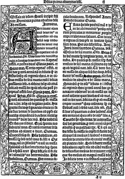
To the printer Richard Pynson belongs the credit of producing the most sumptuously decorated book that appeared in England in the fifteenth century. Pynson’s excellent work as a printer had brought him to the notice of many learned men, and amongst his patrons was Cardinal John Morton. Morton was an Oxford man, and filled many high offices[38] before he became Archbishop of Canterbury in 1486. He was a lover of books, and in 1500 he commissioned Pynson to print a Missal that should equal in beauty of letterpress and decoration anything of that kind that had been produced on the Continent. We cannot doubt that he financed Pynson during the preparation of this work, and we may go even further and say that the decorative work seen in it is largely English. By the kindness of Dr Cowley, librarian of the Bodleian, and with the help of the Oxford University Press, a page from this splendid specimen of Pynson’s craftsmanship forms the frontispiece to the present volume. The Missal was a small folio, printed in a bold, handsome type of black letter in double columns. Each page was surrounded by a border which, as will be seen from the illustration, consisted of four pieces. In some respects this border resembles that of Theodoric Rood, to which indeed Pynson may have gone for his model. On the other hand, the work is somewhat reminiscent of certain French service books.
The bottom panel, with its rebus of Morton, was probably of native work. Not only are the spirals differently treated to those in the side panels, but the flowers and fruit are also of a different character. The page is, in fact, as nearly perfect as the skill of the printers and woodcutter could make it.
During the first eighteen years of the sixteenth century some interesting borders are met with in books printed in England.
[39]
In the year 1503 Wynkyn de Worde printed an edition of Æsop’s Fables in quarto, and he surrounded the title with a made-up border that is typical of the slovenly way in which he often did his work. The outer border consists of two pieces, evidently parts of what had at one time been one block, of which the left-hand portion retained its original form, but the other half had at some time been damaged, and a part of the lower corner had gone altogether, giving the whole an uneven appearance. Further, in order to fill up the space between the illustration at the top and outer border, two smaller pieces, but of different sizes and design, were inserted. The general design in these blocks is spirals of flowers and foliage, the flowers being apparently pinks, or carnations, and daisies.
The printer used this border in exactly this same state on the title-page of Nychodemus Gospell, which he printed in 1511; but in the edition of 1518 of that work the border had undergone a strange transformation. The whole of the top and the right-hand portion had gone, the top being occupied with a heavy block upon which the title was cut in white letters on a black ground, while the right-hand side was filled up with (1) A block from the Fifteen Oes; (2) Four lozenges; (3) Two pieces of ‘ribbon’ ornament; (4) One piece of twisted ornament; (5) A fleuron.
The printer’s device, which in the earlier edition is seen below the cut of the Crucifixion, is also absent from this, its place being filled by another cut of the Crucifixion, evidently[40] from a Missal or Book of Hours; but the printer either forgot (or did not trouble himself about the matter) that the device in the earlier edition was set horizontally, whereas the block of the Crucifixion, which he chose to replace it, had to be set upright, and although it was to all practical purposes the same size, placing it upright left a vacant space under the inner top block and a space all round, which he filled with odds and ends of small ornaments, including two lozenges and two six-petalled flowers.
In the same year, 1503, Julian Notary printed the first of the two books alluded to above, a folio edition of the Legenda Aurea. On the last leaf he placed his device, and made a border for it with no less than eighteen of the decorative blocks that he had obtained from France. In the following year he printed an edition of St Albans Chronicle, again in folio.
This work had no title-page, but in the place of one Notary arranged, on the recto of the first leaf, five of the cuts used in the text, and, to heighten their appearance and make the page more effective, he put round them a border of fifteen of these same decorative blocks. Altogether some two and twenty separate designs are seen in these two collections, and as, after Notary’s retirement from business or death, they appear frequently in the books of other printers during the sixteenth century, it may be helpful if I tabulate them.
In this list the letters L. and C. stand for Legenda and Chronicle; the depth measurements are taken from the centre[41] and not the ends of the blocks. All of them are criblé, and each is enclosed within rules.
1. Sprays of flowers and fruit, birds and a butterfly. 120 by 12 mm. L. and C.
2. Three monkeys and trees. 120 by 10 mm. L. and C.
3. Spirals of flowers and leaves; two birds. 120 by 11 mm. L. and C.
4. Spirals of leaves and stems; various animals; in centre a man blowing horn. 120 by 11 mm. L.
5. Spirals of foliage, birds, and various animals. 120 by 10 mm. L. and C.
6. Leaves only. 120 by 5 mm. L. and C.
7. Wavy line with half flower. 120 by 6 mm. L.
8. Spiral of leaves; two grotesque animals. 120 by 6 mm. L. and C.
9. Spirals of leaves and flowers; three grotesque animals and butterfly. 120 by 6 mm. L.
10. A thick wavy stem, flowers and fruit. 120 by 6 mm. L.
11. Sprays of conventional foliage; bird in centre with outstretched wings. 62 by 15 mm. L. and C.
12. Spiral of leaves and flowers. 62 by 15 mm. L. and C.
13. Man and two monkeys with basket; spiral of foliage. 62 by 15 mm. L. and C.
[42]
14. Hunting scene; dog pursuing stag; forest of trees. 62 by 15 mm. L. and C.
15. Two figures mounted on fighting cocks and armed with quintain; spiral of foliage. 62 by 15 mm. L. and C.
A variation of this is seen in a block used by Wynkyn de Worde at a later period. In this the two figures become two monkeys, their weapons a broom and a pitchfork and their steeds a dog and a goat. It is much more coarsely cut than Notary’s and was slightly larger. This is one of a number of blocks with which De Worde surrounded his device on the last page of the Chronicles of England, which he printed in 1528.
16. Thick spiral, with leaves and flowers; two figures, one naked. 62 by 15 mm. L. and C.
17. Spiral of flowers and foliage, with a dog in centre. 62 by 15 mm. L.
18. Spirals of conventional foliage issuing from mouth and tail of grotesque animal. 62 by 15 mm. L. and C.
19. Spiral of foliage and flowers. 120 by 5 mm. C.
20. Chain ornament. 120 by 5 mm. C.
21. Spiral of conventional foliage. 62 by 6 mm. C. (Description of England.)
22. Spiral of leaves and flowers. 62 by 6 mm. C. (Description of England.)
[43]
In another edition of this Chronicle, printed at a later date, either by Richard Pynson or Wynkyn de Worde, the printer, following the plan of Julian Notary, placed five blocks on the front page and surrounded them with a border. The largest block measures 118 by 99 mm., and represents a king on horseback riding through an archway. This is a variant of the block seen in the Polychronicon. At the top are two smaller blocks, one representing St George and the Dragon and the other the royal arms crowned with angels as supporters. Down the outer side of the large cut are two other blocks, the upper one possibly an odd cut from a Book of Hours, measuring only 40 by 25 mm., representing a priest at the bedside of a sick man; and the lower one the soldier with the pike which De Worde had used in the play of Hickscorner. The border was made up by the repetition of five small ornaments—(1) The ribbon; (2) The cable; (3) A variant of the fleuron; (4) A flower or star; (5) A Maltese cross. Altogether 126 separate units went to make up this very singular border.
In 1504 William Faques printed the Statutes of the 19th Henry VII. in folio, and placed round each page a neat but not very striking chain border, and in 1508 Pynson printed a quarto edition of Petrus Carmelianus with a title in a border, built up with a series of small ornaments somewhat resembling two narrow strips of ribbon plaited at the ends, with a fleuron introduced here and there. As similar ornaments are found in books printed at Rouen, it is very[44] likely that Pynson obtained them from thence, but they appear to have been a stock pattern, as Wynkyn de Worde had an identical set.
A curious set of border pieces was used by Pynson in 1509 in his edition of Sebastian Brant’s Shyp of Folys. Each illustration throughout the book had a border piece on either side. The first two are seen on sig. b 5, and are not unlike those used by Caxton in the Fifteen Oes. They were not long enough to reach the bottom of the cut, so the printer filled the intervening space with a lozenge-shaped ornament. Throughout the remainder of the book he rang the changes on four blocks. Two of these measured 112 by 14 mm., and the design of one was a naked figure in the midst of flowers and foliage, with a bird at the top and some fabulous animal at the bottom; the second showed spirals of flowers and foliage with three birds. The other two blocks measured 112 by 12 mm. and were both alike, their design being a series of half fleur-de-lys alternating with halves of some other pattern and divided from each other by double white lines. All these blocks were criblé and within double rules.
Another good example of a built-up border is seen in a volume of Year Books of the reign of Edward III., printed by Pynson in 1518. Preceding the title-page is his large device (McKerrow, 44) surrounded by a border of various ornaments. At the top is a block measuring 118 by 9 mm., much the same in design as the one just mentioned above. At the[45] bottom two much smaller blocks are placed side by side. In one the principal features are a dragon and a monkey; in the other a man and woman, the man impaling a bird that is seated in the centre between two sprays of flowers. These look French in style, both are criblé, and they bear a close resemblance to those in use by Notary. On the left-hand side of the device are two narrow blocks, each measuring 65 by 11 mm. The upper one has a spiral of fruit and leaves, and the lower a human figure holding a leaf. As these two blocks did not fill up the space required to be filled, two pieces of the ribbon ornament were placed between and below them. On the opposite side are two more blocks, both very narrow, and they have printed badly. There is nothing striking in their design.
Another of Pynson’s borders is seen in the edition of Sallust printed in 1520.
In 1523 Richard Faques printed Skelton’s Goodly Garland in quarto. On the title-page is a cut of a student at his desk, and this has on three sides a border of printers’ ornaments. The outer border was made up of what are probably variations of the fleuron, each unit being about 13 mm. in length. The inner border of the two sides is made up of a series of units which, I think, is intended to represent the heraldic tincture ‘Ermine.’ They were evidently a reproduction on a very small scale of the half ornament that alternates with the half fleur-de-lys, in one of the blocks used in Pynson’s Shyp of Folys.
[46]
Again, on the last leaf of this book is Faques’ device surrounded by a border built up with whole or portions of the lozenge ornament arranged within borders of the fleuron unit seen on the front page. These lozenge ornaments are slightly smaller than those in Pynson’s hands.
Altogether this is a rather effective border. Another example of a ‘mixed border,’ to use a gardening term, is found in the Greate Herball, printed by Peter Treveris in 1526. Two of these blocks, the side pieces, certainly belonged to Wynkyn de Worde, who had used them in 1519 on the front page of the Orcharde of Syon.
As it is manifestly impossible to describe in detail all the border pieces in use in the sixteenth century, I must confine myself to a rapid survey of the remaining seventy years. For the reason already given, I pass over the elaborate one-piece borders used in the various editions of the Bible and Common Prayer Book, and also all those elaborate architectural borders seen in folio books, which began to make their appearance about 1540. These last generally contain in their design the initials, monograms or device of the printers, whether as a mark of ownership or simply as advertisement is not clear; and the most important of them have been reproduced by Mr McKerrow in his valuable book on English Printers’ Devices. But attention must be drawn to the delightful window frame borders found on the title-pages of some of the smaller books printed by Thomas Berthelet, particularly to that seen in the edition of the[47] Modus Tenendi, printed in 1537, and that in Lyttleton’s Tenures in 1545.
Some very interesting borders are also found in the books printed by John Oswen, both at Norwich and Worcester, between the years 1548 and 1551. While not altogether endorsing Mr Duff’s opinion that they were “very much superior to the material used by most of the contemporary printers,”[7] they were certainly unlike anything found in other books, and were probably of foreign origin, though it would be rash to speculate as to what part of the Continent they come from.
I take as an example the title-page of Certayne Sermons appointed by the Kinges Majestie ... printed by him at Worcester in 1549. In this no less than seven distinct pieces are used—one at the top, two at the bottom, and two more on each side. The groundwork of all these is alternately black and white, sometimes arranged in bands, sometimes in triangular form, and there are the usual collection of birds, flowers and human beings.
About the year 1570 English printers began to use the ‘fleuron’ as a material for borders. What has been termed ‘lace’ borders were nothing less than a number of fleurons built up together in the shape of a frame, but the variations in them are infinite. Sometimes they were used singly, sometimes in two rows, but the most effective consisted in a[48] combination of four or eight units repeated over and over again to form a frame, sometimes left with rough edges, sometimes enclosed within rules or other printers’ ornaments. Some of the most delicate and beautiful of these lace borders are to be seen on the title-pages of books printed by Henry Bynneman, Thomas Creede, Henry Denham and Thomas East, although they were adopted by all the English printers of the second half of the sixteenth century, and have continued in popularity to the present day.
This review of the borders found in sixteenth century books may fittingly close with a notice of some used by Henry Denham. In the years 1581–82 he printed for Abraham Fleming two little duodecimos, one called the Footepath to Felicitie, and the other A Monomachie of Motives in the Mind of Man. Both these were devotional works that could be slipped into the pocket, and in each the pages were surrounded by a four-piece border of exquisite design. In the Footepath all the borders were the same, and they may best be described as a chain border, a square alternating with an oval and linked together by a ring, the top and bottom pieces being finished off with a star at either end. In the other book the design is made up of the rose, fleur-de-lys, and portcullis linked together with a delicate flower.
All these borders passed into the hands of Peter Short, Denham’s successor, and afterwards into those of Humfrey Lownes. They thus form an interesting link between the sixteenth and seventeenth centuries, as in 1602 another of[49] Fleming’s books, The Diamond of Devotion, was printed by Peter Short, and each page of this, like its predecessor, had a border, and these show variations from those used before: (1) a border of flowers in an interlaced design, seen on sig. M 2 and elsewhere throughout the book, and (2) a design with the letters E. R., i.e. Elizabeth Regina, with a fleur-de-lys at either end.
In other respects the seventeenth century has little to show in the way of borders, and what it has are neither original nor striking. The engraved title-page came into fashion, but as these belong rather to a History of Engraving than a book on Printers’ Ornaments, they are not dealt with in the present volume. What woodcut borders are met with had done duty in the preceding century, and were generally the worse for wear. But there are one or two uncommon ones to which I should like to draw attention. Amongst the Bagford fragments in the British Museum (Harl. 5927, 155) is a title-page to the second part of Thomas Scot’s Philomythie, or Philomythologie, with the imprint, “Printed at London for Francis Constable, 1616.” This title is surrounded with a light and graceful geometrical border. None of the editions of 1616 in the British Museum appear to have this second part of Philomythie.
In 1641 a curious border resembling a twisted skein of wool, printed white on a black ground, is seen on the title-page of the Rev. T. Denison’s sermon, The White Wolf.
The fleuron borders still continued to be popular, but[50] no such effective use was made of them as in the days of Bynneman and East.
An interesting example of the combination of the two classes of ornament—i.e. the fleuron and the decorative block—is found in the early part of this century. In 1613 the printer John Beale, whose material and work were notoriously bad, printed the second edition of William Martyn’s Youth’s Instructor, and he made up a border to the title-page in the following manner: At the top he built up a gable end of various units of fleuron, enclosed between printers’ rules. Below this he placed a decorative head-piece, the double A, with two naked children. On either side of the title he built up a column of fleurons and other ornaments, and at the bottom he placed another decorative block in which the prominent features are two winged figures blowing horns, and two birds, evidently intended for peacocks, are perched on the filials at the bottom. The whole is a curious medley, and I know of no other like it. Both the decorative blocks used in this border, or copies of them, are found in the hands of other printers at this time. Other small ornaments came into use during the sixteenth century. The national emblems the rose, the thistle, and the harp crowned, each a separate unit, but generally used together; the acorn, the fleur-de-lys, stars and various other forms to which it is difficult to give a name, are found, and towards the close of the century we come upon a border made up of ten printers’ rules set close and printed in red and black, which has a novel if not very[51] artistic appearance. The use of rules, not only on the title-page, but on every page of a book, dates back to the sixteenth century, and was probably a relic of the days when all manuscripts were rubricated, and it was adopted by the sixteenth century printers as an adornment for all manner of service books, particularly Bibles.
In the eighteenth century borders of any kind are rare, but two are here reproduced: that to Dodsley’s edition of Gray’s Elegy, printed in 1751, and the border used by John Wilson of Kilmarnock, when printing the first edition of Burns’s Poems in 1786.
Although, as we have seen, it was at Oxford that the earliest use of a border in English books is found, the University printers of that city in the sixteenth and seventeenth centuries were content to follow in the footsteps of the London men, and until we come to the work of M. Burghers, late in the seventeenth century, there is nothing that calls for special notice.
Burghers’ engraved title-pages do not come within the scope of this work, for reasons already stated.
Cambridge has a somewhat better record: Siberch, the first printer there, had a woodcut border which is found in most of his early books. It is either German or Dutch in character. Its design is architectural, showing an arch supported by curiously decorated columns, with children, one of whom has wings, playing round them. Two other winged figures are seen on the arch, and two more in the[52] bottom compartment, are acting as supporters to the Royal Arms. As Siberch’s sign was the Arma Regia, this bottom block is said to represent it. As a specimen of the woodcutters’ art this border is of no great merit; it is a one-piece border, and it has been reproduced scores of times. But as being the earliest border used in Cambridge it calls for mention in this volume, and we give a reproduction of it. In the seventeenth century the Cambridge printers built up some effective borders with small ornaments. An extremely pretty one is seen round the title-page of the Clavis Apocalyptica, printed by Thomas Buck in 1632. In this instance thirty-nine units are used in a space of 110 mm. and placed within rules, giving the whole a neat and pleasing appearance. In 1633 Roger Daniel printed an octavo edition of Dionysius, and used as a border to the title-page a flower perhaps meant for a rose, with stalk and leaves, measuring only 4 × 2 mm., and he placed the units in a double row.
In another case the ornament looks like a fleur-de-lys rising from a slender stem with a leaf on either side. The unit measures 5 × 4 mm., and a double row is made with them.
[53]
HEAD AND TAIL PIECES—SMALL ORNAMENTS
[55]
This part of our subject is almost wholly unexplored. In dealing with borders we not only had the large collections of title-pages made by Bagford and Ames to draw upon for illustration, but also the studies of such able writers as Mr E. G. Duff and Mr A. W. Pollard. When we come to deal with initial letters we shall also find the writings of Mr C. Sayle and Mr Pollard and others of great value to us; but in dealing with the ornaments known as head-pieces and tail-pieces we have no guidance. No collections of them are known, and no bibliographer has ever made them a special subject of study.
Under these circumstances it will be best to deal with these two classes of printers’ ornaments together, because although there were special blocks designed and cut as head-pieces and tail-pieces which were never used except in their rightful places, on the other hand the early English printers frequently used the same block without distinction.
As their name implies, the object of these blocks or ornaments was to fill blank spaces at the beginning and end of divisions in the text, such as Dedicatory Epistles, Prefaces,[56] Sections of a work, or Chapters. They were also frequently placed above and below a colophon.
Whatever may have been the custom amongst Continental printers with regard to the use of such ornaments, the sixteenth century was well advanced before they began to make their appearance in English books.
So far as I know, no book of Caxton’s exhibits any ornament of this kind. He followed the habit of the scribes and began his letterpress high up the page and did not leave a space that required filling up, and was content to leave other spaces unfilled. Both Wynkyn de Worde and Pynson had a varied assortment of blocks, which, as we have seen, they used as borders to title-pages or to their devices, but neither of them during the fifteenth century placed any ornaments at the head of the text or at the end of any of their books, and even as late as 1525 Pynson’s folio edition of Froissart was entirely devoid of head-or tail-pieces, and so was the folio Bible of 1539.
This at least we may say, with confidence, that the use of some kind of ornament at the bottom of a chapter, or the end of a book, preceded the use of head ornaments, and we may go even further and say that the earliest form of tail-piece used by any English printer was a single fleuron of especially large size, and perhaps cut in wood and not metal, three of which arranged as a reversed triangle is frequently seen in books at an early date in the sixteenth century. We may date the adaptation of the fleuron for the decoration[57] of blank spaces as between 1560 and 1570, and an exceedingly good specimen of its adaptability for this purpose is here reproduced. Bound up with a copy of the Book of Common Prayer, printed by Richard Jugge in 1573, is, A Treatise made by Athanasius ... in what manner ye may use the Psalmes. This consisted of four leaves only, the first of which is missing, signed A [1]—A iiij, and on the verso of A iiij is this elaborate tail-piece. The centre, as will be seen, is formed of a fleuron ornament surrounded by a ‘lace border’ of other fleurons, and flanked at each of the four corners by two pieces of the same ornament. Below this again is a block of a semi-architectural character, with a human head in the middle and a lion’s head at either end, with bunches of fruit in between—the whole design measuring 135 × 122 mm. The ornament in the centre of this tail-piece is a single block and not formed of separate units like the frame; but it is none the less the fleuron worked into an arabesque design. These blocks had been in use some years and became very popular, and a few more that have been met with may be mentioned. Three found in Sophocles’ Antigone, printed in 1581, illustrate the manifold ways in which the fleuron could be treated. The first is triangular in form, while the other two are square but set cornerwise. John Day used several in the Cosmographical Glasse, 1559. Another fine example is to be seen on the title-page of John Bodenham’s Garden of the Muses, printed in 1610 by E. A.—that is, Edward Allde—for John Tap.[58] Both in shape and design this differs altogether from the others. In this instance it becomes an ornament, but it was no doubt used elsewhere as a tail-piece.
Equally when built up to form head and tail pieces the individual fleuron was worked into bewildering variations: to attempt to mention or illustrate them all would be impossible; but an example or two from the sixteenth century books are illustrated. The first is a single row of a single unit, set as a pair back to back. It is taken from sig. F 6 of Vautrollier’s De Rep. Anglorum of 1579. It will be noticed that the original form of the fleuron—the single leaf and stalk—has undergone considerable variation, particularly by the introduction of a heavy cross-piece, perhaps intended as a development of the second piece of stalk, which was a feature of the early unit, but introduced with a purpose, as this example shows. The second and third of our illustrations are taken from the title-page of the first edition of Shakespeare’s Love’s Labour’s Lost, printed in London in 1598, and from Waldegrave’s edition of the Basilicon Doron, printed in Edinburgh in 1599. The contrast between the two is worth noting. The units in the Shakespeare measure 9 × 6 mm. each; portions of the stem are shaded, and they are arranged in sets of four and two. Waldegrave’s fleurons were a shade larger, i.e. 9 × 7 mm. The arrangement is the same, but the stem, being entirely black, imparts a totally different appearance to the ornament. In another instance in this book the same units are used, but in this case they[59] are placed horizontally, thus giving a complete alteration in appearance.
A fourth example is built up of two units only—arranged as seven central groups of four, with a border top and bottom consisting of seven pairs; and by leaving out the bottom row yet another change was wrought. Indeed, the possible combinations were endless. No wonder that the fleuron ornament has kept its place in the compositor’s box until the present day.
Another ornament used as a tail-piece in the sixteenth century may be best described as the ‘lozenge’ ornament. Like the ‘fleuron’ it was apparently a stock pattern, supplied to all printers alike from quite the beginning of the sixteenth century. It is found on the Continent, and also in the offices of Wynkyn de Worde, Pynson, Richard Faques, and others.
Robert Redman used seven of them, no doubt part of Pynson’s stock, to form a tail-piece at the end of his Year Book for Michaelmas Term, 11th Henry VI., believed to have been printed about 1540, and with them another of Pynson’s border pieces [B.M. 504, f. 16 (8)]. Another curious example of its use is seen at the end of An Enterlude called Lusty Juventus, printed by John Awdeley, without date, but not earlier than 1560, where no less than twenty-seven half lozenges arranged as an inverted triangle are found beneath his imprint on the last page.
An ornament quite common in the sixteenth century, which on occasion served both as head-and tail-piece, may[60] perhaps be described as a ‘ribbon’ ornament, as in appearance it resembles two pieces of ribbon interlaced into circles and squares, a five-pointed star being placed in the centre of the circles and a flower in the centre of the squares. This is all one piece, and was probably metal and could be cut to any length. In 1579 it is found in a book printed by Vautrollier. During the seventeenth century the small ornaments already noticed as used for borders to title-pages—the star, the rose, the crown, the thistle, the fleur-de-lys and the acorn, cast in various sizes—shared with the fleuron the duty of supplying head and tail pieces, or dividing sections of a book.
In 1662 we come upon another example—an urn with a flower growing in it, used in the Liber precum publicarum, printed in 1662, where at the head of the licence fifteen of them are used at the head of the page and again on the verso of the same page; but, whether purposely or not, in each case units of a different design are introduced.
Some further varieties of these small printers’ ornaments, not easily describable—they may be meant for flowers or urns or anything else—are found in a volume of Parliamentary Declarations, etc., of the time of the revolution. When they happened to be new, or were used by a careful printer, these small ornaments were effective, but when, as too often happened during the period between 1640 and 1660, they were old, badly arranged, and badly inked, they often spoilt the book or document in which they were used. By the[61] time the eighteenth century was reached, the compositor’s box had become crowded with small printers’ ornaments. Like all other printers’ materials at that time, these were the production of type-founders in Holland. But in 1720 William Caslon, an engraver of gun-locks, was introduced to the printers William Bowyer and John Watts, and was by them taken to the foundry of James in Bartholomew Close. Bowyer and Watts also advanced him sums of money to enable him to set up as a type-founder. Caslon’s superiority over all other letter-cutters, English or Dutch, was quickly recognized. The shape and proportion of his Roman letter, combined with its wonderful regularity in height, was such as had not been seen in England since the days of Pynson, while his italic founts were also remarkable for their beauty and regularity.
That it was printed with Caslon’s letter was the best advertisement a book could have in the eighteenth century, and his foundry soon eclipsed all others in this country.[8]
His first specimen sheet was issued in 1734, but it shows only five examples of fleuron ornament and two rows of stars. The first of these examples was not a common pattern, although it may have had a predecessor in the seventeenth century. The other four showed no originality—they had been in use for a couple of centuries—but they were cast clearly. If these were all the flowers which Caslon thought it necessary to show after fourteen years’ experience, the[62] inference is that he was more concerned with the cutting of type-faces than ornaments. In the specimen book of 1764 the flowers fill no less than four pages, and in addition to the fleuron, which is shown in many sizes and some new variations, the type-founder had introduced several new designs, such as minute circles that could be arranged in many decorative ways—an hour-glass and skull and cross-bones, no doubt for use as head or tail pieces in funeral sermons—and had also, in one instance at least, reverted to a fifteenth century ribbon pattern. Many single-line castings were also shown. In the specimen book of 1785 many new designs and their possibilities as head and tail pieces were illustrated by artistic and novel arrangement of the various ornaments, some of which we know were adopted by printers throughout the country. Further specimen books were issued by the firm from time to time.
Some examples of the use of small ornaments in the decoration of books in the eighteenth century in which Caslon’s influence is evident are here shown. The first is seen on sig. B of the Rev. William Gardner’s Sermon, preached at the Assizes at Kingston-upon-Thames on August 4, 1726, and is an extremely effective combination of several units of different design surrounded by what may best be described as a bead border, the beads being arranged in groups—an oval between two round—and each group being separated by a star. [B.M. 226, f. 3 (9).]
The next, which shows several new forms of the treatment[63] of the fleuron as a decorative unit, is also remarkable for the very artistic way in which they are arranged, the whole forming what, to use the language of that day, would probably have been called a ‘very elegant’ head-piece. It is seen at the head of the text of A Sermon preached at Stafford at the Assizes held there on August 22nd, 1756, by the Rev. Joseph Crewe. In neither of the above cases do we know the printer. [B.M. 225, f. 3 (5).]
Finally we may notice one or two from a little book called The Lover’s Manual, published by a country bookseller, S. Silver of Sandwich, but printed in London, possibly at the same press as the preceding, as the ornaments are very similar.
John Baskerville, who shared with Caslon the merit of being one of the best type-founders of the eighteenth century, made a very sparing use of ornaments; but such as he did use we may suppose him to have cast in his own foundry. Messrs Straus & Dent in their life of this eminent printer have reproduced fourteen of his ornaments. Nos. 14 and 4 differ only as regards size. This flower ornament with circle in the centre was a departure from the old model. Indeed, all these ornaments are light, graceful, and in keeping with the character of the fine types of which he was the founder. Nos. 6 and 7, reproduced by Messrs Straus & Dent, are very beautiful variations of the old-fashioned fleuron, the nearest approach to which are the feathery examples, Nos. 2 and 8, which, however, lack both[64] the firmness and the grace seen in those of the sixteenth century. The ribbon ornament, No. 5, seems to be a survival, or perhaps revival would be the better word, of the ornament found in the hands of Pynson and Wynkyn de Worde.
Altogether the printers of the eighteenth century could obtain a wealth of small ornaments such as they had never possessed before.
[65]
HEAD AND TAIL PIECES—DECORATIVE BLOCKS
[67]
In the foregoing chapter I have dealt with head and tail pieces, more or less built up of small single printers’ ornaments. These did all very well until the advent of something better; but the English printer had to wait until between 1570 and 1580 before what may be termed legitimate head and tail pieces—that is, blocks of a decorative or pictorial design, especially cut for the purpose—were put in his hands. These ran to all sizes, from blocks measuring 139 by 34 mm. for head-pieces in folio books to others measuring only 47 by 12 mm., these last being used independently as head-or tail-pieces, or as ornaments for the title-page. The larger ones are rarely found used elsewhere than in their rightful places.
Before their advent, any odd blocks that had done duty in books of hours or primers on the Continent, and had been bought by some English printer on his annual visit to the Frankfort Fair, were pressed into service as head and tail pieces.
One of the earliest examples of the use of an odd block as a tail-piece is found in Middleton’s edition of the Statutes of the 7th Henry 6th, printed between 1530 and 1540, at[68] the end of Michaelmas term (sig. K 2), where a geometrical and architectural block, measuring 119 by 19 mm., is very effective. This had previously belonged to Wynkyn de Worde.
Another may be seen at the end of A Newe Booke—An Exhortation to the Sicke, printed by John Oswen at Ipswich in 1548, where above and below the imprint are the two blocks here reproduced. They were clearly not specially cut for the purpose—indeed, I have a shrewd suspicion that I have seen the lower one in books printed by Robert Wyer. Nor can we accept the two blocks placed above and below the colophon to the Sarum Missal, printed by Kingston & Sutton in 1555, as genuine head and tail ornaments. They obviously belong rather to the class of border-pieces from some foreign book of hours.
An example of the miscellaneous tail-pieces to be found in sixteenth century books was brought to my notice recently by Miss Murphy. It turned up unexpectedly in the second edition of Harman’s Caveat or Warneing for Common Cursetors, vulgarly called Vagabones, printed by William Griffith in 1567, and it would, I think, be difficult to match it.
The centre is a cut of the Virgin and Child forming the centre of a rose. Outside this is a circle of beads, and outside that again a circle of flowers on a single stem with five roses placed at equal distances round the circle. The whole measures 95 mm. in diameter. It may be one block,[69] and the association of the rosary, the beads and the picture of the Virgin seems to point to its having been cut for some Roman Catholic book. At the end of the Preface is a good tail-piece of arabesque design.
Specially designed decorative head and tail pieces began to make their appearance in English books about the year 1570. One of the earliest I have met with is a head-piece found in the hands of Thomas Vautrollier, whose printing office was one of the best equipped in England. It appears on sig. A of Chaloner’s De Rep. Anglorum instauranda libri decem, a quarto printed in 1579. [B.M. 1070, m. 31.]
The block measures 102 by 22 mm. The design is an elaborate one, the main feature being two spirals that look like capital A’s. On these are resting two naked boys with a bowl between them containing fruit and flowers. Below is a grotesque head. From these large spirals issue smaller ones with a squirrel on one side and a rabbit at the other, and two filials of grotesque animals at each of the bottom corners.
This may be a metal block, but it was light and graceful in treatment, and was in every way suitable to the beautifully printed book in which it is found. In another book, M. T. Ciceronis Epistolæ, printed at the same press in the same year, is found Vautrollier’s well-known tail-piece of the Gorgon’s head, with his initials T. V. on either side.
There were, no doubt, similar blocks in use in folio books before 1580, but the earliest I have met with is the[70] artistic head-piece seen in sig. A of Bynneman’s edition of Morelius’ Verborum Latinorum, printed in 1583. In the centre we see a figure holding in each hand a bird with long tail feathers. On either side is an archer with a drawn bow and arrow, with rabbits sitting behind him, while at each of the lower corners is an animal with very long and curving horns. This block measures 139 by 34 mm. It was afterwards in the hands of the Eliots Court Press, and can be traced in use until about 1650.
Before the close of the sixteenth century specially designed head and tail pieces of all sizes were in general use, and continued so throughout the following century. When I add that every good block was immediately copied, and frequently copied so faithfully that it needs almost microscopical examination to discover the difference, some idea will be gained of the wide field of illustration thrown open in this branch of our subject. In the dainty little devotional works of Abraham Fleming, already alluded to in my chapter on Borders, are found several delightful little head and tail pieces, all of which passed into the hands of Henry Bynneman, and from him to the Eliots Court Press.
Holinshed’s Chronicles, first printed in 1577, also contain some very fine examples. At the head of the Dedication to the first volume is seen the block with a bear sitting on his haunches holding spirals of foliage. Two dogs, two men with staves, and two serpents are also parts of this design. It seems possible that these large folio head-pieces[71] were lent by one printer to another, as this one is found in many books. Again, at the head of the “First Booke of the Historie of England,” in these Chronicles, is a semi-architectural head-piece with the Royal Arms in the centre. At the head of sig. K 6 in the “Chronicles of Ireland” is another good decorative block, which is sufficiently like that at the head of the Dedication to the first volume to suggest a common origin, as indeed do those in use by the Eliots Court Press. Another good example of these blocks is that found at the head of Geoffrey Fenton’s History of Guicciardini, printed by Richard Field in 1599. The same spirit seems to run through them all, and they deserve more notice than they have hitherto received. The charming little tail-piece, showing a boy playing two drums, is also from the Chronicles, and is found at the end of the Preface to the “Chronicles of Ireland” in the third volume. In some respects it is reminiscent of the eighteenth rather than the sixteenth century. At the opening of the seventeenth century the decorative blocks used by the Eliots Court printers call for special notice, and by the kind permission of the Bibliographical Society one or two of those that appeared in my article in The Library a short time ago are here shown. It was not possible at that time to illustrate any of the head-pieces that appeared in books printed in folio. No such restriction bars us now, and consequently three of these characteristic head-pieces from an edition of the Workes of Homer, printed at that press, are here shown. The first, which measures[72] 142 by 36 mm., consists of spirals of flowers, radiating from a central stem, with caterpillars and various winged insects dotted all over it. This was also used in the folio edition of Bishop Jewell’s Works, published by John Norton in 1609, and two years later M. Bradwood, who succeeded Arnold Hatfield in the management of the office, used it in Queen Anne’s New World of Words, and as late as 1639 it was in the hands of Edward Griffin the second.
The second of these large head-pieces has as its design the sun in glory and four horsemen between sprays of flowers and foliage. It is found again in the folio edition of Montaigne, printed by Bradwood, and was in constant use down to the year 1638.
The third, in which the principal features are two large cornucopiæ and two lions holding shields, was also used by all the Eliots Court printers down to 1640, and there was also another block something like it in the hands of other printers.
Passing to the smaller blocks of this press, one of the most artistic is that of the two cherubs blowing horns, used as head-piece in A Copy of a Letter written by E. D., a pamphlet printed in 1606 by M. Bradwood. It was of Continental origin, and it has served as a model for printers down to our own day, a variation of it being amongst those in use by the Chiswick Press.
In the same book is found the ‘fleur-de-lys’ head-piece. It was used by all the Eliots Court printers[73] without exception; but Felix Kingston, another London printer, had a block so similar that it is almost impossible to tell one from the other. It makes a very handsome head-piece.
The other two examples here shown are also from A Copy, etc., and both were in use, the one as late as 1644 and the other to 1650. The one with the squirrels was copied repeatedly, and several variants of it are met with in other books. The blocks of the national emblems when used together formed an effective head-piece, but they were sometimes used in pairs to form side-pieces to other blocks. There was also a smaller set without the decorative spirals.
When George Purslowe joined the firm he brought with him several ornaments that had belonged to Simon Stafford, and in 1620, when he printed the Rev. Elnathan Parr’s Exposition on the Epistle to the Romans, he used as a head-piece a block which is found in the hands of Henry Bynneman as far back as 1581, and it was a curious medley of part of one of Simon Stafford’s and part of the ‘fleur-de-lys’ block, and shows that the designs of both those blocks had their origin in sixteenth century work.
These Eliots Court head-pieces are very typical of seventeenth century work; but such printers as Robert Barker, Adam Islip, Humfrey & R. Lownes, Miles Fletcher, and others had a large and varied stock, from each of which an equally good collection might be made.
[74]
A good decorative head-piece was that used by H. Lownes in J. Dowland’s Pilgrimes Solace, printed in 1612, embodying the national emblems.
Passing over the period of the Revolution and Commonwealth, in which most of the blocks used were old ones, a word or two must be said of the work done by Mr Burghers at Oxford during the last years of the seventeenth century and the opening years of the eighteenth century.
It is somewhat remarkable that so little attention has been paid to M. Burghers and his work by Oxford students. For upwards of fifty years he must have been a well-known figure in the University town. For many years he designed the allegorical illustration for the Oxford Almanac. There is no question as to his ability both as artist and engraver. Yet Bryan, in his Dictionary of Engravers, dismisses him curtly without even mentioning the period during which he worked, and refers to his work as ‘stiff and tasteless.’ The Dictionary of National Biography accords him just twenty-three lines, and finishes off by saying, “He died, according to Hearne’s Reliquæ, on the 10th January 1726–7.” As a matter of fact, Hearne gives the best memoir of him, but has very little to say about the vast amount of work he did and his skill as an artist. On these points all he says is, “He was looked upon as the best general engraver in England, and had always till very lately, within these last two or three years, a vast deal of business, so that being withal a very industrious man, he[75] got a vast deal of money and purchased a pretty estate in Oxford.”
This is a poor account of a man whose work was not confined by any means, as the Dictionary of National Biography would lead one to think, to the engraving of portraits, but who executed engravings for many books. None of his biographers call attention to the wonderful series of head and tail pieces and initial letters which Burghers designed and engraved for the folio edition of Clarendon’s History of the Rebellion and Civil Wars in England ... printed at the Theater, An. Dom. MDCCII. (-IV.).
Amongst the many things collected by John Bagford were specimens of Burghers’ work.[9] Unfortunately he gave no clue as to what books they appeared in, but some of them were from this work, and the beauty of the designs no less than the excellence of the engravings places them in the very first rank of English Printers’ Ornaments. None of these deserve Bryan’s censure. They are not only spirited; but they are worthy of the great work in which they appeared. No. 234 in Bagford’s volume is a head-piece, the design of which is classical in treatment—spirals of flowers and foliage of a highly ornate character springing from a central stem, which consists of the body of a child emerging from foliage with his hands uplifted in terror of the two lions who are apparently coming for him on either side. This is the head-piece to the thirteenth Book, vol. iii., p. 285. No. 207 in[76] the same volume was evidently designed for an English book on Science, printed about 1696. In the centre is seen Britannia, with shield and trident, looking out over the sea. Beneath her is the date 1696, the whole being surrounded by a laurel wreath. On either side are open books, that on the left apparently dealing with Euclid and that on the right with architecture. Other books and rolls and mathematical instruments have also a background of laurel, and the design is surrounded by a decorative frame.
The tail-pieces designed by Burghers are even more splendid than the head-pieces. The two we have chosen for illustration are entirely different in character, but are both remarkable for their grace and beauty. No. 310 in Bagford’s collection consists of spirals emanating from a central sun-like flower. These dancing figures and two birds form part of the design, which measures no less than 152 by 120 mm., and has the signature “M. Burge, sculp.” at the bottom. No. 322 is a classical design figuring Hercules. Both appeared in Clarendon’s History.
With the opening of the eighteenth century the character of these decorative head and tail pieces other than the fleuron changed entirely.
In the first place the old wood block was superseded by metal ones, and no doubt the change gave greater clearness of impression and longer life. Then with Caslon’s advent as a type-founder native talent began to assert itself; but the alteration went even further than this, and[77] heralded a change in taste on the part of printers, who seem to have been captured by a different school of designers altogether. We suspect that this was largely due to the influence of the Oxford engraver, M. Burghers. Whether the blocks produced during this century were or were not more artistic than those they supplanted must be left to experts to decide. My work is to record the change and show its development.
In 1712 William Bowyer printed a great folio, Atkyn’s Ancient and Present State of Gloucestershire, in which we find a large head-piece signed I. L., which is a good example of the head-piece that had come into fashion.
The centre shows a basket piled with fruit, with some kind of drapery hanging from it and the letters I. L. f. below this. On either side of the basket the ornament takes the form of sprays or spirals of flowers or foliage, somewhat resembling the designs of M. Burghers at Oxford. Indeed, baskets of fruit and flowers became a feature in nearly all head and tail pieces of the eighteenth century. In the same volume is a tail-piece which is equally typical of eighteenth century work.
Some very beautiful examples of the decorative head and tail pieces of the early eighteenth century are found in the octavo edition of Lucretius’ De rerum natura, printed by J. Tonson and J. Watts in 1713. While some of these head-pieces are pictorial, they are in some measure called[78] forth by the text, and perhaps more in the nature of illustrations; the tail-pieces have a character of their own, especially the one at the end of the fourth book and that at the end of the sixth book, and the final one.
Another fine head-piece is seen in the first volume of the Works of Sir William Temple (sig. B ij), printed in folio in 1720, and is matched by the tail-piece on the verso of B 3 in the second volume. Another example of a signed head-piece occurs on a block found in the octavo edition of the Works of George Farquhar, published by Knapton and other booksellers in London in 1728. Whether it is meant to be emblematical or not it is hard to say, but in the foreground is seen a lion pointing with his right foreleg to a plant in front of him, two of the leaves of which bear the initials F. H. and M. M. Round about are several trees. The work of F. H. was evidently a favourite as late as 1738, when we meet with another example of it in a sermon printed for J. Roberts in Warwick Lane. In this case not only is the block larger, but the design consists of vegetable growths, ornately treated with a vase of flowers in the middle and a bird with outstretched wings at the top.
The various parts of James Thomson’s poem on Liberty, printed in 1735, have head-pieces, none of them of great merit, of which one is here shown as a contrast with that just noticed, while, as an example of how thoroughly bad[79] some eighteenth century work could be, we show a tail-piece representing a fountain, found in a volume of translations of the Odes of Horace, printed in 1743. [B.M. 11375, c. 17.]
The provincial printers probably stocked themselves from the London foundries, and consequently their ornaments followed the prevailing fashion. We have already seen specimens of the work of M. Burghers at Oxford, and while the sister University cannot show anything quite so gorgeous, the printers in Cambridge had a good selection, many of which are shown in R. Bowes’ Catalogue of Books printed at Cambridge from 1521 to 1893. From these has been chosen a head-piece used by Cornelius Crownfield between 1698 and 1743 as being typical of the period, and two tail-pieces used by the same printer [Nos. 81, 82 in that Catalogue], while a tail-piece from a work by an unknown printer illustrates once again the innumerable ways in which the fleuron could be treated. In this case twenty-eight units are arranged so as to form an inverted triangle.
Moving further northwards we find John White, the printer at Newcastle-on-Tyne, with a good stock of ornaments, which he used with effect in Bourne’s History of Newcastle, which he printed in 1736. The head-piece here shown is a characteristic example of eighteenth century work (note the baskets of flowers and fruit, the birds and the cherubs), and Mr Welford, in his Early Newcastle[80] Topography, describes the larger of the two tail-pieces as ‘gorgeous.’
Coming south again, the printer at Truro, from whose press came the unfinished work called the Compleat History of Cornwal, used the head-and tail-piece here reproduced.
[81]
MISCELLANEOUS ORNAMENTS
[83]
In addition to the forms treated of in the foregoing chapter, the early English printers sometimes filled up the space at the end of a paragraph with small printers’ ornaments. In his edition of Johannes de Garlandía, Multorum Vocabulorum, printed in 1514, Pynson placed at the end of the last line of the colophon two units of a fleuron reversed. This is not shown by Messrs Meynell and Morison in their article in the Fleuron, and nothing exactly like it is shown by Mr D. B. Updike in his numerous illustrations of specimen sheets English and Foreign. It consisted of a spiral with two leaves, and measures about 10 mm. in length. It also proves that the fleuron or ‘petit fer’ was known in this country in 1514, and probably earlier. He used these again in the Year Books of Edw. III. But on what system, if any, he worked it is not easy to understand. In the first five sheets of this book, although there were many vacant spaces that could have been filled, no ornaments were used, but on signature F iiij they begin to appear; but still there seems no uniformity. At the end of one paragraph three such ornaments are placed: in the next nothing, although the space at the end of the paragraph was just as large. Then[84] we find one with five; but the average number was three. Nor were they all of the same kind. One arrangement was ribbon, fleuron, ribbon; another, one plait and two ribbon; a third, three ribbon and one fleuron, and so on; but why the compositor should have wasted his time putting in these ornaments here and there only, is inexplicable.
Robert Redman was equally arbitrary in his use of them, the only difference he made being to place a colon between each unit. This custom very soon died out.
But the miscellaneous ornaments I have in mind are usually found on the title-pages of books, and even there they are only occasionally met with in the sixteenth century, when it was usual for the printer to place his own device above the imprint. As these devices were often very artistic, they served their purpose of decoration very well. Vautrollier’s fine series of the Anchora Spei may be cited as an instance.
But there was at least one printer in the sixteenth century who did not follow this custom, and that was Henry Bynneman. It was not that he had no small block of the Mermaid to put on his title-pages, because we know that he used such a block at the end of one of his books. From the care he took in the printing of his books we may suppose him to have taken a pride in their appearance, and this probably arose from his chief patron being Sir Christopher Hatton, who at that time was the most powerful of Elizabeth’s favourites, and was the friend and helper of[85] literary men. At any rate Bynneman frequently placed the crest of that nobleman, a hart surrounded by the motto, “Cerva charissima et gratissimus hinnulus,” with a very elaborate frame, on his title-pages. It is seen in the fourth part of Gabriel Harvey’s Gratulationis Valdinensis, the other three parts of which have on the title-page: the first, the royal arms; the second, the crest of the Leicester family—the bear and ragged staff; and the third, the crest of the Burleighs—a sheaf of corn with two lions rampant as supporters, and the motto, “Cor unvm via una,” within a border of fleurons.
Several of the blocks reproduced by Mr McKerrow in his Printers’ and Publishers’ Devices were not devices at all, but merely ornaments. Such a one is No. 248, which he describes as a “two-tailed mermaid blowing two horns. A fringe of tassels below.” In fact, he admits that it is an ornament. Another was No. 244, which he describes as a wreath enclosing armorial bearings found in A. Broke’s Tragical History of Romeus and Juliet, printed by R. Robinson in 1578. A third that was certainly not a device, though it was associated with the Eliots Court Press, was the “Veritas felix temporis” block, a copy from a foreign source, which, in spite of the bad workmanship, retains much of its original grace and beauty.
John Windet placed on the title-page of H. Swinburne’s Briefe Treatise of Testaments and Wills, 1590, a curious little decorative block, in which two happy-looking cherubs[86] sitting under overhanging sprays of foliage that are part of the contents of an urn or basket of fruit and flowers are busily playing, one a guitar and the other a viol or violin, but whether they are serenading the lady whose head forms part of the design one is left to guess. This block was perhaps in reality a tail-piece.
The title-page of the first edition of King Lear, published by Simon Stafford in 1605, had as an ornament a block that was used on occasion both as head and tail piece, and came afterwards into the possession of George Purslowe and so to the Eliots Court Press. That seen on the title-page of Cyril Tourneur’s Atheist’s Tragedie, published for John Stepneth and Richard Redmer in 1611, also belongs to the same category, as does also the one placed on the title-page of A Description of New England, printed by Humfrey Lownes in 1616. The fleur-de-lys placed above his imprint by William Jones in Gerard Malynes’ Center of the Circle of Commerce is familiar in several seventeenth century books, while that seen on the title-page of Euphues, his Censure to Philautus, printed by Elizabeth Allde in 1634, had a counterpart amongst the blocks of Felix Kingston, and is frequently found as a head-piece.
Indeed, one can never be sure whether they are dealing with the original or only a copy, as most of these blocks were copied over and over again.
[87]
INITIAL LETTERS AND FACTOTUMS
[89]
Nothing tends to heighten the artistic beauty of a book so much as the initial letters. This fact was recognized by the monastic scribes, who lavished all their skill in the production of beautifully illuminated letters in the Missals and Books of Hours upon which they spent their time in the scriptorium.
For some time after the introduction of printing, with certain rare exceptions, the early printers left the space to be filled by the initial letter blank for the illuminator to fill in. But before long they began to cut the initials for their books in wood, and they went to the manuscript books for their earliest model, hence the ecclesiastical character of the first woodcut initials; and although they could never hope to obtain the beauty of the illuminated letter, which was due as much to the colouring as the design, the printers soon learnt to produce very striking and effective decorative initials. For an illustration we need go no further than Paris, where in the fifteenth century the books of Antoine Verard were decorated with a grand series of woodcut L’s, copied from the decorative script of that period, while it is only necessary to glance through Mons. A. Claudin’s magnificent[90] history of printing in France to see many other examples; while M. Butsch’s Bücher-Ornamentik and Castellani’s Early Venetian Printing show that the presses of other countries were equally prolific in this field of book decoration.
The early English printers in this, as in every other, branch of their work were content to copy or to borrow from foreign sources rather than to create, consequently the initials found in their books before 1500 show little originality. They borrowed chiefly from France, or perhaps it would be more correct to say that they bought chiefly from France. There was so much material in the market, and it saved so much time and trouble to buy from others. Or was it that there was no man in England sufficiently skilled to draw or design initial letters, and no craftsman skilled enough in woodcutting to produce them? Whatever the reason, this foreign trade in initials continued throughout the sixteenth century, as blocks that had come from Paris, Lyons, Basle, Venice, Florence, the Low Countries, and even Spain are frequently met with in books of that time. Matters improved as time went on, and English gravers began to turn out some very creditable work, so that, regarded as printers’ ornaments, whether their origin be native or foreign, the initial letters found in English books from the fifteenth to the twentieth century are of sufficient artistic merit, as well as sufficiently numerous, to deserve a book or books to themselves. The publication of such a book is long overdue.[91] Too much good material has already been wasted in the piecemeal treatment of the subject and in the needless repetition of the same illustrations. What is needed is a comprehensive study of the whole subject, tracing as far as possible the birthplace of various alphabets, and what is no less interesting, pointing out the variations in certain alphabets due to the copyist.
In the hope that such a work may not be much longer delayed, I think it as well to say as little as possible on this branch of English printers’ ornaments, and in this section merely to whet the appetite of the reader for that full study of the subject that is bound to come.
Fortunately there is no lack of material. The studies of Mr Charles Sayle, of Cambridge University Library, which have extended over several years, supplemented by those of Mr A. W. Pollard, Dr Oscar Jennings, and recently of Mr Percy Smith, make the task a light one as far as the initials of the fifteenth and sixteenth centuries are concerned. With Mr Sayle’s kind permission two or three examples have been chosen from his paper on the subject read before the Bibliographical Society in November 1902. To these I have added a few others of that period that, so far as is known, have not hitherto been reproduced, and I have further supplemented them with some examples from my recent paper on the Eliots Court Press and other sources to illustrate the work of the seventeenth and eighteenth centuries.
[92]
For the purposes of this section I have divided the letters into groups, according to their subjects, such as ecclesiastical, biblical, classical, grotesque, heraldic, and finally miscellaneous, embracing designs not otherwise groupable.
An early example of the ecclesiastical initial is the letter T found on the verso of the title-page of the Legend Aurea. Those seen in the Morton Missal of 1500, some of which embody Cardinal Morton’s rebus, also belong to this class, and have the additional merit of being, it is believed, English workmanship.
The highly decorative L found in some of the books of R. Faques about 1530 is another good example, while the F used in 1540 by William Middleton in the Year Books of Henry VI., showing a bishop with a mitre, is also worth notice.
The Reformation and the printing of Bibles and Common Prayer called for large numbers of initial letters of all sizes, and it is not surprising that Biblical scenes should have formed the subject of many of these. Here again the English printer had no need to create. The large number of service books, printed by the various printers on the Continent ever since the first establishment of the art in Europe, had flooded the market with a quantity of such blocks, of which he was not slow to avail himself. As Mr Sayle remarks, the Great Bibles of 1540 and 1541 are a mine in themselves. The magnificent letter I, illustrating the Creation, is sufficiently well known. The H, representing[93] Samuel and Eli, first used by Herford in 1544, is another familiar example.
Reginald Wolfe also had a very interesting set, illustrating scenes in the life of St Paul, used in an edition of the New Testament, and in his Chrysostum is a Q, the subject of which is the Judgment of Solomon.
In Bullinger’s Sermons, printed by Ralph Newberrie in 1577, is a letter D that I think belongs to this division, and represents the death of the firstborn in Egypt.
Classical subjects begin to appear in English books about the middle of the sixteenth century, although as early as 1521 Siberch at Cambridge used a letter C, representing St George and the Dragon, white on a black ground, which Mr Sayle thinks is local work.
A very fine outline letter S, measuring 64 by 63 mm., shows two figures appealing to a satyr, with a background of flowers and foliage, was used by T. Berthelet in the Bibliotheca Eliotæ in 1559. This printer also used an artistic alphabet which clearly came from Basle. Another S of the same group, but a different subject, is seen in Day’s Cosmographical Glass, one of the finest examples of that printer’s work, in which are many artistic initials signed I. B., I. C., and I. D. The last two are supposed to stand for John Day, but there is little to support the attribution. But the most famous of these signed initials were those attributed to Anton Sylvius: examples of these are found in books printed by Reginald Wolfe, John Day, and others.[94] As Mr Sayle very rightly says, these initials are worth a monograph in themselves.
Grotesques were of many kinds. They were popular on the Continent in the fifteenth century, and an early example of their use in England is the letter A found in Notary’s hands in 1504, which he had obtained from Bocard of Paris. Another early set were those in which the human face formed a part of the design. These are clearly of French ornament, and sets are found in the hands of Wynkyn de Worde, Pynson, Faques, and many others. Wynkyn de Worde also obtained a fine alphabet of this kind from Gottfried van Os, a printer of Gouda, the only letter that he used being an H, seen in Catherine of Siena. They continued in use until the middle of the century.
Heraldic and personal initials are a fairly numerous class. One of the finest is a large decorative letter P, bearing the initials of Edward Whitchurch, and used in the Bible of 1539. In another Bible is found an initial showing the arms of the See of Canterbury. These arms are sometimes found with Archbishop Parker’s initials added to them. In the Chaucer of 1542 is a letter A, with the initials of John Reynes. A fine example of an heraldic letter was a letter D showing the arms of the Earl of Leicester, used by John Day in the Cosmographical Glass, printed in 1559. Christopher Barker, in the Prayer Book of 1580, introduced an A and a T bearing his initials, and in many of his books[95] are found other initial letters bearing the crest and arms of his patron, Francis Walsingham.
The group I have called Miscellaneous is so vast that the examples here noted are barely a fraction of them. They range from all sizes, and are chiefly ornamental—that is, their design illustrates no particular subject.
The E used by Siberch in 1521, in the Libellus de Conscribendis, consists of decorative spirals, white on a black ground, and is very effective. The O and S from the same alphabet are equally fine. These letters bear some relation to those used by Pynson at this time. Stipple work and ornament of a different kind are the main features of the fine H used on sig. A 2 of Pynson’s Libello huic regio hæc insunt, printed in the same year.
Still more striking is the V seen in the Year Books of Edward III., printed by Robert Redman in 1540, and which was probably part of Pynson’s material. This may have come from Italy.
Vautrollier, the Huguenot printer in London, had some beautiful initials, amongst them the E here shown, and which figures in many of his books. A contrast to this is the outline letter C from the 1562 edition of Foxe’s Book of Martyrs. Decoration of an arabesque kind is seen in a fine set of initials used by Christopher Barker in the Prayer Book of 1580, mentioned above.
Some of the small initials in the sixteenth century are equally as good as the large ones. Hundreds of them call[96] for illustration, but there is only room here to include one of two exquisite little examples that were amongst Denham’s stock, and which he used in The Footepath to Felicitie in 1581. These are two T’s, both the same size but differing in design.
Passing on into the seventeenth century we come at once upon the work of the Eliots Court Press. Many of their large stock of decorative initials came to them through Henry Bynneman, and can be traced back to the presses of Henry Denham, Reginald Wolf, and Richard Jugge. But there was one alphabet that I have called the Apostle series, as each letter showed a figure round whose head was a nimbus, some of which have the emblems of the apostles, but other personages, such as King David, are now and again substituted. These initials were enclosed in a frame each side of which shows a certain number of circles, or they may be intended for studs. This alphabet made its first appearance in books printed at the Eliots Court Press in 1603, when it was used in the folio Plutarch, which bears Arnold Hatfield’s imprint; but both George Robinson and Henry Middleton had previously used a similar alphabet. In fact, there is no doubt that here we see the copyist at work, and it seems probable that the Eliots Court ‘Apostle’ alphabet was a direct copy from that used by Henry Middleton; but there was one feature of the Middleton letters that, fortunately for the bibliographer of modern times, the copyist did not consider it necessary to follow strictly, and that was the[97] number of circles that were to appear in each section of the frame. So when copying the letter F, instead of putting twelve circles at the top and thirteen at the bottom, as shown in the Middleton letter, he only put nine at the top and ten at the bottom, and it is only by noting this difference in the number of circles in the frame that one can tell the difference between the Eliots Court letters and those of Robinson, Middleton, and various other printers of the seventeenth century who used similar alphabets. By the kindness of Professor A. W. Pollard I am enabled to show two of these Apostle letters which appeared in my article; also two other decorative letters that are found in books issuing from that press. Probably the I was designed to commemorate the accession of King James, in honour of the king of that name, as it embodies the rose and thistle crowned.
Mr Sayle, in a footnote to his paper mentioned above, calls attention to the heraldic initials found in Thos. Fuller’s Church History, 1655, each section of which was dedicated to a nobleman, whose arms are shown in the initial of the opening paragraph.
The work of the University presses at this time also provide some good initial letters. M. Burghers of Oxford designed some very fine ones for the Clarendon’s History of the Rebellion, and Buck and Daniel at Cambridge used a somewhat ornate but very decorative alphabet, examples of which are reproduced in Bowes’ Catalogue of Cambridge[98] Books. In the Lucretius of 1713, already referred to in the section on head and tail pieces, the initials carry on the unity of design and are in every way suitable. Though small in size they fit in with the type admirably and add to the charm of what was undoubtedly one of the best productions of the eighteenth century press, as may be seen from the two examples here reproduced.
Of another character altogether is the initial A taken from a tract written by the Rev. Elisha Smith in 1719, and the T found in a sermon printed at Edinburgh in 1740.
Where a printer had but a small stock of decorative initial letters he frequently made use of an ornamental frame, in the centre of which he placed an ordinary capital. This practice seems to have arisen about the middle of the sixteenth century, and it probably had its origin on the Continent.
These borders for initials have come to be known as ‘factotums,’ because they were called to do duty on all occasions, and they have been heartily condemned as destructive of all artistic feeling. When, as they often do, they occur throughout a book, they become monotonous. On the other hand, these factotums, to give them their modern name, are not without merit, and in the case of large ones they could be made artistic or decorative. They were made both in metal and wood, and certain patterns were[99] apparently turned out by the foundries in large numbers and supplied to all printers alike. Two of the commonest and perhaps the earliest forms were small frames measuring 22 × 21 mm. and were of classic design, in one case the filials rising from two cornucopiæ apparently fastened together with bows and ends of rope (?). In the other instance the cornucopiæ are more floral in treatment. In one the filials consist of a female head at the end of an elongated and curved neck and are both alike, but in the other the upper portions of a male and female are seen. Another feature of these two factotums is some kind of drapery and they were enclosed within single rules. Both of them are found in the hands of many printers in London and of those at Oxford and Cambridge at the same time.
Equally familiar in books of the sixteenth and seventeenth centuries are two larger forms, one of which shows a man and woman plucking thistles and tufts of thistles in the foreground. Needless to say this was of Scottish origin, and is first found in the books of Waldegrave when he was printing in Scotland. It afterwards was used by the Eliots Court Press and other printers in the sixteenth and seventeenth centuries. The smaller of the two represents the story of Salome.
A series of factotums found in Grover’s printing office in 1679 and used by him in the folio Herodotus are evidently woodcuts and are not without merit. A very similar factotum which may possibly have migrated from Grover’s[100] foundry was in use by the Clarendon Press in 1759.[10] They are evidently by the same hand that cut the tail-piece seen in the same volume.
The use of these borders continued throughout the eighteenth century, and a good example is seen in a sermon printed in 1738, which is partly geometrical and partly floral.
They were frequently made up of fleurons and very cleverly arranged. We reproduce one taken from The Lovers’ Manual, 1753.
[101]
MODERN WORK
[103]
Preceding chapters of this book have dealt with the various kinds of printers’ ornaments met with in English books down to the end of the eighteenth century. We have now reached our last port of call on this eventful voyage of discovery, viz., Modern Work, which may be said to have taken its rise from the nineteenth century and the Whittingham Press. Although many fine books have been printed by William Bulmer, Archibald Hamilton, and others at the close of the eighteenth century, and by Charles Whittingham the elder during the early part of the nineteenth century, their attraction lay chiefly in the clearness of the type with which they were printed and the beauty of the illustrations, for they were wholly devoid of printers’ ornaments of any kind, so that when in 1844 the Diary of Lady Willoughby made its appearance, it may be said to have swept away all the preconceived notions as to book decoration that had been in vogue before its advent.
Charles Whittingham the younger, the printer of this book, was the nephew and successor of Charles Whittingham, the founder of the Chiswick Press in 1809, at which[104] a library of pretty books had been printed before Charles Whittingham the younger was out of his apprenticeship.
For a time the two men were in partnership, but their natures differed so widely that in 1828 they dissolved partnership, and while the elder Whittingham continued to print at Chiswick, Charles Whittingham the younger came to London and started as a printer in Tooks Court, Chancery Lane, where the business is still carried on under the same title, though no Whittingham is now connected with it. At the same time he was ready to help his uncle in emergencies and was frequently at Chiswick. But it was while he was at Tooks Court that Charles Whittingham the younger was introduced to William Pickering, the publisher. They quickly became friends. Pickering, to quote from Mr Warren’s book,[11] was one of the very first publishers of his century to make the production of fine editions a particular branch of enterprise. “He was not only a bookseller, but a book lover. He had a taste for old books.” And again, to quote from Mr Warren, “He had a notion that if an old author were a good one, he deserved to be dressed well.” Pickering was a well-read man, of good judgment and rare taste.
Charles Whittingham the younger was a man of ideas. Liberally educated, he turned his education to good account. He also was a book lover as well as a printer, and consequently there sprang up a life-long connection between[105] the two that resulted in the production of some notable books. Whereas Whittingham the elder had been noted for his printing of pictures, Whittingham the younger made it the peculiar “grace of his craft to bedeck books with borders, comely head-pieces, and other alluring devices. He carried this branch of his work to such an extent that you shall find nothing lovelier between book-covers until you turn back to the illuminated manuscripts of the Middle Ages.” For these ornaments for his books Charles Whittingham the younger went back to the printers of the eighteenth century—to Geoffrey Tory of Paris, to Henry Bynneman and Henry Denham of London. He taught his family to appreciate their beauty and to perpetuate it, and his daughters Charlotte and Elizabeth copied and designed head and tail pieces, borders and initial letters, while another lady, Mary Byfield, who came of a family of engravers, engraved them. It is said that Pickering and Whittingham would spend their Sunday afternoons studying sixteenth century books, and the ornaments to be found in them which they afterwards adapted for the decoration of their publications.
But the Diary of Lady Willoughby was as remarkable for the type as its ornaments. Whittingham the younger wanted something better than the founts of type then in vogue, and he found it in the old face type of the Caslon foundry, i.e. the beautiful fount that had been cut by the elder Caslon more than a hundred years before, and which had[106] aroused the admiration of that generation. It was no easy task to find the matrices, and this caused some delay in the publication of the book; but when it appeared about the middle of 1844 the Diary of Lady Willoughby was hailed as one of the best specimens of typography seen in England since the days of Baskerville and the elder Caslon. From that day to the present old face type has retained its popularity, and has been adapted by many other modern firms. Both the type and ornaments designed by Whittingham the younger are still largely used by the present proprietors of the Chiswick Press, and may be seen in two notable books published during the year 1923. The first is the fine edition of the Works of William Blake, printed for the Grolier Club of New York, in itself a testimony of the high position gained in the printing world by this press, while the collotype reproductions throughout the work are excellent. The other book is the History of St Bartholomew’s Hospital, issued to commemorate the foundation of that institution. The Whittingham ornaments and old face type are especially suitable to the character of the work.
The influence exercised by the Chiswick Press was continued until there arose on the horizon of the book world one greater than either of the Whittinghams—William Morris. Educated at Marlborough School and Exeter College, Oxford, this gifted man became a weaver of wonderful tales in prose and verse, a painter of pictures and frescoes, a designer of art tapestries, the founder of a[107] decorating firm in which artists such as Rossetti and Burne-Jones were partners. Towards the close of his life he turned his attention to the art of printing, and founded, in the Upper Mall, Hammersmith, the Kelmscott Press.
The first book that came from that press was The Story of the Glittering Plain, one of his own writings, which appeared on April 4, 1891. It was a small quarto printed with the Golden Type, and the issue was limited to 200 ordinary copies and six on vellum.
It was at once evident that Mr Morris had gone back to the fifteenth century for both his type and ornaments. The first page of the text was surrounded by a border designed by Mr Morris himself and showing traces of the Venetian school. It was printed in a specially cast fount of Roman letter, modelled on that of Nicholas Jenson, the printer in Venice, in the fifteenth century. It was not quite rigidly Roman, some of the letters showing a trace of Gothic.
On September 24, 1891, another quarto was issued, Poems by the Way, and during the next twelve months five more books from the Kelmscott Press made their appearance—Love-Lyrics and Songs of Proteus, and other Poems, by Wilfred Blunt; Of the Nature of Gothic, by John Ruskin; William Morris’s Defence of Guenevere, and other poems, followed by the same author’s Dream of John Ball, and in September Caxton’s edition of the Golden Legend, in three large quarto volumes, with woodcuts by Burne-Jones.[108] This was intended to be the first issue of the Press, but was delayed by an accident. The initial letters, which in the earlier books appeared to be somewhat too large for the page, were exactly right in this. Here, too, appeared for the first time the woodcut frontispiece title that afterwards became a feature of the Kelmscott Press. Sometimes these were printed in white letters on a ground of dark scroll-work, sometimes in black letters on a lighter ground, and they were surrounded by a border of the same design as that to the first page of the text, it being William Morris’s principle that the unit, both for arrangement of type and for decoration, is always the double page. The type used in this was the same as that seen in the first production of the Press: but from its use in this book it was afterwards distinguished as the Golden type.
Beautiful as the Golden Legend was as an example of the printer’s craftsmanship, it was immediately followed by another book that eclipsed it, a reprint of Caxton’s Recuyell of the Histories of Troy in two volumes in large quarto. For this Morris had designed a new fount of type, a handsome Gothic letter, which recalled that of the fifteenth century printer, Anton Koberger of Nuremberg, and was not unlike a fount of type used by Thomas Berthelet. This type came to be known as the Troy types; but it was not alone the type that attracted attention. The decoration of these two volumes was equally remarkable.
Another book printed in the Troy type was Godefrey of[109] Bologne, and by the courtesy of the Trustees of the Kelmscott Press, one of the borders designed by Morris for this book is here reproduced. The boldness of execution no less than the simplicity of the design and its uniformity with the text, show the skill of the woodcutter. Another notable departure from stereotyped pattern was introduced by Morris. His fleuron became a perfect leaf—a black leaf with white ribs, which took the place of the reversed P or D used for paragraph marks.
The type in which these books were printed was afterwards recut in a smaller size for the folio edition of the works of Chaucer, which issued from the Kelmscott Press in 1895, and with its magnificent illustrations by Burne-Jones, is its crowning glory.
William Morris died in 1896 after he had printed fifty-three books. Short as his career as a printer was, his influence spread in ever-widening circles and still remains with us. In a few words, which cannot be too often quoted, he set out his ideal of what a printer should do and what a printed book should be: “The whole duty of Typography is to communicate to the imagination, without loss by the way, the thought or image intended to be conveyed by the author. And the whole duty of beautiful typography is not to substitute for the beauty or interest of the thing thought and intended to be conveyed by the symbol a beauty or interest of its own, but on the one hand to win access for that communication by the clearness and beauty of[110] the vehicle, and on the other hand to take advantage of every pause or stage in that communication to interpose some characteristic and restful beauty in its own art.”
In this spirit William Morris’s immediate disciples—Mr Emery Walker, Mr Cobden Sanderson, and Mr St John Hornby—founded the Doves Press and the Ashendene Press.
The Doves Press was founded in 1900 and closed its doors in 1916. In that time was produced a Bible in five quarto volumes, as well as plays of Shakespeare, poems of Milton, Shelley, Wordsworth, Keats, and others, and prose works by John Ruskin and Emerson.
Mr St John Hornby attained success at his Ashendene Press with a fount of Greek adapted from the fount used by the first printers in Italy, but the books produced at these two presses contribute nothing to the history of English Printers’ Ornaments. Apart, however, from the work of the private enthusiasts, the trade as a whole was purified and immensely improved by their example.
In the early part of the present year the Directors of the Medici Society arranged an exhibition of Twentieth Century Books at the Grafton Galleries in London. More than half the exhibits were from English presses, and the general impression conveyed by that exhibition was, that a great improvement in craftsmanship had taken place all round in the last five and twenty years. What our printers and type-founders can do at the present day in the way of book[111] decoration will be seen by a study of the following pages, in which, by the kindness of the various firms, we are able to bring together a representative collection of modern Printers’ Ornaments.
The modern Caslon foundry still carried on by H. W. Caslon & Co. in Chiswell Street, to which William Caslon the first transferred his business in 1734, is still one of the leading foundries in this country. After his death his son William the second reigned in his stead and carried on the traditions of the foundry, and was in due course succeeded by his son William the third, who in 1792 gave up his interest in the business to his mother and his brother Henry’s widow. On the death of Mrs William Caslon her will was disputed, and as a result the business was put up to auction and secured by Mrs Henry Caslon for the modest sum of £520. Seven years before a one-third share in the business was worth £3000. The cause of this drop was, says Mr J. F. McRae, in his Two Centuries of Type-founding: (1) Depreciation in the value of the stock; (2) competition; (3) a reluctance to run up the price against a widow.
Undoubtedly the main cause was a change in public taste. Even beauty palls after a time, and the public had taken up with Bodoni and other much inferior faces, and this neglect lasted for nearly a century.
In 1844 Messrs Charles Whittingham the younger and Thomas Longman brought about a revival of interest in the Caslon Old Face type by their publication of The Diary of[112] the Lady Willoughby. To quote again from Mr Warren’s book: “Matrices that had been reposing in the vaults of the Caslon foundry for nearly three generations were refitted to moulds, and made to serve for the casting of type” (p. 238).
But the firm was not yet through its difficulties. In 1865 a strike of some of the workmen, on a question of wages, was followed by a lock-out that lasted for eight months and brought its fortunes to their lowest ebb. Then in 1872 Mr Thomas W. Smith, who had for some years acted as traveller to the foundry, was asked to take over the management. His position was a difficult one. Old fashions die hard, and the foreman and many of the workmen had been with the firm all their lives and resented change. But Mr Smith persevered, his object being, as he himself declared, to work up arrears of production and to rescue the Specimen Book from the miserable and degraded state to which it had fallen.
His success was complete, and the firm to-day stands as high as ever it did, thanks mainly, no doubt, to the great popularity of the Caslon Old Face. In the matter of ornaments it is only necessary to compare the Specimen Book of 1842 with that of 1910 to show how great had been the improvement in the interval, an improvement that the examples have shown of the firm’s work at the present day fully bear out.
Between the years 1883 and 1900 the English Illustrated[113] Magazine made a feature of its ornaments. These included reproductions of famous head and tail pieces and initials by various foreign masters of the sixteenth century belonging to the French, German, and Dutch schools, the work of Aldus, Theodoric de Bry, and Holbein; nor were native artists neglected. Between 1883 and 1887 we find some excellent head-pieces by A. P. Hughes. In July 1889 appeared a tail-piece from the pencil of Sir E. Burne-Jones, followed by a good decorative head-piece by Matilda Stokes. In 1893–94 the work of Lawrence Housman begins to appear. The initials used in Bibliographica and in the various monographs, etc., of the Bibliographical Society down to the present time were designed by him, and are worthy to rank with the best art work of the early Italian school.
Walter Crane and Emery Walker were other well-known contributors to the English Illustrated Magazine, and by the kindness of Messrs R. & R. Clark one of Mr Crane’s decorative blocks is here reproduced.
Akin to the Caslon Foundry, and also linked up with that of John Baskerville of Birmingham, is the firm of Stephenson, Blake & Co., of Sheffield, Manchester, and London, which had its origin in the firm of Blake, Garnett & Co., founded in 1819. It was from the office of Stephenson, Blake & Co. that Mr T. W. Smith passed to the Caslon Foundry, and it was on his suggestion that a branch of the firm was established in London. The firm has to-day a large assortment[114] of flowers, borders, and ornaments, both well designed and well cast. Many of the old forms are retained and some variations of the fleuron introduced.
Messrs Shanks, of Red Lion Square, have sent some head and tail pieces shown in their most recent specimen. These, both in design and treatment, recall French work of the sixteenth century, while the Cubist idea that marks their Athenian border brings us back to the twentieth century.
The productions of the Curwen Press are well known to all bookmen. Much of its art work came from the pencil of the late Claude Lovat Fraser, who also designed many of the ornaments and tail-pieces. His successor, Mr P. J. Smith, was the designer of the conventional fleurons, here reproduced.
The Morland Press in Ebury Street is another of the modern presses whose craftsmanship is highly esteemed, and much of its art work is by the well-known artist F. Brangwyn.
The specimen sheet of the Pelican Press, which was established in 1917, is an ambitious one. It reproduces for the consideration and choice of its customers borders designed after those of Ratdolt of Venice, Geoffrey Tory of Paris, and some of the printers of Lyons.
In ornaments it produces a large selection modelled on the old forms of the sixteenth and seventeenth centuries, one of which resembles very closely an ornament used on the[115] title-page of John Bodenham’s Garden of the Muses, printed in 1610, and in addition to all kinds of fleurons, they reproduce the fleur-de-lys, the acorn, and various stars. They also show a fine collection of initials, French and Italian, that they claim are modelled on the best work of the fifteenth and sixteenth centuries.
No account of Modern Printers’ Ornaments would be complete without a record of the work done by the University Presses. Marching with the times the Oxford University Press, still familiarly known as the Clarendon Press, has long since relegated the once famous Fell and Junius types to the vaults as curiosities, and has availed itself of the best founts that a modern foundry can produce. In 1766 the University had an account with William Caslon, from whom it bought both English and Foreign sorts, and at the present day no firm in England can show better craftsmanship. Whether in its many editions of the Bible and Prayer Book, its classical books, or the great dictionaries, its work in all departments—composition, excellence of spacing and presswork, and in clearness of type—is beyond all praise. Book-lovers were at one time known to complain of it as uninteresting, but under Mr Horace Hart the work of the Press became distinctly richer and more individual.
As regards ornaments the Clarendon Press still retains in use those that have served it so well. The Phœnix is one of the original Fell ornaments, as are also the following units, which are seen in a little book printed in 1922, called Some[116] Account of the Oxford University Press. Amongst these is the triple flower, which had its origin in Augsburg in the sixteenth century. In this book also some of M. Burghers’ head-pieces are seen in a reduced form.
In 1923 Cambridge celebrated its fourth centenary of printing. Its development has been slower, perhaps, than that of the sister University. It has been hampered largely by its constitution, but in the early nineteenth century many improvements were carried out, including the erection of the Pitt Press in 1833, and to-day its work is in every way worthy of its great traditions. In the foregoing pages we have watched the growth of endeavour on the part of the printers of England to reach the highest standard in the art of book-decoration. We have seen the small printers’ ornaments grow, not only in variety of design, but also in regularity of face and clearness in reproduction. The ugly ornament, like the old-fashioned, fat-faced type, has given place to artistic and tasteful designs, coupled with growing knowledge on the part of the printers of the present day as to how they should be used, and it is a notable thing how one printer is vying with another, not only in reproducing ‘old face’ type, but in seeking their ornaments in the best productions of the fifteenth and sixteenth century presses.
Boswell was once arguing with Dr Johnson on Goldsmith’s merit as an author, and in the course of the argument Johnson said:
[117]
“Besides, Sir, it is the great excellence of a writer to put into his book as much as his book will hold....”
If English Printers’ Ornaments is not as full as it might be, we hope the reader will find enough in it to please his eye and feed his mind.
[119]
DESCRIPTIVE CATALOGUE OF THE ILLUSTRATIONS
[121]
| 1. | Machlinia. Border used by R. Pynson. William de Machlinia printed a Book of Hours with borders which later passed into Pynson’s hands. The design consists of spirals of flowers and foliage. | 1483 |
| 2. | Caxton. Fifteen Oes. A decorative border of which the main features were spirals of flowers and foliage varied by the introduction of birds and grotesque animals. | 1494 |
| 3. | Pynson. Morton Missal. One of the fine borders of the Morton Missal, consisting of four pieces introducing spirals of flowers and fruit. The bottom panel contains Cardinal Morton’s rebus. The reproduction, which is slightly reduced, also shows one of the beautiful initials designed for this Missal. (See Frontispiece.) | 1500 |
| 4. | Notary. Chronicle of England. Border made up of flowers, animals, and various other designs, all separate. | 1504 |
| 5. | Pynson. Petrus Carmelianus, which is built up with a series of small ornaments resembling narrow strips of ribbon introducing fleurons. | 1508 |
| 6. | Pynson. Sebastian Brant’s Shyp of Folys. These border pieces were used by Pynson on either side of his illustrations. The one reproduced is formed by a series of half fleur-de-lys alternating with another pattern and divided by double white lines. | 1509[122] |
| 7. | De Worde. Design from Nicodemus Gospel made up of all kinds of odd ornaments. | N.D. (c. 1515) |
| 8. | Pynson. Built-up border from Year Books of Edward III. This design included spirals of fruit and leaves, human figures, a dragon and a monkey. | 1518 |
| 9. | Pynson. Sallust. An effective border appears on each side of the illustration. Note also the initial R. This illustration is here reproduced by the courtesy of Messrs Maggs Bros. | 1520 |
| 10. | Siberch. The first border printed at Cambridge is a one-piece border of architectural design, introducing an arch supported by columns, and, below, two children acting as supporters to the Royal Arms. The border is here reproduced by the courtesy of Messrs Bowes & Bowes of Cambridge. | 1521 |
| 11. | Faques. Skelton’s Goodly Garland. A border made up of small ornaments representing the heraldic tincture “ermine.” | 1523 |
| 12. | Faques. Skelton’s Goodly Garland. On three sides of the illustration are printers’ ornaments made up of variations of the fleuron. | 1523 |
| 13. | Treveris. Border from the Greate Herball, two pieces of which formerly belonged to Wynkyn de Worde. | 1526 |
| 14. | Siberch. Border design from some foreign Missal or Book of Hours. Reproduced by the courtesy of Messrs Bowes & Bowes of Cambridge. | 1521[123] |
| 15. | Myddylton. Lyttleton’s Tenures. A one-piece border of elaborate design introducing scroll-work and cupids. | 1545 |
| 16. | Siberch. Border design from some foreign missal or Book of Hours. Reproduced by the courtesy of Messrs Bowes & Bowes of Cambridge. | 1521 |
| 17. | Berthelet. Gower’s De Confessione Amantis. A window-frame border slightly reduced in size. | 1554 |
| 18. | Bynneman. John Grange’s Golden Aphroditus. Curious fleuron border. | 1577 |
| 19. | Bynneman. Palace of Pleasure, vol. ii. A typical fleuron border. | 1567 |
| 20. | Denham. Palace of Pleasure. A very delicate flower design enclosed in rules. | 1566 |
| 21. | Bynneman. A Sermon preached before the Queene’s Maiestie. Fleuron border. | 1573 |
| 12. | Denham. The Monomachie of Motives. Four-piece chain border, a square alternating with an oval and linked together by a ring, the top and bottom pieces being finished with a star. | 1582 |
| 23. | Short. Footepath to Felicitie is in a new style showing the transition stage between the sixteenth and seventeenth centuries. | 1602 |
| 24. | The Lanterne of Lyghte is a one-piece window-frame border composed of rules with a small running design. | c. 1600[124] |
| 25. | Jackson. Greene’s Arbasto: The Anatomie of Fortune. A made-up design of ornaments confined in a lattice-work of white lines. | 1584 |
| 26. | Bishop. Border made up from a head-piece used by G. Bishop. This is one of the most usual forms of the fleuron. (See Title-page.) | 1585 |
| 27. | Waldegrave. The Basilikon Doron made up of two illustrative side pieces linked top and bottom by four small printers’ ornaments of different designs. | 1599 |
| 28. | Beale. William Martyn’s Youth’s Instructor, second edition. A curious medley combining the fleuron and the decorative block. The effect is not good, and, perhaps fortunately, it is unusual. | 1613 |
| 29. | Barker. A section of a bold fleuron border reproduced from the Incomparable Treasure of Holy Scripture, which was printed in large folio. | 1630 |
| 30. | Printer unidentified. An effective small border of separate ornaments of common design used in Hilton’s Discovery. | 1664 |
| 31. | Same, reversed. | |
| 32–33. | Printed for Dodsley. Two curious border pieces on the title-page to Gray’s Elegy. The design is the same, in each case the implements of Time and Death—the scythe, the hour-glass, the crown, skull and cross-bones. | 1751 |
| 34. | Wilson of Kilmarnock. Border used on the 1786 edition of Poems by Robert Burns. The reproduction is taken from the volume of poems by David Sillar. | 1789[125] |
| 35. | Printer not identified. A grass and flower design border used on W. Baxter’s British Phænogamous Botany, vol. v., published by the author. In all probability the design was specially drawn for the book in order to harmonize with the subject. | 1840 |
| 36. | Printer not identified. Late eighteenth century border of rose design which may be regarded as essentially English. The reproduction is made from The Artist’s Repository. So well has this border stood the test that it may be found to-day amongst the designs of Messrs Stephenson, Blake & Co., Ltd., one of our premier type-founders. | c. 1795 |
[127]
| 37. | Kingston & Sutton. Missale ad usum Sarisburiensis. Flowers and figures. | 1555 |
| 38. | Oswen. Exhortation to the Sicke. Triangular design with fox in centre. | 1548 |
| 39. | Printer unidentified. The Treasury of Health. Flowers and foliage. | 1585 |
| 40. | Denham. School of Skill. Conventional design: flowers. | 1581 |
| 41. | Denham. Footepath of Felicitie. Conventional flowers. | 1581 |
| 42. | Denham. Guide to Godlinesse. Conventional design, showing rose. | 1581 |
| 43. | Head-piece from Philip Sidney. Twisted ribbon design. | 1580–90 |
| 44. | Denham. Head-piece from Holinshed’s Chronicles, vol. i. Bear holding sprays. Men and dogs. Conventional foliage. | 1579 |
| 45. | Holinshed’s Chronicles of Ireland. Conventional sprays: satyrs, animals, insects, etc. | 1579 |
| 46. | Field. History of Guicciardini. Conventional design: sprays and flowers, two winged figures playing on flutes. | 1599[128] |
| 47. | Waldegrave. Basilikon Doron. Arabesque design. | 1599 |
| 48. | Bynneman. Morelius. Conventional design, with two archers. | 1583 |
| 49. | Vautrollier. De Rep. Anglorum. Head with cornucopia of fruit. | 1579 |
| 50. | Vautrollier. De Rep. Anglorum. Composite design: spirals resembling letter A. Boys with bowl of fruit and flowers, animals and grotesques. | 1579 |
| 51. | The Journall or Daily Register. Similar design to foregoing, but smaller. | 1601 |
| 52. | Eliots Court Press. Copy of a Letter. Composite design: spirals of foliage, grotesque fish, winged snakes, winged figures with javelins. | 1606 |
| 53. | Eliots Court Press. Spirals of foliage. National emblems: lion and unicorn. | 1606 |
| 54. | Eliots Court Press. National emblems, crowned and separate. | 1606 |
| 55. | Eliots Court Press. Fleur-de-lys with figures and scrolls. | 1606 |
| 56. | Eliots Court Press. Cherubs blowing horns, from which issue spirals of fruit and flowers. Copy of French block. | 1606 |
| 57. | Macham. Homer, Prince of Poets. Composite design: two cornucopiæ. National emblems: lion and unicorn. | 1610 |
| 58. | Printer not known. A Pilgrime’s Solace. Zig-zag ribbon, with national emblems. | 1612[129] |
| 59. | Haviland. Fruit and flowers issuing from a jar. | 1634 |
| 60. | Macham. Homer, Prince of Poets. Architectural, with royal arms. | 1610 |
| 61. | Macham. Homer, Prince of Poets. Composite design: spirals of fruit and flowers with insects. | 1610 |
| 62. | Macham. Homer, Prince of Poets. Composite design: four horsemen. | 1610 |
| 63. | Barker. Architectural, with royal arms. | c. 1620 |
| 64. | Printer unknown. Book of Prayers. Urns with flower ornaments. | 1662 |
| 65. | Printer unknown. Double row of national emblems and fleur-de-lys. | c. 1680 |
| 66. | For Busbie. O per se O. Fleurons arranged as headpiece. | 1612 |
| 67. | Printer unknown. Double row of acorns. | 1620 |
| 68. | Printer unknown. Double row of fleurons. | 1630 |
| 69. | Oxford University Press. Head-piece by Burghers of Oxford, designed for Clarendon’s History of the Rebellion. | 1702 |
| 70. | Do. do. do. | 1702 |
| 71. | Bowyer. Atkyn’s Ancient and Present State of Gloucestershire. Head-piece signed J. L. Basket of fruit, spirals of flowers and foliage. | 1712 |
| 72. | Printer unknown. The Compleat History of Cornwall, Part II., printed at Truro. Spirals of flowers and foliage, two eagles. | 1750[130] |
| 73. | Crownfield, Cambridge. Fruit and flowers in basket, four birds and conventional ornament. | c. 1730 |
| 74. | Knapton. Works of Farquhar. Head-piece signed F. H. and M. H. | 1728 |
| 75. | Printed for Dodsley. Irene, A Tragedy. Spirals of foliage, squirrel in centre. | 1749 |
| 76. | Silver of Sandwich. Lovers’ Manual. Fleurons arranged in geometrical form. | 1753 |
| 77. | Printer unknown. Ode of Horace. | 1719 |
[131]
| 78. | Middleton. Statutes II. Henry VI. Long narrow architectural block, formerly De Worde’s. | c. 1540 |
| 79. | Kingston & Sutton. Missale ad usum Sarisburiensis. Design: human figure, sprays of flowers, animal and bird. Criblé. Probably French. | 1555 |
| 80. | Redman. Year Book II. Henry VI. Seven lozenge ornaments. | c. 1540 |
| 81. | Oswen, Ipswich. Exhortation to the Sicke. Two figures with stars. | 1549 |
| 82. | Berthelet. Castle of Health. Ornament on dark background from French sources. | 1539 |
| 83. | Printer unknown. Treasury of Health. Flower and bird. | 1585 |
| 84. | Redman. Year Book II. Henry VI. Half fleur-de-lys and half feathers divided by zigzag white lines. | c. 1540 |
| 85. | Denham. Holinshed, vol. iii., Chronicles of Ireland. Boy beating two drums. | 1579 |
| 86. | Jugge. Book of Common Prayer. Elaborate fleuron border in four sections, showing three designs. | 1573 |
| 87. | Griffith. Caveat or Warneing. Arabesque design. | 1567 |
| 88. | Griffith. Caveat or Warneing. Virgin and child in circle surrounded by floral borders. | 1567[132] |
| 89. | Wolfe. Sophocles, Antigone. A fleuron tail-piece. | 1581 |
| 90. | Vautrollier. De Rep. Anglorum. Arabesque design. Single block. | 1579 |
| 91. | E. Allde. Bodenham’s Garden of the Muses. Arabesque design with architectural detail. | 1610 |
| 92. | W. W. for Cuthbert Burby. Love’s Labours Lost. Arabesque design. Single block. | 1598 |
| 93. | E. Allde. Basilikon Doron. Fleuron ornament. | 1603 |
| 94. | John Day. Ascham, Scholemaster. Circular arabesque design. Single block. | 1579 |
| 95. | Islip. Wit’s Miserie. Square arabesque design. Single block. | 1596 |
| 96. | An arabesque tail-piece from Shakespeare’s Pericles. | c. 1615 |
| 97. | Vautrollier. Ciceronis Epistolæ. Gorgon’s head. | 1579 |
| 98. | Printer uncertain. Cambridge. Tail-piece of seven rows of fleurons arranged as reversed triangle. Reproduced by courtesy of Messrs Bowes & Bowes. | c. 1700 |
| 99. | Wolfe. Sophocles, Antigone. A fleuron tail-piece showing a different design from No. 89. | 1581 |
| 100. | Printed for B. Lintott. Odes of Horace. Tail-piece to Book IV. Ornate design: cherubs holding birds, sprays of foliage. | 1719 |
| 101. | Printed for Knapton. Works of Farquhar. Tail-piece of florid design, showing bird in centre flanked by baskets of flowers. | 1728[133] |
| 102. | Tonson & Watts. Lucretius, De rerum natura. A specially designed tail-piece to Book IV. | 1713 |
| 103. | Tonson & Watts. Lucretius, De rerum natura. A specially designed tail-piece to Dedication. | 1713 |
| 104. | Crownfield, Cambridge. Bird with outstretched wings. Reproduced by courtesy of Messrs Bowes & Bowes of Cambridge. | c. 1730 |
| 105. | Clarendon Press, Oxford. Clarendon’s History of the Rebellion. Tail-piece designed and engraved by M. Burghers. | 1702 |
| 106. | Clarendon Press, Oxford. Clarendon’s History of the Rebellion. Tail-piece designed and engraved by M. Burghers. | 1702 |
| 107. | Welsh Bible. Architectural design with crowned rose and cherubs in centre. | 1620 |
| 108. | Odes of Horace. Fountain and mermaids. Sprays of foliage. | 1743 |
| 109. | Crownfield, Cambridge. Tail-piece. Two cornucopiæ with fruit and flowers. Tied together with ribbon and with bunch of flowers suspended from them. Reproduced by courtesy of Messrs Bowes & Bowes of Cambridge. | c. 1730 |
| 110. | Printer unknown. Truro. History of Cornwall. Figure of Mercury in frame with conventional sprays of foliage and arch. Flanked with long-tailed birds holding flowers in their beaks. | 1750 |
[135]
| 111. | Pynson & De Worde. Chain ornament. | 1500–30 |
| 112. | Pynson & De Worde. Three designs used to fill up spaces in the text. | 1500–30 |
| 113. | Printer unknown. Song of Solomon. Three acorns. | 1620 |
| 114. | Printer unknown. A Declaration of Favourable Dealing of Her Majestie’s Commission. Arabesque design. | 1583 |
| 115. | Printer unknown. History of London. | N.D. |
| 116. | Field. E. Nicholas, Apologia. Fifteen fleuron units and acorn arranged as reversed triangles. | 1649 |
| 117. | Grafton. Actes of Edward VI. Early form of fleuron arranged on either side of word “Finis.” | 1560–70 |
| 118. | Allde (Eliz.). Greene’s Euphues, His Censure to Philautus. Female head. Sprays of foliage. Woman’s head in centre. | 1634 |
| 119. | Printed for R. Dodsley. Irene: A Tragedy, by Saml. Johnson. Basket of flowers. Sprays of foliage. Two birds. Could be used as tail-piece if desired. | 1749 |
| 120. | For Stepneth & Redmer. Atheist’s Tragedie, by Cyril Tourneur. Small ornament. Conventional sprays, with head in centre. | 1611[136] |
| 121. | Lownes. Description of New England. Small ornament. Lion’s head in centre. Festoons of flowers. Mark at either end. | 1616 |
| 122. | Buck, Cambridge. Locustæ. Small ornament. Conventional sprays and flowers. | 1627 |
| 123. | Stafford, for John Wright. King Leir. Small ornament. Conventional sprays and flowers. Differing from preceding. | 1605 |
| 124. | Cotes, for Bellamie. Wm. Wood’s New England’s Prospect. Small ornament. Crowned rose. Conventional sprays. | 1634 |
| 125. | Jones. Gerald Malynes’ Center of Circle of Commerce. Small ornament. Fleur-de-lys centre. Conventional sprays. | 1623 |
| 126. | E. A., i.e. Edward Allde, for John Tap. Bodenham’s Garden of the Muses. Very beautiful arabesque ornament. Reproduced by kind permission of Messrs Maggs Bros. | 1610 |
| 127. | Adlard & Browne. A flower ornament of unusual design, reproduced from Luckombe’s History of Printing. | c. 1770 |
| 128. | Do. do. do. | |
| 129–134. | Caslon. Six of the border designs used on the first specimen sheet issued by this famous type-foundry. They were more delicate and graceful than those used in England by his predecessors and are still in vogue. Compare the modern specimens manufactured by the same firm. | 1734[137] |
| 135–148. | Baskerville. Fourteen single line ornaments and flowers designed by John Baskerville. Reproduced from John Baskerville by R. Straus and K. Dent, by kind permission of Mr R. Straus and the courtesy of the Cambridge University Press. | c. 1750 |
[139]
| 149. | T De Worde. The Golden Legend. Large ornamental letter of ecclesiastical design with decorative sprays. | 1493 |
| 150. | P Whitchurch. Great Bible. Black with white strap ornament. Bird in centre. With printer’s initials. | 1540 |
| 151. | S Redman. Statuta. In imitation of script. Probably of French origin. | 1540 |
| 152. | F Middleton. Year Book of Henry VI. | 1540 |
| 153. | H De Worde. Reproduced by kind permission from Mr Sayle’s article, Nov. 1902 (Bibliographical Society). | 1519 |
| 154. | Q Faques. Manuale Sarum. Reproduced by kind permission from Mr Sayle’s article, Nov. 1902 (Bibliographical Society). | 1530 |
| 155. | A Notary. Chronicles of England. Obtained from Bocard of Paris. | 1504 |
| 156. | H Pynson. Libello huic regio hæc insunt. White on black ground, criblé. | 1521 |
| 157. | P Notary. Golden Legend. Obtained from Bocard of Paris. Reproduced by kind permission from Mr Sayle’s article, Nov. 1902 (Bibliographical Society). | 1503[140] |
| 158. | T H. Middleton. Apostle series. | 1584 |
| 159. | F Barker. Prayer Book. Arabesque design with Walsingham Crest. | 1580 |
| 160. | T Barker. Prayer Book. Arabesque design with printer’s initials. | 1580 |
| 161. | F Eliots Court Press. Plutarch. Apostle series. Seated figure. | 1603 |
| 162. | V Redman. Year Books, Edward III. White on dead black ground. | 1540 |
| 163. | H Eliots Court Press. Plutarch. Apostle series. Figure with nimbus. Staff in left hand; book in right. | 1603 |
| 164. | S Berthelet. Bibl. Eliotæ. Classical. Two figures and satyr. | 1559 |
| 165. | H Printer unknown. Philip Sydney. Factotum. Arabesque design. | c. 1596 |
| 166. | W Waldegrave. Factotum from Basilikon Doron. Two figures plucking thistles. | 1599 |
| 167. | S Morley Canzonets. Pictorial. Previously in the hands of John Day. | 1600 |
| 168. | T Eliots Court Press. Especially used by Bradwood. Decorative sprays. | 1603–27 |
| 169. | T Denham. Footepathe to Felicitie. Conventional sprays. | 1577[141] |
| 170. | I Eliots Court Press. Especially used by Bradwood. Rose and thistle crowned. | 1603–27 |
| 171. | E Vautrollier. Ciceronis Epistolæ. Outline letter. Conventional sprays. | 1579 |
| 172. | D Barker. Prayer Book. Arabesque design. | 1580 |
| 173. | D Newberrie. Bullinger’s Sermons. Outline letter. Pictorial. Probably scene from Bible. | 1577 |
| 174. | S Siberch. Erasmus. De conscribendis epistolis. Reproduced by kind permission of Messrs Bowes & Bowes of Cambridge. | 1521 |
| 175. | C Day. Fox, Book of Martyrs. Outline letter. Conventional sprays. Bird with outstretched wings. Two grotesque figures. | 1562 |
| 176. | A Siberch. Erasmus. De conscribendis epistolis. Reproduced by kind permission of Messrs Bowes & Bowes of Cambridge. White on black. Ecclesiastical with decorative sprays. | 1521 |
[143]
| 177–187. | H. W. Caslon & Co., Ltd. Old English borders. | 18th century |
| 188. | The Morland Press, Ltd. Border design by Claud Lovat Fraser. Reproduced from the title-page re-arranged by Haldane Macfall for The Lovat Book. | 1890–1921 |
| 189. | The Morland Press, Ltd. Tail-piece by Frank Brangwyn, R.A., representing an initial F rising from tulip design. | c. 1920 |
| 190. | The Morland Press, Ltd. Head-piece basket of flowers from design by Frank Brangwyn, R.A. | c. 1920 |
| 191. | The Morland Press, Ltd. Initials M. P. Design by Ludovic Rodo. | c. 1920 |
| 192–197. | Chiswick Press. Six head-pieces. Conventional designs. | 1830–1923 |
| 198–200. | Chiswick Press. Three head-pieces, floral. | 1830–1923 |
| 201–202. | Chiswick Press. Two tail-pieces. | 1830–1923 |
| 203–214. | Chiswick Press. Twelve initials. Various designs. | 1830–1923 |
| 215. | University Press, Oxford. Phœnix ornament reproduced from Hart’s Century of Typography. | 17th century[144] |
| 216. | University Press, Oxford. B. Blooming initial reproduced from Hart’s Century of Typography. | 17th century |
| 217. | University Press, Oxford. I. Initial reproduced from Hart’s Century of Typography. | 17th century |
| 218. | University Press, Oxford. Head-piece reproduced from Hart’s Century of Typography. | 17th century |
| 219. | P. M. Shanks & Sons, Ltd. Border design. | 1920 |
| 220. | Do. do. do. | 1920 |
| 221. | University Press, Oxford. Circular ornament, floral design. | 18th century |
| 222. | P. M. Shanks & Sons, Ltd. Border design, same as 220. | 18th century |
| 223. | University Press, Oxford. Fleuron tail-piece. | 18th century |
| 224. | University Press, Oxford. Fleuron tail-piece of a different design. | 18th century |
| 225. | P. M. Shanks & Sons, Ltd. Bold foliage design for border. | 1920 |
| 226. | P. M. Shanks & Sons, Ltd. B. White initial on black background. | 1920 |
| 227. | P. M. Shanks & Sons, Ltd. T. White initial with foliage on black background. | 1920 |
| 228. | P. M. Shanks & Sons, Ltd. Bold foliage design for border same as 225. | 1920 |
| 229. | P. M. Shanks & Sons, Ltd. Head-piece, spirals of foliage. White on black ground. | 1920[145] |
| 230. | R. & R. Clark, Ltd., Edinburgh. Decorative head-piece designed by Walter Crane. | 1875 |
| 231. | P. M. Shanks & Sons, Ltd. Tail-piece, triangular, white on black ground. | 1920 |
| 232. | Pelican Press. Border design with centre ornament. Copy of early arabesque design. | 1920 |
| 233–240. | Pelican Press. English flowers, seven designs. | 1920 |
| 241. | Pelican Press. Border design after Geoffrey Tory. | 1923 |
| 242. | Kelmscott Press. Design from Godefroy of Boulogne. | 1893 |
| 243–251. | Curwen Press. Nine decorations designed by Claud Lovat Fraser. | 1920 |
| 252–260. | Curwen Press. Nine flowers and decorations designed by Percy J. Smith. | 1922 |
| 261–273. | Stephenson, Blake & Co., Ltd. Fourteen designs of delicate flower borders, ornaments, and the famous rose border. | c. 1790 |
| 274–284. | Stephenson, Blake & Co., Ltd. Various designs for borders, and initial S and two fine tail-pieces designed and executed by Bewick. | c. 1780 |
[149]
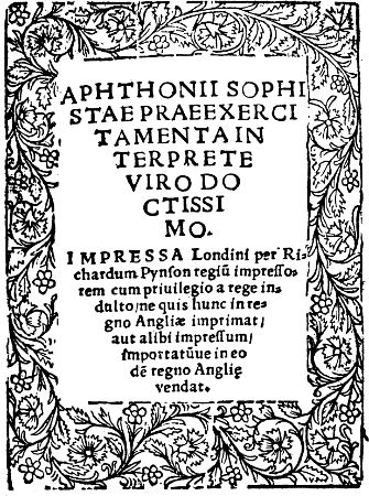
APHTHONII SOPHISTAE
PRAE EXERCITAMENTA
INTERPRETE
VIRO DOCTISSIMO.
IMPRESSA Londini per Richardum
Pynson regiū impressorem
cum priuilegio a rege indulto/
ne quis nunc in regno
Angliæ imprimat/
aut alíbí impressum/
importatūue in eo
dē regno Anglie
vendat.
1
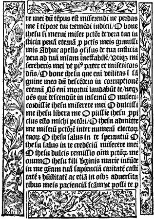
2
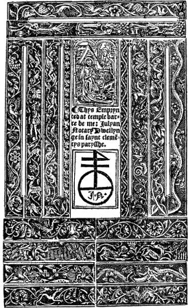
4
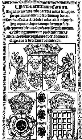
5
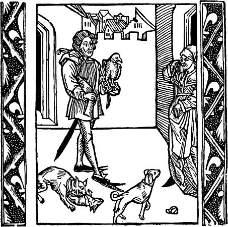
6
[159]
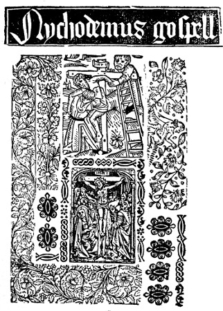
Nychodemus gospell
7
[161]
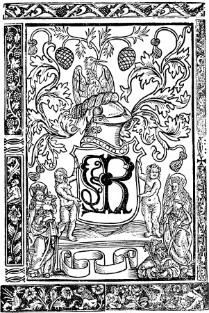
8
[163]
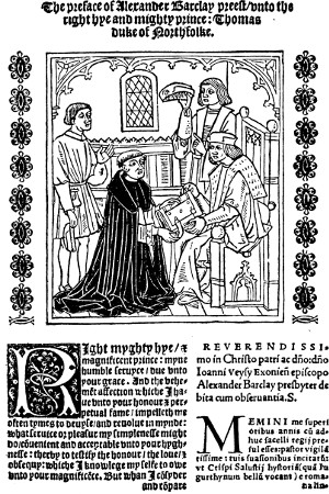
9
[165]
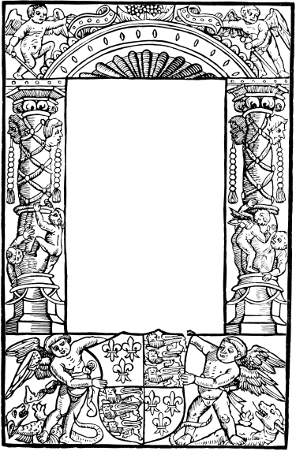
10
[167]
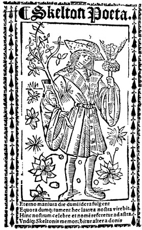
¶ Skelton Poeta.
11
R F
Richard Fakes
12
[171]
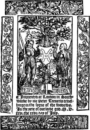
13
[173]
14
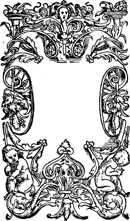
15
16
[175]
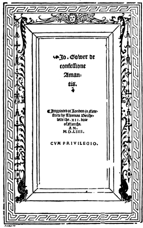
17
[177]
18
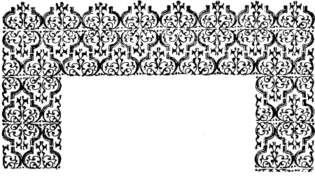
19
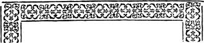
20

21
[179]
22
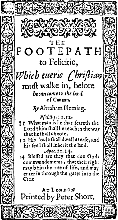
23
[181]
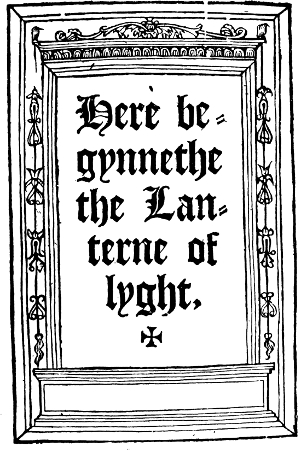
24
25
[183]
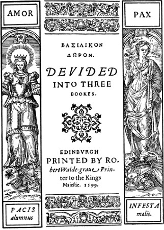
27
[185]
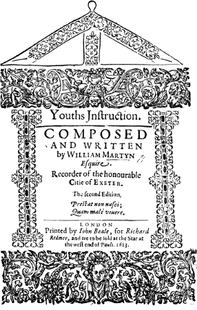
28
[187]
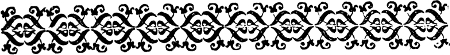
29

30

31

32

33
[189]
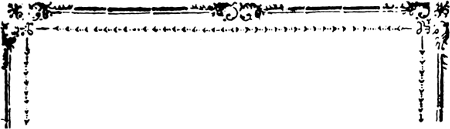
34
35
36
[191]
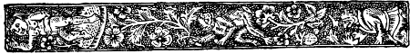
37
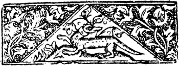
38

39

40
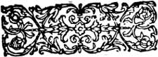
41
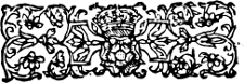
42
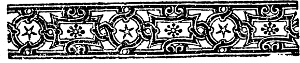
43
[193]
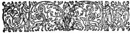
44
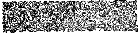
45
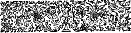
46
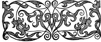
47
[195]
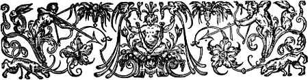
48
49
50
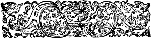
51
[197]
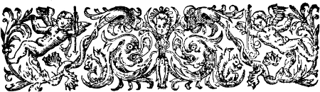
52
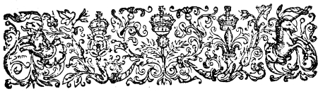
53
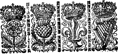
54
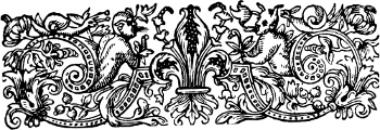
55
56
[199]
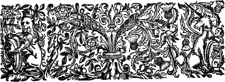
57
58
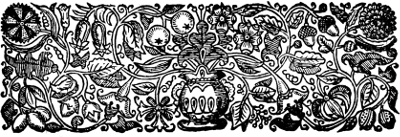
59
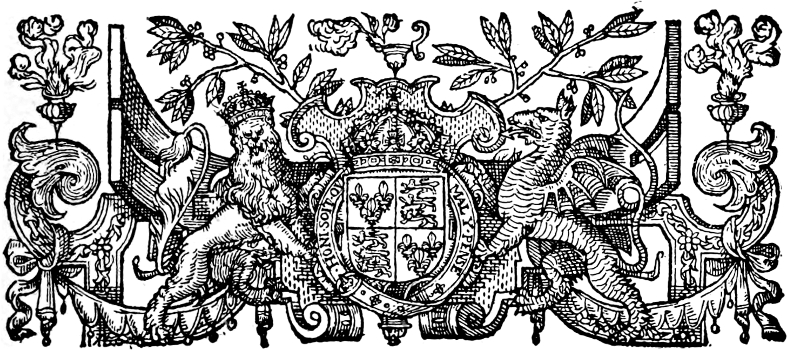
60
[201]
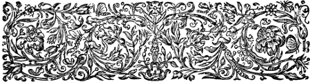
61
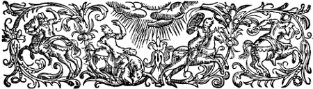
62
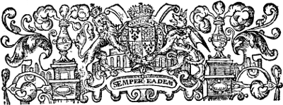
63
[203]
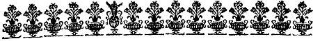
64
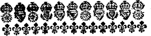
65
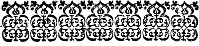
66
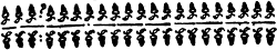
67

68
[205]
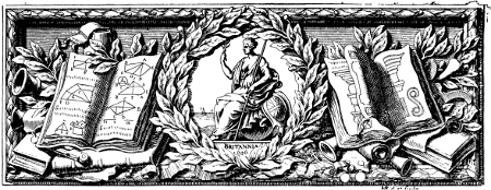
69
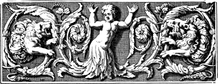
70
[207]
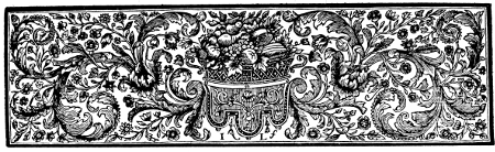
71
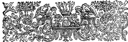
72
[209]
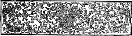
73
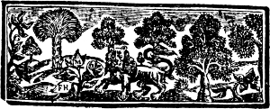
74

75
76
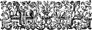
77
[211]
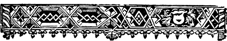
78
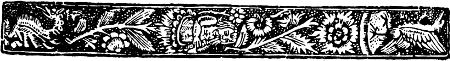
79

80
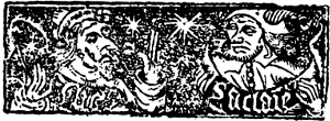
81
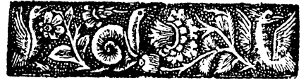
82

83

84
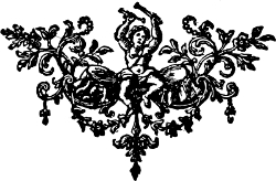
85
[213]
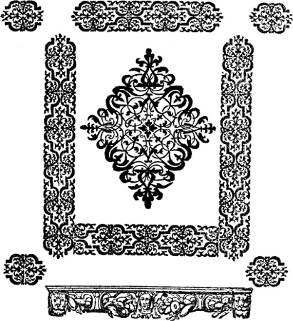
86
[215]
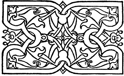
87
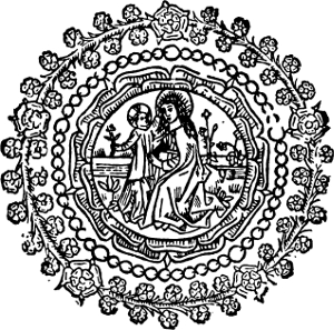
88
[217]
89
90
91

92
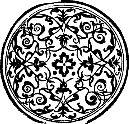
93
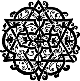
94
[219]
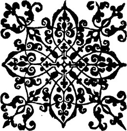
95
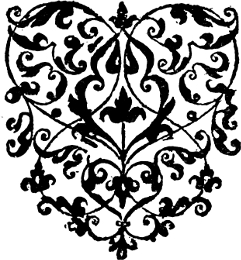
96
97
98
99
[221]
100
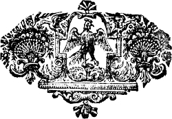
101
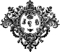
102
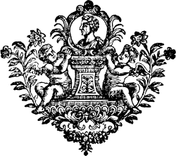
103
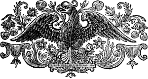
104
[223]
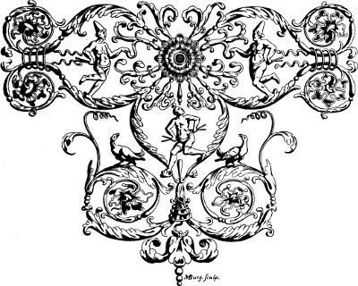
MBurg. sculp.
105
[225]
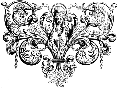
106
[227]
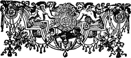
107
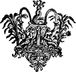
108
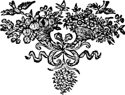
109
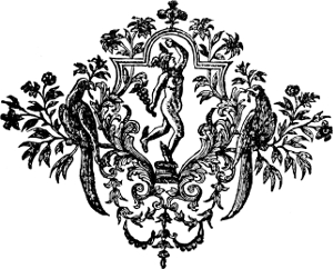
110
[229]

111

112

113
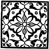
114

115
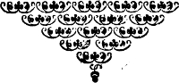
116

FINIS
117
[231]

118

119

120
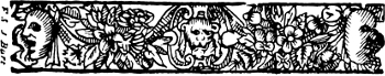
121
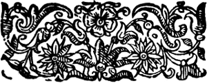
122
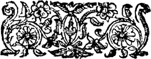
123

124

125
[233]
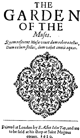
THE
GARDEN
OF THE
Muses.
Quem reserent Musa vtuet dum robor & tellus,
Dum cœlum stellas, dum vehet amnis aquas.
Printed at London by E. A. for Iohn Tap, and are
to be sold at his shop at Saint Magnus
corner. 1610.
[235]
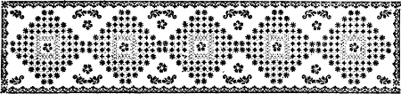
127
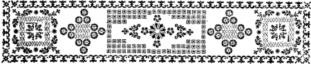
128
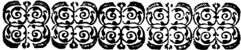
129

130

131
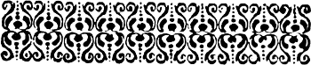
132

133

134
[237]

Ornament 1

Ornament 2

Ornament 3

Ornament 4

Ornament 5

Ornament 6

Ornament 7

Ornament 8

Ornament 9

Ornament 10

Ornament 11

Ornament 12

Ornament 13

Ornament 14
135–148
[239]
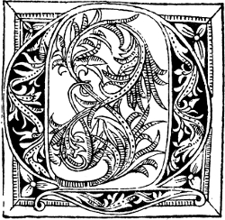
T
149
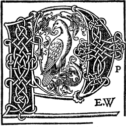
P P
E.W
150
[241]
S
151
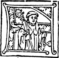
F
152
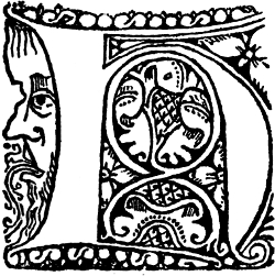
H
153
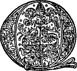
Q
154
[243]
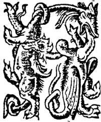
H
155
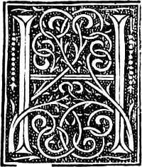
H
156
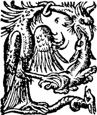
P
157
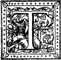
T
158
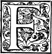
F
159
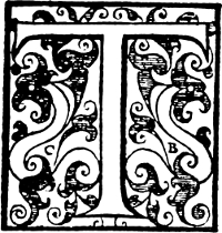
T
160
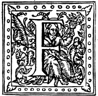
F
161
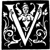
V
162
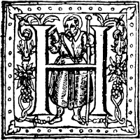
H
163
[245]
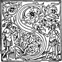
S
164
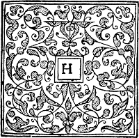
H
166
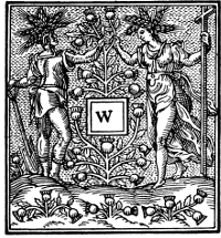
W
165
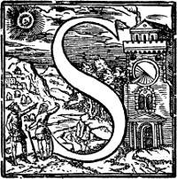
S
167
[247]

T
168
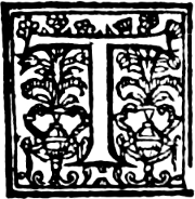
T
169
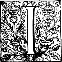
I
170
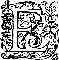
E
171
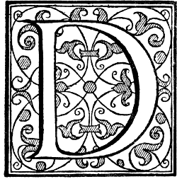
D
172
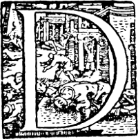
D
173
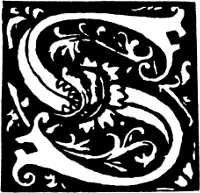
S
174
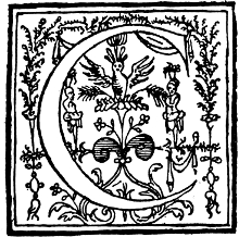
C
175
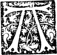
A
176
[249]

177

178

179

180

181
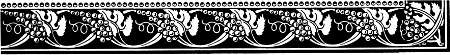
182
Old English Borders from the Foundry of Messrs H. W. Caslon & Co., Ltd.
[251]
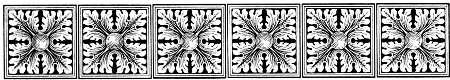
183

184

185

186
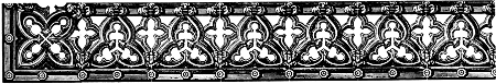
187
Old English Borders from the Foundry of Messrs H. W. Caslon & Co., Ltd.
[253]
DESIGNS BY
CLAUD
LOVAT FRASER
[1890–1921]
THE MORLAND PRESS
190 Ebury Street
London SW 1
188
A Border from The Morland Press, Ltd.
[255]
189

190
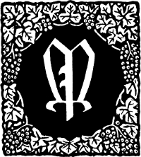
191
Ornaments from The Morland Press, Ltd.
[257]
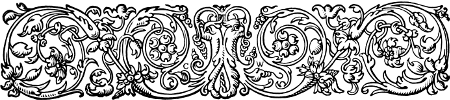
192
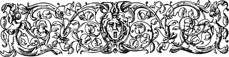
193
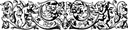
194
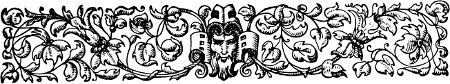
195
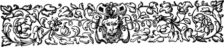
196
197
Head-pieces from The Chiswick Press
(Messrs Charles Whittingham & Griggs Ltd.)
[259]
198
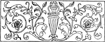
199
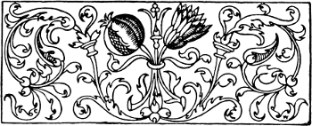
200
201
202
Head and Tail Pieces from The Chiswick Press.
[261]
M
203
C
204
O
205
S
206
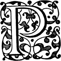
P
207
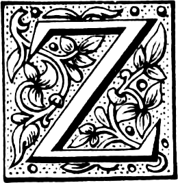
Z
208
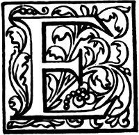
E
209
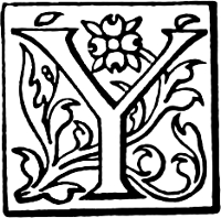
Y
210
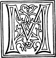
M
211
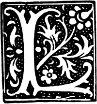
L
212
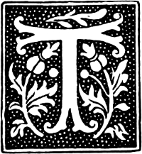
T
213
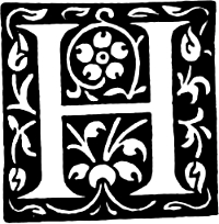
H
214
Initials from The Chiswick Press.
[263]
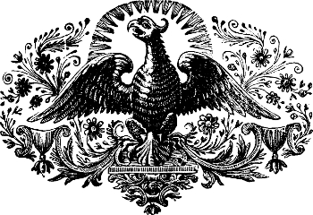
215
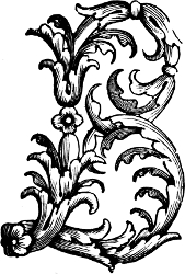
B
216
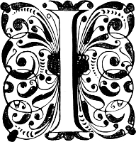
I
217
218
Ornaments from The University Press, Oxford.
[265]
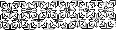
219
220
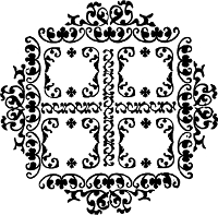
221
222

223
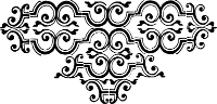
224
Designs from the Foundry of Messrs P. M. Shanks & Sons, Ltd. (219, 220, 222), and from The University Press, Oxford (221, 223, 224).
[267]
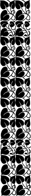
225
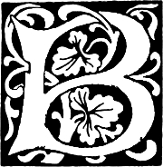
B
226
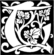
T
227

228
Designs from the Foundry of Messrs P. M. Shanks & Sons, Ltd.
[269]
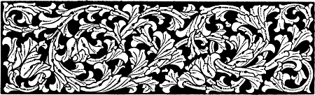
229
Messrs P. M. Shanks & Sons, Ltd.
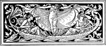
230
Messrs R. & R. Clark, Ltd., Edinburgh.

231
Messrs P. M. Shanks & Sons, Ltd.
[271]
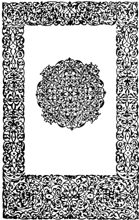
232
Ornamental Border from The Pelican Press.
[273]
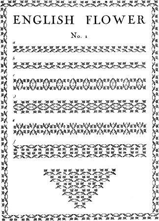
233–240
Designs from The Pelican Press.
[275]
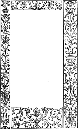
241
A Border from The Pelican Press.
[277]
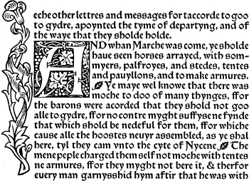
eche other lettres and messages for taccorde to goo
to gydre, apoynted the tyme of departyng, and of
the waye that they sholde holde.
AND whan Marche was come, ye sholde
haue seen horses arrayed, with sommyers,
palfroyes, and stedes, tentes
and pauyllons, and to make armures.
Ye maye wel knowe that there was
moche to doo of many thynges, ffor
the barons were acorded that they shold not goo
alle to gydre, ffor no contre myght suffyse ne fynde
that which shold be nedeful for them, ffor whiche
cause alle the hoostes neuyr assembled, as ye shal
here, tyl they cam vnto the cyte of Ntycene. The
mene peple charged them self not moche with tentes
ne armures, ffor they myght not bere it, & therfor
euery man garnysshid hym aftir that he was with
242
A Design from The Kelmscott Press. Reproduced by kind permission of the Trustees from a block by Emery Walker, Ltd.
[279]
Printers’ Decorations Designed by the late Claud Lovat Fraser, for the Curwen Press in 1920
243–251
[281]
Printers’ Flowers and Decorations, designed by Percy J. Smith, for the Curwen Press in 1922
252–260
[283]
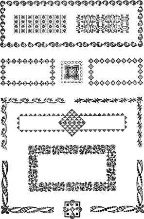
261–274
Old English Designs from the Foundry of Messrs Stephenson, Blake & Co., Ltd.
[285]
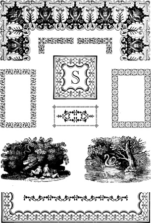
275–284
Old English Designs from the Foundry of Messrs Stephenson, Blake & Co., Ltd.
[287]
A
B
C
D
E
F
G
H
I
J
K
L
M
N
O
P
Q
R
S
T
U
V
W
Y
[1] The Fleuron, a journal of typography, edited by Oliver Simon, 1923.
[2] A Concise History of the Origin and Progress of Printing, with practical instructions to the trade in general. London, 1770, pp. 287–90.
[3] T. B. Reed, A History of the Old English Letter-Foundries, 1887, p. 28.
[4] A. W. Pollard, Early Illustrated Books, 1893, p. 228.
[5] C. Sayle, “Initial Letters in Early English Printed Books” (Transactions of the Bibliographical Society).
[6] Harl. 5915 (45).
[7] English Provincial Printers, Stationers and Bookbinders to 1557. Sandars Lectures, 1911. Cambridge, 1912, 8vo.
[8] Two Centuries of Type-founding. [By J. F. McRae.] 1920.
[9] Harl. 5929.
[10] H. Hart, Notes on a Century of Typography, 1900, p. 145.
[11] The Charles Whittinghams Printer, 1896.
Transcriber’s Notes:
1. Obvious printers’, punctuation and spelling errors have been
corrected silently.
2. Where hyphenation is in doubt, it has been retained as in the
original.
3. Some hyphenated and non-hyphenated versions of the same words have
been retained as in the original.
This eBook is for the use of anyone anywhere in the United States and most other parts of the world at no cost and with almost no restrictions whatsoever. You may copy it, give it away or re-use it under the terms of the Project Gutenberg License included with this eBook or online at www.gutenberg.org. If you are not located in the United States, you will have to check the laws of the country where you are located before using this eBook.