Tintometer.
Form of Instrument for Opaque Observation.
Form of Instrument for Opaque Observation.
Project Gutenberg's Light and Colour Theories, by Joseph W. Lovibond

This eBook is for the use of anyone anywhere in the United States and most
other parts of the world at no cost and with almost no restrictions
whatsoever.  You may copy it, give it away or re-use it under the terms of
the Project Gutenberg License included with this eBook or online at
www.gutenberg.org.  If you are not located in the United States, you'll have
to check the laws of the country where you are located before using this ebook.

Title: Light and Colour Theories
       and their relation to light and colour standardization

Author: Joseph W. Lovibond

Release Date: June 15, 2018 [EBook #57335]

Language: English

Character set encoding: UTF-8

*** START OF THIS PROJECT GUTENBERG EBOOK LIGHT AND COLOUR THEORIES ***


Produced by Chris Curnow, Chris Jordan and the Online
Distributed Proofreading Team at http://www.pgdp.net (This
file was produced from images generously made available
by The Internet Archive)
By
JOSEPH W. LOVIBOND
ILLUSTRATED BY 11 PLATES COLOURED BY HAND
London
E. & F. N. SPON, Limited, 57 HAYMARKET
New York
SPON & CHAMBERLAIN, 123 LIBERTY STREET
1915
| PAGE. | |
| List of Plates | vii |
| Purpose | ix |
| CHAPTER I. | |
| Introduction | 1 |
| CHAPTER II. | |
| Evolution of the Method | 5 |
| CHAPTER III. | |
| Evolution of the Unit | 9 |
| CHAPTER IV. | |
| Derivation of Colour from White Light | 11 |
| CHAPTER V. | |
| Standard White Light | 14 |
| CHAPTER VI. | |
| Qualitative Colour Nomenclature | 17 |
| CHAPTER VII. | |
| Quantitative Colour Nomenclature | 20 |
| CHAPTER VIII. [vi] | |
| The Colour Scales | 28 |
| CHAPTER IX. | |
| Colour Charts | 31 |
| CHAPTER X. | |
| Representations of Colour in Space of Three Dimensions | 34 |
| CHAPTER XI. | |
| The Spectrum in relation to Colour Standardization | 36 |
| CHAPTER XII. | |
| The Physiological Light Unit | 45 |
| APPENDIX I. | |
| Colour Education | 59 |
| APPENDIX II. | |
| The Possibilities of a Standard Light and Colour Unit | 69 |
| APPENDIX III. | |
| Dr. Dudley Corbett’s Radiometer | 83 |
| Index | 89 |
Plate I. Newton’s Theory. The Indigo line is erroneously placed between the Violet and the Red; it should be between the Blue and the Violet.
Page 40.—Fifth line from the bottom, for Fraunhoper read Fraunhofer.
To face p. vi., Lovibond, Light and Colour Theories.] [P.R. 1317
| TO FACE PAGE | |||
| Plate | I. | Six Colour Theories | 4 |
| " | II. | Circles Illustrating Absorption of White Light | 11 |
| " | III. | Diagram Illustrating Analysis of White Light | 13 |
| " | IV. | First System of Charting Colour | 31 |
| " | V. | Second System of Charting Colour | 33 |
| " | VI. | Six Tintometrical Colour Charts | 39 |
| " | VII. | Two Circles | 40 |
| " | VIII. | Absorption Curves of Dyes | 76 |
| " | IX. | Fading Curves of Dyes | 78 |
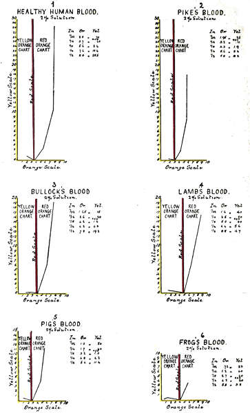
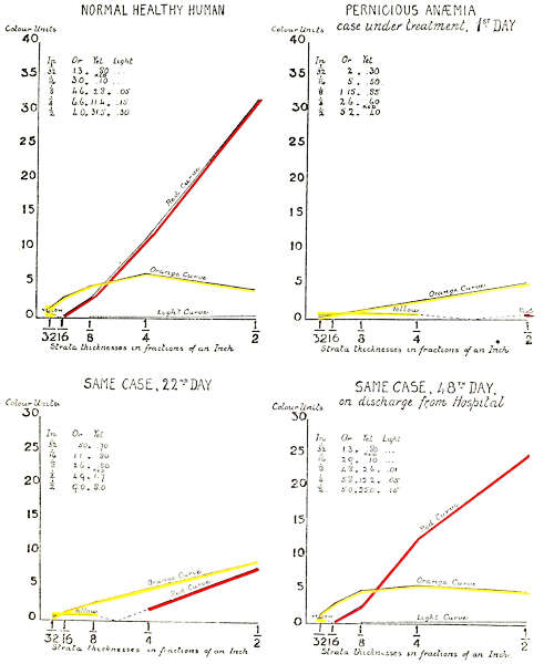
| " | X. | Comparison Curves of Healthy and Diseased Blood | 80 |
| " | XI. | Specific Colour Curves of Healthy and Diseased Human Blood | 82 |
The purpose of this work is to demonstrate that colour is a determinable property of matter, and to make generally known methods of colour analysis and synthesis which have proved of great practical value in establishing standards of purity in some industries.
The purpose is also to show that the methods are thoroughly scientific in theory and practice, and that the results are not likely to be changed by further discoveries. Also that out of the work done a new law has been developed, which the writer calls the Law of Specific Colour Development, meaning that every substance has its own rate of colour development for regularly increasing thicknesses.
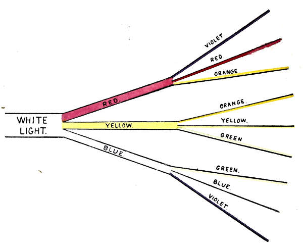
Of the six colours in white light—red, orange, yellow, green, blue and violet; Red, Yellow and Blue are regarded as dominants, because they visually hold the associated colours orange, green and violet in subjection.
An equivalent unit of pure red, pure yellow and pure blue is adopted, and incorporated into glass. The unit is multiplied to obtain greater intensities, and divided to obtain lesser intensities.
The coloured glasses are called absorbents. The red absorbent transmits violet, red and orange, but the red ray alone is visible as colour, until the other absorbents are superimposed, and the character of the group of rays changed. In the same way yellow transmits orange and green, and blue transmits green and violet, whilst the yellow and blue alone are visible as colour. Orange, green and violet are here called subordinates, which may be developed as follows:—
Or. = R. + Y. Gr. = Y. + B. Vi. = B. + R.
Twenty-five years’ experience in the application of the theory and the method to the requirements of practical work, have given no reason for change. Following will be found a list of awards from International Juries and Scientific Societies, also a list of industries in which the writer’s method is giving entire satisfaction.
| Awards by International Juries. | |
| St. Louis | 1 Silver Medal. 2 Bronze Medals. |
| Brussels | 1 Gold Medal. 3 Silver Medals. |
| Turin | Diploma of Honour. 1 Gold Medal. 1 Silver Medal. |
Awards by Scientific Societies.
Sanitary Institute of Great Britain—
Bronze Medal for Colourometrical Water Analysis.
Royal Sanitary Institute—
Bronze Medal for Measuring Smoke Densities.
International Congress on School Hygiene—
[xi]
Bronze Medal for Colour Educator.
Royal Sanitary Institute—
Silver Medal for Colour Educator.
Smoke Abatement Society, Sheffield—
Diploma for System of Colour Measurement.
Royal Sanitary Institute—
Bronze Medal for Quantitative Estimation of Colour Blindness.
Franco-British Exhibition—
Gold Medal for Colour Educator.
International Medical Congress—
Bronze Medal for Tintometer as Medical requisite.
Royal Sanitary Institute—
Silver Medal for recent developments.
Royal Sanitary Institute—
Silver Medal Corbett’s Radiometer.
Formal Adoption of Tintometer Standards by—
The Petroleum Industry.
The Massachusetts Board of Health.
The International Association of Leather Trades Chemists.
The Inter-states Cotton Seed Oil Association.
The Bureau of Engraving and Printing, China.
In general use by the following Industries—
Brewing and Malting.
Tanning.
Wine and Spirit Merchants.
Dyeing and Printing.
Paint, Oil and Varnish Merchants.
Millers.
Water Works Chemists.
Ceramic Works.
For estimating per cent. of Carbon in Steel.
For estimating per cent. of Ammonia.
For estimating Colours for Anthropological Classifications.
For estimating Smoke Densities.
For estimating Haemoglobin in the Blood.
For estimating Colour of Whale Oil, etc., etc.
The colour composition of any object may be measured by superimposing units of different colours until the colour of the object is matched. A convenient apparatus is furnished for this purpose. The composition of the colour is learned by merely reading the markings on the glasses.
It is of course necessary that in the isolation of colour rays, some unit for measuring the intensity of both light and colour be established. As will be explained later, all such units are necessarily arbitrary. In this method the unit has been established by taking the smallest amount of colour easily perceptible to the ordinary vision. This unit or “one” is divided into tenths in the darker shades, and hundredths in the lighter scale. One one-hundredth is the smallest amount of colour measurable by a normal trained vision.
When equivalent units in the three colours are superimposed, their equivalent value (not their aggregate value) represents so much white light absorbed. For instance, 2 R. + 2 Y. + 2 B. absorbs two units of white light.
When the absorptive power of the colour standards is less than the intensity of the light, associated white light remains.
JOSEPH W. LOVIBOND.
The Colour Laboratories,
Salisbury.
December, 1914.
It may at first appear strange that colour, one of the most important indices of value in the Arts, Manufactures, and Natural Products, should have no common nomenclature or reliable standard for reference, the reproduction of a given colour depending for exactitude on the memory of a sensation; whereas this branch of science requires a physical means of recording a colour, with a power of recovery. It remains to be shown that this power of record and recovery is possible, and depends only on the observance of a few simple natural laws easy of application.
The study of colour is carried on by two principal methods: the spectroscopic, where the colours are partially separated as a continuous band by a regular variation in their indices of refraction, the colours gradually merging into each other by overlapping in opposite directions; or by absorption, where a colour is developed by absorbing its complementary, and is isolated as a single or complex colour. This latter is nature’s own method.
It is necessary to touch on some theoretical differences which exist between Scientists and Artists, as to which are Primary colours, as confusion of this[2] character retards investigation. Scientists adopt Red, Green, and Violet as Primaries, regarding all other colours as mixtures of these; whilst Artists and Colourists adopt Red, Yellow and Blue as the Primaries, and all other colours as made from them.
The theory of the Scientists is based on the phenomena developed by mixing coloured lights taken from different parts of the spectrum. This is a method of synthesis, each added colour being a progressive stage towards the complexity of white light. In this case the colour developed is that of the preponderating ray of a complex beam. The theory of the Artists is based on the phenomena developed by mixed pigments. This is a method of analysis, tending towards ray simplicity, each added pigment reducing the complexity of the colour developed by its power of selective absorption.
The theoretical differences between the two schools appear to have arisen from supposing that a given colour developed by the two methods should correspond; but considering the differences in their ray composition, this would be impossible, for although both may be describable by one general colour term, as for instance a Red, they would be of two varieties. It remains to be shown that one theory may cover both sets of phenomena.
The Red, Green, and Violet theory appears to be based on two principal assumptions: first that there are only three fundamental colours; and second that the rays taken from different colour areas are pure colours. Both assumptions are open to question. In regard to the first, there is no difficulty in isolating six colours; and as to the second,[3] it can be demonstrated that the colours do overlap in every part, with a double overlapping in the middle colours, and are therefore not simple but complex.
In a work of this nature it is unnecessary to deal minutely with the theories which have been adopted from time to time since Newton’s discovery of the continuous spectrum. It will, however, be useful to touch on the principal points where theorists are agreed, and also on some of their points of difference, the latter in order to find, if possible, the causes of their difference.
TABLE I.
| No. of Rays. | Primary Colours. | |||||||
| Newton (later) | 7 | Red, | Orange, | Yellow, | Green, | Blue, | Indigo, | Violet |
| Werner | 6 | Red, | Orange, | Yellow, | Green, | Blue, | Violet | |
| Newton and Helmholtz (early) | 5 | Red, | Yellow, | Green, | Blue, | Violet | ||
| Hering | 4 | Red, | Yellow, | Green, | Blue | |||
| Chevieul, Brewster, Hay, Redgrave, Field | 3 | Red, | Yellow, | Blue | ||||
| Young, Helmholtz (later) | 3 | Red, | Green, | Violet | ||||
Note to Plate I.
The respective positions of the primaries of each theory in regard to the whole cycle of distinguishable colours are illustrated above, and the primaries of each theory are shown in their several spectrum positions, the spectrum being shown as bent in circular form.
The six principal theories of primary colours are[4] given in Table I, and illustrated on Plate I, with the names of the primaries of each theory opposite the names of some of their principal advocates. It should not be forgotten when comparing these wide divergences, that each theory has been the result of experimental evidence, in what was, at the time, and remains up to the present, a new and progressive branch of science.
They agree that the spectrum colours are purer than the pigmentary colours, and that by reason of their being referable to wave length positions, they are most adaptable as standards of colour. There has also been common agreement that certain colours are primaries, and that all other colours are mixtures of these, but there has been wide divergence as to their number and even the colours themselves.
To face page 4.[Lovibond, Colour Theories.
The writer was formerly a brewer, and this work had its origin in an observation that the finest flavour in beer was always associated with a colour technically called “golden amber,” and that, as the flavour deteriorated, so the colour assumed a reddish hue. It was these variations in tint that suggested the idea of colour standards as a reliable means of reference.
The first experiments were made with coloured liquids in test tubes of equal diameter, and by these means some useful information was obtained; but as the liquids soon changed colour, frequent renewals were necessary, and there was always a difficulty and uncertainty in their exact reproduction.
To obviate this, glass in different colours was tried, and long rectangular wedges with regularly graded tapers were ground and polished for standards, whilst correspondingly tapered glass vessels were made for the beers. These were arranged to work side by side, and perpendicularly, before two apertures of an optical instrument, which gave a simultaneous view of both. The apertures were provided with a fixed centre line, to facilitate the reading off of comparisons of thickness. There[6] was no difficulty in obtaining glass which approximated to the required colour when used in one thickness only. But as thickness varied, the test no longer held good for both standards, their rates of colour change being different, making the method unreliable.[1]
The system about to be described is one of analytical absorption, and has been published from time to time in the form of papers, read before Societies interested in the question of colour standardization; as also in two descriptive works by the present writer. The earlier works were necessarily fragmentary, but gathered system as the subject progressed.
At an early stage in the investigations it was realized that the handbooks of the period dealt largely with theoretical differences which were of little service to the technical worker. Under these circumstances the writer applied for advice to the late Mr. Browning of the Strand, who gave it as his opinion that no work existed which could be of service to the writer. All that could be done was to go on until something should be arrived at. On this, all theoretical reading was put aside, and the work proceeded on the simple lines of observing, recording, and classifying experimental facts.
In working with glass of different colours it was found that some combinations developed colour, whilst other combinations destroyed it. This suggested[7] the probability of a governing natural law; and experimental work was undertaken in the hope of discovering it. The result was the construction of a mechanical scale of colour standards, which are now in use in over one thousand laboratories, and no question of their practical accuracy arises. The principal conditions for ensuring accuracy and constancy of results are embodied in the following code of nine precautions, which have been published for nearly twenty years without being disputed. They may therefore be considered as governing laws, at least for the present. The colour theory adopted for these Governing Laws has grown out of a series of experimental facts capable of demonstration, and is summed up in the following code of nine Laws.
Laws 1, 2, and 3 relate to White and Coloured Light, and are as follows:—
1. Normal white light is made up of the six colour rays, Red, Orange, Yellow, Green, Blue and Violet in equal proportions. When these rays are in unequal proportions the light is abnormal and coloured.
2. The particular colour of an abnormal beam is that of the one preponderating ray, if the colour be simple, or of the two preponderating rays if the colour be complex. The depth of colour is in proportion to the preponderance.
3. The rays of a direct light are in a different condition to the same rays after diffusion, and give rise to a different set of colour phenomena.
Laws 4, 5, 6, and 7 deal with The Limitations of the Vision to appreciate Colour.
4. The vision is not simultaneously sensitive[8] to more than two colours in the same beam of light. The colour of any other abnormal ray is merged in the luminosity of the beam.
5. The two colours to which the vision is simultaneously sensitive are always adjacent in their spectrum order, Red and Violet being considered adjacent for this purpose.
6. The vision is unable to appreciate colour in an abnormal beam outside certain limits, from two causes:
(a) The colour of an abnormal beam may be masked to the vision from excess of luminosity.
(b) The luminous intensity of the abnormal beam may be too low to excite definite colour sensations.
7. The vision has a varying rate of appreciation for different colours by time, the lowest being for red. The rate increases in rapidity through the spectrum, until the maximum rate is reached with violet. And since this varying rate necessitates a time limit for critical observations, five seconds has been adopted as the limit, no variations being perceptible in that time.
Laws 8 and 9 relate to Colour Constants.
8. The colour of a given substance of a given thickness is constant so long as the substance itself, and the conditions of observation, remain unaltered.
9. Every definite substance has its own specific rate of colour development for regularly increasing thicknesses.
The dimensions of the light and colour unit here adopted, together with the scales of division, were in the first instance physiological, depending entirely on the skill of normal visions for exactitude. The co-relation of equal values in the different colour scales, was secured by an elaborate system of cross-checking, rendered necessary because the establishment of a perfectly colourless neutral tint unit, demanded an exact balance in values of the different colour scales. These scales have stood the test of many years’ work by many observers, and in no case has any alteration been required. The original set is still in use.
The first point which required consideration after the want of standard colour scales was realized, was the basis and dimensions of the unit. So far as the writer knew there was no published information bearing on this which could be used as a guide.
Several arbitrary scales for specific purposes had already been constructed by selecting a colour depth which could easily be distinguished, calling it a unit, and scaling it by duplicating and subdividing. This course was adopted with a coloured glass[10] which approximately matched Ales and Malt solutions, and another which matched Nesslerized Ammonia solutions. No insuperable difficulty occurred in constructing scales available for quantitative work in these two instances.
The intensity of the colour unit for these arbitrary scales, was that which appeared to be most convenient for the purpose required, but the several scales had no common basis. The unit was physiological, and the exactitude of the scales depended entirely on the skill of the vision for discriminating small differences.
As the writer’s experimental work progressed, it became evident that red, yellow, and blue were the only colours suitable for systematic work. The superimposition of any two, developed a third colour which apparently had no relation to either. The superimposition of the third glass modified or destroyed all colour and reduced the amount of light. This suggested the idea that if the three colours could be so balanced that the light transmitted was colourless, it would be evidence of equivalence of intensity in the individual colours.
The real difficulty was in obtaining this equivalence, because a balance which transmitted a neutral tint by one light developed colour by another. This necessitated the selection of a standard light. The light finally selected was that of a so-called sea fog, away from the contaminating influence of towns. The white fog of Salisbury Plain was used as being most available. It required two years’ work to establish equivalence in the unit.
To face page 11. [Lovibond, Colour Theories.
The method of analysing white light into its colour constituents by means of coloured glass absorbents of known intensity and purity, is illustrated by the set of nine circles in Plate II, which demonstrate that colour is developed by the absorption of the complementary colour rays. The ratios of transmission are equal.
In this set of illustrations the circles represent light of 20 units luminous intensity, and the absorptive value of the three glass colours is each of 20 units, therefore the whole of the light and colour energies are presumed to be dealt with.
In the first set of three circles, A represents a beam of normal white light. B a similar beam as divided into the six colour rays, Red, Orange, Yellow, Green, Blue and Violet in equal proportions, C as wholly absorbed by Red, Yellow, and Blue glasses, each of 20 units colour intensity.
Figures 1, 2 and 3 represent the specific action of Red, Yellow, and Blue glass on the white light.
Red absorbs Yellow, Green and Blue, transmitting Violet, Red and Orange, developing Red only.
Yellow absorbs Blue, Violet, and Red, transmitting Orange, Yellow and Green, developing Yellow only.
Blue absorbs Red, Orange and Yellow, transmitting Green, Blue, and Violet, developing Blue only.
By this method of development, Red, Yellow or Blue, when seen alone are visually monochromatic, although composite in structure, each containing a group of three rays, the middle ray alone exciting the colour sensation.
Circles 4, 5, and 6 illustrate the development of Orange, Green and Violet from the triad groups, by intercepting the light with two glass colours.
Circle 4, Red on Yellow, develops Orange by absorbing Yellow, Green, Blue, Violet and Red.
Circle 5, Yellow on Blue, develops Green by absorbing Blue, Violet, Red, Orange and Yellow.
Circle 6, Blue on Red, develops Violet by absorbing Red, Orange, Yellow, Green and Blue.
By this method of demonstration the six colours fall naturally into two groups. The first group includes Red, Yellow, and Blue, whilst the second group includes Orange, Green, and Violet. The colours of the second group, Orange, Green, and Violet, are true monochromes, each being isolated from the light, by the absorption of the five other rays.
These illustrations deal with light and colour of 20 units intensity;[2] as the intensity of the light here is exactly equal to the absorptive power of the standards, no free light remains; where the absorptive power of the colour standards is less than the light, associated white light remains; for[13] instance, if only one unit of colour was developed, 19 units associated white light would remain.
To face page 13. [Lovibond, Colour Theories.
This method of colour development by analytical absorption is further illustrated by Plate III, showing the effect of superimposition of the three colours in their several combinations as intercepting a beam of white light.
Not all lights which appear white to the vision are truly normal white; colour may be masked by excess of luminosity, and only become evident when the luminosity has been reduced, by placing neutral tint standards between the light and the observer. Direct sunlight, and some artificial lights, are instances. (Law 6 (a) page 8.)
On the other hand, an abnormal light may be too low for the vision to discriminate colour. This may be observed in nature by the gradual loss of colour in flowers, etc., in the waning intensities of evening light. The order of their disappearance is shown in Chart I.
The colour of a substance is determined by the ray composition of the light it reflects, or transmits to the vision, the colour would therefore vary with every change in the ray proportions of the incident light; it follows that constancy in colour measurement can only be obtained by a colourless light. Up to the present diffused daylight is the only light which complies with the condition of ray equality.
The absolute equality of the six spectrum colours may be difficult to establish in any light, and their constancy in equivalence under varying light intensities may be open to argument. But, as everyday work is carried on mainly under daylight conditions, and as the vision is the final arbiter for colour work, theoretical questions outside the discriminating power of the vision, need be no bar to the establishment of a working standard white light; and in saying that diffused daylight is normal white, it is only intended to mean: In so far as a normal vision can determine.
Apart from any theoretical explanation it is an experimental fact, that the abnormal rays of direct[15] sunlight, and some artificial lights, may be so modified by diffusion as to be available for a limited range of colour work. In the case of diffused north sunlight, when taken from opposite the sun’s meridian, the modification is sufficient to make it available as a standard white light. In the case of artificial lights, their use is, as yet, limited to visual matching (not recording) and arbitrary comparisons.
Ideal black is total absence of light, and can only be realized as a sensation, in the presence of light, which may however be in contrast or in association.
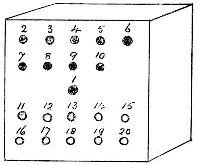
The nearest approach to ideal black by contrast, is to view a hole in a box with a blackened interior, so arranged that no light entering the hole, can be reflected back to the vision: in this way associated light, if not entirely absent, is reduced to a minimum and total darkness is practically realized by the vision in contrast with the surrounding light.
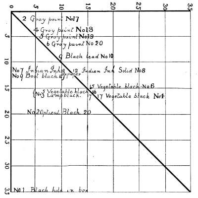
Pigmentary black viewed under diffused daylight conditions is always associated with white light, as no substance, however black it may be, absorbs all the impinging light; as examples, the following measurements of three white and three black pigments were made at an angle of 45 degrees with a light intensity of 25 units.
This is a true quantitative analysis of the 25 units of white light after reflection from the black pigments. The black units represent the proportion of white light absorbed, whilst the beams reflected[16] from the pigments consist of the colour values developed which are associated with the unabsorbed white light.
TABLE II.
| Lime Sulphate | Blue Black | Lamp Black | Ivory White | Zinc White | White Lead | |
| Standard light units | 25·0 | |||||
| Black units (light absorbed) | 9·0 | 9·2 | 9·2 | — | ·08 | |
| Violet units (colour developed) | 2·2 | 1·4 | 1·4 | — | — | |
| Blue units (colour developed) | 1·0 | 1·9 | ·4 | ·01 | ·05 | |
| Green units (colour developed) | — | — | — | — | ·07 | |
| Associated white light | 12·8 | 12·5 | 14·0 | 24·99 | 24·80 | |
| Totals | 25·0 | 25·0 | 25·0 | 25·0 | 25·0 | 25·0 |
The analyses demonstrate that black is not itself an active energy analogous to colour, but is a minus quantity distinguishable by contrast with the original light. The reflected beam consists of the colour developed, associated with the residue of unaltered light.
Note.—Suitable proportions of Violet and Blue give character and value to black, whilst Orange and Yellow are less pleasing as tending to rustiness.
The vision can separate six monochromatic colours from a beam of white light, therefore in practical work six must be dealt with, no matter how they may be theoretically accounted for. They naturally take the accepted spectrum names and symbols already in use. To these are added two other terms, Bk. to signify black, and L. for light; these terms deal with the brightness, or dinginess, of a colour.
| Simple Terms. | Symbols. |
| Red | R |
| Orange | O |
| Yellow | Y |
| Green | G |
| Blue | B |
| Violet | V |
| Black | Bk |
| White | L |
The order of the association of simple colours to form complex, is governed by two factors. The[18] first is a physiological limitation of the vision, which is unable to simultaneously distinguish more than two colours, in the same beam of light, this limits the most complex colour to two colour names. The second limitation is one of association, based on the experimental fact, that the particular two must be adjacent in their spectrum order, spectrum red and violet being considered adjacent for this purpose. Under these conditions, any given colour must be either a monochrome, or a bichrome, and all complex colours must be bichromes. Therefore the only possible combinations are as follows:—
Red and Orange
Orange and Yellow
Yellow and Blue
Blue and Green
Green and Violet
Violet and Red
The classified order of associating symbols for describing the components of the whole range of distinguishable colours is set out in the following tables:—
| Monochromes of a Standard Brightness. |
Monochromes Brighter than Standards. |
Monochromes Duller than Standards. |
| R. | R. L. | R. Bk. |
| O. | O. L. | O. Bk. |
| Y. | Y. L. | Y. Bk. |
| G. | G. L. | G. Bk. |
| B. | B. L. | B. Bk. |
| V. | V. L. | V. Bk. |
The separation of the six monochromatic sensations from a point of white light, and the formation of binary sensations by the combination of adjacent colours, is graphically illustrated in the above diagram.
In order to make the qualitative symbols quantitative it is only necessary to add the numerical unit value to each factor as found by direct experiment.
At an early stage of the investigation, it was found that coloured glass gave better results than coloured solutions, and that Red, Yellow, and Blue, were the only colours suitable for systematic work; it was also found that any colour could be produced by their combination. As already described arbitrary scales were first used in many colours, but were superseded by these three, which, when graded into scales of equivalent value, were found to cover all daylight colours.
Upon this evidence, scales of red, yellow and blue were constructed of glass slips, each scale being all of one colour, with a regular variation of intensity from 0·01 to 20·0 units, equal units of the three scales being in equivalence with each other. The dimensions of the unit are necessarily arbitrary, but the scales comply with the essentials of a scientific standard, in that the divisions are equal, and the unit recoverable. The equality of the unit divisions in the scales, is demonstrated by a system of cross-checking. The test of colour equivalence has already been described on pages 10 and 28.
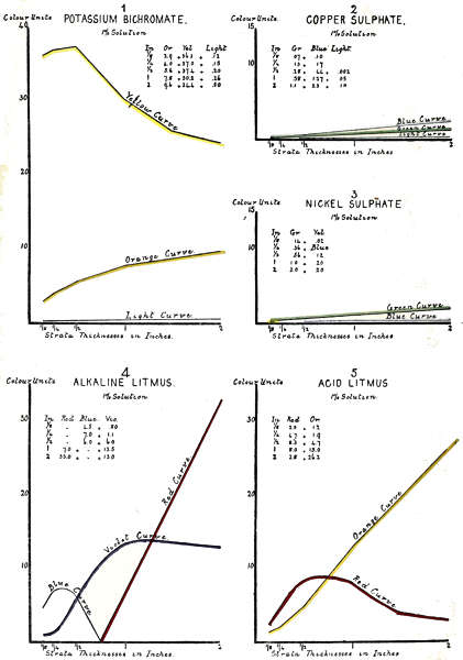
The power of recovering the unit, is by co-relation to well-known physical colour constants, such as is easily obtained by definite intensities of percentage solutions, of selected pure chemical compounds in distilled water, at standard temperatures. For example, a one per cent. solution of pure crystallized copper sulphate C2SO45H2O at 60° F. when viewed in the optical instrument in a 1-inch stratum, must be matched by a combination of Yellow 1·58 and Blue 1·55.
The inch of distilled water itself constitutes very little of this colour; the colour of distilled water is remarkably uniform, and might almost be taken as a colour constant, thus: A 2-foot stratum is matched by Yellow 0·1 and Blue 0·34, a 4-foot stratum by Yellow 1·0 and Blue 1·45.
A one per cent. solution of Nickel Sulphate NiSO47H2O, tem. 60° F. in a 2-inch stratum must be matched by 2·2 Blue and 2·0 Yellow units.
A one per cent. solution of Potassium Bichromate K2Cr2O, Tem. 60° and in a 2-inch stratum after being dulled by 0·5 neutral tint units must be matched by 34·0 yellow and 9·6 red units.
The single sensation colours, Red, Yellow and Blue, are matchable by a single glass from the corresponding colour scale; the depth of colour is directly indicated by the value of the glass used.
The single sensation colours, Orange, Green and Violet, are matchable by a combination of equal units, from two of the standard scales, the depth[22] of colour is directly indicated by the unit value of either of the glasses, thus: 2·0 Blue + 2·0 Red develop 2·0 units Violet.
A given neutral grey is matchable by a combination of equal units from the three standard scales, the depth of grey, is directly indicated by the unit value on either of the glasses used, thus:—
3·0 Red + 3·0 yellow + 3·0 blue develop 3·0 units neutral tint.
The complex colour sensations, red and yellow oranges, yellow and blue greens, blue and red violets are matchable by unequal glasses from two of the standard scales; the colour developed is not directly indicated by the unit value of the glasses, but is recorded by means of an equation, the first half of which contains the separate values of the glasses used, and the second half the names and the depth of the colours they transmit. For instance—
The equation of a colour matched by 17·0 red and 2·6 blue units, is as follows:—
Standard Glasses. Colour Developed.
Red. Blue. Violet. Red.
17·0 + 2·6 = 2·6 + 14·4
The colour developed is a red violet in these proportions.
A colour matched by
Standard Glasses. Colour Developed.
Red. Yellow. Orange. Red.
10·0 + 3·0 = 3·0 + 7·0
The colour developed is a red orange in these proportions.
A colour matched by
Standard Glasses. Colour Developed.
Yellow. Blue. Green. Yellow.
3·0 + 1·5 = 1·5 + 1·5
The colour developed is a yellow green in these proportions.
A colour matched by
Standard Glasses. Colour Developed.
Blue. Red. Blue. Violet.
6·0 + 1·8 = 4·2 + 1·8
The colour developed is a blue violet in these proportions.
The standard glass colours are necessarily of a given brightness, and colours for measurement may be either brighter, or sadder than the standards.
A given complex colour of less than glass standard brightness, is matchable by unequal numbers from the three standard scales; the smallest unit value always represents the “black,” or neutral unit factor. The equation is as follows:—
A colour matched by
Standard Glasses. Colour Developed.
Red. Yellow. Blue.
Neutral Tint. Green. Blue.
1·0 + 3·0 + 9·0 =
1·0 + 2·0 + 6·0
The colour is a blue green, in the proportion of six to two, saddened by one of neutral tint.
A given complex colour of greater brightness than the glass standards, is first dulled by the interception of neutral tint units, until measurable in the manner described above; the intercepting glasses[24] represent the unit value of excess of brightness, and is shown in the equation as light units, for instance—
Standard Glasses. Colour Developed.
Neutral Tint. Yellow. Blue. Light. Green. Yellow.
1·5 + 7·5 + 0·5
= 1·5 + 0·5 + 7·0
The colour is a yellow green in the proportions of 7·0 of yellow, to 0·5 of green, and 1·5 brighter than the standards.
Every daylight colour being thus measurable by a suitable combination of standard glasses, with or without the addition of a Light, or a Neutral Tint factor, it follows that any colour can be described both qualitatively, and quantitatively, in terms of the colour sensations yielded by the standard glasses and their combination. The distinct colour sensations are those, which, by common consent are known as Red, Yellow, Blue, Orange, Green and Violet, and they are yielded by single glasses, or by pairs as already described; all colours therefore fall into the following categories:—
A.—Single colour sensations:—
1. Transmitted by single glass standards:
Red.
Yellow.
Blue.
2. Transmitted by equivalent pairs of standard glasses:
Orange.
Green.
Violet.
B.—Double colour sensations transmitted by unequal pairs of standard glasses.
Red orange, transmitted by unequal units of red and yellow, red preponderating.
Yellow orange, transmitted by unequal units of red and yellow, yellow preponderating.
Yellow green, transmitted by unequal units of yellow and blue, yellow preponderating.
Blue green, transmitted by unequal units of yellow and blue, blue preponderating.
Blue violet, transmitted by unequal units of blue and red, blue preponderating.
Red violet, transmitted by unequal units of blue and red, red preponderating.
C.—Any of the above colours with the addition or subtraction of neutral tint.
Neutral tint itself, is transmitted by a combination of equal units of the standard glasses, thus three units red, yellow and blue, when superposed, transmit three units neutral tint.
Three units red, of standard brightness, completely describes a colour matched by a red glass of three units, and is denoted
R. 3·0
Three units red saddened by one neutral tint, completely describes a colour matched by a red glass standard of four units red, combined with a blue and yellow of one unit each, and is denoted
R. 3·0 + N.T. 1·0
A given red of three units, which is one unit brighter than standards, after having been saddened by[26] one unit each of red, yellow and blue, is matched by three units of red and is correctly described by
Red 3·0 + Light 1·0
Three units of violet, of standard brightness, is matched by a red and a blue glass of three units, and is correctly described by
V. 3·0
Three units of orange, of standard brightness, is matched by a red and a yellow glass of three units, and is correctly described by
O. 3·0
A binary red violet of standard brightness, in which red preponderates by one unit, is matched by four units red, and a blue of three units, and is correctly described by
R. 1·0 + V. 3·0
A binary red orange, of standard brightness, in which orange preponderates by three units, is matched by red four and yellow three units, and is correctly described by
R. 1·0 + O. 3·0
A red orange, of less than standard brightness by one unit, in which orange preponderates by three units, is matched by a red five, yellow four, blue one, and is correctly described by
R. 1·9 + O. 3·0 + N.T. 1·0
A red violet, in which red preponderates by one unit, and is one unit brighter than standard, is first dulled by one unit red, yellow and blue, and then[27] matched by four red and three blue, and is correctly described by
R. 1·0 + V. 3·0 + Light 1·0
A red orange, in which red preponderates by one unit, and is one unit brighter than standard, is first dulled by one red, yellow and blue, and then matched by four red, and three yellow, and is correctly described by
R. 1·0 + O. 3·0 + Light 1·0
A normal vision under ordinary conditions, has no hesitation in correctly naming the sensations produced by the triad groups red, yellow and blue, or by the single rays orange, green and violet. It can also correctly describe a complex colour sensation, by naming the two associated colours, such as red orange, yellow orange, blue green, blue violet, etc.; but when called upon to decide differences of colour depth, it can only do so by using arbitrary terms of no precise scientific value, such as light, medium, dark, etc.
This deficiency is because the vision has in itself no arrangement for the quantitative definition of colour depth. This want can only be met by co-relating colour sensations, to some physical colour constants.
This co-relation has now been effected by a series of glass standard colour scales, which are numerically graded for colour depth, the scales themselves being colour constants by co-relation to percentage solutions, of such coloured chemicals, as copper sulphate, nickel sulphate, potassium permanganate,[29] etc. These substances as well as many others, are always available for checking the constancy of the scales, or for recovering the unit if lost.
As already mentioned, the system of taper scales proved to be useless for the purpose, not only because the rate of colour increase was never in proportion to the rate of thickness increase, but also because no two substances are equal in this respect, each having a rate specific to itself.
The prismatic spectrum colours were not available for several reasons, first as being unsuitable for critical comparisons under daylight conditions, as being too weak except “in camera”; also they were found to be too crowded for the separation of a working area of monochromatic colour, and some corrections would have been necessary for variation in the refractions of different colour rays. This is more fully dealt with under the heading of The Spectrum in relation to Colour Standardization, page 36.
The method employed for obtaining equality of the unit divisions, and colour equivalence between the different scales was as follows:—
Two slips of red glass in a light shade were made exactly equal in colour, and considered as initial units; these were then superimposed and matched by a single glass, which was then considered as of two units, this and one of the initial units were superimposed, and matched by a single glass of three colour units, and so on, until a progressive red scale[30] was constructed, ranging in intensity from ·01 to 20· units.[3]
The yellow and blue scales, were similarly constructed, taking care that their similar unit values were in colour equivalence with the red units, the test of equivalence being, that when equal units of the three scales were superimposed against a normal white light, a neutral grey was transmitted, in which no trace of colour could be perceived by the common consent of the whole staff of trained observers.
The scales were then considered as in colour equivalence with each other. The system of cross-checking was so elaborate, that after the equivalence of the first unit was established, nearly four years was occupied in the work before the scales were passed as satisfactory.
It may be urged that the unit is arbitrary, but this applies also to the unit of any other standard scale; it is sufficient that the essentials of a philosophic scale are complied with, in that the divisions are equal, and the unit recoverable.
To face page 31.[Lovibond, Colour Theories.
A colour chart is constructed by placing two colour scales at right angles to each other, with their zeros at the angle.
A measured simple colour, finds its position directly on its corresponding colour scale at the point of its measured value.
A measured complex colour, finds its position within the angle, at that point where perpendiculars drawn through the two colour values meet.
The above statements are complete only for colours of standard brightness, should the colour be brighter or duller than standards, a light factor is necessary, the value of which is furnished by the measurement itself, and must be written in numerals near the colour point.
By this method the chart position of even the most complicated colour is indicated by a single point which is determined by the analytical value of the composing factors.
Examples.
| Simple Colour of Standard Brightness. |
Complex Colour of Standard Brightness. |
Simple Colour Brighter than Standards. |
Complex Colour Duller than Standards. |
| 3· Red. | 6· Blue, 10· Violet. | 7· Yellow, Light 2· | Red 6, Orange 5, Black 2. |
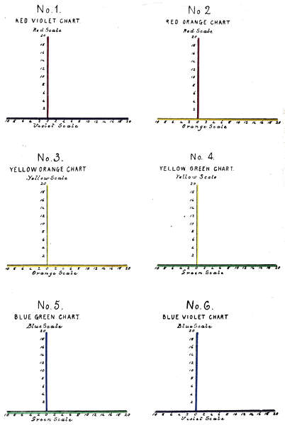
The number of complex colour charts is limited to the six represented in Fig. 1 as lying in their order on a continuous spectrum. The red and violet mixtures having no visible spectrum position are represented in the ultra violet. The ordinates of the charts are made by erecting the overlying red, yellow and blue scales as perpendiculars.
The information to be obtained by charting measured colour is more extensive than appears at first sight, as by varying the character of the co-ordinates, and charting suitable series of measurements, new fields of investigation are opened, thus throwing light on some hitherto obscure questions, of which the following are some instances.
It has sometimes been assumed that colour increase was in direct ratio to intensity increase, but this is never the case, each substance has its own rate, specific to itself. It is conceivable that the colours of two substances may coincide at one point, but as their densities increase, or decrease, their rates of change vary.
The term “Specific Colour” is based on the experimental fact, that the colour of a given substance[33] is constant, so long as the substance itself and the conditions of observation, remain unaltered. During experimental work a sufficient number of instances have accumulated to warrant the writer in advancing and using the term “Specific Colour” as describing a new natural law, as rigid in its application as that of “Specific Gravity” or “Specific Heat.”
To face page 33.[Lovibond, Colour Theories.
When this principle is applied to the measurement of regularly increasing thicknesses, curves of colour changes can be established, which are specific for the substance in question, and afford a certain means of identifying similar substances in future. This is effected by varying the nature of the co-ordinates, making the ordinates to represent the tintometrical scale of colour units irrespective of colour, whilst the abscissae represent the scale of increasing thicknesses. Then by plotting the separate factors of each measurement according to their unit values, a series of curves is established, specific to the substance in question, and applicable to none other.
We have now two systems of charting colour, in the first, the complete sensation is represented by a single point, as in Plate IV. In the second, each factor is represented by a separate point, and by connecting points of similar colours, a series of curves is established which represents a quantitative analysis of the progressive colour development, as in Plate V.
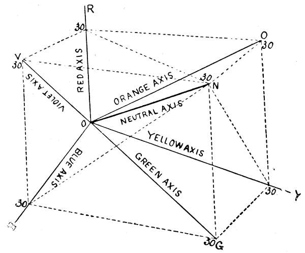
The relations of the different colours to one another, and to neutral tint are, perhaps, best represented to the mind by a solid model, or by reference to three co-ordinate axes, as employed in solid geometry (see Fig. 2).
Let the three adjacent edges OR, OB, OY, of the above cube be three axes, along which are measured degrees of Red, Yellow and Blue respectively, starting from the origin O. Every point in space on[35] the positive side of this origin will then represent a conceivable colour, the constituents of which in degrees of red, yellow and blue are measured by the three co-ordinates of the points. Pure reds lie all along the axis OR, pure yellows on the axis OY, and pure blues on the axis OB.
All normal oranges, normal greens, and normal violets lie on the diagonals of the faces of the cubes OO1, OG, OV respectively.
Pure neutral tints lie on the diagonal ON of the cube, equally inclined to the three principal axes.
Red violets will be found on the plane ROB, between OV and OR.
Blue violets on the same plane between OV and OB.
“Saddened” red violets all within the wedge or open space enclosed by the three planes, whose boundaries are OB, OV, ON.
The other colours, red and yellow oranges, blue and yellow greens, pure and saddened, are found in corresponding positions in relation to the other cases.[4]
The spectrum has naturally been considered as a suitable source for colour standards, but the power of analysing has disclosed some difficulties, which have yet to be overcome.
Concerning the prismatic spectrum, there has always been a difficulty in apportioning the different colours to specific areas, and further, before this spectrum is available for colour standardization, some method of correction for the unequal distribution of colours must be devised.
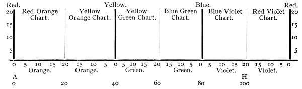
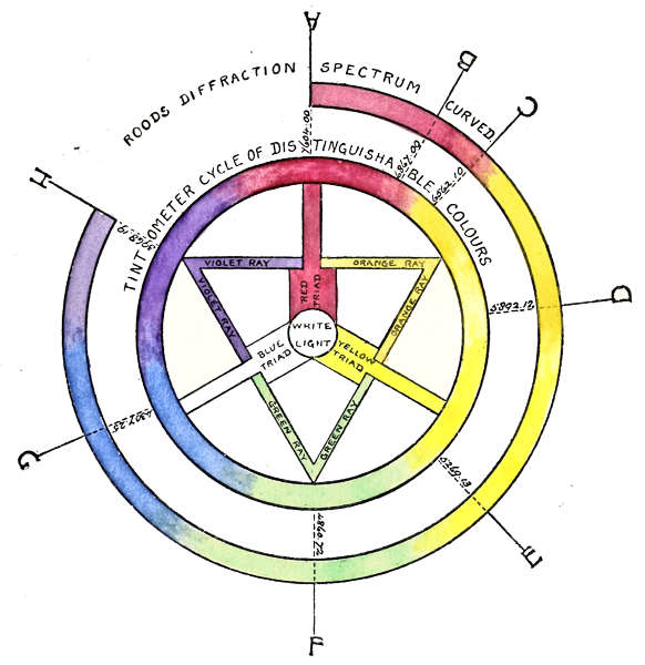
Neither of these difficulties occur in the use of the diffraction spectrum, where the pure colours are apportioned by Professor Rood from A to H in the manner shown in table on next page.
Professor Rood further divides the spectrum from A to H into 100 equal divisions, allotting 20 unit divisions of 72,716 wave lengths to the space between each two colour lines. This allots a space of 3,635 W.L. to each unit division, as shown in Table III.
TABLE III.
| Wave Length Position. | No. of Wave Lengths from Colour between each. |
Division | W.L.K. per Division | ||
| 760,400 A. | Red | 760,400 —— |
72,717 | == 20 | 3,635 |
| Orange | 687,683 —— |
72,716 | == 20 | 3,635 | |
| Yellow | 614,967 —— |
72,716 | == 20 | 3,635 | |
| Green | 542,251 —— |
72,716 | == 20 | 3,635 | |
| Blue | 469,535 —— |
72,716 | == 20 | 3,635 | |
| 396,819 H. | Violet | 396,819 | |||
| 363,581 | Total W.L. between A. & H. | 363,581 | 100 | ||
Having provided equal wave length positions for the six pure colours, the intermediate colours are necessarily binaries in definite proportions, accounted for by a regular overlapping of two bounding colours in opposite directions from zero to 20, as shown in the following table from Red to Orange, representing the space between these two pure colours.
| Red W.L 760,400 |
20 | 19 | 18 | 17 | 16 | 15 | 14 | 13 | 12 | 11 | 10 | 9 | 8 | 7 | 6 | 5 | 4 | 3 | 2 | 1 | 0 | W.L 687,683 Orange. |
| 0 | 1 | 2 | 3 | 4 | 5 | 6 | 7 | 8 | 9 | 10 | 11 | 12 | 13 | 14 | 15 | 16 | 17 | 18 | 19 | 20 | ||
| 20 | 20 | 20 | 20 | 20 | 20 | 20 | 20 | 20 | 20 | 20 | 20 | 20 | 20 | 20 | 20 | 20 | 20 | 20 | 20 | 20 |
It follows, that apart from the six monochromes, all spectrum complex colours in a single wave length must be binaries, whose united values equal 20.
On comparing Professor Rood’s scales of divisions with those of the tintometrical scales already described,[38] they appear to coincide in several particulars, for instance:—
The monochromes correspond both in number and in name.
Their positions in the scales correspond.
Their unit divisions are equal in number, and in dimensions.
Their colour positions correspond, when an artificial tintometrical spectrum is made by regularly overlapping monochromes.
It follows that when the two scales are superimposed as in Plate V., showing similar monochromes as lying in the same perpendicular, the same wave length numbers apply to both; concerning the dimensions between the monochromes, the spaces occupied by 72,716 wave lengths between the spectrum monochromes, also represent similar spaces in the tintometrical scales, and one-twentieth of this 3,635 represents the space of a single unit in each case.
In connexion with these co-related dimensions, some information is obtainable bearing on the limitation of a monochromatic vision for discriminating small colour differences. Under ordinary daylight conditions, the unit in the lighter shades of the tintometrical scale is divided into 100 fractional parts, each fraction therefore represents a space occupied by thirty-six wave lengths in the spectrum scale. This may be near the limit of dimension for monochromatic vision in such a gradually changing colour scale, as that of the spectrum, and may be some guide as to suitable slit areas in the synthetical building up of complex coloured light.
To face page 39.[Lovibond, Colour Theories.
In Plate VI. are shown the six tintometrical colour charts, as lying in their order on the tintometrical spectrum, illustrating that any measured colour factor lies in a perpendicular drawn through both spectra, and occupying the same wave length position, and may therefore be designated by that wave length number.
This explanation is not intended to convey that the colour energies do not really overlap beyond the boundaries of the dual combinations, but only that the vision is unable to distinguish as colour, such overlapping if it exists.
On further comparisons of the two scales there are some points of difference which have a bearing on their values as colour standards.
There is a variation in the length of the two scales, the spectrum terminating at H, whilst the tintometrical scale is extended to a sixth division in the region of the ultra violet, showing overlapping combinations of Red and Violet, strictly analogous to the overlapping binaries in the other five sections.
These red and violet combinations constitute one-sixth of the cycle of distinguishable colours, and cannot be omitted in any system of colour standardization, therefore their absence in the continuous spectrum is a drawback.
A second drawback, is the limited number of spectrum complex colours, in consequence of each colour being blended only with overlapping colour value, which lies in its own wave length, whereas in[40] nature each colour may be blended with any value of the overlapping colour. In the tintometrical standards, similar effects are obtained by changing the value of the graded slips.
It is true, that complex colours other than those in the same wave length, may be developed by blending two colours from different parts of the spectrum, but the ray proportions of colours so produced, are necessarily more complex than those developed by specific absorption; the first being a method of synthesis towards complexity, and the second a method of analysis towards simplicity, and although two colours so produced may be similar in name, red for instance, they must differ in character. This view may tend to reconcile some of the theoretical differences between Scientists and Artists.
The complete range of daylight colours not being fully comprised in a continuous spectrum, may be considered as a cycle of radiant energies, sensitive to the vision as colour, which can be represented as a circle as in Plate VII. The outer and broken circle represents a bent spectrum, the unoccupied division corresponding in position with that of the red and violet mixtures in the complete cycle.
This arrangement does not alter the relative positions of the Fraunhoper lines A, B, C, D, E, F, G and H in reference to either scale, but, it theoretically breaks that sequence of the successive wave lengths in the Red Violet which holds good in the other five divisions from A to H.
To face page 40.[Lovibond, Colour Theories.
In order to theoretically avoid this juxtaposition of wave length contrast, it is only necessary to imagine that the violet energy beyond H in the ultra violet, is overlapped by the infra red energy of a succeeding spectrum, filling this section with a series of overlapping binaries analogous in wave length sequence to that of the other sections.
Apart from the colours of everyday life there is, in sunlight and most direct artificial lights, an additional red energy which differs materially from the red energy in diffused daylight.
It was first noticed whilst establishing the colour equivalence of the tintometrical light unit, by developing a red sensation which disturbed constancy of reading under certain conditions of light.
So far as the writer knows, this energy has never been investigated as separate from the other spectrum red. The following observations must be considered as tentative only.
It does not obey the laws of absorption which govern the red of diffused daylight. When the six transparent pigmentary colours are illuminated by direct sunlight, and viewed through a sufficient number of Neutral Tint units, the colours all disappear, all appearing red alike, with only differences in luminosity.
The spectrum position of this red energy is in the A. B. region, and further interception by[42] Neutral Tint whilst narrowing the band, intensifies the colour, until obstructed by the large number of intercepting glass surfaces.
It has no photographic action on the six sensitised papers dealt with in the photographic section.
The apparatus for determining the unit values of light intensities in the following series of measurements, consisted of a conical rectangular hopper tapering from 2 feet to 2 inches square. This was adapted so that the light from the small end, commanded the stage of the optical instrument sufficiently close to cut off outside light. The wide end facing a north sky was adapted with sliding shutters, to regulate the area of incident light; of the six water-colour pigments which nearest corresponded to the standard colours, washed to their full depth on Whatman’s paper, six measurements were made. These measurements are shown in Table IV, and classified in Table V.
It will be noted that the readings are constant for all the colours between 16 and 26 units, except a variation of light ·15 in the 24-inch opening, which is in effect as if the cone was not present, and ·2 in the 8-inch area of orange.
Note.—Experiments in this branch give some information relating to the perception of colour under daylight conditions, by limiting the range of intensities within which colour can be distinguished and differentiated, whilst their separate photographic action (page 48) suggests the impression that colour phenomena, outside these limits, may be a physiological expression of widely varying underlying energies.
TABLE IV.
| Pigment. | Square Inches Aperture. |
Light Intensity. | Black. | Red. | Orange. | |
| Carmine | 2 | 10 | ·5 | 20·2 | ·3 | — |
| " | 4 | 11 | ·5 | 19·1 | ·4 | — |
| " | 6 | 14 | ·46 | 18·95 | ·59 | — |
| " | 10 | 20 | — | 16·9 | 1·1 | — |
| " | 12 | 22 | — | 16·9 | 1·1 | — |
| " | Open | 26 | — | 16·9 | 1·1 | — |
| Yellow | ||||||
| Lemon Yellow | 2 | 10 | — | 6·9 | ·1 | — |
| " | 4 | 11 | — | 6·9 | ·1 | — |
| " | 6 | 14 | — | 6·9 | ·1 | — |
| " | 8 | 16 | — | 7·0 | — | — |
| " | 10 | 20 | — | 7·0 | — | — |
| " | 12 | 22 | — | 7·0 | — | — |
| " | Open | 26 | — | 7·0 | — | — |
| Blue. | Violet. | |||||
| Cobalt Blue | 2 | 10 | — | 10·5 | — | — |
| " | 4 | 11 | — | 10·5 | — | — |
| Green. | ||||||
| " | 6 | 14 | — | 10·5 | ·2 | — |
| Violet. | ||||||
| " | 8 | 16 | — | 10·5 | ·5 | — |
| " | 10 | 20 | — | 10·5 | ·5 | — |
| " | 12 | 22 | — | 10·5 | ·5 | — |
| " | Open | 26 | — | 10·5 | ·5 | — |
| Red. | Orange. | Light. | ||||
| Chrome Orange | 2 | 10 | — | 3·4 | 6·0 | — |
| " | 4 | 11 | — | 3·4 | 6·0 | — |
| " | 6 | 14 | — | 3·0 | 6·2 | ·05 |
| " | 8 | 16 | — | 3·0 | 6·0 | ·05 |
| " | 10 | 20 | — | 3·2 | 6·0 | ·05 |
| " | 12 | 22 | — | 3·2 | 6·0 | — |
| " | Open | 26 | — | 3·2 | 6·0 | — |
| Yellow. | Green. | |||||
| Emerald Green | 2 | 10 | — | ·2 | 6·4 | ·05 |
| " | 4 | 11 | — | — | 6·4 | ·05 |
| " | 6 | 14 | — | — | 6·4 | ·05 |
| " | 8 | 16 | — | — | 6·6 | 2·0 |
| " | 10 | 20 | — | — | 6·6 | 2·0 |
| " | 12 | 22 | — | — | 6·6 | 2·0 |
| " | Open | 26 | — | — | 6·6 | ·05 |
| Red. | Violet. | |||||
| Mauve | 2 | 10 | — | 3·0 | 7·4 | — |
| " | 4 | 11 | — | 3·0 | 7·4 | — |
| " | 6 | 14 | — | 3·0 | 7·4 | — |
| " | 8 | 16 | — | 2·8 | 7·2 | — |
| " | 10 | 20 | — | 2·8 | 7·2 | — |
| " | 12 | 22 | — | 2·8 | 7·2 | — |
| " | Open | 26 | — | 2·8 | 7·2 | — |
TABLE V.
COLOURED SURFACES
Table of Varying Luminous Intensities
| Inches Square. | Light Units. |
Red. | Yellow. | Blue. | |||||
| “Carmine.” | “Lemon.” | “Cobalt.” | |||||||
| R. | Or. | Blk. | Y. | Or. | B. | Vi. | Blk. | ||
| 2 | 10 | 20·2 | ·3 | ·5 | 6·9 | ·1 | 11·5 | — | — |
| 4 | 14 | 19·1 | ·4 | ·5 | 6·9 | ·1 | 11·5 | — | — |
| 6 | 14 | 18·95 | ·59 | ·46 | 6·9 | ·1 | 10·7 | Gr. ·2 | ·1 |
| 8 | 16 | 16·9 | 1·1 | — | 7·0 | — | 10·5 | Vi. ·5 | — |
| 10 | 20 | 16·9 | 1·1 | — | 7·0 | — | 10·5 | ·5 | — |
| 12 | 22 | 16·9 | 1·1 | — | 7·0 | — | 10·5 | ·5 | — |
| Open 24 | 26 | 16·9 | 1·1 | — | 7·0 | — | 10·5 | ·5 | — |
| Inches Square. | Light Units. |
Orange. | Green. | Violet. | |||||
| “Chrome.” | “Emerald.” | “Fr. Mauve.” | |||||||
| Or. | R. | Light. | Gr. | Y. | Light. | Vi. | R. | ||
| 2 | 10 | 6· | 3·4 | ·05 | 6·4 | ·2 | ·05 | 7·4 | 3· |
| 4 | 14 | 6· | 3·4 | ·05 | 6·4 | ·2 | ·05 | 7·4 | 3· |
| 6 | 14 | 6·2 | 3· | ·05 | 6·4 | — | ·05 | 7·2 | 3· |
| 8 | 16 | 6· | 3· | — | 6·6 | — | ·2 | 7·2 | 2·8 |
| 10 | 20 | 6· | 3·2 | — | 6·6 | — | ·2 | 7·2 | 2·8 |
| 12 | 22 | 6· | 3·2 | — | 6·6 | — | ·2 | 7·2 | 2·8 |
| Open 24 | 26 | 6· | 3·2 | — | 6·6 | — | ·05 | 7·2 | 2·8 |
The physiological values of light intensities determined by the absorptive method, differ in some respects, from the intensities based on the inverse ratio of the squares of distance between the shadows of two lights.
However valuable this method of calculating light intensities may be from a mathematical point of view, it does not express the physiological appreciation of light differences.
The dimensions of the light unit used in the following experiments have already been described.
This method cannot deal exhaustively with intense direct lights, on account of the presence (activity) of the disturbing red ray which prevents total absorption. Such lights must first be modified by intercepting media of known diffusive value, or by reflection from a white surface.
One object of these experiments was to obtain more insight into the physiological conditions of light, as bearing on the question of standardization.
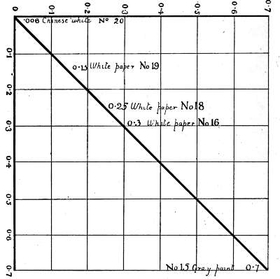
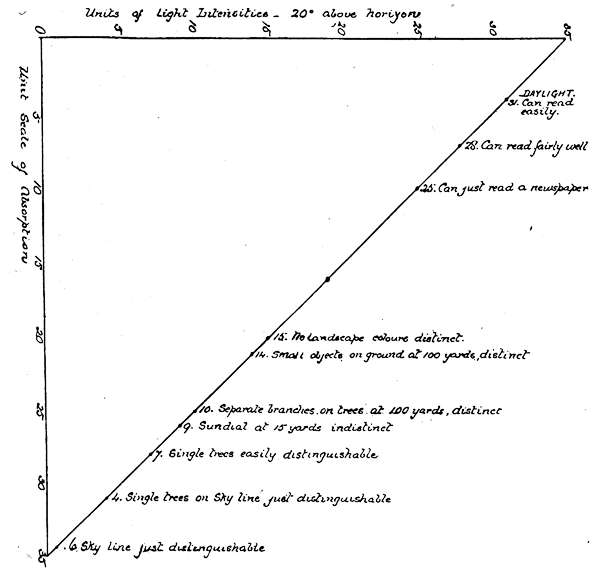
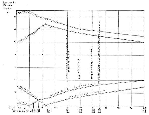
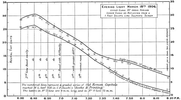
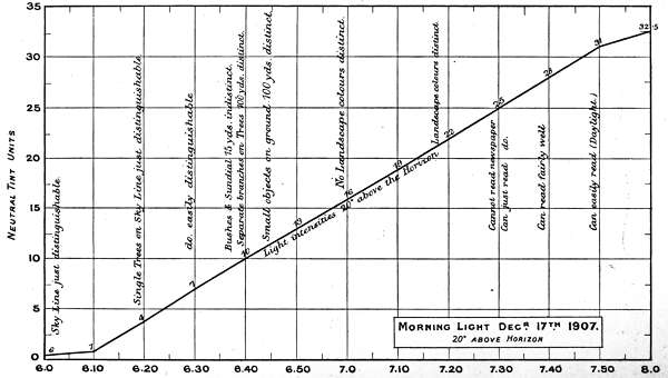
The first two experiments are records of intensity changes by time, in Morning and Evening light, and[46] are of interest, as bearing on the lowest luminosities for reading, for viewing objects at different distances, and for defining the limits at which colours visually disappear. The measurements are marked in neutral tint units and plotted in curves in Charts 1 and 2.
The numbers on the single curve in the Morning chart represent total absorption of the direct light 20 degrees above the horizon. The upper curve in the Evening chart also represents the direct light, whilst the under curve represents the light values as reflected from a lime sulphate surface; except in the case of the reading notes when it represents the printed paper surface. The difference between the two curves is the loss of light incident on reflection, but this must not be rigidly interpreted for all cases, as there is reason for supposing it varies with different lights.
In measuring the physiological intensity of direct lights, the presence (activity) of the unabsorbable red ray, prevents their being dealt with directly by the absorptive method. Such lights can, however, be made measurable by a sufficient diffusion, as already explained in the case of direct sunlight, the proportion of diffusion required, being more or less according to the intensity of the light; in the following examples, one reflection from a white surface or from the ordinary grease spot arrangement, was found to be sufficient.
Note.—Light reflected from grease is not above suspicion, it being governed by the law of specific absorption already dealt with.
The experiments were carried out on a home-made twelve-foot photometer, with the usual protected lantern at each end, one being removed for present purposes. The grease spot carrier was replaced by a one-foot square diaphragm, with a standard white surface; this travelled the whole length of the photometer at right angles to the light, and the readings made at one-foot intervals at an angle of 45 degrees, 10 inches distance from the white surface.
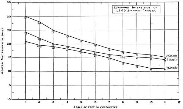
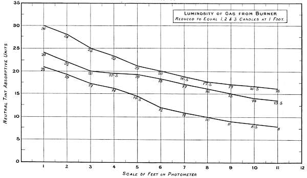
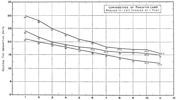
Charts 3, 4 and 5 deal with experiments, with one, two and three standard candles of the London Gas Referees. The curves represent the physiological rate of declining luminosities by distance. Some characteristic differences from other lights are brought together in Charts 4 and 5. The slight irregularities in the curves are probably due to the readings being made at half unit intervals. These acting sometimes in opposite directions, fully account for want of symmetry in the curves.
A noticeable feature in these experiments is the small amount of physiological luminosity added by each successive candle to the first. Theoretically, if one candle equals 21 units intensity, two should equal 42, and three 63, whereas the physiological additions of luminosity are not only much less, but vary with different luminous intensities, as will be seen by the following comparisons:—
| 1 Candle | 2 Candles | 3 Candles | Total. | ||||
| Theoretical | 21 | + | 21 | + | 21 | = | 63 |
| Physiological | 21 | + | 3 | + | 6 | = | 30 |
Chart 4 represents the Luminosity of gas from[53] a batswing burner reduced to one, two and three candle power at one foot distance.
| 1 Candle | 2 Candles | 3 Candles | Total. | ||||
| Theoretical | 21 | + | 21 | + | 21 | = | 63 |
| Physiological | 21 | + | 3 | + | 7 | = | 31 |
Chart 5 represents the Luminosity of a hand Paraffin Lamp similarly reduced.
| 1 Candle | 2 Candles | 3 Candles | Total. | ||||
| Theoretical | 21 | + | 21 | + | 21 | = | 63 |
| Physiological | 21 | + | 3 | + | 6 | = | 30 |
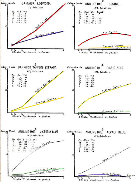
The following experiments are preliminary only, and were undertaken to determine the relationship of the several colours of the tintometrical scales, to their associated photographic values, under different conditions of light and times of exposure, the end in view being the hope of standardizing screens, papers and impressions.
The standardized colours act as selective light absorbents on the same principle as screens for trichromatic colour work, but differ from these in their having a definite standard of colour depth and colour purity.
Work of this character requires paper of a known degree of sensitiveness, but on inquiry it was found that no reliable standard had as yet been established. On this, six makes of “white” paper were purchased[54] in the open market and submitted to exposures under the following conditions:—
Six slips of the sensitized papers were covered by a thin metal plate, pierced by six rows of apertures, a complete row lying over each sample of paper. The rows contained seven apertures each, one being left uncovered to receive the full energy of the impinging light. The remaining six were covered respectively by a Red, Orange, Yellow, Green, Blue or Violet standardized screen of 15 units colour intensity; the whole was fitted into a suitable exposure frame. Many exposures were made, from which the four following were selected:—
No. 1. 20 min. exposure to a dull sky.
No. 2. 10 min. exposure to bright sunlight.
No. 3. 20 min. exposure to bright sunlight.
No. 4. 30 min. exposure to bright sunlight.
The results are arranged in Tables VI and VII.
Table VII contains results of different exposures under sunlight conditions.
TABLE VI.
DULL SOUTH LIGHT.
20 Minutes’ Exposure on White Sensitized Papers.
| Papers | Open Screen. | Red Screen. | Orange Screen. | ||||||
|---|---|---|---|---|---|---|---|---|---|
| Blk. | Or. | Red. | Blk. | Or. | Yel. | Blk. | Or. | Red. | |
| 1 | 7·8 | 4·2 | 6·0 | 2·0 | 4·8 | 3·0 | — | ·3 | ·2 |
| Red. | |||||||||
| 2 | 6·0 | 5·0 | 5·5 | 1·9 | 3·1 | ·4 | — | — | — |
| Yel. | |||||||||
| 3 | 7·8 | 3·2 | 7·0 | 2·7 | 4·7 | 3·0 | — | — | — |
| Red. | |||||||||
| 4 | 7·2 | 4·3 | 6·0 | 2·2 | 3·2 | ·2 | — | — | — |
| 5 | 5·8 | 7·2 | 4·0 | 1·9 | 2·3 | ·8 | — | — | — |
| 6 | 5·6 | 7·4 | 4·0 | 1·8 | 2·6 | 6 | — | — | — |
| Papers | Yellow Screen. | Green Screen. | Blue Screen. | Violet Screen. | ||||||||
|---|---|---|---|---|---|---|---|---|---|---|---|---|
| Blk. | Or. | Red. | Blk. | Or. | Red. | Blk. | Or. | Red. | Blk. | Or. | Red. | |
| 1 | 2·0 | 3·0 | 1·6 | — | — | — | 3·9 | 7·6 | 3·5 | ·2 | ·4 | 1·0 |
| Yel. | ||||||||||||
| 2 | ·4 | ·4 | 1·0 | — | — | — | 4·3 | 9·2 | 4·5 | ·2 | ·8 | ·8 |
| Red. | ||||||||||||
| 3 | 1·2 | ·5 | ·8 | — | — | — | 3·7 | 9·3 | 2·0 | ·7 | ·6 | ·9 |
| Yel. | ||||||||||||
| 4 | 1·2 | ·1 | 1·2 | — | — | — | 3·4 | 1·1 | 1·0 | ·7 | ·7 | ·9 |
| 5 | 1·0 | ·3 | ·3 | — | — | — | 3·3 | 8·7 | 2·0 | ·3 | ·3 | 1·2 |
| Red. | ||||||||||||
| 6 | ·2 | ·3 | ·4 | — | — | — | 3·6 | 8·9 | 1·5 | ·4 | ·2 | ·9 |
TABLE VII.
BRIGHT SUNLIGHT (South), 18—9—12.
10 Minutes’ Exposure on White Sensitized Papers.
| No. | Open Screen. | Red Screen. | Orange Screen. | Yellow Screen. | |||||||||
|---|---|---|---|---|---|---|---|---|---|---|---|---|---|
| Blk. | Or. | Red. | Blk. | Or. | Yel. | Blk. | Or. | Red. | Blk. | Or. | Red. | ||
| 1 | 8·4 | 1·6 | 6·5 | 2·8 | 6·8 | 1·9 | ·34 | 1·41 | ·55 | 2·3 | 7·1 | — | |
| 2 | 8·2 | 2·0 | 6·3 | 2·7 | 4·7 | 3·6 | — | — | — | ·8 | 1·9 | ·70 | |
| 3 | 7·8 | 2·2 | 7·5 | 2·4 | 7·0 | 4·1 | — | — | — | 2·4 | 4·2 | ·80 | |
| 4 | 7·8 | 1·6 | 8·6 | 2·4 | 5·4 | 3·2 | — | — | — | 1·5 | 2·3 | ·70 | |
| 5 | 6·4 | 4·4 | 7·7 | 2·4 | 5·2 | 3·0 | — | — | — | ·9 | 1·8 | ·80 | |
| 6 | 5·2 | 6·3 | 5·5 | 2·3 | 5·1 | 3·0 | — | — | — | 1·1 | 2·0 | ·80 | |
BRIGHT SUNLIGHT (South), 18—9—12. 20 Minutes. | |||||||||||||
| Vio. | Red. | Or. | Red. | Or. | Yel. | Red. | |||||||
| 1 | 10·6 | 1·4 | 5·0 | 7·0 | 2·2 | 8·3 | 1·1 | 3·6 | ·9 | 10·0 | — | 7·0 | |
| Red. | Or. | ||||||||||||
| 2 | 10·0 | — | ·8 | 7·0 | 2·6 | 7·4 | — | 1·0 | ·3 | 7·4 | 2·0 | 3·6 | |
| Or. | |||||||||||||
| 3 | 9·2 | 1·6 | 2·2 | 4·5 | 5·5 | 8·0 | 1·8 | 7·4 | — | 5·2 | 4·2 | 8·1 | |
| Or. | |||||||||||||
| 4 | 10·6 | ·4 | 3·5 | 6·0 | 4·2 | 8·3 | ·44 | 1·36 | ·8 | 9·0 | 2·5 | 5·0 | |
| 5 | 10·0 | ·8 | 5·7 | 6·2 | 4·0 | 8·3 | — | ·7 | ·45 | 7·0 | 5·0 | 4·0 | |
| 6 | 6·2 | 4·6 | 7·7 | 5·0 | 7·5 | 4·0 | ·2 | ·4 | ·5 | 5·4 | 7·1 | 4·5 | |
BRIGHT SUNLIGHT (South), 18—9—12. 30 Minutes. | |||||||||||||
| Or. | Red. | Or. | Red. | Or. | Red. | Or. | Red. | ||||||
| 1 | 10·6 | ·9 | 1·5 | 6·4 | 4·4 | 5·7 | 2·6 | 7·8 | 1·1 | 5·2 | 3·4 | 10·4 | |
| 2 | 9·2 | 1·4 | 2·9 | 6·2 | 5·3 | 5·5 | ·1 | ·7 | ·4 | 7·8 | 3·0 | 5·2 | |
| 3 | 10·8 | 1·2 | 1·5 | 7·2 | 3·4 | 8·4 | ·7 | 2·0 | ·2 | 9·2 | 1·6 | 5·2 | |
| 4 | 10·0 | 2·0 | 1·5 | 6·2 | 4·4 | 6·9 | ·5 | 1·0 | ·7 | 8·2 | 2·0 | 7·3 | |
| 5 | 9·6 | 4·4 | 4·5 | 5·8 | 5·0 | 7·2 | ·2 | 1·9 | ·7 | 6·2 | 3·8 | 6·5 | |
| 6 | 6·6 | 7·9 | 5·0 | 4·8 | 7·2 | 5·0 | ·2 | ·5 | ·55 | 5·0 | 7·5 | 2·0 | |
TABLE VII.
BRIGHT SUNLIGHT (South), 18—9—12.
10 Minutes’ Exposure on White Sensitized Papers.
| No. | Green Screen. | Blue Screen. | Violet Screen. | ||||||
|---|---|---|---|---|---|---|---|---|---|
| Blk. | Or. | Red. | Blk. | Or. | Red. | Blk. | Or. | Yel. | |
| 1 | ·26 | ·69 | ·10 | 5·2 | 4·4 | 8·4 | 1·75 | 3·65 | ·40 |
| 2 | — | ·15 | ·03 | 6·0 | 3·8 | 6·7 | 1·7 | 3·9 | ·40 |
| 3 | ·22 | ·02 | ·04 | 5·6 | 5·9 | 6·5 | 1·5 | 3·5 | 1·2 |
| 4 | ·19 | ·05 | ·12 | 4·8 | 5·6 | 6·6 | 1·3 | 3·2 | — |
| Red. | |||||||||
| 5 | — | — | — | 4·0 | 10·5 | 2·0 | ·6 | 1·7 | 1·0 |
| 6 | — | — | — | 4·0 | 11·5 | 1·0 | ·5 | 1·9 | 1·1 |
BRIGHT SUNLIGHT (South), 18—9—12. 20 Minutes. | |||||||||
| Or. | Yel. | Or. | Red. | Or. | Red. | ||||
| 1 | 3·1 | 6·1 | 1·8 | 8·0 | 2·0 | 8·5 | 4·5 | 7·5 | 4·5 |
| Or. | |||||||||
| 2 | 1·9 | 3·7 | ·8 | 8·8 | ·6 | 3·6 | 5·0 | 6·5 | 4·5 |
| 3 | 1·0 | 7·0 | 1·6 | 8·6 | 1·4 | 3·5 | 4·0 | 8·5 | 4·5 |
| 4 | 1·8 | 4·8 | 1·2 | 8·0 | 2·2 | 6·8 | 4·5 | 7·5 | 4·5 |
| 5 | 1·7 | 4·9 | 1·4 | 7·6 | 2·4 | 8·0 | 4·0 | 8·5 | 4·0 |
| Red | |||||||||
| 6 | 1·8 | 3·4 | ·4 | 6·4 | 4·4 | 8·2 | 3·5 | 8·5 | 1·0 |
BRIGHT SUNLIGHT (South), 18—9—12. 30 Minutes. | |||||||||
| Or. | Yel. | Or. | Red. | Or. | Red. | ||||
| 1 | 1·0 | 6·8 | ·2 | 6·4 | 2·6 | 7·5 | 4·2 | 6·8 | 6·0 |
| 2 | 1·8 | 3·4 | ·2 | 8·4 | 8 | 3·8 | 5·4 | 8·1 | 1·0 |
| 3 | 2·2 | 5·2 | 2·2 | 8·0 | 2·0 | 7·5 | 4·5 | 8·5 | 4·0 |
| 4 | 2·5 | 4·7 | 2·0 | 8·0 | 1·6 | 7·4 | 3·7 | 10·3 | 1·0 |
| Yel. | |||||||||
| 5 | 1·6 | 4·2 | 2·8 | 7·6 | 2·6 | 6·8 | 3·1 | 9·4 | 1·5 |
| 6 | 1·5 | 3·9 | ·2 | 6·4 | 7·6 | 5·5 | 3·4 | 9·7 | 1·5 |
It would be unsafe to draw definite conclusions from a few experiments, but so far as permissible, the results show considerable differences, both in depth and in colour, of the energy of the different rays, for instance—
Compare Nos. 1 and 6 under 20 min. sunlight.
| Black. | Orange. | Red. | |||
| No. 1 | 10·6 | + | 1·4 | + | 5·0 |
| No. 6 | 6·2 | + | 4·6 | + | 7·7 |
or again 3 and 6, the maximum and minimum, under 30 min. exposure.
| Black. | Orange. | Red. | |||
| No. 3 | 10·8 | + | 1·2 | + | 1·5 |
| No. 6 | 6·6 | + | 7·9 | + | 5·0 |
The sensitiveness of Nos. 2, 4 and 5 appears to have been exhausted by 20 min. exposure to sunlight, further exposure showing no reaction; whilst the sensitiveness of Nos. 1, 3 and 6 do not appear to have been exhausted by 30 min. sunlight exposure.
Other noticeable points are the small action under the Orange, Green and Violet screens, and the greater, although variable proportion of colour to black under all the colour screens.
Table VIII contains the colour measurements of five sets of screens for trichromatic colour work which have come from time to time under the writer’s notice.
The measurements are the tintometrical colour units required to match the screens under daylight conditions, and are classified under the theoretically accepted terms of Red, Green and Violet.
TABLE VIII.
| Set. | Red Screens. | Green Screens. | Violet Screens. | ||||||||
|---|---|---|---|---|---|---|---|---|---|---|---|
| No. | Red. | Or. | Vi. | Light. | Yel. | Green. | Or. | Light. | Blue. | Green. | Black. |
| 1 | 119·0 | — | — | 1·6 | 27·0 | 36·0 | — | 9·0 | 32·0 | 1·4 | 6·6 |
| 2 | 24·2 | +·8 | — | — | 8·9 | — | ·1 | — | 13·0 | — | 3·1 |
| 3 | 26·4 | — | ·8 | — | 7·5 | — | 1·4 | — | 16·6 | — | 3·2 |
| 4 | 22·6 | — | — | — | 7·6 | — | 1·4 | — | 15·3 | — | 3·1 |
| 5 | 21·0 | — | 9·0 | — | 28·0 | 14·0 | — | — | 28·0 | — | 2·8 |
The Red screens are all practically pure except No. 5, which transmits also 30 per cent. Violet. No. 1 is distinguished by its greater colour depth and purity, the degree of which latter is recorded at 1·6 light units brighter than standard.
In the Green division, only Nos. 1 and 5 transmit any green, No. 1 transmitting also 42·8 per cent. yellow and being 9·0 units brighter than standards; No. 4 transmits 66·6 per cent. yellow to 33·3 per cent. green; Nos. 2, 3 and 4 are all yellows tinged with orange.
In the Violet division, Nos. 2, 3, 4 and 5 are all pure blues; No. 1 is tinged with green.
The time has passed when it might have been considered necessary to preface a handbook on the teaching of colour by arguments to prove that it is a legitimate subject of instruction in schools, but it has not hitherto been sufficiently recognized that the early stages of such instruction must be on sound lines and that nothing must be taught which will afterwards have to be unlearned.
Apart from the pleasure its sensations give to all properly constituted persons, the study of colour has an intellectual value in common with other branches of science. It strengthens the judgment by constantly requiring thought and precision in definition, it also develops the faculty of colour perception even to the point of curing some forms of colour blindness. In addition to this, it forms a necessary part of the instruction in all schools in which drawing is properly taught by methods which demand from the pupils faithful representations of the appearances of actual objects in colour as they are seen.
In the past the systematic study of colour has been more or less neglected from two principal causes: first, the want of a comprehensive scheme of colour nomenclature capable of describing all colours in terms precise enough for general understanding and record; and, second, the absence of any reliable means of reproducing any specific[60] colour if lost or faded. Both these conditions may now be secured by the use of the standardized coloured glasses supplied with the Colour Educator, and this work is intended to bring the subject before teachers in such a way as to make each point perfectly easy of demonstration to a class in a systematic manner.
To-day the value and importance of a keen perception of colour and of an apparatus furnishing definite colour standards, though perhaps not much appreciated by the general public, are widely recognized in the industrial and scientific world; and it is evident that in these days of keen commercial competition between nations we cannot afford to neglect any means which will enable us to maintain present industries and to develop new ones.
General Remarks.—It is not advisable to introduce colour theories to pupils before they know the names of the different colours, but, as the glasses used in the apparatus are graded for colour-depth according to a set of scales now generally accepted as of standard value, a short description of the derivation of the colour names will be of service when the pupils are sufficiently advanced.
The names of the six spectrum colours, Red, Orange, Yellow, Green, Blue, and Violet, are accepted by common consent as describing the principal hues into which a beam of white light can be resolved by a diffraction grating or by prismatic refraction. They are also the colours distinguishable in objects of everyday life, and the following Educational Method is based on the fact that they can be separated at will from ordinary daylight. Therefore the first educational step is to associate these six colour rays with their respective names, the pupils being made to understand that there are many degrees of depth in each colour.
The Applications of Colour to the Work of Everyday Life are so universal that a complete list is almost impossible, though some of the most important are mentioned below. In a general way the visual characteristics of every visible object are determined by contrasts of light and colour, outline itself being governed by differences of light intensity.
In Nature, colour is practically universal. There are few objects perfectly white. Most of them have colour of greater or less complexity; even snow under a cloudless sky has a blue tint which is measurable against such white objects as pure lime sulphate, zinc white, etc., the blue tint being manifestly reflected from the cloudless sky, as it disappears under a cloudy overcast.
Some of the Scientific Applications of Colour.—It associates colour sensations with definite names and values; discovers and classifies cases of colour-blindness, and is a preparation for the physical study of light. It is also essential for studying the physiological structure of the organs of vision, for disclosing abnormal conditions of the blood, and for measuring the colour of the hair and skin for the anthropological classification of races. It is used in general laboratory work for analytical and original investigation; and it furnishes standards of value for the petroleum industry, the International Tanning Association, the inter-States Cotton Seed Oil Association, etc. It is also one of the principal factors in all artistic industries; for, besides having an important educational value in questions of harmony, contrast, and taste, it is of direct commercial value in such industries as dyeing, calico printing, all woollen industries, wall-paper printing, paint making, house decoration, etc.
General Instructions for Using the Apparatus.—The apparatus consists of a frame having six little windows, fitted with sliding shutters, and a tray containing eighteen standardized glasses.
The frame must be placed on a table or stand facing the children, with a window or some other source of diffused white light behind it. Care must be taken not to have a coloured background of any kind.
The glasses are in three colours, Red, Yellow, and Blue, of different depths. The depth of colour is marked in figures on each glass, and corresponding numbers in the three colours are of equal intensity. It is of importance that the six spectrum colour terms should be the only ones used in the preliminary stages. The first step in colour teaching must be to develop and train the perceptive faculties of the children so as to enable them to express in words the colour sensations which are excited. For this purpose it is necessary to begin by demonstrating that the six spectrum colours Red, Orange, Yellow, Green, Blue, and Violet, are derived from white light.
Red, Yellow, and Blue should first be dealt with, and for practical work each pupil should be supplied with three water-colour pigments closely corresponding in hue to the standardized glasses, viz., Crimson Lake, Lemon Yellow, and Cobalt Blue; also with a piece of white paper ruled into six small rectangular spaces corresponding to the little windows of the apparatus.
As each colour is demonstrated by means of the glass in the apparatus, each pupil should paint the corresponding pigment in its proper place on the paper.
The little shutters being placed in all the six little windows, remove the top left-hand shutter and insert a deep Red glass, thus showing
Red.—The pupils will name this and then paint the corresponding colour on their papers.
Next, remove the shutter below the first one, and insert a Yellow glass of the same numerical value as the Red one, thus showing
Yellow.—The pupils will name this and then paint the corresponding colour on their papers.
Now remove the shutter next below and insert a Blue glass of the same numerical value as the Red and Yellow ones, thus showing
Blue.—The pupils will name this and then paint the corresponding colour on their papers.
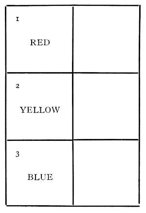
There are now exposed to view the three colours which are by artists commonly called primaries, but it will be found convenient to term Red, Yellow, and Blue the Dominant colours of this system.
The second step is to show how the three secondary or subordinate colours are derived or developed.
Remove the top right-hand shutter and insert a deep Red and a deep Yellow glass of equal depth, showing the[64] pupils that these two colours combined in equal proportions develop
Orange.—The pupils will name this, and will then mix their Red and Yellow pigments to obtain a similar Orange which will be painted in its proper place on their papers.
Now remove the shutter next below and insert a deep Yellow and a deep Blue glass of equal depth, showing the pupils that these two colours combined in equal proportions develop
Green.—The pupils will name this, and will then mix their Blue and Yellow pigments to obtain a similar Green which will be painted in its proper place on their papers.
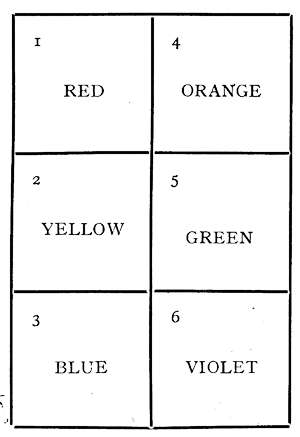
Remove the last right-hand shutter and insert a deep Red and a deep Blue glass of equal depth, showing that these two colours combined in equal proportions develop
Violet.—The pupils will name this, and mix their Blue and Red pigments to obtain a similar Violet, which will also be painted in its proper place on their papers.
Now are exposed to view on the left-hand side the three primary or dominant colours, and on the right-hand side[65] the three secondary or subordinate colours, and the whole frame is filled with the six spectrum colours in equal colour depth. Corresponding to the colours in the frame, each pupil’s paper should show a similar arrangement of colours, and the pupils can be taught their spectrum order by reading them in rows horizontally—Red, Orange, Yellow, Green, Blue, and Violet.
The teacher should now take out the coloured glasses and replace the shutters, except the two top windows, one of which is left open to show white light, and the other filled with three equally deep glasses in Red, Yellow, and Blue, showing either black or neutral grey, and demonstrating the total or partial absorption of light according to their higher or lower numerical unit value. It is of the utmost importance to bear in mind that the glasses are graded for diffused daylight, and that all artificial lights are more or less coloured and would give a different effect. The same remark applies to light taken direct from coloured objects.
In this set the six windows are in one horizontal line, and should be uncovered in the following order:
{ No. 1 Window for Red.
Dominants { No. 3 Window for Yellow.
{ No. 5 Window for Blue.
{ No. 2 Window for Orange.
Subordinates { No. 4 Window for Green.
{ No. 6 Window for Violet.
One advantage in this method is that when all the colours are in they are arranged in their spectrum order.
Complex Colours.—We have demonstrated that single standard glasses develop the three Dominant colours, Red, Yellow, and Blue, and that pairs of equal standard glasses[66] develop the three Subordinate colours, Orange, Green, and Violet. In order to produce complex colours two standard glasses of unequal value must be used. The degree of inequality does not alter the spectroscopic names of complex colours, variation in proportions being only a statement of degree.
| Complex Name. | High value. Lower. | ||
| To develop a | Red-Orange | insert a | Red and Yellow. |
| " | Yellow-Orange | " | Yellow and Red. |
| " | Yellow-Green | " | Yellow and Blue. |
| " | Blue-Green | " | Blue and Yellow. |
| " | Blue-Violet | " | Blue and Red. |
| " | Red-Violet | " | Red and Blue. |
A reference to the circles, 7, 8, and 9, on the cards supplied with the apparatus will show that all complex colours are members of the same triad group, and experiments have shown that the six combinations above are the only ones distinguishable in Nature, subject, however, to unlimited variations in brightness or dullness. It remains to be shown how these variations are effected.
Variations in brightness are produced by inserting with the two glasses forming a complex colour the third spectrum colour, always bearing in mind that it must be less in value than either of the other two. The addition of the third colour has a dulling or saddening effect, the degree of which is determined by the numerical value of the third colour. The colour produced by the addition of the third colour may be termed a saddened or dingy colour, the appearance being that of a brighter colour seen in shadow.
Reviewing the foregoing, it is demonstrated that primary or dominant colours are transmitted by a single coloured standard glass; the secondary or subordinate colours are transmitted by two equal standard glasses of different colours;[67] the complex colours by two unequal standard glasses of different colours. Saddened pure colours are developed either by one coloured standard glass combined with two equal standard glasses of different colours and lesser value or by two equal standard glasses of different colours and a third of lesser value. Saddened complex colours by three unequal standard glasses of different colours. Greys, which are steps towards blackness, are produced by three equal standard glasses of different colours.
It is well known that Colour Blindness is a defect in the vision often involving the confusion of such utterly distinct colour sensations as Red and Green, Orange and Violet, and many others as widely different. In the cases of Red and Green the confusions are specially disastrous should the subject be a railwayman or a sailor. It is not, however, so well known that many cases of so-called Colour Blindness are in reality cases of Colour Ignorance, and the capacity for distinguishing between colours and shades is often latent, and only waiting to be developed by Education.
When a child persistently misnames colours after having received an amount of instruction sufficient to remove colour ignorance in a normal case, the errors are probably due to some form of colour blindness.
Such cases should be registered for further examination, taking note of the miscalled colours. It would be an additional precaution to change the position of the colours in the windows of the apparatus, in order to prevent the association of colours with their positions as first given in the instructions.
Note.—The paints which most nearly correspond to the colour standards in the Colour Educator are tabulated below, the third column containing their measured colour proportions[68] when they are washed thickly on white paper (Whatman’s).
| Spectrum Names. | Artists’ Names. | Colour Composition in Standard Units. | |||||
| Red. | Orange. | Yellow. | Green. | Blue. | Violet. | ||
| Dominants: | |||||||
| Red | Crimson Lake | 18·0 | 0·4 | — | — | — | — |
| Yellow | Lemon Yellow | — | — | 6·6 | — | — | — |
| Blue | Cobalt | — | — | — | — | 9·0 | — |
| Subordinates: | |||||||
| Orange | Chrome Orange | — | 7·2 | 1·6 | — | — | — |
| Green | Emerald Green | — | — | 0·40 | 5·4 | — | — |
| Violet | Mauve | 3·3 | — | — | — | — | 8·2 |
In mixing two dominant colours (artists’ primaries) to develop subordinates (artists’ secondaries), their relative colour depth must be taken into account; for instance, Crimson Lake has a natural colour depth nearly three times that of Lemon Yellow; therefore, in order to develop a normal Orange nearly three times the quantity of Yellow must be used, presuming that they were originally ground to an equal degree of fineness.
It is desirable that a record of the children’s own painting should be preserved, with a view to discriminating between errors arising from Colour Blindness and Colour Ignorance, the former perpetuating itself, and the latter naturally remedying itself. For this purpose painting books containing sets of diagrams corresponding to the figures in the foregoing pamphlet can be supplied.
The past attempts to standardize light and colour are mainly limited to those radiant energies which excite light and colour sensations under diffused daylight conditions, because in direct sunlight, and in most artificial lights, there are other colour energies, which, unless sufficiently modified by diffusion, disturb the colour readings. There are also latent colour energies, which only become distinguishable by special means. They do not, however, appear to influence diffused daylight colour work.
The definition of a normal vision is one which agrees with a majority of others. This definition has proved satisfactory up to the present, as the normals are many and the colour blind few.
Light Intensities.—There are two methods of determining light intensities by means of a graded scale of light absorbents.
First. By total absorption of the light, when the intensity is directly represented by the unit value of the absorbents required. This method is applicable for low lights, internal surfaces, such as a desk, etc., where a standard light is not available for comparison.
Second. By the reduction of a standard light by absorption until it equals the light of the object. In this case the standard must be originally brighter than the object.
Constants.—The first requirement in establishing a scale of light and colour units is a means of co-relating visual sensations to a scale of physical colour constants, in order to secure a power of record and recovery. There is no natural scale available for quantitative colour work, but artificial scales can be constructed, and made constants by co-relation at different points with physical colour constants, and by cross-checking the intervals between these.
The scales used in the “tintometer” consist of red, yellow and blue glass, so graded in equivalents that combinations of equal units transmit colourless light. Full details of these have already been placed before the Society (see this Jour., 1887, p. 186, and 1908, p. 36).
Scale of Luminous Intensities. The Light Unit.—The natural terminals in a scale of luminous intensities are black and white, and the first question which arises is what is black, and what is white? as when used in a popular sense each term covers a wide range of differences.
In the author’s sense the term black means total absence of light, and the term white means a diffused daylight of given intensity, as reflected from a lime sulphate surface. In this sense black and white are the terminals of a scale of light intensities; the scale is divided into units and fractions of units. The unit itself is physiological, and is not in progressive accord with the mathematical light unit based on the inverse squares of distance.
The Black Unit.—Ideal black is practically obtained under daylight conditions by viewing a hole in a box with blackened interior, so arranged that no entering light can be reflected back to the vision.
The box used for this purpose is illustrated in Fig. 3, and has one surface covered with standard white for the purpose of easy comparison with the pigments. The standard black aperture (1) is in the middle. The pigmentary blacks (2 to 10) are arranged over this, and the pigmentary whites and greys (11 to 20) underneath, each being numbered in accord with its intensity as tabulated.
The degrees of blackness are the number of absorptive units required to reduce the standard white to equal the pigments in each case.
Light Absorbed by Various Pigments.
| No. | Absorbed Light. |
Unabsorbed Light. | Initial Light. | |
| 1 | Black Hole in Box | 36 | — | 36 |
| 2 | Optical Black | 20 | 16 | 36 |
| 3 | Lamp Black | 17 | 19 | 36 |
| 4 | Vegetable Black A | 17 | 19 | 36 |
| 5 | Vegetable Black B | 14 | 22 | 36 |
| 6 | Vegetable Black C | 15 | 21 | 36 |
| 7 | Indian Ink on Paper | 14 | 22 | 36 |
| 8 | Indian Ink Solid | 12 | 24 | 36 |
| 9 | Boot Black | 11 | 25 | 36 |
| 10 | Black Lead | 9 | 27 | 36 |
This gives a working scale of colourless light intensities, the terminals being black and white, with a range of 36 units.
The Standard White.—White is the natural terminal of the luminous end of the scale, and it is necessary to select a physical objective white as a constant. Pure precipitated lime sulphate has been adopted, and departures from the light intensity of this are recorded in units of lessened light intensity throughout the scale, comprising all degrees of colourless whites, greys, and blacks.
Strictly speaking, white is a qualitative term only, until the degree of variation from the zero of the scale has been established. The measured variation then takes its position in the scale of luminous intensities according to its numerical unit value.
Light Absorbed by Various White and Grey Pigments.
| No. | Pigments. | Absorbed Light. |
Reflected Light. | Initial Light. |
| 11 | Grey Paint E | 6·0 | 30·0 | 36 |
| 12 | Grey Paint D | 5·0 | 31·0 | 36 |
| 13 | Grey Paint C | 4·0 | 32·0 | 36 |
| 14 | Grey Paint B | 2·0 | 34·0 | 36 |
| 15 | White Paint A | 0·7 | 35·3 | 36 |
| 16 | White Paper D | 0·3 | 35·7 | 36 |
| 17 | White Paper C | 0·2 | 35·8 | 36 |
| 18 | White Paper B | 0·25 | 35·75 | 36 |
| 19 | White Paper A | 0·15 | 35·85 | 36 |
| 20 | Chinese White | 0·006 | 35·994 | 36 |
As the scale is differentiated into hundredths of a unit, there can be 100 variations of white pigments in a single unit, each quite easily distinguishable from the others.
Any definite mixture of black and white finds a position on the diagonal of a chart whose co-ordinates are the black and white scales; for example, the 20 measured pigments are charted on Figs. 4 and 5, the latter being on an enlarged scale, as the whites would be too crowded to be noted on Fig. 4.
The merging of white into grey, and of grey into black is gradual, having no strict lines of demarcation.
An example of this method of determining light intensities is illustrated in Fig. 6 by the light intensities at which different objects are discernible. The points of most interest are, that colour is indistinguishable as such in lights below 15 units intensity; and that ordinary work, such as reading a newspaper, requires for comfort a minimum of 28 units.
The Colour Unit.—The colour unit is physiological, and its dimensions are determined by the dimensions of the colourless[74] light from which it is derived. This deduction is based on the experimental fact that colourless light is a mixture of the six colour rays—red, orange, yellow, green, blue, and violet—in equal proportion, as illustrated in Fig. 7, showing that a white light of 20 units light intensity is made up to the six colour rays, each of 20 units colour intensity. This is demonstrated by the fact that any proportion of any colour can be developed at will by means of the glass standard scales already mentioned; it follows that the smallest disturbance of equivalence between the composing rays results in the development of colour.
The above remarks apply to both simple and complex colours, and the complex colours are always dichromes, being governed by another physiological fact, which is: That the vision is unable to simultaneously distinguish[75] more than two colours in the same beam of light. The order of their association is definite, and may be described by saying that the combined two are always adjacent in their spectrum order, red and violet being considered adjacent for this purpose. It follows that all complex colours are binaries, and the only possible combinations are as follows:—
Red with Orange.
Orange with Yellow.
Yellow with Green.
Green with Blue.
Blue with Violet.
Violet with Red.
In the author’s colour nomenclature, a monochrome is qualitatively described by a single term, and a complex colour by a combination of two single terms. For a quantitative description, it is only necessary to add the measured[76] unit value to each term. When there is excess of brightness, or a saddening factor, these also must be quantitatively estimated.
The colours developed by means of these scales are governed by the same law of selective absorption which governs the development of natural colours, any of which can be matched and reproduced by means of their established ray proportions.
The governing law is simple, and may be stated by saying that the colour developed is always complementary to the colour absorbed, not in the generally accepted sense that their mixture necessarily makes white light, but in the sense that they are opposite in the cycle of daylight colours.
The dimensions of the unit are necessarily arbitrary, it was originally selected as being a convenient depth for distinguishing differences, the scale was then constructed by equal additions and sub-divisions; the two essentials of a scientific scale being complied with, in that the divisions were equal and the unit recoverable. The power of recovery lies in the fact that different parts of the scale are co-related to physical colour constants, which can be prepared in any laboratory.
To face page 76.[Lovibond, Colour Theories.
Specific Colour.—The relationship of colour increase to intensity increase in substances has hitherto been somewhat obscure. It has been sometimes considered that they were in direct proportion, but in the absence of a means of recording colour sensations, no definite results were obtainable.
Sufficient information is now available to warrant the formulation of the following law: “That every substance has its own rate of colour development for regularly increasing intensities, which, when once established, becomes a constant for identifying similar substances in future.” This is the meaning of specific colour, and when a series of measurements at regularly increasing densities of a given substance have been made, the specific colour rate of that substance is established. This can be charted in curves and used as a basis for estimating quantities, properties, changes of condition, differences in value, detecting adulteration, etc.
Applications.—The author has permission to use the names of several gentlemen who have used the tintometrical scales for various purposes.
Sir Arthur H. Church, F.R.S., has employed the tintometrical standards for the purpose of registering the colours of certain wild flowers.
Sir Boverton Redwood has used the scales and system for petroleum investigations. At his instance the specific colour rate of petroleum was established, and the several composing colours plotted in curves, as in Fig. 8, where the ordinates represent the scale of units irrespective of colour, and the abscissæ the scale of strata thicknesses.
The measurements were made at two-inch intervals, and the four perpendicular lines are at the colour points selected for valuing the four distinguishing marks, technically known as “Water White,” “Superfine,” “Prime,” and “Standard.” Intermediate qualities find their position in the scale of curves according to their measured colour values.
This method of standardizing commercial values has also been adopted by the International Tanners’ Association, the Inter-States Cotton Seed Oil Association, and other oil industries. Also for scale, solid fats, and such substances as can be easily melted and measured by transmitted light.
Varying Effects of Different Lights. Pathological Applications.—The law of specific colour development was made use of by Dr. George Oliver in determining the degrees of hæmoglobin in the blood. The method is fully explained in his Croonian Lecture before the Royal College of Physicians of London, July 11, 1896.
Detection of Forgeries.—The system and apparatus is used by Professor A. S. Osborne, Examiner of Questioned Documents, New York City, for determining the variety of[79] ink, the age of the writing, and the detection of forgeries. A full description of the process will be found in his work entitled Questioned Documents, published by the Lawyers’ Co-operative Society, Rochester, N.Y.
To face page 78.[Lovibond, Colour Theories.
The application to chemical analysis is too well known to require enlargement here.
Dyes.—As an example of the use of the system in the valuation of dyes, Fig. 9 illustrates the specific colour curves of four samples of Methylene Blue. No. 1 was priced at 5s. 9d. and No. 2 at 5s. per lb., Nos. 3 and 4 were not priced, the solutions were measured in percentages from 0·001 to 0·048 in distilled water. To find the cost per unit of colour in the priced samples is only a question of simple arithmetic, which furnishes data for the valuation of the unpriced samples.
The yield in the dye vat may not be in direct relation to the solutions in water, the establishment of this is a question for the expert, and presents no apparent difficulty.
The use of the scheme in recording the degree of fading of dyes has been previously dealt with in the Journal (q.v., 1908, p. 36).
Limitations and Precautions.—It has been shown that we have analytical control, within certain limits, of light and colour under daylight conditions.
The general limits for colourless light range from total darkness to 28 units, when the unabsorbable red ray comes into evidence.
For colour, the general limits range from 28 to 18 units, between 18 and 15 all colours become indistinct, but at varying rates, below 15, colour is not distinguishable.
The principal disturbing conditions in making observations are want of colour education and insufficient diffusion. In the case of the latter, the first evidence is the disturbance of constancy by the penetrating red ray. A partial remedy is to interpose a white diffusion screen, such as tissue paper.
Time of Observation.—This should not exceed five consecutive seconds, as the keenness of perception decreases by time, but varies for different colours.
Angle of Incidence.—Sixty degrees is safe for most solids, but for bright or polished surfaces, such as varnishes, polished metals, etc., the angle must be lessened as the degree of smoothness increases. For very rough surfaces, such as loosely woven stuffs, etc., care must be taken that the lay of the fibre is uniform.
Distance from the Object.—Ten inches has been adopted for general work, but certain visions require more or less as their focus varies from normal.
To face page 80. [Lovibond, Colour Theories.
Unabsorbable Colours.—In addition to the daylight colours already dealt with, there are, in direct lights, colours which do not obey the laws of absorption governing those of diffused daylight.
The work already done on these unabsorbable rays has only been incidental, where they happened to interfere with the standardization of diffused daylight colours. The sensations excited are red and violet. They blend, producing red-violet mixtures, but in unequal proportions, the red being dominant.
The red is developed in intense lights by constant interception of neutral tint absorbents. In the case of a 4-volt incandescent light, the first absorption simply reduces the light intensity without developing colour; the light is colourless up to 14 units. At 16 units the light begins to assume a reddish hue, which rapidly becomes a brilliant intense red by further interceptions of neutral tint absorbents.
Violet is developed by constant absorption by blue standards, which grows in intensity by successive additions up to about 120 units. Beyond this point the brilliancy decreases.
Preliminary experiments point to this ray as fatal to vegetation, and presumably also to lower forms of organic life.
There remains a factor of considerable importance which has not yet received the attention it deserves, the physiological changes resulting from environment.
This aspect of the question has come under the notice of the author by measuring the vision of experts who excelled in given hues. It was generally found that their vision was sensitive to a small increment of their particular colour in harmonies where it was silent to a normal vision.
In seeking an explanation of this phenomenon there are at least three possible lines for working:
First. Is the vision naturally more sensitive to that particular energy?
Second. Is it by careful education?
Third. Is it an unconscious adaptation to surroundings, such as other organs undergo under changes of environment?
To face page 82.[Lovibond, Colour Theories.
Dr. Dudley Corbett.
The gradations in the tint given by the Sabouraud-Noiré pastille when exposed to X-rays are so fine, especially in that region of the colour scale where lies the erythema dose, that many have felt the want of a more accurate means of reading these tints, as well as a series of reliable standards for comparison. Hitherto the only methods at all generally used have been Hampson’s radiometer and Bordier’s radio-chronometer, the former in this country, and the latter on the Continent. Hampson’s instrument has two disadvantages: it can only be used with electric light, and the standards are made of tinted paper liable to get soiled, and to vary slightly with the changes in the pigment employed. Its advantage is that it may be used as a sliding scale, thus economising the pastilles. Some persons, however, have considerable difficulty in reading the tints, the scale rising only by gradations of 1/4 B.
In the construction of any such instrument, the really important point is to obtain a reliable standard for Tint B—i.e., the normal epilation dose. The tints on the Sabouraud card itself are not always identical, some representing a dose which will only just epilate, others an almost dangerous dose for unfiltered rays. The Tint B, which is the standard, allows a margin of error of 20 per cent. on[84] either side. In other words, 4/5 B will almost always epilate, while 1-1/5 B is nearly the limit of safety. This observation is in accordance with the experience of other workers on this subject. In my instrument Tint B has been obtained by measuring the pastille with Lovibond’s tintometer immediately after exposure to the X-rays. The pastille was turned to a tint corresponding to an epilation dose which was known to be safe, as proved by clinical results. This tint was measured directly both by daylight and by artificial light from an 8-candle power carbon filament lamp with frosted glass shade. I am indebted to Mr. Dean for suggesting the use of Lovibond’s instrument for this purpose.
The methods employed in the experimental work have been described in the British Journal of Dermatology for August, 1913. By using a very constant focus tube and averaging a large number of readings and correlating the results with those obtained in clinical practice, we were able to construct the curves indicating the colour developed by the pastille. In these curves, shown in Fig. 10, the ordinates are the Lovibond colour units, the abscissa the time during which the current was actually passing. When using an interrupter working at a constant speed, the actual time was taken, otherwise the number of current interruptions as measured by a dipper tachymeter was used.
As was to be expected, the daylight and electric light curves were quite different. In each case the standard yellow glasses employed were kept constant throughout the curve, that for daylight being 15 units, that for electric light 13 units. When these were combined with blue and red glasses in varying units and fractions of a unit, they gave a colour range which matched the pastille exactly in the changes it undergoes from the unexposed condition to the 2 B Tint.
The curves are plotted in accordance with Mr. Lovibond’s practice—that is, not as a direct representation of the standard glasses used, but as showing the colour sensation received by the eye.
First, as to the daylight curve: In order to match the unexposed pastille we interpose between the pastille and the observer’s eye a yellow and a blue glass, plus a certain amount of neutral tint (composed of three equal colour units). Thus the colour sensation received is a yellow green, together with a certain amount of white light. As the pastille darkens under irradiation, both the green and the white light disappear, until at a point just below the 1/2 B dose, there is no other colour present but yellow. After this red glasses are required—i.e., the colour sensation is a yellow orange, which gradually deepens owing to an increase in the proportion of red. The yellow curve thus rises till just below the 1/2 B point, and then falls as the orange increases.
Next, as to the electric light curve. The unexposed pastille has but a trace of green, which is soon lost. The orange begins much earlier than in daylight, and thus at Tint B has reached a higher point than in daylight. From this point the orange and yellow parts of both curves run practically parallel with one another up to 2 B. Beyond 2 B the readings become more difficult. I have not determined the point when no more colour develops, as it has no great practical value, though it might well be of interest from a physico-chemical standpoint.
In my radiometer the standards are composed of the Lovibond standard glasses in combination. The apparatus itself consists of an optical instrument or viewing box. This is divided by a central partition, so that on looking through the eyepiece one sees a white background through two small circular apertures. On one side, level with the background, is a fitting to take the pastille in its holder. On the other side is a groove in the instrument itself for the insertion of the standard glasses. A similar groove is fitted on the pastille side of the instrument to take neutral tints if required. The colour of the pastille as seen by reflected light can thus be compared with that obtained by transmitted light through the standard glasses seen against the white background. A difference of 1/5 B or 1 H is quite easily perceivable.
It is usually of no great importance to obtain extremely accurate measurement of the smaller fractions below 1/3 B. Where this is necessary, neutral tints must be used when working with daylight. With electric light these are unnecessary. When required the neutral tints are interposed between the pastille and the eye to absorb the white light reflected from the pastille. The neutral glasses required are 1·5 for the unexposed pastille, 0·6 for 1/4 B, and 0·2 for 1/3 B.[87] These values are subject to slight variations due to changes in the varnish of the pastille emulsion. The difficulty can always be avoided by using electric light, where a trace of neutral tint is needed only when matching the unexposed pastille—an unimportant point.
Method of Use.—The choice of daylight or artificial light is a personal matter, but one should practise reading the scale with both. The use of the instrument shows that the pastille fades very nearly as quickly under electric light as it does under daylight. The following precautions should be observed: In daylight work in a good white light, avoid shadows and yellow light of any kind. With electric light use an 8-candle power carbon-filament lamp with frosted glass and a suitable white shade so arranged that the pastille is 8 inches from the lamp. No other light should be allowed to reach the pastille during examination. A low power metal-filament lamp may be used, but greater accuracy will be obtained with a carbon-filament lamp which was used for the experimental work. The lamp should be discarded as soon as the light becomes yellow from prolonged use. Whether in daylight or electric light, the examination must be rapid to avoid the fading of the pastille. When it is desired to give an accurate 1 B dose, it is better to put up the 4/5 B standard first. It is then easy to calculate how much more exposure is required for the extra 1/5 B. It is important to adjust the pastille carefully so that none of the unirradiated green portion is visible through the small aperture, as this will upset the reading. In very accurate dosage new pastilles should be used, as a bleached pastille never returns exactly to its original tint. When such a bleached pastille is irradiated the colour changes start a little farther down the curve, and thus the tint for a given dose must be taken a little above the normal[88] tint. This increase is very slight, but is nevertheless quite appreciable, and may amount to as much as 5 and 10 per cent. Even then the margin for error is ample in the neighbourhood of the B tint, and if a pastille is not used more than three times, and is well bleached in daylight after each exposure, no serious error is likely to occur. A standard white background should always be used, and discarded for a new one when it gets dirty. The colour standards usually provided are those in common use—namely, 1/4, 1/3, 1/2, 4/5, 1, 1', and 2 B, but it is quite easy to make up standards for any point on the curve. The symbol “B,” as the erythema or epilation dose, has been retained, as it was thought inadvisable to add to the number of such symbols already existing.
To sum up:
1. The experimental work has determined the exact colour changes occurring in the Sabouraud pastille when exposed to X-rays.
2. These experiments have established a permanent standard for Tint B, which matches the pastille exactly, does not fade, is easily kept clean. These coloured glasses can be readily and accurately reproduced, as they are standardized spectroscopically by a firm who specialise in such work. The standard will therefore remain constant so long as the Sabouraud emulsion remains unaltered.
3. Glasses may be prepared of the correct tint for any fraction or multiple of this dose up to 2 B or 10 H.
4. Either daylight or electric light can be used.
5. The optical instrument itself, by cutting off extraneous light, greatly assists the colour comparisons, so that the practical error need never exceed 10 per cent.
Butler & Tanner Frome and London
[1] It was afterwards found that these colour changes through variations of intensities were due to a natural law to be described under the heading of “Specific colour.” (See page 32.)
[2] For description of the light and colour units, refer to chap. III, page 9.
[3] It was found that the superimposition of two glasses did not visually disturb equivalence, therefore only two glasses were used for each observation in constructing the scales.
[4] This method of illustration was suggested by Dr. Herbert Munro.
[5] Reprinted from the Journal of the Society of Dyers and Colourists, March, 1913. No. 3, vol. xxix.
Transcriber’s notes:
In the text version, italics are represented by _underscores_, and bold and black letter text by =equals= symbols. Superscripts are represented by ^{} and subscripts by _{}
Missing or incorrect punctuation has been repaired.
Inconsistent spelling and hyphenation have been left,
In the html version, dittos have been replaced by the repeated text so that text aligns for easier reading.
Very wide tables (V and VI and VII)have been split to fit on portrait oriented pages.
The following mistakes have been noted:
End of Project Gutenberg's Light and Colour Theories, by Joseph W. Lovibond

*** END OF THIS PROJECT GUTENBERG EBOOK LIGHT AND COLOUR THEORIES ***

***** This file should be named 57335-h.htm or 57335-h.zip *****
This and all associated files of various formats will be found in:
        http://www.gutenberg.org/5/7/3/3/57335/

Produced by Chris Curnow, Chris Jordan and the Online
Distributed Proofreading Team at http://www.pgdp.net (This
file was produced from images generously made available
by The Internet Archive)

Updated editions will replace the previous one--the old editions will
be renamed.

Creating the works from print editions not protected by U.S. copyright
law means that no one owns a United States copyright in these works,
so the Foundation (and you!) can copy and distribute it in the United
States without permission and without paying copyright
royalties. Special rules, set forth in the General Terms of Use part
of this license, apply to copying and distributing Project
Gutenberg-tm electronic works to protect the PROJECT GUTENBERG-tm
concept and trademark. Project Gutenberg is a registered trademark,
and may not be used if you charge for the eBooks, unless you receive
specific permission. If you do not charge anything for copies of this
eBook, complying with the rules is very easy. You may use this eBook
for nearly any purpose such as creation of derivative works, reports,
performances and research. They may be modified and printed and given
away--you may do practically ANYTHING in the United States with eBooks
not protected by U.S. copyright law. Redistribution is subject to the
trademark license, especially commercial redistribution.

START: FULL LICENSE

THE FULL PROJECT GUTENBERG LICENSE
PLEASE READ THIS BEFORE YOU DISTRIBUTE OR USE THIS WORK

To protect the Project Gutenberg-tm mission of promoting the free
distribution of electronic works, by using or distributing this work
(or any other work associated in any way with the phrase "Project
Gutenberg"), you agree to comply with all the terms of the Full
Project Gutenberg-tm License available with this file or online at
www.gutenberg.org/license.

Section 1. General Terms of Use and Redistributing Project
Gutenberg-tm electronic works

1.A. By reading or using any part of this Project Gutenberg-tm
electronic work, you indicate that you have read, understand, agree to
and accept all the terms of this license and intellectual property
(trademark/copyright) agreement. If you do not agree to abide by all
the terms of this agreement, you must cease using and return or
destroy all copies of Project Gutenberg-tm electronic works in your
possession. If you paid a fee for obtaining a copy of or access to a
Project Gutenberg-tm electronic work and you do not agree to be bound
by the terms of this agreement, you may obtain a refund from the
person or entity to whom you paid the fee as set forth in paragraph
1.E.8.

1.B. "Project Gutenberg" is a registered trademark. It may only be
used on or associated in any way with an electronic work by people who
agree to be bound by the terms of this agreement. There are a few
things that you can do with most Project Gutenberg-tm electronic works
even without complying with the full terms of this agreement. See
paragraph 1.C below. There are a lot of things you can do with Project
Gutenberg-tm electronic works if you follow the terms of this
agreement and help preserve free future access to Project Gutenberg-tm
electronic works. See paragraph 1.E below.

1.C. The Project Gutenberg Literary Archive Foundation ("the
Foundation" or PGLAF), owns a compilation copyright in the collection
of Project Gutenberg-tm electronic works. Nearly all the individual
works in the collection are in the public domain in the United
States. If an individual work is unprotected by copyright law in the
United States and you are located in the United States, we do not
claim a right to prevent you from copying, distributing, performing,
displaying or creating derivative works based on the work as long as
all references to Project Gutenberg are removed. Of course, we hope
that you will support the Project Gutenberg-tm mission of promoting
free access to electronic works by freely sharing Project Gutenberg-tm
works in compliance with the terms of this agreement for keeping the
Project Gutenberg-tm name associated with the work. You can easily
comply with the terms of this agreement by keeping this work in the
same format with its attached full Project Gutenberg-tm License when
you share it without charge with others.

1.D. The copyright laws of the place where you are located also govern
what you can do with this work. Copyright laws in most countries are
in a constant state of change. If you are outside the United States,
check the laws of your country in addition to the terms of this
agreement before downloading, copying, displaying, performing,
distributing or creating derivative works based on this work or any
other Project Gutenberg-tm work. The Foundation makes no
representations concerning the copyright status of any work in any
country outside the United States.

1.E. Unless you have removed all references to Project Gutenberg:

1.E.1. The following sentence, with active links to, or other
immediate access to, the full Project Gutenberg-tm License must appear
prominently whenever any copy of a Project Gutenberg-tm work (any work
on which the phrase "Project Gutenberg" appears, or with which the
phrase "Project Gutenberg" is associated) is accessed, displayed,
performed, viewed, copied or distributed:

  This eBook is for the use of anyone anywhere in the United States and
  most other parts of the world at no cost and with almost no
  restrictions whatsoever. You may copy it, give it away or re-use it
  under the terms of the Project Gutenberg License included with this
  eBook or online at www.gutenberg.org. If you are not located in the
  United States, you'll have to check the laws of the country where you
  are located before using this ebook.

1.E.2. If an individual Project Gutenberg-tm electronic work is
derived from texts not protected by U.S. copyright law (does not
contain a notice indicating that it is posted with permission of the
copyright holder), the work can be copied and distributed to anyone in
the United States without paying any fees or charges. If you are
redistributing or providing access to a work with the phrase "Project
Gutenberg" associated with or appearing on the work, you must comply
either with the requirements of paragraphs 1.E.1 through 1.E.7 or
obtain permission for the use of the work and the Project Gutenberg-tm
trademark as set forth in paragraphs 1.E.8 or 1.E.9.

1.E.3. If an individual Project Gutenberg-tm electronic work is posted
with the permission of the copyright holder, your use and distribution
must comply with both paragraphs 1.E.1 through 1.E.7 and any
additional terms imposed by the copyright holder. Additional terms
will be linked to the Project Gutenberg-tm License for all works
posted with the permission of the copyright holder found at the
beginning of this work.

1.E.4. Do not unlink or detach or remove the full Project Gutenberg-tm
License terms from this work, or any files containing a part of this
work or any other work associated with Project Gutenberg-tm.

1.E.5. Do not copy, display, perform, distribute or redistribute this
electronic work, or any part of this electronic work, without
prominently displaying the sentence set forth in paragraph 1.E.1 with
active links or immediate access to the full terms of the Project
Gutenberg-tm License.

1.E.6. You may convert to and distribute this work in any binary,
compressed, marked up, nonproprietary or proprietary form, including
any word processing or hypertext form. However, if you provide access
to or distribute copies of a Project Gutenberg-tm work in a format
other than "Plain Vanilla ASCII" or other format used in the official
version posted on the official Project Gutenberg-tm web site
(www.gutenberg.org), you must, at no additional cost, fee or expense
to the user, provide a copy, a means of exporting a copy, or a means
of obtaining a copy upon request, of the work in its original "Plain
Vanilla ASCII" or other form. Any alternate format must include the
full Project Gutenberg-tm License as specified in paragraph 1.E.1.

1.E.7. Do not charge a fee for access to, viewing, displaying,
performing, copying or distributing any Project Gutenberg-tm works
unless you comply with paragraph 1.E.8 or 1.E.9.

1.E.8. You may charge a reasonable fee for copies of or providing
access to or distributing Project Gutenberg-tm electronic works
provided that

* You pay a royalty fee of 20% of the gross profits you derive from
  the use of Project Gutenberg-tm works calculated using the method
  you already use to calculate your applicable taxes. The fee is owed
  to the owner of the Project Gutenberg-tm trademark, but he has
  agreed to donate royalties under this paragraph to the Project
  Gutenberg Literary Archive Foundation. Royalty payments must be paid
  within 60 days following each date on which you prepare (or are
  legally required to prepare) your periodic tax returns. Royalty
  payments should be clearly marked as such and sent to the Project
  Gutenberg Literary Archive Foundation at the address specified in
  Section 4, "Information about donations to the Project Gutenberg
  Literary Archive Foundation."

* You provide a full refund of any money paid by a user who notifies
  you in writing (or by e-mail) within 30 days of receipt that s/he
  does not agree to the terms of the full Project Gutenberg-tm
  License. You must require such a user to return or destroy all
  copies of the works possessed in a physical medium and discontinue
  all use of and all access to other copies of Project Gutenberg-tm
  works.

* You provide, in accordance with paragraph 1.F.3, a full refund of
  any money paid for a work or a replacement copy, if a defect in the
  electronic work is discovered and reported to you within 90 days of
  receipt of the work.

* You comply with all other terms of this agreement for free
  distribution of Project Gutenberg-tm works.

1.E.9. If you wish to charge a fee or distribute a Project
Gutenberg-tm electronic work or group of works on different terms than
are set forth in this agreement, you must obtain permission in writing
from both the Project Gutenberg Literary Archive Foundation and The
Project Gutenberg Trademark LLC, the owner of the Project Gutenberg-tm
trademark. Contact the Foundation as set forth in Section 3 below.

1.F.

1.F.1. Project Gutenberg volunteers and employees expend considerable
effort to identify, do copyright research on, transcribe and proofread
works not protected by U.S. copyright law in creating the Project
Gutenberg-tm collection. Despite these efforts, Project Gutenberg-tm
electronic works, and the medium on which they may be stored, may
contain "Defects," such as, but not limited to, incomplete, inaccurate
or corrupt data, transcription errors, a copyright or other
intellectual property infringement, a defective or damaged disk or
other medium, a computer virus, or computer codes that damage or
cannot be read by your equipment.

1.F.2. LIMITED WARRANTY, DISCLAIMER OF DAMAGES - Except for the "Right
of Replacement or Refund" described in paragraph 1.F.3, the Project
Gutenberg Literary Archive Foundation, the owner of the Project
Gutenberg-tm trademark, and any other party distributing a Project
Gutenberg-tm electronic work under this agreement, disclaim all
liability to you for damages, costs and expenses, including legal
fees. YOU AGREE THAT YOU HAVE NO REMEDIES FOR NEGLIGENCE, STRICT
LIABILITY, BREACH OF WARRANTY OR BREACH OF CONTRACT EXCEPT THOSE
PROVIDED IN PARAGRAPH 1.F.3. YOU AGREE THAT THE FOUNDATION, THE
TRADEMARK OWNER, AND ANY DISTRIBUTOR UNDER THIS AGREEMENT WILL NOT BE
LIABLE TO YOU FOR ACTUAL, DIRECT, INDIRECT, CONSEQUENTIAL, PUNITIVE OR
INCIDENTAL DAMAGES EVEN IF YOU GIVE NOTICE OF THE POSSIBILITY OF SUCH
DAMAGE.

1.F.3. LIMITED RIGHT OF REPLACEMENT OR REFUND - If you discover a
defect in this electronic work within 90 days of receiving it, you can
receive a refund of the money (if any) you paid for it by sending a
written explanation to the person you received the work from. If you
received the work on a physical medium, you must return the medium
with your written explanation. The person or entity that provided you
with the defective work may elect to provide a replacement copy in
lieu of a refund. If you received the work electronically, the person
or entity providing it to you may choose to give you a second
opportunity to receive the work electronically in lieu of a refund. If
the second copy is also defective, you may demand a refund in writing
without further opportunities to fix the problem.

1.F.4. Except for the limited right of replacement or refund set forth
in paragraph 1.F.3, this work is provided to you 'AS-IS', WITH NO
OTHER WARRANTIES OF ANY KIND, EXPRESS OR IMPLIED, INCLUDING BUT NOT
LIMITED TO WARRANTIES OF MERCHANTABILITY OR FITNESS FOR ANY PURPOSE.

1.F.5. Some states do not allow disclaimers of certain implied
warranties or the exclusion or limitation of certain types of
damages. If any disclaimer or limitation set forth in this agreement
violates the law of the state applicable to this agreement, the
agreement shall be interpreted to make the maximum disclaimer or
limitation permitted by the applicable state law. The invalidity or
unenforceability of any provision of this agreement shall not void the
remaining provisions.

1.F.6. INDEMNITY - You agree to indemnify and hold the Foundation, the
trademark owner, any agent or employee of the Foundation, anyone
providing copies of Project Gutenberg-tm electronic works in
accordance with this agreement, and any volunteers associated with the
production, promotion and distribution of Project Gutenberg-tm
electronic works, harmless from all liability, costs and expenses,
including legal fees, that arise directly or indirectly from any of
the following which you do or cause to occur: (a) distribution of this
or any Project Gutenberg-tm work, (b) alteration, modification, or
additions or deletions to any Project Gutenberg-tm work, and (c) any
Defect you cause.

Section 2. Information about the Mission of Project Gutenberg-tm

Project Gutenberg-tm is synonymous with the free distribution of
electronic works in formats readable by the widest variety of
computers including obsolete, old, middle-aged and new computers. It
exists because of the efforts of hundreds of volunteers and donations
from people in all walks of life.

Volunteers and financial support to provide volunteers with the
assistance they need are critical to reaching Project Gutenberg-tm's
goals and ensuring that the Project Gutenberg-tm collection will
remain freely available for generations to come. In 2001, the Project
Gutenberg Literary Archive Foundation was created to provide a secure
and permanent future for Project Gutenberg-tm and future
generations. To learn more about the Project Gutenberg Literary
Archive Foundation and how your efforts and donations can help, see
Sections 3 and 4 and the Foundation information page at
www.gutenberg.org


Section 3. Information about the Project Gutenberg Literary Archive Foundation

The Project Gutenberg Literary Archive Foundation is a non profit
501(c)(3) educational corporation organized under the laws of the
state of Mississippi and granted tax exempt status by the Internal
Revenue Service. The Foundation's EIN or federal tax identification
number is 64-6221541. Contributions to the Project Gutenberg Literary
Archive Foundation are tax deductible to the full extent permitted by
U.S. federal laws and your state's laws.

The Foundation's principal office is in Fairbanks, Alaska, with the
mailing address: PO Box 750175, Fairbanks, AK 99775, but its
volunteers and employees are scattered throughout numerous
locations. Its business office is located at 809 North 1500 West, Salt
Lake City, UT 84116, (801) 596-1887. Email contact links and up to
date contact information can be found at the Foundation's web site and
official page at www.gutenberg.org/contact

For additional contact information:

    Dr. Gregory B. Newby
    Chief Executive and Director
    gbnewby@pglaf.org

Section 4. Information about Donations to the Project Gutenberg
Literary Archive Foundation

Project Gutenberg-tm depends upon and cannot survive without wide
spread public support and donations to carry out its mission of
increasing the number of public domain and licensed works that can be
freely distributed in machine readable form accessible by the widest
array of equipment including outdated equipment. Many small donations
($1 to $5,000) are particularly important to maintaining tax exempt
status with the IRS.

The Foundation is committed to complying with the laws regulating
charities and charitable donations in all 50 states of the United
States. Compliance requirements are not uniform and it takes a
considerable effort, much paperwork and many fees to meet and keep up
with these requirements. We do not solicit donations in locations
where we have not received written confirmation of compliance. To SEND
DONATIONS or determine the status of compliance for any particular
state visit www.gutenberg.org/donate

While we cannot and do not solicit contributions from states where we
have not met the solicitation requirements, we know of no prohibition
against accepting unsolicited donations from donors in such states who
approach us with offers to donate.

International donations are gratefully accepted, but we cannot make
any statements concerning tax treatment of donations received from
outside the United States. U.S. laws alone swamp our small staff.

Please check the Project Gutenberg Web pages for current donation
methods and addresses. Donations are accepted in a number of other
ways including checks, online payments and credit card donations. To
donate, please visit: www.gutenberg.org/donate

Section 5. General Information About Project Gutenberg-tm electronic works.

Professor Michael S. Hart was the originator of the Project
Gutenberg-tm concept of a library of electronic works that could be
freely shared with anyone. For forty years, he produced and
distributed Project Gutenberg-tm eBooks with only a loose network of
volunteer support.

Project Gutenberg-tm eBooks are often created from several printed
editions, all of which are confirmed as not protected by copyright in
the U.S. unless a copyright notice is included. Thus, we do not
necessarily keep eBooks in compliance with any particular paper
edition.

Most people start at our Web site which has the main PG search
facility: www.gutenberg.org

This Web site includes information about Project Gutenberg-tm,
including how to make donations to the Project Gutenberg Literary
Archive Foundation, how to help produce our new eBooks, and how to
subscribe to our email newsletter to hear about new eBooks.