*** START OF THE PROJECT GUTENBERG EBOOK 54476 ***
Transcriber's Note:
The cover image was created by the transcriber and is placed in the public domain.
The ART & PRACTICE of
TYPOGRAPHY
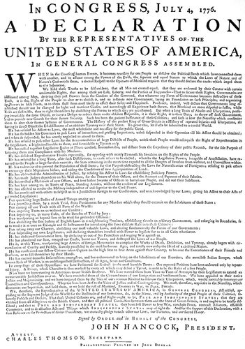
THE FIRST PRINTED DECLARATION
Fac-simile in reduced size (original type form about twelve by seventeen inches) of the Declaration of Independence officially printed about July 5, 1776. It was this setting of the Declaration that was read before Washington’s army. Reproduced direct from the original in the Congressional minute book of July 4, 1776
The ART & PRACTICE of
TYPOGRAPHY
A Manual of American Printing
INCLUDING A BRIEF HISTORY UP TO THE TWENTIETH CENTURY, WITH REPRODUCTIONS OF THE WORK OF EARLY MASTERS OF THE CRAFT, AND A PRACTICAL DISCUSSION AND AN EXTENSIVE DEMONSTRATION OF THE MODERN USE OF TYPE-FACES AND METHODS OF ARRANGEMENT
By
EDMUND G. GRESS
EDITOR THE AMERICAN PRINTER
AUTHOR THE AMERICAN HANDBOOK OF PRINTING
NEW YORK·OSWALD PUBLISHING COMPANY·1917
Copyright, 1917, by the
Oswald Publishing Company
TO THE TYPOGRAPHERS OF THE PAST WHO MADE THE ART HONORED AMONG MEN AND TO THE TYPOGRAPHERS OF THE PRESENT WHO ARE RESTORING TO PRINTING ITS ANCIENT DIGNITY THIS BOOK IS DEDICATED
TABLE OF CONTENTS
|
PAGE |
| |
| Author’s Preface |
vii |
| |
| Synopsis of Contents |
ix |
| |
| List of Reproductions |
xvi |
| |
| List of Designers |
xx |
| |
| |
| WHEN BOOKS WERE WRITTEN |
1 |
| |
| THE ORIGIN OF TYPOGRAPHY |
7 |
| |
| THE SPREAD OF TYPOGRAPHY |
13 |
| |
| TYPOGRAPHY IN COLONIAL DAYS |
19 |
| |
| TYPOGRAPHY IN THE 19TH CENTURY |
27 |
| |
| THE “LAYOUT” MAN |
35 |
| |
| HARMONY AND APPROPRIATENESS |
41 |
| |
| TONE AND CONTRAST |
47 |
| |
| PROPORTION, BALANCE AND SPACING |
53 |
| |
| ORNAMENTATION |
59 |
| |
| THE TYPOGRAPHY OF BOOKS |
67 |
| |
| BOOKLETS, PAMPHLETS, BROCHURES, LEAFLETS |
75 |
| |
| CATALOGS |
83 |
| |
| PROGRAMS |
91 |
| |
| ANNOUNCEMENTS |
99 |
| |
| TICKETS |
107 |
| |
| LETTERHEADS AND ENVELOPS |
111 |
| |
| BILLHEADS AND STATEMENTS |
119 |
| |
| PACKAGE LABELS |
123 |
| |
| BUSINESS CARDS |
127 |
| |
| THE BLOTTER |
131 |
| |
| POSTERS, CAR CARDS, WINDOW CARDS |
135 |
| |
| ADVERTISEMENTS |
139 |
| |
| NEWSPAPERS |
147 |
| |
| PERIODICALS |
151 |
| |
| HOUSE-ORGANS |
161 |
| |
| TYPE-FACES |
169 |
| |
| IMPRINTS |
195 |
| |
| |
| Appendix—GREETING CARDS |
|
vii
AUTHOR’S PREFACE
In the preface to the first edition of “The Art and Practice
of Typography,” the author stated that he did not
“anticipate again having the pleasure of producing a book
as elaborate as this one,” but the favor with which the
volume was received made another edition advisable, and
in consequence he has had the additional pleasure of enlarging
and revising it and of producing a volume even
more elaborate and with a better selection of examples.
The task of rewriting and replanning the second edition
was near completion when America entered the war
against Germany, and now, a few months later, the book
is presented to the public. The first edition was published
in February, 1910. Work on the new edition was begun by
the author in the latter part of 1913, and so great has been
the task, in addition to his customary editorial labors, that
almost four years have passed.
The extent of the work will be comprehended when it
is mentioned that there are twenty-eight chapters, in which
the illustrations or typographic arrangements, numbering
six hundred and fifteen, include forty full-page specially-printed
inserts. Most of these illustrations or typographic
arrangements are in color. The text matter, which
makes direct reference to the examples, totals nearly one
hundred thousand words.
That these examples are mostly high-class and by many
of the best typographers in America (Europe also being
represented), is due to the fact that the author during
his connection with The American Printer has received
several thousand pieces of printing, from which selections
were made for this work.
Great care was exercised in the choice of examples
in order that the book would not become obsolete, and it
is believed that most of the type arrangements shown will
be considered good for a hundred years to come. That
this is possible is proved by the Whittingham titles on
page 32, one of which is sixty-eight and the other seventy-three
years old at this writing. These titles were set up
when most typography was poor, yet few other type arrangements
of that time would meet approval today; which
indicates that it is not when printing is done, but how it is
done that makes it good or bad.
Attention should be called to the plan of this volume.
There are two parts, the first having to do with typography
of the past and the second with typography of the
present. Good printing of the present has a basic connection
with that of the past, and for this reason one part
is incomplete without the other.
The entire first part should be studied before any of
the ideas in the second part are applied to present-day
problems, and especially should the chapter on Type-Faces
be patiently read and studied. The printer should
first know type-faces and then learn how to use them.
In the chapters on Harmony, Tone, Proportion, Ornamentation
and other art principles the author does not
intend to advocate that his readers shall make pictures
with type or build pages that are merely beautiful. The
first requirement of typography is that it shall be easy to
read; the second is that it shall be good to look at. The
efficient typographer studies the copy and arranges it so
that the reader’s task is an easy and pleasant one.
In planning the second edition the general style of the
first edition was retained. However, an effort was made
to change the style, especially of the binding, but so satisfactory
was the original that it was again adopted.
The historical chapters in the first part have been revised
and slightly altered, but they are practically as before.
Extensive changes have been made in the second
part. The text has been thoroly revised, and better typographic
examples substituted in many cases. These chapters
especially have been greatly altered: Booklets, Catalogs,
Announcements, Letterheads, Billheads, Business
Cards, Posters, Advertisements, Imprints.
The chapter on Type-Faces is all new and has been
enlarged from ten to twenty-four pages. New chapters on
the following subjects have been added: Package Labels,
Blotters, Newspapers, Periodicals, House-Organs. In
place of the medley of contest specimens in the appendix
of the first edition, there are halftone reproductions of
more than one hundred attractive holiday greetings.
No one realizes more than does the author the minor
defects in typography, presswork and other details that
viiiare present in this volume, yet the effort of a Hercules
and the patience of a Job have been expended in making
everything as correct as possible. As the book now stands,
it is a reaching after the ideal, with human inability to
attain perfection. It is needless to point out imperfections;
the reader will discover them.
In his selection of examples and recommendation of
type-faces the author has been entirely free from pressure
from any source. If certain type-faces are favored,
it is because the author believes he is doing something for
the cause of good printing by favoring them. What has
been written has been written with sincerity.
It is well to mention that the “Pilgrim’s Progress” title
on page 21 is not genuine. Having seen the book on exhibition
at the New York Public Library, the author arranged
to have it photographed and included in this work.
The sequel to this is interesting and rather humorous.
When the chapter on Type-Faces was being written and
Caslon types were being studied, the author was startled
to find that the types used on the “Pilgrim’s Progress”
page were the same as those William Caslon was supposed
to have designed forty-four years later. Greatly puzzled,
the author made a trip to the library and examined the original.
He immediately saw that the type-face used on the
body of the book differed from that on the title. Discovering
a note on the fly-leaf signed by William Pickering,
the explanation dawned on him. The book was probably
owned by Pickering in the middle of the last century and
the title-page being missing a new one was set up, printed
and inserted when the book was rebound. It was Whittingham,
Pickering’s printer, who revived the Caslon types
about that time, and he naturally used these types as the
nearest approach to the English types of the period, 1678,
when “Pilgrim’s Progress” was first published.
It is impossible to mention by name all of those who
have in one way or another assisted and encouraged the
author in the production of this volume. A list of acknowledgments
would include typographers of international
note and typographers-to-be whose prentice hands need
guidance. It would include office associates and those of
the workrooms whose interest and attention to technical
details helped much in the effort to make the work worthy.
There is one, however, were such a list printed, whose
name would lead all the rest, the man who, back in 1903,
conceived the idea of this book; without whose business
support this elaborate and costly work would have been
impossible; whose ideals have been an inspiration; whose
confidence and encouragement generated the energy and
enthusiasm that have attended the author during the fourteen
years in which this work has been building. It is a
privilege to pay this tribute to John Clyde Oswald.
Edmund G. Gress.
ix
SYNOPSIS OF CONTENTS
The printer and typography—Definitions
and derivations of trade words—Printing
with separate types practiced
between 1450–1455—Books previously
written by hand or printed from wood—The
Middle and Dark Ages—Latin in
written books kept knowledge alive—Meaning
of “manuscript”—Writing materials—Arrow-shaped
writing of the
Chaldeans—Papyrus rolls of the Egyptians—Ink,
paper and block-printing supposedly
invented by the Chinese—Dressed
skins and palm leaves used by Hindoos—The
Hebrews wrote upon stones and animal
skins—We owe the present Roman
alphabet to the Phœnicians—The word
“alphabet” derived from the first two letters
of the Greek alphabet, Alpha and
Beta—The bards of Greece—Manuscripts
written by slaves—Papyrus imported
from Egypt—Development of parchment,
and what it is—The great Alexandrian
library—Length of rolls—Story of “Septuagint”—Destruction
of the Alexandrian
library—Rome supersedes Alexandria as
an intellectual center—Cæsar credited as
the founder of the first newspaper—“Short-hand”
writing—The period of Emperor
Augustus a memorable one in literature—Producing
large editions of manuscript
rolls—Books were plentiful and
cheap—Elaborate parchment rolls—Origin
of flat-sheet books—Hinged waxed
tablets—Destruction of the library at
Constantinople—Drift of literature toward
the East—Transcribing and decorating
holy writings in the monasteries
of Europe—Monopoly of learning gave
power to Church of Rome—Since the seventh
century monastery manuscripts in
Latin, the official language of that church—Translation
of Bible into “Vulgar
tongue” forbidden—William Tyndale’s
English translation—Martin Luther’s
German translation—Making of manuscript
books in the Middle Ages—St.
Benedict sets the monks to work copying
manuscripts—Popularity of cloisters—The
scriptorium and the rules governing
scribe or copyist—Tools and materials—Rubrics—Illuminating—The
copyist at
work—A beautiful Irish book—Illuminators’
colors and binding of manuscript
books—Missal, Psalter, Book of Hours—Donatus,
books associated with the Middle
Ages—First types were imitations of
current Gothic lettering—Types cut in
style of Roman lettering—Ancient Roman
writing all capitals—Evolution of Roman
capitals into small or lower-case letters—The
uncial and half-uncial—Minuscule
and majuscule—Development of writing
toward both heavy pointed Gothic and
the Roman style used by Nicholas Jenson—Cursive,
a “script” letter.
The invention of typography marked
the beginning of a new civilization—The
beginning and end of the Middle Ages—Printing
with separate metal types an
evolution—Demand for playing cards and
sacred pictures—Engraved wood blocks—Block
books, and method of printing
them—Coloring cards and pictures by
means of stencils—The oldest dated specimen
of printing—The first block books
probably Latin grammars—The “Art of
Dying,” the “Bible of the Poor,” and the
“Mirror of Human Salvation”—When,
where and by whom was typography invented?—The
inventor failed to print his
name on his product—Almost every European
country claimed the honor—All
claims disproved excepting those of Germany
and Holland—Weight of evidence
is with Germany—Typography was practiced
by Gutenberg at Mainz some time
during 1450–1455—Claims of priority for
Coster of Haarlem—Story of the invention
by Ulrich Zell the earliest testimony
on the subject—Dierick Coornhert’s version—The
unfaithful servant—Dignified
gray heads point out the house of “the
first printer”—Hadrian Junius and his
“Coster Legend”—Fashioning the bark of
a beech tree in the form of letters—Changing
the letters to lead and then to
tin—Old wine flagons melted into type—A
workman, John Faust, steals the type-making
instruments—Cornelis, an old
book binder—The story dissected—Peter
Scriverius has another version—A clap of
thunder—Confusion of dates—A statue
erected to Coster in Haarlem—“True and
rational account” by one Leiz—Gerard
Meerman’s story—The sheriff who printed
with wooden types—Robbed by a brother
of Johann Gutenberg—Jacob Koning
awarded a prize for his essay on the invention—Makes
researches in Haarlem
archives—Corroborates some details in
preceding stories—For many years Coster
given equal honor with Gutenberg—Investigations
by Dr. Anton Van der Linde—Forgeries
and misrepresentations revealed—Haarlem
practically surrenders
its claim and alters its school books—Records
of Louwerijs Janszoon and Laurens
Janszoon Coster—Van der Linde
goes to Germany, alters his name and
writes a book—Hessels translates the
book into English, and afterward becomes
a Haarlem advocate—Coster proofs are
weak—Haarlem claimants unable to agree
as to Coster’s identity—Gutenberg a tangible
human being, and probable inventor
of the art—Parentage of Gutenberg—The
family removes from Mainz presumably
to Strassburg—Was the new art practiced
at Strassburg?—Records of a lawsuit—Gutenberg
agreed to teach Andrew
Dritzehen certain trade secrets—Fust
lends money to Gutenberg and takes a
mortgage on his printing office—Fust
seizes all types, presses and books—Records
of this suit evidence of Gutenberg’s
invention—The famous Forty-two Line
Bible—Gutenberg again establishes himself
as a printer—An appointment from
the Bishop of Mainz—Dies about 1468—H.
Noel Humphrey’s tribute—Peter
Schœffer—Copies books at the University
of Paris—Becomes Gutenberg’s assistant—Assumes
charge after his master’s death—Marries
Fust’s daughter—The new firm
publishes a Psalter—First book with a
printed date—Features of the book.
The city of Mainz—A conflict between
two archbishops—The city is set afire—Fust
and Schœffer’s printing office burned—The
workmen flee to various parts of
Europe—A table of the spread of typography
from Mainz—In Germany—John
Mentel at Strassburg—Albrecht Pfister at
Bamberg—Ulrich Zell at Cologne never
printed a book in the German language—Arnold
Ter Hoorne first to use Arabic
numerals—Gunther Zainer at Augsburg
first in Germany to print with Roman
characters—Heinrich Keffer at Nuremberg—John
Sensenschmidt at Nuremberg
and Bamberg—The Bamberg Missal—Anthony
Koburger at Nuremberg had
twenty-four presses in operation—In Italy—First
type printing done in the monastery
at Subiaco—Conrad Schweinheim
and Arnold Pannartz brought from Germany—Ulrich
Hahn first printer in city
of Rome proper—John de Spira first
typographer at Venice and had exclusive
right—Nicholas Jenson comes to Venice
and uses a new Roman type-face—Story
of his introduction to the art—The first
page of displayed type composition—J,
U and W not in books printed by Jenson—His
office passes to Aldus Manutius—Italic
introduced—Aldus reduces the size
of books and suggests the printing of a
polyglot Bible—Works of Peter Paul
Porrus and Augustin Justinian—Aldus
xassisted by scholar-refugees from Constantinople—His
complete name—Venetian
printing offices and their product—Bernardo
Cennini at Florence—Johann
Numeister at Foligno—In Switzerland—Bertold
Ruppel at Basel—This city gave
France its first typographers—John Froben
at Basel—Erasmus has him print his
books—In France—Ulrich Gering, Martin
Crantz and Michel Friburger at Paris—Gering
becomes rich—Sectional wood
border on book printed by Philip Pigouchet
for Simon Vostre—Henry Estienne
at Paris—First of illustrious family of typographers—Robert
Estienne best known
and most scholarly—Flees to Geneva,
Switzerland, for safety—Dies there after
a labor of love—In the Netherlands—A
press erected at Utrecht—Colard Mansion
and William Caxton at Bruges produce
the first book printed in English—Van
der Goes at Antwerp—Christopher
Plantin at Antwerp gave renown to that
city—His printing office now a museum—A
polyglot Bible his greatest work—Louis
Elzevir, founder of a family of learned
printers, at Leyden—The second Louis
Elzevir at Amsterdam—Johannes Andriesson
at Haarlem—In England—William
Caxton the first to set type in that
country—Apprenticed to a merchant and
goes to Bruges—Becomes Governor—Enters
the service of the Duchess of Burgundy—Translates
a “Historie of Troye”
and learns how to print it—Returns to
England and sets up a press at Westminster
Abbey—Peculiarities of Caxton’s work—Wynken
de Worde succeeds to Caxton’s
business—Introduced the Roman letter
into England—Richard Pynson at London—Richard
Grafton as a printer of
English Bibles translated by William
Tyndale and Miles Coverdale—Tyndale
suffers death—Grafton imprisoned for
printing the “Great Bible”—Edward
Whitechurch his partner—John Daye also
imprisoned—Fox’s “Acts and Monuments”—In
Scotland—Androw Myllar
and Walter Chepman at Edinburgh—In
Ireland—Humphrey Powell at Dublin—In
North America—John Cromberger at
Mexico City—In the United States—Stephen
Daye at Cambridge, Mass.
TYPOGRAPHY IN COLONIAL DAYS
Martyrs in typographic history—Ecclesiastical
and political conditions in Europe
from the sixteenth to eighteenth
centuries—A book of treaties on the intended
marriage of Queen Elizabeth—Oliver
Cromwell encourages printing and
literature—First edition of Milton’s “Paradise
Lost”—Thomas Roycroft prints
Brian Walton’s Polyglot Bible—The first
book published in England by subscription—Paper
for the work allowed to come
in duty free—Cardinal Mazarin discovers
a copy of Gutenberg’s Forty-two Line
Bible—Chap-books and something about
them—Poor representatives of the art of
typography—Woodcuts and type battered
and worn—Peddled by chapmen—Dicey
books—Broadsides—Puritans land at
Charlestown and begin to settle Cambridge
and Boston—Rev. Jesse Glover
solicits money for press and types—Contracts
with Stephen Daye to come to new
country—Rev. Glover dies—Daye reaches
Cambridge with outfit—Begins printing
in 1639—The first work—The first book—Poorly
printed—President Dunster of
Harvard College appoints Samuel Green
to succeed Daye—Another press and
types added—An inventory—The printing
office discontinued—Printing in the
colonies of Massachusetts and Virginia—Pennsylvania
second English colony to
have typography—William Bradford
prints an almanac—Bradford arrested in
Philadelphia for printing an address—Type
pages as evidence—“Pied” by a
juryman—Bradford goes to New York—First
printshop there—Official printer—Publishes
the first New York newspaper—Benjamin
Franklin—Indentured to his
brother James—The New England “Courant”—James
is imprisoned—Benjamin
becomes the publisher—The brothers disagree—Benjamin
ships to New York—Meets
William Bradford and goes to
Philadelphia—Secures employment with
Samuel Keimer—Leaves for England to
buy printing equipment—Goes to work
in London—Returns to Philadelphia and
starts a printing office—One of the first
jobs—Publishes “Poor Richard’s Almanack”—Proverbs
widely quoted—Sells
his shop to David Hall—Quaintness of
Colonial typography—Comments on reproductions—Page
from a Caslon specimen
book of 1764—The work of Bodoni.
TYPOGRAPHY IN THE NINETEENTH CENTURY
William Morris’s declaration—The first
printed book a testimony to genius—The
first cylinder press and first linotype were
crudely constructed—Typography at its
highest point—Italian and German styles
contrasted—These styles blended into the
Colonial—Franklin as a typographer compared
to Aldus and Plantin—Beginning
of the nineteenth century—Utility and
art—William Nicholson plans a cylinder
press—Dr. Kinsley constructs a model—A
new roman type-face designed—Ornaments
and borders discarded—Style of
typography becoming uninteresting—Transition
illustrated by four title-pages—Charles
Whittingham and William
Pickering—Artistic qualities introduced—Punches
of Caslon Oldstyle recovered—A
page in Colonial style—Punctuation
marks omitted—Fifty years ahead of
their time—Job printing of modern development—Newspaper,
book and job
work—Typography should be based upon
art foundations—A Book of Common
Prayer—Title-pages without ornamentation—Job
printers take to fancy typography—Imitations
of copperplate engravers’
work—A business card and a bill of
fare—Changing styles applied to commercial
headings—MacKellar, Smiths &
Jordan—A card with apologies—A longing
for pictures, color and decoration—Brass
rule and tint blocks—Remarkable
skill exhibited—The “Modern Renaissance”—Machinery
led typography away
from art—Printers thought they were doing
artistic work—Inspiration wrongly
interpreted—Forming of a curious chain
of events—The Kelmscott Press—William
Morris, artist, poet, designer and craftsman—Franklin
and the Franklin stove—Morris
and the Morris chair—The influence
of Morris on house furnishing and
typography—His home—Learned to print
and to make paper—Designs type-faces—“Golden”—“Troy”—Draws decorative
initials and borders—Additional designs
by Burne-Jones—Morris criticised—Revolutionizes
typography—Aubrey Beardsley—Will
Bradley—A country printer—Studies
art in Chicago—The “Wayside
Press”—“Bradley: His Book”—Inspired
by both past and present—A new typography—Combines
with the University
Press—Becomes an interesting subject
for discussion—An opinion by George
French—Attempts another new style of
typography—Profuse ornamentation—Works
rapidly—Bradley and his clients—His
personality—Influence upon the
American style of typography—Other
influences-Theodore L. De Vinne—Has a
college degree—Apprentice in a country
printshop—Job compositor with Francis
Hart—Takes charge of the business—A
writer on printing subjects—Exponent of
the conservative and dignified in typography—Should
be no conflict between the
styles of Morris, De Vinne and Bradley—For
different purposes—The compositor
must decide—De Vinne a leader in perfecting
modern methods—Designs a type-face—Persuades
printers to group wording—Charles
T. Jacobi—Has done much
for typography in England—Responsibilities
of the modern typographer—Underrating
the value of history—All knowledge
is valuable.
[The chapters following are devoted
to the consideration of typography
as practiced in the twentieth century.]
Typography in the twentieth century—Compared
with the past—Perfection not
attainable—The spirit of the master
craftsman—Inspired work—The necessity
of careful preparation—Every printshop
should have a layout man—When a
building is erected—Quality printing is
xinot accidental—Shop style—Layout men
in large and small shops—Please the customer—Typography
essentially a business
vocation—Orders obtained thru “dummies”
submitted—Selecting a layout man—Type
equipment should be appropriate
and sufficient—A working outfit for the
layout man—Portfolio of sample sheets—Laying
out a small booklet—Paper, margins,
type page and size of type—Words
to a square inch—Arrangement of title-page—Specimen
pages in available body
type—Use of crayon and pencil—Dummy
submitted to customer—Duplicating it in
the workrooms—Dummy sheets for periodicals
and large catalogs—Incorporating
illustrations in the text matter—Marking
copy for machine composition—The
average stationery job—A patchwork of
typographic styles—Different results if
handled by a layout man—Studying color
harmony—Determining color combinations—The
colder color should predominate—Indicating
the finished result—Proofs
in the colors and on the stock to
be used—Blending paper stock—Laying
out advertisements.
HARMONY AND APPROPRIATENESS
“Leit-motif”—The central idea in composition—Harmony
and appropriateness—Undervaluing
their importance—What
is appropriate?—Discriminating judgment
required—Discreet selection of type,
ink and paper—It makes a difference—As
to type-faces—As to inks—As to papers—Simplicity
synonymous with good
typography—The ideal printshop—Harmonious
type-faces, ink colors and paper
stock—Certain amount of contrast desirable—All
capitals or all lower-case—Harmony
of type-faces and borders illustrated—Typographic
sins—In typography
there should be a motive—“Is it appropriate?”—An
architectural motive—In
which strength is the motive—Design suggested
by an old lock-plate—Typographic
motive found in woodcut borders and initials
of early printers—A millinery booklet
cover—A page severely plain and
non-sentimental—A program for a church
service appropriate to the environment—A
page in keeping with a festive spirit—Typographers
should give support to
artists—The Colonial arch and a title-page—The
better the typographer, the
more restraint will he exercise.
A story of white and black—A combination
popular with writers, printers and
readers—Uniformity of tone or depth of
color—A mixture of irregular gray and
black tones inexcusable—Art principles
too often ignored—Contrast necessary,
but uniformity should not be sacrificed—Art
makes concession to utility—A right
way and a wrong way—Unjust blaming
of the customer—A German example of
uniform tone—Practical demonstration of
uniform tone—Four ornaments, upon
which four pages are constructed—Contrast,
from the viewpoints of art and
utility—Lessening the contrast between
print and paper—A compromise—Impressing
the print firmly on antique paper—Setting
the print daintily upon glossy
paper—Lack of artistic feeling responsible
for unpleasant contrasts—Great contrast
is eccentricity—Mark Twain and contrasts—Cover-page
should be darker than title-page—The
tone of a massed page—Controlled
by spacing—Duplicating the tone
of a pen-and-ink illustration—A spotted
black tone—Equalizing the tone by using
lighter ink—Spaced capitals and open-line
illustration—A classic interpretation
of uniform tone—Characteristics and tone
superbly blended—Initial and headpiece
should approach the tone of the type page—Uniform
tone between display line and
border—Catalog illustrations should stand
out in relief—Outline type-faces to obtain
gray tone on newspaper page—Letterspacing—All
lines should be similarly
spaced—An unusual heading.
PORTION, BALANCE AND SPACING
Symmetry is necessary to beauty—What
has art to do with printing?—Two
views—The book printer and the job
printer—Pleasing the few or being all
things to all men—Printing as a business
and as an art—Art is essential to printing—Study
of art arouses ambition—Unfolds
a new world—Proportion—Book
pages—The width and length of a page—Position
of the page—Margins—The job
printer and proportion—Relation of shape
of type-face to page—Condensed types
for narrow pages—Extended types for
wide pages—Architecture as an example—Vertical
and horizontal lines—The relation
of lines to proportion—A page with
ornament, type-face and page design in
proportion—Irregularity and when it may
be introduced—A type line large or small
by contrast—The happy medium—Balance,
an important subject—Type lines
horizontally centered—Safety from blunders—Out-of-the-center
balance—The
point of vertical balance above center—Testing
balance to the limit—Diagonal
arrangements show lack of imagination—Spacing—Its
proper apportionment—An
important feature when letters are
designed—The capital L—Emphasis by
means of spacing—The effect of separate
lines—Should be an even page tone—Distributing
display lines over the entire
page—Grouping them at the point of balance—Spaced
words in narrow measures—A
good sign when one recognizes imperfections.
The human race has a liking for ornamentation—Natural
and artificial beauty—Nature
furnishes motives for man’s
work—The average man giving thought
to art—Beautiful things all about—Privileges
of museums and art galleries
available to printers—Take less thought
of food and raiment and these things shall
be added—Is ornamentation necessary to
art typography?—Paper as embellishment—Covering
poor stock with decoration—Ornaments
under lock and key—Revising
ideas of art—Abstinence—Using ornaments
with discrimination—Study of significance
and appropriateness—Motive or
reason in ornamentation—Italian and
German influences—Harmony because of
sympathy between arts and crafts—Inharmonious
ideas of several persons—Relation
of typography to architecture
shown in alphabets—Roman and Gothic—Ornamentation
both inventive and imitative—Conventionalized
ornament—With
or without perspective—Things which
have inspired the decorator—Artists’
work full of meaning—Leaves, mythical
beings, sacred animals—Architectural designs
on title-pages—Egg-and-dart and
bead ornaments—Results of observation—Designs
thousands of years old—Typographic
borders—Triple division of taste—The
severely plain, Doric—The slightly
ornamental, Ionic—The elaborately ornamental,
Corinthian—Sturdiness and grace—Difference
in ideals and preferences—Some
delight in magnificence, others in
plainness—The three divisions of taste
applied to typography—The style of architecture
and home furnishings influence
typography—The “mission” style and
straight lines—The frivolous rococo style
and curved lines—Rococo type ornamentation
not successful—A style to please
those who like neither the severely plain
nor the elaborately ornamental—Ornament
secondary—Should not distract attention—Excess
of embellishment—Chippendale
first made furniture serviceable,
then added ornament—Regularity and
variety in repetition—Four classes of ornament—Based
upon geometrical lines,
upon foliage, upon the inanimate, and
upon the animate—Initials as means of
ornamentation—Corner ornaments—Decoration
with a motive—Reversing half of
a design—A page with but a single ornament—Present-day
preferences are for
Gothic rather than for Italian type ornaments—The
reason—Ornamentation.
Good taste important in production of
books—Judgment perfect in one respect
and erratic in others—Good taste and
conservatism—Catering to fashion leaves
unsalable stock—Conservatives are few—Printed
xiithings that please for the moment—Art
reasons in book typography
applicable to job typography—The job
compositor drawing closer to his book
brother—The book typographer governed
by precedent—The conservative man constructive—The
radical destructive—Masterpieces
discarded for frivolous things—Morris
set out to change book typography—He
offered the good things of the old
masters—Age not proof of merit—Good
typography always good—Book industry
in America tremendous—Carnegie at first
ridiculed, now acknowledged a benefactor—The
need of good books well printed—Majority
of books poorly printed—Rarely
do reading pages, title-page and cover
harmonize—Cover only part given artistic
attention—Should be honestly what it
seems—A book model in its way—Not a
line in capitals—Only two sizes of type
on title-page—Chapter headings cling to
type page—Margins—Surface covered—Proportion—Bruce
Rogers—Designs
books for the Riverside Press—Regard
for the appropriate—The literary motive
the cue—Suggesting a product of the
middle nineteenth century—Two pages
with faults—Inharmonious typography—The
cost of an appropriate title-page
ridiculously small—Provide display faces
to match machine letters—Artist and typographer
and the literary motive—Composite
Colonial and modern—Unfinished
effect—Books that lend themselves to
decoration—Serious books—Typographic
results exceptionally good—General use
of border—Title page an excellent example—Reading
matter close to border—One
margin—Style of the modern novel—Modern
book composition set on the linotype—An
unconventional page—Page from
a book written and illustrated by Will
Bradley—Harmony between type-face
and decoration—Effectiveness of a plain
initial—Title-page of classic design—Dignified
beauty—Classic feeling in a
modern title-page—A serious effort by
the Roycrofters—Page from a book by
De Vinne—An ecclesiastical book by Updike—Improving
typography in America—A
book with a French motive—Avoiding
commonplace types—Fonts from old
matrices—Specially designed faces—Arrangement
of a book—Fly leaf, sub-title,
title-page, copyright notice, imprint, table
of contents and illustrations, preface,
frontispiece, dedication, index—Numbering
the pages—The space under running
titles—Lowering of the chapter headings—The
space around initials—Position of
a book page—Em-quad or en-quad between
sentences?
BOOKLETS, PAMPHLETS, BROCHURES, LEAFLETS
Misuse of the word “booklet”—Definitions
of booklet, pamphlet, brochure, leaflet—Chap-books—The
booklet’s mission
educational—Users—Ideas of writer and
artist should be blended—Harmonious
and complete—Printers have many artists
to select from—The connecting link between
job typography and book typography—Blending
the typography with a
lettered title-page—Pure typographical
effects—Approved faces—Three series
only—A page one likes to read—Reluctance
to explore the past—Understanding
of typography—Type alone can be effective—Good
typography to be preferred
to poor art work—Distinctive features—Space
between sentences—Dignity in lettering
and decoration—Title labels—A
small amount of reading matter—Placing
an illustration that is out of proportion—Care
in the details of typesetting—Results
of careless typography—Buyers
slaves to conventionality—Newness and
bright coloring that gets attention—Lower-case
letters for capitals—Interesting
decorative headings—The initial furnishes
a spot of black—No decoration of
any kind—Depending on type-faces and
paper for results—Swash italic capitals
and letterspaced capitals—Chapter heading
not sunk—Suggestions from lettered
designs—A standard type for old-style
effects—Lettering in Caslon style on blue-prints—A
memorial volume—Strict typographic
harmony—Suggesting such volumes-Japanese
paper printed on one
side—Simple typography—Living in an
artistic atmosphere—Printing journals—Specimen
booklets for study purposes—Printers
depend too much on artists—Possibilities
of type arrangement never
exhausted—Working together.
Three branches of architectural virtue
applied to the catalog—Act well, speak
well, look well—The days when the catalog
was a heterogeneous collection of
woodcuts and type-faces—Now care and
taste shown—The catalog a portable show
case—Proper display of goods makes selling
easier—Playing up the ordinary—A
block of marble, rough and carved—Standardizing
the dimensions of catalogs—Engineers
recommend standard sizes—Other
suggestions—Overlapping covers—Titles
on exposed backs—Date—Index
card inclosed—Copy should be legible—A
dummy should be passed on—Decoration
supplemental—Expressing personality—The
penalty of being an average
typographer—The envy of master printers
of old—Horizontal position of illustration—Brass
rule well used—A design
full of character—Description facing illustration—Small
amount of reading matter—Red
borders—Variety and interest
by simple means—Cover-page built on an
illustration—Modern German typographic
ideas—Bold type desirable when color is
to be shown—An art museum catalog—Securing
value from background—Technical
details kept orderly—A book-catalog
page—Rule border adds decorative
quality—Typography seldom receives the
attention it deserves—An uncommon catalog
page—Tabular treatment for a high-class
wine list—The stone rejected by
the builder—A dainty German page—A
legible ornamental letter—Absence of roman
lower-case—Appropriate woodcut—Marginal
distribution—Realistic pictures—Gloves
well shown—Usual method of
selling—Tabular matter.
“Let all things be done decently and in
order”—Four classes of programs—Programs
of sacred services—Offer opportunity
for artistic treatment—Significance
an important element—The key to
ecclesiastical printing—Rubrics—A modern
interpretation of the historic—Pointed
Gothic type-face—Uncial rubricated initials—Red
lines—A significant device—Prejudices
among clergymen—A churchly
aspect by rubrication—Arranging numerous
small titles—Economizing space—An
almost perfect specimen of church
program printing—A specialist on church
typography—Program of lenten services—A
small program, with a page for each
event—Arranging a program with little
matter—The dance program—Should be
dainty—Stock folders—Must “look like a
dance program”—A typographic dance
card—Centered dots in place of periods—Uniform
border treatment on an outing
program—An unconventional dance program—Banquet
programs and varied
treatments possible—Value of the decorative
border—Arrangement of type matter—A
background in olive—The menu program
in small booklet form—Menu dishes
in the form of checks—“Hash” and “Rehash”—A
bit of fun—A classic menu-page—A
style appropriately humorous—Eating
in a foreign language—Side hits—Artistic
treatment simulating woodcut decoration—A
simply constructed menu page—Unique
arrangement—Titles at the left—Symmetrical
arrangement—Programs
for entertainments and exercises—The
commonplace program a disappointment—Artistic
programs—A refined page by
Updike—Features of interest in a page
by Rogers—Admirable treatment of a
brief program—Appropriate decoration
overprinted by type—A page dominated
by the Gothic style—List of characters
unusually displayed—A neat page in Caslon
type—The program containing small
advertisements—Theater programs exert
influence on public taste.
Publicity essential to success—Announcements
the modern representative
of the public crier—Not confined to any
xiiisize or shape—Often consists of only one
page—The most personal of printed mediums
of publicity—The printer depended
on for suggestions and advice—Confidence
of the customer an asset—Imitation
engraved announcement the most common—Allows
of no original or decorative
treatment—The cobbler and
tinker—Satisfaction from work well done—The
uncommon typographer not governed
by usual warnings—An announcement
folder of a quality seldom attained—Points
of interest in a Caslon page—Black
text letter and a generous size of
sheet—Sturdy masculine lettering—The
human quality of imperfection—A cartoonist’s
task—Broad strokes make a liberal
showing of color possible—Classic
dignity—Ornaments as eye-attractors—A
postal-card announcement—One-tenth
manual labor and nine-tenths brain exercise—Mistake
to make type-face very
large or very small—Obtaining variety
and emphasis by use of italic and small
capitals—Spacing of lower-case—One
size of type only—Division into two type
groups—A study in tone values—Harmony
of type-face and decoration—A
brief announcement—Colonial effects—Appropriate
typography based on an
early newspaper—Lack of margins and
absence of print—Heavy- and light-faced
rule—Greater legibility when lines are
separated—A misplaced initial—A blotter
announcement—Printers’ own announcements.
Good results by accident—A good job
of printing should be an everyday occurrence—Lack
of interest reason for non-development—Any
man not interested in
his vocation to be pitied—Thought concentrated
on typography—Efficiency a
guarantee—Accept responsibilities—The
first observations of a student—“None
perfect, no not one”—Tickets afford practice
of art printing—Many themes and
styles in typography—Resourcefulness a
valuable characteristic—Ticket forms especially
designed—One based upon a
classic motive—An idea from ancient
Rome—Capitals slightly spaced—The
historic Gothic or church style—Contrast
by the use of color—A modern conception
with a masculine motive—The margins
of two styles—An odd and striking
effect—Modern treatment based upon the
Colonial—A bookish effect—An idea for
a lecture course—White or colored stock?—A
ticket of peculiar interest to women—The
geometric or secession style—Enthusiasm
over new styles—Building a
house in the sands—Square-faced type
and square ornaments—An adaptation of
the missal style—Inspiration from William
Morris and Italian printers—For
educational and art functions—A motive
from the art workers of the Middle Ages—A
modern application of classic type
effects—A purely Colonial effect—Dainty,
refined treatment and symbolic decoration—Typography
that is distinctly masculine—Orange
is lighter than black in
tone—An arrangement dictated by an ornament—A
ticket not easily duplicated—Color
background—Corner decoration in
keeping with the subject—A motive from
early French books—Typographers should
go thru the world with eyes open.
Standard sizes—Single leaves and the
folded note sheet—Official envelops—Folding
the sheets—Printing on fourth page—Society
stationery—Ruled sheets seldom
called for—Paper and typographical
treatment of letterhead and envelops
should have relation—Style of professional
stationery seldom changes—Simple,
neat, refined typography—Color seldom
well used—Styles furnished by lithographers
and steel-die printers—Work
along standardized lines—A letterhead
one form of advertising—Two tones of
type-face for much copy—Elaborate
treatment seldom advisable—All matter
in one group—Blank space a factor—Brief
copy—Use of a decorative device—A
harmonizing border—A meeting announcement—Suggesting
an architectural
panel—Appropriate to the business—All
lines of same length—For a general
store—Resetting of a “brick” letterhead—Too
literal—Injection of individuality—Something
different—Attractive club
stationery—Typographic neatness—A
copperplate letterhead—Two distinct
groups—Italic on a heading—Inclosing
type matter in a panel—A line border
finishing off the edges of a letter sheet—A
spot of decorative color—The cross-line
panel—German treatment—Notehead by
a book typographer—Humor—Envelops
a convenience—Its purpose and use—Advertising
possibilities—“After five days
return to”—Medieval character—Bringing
out the business—An envelop corner
that is artistic—Elaborate treatment.
Suitable and dignified type composition—Should
correspond in style to that
of letterhead—Standard sizes—Allowance
for head portion—Window envelops—Change
in arrangement—Billheads of a
quarter of a century ago—Features of the
average billhead or invoice—Composition
of a billhead—Transforming a letterhead
into a billhead—Classic typography—Typographic
art and good taste on a billhead—Stationery
of a book dealer—Printing
on colored stock—Lower part
divided into columns—A decorator’s stationery—Business
stated in firm name—Credit
bills—Use of the statement—Other
forms used in business.
Effectiveness of an attractive package
label—Good clothes and the package—Selection
of wrapping stock—Appreciation
of neat wrapping—Druggists excel—The
art of making a good impression—Twine,
gummed-paper tape, corrugated
board—The printed label as a spot of attraction—The
wrapping paper as a background—Two
labels of contrasting treatment—Stronger
label striking—Labels
not usually seen at close range—No
standard size—Stock that pastes easily—Hand
lettered labels as studies—Italic
with a decorative quality—A label design
with no border—Suggestion of Italian
art—Closely-spaced black-toned lettering—Artistic
quality and interest by
means of typography—A study in black
and white—The Aldine combination—Border,
decorative device and lettering in
the same key—A label design that could
be improved—A Goudy type arrangement—Label
with address printed in—Stock
labels should be studied.
Courtesies of business—The business
card as an introduction—Sizes of cards—White
cards predominate—An attempt at
standardization in arrangement—A model
of dignity—Featuring the individual’s
name—Contrast in tone—A specimen of
hand lettering—A design of strength and
interest—An attractive black monogram—Decorative
device in color—An interesting
contrast—High-hat and frock-coat
treatment in French style—Arrangement
in blocked Caslon capitals—Decorative
device in tint—Roman capitals with italic—A
representative German card—The
word “decorators” furnishes the cue—Italic
for dainty effects—A strong, simple
arrangement—Classic arrangement in
one size of type—Much information on a
card—Decorative treatment that could be
merged with the stock—Horizontal rule
lines—A card in Bodoni—More than one
right way—Styles available for all likes
and dislikes—Character and personality
expressed typographically—More individuality
now permissible—Copperplate
engravers set the style for much business-card
printing—How to obtain results.
Business cards and blotters—Less restraint
and dignity—Coarseness should
be avoided—No longer an experiment—Advertising
values—The size—Enameled
surfaces—A model typographic blotter
with calendar—Treatment should be simple—One
design of type-face—Blank
space liberally distributed—Natural freedom—Most
blotters contain too much
xivtype matter—Relief from sledge-hammer
advertising—Blotter for personal checkbook—Good
taste—For a convention—Pleasing
factors—Strong contrasts—Reading
the message as the signature is
blotted—Masculine treatment—The character
of an architectural panel—Pleasure
in using—Material that is used and
material that is not used—A model of
good taste in blotter typography—The
test of time—A neat, refined arrangement—The
use of large type—The narrow way—Gray
features—A touch of appropriateness—Other
features.
POSTERS, CAR CARDS, WINDOW CARDS
Poster printing a specialty in large
cities—Type equipment well selected, but
not elaborate—Blend of type-faces—Standard
job faces duplicated—Sizes of
posters, car cards and window cards—Color
and lettering—What the poster
should be—Viewed at closer range—Typographic
effects in poster printing—A
poster that measures up—A study of
composition—Contrast of color—Card in
conversational style—Using types in a
sane, simple manner—Strong simplicity—Refinement
in theatrical printing—A
strong poster in gothic and “secession”
border—Making the typography appropriate-Shakespearean
typography—Decoration
reproduced from original sources—Usefulness
of a library of books—A
hanger in one size of type—The Colonial
style of type arrangement—Why cardboard
is used—Suggested arrangement
for excursion card—Printers and poster
printing—The best sale-bill compositor in
the country—Work should be done profitably—Poster
printing on a large scale.
Advertisements, business men and printers—Blame
for ineffectiveness—Treating
the advertisement typographically—Study
of good type work, advice and
judgment—Oratory—A good speaker and
a good typographic advertisement—Print
too small or too large—Bluntness and
forcefulness—Decorative attractiveness—Emphasizing
significant parts—The
difference between setting type with a
stick and setting it with the head—Assuming
a new formation—A multiplication
of small advertisements—Easily
read, conversational style of advertisements—Not
much to say—Popularizing
zinc—A well-treated signature—One of
many clever advertisements—A peculiar
department-store advertisement—Problems
of the country newspaper—Typography
influenced by the article advertised—Text
types in advertisements—Harmonious
suggestion—A long list of cities
and agents—Selling costly automobiles—Suggesting
Roman architecture—Text
group in upper right corner—Little display—Blank
space well used—Interesting
country-newspaper advertisement—Classified
advertisements well displayed.
Neutral gray—Building suitable and
harmonious typographic form—Problem
simpler in early days—The ideal newspaper—The
title—Distinctive in design—Text
letters—Using the ends of titles—Slogans
and quotations—Date lines—The
text—Small type—Narrow columns—Lengthy
excerpts indented—The headings—First
newspaper a letter and not set off
by headings—Side headings—Wars developed
display—Advertising the contents—Condensed
type necessary—Harmonious
type lines—Italic to overcome monotony—Paneled
headings—A four-deck single-column
heading—The make-up—A good-looking
newspaper—Alternating large
and small headings—No advertisements
on front page—Position of article of most
importance—Paneled news—Editorials—Usual
position—The sporting page—Building
advertisements from the lower
right corner of the page.
Making publications attractive—Letterer
and decorator—Circus poster type—The
poor always with you—Many periodicals
good to look at and easy to read—The
dimensions—Nine by twelve inches
a favorite with technical publications—Three
groups for magazines—Growing
larger—Pocket magazines—The front
cover—Paintings—Decorative designs—Paid
advertisements on the front cover—Appropriate
views in halftone—Columns—Number
decided by size of type—Wide
columns strain the eyes—Gutenberg used
two columns—Small type in very wide
measures—The margins—Proportions as
in good books—Good margins spoiled in
bindings—Type-faces for the text—Chosen
for legibility in small sizes—Separation
with one-point leads because of lack of
descenders—Difference in type-faces
printed on coated and antique-finished
paper—Lines need to be separated by
leads—Should be well-formed as well as
readable—Thin lines should be cut a trifle
stronger—Type-faces for the headings—Same
design as type for text matter—Desirable,
but not always possible—An
instance—Large, black headings should
be avoided—Slightly decorative panels—Editorial
headings and titles—Make-up of
the illustrations—A background of gray—Well
balanced—Text matter between illustrations—Same
style on facing pages—Arrangement
of headings—They sell
the contents—A well-advertised story—The
captions—Centered under illustrations—In
two parts—Lines of same length—The
editorial pages—No standard style—Unlike
other reading pages—Features—Verse
in italic—Restraint necessary—The
advertisements—Bold types overshadow
text pages—Good taste—Not to be
mingled with text matter—Treatment
need not be timid or blustering—When
advertisers are best served.
Little brother of the periodical and
newspaper—Smallest and largest dimensions—Favorite
sizes—Self-covers and
covers that are separate—Not many pages—Published
regularly-Titles—Number
of columns—Margins—Type-faces—Headings—House
advertising—Illustrations,
descriptions and prices—Mistake to
use dark types with illustrations—Ideal
typographic treatment—Useful and informative—Light
matter to maintain interest—Features—Borders
and initials—Almanacs—House-organs
on blotter stock—In
newspaper style—A western printer’s
expression—Specimens of actual work—Too
much copy—Loose inclosures should
not prove a nuisance—Return post cards—Postal
regulations.
Type-faces not easily remembered—Naming
and numbering—Six representative
standard Roman type-faces—Legible
and good-looking and possessing character—Caslon
Oldstyle—Scotch Roman—Cheltenham
Oldstyle—Cloister Oldstyle—Bodoni
Book—French Oldstyle—Private
type-faces not considered—Permanency
and investment—Cloister Oldstyle based
on Jenson’s Roman letter—Not the first
Roman type—Caslon Oldstyle—A historic
American type-face—Approved by good
printers as the best and most useful Roman
face available—Difficulties in machine
composition—Not an entirely new
Roman letter—Story of its designing—Ill-treated
by modern founders—The revival—Bodoni
Book—Refined and legible—Its
history—Modern ideas of improvement—Scotch
Roman—The link connecting
the graceful old-style and the severe
modern Roman—French Oldstyle—Capitals
especially pleasing—Cadmus, the
Mayeur letter—Cheltenham Oldstyle—Designed
in America and developed into
a numerous family—The space above the
line emphasized by long ascenders—Used
for narrow booklets—Capitals awkwardly
large—Development of the Roman type-face—In
the beginning Roman letters
were in capitals only—Lower-case letters
in formation—Black Letter and
White Letter—Jenson fortunate in the
selection of a model—Comparisons—A
change in form—Moxon’s drawings of
the alphabet—Made into type—Baskerville’s
xvtypes rival Caslon’s in beauty—Bodoni
threw typography out of gear—His
types not so dressed up and finished as
at the present time—Modernized Oldstyle—Characteristics
of Roman type-faces—The
serifs—Has a decorative quality—Oldstyles
and Moderns distinguished by
serifs—Thick and thin strokes—Makes
lettering interesting—Their distribution—Characteristics
of pen-made letters—Ascenders
and descenders—Beauty in the
strokes—False logic—Proportion of letters—Old
Roman capitals as models—Uniformity
in width revealed in typewriter
type—Legibility of type-faces—Type
matter should be easy to read—Tests
for legibility—Printing on a hard-finished
paper and a soft-finished paper—Decided
contrasts tire the eye—Lower-case
more legible than capitals—Space
between lines necessary—Space between
words—Advantage of close spacing—Possible
in machine composition—Words
more easily read than letters—Group of
words almost as easily read as one word—Length
of line—Recommendations—Size
and kind of type should be considered—Measuring
one and a half alphabet—Technical
and optical reasons—Testing
newspaper types—Approved type sizes
and leading—Dr. Cohn’s measurements—Italic
types—The mate of Roman types—Was
first cut by Francia for Aldus—Not
merely an inclined Roman—Moxon’s Italic
letters, including Swash capitals—Text
faces—Fashioned after Black Letter writing—Other
names—Block types—An unfinished
Roman letter—Poster rendering
in black tones—Bold types—Many could
be dispensed with—Ornamental types—Types
for special purposes—The influence
of Frederic W. Goudy on typography.
The printer should regularly use his
name and device—Neglect and fear of
customer’s condemnation—Should mark
his product as other craftsmen and manufacturers
do—A guarantee of quality—How
the innovation could be introduced—A
precaution—Imprint should be unassuming
and inconspicuously placed—Various
uses—First use of a printers’
decorative device—Historical uses of distinguishing
marks—Emblems of hospitality—The
sign of the Cross—Printers
should select a device and attempt to live
up to it—The Gutenberg Bible contained
neither device nor printed name—Fust
and Schœffer’s Psalter first book with imprint—The
colophon-A decorative device—Its
significance—Imitated—As used
by a descendant—The classic Aldus device—Pickering
uses it—Others adopt it—Bruce
Rogers’s interpretation—The imprint-device
of the Venetian Society of
Printers—Its significance—Emblem of
authority—The most popular of old imprints—Hubbard
adopts it—Used on biscuit
packages—Other adaptations—Caxton’s
imprint device—Resembles a rug—Characters
cause discussion—A trade device
used by the merchants of Bruges—A
merchant’s memorial plate—De Worde
adapts the device—Morris’s device resembles
De Worde’s—The device of the German
master printers—Typothetæ—A modern
adaptation—The British printer and
the pun—Daye and Myllar—Froben’s imprint—Devices
of Bebel, Plantin, the Elzevirs,
Tory, Dolet and Estienne—Devices
very large in the old days—Ancient motives
in two modern devices—The winged
Lion of St. Mark—Recent adaptations—Story
of the device—A colophon-imprint—Designs
with ancient motives—The
unique mark of the De Vinne Press—Imprint-devices
based upon architectural
motives—Initials in monogram form—Representative
devices used by commercial
printers—Decorative imprints with
typefounders’ material—Harmony of
type, rule and ornament—Small type imprints—Where
should an imprint be
placed—On books—On small commercial
work—A legitimate opportunity for publicity
that should be.
xvi
LIST OF REPRODUCTIONS
- The scribe at work, opp. p. 1
- Assyrian clay tablet, p. 1
- Ancient Roman reading manuscript, p. 2
- Roman waxed tablet, p. 3
- The Egyptian “Book of the Dead,” p. 3
- Evolution of the alphabet, p. 4
- Capital letters of the ancient Romans, p. 4
- Uncial letters of the sixth century, p. 5
- Half-uncial letters, p. 5
- Gothic letters of the fifth century, p. 5
- Page from the “Book of Kells,” p. 6
- Portion from Fust and Schœffer’s Psalter of 1457, opp. p. 7
- French playing card, a block print, p. 7
- Image print of 1423, p. 7
- Bible of the Poor, from block book, p. 8
- Text page from the block book “Ars Moriendi,” p. 8
- Page from an engraved wood block, p. 9
- Page from separate metal types, p. 9
- Two pages from the Huntington copy of Gutenberg’s Bible, p. 12
- Decorated page from Gutenberg’s famous Bible of Forty-two Lines, opp. p. 12
- The Venetian style of typography and decoration, opp. p. 13
- The spread of typography (table), p. 13
- Page printed by Koburger, p. 14
- The first displayed composition, p. 14
- A page from the famous Bamberg Missal, opp. p. 14
- The first italic, a page by Aldus, p. 15
- Specimens from Plantin’s Polyglot Bible of 1569, pp. 16, 17
- Gothic ornamental pieces, from a “Book of Hours,” p. 16
- Page by England’s first printer, p. 17
- Page in English by John Daye, p. 18
- The first Psalter in English, p. 18
TYPOGRAPHY IN COLONIAL DAYS
- A title-page of 1655, with much type display, opp. p. 19
- First book printed in English America, p. 19
- Title-page of a Shakespeare book, p. 20
- First edition of “Pilgrim’s Progress,” (reset by Whittingham), p. 21
- First issue of the London “Times,” p. 21
- Page from a chap-book, p. 22
- Page from “Description of Trades,” p. 22
- French specimen of 1742, p. 23
- Caslon types and ornaments, p. 23
- First edition of “Paradise Lost,” p. 24
- Two pages from “Poor Richard’s Almanack,” p. 25
- Italian specimen of 1776, p. 26
- Pages from Bodoni books of 1789 and 1806, p. 26
TYPOGRAPHY IN THE NINETEENTH CENTURY
- A Morris title-page and text page, opp. p. 27
- Page from a “Book of Common Prayer,” p. 27
- A design of the rule-curving period, p. 28
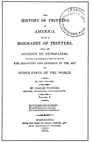
- Title-page of 1810, p. 28
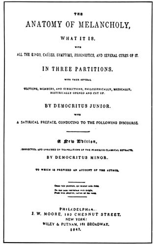
- Title-page of 1847, p. 28
- Title-page of 1872, p. 28
- Title-page of MacKellar’s “American Printer,” p. 29
- A banquet program of 1865, p. 29
- From a type-foundry specimen book of 1885, p. 30
- A business card of 1865, p. 30
- A business card of 1889, p. 31
- Stationery composition of 1870, p. 31
- The panel as used in 1893, p. 31
- A neat letterhead of 1897, p. 31
- Title-pages by Charles Whittingham, p. 32
- Bradley’s adaptation of the Colonial style, opp. p. 32
- A Jacobi page of 1892, p. 33
- A Bradley page in lower-case, p. 33
- A Bradley page in Caslon capitals, p. 34
- A De Vinne page, p. 34
PART TWO
(The index figures refer to the number of the example)
THE “LAYOUT” MAN
- Booklet cover-page laid out with pencil and crayon, 1
- Anticipating the appearance of the printed page, 2, 3
- Ascertaining color combination with crayons, 5, 6
- Laying out copy for machine composition, 4-a, 4-b
- Table for ascertaining the number of words to square inch, 7
- Notehead set without instructions, 8
- Business card set without instructions, 9
- Label set without instructions, 10
- Notehead laid out for compositor, 11
- Business card laid out, 12
- Label laid out, 13
- Layout of a cover-page, 14
- Cover-page as set from instructions, 15
- Layout sketch for a cover, 16 (insert)
- The cover printed as indicated, 17 (insert)
HARMONY AND APPROPRIATENESS
- Harmony by the use of lower-case, 18
- Harmony of type-faces and borders, 19
- An architectural subject treated appropriately, 20 (insert)
- A booklet cover suggestive of the subject, 21 (insert)
- Cover suggested by old lock-plate, 22
- An old lock-plate, 23
- Inscription on a Roman arch, 24
- Cover-page for a catalog of books, 25
- A plain page for a plain purpose, 26
- Treatment appropriate for a church program, 27-a
- Portion of a page of an old manuscript missal, 27-b
- Cover-page for a catalog of decorative materials, 28
- The Colonial arch, 29
- Title-page in semi-Colonial style, 30
- Contrast in color and tone, 31
- Uniform tone and contrast of black and white, 32
- Four ornaments, each of a different depth of tone, used in the construction of four pages, 33, 34, 35, 36, 37
- Extremes of tone on book pages, 38, 39
- Blending of illustration and text, 40
- Spotted black tone of border and text, 41
- Blending of illustration and type-face, 42
- Uniform tone in classic typography, 43 (insert)
- A study in uniform tone, 44 (insert)
- Tone-blending of initial, headpiece and text, 45
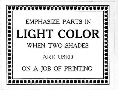
- Emphasis of parts to be printed in light color, 46, 47
- Display lines should match the border in tone, 48
- Uniform tone by equal spacing, 49
PROPORTION, BALANCE AND SPACING
- One method of determining the page length, 50
- Another method, 51
- xviiThree widths of type-faces, 52
- Type page in which vertical lines predominate, 53
- An architectural comparison, 54
- The conventional page shape, 55
- Type page in which horizontal lines predominate, 56
- An architectural comparison, 57
- Page in which ornament, border and type-face are in proportion, 58 (insert)
- Pages in which the type-face is not in proportion, 59, 60
- Mismated type-faces and borders, 61
- Vertical lines proper, 62 (insert)
- Horizontal lines not suitable, 63
- A display line surrounded by other type lines must be larger, 64, 65
- Type proportionately too large, 66
- Type proportionately too small, 67
- A proportion that is about right, 68
- Out-of-center balance on a card, 69
- Type grouped unusually high, 70
- Exact center is too low, 71
- The point of vertical balance, 72
- An architectural example of out-of-center balance, 73
- A disorderly arrangement, 74
- An ornament that balances with the design, 75
- Out-of-center balance on an announcement, 76
- The effect of horizontal lines in a type page, and how it is avoided, 77, 78
- Spacing letters to obtain even tone, 79
- Emphasis obtained by letterspacing, 80
- The obsolete practice of spreading the lines over the page, 81
- The modern practice of grouping the type lines, 82
- The egg-and-dart ornament, 83
- The bead ornament, 84
- The egg-and-dart ornament as a typographic border, 85
- The bead ornament as a typographic border, 86
- Conventionalized papyrus plant, 87
- The winged ball, 88
- The acanthus leaf, 89
- Palm-like Greek ornament, 90
- The Doric pillar, 91
- The Ionic pillar, 92
- The Corinthian pillar, 93
- Ornamentation on an entablature, 94
- Square-lined, ornamentless furniture, 95
- Square-lined, ornamentless typography, 96
- Dainty, elaborate rococo ornament applied to furniture, 97
- Similar treatment of a program title-page, 98 (insert)
- Slightly ornamental furniture, 99
- Slightly ornamental typography, 100
- Monotony and variety in strokes and shapes, 101, 102, 103, 104, 105
- Roman architectural border and roman type-face, 106
- Gothic pointed ornament and Gothic type-face, 107
- Natural and conventionalized ornament, 108
- Extravagant wall border ornamentation, 109
- Roman scroll ornament cut in stone, 110
- Type ornament based upon geometric lines, 111
- Type ornament based upon foliage, 112
- Ornament based upon the inanimate, 113
- Ornament based upon the animate, 114
- Ornamental hand-lettered effect, 115
- Corner ornaments, from bolts on inscription plates, 116
- Decoration from a manuscript book, 117
- Filling blanks with ornamentation, 118
- Semi-ornamental ecclesiastic style, 119
- Initials of various kinds, 120
- Simple ornamentation applied to letterhead, 121
- Appropriate ornamentation on a modern booklet, 122
- Effect of alternating colors, 123
- An ornament based upon the animate, 124
- The significance of ornamentation applied, 125 (insert)
- Two model specimens of book typography, 126, 127 (insert)
- Title-page of a book of classic poems, 128
- Title-page with a nineteenth-century motive, 129
- Two book pages inharmoniously treated, 130, 131
- Two pages, composite Colonial and modern, 132, 133
- Two pages constructed with care for detail, 134, 135
- A text-page in modern roman, 136
- A text-page in old-style type-faces, 137
- Title-page with an Italian motive, 138
- Page from a children’s book, 139
- Harmony in tone of type-face and decoration, 140
- A title-page of classic design, 141
- Classic feeling in a modern title-page, 142 (insert)
- Text-page of a Roycroft volume, 143
- Text-page from a book by De Vinne, 144
- Two pages from a small ecclesiastical book, 145, 146
- Gothic treatment of a book of poetry, 147
- Title-page with a French motive, 148
BOOKLETS, PAMPHLETS, BROCHURES, LEAFLETS
- Title-page by Goudy, 149
- Two pages from leaflet in simple typography, 150, 151
- Three easily-read pages by Sherbow, 152, 153, 154
- Two typographic leaflet pages, 155, 156
- Three pages in which rules are factors, 157, 158, 159
- Label on a brilliant cover, 160
- Admirable treatment for small amount of matter, 161
- Adopting a photograph of wrong proportions, 162
- Two artistic pages from type and rule, 163, 164
- Rear and front cover designs of unconventional booklet, 165, 166
- A prospectus page by Bradley, 167
- Dignified typographic beauty, 168, 169
- Hand-lettered cover page, 170
- Representative page from a commemoration book, 171
- Unconventional arrangement of a booklet page, 172
- Page from an automobile catalog by Cleland, 175
- Unusual treatment of a page, 176
- Architectural title treatment, 177
- Effective results obtained in a simple way, 178, 179
- Inside page and cover of a publication catalog, 180, 181
- German poster type on a catalog, 182
- Title-page and inside page of a museum catalog, 183, 184
- Rules on a book catalog, 185
- Type matter prominently treated, 186
- Unusual automobile catalog page, 187
- Tabular rules in a wine list, 188
- German wine-list treatment, 189
- Title-page of an exhibit catalog, 190
- Capitals and italic for descriptions, 191
- Page from a sewing-machine catalog, 192
- An attractive background, 193
- Artistic catalog treatment, 194
- Tabular matter in a catalog page, 195
- Program cover-page in ecclesiastical style, 200 (insert)
- Economizing space on a program, 201
- Missal style of church program, 202
- Classic treatment of a church program page, 203
- Program page in semi-missal style, 204
- Generous margins on a program, 205
- A dance card, 206
- Page from a booklet program, 207
- Unconventional treatment of a dance program, 208
- The decorative border on a banquet program, 209
- A halftone decorative background on a program, 210
- A booklet program, 211
- The banquet program in the form of a check book, 212
- Humorous treatment of titles and odd arrangement, 213
- Suggestion for a menu page, introducing a bit of fun, 214 (insert)
- A classic menu page, 215
- Program used by master printers, 216
- Dignified style for menu page, 217
- Treatment simulating woodcut decoration, 218
- xviiiThe missal style adapted to a menu program, 219
- Unique arrangement of a menu page, 220
- Excellent typographic treatment, 221
- Refined entertainment program page, 222
- Two pages from an entertainment program, 223, 224
- Program page in lower-case, 225
- The decoration was in color, 226
- Program in Gothic style, 227
- A well-arranged page, 228
- Classic capitals combined with rules, 229 (insert)
- Two pages from an announcement folder, 230, 231
- Announcement in Colonial style, 232
- Odd treatment of an announcement, 233
- Announcement in poster art, 234, 235
- Invitation based on inscription plate, 236
- Ornaments as eye-attracters, 237
- Postal-card announcement, 238
- Good advertising typography, 239
- An announcement, 240 (insert)
- Announcement in two groups, 241
- Study in tone values and margins, 242
- Harmony of type and decoration, 243
- A brief announcement, 244
- Colonial style of treatment, 245
- Literal treatment in Colonial style, 246
- Two pages from an announcement circular, 247, 248.
- From a convention announcement, 249
- Liberal leading of type lines, 250
- Harmony in gray tones, 251
- Blotter in rugged style, 252
- Classic, refined treatment for art and literary purposes, 256
- The historic Gothic, or pointed style, 257 (insert)
- Strong treatment, the motive of modern origin, 258 (insert)
- A striking effect for the college student, 259 (insert)
- Modern treatment based upon the Colonial, 260
- Suggestion for course tickets, 261
- Daintily appropriate in type-face and illustration, 262
- The mission style applied to ticket composition, 263
- The ecclesiastical or missal style well adapted, 264
- Perhaps Morris would have set a ticket this way, 265
- The medieval art worker furnished this motive, 266
- Modern application of classic type effects, 267
- Patterned after Colonial treatment of title-pages, 268
- A dainty, refined effect suited to many occasions, 269
- Robust treatment of an outing ticket, 270
- The cab ornament dictated the type formation, 271
- Treatment that should prevent easy counterfeiting, 272
- Decoration suitable for the subject, 273
- Arrangement with French motive, 274
- A large amount of copy conventionally treated, 275 (insert)
- Small type for professional stationery, 276 (insert)
- Church stationery of the conventional kind, 277 (insert)
- A change in style of professional stationery, 278 (insert)
- Elaborate border around letter sheet, 279
- Symmetrical arrangement, 280
- Squared effects, 281
- Simple treatment of little copy, 282
- Character in letterhead design, 283
- Colonial rule border panel, 284
- Advertising a meeting, 285
- A well-treated panel heading, 286
- Suggestion of the ecclesiastic, 287
- Three lines of equal length, 288
- For the general store, 289
- Treatment suggesting the business, 290
- Novel and dignified treatment, 291
- A distinctive heading, 292
- Decorative initials in heading, 293
- Just a neat typographic arrangement, 294
- Dignity in letterhead designing, 295
- A heading in two groups, 296
- Uncommon distribution of color, 297
- Double-panel treatment, 298
- Distinction in letterhead design, 299
- An ornament with a touch of color, 300
- A cross-lined panel, 301
- A German idea, 302
- Note-sheet typography, 303
- Humor in a notehead, 304
- Conventional treatment of an envelop corner, 305
- Artistic envelop treatment, 306
- Envelop corner in text letter, 307
- Harmony of device and typography treatment, 308
- Elaborate envelop corner, 309
- Features of the average invoice, 310
- Converting letterhead into billhead, 311
- The non-stock-ruled type of billhead, 312 (insert)
- Italic lower-case and Roman capitals, 313 (insert)
- Billhead suggesting early printing, 314
- Good taste on billheads, 315
- Interesting border treatment, 316
- Large setting of a billhead, 317
- Invoice with many columns, 318
- Decorative type treatment that is suitable, 319
- An uncommon arrangement, 320
- Credit bill made from billhead, 321
- Professional bills, 322
- Catching attention at a distance, 323 (insert)
- Emphasizing daintiness and delicacy, 324 (insert)
- Lettering for typographic study, 325
- A label rich in suggestion, 326
- Ruled line for the address, 327
- Black lettering with contrasts, 328
- Artistic quality thru typography, 329
- Study in black and white, 330
- A Caslon specimen, 331
- Harmony of border and lettering, 332
- Possible of typographic improvement, 333
- Freedom of treatment, 334
- Label used for a special list, 335
- Standardizing the arrangement, 336
- Dignified treatment for a well-known house, 337
- Forceful card treatment, 338 (insert)
- An unconventional effect, 339 (insert)
- A black monogram that is attractive, 340 (insert)
- The monogram in color, 341
- An uncommon typographic effect, 342
- High-hat-and-frock-coat treatment, 343
- Business card in blocked capitals, 344
- An underprinting decorative device, 345
- Roman capitals with italic lower-case, 346
- Modern German card treatment, 347
- Decorative style suited to business, 348
- Italic is sometimes pleasing, 349
- A strong design for special purposes, 350
- Classic arrangement in one size, 351
- A large amount of copy, 352
- Highly decorative, 353
- Horizontal lines well employed, 354
- For general purposes, 355
- A model blotter, 356 (insert)
- Modest amount of copy, 357
- A convention-hall blotter, 358
- Strong but pleasing contrasts, 359
- Suggestive of an architectural panel, 360
- Treatment that survives the test, 361
- Neat, refined arrangement, 362
- Type matter that fills the blotter, 363
- A blotter arranged the narrow way, 364
- Harmonizing typography, 365
POSTERS, CAR CARDS, WINDOW CARDS
- Typographic poster in Roman capitals, 366 (insert)
- Lettered poster worthy of study, 367
- A car card that has suggestion, 368
- Little copy and strong contrasts, 369
- Unique insurance advertising, 370
- Simplicity worthy of adaptation, 371
- Refined theatrical printing, 372 (insert)
- xixA strong poster on plain lines, 373 (insert)
- Type treatment that suggests Franklin’s time, 374
- Poster in Shakespearean typography, 375
- Simple typographic treatment, 376
- Colonial style on a window card, 377
- Suggestion for an excursion card, 378
- Newspaper advertisement arranged without thought, 379
- Easier to read and more pleasing to look at, 380
- A city department-store advertisement, 381 (insert)
- The conversational style, 382
- Name and trademark sell the goods, 383
- One word thoroly advertised, 384
- Interesting use of white space, 385
- A bordered advertisement, 386
- Study in advertising values, 387
- Pictorial store advertisement, 388
- The store name does not appear, 389
- Four country-newspaper advertisements, 390 (insert)
- A good-looking advertisement, 391
- Suggested by building architecture, 392
- A long list of agents, 393
- Planned to sell high-priced cars, 394
- Roman lettering and architecture, 395
- Uncommon placing of blank space, 396
- Modest display of a magazine advertisement, 397
- Blank space emphasizes illustration, 398
- A country-newspaper advertisement, 399
- Classified advertisements, 400
- First number of America’s first newspaper, 401
- The first newspaper issued regularly, 402
- Make-up of a suburban newspaper, 403 (insert)
- Front-page make-up of a Hearst newspaper, 404
- Same news story by the “Times,” 405
- A four-deck heading, 406
- Sporting-page make-up, 407
- Pyramid make-up of advertisements, 408
- Decorative treatment of a Thanksgiving number, 409 (insert)
- Dignity in make-up and typography, 410
- Samples of actual type matter, 410-A, 422-A, 424-A
- Typographical harmony of heading and text, 411
- Advertising the story to the readers, 412
- Inserted feature panel, 413
- Illustration separated from heading, 414
- Headings and text in same face, 415
- Use of a small illustration, 416
- Box headings on editorial pages, 417
- Another way to feature editorials, 418
- Excellent editorial typography, 419
- Use of rules on editorial page, 420
- News photograph on front page, 421
- Fine typographic make-up, 422
- Attractive first text page, 423
- Running around illustration, 424
- Feature page of a Christmas number, 425
- Convention feature of a trade journal, 426
- News headings and make-up, 427
- Conservative, readable editorial page, 428
- Caslon headings and old-style text, 429
- Caslon typography on a magazine, 430
- Typography of a pocket magazine, 431
- Two pages in Kennerley typography, 432 (insert)
- Three pages from a quaintly-treated house-organ, 433, 434, 435
- Distinctive lettering and typography, 436
- Interpolated paragraphs in italic, 437
- A house-organ in miniature, 438
- Another on the same plan, 439
- Attractive rule treatment of headings, 440
- Contents outlined on cover, 441
- Simple, effective typography, 442
- Dark-toned typography, 443
- Suitable treatment for silverware, 444
- Rubricated typography on a house-organ, 445, 446
- Easily read and pleasingly illustrated, 447
- A typographic house-organ, 448
- Editorial page typographically neat, 449
- Attractive use of rules and italic, 450
- Elaborate house-organ title-page, 451
- A page in Cloister type, 452
- Use of paragraph marks, 453
- Good specimen of house-organ cover, 454
- Blank space used to good advantage, 455
- Cover of the “Philistine,” 456
- An “almanack” feature, 457
- Bodoni typography, 458
- Cover of a small house-organ, 459
- Suggestions for return post cards, 460, 461, 462
- Comparison of the same type forms on two finishes of paper, 463 (insert)
- Roman alphabet from Trajan column, 464-A
- Proportions of Roman capitals, 464-B
- Evolution of Roman lower-case, 465
- Two standard legible type-faces, 466
- Six standard representative Roman type-faces, 467
- Types of Sweinheim and Pannartz, 468
- Roman types of John and Wendelin of Spires, 469
- Roman type-face of Nicholas Jenson, 470
- Manuscript of the fifteenth century, 471
- Type-face used by Paul Manutius, 472
- Cloister Oldstyle as a Jenson title, 473
- Type-face used by National Printing Office, 474
- Comparison of old-styles, 475
- Cheltenham Oldstyle in Plantin typography, 476
- Type-faces used by Daniel Elzevir, 477
- Roman types of Fournier, 478
- Capital alphabet drawn by Moxon, 479
- Moxon’s lower-case alphabet, 480
- Moxon’s alphabets inked in and reduced, 479-A, 480-A
- Earliest Caslon specimen sheet, 481
- Two slightly different faces to Caslon fonts, 482
- Baskerville types, 483
- Possible descent of Scotch Roman, 484
- A study in French Oldstyle, 485
- Resetting in Bodoni Book, 486
- Comparison of original Bodoni with present types, 487
- Modern Roman of the nineteenth century in three tones, 488
- Modern Roman as used on newspapers, 489
- Optical changes by adding serifs, 491
- Differences in serif construction, 492
- Oldstyle changed to modern, 493
- Modern changed to old-style, 494
- Comparison of strokes, 495
- Thick and thin strokes in the alphabet, 496
- Serifs and stroke contrasts, 497
- Vertical thick strokes, 498
- Diagonal thick strokes, 499
- Heavy strokes in the letter “O,” 500, 501
- Letters with ascending and descending strokes, 502
- Descending strokes long in lettering, 503
- Cramped descenders and compressed ends, 504
- Descending and ascending numerals, 505
- The space between words in good lettering, 506
- Lower-case letters grouped according to formation, 507
- Legibility and other qualities, 508
- Sizes of type set to proper lengths, 509
- Ascertaining the proper optical length, 510
- Moxon’s Italic capitals of 1676, 511
- Italic lower-case of Moxon, 512
- Resetting in Cloister types, 513
- Decorated capitals or Swash letters, 514
- Roman and Italic compared, 515
- A few representative Italic type-faces, 516
- Complete Roman and Italic Caslon alphabets, 517
- Text capitals of Moxon, 518
- Text lower-case of Moxon, 519
- Two standard German type-faces, 520
- A half-Gothic and half-Roman type, 521
- Several representative Text types, 522
- Block types, serifless and of one thickness of stroke, 523
- Modern art poster type, 524
- A bold-face from French Oldstyle, 525
- A few representative bold types, 526
- Eighteenth-century ornamental types of Fournier, 527-A
- Early nineteenth-century ornamental types of English founders, 527-B
- Recent American types of the ornamental kind, 527-C
- The first “imprint,” as found on Fust and Schœffer’s Psalter, 1457, 528-A (insert)
- .pn=xx
- Colophon and imprint by Peter Schœffer, 1476, 528-B (insert)
- The first imprint-device, and three adaptations, 529
- Aldus’s anchor and dolphin device, and adaptations by modern printers, 530
- The most popular imprint-device as early used by printers, and modern interpretations, 531
- Arms supposedly granted the Typothetæ, German master printers, 532
- The imprint-device of England’s first printer, its probable derivation, and two notable devices evolved from it, 533
- Two designs with ancient motifs, 534
- The pun, as found in two ancient printers’ marks, 535
- Devices used by notable printers of the sixteenth and seventeenth centuries, 536
- A printer’s device and imprint that monopolizes two-thirds of the title-page, 536-A
- Colophon-imprint by D. B. Updike, 537
- The Lion of St. Mark adapted to a book on Venetian life, 538
- The Lion of St. Mark and its use by the Oswald Press, 539-A, 539-B
- Robert Estienne’s mark and Bruce Rogers’s adaptation, 540
- An appropriate mark for a printer, 541
- Use of oval shape in the designing of printers’ marks, 542
- Modern imprints suggested by ancient forms, 543
- Printers’ marks based upon architectural motifs, 544
- An imprint that has to do with mythology, 545
- The monogram is an attractive form for printers’ devices, 546
- Representative of the large variety of devices in use by printers, 547
- Decorative imprints constructed with typefounders’ ornaments and suitable type-faces, 548
- Type imprints and the various effects possible with them, 549
- Quaint book-ending as used by Elbert Hubbard, 550
- Reproductions of more than a hundred greetings, in various forms, received by the editors of “The American Printer.”
xx
LIST OF DESIGNERS
- Aldus Manutius, p. 15
- Barker, Christopher, p. 18
- Bodoni, John Baptist, p. 26
- Bradley, Will, opp. p. 32, 33, 34
- Caxton, William, p. 17
- Daye, John, p. 18
- Daye, Stephen, p. 19
- De Vinne, Theodore L., p. 34
- Franklin, Benjamin, p. 25
- Fust and Schœffer, opp. p. 7
- Gutenberg, Johann, p. 12, opp. p. 12
- Jacobi, Charles T., p. 33
- Jenson, Nicholas, p. 14
- Koburger, Anthony, p. 14
- MacKellar, Thomas, p. 29
- Morris, William, opp. p. 27
- Newcomb, Thomas, opp. p. 19
- Parker, Peter, p. 24
- Plantin, Christopher, p. 16, 17
- Rand, George C., and Avery, p. 29, 30
- Roberts, James, p. 20
- Sensenschmidt, J., opp. p. 14
- Thomas, Isaiah, p. 28
- Whittingham, Charles, p. 21, 32
PART TWO
(Figures refer to the example numbers)
- Adams-Brander Company, 301
- Advertisers Press, 300
- Anger, Harry A., 121, 292, 296
- Baker, William Henry, 155, 156, 239, 340, 457, 458, 462
- Bartlett-Orr Press, 335
- Becker, August, 362
- Beran, C. R., 207
- Blanchard Press, 170
- Bradley, Will, 62, 76, 100, 139, 167, 211, 219, 237, 339, 409, 425, 430
- Bradley, William Aspenwall, 141
- Cadillac Printing Company, 187
- Calkins & Holden, 384
- Calumet Press, 241, 245
- Capon, Charles R., 283, 311, 326, 454
- Carr, Horace, 252, 361
- Chasmar-Winchell Press, 195
- Cleland, T. M., 49, 160, 175, 176, 188, 233, 250, 394
- Colonial Press, 136, 137
- Cook Printing Company, 124
- Cooper, Frederick G., 338
- Cooper, Oswald, 234, 235, 328
- Corday & Gross, 172, 295
- Crittenden, Lee L., 204, 351
- Currier, Everitt R., 230, 231, 448
- De Vinne Press, 217
- De Vinne, Theodore L., 144
- Douglas, Lester, 423
- Dunn, H. H., 367
- Dwiggins, Will, 177, 435
- Fell Company, William F., 289, 325
- Fleming & Carnrick, 96
- French, George, 126, 127, 294
- Frommader, E. A., 363
- Gilliss, Walter, 183, 184, 410, 411
- Glover, John, 304
- Goudy, Frederic W., 142, 149, 170, 334, 366
- Government Printshop, Berlin, 118
- Gress, Edmund G., 1, 2, 3, 4, 5, 6, 11, 12, 13, 14, 15, 16, 17, 18, 20, 21, 22, 25, 26, 27-A, 28, 30, 34, 35, 36, 37, 38, 39, 46, 48, 58, 64, 65, 68, 69, 82, 85, 86, 106, 107, 115, 116, 119, 168, 169, 171, 200, 205, 208, 214, 218, 220, 240, 242, 243, 246, 256, 257, 258, 259, 260, 261, 262, 263, 264, 265, 266, 267, 268, 269, 270, 271, 272, 273, 274, 276, 277, 278, 282, 285, 287, 289, 291, 307, 310, 313, 316, 317, 319, 322, 323, 324, 329, 330, 336, 337, 343, 345, 348, 352, 355, 356, 357, 358, 364, 365, 372, 373, 374, 375, 376, 377, 378, 391, 393, 399, 400, 415, 416, 426, 427, 428, 438, 439
- Greenleaf, Ray, 308
- Gress, Walter B., 346
- Griffith-Stillings Press, 210, 213, 443
- Haime, Harry, 221
- Hall-Taylor Company, 193, 393
- Heintzemann Press, 45, 281
- Jacobson, E. G., 165, 166
- Kehler, J. H., 40
- Kleukens, F. W., 32
- Lang, Fred S., 226
- Leader, Leon I., 288, 297
- Lewis, Barnard J., 157, 158, 159
- Mackay, A. F., 232, 244
- Marchbanks Press, 150, 151, 331, 460, 461
- Matthews-Northrup Works, 125, 178, 179, 192
- Munder-Thomson Company, 122
- Nash, J. H., 134, 135, 147, 185, 279, 442, 450, 451
- Neal Press, 306
- Nelson, Arthur, 138, 249, 284, 286, 290, 440
- Peabody, Charles Edward, 342
- Radcliffe, B. Walter, 360
- Rogers, Bruce, 43, 128, 129, 148, 223, 224, 449-B, 451
- Roycroft Shop, 143, 456
- School of Printing, Boston, 42, 75, 335
- Seaver-Howland Press, 433, 434
- Sherbow, Benjamin, 152, 153, 236, 238, 247, 248, 380, 412, 413, 414, 420
- Smith Company, Eugene, 452
- Stetson Press, 225, 228
- Stillson Company, Robert L., 186
- Stutes, Edward W., 206, 350
- Taft, Henry D., 353
- Tapley Company, J. F., 344
- Taylor & Taylor, 163, 164, 194, 445, 446
- Trow Press, 140
- University Press, 41
- Updike, D. B., 70, 145, 146, 180, 181, 190, 191, 203, 215, 222, 227, 303, 314, 315
- Warde Press, 447
- Winchell, Edward Everett, 161, 162, 209
PART ONE
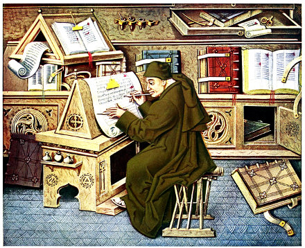
THE SCRIBE AT WORK
Representing a secretary to Philip the Good, Duke of Burgundy and patron of learning, copying manuscript books at the Hague about the time typography was invented
1
WHEN BOOKS WERE WRITTEN
To many persons the words “Printing” and “Typography”
are synonymous. The Standard dictionary, in its
leading definition of the word “Printer,” says: “One
engaged in the trade of typographical printing; one who
sets type or runs a printing press; specifically a compositor.”
But in these days there are so many kinds of printers
(lithographic printers, steel- and copper-plate printers,
linotype printers, textile printers, etc.) that to define the
sort of printer who does his work with type the use of
the adjective “typographic” is necessary.
The word “typography” is derived from the Greek
typos, or type; and graphe, or writing—type-writing.
Typography, then, as I shall use it, means printing from
movable, or separate, types.
The origin of typography may be open to dispute, but
it is an undeniable fact that the art of printing with separate
types was practiced at Mainz, Germany, during the
years 1450–1455, and from there spread over Europe.
Before that period books were written by hand or
printed from crudely engraved blocks of wood.
The thousand years preceding the invention of printing
(the fifth to the fifteenth century) are known in
history as the Middle Ages, and the first six centuries
of this period (the fifth to the eleventh) are called the
Dark Ages, because during those years civilization in
Europe relapsed into semi-barbarism, and scientific, artistic
and literary pursuits were almost entirely abandoned.
Latin had been the language of intellectual Europe up
to the time of the fall of Rome (476 A.D.) and one of the
influences that led up to this benighted period was that
Southern Europe was overrun by so-called barbarians
from Germania in the north—the Angles and Saxons,
who settled in Britain; the Franks, Burgundians and
Goths, who settled in Gaul (now France) and Germany;
the Vandals who settled in Spain, and the Lombards,
who settled in Italy.
In Italy, Spain and Gaul the Latin-speaking natives
far outnumbered the invaders, and the Germanic conquerors
were forced to learn something of Latin. The
present languages of those countries are the result of
that attempt. The language of the Germanic Angles and
Saxons was used in Britain after their invasion of that
country, but was modified by the French-speaking Normans
who conquered England in the eleventh century.
Thus Latin as a common language died.
Altho dead to most of the population of Europe, Latin
was made the official language of the Christian church,
and, during that period of the Middle Ages when French,
Spanish, Italian and English were in a state of evolution,
it afforded a means of keeping alive in written books the
knowledge the world had gained before the dark curtain
of ignorance was rung down.
Manuscript books are so-called from the Latin words
manu scripti, meaning “written by hand,” and the initials
of these two Latin words are frequently used for the word
manuscript, i.e., “MS.”
The materials upon which books were written have
at various times been clay, stone, wood, lead, skin, papyrus
and paper.
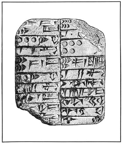
ASSYRIAN CLAY TABLET
Showing the cuneiform (arrow-shaped) writing
Looking back six thousand years to the beginning of
recorded time we find the Chaldeans (Babylonians and
Assyrians) writing arrow-shaped characters with a sharp
tri-pointed instrument upon damp clay, which was then
made permanent by baking. In 1845 a library of baked
clay tablets was discovered among the ruins of Nineveh.
Thousands of these tablets have been collected in the
British Museum, the most interesting of which is one
which had been broken in eighteen pieces, containing an
account of the Flood.
Twenty-five hundred years before the Christian era,
when the great pyramids were being built, the Egyptians
wrote upon papyrus, a plant growing on the banks of the
Nile. The inner portion of the plant was stripped, the
strips laid across each other, pressed and dried. The
squares of material thus made were then joined together
to form a long strip which was rolled around a rod.
Upon papyrus is written one of the oldest “books” in
the world, “The Book of the Dead,” now in the British
Museum. This is a literary work of a semi-sacred character,
and copies were placed in the tombs with deceased
2Egyptians, whence its name. A reproduction of a portion
of this book is given on page three.
Supposedly under the patronage of the Egyptian ruler,
Rameses II., about thirteen hundred years before Christ,
many books on religion, law, medicine and other subjects
were written, and a great library was accumulated.
The Chinese wrote with a stylus or brush upon tablets
of bamboo fiber. It is impossible accurately to determine
the antiquity of Chinese methods, as the extravagant and
often unsubstantiated claims of historians antedate those
of modern discovery. Ink, paper, and printing from
blocks were all supposedly invented by the Chinese early
in the Christian era, and even the first use of separate
types is credited to Pi-Shing, a Chinese blacksmith. It
may be relevant to suggest that the old-time “blacksmith” joke
and the printing-term “pi” are derived from
this source.
Dressed skins and palm leaves were used by the Hindoos,
and writings in Sanscrit were probably done in the temples
by the Brahmins, the priests and philosophers of
early India. The Vedas, sacred writings as old as 2000
B.C., formed a big portion of the Hindoo literature.
The Hebrews wrote upon stones and animal skins. In
this manner they preserved the Old Testament portion of
the Bible, and gave to posterity one of the most wonderful
books ever written.
The ancient Phœnicians were commercial people, and
being such did very little in producing literature; yet it is
to them that we owe the present Roman alphabet. The
illustration on a following page shows how this transition
probably came about. There is a slight resemblance between
some of the twenty-one characters in the Phœnician
alphabet and certain picture writings of the Egyptians,
whose hieroglyphic alphabet consisted of several
hundred characters and was as cumbersome as is the Chinese
alphabet with its several thousand characters.
The Greeks received their alphabet directly from the
Phœnicians, there being a tradition that one Cadmus introduced
it into Greece. Some writers claim that “Cadmus”
merely signifies “the East” and does not refer to
an individual. The names of the first two letters of the
Greek alphabet, Alpha and Beta, are similar to those of
many other languages, and the word “alphabet” is derived
from these two words.
In Greece, especially at Athens, before manuscripts
became numerous, lectures and public readings were important
features of intellectual life.
The poems of Homer, supposed to have been composed
about 880 B.C., were not put into writing until 560 B.C.,
and during this period of more than three hundred years
they were retained in the memory of bards, by whom
they were sung or recited.
“Plutarch’s Lives,” one of the best known Greek literary
works, was written in the second century, A.D.
The Greek nation is generally acknowledged to have
been one of the most intellectual of ancient times, yet it
is a peculiar fact that only the boys were given an education,
the intellectual development of women being considered
unnecessary.
Copying of manuscripts was often a labor of love.
Demosthenes, the great philosopher, is said to have transcribed
with his own hands the eight books of Thucydides
on the history of the Peloponnesian War.
Many of the Greek manuscripts were written by scribes
and copyists who were slaves, and some of these slaves
developed much talent of a literary kind.
The Greeks imported papyrus as a writing material,
until one of the Ptolemies, in the interests of the Alexandrian
library, decreed that no papyrus should go out of
Egypt. This led to the development of parchment, so
named from the city of Pergamus, where it was first
made. Parchment is the skin of calves, goats or sheep,
cleaned and smoothed.
In the days of militant Greece, Alexander the Great
conquered Egypt, and in the year 332 B.C. founded Alexandria.
When at his death Alexander’s empire was
divided among his generals, Egypt fell to the lot of
Ptolemy, surnamed Soter. Thus began a dynasty of
Egyptian kings known as Ptolemies, ending in 30 B.C.
with the death of Cleopatra, the last of the line. The
second Ptolemy, surnamed Philadelphus, founded the great
Alexandrian library, which accumulated over five hundred
thousand rolls of manuscript, mostly brought from
Greece. The length of the rolls varied from small ones
of two hundred lines to massive scrolls of one hundred
and fifty feet when unwound.
There is a legend that Ptolemy Philadelphus was so
impressed with the appearance of a roll of parchment containing
in gold letters the sacred scriptures of the Hebrews,
that, about 270 B.C., he caused their translation
to be made into Greek. This, it is said, was done in
Alexandria in seventy-two days by seventy-two learned
Jews from Jerusalem. Hence the name “Septuagint,”
which has always been applied to that Greek version of
the Old Testament.
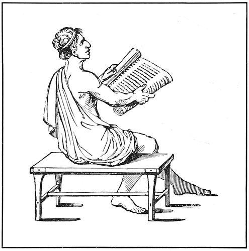
ANCIENT ROMAN READING A MANUSCRIPT ROLL
From a painting found at Pompeii
Julius Cæsar, the Roman conqueror, whom Shakespeare
designated “the foremost man of all this world,”
about the year 30 B.C. visited the city of Alexandria and
became interested in Cleopatra, the Egyptian queen. This
led to a war with King Ptolemy, and during a fierce
battle Cæsar set fire to the Egyptian fleet. Unfortunately
the flames extended to the Alexandrian library and destroyed
the greater part of its magnificent collection of
manuscripts.
Gradually after that, Rome superseded Alexandria as
an intellectual center, as Alexandria had previously
superseded Athens. The conquest of Greece, over a hundred
years before, had been the cause of many Greek
scholars and philosophers taking up their abode in Rome.
This, with the fact that a great number of scribes and
copyists had involuntarily come to the Eternal City because
of the fortunes of war, helped to develop in the
Romans an interest in literature.
During the period of Roman history identified with
Julius Cæsar there were customs in manuscript making
that are interesting in their suggestion of modern newspaper
methods. In fact, Cæsar is credited with having been
the founder of the newspaper.
3He introduced the daily publication of the news of the
Roman Senate and People, a radical change from the
previous custom of issuing yearly news-letters known as
the Annals. The acts of the senate were reported by
trained writers known as tabularii, or inscribers of tablets,
and were revised and edited before publication by a
senator appointed to that duty. Abbreviated forms of
writing were used in “reporting,” a sort of short-hand
which enabled the scribe to write as rapidly as a man
could speak. Cæsar himself wrote his letters in characters
which prevented them being read by his enemies.
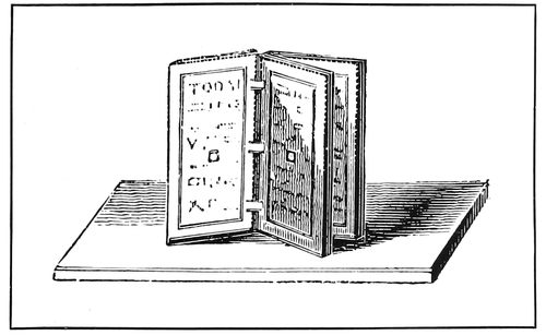
ROMAN WAXED TABLET
The present method of binding flat books might have originated with these old tablets
The “Acts of the Senate” grew into a diary of general
news, known as the “Acts of the City,” and it is likely
that the educated slaves in the families of public men were
called into service to duplicate copies for circulation.
Altho the Emperor Augustus, who reigned in Rome at
the beginning of the Christian era, discontinued publishing
the Acts of the Senate, he encouraged the writing
and copying of books to such extent that
the period is a memorable one in literature.
The classic authors, Virgil and Horace,
wrote at that time, and many other important
manuscripts were produced.
Slave labor was utilized for copying, and
large editions of manuscript rolls were produced
with an ease that rivaled the later
method of the printing press. In such instances
it was the custom for a reader to
read aloud, to, say, one hundred trained
writers. The possibilities of this process may
be imagined. Horace allowed his slaves
rations which were so meager that the entire
cost of production, including papyrus
and binding, of a small book was equivalent
to about twelve cents in United States coin.
Thus it will be seen that in the days of
the Roman Empire books were plentiful and
cheap because of slave labor, just as they
are cheap in modern times because of machinery.
For most of their books the Romans, as
had the Egyptians and Greeks before them,
used rolls of papyrus wound about rods.
Ordinarily these rods were made of wood,
but for highly-prized manuscripts, rods
made of ivory with gold balls at the ends
were used, and the writing in such cases was
on purple-colored parchment, elaborately
decorated with gold or red ink.
The present style of flat sheet books
might have originated with the use by the
Romans of tablets of wood or metal, wax-coated,
on which memoranda were scratched with the
stylus. Several tablets were hinged together and the
wax surface was protected by raised edges in the manner
of the modern school slates (see illustration). This
led to the use of several leaves of vellum fastened together
and enclosed by richly carved ivory covers, a
form that came into use about 300 A.D., shortly before
Constantine removed the Roman capital to Constantinople.
Constantinople naturally became the center of civilization,
and the work of transcribing manuscripts was taken
up in that city. In the eighth century the reigning emperor,
in order to punish the transcribers for insubordination,
caused the library at Constantinople to be “surrounded
by vast piles of fagots, which being fired at a
given signal, the whole building was totally destroyed,
along with its twelve scribes and chief librarian and
more than thirty thousand volumes of precious manuscripts.”
It seems to have been a favorite method of
punishment during the Middle Ages for those in authority
to destroy valuable manuscripts.
While, as we have seen, with the fall of the Western
Empire of Rome, the drift of literature was toward the
East, there remained in the West a dim light that was
kept burning thru the six hundred years so fittingly
called the Dark Ages. This light came from the monasteries
of Europe, in which little bands of devoted men
were transcribing and decorating the holy writings used
by the Christian church.
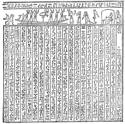
THE FAMOUS “BOOK OF THE DEAD”
Part of the seventeenth chapter of the “Book of the Dead,” showing hieroglyphics and illustrations. This book was written upon papyrus, and copies were placed by ancient Egyptians in tombs with their dead
The Christian church as an organization became powerful
after the Roman Empire declined, and the monopoly of
learning which the church possessed during the Dark
Ages gave it such a superior knowledge and power that
the Church of Rome granted authority to kings, and took it
away, at its pleasure. A memorable instance of this
power took place in the eleventh century, when Hildebrand,
who as head of the church was known as Pope
Gregory VII., forced Henry IV. of Germany, who had
4offended him, to seek pardon in a most humiliating manner.
Henry stood barefoot in the snow for three days,
before Hildebrand would pardon him.
On one occasion previous to the event mentioned
above, Charlemagne (Charles the Great), king of the
Franks, who was crowned by Pope Leo III. and saluted
as Emperor of the West, was so mistakenly zealous in
extending along with his own kingdom that of the Lowly
Nazarene, that he ordered the hanging of more than four
thousand prisoners before the Saxons would consent to
be baptized and conquered.
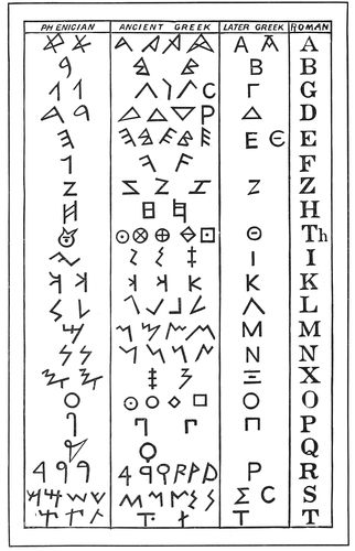
EVOLUTION OF THE ALPHABET
This table shows how the present-day Roman alphabet came to us from the ancient Phœnicians
Latin as a language is dead, so far as the secular world
is concerned, but since the seventh century it has been
the official language of the Church of Rome. All manuscripts
produced by monks after that time, whether written
in Britain, Germany or Italy, are in Latin, and the
services of the Roman Catholic Church are conducted in
that language even today. In the year 1080, the King of
Bohemia asked Hildebrand, the Papal head of the church,
for permission to have the services performed in the
language of the people. This request Hildebrand refused,
saying: “It is the will of God that his word should be
hidden, lest it should be despised if read by every one.”
In 1229 a council of the church published a decree
which not only strictly forbade the translation of the
Bible into a “vulgar tongue,” but also forbade all but
the clergy to have copies in their possession.
In spite of these mandates, translations of various
portions of the Bible were made into common tongues,
but at great risk. William Tyndale set about to translate
the Bible into English, vowing that ere many years he
would cause the plough-boy to know more of the Scriptures
than did the priests. By 1526 he had completed
the New Testament, but his books were burned in the
public squares as soon as completed. Ten years later
Tyndale was burned, as had been his books.
In 1534 Martin Luther completed his wonderful translation
into German of the entire Bible, and gave to the
people what had previously been denied them.
We will now consider the making of manuscript books
in the Middle Ages. In the early days of the Christian
church, persecution was so severe that Christians lived in
hiding, or secluded themselves from the outer world to
worship. This condition led to the existence of a class
of men known as monks (from a Greek word monos,
meaning “alone”). At the beginning of the sixth century,
an earnest, conscientious Christian, now called
Saint Benedict, set out to reform the evils then prevalent
in monastic life. One of his theories was that the
monks should spend their time, not in idleness, but in
manual labor, in teaching the youth, and in copying
manuscripts. The Benedictine monks, as the followers
of Benedict are known, were the main agents in spreading
Christianity and keeping learning alive during the
Dark Ages. Their mode of living became so popular that,
it is said, there were at one time thirty-seven thousand
monasteries or cloisters in existence.
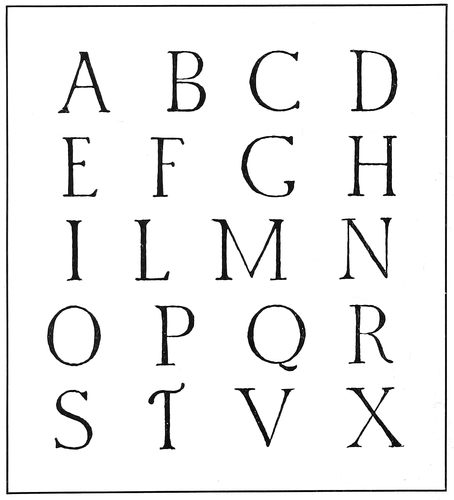
CAPITAL LETTERS OF THE ANCIENT ROMANS
From inscriptions carved in stone
One of the occupations of the Benedictine monks was
that of copying manuscripts, and in some monasteries a
room known as the scriptorium was set apart for such
work. The office of scribe or copyist was one of great
importance, and stringent rules governed the work. No
writing was done by artificial light, talking was prohibited,
and none but the scribes was allowed in the
room. The tools were quill pens, knives to cut the quills,
pumice stone to smooth the surface of the parchment,
awls and rulers with which to make guide-lines, and weights
to keep down the pages. Parchment and vellum, the
former made of the skins of calves, goats or sheep, the
5latter of the skins of unborn lambs and kids, were the
materials written upon. Black ink was commonly used
for the text of books; and vermilion, an orange-red ink
made of red clay, was used for titles and important parts
of the text. The portions in red were known as rubrics,
from rubrica (red earth.)
Illuminating was done to some extent in the monasteries,
but illuminators other than monks were often
called upon to assist in this work. This practice led to
queer combinations, as sacred writings were frequently
decorated with monkeys and other animals and birds,
which might have afforded appropriate decoration for an
account of the Flood.
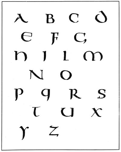
UNCIAL LETTERS OF THE SIXTH CENTURY
These letters show the Roman capitals assuming the shape of the later Gothic, or text, letters
After the parchment was prepared and before beginning
to write the scribe would scratch his guide-lines upon
it with an awl. The position of the page and the lines
of lettering were thus indicated, the page
guide-lines extending to the edge of the
parchment. The scribe’s work was principally
that of copying (setting reprint,
printers would say) from a book on the
reading desk at his side. He was supposed
strictly to “follow copy,” and his work
was compared occasionally by a person
known as a corrector. The black writing
finished, the skins were passed to the rubricator
or illuminator, if the manuscript
was to be elaborately treated.
The colored plate shown as a frontispiece
is from an old print and pictures a
scribe at work. He is writing the text on
a sheet of parchment held in place by a
weight. The book from which he is copying
is in front of him, above his writing
desk, and his copy is indicated by a guide
such as printers still use. Ink pots and
pens are in place and an elaborate library
is evidently at his disposal. The picture
is defective in perspective but is withal rather interesting.
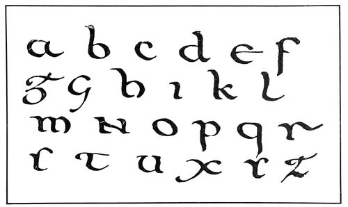
HALF-UNCIAL LETTERS
Demonstrating the transition of Roman capitals into small, or lower-case, letters
The most beautiful and elaborate specimen of the
illuminator’s art now in existence is the famous “Book of
Kells,” a copy of the Gospels written about the seventh
century. It is notable because of the excellence of its
decoration, the endless variety of initial letters it contains,
and the careful lettering. The scribes and illuminators
of Ireland have a lasting monument in this book,
as it is supposed to have been produced in the monastery
of Kells, founded by St. Colombo.
Gold, red and blue were favorites with the illuminators,
the burnished gold leaf adding richness to the
brilliancy of the effect.
Manuscript books were ordinarily bound in thick
wooden boards, covered with leather, but there are
books yet preserved the boards of which are of carved
ivory, and others that are inlaid with precious stones.
The books associated with the Middle Ages most
familiar to us are the Missal (mass-book), containing the
services of the celebration of the mass; the Psalter (book
of psalms), containing the psalms used in church services;
the Book of Hours, containing prayers and offices for the
several hours of the day, and the Donatus, a short Latin
grammar, the work of Ælius Donatus, a Roman grammarian
of the fourth century.
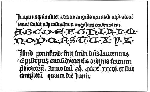
GOTHIC LETTERS OF THE FIFTH CENTURY
Also showing the decorative uncial-like initials used on manuscript Missals
When printing was invented the first types used were
imitations of the current Gothic lettering, known to us
as Black Letter, Old English, etc. A few years later,
when typography was introduced into Italy, the types
6were cut in imitation of the lettering selected for use by
the scribes of the Italian Renaissance, which lettering is
familiarly known in our time as Roman. The capitals of
this Roman lettering are fashioned after those used in
ancient Rome, and the small or lower-case letters are
after the Roman writing known as minuscule, of the
twelfth century.
The ancient Roman writing was all capitals, and as
found on stamps and coins was of the character of the
modern so-called “gothic” (plain strokes, without the
small cross strokes known as serifs). The more carefully
made Roman capitals, as carved on monuments and
buildings, are not unlike the present type-faces known
as Caslon and French old style.
The evolution of Roman capitals into the small or
lower-case letters of the present day is traced in the
writing called uncial, in which the letters A, D, E, H,
M, Q are rounded and altered in appearance. More
changes developed the writing known as half-uncial,
in which only the N and F retain the appearance of
Roman capitals. The small (lower-case) letters became
known as minuscule, as contrasted with majuscule, or capital
letters. (See reproductions on preceding pages.)
From this point book writing developed in two directions:
one toward the heavy pointed stroke of the churchly
Gothic style, and the other, guided by Charlemagne in
the eighth century, to the style of Roman letter used by
Jenson and other printers of Venice, Italy, in their
classic printing of the fifteenth century. Our old-style
Roman types are from this source.
Another style, called cursive, was the carelessly executed
handwriting used for ordinary purposes, and in that
respect may be likened to our own business script.
Thus as the fifteenth century dawned upon Europe we
find literature and learning locked in the cells of the
monks, while outside, the hosts of people who for ten
centuries wandered in semi-darkness had reached an
elevation which showed them a new existence coming
with the intellectual awakening that was then already
upon them.
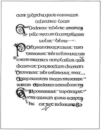
LETTERED PAGE FROM THE “BOOK OF KELLS”
Showing the beautiful writing of the Irish scribes of the seventh century
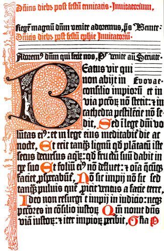
Portion of a page (full size) from Fust and Schœffer’s Psalter of 1457
The first book with a printed date: showing initials and decoration cut in wood
7
THE ORIGIN OF TYPOGRAPHY
The invention of typography in the fifteenth century
marked the beginning of a new civilization and the end
of the medieval thousand years. The Middle Ages may
be said to have begun with the capture of Rome by the
Vandals in 455 A.D., and to have ended with the production
of what is considered the first printed book in 1455.
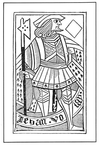
FRENCH PLAYING CARD
A block print of the fifteenth century
As has been shown, during most of the thousand years
preceding the invention of typography, ignorance and
superstition reigned thruout Europe, despite the efforts of
Charlemagne and others to revive learning and encourage
interest in books. The popular mind had become so perverted
that ability to read and write and love for art
were considered proofs of effeminacy.
As the medieval period neared its close, the brain of
man became more active; he began to reason and to
understand much that before had been mystery. Interest
was manifested in the problems of science and religion,
and notable things were accomplished by artists
and craftsmen. It seemed as if the intellect of mankind
was awakening from a long sleep, and civilization was
being born again.
As the light of the new intelligence shone upon the
earth and Europe rubbed its dazzled eyes, Typography,
the star that was to light the way to modern knowledge
and achievement, appeared.
Printing with separate metal types, while involving
a new principle, was to some extent a development of
other methods. The evolution from manuscript books
to block books, and from block books to books printed
from types occurred quietly in the natural course of events;
so quietly, indeed, that there is mystery surrounding each
change of method.
In the early part of the fifteenth century, when writing
was the only agency used for making books, the demand
for playing cards and sacred pictures necessitated a
method of reproduction more rapid than the old; and thus
engraved wood blocks were introduced.
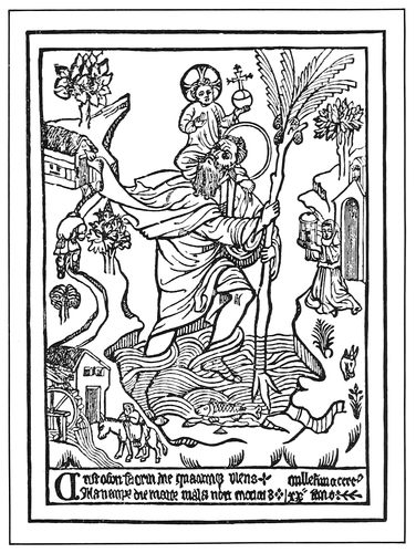
IMAGE PRINT OF 1423
The first block print with a date
As the desire for knowledge outgrew the productive
resources of the russet-gowned scribes, men with a mechanical
turn of mind began to engrave pages of books
on wooden blocks, a process which, tho extremely tedious,
afforded a means of partly satisfying the need, and which
became the stepping stone to the invention of printing
with separate types. The block books, as they were
8called, sometimes contained whole pages of reading matter,
each letter cut in relief on the face of the wood, and
frequently the page included a large illustration carelessly
drawn and crudely engraved. The early method of printing
block books was by placing the paper on the inked
surface and rubbing the back. Only one side was printed
and a brown distemper ink (a kind of watercolor) was used.
Simply constructed presses, prototypes of the modern
hand press, were employed by block-book makers in
later years. Playing cards and image prints were popular
products of the block-book period, and after being printed
were colored by means of stencils. A French playing
card of the fifteenth century is reproduced on the preceding
page, as well as a print illustrating the old legend
of St. Christopher carrying the infant Jesus across
a river. This last-mentioned print is dated 1423, is
8⅛ × 11¼ inches in size, and is the oldest dated specimen
of printing.
The invention of printing really dates from the time
books were printed from wooden blocks, altho the more
important invention, that of typography (printing with
separate types), is also known by the general word “printing.”
The first block books, probably Donatuses, may
have been printed in Holland. The “Donatus” is a
Latin grammar, and received its name from its author,
Ælius Donatus, a Roman grammarian of the fourth century.
It is a small book of not more than thirty-four
pages printed on parchment, and had a large sale.
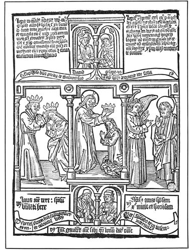
BIBLE OF THE POOR
Famous block book of the fifteenth century
There is a morbid side to human nature, and it has
been with us since the beginning. Today it finds delight
in perusing in the sensational newspapers detailed descriptions
of murders, train wrecks, and other happenings
in which blood is spilled. During the Middle Ages it prevailed,
and is reflected in the pictures that have come down
to us in the block books. A doleful atmosphere is
present in the block book, “Ars Moriendi” (Art of Dying),
whose illustrations show weeping angels and leering
demons, weird settings that are magnified by the crudeness
of the engravings.
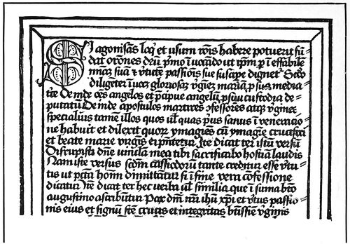
TEXT PAGE FROM A BLOCK BOOK
“Ars Moriendi,” printed in the fifteenth century
The “Biblia Pauperum” ( Bible of the Poor) is another
block book very popular in the days preceding the invention
of typography. It is a book of about forty pages,
consisting principally of illustrations of the important
happenings as told in the Scriptures. The book was for
the use of illiterate monks and those that did not have
access to the elaborate manuscript Bibles.
A book of similar purpose, but more complete than the
Bible of the Poor, is called “Speculum Humanæ Salvationis”
(Mirror of Human Salvation). This book literally
presents the transition from block books to type-printed
books, for of the sixty-three pages in one edition
twenty are printed from wood blocks and forty-three from
separate types (see reproductions herewith). The printed
page of the “Mirror” is a trifle larger than the page that
is now being read. Almost every monastery in Europe
contained copies of the “Speculum.”
When, where and by whom was typography invented?
It is surprising that there should be any real uncertainty
about the facts connected with the invention of
typography, but some uncertainty does exist, and various
opinions and conclusions are set forth in books on
the subject. The new method of printing was invented
in the midst of indifference and ignorance, and for many
years but few cared that it had come among them.
The inventor of typography, whether Coster or Gutenberg,
was too modest to claim the credit in a substantial
way, as he failed to print his name on the first books
done by the new method.
This modesty, or whatever else it may have been,
opened the way for almost every European country to
claim the honor of having been the home of the invention.
However, all claims have been disproved excepting
those of Germany and Holland, and as the argument now
stands the weight of the evidence is with Germany.
C. H. Timperley, in his “Dictionary of Printing” (1839)
says that of those who had written on the subject up to
his time, one hundred and nine favored Mainz and twenty-four
favored Haarlem as the birthplace of typography.
There is indisputable evidence to prove that typography
was practiced by Gutenberg at Mainz, Germany,
from 1450 to 1455, and that the art spread from that
city to all parts of Europe. There is no doubt about that.
The only thing which can lose to Gutenberg and Germany
the credit of the invention is proof that another
man printed from separate types in another country previous
to 1450. Certain investigators have attempted to
supply this proof, as we shall see.
9
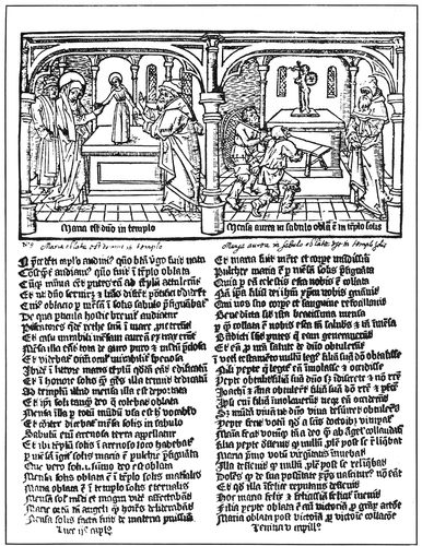
PAGE PRINTED FROM AN ENGRAVED WOOD BLOCK
From the “Mirror of Human Salvation”
By an unknown Dutch printer
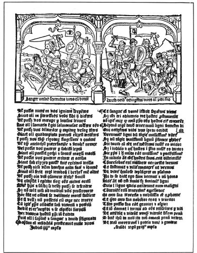
PAGE PRINTED FROM SEPARATE METAL TYPES
From the “Mirror of Human Salvation”
By an unknown Dutch printer
10The pretensions of Holland are that one Laurens Janszoon
Coster (Lawrence, son of John, the sexton or
sheriff) printed with separate types about the year 1430
at Haarlem.
The earliest testimony on the subject is a chapter in
the “Chronicle of Cologne” (1499) wherein the author
speaks of information about the invention of typography
received by him from Ulrich Zell, who printed books at
Cologne, Germany, as early as 1464. He states that the
“art was discovered first of all in Germany, at Mainz on
the Rhine,” and that the “first inventor of printing was
a citizen . . . named Junker Johann Gutenberg.” This
statement is added to by the assertion that the new art
“found its first prefiguration in Holland in the Donatuses
which were printed there before that time.” It has been
argued that the last assertion refers to block books.
An extract from the Cologne-Chronicle account may
be of interest:
This highly valuable art was discovered first of all in Germany,
at Mainz on the Rhine. And it is a great honor to the German
nation that such ingenious men are found among them. And it
took place about the year of our Lord 1440, and from this time
until the year 1450, the art, and what is connected with it, was
being investigated. And in the year of our Lord 1450, it was a
golden year, they began to print, and the first book they printed
was the Bible in Latin; it was printed in a large letter resembling
the letter with which at present missals are printed. Altho the
art was discovered at Mainz, in the manner as it is now generally
used, yet the prefiguration was found in Holland, in the Donatuses,
which were printed there before that time. And from
these, the beginning of the said art was taken, and it was invented
in a manner much more masterly and subtle than this,
and became more and more ingenious.... But the first inventor
of printing was a citizen of Mainz, born at Strassburg, and
named Junker Johann Gutenberg. From Mainz the art was introduced
first of all into Cologne, then into Strassburg, and afterwards
into Venice. The origin and progress of the art was told
me verbally by the honorable master Ulrich Zell, of Hanan, still
printer at Cologne, anno 1499, by whom the said art came to
Cologne.
There was printed in the year 1561 an address to the
town officers at Haarlem by Dierick Coornhert, an engraver,
in which he stated that he was
often told in good faith that the useful art of printing books
was invented, first of all, here in Haarlem, altho in a crude way,
as it is easier to improve on an invention than to invent; which
art having been brought to Mainz by an unfaithful servant, was
very much improved there, whereby this town, on account of its
first having spread it, gained such a reputation for the invention
of the art, that our fellow-citizens find very little credence when
they ascribe this honor to the true inventor. . . . And because I
implicitly believe what I have said before, on account of the trustworthy
evidence of very old, dignified and gray heads, who often
told me not only the family of the inventor, but also his name and
surname, and explained the first crude way of printing, and
pointed with their finger the house of the first printer out to me.
It will be noticed that Coornhert fails to mention the
name of the alleged inventor, the location of his house,
or the date of the invention. The claim that “the useful
art of printing books was invented, first of all, here at
Haarlem, altho in a crude way,” may refer to the printing
of block books and not to typography.
The claims of Holland were first presented definitely
about 1566 in a history of the Netherlands called “Batavia,”
the author of which was known in his own tongue
as Adrian de Jonghe; in English as Adrian the Younger,
and in Latin as Hadrian Junius. The story as written by
Junius has been dubbed the “Coster Legend” and it
reads in part as follows:
About one hundred and twenty-eight years ago there dwelt in a
house of some magnificence (as may be verified by inspection, for
it stands intact to this day) in Haarlem, near to the market, and
opposite the royal palace, Laurentius Joannes, surnamed Æditus,
or Custos, by reason of this lucrative and honorable office, which
by hereditary right appertained to the distinguished family of
that name. . . . When strolling in the woods near the city, as
citizens who enjoyed ease were accustomed to do after dinner and
on holidays, it happened that he undertook as an experiment to
fashion the bark of a beech tree in the form of letters. The letters
so made, he impressed the reverse way, consecutively, upon a leaf
of paper, in little lines of one kind and another.... Thereupon
he made, by the addition of letters, explanations for pictures on
engraved wood. Of this kind of printing, I myself have seen some
stamped block books, the first essays of the art, printed on one
side only, with the printed pages facing each other, and not upon
both sides of the leaf. Among them was a book in the vernacular
written by an unknown author, bearing the title “Spieghel onzer
Behoudenis” [Dutch edition of the “Mirror of Salvation,” two
pages of the Latin edition of which are here shown].... He
subsequently changed the beech-wood letters for those of lead,
and these again for letters of tin, because tin was a less flexible
material, harder and more durable. To this day may be seen in
the very house itself ... some very old wine flagons, which
were made from the melting down of the remnants of these very
types. The new invention met with favor from the public and
... attracted purchasers from every direction.... He
added assistants to his band of workmen, and here may be found
the cause of his troubles. Among these workmen was a certain
John. Whether or not, as suspicion alleges, he was Faust ...
or another of the same name I shall not trouble myself to ascertain.
This man, altho bound by oath to the typographic art, when
he knew himself to be perfectly skilled in the operation of type
setting, in the knowledge of type founding, and in every other
detail appertaining to the work, seized the first favorable opportunity
... and flew into the closet of the types, and packed
up the instruments used in making them that belonged to his
master, and ... immediately after slunk away from the
house with the thief. He went first to Amsterdam, thence to
Cologne and finally regained Mainz.... Within the space
of a year, or about 1442, it is well known that he published, by
the aid of the same types which Laurentius had used in Haarlem,
the “Doctrinal” of Alexander Gallus ... and also the
“Treatises” of Peter, of Spain.... I remember that Nicholas
Gallius, the preceptor of my boyhood, a man of tenacious
memory, and venerable with gray hairs, narrated these circumstances
to me. He, when a boy, had more than once heard Cornelis,
an old bookbinder and an underworkman in the same printing
office when not an octogenarian and bowed down with years,
recite all these details as he had received them from his master.
This is the strongest proof the friends of Coster can
present, and it has been thoroughly dissected by investigators
representing both sides of the controversy. The weak
points of the document appear to be:
(1) The date of the experiment with wood letters in
the garden (about 1440) does not leave enough
time for completion of the invention of separate
metal types and the equipment of a large printing
office until the theft which Junius says occurred
in 1441.
(2) The date of the theft of 1441 does not reconcile
itself with the fact that Gutenberg in 1436 was
probably experimenting with his invention at
Strassburg.
(3) The claim that a Dutch edition of the “Mirror of
Salvation” was printed with separate types cut from
wood seems doubtful, because even the best modern
machinery has not demonstrated that wood type
can be made as accurately as is necessary for arrangement
of small types in a massed page. When
it is considered that the size of types used on the
edition mentioned was about fourteen point, and
the lines were printed in alignment, the modern
printer is sure to question the accuracy of the assertion.
Four editions, two in Latin and two in Dutch, of the
“Mirror of Salvation,” are known to exist, all printed
from types except twenty pages of the second edition,
which are printed from engraved blocks. They are the
work of some early printer of Holland; whether his name
was Coster or whether the books were printed before or
after 1450 will probably never be ascertained.
One Peter Scriverius in 1628 wrote a new version of
the invention in which he says that “In the year 1428,
Laurens Coster, then a sheriff of Haarlem, strolled into
the Haarlem woods. He took up the branch of an oak-tree,
cut a few letters in relief on the wood, and after
a while wrapped them up in paper. He then fell asleep,
but while he slept, rain descended and soaked the paper.
11Awakened by a clap of thunder, he took up the sheet,
and to his astonishment discovered that the rain had
transferred to it the impress of the letters,” etc.
Junius had placed the date of Coster’s invention at
about 1440; Scriverius put it at 1428. The date was
again changed, this time to 1420, by Marcus Boxhorn,
who wrote on the subject in 1640.
In 1722 a statue of Coster was erected in Haarlem,
but no date was placed upon it.
A “true and rational account of the invention” was
published at Haarlem by one Leiz in 1742, which gives
in detail the supposed events of Coster’s life as a printer,
from the cutting of the wood letters on the tree bark in
1428 to his death in 1467, but does not reveal the source
of information.
Gerard Meerman, a learned but impractical writer of
Rotterdam, in 1765 published a book, “Origines Typographical,”
and comes to the conclusion that typography
was invented by Louwerijs Janszoon, known as
Laurens Coster, who was sheriff at various times between
1422 and 1434, and who died between 1434 and 1440;
he used separate wooden types about 1428 or 1430, and
did not (as Junius had claimed) use lead or tin types;
he was robbed on Christmas night 1440 by Johann Gensfleisch
(elder brother of Johann Gutenberg), who carried
the art to Mainz; he printed one edition of the “Mirror”
from wooden types.
In the early part of the nineteenth century a scientific
society of Holland offered a prize for the best treatise
on the subject of the invention and in 1816 Jacob
Koning was given the award for his essay, “The Origin,
Invention and Development of Printing.” Koning was
the first writer on the subject to make researches in the
Haarlem archives and in his book he claimed to have
carefully collected from the registers, account books,
and other official data all the entries that could throw
light on the subject, and to have got together all the
documentary evidence to be found.
The investigations of Koning, as reported by himself,
corroborated some of the details of the stories of those
who preceded him, and he found that Louwerijs Janszoon
lived at Haarlem from 1370 to 1439, when he died.
For many years the discussion stood as Koning had
left it and Coster was universally given equal honors with
Gutenberg as the inventor of typography; but for several
years previous to 1869 rumors of errors and defects
in the Haarlem claim were in circulation in Holland.
Dr. Anton Van der Linde took up the task of investigating
these rumors and the results of his labors were
given in a series of articles in the Dutch Spectator during
1870. These articles were revised and issued in book
form under the title, “The Haarlem Legend of the Invention
of Printing.”
Van der Linde showed how Coster’s cause had been
bolstered by Koning and others with misrepresentations,
evasions and even forgeries, and Holland practically
surrendered its claims and altered its school books
to meet the new conditions.
The town records revealed no mention of printing in
connection with Louwerijs Janszoon, the sheriff, who died
in 1439, or with Laurens Janszoon Coster.
Van der Linde went to Germany as librarian of the
royal library at Wiesbaden, became Von der Linde and
in 1878 published an enlarged edition of his former book
under the title “Gutenberg,” in which he argued that
Gutenberg was the inventor of typography.
In 1879 J. H. Hessels, who had translated into English
Van der Linde’s first book, was asked to write a review
of the new book, “Gutenberg,” and in doing this he
became so interested in the subject that he began a careful
investigation into the question. He afterward declared
in the preface of his book, “Gutenberg” (1882). “Had I
myself been able to realize beforehand the time, the
trouble, and the expense that this Gutenberg study
would cost me, I should have abandoned the subject at
the outset.” But the work was so infatuating that in
1887 he published another book: “Haarlem, the Birthplace
of Printing; not Mentz.”
To demonstrate the fickle workings of the human mind
it may be interesting to note that in his book of 1882
Mr. Hessels wrote, “I have never made any thoro examination
of the Haarlem question, but such inquiries as
I have made have led me to believe that the Haarlem
claim cannot be maintained.” Contrast this with the
title of his book of 1887: “Haarlem, not Mentz,” and
notice his change of base.
While Mr. Hessels had come to believe in Haarlem,
Van der Linde’s faith in the cause of Gutenberg was so
strong he forsook his native land, and in America Theodore
L. De Vinne in his book “The Invention of Printing”
(1876) had reasoned out the tangle in a way to
satisfy himself and many others that Gutenberg, and
not Coster, was the inventor of typography.
It is impossible here to go into detailed discussion of
the points at issue, and only because the burden of proof
is upon the Holland advocates has so much space been
given to Coster.
While there may be some truth in the Coster story,
the proofs are weak, and Haarlem claimants do not seem
able to agree as to the identity of the man Coster.
Gutenberg, on the contrary, is shown by records too
numerous to here mention separately, to have been a
real, tangible human being, one who printed with separate
metal types, and the probable inventor of the art.
It is believed that Gutenberg was born at Mainz, Germany,
about the year 1399. His parents were Frielo
Gensfleisch (goose-flesh) and Else Gutenberg (good-hill).
The boy Johann took the last name of his mother, in accordance
with the German custom of perpetuating a name.
Because of civil strife in Mainz, the Gensfleisch family
left that city about 1420 and took up residence presumably
at Strassburg.
There is a possibility that typography spent its infant
days at Strassburg. Gutenberg lived there in 1439 and
was practicing a secret art, which resulted in a lawsuit.
The records of the case had lain, with other records of
the time, in an old tower, and were not found until
about 1740. They were removed to the Library of Strassburg,
remaining there until the Franco-Prussian War
(1870), when they were destroyed by soldiers.
This suit against Gutenberg was brought by the relatives
of Andrew Dritzehen, one of his workmen, whom
Gutenberg had agreed to teach certain things connected
with the business in which he was engaged. The testimony
of the several witnesses includes references to
secrets which Gutenberg would not impart to his associates:
four pieces lying in a press (which De Vinne
claims was a type-mould); lead, melted forms, work connected
with printing, etc.
It is argued that Gutenberg could not have printed in
such a perfect manner at Mainz in 1455 if he had not
devoted many of the years before to perfecting the new art,
and for this reason Strassburg may reasonably claim to be
the birthplace of typography.
Gutenberg’s greatest misfortune, the seizure by Fust
of his printing office and the just completed edition of
the famous Forty-Two-Line Bible, furnishes a strong link
in the chain of evidence that goes to prove him the inventor
of printing.
The story has been often told how Johann Gutenberg,
in need of cash to finance his invention, went to Johann
Fust, a citizen of Mainz, and obtained a sum of money
for which he mortgaged his printing office. This was in
121450. Five years later we find Fust appearing before a
public notary in the convent of the Bare-Footed Friars
to enforce his claim. Fust evidently caught Gutenberg
unawares, for the courts decided against the inventor, and
all types, presses and books in the possession of Gutenberg
were taken to the house of Johann Fust.
The records of the agreement and lawsuit just mentioned
are proof that Johann Gutenberg printed with separate
metal types at Mainz, Germany, during the years
1450–1455. While he did not print his name on any of
the products of his printing office, there are specimens
of Mainz printing such as Indulgences, Donatuses, etc.,
which corroborative evidence shows to have been done
before 1455.
The greatest achievement of Gutenberg, the culmination
of his efforts in the new art, was the famous Forty-Two-Line
Bible. There are a number of copies of this
book in existence, some printed on vellum, some on
paper. It consists of almost thirteen hundred pages, about
twelve by sixteen inches, two columns to the page, the
columns containing for the most part forty-two lines,
whence the name by which the book is known. The
types in size are equivalent to the present-day twenty-point,
and in style are a copy of the book-Gothic letters
of the fifteenth century.
The reproduction of an illuminated page of the Bible
herewith is less than one-half the size of the original,
which is in the British Museum, but will give an idea of
the style of treatment accorded what is probably the first
type-printed book. The text portion was printed in black
ink only. The illuminators put a dab of red on the initial
beginning each sentence, and filled all blank spaces with
decoration, with which the initials I and P are cleverly
blended. The smaller reproduction shows two pages from
the copy that was sold for fifty thousand dollars in 1911.
Johann Gutenberg, after his printing outfit was taken
by Fust, did not entirely lose heart, but again established
himself as a printer, altho he never afterward produced
the equal of his great work, the Forty-Two-Line Bible.
In 1465 he was appointed a gentleman of the court of
the Bishop of Mainz, as a reward either for his invention
or for political activity.
Gutenberg died about 1468 and his printing material
and equipment went to one Conrad Humery, who had
some rights of ownership in them.
Among Gutenberg’s workmen in 1455 was a young
man about twenty-five years of age named Peter Schœffer,
who previously had copied books while a student at the
University of Paris. He was a valued assistant to Gutenberg,
and when Fust took over the equipment forfeited
by the inventor, Schœffer assumed charge, married Fust’s
daughter and became a partner in the business.
Two years later the new firm published a Psalter, which
has become, along with Gutenberg’s Bible, one of the
great books of historic printerdom. Seven copies are
known to exist. The Psalter consists of one hundred and
seventy-five vellum leaves nearly square. The Psalms are
in types of about forty-point body, twice the size of those
used on Gutenberg’s Bible and of a similar style. The
features of the Psalter are the large printed two-color
initials, generally credited to Schœffer, altho some authorities
have declared that they originated with Gutenberg.
This Psalter was the first book with a printed date,
the colophon at the end containing “August 14, 1457.”
The portion of a page shown in this connection, being
full size and in colors, should convey an idea of the
appearance of the Psalter. The four cross lines are for
the music notes, which were inserted by hand.
Fust died about 1466 from the plague while at Paris
arranging for the sale of books. Schœffer continued to
print, and many books came from his presses. The last
book he printed, just before his death (about 1502), was,
a fourth edition of his Psalter.
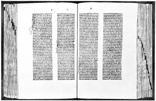
THE GUTENBERG BIBLE OF FORTY-TWO LINES
Photographed by Walter Gilliss from the copy for which Henry E. Huntington paid fifty thousand dollars at the sale of Robert Hoe’s library in 1911
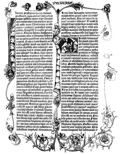
THE GUTENBERG BIBLE, ILLUMINATED
Less than half the size of the original which is in the British Museum. Not all pages in the book were decorated like this, and copies in other collections are illuminated in a different style. From Humphrey
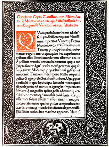
The Venetian style of typography and decoration
13
THE SPREAD OF TYPOGRAPHY
The city of Mainz is in the western part of Germany,
on the banks of the river Rhine, and even at the present
time is heavily fortified. In the year 1462, seven years
after Gutenberg’s first Bible was completed, it was the
scene of a terrible conflict between two archbishops,
Diether and Adolph II., who contended for the office of
elector. The elector had a vote in the selection of the
king or emperor, and Mainz was one of seven principalities
entitled to such an officer.
Diether was the choice of a majority of the citizens of
Mainz, but Adolph had the support of the pope in his
claims and made war to establish himself in the office.
One night in October, 1462, there was an uprising of the
followers of Adolph within the city and hundreds of the
inhabitants were murdered. The soldiers of Adolph then
entered Mainz and set it afire. Most of the citizens fled,
and industry and business
were paralyzed.
Gutenberg was not
affected by these events,
as his new shop was outside
of the city proper,
in the village of Eltville,
a short distance away.
The printing office of
Fust and Schœffer, however,
was burned, and
the workmen, fleeing
for safety from the distressed
city, took up residence
in various parts
of Europe. Thus was the
new art of typography
spread and its secrets
made common property.
As an introduction to
the consideration of the
spread of typography,
the accompanying table
may be of value. The
information is as accurate
as can be given after
carefully consulting
numerous authoritative
books on the subject.
Most writers disagree as
to the years in which
typography was introduced
into many of the
cities of Europe, and
for that reason in cases
where such doubt exists
one of the later dates has
been chosen for the purpose
of this table.
In Germany, before the capture of Mainz, John Mentel
at Strassburg and Albrecht Pfister at Bamberg, were printing
books by the new process. With this fact as a basis,
both Mentel and Pfister were once proclaimed inventors
of typography by over-enthusiastic students of printing
history.
Of the printers driven from Mainz by the sacking of
the city, Ulrich Zell is probably the best known, because
of his connection with the Coster-Gutenberg controversy.
Zell became rich as a printer and publisher at Cologne,
conducting an office there for more than forty years.
During all that time he never printed a book in the German
language. He had as business competitors twenty-one
other master printers, one of whom, Arnold Ter
Hoorne, was the first to make use of Arabic numerals.
Gunther Zainer began to practice typography at Augsburg
in 1468 and was
the first printer in Germany
to print a book in
Roman characters. He
was also one of the first
printers to encounter
restrictions by labor
unions. Zainer illustrated
his books with
woodcuts, and this the
block-printers’ guild objected
to. They induced
the magistrates to pass
a law against typographers
using woodcuts,
but this law was afterward
modified to allow
the use of woodcuts
when made by regular
engravers.
Heinrich Keffer
printed at Nuremberg
about 1470 under the
direction of John Sensenschmidt,
who in
1481, at Bamberg, published
his famous Missal,
printed with large
Gothic types of about
sixty-point body. Keffer
had been a witness for
Gutenberg in his law
suit of 1455.
Anthony Koburger
opened a printing office
at Nuremberg in 1473,
and later also conducted
offices at Basel in Switzerland,
and at Lyons in
France. Koburger was one of the most successful of the
early printers; he had twenty-four presses in operation
at Nuremberg alone and is said to have printed twelve
editions of the Bible in Latin and one in German.
| CITY AND COUNTRY |
YEAR THE ART WAS INTRODUCED |
BY WHOM |
| Mainz |
Germany |
1450 |
Johann Gutenberg |
| |
|
|
|
| Strassburg |
Germany |
1460 |
John Mentel |
| Bamberg |
Germany |
1461 |
Albrecht Pfister |
| Cologne |
Germany |
1464 |
Ulrich Zell |
Rome
[Subiaco] |
Italy |
1465 |
Conrad Schweinheim
Arnold Pannartz |
| Basel |
Switzerland |
1468 |
Bertold Ruppel |
| Augsburg |
Germany |
1468 |
Gunther Zainer |
| Venice |
Italy |
1469 |
John de Spira |
| Nuremberg |
Germany |
1470 |
Heinrich Keffer
John Sensenschmidt |
| Paris |
France |
1470 |
Ulrich Gering
Martin Crantz
Michel Friburger |
| Florence |
Italy |
1471 |
Bernardo Cennini |
| Utrecht |
Netherlands |
1473 |
Nicholas Ketelaer
Gerard de Leempt |
| Bruges |
Netherlands |
1474 |
Colard Mansion |
London
[Westminster] |
England |
1477 |
William Caxton |
| Barcelona |
Spain |
1478 |
Nicholas Spindeler |
| Oxford |
England |
1478 |
Theodoric Rood |
| Leipzig |
Germany |
1481 |
Marcus Brand |
| Vienna |
Austria |
1482 |
John Winterberger |
| Stockholm |
Sweden |
1483 |
John Snell |
| Haarlem |
Holland |
1483 |
Johannes Andriesson |
| Heidelberg |
Germany |
1485 |
Frederic Misch |
| Copenhagen |
Denmark |
1493 |
Gothofridus de Ghemen |
| Munich |
Germany |
1500 |
John Schobzer |
| Edinburgh |
Scotland |
1507 |
Androw Myllar |
| Mexico City |
Mexico |
1540 |
John Cromberger |
| Dublin |
Ireland |
1551 |
Humphrey Powell |
| Cambridge, Mass. |
[U.S.] |
1639 |
Stephen Daye |
| |
| THE SPREAD OF TYPOGRAPHY FROM MAINZ |
14
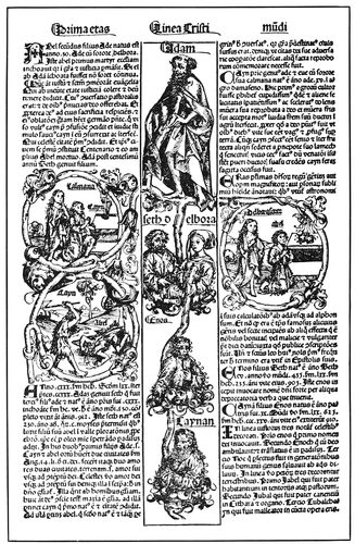
PAGE PRINTED BY KOBURGER
Combination of woodcuts and typography in a book of 1493
In Italy the first printing done with separate types was
in the year 1465 in the monastery at Subiaco, a village
on the outskirts of Rome. The cardinal in charge of the
monastery, impressed with the importance of the new
art and anxious to have it introduced into Italy, persuaded
Conrad Schweinheim and Arnold Pannartz to
come from Germany for the purpose. In 1467 these two
printers removed to the city proper and there printed more
extensively. Many classical works were produced, but
five years later they complained that a large portion of
the product had not been sold and that they were in distress.
Ulrich Hahn was the first printer in the city of Rome
proper, having opened an office there soon after Schweinheim
and Pannartz began work at Subiaco.
John de Spira (born in Spire, Germany) was the first
typographer at Venice, the Italian city famous for the
excellence of its printed books. Setting up a press in
1469, his work was of such quality as to obtain for him
exclusive right to print by the new process at Venice.
De Spira died in 1470 and the privilege was forfeited.
Nicholas Jenson, who came to Venice in 1470, is known
as the originator of the Roman type-face. Schweinheim,
Pannartz, Hahn and De Spira, all had used type-faces
based upon the letters of Italian scribes, but the types
had Gothic characteristics. Nearly all Roman type-faces
of the present day trace lineage, as it were, to the types
of Jenson.
With the exception of Gutenberg, Fust and Schœffer,
and perhaps Aldus, who succeeded him, Jenson is the
most conspicuous figure among the early printers. The
story of his introduction to the art is interesting: Charles
VII., King of France, in the year 1458 decided to send
an emissary to Mainz to learn the new art, which was
supposed to be a secret, and Jenson, then an engraver
and master of the royal mint at Tours, was selected for
the mission. Three years later he returned to Paris with
a full knowledge of typography, but found the king had
died and that his successor was not interested in the matter.
This condition of affairs seems to have discouraged
Jenson, for he did not begin to print until 1470, and then
at Venice, Italy. (A typographical error in a printed
date of one of his books makes it read 1461 instead of
1471, and encourages some writers to claim that Jenson
was the first Venetian printer.) The death of John de
Spira opened the field for other printers in Venice, and
Jenson was one of the first to take advantage of it.
Jenson cut but one set of punches for his Roman type-face,
the cutting being done so accurately that no changes
were afterward necessary. The Roman types, being less
decorative and more legible than the Gothic letters of
the Germans, allowed the use of capitals for headings. A
colophon, the forerunner of the modern title-page, was
set by Jenson entirely in capitals with the lines opened
up by liberal space. This colophon, which was probably
the first page of displayed type composition, is reproduced
below.
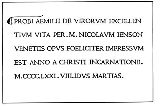
THE FIRST PAGE OF DISPLAYED TYPE COMPOSITION
Arranged by Jenson at Venice in 1471
It is an interesting fact that the books of Jenson do
not contain the letters J, U and W, these characters
not having been added to the alphabet until some years
later. To satisfy a demand he also cut and used a round
Gothic face. The product of Jenson’s presses represents
the highest attainment in the art of printing. His types
were perfect, the print clear and sharp, paper carefully
selected, and margins nicely proportioned.
Jenson died in 1481, honored and wealthy. His printing
office passed first to an association and then to one
whose fame as a printer perhaps surpasses that of
Jenson.
Aldus Manutius was a learned Roman, attracted to
printing about 1489 by the pleasures it afforded in the
publishing of books. He introduced the slanting style
of type known as italic, so named in honor of Italy and
fashioned after the careful handwriting of Petrarch,
an Italian poet. Italic at first consisted only of lower-case
15letters, small upright Roman capitals being used with
them. The reproduction below shows this combination
and also the peculiar style of inserting a space after the
capital letter beginning each line.
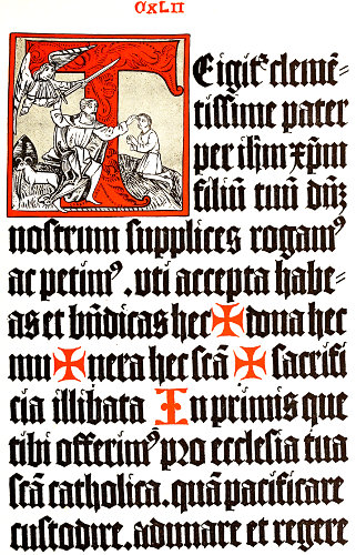
A page (actual size) from the famous Bamberg Missal
Printed by Sensenschmidt in 1481
Aldus also introduced the innovation of considerably
reducing the size of books from the large folio to the convenient
octavo. The size of a folio page is about twice
that of this one, which is known as a quarto, and an
octavo page is half the size of a quarto.
Aldus was the first to suggest the printing of a polyglot
Bible. The word polyglot means “many tongues”
and here refers to a book giving versions of the same
text or subject matter in several languages. The polyglot
Bible of Aldus was to have been in Hebrew, Greek
and Latin, but got no further than a few specimen pages.
The first polyglot work ever printed was a Psalter of
eight columns, each a different translation, from the press
of Peter Paul Porrus, at Genoa, Italy, in 1516. This
Psalter was the literary work of Augustin Justinian, a
Corsican bishop, who later also arranged an entire Bible
on similar plans.
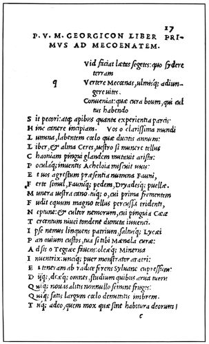
THE FIRST ITALIC TYPE-FACE
Page printed by Aldus at Venice in 1514
Aldus is honored wherever books are known, not only
on account of the excellence of his productions, but
because of the sincerity of his purpose and his love of
printing. In the first book printed by him at Venice he
declares for himself and co-workers: “We have determined
henceforth to devote all our lives to this good
work, and call God to witness that our sincere desire is
to do good to mankind.” In the production of classical
works Aldus was assisted by many scholar-refugees from
Constantinople, which city had been captured by the
Turks. Aldus’s fame spread thruout Europe, and many
visitors came to Venice to see him. This annoyed him to
such an extent that he had a notice placed above the
entrance to his printing office which in part read: “Whoever
you are that wish to see Aldus, be brief; and when
business is finished, go away.” It can thus be seen that
the present-day motto cards popular in business offices
are not a new idea.
Aldus’s complete name was Aldus Pius Manutius
Romanus, the first word of which is abbreviated from
Theobaldus.
There were more than two hundred printing offices in
Venice before the year 1500 and two million volumes
were produced. These figures may surprise the average
modern reader, who is not inclined to concede extensive
production to the past.
Bernardo Cennini, a goldsmith, introduced typography
into Florence, Italy, in the year 1471. It is claimed
that he made his tools, cast his types and printed without
instruction from German typographers, depending
upon verbal reports of the process and examination of
printed books. Cennini produced only one book.
Johann Numeister, who had been a pupil of Gutenberg,
after the death of his master journeyed toward Rome,
but for some reason stopped at the little Italian city of
Foligno and began to print there in 1470. He used both
Roman and Gothic types.
In Switzerland the new art was first practiced at Basel
about 1468 by Bertold Ruppel or Rodt, who had been
one of Gutenberg’s workmen. Basel was an important
printing center in the days when the art was young, and
gave to France its first typographers.
John Froben, who set up a press at Basel in 1491, is
perhaps the best known of the printers of that city, and
because of his use of the then new italic letters was
called the “German Aldus.”
In those days lived the famous Dutch philosopher and
theologian Erasmus, one of the brightest minds of
Europe. Erasmus, having heard of Froben, came to Basel
to arrange for the printing of his books, and thus began
a friendship which lasted many years. Erasmus became
a guest at the house of Froben, and his presence was a
big factor in that printer’s success. Erasmus once said of
Froben that he benefited the public more than himself,
and predicted that he would leave his heirs more fame
than money. (A book of one of the works of Erasmus,
printed by Hieronymus Froben, son of John, recently
sold for fifteen hundred dollars at a sale in New York.)
In France typography might have been introduced as
early as 1461 had not the death of Charles VII. interfered
with the plans of Jenson and caused him to go to
Venice. As it was, in the year 1470 Ulrich Gering,
Martin Crantz and Michel Friburger, three German
printers who had been working at Basel, Switzerland,
settled at Paris and began to print under the patronage
of two members of the University of Sorbonne. The
early books of this press were printed from a Roman type-face.
The quality of the work of these printers is said
not to have been good. Types were defective and presswork
deficient, many of the printed letters needing retouching
by hand.
Gering became rich and upon his death left much of
his fortune to the university within whose walls he had
first printed upon coming to Paris.
In order to demonstrate the success of the early printers
in decorating their books without the aid of illuminators,
a page is reproduced, printed about 1486 by
Philip Pigouchet for Simon Vostre, a bookseller of Paris.
The decorations were printed from wood blocks, engraved
16in the style of the Gothic period, with stippled backgrounds,
and are interesting to the printer because they
show early use of the pieced border, a method now familiar.
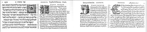
SPECIMENS FROM THE FIRST TWO PAGES OF THE POLYGLOT BIBLE IN HEBREW, LATIN AND GREEK. PRINTED BY PLANTIN AT ANTWERP. ABOUT 1569
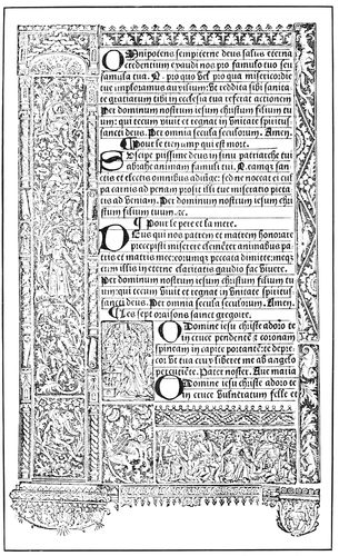
GOTHIC ORNAMENTAL PIECES
Book of Hours, printed for Simon Vostre at Paris in 1486
Henry Estienne settled in Paris in 1502 and was the
first of an illustrious family of typographers. The Estiennes
flourished until 1664, during that time printing
many remarkable books. A grandson of Henry Estienne
was the first to apply the system of numbered verses to
the entire Bible.
Robert Estienne, a son of Henry, was the best known
and most scholarly of the Estiennes. He was patronized
and favored by the King of France, and his press may
be said to have been the beginning of the celebrated
Greek Press of Paris.
Robert Estienne’s ambition, the printing of de-luxe
editions of the classics, was his undoing as well as his
making. The priests of the Sorbonne, upon the appearance
of a polyglot Bible in Hebrew and Greek from the
Estienne press, became enraged and Robert had to flee to
Geneva, Switzerland, for safety. There was little demand
in that city for elaborate books, but Estienne patiently
worked there until his death in 1559. His life had been
spent in a labor of love, for he had scorned money as a
reward for his work.
In the Netherlands typography was not practiced so far
as is known until 1473, when a press was erected at
Utrecht. While it is supposed that printing was done
before that time at Bruges, there is no direct evidence
to support the supposition. It is known, however, that
Colard Mansion printed at Bruges in 1474, and that he
taught typography to William Caxton, with him producing
the first book printed in the English language.
There is a book with the date 1472, printed at Antwerp
by Van der Goes, but this date is supposed to be a misprint,
as in the case of Jenson’s book of 1471.
Christopher Plantin, a Frenchman, who began to print
at Antwerp in 1555, gave to that city the renown which
it enjoys in the printing world. Plantin printed on a
magnificent scale, his luxurious notions extending to the
casting of silver types. His printing office was considered
one of the ornaments of the city and is today used
as a museum for the display of paintings and typographical
work. Plantin retained a number of learned men as
correctors of his copy and proofs, and the story is told
that his proof sheets, after undergoing every possible
degree of correction, were hung in some conspicuous
place and a reward offered for the detection of errors.
Plantin’s greatest work was his polyglot Bible of 1569,
a portion of which is reproduced above.
17Louis Elzevir, founder of the family of learned printers
of that name, first printed in 1595 at Leyden. The
second Louis Elzevir opened an office at Amsterdam in
1640. The product of the Elzevirs was of such quality
as to make them famous thruout Europe as printers of
the classics, and their books were extensively imitated
and counterfeited.
While Haarlem is claimed to have been the birthplace
of typography, a book cannot be produced printed in
that city with a date earlier than 1483, when Johannes
Andriesson had an office there.
In England the name of William Caxton is one to conjure
with among typographers, for Caxton was the first
to set type in that country, the event taking place
about the year 1477. Perhaps the thing that endears
Caxton to the hearts of English printers is that he was
born in England. The first printers of Italy, Switzerland
and France were Germans, but Caxton was English;
we have his own words to prove it: “I was born and
lerned myn englissh in Kente in the weeld where I
doubte not is spoken as brode and rude englissh as it is
in ony place in englond.”
Caxton had been apprenticed when a young man to a
merchant, and after his master’s death took up residence
at Bruges in the Netherlands, with which city England
did considerable trading. There he prospered and as
governor of the Merchant Adventurers had control over
all English and Scotch traders in the Low Countries. The
device later used by Caxton for his imprint is supposed
to have been copied from some trading mark of the Bruges
merchants.
Caxton resigned as governor and entered the service
of the Duchess of Burgundy, who encouraged him in
literary work. Under her patronage he translated (1469–1471)
a “Historie of Troye.” The demand for this work
was an incentive for Caxton to learn how to print it.
This he did with the assistance of Colard Mansion who
had started a printing office at Bruges.
Shortly afterward, Caxton returned to England and
set up a press in the vicinity of Westminster Abbey,
then on the outskirts of London. The first book with a
date printed by him is “The Dictes and Sayinges of the
Philosophers,” completed in November, 1477. His type-faces
are copies of those of Mansion, who in turn imitated
the letters of Dutch copyists. A type-face based
on Caxton’s letter is now made by an American foundry.
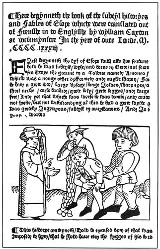
PAGE BY ENGLAND’S FIRST PRINTER
How Caxton arranged a book title in 1483
The product of Caxton’s press during his life is estimated
at eighteen thousand pages, nearly all of folio
size. Caxton did not print de-luxe editions as did other
of the early printers of Europe, but his productions were
no less interesting. On his first books the lines were
18not spaced to the full length. This gave to the right side
of the page a ragged appearance, as in modern typewritten
letters.
Caxton did not devote a separate page to a book title
until late in his life, when he printed a title alone in
the center of the first page. The reproduction (on the
preceding page) of a part of Caxton’s “Fables of Esope”
shows how the title was arranged at the page head.
Wynken de Worde, a native of western Germany,
was a workman under Caxton and upon the latter’s
death, about 1491, succeeded to the business of his
master. He continued to print in Caxton’s house for
several years, afterward removing to “Fleet-street at
the sygn of the Sonne,” in London proper. Old English
black-letter, which is now so popular, was used by
De Worde to a great extent, and he was the first printer
to introduce the Roman letter into England.
Richard Pynson, another of Caxton’s workmen and
friend of De Worde, set up a press in Temple Bar, London,
about 1492, and printed many useful books.
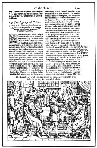
PAGE IN ENGLISH BY JOHN DAYE
From Fox’s famous “Acts and Monuments,” London, 1560
Richard Grafton is famous as a printer of English
Bibles during the troublous times of the Reformation.
The church authorities believed it was not good for the
people in general to read the Sacred Scriptures, and the
Bible, translated into English by William Tyndale and
Miles Coverdale, and printed anonymously by Richard
Grafton at Antwerp, was the object of much concern to
the ecclesiastics. The Bishop of London complained
that “Some sons of iniquity have craftily translated
the Holy Gospel of God into our vulgar English.”
After a long imprisonment Tyndale suffered death by
strangulation and burning. Grafton was imprisoned in
1540 for printing a large folio Old and New Testament
known as the “Great Bible.” This tremendous task of
printing was accomplished by Grafton in partnership
with Edward Whitechurch at Paris and London.
Shortly after this the prejudice against an English
translation was partly overcome, and in 1543 Parliament
passed an act allowing the Bible to be read by certain
classes, but forbidding women, apprentices, journeymen,
husbandmen or laborers to read it privately or openly.
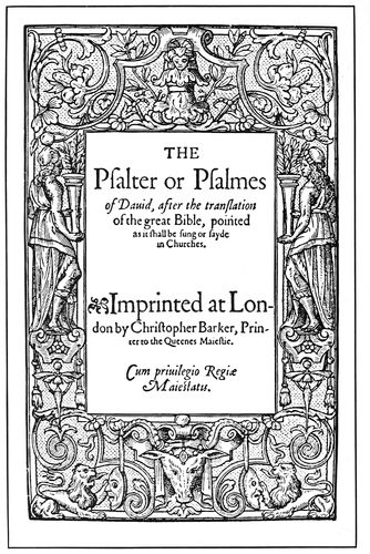
THE FIRST PSALTER IN ENGLISH
Printed at London about 1565 by Christopher Barker
John Daye, who first printed about 1546, was another
English typographer to suffer imprisonment on account
of activity in the Protestant cause. Many important
books were printed by Daye, and in character and accomplishments
he has been likened to Plantin who
printed during the same period at Antwerp.
The best known of the books printed by Daye is
Fox’s “Acts and Monuments,” on the subject of wrongs
and persecutions in the days of the Reformation. Dibden
says it was “a work of prodigious bulk, expense and labor.”
In Scotland printing was introduced in 1507 at Edinburgh
by Androw Myllar, in partnership with Walter
Chepman, under a patent granted by King James IV.
In Ireland a prayer book was printed by the new process
in 1551 at Dublin by Humphrey Powell.
In North America typography was first practiced in
1540 at Mexico City, Mexico, by John Cromberger.
In the United States, or rather the territory now included
under that name, typography was introduced in 1639 at
Cambridge, Massachusetts, by Stephen Daye.
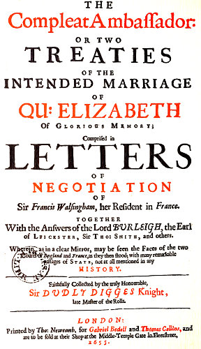
A title-page of many words and much type-display
(Actual size and color treatment)
19
TYPOGRAPHY IN COLONIAL DAYS
Typography has been an important factor in the development
of modern civilization. In the battle for civil and
religious liberty, in both Europe and America, the man
with the pen and he of the composing-stick have been
together on the firing line. With Paul they could well
boast that they had been “in perils of waters, in perils
of mine own countrymen,
in perils in the
city, in perils in the
wilderness, in weariness
and painfulness,
in hunger and thirst.”
William Tyndale died
at the stake, Richard
Grafton and John Daye
suffered imprisonment;
Robert Estienne became
an exile from his
own country; Jesse
Glover on his way to
America found a grave
in the waters of the
Atlantic; Stephen
Daye set type in a wilderness;
James Franklin,
William Bradford
and John Peter Zenger
were imprisoned, and
Benjamin Franklin
suffered hunger and
privation.
As ecclesiastical and
political conditions in
Europe strongly influenced
the practice of
typography during the
days of the American
colonies, I will briefly
review the events of the
sixteenth, seventeenth
and eighteenth centuries
that the reader may
better understand and
appreciate the subject.
In the year 1521,
when Luther appeared
before the Diet of
Worms in Germany, the
English people were
ardent Roman Catholics.
Henry VIII. was
King of England and
the great Cardinal Wolsey
was in high authority.
Henry, in the
early part of his reign, was exceedingly loyal to the
Catholic Church; he published a book in answer to the
attacks of Luther, for which the pope gave him the title
“Defender of the Faith.” However, when Henry wished
to divorce his wife that he could marry Anne Boleyn,
the church authorities did not approve. This so angered
the king that he took
from Wolsey his office
and possessions, denied
the authority of the
pope over the Church
of England, and had
himself declared the
supreme head of that
organization. The king
was excommunicated
by the pope and in
return Catholics were
persecuted and put to
death, and their monasteries,
colleges and
hospitals broken up.
Henry repeatedly
changed his religious
opinions, and for many
years both Catholics
and Protestants were
put to death for differing
with him.
For six years after
Henry’s death in 1547,
during the reign of his
son Edward VI., the
Protestants were in
power. Then for five
years under Mary the
Catholics controlled
the religious affairs of
the country, and the
flesh of “heresy” was
toasted at the stake.
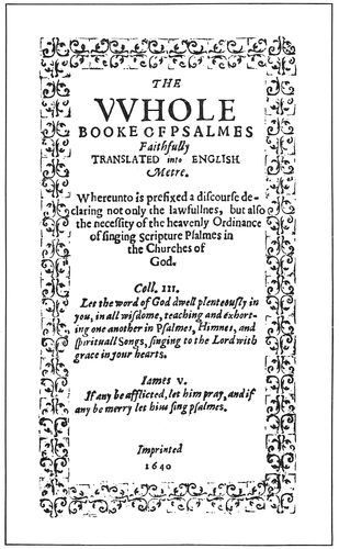
THE FIRST BOOK PRINTED IN ENGLISH AMERICA
By Stephen Daye at Cambridge, Mass., 1640. (Page slightly reduced)
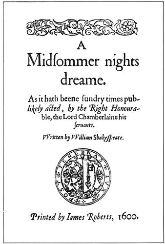
TITLE-PAGE OF A SHAKESPEARE BOOK
Printed in 1600, while Shakespeare was in the midst of his literary labors
Elizabeth, who began
to rule in 1558,
was proud of the appellation
“Virgin Queen”
and gave the name
“Virginia” to the English
colony in America.
She never quit spinsterhood,
but about the
year 1570 considerable
correspondence was
carried on between the
English and French
courts regarding her
20intended marriage. This resulted in the accumulation of
over three hundred letters, which eighty-five years later
were collected and printed as a 442-page quarto. (The
title-page is reproduced full size as an insert in this
chapter.) A poor Puritan named Stubbs and a poor bookseller
named Page published a pamphlet against the marriage
of Queen Elizabeth to the French king’s brother,
and tho the queen herself had said she would never
marry, these unfortunate subjects were punished for their
audacity by having their right hands cut off.
Under Elizabeth, the “Protestant” religion was permanently
established in England, but the enactment of
severe laws, such as prohibiting any one attending the
ministry of clergymen who were not of the established
religion, gave rise to dissenters derisively called Puritans
because they wished to establish a form of worship based
on the “pure” word of God. It was by these so-called
Puritans that printing was introduced
into English America.
Elizabeth reigned until 1603 and
was the last of the Tudor family
of sovereigns. The first of the
Stuart Kings, James I. (son of
Mary Queen of Scots), then
ruled until 1625, when he was
succeeded by his son Charles I.
Charles was a despot and claimed
that the people had no right to
any part of the government. A
civil war resulted, Charles was
beheaded (1649) and a form of
government known as the Commonwealth
was established.
Oliver Cromwell shortly afterward
became Lord Protector with
more power than the king had
possessed.
Cromwell was a Puritan, but
of the radical element known as
Independents, differing from another
element of Puritans known
as Presbyterians. The Independents
have come to be known
as Congregationalists. Under
Cromwell’s severe Puritanic
rule, sculpture and painting
were declared as savoring of
idolatry and public amusements
were sternly put down. However,
Cromwell encouraged printing
and literature. He was an
intimate friend of John Milton,
the blind author of “Paradise
Lost” (see title-page reproduced
on a following page), which
book was published in 1667, the
year following the Great Fire.
Milton was Latin secretary to
Cromwell, and published a book
which argued against royalty,
for which, on the accession of
Charles II., he was arrested.
In 1657 (the year before Cromwell
died) was published the sixth
and last volume of the London
Polyglot Bible, compiled by
Brian Walton and printed by
Thomas Roycroft. In this Bible
there were used nine languages:
Hebrew, Chaldee, Samaritan,
Greek, Syriac, Arabic, Ethiopic,
Persian and Latin. The work took
four years in printing, and was the first book ever published
in England by subscription. Cromwell encouraged
the undertaking by allowing paper to be imported into
England duty free, and by contributing a thousand
pounds out of the public money to begin the work.
In those days the Puritans presented a curious contrast
to the Royalists. The Puritan, or “Roundhead” as he
was also called, wore a cloak of subdued brown or black, a
plain wide linen collar, and a cone-shaped hat over closely-cut
or long, straight hair. The Royalist, or “Cavalier,”
wore clothes of silk or satin, a lace collar, a short cloak
over one shoulder, short boots, and a broad-brimmed
beaver hat adorned with a plume of feathers.
The period designated as the Restoration, long celebrated
by the Church of England, began soon after
Cromwell’s death, when in 1660 Charles II. ascended
the throne. This period brought with it a reaction from
21the Puritanic conditions that previously existed and all
sorts of excesses were practiced. Cromwell’s body was
taken out of its grave in Westminster Abbey, hanged on
a gallows and beheaded.
It was during the reign of Charles II. (1665) that the
Great Plague killed one hundred thousand people in
London, a terrible experience followed by one equally
terrible the next year: the Great Fire, which consumed
thirteen thousand houses.
In 1688 there was another revolution; the people
passed a Bill of Rights, and set a new King (William III.)
on the throne.
George I., the head of the dynasty now represented
in England by King George V., came to the throne in
1714. He was a German, could not speak English, and
was the grandfather of George III., the “villain” in the
great drama of the American Revolution.
In France the Protestant Huguenots were persecuted
by Cardinal Richelieu, whose strong personality dominated
King Louis XIII. from 1622 to 1642, and many of
them left for America. In 1643 Louis XIV. became
King of France and his long reign of seventy-two years
is renowned because of the magnificence which found
expression in sumptuous buildings, costly libraries,
splendidly-bound books, and gorgeous dress.
Cardinal Mazarin, in whose library was later discovered
a copy of Gutenberg’s Forty-Two-Line Bible, acted as
advisor while Louis XIV. was under age.
In the seventeenth and eighteenth centuries many
mechanics in England worked for a shilling a day; their
chief food was rye, barley and oats; and one-fifth of the
people were paupers. Teachers taught their scholars
principally by means of the lash, masters beat their servants
and husbands their wives. Superstition was strong
and children and grown folks were frightened with lugubrious
tales into being “good.” This spirit is especially
noticeable in the chap-books that were sold during the
seventeenth and eighteenth centuries. A title to one of
these chap-books (dated 1721) reads:
A Timely Warning to Rash and Disobedient Children; being a
strange and wonderful Relation of a young Gentleman in the
Parish of Stepheny in the Suburbs of London, that sold himself
to the Devil for twelve years to have the Power to be revenged
on his Father and Mother, and how his Time being expired, he
lay in a sad and deplorable Condition to the Amazement of all
Spectators.
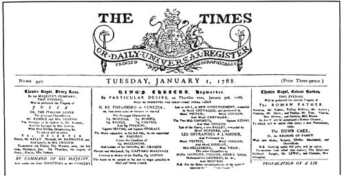
THE FIRST ISSUE OF THE LONDON “TIMES” UNDER THAT TITLE. 1788
The heading mentions that logotypes were used in the composition of this newspaper
Children in those days were either devilishly bad or
ridiculously good. Read this title-page:
The Children’s Example; shewing how one Mrs. Johnson’s
Child of Barnet was tempted by the Devil to forsake God and
follow the Ways of other Wicked Children, who us’d to Swear,
tell lies, and disobey their Parents; How this pretty innocent
Child resisting Satan, was Comforted by an Angel from Heaven
who warned her of her approaching Death; Together with her
dying Speeches desiring young Children not to forsake God, lest
Satan should gain a Power over
them.
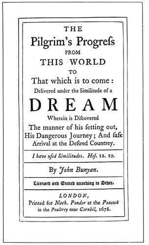
FIRST EDITION OF “PILGRIM’S PROGRESS”
Title-page (actual size) of Bunyan’s well-known book, London, 1678
Jack the Giant Killer, the
hero of our childhood days,
was a favorite subject for chap-book
exploitation. There is
shown on the following page
the title of such a “history.”
Chap-books are poor representatives
of the art of typography
in Colonial days because
they were to the book industry
then what reprint books
are to the trade in our time.
Today it is customary for some
publishing houses to buy up
old electrotype plates of obsolete
editions of dictionaries
and other popular books. The
plates having already been put
to extensive use, are battered
22and worn, and impressions from them cannot be accepted
as criterions for determining the quality of modern printing.
Neither are the chap-books true printing representatives
of their times. The woodcuts, crudely drawn in
the first place, were also worn and battered by repeated
use.
PAGE FROM A “CHAP-BOOK”
Probably a Dicey product of the eighteenth century
In the early part of the seventeenth century chap-books
were 8vos. (sixteen pages of about 5 × 8 inches),
but later were reduced to 12mos. (twelve or twenty-four
pages of about 4 × 6½ inches). The stories were condensed
to fit these small penny books, which were peddled
by chapmen. A chapman is described in a “Dictionarie”
of 1611 as “A paultrie Pedlar, who in a long
packe, which he carries for the most part open, and
hanging from his necke before him hath Almanacks,
Bookes of News, or other trifling ware to sell.”
Many of the chap-books of the eighteenth century were
printed and published at Aldermary-Church-Yard and
Bow-Church-Yard, London, by William and Cluer Dicey,
afterward C. Dicey only. The Dicey books were better
productions than those of their imitators. It is not possible
to determine the exact year in which the majority
of chap-books were printed, as many title-pages merely
read “Printed and sold in London,” etc., or “Newcastle;
printed in this present year,” without the formality
of the date.
There were also other cheap productions known as
broadsides, single sheets about 12 × 15 inches, in most
cases printed broadwise of the paper and on one side
only.
On December 21, 1620, there landed at Plymouth
Rock, in what was afterward the colony of Massachusetts,
a band of Puritans from England. These non-conformists,
unable conscientiously to obey the laws of their
native country, had come to America to worship God in
their own manner. Ten years later Governor Winthrop
with one thousand Puritans landed at Charlestown, and in
the following year these immigrants began to settle Cambridge
and Boston. A building for an academy (now
Harvard University) was erected at Cambridge in 1638,
and in 1639 Stephen Daye began to print there.
For the establishment of this, the first printing office
in what is now the United States, Rev. Jesse Glover, a
Puritan minister of some wealth, was chiefly responsible.
Himself contributing liberally, he solicited in England
and Holland sufficient money to purchase a press and
types, and June 7, 1638, entered into a contract with
Stephen Daye, a printer, to accompany him to the new
country. Rev. Glover (with his family, Stephen Daye
and the printing outfit) embarked on a vessel for New
England, but on the voyage across the ocean he was
taken ill and died.
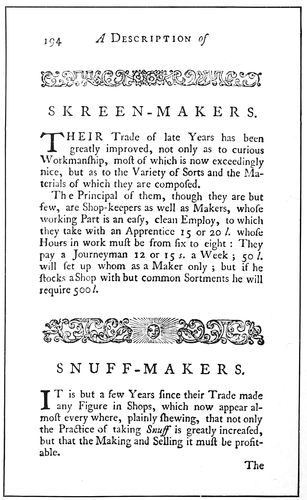
PAGE FROM “DESCRIPTION OF TRADES.” LONDON, 1747
Showing use of decorative bands to separate subjects
The press and types having reached Cambridge were
finally placed in charge of Stephen Daye and printing
was begun in 1639. The first work produced was “The
Freeman’s Oath,” probably a single sheet, and the first
book (1640) was the “Booke of Psalmes,” familiarly
known as the “Bay Psalm Book.” (The reproduction on
the first page of this chapter is from one of these books
23preserved in the public library, Forty-Second Street, New
York.) This book of Psalms is a revision of Ainsworth’s
version of 1612, and was in use in New England for upwards
of a century, more than fifty editions having been
published. The size of the type-page of the first edition
is 3¼ × 6¼ inches.
In quality of presswork this first book of Stephen Daye
affords a decided contrast to the Bible of Gutenberg, near
which it lies in the cases at the public library. The print
on the pages of the Psalm Book is uneven in color and
impression, while that on the pages of the Bible is dense-black
and firmly and evenly impressed. The reproduction
of the title-page of the Psalm Book does the original
no injustice. It is difficult to determine whether the
shoulders of the border printed the angular lines, or
whether these are a part of the design. It is interesting
to note how in the word “Whole,” Daye formed a W
by combining two Vs, his font of types being one evidently
intended for Latin work only.
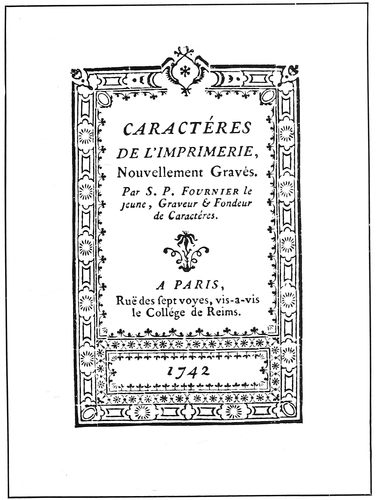
FRENCH SPECIMEN OF 1742
(Actual size)
Daye continued in charge of the printing office for
about ten years. Jesse Glover’s widow had married
Henry Dunster, the first president of Harvard College,
and Dunster, for his wife and as president of the college,
managed the printing office and received such profits as
were made. For some reason Daye in 1649 ceased to be
master printer and Dunster appointed Samuel Green to
the position. Green had come from England in 1630
with Governor Winthrop, but was not a printer at that
time.
The commissioners of the united colonies, who had in
charge the propagation of Christianity among the Indians,
added another press to the one already at Cambridge,
together with types, etc., for the purpose of printing the
Bible and other books in the Indian language. In 1662
Green gave to the commissioners the following “account
of utensils for Printing belonging to the Corporation:”
The presse with what belongs to it with one tinn pann and two
frisketts.
Item two table of Cases of letters with one ode Case.
Item the ffont of letters together with Imperfections that came
since.
Item one brasse bed, one Imposing Stone.
Item two barrells of Inke, 3 Chases, 2 composing stickes, one
ley brush, 2 candlestickes one for the Case the other for the
Presse.
Item the frame and box for the sesteren.
Item the Riglet brasse rules and scabbard the Sponge 1 galley
1 mallett 1 sheeting sticke and furniture for the chases.
Item the letters that came before that were mingled with the
colledges.
CASLON TYPES AND ORNAMENTS
From the specimen book of W. Caslon and Son, London, 1764
In 1670 the commissioners presented this equipment
to Harvard College. Green continued to print until he
was very old, and upon his death in 1702 the printing
office was discontinued.
Before 1740 more printing was done in Massachusetts
than in all the other colonies. Printing was not introduced
into the colony of Virginia until about 1727, principally
because the authorities deemed it best to keep
the people in ignorance.
Pennsylvania was the second English colony in America
in which typography was practiced. The charter of
this colony was granted to William Penn in 1681 and in
1687 William Bradford at his printing office “near Philadelphia”
printed an almanac. This was a sheet containing
the calendar of twelve months (beginning with March
and ending with February, as was customary in the seventeenth
century). In England, Bradford had worked for a
printer who was intimately acquainted with George Fox,
founder of the Society of Friends (Quakers). This influenced
Bradford to adopt the principles of that sect and he
was among the first to emigrate to Pennsylvania in 1682.
24
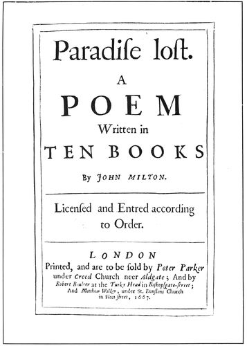
FIRST EDITION OF “PARADISE LOST”
Title-page (slightly reduced) of Milton’s famous book, London, 1667
Bradford became involved in a quarrel among the
Quakers of Philadelphia and in 1692 was arrested for
printing a pamphlet. The sheriff seized a form of type
pages to be used as evidence, and it is said that Bradford
later secured his release because one of the jurymen in
examining the form pushed his cane against it and the
types fell to the floor, “pied” as it is technically expressed.
The trouble into which Bradford found himself
in Philadelphia very likely influenced him in 1693
to leave that city and establish a printing office in New
York “at the sign of the Bible” (the site at 81 Pearl
Street is now marked by a tablet), his being the first
printshop in New York and the only one for thirty years.
He was appointed in 1693 official printer to the government.
In 1725, when Bradford was sixty-one years old,
he began the publication of the first newspaper in New
York (the Gazette).
No review of Colonial printing would be complete
without an account of Benjamin Franklin, whose birthday
(January 17) is each year widely celebrated. Franklin’s
father was an Englishman who came to New England
about 1685, and Benjamin was born in Boston in
1706, the youngest but two of seventeen children. He
came near being a minister, a seaman, a tallow-chandler
or a cutler, but love of books caused him
finally to be indentured to his brother,
James Franklin, who had opened a
printing office in Boston. Benjamin
was twelve years of age when indentured
and was to serve as apprentice
until his twenty-first birthday. Making
an arrangement with his brother to
be allowed to furnish his own board,
Franklin provided himself with meals
“often no more than a biscuit or a slice
of bread, a handful of raisins, or a tart
from the pastry cook’s and a glass of
water,” using the money thus saved
for the purchase of books. In 1721
James Franklin began to print a newspaper
(the New England Courant) and
Benjamin tells how some of his
brother’s friends tried to dissuade him
from the undertaking, “one newspaper
being, in their judgment, enough for
America.” Some articles in this newspaper
giving offense to the Assembly,
James Franklin was imprisoned for a
month, and on his discharge was forbidden
to publish the Courant. To
evade this order Benjamin’s name was
substituted for that of James Franklin
as publisher.
A short time afterward (1723) the
brothers disagreed, and Benjamin left
Boston, coming by ship to New York.
Here Franklin offered his services to
William Bradford, then the only printer
in the city, but he could give him no
work. However, he suggested that
Franklin go to Philadelphia where
Andrew Bradford, his son, had a shop.
Franklin did not succeed in getting
work with Andrew Bradford, but was
more fortunate with Samuel Keimer.
The printing house of Keimer, as described
by Franklin, consisted of an old
damaged press, a small worn-out font
of types, and one pair of cases. Here
Franklin worked until he left for England
to select an equipment for a
new printing office to be established
by him in Philadelphia. At that time there was no type
foundry or press manufactory in the United States.
Franklin had been encouraged by Governor Keith with
promises of financial assistance, but the trip to London
proved a fool’s errand and Franklin went to work in a
printing office there as a journeyman, first at the press,
later in the composing-room. (It is told that forty years
afterward when Franklin was residing in Great Britain,
he went into this printing office and with the men there
drank “Success to printing.”) He returned to Philadelphia,
worked as a foreman for Keimer, and then with
a partner, Hugh Meredith, opened a printing office.
One of the first jobs done by the new firm was forty
sheets of the history of the Quakers, set in pica and long
primer. Franklin tells how he “composed a sheet a day
and Meredith worked it off at press; it was often eleven
at night, and sometimes later, before I had finished my
distribution for the next day’s work. But so determined
I was to continue doing a sheet a day that one night,
when, having imposed my forms, I thought my day’s
work over, one of them by accident was broken and two
pages reduced to pi, I immediately distributed and composed
it over again before I went to bed.”
In 1732 (for the year 1733) Franklin first published
25“Poor Richard’s Almanack.” For this purpose he used the
name of Richard Saunders, an English astrologer. This
almanac continued to be published by Franklin for
twenty-five years, nearly ten thousand copies being sold
annually. The two pages here reproduced are full size,
and as it is likely that Franklin gave close attention to
the typography it will be interesting to study their arrangement.
They are good examples of title-page and
tabular composition of Colonial days.
Franklin considered this almanac a proper vehicle for
spreading instruction among the common people, and
filled the little spaces that occurred between the remarkable
days in the calendar with proverbial sentences. These
proverbs, which contained the wisdom of many ages and
nations, were latter gathered together as a harangue of a
wise old man under the title “The Way to Wealth,” and
the familiar phrase “As Poor Richard says” is often repeated
therein.
In 1748 Franklin took as a partner David Hall, the
firm name being Franklin & Hall until 1766, when Hall
became sole proprietor.
Quaintness is the chief characteristic of Colonial typography.
While the treatment lacks the artistic quality, the refinement,
and the dainty finish of the productions of Aldus,
Froben and other printers of classics, it has natural simplicity,
human interest, and an inexpressible something
that makes it attractive to the average printer of today.
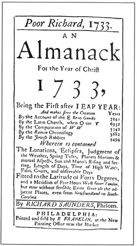
TWO PAGES FROM “POOR RICHARD’S ALMANACK”’
Printed by Benjamin Franklin in 1732
The title-page of the “Compleat Ambassador,” showing
the actual size of the original, is constructed in a
severely plain manner, a style known as the “long and
short line,” with catchwords.
The “Midsommer Nights Dreame” title-page is one
of the most artistic of Colonial pages, printed when
Shakespeare was in the midst of his famous literary labors
(1600). To get contrast the compositor alternated lines
of roman with lines of italic. The spacing material could
not have been accurate, and two capital V’s were used for
a W, as in the Daye title-page.
The “Paradise Lost” title-page is a poor specimen of
composition and presswork. It was common in Colonial
days to surround the type-page with a double rule border,
and in this specimen the rules are bent and battered.
Printed in 1667, it is a part of the first edition of Milton’s
famous book.
The London Times heading is interesting, representing
as it does the first number, under the new name, of a
newspaper which has since become world-famous. The
26heading mentions that the Times was printed “logographically.”
Logotypes (two or three letters cast together)
were being experimented with to facilitate type composition,
but did not prove successful.
ITALIAN SPECIMEN OF 1776
Showing use of decoration
The printers “At the Peacock in the Poultrey near
Cornhil” surely were good workmen. The “Pilgrim’s
Progress” title-page is a finished bit of printing.
The custom of using decorative border units to make
printed books attractive was seemingly practiced thruout
Europe. The Italian page of 1776 is an example of
this, as is also the French specimen of 1742.
The page from the Colonial book, “Description of
Trades,” exhibits the use of the decorative band for dividing
subjects, which idea has possibilities in the direction
of general job printing that make it worthy of experiment.
Because Caslon types and ornaments were extensively
used by Colonial printers I have reproduced on a previous
page specimens of types and ornaments from the type-specimen
book of W. Caslon & Son, printed in 1764. The
Caslon type-face was original in the sense in which the
type-face cut by Jenson was original; both had characteristics
which identified them with their designers, but
both also had a general resemblance to type-faces previously
used. The Roman face cut by Caslon bears a
marked similarity in its capitals to the type-faces used by
Thomas Newcomb on the title-page of the “Compleat
Ambassador” (see insert).
There are shown here two specimens of type-faces designed
by Bodoni, which were the first of the so-called
“modern” romans. The letters reveal a thinning of the
lighter lines and a thickening of the heavier lines. The
serifs are straight and sharp. The design of the letters
was such as to afford the typefounders of the nineteenth
century a model upon which to base their efforts at mechanical
accuracy in the cutting of type-faces. As a result
of the introduction of Bodoni’s new type-face there
was not a type foundry in the world in 1805 making the
old-style roman type-faces. Giovan Battista (John Baptist)
Bodoni was a printer-typefounder of Parma, Italy.
The illustrations in this chapter were in most instances
photographed from originals in the New York Public Library,
the library of the New York Typothetæ, and the
private library of The American Printer.
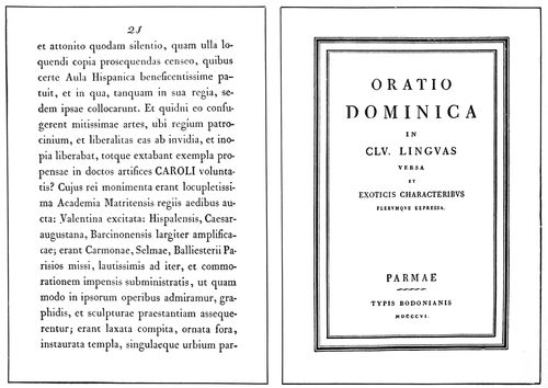
Pages from Bodoni books of 1789 and 1806, showing the first “modern” type-faces
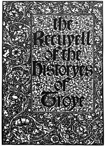
Title-page of the “Historyes of Troye” designed by Morris and engraved on wood
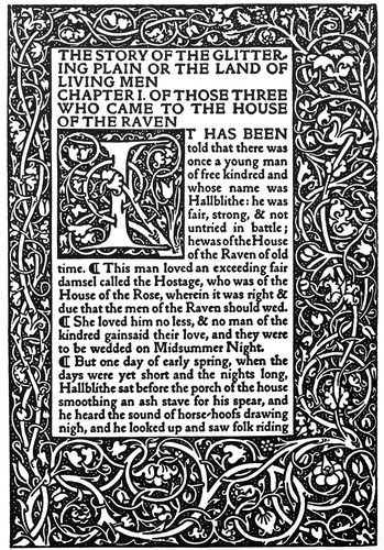
First text page of “The Story of the Glittering Plain” showing the “Golden” type
The Morris style of typography and decoration
27
TYPOGRAPHY IN THE 19th CENTURY
It was near the close of the nineteenth century when
William Morris, the distinguished exponent of strength
and simplicity in art, declared that “no good printing
has been done since 1550.” According to this statement
one hundred years after its invention typography forfeited
its place among the esthetic arts, and then for
three hundred years remained below the standard set by
its inventor. By setting his date at 1550 Morris overlooked
the achievements of such eminent printers as
Plantin and the Elzevirs, but his arraignment probably had
some justification.
Posterity had defaulted
in its administration
of the legacy
left by Gutenberg.
The first book
printed from separate
types, as an example
of artistic
arrangement and
careful workmanship,
is a remarkable
testimony to the
genius of the inventor,
especially when
the completeness of
the invention is compared
with the initial
productions of later
inventors. The first
cylinder press and
the first linotype
machine were both
crudely constructed.
Typography attained
its highest
point toward perfection
in Italy in the
days of Jenson and
Aldus. The Italian
style of lettering
and decoration differed
greatly from
the German. There
were dignity, refinement,
a dainty neatness,
in the printed
pages of the Venetians,
and their
type-faces were precise
and of a dark-gray
tone. The German
page, with its
bold Gothic letters
arranged in masses
of black, was characteristic of the religious fidelity and
sturdiness of the dwellers on the banks of the Rhine.
As the art of printing spread, the German and Italian
styles became mingled, finally resulting during Colonial
days in a style of typography which represented the
Italian modified by the German just enough to make it
interesting. But typography as an art was in a state of
deterioration. Even Franklin, called by the printers of
America their “Patron Saint,” as a typographer lacked
the artistic perception of Aldus and Plantin, altho he was
a superior mechanic
and a shrewd business
man.
The beginning of
the nineteenth century
found the practice
of typography
leaning more than
ever toward utility
and away from art.
William Nicholson,
an Englishman, had
planned a cylinder
printing press, and
Dr. Kinsley, of Connecticut,
had constructed
a model of
one. A roman type-face
on severe, mechanical
lines had
been designed, and
picturesque old
romans such as the
Caslon were going
out of use. Ornaments
and borders
were being discarded,
and the style of
typography was
getting uninteresting
and losing the
personal element.
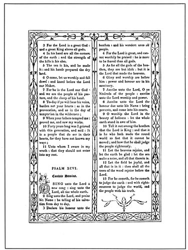
PLEASING BORDER ARRANGEMENT
Letterpress imitation of the decoration of double-column pages on early books. From the “Book of Common Prayer,” London, 1814
To illustrate this
transition there are
reproduced four
representative title-page
arrangements.
The first is that of
a book on printing
published in 1810,
containing several
lines of the then new
roman type-face. In
arrangement this
page is similar to the
28“Queen Elizabeth” page inserted in the chapter on Colonial
typography which is perhaps the source from which
came the “long-and-short-line” and “catch-word” style
of the average title-page of the nineteenth century. The
second example of the group shows a displayed page of
1847 similarly treated, and the third is a reproduction
of the title-page of a printer’s manual of 1872. This last-mentioned
example is the product of a prominent type
foundry of that time and very likely was arranged in
the style then accepted as good typography. A more uninteresting
page could hardly be conceived, especially
in a book intended for printers.
DESIGN MADE WITH BRASS RULE
Executed in 1879, it is one of the best specimens of the rule-curving period
The fourth example is a reproduction of the title-page
of MacKellar’s well-known manual, “The American
Printer” (now out of print), and presents what to the
head of the most prominent American type foundry was
probably an ideal arrangement. While revealing the
long-and-short-line characteristics of the previously mentioned
pages, as a whole the effect is more interesting to
printers. In this page may be noticed the trend toward
delicate, characterless typography.
A printer, Charles Whittingham, of the Chiswick Press,
and a publisher, William Pickering, of London, England,
furnish an example of effort made in the middle
of the nineteenth century to raise the practice of typography
to a more artistic standard. These men, both
lovers of books, and artists in temperament, had become
intimate friends, and together endeavored to introduce
into their publications simplicity, appropriateness, and
other artistic qualities.
Desiring to use an old-style face on one of their books,
Whittingham inquired of the Caslon type foundry if any
of the punches cut by the first William Caslon were in
existence. The original punches being recovered after
years of disuse, fonts of type were cast and used on a book,
“The Diary of Lady Willoughby,” printed in 1844. The
title-page of this book is reproduced on a following page,
and it will be seen that Whittingham arranged the typography
in the Colonial style to harmonize with the literary
motive of the book. So well was this done that one
has to look twice at the date to satisfy himself it is not
1644. Other typography from these men is not quite so
radically different from that of their contemporaries, but
is more refined, artistic and tasteful, as may be seen by
the “Friends in Council” page further on in this chapter.
An innovation by Whittingham was the omission of
punctuation marks excepting where needed to make
clear the significance of the wording.
Whittingham and Pickering, in the field of artistic
typography, were fifty years ahead of their time, as printers
in general were not ready to accept the good things
offered them. The modern renaissance came later.
Job printing as a distinct department is of modern
development. Typographers of old were primarily book
and pamphlet printers, and in many cases interest was
chiefly centered in publishing newspapers or almanacs;
job printing was incidental. This caused similarity in
the typography of newspaper, book and job work, a condition
29that today exists only in a small degree. Now
these three classes of work are generally separated into
departments, each with its own rules, styles and practices,
job composition being less restrained by customs
and rules than any of the other departments.
TITLE-PAGE OF 1872
Showing the development during the nineteenth century of a severe and uninteresting style
Attractiveness is as necessary to the typography of the
general job of printing as dignity and legibility are to a
law brief, but, endeavoring to get attractiveness into
their work, job printers often go astray. They wrongly
labor under the impression that to have a job distinctive
it must be made freakish. Typography is not good unless
based upon art foundations.
Ideas in plenty could have been plucked by the printer
of the nineteenth century from old books, especially
from those printed for religious organizations, such as
the “Book of Common Prayer.” A handsome edition of
a book of this kind was printed in London by John
Murray in 1814. Each pair of pages is different in decoration
and typography, the designs being by “Owen
Jones, architect.” The decorative treatment of the page
of Psalms reproduced from this book is worthy of study
and adaptation.
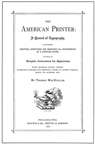
THE TREND TOWARD DAINTINESS
Title-page of MacKellar’s manual, “The American Printer,” 1882
About the time of the Civil War the job printer was
less fettered than ever by the customs of the book
printer. While title-pages of books were being composed
without ornamentation in severe-looking modern romans,
the job printer, influenced by the typefounder, took a
liking to fancy typography, for the production of which
there were shaded, outlined, rimmed and ornamental
letters, in imitation of the work of the copperplate engraver.
The business card on the next page, and the
“bill of fare” here shown, are specimens of such work.
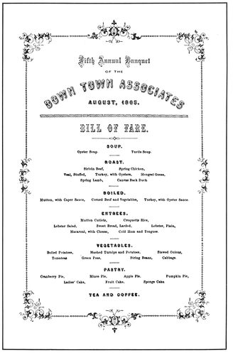
BANQUET PROGRAM
As arranged in Boston in 1865
The changing styles of typography as applied to commercial
headings are well set forth by the group on the
fifth page of this chapter. The first specimen is a
“plain” billhead of 1870. The second is a billhead of
1893, when the compositor was taught to corral all excess
wording in an enclosure of rules at the left side of
the heading proper. In this specimen there is a touch
of ornamentation and a showing of seven different type-faces,
one of which is the then conventional script for
the date line. The third specimen of the group, a letterhead
which won first prize in a contest held in 1897,
reveals further development of simple typography. Only
one face of type is used (Tudor black) and there is no
ornamentation excepting a few periods on each side of
the word “The.”
During the nineteenth century no type foundry did
more toward influencing the typography of the general
job printer than the one known at the time of its absorption
by the American Type Founders Company as MacKellar,
Smiths & Jordan, of Philadelphia. The reproduction
of a few clippings from its specimen book of 1885
may recall memories to the printer now of middle age.
The Free Press business card has peculiar interest to
the author. It was set and printed by him during dull
hours about the year 1889, when his thinking apparatus
was controlled by influences from the underworld of
typographic practice.
There is another phase of late nineteenth-century
typography which should be mentioned. It seems that
printers had developed a longing for pictures, color and
30decoration.
The process
of photo-engraving
not having
been perfected,
job
printers
shaped
brass rule
into representations of
composing-sticks,
printing presses, portraits
and architectural
designs, and cut tint
blocks from patent
leather and other material.
The skill exhibited
by many printers is
remarkable; beautiful
combinations of tints
were produced. It will
be difficult for many persons to believe
that the “Boston Type Foundry”
design (shown on a preceding
page) was originally constructed with
pieces of brass rule, but such is the
fact. It was composed by C. W. L.
Jungloew in 1879, and is truly a
wonderful example of the work of the
printer-architect. The perspective
obtained by the designer is a feature.
Black, gold, and several tints were
used in the printing.
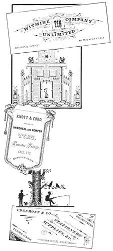
“IN THE GOOD OLD DAYS”
From a specimen book of 1885
Interesting as are these
wonders of the curved-rule
period, they are not artistic
in the true sense of the word;
examples of skill
indeed, but not art
as it is today understood.
We now come to
one of the most interesting
periods
in the history of
printing, a period
which may well
be termed the
“Modern Renaissance.” As was intimated earlier in this
chapter, the invention of printing machinery served to
lead typography away from art. The printers of that
time thought they were doing artistic work when they set
their jobs in fancy type-faces, twisted brass rule, or printed
in many colors. They did not know that art-printing was
simplicity—and something else. The apprentice was
taught to set type as was his journeyman instructor before
him. Any inspiration he received came from the typefounders,
and even that was often interpreted wrongly.
Ten years before the close of the nineteenth century
display typography was in a chaotic state so far as art
was concerned. Printers who before had not doubted the
appropriateness and quality of their own typography,
began to realize that it lacked something they were not
able to supply, and were ready to follow a Moses who
could lead them to better things. Then began to form a
curious chain of events that was to have a revolutionary
influence upon commercial typography as well as upon
commercial art. The first link in this chain was the
establishing of the Kelmscott Press in England by William
Morris.
William Morris was an artist, a poet, a designer and
a craftsman. Partiality for things medieval showed itself
early in his life, and before he took up printing he
manufactured artistic house furnishings in the ruins of
an old abbey.
Years ago if the average American citizen were asked
what great thing Benjamin Franklin did, his answer might
have been, “He invented the Franklin stove.” The average
person of today would connect the name of Morris
with the Morris chair. As the application of art principles
to typography has caused the compositor to turn
from rule curving, to set his lines straight, and to seek
paper and ink without luster, so the influence of Morris led
to a distaste for gilt and polish and trimmings, and
created a demand for subdued colors and straight lines
in home furnishings. He who can influence others to
think and act in manner different and better than they
have done before, is truly great.
Morris lived in a picturesque old manor-house in Kelmscott
on the Thames in England, and it was there at the
age of fifty-seven years that he began to print. He was
not a printer by trade, but before a type was set he
studied the art from the beginning. He even learned to
make a sheet of paper himself. Kelmscott Press paper
was made by hand of fine white linen rags untouched by
chemicals. Morris as a handicraftsman had an abhorrence
for machinery. It is doubtful if he would have
used even a hand-press if results equally good could have
been obtained without it.
Morris’s idea seems to have been to take up good typography
where the early printers left off. When he wanted
types for the new printshop he had enlarged photographs
made of the type pages of Jenson, Koburger and
other printers of the fifteenth century, and from these
photographs designed his type-faces, arranging the details
of the letters to conform to his own ideas.
His roman type-face he called “Golden,” probably
because of its use on the “Golden Legend.” This type-face
was afterward reproduced by foundries in America
as Jenson, Kelmscott, and other type-names. Morris was
wont to say that he considered the glory of the Roman
alphabet was in its capitals, but the glory of the Gothic
alphabet was in its lower-case letters. He also designed
a type-face characteristic of the Gothic letters used
by Koburger and other fifteenth-century printers, and,
probably because of its use on the “Historyes of Troye,”
called it Troy. This type also was reproduced by type
foundries, and printers knew it as Satanick and Tell
Text.
The space ordinarily assigned to the page margins
Morris covered with foliage decoration in the manner
of the early Italian printers, large decorative initials
blending with the borders. These initials and borders,
with few exceptions, were drawn by himself and engraved
upon wood by W. H. Hooper. Compare the right-hand
page of the two pages here reproduced with the Venetian
specimen in the chapter on “The Spread of Typography.”
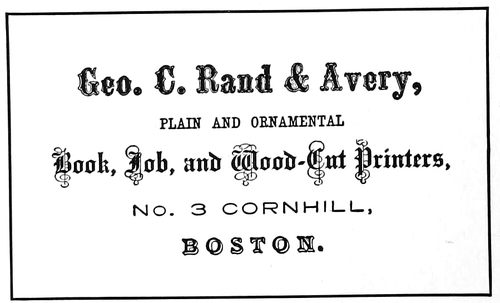
BUSINESS CARD
As displayed in 1865
One of Morris’s books, an edition of Chaucer, was
additionally
enriched by
upward of
a hundred
illustrations
by Burne-Jones,
a
noted British
artist.
In both
England
and America
Morris was
the subject
31of much criticism. Men who as art printers were not fit
to touch the hem of his garment were loud in condemnation
of his work. Others, more fair, pointed out the
excellence of his printing, but claimed that neither his
type-faces nor his style of typography would be used many
years. This last prediction has proved partly true. The
Jenson, or Kelmscott, type-face was used so frequently
and so generally that despite its virtues it finally tired the
public eye, and is now seldom seen. Satanick, the “Troy”
type-face, as made by the American Type Founders Company,
is not now displayed in that company’s specimen book.
A BUSINESS CARD OF 1889
One of the author’s early attempts at artistic (?) printing
However, the work of William Morris, tho not accepted
as the model for general use, was the cause of a
revolution in modern typography. Instead of the delicate
and inartistic type-faces and ornamentation
of 1890, the contents of type-foundry specimen
books revealed strong, handsome, artistic letters
and common-sense art borders and ornaments.
Morris’s experience as a printer did not
cover five years, yet his name will always live
because of the good he did typography in the
nineteenth century.
Decorative artists were wielding a big influence
in the revival taking place in the field of typography.
Contemporary with Morris in England
was a young artist, Aubrey Beardsley, prominent
in a new school of art which saw merit in the
flat masses of color as found in the seemingly
grotesque designs of the Japanese.
Here in America the work of Morris and
Beardsley found favor in the eyes of Will Bradley,
who was destined to lead the forces in the typographic
revolution on American soil. Bradley had
been a country printer; as apprentice, journeyman
and foreman he had tasted both the joys
and sorrows of practical work in the printshop.
However, Bradley was more than printer; he
had artistic tendencies which finally influenced
him to go to Chicago to study art. There he
frequented the art galleries and public libraries,
and developed into a poster artist of exceptional
merit. There were those who called him the
“American Beardsley.”
The year 1896 found Bradley with a studio at
Springfield, Mass., where his love of printing influenced
him to open a printshop which he called
the “Wayside Press.” In May of the same year
he issued the first number of “Bradley: His
Book,” a unique publication for artists and
printers. The type-faces used were Jenson, Caslon
and Bradley, and almost every page contained
decoration. There were many odd color
combinations and Bradley must have stood close
to his presses when this first number was printed.
Purple-brown and orange, olive-green and orange-brown,
orange-yellow and chocolate-brown,
purple-red and green-blue—these were some of the color
harmonies.
The Christmas number of “Bradley: His Book” was
set entirely in Satanick, the American copy of Morris’s
“Troy” type, and bright vermilion was nicely contrasted
with dense black print.
While Morris was a medievalist, and received his inspiration
from the printed books of the fifteenth century,
Bradley was inspired by both past and present. Printers
know him particularly because of his adaptations of the
styles of the seventeenth and eighteenth centuries. He
demonstrated how Colonial printers could have done their
work better. In presenting the Colonial specimens which
are here reproduced from the November, 1906, “Bradley:
His Book,” Bradley wrote:
Antique and deckle-edge papers enter so largely into the making
of books today that printers cannot do better than to study
the styles of type-composition that were in vogue when all books
were printed upon hand-made papers. A knowledge thus gained
should prove of great value, especially in the setting of title-pages....
The only face of Roman type which seems appropriate
to antique paper is that which is known as Caslon. When types
were fewer, and the craft of printing less abused than it is
now, this was the only type used in bookwork; and some of the
title-pages in our earlier books are extremely interesting and suggest
motifs which may well be carried out today. Taking suggestions
from these books we have set a few pages, using as subjects
the titles of some modern works. There seems to be an unwritten
law which we are supposed to follow in this class of composition;
and yet one should be a little brave and daring, purely for the
joy of getting out of the old beaten track.
Stationery composition of 1870
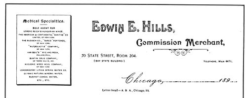
The panel as used in 1893
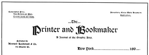
A neat letterhead of 1897
THE CHANGING STYLES OF COMMERCIAL HEADINGS
The type foundries helped the spread of the new typography
32by supplying a series of Bradley’s decorations,
known as “Wayside Ornaments.”
Bradley discontinued the Wayside Press in 1898 and
combined his printshop with that of the University Press
at Cambridge, Mass. There a battery of presses was kept
busy during the continuance of the extraordinary interest
in Bradley booklets.
In 1905 Bradley impaired the strength of his following
by attempting for the American Type Founders Company
the introduction of a new style of typography, the
prominent feature of which was profuse ornamentation.
While this effort supplied job printers with many valuable
ideas in type arrangement and color treatment, happily
the style as a whole was not adopted by printers generally
or typographic conditions might have become as unfortunate
as they were previous to 1890.
Frank B. Berry, associated with Bradley during his
engagement with the American Type Founders Company,
tells in these words of the construction of a thirty-two-page
pamphlet of specimens entitled “The Green Book
of Spring”: “Starting in on this about half-past ten one
morning Bradley made up a dummy, prepared the copy
and laid out the work—specifying the size and style of
type to be used, the form of display and designating the
exact position of each ornament with the required spacing.
This was in effect practically furnishing reprint copy for
the compositors. Then, to ‘give good measure,’ as he
expressed it, copy was prepared for the cover, and the
work was ready for the printers before half-past one.”
AN INTERESTING TITLE-PAGE
By Charles Whittingham, London, 1849
In the few years succeeding the establishment of the
Wayside Press, Bradley’s style of typography was closely
followed by many printers, and all the printshops of
America were more or less influenced by it, but at this
date his ideas and Morris’s ideas are merged more or less
with those of De Vinne, Jacobi, Updike, Rogers, Cleland,
Benton, Kimball, Goudy, Goodhue, Winchell and others.
From Germany, too, have lately come suggestions in decoration
that are visibly influencing general typography.
TITLE-PAGE IN THE COLONIAL STYLE
By Charles Whittingham, London, 1844. The first use in the nineteenth century of the Caslon type-face
In recent years Bradley devoted his talents to the
make-up of magazine pages. His characteristic decoration
has added interest to the text sections of several leading
magazines. He dictated the make-up and drew the cover design
and department headings for the twenty-fifth anniversary
number of The American Printer issued July, 1910.
This versatile artist-printer also accomplished the unique
task of applying business and industrial methods to the
making and selling of art work. He had a staff of working
artists, one of whom acted as foreman. Bradley had a
book in which he pasted his sketches of decorative borders,
ornaments and illustrations. These were classified and
numbered, and when a design was to be drawn he gave instructions
to the working artist indicating which sketches
were to be worked up. In this manner he eliminated the
manual labor so far as he was concerned and was able to
accomplish much more than if he had attempted to do
everything himself. He also planned a series of decorative
units and illustrations and offered a quick art-service
to advertisers and printers.
Fred W. Goudy, who designed such type-faces as Pabst,
Powell, Forum, Kennerley and Goudy Old Style, has influenced
printing styles in the direction of classic effects.
Goudy as a student of Roman architecture and letter-carving
has dignified the printing industry and enriched typographic
art.
This lesson would not be complete without a tribute
to the work of Theodore L. De Vinne, who had the distinction
of being the only printer but one in America to
receive a college degree for accomplishments as a printer.
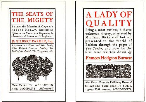
Bradley’s adaptation of the Colonial style as produced by him at the Wayside Press in 1896
De Vinne’s introduction to typography was as an
33apprentice in a country printshop. He went to New York
in 1847 and worked at the case and press in several
offices before accepting a position as job compositor with
Francis Hart. Upon the death of Mr. Hart in 1877, Mr.
De Vinne took charge of the business, which is now
known as the De Vinne Press.
As a writer on printing subjects, perhaps his greatest
work is “The Invention of Printing,” published in 1876.
I have examined and read most of the books on the subject
of the invention, and De Vinne’s book is the most
reasonable, fair and understandable of all.
De Vinne had always been an exponent of the sane,
conservative and dignified in typography. The work of
his shop was precise, exact and thoro. While giving credit
to Morris and Bradley for their accomplishments, he had
little sympathy for the styles of either. De Vinne properly
claimed that a writer’s words are of more importance
than the decoration of a designer. Morris intended his
books for the shelves of the book collector; De Vinne
looked upon a book as something to be read. However,
there need be no conflict between the styles of Morris,
De Vinne and Bradley. The typographer should learn to
discriminate, to choose wisely when selecting a style for
a book or a piece of job work. For editions de luxe in
limited numbers, and for booklets on art or literary subjects,
the Morris style is appropriate. For books on scientific
or legal subjects, and for booklets of conservative and dignified
nature, there is nothing better than the De Vinne
style. For booklets which are to attract attention and
for job work that is to be distinctive, Bradley shows the way.
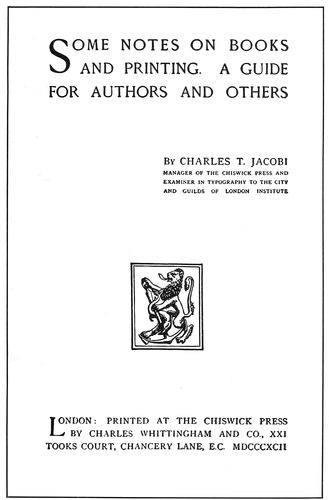
A JACOBI PAGE OF 1892
Arranged in squared groups in the form of a letter Z
With De Vinne beckoning to us from the point of conservatism
and Bradley from the point of radicalism, the
typographer anxious to do work properly must decide for
himself how to treat it. I have seen a jeweler’s booklet
cover so filled with ornamentation by Bradley that it
was almost impossible to read the wording, and I have
also seen a children’s Bible typographically treated by the
De Vinne company in a style as severe as if it were a
book of legislative acts.
A BRADLEY PAGE
As produced at the Wayside Press, 1896
De Vinne had always been a leader in the perfecting
of modern methods. He was one of the pioneers in the
use of dry paper and hard press-packing, and gave much
thought to modern type-faces. The type-face known as
Century was designed after his suggestions as a model
roman letter.
De Vinne did much in persuading printers to group
the wording of title-pages instead of equally separating
the type lines as was done in the middle of the nineteenth
century.
Charles T. Jacobi, of the Chiswick Press, London, as
an instructor and writer on printing subjects has done
much for typography in England. He is not wedded to
a particular style of typography, but advocates the adaptation
of any style that is good when by so doing clients
are pleased and the principles of art are not violated.
The title-page reproduced in this connection is unusual
in arrangement. The type groups and the device are all
squared and their angularity is enhanced by the exclusive
use of capitals. Realizing that a page or design is defective
if it presents the appearance of disjointed sections,
Mr. Jacobi has avoided such results in this instance by
arranging the page in the form of a letter Z.
34With this chapter the history of typography is brought
down to the twentieth century. The modern typographer
has great responsibilities. Upon him depends the solution
of the problem whether or not our beloved calling is to
be ranked with the esthetic arts. Shall the product of
the village printer be only of the standard of that of the
village blacksmith? Every typographer, regardless of the
nature of the work that is his to do, should cultivate a
love for the artistic and enlarge his knowledge of the
things that make for good printing. The chapters that
follow will help to this end.
Because printing as now practiced is in a great degree
dependent upon principles and styles developed during
the early days of the art, the student should not neglect
carefully to read and digest the historical facts and reproductions
that have been presented. Too many typographers
underrate the value of a knowledge of history. “I
do not care what printers of old did; I want to know
what the printer of tomorrow is going to do.” This is
almost a literal quotation of the remark of a printer who
prides himself on his progressiveness, and he is only one
of many who imagine that to be up-to-date it is sufficient
to use new type-faces, ornaments and borders,
caring little if the resulting jobs lack appropriateness,
harmony, color, tone, and other elements that are essential
to perfect typography.
A BRADLEY PAGE
As produced at the Wayside Press, 1896
A DE VINNE PAGE
This probably presents De Vinne’s idea of title-page arrangement
He who labors without a knowledge of history is much
like the young man who started to work on a job press.
He was allowed to make ready a form, and after a while
the pressman went over and examined the work. On the
back of the form he found something that looked like an
underlay, but could discover no reason for its use. Mystified,
he inquired what it was all about, and was told
that the apprentice was doing only what he had seen
the pressman often do before—cut out several pieces of
paper and place them under the form. It had never occurred
to the young man to ask why this was done. Thus
it may be with the typographer. He arranges a job of
type composition in the style of something good he has
seen, but fails to get the quality of the original because
he does not comprehend just what has served to produce
that quality.
Morris was a student of ancient printing. His thoughts
were back in the fifteenth century with Jenson, Aldus
and Koburger, and when he began to print, he printed
understandingly. There was a well-defined plan, and
there was harmony in ornament, type, ink and paper.
When the “up-to-date” printer began to imitate Morris
he did it with the same degree of comprehension possessed
by the young man who made the “underlay.”
Will Bradley would not today be as famous as he is in
printing circles if he had labored under the false idea
that it was useless to know history. Bradley knows printing
history and loves old books, and this knowledge and
affection are expressed in his work. The printer who succeeds
is the one who looks upon all knowledge as valuable
and has a good reason for everything he does.
PART TWO
EXAMPLE 16
Layout sketched with colored crayons for a catalog cover
EXAMPLE 17
The cover printed as indicated by layout sketch
35
THE “LAYOUT” MAN
How does the work of the typographer of the twentieth
century compare with productions of the past? In the
belief of some the good typographer, like the good Indian,
is dead. The truth is that much of the printing done
during the first four hundred years was not well done.
While the same proportionate result still prevails, the
ancient did not have the
excuse of the modern—lack
of time; nor has the
modern the excuse of the
ancient—lack of facilities.
However, while poor
work in any century or
any industry is explainable,
it is not excusable.
EXAMPLE 1
Booklet cover page laid out with pencil and crayon on gray stock
Someone said, “The
man who attained his ambition
did not aim high
enough.” Perfection is
not attainable, but it
should be the goal in our
race. Many typographers
are doing good work,
altho each is doing it
differently. No one is producing
perfect typography;
but when perfection
is the pacemaker no
result can be commonplace.
The good typographers
of the past had the spirit
of the master craftsman
and their product was inspired.
The modern
printer to succeed needs
only the inspiration that
comes of study, hard work
and love of his trade.
Inspired work, however,
is generally the result of
preparation.
Artists and advertising
men realize the necessity
of careful preparation for
the process of printing, but typographers as a class evidently
do not. If they did they would do even better work
and make bigger profits possible. Every printshop should
have a “layout” man.
In spite of the fact that much good printing is done
today, fully nine-tenths of the product is partially unsatisfactory
because of lack of preparation. When a business
man decides to erect an office building he does not
immediately go to a building contractor and tell him to
build it. He first consults an architectural engineer, examines
drawings and exchanges opinions, and when the
building contractor starts his work everything has been
planned and specified.
Should printing be done in a less thoro manner? Is
not the making of a book, catalog or business card each
proportionately as important and as well entitled to
proper attention as the
larger undertaking? Good
typography cannot be
produced if preparation is
slighted.
Quality printing is not
accidental. Shops famed
for the artistic excellence
of their product have
maintained their “shop
style” despite changes in
the force of workmen and
executives, and this individuality,
or “shop style,”
as it is termed, has been
obtained and retained
only because the copy has
been carefully prepared
and the work has been intelligently
laid out by
some qualified person
(artist, ad-writer or typographer)
who understands
shop preferences in
the matter of style. It is
the “institutional
idea.”
In printshops extensive
enough to allow of the expense,
one or more layout
men should be employed,
and in the smaller concerns
the head job compositor
or foreman could
do the work. Solicitors,
when artistically fitted,
could in special cases lay
out their own jobs of
printing, as personal contact
with the customer peculiarly fits them to do it satisfactorily.
The important thing, anyway, is to please
the customer. While the art side of the practice of
typography is important, it is not all important. Typography
is also a business.
If the customer’s tastes and prejudices were ascertained
beforehand, many of the changes now made after jobs are
in type, frequently causing inharmonious arrangements,
could be avoided. The average printer rarely parallels the
experiences of a few fortunate printing concerns which,
36when receiving an order for a booklet or catalog, are told
the amount of the appropriation and given carte blanche.
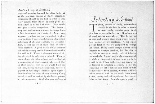
EXAMPLE 3 EXAMPLE 2
Anticipating the appearance of the printed page by utilizing old booklets or preparing specimen sheets of text matter which are cut to proper size and pasted in position. The headings are roughly sketched with pencil
Orders for much of the better class of work are obtained
thru “dummies” submitted by printers or solicitors. The
customer advises a certain number of such persons that
he is in the market for a booklet and would like to receive
suggestions. Each competitor prepares a “dummy”
on the stock and in the binding intended for the completed
booklet. The cover design is roughly sketched or
otherwise indicated and the inside pages prepared to represent
the finished job.
Let us imagine ourselves in a printshop of medium
size, which cannot afford the regular services of an artist.
From the composing-room force take the most artistic
and practical job compositor and install him at a desk.
If there is not sufficient desk work to occupy his full time,
arrange with him to fill in spare time at the case. In
selecting a man for the position it should be remembered
that few typographers have qualifications combining
artistic perception and thoro workmanship. It is in a
great measure true that a nervous, artistic temperament
unfits a typographer for thoro, finished work at the case
or stone, while on the contrary, a calm, precise, methodical
disposition is often accompanied by lack of imagination.
37Each workman should have opportunity to do that
which he can do best. He of the artistic temperament
should lay out the jobs, and he of the mechanical turn of
mind should construct them.
EXAMPLE 6
Ascertaining color combination by means of crayons. The colder color should predominate
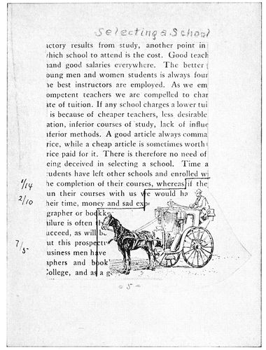
EXAMPLE 4-a
After pasting in illustration and counting the lines for machine composition. Reduced from the original
The proprietor or other person in authority should discuss
with the layout man the subject of shop style in
typographical arrangement.
The matter of
type equipment should
also be gone over, as
nothing hinders the
layout man so much as
to be compelled to use
type-faces selected by
another having ideas
widely different. It is
important that the type
equipment be appropriate
and sufficient
for the class of work
done. An equipment
of a half dozen harmonizing
faces of type is far better than one of two
dozen ill-assorted faces. Good typography is to a large
extent dependent upon the type-faces used.
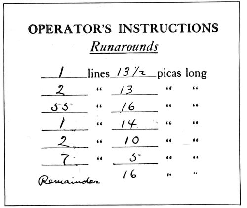
EXAMPLE 4-b
Instructions to operator
The layout man should make a study of the personality
and tastes of a customer. He should meet all such
that come into the office, and arrange to call once upon
each of the regular customers. He must keep in close
touch with conditions in the composing-room, so that in
the discharge of his duties he does not call for type-faces
already set out of the cases, or not a part of the equipment.
The mechanic and the artist, to do satisfactory work,
must have a certain working outfit. The layout man is
no exception; while he could perhaps manage with only
a lead pencil and foot rule, it would be foolish to do so.
His work will be expedited if he has an assortment of good
crayons; hard, medium and soft lead pencils; a pair of
shears, a T-square, a gelatine triangle, a type-line gage,
a table for giving the number of words to an inch in the
various size type bodies; and a library of books and periodicals
on printing, especially of those showing examples
of type designs. To provide him also with a set of water
colors, a jar of Chinese white, a bottle of gold paint, a
bottle of india ink and several brushes would not be extravagance.
It would be economical and wise if several sample
sheets of each kind of stock were kept near his desk in
a portfolio or convenient drawer. Book papers could be
cut in quarters, cover papers in halves, and cardboard in
various convenient sizes, all ready to be used at an instant’s
notice. Several each of ruled headings, cut cards
and other standard goods should also be included. In
laying out jobs, especially large runs, he should make
them of such size as will cut from the sheet with little
or no waste. If an order is to be rushed, he should ascertain
if the stock may be had without delay.
| WORDS TO THE SQUARE INCH |
|---|
| |
|
Sizes of Type—SOLID |
| SQUARE INCHES |
5 POINT |
6 POINT |
7 POINT |
8 POINT |
9 POINT |
10 POINT |
11 POINT |
12 POINT |
| 1 |
69 |
47 |
38 |
32 |
28 |
21 |
17 |
14 |
| 2 |
138 |
94 |
76 |
64 |
56 |
42 |
34 |
28 |
| 4 |
276 |
188 |
152 |
128 |
112 |
84 |
68 |
56 |
| 6 |
414 |
282 |
228 |
192 |
168 |
126 |
102 |
84 |
| 8 |
552 |
376 |
304 |
256 |
224 |
168 |
136 |
112 |
| 10 |
690 |
470 |
380 |
320 |
280 |
210 |
170 |
140 |
| 12 |
828 |
564 |
456 |
384 |
336 |
252 |
204 |
168 |
| 14 |
966 |
658 |
532 |
448 |
392 |
294 |
238 |
196 |
| 16 |
1104 |
752 |
608 |
512 |
448 |
336 |
272 |
224 |
| 18 |
1242 |
846 |
684 |
576 |
504 |
378 |
306 |
252 |
| 20 |
1380 |
940 |
760 |
640 |
560 |
420 |
340 |
280 |
| 22 |
1518 |
1034 |
836 |
704 |
616 |
462 |
374 |
308 |
| 24 |
1656 |
1128 |
912 |
768 |
672 |
504 |
408 |
336 |
| 26 |
1794 |
1222 |
988 |
832 |
728 |
546 |
442 |
364 |
| 28 |
1932 |
1346 |
1064 |
896 |
784 |
588 |
476 |
392 |
| 30 |
2070 |
1410 |
1140 |
960 |
840 |
630 |
510 |
420 |
| 32 |
2208 |
1504 |
1216 |
1024 |
896 |
672 |
544 |
448 |
| 34 |
2346 |
1598 |
1292 |
1088 |
952 |
714 |
578 |
476 |
| 36 |
2484 |
1692 |
1368 |
1152 |
1008 |
756 |
612 |
504 |
| |
|
Sizes of Type—LEADED with 2-point leas |
| SQUARE INCHES |
5 POINT |
6 POINT |
7 POINT |
8 POINT |
9 POINT |
10 POINT |
11 POINT |
12 POINT |
| 1 |
50 |
34 |
27 |
23 |
21 |
16 |
14 |
11 |
| 2 |
100 |
68 |
54 |
46 |
42 |
32 |
28 |
22 |
| 4 |
200 |
136 |
108 |
92 |
84 |
64 |
56 |
44 |
| 6 |
300 |
204 |
162 |
138 |
126 |
96 |
84 |
66 |
| 8 |
400 |
272 |
216 |
184 |
168 |
128 |
112 |
88 |
| 10 |
500 |
340 |
270 |
230 |
210 |
160 |
140 |
110 |
| 12 |
600 |
408 |
324 |
276 |
252 |
192 |
168 |
132 |
| 14 |
700 |
476 |
378 |
322 |
294 |
224 |
196 |
154 |
| 16 |
800 |
544 |
432 |
368 |
336 |
256 |
224 |
176 |
| 18 |
900 |
612 |
486 |
414 |
378 |
288 |
252 |
198 |
| 20 |
1000 |
680 |
540 |
460 |
420 |
320 |
280 |
220 |
| 22 |
1100 |
748 |
594 |
506 |
462 |
352 |
308 |
242 |
| 24 |
1200 |
816 |
648 |
552 |
504 |
384 |
336 |
264 |
| 26 |
1300 |
884 |
702 |
598 |
546 |
416 |
364 |
286 |
| 28 |
1400 |
952 |
756 |
644 |
588 |
448 |
392 |
308 |
| 30 |
1500 |
1020 |
810 |
690 |
630 |
480 |
420 |
330 |
| 32 |
1600 |
1088 |
864 |
736 |
672 |
512 |
448 |
352 |
| 34 |
1700 |
1156 |
918 |
782 |
714 |
544 |
476 |
374 |
| 36 |
1800 |
1224 |
972 |
828 |
756 |
576 |
504 |
396 |
| |
| EXAMPLE 7 |
|---|
| |
| Table for ascertaining the number of words to square inches. Use of this table in laying out booklets and catalogs will not only save time but will minimize the chance of a miscalculation |
38
EXAMPLE 8
Notehead as set without instructions from layout man The three specimens on this page lack relation in design
For an example of the workings of the layout system
we will suppose that the principal of a local business college
has brought in typewritten copy of about a thousand
words to be made into a small booklet. A little questioning
brings out the information that the customer
desires something attractive, refined, and of good quality.
He does not want a cheap job, and neither has he
money to spend upon expensive de luxe booklets.
The layout man looks over his sample papers and finds
that there is on hand a ten-cent white antique paper
25 × 38 inches in size. Taking a quarter sheet he folds
it repeatedly until the leaf appears to be about the
proper size. Measuring it he finds it to be 4¾ × 6¼
inches. The leaf is then trimmed to 4⅜ × 5⅞ inches
(thus allowance should always be made for trimming the
edges after binding).
For the cover the layout man selects from his samples
a medium gray antique stock of good quality. The cover
stock should harmonize in finish with the paper on the
inside. In this instance an antique finished stock is
selected to cover the antique finished paper on the inside.
Many are the booklets that would have been improved
by attention to this rule of harmony. However, a rough
finished cover stock and a smooth inside paper is not as
inartistic a combination as a smooth cover stock and a
rough inside paper.
The cover stock selected in this instance is 20 × 25
inches in size, and an eighth of this sheet folded once
gives a leaf 5 × 6¼ inches. Deciding to have the cover
lap three-sixteenths of an inch over the edges of the inside
leaves, it is trimmed to 49⁄16 × 6¼ inches.
EXAMPLE 10
Label as set without instructions
On one of the inside leaves a page is penciled off, the
layout man judging how much of the paper should be
covered by print. For cheap
work it is generally necessary
to crowd the matter into the
least possible number of pages,
and in such case narrow margins
are allowed. For the better
quality of work, liberal margins
are necessary to proper results.
A page should set toward the
top and binding edges, the
margins at these places being
each about the same. The margin
at the right edge should be
a little more than at the top
and back, and the margin at
the bottom should be a little
more than at the right edge.
For the booklet now supposed
to be in course of preparation, 2¾ × 4 inches has been
determined as the proper size of the type-page. Each page
thus requires eleven square inches of type-matter. The
layout man refers to the table (Example 7) which gives
the number of words to a square inch and ascertains that
eleven square inches of ten-point type, the lines separated
by two-point leads, should accommodate one hundred
and seventy-six words. Multiplying this number by
six, allowing two pages at the front of the booklet for
the title, etc., he finds the booklet will take 1,056 words,
about the number of words in the copy supplied.
EXAMPLE 9
Business card as set without instructions
For a booklet of this kind the type should be no
smaller than ten-point. Instead of stinting margins and
sacrificing legibility, as is often done in endeavoring to
force copy into a limited number of pages, additional
leaves should be added.
The cover and inside papers having been prepared in
the proper size and number of leaves, the dummy is
stitched with wire or sewed with silk floss as may be
desired. The arrangements of the title-page, the first
text-page and a page entirely text matter are indicated
in proper position by means of pencil and crayon; or for
booklets of a large number of pages it is well to set the
first text-page in type and paste a proof of it in the
dummy, getting by this means the customer’s approval
of both type-face and general effect.
The appearance of the printed page may be anticipated
by pasting in position a type-page cut from another
booklet already printed. (Examples 2 and 3.) In a shop
where much booklet work is done, it would be a convenience
to the layout man if a number of specimen
pages, set in the available body type (both solid and
leaded), were printed for use in preparing dummies.
These specimen pages should be about 5½ × 7 inches, a
size that would make them usable for most purposes.
The cover arrangement was sketched on the gray stock
39(Example 1), the border being
represented by the gray lines
of a hard lead pencil. The type
line was indicated by means of
a soft black lead pencil and an
orange crayon. Ornaments are
not specified because they are
better omitted on booklets
where dignity is the principal
feature.
The dummy booklet thus
completed is submitted to the
customer and when approved
goes to the workrooms with the
copy. The compositor, make-up
man, stockman, pressman
and binder have no excuse for
any misunderstanding, as, generally
speaking, they have
merely to duplicate the dummy. The labor of the estimate
man, too, is lessened, as the dummy booklet affords
a substantial basis upon which to figure the cost.
The plan of making a dummy booklet, just explained,
can be adapted to many jobs, but of course it should be
varied to suit special requirements.
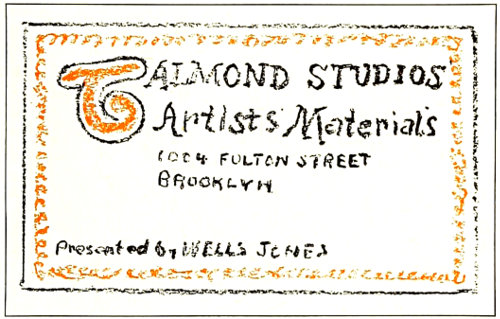
EXAMPLE 12
Business card as laid out
In cases of periodicals and voluminous catalogs, dummy
sheets should be printed with the outlines of the page
indicated by light-faced rule. With such sheets the layout
man is enabled quickly to paste in position prints of
the illustrations and text matter from the galley proofs.
Getting his instructions in such methodical manner the
make-up man can do his work without confusion of
orders, and the proofreader’s task is made easy.
When illustrations are provided to be incorporated in
the text matter there is more or less trouble in making
up the pages. To center all illustrations so as to avoid
changing the width of the type lines is easy but not
always artistic. It is economical to have plates made the
full width of type matter, but the printer is seldom consulted
until after the plates are made. However, various
sizes of illustrations may be attractively grouped on facing
pages and the type-matter filled in around them. This
method may appear difficult because the text matter is
often composed on machines; but it is not difficult if
prepared in this manner: Take the prepared body-type
sheets, cut them to the required page size, paste them to the
dummy sheets, and upon the pages of text matter thus
presented fasten the prints of the illustrations in proper
positions. The body-type sheets need not be used on
pages for which there are no illustrations; in such instances
merely the number of lines to a page is ascertained.
Example 4-a demonstrates how the print of the illustration
is placed over the body-type page, and the “step” shape
of the pencil lines shows how the boundaries of the type
lines are made to fit the outline of the illustration. The
length of type lines should always be ascertained with
the pica (twelve points) as the unit of measurement.
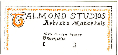
EXAMPLE 11
Notehead as laid out for compositor. The three specimens on this page are related in design
Supposing Examples 2, 3 and 4 to be dummies of
pages, the composition of which is to be done on the
linotype or monotype machine, the layout man with his
pica measure starts at the initial letter T and measures
and counts the lines, noting the results in the margins.
(See Example 4-a. The page as shown is slightly reduced,
hence the lines do not measure as set forth.) The
figures are copied from the margins onto a slip and will
then appear as shown in Example 4-b.
This plan emphasizes the necessity of a layout man as
a member of the executive staff in the modern printshop.
It may be a simple procedure to reset run-around matter
at the moment it is needed by the make-up man, but it is
an expensive habit.
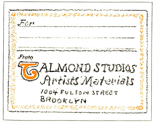
EXAMPLE 13
Label as laid out
The average stationery job is sometimes given scant
attention in the larger printshops where long runs on
cylinder presses overshadow it in importance. This condition
leads to unsatisfactory results and the customer is
the sufferer; his stationery as a whole is likely to be not
only inartistic but a patchwork of typographic styles and
arrangements. To illustrate this: A dealer in artists’
materials orders at various times letterheads, business
cards and package labels, and the copy is sent to the
workrooms with no instructions about style. Assuming
that a different compositor gets each order, the jobs are
composed as shown in Examples 8, 9 and 10. These specimens
40are above the average in arrangement, but are faulty
in that they have no relation to each other in appearance;
have nothing distinctive in their typography that
identifies the business card with the letterhead or the
label.
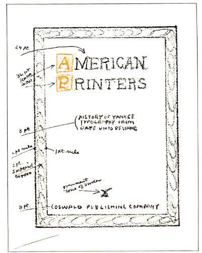
EXAMPLE 14
Layout of a cover-page, with instructions in detail as to material to be used. Reduced from original
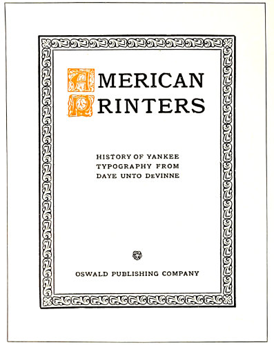
EXAMPLE 15
Cover-page as set from the instructions. Reduced from original
How different the results had an artistic layout man
prepared each order before it was given to the compositor.
Examples 11, 12 and 13, roughly sketched with pencil
and crayon, demonstrate what could have been done.
With stationery thus harmoniously treated a business
house would be given credit for individuality and progressiveness.
In a printshop doing a good class of work (every printshop
should endeavor to do that) the layout man ought to
make a study of color harmony. Not that it is necessary
for him to attend an art school or devote most of his time
and attention to experimenting with prisms and light
rays; charts and tables which help to solve the color
problem are easily obtainable. After a little study and
practice he will learn that while red, yellow and blue
(the primary colors) harmonize with each other, mixtures
of two or all three give shades that are more pleasing.
Olive-green (an art shade) substituted for blue, in combination
with orange, produces an artistic blend in place
of the gaudiness which otherwise would prevail. This
because olive-green is a mixture of blue and orange; a
relationship in color composition is established and contrast
lessened.
A black page increases in interest with the addition of
a touch of red, and for this purpose vermilion is recommended.
The vermilion shade of red is approximated by
mixing white with orange-red.
The colored crayons with which the layout man should
be supplied are exceedingly useful in determining color
combinations. The eye is a reliable guide in this matter,
if it is carefully trained to recognize color harmonies. It
should be easy to distinguish the right from the wrong
color treatment in Examples 5 and 6. The colder color
should always predominate; backgrounds of bright red
and bright yellow are difficult to harmonize with any
color of ink excepting black.
From the insert (Examples 16 and 17) will be seen how
a color combination may be roughly sketched on the
actual stock to be used and the finished result indicated
without setting a line of type or inking a roller.
When the page is set in type it is well to have the
proofs in the colors and on the stock to be used, but it
is unnecessary to separate the design into several forms
to do so. For a job such as Example 15, for instance,
two proofs may be pulled, one in black and one in orange,
and the initial cut out of the sheet printed in orange and
pasted in position on the sheet printed in black. Another
and a more satisfactory way is to ink the entire
page with black, then clean the black from the initials,
and ink them with orange by means of a finger. It may
be relevant to suggest that the human skin is ideal for
inking purposes, and that a printer’s composition roller
is an imitation of its qualities.
The layout man, in addition to the study of ink harmony,
should learn to blend colors and tints of paper
stock. He should know that a buff or cream inside paper
reflects the color of a yellow-brown cover stock, and
hence makes a prettier combination than white inside
paper and brown cover stock. Another important point
is the color blending of a tipped-on illustration and the
stock acting as a background. The prevailing shade in a
color illustration should be matched by the background
or by a surrounding border, or by both.
When laying out advertisements or other display pages
the size of the type-face should be written in the margin
(Example 14). Practice will enable the layout man intuitively
to approximate the size needed.
EXAMPLE 20
An architectural subject appropriately treated
41
HARMONY AND APPROPRIATENESS
In music there is that which the Germans call “Leit-motif”—the
guiding theme in the construction or interpretation
of musical compositions. The “Leit-motif”
finds a parallel in the central idea or motive governing
the composition of a building, a painting, a book or a
job of printing. If Gothic is selected as the style of
architecture for a building, every detail from the arches
to the smallest bit of ornamentation
is kept in harmony
with the central idea
of construction. If the
building is to be Colonial,
every detail is made appropriate
to the Colonial
motive.
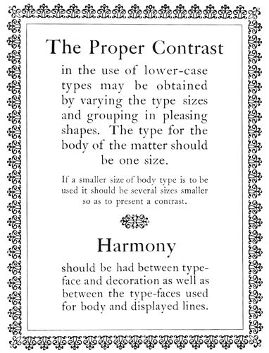
EXAMPLE 18
To obtain Harmony it is frequently necessary to use but one series of type, and either all capitals or all lower-case
The person is legion who
undervalues the importance
of harmony and appropriateness.
Houses are furnished
without regard to a
general plan and furniture
is added because it strikes
the fancy at the moment of
purchase. A Morris chair in
dull-finished wood, a Louis
XV table with dainty
curves and gilt luster, and
a mahogany or ebony piano
case are gathered in motley
discord on an oriental rug.
And when this same person
has printing done, or
does it himself, there is
again revealed an utter disregard
for the things that
make for harmony.
What is appropriate?
There are times when it is
difficult to give an unprejudiced
answer, especially
when an idealistic art interpretation
of the appropriate
is combatted by the homely
reasoning of a tiller of the
soil. As a finishing touch
to the classic architecture of the agricultural building
at Washington the words Fructus, Cereales, Forestes and
Flores were carved in suitable places on the structure.
The secretary of agriculture noticed the Latin words and
forthwith ordered the architect to have them recarved
in the English—Fruits, Grains, Woods and Flowers.
Now there are those who say the words as modified suggest
a sign on a country store. The architect probably
reasons that the words as originally carved were purely
decorative, and in their English form are not only unnecessary
but are about as poetic as a page of stock
quotations in a newspaper or a package of little pig
sausages.
It requires a discriminating judgment to distinguish
between the appropriate and inappropriate. The plain
people of one of the new sections of New York City were
astounded recently to find the street signs bearing such
names as Socrates, Horatius,
Poseidon, Aphrodite, Pericles
and Seleucus. Names
such as Wall Street, Broadway,
Bowery and Fifth Avenue
are unobjectionable, but
Seleucus Street and Pericles
Street—!
Typographers frequently
go wrong in the use of the
old Roman V. The V as
part of the words PVBLIC
LIBRARY on a stone building
excites no comment; it
seems appropriate and in
good taste; but as part of
the words PVRE MILK on
a grocer’s letterhead it
tempts the risibility in our
natures. After all, good
judgment is one of the most
valuable assets a man can
possess.
Harmonious and appropriate
results in printing
are brought about by discreet
selection and use of
these three elements:
type, ink, paper. It is one
thing to ink the type and
pull an impression on
paper, and it is another
thing to do it properly. It
makes a difference what
type is used, what ink is
used, and what paper is
used. There are hundreds
of type-faces, many colors and qualities of inks, and a
variety of finishes and qualities of papers.
As to type-faces: Printers of law briefs and legal
blanks need the formal, legible modern romans. Printers
making a specialty of commercial stationery, wedding
invitations and calling cards need scripts and engravers’
romans. Printers whose chief product is high-class
announcements and booklets cannot do without old-style
romans, italics and text faces. When everything in
printing from the diminutive calling card to the massive
42catalog is solicited many styles of type-faces are needed.
A
Harmony. The heavy line and the light line are found in the construction of both border and type-face.
B
Harmony. The black, pointed characteristic is a peculiarity of both type-face and border.
C
Harmony. Type-face is made of strokes of one width; border is composed of one line of similar width.
D
Harmony. The two type faces are of the same design; one is stronger in tone.
E
Harmony. The two type faces are of similar design; one is slanted and slightly altered to obtain contrast.
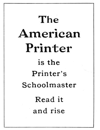
F
Near-harmony. Type faces are sufficiently similar in design to blend if contrasting sizes are used.
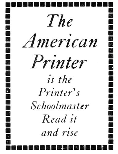
G
Incongruous. Border has no characteristics that can be found in the italic type-face.
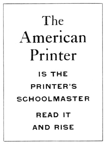
H
Incongruous. There is no relation in the style of these two type-faces; one has serifs, the other none.
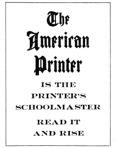
I
Incongruous. Letters not related in design: one is condensed, the other extended.
EXAMPLE 19—Harmonious combinations, and combinations that are incongruous
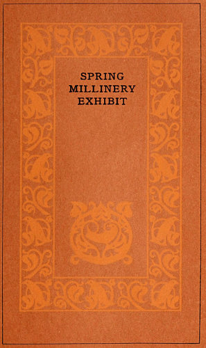
EXAMPLE 21
A booklet cover, the coloring and typography of which is suggestive of the subject
As to inks: There are inks ground in strong varnish
for bond papers, inks ground in soft varnish for coated
papers, and heavy opaque inks for dark cover papers,
and it makes a deal of difference if they are not used
appropriately. And then, in the matter of harmony of
colors there is a subject for much study. The wise printer
will use good black inks and enliven his jobs with mere
touches of orange or vermilion. Black and orange are
always pleasing in combination and look well on most
papers. There are pitfalls in the use of numerous colors,
and until the subject of color harmony is understood by
the printer he will wisely adhere to black and orange.
As to papers: Wove and laid antique papers, white
and buff tinted, are appropriate for announcements and
booklets in combination with old-style type-faces and
black and orange inks. Dainty papers of linen finish in
combination with delicate engravers’ type-faces, are appropriate
for milliners, florists, jewelers and others catering
to the esthetic tastes of women. Dull-finished coated
papers are considered more artistic than highly enameled
ones, and there are those who prefer it as being more
restful to the eyes.
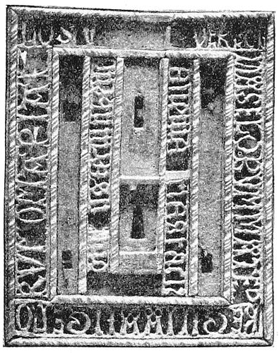
EXAMPLE 23
An old lock-plate
It is a stupendous undertaking, in face of the multitudinous
elements that are part of the production of
printed work to point out
a path that will lead to
good typography. There
are many printers doing
good work and each of
them has probably arrived
at his point of attainment
by a different route. There
is no royal road to learning.
The student may be
assisted, but whether he
succeeds depends to a
great degree upon himself.
He must have an open
mind, good judgment, and
a liking for simplicity.
Simplicity is synonymous
with good typography
and its path is a
straight and narrow one.
He who would do worth-while typography must decide
wisely when accepting the good things offered by his
friends, the paper man, type man and ink man. They are
generous in their offerings and willingly assist the doubting
one in deciding; but confidence in his own judgment
is a necessary qualification for the typographer who would
attain success.
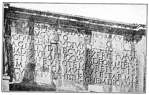
EXAMPLE 24
Inscription on a Roman arch
The ideal printshop is that one which contains only
harmonious type-faces, ink colors and paper stock. This
ideal condition being impossible except in a small shop,
the best alternative is to have all type-faces as nearly
harmonious as possible. It would be wise to build upon
the body
type as a
foundation.
Choose a
body face
that will be
suitable for
most purposes,
and
then select
a series or
family of
display
types that
harmonize
with it. If Caslon Old Style is chosen as the body letter,
Caslon bold, Caslon italic and Caslon text will afford
variety in display while retaining harmony. (Of course
the large display sizes of the Caslon Old Style should be
included.) The Cheltenham family probably provides the
greatest variety of harmonizing faces. Scotch Roman is a
dignified and legible letter, and supplemented by its italic
and the larger display sizes is a satisfactory face for many
purposes. Old Style Antique is a useful letter where a
black tone is desired and is pleasing in its original form.
There are many artistic letters now to be had that give
the effect of hand-lettering, which are admirable for distinctive
advertising literature.
EXAMPLE 22
Type-design for catalog cover suggested by the old lock-plate
While harmony of type-faces is essential, yet a certain
amount of contrast is desirable. At one time it was customary
to alternate a line of capitals with one of lower-case.
This arrangement gave contrast, but not harmony.
The best results are obtained by the use of either all
capitals or all lower-case. As explained in the chapter
“When Books Were Written,” our alphabet in its original
Roman form consisted of capital letters only. Lower-case
letters, also known as minuscules, are the result of
evolution, and in form differ materially from the capitals.
Custom decrees that a capital letter be used to begin an
important word otherwise in lower-case, but with this
exception either kind is better used alone.
Example 19 illustrates harmonious combinations of
type-faces and borders and also presents several incongruous
features.
Section A is an all-capital scheme enclosed in a border
of heavy and light rule. A border such as this owes its
origin to the panels used by the Romans to surround inscriptions
on stone, and as these inscriptions were in capital
letters only, the appropriateness of the treatment is
manifest. As the letter is also formed of heavy and light
strokes the harmony is enhanced.
In section B there is harmony from both the historic
44and artistic viewpoints. The black text face, representing
as it does the direct result of the evolution from capital
letters, is appropriately used only in its lower-case form.
The use together of text capitals is objected to on the
ground of illegibility. This black text face (correctly called
Gothic) is historically associated with ecclesiastical printing,
and the border, consisting of pointed crosses of black
tone, blends with the pointed black letters of the type-face.
EXAMPLE 25
Cover-page for a catalog of books, using type imitations of woodcut initials and borders
Section C shows a plain letter of modern cut known
erroneously as gothic. Containing no serifs, it lacks a
feature which has always been considered necessary to
beauty in type-faces. As a harmonious border for this
face there is nothing better than a plain rule of the width
of the type strokes.
The next three panels demonstrate such harmony as
may exist between type-faces of different series:
D.—This panel shows Caslon bold in combination with
Caslon roman, and demonstrates the close harmony existing
between type-faces of the same family.
E.—Another demonstration of the harmony of the
family types.
F.—Harmonious, to a certain extent.
The type and rule in the next panel do not harmonize
for these reasons:
G.—The border is too black and square in form. Italic,
because of the slant of its letters, looks better not surrounded
by a border, but when one is used it should be
light and contain some of the characteristics of the italic.
In all cases where ornamental borders are used more
finished results are obtained if a rule separates the border
from the type, as in Section B.
The next two panels present the “horrible examples,”
which are defective for these reasons:
H.—The type-face of the upper group has nothing in
common with that of the lower group. That of the upper
group is a distinctive old-style roman, with serifs, and
is set in lower-case, while that of the lower group is a
plain black modern letter, without serifs, and is set in
capitals. The main display should never be lighter in
tone than the less important type matter.
EXAMPLE 26
A plain page without ornament or decorative types, for a plain purpose
I fails to harmonize because the type-face of the lower
group is slightly extended and the one of the upper group
is condensed. The shape of the letters of a type-face
should conform to the shape of the page, and so far as
possible to the shape of the companion letter, when one
is used. Condensed letters should be avoided except for
pages that are long and narrow, and an extended letter
should not be used except on a wide page.
There are more typographic sins committed thru violation
of the laws of appropriateness than in any other
way. In this regard it would not be difficult to make
out cases against the best of typographers, whose sins are
washed away by good work in other respects. As in architecture,
where one part of a building bears relation to all
other parts, so in typography there should be a motive
that blends all elements in serving one well-defined purpose.
The phrase “Is it appropriate?” prominently displayed
above the type cabinets, over the presses, in the
stock-room, and over the layout man’s desk, would help
to keep in mind this important requirement.
An architectural motive was suggested by the copy for
Example 20, and type-face and decorative border were
selected that the motive should be emphasized. The
architecture of the Romans was frequently embellished
with inscriptions (see Example 24), and in modern architecture
the panel of Roman lettering is a feature; the
lettering is generally all capitals of the same size, of a
style near that of the ancient lettering; and the panel
45is outlined with molding, plain or decorative. Serving a
purpose equivalent to the architect’s panel molding, the
type or rule border is a valuable addition to a page of
type. A page of display type or a halftone not surrounded
by a border is like an oil painting without a frame. The
egg-and-dart border around Example 20 is historically
associated with architecture. The type-face is a Roman
capital letter designed by Fred. W. Goudy from an inscription
found in the ancient Forum at Rome.
EXAMPLE 27-a
Treatment appropriate for a church program, in style based upon old ecclesiastical manuscript books. (See specimen below.)
EXAMPLE 27-b
Portion of a page of an old manuscript missal
Bismarck was called the “Iron Chancellor” because
of his great strength of character and unbending will.
Strength instantly associates itself with the mention of
iron or steel, hence the motive for the construction of
Example 22. It may be interesting to know that the
design of this page was further suggested by the old
lock-plate (Example 23). A printer with imagination
can absorb ideas from many sources. The lock-plate is
not literally reproduced in type, but a few of its features,
including the key-hole, were borrowed and conventionalized.
An artist-designer does not copy his
models closely; they serve the purpose of suggesting
shape and treatment and his imagination does the rest.
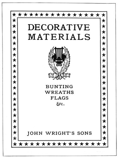
EXAMPLE 28
Cover-page for a catalog of decorative materials, suggesting festive gatherings, music and waving flags
For the cover of a small catalog listing rare books, a
typographic motive is found in the woodcut borders and
initials of the early printers. Example 25 shows what
may be done with type-foundry material on such a cover.
The border is of black tone and the type and initials are
given the strength that harmonizes with it.
Old books suggest discolored leather, dusty shelves
and plain men, and it is an abrupt change to the subject
of millinery, with its bright colored feathers, ribbons and
delicate finery. The milliner ornaments his salesroom
with vines and flowers and dainty colors, and the printer
gets his typographic motive from such sources. Example
21 illustrates a booklet cover treated thus appropriately.
The page size is unconventional, the coloring is dainty,
and the type lines are neatly diminutive.
As a millinery store is unlike an office in which are
maps and blue prints and legal documents, so typography
for these two purposes should be unlike. Example 26
is a page severely plain and non-sentimental. The types
are merely to tell something in a blunt manner. There
is needed no touch of decoration or color to interest the
reader, because those who read it would do so whatever
the treatment. This is the only example in the present
chapter in which the advertising element is unimportant.
The page may be commonplace because it need not be
anything else, altho it is well to do good work even
here.
From the surveyor’s office our journey of instruction
takes us into a church during an elaborate Easter service.
Light filtered of its brightness by stained glass
windows; high-placed Gothic arches pointing toward
the sky; soft organ-music—all these create an atmosphere
46of solemnity and harmony. A program or pamphlet
for use during a church service should be as appropriate
to the environment as a Book of Common Prayer or
Bible. Typographic treatment good as shown in Examples
22, 26 or 28 would be ridiculous for a church program.
Example 27-a shows a page historically appropriate. The
type-face is peculiarly fitting because of its pointed form,
and also for the reason that a letter of similar design was
used by medieval scribes on ecclesiastical books (see Example
27-b). The crossed rules, which should be printed
in orange-red, are adapted from the guide lines as made
by the scribes for marking the position of a page on the
sheet.
EXAMPLE 30
Title-page in semi-Colonial style, appropriate for use with a cover design such as Example 29
When a holiday crowd is gathered, dignity is put aside
and all enter into the festive spirit of the occasion. Here
is the motive for the typographic treatment of a booklet
or catalog of decorative materials as presented by Example
28. It would be excessive emphasis of appropriateness
to print such a page in a combination of bright
red and blue. The colors should be softened. The page
would look well printed in a deep blue with a flat blue
tint overprinting the star border.
There is room for improvement in the support typographers
give artists in the production of booklets and
catalogs. In many cases title-pages are constructed with
no regard to the motive suggested by the design on the
cover. Bibliophiles judge a book not only by the excellence
of its execution, but by the harmonious unity that
may be expressed in every detail, from the literary contents
to the last bit of tooling worked on the cover. The
type, ornamentation, paper, ink, margins, leather, the
arrangement of the title-page and the cover treatment,
all must be selected and utilized in expression of a dominant
central motive. The same rule presents the key to
good typography in job work. Example 29 shows the
Colonial arch adapted as the border of a booklet cover.
The artist gives this treatment to the cover because of
the motive suggested by the name “Colonial Trust Company,”
and when the title-page is set it would be a mistake
not to use some Colonial arrangement. Example 30
blends with Example 29 and is modified from the old
Colonial title-page treatment just enough to give it a
modern appearance without sacrificing the old-time atmosphere.
The border suggests both the widely-spaced
rules of the Colonial printers and the architectural pillars
of Example 29. No letter spacing is used, despite
the temptation offered.
EXAMPLE 29
The Colonial arch
Discussion of the subject of harmony and appropriateness
could be extended much further than is allowed by
these limits. Pages could be filled with descriptions of
instances in which the compositor had erred in treating
typography and ornamentation inharmoniously or with
an unimaginative appropriateness. The use of angelic
ornaments on Y. M. C. A. printing, where something
more substantial is desirable; the double-meaning that
may be read into the use of a horseshoe ornament on a
printer’s letterhead; the placing of illustrations of live
fish, lobsters and animal food
on banquet programs—these
are a few of the things that
might be mentioned.
High-class catalogs have
been marred by the use of
stock decorative initials
which were at variance with
the other decoration. In order
to save a few cents both
printer and customer are inclined
to use stock decoration
that happens to be on
hand at the moment. Hundreds
of dollars are spent on
the work and then for the
sake of saving thirty cents
(the cost of a harmonious initial
or ornament) many dollars in effectiveness are sacrificed.
Another way of injuring the appearance of a book
is to use a type-face on the title-page that does not harmonize
with that used for the body matter and the sub-headings.
In order to secure complete harmony even the
lettering on the cover should blend in style with that used
for the title-page, sub-headings and text pages.
Altho strict adherence to the laws of harmony and appropriateness
is necessary in the production of good
work in any field of endeavor, Americans seem to be really
proud when they violate such laws. We all know the
person who dresses in a slouchy manner because he read
somewhere that Horace Greeley dressed that way. And
there is the modern politician who wears a slouch hat
and constantly carries a quid of tobacco in his mouth because
Henry Clay did so. There are also house-organ publishers
who use inharmonious and inappropriate type-faces
and decoration because Elbert Hubbard thus treats
the cover of the Philistine.
It is not a question of the sort of clothes a person actually
needs to go from one end of a street to another—Lady
Godiva reached her destination with no clothes at
all—yet we often admire a person dressed harmoniously
and in good taste without knowing the reasons for our admiration.
As there is art in tailoring and in the selection
of clothes, there is also art in printing, and he who investigates
will find that the great natural laws of beauty apply
even to typography, which some by their work seem to
think requires no more thought than ditch-digging.
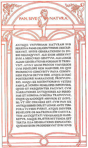
EXAMPLE 43
Uniform tone in classic typography. Page by Bruce Rogers
47
TONE AND CONTRAST
This chapter is a story of the alpha and omega of color—white
and black. Since the creation of the world,
when light first illumined the darkness, these two colors
(if I may call them colors) have been emblematic of
extremes—white, the symbol of purity and goodness,
black of impurity and evil. White and black represent
extremes in color. Mixing of all the color rays of the solar
spectrum produces white, and
mixing of all the colors in the
solid form of printing ink produces
black. From this contrast
of white and black maybe drawn
a lesson in color. (Example 31.)
Light represents warmth, darkness
cold. As the colors are
toward light they are warm; as
they are toward darkness they
are cold. Red becomes warmer
as it takes on an orange hue, and
colder as it takes on a purple
hue. A warm color should be
contrasted with a cold color—as
orange with black. The further
in tone the color is from black
the more it contrasts with the
black. As an illustration:
Orange is more pleasing than a
deeper shade of red as a companion
color for black. Blue,
purple or green, selected to be
used with black, must be lightened
with white ink to get the
desired contrast.
EXAMPLE 31
Contrast in color and tone
White and black as a combination
are and ever have been
popular with writers, printers
and readers. Fully nine-tenths of
the newspapers, books, catalogs
and other forms of reading matter
are printed with black ink
on white stock. It is coincident
that optical necessities require for best results in reading
a black-and-white combination, and black ink and white
paper are more cheaply and easily produced than other
colors of ink and paper.
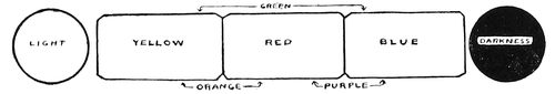
EXAMPLE 32
An example of uniform tone and contrast of black and white. Page by F. W. Kleukens, Darmstadt
This chapter is also an illustrated sermon on uniformity
of tone or depth of color, in which is pointed out the
necessity of bringing many spots of black or gray into harmonious
relation. The esthetic
importance of uniformity
of tone is universally
recognized. Choirs
are robed in white and
black; fashion has its uniform
clothing for the hours
and functions of the day and night; theater choruses and
the soldiery are living masses of uniform tone and color.
As uniformity is important in these things, so is uniformity
important in the tone of a page of printing. A type-page
exhibiting a variegated mass of black and gray
tones is not unlike a squad of recruits in different styles
of clothing marching irregularly; while on the contrary
a type-page of uniform tone and
arrangement maybe likened to
a uniformly equipped regiment
of soldiers marching with rhythmic
tread.
A page of display typography
composed of a mixture of
irregular gray and black tones
is inexcusable in the sight of the
art-loving reader. As combinations
of inharmonious type-faces
are wrong, equally so are combinations
of incongruous tones.
For the sake of contrast and
variety in typography, art principles
are too often ignored, the
printer confessing to ignorance
or lack of ingenuity. Contrast
is necessary, but it may be had
without sacrificing uniformity.
Again making use of a military
simile: soldiers are marched in
platoons, companies, battalions
and regiments that the monotony
of solid formation may be
broken; type is arranged in
groups and paragraphs for similar
reasons. While an absolutely
solid page of type may
present a pleasing tone, a slight
break in the regularity is desirable
for reading purposes. Thus
art makes concession to utility,
but such concession should always
be granted reluctantly. There is classic authority
for the arrangement of the type lines in Example 20
of the preceding chapter, but on the majority of printing
jobs it is necessary to compromise with utility and
emphasize important words, as in Example 19-a of the
same chapter. The secret of producing artistic typography
in these practical times is to pilot the ideas of the
customer into artistic channels;
emphasize the words
he wants emphasized, but
do it in a way that will result
in creditable typography.
There is a right way
and there is a wrong way
48of arranging type, and too many typographers arrange
type the wrong way and unjustly blame the customer for
the result.
The effectiveness of uniformly black tone on a background
of white is well illustrated on the beautiful book
title shown as Example 32, in which even depth of color
is consistently maintained. There is not a weak spot on
the page; border, ornament and lettering are of equal
tone, and the white background is reflected thru the
black print in agreeable contrast. The Germans are
masters in their treatment of contrast and uniform tone,
and he who bewails the limitations of black and white
printing should ponder over the results shown by this
specimen from over the sea.
Here is a practical demonstration of the workings of
the theory of uniform tone in typography. Example 33
displays four ornaments, each of a different tone or
depth of color. One of the customs when constructing
a booklet cover-page to be ornamented, is first to select
an ornament that is appropriate in design and of proper
proportions. Upon this ornament the page is constructed,
and it dictates the characteristics of the border and of
the type-face; its tone determines the tone of the entire
page. This is also true of a trademark furnished by the
customer, altho such plates are frequently so inartistic
that a compromise is necessary.
Assuming that a cover-page is to be designed and that
ornament A has been selected for use on the page, a rule
border is chosen with triple lines approximating the
strength of those in the ornament. (Example 34.) The
lines are very thin, and white space is a large factor in
producing a tone that is light and dainty, in keeping
with the subject of the illustration. A perfect result
would be obtained with a type-face of very thin strokes,
yet Caslon capitals, slightly separated to let in white
space, give good results.
EXAMPLE 33
Four ornaments, each of a different depth of tone, used in the construction of the four pages shown as examples 34, 35, 36 and 37
49
The ornament shown as B has been formed of lines
darker than those used in the first ornament, and a mass
of white forms a spot of contrast. Rules of the proper
tone are selected and a border unit adopted that reflects
the spot of white in the ornament. (Example 35.) Cheltenham
capitals maintain the tone scheme. In this case,
as in others, the type-face is a trifle stronger in tone than
ornament and border. This is well. Type-lines on a cover
are usually of more importance than the decoration.
EXAMPLE 38. Dark tone—solid
EXAMPLE 39. Light tone—spaced
Two extremes of tone on book pages. The same type-face is used on both pages; the spacing between words and lines alters the tone
50
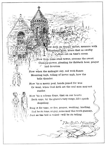
EXAMPLE 40
A page by J. H. Kehler, in which illustration and text are blended in uniform tone
Ornament C differs from ornament A in that it is composed
of light lines contrasted with solid blacks. A border
is made of a light line and a dark one, and the Bodoni
type-face, containing light and heavy strokes in contrast
with a white background, assists in producing a decidedly
pleasing medium black tone (Example 36).
This combination of ornament, type and rule demonstrates
there is considerable tone beauty in a well-selected
contrast of light and dark lines when set off by liberal
white space between lines and in the background.
The dense black tone of ornament D is duplicated in
the dark-line border filled with black decorative units
(Example 37). The black-printing Chaucer Text reflects
not only the tone but the decorative characteristics of
ornament and border. The tone of this example approximates
that of the German page (Example 32).
These four examples afford an interesting study in
uniform tone.
As the tone or depth of color increases from the light
gray of Example 34 to the dense black of Example 37,
it will be observed that the contrast between the print
and the paper background also increases. This leads to
the subject of contrast. What amount of contrast is
needed on the ideal job of printing? There is conflict
between art and utility on this question, but there need
be none. Art demands that the print be a part of the
paper upon which it is impressed, much as the plant is a
part of the earth in which its roots are buried, and utility
demands that the print shall be strong and clear that
reading may be made easy. The artist-printer lessens the
contrast between print and paper by printing with gray
ink on gray stock, brown ink on light brown stock, and
so forth. The utility printer gets the maximum of contrast
by printing with black ink on white stock. As printing
is both art and business some compromise must be
made, and it is this: On two-color printing have all
reading matter in the stronger color and subdue the color
of the decoration so that the contrast between the paper
and the print of the reading portion of the page is softened
by this intermediate tone. Black print on white
paper is made artistic by impressing the print firmly on
antique paper. This roots the print to the paper, and
the result is more idealistic than that presented by the
print daintily set upon the surface of glossy, enameled
papers.
EXAMPLE 41
The spotted black tone of the border is reflected in the treatment of the text. The tone is made uniform by printing the border in a light color. Page by University Press, Cambridge
Lack of artistic feeling among typographers and customers
is responsible for unpleasant contrasts in tone.
A dense black illustration or initial will be set in a page
of light gray reading matter, or type of black tone will
be used on a page with an illustration of light lines.
Great contrast in any detail of typography is not art but
eccentricity; this statement may be made plain by a
comparison. One winter’s day when the conventional
folk of New York were wearing clothing of a somber
hue, they were startled by the appearance among them
of Mark Twain in a suit of white. Six months later the
humorist’s garb would have excited no comment, but
the black clothed mass of humanity around him emphasized
the whiteness of his attire, and the conspicuousness
thus produced separated him from his surroundings
and made him an object of curiosity. Such things
are done by great men to show their disregard for custom
and by others because they are foolish or are advertising
something; but it is common-sense right from Cervantes
to do when in Rome as the Romans do (meaning
that printed work which both attracts and repels by its
gaudy, unconventional appearance is not nearly so good
or desirable as the more conventional printed work which
51tastefully and quietly presents its message in subdued
tones). One man will become widely known because he
has dived from a big bridge or gone over Niagara Falls;
another because he has painted a great picture or modeled
a great statue. The one thrills, the other impresses.
It may be easier to produce typography which attracts
attention by contrast, but such results do not bring the
lasting satisfaction that comes from typography thoughtfully
and artistically designed.
EXAMPLE 44
A study in uniformity of tone as found in combinations of type and decoration
EXAMPLE 42
The tone of the illustration and type-face is here blended. Card by School of Printing, Boston, Mass.
Several other points are suggested by Examples 34 to
37. A page for a cover should be of darker tone than a
page to be used as a title inside the book; this where the
body-type of the inside pages is of the customary gray
tone. A cover placed upon a book to protect it suggests
strength, and the typography of the cover should conform
to this suggestion. The reason for the uniform tone presented
by each of the four examples above mentioned
is another important point. Were the border darker than
the ornament and type lines, the ornament darker than
the border and type lines, or the type lines darker than
the ornament and border, there would not be uniformity
of tone, and a consequent loss in the effectiveness that
comes from tone harmony.
The tone of a massed page is of vital importance in
the typography of a book, and a happy medium is somewhere
between the under-spaced black type-page of Morris
and the over-spaced hair-line type-page against which the
Morris page was a protest. Examples 38 and 39 show the
manner in which the tone of a page may be controlled
by spacing. In Example 38 the page is moderately spaced
between words and lines and in Example 39 the page is
liberally spaced, presenting two extremes and vividly
picturing the manner in which spacing influences the
page tone.
The tone of the pen-and-ink outline illustration in
Example 40 is admirably duplicated in the typographical
treatment accorded the page. The result would not have
been so satisfactory if there had been no quad lines to
break the solidity of the page.
The spotted black tone of the decorative border in
Example 41 is reflected in the typography of the page,
a result obtained by using a bold-faced body-type and
separating the words with a liberal amount of space.
However, the tone would not be equal printed in one
color, but by printing the border in a lighter color the
tones are equalized. Here is a suggestion for obtaining
even tones. Where one portion of the page is bolder than
the other, print it in a lighter shade of ink, or if any
part of a type-page must be printed in a lighter color, set
that part in a type-face of darker tone (Example 47).
Job printers should be interested in Example 42, as it
is a good presentation of the theory of uniform tone.
The effect of the open-line illustration is duplicated in
the spaced Jenson capitals and cross lines. The result
would have been even better had the small groups on
both sides of the illustration been slightly letterspaced
and the line at the bottom spaced less.
Example 43, on the insert, is a classic interpretation
of uniform tone. The architectural design is formed of
lines about the same strength as the strokes of the type-face
and the massed capital letters admit sufficient light
to give them a tone near to that of the open-spaced
border.
Example 44 (insert) is a pleasing blend of tone and
characteristics. The delicate light-gray tone of the
Camelot type-face is closely matched in the decoration
and border, and altogether this is an almost perfect exemplification
of the subject of this chapter. It is seldom that
an artist so carefully considers the characteristics of a type-face
and reproduces these characteristics in so admirable
a manner as was done in this instance.
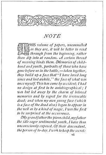
EXAMPLE 45
In which the tone of the initial and headpiece is lightened to near that of the text portion. Page by Heintzemann Press, Boston
Initials and headpieces should approach closely the tone
of the type-page of which they are parts. Example 45
shows such a combination, with the tone of the decoration
just a trifle darker than that of the text portion. An
initial has other duties to perform than merely to look
pretty; it must direct the eye to the beginning of the
reading matter. In the manuscript books of the Middle
Ages, written without paragraphs, the starting point of a
new thought was denoted by an initial more or less elaborate.
The utilitarian purpose thus served by the initial
52is reason for making it a trifle darker than the remainder
of the page. However, if there is great contrast in tone,
the page will be difficult to read because of the initial
claiming too much attention. The effect would be much
like attempting to listen to one speaker while another is
calling and beckoning.
EXAMPLE 48
Display lines in tone should match the border
Every rule has its exception and I wish to record one
in the matter of uniform tone. On a page composed of
display lines and a large amount of reading matter it is
an offense against legibility to set the reading matter in
a type-face of black tone to correspond with the display
lines, considerable contrast being necessary in such cases
to make reading easy. (Example 48.) Notwithstanding
this exception in the case of reading matter, uniform
tone should be retained between display lines and border.
If a catalog is illustrated (and the majority are) it is
important to have the illustrations prominent on the
page, sacrificing tone to utility if necessary. Sometimes
the illustrations are printed in dense black and the remainder
of the page in gray or brown. While this causes
the illustrations to stand out in relief—an important
point when machinery is depicted—it should not be forgotten
that the type matter must be read.
In advertising composition it is seldom possible to
have an even tone on the entire page. The New York
Herald advertising pages are unique in this respect.
Outline type-faces are used, and all illustrations are redrawn
in outline before they are published. This serves
to give a uniformly gray tone to the pages, but the advertisers
are not enthusiastic over the effects. While
other newspapers may not be able to maintain uniform
page tone, it is possible at least to have each advertisement
present a tone uniform in its displayed parts and border,
and the good typographer will secure such effects. The
gray shaded type-faces now available should enable printers
and publishers to obtain tone uniformity where gray
effects are desired and large type sizes used.
EXAMPLE 49
Equal spacing is necessary to obtain uniform tone
Irregular letterspacing has been the cause of many
pages of unsatisfactory tone. In a displayed page where
one line is spaced between letters, all lines should be
similarly spaced. Example 49 presents a decidedly unconventional
letterhead by reason of the letterspacing,
and it illustrates the point that all lines should be spaced
equally. It may be well to warn job compositors inclined
to imitate the style of this heading that there are few
customers who would concede any merit to such an arrangement,
and it should be used sparingly. Unconventional
treatment, even tho good along the lines of the
style chosen, is not always appreciated.
EXAMPLE 58
In which the ornament, the border and the type-face are in proportion
53
PROPORTION, BALANCE AND SPACING
Symmetry is necessary to beauty. This law of esthetics
is as applicable to typography as to sculpture and
architecture. Proportion and balance—the things that
make for symmetry in typography—are obtained only
by giving the work more attention than seems necessary
to the average producer and buyer of printing.
Why should the printer worry about esthetics—about
symmetry? What has art to do with printing, anyway?
Questions such as these find too frequent voice in the
printing trade, coming from the employee whose interest
and ambitions
end when he “gets
the scale,” and the
employer who is
satisfied merely to
deliver so many
pounds of paper and
ounces of ink for so
much money. Pity
the man whose work
is drudgery and who
denies that art and
beauty are meant
for him. He has his
antithesis in the
man who, appreciating
the higher
blessings, neglects
to give value to the
more common and
practical things.
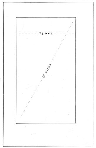
EXAMPLE 50
One method of determining the page length. The page should measure diagonally twice its width
There have always
been two opposing
classes—in
religion, politics,
art, music, business.
On all questions one
portion of humanity
is “for” and the
other “against,” mostly because of the influence of environment
upon tastes and interests. Mozart’s and Beethoven’s
music charms and enthuses and also lulls to
sleep. One class should try to understand the other.
Each has good reasons for its preferences, but none at
all for its prejudices. The painter Rubens, gathering inspiration
in the courts of royalty, portrayed luxury and
magnificence. Millet, painting in a barn, pictured poverty,
sorrow and dulled minds. What pleased one found
little sympathy in the other. During the Middle Ages
learned men talked, wrote and thought in Latin, and
when it was proposed to translate the Scriptures into the
language of the masses these men held up their hands in
horror.
Not so many years ago the book printer looked upon
the job printer as the Roman patrician looked upon the
plebeian, but the job printer has absorbed dignity and typographic
taste from the book printer. While the book
printer’s highest ideal is a volume with uncut leaves
ornamenting the book shelves of the collector, the job
printer’s mission is to be all things to all men. He prints
the refined announcements of art schools one day and
another day finds him placing wood type to tell the story
of a rural sale of articles “too numerous to mention.”
There should be more sympathy between the book
printer and the job printer, and also between the printer
who regards his calling
as a business and
the printer who regards
it as an art.
The employer and
employee who consider
printing only a
means to an end and
that end money, are
as near right and as
near wrong as they
who produce art
printing for art’s
sake and forget the
pay envelop and the
customer’s check.
The first starve their
souls, the last their
bodies.
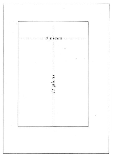
EXAMPLE 51
Another method of determining the page length. The length of the page should measure fifty per cent more than its width. These examples also present proportionate margins, the foot margin in each instance being the largest
The printer who
does things artistically
in an economical
manner “strikes
twelve” (in the
slang of Elbert
Hubbard). Printing
need not be shorn
of beauty to be
profitable to both
printer and customer, tho beauty too conspicuous turns
attention from the real purpose of the printed job—which,
in the case of a booklet, is the message the words
convey. An equestrian statue of Napoleon should feature
the great conqueror, not the horse, but would be impossible
with the horse left out.
Art is essential to printing; so are Uncle Sam’s specimens
of steel engraving. The more art the printer absorbs
the larger should grow his collection of these engravings.
Study of art arouses ambition; ambition brings better
and harder work. It reveals in the typographer the difference
between mere lead-lifting and the artistic selection
and arrangement of types. The boy who sweeps the
floor and does his best is nearer art-heaven than he who
sets type and cares not how he does it.
The printer who determines to learn about art—who
54makes continued effort to
find the reason why one
man’s work is good and another’s
is not, will be surprised
and gratified at the
new world that unfolds itself
as he studies. He will
find that altho having eyes,
he has really seen only as
he has appreciated. There
is no easy road to the appreciation
of the beautiful.
Art does not consist merely
of a set of rules to be observed;
there are few beacon
lights placed by those who
have trod the road. Beyond
a certain point the novice
must depend upon intuition
or “feeling.” Great painters
have been asked their
method of producing masterpieces,
and have been unable
to explain.
EXAMPLE 53
In which vertical lines predominate
In introducing the subject
of “Proportion” it is well
first to dispose of book pages.
In olden times the sizes of books were known by the
number of folds to a sheet of paper about 18 × 24 inches.
A book made from such sheets, folded once into two
leaves, was known as a folio volume and measured about
12 × 18 inches. Folded twice into four leaves, a quarto,
measuring 9 × 12 inches. Folded three times into eight
leaves, an octavo, measuring 6 × 9 inches. Paper is now
made in a variety of sizes, which allow of individual
preferences being satisfied. For the sizes of catalogs 9 × 12
and 6 × 9 are becoming standard. The sizes do not depart
far from the rule of proportion which holds that the width
of the page should be two-thirds its length.
Examples 50 and 51 illustrate two widely-used methods
of determining page lengths. By the first method
(Example 50) the page should measure diagonally twice
its width. In this instance the width being eight picas,
the diagonal measurement is sixteen picas. By the second
method the length of the page should measure fifty
per cent more than its width. Here the width being
eight picas, the length is twelve picas. These measurements
may or may not include the running
titles or folios.
EXAMPLE 54
Compare with Example 53
If only small margins are possible,
the page (exclusive of running title)
should be about centered, with a slight
inclination toward the head and back.
But when margins are reasonably ample
the page should set liberally toward
the head and back; the margins of the
head and back (exclusive of the running
title) should be about the same, the
outer side margin should be fifty per
cent more than the back margin, and
the foot margin one hundred per cent
more than the back margin. Various
explanations of this rule have been put
forward, a few of which are: The old
book-owner making marginal notations
as he read, needed wide margins for
the purpose. Early manuscript books
were bound on wood, and this wood was
extended at the foot and used to hold
the book when reading. Two pages
being exposed to view were treated as
one page, much
as double columns
are now
treated. As
book illuminators
required
room for their
handiwork the
margins may
have thus originated.
The
principal reason
why we
should observe
such margins
is that the arrangement
has
the sanction of
long usage and
the approval of
the best bookmakers
since
books were
written.
The job
printer, it is
reasonable to
suppose, is more interested in proportion as it refers
to display typography. He asks: What relation has
type, in the shape of its face, to the page of which
it is a part? And the answer is: A type-face should conform
in the proportion of its letters to the proportion of
the page. Let us thoroly understand this. In Example
52 there are shown three widths of type—condensed,
medium and extended. The type of medium width is
more used than the condensed
or extended kind, and most
pages have a proportion such
as Example 55. From viewpoints
of both economy and
art, the type-face of medium
width should be given preference
when selecting type
equipment. Condensed types
are properly proportioned for use as headings in the
narrow columns of newspapers and for narrow folders
and booklets.
EXAMPLE 55
The conventional page shape, with type and ornament in proportion
EXAMPLE 52
Three widths of type-faces
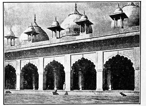
EXAMPLE 57
Compare with Example 56
Many of the laws that are necessary to good typography
also govern the other arts. As an instance, in
architecture it is requisite that a tall and narrow building
contain a preponderance of vertical lines, a feature
most noticeable in church buildings of Gothic style
(Example 54). Because the extent of vertical lines is
greater than that of horizontal ones in a condensed type-face,
such a face is proper for a long and narrow page
(Example 53). The proportion of page shown by Example
55 is about
that met with most
frequently in printing
production.
Here the vertical
lines are in a slight
majority, but it is
interesting to observe
that in Example
56 where
the page is more
wide than long,
horizontal lines
are more numerous
than vertical ones.
55
EXAMPLE 56
In which horizontal lines predominate
It is not always possible to follow out in every detail
the requirements of proportion. Architects must sacrifice
much in the interests of utility and in deference to
the wishes of their clients. Printers must do likewise, but
as a rule they travel farther from true art principles than
do architects. Consider the contrasting proportions of
the structures in Examples
54 and 57. In Example 54
notice that the openings have
been made to conform to the
general proportions, and that
vertical lines have been multiplied
to emphasize narrowness
and hight. As a contrast,
in Example 57 observe
the width of the openings;
how it blends with the general
proportion of this structure.
Now to ascertain that
typography parallels architecture
compare Example 53
with 54, and 56 with 57.
EXAMPLE 60
The type-faces of these two examples are not in proportion with the pages
An exaggerated idea of
the relation of lines to proportion
is furnished by Examples
62 (see insert) and 63.
The vertical lines of Example
62 run with the length of the
page as smoothly as a canoe
floating down stream. The
horizontal lines of Example
63 are irritating in their disregard
of proportion. For
the eye to take in at a glance both the page lines running
vertically and the rules running horizontally is as
difficult as watching a three-ring circus. Examples 59
and 60 also illustrate this point.
I have prepared in Example 58 (see insert) a page in
which not only are ornament, type-face and page-design
in proportion, but the characteristics of the ornament
are reflected in the border, and the tone is uniform.
Irregularity of form is valuable in breaking monotony,
and in some forms of art may be essential, but as contained
in Example 61 this feature is inharmonious. Before
experimenting with variety or becoming agitated
about monotony the typographer should perfect himself
in the things that make for regularity. When he learns
to set a page that is harmonious and in proportion then it
may be well to introduce irregularity—in homeopathic
doses.
There is much uncertainty manifested among typographers
as to the proportionate
strength of display
lines on a page.
A type line is proportionately
large or small
as it contrasts with its
environment. Gulliver
was a giant when
among pigmies. The
foremost citizen of a
country town is considerably
reduced in
importance when he
rubs elbows with the
big men of the cities.
The homely adage that
“a big frog in a small
puddle is a small frog
in a big puddle,” is
applicable to typography.
A display line surrounded
by other type
lines (Example 64)
must be made larger
or by strengthened
strokes made bolder
than when alone on
the page (Example 65).
The old City Hall in
New York is claimed
to be the most beautiful work of architecture in the city,
but is ridiculously out of proportion with the towering
office buildings surrounding
it.
EXAMPLE 63
Horizontal lines are not suitable for a vertically narrow page (See Example 62, insert)
EXAMPLE 61
Type-faces and borders are mismated
Examples 66, 67
and 68 are studies
in the proportion of
a type-face to the
page of which it is a
part. In Example 66
the page is largely
covered with type,
treatment that is
necessary on poster,
dodger and other
printed matter that
must force its presence
upon the public.
In Example 67
the page consists
mostly of blank
space, the type
standing modestly
56and apologetically in the midst of that space. This treatment
is proper on dainty works of poetry or when the
demands of extreme refinement are to be satisfied. Example
68 is the “happy medium,” the compromise—a
strength of display that will be satisfactory in almost
every case. This method of arriving at correct treatment
emphasizes the need in the typographer of a
judicial as well as an artistic temperament. The wise
judge knows that truth is about midway between the
claims of opposing counsel.
EXAMPLE 65
A display line surrounded by other type lines must be made larger than when alone on the page, to obtain proportionate emphasis
Balance is another important subject, as it has a big
share in making typography good or bad. The builder
works with plumb-line and spirit-level that his walls may
be in perfect balance, tho sometimes he is tempted, as
the printer is tempted, to work away from the center of
gravity. In Italy there is a building, an architectural
curiosity—the leaning tower of Pisa (Example 73) in the
construction of which gravity has been defied to the
limit, and in Canada only recently a bridge in course of
construction on this gravity-defying principle, fell in a
mass into the river. In typography, safety from blunder
lies in type lines horizontally centered. Typographic experts
experimenting with out-of-the-center balance, both
succeed and fail. Compositors imitating them generally
fail. Example 76 is an out-of-the-center arrangement that
is fairly successful. Balance is saved by the type-lines in
the upper left corner and by the border surrounding the
page. Examples 69 and 75 show out-of-center balance
adapted to a business card and a booklet cover.
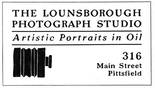
EXAMPLE 69
Out-of-center balance, adapted to a business card
While horizontally the center is the point of perfect
balance, vertically it is not. Stick a pin thru the very
center of an oblong piece of cardboard and twirl the
card; when movement ceases the card may not hang uprightly.
Mark off
the card in
three equal
sections
and stick
the pin
thru the
horizontal
center of
the line
separating
the upper
two thirds.
After being
twirled the card will cease to move in a perfectly upright
position. Example 71 shows a word placed in exact
center, yet it appears to be low. Example 72 shows a
line above center at the point of vertical balance. On a
title-page, business card, and on most jobs of printing
57the weight should
come at this point.
The principal line,
or group, should
provide strength
necessary to give
balance. Example
70 presents a page
with type group
and ornament
placed unusually
high. The typographer
responsible
was undoubtedly
testing balance to
the limit.
EXAMPLE 66
Type proportionately too large for the average page
EXAMPLE 67
Type proportionately too small for the average page
EXAMPLE 68
This proportion is about right for the average page

EXAMPLE 62
In which the lines of the design run in the proper direction. Arranged by Will Bradley
EXAMPLE 70
In which the upper type group is unusually high. Page by D. B. Updike
Sometimes the
customer gets a
notion he wants a
type-line placed diagonally
across the
page in a manner
like Example 74.
Such arrangements
generally show
lack of imagination
and are crudely
freakish. There are
so many orderly
ways of arranging
type that such
poorly balanced
specimens are deplorable.
EXAMPLE 74
A disorderly arrangement
Spacing is seemingly one of the little things—merely
incidental to the mechanical practice of typography.
When the apprentice compositor is told to divide his
spaces evenly among all the words in a line; not to thin
space one line and double-thick space another; to transpose
a two-point lead, or make some other what to him
may appear to be trivial alteration in spacing, he judges
his instructor to be over-particular. Yet the proper apportionment
of space on a page determines
the tone and the balance and aids
in giving proportion and emphasis.
In type-making, when a font of type
is designed, not only is each letter considered
separately, but in combination
with every other letter of the alphabet,
that when the letters are assembled into
words space may be evenly distributed.
The designers of the best type-faces
have given attention to this feature
and have demonstrated that legibility
is increased
with proper
space distribution.
Because
of the
excessive
open space it
contains, the
capital L
gives the
most trouble
of any letter
used as an
initial. As
part of the
word “Millinery”
the
irregularity
of spacing is particularly prominent (Example
79-a). Partly to overcome this
irregularity the companion letters should
be spaced as shown in 79-b. When the
letters A T occur together, and the space
between them should be decreased, it is
necessary to file the metal in the upper
right of the type A and the metal in
the lower left of the type T.
EXAMPLE 71
A word placed in exact center appears to be low
EXAMPLE 72
Showing the point of vertical balance
With roman type-faces, important
words are usually emphasized by italics
or small capitals. The Germans, using
for body purposes a text letter which
has no italic or small capitals, space the
letters to get emphasis (Example 80-a).
Letter-spaced words thus used are perhaps
as neat as italic, and the idea may
well be adapted to roman types (Example
80-b).
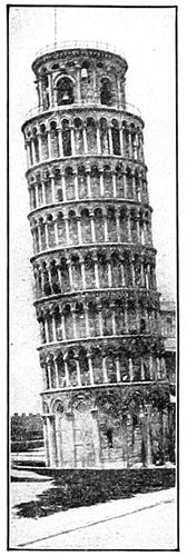
EXAMPLE 73
Balance out of center
EXAMPLE 75
The ornament balances the design. Page by School of Printing, Boston
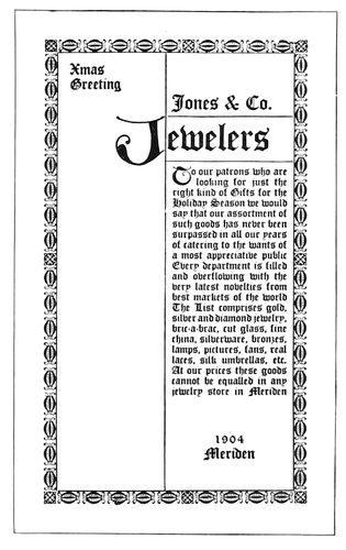
EXAMPLE 76
Out-of-center balance. Page by Will Bradley
The relation of lines to proportion,
58as illustrated
by
Examples
62 and 63,
is also to be
considered
in the composition
of
plain reading
pages.
Example 77
shows how
the effect
of horizontal
lines is
given by
narrow
spacing
between
the words
and wide
spacing between
the
lines. This
gives a result,
like
that of Example
63, contrary to the principles of proportion. How
this may be overcome is illustrated in Example 78, which
contains the same
amount of space between
the words as is
between the lines. This
treatment not only
gives better proportion,
but improves the tone
of the page.
EXAMPLE 77
The effect of horizontal lines is given by narrow spacing between the words and wide spacing between the lines
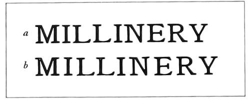
EXAMPLE 79
Other letters must be spaced because of the open appearance of the letter “L”
EXAMPLE 81
The erroneous and obsolete practice of spreading the lines over the page
Adapting this principle
to display composition,
Examples 81
and 82 are enlightening. Example 81 shows the manner
in which some years ago display lines were erroneously
distributed over the entire page, presenting in
effect the
faults of
Example
77. The
manner of
rectifying
these faults
is demonstrated
in
Example
82, where
main lines
are grouped
at the point
of balance
in the upper
part of
the page.
The narrow
measure to
which
these words
are set necessitates
letterspacing.
The
resulting
appearance
is far from
satisfactory
yet it enables
illustrations
to
be grouped
pleasingly
and makes
possible a
squaring of
the pages
which could
not be done
otherwise.
EXAMPLE 78
The effect of horizontal lines is avoided by having the space between the words approximate that between the lines
EXAMPLE 80
Emphasis obtained by letterspacing, in lieu of italics and small capitals
EXAMPLE 82
The correct modern practice of grouping the lines at the point of balance
It is not
always that
results are
as perfect
as we desire
them. In
New England
there
is a printer
who, in the
opinion of
those fortunate
to have
viewed his
work, is producing typography classically perfect; yet this
man goes from his work at the close of the day almost discouraged
because of
the faults
that are evident
to his
trained
eye. The
artist’s
ideal always
eludes
him and the
chase seems
a hopeless
one,
yet he continues
on
lest he lose
sight of it
altogether.
It is a good
sign when
one recognizes
imperfections;
it
means that
he is gaining
ground
on success.
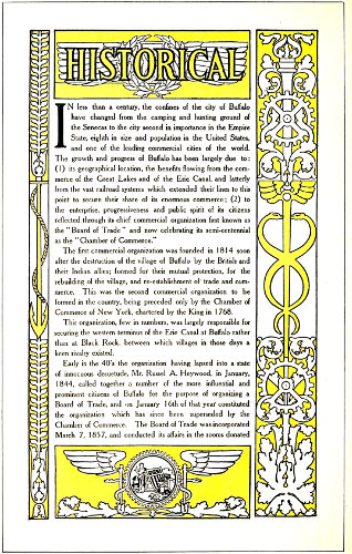
EXAMPLE 125
Illustrating the significance of ornamentation, as applied to a booklet. Design by the Matthews-Northrup Works, Buffalo, N. Y.
59
ORNAMENTATION
Offer a child the choice of two toys, alike excepting that
one has a flower painted upon it, and he will doubtlessly
select the ornamented one; proving that the human race
has a natural liking for ornamentation. When the old-time
trader visited savage countries, he took with him
colored glass and brought back gold. The glass soon after
ornamented the somber bodies of the savages, and the
gold became rings and bracelets worn by the whites.
There are those in this day who love the trees and the
flowers and hear music in the
brooks, but more find pleasure in
artificially ornamented ball-rooms
with music blown and sawn and
hammered from brass and catgut
and sheepskin.
EXAMPLE 83
The egg-and-dart ornament
EXAMPLE 84
The bead ornament
Man was created in a garden
of flowers and trees pleasant to
the sight, yet he has ever been
yearning for a new Eden of pure
gold, garnished with precious
stones, forgetting that Solomon
in all his glory was not arrayed like the lily of the field.
Nature is the great artist, and man’s ornamentation at
best is a poor imitation of natural things. The trees of
the forest gave the motive for the stone columns and
ornamental capitals of architecture, and the plant and
animal world furnished themes for talented calligraphers
in the days when books were literally written. The
blue vault of the skies inspired Michelangelo to plan
the great dome of St. Peter’s at Rome, as the sun furnished
a model for the Indian while decorating his tepee,
and the flowers of the field have provided inexhaustible
color harmonies.
EXAMPLE 85
The egg-and-dart ornament as a typographic border
In the early days of this country most of the inhabitants
devoted their working hours to the struggle for existence,
and it has been only within recent years that the
average man has given thought to art. Many a one has
thrown off his lethargy to discover beautiful things all
about which he had never before noticed.
Art galleries and libraries all over the United States
are aiding greatly in the cultivation of taste for art, and
the printer to whom these privileges are accessible, yet who
does not avail himself of their advantages, is much like
the man who was lost in the Adirondacks, not knowing
he was but a half-mile from a
railroad. China, who could conquer
the world if she only knew
her power, has been sleeping for
centuries, while a little handful
of intelligent people on a small
island of Europe wields an influence
that is felt wherever the
sun shines.
EXAMPLE 86
The bead ornament as a typographic border
The printer and he of an allied
vocation should take less thought
of food and raiment and devote
more thought to learning the things of today and yesterday
with which he may be but little acquainted. If one
knows just enough to “make a living” he will never make
more than a living. A study of art, of history, of the
larger things in the printing business, will result in the
good things of the earth being added.
Is ornamentation necessary to art-typography? Ask
one good printer and he will answer, yes. Ask another
and he will answer, no. One of the meanings of ornament
as given by the Standard dictionary is: “A part or
an addition that contributes to the beauty or elegance of
a thing.” A paper may be so pleasing in texture as to
give beauty or elegance to an otherwise plain page of
60printing; in fact, it is sometimes a mistake
to use type ornaments or other
embellishment on a richly finished hand-made
paper. On the contrary, a stock
poor in quality or color had better be covered
with decoration to divert attention
from the paper.
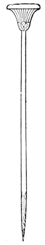
EXAMPLE 87
Conventionalized papyrus plant (Egyptian)
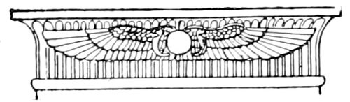
EXAMPLE 88
The winged ball, an ornament much used by the Egyptians
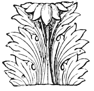
EXAMPLE 89
The acanthus leaf, much used by the Greeks and Romans in ornamentation
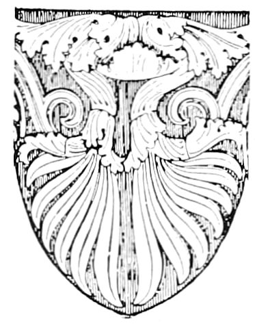
EXAMPLE 90
Palm-like ornament, used by Greeks and Romans
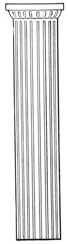
EXAMPLE 91
Plain and dignified. The Doric pillar
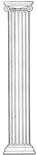
EXAMPLE 92
Slightly ornamental. The Ionic pillar
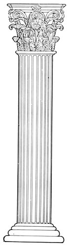
EXAMPLE 93
Elaborately ornamental. The Corinthian pillar
There are printshops in which all
ornaments are kept under lock and key;
a compositor wishing to use
decoration must present good
reasons before he gets it.
Customers have become suspicious
of type ornamentation
because of the peculiar use
to which printers sometimes
put it. A young man some
years ago became possessed of a desire to do artistic
printing and had a number of type ornaments purchased
with which to express his ideas. When one proof after
another came from the customer with ominous blue marks
upon the cherished ornaments, he realized
the necessity of revising his ideas
of art. For fully a year after that he
worked without
voluntarily using
an ornament,
meanwhile developing
all the
possibilities of
good type-faces
and appropriate
paper stocks
and color combinations.
It has been claimed that
fasting has a beneficial
effect on the body; be that
as it may, our friend certainly
improved his artistic
taste by his abstinence.
When he again began
using ornaments it was
with discrimination and
after study of their significance
and appropriateness.
This leads to the subject
of motive or reason in
ornamentation. The styles
of typography may be generally
divided into two
classes, one dominated by
Roman or Italian influence
and the other by Gothic
or German influence.
During the Middle Ages
the Gothic influence was
felt chiefly because the
pointed style of architecture
and embellishment
was sanctioned by
the Christian church. As
art was practically dead outside the church,
the art-workers absorbed the Gothic style.
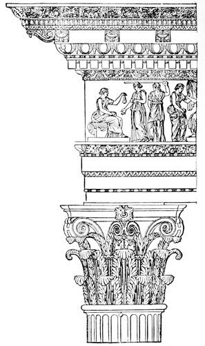
EXAMPLE 94
Ornamentation as used by the Romans on an entablature and a Corinthian pillar, showing egg-and-dart, bead, and acanthus ornaments
When typography was invented Gutenberg’s
first book was based upon the Gothic style—the
type-face a pointed black letter, such as
was then used on manuscript books, and the
ornamentation pointed foliage (done by hand).
It was some years after this that typography
came under the influence of the Italian Renaissance,
and both type-faces and decoration
assumed the Roman style. In the old days
there was sympathy between the various arts
and crafts, and it worked for harmony in
effects. Building-decoration, metal-carving
and wood-engraving were governed by the
same artistic motive, and were often done by
the same man, much as the printer at one
time was compositor, pressman, binder, typefounder,
ink-maker and paper-maker, all in one.
Now, many a piece of printing goes wrong because
the ideas of several people, inharmonious
from lack of relation, are injected into the
work during the several stages necessary for
its production.
The relation of typography to architecture
is plainly shown in the formation of the Roman
and Gothic alphabets. The letters of the Roman
alphabet, dignified in their straight strokes and
symmetrical in their rounded lines, suggest
features of Roman architecture (Example 106;
also see Example 43 of a previous article).
In the interesting picturesqueness of the
pointed black Gothic letter may be seen reflections
of the graceful arches of the cathedral
pointing upward like hands in prayer—and
of the pointed leaf ornamentation of the
Gothic period. (Example 107.)
EXAMPLE 98
Dainty, elaborate rococo ornament, as applied to a program title-page. Compare with the chair, Example 97
61Ornamentation is both inventive
and imitative. An ornament purely
inventive or one purely imitative is
seldom artistic. A child may make a
jumble of lines that altho original
means nothing; when it is older it
may draw a flower so realistic and
imitative that little is left to the
imagination. When a flower or plant
is used as a model in designing an
ornament it is “conventionalized,”
that is, it is blended with its environment.
A flower in a garden
surrounded by other vegetation
should be as the other flowers, but as an ornament on the
flat surface of paper it should be
without perspective. Example 108-a
shows how commonplace an ornament
looks when its details are carefully
shaded in perspective. Examples
108-b and 108-c show how
more decorative an ornament is when
either outlined or filled in. Sometimes
shadows are merely suggested,
as on the fruit basket and book ornaments
in Example 113.
EXAMPLE 95
Square-lined, ornamentless furniture
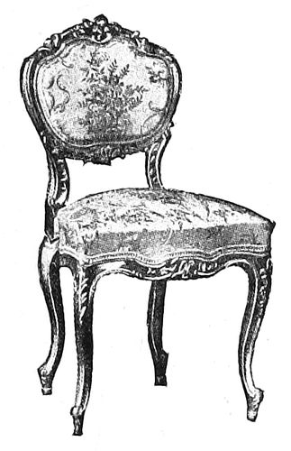
EXAMPLE 97
Dainty and elaborate rococo ornament, as applied to furniture. Compare Example 98
EXAMPLE 100
Slightly ornamental typography. Compare with chair opposite. Design by Will Bradley
In the conventionalized decorative
art of all ages may be found
traces of the things which have inspired
the decorator. The lotus leaf,
and the papyrus plant (which once
gave writing material to the world)
thousands of years ago influenced
Egyptian design (Example 87). Religion dictated many
of the decorative forms in ancient art. The winged-ball-and-asps
(Example 88) was a favorite device in Egyptian
decoration and has come to us by way of Roman mythology
as the winged staff of the herald Mercury, the ribbons
on the staff supplanting the Egyptian asps, but later
evolving into serpents as in the decorative border of Example
125. The work of the best artists is full of meaning.
The Egyptians considered certain animals sacred,
and they were reproduced numerously in the picture-writing
and ornamentation of the time. The sacred beetle
as conventionalized was much used. In Example 125 the
cog-wheel of commerce is conventionalized as the rim of
the ball, which also contains a seal. The anchor and
rope, hour glass, wreath, torch, acanthus leaves, all are
conventionalized and blended pleasingly in outline drawing.
The tone of the border approximates that of the type
matter it surrounds.
EXAMPLE 96
Square-lined, ornamentless typography. Compare with chair opposite. Design by Fleming & Carnrick, New York
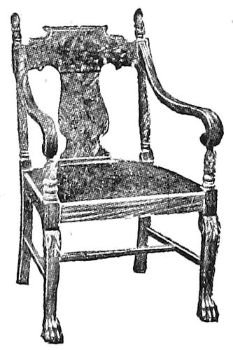
EXAMPLE 99
Slightly ornamental furniture
The acanthus leaf (Example 89) is the model for much
of the elaborate leaf decoration found
on the capitals of Corinthian columns
and wherever rich imposing leaf ornament
is desired. The anthemion (Example
90) is a palm-like ornament
used by the Greeks and Romans, now
frequently found in decorative work
of an architectural nature.
It may not occur to the average
printer that architecture is in any
way allied with typography—that
there is any connection between the
ornamentation of a building and a job
of printing. Fred W. Goudy, Bruce
62Rogers and D. B. Updike employ conventionalized architectural
columns and arches to ornament title-pages of
classic motives. The average typographer, tho, finds more
inspiration in the ornamentation that is only an embellishment
to architecture. There are several ornamental
units that are used more frequently than others, and these
are the egg-and-dart (Example 83) and the bead (Example
84). You, who are reading this, are invited to
verify by observation this last statement. A printer who
did so was astonished at the eggs, darts, and beads that
were to be seen wherever he looked. Cut into the stone
of buildings, carved into the wood of furniture, used on
molding about doors and windows, on office partitions, on
library lamps, in the ceiling panels of restaurants, about
the prosceniums in theaters, around the mirror in the barber
shop—wherever he looked there were the ornaments.
It is remarkable how non-observant the average printer
is. The hands of artists—Greeks and Romans—who
lived thousands of years ago made similar designs, and yet
a knowledge of history is counted non-essential by printers
and others!
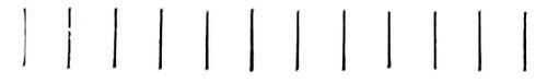
EXAMPLE 101
Regularity of repeat
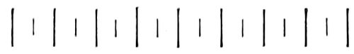
EXAMPLE 102
Variety of repeat

EXAMPLE 105
Contrasted shapes prevent monotony
EXAMPLE 106
Type border of Roman architectural ornament. Compare the straight and curved lines with the Roman type-face
Let us apply the egg-and-dart and bead ornaments as
borders in typography, and notice how admirably they
serve the purpose. Example 85 shows the egg-and-dart
ornament perhaps too carefully drawn as to detail; and
Example 86 demonstrates how the bead ornament may
be adapted to panel work.
From early times there seems to have been a triple
division of taste regarding ornament. In the days of
Rome these divisions were given expression in the treatment
of supporting columns, the three styles being known
respectively as Doric, Ionic and Corinthian. The Doric
column is severely plain, the Ionic slightly ornamental,
and the Corinthian elaborately ornamental.
The Doric style (Example 91) is emblematic of dignity,
simplicity and strength, and appeals to the man
preferring these qualities in printing.
The Ionic style (Example 92) represents refinement in
ornament, and pleases the man able to discriminate between
the severely plain and the over-ornamented—a quality
of judgment worth cultivating by every typographer.
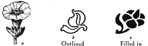
Outlined Filled in
Illustration, not ornament Ornaments without perspective
EXAMPLE 108
The Corinthian style (Example 93) expresses the preference
of many who delight in ostentation and elaboration
in ornament. The elaborate, showy acanthus leaf
usually forms the chief decoration for the capital surmounting
the column, and the entablature (Example 94)
is particularly rich in ornamentation.
The Doric pillar has been called masculine and the
Ionic feminine, the sturdiness of the one and the grace
of the other also being likened to the warlike Spartans
who emphasized the development of the body and the
artistic Athenians
who especially developed
the intellect.
This difference in
ideals and preferences
has come down
the centuries to our
time. A few years
after Cromwell,
plain, blunt, and
even disapproving of
sculpture and painting,
was ruling
England, across the
channel Louis XIV.
strutted in corsets
and on high red
heels amid gilt and
glamour in the courts
of France.
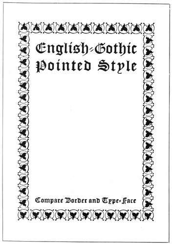
EXAMPLE 107
Type-border of English-Gothic pointed ornament.
Compare the black pointed effects with the Gothic type-face
Monks and nuns
lived plainly in the
company of bare
walls and squarely
cut chairs, and
dressed in subdued
browns and blacks,
while at Rome surrounded
by the art
works of Michelangelo
and Raphael
the higher dignitaries
63were clothed in brilliant reds, and gold and white.
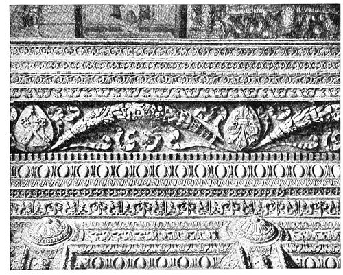
EXAMPLE 109
Extravagant wall border ornamentation, designed during the Renaissance in Italy
Morris loved an old worn-out house, squarely-cut furniture,
burlap, and subdued colors; while the Newly-riches
boast of the magnificence of their mansions, Louis
Quinze ball-rooms and imported tapestry.
Only recently two church buildings were remodeled.
In one were placed ornamental brass railings, lectern,
pulpit and candelabra, and stained-glass pictorial windows;
the walls were covered with gilt fleurs-de-lis on
maroon backgrounds, and the entire effect was one of
cheap magnificence. The other church had been an old
Colonial structure of square proportions. Dignified mahogany
furnishings were selected, the walls were ornamented
in pure geometric designs, pale gold on tinted
backgrounds, and the windows were made of small panes
of glass subdued in color, in harmony with the architecture
of the building, with a result that spoke good taste
and refinement.
Examples 95, 96, 97, 98, 99, 100, present the three
divisions of taste—the plain, ornamentless; the slightly
ornamental, and the elaborately ornamental—applied to
typography and reflected in furniture. The typographer
should learn that the arts are related, that the styles of
home-furnishings and architecture influence the styles
of typography. A few years ago mission furniture was
introduced and along with it came architecture that
called for exposed roof supports, squarely-cut moldings,
coarse fabric wall coverings, subdued green and brown
tapestries. And before they knew the reason, printers
were using heavy brass rules, rugged type-faces and
printing on dark-hued antique papers. Example 96 is a
program page produced under these influences. Compare
it with the
so-called
“mission”
chair (Example
95)
and note
the resemblance
of
motive.
Both are
rugged,
angular and
plain.
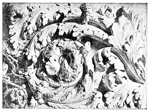
EXAMPLE 110
Roman scroll ornament cut in stone
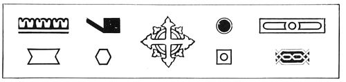
EXAMPLE 111
Type ornament based upon geometric lines
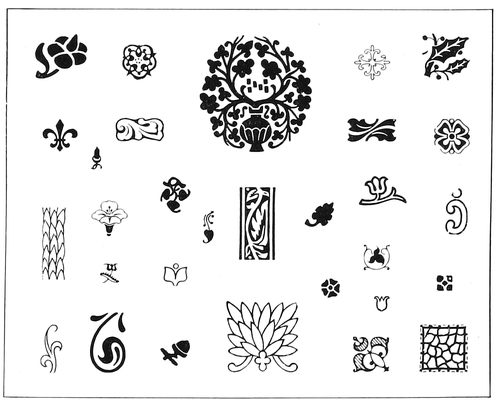
EXAMPLE 112
Type ornament based upon foliage
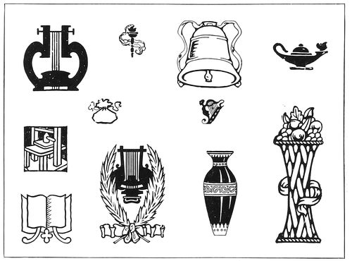
EXAMPLE 113
Type ornament based upon the inanimate
EXAMPLE 114
Type ornament based upon the animate
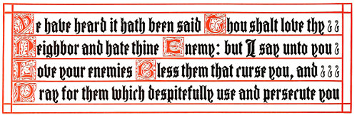
EXAMPLE 115. Ornamental hand-lettered effect; obtained by initials, text letter and rule
Now for
contrast,
compare
them with
64the dainty, elaborately
ornamental
chair (Example 97)
and the title-page
(Example 98). Both
chair and title-page
designs are based
upon the frivolous
rococo style of the
period known as
Louis XV. (or Louis
Quinze). In that
period, shells and
leaves conventionalized into graceful, golden curves
were blended with a profusion of roses and other flowers.
Straight lines were avoided, and furniture and architecture
took on curves even to the extent of causing structural
weakness.
EXAMPLE 116
Corner ornaments may have been suggested by the bolts on inscription plates or by the cross lines on books
EXAMPLE 117
Ivy-leaf ornamentation, and spaces filled in by decoration. From an old manuscript book
Because a majority of type-faces are built upon horizontal
and vertical lines, rococo type ornamentation is
seldom successful in typography. The pen-and-ink border
design (Example 98) is a clever adaptation of the Louis
XV. rococo style. There is not an absolutely straight
vertical or horizontal line in the border, and with the
curves and flowers, ribbons, lattice-work and cupids it
makes an appeal to women. The type-face combined
with the border has similar characteristics—a freedom of
line and an abundance of curves.
Examples 99 and 100 show a chair and an announcement
page, both slightly ornamented to please those
folks who like neither the severely plain nor the elaborately
ornamental.
Ornament is secondary to the real purpose of the thing
it embellishes; it should not be so lavish as to distract
attention from the more important object. A booklet is
issued to convey a message, and should the reading matter
be overshadowed by ornamentation, this purpose may not
be accomplished. A “flowery” oration may entertain and
please an audience, but it may not convince. In 1896
Bryan stampeded a
convention by his
extemporaneous eloquence
and metaphor,
but when he
came to the “enemy’s
country” and
faced an audience
which wanted facts,
he read his address
from carefully prepared
manuscript.
EXAMPLE 118
Filling blank spaces with ornamentation, as was done on manuscript books. Page by Government Printshop, Berlin, Germany
During the Middle
Ages, when nations
were fighting for
existence and necessities
of life were
barely obtainable,
there was little ornamentation
except
in isolated instances,
but when, about the
fifteenth century,
the Renaissance
came, art received an
enthusiastic reception.
Ornamentation
was indulged in
to excess, the artists
using all the classic
forms and inventing
new ones. Example
109, showing wall
border decoration,
65looks to the printer like a specimen sheet of type borders.
This brings to mind that there is always the temptation
to over-ornament when an artistic job is desired,
and the necessity of advising printers to restrain themselves
and save a few ornaments for other work. Our
brethren of the cloth like to repeat the story of the theological
student preaching his first sermon before the Seminary
authorities. He began at Genesis and took his hearers
thru the entire Bible to Revelation. When he had
finished an old professor gravely asked what he would
preach about the next Sunday.
The famous designer Chippendale, first made his furniture
serviceable and then added ornament, from which
fact the printer should profit. Have a printed job serve
its purpose, and ornament it only so far as is consistent
to this end. It is frequently advisable to omit decoration
and let the type talk without interruption.
Ornamentation when used for border purposes has two
features which may not be apparent to the superficial
glance—regularity in repetition and variety in repetition.
Example 101 shows repeated strokes of the same
length. In Example 102 by alternating the length of
the strokes the design is made more interesting. Examples
103, 104 and 105 illustrate this principle in
rounded forms. In the first there is monotonous repetition,
in the second there is less monotony because the
oval form is less regular than the circle, and in Example
105, by contrasting the forms in both size and shape the
design acquires new decorative interest. This principle
of contrast and variety is exemplified in most border designs.
In Example 107 the light scroll lines contrast
with the black leaves, and in Example 106 curves are
contrasted with angles. Contrast is sometimes obtained
with color, as shown in Example 123.
EXAMPLE 119
Semi-ornamental ecclesiastic style
Ornament as used by the printer may be divided into
four classes: Ornament based upon geometric lines
(Example 111), ornament based upon foliage (Example
112), ornament based upon the inanimate (Example 113)
and ornament based upon the animate (Example 114).
The center ornament in Example 111 contains the cross
and circle, ecclesiastic devices, and its conventionalized
pointed leaves would also admit it to the group shown
as Example 112—ornament based upon foliage. Leaves
and flowers from the beginning have been a prolific source
of inspiration to artists. Before the invention of typography
the decorator of manuscript books reveled in foliage,
as will be seen by Example 117, and today when decoration
is added by the process of printing the same liberal
use of foliage is evidenced (Example 118). In both examples
should be noticed the custom of filling blank
spaces with decoration.
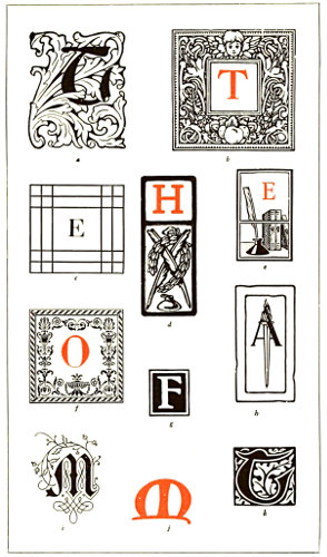
EXAMPLE 120. INITIALS
a—Foliage decoration based on the acanthus leaf
b—Imitation of mortised woodcut initials
c—Simple geometric treatment
d—Rugged Colonial style
e—Suggesting literary use
f—Italian ornamentation
g—Plain black and white effect
h—Modern adaptation of Roman torch
i—German scroll decoration
j—Based upon the uncial character
k—Woodcut effect as used by Morris
The inanimate (Example 113) lends itself better for
ornamental purposes than does the animate (Example
114), and the less familiar the subject the better ornament
66it makes. An ornament based upon the animate is
shown in Example 124, and as will be seen it is not as
pleasing as the one in Example 121, which is based upon
the inanimate.
EXAMPLE 121
Simple ornamentation applied to letterhead. Design by Harry A. Anger, Seattle, Wash.
Initials afford a convenient means of ornamentation
(Example 120). An initial well chosen as to tone and appropriateness
often satisfies all demands in this line. The
mortised Colonial initial indicated by b looks well with
Caslon roman and printed on antique paper. The acanthus
design a looks well with Washington Text; the Italian
design f, with a letter such as Bodoni. Initials are used
in a highly decorative manner in Example 115, after the
style found in ecclesiastical manuscripts. The possibilities
of type and rule are here well set forth.
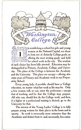
EXAMPLE 122
Appropriate ornamentation applied to the modern booklet. Page by the Munder-Thomsen Company, Baltimore, Md.
Sometimes ornaments in the corners of a plain rule
border (Example
116) are sufficient
decoration.
These
effects may have
been suggested
by the corner
bolts with which
brass plates are
fastened to
walls.
In the booklet
decoration
(Example 122)
the artist has
taken his motive
from the word
“Washington”
making the capitol
dome and
its supports the
central figure in
the design,
which is Colonial
in character.
Drawing a line
down thru the
center of the
design it will be found that with a few minor exceptions
the right half is a duplicate in reverse of the left half.
The effect is frequently found in decorative work, as it
gives balance and differentiates between illustration and
decoration. An illustrative design, showing an actual
scene, would not be effective.
EXAMPLE 123
Effect of alternating colors, for covers and end-leaves of booklets and catalogs
Wall paper and linoleum designs are made in patterns
that repeat at intervals and for this reason answer the
purpose of decoration.
Example 119 presents a program page, which, while
attractive, has but one ornament, an ecclesiastic design.
The arrangement of bands above and below the main
display assists in forming a decorative effect.
Type decoration in use today shows a preference for
forms from Italian sources. Several years ago the Colonial
spirit had influenced a preference for Gothic-English
forms. The work of Goudy, Cleland and others has had
a part in developing taste for the Italian.
In closing this chapter it may be well again to warn
the printer not to over-ornament. The relation of ornament
to typography is well covered in the caution of an
experienced architect to a novice: “Ornament construction,
but do not construct ornament.”
The best art is that which is concealed, and which unobtrusively
adds effectiveness to a piece of printing.
EXAMPLE 124
This ornament, based upon the animate, not well suited for business purposes
EXAMPLE 127
These pages are model specimens of book typography. Shown here in the actual size of the originals, from zinc etchings
67
THE TYPOGRAPHY OF BOOKS
Good taste, a quality essential to the successful production
of all kinds of printing, is of great importance
in the typography of books. In the matter of good taste
most of us are specialists—we perfect our judgment in
some one respect and let it remain erratic in others. A
musician or other artist may stand high in his class and
yet, perhaps, show poor taste in dress and manners.
EXAMPLE 128
Appropriate title-page of a book of classic poems. By Bruce Rogers
A person of good taste is usually conservative. He
weighs all new things in the balance of judgment, and
allows enthusiastic faddists to push him off the sidewalk
rather than join the crowd and shout with it. He knows
the fickleness of mobs and remembers that in a week
hosannas have been changed to shouts of bitter invective.
The merchant catering to the whims of fashion ever has
unsalable stock on his shelves. In the days of militant
Rome the crowd which one day cheered Sulla, the next
day crowned Marius with laurel.
EXAMPLE 129
Title-page with a nineteenth century motive. By Bruce Rogers
The natural tendency of humanity is radical. The
conservatives are in the minority, yet their influence is
great because their opinions are generally based upon
sure foundations. Of course a person can be progressive
and possess a present-day mind without being either
radical or conservative. The natural tendency of job
printers is radical. Left much to their own whims and
fancies they produce printed things which may please
only for the moment. The test of gold is not in its
appearance when purchased, but in years of wear. Because
a job of printing is made for short service is no reason
why it should not be as well done as book composition is
required to be. All the art-reasons in book typography
68are equally applicable to job typography. The two methods
should not be judged by separate standards—a thing is
good, or it is not. At the present time educational work
is elevating the standard of job typography, and the designer
of job composition, drawing closer to his book
brother, is beginning to notice the faults and flaws in the
latter’s work.
EXAMPLE 131
Poor examples of book typography. Two pages which set forth the common practice of inharmonious type treatment, the title-page containing old-style type-faces and the text-page modern type-faces. The type-face should be of the same design
The book typographer, like the lawyer, is governed
by precedent. When the legal man presents an argument
he cites Doe v. Doe, and Smith v. Jones, and with
each new discovery of precedent is increasingly happy.
The common law under which we in America are governed
originated in England centuries ago, and the radicals
who would dispense with this law catalog themselves
as anarchists. The right-thinking man is constructive.
When a new thing has been proved good he believes in
adding it to what has already been constructed. The
radical is destructive in that he would destroy what has
been constructed and without always setting some new
thing in its place. Attics have been known to hold masterpieces
which have been discarded for new, frivolous
things that from an art viewpoint are worthless.
William Morris set out to change book typography,
and in contrast to the typography of the day his ideas
may have seemed radical. What he really offered was
the good things found in the works of the old masters of
Venice and Nuremberg—typography and decoration
that had well stood the test of centuries. Book pages
produced fifty years ago by Pickering and Whittingham
look well today; not because they are old, but because
they were in good taste then, and are in good taste now.
Pages set by their contemporaries in condensed roman
look abominable now, because they were contrary to true
art principles then.
The book industry in America is tremendous—so much
so that because of its magnitude quality in typography is
likely to be lost sight of. In New York City in one year
eight million books are read or consulted thru its public
library system! Could the monk, with his mere score of
books chained to shelves, have had a vision of this, what
would have been his thoughts? Or, Benjamin Franklin,
as he founded the first circulating library? Andrew Carnegie,
ridiculed when announcing his intention to use
his wealth in providing buildings for public libraries, lived
to see himself acknowledged a benefactor of mankind.
Next to providing books is the necessity of providing
good books and of printing them according to the laws
of art and good taste. Continual association develops a
taste for the things associated with. If the majority of
books are poorly composed or poorly printed, they will
unconsciously be taken as standards of book style by the
reading public. The style of book typography, averaged
in this way, is today far from flattering. It is rarely
that the reading pages, title-page and cover harmonize in
style and motive. On the average volume the text-pages
seem to have been set in any face that chanced to be on
the composing machine at the time; the title-page is in
some type foreign in style and design to the face used
69on the body of the book, and the cover (usually the
only part of the work given artistic attention) is designed
without regard to what is on the inside. The whole effect
reminds one of a box of berries with only the healthy
members of the family in view. Many a time I have
picked up a book in artistic binding, only to lay it down
disappointed at the typographical treatment of the inside
pages. Even a book should be honestly what it
seems, and not a wooden nutmeg.
EXAMPLE 133
Two pages of composite Colonial and modern typography. Relation is established between the title-page and text-page thru use of the same kind of decoration
The book-page reproductions used in connection with
this chapter may prove more valuable if each is considered
separately in the order of its appearance.
Examples 126 and 127 (Insert).—The title-page and
an inside page of a book which in its way is a model. From
the viewpoints of art, legibility, good taste, typography,
printing, and binding, the book is very satisfactory. The
classic restraint of the Italian school and the human
interest of the Gothic are here blended harmoniously.
These pages will please the lover of lower-case letters, as
from the label-title on the cover to the last paragraph of
this volume not a line has been set in capitals. The type-face
is a handsome old-style roman based upon the Caslon
model, and in the book itself is printed upon a hard
hand-made paper in a dense and clear black ink. The
only decoration used in the book is found in the chapter
initials, altho decoration is suggested in the use of brackets
on each side of the page numbers. Only two sizes of
type are on the title-page, and the chapter headings
cling to the type-page in a manner that helps the tone
effect of the whole. The reproduced pages are shown in
the actual positions of the originals. The margins of a
full reading page measure five picas at the fold, six picas
at the head, seven-and-a-half picas at the outer edge,
and eleven picas at the foot. The type-page covers
slightly more than one-third of the surface of the leaf
upon which it is printed. The type-page in proportion
measures diagonally twice its width, a point illustrated
in Example 50 of a previous article.
Example 128.—A reduced facsimile of the title-page
of a limited edition of classic poems, produced at the
Riverside Press under the supervision of Bruce Rogers.
This typographer stands among those in America who
are giving themselves to the work of steering the printing
craft back to the waters in which it sailed in the
days of Aldus Manutius. Bruce Rogers came from Indiana
with no technical knowledge of typography, but
artistic talent soon enabled him to gather the details,
and for a number of years he designed books for the
Riverside Press that brought him fame and helped to raise
the standard of printing in America.
Example 129.—There is one feature of Bruce Rogers’
work which stands out prominently, and that is his regard
for the appropriate. The literary motive of a book
gives the cue for its typographic treatment, and he prints
as if he were living in the period so presented, and influenced
by its tastes. The “John Greenleaf Whittier”
title-page suggests a product of the middle nineteenth
century, when Whittier lived, and Example 128 is imbued
with the spirit of the Greek Theocritus. But two
sizes of type are used in the Whittier page, and these
are apportioned according to the importance of the
wording.
70
EXAMPLE 135
Two pages, the typography of which shows unusual care and consideration for detail. Typography by J. H. Nash
EXAMPLE 136
A text-page in modern roman. By Colonial Press
EXAMPLE 137
A text-page in old-style type-faces. By Colonial Press
Examples 130 and 131.—Two pages from a book issued
by a prominent publishing house and printed by a prominent
press. They are reproduced for the purpose of pointing
71out a fault common to a majority of books
of the present day—inharmonious typography.
While the text pages are consistent in
the use of plain modern roman, the title-page
with no regard for the face used on the text
pages is composed in Caslon roman and modernized
old-style. It would seem that, true to
the title, the printer had aimed to present
three representative type-faces used during a
hundred years. And, to make matters worse,
the cover contains an elaborate twentieth century
design. Why do not publishers realize
that these things are wrong? Why do not
printers realize it? After the six hundred pages
of this book had been set in modern roman,
the cost of setting a title-page also in modern
roman would have been ridiculously small.
Printers doing work for publishers should provide
display faces to match their machine letters,
or else when buying matrices of a body
face, assure themselves that display faces may
also be had. Artists, too, should be cautioned
to make their design not only after the motive
suggested by the literary contents of the book,
but also after the typography (which should
of course be based upon the literary motive).
EXAMPLE 138
Title-page with an Italian motive. By Oswald Press, New York
Examples 132 and 133.—Two pages in style
composite Colonial and modern. Relation between
the reading pages and the title-page is
established thru use of type of the same series
and also by adapting the flower decoration to
the running head. Certain books lend themselves
to decoration; this is one of them, because
it is of the entertaining sort. Serious
books, such as those on the subjects of law,
medicine and science, should have no decoration. The wise
book typographer will not use decoration unless he comprehends
just what he is doing.
EXAMPLE 139
Page from a children’s book, designed and written by Will Bradley
Examples 134 and 135.—J. H. Nash, who designed the
typography of the book of which these two pages are a part,
produced results that are exceptionally good from a typographic
point of view. The border as seen in Example 134
was used on the title, introduction and contents pages, and
the border in Example 135 was used thruout the text pages.
The crossed-line border effect was even adapted to the frontispiece.
The title-page is an excellent example of consistent
typography; not a line of lower-case is to be found on the
page, and prominence is proportionately given the title of the
book and the names of author and publishers. The reading
matter is set within six points of the rule border, that the
page should have but one margin. If the space between type
and border were larger it would give the appearance of another
margin. The initial letters assist the reader in locating the
beginning of each story.
Example 136.—This page is in a style associated with the
modern novel and was set on the linotype in eleven-point
Scotch Roman; the lines twenty picas wide, leaded with two-point
leads. The running head is in capitals of the body letter,
separated from the reading page by a half-point rule, and
the page number is centered at the foot.
Example 137.—A good example of modern book composition,
set on the linotype in twelve-point Caslon Old Style, the
lines twenty picas wide, separated by four points. The running
head is in a black text letter suited to a book of this kind. An
amount of space equal to a line of type and the leading following
it, has been placed between the running head and the
reading page.
Example 138.—No style of typography is in such good taste
as that which is based on the old Italian, in which but one
72style of type-face, usually the Caslon, is used, and the
capitals letterspaced a trifle. This style has been worked
into a symmetrical page and an ornament included that
because of its Italian treatment blends neatly with the
typography. It might be interesting to note that the illustrations
in this book were in line, and where emphasis
was needed in side headings small capitals were used and
the letters separated by slight spacing.
Example 139.—A page from a book for children, written
and illustrated by Will Bradley. The type-face is a
wide, legible letter and was specially designed by Mr.
Bradley. Each chapter is begun with a line of old English
black letter, followed by several lines of highly decorative
italic. The illustrations are interpreted in the
grotesque decorative style that Bradley does so well. The
running heads and page numbers are in the italic.
EXAMPLE 140
Harmony in tone of type-face and decoration. Typography by the Trow Press, New York
Example 140.—A page notable for the harmony between
the tone of the type-face and decoration. The
illustration has been treated by Beatrice Stevens in a
decorative spirit, and is very effective. The capitals of
the body matter are used for the “Chapter III” line,
and smaller capitals for the descriptive line under it.
The plain initial is more effective than an ornamental
one would have been.
Example 141.—A title-page of classic design in Scotch
Roman type. The anchor and dolphin, originally the device
of Aldus, as enlarged in outline has much to do with
the effectiveness of the page. The dignified beauty of this
page makes it worthy of close study.
Example 142.—A further demonstration of the beauty
of classic typography. Fred. W. Goudy has done many
things worth while, but none better than this. He not
only designed the smaller type-faces and lettered the large
lines in harmony, but arranged the page and, in its original
form, printed it. American typography owes much to
Mr. Goudy and it is a pleasure to include this page here.
EXAMPLE 141
A title-page of classic design, with an Aldine anchor device. By William Aspenwall Bradley
Example 143.—This is a page from one of the Roycrofters’
serious efforts in bookmaking. It was printed in
dense black ink on white stock, the large text initials
standing forth in pleasing contrast.
Example 144.—This is a page from a book by Theodore
L. De Vinne, and probably presented his personal
ideas in book typography. Notice the spacing around the
subheading, and the treatment of footnotes. The first
line under the subheading is not indented.
Examples 145 and 146.—D. B. Updike, of the Merrymount
Press, is responsible for the typography of these
pages, which are a portion of a book containing the ceremony
of marriage as performed in the Protestant Episcopal
Church. The type is a special letter based upon early
forms. The book was printed in black and vermilion.
Mr. Updike, with Rogers, Goudy and others, believes
that the way to improve typography in America is to do
typography as well as it can be done. He established the
Merrymount Press in 1898, and has arranged and printed
many fine volumes, in addition to much high-grade small
work.
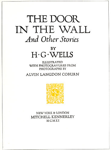
EXAMPLE 142
Classic feeling expressed in a modern title-page. Designed by Fred. W. Goudy
Example 147.—Books of poetry are usually treated in
a typographic style that is light and dainty. The typographer
73who has the spirit of the artist in him puts more
into a book than is required by the traditions of the craft
and endeavors to express
with type and decoration
the spirit of the poet’s
message. The verses of
Edgar Allan Poe, with
their suggestion of dark
shadows and pathos,
make the book designer’s
task difficult, but in this
example Mr. Nash has
given the work a decorative
treatment that in its
dark tone helps to beautify
the sad spirit of the great
American poet. Washington
Text shows forth admirably
as a type for these
pages and the decorative
panel harmonizes with it
in both tone and design.
In its original form
the book was printed in
dull black and dull red
inks on a toned hand-made
paper. The liberal
margins assisted in giving
that touch of exclusiveness
and taste that is essential
in good book-printing.
EXAMPLE 143
Text-page of a de luxe volume. By the Roycrofters, East Aurora, N. Y.
EXAMPLE 144
Text-page from a book by De Vinne. Note treatment of running titles, sub-headings and footnotes
EXAMPLE 146
Two pages from a small ecclesiastical book. By D. B. Updike
Example 148.—French
title-pages of the eighteenth century are furnishing motives
for the designing of cover and title-pages for the uses of
74publishing and advertising, and to many this page by
Bruce Rogers will have considerable interest. The design
carries the spirit of an age when decoration was rampant
and when architecture and books were festooned and
adorned with cupids. The decorative lettering used in
the main title shows such influence. This book in its
first edition was printed in 1789, and when recently reprinted
the typographic spirit of the old volume was incorporated
in it. It does not measure up to the recently
accepted ideas of tone-harmony and shape-harmony, yet
the element of appropriateness is so strong that those
shortcomings are not to be held against it.
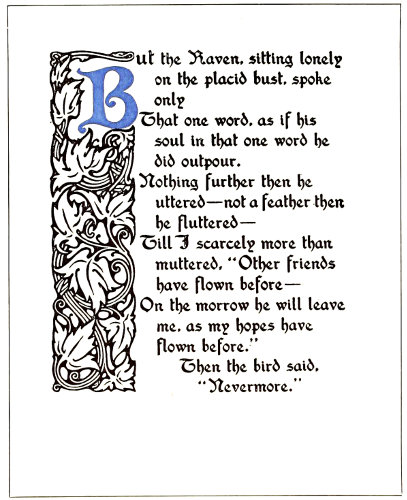
EXAMPLE 147
Gothic treatment of a book of poetry. Typography designed by J. H. Nash for Paul Elder & Company
Custom has developed a law for the arrangement of
the several parts of a book. There is first a blank leaf
known as the fly-leaf, followed by a leaf with the title
of the volume in small type slightly above center or
placed toward the upper right corner. The frontispiece, if
one is used, is then inserted. The next leaf contains the
title-page, which usually gives the title of the work, name
of author or editor, place of origin, name of publisher and
date of issue. On the back of this leaf, slightly above
center, is the copyright notice, and in the lower center
or right corner the imprint of the printer. The table of
contents and the table of illustrations follow, taking as
many pages as are necessary. The preface, or author’s
introduction, is next, after which another half-title may
be inserted ahead of the first chapter. The dedication, at
one time occupying a page in the fore part of the book,
is occasionally used. The index is inserted in the rear of
the book. This rear-index is not found in novels, but in
books on technical subjects and those used for reference
purposes.
It is customary to number book pages with Arabic
numerals beginning with the first chapter, all pages in
advance of the first chapter being numbered with lower-case
Roman numerals. The page numbers, when at the
foot, should be separated from the type-page by the same
amount of space used between the lines. There is tendency
among inexperienced printers to place the numbers
too far from the type-page.
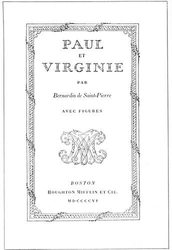
EXAMPLE 148
Where a French style of treatment is appropriate. Designed by Bruce Rogers
There is a rule that the running title should be separated
from the type-page by space equivalent to a quad
line of the size of body-type used, altho the best typographers
prefer only about half that amount of space.
Pages containing chapter headings are lowered at the
head below the regular page hight. Example 127 shows
a lowering of five picas space. Other books show more or
less than this amount of space, but the space allowed in
this example is pleasing.
When an initial is used the space between it and the
type should be the same, both at the right side and foot
of the initial.
The position of a book page should be toward the
binding and the head. In elaborate books of wide margins
this inclination should be great, but in the conventional
book of narrower margins it should be less noticeable—say
six points toward the binding and eighteen
points toward the head.
The use of an em-quad between sentences on a book
page is encouraged by many printers, but the new-thought
compositor uses two three-to-em spaces or less.
By referring to example 127 it will be found that the
same amount of space separates all words in one line.
The capital letter seems sufficient indication of the beginning
of a sentence. In the first book printed from separate
types (see reproduction of page from Gutenberg’s
Bible in the chapter on “The Origin of Typography”)
there was no space used between sentences, the period in
the judgment of the printer separating the words sufficiently.
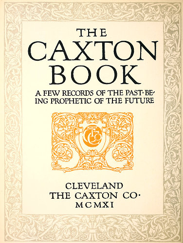
EXAMPLE 149
Title-page lettering and decoration by F. W. Goudy, for the Caxton Co., Cleveland, O.
75
BOOKLETS, PAMPHLETS, BROCHURES, LEAFLETS
Did I wish to be flippant I would open this chapter by
asking, “When is a booklet not a booklet?” and might
even be pardoned for doing so, for no other word has been
so misused as has “booklet.”
A booklet, the dictionaries tell us, is just a little book,
as is indicated by the suffix “-let,” which termination
forms diminutives from French and English nouns. Yet
“booklet” has been used to designate not only little books,
but big books, and has led to the rather tautological description,
“a little booklet.” When does a booklet cease
to be little, and is its littleness in its dimensions, in the
number of printed sheets, or in some other feature not
recognized in a hurried consideration of the subject?
Going back to the lexicons—
A booklet, as has been said, is a little book.
A leaflet, according to the Standard Dictionary, is “a
little leaf; also a tract.” Webster says it is “a sheet of small
pages which are folded, but not stitched; a folder.”
A pamphlet, we understand from the Standard, is “a
printed work stitched or pasted,
but not permanently bound;
a brief treatise or essay.”
Webster says it is “A book of
a few sheets of printed matter,
or formerly of manuscript,
commonly with a paper cover;
specifically, sometimes, any
such work not in excess of
eighty pages, and not bound.”
The word “pamphlet” was derived
from a popular Latin
poem, “Pamphilus,” of the
twelfth century.
“Brochure” is a French
word often used for “pamphlet.”
Webster gives its
meaning as “a printed and
stitched book containing only
a few leaves; a pamphlet; a
treatise or article published in
such form.”
A circular is a letter or a
note, usually printed.
However, for the purposes
of this chapter, while I shall
endeavor so far as possible to
use one of the above approved
terms in designating the various
examples of printing, the
word “booklet” in some instances
may have a wider application
than “a little book.”
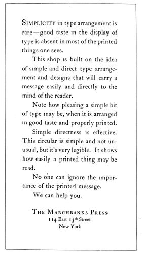
EXAMPLE 151
Two pages from a leaflet designed without decoration or color, a noteworthy exponent of simplicity in typography. By the Marchbanks Press, New York
The chap-books sold in the
seventeenth century, containing
abbreviated stories, were, perhaps, prototypes of the
booklet; but as now used the booklet is a modern conception.
It is a result of development in æsthetical knowledge
among advertisers and the buying public, who have learned
to discriminate and to demand artistic, tasteful workmanship.
When the “dodger” or handbill ceased to be effective
as a publicity auxiliary to the newspaper, the booklet
was born. State laws consider a few placards or publication
in one or two obscure newspapers sufficient notification
to the public, but the advertiser knows the futility
of such obsolete methods and gets his message to the public
in numerous ways—traveling salesmen, newspapers and
magazines, trade, technical and class publications, house-organs,
catalogs, booklets, circulars, posters, novelties,
car cards, electric signs, etc. To an extent the booklet’s
mission is educational; it introduces the business house,
gives authoritative answers to questions that the prospective
buyer would naturally ask, explains advantages and
gives reasons for superiority. The booklet is best if written
76in a style that is non-technical, and should be treated
by the artist and printer in a manner that will interest
the recipient.
EXAMPLE 154
Three pages from an easily read booklet in Scotch Roman, showing the typographic style of Benjamin Sherbow, New York
EXAMPLE 156
Two pages from an eight-page leaflet, in which the typography was relied upon for results. The rule borders were printed close to the edges of the paper. By William Henry Baker, Cleveland, O.
Among the users of the booklet as a publicity medium
are railroads, cities, hotels, real-estate companies, banks,
clothiers, educational institutions, printers, and manufacturers
of automobiles, musical instruments, cameras, and
tools and equipment of many kinds. If one wishes to purchase
intelligently a piano or other expensive article he
obtains a booklet on the subject, and whether he buys or
not depends largely upon the impression obtained from
the booklet; if it is well written, informative, carefully
illustrated and handsomely printed, it will be likely to
exert an influence in favor of a sale. The printer’s share
in producing such a booklet is
large, altho he is called upon
to work in conjunction with
the writer, the artist and the
engraver.
Much of the booklet printing
is planned by advertising writers
and commercial artists. The
best results are obtained when
artist and writer blend their
ideas harmoniously; this is possible
only when the writer has
artistic tastes and a definite
understanding of typography.
In many booklets the text matter
does not fit the decoration.
I have in mind an instance in
which the artist laid out sixteen
pages of marginal illustrative
decoration, and the writer
supplied only about half the
copy necessary to fill the sixteen
pages. To overcome the
deficiency the printer set the
text matter in an excessively
large size of type, but even then
the space left for the reading
matter was only partly filled.
If the writer was unable to fill
the space, the artist should have
decreased the number of decorative
pages or else planned
his decoration to cover more
surface.
EXAMPLE 159
Three pages that demonstrate the possibilities of type and rule in obtaining effective results. By Barnard J. Lewis, Boston, Mass.
Those houses that have made
a success of booklet printing
produce a job that is harmonious
77and complete. Reading matter, illustrations, decoration,
paper, ink and color treatment, all blend on their
booklets. There is a central motive around which all concerned
in the make-up of the booklet weave their ideas.
Altho such a condition is ideal, it is not absolutely
necessary, and it is not always profitable, for a printshop to
have under its roof a complete equipment for producing
every detail of a booklet. One of the successful producers
of booklets—an artist with associates able to interpret
his ideas—had in his artistic suite of offices a palm which
he enjoyed showing to visitors who asked to see the
“plant.” On the other hand, there is the head of a large
printing concern producing high-class booklets who has
artistic ideas but who depends upon the open field of artists
and engravers to develop and perfect his plans. He manages
to meet a prospective customer and from conversation
with him learns something of his tastes and preferences.
This printer then selects an artist whose style of
work will most likely appeal to the customer and be best
for the purposes of the booklet. He assumes that the most
successful artists are those who have specialized on some
one kind of work—classic Roman lettering and decoration;
seventeenth-century French decoration; Old English
or American colonial effects; modern German coloring
and decoration; art-nouveau creations, the serious and
the humorous; illustrations of child life, or of the Civil
War period. While there are versatile artists like Will
Bradley who can do good work in many styles, they are
not numerous.
Some printers retain typographic artists who serve
clients by the hour. These artists sometimes are advertising
writers who have studied the art side of printing and
know that much depends upon the type-face used.
To plan a booklet properly the commercial printer must
know something of the principles of art and advertising
and of good book typography. Booklet printing is really
the connecting link between job printing and book printing.
The unconventionality of job typography and the
dignity and conservatism of book typography can successfully
be blended in the booklet.
Example 149 (Insert).—This style of title-page is appropriate
for a booklet or brochure in which the typography
plays an important part in the production. The printer
having plates of this kind delivered to him should for the
remaining pages endeavor to use a type-face which has
some relation in style to the lettering found in this example.
The page having been drawn by Frederick W.
Goudy, one of his type-faces would, of course, be most harmonious,
but other old-style letters such as Cloister Oldstyle,
Caslon Oldstyle and Old-Style Antique would also
be suitable. Some of the pages would possibly include initial
letters drawn in the same style as the decoration,
and thruout the work the motif established by the title-page
should be maintained. An antique-finished paper
blends best with the general decorative plan, but if coated
stock must be used it should be of a dull finish. Art work
of the quality of this example cannot be procured from
every artist. This example is expressive of the personal
taste and talent of Goudy.
EXAMPLE 160
A label pasted on a brilliant cover stock is striking. Designed by Thomas Maitland Cleland for the Oswald Press, New York
Examples 150 and 151.—The printer in the main must
be his own artist, and
he can best serve
himself and his customers
on such occasions
by providing
pure typographical
effects. This is difficult.
The printer
must have studied
good typography—he
must know typography
not only as a
worker at the trade
but as a student of
the art. He must be
thoroly acquainted
with type-faces. His
type equipment usually
shows his knowledge
in this regard;
if it consists of odds
and ends of type-faces
aimlessly selected,
he is not in
a position to give his
customer the proper
service, but if his
78equipment mainly consists of those type-faces
that have been approved by the leading typographers
and type designers of the country,
he will not only render good service to his customer
but will confer a benefit on every one
who receives a copy of the printed matter. The
public learns to like whatever is served to it
most frequently, and if it is provided with good
printing and especially good typography, the
tone of printing generally will be elevated and
further dignity given to the business. The examples
under consideration are from a nationally
known printing office which confines its
type equipment to three series and at one time
practically used but one series on all its work.
The leaflet was made to fit a business envelop.
The stock was Japan vellum and there was no
decoration—only a standard approved type-face
of a readable size (fourteen-point). Such
a leaflet attracts attention above most advertising
matter because of its simplicity. It is good
more because of what is left off than for what
is put on.
EXAMPLE 161
Admirable treatment for a small amount of reading matter. Both pages by Edward Everett Winchell, New York
Examples 152, 153 and 154.—These are the
cover-page and first and second text pages of a
booklet which is purely a typographical product.
There was also a title-page similarly
treated. The first two words of the title, “Getting
into Print,” were on each of the four
pages set in italic lower-case, and the word
“Print” was in roman capitals. Scotch Roman
was used, and Mr. Sherbow has produced other
effective booklets with this type-face. He has
a preference for the eleven- and twelve-point
sizes and frequently separates his lines with a
two-point lead. The result, especially in the
narrow measure made necessary by the smallness
of the booklet, is a page that one likes to
read. There is a freshness, an individuality,
about his type arrangement, which quality
is probably due to the fact that he never was
a practical printer. He began as an advertising
writer and studied typography and its use
for advertising purposes unrestrained by the
traditions of the craft as handed down from
compositor to apprentice. His work, however,
is influenced by the study he has made of the
work of typographers and calligraphers of the
past five or six centuries. By this study he has
obtained a knowledge that most printers lack
because of their reluctance to explore the past.
The borders surrounding these pages are made
from typefounders’ brass rule, and otherwise
the only ornamentation is a floret on the cover
and a smaller one on the first text page. Perhaps
no new note is struck in the arrangement
of the cover-page, but the treatment of the
upper part of the first text page is different
from that which would be given by the average
good compositor.
EXAMPLE 162
A good way to arrange a page when the photograph is of proportions different from those of the booklet page. Note treatment of caption
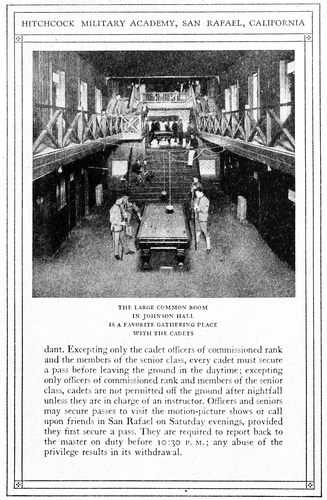
EXAMPLE 164
Two booklet pages in which typography was the chief dependence in securing artistic results. The borders were made with brass rule and the illustration was tipped on. By Taylor & Taylor, San Francisco, Cal.
Examples 155 and 156.—These are from an
eight-page leaflet, and, like the previous examples,
79they give evidence of an understanding of typography
that comes from study of the subject. Mr. Baker in
these pages provides practically no margins outside or inside
the rule border. This border is merely a one-point
rule which serves a good purpose without forcing itself
upon the attention. The type-face is Old-Style Antique,
which as the years go by does not seem to lose its “flavor.”
It is a readable type-face and one that is at its best when
used on antique-finished paper, as in this case. The leaflet
was printed in black ink on a greenish cream-tinted paper.
Mr. Baker’s personal device adds decorative value to the
title-page. It will be noticed that the headings are set
in a larger size of the body type and lined at the left.
There is no indention excepting for the reprinted letters,
which are set in a small size of the same type. These letters
treated in this manner are only incidentally made a
part of the advertising argument.
Examples 157, 158 and 159.—Caslon Oldstyle and Caslon
Text are factors in the effectiveness of the booklet of
which these three pages are representative. These three
examples are additional evidence that type alone when
properly used is almost as effective from an advertising
point of view as if supported by the best decoration and illustration.
It might be said that good typography is to be
preferred at all times to poor art work, altho really good
art work properly subordinated will undoubtedly add attractiveness
and interest to a booklet otherwise well treated
typographically. The border of contrasted heavy and light
rule adds typographic value to the booklet under consideration,
and the use of the light rule in other ways on the
title-page and under the headings in Examples 158 and
159 also has an influence for good. A two-line initial in
color at the beginning of each paragraph and the setting
off of one paragraph from another by blank space are distinctive
features in the make-up of the pages. Ornaments
are used in the running headings, and they are the same
design as that used on the title-page. The size of this
booklet was 3½ × 5½ inches. It should be noticed that
Mr. Lewis in these pages places no more space between
sentences than between the various words of the line, altho
Mr. Sherbow and Mr. Baker on the preceding examples
use more. There is difference of opinion among good
printers as to the amount of space between sentences. Some
of them prefer the em-quad, which has been used by the
average printer for a great many years. Others believe
with the ancient printers that the period and the capital
are sufficient indication of the beginning of a new sentence
without the insertion of a square of white space that affects
the tone of the page. It should be noted in Mr.
Lewis’s pages that while he has allowed fair margins
around the outside of the rule border, he has arranged for
very little margin inside, and to this is due a certain compactness
that is agreeable.
Example 160.—This is the cover of a small book of information.
The cover stock was deep red in color and the
title was printed on Japan vellum stock and pasted as a
label on the cover. The label design is by Thomas Maitland
Cleland, whose carefully formed lettering offers suggestions
to good printers who know the value of dignity
in lettering and decoration. A title label, especially when
dark cover stock is used, makes it possible to include a
typographic effect on the cover, thus insuring harmony
80consistent with the type-face
that may be used on
the inside of a booklet.
The title-page that was a
part of this small book was
shown as Example 138 of
the chapter on books.
EXAMPLE 166
Attractive rear and front cover designs of an unconventional booklet. The arrowheads in the original were in emerald-green ink. By E. G. Jacobson, New York
EXAMPLE 167
One of the eight pages of a prospectus for “The American Printer.” The initial “A” was in color. By Will Bradley
Examples 161 and 162.—Two
facing pages from a
booklet designed by Edward
Everett Winchell and
presenting the attractive
features of a large New
York hotel. There is but a
small amount of descriptive
matter, confined mostly
to two pages in the front
of the book, yet the treatment
is such that more
words would have spoiled
it. The plain rule border
gives uniform shape to the
pages and pleasingly contrasts
with the liberal white
space inside. In Example
161 the descriptive matter
is grouped at the head
of the page in Avil, an interesting
old-style roman
type-face. The fading of
the vignetted edges of the
halftone into the surrounding
white space is effective.
Example 162 demonstrates
how an illustration which
is out of proportion to the
page may be placed to get
good results. The caption, set in capital letters slightly
spaced, is in keeping with the squared style of the page.
Compositors should study the position of this caption.
Many would be inclined to center it directly under the
illustration; this would cause the lower part of the page
to seem empty and unfinished. By moving the caption
down, so as to break into the white space and divide it,
the sense of vacancy is not experienced.
Examples 163 and 164.—These are two pages from a
booklet in which typography was the chief dependence of
the printer in securing artistic effects. The border is made
of brass rules and four small ornaments; a decorative initial
is introduced at frequent intervals thruout the booklet;
otherwise, the effect is due to care in the details of
typesetting. The space between sentences is the same as
that between the words of a line, and widely spaced lines
are not to be found. It should be kept in mind that the
best typography is that in which the spacing between
words is not excessive. Carelessness in typesetting and in
the operation of composing machines is responsible for unpleasant
effects produced by wide spacing and by “rivers”
running thru the page. In Example 164 the illustration
was tipped on. The paper used in this book was a buff antique,
the tipped-on prints being on dull-coated stock. The
dark-brown ink used for the text pages was also used for
the prints, making a pleasing color harmony.
EXAMPLE 169
Two pages from a booklet in which no decoration was used, the decorative quality of the type-face impressed on hand-made paper having been depended on to provide a dignified beauty. By the Oswald Press, New York
Examples 165 and 166.—These are rear and front booklet
covers, the design of which is striking because of the
disregard for conventionality. No capital letters are used,
an idea that should be adopted with reluctance by printers
unless their customers approve of the innovation. Most
buyers of printing are slaves to conventionality and hesitate
to accept typography or especially drawn work which
is bizarre or in any way a departure from the usual methods
of treating printed work. The activity of German,
81Austrian and French artists in this country, however, has
caused some business and advertising men to be more tolerant
in these things, as the bright
coloring, dashing decoration and the
newness of it all seem to get attention
where conventional effects fail. It
might be said in reference to the lettering
on these examples that the
designer has not produced anything
really new so far as the use of the so-called
lower-case letters instead of
capitals is concerned. There was a period
in the development of the modern
alphabet when its characters were
neither “capitals” nor “lower-case”
as we know them—a period in which
the minuscules were being evolved
from the ancient Roman capitals or
majuscules. Altho modernized, the
lettering here used can be traced historically
to the uncial lettering of the
days of manuscript books. The arrowheads
were in emerald green.
EXAMPLE 170
A hand-lettered cover-page. By the Blanchard Press, New York
Example 167.—This page, designed
for the prospectus of the twenty-fifth
anniversary number of The American
Printer, in my opinion is among the
best things that Will Bradley has
done. There were eight pages and on
all the decorative headings were similar,
altho each had sufficient change
in the treatment to give special interest
to the page. The fine line decorative borders were in
pleasing contrast to the dark-toned illustrations and the
liberal apportionment of blank space.
Fourteen-point Caslon Oldstyle, the
kind with the long descenders, was
used for the text matter. The large
Caslon initial added another interesting
spot of black. The decoration
and type matter were printed in black
ink on buff-tinted dull-coated paper,
and the large drawn initial on each
page was in sepia brown. The original
size of this pamphlet was 6¾ × 9½
inches.
Examples 168 and 169.—No decoration
of any kind was used in this
booklet, unless the period groups may
be counted as such. The purpose was
to produce artistic printing in good
taste by depending upon the type-face
and the paper for results. Decorative
interest (usually welcome in a mild
way) was supplied by the swash capitals
of the italic and by letterspacing
capitals and small capitals wherever
they appeared. The chapter headings
of all the pages in this book were
aligned with one another and not
“sunk” as is sometimes done. The
pages are made interesting by the
varied use of italic lower-case and
roman capitals. The size of this booklet
82in the original was five by eight inches, and the margins
were made to conform to those used on good book
composition, each margin increasing in this order: Head,
inner side, outer side, foot.
EXAMPLE 171
Page from a typographically treated commemoration book
EXAMPLE 172
Unconventional arrangement of a booklet page. By Corday & Gross, Cleveland, O.
Example 170.—Lettering, as has been pointed out, has
an important place in booklet designing along with decoration,
illustration and typography, and from well-lettered
designs the printer can obtain valuable suggestions. This
example was printed on hand-made
paper, and the deckle edges and
rough surface of the paper blended
with the freehand drawing of
letters and border. There was a further
blend of the hand-lettering
and the Caslon type-face used on
the inside pages. The lettering was
based upon the same model as the
Caslon, which is standard for old-style
effects. Here is a hint for
printers: Distinction will be added
to booklets otherwise printed from
Caslon or similar type-faces if the
cover and the display headings are
hand-lettered. This may be done
with fair results by setting them
first in Caslon type. After the type
has been arranged satisfactorily,
take a print in blue tint on paper
suitable for drawing with ink. The
letters may then be traced freehand
with black india ink over the blue
print and any desired ruggedness
or variation introduced. As light-blue
ink will not reproduce when a
zinc etching is made, the blue proof need not be carefully
adhered to. Italic and small capitals should be introduced
in such lettered designs.
Example 171.—This is a page from a souvenir booklet
containing an account of the exercises held in commemoration
of the fiftieth anniversary of the New York Typothetæ.
Almost the entire book was set in fourteen-point
Cloister Oldstyle and Italic and printed in black and orange
ink on a white antique-finished paper of good quality.
The cover was a domestic vellum-like paper which contained
the words, “Golden Anniversary of the Typothetæ,”
set in Cloister Italic with swash initials, the two
lines being deeply stamped into the paper on gold leaf.
In this manner strict typographic harmony was maintained
thruout the booklet. Large decorative initials were
introduced in several instances and two-line initials of
Cloister capitals were used in a minor way. This page
should offer suggestions to printers who are called upon
to print souvenir volumes; in fact, much work of this kind
can be created by the printer suggesting the publishing
of such volumes after historic or memorial meetings are
held in his city.
Example 172.—This is the first inside page of a booklet,
the stock of which consisted of a thin straw-colored
Japanese paper, printed on one side only. The cover, a
heavy, rough dark-green paper, contained only the wastebasket
illustration printed on both front and rear in gold
ink set into the stock by a heavy impression. The simplicity
of the typography accords with the treatment as a
whole.
Printers will accomplish the most in booklet printing,
as in other branches of the craft, if they live in an artistic
atmosphere. Sir Joshua Reynolds, the great English
painter, said: “The more extensive your acquaintance is
with the works of those who have excelled, the more extensive
will be your powers of invention.” That is the
reason painters haunt Italy and other art centers where
the works of the old masters are accessible. The printer
should take journals such as The American Printer, devoted
to the art of typography; for these journals bring
to the great army of craftsmen specimens of the work of
famous printers and of those who are contributing their
mite to the cause of good typography.
The helpful atmosphere of the trade papers can be supplemented
by specimen booklets for study purposes. These
booklets can be obtained by writing to the printers producing
them, or to the advertiser;
and many can be had from retail
houses selling the articles advertised
in the booklets.
The printer must learn more than
he now knows about art or he will
become only a caddie in the game
of booklet printing, with the artist
and ad.-writer making all the puts.
The printer is depending too much
upon the artist and too little upon
himself. The possibilities of type
arrangement have not been exhausted
and never will be, yet many
workers at the printing trade act
upon the assumption that good
printing is impossible without the
artist’s initiative and co-operation.
Many a good job of printing has
been spoiled by inferior lettering
or decoration, the work of a poor
artist.
Withal, there is nothing more
ideal than a good printer and a good
artist working together to produce
perfect printing.
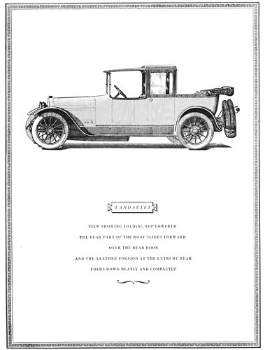
EXAMPLE 175
Page from an automobile catalog designed by Thomas Maitland Cleland. The caption is grouped in spaced capitals of Bodoni Book. The illustration is from a pen-and-ink drawing
EXAMPLE 176
Unusual treatment of a specifications page. Words in capitals are letterspaced. Rules are used to add character to the page. These reproductions are one-half the size of the originals
83
CATALOGS
Ruskin, enumerating three branches of architectural
virtue, requires of a building (1) that it act well, and do
the things it was intended to do, in the best way; (2)
that it speak well, and say the things it was intended to
say, in the best words; (3) that it look well, and please
us by its presence, whatever it has to do or say.
These three requirements, like many others that are
important in the eyes of the architect, can be applied to
the illustrated catalog, which most printers at one time
or another are called upon to produce:
(1) The catalog should act well; it should be constructed
in a manner fitting the purpose for which it is
issued. If, say, it contains a list of plumbers’ supplies, it
should be bound in strong stock of a color that will not
easily soil. If it contains a list of jewelry and is for retail
purposes, it could be bound delicately in light stock.
(2) The catalog should speak well; the illustrations
should be faithful presentations of the articles to be sold,
and the descriptive matter should be well written, accurate
and informative.
(3) The catalog should look
well; the type-faces, paper, ink,
binding and other elements
should be harmonious; the illustrations
and descriptive matter
should be arranged with regard
to balance and proportion, and
the treatment as a whole should
be pleasing and interesting.
There was a time when catalogs
were printed without attention
to these things, or if
the first two requirements were
complied with the third was ignored.
It will necessitate no effort
for the reader to recall the
days when merchants had no orderly
plans for displaying their
wares—when the average storeroom
and window looked like a
curiosity shop. Those were the
days when the catalog was a heterogeneous
collection of woodcuts
and type-faces, packed on
the pages to the very edge of
the paper.
Now many show windows and
salesrooms are delights to the
eye, and similar care and taste
are shown in the printing of the
catalog.
EXAMPLE 177
Architectural title treatment by Will Dwiggins. The lettering contains typographical suggestions
The catalog is a portable
showcase and from it the customer
makes selection, often
without seeing the article itself.
These facts make it essential that goods be displayed invitingly
and in good taste. An article well displayed requires
few words to sell it.
Place a girl of plain features, but handsomely dressed,
in the midst of beautiful colors and lights, and a dozen
millionaires will want to marry her—an extreme illustration
of the power of attractive display, emphasizing the
necessity of “playing up” the ordinary to create the desire
of possession. It is possible, also, to accomplish this
purpose by different methods. It is told of Josephine that,
wishing to gain the admiration of Napoleon, she appeared
at a reception in a gown of pure white, without ornament.
The contrast of her simple dress with the elaborate costumes
of the other women and with the elegant furnishings
of the room was such as to draw compliments from
the emperor. It should be remembered, however, especially
by the typographer, that mere plainness of dress did
not win Josephine her triumph, but that artistic simplicity
did. A block of marble rough-hewn from the quarry is
plain, but, carved into statuary
by a Rodin, is far more than
that.
This point is worthy of meditation
by all who wish to produce
the effective and attractive
catalog.
Efforts have been made to
standardize the dimensions of
catalogs; it would be well for
printers and others to assist in
accomplishing this purpose. A
committee of the American Society
of Mechanical Engineers,
after investigating the sizes of
catalogs in common use, recommended
that the standard size
of catalogs be six by nine inches.
The recommendation was also
made that the size of bulletins
and large catalogs be eight and
a half by eleven inches.
Other suggestions by the committee
were: Paper-covered catalogs
intended to be permanently
filed should be trimmed
to exact size, cover and all, barring
deckle edges. Overlapping
covers are favored only when the
covers are stiff enough to support
the catalog’s weight when
standing on edge. Titles should
be printed on the exposed backs
of the catalogs, reading from top
downward. The date of publication
should appear on the title-page.
84An index card of standard size (three by five inches),
containing the title and character of the contents, should
be inclosed in every catalog.
EXAMPLE 179
Facing pages that show effective results obtained in a simple way. The plain, legible typography ably supports the strong illustration and attractive border treatment. By the Matthews-Northrup Works, Buffalo, N. Y.
Before proceeding with the composition of a catalog the
printer should insist that the copy be legible, orderly prepared,
and all points settled as to type-face, headings and
position of illustrations. A dummy page should be planned
and set up, and it should be studied and discussed by customer
and printer before work is begun on the catalog as
a whole.
If the catalog is to be elaborately treated, all drawings
should be approved and plates made before the type work
is commenced. If the printer is assisting in the general
preparation of the catalog, he should keep before the customer
the fact that decoration is merely supplemental, and
should urge first attention to the type matter and illustrations.
Example 175.—This catalog is one of those productions
which in style so closely express the personality of an
individual that they are not a direct help in teaching
typography or catalog planning to others. Most typographers
must proceed according to defined requirements and
plan their work with regard to set styles. Mr. Cleland and
a few other typographic artists in this country carry out
their ideas without the assistance of an advisory board.
The average typographer or artist, on the other hand,
must not only incorporate the suggestions of half a dozen
persons, but must submit to the deletion of most of the
little things that to his way of thinking give his work
character and make it worth while—the penalty of being
merely an average typographer. Mr. Cleland is a student of
the best printing of past centuries, and his refined taste
and wonderful skill with the pen enable him to produce
effects that would be envied by the master printers of old.
On this page he has used Bodoni Book, slightly spacing
the capital letters and grouping the matter so that it
dominates the blank space in the lower portion of the
page.
The cartouche, or panel, as here used for the car name
was in favor in Bodoni’s day, a hundred or more years ago.
The horizontal position of the illustration adds to the
pleasure in examining the catalog, for when an illustration
runs the long way of such a page the necessary turning
of the book is an annoyance.
Example 176.—Brass rules are seldom well applied in
typographic work, but when they are, as in this instance,
the results are pleasing. This page, because of its tabular
nature, was doubtlessly difficult to arrange, and every compositor,
appreciating that fact, will admire what Mr. Cleland
has accomplished. It should be noticed that words
of roman capitals have in every instance been letterspaced,
while those in lower-case have not. This treatment
gives effects that are unusual and well liked by persons of
good taste.
Example 177.—This shows the cover of a catalog of
plays. Will Dwiggins in his usual clever manner has
made a design full of character, human in the absence
of the mechanical. The lettering contains suggestions for
effects that could be approximated with some well-designed
type-face. It will probably be well to warn against
85the careless use of typographic ornaments in any attempts
that may be made to imitate the effect of this decorative
border. Architectural designs formed with the average
printshop material seldom look well. Simple rule effects
would be better.
EXAMPLE 181
Inside page and cover of a publication catalog designed by D. B. Updike. The typographic treatment of these two pages is suitable and pleasing. The cover stock was green-gray of a rough antique finish
Examples 178 and 179.—In many catalogs a page illustration
is faced with a page of reading matter describing
it. In this instance the descriptive matter is small in
amount and for that reason presented a problem in typography.
The printer, however, solved the difficulty by using
a type-face fairly large in size, but of good design, and
placing the group in the upper part of the page aligned
with the top of the illustration. It is well to keep in mind
that in booklets, catalogs and similar work good results
are frequently obtained by aligning all pages at the head.
The effectiveness of these two pages is helped also by the
fact that a red border surrounds each page and the halftone
has a dark background.
Example 180.—There is evidence in this specimen
that it is possible to obtain variety and interest by simple
means. The italic, especially with the decorative quality
found in swash letters, is a factor, and the rule at the head,
with bits of decoration at the ends, also helps. It will be
noticed that no leaders have been used; their omission is
sometimes advisable, at other times not. An antique-finished
white paper is best for old-style effects such as this.
Example 181.—This cover-page has been built on the
small illustration. From the old fireplace the view of the
room fades into the paper stock. After the border line
is extended from the drawing, there remains a large amount
86of blank space, on which the title, in a well-balanced position,
is arranged in type. The address neatly fitted in the
space at the foot finishes the design at that point.
EXAMPLE 182
German poster type on a grocery catalog with characteristic block grouping
EXAMPLE 184
Typographic arrangement of the title-page and one of the inside pages of a museum catalog. The proportions of this type-face blend harmoniously with the dimensions of the page. Example 184 shows some details of catalog composition
EXAMPLE 185
Rules add a decorative quality to this book catalog. By J. H. Nash
Example 182.—Modern German typographical ideas
have found expression in this grocery-catalog page. The
lettering is type, the black tone and decorative form of
which were probably inspired by strong lettering designed
for poster purposes. Rules seem to have a place in the
building of modern German art effects, as will be seen by
this design. Bold type as used here is possibly unnecessarily
forceful, but when color is to be shown in its true
values it is desirable. Color never shows to advantage in
thin lines, while broad lines bring out the color qualities
of the ink. This is why colored inks printed from light-faced
types seem to lack the brilliancy of the prints from
flat-surfaced plates in ink-makers’ sample books.
Examples 183 and 184.—Every printer at some time is
called on to produce catalogs in which books or other published
articles are listed and priced, and on such occasions
wishes to see what “the other fellow” has done in this
line. For this reason the two pages are of interest. They
show a title-page and a representative inside page from a
catalog issued by the Metropolitan Museum of Art, New
York. The type-face is of the class usually designated as
French Oldstyle, and its proportions blend harmoniously
with the dimensions of the page. The distribution of blank
space on the title is pleasing; the type lines are so grouped
as to secure value from the background of white. In
Example 184 the heads and subheads are pleasingly contrasted
by the use of capitals in some cases and small
87capitals in others. Each item is grouped, and the technical
details are kept orderly by being placed in a line with the
price. No period is used after the item number.
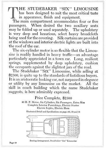
EXAMPLE 186
An automobile catalog page in which the type matter was prominently treated. The original page (about twice this size) was printed in dark-gray and orange inks on white antique paper. By the Robert L. Stillson Company, New York
EXAMPLE 187
Unusual treatment of an automobile catalog page. The original was more than twice this size. The matter is liberally supplied with headings, the arrangement in the panel at the left taking care of most of them. By the Cadillac Printing Company, Detroit, Mich.
EXAMPLE 188
Page in reduced size from a wine list designed by T. M. Cleland for the Oswald Press. Interesting use of rules in tabular style
Example 185.—Scotch Roman type is used to excellent
advantage in this book-catalog page. The title in each
case is in large capitals, the sub-title and the name of the
author are in smaller capitals, the explanatory matter in
roman lower-case and the technical details in small italic.
It will be seen that the advertising points have been carefully
considered. A rule border and two ornaments add
decorative quality. The closeness of the border to the
type matter merges it with the page in an attractive manner.
As in this case, decorative treatment should be a part
of the general design and not something separate.
Example 186.—On automobile catalogs typography
seldom receives the attention it deserves. Illustration and
decoration are given great attention, and what type matter
is used seems to be like a guest invited at the eleventh
hour. However, this example is from a catalog in which
type acts an important part. In its original form this page
was about twice the size of the reproduction and was
printed in dark gray and orange on white antique paper.
It will be seen that beginning with a colored initial the
reader can without effort or eyestrain read the descriptive
matter, which is followed by technical details in smaller
type and a line illustration of the car. Scotch Roman was
used, and it was not found necessary to introduce italic.
Example 187.—The treatment of this page is uncommon
for catalog purposes. A Goudy type-face was printed in
dark brown (border rules in light brown) on an Italian
hand-made paper. The size was more than twice that shown
here. Sub-headings have all been grouped in the panel at
the left, each so placed as to be opposite the paragraph to
which it belongs. The effect was one of richness and suggestive
of quality. Illustrations of the cars were of page
size printed by the gravure process.
Example 188.—Few printers would use rules in tabular
form for a high-class wine list; tabular work is supposed
to offer no opportunity for art expression. We know of
the stone rejected by the builder which became the headstone
of the corner. We have also heard of Michelangelo
carving a masterpiece from an ill-shaped block of
stone that had been discarded by other sculptors. Mr. Cleland
did an equally interesting thing when he selected
rules to give decorative quality to this wine list, supplementing
characteristically drawn head- and tail-pieces.
Caslon Oldstyle was used and the paper was hand-made.
A pleasing effect was obtained by letterspacing the capitals
in the headings.
EXAMPLE 189
German treatment of a wine list, showing neat typography and attractive decoration
Example 189.—We usually expect strong, masculine effects
from German typographers and decorators, and when
we come across a wine list as dainty as this one we are
surprised and pleased. There is remarkable harmony of
type-face, decoration and illustration. The type-face is
uncommonly legible for so ornamental a letter, and the
light decorative lines of the illustration and border reflect
the qualities of the type-face. In the original there was
an additional border around the one here shown, and it
was printed in a very light gray-brown tint. The tint also
appeared in parts of the illustration.
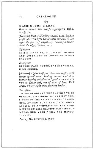
EXAMPLE 191
Title-page of a catalog of exhibits, and a page showing the use of capitals and italic for the descriptions. By D. B. Updike
Examples 190 and 191.—These pages are from an exhibition
catalog. D. B. Updike is responsible for the typography,
hence the pages afford an interesting study.
The catalog is printed in four sizes of type, altho a cursory
view of the pages would lead to the impression that a less
number is used. There are three sizes of capitals and one
88size of italic. A fact that makes the
catalog unique is the absence of roman
lower-case. It is difficult to visualize
an eighty-two-page book without
roman lower-case, but here is
one. The title-page (Example 190)
is composed in three closely related
sizes of capitals, corresponding to
the sizes used on the inner pages.
The important words, “Catalogue,”
“Memorial Exhibition” and “Augustus
Saint-Gaudens,” are set a size
larger than the minor words “of a”
and “of the works of,” altho the difference
is but a point. The small
woodcut is an appropriate accompaniment
of the classic style of the type
composition, and the harmony is further
enhanced by printing in a clear
black ink on thin white antique paper.
Example 191 shows a page from
the body of the catalog, the features
of which are worth noting. All lines
excepting the exhibit number are set
flush at the left, and the paragraphs
or groups are separated by space. The
title of the exhibit is set in the larger
capitals, the descriptive matter in
italic lower-case, and quoted words
in the smaller capitals. Punctuation
at the ends of lines is sometimes
omitted and sometimes used. The
rule adopted by modern typographers—to
omit punctuation points at the
ends of display lines—leads to nice
distinctions when a page such as this
one is to be treated. As a help in
deciding on proper marginal distribution
on work of this sort, it is well
to mention that the size of the leaf
of this catalog was 4¾ × 7¾ inches,
the type pages measuring 2⅝ × 5½
inches or less, the type pages not
being of regular length. The margin
at the head was ⅝ inch; at the binding
edge, ⅞ inch; at the outer edge,
1¼ inches; at the foot, 1⅝ inches
or more.
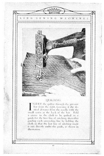
EXAMPLE 192
Interesting page from a sewing-machine catalog. By Matthews-Northrup Works, Buffalo, N. Y.
Example 192.—This shows a page
from a catalog of sewing machines
and sewing-machine parts. The
workings of the machine were pictured
in such a realistic manner that
the effect was almost equivalent to
a demonstration on the machine itself.
The border did not force itself
on the attention, yet furnished the
decorative element to the page. The
type matter, in Caslon roman, was
stylishly arranged in harmony with
90illustration and border, and was notable because it was
probably given as much consideration as the designing
and plate-making.
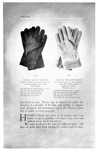
EXAMPLE 193
Neat typography on an attractive background. Glove catalog by the Hall-Taylor Company, Milwaukee, Wis.
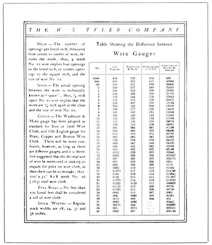
EXAMPLE 195
Clever treatment of tabular matter in a catalog page. By the Chasmar-Winchell Press
EXAMPLE 194
An artistic treatment of a commercial catalog showing what is possible in typography. By Taylor & Taylor, San Francisco, Cal.
Example 193.—This firm has gloves to sell and in a
particularly pleasing and artistic manner catalogs them
for the information of the buying public. By means of the
four-color process the gloves are shown in their natural
colors, and placed in the “spotlight,” as it were, by the
gradual fading away of the dark background about them.
A general talk on the subject of gloves is carried from page
to page, while the number and description are placed in
smaller type directly beneath the articles.
Example 194.—In commercial catalog work the illustration
of the article to be sold is of the same importance as
the article on the counter in the salesroom. The usual
method of selling is to show the customer the article and
then by giving information about it and telling of its good
qualities to persuade the customer to buy. The illustration,
then, is important, and by looking on Example 194, we
can see how one printer recognized this fact. The roll of
yarn is prominent in the page and the name of the yarn
is second in seeking attention. The goods are displayed
attractively in surroundings that are interesting. The
decorative border (made of rule) has merged with it the
name of the manufacturer.
Example 195.—It requires the skill of a typographer
and the talent of an artist to make a good-looking page
from tabular matter. Where this combination is lacking
the result is commonplace and unsatisfactory. It was not
lacking on this example, for one seldom sees a tabular
page so attractively arranged.
EXAMPLE 200
Program cover page in ecclesiastical style
91
PROGRAMS
“Let all things be done decently and in order.” These
words of Paul, while possible of wide application, have
peculiar significance applied to the program. The program
exists because of recognition of the necessity of
orderly procedure “where two or three are gathered together.”
Historically, the program has come to us from
the early times, when all knowledge was transmitted by
word of mouth. Church services are the result of evolution
from ancient ceremonies, and other exercises for
which programs are used originated in the far past.
Programs familiar to printers could be divided into
four classes: Programs of sacred services, dance programs,
banquet programs, and programs for various entertainments.
In this order they will be considered.
EXAMPLE 201
Excellent arrangement for economizing space on a program containing numerous small titles
The historical side of the program of sacred services
should not be overlooked. It is a mistake for printers to
produce church programs in the same style of typography
employed on secular forms. Church programs, more than
any other line of printing, offer opportunity for artistic
treatment, and their production is pleasure to the artist-printer
who believes significance is an important element
in good typography.
EXAMPLE 202
An almost perfect specimen of church-program printing, showing the missal style
The key to the proper treatment of ecclesiastical printing
lies in the old manuscript books written in the monasteries.
Black ink was commonly used for the main
portion of books, and vermilion, a red earth (rubrica), for
titles and important parts of the text. In the writing of
Missals (containing services of the celebration of mass),
of Psalters (containing the psalms), and of Books of Hours
(containing prayers and offices for the several hours of
the day), maltese crosses and uncial capitals were written
in vermilion. Uncial capitals are now made by several
type foundries as Missal initials, Caxton initials, Sylph
initials, etc., and maltese crosses are easily procured. As
black text letters were also used on these missals and
psalters, the type-faces now known as Caslon Text,
92Cloister Black,
Flemish Black,
etc., being
copies of these
early text letters,
are appropriate
faces
for display
portions of
church programs.
Text
letters were
long ago discontinued
for
body purposes
in English
printing,
hence they
have become
unfamiliar to
the general
reader and it
is not desirable
to use them for
such purposes.
A roman letter
such as Caslon
is the best
companion for
these black
text letters.
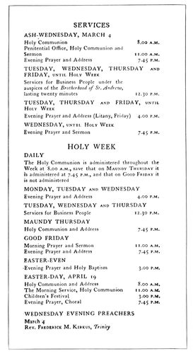
EXAMPLE 203
Classic treatment of church-program page. By D. B. Updike, Boston, Mass.
The Church
of England,
the American
branch of
which is known
as the Protestant
Episcopal Church, deserves much credit for the modern
development of an ecclesiastical style of printing. Because
of the custom of using red ink in forms of service, for the
parts giving direction as to the conduct of the services,
these parts have become known
as “rubrics.” It is necessary
to mention to printers generally
that when colors are used
on programs or books of service
the “rubrics” should be
in red. This treatment is illustrated
in the page from the
marriage service shown as Example
146 in the chapter on
“Books” which also shows
an uncial initial. When only
black is used it is customary
to set the rubrics in italic.
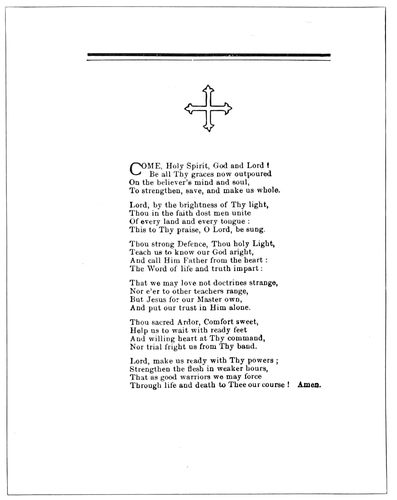
EXAMPLE 205
Generous margins on a church program are pleasing
Example 200 (Insert).—This
title-page presents a modern
interpretation of the historic
ecclesiastical treatment. The
black type-face is Caslon Text,
and is a copy of one of the
early manuscript letters, as before
mentioned. As pointed
Gothic is usually accepted as
the style of church architecture,
so pointed Gothic
type-faces have been adopted
for church printing by typographers
who know. Uncial rubricated
initials as used on this
title-page are known commercially
as Caxton initials. The
red lines
which are a
prominent
part of the
page have
historic significance.
Now grown
to possess
decorative
value, they
originated
thru the
necessities
of writers of
manuscript
books, and
were originally
guide
lines for
writing.
They designated
the
position of
the page
and the
lines of letters.
With the ancient churchmen the maltese cross was
the symbol of Christ, and today also these crosses have
that significance, altho to a great extent they are now
considered merely as ecclesiastical decoration. The square
device in the center is in the Celtic style of ornament.
The significance of the design lies in the decorative cross
and the letters I. H. S. (Iesus Hominum Salvator, Latin,
meaning “Jesus Saviour of Men”). It may be well to suggest
that treatment of church printing should be varied
sometimes with the denomination for which the work is
done. The majority of clergymen will be pleased with printing
treated in the accepted ecclesiastical style, yet there
are some, prejudiced against “high church” liturgies and
emblems, and others with individual ideas of what is appropriate,
who must be considered.
The writer recalls an
instance in which the customer,
an Episcopal clergyman,
objected to what he
called a “Latin” cross, used
as an ornament on a title-page,
and was satisfied when a maltese
cross was substituted for
the purpose. Many church programs
which now appear commonplace
would take on a
churchly aspect if rubricated,
even tho that be possible only
on the title-page.
The example under consideration
(No. 200), it will be
noticed, is constructed on
squared lines, a shape dictated
by the large decorative device.
While the page as arranged is
interesting and fairly harmonious,
the pointed letters in the
type lines would blend better
with a device of the pointed
Gothic kind; or, again, the
squared device would be in
closer harmony with a squared
type effect such as could be
obtained with roman capitals.
EXAMPLE 204
Program cover-page in semi-missal style. By Lee Crittenden, New York
Example 201.—This page
93presents an excellent
suggestion for
the arrangement of
a program in which
numerous small
titles appear. If
each title were set
in a measure the
full width of the
type page, as is frequently
done, the
matter would not
come into one
page. The arrangement
as shown not
only economizes
space but gives
symmetry and
tone, which otherwise
would not be
had. The portions
in red are well selected
for printing
in that color. There
is artistic value in
the shape formed
by the vertical dividing
rule and the
page heading.
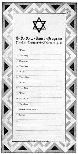
EXAMPLE 206
A dance card by Edward W. Stutes, Spokane, Wash.
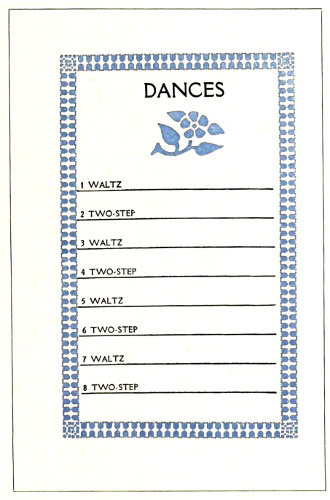
EXAMPLE 208
Unconventional treatment of a dance program
Example 202.—This
page has not
the compactness of
the preceding one,
yet esthetically it
is more pleasing. It is an almost perfect specimen of
church-program printing. As already mentioned, the horizontal
red lines and the black text letter used for titles
have an ecclesiastical motive. Careful disposition of blank
space has given a pleasing tone to the page, which is also
helped by the position of the second stanza of the hymn
at the foot. The type-faces are harmonious, the use of
black text,
old-style
roman and
italic affording
a pleasing
variety.
By including
in the
color the
initial letters
and the
title “Holy
Communion,”
all
parts of the
page are
blended
and related.
Example
203.—The
printer may
be naturally
curious to
know how
a typographer
such
as D. B. Updike,
who is
known to
specialize
on ecclesiastical
typography,
treats
church
programs.
Here is an
Updike
page, from
a program
of Lenten
services, arranged
in
the simple,
classic style
of typographic
treatment
that
he always
renders so
well. As
will be noticed,
the
main portion
of the
type page
is aligned
at the left.
The manner
of using
capitals,
small capitals,
lower-case
and
italic is an
interesting
study.
While examining
the page it
is enlightening
to
note that
A.M. and
P.M. are in small capitals, and that no space other than
furnished by the period is placed between these abbreviations
or the degrees D.D., Ph.D., etc.
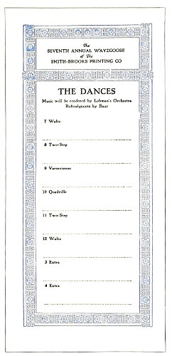
EXAMPLE 207
Page from a booklet program. By C. R. Beran, Denver, Colo.
Example 204.—This is the title-page of a small program
which was in booklet form, a page being devoted
to each event on the program. The title-page is in missal
style, with cross rules and uncial initials. The spaced
Pabst capitals at the foot are not sufficiently strong in
tone to balance the upper part of the page. Perhaps the
effect would be better had the missal style of treatment
been extended to the lower portion of the page.
Example 205.—This is the second page of a small program
used at the laying of the corner-stone of a new
church building. It would have been possible to get all
the type matter on one page, but crowding into small
space is often done at the sacrifice of beauty, and this
program profits by the liberal margins. The rule lines at
the head were used to obtain uniformity of page width
and hight. The outline type ornament gives ecclesiastic
dignity to the program. The two-line initial at the beginning
of each hymn adds style and finish to the typography.
The dance program is a far step from the church program.
The contrast between the subdued and reverent
atmosphere of the house of worship and the gayety and
frivolity of the brilliantly lighted ball-room emphasizes
the necessity of printers using their best powers of discrimination
in treating the various programs that come
to their shops.
94The dance
program
should be
dainty. White
seems to be
more acceptable
than colored
stock on
which to print
the order of
dancing. The
type and ink
treatment
should be neat
and delicate.
If a bold type-face
be used,
it should be
printed in a
light tint of
ink, such as
gray, pale
blue, pale
green, and the
like. It is possible
for printers
to produce
attractive
dance programs
with the
material generally
found in
the shop, yet stock folders may save wear of the thought
machinery and probably be more satisfactory to the customer.
Young people are imitative and may be suspicious
of a dance program which does not resemble those they
have seen before; it has got to “look like a dance program.”
For fifty years or
more dance programs have
consisted of folded cardboard
with tassel and pencil dangling
therefrom. The stock
folder is to be had in a variety
of designs printed or embossed
on the first page, appropriate
for many occasions.
However, there are shown
three typographic dance programs.
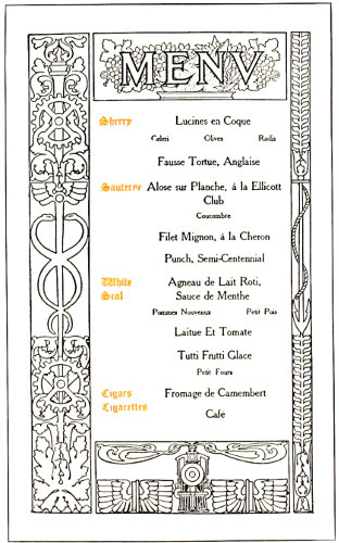
EXAMPLE 209
The decorative border on a banquet program. By Edward Everett Winchell, New York
EXAMPLE 211
Page from a booklet program. By Will Bradley
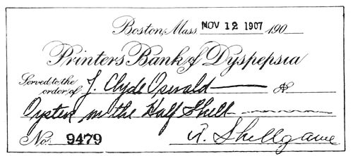
EXAMPLE 212
The banquet program in the form of a checkbook
Example 206.—An Indian
border was used around this
dance card, but its strong
lines were softened by printing
in gray and red. White
stock was used. In the headline,
instead of the customary
periods, dots are centered
decoratively. Artists often
place a dot or
small ornament
between
words of a lettered
design
for the purpose
of benefiting
the tone. More
often practically
no space
at all is placed
between words
if in lower-case
beginning
with capital
letters.
Example
207.—A part
of an outing
program, this
page carries
the style of all
the other
pages as regards
border
and head
panel. It illustrates
the effectiveness and economy of uniform border
treatment on a program. There are very few programs
that would not be benefited by decorative borders in
color. But one border need be set in type, duplicates
being obtained by electrotyping. If there are to be only
a few hundred programs, two borders may be set in type
and printed on all the sheets, running only two pages
on. If desired, a hand-drawn decorative border could be
engraved and afterward duplicated by electrotyping.
Example 208.—There is nothing conventional in the
design of this dance program. It is different from most
others. The rule lines extend to the border, and the
heading “Dances” sets slightly to the right of center,
supported underneath by the graceful flower ornament.
Punctuation is omitted. This
page is recommended for
dance cards, when the printer
desires to have the job exclusively
typographic.
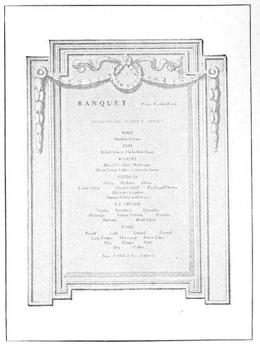
EXAMPLE 210
A halftone decorative background on a program. Design by Griffith-Stillings Press, Boston, Mass.
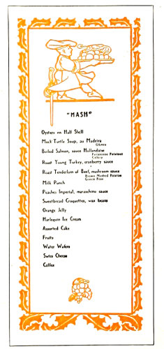
EXAMPLE 213
Humorous treatment of titles and odd menu arrangement. Design by the Griffith-Stillings Press, Boston, Mass.
The banquet program not
so many years ago here in
America and in England was
commonly called a bill of fare.
Now only the cross-roads hotel
and the cheap city eating
house have bills of fare. The
polite title is now “menu,”
pronounced men-yu or meh-noo.
Some writers claim the
word came to us from
“Manu,” a mythical sage
said to have sprung from the
god Brahma. Yet the dictionary
would seem to indicate
that the word is French,
meaning small, and was derived
from the Latin minutus,
little. It is possible that the
small portions now served in
many restaurants suggested
the use of “menu” because
of the contrast with the generous
“helpings” of the old-fashioned
meal. In 1512 a
95“shore dinner”
for an
individual
consisted of
“a quart of
beer, a
quart of
wine, salt
fish, red
herring,
white herrings
and a
dish of
sprats.”
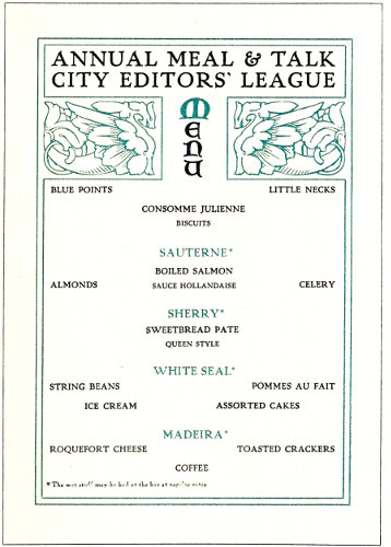
EXAMPLE 214
Suggestion for a menu page, introducing a bit of fun
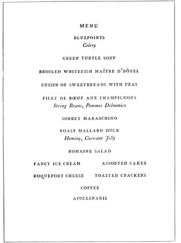
EXAMPLE 215
A classic menu page. Designed by D. B. Updike, Boston, Mass.
In the
banquet
program
the printer
has great
opportunity
to make use
of his inventive
faculties. No
other kind
of program
allows of
such varied
treatment.
There is no
limit to the shapes, the type arrangements and the color
treatments that are suitable for banquet programs. An
association of leather merchants holds a dinner and the
members may find beside their plates a program bound in
a miniature hide, the sheets of the program attached by
a leather thong.
Bankers meet and the program may be in the form of
a checkbook.
For an athletic association an oval-shaped program suggesting
a football will “score.”
Newspaper publishers will appreciate the menu list presented
as a papier-mache matrix of the type form.
Commercial travelers would be pleased were their banquet
programs designed in imitation of a mileage book.
A literary society dinner would be appropriately graced
were the program printed on parchment and wound around
a wooden or
ivory rod, as
“books” were
bound in ancient
times.
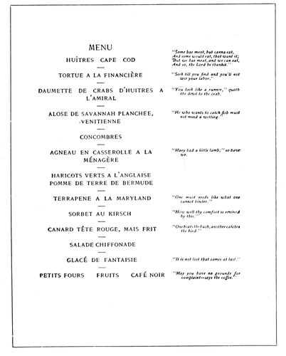
EXAMPLE 217
Dignified style for menu page. By the De Vinne Press, New York
Pyrography
could be
blended with
typography in
producing odd
effects in banquet
programs.
One way of
getting results
by this method
is to print the
menu page on
a piece of soft
wood, say a
quarter of an
inch thick,
and then, by
means of the
pyrographic
writing tool,
burn a decorative
border
around it.
Type ornaments
and borders
could be
printed on the
wood as a guide
for burning
the designs.
Many effective menu
forms could
also be evolved
with the assistance
of the
bookbinder.
Pulp board
covered with
an artistic
cover paper
makes a handsome
background
for
mounting the
menu page,
which should
be printed on a
harmonizing
stock. Italian
and Japanese
hand-made
papers are particularly suitable for such work, and when
the style of typography is made to blend with the stock
the effect is rich. Domestic manufacturers, too, make a
large line of artistic papers applicable to the purpose.
Example 209.—This page is from a booklet program,
and is companion to Example 125 inserted in a preceding
chapter. It sets forth the value of the decorative border
on programs. The arrangement of the type matter is the
customary one. The minor dishes are set in small type,
while the damp stuff from the wine cellar is represented
at the left in rubricated text letters.
Example 210.—A halftoned decorative background in
olive was a feature that lent value to this page, which is
one of a
number of
similarly
treated
pages in a
booklet
program.
The classic
panel design
makes
a good
background
for a menu
page. The
idea is applicable
in
many other
ways.
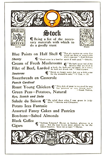
EXAMPLE 216
A menu program used by master printers. By Charles Edward Peabody, Toronto, Ont.
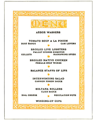
EXAMPLE 218
Treatment simulating woodcut decoration
Example
211.—This
chapter
would be
incomplete
without
one or two
Bradley
specimens.
Here is an
96idea in
menu printing
born
while he
was with
the American
Type
Founders
Company
in 1905. It
took the
form of a
small booklet
2¾ by
4¾ inches,
eight pages
and cover,
and each
page was
devoted to
one of the
dishes on
the menu.
Below the
name of
the dish
was a chap-book
ornament.
Altho the
small booklet
has been
little used as a form for menu purposes, it has possibilities
for development that should not be overlooked by
the printer.
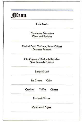
EXAMPLE 219
The missal style adapted to a menu program. By Will Bradley
Example 212.—Here is a novel banquet program. Each
dish on the menu was presented in the form of a check
on the “Printers’ Bank of Dyspepsia,” and the “bank”
was ordered to pay to the order of the guest a portion of
food or drink, in this instance oysters on the half-shell.
The checks were signed by appropriate names, “A. Shellgame”
in this instance. The entire lot of checks was
bound in the customary checkbook style.
Example 213.—In this program the menu is termed
“Hash” and the toasts “Rehash.” The treatment is
unique, especially
in
the arrangement
of the list
of palate
ticklers.
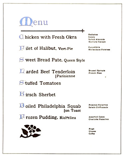
EXAMPLE 220
Unique treatment of a menu page in which the minor dishes are arranged at the right
Example
214 (Insert).—Suggested
for a
menu page
in two colors.
Banquets
are
occasions of
gayety and
enjoyment,
and humor
is appreciated.
Displaying
choice
drinks
prominently, and
then
in a note at
the foot
calling attention
to
the fact
that they
can be had
at the bar
at regular
rates, is a
bit of fun
that has not
been widely
perpetrated.
Typographically
the
page is refined,
yet is
sufficiently
decorative
to appeal to
a large class
of customers.
Example
215.—A
classic
menu page
by Updike. Roman capitals and italic lower-case only are
used. Perhaps this is the way Aldus would set the page
were he alive today. The page as a mass is symmetrical.
Example 216.—This page is from a program used at a
master printers’ banquet, all pages being treated in a
style appropriately humorous. The word “Stock” tops
the page instead of the usual “Menu.” “Make-up” heads
the list of officers, and in this manner were the guests’
funny-bones agitated.
Example 217.—Here is a program for those accustomed
to eat in a foreign language. The typographic
treatment is refined and dignified, the roman capitals and
the italic blending classically. Little side hits such as
those to the right are always appreciated, especially
when carefully
selected.
EXAMPLE 222
Refined entertainment program page. Design by D. B. Updike, Boston, Mass.
EXAMPLE 221
Excellent typographic treatment. By Harry Haime, Boston, Mass.
Example
218.—An
artistic
treatment
simulating
woodcut
decoration
suitable for
many occasions
is presented
by
this page.
The four
initial letters
give
the appearance
of a
decorative
heading
and blend
well with
the border.
It is appropriate
that
capitals
should be
used thruout
97the page and that the type-face should be Old-Style
Antique. The florets dividing the dishes distribute the
color pleasingly. The fact that this program was used by
an organization of mechanical engineers explains the
queer wording of the list of good things to be eaten.
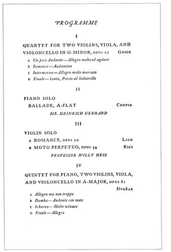
EXAMPLE 224
These two pages are from an entertainment program by Bruce Rogers, Cambridge, Mass., and furnish interesting material for study
Example
219.—Bradley
suggests another
good arrangement
in
this page. It is
simply constructed,
yet
possesses interest
and
style. The
original was in
black and
light-brown
inks on buff
antique stock.
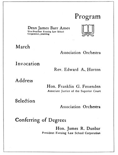
EXAMPLE 225
A program page in lower-case. By Stetson Press, Boston, Mass.
Example
220.—This
page has the
merit of being
unique while
containing
elements of
the artistic.
The important
dishes are set
forth prominently,
the minor dishes appearing in small type grouped
at the right. Uncial initials blend with the Old-Style
Antique type. The horizontal rule and the large flower
ornament play necessary parts in obtaining a balance.
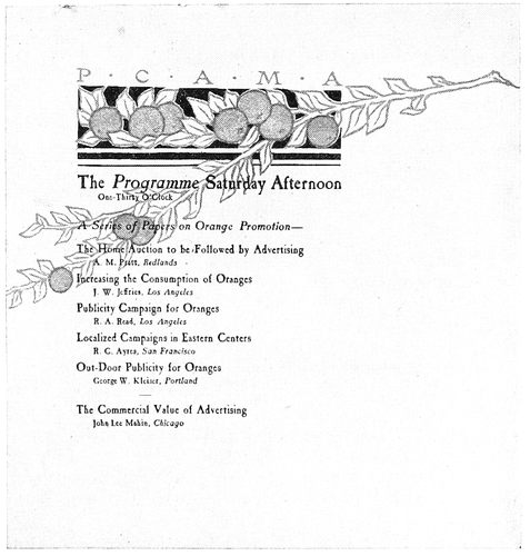
EXAMPLE 226
The decoration was in color. By Fred S. Lang, Los Angeles, Cal.
98Example 221.—The treatment of the titles at the left
side and the symmetrical arrangement at the foot of this
example are highly commendable. The details of the entire
page denote the finished typographer. The combination
of capitals and small capitals is pleasing, and the
manner in which variety has been secured in a design of
orderly arrangement is commendable.
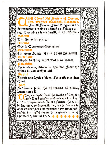
EXAMPLE 227
Program in the Gothic style. Designed by Merrymount Press, Boston, Mass.
Programs for entertainments and exercises, while not
allowing the unrestrained workings of the fancy that
those for banquets do, are yet proper vehicles for carrying
artistic ideas. The program should be artistic. The
commonplace program is a disappointment to the intelligent
auditor and an evil in that it influences the public
taste towards mediocrity. The printer who cannot produce
a good entertainment program has need to study art principles
and observe the artistic programs being produced
by others.
Example 222.—A refined program page by Updike.
In the original the border was printed from a copper intaglio
plate on smooth-surfaced hand-made paper, the
reading portion being printed clearly and sharply from
type. Updike’s work is noted for the clearness of the
print. Just enough ink is carried to prevent the print
being called gray. Of course the type must be clean and
unaffected by wear, the ink well ground and the impression
firm. This specimen is almost entirely in italic, with
“swash” or decorative capitals that add interest to a page
of dignified typography. Swash italic capitals properly
used are valuable aids in securing attractive yet refined
typographic effects.
Examples 223 and 224.—These two pages by Bruce
Rogers should have interest for every printer who loves
good typography. The zinc reproductions of these pages,
also that of the preceding example, fail to present the
sharp print of the originals. Roman lower-case is absent
from this program. Rogers and Updike, with Aldus, have
demonstrated that roman lower-case is not essential to
typography. Perhaps that is why their work has distinction—other
printers set most of their type from the
roman lower case.
On the title-page the features of particular interest
are the long s in the word “music,” the swash italic capitals
and the woodcut ornament.
The program page is interesting in its construction and
its details should be studied closely. Unless suitable ornamentation
is available, program pages had better be
treated plainly as here, with such attention to the details
of the type arrangement as will obtain finished results.
It is a test of typographic ability in the production of a
program page to compose work that, without the friendly
aid of decoration, is pleasing to look upon.
Example 225.—This page shows admirable treatment
of a brief program. The various sizes of type are well distributed,
and the consistent use of roman lower-case is
pleasing.
Example 226.—The type in this page overprinted the
decoration which was in pale orange and pale green. The
decoration was appropriate in that the program was for a
meeting held on the fruit-growing Pacific Coast.
Example 227.—The Gothic style dominates this page.
Excepting the two uncial initials, only one size of type
has been used. That fact alone is interesting, as the result
is remarkably finished. Decoration of quality for similar
effects can be obtained by having historic decorative
borders from old books photographed and redrawn upon
the photograph with such alterations as are desired.
The face of the photograph can then be washed away,
leaving only the drawing, from which the plate is made.
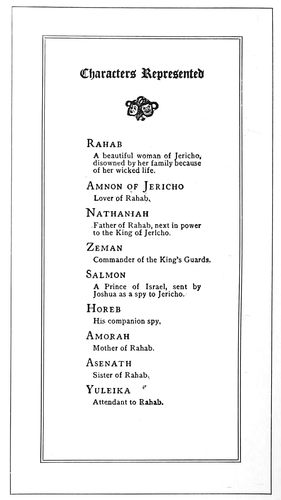
EXAMPLE 228
A well-arranged page. By Stetson Press, Boston, Mass.
Example 228.—The list of characters in a dramatic
entertainment
is here displayed
in an
unusual manner.
It is so
easy for compositors
to set
copy such as
this in the
conventional
type-leader-type
method,
but this compositor
has arranged
it to
conform to the
proportion of
the page.
The program
containing
small advertisements,
especially the
theater program,
is possible
of much
improvement.
Such typography
should be
given better
attention, as
theater programs
exert
large influence
in forming
public taste.
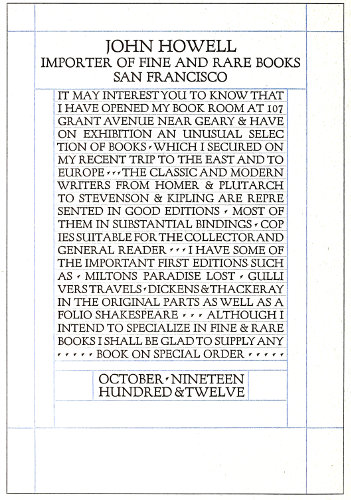
EXAMPLE 229
Classic capitals combined with rules. Suitable for announcements having to do with art, architecture, literature and music
99
ANNOUNCEMENTS
Publicity is doubtlessly essential to success in every
business and profession. The public is interested in the
man who does things, but this interest is obviously confined
to the man who it knows does things. The great
men are advertised men. The great deeds of history are
those advertised by poets and historians. Shakespeare
made famous many ancient characters, as did Plutarch
before him, and the most famous acts of the American
Revolution are those performed near the homes of poets
and writers. We would not be familiar with the rides of
Paul Revere and “Phil” Sheridan had they not been advertised
by means of printers’ ink.
Several years ago in New York an influential art society
recognized the work of a mural painter by awarding him
a medal. In accepting it the artist sadly remarked that
the recognition came too late in life for him to “use it as
a help to live with,” which proves that in the heart of
the most proud and sensitive artist or professional man
there is a feeling that he needs publicity—recognition,
if that word is less offensive—in order that his life work
may be successful.
It is fashionable for prominent persons to employ press
agents, and goings and comings and doings are told to the
public at every opportunity. In the days before the development
of newspapers and other typographical mediums
for advertising, the people depended upon the public crier
to make all sorts of announcements. He would attract a
crowd by sounding blasts with a horn or by ringing a bell,
and then make known his message.
The modern representative of the crier is the printed
announcement. It is not confined to any definite size or
shape, often consisting of one page only, printed on card
or paper stock.
EXAMPLE 231
Two pages from a dignified, refined and artistic announcement folder, printed in black ink on brown-tinted hand-made paper
The announcement form may be considered the most
100personal of the printed mediums of publicity.
It presents a direct, individual appeal or invitation,
and the recipient, influenced by this
fact, is likely to give it more consideration
than some other form of advertising. Recognition
is flattering to all of us, and upon receipt
of an announcement we are apt to feel
pleased that our patronage or personality is
thus recognized.
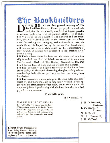
EXAMPLE 232
Announcement in Colonial style. By A. F. Mackay
The printer is depended upon by most customers
to furnish suggestions for the physical
make-up of the announcement, and he is also
frequently asked for advice in regard to the
phraseology. This places a responsibility upon
him that he cannot well ignore, and he should
be able to respond with proper suggestions.
Being thus qualified to assist the customer has
many times led to further and profitable business.
The printer possessing the confidence of
his customers has an asset of great value.
The most common form of typographic announcement
is that printed from roman, text,
gothic or script type-faces in imitation of engraved
intaglio printing. The styles of this
form of announcement change slightly with
the fashions in copperplate effects. Printers
desiring to do such work would do well to obtain
samples from one of the leading society
stationers and follow them closely in arrangement,
spacing of words and lines, and size and
kind of stock. This class of work allows of
little original or decorative treatment. If other
forms or treatments are desired a standard
type-face, such as Caslon or Cloister, should
be used. Many compositors err in combining
copperplate-engravers’ faces with rules and
borders, or in other ways misusing them; for
such results are “neither flesh, fish nor fowl,”
as the saying goes.
If the customer requests an imitation copperplate
effect, give it to him as closely as you
can; that is good business policy, and is in
accordance with the sound advice to “Do your
best, no matter what the circumstances,” reminding
one of the old rhyme:
If I were a cobbler, it would be my pride
The best of all cobblers to be;
If I were a tinker, no tinker beside
Should mend an old kettle like me.
But, whenever possible, get on higher ground.
If you must be a tinker, be a good one, but
rather be a producer of new things than a
builder of patches and something that is “as
good as new.” Printers should test their earnestness
with tasks that develop their art instincts
and, accompanied by proper financial
return, bring that satisfaction which comes
from work well done.
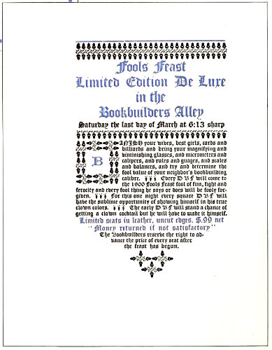
EXAMPLE 233
Odd treatment of an announcement. By T. M. Cleland
Example 229 (Insert).—Usually the printer
should not set an advertising page all in capitals,
nor should he use many rules in its composition;
101but when the
typographic designer
has skill and artistic
taste in addition to a
developed sense of fitness
and refinement,
the warnings and “thou-shalt-nots”
that apply
to most printers are not
for him. Mr. Nash, with
the use of Fred W. Goudy’s
Forum type-face
and rules that suggest
the guide lines of old
manuscript books, has
produced an announcement
that is classic in
composition, pleasant
to look upon, and a page
that carries the message
in an especially
effective and appropriate
manner. The original
was printed on
hand-made paper. This
type-face has been modeled
on ancient Roman
lettering and for that
reason has a classic
character that makes it
suitable for announcements
and other printing
having to do with
art, architecture, literature
and music.
Examples 230 and
231.—These are the
first and third pages of
an announcement originally
printed in black
ink on brown-tinted
hand-made paper. The type-face, Caslon, was sharply impressed
into the stock. It may be advisable to state here
that all Caslon romans are not alike. The face usually sold
by typefounders has the descenders shortened, that the
letters may conform to the system of alignment adopted
some years ago in America. This shortening of descenders,
seemingly a trivial matter, affects the general appearance
of the type-face. Attempts to “improve” the Caslon face
are apt to end disastrously to the effectiveness of the letter.
It has characteristics that are essential to its beauty,
and shorn of any of those characteristics it loses attractiveness
proportionately. This announcement folder is of a
quality seldom attained in printing, depending as it does
upon detail in typesetting and presswork. The reproduction
cannot present these points, because the finish of the
paper, the clearness of the print, the spacing, the apportionment
of margins, the tone, all counted in the finished
result.
Example 232.—This circular announcement in its original
form was 9½ × 12½ inches in size, the paper upon
which it was printed being gray-green laid hand-made.
The positions of the groups of type matter and the sizes
of margins are features worthy of study. Other points of
interest are: the treatment of heading and initial, the
use of florets at the beginning of each paragraph, and the
committee signatures. The last-named lines are set in
italic lower-case with roman capitals, Aldus style. The
border was printed in dull red, close to the edge of the
paper.
Example 233.—This meeting announcement is of the
same series as the preceding example, but, set all in black
text letter without border, the effect is totally different.
The peculiar black and gray tones of the Caslon ornaments
blend well with similar characteristics presented in the
massed black letter. The page was printed in vermilion
and black on buff laid hand-made stock. The effectiveness
of this style of announcement is due not alone to the
typography and stock, but to the generous size of the
sheet used—good paper and plenty of it. This announcement
was mailed without envelops, the double sheet being
folded into thirds and the lower end inserted into the
upper end.
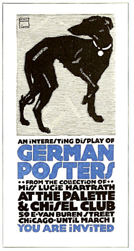
EXAMPLE 235
These specimens are lettered in a style that suggests the sturdy masculine character of the lettering developed with the new German decorative poster art. Designed by Oswald Cooper, Chicago
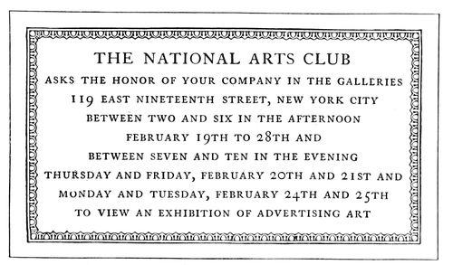
EXAMPLE 236
A classic arrangement based upon the architectural inscription plate. By Benjamin Sherbow, New York
102
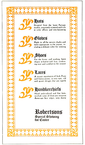
EXAMPLE 237
Ornaments as eye-attracters. An idea that could be adapted to many jobs of printing. Designed by Will Bradley
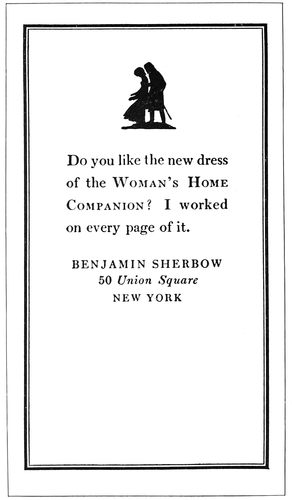
EXAMPLE 238
Postal-card announcement, the typography of which is attractive, not because of what is put on, but because of what is left off
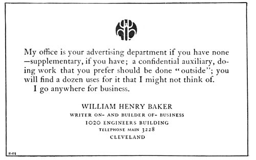
EXAMPLE 239
Good advertising typography. Type groups and blank space well proportioned, and an interesting decorative spot of color
Example 234.—This announcement page is lettered in
a style that suggests the sturdy masculine character of
the lettering that has been developed with the new German
decorative art. Typographers should not make the
mistake of assuming that a page set in the so-called gothic
types of the typefounders would give this effect. While
the letters are without serifs, as are the gothic types, yet
they have not the mechanical perfection of those types.
Type-faces, lettering and drawing of any kind seem to be
better liked when they possess the human quality of imperfection.
I once called on Boardman Robinson, then cartoonist
of the New York Tribune, and found him at work
on a cartoon for the day. I noticed that he had considerably
altered the picture on which he was working, and I
asked him about it.
With a smile, he
stated that he had
been working on
the cartoon for several
hours in order
to make it look as
if it had been drawn
in fifteen minutes.
German typefounders
have made type-faces
that carry the
qualities of this
poster style of lettering.
The young
printer should not
infer from this that
careless and unfinished
typographic
work is preferable
to a careful, finished
product. It will be
found that the artist
or printer who
can best give this
little touch of human
nature to designs
is one who
first learned to do
the work as perfectly
as possible.
Example 235.—This
design was the
first page of a folder
of which Example
234 was the third
page. Oswald Cooper,
who lettered
this announcement,
used the figure of a
dog that had been drawn by the German poster artist
Hohlwein, but gave him due credit in the upper left corner.
This style of lettering, as has already been mentioned,
is appropriate to the subject of German posters
and in harmony with the poster illustration used. Heavy
treatment of this kind offers a rich opportunity for the
use of strong and harmonious colors. Light-faced type is
very unsatisfactory as a carrier of color, but the broad
strokes of this style of lettering make possible a liberal
showing of color on the page. An extra color has been
introduced, altho the original announcement was entirely
in brown on a brown-tinted card.
Example 236.—From the viewpoints of art and dignity
an announcement card such as this one is always in good
taste. Its style is classic, being arranged along the lines
of an architectural inscription plate. The border is the
reliable egg-and-dart pattern and the type-face is Caslon.
Capitals are essential to best results in this sort of design.
Example 237.—The idea suggested in this page, of
using ornaments as eye-attracters, is a good one. While
the design as a whole is decorative in character, the advertising
element is not overlooked. The several articles
of merchandise are prominently displayed, as is also the
name of the store. In the series of type designs of which
this was a part, the designer strongly emphasized ornamentation.
There was a reason for his doing this, as he
was engaged in introducing new typographic decorative
material, but printers working for the commercial public
are engaged in a different vocation. In attempting such
designs as this, compositors should decrease the prominence
of the ornaments and border and increase that of
the reading portion of the page.
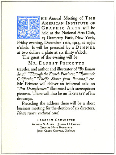
EXAMPLE 240
Showing the use of roman, italic and spaced small capitals on an organization announcement
103
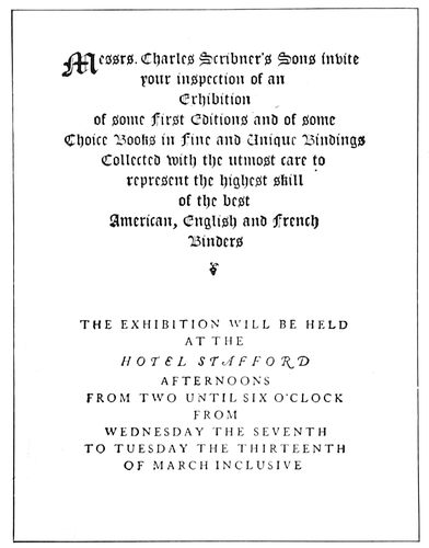
EXAMPLE 241
Unusual division into two groups, providing for fold. By the Calumet Press, New York
Example
238.—This
announcement
was
printed in
black ink on
a Government
postal
card. The
young compositor
will,
no doubt,
recognize
the small
amount of
actual typesetting
necessary
for
this page;
however, he
should not
overlook
the fact that
the results
were really
secured by
one-tenth
manual labor
and nine-tenths brain exercise. A specimen such as
this is good not because of what is put on but because of
what is left off. There are only a rule border, a small silhouette
illustration and four lines of type exclusive of the
signature, yet the busy man gets the message and experiences
pleasure in getting it. The type in the original was
no larger than was necessary to be easily read. Compositors
frequently forget that announcements of this kind
are read at a distance of only a foot from the eyes, and
that twelve-point type is really large enough for the purpose.
It is usually a mistake to make the type-face very
large or very small. One is an unnecessary size and the
other is an illegible size.
Example 239.—This is another announcement set in
twelve-point type, with a liberal distribution of blank
space. The personal mark of Mr. Baker adds a decorative
touch of color that attracts attention and helps to make
the page distinctive.
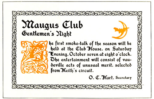
EXAMPLE 243
Harmony of type-face and decoration
Example 240 (Insert).—This announcement has typographic
interest in that it shows how variety and advertising
emphasis can be obtained by the proper use of italic
and small capitals with lower-case roman, especially with
a type-face such as Cloister Oldstyle. The small capitals
are letterspaced; they usually respond pleasingly to such
treatment. Typographers who have studied the matter of
spacing have found that capitals and small capitals can
be letterspaced with good results, and that roman and
italic lower-case seldom look well if the letters are separated
by spacing. It is probably an exaggeration to say
that lower-case should never be spaced, as typographic
artists such as Will Bradley have produced very effective
results with letterspaced lower-case; but the average compositor
had better adhere to the rule of never letterspacing
lower-case letters. It will be noticed that on this
announcement the name of the organization, the words
“Dinner” and “Exhibit”
and the name
of the guest, are set
in capitals and small
capitals with letterspacing.
The names
of the books, the
title of the talk, and
the request to return
a card, are in italic.
Only one size of type
has been used, excepting
for the committee
group at the
foot. In order that
the words “Program
Committee” should
not look exactly like
the other lines in
this group, they were
letterspaced.
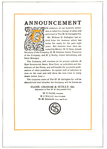
EXAMPLE 242
A study in tone values and margins
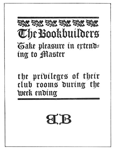
EXAMPLE 244
Artistic form for brief announcement. By A. F. Mackay, New York
Example 241.—This
announcement
form, like No. 240,
104is conventional in size, the paper upon which the original
was printed measuring 5½ × 7 inches. The arrangement
of the type page was designed to provide for the fold
which horizontally crossed the center of the page. The
division into two groups, each in a different type-face, is
unusual, and the manner in which this has been accomplished
is instructive to the student of typography. The
use of a large initial gives distinction to the upper group,
and spacing of the Caslon capitals in the lower group
maintains a distinction there. This page illustrates two
points recognized by good typographers—that the printed
effect of old-style roman capitals is usually improved by
a slight increase of space between letters, and that, on
the other hand, the printed effect of text letters would
be impaired by increased space between them. There is
danger of too great contrast of tone in a page, and had
this example been executed less skilfully, it would have
failed in effect.
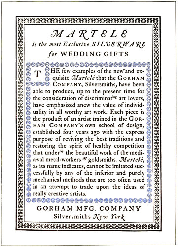
EXAMPLE 245
Colonial treatment of an announcement page. By the Calumet Press, New York
Example 242.—This announcement circular affords a
study in tone values, especially in the original size, which
was 9 × 12½ inches. The type, Old Style Antique, was
twelve-point, with six-point slugs between lines. The
black tone of the type-face and the liberal spacing found
relationship in the black tone and open lines of the
initial letter at the head. This harmony was carried
out in the entire page, the black and white tones contrasting
thruout. No gray lines were used; even the monogram
at the foot was constructed of strong lines. In
obtaining an effect like this it is necessary that the type-face
be of medium black tone somewhere between the
gray tone of the Caslon face and the heavy black tone of
the John Hancock or other extra-black faces. It may be
well to call attention to the margins inside the rule border.
The artist avoids monotony in margins. In old books
the four margins surrounding a type page differed. The
foot margin was the largest, the others being smaller in
this order: outer side, head, inner side. In this announcement
page the foot margin is larger than the others, and
the head presents the smallest amount of marginal space.
The side margins were made equal because, unlike the
paired book page, this page stands alone.
Example 243.—Harmony of type-face and decoration
is the chief attraction of this announcement card. Some
of the characteristics of Washington Text in tone and
stroke are also found in the initial letter and border, and
to this the harmony is due. Placing of the initial letter
so low on the page was a bit of daring, yet balance is retained,
due to the heading.
Example 244.—While only a little folder, 3½ × 4½ inches
in size, this job was exceedingly effective. It was printed
in black on white antique stock. Such a form could well
be adapted to many brief announcements.
Example 245.—This form was set in type during the
Colonial revival that interested good printers about the
year 1900. Caslon type and Colonial decoration give an
individual character to the page. Colonial effects are not
so common just at this time, which fact is quietly digested
by the wise typesetter as he recognizes his opportunity.
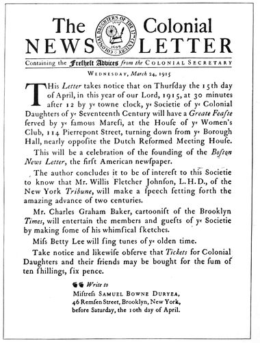
EXAMPLE 246
An announcement literally treated in Colonial typography, even to the use of the long “ſ”
105

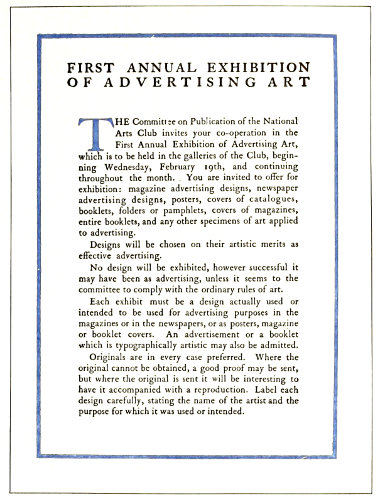
EXAMPLE 248
First and second page of an artistic, unembellished announcement circular. Designed by Benjamin Sherbow, New York
Example 246.-This announcement demonstrates the
possibilities of typography along the lines of appropriateness.
A Colonial organization wished to announce a meeting
at which would be celebrated the founding of the
first American newspaper, and desired something in Colonial
style. The printer looked up a reproduction of an
early newspaper and set the heading in a style such as
was given the headings of newspapers in the early days.
The society had an emblem or seal engraved in the
serifless and characterless style of lettering that the average
engraver will give an organization. The printer had
the emblem redrawn, giving instructions to the artist to
draw the entire design in freehand and to be careful that
the lines and lettering be not too regular. Instructions
were also issued to have serifs on the lettering and to have
it contain the contrasted light and heavy strokes of the
roman type-face of the Colonial period. As will be seen
by the example herewith, the idea was well carried out
by the artist. The society had appropriately phrased the
announcement. The printer carried the idea along by
using a small size of “e” in the word “ye,” and a long
“s,” made by cutting a part of the cross from the “f.”
A suitable hand-made paper was selected and the paper
was dampened before printing it. The announcement was
then folded up and sealed in the style of Colonial times,
without an envelop.
Examples 247 and 248.—These are the first and second
pages of a large circular announcement printed in black
and light olive-brown on buff-tinted laid antique paper.
No embellishment is used, nor is any needed, the treatment
being sufficiently artistic. The arrangement of the
first page is uncommon. The lack of margins around the
type group and the absence of print on three-fifths of the
page would be counted by some printers as mere eccentricities,
yet to others these things spell art. Compositors
interested in this arrangement should notice how the type
lines fit the phraseology. The advertising element has been
considered by the designer along with æsthetic requirements.
The double line of capitals at the head of the second
page was duplicated on the third. The second page
shows simplicity and legibility that are admirable, the
liberal margins and the three-line initial being noteworthy
features.
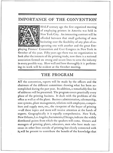
EXAMPLE 249
One of four pages of a convention announcement, showing the attractiveness of rules when properly used with headings
Example 249.—This is the second page of a convention
announcement and is evidence of the success that is possible
with the proper use of a well-designed type-face, an
106appropriate initial, and rules to separate the headings. A
combination of a heavy- and light-faced rule has always
looked well with the Caslon style of type-face.
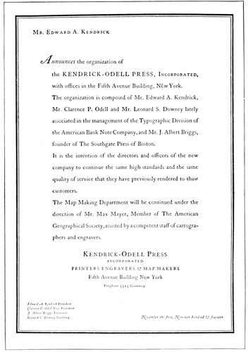
EXAMPLE 250
Announcement designed by an artist who believes in the liberal leading of type lines
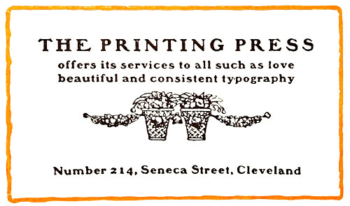
EXAMPLE 252
Blotter announcement in rugged Colonial style
Example 250.—This announcement, originally printed
on hand-made paper, all in black ink, was designed by a
famous New York artist-typographer, who believes that
there is greater legibility when the lines are separated
by a liberal use of leads than when they are “set solid.”
The arrangement is unusual in several respects—the placing
of the name in the far-off upper corner, the use of the
initial “A” in the midst of a sentence, the setting of the
names of the officers in italic and their titles in roman,
and the liberal leading previously referred to.
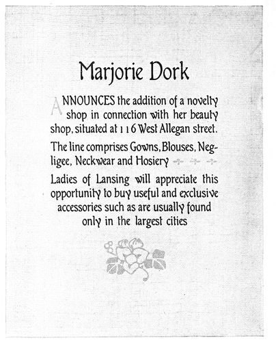
EXAMPLE 251
Announcement in black and gray on gray fabric-finished stock, illustrating harmony of type-face and decoration
Example 251.—This specimen also has the feature of
an initial in the midst of a sentence, and it may be well
to suggest to young compositors that it is better not to use
an initial in this manner. This page would probably be
even more effective if the entire word “announces” were
in lower-case. The announcement was printed in black
and gray on a light-gray stock. The foundry that made
this series of type also made ornaments that would harmonize
with it and thus enabled the printer to produce
an artistically pleasing page. This letter is one of a few
that closely suggest good hand-lettering. The selection
of type sizes and the arrangement
and apportionment of margins help
to make a result that reflects credit
on the printer’s art.
Example 252.—A blotter was the
vehicle that carried this announcement,
which is in the rugged Colonial
style of typography of the year
in which this piece of work was produced.
The tone is pleasing, as is
also the contrast of white and black.
The ornament blends in shape and
style with the accompanying typographical
treatment.
In the production of his own announcement
forms the printer is not
hampered by the requirements of
customers. He works with the unrestricted
freedom of a Michelangelo
and there is little reason why his
work should not be of the best, if he
will read and study books and trade
magazines.
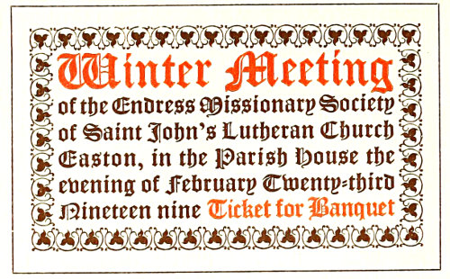
EXAMPLE 257
The historic Gothic, or pointed style
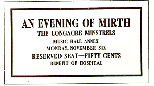
EXAMPLE 258
Strong treatment, the motive of modern origin
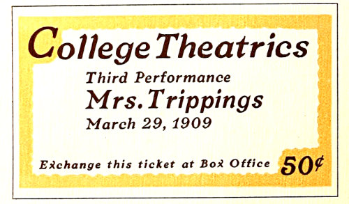
EXAMPLE 259
A striking effect that should please the college student
107
TICKETS
It is said of printers who make no attempt to learn the
principles governing art typography, that once or so in a
lifetime they produce an artistic job of printing. They
become much elated at the phenomenon, not realizing
that it was brought on by the unconscious introduction
into their product of art principles. The experience may
be likened to that of a child who accidentally touches an
electric button, causing the room suddenly to be illuminated.
The child knows the light is there, but does not
comprehend how it got there.
Now instead of being the cause of an oriental handshake,
a good job of printing ought to be an everyday occurrence,
and the stirring of the waters should be left for
the bad job of printing
when, unfortunately, it happens
along.
Lack of interest is the
reason for the non-development
of many printers in the
art side of typography. Because,
to many compositors,
printing is merely a means
of making a living, only
enough knowledge is acquired
to enable them to
“hold their jobs,” or, in
the cases of employers, to
retain their customers.
Time spent in the printshop
is considered drudgery and
the pleasures of life come
after the whistle has blown.
There are young printers who know comparatively nothing
about good typography, yet are authorities on the rules of
pinocle, baseball, or other pastimes. And there are older
printers, too, who could write a book about chicken-raising,
yet do not know when type-faces harmonize.
Any man who is not interested in his vocation is to
be pitied. Unless his heart is in his work, a lawyer,
preacher, editor, ad-writer, artist or printer will not be
successful.
Interest may be developed. If the typographer will
devote a portion of the time now spent on outside matters
to the study of his craft, and especially the art side
of printing, his work will become lighter and the hands
on the clock will chase each other. The same concentration
of thought now devoted to unimportant side interests
would bring large dividends if invested in the study
of typography. Efficiency is a guarantee of steady work
and good pay to the employee, and an assurance of steady
customers and better prices to the employer.
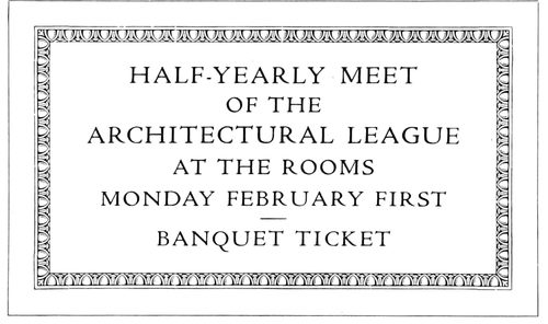
EXAMPLE 256
Classic, refined treatment, for art and literary purposes
The typographer who prefers freedom from care, and
the blissfulness of ignorance, is a poor member of society.
He should line up among the world’s workers and
accept some of the responsibilities. The first things he
observes, should he become a student, are the imperfections
of his own product. Work that before looked good
to him, now, viewed in a new light, is defective, and
finally the old verdict is reached, “There is none perfect,
no, not one.” While to the experienced art-printer expectations
of absolutely perfect results are known to be
futile, he tries for one hundred per cent just the same.
A man lacks something in his make-up when he is satisfied
to be rated as a twenty-five or fifty per cent printer.
Tickets, altho only a minute part of the printing-office
product, afford opportunity for the practice and development
of art printing. In typography there are many
themes and styles and their
incorporation into type-designs
is an interesting
and instructive study. The
compositor or layout man
should know and understand
these various styles,
that he may be able to
adapt himself to any demand
made for “something
different.” Resourcefulness
is a valuable characteristic
for any printer to possess,
and close examination of
the nineteen ticket forms,
and careful reading of what
follows, should serve to develop
that quality. These
forms were designed by the
author especially for this chapter.
Example 256.—It is fitting, in commencing a series of
type arrangements, first to show one based upon a classic
motive. The design is old to students of art, yet may be
new to printers in general. The arrangement has been
used for many years by leading architects on inscription
tablets, and the idea itself comes from ancient Rome.
The egg-and-dart border is a standard embellishment in
architectural designing. The roman type-face is historically
proper, especially the adherence to capitals, as originally
there was none but what we call capitals, the small
“lower-case” or minuscule letters having been evolved
during the Middle Ages. The letters of roman type-faces
usually set very close together and to get certain results
the capitals should be slightly spaced. One-point spaces
have been used in this example. White cardboard is preferable
to a colored one on which to print this design.
Example 257 (Insert).—The historic Gothic or church
style furnished the motive for the treatment of this ticket.
Both border and type-face possess characteristics peculiarly
Gothic—notably the pointed form of the letters
and floret. There is also blend of tone, and similar contrast
of heavy and light strokes in letter and border.
108Ancient features are consistently carried out in the arrangement.
The lines are set close to the border and
made full length. Contrast is obtained by the use of
color and the emphasis in type size of two important
phrases. This style of treatment is appropriate for tickets
used by churches or kindred organizations.
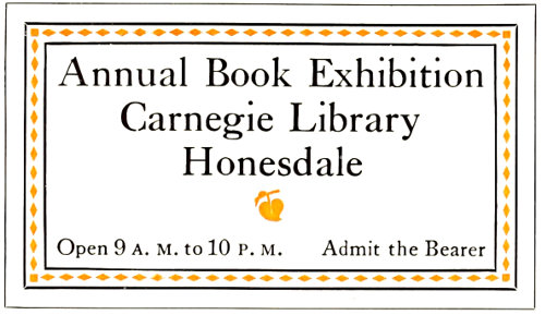
EXAMPLE 260
Modern treatment based upon the Colonial
Example 258 (insert).—The style of this ticket is a
modern conception and originated in the art revival of
the latter part of the last century. The motive is masculine
and its features are contrast
of tone, massing of
lettering, and liberal blank
space. It will be noticed
that while in this specimen
the margin inside of border
is wide, on the previous
specimen (Example 257)
there is practically no space
inside of the border. These
features are necessary in
the correct interpretation of
the respective styles. The
motive of the specimen
under consideration is particularly
applicable to
tickets for minstrel performances,
smokers, club outings,
and other affairs in which men are interested.
Example 259 (Insert).—The color border on this specimen
suggests a means of varying the treatment of tickets,
the extension of the border into two of the corners adding
distinction. Such a design as this is likely to meet approval
among college students, as they welcome odd and
striking effects. The strong italic lower-case is a relief
from the many more familiar roman faces used on such
tickets. Emphasis of important parts is obtained by increasing
the type sizes until proper contrast is obtained.
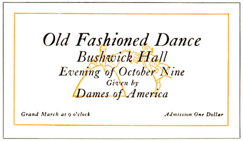
EXAMPLE 262
Daintily appropriate in type-face and illustration
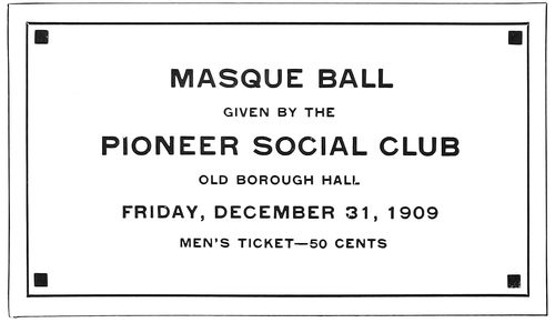
EXAMPLE 263
The secession or mission style applied to ticket composition
Example 260.—The treatment of this example may be
described as modern based upon the Colonial. The Caslon
type-face furnishes a Colonial atmosphere, and the border
treatment of color inside surrounding rules blends with
the type-face. Only two sizes of type are used and lower-case
is consistently adhered to. The shape of the main
group gives a pleasing symmetry to the arrangement, the
floret serving well to complete this result. The effect as
a whole is bookish, and may be adapted to various
literary and art purposes.
White or buff stock would
be suitable, antique finish
preferred.
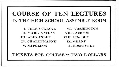
EXAMPLE 261
Suggested for course tickets. Coupons should be attached
Example 261.—There
may be an idea here for
course tickets in which a
number of lectures are listed.
The form as shown is not
complete, the idea including
the attachment at one side
of coupons containing the
names and dates of the lectures.
Only capitals are used
and the three main lines are
aligned at each end of the
measure. The narrow border
gives a finish to the
general design, which is well suited for printing in black
ink on white stock.
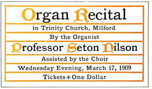
EXAMPLE 264
The ecclesiastical or missal style well adapted
Example 262.—Here we have a ticket of peculiar interest
to women and the treatment is daintily appropriate.
Caslon italic is an admirable letter for the purpose,
as it is graceful and neat. Bold treatment and large type
have been avoided, the main portion of the copy being
grouped in the center and surrounded by liberal blank
space. The outline illustration underprinting the type
group gives added interest to the ticket and may have
109advertising value in the suggestion it presents of the evening’s
pleasure. White card would be proper, and a buff
or gray-blue stock might also look well.
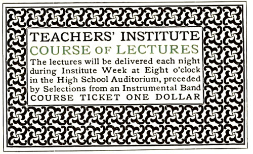
EXAMPLE 265
Perhaps Morris would have set a ticket this way
Example 263.—This ticket presents the geometric, or
so-called secession style; a mild example, tho. Because
straight lines form its motive, some call it the mission
style. There are possibilities in it for the typographer
looking for fresh ideas with which to vary his work.
Right here it may be well to warn compositors against
becoming enthusiastic over
every new style of type arrangement
that may come
to his notice. There are
men who in their endeavors
to do something to win
fame—something astonishing
and entirely original—set
out on unknown seas
without rudder or compass.
The result usually is shipwreck.
The printer who
starts out to produce typography
not founded on some
proved and tried base builds
a house in the sands that
may come tumbling down at
the first test of endurance.
A type-face of squared shape such as the capitals of
lining gothic is best fitted to accompany the squares and
angular ornaments of the mission or secession style. A
gray stock on which to print this example would be a
wise selection.
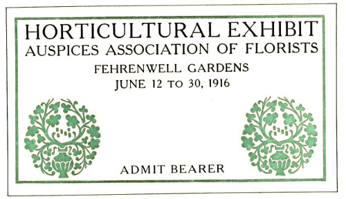
EXAMPLE 267
Modern application of classic type effects
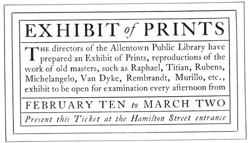
EXAMPLE 268
Patterned after Colonial treatment of title-pages
Example 264.—This specimen will be recognized as an
adaptation of the missal or mass-book style of treatment,
mentioned in a previous chapter. It is an accepted ecclesiastical
arrangement, and proves as pleasing on a ticket
as on a title-page. Uncial initials (as are here shown in
color) may be had of typefounders in slight variations.
White or buff card admirably supports missal treatment.
Example 265.—Inspiration for ticket designs may even
be drawn from the work of William Morris and the Italian
printers who used the black-toned decorative border,
altho this style should not be undertaken unless the
proper border is available. The one here adapted carries
out the idea fairly well. Old Style Antique set snugly to
fill the panel gives the proper results, the capital lines
also being necessary to this
style. Tickets for educational
and art functions
especially lend themselves
to this treatment and white
card should be used.
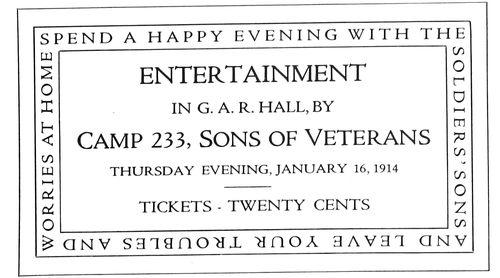
EXAMPLE 266
The medieval art worker furnished a motive for this ticket
Example 266.—The motive
for this ticket form
came from observing that
art workers during the Middle
Ages frequently engraved
inscriptions around
the margins or borders of
plates, slabs, doors, and like
objects. This suggested the
adoption of the idea to
carry a few pertinent words
on an entertainment ticket.
Cardboard of almost any color could be used.
Example 267.—Perhaps this arrangement could be
described as a modern application of classic type effects.
The display lines are in Cheltenham, a face that approximates
some of the ancient Roman lettering, and the treatment
of the ticket as a whole is chaste. The ornaments,
surrounded as they are by blank space, emphasize the
classic simplicity of the ticket. The type group is tapered
to give proper symmetry.
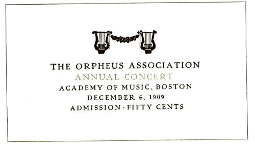
EXAMPLE 269
A dainty, refined effect suited to many occasions
Example 268.—This is purely a Colonial effect and
110closely follows the arrangements found on title-pages of
the seventeenth and eighteenth centuries. Hair-line rules
well separated by space were common in those days. The
type here used is Caslon, a letter cut in the eighteenth
century, and one especially suited to Colonial typography.
Antique-finished card in white and buff is appropriate.
Example 269.—Dainty, refined effects are demanded
by certain customers. This specimen demonstrates the
effectiveness of such treatment on a ticket. Two sizes
of type (Pabst), all capitals
and slightly spaced, give
the proper results. The ornaments
are used as symbolic
decoration.
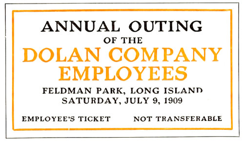
EXAMPLE 270
Robust treatment of an outing ticket
Example 270.—The typography
of this ticket is
distinctly masculine. This
result has been obtained by
the use of capitals of a robust
type-face, so distributed
in size as strongly to
emphasize the important
phrases. Had this form been
printed in one color, the
two type lines now in color
should have been reduced a
size. It is well for compositors
to keep in mind that
when orange is used in combination with black, the portion
printed in orange will be lighter in tone than that
in black, unless the difference is provided for by bolder
or larger type-faces. Any color of stock excepting dainty
tints would do for this ticket.
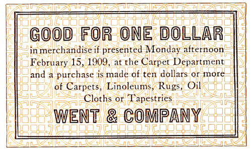
EXAMPLE 272
Treatment that should prevent easy counterfeiting
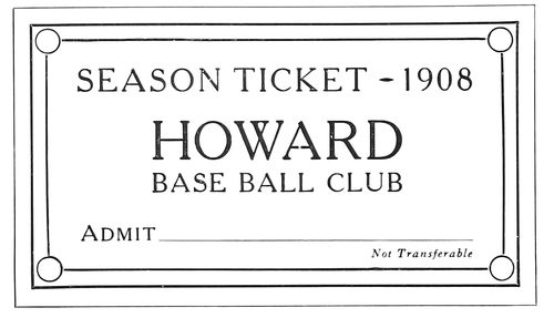
EXAMPLE 273
Corner decoration suitable to the subject
Example 271.—This unusual arrangement was dictated
by the nature of the cab ornament. The shapes of the
type groups are built about it. Were the cab ornament
not used, another arrangement would be necessary. There
are social clubs of all kinds in every city, and balls are
frequently held for which tickets are needed. An element
of interest such as is given by the cab ornament
would surely be appreciated by such customers.
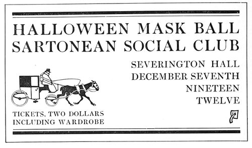
EXAMPLE 271
The cab ornament dictated the type formation
Example 272.—Occasionally there comes to the printshop
a customer wanting a ticket which cannot easily be
duplicated by any one with a press and a few fonts of
type. Instead of referring the customer to a lithographer
the printer should ascertain if he is not in a position to
produce such a ticket. The
style of the one here shown
is suggested for such emergencies.
A type border
printed in color forms the
background. Over this print
the reading matter, and for
the display lines use a type-face
that happens not to be
possessed by other printers
in the same city. In providing
a border for this ticket
a rule with double lines has
been used, thus blending it
with the double lines of
the type-face. White stock
should be selected for this
ticket.
Example 273.—The corner
decoration is in keeping with the subject of this ticket,
and the arrangement as a whole is suggested for similar
purposes. Any color of cardboard is suitable.
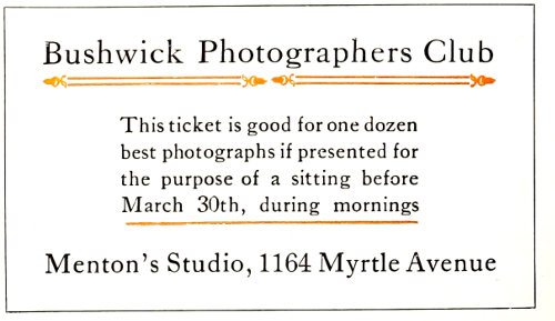
EXAMPLE 274
This arrangement has an old French motive
Example 274.—The decoration of early French books
furnished the motive for the typographical treatment of
this ticket. It is submitted simply to demonstrate that
ideas for arrangement can be picked up in many quarters,
and as a suggestion that typographers go thru the world
with eyes open.
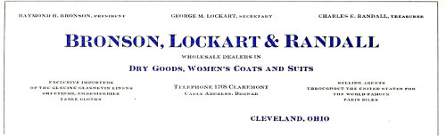
EXAMPLE 275
Neat, conventional treatment of a letterhead containing a large amount of copy. The bold-face type lends variety to the heading and brings out important points
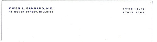
EXAMPLE 276
Professional stationery must be treated with dignity and refinement. The type should be small
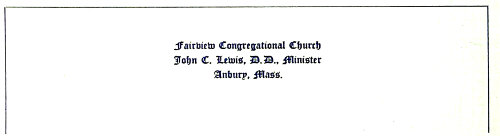
EXAMPLE 277
Suggested treatment for church stationery of the conventional kind. A text letter is appropriate and is usually satisfying
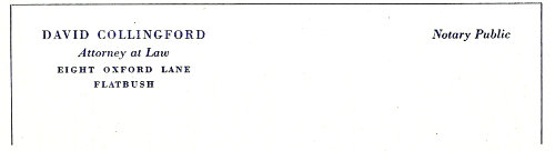
EXAMPLE 278
As a change from the style shown in Example 276, professional stationery could be treated in this manner in one body size of a modern job type
111
LETTERHEADS & ENVELOPS
Is there a standard size of letter sheet and envelop for
commercial correspondence? A look thru the letter files of
any business house will reveal the interesting fact that
most of the letters are on sheets measuring 8½ × 11 inches.
Letter sheets of about this size have been in use for many
years. From De Vinne’s Price List of 1871 we learn that
10 × 16 inches (8 × 10 folded) was the favorite size of letter
sheet, and that for commercial letters the size 10¾ × 17
inches (8½ × 10¾ folded) was sometimes required.
Note sheets were
then in two sizes:
Commercial note, 8 ×
10 inches (5 × 8 folded);
and packet note,
9 × 11¼ inches (5⅝
× 9 folded).
The typewriter and
modern commercial
requirements have
since developed use of
the single leaf, altho
for personal correspondence
and certain
refined business purposes
the folded note
sheet is proper.
In passing it might
be noted that in the
price list above mentioned
the printer is
urged to charge an
increased price when
“brass or French flourishes are used in excess.” The composition
of “one plain heading, of not more than four
straight lines,” was to be charged at seventy-five cents;
“one ornamental heading with curved lines,” twenty-five
or fifty cents additional.
EXAMPLE 279
This elaborate border continued around the entire sheet. In the original the colors were subdued and harmonious and on a brown-gray hand-made paper
EXAMPLE 280
A suitable type-face symmetrically arranged, with a harmonious decorative device
As has been stated, the standard size of the present-day
commercial letterhead
is 8½ × 11
inches. Strange to
say, the standard size
of envelop (known as
No. 6¾ Government)
used for the carrying
of these letter sheets
measures 6½ × 3⅝,
tho if a snug fit were
required the envelop
would be about 5¾ × 3
inches. The standard
size, however, should
usually be selected,
as all sorts of enclosures
are made to fit it.
The large “official” envelop is also used extensively
for business purposes, the most common size (No. 10 Government)
measuring 9½ × 4⅛ inches. It takes a letter
sheet of two parallel folds, and also provides for business
and advertising enclosures larger than those planned for
the standard envelop of smaller dimensions.
Distinction is given business stationery by folding the
standard letter sheet twice so that, folded, it measures
5½ × 4¼ inches, and by using an envelop (Baronial) that
measures an eighth or
a quarter of an inch
larger each way. For
private or semi-private
purposes this
kind of envelop is
preferred, especially
if the letter sheet is
used as a double note
sheet. The heading
is frequently printed
on the fourth page
of the double note
sheet, so that when
the message is written
on the fourth and
first pages and the
sheet is opened, the
letter appears as two
pages in a book.
Another size of
men’s personal correspondence
sheet
measures 5 × 8 inches folded once. After being written
upon the sheet is again folded, and it then measures 5 × 4
inches. When the customer is willing to pay a price for
which the best quality of stationery may be furnished, the
printer should secure from houses specializing in society
stationery envelops that are made with a more stylish flap
than those commonly
used for business purposes.
Another size of letter
sheet, used for
men’s personal correspondence
and for
giving an exclusive
appearance to commercial
stationery,
measures about 7¼ ×
10½ inches. The
paper is given two
parallel folds and fits
in an envelop that
measures about 7½ ×
4 inches.
112
EXAMPLE 281
Artistic treatment in squared effects
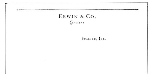
EXAMPLE 282
A simple treatment of a heading with little copy. Capitals have been letterspaced a trifle
Since the typewriter is in such general
use, ruled letter sheets are seldom called for;
in fact, ruled correspondence sheets of any
kind are now in poor taste.
The old-time notehead is also little used,
the half-letter sheet (8½ × 5½ inches),
and the two-thirds letter sheet (8½ × 7⅓
inches), printed the broad way, taking its
place for brief business messages.
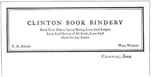
EXAMPLE 284
The heavy border effect of the Colonial style of typography gives character to this heading. By Arthur Nelson
The typographical treatment of letterheads
and envelops should have some relation,
and it is now generally conceded that
the paper should be the same in both cases.
A good grade of paper is now considered
essential for bona-fide correspondence, a
cheaper grade being allowed for form letters.
A light-weight paper of a high grade is
preferable over a heavy-weight paper of a low
grade. Quality isn’t a matter of weight, altho
if it can be afforded the heavier weight is not
in the least objectionable. Twenty-pound folio
(17 × 22) seems to be most easily obtained in
the various papers.
As to the style of typographic treatment,
the printer must in all cases consider the tastes
of his customers, and especially the business or
profession for which the stationery is to be
used. As an instance, the style of typographic
treatment of doctors’ and lawyers’ stationery
seldom changes.
It should be kept in mind that simple, neat,
refined typography is appropriate for almost
every order of stationery, while elaborate typography
in many cases is inappropriate.
Color is seldom well used on stationery.
Most letterheads that the writer has seen
which have been treated in three or four colors
would have been more pleasing if given
but one printing. A test of typographic skill
is to design a letterhead that in one printing
will look attractive and distinctive. The heading
should usually be printed in black or some
darkened color, and if another impression is
desired a very small part of the design printed
in orange or vermilion will add a touch of
bright color.
All the reproductions shown are reduced in
size, those on the inserts being only slightly
smaller.
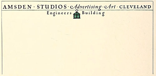
EXAMPLE 283
There is a great deal of character in this simple letterhead design. The lantern is really a monogram. By Charles R. Capon
Example 275 (Insert).—Lithographers and
steel-die printers really furnish the styles for
the conventional arrangement of letterheads.
They work along standardized lines and usually
produce well-balanced, appropriate headings.
Typographical printers should study stationery
produced by these processes and observe how
the parts of headings are grouped and the advertising
points emphasized; for a letterhead
is one form of advertising. There are limitations,
however, in the copying of such letterhead
arrangements. Only plain designs should
be studied for this purpose. Imitations of shaded
and ornamental lettering are seldom successful.
Example 275 demonstrates how a good
letterhead can be designed along lithographic
lines. The effectiveness of this heading depends
a great deal upon the use of both light-
and dark-faced type. Where there is a great
deal of matter, as in this instance, the heading
113would likely appear flat and uninteresting and
would lose some of the advertising qualities it
possesses if the light-faced type were used thruout.
This is no argument for bold-faced type
on stationery headings as a usual thing, but refers
to the kind of heading here shown. The
parts in the dark-faced type include the firm
name, the nature of its business and the city
in which the firm is located. The names of the
officers are arranged in the upper part of the
heading, and this position of the names seems
to be satisfactory in most instances. The telephone
number and cable address are in the center
near the date line. The type used in this
heading is Card Litho and Card Light Litho.
Example 276 (Insert).—Professional stationery
must be treated with dignity and refinement,
and the type should be small. Treatment
such as this would undoubtedly meet with
approval from the professional customer. It
would be a mistake to apply to professional stationery
the variety of attractive and interesting
arrangements that are applicable to stationery
used for many business and advertising purposes.
The printer would save resetting of the
work and more surely please his customers if,
in filling orders for doctors, lawyers, architects,
engineers and other professional men, he attempted
nothing but the conventional dignified
treatment illustrated by this example. The
type is an imitation engravers’ gothic slightly
letterspaced to give the effect usually found on
steel-die work.
Example 277 (Insert).—Ministers, included
as they are in the professional class, like to
have their stationery dignified and neat. At
the same time they do not object to the use of
text type, as it has a churchly suggestion. This
type, too, must be small, that used here being
eight-point in size.
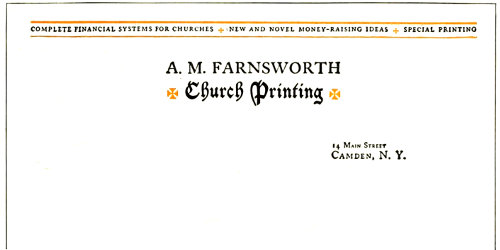
EXAMPLE 287
Suggestion of the ecclesiastic in the design of a letterhead for a church printer
Example 278 (Insert).—Stationery for a
lawyer, like that for a doctor, should be dignified
and refined. It is well to give him the
professional customer’s style of typography
such as that of the doctor’s heading, but if a
departure is to be made from the imitation
steel-engraved lettering, it is possibly well to
use a modern style of type such as the Bodoni,
and letterspace the capitals, as was done in
this example. But one size of type-face has
been used here (eight-point), capitals, italic,
and small capitals being utilized.
Example 279.—Practically never should a
letterhead be treated with the elaborateness
of this one unless the customer expressly desires
such treatment and is willing to pay for
it, or the letterhead is the printer’s own, as
in this instance. The reproduction, unfortunately,
does not present the rich qualities of
the original, which was printed in green-gray
and red-gray on a gray hand-made paper. The
typography was merged with the paper stock,
and there was not the contrast found in the
reproduced specimen.
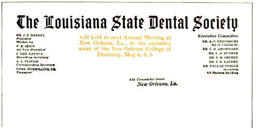
EXAMPLE 285
On which a meeting is advertised
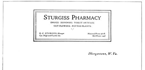
EXAMPLE 286
A panel, when well treated, gives distinction to stationery. By Arthur Nelson
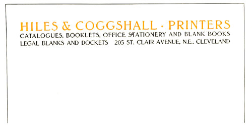
EXAMPLE 288
Artistic yet simple arrangement, the feature of which are the three lines of equal length. By Leon I. Leader
Example 280.—Old-Style Antique, as this
heading shows, is a good type-face for the letterhead
of an art publication company. Capitals
have been used thruout and grouped so as
to form a symmetrical arrangement that harmonizes
well with the decorative device placed
114under it. A feature of this heading is that
all matter is included in the one group, excepting
the name of the city, which is
placed to receive the date line.
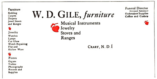
EXAMPLE 289
Letterhead for a storekeeper selling a general line of goods
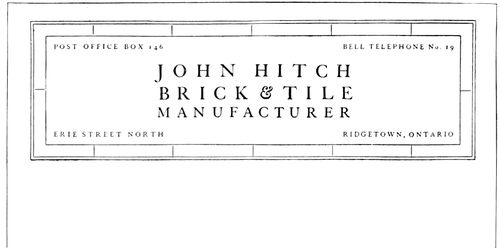
EXAMPLE 290
Panel treatment that suggests the business. By Arthur Nelson
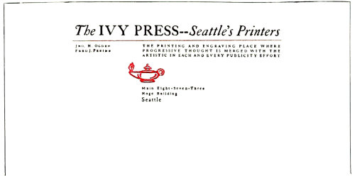
EXAMPLE 292
Unique arrangement of a distinctive heading. By Harry A. Anger
Example 281.—Successful treatment of
a heading like this depends upon the typographer’s
ability so to arrange the copy,
without resorting to letterspacing, that all
lines are the same length. It is necessary
also to use all capitals of an old-style face
of dark tones in which the letters set fairly
close together, a result such as can be had
with Old-Style Antique or Cloister Oldstyle.
The decorative device in its shape harmonizes
with the formation of the group of type
lines above it. The liberal blank space that
surrounds this heading is an important factor
in its attractiveness. The original was on brown
paper.
Example 282.—When the printer receives
copy as brief as that used for this letterhead
he experiences difficulty in producing an effect
that will be attractive. With the customary
engravers’ type-faces nothing very satisfactory
is possible, but by using a type-face of character,
such as Caslon Oldstyle in its original
form, as was done here, artistic interest can be
added. Two sizes of capitals, spaced, were used
for the firm name. Italic was selected for the
word “Grocers,” with a swash or decorated capital
that accompanies the old Caslon type-face.
Capitals and small capitals were utilized for the
date line. A touch of decorative interest was
added to the heading by the use of a rule, on
each end of which was placed a dagger, such
as is usually a part of book fonts. This treatment
could be made even more effective by
printing the letterhead on a white bond paper
of good quality.
Example 283.—This letterhead is offered as
a suggestion for artistic treatment when not
much copy is furnished and it is possible to
use a small decorative device. The type-face
should have old-style qualities of an artistic
nature and should be slightly letterspaced.
The lantern device on this heading is really a
monogram, cleverly designed. The original was
in black and orange on buff-tinted paper, and
as shown by the reproduction, the heading
was placed very high on the sheet.
EXAMPLE 291
Dignified yet novel treatment
Example 284.—For some reason a border
made of a heavy line and a light one harmonizes
with the type matter in Caslon Oldstyle,
especially when liberal blank space separates
the type and the border, as in this instance.
It is well usually not to have the border
darker in tone than the type matter, but on
this heading it would be a mistake to lighten
the border, which, however, would look well
printed in vermilion or orange ink. A buff-tinted
paper of an antique finish would blend
with the Caslon typography. It is a departure
from conventional methods to place the names
of the firm members in the lower part of the
panel. This was probably done so that the name
of the bindery would stand out without interference
from type matter above it, but as a concession
to conventionality it would probably
be well to place the names in the upper part
of the panel.
115Example 285.—The printer is frequently
called upon to arrange for an organization a
letterhead which contains an announcement of
the next meeting of the society. The example
under consideration shows how this may be
done; the meeting announcement is presented
plainly, yet a letterhead appearance is retained.
The name of the society crosses the
letter sheet and is joined on each end by a
group of officers. The reference to the meeting
occupies the space directly under the name of
the society. In the original the main part of
the heading, which now stands out so strongly,
was subdued by the use of gray ink.
Example 286.—There is suggestion of the
architectural panel about the arrangement of
this heading. The suggestion is continued by
the use of a classic Roman type-face mainly
in capitals. Panels are not as successful on letterheads
as they would be if more judgment
were used in forming them. This heading
should prove helpful in working out the panel
idea. Its proportions could be smaller with
good results. The original was printed with
green-black ink on a primrose color of bond
paper, but would also look well on white stock.
Example 287.—A letterhead is successful if
by its treatment it suggests the line of business
for which it is used. This one measures up in
that respect. By the use of the old text type
and Maltese crosses an ecclesiastical touch is
given. The old church missal books of the
manuscript days were brilliant in rubrication,
a feature of which were ruled lines, crosses
and initials in vermilion. The arrangement of
this heading is also one that could be used for
many purposes. Some of the facts about the
business are blended with rules in a decorative
band that gives breadth to the heading.
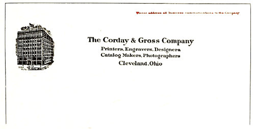
EXAMPLE 295
Neatness and dignity in letterhead designing
Example 288.—Letterheads arranged so that
all lines are the same length, especially if such
arrangement allows proper emphasis of the
firm name, usually look well and have artistic
interest. This heading is one such as almost
any printer with a good old-style type-face
could produce. Like Example 281, this treatment
requires the use of capitals. Lower-case
in square or block formation does not shape
up harmoniously. Capitals exclusively should
be used when such effects are planned.
Example 289.—A letterhead for a general
store invariably presents a problem to the
printer who wishes to produce a harmonious
and well-balanced heading. It is difficult properly
to display copy which includes such a variety
of articles as furniture, jewelry, stoves and
coffins. The typographer responsible for this
letterhead set it in Caslon Oldstyle, grouped
it as well as he could, and introduced decorative
value by means of florets printed in color.
The name of the merchant was given the most
prominence, and “Furniture” was featured
for the reason that it seemed to constitute the
principal part of the business. The printer who
objects to this arrangement should try his hand
at resetting it. As copy, this heading is in strong
contrast to that supplied for Example 282.
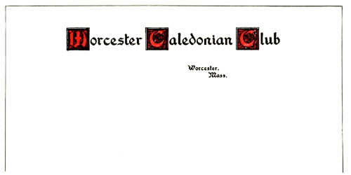
EXAMPLE 293
Individuality obtained by means of decorative initials
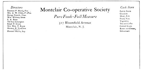
EXAMPLE 294
Just a neat typographical arrangement
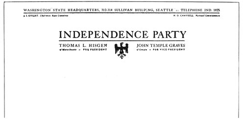
EXAMPLE 296
A heading in two groups. By Harry A. Anger
Example 290.—This example is a resetting of
a letterhead on which the printer had imitated
bricks by using oblong border units printed in
116red. His effort was too literal, and in rearranging
the heading the purpose was merely to suggest
bricks and tiles in a light-printing border.
Spaced Caslon capitals completed an effect that
is unusual and distinctive. The line “Brick
and Tile” could be printed in color.
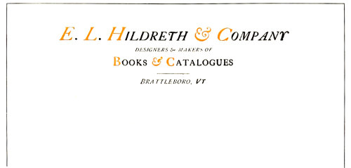
EXAMPLE 297
A neat letterhead and uncommon distribution of color. By Leon I. Leader
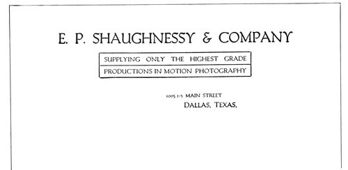
EXAMPLE 298
Double-panel treatment that is unusual
Example 291.—There is a dignified yet novel
attractiveness about this heading. The light
cross-rules give shape, and individuality is injected
by slightly spacing the letters and confining
the color to three small initials. Gothic
(sans-serif) type looks well treated in this
manner. As will be seen, liberal blank space
is necessary for a right effect. The original was
printed in black and vermilion ink on gray
bond paper.
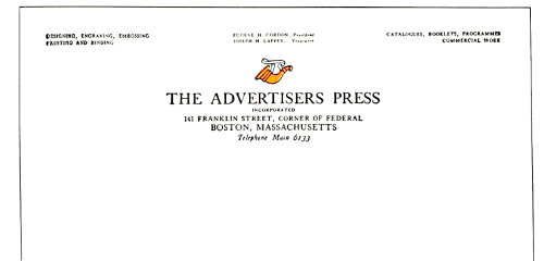
EXAMPLE 300
A letterhead in Caslon roman capitals and italic lower-case, with touch of color in the distinctive shop mark
Example 292.—The designer of this letterhead
planned to get something different and
succeeded. He did it, too, with the good old
Caslon type-face. This type has proved its
worth in commercial job work, and there
seems to be no limit to its usefulness. By spacing
the letters in this heading a peculiar tone
has been obtained which gives the letterhead
much of its character. The position of the lamp
ornament is odd. Black and orange ink and
white paper were used.
Example 293.—While it is safer to print club
stationery in the conventional style of professional
stationery, there are clubs which will
appreciate any individuality and attractiveness
the printer may introduce on the letter sheet.
This heading is a suggestion of what might be
done in this direction. Washington Text has
been combined with decorative initials.
Example 294.—The problem here was to
produce a letterhead for men who appreciate
typographic neatness, and the problem was met
by setting the heading in Caslon lower-case
and introducing italic in several places where
it would be of the most value. As will be seen,
the names of the officers were grouped on the
left, and balanced on the right by a group that
tells of the things the store has to sell. It is
likely that copy such as this would meet with
different treatment from the average compositor,
who would be inclined to distribute
the copy over all parts of the letterhead. The
lesson to be learned is that the several parts
of copy should be orderly apportioned to positions
on the letter sheet, as in this instance.
Example 295.—This is an excellent example
of a good letterhead, originally produced by
the incised copperplate method. Study of its
details would benefit the typographic printer
for the reason that, as mentioned in the beginning
of this chapter, designers of letterheads
produced by lithographic and intaglio processes
have given much thought to letterhead
arrangement. The main part of the heading
is symmetrically arranged in a group in which
attention has been given to spacing. The illustration
is disposed of at the left, and an added
line has been placed in the upper right corner
and printed in red. The neatness and dignity
of this letterhead are an inspiration.
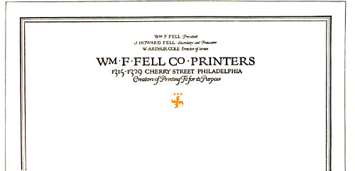
EXAMPLE 299
Distinction in letterhead design. The rule border, which extended around the entire sheet, was in a shade of ink lighter than that used for the type
Example 296.—The copy of this letterhead
presented a problem which was solved by making
two distinct groups of the type matter. In
the main group were placed the matters of national
117importance, and in the upper group in
smaller type such copy as refers to the state
organization. Compositors should observe how
the “Y” at the end of the main line has been
extended into the margin so that the group
alignment might be retained. The printing
combination was black ink and white paper.
Example 297.—Perhaps the use of italic capitals
exclusively would have been more consistent,
yet the one line of roman capitals does
not detract from the pleasure the neatness of
this heading affords the admirer of good printing.
The distribution of color is uncommon.
The italic short-and (&) adds a touch of decoration
to the heading. Typographers will find
that these old-style italic short-ands look well
in display lines substituted for the spelled-out
“and.” The roman short-and (&) is severe in
character and is not so pleasing.
Example 298.—Occasionally it is advisable
to inclose type matter in a panel, altho in most
instances the typographer will find that a letterhead
is neater if no rule panel is used. However,
there is something attractive and different
about the panel treatment of this letterhead.
Without the rules the heading would be
neat, but would lose a distinction that is now
given it by the rules. The type-face, Packard
Oldstyle, possesses a quality found in hand-lettering
and looks well on this heading.
Example 299.—A line border finishing off the
edges of the letter sheet adds a quality to the
appearance of the stationery that makes it
worth while when the printer uses the idea on
his own stationery or a customer is willing to
pay the increased cost necessary for such an
effect. On the Fell letterhead the border was
in a shade of ink lighter than that used for the type. The
arrangement of the heading is worthy of study, especially
the disposition of the officers’ names, which are placed one
under another instead of being conventionally arranged
in a line at the top of the sheet. While this heading is
hand-lettered, it is suggestive of similar effects that could
be produced with good type-faces of an old-style design.
Example 300.—Another letterhead in the Caslon type-face,
roman capitals and italic lower-case being used.
Much of the attractiveness of the heading is due to the
spot of decorative color made by the shop device, which
in design blends well with the type-face and because of
its position brings the eye to the title of the press. The
names of the officers are placed above the center, and the
service rendered by the press is outlined in the end groups.
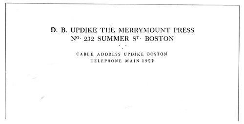
EXAMPLE 303
Type arrangement as used by a noted typographer. Printed on the fourth page of a folded note sheet
Example 301.—The cross-line panel is here adapted to
letterhead purposes with some success. The decorative
border is a suitable one for such arrangement and affords
relief from the plain brass rule. However, it only departs
from the plain rule sufficiently to add an interesting touch
of irregularity to the lines. Text type has been used for
the center, and where Caslon capitals are found in the
panel they are letterspaced.
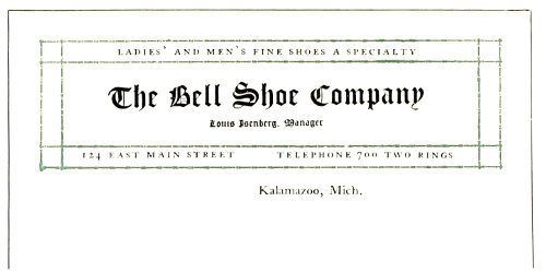
EXAMPLE 301
The crossed-line panel successfully adapted to letterhead purposes. By Adams-Brander Company
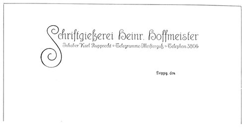
EXAMPLE 302
A German idea in letterhead treatment
Example 302.—While German treatment in advertising
design and typography is usually thought to be strong
and forceful, yet certain classes of work are produced in
a dainty yet characteristic style. This letterhead is presented
because of the interest it will doubtless have to
American printers.
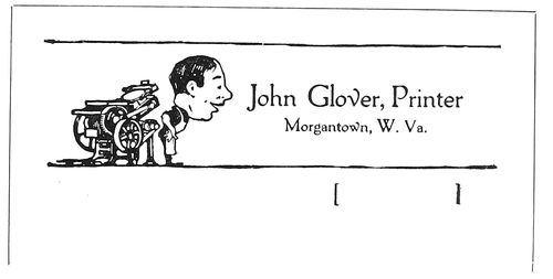
EXAMPLE 304
Humor in a notehead is exceptional
Example 303.—This notehead printed in two sizes of
capitals is interesting in that it is the work of a noted
book typographer. The larger capitals are not letterspaced,
but the smaller ones are. A triangular formation of periods
118adds a touch of decoration between groups. This notehead
was printed on the fourth page of a folded sheet in
dull-finished black ink on white bond paper.
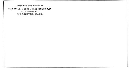
EXAMPLE 305
Conventional treatment of an envelop corner
Example 304.—Humor in a notehead is questionable
and should be used only in exceptional cases. Mr. Glover,
however, has used it to good advantage. Printing has always
been such a serious business that customers may welcome
a printer who can smile even on his note sheets.
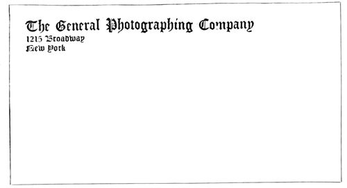
EXAMPLE 307
Envelop corner prominently treated in a decorative letter
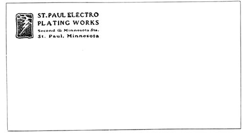
EXAMPLE 308
Harmony of device and type treatment. By Ray Greenleaf
The envelop is an acknowledged convenience in correspondence.
It not only protects the letter from being
soiled or tampered with, but is a convenience to the post-office
and a means of advertising. The first use that the
printed part of an envelop has is to inform the postal
authorities of the name and address of the sender so that
if a letter cannot be delivered it can be returned. On
government-printed envelops this information is given
in the briefest and plainest possible way. However, the
greater number of business men recognize the advertising
possibilities of the envelop, and not only have the paper
match that used for letterheads, but see to it that the typographic
treatment is also in accord with that on the letter
sheet. The treatment of the face of the envelop should be
neat. It is not only in poor taste to cover the envelop with
printing, but is against the post-office regulations. There
are those who prefer to print the type matter on the flap
of the envelop, and others who print the type matter in
the usual corner and the trademark on the flap.
Example 305.—This is a specimen of a conventionally
treated envelop corner in imitation steel-engraved lettering.
The old-fashioned “After five days return to” as here
used is not much in vogue, and printers would do well to
omit it unless the customer insists upon its inclusion. This
envelop corner is in the same style of typography as the
letterhead that accompanied it.
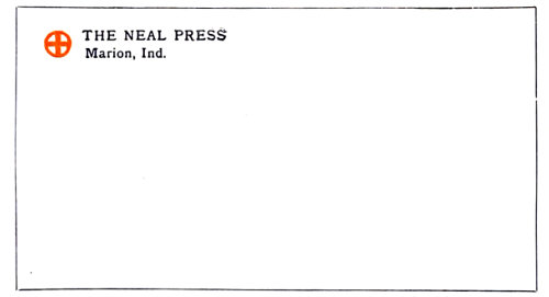
EXAMPLE 306
Distinctive and artistic treatment
Example 306.—Artistic interest of a medieval character
has been given this envelop corner by the use of Old-Style
Antique, and especially by the decorative device in color.
The design of this envelop is distinctive, and mail from
this source would easily be recognized after one or two
letters had been received.
Example 307.—Occasionally it is good policy to bring
out the name of the business in a prominent way, especially
if it can be treated in a decorative letter such as the
one used in this instance. Not every business will allow
of such prominent treatment, and in this matter the
printer needs to use judgment. The type has been aligned
at the left.
Example 308.—It is seldom that an envelop corner is
treated so harmoniously and artistically as the one under
consideration. The general character of the decorative device
is matched by the style of the type-faces used. The
squaring of the type group also adds shape harmony. This
corner card, designed some years ago, is proof of the fact
that good work is always good.
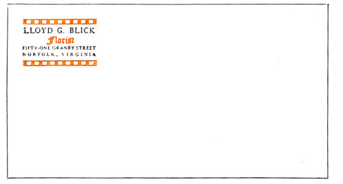
EXAMPLE 309
An elaborate envelop corner
Example 309.—Seldom should an envelop corner card
be as elaborate as this one, but when such an arrangement
is allowable, as in this case, the design shown is
worthy of consideration. The type-face is Caslon with
Caslon Text, and the bands are made by using square
ornaments with alternating blank space inside of rules.
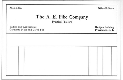
EXAMPLE 312
The non-stock-ruled type of billhead, with a panel in which name, date and other items are recorded. Showing use of roman lower-case
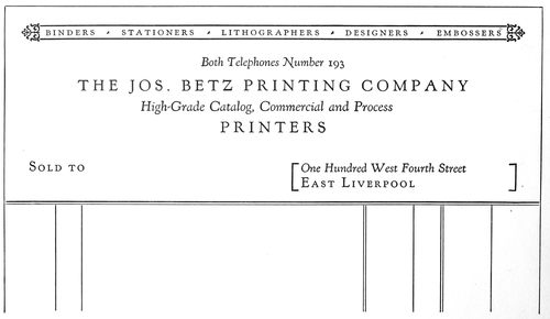
EXAMPLE 313
Remove the words “Sold to” and the rule work, and this could be used as a letterhead. Showing use of italic lower-case with spaced roman capitals
119
BILLHEADS & STATEMENTS
The printer called on to produce a billhead has a responsibility
seldom fully realized. He has a duty to himself,
to his customer and to those who come after, which is best
carried out by suitable and dignified type composition. A
business house has been known to use the same design of
billhead for fifty years, and it is a fact that many merchants
cannot be persuaded to change the style of the billhead,
no matter how homely it may be.
Billheads and statements should correspond in style to
that of letterheads
and other forms of
stationery, and in
changing the design
it must not be forgotten
that these other
forms should also be
altered to harmonize.
The paper should
be of the same finish
and color, and the
main features of type
arrangement similar.
The type-face must
be the same on all.
The standard sizes
of billheads for commercial
purposes are:
8½ × 5½ inches, 8 out of a sheet 17 × 22.
8½ × 7 inches, 8 out of a sheet 17 × 28.
8½ × 9⅓ inches, 6 out of a sheet 17 × 28.
8½ × 14 inches, 4 out of a sheet 17 × 28.
Professional billheads
are usually an
inch or two smaller
than the smallest size
of commercial billheads.
There is a variety
of sizes in statements.
Popular sizes
are those cut out of
folio (17 × 22 inches),
which then measure
5½ × 5⅝ inches, and
5½ × 8½ inches.
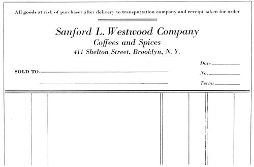
EXAMPLE 310
In which are presented the principal features of the average commercial invoice, or billhead. The customer’s name is placed in the lower left corner
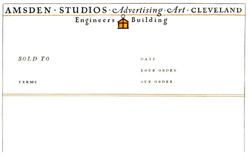
EXAMPLE 311
How a letterhead may be converted into a billhead. The upper portion is also shown as Example 283 in the chapter on letterheads
Whether ruled or
not, it is customary
to allow about 2¾
inches for the printed
heading on both billhead
and statement.
Because of the extensive use of “window” envelops,
the heading should be so arranged that the name and address
of the customer can be placed in the lower left part of
the billhead. The exact position can be ascertained by
placing a billhead over such an envelop and jogging the
two at the head and left side. When held to the light the
opening in the face of the envelop can be traced on the
billhead. The billhead is folded to fit the envelop and inserted
so that the name and address can be seen.
Use of the typewriter
and window
envelops has brought
a change in the arrangement
of billheads,
and printers,
whenever they have
opportunity, should
alter the old billhead
arrangement to conform
to the new requirements.
Most billheads a
quarter of a century
ago contained in the
upper right corner in
script (usually) a date
line, and under it at
the left was a dotted
line beginning with
a large script M. Immediately
following
came the firm name
(usually rather large)
flanked on the left
by the word “To,”
and on the right by
the abbreviation of
debtor, “Dr.” So the
apprentice boy was
taught, and he would
then be further instructed
to place the
words “Dealers in”
(or their equivalent)
in small type, centered;
then to display
the words indicating
the line of goods carried.
In a small line at
the lower right corner
was the street
address, and aligned
opposite were the
mystic words “Terms
Cash.”
120Sometimes the words “Bought of” were substituted
for “To” and “Dr.” The older printers
will remember the logotypes in various fancy
designs of the phrase “Bought of” that the
typefounders furnished in those days, which
logotypes were set against type lines of double
great primer caps. Now “Bought of” has been
supplanted on billheads by “Sold to,” which
directs attention to the fact that John Smith
has sold goods to Thomas Brown, rather than
that Thomas Brown has bought goods of John
Smith—a distinction without a difference, one
might say, yet there is interest in noting the
change.
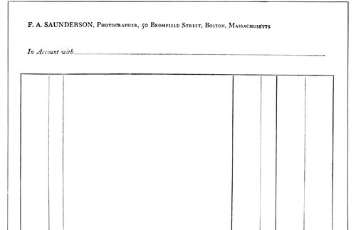
EXAMPLE 314
A billhead, or statement, in a classic non-display style of typography that suggests early printing. By D. B. Updike
The probable reason for the “M” being discarded
in recent years on commercial billheads
is that many business houses are now corporations,
which fact makes “Mr.” and “Messrs.”
no longer suitable as forms of address.
EXAMPLE 316
A suitable billhead with interesting border treatment. No guide lines have been used
Example 310.—This specimen presents the
main features of the average commercial invoice,
or billhead. Usually there are conditions
of sale which can be placed at the top of the
heading with a rule underneath, altho they are
sometimes arranged at the side or at the foot of
the invoice. The name of the company is given
most prominence, followed by mention of the
commodity or product. The number, street and
city naturally should be displayed so that the
customer’s location can be referred to quickly
in correspondence. “Sold to” precedes the
space left blank for the customer’s name, and
this, as has been explained, should be in the
lower left corner. Blanks for the date, terms,
invoice number, ledger number, customer’s order
number and other notations of record may
be grouped in convenient open spaces.
Example 311.—The composition of a billhead
really begins with the composition of a
letterhead. It should be possible to take any
letterhead and by adding a few lines convert it
into a billhead. The specimen under consideration
shows how this is done. The original of
this billhead was exhibited as Example 283 in
the preceding chapter. The conventional phrase
“Sold to” is placed in its customary position
and the other phrases added at suitable spots.
Printers should keep this suggestion in mind
and, when laying out a billhead, design the upper
part as they would a letterhead.
EXAMPLE 315
Typographic art and good taste, as demonstrated by this specimen, have a place on billheads as well as on books
Example 312 (Insert).—This is an interesting
representative of the non-stock-ruled
heading, and it also illustrates the changes the
typewriter has wrought in billhead printing.
When bills were written in by hand, script type
and dotted rule prevailed, but because of the
use of typewriters, script and horizontal guide
lines are gradually disappearing from the face
of billheads. The example under consideration
also demonstrates the effectiveness of Caslon
lower-case for billhead purposes. When every
line is in roman lower-case there is harmony,
but sometimes there is also monotony. In this
instance, however, the introduction of italic
and small caps would alter the plan of the
heading and detract from its distinction. The
rule border and the panel for the insertion of
customer’s name and address give distinction.
121Example 313 (Insert).—There is here another
demonstration of the transformation of
a letterhead into a billhead. Remove the words
“Sold to” and the ruling at the foot and the
form is ready for the letter sheet. Kennerley
type, altho primarily a book face, is also usable
on stationery where neat, distinctive effects are
desired. Capitals are spaced (as in the old
books of Aldus), and italic is used with the capital
lines, this use of italic also being suggested
by the work of the Aldine Press. However, the
specimen is not intended to be in the classic
spirit of Aldus; it is merely a modern commercial
suggestion.
Example 314.—Here is a billhead, or statement,
in classic typography that suggests the
style of the fifteenth century. The heading
is practically in one size of type. Advertising
distinction is obtained by using capitals for the
name, capitals and small capitals for the business
name and address, and italic for “In account
with.” There is not much that is striking
about this billhead, yet, printed on a fine quality
of writing paper, it would make one really glad to
receive a bill of this kind.
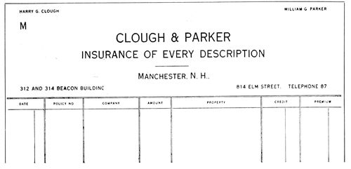
EXAMPLE 318
Invoice with lower portion divided into columns, as sometimes used in business
Example 315.—D. B. Updike makes plain by this specimen,
as well as by the preceding one, that typographic art
and good taste can be used in the designing of a billhead as
well as in the designing of a book. The woodcut device has
the same good quality as the typography. The old-fashioned
“M” and “Dr.” are used, and blend well with the old
dignity of the heading. The ruling on the lower part of
both of these headings was printed from rules. There are
other good printers who prefer brass rule to the ruling
machine for billhead purposes. Machine ruling is convenient,
but is not in good taste for billheads, statements and
letterheads of really fine quality.
Example 316.—The stationery of a book dealer should
have a bookish character—that is, the typography should
be inspired by the same skill and taste evinced in the treatment
of a good book. A well-designed type-face should be
selected, and there should not be a great contrast in the
sizes used. When it is possible to have two printings, the
extra impression could take the form of a simple rule
border in color, as on this specimen. The first type line runs
almost from border to border at the head, and another portion
of the copy is arranged directly under it in three even
lines. The “Sold to” occupies its approved position. No
guide lines are provided for the accountant’s part of the
bill, as with a typewriter the various items can better be
filled in without them, and a billhead really looks neater
without the rules.
Example 317.—For printing on colored
stock strong treatment is sometimes advisable—treatment
such as has been given this heading.
On white paper the type sizes should be
kept small, as the light background illuminates
the print. White and black form the greatest
contrast. There is not much contrast between
blue ink and blue paper, for instance, and it is
necessary to strengthen the print by the use of
a larger or bolder type-face. The arrangement
shown is unconventional. A full line has been
made of the business title, the name itself being
slightly emphasized by printing it in color and
giving an initial effect to the first letter. Other
parts of the copy are grouped at suitable
points, “Sold to” occupying the usual lower left
corner.
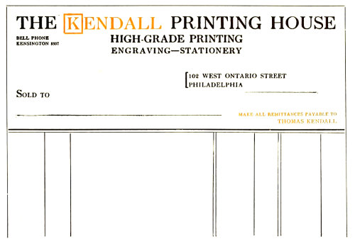
EXAMPLE 317
Large treatment that would look well in harmonious colors on colored paper
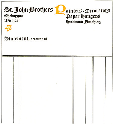
EXAMPLE 319
Decorative type treatment suitable for the business of painting and decorating
122Example 318.—Many invoices and billheads now have
the lower part divided into columns for taking care of the
various items peculiar to the business, as in this instance.
The customer usually decides when he wishes to depart
from the conventional ruled effect, and it is just as well for
the printer not to suggest a change of this sort, as it means
extra composition for which the customer may be disinclined
to pay. The type-face on this well-arranged example
is a good one for plain commercial headings. It would be
well, for convenience, to place the “M” in the lower left
corner and move the building address to the right corner,
over the street address.
Example 319.—A decorator’s stationery seems to offer
opportunity for effects away from the customary plain
treatment of the average heading. This statement, in the
same style as a letterhead that accompanied it, shows a
decorative type-face and an arrangement that could possibly
be called decorative. The upper two type groups are
joined by the uncial initial, and the two groups at the left
are connected by the flower ornament.
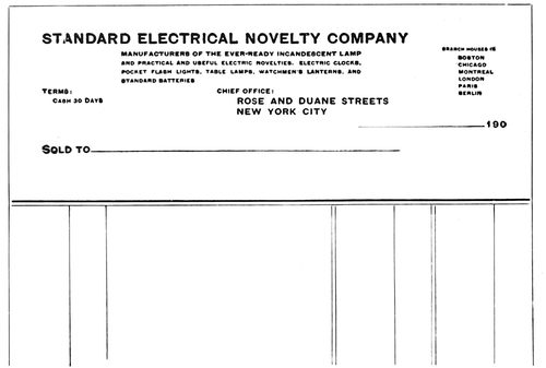
EXAMPLE 320
An uncommon arrangement. The main type line tells the story, as the company’s title describes the business
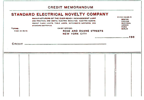
EXAMPLE 321
Credit bill made from the preceding billhead by adding a line at the head and changing “Sold to” to “Credit”
Example 320.—This is an unusual arrangement for a
billhead. As the business is stated in the firm name, there
is not the usual necessity for a second display line. While
this arrangement could be carried out in some
other type-face, the serifless “block” letter as
here used is not displeasing. The grouping of
the branch houses is good, and other groups are
also well placed.
Example 321.—Most business houses find
need for credit bills, to be used when goods are
returned or some error has been made in billing.
Such forms are easily provided by using
the billhead, adding the words “Credit Memorandum”
at the head and changing “Sold to” to
“Credit.” In order that credit bills may look
unlike regular bills, they should be printed in
color as is here shown.
Example 322.—All professional stationery
should be refined. The sizes of paper and type
should be small and the whole effect restrained
and polite. Such work seldom changes in style,
and consequently there is little variety. The
form shown here would probably prove acceptable
for many years to men of the medical and
similar professions.
It may not be out of place to remind the
reader that an invoice (or bill) is a list sent to
a purchaser or consignee, containing the items
and charges of merchandise that have been
forwarded to him.
As to the statement: It is a common practice
to send each customer at the first of the month
a statement showing the debit balance of his
account to date, whether it is due or not, enabling
him to compare the statement with the
ledger account. In order to call the attention of
customers to the fact that payment is desired,
many business houses send a statement whenever
a bill is due (when goods are purchased on
January 10, as an instance, at ten days, a statement
is sent January 20).
There are numerous other forms used in
business, such as checks, deposit slips, drafts,
promissory notes, bills of lading and the like,
but there is not space to show them here.
Such forms, if possible, should be in harmony
with the style of the letterheads, billheads and
other stationery. The same type-face should be
used and the arrangement of display parts
should have similarity.
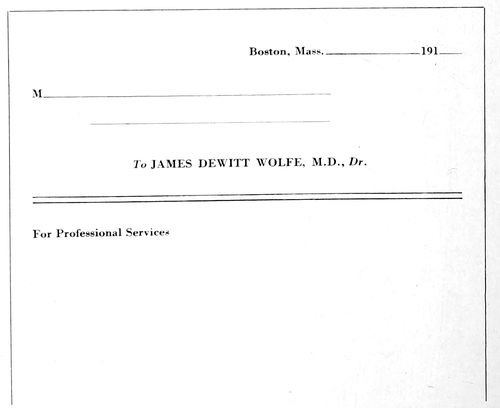
EXAMPLE 322
On professional bills the paper and type should be small and the treatment restrained and polite
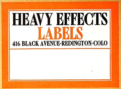
EXAMPLE 323
A label that catches the attention at a distance and looks well on the background of wrapping paper
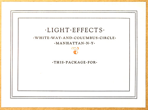
EXAMPLE 324
A label of classic simplicity for small packages and a business that emphasizes daintiness and delicacy
123
PACKAGE LABELS
The effect of an attractive package is recognized to be of
such importance that a widely known manufacturing concern
recently sued a competitor for imitating the appearance
of its packages and labels. However, not all business
men feel this way about it.
After spending time and money in the production of merchandise
of high quality, it is more than foolish to economize
on the packing.
It is possible, with
good clothes well selected,
to make an unattractive
person attractive,
and it is also possible
to make an attractive
person unattractive by
poor clothes ill selected.
Apply this.
The wrapping paper
should be strong, and of
color and finish suited to
the article to be wrapped.
Some stylish city
dry-goods houses use
paper with distinctive
stripes or small monograms
printed over its
surface. A well-known
haberdasher wraps his
hats in soft black paper.
The selection of the
wrapping stock should
of course be governed
by the character of the
business and the class
of customers, but as in
similar instances, it is
dangerous to underestimate
the taste of
one’s customers. The
persons who lack appreciation
of a neatly
wrapped and attractive
package are very
few indeed.
Among merchants,
druggists are known to
wrap the neatest packages.
This seems to be
due in part to their professional
training. Not
many printers give
their product a similar
attractiveness at the
time of delivery.
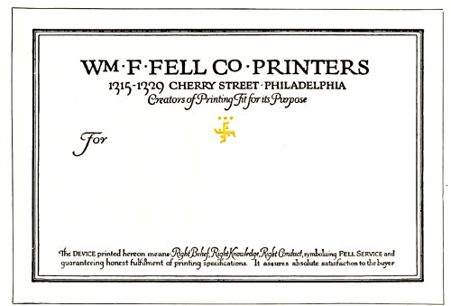
EXAMPLE 325
A hand-lettered design for typographic study
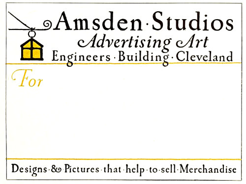
EXAMPLE 326
Another label rich in suggestion
The art of making
a good impression also includes the fastening of the wrapper.
Cord and twine are commonly used, and interest is
sometimes added by selecting appropriate colors. Linen
tape for a business of an exclusive nature gives distinction.
Gummed-paper tape, while convenient, seldom looks
well, and when printed on looks worse.
Corrugated board when properly used adds both neatness
and protection to the
package. Some printers
have cartons made
from this board, in which
their product is packed
and delivered.
The printed label is
of the most interest, as
it affords a spot of attraction
and furnishes
information needed in
the delivery of packages.
All labels should
be planned with the
wrapping paper as a
background. A label
may look well alone,
yet when placed on
the package may appear
weak and uninteresting.
In order to test this,
two labels of contrasting
treatment are pictured
mounted on a
sheet of conventional
wrapping paper.
It will be admitted
that the stronger label
is more striking and
catches the attention.
There are those who
will prefer the weaker
label because of its
neatness and beauty,
yet we must not lose
sight of the fact that
labels, unlike business
cards and letterheads,
are not usually seen
at close range when on
packages. A business
card is examined a few
inches from the eyes,
while a label on a package
is frequently viewed
from a point several
feet away.
124
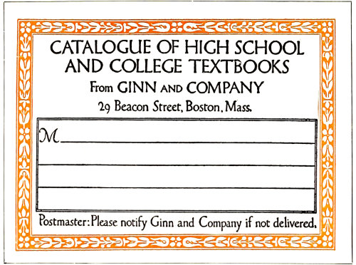
EXAMPLE 327
Ruled lines for the address, in panel
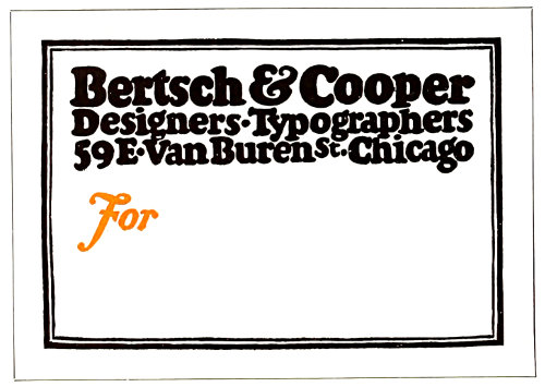
EXAMPLE 328
A mass of black lettering with contrasts
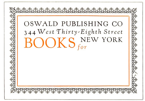
EXAMPLE 329
Artistic quality and interest through typography
There does not seem to be any standard size
for labels. They vary from four, five and six
inches wide to three, four and five inches high.
When The American Printer conducted a label
competition it specified the size as five by four
inches, and this seems to be a good average
size.
The paper on which the label is printed
should be stock that pastes easily. White is
used to the greatest extent, altho a cream-tinted
color such as comes in Japan vellum is
preferred by some persons of good taste.
Example 323 (Insert).—As has been said,
this label shows the effectiveness of heavy effects.
A design such as this has advertising
value. It can be seen and read at some distance,
yet is not offensive in appearance. The red border
is attractive, and merges the label with the
wrapping background. The type-face has decorative
quality. The combination of black, red
and cream in strong contrasts is worthy of
study. As will be noticed, all capitals have been
used, and there is not much space between the
lines or between border and type-face.
Example 324 (Insert).—For small packages
and for a business that places emphasis on
daintiness this label treatment would be just
the thing. The classic simplicity of its design
and the mere touch of color should appeal to
many. The main line is set in fourteen-point
capitals and the other three lines in twelve-point
small capitals. Letterspacing adds decorative
interest and merges the letters with the
background by allowing the paper to show
thru. The type-face is Goudy Oldstyle. The
dots between the words are hyphens slightly
cut. The border is arranged to suggest an architectural
panel. This label and the preceding
one have been composed merely to suggest possible
effects. It would not be difficult to adapt
most label copy to the styles shown.
Example 325.—This and other hand-lettered
labels included in this chapter are presented as
studies for the typographer. Hand-lettered designs
by good artists are usually arranged with
much thought, and the details give many ideas
to those who have trained themselves to grasp
them. It will be noticed that the border of this
label is composed of three lines, a heavy and
light line close together and a light line a trifle
removed. At the head are two lines of roman
capitals and one of italic. Do not overlook the
smaller capitals “M” and “O,” and the close
spacing of the words in italic. The device is
small and in color. The use of roman lower-case,
capitals and small capitals and italic in
the lower group should be examined carefully.
While it is not possible to obtain exactly these
same results with type, they can be approximated
effectually. It is well, however, to emphasize
at this point that in approximating the
effects of any good piece of lettering it makes
a difference what type-face is used. It will be
noticed that the italic capitals in this specimen
have a decorative quality. Such an effect can
be imitated in a small way by the use of the
swash letters that are furnished with some old-style
italics.
Example 326.—This is another lettered design
that is rich in suggestion. No border is
used, and the lettering is arranged close to the
125edges of the paper. Contrary to the treatment
of the preceding example, the lettering is all
slightly spaced. While it is well for the young
compositor not to letterspace lower-case, such
practice is allowable when the results are good.
The effect here is one of antiquity, especially
since the letters are not perfectly formed (note
the “m” in the word “Amsden”). Caslon Oldstyle
should be used in planning this style of
work. An unusual feature is that a part of the
copy is placed at the foot of the label so that
the address is written between two groups of
lettering. The same plan is found in the preceding
example.
Example 327.—There is suggestion of Italian
art in this label. Similar effects could be
closely approximated with typefounders’ material.
Attention is called to the manner in
which the letters are treated so as to avoid an
excess of blank space in such groups as the
“ATA” in “catalogue.” Rule guide lines in a
panel are provided for the address. This space
is usually left blank on modern labels, altho
conservative houses are inclined to retain the
rules. In line with old ideas, the “M” is included
in the address portion. This letter is
usually omitted on labels for the same reason
that it is left off of billheads.
Example 328.—Closely spaced black-toned
lettering is still liked by some persons, and
there is no use denying that when it is well
rendered the effect is pleasing. This example
presents a mass of black lettering in three lines
of equal length, the lines merging with one another
to preserve the mass effect. The border,
formed of a heavy and a lighter line, is drawn
with human irregularity that is in keeping
with the character of the design as a whole.
The “For” in italic affords contrast in both
form and color. Also note the treatment of
“St.,” which is made small and placed in a position
above the base of the other letters. This
treatment is typical of antique typography.
Example 329.—That artistic quality and
interest may be put in a label form by means
of typography is proved by this example. The
lacelike border, the spaced Kennerley types
and the words and rule in red blend attractively.
Advertising value is present, yet it is so
merged with the general composition and the
label that it is not offensive. In fact, it adds
decorative qualities. This label form would
look well clearly printed on a rough-finished
paper of good quality—a hand-made paper if
possible.
Example 330.—Another typographic label
of character, a study in black and white. The
border (a combination of a heavy and a light
rule) was made intensely black to contrast
with the white background, an effect as of
color. A type-face (Bodoni Bold) with similar
strong contrasts was then selected, arranged
with liberal margins in the upper part. A suitable
ornament in dark tones added the picture
element, and the words “Deliver to” were
widely letterspaced, as they were used decoratively.
This and the other typographic specimens
indicate the possibilities that are present
in the everyday tools of the printer and the
material that is available. Many printers feel
that they are not able to produce typographic
work of real quality, assuming that special
equipment is needed. The truth is that many
are not able to produce good printing because
their type equipment and decorative material
have not been well selected. The fact that there
is a lack of suitable type-faces usually reveals
itself to them after they have learned that one
type-face is not so good as another. In the finished
work there is nothing seen of the presses,
of the imposing stones, or of the composing
frames, but the print of the type-face is on
every sheet.
EXAMPLE 330
A typographic study in black and white
EXAMPLE 331
A Caslon specimen, with decorative interest
EXAMPLE 332
Harmony of border, decorative device and lettering
126
EXAMPLE 333
Possible of typographic improvement
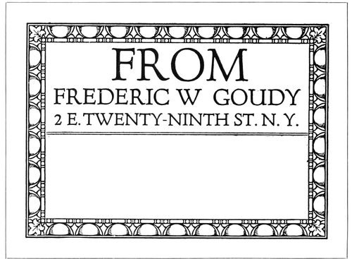
EXAMPLE 334
Freedom of treatment that is distinctive
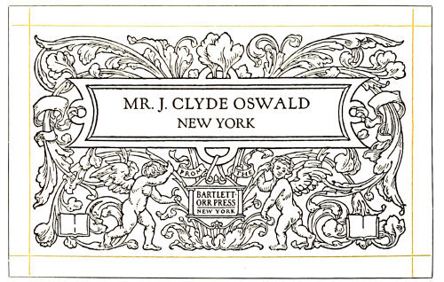
EXAMPLE 335
Label used for a special list
Example 331.—A specimen in Caslon, in
which roman capitals and italic lower-case
(the Aldine combination) make up an interesting
label. The swash italic capitals add a
specific decorative quality. The large lower-case
“f” gives a graceful touch to the “for.”
Dotted rule inside the black border is a change
from the conventional continuous line. This
form was printed on Japan vellum.
Example 332.—This is another hand-drawn
label with qualities that can be approximated
in typography. Border, decorative device and
lettering are in the same key, and the harmony
is agreeable. There are those who thoughtlessly
condemn black borders as funereal, a
judgment that is based on prejudice and not
on an understanding of their use. It is well,
however, to caution the young compositor
against abuse of the black border; it would be
well if he were to use no black borders until
he had developed taste in the practice of typography.
Example 333.—An unusual label design
that could probably be improved with careful
typography. The initials of the text lettering
are not exactly harmonious, and the space between
words in the lower group is excessive.
Printers should practice on the improvement
of the design.
Example 334.—A characteristic Goudy type
arrangement, with a freedom of treatment that
is distinctive. How many printers would give
the prominence to “From” that it has here?
This suggests the custom of printers of the
sixteenth century in starting a title-page with
a large size of type regardless of the importance
of the word or words.
Example 335.—This label was used in mailing
to a special list some fine pieces of printing.
The name of each addressee was printed
in with type as shown by the reproduction,
and, needless to state, attracted attention. The
treatment of this label is uncommon in another
respect—the modest inconspicuousness of the
phrase, “From the Bartlett-Orr Press, New
York.”
It would do no harm if printers also studied
the stock labels manufactured by certain
stationery houses. They will find much that is
poor and commonplace and little that should
be directly copied, but there are many suggestions
in label making that could be adapted.
The “reverse-plate” idea is one. The label is
set in type and a proof sent to the photo-engraver,
who makes a plate in which the letters
show white and the background black. This
plate can then be printed in color on gummed
paper and the paper trimmed so as to “bleed”
the edges of the printed background.
EXAMPLE 338
Forceful business-card treatment exemplified by band-lettering
EXAMPLE 339
Gray-brown stock is suitable for unconventional effects of this kind
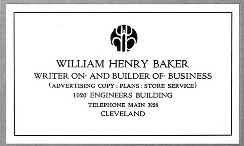
EXAMPLE 340
The black monogram has much to do with this card’s attractiveness
127
BUSINESS CARDS
Polite society requires that a visitor shall be announced
by a card bearing his or her name, and the courtesies of
business call for this same formality. The man called on
unexpectedly is placed at a disadvantage if he has not understood
the visitor’s name and has no idea of his business.
A card that clearly tells both name and business prevents
embarrassment and misunderstanding.
The card makes it unnecessary for the caller to explain
who he is. Without the printed information he would likely
need to introduce himself thus: “I am James Johnson. I
am president of the Johnson Manufacturing Company.
We manufacture machinery
for the making of paints.
Our office is at 320 Broadway.
Our telephone number
is Worth 4653.” But with
all this neatly printed or
engraved on a card, dignity
is maintained and embarrassment
avoided.
The sizes of business
cards are far from being
standardized. Examination
of about one hundred business
cards showed a range
of sizes from 3 × 1½ to
4 × 2½ inches. The size of
which there were most and
which gave an indication of
standardization was 3½ × 2
inches. Fully one-quarter of the cards were of that size.
From this investigation it would seem logical for printers
to use that size unless the customer orders otherwise.
White cards predominated in the lot examined, and this
suggests that it is in good
taste for the printer to use
white stock on most of the
business cards that he is
called on to print.
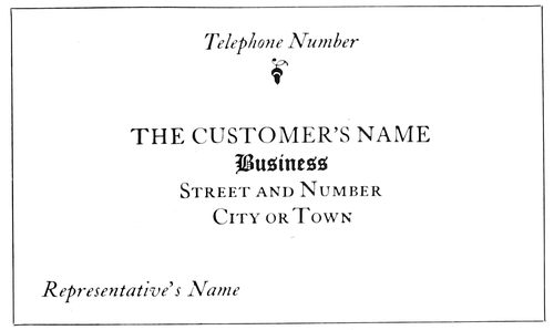
EXAMPLE 336
The probable result of an attempt to standardize the contents and arrangement of a business card
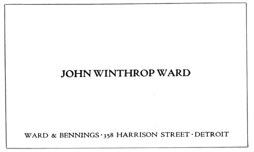
EXAMPLE 337
Dignified treatment for the card of a well-known house. The firm name and address are subordinated to the name of the person using the card. No business is mentioned, an omission open to discussion
Example 336.—If an effort
were made to standardize
the contents and arrangement
of a business
card, the plan presented by
this example would probably
result. The customer’s
name is placed at the point
of greatest prominence, a
trifle above the center of the
card. The words describing
the business are second in
position under the customer’s
name. The street and
number are taken care of on
the next line, and under the street and number is the name
of city or town. In the lower left corner is provision for
the representative’s name. The telephone number, for
which a business card is frequently preserved, finds place
in the upper part of the card. A variant for the position
of the street and number and the name of the city or town
is in the lower right corner.
Example 337.—Here is a card that is a model of dignity
and of simple business-card treatment. A good word can
be said in favor of using the individual’s name in the center
of the card and the firm name in a less prominent position.
When a card is handed
to a business man, he looks
at it first for the purpose of
finding out who it is that
wishes to see him. A card of
this kind tells him instantly.
In many cases the individual’s
name alone would be
sufficient. No business is
mentioned, as it is one of
those cases in which it is assumed
that the name of the
firm provides sufficient identity.
In omitting mention
of the business, one should
make sure that the firm is as
well known as he assumes it
is. If the name is not familiar
to the person receiving
it, he will be perplexed, not knowing if the visitor desires
to sell him books, insure his life, or buy a bill of
goods. In the typographic treatment of this card Cloister
Oldstyle, capitals, has been used for the smaller line and
Cloister Bold, capitals, for
the larger line. This slight
contrast in the strength of
lettering in many instances
gives quality and legibility
to steel-engraved and lithographed
business cards and
stationery. The printer by
having a well-designed type-face
in two strengths will
be able to introduce similar
good qualities in his work.
The spacing between words
on this card is closer than
that usually allowed by compositors.
Close spacing between
words is a quality
found in good lettering and
in good typography.
Example 338 (Insert).—While
128the main purpose of this chapter is to encourage
the use of typography on business cards, a specimen of
hand-lettering is used to point out forceful treatment that,
aided by good printing, liberal blank space and high-class
card stock, may sometimes be effective for business-card
purposes. The printer using a card of this kind would see
to it that it was not presented to a prospective customer
who had a dislike for anything unconventional.
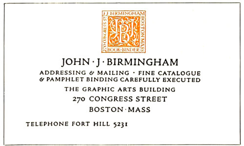
EXAMPLE 341
The monogram in color adds distinction
Example 339 (Insert).—Conceding that a conventional
arrangement on a white
cardboard is best for most
purposes, it cannot be denied
that a design of the
strength and interest of this
one would often be received
with pleasure by the man in
the business office. It is not
unlikely that the thought
would occur to him that the
printer who can produce a
card of this kind is qualified
to design and print publicity
matter equally attractive
for other purposes.
Bewick Roman is the decorative
type-face shown.
The border and ornaments
used are essential to the good results in this design. The
card would not be as pleasing with the ornaments or the
border taken off. This card, by the way, is one of the good
things arranged by Will Bradley back in 1905.
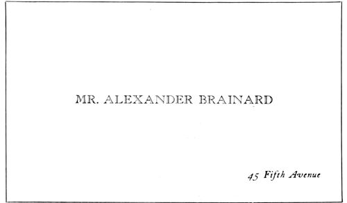
EXAMPLE 343
High-hat-and-frock-coat treatment
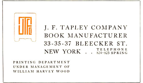
EXAMPLE 344
A business card in blocked capitals, with monogram of harmonious shape
Example 340 (Insert).—Quality is added by an attractive
black monogram on a background of white supplemented
by the gray formed by the type group. This is
an interesting specimen of business-card typography, suggestive
of architectural panel treatment. The lines (in
Cloister Title) are graded in size according to their importance,
the telephone line occupying an unusual position
between the street address and the name of the city. Because
of its position, it also adds a bit of legibility and
prominence to both of these lines.
Example 341.—This treatment is similar to the preceding
example, with the decorative device in color.
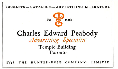
EXAMPLE 342
An uncommon typographic effect
Example 342.—This card is an interesting contrast to
those that have just been
considered.
Example 343.—Here is
a card French in motive and
of a style that emits exclusiveness.
It almost pictures
the high hat and frock coat
of the man who would probably
use it. All the formalities
are observed, the abbreviation
“Mr.” preceding the
name. The man who uses a
card of this kind would no
more think of mentioning
his business on a card than
he would of putting a business
sign on his residence.
The open-face type is College
Title and the italic is Caslon.
Example 344.—An unusual arrangement in blocked
Caslon capitals slightly letterspaced. Arrangements of
this kind are difficult for the compositor and should not be
attempted unless he is not hurried and can experiment
with the details of the composition. The shape of the
monogram lends itself to the general arrangement.
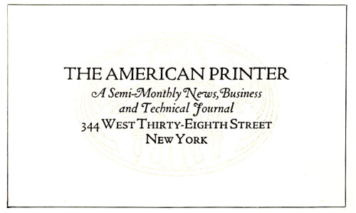
EXAMPLE 345
Arrangement as suggested in Example 336 with an underprinting decorative device
Example 345.—This is a compact arrangement built
129somewhat after the scheme outlined in Example 336. The
decorative device in the original was printed in a tint so
like the stock that it suggested a watermark.
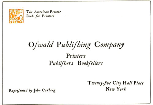
EXAMPLE 346
Roman capitals with italic lower-case
Example 346.—This card would better please the average
person if italic capitals were substituted for the roman.
However, there was a historical motive for treating it in
this manner. When Aldus Manutius introduced the slanting
style of type we know
as italic, only lower-case
letters were cast, and roman
capitals were used with
them.
Example 347.—The Germans
in the designing of
business cards seem to have
abolished conventionality,
as they endeavor to have
each card in its design possess
distinct advertising
value. This example is representative
of such effects.
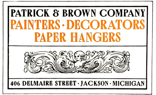
EXAMPLE 348
Decorative treatment suggested by the business
Example 348.—The designer
of this business card
took his cue from the word
“decorators” and endeavored
to form a card with
decorative values. This was the reason for the selection of
Bewick Roman for the type-face and the Italian ornament
to occupy space that is usually left blank on business cards.
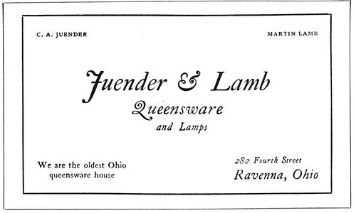
EXAMPLE 349
Italic is pleasing on some cards
Example 349.—When dainty effects are desired, Caslon
italic, as used on the greater portion of this card, almost
always looks well.
Example 350.-A strong ornamental effect, such as appears
on this card, is liked by some people, but the printer
would make a mistake to use it unless he was sure that the
customer would care for it. The typographic treatment is
simple and compact and lacks nothing in legibility. The
shape of the border corners fits into the space left by the
contour of the type group.
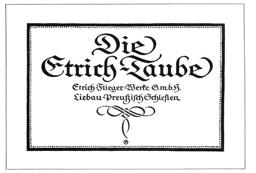
EXAMPLE 347
Modern German business-card treatment
Example 351.—An arrangement that has a suggestion
of the classic. All lines are in one size and in capitals. This
treatment should not be
used excepting in special
cases, as it would not meet
the approval of most customers.
Example 352.—In the
amount of matter it contains
this card contrasts
strongly with Example 343.
Some small business men
find it good advertising to
give as much information
on their cards as the size of
the card will allow. This example
shows how a great
deal of copy was treated so
that the general effect was
not displeasing. In order to
accommodate this amount of
copy, it is usually necessary to enlarge the size of the card
a trifle. Bodoni was used for all excepting two lines, the
firm name and address, which were set in Bodoni Bold.
Example 353.—A decorative card that could be merged
in color treatment with an antique-finished stock of some
suitable tint.
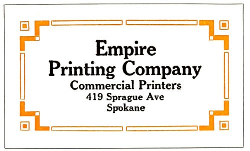
EXAMPLE 350
A strong design for special purposes
Example 354.—Horizontal lines crossing the face of a
card are rarely successful because they usually separate
130connecting phrases, but in this instance the lines are a
necessary part of the design and divide the type matter at
a suitable place.
EXAMPLE 351
Classic arrangement in one size of type
EXAMPLE 353
Highly decorative, with possibilities for harmonious color effects
EXAMPLE 354
The horizontal lines are well employed
Example 355.—This card in Bodoni and Bodoni Bold
capitals, letterspaced, with the use of a few rules, has distinction
that could be successfully carried to other forms
of stationery. The contrasting heavy and light rules blend
with the heavy and light lines of the Bodoni Bold.
These specimens will convince
both printer and user
that there is more than “one
right way” to design business
cards. Typography is
the interesting study that it
is because, to paraphrase
the words of Shakespeare,
age cannot wither nor custom
stale its infinite variety.
Some style of typographic
treatment is available to
meet the likes and dislikes,
preferences and prejudices,
of every one using business
cards. The strictly conventional
person can be supplied
with a strictly conventional
card, proper in
all details. The artistic person, he of the flowing tie, can
obtain a card with sympathetic qualities. The noisy huckster
can be supplied with a typographic effect that almost
shouts the message it contains. In fact, character and personality
can be expressed typographically on the business
card, and the printer will find this matching of typography
with human nature an interesting study.
A large city wholesale house cannot afford to circulate
the cheap-looking, inharmonious cards that some owners
of small shops on side streets seem pleased to use.
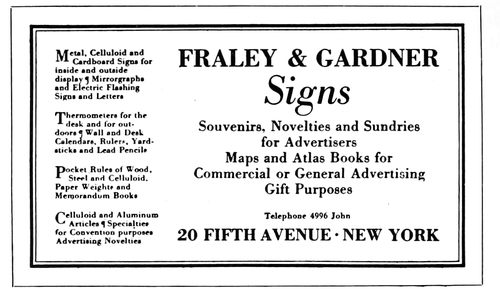
EXAMPLE 352
A business card with a large amount of copy
More than an ordinary amount of thought should be
given to the physical construction of a business card. Because
of the present great interest in all forms of advertising,
more individuality is permissible than formerly. As
typography can give distinction and attractiveness to business
cards, printers should study the use of type on this
class of printing, and give
their customers the best
possible service.
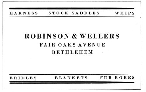
EXAMPLE 355
Distinctive treatment adaptable for general stationery
Printers are producing
cards in imitation of intaglio
work to satisfy customers
who do not consider that
a truly typographic design
“looks like a business card.”
There is no use denying
that copperplate engravers
set the style for much of
the business-card printing.
Shops doing this imitation
work should have samples
of the best card work done
by engravers, so that their
imitations may be as accurate
as possible, so far as
concerns style, face and arrangement. There is little pleasure
in being an imitator unless you are a good one, and here
is opportunity to gain a reputation for the clever printing
of imitation engraved work. Good stock, a dense-black ink
and perfect types are means to this end. Pleasing results
have also been obtained by using green-black ink or dull
gray-black ink, which assists in conveying the soft, pleasing
effects of lithography.
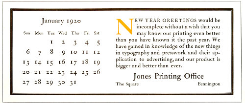
EXAMPLE 356
This size of blotter will cut twelve out of a sheet of standard blotting stock. The copy includes a calendar and is representative of the conventional copy usually supplied for blotters. The calendar is arranged without rules. The initial furnishes a spot of attraction, separates the two groups and carries the eye to the beginning of the message
131
THE BLOTTER
Blotters have a place in modern business which, while
not so important as that of business cards, is fairly well
established.
Business cards are left with customers as reminders,
and altho blotters are sent for the same purpose, they have
the added quality of usefulness. The treatment of a blotter
should be as well thought out as that of a business card. In
a sense the blotter represents the business house sending
it, and while it may show less restraint and dignity than
the business card, coarseness should be avoided in the handling
of both type and illustration.
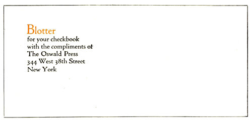
EXAMPLE 357
A modest amount of copy and neat treatment
The blotter as a means of publicity much used by advertisers
is no longer an experiment; it is a familiar form in
the printshop.
The advertising value of a blotter seems to lie in its
ability to do one of two things—strongly and favorably
to attract attention when received, or thru attractive simplicity
to grow in favor during use. The former may be
likened to a rocket which compels attention and pleases
for a moment, and the latter to a star whose beauty attracts
forever.
In planning a blotter it is well to keep in
mind its utilitarian character and make it as
useful as possible.
The size is determined by the sheet of stock
out of which blotters are cut. As the stock
measures 19 × 24 inches, most printers cut blotters
a trifle less than 9½ × 4 inches, thus securing
twelve blotters to a sheet of stock. There
are others who prefer the blotters not so wide
and make them 8 or 8½ inches.
Another reason for the blotter size of a trifle
less than 9½ × 4 inches is that it fits nicely in
a standard No. 10 Government envelop, which
measures 9½ × 4⅛ inches.
A size of blotter that is also much used measures
about 6 × 3¼, and fits in a No. 6¾ Government envelop,
which measures 6½ × 3⅝. This size is most convenient
for inclosing with everyday business mail, and it
is possible that most of those actually using blotters prefer
the smaller size.
The blotter with an enameled surface on one side is
probably the best for use. A person naturally rubs his hand
over the blotter to absorb the wet ink, and an enameled
surface feels more pleasant to the touch. When not many
blotters are on hand in a business office those with absorbent
surfaces on both sides render the greater service, but
usually advertisers keep offices well supplied.
From a printing point of view the blotter
stock with one side enamel-finished is better
for illustrations or small type, while rough-finished
stock is suited to typographic treatments
that require antique effects.
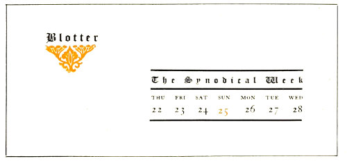
EXAMPLE 358
Blotter used in the writing room of a convention hall
Example 356 (Insert).—This blotter represents
not only the size of a great many blotters
but the contents, as it is customary to
include a monthly calendar. Too frequently
forms of this character are made inharmonious
because stock calendar plates are utilized and
are accompanied by type-faces of another design.
This lack of harmony is seldom necessary,
as the printer in his typography should match
the style of type used for the stock calendar
plate. Sometimes in addition to the calendar
plate a stock illustration is also introduced, with consequent
duplication of spots of attraction. Either the calendar
plate or the illustration should be used; not both. The
typographic arrangement of blotters oftentimes is of a
poor kind because the copy is separated into numerous
display parts. In so far as it is possible, the treatment
should be simple, and in order to suggest such treatment
this example has been prepared. It will be noticed that the
entire blotter has been set in one design of type-face—all
132roman, and mostly lower-case. This manner of handling
the typography will give good results in almost every instance
in which it is tried. The message of the advertiser
is presented in a plain, legible paragraph introduced by an
initial in color. The blank space liberally distributed is
restful, and the dark-printing qualities of the heavy-and-light-line
border contrast with the blank background, the
rubricated initial and the mass of gray in the type matter.
No rule lines appear in the calendar section, and the result
is an appearance of natural freedom.
EXAMPLE 359
Simple typographic arrangement with strong but pleasing contrasts
Example 357.—Most blotters contain too much type
matter. The business man would probably appreciate a
modest little announcement and consider it a relief from
the sledge-hammer advertising that too often forces itself
on his attention in an unwelcome way. As one rubs over
the average blotter he finds it almost necessary to close his
eyes because of the strong character of the design or color
treatment. The arrangement of this example is a suggestion
for a little blotter that would doubtless be welcomed
by many. It could be of a size that would fit in the personal
checkbook. Because of the intimate character of its use the
typography should be confined to a simple paragraph or to
a group arrangement as shown. Both the message and the
treatment here given are in good taste for such a purpose,
and, as has been suggested, it is likely that similar treatment
on a larger blotter would win approval.
Example 358.—This blotter was used in the writing
room of a convention hall and was prepared for a state
meeting of a church organization. It will be noticed that
only the week of the convention is given in the calendar,
and that it begins on Thursday and ends on Wednesday.
Some of the factors that make this blotter pleasing are
the liberal blank space, the black lines of the rules, and the
ornament in color. Text type is used because of the religious
character of the convention, and it is letterspaced.
As a general rule it is well not to letterspace text type, but
here in order to obtain a certain distinctive effect it has
been done with good results.
Example 359.—Here is a suggestion for a simple typographic
arrangement with strong but pleasing contrasts.
The color of the rule border contrasts with the white of
the background and the black of the illustration. The gray
effect of the type group is a harmonizing factor that
softens the contrasts. Only one face of type—Cloister
Oldstyle—is used, and that of a size that makes it possible
for the business man to read the message as he blots his
133signature. The treatment is masculine and will please a
great many because of its style.
EXAMPLE 360
A blotter arrangement suggestive of an architectural panel
143
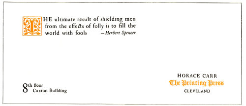
EXAMPLE 361
Blotter treatment that survives the test of time
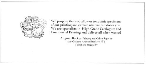
EXAMPLE 362
Neat, refined arrangement of type matter and illustration
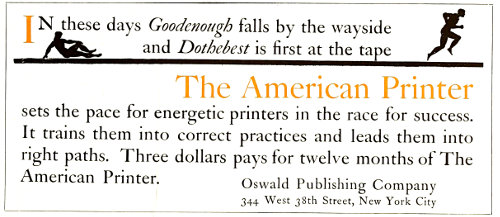
EXAMPLE 363
In which the type matter fills the blotter
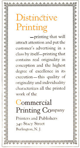
EXAMPLE 364
A decorative blotter arranged the narrow way
Example 360.—This blotter has the character of an
architectural panel, a motif that is adaptable to many
forms of typography. The general gray effect of the
Forum Title and the architectural border is satisfying,
especially as the type group and border are separated by
a liberal amount of blank space. The shape of the type
group suggests a keystone. This is one of those blotters
that the business man should find pleasure in using and
looking at frequently. It will be noticed that the spacing
between the words is less than the en-quad which the typographer
would customarily use in capital lines. It would
be a mistake to separate these Roman capitals with more
space than that used here.
Example 361.—It has been said that two important
factors in good typography are the material that is used
and the material that is not used. Horace Carr has done
many good things with the Caslon type-face, but none
more pleasing than this blotter. It is a model of good taste
in blotter typography and the sort of treatment that has
proved to be good blotter advertising. This particular example
was received by the author some years ago and was
then reproduced. Testing it with careful examination after
all this time, it looks as well as ever.
Example 362.—Here is suggested a neat, refined arrangement,
in which type group and illustration are placed
practically in the center of the blotter and surrounded
with blank space that accentuates its neatness.
Example 363.—This blotter—one that was submitted
several years ago in a blotter competition—shows treatment
which calls for the use of large type that occupies
almost the entire surface of the blotter. While an effect
such as that of the previous example is preferable for most
purposes, there are times when it is desirable to have the
typography arranged on a large scale.
Example 364.—It is customary to design a blotter the
broad way, but occasionally printers desire for the sake
of novelty to arrange it the narrow way, as is done on this
example. The blotter has decorative quality because of the
use of the gray border and the lower-case of Kennerley
Oldstyle. Lower-case properly used is usually attractive.
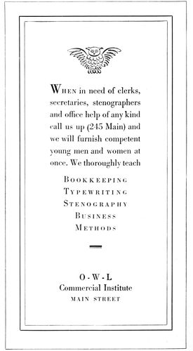
EXAMPLE 365
Appropriate trademark and harmonizing typography
Example 365.—A touch of appropriateness is given to
this blotter by the use of the scroll decorative piece, and
the harmony is further carried out by the selection of
Bodoni Book for the type portion.
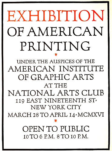
EXAMPLE 366
Typographic poster in Roman capitals by Frederic W. Goudy
135
POSTERS, CAR CARDS, WINDOW CARDS
Poster printing is a specialty in large cities, where
plants are equipped for the economical and effective production
of such work. However, consideration of the subject
in this chapter will be confined to the interest it may
have for the general commercial printer, he who is called
upon at one hour to print a business card and at another to
produce a window card, car card or other form of poster
printing.
The type equipment of the poster specialist includes
strong gothic and Clarendon faces, of a variety of widths
that enable him to make a full line of almost any word or
combination of words. When such strong-printing capital
letters are used, most of the lines should be full, as the
general effect should be one of compactness. A very little
amount of spacing is sufficient. No extended reference will
be made here to the conventional poster that carries these
heavy types, as its arrangement
is merely one
that emphasizes in a plain
manner the various important
parts of the copy.
Skill is necessary, but not
the skill of an artist.
The wood-type equipment
of the general commercial
printer need not
he elaborate, but it should
be well selected. There
should be a blending of
styles in type-faces from
the smallest size of metal
type to the largest wood
letter. The wood-type
makers duplicate most of
the standard job faces,
so that harmony in this
respect need be no idle
dream.
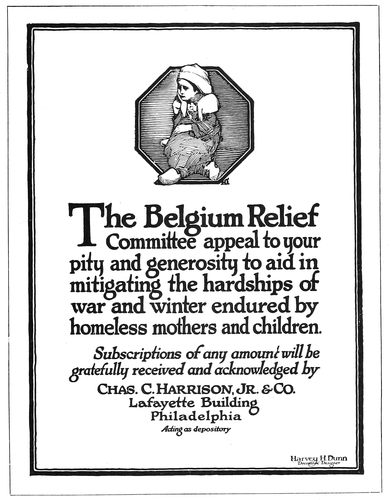
EXAMPLE 367
A lettered poster by Harvey Hopkins Dunn that should be studied by the typographer
Among poster printers
a sheet 29 × 39 inches is
taken as a unit and is
known as a “one-sheet.”
“Four-sheet,” “twelve-sheet,”
etc., are terms
designating the number
of units or “one-sheets”
in the whole display. On
the other hand, the commercial
printer’s “sheet”
poster is generally the
full 25 × 38-inch paper, a
“half-sheet” being 19 × 25
inches and a “quarter-sheet”
12½ × 19 inches.
The size of car cards—the advertisements used in trolley,
elevated and subway cars—is usually 11 × 21 inches.
The most common sizes of window cards—advertisements
placed in store windows by courtesy of the merchants—are
quarter-sheets (11 × 14 inches) and half-sheets
(14 × 22 inches), the unit of which is the standard sheet of
cardboard (about 22 × 28 inches).
Posters in their most attractive form are designed in
pleasing combinations of decorative illustration, lettering
and harmonious coloring. The printer with type alone cannot
give the picture element, but he can give color and
lettering.
What a poster authority has said of the pictorial poster
can to some extent be said of the typographic poster:
“The poster should be simple, clever, attractive, perhaps
sparkling, spontaneous, appropriate, sometimes humorous,
but in good taste, and
should tell the story at a
glance. It should not be
elaborate in detail or
labored; the designer
should know where to
stop. The coloring should
be brilliant, yet simple;
when many colors are
used most of them are
wasted, as the eye does
not see them all. As detail
in a poster is lost at
a distance, it is unnecessary.
The best posters
have no background and
not much lettering, as
small lettering cannot be
seen across the street,
which is the test.”
It is assumed that the
typographic poster is
viewed at closer range,
as in its smaller sizes it
is usually hung in stores
and offices or posted in
convenient locations that
permit of easy reading;
yet the printer who sets
the work, as well as the
man who writes the copy,
should keep before him
the manner in which the
poster, car card or window
card is to be used.
A person sitting on the
opposite side of the car
should be able to read the
136car card, and the person passing a store window
should find it possible to obtain the principal
points of information from the window
card. On store cards, such as used during special
sales, the price should be prominently displayed.
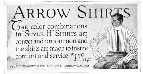
EXAMPLE 368
A lettered arrangement that has suggestion
EXAMPLE 369
A few words of copy and strong contrasts
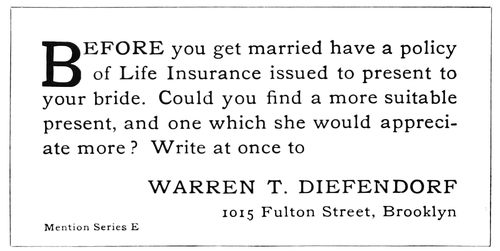
EXAMPLE 370
A typographic style unique among insurance advertising in cars
EXAMPLE 371
Simplicity that is worthy of adaptation
Example 366 (Insert).—The possibilities of
typographic effects in poster printing are to be
seen in this example, arranged by Frederic W.
Goudy. Forum Title, designed by him, was selected
as the type-face. In order to obtain the
larger sizes, the type was set in a smaller size,
a clear proof pulled and a photo-engraving
made. This poster measures up to the qualities
outlined by the poster authority previously
quoted. It is “spontaneous, appropriate, simple,
clever, attractive.”
Example 367.—Altho this design is lettered,
it should prove of great value to the typographer
as a study of composition. In the production
of this effective poster Mr. Dunn has
given of his talent as an illustrator as well as
of his skill as a letterer. The apportionment of
blank space in the margins and at the head is
pleasing, and it helps to make effective the
black masses of lettering and the octagonal illustration.
The border of thick and thin lines
ties the design together.
Example 368.—Most cards in urban cars
are made up greatly of design and illustration,
but in this one we find the illustration taking a
minor position. The lettering is the main feature,
and it should suggest treatment with type
that could be almost as effective.
Example 369.—The strong contrast of
black, red and white in this car card could be
approximated with bold, well-designed wood
type. The trade name is given most prominence,
altho the remainder of the copy is also
strongly presented. A suggestion of decoration
is to be found in the ruled lines at the head
and foot.
Example 370.—Seldom is copy such as this
furnished for car cards, yet its conversational
style probably caused it to be read more than
other cards. As an advertisement it is an improvement
over the common method of merely
stating name and business. It presented opportunity
to the printer to use types in a sane,
simple manner, and he did so. A two-line initial
letter starts the reading pleasantly, and the
name in capitals has sufficient prominence.
Example 371.—At an exhibit of German
modern-art posters the design that stood out
most strongly was one which contained only a
name lettered and an article illustrated. There
was no detail to detract, and the effect was
altogether pleasant. This shoe card is planned
along similar lines, and the idea could well be
put to further use.
Example 372 (Insert).—This is a presentation
of a three-sheet poster which attracted the
attention of the writer a few years ago because
of its simplicity. For such effects as this, which
carry but little copy, lower-case letters are appropriate.
It is seldom, however, that the commercial
printer is provided with so few words
for his posters. Lower-case display, to look
well, requires plenty of surrounding blank
space, while capitals accommodate themselves
to close quarters.
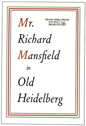
EXAMPLE 372
Refinement in theatrical printing. Was a large three-sheet poster
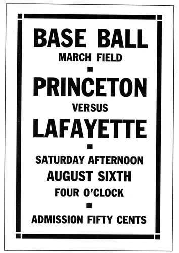
EXAMPLE 373
A border such as this blends with gothic type-faces
137Example 373 (Insert).—The “Secession”
style of border and ornament blends well with
monotone type-faces without serifs, such as
the type commonly known as gothic. As the
wood-type equipment of most printshops very
likely includes gothic faces, the style of treatment
shown by this specimen may be produced
successfully. A border such as this is easily
procured, or can be made by the printer if he
desires.
Example 374.—Printers seldom take advantage
of the opportunities offered for unusual
effects. This copy did not suggest anything to
the compositor who first set it and the result
was commonplace, with nothing to excite anything
but ordinary interest. The fact that the
birth of Franklin was to be celebrated should
have been sufficient to suggest an arrangement
such as is here presented, but it did not. Benjamin
Franklin purchased his type in England,
some of it at the old letter foundry of the Caslons;
and what is more interesting than a poster
announcement of a Franklin dinner set in
the style of type-face that Franklin himself
used? This has been done in the example under
consideration. Roman, italic, capitals and
lower-case have been blended in the interesting
manner in which this was done in the eighteenth
century. The long s (ſ) of Franklin’s
time is also used, to carry along the interest;
it appears, as will be noticed, in all cases excepting
at the end of words. A Caslon ornamental
band is at the head and foot.
Example 375.—This is another instance
where the copy furnished a motif that could
be developed typographically. Reproductions
from the First Folio of Shakespeare’s works
were available and from them an initial and
two decorative bands were enlarged to the desired
size. The typography of Shakespeare’s
time was then studied and worked into the
poster. The Caslon type-face is not exactly the
same as that used in the seventeenth century,
but there is sufficient similarity to make it suitable.
Many persons of the present day will shy
at the use of a single capital letter immediately
following the initial, but that is the way it was
done in the old days. Typographers should
early begin to accumulate a library of books.
They should frequent the second-hand bookstores,
and occasionally purchase some old
volume that shows the style of typography of
fifty, one hundred or more years ago. The best
printers do this.
Example 376.—It should be an easy matter
to produce attractive window cards or paper
hangers in this style. Selections from the many
artistic and odd cover papers obtainable, supported
by harmonizing color combinations,
make possible any number of attractive effects.
Only one size of type should be used, and the
border should be one that reflects the character
of the type-face. Plain rules for border
purposes are more successful in obtaining harmony
than is decoration. As most letters contain
two widths of line, a rule border matching
the wider line, or both lines, is pleasing.
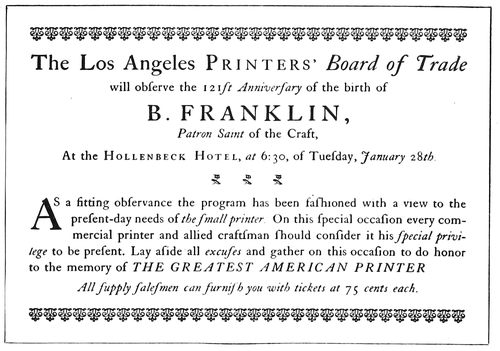
EXAMPLE 374
Type treatment that suggests Franklin’s time
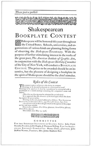
EXAMPLE 375
Poster in Shakespearean typography
Example 377.—The Colonial style of type
arrangement is here adapted to window-card
purposes. The window card has the same advertising
reason for its existence as the paper
138poster, and is printed on cardboard to enable it
to stand upright. The treatment of this card
is such that the word “Pinafore” and the decoration
stand out most prominently, taking for
granted that a person interested by the sight
of this word will come close to the card and
read it. Such an arrangement should not be
attempted unless the copy is suitable. Forcing
unsuitable copy in full-line Colonial arrangements
results in illegibility and dissatisfaction.
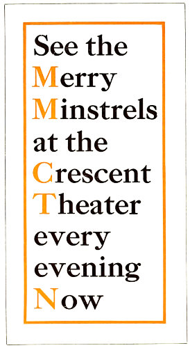
EXAMPLE 376
A simple typographic treatment that offers possibilities for attractive posters or window cards
Example 378.—Sunday-school excursions
furnish copy for many window cards. The
printer may appreciate this suggestion for an
arrangement of such a job. It is sufficiently
unconventional to attract attention, at the same
time providing a simple way of arranging the
matter that usually comes in with such orders.
The arrangement has merit from an advertising
point of view, the information being given
concisely and legibly.
It is probably true that the majority of
printers have given no thought whatever to the
arrangement and treatment of posters. It is
even likely that there are job printers who feel
that poster composition is beneath their dignity.
In view of these conditions, it is to be
hoped that what has here been written regarding
the poster will serve to create new interest
in that line of work.
Years ago the author knew an old printer
who had the reputation of being the best sale-bill
compositor in the county. His work was confined almost entirely
to the setting of posters announcing sales of farm goods, yet he did it
so carefully and efficiently that residents of the county traveled miles
to place an order with the concern for which this man worked.
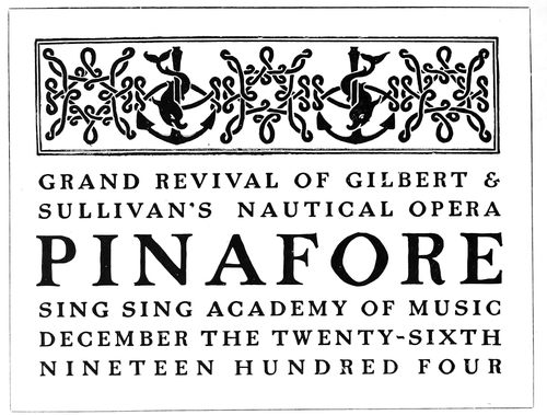
EXAMPLE 377
The Colonial style used on a window card
Poster printing should not be attempted unless the equipment is
such that the work can be done profitably. Lack of sufficient wood type
will result in poor printing and makeshift arrangements. However,
absence of equipment did not worry a certain printer who did business
some years ago. He had no wood type at all, yet he accepted orders
for posters and, taking advantage of the craft courtesies of those days,
borrowed all the type lines from a competitor. It frequently happened
that when the competitor desired to set up a bill he found that the type
was mostly in the possession of the borrowing printer.
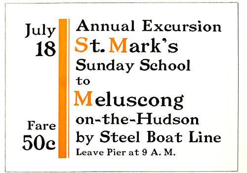
EXAMPLE 378
Suggestion for an excursion window card
The large two-sheet and three-sheet posters look very big indeed
to the printer in the small shop whose product is confined to the output
of his platen presses, yet poster printing is merely printing on a
larger scale. The builder of the New York subways was once asked
how he found it possible to put through such a large undertaking. He
replied that he knew he could build a cellar, and a subway was merely
a multiplication of cellars. The printer who learns how effectively to
produce a small piece of printed advertising matter should be able, by
developing and enlarging on his ideas, to produce good poster work.
EXAMPLE 381
A city department-store advertisement of the good kind
139
ADVERTISEMENTS
Not every business man can write an advertisement well.
Not every printer can set an advertisement well.
Of the poor advertisements that mar newspapers and
periodicals, fifty per cent of the ineffectiveness should be
blamed on those who write
them and fifty per cent on
those who set them.
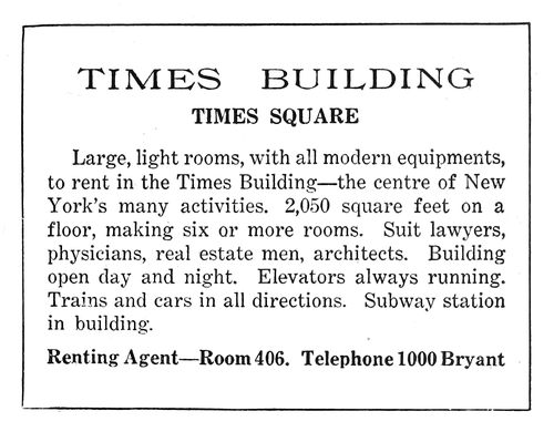
EXAMPLE 379
Newspaper advertisement arranged without thought. See 380
In this chapter we are
interested not in writing
the advertisement, but in
properly treating it typographically
after it has
been written.
Some day advertising typography
may become so
standardized that a compositor
can be told in a few
words just how he shall
arrange it. Meanwhile as
there is more than one way
to set type for advertisements,
we must for the
present depend on the
study of good type work,
the advice of those who
have theories, and our own
judgment.
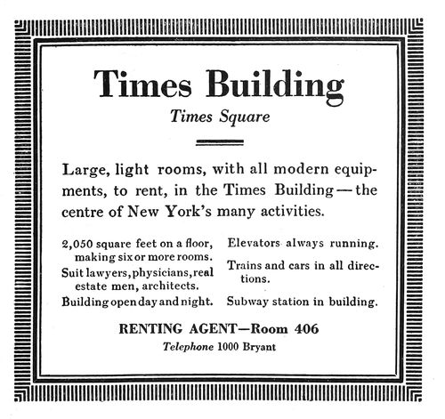
EXAMPLE 380
Easier to read and more pleasing to look at than 379
It is possible, however,
to learn something about
advertising typography by
giving thought to the ways
of the orator, who swayed
human beings long before
printing was invented. We
have all listened to oratory
in the church pulpit,
the public square and the
Chautauqua tents, and in
halls on the occasion of
political gatherings and
organization conventions.
Our most agreeable recollections
are of those moments
when we were so
pleased and impressed
with what the speaker was
saying that we did not
think of his manner of saying
it. Probably the most
successful printed matter
is that which pleases and
impresses without one’s
being immediately aware
of the cause.
A good speaker will enunciate clearly and speak in a
moderate tone that can be heard.
A good typographic advertisement will be set in a legible
type-face and in a size that can be easily read.
Print can be too small
or too large, too gray or
too black.
If a speaker is addressing
an exclusive group of
persons, he lowers his
voice and talks in polite
diction.
If he addresses a large
crowd, many of whom are
of less fastidious tastes,
he raises his voice, perhaps
using all his power,
and most likely mixes with
his English a little popular
slang.
Thus advertising printing
of the exclusive kind
would likely be set in type
smaller and in design
more classic than that used
for publicity matter that
has wide and promiscuous
circulation.
The typographer must
keep in mind that while
bluntness and forcefulness
are liked by some, they
give offense to others.
There are orators so
eloquent and flowery that
one is led away from the
message by pleasure and
admiration for qualities
that should merely carry
the message.
There are advertisements
so attractive in decorative
beauty that one
sometimes forgets to read
them.
And then there is the
heavy-voiced orator who
emphasizes every statement.
He startles and he
tires, and is as unsuccessful
as the speaker who
croons his audience to
sleep with uninteresting
monotones. How like such
140speakers are the excitable, over-displayed advertisement,
and the large advertisement monotonously set without emphasis,
in one size of type!

EXAMPLE 382
The conversational style of page advertisement
The speaker who gracefully accentuates his talk at important
points has the same good judgment as the typographer
who neatly displays or emphasizes significant parts
of his copy—not forgetting the orator who gets applause
at the wrong time, and the printer who by carelessness in
arrangement suggests the wrong thought.
Many speakers use the same words that Shakespeare
used, but “they phrase them differently,”
just as printers arrange type differently.
The orator has a message, and he tries
to “get it over.” The advertiser has a
message too, and he calls on the typographer
to assist him in gaining customers.
The problems are not unlike.
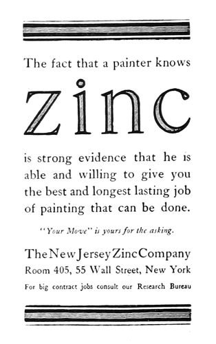
EXAMPLE 384
One word is thoroly advertised
Examples 379 and 380.—These two
advertisements picture the difference between
setting type with a stick and setting
it with the head. It would be illogical
to assume that any thought at all was
given to the type composition of Example
370. It not only is unpleasant to look
at, but is difficult to read, notwithstanding
the size of type used for the text.
Benjamin Sherbow, who has given much
time to the training of type to act for the
advertiser, took the same material the
newspaper compositor had to work with,
and at the crack of his whip the words
assumed a new formation. Keep in mind
that Mr. Sherbow was not attempting to
improve the looks of the advertisement;
he did improve the appearance, but what
he started out to do was to make the message easy to read.
He labored from the viewpoint of the reader and not from
that of the advertiser or printer. The difficulty usually is
that the merchant and typographer are too close to the
details of their own daily occupations and fail to view the
advertisement as does the prospective customer.
The important first sentence was emphasized by subordinating
the type below. The smaller type is nevertheless
easier to read than the same words as originally arranged.
The border serves to catch the reader’s attention,
as in the newspaper this little advertisement
dominated the page.
Example 381 (Insert).—The department-store
advertisement as represented
by this example is really a multiplication
of small advertisements. It is necessary
for the writer and printer to give attention
in detail to each of the small paneled
advertisements, but someone must assemble
them into a harmonious whole. This
is usually done by first making a layout
in actual size. Such a layout as planned
for the Lord & Taylor page under consideration
probably looked just as this
advertisement would look if everything
but the panel borders, headlines and illustrations
were removed. Each panel was
numbered, and the copy in each instance
contained a corresponding numeral.
EXAMPLE 383
The name and the trademark depended on to sell goods
The style of lettering used for the firm
name (Caslon italic) is a sort of trademark,
as it is to be found on the store’s
stationery, on its building and on its
delivery cars. The ornamental border,
especially the festoon effect at the head,
141is used in all the newspaper advertising. It will be noticed
that two of the panels have been accentuated with stronger
borders, larger headlines and with decorative illustrations.
They are so placed in the
general group as to balance
pleasingly. Prices are emphasized,
but not as they usually
are by department stores
that appeal more to the class
of people who for economical
reasons find it necessary to
take advantage of bargains.
The names of articles in the
Lord & Taylor advertisement
are set in a neat, bold type-face.
EXAMPLE 385
Interesting use of white space
Example 382.—This is
one of those easily read, conversational
styles of advertisement
set in Caslon Oldstyle.
The first paragraph,
in type a size larger than the
rest, invites the attention of
the reader. The ornament in
the upper left corner adds
attraction at the introductory
point.
EXAMPLE 387
A study in advertising values
Example 383.—Like the
house of Tiffany, the makers
of Knox hats do not have
much to say in their advertisements.
The name and the
trademark are depended on
to sell the hats. Cloister Oldstyle,
the type-face, surrounded by liberal blank space, is
effective.
Example 384.—The purpose of this advertisement is to
popularize zinc, and for this
reason that word stands out
so prominently. The rule band
at the head and foot attracts
the attention, and the Caslon
type-face makes the advertisement
readable.
Example 385.—An easily
read advertisement, due to the
size and kind of type and the
use of blank space. Hart,
Schaffner & Marx appreciate
the value of good typography.
The two-line initial at
the head guides the eye to
the beginning of the message.
The signature at the foot is
so placed that it is not forced
on the attention, yet it cannot
be missed after the two
large paragraphs have been
read.
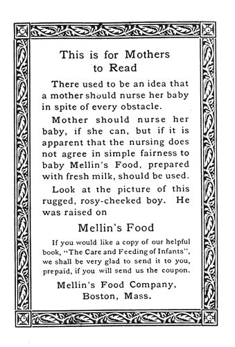
EXAMPLE 386
A bordered advertisement
Example 386.—This arrangement
of an advertisement
shows a style liked by
the Mellin’s Food Company.
The decorative border confines
the attention to the reading
matter it contains, which
is presented in Old-Style Antique,
a dark-toned, interesting,
142legible type-face. The display lines are emphasized
just enough to make them stand out from the main portion
of the text.
EXAMPLE 388
This pictorial department-store advertisement attracted a great deal of attention in New York newspapers during the holidays
EXAMPLE 389
The store name does not appear in this large department-store advertisement published in the New York City newspapers
EXAMPLE 390
Four country-newspaper advertisements, showing slight variation in border treatment
Example 387.—The principal points in this advertisement
are the name of the company (which is accentuated
to catch the eyes of the many who know this house) and
the three lines at the head (which are informative to those
who may not know the Gorham company). This advertisement
serves well as a study in advertising typography.
Careless handling of it in the composing-room would have
spoiled its effectiveness. The border has probably been
used to attract attention, yet it does not interfere with the
reading of the advertisement, as the typographer has maintained
a liberal margin around the type matter.
Example 388.—This is one of the many clever advertisements
that are inserted in newspapers by John Wanamaker,
and is different from most others because it is a
picture-story of the goods on sale. The type matter is secondary
thruout excepting in the introductory panel at the
head, which is displayed merely to call attention to the
style of the advertisement and to the name of the advertiser.
Example 389.—Few printers have seen a department-store
advertisement just like this one. It does not contain
the name of the advertiser, and there is practically no display.
It looks more like a story in a general magazine. A
few circular illustrations are so placed as to relieve the
monotony of the columns of text, and a decorative piece
is placed on both sides of the heading. The page is also
made interesting by the use of space between paragraphs.
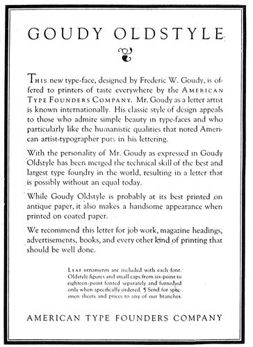
EXAMPLE 391
A good-looking page advertisement that was easily read
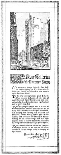
EXAMPLE 392
Typography and shape of this four-column advertisement suggested by the architecture of the tall building pictured
Example 390 (Insert).—The most difficult copy to arrange
well is probably that supplied country newspapers
by their advertisers. There is seldom much to the copy,
and it is almost always necessary to use display unsupported
by the solid paragraphs of text that soften the contrast
in advertisements that appear in city dailies. Here
are four advertisements different in size and representative
of small-town business. Some one has urged that fancy
borders be not used in the small-town newspaper, and that
the rules for borders be the same thruout. This advice is
probably wrong, as it was tried in this instance and the
effect was found to be monotonous and uninteresting. The
same rule border is used around each advertisement, but
to obtain contrast an additional rule has been added to the
coal advertisement and a holiday border and another rule
to the general-store advertisement. These slight variations
in border treatment add a great deal of interest to the
page. Each advertiser is entitled to an individual hearing,
144and this is only possible when there is some distinct feature
found in his advertisement alone. In the city newspapers
each department store usually has a distinctive
type-face which appears in no other advertisement. In the
small-town newspaper it may not be possible for the publisher
to render such service, but an effort in the same direction
can be made by varying the border treatment. The
type-faces used in this example are Bodoni and Bodoni
Bold. With the use of the Bold, emphasis is given at proper
points in each of the four advertisements. In the largest
one it is used for the name of the firm, in the smallest one
it sets forth the name of the café, and in the other two
advertisements it emphasizes the name of the business.
There may be another way to arrange the names of the
articles in the general-store advertisement, but it is doubtful
if any other arrangement would make reading easier.
Typographers who are inclined to treat lightly the problems
of the small-town printer should attempt to improve
these advertisements.
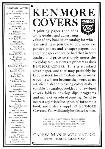
EXAMPLE 393
A page in which attractive typography was possible in spite of a long list of agents
Example 391.—The style of treatment of this trade-journal
advertisement is influenced to some extent by the
article advertised, yet there is no reason why this treatment
would not be suitable for many advertisements of
another kind. The heavy-and-light-line rule border is of
a darker tone than the type page and for this reason adds
color and interest. There is sufficient blank space between
the border and type matter to allow for the text being read
without interference. The capitals in the headings are letterspaced,
the letterspacing not only giving them character,
but making them more legible. The text matter is introduced
with an initial that extends upward from the first
line instead of downward as most initials are placed. This
advertisement is of the conversational style, arranged for
easy reading.
Example 392.—Some one has decreed that text types
shall not be used in advertisements, but fortunately those
responsible for the planning of this advertisement paid
no attention to the decree. The advertisement was inserted
in newspapers for the purpose of calling attention to the
new building in the Gothic style of architecture erected
for the Hampton Shops. Any one who has studied the details
of a Gothic structure such as this or the Woolworth
Building has felt the influence of the long, narrow lines
found in Gothic architecture. The shape of this advertisement
and the thin, pointed character of the text type used
are in splendid harmony with the general idea.
Example 393.—There was presented to the designer of
this advertisement the problem of including in legible size
a long list of cities and agents and yet reserving sufficient
space in which to give due prominence to the text matter.
The solution of the problem was the long, narrow panel
at the left. While the entire advertisement is easily read,
especially in its larger form, and probably has the approval
of those who insist on legibility in advertising composition,
there is yet something about it that will also interest
those who maintain that typography should be built
on art principles. The border, trademark and name of the
article advertised blend in tone, while the remaining type
matter shows a pleasing gray. Inserting the trademark in
the space left by the shorter words of the heading makes
the effect unusual.
EXAMPLE 394
An advertisement planned to sell high-priced cars
Example 394.—This is one of a series of newspaper advertisements
prepared for the Locomobile Company by
T. M. Cleland. Planned to sell automobiles costing five or
six thousand dollars, it naturally is treated differently
145from an advertisement that would sell cheaper cars. The
decorative crest is a factor in the effectiveness of this advertisement,
and the italic with the swash capitals helps
to give a touch of exclusiveness. It is an advertisement
that will stand out on the average newspaper page.
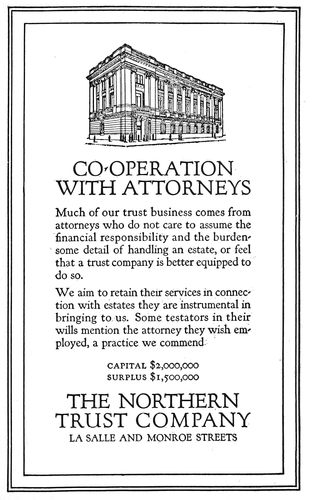
EXAMPLE 395
Roman lettering and Roman architecture
Example 395.—This advertisement has qualities similar
to those of Example 392, the typography of which was
suggested by the architecture of a building. Here we have
an illustration of a building in Roman architecture, hence
it is suitable that the type should be Forum, which is based
on Roman carved lettering, and that the border should
contain lines that suggest an architectural panel. Of course,
this matter of harmonizing the plan of an advertisement
with the architecture of a building can be overdone. An advertisement
is not necessarily a good advertisement because
of such harmony, yet if an advertisement is readably
presented, harmonious type selection and arrangement
should add effectiveness.
Example 396.—This advertisement in a way suggests
Example 385, and in contrast with that example furnishes
a study in the use of blank space. In the Hart, Schaffner
& Marx advertisement the margin is equal on both sides,
and monotony is avoided by having the margin at the foot
of the type group more than on the sides. In this Kodak
page the text group is courageously pushed to the extreme
upper right corner, and all of the blank space is assembled
at the left and at the foot. The use of so much space is
probably for the purpose of attracting attention, which
it undoubtedly does. Nevertheless, it is possible that the
advertisement would look better if the text group were
treated as in Example 385.
EXAMPLE 396
Uncommon placing of blank space to attract attention
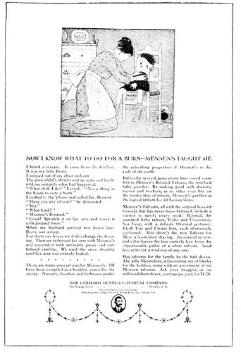
EXAMPLE 397
The modest display of a large magazine advertisement
146Example 397.—This advertisement has been reduced
considerably, as it originally occupied a large magazine
page. For effectiveness the typographic treatment was depended
on, and, as will be seen, it is unusually neat. The
headline and the name of the company are the only suggestions
of display on the page. The illustration, of course,
is to catch the reader’s attention.
EXAMPLE 398
The blank space emphasizes the illustration
Example 398.—Altho this is a lettered advertisement,
it is a good example of blank space used to attract attention
not only to the advertisement, but to the illustration,
which here is really of the most importance. It should be
noticed how the blank space in the upper right portion
clears the way for a view of the automobile. Many advertisers
are using a strip of white space in their advertisements,
at the right or at the left.
Example 399.—The treatment of this advertisement
proves that it is not absolutely necessary to have the typography
of country-newspaper advertisements as formal
as that presented in Example 390. For general newspaper
use Bodoni modern might have preference over the more
interesting Cloister Oldstyle, yet a newspaper treated
entirely in old-style type-faces would be likable. If this
advertisement were placed on the average newspaper advertising
page, it would stand out strongly because of the
blank space used around the type group, the restful and
pleasing type-face and the dark-toned border.
Example 400.—The manner in which this page of advertisements
is treated should have suggestion for newspaper
and periodical publishers who wish to make their
classified-advertising sections more interesting. This page,
from a trade publication (The American Printer), was
set in eight-point type instead of the six-point that some
publications usually use. It is a mistake to use type smaller
than eight-point for matter that is supposed to be read.
The expense and the time necessary to put in initials at
the beginning of each advertisement are avoided by capitalizing
the first word and setting it flush with the end of
the line. Instead of using the stereotyped “Help Wanted”
and “Situations Wanted” headings, human interest was
introduced by phrasing each heading as a question, as
would likely be done on a larger advertisement.
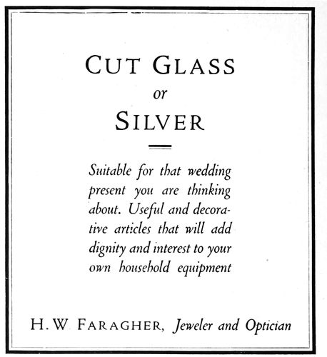
EXAMPLE 399
A country-newspaper advertisement
EXAMPLE 400
Suggested for treatment of classified ad. sections
EXAMPLE 403
The neat typography and well-balanced make-up of a suburban newspaper
147
NEWSPAPERS
We are all familiar with the modeling clay with which
children amuse themselves. They take a portion of gray
clay, mold it into some shape, and decorate it with small
portions of red, yellow and blue clay. After they tire of
their production they knead it with their fingers and lo!
the bright colors disappear and there remains only the
neutral gray.
EXAMPLE 401
The first and only number of America’s first newspaper
The only way the typographical appearance of the average
newspaper can be improved is by first reducing the
glaring headlines and heterogeneous assortment of type-faces
to a neutral gray. Upon this drab background the
details of suitable and harmonious typographic form can
be built.
However, it is easier to assert that the typography of
newspapers can be improved than it is to improve it. In
the early days of newspaper publishing the problem was
a simple one, but today the newspapers of the large cities
have hundreds of thousands of readers to serve, and much
of the prevailing poor typography has resulted from efforts
to present the news to these readers in a way that
editors assume will please them best, without giving any
thought to technical defects in the type work.
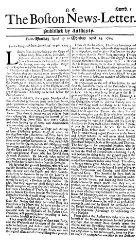
EXAMPLE 402
First number of the first American newspaper issued regularly
EXAMPLE 404
Front-page make-up of a Hearst newspaper on the occasion of a big story. All of the display headings are probably too large
EXAMPLE 405
The same news story, featured by the conservative “Times.” Headings are mostly well balanced. Note the use of panels
148The ideal newspaper would probably be one in which
the reader finds it easy to locate and read the articles in
which he is interested, and in which the contents are presented
in an orderly, good-looking, well-balanced and harmonious
manner.
The Title.—The name of the newspaper at the head
of the front page should be distinctive in design, and it
would probably add interest if the style of the letters composing
the title bore some relation to that used at the time
the publication was founded. Unfortunately, on most newspapers
the headings are altered every time a new type
dress is adopted.
For titles, most publishers of city newspapers seem to
have a liking for English or German text letters. Such letters
are doubtless good for the purpose, as they are different
from any that appear elsewhere in newspapers.
The New York Sun, as an instance, uses a black German
text letter, altho on its first issue in 1833 the title head
appeared in modern roman capitals.
It has become a practice to make use of the blank space
on both ends of the title line, and in such spaces will now
be found weather forecasts, slogans such as “All the News
That’s Fit to Print,” and edition names. (See Example
405.) It was the custom at one time, and is today to some
extent, to print under the title a quotation which defined
the newspaper’s editorial policy. (See Example 403.)
A type line under the title separated by rules on both
sides contains the name of the city, the date, the volume
number, and information regarding the price. (See Example
403.) Usually the rules have a double line, altho
some newspapers use single rules for this purpose.
The Text.—The main desire of newspaper publishers,
besides preparing the news, seems to be to have the matter
set in the smallest size of type that can possibly be read.
The large city dailies habitually use a seven-point type-face,
which is the smallest that should appear on any newspaper.
(See Example 406.) During the recent prevailing
high cost of print paper some publishers began to use six-point
in order to save paper, but they found that this move
was a mistake. Newspapers are published to be read, and
everything possible should be done to make the reader’s
task an easy one. Experiments by an educational body in
England resulted in determining that ten-point should be
the minimum size of type used for educational purposes.
From this it will be seen that the seven-point type used
on newspapers is too small and a cause of eyestrain.
The narrow width of the columns of newspapers—twelve
and a half or thirteen picas—makes reading of the
small type fairly easy, however. The eye has been tested
scientifically and the discovery made that a person actually
sees at a glance less than an inch of a line of type.
Hence long lines require extreme side movements of the
eyeballs or of the head. It is a mistake, as will be seen, to
set editorials in a measure that extends over two columns,
as is done on some publications.
Space between lines also helps the reader in locating
the beginning of the next line, for which reason, and also
to give them prominence, editorials are usually leaded.
The beginning of an important article is sometimes leaded.
Lengthy excerpts or quotations are usually set in the
same size of type but indented one em at the right and left
ends of the line. (See Example 405, third column.)
The Headings.—The first newspaper continuously published
in this country was a letter (see Example 402), and
the items it contained were not set off with headings. As
the quantity of news increased and newspapers became
larger in size, headings were added. During the middle of
the last century most of these were side headings joined
to the first paragraph. When it became possible to print
news promptly more attention was given to displaying the
headings. As the Civil War developed, newspaper headlines
grew, and with the Spanish War came front-page
headings of poster proportions.
Headlines not only advertise the contents of the text
pages, but assist the reader quickly to absorb the news. As
the reader cannot in these busy days read the entire paper,
headings assist him in locating the items in which he is
interested.
The error of using thrilling scareheads for comparatively
unimportant events was made evident when the
European War started. Some of the publications had cried
“Wolf!” so frequently that there was no emphasis left for
a really big story.
EXAMPLE 406
Actual size of a well-treated four-deck Heading
Head-letter type should not be intensely black, unless
the reader is expected to read only the headlines. It is
irritating to attempt to read the text matter in an article
if strong black headlines continually glare at you. (See
Example 404.) The head letter should be just a trifle
darker in tone than the background of text type, or if
liberal leading is possible a letter the same tone as the
text is suitable.
Because of the narrowness of newspaper columns it is
necessary that type for headlines shall be slightly condensed,
especially for the large lines. As few type-faces
are legible in a condensed form, it is a problem to select
a type-face for this purpose. Probably the most successful
type-face of this kind has proved to be Latin Antique
Condensed, a letter that has been in such use for a number
of years. (See Example 406.)
It is, of course, best to have all type-faces harmonious
in design, but the requirements of the newspaper are so
unusual that in order to secure contrast this rule must be
150violated. In Example 403 will be seen the neat and restful
effect that is possible by using thruout type that is harmonious,
yet there is a monotony to the page that could
probably be overcome by substituting, say, italic for roman
in several of the headings. On the page of the New York
Times (Example 405) will be found headings in italic.
Lower-case italic looks well used for the main lines of a
double-column heading.
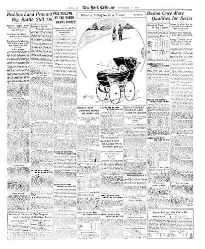
EXAMPLE 407
The sporting page of the New York “Tribune,” showing interesting make-up
It is well first to harmonize the newspaper page, as in
Example 403, and then add needed contrast, as in most
newspapers attempts at contrast are so frequent that the
result is confusing.
Paneled headings also add variety; specimens of such
headings will be found in Examples 404, 407 and 408.
Restraint in the use of display headings by the New
York Times, as compared with the noisy scareheads of the
New York American used in reporting the same news, will
be seen by comparing Example 405 with Example 404.
What is called a four-deck single-column heading, as
used by the New York Times, is shown actual size in Example
406. Latin Antique Condensed is used for the first
two lines and Newspaper Gothic for the other three decks.
This heading as it stands is perhaps the most pleasing
and legible of those used by metropolitan newspapers.
A four-deck heading should present in the first deck the
feature of the story; the first deck, and if possible every
other deck in the heading, should contain a verb. The third
deck is really the second in importance, and, like the first
one, is usually set in capitals. The size of the lower-case
used for the fourth deck is usually smaller than that used
for the second. It would be a mistake to use capitals for
the second and fourth decks, as the result would be monotonous
and illegible. The small section of text matter accompanying
the head also shows a seven-point face on an
eight-point slug, as used by the Times.
The Make-up.—In the make-up of a newspaper the
sometimes derided “art tenets” should not be neglected.
A good-looking newspaper has well-balanced headings,
properly placed illustrations, and the various typographic
details treated according to the requirements of good taste.
Large display headings are usually alternated at the head
of the page with small headings, which arrangement not
only looks well, but enables the reader to peruse one heading
without interference from another.
It is the practice of most good newspapers not to have
advertisements appear on the front page, which is given
over to the important news of the day. As will be seen by
Examples 404 and 405, the article of most importance, no
matter how large the heading given to it, appears in the
furthermost right column, whence it is usually continued
to the second page. Example 403 also shows how an important
article can be featured in the center of the page.
Interest and variety are also obtained by the use of a
one-point rule around a portion of the news, as will be seen
on Examples 404 and 405. The type matter on the inside
is set close to, but not against, the rule panel.
The editorials on most newspapers are to be found on
the sixth page, and on the same page letters to the editors
are also placed. There is a movement, begun by the Hearst
newspapers, to have the editorials appear on the last page
so that they may be read without the necessity of locating
them in the paper.
The sporting page has also come to be an important
feature of the newspaper. An attractively arranged sporting
page is shown in Example 407.
It is customary to build advertisements from the lower
right corner of the page in a step or pyramid arrangement.
(See Example 408.) This allows most of the text matter
to appear at the left and in the upper portion of the page,
and also makes it easy to give position next to reading
matter as required by some advertisers.
EXAMPLE 408
So-called pyramid make-up of a newspaper’s advertisements. A “make-believe” newspaper
EXAMPLE 409
Church book decorative treatment by Will Bradley Featured on a Thanksgiving number of “Collier’s”
151
PERIODICALS
The typography and the make-up of periodicals in the
century last past were sedate and uninteresting to most
Americans. As a consequence there came a change, and
publishers endeavored to make their publications more
attractive to readers. The letterer and the decorator were
permitted to let their fancies run free over the magazine
pages, and assuming that their readers had poor taste and
weak eyesight the publishers of trade journals splattered
their pages with ugly black circus poster type.
So long as there is poor printing (we read in the Good
Book: “For ye have the poor always with you”) there will
be periodicals typographically poor. Yet, thanks to those
who have trained themselves as typographic advisors,
many American periodicals are now good to look at and
at the same time easy to read.
EXAMPLE 410
Dignity in make-up and type treatment. By Walter Gilliss
We will consider the dimensions of the publication, the
front cover, number of columns, the margins, type-faces
for the text and for the headings, make-up of the illustrations,
arrangement of headings, the captions, the editorial
pages, features, and the advertisements.
The Dimensions.—Whim has much to do with the selection
of sizes for periodicals, and precedent, or what the
other fellow is using, has some influence also. Assembled
and stood on end, several dozen periodicals gathered at
random present the appearance of a platoon of “rookie”
soldiers before they have been ranged according to hight.
Sixty-six business and technical publications were recently
measured by the writer, and the dimensions of about
half of them approximated 9 × 12 inches. The other half
varied from 6 × 9 to 10 × 15 inches.
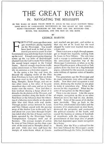
EXAMPLE 411
Harmony of the type-faces used for heading and text
Examination of about two score of magazines revealed
three groups of dimensions: 7 × 10, 9 × 12 and 11 × 14 inches.
These dimensions are approximate, few magazines measuring
152exactly the same, the variations amounting to half
an inch in some instances and several inches in others.
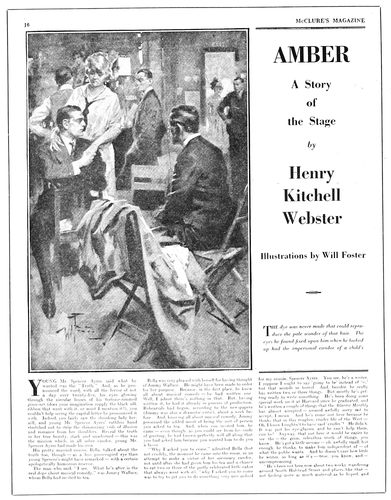
EXAMPLE 412
Advertising the story to the readers
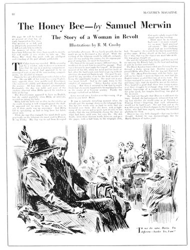
EXAMPLE 414
Style of make-up of these three pages suggested by Benjamin Sherbow
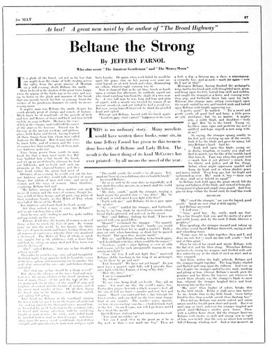
EXAMPLE 413
Interesting heading treatment and inserted feature panel
Scribner’s is a type of the magazine in the 7 × 10 class
(the actual measurement being a trifle minus); the Independent,
of the 9 × 12 class (actual measurement 8¾ × 12
inches); and the Saturday Evening Post, of the 11 × 14
class, measuring exactly that size.
There has been a movement among magazines away
from the smaller dimensions toward the larger, for the
purpose of better displaying features and of enabling
reading matter to be placed alongside of advertisements.
To a similar extent the business and technical publications
have experienced reductions from the very large
sizes that originally were probably inspired by the bigness
of newspapers.
There are also a few small pocket magazines of the
Philistine size that Elbert Hubbard made popular.
The Front Cover.—Typography has little to do with
the average cover of the general magazine in America.
The foundation of the design is usually a painting, the
subject being seasonable or otherwise appropriate. Lettering
and decoration are added by an artist other than the
one drawing the picture. In such cases the design is
changed with every issue. Some magazines, the more conservative
ones, use a design containing lettering and decoration
only, and with each issue merely change such lettering
as refers to editorial features.
The European custom of printing a paid advertisement
on the front cover of periodicals has extended to America,
and, while such advertisements will not be found on the
general magazines, some business and technical periodicals
have succumbed to the temptation thus offered for
increased revenue.
When the front cover is sold, only an inch or so is retained
for the title of the periodical. One publisher did
stipulate that no color in the cover advertisement should
come within two inches of the title; but even this rule is
now disregarded on his periodicals. The time may yet come
153when the title of a publication will appear at the foot of
the front cover in six-point.
EXAMPLE 415
Headings and text matter in the same face of type, Scotch Roman
EXAMPLE 416
Type of medium strength and use of a small illustration in heading
154
EXAMPLE 410-A
Section of text matter from the “World’s Work”
(Monotype No. 22-E, 10-point on 11-point body, 10 set)
A weekly technical periodical in every issue has some
appropriate view made into halftone and uses it inside a
large panel under the title, and a photographic journal
prints a reproduction of an artistic photograph on the
cover, changing the subject with each issue.
Columns.—The number of columns to a page should
be decided by the size of type used. Seven-point and eight-point
type should be confined in columns twelve or thirteen
picas wide. Ten-point, eleven-point and twelve-point
type can be read even if the columns are sixteen or more
picas wide. However, no column in a book or periodical
should exceed twenty-four picas. Neither should a column
be unreasonably narrow.
Scientific tests show that the eye is strained in the reading
of wide columns. The column should be of such width
that reading of the matter can be accomplished with only
slight movements of the eyes to the right, after they have
been focused at the beginning of the line to fit the size of
type. When the column is too wide the head must be moved
to the right and left with the reading of every line or the
eyes may be injured from the strain and repeated change
of focus.
A look over the examples of periodical pages in this
chapter will show practically an acceptance of these requirements—three
columns in the periodicals of large size
and two columns in those of smaller size. For pocket magazines
one column is naturally sufficient. In several instances
(Examples 417 and 418) three columns instead
of two would have been advisable.
Gutenberg, when he planned the pages of his famous
Bible, arranged for two columns each about twenty picas
wide, altho his type was large—about twenty points in
size.
EXAMPLE 424-A
Section of text matter from the “Saturday Evening Post”
(Monotype No. 20-A, 8-point on 9-point body, 8¾ set)
It is a great mistake to set, as some business publications
do, six-point type in lines twenty-five or thirty picas
wide. To require the reader’s eyes, after being focused on
such small type, to travel back and forth that distance is
almost an invitation not to read the matter.
The Margins.—Blank space surrounding the printed
pages in periodicals should be apportioned as it is in
good books—the smallest margin at the binding side and
increasing in amount in this order: Head, outer side, foot.
Even when the total amount of margin is small it should
be apportioned in this manner.
The rule can be stated in another way: the largest margin
at the foot, with the type page inclining toward the
bound side.
Periodical binderies do not always give the publisher
good margins, even after he has planned for them. Unevenly
cut paper, careless folding and inaccurate trimming
will prevent the securing of desired results.
In measuring margins the running headings should be
ignored if they are small, but in any event the printed
page should have the appearance of being a trifle high on
the leaf.
Type-Faces for the Text.—Type-faces for the text
matter of most periodicals must be chosen for reasons different
from those governing the selection of type-faces
for other purposes, because of the small size, usually eight-point
or nine-point.

EXAMPLE 422-A
Section of text matter from the “Independent”
(Monotype No. 20-A, 9-point on 10-point body, 9¾ set)
Type-faces that are legible and good-looking in twelve-point
may prove illegible and ill-looking in eight-point.
This is to some extent true of Caslon Oldstyle when
printed on calendered surfaces. Such illegibility may be
due to the hairlines, which almost disappear in the small
sizes.
Commendable letters for periodicals that require small
type-faces are the dark-printing kind represented by Century
Expanded. Examples 422 and 424 are set in letters
of this kind. (See also Examples 422-A and 424-A for
type matter as actually used.)
As these types have short descenders the text matter is
made more legible by separating lines with one-point leads
or, in machine composition, by casting a face on a body a
point larger (as in Example 424-A, which shows an eight-point
face cast on a nine-point body, and in Example
422-A, which shows nine-point on ten-point body).
French Oldstyle (especially Cadmus) is not only fairly
legible in small sizes but good-looking. A representative
of this style of type will be found in Examples 410 and
411, and is shown actual size in Example 410-A.
Modern or old-style type-faces that are legible when
printed on news paper or antique paper are sometimes not
so when printed on calendered surfaces. A type-face such
as Caslon Oldstyle was designed for printing on dampened
paper of an unfinished surface, and it is no wonder
that it does not appear at its best in small sizes on calendered
paper.
155
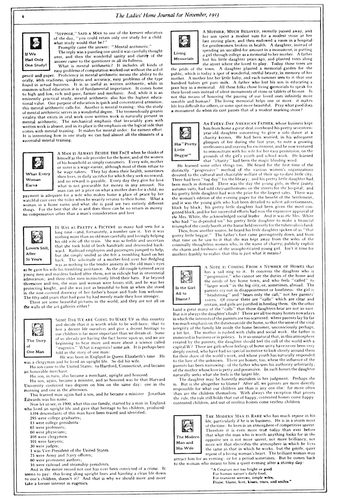
EXAMPLE 417
Box headings are conspicuous on this editorial page
EXAMPLE 419
Excellent typography of an editorial page
EXAMPLE 418
Another way to feature the editorials
EXAMPLE 420
Novel use of rules on an editorial page. By Sherbow
156
EXAMPLE 421
News photograph on the front page
It is absolutely necessary that the text matter of a periodical
be easily read, yet the type-face should not be selected
for that reason alone. It should be well formed and
pleasing to look at, and, if possible, be a face that makes
feasible some harmony in design between text type and
head letter.
In publications that have text matter in eleven-point or
twelve-point a letter such as Caslon Oldstyle would doubtless
be satisfactory, and on small publications Old-Style
Antique or Cushing Oldstyle render excellent service.
Scotch Roman, notwithstanding the fact that it contains
hairlines, gives fairly good results, provided the paper is
not highly calendered.
Letters with hairlines when printed on calendered paper
lack the little legibility that they otherwise possess.
Many letters could be made more legible, especially those
composed on machines, by cutting the matrices so that the
print of the thin lines is a trifle stronger.
The chapter on “Type-Faces” should be read in this
connection.
Type-Faces for the Headings.—An ideal condition
in periodical make-up is one which makes possible the use
for headings of the identical design of type that has been
selected for the text matter, as in Examples 410 and 411,
where a French Oldstyle has been used, and in Example
415, where Scotch Roman is the type-face.
It is not possible always to use the very same design of
type-face for both headings and text matter. After a text
letter has been chosen for legibility or other reason, the
identical type in larger sizes may prove to be too plain
for the sort of periodical on which it is to appear. And
there are sometimes special reasons, regrettable but unavoidable,
an instance of which is this volume, wherein the
text matter is in Scotch Roman (a modern letter with
some relation to old-style) and the headings and captions
in a type-face of old-style form. This combination is not
ideal, and the explanation follows. In order that “The
Art and Practice of Typography” could be published at
a price that would enable it to be widely circulated, the
chapters, as soon as each was prepared, were first printed
in The American Printer. The type-face used for the text
matter and headings in that publication was Scotch Roman,
hence it was felt necessary to use Scotch Roman for
the text of this volume. However, it was believed that a
darker type-face of old-style formation would be more
pleasing for the headings, and a Goudy letter was selected.
EXAMPLE 422
Fine specimen of typographic make-up
A modern type-face (Bodoni Bold) appears on the
headings in Example 412, 413 and 414. Bodoni (not the
bold) is also used for headings in Examples 416 and 427.
Caslon Oldstyle is to be found used for both headings
and text in Examples 426 and 430. Old-Style Antique appears
in Example 431.
The Saturday Evening Post for many years made use
of an old-style letter for its headings that as a type-face
was known as Post Oldstyle. The italic, outlined and filled
in with gray-printing lines, is shown in Example 424.
A Gothic decorative letter is not out of place on a
Christmas number of Collier’s (Example 425), but is not
recommended for general use on periodical pages.
Large, bold, black type-faces for headings in periodicals
should be avoided.
Interest can be added, in the treatment of department
157headings of technical publications, by using slightly decorative
panels, but such decoration should be light or slight,
and not the commonplace sort sometimes found in ill-treated
job work.
EXAMPLE 423
An attractive first text page. By Lester Douglas
Editorial and title headings in typographic treatment
should blend with other parts of the text pages and not
look, as some do, like quarter-page advertisements inserted
in reading matter. Example 429 shows good treatment.
Make-up of the Illustrations.—When planning to
use illustrations on periodicals both facing pages should
be before the person doing the planning. The text matter
of the two pages forms a background of gray, and the
problem is to place illustrations, headings and initials in
positions that will not only be well balanced but so assembled
that one will not interfere with another.
Usually there should be some text matter between illustrations;
they should be placed toward the outer side of
the page (see Example 422). The center position is practicable
when there are three columns and the illustration
is but a single column in width, or when the expense of
running around may be incurred (see Example 424).
Illustrations frequently look better separated from the
heading, as in Example 414, than when joined with the
heading, as in Example 412.
The same style of illustration should, if possible, be
used on facing pages. Make-up that shows a line plate on
one page and a halftone on the adjoining page is inharmonious
and not so pleasing as when all illustrations on
facing pages are of the same character. They should be,
say, either line like that in Example 414 or halftone like
that in Example 412.
EXAMPLE 424
Illustration placed in center, necessitating running around
EXAMPLE 425
Feature page of a Christmas number
When an illustration appears on a text page, initial letters
158should be plain and small, as in Example 414; but
when no illustration appears the initial can be large, as
in Example 411, or even decorative. For regular purposes
initials as used on Examples 409 and 425 are inadvisable.
EXAMPLE 426
Convention feature page of a technical journal
Pleasing use of a vignette style of illustration is to be
seen in Example 430. It lends interest to the first text
page and at the same time illustrates the leading article.
The illustration in Example 429 is also effectively
placed.
Arrangement of Headings.—Headings, in a way, advertise
or “sell” the contents of a periodical, and their
arrangement depends on how far the editor or layout man
wishes to go in advertising or “selling” the contents. The
American people have so much reading matter available
that it is probably necessary in most instances almost to
force them to read the various articles in periodicals. Encyclopedias
are read even if there are no display headings
and the type is in six-point, and there are periodicals that
are read without urging; but it may as well be conceded
that articles are read more when they are well advertised.
A well-advertised story will be found in Example 413.
The title is brought out prominently in a large, bold type,
as is the name of the author. The italic line above the title
smacks of real advertising, as does the group of type inserted
in the upper part of the text. The display in Example
412 is frankly advertising in its appearance.
The Saturday Evening Post heading (Example 424) is
large, but there is no descriptive advertising, and there is
little of the nervous fear of going unread so evident in
Examples 412 and 413.
Calm, yet pleasing, treatment of headings is to be found
in Examples 411 and 423.
It is well to give attention to the presentation of article
headings, but sometimes in the place where the heading
should go there is so much noise and so much talking that,
as a means of resting the nerves, the leaf is quickly turned
or the periodical laid aside.
EXAMPLE 427
News headings and make-up
Periodical titles, as they appear on the first text page of
each issue, are variously treated. The small, neat effect
of Example 423 is commendable. It is in Scotch Roman
and harmonizes with the article heading and text type.
Title headings on a larger scale will be found in Examples
410, 415 and 416. Special lettering is sometimes pleasing,
as in Examples 421 and 430.
The news department of trade and business periodicals
requires numerous headings. Example 427 is suggestive.
There the news articles are in narrow columns and have
a newspaper style of heading.
Caslon Oldstyle looks well on any class of publication.
Roman capitals and lower-case and italic may be used in
the same line, as on Example 429.
The Captions.—It is customary to set captions centered
under illustrations in a size smaller of the type-face
used for the text matter and to arrange the caption in one
or more lines no wider than the illustration.
When the caption is in two parts the first part is usually
set in capitals and the second part in lower-case, both centered.
The lower-case is sometimes roman and sometimes
italic.
Seldom do captions receive the special decorative treatment
that has been accorded them in Examples 412 and
414. Even two-line initial letters have been used with them.
The plain double caption in roman capitals and lower-case
is to be found in Examples 421 and 422. A single caption
159in italic lower-case is shown inside a rule that surrounds
the illustration in Example 424.
EXAMPLE 428
A conservative and readable editorial page
Arrangement of captions in lines of the same length,
making a block of type (as in this book) is liked by many.
However, the caption is to be read and its shape is not of
more importance than its legibility. It is a mistake to arrange
a caption in several lines of capitals and then letterspace
some of the words to obtain the block effect. Such
letterspacing advertises the effort as unsuccessful and also
disfigures the page.
The Editorial Pages.—In periodicals, editorial pages
are treated variously. There is no standard style such as
is found in most newspapers. All five editorial pages reproduced
here, in make-up and typographic treatment,
differ from one another.
The Ladies’ Home Journal (Example 417) has the title
of each editorial in a small rule panel along with the publication’s
trademark, and the matter is set in two wide
columns. The first clause beginning each editorial is composed
in capitals and small capitals. The page is surrounded
by a double-line border.
Collier’s (Example 418) begins each editorial with an
initial letter, followed by several words in capitals, and
the title in a dark-faced italic is set at the left end of the
line. A decorative symbolic heading is placed above all.
System (Example 419) has a neat, readable editorial
page, arranged in an interesting manner. The name of the
magazine, of the editor, and the month and volume are
neatly placed at the top, and the blank space that follows,
occupied solely by the small black decorative mark, gives
pleasure. Each editorial is introduced by a heading in
small capitals and by an initial, which is larger in the first
article.
The editorial page of Advertising and Selling (Example
420), by Sherbow, is unlike any of the others. Rules
are used between columns, on both sides of headings, and
above and below the page heading. The result is pleasing,
and invites reading of the page.
EXAMPLE 429
Caslon headings and an old-style text type
The style of make-up of The American Printer editorial
page (Example 428) was purposely patterned after that
of the conventional newspaper editorial page. The editorials
of conservative metropolitan newspapers are probably
read more regularly than any other part of the publications,
and such reading has possibly been invited by
the restful style of the typography. There is reason to
believe that this somewhat old-fashioned treatment and
its lack of affectation have really accomplished what was
intended.
The editorial page should be unlike the other pages of a
periodical, and these examples should assist printers and
editors in determining suitable typographic treatment.
Features.—Typography can have much to do with the
playing up of features in periodical make-up. An instance
is the page reproduced as Example 426, which consists of
what would ordinarily be the notes of the convention. In
this instance the notes were written in a style that suggests
the quaint diction of Colonial days. Some of the
words of the text were capitalized, as was done in those
times. In the page heading a few of the letters were tilted
to give an irregularity caused in old composition by defective
typefounding. Even the brass rules were nicked
(brass rule was seldom in good condition in the old days).
A crude initial of ancient vintage and an illustration simulating
an old woodcut added decorative interest. This page
was a change from the routine style of the other pages.
The page from Collier’s (Example 409, Insert) was
160one of the features of a Thanksgiving number. Its decorative
border suggests the treatment found in Books of
Common Prayer (see page 27).
EXAMPLE 430
Caslon typography on a magazine. By Will Bradley
Christmas feature treatment is also found in Example
425, also by Will Bradley. The text letter used in this example
for initials and headings is hardly suitable for use
generally in periodicals, but for occasional features it is
not out of place.
Verse when used will usually look more interesting set
in italic, especially when the italic has a decorative quality.
One of the important general magazines sets verse
in Kennerley italic in a decorative panel broken into the
text page at a suitable point.
Important parts of an article reprinted in an attractive
panel on the same page would call attention to the article
and invite reading.
A certain amount of restraint is necessary when planning
typographic features for periodicals. Type-faces
should be selected with knowledge and care, and seldom
should large sizes be used. “Jobby” display effects are
never in order on the text pages of periodicals.
The Advertisements.—The typographic details of the
editorial section of a national periodical in the field of
advertising were recently revised and made more pleasing,
yet when made up and printed the work that had been
done was so overshadowed and counteracted by the bold
types on the advertising pages that the general result was
disappointing.
It is useless to attempt good typography on periodicals
so long as advertisements are inserted in text pages or
occupy facing positions; that is, it is useless unless the
periodicals set or reset the advertisements neatly in good
taste as is done by the Curtis publications.
Advertisements should not be mingled with text matter.
According to old-fashioned ideas, the reader buys a periodical
for the text matter, and it is for him to determine
whether or not he shall read the advertising pages. In
some publications the text pages are yet to be found intact,
altho preceded and followed by sold space; in others
good resolves peter out as text meets advertisement toward
the rear, and in others—a majority perhaps—advertisements
dominate almost all of the text pages.
Treatment of advertisements in periodicals need not
necessarily be shy and timid; neither need it be blustering
and noisy. Where advertisements are neatly treated and
not unduly forced on the attention, readers are likely to
give as much time to their perusal as to the text pages. A
gentlemanly solicitor who talks clearly in low tones is
more likely to sell goods than one who disturbs the entire
office by his loud talk and boisterous demeanor. Apply this
to the typography of the advertising pages.
Editorially, it is to be regretted that advertising must
go “alongside of reading,” but it is to be deplored that in
so many periodicals, especially of the business and technical
class, reading matter is seemingly written and placed
for the purpose of accommodating the advertising.
The successful publication of a periodical, as of a newspaper,
depends on liberal patronage from advertisers;
yet these advertisers are best served when the publication
is planned with first consideration for the text features,
and the advertisements are prepared to harmonize and not
clash with the typography of the text matter.
EXAMPLE 431
Good typography of a pocket magazine
EXAMPLE 432.—A house-organ by Taylor, Nash & Taylor, San Francisco, that features typography
161
HOUSE-ORGANS
The house-organ is the little brother of the periodical
and newspaper. It is published most frequently as a means
of communication between a business house and buyers of
that house’s product. Sometimes the publication is circulated
only among the house salesmen or other employees.
Examination of more than one hundred house-organs
revealed a condition that prevails in every department
of publishing—lack of standardization in dimensions. The
smallest house-organ measured about 3 × 5 inches and the
largest 9 × 12 inches. The dimensions grew, from the smallest
to the largest, by quarter inches and half inches. There
are many small pocket house-organs, some of which fit
commercial envelops and others fit baronial envelops. If
there is a favorite size for house-organs, it is 6 × 9, which
dimensions are those of Examples 432, 436, 437, 441, 447
and 448, illustrated in this chapter. Another favorite size
is 7 × 10 inches, which are the dimensions of Examples 444
and 449. House-organs planned in the style of newspapers
and containing four or eight pages are usually 8 × 11
or 9 × 12 inches in size.
A different stock is frequently used for the covers of
house-organs, but equally popular is the self-cover style—the
first page of an eight- or sixteen-page form containing
the cover design. The practices that govern the use of
cover designs on periodicals apply to some extent to house-organs,
although typographic covers are more often found
on the last-mentioned kind of publication.
Example 441 shows a typographic cover in which most
of the page is given over to a table of contents—not a bad
idea when the contents are abundant.
Should a house-organ consist of only two or four leaves,
it is unnecessary to give over the entire first page to a
cover design, as the title could be treated as in Examples
436, 438, 439, 448 and 452. If the cover page is to be
lettered, it is well to have it treated in a style that will
harmonize with the typography of the inner pages. See
Example 435.
Seldom is there any reason for a house-organ to contain
more than four or eight pages. Few of the more ambitious
house-organs survive the first one or two issues, or
are profitable if they do. A house-organ to be effective
should be published regularly. Too many instead of being
periodicals are “spasmodicals.” There is more likelihood
of a house-organ being published regularly if it be modest
in plan and brief in contents. Printers err when they suggest
elaborate and bulky house-organs to their customers.
The smaller kind, neat and stylish in typography, attractive
in make-up, good to look at and easy to read, are more
desirable under average conditions.
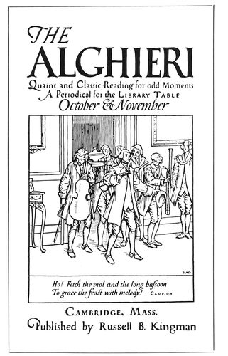
EXAMPLE 435
Pages from a quaintly-treated house-organ, by the Seaver Howland Press, Boston. Both type and illustration suggest the “good old days”
162
EXAMPLE 436
Distinctive lettering and typography
EXAMPLE 437
Interpolated paragraphs in italic
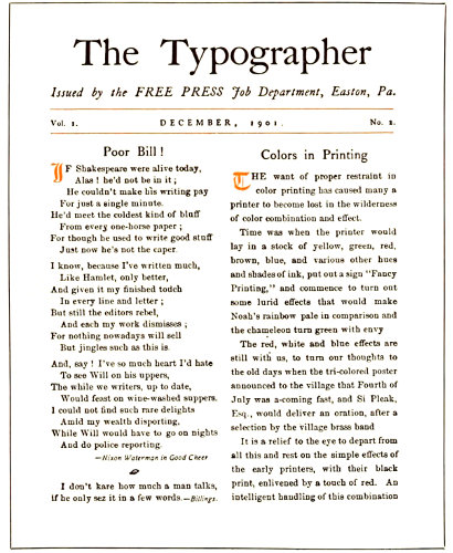
EXAMPLE 438
A house-organ in miniature
EXAMPLE 439
Planned after the printer’s house-organ at the left
The titles of house-organs are not usually as conventional
163and dignified as those of magazines and other periodicals,
although those who have a liking for the conventional
select the word “Bulletin,” adding to it as part of
the title a word which connects it with the business. Hence
we have the “Linotype Bulletin,”
the “Hampshire Service
Bulletin” (Example 436) and
the “Ad.-League Bulletin” (Example
440). Printers, for their
house-organs, use a variety of
titles that include “Typographica,”
“Imprint” (Examples 432,
442, 445, 446, 450 and 451),
“The Typographer” (Example
438), “Pica” (Example 448),
“Type Talks” (Example 452),
“Warde’s Words” (Example
447). In other lines are to be
found “Drug Topics,” “Statler
Salesmanship,” “The Constructive
Banker,” “The Wallace”
(Example 444), “Poor Richard’s
New Almanack,” “Selling
Sense” and “The Ambassador”
(Example 455).
EXAMPLE 440
Attractive rule treatment of headings
EXAMPLE 442
Simple, effective typography
The number of columns that
should be used in house-organs
depends, of course, on the size
of the page. One column is sufficient
for the small pocket publication
(Examples 433, 434,
435, 445, 446, 453, 458 and
459). The page should be made
up in two columns when the size is about 6 × 9 (Examples
438, 439, 440, 444, 448, 449, 450 and 451). The purpose
of more than one column is to make reading easier and not
just to provide a narrow column. On some house-organs
the columns are made so narrow
that it is as difficult to read them
as when they are very wide.
EXAMPLE 441
Contents outlined on the cover
The margins on the house-organs
should be of the same
proportions as on periodicals
and booklets—the most margin
at the foot, with the type-page
inclining toward the head and
binding side. In fact, such margins
should be found on all
printing in which there are two
facing pages.
The type-faces used on house-organs
should be legible and at
the same time good-looking.
Caslon Oldstyle is suitable for
house-organs as well as most
other purposes. The Caslon
style of type is used on Examples
433, 434, 436, 440, 441,
448, 450, 451, 453, and 455.
Other faces used on the house-organs
here reproduced are
Kennerley Oldstyle (Examples
432, 445, 446), Old-Style Antique
(Examples 442 and 447),
Cloister Oldstyle (Example
452), Bodoni Book (Examples
164457 and 458). These and other good faces are available
for house-organ purposes.
EXAMPLE 443
Dark-toned typography by Griffith-Stillings Press, Boston
EXAMPLE 446
Rubricated typography by Taylor & Taylor, San Francisco
EXAMPLE 444
Suitable treatment for this silverware publication
What has been said in the chapter on “Periodicals”
about the suitability of type for headings applies as well
to house-organs. In most of the pages here reproduced it
will be seen that the head letter is the same kind of type
as the text letter or is harmoniously similar.
The treatment of display announcements or house advertising
should be such as to carry out the purpose for
which the house-organ is issued. If,
as an instance, the publication is issued
for the purpose of presenting
the attractive wares of a stationery
house, it would be well to devote half
of the pages to illustrations, descriptions
and prices of stationery supplies.
Sometimes when the display
announcements are as numerous as
the text pages, an announcement is
placed on the left page facing a text
page at the right. When this is done,
the typography should be neat in appearance;
the type sizes should not
be large, and the type itself not any
blacker than, say, Caslon Oldstyle.
Especially is it a mistake to use dark
faces when illustrations of merchandise
are a part of the page. Dark
type-faces subordinate and render ineffective
such illustrations.
A house-organ designed entirely—display
announcements included—in
the original Caslon Oldstyle by someone
who knows how to get the best
out of the type, would be ideal. The
capitals, small capitals and lower-case
of roman, and the capitals and
165lower-case of italic, can be manipulated so as to produce
an abundance of typographic variety and interest.
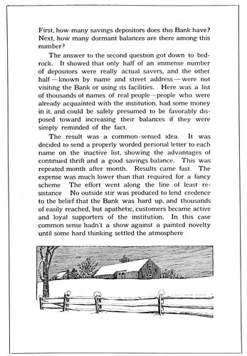
EXAMPLE 447
Easily read and pleasingly illustrated. By the Warde Press, Pittsburgh
While house-organs should be edited with the purpose
of presenting useful technical and business information to
customers, there should be sufficient light matter and features
to maintain interest. Not unimportant is the typography
of such features. In the make-up of all house-organs
are spaces at the end of articles that are available
for feature purposes. Example 432 shows how one
bit of blank space was made attractive by well-arranged
small capitals, and in Example 450 similar use has been
made of italic.
Articles of merchandise that are old-fashioned in their
appeal furnish a motif for typographic treatment that can
be made a feature. Examples 433 and 434 show Colonial
typographic treatment, the use of italic and spaced small
capitals, added to which is a feature page topped by an
old-fashioned woodcut.
There is a suggestion of ancient rubricated books in the
typographic handling of Example 445, appropriate for a
printer who does typography especially well.
Borders around the text pages of house-organs can be
made to act as features if they are designed with proper
restraint, as was done in Examples 432 and 450.
Rules and decorative borders, ornaments and initials
are not out of place on house-organs when used as they
are in Examples 440, 443, 444 and 445.
When the house-organ is issued monthly an old-fashioned
“almanack,” with appropriate matter interpolated,
makes a good feature, as in Example 457.
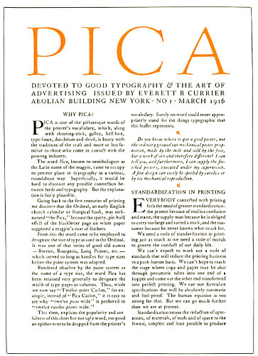
EXAMPLE 448
A typographic house-organ
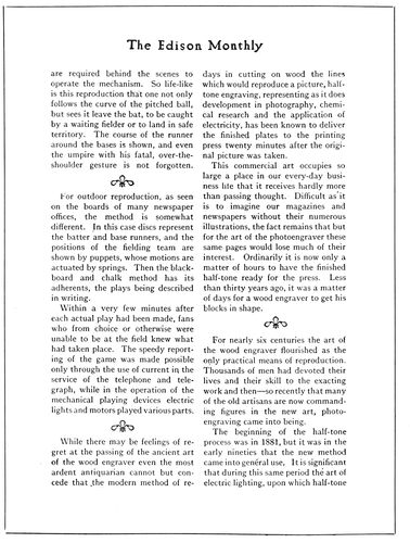
EXAMPLE 449
An editorial page of typographic neatness
166
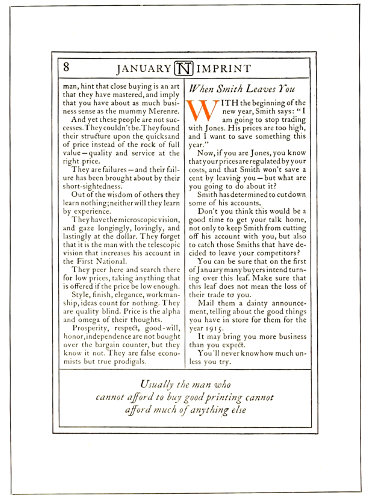
EXAMPLE 450
Attractive use of rules and italic
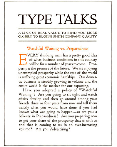
EXAMPLE 452
A page in Cloister type
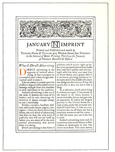
EXAMPLE 451
An elaborate house-organ title-page
EXAMPLE 453
Use of paragraph marks. From Cottrell’s Magazine
As a novelty, house-organs have been printed on blotter
stock. The general treatment for blotter house-organs is
167not different from that of other kinds. The appearance of
a publication is maintained and the matter is merely
adapted to the dimensions of the blotter.
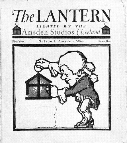
EXAMPLE 454
A good specimen of house-organ cover
EXAMPLE 456
Cover of “The Philistine” issued about two months before Elbert Hubbard went down with the “Lusitania”
House-organs are sometimes successful when laid out
in newspaper style for four pages about 9 × 12 inches in
size. The text matter is planned for three columns, the
text type being eight- or nine-point, such as is customarily
found on machines. Headings are graduated on the newspaper
plan according to their importance. Illustrations
are included at suitable points in such newspaper-like
house-organs.
EXAMPLE 455
Blank space used to good advantage. Text page from “The Ambassador”
There is suggestion for a novel house-organ treated in
old-time newspaper style in the reproductions of the first
two newspapers published in America. (See Examples
401 and 402 of the chapter on “Newspapers.”)
A western printer, who has found the house-organ to be
effective in his business, expressed himself in these words:
Nowadays children are entertained as they are taught, and
they learn unconsciously and much more readily than when
study was made a task and a hardship. That is the principle
we must embody in a house-organ—entertain and instruct simultaneously.
Make your readers smile and enjoy themselves while
they are learning the value of good printing, prompt service and
square dealing. Create in them a desire to be as particular about
their printing as they are about their company or the set of a
collar, but keep them entertained and interested the while. Of
course this can be overdone, so don’t make the mistake of having
too much outside matter, but keep to your subject in a tactful
way.
The day is past when business secrets can be kept from the
buying public. During the past ten years magazine and general
advertising policies have educated consumers along entirely new
lines, and now they insist on knowing why they pay special prices
for specific articles. They not only want to know why, but what
it is, where it comes from, who makes and sells it, and how. The
sooner we tell them these things, just that much sooner will confidence
be established and buyers of printing acquire a knowledge
that will enable them to buy intelligently, to distinguish
between the economy in good service and the extravagance in
poor service. In a house-organ there is unlimited opportunity
for preaching the gospel of good service and for educating the
public to the fact that that kind of service is the cheapest.
168
EXAMPLE 457
An “almanack” feature
EXAMPLE 458
Bodoni typography
EXAMPLE 459
Cover of a small house-organ
I consider the establishment of this confidence between the
printer and customer one of the strongest pulling features of
a house-organ. I do not mean by that that one should open his
books to the public, but give enough information to let your
readers know that you are in a business that requires capital for
its conduct, that it is a dignified business, that you give efficient
service, and that such efficiency costs you proportionately as
much as it costs him. Having let your readers into this much of
your business secrets, keep hammering away on your service and
efficiency, but do it in a tactful way. Don’t bore him. Entertain
him. Remember the old proverb, “He who tries to prove too
much proves nothing.” So give it in homeopathic doses, but
mighty regular ones.
A feature of the house-organ as issued by a printer
should be specimens of actual work. Small cover designs
and pages from booklets and other specimens can be saved
and collected from overruns and presented in the house-organ.
It would be better to use but one or two specimens
in each issue than to overload the publication. Only creditable
work should be included in this manner. If, say, a
bit of four-color process work is produced, it should not
be used as an exhibit merely because there is color in it,
but it should be tested by answering these questions: Is it
a good drawing? Are the colors properly blended, or is
there an unpleasant predominance of red and yellow?
Are the plates in good condition? Have they been properly
printed? Unless the answer is affirmative, it would be better
to include neat, modest black-and-white specimens.
Many house-organs are made ineffective by the anxiety
of the business house issuing it to include everything possible.
A number of issues should be planned and each
should contain a limited amount of text matter and illustration.
Many of those to whom the house-organ is sent
also receive dozens of others, and examination and reading
of the publication should not be discouraged. When
there is too much of an abundance, the house-organ is
either thrown in the waste basket or laid aside and never
looked at again.
Loose inclosures should not be numerous. Attention is
frequently taken away from the house-organ itself by the
variety of envelop slips, calendars and blotters that are
included in the mailing. There should be nothing but a
return post card, and this should be clipped to the inside
of the rear cover and not tucked in on top of the title-page,
as is too often done. Several return cards are reproduced
(Examples 460, 461 and 462). When these post
cards are planned the postal regulations governing their
use should be investigated. It may be well to quote from
the United States Postal Guide:
Post cards manufactured by private persons, consisting of an
unfolded piece of cardboard in quality and weight substantially
like the Government postal card, not exceeding in size 39⁄16
by 59⁄16 inches, nor less than 2¾ by 4 inches, bearing either
written or printed messages, are transmissible without cover in
the domestic mails (including the possessions of the United
States), and to Canada, Cuba, Mexico, Republic of Panama, and
city of Shanghai (China), at the postage rate of 1 cent each,
and in the foreign mails at the rate of 2 cents each, to be paid
by stamps affixed.
Advertisements and illustrations may appear on the back of
the card and on the left half of the face. The right half of the
face must be reserved for the address, postage stamps, postmark,
etc.
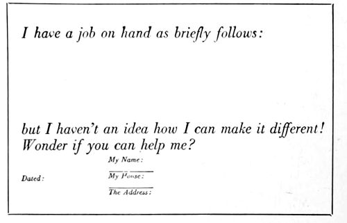
EXAMPLE 462
Suggestions for treatment of the return post cards that usually accompany house-organs
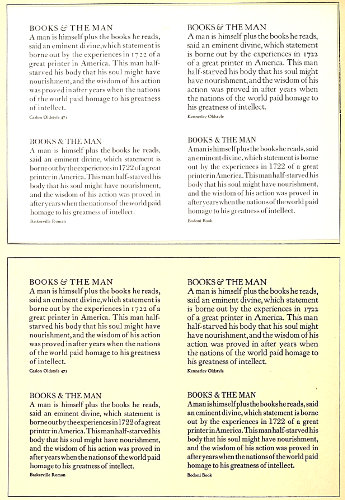
EXAMPLE 463
Comparison of the same type forms printed on a hard-finished paper, and also on a soft-finished paper. The good qualities of these type-faces (Caslon Oldstyle, Baskerville Roman, Kennerley Oldstyle and Bodoni Book) are more evident and the print of the types more legible on the soft-finished paper
169
TYPE-FACES
TYPE-FACES, at first acquaintance, are no more easily
remembered than the faces of people we meet. Many persons
look alike and many type-faces look alike, until we
get to know them intimately and are able to distinguish
their characteristics. The average man or woman is unable
to identify Caslon Oldstyle, Scotch Roman, Bodoni Modern,
or any specific letter used in printing, altho there are
those who have a vague idea of the existence of types
known as “old-style” or “modern.”
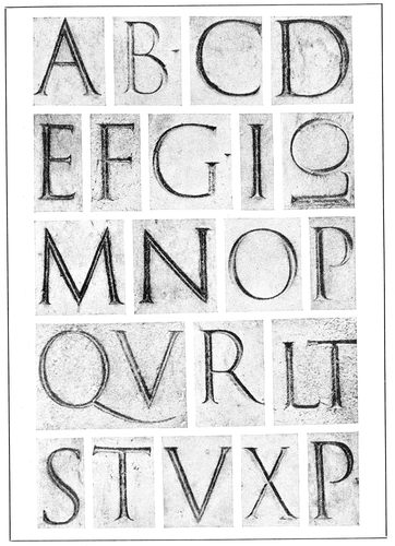
EXAMPLE 464-A
Roman alphabet from the inscription on the base of the Trajan column, Rome, about A. D. 114. From Johnston
The fact that there are thousands of type-faces on the
market adds to the difficulty of recognizing and naming
them, and the situation is further involved by the practice
of composing-machine makers in using only numbers to
designate type-faces and by various typefounders giving
different names to the same design of type. The special
type-faces of private presses are usually given the name
of the work on which they are first used.
Six Representative Standard Roman Type-Faces
Believing that such a service would be appreciated by
printers and users of typography, the author made a study
of the thousands of Roman type-faces on the market, with
the purpose of selecting a half-dozen representative standard
faces. It was felt that these type-faces should be legible
and good-looking, and possess character; that their
merits should be acknowledged by authorities, and that
the types should be capable of wide serviceability on both
book and job work.
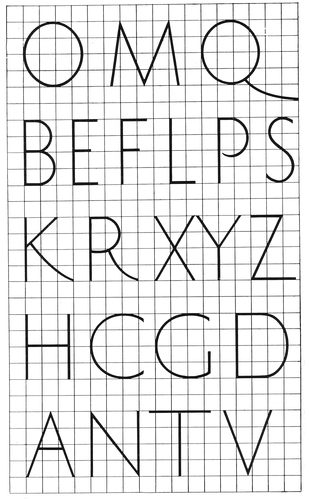
EXAMPLE 464-B
Proportions of Roman capitals as found in the Trajan alphabet, and a few additional letters
170
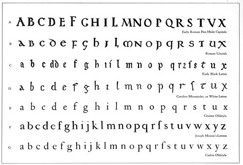
EXAMPLE 465
Evolution of Roman lower-case type-faces. (A) Pen-made Roman capitals. (B) Development into Minuscules or lower-case thru rapid lettering. (C) Black Letter or German Text developed from Roman Uncials. (D) White Letter, the open, legible Caroline Minuscules, on which Jenson based his Roman type-face of 1470. (E) A recent type-face closely modeled on Jenson’s Roman types. (F) Joseph Moxon’s letters of 1676. (G) Caslon’s type-face of 1722
The face first selected—and without hesitation—was
Caslon Oldstyle as originally designed. Scotch Roman was
the second selection, Cheltenham Oldstyle the third, Cloister
Oldstyle the fourth, Bodoni Book the fifth, and French
Oldstyle the sixth. (All shown in Example 467.)
Type-faces designed and cut for private use were not
considered in making these selections, as it was believed
best to adhere to type-faces that are procurable from most
foundries and that are available for machine composition.
It may be well to inject here a warning that most so-called
Caslon Oldstyles are not as good as the one selected (Example
467-B); that Jenson Oldstyle is inferior to Cloister
Oldstyle (Example 467-A) as a representative of the
original Jenson type. However, good representatives of
Scotch Roman (Example 467-D) are obtainable under the
name of Wayside, of National Roman, etc.
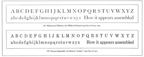
EXAMPLE 466
Two standard type-faces that rate high in legibility, but that are colorless in the mass and lacking in the pleasing irregularities of form that characterized Roman type-faces before the nineteenth century. The various qualities of legibility found in Modernized Oldstyle have been converted to narrower letter shapes and more “modern” form in Century Expanded
171
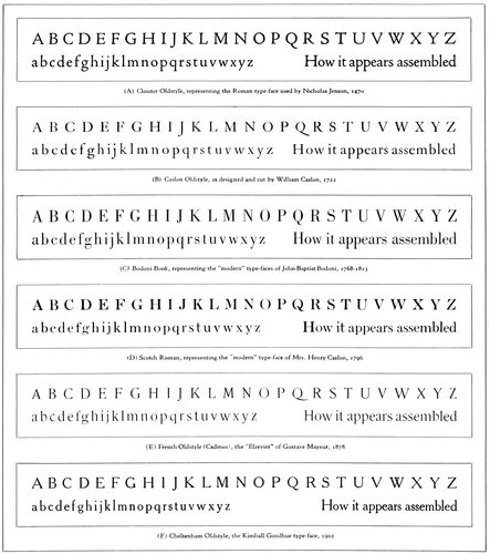
EXAMPLE 467
Six standard representative Roman type-faces, approved by authorities for both beauty and legibility, and selected by the author from the thousands of type-faces available for hand and machine composition
Selection of these faces was also made just as a person
makes a wise selection of records for a Victrola—for permanency
and investment. As standard records can be selected
which will “wear” for a long time, so standard
type-faces can be selected which will look well for many
years. Good type-faces are like good music.
We will discuss these six faces.
Cloister Oldstyle.—Use in American printing of a
standard type-face based on the Roman letter cut by
Nicholas Jenson about 1470 has been retarded by the
fact that typefounders in this country some years ago used
as a model Morris’s interpretation of the Jenson face instead
of going direct to the original letter. Jenson’s face
had been copied by Bruce Rogers, T. J. Cobden-Sanderson,
Frederic W. Goudy and others, and the fonts used
privately, but for general use it was not until 1914 that a
creditable copy of the face was made available by the
good judgment displayed by the American Type Founders
Company in bringing out Cloister Oldstyle. This is probably
the best rendition of the spirit of an old Roman type-face
that a modern type foundry has made. If there is a
fault, it is that the lower-case letters set a trifle too close.
172
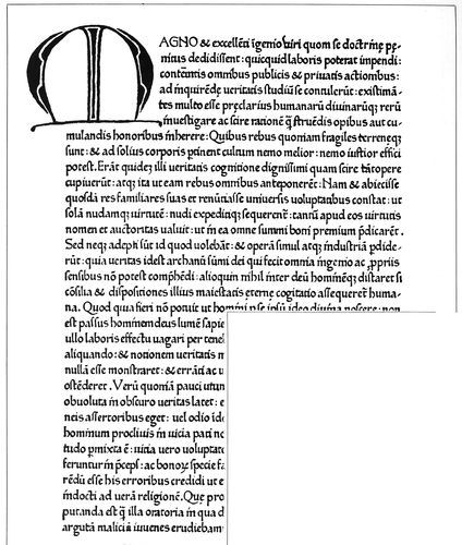
EXAMPLE 468
Type-face used in Italy by Sweinheim and Pannartz in 1465. From De Vinne
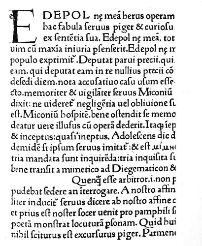
EXAMPLE 469
The Roman types of John and Wendelin of Spires, Venice, 1469. Greek letters were to be written in the line now half blank. From the original in Typographic Library and Museum, Jersey City, N. J.
173
EXAMPLE 470
The beautiful “White Letter” Roman type-face of Nicholas Jenson, 1470, from “Eusebius,” the first book printed by him at Venice. The dot over the “i,” small and slightly to the right, is found, also, in the manuscript specimen here inserted. From the original in the Typographic Library and Museum, Jersey City, N. J.
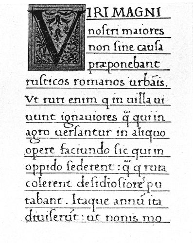
EXAMPLE 471
Section of manuscript of the fifteenth century, in the Charlemagne “White Letter” on which Jenson may have modeled his Roman type-face. From Humphrey
Jenson’s face was not the first Roman type made, as is
174sometimes supposed; others had previously been used
(Example 469), but it was the first Roman type to meet
the approval of those who preferred the Italian White
Letter to the Gothic Black Letter.
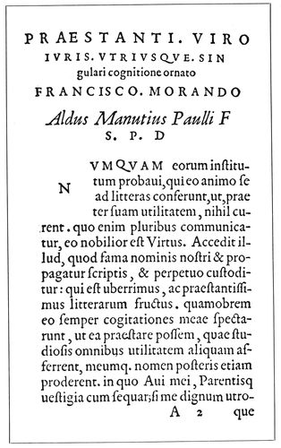
EXAMPLE 472
Type-face used by Paul Manutius at Venice in 1566
Sweinheim and Pannartz were German printers who,
in 1465, began to print near Rome. Until this time the
black Text letter such as Gutenberg had printed with
ten years before was the only one used in typography,
but book buyers in Italy wanted Italian lettering. The
German printers attempted to cut an Italian face, but in
appearance they did not advance far from Gothic lettering
(Example 468).
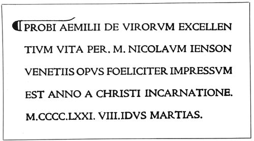
EXAMPLE 473
Cloister Oldstyle set in imitation of the Jenson title on page 14. Printed and zinc-etched, as was the original
EXAMPLE 474
Type-face cut in 1693, now used by the National Printing Office, Paris. Notice slight projection on lower-case “l,” a decorative feature used by Gutenberg in his types
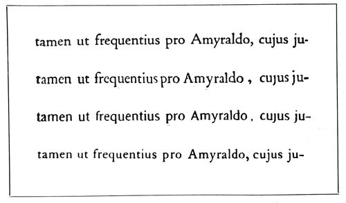
EXAMPLE 475
The first line is set in Cloister Oldstyle; second reproduced from Elzevir page opposite; third set in Cadmus; fourth in Caslon Oldstyle. These lines are zinc-etched
John and Wendelin of Spires, Germans, began to print
at Venice in 1469 with a type-face that was more Italian
in character, yet it had Gothic characteristics. Nicholas
Jenson, a Frenchman, who began to print in 1470 at
Venice, was more successful, and he gave to the world the
fine Roman type-face that he used on his first book, shown,
together with a sample of contemporary lettering of similar
design, as Example 470. More facts about Jenson will
be found on page 14.
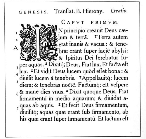
EXAMPLE 476
Cheltenham Oldstyle, with the capitals a size smaller, set in imitation of the Plantin typography on page 16
175
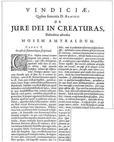
EXAMPLE 477
Type-faces used by Daniel Elzevir at Amsterdam in 1675. From “The American Printer” library
EXAMPLE 478
The Roman types of Fournier, the French founder, taken from his type book of 1766
176
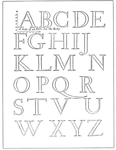
EXAMPLE 479
A capital alphabet drawn by Joseph Moxon (1676) to a scale of forty-two small squares
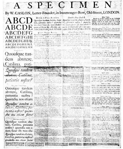
EXAMPLE 481
Earliest known specimen sheet of printing types, issued by William Caslon in 1734
As time went on, printers and typefounders made
changes in the Jenson design, but these alterations were
not numerous (the cross stroke in the lower-case e was
one, Example 495), and fairly close resemblance to the
Jenson types is found in the Roman types of Paul Manutius,
1566 (Example 472), Daniel Elzevir, 1675 (Example
477), and Fournier, 1766 (Example 478).
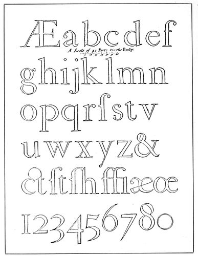
EXAMPLE 480
Moxon’s lower-case alphabet, which he says was patterned after the letters of a Dutch punch cutter
In selecting a page from Jenson’s book, “Eusebius,” to
be photographed, the writer had great difficulty in finding
one of sufficient evenness and clearness of print. It may
be that Jenson, in his endeavor to enhance the “White
Letter” effect of his types, used a minimum of ink, and,
under these circumstances it was perhaps more difficult
for him to maintain consistent page color than it was for
Gutenberg to do so with his “Black Letter” pages. Bruce
Rogers’s printing of his Jenson-like pages of typography
would be a revelation to the old-time Venetian printer.
Jenson made his Roman letter in only one size, and that
fairly large (about sixteen-point), so that the open design
of the characters would admit white light from the
paper background. When, some years later, he was required
to print cheap devotional books, he cut and used
a compact Black Letter Text type for the purpose.
There is now a movement away from the mechanical
style of type-face, restricted in design by arbitrary craft
rules, in the direction of the graceful, interesting yet legible
faces represented by Cloister Oldstyle.
This type will be found in use in Examples 171, 240,
256, 266, 286, 316, 337, 340, 341, 345, 357, 359, 372,
383, 399 and 452.
The Italic that accompanies Cloister Oldstyle is based
on the Italic of Aldus Manutius.
Caslon Oldstyle.—This is a historic American type-face.
It was used by that renowned American printer,
Benjamin Franklin; it appears on eighteenth-century
school books, and even our paper money was printed with
it. It was the type-face used by John Dunlap, the Philadelphia
printer, in setting up and printing the first published
177copies of the Declaration of Independence,
a few hours after it had been
passed by Congress, July 4, 1776. (See
facsimile that appears as a frontispiece
to this book). It was one of these copies
that was read to the Continental Army.
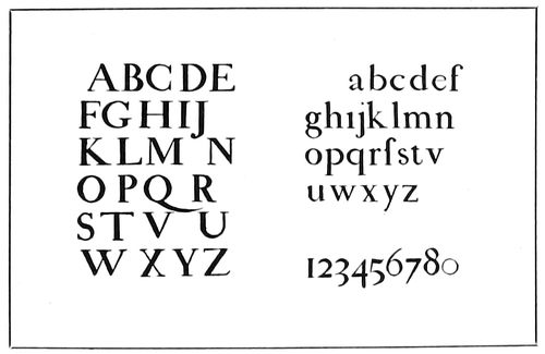
EXAMPLES 479-A and 480-A
The Moxon alphabets inked in and reproduced in a smaller size
Today, nearly two hundred years after
the first font was cut, Caslon Oldstyle
has the approval of the good printers of
America, who regard it, in its original
form, as the best and most useful Roman
type-face available, as it is one of the
few old faces the punches and matrices
of which have been preserved and placed
at the disposal of all printers.
The Caslon foundry in England now
casts the original letter as “Caslon Old-face.”
In this country, all typefounders
make some sort of Caslon, and it may be
procured practically in its original form,
with long descenders, kerned f and j, old
special characters, decorated Italic capitals
and all, from the American Type
Founders Company, which has named it
“Caslon Oldstyle 471” (Example 517).
Other foundries are preparing to furnish the letter
more in its original form, and composing-machine makers
are doing likewise. The monotype company, after cutting
several faces in imitation of imitations of Caslon’s
type, finally copied the original fairly successfully, and
this, as now obtainable, is known as Caslon Oldstyle No.
337. The linotype company is recutting its Caslons and
is making a sincere effort to reproduce the original letter
as closely as possible. Mechanical difficulties prevent
an exact duplication in every detail of the Caslon type in
machine composition, yet the companies that are attempting
it show a spirit that augurs well for the future quality
of printing in America.
Caslon Oldstyle is not at its best printed on a smooth,
highly-calendered surface.
When properly composed and printed, it presents as
a page a dark-gray tone, formed of a pleasant mixture
of black ink and white paper; its letters show more of
a contrast in thick and thin strokes than do the Roman
types of Nicholas Jenson, and have more color and interest
than the modernized old-styles of the nineteenth century.
In the sizes above ten-point it measures up in legibility
and beauty to the requirements of the best printers
and other students of typography.
Caslon did not create an entirely new Roman letter, but
with the elements that had already been provided by Jenson
and the type designers of Holland he did, with good
taste and skill, build a type-face that is distinctive, legible
and beautiful. The illustration of the evolution of
Roman lower-case in Example 465 furnishes opportunity
for study of this point.
The story of the designing of Caslon Oldstyle has been
often told, yet a few brief facts may be of interest here.
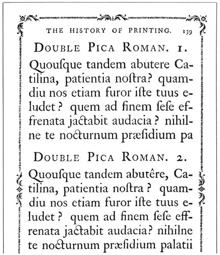
EXAMPLE 482
There were two slightly different faces to many of the Caslon fonts. From the specimen pages in Luckombe’s “History of Printing,” published in 1770
Typefounding and printing had deteriorated in England,
and the product of the printing press was pathetically
poor (the author was surprised, in examining important
volumes printed in England about 1700, at the
consistently poor work of typefounder, compositor and
pressman), when, in 1720, William Caslon, an engraver
on metal, was called upon to cut a font of Arabic characters,
to be used in printing a New Testament for the poor
Christians in Palestine and Arabia. At the same time, for
use at the foot of the proofs of his Arabic types, he cut
his own name in Roman, pica size. (This was at the time
when Benjamin Franklin was working as a journeyman
at Watt’s printing office.)
The pica size, however, was not cast immediately. So
far as is known, the size of Roman first to be cast by Caslon
was that called “English” (about fourteen-point),
which he cut in 1722. Additional sizes followed, and at
about the period of his death, in 1766, there were at least
thirty fonts of Roman (pearl to five-line pica), nineteen
fonts of Italic, ten fonts of Black Text, and various fonts
of Greek, Hebrew and other alphabets, together with
more than a half-hundred fonts of flowers and bands.
The fonts that have been preserved to us, and that are
purchasable, do not include all. There were Nos. 1 and 2
faces in nonpareil, brevier, bourgeois, long-primer, small-pica,
pica, english and double-pica (two-line small-pica).
The No. 1 face in each case was a trifle larger than that
of No. 2, and a third face, still larger, was made in bourgeois
and long-primer.
178These faces were all shown, in honor of the memory of
William Caslon and as a tribute to the merit of the type,
in Luckombe’s “History of Printing,” published by Adlard
& Browne, London, in 1770 (Example 482).
It is probably the smaller and lighter No. 2 faces that
have been preserved to us in the ten-point (long-primer)
sizes and under. The lighter, more open eighteen-point
(great-primer) Italic (Example 517), so different from
the Italic of the other sizes, is as Caslon made it. In some
respects it is better than the Italic of other sizes.
While the general appearance of all sizes of the Roman
is the same (and of the Italic also, with the exception
noted), there are slight differences in details of design in
the various sizes. For this reason, when Caslon Oldstyle
is compared with the original letters, the comparison
should be with the same size in each instance.
De Vinne, perhaps influenced by the prejudices and
practices of nineteenth-century typefounders, in one of
his books points out as defects in the original Caslon types
features that typefounders and composing-machine makers
are today restoring to the face as used in America.
The “defects” were supposed to be: “Too long a beak to
the f and j; unnecessary narrowness in the s and a, and
in some capitals; too great width of the c, o and v.”
Typefounders and composing-machine makers have
filled the type cases of the printers of this country with
Caslons that have been improved (!), recut, modified, adjusted
to “lining” systems, made bold, disfigured, sawed-off
and ill-treated generally; and as they bring out good
copies of the original letter, it is to be hoped that, so far
as possible, sale of the defective and offending type-faces
and matrices will be discontinued.
William Caslon died in 1766, and the business was
continued by William Caslon the second, and then by William
Caslon the third. Mrs. Henry Caslon conducted the
business in 1796, when was brought out the modernized
Caslon (Example 484-B) that was probably the model for
the type we know as Scotch Roman. This modernization
was a concession to the demand for types in the new style
that had been designed by Giambattista Bodoni, an Italian
typefounder.
The influence of Bodoni’s ideas in type design was such
that Caslon Oldstyle was not included in the 1805 specimen
book of the Caslon foundry, and did not again appear
therein until 1860, a year after the face had been reintroduced
to America by a Philadelphia foundry.
The story of the revival of Caslon Oldstyle in England
has been told in these words:
In the year 1843, Mr. Whittingham, of the Chiswick Press,
waited on Mr. Caslon to ask his aid in carrying out the then
new idea of printing, in appropriate type, “The Diary of Lady
Willoughby,” a work of fiction, the period and diction of which
were supposed to be of the reign of Charles I. The original matrices
of the first William Caslon having been fortunately preserved,
Mr. Caslon undertook to supply a small font of great-primer.
So well was Mr. Whittingham satisfied with the result
of his experiment that he determined on printing other volumes
in the same style, and eventually he was supplied with a complete
series of all the old fonts.
America took part early in the revival of Caslon’s old-style
types, for in 1858 matrices were brought to the
United States by the Johnson Type Foundry, afterward
MacKellar, Smiths & Jordan, now the Philadelphia branch
of the American Type Founders Company.
The first size made in this country was brevier, which
was announced in the “Typographic Advertiser,” the
company’s house-organ, of January, 1859. Six months
later thirteen sizes were shown, and in 1865 Caslon Oldstyle
was made in sizes from pearl to six-line pica.
The decorative Italic types, known as Swash letters,
were not until 1916 included in the American fonts, but
these, redrawn by T. M. Cleland, are now procurable.
Selection of Caslon Oldstyle, in 1892, for the text and
advertisements of Vogue, the use of the letter by Will
Bradley at the Wayside Press, in 1896, and the general
old-style revival, influenced by the work of William Morris,
of the Kelmscott Press, in England, were causes that
led to the present popularity of Caslon Oldstyle.
This Caslon style of type-face is one of the few standard
letters that has practically unlimited usefulness. Properly
treated, it looks well on any class of printing, from
a business card to the text and advertising pages of periodicals.
It may be seen in action in this book by referring
to Examples 18, 34, 64, 65, 66, 67, 68, 81, 82, 86, 96, 119,
121, 126, 127, 132, 133, 134, 135, 138, 150, 151, 167, 168,
169, 172, 178, 180, 188, 190, 191, 195, 203, 215, 221, 222,
223, 224, 225, 228, 230, 231, 232, 236, 239, 245, 246, 247,
248, 249, 250, 260, 262, 268, 274, 282, 284, 287, 289, 290,
292, 294, 296, 297, 300, 374, 375, 382, 384, 385, 393, 394,
396, 426, 429, 430, 433, 434, 436, 438, 439, 440, 441, 448,
450, 451, 453, 455, 459, 460 and 461; the frontispiece;
upper specimen, page 21; reproductions, page 23; insert
opposite page 32; upper specimen, page 33.
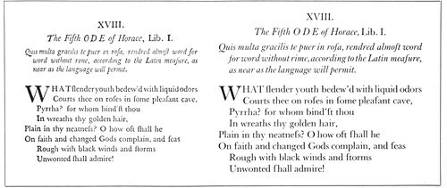
EXAMPLE 483
On the left is a reduced reproduction (from Reed) of Baskerville’s types used in a book of 1758, and on the right, for comparison, is the same matter set in Baskerville Roman, twelve-point size, introduced to America in 1917
179
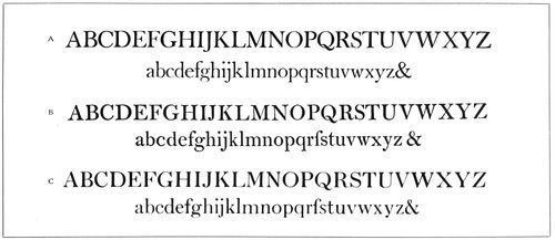
EXAMPLE 484
The possible descent of Scotch Roman. (A) Baskerville Roman, based on Baskerville’s letter of 1758. (B) Mrs. Caslon’s “modern” Roman of 1796. (C) Scotch Roman, as we know it today
Bodoni Book.—When a representative of the Bodoni
type family was selected for a place in the group of standard
faces, Bodoni Book was chosen for its refinement and
legibility. In its lower-case, especially when printed on
other than gloss-surfaced paper, it seems to have more of
the qualities of the best types of the Parma printer than
does Bodoni, the first series brought out by the American
Type Founders Company. Scientific tests have demonstrated
that in the small sizes usually used for text purposes,
type-faces with considerable contrast of hairlines
and heavy strokes strain the eyes. The contrast found in
Bodoni Book is moderate.
John Baptist Bodoni was born in Italy twenty years
after William Caslon cut his first font of Roman letter.
Bodoni’s subsequent career as a printer and typefounder
doubtless resulted from his entrance, when eighteen years
old, to the printing house of the Propaganda, in Rome.
He began his important work in Parma in 1768.
The print of his books is remarkable for clearness, and
in both type-cutting and printing he was skilful to a high
degree. His types are not quite so regular in design as the
recent Bodonis, and were given additional character by
being impressed firmly in paper that did not have the
enameled surface so much in use in our day.
His type-faces were a change from those previously
used—different from the type-faces of Jenson, the Elzevirs
and Caslon. The change was principally in the serifs,
which were straight, thin strokes; and the general character
of the letters was also distinctive. He used a few fonts
in which the straight serifs were rounded by being filled
in slightly at the corners, and these fonts probably suggested
to Scotch, English and American founders the
style known as “modern,” as compared with the “old-style”
faces in use before Bodoni’s time.
The reader can compare for himself the resemblance of
Bodoni Book to one of the text types of Bodoni as used
in 1789. In order that the comparison could be fairly
made, the Bodoni Book (Example 486) was printed on
antique paper and etched on zinc, as the original Bodoni
page had been (see page 26). This type is not only lighter,
but other details are different from a 1790 type of Bodoni
(Example 487-A), which may have served as a model for
the present-day type-face called Bodoni. Compare the
capital Rs, and notice that the cross stroke on the lower-case
t in the 1783 alphabet is low and distinct, while on
the 1789 page it is high and joined with the upper end of
the vertical stroke. The latter treatment prevails on many
of Bodoni’s types, as it does on practically all type-faces.
Excepting for the straight serifs, many of Bodoni’s types
have some general resemblance to other Roman types of
the seventeenth and eighteenth centuries.
In designing the present-day Bodoni, the typefounders
gave it much of the “finish” in design that was given type-faces
by Scotch and American founders during the nineteenth
century. Typefounders seldom succeed in faithfully
reproducing old type-faces, for the reason that they
“correct the faults” of the old faces, and in doing so lose
much of the humanistic spirit of the original. Were it not
that the punches of some of William Caslon’s types were
preserved, we would not have the true rendering of this
old-style that we now possess. Modernized Oldstyle represents
the Caslon face corrected and improved as the
typefounders of the nineteenth century thought it should
be. Some American founders, however, are making excellent
progress in reproducing the spirit of old type-faces,
and it is possible that we may yet have a satisfactory copy
of the famous “silver” types of the Elzevirs.
Bodoni types are shown in use on page 26, and in Examples
26, 36, 48, 175, 176, 194, 278, 310, 322, 330, 352,
355, 365, 387, 390, 412, 413, 414, 416, 428, 437 and 458.
Scotch Roman.—During the nineteenth century English,
Scotch and American typefounders took Bodoni’s
type-faces, redesigned them more along mechanical lines,
filled in the corners of his straight serifs so as slightly to
round them, and gave to the English-speaking world what
are best known to printers as the modern Romans.
Looking over the specimen books of the type foundries
of the last century—those of Bruce, MacKellar, Smiths &
Jordan, and others—one marvels at the wonderful skill
in the cutting of the hairlines and the general mechanical
excellence of the modern Romans.
Because of their continued use on newspapers and in
books of reference, these letters are in wide use today,
altho there is a movement away from them.
The most generally used type-face on small city newspapers
in America is the linotype company’s Modern
Roman No. 2 (Example 489). In the hand-set days this
broad, open-faced letter was so made for the reason that
it would stereotype easier than would the narrower letters.
It was adopted by the ready-print and plate houses,
and when the newspapers installed linotypes they naturally
180selected the same face, so that the type matter thruout
the publication would match. The larger city dailies
give more attention to the details of the faces they use for
body purposes. If No. 2 is selected, or the leaner No. 1,
modifications are frequently made in some of the letters
or figures. The No. 1 Modern Roman is used by the New
York Times (Example 406).
However, instead of the selection of a severe letter,
such as the so-called Scotch-cut Modern Roman as a representative
type-face in the group of six standard Roman
letters, the more interesting Scotch Roman won the place.
This type-face was first made in America by A. D. Farmer
& Son, and the eight-point and ten-point sizes were
used as body type by The American Printer first in April,
1902. In September of that year there appeared in that
publication showings of the eight-point, ten-point, eleven-point,
twelve-point and fourteen-point sizes, with the
statement that other sizes were in preparation. The name,
“Scotch Roman,” probably comes from the fact that
Miller & Richard, the Edinburgh typefounders, made a
similar letter in sizes from eight-point to twelve-point.
However, they call it “Old Roman.”
Scotch Roman is the link that connects the graceful
old-style and the severe modern Roman. Compare it with
the letter (Example 484-B) made at the foundry owned
by Mrs. Henry Caslon in 1796, and notice the resemblance.
(As a further study, there is added an alphabet of
Baskerville Roman, recently introduced to America.)
Scotch Roman is also procurable under the names of Wayside
Roman and National Roman.
Scotch Roman has been used in Examples 38, 39, 77,
78, 85, 143, 152, 153, 154, 185, 186, 238, 271, 317, 400,
420, 423, 427, 428 and 444.
French Oldstyle.—This is the title by which is known
among printers a style of type-face made, under the
name of “Elzevier,” by the Gustave Mayeur foundry
of Paris in 1878. Its design, M. Mayeur tells us, was suggested
by types used in a book printed in Leyden by the
Elzevirs in 1634.
In 1889, Farmer, Little & Co. of New York procured
drives of five sizes from France and began making the
letter in America, naming it “Cadmus.” The type foundry
of Phelps, Dalton & Co. of Boston had as early as
1884 made a similar and rather pleasing letter in capitals
only, which it called French Oldstyle.
Theodore L. De Vinne was the first to use the Mayeur
French Oldstyle in America. It was a favorite with Walter
Gilliss, who adopted it in remodeling the catalogs and
other printed matter used by the Metropolitan Museum
of Art, New York.
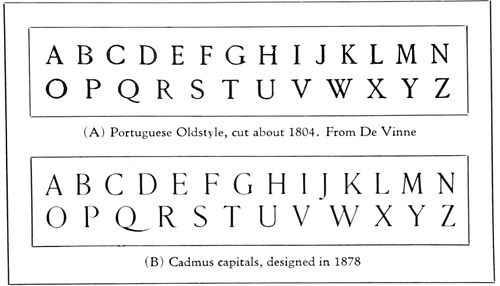
EXAMPLE 485
A study of the French Oldstyle design of Roman capitals
The capitals of French Oldstyle are especially pleasing,
and when this letter is employed they should be used
in display with frequency. The Mayeur letter would be
even more attractive if the proportions of its capitals were
nearer those of early Roman lettering (Example 464-B),
as are some other French Oldstyles.
French Oldstyle is tall and formed with liberal space
between the strokes of the lower-case letters. It should
always be leaded, as its open character and large lower-case
demand that it shall not be crowded. Like Cheltenham,
it is best suited for pages that are narrow and long,
such as the 12mos issued in the seventeenth century by
the Elzevirs.
The Mayeur French Oldstyle has a slight resemblance
to the type-faces found in the Elzevir seventeenth-century
books (Example 475), but is a rather free rendering
of those types. The capitals of the Elzevirs are more in
the proportions of Jenson’s (see Cloister Oldstyle, Example
467-A), and the small letters (o) of the lower-case are
not so large in comparison with the tall letters (l) as they
are in French Oldstyle. The Mayeur letter also contains
the shortened descenders and short-kerned f of the nineteenth-century
typefounders. In fact, both ascending and
descending strokes have been shortened.
Examples 45, 183, 184, 217, 410, 411, and the Jacobi
specimen on page 33 show French Oldstyle in use.
Cheltenham Oldstyle.—This extremely popular type-face
was designed in America and here developed into the
most numerous family known to typefounding—at least
thirty series. A pamphlet issued in 1905 by the Mergenthaler
Linotype Company tells the story of its origin.
Ingalls Kimball, director of the Cheltenham Press, New
York, was commissioned to suggest and supervise the
making of a letter that would have both beauty and legibility.
Cheltenham Oldstyle resulted, the drawings of
which were made by Bertram G. Goodhue.
It was realized by the designers of this type-face that
space between lines increases legibility, and experiments
seem to show that the upper half of lower-case letters are
easier to read than the lower half. For this reason the
lower-case was then designed with long ascending strokes
and short descending strokes. While the theory regarding
the superior legibility of the upper half was announced as
a new one, it had been put forth about 1882 by Dr. Émile
Javal, a Parisian oculist. (See the demonstration in Example
508-G.)
The first announcement by the American Type Founders
Company of Cheltenham Oldstyle in The American
Printer, January, 1903, showed eleven sizes—eight-point
to forty-eight-point. Claim was made that it was a “compact
and legible book type,” and that it would become the
most popular job type.
Because of its lean formation and close set it has been
frequently used for narrow booklets.
A Roman type-face entirely new in design would be a
freak and unreadable in the mass. As a completed design,
Cheltenham Oldstyle was different from others in use in
1903, yet it is made up of features of Roman type design
in vogue between the designing of Jenson’s letter and
Caslon’s types. Study Examples 470, 472, 476, 477 and
478. Compare with the Portuguese capitals, especially
G, P, W, in Example 485.
Cheltenham Oldstyle has strength, readability, and a
certain amount of beauty. Its capitals are awkwardly
large in comparison with its lower-case. It is shown in
use with smaller capitals in Example 476.
Because of the smallness of most of the lower-case and
the close set of the letters, very little space is needed between
words; yet, as used by printers generally, much of
the legibility the type-face possesses is lost by wide spacing
between words, especially on machines.
Because the eye, as a rule, gives less attention to the
lower part of a line of reading matter, the descenders
181were cut off almost entirely in the designing of Cheltenham.
It would be as reasonable, because the eye usually
sees only the upper part of a man, to amputate his legs.
This amputation of the legs of type-faces by modern founders
has maimed many other letters, notably Caslon Oldstyle
as we most frequently see it.
The serif, which is supposed to distinguish modern
types from old-style, is very small in Cheltenham Oldstyle,
and is more like the serif found in modern types.
The general character of Cheltenham, however, is extremely
old-style.
This letter has been used in the composition of Examples
35, 40, 47, 106, 122, 125, 209, 267, 273 and 350.
Development of the Roman Type-Face
In the beginning, Roman letters were in capitals only
(Example 464-A), and, carved on stone, were at their best
about the beginning of the Christian era. The present so-called
Roman, Italic and Text types are descended from
them.
EXAMPLE 486
Resetting in Bodoni Book of the 1789 Bodoni specimen on page 26. Like the original, this specimen was printed and then zinc-etched
Use of the pen and brush in lettering and the tendency
to letter rapidly finally gave us the lower-case type of
today. The evolution is pictured in Example 465. “A”
shows the Roman capital alphabet as made with the pen
(compare with the chiseled letters of Example 464-A). In
“B” we have the result (known as uncials) of hurried
writing of the Roman capitals, and one can see how the
lower-case letters were forming. At about this point in the
development, the minuscules, or lower-case letters, took
two separate growths—one in the direction of the “Black
Letter” or German Text types of today, and the other
toward the “White Letter” of the Caroline Minuscules,
which, as Roman lower-case, are now used almost exclusively
in America, England, France and other countries
in North and South America and Europe, the notable exception
being Germany.
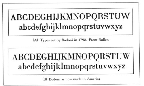
EXAMPLE 487
Comparison of one of Bodoni’s alphabets with a new type-face. Both are rough, having been zinc-etched
When Gutenberg began to print he used a black Text
type designed after the bold lettering of the German
manuscript books, and when Germans went to Italy to
print they had difficulty in rendering into types the character
of Italian lettering. Example 468 shows the efforts
in this direction by Sweinheim and Pannartz in 1465, and
in Example 469, types by John and Wendelin of Spires,
an improvement is noticed.
It remained, however, for the Frenchman, Jenson, to
design and cut a letter that is the alpha of Roman type-faces
(Example 470). Jenson was fortunate in the selection
of a model, and it is interesting to include in the
corner for comparison a section of an Italian manuscript
of the same century. Development of the Roman letter
into the beautiful and legible form known as “Caroline
Minuscules” was due to the encouragement of Charlemagne.
Why it is called “White Letter” in contradistinction
to “Black Letter” may be seen by comparing the
light-gray tone of the Jenson page (Example 470) with
the missal specimen opposite page 14. It may be well to
explain that the seeming disfigurement of the capitals in
the Jenson page is due to the custom that book decorators
had of placing a stroke of vermilion over the capitals. In
the reproduction these strokes came out black. Both the
Spires and the Jenson specimens were reproduced from
the original volumes in the Typographic Library and
Museum at Jersey City.
Example 465 also shows, for comparison with the style
of lettering known as the Caroline Minuscules, a type-face
based on Jenson’s letter of 1470, following which are
Moxon’s and Caslon’s lower-case alphabets.
The faithfulness with which Jenson’s type-face was followed
in the designing of Cloister Oldstyle may be seen
by comparing the Cloister alphabet (Example 467-A)
with the Jenson letters as they are found in Example 470.
A very interesting comparison can also be made of Jenson’s
capitals, on page 14, and Cloister Oldstyle, in Example
473. If a comparison of present-day type-faces
with very old faces is to have any value, the present-day
type-faces should be printed on antique-finished paper
dampened if possible. And if the old face is reproduced
by zinc etching from an old book the other type-face
should also be zinc-etched. Printing and zinc etching were
resorted to in the case of this example and in other instances
in this chapter.
In some works reproductions of type-faces are valueless
and misleading, for the reason that they have been
retouched by an artist, redrawn, or cut in wood.
182
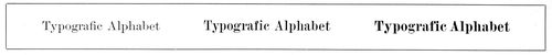
EXAMPLE 488
Modern Romans of the nineteenth century in three tones
The influence of the Jenson style of Roman was seen
for some years, but in 1566 (Example 472) we find a
change of form. The type is more condensed, and instead
of a diagonal stroke on the lower-case e there is a horizontal
stroke close to the top of the letter. This style, as
used by Paul Manutius in 1566, seems to have been maintained
with little alteration in the work of Daniel Elzevir
a hundred years later (Example 477) and two hundred
years later in the types of Fournier, the French
founder (Example 478). This style of letter was also used
by Plantin, the Antwerp printer, in 1569, and for the interest
there may be in it the reproduction of a bit of his
work (see page 16) should be compared with Example
476. This last-mentioned example has been set in Cheltenham
Oldstyle. However, ten-point capitals have been
used with twelve-point lower-case. It may be that the
appearance of most reading matter would be improved if
the capitals were a trifle lower in hight than the ascending
strokes of the lower-case letters b, d, f, h, k, l.
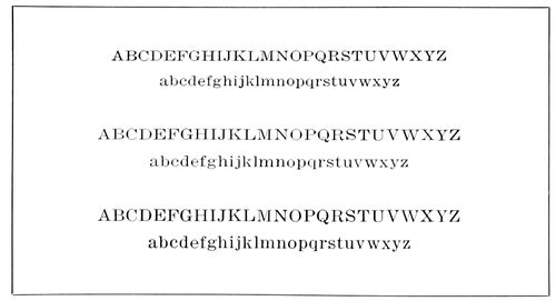
EXAMPLE 489
Modern Roman as it is used on many American newspapers. Six-point, seven-point and eight-point Linotype Roman No. 2. A readable but not a handsome type-face
The National Printing Office at Paris is using on some
of its productions a type-face designed in 1693 by Grandjean.
While it is greatly like other letters of that period,
it has peculiarities, one of which is a slight dot on the left
center of the lower-case l, a feature also present in the
Black Letter of Gutenberg, and in the types of Fust and
Schœffer (see inserts opposite pages 7 and 12).
We have a key to the formation of the Roman types of
the seventeenth century in the alphabets drawn by Joseph
Moxon, an English typefounder, and published in 1676
(Examples 479 and 480). These are here reproduced from
Moxon’s “Mechanick Exercises,” as reprinted, under the
supervision of Theodore Low De Vinne, by the New York
Typothetæ in 1896. Moxon says these letters are copied
from the letters of Christopher van Dijk, a punch cutter
of Holland. As will be seen by the scale in the upper left
corner of Example 479, he attempted to show how the
shapes of letters were “compounded of geometric figures,
and mostly made by rule and compass.” Each letter was
to be plotted on a framework of small squares, forty-two
squares in hight and of a proportionate width. Passing up
this idea as impractical, De Vinne said:
It is admitted that the characters are rudely drawn, and many
have faults of disproportion; but it must not be forgotten that
they were designed to meet the most important requirement of
a reader—to be read, and read easily. Here are the broad hair
line, the stubby serif on the lower-case and the bracketed serif
on the capitals, the thick stem, the strong and low crown on
letters like m and n, with other peculiarities now commended in
old-style faces and often erroneously regarded as the original
devices of the first Caslon.
The writer was curious to see how these letters of Moxon’s
made up into type, and for this purpose had the outlined
alphabets inked in and reproduced in smaller size
(Examples 479-A and 480-A).
When William Caslon, in 1720, cut his first Roman letter
he may have had Moxon’s Roman alphabet before him.
There are some resemblances, but that he did not slavishly
follow the Moxon letters may be seen by comparing
both type-faces (Examples 465-F and 465-G).
We could be more familiar with the types of Baskerville
than we are, but now that the typefounders are reproducing
them (Example 483) we shall come to a realization
that they rival the letters of Caslon in beauty and
readability. John Baskerville, the English typefounder
and printer, spent six years and thirty thousand dollars
in designing and cutting his first font of type. In 1758
he had cut eight fonts of Roman, but other printers would
not buy his types, preferring those of Caslon. Two years
later he attempted to sell his types and retire from the
printing business. After his death, in 1775, his widow
sold all his type and type-making material and they were
removed to Kehl, near Strassburg. There is a legend that
the types finally reached France and were melted into bullets
for the French Revolution. It is a pity that Baskerville’s
original punches are not available, like those of Caslon,
so that printers of today could make use of the splendid
type-faces that were unappreciated in his lifetime.
However, Baskerville Roman is a satisfactory reproduction
of the types of John Baskerville.
Like Caslon Oldstyle, however, it should be printed on
other than gloss-surfaced paper (Example 463), as then,
especially in the smaller sizes, the good qualities of the
letter are brought out and it is made more legible.
When Mrs. Henry Caslon, in 1796, “Bodoni-ized” the
types of William Caslon the first, she was probably influenced
as much by the types of Baskerville as by those
of Bodoni. This is borne out by the comparisons in Example
484. In “A” is shown an alphabet of Baskerville
Roman as now made in America, and in “B” Mrs. Caslon’s
Modern Roman. The third type-face (C) is Scotch
Roman, one of the six selected representative type-faces
(Example 467-D).
John Baptist Bodoni made some very good type-faces,
but it is not difficult to lay at his door the responsibility
for throwing typography out of gear for almost a century.
Thru his influence and the desire of Scotch typefounders
to improve on his work, the nineteenth century was inflicted
with those stiff “Modern Romans” (Example
488) that in all their inhuman “perfection” yet abide
with us and are still liked by Victorian persons of staid
tastes. Many of our school children are being brought
up on them, and in lighter form (Example 489) they are
being fed to millions of Americans thru the homely typography
of most newspapers. This double influence works
for a lowering of typographic taste among printers and
buyers of printing that for many years will keep the general
standard of printing below what it should be.
To return to Bodoni. This Italian typefounder’s types,
as a rule, were not so faultlessly finished as are the
183recent types that bear the name. There may be seen in
Example 487 the alphabet of a type-face cut by Bodoni
in 1790, together with an alphabet recently cut in America.
The Bodoni type of the American foundry is a clever
copy of the original, yet there is in the copy much of the
modernization of the Scotch founders of the nineteenth
century. Bodoni Book is a better-looking and more readable
type-face.
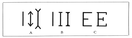
EXAMPLE 491
(A) Optical changes caused by adding Vs at end of strokes. (B) Appearance of vertical stroke altered by adding small horizontal strokes, or serifs, and by joining both with curved line. (C) Cross strokes or serifs added to E
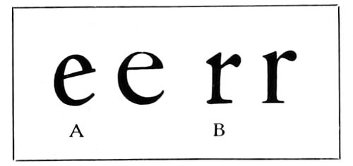
EXAMPLE 495
(A) The diagonal stroke of the first Roman type-faces. (B) The lower cross stroke or serif extended to right on the Roman type-face of Jenson
The Scotch typefounders also attempted to improve
the types of William Caslon,
and the result of their
labors is known as Modernized
Oldstyle (Example
466-A). This kind of type
was first made about 1852
for Miller & Richard of
Edinburgh, Scotland. With
Caslon Oldstyle unknown,
Modernized Oldstyle would
be a rather satisfactory letter,
but with Caslon Oldstyle
procurable there seems
to be no need of the Scotch letter. There was brought out
in 1884 by the MacKellar, Smiths & Jordan Company a
decorative Modernized Oldstyle under the name of Ronaldson
Oldstyle.
Characteristics of Roman Type-Faces
The Serif.—The serif is that portion of a type-face
indicated by the small black sections in Example 492. It
has a powerful influence in determining the character and
style of a face of type.
As an experiment, we will make three vertical lines exactly
the same length (Example 491-A), leaving one as
it was first drawn, but on the other two adding V-shaped
marks, because of which the character of the line is
changed and the length seemingly affected.
However, the serif, when properly used, has a decorative
quality and is to type what the capital is to the
column and the cornice to the building in architecture.
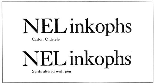
EXAMPLE 493
By altering the serifs, “old-style” type is changed into “modern.” From Bullen
After further experimenting with three vertical lines
that we will now identify as capital Is (Example 491-b),
there can be no doubt that the serif is necessary as a finishing
stroke. The serifless I suggests a man in the public
streets without hat or shoes. The crudest manner of adding
a serif is to place a small horizontal stroke at the head
and foot of the long vertical line, but the sharp angles
thus formed can be softened and one stroke joined to another
by a curve, with the corner filled in, as is shown.
These two illustrations of the serif are merely for the
purpose of introducing the novice to the subject. The fact
that there are so many different faces of type is due somewhat
to the manipulation of the serif—changes of length,
thickness, direction and curve.
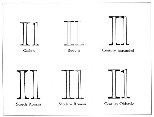
EXAMPLE 492
The black sections indicate the serifs, and show the differences in serif construction on several well-known type-faces. From Bullen
It is by the serif that in most cases old-style types are
distinguished from the so-called modern Romans. An
interesting demonstration of this was made by Henry L.
Bullen with Century Expanded, a modern Roman (Example
494). The first line shows the letter unchanged.
As the serifs in most old-style faces project diagonally,
he, in the second line, altered the modern serifs to conform
to this idea. The third line shows Century Oldstyle
as it actually appears in type.
There is, of course, more to a true old-style face than
mere change of serifs, and in the actual cutting of the
types other minor alterations were made, as will be seen
by study of the third line.
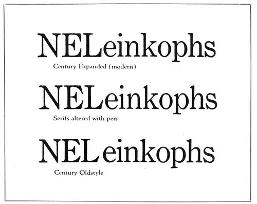
EXAMPLE 494
By altering the serifs “modern” type is changed into “old-style.” From Bullen
184
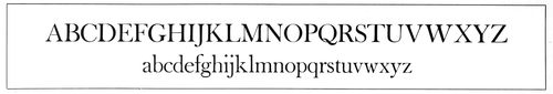
EXAMPLE 496
In most Roman alphabets all vertical strokes are thick, excepting in M, N, U. Horizontal strokes are thin. Diagonal strokes running down from left to right are thick and from right to left are thin, excepting Z, z.
This process was reversed by Mr. Bullen, and in Example
493 certain serifs of Caslon Oldstyle are in the
letters i, n, k, p, h made horizontal, and in the letters E,
L, s made vertical. Modernized in this manner, Caslon
Oldstyle resembles Scotch Roman (Example 484-C).
Thick and Thin Strokes.—The inbred good taste and
instinct for beauty possessed by the Roman calligrapher
which directed him to add the serif to his lettering also
impelled him to vary the width of the strokes (Example
464-A).
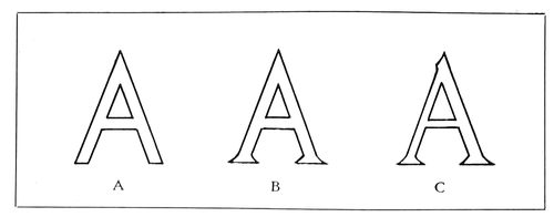
EXAMPLE 497
(A) No serifs or stroke contrast. (B) Serifs added. (C) With serifs and thick and thin strokes
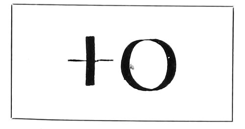
EXAMPLE 498
Vertical thick strokes were made with pen held straight
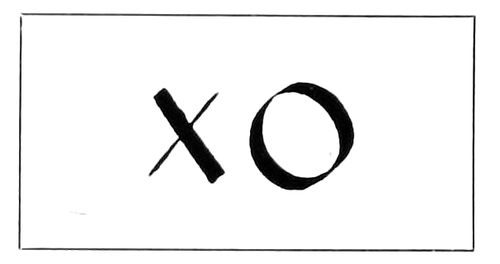
EXAMPLE 499
Diagonal thick strokes were made with pen held at a slant
The most uninteresting kind of lettering is that which
is not only serifless but without contrast in the width of
its strokes—lettering that is known to the printer as
Block, or Gothic (Example 497-A). Dignity and something
of good looks are given to it by adding serifs (Example
497-b), yet it is not eligible for admission to the
select society of pure Roman type-faces until the various
strokes show, properly proportioned, a difference in thickness
(Example 497-C). The difference should be at least
as two to one. It is about that in Cloister Oldstyle, but in
Baskerville Roman (Example 496) it is as six to one.
When the difference in thick and thin lines is exaggerated,
as was done in the nineteenth century, the result is a caricature
and type that is almost impossible to read, even in
large sizes.
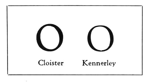
EXAMPLE 500
Heavy strokes in the lower left and upper right part of curves
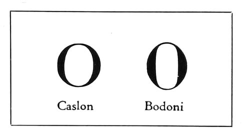
EXAMPLE 501
Heavy strokes in vertical positions
Generally the distribution of thick and thin lines in
Roman letters, as shown in Example 496, is as follows:
All vertical strokes are thick (excepting in M, N, U).
Horizontal strokes are thin. Diagonal strokes running
down from left to right are thick, and from right to left
are thin (excepting Z, z).
When this rule is reversed, as was actually done by a
nineteenth-century typefounder in a weird attempt at
novelty, there is begotten a monstrosity. Good typography
requires that basic principles be adhered to.
In the recent recutting of the Roman type-face of Nicholas
Jenson, the founders went all the way back to his type
for their models, and did not content themselves, as they
did near the end of the last century, with copying Morris’s
type or the faces of other foundries. As Jenson based the
design of his types closely on Italian manuscripts, we have
in such a face as Cloister Oldstyle many of the characteristics
of the pen-made letters, one of which is the position
of the thick strokes on round letters. The thick strokes on
the O, as an instance, instead of being vertical, are diagonal.
This is due to the manner of holding the pen when
lettering. When held to write vertically and horizontally,
the pen makes lines as in Example 498; when held at a
slant, the pen makes thick lines diagonally as in Example
499. The Caroline Minuscules, upon which the lower-case
types of Jenson were based, were written with a
slanted pen.
In Example 500 are to be seen two well-known type-faces
on which the slanted-pen thick strokes are used. In
Example 501 are two faces that could be made by writing
vertically. It was Mr. Goudy who reintroduced into type
forms a characteristic of Jenson’s Roman—that of having
the lower serifs extend more to the right than to the left,
as shown by Example 495-B.
Ascenders and Descenders.—Not a little of the beauty
of Roman type-faces lies in the ascending and descending
strokes, and one reason why our types are becoming more
beautiful is that we are going thru a period of restoration—the
long-missing ascenders and descenders are being
given back to us, after an absence of many years.
What should be the length of these strokes? Edward
Johnston, in “Writing and Illuminating and Lettering,”
illustrates this point (Example 503), and says: “The
lines in massed writing are kept as close together as is
compatible with legibility. The usual distance apart of
the writing lines is about three times the hight of the
letter o. The descending strokes of the upper line must
clear the ascending strokes of the lower line.”
Bodoni, the Italian typefounder, had a system of measurement
for the proportions of his lower-case letters:
“Divide the body of the type into seven parts and let two
at the top and two at the bottom be for the ascenders and
descenders and the three in the middle for the other letters.”
The ascenders and descenders, as found in Cloister
Oldstyle and in the original Caslon Oldstyle, approximate
the proportions given by Bodoni.
Half the letters of the lower-case alphabet—thirteen—are
185of the hight of the o, and we will call them the small
letters. The letters with ascending strokes number eight,
with descending strokes five (Example 502). Because the
descending letters are only five in number, they are most
frequently picked out for mutilation. This sawing off of
a portion of the descending strokes cripples the letters
just as the sawing off of a portion of a man’s legs cripples
his body. Not only is typography made imperfect by missing
descenders, but, generally, the practice has worked
toward the degeneration of type print, making it less
easy to read, as the lines set too close together. When the
descenders are of proper length they maintain a strip of
blank space between lines, but when they are cut off the
printer must add leads to recover the space—which he
seldom does.
The printer and user of typography have been using
false logic in favoring type-faces that have descenders
cut off. They think they are getting more for their money
when they obtain a normal twelve-point type-face on an
eleven-point body, but as the one-point linear space must
be restored by leading, there is nothing gained. Scientists,
in the study of eye hygiene, have ascertained that a certain
amount of space between lines is necessary to save
eyestrain, and the descenders are essential in furnishing
some of this needed space.
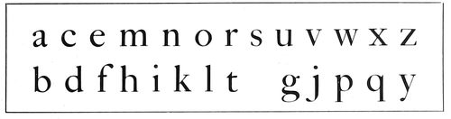
EXAMPLE 502
Of the twenty-six letters of the alphabet, eight have ascending strokes, five have descending strokes, and thirteen have neither
The descending curves of the lower-case g are a thing
of beauty when allowed freedom (Example 504-A), but
on the shortened plan they resemble a man cramped with
rheumatism, in need of crutches.
Proportion of Letters.—One of the elements in the
beauty of the ancient Roman stone-carved alphabet is the
proportion of its letters. Goudy, drawing lettering and
designing type-faces modeled after the inscription capitals
of the Romans, has had a large influence in reviving
good proportion in type. Cloister Oldstyle (Example
467-A), designed by L. M. Benton after Jenson’s letter,
is an excellent study of the old proportions introduced in
present-day type-faces. However, there is no type that has
the beauty of proportion to be found in the Roman capitals
(Example 464-A) reproduced from an inscription
on the Trajan column at Rome. The author has endeavored,
in plain lines, to trace these capitals and show their
proportions on a background of squares. It will be seen
that the width of the letters B, E, F, L, P, S is less than
half their hight, and about half the width of O, M, Q, C,
G and D. It is this contrast in width as well as in shape
that makes the alphabet as a whole so pleasing.
Comparison of the capitals of the six standard faces in
Example 467 will show that “old-style” faces tend toward
the old Roman proportions and that “modern” types, such
as Bodoni Book and Century Expanded (Example 466-B),
reveal an effort to make the capitals as uniform in size
as possible. Typewriter types are an example of what
happens when this idea of uniformity is carried to its
logical end. It is really not necessary to throw Beauty
out of the back door as Utility is admitted at the front.
Both can live happily under the same roof.
As will be seen by Example 507, the lower-case letters
are made up of a variety of curved lines, and vertical,
horizontal and diagonal
strokes, the purpose being
the same as that of having
capitals of different widths, to make them when joined
together in words readable and pleasant to look at. The
word “minimum” is an example of unpleasant monotony
in the repetition of similar forms.
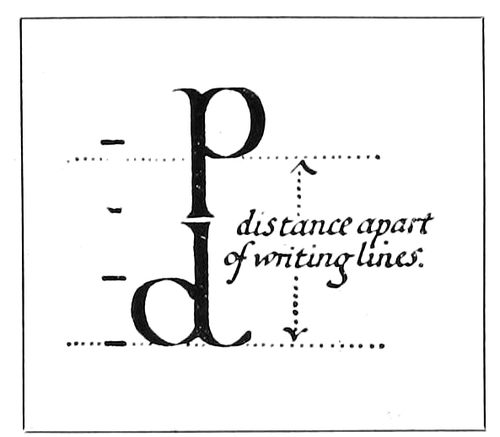
EXAMPLE 503
In good lettering, the descending strokes are as long as the ascending strokes. From Johnston
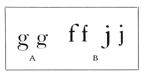
EXAMPLE 504
(A) How descenders are frequently cramped. (B) Compression of upper or lower ends of letters as found in “improved” Caslon Oldstyle
Legibility of Type-Faces
Type matter should be easy to read, and this end is attained
not only in the designing of type-faces but in the
manner of their use.
Many tests for legibility have been made in this country
and in Europe, but none of them, so far as the writer
knows, has considered the manner of printing the types
and the character of the paper surface as factors in legibility,
altho glossy paper has been condemned because of
its reflection of light, and cream-white paper preferred to
blue-white. There is shown as Example 463 a test made
in the printing of the same type-faces on a hard-finished
paper and on a soft-finished paper. The Caslon and
Bodoni types are not only more legible on the soft-finished
stock, but the character of the designs is brought out. The
results of this demonstration should not be wondered at,
as the original Caslon and Bodoni types were intended to
be printed on soft-finished stock, and not on highly calendered
coated paper.
Studies in legibility are presented in Example 508. As
there are many details that count in the production of
good-looking typography, so there are seeming trifles
which go to make typography easily read. In “A” there
are groups set in Cheltenham Oldstyle and Cloister Oldstyle.
As Cheltenham is narrower in form and closely set,
it is more suitable for long, narrow pages or columns.
Cloister, on the other hand, conforms better to wider
pages and columns. In lighter types (B) Bodoni Book
and Caslon Oldstyle are similarly compared. For further
illustrations of this point see Examples 509 and 510.
One of the tests previously referred to proved Gothic
(C) the most legible type-face. This unshaded, serifless
type, which has long been popular on sales bills and for
advertisements in some newspapers and trade publications,
is not approved by those who believe there should
also be character in type-faces, as it lacks the two essentials
of typographic beauty—serifs and contrasting thickness
of strokes. Then, again, it is not as legible in the
mass as in single lines.
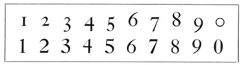
EXAMPLE 505
In the old-style Arabic numerals, five figures descended, two ascended and three did neither. The modern style is to have them of one hight
While bold-face types, especially those with decided
186contrasts in thickness of strokes, are legible when used
in groups of two to a half-dozen words, they greatly tire
the eye when used for entire pages of text. For this reason
Bodoni Book is to be preferred over Bodoni for text
purposes (D). The writer came to this conclusion when,
during the reading of a book set in Bodoni, he found it
necessary frequently to stop because of eye fatigue produced
by the sharp contrasts and bewildering medley of
light and shade.
It is generally conceded by authorities that lower-case
types in the same size of letter are more legible than
capitals (E) and should be used for headings and for
display lines in advertising matter, where easy reading is
essential.
Assuming that the largest possible face on the smallest
possible type body results in legibility and allows more
matter on a page, both users and makers of type have in
many fonts caused the descending and ascending strokes
to be shortened. The lower-case letters g, j, p, q and y
have been the principal sufferers, as they are the only
ones with descending strokes. The ascending strokes of
letters b, d, f, h, k and l have been treated with more respect,
and their principal ancestor, the Caroline Minuscule,
would not have so much difficulty in recognizing
them.
The left portion of section F of Example 508 shows
what this practice has done to Caslon Oldstyle. It has
also affected legibility by lessening the space between
lines (see also Example 509), and reading, already difficult,
is made still more so by the excess space that careless
hand compositors and “speedy” machine operators
place between words.
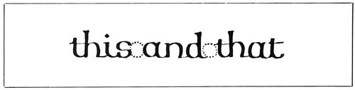
EXAMPLE 506
The space between words in good lettering, according to Johnston, is less than the width of letter “o” (lower-case)
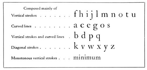
EXAMPLE 507
The lower-case letters grouped according to formation. As generally mixed in various combinations, distinctive word groups are formed. The word “minimum” is an exception
Space Between Words.—The eyes can, in the same
space of time, read many more words if the words are
narrowly spaced than if they are widely spaced. The early
printers knew this and set type accordingly. When lower-case
letters are widely spaced one letter must be read at
a time (508-I). When words are widely spaced one word
must be read at a time. A person accustomed to reading
reads by thoughts—groups of words or sentences. Even
in the schools they are discarding the long-used method
of teaching the A-B-Cs, and instead of at first learning
each letter separately, the child learns to know words by
their formation and to read by word groups.
The present prevalence of wide spacing in the composition
of books, catalogs, pamphlets, periodicals and newspapers
is a legacy from the ante-machine period.
In hand-set days, job and book compositors, when they
were called on to set so-called straight matter, were required
to use great care in spacing. In the spacing out of
a line the conscientious compositor would remove thick
spaces and insert thin spaces rather than add much extra
space between the words. The newspaper compositor, on
the other hand—he usually being a piece worker—seldom
thin-spaced, but liberally added space between words, especially
on occasions when his “take” was to “meet” that
of another compositor. When machine composition was
introduced the spacing practices of the news-room hand
compositor were passed along to the machine, with the result
that today a page of machine matter set in the average
careless way shows open spaces running irregularly
down the page, resembling a trench map of a modern battlefield.
Close spacing and the resultant neat and readable appearance
of the page are possible in machine composition,
as many users of these machines are obtaining such results;
but the general standard, due not a little to the demand
for rapidity and somewhat to ignorance of the fundamentals
of good typography, is humiliatingly low.
The design and form of the type-face, of course, determine
the amount of space between words. Johnston
tells letterers that “the average space between two words
is less than the width of the letter o.” Example 506 is
illustrative.
A newspaper editor some years ago asked the hand
compositors to thin-space, as there was a great deal of
copy that day, whereupon the printers all laughed in ridicule
of the lay notion that such a procedure would be of
much use. That the request was not such an impractical
one was recently borne out by an experience of a periodical
publisher, who, on the machines in his own shop, produced
close-spaced matter. In an emergency an outside
machine-composition house was called on to set a part of
the copy. When the work of making up was completed, it
was found that there were several galleys of matter that
could not be used, altho there was no more copy than
usual. By again referring to Example 508-F it will be seen
that in the left group spacing between words is lavish,
while in the right group there is no waste of such spacing.
Altho there is more space between the lines of the right
group, it contains three more words than the left group.
In the lower part of Example 508 is the word “Typography”
set in small six-point, and near the word is the
lone letter a, same size. It is difficult for a person without
excellent eyesight to identify the small six-point “a,”
but he can more easily and as quickly read the word
made in the same size from ten letters. When the letters
of the word “Typography” are widely spaced (even in
larger size, as shown) they must be read one letter at a
time, but when closely assembled they can be seen at a
glance and read ten times as rapidly.
An experienced proofreader does not read a galley letter
by letter, but recognizes a wrong type because the
natural formation of the word has been broken.
Carrying the experiment further, place in “open formation”
the words “Art and Practice of Typography,” and
they must be read slowly one word at a time, but group
the words closely, as has been done in the lower left of the
same Example 508, and the entire group of words can be
read practically at a glance. Just as an illiterate person
laboriously reads letter by letter, a young child beginning
to read will see only one word at a time. While on rudimentary
primers the words should be isolated, there is no
necessity for wide spacing between words in text matter
intended for adults.
187
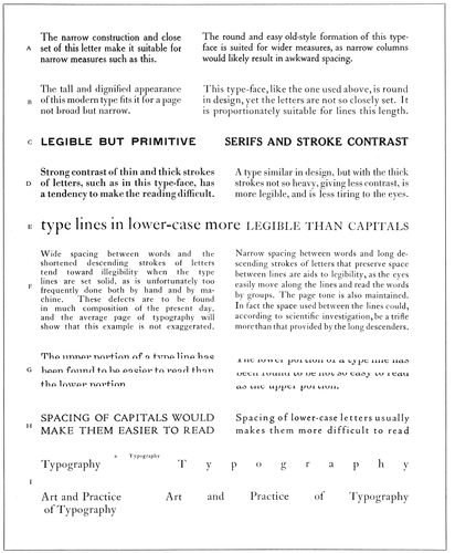
EXAMPLE 508
Legibility and other qualities illustrated
Length of Lines.—This leads to consideration of the
effect length of lines has on reading.
The Board of Education of the city of New York disqualifies
textbooks in which the length of line is more
than 100 millimeters (about twenty-four picas, or four
inches). The maximum length of line recommended by the
British Association for the Advancement of Science in
1912 is about the same. Professor Huey, in “The Psychology
and Pedagogy of Reading” (1907), says: “There is
a general consensus in favor of the shorter as against the
longer lines, with a tendency to favor 90 millimeters as a
maximum, some placing the maximum at 100 millimeters.”
Dr. Javal, the French oculist, who thirty-five years ago
made tests in typography, believes the maximum should
be considerably below 90 millimeters (about 21 picas).
It would be well, in order to arrive somewhere in determining
188the proper length of line, to consider the size
and kind of type that makes up the line.
The author asks consideration of Examples 509 and
510. The length of line is limited by authorities because
the eye finds it difficult to read a long line of comparatively
small type. Isn’t it true that healthy eyes can read
a line of type twelve inches long set in fifty-four-point
Caslon Oldstyle, say, with the same ease as a line four
inches long set in eighteen-point Caslon Oldstyle?
By the same reasoning, the line of twelve-point Caslon
Oldstyle set three inches wide (Example 509) is as easily
read, after the eyes are focused on it, as the line of eighteen-point
Caslon set four inches wide.
The author suggests, then, that the proper length of
type lines be ascertained by measuring one-and-a-half alphabets
of the lower-case of the desired type, as is demonstrated
in Example 510.
Let us try out the top group—Caslon Oldstyle. (This
type-face seems smaller, according to body sizes, than
Scotch Roman, for the reason that its descending strokes
have not been cut off, while those of the Scotch Roman
group have been shortened; but of this more later.)
A lower-case alphabet-and-a-half of twelve-point Caslon
Oldstyle (with long descenders) measures 17½ picas
in length, as will be seen in Example 510. How it appears
set in words in two lines of the same measure is to be seen
in the upper part of Example 509. According to the working
out of the plan, 17½ picas is the ideal length of line
for books using this twelve-point type. By referring back
to Example 127 in the chapter on “Books,” the theory will
be found borne out in practical use on a model book page.
Testing the length of lines by reading (Example 509),
it will be found, if the distance between the eyes and book
is lengthened as the sizes grow larger, that the line is short
enough not to necessitate a hunt for the beginning of the
second line after the first is read.
The optical disadvantage of using in one piece of printing
type-faces of any great contrast in sizes may be proved
by focusing the eyes so as easily to read the eighteen-point
size and then changing quickly to the eight-point
size, attempting to read the latter without again focusing
the eyes to fit the smaller type.
There is a technical as well as an optical reason for determining
the length of line by measurement of the types
themselves. It will be seen by Example 509 that the copy
adjusts itself to the various lengths of lines, or, in the vernacular
of the printer, “works out line for line.” If fourteen-point
type, instead of twelve-point type, were set in
lines measuring fifteen picas in length, the compositor
would have more difficulty in adjusting the spaces between
words, as these spacing points would number two less.
This difficulty is usually solved by regrettable wide spacing
between words or more regrettable spacing between
letters.
Testing types used on newspapers, selecting for the
purpose the most used newspaper linotype face (see lower
part of Example 510), we find that the length of line for
six-point should be thirteen picas and for seven-point
fourteen picas. As actually used in newspapers, the length
of line is usually twelve and a half or thirteen picas.
Approved Type Sizes and Space Between Lines.—The
type in the upper part of Example 509 also illustrates the
sizes of type and the amount of space between type lines
that investigators have determined are minimum for use
on schoolbooks.
Dr. Cohn, whose findings in these matters have been
practically indorsed by educational boards and writers on
school hygiene, stipulates that for first-year school children
the vertical measurement of the lower-case o should
be at least 2.6 millimeters, with space between lines (measuring
vertically between a lower-case o in one line and a
lower-case o in the line above or below) of 4.5 millimeters.
Twenty-two-point Caslon Oldstyle, with long descenders
(not shown here), conforms to these measurements.
For the second and third years, the measurement of the
o should be at least 2 millimeters, with space between lines
of 4 millimeters. Eighteen-point Caslon Oldstyle, with
long descenders (as shown in Example 509), conforms to
these measurements.
The fourteen-point size meets the requirements for the
fourth school year—at least 1.8 millimeters, with space
between lines of 3.6 millimeters.
After the fourth school year the type should measure
not less than 1.6 millimeters, with space between lines of
3 millimeters, to which twelve-point Caslon Oldstyle, with
long descenders, conforms.
The descending strokes are sufficiently long in the
eighteen-point size to maintain between the lines of type
the amount of spacing stipulated by Dr. Cohn, but in the
fourteen-point size it was necessary to add a two-point
lead and in the twelve-point size a one-point lead.
In comparing one font of type with another, it is not
accurate to compare, say, eleven-point with eleven-point.
Not infrequently one type-face has been pronounced more
readable than another, when the preferred type-face was
really a twelve-point face on an eleven-point body, with
the descending strokes mutilated to allow for such an arrangement.
The faces should be compared by the Cohn
method given above.
The panel inserted in Example 509 is illustrative.
The three letters (Hdp) at the left are twenty-four-point
“lining” Caslon; the three letters (Hdp) at the
right are thirty-point Caslon Oldstyle No. 471. The economical
printer too often prefers the “lining” fonts, as he
does not need to buy waste (?) metal. It is the same sort
of reasoning that sees in the park spaces of the cities real-estate
waste.
The laws of compensation in good typography require,
where one point or two points or more are unwisely removed
by shortening descenders, that these points shall
be restored by leading. So where is the gain by mutilation?
Italic Types
Italic, the graceful, inclined, feminine type that is now
mated with most Roman types, was not known by Jenson
or his contemporaries. It made its appearance for the
first time in 1501 on a book printed and published at
Venice, Italy, by Aldus Manutius. In that volume, an edition
of Virgil, Aldus gave credit for the cutting of the
face to “Francia of Bologna,” who has since been identified
as the great painter and contemporary of Leonardo
da Vinci.
The legend has been passed along for many years that
Italic was fashioned after the handwriting of the Italian
poet Petrarch, but specimens of his handwriting do not
bear the proper resemblance, and there are now those who
scoff at the story.
However, the Aldus Italic is not, as one writer declares,
merely an inclined Roman. As it has been recut by the
American Type Founders Company and mated with
Cloister, the recut Roman letter of Jenson, there is opportunity
to compare Italic and Roman lower-case, which
is done in Example 515. It will be seen that, while there
is a family resemblance, there are many differences other
than that of mere inclination. Italic capitals, however,
are inclined Roman letters, but it should be remembered
that Aldus and Francia did not make or use Italic capitals,
but that with the slanting lower-case letters Aldus
used small Roman capitals. Example 513 shows how this
was done, and this example, by the way, is a resetting in
189Cloister Italic and Roman small capitals of the Aldus
page, reproduced on page 15 of the chapter on “The
Spread of Typography.” In that chapter are included
further facts about this famous printer.
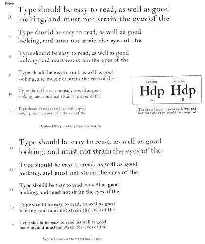
EXAMPLE 509
The various sizes of type set to lengths determined by measuring as in Example 510. Also showing the space between lines needed for easy reading. The size of type-face and space between lines of the eighteen-point, fourteen-point and twelve-point of the Caslon group have been authoritatively recommended for schoolbook printing (Read page 188)
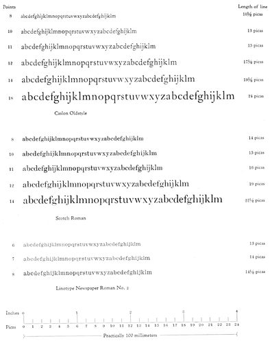
EXAMPLE 510
Ascertaining the proper optical length of line by measuring a lower-case alphabet-and-a-half of each size and style of type. This method furnishes a practical rule for determining lengths of line. (Read pages 187 and 188.) The accompanying scales may be used for measurements
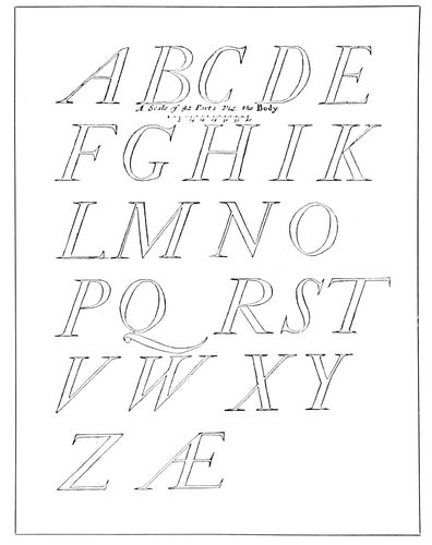
EXAMPLE 511
Moxon’s Italic capitals of 1676
Examples 511, 512 and 514 are reproductions of Moxon’s
drawings (1676) of the Italic types of a Dutch
punch cutter. They show the character of Italic used in
the seventeenth century. The long s of that time is included
in Example 512, and Example 514 shows the
decorated Italic capitals that we know as “Swash letters.”
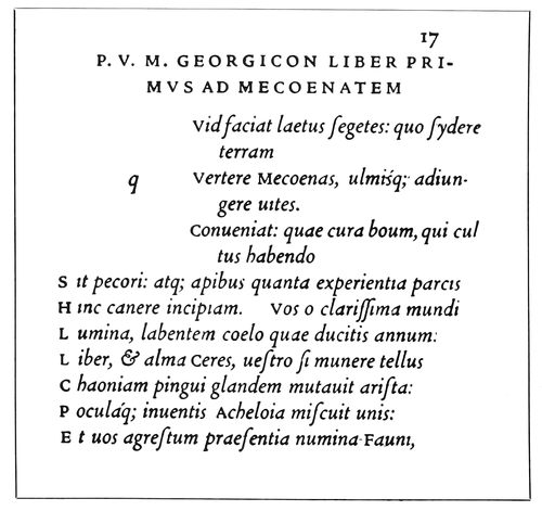
EXAMPLE 513
Resetting in Cloister types of an example on page 15 of this book of the original Italic types of Aldus and Francia
Swash Italic capitals and the old-style long s are to be
had with Caslon Oldstyle. See Example 517. The Italic
mates of a few of the present-day Romans are shown in
Example 516.
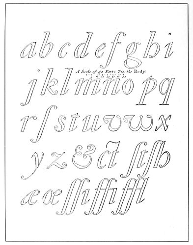
EXAMPLE 512
The Italic lower-case of Moxon, with long “s” (ſ)
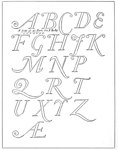
EXAMPLE 514
Decorated capitals, or Swash letters, as drawn by Moxon from Dutch sources
190
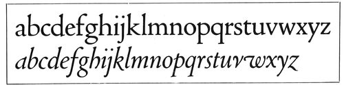
EXAMPLE 515
The first Italic was not made merely by inclining the Roman lower-case letters. Cloister Oldstyle (upper line) is modeled after one of the first Roman types, that of Jenson, cut in 1470. Cloister Italic is modeled after the first Italic type of Aldus and Francia, 1501
Italic types, besides the instances previously mentioned,
may be seen in use on pages 17, 18, 19, 20, 22, 23, 24, 25,
26, 32, and in Examples 45, 98, 100, 128, 138, 139, 144,
152, 158, 168, 169, 170, 171, 180, 185, 191, 215, 222, 223,
224, 232, 240, 245, 246, 250, 262, 282, 292, 294, 297, 299,
310, 311, 313, 314, 315, 316, 325, 326, 329, 331, 332, 336,
342, 343, 345, 346, 349, 363, 372, 374, 375, 384, 387, 390,
394, 396, 398, 399, 401, 402, 404, 405, 406, 412, 413, 414,
418, 420, 423, 424, 426, 428, 429, 472, 477, 481 and 483.
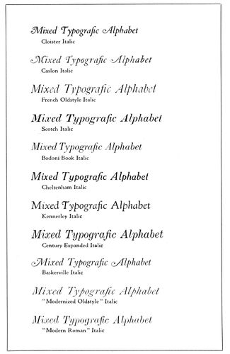
EXAMPLE 516
A few Italic type-faces
Text Types
Gutenberg and other German printers who followed
him fashioned their type-faces after Black Letter, the
formal writing of the German scribes, as Jenson fashioned
his type-face after White Letter, the formal writing of the
Italian scribes. The White Letter of Jenson grew into the
Roman types that today are used almost exclusively in
France, England and Italy and in our own country, while
Black Letter developed into the German types that are
almost exclusively used in the German Empire. As this
is being written, the Great War is being fought. America
has just entered it, and it is a coincidence that the
countries favoring White Letter are on one side in the
struggle and the countries favoring Black Letter on the
other side. The years that follow the war may see, so far
as general reading purposes are concerned, the gradual
elimination of the letter we know as Text and the largely
increased use of Roman characters in the books and newspapers
of all races. The Germans are already favoring a
Roman half Text in character (Example 521).
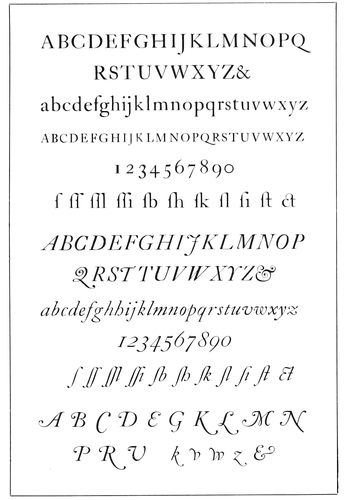
EXAMPLE 517
Complete Roman and Italic alphabets of Caslon Oldstyle with “Swash letters” and long “s” (ſ)
Text type, besides being known as Black Letter, is also
called Gothic and Old English; Gothic because of its
preference by Gothic or German peoples, and Old English
because of its use by Wynkyn de Worde and other early
printers of England.
Moxon, in 1676, drew an alphabet of Text letter in
both capitals and lower-case (Examples 518 and 519),
and Caslon, in the eighteenth century, cut a Text letter
similar but somewhat thinner in form. Alteration in capitals
works great changes in Text type.
Text letter in a variety of designs is used in America
for special purposes—sometimes as headings of newspapers
or for a line on stationery, but because it is generally
considered illegible it seldom is given place, except in
German-language newspapers, on body portions of printed
work.
The story of the evolution of Text type from Roman
capitals has already been told on pages 5 and 6 of the
chapter, “When Books Were Written,” and under the
191head, “Development of the Roman Type-Face,” in this
chapter. It is illustrated in Example 465.
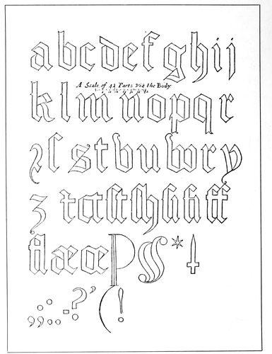
EXAMPLE 519
Text capitals and Text lower-case letters as drawn by Moxon in 1676
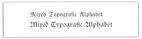
EXAMPLE 520
Two standard German type-faces, the Fractur and the Schwabacher
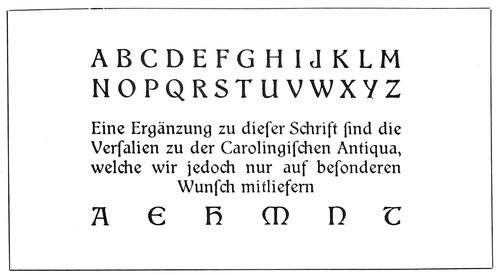
EXAMPLE 521
The half-Gothic and half-Roman type-face now favored in Germany as the nearest approach to the Roman allowed by national prejudice of readers
Text type may be seen in use, even to a small extent,
on pages 5, 7 (insert), 8, 9, 12, 13 (insert), 14 (insert),
16, 17, 18, 27 (insert), 31, and in Examples 19, 27, 32,
37, 75, 76, 107, 115, 117, 118, 137, 143, 145, 146, 147,
157, 158, 159, 200, 201, 202, 204, 206, 216, 219, 220, 221,
227, 228, 232, 233, 237, 241, 243, 244, 257, 277, 285, 287,
301, 307, 319, 333, 336, 347, 353, 354, 358, 361, 392, 404,
405, 421 and 425.
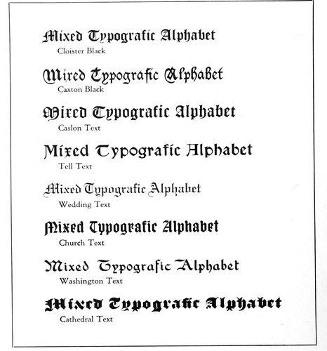
EXAMPLE 522
Several representative Text types
Block Types
The style of letter known as “Block,” because of its
plain, square appearance, is more in use than it should be
192(Example 523). It serves a purpose for very small sizes
of lettering on lithographed stationery and on blank work,
its capitals being more legible than regular Roman capitals
in diminutive form; but its use on periodical and
newspaper advertising, books and general job work is
deplorable.
It is an unfinished Roman letter, as shown by Example
497. It is really not admissible to the company of the
educated and informed until serifs have been added and
a difference in thickness of strokes is visible.
Some American typefounder many years ago called this
style of face “Gothic,” and under that name this rather
questionable type is widely known, probably better known
than many worthier faces. It is possible, also regrettable,
that it is the “best seller” of the type foundries’ product.
Over in Scotland and England the type is called “Sans-Serif”
and “Grotesque”; in Germany it is known as
“Block”; in France and Spain as “Antique.” Examples
showing use of “Block” type or “Gothic”: 263, 276, 291,
305, 318, 320, 321, 373, 404, 405, 406.
Poster artists of Germany and Austria have developed
the “Block” type into a very strong letter of wide strokes,
which, when printed in color, show forth color values attractively
(Example 235, chapter on “Announcements”).
This style of letter has been brought out in type form in
Germany and in America. Alphabets of the American type
(Publicity Gothic and Advertisers’ Gothic) are shown in
Example 524. As indicated by the titles, these types serve
a special purpose.
Bold Types
There is a legitimate use for bold type-faces, especially
in small sizes, on books of reference, schoolbooks, catalogs,
and similar printed work, but it is safe to wager that
half the bold types in use, and almost all of the large sizes,
could well be dispensed with. When used to a great extent,
the printed work on which it appears is unattractive.
Bold type is to typography what the bass drum is to
music: it fits in nicely for purposes of accentuation and
emphasis; but who likes a bass drum solo?
However, a slight strengthening of lines sometimes
serves special purposes well. Daniel Elzevir used a letter
with slightly deepened strokes for the main line in Example
477.
Old-Style Antique has long been popular with good
printers for typography requiring a darker tone than is
given by Caslon Oldstyle; the so-called Caslon Bold will
never really take its place.
Most of the standard type-faces referred to in this
chapter are procurable in bold form. Cloister Bold, Caslon
Bold, Bodoni Bold and Cheltenham Bold are included
with a few other faces in Example 526.
Ornamental Types
Typography has its periods of abstention and fasting,
which usually follow periods of revelry in decorative
types in which good taste and dignity are not infrequently
sinned against. After the typefounders of the nineteenth
century had twisted, distorted, decorated, shaded and
otherwise disguised the Roman alphabet until Jenson,
Aldus, the Elzevirs, Caslon and Franklin would no longer
recognize it, the users of printing, the printers and the
typefounders became sobered and realized what they had
done.
A period of fasting set in, but, recollections of the old
typographic carousal wearing off, ornamental letters again
began to appear. They were on different models, however—some
of them very good—and were acceptable for informal
typography (Example 527-C).
Some ornamental types of historic origin are based on
the eighteenth-century letters of Fournier, the French
typefounder, and on those of English founders (Examples
527-A and 527-B).
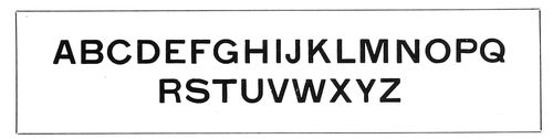
EXAMPLE 523
Block types, serifless and of one thickness of stroke
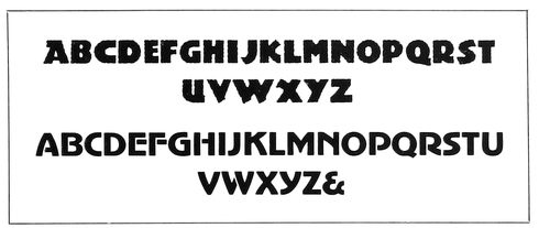
EXAMPLE 524
Modern-art poster type; the upper alphabet being known as Publicity Gothic, and the lower one as Advertisers’ Gothic
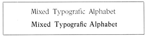
EXAMPLE 525
McFarland (lower line), based upon the French Oldstyle (upper line), the strokes having been made bolder
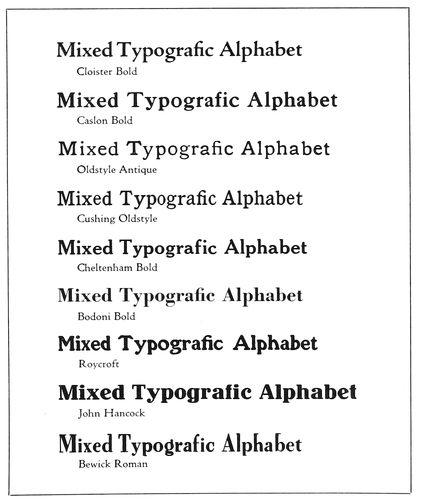
EXAMPLE 526
A few representative bold-face types
Types for Special Purposes
There are numerous other faces, many of them admirable,
which for lack of space cannot be shown or described
194here. There are type-faces for special purposes, such as
the imitation copperplate-engraving faces, made in English
and French Scripts, Romans, Texts and Gothics;
imitation typewriter faces, gray-printing “halftone” faces,
such as were used for many years as a head-letter on the
Ladies’ Home Journal.
EXAMPLE 527-A
The eighteenth-century ornamental types of Fournier, the French founder
EXAMPLE 527-B
Early nineteenth-century ornamental types of English founders
A dozen pages, were they available, could well be given
over to exhibits of the privately designed types of the
Riverside Press, Merrymount Press, University Press,
Village Press and other notable printing offices.
The Influence of Goudy
A liberal showing would be worth while of the various
fonts designed by Frederic W. Goudy, who has done much
in influencing type design during recent years, but it
will be necessary to be content with the exhibit of Kennerley,
in Example 463, and other faces by Mr. Goudy in use
in preceding chapters. Kennerley, the best known and most
characteristic of the Goudy letters (1911), is shown in
Examples 187, 313, 329, 364, 395, 432, 445 and 446.
Forum, made in capitals only, is to be found in Examples
20, 229, 334, 360, 366 and 395. Goudy Oldstyle is used
in Examples 324 and 391. Camelot, which was Mr.
Goudy’s first effort at type designing (1896), appears in
Examples 44 and 124. Pabst, another early effort of Mr.
Goudy, but not so good in design as his later types, will
be found in Examples 30, 100 and 214, and also used
in this book for headlines, captions, title-page and cover
labels.
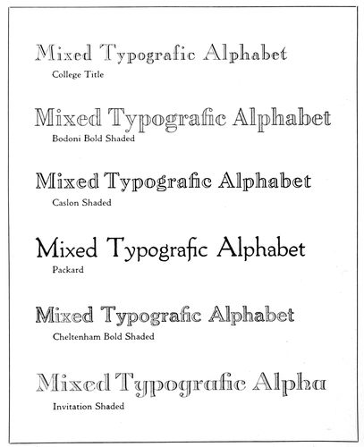
EXAMPLE 527-C
Type-faces of the ornamental kind
Frederic W. Goudy is wielding a large influence over
art work and typography in America. His style of lettering,
decoration and type designing is now to be found on
much of the good printing produced in our country. His
type-faces are original; in their completed form they are
not just like any one type-face previously used, but they
revive details in letter forms that for many years had
been considered obsolete by typefounders. Mr. Goudy is
a humanist; he believes that type-faces should be more
expressive of the art of the letterer than the skill of the
typefounder. He is speaking:
Type must be finely and boldly designed to be beautiful. In
the majority of cases where these points are claimed for a type,
it will be found that the claims rest on their perfect finish, exact
lining or ranging, perfection of curve, precise angles, straightness
of stem, or sharpness of serif and hair line. None of these
points give beauty or legibility, altho they may be present in a
type both beautiful and legible. Finish in the design of a letter
is a merit only when it improves, but if made at the expense of
design it constitutes a defect.
Ruskin’s universal law, that “neither architecture nor any
other noble work of man can be good unless it be imperfect,”
applies no less to our type designs. Types are made to use, and
when spontaneous in design, the natural irregularities and deficiencies
are signs of life and sources of beauty, giving credit to
the designer for careful craftsmanship according to his ability.
The demand for perfection is evidence of a misunderstanding of
the true ends of art.
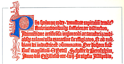
EXAMPLE 528-A
The first “imprint,” as found on Fust and Schœffer’s Psalter of 1457 From De Vinne
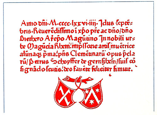
EXAMPLE 528-B
Colophon and imprint by Peter Schœffer, 1476 From the original in the Typographic Library and Museum, Jersey City
195
IMPRINTS
The printer’s name or device should, with all regard to
good taste, be placed on every well-executed piece of work
produced by him. That this is not more often done is due
to neglect of advertising opportunities and
to fear of the customer’s objection. Why
should not the printer mark his product as
other craftsmen and manufacturers do?
Each piece of clothing he wears, from hat
to shoes, probably carries the name or trademark
of its maker, as do automobiles, pianos,
watches, silverware and many other
articles he owns. The maker’s name and
trademark are a guarantee of
a certain quality of product;
in fact, they are absent only
on cheap or imitative articles.
If the printer is doing careless
work and giving no thought to
quality, he had better hide his
identity, but if he is really
producing good printing, as a
duty to the craft of which he
is a member he should “let his
light shine before men.”
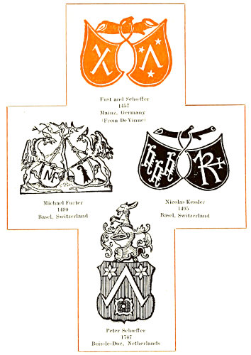
EXAMPLE 529
The first imprint-device, and three marks based on it
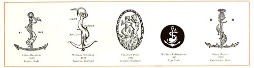
EXAMPLE 530
Aldus’s anchor-and-dolphin device, and adaptations by modern printers
If a commercial printer has
not been in the habit of placing an imprint on
his product, and he decides to do so, customers
should tactfully be made acquainted with the
innovation. They probably stand ready to be
convinced of its reasonableness. It may be an
excellent plan for the printer to mail his customers
an announcement to this effect: “The
standard of quality attained by the Smith
Printshop is such that it is due our customers
and ourselves so to mark each piece of printing
produced by us as to identify it as a product
of the Smith Printshop. This we will do
hereafter.”
As a further precaution, all proofs receiving the O. K.
of the customer should contain the imprint just as it is to
be used, and on important large orders, where there is any
doubt, permission should be obtained. There
are instances where customers have refused
to accept printed work for the reason that
an imprint was placed on it.
It is only necessary to have printing-office
patrons become accustomed to the new
order of things.
John Dunlap, who printed the Declaration
of Independence for Congress, placed
his imprint on it (see frontispiece
of this volume). If some
friend had suggested to John
Gutenberg that he imprint his
name on his work, the discussion
that has since arisen as to
whether or not he printed the
“Bible of Forty-two Lines”
would not have taken place.
The commercial printer’s
imprint should be unassuming
and placed inconspicuously.
Decorative imprints could be
used on booklet and catalog work, and in addition
the decorative device should find place
on every piece of the printer’s own stationery
and advertising matter, even on the office door.
The use by printers of decorative devices
dates back to one of the first printed books,
the famous Psalter of 1457. For a great many
hundred years previous, pictures and devices
in various forms had been relied upon to convey
information and to act as distinguishing
marks for various purposes. Figures such as
the white horse and the red lion, hung as signs
in front of taverns and public
houses during the last two centuries,
were outgrowths of the
coats-of-arms of titled folk who
in ancient times hung the family
device in front of their estates
as emblems of hospitality to the
weary traveler.
196
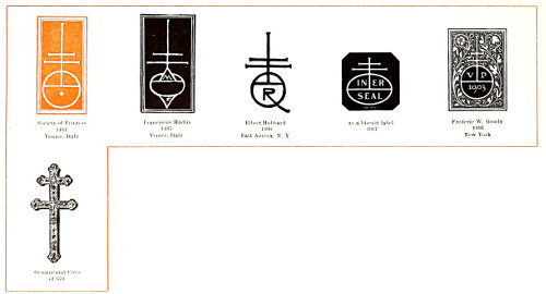
EXAMPLE 531
The most popular imprint-device as early used by printers, and modern interpretations
Emblems and devices seem always
to have had place in human
history. The sign of the Cross
in the eleventh century led the Crusaders against the followers
of the Crescent. The cross of St. George (+) furnished
inspiration for the English in their warfare with
the Scots, who rallied around the cross of St. Andrew (❌),
and the combined crosses of St. George, St. Andrew and
St. Patrick now inspire the patriotic Britisher.
It would seem that printers could do better work if
they were to select some device which would represent an
ideal, and then attempt to live up to it.
While the Gutenberg Bible of Forty-two Lines, generally
accepted as the first book printed with separate
metal types, contained neither device nor printer’s name,
the Book of Psalms, or Psalter, of 1457, not only has the
names of Fust and Schœffer and the date, but an imprint
device which has the distinction of being the first ever
used on a book typographically printed. This famous
Psalter was the product of Johann Fust and Peter Schœffer,
who succeeded to Gutenberg’s printing office. At the
end of the book, printed in red ink, is the colophon of the
printers (Example 528-A), a translation of which follows:
“This book of Psalms, decorated with antique initials,
and sufficiently emphasized with rubricated letters, has
been thus made by the masterly invention of printing and
also of type-making, without the writing of a pen, and is
consummated to the service of God, thru the industry of
Johann Fust, citizen of Mainz, and Peter Schœffer of
Gernszheim, in the year of our Lord 1457, on the eve of
the Assumption.”
The colophon contains a typographic error, perhaps the
first to be made by a typesetter, the second word showing
“spalm-” for “psalm-.” On several of the Psalters still
in existence (one is without it) the colophon is accompanied
by the decorative device shown in Example 529,
consisting of a pair of shields suspended from the limb
of a tree. The significance of the characters on the shields
is not definitely known. Humphreys, in his “History,”
asserts that the shields contain the arms of Fust and
those of Schœffer. It is conceded that the shield on the left
is Fust’s and the shield on the right Schœffer’s. In Rietstap
it is found that one branch of the old German family
of Faust bore a coat-of-arms containing on a shield two
crampons in saltire (crossed). Bullen claims the character
in the Fust shield is the Greek letter Chi (Χ) and
that in Schœffer’s shield the Greek letter Lambda (Λ),
and that they had some connection with secret societies
to which Fust and his son-in-law Schœffer belonged.
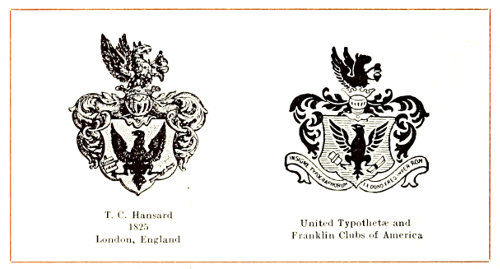
EXAMPLE 532
Arms supposedly granted the Typothetæ, a society of master printers, by Frederick III
Schœffer’s device was used for many years by his descendants,
Example 529 showing its use as late as 1747
by Peter Schœffer, of Bois-le-Duc, in the Netherlands.
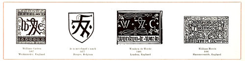
EXAMPLE 533
The imprint-device of England’s first printer, its probable derivation, and two notable devices evolved from it
197This device of Fust and Schœffer furnished inspiration
to several printers of the same century, chief among whom
were Michael Furter and Nicolas Kessler, whose devices
are shown in Example 529. Furter, who printed at Basel,
Switzerland, in 1490, was once credited with being the
inventor of printing, thru an error in a book, the date of
which was made to read 1444 (M.CCCC.XLIIII), instead
of 1494 (M.CCCC.XCIIII).
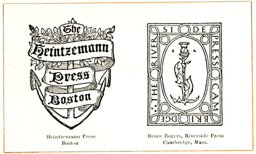
EXAMPLE 534
Two modern designs with ancient motifs
What is considered to be the most classic of all imprint-devices
(Example 530) is that used by Aldus Manutius,
the great Venetian printer, who introduced the italic face
of type. The device, an anchor, around which is twisted a
dolphin, is said to be symbolic of the proverb “Hasten
slowly.” The anchor represents stability and the dolphin
swiftness. The mark was taken by him from a book he
had printed, “Reveries of Polyphilus,” and was used as
the Aldus device for the first time in an edition of Dante
of 1502.
In a spirit of affection and regard for the famous Venetian,
the device of Aldus has been adopted or adapted by
several well-known printers. There is a nice sentiment
connected with the use of this mark by William Pickering,
the noted English publisher. In place of the “AL-DVS”
of the original, Pickering’s adaptation contained a motto
in which he announced himself as the English disciple of
Aldus. The reproduction of the Pickering device shown is
from a book published by Pickering and printed by Whittingham
in 1840.
By 1892 we find a lion added to this device, as used by
the Chiswick Press.
The McClure Publications of New York have a conventionalized
interpretation which shows the dolphin and
anchor in white upon a black circular background (Example
530).
Bruce Rogers, at the Riverside Press, has most interestingly
adapted the Aldus device. It seems that he always
had a fondness for the thistle, the national flower of Scotland,
and when seeking a
motif for his mark, naturally
turned to it. When
the time came for putting
it into use, the first requirement
happened to be
for an Aldine page, so it
was cast in a form that
would distinctly suggest
the Aldus anchor and dolphin.
(Compare the two
designs in Example 530.)
While on the subject of
Bruce Rogers’s device it
may be interesting to relate
that later, when he
desired to use it on a book
modeled on French sixteenth-century
work, he
reshaped it as shown in
Example 540, which carries
a suggestion of one of
Robert Estienne’s marks
shown with it. Rogers redrew
his personal device,
or that of the Riverside
Press, to blend with the
motif of the book on which
it was to be used, a practice
that embodies the highest use of the printer’s mark.
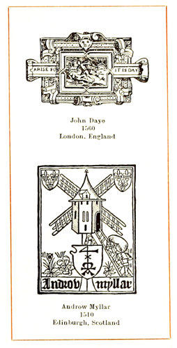
EXAMPLE 535
The pun, as found in two printers’ marks
One of the most famous imprint-devices is that adopted
by the Society of Printers of Venice in 1481 (Example
531), about the time of the death of Nicholas Jenson, who
is supposed to have originated the design. Various explanations
have been given of the significance of this device,
the most reasonable being that the globe and cross
refers to the millennium, when, according to prophecy,
God shall reign upon earth. The globe-and-cross symbol
was frequently embellished with supplementary characters
having other religious significance. The mark of Androw
Myllar (Example 535) contains a figure 4, which
denoted the Supreme Being. People of antiquity frequently
composed the name of the Deity in four letters.
The globe in the Venetian device probably represented the
earth, altho the fact that the earth was round was not
common knowledge in the early days. The theory, however,
was accepted by the educated priest and layman long
before Columbus sailed, as he thought, for India.
The double-cross in the Roman church today is associated
with the authority of an archbishop, and as a decorative
form of the cross, extends back many centuries. The
ornamental double-cross pictured in this connection was
once the property of St. Waudru of Belgium, who died
198in 670. The
double cross
or Lorraine
cross was used by Geofroy Tory as a small mark on his
wood engravings (see lower left corner of the Tory mark
in Example 536).
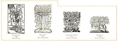
EXAMPLE 536
Devices used by notable printers of the sixteenth and seventeenth centuries
EXAMPLE 537
A colophon-imprint by D. B. Updike, from “Petrarch and His Masters,” 1907
EXAMPLE 538
The Lion of St. Mark appropriately adapted by Bruce Rogers to a book on Venetian life
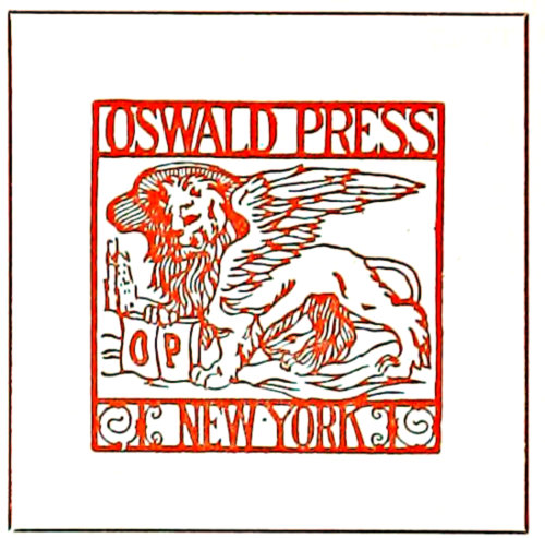
EXAMPLE 539-A
The Lion of St. Mark as a printshop device
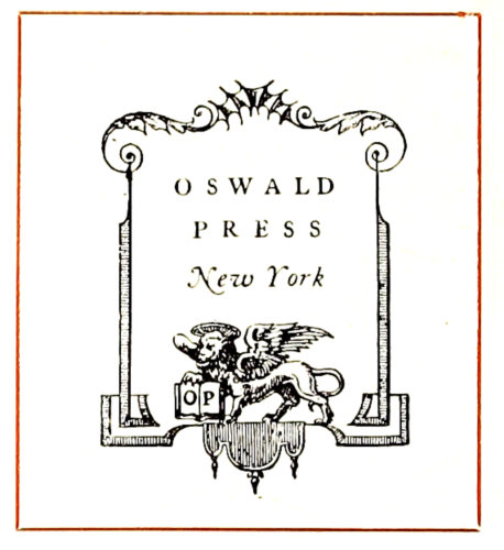
EXAMPLE 539-B
The Oswald Press mark designed by T. M. Cleland
In further consideration of the cross-and-globe device
it may be well to mention that an astronomical sign consisting
of a circle with a cross above it (♁) was used by
the Egyptians many years before the Christian era. Such
a sign is yet used astronomically and also to indicate the
male in botany. Another astronomical sign bearing on the
subject is that of a cross within a circle (⨁), by which
the earth is indicated.
EXAMPLE 540
Robert Estienne’s mark, and Bruce Rogers’s adaptation of it
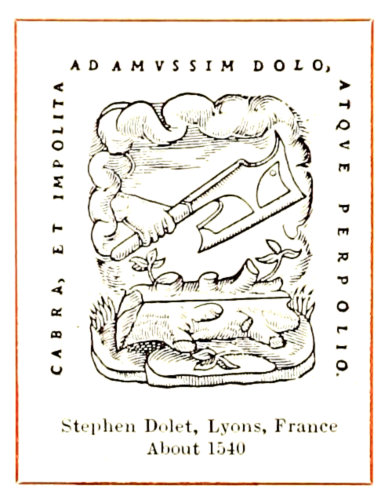
EXAMPLE 541
An appropriate mark for a printer to adopt
The cross-and-globe device of the Venetian Society of
Printers has proved the most popular of any of the old
imprints. When Elbert Hubbard established the Roycroft
Shop at East Aurora, N. Y., in 1896, he adopted it as a
work-mark, placing an
“R” in the lower half
of the circle in place of
the dot. Fra Elbertus’s
interpretation of the
device established the
circle as “the emblem of the perfect (the complete), and
the lines puncturing the circle the attempt to make a perfect
article, to do perfect work.”
When the advertising manager of the National Biscuit
Company was looking about for a trademark this old device
of the Lorraine cross and circle must have appealed
to him strongly, and such is the power of advertising that
printers may some day be accused of copying the design
from this biscuit house.
The remarkable adaptability of the device is also demonstrated
by the Griffith-Stillings imprint, in which it
forms a part of a clever modern decorative design (Example
547).
Frederic W. Goudy incorporated the Venetian printers’
device most interestingly in the decorative mark of the
Village Press (Example 531).
The imprint-device of the Gould Press (Example 543)
may have originated with the Venetian printers’ design.
It is an interesting variant.
These numerous uses by printers and others of the old
circle-and-cross design suggest a paraphrase of an ancient
proverb: “A good device lives forever.”
William Caxton, England’s first printer, used an imprint-device
(Example 533) that in appearance resembles
a rug, which it may have been intended to represent, as
Caxton is supposed to have used this mark when he was a
merchant at Bruges in Belgium. The characters contained
in the design have caused much discussion. The “W” on
the left and the “C” on the right are generally accepted
as the initials of Caxton. The center characters have been
claimed by some to be the figures “74,” but the most reasonable
explanation is that they form a trade device used
by the merchants of Bruges. This explanation is seemingly
confirmed by the discovery of a memorial plate to
one John Felde, containing his trademark as a merchant,
which trademark is very similar to the characters in the
center of Caxton’s imprint-device. The reproduction of the
Felde design shows that if the top stroke were taken away
and a loop added the result would be Caxton’s characters.
199Wynkyn de Worde, when he succeeded Caxton
as England’s printer, adopted Caxton’s
characters (probably a sentimental act) and
in the device shown added his own name at
the foot.
William Morris, in planning an imprint-device
for the Kelmscott Press, evidently made
a study of de Worde’s design, for there is resemblance
in shape and in the placing of the
name at the foot.
T. C. Hansard, on the title-page of his “Typographia”
(1825), uses a device which tradition
tells us was granted by Emperor Frederick
III of Germany to a corporation of
master printers known as the Typothetæ. (See
Example 532.) References by writers to the
origin of this design are generally contradictory.
The United Typothetæ and Franklin
Clubs of America, an association of employing
printers, has adopted the device and uses it in
the conventionalized form shown. The design
in its original form tends to heraldic elaborateness.
There is represented an eagle holding
a copy guide in one claw and a composing stick
in the other. Surmounting the design is a griffin
(eagle-lion) grasping two ink balls. The Winthrop
Press mark (Example 543) and other
printers’ devices have been inspired by this
emblem, as the griffin copyholder and ink balls
are familiar decorative forms.
In Great Britain the printer whose name
would allow a pun has always been considered
fortunate. John Daye, a London printer of
1560, had an elaborate device, paneled, in the
center of which is a picture of a reclining man
being aroused by a figure which, pointing to
the sun, says, “Arise, for it is day.” (Example
535.)
Androw Myllar, who printed in Edinburgh,
Scotland, in 1510, used a device which portrayed
a miller climbing to his mill (Example
535). The arrangement of his name in
the lower part of the design suggests de
Worde’s, and the characters in the shields
have meanings that may be determined by a
study of the religious symbolism of the Middle Ages.
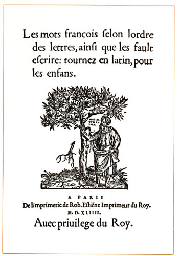
EXAMPLE 536-A
The printer’s device and imprint here occupies two-thirds of the title-page. From a book by Robert Estienne, Paris, France, 1544
The imprints of some of the notable printers of the
sixteenth and seventeenth centuries are interesting. The
first mark in Example 536 shows one of the devices of
Geofroy Tory of Paris from his “Champ Fleury” of 1529.
It consists of a broken pot filled with instruments and the
Latin phrase Non plus (nothing more). The Lorraine
cross in the lower left corner is interesting in connection
with the use made of it by the Venetian Society of Printers
(Example 531). Tory, an accomplished scholar and
noted wood engraver and printer, was, according to an
epitaph written by a compatriot, “the first man to discuss
seriously the art of printing,” and “taught Garamond,
chief of engravers.” His work on the derivation and formation
of Latin characters had considerable renown. He
claimed, according to Fournier, that all the letters are
200formed of I and O. Proportions are arrived at by dividing
a square into ten lines, perpendicular and horizontal,
forming one hundred squares completely filled with circles,
the whole giving form and figure to the letters.
EXAMPLE 542
Use of the oval shape in the designing of printers’ marks
EXAMPLE 543
Modern imprints suggested by ancient forms
The troublous times of the Reformation, during which
John Bebel was imprisoned, may have had some influence
on his selection of a device. It consisted of a tree, in the
branches of which was a prostrate man, and over him was
a large flat thing representing the platen of a printing
press (Example 536). On the platen were words meaning
“Do not press poor me to death.”
Christopher Plantin, printer and publisher of Antwerp,
Belgium, whose famous printing office, preserved as a
museum, was one of the shrines of worshiping printer-pilgrims
up to the beginning of the European war, employed
a device which is emblematic of the saying of Jesus,
“I am the vine.”
A device used by the Elzevirs at Leyden, Holland, in
1620, shows a tree with spreading branches. On one side
of the trunk is the figure of a man and on the other a
scroll with the words Non solus (not alone).
Robert Estienne had a similar device in 1544 (Example
536-A). This device as shown is slightly reduced from
the original, while those previously mentioned are greatly
reduced in size.
John Froben of Basel, Switzerland, who was a close
friend of Erasmus, the philosopher and patron of learning,
in 1520 used a device containing a staff surmounted
by a dove and entwined by two serpents. (Example 542.)
The legend, “Be ye wise as serpents and harmless as
doves,” occasionally accompanied the design.
Sometimes these printers’ marks were so large as to
leave little room for the title-page proper, in contrast to
which is the extreme modesty of Ulrich Zell of Cologne,
Prussia, whose works are numerous and who is credited
with starting the story of the invention of printing by
Coster. Zell scarcely ever placed even his name on a book,
yet his work may easily be identified.
The Heintzemann Press device in Example 534 has an
antique appearance and
its designer evidently received
inspiration for his
anchor, foliage and scroll
from such devices as those
of Aldus and Plantin. The
Rogers-Riverside Press
mark, too, has ancient motifs.
The anchor-shaped
thistle, as already stated,
is based upon Aldus’s device,
and the frame suggests
old designs in metal.
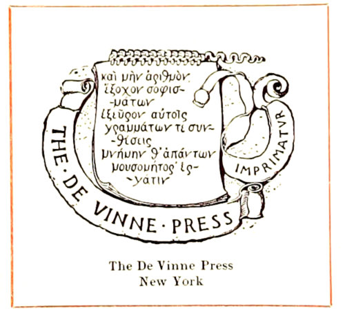
EXAMPLE 545
A mark that has to do with mythology
There is a suggestion of
the pot device of Tory in
the decorative portion of the Merrymount
Press imprint shown as Example 537. This
appeared at the end of the book as a colophon,
the style in which the imprint is written
fitting it for that position. It will be
remembered that the printers of Italy usually
had the beginning and ending set in
capitals to differentiate them from the body
of the book. Elbert Hubbard used the idea
commercially on his advertising booklets,
as in Example 550.
Perhaps the device shown as Example
541 is a bit too suggestive for practical use
by printers of the present day. Stephen
Dolet’s name, in its literal meaning, has
something to do with an ax, hewing and
cutting. Dolet was a scholarly printer of the sixteenth
century who suffered martyrdom at the stake in 1546.
The oval shape for imprint designs is not unpleasant,
as will be seen by Example 542.
The Fezandat device was designed by Tory. The pheasant
is a pun on the printer’s name. The device as a whole
is pleasing.
The Riverside Press device is classically Greek in motif.
Pan and his pipes appear on many of the marks of this
press in various designs. The one shown is from “Pan’s
Pipes,” a Riverside Press publication.
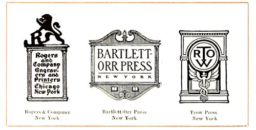
EXAMPLE 544
Printers’ marks based on architectural motifs
The winged ball, torch and other symbolic decorative
devices are blended pleasingly on the mark (Example 542),
which appeared on the title-pages of the famous Eliot
six-foot shelf of books, “The Harvard Classics,” 1909.
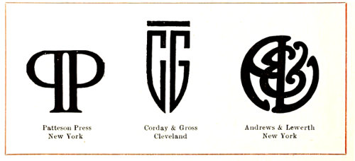
EXAMPLE 546
The monogram is an attractive form for printers’ devices
EXAMPLE 547
Representative of the large variety of devices in use by American printers and publishers
An interesting feature of some early Venetian books is
the use by printers of decorative devices designed upon
the winged Lion of St. Mark. Recent adaptations of this
device are the Oswald Press imprints (Examples 539-A
and 539-B) and the ornament on a title by Bruce Rogers
(Example 538). The Lion of St. Mark is interesting in its
significance. Tradition has it that long ago, when John
Mark, the missionary companion of Paul, was traveling
by way of Aquileia (Roman Secunda) for the purpose of
201preaching the gospel of Jesus,
he found himself, after a violent
storm, on one of the Rialto
Islands that now form the city
of Venice. In a dream an angel
appeared saluting him (Pax
tibi Marce Evangelista meus)
and announcing that on those
islands his bones would some
day find peace. In fulfilment of this prophecy, in the
year 829, several Venetians went to Alexandria, where
the body of Mark had been buried, removed it surreptitiously,
and took it to Venice. Such was the enthusiasm
caused by this event that St. Mark supplanted St. Theodore
as the patron saint of the city. “Viva San Marco”
was heard as the battle cry of the Venetians, and the
winged lion, symbolic of St. Mark, became
the glorious sign of the republic. In Venice
today there are numerous statuary reproductions
of the winged Lion of St. Mark,
holding with one claw a book of the gospels.
The exposed pages of the book usually contain
the salutation of the angel. The story
of St. Mark’s vision and of the bringing of
the body to Venice is pictured in mosaic
work in St. Mark’s Church, Venice, where
his bones rest.
The four-winged beasts mentioned in the
fourth chapter of Revelations are accepted
as symbolic of the four evangelists, the
winged lion typifying St. Mark.
Example 543 shows four designs with
motifs taken from ancient sources. The
Matthews-Northrup device of the mythical
phœnix rising from the fire is emblematic
of immortality; the torch probably signifies
the intellectual light resulting from the invention
of printing. The Winthrop Press
imprint has already been mentioned as having
relation to the ancient Typothetæ arms.
The Binner-Wells design suggests that of
Froben, by the shape and lettering between
lines. The possible derivation of the Gould
Press device from the Venetian master
printers’ emblem has been suggested.
The unique mark of the De Vinne Press
(Example 545) probably pictures a page
from a manuscript book. The legend connected
with the Greek lettering is mythical
and has to do with one Prometheus, who,
while chained to a rock, tells of the benefits
he conferred on mankind. A literal
translation of the Greek at this point reveals
the appropriateness of the quotation
as used: “And further, I discovered for them numeration,
most striking of inventions; and composition, nurse of the
arts, producer of the record of all things.”
Three imprint-devices, based upon architectural motifs,
are shown in Example 544. In the Rogers design
the architectural panel is surmounted by a silhouetted
heraldic figure that adds much to the attractiveness of
the device. A Colonial architectural panel frames the title
of the Bartlett-Orr Press. The Egyptian winged ball,
asps and open book are well blended with the monogram
circle that fits the Roman arch in the Trow imprint.
EXAMPLE 548
Decorative imprints constructed with typefounders’ ornaments and suitable type-faces
Initials in monogram form are frequently adopted by
printers, and three such devices are shown in Example
546. Reversing one of the initials is a favorite method
when the nature of the letter allows it, as in the Patteson
Press device. Fitting the initials to a general shape calls
202for clever work, as in the shield shape of the Corday &
Gross design.
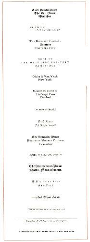
EXAMPLE 549
Type imprints, and the various interesting effects possible with them
Of the large variety of devices in use by other publishers
and printers, those shown in Example 547 are representative.
The Griffith-Stillings device, as has already been mentioned,
includes elements of the mark of the Society of
Printers of Venice.
The American Printer mark shows an American eagle
standing on books, and the initials A. P. used decoratively
in the upper right corner. The dimensions of this oblong
and the background are borrowed from the Venetian mark.
Unusual in shape and in wording is the Stillson device,
which develops attractiveness when printed in several
colors and embossed.
EXAMPLE 550
Quaint book-ending, or colophon, as used by Elbert Hubbard
Notwithstanding the cumbersome size of the acorn, the
Sparrell Print device is not unattractive.
With a decorative quality that suggests the sixteenth
century, the Ginn device is appropriate in its use of the
horn book, an old-time teaching help.
Rather clever is the manner in which Goudy has hung
the ampersand decoratively on the double-T monogram
that is part of the Taylor & Taylor mark.
The diamond-shaped Wright & Joys device, with its
conventionalized tree, is also interesting.
It is possible to construct really creditable decorative
imprints with typefounders’ ornaments and suitable type-faces.
Example 548 presents several such designs as demonstrations
of what can be done in this respect. In building
these imprints the author has kept in mind the rules
that govern combinations of type and ornament, as explained
in the chapters relating to harmony, appropriateness,
tone, contrast and ornamentation. In the Church
Press design the border is made in outline to reflect the ornament.
The types used in the Smith-Brown, Willis Works
and Gothic Shop imprints harmonize with the ornamentation
in both tone and shape. Italic type and the fleur-de-lis
are French in motif. The Caslon type-face and the
old-style parentheses go well together. The block, or
gothic, type-face in its plainness of stroke suggests early
Greek letters, and blends with the plain illustration. The
money-bag ornament is an attempt at a pun, in the Stuff
imprint. The pleasing gray tone of the Horner & Wilburn
device is due to harmony of ornament and type-face.
The printer will more often be called on to use a small,
inconspicuous type-imprint than the prominent decorative
device, and it is just as desirable to have distinction in
these small type lines as in the elaborate devices. There
are grouped in Example 549, a variety of effects suggested
for this purpose. The type used in an imprint should harmonize
and blend with the typography of the work on
which it is used. An imprint in old-style type would not
blend with a page set in modern type. It was the custom
at one time to electrotype imprint lines so that they could
be easily handled, but now the linotype furnishes a convenient
method of casting them. It is well, tho, to
strengthen the face by having the slugs copper-faced,
which work is done by electrotypers.
APPENDIX
Holiday Greetings
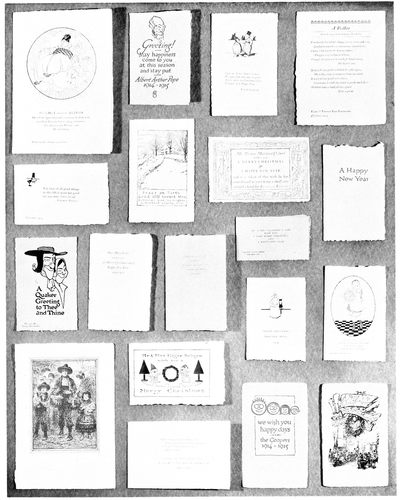
Holiday Greetings furnish opportunity for expression of the art of printing. The more than one hundred specimens reproduced in miniature in this section (received by the editors of “The American Printer” from friends) contain many suggestions of typographic interest
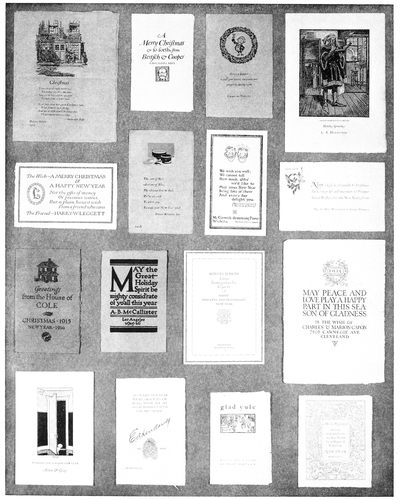
“Everybody in our house
wishes everybody in your house
a Merry Christmas
and a Happy New Year”

“Volumes of good wishes
to friends of ours
from friends of yours”
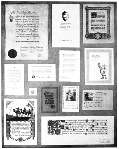
“Christmas:
A time for giving and for getting
and forgiving and forgetting”
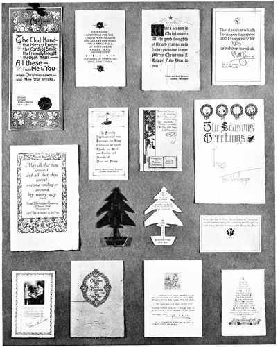
“May all that thou wishest
and all that thou lovest
come smiling around
thy sunny way”
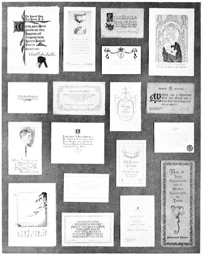
“At Christmas be merry
And thankful withal,
And feast thy poor neighbors,
The great with the small”
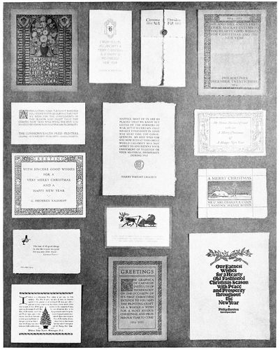
“GLORIA IN EXCELSIS
DEO
ET IN TERRA PAX
HOMINIBUS BONAE
VOLUNTATIS”
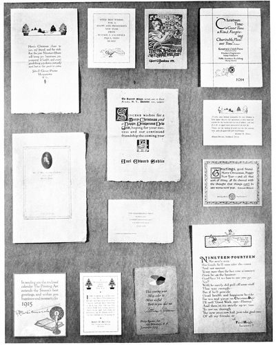
“Ule! Ule!
Three puddings in a pule—
Crack nuts and cry Ule!”
TRANSCRIBER’S NOTES
- Many illustrations may appear to be out of order. The book was in two columns of
text. The text read top to bottom then left to right as normal. However, the
illustrations were usually numbered left to right then top to bottom. The illustrations
were inserted as close as possible in the normal flow of the text. Some illustrations
were out of order, e.g. Example 16.
- The illustrations are displayed in direct proportion to their size in the original.
- Added ‘the’ between ‘of’ and ‘customer’ on p. 119.
- Silently corrected typographical errors.
- Retained anachronistic and non-standard spellings as printed.
*** END OF THE PROJECT GUTENBERG EBOOK 54476 ***