 N this age of progress, when the fine arts are
rapidly becoming trades, and the machine is
on every side superseding that labour of head
and hand which our fathers called Handicraft,
we are in danger of losing sight of, or, at least,
of undervaluing the genius of those who, with
none of our mechanical advantages, established
and made famous in our land those arts and handicrafts of which
we are now the heritors.
N this age of progress, when the fine arts are
rapidly becoming trades, and the machine is
on every side superseding that labour of head
and hand which our fathers called Handicraft,
we are in danger of losing sight of, or, at least,
of undervaluing the genius of those who, with
none of our mechanical advantages, established
and made famous in our land those arts and handicrafts of which
we are now the heritors.
The Art of Letter Founding hesitated long before yielding to the revolutionary impulses of modern progress. While kindred arts—and notably that art which preserves all others—were advancing by leaps and bounds, the founder, as late as half a century ago, was pursuing the even tenor of his ways by paths which had been trodden by De Worde and Day and Moxon. But the inevitable revolution came, and Letter Founding to-day bids fair to break all her old ties and take new departures undreamed of by those heroes of the punch and matrix and mould who made her what we found her.
At such a time, it seems not undutiful to attempt to gather together into a connected form the numerous records of the Old English Letter Founders scattered throughout our literary and {vi} typographical history, with a view to preserve the memory of those to whose labours English Printing is indebted for so much of its glory.
The present work represents the labour of several years in what may be considered some of the untrodden by-paths of English typographical history.
The curious Dissertation on English Typographical Founders and Founderies by the learned Edward Rowe Mores, published in 1778, is, in fact, the only work in the language purporting to treat of Letter Founding as distinct from the art which it fosters. This quaint and crabbed sketch, full of valuable but half-digested information, was intended to accompany a specimen of the types of John James, whose foundry had gradually absorbed all the minor English foundries, and, after the death of its owner, had become the property of Mores himself. The enthusiasm of the Oxford antiquary infused new life into the dry bones of this decayed collection. Working backwards, he restored in imagination the old foundries of the seventeenth and eighteenth centuries, as they had been before they became absorbed in his own. He tracked back a few famous historical types to their fountain-head, and even bridged over the mysterious gulf which divided the early sixteenth from the early seventeenth centuries of English letter-founding.
Mores’ Dissertation has necessarily formed the basis of my investigations, and is, indeed, almost wholly incorporated in the present volume. Of the additional and more anecdotal notes on the later founders, preserved by Nichols and Hansard, I have also freely made use; although in every case it has been my endeavour to take nothing on report which it has been possible to verify by reference to original sources. This effort has been rewarded by several interesting discoveries which it is hoped may be found to throw considerable fresh light on the history of our national typography.
The first century of English letter-founding is a period of great obscurity, to master which it is absolutely essential to have {vii} unlimited access to all the works of all the printers whose books were the only type specimens of their day. Such access it has been beyond my power fully to secure, and in this portion of my work I am bound to admit that I can lay claim to little originality of research. I have, however, endeavoured to examine as many of the specimens of these early presses as possible, and to satisfy myself that the observations of others, of which I have availed myself, are such as I can assent to.
In detailing the rise and progress of the various English Letter Foundries, it has been my endeavour to treat the subject, as far as possible, bibliographically—that is, to regard as type-specimens not merely the stated advertisements of the founder, but also the works for which his types were created and in which they were used. The Catena on Job, Walton’s Polyglot, Boyle’s Irish Testament, Bowyer’s Selden, thus rank as type specimens quite as interesting as, and far more valuable than, the ordinary letter founders’ catalogues. Proceeding on this principle, moreover, this History will be found to embody a pretty complete bibliography of works not only relating to, but illustrative of, English Letter Founding. At the same time, the particular bibliography of the subject has been kept distinct, by appending to each chapter a chronological list of the Specimen Books issued by the foundry to which it relates.
The introductory chapter on the Types and Type Founding of the First Printers may be considered somewhat foreign to the scope of this History. The importance, however, of a practical acquaintance with the processes and appliances of the Art of Letter Founding as a foundation to any complete study of typographical history—as well as the numerous misconceptions existing on the part even of accepted authorities on the subject—suggested the attempt to examine the various accounts of the Invention of Printing from a letter founder’s point of view, in the hope, if not of arriving at any very definite conclusions, at least of clearing the question of a few prevalent fallacies.
The two chapters on Type Bodies and Type Faces, although also {viii} to some extent foreign, are considered important by way of introduction to the history of English Letter Founding in which the “foreign and learned” characters have so conspicuously figured.
If this book—the imperfections of which are apparent to no one as painfully as they are to the writer—should in any way encourage the study of our national Typography, with a view to profit by the history of the past in an endeavour to promote its excellence in the future, the labour here concluded will be amply repaid.
The agreeable task remains of thanking the numerous friends to whose aid and encouragement this book is indebted for much of whatever value it may possess.
My foremost thanks are due to my honoured and valued friend, Mr. William Blades, to whom I am indebted for far more than unlimited access to his valuable typographical library, and the ungrudging use of his special knowledge on all subjects connected with English typography. These I have enjoyed, and what was of equal value his kindly advice and sympathy during the whole progress of a work which, but for his encouragement from the outset, might never have been completed.
Another friend who, brief as was our acquaintance, had taken a genuine interest in the progress of this History, and had enriched it by more than one valuable communication, has been snatched away by the hand of Death before the thanks he never coveted but constantly incurred can reach him. In Henry Bradshaw the world of books has lost a distinguished ornament, and this little book has lost a hearty friend.
To Mr. F. Madan, of the Bodleian Library, Oxford, I owe much valuable information as to early printing at that University; while to the kindness of Mr. Horace Hart, Controller of the University Press, I am indebted for full access to the highly interesting collection of typographical antiquities preserved at that Press, as well as for the specimens I am here enabled to show of some of the most interesting relics of the oldest Foundry in the country. {ix}
Mr. T. W. Smith has kindly given me similar facilities as regards the archives and historical specimens of the venerable Caslon Foundry.
Mr. Sam. Timmins most generously placed at my disposal much of the information embodied in my chapter on Baskerville, including the extracts from the letters forming part of his unique collection relating to that celebrated typographer.
To Mr. James Figgins I am obliged for many particulars relating to the early association of founders at the commencement of the present century; also for a specimen of one of the most noted founts of his distinguished ancestor.
Mr. Charles R. Rivington I have to thank for one or two valuable extracts from the Minutes of the Court of the Stationers’ Company, relating to Letter Founders.
To Messrs. Enschedé and Sons, of Haarlem, my thanks are also specially due for giving me specimens of some of their most curious and ancient types.
It is also my pleasure, as well as my duty, to thank the Secretary of the American Antiquarian Society for information regarding specimens in his possession; my friend, Dr. Wright, of the British and Foreign Bible Society, for free access to the highly interesting Library under his care; Messrs. Tuer, Bremner, Gill, and others for the kind loan of Specimens; the Librarian of the London Institution for permission to facsimile portions of the rare specimen of James’ Foundry in that Library; and the numerous other friends, who, by reading proofs and in other ways, have generously assisted me in my labours.
I also take this opportunity of thanking Mr. Prætorius and Mr. Manning for the care they have bestowed on the preparation of facsimiles for this work; and of expressing my obligations to the officials of the British Museum and Record Office for their invariable courtesy on all occasions on which their assistance has been invoked.
LONDON, January 1st, 1887.
Introductory Chapter. THE TYPES AND TYPE FOUNDING OF THE FIRST PRINTERS |
1 | |
| Chap. 1. | THE ENGLISH TYPE BODIES AND FACES |
31 |
| ″ 2. | THE LEARNED, FOREIGN AND PECULIAR CHARACTERS |
57 |
| ″ 3. | THE PRINTER LETTER-FOUNDERS, FROM CAXTON TO DAY |
83 |
| ″ 4. | LETTER FOUNDING AS AN ENGLISH MECHANICAL TRADE |
102 |
| ″ 5. | THE STATE CONTROL OF ENGLISH LETTER FOUNDING |
123 |
| ″ 6. | THE OXFORD UNIVERSITY FOUNDRY |
137 |
| ″ 7. | THE STAR CHAMBER FOUNDERS, AND THE LONDON POLYGLOT |
164 |
| ″ 8. | JOSEPH MOXON |
180 |
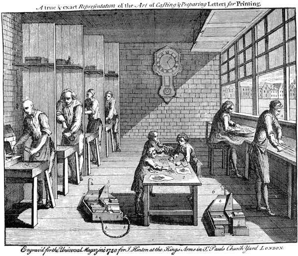
| ″ 9. | THE LATER FOUNDERS OF THE 17TH CENTURY |
193 |
| ″10. | THOMAS AND JOHN JAMES |
212 |
| ″11. | WILLIAM CASLON |
232 |
| ″12. | ALEXANDER WILSON |
257 |
| ″13. | JOHN BASKERVILLE |
268 |
| ″14. | THOMAS COTTRELL |
288 |
| ″15. | JOSEPH AND EDMUND FRY |
298 |
| ″16. | JOSEPH JACKSON |
315 |
| ″17. | WILLIAM MARTIN |
330 |
| ″18. | VINCENT FIGGINS |
335 |
| ″19. | THE MINOR FOUNDERS OF THE 18TH CENTURY |
345 |
| ″20. | WILLIAM MILLER |
355 |
| ″21. | THE MINOR FOUNDERS FROM 1800 TO 1830 |
357 |
1.—Types cast from leaden matrices, circ. 1500 . . . 16
2.—Specimen illustrating the variations in the face of type, produced by bad casting . . . 18
3.—Type mould of Claude Garamond. Paris, 1540. From Duverger . . . 23
4.—Profile tracings from M. Claudin’s 15th century types . . . 21
5.—A 15th century type. From M. Madden’s Lettres d’un Bibliographe . . . 24
6.—A 15th century type. From Liber de Laudibus...Mariæ, circ. 1468 . . . 24
7.—Roman letter. From the Sophologium, Wiedenbach? 1465–70? . . . 42
8.—Roman and Black letter intermixed. From Traheron’s Exposition of St. John, 1552 . . . 45
9.—Robijn Italic, cut by Chr. van Dijk. From the original matrices . . . 52
10.—Gothic Type or Lettre de Forme, circ. 1480. From the original matrices . . . 53
11.—Philosophie Flamand engraved by Fleischman, 1743. From the original matrices . . . 54
12.—Lettre de Civilité, cut by Ameet Tavernier for Plantin, circ. 1570. From the original matrices . . . 56
13.—Blooming Initials. Oxford, circ. 1700 . . . 80
14.—Pierced Initial. Oxford, ante 1700 . . . 81
15.—Caxton’s Advertisement, in his Type 3 . . . face 88
16.—Caxton’s Type 4.* From the Golden Legend . . . face 88
17.—Black letter, supposed to be De Worde’s. From Palmer’s History of Printing . . . 90
18.—Pynson’s Roman letter. From the Oratio in Pace Nuperrimâ, 1518 . . . 92
18a.—Berthelet’s Black letter and Secretary type. From the Boke named the Governour, 1531 . . . 95
19.—Portrait of John Day, 1562. From Peter Martir’s Commentaries, 1568 . . . 99
20, 21, 22.—Day’s Saxon, Roman, and Italic. From the Ælfredi Res Gestæ, 1574 . . . face 96
23.—Letter Founding in Frankfort in 1568. From Jost Amman’s Stände und Handwerker . . . 104
24.—Letter Founding and Printing circ. 1548. From the Harleian MSS. . . . 105
25.—Letter Founding in 1683. From Moxon’s Mechanick Exercises . . . 109
26.—Letter Founding in France in 1718. From Thiboust’s Typographiæ Excellentia . . . 115
27.—Colophon of the Lyndewode, Oxford, n.d. Showing types [c], [d], [e], [f] . . . face 138
28.—Greek fount of the Eton Chrysostom, 1613 . . . face 140
29.—Greeks, Roman and Italic. From the Catena on Job, 1637 . . . face 140
30.—The Sheldonian Theatre, Oxford. From an old wood-block . . . 153
31.—The Clarendon Press, Oxford. From an old wood-block . . . 156
32.—Pica Roman and Italic, presented to Oxford by Dr. Fell, 1667 . . . 152
33.—Pica Roman and Italic, bought by Oxford University in 1692 . . . 152
34, 35, 36, 37, 38.—Hebrew, large and small, Coptic, Arabic, and Syriac, presented to Oxford by Dr. Fell, 1667. From the original matrices . . . 147
39.—Ethiopic, bought by Oxford University in 1692. From the original matrices . . . 154
40.—Ethiopic of Walton’s Polyglot, 1657. From the original matrices . . . 174
41.—Syriac of Walton’s Polyglot, 1657. From the original matrices . . . 174
42.—Samaritan of Walton’s Polyglot, 1657. From the original matrices . . . 174
43.—Specimen of Nicholas Nicholls, 1665. From the original . . . face 178
44.—Portrait of Joseph Moxon. From the Tutor to Astronomy and Geography, 4th ed., 1686, . . . face 180
45.—Moxon’s Irish type, 1680. From the original matrices . . . 189
46.—Dutch Initial Letters. From the original matrices . . . 80
47.—Nonpareil Rabbinical Hebrew in Andrews’ Foundry. From the original matrices . . . 194
48.—Saxon, cut by R. Andrews for Miss Elstob’s Grammar, 1715. From the original matrices . . . 196
49.—Old Dutch Blacks in R. Andrews’ Foundry. From the original matrices . . . 194
50.—Alexandrian Greek in Grover’s Foundry. From the Catalogue of James’ Sale, 1782 . . . 200
51.—Scriptorial in Grover’s Foundry. From the original matrices . . . 204
52.—Court Hand in Grover’s Foundry. From the original matrices . . . 204
53.—Union Pearl in Grover’s Foundry. From the original matrices . . . 204
54.—Walpergen’s Music type. Oxford, circ. 1675. From the original matrices . . . 208
55.—Pictorial pierced Initial. From an 18th century newspaper . . . 81
56.—Title-page of the Catalogue and Specimen of James’ Foundry, 1782. From the original . . . 226
57.—Portrait of William Caslon. From Hansard . . . face 232
58.—View of the Interior of Caslon’s Foundry in 1750. From the Universal Magazine . . . Frontispiece
59.—Pica Roman and Italic, cut by Caslon, 1720. From the original matrices . . . 236
60.—Black letter, cut by Caslon. From the original matrices . . . 239
61.—Arabic, cut by Caslon, 1720. From the original matrices . . . 235
62.—Coptic, cut by Caslon, ante 1731. From the original matrices . . . 236
63.—Armenian, cut by Caslon, ante 1736. From the original matrices . . . 239
64.—Etruscan, cut by Caslon, 1738. From the original matrices . . . 240
65.—Gothic, cut by Caslon, ante 1734. From the original matrices . . . 239
66.—Ethiopic, cut by Caslon. From the original matrices . . . 240
67.—Syriac, cut by Caslon II, circ. 1768. From the original matrices . . . 246
68.—Portrait of Alexander Wilson. From Hansard . . . face 258
69.—Greek, cut by Alex. Wilson, ante 1768. From the Glasgow Homer, 1768 . . . 262
70.—Portrait of John Baskerville. From Hansard . . . face 268
71.—Greek, cut by Baskerville for Oxford. From the Oxford Specimen, 1768–70 . . . face 274
72.—Roman and Italic, cut by Baskerville, 1758. From the Milton, Birmingham, 1758 . . . face 276
73.—Engrossing, cut by Cottrell, circ. 1768. From the original matrices . . . 289
73a.—Silhouette Portraits of Joseph and Edmund Fry. From the originals . . . face 298
74.—Alexandrian Greek (formerly Grover’s), rejustified by Dr. Fry. From the original matrices . . . 304
74a.—Hebrew, cut by Dr. Fry, circ. 1785. From the original matrices . . . 304
75.—Portrait of Joseph Jackson. From Nichols’ Literary Anecdotes . . . face 316
76.—Portrait of William Caslon III. From Hansard . . . face 326
77.—Two-line English Roman, cut by Vincent Figgins, 1792. From the original matrices . . . 337
78.—Samaritan, cut by Dummers for Caslon, circ. 1734. From the original matrices . . . 345
 THE TYPES AND TYPEFOUNDING OF THE FIRST
PRINTERS.
THE TYPES AND TYPEFOUNDING OF THE FIRST
PRINTERS.
 OR four centuries the noise of controversy has raged round
the cradle of Typography. Volumes have been written,
lives have been spent, fortunes have been wasted, communities
have been stirred, societies have been organised,
a literature has been developed, to find an answer to the
famous triple question: “When, where, and by whom
was found out the unspeakably useful art of printing
books?” And yet the world to-day is little nearer a
finite answer to the question than it was when Ulric Zel indited his memorable
narrative to the Cologne Chronicle in 1499. Indeed, the dust of battle has added
to, rather than diminished, the mysterious clouds which envelope the problem,
and we are tempted to seek refuge in an agnosticism which almost refuses to
believe that printing ever had an inventor.
OR four centuries the noise of controversy has raged round
the cradle of Typography. Volumes have been written,
lives have been spent, fortunes have been wasted, communities
have been stirred, societies have been organised,
a literature has been developed, to find an answer to the
famous triple question: “When, where, and by whom
was found out the unspeakably useful art of printing
books?” And yet the world to-day is little nearer a
finite answer to the question than it was when Ulric Zel indited his memorable
narrative to the Cologne Chronicle in 1499. Indeed, the dust of battle has added
to, rather than diminished, the mysterious clouds which envelope the problem,
and we are tempted to seek refuge in an agnosticism which almost refuses to
believe that printing ever had an inventor.
It would be neither suitable nor profitable to encumber an investigation of that part of the History of Typography which relates to the types and type-making of the fifteenth century by any attempt to discuss the vexed question of the Invention of the Art. The man who invented Typography was doubtless the man who invented movable types. Where the one is discovered, we have also found the other. But, meanwhile, it is possible to avail ourselves of whatever evidence exists as to the nature of the types he and his successors used, and as to the methods by which those types were produced, and possibly to {2} arrive at some conclusions respecting the earliest practices of the Art of Typefounding in the land and in the age in which it first saw the light.
No one has done more to clear the way for a free investigation of all questions relating to the origin of printing than Dr. Van der Linde, in his able essay, The Haarlem Legend,1 which, while disposing ruthlessly of the fiction of Coster’s invention, lays down the important principle, too often neglected by writers on the subject, that the essence of Typography consists in the mobility of the types, and that, therefore, it is not a development of the long practised art of printing from fixed blocks, but an entirely distinct invention.
The principle is so important, and Dr. Van der Linde’s words are so emphatic, that we make no apology for quoting them:―
“I cannot repeat often enough that, when we speak of Typography and its invention, nothing is meant, or rather nothing must be meant, but printing with loose (separate, moveable) types (be they letters, musical notes, or other figures), which therefore, in distinction from letters cut on wooden or metal plates, may be put together or separated according to inclination. One thing therefore is certain: he who did not invent printing with moveable types, did, as far as Typography goes, invent nothing. What material was used first of all in this invention; of what metal the first letters, the patrices (engraved punches) and matrices were made; by whom and when the leaden matrices and brass patrices were replaced by brass matrices and steel patrices; . . . . . all this belongs to the secondary question of the technical execution of the principal idea: multiplication of books by means of multiplication of letters, multiplication of letters by means of their durability, and repeated use of the same letters, i.e., by means of the independence (looseness) of each individual letter (moveableness).”—P. 19.
If this principle be adopted—and we can hardly imagine it questioned—it will be obvious that a large class of works which usually occupy a prominent place in inquiries into the origin of Printing, have but slight bearing on the history of Typography. The block books of the fifteenth century had little direct connection with the art that followed and eclipsed them.2 In the one respect of marking the early use of printing for the instruction of mankind, the block books and the first works of Typography proper claim an equal interest; but, as regards their mechanical production, the one feature they possess in common is a quality shared also by the playing-cards, pictures, seals, stamps, {3} brands, and all the other applications of the principle of impression which had existed in one form or another from time immemorial.
It is reasonable to suppose that the first idea of movable type may have been suggested to the mind of the inventor by a study of the works of a xylographic printer, and an observation of the cumbrous and wearisome method by which his books were produced. The toil involved in first painfully tracing the characters and figures, reversed, on the wood, then of engraving them, and, finally, of printing them with the frotton, would appear—in the case, at any rate, of the small school-books, for the production of which this process was largely resorted to—scarcely less tedious than copying the required number by the deft pen of a scribe. And even if, at a later period, the bookmakers so far facilitated their labours as to write their text in the ordinary manner on prepared paper, or with prepared ink, and so transfer their copy, after the manner of the Chinese, on to the wood, the labour expended in proportion to the result, and the uselessness of the blocks when once their work was done, would doubtless impress an inventive genius with a sense of dissatisfaction and impatience. We can imagine him examining the first page of an Abecedarium, on which would be engraved, in three lines, with a clear space between each character, the letters of the alphabet, and speculating, as Cicero had speculated centuries before,3 on the possibilities presented by the combination in indefinite variety of those twenty-five symbols. Being a practical man as well as a theorist, we may suppose he would attempt to experiment on the little wood block in his hand, and by sawing off first the lines, and then some of the letters in the lines, attempt to arrange his little types into a few short words. A momentous experiment, and fraught with the greatest revolution the world has ever known!
No question has aroused more interest, or excited keener discussion in the history of printing, than that of the use of movable wooden types as a first stage in the passage from Xylography to Typography. Those who write on the affirmative side of the question profess to see in the earlier typographical works, as well as in the historical statements handed down by the old authorities, the {4} clearest evidence that wooden types were used, and that several of the most famous works of the first printers were executed by their means.
As regards the latter source of their confidence, it is at least remarkable that no single writer of the fifteenth century makes the slightest allusion to the use of wooden types. Indeed, it was not till Bibliander, in 1548,4 first mentioned and described them, that anything professing to be a record on the subject existed. “First they cut their letters,” he says, “on wood blocks the size of an entire page, but because the labour and cost of that way was so great, they devised movable wooden types, perforated and joined one to the other by a thread.”
The legend, once started, found no lack of sponsors, and the typographical histories of the sixteenth century and onward abound with testimonies confirmatory more or less of Bibliander’s statement. Of these testimonies, those only are worthy of attention which profess to be based on actual inspection of the alleged perforated wooden types. Specklin5 (who died in 1589) asserts that he saw some of these relics at Strasburg. Angelo Roccha,6 in 1591, vouches for the existence of similar letters (though he does not say whether wood or metal) at Venice. Paulus Pater,7 in 1710, stated that he had once seen some belonging to Fust at Mentz; Bodman, as late as 1781, saw the same types in a worm-eaten condition at Mentz; while Fischer,8 in 1802, stated that these precious relics were used as a sort of token of honour to be bestowed on worthy apprentices on the occasion of their finishing their term.
This testimony proves nothing beyond the fact that at Strasburg, Venice, and Mentz there existed at some time or other certain perforated wooden types which tradition ascribed to the first printers. But on the question whether any book was ever printed with such type, it is wholly inconclusive. It is possible to believe that certain early printers, uninitiated into the mystery of the punch and matrix, may have attempted to cut themselves wooden types, which, when they proved untractable under the press, they perforated and strung together in lines; {5} but it is beyond credit that any such rude experiment ever resulted in the production of a work like the Speculum.
It is true that many writers have asserted it was so. Fournier, a practical typographer, insists upon it from the fact that the letters vary among themselves in a manner which would not be the case had they been cast from a matrix in a mould. But, to be consistent, Fournier is compelled (as Bernard points out) to postpone the use of cast type till after the Gutenberg Bible and Mentz Psalter, both of which works display the same irregularities. And as the latest edition of the Psalter, printed in the old types, appeared in 1516, it would be necessary to suppose that movable wood type was in vogue up to that date. No one has yet demonstrated, or attempted seriously to demonstrate, the possibility of printing a book like the Speculum in movable wooden type. All the experiments hitherto made, even by the most ardent supporters of the theory, have been woful failures. Laborde9 admits that to cut the 3,000 separate letters required for the Letters of Indulgence, engraved by him, would cost 450 francs; and even he, with the aid of modern tools to cut up his wooden cubes, can only show four widely spaced lines. Wetter10 shows a page printed from perforated and threaded wooden types11; but these, though of large size, only prove by their {6} “naughty caprioles” the absurdity of supposing that the “unleaded” Speculum, a quarternion of which would require 40,000 distinct letters, could have been produced in 1440 by a method which even the modern cutting and modern presswork of 1836 failed to adapt to a single page of large-sized print.
John Enschedé, the famous Haarlem typefounder, though a strong adherent to the Coster legend, was compelled to admit the practical impossibility, in his day at any rate, of producing a single wood type which would stand the test of being mathematically square; nor would it be possible to square it after being cut. “No engraver,” he remarks, “is able to cut separate letters in wood in such a manner that they retain their quadrature (for that is the main thing of the line in type-casting).”12 Admitting for a moment that some printer may have succeeded in putting together a page of these wooden types, without the aid of leads, into a chase: how can it be supposed that after their exposure to the warping influences of the sloppy ink and tight pressure during the impression, they could ever have survived to be distributed and recomposed into another forme?13
The claims set up on behalf of movable wood types as the means by which the Speculum or any other of the earliest books was printed, are not only historically unsupported, but the whole weight of practical evidence rejects them.
Dismissing them, therefore, from our consideration, a new theory confronts us, which at first blush seems to supply, if not a more probable, certainly a more possible, stepping-stone between Xylography and Typography. We refer to what Meerman, the great champion of this theory, calls the “sculpto-fusi” {7} characters: types, that is, the shanks of which have been cast in a quadrilateral mould, and the “faces” engraved by hand afterwards.
Meerman and those who agree with him engage a large array of testimony on their side. In the reference of Celtis, in 1502, to Mentz as the city “quæ prima sculpsit solidos ære characteres,” they see a clear confirmation of their theory; as also in the frequent recurrence of the same word “sculptus” in the colophons of the early printers. Meerman, indeed, goes so far as to ingeniously explain the famous account of the invention given by Trithemius in 1514,14 in the light of his theory, to mean that, after the rejection of the first wooden types, “the inventors found out a method of casting the bodies only (fundendi formas) of all the letters of the Latin alphabet from what they called matrices, on which they cut the face of each letter; and from the same kind of matrices a method was in time discovered of casting the complete letters (æneos sive stanneos characteres) of sufficient hardness for the pressure they had to bear, which letters before—that is, when the bodies only were cast—they were obliged to cut.”15
After this bold flight of translation, it is not surprising to find that Meerman claims that the Speculum was printed in “sculpto-fusi” types, although in the one page of which he gives a facsimile there are nearly 1,700 separate types, of which 250 alone are e’s.
Schoepflin, claiming the same invention for the Strasburg printers, believes that all the earliest books printed there were produced by this means; and both Meerman and Schoepflin agree that engraved metal types were in use for many years after the invention of the punch and matrix, mentioning, among others so printed, the Mentz Psalter, the Catholicon of 1460, the Eggestein Bible of 1468, and even the Nideri Præceptorium, printed at Strasburg as late as 1476, as “literis in ære sculptis.”
Almost the whole historical claim of the engraved metal types, indeed, turns on the recurrence of the term “sculptus” in the colophons of the early printers. Jenson, in 1471, calls himself a “cutter of books” (librorum exsculptor). Sensenschmid, in 1475, says that the Codex Justinianus is “cut” (insculptus), and that he has “cut” (sculpsit) the work of Lombardus in Psalterium. Husner of Strasburg, in 1472, applies the term “printed with letters cut of metal” (exsculptis {8} ære litteris) to the Speculum Durandi; and of the Præceptorium Nideri, printed in 1476, he says it is “printed in letters cut of metal by a very ingenious effort” (litteris exsculptis artificiali certe conatu ex ære). As Dr. Van der Linde points out, the use of the term in reference to all these books can mean nothing else than a figurative allusion to the first process towards producing the types, namely, the cutting of the punch16; just as when Schoeffer, in 1466, makes his Grammatica Vetus Rhythmica say, “I am cast at Mentz” (At Moguntia sum fusus in urbe libellus), he means nothing more than a figurative allusion to the casting of the types.
The theory of the sculpto-fusi types appears to have sprung up on no firmer foundation than the difficulty of accounting for the marked irregularities in the letters of the earliest printed books, and the lack of a theory more feasible than that of movable wood type to account for it. The method suggested by Meerman seemed to meet the requirements of the case, and with the aid of the very free translation of Trithemius’ story, and the very literal translation of certain colophons, it managed to get a footing on the typographical records.
Mr. Skeen seriously applies himself to demonstrate how the shanks could be cast in clay moulds stamped with a number of trough-like matrices representing the various widths of the blanks required, and calculates that at the rate of four a day, 6,000 of these blanks could be engraved on the end by one man in five years, the whole weighing 100 lb. when finished! “No wonder,” Mr. Skeen naïvely observes, “that Fust at last grew impatient.” We must confess that there seems less ground for believing in the use of “sculpto-fusi” types as the means by which any of the early books were produced, than in the perforated wood types. The enormous labour involved, in itself renders the idea improbable. As M. Bernard says, “How can we suppose that intelligent men like the first printers would not at once find out that they could easily cast the face and body of their types together?”17 But admitting the possibility of producing type in this manner, and the possible obtuseness which could allow an inventor of printing to spend five years in laboriously engraving “shanks” enough for a single forme, the lack of any satisfactory evidence that such types were ever used, even experimentally, inclines us to deny them any place in the history of the origin of typography.
Putting aside, therefore, as improbable, and not proved, the two theories of {9} engraved movable types, the question arises, Did typography, like her patron goddess, spring fully armed from the brain of her inventor? in other words, did men pass at a single stride from xylography to the perfect typography of the punch, the matrix, and the mould? or are we still to seek for an intermediate stage in some ruder and more primitive process of production? To this question we cannot offer a better reply than that contained in the following passage from Mr. Blades’s admirable life of Caxton.18 “The examination of many specimens,” he observes, “has led me to conclude that two schools of typography existed together . . . The ruder consisted of those printers who practised their art in Holland and the Low Countries, . . . and who, by degrees only, adopted the better and more perfect methods of the . . . school founded in Germany by the celebrated trio, Gutenberg, Fust, and Schoeffer.”
It is impossible, we think, to resist the conclusion that all the earlier works of typography were the impression of cast metal types; but that the methods of casting employed were not always those of matured letter-founding, seems to us not only probable, but evident, from a study of the works themselves.
Mr. Theo. De Vinne, in his able treatise on the invention of printing,19 speaking with the authority of a practical typographer, insists that the key to that invention is to be found, not in the press nor in the movable types, but in the adjustable type-mould, upon which, he argues, the existence of typography depends. While not prepared to go as far as Mr. De Vinne on this point, and still content to regard the invention of movable types as the real key to the invention of typography proper, we find in the mould not only the culminating achievement of the inventor, but also the key to the distinction between the two schools of early typography to which we have alluded.
The adjustable mould was undoubtedly the goal of the discovery, and those who reached it at once were the advanced typographers of the Mentz press. Those who groped after it through clumsy and tedious by-ways were the rude artists of the Donatus and Speculum.
In considering the primitive modes of type-casting, it must be frankly admitted that the inquirer stands in a field of pure conjecture. He has only negative evidence to assure him that such primitive modes undoubtedly did exist, and he searches in vain for any direct clue as to the nature and details of those methods.
We shall briefly refer to one or two theories which have been propounded, all with more or less of plausibility.
Casting in sand was an art not unknown to the silversmiths and {10} trinket-makers of the fifteenth century, and several writers have suggested that some of the early printers applied this process to typefounding. M. Bernard20 considers that the types of the Speculum were sand-cast, and accounts for the varieties observable in the shapes of various letters, by explaining that several models would probably be made of each letter, and that the types when cast would, as is usual after sand-casting, require some touching up or finishing by hand. He shows a specimen of a word cast by himself by this process, which, as far as it goes, is a satisfactory proof of the possibility of casting letters in this way.21 There are, indeed, many points in this theory which satisfactorily account for peculiarities in the appearance of books printed by the earliest rude Dutch School. Not only are the irregularities of the letters in body and line intelligible, but the specks between the lines, so frequently observable, would be accounted for by the roughness on the “shoulders” of the sand-cast bodies.22
An important difficulty to be overcome in type cast by this or any other primitive method would be the absence of uniformity in what letter founders term “height to paper.” Some types would stand higher than others, and the low ones, unless raised, would not only miss the ink, but would not appear at all in the impression. The comparative rarity of faults of this kind in the Speculum, leads one to suppose that if a process of sand-casting had been adopted, the difficulty of uneven heights had been surmounted either by locking up the forme face downwards, or by perforating the types either at the time of or after casting, and by means of a thread or wire holding them in their places. The uneven length of the lines favours such a supposition, and to the same cause Mr. Ottley23 attributes the numerous misprints of the Speculum, to correct which in the type would have involved the unthreading of every line in which an error occurred. And as a still more striking proof that the lines were put into the forme one by one, in a piece, he shows a curious printer’s blunder at the end of one page, where the whole of the last reference-line is put in upside down, thus:―
A “turn” of this magnitude could hardly have occurred if the letters had been set in the forme type by type.
Another suggested mode is that of casting in clay moulds, by a method very similar to that used in the sand process, and resulting in similar peculiarities and variations in the types. Mr. Ottley, who is the chief exponent of this theory, suggests that the types were made by pouring melted lead or other soft metal, into moulds of earth or plaster, formed, while the earth or plaster was in a moist state, upon letters cut by hand in wood or metal; in the ordinary manner used from time immemorial in casting statues of bronze and other articles of metal, whether for use or ornament. The mould thus formed could not be of long duration; indeed, it could scarcely avail for a second casting, as it would be scarcely possible to extract the type after casting without breaking the clay, and even if that could be done, the shrinking of the metal in cooling would be apt to warp the mould beyond the possibility of further use.
Mr. Ottley thinks that the constant renewal of the moulds could be effected by using old types cast out of them, after being touched up by the graver, as models. And this he considers will account for the varieties observable in the different letters.
In this last conjecture we think Mr. Ottley goes out of his way to suggest an unnecessary difficulty. If, as he contends, the Speculum was printed two pages at a time, with soft types cast by the clay process and renewed from time to time by castings from fresh moulds formed upon the old letters touched up by the graver, we should witness a gradual deterioration and attenuation in the type, as the work progressed, which would leave the face of the letter, at the end, unrecognisable as that with which it began. It would be more reasonable to suppose that one set of models would be reserved for the periodical renewal of the moulds all through the work, and that the variations in the types would be due, not to the gradual paring of the faces of the models, but to the different skill and exactness with which the successive moulds would be taken.24 {12}
The chief objection urged against both the clay and sand methods as above described is their tediousness. The time occupied after the first engraving of the models in forming, drying and clearing the mould, in casting, extracting, touching up, and possibly perforating, the types would be little short of the expeditious performance of a practised xylographer. Still there would be a clear gain in the possession of a fount of movable types, which, even if the metal in which they were cast were only soft lead or pewter, might yet do duty in more than one forme, under a rough press, roughly handled. On the xylographic block, moreover, only one hand, and that a skilled one, could labour. Of the moulding and casting of these rude types, many hands could make light work. M. Bernard states that the artist who produced for him the few sand-cast types shown in his work, assured him that a workman could easily produce a thousand of such letters a day. He also states that though each letter required squaring after casting, there was no need in any instance to touch up the faces. M. Bernard’s experience may have been a specially fortunate one; still, making allowance for the superior workmanship and expedition of a modern artist, it must be admitted that, in point of time, cost and utility, a printer who succeeded in furnishing himself with these primitive cast types was as far ahead of the old engraver as the discoverer of the adjustable mould was in his turn ahead of him.25
There remains yet another suggestion as to the method in which the types of the rude school were produced. This may be described as a system of what the founders of sixty years ago called “polytype.” Lambinet, who is responsible for the suggestion, under cover of a new translation of Trithemius’s wonderful narrative, explains this to mean nothing less than an early adoption of stereotype. He imagines26 that the first printers may have discovered a way of moulding a page of some work—an Abecedarium—in cooling metal, so as to get a matrix-plate impression of the whole page. Upon this matrix they would pour a liquid metal, and by the aid of a roller or cylinder, press the fused matter evenly, so as to penetrate into all the hollows and corners of the letters. This tablet of tin or lead, being easily lifted and detached from the matrix, would then appear as a surface of metal in which the letters of the alphabet stood out reversed and in relief. These letters could easily be detached and rendered mobile by a knife or other sharp instrument; and the operation could be repeated a hundred times a day. The metal faces so produced would be fixed on wooden shanks, type high; and the fount would then be complete. {13}
Such is Lambinet’s hypothesis. Were it not for the fact that it was endorsed by the authority of M. Firmin Didot, the renowned typefounder and printer of Lambinet’s day, we should hardly be disposed to admit its claim to serious attention. The supposition that the Mentz Psalter, which these writers point to as a specimen of this mode of execution, is the impression, not of type at all, but of a collection of “casts” mounted on wood, is too fanciful. M. Didot, it must be remembered, was the enthusiastic French improver of Stereotype, and his enthusiasm appears to have led him to see in his method not only a revolution in the art of printing as it existed in his day, but also a solution of the mystery which had shrouded the early history of that art for upwards of three centuries.
It may be well, before quitting this subject, to take note of a certain phrase which has given rise to a considerable amount of conjecture and controversy in connection with the early methods of typography. The expression “getté en molle” occurred as early as the year 1446, in a record kept by Jean le Robert of Cambray, who stated that in January of that year he paid 20 sous for a printed Doctrinale, “getté en molle.” Bernard has assumed this expression to refer to the use of types cast from a mould, and cites a large number of instances where, being used in contradistinction to writing by hand, it is taken to signify typography.27
Dr. Van der Linde,28 on the other hand, considers the term to mean, printed from a wooden form, i.e., a xylographic production, and nothing more, quoting similar instances of the use of the words to support his opinion; and Dr. Van Meurs, whose remarks are quoted in full in Mr. Hessel’s introduction to Dr. Van der Linde’s Coster Legend,29 declines to apply the phrase to the methods by which the Doctrinale was printed at all; but dwelling on the distinction drawn in various documents between “en molle” and “en papier,” concludes that the reference is to the binding of the book, and nothing more; a bound book being “brought together in a form or binding,” while an unbound one is “in paper.” {14}
It is difficult to reconcile these conflicting interpretations, to which may be added as a fourth that of Mr. Skeen, who considers the phrase to refer to the indented appearance of the paper of a book after being printed. In the three last cases the expression is valueless as regards our present inquiry; but if we accept M. Bernard’s interpretation, which seems at least to have the weight of simplicity and reasonable testimony on its side, then it would be necessary to conclude that type-casting, either by a primitive or a finished process (but having regard to the date and the place, almost certainly the former), was practised in Flanders prior to January 1446. None of the illustrations, however, which M. Bernard cites points definitely to the use of cast type, but to printing in the abstract, irrespective of method or process. “Moulées par ordre de l’Assemblée” might equally well apply to a set of playing-cards or a broadside proclamation; “mettre en molle” does not necessarily mean anything more than put into “print”; while the recurring expressions “en molle” and “à la main,” point to nothing beyond the general distinction between manuscript and printed matter. In fact, the lack of definiteness in all the quotations given by M. Bernard weakens his own argument: for if we are to translate the word moulé throughout in the narrow sense in which he reads it, we must then believe that in every instance he cites, figurative language was employed where conventional would have answered equally well, and that the natural antithesis to the general term, “by hand,” must in all cases be assumed to be the particular term, “printed in cast metal types.” For ourselves, we see no justification for taxing the phrase beyond its broad interpretation of “print”; and in this light it appears possible to reconcile most of the conjectures to which the words have given rise.
Turning now from the conjectured primitive processes of the ruder school of early Typography, we come to consider the practice of that more mature school which, as has already been said, appears to have arrived at once at the secret of the punch, matrix and adjustable mould. We should be loth to assert that they arrived at once at the most perfect mechanism of these appliances; indeed, an examination of the earliest productions of the Mentz press, beautiful as they are, convinces one that the first printers were not finished typefounders. But even if their first punches were wood or copper, their first matrices lead, and their first mould no more than a clumsy adaptation of the composing-stick, they yet had the secret of the art; to perfect it was a mere matter of time.
Experiments have proved conclusively that the face of a wood-cut type may be without injury impressed into lead in a state of semi-fusion, and thus produce in creux an inverted image of itself in the matrix. It has also been shown that a lead matrix so formed is capable, after being squared and justified, {15} of being adapted to a mould, and producing a certain number of types in soft lead or pewter before yielding to the heat of the operation.30 It has also been demonstrated that similar matrices formed in clay or plaster, by the application of the wood or metal models31 while the substance is moist, are capable of similar use.
Dr. Franklin, in a well-known passage of his Autobiography, gives the following account of his experiences as a casual letter-founder in 1727. “Our press,” he says, “was frequently in want of the necessary quantity of letter; and there was no such trade as that of letter-founder in America. I had seen the practice of this art at the house of James, in London; but had at the time paid it very little attention. I, however, contrived to fabricate a mould. I made use of such letters as we had for punches, founded new letters of lead in matrices of clay, and thus supplied in a tolerable manner the wants that were most pressing.”32 M. Bernard states that in his day the Chinese characters in the Imperial printing-office in Paris were cast by a somewhat similar process. The original wooden letters were moulded in plaster. Into the plaster mould types of a hard metal were cast, and these hard-metal types served as punches to strike matrices with in a softer metal.33
In the Enschedé foundry at Haarlem there exists to this day a set of matrices said to be nearly four hundred years old, which are described as leaden matrices from punches of copper, “suivant l’habitude des anciens fondeurs dans les premiers temps après l’invention de l’imprimerie.”34 By {16} the kindness of Messrs. Enschedé, we are able to show a few letters from types cast in these venerable matrices.
Lead matrices are frequently mentioned as having been in regular use in some of the early foundries of this country. A set of them in four-line pica was sold at the breaking up of James’s foundry in 1782, and in the oldest of the existing foundries to this day may be found relics of the same practice.
At Lubeck, Smith informs us in 1755,35 a printer cast for his own use, “not only large-sized letters for titles, but also a sufficient quantity of two-lined English, after a peculiar manner, by cutting his punches on wood, and sinking them afterwards into leaden matrices; yet were the letters cast in them deeper than the French generally are.”
When, therefore, the printer of the Catholicon, in 1460, says of his book, “non calami styli aut pennæ suffragio, sed mirâ patronarum formarumque concordiâ proportione ac modulo impressus atque confectus est,” we have not necessarily to conclude that the types were produced in the modern way from copper matrices struck by steel punches. Indeed, probability seems to point to a gradual progress in the durability of the materials employed. In the first instance, the punches may have been of wood, and the matrices soft lead or clay36; then the attempt might be made to strike hard lead into soft; that failing, copper punches37 might be used to form leaden matrices; then, when the necessity for a more durable substance than lead for the letter became urgent, copper would be used for the matrix, and brass, and finally steel, for the punch.
Of whatever substance the matrices were made, the first printers appear early to have mastered the art of justifying them, so that when cast in the mould they should not only stand, each letter true in itself, but all true to one another. Nothing amazes one more in examining these earliest printed works than the wonderful regularity of the type in body, height, and line; and if anything could be considered as evidence that those types were produced from matrices in {17} moulds, and not by the rude method of casting from matrices which comprehended body and face in the same moulding, this feature alone is conclusive. We may go further, and assert that not only must the matrices have been harmoniously justified, but the mould employed, whatever its form, must have had its adjustable parts finished with a near approach to mathematical accuracy, which left little to be accomplished in the way of further improvement.
Respecting this mould we have scarcely more material for conjecture than with regard to the first punches and matrices. The principle of the bipartite mould was, of course, well known already. The importance of absolute squareness in the body and height of the type would demand an appliance of greater precision than the uncertain hollowed cube of sand or clay; the heat of the molten lead would point to the use of a hard metal like iron or steel; and the varying widths of the sunk letters in the matrices would suggest the adoption of some system of slides whereby the mould could be expanded or contracted laterally, without prejudice to the invariable regularity of its body and height. By what crude methods the first typefounder contrived to combine these essential qualities, we have no means of judging38; but were they ever so crude, to him is due the honour of the culminating achievement of the invention of typography. “His type mould,” Mr. De Vinne remarks, “was not merely the first; it is the only practical mechanism for making types. For more than four hundred years this mould has been under critical examination, and many {18} attempts have been made to supplant it. . . . But in principle, and in all the more important features, the modern mould may be regarded as the mould of Gutenberg.”
It may be asked, if the matrices were so truly justified, and the mould so accurately adjusted, how comes it that in the first books of these Mentz printers we still discover irregularites among the letters—fewer, indeed, but of the same kind as are to be found in books printed by the artists of the ruder school? To this we reply, that these irregularities are for the most part attributable neither to varieties in the original models, nor to defects in the matrix or the mould, but to the worn or unworn condition of the type, and to the skill or want of skill of the caster. Anyone versed in the practice of type-casting in hand-moulds, is aware that the manual exercise of casting a type is peculiar and difficult. With the same mould and the same matrix, one clever workman may turn out nineteen perfect types out of twenty; while a clumsy caster will scarcely succeed in producing a single perfect type out of the number. Different letters require different contortions to “coax” the metal into all the interstices of the matrix; and it is quite possible for the same workman to vary so in his work as to be as “lucky” one day as he is unprofitable the next. In modern times, of course, none but the perfect types ever find their way into the printer’s hands, but in the early days, when, with a perishable matrix, every type cast was of consequence, the censorship would be less severe,39 and types would be allowed to {19} pass into use which differed as much from their original model as they did from one another. Let any inexperienced reader attempt to cast twenty Black-letter types from one mould and matrix, and let him take a proof of the types so produced in juxtaposition. The result of such an experiment would lead him to cease once and for all to wonder at irregularities observable in the Gutenberg Bible, or the Mentz Psalter, or the Catholicon.
With regard to the metal in which the earliest types were cast, we have more or less information afforded us in the colophons and statements of the printers themselves; although it must be borne in mind that the figurative language in which these artists were wont to describe their own labours is apt occasionally to lead to confusion, as to whether the expressions used refer to the punch, the matrix, or the cast types. We meet almost promiscuously with the terms,—“ære notas,” “æneis formulis,” “chalcographos,” “stanneis typis,” “stanneis formulis,” “ahenis formis,” “tabulis ahenis,” “ære legere,” “notas de duro orichalco,” etc. We look in vain for “plumbum,” the metal one would most naturally expect to find mentioned. The word æs, though strictly meaning bronze, is undoubtedly to be taken in its wider sense, already familiar in the fifteenth century, of metal in the abstract, and to include, at least, the lead, tin, or pewter in which the types were almost certainly cast. The reference to copper and bronze might either apply to the early punches or the later matrices; but in no case is it probable that types were cast in either metal.
Padre Fineschi gives an interesting extract from the cost-book of the Ripoli press, about 1480,40 by which it appears that steel, brass, copper, tin, lead, and iron wire were all used in the manufacture of types at that period; the first two probably for the mould, the steel also for the punches, the copper for the matrices, the lead and tin for the types, and the iron wire for the mould, and possibly for stringing together the perforated type-models.
It is probable that an alloy was early introduced; first by the addition to the lead of tin and iron, and then gradually improved upon, till the discovery of {20} antimony at the end of the fifteenth century41 supplied the ingredient requisite to render the types at once tough and sharp enough for the ordeal of the press. There is little doubt that at some time or other every known metal was tried experimentally in the mixture; but, from the earliest days of letter-casting, lead and tin have always been recognised as the staple ingredients of the alloy; the hard substance being usually either iron, bismuth, or antimony.
Turning now from type-casting appliances to the early types themselves, we are enabled, thanks to one or two recent discoveries, to form a tolerably good idea as to their appearance and peculiarities. We have already stated that, with regard to the traditional perforated wooden types seen by certain old writers, the probability is that, if these were the genuine relics they professed to be, they were model types used for forming moulds upon, or for impressing into matrices of moist clay or soft lead. We have also considered it possible, in regard to types cast in the primitive sand or clay moulds of the rude school, that to overcome the difficulties incident to irregular height to paper, uneven bodies, and loose locking-up, the expedient may have been attempted of perforating the types and passing a thread or wire through each line, to hold the intractable letters in their place.
This, however, is mere conjecture, and whether such types existed or not none of them have survived to our day. Their possessors, as they slowly discovered the secret of the punch, matrix and mould, would show little veneration, we imagine, for these clumsy relics of their ignorance, and value them only as old lead, to be remelted and recast by the newer and better method.
But though no relic of these primitive cast types remains, we are happily not without means for forming a judgment respecting some of the earliest types of the more finished school of printers. In 1878, in the bed of the river Saône, near Lyons,42 opposite the site of one of the famous fifteenth century printing-houses of that city, a number of old types were discovered which there seems reason to believe belonged once to one of those presses, and were used by the early printers of Lyons. They came into the hands of M. Claudin of Paris, {21} the distinguished typographical antiquary, who, after careful examination and inquiry, has satisfied himself as to their antiquity and value as genuine relics of the infancy of the art of printing.
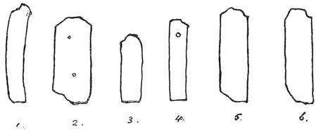
It has been our good fortune, by the kindness of M. Claudin, to have an opportunity of inspecting these precious relics. The following outline profile-sketches will give a good idea of the various forms and sizes represented in the collection. There is little doubt that they were all cast in a mould. The metal used is lead, slightly alloyed with some harder substance, which in the case of a few of the types seems to be iron. The chief point which strikes the observer is the variety in the “height to paper” of the different founts. Taking the six specimens shown in the illustration, it will be seen that no two of the types correspond in this particular. No. 4 corresponds as nearly as possible to our English standard height. No. 3 is considerably lower than an ordinary space height. No. 2 approaches some of the continental heights still to be met with, while Nos. 1, 5, and 6 are higher than any known standard. It is easy to imagine that an early printer who cast his own types would trouble himself very little as to the heights of his neighbours’ and rivals’ moulds, so that in a city like Lyons there might have been as many “heights to paper” as there were printers. It is even possible that a printer using one style and size of letter exclusively for one description of work, and another size and style for another description, might not be particular to assimilate the heights in his own office; and so, foreshadowing the improvidence of some of his modern followers, lay in founts of letter which would not work with any other, but which, as time went on, could hardly be dispensed with. Then, when the days of the itinerant typesellers and the type-markets began, he might still further add to his “heights” by the purchase of a German fount from one merchant, a Dutch from another, and so on.
The type No. 3, though lower than all the rest, has yet a letter upon its {22} end. But it seems likely that the old printers cut down their worn-out letters for spaces, not by ploughing off the face, but by shortening the type at the foot. So that No. 3 (presuming the bodies to have corresponded) might stand as a space to No. 4, or No. 4 to No. 1. At the same time, the collection includes a good number of plain spaces and quadrats (the latter generally about a square body), which may either have been cast as they now appear, or be old letters of which the face and shoulder have been cut off.
The small hole appearing in the side of type No. 4 is a perforation, and the collection contains several types, both letters and spaces, having the same peculiarity. Whether this hole was formed at the time of or after casting; whether the letters so perforated were originally model-types only, or types in actual use; whether the hole was intended for a thread or wire to hold the letters in their places during impression; or whether, for want of a type-case, it was used for stringing the types together for safety when not in use, it is as easy to conjecture as it is impossible to determine. The perforated types which we examined certainly did not appear to be older, and in most cases appeared less old than those not perforated,—the outline of type No. 4 itself shows it to be fairer and squarer than any of its companions.
Another peculiarity to be noted is the “shamfer,” or cutting away of one of the corners of the feet of types 2, 5, and 6. This appears to have been intentional, and may have served the same purpose as our nick, to guide the compositor in setting. None of the types have a nick, and types 1 and 3 have no distinguishing mark whatever. The two small indentations in the side of type 2 are air-holes produced in the casting.
With regard to the faces of the types, there are traces in most of the letters of the “shoulders” of the body having been tapered off by a knife or graver after casting, so as to leave the letter quite clear on the body. In most cases the letter stands in the centre of the body, which is, as a rule, larger than the size of the character actually requires. In point of thickness, however, the old printers appear to have been very sparing; and a great many of the letters, though possessing ample room “body-way,” actually overhang the sides, and are what we should style in modern terminology “kerned” letters. The difficulty, however, which would be experienced by printers to-day with these overhanging sorts, was obviated to a large extent in the case of the old printers by the numerous ligatures, contractions, and double letters with which their founts abounded, and which gave almost all the combinations in which an overhanging letter would be likely to clash with its neighbour.
One last peculiarity to be observed is the absence of what is known as the “break” at the foot of the type. The contrivance in the mould whereby the {23} foot of the type is cast square, and the “jet,” or superfluous metal left by the casting, is attached, not to the whole of the foot, but to a narrow ridge across the centre, from which it is easily detached, was probably unknown to the fifteenth century typefounders. Their types appear to have come out of the mould with a “jet” attaching to the entire foot, from which it could only be detached by a saw or cutter. The “shamfer” already pointed out in types 2, 5, 6, if produced in the mould, may indicate an early attempt to reduce the size of the jet, which, if attaching to the entire square of the foot of a type the size of No. 2, would involve both time and labour in removal. M. Duverger, in his clever essay to the invention of printing,43 gives an illustration of the manner in which he imagines the old types would be detached from their jets; and considers that in the three points only of the want of a breaking “jet,” the want of a spring to hold the matrix to the mould, and the absence of a nick, the mould of the first printer differed essentially from that of the printer of his day.
Such are some of the chief points of interest to be observed in these venerable relics of the old typographers. It is to be hoped that M. Claudin may before long favour the world with a full and detailed account of their many peculiarities. Yet, curious as they are, they prove that the types of the fifteenth century differed in no essential particular from those of the nineteenth. Ruder and rougher, and less durable they might be, but in substance and form, and in the mechanical principles of their manufacture, they claim kinship with the newest types of our most modern foundry. {24}
The old Lyonnaise relics are not the only guide we have as to the form and nature of the fifteenth century types.
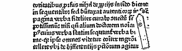
M. Madden, in 1875, made a most valuable discovery in a book printed by Conrad Hamborch, at Cologne, in 1476, and entitled La Lèpre Morale, by John Nider, of the accidental impression of a type, pulled up from its place in the course of printing by the ink-ball, and laid at length upon the face of the forme, thus leaving its exact profile indented upon the page. We reproduce in facsimile M. Madden’s illustration of this type, which accompanies his own interesting letter on the subject.44
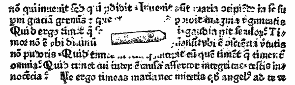
A similar discovery, equally valuable and interesting, was made not many months ago by the late Mr. Henry Bradshaw, of Cambridge, in a copy of a work entitled De Laudibus Gloriosæ Virginis Mariæ, sine notâ, but printed probably about 1468 at Cologne.45 We are indebted to Mr. Bradshaw for the present opportunity of presenting for the first time the annexed facsimile of this curious relic, {25} photographed direct from the page on which it occurs.46 These two impressions are particularly interesting in the light of the old Lyonnaise types still in existence. Like them, it will be seen they are without nick, and tapered off at the face. They are also without the jet-break. The height of both types (which is identical) is above the English standard, and more nearly approaches that of No. 2 of the Lyons letters; and M. Madden points out as remarkable that this height (24 millimètres) is exactly that fixed as the standard “height to paper” by the “réglement de la libraire” of 1723. The body of the types (assuming the letter to be laid sideways, of which there can be little doubt) is about the modern English, and so corresponds exactly to the body of the text on which it lies.
The chief point of interest, however, is in the small circle appearing in both near the top, which M. Madden (as regards the type of the Nider) thus explains: “This circle, the contour of which is exactly formed, shows that the letter was pierced laterally by a circular hole. This hole did not penetrate the whole thickness of the letter, and served, like the nick of our days, to enable the compositor to tell by touch which way to set the letter in his stick, so as to be right in the printed page. If the letter had been laid on its other side, the existence of this little circle would have been lost to us for ever.” It would, however, be quite possible for a perforated type, with the end of the hole slightly clogged with ink, to present precisely the same appearance as this, which M. Madden concludes was only slightly pierced; and were it not for the fact that the pulling-up of the letter from the forme is itself evidence that the line could not have been threaded, we should hesitate to affirm that either of the types shown was not perforated. The sharp edge of the circumference in the type of the De laudibus, leaving, as it does, in the original page, a clearly embossed circle in the paper, makes it evident that the depression was not the result of a mere flaw in the casting, although it is possible (as we have satisfied ourselves by experiment) for the surface of the side of a roughly-cast type to be depressed by air-holes, some of which assume a circular form, and may even perforate a thin type. Indeed, at the present day it is next to impossible to cast by hand a type which is not a little sunk on some part of its sides; and this roughness of surface we can imagine to have been far more apparent on the types {26} cast by the earliest printers. We doubt, therefore, whether, in types liable to these accidental depressions of surface, a small artificial hole thus easily simulated would be of any service as a guide to the compositor. A more probable explanation of the appearance seems to be that the head of a small screw or pin, used to fix the side-piece of the mould, projecting slightly on the surface of the piece it fixed, left its mark on the side of the types as they were cast, and thus caused the circular depression observable in the illustrations.47
Before leaving this subject it may be remarked that the clear impression of the printed matter, despite the laid-on types, which must in either case have been a thin sort, is strong evidence of the softness of the metal in which the fount was cast. The press appears to have crushed the truant types down into the letters on which it lay, and, unimpeded by the obstacle, to have taken as good an impression of the remainder of the forme as if that obstacle had never existed.
The quantity of type with which the earliest printers found it necessary to provide themselves, turns, of course, upon the question, did the first printers print only one page at a time, or more? M. Bernard considers that the Gutenberg Bible, which is usually collated in sections of five sheets, or twenty pages, containing about 2,688 types in a page, would require 60,000 types to print a single section; and if sufficient type was cast to enable the compositors to set one section while another was being worked, the fount would need to consist of 120,000 letters. Others consider that two pages, requiring, in the case of the Gutenberg Bible, only 6,000 types, were printed at one time. But even this estimate has been shown to be opposed to the evidence afforded by a considerable number of the incunabula, respecting which it is evident only one page was printed at a time. On this point we cannot do better than quote the words of Mr. Blades. “The scribe,” he says, “necessarily wrote but one page at a time, and, curiously enough, the early printers here also assimilated their practice. Whether from want of sufficient type to set up the requisite number of pages, or from the limited capability of the presses, there is strong evidence of the early books from Caxton’s press having been printed page by page. . . . . Instances are found of pages on the same side of the sheet being out of parallel, which could not occur if two pages were printed together. . . . A positive proof of the separate printing of the pages may be seen in a copy of the Recuyell of the Histories of Troye, in the Bodleian; {27} for the ninth recto of the third quaternion has never been printed at all, while the second verso (the page which must fall on the same side of the sheet) appears properly printed.”48
What is true of Caxton’s early works is also true of a large number of other fifteenth century printed books. Mr. Hessels, after quoting the testimony of Mr. Bradshaw of Cambridge, and Mr. Winter Jones of the British Museum, refers to a large number of incunabula in which he has found evidence that this mode of printing was the common practice of the early typographers.49
Assuming, then, that the first books were generally printed page by page, it will be seen that the stock of type necessary to enable the printer to proceed was but small. 2,700 letters would suffice for one page of the forty-two-line Bible; and for the Rationale Durandi, about 5,000 would be required. It is probable, however, that, as Bernard suggests, the printers would cast enough to enable one forme to be composed while the other was working, so that double these quantities would possibly be provided. Nor must it be forgotten that a “fount” of type in these days consisted not only of the ordinary letters of the alphabet, but of a very large number of double letters, abbreviations and contractions, which must have seriously complicated the labour of composition, as well as reduced the individual number of each type required to fill the typefounder’s “bill.” This feature, doubtless attributable to the attempt on the part of the early printers to imitate manuscript as closely as possible, as well as to the exigencies of justification in composition, which, in the absence of a variety of spaces, required various widths in the letters themselves, was common to both schools of early typography. M. Bernard states that, in the type of the forty-two-line Bible, each letter required at least three or four varieties; while with regard to Caxton’s type 1, which was designed and cast by Colard Mansion at Bruges, before 1472, Mr. Blades points out that the fount contained upwards of 163 sorts, and that there were only five letters of which there were not more than one matrix, either as single letters or in combination. Speaking of the Speculum, Mr. Skeen counts 1,430 types on one page, of which 22 are a, 61 e, 91 i, 73 o, 37 u, 22 d, 14 h, 30 m, 50 n, 42 s, and 41 t; besides which there are no less than ninety duplicate and triplicate characters, comprising one variation of a, 15 of c, 7 of d, 3 of e, 9 of f, 10 of g, 3 of i, 7 of l, 2 of o, 3 of n, 2 of p, 10 of r, 9 of s, 9 of t, varying in the frequency of their occurrence from once to eleven times, leaving but 541 other letters for the rest of the alphabet, including the capitals; {28} and of these last, from three to twenty would be the utmost of each required. Altogether, calculating 138 matrices (i.e., two alphabets of twenty-four letters each, and ninety double and treble letters) to be the least number of matrices required to make a complete fount,50 the highest number of types of any one particular sort necessary to print a single page would be ninety-one. The average number of the eleven chief letters specified above would be about forty-four, while if we take into calculation the minor letters of the alphabet and the double letters, this average would be reduced to little more than ten. It will thus be seen that the founts of the earliest printers consisted of a small quantity each of a large variety of sorts. Mr. Astle, in his chapter on the Origin and Progress of Printing,51 is, we believe, the only writer who has dwelt upon the difficulty which the first letter-founders would be likely to encounter in the arrangement of their “bill.” This venerable compilation was, he considers, made in the fifteenth century, probably by the ordinary method of casting-off copy. If so, it must have experienced considerable and frequent change during the time that the ligatures were falling into disuse, and until the printer’s alphabet had reduced itself to its present limits.
Of the face of type used by the earliest printers we shall have occasion to speak later on. Respecting the development of letter-founding as an industry, there is little that can be gathered in the history of the fifteenth century. At first the art of the inventor was a mystery divulged to none. But the sack of Mentz, in 1462, and the consequent dispersion of Gutenberg’s disciples, spread the secret broadcast over Europe. Italy, Switzerland, France, the Netherlands, Spain, England, in turn learned it, and after their fashion improved it. Italy, especially, guided by the master-hands of her early artists, brought it to rapid perfection. The migrations of Gutenberg’s types among the early presses of Bamberg, Eltville, and elsewhere, have led to the surmise that he may have sold matrices of his letter.52 In 1468, Schoeffer put forward what may be considered the first advertisement in the annals of typography. “Every nation,” he says, in {29} the colophon to Justinian’s Institutes, “can now procure its own kind of letters, for he (i.e., Schoeffer himself) excels with all-prevailing pencil” (i.e., in designing and engraving all kinds of type).53 For the most part printers were their own founders, and each printer had his own types. But type depôts and markets, and the wanderings of the itinerant typographers, as the demands of printing yearly increased, brought the founts of various presses and nations to various centres, and thus gave the first impulse to that gradual divorce between printing and typefounding which in the following century left the latter the distinct industry it still remains.
Such is a brief outline of the chief facts and opinions regarding the processes, appliances and practices of the earliest typefounders. It may be said that, after all, we know very little about the matter. The facts are very few, and the conjectures, in many instances, so contradictory, that it is impossible to erect a “system,” or draw any but general conclusions. These conclusions we very briefly summarise as follows.
Accepting as a fundamental principle that the essence of typography is in the mobility of the types, we dismiss, as beyond the scope of our inquiry, the xylographic works which preceded typography. Passing in review the alleged stepping-stones between the two arts, we fail to see in the evidence adduced as to the use of movable wooden perforated types anything to justify the conclusion that the earliest printers printed books by their means. Such types may have been cut experimentally, but the practical impossibility of cutting them square enough to be composed in a forme, and of producing a work of the size and character of the Speculum, is fatal to their claims. With regard to the sculpto-fusi types—types engraved on cast-metal bodies—the evidence in their favour is of the most unsatisfactory character, and, coupled with the practical difficulties of their production, reduces their claims to a minimum. The marked difference of style and excellence in the typography of certain of the earliest books leads us to accept the theory that two schools of typography existed side by side in the infancy of the art—one a rude school, which, not having the secret of the more perfect appliances of the inventors, cast its letters by some primitive method, probably using moulds of sand or clay, in which the entire type had been moulded. Such types may have been perforated and held together in lines by a wire. The suggestion that the earliest types were produced by a system of polytype, and that the face of each letter, sawn off a plate resembling a {30} stereotype-plate, was separately mounted on loose wooden shanks, we dismiss as purely fanciful.
Turning now to the processes adopted by the typographers of the more advanced school, we consider that in the first instance, although grasping the principle of the punch, the matrix and the adaptable mould, they may have made use of inferior appliances—possibly by forming their matrices in lead from wooden or leaden punches or models—advancing thence by degrees to the use of steel punches, copper matrices, and the bipartite iron mould. We hold that the variations observable in the early works of this school are due mainly to uneven casting and wear and tear of the types. As to the metal in which the type was cast, we find mention made of almost every metal, several of which, however, refer to the punches and matrices, leaving tin, lead, and antimony as the staple ingredients of the type-metal. Of the types themselves, we find these in most essential particulars to be the same as those cast at a later date. We see, however, evidence of perforated, mould-cast type, and, in the absence of a nick, a “shamfer” at the foot, from which the jet appears to have been sawn or cut, instead of being broken. We remark a great irregularity in the heights of different founts, the average of which height is beyond any modern English standard. The accidental impression of a type in two early German books, proves that about the year 1476 types were made differing only in the two points of the want of a nick and the want of a jet-break from the types of to-day. The quantity of types required by the earliest printers, we consider, would be small, since they appear in most instances to have printed only one page at a time; but the number of different sorts going to make up a fount would be very considerable, by reason of the numerous contractions, double letters and abbreviations used.
Finally, we consider that the art of letter-founding rapidly reached maturity after the general diffusion of printing consequent on the sack of Mentz; and that when the writer of the Cologne Chronicle, in the last year of the 15th century, spoke of “the art as now generally used,” he spoke of an art which, at the close of the 19th century, has been able to improve in no essential principle on the processes first made use of by the great inventors of Typography.
 E have laid before the
reader, in the Introductory Chapter, such facts and
conjectures as it is possible to gather together respecting
the processes and appliances adopted by the first
letter-founders, and shall, with a view to render the
particular history of the English Letter Foundries more
intelligible, endeavour to present here, in as concise a
form as possible, a short historical sketch of the English
type bodies and faces, tracing particularly the rise and
development of the Roman, Italic, and Black letters before
and subsequent to their introduction into this country;
adding, in a following chapter, a similar notice of the
types of the principal foreign and learned languages which
have figured conspicuously in English typography.
E have laid before the
reader, in the Introductory Chapter, such facts and
conjectures as it is possible to gather together respecting
the processes and appliances adopted by the first
letter-founders, and shall, with a view to render the
particular history of the English Letter Foundries more
intelligible, endeavour to present here, in as concise a
form as possible, a short historical sketch of the English
type bodies and faces, tracing particularly the rise and
development of the Roman, Italic, and Black letters before
and subsequent to their introduction into this country;
adding, in a following chapter, a similar notice of the
types of the principal foreign and learned languages which
have figured conspicuously in English typography.
The origin of type-bodies and the nomenclature which has grown around them, is a branch of typographical antiquity which has always been shrouded in more or less obscurity. Imagining, as we do, that the moulds of the first printers were of a primitive construction, and, though conceived on true principles, were adjusted to the various sizes of letter they had to cast more by eye than by rule, it is easy to understand that founts would be cast on no other principle than that of ranging in body and line and height in themselves, irrespective of the body, height and line of other founts used in the same press. When two or more {32} founts were required to mix in the same work, then the necessity of a uniform standard of height would become apparent. When two or more founts were required to mix in the same line, a uniformity in body, and if possible in alignment, would be found necessary. When initials or marginal notes required to be incorporated with the text, then the advantage of a mathematical proportion between one body and another would suggest itself.
At first, doubtless, the printer would name his sizes of type according to the works for which they were used. His Canon type would be the large character in which he printed the canon of the Mass. His Cicero type would be the letter used in his editions of that classical author. His Saint Augustin, his Primer, his Brevier, his Philosophie, his Pica type, would be the names by which he would describe the sizes of letter he used for printing the works whose names they bore. It may also be assumed with tolerable certainty that in most of these cases, originally, the names described not only the body, but the “face” of their respective founts. At what period this confused and haphazard system of nomenclature resolved itself into the definite printer’s terminology it is difficult to determine. The process was probably a gradual one, and was not perfected until typefounding became a distinct and separate trade.
The earliest writers on the form and proportion of letters,—Dürer54 in 1525, Tory55 in 1529, and Ycair56 in 1548,—though using terms to distinguish the different faces of letter, were apparently unaware of any distinguishing names for the bodies of types. Tory, indeed, mentions Canon and Bourgeoise; but in both cases he refers to the face of the letter; and Ycair’s distinction of “teste y glosa” applies generally to the large and small type used for the text and notes respectively of the same work.57
In England, type-bodies do not appear to have been reduced to a definite scale much before the end of the sixteenth century. Mores58 failed to trace them further back than 1647; but in a Regulation of the Stationers’ Company, dated 1598,59 Pica, English, Long Primer, and Brevier are mentioned by name as apparently well-established bodies at that time; and in a petition to the same Company in 1635,60 Nonpareil and “two-line letters” are mentioned as equally familiar.
Moxon, our first writer on the subject, in his Mechanick Exercises, in 1683, {33} described ten regular bodies in common use in his day, and added to his list the number of types of each body that went to a foot, viz.:―
| Pearl | 184 | to a foot |
| Nonpareil | 150 | ″ |
| Brevier | 112 | ″ |
| Long Primer | 92 | ″ |
| Pica | 75 | ″ |
| English | 66 | ″ |
| Great Primer | 50 | ″ |
| Double Pica | 38 | ″ |
| 2-line English | 33 | ″ |
| French Canon | 17 1⁄2 | ″ |
“We have one body more,” he adds, “which is sometimes used in England; that is, a Small Pica: but I account it no great discretion in a master-printer to provide it, because it differs so little from the Pica, that unless the workmen be carefuller than they sometimes are, it may be mingled with the Pica, and so the beauty of both founts may be spoiled.”
In this sentence we have the first record of the introduction of irregular bodies into English typography, an innovation destined very speedily to expand, and within half a century increase the number of English bodies by the seven following additions:
| Minion | 132 | to a foot |
| Bourgeois | 100 | ″ |
| Small Pica | 76 | ″ |
| Paragon | 46 | ″ |
| 2-line Pica | 37 1⁄2 | ″ |
| 2-line Great Primer | 25 | ″ |
| 2-line Double Pica | 19 | ″ |
The origin of these irregular bodies it is easy to explain. Between Moxon’s time and 1720 the country was flooded with Dutch type. The English founders were beaten out of the field in their own market, and James, in self-defence, had to furnish his foundry entirely with Dutch moulds and matrices. Thus we had the typefounding of two nations carried on side by side. An English printer furnished with a Dutch fount would require additions to it to be cast to the Dutch standard, which might be smaller or larger than that laid down for English type by Moxon, and yet so near that even if it lost or gained a few types in the foot, it would still be called by its English name, which would thenceforth represent two different bodies. If, on the other hand, a new fount were imported, or cut by an ill-regulated artist here, which when finished was found to be as much too large for one regular body as it was too small for another, a body would be found to fit it between the two, and christened by a new name. In this manner, Minion, Bourgeois, Small Pica, Paragon, and two-line Pica insinuated themselves into the list of English bodies, and in this manner arose that ancient anomaly, the various body-standards of the English foundries. For a founder who was constantly called upon to alter his mould to accommodate a printer requiring a special body, would be likely to cast a quantity of the letter in excess of what was immediately ordered; and this store, if not sold in due time to the person for whom it was cast, would be disposed of to the first {34} comer who, requiring a new fount, and not particular as to body, provided the additions afterwards to be had were of the same gauge, would take it off the founder’s hands. Facilis descensus Averni ! Having taken the one downward step, the founder would be called upon constantly to repeat it, his moulds would remain set, some to the right, some to the wrong standard, and every type he cast would make it more impossible for him or his posterity to recover the simple standard from which he had erred.
Such we imagine to have been the origin of the irregular and ununiform bodies. Even in 1755, when Smith published his Printer’s Grammar, the mischief was beyond recall. In no single instance were the standards given by him identical with those of 1683. Indeed, where each founder had two or three variations of each body in his own foundry it is impossible to speak of a standard at all. Smith points out that, in the case of English and Pica alone, Caslon had four varieties of the former, and the Dutch two; while of the latter, Caslon had three, and James two. Nevertheless, he gives a scale of the bodies commonly in use in his day, which it will be interesting to compare with Moxon’s on the one hand, and the standard of the English foundries in 1841 as given by Savage, on the other.
| MOXON, 1683 | SMITH, 1755 | CASLON, 1841 | FIGGINS, 1841 | THOROWGOOD, 1841 | WILSON, 1841 | |
|---|---|---|---|---|---|---|
| Canon | 17 1⁄2 | 18 and G. P. | 18 | 18 | 18 | 18 |
| 2-line Double Pica | — | 20 3⁄4 | 20 3⁄4 | 20 3⁄4 | 20 1⁄2 | 20 3⁄4 |
| 2-line Great Primer | — | 25 1⁄2 | 25 1⁄2 | 25 1⁄2 | 26 | 25 1⁄2 |
| 2-line English | 33 | 32 | 32 | 32 | 32 1⁄4 | 32 |
| 2-line Pica | — | 35 3⁄4 | 36 | 36 | 36 | 36 |
| Double Pica | 38 | 41 1⁄2 | 41 1⁄2 | 41 1⁄2 | 41 | 41 1⁄2 |
| Paragon | — | 44 1⁄2 | 44 1⁄2 | 44 1⁄2 | — | 44 1⁄2 |
| Great Primer | 50 | 51 and an r. | 51 | 51 | 52 | 51 |
| English | 66 | 64 | 64 | 64 | 64 1⁄2 | 64 |
| Pica | 75 | 71 1⁄2 | 72 | 72 1⁄2 | 72 | 72 |
| Small Pica | — | 83 | 83 | 82 | 82 | 83 |
| Long Primer | 92 | 89 | 89 | 90 | 92 | 89 |
| Bourgeois | — | 102 and space. | 102 | 101 1⁄2 | 103 | 102 |
| Brevier | 112 | 112 1⁄2 | 111 | 107 | 112 | 111 |
| Minion | — | 128 | 122 | 122 | 122 | 122 |
| Nonpareil | 150 | 143 | 144 | 144 | 144 | 144 |
| Pearl | 184 | 178 | 178 | 180 | 184 | 178 |
| Diamond | — | — | 204 | 205 | 210 | 204 |
This list does not include Trafalgar, Emerald, and Ruby, which, however, were in use before 1841. The first named has disappeared in England, as also has Paragon. The Printer’s Grammar of 1787 mentions a body in use at that time named “Primer,” between Great Primer and English.
It is not our purpose to pursue this comparison further or more minutely; nor does it come within the scope of this work to enter into a technical {35} examination of the various schemes which have been carried out abroad, and attempted in this country, to do away with the anomalies in type-bodies, and restore a uniform invariable standard. The above table will suffice as a brief historical note of the growth of these anomalies.
As early as 1725, in France, an attempt was made to regulate by a public decree, not only the standard height of a type, but the scale of bodies. But the system adopted was clumsy, and only added to the confusion it was designed to remove. Fournier, in 1737, invented his typographical points, the first successful attempt at a mathematical systematisation of type-bodies, which has since, with the alternative system of Didot, done much in simplifying French typography. England, Germany, and Holland have been more conservative, and therefore less fortunate. Attempts were made by Fergusson in 1824,61 and by Bower of Sheffield about 1840,62 and others, to arrive at a standard of uniformity; but their schemes were not warmly taken up, and failed.
Before proceeding to a brief historical notice of the different English type-bodies, we shall trouble the reader with a further table, compiled from specimen-books of the 18th century, showing what have been the names of the corresponding bodies in the foundries of other nations,—premising, however, that these names must be taken as representing the approximate, rather than the actual, equivalent in each case63:―
| ENGLISH. | FRENCH. | GERMAN. | DUTCH. | ITALIAN. | SPANISH. | |
|---|---|---|---|---|---|---|
| 1. | French Canon. | Double Canon. | Kleine Missal. | Parys Kanon. | Reale. | .... |
| 2. | 2-line Double Pica. | Gros Canon. | Große Canon. | Groote Kanon. | Corale. | Canon Grande. |
| 3. | 2-line Great Primer. | Trismegiste. | Kleine Canon. | Kanon. | Canone. | Canon. |
| 4. | 2-line English. | Petit Canon. | Doppel Mittel. | Dubbelde Augustyn. | Sopracanoncino. | Peticano. |
| 5. | 2-line Pica. | Palestine. | Roman. | Dubbelde Mediaan. | Canoncino. | .... |
| 6. | Double Pica. | Gros Parangon. | Text or Secunda. | Dubbelde Descendiaan (or Ascendonica). | Ascendonica. | Misal. |
| 7. | Paragon. | Petit Parangon. | Parangon. | Parangon. | Parangone. | Parangona. |
| 8. | Great Primer. | Gros Romain. | Tertia. | Text. | Testo. | Texto. |
| 9. | (Large English.) | Gros Texte. | Große Mittel. | .... | Soprasilvio. | .... |
| English. | St. Augustin. | Kleine Mittel. | Augustyn. | Silvio. | Atanasia. | |
| 10. | Pica. | Cicero. | Cicero. | Mediaan. | Lettura. | Lectura. |
| 11. | Small Pica. | Philosophie. | Brevier. | Descendiaan. | (Filosofia.) | .... |
| 12. | Long Primer. | Petit Romain. | Corpus or Garmond. | Garmond. | Garamone. | Entredos. |
| 13. | Bourgeois. | Gaillarde. | (Borgis.) | Burgeois or Galjart. | Garamoncino. | .... |
| 14. | Brevier. | Petit Texte. | Petit or Jungfer. | Brevier. | Testino. | Breviario. |
| 15. | Minion. | Mignone. | Colonel. | Colonel. | Mignona. | Glosilla. |
| 16. | Nonpareil. | Nonpareille. | Nonpareille. | Nonparel. | Nompariglia. | Nompareli. |
| 17. | Pearl. | Parisienne or Sedan. | Perl. | Joly. | Parmigianina. | .... |
| Perle. | Peerl. | |||||
| (Diamond.) | Diamant. | Diamant. | Robijn. | .... | .... | |
| Diamand. |
A few notes on the origin of the names of English type-bodies will conclude our observations on this subject.
Passing the next four bodies, which with us are merely reduplications,64 we note that―
It now remains to trace briefly the origin and development of the leading type-faces used in English Typography.
To trace the history of the Roman character would almost require a résumé of the works of all the greatest printers in each country of Europe. It must suffice to point out very briefly the changes it underwent before and after reaching England.
 bizarre,” on account
of the peculiar form of that capital letter, was used in that monastery in 146578;
and that among the typographical fugitives from Mentz at that time dwelling in
Cologne, there is little doubt that Jenson was here initiated into the art which he
subsequently made famous. The close resemblance between the Roman of the
Wiedenbach monks and that of the Eusebius is, M. Madden considers, clear
evidence that the same hand had trained itself on the one for the marvellous
perfection of the other.79
Jenson’s fount is on a body corresponding to English.
The form is round and clear, and differing in fashion only from its future
progeny. The capital alphabet consists of twenty-three letters (J, U, and W
not being yet in use); the “lower-case” alphabet is the same, except that the
“u” is substituted for the “v,” and in addition there is a long ſ, and the diphthongs
æ and œ. To complete the fount, there are fifteen contractions, six
double letters, and three points, the . : ? making seventy-three punches in all.80
Jenson’s Roman letter fell after his death into the hands of a “firm” of which
Andrea Torresani was head. Aldus Manutius subsequently
associated himself {42}
with Torresani, and, becoming his son-in-law and heir, eventually inherited his
punches, matrices, and types. The Roman founts of Aldus were eclipsed by his
Italic and Greek, but he cut several very fine alphabets. Renouard81
mentions eight distinct founts between 1494 and 1558. bizarre”
is entitled to rank as the first
Roman letter in Germany. The accompanying facsimile from the Sophologium
will give a good idea of the form and size of this most interesting fount,
and will at the same time show how slightly the form of the Roman alphabet has
changed since its first introduction into Typography.
bizarre,” on account
of the peculiar form of that capital letter, was used in that monastery in 146578;
and that among the typographical fugitives from Mentz at that time dwelling in
Cologne, there is little doubt that Jenson was here initiated into the art which he
subsequently made famous. The close resemblance between the Roman of the
Wiedenbach monks and that of the Eusebius is, M. Madden considers, clear
evidence that the same hand had trained itself on the one for the marvellous
perfection of the other.79
Jenson’s fount is on a body corresponding to English.
The form is round and clear, and differing in fashion only from its future
progeny. The capital alphabet consists of twenty-three letters (J, U, and W
not being yet in use); the “lower-case” alphabet is the same, except that the
“u” is substituted for the “v,” and in addition there is a long ſ, and the diphthongs
æ and œ. To complete the fount, there are fifteen contractions, six
double letters, and three points, the . : ? making seventy-three punches in all.80
Jenson’s Roman letter fell after his death into the hands of a “firm” of which
Andrea Torresani was head. Aldus Manutius subsequently
associated himself {42}
with Torresani, and, becoming his son-in-law and heir, eventually inherited his
punches, matrices, and types. The Roman founts of Aldus were eclipsed by his
Italic and Greek, but he cut several very fine alphabets. Renouard81
mentions eight distinct founts between 1494 and 1558. bizarre”
is entitled to rank as the first
Roman letter in Germany. The accompanying facsimile from the Sophologium
will give a good idea of the form and size of this most interesting fount,
and will at the same time show how slightly the form of the Roman alphabet has
changed since its first introduction into Typography. bizarre.”
Wiedenbach (?), 1465–70.
bizarre.”
Wiedenbach (?), 1465–70.Roman type was adopted before 1473 by Mentelin of Strasburg, whose beautiful letter placed him in the front rank of German printers. Gunther Zainer, who settled at Augsburg in 1469, after printing some works in the round Gothic, also adopted, in 1472, the Roman of the Venetian School, founts of which he is said to have brought direct from Italy. The German name of Antiqua, applied to the Roman character, has generally been supposed to imply a reluctance to admit the claim of Italy to the credit of introducing this style of letter. As, however, the Italians themselves called the letter the “Lettera Antiqua tonda,” the imputation against Germany is unfounded.82 The French, Dutch, and English called it “Roman” from the first. {43}

The Roman made its way rapidly in English typography during the first half of the sixteenth century, and in the hands of such artists as Faques, Rastell, Wyer, Berthelet, and Day, maintained an average excellence. But it rapidly degenerated, and while other countries were dazzling Europe by the brilliancy of their impressions, the English Roman letter went from good to bad, and from bad to worse. No type is more beautiful than a beautiful Roman; and with equal truth it may be said, no type is more unsightly than an ill-fashioned and ill-worked Roman. While Claude Garamond85 in France was carrying out into noble practice the theories of the form and proportion of letters set out by his master, Geofroy Tory; while the Estiennes at Paris, Sebastian Gryphe at Lyons, Froben at Basle, Froschouer at Zurich, and Christopher Plantin at Antwerp, were moulding and refining their alphabets into models which were to become {45} classical, English printers, manacled body and soul by their patents and monopolies and state persecutions, achieved nothing with the Roman type that was not retrograde. For a time a struggle appears to have existed between the Black-letter and the Roman for the mastery of the English press, and at one period the curious spectacle was presented of mixed founts of the two. We present our readers with a specimen of English printing at a foreign press in this transition period, as illustrative not only of the compromise between the two rival characters, but of the average unappetising appearance of the typography {46} of the day. Always impressionable and unoriginal, our national Roman letter, in the midst of many admirable models, chose the Dutch for its pattern, and tried to imitate Plantin and Elzevir, but with very little of the spirit of those great artists. No English work of the time, printed in English Roman type, reproduces within measurable distance the elegant embonpoint, the harmony, the symmetry of the types of the famous Dutch printers. The seeker after the beautiful looks almost in vain for anything to satisfy his eye in the English Roman-printed works of the sixteenth and seventeenth centuries. A few exceptions there are86; and when the English printers, giving up the attempt to cut Roman for themselves, went to Holland to buy it; or when, as in the case of Oxford and Thomas James, the English foundries became furnished with Dutch matrices, our country was able to produce a few books the appearance of which does not call forth a blush.
The first English Bible printed in Roman type was Bassendyne’s edition in Edinburgh, in 1576. We have it on the authority of Watson87 that, from the earliest days of Scotch typography, a constant trade in type and labour was maintained between Holland and Scotland; and he exhibited in his specimen pages the Dutch Romans which at that day were the most approved letters in use in his country.
Utilitarian motives brought about one important departure from the first models of the Roman letter in the different countries where it flourished. The early printers were generous in their ideas, and cut their letters with a single eye to artistic beauty. But as printing gradually ceased to be an art, and became a trade, economical considerations suggested a distortion or cramping of these beautiful models, with a view to “getting more in.” In some cases the variation was made gracefully and inoffensively. The slender or compressed Roman letters of the French, Italian, and in some cases the Dutch printers, though not comparable with the round ones, are yet regular and neat; but in other cases, ours among them, there was little of either delicacy or skill in the innovation. The early part of the seventeenth century witnessed the creation abroad of some very small Roman faces, foremost among which were those of the beautiful little Sedan editions of Jannon,88 which gave their name to the body of the microscopic letter {47} in which they were printed. Van Dijk cut a still smaller letter for the Dutch in Black-letter, and afterwards in Roman; and for many years the Dutch Diamond held the palm as the smallest fount in Europe. England followed the general tendency towards the minute, and though it is doubtful whether either Pearl or Diamond were cut by English founders before 1700, an English printer, Field, accomplished in 1653 the feat of printing a 32mo Bible in Pearl.89 Among English printers in the seventeenth century who did credit to their profession, Roycroft is conspicuous, especially for the handsome large Romans in which he printed Ogilby’s Virgil,90 and other works. Yet Roycroft’s handsomest letter—that in which he printed the Royal Dedication to the Polyglot of 1657—was the fount used nearly a century before by Day,91 whose productions few English printers of the seventeenth century could equal, and none, certainly, could excel. Of Moxon’s attempt in 1683 to regenerate the Roman letter in England, we shall have occasion to speak elsewhere. His theories, as put into practice by himself, were eminently unsuccessful; and though the sign-boards of the day may have profited by his rules, it is doubtful if typography did. His enthusiastic praise of the Dutch letter of Van Dijk may have stimulated the trade between England and Holland; but at home his precepts fell flat for lack of an artist to carry them out.
That artist was forthcoming in William Caslon in 1720, and from the time he cut his first fount of pica, the Roman letter in England entered on a career of honour. Caslon went back to the Elzevirs for his models, and throwing into his labour the genius of an enlightened artistic taste, he reproduced their letters with a precision and uniformity hitherto unknown among us, preserving at the same time that freedom and grace of form which had made them of all others the most beautiful types in Europe. Caslon’s Roman became the fashion, and English typography was loyal to it for nearly 80 years. Baskerville’s exquisite letters were, as he himself acknowledged, inspired by those of Caslon. They were sharper and more delicate in outline, and when finely printed, as they always were, were more attractive to the eye.92 But what they gained in brilliance they missed in sterling dignity; they dazzled the eye and fatigued it, and the fashion of the {48} national taste was not seriously diverted. Still less was it diverted by the experiments of a “nouvelle typographie,” which Luce, Fournier, and others were trying to introduce into France. The stiff, narrow, cramped Roman which these artists produced scarcely finds a place in any English work of the eighteenth century. The Dutch type was now no longer looked at. Wilson, whose letter adorned the works of the Foulis press, and Jackson, whose exquisite founts helped to make the fame of Bensley, as those of his successor Figgins helped to continue it, all adhered to the Caslon models. And all these artists, with Cottrell, Fry, and others, contributed to a scarcely less important reform in English letter-founding, namely, the production by each founder of his own uniform series of Roman sizes,—a feature wofully absent in the odd collections of the old founders before 1720. Towards the close of the century the Roman underwent a violent revolution. The few founders who had begun about 1760 in avowed imitation of Baskerville, had found it in their interest before 1780 to revert to the models of Caslon; and scarcely had they done so, when about 1790 the genius of Didot of Paris and Bodoni of Parma took the English press by storm, and brought about that complete abandonment of the Caslon-Elzevir models which marked, and in some cases disfigured, the last years of the eighteenth century. The famous presses of Bensley and Bulmer introduced the modern Roman under the most favourable auspices. The new letter was honest, businesslike, and trim; but in its stiff angles, its rigid geometrical precision, long hair-seriffs, and sharp contrasts of shade, there is little place for the luxuriant elegance of the old style.93 In France, the new fashion, even with so able an exponent as Didot, had a competitor in the Baskerville type, which, rejected by us, was welcomed by the French literati. Nor was this the only instance in which the fashion went from England to France, for in 1818 the Imprimerie Royale itself, in want of a new typographie of the then fashionable Roman, came to London for the punches.
The typographical taste of the first quarter of the present century suffered a distinct vulgarisation in the unsightly heavy-faced Roman letters, which were not only offered by the founders, but extensively used by the printers; and the date at which we quit this brief survey is not a glorious one. The simple uniformity of faces which characterised the specimens of Caslon and his disciples had been corrupted by new fancies and fashions, demanded by the printer and conceded by the founder,—fashions which, as Mr. Hansard {49} neatly observed in 1825, “have left the specimen of a British letter-founder a heterogeneous compound, made up of fat-faces and lean-faces, wide-set and close-set, proportioned and disproportioned, all at once crying “Quousque tandem abutêre patientia nostra?”
Some of the coarsest of the new fashions were happily short-lived; and it is worth transgressing our limit to record the fact that in 1844 the beautiful old-face of Caslon was, in response to a demand from outside, revived, and has since, in rejuvenated forms, regained both at home and abroad much of its old popularity.
It will not be out of place to add a word, before leaving the Roman, in reference to letter-founders’ specimens. When printers were their own founders, the productions of their presses were naturally also the published specimens of their type. They might, like Schoeffer, in the colophon to the Justinian in 1468, call attention to their skill in cutting types; or, like Caxton, print a special advertisement in a special type; or, like Aldus, put forward a specimen of the types of a forthcoming work.94 But none of these are letter-founders’ specimens; nor was it till letter-founding became a distinct trade that such documents became necessary. England was probably behind other nations when, in 1665, the tiny specimen of Nicholas Nicholls was laid under the Royal notice. It is doubtful whether any founder before Moxon issued a full specimen of his types. He used the sheet as a means of advertising not only his types, but his trade as a mathematical instrument maker; and his specimen, taken in connection with his rules for the formation of letters, is a sorry performance, and not comparable to the Oxford University specimen, which that press published in 1693, exhibiting the gifts of Dr. Fell and Junius. Of the other English founders before 1720, no type specimen has come down to us; that shown by Watson in his History of the Art of Printing being merely a specimen of bought Dutch types. Caslon’s sheet, in 1734, marked a new departure. It displayed at a glance the entire contents of the new foundry; and by printing the same passage in each size of Roman, gave the printer an opportunity of judging how one body compared with another for capacity. Caslon was the first to adopt the since familiar “Quousque tandem” for his Roman specimens. The Latin certainly tends to show off the Roman letter to best advantage; but it gives an inadequate idea of its appearance in any other tongue. “The Latin language,” says Dibdin, “presents to the eye a great uniformity or evenness of effect. The m and n, like the solid sirloin upon our table, have a substantial appearance; no garnishing with useless {50} herbs . . to disguise its real character. Now, in our own tongue, by the side of the m or n, or at no great distance from it, comes a crooked, long-tailed g, or a th, or some gawkishly ascending or descending letter of meagre form, which are the very flankings, herbs, or dressings of the aforesaid typographical dish, m or n. In short, the number of ascending or descending letters in our own language—the p’s, l’s, th’s, and sundry others of perpetual recurrence—render the effect of printing much less uniform and beautiful than in the Latin language. Caslon, therefore, and Messrs. Fry and Co. after him,”—and he might have added all the other founders of the eighteenth century,—“should have presented their specimens of printing-types in the English language; and then, as no disappointment could have ensued, so no imputation of deception would have attached.”95 Several founders followed Caslon’s example by issuing their specimens on a broadside sheet, which could be hung up in a printing-office, or inset in a cyclopædia. Baskerville appears to have issued only specimens of this kind; but Caslon, Cottrell, Wilson and Fry, who all began with sheets, found it necessary to adopt the book form. These books were generally executed by a well-known printer, and are examples not only of good types, but of fine printing. Bodoni’s splendid specimens roused the emulation of our founders, and the small octavo volumes of the eighteenth century gave place at the commencement of the nineteenth to quarto, often elaborately, sometimes sumptuously got up. Mr. Figgins was the first to break through the traditional “Quousque tandem,” by adding, side by side with the Latin extract, a passage in the same-sized letter in English. But it has not been till comparatively recent years that the venerable Ciceronian denunciation has finally disappeared from English letter-founders’ specimens.
The ITALIC letter, which is now an accessory of the Roman, claims an origin wholly independent of that character. It is said to be an imitation of the handwriting of Petrarch, and was introduced by Aldus Manutius of Venice, for the purpose of printing his projected small editions of the classics, which, either in the Roman or Gothic character, would have required bulky volumes. Chevillier informs us that a further object was to prevent the excessive number of contractions then in use, a feature which rendered the typography of the day often unintelligible, and always unsightly.96 The execution of the Aldine Italic was entrusted {51} to Francesco da Bologna,97 who, says Renouard, had already designed and cut the other characters of Aldus’ press. The fount is a “lower-case” only, the capitals being Roman in form. It contains a large number of tied letters, to imitate handwriting, but is quite free from contractions and ligatures. It was first used in the Virgil of 1501, and rapidly became famous throughout Europe. Aldus produced six different sizes between 1501–58. It was counterfeited almost immediately in Lyons and elsewhere. The Junta press at Florence produced editions scarcely distinguishable from those of Venice. Simon de Colines cut an Italic bolder and larger than that of Aldus, and introduced the character into France about 1521, prior to which date Froben of Basel had already made use of it at his famous press. Plantin used a large Italic in his Polyglot, but, like many other Italics of the period, it was defaced by a strange irregularity in the slopes of the letters. The character was originally called Venetian or Aldine, but subsequently took the name of Italic in all the countries into which it travelled, except Germany, which, acting with the same independence as had been displayed towards the Roman, called it “Cursiv.” The Italians also adopted the Latin name, “Characteres cursivos seu cancellarios.”
The Italic was at first intended and used for the entire text of a classical work. Subsequently, as it became more general, it was used to distinguish portions of a book not properly belonging to the work, such as introductions, prefaces, indexes, and notes; the text itself being in Roman. Later, it was used in the text for quotations; and finally served the double part of emphasising certain words98 in some works, and in others, chiefly the translations of the Bible, of marking words not rightly forming a part of the text.
In England it was first used by De Worde, in Wakefield’s Oratio, in 1524. Day, about 1567, carried it to a high state of perfection; so much so, that his Italic remained in use for several generations. Vautrollier, also, in his New Testaments, made use of a beautiful small Italic, which, however, was probably of foreign cut. Like the Roman, the Italic suffered debasement during the century which followed Day, and the Dutch models were generally preferred {52} by English printers. These were carried down to a minute size, the “Robijn Italic” of Christopher Van Dijk being in its day the smallest in Europe.

It is not easy to fix the period at which the Roman and Italic became united
and interdependent. Very few English works occur printed wholly in Italic, and
there seems little doubt that before the close of the sixteenth century the founders
cast Roman and Italic together as one fount. The Italic has undergone fewer
marked changes than the Roman. Indeed, in many of the early foundries, and
till a later date, one face of Italic served for two or more Romans of the same
body. We find the same Italic side by side with a broad-faced Roman in one
book, and a lean-faced in another. Frequently the same face is made to serve
not only for its correct body, but for the bodies next above or below it, so that
we may find an Italic of the Brevier face cast respectively on Brevier, Bourgeois,
and Minion bodies. These irregularities were the more noticeable from the
constant admixture in seventeenth and eighteenth century books of Roman and
Italic in the same lines; the latter being commonly used for all proper names, as
well as for emphatic words. The chief variations in form have been in the
capital letters, and the long-tailed letters of the lower-case. The tendency to
flourish these gradually diminished on the cessation of the Dutch influence, and
led the way to the formal, tidy Italics of Caslon and the founders of the
eighteenth century, some of whom, however, consoled themselves for their loss of
liberty in regard to most of their letters, by more or less extravagance in the
tail of the
 which commenced the Quousque tandem of their specimens. As in
the case of the Roman, Caslon cut a uniform series of Italics, having due relation,
in the case of each body, to the size and proportions of the corresponding
Roman. The extensive, and sometimes indiscriminate, use of Italic gradually
corrected itself during the eighteenth century; and on the abandonment, both
in Roman and Italic, of the long ſ and its
combinations,99
English books were
left less disfigured than they used to be. {53}
which commenced the Quousque tandem of their specimens. As in
the case of the Roman, Caslon cut a uniform series of Italics, having due relation,
in the case of each body, to the size and proportions of the corresponding
Roman. The extensive, and sometimes indiscriminate, use of Italic gradually
corrected itself during the eighteenth century; and on the abandonment, both
in Roman and Italic, of the long ſ and its
combinations,99
English books were
left less disfigured than they used to be. {53}
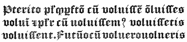
The Gothic letter employed by the inventors of printing for the Bible, Psalter, and other sacred works, was an imitation of the formal hand of the German scribes, chiefly monastic, who supplied the clergy of the day with their books of devotion. This letter, as a typographical character, took the name of LETTRE DE FORME, as distinguished from the rounder and less regular manuscript-hand of the Germans of the fifteenth century, which was adopted by Schoeffer in the Rationale, the Catholicon, and other works, and which became known as LETTRE DE SOMME. The pointed Gothic, or LETTRE DE FORME, a name100 generally supposed to have reference to the precision in the figure of the old ecclesiastical character (although some authorities have considered it to be a corrupt, rather than a standard form of handwriting), preserved its character with but little variation in all the countries to which it travelled. It is scarcely necessary to detail its first appearance at the various great centres of European typography, except to notice that in Italy and France it came later than the Roman.101 In England it appears first in Caxton’s type No. 3,102 and figures largely in nearly all the presses of our early printers. De Worde was, in all probability, the first to cut punches of it in this country, and to produce the letter which henceforth took the name of “English,” as being the national character of our early typography. De Worde’s English, or as it was subsequently styled, Black-letter, was for two centuries and a half looked upon as the model for all his successors in the art; indeed, to this day, a Black-letter {54} is held to be excellent, as it resembles most closely the character used by our earliest printers. The Black being employed in England to a late date, not only for Bibles, but for law books and royal proclamations and Acts of Parliament, has never wholly fallen into disuse among us. The most beautiful typography of which we as a nation can boast during the sixteenth and seventeenth centuries, is to be found in the Black-letter impressions of our printers. The Old English was classed with the Roman and Italic by Moxon as one of the three orders of printing-letter; and in this particular our obligations to the Dutch are much less apparent than in any other branch of the printing art. Indeed, the English Black assumed characteristics of its own which distinguished it from the LETTRE FLAMAND of the Dutch on the one hand, and the FRACTUR of the Germans on the other. It has occasionally suffered compression in form, and very occasionally expansion; but till 1800 its form was not seriously tampered with. Caslon was praised for his faithful reproduction of the genuine Old English; other founders, like Baskerville, did not even attempt the letter; the old Blacks were looked upon as the most useful and interesting portion of James’s foundry at its sale103; and the Roxburgh Club, those Black-letter heroes of the early years of this century, dismissed all the new-fangled founts of modern founders in favour of the most venerable relics of the early English typographers. Of these newfangled Blacks, it will suffice to recall Dibdin’s outburst of righteous indignation—“Why does he (i.e., Mr. Whittingham), and many other hardly less distinguished printers, adopt that frightful, gouty, disproportionate, eye-distracting and taste-revolting form of Black-letter, too frequently visible on the frontispieces of his books? It is contrary to all classical precedent, and outrageously repulsive in itself. Let the ghost of Wynkin de Worde haunt him till he abandon it!”104
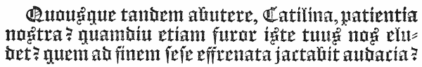
The LETTRE DE SOMME of the Germans, which, as we have seen, was adopted by Schoeffer in 1459, became in the hands of the fifteenth century printers a rival to the Gothic. Whether, as some state, it was derived from the Gothic, or was a distinct hand used by the lay scribes, we need not here discuss. Its name has been generally supposed to owe its origin to the fact that among the earliest works printed in this character was the Summa fratris S. Thomas de Aquino.105 {55} Others derive the name from the carelessly formed letters used in books of account. This letter developed in considerable variety among the early presses of the fifteenth century. Its main characteristics being that of a round Gothic,106 or at least of a Gothic shorn of its angles, it lent itself readily to the influence of the Roman, and we find it, as in the case of the first Italian books, merging into that character; while in the case of many of the German and Netherlands presses we find it occasionally absorbing that character, adopting its form frequently in the capitals, and “Gothicising” it in the lower-case. But to arrive at an accurate idea of the changes and varieties of the LETTRE DE SOMME, it is necessary to study carefully the productions of the various presses and schools of typography in which it was used. In England it appeared, as might be expected, in some of the early works of the first Oxford press,107 whither it was brought from Cologne. But it never took root in the country, and was speedily rejected for the national Gothic, only to reappear as an exotic or a curiosity.
The SECRETARY, or GROS-BÂTARDE, was the manuscript-hand employed by the English and Burgundian scribes in the fifteenth century. It was, therefore, only natural that Caxton, like his typographical tutor, Colard Mansion of Bruges, should adopt this character for his earliest works, in preference to the less familiar Gothic, Semi-Gothic, or Roman letter. The French possessed a similar character, which, according to Fournier, was first cut by a German named Heilman, resident in Paris about 1490. But several years before 1490 the Gros-Bâtarde was in use in France; in some cases the resemblance between the French and English types being remarkable. The Rouen printers, who executed some of the great law books for the London printers early in the sixteenth century, used a particularly neat small-sized letter of this character. Like the Semi-Gothic, the Secretary, after figuring in several of the early London and provincial presses, yielded to the English Black-letter, and after about 1534 did not reappear in English typography. It developed, however, several curious variations; the chief of which were what Rowe Mores describes as the SET-COURT, the BASE SECRETARY, and the RUNNING SECRETARY. Of the first named, James’s foundry in 1778 possessed two founts, come down from Grover’s108; but as the old deformed Norman law hand which they represented was abolished by law in 1733, the matrices, which at no time appear to have been much used, {56} became valueless. The name COURT HAND has since been appropriated for one of the modern scripts. Its place was taken in law work by the ENGROSSING hand, which Mores denominates as Base Secretary. Of this character, the only fount in England appears to have been that cut by Cottrell about 1760.109 The RUNNING SECRETARY was another law hand, described by Mores as the law Cursive of Queen Elizabeth’s reign. It was similar to the French Cursive, of which Nicolas Granjon in 1556 cut the first punches at Lyons. Granjon’s letter at first was called after its author, but subsequently became known as LETTRE DE CIVILITÉ, on account of its use, so Fournier informs us, in a work entitled la Civilité puerile et honnête, to teach children how to write. Plantin possessed a similar character in more than one size, which he made use of in dedications and other prefatory matter. The English fount in Grover’s foundry appears to have been the only one in this country.
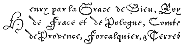
The SCRIPT, by which is meant the conventional copy-book writing hand, as distinguished from the Italic on the one hand and the law hand on the other, is another form of the Bâtarde, and is supposed to have originated with Pierre Moreau of Paris, whose widow in 1648 published a very curious Virgil, the first volume of which is printed in this character, in four or five sizes. The Dutch founders copied it, and the curious founts in Grover’s foundry were probably most of them of Dutch origin.110 About 1760 Cottrell and Jackson both cut improved founts of this character. The Script, which the French have called LETTRE COULÉE and LETTRE DE FINANCE, and the Germans GESCHREVEN SCHRIFT, has undergone a good many changes, especially during the present century. M. Didot in 1815 introduced a series of ligatures, or connectors, which had the effect of making the letters in each word join continuously; and at the same time cast his letters on an inclined body, so as to fit closely together, and be self-supporting. His system, however, involved a large number of combination-letters and ligatures, which rendered it generally impracticable; and it was eventually replaced by a square-bodied Script, contrived to unite all the advantages, and obviate all the disadvantages, of his ingenious system.
 REEK
type first occurs in the Cicero de Officiis, printed
at Mentz in 1465, at the press of Fust and Schoeffer.
The fount used is exceedingly rude and imperfect,
many of the letters being ordinary Latin.111
In the same
year Sweynheim and Pannartz at Subiaco used a good
Greek letter for some of the quotations occurring in
Lactantius; but the supply being short, the larger quotations
were left blank, to be filled in by hand. The first
book wholly printed in Greek was the Grammar of Lascaris, by Paravisinus, in
Milan, in 1476, in types stated to be cut and cast by Demetrius of Crete. The
fount (about a Great Primer in body) is a curious one, and contains breathings,
accents and a few abbreviations. The headings to the chapters are wholly in
capitals, which are very bold.112
It is to the glory of Milan that not only was the
first Greek book printed within its walls, but also the first Greek classic and the
first portion of the Greek Scriptures. The former was the Æsop, printed, it is
supposed, in 1480, but without printer’s name.
The resemblance, however, {58}
between the fount of this work and that of the Lactantius is so close that there
seems much reason for crediting Paravisinus with the performance. The Greek
of the Psalter of 1481 is very different, the lower-case being larger, and remarkably
bold and compact in appearance. The capitals generally resemble the
Lactantius fount.
REEK
type first occurs in the Cicero de Officiis, printed
at Mentz in 1465, at the press of Fust and Schoeffer.
The fount used is exceedingly rude and imperfect,
many of the letters being ordinary Latin.111
In the same
year Sweynheim and Pannartz at Subiaco used a good
Greek letter for some of the quotations occurring in
Lactantius; but the supply being short, the larger quotations
were left blank, to be filled in by hand. The first
book wholly printed in Greek was the Grammar of Lascaris, by Paravisinus, in
Milan, in 1476, in types stated to be cut and cast by Demetrius of Crete. The
fount (about a Great Primer in body) is a curious one, and contains breathings,
accents and a few abbreviations. The headings to the chapters are wholly in
capitals, which are very bold.112
It is to the glory of Milan that not only was the
first Greek book printed within its walls, but also the first Greek classic and the
first portion of the Greek Scriptures. The former was the Æsop, printed, it is
supposed, in 1480, but without printer’s name.
The resemblance, however, {58}
between the fount of this work and that of the Lactantius is so close that there
seems much reason for crediting Paravisinus with the performance. The Greek
of the Psalter of 1481 is very different, the lower-case being larger, and remarkably
bold and compact in appearance. The capitals generally resemble the
Lactantius fount.
Jenson, at Venice, appears to have cut Greek type as early as about 1470. In 1486 two Cretan printers produced respectively a Greek Psalter, with accents and breathings, and Homer’s Batrachomyomachia. It was, however, reserved to Florence to boast of the first complete edition of Homer, which was printed in that city in 1488. This work, one of the most glorious monuments of the typographic art, appears in a beautiful Great Primer type, of remarkable elegance and neatness, with few abbreviations. The printer was Demetrius of Crete.
But it was at Venice that Greek printing was destined to reach its greatest excellence in the fifteenth century, at the press of Aldus, who in 1495 produced his famous Aristotle, in a beautiful letter which eclipsed all its predecessors. His fount was about a Double Pica in body, and much bolder and more imposing than any which had yet appeared, as well as being better cast and justified. The splendid Greek impressions of the elder Aldus are too well known to need further notice here. Renouard mentions nine separate founts used at this press.
The fame of the Italian Greek presses early roused emulation in France. Among the first printers of Paris, however, the Greek quotations and words introduced in their works were scanty and indifferent. Gering used but a very few letters, and Jodocus Badius, in 1505, excused the poverty of his Annotationes in Nov. Testamentum, by pleading the paucity of his types. The early works of the first Henri Estienne were similarly defective. In 1507, however, Greek punches were cut and matrices struck by Gilles de Gourmont, and the first wholly Greek work was printed at his press in this year, being a Greek Alphabet, with rules for pronunciation and reading. In the same year he also printed the Batrachomyomachia. Greek printing, once started in Paris, made rapid progress. Jodocus Badius, Vidouvé, Colinæus, and Christian Wechel, all distinguished themselves. Geofroy Tory contributed largely to the improvement in the form of the character. But it was not till Robert Estienne, with the title of “Regius in Græcis Typographus,”113 commenced his career, that Greek printing reached its greatest perfection in France. On the establishment of an Imprimerie Royale by Francis I,114 Claude Garamond, the first typographical artist of his day, {59} was entrusted with the care of engraving punches and preparing matrices for three founts of Greek, about an English, Long Primer, and Double Pica in body, which henceforth became famous throughout Europe as the “Characteres Regii.”115 These characters, modelled as to their capitals on the alphabet of Lascaris, and as to their “lower-case” and abbreviations from the beautiful Greek calligraphy of Angelus Vergetius of Candia, first appeared in the Eusebius, printed, in 1544,116 by Robert Estienne, to whom the use of the types was, by virtue of his office, conceded, and who employed them in the production of some of the most brilliant Greek impressions Europe has ever seen.117 During the seventeenth century the Royal Greek punches and matrices lay for the most part idle; but in 1691, Anisson, Director of the Imprimerie Royale, rescued them from obscurity, and caused new punches to be cut and matrices struck, to supply what were missing, by Grandjean, the famous Parisian founder.
In the Low Countries, as early as 1501, Thierry Martens, at Louvain, had Greek types with which he printed occasional words. He produced an edition of Æsop in 1513, and in 1516 a Grammar of Theodore de Gaza’s, and a little book of Hours, in Greek. The latter is considered an excellent piece of typography. Greek printing attained to considerable celebrity in the Low Countries. The Greek fount used in Plantin’s Polyglot, in 1569–72, is said to have been cut by the famous French founder and engraver, Le Bé.
Spain claims a prominent place in the history of early Greek printing in Europe, as it was at Alcala in that country that the famous Complutensian Polyglot of Cardinal Ximenes was printed in 1514–17,118 including the entire text of the Bible in Greek. The fount employed in the New Testament is very grand and imposing, and is said to have been cut specially for the work on the models of Greek manuscripts of the eleventh or twelfth century.
Before the completion of this great work, Germany had secured the honour of producing the first entire Greek Testament at the press of Froben of Basle. Froben’s Greek is somewhat cramped and stiff. Oporinus, who printed in the {60} same city in 1551, besides using a fount identical with that of Froben, introduced a smaller and much neater letter at the same time. Numerous printers produced Greek works in Germany at this period, perhaps the most famous being Andrew Wechel, who began at Paris with types inherited from his father, but in 1573 established himself at Frankfort, where he printed several very fine works in a new and most elegant Greek, said to have been acquired from the Estiennes, to whose letter it bears the closest resemblance.
The first appearance of Greek type in England is observed in De Worde’s edition of Whitintoni Grammatices, printed in 1519, where a few words are introduced cut in wood. Cast types were used at Cambridge in a book entitled Galenus de Temperamentis, translated by Linacre, and printed by Siberch in 1521. Siberch styles himself the first Greek printer in England; but the quotations in the Galenus are very sparse, and he is not known to have printed any entire book in Greek. In 1524, Pynson also used some Greek words and lines, without accents or breathings, in Linacre’s De emendatâ structurâ Latini sermonis; but added an apology for the imperfections of the characters, which he said were but lately cast, and in a small quantity. The first printer who possessed Greek types in any quantity was Reginald Wolfe, who held a royal patent as printer in Greek, Latin, and Hebrew, and printed, in 1543, Two Homilies of Chrysostom, edited by Sir John Cheke, the first Greek Lecturer at Cambridge. Eight years later, in the first volume of Dr. Turner’s Herbal, printed at Mierdman’s press in London, the Greek words were given in Black, and quotations in Italic. In Edinburgh, in 1563, and as late as 1579, the space for Greek words was left blank in printing, to be filled in by hand. The Oxford University press, re-established in 1585, was well supplied with Greek types, which were used in the Chrysostom of 1586, and the Herodotus of 1591. The beautiful Greek fount used in the Eton Chrysostom119 in 1610–12—a work which takes rank with the finest Greek impressions in Europe—is supposed to have been obtained from abroad, probably from Paris or Frankfort. Its similarity to the Greek of the Estiennes is remarkable. Indeed, the “characteres regii” of France were at that time, and for long afterwards, the envy and models for all Europe. The Eton Greek types, of which probably the matrices were not in England, were acquired by the Oxford University, to which body, in 1632, application was made by Cambridge for the loan of a Greek fount to print a Greek Testament, the sister University possessing no Greek types of her own. A Greek press was established in London in 1637, under peculiar circumstances, which are detailed in our account of the Oxford press. There is every reason to suppose that of the handsome Greek letter provided {61} for this press,120 not only the types, but the matrices were acquired. After this, Greek printing became general in London and Oxford. The various typefounders all provided themselves with a good variety of sizes, some of which were very small and neat. There was a very fine Brevier Greek in Grover’s foundry in 1700, and a Nonpareil in that of Andrews in 1706; but for minute Greek printing, England could produce nothing to equal the Sedan Greek Testament, printed by Jannon in 1628.
As was the case with the Roman letter, many of our printers at the close of the seventeenth century preferred the Dutch Greeks, which at that time were good, particularly those cut by the Wetsteins. Thomas James, in 1710, brought over the matrices of four founts from Vosken’s foundry at Amsterdam. In 1700, Cambridge University, still badly off for Greek, made an offer for the purchase of a fount of the King’s Greek at Paris; but withdrew on the French Academy insisting as a condition that every work printed should bear the imprint, “Characteribus Græcis e Typographeo Regio Parisiensi.” The large number of ligatures and abbreviations in the Greek of that day made the production of a fount a serious business. The Oxford Augustin Greek comprised no fewer than 354 matrices, and the Great Primer as many as 456, and the Pica 508; Fournier, however, went beyond all these, and showed a fount containing 776 different sorts! The impracticability of such enormous founts brought about a gradual reduction of the Greek typographical ligatures—a reform for which the Dutch founders, under the guidance of Leusden, deserve the chief credit. Fournier, in 1764, stated that for some years previously, in Holland, Greek printing had been carried on with the simple letters of the alphabet. Wilson’s beautiful Double Pica Greek,121 used in the Glasgow Homer of 1756, was in its day the finest Greek fount our country had ever seen. A new departure, however, was initiated by the production, in 1763, of Baskerville’s Greek fount122 for the Oxford New Testament. The letter is neat, but stiff and cramped, and apparently formed on an arbitrary estimate of conventional taste, and without reference to any accepted model. The fount was praised, and provoked imitation. Baskerville’s apprentice, Martin, produced a letter still less Greek than his master’s, and the general tendency was countenanced by the form of Bodoni’s types, which were so much admired in this country at the close of the century. A reaction, however, had begun before Bodoni’s time. The Glasgow Greek kept its place in Wilson’s specimens; and Jackson, encouraged by the younger Bowyer’s remark, that the Greek types in common use “were no more Greek {62} than they were English,” cut a beautiful Pica about 1785 for his rising foundry. Early in the nineteenth century, a new fashion of Greek, for which Porson was sponsor and furnished the drawings, came into vogue, and has remained the prevailing form to this day. It may be doubted if the Porsonian letter would be recognised by an ancient Greek scribe as the character of his native land; but at any rate it is neat, elegant, and legible, and dispenses with all useless contractions and ligatures. In taking leave of this subject, it would be an omission not to mention the most beautiful little fount in which Pickering printed his Homer, in 1831. Probably no finer masterpiece of minute Greek printing exists anywhere.
The first Hebrew types are generally supposed to have appeared in 1475, in a work printed by Conrad Fyner, at Esslingen in Wirtemburg, entitled Tractatus contra perfidos Judæos. In Pheibia, in Austrian Italy, also in 1475, a Hebrew work in four folio volumes, entitled the Arba Turim of Rabbi Jacob ben Ascher, is stated by De Rossi123 to have been printed; while in the same year, a few months earlier, at Reggio in Italy, appeared Salamon Jarchi’s Commentary on the Pentateuch, by Abraham ben Garton ben Isaac. The type of this last-named work (which Schwab124 considers without doubt to be the first Hebrew book printed) is in the Rabbinical character, somewhat rudely cut, but neat. Numerous other Hebrew works followed, earlier than 1488, at which date the first entire Hebrew Bible was printed at Soncino, by a family of German Jews. This rare Bible is printed with points, and is neat and regular in appearance. The volume itself is highly decorative, and shows a considerable amount of typographical skill on the part of its Jewish printers.
Hebrew printing did not spread very rapidly. De Rossi mentions several works printed at Constantinople during the fifteenth century, as also in the Italian towns to which the family of Soncino printers carried the art. Aldus was possessed of some rude Hebrew characters; but it was Bomberg, who established his Hebrew press in Venice in 1517, who raised the fame of that already famous city by the excellence of his types and workmanship. But as late as 1520, at Naples, in a treatise on the Hebrew, Greek, and Latin letters, by De Falco, the Hebrew words, for lack of types, were written in by hand.
In Western Europe, France was next to Italy in producing Hebrew type. Mention is made of an Alphabetum Hebraicum et Græcum, printed by Gilles de Gourmont in 1507; and in 1508 that able typographer, whose distinction as {63} the first cutter of Greek type in France we have already noticed, produced, under the conduct of his patron, Tissard, a Hebrew Grammar, together with the Oratio Dominica, and other passages in the sacred language. The types made use of were ill-formed and imperfect. Although thus early initiated, Hebrew printing made little or no progress for some years. Jodocus Badius showed a few lines in 1511; and in 1516 Gourmont printed an Alphabetum Hebraicum et Græcum. In 1519, Augustino Giustiniani, a native of Genoa, who had already distinguished himself by superintending the production of Porrus’ Polyglot Psalter at that city in 1516, being invited to Paris by the King, caused new punches and matrices of the Hebrew to be made by Gourmont. The work took a year and a half to complete; when, in 1520, was published the Grammar of the Rabbi Moses Kimhi, the first wholly printed Hebrew work produced in Paris. From this time Hebrew printing made steady progress in France. Most of the printers possessed types, the Wechels and the Estiennes being the most distinguished in their use of them.
In Spain the printers of the Complutensian Polyglot made use of a fine Hebrew fount in 1514–17.
In Germany, as early as 1501, in a book supposed to have been printed at Erfurt, Hebrew letters occur, cut rudely on wood; and at Basle, Strasburg, and Augsburg a similar primitive method was adopted, as it was also in the case of the Hebrew Grammar printed at Leipsic in 1520. In 1512, however, at Tübingen in Wirtemburg, the Septem psalmi pœnitentiales were printed in cast metal type. In 1534, at Basle, the first Hebrew Bible printed by a Gentile was produced at the press of Bebel. Froben’s Bible, in the same town, in 1536, is in a type inferior to that of Bomberg. The running titles are all in the Rabbinical character. In 1587, Elias Hutter printed at Hamburg a Hebrew Bible in large type, in which the “radical” letters appear black in the usual way, and the “serviles” are open, or in outline, while the “quiescents” are in smaller solid letters placed above the line. This Bible was reprinted in 1603, and is a typographical curiosity.
In the Low Countries, Hebrew words, probably cut in wood, occur in the Epistola apologetica Pauli de Middleburgo, printed at Louvain in 1488; and Gand125 gives 1506 as the probable date of a Hebrew Dictionary, sine notâ, but attributed to Martens. This, however, appears doubtful, as in 1518 Martens first announced his intention to print in Hebrew. His first-dated Hebrew work was a Grammar, in 1528; though Schwab considers that the Dictionary above referred to properly belongs to the year 1520. Martens’ earliest founts were a large Hebrew with vowel points, and a small, without. Hebrew printing was also practised at {64} Leyden in 1520. The splendid type cut by Le Bé, the Frenchman, for Plantin’s Polyglot, printed at Antwerp in 1569–72, placed the Netherlands in the front rank of Hebrew typography. Amsterdam, during the seventeenth century, excelled all other cities in its Hebrew printing. Abraham and Bonaventura Elzevir printed here in Hebrew about 1630, and the Hebrew Bibles of Janson in 1639, Athias in 1667, and Van der Hooght in 1705, are justly regarded as masterpieces of Hebrew typography.
The first specimen of Hebrew printing in England occurs in Wakefield’s Oratio de laudibus et utilitate trium linguarum, printed by De Worde in 1524, where a few words appear, rudely cut on wood. In the same work the author complained that he was compelled to omit a third part, because the printer had no Hebrew types. Hebrew words cut in wood are also used in Humfrey’s Life of Bishop Jewell, printed by John Day in 1573; and Todd, in his Life of Walton, mentions a work of Dr. Peter Baro on Jonah, printed at the same press in 1579, in the preface to which occur several verses of Hebrew. As late as 1603 Dibdin points out that in a poem, published at Oxford, composed by Dr. Thorne, Regius Professor of Hebrew at that University, a phrase in Hebrew is added, with the remark, “Interserenda hoc in loco . . . sed enim Typographo deerant characteres.” Todd, however, mentions a work printed at Oxford in 1597, in which Hebrew type is used, while a translation from S. Chrysostom, of John Willoughbie, printed by Barnes in 1602, shows two distinct founts in use. The first English book in which any quantity of Hebrew type was made use of was Dr. Rhys’s Cambro-brytannicæ Cymræcæve linguæ institutiones, printed by Thomas Orwin in 1592. Minsheu’s Ductor in Linguas, in 1617, printed by John Browne, shows Hebrew which serves not only for its own language, but also for the Syriac. And in 1621 John Bill used a newer and better letter for printing Dr. Davies’s Antiquæ linguæ Britannicæ . . rudimenta. The Hebrew fount made use of in Walton’s Polyglot in 1657 was probably the first important fount cut and cast in this country; and, as we shall have occasion to notice, was found fault with by the critics of that great undertaking. Oxford received a great and small Hebrew126 among the matrices presented to her by Dr. Fell; and both there and in London several Hebrew works were printed at the close of the seventeenth century, although none of striking importance. It is significant of the superior reputation of the Oxford Hebrew, that the Hebrew and Chaldæan versions in the Oratio Dominica of 1700 were among the versions printed for the London publisher of that work in the University types. Thomas James, although he visited Amsterdam in 1710, at that time the centre of the best {65} Hebrew printing in Europe, failed to secure any matrices; and most of those which subsequently were added to his foundry appear to have been cut by English founders. Among them were four founts of Rabbinical Hebrew,127 for which character there existed no matrices in England in Walton’s time, as he was compelled to cut the alphabet shown in his Prolegomena in wood. Mores counted as many as twenty-three different founts in James’s foundry in his day, eight of which were with points, the remainder without. For those without points it was early the practice to cast points on a minute body, to be worked in a separate line below the letter. Caslon cut several good founts of Hebrew (one of which was of the open or outline description first introduced by Hutter); and during the eighteenth century the character became a necessary part of the stock of every founder. It would be difficult, however, to point to any striking achievement in Hebrew typography earlier than Bagster’s Polyglot in 1817–21, in which the Hebrew text is printed in a very small and beautiful type cut by Vincent Figgins, which in its day had the reputation of being the smallest Hebrew with points in England, and of equalling in size and exceeding in beauty even the elegant letter of Jansson of Amsterdam, two centuries before.
The first book printed in Arabic types is supposed to be a Diurnale græcorum Arabum, printed at Fano in Italy, in 1514. Two years later, Porrus’ Polyglot Psalter, comprising the Arabic version, was printed at Genoa; and two years later still, a Koran in Arabic is said to have been printed at Venice. Thus, says De Rossi, while no Arabic types were to be found in any other part of Europe, three towns of Italy possessed, and were making use of them at the same moment.
In 1505 an Arabic Vocabulary at Granada had the words printed in Gothic letter with the Arabic points placed over them; and in other presses where there were no Arabic types, the language was expressed in Hebrew letters or cut in wood. De Guignes and others mention a fount of Arabic used by Gromors in Paris, in 1539–40, to print Postel’s Grammar, and add that the fount subsequently disappeared and was lost; and as late as 1596, in a book printed at Paris, the Arabic words had to be rendered in Hebrew. In 1591 the Vatican press had a fine fount of Arabic, a specimen of which is given by Angelo Roccha in his Bibliotheca Apostolica Vaticana, printed at that press. The Medicean and Borromean presses also had founts; and at Leyden, Raphlengius and Erpenius {66} were both celebrated for their Arabic letter. In 1636 the foundry of the Propaganda showed specimens of Arabic, previous to which date Savary de Brèves had had cut in Constantinople, and finished by Le Bé of Paris, the famous Arabic founts which were used to print the Psalter at Rome in 1614, and subsequently were purchased by Vitré for the French king,128 and used in Le Jay’s magnificent Paris Polyglot of 1645. The punches and matrices of these founts still exist. Cotton mentions an Arabic press in Upsala in 1640.
In England it was not till early in the seventeenth century that Arabic printing began to be practised. In Wakefield’s Oratio de laudibus . . trium linguarum, Arabicæ, Chaldaicæ et Hebraicæ, printed by De Worde in 1524, a few rude Arabic letters are introduced, cut in wood. In Minsheu’s Ductor in Linguas, 1617, the Arabic words are printed in Italic characters. Laud’s gift of Oriental MSS. to Oxford in 1635, and the appointment of an Arabic lecturer, was the first real incentive to the cultivation of the language by English scholars. Previous to this, it is stated that the Raphlengius Arabic press at Leyden had been purchased by the English Orientalist, William Bedwell; but if brought to this country, it does not appear that it was immediately made use of.129 The Arabic words in Thomas Greave’s oration, De Linguæ Arabicæ Utilitate, printed at Oxford in 1639, were written in by hand; and the same author, when publishing his Elementa Linguæ Persicæ at the press of James Flesher at London, in 1649, explained in his preface that his work had been ready for publication nine years before, but having no types with which to print it, it had been delayed. A year earlier, in 1648, Miles Flesher, predecessor to James and one of the Star Chamber printers, had published in the same type, and at the same press, a work entitled De Siglis Arabum et Persarum Astronomis. James Flesher was the printer who printed in his own types the original specimen-page of the London Polyglot in 1652. His Arabic, however, is a smaller character than that subsequently made use of by Roycroft for this grand work. Dr. Fell’s gift of matrices to Oxford in 1667 included a fount of Arabic,130 which appeared in the specimen of the foundry, and was used also in the Oratio Dominica of 1700. Prior to this, however, Pocock’s Carmen Tograi was printed at Oxford by Hall in 1661, “Typis Arabicis Academicis,” in a letter differing both from Flesher’s {67} and Dr. Fell’s. In 1721, William Caslon cut for the Society for Promoting Christian Knowledge the fount of Arabic for the Psalter of 1725, and the Testament of 1727. This fount,131 with those of Oxford and the Polyglot, shared among them nearly all the Arabic printing in England for about a century later, when new faces began to be cut or imported. The Polyglot Arabics passed through Grover’s foundry into that of Thomas James, at the sale of which, in 1782, they were bought in an imperfect state by Dr. Edmund Fry for the Type Street foundry. Mores mentions three other Arabic founts cut by English founders, but includes them among the lost matrices in his collection.
Syriac type, probably cut in wood, first appeared in Postel’s Linguarum xii Alphabeta, printed in Paris in 1538; but the characters are so rude in form and execution as to be scarcely legible. In 1555, however, Postel assisted in cutting the punches for the famous Syriac Peshito New Testament, printed at Vienna, in two vols. 4to, the first portion of the Scriptures, and apparently the first book printed in that language. In 1569–72 Plantin at Antwerp included the Syriac New Testament in his Polyglot, and reissued it in separate form in 1574. The Vatican press had a good fount in 1591, which appears in Roccha’s Bibliotheca Apostolica Vaticana. Mores mentions a Nomenclature by Ferrarius at Rome in 1622 with Syriac type. In 1636 the press of the Propaganda issued a specimen of the Estranghelo and Syriac alphabets, and in the same year Kircher’s Prodromus Coptus, published at the same press, contained passages in both these characters, and in Heraclean. A Syriac Testament was printed at Cothon, in Upper Saxony, in 1621, and at Hamburg in 1663; and later, Gutbier printed the same work in several editions. In France, after the disappearance of Postel’s types, there was no Syriac printing for nearly a century. Henri Estienne printed his Syriac New Testament in 1539, in Hebrew characters; and in Cajetan’s Paradigmata de iv lingis, which appeared in 1596, the Syriac character was cut on wood, and longer passages expressed in Hebrew type. In 1614 Savary de Brèves brought Syriac matrices along with those of other Oriental characters to Paris, and these were made use of by Vitré, in 1625, to print a Syriac and Latin Psalter, and appeared subsequently in the great Polyglot of Le Jay.
Syriac did not make its appearance in England till the middle of the seventeenth century. The language was usually expressed in the earlier works in Hebrew characters. A letter of Bishop Usher’s, in 1637, mentions a project to {68} purchase Syriac type abroad, and negotiations appear to have been made both in Paris (where the Bishop’s correspondent informed him there were at that time three or four founts) and at Geneva, with a view to procuring the characters.132 But it was not till the prospectus and preliminary specimen of Walton’s Polyglot were issued in 1652 that we find Syriac type in use in this country. The Polyglot contains the entire Bible in Syriac. In 1661 there was a fount at Oxford, which appears in Pocock’s Carmen Tograi, and differs from the fount subsequently presented by Dr. Fell,133 which was used in the Oratio Dominica of 1700, and other Oriental publications of the University. The Polyglot fount134 found its way to Caslon’s foundry, who added two new founts of his own cutting. In 1778 Mores noted six founts altogether in the country. A fresh interest was taken in Syriac printing by the exertions of Dr. Claudius Buchanan, who, in 1815, had the Gospels and Acts printed in types cut and cast under his supervision by Vincent Figgins. After his death, his work fell into the hands of Dr. Lee to complete, who, objecting to the omission of the vowel points, printed the entire New Testament in 1816. In 1825 Dr. Fry produced the beautiful Nonpareil Syriac for Bagster’s Polyglot, and in 1829 Mr. Watts cast the fount of Estranghelo for the edition of the Bible published that year, which at the time was the only Syriac Bible in Nestorian characters printed in this country.
The press of the Vatican at Rome possessed a good fount of this character in 1591, when Angelo Roccha showed a specimen in his Bibliotheca Apostolica Vaticana. Previous to this a Psalter is said to have been printed at Rome in 1565, and Rowe Mores mentions doubtfully a Liturgy printed at Cracow in 1549. In 1662 the Armenian Bishops applied to France for assistance in printing an Armenian Bible, but being refused, although Armenian printing had been practised in Paris in 1633, went to Rome, where, as early as 1636, the press of the Propaganda had published a specimen of its Armenian matrices. The Patriarch, after fifteen months’ residence in Rome, removed to Amsterdam, where he established an Armenian press, and printed the Bible in 1666, followed, in 1668, by a separate edition of the New Testament. In 1669 the press was set up at Marseilles, where it continued for a time, and was ultimately removed to Constantinople.
In England the first Armenian types were those presented by Dr. Fell to {69} Oxford in 1667. In the Prolegomena of Walton’s Polyglot, the alphabet there given had been cut in wood. In 1736 Caslon cut a neat Armenian135 for Whiston’s edition of Moses Chorenensis, and these two were the only founts in England before 1820.
The earliest type of this language appeared in Potken’s Psalter and Song of Solomon, printed at Rome in 1513. The work was reprinted at Cologne in 1518, in Potken’s polyglot Psalter. In 1548 the New Testament was printed at Rome by some Abyssinian priests. The press of the Propaganda issued a specimen of its fount in 1631, and again in Kircher’s Prodromus Coptus in 1636. Erpenius at Leyden had an Ethiopic fount, which in 1626 was acquired by the Elzevirs. Usher attempted to procure the fount for this country, but his attempt failing, punches were cut, and matrices prepared by the London founders for the London Polyglot, which showed the Psalms, Canticles, and New Testament in the Ethiopic version. Various portions of Scripture were printed at Leyden and Frankfort about the same time, of which the most important work was the Psalter, etc., of Ludolfus, printed at the latter place in 1701, in a letter bolder and larger than either the Vatican or London fount. The Oxford press possessed a fount of Ethiopic136 prior to 1693, which appears, with the other Oxford Orientals, in the Oratio Dominica of 1700 and 1713—the Amharic being in the same character. Chamberlayne’s Oratio Dominica, printed at Amsterdam in 1715, shows these versions in copperplate. Mores mentions a second English fount in his list of the matrices of the “Anonymous” foundry, besides the fount cut by Caslon137 for his foundry. There were thus four founts in England in 1778. The Polyglot fount138 and that of the anonymous founder came into the possession of James, and at the sale of his matrices in 1782, were acquired by Dr. Fry. The reprint of Ludolfus’ Psalter by the Bible Society in 1815 was in the latter type. But the Ethiopic Gospels printed by the same society in 1826 were in a fount of types cast from the matrices presented by Ludolfus to the Frankfort Library in 1700. No new fount of Ethiopic in England had been added to the four already named, when Hansard wrote in 1825.
Of this character the press of the Propaganda possessed a fount, of which a specimen was issued in 1636, in which year also Kircher’s Prodromus Coptus {70} appeared at the same press. No fount, however, appeared in England till 1667—the alphabets shown in the Introduction and Prolegomena to the London Polyglot in 1655 and 1657 being cut on wood. In 1667 Dr. Fell presented Coptic matrices139 to Oxford, and it was from these that the types were cast for David Wilkins’ edition of the New Testament, printed in 1716. In 1731 the same scholar published an edition of the Pentateuch, this time at the press of Bowyer, in types specially cut by William Caslon.140 Mores further mentions a Coptic fount cut by Voskens of Amsterdam; and abroad, besides the fount at Rome, there was one (or more) at Paris. A specimen is shown in Fournier; and in 1808, in Quatremère’s work on the Language and Literature of Europe, considerable portions of Scripture in Coptic were included. In our own country the Oxford and Caslon founts were the only two in 1778, when Mores wrote, nor had the number been increased when Hansard compiled his list of foreign founts in 1825.
Samaritan type appears to have followed closely on the purchase of the celebrated MS. of the Samaritan Pentateuch, which was deposited in the Oratory at Paris in 1623. The press of the Propaganda had a fount in 1636, and the Paris Polyglot, completed in 1645, contained the entire Pentateuch in type of which the punches and matrices had been specially prepared under Le Jay’s direction. The fount used in the London Polyglot in 1657 is admitted to be an English production,141 and was probably cut under the supervision of Usher, who between 1620 and 1630 was most active in procuring Samaritan MSS. for this country. Samaritan type was used in Scaliger’s De emendatione temporum, printed at Geneva in 1629; also in Leusden’s Schola Syriaca, at Utrecht, in 1672; besides which, Mores mentions a fount neatly cut by Voskens of Amsterdam. Another fount was included in Dr. Fell’s gift to Oxford in 1667, and this appears in the Oratio Dominica of 1700. The Polyglot Samaritan passed into Grover’s hands, thence to James, at whose sale it was bought, together with another fount of the same character, by Dr. Fry. The Leusdenian fount belonging to Andrews also came to James’s foundry, but was there lost. Caslon had a fount cut by Dummers,142 which, with those of James and Oxford, were the only founts in the country in 1778.143 In Hansard’s list of learned founts in 1825, these four founts were still the only Samaritans in the country. {71}
Types in this character existed at an early date, a Psalter having been printed at Cracow in 1491, and reprinted at Montenegro in 1495. In 1512 the Gospels were printed at Ugrovallachia, and again in 1552 at Belgrade, and in 1562 at Montenegro. There was, in 1553, a Sclavonic press established by the Czar Ivan Vasilievitch at Moscow, whence, in 1564, appeared the Acts and Epistles, a volume which has the distinction of being the first book printed in Russia. The type and material for this press are said to have been brought from Copenhagen. The first Russian printers were persecuted, but succeeded in producing several other works in Sclavonic type. In 1581 the first Bible in that language was printed at Ostrog, and after that printing became more general. The second Moscow press, established in 1644, was famous for its excellent typography; the second edition of the Bible, in 1663, is a splendid performance. Sclavonic printing appears to have been but little practised out of Russia, yet we find matrices with Voskens of Amsterdam about 1690; from which, probably, the improved types introduced into the Moscow press in 1707 were cast.
The only Sclavonic fount in England was that given by Dr. Fell to Oxford, and this, Mores states, was replaced in 1695 by a fount of the more modern Russian character, purchased probably at Amsterdam. The Oratio Dominica of 1700 gives a specimen of this fount, but renders the Hieronymian version in copperplate. Chamberlayne’s Oratio Dominica at Amsterdam in 1715 does the same; but the Cyrillian type differs from that of Oxford. The press of the Propaganda showed founts both of Cyrillian and Hieronymian in 1753, and founts occur in nearly all the Polyglot specimens of the chief European foundries.
The MODERN SCLAVONIC, better known to us as RUSSIAN, is said to have appeared first in portions of the Old Testament, printed at Prague in 1517–19. Ten years later there was Russian type in Venice. A Russian press was established at Stockholm in 1625, by order of Gustavus Adolphus, and in 1696 there were matrices in Amsterdam, from which came the types used in Ludolph’s Grammatica Russica, printed at Oxford in that year, and whence also, it is said, the types were procured which furnished the first St. Petersburg press, established in 1711 by Peter the Great. At Amsterdam, also, a second attempt to translate and print the Bible into Russian, begun about 1698, was frustrated by the loss of the MSS. and library of Ernest Gluck, the editor and translator, at the siege of Marienburg, in 1702. The presses at St. Petersburg increased, and it is probable that on the establishment of the press in connection with the Academy of Sciences, in 1727, Russian types were cast in that city. Breitkopf of Leipsic {72} had matrices prior to 1787; Fournier, at Paris, in 1766, showed a specimen of a fount in his foundry; Marcel, in his Oratio Dominica, 1805, showed another; and Bodoni of Parma, in his Manuale Tipografico, 1818, had no less than twenty-one sizes.
The Emperor Alexander, in 1813, promoted the publication of a Bible by the Russian Bible Society, which resulted in the printing of the Gospels in 1819, and of the entire New Testament in 1823.
In England, Mores notes that in 1778 there was no Russian type in the country, but that Cottrell was at that time engaged in preparing a fount. It does not appear that this project was carried out, and the earliest Russian we had was cut by Dr. Fry from alphabets in the Vocabularia, collected and published for the Empress of Russia in 1786–9. This fount appeared in the Pantographia in 1799. About 1820 Thorowgood procured matrices in two sizes from Breitkopf, and these three founts were the only ones enumerated by Hansard in 1825.
The fount of this character cut by William Caslon144 about 1733 for Mr. Swinton of Oxford was apparently the first produced. Fournier, in 1766, showed an alphabet engraved in metal or wood. In 1771 the Propaganda published a specimen of their fount, and Bodoni of Parma, in 1806, exhibited a third in his Oratio Dominica. The character is one rarely used, and prior to 1820 it is doubtful whether there were more than the three founts above mentioned in existence.
Types of this character were first used at Stockholm in a Runic and Swedish Alphabetarium, printed in 1611. The fount, which was cast at the expense of the king, was afterwards acquired by the University. About the same time Runic type was used at Upsala and at Copenhagen. Voskens, at Amsterdam, had matrices about the end of the century, and it was from Holland that Junius is supposed to have procured the matrices which in 1677 he presented to Oxford. This fount appears in the Oratio Dominica of 1700, and in Hickes’ Thesaurus, 1703–5. Mores mentions a second fount, incomplete, in James’s foundry, which, however, was lost; so that the Oxford fount remained the only one in the country. Fournier and Fry show the alphabet engraved. {73}
Matrices of this language were presented to Oxford by Junius in 1677. There appear to have been other matrices in Holland, as the neat Gothic type used in Chamberlayne’s Oratio Dominica at Amsterdam in 1715 differs from the Oxford fount which had appeared in the edition of 1700, as well as in Hickes’ Thesaurus. Mores speaks of another fount in James’s foundry, whither it had come from the “Anonymous” foundry. But the matrices were lost. Caslon, however, cut a fount,145 which appeared in his first specimen in 1734. This and the Oxford fount were the only two in England in 1820.
Founts of these characters were also included in Junius’ gift to Oxford in 1677, and were probably specially prepared in Holland. The first-named is shown in the Oratio Dominica of 1700, and in Hickes’ Thesaurus. Printing had been practised in Iceland since 1531, when a Breviary was printed at Hoolum, in types rudely cut, it is alleged, in wood. In 1574, however, metal types were provided, and several works were produced. After a period of decline, printing was revived in 1773; and in 1810 Sir George McKenzie reported that the Hoolum press possessed eight founts of type, of which two were Roman, and the remainder of the common Icelandic character, which, like the Danish and Swedish, bears a close resemblance to the German.
The first type for this language was cut by John Day in 1567, under the direction of Archbishop Parker, and appeared in Ælfric’s Paschal Homily in that year, and in the Ælfredi Res Gestæ of Asser Menevensis, published in 1574. Parker, in his preface to the latter work, makes mention of Day as the first who had cut Saxon characters. This interesting fount146 is rather less than a Great Primer in body, and in general appearance is handsomer than many of its successors. Day used the type in several other works, and added another fount on Pica body. Saxon type was used by Browne in 1617, in Minsheu’s Ductor in Linguas; and Haviland, who printed the second edition of that work in 1626, had in 1623 already made use of the character in Lisle’s edition of Ælfric’s Homily. Another fount was used by Badger in 1640 for Spelman’s Saxon Psalter, {74} so that, as Mores points out, at that date there were already four founts in the country. Hodgkinson, one of the Star Chamber printers, had a Pica Saxon, which was used in Dugdale’s Monasticon, 1655; and Mores mentions two founts, a Great Primer and a Pica, in use at Cambridge in 1644, in Wheelock’s edition of Bede. In 1654 Francis Junius had a fount of Saxon “cut, matriculated, and cast,” at Amsterdam, which, after printing Cædmon’s Paraphrase of Genesis in 1655, and some other works in that town, he brought over to England, and in 1677 presented to the University of Oxford. As early as 1659 the University had possessed a Saxon fount, and a second had been included among the purchases made, probably, about the year 1672. Junius’ fount was used in Hickes’ Thesaurus, 1705, and his Saxon Grammar in 1711, but was not employed by the printer of the Oratio Dominica of 1700, where a different fount appears—the same, apparently, which in 1709 Bowyer used to print Miss Elstob’s Homily on the Birthday of St. Gregory. The Amsterdam printers of the Oratio Dominica of 1715 used a handsome fount of their own. The great interest taken in the study of the Northern languages at this period in England produced many Saxon works, and some of our scholars devoted themselves to the study of the most beautiful of the old manuscripts, with a view to the improvement of the character in print. But the failure of the typefounder Robert Andrews to do justice to Humphrey Wanley’s drawings, in cutting the punches for Bowyer’s new fount in 1715,147 apparently discouraged further endeavours. Miss Elstob’s Anglo-Saxon Grammar was printed in that year in the new type, the matrices of which were subsequently presented to Oxford, where they still remain.
Voskens, the Dutch founder, had Anglo-Saxon matrices at the beginning of the eighteenth century, but, except in England and Holland, the character was not used. Caslon and most of his successors cut Saxon founts. Mores noted eleven different founts existing in England in 1778. This number was afterwards increased by numerous new founts cut by Fry, Figgins, and Wilson; and Hansard enumerated twenty-three in 1825.
The Anglo-Norman Saxon character in which the Domesday Book was written, was twice imitated in type during the eighteenth century, once by Cottrell, whose attempt was not wholly successful, and again by Joseph Jackson, under the supervision of Abraham Farley, in 1783. Jackson’s types were used in the facsimile printed by Nichols in that year, and the matrices, it is stated, were deposited with the British Museum. {75}
The first fount of this character was that presented by Queen Elizabeth to O’Kearney in 1571, and used to print the Catechism, which appeared in that year in Dublin, at the press of Franckton. The fount, which is on English body, is only partially Irish, many of the letters being ordinary Roman or Italic. Its general appearance is, however, neat. It was used in several works during the early years of the seventeenth century, notably in the Daniel’s New Testament, printed by Franckton in 1602, and the Common Prayer, issued from the same press in 1608. This interesting fount was stated by some to have been secured by the Jesuits, and transferred by them to one of their seminaries abroad; but there appears to be no foundation for such a statement. As late as 1652 it was used in Godfrey Daniels’ Christian Doctrine, printed in Dublin; and still later occasional words mark its gradual extinction. The Irish seminaries abroad, meanwhile, were better supplied with Irish type than our countrymen. At Antwerp, in 1611, O’Hussey’s Catechism was printed in an Irish fount, which subsequently reappeared in 1616 at Louvain, and was afterwards used to print a number of works published by the Irish College in that place. In 1645 a second and larger Irish fount appeared at Louvain, in Colgan’s Acta Sanctorum Hiberniæ. In 1676 the press of the Propaganda at Rome published Molloy’s Lucerna Fidelium in a handsome and bold character, Great Primer in body, which was used again in the following year in Molloy’s Grammar, and in 1707 for the Catechism of O’Hussey. Previous to this, however, Irish printing had revived in England, and Moxon, in 1680, had cut the curious fount of Small Pica Irish,148 used in Boyle’s New Testament, printed by Robert Everingham in 1681, followed by Bedell’s Old Testament in 1685, and in several further publications from the same press. Until the year 1800 this fount was the only Irish in this country. Abroad, a new fount appeared at Paris in 1732, where it was used in McCuirtin’s Dictionary, and in 1742 in Donlevey’s Catechism, printed by Jas. Guerin. The matrices for this fount appear to have been held, if not prepared, by Fournier, as in the Manuale Typographique (ii, p. 196), issued by him in 1766, a specimen of it appears among the foreign founts of his foundry. The fate of this fount is a matter of uncertainty. After 1742 a general cessation of Irish typography at home and abroad took place; and the few Irish works which appeared between that date and 1800 were for the most part in Roman type (like O’Brien’s Dictionary, Paris, 1768), or with the Irish {76} characters in copperplate (like Vallancey’s Grammar). In 1804, however, a revival took place, beginning in Paris, where Marcel, being at that time in possession of several of the founts belonging to the press of the Propaganda, which Napoleon had impounded for the use of the press of the Republic, repaired and re-cast the Irish founts of the Lucerna Fidelium, and issued a short sketch of the character and language, illustrated with readings in this type. In his beautiful Oratio Dominica, printed in 1805 in presence of Napoleon, the same type is used. “Strikes” of these founts were retained in Paris, and the letter has reappeared in specimens issued in 1819 and 1840. The matrices probably remain part of the stock of the Imprimerie Nationale to this day. The revival in our kingdom was more rapid. Moxon’s fount, which had passed through the hands of Robert Andrews, came in 1733 into the foundry of Thomas James, at the sale of which, in 1782, the punches and matrices were purchased in a somewhat defective condition by Dr. Fry. A specimen was shown in Dr. Fry’s specimen of 1794, and in his Pantographia, 1799, after which the fount occasionally reappeared until 1820, when it was last seen in O’Reilly’s Catalogue of Irish Writers, printed in Dublin in that year. By this time, however, there were some six new founts in the country. Neilson’s Grammar, printed at Dublin in 1808, appeared in a type apparently privately cut, as it is not found in the specimens of any of the British founders. Vincent Figgins cut an elegant fount after the copperplate models in Vallancey’s Grammar; Dr. Fry, under the inspection of Thaddeus Conellan, cut a Long Primer, Small Pica, and Pica, and Watts shortly afterwards added three others.
The earliest specimen of music-type occurs in Higden’s Polychronicon, printed by De Worde at Westminster in 1495. The square notes appear to have been formed of ordinary quadrats, and the staff-lines of metal rules imperfectly joined. In Caxton’s edition of the same work in 1482 the space had been left blank, to be filled up by the illuminator or scribe. In other countries music was occasionally shown, but not in type. The plain chant in the Mentz Psalter of 1490, printed in two colours, was probably cut on wood. Hans Froschauer of Augsburg printed music from wooden blocks in 1473, and the notes in Burtius’ Opusculum Musices, printed at Bologna in 1487, appear to have been produced in the same manner149; while at Lyons, the Missal printed by Matthias Hus in 1485 had the staff only printed, the notes being intended to be filled in by hand, {77} either with a pen or by means of an inked stamp or punch. About 1500 a musical press was established at Venice by Ottavio Petrucci, at which were produced a series of Mass-books. In 1513 he removed to Fossombrone, and obtained a patent from Leo X for his invention of types for the sole printing of figurative song (cantus figuratus). Petrucci’s notes were lozenge-shaped, and each was cast complete, with its correspondent proportion of staff-lines. Before 1550 several European presses followed Petrucci’s example, and music-type, among other places, was used at Augsburg in 1506 and 1511, Parma in 1526, Lyons in 1532, and Nuremburg in 1549. In 1525 Pierre Hautin cut punches of lozenge-shaped music at Paris. Round notes were used at Avignon in 1532, and Granjon cut this kind at Paris about 1559. In 1552, Adrian Leroy, musician to Henri II of France, and Robert Ballard were appointed King’s printers for music. Their types are said to have been engraved by Le Bé. In England, after its first use, music-printing did not become general till 1550, when Grafton printed Marbecke’s Book of Common Prayer, “noted” in movable type; the four staff lines being printed in red, and the notes in black. There are only four different sorts of notes used,—three square and one lozenge. The appearance of the music is very bold and distinct. Day, Vautrollier, and East, all printed with music-type, which was of the kind generally used during the sixteenth century in Italy, Germany and France. Vautrollier was the printer for Tallis and Bird, who obtained a patent from Elizabeth for the sole printing of music. After the expiration of their patent, and another granted to Morley in 1598, music-printing was exercised (as Sir John Hawkins states) by every printer who chose it. A larger variety of founts appeared, and in some works two or more founts of music appear mixed in the same work. About 1660 the detached notes hitherto used began to give place to the “new tyed note,” by which the heads of sets of quavers could be joined. But at the close of the seventeenth century music-printing from type became less common, on account of the introduction of stamping and engraving plates for the purpose. There was music-type in Aberdeen in 1666 at the press of Forbes. Oxford University possessed music matrices, some apparently presented by Dr. Fell about 1667, and others cut by Walpergen. The punches and matrices of the latter are still preserved,150 and are very curious; many of the matrices being without sides in the copper, and justified so that the mould shall supply the side, and the lines thus be cast so as to join continuously in the composition. Grover’s foundry also had a Great Primer music, and Andrews had matrices of several sizes of the square-headed or plain chant character. Caslon possessed a set {78} of round-headed matrices in two sizes, which came to him from Mitchell’s foundry. In 1764 Breitkopf of Leipsic succeeded in casting a music-type, in which the notes were composed of several pieces, which were “built up” by the compositor. Fleischman cut an improved music on the same principle for the Enschedés at Haarlem. Rosart of Brussels, and Fournier of Paris, succeeded in reducing the number of pieces of a fount to three hundred and one hundred, respectively. Henry Fought, in our own country in 1767, invented sectional types, which divided so as to admit the staff lines. The principal improvements after Fought’s time aimed at overcoming the hiatus caused by the joining of the lines. Attempts were made to cast the notes separately from the lines, or to adopt a logographic system of casting several notes in one piece. After the beginning of the present century the production of music-type was left in the hands of specialists, amongst whom Mr. Hughes, as late as 1841, had the reputation of possessing the best founts in the trade. Of the plain chant and psalm music, both Dr. Fry and Hughes had matrices in several sizes.
Printing for the blind was first introduced in 1784, by Valentin Haüy, the founder of the Asylum for Blind Children in Paris. He made use of a large script character, from which impressions were taken on a prepared paper, the impressions so deeply sunk as to leave their marks in strong relief, and legible to the touch. Haüy’s pupils not only read in this way, but executed their own typography, and in 1786 printed an Essai giving an account of their institution and labours, as a specimen of their press.151
The first School for the Blind in England was opened in Liverpool in 1791, but printing in raised characters was not successfully accomplished till 1827, when Mr. Gall, of the Edinburgh Asylum, printed the Gospel of St. John from angular types. Mr. Alston, the Treasurer of the Glasgow Asylum, introduced the ordinary Roman capitals in relief, and this system was subsequently improved upon by the addition of the “lower-case” letters by Dr. Fry, the type-founder, whose specimen gained the prize of the Edinburgh Society of Arts in 1837.
A considerable number of rival systems have competed in this country for adoption, greatly to the prejudice of the cause of education among the blind. The most important of these we here briefly summarize: {79}
1. LUCAS SYSTEM. The letters were represented by curves and lines, having no connection with the form of the characters they denoted. In this type the Scriptures occupied about 36 volumes.
2. FRERE’S SYSTEM. Wholly phonetic, the sounds being represented by circles, angles, and lines. These symbols were cut in copper wire, and soldered upon sheets of tin. From this form a stereotype-plate was taken.
3. MOON’S SYSTEM. Based upon the two preceding, but professed to be alphabetic. Nearly each symbol represents the form of a portion of the Roman letter it denotes. The plates were prepared by Frere’s method.
4. BRAILLE’S SYSTEM. A series of dots in various combinations, designed as a universal system. This system was introduced in the “Institution pour les jeunes aveugles” in Paris, in place of the alphabetical system which had prevailed since Haüy’s time.
5. CARTON’S SYSTEM. Also arbitrary, though following somewhat the form of the lower-case alphabet.
6. ALSTON’S SYSTEM. This great improvement consisted in the rejection of all arbitrary symbols, and the adoption of the plain Roman alphabet of capitals. In addition to the simplicity both to the teacher and the scholar, its adaptability to typography was obvious. Instead of soldering the wire outlines on to tin, the letters were now cut and cast by the ordinary process of typefounding.
The subsequent alphabetical systems have all been modifications of or attempted improvements on that of Alston, as perfected by Dr. Fry, and there seems every probability that this system will eventually become the recognised method of printing for the blind in all European countries.
In the earliest printed books, with the exception of the Mentz Psalter,
where engraved letters are undoubtedly used, a blank space was left for initial
letters, which were inserted by hand. A small index-letter, indicating what
the letter was to be, was generally printed or written in the space by the printer
before handing the work over to the illuminator. The trouble and cost involved
by this system early suggested the use of wood-cut initials, and Erhard Ratdolt
of Venice, about 1475, is generally supposed to have been the first printer to introduce
the “Literæ florentes,” which eventually superseded the hand-painted
initials. These ornamental initials, called also lettres tourneures, or sometimes
typi tornatissimi, were not generally adopted till the close of the century, by
which time, however, they had found their way to England, where, in 1484,
Caxton had introduced one or two kinds. The more elaborate
initials, such as {80}
that used in the Mentz Psalter, and the later beautiful letters used by Aldus at
Venice, by Schoeffer at Mentz in 1518, by Tory and the Estiennes at Paris,
by Froben at Basle, and by the other great printers of their day, were known as
lettres grises. Besides these, the ordinary “two-line letters,” or large plain
capitals, came into use; and these were generally cast—the ornamental letters
being for the most part engraved on wood or metal, and shifted about from one
forme to another. The general debasement of artistic taste in the latter half of
the sixteenth and seventeenth centuries is very apparent in the initial letters,
particularly in England. Large black-letters were frequently used as initials
to books in Roman type, the large plain caps appear to have been most rudely
cut and cast, and when pictorial letters were made use of,
the effect was not infrequently
 46. Dutch Initial Letters used in Boyle’s Irish
Testament, 1681. From the original matrices in the
Enschedé foundry, Haarlem.
grotesque. Dutch initials found their way into this
country in large numbers. They were, as a rule, heavy and
indistinct, and lacked the elegance of the letters which,
even as late as 1650, characterised some of the best
printing in France. The best initial letters we had were
those used at Oxford, and these were for the most part
copperplate, and engraved by an artist specially retained
46. Dutch Initial Letters used in Boyle’s Irish
Testament, 1681. From the original matrices in the
Enschedé foundry, Haarlem.
grotesque. Dutch initials found their way into this
country in large numbers. They were, as a rule, heavy and
indistinct, and lacked the elegance of the letters which,
even as late as 1650, characterised some of the best
printing in France. The best initial letters we had were
those used at Oxford, and these were for the most part
copperplate, and engraved by an artist specially retained
 13. Blooming Initials, at the Oxford University Press.
Circa 1700.
by the University for the purpose. The “Dutch Bloomers” shown by Watson
in 1711 probably represented the ne plus ultra of typographical ornament at
that day. With Bible printers it was not uncommon to
use appropriate pictorial {81}
letters, and we frequently find in their works, both sacred and profane, the
initial “I” of Genesis representing the Creation, the “D” representing David
playing on his harp, the “P” representing the conversion of St. Paul, and so on.
Armorial initials were also occasionally used, and sometimes letters embodying
portraits or landscapes. About the beginning of the seventeenth century, pierced
initial ornaments—that is, wood block devices, in which a space is pierced
13. Blooming Initials, at the Oxford University Press.
Circa 1700.
by the University for the purpose. The “Dutch Bloomers” shown by Watson
in 1711 probably represented the ne plus ultra of typographical ornament at
that day. With Bible printers it was not uncommon to
use appropriate pictorial {81}
letters, and we frequently find in their works, both sacred and profane, the
initial “I” of Genesis representing the Creation, the “D” representing David
playing on his harp, the “P” representing the conversion of St. Paul, and so on.
Armorial initials were also occasionally used, and sometimes letters embodying
portraits or landscapes. About the beginning of the seventeenth century, pierced
initial ornaments—that is, wood block devices, in which a space is pierced
 14. Pierced Initial, at the Oxford
University Press. Ante 1700.
14. Pierced Initial, at the Oxford
University Press. Ante 1700.
 55. Pierced Initial. London,
circa 1700.
out to admit of any letter—came into use. The great letter-founders of the
revival, Caslon, Baskerville, and their immediate successors, confined their
attention to the large plain initials, uniform in shape and design with their Roman
letters; and it was not till a taste for fancy type arose, early in the present
century, that founders cut punches for and cast ornamental
initials. {82}
55. Pierced Initial. London,
circa 1700.
out to admit of any letter—came into use. The great letter-founders of the
revival, Caslon, Baskerville, and their immediate successors, confined their
attention to the large plain initials, uniform in shape and design with their Roman
letters; and it was not till a taste for fancy type arose, early in the present
century, that founders cut punches for and cast ornamental
initials. {82}
These began, like the initials, with the illuminators, and were afterwards cut on wood. The first printed ornament or vignette is supposed to be that in the Lactantius, at Subiaco, in 1465. Caxton, in 1490, used ornamental pieces to form the border for his Fifteen O’s. The Paris printers at the same time engraved still more elaborate border pieces. At Venice we find the entire frame engraved in one piece; while Aldus, as early as 1495, used tasteful head-pieces, cut in artistic harmony with his lettres grises. Of the elaborate woodcut borders and vignettes of succeeding printers we need not here speak. As a rule, they kept pace with the initial letters, and degenerated with them. Early in the sixteenth century we observe detached ornaments and flourishes, which have evidently been cast from a matrix, and the idea of combining these pieces into a continuous border or head-piece was probably early conceived.152 Mores states that ornaments of this kind were common before wood-engraved borders were adopted, and Moxon speaks of them in his day as old-fashioned. In Holland, France, Germany and England, however, these “type-flowers” were in very common use during the eighteenth century, and almost every foundry was supplied with a considerable number of designs cast on the regular bodies. Some of the type-specimens exhibit most elaborate figures constructed out of these flowers, and as late as 1820 these ornaments continued to engross a considerable space in the specimen of every English founder.
 N taking a brief survey of that early period of English
Typography when printers are assumed to have been
their own letter-founders, we shall attempt no more than
to gather together, as concisely as possible, any facts
which may throw light on the first days of English letter-founding,
leaving it to the historian of Printing to describe
the productions which, as we have already stated, must be
regarded, not only as the works of our earliest printers,
but as the specimen-books of our earliest letter-founders. Mores and other
chroniclers are, as we conceive, misleading, when they single out half a dozen
names from the long list of printers between Caxton and Day, as if they only
had been concerned in the development of the art of letter-cutting and founding.
It is true that these names are the most distinguished; but it is necessary to
bear in mind that the most obscure printer of that day, unless he succeeded in
purchasing his founts from abroad, or in obtaining the reversion of the worn
types of another printer, probably cast his letter in his own moulds, and from
his own matrices.
N taking a brief survey of that early period of English
Typography when printers are assumed to have been
their own letter-founders, we shall attempt no more than
to gather together, as concisely as possible, any facts
which may throw light on the first days of English letter-founding,
leaving it to the historian of Printing to describe
the productions which, as we have already stated, must be
regarded, not only as the works of our earliest printers,
but as the specimen-books of our earliest letter-founders. Mores and other
chroniclers are, as we conceive, misleading, when they single out half a dozen
names from the long list of printers between Caxton and Day, as if they only
had been concerned in the development of the art of letter-cutting and founding.
It is true that these names are the most distinguished; but it is necessary to
bear in mind that the most obscure printer of that day, unless he succeeded in
purchasing his founts from abroad, or in obtaining the reversion of the worn
types of another printer, probably cast his letter in his own moulds, and from
his own matrices.
Respecting many of our early printers, our information especially with regard to their mechanical operations, is extremely meagre. But the researches of Mr. William Blades153 have thrown a stream of light upon the typography of {84} Caxton and his contemporaries, of which we gladly avail ourselves in recording the following facts and conjectures as to the letter-founding of the period in which they flourished. Adopting as a fundamental rule “that the bibliographer should make such an accurate and methodical study of the types used and habits of printing observable at different presses, as to enable him to observe and be guided by these characteristics in settling the date of a book which bears no date upon the surface,” Mr. Blades has succeeded not only in establishing a precise chronology of the productions of the first English printer, but an exhaustive catalogue of his several types, such as has never before been successfully accomplished.
Previous writers, many of them practical printers, have all failed in this particular. Most of them lacked the patience or the opportunity to make a systematic study of the specimens of Caxton’s press, and have been content to perpetuate the account of others who, like Bagford, Ames, Herbert and Dibdin, had ample opportunity for such a study, but failed to bring to bear upon their investigations that practical experience which would have saved them from the inaccuracies with which their descriptions abound. Among such writers few have been more unfortunate than Rowe Mores, whose account of Caxton’s types (although endorsed by the authority of his editor, John Nichols) is as misleading as it is meagre.
As we are concerned with Caxton only in his capacity as letter-founder, we must refer the reader for all details respecting his life and literary industry to Mr. Blades’ admirable biography; merely stating here that he made his first essay at printing in the year 1474–5, in the office of Colard Mansion at Bruges; that in 1477, if not earlier, he settled as printer at Westminster, where he remained an industrious and prolific worker until the year of his death in 1491.
As we have already observed, the history of the introduction of printing into England differs from that of its origin in most other countries in this important particular, that whereas in Germany, Italy, France and the Low Countries letter-founding is supposed to have preceded printing, in our own country it followed it. Caxton had already run through one fount of type before he reached this country, and it appears to be quite certain that his Type No. 2, with which he established his press at Westminster, was brought over by him from Bruges, where it had been cast for him, and already made use of by his preceptor, Colard Mansion. The English origin of his Type No. 3 is also open to question. There seems, however, reasonable ground for supposing that Type No. 4 was both cut and cast in England; so that Caxton had probably been at work for a year or two in this country as a printer, before he became a letter-founder. It must be admitted that any conclusion we may come to as to {85} Caxton’s operations as a letter-founder are wholly conjectural. In none of his own works (in several of which he discourses freely on his labour as a translator and a printer) does he make the slightest allusion to the casting of his types, nor does there remain any relic or contemporary record calculated to throw light on so interesting a topic.
That Caxton made use of cast types, it is hardly needful here to assert. Even admitting the possibility of a middle stage between Xylography and Typography, the general identity of his letters, the constant recurrence of certain flaws among his types, and the solidity of his pages, may be taken as sufficient evidence that his types were cast, and not separately engraved by hand.
It is scarcely likely that during his residence at Bruges, where, as he himself states in the prologue to the third book of the Recuyell, “I have practysed and lerned at my grete charge and dispense to ordeyne this said book in prynte,” he would omit to make himself acquainted with the methods used in the Low Countries for the production and multiplication of types; and it is at least reasonable to suppose that, once established in this country, and removed from the source of his former supplies, he would put into practice this branch of his knowledge, and produce for himself the remaining founts of which he made use.
As to the particular process he employed, we have, as Mr. Blades points out, only negative evidence on which to rely. The frequent unevenness and irregularity of his lines, as well as the variations of the letters themselves, lead to the conclusion that the method employed was a rude one, inferior not only to that now in use, but even to that adopted by the advanced German School of Typography of his own day. Rude, however, as his method may have been, we are not disposed to allow that Caxton could have produced the types he did without the use of a matrix and an adjustable mould. Despite his rough workmanship, his types are as superior to those of the Speculum and Donatus as they are inferior to those of the Mentz Bible and the Catholicon; and we consider it out of the question that works like the Dictes, or the Polychronicon, or the Fifteen O’s, could have been produced from types cast by a clay or sand process, which we have elsewhere described as possibly employed in the most primitive practice of the art.
It is more probable that both Colard Mansion and Caxton, possessing the principle of the punch, matrix and adjustable mould, but ill-furnished with the mechanical appliances for putting that principle into practice, made use of rough and perishable materials in all three branches of the manufacture. Some such rough appliances we have already suggested in our introductory chapter. . His {86} punches, as Mr. Blades has pointed out, were, in the case of at least two of his founts, touched-up types of a fount previously in use. A matrix formed from such a punch, either in soft lead or plaster, could not be anything but rough and fragile; and such a matrix, when justified and applied to a mould of which the adjustable parts may have lacked mathematical finish and accuracy, could scarcely be expected to produce types of faultless precision.
As we have freely admitted, it is impossible on this subject to go beyond the regions of speculation, but we decidedly incline to the opinion that the irregularities and defects of Caxton’s types may be accounted for in the way here suggested, rather than by the assumption that he made use of a method of casting differing wholly in principle from that which was presently to become the universal practice.
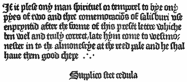

Such is a brief summary of the types of our first printer. It would be interesting, were it possible, to continue in an equally detailed manner an examination of the types of all the early English printers. But the rapid increase of printing which followed Caxton’s death would render such a task one of great labour and difficulty. We shall content ourselves with collecting such references to typefounding as may throw general light on the progress of the art during the first century of its existence.
We have elsewhere stated our reasons for supposing that the first Oxford press was commenced with types brought from abroad. Of the St. Alban’s printer and his contemporaries, Lettou and Machlinia, in the city of London, we know very little. The types of both presses were extremely rude, and might therefore suggest that an attempt was made to produce them by untrained English artists, or, as is equally probable, that the old and worn-out soft lead types of an earlier printer were made use of.
This piece of evidence is not very convincing. It is more to the point that some of his early types are not to be observed in books from the press by any foreign printer at that time; which could scarcely have been had he, along with other English printers, purchased founts from some of the foreign founders at that time carrying on a brisk trade with this country. It is, however, to be borne in mind that every printer cut or provided himself with Black as regularly as with Roman and Italic; and the Black-letter, especially in the large sizes, being easy to imitate, the general resemblance among the founts of that period may mean nothing more than that De Worde’s models were faithfully copied by his imitators.
De Worde introduced a larger variety in body than Caxton, and in some of {91} his works, as in the Whitintoni Lucubrationes, in 1527, used a very small Black-letter, apparently, as Herbert remarks, because he had no Roman or Italic small enough. In his Black founts he used a large number of abbreviations, though not so many as were at that time used by printers abroad. He has been erroneously credited by some writers with having been the first to introduce the Roman letter into this country. It appears, however, that he closely followed Pynson in this innovation157; and, in his later works, made considerable use of that character, both for printing entire books, and for distinguishing remarkable words or quotations in his Black-letter text.
Although characterised as a better printer than scholar, he was the first to introduce letters of some of the learned languages into his books. In 1519, in Whitintonus de concinitate grammatices, he used some Greek words, the first in England, cut in wood. Later, in 1524, in Wakefield’s Oratio,158 printed in Roman characters with marginal notes in Italic,159 he printed some Greek words in movable types, and showed Arabic and Hebrew cut in wood, the first used in this country. The Hebrew is Rabbinical, and the author complains that he has been obliged to omit a third part, because the printer lacked Hebrew types. As early as 1495, moreover, De Worde, as we have elsewhere noted, in his edition of the Polychronicon, used the first music-types known in typography.
He died in 1534, after printing upwards of 400 books.
In 1518 he printed his first work in Roman type, the Oratio in Pace nuperrimâ,161 by Richard Pace. Only one fount is used throughout this interesting little work, of which we here reproduce the colophon.
A document still preserved in the Record Office, dated June 28, 1519, contains an interesting mention of Pynson’s types. It is an indenture between Wm. Horman, Clerk and Fellow of the King’s College at Eton, and Pynson, for printing 800 copies of such Vulgars as be contained in the copy delivered to him, “in suffycient and suyng stuff of papyr, after thre dyverse letters, on for the englysh, an other for the laten, and a thyrde of great romayne letter for the tytyllys of the booke.” {93}
In 1524 Pynson possessed a fount of Greek which he used in Linacre’s De Emendatâ Structurâ.162 This is of special interest, since the preface contains the first distinct reference to letter-founding which occurs in any English book. The Greek accents and breathings, it appears, were not sufficient for the whole of the quotations in the book, and their paucity is made the subject of the following interesting apology: “Lectori. S. Pro tuo candore optime lector æquo animo feras, si quæ literæ in exemplis Hellenissimi vel tonis vel spiritibus vel affectionibus careant. Iis enim non satis erat instructus typographus videlicet recens ab eo fusis characteribus græcis, nec parata ea copia, quod ad hoc agendum opus est.”163 The Linacre is printed in a good Great Primer Roman type, with which the Greek ranges fairly. The letters of the latter character are cast wide, so that each letter stands apart from the next, instead of joining close.
A further mention of Pynson’s types occurs in a Latin letter of his own, printed at the end of the Lytylton Tenures of 1527, in which he thus inveighs against the piracy of his rival and contemporary, Robert Redman: “Richard Pynson, the Royal printer, salutation to the Reader. Behold, I now give to thee, candid Reader, a Lyttleton corrected (not deceitfully), of the errors which occurred in him; I have been careful that not my printing only should be amended, but also that with a more elegant type it should go forth to the day: that which hath escaped from the hands of Robert Redman, but more truly Rudeman, because he is the rudest out of a thousand men, is not easily understood.”
The new fount here referred to must have been among the latest productions of this printer’s industrious labours, as he ceased printing in 1528, having issued upwards of 210 works.
With Faques and Pynson early English Typography seems to have reached for a time its high-water mark. A slow deterioration set in, probably consequent on the withdrawal of the foreign trade in type, and the necessity thereupon for every printer to become his own punch-cutter and typefounder.
Mores, in passing, is careful to rescue a few names from reproach. “COPLAND THE ELDER,” he says, “(who had been servant to De Worde) and WYER and REDMAN, had founts of two-line Great Primer, the letter good and beautiful. . . WILL. RASTEL used Italic in 1531. . . Redman164 used a Secretary type in the edition of Rastell’s Grete Abridgement, printed in the year 1534, which Secretary is the last Secretary we remember. BERTHELET had a fount of English Roman with a face as thick as English” (Black-letter), “but pretty.”
We annex a specimen of the curious semi-Gothic fount used by this last-named printer in 1531 for printing Sir Thomas Elyot’s Boke named the Governour. The face is of rare occurrence in English typography, and was probably procured {95} from abroad. The small Secretary type mixed with it is doubtless English, and was one of the latest founts of its kind used in the country.
There appears to be no special reason, as we have stated, why the names and types of any particular printers at this period should be selected to the exclusion of others who equally with them produced types for their own use. We may, however, mention REYNOLD WOLFE, who in 1543 held the first patent as printer to the king in Latin, Greek and Hebrew, and printed the first entire Greek and Latin book in England, being Sir John Cheke’s edition of Chrysostom’s two Homilies.165 He appears, however, to have printed nothing in Hebrew.
He was born in 1522, and began business about 1546, in St. Sepulchre’s parish. In 1549 he removed to Aldersgate, where he continued until 1572. The persecutions of Queen Mary’s reign caused him to seek refuge abroad, but he returned in 1556, in which year he was the first person admitted to the livery of the Stationers’ Company, newly incorporated by the charter of Philip and Mary. On the accession of Queen Elizabeth he became an important printer, and was chosen Warden of the Company in 1564 and three subsequent years, and Master in 1580.
Early in the Queen’s reign he found a generous patron in Archbishop Parker, under whose auspices he cut some of his most famous founts. One of the earliest of these was the fount of Saxon, which appeared first in Ælfric’s Saxon Homily, edited by the Archbishop under the title of A Testimonie of Antiquitie, and printed in 1567. It was used again in Lambard’s Archaionomia in the following year, in the Saxon Gospels, printed in 1571, and subsequently in the Archbishop’s famous edition of Asser Menevensis’ Ælfredi Res Gestæ in 1574.166
This last-named work, which may be regarded as one of the first historical monuments of English letter-founding, contained a preface by Parker, in which {96} Day’s performance in cutting the punches is thus particularly alluded to:—“Jam vero cum Dayus typographus primus (et omnium certè quod sciam solus) has formas æri inciderit; facilè quæ Saxonicis literis perscripta sunt, iisdem typis divulgabuntur.”167
The Saxon fount, as will be seen by the facsimile, is an English in body, very clear and bold. Of the capitals, eight only, including two diphthongs, are distinctively Saxon, the remaining eighteen letters being ordinary Roman; while in the lower-case there are twelve Saxon letters as against fifteen of the Roman. The accuracy and regularity with which this fount was cut and cast is highly creditable to Day’s excellence as a founder.168 He subsequently cut a smaller size of Saxon on Pica body.
The typography of the Ælfredi is superior to that of almost any other work of the period. Dibdin considered it one of the rarest and most important volumes which issued from Day’s press. The Archbishop’s preface is printed in a bold, flowing Double Pica Italic, and the Latin preface of St. Gregory at the end in a Roman of the same body, worthy of Plantin himself. It is at least a curious circumstance, pointing to a community of founts among printers even at that day, that in Binneman’s169 edition of Walsingham’s Historia, bound up with Day’s Asser and the Ypodigma Neustriæ, this same large Roman and Italic is made use of.
Respecting an Italic fount cut by Day in 1572, several interesting particulars are preserved, which tend to throw further light on our printer’s operations as a punch-cutter and letter-founder.
It appears that in that year, at the time when Day removed his shop from {97} Aldersgate to St. Paul’s Churchyard, Archbishop Parker was engaged in providing replies to a Popish polemic of Nicholas Sanders, entitled De Visibili Monarchia. Dr. Clerke of Cambridge was selected for the task, and his Responsio was entrusted to Day to print. In a letter to Lord Burleigh, dated December 13, 1572, the Archbishop thus refers to the typography of the forthcoming work170:
“To the better accomplishment of this worke and other that shall followe, I have spoken to Daie the printer to cast a new Italian letter, which he is doinge, and it will cost him xl marks; and loth he and other printers be to printe any Lattin booke, because they will not heare be uttered and for that Bookes printed in Englande be in suspition abroad.”
Strype, referring to the transaction, adds a note: “For our Black English letter was not proper for the printing of a Latin Book; and neither he (Day) nor any one else, as yet had printed any Latin books.”171 This misleading statement is corrected by Herbert,172 who points out that many Latin books had been printed, few of which, after 1520, had been in Black-letter, and he believed none at all after 1530. Moreover, many English books had long before 1572 been printed in Roman or Italic, and even such as had generally been printed in Black-letter usually had the notes and quotations in Roman or Italic.
It is singular that, after this announcement by the Archbishop, neither of the replies to Sanders was printed in Italic type. Clerke’s Responsio,173 in 1573, appeared in a new Great Primer Roman type, with the quotations only in Italic, the headings being set in the large Italic afterwards used in the Asser. Acworth’s De Visibili Romanarchia,174 another rejoinder, in the same year, was in an English Roman, with a corresponding Italic and Greek. In Parker’s great work, however, De Antiquitate Britannicæ Ecclesiæ,175 published the year before (1572), and supposed by some to have been printed by Day at a private press of the Archbishop’s at Lambeth, the entire text, consisting of 524 pages, was in the English Italic, which Dibdin describes as “a full-sized, close, but flowing Italic letter.” The preface only to this work was in Roman; the various titles and sub-titles being in the larger founts of the Responsio and Asser.
Day was among the first English printers who cut the Roman and Italic to range as one and the same fount. Hitherto the two letters had been but seldom {98} intermixed, and when they were, they frequently exhibited a disparity in size and an irregularity in line which was disfiguring.176 Day, however, cut uniform founts.
In addition to the characters already mentioned, he greatly improved the Greek letter of the day. The Christianæ Pietatis Prima Institutio, printed by him in 1578, is in a beautiful type, which is considered to be equal to that of the great Greek typographers of Paris—the Estiennes.
Among his further enterprises in letter-cutting may be mentioned the Hebrew words, cut in wood, which he used in Humphrey’s Life of Jewell, in 1573, and in Baro’s Readings on Jonah, in 1579; and the musical notes which he introduced into his editions of the metrical Psalter. These notes are chiefly lozenge-shaped and hollow, differing from those used by Grafton in 1550, in Merbecke’s Booke of Common Praier, noted, which are mostly square and solid. He also, as he himself stated in a book printed in 1582, “caused a new print of note to be made, with letters to be joined to every note, whereby thou mayest know how to call every note by its right name.” Besides these, he made use of a considerable number of signs, mathematical and other, not before cast in type; while his works abound with handsome woodcut initials, vignettes and portraits, besides a considerable variety of metal “flowers.” Of the disposal of Day’s punches and matrices after his death we have no precise information, but the reappearance of the beautiful Double Pica Roman and Italic of the Ælfredi, in the Bibles printed by the Barkers, in Young’s Catena on Job in 1637, in Walton’s Polyglot in 1657, and other works, most of them executed by the royal printers, suggests that these founts at any rate were retained (probably under archiepiscopal control), and handed down for the service of the privileged presses.
In Strype’s Life of Parker, already quoted, is preserved an interesting account of Day’s business, with which we close this short notice: “And with the Archbishop’s engravers, we may joyn his printer Day, who printed his British Antiquities and divers other books by his order . . . for whom the Archbishop had a particular kindness . . . Day was more ingenious and industrious in his art and probably richer too, than the rest, and so became envied by the rest of his fraternity, who hindered, what they could, the sale of his books; and he had in the year 1572, upon his hands, to the value of two or three thousand pounds worth, a great summ in those days. But living under Aldersgate, an obscure corner of the city, he wanted a good vent for them. {101} Whereupon his friends, who were the learned, procured him from the Dean and Chapter of St. Pauls, a lease of a little shop to be set up in St. Pauls Churchyard. Whereupon he got framed a neat handsome shop. It was but little and low, and flat-roofed and leaded like a terrace, railed and posted, fit for men to stand upon in any triumph or show; but could not in anywise hurt or deface the same. This cost him forty or fifty pounds. But . . . his brethren the booksellers envied him and by their interest got the mayor and aldermen to forbid him setting it up, though they had nothing to do there, but by power. Upon this the Archbishop brought his business before the Lord Treasurer, and interceded for him, that he would move the Queen to set her hand to certain letters that he had drawn up in the Queen’s name to the city, in effect, that Day might be permitted to go forward with his building. Whereby, he said, his honour would deserve well of Christ’s Church, and of the prince and State.”—P. 541.
Day died in 1584, aged 62, and was buried at Bradley Parva. He published about 250 works. “He seems indeed,” says Dibdin, “(if we except Grafton) the Plantin of Old English Typographers; while his character and reputation scarcely suffer diminution from a comparison with those of his illustrious contemporary just mentioned.”
 T will be convenient, now that we have reached a point at
which letter-founding enters upon a new stage as a
distinct trade, to take a brief survey of its progress as a
mechanical industry; availing ourselves of such records
and illustrations as may be met with, to trace its
development and improved appliances during the period
covered by this narrative.
T will be convenient, now that we have reached a point at
which letter-founding enters upon a new stage as a
distinct trade, to take a brief survey of its progress as a
mechanical industry; availing ourselves of such records
and illustrations as may be met with, to trace its
development and improved appliances during the period
covered by this narrative.
As has already been stated, the reticence of our first printers leaves us almost entirely in the dark as to the particular processes by which they produced their earliest types. Mr. Blades leans to the opinion that Caxton, in his first attempts at typefounding, adopted the methods of the rude Flemish or Dutch School, of whose conjectured appliances we have spoken in the introductory chapter. “The English printers,” he says, “whose practice seems to have been derived from the Flemish School, were far behind their contemporaries in the art. Their types show that a very rude process of founding was practised; and the use . . . of old types as patterns for new, evinces more of commercial expediency than of artistic ambition.”
At the same time, there seems reasonable ground for inferring, from the peculiarities attending the re-casting of Caxton’s Type 4 as 4*, to which allusion has already been made, that at least as early as 1480 Caxton was possessed of the secret of the punch, and matrix and adjustable mould; while the {103} excellent works of De Worde and his contemporaries demonstrate that, however rudely, the art may have begun, England was, in the early years of the sixteenth century, abreast of many of her rivals, both as to the design and workmanship of her founts.
The frequent indications to be met with of the transmission of founts from one printer to another, as well as the passing on of worn types from the presses of the metropolis to those of the provinces, are suggestive of the existence (very limited, indeed) of some sort of home trade in type even at that early date. For a considerable time, moreover, after the perfection of the art in England, the trade in foreign types, which dated back as early as the establishment of printing in Westminster and Oxford, continued to flourish. With Normandy, especially, at the beginning of the sixteenth century, a brisk commerce was maintained. Not only were many of the English liturgical and law books printed abroad by Norman artists, but Norman type found its way in considerable quantities into English presses. M. Claudin, whose researches in the history of the early provincial presses of France entitles him to be considered an authority on the matter, states that Rouen, at the beginning of the sixteenth century, was the great typographical market which furnished type not to England only, but to other cities in France and to Switzerland. “It evidently had special typographical foundries,” he observes. “Richard Pynson, a London printer, was a Norman; Will Faques learned typography from J. le Bourgeois, a printer at Rouen. These two printers had types cast expressly for themselves in Normandy. Wynkyn de Worde must have bought types in Normandy also, and very likely from Peter Olivier and Jean de Lorraine, printers in partnership at Rouen.”177 And with regard to the first printer of Scotland, M. Claudin has no doubt that Myllar learned his art in Normandy, and that the types with which his earliest work was printed were those of the Rouen printer, Hostingue.
It is reasonable to suppose that English printers would endeavour, if possible, to provide themselves, not with types merely, but with matrices of the founts of their selections; and, indeed, we imagine some explanation of the marked superiority of our national typography at the close of the fifteenth century over that of half a century later, is to be found in the fact that, whereas many of the first printers used types wholly cut and cast for them by expert foreign artists, their successors began first to cast for themselves from hired or purchased matrices, and finally to cut their own punches and justify their own matrices. Printing entered on a gloomy stage of its career in England after Day’s time, {104} and as State restrictions gradually hemmed it in, crushing by its monopolies healthy competition, and by its jealousy foreign succour, every printer became his own letter-founder, not because he would, but because he must, and the art suffered in consequence.
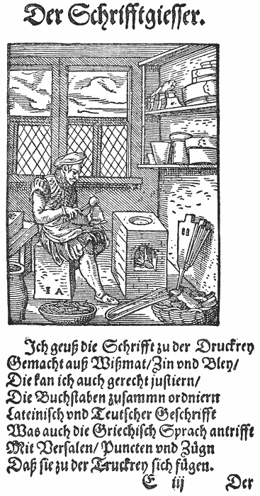
Of the operations of a sixteenth century letter-foundry, we are fortunately able to form some idea from the quaint engraving preserved to us by Jost {105} Amman in his Book of Trades178 in 1568, and reproduced here. The picture represents the Frankfort founder seated at his small brick furnace, casting type in a mould. This mould differs from the modern hand-moulds in being pyramidical in shape, and holding the matrix as a fixture in its interior. One of the moulds on the shelf shows a hole in the side, into which the matrix was probably inserted. From the manner in which the caster is grasping the mould, it would seem that it was bipartite, and needed the two halves holding together during casting. The cast types lying in the bowl have “breaks” attached to them, which at that date were in all probability cast so as to be easily detached. Behind the caster are some drawers, probably intended to contain matrices, of which one or two lie on the top waiting their turn for use. On the lower of the two shelves above the furnace are some crucibles, in which the metals would be mixed before filling up the casting-pan. On the upper shelf, besides three more moulds, are some sieves, suggestive of the use of sand, either for moulding large letters, or, as Mr. Blades suggests, for running the small ingots of metal into for use in the melting-pot. The small room in which this caster is operating in all probability formed part of a printing-office; and another interesting engraving of perhaps a still earlier date, which we here reproduce from the original in the British Museum,179 shows the two departments of the typographer’s art going on in {106} adjoining apartments. In this case, as in the Frankfort cut, the caster is sitting; but his mould, large as it is, appears to be furnished with a spring at the bottom, more like the later hand-moulds.
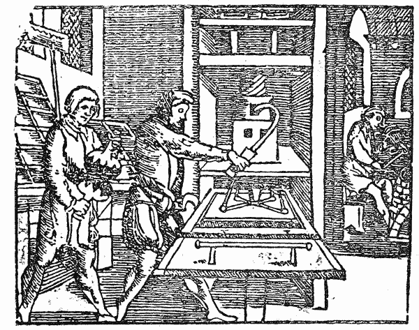
In the lines accompanying Amman’s picture the founder is made to say that he casts types made of “Bismuth, Tin and Lead,” a statement which, if correct, shows that the Frankfort types of that day must have been cast in terribly soft metal, of about the substance and durability of modern solder. The presence of the crucibles, however, points to the use of some fourth metal, of sufficient hardness to require a violent heat to fuse it. The founder also states that he can correctly justify his letters, which may refer either to the dressing of the types after casting, or the more important justification of the matrix to adapt it to the mould.
Another interesting memorial of a sixteenth century foundry is to be met with in a visit to the once famous printing-office of Christopher Plantin at Antwerp.180 The foundry of the great Netherlands “Archi-typographus,” which is still preserved in its pristine condition, was on the upper floor of his house, and consisted of two rooms, one devoted wholly to the casting, the other being a store-room for types awaiting use at the press. In the casting-room is still to be seen a large brick furnace covered with an earthenware slab. To the right of this is a smaller furnace, surmounted by the metal pot, which even yet contains some of the old type-alloy. On the walls hang tongs, ladles, knives and moulds. In a box are preserved small parcels of pattern-types for setting the moulds by, among which the visitor is shown three or four types of silver.181 In another box are a {107} large number of punches182 and moulds of all sizes. A bench extends along one side of the room, doubtless for the use of the dressers or rubbers.
In all these points we recognise that even in Plantin’s day the general appointments of a letter-foundry differed very little from those of the modern foundry before the introduction of machinery. Although we have no description of any English foundry before Moxon’s time, we know that the processes in use among us boast a much earlier origin. Moxon described no new method, but the old-established practice which had obtained, if not from the infancy of the art, at least from the commencement of that gradual divorce between printing and letter-founding which led, about 1585, to the establishment of foundries for the public use. We have no reason to suppose that the foundries connected with the presses of Day, Wolfe and others differed in practice from those of their Frankfort and Antwerp contemporaries, or that when, in 1597, Benjamin Sympson, a letter-founder, gave bond to the Stationers’ Company not to cast type for the printers without due notice, he, or the founders who followed him, knew any other methods of producing their type than those already familiar to every printer at home and abroad.
Turning now to Moxon’s account of English letter-founding as it was in his day, we find no lack of detail as to every branch of the art and every appliance in use by the artist. It is not our purpose here to follow these descriptions further than as they give a general idea of the practice and method of letter-founding two centuries ago,—a practice and method which, as we have said, existed long before his day, and were destined to be in common use for nearly a century and a half after. We shall best indicate the processes and appliances he describes by giving a brief analysis of that portion of his book which is {108} devoted to the mechanics of letter-founding,183 reserving for a later chapter a general summary of the complete work.
Naturally beginning with punch-cutting, he first describes in detail the various tools made use of by the engraver, viz., the forge, the using file, the flat gauge, the sliding gauges, the face gauges, the Italic and other standing gauges, the liner, the flat table, the tach, and other furniture of the bench. Every one of these tools is to be found in the punch-cutter’s room of the present day, scarcely changed in form or use from the woodcuts which illustrate Moxon’s description.
Turning from the tools to the workman, Moxon next proceeds to describe his choice of steel for the punches; the making and striking of the counter-punches on the polished face of the punch; the “graving and sculping” of the insides of the letters; together with certain rules in the use of the gravers, small files, etc., employed in this delicate operation.
With regard to the process described as counter-punching, it is necessary to admit that this constituted a refinement of the art of punch-cutting apparently unknown to the first printers. The freedom of their letters, consequent on the imitation of handwriting, which served as their earliest models, makes it evident that they cut by eye, rather than by mathematical rule. But as typography gradually made models for itself, the best artists, particularly those who aimed at producing regular Roman and Italic letters, discovered the utility and expediency of arriving at uniformity in design and contour, by the use of these counter-punches, which stamped on to the steel the impress of the hollow portions of the letters they were about to cut, leaving it to the hand of the engraver to cut round these hollows the form of the required character.
The punches being cut, finished and hardened, Moxon next deals with the various parts of the type-mould, describing in turn the “Making” of the mould: The Carriage,184 (a); the Body, (b); the Male Gauge, (c); the Mouthpiece, (d e); the Register, (f i); the Female Gauge, (g); the Hag, (h); the Bottom Plate, (a); the Wood, (b); the Mouth, (c); the Throat, (d); the Pallat, (e d); the Nick, (f); the Stool, (g); the Spring, (h).
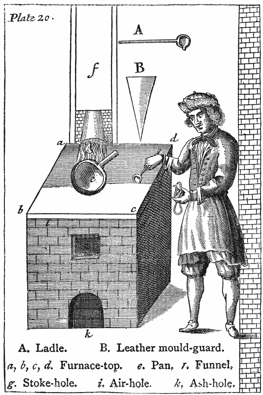
Here again we have described, with scarcely a difference, the mould in which scores of men yet living have in their day cast types for the trade. The {111} justification of the mould is then described; after which the important operation of striking the steel punch into copper, and forming and justifying the matrix, is treated of, with instructions for “botching” matrices in the event of a mistake in the latter process. The matrices being thus ready, the founder is instructed how to adjust them to the mould in preparation for casting,—a solemn process which may be best described in the writer’s own language:―
“Wherefore, placing the under-half of the Mold in his left hand, with the Hook or Hag forward, he clutches the ends of its Wood between the lower part of the Ball of his Thumb and his three hind-Fingers. Then he lays the upper half of the Mold upon the under half, so as the Male-Gages may fall into the Female Gages, and at the same time the Foot of the Matrice place itself upon the Stool. And clasping his left-hand Thumb strong over the upper half of the Mold, he nimbly catches hold of the Bow or Spring with his right-hand Fingers at the top of it, and his Thumb under it, and places the point of it against the middle of the Notch in the backside of the Matrice, pressing it as well forwards towards the Mold, as downwards by the Sholder of the Notch close upon the Stool, while at the same time with his hinder-Fingers as aforesaid, he draws the under half of the Mold towards the Ball of his Thumb, and thrusts by the Ball of his Thumb the upper part towards his Fingers, that both the Registers of the Mold may press against both sides of the Matrice, and his Thumb and Fingers press both Halves of the Mold close together. Then he takes the Handle of the Ladle in his right Hand, and with the Boll of it gives a Stroak two or three outwards upon the Surface of the Melted Mettal to scum or cleer it from the Film or Dust that may swim upon it. Then he takes up the Ladle full of Mettal, and having his Mold as aforesaid in his left hand, he a little twists the left side of his Body from the Furnace, and brings the Geat of his Ladle, (full of Mettal) to the Mouth of the Mold, and twists the upper part of his right-hand towards him to turn the Mettal into it, while at the same moment of Time he Jilts the Mold in his left hand forwards to receive the Mettal with a strong Shake (as it is call’d) not only into the Bodies of the Mold, but while the Mettal is yet hot, running swift and strongly into the very Face of the Matrice to receive its perfect Form there as well as in the Shanck.”
This done, the mould is opened, and the type released; Moxon adding that a workman will ordinarily cast 4,000 such letters in a day.
Then follow rules to be observed in breaking off, rubbing, kerning, setting-up and dressing, with descriptions of the dressing-sticks, block-groove, hook, knife and “plow.” That these operations, as well as the casting, had undergone no alteration nearly a century after Moxon’s day, may be judged from the fact that Moxon’s descriptions are used verbatim to accompany the view of the {112} interior of Caslon’s foundry, shown in the Universal Magazine of 1750, where all these operations are exhibited in active progress.
With regard to the preparation of the type-metal, Moxon’s account is minute and a trifle peculiar. This metal was, according to his account, made of lead hardened with iron.185 Stub-nails were chosen as the best form of iron to melt, and the mixture was made with the assistance of antimony, of which an equal amount with the iron was added to the lead, in the proportion of 3 lb. of iron to 25 lb. of lead. The great heat required to melt the iron necessitated open furnaces of brick, built out of doors, in a broad, open place, well exposed to the wind, into which the iron and antimony mixture was put in pots surrounded with charcoal. After half an hour’s time the metal men were to “lay their Ears near the Ground and listen to hear a Bubling in the Pots,” which is the sign that the iron is melted. They then were to erect another small furnace, “on that side from whence the Wind blows,” which was to contain the large pot full of lead. The lead being melted, they were to carry it at a great heat, with a “Labour would make Hercules sweat,” to the open furnace, filling up the pots of iron and antimony with the lead, and stirring at the same time. The open furnace was to be then demolished, and the mixed metal left to cool in the pots. And “now,” says Moxon, “(according to Custom), is Half a Pint of Sack mingled with Sallad Oyl provided for each Workman to Drink; intended for an Antidote against the Poysonous Fumes of the Antimony, and to restore the Spirits that so Violent a Fire and Hard Labour may have exhausted.”
Such is a brief account of the practice of typefounding in Moxon’s time. Of the trade customs of the day our author also presents us with a curious picture, in his account of the Chapel.
“A Founding-House,” he says, “is also call’d a Chappel: but I suppose the Title was originally assum’d by Founders to make a Competition with Printers. The Customes used in a Founding-House are made as near as maybe those of a Printing-House; but because the Matter they Work on and the manner of their Working is different, therefore such different Customes are in Use as are suitable to their Trade, as:―
“First, To call Mettle Lead, a Forfeiture.
“Secondly, A Workman to let fall his Mold, a Forfeiture.
“Thirdly, A Workman to leave his Ladle in the Mettle Noon or Night, a Forfeiture.” {113}
We are given to understand that in the case of other offences, common to both printing and typefounding, such as swearing, fighting, drunkenness, abusive language, or giving the lie in the chapel, or the equally heinous offence of leaving a candle burning at night, the journeyman founder was liable to be “solaced” by his fellow-workmen, in the same hearty and energetic way which characterised the administration of justice among the printers.
After Moxon’s time we meet with numerous accounts of foundries and their appointments. The interesting inventory of the Oxford foundry, appended to the specimen of the press in 1695, gives a good idea of the extent of that establishment. There were apparently two casters, two rubbers, and two or three dressers, and the foundry possessed twenty-eight moulds. The punches were sealed up in an earthen pot, possibly to protect them from rust or injury; or possibly, because having once served their purpose in striking the matrices, they were put aside as of little or no use. The small value put upon punches after striking is constantly apparent about this period. Very few punches came down with the foundries which were absorbed by that of John James; and of those that did, the greater portion were left to take their chance among the waste as worthless. The small value set upon the punches of Walpergen’s music, in the inventory of his plant,186 shows that they were considered the least important of his belongings. Matrices did not wear out in the old days of hand-moulds and soft metal, as they do now under steam machines and “extra hard”; but the liability to loss or damage, and the importance of protecting and preserving the steel originals of their types, can hardly have been less with the founders of a century and a half ago than it is to-day.
The entertaining letters of Thomas James from Holland, in 1710,187 point to a curious practice in that country, which we believe has never obtained in this. We refer to the habit of lending casters and matrices by one founder to another. In each of the two foundries he visited there were places for four casters; but in one case only one man was at work, and in the other no one was to be found, for this reason. This system of interchange is hardly consistent with the jealousy and suspicion shown by the same Dutch founders towards their English rival in his endeavours to procure sets of matrices from their punches. In this endeavour, however, he succeeded, much to his own satisfaction. He also purchased moulds, which, like all the other Dutch moulds he saw, were made of brass. Voskens’ foundry, which he visited, appears to have been “a great business, having five or six men constantly at the furnace, besides boys to rub, and himself and a brother {114} to do the other work.” He also found artists who, like Cupi and Rolij, were punch-cutters only, not attached to any one foundry, but doing work for founders generally. Van Dijk was a cutter only, who kept a founder of his own named Bus, and this founder cast, not at his own or Van Dijk’s house, but at the house of Athias, by whom probably he was also engaged. The Voskens, who succeeded Van Dijk, did their own casting, but their punches and matrices were supplied them by Rolij, who, as an independent artist, was free to sell duplicate matrices of his letters to James. This division of letter-founding into one or more trades, though common abroad, was never a common practice in England, where jealousy and lack of enterprise conspired to keep each founder’s business a mystery known only to himself.188
In the course of this book we shall have constant occasion to point out the intimate relations which existed at the beginning of the eighteenth century between English printers and Dutch founders. There was probably more Dutch type in England between 1700 and 1720 than there was English. The Dutch artists appeared for the time to have the secret of the true shape of the Roman letter; their punches were more carefully finished, their matrices better justified, and their types of better metal, and better dressed, than any of which our country could boast. Nor was it till Caslon developed a native genius that English typography ceased to be more than half Dutch.
Thiboust’s quaint Latin poem on the excellence of printing,189 though throwing little new light on the practice of the art, is worth recording here, not only for the description it gives of letter-founding in France at the time, but for the sake of the curious woodcut which accompanies it. The latter represents a round furnace in the centre of a room, surmounted by a metal pot, at which two casters are standing, with ladle and mould in hand. The moulds, of which a number are to be seen in a rack against the wall, are almost cubic in shape, and apparently without the hooks shown in Moxon’s illustration. One of the casters is holding his mould low, as in the act of casting. A workman sitting on a stool is setting up in a stick the newly-cast type from a box on the {115} floor—possibly breaking them off at the same time. Beyond is a dresser grooving out the break in a stick of types.
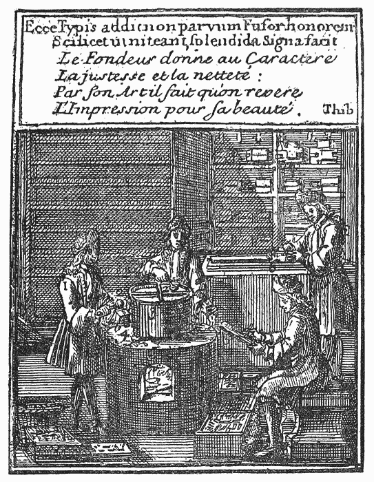
Of the portion of the poem devoted to letter-founding,190 we venture to give the following rough translation:― {116}
- “The founder see, whose molten metal glows
- Above the blazing furnace. From the pot
- His ladle nimbly feeds the curious mould,
- Whence straight the type in perfect fashion falls.
- The willing servant, he, of all the Schools,
- Whether in Latin they would write, or Greek,
- Or in the Hebrew tongue their minds disclose,
- Or in the German. He, for all prepared,
- Skilful, for each his character provides.
- See with what art the several types are cast,
- Each from its parent matrix; see how bright,
- Trimmed by the dresser’s cunning knife, they lie.
- He the redundant metal first breaks off,
- Then on the stick in order sets the type,
- And with his plane their equal height assures.
- Such is the founder’s craft, whose arduous round
- Of toil ’midst ardent heats is daily found.”
A still more satisfactory view of an eighteenth century foundry is to be found in the Universal Magazine of 1750. This engraving, of which our frontispiece is a facsimile, represents the interior of Caslon’s foundry, with the processes of casting, breaking-off, rubbing, setting-up, and dressing, all in operation. The casting is specially interesting, in the light of Moxon’s graphic account of the attitudes and contortions of the caster. Unlike their French brethren, each of Caslon’s casters stands partitioned off from his neighbour, with a furnace and pan to himself. One of them is dipping his ladle in the pot for a new cast; the next holds his mould lowered, at the commencement of a “pour”; the third has evidently completed the upward jerk necessary to force the metal into the matrix; and the fourth, with his mould again lowered, is apparently throwing out the type and preparing for the next casting.
A set of three views of the interior of a French foundry, from an Encyclopædia191 of about this date, presents a few interesting points of contrast between foreign and English methods. In the first view the process of punch-cutting is displayed.192 One man is finishing a punch with his file; another is striking a counter-punch (with perhaps undue energy) into the steel face of a punch; while the third, at a large forge, is hammering a piece of steel in readiness for the engraver. The second view shows metal making, casting, breaking-off, and {117} rubbing, in operation. There are two men at the large furnace, one watching the melting of antimony in a crucible, the other pouring off the mixed metal into ingots. At the small metal pot with three divisions, in the centre of the room, are three casters, one of whom is about to cast, another has finished his “throw,” and the third is loosening his spring so as to open the mould. At the table in the rear sit two girls, one breaking off, the other rubbing. The third view represents a dressing-room, where a girl is setting up the rubbed types on a stick. The dresser is ploughing the “break” from the foot of a stick of types, which is placed in the blocks, not lengthways along the bench, but across it. An apprentice sitting at the table completes the dressing, holding one end of the stick tilted while he passes his scraper over the front and back of the row of types. Drawings of all the tools and parts of tools used in typefounding complete the illustration.
Fournier, the French Moxon, in 1764 devoted the latter part of vol. i of his Manuel Typographique193 to the appliances and instruments used in type-casting. His work enters in detail into the form and use of every tool used in every department of the trade, from the cutting of the punch to the storage of the finished types, giving careful and accurate woodcuts of each. Allowing for a few national peculiarities, and certain improvements in casting, there is scarcely anything but the date of the book to distinguish it from a mechanical handbook to typefounding in the middle of the nineteenth century.
The operations of punch-cutting and justifying appear to have been kept a mystery from the earliest days of the trade. To lay minds, the one work of the founder was to cast types; but the preliminary operations on which his whole reputation as a founder depended, were little understood by any but the founder himself. And even he, as in the case of the first two Caslons, carried on this part of the mystery stealthily, and with closed doors even against his own apprentices. In many cases, especially with the originators of the great foundries, Caslon, Cottrell and Jackson, it was the master himself who designed and cut his own punches. It was not till the unusual demand for artists at the close of last century broke down this exclusiveness that outsiders arose to work for the trade in general. And even these, it was the policy and endeavour of each founder to attach to himself, treating him as a gentleman at large, and free from the obligations imposed on his other workmen.
The Rules and Regulations of Thorne’s Foundry, printed about the year 1806, give an interesting glimpse into the internal economy of a foundry of that period. After fixing the prices to be paid for work (for casting, rubbing, and kerning were {118} all paid by “piece”), they provide that the dressers shall have 25s. a week, “abiding by the old custom of leaving work at four o’clock on Mondays. Each man to dress after four casters.” The fines for “foot-ale” imposed on new hands are ordered to be deposited with the master, who is to keep an account of the same, and divide it equally among the men at Christmas. The foundry hours are from six in the morning to eight in the evening in summer, and from seven to eight in winter, “beginning when candle-light commences.” The dressers are to work from seven to eight in summer, and eight to eight in winter. Any man losing or damaging a mould, matrix, or tool, to make good the loss on the following Saturday. Any man leaving his lamp or candle alight after hours is to pay 6d., and the master for a similar offence is to fine himself 1s. Rubbers must grind their stones once a fortnight, “if requested to do so either by the master or foreman.” No work to be taken out of the foundry. Casters and rubbers must take their turn at carrying in metal. Breaking-off and setting-up boys shall earn 10d. a week for each man they set-up after. Many of these customs are traditional, and survive at the present time.
Conservatism, indeed, has been a marked feature in the history of British letter-founding. Between 1637 and 1837 the number of important foundries rarely exceeded the limit prescribed by the Star Chamber decree of the former year. The methods and practice of the art, as we have seen, remained virtually unchanged during the whole period. The traditional customs, the trade argot, the relations of men to men, and men to masters, even the tricks and gestures of the caster, suffered nothing by the lapse of two centuries. The relations of the founders among themselves during the period underwent more vicissitudes. At all times jealous of their mystery, they mistrusted in turn the printers and one another. As the new school of Caslon and his apprentices rose up to oust the old Dutch school of James, mutual antagonism was the order of the day. The literary duel between the Caslons and the Frys was perhaps the least injurious outcome of this spirit. This antagonism resolved itself, at the close of last century, into a combination of London founders against their rising Scotch competitors. An Association was formed in 1793, which continued for three years. In 1799 it was re-formed, and this time lasted four years; and again in 1809 it was revived and continued till 1820, when it terminated. In the early days of this Association the lady Caslons took a prominent part in its deliberations, which, however, frequently consisted of little more than the imposition of fines for non-attendance. The prices of type during this period, chiefly owing to the fluctuations in the value of metals during the French war, were constantly changing. Pica in 1793 was 1s. 1 ½d. a pound, in 1800 1s. 4d., in 1810 3s., and in 1816 (after the price of antimony had gone down from £400 to £200 a {119} ton), 2s. The Scotch founders, however, joined presently by the Sheffield houses, continued to underbid the London founders in their own market; and at one time a combination of all the English houses existed in opposition to the unfortunate new foundry of the Frenchman, Pouchée.
Our survey does not extend beyond the year 1830, but before concluding this hasty outline of the progress of letter-founding as a mechanical trade, it will be interesting to notice the gradual changes in the process of casting which led to the final abandonment of the venerable hand-mould in favour of machinery.
We cannot do better than give a brief summary from the Patent Book194 of the chief improvements proposed to be made in typefounding prior to 1830, premising that many of the schemes advanced no further than the proposal, and that some of the most important improvements which actually did take place were not registered in the Patent Book at all.
1790.—WILLIAM NICHOLSON proposed to cast type in the usual manner, except that instead of leaving a space in the mould for the stem of the letter only, several letters are cast at once in ordinary moulds, communicating by a common groove at the top. The types are also to be scraped in dressing, so as to render the tail of the letter gradually smaller the more remote it is from the face; thus enabling them to be set imposed upon a cylindrical surface.
1790.—ROBERT BARCLAY. A method of making punches on broken steel, the irregular figures in the grain of which will effectually obviate counterfeit. Punches may be formed of steel broken as above, by cutting, drilling, punching, bending parts of the letters, and leaving the grain of the steel to form the lines or strokes; and in this way complex founts of type might be cast, every letter of which would vary in its lines from every other.
1802.—PHILIP RUSHER.195 Improvements in the form of printing types. Each capital letter, with few exceptions, should be comprised in the compass of an oval. Each small letter is to be without tail-piece or descender, and the metal (both in small letters and capitals) is to extend no lower than the body of the letter. The letters above the line have their heads shortened or lowered about one-third.
1806.—ANTHONY FRANCIS BERTE. A machine for casting type. The casting is performed by applying the mould to one of several apertures in the side of the metal pot, through which, by the removal of a lock or valve, the metal is made suddenly to flow into the mould with a force proportionate to the height of the surface of the type-metal in the vessel.196 {120}
1806.—ELIHU WHITE. A machine for casting types; consisting of a matrix-box containing a certain number of matrices, which is applied to a complex mould having a similar number of apertures, through which the metal is poured, thus forming several types at one operation.
1807.—ANTHONY FRANCIS BERTE. Improvements on his former patent. The metal is forced through the aperture by means of a plug or piston, and the machine is so contrived as to regulate the quantity of metal ejected at each application of the mould.
Another improvement consists of making the body of the mould in four adjustable pieces instead of two, which will admit of changes in the body, as well as the thickness of the types. The moulds are without nicks,197 and the type, when cast, is expelled by a punch or other tool, without opening the mould.
1809.—JOHN PEEK. A machine for the more expeditious casting of types, by which three motions out of the five ordinarily made use of in casting, are saved. This consists in the addition of two parts to the ordinary hand-mould; that to the upper part being a plate with a socket in which the matrix is suspended on pivots, and that to the lower part being a bolt which presses the matrix to the mould, where it is kept by a spiral spring round the bolt, and by the withdrawal of which the matrix is tilted, another spiral spring keeping it in that position till the mould recloses. The bolt is worked by a lever.198
1812.—WILLIAM CASLON. An improved printing type. The face or letter part of the type is made of the usual thickness, and in the usual way, “but the body, which is commonly made about seven-eighths of an inch, I make only three-sixteenths of an inch in thickness; and the front of the said body I make sloping or bevelling upwards from the outer side towards the face, as well as the opposite side or back, by which means the upper part of the body is about one-eighth of an inch narrower than the under part of the same.” These short types are raised to the requisite height to paper by stands of the necessary thickness. “Or the body may, without being bevelled, be fixed by nails or otherwise, upon blocks of wood of a proper width and height. Or the stands may be made of the whole width of the body of the type, with only one projecting part, the other being screwed on after the types are put on the stands. The advantage of these types is in economy of weight and space; the former being one-half, and the latter one-third to one-half of the ordinary types.”
1814.—AMBROISE FIRMIN DIDOT. An improvement in the method of making types. In Roman text, running hand or any other hand consisting more or less in hair strokes or fine lines, from letter to letter, the projecting extremities of each letter are extended so as to form a join with the next. In the case of inclined letters “I do, by suitable alteration in my moulds, cast my types and the beards and shanks or tails thereof with the same or nearly the same inclination or slope of surface as aforesaid; and to prevent such types sliding upon each other {121} when set up, a protuberance or projecting part is cast on one face, and a cavity or indentation corresponding to it in the opposite one; or otherwise I do, by angular or curved deviations from, in, or as to the straight direction of the said surfaces, render it impossible that any sliding should take place between the same.”
1816.—ROBERT CLAYTON. A new method of preparing metal . . . types. The specification mainly relates to plate-printing, but concludes: “Thirdly, I obtain what I shall term alto or high-relief, by producing metal castings from wooden moulds or matrices, punched in wood with a cross-grain, which has been previously slightly charred or baked.”199 The metal is bismuth, tin and lead in equal parts, or tin (4), bismuth (4), lead (3), and antimony (1).
1822.—WILLIAM CHURCH. Machine for casting the types and arranging them ready to be transferred to the composing machinery. A matrix-bar containing a series of matrices is applied to a mould-bar, with a corresponding number of moulds. At the time of casting the latter is applied to jets leading from the metal chest, which is supplied from a metal fountain connected with the metal pot, and furnished with a valve to prevent the return of the metal. After the casting, the mould-bar, drawn endways, cuts off communication with the metal, and brings the said types beneath a series of punches, which descend and force them out at the same time that the matrix-box is unlocked, and descends clear of the types . . . The mould-bar is kept cool during the process by a stream of water passing through it . . . The metal is injected by the descent of a plunger into the metal chest. The type, as cast, is carried direct into a composing machine, where it is set up by means of a mechanism worked by keys, resembling the notes of a piano.200
1823.—LOUIS JOHN POUCHÉE201 (communicated by Didot of Paris). Machine calculated to cast from 150 to 200 types at each operation, the operation being repeated twice or oftener in a minute. The moulds are composed of steel bars. The first has horizontal grooves at right angles to its length, and forms the body of the letter. The second is a matrix-bar, screwed to the bottom of the first. The third bar forms the fourth side of the type-body. The feet of the type are made by the fourth, a “break bar,” with orifices communicating with each type-mould. Two of these moulds are placed side by side so as to form a trough between them, in which the molten metal is poured, nearly as high as the orifices on the “break bar.” On pulling a trigger by a string, a plunger at the end of a lever falls into the trough, and injects the metal into the moulds. The lever is slightly raised after the casting, by a treadle, after which the workman raises it by hand until it passes a catch, which retains it until the string is pulled again. The mould is then unclamped, the mould-bars drawn asunder by wrenches, the types are found adhering to the break bar like the teeth of a comb, when they are broken off and dressed in the usual way.
1823.—JOHN HENFREY AND AUGUSTUS APPLEGARTH. Certain machinery for casting types. The type is cast in a space between two flanges, set at right angles on a spindle, and pressed to and drawn from one another alternately by a spring and a peculiarly arranged eccentric piece. A piece of steel, called the “body,” adjustable to the thickness of the particular type, is screwed to one of the flanges. The matrix is on a carriage, and is run through holes in the flanges for the casting, and kept in its place by a spring. The metal is {122} injected by the descent of a plunger, which recovers itself by a spring. After the casting the spindle begins to revolve, immediately upon which the matrix is disengaged from the type and withdrawn clear of the flanges. The flanges are then opened, and the cast type pushed from the mould by the action of spring pins. A type is thus cast for each revolution of the spindle. The “break” is disengaged from the letter by two small pins, one of which protrudes from each jaw after the casting.202
1828.—THOMAS ASPINWALL. An improved method of casting types, by means of a “Mechanical Type Caster.” The working parts of this machine are mounted on a table suspended so as to move to and from the melting-pot. The mould is in two parts, mounted on two sliding “carrier pieces” on the table, inclined to each other at a slight angle. The matrix is held during the casting by a spring. On the revolution of the crank shaft (by hand) a sliding rod on the table is made to move towards the melting-pot, and the carrier pieces being acted upon by a cross-bar attached to it by springs, are drawn forward so as to unite the two parts of the mould for the casting. By a further revolution of the crank shaft, a projecting piece on the end of the sliding rod, coming in contact with an adjusting screw on one end of a bent lever, causes it to turn on its centre, and by a friction roller at the other end forces down the plunger of a cylinder communicating with the metal pot, so as to inject the metal into a chamber, whence it ejects a portion previously there through a nozzle into the mould as it is moved forward by the forward motion of the table. The handle of the crank is then turned the reverse way, the table swings back from the metal pot, the plunger rises by a spring, the parts of the mould separate, the matrix is withdrawn from the cast type by a lever (which overcomes the force of the spring by which it is held during the casting), and the type itself loosened from the mould by coming in contact with an inclined plane.
We conclude these extracts with a proposal suggestive more of the primitive experiments of the first printers than of nineteenth century letter-founding.
1831.—JAMES THOMSON. Certain improvements in making or producing printing types. “My improvements consist in making printing types by casting or forming a cake of metal having letters formed and protruding on one side of it, and in afterwards sawing this cake directly or transversely, so as to divide it into single types.” The casting is effected in two ways. First by forming a mould from types set up, and immersing this within an iron box in a pot of melted type-metal, “as in making stereotype plates; with this difference, however, that in the present case, the plate must be as thick as the length of the intended type; and further, that in setting up the types for the cast, proper spaces must be made between each letter and between the lines, in order to allow for what will be taken away in the sawing.” The second mode is “by taking a plate of copper or other suitable metal, and making in it indentations or matrices with a punch having on it the letter for the intended type, taking care to make them in straight rows, direct and transverse. The plate being so indented, is put into an iron box and immersed in a pot of liquid type-metal, and kept there the proper depth and proper time, so as to enable the metal fully to enter into those indentations or matrices, that the letter may be well formed. The cake thus cast or formed, after being taken out and cooled, is sawed as before.”
 UR Statute Books and Public Records do not throw
any very important light on the early history of English
letter-founding. Although a busy import trade in type
appears to have been maintained by the earliest printers,
and although as early as the days of De Worde, as we
have seen, there were English printers who not only cast
types for themselves, but are supposed to have supplied
them to others, we search in vain for any definite reference
to letter-founding in the decrees and proclamations which, prior to 1637, had for
their object the regulation or repression of printing. It is true that the term
printing was at that period wide enough to cover all its tributary arts, from paper-making
to book-selling. At the same time, it is noteworthy that, whereas in many
of the early decrees paper-making, book-binding and book-selling are distinctly
mentioned, letter-founding is invariably ignored. If any inference is to be drawn
from this fact, it is that type was one of the latest of the printer’s commodities
to go into the public market. A printer’s type was his own, and no one else’s;
and if occasionally one great printer was pleased to part with founts of his letter
to his brother craftsmen, either by favour or for a consideration, it was not till
late in the day—that is, not for about a century after the introduction of printing
into England—that English-cast types became marketable ware in the country.
UR Statute Books and Public Records do not throw
any very important light on the early history of English
letter-founding. Although a busy import trade in type
appears to have been maintained by the earliest printers,
and although as early as the days of De Worde, as we
have seen, there were English printers who not only cast
types for themselves, but are supposed to have supplied
them to others, we search in vain for any definite reference
to letter-founding in the decrees and proclamations which, prior to 1637, had for
their object the regulation or repression of printing. It is true that the term
printing was at that period wide enough to cover all its tributary arts, from paper-making
to book-selling. At the same time, it is noteworthy that, whereas in many
of the early decrees paper-making, book-binding and book-selling are distinctly
mentioned, letter-founding is invariably ignored. If any inference is to be drawn
from this fact, it is that type was one of the latest of the printer’s commodities
to go into the public market. A printer’s type was his own, and no one else’s;
and if occasionally one great printer was pleased to part with founts of his letter
to his brother craftsmen, either by favour or for a consideration, it was not till
late in the day—that is, not for about a century after the introduction of printing
into England—that English-cast types became marketable ware in the country.
It is not our purpose here to review in detail the various decrees and {124} proclamations which regulated printing in this country203; but it will be interesting to notice such of them as appear to have special reference to letter-founding.
The earliest Statute relating to printing was made in 1483, before the art had well taken root in the country; and proclaimed free trade in all printed matter imported from abroad. In 1533 this enactment was repealed, on the ground that “at this day there be within this realm a great number of cunning and expert in the said science or craft of printing.”204
More direct control was assumed in 1556, when the charter was granted to the Stationers’ Company, constituting that body the “Master and Keepers, or Wardens and Commonalty, of the Mystery or Art of a Stationer of the City of London.”205 Under this comprehensive term, there is little doubt, founders of type, had any at that time been practising in London, would be included; and such being the case, it would become necessary for them, as well as for paper-makers, printers, binders, booksellers and others, to become members of the Stationers’ Company, and subsequently, in compliance with the enlarged powers conferred on the Company in 1559 and 1556, to give surety to that body for the due observance of the ordinances by virtue of which they held their privileges.
The powers conferred on the Company by its charter related exclusively to the publication of printed matter; and the rights of search granted in the subsequent Acts confirming the charter appear to have been directed rather against the possession of smuggled or illegally printed books than against the possession of the materials necessary to produce them.
In 1582 was tried a celebrated lawsuit known as the Star Chamber case of John Day versus Roger Ward and William Holmes, for illegal printing of an {125} A B C and Catechism.206 In the course of the inquiry occurs an interesting reference to the practice of printers as their own letter-founders, which we reproduce as being one of the earliest direct notices of letter-founding in the Public Records. Amongst the questions put to the recalcitrant Roger Ward207 the following three were intended to discover whether the illicit A B C was printed by him in his own type, or whether (with a view to remove suspicion from himself) he had printed it in the type of another printer:―
“QUESTION XIII. Did any person or personns Ayde help or assist you with paper letters (type) or other necessaries in this work?
“ANSWER. He was not with paper letters (type) or other necessaryes in the said worke aidyd holpen or assistyd by any manner of personne or persons but that one Adam a Servant of Master Purfo(o)ttes dyd lend him some letters wherewith he imprinted the said boke.
“QUESTION XVIII. Whether were the Letters wherewith you imprinted the sayd A B C your owne yea or no? If not whose were they and by what meanse came you by them, And whether with the Consent of the owner or not? And whether have you redelivered them back againe and how long since, And what nomber of Reames did you imprint with the said letter?
“ANSWER. That all the letters wherewith he impryntyd the said A B C were not his owne for he dyd borrowe of one Adame, a man of one master Purfott all the Inglisshe (i.e., Black) Letters to the said worke and he borrowyd these letters without the consent of the said master Purfytt and hath the same as yet in this defendants custodye and have not Redelyvered of the same sithes he borrowyd the same as aforesaid and to his Remembrance he Did imprynt with the sayd letter the nomber of Twentie Reames of paper.
“QUESTION XIX. Whether have you cast any new Letter of your owne since the first printinge of the said A B C, and what nomber of the same have you printed of that letter (in that type)?
“ANSWER. He confessyth that he hath sythes the first imprintyng of the said A B C, cast a newe letter of his owne and yet he hath not pryntyd any of that letter (in that type).”
This testimony was generally corroborated by the other printers and persons examined, to many of whom it appeared to be notorious that Roger Ward had printed the book in a letter not his own, and that he had since cast a new fount of type for his own use. The whole inquiry throws a curious light on the methods of business of the printers of the day. Composition then, as Mr. Arber points out, was not necessarily done in the master-printer’s house where he kept {126} his press. Of course that which was done by himself and his apprentices was done there, but work given out to journeymen (who were generally householders), was probably done in their houses and paid for by piecework. “A custom which,” continues Mr. Arber, “was facilitated by most of the books then printed being almost always in some one size of type. Therefore there could not be so much control exercised over the literature in respect to the guardianship of the type—however easy it was for printers of that day to identify the printer of a book by its typography—neither do we find any such attempted; but only in respect to the custody of the hand printing press, which was doubtless well secured every night as a dangerous instrument, lest secret nocturnal printing should go on without the owner’s consent.”208
In the same year, 1582, Christopher Barker, the Queen’s printer, drew up an able report on the condition of printing as it then existed, in which, among other matters, he referred to the cost of making type, and its consequent effect on publishers and printers. “In King Edward the Sixt his Dayes,” he says, “Printers and printing began greatly to increase; but the provision of letter, and many other thinges belonging to printing was so exceeding chargeable, that most of those printers were Dryven throughe necessitie, to compound before[hand] with the booksellers at so low value, as the printers themselves were most tymes small gayners and often loosers . . . The Bookesellers . . now (1582) . . keepe no printing howse, neither beare any charge of letter, or other furniture, but onlie paye for the workmanship . . . so that the artificer printer, growing every Daye more and more unable to provide letter209 and other furniture . . . will in tyme be an occasion of great discredit to the professours of the arte.”
The report goes on to mention that at that time (December 1582) “there are twenty-two printing howses in London, where eight or ten at the most would suffise for all England, yea, and Scotland too.”210
In May of the following year there were twenty-three printers with fifty-three presses among them, and during the next two years the number appears to have increased so considerably as to call for that sweeping enactment, the Star Chamber decree of 1586. This famous measure prohibits all presses out of London, except one each at the two Universities, and “tyll the excessive {127} multytude of Prynters havinge presses already sett up be abated,” permits no new press whatsoever to be erected.211 The Stationers’ Company have authority to inspect all printing offices, “to search take and carry away all presses, letters and other pryntinge instrumentes sett up, used or employed . . contrary to the intent and meaninge hereof; . . . and thereupon shall cause all suche printing presses, or other printing instruments, to be Defaced, melted, sawed in peeces, broken, or battered . . . and the stuffe of the same so defaced, shall redelyver to the owners thereof againe within three monethes next after the takinge or seizinge thereof as aforesayd.”212
The Company were not slow in making use of their enlarged powers, and the refractory Roger Ward appears to have had considerable experience of the rigours of the new decree. In October 1586 the wardens seized on his premises “3 presses and divers other parcells of pryntinge stuffe,” and ordered them to be defaced and rendered unserviceable, according to the tenor of the decree. In 1590 they made a further visitation, and discovered that “he did kepe and conceale a presse and other pryntinge stuff in a Taylor’s house near adjoyninge to his owne, and did hide his letters in a hen house near St. Sepulchure’s Churche, expressely against the Decrees of the Star Chamber. All the whyche stuff were brought to Stacioners Hall” and duly destroyed. But the dauntless Roger Ward was not thus to be extinguished, and scarcely six months later, at Hammersmith, another press, “with 5 formes of letters of Divers sortes and 3 cases with other printing stuffe,” were impounded and rigorously defaced.
Nor was Ward the only victim. In a Secret Report presented in September 1589 to Lord Burleigh respecting the authors of the famous Marprelate Tracts, it is stated that the printer of the first three of these, “all beinge printed in a Dutch letter,” was Robert Waldegrave; and “towchinge the printinge of the two last Lebells in a litle Romaine and Italian letter,” the report states—once more showing how in those days a printer was known by his types—“the letter that these be printed in is the same that did printe the Demonstration of Discipline aboute Midsommer was twelve moneth (24 June, 1588), which was printed by Waldegrave neere Kingston upon Thames, as is discovered. When his other letters and presse were defaced about Easter was twelve moneth {128} (7th April, 1588) he saved these lettres in a boxe under his Cloke, and brought them to Mistris Cranes howse in London, as is allso confessed; and they are knowen by printers to be Waldegrave’s letters; And it is the same letter that was taken with Hodgkys. These two last Libells came abroade in July (1589) last. Now it is confessed by the Carier that John Hodgkys that is taken, did send from a gentlemans howse in Woltonam in Warwikeshier unto Warrington immediatlye after whitsontyde last (18 May 1589), a printinge presse, two boxes of letter, a barrell of nicke (incke ?), a baskett and a brasse pott, which were delyvered to him at Warrington,” etc.213
The Stationers’ Company, on the whole, had a busy time during the few years following the Star Chamber decree, in hunting up and destroying disorderly presses and the “stuffe” appertaining thereto. The numerous monopolies and patents of which they were the appointed guardians provoked a regular secret organisation of unprivileged printers,214 who pirated right and left, sometimes with impunity, sometimes at the cost of losing their whole plant and stock-in-trade by a raid of the authorities.
These raids must have kept the typecasters of the day well occupied, and it is even possible that the “stuffe” which from time to time fell into the hands of the Company may have included punches, matrices and moulds, which it would be far less easy to replace than presses, ink and balls.
A printer liable to such visitations would prefer, if possible, to procure his type out of doors, rather than maintain the valuable plant requisite to make it himself; and it is probable that the outside demand thus created may have been among the causes which led to the establishment of one or two small foundries, unconnected with any one printing office in particular, whose business it would be to supply any purchaser with type from its matrices.
The Stationers’ Company, who from time to time supplemented the powers conferred upon them by the Star Chamber with regulations of their own on matters such as standing formes, apprentices and prices, would naturally recognise a source of danger in a new foundry starting under the circumstances described, and were prompt to assert their authority.
Accordingly we find the following entry in the Index to the Court Books of the Company under date 1597:―
“BENJAMIN SYMPSON, letter founder, to enter into a £40 bond not to cast any letters or characters, or to deliver them, without advertising the Master and Wardens in writing, with the names of the parties for whom they are intended.—1597.” {129}
Here we have the first historical record of letter-founding as a distinct and recognised trade.215 Of Benjamin Sympson and his types nothing is known. His name does not occur in any of the lists of printers of the period, nor does it appear that he was even a member of the Stationers’ Company. Whether he was called upon at his own request to qualify as a typefounder, or whether the resolution of the Court was arrived at in consequence of his previous transactions with one or more of the disorderly printers, is equally uncertain.
In 1598 the Stationers’ Company made a regulation respecting the price of work, which is also of interest, as indicating the bodies of type at that time most commonly in use for bookwork. It was as follows:―
“No new copies without pictures to be printed at more than the following rates: those in pica Roman and Italic and in English (i.e., Black letter) with Roman and Italic at a penny for two sheets; those in brevier and long primer letters at a penny for one sheet and a half.”216
A further regulation regarding typefounders shows that in 1622 the trade had more than one recognised representative:―
“The Founders bound to the Company by bond, not to deliver any fount of new letters, without acquainting the Master and Wardens—1622.”
The Act of 1586, despite the rigour with which, at first at any rate, it was enforced, appears to have fallen into contempt, and to have been openly {130} disregarded by the printers of the first quarter of the seventeenth century. According to the account of the “London Printer,” who wrote his Lamentation in 1660, printing and printers, about 1637, were grown to such “monstrous excess and exorbitant disorder” as to call for the prompt and serious attention of the Court of Star Chamber, who in that same year, because the former “Orders and Decrees have been found by experience to be defective in some particulars; and divers abuses have sithence arisen and been practiced by the craft and malice of wicked and evill disposed persons,” put forward the famous Star Chamber Decree of 1637.217
In this decree, the severity of which called forth from Milton his noble protest, the Areopagitica,218 letter-founding is formally recognised as a distinct industry, and shares with printing the rigours of the new restrictions. The following is the text of the clauses relating to founders:―
XXVII.—Item, The Court doth order and declare, that there shall be foure Founders of letters for printing allowed, and no more, and doth hereby nominate, allow, and admit these persons, whose names hereafter follow, to the number of foure, to be letter-Founders for the time being, (viz.) John Grismand, Thomas Wright, Arthur Nichols, Alexander Fifield. And further the Court doth Order and Decree, that it shall be lawfull for the Lord Arch-bishop of Canterbury, or the Lord Bishop of London for the time being, taking unto him or them, six other high Commissioners, to supply the place or places of those who are now allowed Founders of letters by this Court, as they shall fall void by death, censure, or otherwise.
Provided that they exceede not the number of foure, set down by this Court. And if any person or persons, not being an allowed Founder, shall notwithstanding take upon him, or them, to Found, or cast letters for printing, upon complaint and proofe made of such offence, or offences, he, or they so offending, shal suffer such punishment, as this Court, or the high Commission Court respectively, as the severall causes shall require, shall think fit to inflict upon them.
XXVIII.—Item, That no Master-Founder whatsoever shall keepe above two Apprentices at one time, neither by Copartnership, binding at the Scriveners, nor any other way whatsoever, neither shall it be lawfull for any Master-Founder, when any Apprentice, or Apprentices shall run, or be put away, to take another Apprentice, or other Apprentices in his, or their place or places, unless the name or names of him, or them so gone away, be rased out of the Hall-booke of the Company, whereof the Master-Founder is free, and never admitted again, upon pain of such punishment, as by this Court, or the high Commission respectively, as the severall causes shall require, shall be thought fit to bee imposed. {131}
XXIX.—Item, That all Journey-men-Founders be imployed by the Master-Founders of the said trade, and that idle Journey-men be compelled to worke after the same manner, and upon the same penalties, as in case of the Journey-men-Printers is before specified.219
XXX.—Item, That no Master-Founder of letters, shall imploy any other person or persons in any worke belonging to the casting or founding of letters, than such only as are freemen or apprentices to the trade of founding letters, save only in the pulling off the knots of mettle hanging at the ends of the letters when they are first cast, in which work it shall be lawfull for every Master-Founder, to imploy one boy only that is not, nor hath beene bound to the trade of Founding letters, but not otherwise, upon pain of being for ever disabled to use or exercise that art, and such further punishment, as by this Court, or the high Commission Court respectively, as the severall causes shall require, be thought fit to be imposed.
XIV.—Item, That no Joyner, or Carpenter, or other person, shall make any printing-Presse, no Smith shall forge any Iron-Worke for a printing Presse, and no Founder shall cast any Letters for any person or persons whatsoever, neither shall any person or persons bring, or cause to be brought in from any parts beyond the Seas, any Letters Founded or Cast, nor buy any such Letters for Printing, Unlesse he or they respectively shall first acquaint the said Master and Wardens, or some of them, for whom the same Presse, Iron-works, or Letters, are to be made, forged, or cast, upon paine of such fine and punishment, as this Court, or the high Commission Court respectively, as the severall causes shall require, shall thinke fit.
Respecting the four founders thus nominated, and their types, we shall have occasion to speak in a following chapter. Continuing here our cursory review of the Statutes which affected letter-founding, it is necessary to remind the reader that this tremendous decree, which for severity eclipsed all its predecessors, was short-lived.
On November 3, 1640, the Long Parliament assembled, and with it the Star Chamber disappeared, and its decrees became dead letters. Then for a season there was virtually free trade in printing, and advantage was taken of the new condition of affairs to infringe existing rights on every hand, the King’s Patent Printers (if we are to believe the “London Printer,” above quoted) being the chief and most unscrupulous transgressors.
Parliament was not slow to take up the mantle dropped by the late Star Chamber, and in 1643 attempted to stem “the very grievous” liberty of the press, reinvesting the Stationers’ Company with powers to search and seize all unlicensed presses and books, and to apprehend the “authors, printers and other persons whatsoever employed in compiling, printing, stitching, binding, {132} publishing and dispersing the said scandalous, unlicensed and unwarrantable papers, books and pamphlets.”
This ordinance, in which once more typefounders are conspicuous by their absence, was strengthened by a further decree in 1647, and two years later the Act of Sept. 20, 1649, virtually reimposed the old Star Chamber regulations, requiring, among other provisions, that printers should enter into a £300 bond not to print seditious or scandalous matter; also that no house or room should be let to a printer, nor implements made, press imported, or letters founded, without notice to the Stationers’ Company. The penalties attached to a breach of these orders were severe. This Act was renewed in 1652, but it failed to remedy the abuses it was intended to meet. Private presses sprung up on all hands; the art was degraded and prostituted to all manner of base uses; workmen as well as master printers joined in their complaints against disorders which were working their ruin. The number of printers, restricted since 1586 to twenty, had grown to sixty; the Royal printers themselves were interlopers, two of them not even being practical printers, and all of them being political incendiaries.
Such being the condition of affairs, it is not surprising that in 1662 the remonstrances raised on all sides should result in an Act of Parliament intended to dispose finally of the abuses complained of.
The Act of 1662 (13 and 14 Charles II, c. 33) reimposes the provisions of the Star Chamber decree of 1637 with additional rigour.220 It enacts that no type is to be founded or cast, or brought from abroad, without licence from the Stationers’ Company. The number of founders is again limited to four, and all {133} vacancies in the number are to be filled up by the Archbishop of Canterbury or the Bishop of London.221 Masters of the Stationers’ Company, past and present, may have three apprentices, liverymen two, and the commonalty only one. Master founders must see that their journeymen are kept at work; and these journeymen must be all Englishmen and freemen, or sons of freemen. Founders working for the trade who offend are to be disabled from following their craft for three years, and on a second offence to be permanently disqualified, besides suffering punishment by fine or imprisonment, or “other corporal punishment not extending to life and limb.”
This uncompromising Act was continued from time to time, with temporary lapses, until 1693,222 when, in the tide of liberty following the Revolution, it disappeared. Despite its stern provisions, we find from a petition entitled The Case of the Free Workmen Printers, presented to the House about 1665, praying for its renewal, that the number of printing-houses had already grown to seventy, with one hundred and fifty apprentices; and in 1683 we have the evidence of Moxon that the number of founders, as well as of printers, was grown “very many.” It does not, however, appear that at any time during the continuance of the Act, that the number of founders ever exceeded four. How far they complied with the regulation requiring them to account to the Company for all type cast, we are unable, in the absence of any register of such accounts, to say; but that a register was duly kept is evident from the following important minute of the Court in 1674:―
“All the Letter-founders to give timely notice to the Master and Wardens, of all such quantities of letter as they shall cast for any person; which notice shall be entered by the Clerk in a register book to be provided for that purpose.—1674.”
In 1668, as will be seen in a subsequent chapter, the Company had, in discharge of their authority, nominated Thomas Goring to the Archbishop of Canterbury as “an honest and sufficient man” to be one of the four founders allowed by the Act, there being then a vacancy in the number. And that the penal clauses were not neglected is equally evident from the resolution of the Court in 1685, withholding Godfrey Head’s dividend until he should comply with the Act by giving an account to the Company of what type he was casting. {134}
The latest minute on the Court Books relating to letter-founding was in 1693—the year in which the Act expired—when the following order was made:―
“Printed papers to be delivered to all Founders, Press Makers and others concerned, requiring obedience to that Clause in the Act for preventing abuses in Printing, whereby all Letter Founders, Press Makers, Joiners, and others are commanded to acquaint the Master or Wardens what Presses or Letters they shall at any time make or cast.—1693.”
After 1693, letter-founding came from under all restraint. Laws of copyright and patent still clung to printing,223 but, except for a proposal made about 1695 by one W. Mascall224 that every printer, letter-founder and press-maker should enter with a statement on oath the number of his presses, the weight of his letter and the extent of his other utensils, we find no reference to letter-founding in the Public Records for upwards of a century.
Notwithstanding this liberty, the number of founders during the eighteenth century appears rarely to have exceeded the figure prescribed by the Star Chamber Decree of 1637, and occasionally to have been less.
One more attempt was made in the closing days of the eighteenth century to control the freedom of the press by law. There is something almost grotesque in the efforts made by legislators in 1799 to refit, on a full-grown and invincible press, the worn-out shackles by which the Stuarts had tried to curtail the growth of its childhood; and the Act of the 39th George III, cap. 79,225 in so far as it deals with printing, will always remain one of the surprises, as well as one of the disgraces, of the Statute-book. Among its worst provisions, the following affect letter-founders and letter-founding:―
Sec. 23 ordains that no one, under penalty of £20, shall be allowed to possess or use a printing-press or types for printing, without giving notice thereof to a Clerk of the Peace, and obtaining from him a certificate to that effect.
Sec. 33 provides that any Justice of the Peace may issue a warrant to search any premises, and seize and take away any press or printing-types not duly certificated. {135}
The following sections we give in full:―
Sec. 25. “That from and after the Expiration of Forty Days after the passing of this Act, every Person carrying on the Business of a Letter Founder or Maker or Seller of Types for Printing or of Printing Presses, shall cause Notice of his or her Intention to carry on such Business to be delivered to the Clerk of the Peace of the . . . Place where such Person shall propose to carry on such Business, or his Deputy in the Form prescribed in the Schedule of this Act annexed.226 And such Clerk of the Peace or his Deputy shall, and he is hereby authorized and required thereupon to grant a Certificate in the Form also prescribed in the said Schedule,227 for which such Clerk of the Peace or his Deputy shall receive a Fee of One Shilling and no more, and shall file such Notice and transmit an attested Copy thereof to one of his Majesty’s Principal Secretaries of State; and every Person who shall, after the expiration of the said Forty Days, carry on such Business, or make or sell any Type for Printing, or Printing Press, without having given such Notice, and obtained such Certificate, shall forfeit and lose the Sum of Twenty Pounds.”
Sec. 26. “And be it further enacted, That every Person who shall sell Types for Printing, or Printing Presses as aforesaid, shall keep a Fair Account in Writing of all Persons to whom such Types or Presses shall be sold, and shall produce such Accounts to any Justice of the Peace who shall require the same; And if such Person shall neglect to keep such Account, or shall refuse to produce the same to any such Justice, on demand in Writing to inspect the same, such Person shall forfeit and lose, for such offence, the Sum of Twenty Pounds.”
Such was the law with regard to typefounding at the time when the widows of the two Caslons were struggling to revive their then ancient business, when Vincent Figgins was building up his new foundry, and Edmund Fry, Caslon III and Wilson were busily occupied in cutting their modern Romans to suit the new fashion. And such the law remained nominally until the year 1869,228 {136} just upon four centuries after the introduction of the Art into this country. It is probable that, during the first few disturbed years of its existence, the Act may have been enforced, that certificates may have been registered, and accounts dutifully furnished.229 But its provisions appear very soon to have fallen into contempt, and certainly, as far as we can ascertain, failed to trouble the peace of any British letter-founder.
Such is a hasty and very cursory review of the various laws which from time to time have taken letter-founding under control. Whether they succeeded in placing any real check on the progress of the art, it is difficult to determine. But it is certain that the heaviest restrictive measures have generally been accompanied not only by the most grievous abuses in the spirit of the press, but by distinct degeneration in the quality of the typographical work executed. A privileged printer, sure of his monopoly and safe from competition, would have little or no inducement to execute his work at more cost or pains than was necessary. Old type would do as well as new, and bad type would do as well as good. Free trade and open competition were the great evils to be dreaded, because free trade and open competition would demand the best paper, and type and workmanship. The typography of the entire Stuart period is a disgrace to English art. Fine printing was an art unknown; and only a few works like Walton’s Polyglot, which were produced in an atmosphere untainted by mercenary considerations, stand out to redeem the period from unqualified reproach.
On the other hand, the removal of the restrictions was the signal for a revival which may be traced in almost every printed work of the early eighteenth century. In the absence of any great English founder, the best Dutch types came freely into the English market. Books came to be legible, paper became white, ink black, and press-work respectable. Caslon came in on the tide of the revival, as also did Bowyer, Watts, Bettenham, and artists of their rank; and the emancipated press, among them, made up the leeway of a wasted century, and, no longer in the grip of faction, but the free servant of the great and wise of the land, raised for itself monuments which will remain a lasting glory not only to English scholarship and English eloquence, but also to English typography, for which liberty has been, and always will be, the surest road to achievement.
 THE OXFORD UNIVERSITY FOUNDRY.
 RINTING was practised at Oxford within a year of the
introduction of the art into England. Setting aside the
legend of Corsellis and the “1468” Exposicio Simboli,
we find that a printer, presumably Theodoric Rood, from
Cologne, was settled here in 1478, and issued three works
anonymously from his press during that and the following
year. Between 1480 and 1483, Rood printed eight works
bearing his own name, and in 1485 and 1486, in partnership
with an Englishman named Thomas Hunte, he produced six more.
RINTING was practised at Oxford within a year of the
introduction of the art into England. Setting aside the
legend of Corsellis and the “1468” Exposicio Simboli,
we find that a printer, presumably Theodoric Rood, from
Cologne, was settled here in 1478, and issued three works
anonymously from his press during that and the following
year. Between 1480 and 1483, Rood printed eight works
bearing his own name, and in 1485 and 1486, in partnership
with an Englishman named Thomas Hunte, he produced six more.
Whether the first Oxford printer made his own type or procured it from abroad, we have no information, but the distinctly Cologne character of the two earliest founts favours the supposition that, like Caxton, he brought at any rate his first types with him from the Continent. The vague reference which Rood and Hunte make to their labours at the end of the Phalaridis Epistolæ in 1485,230 does not throw much light on the question, although the boast of an independent discovery of the art of printing there recorded may possibly mean that towards the close of their career they had arrived at a knowledge of the mystery of making their own types.
Without attempting a detailed examination of the seventeen works of the {138} first Oxford printers, we observe that during the eight years in which they practised their art, they made use of seven different kinds of type, which arrange themselves chronologically as follows231 :
| KNOWN DATE. | TITLE. | TYPE. | GROUP. |
|---|---|---|---|
| “1468”† | Exposicio Symboli |
a | Group I, “1468”-1479. (No printer’s name.) |
| 1479 | Aristotelis Ethica |
a | |
| 1479 | Ægidius de peccato originali |
a | |
| ... | Cicero pro Milone |
b | Group II, 1481–82. (Theodoric Rood.) |
| ... | Latin Grammar in English |
b | |
| 1481 | Alexander de Ales. Expositio de Animâ. Two Editions |
b,c | |
| 1482 | Lattebury. Morales. Two editions |
b,c | |
| ... | Hampole. Explanationes |
d,e | Group III, 1483–86. (Rood and Hunte.) |
| ... | Swyneshed. Insolubilia |
d,e | |
| ... | Anwykyll. Compendium. 1st edition |
d[e?]f | |
| ... | Anwykyll. Compendium. 2nd edition |
d,f | |
| ... | Lyndewode. Constitutiones |
c,d,e,f | |
| 1485 | Phalaridis Epistolæ |
c,f | |
| 1486 | Liber Festivalis |
f,g | |
| ... | Textus Alexandri |
d,f,g |
It will be noticed from the above list that type [a]
was used solely by the first anonymous Oxford printer, and
disappeared entirely as soon as Rood began to print in
his own name. The letter is a Black of similar character,
as Mr. Bradshaw points out, to that used by Zell and
Guldenschaft at Cologne, and was probably brought thence to
this country. The body corresponds closely to the present
“English.” One peculiarity about type [a] is that in the
mis-dated Exposicio Simboli the capital
 is always printed sideways
(
is always printed sideways
( ), whereas
in the two following books it appears correctly.
), whereas
in the two following books it appears correctly.
During the two years that Rood printed under his own name alone, he made use of a compressed Black-letter of English body, type [b], with which, in the Ales and Lattebury, he combined a larger Black, type [c], on Double English body for chapter-headings or initials.
Type [b] disappeared entirely at the close of Rood’s solitary labours. Type [c], however, was preserved; we find it used in single letters, or very sparsely in two later works.
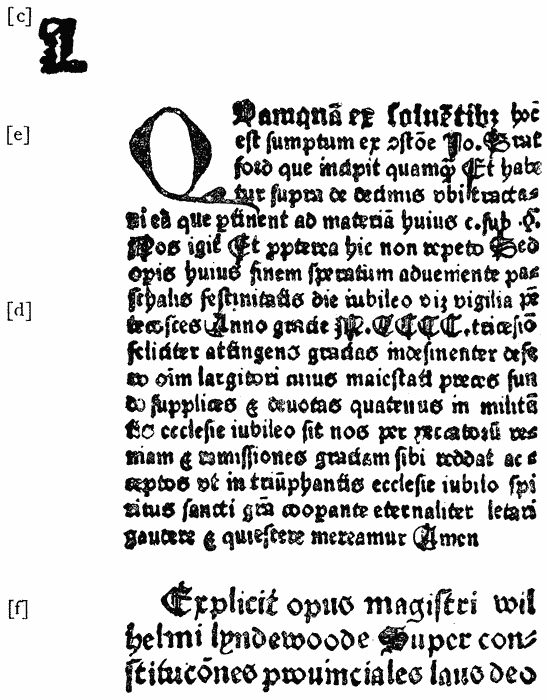
Rood and Hunte inaugurated their partnership by the introduction of two {139} new founts of Black-letter, types [d] and [e], or rather one fount having one size of capitals, and a small and large size of “lower-case,” all cast on the same body, about a Pica, and capable of being used interchangeably. Subsequently they used another double fount, types [f] and [g], cast in the same manner, [f] being the small, and [g] the large “lower-case,” with one size of capitals for both, all cast on a body closely corresponding to Great Primer. The character of this letter is decidedly Caxtonian, and suggests the possibility that at this stage of their labours the printers may have learned the art of making their own type. Type [f] had been in use for some time in combination with [c], [d] and [e], before type [g] appeared. The accompanying facsimile from the Lyndewode shows types [c], [d], [e] and [f].
We thus find that the seven early Oxford types reduce themselves to four principal founts, and one fount of initial letter, of which the following table will briefly sum up the typographical details :
| TYPE. | CHARACTER. | APPROXIMATE BODY. | NOTES. | |
|---|---|---|---|---|
a |
Cologne Black |
English |
Used with no other type. | |
b |
Narrow Dutch Black |
English |
Used alone or with [c] for headlines. | |
c |
Heading and Initial Black |
2-line English |
Used chiefly with [b], also with [d], [e], [f]. | |
d |
Small lower-case Dutch Black |
With one set of Capitals. |
Pica |
Used chiefly with [e], also with [f] and [g]. |
e |
Large lower-case Dutch Black |
Pica |
Used chiefly with [d], also with [f]. | |
f |
Small lower-case Caxtonian Black |
With one set of Capitals. |
Great Primer. |
Used chiefly with [g], also with [d] and [e]. |
g |
Large lower-case Caxtonian Black |
Great Primer. |
Used chiefly with [f], also with [d]. | |
The first Oxford press disappeared altogether in 1486, between which date and 1517 no work is known to have issued. In 1517 John Scolar, another German, printed a few small works very neatly in English and Brevier black-letter, with a Great Primer for titles, and made use of the University arms for the first time, either on his titles or last pages. Scolar’s press, in turn, came to an abrupt standstill in 1519, after which, in common with the other provincial presses of the country, printing at Oxford remained dormant for upwards of half a century.232
It was not till the year 1585 that the art was actively resumed. In that {140} year the Earl of Leicester presented a press, and the University made a grant of £100. The Star Chamber Decree of the following year formally allowed (with rigid restrictions) the establishment of the new press, and under Joseph Barnes, the first University printer, it rapidly rose to prominence. It appears from the outset to have been well provided with types, many of them of a beautiful cut, particularly those of the Greek character. The Chrysostomi Homiliæ, printed by Barnes in 1586, and the Herodotus of 1591, were both noticeable for the excellence of their letter. The former is said to be the first Greek book printed at the University.
The reputation of the University for its Greek types was enhanced some years afterwards by the acquisition of the letter in which the magnificent edition of St. Chrysostom233 had been printed at Eton by John Norton in 1610–13, at the charge and under the direction of Sir Henry Savile.234 This work, one of the most splendid examples of Greek printing in this country, is said to have cost its author £8,000. Respecting the origin of the types, Bagford says, in one of his MSS.: “Sir Henry Savile, meditating an edition of St. Chrysostom, prepared a fount of curious Greek letters, which in those days were called the Silver letter, not being cast of silver, but for the beauty of the letter so called.” Beloe,235 on the other hand, considers that the types were procured from abroad. “They certainly resemble,” he says, “those of Stephens, and the other Paris printers, as well as those of the Wechels at Frankfort, at a subsequent period. From the Wechels indeed they are said by some to have been procured, but this fact I have not been able to ascertain. It appears beyond a doubt, from a passage in one of the Epistles of Isaac Casaubon, that they were cast abroad.”236
The fine execution of this work obtained for Norton the distinction accorded to Robert Estienne of Paris by Francis I, of “Regius in Græcis Typographus.” Scarcely less high an honour had been paid to this printer in 1594, when we are told Paul Estienne (son of Henri Estienne II) visiting England, and appreciating his merit, permitted him to make use of the device of the Estiennes.237

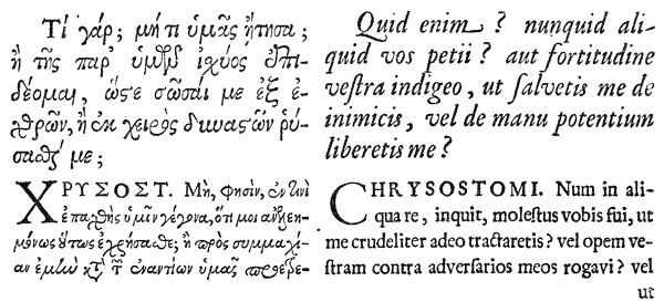
At what date these famous Greek types came into the possession of the {141} Oxford University Press it is impossible to determine. It was probably not till after some years of rough usage following Sir Henry Savile’s death; as Evelyn,238 in one of his letters, after lamenting the loss of Sir Simon Fanshaw’s medals, says that “they were after his decease thrown about the house for children to play at counter with, as were those elegant types of Sir Henry Savill’s at Eton, which that learned knight procured with great cost for his edition of St. Chrysostom.”
The types, of which we give a specimen (No. 28), were of a Great Primer body, very elegantly and regularly cut, with the usual numerous ligatures and abbreviations which characterised the Greek typography of that period.
During the early part of the seventeenth century the Oxford Greek types do not appear to have been extensively used; and in 1632 we find it recorded that Lord Pembroke, the then Chancellor of the University of Cambridge,239 applied for and obtained the loan of one of these founts for the purpose of printing the Greek Testament,240 which was issued in that year by Buck, the University printer, and which, says Beloe,241 “has ever {142} been admired for the perspicuity of its types as well as for the accuracy of its typography.”
The reason urged for this loan was, that the Oxford press made no use of the Greek type itself. This reproach was, however, shortly afterwards removed by the bounty and interest of Archbishop Laud, whose generous encouragement of printing at Oxford must always entitle him to an honourable mention in any record of the history of the art.
Laud, at that time Bishop of London, was appointed Chancellor of the University in 1630, and in the same year projected, among other acts of bounty, two important measures for the advancement of printing at that Academy. These were:―
“To procure a large Charter for Oxford, to confirm their Ancient Privileges, and obtain new for them, as large as those of Cambridge, which they had got since Henry the 8th and Oxford had not.
“To set up a Greek press in London and Oxford, for printing the Library-Manuscripts, and to get both Letters and Matrices.”242
The former of these projects was carried out in 1632, when Charles I granted a charter to Oxford, giving her equal privileges with the sister University, authorising her to employ three printers, and securing to her a right for a certain term over all books issued. In forwarding this charter to the University, Laud mentioned by name two of the printers—King and Motteshead, but urged Convocation as yet to nominate no one as the third, in order, he said, “that you may get an able man, if it be possible, for the printing of Greek when you shall be ready for it.”243
This is clearly an allusion to the Bishop’s other project, which, however, was only partially fulfilled during his lifetime.
A Greek press was established in London in 1632, under peculiar circumstances, which, though not strictly bearing upon the history of letter-founding at Oxford, we may here refer to as an interesting episode in the history of English printing.
Robert Barker and Martin Lucas, the King’s printers in London, were arraigned before the High Commission Court for a scandalous error in a Bible244 printed by them in 1631, whereby the seventh commandment was made to read, “Thou shalt commit adultery.” For this grave offence, the impression (which numbered 1,000 copies and was full of typographical errors) was called in, and {143} the printers were ordered to pay a fine of £300.245 This sum of money Laud received the royal authority to expend in the purchase of Greek types, according to the terms of the following letter addressed to him by the King, dated January 13, 1633:
“Most reverend father in God, right trusty and right entirely beloved counsellor, we greet you well. Whereas our servant, Patrick Young, keeper of our library, hath lately with great industry and care published in print an epistle of Clemens Romanus246 in Greek and Latin, which was never printed before, and has done this to the benefit of the church, and our great honour, the manuscript, by which he printed it, being in our library; and whereas we further understand that the right reverend father in God, Augustin,247 now Bishop of Peterborough, and our said servant Patrick Young, are resolved for to make ready for the press one or more Greek copies every year, by such manuscripts as are either in our library or in the libraries of our universities of Oxford and Cambridge, or elsewhere, if there were Greek presses, matrices, and mony ready for the work which pains of theirs will tend to the great honour of our self, this church, and nation; we have thought good to give them all possible encouragement herein, and do therefore first require you, that the fine lately imposed by our high commissioners upon Robert Barker and Martin Lucas for base and corrupt printing of the Bible, being the sum of three hundred pounds, be converted to the present buying of such and so many Greek letters and matrices, as shall be by you thought fit for this great and honourable work. And our further will and pleasure is that the said Robert Barker and Martin Lucas, our patentees for printing, which either now are, or shall hereafter succeed them, being great gainers by that patent, which they hold under us, shall at their own proper costs and charges of ink, paper, and workmanship, print, or cause to be printed in Greek, or Greek and Latin, one such volume in a year, be it bigger or less, as the right reverend father aforesaid, or our servant Patrick Young or any other of our learned subjects shall provide and make ready for the press, and shall print such a number of each copy, as yourself, or your successors for the time being, shall think fit; and all this they shall perform, whether the said copy or copies be to be printed in London, Oxford, or Cambridge, which shall be left free to their judgments and desire, whose pains prepare the copy or copies for the press. And last of all, our further will and pleasure is, that the aforesaid patentees do without any delay procure such, and so many matrices and letters, as aforesaid, that no hindrance be put upon the work, and that they be at the charge of printing in the mean time with such letters, as are already in the kingdom. Of all which or any other necessary circumstances for the furtherance of this work, we shall not fail to call for a strict account from you; and therefore do look that you call for as strict a one from them: provided always, that it shall be, and remain in your power to mitigate their fine aforesaid, according as you shall see their diligence and care for the advancing of this work.”248
This letter Laud forwarded to the printers, who in reply, “accounted it so {144} great a happiness” to receive the royal commands in the matter, and stated that they were already labouring “to find out the best fount and matrices, and to purchase the same at what cost soever.”249
The new Greek press, thus furnished, was in due time settled in London, at the King’s Printing House in Blackfriars, and from its types was printed, in 1637, Patrick Young’s Catena on Job,250 “in as curious a letter,” says Bagford, “as any book extant.” In this interesting work, from which we here give a facsimile, two Greek founts are used, the larger being a handsome Double Pica,251 not dissimilar to that in which Estienne’s great folio Greek Testament was printed in Paris. The smaller fount, a Great Primer, bears so close a resemblance to the fount used in the Eton Chrysostom, that it is probable it may have been cast abroad from the same matrices. The Double Pica Roman and Italic used in the work are the same as those employed by Day in the preface to the Ælfredi in 1574; the matrices having apparently been secured by the Archbishop for the use of the Royal press.
Although Laud’s project for the establishment of a Greek press at Oxford, similar to that in London, was not fully realised, his efforts on behalf of the University and its press continued unabated. In 1635 he presented his fine collection of Oriental Manuscripts, and established a Chair of Arabic, which greatly encouraged and promoted the study and printing of works in that and other Eastern languages. This favour he followed up with a gift of Oriental types, which is alluded to in a letter from John Greaves to Dr. Peter Turner, dated 1637.252 Greaves approves of the bargain formed by the proctor’s brother, Mr. Browne, for the purchase at Leyden253 of some printing types, of probably an {145} Eastern language. The only danger is that some are wanting. Mr. Bedwell, when he bought Raphelengius’s Arabic press, found some characters defective, which he was never able to get supplied. The writer hopes that, “now that Archbishop Laud has taken such care for furnishing the University with all sorts of types, and procuring so many choice MSS. of the Oriental languages, that some will endeavour to make true use of his noble intentions, and publish some of those incomparable pieces of the East, not inferior to the best of the Greeks or Latins.”254
In a letter addressed May 5, 1637, to the Vice-Chancellor, the Archbishop himself refers to these recent acquisitions in the following terms:―
“You are now upon a very good way towards the setting up of a learned press; and I like your proposal well to keep your matrices and your letters you have gotten, safe, and in the mean time to provide all other necessaries, that so you may be ready for that work.”255
One of the last recorded services of Laud to the Oxford press was the recovery, in 1639, of the Savile Greek Types, which had been clandestinely abstracted by Turner, the University printer. His letter on the subject is characteristic of the fatherly care which he exercised over the interests of the Oxford Press:
“I am informed,” he says, “that under pretence of printing a Greek Chronologer . . . Turner, the printer . . . got into his hands all Sir H. Savil’s Greek letters amounting to a great number, some of them scarce worn. It was in Dr. Pink’s time. I pray speak with the Dr. about it and call Turner to an account before the heads what’s become of them. I doubt Turner’s poverty and knavery together hath made avoidance of them.” Oct. 18, 1639.
“Feb 13th. Turner brought back the Greek letters, and delivered them by weight as he received them: there were not any wanting. He came very unwillingly to it.”256
This celebrated Greek fount does not appear to have been much used after this, and no trace of it now remains at the University press.257
Unfortunately for the cause of learning at Oxford, as elsewhere, the political troubles of the following years abruptly terminated Laud’s services in that {146} direction, and suspended for a time all further progress in the development of the press.258
A revival took place during the Commonwealth, on the appointment, in 1658, of Dr. Samuel Clarke, the learned Orientalist (who a short time previously had assisted in the correction of Walton’s Polyglot), as Archi-Typographus. This responsible functionary was “a person,” so the University Statute ordained, “set over the printers, who shall be well skilled in the Greek and Latin tongues, and in philological studies, . . whose office is to supervise and look after the business of Printing, and to provide at the University expence, all paper, presses, types, etc., to prescribe the module of the letter, the quality of the paper, and the size of the margins, when any book is printed at the cost of the University, and also to correct the errors of the press.”259 This office was, by the same Statute, annexed to that of superior law bedel, as having less business than the rest.
After the Restoration, printing at Oxford made still greater advances, chiefly through the instrumentality and munificence of Dr. John Fell.
This eminent scholar and theologian was born in the year 1625. He entered as a student of Christ Church at the age of eleven, and in 1643 bore arms in the civil wars for the king in the garrison of Oxford. At the Restoration he received ecclesiastical promotion, and in 1666 became Vice-Chancellor of the University.260 In this capacity he exerted himself strenuously to continue the work begun by Laud for the advancement of learning and encouragement of printing at the University;261 and about 1667 presented a complete typefoundry, consisting of the punches and matrices of twenty founts of Roman, Italic, Orientals, Saxons, Black and other letter, besides moulds and all the apparatus and utensils necessary for a complete printing office.
The extent of this noble gift, the importance of which can only be estimated {148} by recalling the low condition of letter-founding in England at the time, will best appear by the following Inventory, published by the University in 1695:
1. Great Primer Roman
2. Double Pica Roman
3. Pica Greek
4. Augustin Greek
5. Long Primer Greek
6. Great Primer Greek
7. Long Primer Italic
8. Small Pica Italic
9. Long Primer Roman
10. Pica Roman
11. Brevier Roman
12. Great Brass Roman Caps.
13. Augustin Roman
14. English Black
15. Small Pica Roman
16. Coptick
17. Augustin Italic
18. Pica Italic
19. Nonpareil Italic
20. Nonpareil Roman
21. & 22. Paragon Greek
23. Syriac
24. Double Pica Italic
25. Great Canon
26. Brevier Italic
27. Music
28. [Pica Roman and Italic, bought by the University, an. 1692.] Roman, 93; Italic, 78; Small Caps., not justified, 27; in all
28. Great Primer Italic
29. Astronomical Signs, Pica
29. Samaritan, English
29. Mathematical Marks
29. Cancelled Figures, Pica
29. Brasses, Long Primer
29. Mathematical Marks, Small Pica
30. Hebrew, Great and Small
31. Hebrew, Great and Small
31. Armenian
32. Arabic, Syriac, and Hebrew
32. Arabic Figures
33. Sclavonian, Great Primer
A paper of Flower Matrices.
A paper of Great Primer Roman and Italic, cut by Mr. Nichols—not good.
New Music Puncheons and Matrices, cut by Peter Walpergen.
For the Double Pica Roman and Italic, and some for the Double Pica Greek.
For the Great Brass Roman Capitals.
For the Black, English.
For the Coptick.
For the Syriack.
For the Samaritan.
For the Cannon Roman and Italic.
For the Astronomical Signs and Figures.
[For the Pica Roman and Italic.]
[For the Sclavonian also there were 109 punches.]
1 small anvil.
4 hammers.
28 moulds.
1 engine to make brass rules with a plane.
1 wyer sieve.
332 dressing sticks. {149}
2 great vices.
2 hand vices.
21 great files.
1 pair of sheers.
2 iron pots.
4 dressing planes.
3 dressing blocks.
3 plyers.
2 rubbing stones.
1 grinding stone.
26 copper borders.
32 copper letters.
7 printing presses, with all things belonging to them.
2 rolling presses, with all things necessary to them.
132 upper and lower cases.
5 pair of capital cases.
5 pair of fund cases.
13 pair of Greek cases.
50 chases.
Dr. Fell supplemented this gift by a further signal service, which is thus recorded by Bagford:―
“The good Bishop provided from Holland the choicest Puncheons,263 Matrices, etc., with all manner of Types that could be had, as also a Letter Founder, a Dutchman by Birth, who had Served the States in the same quality at Batavia, in the East Indies. He was an excellent workman, and succeeded by his son, who has been since succeeded by Mr. Andrews.”264
The Dutchman here spoken of was Walpergen, who, as will be seen later on, preceded Sylvester Andrews as typefounder in Oxford.
Fell was a zealous defender of the privileges enjoyed by his University, and in 1679 drew up a report setting forth its claims in the matter of printing.265 In this report he mentions that, in the year 1672, several members of the University, himself included, taking into consideration the “low estate of the manufacture of printing” in the kingdom, and particularly in the University, “took upon themselves the charges of the press in the said University, and at the expence of above four thousand pounds furnisht from Germany, France and Holland, an Imprimery, with all the necessaries thereof, and pursued the undertaking so vigorously, as in the short compass of time which hath since intervened, to have printed many considerable books in Hebrew, Greek and Latin, as well as in English; both for their matter and elegance of paper and letter, very satisfactory to the learned abroad and at home.”
It is probable that the transaction here recorded constituted a portion of what became known as Dr. Fell’s gift to the University; a series of benefactions which doubtless extended over several years—from 1667 to 1672—and included, when complete, the whole of the types and implements named in the above Inventory. Mores, who is responsible for the date, 1667, leads us to suppose {150} that the gift was completed in that year; but he gives no authority; and the absence of any second inventory of the acquisitions made in 1672, points strongly to the conclusion that the two transactions were part of the same gift.
In 1675 Dr. Fell was created Bishop of Oxford, and continued his active services to the cause of learning until the time of his death in 1686, having, as Anthony à Wood remarks, “advanced the learned press, and improved the manufacture of printing in Oxford in such manner as it had been designed before by that public spirited person, Dr. Laud, Archbishop of Canterbury.”266
In 1677 the University press was further enriched by another important gift of type and matrices, presented by Mr. Francis Junius.
This learned scholar, whom Rowe Mores styles the restorer—if not more than the restorer—of the knowledge of the Septentrional languages in England, was a German, the son of Francis Junius, the theologist, of Heidelberg. He resided for some time in England as librarian to the Earl of Arundel, during which time he zealously prosecuted his philological studies. In 1654, being then at Amsterdam, he furnished himself with a set of Saxon punches and matrices, respecting which he wrote as follows to Selden in that year267:―“In the meanwhile have I here Anglo-Saxonic types (I know not whether you call them puncheons) a cutting, and I hope they will be matriculated and cast within the space of seven or eight weeks at the furthest. As soon as they come I will send you some little specimen of them to the end I might know how they will be liked in England.” In addition to this Saxon, Junius also obtained founts of Gothic, Runic, Danish, Icelandic, Greek, Roman, Italic, and a pretty Black, all cast on Pica body. These he brought over with him to this country. Of the Gothic, Runic, Saxon, and Greek he certainly brought punches and matrices as well as types, as these are to this day preserved at Oxford, and there is reason to suppose all his founts were similarly complete.268
Junius, who had spent much time in his younger years at Oxford for the {151} sake of study, libraries, and conversation, and had visited it frequently since, retired there at last in 1676, and executed a deed of gift whereby he presented his books in the Northern language and his punches and matrices to the University, the latter consisting of the following founts:―
Junius died the following year at Windsor, at the great age of ninety. A quaint tribute to his memory exists in a note from Dr. (afterwards Bishop) Nicolson, who, writing to Thwaites in May 1697, says, “My acquaintance with that worthy personage was very short, and in his last days, when he was near ninety . . . . alas! I can remember little more of him than that he was very kind and communicative, very good, and very old.”269
The custodians of his valuable gift scarcely appear at first to have been impressed with an adequate sense of their responsibility, for we find that the Junian punches and matrices disappeared shortly after their presentation, and remained lost for a considerable period, when they were discovered by chance under the circumstances thus humorously narrated in a letter from Dr. (afterwards Bishop) Tanner, dated All Souls College, Aug. 10, 1697, and addressed to Dr. Charlett:―
“Mr. Thwaites and John Hall took the courage last week to go to Dr. Hyde about Junius’ matrices and punchions which he gave with his books to the University. These, nobody knew where they were, till Mr. Wanley discovered some of them in a hole in Dr. Hyde’s study. But, upon Mr. Hall’s asking, Dr. Hyde knew nothing of them; but at last told him he thought he had some punchions about his study, but did not know how they come there; and presently produces a small box-full, and taking out one, he pores upon it, and at last wisely tells them that these could not be what they looked after, for they were Ethiopic270: but Mr. Thwaites desiring a sight of them, found that which he looked on to be Gothic and Runic punchions, which they took away with them, and a whole oyster-barrel full of old Greek letter, which they discovered in another hole.”271 {152}
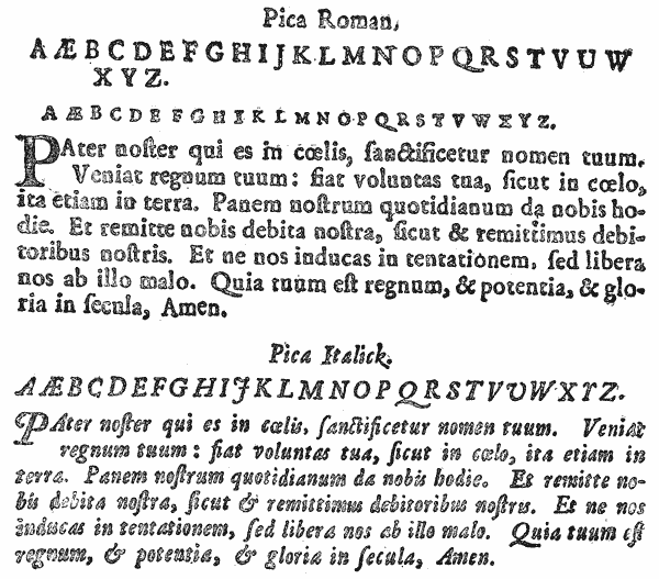
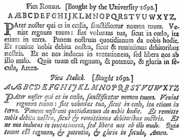
The combined gifts of Dr. Fell and Francis Junius laid the foundation of the Oxford University foundry as it now exists. Even before the close of the century it had been augmented by numerous small additions and purchases. About the time of Fell’s gift the press received a second fount of Coptic, presented by Witsen, the Burgomaster of Amsterdam.272 In 1694, Dr. Charlett, writing to Archbishop Tenison, refers to the founts of Slavonic and Armenian types, “very elegantly cut, which M. Ludolfus is bringing to Oxford from Holland.” The University also purchased matrices of Pica-Roman and Italic in 1692, besides adding to its stock some indifferent Great Primer matrices by Nichols, and music cut by the Oxford founder, Walpergen.273
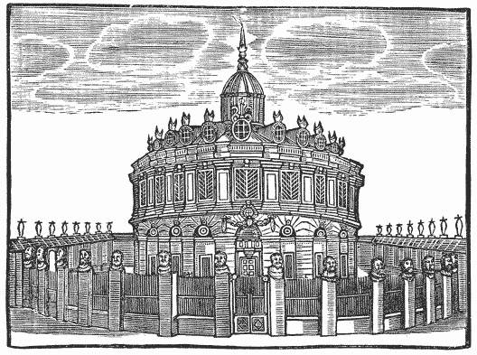
About the year 1669 the foundry, which, together with the press, had been carried on in hired premises provided by Fell, was transferred to the basement of the then new Sheldonian Theatre.274 Here it was that, in the year 1693, appeared the earliest known “Specimen of the several Sorts of Letter given to the University by Dr. John Fell, late Lord Bishop of Oxford, to which is added the Letter given {154} by Mr. F. Junius.” A manuscript note on the title-page of the Bodleian copy of this interesting specimen adds “with puncheons and matrices bought of others.” These additions, besides those already noted, include an Ethiopic “bought of Dr. Bernard,” and some supplementary Arabic sorts and Syriac vowels “bought by Dr. Hyde.” The Specimen consists of eighteen leaves.
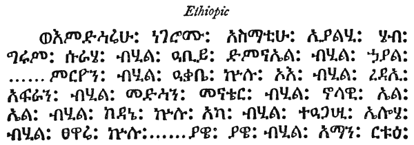
In 1695 a fuller specimen (of twenty-four leaves) appeared with the same title, and included the Junian Danish, a few later acquisitions, such as the new Slavonic, and a fount of spoon-shaped music cut by Walpergen. To this document was also appended the inventory of “utensils for printing,” already given in the account of Dr. Fell’s gift.
Of the estimation in which this specimen was held at the time, the following eulogium of Bagford may be taken as testimony. He says: “For the satisfaction of the curious, I shall give a catalogue and specimen of the letter presented by Dr. Fell, the like of which cannot be shown by any of the great printing houses in Europe, which may be seen by that printed in 1695, although it may fall into the hands of foreign printers of Holland, Flanders, Italy, Germany and France, they must confess that they had not seen the like, both for the great beauty and goodness of the letters.”275
Apart from its value as a specimen of the Oxford foundry, considerable interest attaches to the specimen of 1695, as being the first polyglot production in this country in which a stated portion of the Scripture—the Lord’s Prayer—appears in as many as forty-five different forms and nineteen different languages. In this respect, however, it was shortly afterward eclipsed by a polyglot Oratio Dominica, published in London in 1700,276 exhibiting the Lord’s Prayer in upwards of one hundred versions. This may, to some extent, be regarded as a specimen of the University press, as the two principal sheets of the work were printed at Oxford containing the prayer in the Hebrew, Samaritan, Chaldee, {155} Syriac, Coptic, Ethiopic, Amharic, Arabic, Persic, Turkish, Tartaric, Malayan, Gothic, Runic, Icelandic and Sclavonic, of the University foundry.277 These constitute the most interesting part of the collection, as the remaining versions, requiring special characters, are produced chiefly in copperplate.278 Rowe Mores points with some pride to this specimen as showing how far superior we were at that time to our neighbours abroad in the variety of our metal types.279
Specimens of Dr. Fell’s and Junius’ gifts, and an account of the foundry with its recent acquisitions, were frequently printed in the early part of the eighteenth century. Rowe Mores mentions four between 1695 and 1706. In the latter year the document had grown to twenty-five leaves, and included a Great Primer and a two-line Great Primer, purchased in 1701, and other additions. The inventory mentions twenty-eight moulds as being the number still in use in the foundry, and seven presses in the printing-house. It also distinguishes certain types as being of the Dutch height, a discrepancy to which, in all probability, may be traced that unfortunate anomaly of “Bible height” and “Classical height,” which to this day hampers the operations of a foundry where, in perpetuation of a blunder made two centuries ago, types are still cast to two different heights, agreeing neither with one another nor with any British standard.280
A later specimen, without date, was issued in broadside form, in which the old title gave place to the more simple one of A Specimen of the several Sorts of Letters in the University Printing House, Oxford. In this specimen, while including all the recent acquisitions, several of the older and less sightly founts comprised in Dr. Fell’s gift are discarded. {156}
In the year 1712 the University press was removed from the Sheldonian Theatre to occupy its new quarters in the Clarendon Printing House, erected for its accommodation—a building considered at the time one of the finest printing-houses in the world.281
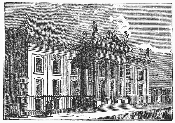
The encouragement given by Junius to the study of the Northern languages resulted in the production of many important works in that branch of literature at the University press during the early years of the eighteenth century. Foremost among these was Dr. Hickes’ Thesaurus,282 printed in 1703–5, a learned and elaborate work, in which the types presented by Junius are many of them displayed to advantage.
Rowe Mores, for the honour of his University in general, and his own college in particular, gives a list of the famous “Saxonists” of Dr. Hickes’ time. Amongst these, not the least eminent was Miss Elizabeth Elstob, who published in 1715 an Anglo-Saxon Grammar, printed in types, which, as they subsequently found their way into the Oxford foundry, call for a particular mention here.
William Bowyer the younger had printed in 1709 a work entitled An English-Saxon Homily on the Birth-Day of St. Gregory, translated by the Rev. William Elstob of Oxford and his sister, a young lady of great industry and {157} learning, whom Mores describes as the “indefessa comes” of her brother’s studies, and a female student of the University.283 In 1712, in the same types, was issued a specimen of Miss Elstob’s Anglo-Saxon Grammar.
Before, however, this work could be completed, Bowyer’s printing-house was destroyed by fire, and his types, including the Anglo-Saxon, perished in the flames. This disastrous event was the occasion for a remarkable display of sympathy on the part of Mr. Bowyer’s many friends, both in and out of the profession, which found expression in several forms,284 one of the most practical of which was the offer of Lord Chief Justice Parker (afterwards Earl of Macclesfield) to be at the cost of cutting a new set of Anglo-Saxon types for Miss Elstob’s Grammar. The drawings for the new types were made, at Lord Parker’s request, by Humphrey Wanley,285 the eminent Saxonist, and the cutting of the punches entrusted to Robert Andrews the letter-founder, who, however, proved unequal to the task. “I did what was required,” Mr. Wanley wrote, “in the most exact and able manner that I could in all respects. But it signified little; for when the alphabet came into the hands of the workman (who was but a blunderer), he could not imitate the fine and regular stroke of the pen; so that the letters are not only clumsy, but unlike those that I drew. This appears by Mrs. Elstob’s Saxon Grammar.”286 {158}
Poor as the letter-founder’s performance was, the Grammar duly appeared in the new letter in 1715,287 and the punches, matrices and types remained in the possession of Mr. Bowyer and his son, being used occasionally in some of their subsequent works, though not in any other of which Miss Elstob was the authoress.288 In 1753 they were sent by William Bowyer the younger, to Rowe Mores, with the following letter, for presentation to the University of Oxford:―
4th December, 1753.
“To EDWARD ROWE MORES, Esq., at Low Leyton.
“Sir,—I make bold to transmit to Oxford, through your hands, the Saxon punches and matrices, which you were pleased to intimate would not be unacceptable to that learned body. It would be a great satisfaction to me, if I could by this means perpetuate the munificence of the noble donor, to whom I am originally indebted for them, the late Lord Chief Justice Parker, afterwards Earl of Macclesfield, who, among the numerous benefactors which my father met with, after his house was burned in 1712–13, was so good as to procure those types to be cut, to enable him to print Mrs. Elstob’s Saxon Grammar. England had not then the advantage of such an artist in letter cutting as has since arisen,289 and it is to be lamented, that the execution of these is not equal to the intention of the noble donor, and, I now add, to the place in which they are to be reposited. However, I esteem it a peculiar happiness, that as my father received them from a great patron of learning, his son consigns them to the greatest seminary of it, and that he is, Sir, your most obliged friend, and humble Servant,
“W. BOWYER.”
The adventures of this epistle and the gift which accompanied it, before reaching their destination, are almost romantic. For some reason which does not appear, Rowe Mores, on receipt of the punches and matrices, instead of transmitting them to Oxford, took them to Mr. Caslon’s foundry to be repaired and rendered more fit for use. Mr. Caslon having kept them four or five years without touching them, Mr. Bowyer removed them from his custody, and in 1758 entrusted them to Mr. Cottrell, from whom in the same year he received them again, carefully “fitted up” and ready for use, together with 15 lbs. of letter cast {159} from the matrices. In this condition the whole was again consigned by Mr. Bowyer to Rowe Mores, together with a copy of Miss Elstob’s Grammar, for transmission to Oxford. On hearing, two years later, that his gift had never reached the University, he made inquiries of Mores, from whom he received a reply that “the punches and matrices were very safe at his house,” awaiting an opportunity to be forwarded to their destination. This opportunity does not appear to have occurred for three years longer, when, in October, 1764, the gift was finally deposited at Oxford. Its formal acknowledgment was, however, delayed till August 1778, exactly a quarter of a century after its presentation.290
The correspondence touching this transaction, amusing as it is, throws a curious light on Rowe Mores’ character for exactitude, and it is doubtful whether the publication of Mr. Bowyer’s first letter in the Dissertation,291 together with a few flattering compliments, was an adequate atonement for the injury done to that gentleman by the unwarrantable detention of his gift. Nor does the title under which the gift was permitted to appear in the University specimen, suppressing as it does all mention of the real donor’s name, and giving the entire honour to the dilatory go-between, reflect any credit on the hero of the transaction. The entry appears thus: “Characteres Anglo-Saxonici per eruditam fœminam Eliz. Elstob ad fidem codd. mss. delineati; quorum tam instrumentis cusoriis quam matricibus Univ. donari curavit E. R. M. e Collegio Regin., A.M. 1753.
- “Cusoria majuscula 42 (desunt
et
)
- Matrices majusculæ 44.
- Cusoria minuscula 37 (desunt e et
)
- Matrices minusculæ 39.”
It does not appear that these types were ever made use of at Oxford. The punches and matrices remain in the University press to this day.292
Between the Broadside sheet following the specimen of 1706, and 1768, no specimen of the Oxford foundry occurs. There exists, however, in the works issuing from the Press during that period ample testimony to its activity. The proposal to print Dr. Mawer’s Supplement to Walton’s Polyglot, with its types, is evidence of the continued reputation of its “learned” founts; while such an admirable specimen of typography as Blackstone’s Charter of the Forest, printed in 1759,293 affords proof that Oxford was not behindhand in that famous {160} revival of printing which received such impetus from the taste and genius of Baskerville.
The Delegates of the Press had, indeed, so high an opinion of the talents of this famous artist, that they employed him in 1758 to cut a fount of Great Primer Greek type for a Greek Testament shortly to be issued.294 The performance was pronounced unsuccessful, but the Greek types duly appeared, together with numerous other acquisitions, including a Long Primer Syriac purchased from Caslon, in the Specimen of 1768–70.295
Of this specimen Rowe Mores (who informs us that it was printed at the request of foreigners) falls foul as inaccurate. “The materials from which this account (i.e., his summary of the contents of the Foundry) is drawn,” he says, “are not so accurate as might have been expected from an Archi-typographus and the Curators of the Sheldonian. In excuse may be alleged that neither the Archi-typographus nor the Curators are Letter-founders; certainly that the matter has not been treated with that precision which in so learned a body should seem to be requisite. For one instance among others, which might be produced, take the Double Pica, Brevier and Nonpareil Hebrew, the only Hebrew types the University then had. They are two-line English, English and Long Primer. And this mistake has run through all the editions of the Oxford specimen, and in the last of 1770, the leanest and the worst of all, appears most glaringly. For this Brevier is placed immediately under Caslon’s Long Primer, a diversity sufficient one would think to show the blunder without the aid of a magnifier. The Nonpareil as it is called is omitted in this last specimen, and so are many other sets of matrices which have been given to the University, touching which enquiry should be made out of respect (at least) to the memory of the donors.”296 {161}
Another specimen appeared in 1786, in which more of the old founts are discarded in favour of more modern letters, among which are noticeable several Roman founts cast on a large body, to obviate the necessity of “leading”; including an English, cast for Mr. Richardson’s Dictionary. Almost all the “learned” founts presented by Fell and Junius are here shown, as well as a considerable number of borders and ornamental initials.
In 1794 a still fuller specimen appeared, which included a Great Primer Greek, cut by Caslon, and several new titling letters. To this specimen is appended a detailed inventory, both of the punches and matrices at that time in the possession of the University, and of the quantity of type of various kinds in stock, with the utensils for printing.
The following is a summary of the foreign and “learned” punches and matrices included in this catalogue:―
79 Anglo-Saxon
33 Arabic
65 Armenian
72 Black, English
116 Coptic, Pica
25 Gothic
114 Greek, Great Primer
148 Greek, Great Primer (Baskerville’s)
190 Greek, Double Pica
10 Greek, 2-line English
20 Hebrew, with points
220 Music
24 Runic
28 Samaritan, English
21 Saxon
106 Slavonian
90 Syriac, English
47 Turkish, Persian, Malayan
228 Arabic, Syriac and Hebrew
10 Arabic figures
83 Anglo-Saxon
77 Armenian
7 Armenian
7 Armenian
73 Black, English
135 Coptic
27 Coptic
224 Ethiopic
351 Greek, Augustin (or English)
493 Greek, Great Primer
167 Greek, Great Primer (Baskerville’s)
239 Greek, Double Pica (bad)
432 Greek, Paragon (Double Pica)
352 Greek, Long Primer
11 Greek, 2-line English
230 Hebrew, large and small
250 Hebrew, large and small
228 Music
70 Music
89 Runic, Dutch, Saxon, Gothic and Greek
30 Samaritan
20 Saxon, Small Pica, Long Primer, Pica
110 Slavonic
120 Syriac, English
5 Syriac, vowels
47 Turkish, Persian, Malayan
10 Welch
Of the printing utensils, the following items will give an idea of the extent of the press at that date:― {162}
267 Common cases
44 Single cases and boxes
26 Fount cases
34 Long Greek cases
30 Frames
129 Chases
37 Letter boards
5 Presses
1 Proof press
Of the presses, one is described as “mahogany, set up in the year 1793,” and another as “on the new constitution which works with a lever, set up in 1793.”
We have now brought our account of letter-founding at Oxford to the close of the last century. Its later history is of comparatively slight interest. The foundry still remains a part of the Press, and the reputation of the University for its oriental and learned founts has been maintained by numerous additions to its punches and matrices. Of such matters, however, in the absence of periodical general specimens, it is impossible to give particulars. The list of matrices given by Hansard in 1825 is entirely misleading, as he merely summarises the list taken by Mores from the Specimen of 1768–70.
We may, however, observe that at the present moment, under able management, the foundry is in active operation, and that the University Press possesses probably the largest collection of “Polyglot” matrices of any foundry in the kingdom.
The famous gifts of Fell and Junius are now relegated to the relics of this venerable yet still flourishing foundry, where, in company with Baskerville’s Greek, Walpergen’s music and Miss Elstob’s Anglo-Saxon, they rest from their labours, and remain to this day the most interesting monuments our country possesses of the art and mystery of its early letter-founders.
Appended is a list of the various specimens issued by the Oxford press from 1693 to 1794.―
1693. A specimen of the Several sorts of Letter given to the University by Dr. John Fell, late Lord Bishop of Oxford. To which is added, the Letter given by Mr. F. Junius. Oxford, printed at the Theater, A.D. 1693. 8vo. (Bodl. C., i, 24, Art.)
1695. A specimen of the Several sorts of Letter given to the University by Dr. John Fell, sometime Lord Bishop of Oxford. To which is added the Letter given by Mr. F. Junius. Oxford, Printed at the Theater, A.D. 1695. 8vo. (Bodl. Gough, Ox., 142; B. M. Harl. MS. 1529.)
1706. A specimen of the Several sorts of Letters given to the University by Dr. John Fell, sometime Lord Bishop of Oxford. To which is added the Letter given by Mr. F. Junius, Oxford, Printed at the Theater, A.D. 1706, 8vo. (Bodl. Gough, Ox., 142.)
No date. A specimen of the Several Sorts of Letters in the University Printing House. Oxford. Broadside. (Bodl. C., i, 24, Art.)
No date. Characteres Anglo-Saxonici per eruditam fœminam Eliz. Elstob ad fidem codd. {163} mss. delineati, quorum tam instrumentis cusoriis quam matricibus Univ. donari curavit E. R. M. e. collegio Regin. A.M. 1753. 8vo leaf. (W. B.)
1768–70. A specimen of the Several sorts of Printing Types belonging to the University of Oxford at the Clarendon Printing House, 1768 (together with New Letters purchased in the years 1768, 1769, 1770). Clarendon Press, Sept. 29, 1770. 8vo. (Univ. Pr.)
1786. A specimen of the Several sorts of Printing Types belonging to the University of Oxford at the Clarendon Printing House, 1786. 8vo. (Univ. Pr.)
1794. A specimen of the Several Sorts of Printing Types belonging to the University of Oxford, at the Clarendon Printing House, 1794. 8vo. (W. B.)
 RIOR to 1637, letter-founding is not specifically mentioned
as a distinct industry in any of the Public
Documents. We are not on that account however, (as
we have endeavoured to point out), to assume either that
the restrictive provisions of previous enactments which
regulated printing did not apply to letter-founding, or
that, as a trade, it had no separate existence before
that date. The divorce of letter-founding from printing
was in all probability a long and gradual process; and although it would be
difficult to fix any precise date to the completion of that process, we may yet
infer from the fact that the Decree of 1586 (which includes by name almost
every other branch of industry connected with printing) makes no mention of
letter-founding, while the Decree of 1637 particularly names it, that between
these two dates printers ceased generally to be their own letter-founders.
RIOR to 1637, letter-founding is not specifically mentioned
as a distinct industry in any of the Public
Documents. We are not on that account however, (as
we have endeavoured to point out), to assume either that
the restrictive provisions of previous enactments which
regulated printing did not apply to letter-founding, or
that, as a trade, it had no separate existence before
that date. The divorce of letter-founding from printing
was in all probability a long and gradual process; and although it would be
difficult to fix any precise date to the completion of that process, we may yet
infer from the fact that the Decree of 1586 (which includes by name almost
every other branch of industry connected with printing) makes no mention of
letter-founding, while the Decree of 1637 particularly names it, that between
these two dates printers ceased generally to be their own letter-founders.
As we have elsewhere noticed, the Stationers’ Company as early as 1597 took cognisance of letter-founding as a distinct trade, when it called upon Benjamin Sympson to enter into a bond of £40 not to cast any letters or characters, or to deliver them, without previous notice to the master and wardens. And that there was a certain body of men known in the trade as “founders” owning the authority of the Stationers’ Company in 1622, is evident {165} from the fact that in that year the Court called upon “the founders” to give bond to the Company not to deliver any fount of new letters without notice.
It would be erroneous, therefore, to imagine that the Star Chamber Decree of 1637 in any sense created letter-founding as a distinct trade. Its purpose, as in the case of printing, was to restrict the number of those engaged in it, which had probably grown excessive under the milder regime of the Decree of 1586.
In the curious little tract, to which allusion has already been made, entitled The London Printer, his Lamentation,297 the author, writing in 1660, after highly commending the Decree of Elizabeth (23 June, 1586), limiting the number of printers, says that about 1637, notwithstanding the above Decree, “printing and printers were grown to monstrous excess and exorbitant riot,” and that the law was infringed at all points. In this “monstrous excess and exorbitant riot,” it is highly probable that the letter-founders of the day figured. And it seems equally probable that John Grismand, Thomas Wright, Arthur Nicholls (or Nichols298) and Alexander Fifield, who were appointed by the Decree of 1637 as the four authorised founders, had already been founding types for several years, with or without the sanction of the authorities.
In the Registers of the Stationers’ Company, the names both of John Grismand and Thomas Wright occur as publishers of certain works, the former in 1635, the latter in 1638; from which it would appear that both before and after 1637 they may have combined the trade of bookseller and printer with that of letter-founder.299
And in another curious document, preserved among the Bagford collections, and entitled The Brotherly Meeting of the Masters and Workmen Printers, began November 5, 1621; the first Sermon being on November 5, 1628, {166} and hath been continued by the Stewards, whose names follow in this Catalogue to this present third of May 1681,300 the names of Thomas Wright, Arthur Nichols, and Alexander Fifield all appear as having served their Stewardship, although unfortunately the list does not assign dates to the respective terms of service.301
In the lists of the Stationers’ Company, however, we find that the four founders took up their freedom in the following order: John Grisman (sic), December 2, 1616; Thomas Wright, May 7, 1627; Arthur Nicholls, December 3, 1632; and Alexander Fifield, July 20, 1635.302
Respecting Wright and Fifield, after their nomination as Star Chamber founders history records nothing. It is probable that they continued to combine the callings of printer and founder, as John Grismand certainly appears to have done, for we find him named in a State Paper in 1649 as having on the 19th October of that year entered into a bond of £300, and given two sureties, not to print any seditious work.303
Of Arthur Nicholls there remains a record of a more ample and satisfactory nature, which we are glad to lay before the reader (as we believe) for the first time, being undoubtedly one of the most valuable and interesting memorials of early English letter-founding which we possess.
It appears that Nicholls, at the time of his nomination as Star Chamber founder in 1637, was also a candidate for the vacant place of printer at Oxford, at that time at the disposal of Archbishop Laud, who, as we have seen in the {167} preceding chapter, had been reserving it for a printer well versed in the Greek language. Nicholls, being unsuccessful in this matter, and driven by his straitened circumstances to seek some addition to his slender pittance as letter-founder thereupon made application to Laud to be admitted as a licensed master-printer in London, that so he might make use of his own type. His letter and the “Cause of Complaint” annexed are preserved among the State Papers,304 and are so important that we make no apology for quoting them in extenso:
“To the Right Reverend Father in God, WILLIAM, LORD ARCHBISHOP OF CANTERBURY, his Grace, Primate and Metropolitane of all England.
“The humble peticion of Arthur Nicholls. Showeth unto your grace:
“That the said peticioner hath spent much tyme and paines in cuttinge and foundinge of letters for divers of the printers in London, and at this tyme hath greate store of letters ready cast lying upon his hands, they refusing to take them from him att any rate.
“Besides this his imployment of founding letters is of soe small gaine that alone it will not mainteyne him and his familie but that of necessitie hee must betake himself to some other course whereby to be freed from extreame povertie, and utterly to quitt himself of that, unless your Grace be pleased out of your wonted goodness to comiserate his case.
“May it therefore please your Grace, since you have otherwise determined to dispose of the printers place att Oxford, to give him leave, for the better encouragement of that course wherein he hath so long exercised himself, to bee a printer here in London, That soe he may make use of his owne letters for the elegant performance whereof hee doth promise to use his best care and industry And ever to pray for your Grace’s honour and happinesse.”
The “Cause of Complaint” gives a lively picture of the tribulations of letter-founders at that time:
“The Cause of Complaint of ARTHUR NICHOLLS” (endorsed “Mr. Nicholls his reasons to be made printer.”)
“The Complainant being the cutter and founder of Letters for Printers is 3 quarter of a yeares time cuttinge the Punches and Matrices belonginge to the castinge of one sorte of letters, which are some 200 of a sorte, after which they are 6 weekes a castinge, that done some 2 monthes tyme is required for triall of every sorte, and then the Printers pay him what they themselves list; thus he is necessitated to lay out much money and forebeare a long tyme to little or noe benefitt.
“Likewise for the Greeke the Printers came unto him promisinge him the doinge of all the common worke, which drewe him to doe 400 Mattrices and Punches for 80 l. which weare truly worth 150 l.:
“Further they caused him to spend 5 weekes tyme in cutting the letters for the small Bible, it beinge finished was approved for the best in England, notwithstandinge they put him off aboute it from tyme to tyme for 15 weekes till (as they pretended) Mr. Patricke Yonge came out of the contry. {168}
“All which tyme he kept his servants standinge still, in regard whereof he refused to doe it, except he might doe the common worke likewise, when for feare of the displeasure of my lord his Grace, they came to him agayne but told him that if they should lett him have worke enough, he would growe to ritch.
“Albeit, of soe small benifitt hath his Art bine, that for 4 yeares worke and practice he hath not taken above 48 l., and had it not bine for other imploymente he might have perrisht.
“He seeinge himself soe slightly regarded by them, was the rather annimated to sell off the proffitablest of his worke thinking to take some other businesse in hand, whereby to free himselfe from want, being not able to subsist by workinge only for 2 or 3.
“Notwithstandinge his longe tyme spent in that Art, wherein he hath brought up his sonne to bee soe expert and able that if it please God to call him, the other is able exactly to performe anythinge touchinge the same.
“Wherefore he requesteth my lorde Grace not to confine him to these miserable uncertainties, but promiseth if he will bee pleased to grant his peticion, he shall see more done in one yeare than was ever done in England for all kindes of languages which he is assured will bee for the good of the commonwealth in general and his Graces particular content.”
Whether Nicholls’ application was successful or otherwise, is not known. In the disastrous times which immediately followed the four Star Chamber founders are lost sight of. It is scarcely likely, judging from the dismal account given above of the trade in times of peace, that they were able, any of them, to keep a business together in times of civil war. Nor is there any certainty that when, in 1649, the Commonwealth re-enacted the main provisions of the Star Chamber Decree, that the four founders then appointed were the same who had been licensed in 1637. Mores, however, leads us to suppose that they were, and for the purpose of enumerating the Oriental and learned matrices which about the year 1657 were in use in the country, treats their four foundries as one. There is, however, no reason for supposing that they worked in partnership, or that their business was in any way connected. But in one great undertaking they were associated; and the London Polyglot of 1657 has generally been regarded as the product of the types of some, if not all, of their number.
“By these or some of them,” observes Mores, “we may suppose to have been cut the letter used in The English Polyglott: but as we cannot assign to any of them their particular performances we shall till we are better able to ascertain them, call their labours by the name of the POLYGLOTT FOUNDERY, which, as nearly as that work and the Heptaglott which accompanies it instructs us, is described at the bottom of the page.305 But it is not to be doubted, considering the elegance and simplicity of the assortment which we see, that the foundery {169} was as completely furnished with that which we see not, and which, for that reason we cannot mention.”306
The London Polyglot ranks deservedly as one of the most conspicuous landmarks of English typography. Great works had gone before it, and greater followed. But in few of these has the learning of the scholar, the enterprise of the publisher, the industry of the editor, the ability of the printer, and the skill of the letter-founder been combined to so extraordinary a degree as in the production of this magnum opus of the Commonwealth press.
A brief sketch of the typographical history of this famous work may be interesting, and not out of place here.
The London Polyglot was the fourth great Bible of the kind which had been given to the world.307
In 1517308 the Complutensian Polyglot had been printed at Alcala, at the charges of Cardinal Ximenes, in six volumes, containing the Sacred Text, in Hebrew, Latin, Greek and Chaldean, including an “Apparatus” consisting of a Hebrew and Chaldee Lexicon, etc. This work will always be famous, if for no other reason, for the grand, bold Greek type in which the Septuagint and New Testament are printed.
In 1572 the Antwerp Polyglot of Arias Montanus was printed, in eight magnificent volumes, by Christopher Plantin. It comprises the whole of the Complutensian texts, with the addition of the Syriac, and an Apparatus containing Lexicons and Grammars of Hebrew, Chaldee, Syriac and Greek.
In 1645 the Paris Polyglot, edited by Le Jay and others, was published in ten sumptuous volumes. It comprises the whole of the texts of the Antwerp Polyglot, with the addition of Arabic and Samaritan. Owing to the abrupt completion of this work, no Apparatus was included of any description. This work was seventeen years in the press.
The London Polyglot, as we shall observe, added to the languages used in the Paris Polyglot, the Persian and Ethiopic, with an Appendix containing additional Targums, also a complete “Apparatus” and Prolegomena, with alphabetical tables of the various languages employed, and others besides. {170}
The following table will show clearly the gradual advances made by the four great Polyglots in respect of the versions they comprise309:―
| COMPLUTUM, 1520. | ANTWERP, 1572. | PARIS, 1645. | LONDON, 1657. | |
|---|---|---|---|---|
| 1 | Old Test., Heb. | Old Test., Heb. | Old Test., Heb. | Old Test., Heb. |
| 2 | Vulgate, Lat. | Vulgate, Lat. | Vulgate, Lat. | Vulgate, Lat. |
| 3 | Septuagint, Gr. Lat. | Septuag. Gr. Lat. | Septuag., Gr. Lat. | Septuag., Gr. Lat. |
| 4 | Pentat., Chal. Lat. | Old Test., Chal. Lat. | Old Test., Chal. Lat. | Old Test., Chal. Lat. |
| 5 | New Test., Gr. Lat. | New Test., Gr. Lat. | New Test., Gr. Lat. | New Test., Gr. Lat. |
| 6 | ..... | New Test., Syriac, Heb. Lat. | New Test., Syriac, Heb. Lat. | New Test., Syriac |
| 7 | ..... | ..... | Old Test., Syriac Lat. | Old Test., Syriac |
| 8 | ..... | ..... | Bible, Arab. Lat. | Bible, Arab. |
| 9 | ..... | ..... | Pentat., Samar. Lat. | Pentat., Samar. |
| 10 | ..... | ..... | ..... | Pentat. Gospels, Per. Lat. |
| 11 | ..... | ..... | ..... | Ps., Cant. New Test., Eth. Lat. |
| 12 | ..... | ..... | ..... | Add. Targums |
| 13 | Apparatus | Apparatus | ..... | Apparatus, Proleg., etc. |
The first announcement of the London Polyglot was made in 1652, when Dr. Walton published A Brief Description of an Edition of the Bible in the Original Hebrew, Samaritan, and Greek, with the most ancient Translations of the Jewish and Christian Churches, viz. the Sept. Greek, Chaldee, Syriac, Ethiopic, Arabic, Persian, etc., and the Latin versions of them all; a new Apparatus, etc.310 {171} This Description, which set forth the various improvements in the proposed Polyglot on its predecessors, was accompanied by a specimen-sheet311 containing the first twelve verses of the first chapter of Genesis in the following order: On one side, Hebrew with interlinear Latin translation, Latin (Vulgate), Greek (Septuagint) with Latin, Chaldean paraphrase with Latin, Hebrew-Samaritan, Samaritan. On the other side, Syriac with Latin, Arabic with Latin, Latin translation of the Samaritan, Persian with Latin. The imprint to this highly interesting specimen (a copy of which is said to be in the Library of Sydney College, Cambridge) was: Londini, Typis Jacobi Flesher; from which it appears that James Flesher was the first possessor of some of the types cast by the polyglot founders, and subsequently used by Roycroft in this great work.312
Flesher’s Specimen, which we have unfortunately not been able to discover, met with many critics. Amongst others was Dr. Boate, the Dutch scholar (who had already found fault with the Hebrew character used in the Paris Polyglot, which he described as “a very scurvy one, and such as will greatly disgrace the work”), was very disparaging to the new undertaking. It was probably in deference to this critic that Dr. Walton added the following MS. note to the copy of the specimen now at Sydney College, Cambridge: “Typos Hebr. et Syr. cum punctis meliores, parabimus, etc.”
The time occupied in securing the co-operation and assistance of the learned men of the day, in getting subscribers,313 in arranging copy, and finally in {172} providing the necessary types, delayed the commencement of the undertaking till September 1653. Writing to Usher on July the 18th of that year, Dr. Walton thus notes the near completion of the preliminary arrangements: “I hope we shall shortly begin the work; yet I doubt the founders will make us stay a week longer than we expected. . . . We have resolved to have a better paper than that of 11s. a ream, viz., of 15s. a ream.”314
Towards the end of September 1653, the impression of the first volume was begun at the press of Thomas Roycroft, in Bartholomew Close, whose name will always be honourably associated with this famous work.
Very little is known of the actual manual labour employed in the production, beyond the fact that two presses only were said to have been kept at work, and that the types were supplied by more than one of the four authorised founders.
Chevillier315 speaks somewhat contemptuously of the typographical execution (fabrique de l’Imprimerie) of the London as compared with that of the Paris Polyglot. And if, as Le Long points out, “he means by that term the beauty of the paper and the magnificence of the types, it must be admitted that the Paris edition is superior; but if he means the arrangement of the texts and versions, and the general disposition of the entire work, then it is much inferior; for Walton has mapped out his work so precisely that at a single opening of the book you see the texts and versions all at a glance; thus giving a great facility for comparison, wherein the chief usefulness of compilations of this sort consist.”316
Not the least noticeable feature about the work is the fact that from the time of its first going to press to its completion, the printing barely occupied four years. The first volume was completed at the beginning of September 1654. A month later, from the same press was published Dr. Walton’s Introductio ad Lectionem Linguarum Orientalium for the use of subscribers.317 In 1655 the second volume of the Bible was finished; in 1656 the third, and about {173} the close of 1657 the remaining three.318 “And thus,” says a contemporary,319 “in about four years was finished the English Polyglot Bible,320 the glory of that age, and of the English Church and Nation; a work vastly exceeding all former attempts of the kind, and that came so near perfection as to discourage all future ones.”
Apart altogether from the literary and scholastic value of the Bible, the amount of labour and industry represented in its mere typographical execution is astonishing. Each double page presents, when open, some ten or more versions of the same passage divided into parallel columns of varying width, but so set that each comprehends exactly the same amount of text as the other. The regularity displayed in the general arrangement, in the references and interpolations, in the interlineations, and all the details of the composition and impression, are worthy of the undertaking and a lasting glory to the typography of the seventeenth century.321
With regard to the types, which concern us most, the following is the list of the characters employed, as extracted by Rowe Mores:―
* Of the founts marked thus (*) in the present and following summarised lists of the contents of the English foundries, the matrices or punches, and in some cases both matrices and punches, still exist.
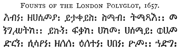
The matrices of three of these founts, the Samaritan, the Ethiopic, and the Syriac, have survived to the present day, and in the course of this work we shall have occasion to trace their descent from the original makers to the present owners. Meanwhile, it is with great satisfaction that we are able here to show a specimen of types actually cast from these venerable relics as they now exist.323 Of the Arabic fount, some of the punches and matrices also exist, but in too incomplete and dilapidated a state to allow of their being used.
Of the Orientals, the Hebrew is, perhaps, the least good. The Syriac and Arabic are fine bold characters. The Greek is neat, though somewhat insignificant. The Ethiopic324 and Samaritan325 are both good and elegant faces. The Italic is particularly neat. As might be expected from founts procured from various foundries in that day, there is a certain absence of uniformity in the {175} bodies on which the different founts are cast. This only makes the more remarkable the accuracy and precision with which the columns are arranged. In most copies the columns are divided by red lines, ruled by hand—in itself an enormous task.
Nine languages are used in the Polyglot, but no single book is printed in so many. The following is the arrangement of texts according to volumes:
It will thus be seen that the Greek, Latin, Syriac and Arabic texts run throughout the work. The Chaldean text and Targums are all given in Hebrew type. The Hebrew text is printed throughout masoretically.
In addition to the above fundamental characters used, the Prolegomena show the following Alphabets cut in wood, viz.:—Rabbinical Hebrew, Syriac duplices, Nestorian and Estrangelan, Armenian, Coptic, Illyrian, both Cyrillian and Hieronymian, Iberian, Gothic, Chinese, and the character of the Codex Alexandrinus. These are, for the most part, rudely cut, and valuable only as curiosities.
From our point of view, the chief glory of the English Polyglot is that it is wholly the impression of English type. It marks an epoch in the history of our national letter-founding, as, before it appeared, no work of importance had been printed in any of the learned characters except Latin and Greek. The Hebrew, Samaritan, Syriac, Arabic and Ethiopic were probably cut expressly for the work, under the supervision of its learned editors, and became thus the models or prototypes of the numerous Oriental founts which during the eighteenth century figured so largely in the works of English scholarship.
The original preface to the Polyglot contained an honourable reference to Cromwell, who had, from the first, encouraged the undertaking and materially assisted it by remitting the tax on the paper imported from abroad for the use of the work. But the Protector’s death took place in the year after the publication; and the Restoration, which followed two years later, was made the occasion for a somewhat ignoble act of time-service on the part of Walton, who cancelled {176} the last three leaves of the preface, and added a Dedication to Charles II, in which, among other attacks on the memory of his former patron, he referred to Cromwell as “Draco ille magnus.”326 The particular typographical interest of this Royal Dedication is that it is printed in the handsome Double Pica Roman and Italic used by Day in the Ælfredi of 1574, and subsequently by Barker and Lucas in Young’s Catena on Job, in 1637, and in other works. The somewhat worn condition of the types leads Dibdin to condemn the founts as inferior327; but in point of elegance and grandeur this venerable letter remained still one of the best of which our national typography could boast.
In recognition of his services, Charles made Walton his chaplain-in-ordinary, and created him subsequently Bishop of Chester. Nor was he the only worker to whom the completion of this great enterprise brought honour. Roycroft, after what may be considered a feat of rapid and skilful typography, was permitted to take the title Orientalium Typographus Regius.328
The value of the English Polyglot was vastly enhanced by the addition to it of Dr. Edmund Castell’s Heptaglot Lexicon,329 which, after seventeen years of incessant labour, commencing with the first announcement of the Polyglot, was printed, at Roycroft’s press, in 1669, in two volumes, uniform in size and style with the Bible, of which henceforth it formed a necessary complement.
Respecting this famous work, there is little to add from a typographical point of view to what has already been noted with regard to the Polyglot. The {177} same types are, with few exceptions, used in both. Mores considers, but wrongly, that the Amharic shown in Castell’s work is metal, and the same as that used in the Oratio Dominica of 1713. This letter (which also appeared in the first edition of the Oratio Dominica in 1700) belonged to Oxford University, who procured it in 1692, being the Ethiopic character with additions. But the few letters shown in the Heptaglot are evidently engraved by hand, and not cast.
It is to be regretted that Castell’s work, which has been pronounced one of the greatest and most perfect works of the kind ever performed by human industry and learning, and which represented an amount of heroic perseverance in the midst of adverse circumstances scarcely credible, was almost the ruin of its author, both in constitution and fortune. It sold slowly, and at the time of his death upwards of 500 copies were left on hand. The encouragement he received both from royal and episcopal patronage was inadequate to cover the losses which the undertaking had involved, and he died in comparative obscurity in 1685.
Roycroft’s office appears to have suffered severely by the Fire of London in 1666, and a large number of copies of Castell’s Lexicon, then in course of printing, were destroyed. To the same disastrous event may also be attributed the disappearance of some of the founts of the Polyglot founders, after the completion of the Lexicon. Mores, however, succeeds in tracing the most interesting of these; and the fact that all the matrices did not go down to posterity as a single property, is additional proof that they were not all the production of one artist. The Arabic, larger Syriac, and Samaritan passed into the foundry of the Grovers, and the Ethiopic into that of Robert Andrews, who, it seems probable, also inherited the Hebrew and Black. The smaller Syriac came into Mr. Caslon’s hands.
NICHOLAS NICHOLLS.—This founder was son of Arthur Nicholls, the Star Chamber founder, and, as appears by the mention of him in his father’s petition to Archbishop Laud, already quoted, was brought up to the Art, in which, as early as 1637, he was “so expert and able as to be able to perform anything touching the same.” During the Civil Wars he appears to have suffered in the royal cause, and, like many others, at the Restoration to have looked for substantial reward at the hands of the son of the Royal Martyr.
In 1665 he presented to the king a petition to be appointed His Majesty’s Letter Founder. The original document is in the Record Office,330 and is as follows:― {178}
“To the KINGE’S MOST EXCELLENT MAJESTIE. The humble peticion of Nicholas Nicholls. Most humbly sheweth
“That the petitioner in the worst of tymes was a constant and loyall sufferer for the causes of your Majestie and that of your Royall ffather of glorious memory, and thereby reduced to greate extreamities.
“Now soe it is, That the peticioner by Industrie hath attained to a considerable skill in the Art of cutting and casting all kinds of Letters and faire Characters (as by the annexed may appeare) And your Majestie beinge the great encourager of good Literature
“Your Majestie’s peticioner most humbly prays your Grace and ffavour to serve in the place of Letter Founder to your Majesties Presses That soe your Majesties presses may be supplyed with Characters in some measure worthy of your Royall Greatness. And the peticioner makes no question but he shall perform that service (with the blessing of God) to your Majestie’s full content and satisfaction.
“And the peticioner (as in duty bound) shall alwaies pray for your Majesties long and prosperous Reigne over us.”
Attached to the petition, in the centre of a folio sheet, is the tiny polyglot specimen, of which we here present our readers with an exact facsimile. English typography possesses few relics more interesting than this quaint little page—the earliest known type-founder’s specimen in the country.
The execution, particularly of the Roman fount, is very poor, and one wonders, in examining it and comparing it with the recently completed Polyglot, at the artist’s claim “to considerable skill in cutting and casting of faire characters.” It is possible, however, that the unusual minuteness of the type may have been held to be a merit compensating for defects in execution. And as none of the founts are known to have been used in any other work of the time, it may be presumed the letters were cut specially for this specimen. The Roman and Greek founts are Pearl in body, and the Orientals Nonpareil, and display the text “Vivas o rex in perpetuum” in Latin, Greek, Hebrew (with points), Syriac, Samaritan, Ethiopic and Arabic. This loyal aspiration, effusively dedicated as “the prayer of the devoted heart, and the specimen of the Art of the least of the subjects of the greatest of the Kings,” is surrounded by a neat flower-border (also Nonpareil in body), and printed somewhat roughly on coarse paper. Despite its defects, it appears to have found favour with the august personage to whom it was offered, as we find, on January 29th, 1667, a minute of a “Warrant for swearing Nicholas Nicholls, Letter Founder to His Majesty.”331
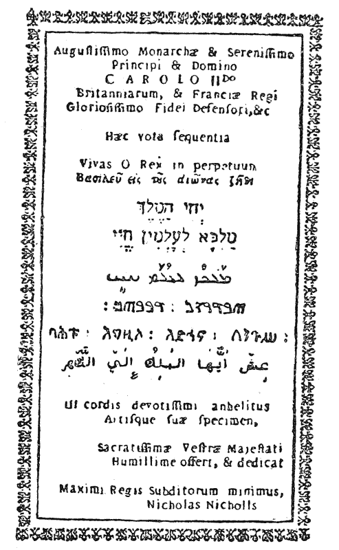
Of the subsequent operations of Nicholls we know very little.332 He probably inherited his father’s foundry, and cast from his matrices. The NICHOLS whom {179} Mores mentions as having founded in 1690,333 could hardly (if the date be correctly given) be the same man who was a practised letter-founder in 1637.
To this last-named founder no doubt belongs the fount of Great Primer Roman and Italic acquired by the Oxford University Press, which had the unenviable distinction of being designated in their Specimen of 1695, as “cut by Mr. Nichols—not good.”334
The following is the only specimen we have to note in this place:―
(1665). Specimen sheet of minute printing in several languages, addressed to the King by Nicholas Nicholls, Letter Founder. (State Papers, Domestic, 1665, vol. 142, No. 174.)
 OSEPH MOXON, whose distinction it is to have been
the first practical English writer on the mechanics of
typography, was born at Wakefield, in Yorkshire, on
August 8, 1627, and appears to have been brought up as a
mathematical instrument maker, in which profession he
showed himself highly proficient. In the year 1659,
being either already settled in the metropolis, or having
come thither for the purpose, he added to his stated
business that of a typefounder, in which, according to Mores, he continued till
1683.
OSEPH MOXON, whose distinction it is to have been
the first practical English writer on the mechanics of
typography, was born at Wakefield, in Yorkshire, on
August 8, 1627, and appears to have been brought up as a
mathematical instrument maker, in which profession he
showed himself highly proficient. In the year 1659,
being either already settled in the metropolis, or having
come thither for the purpose, he added to his stated
business that of a typefounder, in which, according to Mores, he continued till
1683.
It is difficult to fix the precise condition of the laws relating to typefounders in the last year of the Commonwealth. The Ordinances of 1647 and 1649, which reimposed the main provisions of the Star Chamber Decree of 1637, remained nominally in force till the Restoration, so that we are to suppose that Moxon, unless he practised his art surreptitiously or sub rosâ, was formally installed into a vacancy in the body of authorised founders on execution of the usual bond to the Company of Stationers.
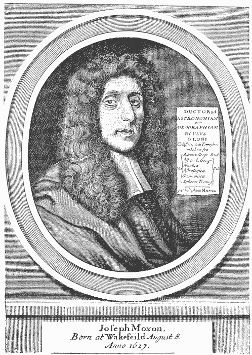
If, as seems probable, he commenced operations with little or no previous experience, and with no plant ready to his hand, the progress of the new foundry must at first have been very slow, particularly as he appears to have devoted much of his time to his other scientific pursuits, to which in 1665 he added that of hydrographer to the king. To this office a considerable salary was attached. In the same year, Mores informs us, he lived at the sign of the “Atlas” on Ludgate Hill, near Fleet Bridge, but the Fire of London in 1666 caused him to {181} quit that abode for another of the same sign in Warwick Lane. From Warwick Lane, where he was living in 1668, he appears to have removed to Westminster, to the sign of the “Atlas” in Russell Street, whence in 1669 was issued his famous specimen of types, the first complete typefounders’ specimen known in England.335
In a passage in the Mechanick Exercises, published several years later, Moxon speaks of the art of letter-cutting as a mystery, “kept so conceal’d among the Artificers of it, that I cannot learn anyone hath taught it any other, but every one that has used it, Learnt it of his own Genuine Inclination.” If this be the writer’s own experience—though his subsequent intimate acquaintance with the minutest details of the art almost disproves it—his specimen must be taken as the production of a self-taught typographer after ten years’ intermittent practice. Viewed in this light, the exceedingly poor performance which the sheet presents can to some extent be accounted for. It must also be borne in mind that Moxon’s theoretical and mathematical studies of the proportions and form of letters had not yet been begun, or, at least, elaborated; so that in no sense is his Specimen to be assumed to be a reduction into practice of those theories.
This specimen, which is entitled Prooves of the Several Sorts of Letters cast by Joseph Moxon, is a folio sheet, showing in double column:
| Double Pica Romain. | Pica Romain. |
| Pica Italica. | |
| Great Primmer Romain. | Long Primer Romain. |
| Long Primer Italica. | |
| English Romain. | Brevier Romain. |
| English Italica. | Brevier Italica. |
The imprint is, “Westminster, printed by Joseph Moxon in Russell Street, at the sign of the Atlas, 1669.”
In all respects it is a sorry performance. Only one fount, the Pica, has any pretensions to elegance or regularity. The others are so clumsily cut, so badly cast, and so wretchedly printed, as here and there to be almost undecipherable. Moxon’s proficiency in the processes of the art does not appear as yet to have attained the pitch of justifying his matrices to any regularity of line, or of casting his types square in body. Some lines of the specimen curve and wave so as to make it a marvel how others kept their places in the forme, and the press-work {182} and ink are so bad that at a first glance the beholder is tempted to mistake the larger letters with their sunken faces for open instead of solid-faced Romans. The sheet was apparently put forward not solely as a specimen of types. The matter of each paragraph is an advertisement of Moxon’s business as a mathematical instrument maker. In Great Canon Romain he calls attention to the “Globes Celestial and Terrestrial of all sizes made by Joseph Moxon, Hydrographer to the King’s Most Excellent Majesty, 1669.” In Double Pica Romain he announces his Spheres; in Great Primer “a Large Map of the World”; in Pica Italica, “a book called a Tutor to Astronomie and Geographie,” and so on. To one or two of the founts, such as the Great Canon, the Pica and the Brevier, he adds a line of accents or signs.
It would appear, from the imprint already quoted, that Moxon combined printing with typefounding at Westminster. If so, he probably confined his press to the printing of specimens and advertisements of his own goods, as we cannot ascertain that any of his other works were printed by himself, or that he printed anything for the public.
About 1670 he removed back to the sign of the Atlas, in Ludgate Hill. Rowe Mores considers it probable that for some time he resided in Holland, during which time he acquired a certain proficiency in the Dutch language.336 During the same period it is probable that he may have come across, and been struck by specimens of the beautifully proportioned Elzevir letters of Christoffel Van Dijk, which he admitted were the inspiration of his Regulæ Trium Ordinum.
Of this curious work,337 which was published in 1676, it will suffice to say here, it is a work intended not so much for the letter-cutter as for the sign-board and inscription painter. Taking the Van Dijk letters as his models, the writer attempts to demonstrate that each letter is a combination of geometrical figures, bearing regular proportions one to another; and by sub-division of the square of each letter into forty-two equal parts, he professes to be able to erect in any other square, similarly sub-divided, the same letter in precise proportion and harmony. This theory he illustrates by copper-plate figures of the various letters {183} of the Roman, Italic and Black Alphabets, and their sub-divisions. The result is not pleasing. The letters are stiff, and in some cases distorted; although this we believe to be the fault not so much of the theory itself as of the rules of proportion for the different parts of each letter predicated in the first instance. The book, as we have observed, is clearly not intended as a guide to punch-cutting. We regard it rather as an interesting attempt to reduce to precise mathematical rules a set of characters which never have and never will yield themselves entirely to such treatment.338
At the conclusion of the section devoted to “the ordering of Inscriptions”, Moxon says (p. 11), “But of this and several other Observations of this Nature, I have written more at large in a book I intend to publish on the whole Art of Printing.” From this it is evident that, as early as 1676, his treatises on Typography, which formed the second volume of the Mechanick Exercises and were published in 1683, were already written.
To this highly interesting work339—the first work on the mechanics and practice of printing and letter-founding—we have already alluded in a previous chapter. It is impossible here to give more than a brief summary of its contents. Its publication commenced in 1677, with a series of monthly “Exercises” devoted to the Smith’s, Joiner’s, Carpenter’s and Turner’s trades. These formed the first volume. Moxon himself informs us that their publication was interrupted by the excitement of Oates’ plot, “which took off the minds of his few {184} customers from buying them, as formerly.” It was not till 1683 that the work was resumed. The second volume (which appeared in twenty-four monthly parts), treating wholly of the Art of Printing, commences with a brief account of the Invention of the Art (in which the reader is left to decide between the titles of Haarlem and Mentz), and with a claim on behalf of Typography equally with Architecture to be regarded as a Mathematical Science.340 “A scientifick man,” says Moxon, “was doubtless he who was the first Inventor of Typographie; but I think few have succeeded him in Science, though the number of Founders and Printers be grown very many: Insomuch that for the more easie managing of Typographie, the Operators have found it necessary to devide it into several Trades. . . . The several devisions that are made are—1. The Master Printer. 2. The Letter Cutter. 3. The Letter Caster. 4. The Letter Dresser. 5. The Compositer. 6. The Correcter. 7. The Press Man. 8. The Inck-Maker. Besides several other Trades they take in to their Assistance, as the Smith, the Joyner, etc.”
These divisions he proceeds to treat of seriatim and in detail. We have elsewhere quoted freely from this work, with a view to illustrate the condition of letter-founding as a mechanical trade in his time.341 But we notice here, that in the advice which he gives to the Master Printer on the choice of letter for his office, he takes the opportunity to reiterate his admiration of the Dutch form of letter, particularly that adopted by Christoffel Van Dijk, and his conviction that as the Roman letters were originally made to consist of circles, arcs of circles and straight lines, the cutting of those letters should invariably be according to strict mathematical rule of form and proportion. His advice on the choice of letter is fourfold.
1. “That the Letter have a true shape.”
2. “That they be deep cut” (i.e., in the punch).
3. “That they be deep sunck in the Matrices” (with a good “beard”).
4. “That his Letter be cast upon good Mettal.”
He then proceeds to indicate the quantities of each body of letter with which the printer should provide himself; and from that proceeds to notice in turn every possible requisite for a well-ordered printing office, from the “ball-nails” to the press.
His “Exercises on Letter Founding” may be best introduced in his own language: “Having shown you the Master Printers Office,” he says, “I account {185} it suitable to proper Method to let you know how the Letter Founder Cuts the Punches, how the Molds are made, the Matrices sunck, and the Letter Cast and Drest. . . . Wherefore the next Exercises shall be (God willing) upon Cutting of Steel Punches.”
The minuteness with which he enters into every detail connected with this mysterious art, and his familiarity with the terminology of the craft, prove that Moxon, although he professed to have learned it not from any master, but “of his own genuine inclination,” was an experienced and even enthusiastic punch-cutter. He devotes considerable attention to the tools and gauges necessary for the work, and returns once more to the charge on behalf of geometry as the foundation of typography.
Anyone acquainted with the modern practice of punch-cutting, cannot but be struck, on reading the directions laid down in the Mechanick Exercises, with the slightness of the change which the manual processes of that art have undergone during the last two centuries. Indeed, allowing for improvements in tools, and the greater variety of gauges, we might almost assert that the punch-cutter of Moxon’s day knew scarcely less than the punch-cutter of our day, with the accumulated experience of two hundred years, could teach him.
Moxon’s observations, as in the Regulæ Trium Ordinum, apply only to the Roman, Italic and Black-letter, and these he illustrates by a series of plates devised on the same method as in his former work, showing each letter in a magnified form on a square subdivided into forty-two parts, with the proportions for the various parts of each letter minutely laid down. He imagines an objection that it may be deemed impossible in the case of a small letter to divide the square of the body into forty-two equal parts. “But yet,” he says, “it is possible with curious working,” and proceeds, evidently to his own satisfaction, to demonstrate the fact in a very curious way, by suggesting a series of graduations in the rubbing of spaces and points, whereby a thin342 space may be enlarged by sixths until a series of 42nd parts of each body is arrived at.
Impracticable as such a system appears, it is consistently carried out in the enlarged letters which illustrate the Exercises. The result is not more successful than that produced in the Regulæ Trium Ordinum; and we venture to think that if any proof were needed that geometry is not, and cannot be, the Alpha and Omega of typographical beauty, these reductions into practice of Moxon’s ingenious theories will supply it.
Passing from letter-cutting, Moxon next describes with much minuteness {186} the various parts of the mould and the method of putting them together. Here the practical instrument maker is on familiar ground, and the directions he gives remained the best authority on the subject, until the venerable hand-mould which he describes began to give place, a century and a quarter after his time, to the lever-mould from America.
Next to mould-making, the Exercises deal with the important processes of striking and justifying the matrices, operations which, like that of punch-cutting, have undergone but little change since his day. Then follow descriptions of the furnace, the alloy of the metal, and the methods of casting and dressing the type, with the implements necessary for these branches of the work; and this portion of the work closes with a few highly interesting plates, amongst which that of the caster at work343 is the most curious and valuable.
The remainder of the book is devoted to various departments of the letter-press printer’s trade, those of the compositor, the corrector, the pressman, and the warehouse keeper. To this is added an Appendix, describing the ancient customs of the “Chapel,” and a Dictionary of typographical terms.
Such is a brief and meagre outline of the contents of this first English book on printing and letter-founding. It is a work which no one interested in English typography can omit to consult. For almost a century it remained the only authority on the subject; subsequently it formed the basis of numerous other treatises, both at home and abroad, and to this day it is quoted and referred to, not only by the antiquary who desires to learn what the art once was, but by the practical printer, who may still on many subjects gather from it much advice and information as to what it should still be.
Reverting now to Mores’ description of the contents of Moxon’s foundry, we meet with one fount which calls for particular mention here.
The Pica Irish was cut expressly for the purpose of printing the Irish New Testament, published in 1681 at the cost of Robert Boyle, son of the Earl of Cork, and is described by Mores as the only fount of purely Irish type he had ever seen in the country. We may, perhaps, be excused a slight digression in this place for the purpose of giving a sketch of the efforts which before Moxon’s day had been made to propagate the Irish language by means of typography.
The first fount of Irish type known was presented in 1571 by Queen Elizabeth to John O’Kearney, treasurer of St. Patrick’s, with a view to encourage the diffusion of the Scriptures in the Irish character.
By whom this character was prepared we are not informed. It is not the {187} genuine Irish, but a hybrid fount, consisting chiefly of Roman and Italic letters, to which the “discrepants,” or seven distinctively Irish sorts, are added.344 It is accompanied by a small and equally neat letter for notes, which, however, appears to be Saxon.
The earliest specimen of this fount appears in a broadside Poem on the Last Judgment,345 printed in 1571, and sent over to the Archbishop of Canterbury, apparently as a specimen of the type. This was followed almost immediately by the Church Catechism and Articles, translated by O’Kearney and Nicholas Walsh, afterwards Bishop of Ossery, and printed in 1571 at the cost of John Ussher.346
The object of the royal donor was further realised in 1602, when there appeared from the press of John Francke, William O’Donnell’s (or Daniel’s) Irish New Testament,347 the first version of that or any portion of the Holy Scriptures in the native character. In dedicating the translation to James I, Daniel thus refers to the royal origin of the types:—“And notwithstanding that our late dreade Soveraigne Elzabeth . . . provided the Irish characters and other instrumentes for the presse in the hope that God in mercy would raise up some to translate the Newe Testament into their native tongue, yet hath Sathan hitherto prevailed, and still they remain Lo-ruchama Lo-ammi, etc.”
The type did further service in 1608, when Daniel’s Common Prayer348 was printed by Francke, a well-executed work, with engraved title and beautiful {188} ornamented initials, each page being enclosed in a rule border. After the appearance of this book nearly a quarter of a century elapsed before the type reappeared in Bishop Bedell’s A B C, or English and Irish Catechism, printed by the Stationers’ Company at Dublin in 1631.349 This Catechism, with additional matter, was republished by Godfrey Daniel in 1652, also in Dublin,350 after which the Irish type of Queen Elizabeth disappeared in Ireland, and reappeared only in occasional words occurring in Sir James Ware’s books, printed in London by Tyler, in 1656 and 1658.
There seems no reason for believing, as some state, that it was secured by the Jesuits and taken abroad.351 Not only is it not to be found in any Irish work printed abroad, but the Irish Seminary at Louvain possessed a fount of its own, which, between 1616 and 1663, was in constant use.
After 1602 no serious attempt had been made to complete the translation of the Scriptures into Irish until Dr. Bedell, Bishop of Kilmore, undertook the task about 1630. For this purpose, being then at the age of 57, he devoted himself to the study of the language, and having secured the assistance of Mr. King and the Rev. Denis Sheridan, both eminent Irish scholars, the translation of the Old Testament was completed in 1640. Bedell, we are informed “determined to publish the version immediately at his own expense and in his own house, and made an agreement with a person who undertook to print it: the types were even sent for to Holland.”352 But the troubles and persecutions of the ensuing year, followed closely by the death of the Bishop, hindered the design, and the manuscript lay neglected for forty years.353 {189}
In the year 1680, the New Testament of 1602 being then entirely out of print,354 and no Irish types being available, the illustrious Robert Boyle determined on republishing it at his own expense. To this end he caused a fount of Irish type to be cut and cast in London, and had an able printer instructed in the language for the purpose of printing it.
Moxon was the founder selected to produce the types, and the result was the curious Irish fount of which the matrices formed part of his foundry. With this type Boyle is said to have had the Church Catechism, with the Elements of the Irish Language, printed in 1680,355 and in the following year was issued in London, with a preface in Irish and English, the new edition of Daniel’s Irish New Testament.356
“God hath raised up,” says this preface, “the generous Spirit of Robert Boyle, Esq., son to the Right Honourable Richard, Earl of Cork, Lord High Treasurer of Ireland, renowned for his Piety and Learning, who hath caused the same Book of the New Testament to be Reprinted at his proper Cost; And as well for that purpose, as for Printing the Old Testament, and what other Pious Books shall be thought convenient to be published in the Irish Tongue, has caused a New Set of fair Irish Characters to be Cast in London, and an able Printer to be instructed in the way of Printing this Language.”
The printer was Robert Everingham,357 at the Seven Stars, in Ave Maria Lane, who in 1685 was further employed by Boyle to print, in the same Irish {190} types,358 Bishop Bedell’s translation of the Old Testament,359 the manuscript of which had fortunately been preserved. The whole Bible being thus complete, it was issued in two 4to volumes, and in 1690 was reprinted in Roman characters at Everingham’s press for the use of the Highlanders.360
Our space forbids us to give here anything like a list of the different works in which Moxon’s Irish type appeared after 1690. An interesting note as to the early use of the fount in Ireland occurs in a petition presented in 1709 to the Lord Lieutenant by several of the clergy and gentry of Ireland for the printing of a new edition of the New Testament “in the Irish character and tongue, in order to which the only set of characters now in Britain is bought already.”361
This petition does not appear to have been successful; but in 1712 a Book of Common Prayer,362 translated by Dr. John Richardson, Rector of Annah (Chaplain to the Lord Lieutenant), with the assistance of the Christian Knowledge Society, was printed by Elinor Everingham, at the Seven Stars in Ave Maria Lane. Dr. Richardson also published some Irish Sermons363 at the same press, and a History of the Attempts . . . to Convert the Popish Natives of Ireland.
In 1700, in the London Oratio Dominica, Moxon’s Irish type was used, as also in the reprint in 1713, after which the fount frequently reappeared until 1820, when it was used in the Transactions of the Iberno Celtic Society, for printing the titles of E. O’Reilly’s “Chronological Account of Irish Writers” there given.
The “punches and matrices”, said Mores, writing in 1778, “have ever since continued in England. The Irish themselves have no letter of this face, but are supplied with it by us from England; though it has been said, but falsely, that {191} the University of Louvain have lately procured a fount to be cut for the use of the Irish Seminary there.”364
We are glad to add to this statement that the punches of this interesting fount are still in existence, and, indeed, that these most curious relics of the handiwork of the author of the Mechanick Exercises lie before us as we write these words.
Among the other peculiar characters cut by Moxon may be mentioned the symbols used in Mr. George Adams’ scientific works, and the Philosophic or “Real Character” designed by Bishop John Wilkins for his learned Essay towards a Universal Language, printed in 1668.365 The correcting marks used in the Mechanick Exercises, as well as other mathematical and astronomical symbols, were also the work of this versatile artist, whose scientific genius appears to have had a special bent towards the more curious by-paths of typography.
Moxon’s foundry descended to Robert Andrews, with whom it is possible he was, during the close of his career, associated, either as a master or a partner. Rowe Mores is unable to distinguish, beyond the peculiar founts above noted, and the Canon Roman and Italic (which subsequently came into Mr. Caslon’s hands), what were the precise contents of his foundry. He therefore omits his usual list, and includes the whole in Andrews’.
The date of Moxon’s death is uncertain. A third edition of the Mechanick Exercises, not including the typographical portion, was issued in 1703. Unless this was a posthumous publication, Moxon must have been seventy-six years old at the time.
Mores states that he founded in London from 1659 to 1683, from which it would seem that he retired from the type business a considerable time before his death. He was a voluminous writer on scientific and mathematical subjects, and many of his works ran through several editions. {192}
Mores describes him cordially as an admirable mechanic and an excellent artist, and states that he was made a Fellow of the Royal Society, 30th November 1678. He was succeeded in his office of Hydrographer to the King by Mr. George Adams, whom Mores describes as “our ingenious friend . . . and a successor to Mr. Moxon as well in skilfulness and curiosity as well as office.”366 Our portrait of Moxon is taken from the frontispiece to the fourth edition of his Tutor of Astronomy and Geography, 1686, printed by Samuel Roycroft for the author.
It is doubtful whether his investigations and theories had any sensible effect on the practice of English letter-founding. They may have tended to encourage the favour with which Dutch letter was regarded at the beginning of the eighteenth century; but it is not clear that his attempt to confine to rule and compass the art of letter-cutting either secured general adoption or was productive of any appreciable reform in our national typography.
The following is the title of the only specimen known to have been issued by Moxon:―
1669. Prooves of the Several Sorts of Letters cast by Joseph Moxon. Westminster, printed by Joseph Moxon in Russell Street, at the sign of the Atlas, 1669. Fo. (B. M., Harl. MS. 5915, fo. 160.)
 F these two founders nothing is known beyond what is
recorded in two short entries on the books of the
Stationers’ Company, viz.:―
F these two founders nothing is known beyond what is
recorded in two short entries on the books of the
Stationers’ Company, viz.:―
1668. The Master and Wardens requested to certify to the Archbishop of Canterbury that Thomas Goring, a member of this Company, is an honest and sufficient man, and fit to be one of the four present founders; there being one now wanting, according to the Act of Parliament.
1669. Mr. Joseph Lee and Mr. Goring to give at the next Court an account in writing, what sorts of letter they have made, and for whom, since the Act of Parliament in that case was provided.
The names of both these founders occur in the list, already referred to, of former Stewards of the Brotherly Meeting of Masters and Workmen Printers, issued in 1681.367 {194}
This founder, who was born in 1650, succeeded Joseph Moxon, probably about the year 1683,368 and transferred his foundry to Charterhouse Street, where he continued in business till 1733. His foundry, of which, Mores informs us, Moxon’s matrices formed the most considerable part, was, next to that of the Grovers, the most extensive of its day; and it would appear that, for some time at any rate, these two shared between them the whole of the English trade. Andrews’ foundry consisted of a large variety of Roman letter and Titlings; and in “learned” founts was specially rich in Hebrew, of which there were no less than eleven founts, and five Rabbinical. Of peculiar sorts, he possessed the matrices of Bishop Wilkins’ “Real Character,” also the correcting-marks used by Moxon in his Mechanick Exercises, and other symbols, besides three or four founts of square-headed music.

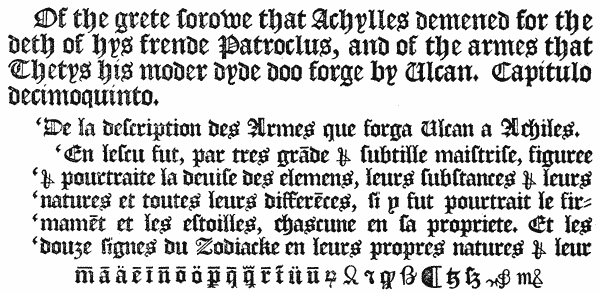
He also possessed the Hebrews and the Ethiopic369 used in Walton’s Polyglot; the Irish cut by Moxon for Boyle’s New Testament, and a curious alphabet of Great Primer Anglo-Norman; besides a fine specimen of old Blacks (two of which are here shown), probably handed down from some of the early English {195} printers, whose character they strongly resemble. His son, Silvester Andrews, as we shall notice later on, founded at Oxford, whither he appears to have taken matrices of some of the Romans and one fount of Hebrew from his father’s foundry.
The following is the list of matrices in the foundry in 1706, as given by Mores. Founts of which the punches or matrices are still in existence are distinguished by an asterisk; those descended from the Polyglot foundry are marked [P.], and those from Moxon’s [M.]:―
‡ “These three were purchased by Thos. James, 20th April 1724, ten years before the sale of the foundery.”

Although he accumulated a large quantity of matrices, Robert Andrews does not appear to have been a good workman. The very indifferent manner in which he cut the punches for Miss Elstob’s Saxon Grammar has been elsewhere recorded,370 and the fact that his apprentice, Thomas James, after quitting his {197} service and setting up for himself, furnished his new foundry entirely with foreign matrices, speaks somewhat unfavourably for the merits of the English letter then in common use.
Three of the Greek founts, however, James did subsequently purchase, in 1724, for his own use; and nine years later, on Andrews’ retirement from business, he purchased the whole of his foundry, and that of his son, with the exception of the Canon Roman and Italic, which were acquired by Mr. Caslon.
Robert Andrews was one of the Assistants of the Stationers’ Company. He only survived his retirement two years, and died November 27th, 1735, at the age of 80.
His name appears as a contributor of £5 5s. towards the subscription raised by Mr. Bowyer’s friends in 1712, after the destruction by fire of that eminent printer’s office.
This foundry, which, according to Rowe Mores, was supposed to include founts formerly belonging to Wynkyn de Worde, was the most extensive, and in many respects the most interesting of the later seventeenth century foundries. It seems probable that James and Thomas Grover began business in partnership, about the year 1674, in succession to one of the “Polyglot” founders, whose matrices they appear to have acquired. Their foundry was situated in Angel Alley, Aldersgate Street; and, about 1700, at which date Rowe Mores fixes his summary, was evidently of considerable extent.
Although many of the founts are of little importance, it is worthy of note that among the Roman and Italic matrices is included, for the first time, a Diamond; and that a Pica and Long Primer are distinguished as “King’s House” founts, and were probably reserved for the service of the Royal press at Blackfriars. The large-face Double Pica Roman and Italic, there is reason to suppose, is the famous fount cut by John Day about 1572, which had subsequently been in the possession of one of the Polyglot founders.372 In Scriptorials, Cursives and other fancy letters, as well as in peculiar and mathematical sorts, the foundry was unusually rich. The Great Primer and 2-line Great Primer Black matrices are those reputed to have belonged to De Worde; and from these {198} founts, says Mores, were taken the two specimens shown on page 343 of Palmer’s General History of Printing.373
Among the “learned” founts, the English Samaritan matrices were those from which had been cast the type for Walton’s Polyglot, in 1657, as were also those of the larger Syriac; while the Double Pica large and small faced Greek claim a still earlier origin, being the founts in which was printed Patrick Young’s Catena on Job, in 1637, the matrices having been procured from the proceeds of the fine on the King’s printers for their scandalous errors in the printing of the “Wicked” Bible, as detailed in a former chapter.374 The smaller face, as we have noticed, bears the strongest resemblance to the Greek of the Eton Chrysostom. Mores states that the Great Primer Arabic of the Polyglot was in this foundry, but omits to include the matrices in his summary.375
The following is the full list of the matrices in the foundry, circ. 1700, as given by Mores:―
“This seems to be a mistake of the cataloguers, who had fallen upon something which they did not understand; we suppose the Alexandrian fount, which from the semblance they took to be Coptic; the number 81 was made up with something else they were strangers to; and so are we. But whatever it was (it is in the foundry) it is now in its proper place.”
Respecting one of the founts in this foundry a special interest exists, which calls for particular reference here. Among the “Meridionals” in the list is included a “Coptic (the new hand) 81 matrices,” an entry which Mores considers {200} to be “a mistake of the cataloguers, who had fallen upon something they did not understand—we suppose the Alexandrian fount, which from the semblance they took to be Coptic. The number 81 was made up with something else which they were strangers to, and so are we.”376 Later on, in noting the various founts missing in the collection of John James, he again refers to this “New Coptic,” adding, “it certainly was the Alexandrian which they called New Coptic”;377 and a specimen of this Alexandrian Greek duly appears in the catalogue of James’s foundry, prepared by Mores in 1778. This fount, which we are thus enabled to trace back with tolerable certainty to an earlier date than 1700, is interesting as being the first attempt at facsimile reproduction by means of type. The history of its origin is vague, but there seems reason to believe that it may have been in existence at least half a century before coming into the hands of the Grovers.

In the year 1628 Cyrillus Lucaris, a native of Crete and Patriarch of Constantinople, sent to King Charles I, by the hand of Sir Thomas Rowe,378 English ambassador to the Grand Seignor, a manuscript of the Bible in four volumes, written in Greek uncial or capital letters, without accents or marks of aspiration, and supposed to be the work of Thecla, a noble Egyptian lady who lived in the {201} sixth century. This precious work was received by Charles I and deposited in the Royal Library of St. James, of which at that time Patrick Young was the Keeper.
Young applied himself with enthusiasm to the work of collating and examining the Manuscript, with a view to putting forward a literal transcript of its contents in print. Having published at Oxford, in 1633, an edition of the first epistle of Clemens Romanus to the Corinthians, in Greek and Latin, the text of which is included in the Alexandrian MS., he was encouraged to put forward, in 1637, his Catena on Job, which contained the entire text of that book transcribed from the same Codex. This book was printed in the Greek types of the Royal printing office, purchased under the peculiar circumstances already detailed.379 After this, says Gough, Young “formed the design of printing the entire text of the Codex in facsimile type, of which, in 1643, he printed a Specimen, consisting of the first chapter of Genesis, with notes, and left behind him scholia as far as to the fifteenth chapter of Numbers.”380
Of this specimen, unfortunately, no copy can be discovered; although as to the existence of such a document there is no lack of contemporary evidence. In his Prolegomena to the London Polyglot of 1657, Bishop Walton, who had made a careful study of the Codex, and availed himself freely of Young’s notes, distinctly states that he had seen the specimen, and that the proposal to carry through the work had been discouraged by the advice of Young’s friends.381 Walton shows a few words of the Alexandrian Greek, poorly cut in wood, among the specimens in his Prolegomena: a circumstance which would suggest that in 1657 the matrices used for Junius’ facsimile, if in existence, were not then available.
Walton’s statement was confirmed by Grabe, Mill, and others, who made a study of the Codex and its history; and in 1707 Young’s biographer and successor in the task of preparing the Codex for print, Dr. Thomas Smith, repeated it with the authority of one who had also personally inspected the Specimen.382 {202}
It has been assumed by later writers that both Walton and Thomas Smith made reference to a proposed facsimile reprint of the Manuscript; and Gough’s circumstantial statement, already quoted (which is adopted by Nichols and copied by others, such as Horne, Edwards, etc.), leaves little doubt that the chapter of Genesis was actually put forward in 1643, in facsimile type, as a specimen of the forthcoming work. The evidence as to the existence of the types receives further countenance from the presence of these matrices in Grover’s foundry, certainly before the year 1700.
Anthony à Wood states that Young’s project excited much curiosity and expectation, and that in 1645 an ordinance was read for printing and publishing the Septuagint, under the direction of Whitelock and Selden. The troublous times which ensued, however, as well as certain doubts as to the fidelity with which the original text was being treated by the transcriber, led to the abandonment of the scheme during Young’s tenure of office, which ceased in 1649. In that year Bulstrode Whitelock became Library Keeper, and consequently custodian of the MS. It would appear, however, from a sentence in one of Usher’s letters,383 that as late as 1651 Young retained his purpose of publishing the Bible from the text of the Codex, but his death in the following year finally stopped the enterprise.
What became of the specimen chapter of Genesis it is impossible to say. Bishop Walton, as he himself states, acquired possession of the scholia to the end of Numbers and the remainder of Young’s Greek and Latin MSS., Wood informs us, came to the hands of Dr. Owen, Dean of Christ Church, Oxford. Assuming the matrices to have existed, their natural location would be either the Royal Printing Office, or the foundry in which already had been deposited the Greek types and matrices used in the Catena on Job. If, however, they remained in the St. James’s Library, it is possible to conceive of their disappearance for a considerable period, as Whitelock’s principal duties during his term of office appear to have been to check the depredations which in Young’s own time had already deprived the Library of many of its treasures.384 {203}
At the Restoration, the Keepership of the Library was bestowed on Thomas Rosse, by whom was once more revived the suggestion of reproducing the Alexandria Codex in facsimile, not this time by means of type, but by copper-plate. This circumstance is thus related by Aubrey in his inedited Remains of Gentilism and Judaism, preserved among the Lansdowne MSS. in the British Museum.385
“. . . . ye Tecla MS. in St James Library . . . was sent as a Present to King Charles the First, from Cyrillus, Patriark of Constantinople: as a jewell of that antiquity not fit to be kept among Infidels. Mr. . . . Rosse (translator of Statius) was Tutor to ye Duke of Monmouth who gott him the place (of) Library-Keeper at St James’s: he desired K. Cha. I (sic) to be at ye chardge to have it engraven in copper-plates, and told him it would cost but £200; but his Maty would not yeild to it. Mr. Ross sayd ‘that it would appeare glorious in History, after his Maty’s death.’ ‘Pish,’ sayd he, ‘I care not what they say of me in History when I am dead.’ H. Grotius, J. G. Vossius, Heinsius, etc., have made Journeys into England purposely to correct their Greeke Testaments by this Copy in St James’s. Sr Chr. Wren sayd that he would rather have it engraved by an Engraver that could not understand or read Greek, than by one that did.”
The Manuscript was subsequently handed, in 1678, to Dr. Thomas Smith to collate and edit, with a view to its reproduction; but once again the scheme fell through, and (with the exception of Walton’s Polyglot) it was not till Grabe, in 1707, published his Octateuch (accompanying his preface by a small copper-plate specimen of the MS.), that any considerable portion of the Bible appeared from this ancient text.
Of the subsequent successful attempt to produce the entire Manuscript in facsimile type we have spoken elsewhere.386 Meanwhile, we find from the facts here given, that in 1643 a specimen of a portion of the text of the Codex is said to have been issued in facsimile type; that constant efforts had been made during the latter half of the seventeenth century to carry out Patrick Young’s purpose of reproducing the entire Bible in this form; that in 1657 Bishop Walton was presumably unaware of the existence of any matrices from which to exhibit a specimen of the uncial Greek of the Codex; that Grabe, similarly ignorant, made use of copper-plate in 1707 for a similar purpose; but that prior to the year 1700, concealed under the erroneous name of “Coptic—the new hand,” there existed in the foundry of the Grovers (where already were deposited several of the “King’s House” matrices, as well as those of the Greek fount used in Junius’ Catena on Job in 1637) a set of matrices consisting of a single alphabet of the Alexandrian Greek, which apparently lay undetected until 1758, when that foundry came into the hands of John {204} James, or more probably until 1778, when Rowe Mores applied himself to the task of arranging and cataloguing the various matrices of interest in that miscellaneous collection.
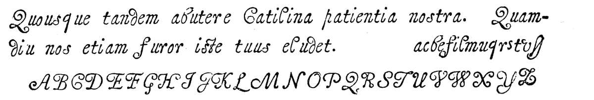
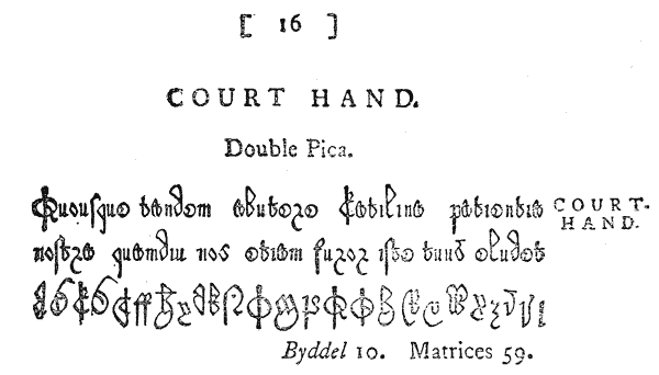

It may be added that the letters of this fount (like those of the old Greek, Court Hand, Scriptorial and Union Pearl in the same foundry) are struck inverted in the copper387; a peculiarity which may be due either to their foreign execution, or to the ignorance of the English striker, and which, in either case, goes far to account for the confusion which existed respecting their identity.
Unfortunately, the link which might definitely connect these Alexandrian matrices with the facsimile types of Patrick Young is, in the absence of any copy of the specimen chapter of Genesis of 1643, wanting. But, apart even {205} from this, the fount undoubtedly claims the distinction of being the first attempt at facsimile by means of type388; on which account this somewhat lengthy note as to its history will, perhaps, be pardoned.
Thomas Grover had several daughters, one of whom, Cassandra, was the wife of Mr. Meres389; and Mr. Meres’ daughter Elizabeth was the wife of Mr. Richard Nutt.390 On Thomas Grover’s death391 his foundry became the joint property of all his daughters, who attempted to dispose of it by private contract in 1728, when it was appraised by Thomas James and William Caslon. Mr. Caslon actually made an offer for its purchase, but at so low a figure that it was not accepted. The foundry therefore remained locked up in the house of Mr. Nutt, who appears to have been a printer, and to have provided himself with type for his own use during his tenure of the matrices. Finally, on the death of all Grover’s daughters, the foundry became Mr. Nutt’s absolutely, and was by him sold on the 14th September 1758 to John James.
was one of the authorised founders in 1685, when the following record against him was entered on the Court minutes of the Stationers’ Company:―
“The next dividend of the Stock of Mr. Godfrey Head to be detained in the treasurer’s hand until further order, for his not giving a due account of the letter he is to cast, as the Act of Parliament prescribes.—1685.
“Godfrey Head’s dividend paid on his submission, and giving 20s. to the poor’s box.” {206}
His foundry, Mores informs us, was in St. Bartholomew’s Close. Whether Head succeeded to it or established it, we are unable to ascertain. Of his productions, two founts only can be traced with any certainty, the Pica Greek and the English Black, both of which subsequently passed into Mr. Caslon’s foundry. He was succeeded by
who had formerly been servant to Mr. Grover. Mitchell removed the foundry first to Jewin Street, and afterwards, says Mores, “lived over Cripplegate, and afterwards in Paul’s Alley, between Aldersgate Street and Red Cross Street. His foundry, containing nothing very curious, unless it were the Blacks, was on the 26th July 1739 purchased by William Caslon and John James jointly, and divided between them.”
The following is Mores’ summary of the contents of this foundry, at its partition:―
Over and above the foundries described by Mores as having been absorbed by that of Thomas and John James, there remained in his possession a certain number of matrices—some of them of some importance—of whose former owners he was unable to give us an account. “These may be considered as a distinct foundery,” he says, “and distinguished by the title of ‘anonymous,’ for we know not whence they came. Our account of Mr James’s purchases is accurate, and these are not included amongst them, but at the end of our scrutiny remained unclaimed. Let them be called ‘The Anonymous Foundry’.” {207} We do not presume to step in where Rowe Mores fears to tread, and therefore leave the matrices, of which the following is his list, still unappropriated:―
(“of all of which a more full account will be given in the ensuing catalogue.”)
PETER WALPERGEN, or Walberger, as we have stated in our account of the Oxford Foundry, was doubtless the individual alluded to by Bagford when, in recounting Fell’s services to Oxford, he says: “The good Bishop provided from Holland . . . a Letter Founder, a Dutchman by birth, who had served the States in the same quality at Batavia in the East Indies.”393 Bagford, it is true, does not name this founder, but as there exists in the Bodleian Library a copy of a Portuguese version of Æsop’s Fables, edited by Jo. Ferreira d’Almeida, and printed at Batavia by Pedro Walberger in 1672,394 we have no hesitation in identifying our founder with this Dutch typographer, and in fixing his settlement at Oxford somewhere about the above date, which, it will be remembered, was the year in which Fell and others took upon them the charge of the University Press, and furnished from abroad all the necessaries for its use and advancement.
That he was well known at Oxford in 1683 is also apparent from a casual reference to “Mr. Walberger of Oxford” in Moxon’s Mechanick Exercises,395 where the writer dwells with some minuteness on a peculiar and elaborate tool, called the “Joynt-Flat-Gauge,” contrived by this founder for polishing the faces of his punches after hardening them, and before striking them into the copper. {208}
It was doubtless from this casual notice that Rowe Mores derived his scant reference to Walpergen, of whom he knows nothing, save that he founded at Oxford in 1683, was sometimes called Walperger, and by name appears to have been a foreigner, therefore probably a “transient,” by means of his countryman Michael Burghers, the University engraver.
Of Walpergen’s work little is known beyond the fact that he appears to have devoted his attention chiefly to the production of Music type, impressions of which appear in the University Specimen of 1695. The punches and matrices of this interesting fount are still preserved at Oxford, and are singular relics of the old letter-founders’ art.396
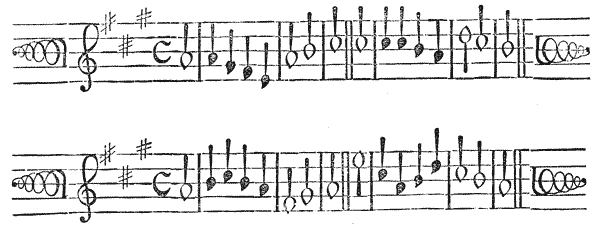
Although the Music was the only fount cut by Walpergen of which we have any certain knowledge, it is probable that the experienced Dutch artist, whom Bagford describes as an excellent workman, did not confine his labours to that class of work. What were his exact relations with the University Press is also a matter of conjecture. But it seems probable, from the manner in which he is spoken of by Moxon, and in the Oxford Specimen, that he practised as a letter-founder on his own account, and not wholly as an official of the University.
He died in 1714.397 Among the University archives is preserved an inventory of his chattels, which, if a full account of his earthly possessions, speaks {209} poorly for the profits of the profession of letter-founding in those days. This highly interesting document runs as follows398:―
An inventory of the Chattels of Peter De Walpergen,
deceased, taken the tenth day of January 1714–5.
Being the Moiety of a Fount of Musick. | |||
| £ | s. | d. | |
|---|---|---|---|
Two hunderd and two pounds weight of Mettal (? cast type) at four pence per pound his part is |
1 | 13 | 8 |
One hunderd fourty seven Matrices at one Shilling per piece his part is |
3 | 13 | 6 |
Nine quadrats at two pence per piece his part is |
0 | 0 | 9 |
Four moulds at two shillings six pence per piece his part |
0 | 5 | 0 |
Sixty three puncheons at five shillings (i.e., for the lot) his part |
0 | 2 | 6 |
Four cases at four shillings his part |
0 | 2 | 0 |
Two galleys at two shillings his part |
0 | 1 | 0 |
A box at sixpence his part |
0 | 0 | 3 |
Appraised by us,
LEONARD LICHFIELD.
RICHARD GREEN.
The extraordinarily low value of the punches is quite consistent with the esteem in which these now precious steel originals were held at the time, after once being struck.
Walpergen’s music matrices were secured by the University Press, in whose Specimens the type had already figured for some years; but we have, so far, been unable to discover any important works in which the character was used.
SYLVESTER ANDREWS, who succeeded to Walpergen’s foundry before the year 1714, was the son of Robert Andrews, the London founder. His foundry, which, with the exception of one alphabet of Hebrew, consisted entirely of Roman and Italic, was, Rowe Mores informs us, nothing compared with that of his father, and was indeed a part of his father’s. The following is the list of his matrices:―
Although his stock of matrices was limited, he appears to have done a considerable business, not only with the University, in whose service he was probably retained, but also with other printers practising in Oxford, notably with John Baskett, the king’s printer, to whom, with two others, the “Chancellor, Masters and Scholars of the University,” leased their “privilege and interest in printing” for twenty-one years from March 1713.
In the year 1719 Baskett, who had two years previously produced the magnificent “Vinegar” Bible399 at Oxford, mortgaged his stock and privilege at the University to James Brooks, stationer, of London, as security for a loan of £3,000. And in a schedule attached to an indenture, dated May 23, 1720, having reference to this transaction, occurs an inventory of the type at that time in the printer’s possession, which is highly interesting, not only as throwing light on Andrews’ business, but as indicating the contents of a large office of the period, and the extent to which Dutch type at that time competed in this country with English. The schedule is as follows:―
The schedule is signed “Jno. Baskett.”401
In 1733 Sylvester Andrews’ foundry was purchased, at the same time with that of his father, by Thomas James, and removed to London. His epitaph remains, and gives an amusing glimpse of his character and the reputation he bore at Oxford.
On a Letter-Founder at Oxford.
- “Underneath this stone lies honoured Syl
- Who died, though much against his will;
- Yet, in his fame he will survive―
- Learning shall keep his name alive;
- For he the parent was of letters,―
- He founded, to confound his betters;
- Though what those letters should contain
- Did never once disturb his brain.
- Since, therefore, reader, he is gone,
- Pray let him not be trod upon.”402
 HOMAS JAMES was the son of the Rev. John James,
vicar of Basingstoke.403
He served his apprenticeship to
Robert Andrews, but quitted his service prior to the year
1710, in order to start business on his own account.
Impressed, doubtless, with the present low condition of
the art in England, and lacking the skill to regenerate
it by his own labour, he determined to visit Holland and
procure for himself, from that famous typographical
market, the matrices and moulds necessary for establishing
a successful foundry {213}
in London. The characteristic letters in which he describes this expedition
to his brother are given by Rowe Mores,404
and present so instructive and entertaining
a picture of the Dutch type-founders of the day, that we are tempted to copy
them in extenso.
HOMAS JAMES was the son of the Rev. John James,
vicar of Basingstoke.403
He served his apprenticeship to
Robert Andrews, but quitted his service prior to the year
1710, in order to start business on his own account.
Impressed, doubtless, with the present low condition of
the art in England, and lacking the skill to regenerate
it by his own labour, he determined to visit Holland and
procure for himself, from that famous typographical
market, the matrices and moulds necessary for establishing
a successful foundry {213}
in London. The characteristic letters in which he describes this expedition
to his brother are given by Rowe Mores,404
and present so instructive and entertaining
a picture of the Dutch type-founders of the day, that we are tempted to copy
them in extenso.
“Rotterdam, 22 June 1710.—I have been with all the Letter Founders in Amsterdam, and if I would have given —— for matrices, could not persuade any of ’em but the last I went to, to part with any. So far from it that it was with much ado I could get them to let me see their business. The Dutch letter founders are the most sly and jealous people that ever I saw in my life. However this last man (being as I perceived by the strong perfume of Geneva waters a most profound sot) offers to sell me all his house for about —— I mean the matrices: for the punchions with them he will not sell for any money. But there being about as much as he would have —— for, Hebrew and other Oriental languages such as Syrian, Samaritan and Russian characters, I would not consent to buy ’em. But the rest consisting of about 17 sets of Roman and Italic capitals and small letters, and about 5 sets of capital letters only, and 3 sets of Greek, besides a set or two of Black with other appurtenances, these I design to buy. He is not very fond of selling them because it will be a great while before he can furnish himself again. However I believe I shall have ’em for less than —— a matrice, which as he says is cheaper than ever they were his; but having most of the punches he can sink ’em again and so set himself to rights with little trouble and less charge.”
The next letter, dated Rotterdam, 14th July 1710, describes graphically the difficulties which James encountered in driving his bargain to a conclusion.
“I took a place in the waggon for Tergoes and from thence in a scayte for Amsterdam, where I arrived at 5 o’clock on Monday morning 10 July. As soon as I thought the person I have dealt with was stirring I went to confer with him farther about his matrices; but instead of finding all things set in order for sale, I found him less provided than when I was with him before; for indeed he had lent about eight sets of matrices to another Letter Founder. I let him know my mind by an interpreter. He told me what a disposition his things were in, and said he had rather part with some particular sets than with all. In short, I found he had not a mind to part with any but those which he esteemed least, and those of which he had the puncheons by him to sink again when he pleased. I told him that I came expecting to make an end of the bargain, if he would part with all the sets I had seen in his proof for the price I had offered. The man hesitated a good while and at last told me he would advise about it. I told him I’d have him resolve presently, and showed him the bill . . . The sight of the bill made the man begin to be a little more serious than before; so after a few more words he told me he would send for his other sets in the afternoon. I told him that he might do, but in the meantime I would survey those he had by him; so he had a table set and he fetched his matrices to me. The reason why I would not stir out of his house till I had taken a survey of his matrices was, because I was fearful that he might pick and cull (as we call it) a great {214} many things which are useful in printing besides just the alphabets; and indeed lest he might change some whole sets; though indeed the man declares he would not do a thing so ill for his life. However I having all the matrices brought into one room locked ’em up and took the key away with me, and went to dinner. In the afternoon I went again with my interpreter (being an Exchange Broker) where we sat all the afternoon viewing the matrices. At night I locked ’em up again and took the key with me, and on Tuesday morning presented my bill, which was accepted and paid immediately. But I should have told you that the afternoon before he sent his wife to speak to the people to send home the other sets; but she brought a note from the house and said the master who had the key and keeping of ’em was gone a great way out of town to the burial of his mother, and they did not expect him back till Wednesday. This news was very disagreeable to me; but not knowing how to help myself, on Tuesday, after having viewed all day those he had, I paid him ——, and took ’em along with me to my lodging when it was too late to send to you by the post from Amsterdam. On Wednesday I went again but could not find the man at home. He was gone for the other sets. So I tarried till yesterday and went again and received 3 of the 8 sets. The rest are not to be had yet, the man being not returned, only his wife who gave him those three sets. So there are wanting but five sets more which are all Greeks but one. I took ’em, molds and all, and packed them up in a box and sent ’em by an Amsterdam scayte appointed to carry goods for Rotterdam. This I did, fearing the Catherine yacht might sail if I tarried for the rest. At 8 o’clock last night I took scayte for Tergoes, and arrived there this morning. From thence I came hither by waggon and arrived here before 9.”
The next letter, dated Rotterdam, 27th July 1710, describes his purchase more in detail, and gives particulars as to the Dutch foundries visited.
“You are desirous to know whether the matrices I have bought excel those which are in the hands of the Letter Founders in England. The beauty of letter like that of faces is as people opine; but notwithstanding I had no choice, all the Romans excel what we have in England in my opinion, and I hope being well wrought, I mean cast, will gain the approbation of very handsome letters. The Italic I do not look upon to be unhandsome, though the Dutch are never very extraordinary in those. An account of the names that I think I shall give the sets I have bought is as follows: The largest size I shall distinguish by the name of Four-line Pica, the next by that of French Canon, the next by that of Two-line Pica; these three consist of Capitals only. The fourth size is a small Canon Italic, the fifth a Two-line English Roman and Italic, the sixth Great Primer Roman, of which I have two sets, a great face and a small one, with one Italic to them both. The seventh size is an English Roman and Italic; the eighth a Pica, of which I have three sets Roman, and one Italic; the ninth a Small Pica Roman and Italic, the tenth Long Primer, three sets Roman and one Italic, the eleventh, Brevier Roman and Italic. Besides these I have one set of Great Primer Greek, one of English Greek, one of Pica Greek, one of Brevier Greek, as also one set of Pica Black and one of Brevier Black together with matrices of divers sorts of flowers useful as ornaments in printing. To which I have 15 molds. All the sizes except the three first have Capitals, small letters, double letters, figures and points, as also all the accents, amounting in the whole to the number of about 3500 matrices. As for sets of Nonpareil and Pearl, I am informed nobody in {215} this country has any but the Jew whose name is Athias.405 Him I was with first of all, who assured me he would part with none of any size whatever, as did likewise another man whose name is Foskins.406 The next I went to was Cupi by name. He said he must consult a friend of his before he could give me my answer, which friend being gone out of town it would be two or three days before he could certify me. The next and last I went to the same day: his name was Rolij,407 a German by birth. Him I soon perceived I should agree with, as afterwards I did. But before I went to him I called upon Cupi. He told me he would sell no matrices, but he would cast me as much letter as I would have as cheap as anybody. I went to him before I agreed with Rolij because I would see which would sell cheapest. But finding them all so inflexible I was obliged to agree with Rolij upon his own terms, who, however, did not know but I had come to him first, since himself and Cupi are the only letter-cutters in this country, and he did not imagine but that if he would not have sold me matrices Cupi would, as I found by him afterwards. When Cupi perceived that Rolij would sell me some matrices (as, indeed, then Rolij and I had agreed and he received 1700 gilders in part), he comes to the Exchange-Broker and told him he would sink his puncheons again and in half a year’s time deliver me all the matrices he has, perfect, after the rate of —— per matrice, but that except I would take all one with another, he would sell none at all.
“His Roman letters are very handsome and his Italics ugly, but all printed upon a proof of the best paper; with all the care taken in composing and printing imaginable, which adds much to the lustre of his letter. In a book it is quite another thing; not {216} so handsome as Rolij’s, whose letter in the proofs I could see in matter looks much better than it does in his printed Specimen, which is done with all disadvantage, being wretchedly composed and worse printed off, upon very sorry paper. However I can see when letters are well proportioned. I have two specimens of his letter in matter which look very beautiful. Rolij says whatever matrices I want, whether great or small, he’ll cut ’em for me as soon as I give him orders, provided it happens before a peace. He told me likewise he would see if he could procure any Nonpareil and Pearl of the Jew, I allowing him a reasonable profit for his pains. Rolij says he was the man who made Foskins408 father by the letter he cut for him. Foskins408 is a man of great business, having five or six men constantly at the furnace, besides boys to rub, and himself and a brother to do the other work. How many men the Jew keeps at work I do not know, for he would not permit me to go up into his work-house. Foskins thought I wanted letter to be cast, but when he knew that I was a letter founder he looked very sly, and watched me as if I had been a thief, being I suppose very fearful that I should steal some of their art from them. Cupi was not very forward to let me see his work-house, and the first time avoided it by saying he could not stay for he was just going out, but the second time I did see it though he was as loth then as before, saying he believed there was nobody at work. But I told him the person who was with me wanted to see the trade, and he would oblige me by showing it. He had places for four to work, although there was but one casting. I did not ask Rolij to show me his work-house the first time I went to him, but the second time I went up and saw places for four men and nobody at work. I asked him where his men were; he told me they were gone to a fair at Harlem, but I believe he had lent them out as well as his matrices to some other letter founder. As I was going along the street with him, he told me there was an English gentleman that had lodged at such a house (pointing to it), for whom he had cast three hundred pounds worth of work not long ago, which if true must have been for Tonson.
“I have bought of Rolij in all thirty sets of matrices, besides the box of flowers and 15 molds made of brass as almost all the Dutch molds I saw were. Mr. Cupi has in all but eighteen sets of matrices, but is continually, as I hear, cutting more, designing in time to set up printing and bookselling too. He is a very close and very civil fellow. I do not know but one time or other I may take another trip into this country for matrices, for there’s no trusting to anybody here to manage business for one. There’s hardly such a thing as an honest man to be found. They all live by buying and selling, and whatever they can bite anyone of, they count it fairly got in the way of trade. I hear but a very indifferent character of the young man, the broker, who interprets for me. He is very expert indeed at that, and I do not know what I should have done without him: but I am informed that if it lay in his power to come at any of my money, he would contrive some way or other to cozen me of it, or part of it at least; for which reason I took particular care. He stood very hard with me for a gilder per cent. for every hundred I laid out. The moulds and matrices together stand me in ——. I have enquired very diligently of abundance of Printers, Booksellers, and of Mr. Rolij whether there are any letter founders at Harlem, Leyden, The Hague, Delft or Utrecht. I was told by some they knew of none, and by others that there were none, and Rolij assured me there were none at any of those places; and I myself saw at Foskins408 a box with letter in it, {217} directed for Utrecht; and it seems very probable there may be none at any of these places, because letter may be sent from Amsterdam to any of these places as cheap by water as a porter in London will carry a burthen half a mile. The box of molds and matrices which I bought was brought hither from Amsterdam for twelve stivers into the house, the distance about forty English miles. I am told there is one letter founder at Tergoes, but I can’t hear of one Englishman or English house in the whole town. However I’ll endeavour to find the founder before I leave the country. I have been through Tergoes three times, and as often through Harlem, Leyden and Delft, but never made any stay in any one of them. I have been twice to the Hague, but at such times that I could not see the States House. The town is very fine. One’s charges thither and back again are not above a gilder. ‘Tis very easy, and travelling would be very pleasant if one were not destitute of company.”
On his return to England with his purchases, James established his foundry in Aldermanbury, and afterwards removed to the Town Ditch.
The following is Rowe Mores’ summary of his original matrices:
James’ business appears to have thriven for a time, owing doubtless to the fact of his being possessed of the matrices of Dutch letter, which at that time had quite superseded the home productions in the popular favour. So much were they sought after, indeed, that we hear of a great printer like Tonson making a special journey to Holland, and there laying out as much as £300 on Dutch letter. The upper floor, on which the work of the foundry was carried on in the house at the Town Ditch, being insufficient in strength for the weight of his operations, he removed to the foundry in Bartholomew Close, where he continued till the time of his death. “This founding House,” says Rowe Mores, “is an edifice disjoined from the dwelling-house, and seems to have been built for Mr. James’ own purpose. The dwelling-house is an irregular rambling place, formerly in the occupation of Mr. Roycroft, afterwards in that of Mr. Houndeslow, afterwards in that of Mr. S. Palmer, author of the General History of Printing, and lastly that of the two Mr. James’s, and was a part of the Priory of St. Bartholomew. And in this house wrought formerly as a journeyman {218} with Mr. Palmer, a gentleman well known since in the philosophical world, Dr. Benj. Franklin of Philadelphia.” Franklin worked here in 1725 for about a year, during which time, as he himself states in the interesting note quoted from his autobiography at page 15, he was an occasional visitor in James’s typefoundry adjoining.
James’ later years were embittered by transactions which tended neither to his credit nor his fortunes, and which one would be tempted to pass by unnoticed, but that the history of English type-founding is closely involved in the narration.
In the year 1725 a Scotch printer complained to William Ged, a respectable goldsmith of Edinburgh, of the inconvenience of being compelled to send to London or Holland for type, there being no foundry in Scotland at the time, and urged him to undertake the business of type-founder. Ged, in considering the matter, was struck with the idea of producing plates from whole pages of composed type, and after several experiments, satisfied himself that the idea was practicable.409 In 1727 he entered into a contract with an Edinburgh printer to prosecute the invention, but the latter being intimidated by the rumoured costliness of the process, withdrew from the bargain at the end of two years. In 1729 Ged entered into a new partnership with William Fenner, a London stationer, who offered, for one half of the profits, to find the requisite capital and work the undertaking. Fenner introduced him to Thomas James, the founder, and a company was shortly afterwards formed, consisting of Ged, Fenner, Thomas James, John James, his brother, an architect at Greenwich, and James Ged, son of the inventor. Ged’s narrative, which is simple, and to all appearances straightforward, represents Thomas James as having played from the first a highly dishonourable part in the proceedings of the new company. Being naturally selected to provide the necessary type, he supplied worn and battered letter, which Ged was compelled to reject as useless. Ged next applied to the King’s printers, who had recently discarded James’s type in favour of the highly superior letter of William Caslon, for permission to take plates from some formes of their new letter. The printers consulted Mr. Caslon, who not only denied the utility of {219} the invention, but asserted that he could, if he chose, make as good plates as Ged.410 A wager of £50 ensued. Each of the disputants was furnished with a page of type, and allowed eight days for producing the plate. At the end of a single day Ged produced three plates to the umpire, who was bound to admit his success. This feat becoming known, the partners applied for, and obtained a privilege from the University of Cambridge in 1731, to print Bibles and Prayer Books by the new method.
Ged was, however, again thwarted in every direction by the treachery of his colleagues, especially of Thomas James, who continued to supply imperfect type, and actively intrigued with the King’s printers for the purpose of upsetting the University contract and discrediting the invention. With wonderful courage and perseverance Ged struggled against the opposition, and, it is said, completed two Prayer Books. The printers engaged on the work, however, were influenced by James, the compositors making malicious errors in the text, and the pressmen damaging the formes with their ink balls. The complaint thus raised against the type was the motive for sending James in 1732 to Holland, to procure fresh letter. This second expedition lacked all the interesting features of the first, and he returned after being absent for two months and spending £160, with only one fount of type, far too large for the requirements of the undertaking. Meanwhile, however, in consequence of the persistent animosity of the printers, the books were suppressed by authority, and the plates sent to the King’s printing house, and thence to Caslon’s foundry to be broken up.411 Ged, shattered in health and fortune, returned to Edinburgh in 1733, where, by the assistance of his friends, he was enabled, after some delay, to finish his edition of Sallust.412 He died in 1749.413 {220}
The dishonourable part taken by James in this business reacted on himself, for we find that he suffered considerably both in purse and business, in consequence of his connection with the undertaking. “The printers,” says Mores, “would not employ him, because the block printing, had it succeeded, would have been prejudicial to theirs.”414 The rising fame of Caslon at this particular period contributed also, and with equal force, to the ill-success of his later years.
Before his death, however, he added considerably to his foundry, chiefly by the purchase of the foundries of his old master, Robert Andrews, and of his son Sylvester at Oxford. By the former he acquired not only a large number of Roman and Italics, but also several Oriental and curious founts (some of which had formed the foundry of Moxon), which constituted the nucleus of that large collection for which his foundry subsequently became notorious. He died in 1736,415 after a long illness, during which his son John James managed the business.
The following circular, addressed to the printing trade at the time of his death, is interesting, not only as notifying the fact, but as being put forward as a specimen of the type of the foundry.
ADVERTISEMENT.“The death of Mr. Thomas James of Bartholomew Close, Letter Founder, having been industriously published in the Newspapers, without the least mention of any person to succeed in his business, it is become necessary for the widow James to give as public notice that she carries on the business of letter founding, to as great exactness as formerly, by her son John James, who had managed it during his father’s long illness; the letter this advertisement is printed on being his performance.416 And he casts all other sorts from the largest to the smallest size. Also the Saxon, Greek, Hebrew, and all the Oriental types, of various sizes.” {221}
Although the above seems to indicate that John James was a practical letter-cutter, he does not appear to have contributed much to the increase of his foundry by his own handiwork. In 1739 he purchased, jointly with William Caslon, the foundry of Robert Mitchell, and took a half of the matrices.417 A year later he bought Ilive’s foundry. Of this purchase Rowe Mores mentions that the two founts of Nonpareil Greek, though duly paid for, never came to James’s hands. The remaining matrices, consisting of Roman and Italics and a few sundries, were transferred to Bartholomew Close, where they lay, apparently unused, in the boxes distinguished by the name of Jugge.
A far more important purchase was made some eighteen years later, when Grover’s foundry, after having lain idle for thirty years in the possession of his family, was finally sold to James by Mr. Nutt in 1758. By this purchase James became possessed of a stock of matrices, the number of which nearly doubled his own foundry, and which included many of the most interesting relics of the art.418 At the same time, he combined in one no fewer than nine of the old English foundries, and remained, with Caslon and Baskerville, as one of only three representatives of the trade in the country.419
The following table will present in a clear form the gradual absorption of all the old foundries into that of James:―
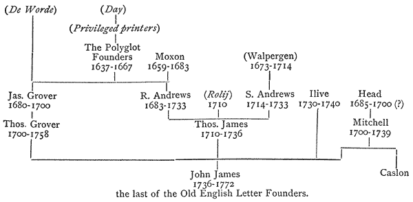
With the exception of the circular already mentioned, nothing of the nature of a specimen of this large foundry appeared during the lifetime of its owner. As early as 1736, Rowe Mores informs us, a specimen was begun, designed to show the variety of matrices with which the foundry then abounded, and from which types could be supplied to the trade. But although so early begun, and progressed with for several years, the work was left incomplete at the time of James’s death in 1772.420
Two causes may be assigned for this fact, one being the frequent and numerous additions to the foundry from time to time, which would render any specimen undertaken at an early stage of its existence incomplete; and the second and more cogent reason is to be found in the fact that the excellence and growing popularity of Caslon’s founts at this particular period tended rapidly to depreciate the productions of the old founders, and, as Rowe Mores himself states, to render many of their founts altogether useless in typography; so that a letter which in 1736 might have commanded a tolerable sale, would in 1756 be despised, and in 1770 scoffed at.
At John James’s death his foundry passed by purchase421 into the hands of Mr. Rowe Mores,422 a learned and eccentric antiquary and scholar, who had devoted himself, among other matters, to the study of typographical antiquities, a pursuit in which he received no little stimulus from the possession of a collection of punches and matrices, some of which were supposed to be as old as the days of Wynkyn de Worde.
Whether any motive besides a pure antiquarian zeal prompted the purchase, or whether he held the collection in the capacity of trustee, is not known, but it {223} seems probable he had been intimately acquainted with the foundry and its contents for some time before James’s death. He speaks emphatically of it as “our” foundry, and his disposition of its contents for sale is made with the authority of an absolute proprietor. It does not appear, however, that during the six years of his possession any steps were taken to extend or even continue the old business, which we may assume to have died with its late owner.
Mr. Mores found himself the owner of a vast confused mass of matrices, many of them unjustified, and others imperfect, which to an ordinary observer might have been summarily condemned as rubbish, but which he, with an enthusiasm quite remarkable, set himself to catalogue and arrange in order, considering himself amply repaid for his pains by the discovery of a few veritable relics of Wynkyn de Worde and other old English printers.
The result of his labours he minutely relates in his Dissertation,423 a work written, as he himself says, “to preserve the memory of this Foundry, the most ancient in the kingdom, and which may now be dispersed,” and intended as an introduction to the completed specimen of its contents. Despite its eccentric style and crabbed diction, the work, by virtue of its learning and acuteness, will always remain one of the most interesting contributions to the history of English typography.
The condition of the foundry will be best described in its author’s own words.
After giving a list of matrices lost,424 and quoting a catalogue of the matrices of the learned languages in the foundry in 1767, written by James himself (which varies considerably from the Catalogue presented at the sale, to be given later on), he observes:
“The specimen will show that several of the matrices are unjustified. This being but an accidental circumstance, does not in the least affect the goodness of the type, though it affects its appearance in the casting. The matrices were amassed at all events to augment the collection, and the operation of the file was suspended till a call for the type should make it necessary. So this defect is no more than a proof that the matrices have not been impaired by use.
“Another circumstance it may be necessary to mention relating to the difference in the number of matrices of the same face and body, which may lead to a suspicion that those of a lesser number are imperfect. But this is not the {224} fact. The difference arises from a difference in the quantity of ligations, which have been always cut in a greater or smaller number according to the humour or fancy of the artist. We own ourselves admirers of ligatures, for they are certainly ornamental and elegant, and it is to be wished that they could be used in typography with the same ease as they are displayed in calligraphy. But this is impossible; fusile types are not so tractable as the pen of a ready writer, and we scruple not to call a fount complete though it be destitute of every jugation. . . .
“A word or two must be added in relation to the Specimen. It was begun by Mr. James in the year 1736, in which year, after the decease of his father, he entered into business for himself, and was designed to show the variety of matrices with which his foundery abounded. Therefore it is a specimen only of the types which he could cast for those who wanted; no reference being made to the situation of the matrices from which he would have cast them. But notwithstanding the number of years intermediate, the Specimen was left unfinished by Mr. James at the time of his death, and that which was left has been mangled since his decease. Not that there was any occasion for such references, for Mr. James was possessed of the matrices, and consequently of the secret of adapting them to his purpose. To supply this deficiency in a specimen of the matrices (for as such the specimen is now to be considered) has been attended with trouble incredible to anyone but one who upon a like occasion shall attempt the same. And such an occasion we believe there will never be.
“For the Specimen some apology is to be made; neither the form nor the matter is so judicious as we could wish, but the greatest part of it was composed long ago, and it was almost impossible now to alter it. Incorrectness must be overlooked, because Letter Founders generally compose their own specimens, and this might be sufficient to apologise for deficiencies in the Composing part. But we must use another plea in extenuation of enormities in this part unavoidable; the confinement of large-bodied letters to a narrow measure; though for blemishes of this sort the just allowance will be made by those of judgement. It shows the letter, the common purpose of this kind of specimens.
“We have inserted specimens of several matrices which the great improvements made in the art of letter-cutting have rendered altogether useless in typography; but these specimens will be found of critical use to an antiquary, for whose sake we have inserted them, regardless of the charge that we deform our Specimen, or of another more material accusation, that by multiplying particulars we endeavour to enhance the value of our foundery. The latter we can easily refute; for the sets we speak of, besides the rudeness of the workmanship, are imperfect, and consequently unsaleable, and will probably be taken {225} from the foundery before it is disposed of to prevent the trouble of a future garbling,425 and this consideration must extend to those objections which may be made against things cast in haste without justification, for the purpose only of shewing the faces.
“Hitherto we have spoken only of Matrices. The punches, though in order they are first, must come last; and of them we have but little to say; for these having performed their office by formation of the matrice are generally like other useful instruments which have discharged their duty, neglected, discarded and thrown away.
“The entire loss, the waste and the rubbish in our foundery in this article are great. The waste and rubbish are in weight about 120 lbs., and were we to put down tale instead of weight (the pusils which seem to make the greater part of this quantity not much exceeding in largeness the little end of a poinctrel) the number would be very great. But covetous of preserving the remembrance of everything which in Mr. James’ Foundery was curious or uncommon, we have re-scrutinized these, and have left behind us nothing but the Roman and Italic in which is nothing either curious or uncommon.
“The same likewise have we done to the matrices, the waste of which now remaining and disposed of in order is in number about 2,600,426 the rubbish in weight about 1⁄2 cwt.
“A work of some trouble but virtù hath been gratified amongst the rubbish of punches by some originals of Wynkyn de Worde, some punches of the 2-line Great Primer English.427 They are truly vetustate formâque et squalore venerabiles, and we would not give a lower-case letter in exchange for all the leaden cups of Haerlem.”428
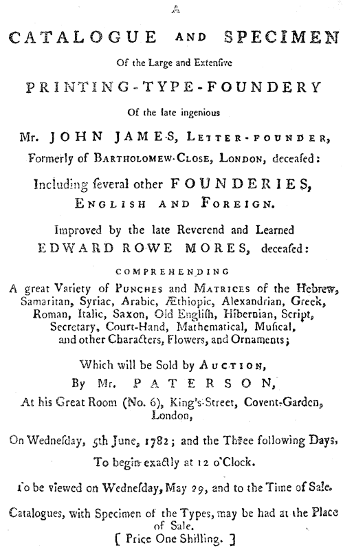
Mr. Mores, unfortunately, did not live to see the publication of his {227} Dissertation, or to complete the Specimen which was to accompany it. He died in 1778, and four years elapsed before the foundry was put up to auction, and the catalogue with its specimen attached finally appeared.
Of this interesting document we need only observe that in point of execution and printing it calls for all the apology which Mr. Mores offers on its behalf;429 for one could hardly imagine a specimen doing less justice to the collection it represents. Yet, in spite of its imperfections, it is a work of the highest importance to anyone interested in the history of the old English letter-founders, and we regret that space forbids quoting the Catalogue in full.
We shall, however, present our readers with an abstract of the Specimen as far as it relates to the matrices of the “learned” languages in the foundry; adding, as far as possible, the initials of the foundries through which each fount had come into James’ hands.430
The specimens shown are as follows:―
Of Roman capitals, eight founts were shown,442 and of Roman and Italic from {229} Canon to Diamond, there were thirty-nine founts in specimen and a hundred and eight not shown.
In addition to the above, the specimen included ninety-seven varieties of flowers, chiefly from the Grovers’ foundry; while other odd flowers, with signs, rules, braces, and various imperfect founts (contained in sixteen drawers) were also sold, though not shown. At the end of the list of matrices came what was perhaps the most interesting feature of the sale, viz., a set of punches contained in a press named “Caxton,” consisting of twenty drawers. Of these the majority were Roman and Italics, which we will not specify, as it is impossible to determine whose handiwork they were in the first instance. We give, however, the contents of drawers A E F and G, which contained the following punches of the learned languages443:
| A.— | Æthiopic | English* | [P.] [A.] |
| Samaritan | Pica* (English?) | [P.] [G.] | |
| Samaritan | Long Primer | ||
| Syriac | English (Pica?) | [G.] | |
| Arabic | Great Primer | [A.] | |
| Arabic | Pica (English?) | [A.] | |
| Greek | Brevier | ||
| Saxon | Pica | [A.] | |
| Hibernian444 | Pica* | [M.] [A.] | |
| E.— | Greek | Great Primer,* points and ligatures |
[G.] |
| F. | Greek | Pica, points and ligatures | |
| G. | Greek | Nonpareil, points and ligatures |
[A.] |
It is at least remarkable that so few punches should have existed in so large a foundry; but it is to be remembered that the wear and tear of the matrices in those days was not so great as now, and the necessity for a new set of strikes from the punches was consequently less frequent. We may even suppose, from Mr. Mores’ own reference to the subject, already quoted, that it was a common practice to discard a set of punches as useless as soon as they had left their impression in the matrices.
The concluding items of the Catalogue are “about 60 or 70 moulds, from 5-line Pica down to Nonpareil, some two, some three or more of a sort which {230} will be lotted according to their bodies; also a parcel of iron ladles; a vice, 33 lbs. weight, several gauges, dividers, blocks, setting-up sticks, dressing sticks, etc.,”—a meagre list, which, if it represents the working plant of the foundry, points to a rough and ready practice of the art which, even in Moxon’s time, would have been considered primitive.
A word must be added respecting the Catalogue. Whether it was taken precisely as Mr. Mores left it, or whether Mr. Paterson, the auctioneer (whose “talent at Cataloguing” Nichols, in his Anecdotes, approvingly mentions),445 completed it, we cannot say. It is as precise, perhaps, as any catalogue of so confused a collection could be. An opening was, however, left for a good deal of misapprehension, by the fact that the nests of drawers in which the matrices were stored, instead of bearing distinguishing numbers, bore the names of famous old printers, which duly figured in the Catalogue.446 Misled by this circumstance, it seems more than likely that Paterson may have enhanced the importance of his lots by dwelling on the fact that one fount was “De Worde’s”, another “Cawood’s,” another “Pynson’s,” and so on. The absurdity of this delusion becomes very apparent when we see the Alexandrian Greek some years later puffed by its purchasers as the veritable production of De Worde (who lived a century before the Alexandrian MS. came to this country), and find Hansard, in 1825, ascribing seven founts of Hebrew and a Pearl Greek to Bynneman.
What was the result of the sale financially we cannot ascertain. Of the fate of its various lots we know very little either, except that Dr. Fry secured most of the curious and “learned” matrices. How far the other foundries of the day, at home and abroad, enriched themselves, or how much of the collection fell into the hands of the coppersmiths, are problems not likely to find solution.
With the sale, however, disappeared the last of the old English foundries, and closed a chapter of English typography, which, though not the most glorious, is certainly not the least instructive through which it has passed.
The only specimen of this foundry is that appended to the Catalogue of the sale:―
A CATALOGUE and Specimen of the large and extensive Printing-Type-Foundery of the late ingenious Mr. John James, Letter-founder, formerly of Bartholomew Close, London, deceased; including several other Founderies, English and Foreign. Improved {231} by the late Reverend (sic) and Learned Edward Rowe Mores, deceased. Comprehending a great variety of punches and matrices of the Hebrew, Samaritan, Syriac, Arabic, Æthiopic, Alexandrian, Greek, Roman, Italic, Saxon, Old English, Hibernian, Script, Secretary, Court-Hand, Mathematical, Musical, and other characters, Flowers and Ornaments: which will be sold by Auction by Mr. Paterson at his Great Room (No. 6) King Street, Covent Garden, London, on Wednesday, 5th June, 1782, and the Three following days. To begin exactly at 12 o’clock. To be viewed on Wednesday, May 29th, and to the Time of Sale. Catalogues, with Specimen of the Types, may be had at the Place of Sale. (Price One Shilling.) 8vo. (Lond. Inst.)
 RINTING had reached a low ebb in England in the early
years of the eighteenth century. A glance through any
of the common public prints of the day, such, for instance,
as official broadsides, political pamphlets, works of literature,
or even Bibles,447
points to a depression and degeneration
so marked that one is tempted to believe that the art
of Caxton and Pynson and Day was rapidly becoming
lost in a wilderness of what a contemporary satirist terms
“Brown sheets and sorry letter.”
RINTING had reached a low ebb in England in the early
years of the eighteenth century. A glance through any
of the common public prints of the day, such, for instance,
as official broadsides, political pamphlets, works of literature,
or even Bibles,447
points to a depression and degeneration
so marked that one is tempted to believe that the art
of Caxton and Pynson and Day was rapidly becoming
lost in a wilderness of what a contemporary satirist terms
“Brown sheets and sorry letter.”
With the exception of Oxford University, no foundry of the day was contributing anything towards the revival of good printing, or even towards the maintenance of such a standard as did exist. And Oxford, as we have said, owed its best founts to gifts procured, almost entirely, from abroad. Grover and Andrews, the heritors of the old founders, originated little or nothing; and where their efforts were put into requisition (as in the case of Andrews’ attempt to cut the Anglo-Saxon for Miss Elstob’s Grammar) they failed. Scarcely a work with any {233} pretension to fine printing was the impression of honest English type. Watson, the Scotch historian of printing, openly rebuked his brethren of the craft for not stocking their cases with Dutch type. Tonson, a king among English printers is said on one occasion to have lodged in Amsterdam while a founder there was casting him £300 worth of type; and James, the only English founder whose business showed any vitality, owed his success chiefly, if not entirely, to the fact that all his letter was the product of Dutch matrices; and even these, in his hands, were so indifferently cast as to be often as bad as English type.
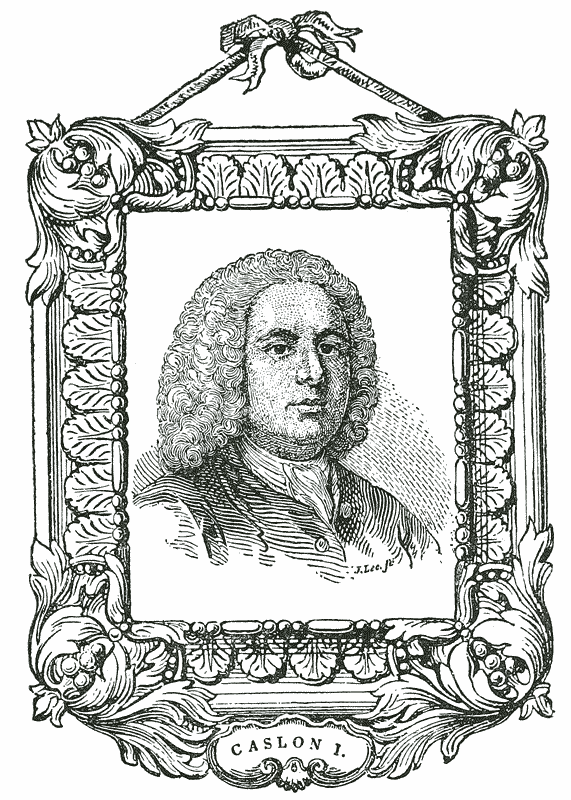
What was the reason for this lamentable decline—how far it was chargeable on the printer, how far on the founder, or how far both were the victims of that system of Star Chamber decrees, monopolies, patents, restraints and privileges which had characterised the illiberal days of the Stuarts—this is not the place to inquire. Nor, happily, are we called upon to speculate as to what would have been the consequence to English Typography of an uninterrupted prolongation of the malady under which it laboured. But it is necessary to remind ourselves of the critical nature of that malady in order to appreciate properly the providential circumstance which turned the attention of William Caslon to typefounding, and thus served to avert from England the disgrace which threatened her.
William Caslon448 was born at Hales Owen in Shropshire in the year 1692. He served his apprenticeship to an engraver of gun-locks and barrels in London, and at the expiration of his term followed his trade in Vine Street, near the Minories.
The ability he displayed in his art was conspicuous, and by no means confined to the mere ornamentation of gun-barrels—the chasing of silver and the designing of tools for bookbinders frequently occupying his attention. While thus engaged, some of his bookbinding punches were noticed for their neatness and accuracy by Mr. Watts,449 the eminent printer, who, fully alive to the present degenerate state of the typographical art in this country, was quick to recognise the possibility of raising it once more to its proper position. He {234} accordingly encouraged Mr. Caslon to persevere in letter-cutting, promising him his personal support, and favouring him meanwhile with introductions to some of the leading printers of the day.
About the same time, it is recorded that another great printer, the elder Bowyer,450 “accidentally saw in the shop of Mr. Daniel Browne, bookseller, near Temple Bar, the lettering of a book, uncommonly neat; and enquiring who the artist was by whom the letters were made, Mr. Caslon was introduced to his acquaintance, and was taken by him to Mr. James’s foundery in Bartholomew Close. Caslon had never before that time seen any part of the business; and being asked by his friend if he thought he could undertake to cut types, he requested a single day to consider the matter, and then replied he had no doubt but he could. From this answer, Mr. Bowyer lent him £200, Mr. Bettenham451 (to whom also he had been introduced) lent the same sum, and Mr. Watts £100.”452
With this assistance Mr. Caslon established himself in a garret in Helmet Row, Old Street, and devoted himself with ardour to his new profession.453 An opportunity for distinguishing himself presented itself shortly afterwards.
In the year 1720 the Society for Promoting Christian Knowledge,454 acting {235} on a suggestion made by Mr. Salomon Negri, a native of Damascus, and a distinguished Oriental scholar, “deemed it expedient to print for the Eastern Churches the New Testament and Psalter in the Arabic language for the benefit of the poor Christians in Palestine, Syria, Mesapotamia, Arabia and Egypt, the constitution of which countries allowed of no printing.” A new Arabic fount being required for the purpose, Mr. Caslon, whose reputation as a letter-cutter appears already to have been known, was selected to cut it. This he did to the full satisfaction of his patrons, producing the elegant English Arabic which figures in his early specimens. The Society was, according to Rowe Mores, already possessed of a fount of Arabic cast from the Polyglot matrices in Grover’s foundry. But Caslon’s fount was preferred for the text, and in it appeared, in due time, first the Psalter in 1725,455 and afterwards the New Testament in 1727.456
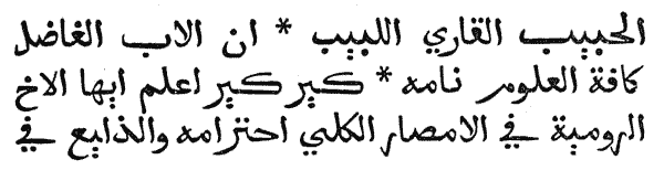
“Mr. Caslon, after he had finished his Arabic fount, cut the letters of his own name in Pica Roman, and placed the name at the bottom of a specimen of the Arabic457; and Mr. Palmer (the reputed author of Psalmanazar’s History of Printing), seeing this name, advised Mr. Caslon to complete the fount of Pica. Mr. Caslon did so; and as the performance exceeded the letter of the other founders of the time, Mr. Palmer—whose circumstances required credit with those who, by his advice, were now obstructed (i.e., whose business was likely to {236} suffer from this new rival)—repented having given the advice, and discouraged Mr. Caslon from any further progress.
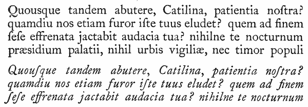
“Mr. Caslon, disgusted,458 applied to Mr. Bowyer, under whose inspection he cut, in 1722, the beautiful fount of English (Roman) which was used in printing the edition of Selden’s Works459 in 1726.”
Caslon’s excellent performance of this task may best be judged of by an inspection of this noble work, which remains conspicuous not only as the impression of the first letter cast at the Caslon foundry, but as marking a distinct turning-point in the career of English typography, which from that time forward entered on a course of brilliant regeneration. The Hebrew letter used in the Selden was also of Caslon’s cutting, and must therefore share with the English Roman the honour of a first place in the productions of his foundry.

His next performance was a fount of Pica Coptic for Dr. Wilkins’s460 edition {237} of the Pentateuch,461 a letter which Rowe Mores commends as superior to the Oxford Coptic in which Dr. Wilkins’ New Testament had been printed in 1716.462 This fount Caslon also cut under the direction of Mr. Bowyer, his generous patron, whom he always acknowledged as his master from whom he had learned his art.
Caslon’s business, thus established, rapidly advanced in fame and excellence. Although at the outset it depended mainly on the support of his three chief patrons, it was soon able to stand alone and compete with the best houses in the trade.
“It is difficult,” observes Mr. Hansard, “to appreciate the obstacles which Mr. Caslon encountered at the commencement of his career. At present the theory and practice of letter-founding are not, as in his time, an ‘art and mystery,’ and efficient workmen in every branch are easily procured. He had not only to excel his competitors in his own particular branch of engraving the punches, which to him was probably the easiest part of his task, but to raise an establishment and cause his plans to be executed by ignorant and unpractised workmen. He had also to acquire for himself a knowledge of the practical and mechanical branches of the art, which require, indeed, little genius, but the most minute and painful attention to conduct successfully. The wishes and expectations of his patrons were fulfilled and exceeded by his decided superiority over his domestic rivals and Batavian competitors. The importation of foreign types ceased; his founts were, in fact, in such estimation as to be frequently, in their turn, exported to the Continent.”463
In 1728 Mr. Caslon narrowly escaped committing an error which might seriously have affected his after career. The foundry of the Grovers being then in the market, he contracted for the purchase of it.464 Fortunately for English typography, the business fell through, and Caslon was still left a free man to pursue his own method, unburdened by the incubus of a large and useless stock of matrices, which, had they been suffered to mingle with his own beautiful productions, would have degraded his foundry to a patchwork establishment little better than that of his competitors at home and abroad. As it was, he had the advantage of completing his specimens after his own plan, and impressing with the mark of his own genius every fount which bore his name.
His fame in 1730 was such, that (as Ged, in his narrative of the invention of {238} Block-Printing, states) he had already eclipsed most of his competitors, and had introduced his founts into some of the chief printing houses of the metropolis, and even secured the custom of the King’s printers to the exclusion of all others.465 Although Ged’s narrative goes to show that Caslon shared the scepticism of his contemporaries with regard to the utility of stereotyping, and was even ready to back his opinion with his money, it is satisfactory to observe that he was no party to the discreditable persecution to which that unfortunate inventor was subjected by other members of the craft. Indeed, the only successful experiment made by Ged appears to have been a cast from Caslon’s type.
That the success of the new foundry was not achieved wholly without opposition is apparent from the following anecdote preserved by Mr. Nichols, and told in connection with the account of Bishop Hare’s Hebrew Psalter, published by Bowyer in 1733.466
This work, it appears, had been originally intended to be printed at the press of Palmer, with whom Caslon, as we have seen, had already had dealings of a not altogether satisfactory character.
“His Lordship, however,” says Nichols (quoting Psalmanazar’s account of the transaction), “had excepted against Mr. Palmer’s Hebrew types which were of Athias’ font,467 and a little battered, and insisted upon his having a new set from Mr. Caslon, which greatly exceeded them in beauty. But Mr. Palmer was so deeply in debt to him (Caslon) that he knew not how to procure it from him without ready money, which he was not able to spare. The Bishop likewise insisted upon having some Roman and Italic types cast with some distinguishing mark, to direct his readers to the Hebrew letters they were designed to answer, and these required a new set of punches and matrices before they could be cast; and that would have delayed the work, which Mr. Palmer was in haste to go about that he might the sooner finger some of his Lordship’s money. This put him upon such an unfair stratagem as, when discovered, quite disgusted his lordship against him; namely, representing Mr. Caslon as an idle, dilatory workman, who would in all probability make them wait several years for those few types, if ever he finished them. That he was indeed the only Artist that could supply him with those types, but that he hated work and was not to be depended upon; and therefore advised his Lordship to make shift with some sort which he could substitute and would answer the same purpose, rather than run the risk of staying so long and being perhaps disappointed.
“The Bishop, however, being resolved, if possible, to have the desired types, sent for Mr. Bowyer, and asked him whether he knew a letter-founder that could {239} cast him such a set out of hand, who immediately recommended Mr. Caslon; and being told what sad and disadvantageous character he had heard of him, Mr. Bowyer not only assured his Lordship that it was a very false and unjust one, but engaged to get the above-mentioned types cast by him, and a new font of his Hebrew ones, in as short a time as the thing could possibly be done. Mr. Caslon was accordingly sent for by his Lordship, and having made him sensible of the time the new ones would require to be made ready for use, did produce them according to his promise, and the book was soon after put to the press.”468
Among the other interesting founts cut by Caslon about this time, may be mentioned the Pica Black, of which we show a specimen, and which received special commendation for its faithful following of the traditional Old English character first used by Wynkyn de Worde.
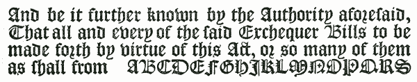
He also cut an Armenian for Whiston’s edition of Moses Choronensis,469 and an Etruscan for Mr. J. Swinton of Oxford, the learned antiquary and philologist, who published his De Linguâ Etruriæ470 in 1738; as well as a Gothic and several other of the foreign and learned characters.


All of these, with exception of the Etruscan and an Ethiopic cut still later, were completed before 1734, in which year the first Specimen of his foundry appeared.
This famous broadside, of which very few copies are now extant, dates from Chiswell Street, to which address Mr. Caslon had transferred the Helmet Row Foundry (after an intermediate sojourn in Ironmonger Row), about the year 1734.
The sheet is arranged in four columns, and displays altogether thirty-eight founts, namely:
Of these, all, with three exceptions, are Caslon’s own handiwork, and represent the untiring industry of fourteen years. Of the excellence of the performance it is sufficient to say that the Specimen placed Caslon absolutely without rival at the head of his profession; “and,” as Nichols says, “for clearness and uniformity, for the use of the reader and student, it is doubtful whether it has been exceeded by any subsequent production.”
The three founts referred to as not the product of Caslon’s hand, were the Canon Roman, from Andrews’ foundry, formerly Moxon’s, and exhibited in the {241} Mechanick Exercises471; the English Syriac, which is from the matrices of the Polyglot472; and the Pica Samaritan, which was cut by a Dutchman named Dummers.
Fame appears to have followed rapidly on the appearance of this Specimen. The sheet was included as an inset plate in the second edition of Ephraim Chambers’ Cyclopædia in 1738,473 with the following flattering notice:—“The above were all cast in the foundery of Mr. W. Caslon, a person who, though not bred to the art of letter-founding, has, by dint of genius, arrived at an excellency in it unknown hitherto in England, and which even surpasses anything of the kind done in Holland or elsewhere.”
Caslon made a further addition to his stock of matrices in 1739 by the purchase of half of Mitchell’s foundry,474 of which the most interesting items were a Pica Greek, sets of Music and flower matrices, and six sizes of Black. The remainder, consisting of Romans and Italics, do not appear to have added much to the resources of the Chiswell Street foundry.475
In the year 1742 Mr. Caslon’s eldest son, William—at that time twenty-two years of age—entered the business, and in the Specimen of the same year his name first appears in conjunction with his father’s. Unfortunately, no copy of this Specimen (which had evidently been seen by Nichols476) is known to be extant. Another Specimen, also unfortunately missing, is mentioned by the same authority, who says, “the abilities of the second Caslon appeared to great {242} advantage in the specimen of the types of the learned languages in 1748.”477 A further Specimen was issued in the following year, in broadside form, which displayed a large variety of letters, from Canon to Pearl, many of them being the handiwork of Caslon the younger. It is possible that this last sheet may have been sent, for the most part, abroad; for while no copy of it is to be found in this country, we find one mentioned with commendation by Fournier in 1766,478 and another preserved to this day in the Sohmian Collection at Stockholm, where, along with several other rare English and foreign specimens, it has been recently discovered by, the indefatigable Mr. William Blades.
In Ames’ Typographical Antiquities,479 published in 1749, appears a specimen of “Mr. Caslon’s Roman letter and the names of the sizes now in use,” the introductory note to which affords the first definite notice of the younger Caslon in connection with the foundry. “The art,” says Ames, “seems to be carried to its greatest perfection by Mr. William Caslon, and his son, who, besides the type of all manner of living languages now by him, has offered to perform the same for the dead, that can be recovered, to the satisfaction of any gentleman desirous of the same.”
Another contemporary record of equal interest, which seems, moreover, to allude to one or more of the three missing Specimens above mentioned, is contained in a little essay on the Original, Use, and Excellency of Printing, published in 1752480; in which the anonymous writer, after dealing with the invention, remarks: “Altho’ the chief honour is due to the Inventor, yet the perfection and beauty that Printing is now arrived at is very much owing to them that came after. Many in the present age have not a little contributed thereto. Among whom I cannot but particularly mention Mr. William Caslon and his Son, Letter Founders in Chiswell Street, who have very much by their indefatigable labours promoted the honour of this Art, and who have lately printed three broadsheet specimens of their curious types; one of them consisting of all the common sorts of letter used in printing; the second sheet is {243} divers sorts of their Orientals, Old-English, and Saxon; and the third contains a great variety of curious Flowers and Fancies for Ornamenting of Title Pages, Tickets, &c., also several sorts of Titling letter of Roman, Old-English and Greek; and the whole, for their master strokes and curious flourishes, outdo all that have been cast in England, Holland or any other place before.”
The above is one of many compliments paid to Caslon at this period by his contemporaries. Smith, in his Printer’s Grammar in 1755, goes out of his way more than once to commend the founder by whose genius “letter is now in England of such a beautiful cut and shape as it never was before.” Baskerville, in a passage quoted elsewhere,481 frankly acknowledges him as the greatest master of the art. Ames and Chambers, as has been noticed, vie with one another in proclaiming his pre-eminence; Mores himself styles him the Coryphæus of modern letter founders, and Lemoine awards him the title of the English Elzevir.
In 1750 Mr. Caslon’s reputation was such that his Majesty George II. placed him on the Commission of the Peace for Middlesex, which office he sustained with honour to himself and advantage to the community till the time of his death.
In June of the same year, the Universal Magazine482 contained an Article on Letter Founding, extracted chiefly from Moxon, and accompanied by a view of the interior of Caslon’s Foundry, containing portraits of six of his workmen. The view (of which our frontispiece is a reproduction) represents four casters at work, one rubber (Joseph Jackson), one dresser (Thomas Cottrell), and three boys breaking off, etc. Considering the extent of the business at the time, it may be doubted whether this represents the entire working staff of the establishment, or whether the view is of a portion only, in which, for the convenience of the artist, the four processes of the manufacture are assembled. The processes of punch-cutting and justifying were conducted in private by the Caslons themselves; yet not, as history shows, in such secrecy as to prevent their two apprentices, Cottrell and Jackson, from observing and learning the manual operation of that part of the “art and mystery.”483
A movement among the workmen of the Foundry in 1757 for a higher scale of wages, although decided in favour of the men, resulted in the dismissal of the two ex-apprentices, who were supposed to have been ringleaders in the {244} movement. With the experience acquired during their term of service at Chiswell Street, both these men were enabled to establish foundries of their own; and it is to the credit of Cottrell’s good sense, if not of his good feeling, that he subsequently supported his own claim to the patronage of the trade by announcing on his specimens that he had “served his apprenticeship to William Caslon, Esq.”
The active part taken by the Second Caslon in the operations of the Foundry may be best judged of by a reference to the Specimen Book of 1764.484 In this book the number of founts which originally appeared on the broadside of 1734 is more than doubled,485 most of the additions (with the exception of those which had formed part of Mitchell’s Foundry) being the handiwork of Caslon II. The following advertisement appears on the last page:―
“This new Foundery was begun in the year 1720, and finish’d 1763; and will (with God’s leave) be carried on, improved and inlarged by William Caslon and Son, Letter-Founders in London.—Soli Deo Gloria.”
Rowe Mores, whose prejudice against the Second Caslon is undisguised, waxes facetious on the head of this innocent declaration,486 although he can find but little to blame in the Specimen itself, “in which,” he says, “is nothing censurable but the silly notion and silly fondness of multiplying bodies”—the Specimen showed a long-bodied English and a large-face Long Primer and Bourgeois—“as if the intrinsic of a foundery consisted in the numerosity of the heads!” Such animadversions, however, leave untouched the younger Caslon’s reputation as an able and successful typefounder, which was, indeed, so well established that during the later years of his father’s life he appears to have had the sole management of the business.
Caslon I, having lived to see the result of his genius and industry in the regeneration of the Art of Printing in England, retired, universally respected, from the active management of the Foundry, and took up his residence first in {245} a house opposite the Nag’s Head in the Hackney Road, removing afterwards to Water Gruel Row, and finally settling in what was then styled a country house at Bethnal Green, where he resided till the time of his death.
“Mr. Caslon,” says Nichols, “was universally esteemed as a first-rate artist, a tender master, and an honest, friendly, and benevolent man.”487 The following anecdote, preserved by Sir John Hawkins in his History of Music, gives a pleasing glimpse into his private life, and shows that in his devotion to the severer arts the gentler were not neglected.
“Mr. Caslon,” says Sir John, “settled in Ironmonger Row, in Old Street; and being a great lover of music, had frequent concerts at his house, which were resorted to by many eminent masters. To these he used to invite his friends and those of his old acquaintance, the companions of his youth. He afterwards removed to a large house in Chiswell Street, and had an organ in his concert room.488 After that, he had stated monthly concerts, which, for the convenience of his friends, and that they might walk home in safety when the performance was over, were on that Thursday in the month which was nearest the full moon; from which circumstance his guests were wont humourously to call themselves ‘Luna-tics.’ In the intervals of the performance the guests refreshed themselves at a sideboard, which was amply furnished; and when it was over, sitting down to a bottle of wine, and a decanter of excellent ale, of Mr. Caslon’s own brewing, they concluded the evening’s entertainment with a song or two of Purcell’s sung to the harpsicord, or a few catches; and, about twelve, retired.”489
Mr. Caslon’s hospitalities were not confined to his musical friends merely. His house was a resort of literary men of all classes, of whom large parties frequently assembled to discuss interesting matters relating to books and studies.490
Mr. Caslon was thrice married. His second and third wives were named respectively Longman and Waters, and each had a good fortune. By his first wife he had two sons and a daughter: William, who succeeded him at Chiswell {246} Street; Thomas, who became an eminent bookseller in Stationers’ Hall Court, where he died in 1783, after having in the previous year served the office of Master of the Stationers’ Company; and Mary, who married first Mr. Shewell, one of the original partners in Whitbread’s brewery, and afterwards Mr. Hanbey, an ironmonger of large fortune. A brother of Mr. Caslon, named Samuel, is mentioned by Rowe Mores, and appears to have served at Chiswell Street for a short time as mould maker, leaving there subsequently, on some dispute, to work in the same capacity for Mr. Anderton of Birmingham.
Mr. Caslon died, much respected, at Bethnal Green, on Jan. 23rd, 1766, aged 74, and was buried in the Churchyard of St. Luke’s, the parish in which his three foundries were all situated. The monument to his memory, kept in repair by bequest of his daughter, Mrs. Hanbey, is thus briefly inscribed:― W. CASLON, Esq., ob. 23rd Jan., 1766, ætat 74. A life-size portrait of him by Kyte is preserved at Chiswell Street, representing him holding in his hand the famous Specimen Sheet of 1734.
William Caslon II issued in the year of his father’s death a Specimen in small quarto, bearing his own name and containing the same founts as those exhibited in the 1764 book.491 This Specimen, consisting of thirty-eight leaves, was again reprinted in 1770 by Luckombe in his History of Printing,492 of which work it occupies pages 134 to 173.
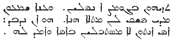
About the year 1768 the Chiswell Street foundry was called upon to supply a Syriac fount for the Oxford University Press, and Caslon produced the Long Primer Syriac which occurs in his subsequent specimens. He had previously supplied the University with a Long Primer Hebrew, and the old ledgers of the foundry show that numerous transactions of a similar kind took place during the latter half of last century.
In 1770, besides the specimen of Luckombe, another indirect specimen of the Caslon types was issued by a Mr. Cornish, printer, in Blackfriars, in a very {247} small form—32mo—exhibiting a series of Romans, two founts of Black, and three pages of flowers.
It was probably on the Specimen of 1766 that Rowe Mores founded his summary of the contents of the Caslon foundry; and it will be interesting to reproduce this list, as it presents a view of the state of the foundry as it then existed, and, at the same time, distinguishes the authors of the several founts with which it was supplied.
Rowe Mores seizes the opportunity afforded by this enumeration for another sneer at Caslon II. “This is the best account,” he says, “we can give of this capital and beautiful foundery, the possessor of which refused to answer the natural questions, because, forsooth, ‘answering would be of no advantage to us; if we wanted letter to be cast, he would cast it.’ But this we can do ourselves.”493
The summary is as follows:―
Caslon II died in 1778, aged 58, and was buried in the family vault at St. Luke’s, the following line being added to his father’s inscription: Also W. Caslon, Esq. (son of the above) ob. 17 Aug., 1778, ætat. 58 years.
Of him, too, an excellent oil portrait is preserved at Chiswell Street. He had married a Miss Elizabeth Cartlitch,503 a lady of beauty, understanding, and fortune, who, during the latter years of her husband’s life, had taken an active share in the management of the foundry.
Mr. Caslon dying intestate, his property was divided equally between his widow and her two sons, William and Henry, the chief superintendence of the business devolving on William Caslon III, at that time quite a young man. The chief event of the new régime was the issue of the admirable Specimen Book of 1785, a work which, for its completeness and excellent execution, has received high approbation. It consists of sixty sheets, twenty-one of which are devoted to Romans and Italics, ten to “learned” letter504 and Blacks, two to Music, two to {249} Script, and no fewer than twenty-six to flowers arranged in artistic combinations and designs. The volume is dedicated to King George III, Mr. Caslon assuming the title allowed a century earlier to Nicholas Nicholls, of “Letter Founder to His Majesty.”
The “Address to the Public,” which prefaces this Specimen, naturally lays claim on behalf of the Caslon Foundry to the merit of having rescued the type trade in England from the hands of foreigners. But it also suggests, by the somewhat acrid tone in which it refers to its “opponents,” that the competition of the newly-established foundries of Cottrell, Fry, Wilson, and Jackson was already beginning to tell on the temper of the third of the Caslons, who evidently did not regard as flattery the avowed imitation of the Caslon models by some of his rivals.505
The Specimen contains one new feature—a Double Pica Script—which, however, is of no particular merit.
The year 1785 was prolific in Specimens of the Chiswell Street foundry. In addition to the book above referred to, two folio Specimens, one an 8 pp. large post-folio, and another a 6 pp. foolscap-folio, appeared, intended for use as {250} inset plates to Encyclopædias,506 in which the principal founts of the foundry, Roman and Oriental, were displayed. In addition to this, there was issued a 2 pp. folio Specimen of large letter507 showing the sand-cast types of the foundry in sizes from 19 to 7-line Pica.
In the preceding year Caslon III. had issued his specimen of Cast Ornaments—the first of the kind exhibited by an English Founder—displaying 65 designs of various size and merit at prices ranging from 3d. to 7s. each. In his introductory note to the second edition, dated July 20, 1786, he takes to himself the credit of an invention “completed with infinite attention and at an inconceivable expence,” whereby the trade is in future to be supplied with typographic designs equal to copperplate and less costly than the commonest wood-cuts. The process thus originated was that of sharply impressing a wood block in cooling metal so as to form a lead matrix from which to “dab” further impressions as required. The specimen of 1785 contained a few small ships of imposing appearance, but these were produced by the usual method of punch and matrix.
It does not appear that the third Caslon’s connexion with the business resulted in any large addition to its founts. As, however, no specimen book of the Foundry is known between 1786 and 1805, it is difficult to judge of its progress during that period.
In the year 1792 Mr. Caslon disposed of his interest in the Chiswell Street business to his mother and sister-in-law. Henry Caslon had died in 1788. He had married Miss Elizabeth Rowe, a lady of good family,508 between whom and their only son, Henry (at that time an infant of two years), he left his share of the Foundry.
“It will not appear extraordinary,” says Hansard, “that a property so divided, and under the management of two ladies, though both superior and indeed extraordinary women, should be unable to maintain its ground triumphantly against the active competition which had for some time existed against it. In fact, the fame of the first William Caslon was peculiarly disadvantageous to Mrs. Caslon, as she never could be persuaded that any attempt to rival him could possibly be successful.”
Mrs. Caslon, sen., was an active member of the Association of Typefounders {251} of her day, which first met in 1793. In this capacity she gained the esteem of her fellow founders as well as of the printers, and on one occasion formed one of a deputation of two to confer with the latter on certain questions affecting the price of type.
She died from the effects of a paralytic stroke in October 1795.
The esteem in which she was held by all who knew her was amply testified by numerous notices in the public prints of the day. “Her merit and abilities,” says one, “in conducting a capital business during the life of her husband and afterwards, till her son was capable of managing it, can only be known to those who had dealings with the manufactory. In quickness of understanding and activity of execution she has left few equals among her sex.” And, in the same strain, the Freemason’s Magazine of March 1796, thus speaks of her: “The urbanity of her manners, and her diligence and activity in the conduct of so extensive a concern, attached to her interest all who had dealings with her, and the steadiness of her friendship rendered her death highly lamented by all who had the happiness of being in the extensive circle of her acquaintance.” The latter notice is accompanied by a portrait of this worthy lady.
Mrs. Caslon’s will becoming the object of some litigation, her estate was thrown into Chancery, and in March 1799, the Foundry was, by order of the Court, put up for auction and purchased by Mrs. Henry Caslon for £520. The smallness of this figure is the more remarkable since only seven years previously, on the retirement of Caslon III., a third share of the concern had sold for £3000.
“On the decease of Mrs. Caslon,” writes Hansard, in 1825, “the management of the Foundry devolved on Mrs. Henry Caslon, who, possessing an excellent understanding, and being seconded by servants of zeal and ability, was enabled, though suffering severely under ill-health, in a great measure to retrieve its credit. Finding the renown of William Caslon no longer efficacious in securing the sale of his types, she resolved to have new founts cut. She commenced the work of renovation with a new Canon, Double Pica and Pica, having the good fortune to secure the services of Mr. John Isaac Drury, a very able engraver, since deceased. The Pica, an improvement on the style of Bodoni,509 was particularly admired, and had a most extensive sale. Finding {252} herself, however, from the impaired state of her health, which suffered from pulmonary attacks, unable to sustain the exertions required in conducting so extensive a concern, she resolved, after the purchase of the Foundry, to take as an active partner Mr. Nathaniel Catherwood, (a distant relation), who by his energy and knowledge of business fully equalled her expectations. This connection gave a new impetus to the improvements of the Foundry, which did not cease during the lives of the partners, and their exertions were duly appreciated and encouraged by the printers. In 1808 the character of the Foundry may be considered as completely retrieved, but the proprietors did not long live to enjoy their well-merited success. In 1799, Mrs. Henry Caslon had married Mr. Strong, a medical gentleman, who died in 1802. In the spring of 1808 she was afflicted with a serious renewal of her pulmonary attack, in consequence of which she was advised to try the effect of the air of Bristol Hotwells, which probably protracted her life during a twelvemonth of extreme suffering, but could not eradicate the fatal disease. Her fortitude and resignation under this long continued, and helpless affliction could not be surpassed, and were truly admirable. Her sufferings were terminated in March 1809, when she was buried in the Cathedral of Bristol. The worthy and active Mr. Nathaniel Catherwood did not long survive his associate, being seized with a typhus fever which baffled the medical art. He died on the 6th of June, ætat. 45, very generally regretted.”510 A portrait of Mrs. Strong is preserved at Chiswell Street.
In 1805 was published the first Specimen containing the new Romans of Messrs. Caslon and Catherwood, among which, however, the Canon and Double Pica referred to by Hansard are not included. The dates affixed to the various specimens511 show that most of them were completed between 1802 and 1805, the {253} earliest being the Great Primer, dated May 1802. The Specimen also contained the Caslon Orientals. In 1808 a further Specimen of the Romans, including a few additional founts, appeared as a supplement to Stower’s Printers’ Grammar.512
These two Specimens, which are the only ones known to have been issued during twenty-three years, indicate clearly the important revolution through which the Chiswell Street Foundry, in common with all the other foundries of the day, had passed in respect of the model of its characters. All the once admired founts of the originator of the Foundry have been discarded, and between the Specimen of 1785 and that of 1808 there is absolutely no feature in common.513
On the death of his mother and her partner, Henry Caslon II assumed the management of the business, and fully maintained its reputation. The former name of the firm was retained, and a fresh specimen of Roman letters and modern Blacks was issued about the year 1812.
In 1814 Mr. Caslon took into partnership Mr. John James Catherwood,514 brother to Mr. Nathaniel Catherwood, and in this association proceeded vigorously with the improvement of the foundry. The partnership continued until 1821, during which period, says Hansard, “the additions and varieties made to the stock of the Foundry have been immense. Nothing that perseverance in labour and unsparing effort could effect, either to meet the fashion and evanescent whim of the day, or with the superior view of permanent improvement, has been wanted to keep the concern up to its long-established eminence, and to enable it to rank high among the many able competitors of the present age. The ancient stock can never be equalled—the modern never excelled.”515
Among the more important accessions to the stock of the Foundry may {254} be mentioned the acquisition in 1817 of the Foundry of Mr. William Martin of Duke Street, St. James’s, which, as elsewhere stated,516 included several good Roman and Oriental letters.
The partnership between Mr. Caslon and Mr. Catherwood being dissolved in 1821 by the withdrawal of the latter,517 Mr. Caslon admitted to a share of the business Mr. Martin William Livermore, “who for many years,” says Hansard, “had evinced ample talent, indefatigable zeal, and obliging attention, as active foreman and manager of the mechanical department.”
It is to be regretted that the absence of any specimen book between 1812 and 1830, prevents us from forming any accurate idea of the development of the Foundry during that period. It may be interesting, however, to quote the list given by Hansard, of matrices of the “learned” languages in the Foundry at the time when he wrote, i.e. 1825:
Messrs. Caslon and Livermore issued specimens in 1830 and 1834, the latter appearing exactly one hundred years after the first broadside published by William Caslon I.
We do not propose to continue the particular history of this venerable Foundry beyond this date. It may, however, be interesting to take a rapid survey of its subsequent career. {255}
Numerous specimens followed the issue of 1834, that of 1839 bearing the title of Caslon, Son, and Livermore, Letter-founders to Her Majesty’s Board of Excise—the new partner being Mr. Caslon’s son, the late Mr. Henry William Caslon. Shortly afterwards, Mr. Livermore’s connexion with the business ceased, and the next few specimens bear the name of Henry Caslon alone.
In 1843 a revival of the Caslon old-style letter took place under the following circumstances, which, as they initiated a new fashion in the trade generally, call for reference here. In the year 1843, Mr. Whittingham of the Chiswick press, waited upon Mr. Caslon to ask his aid in carrying out the then new idea of printing in appropriate type The Diary of Lady Willoughby,521 a work of fiction, the period and diction of which were supposed to be of the reign of Charles I. The original matrices of the first William Caslon having been fortunately preserved, Mr. Caslon undertook to supply a small fount of Great Primer. So well was Mr. Whittingham satisfied with the result of his experiment, that he determined on printing other volumes in the same style, and eventually he was supplied with the complete series of all the old founts. Then followed a demand for old faces, which has continued up to the present time.
An attempt to sell the Foundry in 1846,522 not being successful, the business, again took the style of Caslon and Son.
Mr. Henry Caslon died May 28, 1850, and in the same year the important step was taken of uniting the London Branch of the Glasgow Letter Foundry with that of Chiswell Street, which was now carried on under the style of H. W. Caslon and Co., Mr. Alexander Wilson, of the Glasgow Foundry, being for some time associated with Mr. H. W. Caslon in the management.
In 1873, Mr. Caslon, being in ill health, retired, and died in the following year. He was the last of his race, and the Chiswell Street Foundry, after an uninterrupted dynasty of five generations, covering a period of nearly 160 years, was by his death left without a Caslon to represent it. The management of the business devolved on Mr. T. W. Smith, in whose hands it has since remained. {256}
1734. A Specimen by William Caslon, Letter-founder in Chiswell Street, London. 1734. Large post broadside. (Caslon.)
1738. A Specimen by William Caslon, Letter-founder in Chiswell Street, London. Large post broadside. (Chambers’ Cycl., 1738.)
1742. A Specimen by Caslon and Son, (referred to by Nichols, Lit. Anec., ii, 365). (Lost.)
1748. A Specimen by Caslon and Son (referred to by Nichols, Lit. Anec., ii, 721). (Lost.)
1749. A Specimen by William Caslon and Son, Letter-founders in Chiswell Street, London. 1749. Large Broadside. (Sohmian Coll., Stockholm.)
1749. A Specimen of Mr. Caslon’s Roman Letter, and the names of the sizes now in use. (Ames’ Typ. Antiq., p. 571.)
1763. A Specimen of Printing Types by William Caslon and Son. Printed by Dryden Leach, London, 1763, 8vo. (Amer. Antiq. Soc.)
1764. A Specimen of Printing Types by William Caslon and Son. Printed by Dryden Leach. London, 1764. 4to and 8vo. (T. B. R.)
1766. A Specimen of Printing Types by William Caslon, Letter-founder, London. Printed by John Towers. 1766. Small 4to. (B.M. T, 320, [11].)
1770. A Specimen of Printing Types by William Caslon, Letter-founder, London. 8vo. (Luckombe’s History of Printing, pp. 134–147.)
1770. A Specimen of Printing Types cast by Wiliam Caslon for the use of John Dixcey Cornish, at Number 4, in Printing-House-Yard, Blackfriars, London. 1770. 32mo. (Caslon.)
1784. A Specimen of Cast Ornaments on a new plan by William Caslon and Son. London. 1784. 8vo. (Sohmian Coll., Stockholm.)
1785. A Specimen of Printing Types by William Caslon, Letter-founder to His Majesty. London. Printed by Galabin and Baker, 1785. 8vo. (B.M. 441, f. 14.)
1785. A Specimen of Large letter by William Caslon, London, 1785. Two sheets folio. (B.M. 441, f. 14.)
1785. A Specimen of Printing Types by William Caslon, Letter-founder to His Majesty, 1785. Folio, 8 pp. (Chambers’ Cycl., 1784–6.)
1786. A Specimen of Cast Ornaments on a new plan by William Caslon, Letter-founder to His Majesty. London. Printed by J. W. Galabin, 1786. 8vo. (B.M. 668, g. 17, [2].)
1805. Specimen of Printing Types by Caslon and Catherwood, Letter-founders, Chiswell Street, London. T. Bensley, printer, London. 1805. 8vo. (Ox. Univ. Pr.)
1808. A Specimen of Caslon and Catherwood’s modern-cut Printing Types. London, 1808. 8vo. (Stower’s Printers’ Grammar.)
n. d. Specimen of Printing Types by Caslon and Catherwood, Chiswell Street, London. T. Bensley, printer, London. 1812? 8vo. (Caslon.)
1830. Specimen of Printing Types by Caslon and Livermore, Letter-founders, Chiswell Street, London. Bensley, Printer, 1830. 8vo. (Caxt. Cel. 4411.)
 N the early years of the 18th century, printing in Scotland
was in a condition even more depressed and unsatisfactory
than in England. Except in Glasgow and
Edinburgh the art was almost wholly neglected; and in
those two cities the disadvantages at which printers were
placed, owing partly to restrictive patents and monopolies,
partly to jealousies among themselves, but chiefly to the
absence of any letter-foundry in their own country, were
sufficient bar to all prosperity, either as an industry or an art.
N the early years of the 18th century, printing in Scotland
was in a condition even more depressed and unsatisfactory
than in England. Except in Glasgow and
Edinburgh the art was almost wholly neglected; and in
those two cities the disadvantages at which printers were
placed, owing partly to restrictive patents and monopolies,
partly to jealousies among themselves, but chiefly to the
absence of any letter-foundry in their own country, were
sufficient bar to all prosperity, either as an industry or an art.
A graphic sketch of this lamentable state of affairs is given in James Watson’s History of Printing, published in Edinburgh in 1713,523 a work which, while professing to give a general history of the art, derives its chief interest from the brief account of printing in Scotland given in the preface. That the art was derived in that country from Holland the author entertains no doubt, {258} and that it was indebted for its maintenance and any measure of excellence it might claim to the same foreign source, he boldly asserts. It was the intervention of Dutch workmen that mainly contributed to relieve the deadlock into which the monopolies and patents of the 17th century had brought the trade generally, and it was only by a continuous supply of Dutch workmen, Dutch presses, and Dutch type that printing in Scotland was to be raised from its present low condition. And, as a crowning argument, he exhibits with some pride a selection of indifferent Dutch types and “Bloomers,” with which his own office is provided, as a suggestion of the excellence to which Scotch Typography might yet attain.524 This avowal of entire dependence on foreign labour and workmanship is significant; and the absence of any suggestion for remedying the evil by the establishment of a foundry in Scotland itself only emphasises the helpless condition into which the art had sunk.
But although such a notion was too wild a dream for James Watson, others of his countrymen were bold enough to entertain it, and we find that in 1725 a Scotch printer clearly represented to William Ged the disadvantage under which the country laboured from having no foundry nearer than London or Holland, and urged him to undertake the business. Of Ged’s career we have spoken elsewhere.525 He failed, and Scotch typography, despite the rising fame of Caslon, might have remained many years longer in its depressed condition, but for the accident which directed the genius of Alexander Wilson to letter-founding.
Born at St. Andrews in 1714, young Wilson was originally intended for the medical profession, and it was with a view to push his fortunes in that direction that he came up to London in 1737 and took employment as assistant to a surgeon and apothecary in the great city. While thus engaged he obtained an introduction to Dr. Stewart, physician to Lord Isla, afterwards Duke of Argyle, and in this way came under the notice of his lordship. A common interest in scientific pursuits, particularly astronomy, served to interest Lord Isla in the young doctor’s assistant, and during the term of his service in London Wilson devoted much of his leisure to scientific study under the encouragement and favour of his new patron.
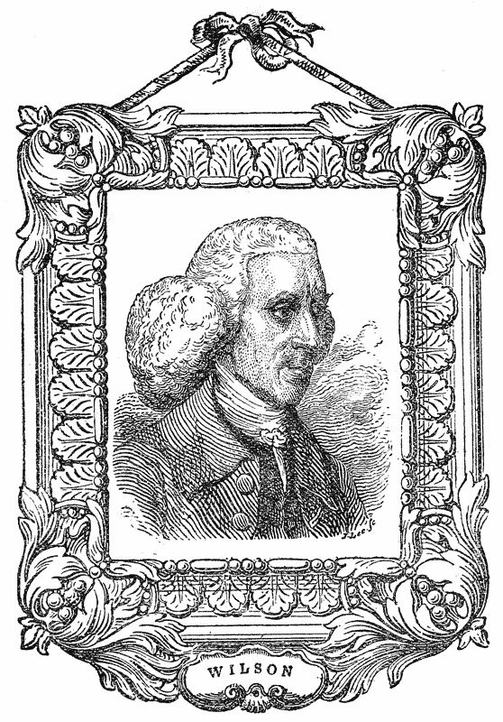
Of his first introduction to typography, we quote the following account given by Hansard on the authority of Alexander Wilson’s son and grandson:526― {259}
“While he was thus passing his time in a manner which he considered comfortable for one at his first entrance upon the world, a circumstance accidentally occurred which gave a new direction to his genius, and which in the end led to an entire change of his profession. This was a chance visit made one day to a letter-foundry with a friend, who wanted to purchase some printing types. Having seen the implements and common operations of the workmen usually shown to strangers, he was much captivated by the curious contrivances made use of in prosecuting that art. Shortly afterwards, when reflecting upon what had been shown him in the letter-foundry, he was led to imagine that a certain great improvement in the process might be effected; and of a kind too, that, if successfully accomplished, promised to reward the inventor with considerable emolument. He presently imparted his idea on the subject to a friend named Baine, who had also come from St. Andrews, and who possessed a considerable share of ingenuity, constancy and enterprise. The consequence of this was, the resolution of both these young adventurers to relinquish, as soon as it could be done with propriety, all other pursuits, and to unite their exertions in prosecuting the business of Letter Founding, according to the plan which had been contemplated with a view to improvements. After some further deliberation, Mr. Wilson waited upon his patron, Lord Isla, to whom he communicated his views, and the design of embarking in this new scheme; and derived much satisfaction from his Lordship’s entire approbation and best wishes for his success.
“Mr. Wilson and Mr. Baine then became partners in the project, and having taken convenient apartments, applied with great assiduity to the different preparatory steps of the business. At an early stage they had proofs of difficulties to an extent which had not been anticipated, and which, had their magnitude been foreseen, would probably have altogether deterred them from their attempt. But although they found their task grow more and more arduous as their experience improved, it may yet be mentioned, as a fact which bespeaks singular probity of mind, that they never once attempted to gain any insight whatever through the means of workmen employed in any of the London foundries, some of whom they understood could have proved of considerable service to them.”
Of the precise nature of the improved system of founding by which the two young Scotchmen proposed to prosecute their undertaking, the narrative given by Mr. Hansard affords no information. It has been suggested by some that it was no other than that of stereotyping by a method similar to, or better than, that attempted a few years earlier by Ged. But whatever it may have been, further experiment failed to justify the scheme as one of practical utility, and the two partners, who had by this time quitted the metropolis and returned to {260} St. Andrews, determined to abandon it and to fall back on the ordinary method of manufacturing type. “In their attempt to prosecute this speculation,” continues Mr. Hansard, still quoting the narrative furnished him by Dr. Wilson’s successors, “they found themselves in a more sure, though still in a difficult track, and in which they had no guide whatever but their own talent of invention and mechanical ability; and it was by the aid of these that they carried things forward until, at length, they were enabled to cast a few founts of Roman and Italic characters: after which they hired some workmen, whom they instructed in the necessary operations, and at last opened their infant letter-foundry at St. Andrews in the year 1742.”
The Scotch printers were not slow in showing their appreciation of the convenience afforded them by the establishment of a foundry in their midst, and from the first Messrs. Wilson and Baine appear to have received liberal encouragement in their new venture. They added steadily to the variety of their founts, and finding the demand for their type on the increase, not only in Scotland, but in Ireland and North America, they decided in 1744 to remove from St. Andrews to a more convenient centre at Camlachie, a small village a mile eastward of Glasgow.
In 1747 the claims of their Irish business necessitated the residence of one of the partners in Dublin.527 Mr. Baine was selected by lot for the duty, and accordingly departed for Ireland, leaving Mr. Wilson at Camlachie. Two years later the partnership was dissolved by mutual consent, and Mr. Baine quitted the business to make an independent venture in type founding.528 {261}
Left to himself, Mr. Wilson actively prosecuted his business, and although no specimen of the foundry is known to exist, either during the partnership between Wilson and Baine, or, indeed, during the entire period of its location at Camlachie, its productions very shortly attained some considerable celebrity.
“During his residence at Camlachie,” says Mr. Hansard, “Mr. Wilson had contracted habits of intimacy and friendship with some of the most respectable inhabitants and eminent characters in that quarter, among whom may be particularly reckoned the professors of the University of Glasgow and Messrs. Robert and Andrew Foulis, the University printers.529 The growing reputation of the University Press, conducted by these latter gentlemen, afforded more and more scope to Mr. Wilson to exercise his abilities in supplying their types; and being now left entirely to his own judgment and taste, his talents as an artist in the line to which he had become devoted became every year more conspicuous.”
“When the design was formed by the gentlemen of the University, together with the Messrs. Foulis, to print splendid editions of the Greek classics, Mr. Wilson with great alacrity undertook to execute new types, after a model highly approved. This he accomplished, at an expense of time and labour which could not be recompensed by any profits arising from the sale of the types themselves. Such disinterested zeal for the honour of the University Press was, however, upon this occasion, so well understood as to induce the University, in the preface to their folio Homer,530 to mention Mr. Wilson in terms as honourable to him as they had been justly merited.”
Of this magnificent work—one of the finest monuments of Greek typography {262} which our nation possesses—it is sufficient to say that if the reputation of Alexander Wilson depended on no other performance, it alone would give him a lasting title to the distinction accorded to him in the preface, of “egregius ille typorum artifex.”531
In 1760 Mr. Wilson was honoured with the appointment of the Practical Astronomy Professorship in the University of Glasgow, about two years after which the foundry was removed to the more immediate vicinity of the college. After this appointment the further enlargement and improvement of the foundry {263} devolved upon his two eldest sons; and he lived to witness its rise under their management to the highest reputation.
Among the later performances of Dr. Wilson, the most important was the beautiful fount of Double Pica cut in 1768 for the 4to edition of Gray’s Poems532 published by the Brothers Foulis, who in their preface made public acknowledgment of the excellence of the letter and the expedition with which it had been provided.533
Another high compliment was paid to Dr. Wilson’s talents in 1775, when Dr. Harwood, in the preface to his View of the Greek and Roman Classics,534 singled out, along with Baskerville’s types, the “Glasgow Greek types which have not been used since the superb edition of Homer in 1757, and which are the most beautiful that modern times have produced,” as fit to form the nucleus of a Royal typography for England, dedicated to the improvement of the “noblest art which human genius ever invented.”535
The first known specimen of the Glasgow Letter Foundry, as it was now called, was published in 1772. It is at least remarkable that no specimen of its types should have been issued during the first thirty years of its successful career. But although Rowe Mores mentions with approval a sheet by Baine, he had apparently seen none bearing the name of Wilson.
The specimen of 1772, which dated from the College of Glasgow, consisted of twenty-four 8vo leaves, and showed Roman and Italic only, in sizes from 5-line to Pearl, there being several faces to most of the bodies. Certain of these, it is stated, are “conformable to the London types”; and the enterprising proprietors undertake “to cast to any body and range, on receiving a few pattern types.”
In 1783, another specimen was issued in a broadside form, in four columns, and is usually to be met with in copies of Ephraim Chambers’ Cyclopædia, enlarged by Rees, where it is inserted to illustrate the article “Printing.” {264} It shows Roman and Italic from 6-line to Pearl, with five sizes of Black, six of Hebrew, and five of Greek, including the famous “Glasgow Homer” Double Pica.536 The general appearance of the sheet is good, and the founts compare favourably in shape and finish with those of any other foundry of the day. A note to the specimen intimates that the founts shown form a portion only of the contents of the Foundry. A full specimen appeared in 1786, and again in 1789, the latter being a small 4to volume of 50 pages, showing very considerable advance on its predecessors.537 A further specimen appeared in 1815, showing the modern cut letters of the Foundry.
With almost a monopoly of the Scotch and Irish538 trade, the Glasgow Foundry became in course of time a formidable rival to the London houses, whose productions it contrived to undersell even in the English market. Its success, however, raised up competitors with itself in Scotland, foremost among which was the foundry of Mr. Miller, a former manager in the Glasgow Foundry.
In 1825 the proprietors of the Foundry were Messrs. Andrew and Alexander Wilson, son and grandson to the originator. Hansard summarises their foreign and learned founts at this date as follows:
In 1828 another complete specimen appeared, showing the new series of Romans from Double Pica to Diamond, Greek, and fifteen pages of flowers.
Mr. Andrew Wilson dying in 1830, the management of the business devolved on his sons Alexander and Patrick, by whom it was decided, in 1832, to establish a branch house in Edinburgh. {265}
A handsome 4to specimen of the Roman letter of the Foundry was published in 1833. This volume is interesting as being one of the first to show the letter not only in the venerable “Quousque tandem” paragraph, but also in an English garb.540 It includes also five pages of Greek, in which the Double Pica “Homer” is still prominent, and two pages of Hebrew, but no other orientals.
In 1834 the important step was taken of transferring the Glasgow Foundry to London, where, in premises at New Street, Gough Square, the business was carried on.541
Briefly to trace the later vicissitudes of the Foundry we may add that, about 1834, a further development of the business was completed by the establishment of a Foundry at Two-Waters in Hertfordshire, where it was expected the cost of production would be considerably reduced by the cheaper labour attainable in the country. A strike occurring in 1837 among the London workmen, the Gough Square House was closed. In 1840 another branch was established at Dublin. Despite the activity of Mr. Alex. Wilson and the continued excellence of his types, the business declined. The latter years of his management were spent in fruitless endeavours to supersede the old method of handcasting by machinery. The various experiments made, however, (one of which was by the present Sir Henry Bessemer, whose father542 had been a type-founder) failed, and tended further to diminish Mr. Wilson’s resources, until in 1845 be became bankrupt.
The London and Two-Waters Foundries being offered for sale by auction, the principal part of the matrices were purchased by the proprietors of the Caslon Foundry in 1850, Mr. Wilson remaining for some time with Mr. Caslon as joint manager.
The Edinburgh branch of the business, started in 1832, had continued for {266} some time with Mr. Duncan Sinclair as managing partner. But on the latter withdrawing from the concern and establishing himself as an independent founder at Whiteford House, Edinburgh, about 1839, the management was entrusted to Mr. John Gallie.
On the breaking up of the business, the plant of the Edinburgh and Dublin branches was acquired by Dr. James Marr, who, in association with Mr. Gallie, carried on the business under the firm of Marr, Gallie, and Co. In 1853 it was James Marr and Co., with branches in London, Edinburgh, and Dublin. Dr. James Marr died in 1866, from which time till 1874, the business was carried on by his widow, with Mr. John Blair as manager. In 1874 it was converted into a Limited Company under the title of the Marr Typefounding Company, Limited, who removed the business from the old premises in New Street, Edinburgh, to Whiteford House, where it is still carried on.
Mr. Duncan Sinclair, between whose specimens and those of the Wilson Foundry there was an obvious similarity, continued for some years at Whiteford House, where his son, formerly manager at the Two-Waters branch of the Glasgow Foundry, subsequently joined him. They published specimens in 1840, 1842, and 1846 (which latter included a fount of “Gem”). In 1861 the Whiteford House Foundry was in the hands of John Milne and Co., who published a quarto specimen. In 1870 the contents of this foundry were dispersed at public auction, and the premises, as already stated, were shortly afterwards taken by the Marr Typefounding Company.
1772. A Specimen of some of the Printing Types cast in the Foundery of Dr. A. Wilson and Sons, College of Glasgow (Glasgow,) 1772. 8vo, 24 leaves. (B.M., B. 722, 8.)
1783. A Specimen of Printing Types . . The above are some of the sizes cast in the Letter Foundery of Dr. Alex. Wilson and Sons, Glasgow. 1783. Broadside. (Chambers’ Cyclopædia, 1784–6.)
1786. A Specimen of Printing Types cast in the Letter Foundry of Alex. Wilson and Sons, Glasgow, 1786. 8vo. (Ox. Univ. Pr.)
1789. A Specimen of Printing Types cast in the Letter Foundry of Alex. Wilson and Sons, Glasgow, 1789. Small 4to. (Caslon.)
1812. A Specimen of Modern Cut Printing Types by Alex. Wilson and Sons, Letter Founders, Glasgow, 1812. 4to. (Caslon.)
1815. A Specimen of Modern Cut Printing Types by Alex. Wilson and Sons, Letter Founders, Glasgow, 1815. 4to. (Caslon.)
1823. A Specimen of Modern Printing Types by Alex. Wilson and Sons, Glasgow, 1823. 4to. (Caxt. Cel. 4402.) {267}
1828. A Specimen of Modern Printing Types by Alex. Wilson and Sons, Letter Founders, Glasgow, 1828. 4to. (Ox. Univ. Pr.)
1833. A Specimen of Modern Printing Types cast at the Letter Foundry of Alex. Wilson and Sons, Glasgow, 1833. 4to. (T. B. R.)
1833. A Specimen of Modern Printing Types cast at the Letter Foundry of Wilsons and Sinclair, New Street, Edinburgh, 1833. 4to. (Ox. Univ. Pr.)
1834. A Selection from the Specimen Book of Alex. Wilson and Sons, Glasgow Letter Foundry, Great New Street, Gough Square, London, 1834. 4to. (Caslon.)
 OHN BASKERVILLE was Born at Wolverley, in The
county of Worcestershire, in the year 1706. He began
life as a footman to a clergyman, and at the age of twenty
became a writing-master in Birmingham. This occupation
he appears to have supplemented by, or exchanged for, that
of engraving inscriptions on tombstones and memorials;
a profession in which he is said to have shown much
talent.543
In 1737 he was still engaged in teaching writing
at a school in the Bull-Ring, Birmingham, and is said to have written an
excellent hand. His artistic tastes led him afterwards to enter into the japanning
business, in which he prospered and became possessed of considerable property.
He purchased an estate on the outskirts of the town, to which he gave the name
of Easy Hill; and here built a handsome house, in which he carried on his
business, and lived in considerable style.544
OHN BASKERVILLE was Born at Wolverley, in The
county of Worcestershire, in the year 1706. He began
life as a footman to a clergyman, and at the age of twenty
became a writing-master in Birmingham. This occupation
he appears to have supplemented by, or exchanged for, that
of engraving inscriptions on tombstones and memorials;
a profession in which he is said to have shown much
talent.543
In 1737 he was still engaged in teaching writing
at a school in the Bull-Ring, Birmingham, and is said to have written an
excellent hand. His artistic tastes led him afterwards to enter into the japanning
business, in which he prospered and became possessed of considerable property.
He purchased an estate on the outskirts of the town, to which he gave the name
of Easy Hill; and here built a handsome house, in which he carried on his
business, and lived in considerable style.544
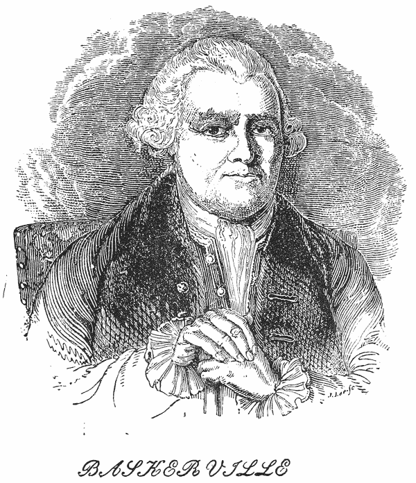
About the year 1750 his inclination for letters induced him to turn his {269} attention to typography, and to add to his business of a japanner that of a printer.545
The condition of printing in England at this period was still anything but satisfactory. Fine printing was an art unknown; and although under the influence of Caslon’s genius the press was recovering from the reproach under which it lay at the beginning of the century, England was still very far behind her neighbours both in typographical enterprise and achievement. Once more it was left to an outsider to initiate the new departure; and as in 1720 the art of letter-founding had been roused from its lethargy by the genius of a gunsmith’s apprentice, so in 1750 the art of printing was destined to find its deliverer in the person of an eccentric Birmingham japanner. Whatever may be the judgment of posterity as to the merits of Baskerville’s performances, to him is undoubtedly due the honour of the first real stride towards a higher level of national typography; an example which became the incentive to that outburst of enthusiasm—that “matrix and puncheon mania,” as Dibdin terms it—which brought forth the series of splendid typographical productions with which the eighteenth century closed and the nineteenth opened.
Baskerville’s first essay in his new enterprise was deliberate, and gave ample proof of the enthusiasm of the man. Six years elapsed before any work issued from his press. During that period he is said to have sunk upwards of £600546 in the effort to produce a type sufficiently perfect to satisfy his fastidious taste. He engaged the best punch-cutters that could be had,547 in addition to which he made his own moulds, chases, ink, presses, and, indeed, almost the entire apparatus of the art.
The following extracts from letters in the possession of Mr. S. Timmins, to whose industrious researches the student of typography is indebted for much new light on the history of Baskerville’s career, and to whose courtesy we are indebted for the present opportunity of placing them before our readers, will {270} best describe the marvellous industry and enthusiasm which carried our printer to the successful issue of his great enterprise. The letters form part of a correspondence between Baskerville and his friend R. Dodsley, the publisher, respecting the preparations for his earliest printing venture:―
Baskerville to R. Dodsley. 2nd October 1752.
“To remove in some measure your impatience, I have sent you an impression of fourteen punches of the Two-lines Great Primer, which have been begun and finished in nine days only, and contain all the letters Roman necessary in the Titles and Half-titles. I cannot forbear saying they please me, as I can make nothing more correct, nor shall you see anything of mine much less so. You’ll observe they strike the eye much more sensibly than the smaller characters, tho’ equally perfect, till the press shows them to more advantage. The press is creeping slowly towards perfection. I flatter myself with being able to print nearly as good a colour and smooth a stroke as the enclosed. I should esteem it a favour if you’d send me the Initial Letters of all the Cantos lest they should not be included in the said fourteen, and three or four pages of any part of the Poem from whence to form a Bill for the casting a suitable number of each letter. The R wants a few slight touches, and the Y half an hour’s correction. This day we have resolutely set about thirteen of the same siz’d Italic Capitals, which will not be at all inferior to the Roman, and I doubt not to complete them in a fortnight. You need, therefore, be in no pain about our being ready by the time appointed. Our best respects to Mrs. Dodsley and our friend, Mr. Beckett.”
Baskerville to R. Dodsley. 19th October 1752.
“As I proposed in my last, I have sent you impressions from a candle of twenty Two-lines Great Primer Italick, which were begun and finished in ten days only. We are now about the figures, which are in good forwardness, and changing a few of those letters we concluded finished. My next care will be to strike the punches into copper and justify them with all the care and skill I am master of. You may depend on my being ready by your time (Christmas), but if more time could be allowed, I should make use of it all in correcting and justifying. So much depends on appearing perfect on first starting . . .”
Baskerville to R. Dodsley. 16th January 1754.
“I have put the last hand to my Great Primer, and have corrected fourteen letters in the specimen you were so kind to approve, and have made a good progress in the English, and have formed a new alphabet of Two-line Double Pica and Two-line Small Pica capitals for Titles, not one of which I can mend with a wish, as they come up to the most perfect idea I have of letters.”
He then details his scheme for obtaining absolutely correct texts of the works he is about to print, as follows:―
“’Tis this. Two people must be concerned; the one must name every letter, capital, point, reference, accent, etc., that is, in English, must spell every part of every word distinctly, and note down every difference in a book prepared on purpose. Pray oblige me in making the experiment with Mr. James Dodsley in four or five lines of {271} any two editions of an author, and you’ll be convinced that it’s scarcely possible for the least difference, even of a point, to escape notice. I would recommend and practise the same method in an English author, where most people imagine themselves capable of correcting. Here’s another great advantage to me in this humble scheme; at the same time that a proof sheet is correcting, I shall find out the least imperfection in any of the Types that has escaped the founder’s notice. I have great encomiums on my Specimen from Scotland.”
The concluding sentence of this letter probably refers to the public announcement of the forthcoming quarto Virgil,548 put forward about this time, together with a specimen of the type. This most interesting document, a very few copies of which still exist, is in the form of a quarto sheet, headed, “A Specimen by John Baskerville, of Birmingham, in the County of Warwick, Letter Founder and Printer.” It displays the Roman and Italic of the Great Primer fount, and is remarkable not only as a piece of exquisite printing,549 but as the first known specimen of the famous Birmingham foundry.
The following letters refer principally to the progress and completion of the Virgil:―
Baskerville to R. Dodsley. Birmingham, 20th December 1756.
“I shall have Virgil out of the press by the latter end of January, and hope to produce the Volume as smooth as the best paper I have sent you. Pray, will it not be proper to advertize how near it is finishing, and beg the gentlemen who intend favouring me with their names, to send them by that time? When this is done, I can print nothing at home but another Classick (a specimen of which will be given with it) which I cannot forbear thinking a grievous hardship after the infinite pains and great expense I have been at. I have almost a mind to print a pocket Classick in one size larger than the old Elzevirs, as the difference will, on comparison, be obvious to every Scholar; nor should I be very sollicitous whether it paid me or not.”
R. Dodsley to Baskerville. 10th February 1757.
“The account you give me of the Virgil pleases me much, and I hope you will in that have all the success your heart can wish. I beg if you have any objection, addition or alteration to make in the following Advertisement you will let me know by return of post:― {272}
“‘TO THE PUBLIC.“‘John Baskerville of Birmingham thinks proper to give notice that having now finished his Edition of Virgil in one Volume, Quarto, it will be published the latter end of next month, price one guinea in sheets. He therefore desires that such gentlemen who intend to favour him with their names, will be pleased to send them either to himself at Birmingham, or to R. and J. Dodsley in Pall Mall, in order that they may be inserted in the list of his encouragers.’”
R. Dodsley to Baskerville. April 7, 1757.
“I am very sorry I advertised your Virgil to be published last month as you have not enabled me to keep my word with the public; but I hope it will not be delayed any longer, as every day you lose now the season is so far advanced, is certainly a great loss to you. I hope I shall have the pleasure of seeing you and it together. However, if the delay is occasioned by your making corrections, I think that a point of so much consequence, that no consideration should induce you to publish till it is quite correct. As to the ornamented paper, I will lower the price since you think it proper, but am still of opinion that it will not sell at our end of the town, tho’ for what reason I cannot imagine. . . . I like exceedingly your specimen of a Common Prayer, and hope you are endeavouring to get leave to print one. There is an error in the Exhortation, shall for should. Your small letter is extremely beautiful; I wish I could advise you what to print with it. What think you of some popular French book—Gil Blas, Molière, or Telemaque ? In the specimen from Melmoth I think you have used too many Capitals, which is generally thought to spoil the beauty of printing; but they should never be used to adjectives, verbs, or adverbs. My best compliments attend your whole family.”
At length, after repeated delays, caused mainly by the nervous fastidiousness of the printer, who even corrected his work currenti prelo up to the last moment, the famous Virgil appeared in 1757,550 and with its publication Baskerville’s reputation was made. Being the earliest performance of this press, the volume possesses a peculiar interest among the productions of English typography. Opinions may differ as to some of the eulogies pronounced on it by bibliographers and bibliophiles,551 but as a typographical curiosity,552 and as a pioneer of fine printing in our midst, it is a work to be treasured and reverenced. {273}
From a letter-founder’s point of view its chief interest consists in its being the earliest book printed in the type of the new Birmingham foundry. The fount used is a Great Primer, slender and delicate in form, combining, as Dibdin says, in a singularly happy manner, the elegance of Plantin with the clearness of the Elzevirs. The Italic letter was specially admired for its freedom and symmetry—qualities in which it excelled even the beautiful founts of Aldus and Colinæus.
Baskerville’s merit met with prompt recognition in many quarters, amongst others, by the Delegates of the Oxford Press, who, in 1758 (apparently on his own application), entrusted him with the cutting and casting of a new Greek fount for their own use. A record of this important transaction remains in the following Minutes of the Delegates:―
“June 6, 1758.—Present (among others) Dr. (Sir W.) Blackstone. Order’d that this Delegacy will at their next meeting take into consideration Mr. Baskerville’s Proposals for casting a Set of new Greek Types.
“July 5, 1758.—Ordered that Dr. Blackstone be empowered to agree with Mr. Baskerville of Birmingham to make a new set of Greek Puncheons, matrices and moulds, in Great Primer, for the Use of the University, and also to cast therein 300 Weight of Types, at the Price of 200 Guineas for the whole. And that he and Mr. Prince (Warehouse-keeper) do give proper Directions for that Purpose.
“Jan. 31, 1759.—Agreed that Mr. Musgrave have leave to print his Euripides at the University Press on Mr. Baskerville’s Types as soon as they arrive.553
“March 11, 1761.—Ordered, That a Greek Testament in Quarto and Octavo be printed on Baskerville’s Letter, and three or four Gentlemen of Learning and Accuracy be desired separately to correct the Proofs.
“June 23, 1761.—500 copies in Quarto and 2,000 in Octavo ordered to be printed.”
In the accounts for 1761 the following entry records the conclusion of the business:―
“To Mr. Baskerville for Greek Types . . . . £210 0 0.”
Considerable expectation was aroused by this order, which was considered of sufficient importance to deserve mention in the public press, as the following extract from the St. James’s Chronicle of September 5, 1758, testifies:―
“The University of Oxford have lately contracted with Mr. Baskerville of Birmingham for a complete Alphabet of Greek Types of the Great Primer size; and it is not doubted but that ingenious artist will excel in that Character, as he has already done in the Roman and Italic, in his elegant edition of Virgil, which has gained the applause and admiration of most of the literati of Europe, as well as procured him the esteem and patronage of such of his own countrymen as distinguish themselves by paying a due regard to merit.”
The anticipations thus expressed were destined to be disappointed; for {274} Baskerville’s genius appears to have failed him in his efforts to reproduce a foreign character. Even before the appearance of the Oxford Greek Testament, which did not occur till 1763, rumours of the failure of this undertaking had begun to circulate. Writing in 1763, respecting a forthcoming Greek Testament of his own, Bowyer says, “Two or three quarto Editions on foot, one at Oxford, far advanced on new types by Baskerville,—by the way, not good ones.”554
The appearance of the work in question555 justified, to some extent, the criticism. Regular as the Greek character is, it is stiff and cramped, and, as Dibdin says, “like no Greek characters I have ever seen.” Rowe Mores goes to the length of styling it “execrable”; and Bowyer appears to have had it specially in mind when he said to Jackson that the Greek letters commonly in use were no more like Greek than English.
Be this as it may, Baskerville made no further excursions into the foreign and learned languages, and, fortunately (as we consider) for his reputation, confined his talents to the execution of the characters of his native tongue, a branch of the art in which he had no rival.
The punches, matrices and some of the types of this interesting fount are still preserved at Oxford,556 and are the only relics in this country of Baskerville’s letter-foundry. We are particularly glad, therefore, to be able to present here, in addition to the annexed facsimile from the Specimen of 1768–70, a line printed from the actual type cast by Baskerville in 1761:―

Among the other important works which, says Mr. Nichols, “Baskerville printed with more satisfaction to the literary world than emolument to himself,” his Paradise Lost, in 4to, printed in 1758,557 is of signal merit and beauty. As a work of fine printing, it equals, if it does not excel, the Virgil. “The type”, observes Hansard (who speaks of it as a Pica instead of an English) “is manifestly an improvement on the ‘slender and delicate’ mentioned by Mr. Dibdin; I should think it, on the contrary, approaching to the embonpoint, and admirably calculated by extending the size (if in exact proportion), for works of the largest dimensions. The Italic possesses much room for admiration. . . . This work will, in my opinion, bear a comparison, even to its advantage, with those subsequently executed by the first typographer of our age. There is a clearness, a soberness, a softness, and at the same time a spirit, altogether harmonising, in Baskerville’s book, that neither of the others with which I am comparing it, can, I think, fairly claim.”558
In his preface to the Paradise Lost, Baskerville gives an interesting account of his own labours and ambitions as a letter-founder. He says:―
“Amongst the several mechanic Arts that have engaged my attention, there is no one which I have pursued with so much steadiness and pleasure as that of Letter Founding. Having been an early admirer of the beauty of Letters, I became insensibly desirous of contributing to the perfection of them. I formed to myself ideas of greater accuracy than had yet appeared, and have endeavoured to produce a Sett of Types according to what I conceived to be their true proportion.
“Mr. Caslon is an artist to whom the Republic of Learning has great obligations; his ingenuity has left a fairer copy for my emulation than any other master. In his great variety of Characters I intend not to follow him; the Roman and Italic are all I have hitherto attempted: if in these he has left room for improvement it is probably more owing to that variety which divided his attention, than to any other cause. I honour his merit and only wish to derive some small share of Reputation from an Art which proves accidentally to have been the object of our mutual pursuit.
“After having spent many years, and not a little of my fortune, in my endeavours to advance this art; I must own it gives me great satisfaction to find that my edition of Virgil has been so favorably received . . .
“It is not my desire to print many books; but such only as are books of Consequence, of intrinsic merit, or established Reputation, and which the public may be pleased to see in an elegant dress, and to purchase at such a price as will repay the extraordinary care and expence that must necessarily be bestowed upon them . . . If {276} this performance (i.e., the Milton) shall appear to persons of judgment and penetration in the Paper, Letter, Ink, and Workmanship to excel, I hope their approbation may contribute to procure for me, what would indeed be the extent of my Ambition, a power to print an Octavo Prayer Book, and a FOLIO BIBLE.”
Both these ambitions were in due time fulfilled. In 1758 Baskerville had applied for the post of Printer to the University of Cambridge, an office which he obtained, with permission to print the folio Bible, and two editions of the Common Prayer in three sizes. This learned body, however, appear to have been influenced in the transaction more by a wish to fill their own coffers than by a desire to promote the interests of the Art; and the heavy premiums exacted from Baskerville for the privilege thus accorded effectually deprived him of any advantage whatever in the undertaking. He continued to hold this unsatisfactory office till 1766.
Meanwhile he had laboured assiduously to complete his promised series of the Roman and Italic faces. At the time of the publication of the Virgil, he put forward a quarto sheet containing specimens of the Great Primer, English, Pica, and Brevier Roman, and Great Primer and Pica Italic, beautifully printed. This sheet, which is noted by Renouard,559 and which is occasionally found bound up with copies of the Virgil, was very shortly followed, about the end of the year 1758, by a larger and more general specimen, consisting entirely of Roman and Italic letter in eight sizes, viz.:—Double Pica, Great Primer, English, Pica, Small Pica, Long Primer, Bourgeois and Brevier. Of the two last, Roman only is shown. The whole is arranged in two columns on a broadside sheet, with appropriate titlings, and forms a beautiful display. Although the only copy we have seen is printed on a greenish paper, somewhat coarse, the Specimen exceeds in elegance and uniformity most, if not all, the productions of contemporary founders.560

It may be worth noting here that in point of body Baskerville appears to {277} have followed an independent course; most of his bodies, even the Pica, varying from the usual standards. The punches of the Greek fount, preserved at Oxford, show marks of high finish, although unnecessarily, as it seems to us, rounded in the stem. It is probable that these and the other punches of his foundry were not his own handiwork, but cut by skilled artists under his critical supervision.
Unfortunately, very little is known of the operations of the Birmingham foundry as a trade undertaking. It is even doubtful whether, at first, Baskerville supplied his types to any press but his own; indeed, the activity of that press during the period when it was in the height of its prosperity was such that it is unlikely its proprietor would encumber himself with the duties of a letter-founder to the trade in general.
The magnificent works561 which between 1759 and 1772 continued to issue from his press not only confirmed him in his reputation, but raised his name to an unique position among the modern improvers of the art. The paper, the type and the general execution of his works were such as English readers had not hitherto been accustomed to, while the disinterested enthusiasm with which, regardless of profit, he pursued his ideal, fully merited the eulogy of the printer-poet who wrote:―
- “O BASKERVILLE ! the anxious wish was thine
- Utility with beauty to combine;
- To bid the o’erweening thirst of gain subside;
- Improvement all thy care and all thy pride;
- When BIRMINGHAM—for riots and for crimes
- Shall meet the long reproach of future times,
- Then shall she find amongst our honor’d race,
- One name to save her from entire disgrace.”562
Baskerville’s third specimen sheet, undated, but probably issued in 1762, is an exquisitely printed large folio on highly glazed white paper. It completes the series of Roman and Italic displayed in the former sheet with a Nonpareil, and the whole is surrounded by an elegant light border. It is incomparably the most beautiful type-specimen of its day, although it must be admitted that not a little of its beauty is due to the brilliancy of the ink and the gloss of the paper.
Despite the applause bestowed on him, and the acknowledged excellence of his work, Baskerville failed to make his new business a paying one. His letter {278} to Horace Walpole in 1762 best details the history of his struggles and disappointments:―
“To the Hon’ble Horace Walpole, Esq., Member of Parliament, in Arlington Street, London, this:EASY HILL, BIRMINGHAM, 2 Nov. 1762.
“SIR,—As the Patron and Encourager of Arts, and particularly that of Printing,563 I have taken the Liberty of sending you a Specimen of Mine, begun ten Years ago at the age of forty-seven, and prosecuted ever since with the utmost Care and Attention, on the strongest Presumption, that if I could fairly excel in this divine Art, it would make my Affairs easy or at least give me Bread. But alas! in both I was mistaken. The Booksellers do not chuse to encourage Me, though I have offered them as low terms as I could possibly live by; nor dare I attempt an Old Copy till a Law Suit relating to that affair is determined.
“The University of Cambridge have given me a Grant to print their 8vo and 12mo Common-Prayer Books, but under such Shackles as greatly hurt me. I pay them for the former twenty and for the latter twelve pounds ten shillings the thousand; and to the Stationers’ Company thirty-two pound for their permission to print one edition of the Psalms in Metre to the small Prayer Book; add to this the great expense of Double and treble carriage, and the inconvenience of a printing house an hundred Miles off. All this Summer I have had nothing to print at Home. My folio Bible is pretty far advanced at Cambridge, which will cost me near £2000 all hired at 5 per cent. If this does not sell, I shall be obliged to sacrifice a small patrimony which brings me in £74 a year to this business of Printing, which I am heartily tired of and repent I ever attempted. It is surely a particular hardship, that I should not get Bread in my own country (and it is too late to go abroad) after having acquired the Reputation of excelling in the most useful Art known to mankind; while everyone who excels as a Player, Fiddler, Dancer, &c., not only lives in Affluence, but has it in their power to save a Fortune.
“I have sent a few Specimens (same as the enclosed) to the Courts of Russia and Denmark, and shall endeavour to do the same to most of the Courts in Europe; in hopes of finding in some of them a purchaser of the whole scheme, on the Condition of never attempting another Type. I was saying this to a particular Friend, who reproached me with not giving my own Country the Preference, as it would (he was pleased to say) be a national Reproach to lose it: I told him nothing but the greatest Necessity would put me upon it; and even then I should resign it with the utmost reluctance. He observed the Parliament had given a handsome Premium for a great Medicine; and he doubted not, if My Affair were properly brought before the House of Commons, but some Regard would be Paid to it. I replied I durst not presume to Petition the House, unless encouraged by some of the Members, who might do me the honour to promote it; of which I saw not the least hopes or probability. Thus, Sir, I have taken the Liberty of laying before you my Affairs without the least Aggravation; and humbly hope your patronage: To whom can I apply for {279} Protection, but the Great who alone have it in their power to serve me? I rely on your candour as a Lover of the Arts and to excuse this Presumption in your most obedient and most humble servant
JOHN BASKERVILLE.
“P.S.—The folding of the Specimens will be taken out by laying them for a short time between damped Papers. N.B.—The Ink, Presses, Chases, Moulds for Casting, and all the apparatus for Printing were made in my own shops.”564
The folio Bible565 referred to in this letter has always been regarded as Baskerville’s magnum opus, and is his most magnificent as well as his most characteristic specimen. It duly appeared in Cambridge in 1763, in a beautiful Great Primer type, fully meriting the applause which it evoked. It had been preceded in 1760 by some very elegant editions of the Book of Common Prayer,566 all published at Cambridge in his capacity of University printer.
After the publication of the Bible, Baskerville wearied of his profession of printing, disheartened alike by the poor pecuniary returns for his labours, and the unfriendly criticism pronounced in various quarters upon his performances. Despite the splendid appearance of his impressions, the ordinary English printers viewed with something like suspicion the meretricious combination of sharp type and hot-pressed paper which lent to his sheets their extraordinary brilliancy.567 They objected to the dazzling effect thus produced on the eye; they found fault with the unevenness of tone and colour in different parts of the same book, and even discovered an irregularity and lack of symmetry in some of his types, which his glossy paper and bright ink alike failed to disguise.
That these strictures were not wholly the result of prejudice and jealousy, a careful examination of Baskerville’s printed works in the light of the modern {280} canons of fine printing will prove. Even his warmest admirers, like Fournier,568 tempered their praise with some reservation; while hostile critics, like Mores, summarily denied him a place among letter-cutters at all.569
Of the prejudice rife against Baskerville at this time, an amusing anecdote is preserved in a letter of Benjamin Franklin to our printer, dated 1760:―
“CRAVEN STREET, LONDON, 1760.
“DEAR SIR,—Let me give you a pleasant instance of the prejudice some have entertained against your work. Soon after I returned, discoursing with a gentleman concerning the artists of Birmingham, he said you would be a means of blinding all the readers of the nation, for the strokes of your letters being too thin and narrow, hurt the eye, and he could never read a line of them without pain. ‘I thought,’ said I, ‘you were going to complain of the gloss of the paper some object to.’ ‘No, no,’ said he, ‘I have heard that mentioned, but it is not that; it is in the form and cut of the letters themselves, they have not that height and thickness of the stroke which makes the common printing so much more comfortable to the eye.’ You see this gentleman was a connoisseur. In vain I endeavoured to support your character against the charge; he knew what he felt, and could see the reason of it, and several other gentlemen among his friends had made the same observation, etc. Yesterday he called to visit me, when, mischievously bent to try his judgement, I stepped into my closet, tore off the top of Mr. Caslon’s specimen, and produced it to him as yours, brought with me from Birmingham, saying, I had been examining it, since he spoke to me, and could not for my life perceive the disproportion he mentioned, desiring him to point it out to me. He readily undertook it, and went over the several founts, showing me everywhere what he thought instances of that disproportion; and declared, that he could not then read the specimen, without feeling very strongly the pain he had mentioned to me. I spared him that time the confusion of being told, that these were the types he had been reading all his life, with so much ease to his eyes; the types his adored Newton is printed with, on which he has pored not a little; nay, the very types his own book is printed with (for he is himself an author), and yet never discovered this painful disproportion in them, till he thought they were yours.
“I am, etc.,“B. FRANKLIN.”570
This occasion for the above interesting letter, was an application made by {281} Baskerville in 1760 to his friend, Dr. Franklin, to assist him in London to sound the literati there respecting the purchase of his types. This attempt failing, a few years later Dr. Franklin undertook a similar good office in Paris,571 and with a similar result. “The French,” he wrote in 1767, “reduced by the war of 1756 were so far from being able to pursue schemes of taste, that they were unable to repair their public buildings, and suffered the scaffolding to rot before them.”
Having lost all spirit for the printing business, Baskerville, about 1766, declined to pursue it except through the medium of a confidential agent, and the following notice, issued about this period, announced this decision to the public:―
“Robert Martin has agreed with Mr. Baskerville for the use of his whole printing apparatus, with whom he has wrought as a journeyman for ten years past. He therefore offers his services to print at Birmingham for Gentlemen or Booksellers, on the most moderate terms, who may depend on all possible care and elegance in the execution. Samples, if necessary, may be seen on sending a line to John Baskerville or Robert Martin.”572
After a retirement of three years, Baskerville resumed work in 1769, completing between that period and the time of his death his fine series of the 4to classics, which bear the marks of unabated genius even in declining days; and suffice, had he printed nothing else, to distinguish him as the first typographer of his time.
It would appear from a passage in a letter of Franklin’s in reference to the fine edition of Shaftesbury’s Characteristics, published in 1773 (4to), that, in that year, Baskerville contemplated some further development of his type-founding business.573 His press, at any rate, seems to have continued active till that date, and even later; although it is doubtful whether the latest works bearing his imprint received his personal oversight.
He died on January 8, 1775. Notwithstanding the poor success of his printing enterprise, he left behind him a fortune of £12,000, which, as he had no heir, went, together with the stock and goodwill of his business, to his widow.574 {282}
Of Baskerville’s personal character, a biographer observes: “In private life, he was a humourist, idle in the extreme; but his invention was the true Birmingham model, active. He could well design, but procured others to execute; wherever he found merit, he caressed it; he was remarkably polite to the stranger, fond of shew; a figure, rather of the smaller size, and delighted to adorn that figure with gold lace. Although constructed with the light timbers of a frigate, his movement was stately as a ship of the line. During the twenty-five last years of his life, though then in his decline, he retained the singular traces of a handsome man. If he exhibited a peevish temper, we may consider that good nature and intense thinking are not always found together. Taste accompanied him through the different walks of agriculture, architecture, and the fine arts. Whatever passed through his fingers bore the living marks of John Baskerville.”575
A less pleasing sketch of his character is given by Mark Noble in his Biographical History of England:—“I have very often”, he says, “been with my father at his house, and found him ever a most profane wretch, and ignorant of literature to a wonderful degree. I have seen many of his letters, which like his will, were not written grammatically, nor could he even spell well. In person he was a shrivelled old coxcomb. His favourite dress was green, edged with narrow gold lace, a scarlet waistcoat, with a very broad gold lace, and a small round hat, likewise edged with gold lace. His wife was all that affectation can describe. . . . She was originally a servant. Such a pair are rarely met with. He had wit; but it was always at the expense of religion and decency, particularly if in company with the clergy. I have often thought there was much similarity in his person to Voltaire, whose sentiments he was ever retailing.”576
Professing a total disbelief of the Christian religion, he ordered that his remains should be buried in a tomb in his own grounds, prepared by himself for the purpose, with an epitaph577 expressing his contempt for the superstition which {283} the bigoted called Religion. Here, accordingly, his body was buried upright, and here it remained, although the building that contained it was destroyed by the Birmingham riots of 1791. About half a century after his death his body was exhumed and exhibited for some time in a shop in Birmingham. Its final resting-place is to this day a matter of debate.
There is a portrait of Baskerville by Exteth, in the possession of the Messrs. Longman, and another in the possession of the Rev. Dr. Caldecott. An engraving of the latter is given in Hansard’s Typographia; and there is a copperplate from the same portrait (unpublished), at the present time in the collection of Mr. Timmins of Birmingham.
Mrs. Baskerville578, on succeeding to her husband’s property, declined to continue the printing business, although continuing that of letter-founding; and thus advertised her intention to the public:―
“Mrs. Baskerville, being about to decline business as a printer, purposes disposing of the whole of her apparatus in that branch, comprehending, among other articles, all of them perfect in their kind, a large and full assortment of the most beautiful types, with the completest printing presses, hitherto known in England. She begs leave to inform the publick, at the same time, that she continues the business of Letter-founding, in all its parts, with the same care and accuracy that was formerly observed by Mr. Baskerville. Those gentlemen who are inclined to encourage so pleasing an improvement may, by favouring her with their commands, be now supplied with Baskerville’s elegant types at no higher expence than the prices already established in the trade.”579 April 6, 1775.
The following further advertisement intimates that two years later the typefounding business was still carried on under the same management:―
“The late Mr. Baskerville, having taken some pains to establish and perfect a Letter-foundry for the more readily casting of Printing-types for sale, and as the undertaking was finished but a little before his death, it is now become necessary for his widow, Mrs. Baskerville, to inform all Printers that she continues the same business, and has now ready for sale, a large stock of types, of most sizes, cast with all possible care, and dressed with the utmost accuracy. She hopes the acknowledged partiality of the world, in regard to the peculiar beauty of Mr. Baskerville’s types, in the works he has published, will render it quite unnecessary here to say anything to recommend them—only that she is determined to attend to the undertaking with all care and diligence; and to the end that so useful an improvement may become as extensive as possible, and notwithstanding the extraordinary hardness and durability of these types above all others, she will conform to sell them at the same prices with other Letter founders.” Feb. 25, 1777. {284}
Notwithstanding Mrs. Baskerville’s avowed intention of continuing the business, many attempts had been made, and were still made, to dispose of the foundry. It was offered to the Universities and declined; and the London booksellers preferred the types of Caslon and his apprentices.580 The stock lay a dead weight till 1779, when the whole was purchased by Beaumarchais for the Société Litteraire-Typographique, for the sum of £3,700, and transferred to France.
Much blame and even contempt was bestowed at the time on the bad taste and unpatriotic spirit of the English nation in thus allowing the materials of this famous press to go out of the country.581 De gustibus non est disputandum. Deprived of the master-hand of their designer, the types which startled the world into admiration in the Virgil of 1757, had lost their magic by 1779; and it seems hardly reasonable to blame the printers of this country for preferring the sterling types of Caslon and Jackson, in which works as beautiful were being produced, and by far simpler methods than those employed by the Birmingham genius. Nor does it appear that after the purchase by the French there was any general feeling of regret in this country at the opportunity missed. It is, however, a fact that for some important works produced towards the close of the century—particularly those of Bulmer’s press—it was considered an advantage to secure the services of artists of the Birmingham school, both in the formation of the types and the execution of the press-work. As the pioneer of fine printing in England, Baskerville deserves, and will receive the grateful approbation of all lovers of the art. But it would be idle to say that he was not speedily matched and even surpassed by the performance of others, or that his types, had they remained in this country, would have been more valuable on account of their intrinsic excellence than of their historical interest.
That the French were well satisfied with their bargain, may be gathered from the following letter quoted by Nichols, dated Paris, August 8th, 1780:―
“The English language and learning are so cultivated in France, and so eagerly learned, that the best Authors of Great Britain are now reprinting in this Metropolis: Shakespeare, Addison, Pope, Johnson, Hume, and Robertson, are to be published here very soon. Baskerville’s types, which were bought it seems for a trifle, to the eternal disgrace of Englishmen, are to be made use of for the purpose of propagating the English Language in this country.”582 {285}
Nichols himself adds, after deploring the comparative failure of Baskerville, to receive appreciation in his native land: “We must admire, if we do not imitate the taste and economy of the French nation, who, brought by the British arms in 1762 to the verge of ruin, rising above distress, were able, in seventeen years, to purchase Baskerville’s elegant types, refused by his own country, and to expend an hundred thousand pounds in poisoning the principles of mankind by printing the Works of Voltaire.”
This great work, for the express purpose of printing which Baskerville’s types were procured, was thus announced to the English public in 1782583:―
“A complete edition of the Works of Voltaire, printed by subscription, with the types of Baskerville.
“This work, the most extensive and magnificent that ever was printed, is now in the press at Fort Kehl, near Strasburgh, a free place, subject to no restraint or imprimatur, and will be published towards the close of the present year. It will never be on sale. Subscribers only can have copies. Each set is to be numbered, and a particular number appropriated to each subscriber at the time of subscribing. As the sets to be worked off are limited to a fixed and small number, considering the great demand of all Europe, those who wish to be possessed of so valuable a work must be early in their application, lest they be shut out by the subscriptions being previously filled. Voltaire’s Manuscripts and Port-Folios, besides his Works already published, cost 12,000 guineas. This and other expenses attending the publication, will lay the Editors under an advance of £100,000 sterling. The public may from thence form a judgment of the extraordinary care that will be taken to make this edition a lasting monument of typographical elegance and grandeur,” etc. June 4, 1782.
The “proposals” were accompanied by two pages of specimens of the type.
Of this famous edition of Voltaire an interesting account is given in Lomenie’s Beaumarchais et ses Temps.584 The Society in whose name Beaumarchais undertook the work consisted of himself alone. Besides the Voltaire MSS. and the Baskerville types, he bought and set to work three paper-mills in the Vosges, and after much difficulty secured the old fort at Kehl as a neutral ground on which to establish in security his vast typographical undertaking. The enterprise was one involving labour, time and cost vastly beyond his expectations, and his correspondence with his manager at Kehl presents an almost pathetic picture of his efforts to grapple with the difficulties that beset his task. “How can we promise,” he wrote in 1780, “in the early months of {286} 1782 an edition which has neither hearth nor home in March 1780? The paper-mills have to be made, the type to be founded, the printing press to be put up, and the establishment to be formed.” And on another occasion he writes: “Here am I, obliged to learn my letters at paper-making, printing and bookselling.”
It was not until 1784 that Volume One appeared; and the whole work in two editions was not completed till 1790,585 by which time France was in the throes of the Revolution, and little likely to heed the literary exploits even of one of her most talented sons. Of the 15,000 copies printed, only 2,000 found subscribers; and after the dissolution of the establishment at Kehl586 (where, besides, he printed an edition of Rousseau and a few other works) all the benefit Beaumarchais received from his enterprise was a mountain of waste-paper.
The final destination of Baskerville’s types is shrouded in mystery. Most writers assert that the printing establishment at Kehl was entirely destroyed at the commencement of the French Revolution, and many suggest that the types performed their last service in the shape of bullets. Plausible as this story is, it is disproved by the existence of four works of Alfieri, all bearing the imprint, dalla Tipografia di Kehl, co’ caratteri di Baskerville, and dated severally 1786, 1795, 1800 and 1809.587 These works, to whose existence no writer on Baskerville appears hitherto to have called attention, bear the strongest internal evidence of the accuracy of their claims, and thus enable us to trace the survival of these famous types to a date twenty years later than that at which they are commonly supposed to have perished. In England, some of Baskerville’s types are said to have been in use in the office of Messrs. Harris, in Liverpool, in 1820; and seven years later, we find a work printed by Thomas White, of Crane Court, London, for Pickering, claiming to be “with the types of John Baskerville”.588 But though a fount or two of the types may have survived, all search as to the ultimate fate of the punches or matrices is baffled. They may still exist, {287} neglected, in the dusty drawers of some foreign press or foundry.589 If so, it is to be hoped that their discovery may in due time reward the patience of those whose ambition it is to recover for their native land these precious relics of the most brilliant of all the English letter-founders.
No date. A Specimen by John Baskerville, of Birmingham, in the county of Warwick, Letter Founder and Printer. 4to sheet. (1752?) (S. T.)
No date. A Specimen by John Baskerville of Birmingham. 4to sheet. (1757?) (Althorp.)
No date. A Specimen by John Baskerville of Birmingham, Letter Founder and Printer. (1758?). Broadside. (S. T.)
No date. A Specimen by John Baskerville of Birmingham. (1762?). Folio. (S. T.)
 HOMAS COTTRELL, described by Mores as à primo
proximus of modern letter-founders, served his apprenticeship
in the foundry of the first Caslon. He was
employed there as a dresser, and the portrait of him
which is to be seen in the Universal Magazine of
1750,590
among a group of Caslon’s workmen, represents
him as engaged in that branch of the business.
HOMAS COTTRELL, described by Mores as à primo
proximus of modern letter-founders, served his apprenticeship
in the foundry of the first Caslon. He was
employed there as a dresser, and the portrait of him
which is to be seen in the Universal Magazine of
1750,590
among a group of Caslon’s workmen, represents
him as engaged in that branch of the business.
It is not improbable that he joined with his friend and fellow apprentice, Joseph Jackson, in clandestinely observing the operation of punch-cutting, secretly practised by his master and his master’s son at Chiswell Street; and being assisted by natural ability, and what Moxon terms a “genuine inclination,” he contrived during his apprenticeship to qualify himself not only in this, but in all the departments of the art.
In 1757 a question as to the price of work having arisen among Mr. Caslon’s workmen, Cottrell and Jackson headed a deputation on the subject to their employer, then a Commissioner of the Peace, residing at Bethnal Green. The worthy justice taking this action in dudgeon, the two ringleaders were dismissed from Chiswell Street, and thus thrown unexpectedly on their own resources.
Cottrell, in partnership for a short time with Jackson, and (according to Rowe Mores), assisted also by a Dutchman, one Baltus de Graff, a former {289} apprentice of Voskens of Amsterdam, established his foundry in Nevil’s Court, Fetter Lane. His first fount was an English Roman, which, though it will compare neither with the performance of his late master, nor with the then new faces of Baskerville, was yet a production of considerable merit for a self-trained hand.
In 1758 an incidental record of Cottrell’s Foundry exists in the history, elsewhere recorded, of Miss Elstob’s Saxon types, the punches and matrices of which, after remaining untouched for several years at Mr. Caslon’s, were brought to Cottrell by Mr. Bowyer, to be “fitted up” ready for use. This task Cottrell performed punctually and apparently to the satisfaction of his employer, returning them with a small fount of the letter cast in his own mould, as a specimen of the improvement made in them.591
In 1759 Jackson quitted the business to go to sea, and Cottrell, left to himself, busily proceeded with the completion of his series of Romans, which he carried as low as Brevier, a size “which,” says Rowe Mores, “he thinks low enough to spoil the eyes.”592
He also cut a Two-line English Engrossing in imitation of the Law-Hand, and several designs of flowers.
The Engrossing, or as Mores styles it, the Base Secretary, was a character designed to take the place of the lately abolished Court Hand in legal documents, and appears to have been designed for Cottrell by a law printer named Richardson. On the completion of the fount, an impression of which we here give, Richardson issued a specimen of it,593 claiming the design, and representing its advantages as the proper character for leases, agreements, {290} indentures, etc. The matrices, however, remained with Cottrell, and the inclusion of the fount in his general specimen shows that Richardson ceased to retain any exclusive use of it. It was the only fount of the kind in England when Mores wrote in 1778.
Cottrell’s first specimen was a broadside sheet, undated, but probably issued about the year 1760. It shows the Roman founts, arranged in a form very similar to that of Caslon’s broadside of 1749. The only copy of this specimen known is that in the Sohmian Collection at Stockholm.
It was followed, a few years later, by an 8vo Specimen Book, which, from its obvious resemblance to Caslon’s Book of 1764, we may judge to have seen the light about 1766.594 This Specimen exhibits the Roman and Italic Founts from Five-line to Brevier, the Engrossing above mentioned, and five pages of Small Pica Flowers elaborately arranged. The general appearance is neat, each page being surrounded by a border. The Romans are cut after the Caslon models, and are fairly good, although a close inspection would suggest that Cottrell’s “genuine inclination” did not extend to the justifying of his matrices with the same success as to the cutting of the punches.
The following note at the foot of the Long Primer on Bourgeois specimen is, perhaps, the most interesting feature of this book:―
“This Foundery was begun in the Year 1757, and will (with God’s leave) be carried on, improved and enlarged, by Thomas Cottrell, Letter Founder, in London.
“N. B. Served my apprenticeship to William Caslon, Esq.”
Fournier, in the second part of his Manuel Typographique, 1766, mentions Cottrell’s Foundry, but in such a manner as to lead one to suppose he had never seen his specimen, or heard of it except by the vaguest hearsay. He mentions him as “Cottrell à Oxfort,” at the head of his list of English Founders.595 {291}
A more satisfactory contemporary record is contained in Luckombe’s History and Art of Printing, 1770, where pages 169 to 174 are occupied by specimens of the Engrossing and Flowers already exhibited in the specimen book, and a fount of English Domesday.
This latter fount, which appears to have been completed subsequent to the issue of the specimen book, Cottrell cut under the inspection of Dr. Morton for the forthcoming issue of Domesday Book, begun in 1773, and “which”, Rowe Mores sarcastically observes, “if the undertakers go on as they have begun, will by domes-day hardly be finished.”
The work was, however, finished and printed, but not in Cottrell’s type, his performance having been eclipsed by that of his old colleague and partner Jackson, who, after returning from sea in 1763, had worked for a short time at the Nevil’s Court Foundry, and then left to start business for himself, taking with him two of Cottrell’s workmen.
Cottrell was at this period a private in the Life Guards; a position considered highly respectable in those days, and not at all incompatible with business pursuits. His military ardour evidently had its effect in the Foundry, for we find that Robinson and Hickson, his two workmen who left with Jackson, were also enlisted in the same service.
He does not appear to have extended his foundry very much as regards its Roman letter. According to Rowe Mores, however, he produced “some uncommon founts of proscription, or posting letter of great bulk and dimensions as high as to the measure of twelve-line Pica.”596 Of these founts (which were no doubt cast, like Caslon’s, in sand), a specimen is in existence, consisting of two broadside sheets, showing about eleven sizes from two-line Double Pica to twelve-line Pica.
No specimen, however, is to be found of the Russian fount, which Mores, writing in 1778, hopes Cottrell is about to cut “for a gentleman who compiles a Russian Dictionary; the same gentleman who translated into English, The Grand Instructions of Her Imperial Majesty Catherine II, for a new Code of Laws for the Russian Empire. London, 1768, 4to., to whom we wish success.”
Cottrell died in 1785. He is described as obliging, good-natured, and friendly, rejecting nothing because it is out of the common way, and expeditious in his performances. Nichols, in recording his death, says “Mr. Cottrell died, I am sorry to add, not in affluent circumstances, though to his profession of a letter-founder were superadded that of a doctor for the toothache, which he cured by {292} burning the ear; and had also the honour of serving in the Troop of His Majesty’s Life Guards.”597
The following is the summary of his foundry as gathered from his specimen book, together with the additional founts cut subsequently:―
Of the history of the Foundry during the nine years following Mr. Cottrell’s death, no record remains. In 1794 it became the property of Robert Thorne, a former apprentice of Cottrell’s, who removed the business from Nevil’s Court to No. 1, Barbican, whence he issued in that year his first specimen and a price list announcing his new undertaking.598
The specimen book consists entirely of elegantly shaped large letters cast in sand, from five-line up to nineteen-line, a then unprecedented size. The bulk of these, comprising the sizes from five to twelve-line, advancing by one pica em in body, it may be surmised, are from Cottrell’s models; the thirteen, sixteen, and nineteen-line, being added by Thorne. For his specimen of ordinary-sized letter, Thorne probably made use at first of Cottrell’s book as it stood.599
But it is evident by the specimen published four years later, in 1798, that if he ever was possessed of the matrices of these founts, he entirely discarded them, in conformity with the passing fashion, in favour of others more closely resembling the beautiful faces of Jackson and Figgins. His specimen of 1798 is indeed one of the most elegant of which that famous decade can boast. For {293} lightness, grace, and uniformity, the series of Romans and Italics which are exhibited excels that of almost all his competitors. The book, which contains not a single fount which had previously appeared in Cottrell’s book, consists of forty-eight leaves, of which thirty are devoted to Roman and Italic, and the remainder to Titlings, Shaded letters, and Flowers, with one fount of Double-Pica Script. A postscript to the specimen states that four more founts were nearly ready, completing the series, the preparation of which had evidently been the labour of many years.600 It is therefore the more to be regretted, that Thorne, in common with all his contemporaries, was compelled almost immediately, by the sudden change of public taste in favour of the new style of Roman, to abandon the further prosecution of this excellent series, and devote himself to the production of founts according to “modern” fashion.
In 1801 a revised price list was issued announcing a rise in the price of type owing to the advanced cost of raw material and journeymen’s wages601; and in 1803 appeared the specimen of the new Roman series, representing the product of five years’ incessant toil and sacrifice. It cannot be said that this specimen of “Improved Types”602—one of the first completed in the trade—bears any comparison with the artistic elegance of its predecessor.
It exhibits the new Roman and Italic in ten, seven, and five-line Pica, Canon, two-line Great Primer (two faces), two-line English (two faces), Double Pica (two faces), Great Primer (two faces), English, Pica, Long Primer (two faces), Bourgeois, Brevier, and Minion. Ornamenteds—two-line Pica (two faces), two-line Small Pica (two faces). Shadeds—two-line Small Pica (two faces), two-line Nonpareil (three faces). Script—Double Pica.
Thorne, indeed, having once abandoned the old style for the new, appears in the van of the innovating fashion. Not sharing in the regret expressed by his brethren in the art at the new departure, he still further advanced upon it by the production of some exceedingly thick and fat (and we may add unsightly) jobbing letters, which, though subsequently followed and even exceeded by others, were at the time unique for boldness and deformity. {294}
In Oriental and “learned” letters he appears to have achieved nothing; as not a single fount, not even Cottrell’s Domesday, appears in this specimen, or in the subsequent inventory of the Foundry.
A curious document entitled Rules and Regulations of the Letter-Foundry of Robert Thorne, London, Jan. 1806, exists, and gives an interesting glimpse into the order and customs of the Barbican Foundry. To the general scope of these rules we have referred in another place603; but as being personal to Thorne in his relations with his men, we may mention here that he constituted himself Treasurer of the fines for “Footale,” imposed by the men on all new workmen, with an obligation to account for and distribute the sum every Christmas Eve, and also made himself liable, equally with his men, to a fine of a shilling if he left his light burning when quitting the Foundry for the night.
For some time (though the exact dates cannot be fixed), Mr. Thorne had a partner in Mr. Hugh Hughes, an able engraver and designer of music and other characters, who afterwards commenced a foundry in Dean Street, Fetter Lane.604 This association does not appear to have lasted long, or to have involved any alteration in the style of the firm.
About the year 1810 Mr. Thorne removed from Barbican to Fann Street, Aldersgate,605 where, in premises formerly occupied by a brewery, he continued his business under the name, which it still bears, of the Fann Street Foundry.
Considerable additions were made to the faces of the Foundry during the next ten years. Two new Scripts were cut, the “Sanspareil” matrices were adopted for the large letters, and a few new book founts appeared with light faces, which contrasted agreeably with the fat style generally predominating in Thorne’s specimens.
In 1817, declining health induced Mr. Thorne to attempt to dispose of his business to his fellow-founders; but his offer being declined, he resumed his labours and continued actively at work until the time of his death, which occurred in 1820, at the age of sixty-six. He was buried in Holloway Churchyard, where a tablet is erected to his memory.
No complete specimen of his type remains later than that of 1803; although the numerous loose sheets which appeared after that date, and the fact that as many as 132 pages of composed specimens were left in type at the time of his death, show that one, if not several books had been issued during the interval. {295}
On June 21st, 1820, the Foundry was put up to auction,606 and purchased entire by Mr. William Thorowgood.
This gentleman was previously unconnected with the typographical profession,607 having been engaged as London manager and agent to a Patent Roller Pump business at Stone, in Staffordshire, of which concern he was one of the principal proprietors.
With the proceeds, it is said, of a fortunate draw in one of the State Lotteries,608 he became possessor of the Fann Street Foundry, and proceeded at once to throw himself into the new business with great energy and no small success.
His first specimen book, issued in January 1821, a few months after the purchase, may be taken as representing the contents of the Foundry pretty much as Thorne left it; although even in this short space of time some additions are apparent, which formed no part of his predecessor’s stock.609 {296}
In the following year Mr. Thorowgood was sworn Letter-Founder to His Majesty, and put forth a specimen of a Greek fount of good cut, which, at the time, was the sole representative of the “learned” languages in his Foundry. Further progress was, however, made in this direction during the next few years; as Hansard, writing in 1825, mentions three sizes of German, two of Greek, one of Hebrew, and four of Russian, as forming part of his stock. The Germans, and the Pica and Bourgeois Russian, were procured from the Foundry of Breitkopf and Härtel of Leipzig.610
A new specimen book was issued in 1828. In the same year, the retirement of Dr. Fry presented Mr. Thorowgood with the opportunity of making a most important addition to his business by the acquisition of the Type Street Foundry. This purchase transferred to the Fann Street Foundry not only the whole of Dr. Fry’s interesting collection of oriental and “learned” founts, which included many relics of the old foundries, but augmented his stock of book founts, Blacks, Titlings, and Flowers, to almost double their former extent.
The transfer was completed in 1829, and early in the following year a specimen of additions to the Foundry contained an announcement that “a new edition of the Greeks, Hebrews, and foreign characters of the Polyglot Foundry, late the property of Dr. Fry, is in preparation.”
This promised specimen duly appeared in 1830, the sheets still bearing Dr. Fry’s imprint; and after this date frequent supplementary specimens marked the development of the business of this now extensive foundry.
As the scope of this history does not extend beyond the period now reached, it will suffice to state that about 1838, Mr. Thorowgood admitted into partnership Mr. Robert Besley, who, since the year 1826, had been in the service of the Foundry as traveller and in other capacities. The firm then became known as Thorowgood and Co., or more commonly Thorowgood and Besley. This partnership ceasing by the withdrawal of Mr. Thorowgood in 1849, Mr. Benjamin Fox, a practical punch cutter of much talent, joined Mr. Besley as Robert Besley and Co. On the retirement of Alderman Besley in 1861, Mr. (afterwards, Sir) Charles Reed, a printer, entered the business, which took the style of Reed and Fox. Mr. Fox died in 1877, when the firm became Sir {297} Charles Reed and Sons. Sir Charles Reed died in 1881, and the business is now in the hands of his two sons.
No date. A specimen by Thomas Cottrell. (1760?) Broadside. (Sohmian Coll. Stockholm.)
No date. A specimen of Printing Types by Thomas Cottrell, Letter Founder, in Nevil’s Court, Fetter Lane, London. (1766?) 8vo. (T.B.R.)
1770. A specimen of Cottrell’s Engrossing, Flowers, and Domesday Letters. 8vo. (Luckombe’s History of Printing, pp. 169–174.)
No date. A specimen of Large Letters by Thomas Cottrell, in Nevil’s Court, Fetter Lane, London. (1785?) 2 sheets, Broadside. (Sohmian Coll. Stockholm.)
1794. Specimen of Printing Types by R. Thorne, Letter Founder, No. 11, Barbican, London. Printed by W. Glindon, 1794. Sm. 4to. (T.B.R.)
1798. Specimen of Printing Types by R. Thorne, Letter Founder, Barbican, London, Printed in the year 1798. Sm. 4to. (Ox. Univ. Pr.)
1803. Thorne’s Specimen of Printing Types, 1803. 8vo. (W.B.)
1821. Thorowgood’s New Specimen of Printing Types, late R. Thorne’s, No. 2, Fann Street, Aldersgate Street, London. 8vo. (T.B.R.)
1822. A specimen sheet of Greek Type, W. Thorowgood, June, 1822. 8vo. (T.B.R.)
1828. Thorowgood’s, late Thorne’s, Specimen of Printing Types, 1828. 8vo. (T.B.R.)
1830. Additions to the Specimen of the Fann Street Letter Foundry, W. Thorowgood, Letter Founder to His Majesty, London, 1830. 8vo. (Caxt. Cel. 4418.)
1830. Fann Street Letter Foundry, London. Thorowgood’s Specimens of Greeks, Hebrews, and Foreign Characters, late the property of Dr. Edmund Fry. 1830. 8vo. (Caxt. Cel. 4413.)
 HIS foundry, first known as Fry and Pine’s, had its
origin in Bristol in the year 1764.
HIS foundry, first known as Fry and Pine’s, had its
origin in Bristol in the year 1764.
Mr. Joseph Fry, a prominent and enterprising Bristolian, was the son of Mr. John Fry, and was born in the year 1728. He entered the medical profession, where, says a biographer,611 “his affable, courteous manners and sound Christian principles soon secured to him a large practice amongst the highest class of his fellow citizens. Possessing uncommon energy and activity of mind, he was led to take a part in many new scientific undertakings, actuated more by the desire to be useful to society and advance the arts than by any hope of individual profit.”
This spirit of enterprise induced him, in the year 1764, to turn his attention to letter-founding, which, though hardly to be called a new scientific undertaking, was at least a novel industry for a provincial city. The success of Baskerville’s foundry at Birmingham, at that time in the height of its celebrity, was undoubtedly an incentive to the adventurers of Bristol, whose first founts were avowedly cut in close imitation of those famous models.
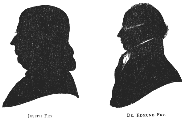
William Pine, Mr. Fry’s partner, was a practical printer of some note in his native city. He was the first printer of the Bristol Gazette, and carried on a considerable business at his premises in Wine Street. The new foundry was {299} attached to his office, and its productions may be traced in several works which issued from his press between the years 1764 and 1770.612 Messrs. Fry and Pine’s manager was one Isaac Moore, who (Rowe Mores informs us) was originally an ingenious whitesmith of Birmingham before he removed to Bristol. The practical superintendence of the foundry, if not the actual cutting of its punches, devolved on him; and his services appear to have been acknowledged by his admission into the partnership at an early stage of the undertaking, the business being carried on in his name.
Renouard mentions a Specimen by Isaac Moore, Bristol, in 1768, of which he possessed a copy mounted on linen,613 and which he describes as displaying “caractères assez bien gravés, et imitant ceux de Baskerville.” If this was, as it would appear from the title, issued at Bristol, we must conclude that the removal of the foundry to the metropolis took place in the same year, as there exists in the Sohmian Collection at Stockholm, where it was recently discovered by Mr. W. Blades, a broadside Specimen by Isaac Moore and Co. in Queen Street, near Upper Moorfields, London, showing the Roman series from five-line to Brevier, bearing the same date. Whether the two specimens are the same or not, it is hardly likely that their contents could have varied much during the brief interval. Two years later, however, the progress of the undertaking was announced by the issue of a fresh broadside sheet containing the complete series of Romans, cut after the Baskerville models, from eight-line to Pearl, with Italics to most of the founts, besides a fair display of flowers. The general appearance of the letters is elegant, especially in the larger sizes.
Appended to the specimen, in the form of a postscript, is the following address to the public (the first of a series of florid effusions which characterised the specimens of this foundry), in which the proprietors announce the principles on which their venture is to be conducted, and refer with satisfaction to the success already achieved by their productions:―
“The Proprietors of the above Foundery having nearly compleated all the Roman and Italic Founts, desire with great Deference, to lay this Specimen before the Trade; and intreat the Curious and critical, before any decisive Judgement be passed, on the Merits or Demerits of the Performance, to make a minute Examination and Comparison of the respective letters and founts of each Size, with the same Letters and Founts of the most respectable Founders in the Kingdom; For as all Letters, whether Roman or Italic, bear a great Similitude to each other, to apprehend the peculiar Beauty or Deformity of them are only to be discovered by such a Comparison. In making {300} which they hope the Candid and Judicious will set aside the Influence of Custom and Prejudice (those Great Barriers against Improvement) and attend to Propriety, Elegance and Mathematical Proportion. And as these have been objects particularly attended to in the Course of the Work, they apprehend it will appear on such a Disquisition, that all the above sizes bear a greater Likeness to each other, than those of any other Founder. They have been already favoured with the Encouragement and Approbation of several very respectable printers, who have wrought off many large Editions on their Founts, which have been Experienced to wear extremely well; owing to the Letter being clearly and deeply cut and to the Goodness of the Metal, which they make of an Extraordinary Composition; the Singular Advantage of which cannot but be obvious. Therefore hope that others will likewise make Trial of them, as they doubt not but they also will find it greatly to their Satisfaction.”614
It is doubtful whether the encouragement accorded to the new foundry on its first establishment in the metropolis came up to the expectations of the proprietors; and a circular issued shortly afterwards by two of the partners, suggests that some fillip was deemed necessary to awaken a more extended patronage of the concern. This curious document is entitled Proposals for discovering a very great Improvement which William Pine, printer of Bristol, and Isaac Moore, Letter Founder, in Queen Street, Upper Moorfields, London, have made in the Art of Printing, both in the Construction of the Press and in the Manner of Beating and Pulling, and publicly offers the secret of the invention (the precise nature of which is not apparent) to any customer of the new foundry ordering type to the value of ten pounds and upwards.615 {301}
How far this ingenuous offer had the effect of stimulating the type business is not recorded; but the proprietors were forced before long to recognise the desirability of adopting other and surer methods for gaining the popular favour.
Although Luckombe, writing in 1770,616 mentions Moore along with Caslon and Jackson, as one of the three London founders, the same authority makes a decidedly disparaging reference to his types617; a circumstance which may be accounted for by the then growing prejudice amongst metropolitan printers against the Baskerville form of letter adopted by the new foundry.
Representations of a similar nature having been made from several influential quarters, it became evident to the proprietors that if they were to retain public favour at all, it must be by adapting themselves to public taste, and abandoning the formal, delicate models of Baskerville for the more serviceable, dashing characters of Caslon.
This laborious task occupied several years in completion. Meanwhile the original founts were not discarded.
The printing office connected with the foundry distinguished itself in the interval by the production of two highly interesting Bibles, the one a folio, published in 1774, and the other an 8vo, in five volumes, published 1774–6.618 Both are elegantly printed in the clear Great Primer letter shown in the 1770 Specimen; the latter being in long lines specially for the use of the aged. The general appearance of the folio edition compares not unfavourably with the Baskerville Bible of 1772.
In 1774, Pine printed at Bristol a very neat Bible in the Pearl type of the foundry, “being”, says the preface, “the smallest a Bible was ever printed with, and made on purpose for this work.”619 {302}
Moore’s connection with the business appears to have terminated in 1776, after which the style of the firm became J. Fry and Co., who in the following year issued, in their own name, reprints of the folio and octavo Bibles above referred to.620 No specimen-sheet of their types appeared till seven years later, by which time Mr. Pine had also withdrawn from the business.621 He continued to print the Bristol Gazette in Wine Street, Bristol, till the time of his death, which occurred in 1803, at the age of sixty-four years.
Left to himself, Mr. Fry, in the year 1782, admitted his sons Edmund and Henry into partnership, under whose supervision the work of re-cutting the Romans of the foundry made active progress.
Edmund Fry, probably the most learned letter-founder of his day, had, like his father, been educated for the medical profession, and had taken his doctor’s degree. But the infirmity of deafness prevented him from following that walk in life, and he abandoned it for typefounding, applying himself to that pursuit, not only with the enthusiasm of an ardent philologist, but also with considerable natural ability for conducting the practical operations of the art.
The year of his entry into the business (1782) was signalised by an important event in the typefounding world—the sale of James’s foundry. This event has been fully alluded to elsewhere,622 but it is interesting to note that the Frys were considerable purchasers on the occasion, securing amongst other items the chief part of the “learned” and foreign matrices, for which that collection was noted.
The following list of their purchases forms an interesting connecting link between the old and the new letter-foundries; particularly as either punches or matrices of all the founts (and in some cases both) still exist, many of the latter being to this day in occasional use:― {303}
The business was shortly afterwards removed to Worship Street, hard by the old premises; and here, in 1785, the first specimen-book of the foundry was issued. This volume exhibits the greater part of the new Caslon series of Romans, which the proprietors in their “Advertisement” frankly admit to have been cut in the closest possible imitation of that ingenious artist’s models.624 It includes also two pages of Hebrew type. Later in the same year appeared a large broadside sheet printed both sides, containing an epitome of the specimen-book, and displaying, besides the Arabic, Hebrews, Greek and Samaritan {304} recently acquired at James’s sale,one or two fresh Hebrew founts lately finished. Considerable variety is thrown into this and later specimens by showing each size not only on its own body, but upon the bodies next larger and next smaller,—short descending sorts being specially cut for the latter. The broadside also includes a Diamond Roman, the first in England, for which the founders claim that it is “the smallest letter in the world,” adding subsequently that it “gets in considerably more than the famous Dutch Diamond.”
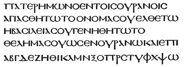
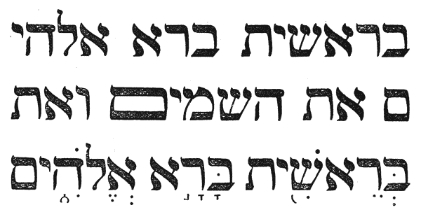
Another Specimen followed in 1786, showing several more of the new founts, and including seven pages of Orientals. This volume is dedicated to the Prince of Wales, and is prefaced by an address to the public of the usual self-laudatory character, with a somewhat aggressive reference to the rival foundry at Chiswell Street.625
In the following year Mr. Joseph Fry retired from the business. Besides founding a chocolate business in his native city, and becoming a considerable {305} partner in the new Bristol Porcelain Works, he had added to his other enterprises that of a Chemical Works at Battersea, and later still had established some important Soap Works in partnership with Mr. Alderman Fripp of Bristol.
He did not long survive his retirement, and died, after a few days’ illness, on March 29, 1787, aged fifty-nine, greatly respected. He was buried in the Friends’ burial-ground at the Friars, Bristol. A silhouette portrait of him is to be seen in Mr. Hugh Owen’s Two Centuries of Ceramic Art in Bristol, where also many interesting details of his life are to be found.626
In 1787 was issued a Specimen of Printing Types by Edmund Fry and Co.—the first mention of the firm under its new title. This was followed in the next year by a full specimen of the foundry, with a preface and dedication similar to those of the 1786 edition, but showing several fresh additions, particularly among the Orientals, which occupy twelve pages. Of the latter, several founts had been cut by Dr. Fry himself.
The specimen of 1787 was included in the Printer’s Grammar627 published in that year—a work which makes considerable reference to the Frys’ foundry, whose specimens and standards are used in illustration of the various subjects dealt with. The introductory note to the specimen gives the following account of the then condition of the foundry. It “was begun in 1764 and has been continued with great perseverance and assiduity, at a very considerable expence. The plan on which they first sat out, was an improvement of the Types of the late Mr. Baskerville of Birmingham, eminent for his ingenuity in his line, as also for his curious Printing, many proofs of which are extant and much admired: But the shape of Mr. Caslon’s Type has since been copied by them with such accuracy as not to be distinguished from those of that celebrated Founder. They have at present Twenty-seven complete Founts in punches and matrices of Roman and Italic, besides many sizes of larger Letter cast in Sand; also an elegant assortment of Blacks, with Hebrews and Greeks, and many other Orientals: They have also a greater variety of Flowers than are to be met with in any other Foundery in this Kingdom.”
The premises at Worship Street becoming inadequate for the type and printing business combined, Dr. Fry took a plot of ground opposite Bunhill Fields in Chiswell Street—then open fields—and there built the foundry which gave its name to Type Street. To these premises the business was removed in 1788; and the Specimen of that year dates from the Type Street Foundry. {306}
Among many elegant works printed at this time in the types of this foundry was the Rev. Mr. Homer’s fine edition of the classics,628 printed by Millar Ritchie,629 in which the somewhat rare compliment was paid the founder, of adding his name to the list of typographers engaged on the work.
The printing business was about the same time dissociated from the type-founding, and remained at Worship Street under the management of Henry Fry, who styled his office the “Cicero Press.”630
In the year 1794 Dr. Fry took Mr. Isaac Steele into partnership, and the specimen of this year, under the title of Edmund Fry and Isaac Steele, Letter-Founders to the Prince of Wales, shows a marked advance on its predecessors. Besides the additional Romans, it includes the Irish fount originally cut by Moxon in 1680, and is further supplemented by a considerable display of “Metal Cast Ornaments, curiously adjusted to paper”, of which a specimen had already appeared in the preceding year. Rude as many of these cuts now appear, they were much affected at the time, while a few of their number bear evident testimony to the wholesome revolution then being effected in the art of engraving by Mr. Bewick. A distinct improvement in the same direction may be traced in the series of “Head and Fable Cuts” for Dilworth’s Spelling Book, a specimen of which was issued shortly afterwards.631
In 1798 Dr. Fry put forth proposals for publishing the important philological work on which he had for sixteen years been engaged, and which, in the following year, was issued under the title of Pantographia, with a dedication to Sir Joseph Banks, President of the Royal Society. {307}
This important work,632 which displays great learning and research, was favourably received. It exhibits upwards of 200 alphabets, amongst which are 18 varieties of the Chaldee and no less than 39 of the Greek. Many of the letters were cut by the author expressly for the work, under the direction or with the advice of some of the most eminent scholars of the day, and not a few subsequently found a place among the specimens of the foundry.
In 1799 Mr. George Knowles was admitted into partnership, and the firm became Fry, Steele and Co.
A new revolution in the public taste necessitated at this stage the abandonment of the Caslon Old Style faces, and the adoption of the modern cut Roman letter then coming into vogue; and the specimens between 1800 and 1808 are interesting as marking the gradual accomplishment of this task. The specimen of 1803 showed the first of the new Romans, and in 1808 Stower’s Printer’s Grammar contained the series almost complete.633
The new style may have been considered an improvement at the time, but a later judgment has endorsed the regret with which Dr. Fry and others witnessed the then entire abandonment of the time-honoured and graceful Elzevir-cut characters of the first Caslon.
Naturally conservative in most matters pertaining to his art, Dr. Fry viewed with the utmost displeasure another innovation of the same period, in the introduction of ornamental type; and to the end of his career he strenuously resisted the “pernicious fashion,” as he styled it; yielding only to the extent of one small series of flowered titling-letters, which crept into his later specimens. But, although opposed to ornaments in this form, the Type Street specimens show no lack of flowers, and Stower’s book includes a profuse specimen of these ornaments, arranged in fantastic designs by Mr. Hazard, the printer, of Bath.634
Both Mr. Steele and Mr. Knowles appear to have retired about the year 1808, when Dr. Fry assumed the sole management of the business. In the specimen of 1816 he styles himself Letter Founder to the King and Prince {308} Regent. Soon afterwards, his own health failing, he admitted his son, Mr. Windover Fry, into partnership, and the firm became Edmund Fry and Son.
The subsequent specimens of the foundry are not marked by any special feature of interest, if we except the introduction of M. Firmin Didot’s Great Primer Script in 1821, containing upwards of sixty lower-case sorts, in a system of ligatures and connectors so elaborate as to necessitate the printing of a scheme to facilitate their composition, and the manufacture of special cases to hold them.
Dr. Fry’s philological studies had not ceased with the publication of Pantographia, and he was constantly adding to the stock of punches and matrices of the “learned” languages, in which his foundry was already rich. His excellence as a cutter of Oriental punches led to his selection by the University of Cambridge635 to execute several founts for that learned body; in addition to which he was employed to produce types for the works of the British and Foreign Bible Society, and similar biblical publications.
His most important effort in this direction was an English Syriac for Bagster’s Polyglot, with the points cast on the body, the entire fount consisting of nearly 400 matrices.
The specimen of 1824, which was issued both in octavo and (more sumptuously) in quarto, for presentation, signalised the completion of his efforts in this department, and at the same time notified that the name of the foundry had been changed—not inappropriately—to the Polyglot Foundry.
It is to be regretted that Dr. Fry’s energy in one particular branch of his art, congenial as it was to his own tastes, did not turn out lucrative from a business point of view; and the last few years of his career as a type-founder were not prosperous. His latest specimen was a broadside sheet of Newspaper founts in 1827.
In the same year he produced a raised type for the blind, under the following circumstances:—The Scotch Society of Arts, anxious to promote the welfare of the blind, and desirous to determine, among the many systems at that time proposed, which was the most suitable method of printing for their instruction, offered a gold medal of the value of £20 for the best communication on the subject. Twenty designs were sent in in 1833, of which Dr. Fry’s was the only one retaining the ordinary alphabetical characters. His specimen consisted of large and small square “sanseriff” capitals working in combination, with no deviation from the regular form. The committee occupied four years in arriving at a decision; employing the time in corresponding with and eliciting {309} the opinion of all the chief persons interested and experienced in the education of the blind, in reference to the various designs. Amongst others they received a long communication from the Rev. W. Taylor of York, who commended Dr. Fry’s system, approving specially of the absence of a “lower-case” letter.636 The report was published May 31st, 1837, awarding the medal to Dr. Fry, who, however, was at that time no more, his death having occurred two years previously.
The following summary of the contents of the Polyglot Foundry, as far as its foreign and rare founts were concerned, is taken from the Specimen Book of 1824, and corresponds closely to the list given in Hansard’s Typographia in the following year. With the exception of the founts purchased at James’ sale in 1782 (which are distinguished by the initials), most of the characters were cut by, or under the direction of, Dr. Fry himself.
In 1828, being now of an advanced age, and after 46 years’ incessant labour, Dr. Fry decided to dispose of his foundry; and a circular was issued announcing the fact to the public. This document, throwing as it does considerable light on the history of the Type Street Foundry, is interesting enough to quote at length. After enumerating generally the contents of the foundry and stating the conditions of sale, Dr. Fry remarks:
“The Substructure of this Establishment was laid about the year 1764; commencing with improved imitations of Baskerville’s founts, of which every size was completed, from the largest down to the Diamond: but they did not meet the encouraging approbation of the Printers, whose offices generally, throughout the kingdom, were stored from the London and Glasgow Founderies with Types of the form introduced by the celebrated William Caslon, early in the last century; chiefly from the admired Dutch models, which gained so much credit to the Elzevirs of Amsterdam, Leyden, &c.
“By the recommendation, therefore, of several of the most respectable Printers of the Metropolis, Doctor Fry, the proprietor, commenced his imitation of the Chiswell Street Foundery, which he successfully finished throughout all it’s various sizes, at a vast expense, and with very satisfactory encouragement, during the completion of it. At which period a rude, pernicious, and most unclassical innovating System was commenced, which, in a short time was followed by the most injurious and desolating ravages on the property of every Letter Founder and Printer in the kingdom, by the introduction of fancy letters of various anomalous forms, with names as appropriate—disgraceful in a Profession, once held so Sacred, as to have it’s operations confined to consecrated Buildings, and those of the highest class.
“The Baskerville and Caslon imitations, all completed with Accents, Fractions, &c., were, in consequence of this revolution, laid by for ever; and many thousand pounds weight of new letter in Founts, estimated on the average at selling prices, at 2s. 6d. per pound, were taken from the shelves, and carried to the melting-pot to be recast into Types, no doubt, in many instances, more beautiful; but no instance has occurred to the attentive observation of the Proprietor of this Foundery, where any Founts of book letter on the present system, have been found equal in service, or {311} really so agreeable to the reader, as the true Caslon-shaped Elzevir Types; and this is the undisguised sentiment of many judicious Printers.
“When that eminent Printer, the late William Bowyer, gave instructions to Joseph Jackson to cut his beautiful Pica Greek, he used to say “Those in common use were no more Greek than they were English.” Were he now living, it is likely he would not have any reason to alter that opinion.
“The Greeks of this Foundery were many of them made in Type Street, copied from those of the celebrated Foulis of Glasgow; and there are two, a Pica, and a Long Primer, on the Porsonian plan. The Codex Alexandrinus was purchased at James’ Sale in 1782.638
“The Hebrews were also chiefly cut by Dr. Fry, subject to the direction and approbation of the most learned Hebraists.
“The two Arabics,639 Great Primer and English, were cut from the original drawings of, and under the personal direction of Dr. Wilkins, Oriental Librarian to the East India Company; and have no rival either in beauty or correctness.
“The Syriac640 has been made within the last two years, with all it’s vowel points, reduced to an English body, from the Double Pica of the eminent Assemann’s edition of Ludolph’s Testament.
“The English, No. 1, and Pica Ethiopics—the Pica and Long Primer Samaritans, were purchased at James’s sale. The other Orientals, viz. two Malabarics—the Amharic—Ethiopic, No. 3, and Guzerattee, were all cut at this Foundery. As was the fine collection of Blacks, or pointed Gothics, except the English, No. 1,—Pica, No. 2,—Long Primer, No. 1,—and Brevier, which were collected by the late John James. There is good authority for believing that this Pica Black, No. 2, was once the property of {312} William Caxton641; Doctor Fry having recut for a reprint of a work published by the celebrated man, all the contractions and accented letters exhibited in the Specimen Book.
“The Occidentals, as termed by Moxon, Mores, and others, viz. the Saxons, Hibernians,642 German, and Russian, were also produced at this Foundery. As were the two Plein Chants, and the Psalm Music.
“The Great Primer Script, which, it must be acknowledged, is the Ne plus ultra of every effort of the Letter Founder in imitation of writing, was made for the Proprietor by the celebrated Firmin Didot, at Paris; the Matrices are of Steel, and the impressions from the Punches sunk in inlaid Silver !643
“In taking leave of a Profession, which has for many years engaged his whole attention, the Proprietor begs to convey, through this channel, the high sense of obligation he hopes to retain during his life, for the great encouragement with which he has been favoured for so long a period; as well as for the generous assistance and advice of many of his learned Friends, in the getting up, and accurate completion of various undertakings. It is also with much gratification, that he can look back and recall to recollection, that he has carefully followed their advices, in not admitting into {313} his Foundery any article degrading or disgraceful, or unbecoming the dignity of that Art, which deserves to be looked up to and revered as the ‘Head of the republic of letters:’—claiming Permission to recommend to his Successor and Contemporaries, the steady pursuit of that plan which will secure the reputation of the once Sacred Profession, and restore to it the honourable Character it obtained several Centuries ago, of
“ARS ARTIUM OMNIUM CONSERVATRIX.”“Polyglot Letter Foundery, 2nd month 14th, 1828.”
The foundry met with a purchaser in Mr. William Thorowgood, of Fann Street, to whose premises the entire stock was removed in 1829, where it now forms part of the Fann Street Foundry.
Dr. Fry retired to his residence at Stratford Green, and subsequently removed to Dalby Terrace, City Road, where he died Dec. 22, 1835.644
He was an old Member of the Stationers’ Company. In private life he was a man of genial disposition. A portrait of him, painted by Frederique Boileau, was exhibited in the Caxton Exhibition of 1877 by his son, the late Arthur Fry, and an excellent silhouette is also in possession of the family of the late Mr. Francis Fry, F.S.A., of Bristol, to whom we are indebted for our copy.
1768. A specimen by Isaac Moore, Bristol, 1768. Broadside. (Renouard, Cat. ii, 310.)
1768. A specimen of Printing Types by Isaac Moore & Co., Letter Founders, in Queen Street, near Upper Moorfields, London, 1768. Broadside. (Sohmian Coll., Stockholm.)
1770. A specimen of Printing Types by Isaac Moore & Co., Letter Founders, of Queen Street, near Upper Moorfields, London, 1770. Broadside. (Caxt. Cel., 4371.)
1785. A specimen of Printing Types made by Joseph Fry and Sons, Letter Founders and Marking Instrument Makers by the King’s Royal Letters Patent. London, Printed in the year 1785. 8vo. (B. M., 679, e. 16.)
1785. A specimen of Printing Types by Joseph Fry & Sons, Letter Founders, Worship Street, Moorfields, London, 1785. Broadside. (T. B. R.)
1786. A specimen of Printing Types by Joseph Fry & Sons, Letter Founders to the Prince of Wales. London, Printed in the year 1786. 8vo. (W. B.)
1787. A specimen of Printing Types by Edmund Fry & Co., 1787. 8vo. (Printer’s Grammar, pp. 273–316.)
1788. A specimen of Printing Types by Edmund Fry & Co., Letter Founders to the Prince of Wales. London, Printed in the year 1788. 8vo. (T. B. R.)
1790. A specimen of Printing Types by Edmund Fry & Co., Letter Founders to the Prince of Wales. London, Printed in the year 1790. 8vo. (Sohmian Coll., Stockholm.) {314}
1793. Specimen of Metal Cast Ornaments, curiously adjusted to Paper by Edmund Fry & Co., Letter Founders to the Prince of Wales, Type Street, London. Printed by T. Rickaby, 1793. 8vo. (Amer. Antiq. Soc.)
1794. A specimen of Printing Types by Fry & Steele, Letter Founders to the Prince of Wales, Type Street, London. Printed by T. Rickaby, 1794. 8vo. (B. M., 11899, i. 18.)
1794. Specimen of Metal Cast Ornaments, curiously adjusted to paper by Edmund Fry and Isaac Steele, Letter Founders to the Prince of Wales, Type Street, London. Printed by T. Rickaby, 1794. 8vo. (W. B.)
1795. A specimen of Printing Types by Fry & Steele, Letter Founders to the Prince of Wales, Type Street, London. Printed by T. Rickaby, 1795. 8vo. (T. B. R.)
1800. A specimen of Printing Types by Fry, Steele and Co., Letter Founders to the Prince of Wales, Type Street, London. Printed in the year 1800. 8vo. (T. B. R.)
1805. A specimen of Printing Types by Fry & Steele, Letter Founders to the Prince of Wales, Type Street, London. Printed in the year 1805. 8vo. (T. B. R.)
1805. Specimen of Metal Cast Ornaments, curiously adjusted to paper by Fry and Steele, Letter Founders to the Prince of Wales, Type Street, London. Printed in the year 1805. 8vo. (W. B.)
No date. Specimen sheet of Head and Fable Cuts for Dilworth’s Spelling Book, cast on hard metal, and curiously adjusted to paper on the best Turkey Box, by Fry and Steele, Letter Founders, Type Street, London. Price £4 4s. (1805?). Broadside. (Caxt. Cel., 4386.)
1808. Specimens of Modern Cut Printing Types from the Foundry of Messrs. Fry and Steele; together with a Specimen of Flowers. 1808. 8vo. (Stower’s Printer’s Grammar.)
1816. A specimen of Printing Types by Edmund Fry, Letter Founder to the King and Prince Regent, Type Street, London, 1816. 8vo. (B. M., 11899, h. 11.)
1820. Specimen of Modern Printing Types by Edmund Fry and Son, Letter Founders to the King, Type Street, London, 1820. 8vo. (T. B. R.)
1824. Specimen of Modern Printing Types by Edmund Fry, Letter Founder to the King (Polyglot Foundry), Type Street, London. 1824. 4to. and 8vo. (B. M., 11899, h. 12.)
1825. A specimen of Diamond, by Edmund Fry, March 1825. 8vo. (T. B. R.)
1827. Fry’s Newspaper Specimen, Type Street, 1827. Broadside. (J. F.)
 OSEPH JACKSON,
apprentice to Caslon I, was born in
Old Street, London, on Sept. 4, 1733. He was the first
child baptised in St. Luke’s, and received his education at
a school in that neighbourhood, the gift of a Mr. Fuller.
During the term of his service at Chiswell Street, he was,
says Nichols,645
exceedingly tractable in the common
branches of the business. Rowe Mores states that he was
an “apprentice to the whole art,”646
but this term evidently
does not comprehend the most important branch of that art, namely the cutting
of punches. This was kept a profound secret at Chiswell Street, Mr. Caslon and
his son constantly locking themselves into the apartment in which they practised it.
Jackson, who had a great desire to learn the mystery, bored a hole through the
wainscot, and was thus, at different times, able to watch his employers through
the process, and to form some idea how the whole was performed; and he afterwards
applied himself at every opportunity to the finishing of a punch. “When
he had completed one to his own mind, he presented it to his master, expecting
to be rewarded for his ingenuity: but the premium he received was a hard
blow, with a threat that he should be sent to Bridewell if he again made a
similar attempt. This circumstance being taken in dudgeon, his mother bought
him what tools were necessary, and he improved himself at her house whenever
he had an opportunity.” {316}
OSEPH JACKSON,
apprentice to Caslon I, was born in
Old Street, London, on Sept. 4, 1733. He was the first
child baptised in St. Luke’s, and received his education at
a school in that neighbourhood, the gift of a Mr. Fuller.
During the term of his service at Chiswell Street, he was,
says Nichols,645
exceedingly tractable in the common
branches of the business. Rowe Mores states that he was
an “apprentice to the whole art,”646
but this term evidently
does not comprehend the most important branch of that art, namely the cutting
of punches. This was kept a profound secret at Chiswell Street, Mr. Caslon and
his son constantly locking themselves into the apartment in which they practised it.
Jackson, who had a great desire to learn the mystery, bored a hole through the
wainscot, and was thus, at different times, able to watch his employers through
the process, and to form some idea how the whole was performed; and he afterwards
applied himself at every opportunity to the finishing of a punch. “When
he had completed one to his own mind, he presented it to his master, expecting
to be rewarded for his ingenuity: but the premium he received was a hard
blow, with a threat that he should be sent to Bridewell if he again made a
similar attempt. This circumstance being taken in dudgeon, his mother bought
him what tools were necessary, and he improved himself at her house whenever
he had an opportunity.” {316}
“He continued,” adds Nichols, “to work for Mr. Caslon after he came out of his time,647 till a quarrel arose in the foundery about the price of work; and a memorial, which terminated in favour of the workmen, being sent to the elder Caslon (who was then in the Commission of the Peace, and had retired to Bethnal Green), young Jackson and Mr. Cottrell were discharged, as supposed ringleaders.
“Compelled thus to seek employment, they united their slender stock in a partnership, and went on prosperously till, Jackson’s mother dying, he entered in 1759, on board the “Minerva” frigate, as armourer; and in May 1761 was removed, with Capt. Alexander Hood, into the same situation in the “Aurora”; and proved somewhat successful, having about £40 prize money to receive at the Peace of 1763. During the time he was at sea, he was visited by a severe fit of sickness, in which he vowed, if he recovered, to lead in future a very penitent life; which promise he punctually fulfilled.”
Quitting the navy, he returned to London and rejoined once more his old comrade and partner, now a fully-established type-founder in Nevil’s Court, Fetter Lane. He worked for some time under Cottrell, but at length, at the instigation, it would appear, of two of his fellow workmen, Robinson and Hickson (who shared with Cottrell the distinction of serving as privates in the Life Guards), he determined to set up in business for himself.
The necessary capital for the new concern was found by Robinson and Hickson, who agreed to allow Jackson, as his salary for conducting the business under the partnership, the sum of £62 8s. per annum, and to supply money for carrying on the trade for two years.
A small house in Cock Lane was taken for the purpose, and such was the modest beginning of this famous foundry.
The hazardous adventure succeeded, thanks to the genius of Jackson, who was able soon to satisfy his partners that the business would be productive before the time promised.
“When he had pursued his labours about six months, Mr. Bowyer accidentally calling to inspect some of his punches (for he had no specimen), approved them so much, that he promised to employ him; adding, ‘My father was the means of old Mr. Caslon riding in his coach, how do you know but I may be the means of your doing the same?’
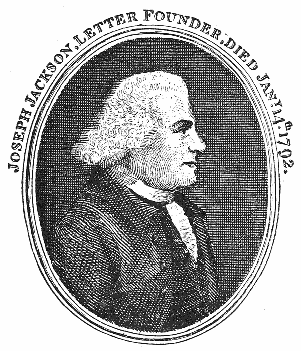
“A short time after this, he put out a small specimen of one fount; which his former young master carried to Bethnal Green with an air of contempt. The good old justice treated it otherwise; and desired his son ‘to take it home and {317} preserve it; and whenever he went to cutting again to look well at it.’ It is but justice to the third William Caslon to add that he always acknowledged the abilities of Mr. Jackson; and though rivals in an art which requires the greatest exertions of ingenuity, they lived in habits of reciprocal friendship.”
It is much to be regretted that no copy of Jackson’s first specimen sheet (which we may assume to have been issued about 1665) is now to be discovered.
Business increasing, he removed from Cock Lane to more commodious premises in Dorset Street, Salisbury Square, Fleet Street, and here his foundry and reputation made rapid advances.
“About the year 1771”, Nichols relates, “he was applied to by the Duke of Norfolk to make a mould to cast a hollow square. Telling the Duke that he thought this was practicable, his Grace observed that he had applied to all the skilful mechanicks in London, Mr. Caslon not excepted, who declared it impossible. He soon convinced the Duke of his abilities, and in the course of three months, producing what his Grace had been years in search of, was ever after held in great estimation by the Duke, who considered him as the first mechanick in the kingdom.”
In 1773, it would appear that Jackson issued a further specimen of his now increasing foundry. Of this performance Rowe Mores makes flattering mention in presenting his summary of the contents of the foundry as it stood in that year:―
“Mr. Jackson,” he says, “lives in Salisbury Court in Fleet Street. He is obliging and communicative, and his Specimen will, adjuvante numine, have place amongst the literate specimens of English letter cutters. The prognostics are these:―
“He has likewise Proscription letters beginning at 12-line Pica, the same with those of Mr. Cottrell, the first who cut letters of this dimension.”
With regard to the Bengalee letter, Rowe Mores states that this was cut by Jackson “for Mr. William Bolts, Judge of the Mayor’s Court of Calcutta, for a work in which he had been engaged at the time of his sudden departure from England about 1774.”648 {318}
The work here referred to was the Grammar of the Bengal Language, projected by the East India Company as part of a scheme for the dissemination of a knowledge of the Indian Languages in Europe. It appears, however, that although Mr. Bolts was supposed to be in every way competent for the fabrication of this intricate character, his models, as copied by Jackson, failed to give satisfaction, and the work was for the time abandoned;649 to be revived and executed some few years later in a more masterly and accurate manner by Mr. Charles Wilkins,650 then in the service of the East India Company in Bengal, {319} who with an extraordinary combination of talents, succeeded, by the work of his own hand, in designing, engraving, casting and printing the Grammar published at Hoogly in 1778.
Mr. Bolts’ failure in this particular reflects no discredit on Jackson, who faithfully reproduced the models given him, and who displayed his talent in the same direction shortly after by the production of a fount of Deva Nagari, cut under the direction of Captain William Kirkpatrick, of the East India Service, and Persian Secretary to the Commander-in-Chief for India, for the purpose of printing a Grammar and Dictionary in that language.
Of this fount a specimen remains—the only specimen extant, we believe, bearing Jackson’s name. It is a broadside, displaying in table form the alphabet and combinations of the Sanscrit, and exhibits no small delicacy of workmanship, not only in the Oriental character itself, but in the few lines of Roman letter composing the title. There is no date to the specimen.
Captain Kirkpatrick’s Dictionary was never completed. One part only appeared in 1785,651 containing the Glossary of the Arabic and Persian words incorporated with the Hindu, and in this no Nagari is used. All the remaining parts of the work, as first projected, depended on the new type; but as they never appeared, the object for which the fount was cut was lost.
The next important undertaking which engaged Jackson’s talents was one of national interest. The House of Lords had, in the year 1767, determined upon printing the Journals and Parliamentary records, “a work, which,” says {320} Nichols, “will ever reflect honour on the good taste and munificence of the present reign” (George III). Jackson had been employed to cut several varieties of letter for this work; and he was now called upon to assist in a further outcome of the same good taste and munificence, in the production of type for the splendid facsimile of the Domesday Book, begun in 1773. This important work was projected and carried through by Dr. Nichols himself, and a brief account of the circumstances under which it saw the light may be interesting and not out of place here.
The Lords, it appears, being petitioned to sanction the printing of the Domesday Book, the most important of the Anglo-Saxon records, as a matter of national importance, referred, through the Treasury Board, to the Society of Antiquaries as to the mode in which it should be published, whether by printing-types, or by having a copy of the manuscript engraved in facsimile. By the examination of several eminent printers, it was learned that according to the first plan very many unavoidable errors would occur; a tracing of the record was then proposed, to be transferred to copper plates. An estimate of the expense of this was next ordered by the Treasury Board, which amounted to £20,000 for the printing and engraving of 1250 copies, each containing 1664 plates; but this sum, however proportionate, was considered too large, and the first plan was again reverted to.
It was then proposed by the learned Dr. Morton that a fount of facsimile types should be cut under his superintendence. This undertaking, however, failed, and Dr. Morton received £500 for doing little or nothing, and nearly £200 more for types that were of no use. The founder to whom Dr. Morton applied was Thomas Cottrell, a specimen of whose unsuccessful fount appeared shortly afterwards in Luckombe’s History of Printing, 1770.
Dr. Morton’s plan being abandoned, on account of the difficulty of producing in type letters which, in the manuscript, were constantly differing in their forms, the work was entrusted to Mr. Abraham Farley, F.R.S., a gentleman of great Record learning, and who had had access to the ancient MSS. for upwards of forty years. His knowledge, however, did not induce him to differ from his original in a single instance, even when he found an apparent error; he preserved in his transcript every interlineation and contraction, and his copy was ultimately placed in Mr. Nichols’ hands. Jackson was then employed to cut the types, and successfully accomplished the difficult undertaking.652 The work occupied ten {321} years in printing, and appeared in 1783, in two folio volumes.653 The type was destroyed in the fire which consumed the printing-office of Mr. Nichols in 1808, previous to which, however, it was used in Kelham’s Introduction and Glossary to the Domesday Book in 1788.654
It was Jackson’s success, no doubt, in his facsimile letter for the Domesday Book, which led to his selection shortly afterwards by Mr. Nichols to cut the type for Dr. Woide’s655 facsimile of the New Testament of the Alexandrian Codex in the British Museum. To the history of this priceless relic reference has been made once or twice in the course of this work.656 Only one attempt had previously been made to reproduce its character in type,—that of Dr. Patrick Young, in 1643, within a few years of the arrival of the manuscript in this country. In this letter was printed a specimen containing the first chapter of Genesis. But the project was abandoned, and the matrices, there is reason to believe, subsequently passed into Grover’s Foundry, and afterwards, through James, into the possession of Dr. Fry in 1782.657 That Mr. Nichols was acquainted with their existence in 1778 is almost certain, since they are mentioned in Rowe Mores’ Dissertation, which he himself edited and annotated. But not being sufficiently exact for the purpose, and, at the same time, it being decided that the facsimile should be produced through the medium of type in preference to other process,658 Mr. Jackson was fixed on to cut a new set of punches from the transcript made by Dr. Woide’s own hand. To this task he proved fully equal, and the work issued from Mr. Nichols’ press in 1786659—a splendid folio edition, worthy alike of {322} its subject and the artists who produced it. The unusual compliment was, in this instance, paid to the letter-founder of mentioning his name on the title-page as the author of the types employed in the work.
The matrices were afterwards deposited in the British Museum, and were again brought into requisition when, in 1812, Mr. Baber produced his facsimile of the Psalms660 from the Alexandrian MS., and afterwards, in 1816–21, at the press of Messrs. R. and A. Taylor, completed the entire Old Testament.661 Thus concluded this great enterprise, which has been justly characterised by the Abbé Jager as “opus plane aureum.”
Jackson having now become famous for his skill in this particular branch of his art, was called upon shortly before his death to execute a work of scarcely less importance than the facsimile of the Alexandrian Greek. This was to cut the punches for Dr. Kipling’s facsimile of the celebrated Codex Bezæ preserved at the University of Cambridge. The character of this MS. differs considerably from that of the Alexandrine; and, being less regular in its execution, the difficulty of reproducing it in type is proportionately greater. Jackson, however, accomplished his task faithfully and with marked success. Unhappily his death in 1792 prevented him from seeing in print the fruit of his labours, as the work did not appear till the following year, when it was published at Cambridge in two beautiful folio volumes,662—a work which, says its reviewer, “reflects honour on the University of Cambridge, and its editor, and, we may add, on the late excellent letter-founder, Mr. Jackson, who cut the types for this handsome book, as well as for the Alexandrine MS. and for Domesday.”663
Jackson’s reputation was not by any means wholly dependent on his skill in expressing in type the character of ancient and difficult manuscripts.
During the time he was occupied in the works above described, he made several useful additions to his foundry. Amongst others, he cut a beautiful {323} fount of Pica Greek for Mr. Bowyer, “who,” says Nichols,664 “used to say that the types in common use were no more Greek than they were English.”
“He had also, under the direction of Joseph Steele, the ingenious author of Prosodia Rationalis,665 augmented the number of musical notes by such as represent the emphasis and cadence of prose.” This curious work, designed to show how the recitation of Garrick and other eminent speakers might be transmitted to posterity in score, was printed by Nichols in 1779, being an amplified edition of a treatise published four years previously,666 in which Jackson’s “expression symbols” were made use of.
The most important work of his later years was undoubtedly the splendid fount of 2-line English Roman, cut for Mr. Bensley, about the year 1789, for Macklin’s Bible.667 As in the case of the Bezæ Gospels, he did not live to see the completion of his labours in the publication of this grand edition, which did not appear till some years after his death, and then in a type not wholly his own, but supplemented, in close facsimile, by a fount cut by his former apprentice and manager, Vincent Figgins.668 Jackson’s grand letter is justly counted among his greatest achievements, exhibiting, as Nichols observes, a pattern of the most perfect symmetry to which the art had at that time arrived.”669
A crowning monument to the skill of this excellent artist is Robert Bowyer’s sumptuous edition of Hume’s History of England, printed by Bensley670 in 1806, in a Double Pica type, on which Jackson was engaged at the time of his death. On the execution of this fount he appears to have staked his reputation; “Mr. Jackson,“ says his biographer in the Gentleman’s Magazine,671” had been engaged to cut the letter for the projected edition of Hume’s History of England, which he declared should ‘be the most exquisite performance of the kind in this or any other country.’ And accordingly he had, in a great degree, accomplished his purpose, but his anxiety and application were so intense that his health suffered and he fell a victim to the great undertaking.” {324}
This circumstance was made the occasion of a curious and affecting Elegy, of which we will venture to inflict a specimen on the reader, not on account of its merit, but as being a rare instance of a letter-founder becoming the object of a poetical tribute:―
- “Patrons of merit, heave the sadden’d sigh !
- Ye brilliant dewdrops, hang on Beauty’s eye !
- Let heavy hearts beat with the tolling bell,
- And mourn the fatal hour when Jackson fell !
- His were the gifts the Gods alone impart―
- A tow’ring genius and a tender heart !
- A greatness equalled only by his skill―
- A goodness greater than his greatness still ;
- An ardent zeal each purpose to obtain,
- Which Virtue and the Arts might entertain.
- But Fate in jealous fury snatched him hence
- The moment he accomplished excellence !
- Tenax propositi—his art he tried,
- Achieved perfection—and achieving died ! ” etc.
Although anxiety and overwork may have contributed to Jackson’s death, the immediate cause was a severe attack of scarlet-fever, which carried him off on January 14th, 1792, in the 59th year of his age. The last few years of his life had been considerably troubled. In 1790 his foundry was destroyed by a fire, in which his moulds and matrices were seriously damaged. The shock of this calamity affected both his health and his energy, and the management of his business was, during his later years, left almost entirely in the hands of his trusted servant, Mr. Vincent Figgins. The foundry was rebuilt, and the damaged materials were, as far as possible (though not wholly), replaced at the time of his death.
Mr. Jackson was twice married—first to Miss Elizabeth Tassell, originally a whinster in Spitalfields, “a very worthy woman,” says Nichols, “and an excellent wife, who greatly contributed by her care and industry to his getting forward in his first entering into business” She died in 1783, and, in the following year, Mr. Jackson married Mrs. Pasham, widow of a well-known printer in Blackfriars,672 a union which materially assisted him in the means of carrying on his {325} business. This lady died in 1791, her husband surviving his bereavement only a few months. He was buried in the same grave with his two wives in the ground of Spa Fields Chapel.
Of Jackson’s private character his contemporaries concur in speaking very highly. “By the death of this ingenious artist and truly worthy man,” says Nichols, “the poor lost a most excellent benefactor, his own immediate connexions a steady friend, and the literary world a valuable coadjutor in their labours.” He was a deacon at the Meeting-House in Barbican, where a funeral sermon was preached by the Rev. Mr. Towers, who also delivered a “neat funeral oration,” at the grave. He died possessed of some considerable property. There is an oil portrait of him in the possession of Mr. Blades, and an engraved portrait in Nichols’ Literary Anecdotes, from which our copy is taken.
It is unfortunately impossible to ascertain in what condition his foundry was left at the time of his death—how far it had recovered from the consequences of the fire, or how far that calamity had destroyed, beyond replacing, any of its contents.
It was offered for sale in 1792, and Mr. Figgins, the presumptive successor to the business, not finding himself in a position to become its purchaser, it was acquired by William Caslon III, who had recently disposed of his share in the Chiswell Street Foundry, over whose affairs he had for some years been presiding.673 He removed the Foundry from Dorset Street to Finsbury Square, where for a few years it remained located; but presently transferred it back to its old quarters, leaving the house in Finsbury Square to be converted by James Lackington, the celebrated bookseller, into the “Temple of the Muses,” one of the largest and most popular old book-shops of the day.
In the hands of Mr. Caslon, Jackson’s foundry was greatly enlarged and improved. The specimen of 1798, dedicated to the King, exhibits 19 pages of Titlings and open letters, 1 of Ornamental, 35 of Roman and Italic, 8 of foreign letter and Blacks, 1 of Script, 5 of sundry specimens, and 12 of Flowers.”674
The book has many features in common with the Chiswell Street specimen of 1785, many of the founts in which re-appear here. Indeed, it would seem that on relinquishing his share in the parental business, William Caslon III had provided himself with duplicate matrices of several of the Chiswell Street founts, {326} particularly of the Foreign and Oriental letters, which figure prominently in this and subsequent specimens of the Salisbury Square Foundry.
Bound with the book is a specimen of Cast Ornaments, a species of a typographical embellishment which Caslon III had had the merit of introducing into this country in 1784, while still at Chiswell Street. In this particular too, the Salisbury Square specimen is a reproduction of that of the Chiswell Street house.
About the year 1803 Mr. Caslon took his son, the fourth William Caslon, into partnership, and the firm became W. Caslon & Son. The specimen of this year exhibits a slight increase on that of 1798, the chief additions being in the modern-faced Romans, then becoming fashionable. The learned and Oriental founts remain unaltered from the 1798 specimen, and as this is the last specimen of the foundry in which these occupy a prominent place, it will be convenient to give the list here:
The whole of these founts, with the exception of the new English Greek, are identical with those shown in the Chiswell Street Specimen of 1785.
The Specimen Book of 1803 appears to have served the foundry for several years; as copies exist in which the date is altered by hand to 1807, and the name of the firm changed from “W. Caslon & Son” to “W. Caslon, Junior.”
This last alteration was consequent on the retirement of William Caslon III from the business in 1807. Although this gentleman’s connection with type founding ceases here,675 we cannot refrain from quoting the few sentences in which Mr. Hansard, in 1825, describes his personal character, while the subject of his notice was yet living:―
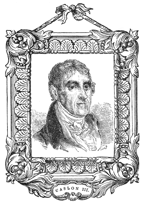
“If his friends had not yet the pleasure of occasionally receiving his lively salutations—of enjoying the gay and gentlemanlike converse, the whim, the anecdote, and the agreeable bagatelle of William Caslon aforesaid, I might be induced to amplify on these points . . . The mention, however, of one thing must not be omitted. Some years ago he was deprived of sight by the {327} formation of a cataract in each eye; still his musical ear furnished the faculty of distinguishing persons whom he knew by their voices; and his cheerful spirits enabled him to sustain the calamity with a becoming temper of mind. At length, his courage, in undergoing the operation of couching three several times, was rewarded with the perfect restoration of his sight; and his friends again experience the delight of hearing him truly say, ‘Ah! I’m happy to see you, by ——.’ But although ever ready with anecdote and whim to enliven, still more to his honour as a man, may it be added, that he can at once turn the cheerful smile into serious solicitations, for the assistance of a decayed old friend, his orphan, or his widow.” Mr. Caslon died in 1833. The portrait here given is taken from that in Hansard’s Typographia.
William Caslon IV, being left in sole possession of the foundry, made considerable progress in extending the business, especially by the addition of the new fashioned fat-faced types, at that period so largely affected. His chief improvement, however, was the introduction in 1810 of the Sanspareil matrices for large letters.676 This invention, which Hansard somewhat extravagantly describes as the greatest improvement in the art of letter-founding that has taken place in modern times, consisted in the substitution of pierced, or rather built-up matrices, in place of the old sand moulds hitherto in use, and it rapidly secured favour in the trade, and was as early as possible adopted by the other founders.
In 1812, Mr. Caslon also took out a patent for a new form of type for imposing on a cylinder, of a size from 1⁄3 to 1⁄7th that of ordinary type, and cast wedge-shaped, or larger at the end containing the face than at the foot; an attempt which reflected more credit on the ingenuity of its author than upon his practical judgment, and which was not proceeded with.677
Although no complete specimen book of Caslon IV has occurred to our notice of a later date than that of 1807 (which is itself the 1803 book altered by pen and ink), the numerous sheets appearing from time to time, and collected in the first specimen of his successors, prove that one or more specimens of the foundry must have appeared during the interval.
In 1819, Mr. Caslon, Junr. disposed of his foundry to Messrs. Blake, Garnett & Co., of Sheffield, to which town the entire stock was removed.
After his retirement from type-founding, he devoted himself actively to the {328} scheme for lighting London with coal-gas. For some of his appliances in connection with this business—the sliding water-joints for pendants and chandeliers amongst others—he received the medal of the Society of Arts (his only reward, for he did not patent his invention). In 1832 he went to reside at Henley, and ten years later was afflicted with total blindness, an operation for cataract having proved unsuccessful. In this state he continued for twenty-seven years, “tired,” as he said, “of having been so long in the dark,” but serene in temper, and his mind illuminated with Christian hope. He taught himself to read the embossed printing for the blind, and was able to write by the aid of a simple apparatus constructed for that purpose. He lived, in spite of his affliction, to a cheerful old age, and died in 1869, aged 88. He left no son.
To estimate the complete revolution which had taken place in the productions of this foundry during the interval between 1807 and 1819, it is only necessary to glance through the first specimen book of the new proprietors, issued in the latter year, which may be taken to represent the state of the foundry pretty nearly as it was at the time of its transfer to Sheffield. There is not a single fount in the one book which reappears in the other. The modern fat-face Romans and Egyptians678 take the place of Jackson’s elegant old-style letters. The Orientals have completely disappeared, and the general appearance of the book reflects as much as any specimen of the period the prevalent taste of a so-called improved art.
It was, apparently, highly esteemed in its day. “Mr. Caslon,” says Hansard, writing only six years after the event, “transferred to the Sheffield founders such a specimen of type and flowers as will ever cause us printers to regret the loss of such a competitor for fame in this difficult business.”
Messrs. Blake, Garnett & Co., a firm formed for the special purpose of acquiring the type business, issued their first specimen, above referred to, very shortly after the transfer of the business to its new quarters. Their prefatory note is interesting, not only as recording the transaction, but as intimating that the Oriental and Foreign founts, which had formed so conspicuous a feature of the previous specimens of the foundry, had also found their way to Sheffield:―
“Blake, Garnett and Co. beg leave respectfully to inform the trade that they have purchased the whole of Mr. Caslon’s Foundery, which, in addition to the Specimens here offered to their inspection, contains founts of Greek, Hebrew, Syriac, Arabic, Saxon, German, etc. from Brevier to Double Pica, chiefly modern, also every kind of Accented letters, . . . . . . and a variety of other Sorts, of which Specimens are not yet printed.” {329}
The activity of the new proprietors resulted in a rapid increase in the extent and business of the foundry. Supplementary specimens were frequently issued between 1820 and 1830, when the style of the firm became Blake and Stephenson. Mr. Stephenson was a man of great energy, practical skill and artistic taste, and it is to his exertions that the rapidly-achieved eminence of the house was chiefly due. In 1841, the firm took its present style of Stephenson, Blake & Co. Mr. Stephenson directed the operations of the Sheffield foundry until 1860, when the management devolved on his son, Mr. Henry Stephenson, in whose hands it still remains.
No date. Jackson’s first Specimen of one fount. 1765? (Referred to by Nichols, Lit. Anec., ii, 360.) (Lost.)
1783. Jackson’s second Specimen (described by Mores, Dissert., p. 83.) (Lost.)
No date. Specimen of the Deo Nagri or Hindvi Type, cut for the purpose of printing a Grammar and Dictionary of that Language under the Direction of William Kirkpatrick, Captain in the Service of the Honourable East India Company, and Persian Secretary to the Commander in Chief in India. By Joseph Jackson, Letter Founder, Salisbury Court, Fleet Street. 1784? Broadside. (J. F.)
1798. A Specimen of Printing Types by William Caslon, Letter Founder to the King, Salisbury Square, London. 1798. 8vo. (W. B.)
1798. A Specimen of Cast Ornaments by William Caslon, Letter Founder to the King. London. Printed by C. Whittingham. 1798. 8vo. (W. B.)
1803. A Specimen of Printing Types by W. Caslon and Son, Letter Founders to the King. London. Printed by C. Whittingham, Dean Street, Fetter Lane. 1803. 8vo. (Caslon.)
1807. The above Specimen, with additions, and title, altered from “W. Caslon and Son, 1803,” to “W. Caslon, junr., 1807.” (Caslon.)
No date. A Specimen of Printing Types, etc., by Blake, Garnett and Co. (successors to Mr. W. Caslon, of London), Letter Founders, Sheffield. (1819.) 8vo. (T. B. R.)
1826. Supplement to Blake, Garnett and Co.’s Specimen, 1826. 8vo. (Caxt. Cel., 4405.)
1827. Specimen of Printing Types by Blake, Garnett and Co. (successors to Mr. W. Caslon of London), Letter Founders, Allen Street, Sheffield. 1827. 8vo. (Caxt. Cel., 4406.)
1827–8. Supplements to Blake, Garnett and Co.’s Specimen, 1827 and 1828. 8vo. (Caxt. Cel., 4408.)
1830. Select Specimen of Printing Types by Blake and Stephenson, Sheffield. 1830. 8vo. (Caxt. Cel., 4414.)
1831. Specimen of Printing Types by Blake and Stephenson (successors to Mr. W. Caslon of London), Letter Founders, Sheffield. 1831. 8vo. (S. B. & Co.)
 ILLIAM MARTIN
was brother to Robert Martin,679
Baskerville’s
apprentice and successor. He appears to have
acquired his first knowledge of the art at the Birmingham
foundry, and about the year 1786 to have come to
London and entered into the service of Mr. George
Nicol,680
as a punch cutter. Mr. Nicol was at that time
engaged in maturing his plans for the production of a
magnificent edition of Shakespeare, and kept Martin at his
own house “to cut sets of types after approved models in imitation of the sharp
and fine letter used by the French and Italian printers.”
ILLIAM MARTIN
was brother to Robert Martin,679
Baskerville’s
apprentice and successor. He appears to have
acquired his first knowledge of the art at the Birmingham
foundry, and about the year 1786 to have come to
London and entered into the service of Mr. George
Nicol,680
as a punch cutter. Mr. Nicol was at that time
engaged in maturing his plans for the production of a
magnificent edition of Shakespeare, and kept Martin at his
own house “to cut sets of types after approved models in imitation of the sharp
and fine letter used by the French and Italian printers.”
On the establishment of the famous “Shakespeare Press,”681 by Messrs. {331} Boydell and Nicol, in 1790, at Cleveland Row, St. James’s, with William Bulmer as presiding genius, Martin was established in premises hard by, in Duke Street; his foundry being a sort of private foundry in connection with the Press. Here it was that he produced the founts in which the magnificent works, issued during the next twenty years from Bulmer’s Press, were printed.
The appearance of the first part of the Shakespeare682 in 1791 at once established the fame of the printer and his types; and the completion of the work, in nine volumes, in 1810, may be regarded as marking an epoch in British typography. “No work of equal magnitude”, says the enthusiastic Dibdin, “ever presented such complete accuracy and uniform excellence of execution. There is scarcely one perceptible shade of variation from the first page of the first volume, to the last page of the work, either in the colour of the ink, the hue of the paper, or the clearness and sharpness of the types.”683
The Milton,684 which followed, is considered a still finer specimen of typography. The enthusiasm animating all concerned in the new undertaking was remarkable, and attracted universal attention. “The nation,” says Dibdin, “appeared to be not less struck than astonished; and our venerable monarch, George III, felt anxious not only to give such a magnificent establishment every degree of royal support, but, infected with the matrix and puncheon mania, he had even contemplated the creation of a royal printing office within the walls of his own palace.” One of the King’s great ambitions was for England to rival Parma in the productions of Bodoni,685 and Dibdin alludes to a story current at the time of “his majesty being completely and joyfully taken in, by bestowing upon the efforts of Mr. Bulmer’s press that eulogy which he had supposed was due exclusively to Bodoni’s”.686
In the advertisement of his edition of the Poems of Goldsmith and Parnell,687 printed in 1795 and dedicated to the Messrs. Boydell and Nicol, the founders of the Shakespeare Press, Bulmer thus bears testimony to the talents of those who had contributed to the performance:—“The present volume, in addition to {332} the Shakespeare, the Milton, and many other valuable works of elegance which have already been given to the world through the medium of the Shakespeare Press, are (sic) particularly meant to combine the various beauties of printing, type founding, engraving, and paper making; as well as with a view to ascertain the near approach to perfection which those arts have attained to (in) this country, as to invite a fair competition with the typographical productions of other nations. How far the different artists who have contributed their exertions to this great object have succeeded in the attempt, the public will now be fully able to judge.”
In all these encomiums, Martin claims a share; and, regarded simply as type specimens, the productions of the Shakespeare Press justify his reputation as a worthy disciple of his great master Baskerville. His Roman and Italic types were cut in decided imitation of the famous Birmingham models; although Hansard points out with disapproval that in certain particulars he attempted unwisely to vary the design. “As to the type”, he says, “the modern artist, Mr. Martin, has made an effort to cut the ceriphs and hair strokes excessively sharp and fine; the long ſ is discarded, and some trifling changes are introduced; but the letter does not stand so true or well in line as Baskerville’s, and, as to the Italic, the Birmingham artist will be found to far excel.”688
The Shakespeare Press, along with all the other presses of the land, had to bow before the revolution which in the closing years of last century swept aside the beautiful old-face Roman, and set up in its stead the modern character; and Hansard’s strictures above-quoted doubtless refer to Martin’s endeavour, while adhering to the Baskerville form as his model, to modify it so as to conform to the new fashion. We are among those who deplore the change thus inaugurated; but at the same time it must be admitted that Martin succeeded as well in the new departure as any of his contemporaries.
Nor did he confine himself to Roman and Italic. He produced several founts of Greeks and Orientals, which eventually came to form the most valuable part of his collection.689 His Greek character, however, like the Greeks attempted by Baskerville and Bodoni, was not a success; and the otherwise beautiful edition of Musæus, printed in 1797,690 and bearing on the title-page his name as the cutter of the type, is marred by the cramped and inelegant effect of that character. {333}
Although Martin’s foundry was entirely supported by, and, indeed, belonged to, the Shakespeare Press, he appears occasionally to have supplied his types to outsiders—amongst others to McCreery, the author of the well-known poem on the Press, and himself a very elegant printer. The Press,691 was printed in 1803 from Martin’s type, as a specimen of typography, and in his preface the author pays the following tribute to that artist’s abilities:—“The extraordinary efforts which have of late years been made to produce the finest models of Printing Types, must be highly gratifying to those who have in any measure interested themselves in raising the credit of the British Press. The spirit for this species of beauty has long been gaining an ascendancy, having received a strong impulse from the talents of Baskerville, who endeavoured to combine sharpness and perfection of impression with graceful types, giving to his works a finish which was before unknown in this kingdom. Mr. Martin, whose abilities are so conspicuously displayed in the productions of the Shakespeare Press, is a pupil of that celebrated school. By the liberality of George Nicol, Esq., I am enabled to boast of being the first who has participated with Mr. Bulmer in the use of these types, a mark of kindness for which my warmest acknowledgements are the least recompense he has a right to expect.” Several of the other productions of McCreery’s press were also printed from Martin’s type.
Among the finest specimens of the Shakespeare Press printed in Bulmer’s time, the three great bibliographical works of Dibdin, viz., the Typographical Antiquities,692 the Bibliotheca Spenceriana,693 and the Bibliographical Decameron,694 will always take a foremost place. Martin, whose Roman type rarely appeared to greater advantage, unfortunately did not live to see the completion of the whole of these typographical masterpieces, as he died in the summer of 1815. He was buried in St. James’s Church, Westminster.
After his death, the foundry (of which unfortunately no specimen-book exists), appears to have been continued for a short time by Mr. Bulmer, who, {334} between 1815 and 1819, when he himself retired, produced several fine works.695
Prior to that event—in 1817—Mr. Nichols states that the foundry was united with that of the Caslons.696 There is, however, reason for supposing that some of the matrices were retained for the use of the Shakespeare Press, and that others went into the market and were secured by other founders.697
The Shakespeare Press, under the supervision of Mr. W. Nicol, continued in active operation till 1855, when he retired, and his printing materials were sold; thus closing one of the most memorable chapters in the history of British typographical enterprise.
 HIS
excellent letter-founder was bound apprentice to Joseph
Jackson in the year 1782, at the age of 16, and remained
in his service till Jackson’s death in 1792. During the last
three years of his master’s life, as has been already said, the
entire management of the foundry devolved on him; and
the experience and connection so acquired fully qualified
him to succeed to and increase the business to whose
success he had materially contributed.
HIS
excellent letter-founder was bound apprentice to Joseph
Jackson in the year 1782, at the age of 16, and remained
in his service till Jackson’s death in 1792. During the last
three years of his master’s life, as has been already said, the
entire management of the foundry devolved on him; and
the experience and connection so acquired fully qualified
him to succeed to and increase the business to whose
success he had materially contributed.
Contrary to expectation, however, Vincent Figgins found himself, on Jackson’s death, left in the position of an ordinary outsider; and not being able or willing to pay the sum demanded, which was in excess of what he conscientiously considered the concern to be worth, he failed in succeeding to the foundry, which was purchased by William Caslon III.
Left thus to his own resources, Mr. Figgins was constrained to enter on an independent undertaking. Encouraged by the advice of Mr. John Nichols, (who, as the intimate friend of Jackson, had had many opportunities of observing the character and talent of his apprentice), he determined to rear a foundry in his own name. “A large order,” says Hansard, “for two founts, Great Primer and Pica, of each 2,000 lbs—even before he had printed a single specimen—gave the young adventurer the best heart to proceed; neither did his liberal patron suffer him to want the sinews of trade as long as such assistance was required.” Writing to Mr. Nichols, fifteen years afterwards, in reference to a passage in {336} the Literary Anecdotes, Mr. Figgins thus gracefully acknowledged the generosity which befriended him at the beginning of his career:―
“I am greatly obliged to you for the very flattering mention of my name, but you have not done yourself the justice to record your own kindness to me: that, on Mr. Jackson’s death, finding I had not the means to purchase the foundry, you encouraged me to make a beginning. You gave me large orders and assisted me with the means of executing them; and during a long and difficult struggle in pecuniary matters for fifteen years, you, my dear Sir, never refused me your assistance, without which I must have given it up. Do mention this—that, as the first Mr. Bowyer was the means of establishing Mr. Caslon—his son, Mr. Jackson—it may be known that Vincent Figgins owes his prosperity to Mr. Bowyer’s successor.”698
Mr. Figgins established himself in Swan Yard, Holborn, and at the outset of his undertaking an opportunity occurred which served as largely as any other to establish his reputation as an excellent artist. This was the completion of Macklin’s Bible, for which, as has already been narrated, Mr. Jackson had, in 1789, cut the beautiful 2-line English Roman fount, in which the first part of the work is printed. “When Mr. Bensley had proceeded some way in the work he wished to renew the fount; but not choosing to purchase it of Mr. Caslon, the then possessor of Jackson’s matrices, he applied to Mr. Figgins to cut a fount to correspond with that he had begun upon. Mr. Figgins undertook the task; and the fount, which was a perfect imitation of the other, was put into use to begin Deuteronomy about the year 1793.”699 Of the excellence of this performance both as a facsimile and as a work of art, a reference to the splendid Bible700 itself and the no less splendid edition of Thomson’s Seasons,701 in which the same type was used in 1797, is the most eloquent testimony. Mr. Figgins received the honour of being named on the title-page of the latter work, which still remains one of the finest achievements of English typography.702 His services were also employed in a similar manner to complete the Double Pica fount for R. Bowyer’s edition of Hume, which, it will be remembered, was in course of execution by Jackson at the time of his death. The splendid types in which these masterpieces of the typographic art were executed, established Mr. Figgins at once in all the reputation he could desire. {337}
In 1792, he put forward a single-leaf specimen of the 2-line English fount on its completion. In the following year, having added a “long-bodied” English and a Pica, he issued his first Specimen Book. This interesting document of five leaves (title, address, and three specimens) was printed by Bensley, and contained the following prefatory note, which will be read with interest as the first public announcement of this Foundry:―
“At a period when the Art of Printing has, perhaps, arrived to a degree of excellence hitherto unknown in the annals of literature, the improvement of Types will no doubt be generally considered an object worthy of attention. Vincent Figgins having had the advantage of ten years’ instruction and servitude under the late ingenious Mr. Joseph Jackson (great part of which time he had the management of his Foundery), flatters himself he shall not be thought arrogant in soliciting the patronage of the Master Printers, and other Literary Gentlemen, when he has commenced an entire new Letter Foundery, every branch of which, with their support and encouragement, he hopes he shall be enabled to execute in the most accurate and satisfactory manner; assuring them that his best endeavours shall be exerted to complete so arduous an undertaking. Although as yet he has but few founts finished, he is anxious to submit a specimen for approbation. All orders he may be favoured with shall be duly attended to and punctually executed. . . The Italics of the following founts, with a Long Primer, Brevier and English, are in great forwardness—specimens of which shall be printed as soon as possible. May 1793.”
One of the first public appearances of the English fount was in the 8vo edition of Milton’s Paradise Lost, begun in 1794 in monthly parts, and published {338} by Parsons in 1796.703 The announcement accompanying Part I makes special reference to “a new and beautiful Type cast on purpose for this work by Vincent Figgins.” The Italic of this fount is specially elegant.
Mr. Figgins’ indefatigable industry enabled him to issue in the next year an enlarged Specimen Book with the same title and address as before, but containing twelve sheets of specimens, four of which were dated 1794.
He met with further encouragement in his new undertaking by the patronage of the Delegates of the Oxford Press, under whose direction he completed a fount of Double Pica Greek, the progress of which had been interrupted by the death of Mr. Jackson. In connection with this circumstance, Mr. Vincent Figgins the younger, in the remarks appended to his facsimile reprint of Caxton’s Game of the Chesse, has preserved an anecdote, which it will be interesting to repeat here, not only as having reference to Mr. Figgins’ early productions, but as illustrating a curious phase of the mystery of type founding at that day:―
“The mystery thrown over the operations of a Type foundry,” says Mr. Vincent Figgins II in 1855, “within my own recollection (thirty-four years), and the still greater secrecy which had existed in my father’s experience, testifies that the art had been perpetuated by a kind of Druidical or Masonic induction from the first. An anecdote of my father’s early struggles may illustrate this. At the death of Mr. Joseph Jackson, whom my father had served ten years as apprentice and foreman, there was in progress for the University Press of Oxford a new fount of Double Pica Greek, which had progressed under my father’s entire management. The then delegates of that Press—the Rev. Dr. Randolph and the Rev. W. Jackson—suggested that Mr. Figgins should finish the fount himself. This, with other offers of support from those who had previously known him, was the germ of his prosperity (which was always gratefully acknowledged). But when he had undertaken this work, the difficulty presented itself that he did not know where to find the punch-cutter. No one knew his address; but he was supposed to be a tall man, who came in a mysterious way occasionally, whose name no one knew, but he went by the sobriquet of ‘The Black Man.’ This old gentleman, a very clever mechanic, lived to be a pensioner on my father’s bounty—gratitude is, perhaps, the better word. I knew him, and could never understand the origin of his sobriquet, unless Black was meant for dark, mysterious, from the manner of his coming and going from Mr. Jackson’s foundry.”
Shortly after the completion of the Greek fount, Mr. Figgins was called upon {339} to execute a fount of Persian under the direction of the eminent Orientalist, Sir William Ouseley.704 This type was used in Francis Gladwin’s Persian Moonshee705 in 1801, and other works; and was commended by Dr. Adam Clarke as a beautiful letter in the finest form of the Nustaleek character.
About the same time, he cut a fount of English Télegú from a MS., for the East India Company, in whose library, says Hansard, the “matrices or moulds” were afterwards deposited. Of this fount he issued two specimens about 1802, one a folio, the other a quarto; and about the same time put forward a specimen of “Two-line letters” in the same form.
In the year 1800, Mr. Figgins was engaged by Messrs. Eyre and Strahan, His Majesty’s Printers, to cut and cast an improved fount of Small Pica Domesday; and, in 1805, a new Pica of the same character, expressly for the purpose of printing the splendid and valuable publications of the Commission of Enquiry into the State of the Records of the Kingdom.706 In the years 1807 and 1808, he was also employed by His Majesty’s Printers in Scotland on three further {340} founts (Pica, Long Primer, and Brevier) for the purpose of printing the Records of that portion of the Empire.707 This improved Domesday (a specimen of which may be seen in Johnson’s Typographia), differs considerably from that of Jackson, in which the Domesday Book had been printed in 1783,708 and became, subsequently, the uniform character adopted for extracts from Domesday and other ancient Charters and Records quoted in modern topographical works.
Mr. Figgins’ good fortune in the first results of his new business was somewhat tempered by the fact that, within a few years of the establishment of his foundry, the public taste with regard to the ordinary Roman letter experienced a complete revolution, setting aside the elegant models on which the punches of Jackson and his contemporaries had been cut, in favour of the new fashion which came in with the nineteenth century.
To accommodate himself to this fashion must have involved Mr. Figgins in a considerable sacrifice of his early labour and industry, and the circumstance may possibly account for the somewhat remarkable absence of any specimen bearing his name for a lengthened period.
In the appendix to Stower’s Printers’ Grammar, 1808, which exhibits the “modern faces” of Caslon and Fry, the compiler regrets not being able to show specimens of the new cut types from Mr. Figgins’ foundry, “but understands that in a few months Mr. F. will have fully completed his specimens.”
These new founts appear in a specimen of 1815, a book which contains 24 pages of large letter from 16-line to 4-line; 35 pages of Roman and Italic from French Canon to Pearl; together with Titlings, Black Letter, and Flowers, and a few Orientals.
Two years later, Mr. Figgins put forward a specimen of Newspaper founts, showing a series of eight sizes, on a broadside sheet,—the first specimen of the kind, we believe, specially addressed to the proprietors of the public press. The title of this sheet is printed in the 5-line German Text, which Hansard describes as a typographical curiosity.
Speaking of Mr. Figgins about 1812, Mr. Nichols remarks (in the passage which called for the acknowledgment already quoted): “With an ample portion of his kind instructor’s reputation, he inherits a considerable share of his talents and industry, and has distinguished himself by the many beautiful specimens he has produced, and particularly of Oriental Types.”709 {341}
The foundry had, in the year 1801, been removed from Swan Yard, Holborn, to West Street, West Smithfield, where, besides the work of completing the founts most commonly in use, several important and interesting tasks of a special character had engaged Mr. Figgins’ attention. Among these may be mentioned the Small Pica Hebrew for Bagster’s Polyglot,710 in 1817, which had the distinction in its day of being the smallest Hebrew with points in England. Dibdin, in his Bibliographical Decameron (ii, 408), while specially commending the Polyglot, quotes a letter from Mr. Bagster in reference to the Figgins Hebrew fount, which it will be interesting to repeat here. Writing to Dibdin, Mr. Bagster remarks:
“The difficulty to the compositor of the Hebrew with points far exceeds every other language. You are doubtless aware that every line is composed of three distinct lines; i.e., points and accents both above and below the line of letters. I wrote to the printer and letter founder to display these, and one of the letters (that of Mr. Figgins which follows) is enclosed as their accounts nearly agree. The difference between the fount with points, and that which is without them is very striking. The former requires 25 points and accents and 136 mixed letters; whereas the latter has only 32 altogether and one stop—a difference between the founts of 132 characters—the first with points exceeding by so considerable a number, and some are so minute that one ounce is found to contain no less than 236.
“When I embraced the design of this work, no suitable fount of Hebrew existed. It became therefore necessary to cut the steel punches and the brass (sic) matrices before the fount of letter could be cast; and thus our country is enriched by the creation of this new fount.
“The Greek and Roman type I think will also be admired for the delicate neatness of their execution. The Hebrew and Greek types are of the neatest form, and the latter is that of Porson.” . . .
Mr. Figgins’ letter enclosed is as follows:―
“The number of Hebrew matrices are 82; these are all first cast on a minion body, and 54 of them are again cast on a diamond body, to admit of marks and accents being put over them. The accents and points are 25 in number, of which there are, of the thinnest sort, about 240 to the ounce. The number of boxes required to contain the fount are:― {342}
“Minion Hebrew 82 Spaces (4), em and en quads (2), large quad (1) 7 Diamond Hebrew 54 Spaces same as Minion 7 Minikin accents and marks 25 Spaces, etc., same as Minion 7 182 “I am, Sir, your obedient servant,V. FIGGINS.”“West Street, London, 16th Oct., 1816.
The Syriac used in Bagster’s Polyglot711 was not cut by Mr. Figgins; but he had previously produced three sizes of this character, viz.: a Double Pica, English, and Long Primer (two founts), under the direction and partly at the expense of Dr. Claudius Buchanan, the eminent Indian missionary and Orientalist, whose work on Christian Researches in Asia, with notices of translations of the Scriptures into the Oriental Languages, had been published at Cambridge, in 1811. At the time of his death, in 1815, Dr. Buchanan was engaged in editing for the British and Foreign Bible Society a Syriac New Testament, which appeared in the following year, printed in Figgins’ type.712
The founts already specified—to which may be added a Small Pica Irish, copied from the copper-plate engravings in Charles Vallancey’s Irish Grammar, and some additional Greeks, cut under Porson’s superintendence—constituted the chief features of Mr. Figgins’ foundry in respect of the learned and foreign founts. With regard to its progress in the characters of more general use, it will be sufficient to quote Mr. Hansard’s note, written in 1825, and based doubtless on an examination of the excellent, specimen of 1821, with its additions in 1822 and 1823:—“No foundry existing is better stocked with matrices for those extraneous sorts which are cut more with a view to accommodation than profit; such as astronomical, geometrical, algebraical, physical, genealogical, and arithmetical sorts; and I feel it particularly incumbent on me to add that, as his specimen bears equal rank with any for the number and beauty of its founts, so he has strayed less into the folly of fat-faced preposterous disproportions, than either Thorne, Fry or Caslon. I consider his Five-line Pica German text a typographical curiosity.”713 {343}
The following is Hansard’s summary of the foreign and learned founts contained in this foundry in 1825:―
Further specimens were issued in 1824 and 1826, each indicating the rapid growth of the rising foundry between those dates. They were followed in 1827 by a compact little 16mo volume; and from that date specimens are frequent.
Mr. Figgins died at Peckham, Feb. 29th, 1844. He was for several years Common Councillor for the Ward of Farringdon Without; “an amiable and worthy character, “says Nichols,” and generally respected.“ He had relinquished business in 1836, leaving it to his two sons, Vincent Figgins II and James Figgins, who issued their first specimen book, a handsome quarto, under the style of V. & J. Figgins, in 1838. Mr. Vincent Figgins II died in 1860,718 when the business was carried on by Mr. James Figgins I and his son, Mr. James Figgins II. On the retirement of the former, then Mr. Alderman Figgins, M.P., the entire management devolved on his son, the present proprietor. The foundry was removed from West Street, Smithfield, to Ray Street, Farringdon Road, in 1865. {344}
No date. A Specimen of Printing Types by Vincent Figgins, Letter Founder, Swan Yard, Holborn Bridge, London. (1792.) 4to, 2 pp., (J. F.)
No date. A Specimen of Printing Types by Vincent Figgins, Letter Founder, Swan Yard, Holborn Bridge, London. (1793.) 4to, 5 pp. (J. F.)
1794. A Specimen of Printing Types by Vincent Figgins, Letter Founder, Swan Yard, Holborn Bridge, London. 1794. 4to. (W. B.)
1802. Specimen of a fount of Télegú Types cast by V. Figgins, London. 1802. folio. (J. F.)
No date. Specimen of 2-line Letters cast by Vincent Figgins, West Street, West Smithfield, London. Broadside. (1802.?) (J. F.)
1815. Specimen of Printing Types by Vincent Figgins, Letter Founder, West Street, West Smithfield, London, 1815. 8vo. (Ox. Univ. Pr.)
1817. Newspaper Founts cast by Vincent Figgins, West Street, West Smithfield, London, 1817. Broadside. (Ox. Univ. Pr.)
1821. Specimen of Printing Types by Vincent Figgins, Letter Founder, West Street, West Smithfield, London, 1821. 8vo. (J. F.)
1824. Specimen of Printing Types by Vincent Figgins, Letter Founder, West Street, West Smithfield, London, 1824. 8vo. (Caxt. Cel. 4403.)
1826. Specimen of Printing Types by Vincent Figgins, Letter Founder, West Street, West Smithfield, London, 1826. 8vo. (J. F.)
1827. Specimen of Printing Types by Vincent Figgins, Letter Founder, London, 1827. 16mo. (Caxt. Cel. 4408.)
1832. Specimen of Printing Types by Vincent Figgins, Letter Founder, West Street, West Smithfield, London, 1832. 8vo. (Caxt. Cel. 4417.)
 HIS founder is mentioned by Mores as a contemporary of
Robert Andrews and Head. Nothing, however, is known
of his types.
HIS founder is mentioned by Mores as a contemporary of
Robert Andrews and Head. Nothing, however, is known
of his types.
Mores says he was a Dutchman who founded in this country, where he cut the fount of Pica Samaritan which appears in Caslon’s Specimen of 1734.719 He subsequently returned to his native country. Smith, in his Printers’ Grammar, after referring to the genius of Van Dijk, mentions Voskin and Dommer (sic) as having “been considered as two Worthies, for their abilities in their profession.” We append a specimen of the Samaritan fount:―
This man appears to have served, in 1733, as punch cutter to Mr. R. Wetstein of Amsterdam, for whom he produced, amongst other founts, the accented Roman with which the Dutch East India Company printed their Malay Edition of the Bible in that year. He came to London, and lived in the Old Bailey, where he attempted an economical way of multiplying founts by casting six different bodies of letter from three sets of punches, viz., Brevier and Long Primer from one set, Pica and English from another, Great Primer and Double Pica from a third. “Accordingly,” says Smith, “he charged his Brevier, Pica, and Great Primer with as full a face as their respective bodies would admit of, and, in order to make some alteration in the advancing founts, he designed to cut the ascending and descending letters to such a length as should show the extent of their different bodies. But though he had cast founts of the three minor sorts of letters, he did not bring the rest here to perfection.”720
While in England, “he printed the greatest part of a Hebrew Bible with letter of his own casting; but was, by adverse fortune, obliged to finish the said work in Holland.” Jalleson’s system, though apparently unsuccessful at the time, was eventually adopted, to a certain extent, by English founders.
This eccentric individual was a connection of the James’s, his mother, Elizabeth, being the daughter of Thomas James, the printer, and consequently cousin to Thomas James, the founder.721 His father was a printer resident in Aldersgate Street,722 and his two brothers, Abraham and Isaac, also followed the same calling.
About the year 1730, he applied himself to letter-founding, and carried on a foundry and printing house together in Aldersgate Street over against Aldersgate Coffee-house, where he was resident in 1734.
“But, afterwards,” says Mores, “when Calasio723 was to be reprinted under the inspection of Mr. Romaine, or of Mr. Lutzena, a Portuguese Jew who corrected the {347} Hebrew—as we ourselves did sometimes another part of the work—he removed to London House (the habitation of the late Dr. Rawlinson) on the opposite side of the way, where he was employed by the publishers of that work. This was in the year 1746.”
His foundry was only a small one, and does not appear to have received much patronage or to have issued a specimen. The following is Mores’ summary of its contents:―
In 1740 (July 3) the foundry was purchased by John James, in whose premises, says Mores, it lay in the boxes named Jugge, and underwent very little alteration. With regard to the sets of Greek matrices, Mores also states that though James paid for these they never came to his hands.
Although abandoning type-founding early, Ilive continued to print until the time of his death in 1763. Mores says he was an expeditious compositor and knew the letters by touch. He was, however, less noted for his typography than for his opinions.
Nichols tells us he was somewhat disordered in his mind. In 1733 he published an Oration proving the plurality of worlds, that this earth is hell, that the souls of men are apostate angels, and that the fire to punish those confined to this world at the day of judgment will be immaterial. This discourse was composed in 1729, and spoken at Joiners’ Hall pursuant to the will of his mother, who died in 1733 and held the same singular opinions in divinity as her son.724 A second pamphlet, entitled A Dialogue between a Doctor of the Church of England and Mr. Jacob Ilive upon the Subject of the Oration, also appeared in 1733. This strange Oration is highly praised in Holwell’s third part of Interesting Events relating to Bengal.725
In 1751 Ilive perpetrated a famous literary forgery in a pretended {348} translation of the Book of Jasher,726 said to have been made by one Alcuin of Britain. “The account given of the translation,” says Mores, “is full of glaring absurdities, but of the publication, this we can say, from the information of the Only-One who is capable of informing us, because the business was a secret between the Two: Mr. Ilive in the night-time had constantly an Hebrew Bible before him (sed qu. de hoc) and cases in his closet. He produced the copy for Jasher, and it was composed in private, and the forms worked off in the night-time in a private press-room by these Two, after the men of the Printing-house had left their work. Mr. Ilive was an expeditious compositor, though he worked in a nightgown and swept the cases to pye with the sleeves.”727
In 1756, for publishing Modest Remarks on the late Bishop Sherlock’s Sermons, Ilive was imprisoned in Clerkenwell Bridewell, where he remained for two years, improving the occasion by writing and publishing Reasons offered for the Reformation of the House of Correction in Clerkenwell, in 1757. He also projected several other reforming works.728
In the last year of his life, 1762, he once more became notorious as the ringleader of a schism among the members of the Stationers’ Company, of which the following narrative (communicated by Mr. Bowyer) is given by Gough:―
“He called a meeting of the Company for Monday the 31st of May, being Whit-Monday, at the Dog Tavern, on Garlick Hill, ‘to rescue their liberties,’ and choose Master and Wardens. Ilive was chosen chairman for the day; and, standing on the upper table in the hall, he thanked the freemen for the honour they had done him—laid before them several clauses of their two charters—and proposed Mr. Christopher Norris and some one else to them for Master; the choice falling upon Mr. Norris. He then proposed, in like manner, John Lenthall, Esq., and John Wilcox, Gent., with two others for Wardens; when the two first nominated were elected. A Committee was then appointed by the votes of the Common Hall to meet the first Tuesday in each month at the Horn Tavern, in Doctors’ Commons, to inquire into the state of the Company, which Committee consisted of twenty-one persons, five of whom (provided the Master and Wardens were of the number), were empowered to act as fully as if the whole of the Committee were present. July the 6th being the first Tuesday in the month, the newly-elected Master, about twelve o’clock, came into the Hall, and being seated at the upper end of it, the Clerk of the Hall was sent for and desired to swear Mr. Norris into his office; but he declined, and Mr. Ilive officiated as the Clerk in {349} administering the oath. A boy then offered himself to be bound; but no Warden being present, he was desired to defer until next month, when several were bound; some freemen made; and others admitted on the livery; one of whom, at least, has frequently polled at Guildhall in contested elections.”729
No particular notice appears to have been taken of the proceedings, and the rebellion was short lived. Previous to its outbreak, Ilive had published a pamphlet on The Charter and Grants of the Company of Stationers; with Observations and Remarks thereon, in which he recited various grievances and stated the opinion of counsel upon several points. “I have a copy of this pamphlet,” says Mr. Hansard, “now lying before me, the twentieth page of which concludes with the line, ‘Excudebat, edebat, donabat, Jacob Ilive, Anno 1762.’” Ilive died in the following year.
Some founders of this name are mentioned by Ames; but Mores supposes that Ames, “who,” he adds, “was an arrant blunderer,” has made Englishmen of the Wetsteins of Amsterdam, who founded in that city about 1733–43. The Wetsteins, though they doubtless had considerable type dealings with this country, are not known at any time to have practised type-founding in England.
After the dissolution of partnership between Wilson and Baine in 1749,730 the latter appears to have come to London, where, Rowe Mores informs us, “he published a specimen (very pretty) without a date. It exhibits Great Primer and Pica Greek and (we take no notice of title letters) the Roman and Italic regulars beginning at Great Primer; and the bastard Small Pica. Mr. Baine left England and is now (1778), we think, alive in Scotland.” He appears to have carried his foundry with him, for we find in a specimen of types belonging to a printer, John Reid, in Edinburgh, in 1768,731 two founts, a Small Pica and a Minion marked as having been supplied by him. In 1787 was published a Specimen by John Baine and Grandson in Co. at Edinburgh, a copy of which is in the Library of the American Antiquarian Society, Worcester, Massachusetts. {350}
About the same date they established a foundry in Philadelphia, the grandson having probably taken charge of the new venture before being joined by his relative. Isaiah Thomas732 speaks in high praise of the mechanical ability of the elder Baine, and adds that his knowledge of type-founding was the effect of his own industry; for he was self-taught. Both, he says, were good workmen and had full employment. They appear to have been moderately successful in America.733 The elder Baine died in 1790, aged 77. His grandson relinquished the business soon after, and, says Mr. Thomas, died at Augusta in Georgia about the year 1799.
No date. Specimen by John Baine, London, 1756 (?). (Noted by Mores.) (Lost.)
1787. A Specimen of Printing Types by John Baine & Grandson in Co., Letter Founders, Edinburgh, 1787. (Amer. Ant. Soc.)
George Anderton, of Birmingham, appears to have been one of the earliest of English provincial letter founders. Mores says he “attempted” letter founding, and in the year 1753 printed a little specimen of Great Primer Roman and Italic. Samuel Caslon, brother to Caslon I, worked as a mould maker in this foundry after having left the latter on account of some dispute.
1753. A Specimen of Great Primer by George Anderton, Birmingham, 1753. (Noted by Mores.) (Lost.)
This man, a German, lived in St. Martin’s Lane about the year 1766, and, in the following year, took out a patent for “Certain new and curious types by me invented for the printing of music notes as neatly and as well, in every respect, as hath usually been done by engraving.” The Invention consisted in the use of sectional types “in many respects similar to what in former ages was used in printing-offices and known by the name of choral type.” An explanatory note, {351} setting forth the details of his scheme, accompanies the specification.734 Fougt issued a specimen of his new type in 1768, and is said to have been the only printer of music from type of his day who produced any good work. Mores says that he returned to Germany, after selling his patent to one Falconer, a disappointed harpsichord maker.
1768. Specimen of a New Type for Music by H. Fougt. In Six Sonatas by Uttini. 3 vols. London, 1768. Folio. (Bibl. Pr. i, 226.)
Mores’ quaint account of this unlucky person is as follows:—“Mr. Joseph Fenwick was a locksmith, and worked as a journeyman in David Street in Oxford Road. Invited by an advertisement from Mr. Caslon for a smith who could file smooth and make a good screw, he applied, and is now mould-mender in ordinary to Mr. Caslon. But his ingenuity hath prompted him to greater things than a good screw. He hath cut a fount of Two-line Pica Scriptorial for a divine, the planner of the Statute at Plaisterers’ Hall for demising and to farm letting servants of both sexes and all services. Of him Mr. Caslon required an enormous sum when he thought that nobody could do the work but himself. Mr. Fenwick succeeded at a very moderate expence; for he has not been paid for his labour. The plausible design of the fount was the relief and ease of our rural vineyarders, and the service of those churches in which the galleries overlook the pulpit.” In the synopsis of founts given at the end of Mores’ book, Fenwick’s Scriptorial, or Cursive, is mentioned as being at that time (1778) obtainable.
Mores says he lived near Hungerford Bridge, and called himself letter founder and toyman; but appeared to be an instrument maker for marking the shirts of soldiers “to prevent plunder in times of peace.” “But we have seen no specimen,” he adds, “either on paper or on rags.”
Mores describes him as a Scotchman without address. “It is said that he hath cut two full-faced founts, one of Two-line English, the other of Two-line Small Pica; hath made the moulds, and casts the letter his self. If this be true {352} (and we have reason to believe it is not altogether false) he must travel like the circumforanean printers of names from door to door soon after the invention of the art, with all the apparatus in a pack upon his shoulders; for he is a nullibiquarian, and we cannot find his founding house.” To this account Hansard adds in 1825:—“I have reason to believe that, some years ago, the foundry of McPhail, which Mores has commemorated by a most humorous paragraph, was carried on either by the same individual or a descendant; but it continues to be screened from observation by the same cloud which obscured it from the curiosity of that illustrious typographical historian.”
Lemoine mentions an ingenious person of this name, “who, among other pursuits, made some progress in the art of Letter Founding, and actually printed several small popular novels at Manchester with wood-cuts cut by himself. But other mechanical pursuits took him off, and death removed him in 1791.”735
This provincial typographer was printer and proprietor of the Birmingham Chronicle in 1774, and appears to have commenced a letter foundry shortly after the breaking up of Baskerville’s establishment. His shops were in the High Street, Birmingham; and in Bisset’s Magnificent Directory (1800) a view of his premises is given, including the Type Foundry. He is styled Letter Founder, Bookseller and Printer, in the Directories of 1785, and subsequently added to his other pursuits that of Medicine Vendor. In 1793 he was a member of the Association of Founders at that time in existence; and, about the year 1803, issued a neat Specimen Book of twenty pages, comprising a series of Roman and Italic and a few Ornamented and Shaded letters. The notice accorded to him in the Magnificent Directory is very complimentary:—“This useful Branch of the Typographic Art, immediately on the demise of the late celebrated Baskerville, was resumed and is now continued, with persevering industry and success, by Mr. Swinney, whose elegant Specimens of Printing add celebrity to the other manufactures of this Emporium of the Arts.” {353}
The Poetic Survey round Birmingham accompanying the Directory, immortalizes our founder in the following couplet:
- “The Gods at Swinney’s Foundry stood amaz’d,
- And at each curious Type and Letter gaz’d.”
Among his workmen was John Handy, a former punch cutter for Baskerville.736 Mr. Swinney died in 1812, aged 74; having been printer and proprietor of the Birmingham Chronicle for nearly fifty years.
No date. Specimen of part of the Printing Types cast by Myles Swinney, of Birmingham. Swinney and Hawkins, Printers, Birmingham. (1802?) 8vo. (S.T.)
This short-lived foundry was established in the Savoy prior to 1789, in which year it appears to have been known as Bell and Stephenson’s British Letter Foundry, and to have issued a specimen. In 1793 the style was altered to Simeon Stephenson & Co., and subsequently to Simeon and Charles Stephenson, who removed the foundry to Bream’s Buildings, Chancery Lane. Both the partners were members of the Association of Founders existing at that time.
Of their foundry little is known beyond what may be gathered from their elegant Specimen Book of Types and Ornaments issued in 1796. The title-page of this volume states that their punches were cut by Richard Austin; and the address to the trade737 (which is dated 1797) refers to the flattering encouragement hitherto received by the proprietors from the public. The specimen exhibits ten pages of large titling letters, fourteen pages of Roman and Italic, from Double Pica to Minion, and the remainder chiefly ornaments. The types, especially in the larger sizes as well as some of the ornaments, are very good. {354}
Despite the merit of its productions the British Foundry was not successful, and in 1797 was put up for auction. Whether it was purchased as a whole by some other founder, or whether it was dispersed, we cannot say. It seems probable, however, that Austin recovered some of the punches cut by him, and used them when starting his own foundry in Worship Street.
1789. A Specimen of Printing Types cast at Bell & Stephenson’s British Letter Foundry in the Savoy. London, 1789. 8vo. (Bodleian.)
1796. First part of a specimen of Printing Types cast at the Foundry of S. & C. Stephenson, Bream’s Buildings, Chancery Lane. The punches cut by R. Austin. London, 1796. 8vo. (W. B.)
1797. Catalogue of the Stock in Trade of S. & C. Stephenson, which will be sold by Auction by Mr. C. Heydinger. 1797. 8vo. (W. B.)
 ILLIAM MILLER, the originator of this now great
foundry, was for some time a foreman in the Glasgow
Letter Foundry. About the year 1809 he left that service
to begin a foundry of his own in Edinburgh under the
style of William Miller and Co. The first specimen is
stated to have been published in this year,738
but no copy
unfortunately has been found still to exist.
ILLIAM MILLER, the originator of this now great
foundry, was for some time a foreman in the Glasgow
Letter Foundry. About the year 1809 he left that service
to begin a foundry of his own in Edinburgh under the
style of William Miller and Co. The first specimen is
stated to have been published in this year,738
but no copy
unfortunately has been found still to exist.
A further specimen was issued in 1813, followed in the ensuing year by another of 28 pages, consisting entirely of Roman and Italic letter, of which there was a complete series from Double Pica to Pearl, with 2-line letters and one page of borders. As Hansard observes respecting early founts of this foundry, the letters so much resemble those of Messrs. Wilson as to require minute inspection to distinguish the one from the other.739
The business, once started, made rapid progress, and in due time became a formidable rival not only to the Glasgow foundry, but to the London founders. The specimen of 1815 showed further additions to the founts, some of which, we have it on Hansard’s authority, were cut by Mr. Austin, of London.740
In 1822, the firm is described as William Miller only, Letter Founder to His Majesty for Scotland. The energy and care displayed by Mr. Miller in the {356} prosecution of his business rapidly brought his foundry to the front rank, and secured for him the support not only of English printers but of some of the most important newspapers of the day, including The Times.
In 1832, Mr. Richard was admitted a partner; and the style of the firm became once more William Miller and Co., and so continued until 1838, when it became Miller and Richard.
Of the later history of this foundry it is beyond the scope of this work to treat, further than to say that it was the first house successfully to introduce machinery for the casting of type in this country; and that on the revival of the old style fashion about 1844, it took a prominent and successful part with its series of “Modern Old Face” letter. For the Exhibition of 1851, the proprietors produced a “Brilliant” type, the smallest then in England,741 and subsequently cut a “Gem” expressly for Mr. Bellows’ French Dictionary742—a book which for clearness and minuteness combined ranks as a typographical curiosity.
After the death of Mr. Miller in 1843, the business was carried on by Mr. Richard and his son, until 1868; when, on the retirement of Mr. Richard, senior, the active management of the Foundry (which since 1850 has had a branch house in London) devolved upon his sons, Mr. J. M. Richard, and Mr. W. M. Richard, the present proprietors.
[1809. Specimen of Printing Types by W. Miller and Co., Edinburgh, 1809.] (B. P. ii, 42.)
1813. Specimen of Printing Types by William Miller and Co., Edinburgh, 1813. 4to. (B. P. ii, 42.)
1814. Specimen of Printing Types by William Miller and Co., Letter Founders, Edinburgh. Edinburgh, printed by A. Balfour. 1814. 4to. (M. & R.)
1815. Specimen of Printing Types by William Miller and Co., Letter Founders, Edinburgh. Printed at the Stanhope Press by R. Chapman. 1815. 4to. (Ox. Univ. Pr.)
1822. Specimen of Printing Types by William Miller, Letter Founder to His Majesty for Scotland, Edinburgh. Printed by James Ballantyne and Co. 1822. 4to. (Caxt. Cel. 4401.)
1833. Supplement to William Miller and Company’s Specimens of Printing Type, Edinburgh, 1833. 4to. (Ox. Univ. Pr.)
 HIS foundry was begun in Sheffield about the beginning of
the present century. In 1810, Mr. Bower issued a price
list below those of the London founders, whose founts he
succeeded occasionally in underselling. Hansard mentions
the foundry in 1824, under the style of Bower, Bacon
and Bower. No specimen is known with an earlier date
than 1837, when the firm was G. W. Bower, late Bower
and Bacon.
HIS foundry was begun in Sheffield about the beginning of
the present century. In 1810, Mr. Bower issued a price
list below those of the London founders, whose founts he
succeeded occasionally in underselling. Hansard mentions
the foundry in 1824, under the style of Bower, Bacon
and Bower. No specimen is known with an earlier date
than 1837, when the firm was G. W. Bower, late Bower
and Bacon.
A later specimen bears the name of Mr. G. W. Bower alone, and in 1841 the firm was Bower Brothers, who published Proposals for establishing a graduated scale of sizes for the bodies of Printing Types, and fixing their height-to-paper, based upon Pica as the common standard.743
After the death of Mr. G. W. Bower, the foundry was continued by Mr. Henry Bower till his death about 1851, in September of which year the plant and stock were sold by auction and dispersed among the other founders. The Catalogue of this Sale contained about 50,000 punches and matrices; many of them, however, being obsolete or of small value. {358}
These two individuals are included among the Letter Founders whose names are given in Mason’s Printer’s Assistant744—the former having had his place of business in Green Street, Blackfriars, and the latter in Featherstone Buildings. They do not appear to have continued long in business, and their names are not included in the list of Letter Founders given in Johnson’s Typographia in 1824.
This man was founding in Edinburgh in 1810, at which date he had some correspondence with the Associated Founders respecting prices. Hansard mentions him as an incipient founder even in 1825, and a competitor of Mr. Miller’s. Nothing is known of the fate of his foundry; nor has any Specimen of his types come under notice.
Anthony Bessemer was a man of remarkable inventive genius. In his twentieth year he distinguished himself by the erection at Haarlem in Holland of pumping-engines to drain the turf pits; and before he had attained the age of twenty-five, he was elected a member of the Académie at Paris for improvements in the microscope. He subsequently turned his attention to letter founding, and established a foundry at Charlton, near Hitchin. Of the exact date of this undertaking we are uncertain; but, as his son, the present Sir Henry Bessemer, was born at Charlton in 1813, it is evident that the father was already settled there at that date. Hansard states745 that “Mr. Bessimer” cut the Caslon Diamond letter. If the person referred to is Mr. Anthony Bessemer, as is probable, it would appear that during the early years of his business as a founder, he placed his energies occasionally at the disposal of his brethren in the art.
In 1821 he issued a specimen of Modern-cut Printing Types, and shortly afterwards took into partnership Mr. J. J. Catherwood, formerly a partner of Mr. Henry Caslon II, who, since his retirement from that business, appears for a short time to have had a foundry of his own at Charles Street, Hoxton.746 Messrs. Bessemer {359} and Catherwood issued a Specimen in 1825, on the title-page of which the new partner styles himself “late of the Chiswell Street Foundry, London.”
Bessemer’s Romans were, in conformity with the fashion of the day, somewhat heavy, but finely cut. His chief performance was a Diamond, which was, as Hansard informs us, cut to eclipse the famous Diamond of Henri Didot, of Paris, at that time the smallest known. The execution of this feat, particularly in the Italic, was highly successful. The partnership between Messrs. Bessemer and Catherwood was not of long duration, and terminated either by the death or the retirement of the latter prior to 1830. Mr. Bessemer then removed his foundry to London, and established it at 54, Red Lion Street, Clerkenwell, whence, in 1830, he issued his final specimen book, consisting almost entirely of Roman founts.
In 1832 he retired from the business, and his foundry was put up to auction and dispersed. The Catalogue of the Sale mentions that the 2,500 punches included in the plant had been collected at an expense of £4,000, and that not a single strike had been taken from them but for the proprietor’s own use. From a marked copy of the Catalogue in our possession, it appears that several of the lots of punches and matrices fetched high prices. The list of implements and utensils shows that the foundry employed about seven casters and an equal number of rubbers and dressers.
Mr. Bessemer’s son, Henry, appears to have been for some time in his father’s foundry, where he mastered the mechanics of the trade. In 1838, being then twenty-five years old, he took out a patent for improvements in type-founding machinery, embodying several ingenious contrivances, some of which have since been adopted.
1821. Specimen of the last modern cut Printing Types by A. Bessemer, Letter Founder, Hitchin, Herts. 1821. 8vo. (Caxt. Cel., 4400.)
1825. Specimen of the last modern cut Printing Types by A. Bessemer & J. J. Catherwood, Letter Founders, Hitchin, Herts. (J. J. Catherwood, late of the Chiswell Street Foundry, London.) 1825. 8vo. (W. B.)
1830. Specimen of the last modern cut Printing Types by A. Bessemer, Letter Founder, 54, Red Lion Street, Clerkenwell, London. 1830. 8vo. (T. B. R.)
Richard Austin began business as a punch cutter in the employ of Messrs. S. and C. Stephenson of the British Type Foundry, about the year 1795. On the Title-page of the specimen issued by that foundry in 1796, his name is {360} mentioned as the cutter of the punches, and the excellent specimen itself is no mean testimony to his abilities.
The activity prevailing throughout the trade generally at that period, consequent on the transition of the Roman character from the old style to the modern, brought the punch cutter’s services into much request, and Hansard informs us that Mr. Austin executed most of the modern founts both for Messrs. Wilson of Glasgow and Mr. Miller of Edinburgh.
Prior to the year 1819 he began a foundry of his own at Worship Street, Finsbury, in which subsequently his son, George Austin, joined him; and, in the year 1824, succeeded to the business. This foundry was styled the Imperial Letter Foundry, and carried on under the style of Austin & Sons. The earliest known specimen was issued in 1827. This 8vo volume is prefaced by a somewhat lengthy address to the Trade, in which, after criticising the letter founding of the day, the proprietors boldly claim to be the only letter founders in London who cut their own punches, which they do in a peculiar manner so as to insure perfect sharpness in outline. They also announce that they cast their type in an extra hard metal.
Mr. Austin appears to have been a man of considerable force and independence of character. It is related of him that once, on receiving—what to any founder at that day must have been a momentous mandate—an intimation that The Times wanted to see him, he replied, with an audacity which sends a shudder even through a later generation, “that if The Times wanted to see him, he supposed it knew where to find him!”
On the death of Mr. Austin, his foundry was acquired by Mr. R. M. Wood, who subsequently, in partnership with Messrs. Samuel and Thomas Sharwood, transferred it to 120 Aldersgate Street, under the title of the Austin Letter Foundry. Messrs. Wood and Sharwoods’ first specimen was issued in 1839. In their preface, reference is again made to the late Mr. Austin’s hard metal, the superiority of which, it is stated, “was owing to one peculiar article being used in the mixture which is unknown to our brethren in the Art.”
Mr. Wood died in 1845, and the firm subsequently became S. and T. Sharwood, who, in 1854, published two specimens, one of Types, the other of Polytyped Metal Ornaments.
This latter collection had been begun more than twenty years previously by Vizitelly, Branston & Co.,747 who, in 1832, had issued a specimen of Cast Metal {361} Ornaments, “produced by a new improved method.” This method appears to have consisted of the soldering of the casts on metal mounts—at that time a novelty. The Sharwoods subsequently acquired this collection of blocks and considerably increased it.
On the death of the two Sharwoods, which occurred about the same time in 1856, the Austin Foundry was thrown into Chancery and put up for auction, and its contents dispersed among the trade.
1827. Specimens of Printing Types cast at Austin’s Imperial Letter Foundry, Worship Street, Shoreditch, London. 1827. 8vo. (Caxt. Cel., 4407.)
1839. A Specimen Book of the Types cast at the Austin Letter Foundry, by Wood & Sharwoods. No. 120, Aldersgate Street, London. 1839. 4to. (Caxt. Cel., 4429.)
1832. Specimen of Vizitelly, Branston & Co.’s Cast Metal Ornaments produced by a new and improved method, greater in number and variety, superior in design and execution, and considerably cheaper in price than any collection hitherto offered to the notice of printers. 76, Fleet Street, London, January 1832. 4to. (Caxt. Cel., 4416.)
This Frenchman started a foundry in Great Wild Street, Lincoln’s Inn. He had probably been established a few years when his first specimen was issued in 1819, the most interesting portion of which was a somewhat lengthy address to the public, setting forth the principles on which his “New Foundry” was to be conducted. He mentions that “only four Type Foundries (exclusive of mine) are worked in London at this time,” and declares his intention of breaking down the monopoly they assumed. The specimen itself is not remarkable.
In 1823, he took out the patent for this country for Henri Didot’s system of polymatype748 which consisted of a machine capable of casting from 150 to 200 types at each operation, each operation being repeated twice a minute. This result was to be obtained by means of a matrix bar which formed one side of a long trough mould into which the metal was poured; and, when opened, “the types are found adhering to the break bar like the teeth of a comb, when they are broken off and dressed in the usual way.” Pouchée became agent in England for this novel system of casting which, says the editor of the partial reprint of Hansard’s Typographia, writing in 1869, was still used successfully in France at that date. {362}
The attempt to introduce this system into England went far to ruin Pouchée; and, according to the above authority, “on his failure to sustain the competition of the associated founders,749 Didot’s machine and valuable tools were purchased by them through their agent, Mr. Reed, Printer, King Street, Covent Garden, and destroyed on the premises of Messrs. Caslon and Livermore.”
Despite this unfortunate speculation, Pouchée (who appears for some time to have had a partner named Jennings),750 issued another Specimen Book in 1827, dated from Little Queen Street, London, in the advertisement of which he again referred to the fact that there were still only four letter-foundries in London (exclusive of his own), and took credit to himself for bringing about a reduction of 12 per cent. in the prices of his opponents. The specimen, which shows Titlings, Roman and Italic, Egyptians, Blacks and Flowers, is of little merit and is marked by a great preponderance of heavy faces.
About the same time,751 he issued a price list of all kinds of printers’ materials, styling himself “Type Founder and Stereotype Caster.” In the beginning of 1830 he abandoned the business, which was sold by auction. The Catalogue included a large quantity of stereotype ornaments, as well as 20,000 matrices and punches, moulds, presses, and 35 tons of Type. The lots were variously disposed of at low prices among the other founders.
1819. Specimen of Printing Types by L. J. Pouchée, at the New Foundry, Great Wild Street, Lincoln’s Inn Fields, London. 1819. 8vo. (Caxt. Cel., 4397.)
1827. Specimens of Printing Types by Louis J. Pouchée, Little Queen Street, London. 1827. 8vo. (Ox. Univ. Pr.)
Richard Watts, a printer of Crown Court, Strand, who, from 1802–9, had held the office of printer to Cambridge University, distinguished himself towards the close of the first quarter of the present century as a cutter and founder of Oriental and foreign characters, of which he accumulated a considerable collection. His first printing office was at Broxbourne, whence in 1816 he removed to Crown Court, Temple Bar, and here, chiefly under the patronage of the Bible {363}
Society and the Mission Presses in India and elsewhere, he produced the punches of a large number of languages hitherto unknown to English typography. He received the assistance and advice of many eminent scholars in his work, some of whom personally superintended the execution of certain of the founts. His collection increased at a rapid rate, and at the time of his death included almost every Oriental language in which, at that time, the Scriptures had been printed. His death occurred in 1844 at Edmonton, in which place his foundry appears to have been for some time located.
He was succeeded in business by his son, Mr. William Mavor Watts, who printed a broadside specimen of the founts, numbering 67 languages and dialects, of which several were shown in different sizes of character. This number was largely augmented during the following years, and, in the specimen prepared by Mr. Watts for the Exhibition of 1862, nearly 150 versions were exhibited. To this specimen was prefixed an interesting note respecting the origin of many of the founts. The collection was subsequently acquired by Messrs. Gilbert and Rivington, in whose possession it still remains and increases.
This artist, described as a very able engraver, was for some time in partnership with Robert Thorne at the Fann Street Foundry. In 1824, he commenced a foundry of his own in Dean Street, Fetter Lane, whence he published a specimen of Book and Newspaper type, without date, which, besides Romans, Scripts, and Egyptians, included also Saxon, Greek, Flowers, and Music.
He appears specially to have applied himself to the production of this last-named character, and attained the reputation of being the best music type cutter in the trade. Savage, in his Dictionary of Printing, shows a specimen of Hughes music, observing that “the English musical types have never to my knowledge undergone any improvement till within a few years, when Mr. Hughes cut two new founts,” (Nonpareil and Pearl), “which are looked upon as the best we have and the largest of which I have used for this article (‘Music’).” Hughes’ system appears to have been that originally introduced by Breitkopf in 1764, and the scheme of a pair of cases by which his specimen is accompanied shows that a complete fount comprised as many as 238 distinct characters. Besides music of the modern notation, Hughes had matrices for the Gregorian Plain Chant Music, of which a specimen is also shown by Savage.
After the death of Mr. Hughes, which took place before 1841, the punches and matrices of his different music founts, Gregorian and modern, were purchased by Mr. C. Hancock, of Middle Row, Holborn, by whom they were considerably {364} improved, and who, subsequently, after his removal to Gloucester Street, Queen Square, issued a specimen. Of the disposal of the other contents of Mr. Hughes’ foundry we have no information.
No date. A Specimen of Book and Newspaper Printing Types by Hugh Hughes, Letter Cutter and Founder, 23 Dean Street, Fetter Lane. 8vo. (Caxt. Cel., 4398.)
No date. Specimen Sheet of Modern Music Types by H. Hughes, 23 Dean Street, Fetter Lane, together with a scheme of Music Cases. 8vo. (T. B. R.)
Hansard states that this founder was early initiated in mechanical science by Mr. Maudsley, the engineer; he was formerly in partnership with Mr. Harvey, an engraver, by whom his founts were principally cut. His foundry was in Stanhope Street, Clare Market, and is mentioned by Johnson as one of the nine foundries carried on in London in the year 1824. No Specimen has come under observation.
To complete the list of minor founders prior to 1830, should be added the names of these three individuals, who are mentioned by Hansard in his Typographia as distinct London letter founders in 1825.
| PAGE | ||
|---|---|---|
| 1665. | Nicholls | 179 |
| 1669. | Moxon | 192 |
| 1693. | Oxford | 162 |
| 1695. | Oxford | 162 |
| 1706. | Oxford | 162 |
| (1708?) | Oxford | 162 |
| 1734. | Caslon | 256 |
| 1749. | Caslon | 256 |
| 1749. | Caslon and Son | 256 |
| 1749. | Caslon and Son | 256 |
| (1752?) | Baskerville | 287 |
| 1753. | Anderton | 350 |
| (1756?) | Baine | 350 |
| (1757?) | Baskerville | 287 |
| (1758?) | Baskerville | 287 |
| (1762?) | Baskerville | 287 |
| (1760?) | Cottrell | 297 |
| 1763. | Caslon and Son | 256 |
| 1764. | Caslon and Son | 256 |
| (1765?) | Jackson | 329 |
| 1766. | Caslon | 256 |
| (1766?) | Cottrell | 313 |
| 1768. | Moore (London) | 313 |
| 1768. | Fougt | 351 |
| 1768–70. | Oxford | 163 |
| 1770. | Caslon | 256 |
| 1770. | Caslon | 256 |
| 1770. | Cottrell | 297 |
| 1770. | Moore | 313 |
| 1772. | Wilson | 266 |
| (1778?) | Oxford | 163 |
| 1782. | James | 230 |
| (1783?) | Jackson | 329 |
| 1783. | Wilson | 266 |
| 1784. | Caslon and Son | 256 |
| 1785. | Caslon | 256 |
| 1785. | Caslon | 256 |
| 1785. | Caslon | 297 |
| (1785?) | Cottrell | 297 |
| 1785. | Fry and Sons | 313 |
| 1785. | Fry and Sons | 313 |
| 1786. | Oxford | 163 |
| 1786. | Caslon | 256 |
| 1786. | Wilson | 266 |
| 1786. | Fry and Sons | 313 |
| 1787. | E. Fry and Co. | 313 |
| 1787. | Baine | 350 |
| 1788. | E. Fry and Co. | 313 |
| 1789. | Wilson | 266 |
| 1789. | Bell and Stephenson | 354 |
| 1790. | Fry and Co | 313 |
| (1792) | Figgins | 344 |
| 1793. | E. Fry and Co. | 314 |
| (1793) | Figgins | 344 |
| 1794. | Oxford | 163 |
| 1794. | Thorne | 297 |
| 1794. | Fry and Steele | 314 |
| 1794. | Fry and Steele | 314 |
| 1794. | Figgins | 344 |
| 1795. | Fry and Steele | 314 |
| 1796. | S. and C. Stephenson | 354 |
| 1797. | S. and C. Stephenson | 354 |
| 1798. | Thorne | 297 |
| (1798?) | Jackson | 329 |
| 1798. | Caslon III | 329 |
| 1798. | Caslon III | 329 |
| 1800. | Fry, Steele, and Co. | 314 |
| 1801. | Fry, Steele, and Co. | 314 |
| 1802. | Figgins | 344 |
| (1802?) | Figgins | 344 |
| 1802. | Swinney | 353 |
| 1803. | Fry, Steele, and Co. | 314 |
| 1803. | Thorne | 297 |
| 1803. | Caslon III and Son | 329 |
| 1805. | Caslon & Catherwood | 256 |
| 1805. | Fry and Steele | 314 |
| (1805?) | Fry and Steele | 314 |
| 1807. | Caslon IV | 329 |
| 1808. | Caslon & Catherwood | 256 |
| 1808. | Fry and Steele | 314 |
| (1809) | Miller | 356 |
| (1812?) | Caslon and Catherwood | 256 |
| 1812. | Wilson | 266 |
| 1813. | Miller | 356 |
| 1815. | Wilson | 266 |
| 1815. | Figgins | 344 |
| 1815. | Miller | 356 |
| 1816. | Ed. Fry | 314 |
| 1817. | Figgins | 344 |
| (1819) | Blake, Garnett | 329 |
| 1819. | Pouchée | 362 |
| 1820. | Ed. Fry and Son | 314 |
| 1821. | Thorowgood | 297 |
| 1821. | Figgins | 344 |
| 1821. | Bessemer | 359 |
| 1822. | Thorowgood | 297 |
| 1822. | Miller | 356 |
| 1823. | Wilson | 266 |
| 1824. | Ed. Fry | 314 |
| 1824. | Figgins | 344 |
| (1824?) | Hughes | 364 |
| 1825. | Bessemer and Catherwood | 359 |
| 1826. | Blake, Garnett | 329 |
| 1826. | Figgins | 344 |
| 1827. | Fry | 314 |
| 1827. | Blake, Garnett | 329 |
| 1827. | Figgins | 344 |
| 1827. | Austin | 361 |
| 1827. | Pouchée | 362 |
| 1828. | Wilson | 267 |
| 1828. | Thorowgood | 297 |
| 1828. | Blake, Garnett | 329 |
| 1830. | Caslon and Livermore | 256 |
| 1830. | Thorowgood | 297 |
| 1830. | Thorowgood | 297 |
| 1830. | Blake and Stephenson | 329 |
| 1830. | Bessemer | 359 |
AMES (JOSEPH), Typographical Antiquities; being an Historical Account of Printing in England. London, 1749, 4to.
AMES (JOSEPH), Typographical Antiquities; augmented by William Herbert. 3 vols. London, 1785–90, 4to.
AMMAN (JOST.), Eygentliche Beschreibung aller Stände und...Handwerker. Frankfurt, 1568, 4to.
ARBER (EDWARD), Transcripts of the Registers of the Stationers’ Company. London, 1875–77, 4 vols. 4to.
ASTLE (THOS.), The Origin and Progress of Writing. London, 1784, 4to.
BELOE (W.), Anecdotes of Literature and Scarce Books, 6 vols. London, 1807–12, 8vo.
BERJEAU, (J. PH.), Speculum Humanæ Salvationis: Reproduit en facsimile. Londres, 1861, 4to.
BERNARD (A. J.), Antoine Vitré et les Caractères orientaux de la Bible Polyglotte de Paris. Paris, 1857, 8vo.
BERNARD (A. J.), Les Estienne et les types grecs de Francis 1er. Paris, 1856, 8vo.
BERNARD (A. J.), De l’Origine et des Débuts de l’Imprimerie en Europe, 2 vols. Paris, 1853, 8vo.
BIBLIANDER (T.), In Commentatione de ratione communi omnium linguarum et literarum. Tiguri, 1548.
BIGMORE and WYMAN, A Bibliography of Printing, 3 vols. London, 1880–6, 4to.
BLADES (WILLIAM), Life and Typography of William Caxton, 2 vols. London, 1861–3, 4to.
BLADES (WILLIAM), Some Early Type Specimen Books of England, Holland, France, Italy and Germany. London, 1875, 8vo.
BODONI (G.), Manuale Tipografico, 2 vols. Parma, 1818, 4to.
BOWERS BROS., Proposals for Establishing a Graduated Scale of Sizes for the Bodies of Printing Types. Sheffield, 1841, 12mo.
BRITISH MUSEUM, Catalogue of Early English Books to 1640, 3 vols. London, 1884, 8vo.
BUTLER, (A. J.), Ancient Coptic Churches of Egypt, 2 vols. Oxford, 1884, 8vo.
CAILLE (J. DE LA), Histoire de l’Imprimerie et de la Libraire. Paris, 1689, 4to.
CAXTON CELEBRATION....Catalogue of the Loan Collection at South Kensington. London, 1877, 8vo.
CHALMERS (ALEX.), The General Biographical Dictionary, 32 vols. London, 1812–17, 8vo.
CHAMBERS (EPHRAIM), Cyclopœdia, 2 vols., 1728, folio (also editions, 1738 and 1784–6).
CHEVILLIER (A.), L’Origine de l’Imprimerie de Paris. Paris, 1694, 4to.
COTTON (HY.), A Typographical Gazetteer attempted. 1st series, 2nd ed., Oxford, 1831, 8vo; second series, 1866, 8vo.
D’ANVERS (Mrs.), Academia, or the Humours of the University of Oxford, 1691.
DAUNOU (P. C. F.), Analyse des opinions diverses sur l’Origine d l’Imprimerie. Paris, 1810, 8vo.
DE GEORGE (LÉON), La Maison Plantin à Anvers. 2nd ed. Bruxelles, 1878, 8vo.
DE VINNE (THEODORE), The Invention of Printing. New York, 1877, 8vo.
DIBDIN (T. F.), The Bibliographical Decameron, 3 vols. London, 1817, 8vo.
DIBDIN (T. F.), Introduction to the Knowledge of the rare and valuable Editions of the Classics. 4th ed., 2 vols. London, 1827, 8vo.
DICKSON (R.), The Introduction of the Art of Printing into Scotland. Aberdeen, 1885, 8vo.
DIDOT (PIERRE), Epitre sur les Progrès de l’Imprimerie. Paris, 1784, 8vo.
DUNTON (JNO.), The Life and Errors of. London, 1705, 8vo.
DUPONT (PAUL), Histoire de l’Imprimerie, 2 vols. Paris, 1854, 8vo.
DÜRER (ALB.), Unterweissung der Messung. Nuremburg, 1525, folio.
[DUVERGER (E.)], Histoire de l’invention de l’Imprimerie par les Monuments. Paris, 1840, folio.
EDWARDS (E.), Libraries and Founders of Libraries. London, 1865, 8vo.
[ENCYCLOPÆDIA], Article sur Fonderie en Caractères de l’Imprimerie. Paris, n. d., folio.
ENSCHEDÉ, Specimen de Caractères Typographiques Anciens. Harlem, 1867, 4to.
ESSAY on the Original, Use, and Excellency of the Noble Art and Mystery of Printing. London, 1752, 8vo.
EVELYN (JNO.), Diary and Correspondence, 4 vols. London, 1850–2, 8vo.
FAULMAN (C.), Geschichte der Buchdruckerkunst. Vienna, 1882, 8vo.
FIGGINS (V.), Facsimile of Caxton’s Game of the Chesse; with remarks. London, 1855, folio.
FINESCHI (V.), Notizie Storiche sopra la Stamperia di Ripoli. Fiorenze, 1781, 8vo.
FISCHER (G.), Essai sur les Monumens typographiques de Jean Gutenberg. Mayence, 1802, 4to.
FOURNIER (P. S.), Manuel Typographique, utile aux gens de lettres, 2 vols. Paris, 1764–66, 8vo.
FRANKLIN (BENJ.), Works of, 2 vols., London, 1793, 8vo; also Bigelow’s edition, 3 vols. Philadelphia, 1875, 8vo.
FREEMASON’S MAGAZINE. London, 1796, 8vo.
FRY (EDMUND), Pantographia. London, 1799, 8vo.
GAELIC SOCIETY OF DUBLIN: Transactions of, Dublin, 1808, 8vo.
GAND (M. J.), Recherches Historiques et Critiques sur la Vie et les Editions de Thierry Martens. Alost, 1845, 8vo.
GED (WILLIAM), Biographical Memoirs of. London, 1781, 8vo.
GENTLEMAN’S MAGAZINE. Vols. for 1792, 1793, 1803, 1836.
GOUGH (R.), British Topography, 2 vols. London, 1780, 4to.
GRESWELL (W. P.), A View of the Early Parisian Greek Press, 2 vols. Oxford, 1838, 8vo.
GUIGNES (J. DE), Essai Historique sur la Typographie Orientale et Grecque de l’Imprimerie Royale. Paris, 1787, 4to.
GUTCH (JNO.), Collectanea Curiosa, 2 vols. Oxford, 1781, 8vo.
HANSARD (T. C.), Typographia. London, 1825, 8vo.
[HANSARD (T. C.), the Younger.] Treatises on Printing and Type-founding (from the Encycl. Britan.). Edinburgh, 1841, 8vo.
HARLEIAN MSS.—The Bagford Collections.
HARLEIAN MISCELLANY, 8 vols. Lond., 1744–46, 4to. Vol. 3.
HARWOOD (EDW.), A View of the Various Editions of the Greek and Roman Classics. Lond., 1775, 12mo.
HAWKINS (SIR JOHN), A General History of the Science and Practice of Music. London, 1776, 4to. Vol. 5.
HEARNE (THOS.), Reliquiæ Hernianæ. Oxford, 1869, 4to, Vol. 2.
HODGSON (T.), An Essay on the Origin and Progress of Stereotype Printing. Newcastle, 1820, 8vo.
IMPRIMERIE ROYALE (de Paris). Specimen: Ancienne Typographic. Paris, 1819, 4to.
JAMES (JOHN), Catalogue and Specimen of the large and extensive Printing Type Foundry of. London, 1782, 8vo.
LABORDE (LÉON), Débuts de l’Imprimerie â Strasbourg. Paris, 1840, 8vo.
LA CROIX, FOURNIER et SERÉ, Histoire de l’Imprimerie, etc. Paris, 1852, 4to.
LAMBINET (PIERRE), Origine de l’Imprimerie, 2 vols. Paris, 1810, 8vo.
LANSDOWNE MSS., No. 231.
LATHAM (H.), Oxford Bibles and Printing in Oxford. Oxford, 1870, 8vo.
LAUD (Arch.), Works of, 7 vols. Oxford, 1847–60, 8vo. Vol. 5.
LEMOINE (HY.), Typographical Antiquities. London, 1797, 12mo.
LINDE (M. A. VAN DER), The Haarlem Legend of the Invention of Printing by L. J. Coster, critically examined. Lond., 1871, 8vo.
LOMÉNIE (L. DE), Beaumarchais et ses Temps. Edwards’ translation, 4 vols. London, 1856, 8vo. Vol. 3.
LONDON PRINTERS’ LAMENTATION. (London, 1660) 4to.
LONG (J. LE), Discours Historique sur les principales editions des Bibles Polyglottes. Paris, 1713, 12mo.
LUCE (L.), Essai d’une nouvelle typographie. Paris, 1771, 4to.
[LUCKOMBE (P.)], A Concise History of the Origin and Progress of Printing. London, 1770, 8vo.
MCCREERY (JNO.), The Press, a Poem. Published as a Specimen of Typography. Liverpool, 1803–27, 4to.
MADDEN (J. P. A.), Lettres d’un Bibliographe, 5 vols. Paris, 1868–78, 8vo.
MASON (MONCK), Life of William Bedell, D.D. London, 1843, 8vo.
MEERMAN (G.), Origines Typographicæ. 2 vols. Hagæ Com., 1765, 4to.
MILTON (JOHN), Areopagitica. (Arber’s Reprint.) London, 1868, 8vo.
MORES (E. ROWE), A Dissertation upon English Typographical Founders and Founderies. London, 1778, 8vo.
MOXON (JOSEPH), Regulæ Trium Ordinum Literarum Typographicarum. London, 1676, 4to.
MOXON (JOSEPH), Mechanick Exercises, or the Doctrine of Handy-Works, 2 vols. London, 1677–83, 4to.
MOXON (JOSEPH), Tutor to Astronomy and Geography, 4th ed. London, 1686, 4to.
NICHOLS (JNO.), Biographical and Literary Anecdotes of William Bowyer, Printer, F.S.A. London, 1782, 4to.
NICHOLS (JNO.), Literary Anecdotes of the Eighteenth Century, 9 vols. London, 1812–15, 8vo.
NICHOLS (JNO.), Illustrations of the Literary History of the Eighteenth Century, 8 vols. London, 1817–58, 8vo.
NOBLE (MARK), Continuation of Granger’s Biographical History of England, 3 vols. London, 1806, 8vo.
OTTLEY (W. Y.), An Inquiry concerning the Invention of Printing. London, 1863, 4to.
OWEN (HUGH), Two Centuries of Ceramic Art in Bristol. 1873, 8vo.
PACIOLI (LUCA), De Divinâ Proportione. Venice, 1509, folio.
PALMER (SAM.), A General History of Printing. London, 1732, 4to.
PANIZZI (SIR A.), Chi era Francesco da Bologna? London, 1858, 16mo.
PANZER (G. W.), Annales Typographici, 11 vols. Nuremberg, 1793–1803, 4to.
PARR (RICHD.), The Life of James Usher, Archbishop of Armagh. London, 1686, folio.
PATENTS FOR INVENTIONS. Abridgments of Specifications relating to Printing (1617–1857). London, 1859, 8vo.
PATER (PAULUS), De Germaniæ miraculo, optimo, maximo, Typis Literarum . . Dissertatio. Lipsisæ, 1710, 4to.
PHILIPPE (J.), Origine de l’Imprimerie â Paris. Paris, 1885, 4to.
PRINTER’S ASSISTANT, The. London, 1810. 12mo.
PRINTER’S GRAMMAR, The. London, 1787, 8vo.
PSALMANAZAR (GEO.), Memoirs of. London, 1765, 8vo.
REID (JNO.), A Specimen of the Printing Types and Flowers belonging to. Edinburgh, 1768, 8vo.
RENOUARD (A.), Annales de l’Imprimerie des Alde. 3 vols. Paris, 1825, 8vo.
RENOUARD (A.), Catalogue de la Bibliotheque d’un Amateur. 4 vols. Paris, 1819, 8vo.
RICHARDSON (REV. J.), A History of the Attempts that have been made to convert the Popish Native of Ireland. 1712, 8vo.
RICHARDSON (WM.), A Specimen of a New Printing Type, in Imitation of the Law-hand. London, n.d. broadside.
RIVINGTON (C. R.), Records of the Company of Stationers. London, 1883, 8vo.
ROCCHA (ANGELO), Bibliotheca Apostolica Vaticana. Rome, 1591, 4to.
ROSSI (J. B. DE), De Hebraicæ Typographiæ Origine ac Primitiis. Parma, 1776, 4to.
RUSHWORTH’S Historical Collections, 8 vols. London, 1659–1701, folio. Vol. 2.
SARDINI (G.), Storia Critica di Nicolao Jenson, 3 vols. Lucca, 1796–98, folio.
SAVAGE (WM.), A Dictionary of the Art of Printing. London, 1841, 8vo.
SAVAGE (WM.), Practical Hints on Decorative Printing. London, 1822, 4to.
SCHOEPFLIN (J. D.), Vindicisæ Typographiæ. Argentorati, 1760, 4to.
SCHWAB (M.), Les Incunables Orientaux. Paris, 1883, 8vo.
SHENSTONE (WM.), Works in Verse and Prose, 3 vols. London, 1791, 12mo.
SKEEN (W.), Early Typography. Colombo, 1872, 8vo.
SMITH (JNO.), The Printer’s Grammar. London, 1755, 8vo.
SMITH (THOS.), Vitæ quorundam eruditissimorum et illustrium Virorum. London, 1707, 4to.
STAR-CHAMBER. A Decree of Starre Chambre concerning Printing (11 June, 1637). London, 1637, 4to.
STATE PAPERS, Domestic, Calendars of, Various years.
STOWER (C.), The Printer’s Grammar. London, 1808, 8vo.
STRYPE (JNO.), Life and Acts of Matthew Parker. London, 1711, folio.
THIBOUST (C. L.), De Typographiæ Excellentiâ; Carmen. Paris, 1718, 8vo.
THOMAS (ISAIAH), The History of Printing in America, (2nd ed.), 2 vols., Albany, 1874, 8vo.
TIMPERLEY (C.), Encyclopædia of Literary and Typographical Anecdote. London, 1842, 8vo.
TIMPERLEY (C.), Songs of the Press, London, 1833, 8vo.
TODD (H. J.), Memoirs of the Life and Writings of the Rt. Rev. Brian Walton, D.D., 2 vols. London, 1821, 8vo.
TORY (GEOFROY), Champ-Fleury. Paris, 1529, sm. folio.
TRITHEMIUS (JOH.), Annales Hirsaugienses, 2 vols. St. Gall, 1690, 4to.
TWYN (JNO.), An Exact Narrative of the Tryal and Condemnation of. Lond., 1664, 4to.
UNIVERSAL MAGAZINE, London, 1750, 8vo.
[WATSON (JAMES)], The History of the Art of Printing. Edinburgh, 1713, 8vo.
WETTER (JOH.), Kritische Geschichte der Erfindung der Buchdruckerkunst. Mainz, 1836, 8vo., and atlas of plates.
WILLEMS (A.), Les Elzevier; Histoire et Annales Typographiques. Bruxelles, 1880.
WILKINS (DAVID), Concilia Magnæ Britanniæ et Hiberniæ. London, 1737, folio. Vol. 4.
WOOD (ANTHONY À), Athenæ Oxonienses, 2 vols. Lond., 1791–2, folio.
YCAIR (J. DE), Orthographia Practica. Caragoça, 1548, 4to.
Acta Apostolorum, Gr., Lat. (Laud. Codex), Oxford 1715; 321
Acta Sanctorum Hiberniæ, Louvain, 1645; 75
Adams (Geo.), successor to Moxon, 192
Advertisement of Caxton, 49, 87
Ælfredi Res Gestæ, Lond. 1574; 73, 95, 96, 98, 144, 176
Ælfric’s Paschal Homily, Lond. 1567; 73, 95: Lond. 1623; 73
Æneas Silvius, Louvain, 1483; 43
Æsop’s Fables, Milan, 1480; 57: Louvain, 1513; 59
Aldus Manutius, Specimen, 49, 169; ‘Silver type’, 106; Greek, 58; Hebrew, 62; Initials, 80; Italic, 50; Ornaments, 82; Roman, 41
Alexandrian Greek, matrices, Grover, 198, 204, 321; James, 228, 303, 321; Fry, 303, 304, 311, 321; Jackson, 321, 322
Alfieri, Works of, Kehl, 1786–1809; 286
Alphabet Irlandais, Paris, 1804; 76, 191
Alphabetarium Runic-Swed., Stockholm, 1611; 72
Alphabetum, Heb., Gr., Paris 1507; 62: Paris 1516; 63
Amerbach, Roman type of, 43
America, first letter-founders in, 350
Ames (Jos.) on Caxton’s types, 84, 242; on Caslon’s, 242; inaccuracy of, 349
Amharic, same as Ethiopic, 69, 177; Castell’s, 177; Oxford, 177; Fry, 309, 311
Amman (Jost), Book of Trades, 104
ANDERTON (GEO.) founder, 246, 350; specimen of, 350
ANDREWS (ROB.) 157, 166, 194–197; succeeds Moxon, 194; punches cut by, 74, 157, 196; summary of foundry, 195; foundry sold, 197
——— Matrices: Anglo-Norman, 196; Arabic, 195; Blacks, 194, 196, 312; Ethiopic, 194, 193; Greek, 195, 197; Hebrew, 194, 195; Irish, 194, 196; Music, 77, 196; Roman and Italic, 195, 197; Samaritan, 70, 195; Saxon, 74, 157, 196; Secretary, 196; Signs, etc., 196; Syriac, 195, 241
ANDREWS (SYL.) son of above, 149, 195, 209; supplies Baskett, 210; foundry sold, 211; epitaph, 211
ANDREWS (SYL.) Matrices: Hebrew, 209; Roman and Italic, 209, 210
‘ANONYMOUS FOUNDRY,’ 206
——— Matrices: Anglo-Norman, 207; Arabic, 207; Black, 207; Ethiopic, 207; Gothic, 207; Greek, 207; Roman, 207
Anglo-Norman Matrices: Andrews, 196; ‘Anon,’, 207; James, 223, 228
Anglo-Saxon; see Saxon
Anthologia, Gr., Florence 1494; 57
Antimony, discovered, 20; use of in type metal, 20, 117; prices of, 118
Antiqua, German name for Roman, 42; Italian ditto, 42
Antiques linguæ Brit, rudimenta, Lond. 1621; 64
Applegarth (A.) type-casting machine of, 121
Apprentice-founders, regulation of, 130, 133; in France, 129
Aquinas (St. Th.) Summa, 1462; 54
Arabic, first types of, 65; printed in Black or Hebrew, 65; early in Italy, 65, 66; Paris, 65; Leyden, 65, 141, 144; Upsala, 66
——— in England, first types, 66; printed in Italic, 66; written by hand, 66; De Worde’s, 66, 91; Bedwell’s, 66, 145; none at Oxford, 1639, 66: Flesher’s, 66
——— Matrices: Oxford, 66, 147, 148, 155, 161; Polyglot, 66, 173, 174, 177, 198; Andrews, 195; Grover, 198, 235; ‘Anon,’ 207; James, 67, 223, 228, 303; Caslon, 67, 235, 240, 247, 254; Fry, 67, 303, 309, 311; Caslon III, 326
——— Punches: James, 229
Arabian Trudgman, Lond. 1615; 66
Arba Turim, Pheibia, 1475; 62
Arber (E.) on early English printers, 125
Archaionomia, Lond. 1568; 95
Areopagitica of Milton, 130
Aristotle, Venice, 1495; 58
Armenian, first types, 68; at Rome, 68; Paris, 68; Amsterdam, 68; Marseilles, 68; Constantinople, 68
——— Matrices: Oxford, 62, 148, 153, 161; Caslon, 69, 239, 240, 247, 254; Caslon III, 326
Aspinwall (T.) type-casting machine of, 122
Astle (T.) on early type ‘bills,’ 28; on Day’s Saxon, 96
Atanasia, Spanish type body, 37
Athias (Jos.) Dutch founder, 114, 215; Hebrew type of, 64, 215, 238, 264
Attempts to convert the Native Irish, Lond., n.d., 190
Augustini, De Civitate Dei, Rome, 1474; 37: Basle, 1506; 37
AUSTIN (RICHD.) letter founder, 359; cuts punches for Stephenson, 353, 359; Wilson, 360; and Miller, 355, 360; starts a foundry, 360; specimen and advertisement, 360; anecdote of, 360; his successors, 360
——— Matrices, Roman and Italic, 360
Baber (H. H.) facs. of Alexandrian Codex, 322
Badius Ascensius, French printer, 20; device, 106; Greek, 58; Hebrew, 63; Roman, 43
Bagford (Jno.) notes on printing, 84, 139, 140, 144, 146, 165; on Oxford Specimen, 154; on Oxford Printing House, 156
Bagster (S.), Polyglot Bible of, 65, 308, 311, 341; Hebrew, cut for, 65, 341; Syriac, 308, 311, 342
BAINE (JNO.) partner with Wilson, 239, 260; begins a foundry in London, 349; in Edinburgh, 349; specimens, 263, 349, 350
Barclay (R.) patent punches of, 119
Barker (Chr.) report on printers, 1582: 126
Barker (F.) printer of ‘Wicked’ Bible, 142, 143
Barnes (Jos.) Oxford printer, 140
BARTON—letter founder, 364
Base-Secretary, peculiar type, 55, 56, 289
BASKERVILLE (JNO.) 268–87; early training, 268; first types cut by, 268, 269, 275; letters to Dodsley, 270–2; Virgil, 1757, 271, 272, 273; specimens, 271, 276, 277, 287; preface to Milton, 275; tribute to Caslon, 243, 275; employed by Oxford Press, 160, 273, 274; dazzling impressions of, 275, 279; relics of, at Oxford, 160, 162, 274; privilege from Cambridge, 276, 278; type bodies, 276; punch-cutters for, 269, 277, 353; letter to H. Walpole, 278; prejudice against, 278, 279, 280, 284; folio Bible, 1763, 279; tries to sell business, 278, 281, 284; correspondence with Franklin, 280, 281; various tributes to, 263, 272, 277, 280, 284; retires from printing, 281, resumes 281; death, 281; personal notices of, 282; epitaph and burial, 282, 283; portrait, 283; his influence on English typography, 284, 299, 305, 310, 332, 333; destination of his types, 287, 286
——— Matrices: Roman, 47, 48, 263, 270, 271, 275, 276, 277, 279, 280, 284; Greek, 61, 160, 273, 274; Initials, 81, 270
Bakerville (Mrs.) notice of, 282, 283; her advertisements, 283; book printed by, 238
Baskett (Jno.) printer at Oxford, 210; his ‘Vinegar’ Bible, 1717–16, 210; inventory of his types, 210; ‘silver initials’ of, 107, 211
Batarde, a class of type, 36, 53, 55
Bay (Jno.) early American founder, 350
Beaumarchais, purchases Baskerville’s foundry, 284; typographical establishment at Kehl, 285; editions of Voltaire, 285, 286
Beauties of the Poets, Lond. 1788; 306
Bebel, Hebrew type of, 63
Bede’s Works, Camb. 1644; 74
Bedell (Bp.) A B C. or Catechism, Dublin, 1631, 188; Irish Old Testament, Lond. 1685; 188
Bedwell (Wm.) buys Arabic abroad, 66, 145
BELL and STEPHENSON, letter founders, 353
Bellows’ French Dictionary, Edinburgh, 1873; 356
Bengalee matrices, Jackson, 317, 318; Wilkins, 318
Bensley (T.) printer, employs Figgins, 336
Bernard (A.) on sculpto-fusi types, 8; sand-cast type, 10, 12; ‘getté en molle,’ 13; on early founts, 27
Berte (A. F.) type-casting machine of, 119, 120
Berthelet (T.) types of, 94; Boke named the Governour, 94
BESLEY (ROBT.) partner of Thorowgood, 296
BESSEMER (ANT.) letter founder, 254, 265, 358; starts at Charlton, 358; joined, by J. J. Catherwood, 358; removes to London, 359; minute types cut by, 358, 359; foundry sold, 359; specimens, 358, 359
——— Matrices:—Roman and Italic, 359
Bessemer (H.) son of above, type casting machine of, 265, 359
Bettenham (Jas.) printer, 234; assists Caslon, 234
Bewick (T.) wood-engraver, 306, 330, 331
Bible (Polyglot), Complutum, 1514–17; 59, 63, 169, 170; Antwerp, 1569–72; 51, 59, 64, 169, 170; Heidelberg, 1586; 170; Hamburg, 1596; 170; Nuremburg, 1599; 170: Paris, 1645; 66, 67, 70, 169, 170, 171; London, 1657; 47, 66, 68, 69, 70, 98, 136; account of, 168–176; London, 1817–28, &c., 65, 68, 308, 341
——— (Hebrew) Soncino, 1488; 62; Basle, 1534: 63; Hamburg, 1587 and 1603; 63, 247; Amsterdam, 1639; 64; Amsterdam, 1667; 64, 215; Amsterdam, 1705; 64
——— (Greek) Alexandrian Codex, Lond. 1816–21; 322
——— (Latin) Mentz n.d., 26, 27, 53
——— (English) Lond. 1539 (Grafton’s) 124; Edinburgh 1576 (Bassendyne) 46; Lond. 1631 (Barker) 142, 198; Lond. 1653 (Field) 47; Oxford, 1717–16 (Baskett) 210; Cambridge 1763 (Baskerville) 279; Lond. 1774–6 (Moore) 301; Bristol, 1774 (Pine) 301; Lond. 1776 (Pasham) 324; Lond. 1777 (Fry) 302; Lond. 1800 (Macklin) 323, 336
——— (Armenian) Amsterdam, 1666; 68
——— (Irish) Lond. 1685; 75, 190; Lond. 1690; 190
——— (Russian) Prague, 1517–19; 71
——— (Sclavonic) Ostrog, 1581; 71: Moscow, 1663; 71
——— (Syriac) Lond. 1829; 68
Bible-height at Oxford, 155
Bible-printing, complaints of, 232
Bibliander, on wooden types, 4
Bibliotheca Apostolica Vaticana, Rome, 1591; 65, 67, 68
‘Bill’ of early founders, 28
Bill (Jno.) Hebrew type of, 64
Binneman (H.) types of, 96
BLACK, a founder, 364
Black letter, early use of in England, 54, 97; Caxton’s, 53, 87, 88, 89, 312, 343; De Worde’s, 53, 89, 90, 91, 197, 199, 225, 239; Faques’, 93; fashions in, 54; semi-gothic, 55, 94; mixed with Roman, 45, 80
——— Matrices:—Oxford, 148, 161; Polyglot, 173, 177; Andrews, 196, 312; Grover, 197, 199, 225; Head, 206, 241; Mitchell, 206, 241; ‘Anon.’, 207; James, 54, 214, 217, 223, 228, 303; Caslon, 54, 239, 240, 248, 254; Wilson, 264; Fry, 303, 310, 311, 334; Thorne, 295; Caslon III, 326; Figgins, 340, 343
Blades (Wm.) on early schools of typography, 9; on page by page printing, 26; Life of Caxton, 83; on early letter-founding, 102
BLAKE, GARNETT & CO., purchase Caslon IV’s foundry, 327; specimen, 328; Orientals, 328
Blind type: Haüy’s, 78; Lucas, 79; Frere, 79; Moon, 79; Braille, 79; Carton, 79; Alston, 78, 79, 309; Fry, 78, 79, 308, 309
Block books, not typographical, 2; latest printed, 2
Block-printing, see Stereotype
Bodies, see Type-bodies
Bodman on wooden types, 4
Bodoni (G. B.) notice of, 251, 252; specimens, 50, 252; influence on English typography, 251, 331; Manuale Tipografico, 72, 252; Etruscan letter of, 72; Greek, 61, 252, 332; Roman, 48, 251; Russian, 72
Boëthius de Consolatione, Oxon. 1698; 151
Boke named the Governour, Lond. 1531; 94
Bolts (W.) Bengalee type cut for, 317, 318, 319
Bomberg, Hebrew type of, 62
Bourgeoise, a class of type, 32
Bourgeois, an English type-body, 33, 39
Bourgeois (J. de) Rouen printer, 103
BOWER (G. W.) Sheffield founder, 357; specimen, 357; partners of, 357; attempt to regulate type bodies, 35, 357; foundry sold, 357
Bowyer (Wm.) printer, account of, 234; Saxon type used by, 74, 157, 289; fire of his office, 157, 197, 205, 234; his aid to Caslon, 234, 236, 238, 316
Bowyer (Wm. II) his aid to Jackson, 315, 316, 323
Boydell (Jno.) founder of the Shakespeare press, 330
Boyle (R.) Irish type cut for, 189
Bradshaw (Henry) on the type of the Mentz Psalter, 11; on the first Oxford types, 138
Branston, engraver and maker of cast ornaments, 360; his stereoplates for music, 360
Breaking off, process in founding, 111, 115, 116, 117, 131
‘Breaks’ of early types, 22
Breitkopf (J. G.) Leipzig founder, 296; German type of, 296; Map type, 296; Music, 78, 296; Russian, 71, 72, 296
Brèves (Sav. de) Arabic cut for, 66; Syriac, 67
Breviary (Icelandic), Hoolum, 1531; 73
Brevier, a type body, 32; English, 32, 33, 39, 129; German, 38
Brilliant, an English type body, 356
British Theatre, Lond. 1791–2; 52
Brotherly Meeting of Printers, 165, 166, 171, 178, 193, 194, 197, 205
BROWN, letter-founder, 358
Browne (J.) Hebrew used by, 64
Bruce (D.) type-casting machine of, 122
Buchanan (Cl.) Syriac cut for, 342
Buck (T.) Cambridge printer, 141
Buel (Abel) early American founder, 350
Bullock’s Oratio, Camb. 1521; 141
Bulmer (W.) fine printer, 330, 331, 333; employs Birmingham cutters, 284, 331; prints for Roxburghe club, 312, 334
Burghers (M.) Oxford University engraver, 151, 210
Bus (J.) Dutch founder, 114, 215
Cædmon’s Paraphrase of Genesis, Amsterdam, 1655; 74
Calasio Concordantiæ, Lond. 1747; 346
Cambridge University, early printing at, 139, 141; offer to buy the Paris Greek, 61, 141; Greek types at, 60, 141; borrow type from Oxford, 61, 141; Saxon types of, 74; privilege to Ged for stereotype, 219; to Baskerville, 276, 278; Orientals, cut by Fry for, 308
Cambro-brytannicæ . . lingua Institutiones, Lond. 1592; 64
Canon, a type body, 32, 36; Tory’s definition of, 32
Carmen Tograi, Oxon. 1661; 66, 68
Cartlitch (Miss), married Caslon II, 248
CASLON (WM.) the First, 233–246; gunsmith’s apprentice, 233; first attempts at typography, 233–6; first foundry, 234; early patrons, 234; Palmer’s conduct to, 235, 238; early difficulties, 237; offers for Grover’s foundry, 237; reputation of, 237; first specimen, 240, 290; view of his foundry, 108, 116, 243, 288, 316; specimens, 241, 242, 280; various tributes to, 158, 241, 242, 243, 275; wager with Ged, 219, 238; rival to James, 219, 222, 238; buys half Mitchell’s foundry, 206, 221, 241; made a Justice, 243; his workmen, 243, 288, 290, 315, 316, 350, 351; family, 245, 246; retires, 244; anecdote of private life, 245; dies, 246; influence on English typography, 47, 249, 284, 301, 303, 305
——— Matrices: Armenian, 69, 239, 240, 247, 254; Arabic, 67, 235, 240, 247, 254, 311; Black, 54, 239, 240, 241, 248, 254; Coptic, 70, 236, 237, 240, 234; Ethiopic, 69, 240, 254; Etruscan, 72, 239, 240, 247,254; Flowers, 222, 240, 241, 248; Gothic, 73, 239, 240, 248, 254; Greek, 240, 241, 247, 254; Hebrew, 65, 236, 240, 247, 254; Initials, 81; Music, 254; Roman and Italic, 47, 48, 52, 159, 197, 236, 240, 247, 254, 284; Samaritan, 70, 240, 241, 247, 254; Saxon, 74, 240, 248, 254; Syriac, 68, 240, 241, 247, 254
CASLON (WM.) the Second, son of above, enters business, 241; specimens, 246; Mores’ prejudice against, 244, 247; anecdote of, 316; dies, 248; wife and family of, 248
——— Matrices: Black, 248; Greek, 247; Hebrew, 247; Music, 248; ‘Proscription-type,’ 248; Saxon, 74, 248; Syriac, 246
CASLON (MRS. W.) wife of above, formerly Miss Cartlitch, 248; manages for her husband, 248; succeeds to the business in 1792, 250; member of trade Association, 250; death, 251; tributes to, 251; decline in value of foundry under, 251
CASLON (WM.) the Third, son of W. Caslon II, succeeds to the business, 248; specimens, 248, 249, 250; founder to His Majesty, 249; altercation with Frys, 249, 303, 304; large sand cast type of, 250; cast ornaments, 254, 326; leaves Chiswell Street, 250; relations with Jackson, 317, 325
——— Matrices (Chiswell Street): Script, 249
——— Buys Jackson’s foundry, 325; uses Chiswell Street Orientals and Cast Ornaments, 325, 326; specimens, 325, 326; retirement and character, 326, 327
——— Matrices (Salisbury Square): Arabic, 326; Armenian, 326; Black, 326; Greek, 326; Hebrew, 326; Samaritan, 326; Saxon, 326; Syriac, 326
CASLON (HENRY) the First, son of W. Caslon II, 248; joint heir to foundry, 248; wife of, 250; death, 250
CASLON (Mrs. HENRY) wife of above, formerly Miss Rowe, 200, 250; joint proprietor of foundry, 251, 252; sole proprietor, 251; regenerates foundry, 251; cuts new founts, 251; her partner, 252; marries Mr. Strong, 252; illness and death, 252; specimen, 252
——— Matrices: Roman and Italic, 251, 252, 253
CASLON (HENRY) the Second, son of above, 250; infant proprietor of foundry, 251; sole proprietor, 253; partners of, 253, 254; additions to foundry, 253, 254, 334; state of foundry in 1825, 234; revives the Old Style, 255; death, 255
——— Matrices: German, 254; Greek, 254; Persian, 254; Diamond Roman, 358; Sanscrit, 254
CASLON (HY. WM.) son and partner of above, 235; unites Glasgow and Caslon foundries, 253, 263; offers foundry for sale, 255; dies, the last of his name, 255
CASLON (WM.) the Fourth, son and partner of Wm. Caslon III, 326; succeeds to Salisbury Square Foundry, 327; improved types, 120, 327; ‘Sanspareil’ matrices, 327; sells foundry to Blake, 327; character, 328
Caslon (Saml.) mould-maker, brother to Wm. Caslon I. 246, 350
Caslon (Thos.) bookseller, son of Wm. Caslon I, 246
Caslon Foundry, type bodies in 1841, 34; changes in the value of, 251, 255; relics preserved at, 245
Cast Ornaments, introduced by W. Caslon III, 250, 326; Fry’s, 306; Vizitelly, Branston’s, 360, 361
Castell (E.) his Heptaglot Lexicon, 176, 177
Casting, primitive methods of, 9; early irregularity of, 18, 25; in sand, 9, 10, 12; in clay, 11, 12; Moxon’s account of, 111; improvements in, 119–22
Castle of Otranto, Parma, 1791; 251
Catechism and Articles in Irish, Dublin, 1571; 75, 187
Catechism in Irish, Lond. 1680?; 189
Catena on Job, Lond. 1637; 98, 144, 176, 198, 201, 228
CATHERWOOD (NATL.) partner of Mrs. H. Caslon, 252
CATHERWOOD (J. J.) brother to above, 253; partner of Hy. Caslon II, 253; leaves Chiswell Street, 254; notice of, by Johnson, 254; starts a foundry, 254, 358; joins A. Bessemer, 358; retires, 359
Catholicon, Mentz, 1460; 16
Caxton (Wm.) first English printer, 84; early training, 84, 85; probable methods of type founding, 85, 86, 343; type cast by, 84, 85, 102; mould of, 88; types of, 86–9; Black, 53, 87, 88; Secretary, 55, 86, 87, 88; Initials, 79; type ornaments, 82; first books of, 86; his advertisement, 49, 87; printed page by page, 26; translation of Ovid’s Metamorphoses, by, 312; employs a foreign printer, 91; facsimiles of his types, 343, 344
Celtis, his reference to cut types, 7
Certificate, letter founders’, form of, 135
‘Chalcographia,’ derivation of, 15
Champfleury, Paris, 1529; 32, 183
Chapel (a founders’), account of, 112, 166, 186
Chapman, prints with Baskerville’s types, 283
Charles II and the London Polyglot, 176; on the Alexandrian Codex facsimile, 203
Chevillier (A.) on the London Polyglot, 172
Chinese type cast in plaster moulds, 15
Christian Doctrine, Dublin 1652; 75, 188
Christianæ Pietatis prima Institutio, Lond. 1578; 98
Chronological account of Irish writers, Dublin 1820; 190
Chrysostomi Homiliæ, Lond. 1543; 60, 95: Opera, Oxon. 1586; 60, 140; Translations from, Oxon. 1602; 64: Opera, Eton 1610–12; 60, 140
Church (W.) Type casting machine of, 121
Cicero’s suggestion of mobile types, 3
Cicero de Officiis, Mentz 1465; 38, 57; Rome 1469; 38
——— de Oratore, Rome 1465; 40
Civilité, Lettre de, a French cursive, 56; Plantin’s, 56
Clarendon Printing House, Oxford, 156
Clarke (S.) Oxford architypographus, 146
Classical ‘height-to-paper’ at Oxford, 155, 274
Claudin (A.) old Lyonnaise types of, 20; on early type markets, 103
Clayton (Robt.) patent matrices, 16, 121
Clemens Romanus ad Corinthios, Oxon. 1633; 143, 201
Codex Alexandrinus, history of, 200; attempts to facsimile, 200–5, 321
Codex Bezæ, facsimile of, Camb. 1793; 322
Collection of Hymns, Bristol 1769; 299
Colonel, a Dutch and German type body, 39
Commentary on the Pentateuch, Reggio 1475; 62
Common Prayer, Lond. 1550; 77: Cambridge 1760–2; 279
——— (Irish) Dublin 1608; 75, 187; Lond. 1712; 190
Complutensian Polyglot, types of, 59, 63, 169
Copland (R.) printer, types of, 94
Coptic types of the Propaganda, 69; Voskens, 70; Fournier, 70
——— Matrices: Oxford, 70, 147, 148, 153, 155, 161; Grover, ‘new-hand,’ 198, 200; Caslon, 70, 236, 237, 240, 247, 254
Cornish (J. D.) his specimen of Caslon’s types, 246
Corpus, a German type body, 39
Coster legend disposed of by Van der Linde, 2
COTTRELL (THOS.) 221, 288–92; apprentice to Caslon, 243, 288, 290, 316; starts a foundry, 288, 316; his tribute to Caslon, 244, 290; specimens, 290, 291, 292; repairs the Elstob Saxon, 158, 289; Fournier’s notice of, 290; private in the Guards, 290, 316; Nichols’ notice of, 291; his foundry, 292
——— Matrices: Domesday, 74, 291, 292, 294, 320; Engrossing, 56, 289, 290, 291, 292, 295; Flowers, 290, 291, 292; “Proscription,” 291, 292, 317; Roman and Italic, 48, 289, 290, 291, 292; Russian, 72, 291
Court Hand, early English, 55, 289
——— Matrices: Grover, 199, 204; James, 228, 303; Fry, 303
Cromwell (Oliver), his aid to the London Polyglot, 172, 175
Cupi, a Dutch punch cutter, 114, 215, 216
Cursiv, a German name for Italic, 51
‘Cut matrices,’ a misnomer, 8
Cyclopædia, E. Chambers, Lond. 1728; 38: Lond. 1738; 241: Lond. 1784–6; 250, 203
Dawks (I.) Script type of, 173
Day (Jno.) printer, account of, 95–101; a letter-founder, 96; his Star Chamber case v. Ward, 124. His types: Greek, 98; Hebrew, 64, 98; Italic, 51, 96, 97, 98, 144; Music, 77, 98; Roman, 47, 96, 97, 98, 144; Saxon, 73, 96
De Antiquitate Britannicæ Ecclesiæ, Lond. 1572; 97
De Arte Supputandi, Lond. 1522; 92
De Divinâ Proportione, Venice, 1509; 183
De Emendatâ Structurâ, Lond. 1524; 60, 93
De Linguæ Arabicæ Utilitate, Oxon, 1639; 66
De Linguâ Etruriæ, Oxon. 1735; 239
De Siglis Arabum, Lond. 1648; 66
De Vinne (Theo.) on early type moulds, 9, 17
De Visibili Romanarchiâ, Lond. 1573; 97
De Worde. See Worde (W. de)
Demetrius of Crete, Greek types of, 57, 58
Demetrius Phalereus: Glasgow, 1743; 261
Descendiaen, a Dutch type body, 38
Deva Nagari matrices: Jackson, 319; Wilkins, 318
Diamond, an English type body, 40; a Dutch body, 40, 304; matrices in Grover’s foundry, 197, 199; founts cut in by Wilson, 264; Fry, 304; Bessemer, 358, 359
Diary of Lady Willoughby, Lond. 1844; 255
Dibdin (T. F.) on Black letter fashions, 54; on Caxton’s types, 84; Bibliographical Works of, 333
Dictes and Sayings of the Philosophers, Westminster, 1477; 86
Didot (A. F.) improved Script type, 56, 120, 308, 312.
Didot (F.) on Polytype printing, 13, 220
Didot (F. A.) typographical points of, 35; Roman type of, 48
Didot (H.) Semi-Nonpareil cut by, 40; Diamond, 359; Patent type-casting machine, 121, 361
Dilworth’s Spelling Book, Lond. n.d. 306
Dives et Pauper, Lond. 1493; 91
Diurnale Gr. Arab. Fano, 1514; 65
Doctrinale, ‘getté en molle,’ 13
Domesday matrices:—Cottrell, 74, 291, 292, 294, 320; Jackson, 74, 291, 320, 321, 340; Figgins, 339, 340, 343
Domesday Book, Lond. 1783; 74, 320, 321, 340
Domesday Book Illustrated, Lond. 1788; 321
Donlevey’s Irish Catechism, Paris, 1742; 75
Double Pica, an English type body, 33, 36
Dressing, an operation in founding, 111, 115, 116
Drury (J. I.) letter cutter to Mrs. H. Caslon, 251
Ductor in Linguas, Lond. 1617; 64, 73, 171
DUMMERS, a letter founder, 345; Samaritan type cut for Caslon, 70, 241, 345
Dürer (A.) on the shape of letters, 32, 183
Dutch Founders, notices of, 113, 213–217; type of, in England, 46, 51, 61, 80, 114, 210, 233; in Scotland, 257, 238; cessation of trade with, 237, 249
Duverger (E.) on early type moulds, 23
East (T.) Music type of, 77
East India Company, types cut for, 318, 319, 339
Elementa Linguæ Persicæ, Lond. 1649; 66
Elstob (Eliz.) Saxon works of, 74, 157; account of her, 157, 158: her Saxon Grammar, 157, 158
Elzevirs, types of: Greek, 264; Hebrew, 64; Orientals, 66, 141; Roman, 44, 263
Emerald, an English type body, 34
English, an English type body, 32, 33, 37; a name for Black Letter, 37, 53
English Two-line, an English type body, 36
English-Saxon Homily on St. Gregory’s Day, Lond. 1709; 74, 156
Engrossing matrices; Cottrell, 56, 289, 290, 291, 292, 295
Enschedés, Dutch letter founders, 215; leaden matrices in their foundry, 15; specimens of their old Italic, 52; Gothic, 53; Flamand, 54; Civilité, 56; Initials, 80
Enschedé (J.) on wooden types, 6
Erasmus at Cambridge, 141
Erpenius, Oriental matrices and types of, 65, 69, 144
Essai sur l’Education des Aveugles, Paris, 1786; 78
Essay on the Original, Use and Excellency of Printing, Lond. 1752; 242
Essay towards a Real Character, Lond. 1668; 191
Essay on Melody of Speech, Lond. 1775; 323
Estienne (H.) Greek types of, 58; flowers, 82
Estienne (P.) his compliment to Norton, 140
Estienne (R.) type of, Greek (Royal), 58, 262; Hebrew, 63; Initials, 80
Ethiopic, early founts at Rome, 69, 174; Leyden, 69; Frankfort, 69; Amsterdam, 69
——— Matrices: Oxford, 69, 151, 154, 155, 161; Polyglot, 69, 173, 174, 177, 195; Andrews, 198; ‘Anon.’, 69, 207; James, 228, 303; Caslon, 69, 240, 247, 254; Fry, 303, 309, 311
——— Punches: James, 229
Eton, Greek printing at, 60, 140
Etruscan type at Rome, 72, Parma, 72
——— Matrices: Caslon, 72, 239, 240, 247
Eusebii Præparatio, Venice, 1470; 41
Eusebius, Paris, 1544; 59
Everingham (R.) printer in Irish, 189, 190; works printed by his widow, 190
Exposicio Simboli, Oxon. ‘1468’; 137, 138
Exposition on St. John, Wesel? 1557; 45
Faques (W.) printer, trained at Rouen, 93, 103; types of, 93; used by De Worde, 94
Fann Street Foundry, 294, 295, 313
Farley (Abr.) Domesday type cut for, 320
Fell (Jno.) his services to Oxford Press, 146, 150; gift of matrices, &c., 148; report on Oxford printing, 149; his printing house, 150; Moxon’s compliment to, 150, 183
Fenner (W.) partner of Ged, 218, 219
FENWICK (Jos.) founder, account of, 351
——— Matrices:—Scriptorial, 351
Fergusson’s proposal for regulating type bodies, 35, 357
Fidelis Servi Responsio, Lond. 1573; 97
FIFIELD (Alex.) founder, nominated, 130, 165; account of, 166
Fifteen O’s, Westminster, 1490; 82, 85
FIGGINS (VINCENT) the First, apprentice and foreman to Jackson, 324, 335, 338; fails to succeed to that foundry, 325, 335; Nichols’ aid to, 335, 336; his first foundry, 336, 341; facsimile Romans cut by, 336, 337; employed by Oxford Press, 338; cuts type for the Record Commission, 339, 340; for Bagster, 341; various tributes to, 340, 342, 343.
——— Matrices:—Black, 340, 343; Domesday, 339, 340, 343; German Text, 340, 342, 343; Greek, 338, 343; Hebrew, 65, 341, 342, 343; Irish, 76, 342, 343; Persian, 339, 343; Roman and Italic, 48, 336, 337, 340; Saxon, 74, 343; Syriac, 68, 342, 343; Télegú, 339, 343
FIGGINS (VINCENT) the Second, son of above, enters business, 343; his anecdote of a punch-cutter, 338; his facsimile of Caxton’s type, 87, 343; body-standards in his foundry in 1841, 34
FIGGINS (JAMES) the First, son of V. Figgins I, 343
FIGGINS (JAMES) the Second, son of above, 343
Filosofia, an Italian type body, 38
Finance (Lettre de) a Script letter, 56
Fischer (G.) on wooden types, 4
Flamand, a Dutch Black-letter, 54
Flemish school of typography, 102
Flesher (Jas.) printer, 171, 178; Arabic type of, 66; Polyglot specimen of, 171
Flesher (Miles) printer, Arabic type of, 66
Flowers, early type-, 82; H. Estienne’s, 82; Day’s, 98
——— Matrices:—Oxford, 148; Grover, 199; James, 222, 303; Caslon, 222, 240; Cottrell, 290, 291, 292; Thorne, 293, 295; Fry, 303, 307
Forme, (Lettre de) Black-letter, 36, 53, 87, 88
FOUGT (H.) Founder of music type, 78, 350; Specimen, 350
——— Matrices:—Music, 350
Foulis (R. and A.) Scotch printers, 261; to Glasgow University, 261; employ Wilson, 261; their Glasgow Homer, 261, 262; beautiful impressions of, 261; the poet Gray’s tribute to, 263
Foulis (Andrew), son of above Robert, 261; his patent for stereotype, 230, 261
Founts of early printers, size of, 26, 27
Fournier, (P. S.), on wooden types, 5; typographical points of, 35; notes on English founders, 242, 290; account of founding in France, 117; his types; Coptic, 70; Etruscan, 72; Irish, 75, 191; Music, 78; Roman, 48; Russian, 72
FOX (BENJ.) partner in Fann Street Foundry, 296
Fractur, a German Black-letter, 54
France, first Gothic type in, 53; Letter Founding in, 114, 116; control of founders in, 129; typographical superiority of, 124
Francesco da Bologna, cut Aldine punches, 51
Frankfort, Letter founding at, in 1568, 105, 106
Franklin (Benj.), a journeyman in London, 218, 233, 235; experiments in casting, 15; letters to Baskerville, 280, 281; starts foundry in America, 350
Frères de la Vie Commune, Roman type of, 41, 42
Froben (J.) his supposed acquaintance with Pynson, 91; his types; Greek, 59; Hebrew, 63; Initials, 80; Roman, 43
Froschouer (Chr.) Roman type of, 43;
Froschouer (Jno.) Music type of, 76
FRY (JOSEPH) begins a foundry in Bristol, 298; imitates Baskerville’s Romans, 284, 299, 305, 310; first specimens, 299; removes to London, 299; Bibles printed by, 301, 302; his partners, 299, 300, 302; adopts Caslon models, 284, 301, 305, 310; purchases at James’ sale, 230, 302, 303; quarrel with Caslon III, 249, 304; retirement and death, 304, 305
——— Matrices: Roman, 48, 284, 299, 300, 301, 310
FRY (EDMUND) son and partner of above, 302; philological talents, 302; specimens, 305, 306, 307, 308, 313; removes foundry to Type Street, 305; his types used by Millar Ritchie, 306; his Pantographia, 306, 307; his partners, 306, 307, 308; new Romans of, 307, 310; dislike to ornamented type, 307 310; letter founder to the King, 307; cuts Orientals for Cambridge, 308; contents of foundry, 309; retires, 310; his Address to the Public, 310; sells foundry to Thorowgood, 296, 313
FRY (EDMUND) Matrices: Alexandrian Greek, 303, 304, 309, 311; Amharic, 309, 311; Arabic, 303, 309, 311; Black, 303, 310, 311; Blind, 78, 79, 308, 309; Cast Ornaments, 306; Ethiopic, 303, 309, 311; Flowers, 303, 307; German, 309, 312; Greek, 303, 309, 311; Guzerattee, 309, 311; Hebrew, 303, 304, 309, 311; Irish, 76, 303, 306, 309, 312; Malabaric, 309, 311; Music, 78, 310; Roman, 303, 305, 306, 307, 310; Russian, 72, 309, 312; Samaritan, 70, 303, 309, 311; Saxon, 74, 309, 312; Script, 308, 312; Syriac, 68, 303, 308, 310, 311, 342
FRY (HENRY) brother and partner of above, 302; becomes a printer, 306
FRY (WINDOVER) son and partner of Edmund Fry, 308
Fust and Schoeffer, music types of, 76; Initials, 79, 80
‘Fusus,’ use of word in colophons, 8
Fyner (C.), Hebrew type of, 62
Gaillarde, a French type-body, 39
Galenus de Temperamentis, Camb. 1521; 141
Gallicantus, Lond. 1498; 92
Gallie (Jno.) manager to Wilson, 266; partner with Dr. Marr, 266
Game and Play of the Chesse (facs.), Lond. 1855; 87, 343
Garamond (Cl.) mould of, 23; Roman cut by, 44; Greek, 58
Garmond, a foreign type body, 39
Ged (Wm.) inventor of Stereotype, 218, 219, 258; misfortunes and failure of, 219, 238; Biographical Memoirs of, 219
Gem, an English type body, 356
Gering, first Paris printer, Greek type of, 58; Roman, 43
German matrices: Caslon, 254; Thorne, 295; Thorowgood, 296; Fry, 309, 312
German-Text matrices: Figgins, 340, 342, 343
Geschreven Schrift, a German Script, 56
‘Getté en molle’, signification of, 13, 14
Glasgow University; fine printing at, 261
Glosa, a class of type, 32
Glosilla, a Spanish type body, 32, 39
Goes (H.) York printer, used De Worde’s types, 89
Golden Legend, Westminster, n. d.; 88
Goldsmith and Parnell, Lond. 1795; 331
GORING (THOS.) letter-founder, 193; nominated 133, 193; notice of, 166
Gothic letter, origin of, 53; Petrarch’s aversion to, 53; Prevost’s eulogy of, 53
Gothic language; types of at Amsterdam, 73
——— Matrices: Oxford, 73, 150, 151, 155, 161; ‘Anon.’, 207; James, 73, 225, 228; Caslon, 73, 239, 240, 248, 254
Gough (Jno.) his anecdotes of Jackson, 321, 323; of Ilive, 348
Gourmont (G. de) Greek type of, 58; Hebrew, 62, 63
Graff (Baltus de), partner of Cottrell, 288
Grafton (Rd.) Bible printed by, 124; Music type of, 77; Dibdin’s tribute to, 101
Grammar of the Bengal Language, Hoogly, 1778; 318
Grammar of the Sanskrita Language, Lond. 1808; 319
Granjon (N.) French, letter-cutter, Greek types of, 59; Music, 77; “Civilité”, 56
Gray’s Poems, Glasgow, 1768; 263: Parma, 1793; 251
Great Charter, Oxford, 1759: 159
Great Primer, an English type body, 33, 37, 86
Greek: earliest, Schoeffer’s, 57; early founts, Italy, 57, 58; France, 58, 59, 60, 61; Netherlands, 59, 61; Spain, 59; Germany, 60; Switzerland, 59; Lascaris “litteræ majusculæ,” 57; French “Characteres Regii,” 59, 60, 61, 141, 262
——— In England: De Worde’s, 60, 91; Siberch’s, 60, 141; Pynson’s, 60, 93; Day’s, 98; Wolfe’s, 60, 95; Mierdman’s, 60; Oxford, 60, 140, 141; Eton, 60, 140, 145; Royal founts, 60, 142, 144, 167, 201, 202; borrowed by Cambridge from Oxford, 60, 141; Dutch founts in England, 61; Cambridge offers for Paris Greek, 61, 141; large number of ligatures, 61; minute sizes, 61, 62, 254; fashions in, 61, 274; Porson’s improvement in, 62, 342
——— Matrices: Oxford, 61, 148, 160, 161, 273, 274; Polyglot, 173, 174; Andrews, 61, 195, 197; Grover, 61, 198, 200; Head, 206; Mitchell, 206, 241; “Anon.”, 207: James, 195, 197, 213, 214, 217, 221, 223, 228, 303; Caslon, 240, 241, 247, 254; Wilson, 61, 261, 262, 263, 264, 265; Baskerville, 61, 160, 273, 274; Thorowgood, 296; Fry, 303, 307, 309, 311; Jackson, 61, 311, 317, 321, 322; Caslon III, 326; Martin, 61, 332; Figgins, 338, 343; Ilive, 347
——— Punches: James, 229
Greek, Alexandrian; see Alexandrian Greek
Grierson (G.) Irish printer, his patent, 260; establishes letter-founding, 261
Grierson (Boulter), son of above, his petition, 260
GRISMAND (JOHN) Star Chamber founder, 130, 165; notices of, 165, 166
Gromors, Arabic types of, 65
Gros Bâtarde, a French Secretary type, 55; Colard Mansion’s, 55, 86, 87
Gros Romain, a French type body, 37
GROVER (JAS.) letter-founder, 166, 197
GROVER (THOS.) son of above, letter-founder, 157, 166, 197–205; Royal founts in his foundry, 197, 203; Caslon offers for foundry, 205, 237; disposal of it, 205
——— Matrices: Alexandrian Greek, 198–205; Arabic, 198; Blacks, 197, 109, 225; Cursives, 199; Greek, 198; Hebrew, 198; Music, 77, 199; Roman and Italic, 197, 198, 199; Samaritan, 70, 198; Saxon, 199; Scriptorials, 199; Signs, 199; Syriac, 198, 241
Gutenberg’s types, migrations of, 28
Guzerattee matrices: Fry, 309, 311
Halhed (N. B.) his Bengal Grammar, 318; his account of C. Wilkins, 318
Hanbey (Mr.) son-in-law of Caslon I, 246
Hancock (C.) buys Hughes’ Music matrices, 363
Handy (J.) a punch-cutter employed by Baskerville, 269, 353
Hansard (T. C.) on type fashions, 48; notices of founders from his Typographia, 251, 253, 254, 258, 264, 296, 309, 310, 312, 326, 328, 332, 336, 342, 343, 352, 355, 361, 364
Hare (Bp.) transactions with Caslon, 238
Harris (Messrs.) use Baskerville’s types, 286
Hautin, Music type of, 77
Haüy, Blind type of, 78
Hawkins (Sir J.) his anecdote of Caslon, 245
Hazard, Bath printer, notice of, 307
HEAD (GODFREY) letter founder, 133, 166, 205
——— Matrices: Black, 206; Greek, 206
HEAPHY, letter founder, 364
Hebrew type, first use of, 62; early founts in Italy, 62; France, 62, 63; Spain, 63; Germany, 63; Netherlands, 63, 64, 65
——— in England: De Worde’s, 64, 91; Day’s, 64, 98; at Oxford, 64; London, 64
——— Matrices: Oxford, 64, 147, 148, 154, 160, 161; Polyglot, 64, 171, 173, 174, 177, 194; Andrews, 195; Grover, 198; James, 64, 65, 223, 227, 303; Caslon, 65, 236, 238, 240, 246, 247, 254; Wilson, 264, 265; Fry, 303, 304, 309, 311; Jackson, 317; Caslon III, 326; Figgins, 65, 341, 342, 343; Thorowgood, 296; Jalleson, 346
Hebrew Dictionary, Louvain, 1520? 63
Hebrew Grammar, Paris, 1508; 63; Leipsic, 1520, 63; Paris, 1520; 63: Louvain, 1528; 63
Height-to-paper of sand-cast types, 10; of old Lyons types, 21; of old Cologne types, 25; varieties of at Oxford, 155
Heilman, Gros Bâtarde type of, 55
Henfrey (J.) type-casting machine of, 121
Herbert (W.) his account of Caxton’s types, 84; on early use of Roman and Italic, 91, 97
Herodotus, Oxford, 1590; 60, 140
Hibernian type, see Irish
Hickes’ Thesaurus, Oxon. 1703–5; 72, 73, 74, 150, 156
——— Saxon Grammar, Oxon. 1711; 74
History of England (Hume’s) Lond. 1806; 323, 336
Hogarth and Baskerville’s types, 47
Homeri Opera, Florence, 1488; 58: Glasgow, 1756–58; 62, 261, 262: Parma, 1808; 251: Lond. 1831; 62, 254
——— Batrachomyomachia, Venice, 1486; 58: Paris, 1507; 58
Hooght (Van der) Hebrew types of, 64
Horæ (Greek), Louvain, 1516; 59
Horatii Opera, Sedan, 1627; 46: Glasgow, 1744; 261: Birmingham, 1762; 277
Horman (W.) his indenture with Pynson, 92
Hostingue, a Rouen printer, 103
HUGHES (HUGH) partner with Thorne, 294, 363; starts a foundry, 363; specimen, 363; his music type, 363
Hunte (Thos.) early Oxford printer, 137, 138
Hutter, curious Hebrew type of, 63, 247; his Polyglot Bible, 170
Iberno-Celtic Society’s Transactions, Dublin, 1820; 190
Iceland, early printing in, 73
Icelandic matrices at Oxford, 73, 151, 155
ILIVE (JACOB) letter founder, 346–9; his eccentricities, 347, 348; forged Book of Jasher, 348; heads schism in Stationers’ Company, 348; his foundry bought by James, 221, 347
——— Matrices: Greek, 221, 347; Roman, 347
IMISSON, letter founder, 352
Imprimerie Royale, Paris, establishment of, 58; Greek type of, 58, 59, 60, 61; Roman, 44, 48
Initials of Mentz Psalter, 79; early cutters of, 79, 80; Caxton’s, 79; Day’s, 98; ‘Two-line letters,’ 80; Pictorial, 80; Dutch, 80; Bible, 80; Armorial, 80; pierced, 81; Oxford copperplate, 80, 159; fashions in, 81; Baskett’s ‘Silver initials,’ 107, 211
Introductio ad Lectionem Ling. Oriental. London, 1655; 172
Ireland, letter foundry in, 260, 265; printing patent for, 260; Scotch and English type supplied to, 260, 265. Vernacular printing in, 75, 76, 186, 187, 188
Irish type in Dublin, 75, 186, 187; Antwerp, 75; Louvain, 75, 188, 191; Rome, 75, 191; Paris, 75, 76, 191; revival of Irish printing, 76, 191
——— Matrices: Moxon, 75, 76, 155, 186, 189, 190, 194, 306; Andrews, 194, 196; James, 229, 303; Fry, 229, 303, 306, 309, 312; Figgins, 342, 343
——— Punches: James, 229
Iron, an ingredient in type metal, 21, 112
Irregular type bodies, origin of, 33
Isla (Lord) patron of Wilson, 258
Italic, first cut by Aldus, 50; early foreign founts, 51; Van Dijk’s, 52; various uses for, 52
——— In England, fashions in, 52; De Worde’s, 52, 91; Day, 52, 96, 97, 98, 144, 176; Vautrollier, 51, 98; James, 214, 217; Caslon, 52; Baskerville, 275
——— See also s.v. Roman and Italic
Italy, first Roman type in, 40; first Gothic type in, 53
JACKSON (JOS.) apprentice to Caslon I, 243, 288, 315; first punch cut by, 315; dismissed, 243, 288, 316; partner with Cottrell, 288, 291, 316; goes to sea, 289, 316; starts a foundry, 291, 316; first specimens, 316, 317; Bowyer’s aid to 317, 323; removes to Salisbury Square, 317; makes a hollow square, 317; his foundry, 317; employed by Nichols, 320, 321; Bensley, 323; Oxford Press, 338; fire of foundry, 324; elegy on, 324; death and tributes to, 324, 325; portraits of, 288, 316, 325
——— Matrices: Alexandrian Greek, 321; Bengalee, 317; Black, 317; Codex-Bezæ Greek, 322; Deva Nagari, 319; Domesday, 74, 320, 321, 340; Greek, 61, 311, 317, 323; Hebrew, 317; Music symbols, 323; Persian, 317; ‘Proscription’ letter, 317; Roman, 48, 317, 323; Script, 56, 317
JALLESON, letter founder, 346; his system of type bodies, 346; Hebrew type, 346
JAMES (THOS.) letter founder, 157, 212–220; his family, 212; apprentice to R. Andrews, 196, 212; his letters from Holland, 113, 213–17; his foundry, 217; buys Greek of Grover, 195, 197; rivalry with Caslon, 218, 220; transactions with Ged, 218, 219; second visit to Holland, 219; decline of his business, 220; buys Andrews’ foundry, 197, 211, 220; death, 220; advertisement by his widow, 220
JAMES (THOS.) Matrices: Black, 214, 217; Greek, 213, 214, 217: Roman and Italic, 46, 213, 214, 217
JAMES (JNO.) son and successor of above, 220; buys half Mitchell’s foundry, 206, 221; Ilive’s, 221, 347; Grover’s, 205, 221; his projected specimen, 222, 224; dies, 222; last of the Old English Founders, 221, 230
——— Matrices and Punches: Anglo-Norman, 228; Arabic, 67, 228, 229, 303; Black, 91, 228. 303; Court Hand, 228, 303; Ethiopic, 228, 229, 303; Flowers, 229, 303; Gothic, 73, 228; Greek, 220, 228, 229, 303; Hebrew, 65, 220, 227, 303; Irish, 229, 303; Runic, 72, 228; Samaritan, 70, 227, 229, 303; Saxon, 220, 228; 229; Scriptorial, 228, 303; Secretary, 228; Syriac, 228, 229, 241
James (Dr. T.) first Bodleian Librarian, 212
James (Elianor) aunt of Thos. James the founder, 212
James (George) son of above, City Printer, 212
James (Jno.) architect, brother of Thos. James the founder, 212; partner with Ged, 218
James’ Foundry acquired by Mores, 222; arranged for sale, 223; catalogue and specimen, 226–30, 303; matrices lost,223, 227, 228; punches lost, 229; obsolete founts, 224, 225; leaden matrices, 16, 228; moulds, &c., 229, 230; sale of, 230, 302
Jannon, Sedan printer, Roman type of, 46, Greek, 61
Jansson, Hebrew type of, 64, 65
Jasher, Book of, Lond. 1751; 348
Jason, Westminster (1477), 86
Jenson, Greek type of, 58; Roman, 41
Jerome’s suggestion of mobile types, 3
Joly, a Dutch type body, 40
Journeyman founders, regulation of, 131, 133
Jungfer, a German type body, 39
Junius (Fr.) his gift to Oxford, 150, 151; Dr. Nicholson’s note on, 151; portrait of, 151
Junius (Pat.) see Young (Pat.)
Jurisson, see Imisson
Justifying of matrices, 10, 111, 186; a secret operation, 117
Justinian, Mentz, 1468; 49
Kehl, typographical establishment at, 285, 286; Voltaire’s Works, printed at, 285, 286; Works by Alfieri at, 286
Kerning, a process in founding, 22, 111
‘King’s House,’ Roman types, 197, 199, 203
Kipling (T.) his facsimile of Codex Bezæ, 322
Kirkpatrick (W.) Sanscrit type cut for, 319
KNOWLES (G.) a partner of Ed. Fry, 307
Koran, Venice, 1518; 65
Laborde (Leon) on wooden types, 5
Lackington (Jas.) bookseller, 325
Lactantius, Subiaco, 1465; 40, 57
La Lèpre morale, Cologne, 1476; 24
Lambinet (P.) on early polytype printing, 12
Lascaris Anthologia (in Greek Capitals), Florence, 1494; 57: Greek Grammar, Milan, 1476; 57
Last Judgment, Irish poem on, Dublin, 1571; 187
Laud (Archbp.) his services to Oxford press, 142–5, 166; letter to, from King Charles I, 143
Le Bé (G.) cuts punches for Plantin, 107; his Arabic, 64; Hebrew, 59; Music, 77
LEE (JOS.) letter founder, 166, 193
Lee (Dr. S.) Orientals cut for by Dr. Fry, 308
L’Estrange (R.) Surveyor of Imprimery, 132
Le Tailleur, Rouen printer for Pynson, 92
Letter-cutting by eye, not by rule, 184
Letter Founders, one named in 1597, 128, 164; regulations of, in 1622, 129, 164; in 1637, 130; in 1662, 132; in 1674, 133; in 1693, 134; called to account, 133, 134, 193, 205; petition and ‘Cause of Complaint’ of one, in 1637, 167; To His Majesty, 178, 249, 296, 307, 329, 356; limited number of, 118, 134; Association of, 118, 250, 352, 353, 358
Letter Founding of the first printers, 9, 12, 14, 18; early secrecy of, 28; spread of, 28
——— In France: State control of, 129; Thiboust’s account of, 114; views of in Encyclopædia, 116; Fournier’s account of, 117
——— In Germany: at Frankfort, in 1568, 105
——— In Netherlands: Plantin’s Foundry, 106; James’ account of Dutch founders, 113, 213–7
——— In England: came after printing, 84; earliest record of, 93; early practice of, 103; curious cut in the Bagford MSS., 105; divorce from printing, 164; practised by Day, 96; early unlicensed, 128; the London Polyglot a land-mark of, 175; Moxon’s account of, 1683, 107–13, 183–6; at Oxford, in 1695, 113; custom of lending casters and matrices, 113, 216; division of trades in, 114, 184; trade jealousies in, 114, 118; Universal Magazine, 1750, account in, 108, 116; secret operations in, 117, 288, 315, 338; rules of Thorne’s Foundry, 1806, 117, 294; conservatism of, 118; competition in, 118; State-control of, 123–136; liberty of, 134; final emancipation of, 135
Lettres Tourneures, initials, 79
Lettres de Forme, 36, 53, 87, 88
Lettou and Machlinia, types of, 89
Leusden, simplified Greek types of, 61
Lever-mould, introduced, 120
Lexicon Heptaglotton, Lond. 1669; 176
Liber de laudibus Mariæ, Cologne? 1478? 24
Life of Jewell, Lond. 1573; 64, 98
Ligatures in old founts, 10, 27, 41, 50, 224
Liguarum XII AIphabeta, Paris, 1538; 67
Linde (A. Van der) on the essence of typography, 2; on ‘getté en molle,’ 13
Literæ Florentes, initials, 79
Littleton Tenures (Pynson’s), Lond. 1527; 93; (Redman’s), Lond. n. d., 94
LIVERMORE (MARTIN) partner to Henry Caslon II, 254; retires from Chiswell Street, 255
Logique d’Okam, 1488, contractions in, 51
London Printer’s Lamentation, 1660: 127, 130, 165
Long Primer, an English type-body, 32, 33, 38
Long ſ, disappearance of, 52
Louvain, Irish type at, 75, 188, 191
Lübeck, leaden matrices at, 16
Lucas (M.) printer of the ‘Wicked’ Bible, 142, 143
Luce (L.) Roman type of, 40, 48
Lucerna Fidelium, Rome, 1676; 75
Luckombe (P.) his History of Printing, Lond. 1770; 246, 291, 301
Ludolf, Ethiopic type used by, 69
Ludolph’s Grammatica Russica, Oxon. 1696; 71
LYNCH, letter founder, 358
Lyndewode Constitutiones, Oxon. n.d.; 139
Lyons, early printing at, 20; fifteenth century types at, 20; nicks used at, 120
Lyons (Israel) Hebrew type cut for, 247
McCuirtin’s Irish Dictionary, Paris, 1732; 75
McCreery (J.) prints with Martin’s types, 333, his poem on The Press, 277, 333
Machine for type casting, first, 122, 265
Machlinia and Lettou, types of, 89
McPHAIL, letter founder, 351
Madden (J. P. A.) on 15th Century type, 24; on the Wiedenbach typographers, 41
Malabaric matrices:—Fry, 309, 311
Mansion (Colard) Caxton’s master, 84, 85, 86, 87, Gros Bâtarde type of, 55, 86, 87
Marcel (J. J.) his Oratio Dominica, 72, 76; his Alphabet Irlandais, 76, 191; Russian type of, 72; Irish, 76
Marprelate Tracts, types of, 127
MARR (DR. J.) acquires part of Glasgow Foundry, 266
Martens (Th.) Greek type of, 59; Hebrew, 63
Martin (Robert) agent and manager for Baskerville, 281, 330; works printed by, 281
MARTIN (WM.) brother to above, 330; cuts punches in London, 330; starts foundry, 330; employed by Shakespeare Press, 331–3; tributes to, 331, 332, 333; supplies McCreery, 333; foundry sold to Caslon, 254, 334; Orientals of, 332
——— Matrices:—Greek, 332; Roman and Italic, 332, 333
Mascall (W.) proposal to register founders, 134
Mathematical signs in type, 98, 148, 191, 196, 199, 217, 342
Matrices, early forms of, 14; of lead, 14, 15, 16, 228; of clay, 15; of wood, 16, 121; justification of, 16; struck inverted, 204; without sides, 208; of steel, 312; ‘Sanspareil,’ 327
MATTHEWSON, letter founder in Edinburgh, 358
Maynyal, Paris printer for Caxton, 91
Mediaan, a Dutch type body, 38
Meerman on sculpto-fusi types, 7
Mentelin, Roman type of, 42
Mentz, Sack of, 28; school of typography of, 9
Meres (Jno.) son-in-law of T. Grover, 205
Metals used in type alloy, 19, 106, 112, 121; softness of, in early types, 26; Moxon’s directions for mixing, 112
Meurs (Dr. Van) on ‘getté en molle,’ 13
Mierdman, Greek types of, 60
Miller (Peter) American printer, anecdote of, 17
MILLER (WM.) manager for Wilson, 264, 355; starts foundry, 355; his early founts, 355; employed by the Times, 356; specimens, 355, 356; partner and successors of, 356
——— Matrices:—Roman and Italic, 355, 356
MILNE & Co., founders, 266
Milton (Jno.) Areopagitica, 130; Works, Birmingham, 1758; 275; Lond. 1794–7; 331; Paradise Lost, Lond. 1796; 337, 338
Minion, an English type body, 33, 39, 210; a foreign body, 39
Minsheu’s Ductor in Linguas, Lond. 1617; 64, 73, 171
Missal, a German type body, 36
Missal, printed at Lyons, 1485; 76
MITCHELL (ROBT.) founder, 206; partition of his foundry, 206, 221, 241
——— Matrices; Black, 206, 241; Greek, 206, 241; Music, 78, 206, 241; Roman and Italic, 206; Signs, 206
Mitchelson, first American founder, 350
Mittel, a German type body, 37
Model types for clay or sand moulds, 11; as punches for lead or clay matrices, 15, 16
Moderne, Italian name for Black letter, 43
Molloy’s Lucerna Fidelium, Rome, 1676; 75: Irish Grammar, Rome, 1677; 75
Monasticon, Lond. 1655; 74
MOORE (ISAAC) manager and partner of Fry and Pine, 299; specimens of, 299; inventions of, 300; retires, 302
Moreau, Script type of, 56
Mores (Ed. Rowe) account of, 222; possessor of James’ foundry, 222, 223; his Dissertation, 222, 223; account of early printers by, 84, 90, 92, 94; of Miss Elstob, 157; his correspondence as to her Saxon matrices, 158, 159; his account of James’ foundry, 223; strictures on Oxford specimen, 160; allusion to Coster, 225; prejudice against Caslon II; 244, 247; against Baskerville, 274, 280; notice of Fry’s specimen, 300; as a compositor, 347
Morton (Dr.) Domesday type cut for, 291, 320
Moses Choronensis, Lond. 1736; 69, 239
Motteroz (M.) ideal Roman letter of, 48
Mould, see Type-mould
MOXON (JOS.) letter founder, 180–192; specimen, 181; a printer, 182; his offices, 181, 182; his Regulæ Trium Ordinum, 182; his Mechanick Exercises, 107–112, 183–186; his standards of type bodies, 33, 34; employed by Boyle, 189
——— Matrices: Irish, 75, 76, 186–191; Roman and Italic, 47, 181
Musæus, Hero and Leander, Lond. 1797; 332
Music; De Worde’s, 76,91; early printing abroad, 76, 77; improvements in, 78; Grafton’s, 77; Day’s, 77, 98; Vautrollier’s, 77; East’s, 77; ‘new-tyed note’, 77; at Aberdeen, 77
——— Matrices: Oxford, 77, 148, 161; Walpergen, 77, 148, 153, 208; Andrews, 77, 196; Grover, 77, 199; Mitchell, 78, 206, 241; Caslon, 77, 241, 248; Fry, 78, 310, 312; Fougt, 78, 350; Branston’s (stereo), 360; Hughes, 78, 363; Jackson’s symbols, 323
Myllar (A.) Scotch printer, types of, 103
Negus (S.) list of printers by, 346
Neilson’s Irish Grammar, Dublin, 1808; 76, 191
New Testament (Greek), Basle, 1516; 59: Sedan, 1628; 61: Cambridge, 1632; 60, 141: Oxford, 1763; 61, 160, 273, 274: Lond. 1786 (Codex Alex.); 321
——— (Latin), Lond. 1574; 46, 51
——— (Arabic), Lond. 1727; 67, 235
——— (Coptic), Oxon. 1716; 70, 237
——— (Ethiopic), Rome, 1548; 69: Lond. 1826 (Gospels); 69
——— (Irish), Dublin, 1602; 75, 187; Lond. 1681; 75, 189
——— (Russian), St. Petersburg, 1819–23; 72
——— (Saxon), Lond. 1571 (Gospels), 95
——— (Sclavonic), Ugrovallachia, 1512 (Gospels), 71: Moscow, 1564 (Acts and Epistles), 71
——— (Syriac), Paris, 1539; 67: Vienna, 1555; 67: Cothon, 1621; 67: Hamburg, 1663; 67: Lond. 1816; 68, 342
——— (Tamulic), Tranquebar, 1714–19; 234
NICHOLLS (ARTHUR) letter founder, nominated, 130, 165; petition to Archbishop Laud, 166, 167; ‘Cause of Complaint,’ 167
NICHOLLS (NICHOLAS) son of above, letter founder, 166, 177; his father’s account of, 168; his petition to the king, 178; his specimen, 178, 181; letter founder to the king, 178
NICHOLS, an Oxford letter founder, 148, 178
Nichols (Jno.) his Anecdotes of Bowyer, 233; Domesday, facsimile of, 320, 321; assists Figgins, 335, 336
Nicholson (W.) patent for type casting, 119, 327
Nicks, origin of, 120; early substitutes for, 22
Nicol (Geo.) founder of the Shakespeare Press, 330; employs W. Martin, 330
Nicol (W.) son of above, succeeds to the Shakespeare Press, 330
Nomenclator Syriacus, Rome, 1622; 67
Nonpareil, an English type body, 32, 33, 39, 129; a foreign body, 39
Norfolk (Duke of) employs Jackson, 317
Norton (J.) printer of the Eton Chrysostom, 60, 140; distinctions conferred on, 140
Nutt (Richd.) successor to Grover’s foundry, 203
O’Brien’s Irish Dictionary, Paris, 1768; 75
Ogilby (Jno.) Roman letter of, 47
O’Hussey’s Irish Catechism, Antwerp, 1611; 75: Rome; 1707, 75
O’Kearney’s Irish Catechism, Dublin; 1571; 75, 187
Oporinus, Greek type of, 59
Opusculum Musices, Bologna, 1487; 76
Oratio Dominica, Lond. 1700; 64, 66, 68, 69, 70, 71, 73, 74, 154, 177, 190: Lond. 1713; 69, 155, 177, 190: Amsterdam, 1715; 69, 71, 73, 74, 154, 236: Paris, 1805; 72, 76: Parma; 1806, 72
Oratio in pace nuperrimâ, Lond. 1518; 44, 92
Oratio trium linguarum, Lond. 1524; 51, 64, 66, 91
Oriental Collections, Lond. 1797–1800; 339
Ornamental type, introduced, 307, 310
Ornaments, see Type ornaments
Orthographia Practica, Saragossa, 1548; 32, 183
Orwin, Arabic type of, 64
Ottley (W. Y.) on early clay moulds, 11
Ouseley (Sir W.) Persian type cut for, 339
Ovid’s Metamorphoses, Lond. 1819; 312
Oxford University Press, first printing at 137–9; types of the early press, 55, 137, 138; Scolar’s press, 139; revival of printing, 140; early Greek founts, 60, 61, 140, 141, 145; lends Greek type to Cambridge, 141; Laud’s services to, 142–5, 166; charter in 1632, 142; early Oriental types, 64, 66, 144: Archi-typographus appointed, 146; Fell’s services to, 146–150; loyalty of, 146; large purchases in 1672, 149; Junius’ gift to, 150, 151; fine printing at, 159
——— Foundry established, 153; state of, in 1665, 113; matrices lost at, 151; removed to Sheldonian Theatre, 153; first specimen, 153; types used in the Oratio Dominica, 1700, 154; heights to paper in, 155; removed to Clarendon Building, 156; gift of Elstob Saxon to, 158, 159; Greek cut for, by Baskerville, 160, 273, 274; specimens, 160, 162; types cut for, by Caslon, 160, 161, 246; by Figgins, 338; inventory of, in 1794, 161, 162; relics at, 150, 159, 160, 162, 274
——— Matrices: Amharic, 177; Arabic, 66, 147, 148, 155, 161; Armenian, 69, 148, 153, 161; Coptic, 70, 147, 148, 149, 153, 155, 161; Danish, 73, 151; Ethiopic, 69, 151, 154, 155, 161, 177; Gothic, 73, 151, 155, 161; Greek, 148, 160, 161, 273, 274, 338; Hebrew, 64, 147, 148, 154, 161; Icelandic, 73, 151, 155; Initials, 80; Music, 77, 148, 153, 154, 161, 209; Roman and Italic, 150, 152, 179; Runic, 72, 151, 155, 161; Russian, 71; Samaritan, 70, 148, 154, 161; Saxon, 74, 151, 161; Sclavonic, 71, 148, 153, 155, 161; Swedish, 73, 151; Syriac, 68, 147, 148, 155, 161
Pacioli (L.) on the shape of letters, 183
Palmer (S.) his note on De Worde, 90; his printing-house, 217; History of Printing, 90, 235, 236; projected account of letter-founding, 114; discreditable conduct to Caslon, 235, 238
Pantographia, Lond. 1799; 72, 76, 306, 307, 308
Paradigmata de IV Linguis, Paris, 1596; 67
Paragon, an English Type body, 33, 36, 86, 343; a foreign body, 36
Parker (Archp. M.) patron of Day, 95; Saxon cut for, 95; Roman and Italic for, 96, 97, 98
Patents relating to letter-founding, 119–122
Pater (Paulus) on wooden types, 4
Paterson, the auctioneer, notice of, 230, 311
Pauli de Middleburgo Epistola, Louvain, 1488; 63
Pearl an English type body, 33, 40
Peek (Jno.) type-casting machine of, 120
Pentateuch (Polyglot) Constantinople, 1546; 170
——— (Coptic) Lond. 1731; 70, 237
——— (Irish) Lond. 1819 (Gen. and Exod.), 312
Perforated wooden types, 4, 5; sand-cast types, 10; mould-cast types, 22, 25
Perle, a French type body, 40
Persian Matrices: Caslon, 254; Jackson, 317; Figgins, 339, 343
Persian Moonshee, Lond. 1801; 339
Petit, a French and German type body, 39
Petit Romain, a French type body, 38
Petrucci, music type of, 77
Phalaridis Epistolæ, Oxon. 1485; 137, 138
Philosophie, a French type body, 32, 38
Pica, an English type body, 32, 33, 38
Picas or Pies, of the early Church, 38, 87
Pickering (W.) minute Greek used by, 62, 254; book printed for, in Baskerville’s types, 286
PINE (WM.) Bristol printer and founder; partner with Fry, 298; his inventions, 300; Bible printed by, 301; retires from founding, 302
Plantin (Chr.) his foundry, 106; supposed silver type of, 106; Types: Greek, 59; Hebrew, 64; Italic, 51; Lettre de Civilité, 56; Roman, 43; Syriac, 67
Plinii Secundi Epistolæ, Lond. 1790; 306
Ploos van Amstel, Dutch founders, 215
Polychronicon, Westminster, 1495; 76, 91
Polyglot Bibles, account of, 169
——— the London, see Bible (Polyglot) Lond. 1657
POLYGLOT FOUNDRY Matrices: Arabic, 66, 173, 177; Black, 173, 177; Ethiopic, 69, 173, 174, 177; Greek, 173, 174; Hebrew, 64, 173, 177; Roman and Italic, 173, 176; Samaritan, 70, 173, 174, 177; Syriac, 68, 173, 174, 177, 241
Polytype, supposed early system of, 12; later attempts at, 122, 220
Porson’s improvement in Greek letter, 62, 342
Postel’s Arabic Grammar, Paris 1539–40, 65; Syriac type used by, 67
POUCHEE (L. J.) Letter Founder, starts a foundry, 361; agent for Didot’s ‘polymatype,’ 121, 361; specimen, 362; abandons business, 362; dispersion of his foundry, 362
Practical Sermons (Irish) Lond. 1711; 190
Press, The, a Poem; Liverpool, 1803; 277, 333
Primer, an English type body, 32, 34; derivation of, 37
Primers of the Early Church, 37, 38
Printing, invention of, 1; degeneration of, in England, 44, 136, 232, 269; comprehensiveness of the early trade of, 123; statutes relating to, 124–136; rise of fine printing, 269, 272
Printers, their own founders, 88, 102, 103, 123, 125; number of, in London, 126, 130, 132, 133, 134
Prodromus Coptus, Rome, 1636; 67, 69, 236
Propaganda Press, specimens, 66, 67, 69, 70; Types of:—Arabic, 66; Coptic, 69; Ethiopic, 69; Irish, 75, 191; Samaritan, 70; Sclavonic, 71; Syriac, 67
‘Proscription’ letter, Matrices:—Caslon, 248; Cottrell, 291, 292, 317; Thorne, 292, 293; Jackson, 317
Prosodia Rationalis, Lond. 1779; 323
Psalmanazar (G.) anecdotes of Palmer by, 114, 238
Psalms (Polyglot) Paris, 1513; 82: Genoa, 1516; 63, 65, 170: Cologne, 1518; 69, 170
——— (Hebrew) Tübingen, 1512, (Septem pœnit.), 63
——— (Heb. Lat.) Lond. 1736; 238, 239
——— (Greek) Milan, 1481; 58: Venice, 1486, 58: Lond. 1812 (Cod. Alex.) 322
——— (Latin) Mentz, 1457; 11, 13, 53: Mentz, 1490; 76
Psalms (Arabic) Rome, 1614; 66: Lond. 1725; 67, 235
——— (Armenian) Rome, 1565; 68
——— (Ethiopic) Rome, 1513; 69: Frankfort, 1701; 69
——— (Saxon) Lond. 1640; 73
——— (Sclavonic) Cracow, 1491; 71
——— (Syriac-Lat.) Paris, 1625; 67
Pump for type-casting machine, 119
Punches, probable earliest, 14; of copper, 15, 16; of wood, 14, 15, 16; small value put on, 113, 209, 225, 229; defects of French, 116; Barclay’s patent, 119
Punch-cutting, account of, 108, 185; a distinct trade in Holland, 114; independent artists in England, 117, 338, 358, 360; secrecy of 117, 243, 288, 315, 338
Pynson (R.) servant to Caxton, 91; correspondence with Rouen printers, 91, 92, 103; types of, 91, 92, 93; his Roman, the first in England, 37, 44, 92; his indenture with Horman, 37, 92; Greek types cast by, 93; apology for, 93
Quatremère, Coptic type used by, 70
Quintilian’s suggestion of mobile types, 3
‘Quousque tandem,’ formula for type specimens, 49, 52
Rabbinical Hebrew, Matrices:—Andrews, 194, 195; James, 65, 227, 303; Fry, 303
Raphelengius, Arabic type of, 66, 145
Ratdolt, initials of, 79
Rasselas, Banbury, 1804; 119
Rastell (W.) types of, 94
Rastell’s Grete Abridgement, Lond. 1534; 94
Readings on Jonah, Lond. 1579; 64, 98
Record Commission, types cut for, 339, 340
——— Reports, Lond. 1800–19; 339: Edinburgh, 1811–16; 340
‘Real Character,’ Moxon’s, cut for Wilkins, 191, 196, 310
Recuyell of the Histories of Troye, Bruges, 1474; 86
Redman (R.) Pynson’s quarrel with, 93; types of, 94
REED (CHARLES) partner in the Fann Street Foundry, 296
Registration of founders, 133, 135
Regulæ Trium Ordinum, Lond. 1676; 182, 185
Reliques of Irish Poetry, Dublin, 1789; 191
RICHARD (MR.) partner of Mr. Miller, 356
RICHARD (J. M.) son of above, 356; ‘Brilliant’ type of, 356; ‘Gem’ type of 356
RICHARD (W. M.) brother of above, 356
RICHARDS (T.) a letter founder, 351
Richardson (Rev. J.) Irish works of, 190
Richardson (W.) Engrossing type cut for, 289, 290
Ripoli Press, metals used in the foundry of, 19; matrices bought by, 28
Ritchie (Millar), fine printer, 306
Robijn, a Dutch type body, 40, 52
Roccha (Ang.) on early perforated types, 4; his Bibliotheca Apostolica Vaticana, 65, 67, 68
Rolij (or Rolu), Dutch letter cutter, 114, 215, 216
Roman letter, origin of, 40; early founts in Italy, 40, 41; Germany, 42; France, 43, 44; Netherlands, 43, 44, 47; Switzerland, 44
Roman letter, in England: introduction of, 44, 91; Pynson’s, 44; 92; De Worde’s, 91; Redman’s, 94; Day’s, 47, 96, 97, 98, 144; Vautrollier’s, 46, 98; degeneration of, 44, 232; called ‘White letter,’ 91; mixed with Black, 45, 97; followed Dutch models, 46; first Bible in, 46; in Scotland, 46; Roycroft’s, 47, 173, 176; Ogilby’s, 47; Field’s, 47; Moxon’s rules for, 47, 182, 184, 185; Caslon’s influence on, 47, 249, 284, 301, 303, 305; narrow faces, 46; Baskerville’s influence on, 47, 284, 299, 305, 332, 333; French influence on, 48; Bodoni’s influence on, 48, 331; revolutions in, 48, 251, 253, 301, 328, 332, 340; French obligations to, 48; heavy faced, 48; revival of the Old Face, 49; Rusher’s improved, 119; Motteroz ideal, 48
——— and Italic matrices: Oxford, 148, 152; Polyglot, 173, 176; Moxon, 181; Andrews, 195; Grover, 198, 199; Mitchell, 206; ‘Anon,’ 207; James, 213, 214, 217, 223; Caslon, 47, 159, 235, 240, 247, 251, 252, 253; Wilson, 48, 260, 263, 264, 265; Baskerville, 47, 48, 263, 270, 271, 275, 276, 277, 279, 280, 284; Cottrell, 48, 289, 290, 291, 292; Fry, 48, 299, 300, 301, 303, 305, 306, 310; Jackson, 48, 317, 323; Figgins, 48, 336, 337, 340; Thorne, 291, 293, 295; Thorowgood, 295; Martin, 332, 333; Ilive, 347; Stephenson (S. and C.), 353; Miller, 355, 356
Rood (Theo.) Oxford printer, 137, 138
Rosart, music type of, 78
Rouen, an early type market, 91, 93, 103
Rowe (Sir T.) family of, 200
Rowe (Eliz.) married H. Caslon, 200, 250
Roxburghe Club, works printed for, 312, 334
Royal Typography in England, proposal for a, 263
Roycroft (Thos.) printer of the London Polyglot, 171, 172; distinction conferred on, 176; printing house of, 217; fire of his office, 177; epitaph, 176; types used by, 47, 64, 66, 173–177
Rubbing, a process in founding, 111, 116, 117
Ruby, an English type body, 34
Runic, early foreign founts of, 72
——— Matrices: Oxford, 72, 150, 151, 155, 161; James, 72, 225, 228
Running Secretary, a French Cursiv, 56
Rusher (Ph.) his improved types, 119; his Rasselas, 119
Russian type, chief foreign founts, 71, 72; none in England in 1778; 72
——— Matrices: Cottrell, 72, 291; Fry, 72, 309, 312; Thorowgood, 72, 296
St. Augustin, a French type body, 32, 37
Sallust, Edinburgh, 1739; 219
Samaritan type, chief founts abroad, 70, 174
——— Matrices: Oxford, 70, 148, 154, 161; Polyglot, 70, 173, 174, 177, 198; Andrews, 70, 195; Grover, 70, 198; James, 70, 223, 225, 227, 303; Caslon, 70, 240, 241, 247, 254; Caslon III, 326; Fry, 70, 303, 309, 311; Dummers, 70, 241, 345
——— Punches: James, 229 Sand moulds, early use of, 16
Sanscrit matrices: Caslon, 254; Jackson, 319; Wilkins, 318, 319
‘Sanspareil’ matrices invented, 327
Savile (Sir H.) his Eton Chrysostom, 60, 140
Saxon, early types of, in England, 73, 74; in Amsterdam, 74
——— Matrices: Day, 73, 95, 96; Oxford, 74, 150, 151, 158, 161; Andrews (for Elstob), 74, 156, 157, 158, 196, 289; Grover, 199; James, 223, 228; Caslon, 74, 240, 248; Caslon III, 326; Wilson, 74, 264; Fry, 74, 309, 312; Figgins, 74, 343
——— Punches: James, 229
Schoeffer (P.) advertisement of, 28, 49; his Lettre de Somme, 54; Greek, 57; Initials, 79
Schoepflin on sculpto-fusi types, 7
Schola Syriaca, Utrecht, 1672; 70, 174
Scholar’s Instructor, Camb. 1735; 247
Sclavonic, various founts abroad, 71
——— Matrices: Oxford, 71, 148, 153, 155, 161
——— modern: see Russian
Scolar (J.) early Oxford printer, 139
Scoloker, Ipswich printer, device of, 106
Scotland, first types in, 103; early use of Dutch types in, 46, 257, 258; condition of printing in, before 1720, 257; no foundry in 1725, 218, 257, 258
Script type, origin of, 56, 204; Dutch, 56; French and German, 56; Moreau’s, 56; Didot’s, 56, 120, 308, 312; Dawks’, 173
——— Matrices: Caslon, 249; Cottrell, 56, 290, 292; Fry, 308, 312; Jackson, 56, 317; Thorne, 293, 294, 295
Scriptorial matrices: Grover, 199, 204; James, 228, 303; Fry, 303; Fenwick, 351
‘Sculpto-fusi’ types, theory of, 7, 8
‘Sculptus,’ use of the word in colophons, 7
Secretary type, early, at Paris, 55; Rouen, 55, 92; Caxton’s, 55, 86, 87, 88; Berthelet’s, 94, 95; variations of, 55; disappearance, 55, 94, 95
Secretary matrices: Andrews, 196; Grover, 199; James, 228
Sedan, small Roman type at, 40, 46; small Greek, 61, 254
Sedan, a French type body, 35
Seldeni Opera Omnia, Lond. 1726; 236
Semi-Nonpareil, a French type body, 40
Set-Court, see Court Hand
Setting-up, an operation in founding, 111, 114, 116, 117
Shakespeare, Lond. 1792–1802; 330, 331
Shakespeare Press, established, 331; works issued by, 331–3
Sheldonian Theatre, Oxford, 153
Shewell (Mr.) son-in-law of Caslon I, 246
Siberch (Jno.) first Cambridge printer, 141; Greek types of, 60, 141
Signs cut by Moxon, 191
Silver, alleged use of for type metal, 40, 106, 140
SIMMONS, a letter founder, 364
SINCLAIR (DUNCAN) manager for Wilson, 266; starts a foundry in Edinburgh, 266
SINCLAIR (JNO.) son of above; manager for Wilson, 265; joins his father, 266
Skeen (W.) on wooden types, 6; on sculpto-fusi types, 8; on ‘getté en molle,’ 14
SKINNER, a letter founder, 345
Small Pica, an English type-body, 33, 38
Smart (W.) purchased Baskerville remainders, 281
Smith (Jno.) his tribute to Caslon, 243; body-standards given by, 34
Smith, (Dr. T.) his tribute to Laud, 145; note by, on the Alexandrian Codex, 201, 203
Smith (T. W.) manager to H. W. Caslon, 255
Society for Promoting Christian Knowledge, notice of, 234; their press at Tranquebar, 234; their Arabic Psalms and Testament, 235
Somme, Lettre de, 54
Soncino, Hebrew type at, 62
Sophologium (Wiedenbach? 1465?) 42
Sower (Chr.) early American founder, 350
Spaces, early contrivances for, 21
Specimens, see Type-specimens
Specklin on wooden types, 4
Speculum, not printed with wood type, 4, 5, 6; nor with sculpto-fusi types, 6; possible sand-cast types of, 10; curious ‘turn’ in 10; possible clay-cast types of, 11; quantity of types and contractions in, 27
Star Chamber; case of Day v. Ward, 124; decrees affecting printers and founders, 126, 130, 167; abolished, 131
Starr (E.) Type-casting machine of, 122
Statham’s Abridgments, Rouen, n.d., 92
Stationers, early brotherhood of, 124
Stationers’ Company, incorporation of, 124; powers against printers, 127, 128, 129; minutes relating to founders, 128, 129, 133, 134, 164, 165, 193; schism in, 348
Statutes affecting printers and founders, 124, 130, 131, 132, 133, 134
STEELE (ISAAC) partner of Edmund Fry, 306, 307
STEPHENSON (S. and C.) London founders, 353; first foundry, 353; specimens, 353, 354; punch-cutter for, 353, 359; foundry sold, 354
——— Matrices:—Roman and Italic, 353; Ornaments, 353
STEPHENSON (HENRY) Sheffield founder, 329
Stereotype, early suggestion of, 13; first attempts at, 218; history of Ged’s invention, 218; re-invention by Tilloch, 220, 261; perfected by Wilson and Lord Stanhope, 220; Didot’s method of, 220
Strong (Mr.) married Mrs. H. Caslon, 252
Strype’s note on Day, 98; on early types, 97
Subiaco, Roman type at, 40; Greek, 57
Swedish Matrices:—Oxford, 73, 151
SWINNEY (MYLES) Birmingham founder, 269, 352; specimen of, 352, 353; poetical tribute to, 353
Swynheim and Pannartz, Roman types of, 40, 41; Greek, 57
SYMPSON (BENJ.) the first recorded English letter-founder, 128, 164
Syriac, chief founts abroad, 67; printed in Hebrew, 67; Usher’s attempt to procure types of, 67, 68
——— Matrices: Oxford, 68, 147, 148, 155, 160, 161; Polyglot, 68, 173, 174, 177, 198, 241; Andrews, 195, 241; Grover, 198, 241; James, 228, 241; Caslon, 160, 240, 241, 246, 247, 254; Fry, 68, 303, 308, 309, 311, 342; Caslon III, 326; Figgins 68, 342, 343; Watts, 68
——— Punches:—James, 229
Tertia, a German type body, 37
Teste, a size of type, 32
Testo, a Spanish type body, 32, 37
Thiboust (C. L.) his account of French founding, 114, 115; his Typographiæ Excellentia, 115
Thomas (Isaiah) his Printing in America, 17; note on the first American founders, 350
Thomson (Jas.) his patent for type-casting, 12, 122
Thomson’s Seasons, Parma, 1794: 251: Lond. 1799: 336
THORNE (ROBT.) apprentice and successor to Cottrell, 292; removes to Barbican, 292; and to Fann Street, 294; regulations of his foundry, 117, 294; specimens, 292, 293, 294; new fashions of Roman, 293; sale of his foundry, 295
——— Matrices: Blacks, 295; Engrossing, 295; Flowers, 293, 295; German, 295; Ornamented, 295; ‘Proscription,’ 292, 294; Roman and Italic, 292, 293, 295; Script, 293, 294, 295; Shaded, 293, 295
THOROWGOOD (WM.) purchases Thorne’s foundry, 295; specimens, 295, 296; purchases Dr. Fry’s foundry, 296, 313; successors, 296; standards of type bodies in 1841, 34
——— Matrices: German, 296; Greek, 296; Hebrew, 296; Roman and Italic, 295; Russian, 72, 296
Tilloch’s patent for stereotype, 220, 261
Timmins (S.) Baskerville relics of, 268, 269, 271, 279
Tonson (J.) buys type in Holland, 216, 217, 233
Tory (Geof.) on shapes of types, 32, 53, 183; his Champfleury, 32, 183; Greek type of, 58; Initials, 80; Roman, 44
Tractatus contra Judæos, Esslingen, 1475 62
Trafalgar, an English type body, 34
Tranquebar, Scriptures printed at, 1714–19; 234
Treatise of Love, Westminster, 1491 ?; 89
Treatyse of Fysshynge with an Angle, Lond. 1827; 286
Trithemius on the Invention of Printing, 7
Turner’s Herbal, Lond. 1551; 60
Turner, a dishonest Oxford printer, 145
Two-line letters, early mention of, 32; use of, 80, 129
Twyn’s Tryal and Condemnation, Lond. 1664; 132
Types, early; first suggestion of mobile, 3; wooden, 3; perforated, 4; Wetter’s specimen of, 5; Laborde’s specimen, 5; ‘sculpto-fusi,’ 7; sand-cast, 10; clay-cast, 11; irregularities in, 18; 15th century types at Lyons, 20–23; and at Cologne, 24–26; ligatures and contractions, 22, 27; quantities of, in founts, 26, 27; one size only in a book, 126; markets for, 20, 28, 90, 103; trade in, 103, 123; early control over, 126
Type-bodies, origin of, 31, 32; names of early, 32–40; irregular, 33; standards of 33, 34; attempts to regulate, 35, 357; names of foreign, 35
Type-casting, Moxon’s account of, 111; machine for, origin of, 122; patents for, 119–22; early machines, 265, 356
Type-ornaments, first at Subiaco, 82; Aldus’, 82; Caxton’s, 82; H. Estienne’s, 82; used in combination, 82
Type patented, Rusher’s, 119; Caslon III, 120, 327
Type-mould, invention of, 9; of sand, 10; clay, 11, plaster, 15; earliest adjustable, 14; in four pieces, 17, 120; peculiarities of early, 23, 105; Garamond’s, 23; Dutch, of brass, 113, 216; ‘drags’ in 26; Moxon’s description of, 108, 186; abandonment of hand, 119; lever introduced, 120, 186
Type-specimens, English, 49, 50; Dibdin on, 49; Bodoni’s, 50, 251
Type Street Foundry established, 305
‘Typi tornatissimi,’ initials, 79
Typographical Antiquities, Lond. 1749; 52, 242
Typographiæ Excellentia, Carmen, Paris, 1718; 115
Typography, essence of, 2; and xylography, 2; two early schools of, 9; a mathematical science, 184
Universal Magazine, 1750: account of letter-founding in, 108, 116, 243, 288, 316
Unterweissung der Messung, Nuremburg, 1525; 32, 183
Usher’s attempt to procure Oriental types, 67, 69, 141
Van Dijk (Chr.) Dutch letter cutter, 114, 215; Moxon’s praise of, 182, 184; Roman letter of, 40, 44, 47, 182, 184; Italic, 52; Black, 47
Vatican Press, Oriental types of, 65, 67, 69
Vautrollier (Th.) Roman type of, 46, 98; Italic, 51; Music, 77
Virgil, Paris, 1648; 56: Lond. (Ogilby’s) 47: Florence, 1741; 204: Birmingham, 1757; 272, 273
Vitré, French printer, Arabic types of, 66; Samaritan, 70; Syriac, 67
Vizitelly, Branston and Co.’s cast ornaments, 360
Vocabularia, St. Petersburg, 1786–9; 72
Vocabulary (Arabic), Granada, 1505; 65
Vocabulary, Persian, Arabic and English, Lond. 1785; 319
Voltaire, Œuvres de, Kehl, 1784–9; 286
Voskens (Dirk) Dutch founder, 114, 215, 216, 290
——— Matrices of: Coptic, 70; Runic, 72; Russian, 71; Samaritan, 70; Saxon, 74; Sclavonic, 71
Waldegrave (R.) a disorderly printer, 127
WALPERGEN (P.) Oxford founder, 149, 207; book printed by, at Batavia, 207; his Music type, 77, 148, 153, 162, 208, 209; inventory of his chattels, 209; small value of his punches, 209
Walpole (Horace) Baskerville’s letter to, 278
Walsingham, Historia Brevis, Lond. 1574; 95, 96
Walton (Brian) editor of the London Polyglot, 170; his Proposals and Specimen, 170; his Introductio ad lectionem, 172; timeservice of, 175; rewards to, 176; note by, on the Alexandrian Codex facsimile, 201
Wanley (Humphrey) designs Saxon letter for Miss Elstob, 157
Ward (Roger) a disorderly printer, 125, 127
Watson (Jas.) Scotch printer, 257; his History of Printing, 257; Specimen, 46, 49, 258; his Dutch Initials, 80, 258
WATTS (RICHARD) Cambridge University printer, 362; printer and founder in London, 362; Oriental types of, 363; specimen by his successors, 363
——— Matrices: Syriac, 68
Watts (Jno.) printer, assists Caslon, 233, 234; Franklin his apprentice, 233, 235
Wechels, Frankfort printers, Greek types of, 58, 60, 140; Hebrew, 63
Wertheimer (Jno.) Hebrew type cut for, 264
Weston, see Wetstein
Westfalia (Jno. de) Roman type of, 43
Wetstein, Dutch founders, 346, 349; Greek types of, 61
Wetter’s unhistorical wooden types, 5
White (Elihu) type-casting machine of, 120
White (Thos.) printer, uses Baskerville’s types, 286
‘White letter,’ a name for Roman, 91
Whittaker (Jno.) Caxtonian restorations by, 344
Whittingham (C.) printer, revives the Old Style Roman, 255
Whitintoni Grammatices, Lond. 1519; 60, 91: De heteroclytis nominibus, Lond. 1523; 91: Lucubrationes, Lond. 1527; 91
Wiedenbach, typographical school at, 41, 42; Roman type at, 42
Wilkins (Dr. C.) Librarian to East India Company, 318; typographical achievements of, 318, 319; Bengal type cut by, 319; Deva Nagari cut by, 319, 320; fire at his office, 319; Sanscrit cut for, 254
Wilkins (Dr. D.) notice of, 236; Coptic works of, 236
Wilkins (Dr. Jno.) Philosophical or Real character of, 191, 196, 310
WILSON (ALEX.) the First; begins as a doctor’s assistant in London, 258; patronised by Lord Isla, 258; starts a foundry, 259; his partner Baine, 259, 260; attempts new method of founding, 259; earliest founts of, 260; settles at St. Andrew’s, 260; Irish and foreign business, 260, 264; removes to Camlachie, 260; casts types for the Foulis, 261; the Glasgow Homer Greek type, 262; retires, 262; tributes to, 262, 263; specimens, 263; foundry removed to Glasgow, 263
——— Matrices: Black, 264; Greek, 61, 261, 262, 264, 265; Hebrew, 261, 265; Roman and Italic, 48, 260, 263, 264, 265; Saxon, 74, 264
WILSON (ANDREW) son of above; assists and succeeds his father, 264; state of the foundry in 1825; 264
——— Matrices: Greek, 264; Roman, 264, 355
WILSON (ALEX.) the Second, son of above, joins his father, 264; succeeds to the foundry, 264; establishes branches at Edinburgh, 264, London, 265, and Two Waters, 265; type casting machine of, 122, 265; fails in business, 265; sells foundry, 265; joins Mr. Caslon, 255, 265
WILSON (PATRICK) brother and partner of above, 264
Wilson Foundry, type standards in 1841; 34: division and dispersion of, 255, 265
Woide (Dr.) his facsimile of the Alexandrian Codex, 311, 321
Wolfe (Jno.) disorderly City printer, 125
Wolfe (Rey.) types of, 95; Greek of, 60
Wolsey (Cardinal) his influence on printing, 139
Women, employment of, in foundries, 117
WOOD AND SHARWOODS, founders, successors to Austin, 360; Cast Ornaments of, 360
Wooden types, the legend of, 3–6; Specimens of at Oxford, 6; used in England, 129
Worde (Wynkyn de) account of, 89–91; used Caxton’s types, 87, 89; and Faques’, 94; bought type abroad, 103; employed a Paris printer, 91; his own letter founder, 89, 90, 103; types of: Arabic, 66, 91; Black, 53, 89, 90, 91, 197, 199, 225, 239; Greek, 60, 91; Hebrew, 64, 91; Italic, 51, 91; Music, 76, 91; Roman, 91
WRIGHT (THOS.) Star Chamber Founder, 165, 166; nominated, 130, 165
Wyer (R.) types of, 94
Xenophon’s Anabasis, Glasgow, 1783; 220
Xylography, a distinct art from Typography, 6; extinction of, 2
Ycair on the shapes of letters, 32, 53; his Orthographia Practica, 32, 53, 183
York, early printing at, 89, 139
Young (Patrick) Royal Librarian, 143, 167; his Catena on Job, 98, 144, 176, 198, 201, 228; his facsimile from the Alexandrian Codex, 201, 321
Zainer (Gunther) Roman type of, 42
Zell (Ulric) his narrative of the invention of printing, 1
1 The Haarlem Legend of the Invention of Printing by Lourens Janszoon Coster, critically examined. From the Dutch by J. H. Hessels, with an introduction and classified list of the Costerian Incunabula. London, 1871. 8vo.
2 Xylography did not become extinct for more than half a century after the invention of Typography. The last block book known was printed in Venice in 1510.
3 “Hic ego non mirer esse quemquam qui sibi persuadeat . . . . mundum effici . . . . ex concursione fortuitâ! Hoc qui existimet fieri potuisse, non intelligo cur non idem putet si innumerabiles unius et viginti formæ litterarum, vel aureæ, vel qualeslibet, aliquò conjiciantur, posse ex his in terram excussis, annales Ennii, ut deinceps legi possint, effici” (De Nat. Deor., lib. ii). Cicero was not the only ancient writer who entertained the idea of mobile letters. Quintilian suggests the use of ivory letters for teaching children to read while playing: “Eburneas litterarum formas in ludum offere” (Inst. Orat., i, cap. 1); and Jerome, writing to Læta, propounds the same idea: “Fiant ei (Paulæ) litteræ vel buxeæ vel eburneæ, et suis nominibus appellentur. Ludat in eis ut et lusus ipse eruditio fiat.”
4 In Commentatione de ratione communi omnium linguarum et literarum. Tiguri, 1548, p. 80.
5 In Chronico Argentoratensi, m.s. ed. Jo. Schilterus, p. 442. “Ich habe die erste press, auch die buchstaben gesehen, waren von holtz geschnitten, auch gäntze wörter und syllaben, hatten löchle, und fasst man an ein schnur nacheinander mit einer nadel, zoge sie darnach den zeilen in die länge,” etc.
6 De Bibliothecâ Vaticanâ. Romæ, 1591, p. 412. “Characteres enim a primis illis inventoribus non ita eleganter et expedite, ut a nostris fieri solet, sed filo in litterarum foramen immisso connectebantur, sicut Venetiis id genus typos me vidisse memini.”
7 De Germaniæ Miraculo, etc. Lipsiæ, 1710, p. 10. “ . . . . ligneos typos, ex buxi frutice, perforatos in medio, ut zonâ colligari unâ jungique commode possint, ex Fausti officina reliquos, Moguntiæ aliquando me conspexisse memini.”
8 Essai sur les Monumens Typographiques de Jean Gutenburg. Mayence, an 10, 1802, p. 39.
9 Débuts de l’ Imprimerie à Strasbourg. Paris, 1840, p. 72.
10 Erfindung der Buchdruckerkunst. Mainz, 1836. Album, tab. ii.
11 The history of these “fatal, unhistorical wooden types” is worth recording for the warning of the over-credulous typographical antiquary. Wetter, writing his book in 1836, and desirous to illustrate the feasibility of the theory, “spent,” so Dr. Van der Linde writes, “really the amount of ten shillings on having a number of letters made of the wood of a pear-tree, only to please Trithemius, Bergellanus, and Faust of Aschaffenburg. . . . His letters, although tied with string, did not remain in the line, but made naughty caprioles. The supposition—that by these few dancing lines the possibility is demonstrated of printing with 40,000 wooden letters, necessary to the printing of a quarternion, a whole folio book—is dreadfully silly. The demonstrating facsimile demonstrates already the contrary. Wetter’s letters not only declined to have themselves regularly printed, but they also retained their pear-tree-wood-like impatience afterwards.” The specimen of these types may be seen in the Album of plates accompanying Wetter’s work, where they occupy the first place, the matter chosen being the first few verses of the Bible, occupying nineteen lines, and the type being about two-line English in body. M. Wetter stated in his work that he had deposited the original types in the Town Library of Mentz, where they might be inspected by anyone wishing to do so. From this repository they appear ultimately to have returned to the hands of M. Wetter’s printer. M. Bernard, passing through Mentz in 1850, asked M. Wetter for a sight of them, and was conducted to the printing office for that purpose, when it was discovered that they had been stolen; whereupon M. Bernard remarks, prophetically, “Peutêtre un jour quelque naïf Allemand, les trouvant parmi les reliques du voleur, nous les donnera pour les caractères de Gutenberg. Voilà comment s’établissent trop souvent les traditions.” This prediction, with the one exception of the nationality of the victim, was literally fulfilled when an English clergyman, some years afterwards, discovered these identical types in the shop of a curiosity-dealer at Mayence, and purchased them as apparently veritable relics of the infancy of printing. After being offered to the authorities at the British Museum and declined, they were presented in 1869 to the Bodleian Library at Oxford, where they remain to this day, treasured in a box, and accompanied by a learned memorandum setting forth the circumstances of their discovery, and citing the testimony of Roccha and other writers as to the existence and use of perforated types by the early printers. The lines (which we have inspected) remain threaded and locked in forme exactly as they appear in Wetter’s specimen. It is due to the present authorities of the Bodleian to say that they preserve these precious “relics,” without prejudice, as curiosities merely, with no insistence on their historic pretensions.
12 Van der Linde, Haarlem Legend. Lond., p. 72.
13 Skeen, in his Early Typography, Colombo, 1872, takes up the challenge thrown down by Dr. Van der Linde on the strength of Enschedé’s opinion, and shows a specimen of three letters cut in boxwood, pica size, one of which he exhibits again at the close of the book after 1,500 impressions. But the value of Skeen’s arguments and experiments is destroyed when he sums up with this absurd dictum: “Three letters are as good as 3,000 or 30,000 or 300,000 to demonstrate the fact that words are and can be, and that therefore pages and whole books may be (and therefore also that they may have been) printed from such separable wooden types.”—P. 424.
14 Annales Hirsaugienses, ii, p. 421: “Post hæc inventis successerunt subtiliora, inveneruntque modum fundendi formas omnium Latini Alphabeti literarum quas ipsi matrices nominabant; ex quibus rursum æneos sive stanneos characteres fundebant, ad omnem pressuram sufficientes, quos prius manibus sculpebant.” Trithemius’ statement, as every student of typographical history is aware, has been made to fit every theory that has been propounded, but it is doubtful whether any other writer has stretched it quite as severely as Meerman in the above rendering of these few Latin lines.
15 Origines Typographicæ, Gerardo Meerman auctore. Hagæ Com., 1765. Append., p. 47.
16 The constant recurrence in more modern typographical history of the expression “to cut matrices,” meaning of course to cut the punches necessary to form the matrices, bears out the same conclusion.
17 Origine et Débuts de l’Imprimerie en Europe. Paris, 1853, 8vo, i, 38.
18 Life and Typography of William Caxton. London, 1861–3, 2 vols, 4to, ii, xxiv.
19 The Invention of Printing. New York, 1876. 8vo.
20 Origine de l’Imprimerie, i, 40.
21 Mr. Blades points out that there are no overhanging letters in the specimen. The necessity for such letters would be, we imagine, entirely obviated by the numerous combinations with which the type of the printers of the school abounded. The body is almost always large enough to carry ascending and descending sorts, and in width, a sort which would naturally overhang, is invariably covered by its following letter cast on the same piece.
22 It is well known that until comparatively recently the large “proscription letters” of our foundries, from three-line pica and upwards, were cast in sand. The practice died out at the close of last century.
23 An Enquiry Concerning the Invention of Printing. London, 1863, 4to, p. 265.
24 In a recent paper, read by the late Mr. Bradshaw of Cambridge, before the Library Association, he points out a curious shrinkage both as to face and body in the re-casting of the types of the Mentz Psalter, necessary to complete the printing of that work. The shrinking properties of clay and plaster are well known, and, assuming the new type to have been cast in moulds of one of these substances formed upon a set of the original types, the uniform contraction of body and face might be accounted for. If, on the other hand, we hold that the types of this grand work were the product of the finished school of typographers, the probability is that the new matrices (of the face of the letter only) were formed in clay, as suggested at p. 15, and that the adjustable mould was either purposely or inadvertently shifted in body to accommodate the new casting.
25 In connection with the suggested primitive modes of casting, the patent of James Thomson in 1831 (see Chap. iv, post), for casting by a very similar method, is interesting.
26 Origine de l’Imprimerie. Paris, 1810, 2 vols., 8vo, i, 97.
27 Origine de l’Imprimerie, i, 99, etc. The following are the citations:—“Escriture en molle,” used in the letters of naturalisation to the first Paris printers, 1474. “Escrits en moule,” applied to two Horæ in vellum, bought by the Duke of Orleans, 1496. “Mettre en molle,” applied to the printing of Savonarola’s sermons, 1498. “Tant en parchemin que en papier, à la main et en molle,” applied to the books in a library, 1498. “Mettre en molle,” applied to the printing of a book by Marchand, 1499. “En molle et à la main,” applied to printed books and manuscripts in the Duke of Bourbon’s library, 1523. “Pièces officielles moulées par ordre de l’Assemblée.” Procès verbaux des Etats Généraux, 1593.
28 Coster Legend, p. 6.
29 Ibid., p. viii.
30 A calculation given in the Magazin Encyclopédique of 1806, i, 299, shows that from such matrices 120 to 150 letters can be cast before they are rendered useless, and from 50 to 60 letters before any marked deterioration is apparent in the fine strokes of the types.
31 Several writers account for the alleged perforated wooden and metal types reputed to have been used by the first printers, and described by Specklin, Pater, Roccha and others, by supposing that they were model types used for forming matrices, and threaded together for safety and convenience of storage.
32 Works of the late Dr. Benjamin Franklin, consisting of his Life, written by himself, in 2 vols. London, 1793, 8vo, i, 143. It is a very singular fact that in a later corrected edition of the same work, edited by John Bigelow, and published in Philadelphia in 1875, the passage above quoted reads as follows: “I contrived a mould, made use of the letters we had as puncheons, struck the matrices in lead, and thus supplied in a pretty tolerable way all deficiencies.” Whichever reading be correct, the illustration is apt, as proving the possibility of producing type from matrices either of clay or lead in a makeshift mould.
33 Origine de l’Imprimerie, i, 144.
34 From this method of forming the matrices (says a note to the Enschedé specimen) has arisen the name Chalcographia, which Bergellanus, among others, applies to printing.
35 Printer’s Grammar. Lond., 1755, p. 10.
36 It has been suggested by some that wood could be struck into lead or pewter; but the possibility of producing a successful matrix in this manner is, we consider, out of the question. In 1816 Robert Clayton proposed to cast types in metal out of wooden matrices punched in wood with a cross grain, which has been previously slightly charred or baked.
37 In the specimen of “Ancienne Typographie” of the Imprimerie Royale of Paris, 1819, several of the old oriental founts are thus noted: “les poinçons sont en cuivre.”
38 In the 2nd edition of Isaiah Thomas’ History of Printing in America, Albany, 1874, i, 288, an anecdote is given of Peter Miller, the German who printed at Ephrata in the United States in 1749, which we think is suggestive of the possible expedients of the first printers with regard to the mould. During the time that a certain work of Miller was in the press, says Francis Bailey, a former apprentice of Miller’s, “particular sorts of the fonts of type on which it was printed ran short. To overcome this difficulty, one of the workmen constructed a mold that could be moved so as to suit the body of any type not smaller than brevier nor larger than double-pica. The mold consisted of four quadrangular pieces of brass, two of them with mortices to shift to a suitable body, and secured by screws. The best type they could select from the sort wanted was then placed in the mold, and after a slight corrosion of the surface of the letter with aquafortis to prevent soldering or adhesion, a leaden matrix was cast on the face of the type, from which, after a slight stroke of a hammer on the type in the matrix, we cast the letters which were wanted. Types thus cast answer tolerably well. I have often adopted a method somewhat like this to obtain sorts which were short; but instead of four pieces of brass, made use of an even and accurate composing-stick, and one piece of iron or copper having an even surface on the sides; and instead of a leaden matrix, have substituted one of clay, especially for letters with a bold face.” De Vinne describes an old mould preserved among the relics in Bruce’s foundry at New York, composed (with the matrix) of four pieces, and adjustable both as to body and thickness. Bernard also mentions a similar mould in use in 1853.
39 A curious instance of this occurs in the battered text of the De Laudibus Mariæ, shown at p. 24, where the rubricator has added his red dashes to capital letters at the beginning, middle and end of a palpably illegible passage.
40 Notizie storiche sopra la Stamperia di Ripoli. Firenze, 1781, p. 49. Prezzi de’ generi riguardanti la Getteria (letter foundry).
| s. | d. | ||||||||
|---|---|---|---|---|---|---|---|---|---|
| Acciaio | (steel) | liv. | 2 | 8 | 0 | la lib. | ( = 9 | 0 | per lb.) |
| Metallo | (type-metal?) | ″ | 0 | 11 | 0 | ″ | ( = 2 | 0 3⁄4 | ″ ) |
| Ottone | (brass) | ″ | 0 | 12 | 0 | ″ | ( = 2 | 3 | ″ ) |
| Rame | (copper) | ″ | 0 | 6 | 8 | ″ | ( = 1 | 3 | ″ ) |
| Stagno | (tin) | ″ | 0 | 8 | 0 | ″ | ( = 1 | 6 | ″ ) |
| Piombo | (lead) | ″ | 0 | 2 | 4 | ″ | ( = 0 | 5 1⁄4 | ″ ) |
| Filo di ferro | (iron wire) | ″ | 0 | 8 | 0 | ″ | ( = 1 | 6 | ″ ) |
41 It would be more correct to say the discovery of the properties of antimony, which were first described by Basil Valentin about the end of the 15th century, in a treatise entitled Currus triumphalis Antimonii.
42 Printing was practised at Lyons in 1473, three years only later than at Paris. From the year 1476 the art extended rapidly in the city. Panzer mentions some 250 works printed here during the 15th century by nearly forty printers, among whom was Badius Ascensius. The earlier Lyons printers are supposed to have had their type from Basle, and their city shortly became a depôt for the supply of type to the printers of Southern France and Spain.
43 Histoire de l’Invention de l’Imprimerie par les Monuments. Paris, 1840, fol., p. 12.
44 Lettres d’un Bibliographe. Paris, 1875, 8vo, Ser. iv, letter 16.
45 Begins “Incipit Liber de Laudibus ac Festis Gloriose Virginis Matris Marie alias Marionale Dictus per Doctores eximeos editus et compilatus”; at end, “Explicit Petrus Damasceni de laudibus gloriose Virginis Marie.” The book is mentioned in Hain, 5918. The drawn-up type occurs on the top of folio b 4 verso.
46 It will be understood that in each case the outline of the types being merely a depressed edge in the original, the black outline of the facsimiles represents shadow only, and not, as might appear at first glance, inked surface. M. Madden’s facsimile is apparently drawn. In the photograph facsimile of the “De laudibus” type, the distribution of black represents the distribution of shadow caused by the somewhat uneven or tilted indentation of the side of the type in the paper.
47 Such projections or “drags” in the mould are not unknown in modern typefounding, where they are purposely inserted so as to leave the newly cast type, on the opening of the mould, always adhering to one particular side.
48 Life of Caxton, i, 39. Later on (p 52), Mr. Blades points out, as an argument against the supposed typographical connection between Caxton and Zel of Cologne, that the latter, from an early period, printed two pages at a time.
49 Haarlem Legend, p. xxiii.
50 Mr. Skeen (Early Typography, p. 299) speaks of 300 matrices as constituting a complete fount; he appears accidentally, in calculating for two pages instead of one, to have assumed that a double number of matrices would be requisite for the double quantity of type.
51 Origin and Progress of Writing. London, 1803. 4to. Chapter ix.
52 The cost-book of the Ripoli press contains several entries pointing to an early trade in type and matrices. In 1477 the directors paid ten florins of gold to one John of Mentz, for a set of Roman matrices. At another time they paid 110 livres for two founts of Roman and one of Gothic: and further, purchased of the goldsmith, Banco of Florence, 100 little initials, three large initials, three copper vignettes, and the copper for an entire set of Greek matrices.
- “Natio quæque suum poterit reperire caragma
- Secum nempe stilo præminet omnigeno.”
54 Unterweisung der Messung. Nuremberg, 1525. Fo.
55 Champfleury. Paris, 1529. 8vo.
56 Orthographia Practica. Caragoça, 1548. 4to.
57 Both Testo and Glosilla subsequently became the names of Spanish type-bodies, the former being approximately equivalent to our Great Primer, and the latter to our Minion.
58 Dissertation upon English Typographical Founders and Founderies. London, 1778. 8vo.
59 See post, chap. v.
60 See post, chap. v.
61 Hansard’s Typographia. London, 1825, 8vo, p. 388.
62 See post, chap. xxi.
63 In several of the German specimens thus examined, not only do the bodies of one founder differ widely from those of others, but the variations of each body in the same foundry are often extraordinary. Faulman, in his Geschichte der Buchdruckerkunst, Vienna, 1882, 8vo, p. 488, has a table, professing to give the actual equivalents of each body to a fraction; but we conceive that, in the absence of a fixed national standard, such an attempt is futile.
64 Two-line English, Mores points out, was originally a primitive, and not a derivative body, corresponding to the old German Prima.
65 Henry VIII, in 1545, allowed his subjects to use an English Form of Public Prayer, and ordered one to be printed for their use, entitled The Primer. It contained, besides prayers, several psalms, lessons and anthems. Primers of the English Church before the Reformation were printed as early as 1490 in Paris, and in England in 1537.
66 We have nowhere met with the suggestion that Primer may be connected with the Latin “premere,” a word familiar in typography, and naturalized with us in the old word “imprimery.” Great Primer might thus merely mean the large print letter.
67 The religious origin of the names of types is in harmony with the occurrence in typographical phraseology of such words as chapel, devil, justify, hell (the waste type-pot), friars and monks (white and black blotches caused by uneven inking), etc.
68 Ulric Hahn’s St. Augustini De Civitate Dei, Rome, 1474, is printed in a letter almost exactly this body. Others derive the name from the great edition of St. Augustine printed by Amerbach at Basle in 1506.
69 “Liber presens, directorium sacerdotum, quem pica Sarum vulgo vocitat clerus,” etc., is the commencement of a work printed by Pynson in 1497.
70 Both the Cicero of Fust and Schoeffer at Mentz, 1466, and of Hahn at Rome, 1469, were in type of about this size.
71 This Prymer of Salysbury use, is set out a long, wout ony serchyng, etc. Paris, 1532. 16mo. Many editions were printed in England and abroad.
72 Fournier (ii, 144) shows a specimen of the lettre de Somme with exactly a Bourgeois face.
73 The first of the family of Paris printers of this name, mentioned by De la Caille, flourished in 1615.
74 The German Brevier, corresponding to our Small Pica, is of more frequent occurrence in these works.
75 De Germaniæ Miraculo. Lipsiæ, 1710, 4to, p. 37.
76 The Lactantius, published the same year, and usually claimed as the first book printed in Italy, appears, according to a note of M. Madden’s (Lettres d’un Bibliographe, iv, 281), not to have been completed for a month after the Cicero de Oratore.
77 “Il (Jenson) forma un caractère composé des capitales latines, qui servirent de majuscules; les minuscules furent prises d’autres lettres latines, ainsi que des espagnoles, lombardes, saxones, françoises ou carolines.” (Man. Typ., ii, 261.)
78 M. Philippe, in his Origine de l’Imprimerie à Paris, Paris, 1885, 4to, p. 219, mentions two books printed in this fount, which contain MS. notes of having been purchased in the years 1464 and 1467 respectively.
79 Lettres d’un Bibliographe, iv, 60.
80 For a full account and analysis of Jenson’s Roman and other type, the reader is referred to Sardini’s Storia Critica di Nic. Jenson. Lucca, 1796–8, 3 parts, fol.
81 Annales de l’Imprimerie des Alde. Paris, 1803–12, 3 vols., 8vo.
82 Sardini (iii, 82) cites an interesting document wherein Zarot, in forming a typographical partnership with certain citizens of Milan, covenants to provide “tutte le Lettere Latine, e Greche, antique, e moderne.” Bernard points out that “antique” undoubtedly means Roman type, the traditional character of the Italians, while “moderne” applies to the Gothic, which was at that time coming into vogue as a novelty among Italian printers.
83 Renouard and others claim that these famous characters were cut by the French artists Garamond and Sanlecques. This legend is, however, disposed of by Mr. Willems, in his work, Les Elzevier. Brussels, 1880, 8vo.
84 Pynson was the first to introduce diphthongs into the typographical alphabet.
85 Garamond’s Roman was cut for Francis I. The Roman character was an object of considerable royal interest in France during its career. In 1694, on the re-organisation of the press at the Louvre under Louis XIV, arbitrary alterations were made in the recognised form of several of the “lower-case” letters, to distinguish the “Romain du Roi” from all others, and protect it from imitations. The deformity of the letters thus tampered with was their best protection.
86 Amongst which should be named Vautrollier’s edition of Beza’s New Testament in 1574, which, both in point of type and workmanship, is an admirable piece of typography. The small italic is specially beautiful. Renouard says this type was cut by Garamond of Paris.
87 History of the Art of Printing. Edinburgh, 1713. 8vo.
88 The Horace, printed in 1627, may be mentioned as one of the most interesting of these little typographical curiosities. The type is exactly the modern pearl body. The text is 2 5⁄6 inches in depth, and 1 1⁄2 inch wide.
89 The Holy Bible, containing the Old and New Testaments. London, printed by John Field, 1653, 32mo. The inexperience of English compositors and correctors in dealing with this minute type is illustrated by the fact that Field’s Pearl Bibles are crowded with errors, one edition, so it is said, containing 6,000 faults.
90 In one of the Bagford MSS. (Harl. 5915) appear, with the title “Mr. Ogilby’s Letters,” the drawings and proofs of this alphabet in capital and lower-case.
91 See Specimen No. 21, post.
92 Tradition has asserted that Hogarth designed Baskerville’s types.
93 In recent years a French typographer, M. Motteroz, has attempted to combine the excellences of the Elzevir and modern Roman, with a view to arrive at an ideally legible type. The experiment is curious but disappointing. For though the new “typographie” of M. Motteroz justifies its claim to legibility, the combination of two wholly unsympathetic forms of letter destroys almost completely the beauty of each.
94 Specimen Bibliorum Editionis Hebr. Gr. Lat. (folio sheet); no date.
95 Bibliographical Decameron, ii, 381–2.
96
Origine de l’Imprimerie de Paris, Paris, 1694, 4to,
p. 110. Chevillier gives a curious instance of this tendency of the
old printers to contract their words. The example is taken from
La Logique d’Okam, 1488, fol., a work in which there scarcely
occurs a single word not abbreviated.
“Si![]() hic ẽ
fa
hic ẽ
fa![]()
![]() m
m
 d ad
simp
d ad
simp![]() r a ẽ
r a ẽ
![]() ducibile
a Deo
ducibile
a Deo
 a ẽ & sir hic a
 ẽ
a
ẽ
ẽ
a
ẽ
![]() ducibile
a Do,”-which means: “Sicut hic est fallacia secundum
quid ad simpliciter; A est producibile a Deo; ergo A est. Et similiter
hic. A non est; ergo A non est producibile a Deo.”
ducibile
a Do,”-which means: “Sicut hic est fallacia secundum
quid ad simpliciter; A est producibile a Deo; ergo A est. Et similiter
hic. A non est; ergo A non est producibile a Deo.”
97 Sir A. Panizzi, in his tract, Chi era Francesco da Bologna ? London, 1858, 16mo, shows that this artist was the same as the great Italian painter, Francesco Francia.
98 The German practice of inserting proper names and quotations, occurring in a German book, in Roman type, probably suggested a similar use of the Italic in books printed in the Roman letter.
99 This reform, which was an incident in the general typographical revolution at the close of last century, is usually credited to John Bell, who discarded the long ſ in his British Theatre, about 1791. Long before Bell’s time, however, in 1749, Ames had done the same thing in his Typographical Antiquities, and was noted as an eccentric in consequence. Hansard notes the retention of the long ſ in books printed at the Oxford University press as late as 1824.
100 The suggestion that Lettres de Forme may have meant merely letters commonly used in print (adopting the early printers’ use of the word forma as type), appears to be somewhat far-fetched. The term, though apparently distinctly typographical, was used both by Tory and Ycair to denote a class of letter which the former denominated Canon, or cut according to rule, as opposed to the more fanciful lettres bâtardes.
101 Petrarch expressed a strong aversion to the character; but some Italian and French printers adopted it, to the exclusion of the Roman, and, like Nicholas Prevost in 1525, boasted of it as the type “most beautiful and most becoming for polite literature.” Gothic printing began in Italy about 1475 and in France in 1473.
102 See specimen No. 15, post.
103 See specimen No. 49, post.
104 Bibliographical Decameron, ii, 407.
105 The first part of this work is without date or printer’s name; but the types are those of the 1462 Bible. The Secunda Secundæ was printed by Schoeffer at Mentz in 1467, in the types of the Rationale.
106 See specimens Nos. 5 and 6, ante, and 18A, post.
107 See specimen No. 27, post.
108 See specimen No. 52, post.
109 See specimen No. 73, post.
110 See specimen No. 51, post.
111 Thus, Ὁτι ἶσα τὰ ἁμαρτήματα appears Oτίcaτaaκaρτηaκaτa.
112 Lascaris caused to be printed at Florence, in 1494, an Anthologia Græca, and several other works wholly in Greek capitals, “litteris majusculis.” In the preface to the Anthologia he vindicates his use of these characters, which he says he has designed after the genuine models of antiquity to be found in the inscriptions on medals, marbles, etc.
113 Robert Estienne was not the first to hold this title, Conrad Néobar, his predecessor, having enjoyed it from 1538–40. In some of his early impressions before 1543, Estienne used occasionally Greek types, apparently the same as those of Badius.
114 The Imprimerie Royale at the Louvre, of which the present Imprimerie Nationale is the direct successor, was not founded till 1640, by Louis XIII. Francis I granted the letters patent in 1538, whereby Néobar and his successors received the title of Royal Printers, but did not create a royal printing establishment.
115 Renouard states that the last of the Greek founts of the Aldine press was without doubt designed from Garamond’s models.
116 Gresswell mentions an Alphabetum Græcum, published in 1543, as a preliminary specimen.
117 The history of these famous types, the matrices of which for some years lay in pawn at Geneva, whence they were released at a cost of 3,000 livres in 1619, may be read in M. Bernard’s Les Estienne et les types grecs de François I er. Paris, 1856. 8vo.
118 Greek printing did not become common in Spain till a later period. A book printed at Oriola in 1603 contains an apology for the want of Greek types.
119 See specimen No. 28, post.
120 See specimen No. 29, post.
121 See specimen No. 69, post.
122 See specimen No. 71, post.
123 De Hebraicæ typographiæ origine. Parma, 1776. 4to.
124 Les Incunables Orientaux. Paris, 1883. 8vo.
125 Recherches . . sur la Vie et les Editions de Thierry Martens. Alost, 1845. 8vo.
126 See specimens Nos. 34 and 35, post.
127 See specimen No. 47, post.
128 The English were in negotiation for the founts when Vitré received his orders to purchase.
129 See Calendar State Papers, 1637–8, p. 245. Raphlengius died in 1597. Among Laud’s MSS. at the Bodleian is a printed work by Bedwell, entitled The Arabian Trudgman, London, 1615, 4to, but no Arabic type is used in it. An attempt to buy the Oriental matrices of Erpenius for Cambridge, in 1626, was forestalled by the Elzevirs, who secured them for their own press.
130 See specimen No 37, post.
131 See specimen No. 61, post.
132 Parr’s Life and Letters of Usher. London, 1686, fol., p. 488.
133 See specimen No. 38, post.
134 See specimen No. 41, post.
135 See specimen No. 63, post.
136 See specimen No. 39, post.
137 See specimen No. 66, post.
138 See specimen No. 40, post.
139 See specimen No. 36, post.
140 See specimen No. 62, post.
141 See specimen No. 42, post.
142 See specimen No. 78, post.
143 James’s foundry also had a set of punches in Long Primer, but these appear never to have been struck.
144 See specimen No. 64, post.
145 See specimen No. 65, post.
146 See facsimile No. 20, post.
147 See specimen No. 48, post.
148 See specimen No. 45, post.
149 Music engraved on wood was used as late as 1845, in Oakley’s Laudes Diurnæ.
150 See specimen No. 54, post.
151 Essai sur l’Education des Aveugles. Dedié au Roi. À Paris. Imprimé par les Enfants Aveugles. 1786. 4to. The work is printed in the large script letter of the press, but not in relief. Appended are specimens of circulars, addresses, etc., printed in ordinary type, for the use of the public.
152 A curious collection of these may be seen in the Quincuplex Psalterium, printed by Henri Estienne I, at Paris, in 1513.
153 The Life and Typography of William Caxton, England’s first Printer. 2 vols. London, 1861–3. 4to.
154 Mr. Figgins, apparently misled by the irregularities in form consequent on the touching-up of Type No. 2, concluded that the whole of the types in which this book was printed were cut separately by hand.
155 The General History of Printing. London, 1732, 4to, p. 343.
156 Among the rubbish of James’s foundry, Mores, who evidently credited the legend, states that he discovered some of the punches from which the two-line Great Primer matrices had been struck. “They are,” he observed, “truly vetustate formâque et squalore venerabiles, and we would not give a lower-case letter in exchange for all the leaden cups of Haerlem” (Dissertation, p. 76). Hansard, in 1825, appears also to have believed in the survival of De Worde’s punches, the form of which he professed to recognise among the Black-letter shown in Caslon’s specimen-book of 1785.
157 The first Roman, or (as it was sometimes called) White-letter, noticed by Herbert in any of De Worde’s books was in the Whitintoni de heteroclytis nominbus, 1523.
158 Roberti Wakefeldi . . . oratio de laudibus et utilitate trium linguarum Arabice, Chaldaicæ et Hebraice atque idiomatibus Hebraicis quæ in utroque testamento inveniuntur. Londini apud Winandum de Vorde (1524). 4to.
159 This is probably the first appearance of Italic type in England.
160 Pynson was not the first English printer who “put out” his work to foreign typographers. Caxton, in 1487, employed W. Maynyal of Paris to print a Sarum Missal for him; and one book, at least, is known to have been printed for De Worde by a Parisian printer.
161 Oratio in Pace nuperrimâ, etc. Impressa Londini, Anno Verbi incarnati MDXVIII per Richardum Pynson, Regium Impressorem. 4to.
162 Thomæ Linacri de emendatâ structurâ Latini sermonis. Londini, apud Richardum Pinsonum. 1524. 4to.
163 i.e., “Greeting to the Reader: Of thy candour, reader, excuse it if any of the letters in the Greek quotations are lacking either in accents, breathings or proper marks. The printer was not sufficiently furnished with them, since Greek types have been but lately cast by him; nor had he the supply prepared necessary for the completion of this work.”
164 Redman, who began to print about 1525, in Pynson’s old house, is supposed to have succeeded to the types of his predecessor. His edition of Littleton’s Tenures (no date) shows the Roman letter in Long Primer body.
165 D. Joannis Chrysostomi homiliæ duæ, nunc primum in lucem æditæ (Greek and Latin) a Joanne Cheko. Londini 1543. 4to.
166 Ælfredi Regis Res Gestæ (without imprint or date), fol. The work was bound up and published with Walsingham’s Historia Brevis, printed by Binneman, and his Ypodigma Neustriæ, printed by Day, both in 1574. The text of the Ælfredi, though in Saxon characters, is in the Latin language.
167 i.e., “And inasmuch as Day, the printer, is the first (and, indeed, as far as I know, the only one) who has cut these letters in metal; what things have been written in Saxon characters will be easily published in the same type.”
168 Astle, in his History of Writing, p. 224, remarks: “Day’s Saxon types far excel in neatness and beauty any which have since been made, not excepting the neat types cast for F. Junius at Dort, which were given to the University of Oxford.”
169 Parker, who, according to Strype (Life of Parker, London, 1711, fol., p. 278), extended his patronage to Binneman as well as to Day, and at whose expense the Historia was published, may possibly have claimed the disposal of founts specially cut for his own use, and in this manner secured for Binneman founts cast from Day’s matrices. Binneman is described as a diligent printer, who applied through Parker for the privilege of printing certain Latin authors, accompanying his petition by a small specimen of his typography, “which the Archbishop sent to the Secretary to see the order of his print. The Archbishop said he thought he might do this amply enough, and better cheap than they might be brought from beyond the seas, standing the paper and goodness of his print. Adding, that it were not amiss to set our own countrymen on work, so they would be diligent, and take good characters.”
170 Timperley, Encyclopædia, p. 381.
171 Life of Parker, pp. 382, 541.
172 Typographical Antiquities, i, 656.
173 Fidelis servi, subdito infideli Responsio. Lond. 1573. 4to.
174 De Visibili Romanarchia. Londini, apud J. Dayum. 1572. 4to.
175 De Antiquitate Britannicæ Ecclesiæ. Londini in ædibus Johannis Daij. 1572. Fol.
176 An illustration of this maybe seen in Vautrollier’s Latin Testaments, where both Roman and Italic are exquisitely cut founts, but not being of uniform gauge, mix badly in the same line.
177 Introduction of the Art of Printing into Scotland. By R. Dickson. Aberdeen, 1885. 8vo. Appendix.
178 Eygentliche Beschreibung aller Stände und . . . Handwerker. Frankfurt, 1568. 4to. Der Schrifftgiesser.
179 Harleian MS. 5915, No. 201. The cut is undated. The following sentence from Mr. T. C. Hansard’s Treatises on Printing and Typefounding, Edinburgh, 1841, 8vo, p. 223, may possibly refer to the same device. “This evidence” (of the process employed by the early letter-founders) “is afforded us by the device of Badius Ascensius, an eminent printer of Paris and Lyon, in the beginning of the sixteenth century, and also by that of an English printer, Anthony Scoloker of Ippeswych, who modified and adopted the device of Ascensius, as indeed did many other printers of various countries. This curious design exhibits in one apartment the various processes of printing, the foreground presenting a press in full work, the background on the left the cases and the compositor, and on the right the foundery; the matrix and other appliances bearing a precise resemblance to those at present in use.” If the above be a description of the block here shown (in which case Mr. Hansard has confused the matrix with the mould), we are able to fix the date approximately at 1548, in which year Scoloker printed at Ipswich.
180 A description of this interesting establishment will be found in M. De George’s La Maison Plantin à Anvers. 2nd ed. Brussels, 1878, 8vo.
181 The legend of the silver types has been a favourite one in the romance of typography. Giucciardini states that Aldus Manutius used them; and Hulsemann describes the Bible printed by Robert Estienne in 1557 as “typis argenteis sanè elegantissimis.” The same extravagance was attributed to Plantin. Possibly the famous productions of these great artists impressed their readers with the notion that their beautiful and luxurious typography was the result of rare and costly material; and, ignoring the fact that silver type would not endure the press, they credited them with the absurdity of casting their letters in that costly material. It is difficult to believe that any practical printer, however magnificent, would make even his matrices of silver, when copper would be equally good and more durable. Didot was said, as late as 1820, to have cast his new Script from steel matrices inlaid with silver. The use of the term “silver” as a figurative mode of describing beautiful typography is not uncommon. Sir Henry Savile’s Greek types, says Bagford, “on account of their beauty were called the Silver types.” Field’s Pearl Bible in 1653 has been spoken of as printed in silver types. Smith, in 1755, referred to the fiction, still credited, that “the Dutch print with silver types.” On the other hand, we have the distinct mention in the inventory of John Baskett’s printing-office at Oxford, in 1720, of “a sett of Silver Initiall Letters,” which we can hardly believe to be a purely poetic description, and probably referred to the coating of the face of the letter with a silver wash. It should be stated here that Ratdolt, the Venetian printer, in 1482 was reported to have printed one work in types of gold!
182 Among the itinerant punch-cutters of Plantin’s day was the famous French artist Le Bé who came to Antwerp to strike the punches for the Antwerp Polyglot.
183 Mechanick Exercises, or the Doctrine of Handy-Works applied to the Art of Printing. The Second Volume. London, 1683. 4to.
184 The index-letters following each part refer to Moxon’s illustration of a mould in the Mechanick Exercises, a reduced copy of which is placed by the artist of the Universal Magazine, 1750, at the foot of his View of the Interior of Caslon’s Foundry, of which we give a facsimile in the frontispiece.
185 Iron does not appear to have continued much longer as a staple ingredient of English type-metal. There was, however, no rule as to the composition of the alloy. The French type-metal at the beginning of the eighteenth century was notoriously bad, and drove many printers to Frankfort for their types, where they used a very hard composition of steel, iron, copper, brass, tin and lead.
186 See post, chapter ix.
187 See post, chapter x.
188 Psalmanazar, in referring to Samuel Palmer’s projected second part to his History of Printing, which should describe all the branches of the trade, says that this project, “though but then as it were in embryo, met with such early and strenuous opposition from the respective bodies of letter-founders, printers and bookbinders, under an ill-grounded apprehension that the discovery of the mystery of those arts, especially the two first, would render them cheap and contemptible . . . that he was forced to set it aside” (Timperley, p. 647).
189 Typographiæ Excellentia. Carmen notis Gallicis illustratum à C. L. Thiboust, Fusore-Typographo-Bibliopôlâ. Paris, 1718. 8vo.
“LIQUATOR.
- “Ecce Liquator adest; en crebris ignibus ardet
- Ejus materies; præbet Cochleare, Catillum
- Et Formas queis mixto ex ære fideliter omnes
- Conflat Litterulas; Hic paret sponte Peritis,
- Sive Latina velint conscribere, Græcáve dicta;
- Sive suam exoptent Hebræâ dicere mentem
- Linguâ, seu cupiant Germanica verba referre,
- Cunctas ille suâ fabricabitur arte figuras.
- Cernis quâ fiat cum dexteritate character
- Singulus Archetypo, quod format splendida signa,
- Cum mollis fuerit solers industria scalpri.
- Illum opus est fusi digito resecare metalli
- Quod superest, Ferulisque Typos componere lêves,
- Ut queat exæquans illos Runcina parare.
- Sed solet esse gravis nimiis ardoribus æstus.”
191 Fonderie en caractères de l’Imprimerie. 4 pp., and 4 pp. of plates. Fol. No date.
192 Smith (Printers’ Grammar, p. 8) blames the French founders of his day for the shallow cut of their punches, which being naturally reproduced in the types, was the cause of much bad printing. Some sorts, he said, as late as 1755, only stood in relief to the thickness of an ordinary sheet of paper. He contrasts English punch-cutting favourably with French in this particular.
193 Manuel Typographique, utile aux gens de lettres. 2 tom. Paris, 1764–6. 8vo.
194 Patents for Inventions.—Abridgments of Specifications relating to Printing (1617 to 1857). London, 1859. 8vo.
195 This misguided reformer lived at Banbury, where, in 1804, he printed an edition of Rasselas, 8vo, in his “improved” types. The result is more curious than beautiful, and the public remained loyal still to the alphabets of Aldus, Elzevir, Caslon, Baskerville, and Bodoni. Nevertheless, Rusher’s edition of Rasselas, “printed with patent types in a manner never before attempted,” will always claim a place among typographical curiosities.
196 This is apparently the first suggestion in England of the “hand-pump,” which was subsequently adopted by all the founders, and formed, in combination with the lever-mould, the intermediate stage between hand and machine casting.
197 The origin of type-nicks is doubtful. Some have considered them to have resulted from a modification of the old alleged system of perforation, and to have been intended as a receptacle for the wire or string used to bind the lines together. The types of the first printers were certainly without them, and as late as 1540 French moulds had none. A nick forms part of Moxon’s moulds in 1683. In French founding the nick is at the back of the type, while in England it is always on the front. In Fournier’s day the Lyonnaise types were an exception to the general French rule, and had the nick on the front, as also did the types of Germany, Holland and Flanders. Some of the old founts procured abroad by English founders were struck in the copper inverted, so that when cast in English moulds they have always had the nick at the back.
198 The lever mould was first used in America about 1800.
199 Clayton issued a pamphlet printed from plates produced by this process.
200 It was calculated that 75,000 types could be produced by two men in an hour.
201 See post, chap. xxi. Prior to Pouchée’s introduction of this system of casting into England, Hansard informs us, Henry Caslon made trial of it, but it was not found eligible to pursue it.
202 The type-casting machine, of which this is the first patented attempt in England, was not generally adopted till after the International Exhibition of 1851, at which the hand-mould alone was shown. The model generally adopted was the machine patented in America in 1838, by David Bruce, which Alexander Wilson introduced in this country about 1853. Previous to David Bruce’s machine, a machine invented by Edwin Starr had been introduced at Boston in 1826, and tried for five years.
203 The reader is referred to the concise summary given under the title “Parliamentary Papers,” in Bigmore and Wyman’s Bibliography of Printing, also to the Abridgments of Specifications relating to Printing, 1617 to 1857, published by the Commissioners of Patents in 1859, and for more minute particulars to Mr. Arber’s Transcript of the Registers of the Stationers’ Company, and the Calendars of Domestic State Papers.
204 Notwithstanding this flattering announcement, we find that five years later Grafton and Whitchurch, who held the King’s Bible patent, received the royal permission to print the revised edition of Matthews’s Bible in Paris, “because at that time there were in France better printers and paper than could be had here in England.” The project, as history records, was cut short by the Inquisition; but the presses, types, and workmen were with great difficulty brought over from Paris to London, where the Bible was finished in 1539.
205 A brotherhood of Stationers, consisting of “writers of text letter,” “lymners of bokes,” and subsequently admitting printers to its fellowship, had existed since 1403. The term Stationer, at the time of the incorporation, included booksellers, printers, bookbinders, publishers, type-founders, makers of writing-tables, and other trades, amongst which were “joiners and chandlers.”
206 Arber’s Transcripts, ii, 753–69.
207 This unruly printer troubled the Company’s peace for eleven years, and demonstrated, by his persistent defiance of their authority, the insufficiency of their powers to execute the control they nominally possessed. John Wolfe, the City printer, distinguished himself in a similar way.
208 Arber’s Transcripts, ii, 22.
209 A commission appointed to inquire into the disputes at that time agitating the Company, gave as one of its chief reasons why the monopolies should be sustained, that if anyone were to print any book he chose, this inconvenience would follow, viz., “want of provisions of good letters,” in other words, the quality both of type and printing would degenerate.
210 Arber’s Transcripts, i, 114, 144.
211 A return of presses and printers made in the same year to the Master and Wardens of the Company after the publication of the decree, shows that this provision had reduced the number to twenty-five printers, with fifty-three presses. A list of these is given in Mr. C. R. Rivington’s Records of the Company of Stationers (London, 1883, 8vo), p. 28.
212 The provisions of this decree were commended in The London Printer his Lamentation, published in 1660, and reprinted in the third volume of the Harleian Miscellany. The writer contrasts it favourably with subsequent decrees.
213 Arber’s Transcripts, ii, 816.
214 A licensed stationer might, with the leave of the Company, employ an unlicensed stationer to reprint a work of his own, on payment of a fine. (Ibid., ii, 19.)
215 In France, as early as 1539, typefounding had been legally recognised as a distinct trade. The edict of 1539 contains the following clause, applying the provisions and penalties of the decree to typefounders: “Et pour ce que le métier des fondeurs de lettres est connexe à l’art de l’imprimeur, et que les fondeurs ne se disent imprimeurs, ne les imprimeurs ne se disent fondeurs, lesdicts articles et ordonnances auront lieu . . . aux compagnons et apprentifs fondeurs, ainsi qu’en compagnons et apprentifs imprimeurs, lesquels oultre les choses dessus dictes seront tenus d’achever la fonte des lettres par eux commencée et les rendre bonnes et valables.” The whole decree is in curious contrast with the Acts regulating English printing and founding. The French “compagnons” are forbidden to band together for military, festive, or religious purposes, to carry arms, to beat and neglect their apprentices, to leave any work incomplete, to use any printer’s marks but their own; and so great is the fatherly solicitude of the Crown for the honour of the press, that printers are made amenable to law for typographical errors in their books. (Lacroix, Histoire de l’Imprimerie. Paris, 8vo, pp. 124–8.)
216 In 1635 the journeymen printers presented a petition to the Stationers’ Company respecting certain abuses which they desired to have reformed. The report of the referees appointed to inquire into the matter, with their recommendations, is still preserved. Amongst other things is a provision against standing formes; also that no books printed in Nonpareil should exceed 5,000 copies, in Brevier 3,000 (except the privileged books); and further, that compositors should keep their cases clean, and dispose of “all wooden letters, and two-line letters, and keep their letter whole while work is doing, and after bind it up in good order.” The Company approved of the report, and ordered it to be entered on the books. (Calendar of State Papers, Domestic, 1635. London, 8vo, 1865, p. 484.)
217 A Decree of Starre-Chamber, concerning Printing. Made the eleventh day of July last past, 1637. London, 1637, 4to. The “London Printer,” previously quoted, writing in 1660, styles this decree “the best and most exquisite form and constitution for the good government and regulation of the press that ever was pronounced, or can reasonably be contrived to keep it in due order and regular exercise.” It was the lapse of its authority in 1640 which led to the abuses over which he lamented.
218 This famous speech has been reprinted by Mr. Arber among his English Reprints, together with a verbatim copy of the decrees which evoked it. London, 1868, 12mo.
219 That is, the Master and Wardens are obliged to find employment for all honest journeymen out of work, the master-printers and founders being bound to give work to anyone thus brought to them. Masters requiring additional hands can compel the services of any journeyman out of work, who can only refuse the summons at his peril.
220 In a rare tract entitled An Exact Narrative of the Tryal and Condemnation of John Twyn, for Printing and Dispersing of a Treasonable Book, etc. (London, 1664, 4to), several curious particulars are given as to the operation and enforcement of this Act as regards printers. But although a bookseller and bookbinder were arraigned at the same time, no reference was made to the founder of the types, who was apparently not held responsible for a share in the offence. In the evidence given by L’Estrange, however, as to Dover, one of the prisoners, we have a curious glimpse of the technical duties devolving on the Surveyor of the Imprimery and Printing Presses under this Act. He states, “I was at his (Dover’s) house to compare a Flower which I found in the Panther (a dangerous Pamphlet), that flower, that is, the very same border, I found in his house, the same mixture of Letter, great and small in the same Case; and I took a Copy off the Press.” The sentence passed upon the unfortunate John Twyn gives a vivid idea of the amenities of a printer at that period: “That you be led back to the place from whence you came, and from thence to be drawn upon an Hurdle to the place of Execution, and there you shall be hanged by the Neck, and being alive shall be cut down, and your privy Members shall be cut off, your Entrails shall be taken out of your body, and you living, the same to be burnt before your eyes: your head to be cut off, your body to be divided into four quarters, and your head and quarters to be disposed of at the pleasure of the King’s Majesty. And the Lord have mercy upon your soul.”
221 Printers were ordered to enter into a bond of £300 to the Crown not to misconduct themselves, but no bond appears to have been exacted by this Act from letter-founders.
222 The Act of 1662 was a probationary Act for two years. In 1664 it was continued till the end of the next session, and again until the end of the session following; and in 1666 again until the end of the first session of the next Parliament. In 1685 it was revived for seven years, at the end of which, in 1692, it was continued for one year more, after which it dropped. According to this account, it must have been dormant at any rate between 1679 and 1685.
223 In 1724, according to the list presented by Samuel Negus to Lord Townsend, the number of printers in London had increased to seventy-five, and in the provinces to twenty-eight. There were also at that time eighteen newspapers.
224 A Proposal for Restraining the great Licentiousness of the Press throughout Great Britain, etc. No date.
225 An Act for the more effectual Suppression of Societies established for Seditious and Treasonable Purposes; and for better preventing Treasonable and Seditious Practices. [12 July, 1799.]
226 “VI. FORM of Notice to the Clerk of the Peace that any person carries on the Business of a Letter Founder, or Maker or Seller of Types for Printing, or of Printing Presses.—To the Clerk of the Peace for (as the case may be) or his Deputy.—I, A. B., of ———— do hereby declare, That I intend to carry on the Business of a Letter Founder, or Maker or Seller of Types for Printing, or of Printing Presses (as the case may be), at ———— and I hereby require this Notice to be entered in pursuance of an Act passed in the 39th Year of the Reign of His Majesty, King George the Third.”
227 “VII. FORM of Certificate that the above Notice has been given.—I, G. H., Clerk (or Deputy Clerk) of the Peace for ———— do hereby certify that A. B. of ———— hath delivered to me a Notice in Writing, appearing to be signed by him, and attested by E. F. as a Witness to his signing the same, that he intends to carry on the Business of a Letter Founder, or Maker or Seller of Types for Printing or of Printing Presses, at ———— and which Notice he has required to be entered in pursuance of an Act of the 39th Year of His Majesty, King George the Third.”
228 The clauses relating to printers and typefounders were repealed by the 32 and 33 Vict., cap. 24: An Act to Repeal certain enactments relating to Newspapers, Pamphlets, and other Publications, and to Printers, Type-founders, and Reading Rooms. [12 July, 1869.]
- “Now register’d—now ticketed we move,
- Our slightest works the double label prove.”
(McCreery, The Press, p. 25.)
- . . . . . “O Veneti,
- Que fuerat vobis ars primum nota Latini,
- Est eadem nobis ipsa reperta premens.”
231 In the following observations on the first Oxford types we are mainly indebted, in common with all students of the subject, to the careful researches and notes of the late Mr. Henry Bradshaw of Cambridge.
232 Bagford attributes this general cessation of printing in Oxford, Cambridge, York, Tavistock, St. Albans, Canterbury and Worcester to Cardinal Wolsey’s interference while legate.
233 S. Joannis Chrysostomi opera Græce, octo voluminibus. Etonæ, in Collegio Regali, Excudebat Joannes Norton, in Græcis &c. Regius Typographus. 1610–13. Fol.
234 Sir Henry Savile (who is not to be confounded with his kinsman and namesake, Long Harry Savile, Camden’s friend) was formerly Greek tutor to Queen Elizabeth. In 1585 he was made Warden of Merton, and in 1596 became Provost of Eton College, where he died in 1621, ætat. 72.
235 Anecdotes of Literature and Scarce Books. London, 1807–12. 6 vols., 8vo, v, 111, 122.
236 The passage referred to is the following vague reply to an inquiry addressed by Sir Henry Savile to Casaubon: “De characteribus Stephanicis longa historia, longæ ambages. Itaque melius ista coram.”
237 Dupont, Histoire de l’Imprimerie. Paris, 1854. 2 vols., 8vo, i, 488.
238 Diary and Correspondence. London, 1850–2. 4 vols. 8vo, iii, 300.
239 Printing was introduced into Cambridge in 1521, when John Siberch printed Bullock’s Oratio and seven other works. He styled himself the first printer in Greek in England, although none of his works were wholly printed in that language. The fount used for the quotations in the Galeni de Temperamentis was probably procured from abroad. The residence of Erasmus at Cambridge lent undoubted impetus to the art, which progressed actively while the Oxford press was idle. The first University printers, three in number, were appointed in 1534, by virtue of a charter granted by Henry VIII, in terms considerably more liberal than those first granted to Oxford. At no period of its career has the Cambridge press boasted of a type-foundry. In 1626 Archbishop Usher made an effort to procure from Leyden, for the use of the press, matrices of Syriac, Arabic, Ethiopic and Samaritan letters, which, had he been successful, might have formed the nucleus of a foundry. Unfortunately, the Archbishop was forestalled by the Elzevirs, who secured the matrices for their own press (Parr’s Life of Usher. London, 1686, fol., p. 342–3). The University made an effort in 1700 to enrich their press by the purchase of a fount of the famous Paris Greek types of Francis I, known as the King’s Greek. But as the French Academy insisted, as a condition of the purchase, that all works printed in these characters should bear the imprint “characteribus Græcis e Typographeo regio Parisiensi,” the Cambridge Syndics, unable to accede to the terms, withdrew from the negotiations (Gresswell’s Early Parisian Greek Press. Oxford, 1833, i, 411; and De Guignes’ Typographie Orientale et Grecque de l’Imprimerie Royale. Paris, 1787, p. 85).
240 Novum Testamentum. Cantabrigiæ. Apud Tho. Buck. 1632. 8vo.
241 Anecdotes, i, 119. Elsewhere (v, 111) Beloe asserts that the type thus used was the Greek of Sir Henry Savile. Although the same size, and in many points closely resembling this letter, it differs from it materially in other respects. This may possibly be accounted for on the supposition that some of the Savile characters having been lost, they had been replaced either by new matrices, or by the addition of letters from some other fount. Buck discarded many of the cumbrous abbreviations used in the Chrysostom, greatly to the advantage of his text (see 4th Report Historical MSS. Commission, p. 464).
242 Rushworth’s Collections, ii, 74.
243 Works of Laud. Oxford, 1847–60. 7 vols., 8vo, v, 80.
244 The Holy Bible, containing the Old Testament and the New, etc. Printed at London by Robert Barker . . . and by the Assignes of John Bill. Anno 1631. 8vo.
245 Bagford and others erroneously mention the fine as £3,000.
246 Clementis ad Corinthios Epistola prior. 4to. Oxonii, 1633.
247 Augustin Linsdell.
248 Wilkins (D.) Concilia, iv, 485.
249 According to documents in the Record Office, the fine was entered Feb. 18, 163 3⁄4, “Fined for errors in printing the Bible, Barker £200, Lucas £100.” It was allowed to stand over from time to time, “to see whether they would set up their press for the printing of Greek.” On June 23, 1635, it was ordered that all Bibles now in Stationers’ Hall which had been erroneously printed should be redelivered to them “with charge to see all the gross faults amended before they vent the same.”
250 Catena Græcorum Patrum in Beatum Job . . . operâ et studio Patricii Junii, Bibliothecarii Regii, etc. Londini, ex Typographio Regio. 1637. Fol. In his dedication to the Archbishop, Young thus refers to the care taken by Laud in the purchase of the type: “Quod quidem si eâ fronte acceperis . . . quâ Britanniam denique characterum elegantiâ in omni linguarum genere locupletas, ac vicinis gentibus, non minus pulchrâ, quam politâ et accuratâ veterum scriptorum editione, invidendam reddis, etc.”
251 The matrices of this fount, as will be seen hereafter, passed into Grover’s foundry, and were sold at the dispersion of James’s foundry in 1782.
252 State Papers, Domestic, 1637–8. No. 75.
253 Probably from the Elzevirs, who in 1626 (as noticed p. 66, note) had succeeded in outbidding the representatives of Cambridge University for the Oriental press and matrices of Erpenius.
254 Thomas Smith at a later date referred to the same gift:—“Circa id temporis . . . D. Guilielmus Laudus . . . postquam ingentem Codicum omne genus manu exaratorum molem pecuniis largissime effusis, ubi ubi merx ista literaria erat reperienda, conquisivisset, elegantissimos typos, omnium ferè linguarum, quæ hodie obtinent, efformari procuravit” (Vitæ, quorundam Virorum . . . Patricii Junii, London, 1707, 4to., p. 27).
255 Works of Laud, v. 168.
256 Ibid., v, 236.
257 Latham’s Oxford Bibles and Printing in Oxford. 1870, p. 46.
258 The University supplied a press and type to King Charles I during the Civil War (Gutch, Collectanea Curiosa. Oxford, 1781. 2 vols., 8vo., i, 281).
259 Lemoine, Typographical Antiquities. London, 1797. 8vo, p. 87. The office of Archi-typographus had been instituted by Laud, about 1637.
260 He it was on whom Tom Brown wrote his famous epigram:―
- “I do not love thee, Doctor Fell,
- The reason why, I cannot tell;
- But this alone I know full well,
- I do not love thee, Doctor Fell.”
261 Bagford (Harl. MS. 5901, fo. 89) mentions that Dr. Fell encouraged the fitting-up of a paper mill at Wolvercote, by Mr. George Edwards, “who was a cutter in wood of the great letters, and engraved many other things made use of in the printing of books, and had a talent in maps, although done with his left hand.” Of this mill, Hearne wrote in 1728, “Some of the best paper made in England is made at Wolvercote Mill” (Reliq., ii, 85, ed. 1869).
262 This list, which was appended to the specimen of 1695, doubtless includes a few items acquired by the Press since Dr. Fell’s death. (Harl. MSS. 5901, 5929.)
263 The Coptic fount included in his gift is said to have been cut, not only at his expense, but under his personal supervision, from a character (Mores states) delineated by Mr. Wheeler, rector of St. Ebbe’s, in Oxford.
264 Harl. MS. 5901, fol. 85.
265 Gutch, Collect., i, 271.
266 Athenæ Oxonienses. London, 1691–2. 2 vols., fol., ii, 604. Wood, in speaking of Mill’s Greek Testament, begun in 1681, says that the first sheets were begun at his Lordship’s cost, “at his Lordship’s printing house, near the Theater” (Fasti Oxon., 3rd ed., ii, 381). This was probably the hired house occupied by the University press prior to its removal to the Theatre, concerning the site of which Hearne remarks (Reliq., i, 254), “One part of the wall, being a sort of bastion, is now to be seen, just as we enter into the Theater-yard, at the west corner of the north side of the Schools, viz., where the late printing-house of Bp. Fell stood.” Moxon, in 1683, recognised the Bishop’s “ardent affections to promote Typographie” in England, by dedicating to him the second volume of his Mechanick Exercises, the first practical work on printing written by an Englishman.
267 A copy of this letter may be seen in the preface to Hickes’ Thesaurus, 1705, p. xliii.
268 The Gothic and Runic punches, and the punches and matrices of the Saxon, formed part of the interesting exhibit of the Oxford University Press at the Caxton Exhibition in 1877.
269 Nichols, Literary Anecdotes, iv, 147.
270 The Oxford Ethiopic types appear to have gone astray, if not at this period, shortly afterwards; for Dr. Mawer, writing to the Archbishop of Canterbury in 1759 respecting his proposed Supplement to Walton’s Polyglot, says that the use of the University types had been offered him (in 1743) for printing a specimen of his work, “but,” he adds, “an obstruction was here thrown in my way by reason of the Ethiopic types being most of them lost, and incapable of printing half a page.” (Todd’s Life of Walton, London, 1821, i, 332.)
271 Nichols, Lit. Anec., iv., 146. One of the first works printed in the recovered types was King Alfred’s Saxon version of Boethius’ Consolationis Philosophiæ Libri. Oxford, 1698, 8vo. It was edited by Mr. Christopher Rawlinson, from a transcript by Francis Junius among the MSS. at Oxford. Opposite the title is a head of Junius by Burghers, from a sketch by Van Dyck, in the Picture Gallery.
272 A. J. Butler, Ancient Coptic Churches of Egypt. Oxford, 1884. 2 vols., 8vo, ii, 257.
273 These additions duly appeared in the second Oxford specimen of 1695, from which the inventory at p. 148 is quoted.
274 There is an amusing account of a visit to the University Press in 1682 in Mrs. D’Anvers’ Academia: or the Humours of the University of Oxford, in Burlesque verse (1691), pp. 25–27.
275 Harl. MS. 5901, fo. 4. The Specimen is given in 5929.
276 Oratio Dominica, πολύγλωττος πολύμορφος, nimirum, plus centum Linguis, Versionibus, aut Characteribus reddita et expressa. Londini, 1700, 4to. 76 pp. The editor was B. M(otte). Typogr. Lond.
277 This circumstance is thus frankly noted in the preface: “Porrò, ne Characterum alienorum copiâ me jactitare videar, scias velim, schedas duas, Linguas Hebraicam, et cæteras usque ad Slavonicam complexas, in Typographéo instructissimo inclytæ Academiæ Oxoniensis excusas esse, cui faustissima quæque comprecator quisquis est qui patriam amat, et bonam mentem colit.”
278 These include the Malabaric, Brahman, Chinese, Georgian, Sclavonic (Hieronymian), Syriac (Estrangelo), and Armenian. The Anglo-Saxon versions are from type, as is also the Irish, which is Moxon’s fount cut for Boyle.
279 A second edition appeared in 1713. In 1715 a similar work was published by Chamberlayne in Amsterdam, entitled Oratio Dominica in diversas omnium fere gentium linguas versa et propriis cujusque linguæ characteribus expressa. Amstelodami 1715. 4to, with dissertations by Dr. Wilkins and others. This production is superior in general appearance to the English book, but the Oriental and other foreign characters being almost entirely copperplate, its typographical value is decidedly inferior.
280 The Bible-side height is slightly above the ordinary English height. The Learned-side height is about the same as the French height. Ancient jealousies between the two rival “Sides” have much to answer for in the growth of this anomaly. Happily, the difference of “height” is now the only difference between the Bible and the Learned Presses.
281 Writing in 1714, Bagford boasted that the Sheldonian Theatre, Plantin’s Office at Antwerp, the King’s Office in Paris, the King of Spain’s Printing House, (Plantin’s Office at Leyden—since Elzevir’s—is a sorry shed), Janson’s in Amsterdam, and that of the Jews in the same city, were not to compare with the Oxford House (Harl. MS. 5901). The imprint, E Theatro Sheldoniano, was continued on Oxford books till 1743.
282 Linguarum Vett. Septentrionalium Thesaurus Grammatico-Criticus et Archæologicus. Oxon. 1703–5. Fol., 3 vols.
283 This learned lady, mistress of eight languages besides her own, was the daughter of Ralph Elstob, a Newcastle merchant, and was born in 1683. Besides making the English translation which accompanies her brother’s Latin version of the Homily on St. Gregory’s Day, she transcribed and translated many Saxon works at an early age. “Miss Elstob,” says Rowe Mores, “was a northern lady of ancient family and a genteel fortune. But she pursued too much the drug called learning, and in that pursuit failed of being careful of an one thing necessary. In her latter years she was tutoress in the family of the Duke of Portland, where we have visited her in her sleeping-room at Bulstrode, surrounded with books and dirtiness, the usual appendages of folk of learning. But if any one desires to see her as she was when she was the favourite of Dr. Hudson and the Oxonians, they may view her pourtraiture in the initial G of the English-Saxon Homily on the Birthday of St. Gregory” (Dissertation, p. 29). Miss Elstob died in 1756, and was buried at St. Margaret’s, Westminster.
284 It is interesting to note that among the money contributors on this occasion (a list of whom is preserved in Nichols’ Anecdotes of Bowyer, pp. 496–7), Robert Andrews and Thomas James, the letter-founders, appear as donors of five guineas each, and Thomas Grover of two guineas.
285 Humphrey Wanley, son of Nathaniel Wanley, was secretary to the Society for Promoting Christian Knowledge, and afterwards librarian to the Earl of Oxford. He was an adept in the Saxon antiquities and calligraphy, and was an important contributor to Hickes’ Thesaurus, for which work he compiled the historical and critical catalogue of Saxon and other MSS. He died in 1726, aged fifty-four. Much of his correspondence is preserved among the Harleian MSS.
286 Nichols’ Anecdotes of William Bowyer. London, 1782, 4to., p. 498.
287 The Rudiments of Grammar for the English Saxon Tongue. London, 1715. 4to. A specimen of the letter is given in chapter ix, post.
288 “This type Miss Elstob used in her Grammar, and in her Grammar only. In her capital undertaking, the publication of the Saxon Homilies, begun and left unfinished, whether because the type was thought unsightly to politer eyes, or whether because the University of Oxford had cast a new letter that she might print the work with them, or whether (as she expresses herself in a letter to her uncle, Dr. Elstob), because ‘women are allowed the privilege of appearing in a richer garb and finer ornaments than men,’ she used a Saxon of the modern garb. But not one of these reasons is of any weight with an antiquary, who will always prefer the natural face to ‘richer garb and finer ornaments.’ And on his side is reason uncontrovertible.” (Rowe Mores, Dissert., p. 29.)
289 i.e., William Caslon.
290 Nichols’ Anecdotes of Bowyer, p. 319. Literary Anecdotes, ii, 361, etc.
291 Dissertation, p. 28.
292 A few of the punches and matrices were shown in the Caxton Exhibition of 1877.
293 The Great Charter and Charter of the Forest. Oxford, at the Clarendon Press, 1759, 4to. This fine work is printed in Caslon’s Great Primer Roman. The copperplate initials and vignettes are very fine, the former containing views of several of the different colleges and public buildings at Oxford.
294 Novum Testamentum, juxta exemplar Millianum. Typis Joannis Baskerville. Oxonii e Typographeo Clarendoniano 1763. Sumptibus Academiæ, 4to & 8vo. (See also post, chap. xiii). The Baskerville Greek punches, matrices and types still preserved at Oxford, are supposed to be the only relics in this country of the famous Birmingham foundry.
295 Though dated 1768 on the title, this specimen appears not to have been completed for two years, as it bears the date Sept. 29, 1770, on the last page, and includes specimens of purchases made in that year.
296 Dissertation, p. 45. These strictures we cannot but regard as somewhat hypercritical. It was no uncommon thing to cast a small face of letter on a body larger than its own; and in the case of Hebrew and other Orientals, where detached points were cast to work over the letter, it was by no means unusual at that time, and till a later period, to designate the latter by the name of the body which it and the point in combination collectively formed. With regard to the gradual lapse of obsolete and superannuated founts from the specimen, Mr. Mores’ antiquarian zeal appears to have blinded him to the fact that the Oxford press may have issued their specimens as an advertisement of their present resources, rather than as an historical collection of their typographical curiosities.
297 Harl. Miscell., Lond., 1745, 4to, iii, 277. The full title and description of this curious tract is as follows:—“The London Printer, his Lamentation; or the Press oppressed, or over-pressed. September 1660. Quarto, containing 8 pages. In this sheet of Paper is contained, first, a short account of Printing in general, as its Usefulness, where and by whom invented; and then a Declaration of its Esteem and Promotion in England by the several Kings and Queens since its first Arrival in this Nation; together with the Methods taken by the Crown for its better Regulation and Government till the year 1640; when, says the Author, this Trade, Art and Mystery was prostituted to every vile Purpose both in Church and State; where he bitterly inveighs against Christopher Barker, John Bill, Thomas Newcomb, John Field and Henry Hills as Interlopers, and, under the King’s Patent, were the only instruments of inflaming the People against the King and his Friends, etc.”
298 Mores makes a serious mistake in calling this founder Arthur Nicholas.
299 In the British Museum Catalogue of Early English Books to 1640, the name of John Grismand appears as publisher of twenty-four books between 1597 and 1636. It is probable that the earlier of these, at any rate, were issued by the father of our founder. The name of one Thomas Wright also occurs as a publisher in 1610.
300 Harl. MS. 5910, pt. i, p. 148.
301 Moxon, in his account of the Customs of the Chapel (Mechanick Exercises, ii, 363), gives a full description of this yearly Feast, which, he says, “is made by Four Stewards, viz., two Masters and two Journey-men; which Stewards, with the Collection of half a Crown apiece of every Guest, defray the Charges of the whole Feast.” The List of Stewards, above referred to, contains, among others, the names of nearly all the seventeenth century letter-founders. Seventy feasts were held between 1621 and 1681, the first few probably being half-yearly. Three or four Stewards officiated at each. The names of the founders occurring in the list are as follows, the figures appended to each indicating the number of the feast at which each served his stewardship, with the approximate date:
- (24) Thomas Wright (1635).
- (26) Arthur Nichols (1637).
- (31) Alexander Fifield (1642).
- (42) Nicholas Nichols (1653).
- (61) James Grover (1672).
- (63) Thomas Grover (1674).
- (64) Joseph Leigh (Lee?) (1675).
- (66) Godfrey Head (1677).
- (67) Thos. Goring (1678).
- (69) Robert Andrews (1680).
302 Arber’s Transcripts, iii, 363–8.
303 Calendar of State Papers, Domestic, 1649, pp. 362, 523. Among the entries of admission to Merchant Taylors’ School occurs: “Johannes Grismond, filius unicus Johannes Grismond, Typographi, natus Londini, in parœciâ de Giles, Cripplegate, Aprilis 1, 1647: an. agens 8. Admissus est Aprilis 3, 1654.”
304 Domestic, 1637–8. Vol. 376, Nos. 13 and 14.
306 Dissertation, p. 40.
307 The first project of a Polyglot Bible is due to Aldus Manutius, who, probably between 1498 and 1501, issued a specimen-page containing the first fifteen verses of Genesis, in collateral columns of Hebrew, Greek and Latin. The typographical execution is admirable. A facsimile is shown in Renouard’s Annales de l’Imprimerie des Aldes, 2nd and 3rd editions.
308 It was begun in 1502; completed in 1517, but not published till 1522.
309 In addition to the four great Bibles, the following polyglot versions had also appeared before 1657:―
1516. Psalter in Hebrew, Arabic, Chaldee, Greek and Latin, published by Porrus at Genoa.
1518. Psalter in Hebrew, Greek, Latin and Ethiopic, published by Potken at Cologne.
1546. Pentateuch in Hebrew, Chaldee, Persian and Arabic, published at Constantinople (but all in Hebrew type).
1547. Pentateuch in Hebrew, Spanish and modern Greek, published at Constantinople.
1586. Bible in Hebrew, Greek and Latin (two versions), published at Heidelberg.
1596. Bible in Greek, Latin and German, published by Wolder at Hamburg.
1599. Bible (portions) in Hebrew, Chaldee, Greek, Latin, German, Sclavonic, etc., published by Hutterus at Nuremberg.
310 These Proposals were printed by R. Norton for Timothy Garthwaite at the lesser North Gate of St. Paul’s Church, London, 1652.
311 It is described by the Rev. H. J. Todd in his Memoirs of the Life and Writings of the Right Rev. Brian Walton, D.D. London, 2 vols., 8vo, 1821. Mr. Todd’s work contains much valuable information respecting the Polyglot.
312 Among the MSS. in Sydney College is a letter written by Abraham Wheelock to the Vice-Chancellor of Cambridge, dated Jan. 5, 1652, in which, referring to the specimen, he says: “When the sheete, here sent, was printed off, I corrected at least 80 errata in it. It as yet serves to show what letters Mr. Flesher, an eminent printer, my friend and printer of my booke, hath” (Todd’s Memoirs, i, 56). James Flesher, son (?) of Miles Flesher (one of the twelve Star Chamber printers named in the Act of 1637), entered into a bond of £300 to the Stationers’ Company in 1649, and held the office of City printer in 1657. His name occurs in the list of the Brotherly Meeting of Printers as Steward at the 42nd Feast. In 1664 he served, together with Roycroft, on the jury at the trial of John Twyn; see ante, p. 132.
313 Walton’s Polyglot is supposed to be the second book printed by subscription in England. In 1617, Minsheu’s Dictionary in Eleven Languages was published by subscription, the names of those who took a copy of the work being printed. Minsheu’s venture, however, turned out a failure. In Dr. Walton’s case this mode of publication was, owing to the energy of the promoter and the number of his friends, successful. The subscription was £10 per copy, or £50 for six copies. The estimated cost of the first volume was £1,500, and of succeeding volumes £1,200 each. Towards this, £9,000 was subscribed four months before the first volume was put to press.
314 Parr’s Life and Letters of Usher. Lond., 1686, fol., p. 590. Dr. Walton received the Protector’s permission to import the paper for his work, duty free.
315 Origine de l’Imprimerie de Paris. Paris, 1694, 4to, p. 59.
316 Discours Historique sur les principales editions des Bibles Polyglottes. Paris, 1713, 12mo, p. 209.
317 This useful little tract was reprinted with improvements in the following year, entitled: “Introductio ad lectionem linguarum Orientalium, Hebraicæ, Chaldaicæ, Samaritanæ, Syriacæ, Arabicæ, Persicæ, Æthiopicæ, Armenæ, Coptæ . . . in usum tyronum . . . præcipuè eorum qui sumptus ad Biblia Polyglotta (jam sub prelo) imprimenda contulerunt. Londini. Imprimebat Tho. Roycroft, 1655. 18mo.” Republished at Deventer in 1658. The Armenian and Coptic alphabets were cut in wood, and reappeared in the Prolegomena of the Polyglot.
318 “The latter part,” says Bowyer, “is much more incorrectly printed than the former, probably owing to the editor’s absence from the press, or to his being over-fatigued by the work. The Hebrew text suffered much in several places by the rapidity of the publication.”
319 Rev. Mr. Twells, author of Life of Dr. Pocock.
320 Biblia Sacra Polyglotta, complectentia Textus Originales, Hebraicum cum Pentateucho Samaritano, Chaldaicum, Græcum; Versionumque antiquarum, Samaritanæ Græcæ LXX Interpr. Chaldaicæ, Syriacæ, Arabicæ, Æthiopicæ, Persicæ, Vulg. Lat. Quicquid comparari poterat. Cum Textuum et Versionum Orientalium Translationibus Latinis . . . Omnia eo ordine disposita, ut Textus cum Versionibus uno intuitu conferri possint. Cum Apparatu, etc. etc. . . . Edidit Brianus Waltonus, S.T.D. Londini. Imprimebat Thomas Roycroft, 1657. 6 vols., fol.
321 One of the compositors employed on the work was Ichabod Dawks (grandfather to Wm. Bowyer), of whose son and his curious script type, see The Tatler, No. 178, etc.
323 In some cases a few of the matrices have undergone renovation in the hands of their successive owners.
324 “The Æthiopic of the Congregation,” i.e., of the Propaganda at Rome, “is not to be compared with ours. And Ludolphus, whose abode was at Gotha, sent his Lexicon to be published at London, where it was printed by Mr. Roycroft upon the type of the English Polyglot” (Mores, p. 12).
325 “The elegant face of the Samaritan is justly attributed by Cellarius to the English, for it was first used in our Polyglot. It differs widely from the type used by Scaliger in his Emend. Temp., and by Leusden at the end of his Scholæ Syriacæ, and from another used in an encomiastic of Abr. Ecchelensis upon F. Kircher, which type belonged to the Congregation at Rome; and which was afterwards more neatly cut by Voskens” (ibid., p. 13).
326 In his “loyal” dedication, Walton asserts that from the outset he had intended to dedicate the work to Charles II, and that Cromwell’s patronage of the work had been offered only as the price of a public compliment for himself (Todd, i, 82 et seq.).
327 “The first view of this dedication,” he says, “will prove it to have been printed with different and inferior types, the hasty produce of a courteous after thought” (Introd. Classics, i, 27).
328 “Thomas Roycroft died August 10, 1677. In 1675 he was master of the Stationers’ Company, and in 1677 he gave to them two silver mugs, weight 27 ozs. 3 dwts. In the rear of the altar at St. Bartholemew’s the Great is this epitaph:—‘M.S. Hic juxta situs est Thomas Roycroft, armiger, linguis Orientalibus Typographus Regius, placidissimis moribus et antiquâ probitate ac fide memorandus, quorum gratiâ optimi civis famam jure merito adeptus est. Militiæ civicæ Vicetribunus. Nec minus apud exteros notus ob libros elegantissimis suis typis editos, inter quos sanctissimum illud Bibliorum Polyglottorum, opus quam maxime eminet. Obiit die 10 Augusti, ann. Reparatæ Sal. MDCLXXVII, postquam LVI ætatis suæ annum implevisset. Parenti optimè merito, Samuel Roycroft, filius unicus, hoc monumentum pie posuit.’”
329 Lexicon Heptaglotton, Hebraicum, Chaldaicum, Syriacum, Samaritanum, Æthiopicum, Arabicum, conjunctim; et Persicum separatim, etc., etc. Authore Edmundo Castello, S.T.D., etc. Londini, Imprimebat Thomas Roycroft, L.L. Orientalium Typographus Regius, 1669. Two vols., fol.
330 State Papers, Domestic, 1665. Vol. 142, No. 174.
331 State Papers, Domestic, 1667. Ent. Book 23, p. 337.
332 In the List of Stewards of the Brotherly Meeting of printers referred to p. 166, Nicholas Nicholls’ name occurs with James Flesher’s as a Steward at the 42nd Feast.
333 Dissertation, p. 46.
335 Nicholas Nicholls’ tiny specimen, printed four years earlier, exhibited only a few lines specially cut, and dedicated privately to the King.
336 In 1677 he published Geometrical Operations, London, 4to, translated by himself from Dutch into English.
337 Regulæ Trium Ordinum Literarum Typographicarum; or the Rules of the Three Orders of Print Letters, viz.: the Roman, Italick, English,—Capitals and Small; showing how they are compounded of Geometrick Figures and mostly made by Rule and Compass. Useful for Writing Masters, Painters, Carvers, Masons and others that are Lovers of Curiosity; by Joseph Moxon, Hydrographer to the King’s Most Excellent Majesty. London. Printed for Joseph Moxon on Ludgate Hill at the Sign of Atlas. 1676. 4to. (Dedicated to Sir Christopher Wren.)
338 The theory of the proportion of letters had been dealt with by several foreign authors in the sixteenth century. In 1509 Fra Luca Pacioli’s book, entitled De Divinâ Proportione, was printed at Venice, containing woodcut illustrations of the various letters of the alphabet. In 1525 Albert Dürer published in Nuremberg his Unterweisung der Messung mit dem Zirkel und Richtscheit, reducing all letters to a combination of circles and straight lines. In 1529 Geofroy Tory’s Champfleury appeared at Paris, an extraordinary treatise, deriving every letter of the Latin alphabet from the goddess IO, of the letters of whose name every other letter is formed; and proportioning each to the human body and countenance in their various poses and aspects. Fantastic as his work was, it is credited with having revolutionised the form of the Roman letter in France. Like Moxon, Tory sub-divided the square of each letter into a number of minute squares, in which he constructed his model letters. A somewhat similar work was published at Saragossa, in Spain, in 1548, by Ycair, entitled Orthographia Practica, containing specimens of alphabets, and intended, like all of the above-named works, more for the use of the caligrapher and sculptor than for the printer.
339 Mechanick Exercises, or the Doctrine of Handy-Works. Began Jan. 1, 1677. And intended to be Monthly continued. By Joseph Moxon, Hydrographer to the King’s Most Excellent Majesty. London. Printed for Joseph Moxon on Ludgate Hill at the Sign of the Atlas. Two vols., 4to.
Vol. I (14 numbers). The Smiths, the Joyners, the Carpenters, and the Turner’s Trades. 1677–80.
Vol. II (24 numbers). Applied to the Art of Printing, 1683–6. (Dedicated to Dr. Fell, Bishop of Oxford.)
340 Mores says that before Moxon’s time letter-cutters worked by eye and hand only, and practised their art by guess-work (Dissert., p. 43).
341 See chap. iv.
342 Or rather a hair space, of which seven go to the body; so that one such space divided by six would give a 42nd part!
344 Of the eighteen letters of the alphabet, the b, c, h, l, m, n, o, s, u, are in Roman, the a and e in Italic.
345 A copy of this rare broadside is in the Library of Corpus Christi College, Cambridge.
346 The full title of this rare little tract, consisting of eight leaves only, is translated as follows:—Aibidil Gaoidheilge Caiticiosma, etc. (The Irish Alphabet and Catechism, precept or instruction of a Christian, together with certain articles of a Christian faith which are proper for everyone to adopt who would be submissive to the ordinance of God and the Queen of this Kingdom. Translated from Latin and English into Irish by John O’Kearney . . Printed in the town of the Ford of Hurdles, (Dublin), at the cost of Master John Ussher, Alderman, at the head of the Bridge, the 20th of June 1571, with the privilege of the great Queen. 1571.) 8vo.
347 Tiomna Nuadh, etc. (The New Testament of our Lord and Saviour Jesus Christ, faithfully translated from the Greek into the Irish by William O’Donnell.) Séon Francke: a mBaile athá Cliath (Dublin), 1602. Fol. This work was printed in the house of Sir William Ussher, Clerk of the Council.
348 Leabhar na nurnaightheadh gcomhchoidchiond agus mheinisdraldachda na Sacrameinteadh, etc. (Translated from the English by W. Daniel, Archbishop of Tuam), a dtigh Shéon Francke, alias Franckton, a Mbaile athá Cliath (Dublin), 1608. Fol. Not published till 1609. In his dedication, Daniel says that, “having translated the book, I followed it to the presse with jealousy and daiely attendance, to see it perfected; payned as a woman in travell desirous to be delivered.”
349 A B C, or the Institution of a Christian. Printed by the Company of Stationers. Dublin, 1631. 8vo.
350 The Catechism, with the Six points of W. Perkins, translated into Irish by Godfrey Daniel. Dublin, 1652. 8vo.
351 “The publication of everything valuable in this language by the fathers of Donegal was unfortunately prevented by the troubles of the time of Charles I, by Cromwell’s usurpation. These fathers had procured a fount for this purpose, which, when forced to fly, they carried with them to Louvain, where some fragments of this fount are yet to be found” (Theoph. O’Flanagan on the Ancient Language of Ireland. Transac. of the Gaelic Soc. 8vo, Dublin, 1808, p. 212). Others stated that the fount had been removed to Douay, and there used to print several Catholic tracts. No Irish work whatever is known to have been printed at Douay. Respecting the various foreign Irish founts, the reader is referred to the account given in chapter ii, p. 75.
352 Life of William Bedell, D.D., by H. J. Monck Mason. Lond., 8vo, 1843, p. 287.
353 In addition to the A B C and Catechism, already referred to as published by Bedell in 1631, some of his biographers record that he had printed a later edition about 1641, and at the same time the following tracts in Irish, viz.: Some forms of prayer, a selection of passages from Scripture, the first three of Chrysostom’s Homilies on the rich man and Lazarus, and some sermons by Leo. Copies of these have not been seen.
354 Most of the copies were stated to have been bought up, like the type, by Roman ecclesiastics.
355 Of this work a copy has not yet been seen.
356 Tiomna Nuadh. (The New Testament of our Lord and Saviour Jesus Christ, faithfully translated from the Greek into the Irish by William O’Donnell). London. Robert Everingham. 1681. 4to.
357 “Mr. Everingham and Mr. Whiteledge,” says Dunton (Life, p. 331), “were two partners in the trade; I employ’d ’em very much, and look’d upon ’em to be honest and thriving men. Had they confin’d ’emselves a little sooner to Household Love, they might possibly have kept upon their own Bottom; however, so it happen’d, that they lov’d themselves into Two Journey-men Printers again.” Everingham was the printer, in 1680, of a Weekly Advertisement of Books for some London publishers.
358 Writing to Dr. Marsh of Dublin, Jan. 17th, 1681–2, Boyle refers to a projected Irish Grammar, and offers the use of his type. “I am glad that so useful a designe as that of frameing a compendious Irish Grammar has been conceived by one that is so able to execute it well; but I presume you will want letters for many of the Irish words; in which case you may please to consider what use may be made of those I have already, that may be consistent with the printing of the Old Testament in the language they relate to; for all the designe I had in having them cut off was, that they might be in a readiness to print useful bookes in Irish, whether there or here” (Mason’s Life of Bedell, p. 301).
359 Leabhuir na Seintiomna, etc. (The Books of the Old Testament translated into Irish by Dr. William Bedell, late Bishop of Kilmore. London.) 1685. 4to.
360 An Biobla Naomhtha. (W. Bedell’s and W. O’Donnell’s Irish Bible, revised, and printed at London by R. Everingham.) 1690. 8vo.
361 Mason’s Life of Bedell, p. 305.
362 The Book of Common Prayer, Irish and English, with the Elements of the Irish Language, by John Richardson. London, 1712. 8vo.
363 Practical Sermons. London, 1711.
364 Dissertation, p. 33. It is worthy of note that at the date when Mores wrote an almost universal cessation in Irish printing was taking place at home and abroad. At Louvain no work had appeared since 1663, at Rome since 1707, or at Paris (with the exception of the specimen in Fournier’s Manuale Typographique, 1764), since 1742. In the few Irish works issued at home during this period (with the notable exception of Miss Brooke’s Reliques of Irish Poetry, printed by Bonham of Dublin in 1789, in a new fount, apparently privately cut) the Irish character is generally rendered in copperplate, or in Roman type. It was not till Marcel published his Alphabet Irlandais, at Paris in 1804, and Neilson his Irish Grammar, at Dublin in 1808, that a revival of Irish typography took place, both abroad and at home.
365 An Essay towards a Real Character and a Philosophical Language, by John Wilkins, D.D., Dean of Ripon. London, printed . . . for the Royal Society. 1668. Fol.
366 Dissertation, p. 43. Mores mentions a James Moxon who in 1677 lived near Charing Cross, and sold Joseph Moxon’s books at his house (p. 44).
367 Joseph Leigh (sic) served at the sixty-fourth Feast (i.e., about 1675), and Thos. Goring at the sixty-seventh (1678). In the same List occurs the name of John Goring, probably a relative of Thomas Goring, at the forty-sixth Feast (1657).
368 His name occurs in the list of Masters and Workmen Printers, as having served as Steward at the sixty-ninth Feast (1680).
369 Mores’ Dissert., p. 13.
371 The names of both occur among the stewards who had served office at the annual Brotherly Meetings of Masters and Workmen Printers; James Grover at the sixty-first Feast (1672), and Thomas Grover at the sixty-third (1674).
375 “The Arabic (of the Polyglot) is Great Primer, in our (i.e., James’s) foundery; and it came from Mr. Grover” (Mores’ Dissert., p. 13; and again, p. 63). Mores, however, only mentions an imperfect set of Double Pica matrices in the summary of this foundry, whereas Andrews possessed a complete fount of Great Primer. A few odd punches of the Polyglot Arabic are still in existence.
376 Mores’ Dissert., p. 46.
377 Ibid., p. 67.
378 This distinguished ambassador belonged to an honourable family, of whom by no means the least worthy member was Miss Elizabeth Rowe, who in 1785 married Henry Caslon, and subsequently—first with her mother-in-law, and afterwards by her own exertions—ably conducted the affairs of the Chiswell Street foundry. See post, chap. xi.
380 Gent. Magaz., vol. 56, p. 497. Nichols’ Lit. Anec., ix, 9.
381 Proposuit quidem D. Junius multis antehac annis MS. hoc typis evulgare, cujus etiam specimen impressum vidi; sed consilium illius, multis viris doctis merito improbatum, ejus progressum retardavit; dum multa pro arbitrio ex MS. detruncaret et mutaret, idque cùm nulla premebat necessitas, prout ex Catalogo satis magno vocabulorum per pauca Geneseos capita, quæ ipse mutaverat et expunxerat (quem mihi ostendit Typographus) constat (Proleg., sec. ix, § 34).
382 Vitæ quorundam eruditissimorum et illustrium Virorum.—Patricii Junii. Lond., 1707. 4to. “Utcunque futuri operis specimen, quod jam præ oculis meis habeo, primum nimirum caput libri Geneseos, una cum doctissimis Scholiis, edere placuit. Omnes illud certamen arripiunt, avidisque oculis legunt perleguntque, ac optimâ spe de promissâ editione, quam cum maximo et vix continendo affectu exspectant efflagitantque, conceptâ, quasi moram pertæsi, Orbem Christianum hoc eximio thesauro, quod dudum fuisset locupletandus, nimium diu hactenus caruisse amicè queruntur” (p. 32).
383 Parr’s Life of Usher, 1686, p. 621. Usher to Boate, June 1651: “ . . . the Alexandrian copy (in the Library of St. James) which he intendeth shortly to make publick, Mr. Selden and myself every day pressing him to the work.”
384 Wood, Athen. Ox., 1691, i, 796; also Edwards, Libraries and Founders of Libraries, Lond., 1865, 8vo, p. 168.
385 Lansd. MSS., No. 231, fo. 169.
386 See post, chap. xvi.
387 The matrices of all these curious founts have survived to the present day, and, indeed, lie before us as we write. They bear strong evidence of having been justified and finished by the same hand.
388 From this assertion we except, of course, the letter of the first printers, which, if not imitating the actual handwriting of one particular scribe, was a copy of the conventional book-writing hand of the period. Some of the earliest scripts, italics and cursives are also reputed to have been modelled on the handwriting of some famous caligrapher or artist. One of the first instances of printing with facsimile types was the copy of the famous Medicean Virgil, produced at Florence in 1741. The types are for the most part ordinary Roman capital letters with a certain number of “discrepants” or peculiar characters. The title of this fine work is:—P. VergiliI Maronis Codex Antiquissimus . . qui nunc Florentiæ in Bibliotheca Mediceo-Laurentiana adservatur. Bono publico Typis descriptus Anno MDCCXLI. Florentiæ. Typis Mannianis. 8vo.
389 This is possibly the printer respecting whom Nichols (Illust. Lit., viii, 464) notes that on Nov. 20, 1732, John Mears, bookseller, was taken into custody for publishing a Philosophical Dissertation on Death . . . Meares succeeded to the business of Richard Nutt, and printed the Historical Register. Among the Bagford Collections (Harl. MS. No. 5915) is a Specimen by H. Meere, printer, at the Black Fryar, in Blackfriars, London. No date.
390 Richard Nutt, printer in the Savoy, died March 11, 1780, aged 80 years.
391 Grover contributed £2 2s. in 1712 towards defraying the loss incurred by the elder Bowyer on the occasion of the fire at his printing-house.
394 Cotton’s Typographical Gazetteer. Second Series, 1866, p. 17.
395 Vol. ii, p. 120.
396 Some of the matrices are without sides, which were probably supplied by a peculiar adaptation of the mould.
397 Bagford (writing in 1714) states that Walpergen “was succeeded by his son, who has long since been succeeded by Mr. Andrews.” If this be the case, the Peter Walpergen whose death occurred in 1714 was probably the son, of whom nothing is known as distinguished from his father.
398 We are indebted to the kindness of Mr. F. Madan, of the Bodleian Library, for our transcript.
399 The Holy Bible, containing the Old Testament and the New, etc. Oxford, Printed by John Baskett, Printer to the King’s Most Excellent Majesty, for Great Britain; and to the University, 1717, 1716. 2 vols., folio. The running title of Luke xx reads, “The parable of the vinegar.”
400 This, in all probability, was the fount used for printing the “Vinegar” Bible.
401 The contents of this very interesting document were communicated to the Athenæum of September 5, 1885, by Mr. J. H. Round, in whose possession the original is.
402 Timperley’s Songs of the Press. London, 1833, 8vo, p. 85.
403 Nichols’ note on the James family (Anecdotes of Mr. Bowyer, pp. 585, 609) is at variance with the account given by Rowe Mores. According to the former, Thomas, John and George James were all brothers, and sons of the notorious half-crazy Elianor James, whose husband, Thomas James, the printer, was a large benefactor to Sion College, and died in 1711. On this point, however, Mores, whose relations with the family gave him special opportunities for information, may be considered as more correct in representing Thomas and John as sons of the Rev. John James. George James, the son of Thomas and Elianor, was City Printer in 1724. His office was in Little Britain, where he wrote and printed the Post Boy. He was Common Councilman for the Ward of Aldersgate Without, and died in 1735. His greatgrandfather, Dr. Thomas James, Dean of Wells, was the first Keeper of Bodley’s Library at Oxford in 1605. Portraits of this Dr. Thomas James, and of Thomas and Elianor, the parents of George James, are preserved in Sion College, as is also a portrait of Elizabeth, their daughter, who married Jacob Ilive, the printer, and who was herself a benefactor to the College. Nichols mentions another member of the family, one Harris James, who, he says, was originally a letter-founder, and “formerly of Covent Garden Theatre, where he represented fops and footmen.”
404 Dissertation, p. 51, et seq.
405 Rabbi Joseph Athias, son of Tobias Athias, who printed a Spanish Bible for the use of the Jews, was a printer, publisher and typefounder in Amsterdam. He succeeded to the Elzevir foundry as improved and added to by Van Dijk. In 1662–3 he issued an edition of the Old Testament printed in Hebrew type, specially cut by Van Dijk, for the accuracy and beauty of which he received great renown; and in 1667, when a new edition of the Bible was published, the Government of the United Provinces signified their satisfaction by presenting him with a gold medal and a massive gold chain. He is said to have printed a great number of English Bibles. Van Dijk, whose models were so warmly applauded by Moxon, was a letter-cutter only, and worked for various foundries. His founder was John Bus, who cast in Athias’ house, as the title of the following specimen-sheet, issued about 1700, indicates:—Proeven van Letteren die gesneden zijn door Wylen Christoffel van Dijck, welke gegoten werden by Jan Bus, ten huyse van Sr. Joseph Athias woonst in de Swanenburg Street, tot Amsterdam. Demy broadside (showing five Titlings, sixteen Roman and Italic, eight Black and two Music). After passing through several hands, Athias’ foundry was purchased by John Enschedé of Haerlem in 1767, in whose family it still remains.
406 This should be Dirk Voskens of Amsterdam, who bought the foundry of Bleau in 1677, and was the first Dutch founder who kept types for the Oriental and recondite languages. Like Athias and others, he was a founder only, his punches and matrices being cut and sunk by Rolij. The foundry descended to his great-grandson, and was ultimately put up to auction in 1780, and purchased by the brothers Ploos Van Amstel, and subsequently became absorbed by the Enschedé foundry.
407 Rolij seems to be Rowe Mores’ way of spelling Rolu, of whose types the following specimen-sheet exists:—Proeven van Letteren dewelcke gegooten worden by Mr. Johannes Rolu, Letter-Snyder woonende tot Amsterdam in de laetste Lelydwars-streat, c. 1710 (probably the specimen referred to by James further on).
408 Voskens.
409 “The matter was first composed in the usual way, then the form was affused with some sort of gypsum, which after it was indurated, became a complication of matrices for casting the whole page in a single piece” (Mores, p. 59). As early as the year 1705 a Dutchman, named J. Van der Mey, had, with the assistance of Johann Muller, a German clergyman, devised a method of soldering together the bottoms of common types imposed in a forme, so as to form solid blocks of each page. By this method, two Bibles, a Greek Testament and a Syriac Testament with Lexicon were produced, the plates of all of which, except the last named, were preserved in 1801. See T. Hodgson’s Essay on the Origin and Progress of Stereotype Printing, Newcastle, 1820, 8vo.
410 “Being called into our company,” says Ged, in his Narrative, “he bragged much of his great skill and knowledge in all the parts of mechanism, and particularly vaunted, that he, and hundreds besides himself, could make plates to as great perfection as I could: which occasioned some heat in our conversation.”
411 Hansard (Typog. p. 823), shows an impression of two pages of a Prayer Book, from plates which had escaped “Caslon’s cormorant crucible.”
412 C. Crispi Sallustii Belli Catilinarii et Jugurthini Historiæ. Edinburgi; Guilielmus Ged, Aurifaber Edinensis, non typis mobilibus, ut vulgo fieri solet, sed tabellis seu laminis fusis, excudebat. 1739, 8vo (reprinted 1744). According to the account given by Ged’s daughter in the narrative above referred to, the Sallust was completed in 1736. No copy of that date is, however, known. Some of the plates of the work are still in existence.
413 The story may be read in detail in Biographical Memoirs of William Ged, including a particular account of his progress in the art of Block printing. London, 1781, 8vo. Fenner died insolvent about the year 1735. James Ged, after working for some time with his father, engaged in the rebellion of 1745, and narrowly escaped execution. He ultimately went to Jamaica, a year before his father’s death.
414 Despite Mores’ prophecy that Ged’s invention, even if at first successful, would soon have sunk under its own burden, the method was successfully revived, or rather re-invented, about the year 1781 by Dr. Tilloch of Edinburgh, in conjunction with Mr. Foulis, printer to the University of Glasgow, at whose press were printed a stereotype edition of Xenophon’s Anabasis in 1783, and several chap-books. Messrs. Tilloch and Foulis did not persevere with their venture, which was about the year 1800 successfully revived and perfected by Mr. Wilson, a London printer, aided by Earl Stanhope. In France, Firmin Didot, in 1795, attempted a method similar to that of Van de Mey in 1705; but abandoning this, succeeded in 1798 in producing good stereo plates by a system of polytypage, as described ante, p. 13. The reader is referred to Hodgson’s Essay for specimens and particulars of the successive efforts to perfect the stereotype process at home and abroad.
415 Mores contradicts himself as to this date, giving it as 1738 in one place, and 1736 in another. As, however, he is particular to mention that John James, in 1736, after his father’s death, commenced his specimen of the foundry, the earlier date may be assumed to be correct.
416 Timperley, who quotes this document (Encycl. p. 655), gives no particulars as to the letter in which it is printed.
419 The Oxford University foundry must, of course, be included as a fourth foundry existing at this time, but does not rank as a trading establishment. Cottrell’s foundry was also started in 1757, but it is doubtful whether he had yet finished cutting his punches. Smith, in The Printer’s Grammar, 1755, in comparing the standard bodies in use at that time in England, names Caslon and James as the only English founders.
420 Smith’s Printer’s Grammar, 1755, in referring to the use of flowers in typography, makes mention of “the considerable augmentation which Mr. Caslon has made here in flowers, and in which Mr. James likewise has so far proceeded that we may soon expect a specimen of them” (p. 137).
421 Nichols, Illust. Lit., viii, 450.
422 Edward Rowe Mores was born about the year 1729, at Tunstall in Kent, of which place his father was rector. He was educated at Merchant Taylors’ School and Queen’s College, Oxford, and being originally intended for holy orders, took his M.A. degree. He did not, however, enter the Church, but devoted himself to literary and antiquarian pursuits. Besides his Dissertation upon English Typographical Founders, he spent some time in correcting Ames, and in other investigations into the early history of printing. On one occasion, as he himself narrates, he assisted Ilive in correcting the Hebrew proofs of Calasio’s Concordance for the press. His latter life was marred by habits of negligence and intemperance, which hastened his death in 1778 at Low Leyton. His valuable library of books and MSS. was sold by auction by Paterson in August 1779, on which occasion the eighty copies of the Dissertation, being the entire impression, were bought up by Mr. Nichols and given to the public with a short Appendix.
423 A Dissertation upon English Typographical Founders and Founderies, by Edward Rowe Mores, A.M. and A.S.S. (London) 1778. 8vo (only 80 copies printed).
424 Consisting of eight founts of Hebrew, four of Samaritan, three of Arabic, four of Greek, five of Roman or Italic, three of Saxon, one of Anglo-Norman, and four of Black.
425 “Such as those which being uniques cannot be perfected without new punches, and if they were made complete, it would be no more than oleum et operam, etc., because they are either out of use or the times afford better, as the Antique Hebrew (spec. 7); Leusden’s Samaritan (spec. 27); 2-line Great Primer Hebrew (spec. 38); the Runic, Gothic, and some other recondites, the matrices for which are incomplete or useless. But of the founts which are in daily use the imperfects will continue, as they mutually aid and help out one another. For the same reason also will continue those which have been cast aside (not by their owner) under the name of waste.”
426 In another place Mr. Mores states that the “waste and pye” of the foundry contained upwards of 6,000 matrices.
428 This sly allusion leaves little doubt as to the light in which Mr. Mores viewed the Coster legend so industriously defended by such writers of his own day as Meerman, Bowyer and Nichols.
429 “Excusatos nos habeant eruditi quibus obvenerit typorum Jamesianorum specimen accuratis perlustrare oculis, quod minus quam expetendum esset, in linguis præsertim reconditoribus, elimatum prodeat; in animo erat de dedisse emendatissimum et si sat se fecisse existiment opifices, si, posthabitis preli, ceterisque maculis, ostendatur literarum facies—limæ non defuit labor,—at cessante Fusore cessavit Fornax et defuerunt fusi ad emaculandum typi.”—Preface to the Specimen.
430 i.e., [P.] Polyglot, [A.] Andrews, [G.] Grover, [R.] Rolij, [N.] Nicholls, [S.A.] Sylvester Andrews, [Anon.] “Anonymous.” Of founts marked *, punches or matrices still exist.
431 Two sets of Small Pica and two sets of Pearl not shown in Specimen, were also sold. A Canon, 2-line Great Primer, three Great Primers, an English, Pica, and Bourgeois, had been lost.
432 It is to be borne in mind that Andrews’ foundry included that of Moxon, from whom many of his oldest founts doubtless came.
433 A Great Primer, Pica, Small Pica and Long Primer had been lost, but the Long Primer punches remained.
434 A 2-line English, Double Pica and Pica had been lost.
435 There were also, not in Specimen, a 2-line Great Primer, Double Pica, Pica, two Small Picas and a set of 2-line Nonpareil Capitals. A Paragon, Bourgeois and two sets of Nonpareil had been lost.
436 This was the fount used in the Catena on Job, 1637.
437 “Remarkably beautifully cut and justified.”
438 A Double Pica, Pica and Long Primer had been lost.
439 A 2-line English had been lost.
440 Also a Double Pica not in specimen.
441 i.e., Black—of which the following sets, not in Specimen, were also sold:—Double Pica, two Great Primers, two English, four Small Picas, Long Primer, three Breviers and Nonpareil. A 2-line Great Primer, Double Pica, Long Primer and Bourgeois had been lost.
442 Of these, one was a 4-line, to which belonged a set of “leaden” lower-case matrices.
443 There is more difficulty in tracing these to their original sources than in the case of the matrices, as not only are the numbers not given, but the bodies named may very likely vary from the actual bodies to which the matrices were justified.
444 See p. 191. Though the matrices of this fount do not appear in the Catalogue, they were evidently in James’s foundry, as they are mentioned in the list drawn up by James in 1767, and are not specified among the matrices lost. They were acquired at the sale of Dr. Fry, and may possibly have been included with the Saxons, or with the imperfect lots.
445 Lit. Anec., iii, 438.
447 In 1703, in the Convocation of Clergy in the Lower House, a complaint was exhibited against the printers of the Bible for the careless and defective way in which it was printed by the patentees. The editions specially complained of were those printed by Hayes, of Cambridge, in 1677 and 1678, and an edition in folio printed in London in 1701. The printers continued, however, to print the Bible carelessly, with a defective type, on bad paper; and when printed, to sell copies at an exorbitant price.
448 The following sketch of William Caslon is mainly taken, and in parts quoted, from the interesting particulars of his career preserved in Nichols’ Anecdotes of Bowyer and the larger work into which that was subsequently expanded. The elder Bowyer’s intimate connection with Caslon’s first ventures in letter-founding give Nichols’ work a special authority in the matter. At the same time there exists a certain confusion in the earlier part of the narrative which it is difficult completely to harmonise.
449 John Watts, a printer of first-rate eminence, for some time partner with Jacob Tonson II in Covent Garden. It was in Watts’ printing office in Great Queen Street, Lincoln’s Inn, that Benjamin Franklin worked as journeyman in 1725. Watts died in 1763, aged 85.
450 William Bowyer, the elder, regarded as one of the foremost printers of his time, was born in 1663. In 1699 he had his office in Dogwell Court, Whitefriars. His premises were burnt in 1713, and in the conflagration he lost all his types and presses. By the liberality of his fellow-printers, however, this loss (estimated at over £5,000) was partly made good, and he was enabled to start again and rise once more to a foremost place in his profession. For all particulars respecting Mr. Bowyer and his learned son, see Nichols’ Anecdotes of William Bowyer, London, 1782, 4to, and Literary Anecdotes of the 18th Century, London 1812–15, 9 vols., 8vo, a work the foundation of which is a bibliography of the productions of this celebrated press. See also ante, p. 157.
451 James Bettenham, husband of the elder Bowyer’s step-daughter, was born 1683. He printed in St. John’s Lane, and attained to considerable eminence as a printer, although after sixty years’ labour he left behind him only £400. “He died,” says Rowe Mores, “in 1774, ferè centenarius sanæque mentis et memoriæ.”
452 Anecdotes of Bowyer, p. 585.
453 A tradition in the Caslon family that William Caslon began his career as a letter-founder in 1716, induced the late Mr. H. W. Caslon to adopt this as the date of the establishment of the Foundry. In the absence, however, of any testimony in support of the statement, and in the face of the clear announcement by Caslon himself that his Foundry was begun in the year 1720, there seems to be no ground for attaching any importance to the use of this earlier date.
454 This Society, which was established in 1698, had already displayed considerable activity in the introduction of printing into the distant fields of its missionary effort. In 1711 it sent out to the missionaries of Tranquebar, on the Coromandel Coast, a printing press furnished with Portuguese types, paper, etc., which, after an adventurous voyage, in which the vessel was plundered by the French of all her other cargo, reached its destination and enabled the missionaries to commence the printing of a Tamulic New Testament, of which the Gospels appeared in 1714, with the imprint “Tranquebariæ in littore Coromandelino, typis Malabaricis impressit G. Adler, 1714.” It is related that the publication of the remainder of the work was delayed from a scarcity of paper, their types being very large; till at length the expedient was adopted of casting a new fount of letter from the leaden covers of some Cheshire cheeses, which had been sent out to the missionaries by the Society. The attempt succeeded, and with these new and smaller types the remainder of the Testament was printed, the whole being published together in 1719. (Cotton, Typographical Gazetteer, 2nd edit., p. 289.)
455 Liber Psalmorum . . una cum decem Præceptis . . et Oratione Dominicâ . . Arabicè; sumptibus Societatis de Propagandâ Cognitione Christi apud Exteros. London, 1725. 8vo.
456 Novum Testamentum, Arabicè. Londini. Sumptibus Societatis de Propagandâ Cognitione Christi apud Exteros. 1727. 4to.
457 “This circumstance,” says Nichols (Anec. Bowyer, p. 317) “has lately been verified by the American, Dr. Franklin, who was at that time a journeyman under Mr. Watts, the first printer that employed Mr. Caslon.”
458 Dibdin, in repeating this anecdote, uses rather stronger language. “Caslon,” he says, “after giving (I would hope) that wretched pilferer and driveller Samuel Palmer (whose History of Printing is only fit for chincampane paper) half a dozen good canings for his dishonesty, betook himself to Mr. Bowyer.” (Bibl. Decam. II., 379.)
459 Joannis Seldeni Jurisconsulti Opera Omnia, tam edita quam inedita. In tribus voluminibus. Colligit ac recensuit . . . David Wilkins, S.T.P. . . . Londini, Typis Guil. Bowyer. 1726. Fol. (Begun in 1722.)
460 Dr. David Wilkins, F.S.A., was Keeper of the Lambeth Library under Archbishop Wake, and drew up a Catalogue of all the MSS. and books there in his time. Besides editing the Selden and the Coptic Testament and Pentateuch, he published some important works in Anglo-Saxon Literature, and edited the learned Prolegomena to Chamberlayne’s Oratio Dominica in 1715. He died in 1740. Rowe Mores considers that in his Coptic studies Dr. Wilkins was indebted to Kircher, the Jesuit, whose Prodromus Coptus, published in Rome in 1636, the Doctor had severely handled.
461 Quinque Libri Moysis Prophetæ in Linguâ Ægyptiâ. Ex M.S.S. . . . descripsit ac Latine vertit Dav. Wilkins. Londini 1731. 4to. Only 200 copies were printed.
462 See ante, p. 147. Nichols, writing about 1813, mentioned that the Coptic fount, having escaped the conflagration of his printing office in 1808, was still in his possession.
463 Typographia, p. 349.
466 Anec. Bowyer, p. 537.
468 Psalmorum Liber. (Heb. et Lat.) in Versiculos metrice divisus, etc. Londini 1736. 2 vols., 8vo.
469 Moses Choronensis Historiæ Armeniacæ Libri iii. Armeniacè ediderunt, Latinè verterunt notisq: illustr. Guil. et Geo. Whistoni. London, 1736. 4to.
470 De Linguâ Etruriæ. J. Swinton. Oxon., 1738.
471 This fount may be seen also in Nichols’ Appendix to Rowe Mores’ Dissertation, p. 96, and in Ames’ Typographical Antiquities, 1st edit., p. 571.
472 If these were the matrices which Mores, in his summary of the Polyglot Foundry (p. 172, ante), described as Great Primer, it is difficult—unless they were duplicates—to determine through whose foundry they passed into Caslon’s hands. Andrews had a Great Primer, and Grover a Double Pica and Pica; but all these came to James, in whose foundry they remained when Mores wrote in 1778.
473 Cyclopædia, or an Universal Dictionary of the Arts and Sciences, etc., by E. Chambers, F.R.S., London, 1738. 2 vols., fol. (Caslon’s Specimen faces the article “Letter.”) The first edition of this valuable work—the first repertory of general knowledge published in Britain—appeared in 1728. It subsequently formed the basis of Rees’ Encyclopædia.
475 Rowe Mores’ account of the Caslon foundry in 1778, wherein he attributes several of the founts which originally appeared in the 1734 Specimen to Mitchell, might suggest at first sight that Caslon had acquired Mitchell’s foundry prior to 1739. Mores is, however, particular to give the exact date of the purchase, 26th July 1739. It seems more probable that, finding the bodies in Caslon’s Specimen corresponding generally with the description of the matrices he was known to have bought from Mitchell, he concluded hastily that the founts shown were Mitchell’s, whereas a reference to the Specimen would have proved that Caslon preferred his own original faces, in most cases, to those he had bought. See also our notes, post, pp. 247, 248.
476 Anec. Bowyer, p. 317.
477 Anec. Bowyer, p. 586.
478 “Les caractères de Caslon ont été gravés, pour la plus grande partie, par Caslon fils, avec beaucoup d’adresse et de propreté. Les epreuves qui on out été publiées en 1749 contiennent beaucoup de sortes différentes de caractères” (Man. Typog., II, xxxviii).
479 Typographical Antiquities. London, 1749, 4to, p. 571. The names of William Caslon, sen., and William Caslon, jun., letter-founders, figure among the subscribers to the work; and the plate of facsimiles of Caxton’s types is dedicated “to Mr. Wm. Caslon, a good promoter of this work, and as suitable to the principal Letter Founder.”
480 An Essay on the Original, Use, and Excellency of the Noble Art and Mystery of Printing. London, 1752. 8vo. The work is of little interest apart from the references to the Caslons, and a curious poem at the end.
481 See post, chap. xiii.
482 The Universal Magazine of Knowledge and Pleasure. London. Vol. vi. June 1750, p. 274.
483 See post, chap. xvi.
484 A copy of this Specimen, dated 1763, evidently an advance copy, is in the library of the American Antiquarian Society, the gift of Isaiah Thomas, the printer, and is, as far as is known, the only copy in existence bearing this date. Copies of the 1764 Specimen occur in 8vo and 4to.
485 Forty-four new founts appear in all, viz.: 2 Titlings, 15 Romans, 4 Greeks, 9 Hebrews, 1 Ethiopic, 1 Etruscan, 2 Saxons, 8 Blacks, and 2 Music, while the Flowers now number 63 varieties.
486 “‘This New Foundery was begun in the year 1720 and finished 1763.’ So we are told by a note at the end of their Specimen published in 1764, although the same note tells us that though it was finished, yet it was not finished, ‘but would (with God’s leave) be carried on, etc.’ Amen!” (Dissert., p. 80.)
487 Among the relics of the Caslon Foundry is a copy of the 1764 specimen book presented by Mr. Caslon to his friend Phil. Thicknesse the poet. At the end of the book appears Mr. Thicknesse’s letter of thanks to the donor, execrably printed by the poet himself, in type given him by Mr. Caslon.
488 This Concert Room remains at Chiswell Street in pretty much its old form, and is now the repository of the interesting collection of portraits and relics, still preserved, of this venerable Foundry.
489 A General History of the Science and Practice of Music. London. 1776. 4to. Vol. v, 127.
490 The Rev. Dr. Lyttelton writes to Ames, April 25, 1744, “Some unforeseen business prevents Dr. Pococke and myself dining with Mr. Caslon to-morrow. I give you this notice that you may defer your visit till some day next week, when we will endeavour to meet there.”—Nichol’s Illustrations of Literature, iv, 231.
491 Copies of which he continued to circulate, erasing with pen and ink the words “and Son” from the title-page and advertisement.
492 A Concise History of the Origin and Progress of Printing, etc. London, 1770. 8vo. Reprinted in the following year with the title:—The History of the Art of Printing, in two Parts, etc., J. P. Luckombe, M.T.A. London, 1771. 8vo.
493 Dissertation, p. 81.
494 Mores calls this “excavated” or “Hutter’s leading-string” Hebrew. A specimen may be seen in The Scholars Instructor. An Hebrew Grammar of Israel Lyons, Cambridge, 1735, 8vo. The open Hebrew is here used to distinguish the servile from the radical letters. Lyons in his preface deprecates Hutter’s method of printing the entire Bible in this character, thereby keeping the learners “too long in leading-strings” (see also ante, p. 63).
495 Mores omits a Small Pica Hebrew, which is the same as the Brevier shown in the sheet of 1734.
496 These founts are not Head’s or Mitchell’s, as Mores states, but were cut by Caslon I, and shown on the 1734 sheet.
497 The Pica Greek shown on the 1734 sheet was discarded in favour of this fount.
498 “But,” adds Mores, “Mr. Caslon is cutting a Patagonian which will lick up all these diminutives as the ox licketh up the grass of the field.”
499 “Supported by arches.” Doubtless cast in sand.
500 These were not cut, as Mores states, by Caslon II, but by Caslon I, and appeared on the sheet of 1734, when Caslon II was but 14 years of age.
501 “These,” says Mores, “are one and the same. The Acts of Parliament are printed in them, therefore we call them as Dr. Ducarel and the Act call them, ‘the common legible hand and character.’”
502 Mores omits here the Pica Black, cut by Caslon I, and shown on the sheet of 1734.
503 Not Cartledge, as erroneously given by Nichols. This lady was the only child of Mr. Cartlitch, an eminent refiner in Foster Lane, Cheapside, and was born May 31, 1730.
504 With the addition of the Long Primer Syriac cut for Oxford University, the “learned” founts in the 1785 Specimen are precisely the same as those which appeared in the book of 1764.
505 The address is a literary curiosity: “The acknowledged excellence of this Foundry, with its rapid success, as well as its unexampled Productions having gained universal Ecomiums on its ingenious Improver and Perfecter (whose uncommon Genius transferred the Letter Foundry Business from HOLLAND to ENGLAND, which, for above Sixty years, has received, for its beauty and Symmetry, the unbounded praises of the Literati, and the liberal encouragement of all the Master Printers and Booksellers, not only in this Country but of all EUROPE and AMERICA) has excited the Jealousy of the Envious and the Desires of the enterprising, to become Partakers of the Reward due to the Descendants of the Improver of this most useful and important Art.
“They endeavour, by every method to withdraw, from this Foundry, that which they silently acknowledge is its indisputable Right: Which is conspicuous by their very Address to the Public, wherein they promise (in Order to induce Attention and Encouragement) that they will use their utmost Endeavours to IMITATE the Productions of this Foundry; which assertion, on inspection, will be found impracticable, as the Imperfections cannot correspond in size.
“The Proprietor of this Foundry, ever desirous of retaining the decisive Superiority in his Favour, and full of the sincerest Gratitude for the distinguished Honour, by every Work of Reputation being printed from the elegant Types of the Chiswell Street Manufactory, hopes, by every Improvement, to retain and merit a Continuance of their established Approbation, which, in all Quarters of the Globe, has given it so acknowledged an Ascendency over that of his Opponents.”
The address prefixed to the 1785 Specimen Book of the Worship Street Foundry had evidently been the inspiration of this tirade, which in turn evoked a spirited reply from the Frys in the following year. See post, chap. xv.
506 The sheets appear (along with some of Fry & Son’s and Wilson’s) in Chambers’ Cyclopædia—incorporated in one Alphabet by Abraham Rees, London, 1784–86. 4 vols. folio.
507 These are sometimes (as in the case of the British Museum copy) bound up with the 1785 8vo specimen book as folding plates.
508 See ante, p. 200. Hansard observes that besides Queen Elizabeth’s Ambassador, the same family had produced Sir Henry Rowe, a Lord Mayor of London; and Owen Rowe, the Regicide.
509 This celebrated typographer was born at Saluzzo, in the Sardinian States, in 1740. At an early age he visited Rome, and obtained a situation in the printing office of the Propaganda, where he gained great credit for his printing. In 1768 he settled at Parma, where he published many famous works, and established a European reputation. His Homer in 3 vols. folio, published in 1808, is his most famous work. He never visited England, although one or two works were printed by him in our language, viz., Lord Orford’s Castle of Otranto, 1791, 8vo, Gray’s Poems, 1793, 4to, Thomson’s Seasons, 1794, folio and quarto. He died in 1813, and his widow finished and published in 1818 the Manuale Tipografico, 2 vols., royal 4to, a most sumptuous work, containing upwards of 250 exquisite specimens of type and ornaments. A monument was erected to him in Saluzzo in 1872. Of Bodoni’s office at Parma the following interesting particulars are preserved in Dr. Smith’s Tour on the Continent, 2nd edit., vol. iii: “A very great curiosity in its way, is the Parma printing-office, carried on under the direction of M. Bodoni, who has brought that art to a degree of perfection hardly known before him. Nothing could exceed his civility in showing us numbers of the beautiful productions of his press, of which he gave us some specimens, as well as the operations of casting and finishing the letters. The materials of his type are antimony and lead, as in other places, but he showed us some of steel. He has sets of all the known alphabets, with diphthongs, accents, and other peculiarities in the greatest perfection. His Greek types are peculiarly beautiful, though of a different kind of beauty from those of old Stephens, and perhaps less free and flowing in their forms.”
510 Typographia, p. 352.
512 The Printers’ Grammar, etc., by C. Stower, Printer. London, 1808. 8vo. The following note is prefixed to the specimen: “A 4-line Pica, Canon and Double Pica of a bold and elegant shape, were not quite ready to introduce with these specimens.”
513 Savage, in his Hints on Decorative Printing, London, 1822, 4to, chapter ii, shows specimens of Mrs. Caslon’s Roman letter contrasted with the old models of the Foundry on the one hand, and its more recent developments on the other.
514 “Chiswell Street, January 19, 1814. Henry Caslon respectfully informs his friends and the printers in general, that the term of his partnership with the executors of the late Mr. Nathaniel Catherwood having expired, he has entered into a new engagement with Mr. John James Catherwood, brother to his late partner, and that the firm is now carried on under the firm of Henry Caslon and J. J. Catherwood. He embraces this opportunity of expressing his grateful sense of the distinguished patronage the Foundry has received, and the kind encouragement he has individually experienced from his friends in the printing business, since the death of his mother and late partner.”
515 Typograpia, p. 353.
516 See post, chap. xvii.
517 See post, chap. xxi, s.v. Bessemer. In the Directory at the end of Johnson’s Typographia, 1824 (ii, 652), a Catherwood is mentioned among the Letter Founders, Charles’ Sq., Hoxton.
518 Cut by William Martin.
519 This beautiful little fount was cut for Pickering’s Greek Testament 1826, and for clearness and minuteness eclipses both the Sedan Greek, and that of Blean of Amsterdam. It was also used in the Homer of 1831. Dibdin (Introd. to the Classics, 1827, i, 166) shows a specimen of the type.
520 Cut for Dr. C. Wilkins, Oriental Librarian to the East India Company.
521 The Diary of Lady Willoughby, as relates to her Domestic History in the Reign of King Charles I. London, 1844. 4to.
522 Particulars of a most valuable property for Investment called the Caslon Letter Foundry; also a most extensive Modern Foundry on which has been expended upwards of £50,000, which will be sold by auction by W. Lewis and Son . . . on Wednesday, Dec. 16, 1846, at 11 for 12 precisely (unless previously disposed of by private contract). In the list of matrices catalogued, the cutters’ names are added, those of Hughes, Bessemer, and Boileau being among the most frequent.
523 The History of the Art of Printing, containing an Account of its Invention and Progress in Europe, with the names of the famous Printers, the places of their birth and the works printed by them, and a Preface by the Publisher to the Printers in Scotland. Edinburgh, printed by James Watson. Sold at his shop opposite the Lucken Booths, and at the shops of David Scot in the Parliament Close, and George Stewart a little above the Cross, 1713, 12mo. Watson’s preface is stated to have been written by John Spotswood, Advocate. The historical portion is a condensed translation of De la Caille’s Histoire de l’Imprimerie, published at Paris in 1689.
524 Specimen of Types in the Printing House of James Watson. 1713. 48 pp., of which 26 are devoted to Dutch “Bloomers” or Initials, and the remainder to Romans and Italics from French Canon to Nonpareil, with a fount of Greek, one of Black, and a few signs, etc.
526 Typographia, p. 362.
527 Ireland, during a portion of the eighteenth century appears to have been well supplied with type from native sources. Of the fortunes of Wilson’s branch foundry here alluded to, we have no further record, unless we are to connect the following statement with the enterprise of the Scotch typographers:—Boulter Grierson in 1764 petitioned the Lord Lieutenant for a renewal of the Patent granted to his distinguished father George Grierson by George II in 1731, for King’s printer in Ireland. Among other reasons in support of his prayer, he states: “That the art of making types for printing was unknown in Ireland until very lately, when your petitioner’s father encouraged it by laying out about One Thousand pounds in that article alone, in order to establish that art in the said kingdom, and there are now as good types made here as any imported, by which means there is a great saving to the public, and great part of the money that would be otherwise sent to foreign country’s is left in this kingdom.” (We are indebted to the kindness of a lady descendent of George Grierson for this interesting extract.) According to a note of Lemoine which we quote at p. 264n, Dublin printers in 1797 were getting their types either from Wilson of Glasgow, or from London. It is therefore probable that, whether George Grierson’s enterprise may have consisted in the encouragement of Wilson’s foundry or in the establishment of another foundry of his own, the art did not long hold its ground in Ireland, and was discontinued in the latter half of the century, only to be once revived, and that for a short period only, by Dr. Wilson’s grandsons in 1840. See p. 265.
528 For an account of Baine’s subsequent career as a type-founder, see post, chap. xix.
529 These eminent printers, the most elegant typographers of which Scotland can boast, produced in their day some of the finest editions ever printed. Robert was originally a barber, but began as a printer in 1740. In 1743 he was appointed printer to Glasgow University, one of his first productions being an edition of Demetrius Phalereus in that year. In 1744 he brought out his famous “immaculate” edition of Horace in 12mo at Glasgow. Shortly afterwards his brother Andrew, who had been a teacher of French at the University, joined him, and the two together, by great industry and excellent artistic taste, produced a large number of beautifully printed works, some of which will rank with the finest achievements of Bodoni, or Barbou, or even the Elzevirs. Their classics, both Greek and Latin, were as remarkable for their exactness as for their beauty, and it is recorded that the brothers, following the example of some of the old masters, were in the habit of publicly exhibiting their proof sheets and offering a reward for the detection of any error. Andrew Foulis died in 1775, and Robert in the following year. The business was carried on under the old name of R. & A. Foulis for some years by Andrew Foulis, son of Robert. This printer it was who was associated with Tilloch in his patent for stereotype in 1784. He died in 1829 in great poverty.
530 Homeri Opera, Græce (ex edit. Sam. Clarke). Glasguæ; in Ædibus Academicis excudebant Robertus et Andreas Foulis, Academii Typographi 1756–8, 4 vols., fol. This work is one of the most splendid editions of Homer ever printed. Each sheet was corrected six times before being finally worked. Flaxman’s illustrations were designed for the work.
531 After stating that it was the ambition of the publishers of this work to rival the finest productions of the Stephani of Paris, the preface continues (p. viii):—“Omnes quidem tres regios Stephanorum characteres græcos expresserat jam apud nos, atque imitatione accuratissimâ repræsentaverat Alexander Wilson, A.M., egregius ille Typorum artifex, quem et hoc nomine adscripserat sibi Alma Mater. In his autem grandioris formæ characteribus Stephanianis id unum desiderari quodammodo videbatur, scilicet, si res ita ferre posset, ut, salvâ tamen ilia solidæ magnitudinis specie quâ delectantur omnes, existeret una simul elegantiæ quiddam, magis atque venustatis. Rogatus est igitur ille artifex, ut, in hoc assequendo solertiam suam, quâ quidem pollet maximâ, strenue exercet. Quod et lubenter aggresus est, et ad votum usque videtur consecutus vir ad varias ingenuas artes augendas natus.”
532 Poems of Mr. Gray. Glasgow, printed by Robert and Andrew Foulis, Printers to the University. 1768. 4to. This edition was published simultaneously with Dodsley’s first collected edition of Gray’s Poems, in London; and far exceeded it in beauty of typography and execution. Writing to Beattie in 1768, Gray says, “I rejoice to be in the hands of Mr. Foulis (the famous printer of Glasgow) who has the laudable ambition of excelling the Etiennes and the Elzevirs as well in literature as in the proper art of his profession.”
533 “This is the first work in the Roman character which they (A. and R. Foulis) have printed with so large a type, and they are obliged to DOCTOR WILSON for preparing so expeditiously, and with so much attention, characters of so beautiful a form.”
534 A View of the Various Editions of the Greek and Roman Classics. London, 1775. 12mo. Improved editions in 1778, 1782, and 1790.
535 Renouard, speaking of the twenty volume edition of Cicero printed by the Foulis in 1749, prefers its type to that of the Elzevirs. Catalogue de la Bibliothèque d’un Amateur. Paris, 1819. 4 vols. 8vo. ii, 75.
536 Hansard states that the Long Primer Greek matrices of the foundry were “from the type cast in which the Elzevirs printed some of their editions”—(Typographia, 404).
537 In a later specimen is shown a “New Small Pica Italic” cut for the King’s printer in Edinburgh, 1807.
538 Lemoine, Typographical Antiquities, 1797, says, “Ireland, by its connection with London and Scotland, produces some very neat printing; Wilson’s types are much approved of at Dublin. Alderman George Faulkner may be considered as the first printer in Ireland in his time; but it must be remembered his letter was all cast in London.” p. 99.
539 This fount (according to Savage, Dict. of Printing, p. 320) was cut after the classical and elegant type of Athias, for Mr. Jno. Wertheimer, of Leman Street, and was used in printing the Rev. D. A. De Sola’s edition of the Prayers of the Sphardim.
540 “In conformity,” says the preface, “with ancient immemorial usage, we have in Part I displayed our Founts in the Roman Garb—the venerable Quousque tandem—but lest it should be supposed we had adopted the flowing drapery of Rome for the purpose of shading or concealing defects, we have in Part II shown off our founts in a dress entirely English.” Mr. Figgins was the first to introduce this practice in his Specimens.
541 The following extract from the preface to the 1834 Specimen, announces the removal: “We had the honour some time ago of announcing the removing of the Glasgow Letter Foundry to London, and we beg leave to inform you that we have now carried our intentions into execution, and are prepared to receive your commands in our establishment in Great New Street, Gough Square, London. The operative department will be conducted by Mr. John Sinclair, whose integrity of conduct and thorough knowledge of his profession we now reward by making him a partner in our business.” London, Aug. 1, 1834. The London Foundry was carried on under the old name of Alex. Wilson & Sons, or occasionally Wilsons and Sinclair; the Edinbro’ branch, and that subsequently started in Dublin, being styled A. & P. Wilson.
542 See post, chap. xxi.
543 There still exists, in Mr. Timmins’ collection of Baskerville relics, a slate tablet beautifully engraved with the words “Grave Stones cut in any of the Hands by John Baskervill, Writing Master,” in which the admirable models of Roman and Italic for which he afterwards became famous are clearly prefigured.
544 “His carriage,” says Nichols, “each panel of which was a distinct picture, might be considered the pattern-card of his trade, and was drawn by a beautiful pair of cream-coloured horses” (Lit. Anec., iii, 451).
545 He appears to have continued his original business to the end of his days. Writing in 1760, Mr. Derrick, in a letter to the Earl of Cork, dated July that year, after describing Baskerville’s printing achievements, adds: “This ingenious artist carries on a great trade in the Japan way, in which he showed me several useful articles, such as candlesticks, stands, salvers, waiters, bread-baskets, tea-boards, etc., elegantly designed and highly finished.” The name of Baskerville had previously been associated with typography, as we find in the lists of the Stationers’ Company a Gabriel Baskerville, who took up his freedom in 1622, and a John Baskerville, who took up his freedom in 1639.
546 Dibdin (Intr. to Classics, ii, 555) says £800.
547 “Towards the end of 1792 died Mr. John Handy, the artist who cut the punches for Baskerville’s types, and for twelve years was employed in a similar way at the Birmingham Typefoundry of Mr. Swinney.” (Gent. Mag., 1793, p. 91.)
548 “John Baskerville proposes, by the advice and assistance of several learned men, to print from the Cambridge Edition, corrected with all possible care, an elegant edition of Virgil. The work will be printed in quarto, on a very fine writing Royal paper, and with the above letter. The price of the Volume in sheets will be one guinea, no part of which will be required till the Book is delivered. It will be put to press as soon as the number of subscribers shall amount to five hundred, whose names will be prefixt to the work. All persons who are inclined to encourage the undertaking, are desired to send their names to John Baskerville in Birmingham, who will give specimens of the work to all who are desirous of seeing them. Subscriptions are also taken in, and specimens delivered by Messieurs R. and J. Dodsley, Booksellers in Pall Mall, London.”
549 Of the two copies in the possession of Mr. S. Timmins, one is printed on very fine banknote paper, and the other, more heavily, on a coarse brown.
550 Publii Virgilii Maronis Bucolica, Georgica, et Æneis. Birminghamiæ Typis Johannis Baskerville. 1757. 4to. As Baskerville reprinted this work in 1771 with the old date 1757 on the title-page, it is necessary to note that, in the genuine edition, among other peculiarities, the 10th and 11th Books of the Æneid are headed “Liber Decimus. Æneidos”, and “Liber Undecimus. Æneidos”, whereas in the re-impression they appear, uniform with the other titles, “Æneidos Liber Decimus.” “Æneidos Liber Undecimus.” A Virgil was printed in 8vo, in 1766.
551 “I have always considered this beautiful production as one of the most finished specimens of typography” (Dibdin, Introduction to the Classics, 2nd ed. II, 335).
552 “My neighbour Baskerville at the close of this month (March 1757) publishes his fine edition of Virgil; it will for type and paper be a perfect curiosity” (Shenstone’s Letters and Works, 1791, Letter 88).
553 Other type was used for this work.
554 Lit. Anec., ii, 411.
555 “Η Καινη Διαθηκη”. Novum Testamentum juxta exemplar Millianum. Typis Joannis Baskerville. Oxonii e Typographeo Clarendoniano. 1763. Sumptibus Academiæ, 4to and 8vo.
556 Some of the Punches were exhibited by the University Press at the Caxton Exhibition in 1877. Since then, thanks to the energy of the present Controller, Mr. Horace Hart, to whom we are indebted for the above extracts and specimens, the matrices of the fount have come to light as well as the punches and matrices of the two-line letters and figures belonging to it. These were exhibited at the British Association Meeting at Birmingham in August 1886, being catalogued as follows:―
“PUNCHIONS of the Great Primer Greek—a large proportion of the fount, but not the whole.
“MATRICES of the same.
“PUNCHIONS of the Two-line Great Primer, with Initial Letters. Complete.
“MATRICES of the same, also complete.
“PUNCHIONS of one set of Figures, supplied with the above.
“MATRICES of the same.”
Still more recently, Mr. Horace Hart has been fortunate enough to discover part of the actual type in its original cases. It is interesting to note that these types, which are of rather a soft metal, are cast to the Oxford Learned-Side “height-to-paper.”
557 Paradise Lost, etc., Paradise Regain’d, etc. Birmingham, 1758. 2 vols., 4to. The work was also published in the same year in 8vo, and again in 4to in 1759. The 4to edition of 1758 appears to be overlooked by some bibliographers, Hansard, among others, who refers in the extract here given to the reprint of 1759.
558 Typographia, p. 310. It is worthy of note that the very high gloss on the paper which characterised most of Baskerville’s later works, is not always observable either in the Virgil of 1757, or the Milton of 1758.
559 Catalogue de la Bibliothéque d’um Amateur, i, 310. After noticing the folio specimen following, he says: “Un autre essai de Baskerville, sur une plus petite feuille, contient seulment quatre caractères romains et deux en italique . . . Outre cette épreuve de grand essai, j’ai l’un et l’autre réunis à la fin de son Virgile in 4.” The only example we have met with is that bound up with Lord Spencer’s beautiful copy of the Virgil in the Althorp Library.
560 Writing to Mr. R. Richardson of Durham on Oct. 29, 1758, Dr. Bedford says: “By Baskerville’s specimen of his types, you will perceive how much the elegance of them is owing to his paper, which he makes himself, as well as the types and ink also; and I was informed whenever they came to be used by common pressmen and with common materials they will lose of their beauty considerably. Hence, perhaps, this specimen may become very curious (when he is no more, and the types cannot be set off in the same perfection), and a great piece of vertû.” (Nichols, Illust. Lit., i, 813).
561 Amongst which should be particularly singled out the Horace in 12mo printed in 1762, which Dr. Harwood describes as “the most beautiful little book, both in regard to type and paper, I ever beheld.”
562 The Press, a poem. Published as a Specimen of Typography by John McCreery. Liverpool, 1803, 4to. p. 19.
563 An interesting notice of Lord Orford’s famous private press at Strawberry Hill, with a Catalogue of the—many of them—finely printed works that issued from it, is given in Lemoine’s Typographical Antiquities, p. 91.
564 The original of this important letter, with the specimen attached, is in Mr. Timmins’s possession.
565 The Holy Bible, containing the Old Testament and the New, translated out of the Original Tongues, and with the former translations diligently compared and revised. By His Majesty’s special command. Appointed to be read in Churches. Cambridge: printed by John Baskerville, Printer to the University. 1763. Cum Privilegio. Fol. The prospectus of this work, with a specimen of the type, appeared in 1760. The folio Bible, printed at Birmingham in 1772, is a much inferior performance.
566 The Book of Common Prayer, Cambridge, 1760, roy. 8vo, (with long lines); 1760, roy. 8vo, (in double columns); 1761, roy. 8vo; 1762, roy. 8vo (with long lines): 1762, 12mo.
567 He appears always to have kept a large number of hot plates of copper always ready, between which, as soon as printed, just as they were discharged from the tympan, the sheets were inserted. The moisture was thus expelled, the ink set, and the smooth, glossy surface put on all simultaneously. However well the method may have answered at the time, the discoloration of his books still preserved in the British Museum and elsewhere, shows that the brilliance thus imparted was most tawdry and ephemeral.
568 “Les caractères sont gravés avec beaucoup de hardiesse, les italiques sont les meilleures qu’il y ait dans toutes les Fonderies d’Angleterre, mais les romains sont un peu trop larges.” . . And of his editions he adds, “Quoiqu’elles fatiguent un peu la vue, on ne peut disconvenir que ce ne soit la plus belle chose qu’on ait encore vue en ce genre.” (Man. Typ., ii, xxxix.)
569 “Mr. Baskerville . . . made some attempts at letter-cutting, but desisted, with good reason. The Greek cut by him or his for the University of Oxford is execrable. Indeed, he can hardly claim a place amongst letter-cutters. His typographical excellence lay more in trim, glossy paper to dim the sight.” (Dissert., p. 86.)
570 The Life of Benjamin Franklin, written by himself, etc. (Bigelow’s edition). Philadelphia, 1875, i, 413. Nichols, in error, gives the date of this letter as 1764.
571 The apparatus was first offered, it is said, to the French Ambassador in London for £8,000. Subsequently Baskerville wrote, on Sept. 7, 1767: “Suppose we reduce the price to £6,000. . . . Let the reason of my parting with it be the death of my son and intended successor, and having acquired a moderate fortune, I wish to consult my ease in the afternoon of life.”
572 The following works were printed by Martin between 1766 and 1769, viz., Christians’ Useful Companion, 1766, 8vo; Somerville’s Chace, 1767, 8vo; Shakespeare, 9 vols., 1768, 12mo; Bible with cuts, 1769, 4to; and editions of the Lady’s Preceptor.
573 Letter dated 21 Sept. 1773. “You speak of enlarging your Foundery” (Works, viii, 88).
574 The remaining copies of Baskerville’s impressions, were, after his death purchased for £1,100 by W. Smart, bookseller, of Worcester, and publisher of the Worcester Guide.
575 Hutton, History of Birmingham, 1835, p. 197.
576 Biographical History of England, ii, 362.
- “Stranger,
- beneath this cone, in unconsecrated ground,
- a friend to the liberties of mankind directed his
- body to be inurn’d.
- May the example contribute to emancipate thy mind
- from the idle fears of Superstition,
- and the wicked arts of Priesthood.”
Touching this epitaph Archdeacon Nares has the following note:—“I heard John Wilkes, after praising Baskerville, add, “But he was a terrible infidel; he used to shock me !”
578 “On Friday last, Mr. Baskerville, of this town, was married to Mrs. Eaves, widow of the late Richard Eaves, Esq., deceased” (Birmingham Register, June 7, 1765). Mrs. Baskerville d. 1788. Two works exist, printed at Birmingham, with the imprint, Sarah Baskerville.
579 In 1776, Chapman used Baskerville’s type for Dr. W. Sherlock’s Discourses concerning Death. 8vo.
580 This preference was so marked, that about this time the proprietors of Fry and Pine’s foundry, who had begun with an avowed imitation of the Baskerville models, were constrained to admit their mistake, and discard that fashion for new founts cut on the model of Caslon.
581 As early as 1775, Dr. Harwood, in the preface to his View of the Editions of the Classics, had pleaded urgently for the purchase of Baskerville’s types, and Wilson’s famous Greek, as the nucleus of a Royal Typography in England.
582 Lit. Anec., iii, 460.
583 Proposals for Printing by Subscription a Complete Edition of the Works of Voltaire, printed with the Types of Baskerville for the Literary and Typographical Society, 1782, 12 pp. 8vo, with 2 pp. specimens of the type. The French proposal appears to have been put forward in 1780.
584 Beaumarchais and His Times. Translated by H. S. Edwards. London, 1856. 4 vols. 8vo (iii, chap. 24).
585 Œuvres Complètes de Voltaire. De l’Imprimerie de la Société litteraire et typographique, (Kehl) 1784–1789. 70 vols. in 8vo; and 92 vols. in 12mo.
586 Renouard mentions having seen at Paris a broadside specimen of all the Baskerville types transported to Beaumarchais’ establishment: “Ce sont les mêmes types,” he adds, “mais quelle différence dans leur emploi!” (Catalogue, i, 310).
588 The Treatyse of Fysshynge wyth an Angle. Attributed to Dame Juliana Berners, reprinted from the Book of St. Albans. London; printed with the types of John Baskerville for William Pickering. (Thos. White, imp.) 1827. 8vo.
589 A statement that they were acquired at the beginning of the century for the printing offices of the Imperial Academy of Sciences at St. Petersburg, appears, after careful inquiry, to rest on no further foundation than rumour.
590 See frontispiece. Cottrell is the figure marked 4.
592 Dissertation, p. 82.
593 A Specimen of a New Printing Type, in Imitation of the Law-Hand. Designed by William Richardson, of Castle Yard, Holborn. London, n. d. Broadside.
594 The Double Pica Script sheet occasionally bound in with this specimen, is evidently an interpolation of a later date, as it neither has the border round, nor does it conform to the measure or gauge of theother sheets. It was not finished in 1778 when Mores wrote. See Dissert., p. 83.
595 Manuel Typographique, ii, xxxviii. This whole notice is so exceedingly incorrect as to call for mention here. “L’Angleterre a peu de Fonderies, mais elles sont bien fournies en toutes sortes de caractères: les principales sont celles de Thomas Cottrell à Oxfort; de Jacques Watson à Edimbourg, de Guillaume Caslon & Fils à Londres, et de Jean Baskerville à Birmingham”! It would almost appear as if, having before him the names of Cottrell, Oxford, James, Wilson of Glasgow, Caslon of London, and Baskerville of Birmingham, the then existing foundries in this kingdom, Fournier had taxed his ingenuity to make four foundries out of six and had succeeded, altering Wilson’s name to that of his long defunct fellow citizen, Queen Anne’s printer, in the process. This feat has, however, been eclipsed in his notice of the Voskens’ foundry at Amsterdam, which, after the death of Dirk Voskens, passed to his widow and sons. “Cette Fonderie” Fournier informs us, “a passée à sa veuve et au Sieur Zonen”!
596 Mores (Dissert., p. 83), says he was the first to produce letters of this size.
597 Lit. Anec., ii, 358.
598 “R. Thorne, Letter-Founder, takes the Liberty of informing the Trade in general that he has begun business upon his own account, and intends serving them at the following old-established prices: [here follows price list]. He respectfully informs those gentlemen that choose to favour him with their orders, that they may depend upon the best workmanship and materials. Barbican, July 1, 1794.”
599 It appears to have been no uncommon practice in the trade to make use of a predecessor’s book, corrected on the title-page in pen and ink. Our copy of Cottrell’s specimen is thus altered to the name of a broker; and the specimens of the Type Street Foundry are many of them similarly corrected to adapt them for the frequently changing style of that firm.
600 In a note, he says, “R. T. informs those gentlemen to whom he is at present unknown, that the Types of the Barbican Foundry are cast to the usual Height and Body; and that great care has been taken to have the Counterpart deeply cut, by which means they will wear much longer than any hitherto in use.”
601 Pica, which in 1798 had been 1s. per lb., is raised to 1s. 2 ½d., and Nonpareil is advanced from 5s. to 5s. 6d. The other sizes are in similar proportion.
602 “Sir,—Having published a Specimen of Improved Printing Types, I have taken the liberty of sending you a Copy, which I hope you will approve of; and be assured that every possible exertion shall be used in completing those orders you may favor me with.
“I remain, your obedient Servant, ROBERT THORNE.”
“Barbican, 1803.
604 See post, chap. xxi.
605 In the Directory at the end of Stower’s Printers’ Grammar, 1808, Thorne’s name is given without address.
606 Particulars of the Lease and Valuable Plant of the Type Foundry of Mr. Robert Thorne, deceased, situate in Fann’s Street, Aldersgate Street,.........which will be Sold by Auction by Mr. W. Davies, at Garraway’s Coffee House, on Wednesday, the 21st of June, 1820, at Twelve o’clock, in One Lot. Besides the lease, plant, and fixtures, the Catalogue comprised 316 lots of matrices and about 340 moulds. The matrices were as follows:―
607 He had a brother (?) a printer, in Wood Street, Cheapside.
608 It is curious to note that the matter of not a few of Thorowgood’s early specimens has reference to the lucky numbers “always found in great variety in the Grand State Lotteries.” Such gratuitous advertisements are no doubt so many grateful acknowledgments of his own obligations to a time-honoured institution.
609 The address to the printers, prefixed to this specimen, is as follows: “I cannot omit the opportunity offered in presenting my first specimen to your notice, to return my most sincere thanks to the profession for that portion of their patronage which I have received since my succession to Mr. Thorne. Although some difficulties presented themselves in redeeming the pledge I made of renovating my small founts and casting them of metal more durable than those in common use, yet I flatter myself that those friends who relied on my professions will bear ample testimony that they have not been disappointed, and that the superior facilities of manufacturing types possessed by myself in common with the other founders of the metropolis has been used to their advantage,” etc.
610 This famous foundry, which still exists, was established by Bernard Christopher Breitkopf in 1719. His son, Johann Gottlieb Immanuel Breitkopf, was the inventor (simultaneously with Haas of Basle) of the art of map printing with movable types, and is claimed also as the inventor of movable music types about 1748. Many eminent punch cutters were employed on the founts of this foundry, which was in 1800 one of the largest in Germany. The first specimen appeared in 1739.
611 Hugh Owen. Two Centuries of Ceramic Art in Bristol, 1873, 8vo.
612 Of these books we have one before us—A Collection of Hymns adapted for Public Worship. Bristol, (1769), 12mo, in the Long Primer of the foundry, showing, besides, several varieties of title-letters and flowers.
613 Catalogue, i, 310, “Grande feuille collée sur une toile ou batiste fine.”
614 Rowe Mores, after quoting the above, adds drily: “Their letter is neat. We do ‘set aside the influence of custom,’ and call it the law of fools, but we must recommend to the consideration of the proprietors the difference between scalping and counterpunching.” (Dissertation, p. 84.)
615 “The Inventors, sensible of the great utility of their Discovery, have mentioned it to several of the Trade, who have made very considerable offers to encourage the laying open the Secret: But as their desire is, that every Printer in the Kingdom might be benefited by it they propose to make the Discovery as universal as possible, by making an honourable and generous present of it to the whole trade: To many of whom they are under some Obligations for the kind encouragement of their new Foundery. And as that is an object they desire here to recommend, they would further propose, (as they have nearly compleated all their founts, and can serve the Trade on as good Terms as any in the Kingdom, and with Types they will warrant to wear as long) that every Printer who shall give them an order for Ten Pounds worth of Type or more (Five Pounds of which to be paid on ordering and the Remainder on the Delivery) shall be made acquainted with the above improvements. So that the whole Advantage proposed is the selling some Founts of Letter which every Printer does or will want. And as they expect that the Trade in general will approve of their Plan, they beg that the Encouragers of it would send their orders with all convenient Speed to the above Foundery; (as they intend as soon as they have got a sufficient Number to lay open the whole) which they hope will not be less universal than the desire of being made Partakers of so interesting a Discovery: for it merits nothing less than the most cordial Encouragement of every Printer in Europe, though here so freely offered. And it will appear when laid open to be of such Service as nothing like it has been discovered in Printing for some Centuries. . . . The whole expence of altering the present presses to the above Improvement will be but about forty shillings.” A notice of this invention, as well as of a patent type-case designed by the same partners, is found in the Abridgments of Specifications for Printing, 1617–1857, London, 1859. 8vo, p. 88.
616 History and Art of Printing, p. 244.
617 After commending Caslon and Jackson, he says: “As to the productions of other Founderies we shall be silent, and leave them to sound forth their own good qualifications, which by an examiner are not found to exist” (p. 230).
618 The Holy Bible, containing the Old and New Testament, with Notes Explanatory, Critical and Practical, selected from the Works of several Eminent Divines. London, I. Moore and Co., Letter Founders and Printers in Queen Street, near Upper Moorfields. 1774. Folio.
The Same, in 5 vols., 8vo:—Vols. 1, 2, 3, 1774; Vol. 4, 1776; Vol. 5 (Apocrypha) 1775.
619 A Commentary on the Holy Bible, containing the Whole Sacred Text of the Old and New Testaments, with Notes, etc. Bristol, Printed and Sold by William Pine. 1774, 12mo.
620 The Holy Bible, containing the Old and New Testament, with Notes Explanatory, Critical and Practical, selected from the Works of several Eminent Authors. London. Printed and Sold by J. Fry and Co., Letter Founders and Printers in Queen Street, near Upper Moorfields. 1777. Folio.
The Same, 4 vols., 1777. 8vo.
621 Amongst other works printed by him there is preserved a tract, entitled An Answer to a Narrative of Facts . . . lately published by Mr. Henry Burgum as far as relates to the Character of Wm. Pine. Bristol. Printed in the year 1775. 8vo. This is a letter of rejoinder addressed by Pine to Burgum, repelling charges relating to the publication of an offensive pamphlet. Pine also printed several works for the Wesleys.
623 The pedigree of the matrices is indicated, as far as can be ascertained, by the initials (see our note 2 at p. 227); but in several cases, particularly in the case of the Blacks, the origin is considerably more remote than the foundry named. The error of inferring anything as to their origin from the names of famous old printers appearing on the drawers in which they were stored at James’s foundry has already been pointed out—see ante, p. 230. Several of these founts Dr. Fry appears to have received in a defective state, necessitating in some cases a complete re-justifying of the matrices, and in others the cutting of a considerable number of punches, and casting on bodies which did not always agree with those named in the sale Catalogue. This circumstance will account for many of the apparent discrepancies between the original founts and the renovated founts as they appear in the Type Street specimens.
624 “It affords them”—the proprietors—“great Satisfaction to observe that the original Shape of their Roman and Italic Letters continues to meet the Approbation of the Curious, both in and out of the Printing Trade: nevertheless, to remove an Objection which the difference in Shape, from the letters commonly used here, raised in some, whereby their Introduction into several Capital Offices have been prevented; they have cut entire new sets of Punches, both Roman and Italic; and they flatter themselves they have executed the Founts, as far as they are done, in an elegant and masterly Manner, which in this Specimen are distinguished by the title NEW, and which will mix with and be totally unknown from the most approved Founts made by the late ingenious Artist, William Caslon.” For Caslon’s acknowledgment of this compliment, see ante, p. 249.
625 “However desirous the proprietor of another Foundery may be to persuade the public into an idea of a superiority in his own favour, owing to Rapid improvements for upwards of Sixty years, a little time may, perhaps, suffice to convince impartial and unbiassed Judges that the very elegant Types of the WORSHIP STREET MANUFACTORY, though they cannot indeed boast of their existence longer than about Twenty years ! will yet rank as high in Beauty, Symmetry, and intrinsic Merit as any other whatever, and ensure equal approbation from the Literati not only in this Country but in every quarter of the Globe.”
626 For a short time following Mr. Fry’s death his widow is said to have been associated with her sons in the conduct of the letter-foundry. Mrs. Fry lived at Great Marlow, and afterwards in Charterhouse Square, London, where she died, Oct. 22, 1803, aged 83.
627 The Printer’s Grammar. London, printed by L. Wayland. 1787. 8vo.
628 We have the following volume very beautifully printed:—C. Plinii Cæcilii Secundi Epistolarum Libri x. Sumptibus editoris excudebant M. Ritchie et J. Samuells. Londini, 1790. 8vo. At end:—Typis Edmundi Fry.
629 This excellent artist was a Scotchman, and printed in Bartholomew Close in 1785. He was one of the first who started in emulation of Baskerville as a fine printer; his series of Mr. Homer’s Classics (Sallust, 1789; Pliny, 1790; Tacitus, 1790; Q. Curtius; Cæsar, 1790; Livy, 1794) established his reputation. His quarto Bible and the Memoirs of the Count de Grammont are also celebrated. He printed on Whatman’s paper with admirable ink and most careful press-work, and is stated to have produced most of his books by his own personal and manual labour.
630 From this press the following elegantly printed volume was issued in 1788:—The Beauties of the Poets, being a Collection of Moral and Sacred Poetry, etc., compiled by the late Rev. Thomas Janes of Bristol. London, printed at the Cicero Press by and for Henry Fry, No. 5 Worship Street, Upper Moorfields. 1788. 8vo. At one time Henry Fry appears to have had a partner named Couchman.
631 A New Guide to the English Tongue in five parts by Thomas Dilworth . . . Schoolmaster in Wapping. Stereotype Edition. London. Andrew Wilson, Camden Town. 8vo. Contains portraits, tail piece and 12 fable cuts.
632 Pantographia; containing accurate copies of all the known Alphabets in the World, together with an English explanation of the peculiar Force or Power of each Letter; to which are added specimens of all well authenticated Oral Languages; forming a comprehensive Digest of Phonology. By Edmund Fry, Letter Founder, Type Street, London, 1799. Roy. 8vo. A few copies were printed on vellum, one of which is in the Cambridge University Library.
633 The Printer’s Grammar or Introduction to the Art of Printing: containing a concise History of the Art, etc., by C. Stower, Printer. London. Printed by the Editor. 1808, 8vo. The same work also shows extracts and specimens from Pantographia.
634 Hazard was also the designer of a pair of cases, a plan of which is shown by Stower, p. 463.
635 The Rev. Samuel Lee, B.D., Regius Professor of Hebrew at Cambridge, was a constant visitor at Type Street, and personally directed the cutting of many of the founts.
636 Dr. Fry’s system was virtually that first introduced by Mr. Alston, of Glasgow, to which reference is made ante, p. 78, where details are also given as to the other principal systems of type for the Blind. A “lower-case” was subsequently added to Dr. Fry’s fount by his successors, and in this form the type was largely used by the various Type Schools following Mr. Alston’s method. Full particulars of this award, with specimens, maybe seen in Vol. I of the Transactions of the Royal Scottish Society of Arts.
637 Hansard mentions a Two-line English Engrossing, two sizes of Music, and the matrices of Dr. Wilkins’ Philosophical Character; none of which, however, formed part of this Foundry.
638 Of the supposed antiquity of this interesting fount an account has already been given at pages 200–5, ante. By a curious confusion of names and dates, Dr. Fry, in his specimens stated that “this character was cut by Wynkyn de Worde, in exact imitation of the Codex Alexandrinus in the British Museum” ! This absurd anachronism—the more extraordinary as emanating from an antiquary of Dr. Fry’s standing—appears to have arisen from the fact that at the sale of James’ Foundry the matrices lay in a drawer which bore the name, “De Worde.” This circumstance misled Paterson, the auctioneer, into advertising the fount as the genuine handiwork of De Worde, a printer who lived a century before the Codex was brought into this country. The further coincidence that Dr. Woide of the British Museum was, at the time of the sale, engaged in producing an edition of the Codex, with facsimile types prepared by Jackson the founder, doubtless added—by the similarity of the names De Worde and Dr. Woide—to the confusion. After its purchase, the fount first appeared in Joseph Fry and Sons’ Specimen of 1786, without note. But, in the subsequent specimens of the Foundry, bearing his own name, Dr. Fry introduced the fiction, which remained unchallenged for a quarter of a century.
639 In addition to which Dr. Fry possessed, in an imperfect condition (many of the characters having been recut), the Great Primer Arabic of Walton’s Polyglot. According to Hansard he also had a set of matrices, English body, from the first punches cut by William Caslon; but this seems to be an error.
640 Used in Bagster’s Polyglot. The same fount was cast on Long Primer with movable points. Hansard is in error in stating that Dr. Fry cut a Nonpareil Syriac.
641 An error still less explicable than that of the Alexandrian Greek, but which not only Dr. Fry’s successors, but Hansard himself has copied. The following seems to be the “good authority” on which the assertion is based. In 1819, Mr. Bulmer, the eminent printer, printed for the Roxburghe Club, Mr. Hibbert’s transcript of the MS. fragment of the translation of Ovid’s Metamorphoses, made by Caxton about 1480, and preserved in the library of Pepys at Magdalen College, Cambridge. The body of the work was set in the English Black bought by Dr. Fry at James’ Sale—but in two places a smaller size of type was required to print passages omitted in Caxton’s translation, but supplied by the Editor in the original French of Colard Mansion’s edition. For these passages the Pica Black was selected, and as the French text contained several accents and contractions, these had to be specially cut. This task Dr. Fry performed, and understanding that the letter was to be used for printing a work of Caxton’s, he appears, without further enquiry, to have assumed that the work in question was a fac-simile reprint, and that his old matrices had been discovered to bear the impress of the veritable character used by that famous man. Had he seen the book in question he would have discovered that not only was it a transcript from a MS. of which no printed copy had ever been known to exist, but that the very passages in which the boasted type was used, were passages which did not even appear in a work of Caxton at all. The matrices are very old. They were in Andrews’ foundry about 1700, and in all probability came there from Holland, as they closely resemble the other old Dutch Blacks in James’ Foundry.
642 In the Small Pica, No. 2, was printed The Two First Books of the Pentateuch, or Books of Moses, as a preparation for learners to read the Holy Scriptures. The types cut by Mr. Edmund Fry, Letter Founder to His Majesty, from Original Irish Manuscripts, under the care and direction of T. Connellan (2nd Edit.) Printed at the Apollo Press, London, J. Johnson, Brook Street, Holborn, 1819. 12mo.
643 Whatever singularity M. Didot may have indulged in in the first strikes from his famous punches for his own use, the matrices now in the possession of Dr. Fry’s successors are of most unmistakeable copper throughout. And it does not appear that more than one set of the strikes was needed to meet all the demands made upon this complicated letter by the printers of the day.
644 Gentleman’s Magazine, May, 1836.
645 Nichols’ Lit. Anec., ii, 358–9; and Gentleman’s Magazine, 1792, p. 93.
646 Dissert., p. 83.
647 Probably as a rubber, in which occupation he is represented as engaged in the View of the Caslon Foundry given in the Universal Magazine for June 1750 (see frontispiece).
648 Dissertation, p. 83.
649 Mr. Halhed thus refers to this circumstance in the introduction to his Bengal Grammar (see post): “That the Bengal letter is very difficult to be imitated in steel will readily be allowed by every person who shall examine the intricacies of the strokes, the unequal length and size of the characters, and the variety of their positions and combinations. It was no easy task to procure a writer accurate enough to prepare an alphabet of a similar and proportionate body throughout, with that symmetrical exactness which is necessary to the regularity and neatness of a fount. Mr. Bolts (who is supposed to be well versed in this language) attempted to fabricate a set of types for it with the assistance of the ablest artists in London. But, as he has egregiously failed in executing even the easiest part, or primary alphabet, of which he has published a specimen, there is no reason to suppose that his project when completed would have advanced beyond the usual state of imperfection to which new inventions are constantly exposed.”
650 This distinguished scholar and self-made typographer was born in the year 1751. He entered the East India Company’s Civil Service, where he devoted himself not only to the study of the Oriental languages, but to the actual production of the types necessary to extend the study of those languages among his fellow-countrymen, with extraordinary skill and perseverance. He succeeded in cutting the punches and casting the types for Halhed’s Grammar of the Bengal Language, published at Hoogly in Bengal in 1778, 4to. In his preface to that work, Mr. Halhed, after referring to Mr. Bolts’ failure, in the passage quoted in the preceding note, thus describes the undertaking:—“The advice and even solicitation of the Governor-General prevailed upon Mr. Wilkins, a gentleman who has been some years in the India Company’s Civil Service in Bengal, to undertake a set of Bengal Types. He did, and his success has exceeded every expectation. In a country so remote from all connection with European artists, he has been obliged to charge himself with all the various occupations of the Metallurgist, the Engraver, the Founder, and the Printer. To the merit of invention he was compelled to add the application of personal labour. With a rapidity unknown in Europe, he surmounted all the obstacles which necessarily clog the first rudiments of a difficult art, as well as the disadvantages of solitary experiment; and has thus singly, on the first effort, exhibited his work in a state of perfection which in every part of the world has appeared to require the united improvements of different projectors and the gradual polish of successive ages.” Mr. Wilkins persevered in his noble undertaking of rendering the Oriental languages available to the English scholar through the medium of typography. With this view he compiled from the most celebrated native Grammars and Commentaries a work entirely new to England on the Structure of the Sanskrita tongue. Of the difficulties and discouragements attendant on the execution of this self-imposed task he thus speaks in his Preface:—“At the commencement of the year in 1795, residing in the country and having much leisure, I began to arrange my materials and prepare them for publication. I cut letters in steel, made matrices and moulds, and cast from them a fount of types of the Deva Nagari character, all with my own hands; and, with the assistance of such mechanics as a country village could afford, I very speedily prepared all the other implements of printing in my own dwelling-house; for by the second of May of the same year I had taken proofs of 16 pages, differing but little from those now exhibited in the first two sheets. Till two o’clock on that day everything had succeeded to my expectations; when alas! the premises were discovered to be in flames, which, spreading too rapidly to be extinguished, the whole building was presently burned to the ground. In the midst of this misfortune, I happily saved all my books and manuscripts, and the greatest part of the punches and matrices; but the types themselves having been thrown out and scattered on the lawn, were either lost or rendered useless.” About ten years afterwards the Directors of the East India Company encouraged Dr. Wilkins, then Librarian to the Company, to resume his labours and cast new types, as the study of the Sanskrita had become an important object in their new College at Hertford. Dr. Wilkins complied, and the Grammar of the Sanskrita Language, London, 1808, 4to, duly appeared from Bulmer’s Press, and was allowed to be a monument at once of beautiful typography and erudite industry. Dr., subsequently Sir Charles, Wilkins died May 13th, 1836, at the advanced age of 85. Specimens of his Bengali and Sanskrit may be seen in Johnson’s Typographia, ii, 389–94.
651 A Vocabulary, Persian, Arabic, and English, containing such words as have been adopted from the two former of these languages, and incorporated into the Hindvi; together with some hundreds of compound verbs formed from Persian or Arabic nouns and in universal use. Being the seventh part of the new Hindvi Grammar and Dictionary. London, 1785. 4to.
652 The Domesday letter of Cottrell and Jackson may be seen in juxtaposition in Fry’s Pantographia, 1799, pp. 50 and 314; also in Stower’s Printer’s Grammar, 1808, p. 253. Jackson’s also appears in Johnson’s Typographia (ii, p. 248), from which work our account is chiefly taken.
653 Domesday Book seu Liber Censualis Willelmi primi Regis Angliæ inter Archivos Regni in Domo capitulari Westmonasterii asservatus. Jubente Rege Augustissimo Georgio Tertio prelo mandatus. Londini. Typis J. Nichols. 2 vols. Folio. 1783.
654 Domesday Book Illustrated. London. 1788. 8vo.
655 Dr. Woide was appointed Assistant Librarian at the British Museum in 1782.
657 A specimen of this letter may be seen in Dr. Fry’s specimens, also in his Pantagraphia, p. 126.
658 Gough, writing in the Gentleman’s Magazine, vol. lvi, p. 497, says:—“It was reserved, therefore, for the industry and application of Dr. Woide . . . to rescue this valuable MS. from the fate which befel a MS. of the Septuagint in the Cottonian Library of equal antiquity, type, and, value, of which a very few fragments escaped the fire in 1733, by adopting the facsimile mode of reproduction, which, from the great expense attending it, has unfortunately been adopted in so few instances.” The facsimile of the Laudian Codex, comprising the Acts of the Apostles, published by Hearne at Oxford in 1715, had been the only previous successful attempt of this kind in England. Hearne’s facsimile, however, was engraved, and not from type. A list of the most important subsequent facsimile reproductions from Codices of the Holy Text is given in Horne’s Introduction (edit. 1872), iv, pp. 682–3.
659 Novum Testamentum Græcum è Codice MS. Alexandrino qui Londini in Bibliothecâ Musei Britannici asservatur, descriptum a Carolo Godofredo Woide . . . Musei Britannici Bibliothecaria Londini. Ex prelo Jeannis Nichols. Typis Jacksonianis, 1786. Folio.
660 Psalterium Græcum è Codice MS. Alexandrino qui Londini in Bibliothecâ Musei Britannici asservatur Typis ad similitudinem ipsius Codicis Scripturæ fideliter descriptum. Curâ et labore H. H. Baber. Londini, 1812. Folio.
661 Vetus Testamentum Græcum è Codice MS. Alexandrino qui Londini in Bibliothecâ Musei Britannici asservatur, Typis ad similitudinem ipsius Codicis Scripturæ fideliter descriptum. Curâ et labore H. H. Baber, Londini, 1816–21. 4 vols., Folio. Mr. Baber, the better to preserve the identity of the original in his fac-similes, introduced a considerable number of fresh types as well as numerous woodcuts.
662 Codex Theodori Bezæ Cantabrigiensis, Evangelia et Acta Apostolorum complectens, quadratis literis, Græco-Latinus. Academia auspicante summâ qua fide potuit, adumbravit, expressit, edidit, codicis historiam præfixit, notasque adjecit T. Kipling. Cantabrigiæ è prelo Academico, impensis Academiæ, 1793. 2 vols., Folio.
663 Gent. Mag., 1793, p. 733.
664 Mores’ Dissert., Appendix, p. 98.
665 Prosodia Rationalis, an Essay towards establishing the Melody and Measure of Speech by Symbols. London, 1779. 4to.
666 An Essay towards Establishing the Melody and Measure of Speech, to be expressed and perpetuated by peculiar Symbols. London, 1775. 4to.
667 The Holy Bible, embellished with Engravings from Pictures and Designs by the most eminent Artists. London: printed for Thomas Macklin by Thomas Bensley, 1800. 7 vols. Folio.
669 Lit. Anec., ii, 360.
670 The History of England from the Invasion of Julius Cæsar to the Revolution in 1688. By David Hume. London: printed by T. Bensley, for Robert Bowyer, 1806. 10 vols. Folio.
671 Gent. Mag., 1792, p. 166.
672 John William Pasham, originally of Bury St. Edmund’s, where he published the Bury Flying Weekly Journal. He removed to Blackfriars in London, where, in 1776, he published a beautiful pocket edition of the Bible in 24mo, which obtained the title of the Immaculate Bible, on account of the rarity of its errors. It had foot-notes, which could be cut off in the binding if required. Of this Bible, Lemoine says “it is spoiled by being dried in a kiln, which has entirely changed the colour of the paper; besides, the colour of the print is uneven, one side being darker than the other.” This Bible is said to have been printed in a house on Finchley Common. Mr. Pasham died Dec. 1783.
674 The prefatory note to this specimen runs as follows:—“Sir, Having completed my new Specimen, I take the opportunity of sending you a copy, and flatter myself it will meet with your approbation. I shall be happy to receive your future orders, and you may be assured of every possible attention being paid to the execution of those you may favour me with. I remain, your obedient humble servant, William Caslon. Salisbury Square, Jan. 1, 1798.”
675 He made an offer in 1817 to travel on commission for the founders generally, but his services in this direction were not made use of.
676 The Circular announcing this improvement is dated Salisbury Square, Jan. 1, 1810. The new types are offered at 1s. 10d. per lb., and, as an encouragement to buyers, 1s. per lb. is offered for old metal.
677 See ante, p. 120. This appears to have been intended as an improvement on the invention of Nicholson, who was the first (in 1790) to suggest the casting of types wedge-shaped, for fixing on cylinders. (p. 119.)
678 Considerable prominence is naturally given to the large letters “cast in moulds and matrices” by the new “Sanspareil” method.
680 George Nicol was born in 1741, and was for many years bookseller to King George III. He married a niece of the first Alderman Boydell in 1787. The idea of the Boydell Shakespeare originated with him. He was a prominent member of the literary clubs of his day, and a personal friend of the Duke of Roxburghe. He died in 1829, aged 88.
681 A history of this celebrated Press would almost involve a history of fine printing in the first quarter of the present century. Dibdin, in the second volume of his Bibliographical Decameron, has given a list of its most famous impressions. Bulmer was a personal friend of Thomas Bewick, the engraver, many of whose blocks were cut for his books. He spared no pains to render the typography of his press the most correct and beautiful England had hitherto known. He retired in 1819, leaving Mr. Wm. Nicol, only son of his friend George Nicol, to carry on the business. Mr. Bulmer died Sept. 9, 1830, in his 74th year, greatly honoured and respected.
682 The Dramatic Works of William Shakespeare. Revised by G. Steevens. London: 1792–1802. 18 parts in 9 vols. Atlas folio. With 100 engravings.
683 Bibl. Decam., ii, 384.
684 The Poetical Works of John Milton, with a life of the Author by William Hayley. London: 1794–7. 3 vols. Folio.
686 Bibl. Decam., ii, 384.
687 Poems by Goldsmith and Parnell. London: 1795. 4to. This work was illustrated with woodcuts by Bewick. It is said that George III ordered his bookseller to procure the blocks of the engravings for his inspection, that he might convince himself they were wood and not copper.
688 Typographia, p. 311.
689 Nichols, Illust. Lit., viii, 485.
690 Musæus. The Loves of Hero and Leander. (Greek and English.) London. Printed by W. Bulmer & Co. Typis Gulielmi Martin. 1797. 4to. This work was privately printed by Mr. Bulmer for Mr. Grosvenor Bedford, the translator.
691 The Press: a Poem. Published as a Specimen of Typography by John M cCreery. Liverpool: printed by J. M cCreery. Houghton Street, 1803. 4to.
692 Typographical Antiquities, &c., greatly enlarged, with copious notes, by T. F. Dibdin, London: 1810–12–16–19. 4 vols. 4to. The work was not completed. The first volume was not printed at the Shakespeare Press.
693 Bibliotheca Spenceriana; or, a Descriptive Catalogue of Books printed in the XV Century, and of many valuable First Editions in the Library of George John, Earl Spencer. London: 1814–15. 4 vols. 8vo.
694 The Bibliographical Decameron; or, Ten Days’ Pleasant Discourse upon Illuminated Manuscripts, and Subjects connected with early Engraving, Typography and Bibliography. London, 1817. 3 vols, 8vo.
695 Amongst which were the early publications of the Roxburghe Club, instituted by Earl Spencer, in 1812, for the republication of rare books or unpublished MSS. M. Renouard censures Bulmer for the use of worn type in the Edition of Ben Jonson’s Works, 1816. 9 vols. 8vo. “L’habile M. Bulmer aurait dû jeter à la fonte les caractères usés dont il a fait usage pour cette volumineuse édition, et les libraires entrepreneurs n’auroient pas dû lui en permettre l’emploi.”
696 Illust. Lit., viii, 485.
697 An early specimen of Thorowgood’s shows a Black, the matrices of which, it is stated, “were purchased by Messrs. Fry & Steele at the breaking up of the Cleveland Row Foundry.” As, however, Messrs. Fry & Steele’s partnership terminated about 1808, we consider the whole statement doubtful.
698 Lit. Anec., ii, 361.
699 Hansard. Typographia, 359.
701 The Seasons. By James Thomson. Illustrated with Engravings by F. Bartolozzi, R.A., and P. W. Tomkins, Historical Engraver to their Majesties, from original pictures painted for the work by W. Hamilton, R.A. London: Printed for P. W. Tomkins, New Bond Street. The letter press by T. Bensley. The Types by V. Figgins. 1799. Folio.
702 Typographia, p. 360.
703 Paradise Lost, by John Milton, with Notes and Life of the Author. . . . By Samuel Johnson, LL.D. Engravings by Heath, &c. London: Printed for J. Parsons, 1796. 2 vols. 8vo.
704 Sir William Ouseley was born in 1771, and accompanied his brother Sir Gore Ouseley, the ambassador to Persia, to that country as secretary. He published Persian Miscellanies in 1795, and Oriental Collections in 1797–1800. In the advertisement at the close of the 1st volume of the latter work, he states, “I have employed a few leisure hours in superintending the execution of a new Persian Type, which will, I trust, exhibit as faithful a representation of the true Taleek character as can be effected by any imitative powers of the Typographick Art.” Of this new fount he shows a single line as specimen, which, however, if cut by Mr. Figgins, is not the Paragon Persian which subsequently appeared in his specimen books. Nor did it appear, as promised, in the Oriental Collections of 1798, the quotations in which continued to be printed in Arabic characters.
705 The Persian Moonshee, by Francis Gladwin, Esquire. Calcutta. London, reprinted 1801. 4to.
706 This important enquiry was the result of an address of the House of Commons to the King, in 1800, setting forth the necessity of a better provision for the arrangement, preservation and use of the various Public Records scattered among the numerous offices of the kingdom. The Commission thereupon appointed were empowered to take all necessary measures to “methodize, regulate and digest the records, etc.”, preserved in all Public Offices and repositories, and “to superintend the printing of such calendars and indexes and original records and papers” as it should be deemed desirable to print. With this large task before them, the Commissioners went actively to work, and in 1800 and 1806 published their first Reports. The following important publication, issued under the Direction of the Commission, was commenced in 1800:—Reports from the Commissioners appointed to execute the measures recommended by a Select Committee of the House of Commons respecting the Public Records of the Kingdom, etc., London, 1800–19, 2 vols., folio. The appendix forming the second volume contains facsimiles of all the Charters (including Magna Charta) and Inrollments from Stephen to William and Mary, with the Seals inserted in the several works printed under the Commission. The list of the subsequent publications of the Commission is very extensive, and includes verbatim copies, with all abbreviations and contractions, of the most important documents in the kingdom.
707 The first important work in connection with the Scotch Record Commission was Inquisitionum ad Capellam Domini Regis retornatarum quæ in publicis Archivis Scotiæ adhuc servantur Abbrevatio cum Indicibus, Edinburgh, 1811–16, 3 vols., folio, and a Supplement.
709 Lit. Anec., ii, 361.
710 Biblia Sacra Polyglotta, Textus Archetypos, Versionesque præcipuas ab Ecclesiâ Antiquitùs receptas complectentia. London: 1817–28. 5 parts, 4to, 4 vols., 8vo. This Bible comprises the original Hebrew text of the Old Testament, the Samaritan Pentateuch, the Septuagint Greek version of the Old Testament, the Vulgate Latin and the Authorised English version of the entire Bible, the original Greek of the New Testament, and the venerable Peschito or Syriac version of it. This Polyglot was republished with the addition of Spanish, French, Italian, and German versions in 1831, with learned prolegomena by Dr. Samuel Lee.
712 Novum Testamentum Syriace denuo recognitum atque ad fidem Codicum MSS. emendatum. Impressit R. Watts. London 1816, 4to. Dr. Buchanan was born in 1766 and went to India in 1796, where his researches led to the discovery, among other things, of some interesting Hebrew Manuscripts of portions of the Bible, on goat skins and tablets of brass. He died in the year 1815. The Syriac Testament was corrected by him as far as the Acts, and completed by Dr. Lee, Arabic Professor at Cambridge. See ante, p. 68.
713 Typographia, p. 360.
714 The matrices of the Long Primer and Brevier cut for the Scotch Record Commission were given up to the Government.
715 Hansard omits the Double Pica Greek cut for Oxford University, the matrices of which were retained by Mr. Figgins. A specimen appears in the book of 1823.
716 The fount for Bagster’s Polyglot.
717 The punches, matrices and moulds of this fount were deposited in the East India Company’s Library.
718 It would be an omission not to mention here Mr. Vincent Figgins II’s interesting reprint of the 2nd Edition of Caxton’s Game of the Chesse, London, 1855, sm. folio. Mr. Figgins cut a fount of type after the original, “which” he remarks, “is a mixture of black-letter and the character called secretary,” the black predominating. The “Caxton Black” so produced has been the only attempt made to approach a facsimile of Caxton’s letter by means of type. In his remarks, Mr. Figgins gives his reasons for concluding, from the variety in the form of the letters, that they were not cast from a matrix but cut separately by hand. This theory Mr. Blades, in his “Life of Caxton,” disproves, pointing out that the Type No. 2* used in the second edition of Caxton’s work is really an old fount originally cast from matrices, and, when worn, trimmed up by hand to form the punches for a new fount—a circumstance amply sufficient to account for the irregularities observed. These irregularities are, of course, sufficient to prevent the absolute possibility of anything like an exact facsimile by means of type. It is, however, interesting to note that John Whittaker’s famous restorations of Caxtonian and other early printed works, were to a certain extent accomplished by means of typography. Mr. Dibdin, in his Bibliographical Decameron (ii, 415), describes the operation as follows:—“He has caused to be engraved or cut four founts of Caxton’s letter. These are cut in the manner of binders’ tools for lettering, and each letter is separately charged with ink, and separately impressed on the paper. Some of Caxton’s types are so riotous and unruly that Mr. Whittaker found it impossible to carry on his design without having at least twenty of such irregular letters engraved. The process of executing the text with such tools shall be related in Mr. Whittaker’s own words:—‘A tracing being taken with the greatest precision from the original leaf, on white tracing paper, it is then laid on the leaf (first prepared to match the book it is intended for) with a piece of blacked paper between the two. Then by a point passing round the sides of each letter, a true impression is given from the black paper on the leaf beneath. The types are next stamped on singly, being charged with old printing ink prepared in colour exactly to match each distinct book. The type being then set on the marks made by tracing, in all the rude manner and at the same unequal distances observable in the original, they will bear the strictest scrutiny and comparison with their prototype; it being impossible to make a facsimile of Caxton’s printing in any other way, as his letters are generally set up irregularly and at unequal distances, leaning various ways,’” etc.
720 Printers’ Grammar, p. 31.
722 Mr. Ilive the elder is named in Samuel Negus’s list of Printers, published by Bowyer in 1724, as one of those “said to be high flyers”. He was a benefactor to Zion College, and printed the classical catalogue of their library from the letter P.
723 Marius de Calasio. Concordantiæ Bibliorum Hebr. et Lat. edente Guil. Romaine, 4 vols., Lond. 1747, folio.
724 Anecdotes of Bowyer, p. 130.
725 “Emboldened by his first adventure, he determined to become the public teacher of infidelity. For this purpose he hired the use of Carpenters’ Hall, where for some time he delivered his Orations, which consisted chiefly of scraps from Tindal and other similar writers” (Chalmers’ Biog. Dict., xix, 228).
726 The Book of Jasher. With Testimonies and Notes explanatory of the Text. To which is prefixed various Readings. Translated into English from the Hebrew, by Alcuin of Britain, who went a Pilgrimage into the Holy Land, etc. Printed in the year 1751. 4to. The fraud was immediately detected and exposed. The work was reprinted, without acknowledgment and with some variations, at Bristol in 1829, by a Rev. C. R. Bond. Both editions are now rare.
727 Dissert., p. 65.
728 These are enumerated in Gough’s British Topography, i, 637.
729 British Topography, i, 597.
731 A Specimen of the Printing Types and Flowers belonging to John Reid, Printer, Bailie Fyfe’s Close, Edinburgh, etc. Edinburgh, 1768. 8vo. All the other founts shown are either Wilson’s or Caslon’s.
732 History of Printing in America. 2nd Edit. Albany, 1874. i, 31.
733 The first attempt to introduce type-founding in America had been made by Mitchelson, a Scotchman, in 1768, and failed. In 1769, Abel Buel, of Connecticut, succeeded in casting several founts of Long Primer. Christopher Sower, in 1772, brought over a foundry from Germany to Germantown in Pennsylvania. John Bay also founded in the same town about 1774. Benj. Franklin and his grandson Bache brought over a foundry from France in 1775 to Philadelphia, which, however, had ceased its operations when Baine and his grandson, some ten years later, established their foundry in the same city.
735 Typog. Antiq., p. 81. This appears to be the person whom Gough, in his list of departed worthies of the eighteenth century, includes among the letter founders, as “Jurisson, d. 1791”. (Gent. Magaz., lxxiii, part i, p. 161.)
737 “British Foundry. S. & C. Stephenson respectfully submit the present edition of their Specimen to the public with the hope that they shall continue to experience the flattering encouragement hitherto received, and for which they beg to return their most sincere thanks.
“To those of the Trade who have not hitherto used the Types of the British Foundry, it may be necessary to observe, that they are composed of the very best Metal, and that they are justified to paper and body agreeable to the usual standard.
“As the Establishment of this Foundry comprises eminent engravers on wood and brass, orders in either of these branches will be executed in the best stile of the Art. February, 1797.”
A first part of the specimen appears to have been issued in 1796, and the whole book in 1797.
738 Bibliography of Printing, ii, 42.
739 Typog., p. 366.
740 Ibid., p. 361.
741 A specimen of this type “the smallest ever manufactured in this country,” was exhibited, and contains the whole of Gray’s Elegy in 32 verses, in 2 columns, measuring 3 3⁄4 inches each in depth.
742 Dictionary for the Pocket; French and English; English and French, &c., by John Bellows, Gloucester, from type cast specially for the work by Miller and Richard, Type founders to the Queen, Edinburgh. 1873. 24mo.
743 Sheffield, 3rd edit., 1841, 12mo. A similar proposal, only with Nonpareil as the standard, was made about 1824 by James Fergusson, whose scheme is quoted in extenso by Hansard in his Typographia, p. 388.
744 The Printer’s Assistant, containing a Sketch of the History of Printing, etc. London, 1810. 12mo.
745 Typog., p. 382.
747 Mr. Branston was an engraver, and resided at Beaufort Buildings, Strand, in 1824. He attempted a new system of printing music, by striking the punches deeper than usual in the plate, so that when a stereo cast was taken from it, the notes appeared sufficiently in relief to be printed at a type press.
748 See ante, p. 121. M. Didot’s invention had been previously tried by Henry Caslon, but unsuccessfully.
749 This appears to be an anachronism. There was no association of Type Founders between 1820 and 1830.
750 Hansard, Typog., p. 361.
751 Johnson, in 1824, gives a list of nine founders (including Pouchée), at that time trading in London. (Typog., ii, 652.)
Original spelling and grammar have generally been retained, with some exceptions noted below. Original printed page numbers are shown like this: {52}. The transcriber produced the cover image and hereby assigns it to the public domain. Footnotes have been renumbered 1–751 and converted to ENDNOTES.
Many images have been moved slightly from their original locations, so the original page numbers shown in the List of Illustrations may be wrong. In order to keep the total size of the epub and mobi files reasonably small, almost all of the images are smaller than 601 by 801 pixels, and file sizes are less than 100kb. Larger image files with better resolution are available for many images. In the HTML edition only, these are linked with the symbol “Μ” in the caption, for example in Figure 9. Alternatively, all of the images are available from the Project Gutenberg download page for this book. The scanned images of the original printed pages are available from archive.org — search for “historyofoldengl00reed”.
Ditto marks have often been eliminated, using text replication when necessary. Large curly brackets “{ }” used as graphic devices to combine information over two or more lines have been removed from the text everywhere. For example, in the table on page 35, first column, 9th and 10th rows, there was a two-row bracket suggesting that “9.” applies to both rows. Herein, “9.” was simply duplicated to indicate that fact. The row headed by “17. Pearl” contains in the second column, in the original printed book, two rows containing “Parisienne or Sedan.” and “Perle.”, enclosed in two-row brackets. Herein, table-cell borders have been drawn to suggest this combination.
Page xi, CONTENTS. The chapter 3 page reference was changed to 83, from 13.
Page 32n. “fromer” to “former”.
Page 35. “Grobe” to “Große”, in two places in the table.
Page 38. “Geeek” to “Greek”.
Page 49. The left double quotation mark in ‘observed in 1825, “have left’ has no closing mark. Several other puzzling usages of quotation marks elsewhere have also been retained.
Page 156. The illustration has been changed from number 41 to 31, to agree with the List of Illustrations.
Page 190n. The phrase or here (Mason’s was changed to or here” (Mason’s, by inserting the missing right double quotation mark.
Page 205n. The phrase “P. VergiliI Maronis Codex” is retained as printed.
Page 221. The illustration is provided below in tabular transcription form.
| (De Worde) | (Day) | |||||
| (Privileged printers) | ||||||
| The Polyglot Founders 1637–1667 | Moxon 1659–1683 | (Walpergen) 1673–1714 | ||||
| Jas. Grover 1680–1700 | R. Andrews 1683–1733 | (Rolij) 1710 | S. Andrews 1714–1733 | Ilive 1730–1740 | Head 1685–1700 (?) | |
| Thos. Grover 1700–1758 | Thos. James 1710–1736 | Mitchell 1700–1739 | ||||
| John James 1736–1772 the last of the Old English Letter Founders. |
Caslon | |||||
Page 274n. A matching right double quotation mark was inserted after ‘Η Καινη Διαθηκη’.
Page 320. Changed “emploeyd” to “employed”.
Page 369 INDEX. The use of punctuation, particularly semicolons, colons, and the 3-em dashes that function as ditto marks, seems often inconsistent or strange. It is generally retained herein as printed. The organization and structure of the original index is retained as well.
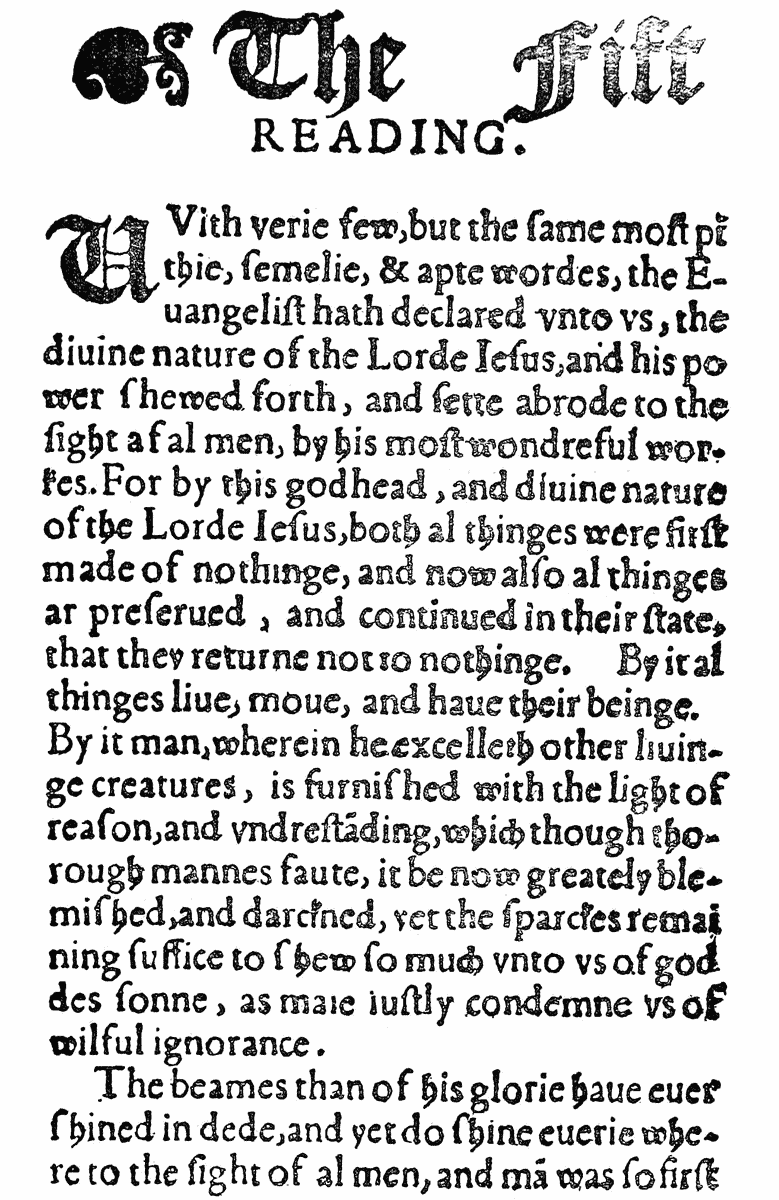
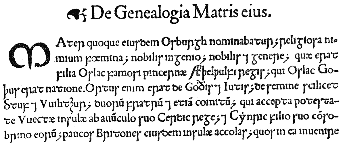
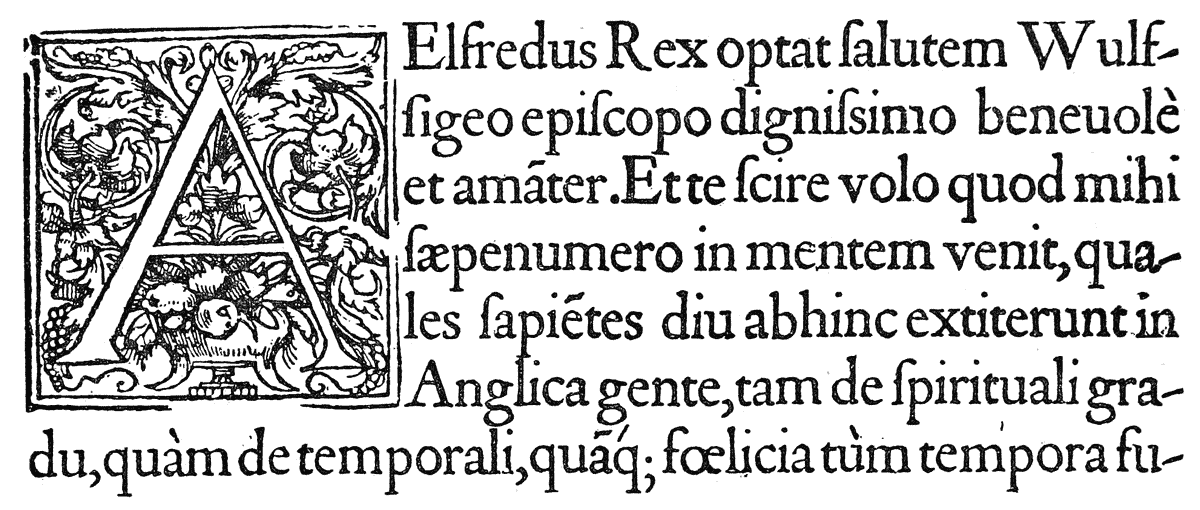
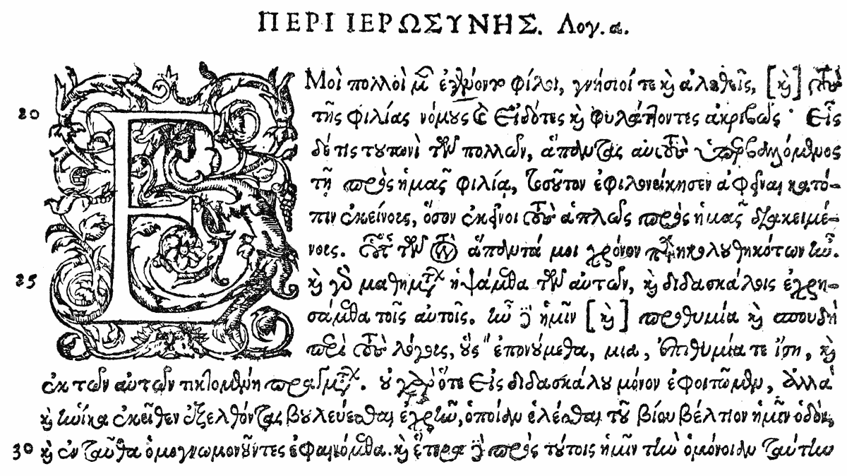
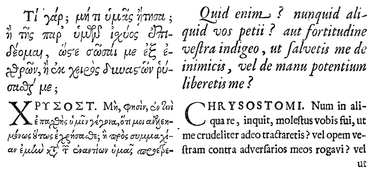
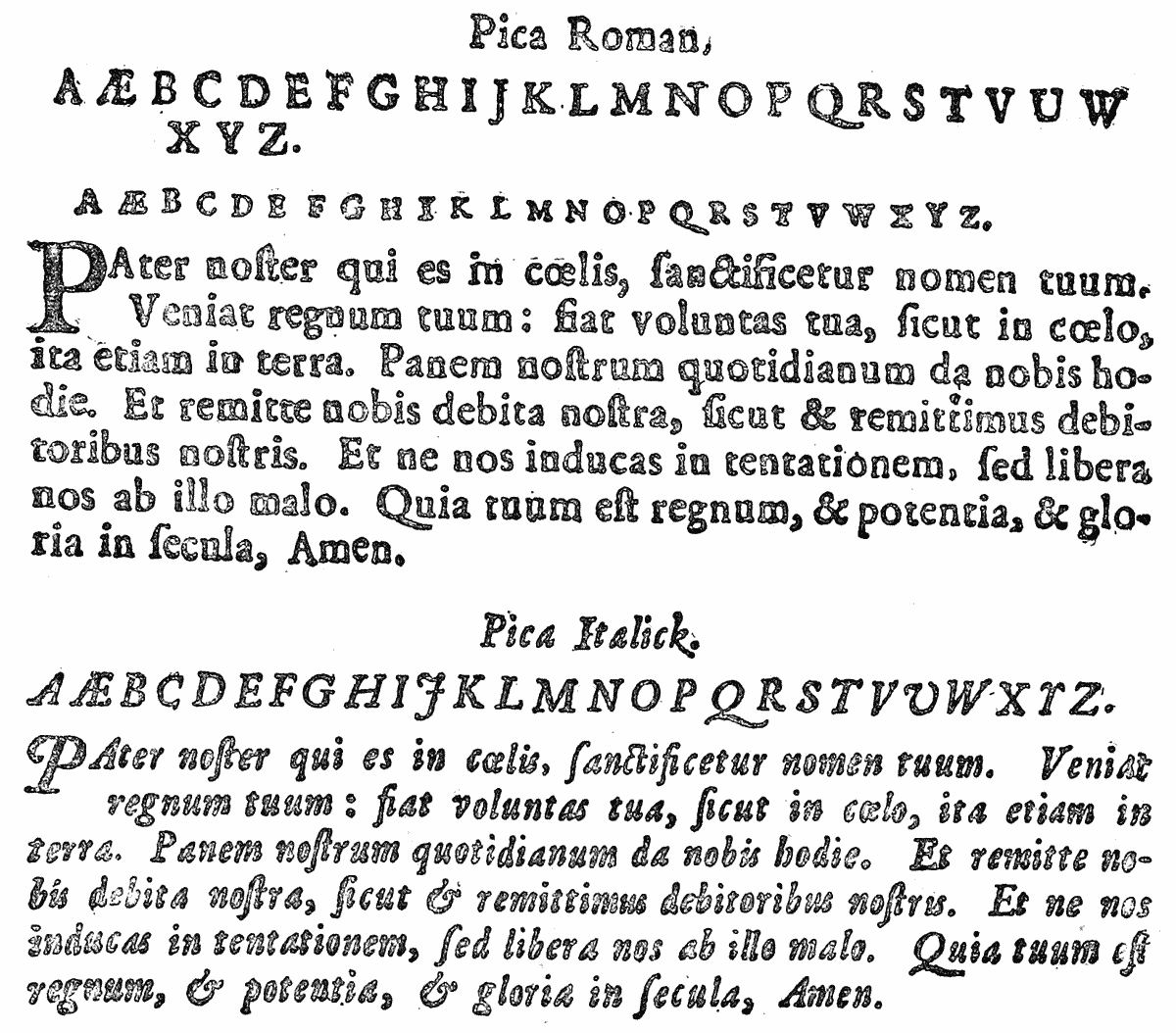
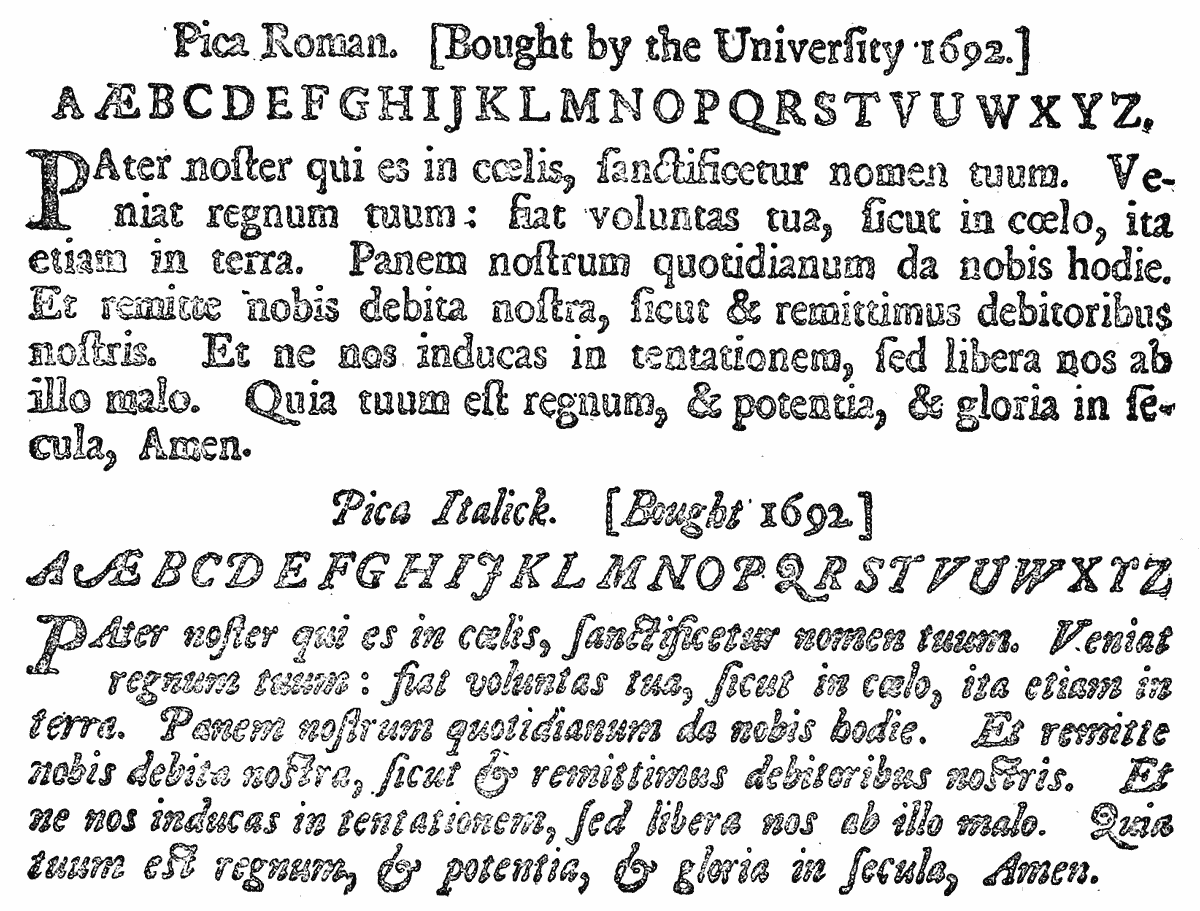
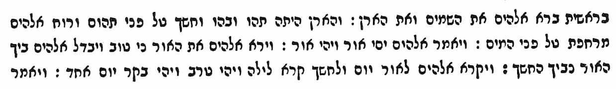
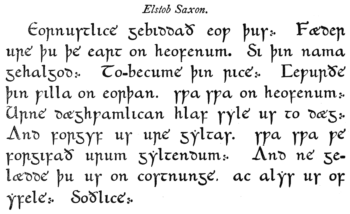
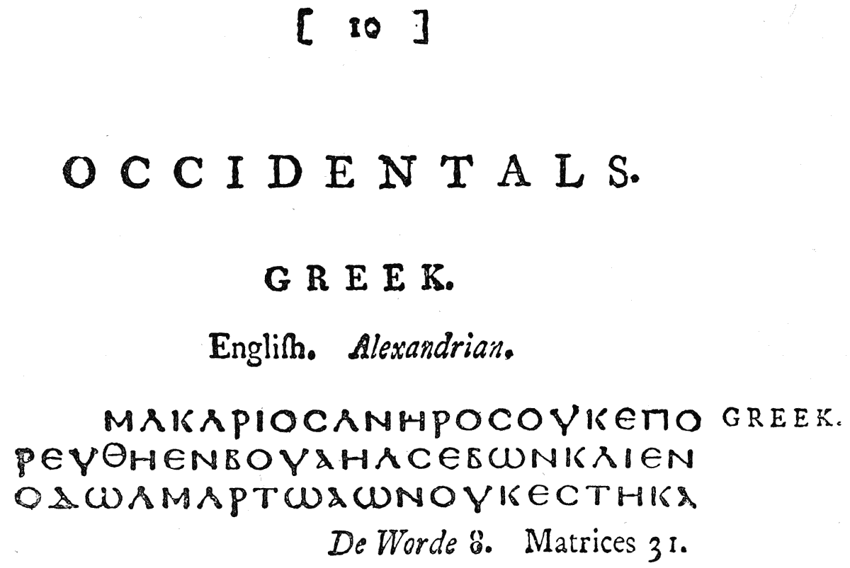
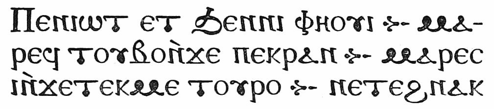
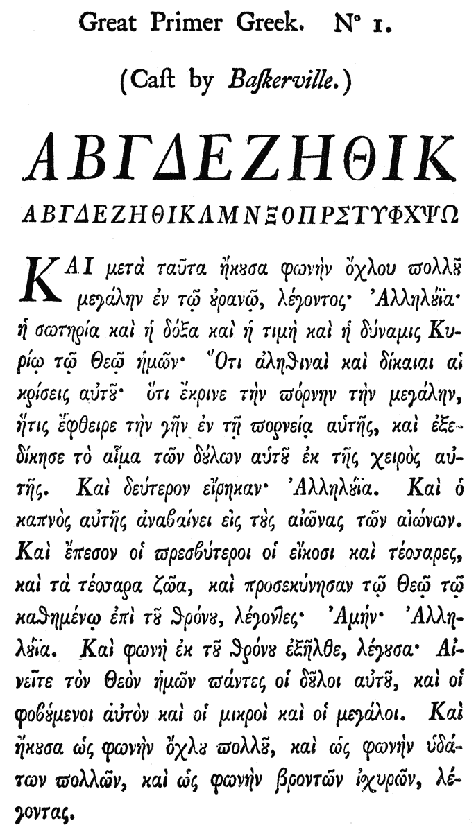
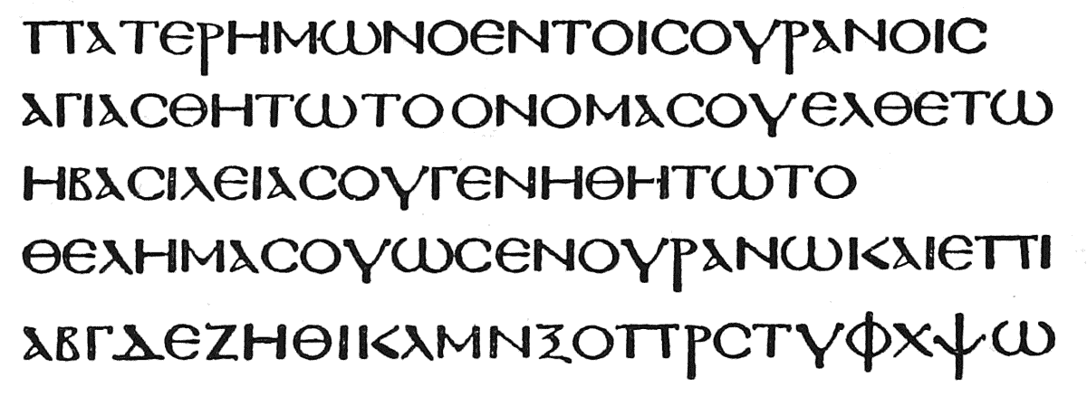
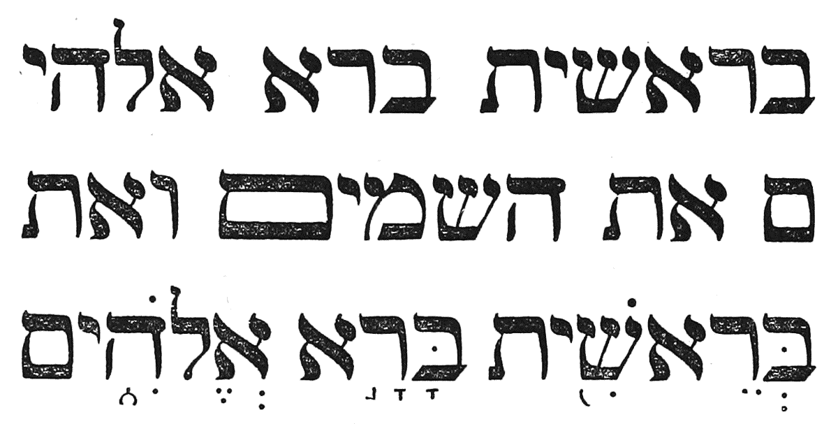