This cover was created by the transcribers
and is placed in the public domain.
This book contains numerous examples of typesetting styles and techniques, including spacing, justification and use of fonts. Efforts have been made to reproduce these examples as faithfully as possible, but there will inevitably be some minor differences from the original.
Details of corrections made can be found in the Notes at the end.
The cover for this ebook was created by the transcribers and placed in the public domain.
| TYPOGRAPHIC TECHNICAL SERIES FOR APPRENTICES—PART II. No. 16 |
TYPESETTING
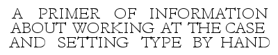
A PRIMER OF INFORMATION ABOUT
WORKING AT THE CASE, JUSTIFYING,
SPACING, CORRECTING, MAKING-UP,
AND OTHER OPERATIONS EMPLOYED
IN SETTING TYPE BY HAND
by
A. A. STEWART

published by the committee on education
united typothetae of america
1919
Copyright, 1919
United Typothetae of America
Chicago, Ill.
Composition and electrotypes contributed by
The Frank D. Jacobs Company
Philadelphia
THERE is a prevalent notion that setting type by hand is not now as important a part of the printer’s vocation as it was years ago. Ingenious composing machines now perform so much of the work of putting into printable shape the literature of the world that it is often assumed the hand compositor’s occupation is fast disappearing and does not offer much inducement for an ambitious young man to follow seriously. This is a mistaken notion entertained only by those who have a limited conception of printing craftsmanship and its possibilities for the exercise of individual skill.
It is true that the greater part of the composition for ordinary printing is now done by machines, just as in other lines of industry machines are relieving human hands of the drudgery in large-scale production by multiplying products through mechanical operations. But that the work of the hand compositor is any less important now than it ever has been is far from the fact. Behind the great volume of machine work, and absolutely essential for any effective use of machine product, there is greater need than ever before of the hand-work and head-work of trained compositors.
One of the great defects of machine composition is its lack of intelligent, trained craftsmanship in typography. Too often it is the work of machine-thinking operators rather than of intelligent compositors trained to use the machine to increase their product and make it of better effect and worth.
Training in hand composition should be a prerequisite for machine keyboard operation. In no other way can the niceties of typography be so thoroughly or conveniently learned as with composing stick and type case.
While hand composition is the particular kind of work the author had in mind when writing the following pages, [Page 4] many of the instructions and suggestions given apply directly to machine-set matter. Expertness and correctness are now demanded of all workmen; correct composition is required from the machine operator even more insistently than from the hand compositor, since the work of the former cannot be so readily rectified.
The first and second volumes of this series, “Type” and “Compositor’s Tools,” dealing more fully with the tools and materials used, should be read in connection with this volume.
THE best and most useful printing is that which has been done by typography; and the best typography has been, and still is, that done by type, hand-set and prepared for the press by well-trained compositors. Good typesetting must be the product of an educated, intelligent mind as well as a skillful hand. It calls for close attention to practical details. It demands the exercise of literary and artistic sense which perceives the requirements of legibility and coherence in thought and the orderly arrangement of words and lines necessary to make the printed page of the greatest usefulness.
A composition of movable types has many advantages over other methods of preparing forms for printing. It offers the readiest means for securing a page of correct reading matter. The mechanical operations are relatively simple. No other process will produce so good a printing surface as quickly or as inexpensively as the typographic method. Serious faults of the original copy, in spelling, use of points, words, phrases, in paragraphing, in spacing of lines, in arrangement of headings, and other errors can be readily corrected in type. The page can be made longer by leading, or shorter by taking out leads.
Any of these changes can be made with the utmost freedom, in a manner that is not practicable in any other branch of the graphic arts. The engraved plate, whether produced by mechanical or by chemical means, when once made, can be changed only in minor details. What is cut must stay; any considerable variation from the first impression can be made only by great skill and by slow processes.
Typography is peculiarly the vehicle for printing literature quickly and effectively. Considering the great influence it can wield, nothing could be simpler than the tools it employs. An intelligent boy of fifteen years, after a little practice, can set type and print it with a press, and the product will be as acceptable as that done by a workman of long experience.
Yet typesetting is not an occupation easily mastered. To find profit and satisfaction in the work an apprentice must acquire a broad knowledge of language and literature and develop an interest in subjects relating to art and design. Although the mechanics of his work are given the chief consideration in the following pages, he should remember that his principal working material is Language and his real tools are alphabets and words.
There are several habits which the young compositor should begin to acquire at the outset if he hopes to make his work agreeable and successful. The mention of these may seem like an unnecessary repetition of trite injunctions, but in work of the kind upon which he is engaged their practice is particularly important. The compositor’s work is one of many details, and careless habits quickly lead to unprofitable results and disappointment. The chief of the good habits may be enumerated as:
1. The habit of silence while at work. A chattering person in the composing room is a nuisance.
2. The habit of keeping materials cleared up. A confusion of articles on the workstand will greatly retard his work. Keep items of the same kind grouped together as much as possible.
3. The habit of picking up at once type and other articles dropped on the floor. A type stepped on is spoiled.
4. The habit of not putting anything in the mouth with soiled hands. Always wash the hands before eating.
5. The habit of standing on both feet and not leaning over the workstand.
6. The habit of dressing so as to be comfortable and reasonably clean.
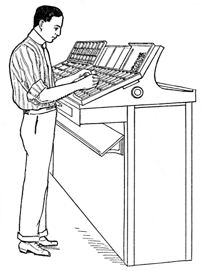
Fig. 1
A compositor should stand comfortably on both feet in front of his case, just a little to the left of the center, and the case should be adjusted to allow free motion of his right arm over the front of the case. This will enable him to shift his weight from one foot to the other occasionally as he reaches from one side [Page 10] of the case to the other. This habit is one that will have to be learned with some effort, but it will mean much to his health and comfort.
The coat should be removed before beginning work, and the shirt sleeves should be rolled high enough to avoid interfering with the work on the galley. A work apron or a loose-fitting coat with short sleeves is advised in order to protect the front of the usual clothing and to provide an extra pocket for small articles like tying-up strings, composing rules, etc. The pocket should not, however, be a depository for types, leads, or brass rules that are usable; these articles should be distributed where they belong.
There are thirty and more different styles of type cases shown in the catalogs of dealers in printers’ supplies, and some of these styles are made in different sizes. This variety may seem bewildering to the beginner who sees the case plans and realizes that a compositor must become familiar with the location of the hundreds of characters in the many boxes of the various cases.
Many of the case plans shown, however, are not in common use, some of them never appearing in the average composing room. A number of them are for special material and their box arrangement is readily understood when one becomes familiar with composing room work. All unusual cases are (or should be) marked clearly, with labels on individual boxes if necessary, showing the name or shape of the character in each box.
The cases used for ordinary hand composition are commonly laid out according to one of two plans: capital case and lower case. Some cases are a combination of both these plans. When the apprentice becomes thoroughly familiar with these two plans and their minor variations [Page 11] he will have little difficulty, if he is observing and careful, in understanding the arrangement of any other special cases which he may have to use occasionally.
The plan of the common capital case is a simple alphabetical order of the letters, with the exception of J and U. The capital case is divided into two sections, each having seven boxes across and seven boxes in vertical line—forty-nine in each half of the case. Of the seven horizontal rows, only the lower four rows are used for the letters, the upper boxes being used for miscellaneous characters; or in some cases left vacant. This arrangement brings the letters AHPX in a vertical line, then BIQY, and so on, as shown in the diagram. 1
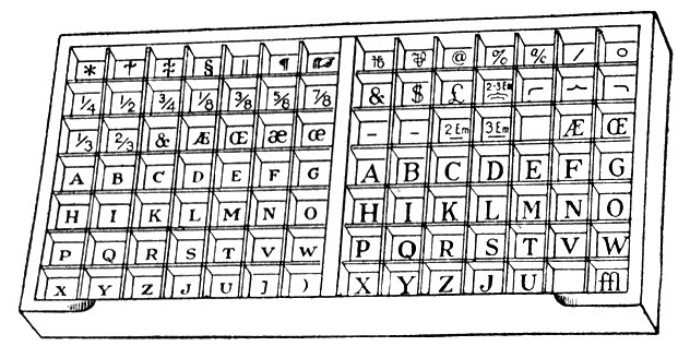
Fig. 2 (a )
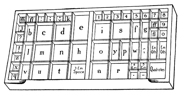
Fig. 2 (b )
1 Note. When the early printers made their case plans I and J, and also the V and U, were treated as variants of the same symbols and no special boxes were provided for them in the capital case. Later, when the J and U were used to express distinctive sounds they were added to the case in the twenty-fifth and twenty-sixth places, which explains why they are out of the usual alphabetical order. The young compositor is advised to read further information about the history of these letters under their special heads in any of the unabridged general dictionaries, such as the Standard, Century, Webster’s, etc.
In the lower-case plan there is an irregular arrangement of the alphabet and a difference in the size of the boxes. Some letters are used much more frequently than others, and the extra quantities of these types need larger boxes. These boxes are placed in the case near the compositor’s hand, while the types less frequently used are kept in boxes farther away.
The pair of upper and lower cases, for many years in use as the standard cases for book composition and for large roman fonts, is being abandoned to a great extent. The increasing use of machines for book and periodical composition during the past few years is gradually eliminating the double cases which were necessary for large quantities of type when type was set solely by hand-work. Type cases in pairs are still generally used, however, and in many composing rooms they hold the chief working fonts of large as well as small sizes of type. A thorough familiarity with the box plans of the upper and lower cases should be the first acquirement of every apprentice.
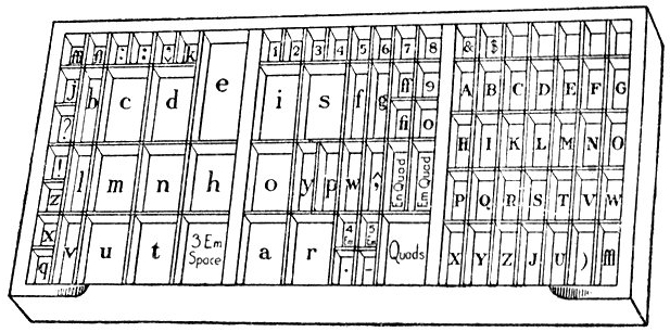
Fig. 3
The style of case now commonly used in America is that known as the California job case, which has boxes for alphabets of both capitals and small letters and for figures, points, spaces, quads, and a few other indispensable characters like &, $, dashes, etc. This style of case is popular because it provides in a convenient single tray enough boxes for a complete font of types needed to compose English sentences.
The “lay of the case” may sometimes be learned in a few hours by an alert boy; sometimes the learning may be a matter of days or even weeks, according to the opportunity and the quickness of the learner. It is a good test of the young compositor’s mental quality to note the quickness and accuracy with which he learns this preliminary task. It may be safely predicted that the boy who works around a composing room for months doing odd jobs, even if he is not given special permission to set type, and fails to learn something of the case plan, through lack of interest or initiative on his part, will not prove an alert, intelligent compositor later on.
Some foremen instruct the beginner to go to an old case with a composing stick and hunt for the letters until, by picking and fumbling, he manages to find those he needs for his first stickful. Another practice is to place types of a large size in the corners of the boxes of the principal letters as guides to the unfamiliar small types. Methods of this kind are slipshod and uncertain; there is sure to be an imperfect knowledge of the contents of the case, for a time at least, and consequent mixing of the types.
The best method of learning the case is to draw a plan of it. This can be done by a study of the case itself before beginning to set type. Let the apprentice first copy the plan of the boxes without trying to memorize the letters in them. When the outline of the boxes is complete the letters can then be marked in place. Another way is to make a copy on a large scale from a print such as shown on page 11. When this is done the apprentice should ask the advice of his foreman or somebody familiar with the cases in his particular room, to be sure that his plan corresponds with the cases he will use. Not all cases are laid exactly alike, even if they appear to be the same at first glance. Many fonts have peculiar characters, or there may be in the case types not ordinarily belonging to the [Page 14] font, which are kept in some spare boxes, or for some reason changes may be desirable in the positions of the regular characters. In this, as in other matters, a safe rule for the apprentice will be: When in doubt, ask somebody who knows. It will always be wiser to proceed carefully at first and know that one is right than to work along in an uncertain, helter-skelter fashion.
The drawing of plans of the different styles of cases in the room is not only a good way to learn the cases accurately but is also a good exercise in the use of pencil and type-measure; it is a simple problem in mechanical drawing which the young compositor should practice, in preparation for more advanced “layout” work which he may do later.
The unit of measurement for types, leads, rules, and other small items used in composing a page is the point, approximately 1⁄72 of an inch, shown by the thickness of this mark:| The most used type bodies are those of 6-point and others graduated by one point up to 12-point.
The amount of type in a page is measured in ems of the size of type
used. An em is a square of the
body ![]() , and varies in size
with each size of type. Thus, an 8-point em is 8 points deep and 8 points
wide; a 12-point em is 12 points deep and 12 points wide. The
common method of measuring the quantity of type on a page is by using
the em as the unit, the number of ems in the line being multiplied by
the number of lines on the page. The term em is applied in many ways to
type; the em dash is one cast on a square body, the em fraction is a
fraction cast on a square body, and so with type borders and other
characters.
, and varies in size
with each size of type. Thus, an 8-point em is 8 points deep and 8 points
wide; a 12-point em is 12 points deep and 12 points wide. The
common method of measuring the quantity of type on a page is by using
the em as the unit, the number of ems in the line being multiplied by
the number of lines on the page. The term em is applied in many ways to
type; the em dash is one cast on a square body, the em fraction is a
fraction cast on a square body, and so with type borders and other
characters.
Before the adoption of the point system type sizes were designated by a variety of names which were meaningless so far as indicating their sizes was concerned. [Page 15] In the point system the size of 12-point corresponds to the old pica. Pica has been a standard type in many countries for a long time, though it has not always been uniform in size. All type founders made pica types, but all picas were not the same size in this country until after the adoption of the point system in 1887. The old names pica and nonpareil (half pica, or 6-point) still survive as convenient terms to use in naming these sizes.
For convenience and economy in the composing room the leads, slugs, rules, metal and wooden furniture, wood type, and other composing material are used in lengths graduated by 12-point or pica. When leads or rules are spoken of as being twenty picas, or twenty ems, it is understood that they are twenty 12-points long. Pica gages are scales marked off in units of 12-point (and half, or 6-point). A graduated composing stick is made to set to measures of 12-point and half.
It will be remembered that the point size was given as approximately 1⁄72 of an inch. Actually a point is .013837 of an inch, but for convenience the simpler fraction of 1⁄72 is sufficiently accurate for composing-room purposes. This makes the 12-point or pica 1⁄6 of an inch. Shop custom measures the items of a page in points, and the page itself or its chief divisions by picas. Paper, sizes and other large dimensions are measured in inches.
It is important for the apprentice to learn these units of measurements and their relation to each other in order to make quick calculations for line lengths, page sizes, margins, etc.
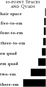
Fig. 4
Trade custom gives the name spaces to the small type blanks and quads to the larger type blanks. These are further specified according to their thickness or fractional part of the em, or square, as 3-to-em, [Page 16] 4-to-em, 5-to-em (hereafter in this treatise, for convenience, termed respectively the 3-space, 4-space, 5-space). Very thin blanks are hair spaces or justifiers. The en quad (half the square) is sometimes called the thick space. 2 The large blanks are the em quad 2-em quad, and (for types of 12-point and smaller) 3-em quad.
To the beginner the difference between some spaces and quads is not always clear because of the frequent identity of size in different type bodies. Thus, a 3-space of an 18-point font is 18×6 points, which is the same as a 3-em quad of 6-point. The difference between the two is in the position of the nicks (except where spaces and quads are cast without nicks). On the 6-point quad the nick is along the 3-em side, while on the 18-point space it is across the narrow 6-point edge. The identity in size is often a convenience, when quads or spaces of one size are exhausted, by allowing the use of pieces from another font.
The apprentice should become familiar with these regular spaces of his case at the outset. He may learn to distinguish them by putting one of each thickness side by side frequently for comparison. By doing this with each size of type as he comes to use it he will soon learn to distinguish the spaces at a glance, to select quickly the space he wants, and to sort them properly in distributing.
These four regular thickness of spaces meet most of the requirements of type composition. Besides their own individual widths they may be combined into any other widths for spacing and justifying lines. The following table, [Page 17] showing twenty-four different widths less than the em which can be made with the four original spaces, should be studied by the beginner who is in despair because he cannot find just the right thickness to fit his line.
2 Note. The 3-space is often miscalled the thick space; but as it is commonly known as the normal space (i.e. neither thick nor thin) it seems illogical to call it also a thick space. The en quad or any space thicker than the 3-space is obviously a thick space.
Taking 60 as the common denominator of the five blanks, including the em quad, which would be 60⁄60, the en quad is 30⁄60, the 3-space is 20⁄60, the 4-space is 15⁄60, and the 5-space is 12⁄60. By combining the various spaces the following fractions of the em square may be obtained:
| 5-space | = 12-60ths | en and 4-space | = 45-60ths | |
| 4-space | = 15-60ths | 3-4-5-spaces | = 47-60ths | |
| 3-space | = 20-60ths | 4 5-spaces | = 48-60ths | |
| 2 5-spaces | = 24-60ths | en and 3-spaces | = 50-60ths | |
| 4-space and 5-space | = 27-60ths | 4-space and 3 5-spaces | = 51-60ths | |
| en quad | = 30-60ths | 2 3-spaces and 5-space | = 52-60ths | |
| 3-space and 5-space | = 32-60ths | en and 2 5-spaces | = 54-60ths | |
| 3-space and 4-space | = 35-60ths | 2 3-spaces and 4-space | = 55-60ths | |
| 3 5-spaces | = 36-60ths | 3-space and 3 5-spaces | = 56-60ths | |
| 4-space and 2 5-spaces | = 39-60ths | en, 4- and 5-spaces | = 57-60ths | |
| 2 3-spaces | = 40-60ths | 3-space, 4-space and 2 | ||
| en and 5-space | = 42-60ths | 5-spaces | = 59-60ths | |
| 3-space and 2 5-spaces | = 44-60ths | em quad | = 60-60ths |
With a supply of the regular spaces at hand it will be seen that for average work there is ample opportunity for careful spacing and proper justification. The trouble often comes, however, because of an insufficient supply of the thinner spaces. Unfortunately in many places these are not supplied in right quantities and the usual boxes for holding them are inadequate for a proper supply. Improper distribution of the thin spaces is also responsible for the lack of a proper supply, as well as for great loss of time in sorting and hunting during composition.
The point system of widths has been applied to spaces, the thickness being graduated by points and half-points, instead of the fractional division of the em. In a font of 10-point, for instance, the four ordinary spaces 5-space, 4-space, 3-space, and en quad, are [Page 18] respectively 2, 21⁄2, 31⁄3, and 5 points thick. In the point system there are five spaces within these limits, namely: 2, 21⁄2, 3, 4, and 5 points thick. The extra space and two intermediate widths between the 4-space and the en quad give many advantages in spacing for good composition; though as yet the use of these point-width spaces is not general in hand composition. The lack of proper boxes to keep them in the ordinary type cases is a serious drawback to their economical use.
The following table shows the widths of point spaces in six common sizes of type:
| POINT SYSTEM OF SPACE WIDTHS | |||||||
|---|---|---|---|---|---|---|---|
| 6-to- em |
5-to- em |
4-to- em |
3-to- em |
Patent space |
en quad |
em quad | |
| 6-point 8-point 10-point 12-point 14-point 18-point |
1 1 11⁄2 2 2 2 |
— 11⁄2 2 21⁄2 3 3 |
11⁄2 2 21⁄2 3 4 4 |
2 21⁄2 3 4 5 6 |
21⁄2 3 4 5 6 — |
3 4 5 6 7 9 |
6 8 10 12 14 16 |
When type composition is to be used regularly for making moulds for electrotypes; high spaces, quads, leads, and slugs are employed instead of the ordinary low spaces and quads. These reach nearly as high as the shoulder of the type and, unlike low spaces, do not leave small holes and crevices between the words and lines into which the moulding wax is forced when moulding. Although a great deal of miscellaneous job work is moulded for electrotyping with low spaces and other blanks, the electrotyper finds it difficult to obtain the best results with forms made up in this manner. The high blank spaces make a better moulding form and are used in composing rooms where the major part of the work is electrotyped.
Large hollow quads, known as quotation quads (quotation furniture, in the larger sizes), are used in place of solid quads where there are many large blanks in the form. These have the advantage of lightness [Page 19] in comparison with regular quads. They should be set in the form with the hollow space down, so as not to catch dirt and small particles that will be likely to come out later on the ink rollers when the form is on the press. There are occasionally places where it will be an advantage to use them hollow-side up for ease in picking them out when changing the form; but the form should never be sent to press or to the electrotype foundry with the hollow spaces up.
In a font of typewriter type all characters are cast on bodies of the same width. Only one kind of space is used (or need be used) for spacing the lines. This space is the same width as the letters, so that each line contains exactly the same number of pieces. The usual size for this kind of type is 12-point and the width of the letters and the space is a little more than the en. The apprentice should notice that the 12-point typewriter space and the 12-point en quad are not the same.
Script types usually need spaces and quads that are beveled on two sides near the top. The bevels are to allow for the overhanging kern of the letters. The spaces and quads are cast to fit the particular design of the face.
The general practice of slug-casting machine composition is to justify the lines by increasing the spaces, which explains the customary wide-spaced appearance of machine-set matter. As the same space-bands are used for all sizes on the machine, a 6-point size is spaced relatively much wider than a 10-point face.
Note. The system of spaces here considered is that of regular foundry type fonts. Linotypes and Monotypes have systems of spacing which differ considerably from this. In Monotype composition a special unit system is used. There are 18 units in a quad, which, unlike the em quad of foundry type, in the smaller sizes is not usually an exact square. The space is 6 units, approximating the foundry 3-to-em space; the 5-unit space equaling the 4-to-em space; and the 4-unit usually a little less than the 5-to-em space. These are cast from matrices and represent fixed widths. But in the process of composition the expanding or justifying space is used to fill out the [Page 20] line. When the keyboard operator sees that another word or syllable can not go into the line the keys indicating the width of the spaces to fill the line are struck, the result being that all spaces are spread equally to fill the line. The actual spaces cast may be any number of units in width.
On the Linotype there are three fixed spaces: the em quad, the en quad (or figure space), and the thin space, equal to a fourth of the em. The regular space is made by space-bands which can be used to make any size between a 3-to-em and double this thickness. If anything smaller than the thin space is needed, it must be put in by hand.
The term justifying refers to the tightening of a line to make it correspond with other lines or parts of the page, so that the whole form may be locked together compactly, with no parts loose and none too tight. The term spacing refers to the blanks between the words in the lines. The term leading refers to the distance between the lines in a paragraph or page of plain matter.
A line of type may be well spaced but improperly justified. On the other hand, it may be badly spaced but nicely justified.
There are many places where spaces thinner than the 5-space are needed, especially for letter-spacing and for careful word-spacing, as well as for tabular pages and other work requiring accurate justification. For such purposes hair spaces, copper-thins, and brass-thins are provided. The thickness of hair spaces varies according to the size of the type; the name is given generally to any cast space thinner than the 5-to-em. Copper spaces are 1⁄2-point in thickness and brass spaces are 1-point thick, the difference in the metal used being for easy distinction of the thicknesses. Copper and brass spaces, because of greater durability, are superior to cast metal hair spaces for hand composition.
When metal thin spaces are not at hand it may be necessary to resort to pieces of paper or thin card. Spaces of this kind should be used only in exceptional cases and not at all as a common practice. There [Page 21] should be never more than a few pieces of paper used in justifying a line. A safe rule for the apprentice, when he thinks he cannot make his line come right without some such expedient, is to ask an experienced compositor, who will usually show him how to justify without the paper.
Lines of type are separated by leads and slugs. These are strips of metal lower than type-high and are furnished by dealers in labor-saving fonts and also in lengths of two feet. Leads are made 1-point, 11⁄2-point, 2-point, and 3-point thick. The 1-point size is furnished in 16-inch lengths. The 2-point is the thickness mostly used. Slugs are made usually 6-point, 12-point, 18-point, and 24-point thick, but other sizes are also made.
Leads and slugs are made in two heights; one slightly less than low spaces and quads, for usual composition when the type is to be used for printing, and the other high enough to reach the shoulder of the type, for use with high spaces and quads in electrotype moulding.
Leads and slugs are also made of brass, in sizes, lengths, and heights similar to the soft metal varieties. While the cost of brass material is much greater than ordinary metal strips, in some cases its greater durability makes it more economical. This is true of the 1-point and 11⁄2-point thicknesses used in standard lengths, as in newspaper and periodical pages. For occasional use in job work the soft metal leads are usually satisfactory.
Strips of wood, called reglet, are sometimes used as substitutes for leads and slugs in large sizes. These are made in lengths of one yard and in sizes of 6-point (nonpareil), 12-point (pica), and 18-point. Larger sizes of the same material are known as wooden furniture.
All the material mentioned under this head is commonly used in lengths graduated by the pica (12-point) [Page 22] and is for the most part in labor-saving fonts or assortments. Each kind should be kept, when not in use, in racks or cases with compartments for the different lengths.
The width of a type page is called its measure. Before commencing to set type the stick must be set to the measure required; that is, for the length of the type line. If the stick is of the modern graduated pattern which sets to standard measures by changing the movable side-piece to a slot or notch where it is fixed, the setting is a simpler matter. These sticks will no doubt be in more common use later than they are now because of their many advantages; but as there are many of the old style thumbscrew sticks (especially the kind known as the Yankee job stick) in use in composing rooms throughout the country, it is necessary to know how to adjust these correctly. The old style sticks not only require care in setting but watchfulness afterward to see that they do not change while being used for a job.
The manner of setting a stick may depend upon the kind of work to be done. For job work of a few lines only, where the lines are to be locked by themselves in a chase, the stick may be set by a bunch of leads of the required length. These are placed in the stick and the movable knee set up to them loosely, so that the leads do not bind at the ends. If the job is to be enclosed in a border or rule panel the stick should be adjusted accurately to ems of 12-point or 6-point.
Fig. 5
For ordinary measures a line of perfect 12-point quads will be a good gage. For very short measures, as in tabular column heads, 6-point quads should be used. A gage that will be more uniformly accurate is a line of 12-point letters (for short measures) or 24-point letters (for longer measures) from a font of foundry-cast [Page 23] type. These should be set in the stick with the nicks sideways, not in front as for composition. The body-size of cast type is the most accurate of any point-size material, and as 12-point and 24-point fonts are at hand in every composing room they furnish a convenient and reliable standard at all times.
Usually the knee should be set lightly against the gage when the thumbscrew is tightened. A good plan is to put a slip of paper at one end of the line of quads or letters (See A, Fig. 5), and to push up the knee firmly. A line of many separate types will not fit together as solidly as a line of a few quads; to allow for a little compression in the line when it is locked up later the slight fullness is given in setting the stick. In setting measures for tabular columns and for very short lines the slip of paper is not necessary.
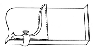
Fig. 6
It is important that the outer end of the knee should be kept at a right angle to make the stick square, in order that the first and last lines of the stickful should be of exactly the same length. If there is any doubt [Page 24] about this, test the front of the stick by moving the gage line forward when the measure is adjusted. If the gage line is looser here than at the back, the outer end of the knee may be closed in by inserting a piece of card between the knee and the back plate, as is shown at A in Fig. 6.
When the measure is set, make the thumbscrew as tight as possible with the fingers. Do not use a wrench, as this is liable to give unnecessary force and break the small clamp.
Make it a practice to try the thumbscrew occasionally while using the stick to prevent the knee from becoming loose, as it may in case the lines are justified tightly.
Lines of type are easier handled by the aid of a composing rule. It is not practicable to set small types in the stick without some support or to set a second line immediately next to another without a lead or rule to separate them. The composing rule furnishes a smooth surface against which to place the types as they are assembled and to keep them in line while the respacing and justifying is done. The rule is also convenient for lifting lines out into the galley and for handling them in later operations.
Sets of these rules can be purchased from supply houses or they may be made from a discarded strip of brass rule (2-point or 3-point), by trimming one end so as to leave a nib 10 points long.
Composing rules are not used now as much as formerly, owing to the fact that hand composition is largely in the nature of job work. A compositor in a day sets a great variety of line-lengths, many of them in large types, and he dispenses with the composing rule as a needless tool, using instead the ready-at-hand leads and slugs needed for the page. In many cases this is advisable. Yet when there are many lines of one length to [Page 25] set and to correct and later to make up into pages, the composing rule is recommended as a useful accessory.
With a correct plan of the case before him the beginner at typesetting may go at his work with confidence that one part of his work is simplified and he can devote his attention to the next steps, that is, to learn to hold the stick comfortably and to pick up the types and put them in line.
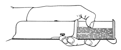
Fig. 7
The accompanying illustration shows the manner of holding the stick. Notice that it is held in the left hand, leaving the right hand free to pick up the letters. Type must be set right-handedly even by left-handed persons. The types are placed in the left corner of the stick with the nicks outward, and each type as it is placed is held gently by the thumb of the left hand.
The stick is always held with the open side slightly tilted up to allow the types to lie against the composing rule, and the left thumb follows each type along the line to keep it from falling out of place.
The beginner will usually try to read his first words in type by turning the stick so that the bottom of the line is toward him. This is not the way experienced compositors do, however. The printer reads his type lines up-side-down, with the top of the line toward him. In this way he reads the lines from left to right, just as he would the printed page except that the top of the type page is nearest to him.
It must be remembered that any printing form is the reverse of the printed sheet. The simplest way is to reverse the page from top to bottom rather than from right to left. Just turn this page face down on the table and you can readily imagine what the types that printed it would look like.
A compositor should always read his copy ahead of his setting and try to get the sense of the words. This will make it easier for him to carry in his mind a number of words at a time in advance of picking up the types. One who must constantly refer to his copy word for word will waste valuable time hunting for his place, will have greater difficulty in keeping the sequence of words, and will be far more liable to make mistakes. Concentration of mind is absolutely essential if he hopes to become a good compositor.
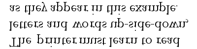
Fig. 8
The nicks on the type bodies are important in helping to pick them up in such a manner that they may be carried to the stick and put in place right side up quickly. Look for a particular type in the box and note the nick first. Select one that can be carried to the stick right side up with the fewest motions. While it is going to its place look for the next type and have the left thumb in the stick do its share of the team work. Fumbling for a type, picking it up and turning it over several times to find the nick before it can be put in the line is a habit that should be guarded against as a positive handicap. Study to avoid as much as possible all superfluous motions. Do not mistake nervous, fussy, trust-to-luck motions for speed; they are usually [Page 27] the reverse. Be deliberate and accurate, even if slow at the start. Learn first to do it right, then strive to do it quickly. Speed is important, but correctness is much more so.
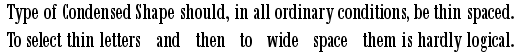
Each line of type must end with a completed word or a syllable. When the line is first set, however, it rarely happens that the types fill the line snugly without more or less changing of the spaces. If a little more room is needed to take in the last letter or two of a word, the spaces are changed for thinner ones until the word is brought in. On the other hand, if there remains a little space after the last word or syllable, the spaces are increased a little until the line is full. Just when to thin space and bring in a word or syllable or when to fill out the line with wider spaces depends upon whether the composition generally is to be thin spaced or is to be wide spaced.
Changing the spaces is done by pushing the top of the space from between the words with the one that is to be inserted in its place. The new space is dropped in and the old one picked out and put in the case where it belongs, the thumb in the stick meanwhile keeping the line from falling. Changing the spaces in this manner should be done with care in order to avoid injuring the face of adjoining types.
Another method of changing spaces is to lift up the wrong space by an upward pressure of the left thumb and pick it out with the right thumb and forefinger, afterward inserting the new space.
A line of type is well justified when it will stand up in the stick without other support than its own tightness. Lines that will fall down when the composing stick is slightly tipped forward are too loosely justified. On the other hand, they should not be so tight that they will be difficult to lift out when the stickful is taken out on the galley. Unnecessary tightness is [Page 28] liable to injure small types at the end of the lines. Careless compositors will sometimes force a type into place so tightly that it will shave a slight film of metal from the adjoining types, the metal remaining under the feet of the letters which will make them higher than the surrounding letters.
Long lines require a little firmer justification than short ones, because the greater number of pieces, especially if the type is old, will compress more than the fewer number in the short line when they are later locked up in the chase.
Leads and brass rules should not be so long that they bind tightly when they are placed in the measure. When this happens the type lines near them will rarely lock up tight without very great pressure in the chase.
The beginner at composition is not at first apt to realize the importance of careful justification. It is not till later when he must lock up the types for printing that he learns why they must be exactly upright to give the proper impression and carefully fitted together to hold solidly in the form.
The first point to note is that the types should be squarely on their feet in the stick when the line is justified. If they are leaning forward or backward and left this way the line will be short when the types are later straightened up on the galley or in the form. It is wise, therefore, before going to the next line to make sure that all types are on their feet when the final letter or justifying space is inserted.
For the first few stickfuls, until the apprentice learns how to handle the lines without pi-ing, leads should be put between all the lines in the stick, even if they are to be taken out later to print the type as solid matter. A lead should be put at the top of the first line and after the last line in the stick. If a composing [Page 29] rule is used, this may or may not be kept with the lines. Many compositors insert the composing rule at the top of the first line while lifting the lines out of the stick, as the rule gives a good surface by which to take hold of the matter.
It is a good plan not to fill the stick too full before emptying. A few lines at first will be enough to practice with, until the knack of grasping the matter all around and lifting out is acquired.
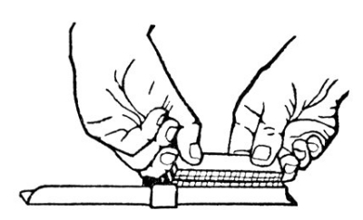
Fig. 9
The galley should be placed on the case or on an adjoining stand or inclined support, with the head turned toward the right. If the lines have been properly justified, there is no need to open the measure of the stick to extricate lines that seem very tight. In this case take out the lines separately, but keep the measure unchanged till the work is done.
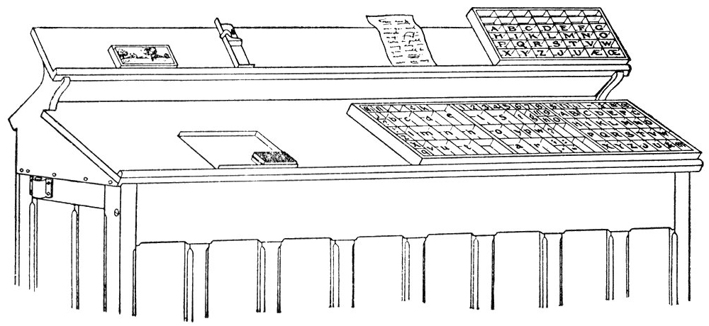
Fig. 10
The stick is emptied in the following manner, as [Page 30] illustrated in the accompanying diagram: Lay the stick near the bottom of the galley, with the top line or back of the stick at the lower rim of the galley. The two forefingers are then placed in the stick after the last line and the two thumbs beside the top line. The second fingers, doubled up, are pressed against the ends of the lines at both sides. Thus holding the lines evenly all around, the top lines are lifted slightly with a turning motion to bring the feet of the type upward. This gives a chance for the thumbs to get a better hold down beside the top line. The small fingers are meanwhile holding the stick down against the upward motion of the matter, while the lines are taken out. The types should then be held in a horizontal position, while the compositor turns his right side to the galley. Still holding the lines firmly, he next turns them feet down in the lower corner, with the beginning of the lines at the lower rim. (Do not release hold until the matter is close against the rim of the galley, keeping the middle fingers at the ends of lines to prevent any types from dropping out of place. If any types should drop, take hold of the handful again and move it farther down the galley, pick up the loose type and then slide the lines to the head of the galley and insert the missing type.)
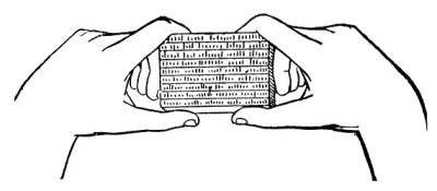
Fig. 11
When first placed on the galley the type is liable to be a little off its feet. Have a piece of good metal furniture 8 × 20 picas to place beside the lines, first at the bottom and then at the ends of the lines, and use this to square up the types on their feet.
An untrained compositor is prone to use more thin spaces than are necessary, and he quickly finds that there are not enough in the case to meet his wants. He puts in extra thin spaces to fill out the line instead of changing the spaces already in for thicker ones. He inserts 5-spaces beside 3-spaces through the line because this appears the easiest way, though in the end it is neither the quickest nor the best way. When wide spacing is necessary it is usually better to change the 3-spaces for en quads, and if the line does not then quite justify to put double spaces between long words or those having tall letters. Obviously it is not wise to put in two 4-spaces when there is a plentiful supply of en quads at hand. By using two thin spaces where one thick space will suffice the supply of thin spaces is soon exhausted, while there will be an over-supply of the thicker kinds left in the case. It often happens that the same kind of composition is set by an experienced workman with half the number of thin spaces used by a novice and it will show greater uniformity in spacing and justification.
Combinations of 3 5-spaces, 3 4-spaces, or 4 5-spaces should be used sparingly, and only when they are needed to justify the line. Two 3-spaces together are better than an en quad and a 5-space. There are usually more 3-spaces in the case, and they are easier to distribute than the thinner spaces.
A good general rule is never to use two or more pieces of material where one piece will suffice.
When the composed lines are on the galley ready for proving they must be fastened temporarily. A column of type is placed on a long narrow galley in which a side-stick of wood is laid beside the lines. This is held in place by pushing in a few wooden wedges or quoins. The Hempel style of metal quoins are well adapted for this purpose.
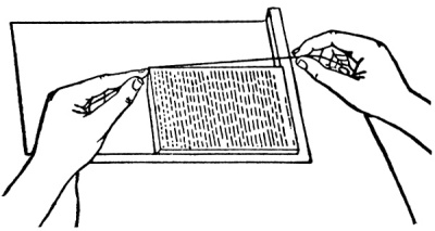
Fig. 12
When the composition is relatively small the lines are usually tied up with a cord. This is done by winding the cord several times around the matter, the number of turns depending upon the size of the page and the stoutness of the cord. Printers’ supply houses call this string page cord. There is no standard thickness or brand. Any good cotton cord can be used. That which is known among twine dealers as Seine No. 12 is excellent for this purpose. Start the cord at the left top corner of the matter as it lies on the galley—that is, usually at the end of the last line. With the left hand hold an inch or less of the cord while the right hand winds it along the upper side, around the head, and down the lower side of the matter close to the rim of the galley, then back to the starting point. Here the cord is crossed over the first end so as to bind it, each turn of the cord at this point going below the preceding one. At the end of the cord turn in a loop just around the corner, pushing the cord between the types and the windings with the nib-end of the composing rule. Draw the loop up reasonably tight so that it will not slip out, and leave a short end out, to be found later when necessary to take the cord off. Hold the left hand on the page until the end of the cord is made fast, to avoid any unexpected movement of the page during the operation. When the page is fastened, move it a little from the lower rim of the galley and push the cords down to the middle of the [Page 33] type-height, especially if low leads, spaces, and quads are used in the matter. When the cord is tight around the upper part of the type there is liability of the page doubling up when it is pushed off to the imposing table or the proof press.
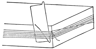
Fig. 13
If the galley has a high rim there may be some difficulty in getting the cord down over the lead at the top line and along the lower edge. In this case, when the first complete turn of the cord is made move the page carefully up on the galley so that the second and succeeding windings may come under the first one.
Do not leave long ends of the cord hanging out, as they are liable to get under the feet of the type and cause damage when the proof is made.
Special care should be taken to keep the feet of the type free from dirt or lumps of any kind. A good practice of many compositors, after tying up pages that are not too large to allow it, is to lift the page perpendicularly and hold it in the left hand while the bottom is brushed off with the right hand, and then to wipe off the surface of the press or imposing table before laying the page down.
In composing rooms where a great deal of job composition is done the time spent in tying up pages is considerable, and the work is often done carelessly. Each compositor should have at hand his own supply of [Page 34] page cords, kept in orderly manner for instant use. A ball of stout white twine every week or oftener costs much less than the time spent in a week to hunt for pieces of cords kept in no particular place. An assortment of the lengths most used, folded into little skeins and kept in the apron pocket, will save time and trouble. Avoid the pieced-up, knotted string around a page of type that is to be placed on the imposing table for locking up. Leave no long loose ends, but make the fastening loop so that it can be readily found after the furniture is placed around the page.
Stout new rubber bands of the right length may be used for tying up pages and jobs, but they must be managed carefully, especially in taking off, to avoid squabbling the type. They are suitable only for temporary tie-ups and should not be used if the pages are to be kept standing many days.
First proofs from composed types are taken for the purpose of correcting any errors. Later proofs are for verifying corrections and to note whether instructions have been followed in make-up and in various other matters necessary to get the type ready for printing.
Proofs are sometimes taken by using a proof planer and mallet, but more commonly by means of a proof press.
In any of the usual methods employed it is first necessary to spread ink on the type face with an ink roller. A small hand roller is used in combination with a smooth steel or stone surface on which to distribute the ink. The composition of the roller should be well seasoned and the roller should be well cleaned. A good grade of slow-drying black ink of the quality known as “book” ink is necessary for the usual work. A very thin ink or a very stiff ink is not suitable. The amount used should be just enough to give a clear [Page 35] impression of the type, and no more. This is graduated to the lightness or boldness of the face, and also to the finish of the paper. A glossy coated paper will need less ink than a machine-finish paper; while an antique-finish paper will need much more ink than either. As a general rule, proofs are made on smooth-finish paper with a minimum quantity of moderately stiff ink.
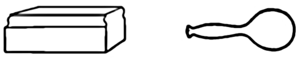
Proof Planer
Round-head Mallet
Fig. 14
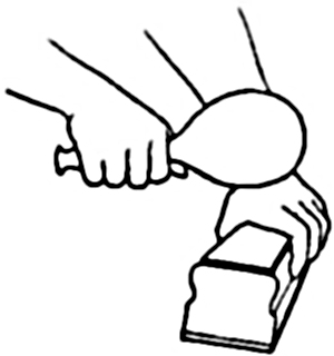
Fig. 15. Proof Planer and Mallet in use
A proof planer is a block of wood about 8 inches long by 31⁄2 inches wide and 21⁄2 inches high, having its face covered with a piece of thick cloth or felt. A planer proof must be made while the type is on the imposing stone or some other solid surface. When ink has been rolled on the type a sheet of thin paper, slightly damp, is laid on the type and the planer is used for taking the impression. The sheet should be dampened evenly all over with a sponge, enough to be a little limp. The unsponged side of the sheet is laid on the type very carefully to avoid slurring the impression. The proof planer, held in the left hand, is placed steadily on top, and a mallet in the right hand is used to tap the planer. If the planer does not cover the whole page, it must be lifted from one part to another [Page 36] until the whole surface is covered. This requires some practice, to avoid a shifting of the sheet on the type and making a double or smeared impression.
A firm foundation for the type and a steady blow, graduated in force to the size of the printing surface, are necessary for a clean impression. The mallet should hit straight, without glancing sidewise, and the planer should be held level and steady.
Fig. 16
The kind of type forms adapted for proving by this method are those with paragraphs of plain matter and strong faces which will not be easily battered. Those with large open spaces and small lines, and those with delicate lines like scripts and kerned italic letters, should not be proved with a planer if another method is available. Small groups of type standing alone, like page numbers and small imprints, require very careful treatment in proving, to avoid unnecessary impression which may batter the face or break off the kerns. When it becomes necessary to take proofs of fine or small types standing without surrounding [Page 37] support, it is a good plan to place near the type, on two sides if possible, type-high blocks upon which the planer may rest while the impression is being tapped.
The proof planer is not the common method of taking proofs, but is employed in places where there is no regular proof press, and also under conditions where a proof press cannot readily be used. The latter condition is in the case of a large form beyond the capacity of the proof press, locked up on the imposing stone, when a proof is required, either of a part or of the whole, for verification of some detail before sending the form to press for printing.
Fig. 17
The other and more common method of taking proofs is on one or another of the several kinds of proof presses, as described in text-book No. 5 of this series, “Proof Presses,” to which the reader is referred for a detailed consideration of the subject.
When a line of type has been set in the composing stick it should be read over with care, compared with copy, and any mistakes corrected before the line is justified. A habit of doing this will make cleaner proofs and save a great deal of time and expense. An error [Page 38] corrected at this time saves a second justification of the line. If the error is an omitted word or syllable or a word inserted twice its detection will save the probable over-running of several lines or even of a whole paragraph later.
The lines should also be scanned before being taken from the stick to the galley. A turned letter or a wrong type overlooked in the first examination may be changed by lifting the line a little until the type can be picked out and the right one put in its place.
Fig. 18
Do not try to correct a line in the stick when another line or part of a line is in front of it. If a correction makes necessary a change of spaces or a re-justifying of the line, take out all the lines in front, then correct and justify again. This allows the stick to be held in the hand and the types can be handled in the same [Page 39] manner as for the original setting. This will be more convenient than to lay the stick on the case while re-spacing a line in the middle of a stickful.
The use of a bodkin or tweezers is seldom necessary for correcting in the stick or on the galley, unless the type is very small and the measure is narrow.
A little care in revising the lines as they are set, before the first proof is taken, will result in cleaner proofs and will reduce the time for proofreading as well as for later corrections.
Even though the lines have been carefully revised while being set, errors of various kinds will probably be marked on the proof when it comes back from the proofreader. If there are many lines and a number of serious errors the corrections are made at the case. The galley is placed at one side of the case if possible, rather than on top of the case, with the head of the galley and the top of the lines toward the right. When only one stand can be used it may be well to put the type case in the rack under the working shelf and to put the galley on the shelf. This will permit free access to the case for the letters needed in correcting and will give a good resting place for the galley and composing stick.
The compositor stands with his right side to the galley and works with the tops of the lines toward him. The composing rule with a nib is useful at this time. Lines in which corrections are to be made should have leads or rules beside them to help keep them from pi-ing during the operation. If the lines are set solid, leads or rules should be inserted temporarily and taken out when the correcting is finished.
Simple errors like the exchanging of one type for another of the same width, the turning of an inverted character, or the transposition of letters or words, are corrected by pressing the line at both ends to lift it up about one-third of its height and picking out the wrong types with the finger and thumb. The line is then dropped in place and the right types put in.
A line in which there is a change of the spaces or of the justification should be lifted into a composing stick of the right measure for correction. Any important change in a line of type should always be made in a stick, where accurate justification is most readily secured. First place the composing stick conveniently at hand, with its back toward the compositor. Insert the composing rule down at the top of the line in the galley, press both ends of the line together, and raise it up gently; when it is clear of the other lines turn it so that the rule is under, and then transfer to the stick. As a rule, lines of type should be carried in a position which keeps the types themselves horizontal, not perpendicular. In this manner they are supported by the lead or rule underneath. If carried with the feet of the types down they are liable to drop out unless perfectly justified and firmly held.
Many careless compositors persist in correcting lines on the galley in a puttering, botchy manner which results in badly justified lines. The beginner is usually inclined to do the same thing because he has not yet learned to perform with ease and safety the trick of transferring lines back and forth from the galley to the stick. Instead of shirking this operation because it looks difficult, he should practice it until he can do it safely and quickly. A compositor who does not justify his lines properly is rated as a careless workman. If he has nothing to do with the later locking up of the forms for the foundry or the press he is prone to slight this part of his work and thus make additional duties for other workmen, as well as increase the risk of subsequent error or accident.
Corrections in type matter often call for the over-running of the lines; that is, the words must be taken from one line to another, requiring changes in other lines beside the one in which the correction was marked. This procedure takes time and is costly. It means [Page 41] that the entire matter thus re-arranged must be revised to see that new errors have not crept in.
There are two ways of handling the lines for over-running. When a few lines are to be thus changed lift them out one at a time and put them on an extra galley above the working galley, standing them in sequence along the lower rim with the nicks up. Put the first line into the stick, take out words or insert new ones as directed in the proof, then take the words in order from the galley, make any corrections called for, re-space and justify to the end. If the lines are long, a brass rule or composing rule of the right length should be used to measure off the new lines, and these may be taken into the stick a line at a time instead of a few words at a time.
Another method of over-running does not require the extra galley if there is some spare room at the bottom of the matter on its own galley. Insert the rule at the top of the line where the over-run commences and move the matter down the galley a distance equal to the length of the lines and an inch farther. Take the first line into the stick. Then turn a half dozen or more of the following lines so that the nicks of the type are toward the lower rim of the galley, keeping the ends of the lines against the matter farther down. Put a piece of 4-em metal furniture at the other end of the turned lines to prevent letters from falling down. Correct the line in the stick and proceed by taking the words in order from the turned lines. If more lines are to be over-run, take them from their regular position in the galley and turn them nicks down in the same way as the first lot.
The spacing of over-run lines should be done as carefully as for the original setting. Sometimes lines too thinly or too widely spaced in the original may be improved in the re-spacing. Unfortunately, much work of this kind is done in a rush and the second justification is neglected. Yet the difference in time taken to do [Page 42] good spacing and that spent on careless work is often very little.
Hand compositors now do a great deal of correcting and page make-up on type set by machines. This work is often in the nature of specialties, yet the general rules of good spacing and justifying apply here also. Usually greater speed is required, and this means more skill and oftentimes the employment of some special facilities adapted for the particular class of work in hand.
It is a rule that any lines of type pied during corrections and reset must have a mark around them on the revise proof to call attention to them for another reading to be sure that no new error has been made.
The beginner will realize after he has set his first few stickfuls that the part of the operation which gives him the greatest trouble is not finding the types for the words of his copy, but it is getting uniform spaces between the words to justify the lines. To the uninitiated the words of a well-set page appear to be separated with spaces of equal thickness. This is far from the fact; it is only in rare instances that several lines in a page have spaces that are exactly alike. A close examination of a page will show a great variety of white spaces between words, although the difference may not be readily recognized by the ordinary reader.
In order to make the reading easy and legible the words should be spaced enough to make them quickly distinguishable at a glance. In order to make it comfortable and pleasing the words should be spaced uniformly and the lines arranged orderly, with neither undue huddling together nor unnecessary separation. Good typesetting means that the spacing must be approximately even and that the average space must be carefully proportioned to the style of the type face, [Page 43] the distance between the lines, and the size and shape of the page.
Uniform spacing between the words in a line is always desirable. A thin space on one side of a word and a wide space on the other is an inexcusable fault. An exception is made of the space between sentences, where the ending of one and the beginning of another occurs in the same line. In this case it is customary to leave a wide space after the period.
Lines should not be wide-spaced at one end and thin-spaced at the other. Absolute evenness may not be easily secured, but an appearance of uniformity may be given by observing some of the methods described further on in these pages.
Good spacing means also that all the lines of a composition should be spaced as nearly alike as is practicable. The extremes of a wide-spaced line and a thin-spaced line in the same paragraph, or of a wide-spaced paragraph and a thin-spaced paragraph of similar types on the same page, should be avoided.
The last line of a paragraph should not be spaced wider than the average spacing in the paragraph itself. Many compositors have a habit of wide-spacing a line which happens to have a few words in it, with the evident aim to make these few words fill the line as much as possible. This often results in lines needlessly wide-spaced.
The standard space between words in ordinary roman lower-case type is the 3-space. This thickness is commonly accepted as the average spacing required for legibility in a printed page to be held in the hand. It gives comfortable legibility in sizes of type from 8-point to 14-point. Smaller sizes may be spaced with an average slightly wider, like the en quad, while for large types to be read at close range the spacing may be less than the 3-space average.
Wide measures, as a rule, require relatively wide spacing. Narrow measures are preferably thin-spaced, whether the lines are leaded or solid.
An apparently equal spacing between all words in a line means that in some cases there must be a slight variation in the width of the actual spaces used. The size and shape of the letters at the ends of words will often affect the amount of white space, especially in the larger faces of type.
There are several combinations of word endings which call for spaces thinner or thicker than the average in the line in order to make all the spaces appear equal. These little variations can be made while changing the spaces to justify the line. They need not, for the most part, take any extra time, while the resulting evenness in the spacing of the page will be noticeable. Good spacing without spending unnecessary time is usually a matter of following a few simple rules.
When necessary to use thinner spaces to get a complete word or syllable in the line, put these thin spaces after a comma, or between word endings like ——e w——, ——y a——. Word endings like ——y A——, ——w v——, ——y u—— can be very thinly spaced if necessary.
On the other hand, if a little extra space is needed to fill the line, increase the spaces between words ending with tall letters,——d l——, ——f b——, etc.
Abbreviated words and initials with the period (Mrs. Rev. M.D. Ph.D. etc.) are places where thin spaces are properly used.
A thin space is required before colons, semicolons, question marks, and exclamation marks, when these are cast on thin bodies. These points should be followed by an extra-wide space. That is, if the line is spaced with a 3-space as the average, a semicolon should have a 5-space before it and an en quad after. If the line is thin-spaced, the spaces before and after the semicolon are reduced also. In some fonts of type these [Page 45] punctuation marks are cast on thick bodies which furnish a slight shoulder on each side of the face of the mark. In such cases the extra spaces may not be required in ordinary composition.
When a question mark or an exclamation mark finishes a sentence, it should be followed by a space equal to that used after periods in other parts of the same matter.
The em dash usually should have a little space on each side of it, especially if the line is spaced with 3-spaces or wider. If the line is thin-spaced, the dash also may be set close to the adjoining words. Whenever possible avoid putting the dash at the end of the line in paragraphs; try to keep it within the line.
A short line, consisting of a word or syllable of two or three letters only, should be avoided at the end of a paragraph, especially in a measure of ordinary width. In a very narrow measure it may not be avoided. Where the other lines of the page are fairly well filled this short line will make an objectionable break in the matter. If it cannot be taken back to the preceding line, a little wider spacing of these lines will allow an additional word or syllable to be brought over to lengthen the objectionable short line.
It is desirable to end a paragraph with an em quad, if this is practicable, rather than fill the last line flush. Do not leave an ordinary space after the period.
When justifying the last line of a paragraph or a headline in which quads are used, keep the justifying spaces next to the types. Do not put small pieces at the end of a quad line or scatter them between the large quads. They will be easier to distribute if placed after the period.
Hyphenated words in a widely spaced line should have a hair space on each side of a thin hyphen; but this may not be necessary if the hyphen is cast on a thick body, as it is in some fonts.
The dollar sign $ is set close to the whole numbers [Page 46] in printing amounts of money: $25. When specifying fractions of a dollar (in tabular columns only) put a space between the sign and the decimal: $ .25. The symbols for English money are also placed close to the figures, thus £10 5s 2d.
When justifying lines some compositors commence respacing at one end of the line and increase the spaces in order till the line is full, regardless of the length of the words or the word endings, repeating this line after line. The result is that one side of the matter is spaced wider than the other—a most inexcusable fault. If a few spaces wider than the average must be used in the line, put these between long words or words with tall letters; and vice versa, if thin spaces are necessary, put them between short words or words with small letters. Do not wide-space short words and leave long words in the same line with thin spaces. Do not, however, if it can be avoided, allow wide spaces to be repeated nearly under each other, to produce noticeable straggling white spaces or “rivers” up and down the page. Spacing of this sort is particularly objectionable for good printing.
An old-time rule required an em quad after a period before beginning another sentence in the line. This is the practice in many places now, but there is an objection to the unnecessary large white spot which it makes in the ordinary page of reading matter. As a distinction between sentences it seems too conspicuous except in matter that is wide-leaded and wide-spaced. The modern practice in good work is to reduce this space to the double 3-space or the en quad, or even to the 3-space in small pages.
Another unnecessarily large space in narrow measure of solid or single-leaded lines is an em quad after the period or Roman numeral in numbered paragraphs. Where the period is used an en quad following it is sufficient.
In good composition quotation marks should not be [Page 47] crowded close against the words which they enclose, unless the lines are close-spaced. Commas and apostrophes cast on very thin types usually need a little space between the quote-marks they form and the words they enclose, especially if they are next to tall letters. A large capital A or a sloping italic capital at the beginning may not need the separating space after the inverted commas, and a period or a comma between the last word and the final quote-mark will furnish the needed separation.
“Q uote-marks properly spaced.”
“T hese are not well spaced. ”
“‘ Quotes’ within ‘quotes’ are like this.”
In open-spaced matter there should be a thin space between an exclamation or question mark and the final quote-mark, thus:
“ Do you wish to become a good compositor ?”
Letter-spacing, or inter-spacing, is frequently employed in headings and in job and display composition. It is rarely a good practice in ordinary lower-case composition in paragraph form. In very narrow measures, where word length or word divisions do not come right to make the lines the desired length, the letter-spacing of a few words is sometimes resorted to in order to extend the words. This should be done with care to avoid making such words conspicuous in the general appearance of the page. It is better to letter-space the whole line a little rather than to put excess spacing in one unimportant word.
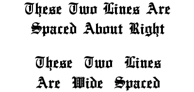
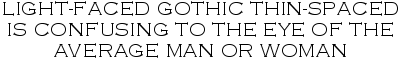
Black-letter, Old English, Priory Text, Cloister Black, and similar varieties should not be wide-spaced, nor should they ever be letter-spaced. The beauty of such letters, which are now used for their decorative rather than utilitarian qualities, depends upon the consistent, well-balanced relation between the white and black spaces of the composition. The compactness of the letter shapes makes words that are compact and unified. As there are relatively close spaces [Page 48] between the strokes of the letters, so there should be thin spaces between the words of the lines and between the lines. Wide spaces between words do not necessarily make them more legible. A comparison of the two groups of lines following will show one as easy to read as the other, while the close-spaced example is less confusing in its detail.
A paragraph of italic type is more difficult to space evenly than the same lines in roman letters. Usually the average spacing may be about the same as the companion face of roman; but more frequently than in roman types the spaces in a line may need to be of unequal thickness in order to give a uniform appearance to the spacing. Overhanging letters are frequent and when these come at the beginning or end of words they require a little more space than is used for words ending or beginning with small letters. Word pairs with letters like ——f p—— and ——l h—— will in most cases need wider spaces than are used between pairs like ——e w—— and ——s A——.
Some italic capitals have extra shoulder-space on the left of the face, like T, W, V, which should be allowed for by thin spacing when they follow small lower-case letters. This extra shoulder is made on letters of this kind to protect the overhanging kern of an adjoining letter when words are set in capitals.
Where an italic f, j, or other kerned letter comes at the beginning or end of a line a thin space should be [Page 49] placed outside of it to keep it from projecting beyond the side of the page, where it is easily broken off. This is important if the matter is to be moulded for electrotyping.
On account of the frequency of overhanging letters italic types require very careful handling during composition, correcting, and locking up. If the kerns over-ride an adjoining type or are subjected to a slight blow of any kind they are easily broken off.
Words in capitals need wider spacing than those in lower-case of the same size. Capitals occupy more space on the type body than small letters and consequently they need a little more openness between the words and between the lines to give them a proportionate relief of white space for legibility.
Roman capitals of the standard faces are often sufficiently spaced with the en quad if the words are short. Long words in a headline may need double 3-spaces, while lines of round open capitals in an open area may need the em quad.
A simple rule to follow is to space wide letters with wide spaces, and thin or condensed letters with narrow spaces. This may be put another way by saying that the spacing should approximate the average width of the letters used, taking an entire alphabet as the basis. Thus, if the alphabet of capitals measures 18 ems, the average width of the letters would be 18⁄26ths, or approximately 2⁄3 of the em.
Like all rules, this is subject to modifications in special cases. The shapes of the letters which end and begin the words may make it desirable to increase or decrease the spaces in some places. Word endings like ——L T—— and ——Y A—— should have a little thinner space than is used between those ending and beginning with full-bodied upright letters like ——M R——.
In small types the inequalities in white space around letters of different shapes may not be readily seen, but in large sizes these differences increase in noticeable degree. A careful compositor will select his spaces to equalize these little differences and thus avoid the numerous inconsistent defects sure to result from mere mechanical justification of the lines.
Combinations of capitals like the following example show distinctly uneven white spaces between the letters of the word. These should be equalized wherever possible by the use of thin leads or cards between the close-fitted letters.

This differential spacing will also be desirable in a line having abbreviations or initials. The following example spaced with en quads in every place shows an excess of white between the initials because of the presence of the periods.

A thinner space between the initials gives uniform spacing through the line.
Large initials used in groups, as in college degrees and military titles, are often set close together with simply the period for separation. This style is preferred in any close-spaced matter; though for more open matter a thin space may be used after the periods.
Two or more lines of capitals of the same size should be spaced as nearly alike as possible. The disproportionate spacing of the following three lines is sometimes seen, but is not pleasing:
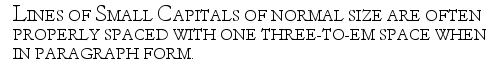
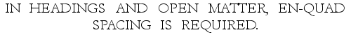
Lines of small capitals of normal size are often sufficiently spaced with the 3-space and slightly wider when in paragraph form. When used in headings and open-leaded matter en-quad spacing is required.

Letters and words huddled together so that they are not readily recognized at a glance do not make easy reading. On the other hand, very wide spacing does not necessarily result in a proportionate increase of legibility; it may even produce results as confusing as very thin spacing.
A general rule affecting wide spacing is that the average distance between the words in the line should be less than the distance between the lines themselves. Notice in the above example how the words group themselves up and down the page rather than in order along the line for the eye to follow. Note also [Page 52] how wide spaces between the words form distinct, irregular streaks up and down the page to lead the eye away from its course along a single line at a time.
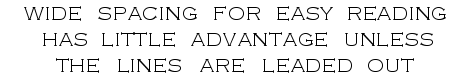
Wide spacing for easy reading has little advantage unless the lines are leaded out in equal proportion.
Double-leaded lines are well spaced with an average of an en quad. When this is used the limit of space would be the double 3-space, while the thin space would be the single 3-space.
An average spacing wider than the en quad is rarely ever necessary in roman lower-case matter even if the lines are separated with more than the double leads. The only excuse for the wider spacing is the necessity for making words and syllables fill the line.
In some kinds of composition wide spacing and wide leading are desirable. Wide measures and ample white space up and down the page naturally call for open spacing of type lines. Large advertisements, wall cards, placards, and other forms intended to be read at a distance farther away than the book or magazine in the hand, are properly wide-spaced and wide-leaded. Extremes in openness, however, are not safe to follow. A study of the work of the leading designers in typography will show a compact grouping of both words and lines which gives unity and orderliness with ample readability. In contrast with this the disconnected, patchy, scattered effects shown in commonplace type composition will prove that habitual wide-spacing is often unnecessary.
There are several styles of indention employed in type composition. These are known as (1) regular paragraph, [Page 53] (2) hanging indention, (3) half-diamond indention or inverted pyramid indention, with its variation of lozenge-shape formation, (4) squared indention, and (5) diagonal indention.
Hanging indention is where the first line of a paragraph begins flush and the second and succeeding lines are indented, as in this paragraph. It is a common form in catalogs, tabular work, and also in poetry.
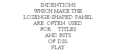
It is often advisable to indent lines at both ends, to make several short lines instead of one or two long lines. In cases of this kind the first line is not indented more than the others, as shown in this paragraph. Squared indention is used for short paragraphs in advertising matter, bits of minor display, and miscellaneous composition.
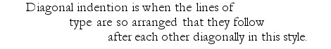
Another manner of indenting lines, somewhat rare in this country but common in Europe, is termed French motto indention. This is usually made with small types, the paragraph being set in squared-up fashion at the right side of the page, within the measure.
An indention should be enough to indicate the paragraph clearly, yet not be so wide as to make it a conspicuous [Page 54] white spot on the page. Its purpose is to show the reader a change of subject or a minor subdivision of the matter. The amount of indention necessary to attain this will vary in different forms of composition, and therefore only general rules can be given.
The usual indention of paragraphs in plain reading matter is an em quad at the beginning of the first line. If the lines are more than average length the indention may be increased to one and a half ems, two ems, or more. Indentions of over two ems, however, are seldom allowable in ordinary reading matter like books and periodicals.
Wide indentions should not be made in narrow measures; nor should indistinct, insignificant indentions be made in broad measures.
Paragraphs set in 10-point or 12-point type in measures from 15 to 20 picas wide are sufficiently indented by the em quad, while 6-point type in the same measure should be indented with a two-em quad.
Wide-leaded, open matter will call for a little more paragraph indention, as a rule, than is given to thin-spaced solid-line paragraphs. In pamphlets, circulars, advertisements, and job work, where wide leading and broken lines of a miscellaneous character are frequent, paragraph indentions may be wider than in book pages. On the other hand, in composition of this kind where other means of showing the commencement of a subject are used, indentions are omitted and the paragraphs begun flush at the margin.
The indention of paragraphs should be uniform throughout any single book or job. It is rare that more than two different widths of indention are needed to give a clear idea of the classification of any group of subjects. A variety of indentions on the same page is confusing and often spoils the orderly arrangement of the matter which the copy writer sought to obtain. Even where there are several sizes of type on the page, [Page 55] if the paragraphs are the same width, the indentions should be alike.
A common defect that is made conspicuous when wide indentions are made in paragraphs following each other is the occurrence of a single short word or syllable in the last line of a paragraph, as shown in this example:
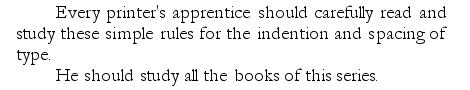
This constitutes a “bad break” and should be avoided either by thin-spacing the last two or three lines of the paragraph to take the short word back and save the line, or by over-running the lines with wider spaces to bring more words to the last line. The choice of these expedients will depend upon the openness or closeness of the composition, in many cases upon the make-up of the page. If a line can be saved, take the solitary word back; if the line is needed, space out the preceding lines, provided it may be done without making bad spacing.
The indention of lines of poetry is sometimes a puzzling matter for the inexperienced compositor, unless he is given printed copy or carefully prepared manuscript in which the line indentions are clearly indicated. There are few rules which govern the subject and these few are sometimes ignored in practice.
If the composing stick will accommodate each line of verse in a line of type the composition will be much simplified. The first consideration will be to indent the lines so that the general body of the poem is approximately near the middle of the page or column. When the lines vary in length a great deal some calculation is needed to get the right indention without going over them the second time. The longest line should be set [Page 56] first and the indention of the others made to accord with this. In this case some lines will be set a little at the left of the page.
Indention of poetry is made with even em quads of the type used. The variations in indention are also graduated by ems; usually one em, but sometimes two, three, or more, according to the relative length of lines. The odd spaces needed for justifying are put after the last word in the line.
As a rule, lines which rhyme with each other are indented alike.
One of the commonest forms of verse is that in which the alternating lines or the second and fourth lines rhyme. In this case the second line of each pair is indented one em beyond the first. If the lines are long and the type small the indention may be two ems.
(Rhyme of first and third, second and fourth lines.)
(Rhyme of second and fourth lines.)
In many cases, however, rhymes like those above are set without varying the indention.
When the rhyme follows at certain intervals, the rhyming lines are indented alike:
In blank verse the indention of lines is uniform, the only consideration being to indent the lines so that the general group will be somewhere near the middle of the page.
A uniform indention is also given to poems in which the rhyme is in two adjoining lines.
When a line is too long to come into the page width the surplus words are turned over to the next line; to avoid confusion this turn-over is indented differently from the beginning of a regular line commencing with a capital.
If the compositor is given any discretion in setting poetry, care should be taken to regulate the length of line and the indentions so that lines will not turn over into extra lines unnecessarily; yet, when the measure is narrow it is better to turn over an occasional long line rather than to place the whole poem out of the center.
The usual heading, termed a center head, is set in the middle of the line. It may be in capitals of the text or in a larger size. If capitals and lower-case are used the size should be several sizes larger, or the face should be bolder. In any case a main heading should be a little more prominent than a line of the text.

A sub-heading is a secondary heading and may be in the center of the measure or a side heading at the beginning of the line. In the latter place it may be in a line by itself, set flush, in italic, in caps. and small caps., or in small bold face; or it may be set in the first line of the paragraph, with the regular indention.
A cut-in head is set in a panel, with or without rule, after the second or third line of the first paragraph.
A running head is at the top of each page of a book or other work of a number of pages. In books and pamphlets the page number is usually at the outside end of the running-head line.
Box headings are enclosed in rules at the top of columns in tabular matter.
In modern practice no punctuation is placed at the end of headings, except the question and quotation marks when these are required. In a heading of two [Page 59] or more lines where a comma or semicolon comes naturally at the end of the first or second line, its omission may change or confuse the sense of the phrase. In such cases it should be used, even if the period is left off the end of the heading.
For additional comment on headings and punctuation see other titles of this series: Book Composition (No. 20); also Punctuation (No. 33) and Capitals (No. 34), etc.
An initial at the beginning of a chapter or other text requires nicety of spacing and justification. In modern practice the use of initials is often overdone, being used in many cases where they might better be omitted. Before the invention of typography, and since, the initial letter has been considered the feature of a page that could be used for decorative purposes. Early manuscripts show many elaborate, beautifully colored initials done by artists and illuminators. It was the custom of early printers to leave blank spaces in their printed pages for initials to be drawn in later. In some cases a small letter was printed in the middle of a large space as a guide to the artist. These small letters would be covered by the larger letter, but sometimes they were left as printed and the decoration drawn around them to fill the space. Later the ornamental initials were cut on wood or cast in metal and printed with the text.
As an initial is usually a prominent spot on a page its selection should be a matter of care. A plain letter of a style of face similar to the text is always a safe choice; an old-style letter for a text set in oldstyle roman, or a modern-cut Bodoni for Bodoni text. If the text is in italic an italic initial is more suitable than an upright letter. Extremely bold initials are not suitable for small types or light-faced text matter.
The size of an initial should be considered in relation [Page 60] to the size of the page and the size of the type used. In small pages of type of 10-point or smaller, a two-line letter will often be large enough; while a large page will require a large initial. If the initial is an ornamental letter it should be of a similar style of ornament to a head-piece or other decoration that may be on the page. Two different styles of initials or other decorative features of a page should be avoided.
In setting an initial into the beginning of a paragraph the letter is placed in the stick and the first line of text set after it. The letters of the first word are set in capitals usually, unless the first word is very long and the line of capitals is too prominent, when small capitals may be used. If the first word contains two or three letters only the next word is also set in capitals. The top of the initial should be even with the top of the first line of the text. If the initial has more shoulder than the body type, which is usually the case, a lead or more may be needed at the top of the first line. This should be properly lined up in the stick.
The spacing between the initial and the text depends upon the particular letter of the alphabet used, if a plain letter, or upon the decoration around the initial. The other letters of the first word are kept close to the initial, but the beginning of the second and succeeding lines are separated from it a little. In this way the initial has a closer relation to the word to which it belongs. The space at the right of the initial, between it and the text, should be apparently equal to that below it. It should not be extra wide in either place, or it will give the initial a detached appearance. To avoid this extra wide space it may be necessary to trim off some of the shoulder from the type, especially below the face. The proper size for an initial-letter should be equal to the number of text lines which it covers. This is not always practicable when miscellaneous types are selected from other fonts. If they are to be put back in their fonts after use as initials they may not [Page 61] be trimmed to odd sizes of body; nor should they ever be trimmed so without express permission of the foreman. For the usual work it is possible to use an initial that is a multiple of the text size with or without leads. An 18-point letter may be used for two-line initial in an 8-point text with 2-point leads; or a 24-point letter in leaded 10-point text.
The width of initials is very likely to make text lines after them of odd length rather than even picas or nonpareils. If the text is solid, this odd length of line is easily justified to the measure; but in case leads are used and even-pica leads do not fit it may be necessary to cut a few special odd-length leads to fit the lines. First, however, after the top line has been justified, put a few leads of even picas in the stick and try a short lead or two up and down beside the initial to fill in to the even-pica leads. If these extra vertical leads do not leave too much space around the initial they will do to take up the odd measure. Sometimes a thin space of a size two points larger than the text may be used.
Make-up is the term describing the various operations of dividing composed matter into pages of uniform length, adding the headings, page numbers (folios), inserting small engravings, and otherwise preparing the pages for locking up in a chase for the press or the electrotype foundry.
Newspaper pages and other large page forms of two or more columns are customarily made up on the stone or a similar flat surface in a special chase, with side-sticks and lock-up fitted for the form.
Pages for books, catalogs, and other small and medium sizes are made up on a broad galley placed on the inclined top of the compositor’s stand or cabinet. The compositor who does this work regularly has the working top of his stand fitted with material and conveniences [Page 62] which should help him to do the work without waste of time. There are several styles of make-up cabinets furnished by dealers in printers’ goods. These are designed with the object of keeping near the workman a supply of leads, rules, furniture, and other articles frequently used, so that he may save steps and minutes in doing his work.
It is important that the make-up galley should set firmly and that the bottom should not sag. If it is liable to move at a slight touch, or the bottom is uneven, the type lines will fall down easily, thereby adding to the care and time needed for the work.
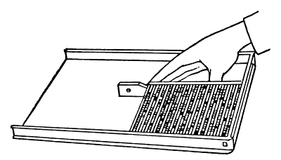
Fig. 19
The galley is laid with its closed end or head at the right hand. A strip should be nailed on the shelf at the right to act as a stop to hold the galley in place while working on it, especially to prevent it from moving when the lines are pushed up to test the length of the page.
The make-up compositor works with his right side inclined toward the stand, as when making corrections on the galley. The galley should not be so high as to be uncomfortable for the right arm, which must be held over it while working on the pages.
The common practice in making up is to handle the pages sideways, with the top toward the right hand, so that the sequence of lines follows to the left down the galley. In this way the beginning of each line rests against the lower galley rim, and by the use of leads or [Page 63] rules one or any number of lines can be taken out or moved back and forth on the galley with safety. Some job compositors handle small forms with the top line along the lower rim of the galley. This method may suffice with a few lines of large type, but it is not recommended. It is not practicable for pages of many lines or for lines without leads.
The galley matter should be corrected and revised before making up begins. This is important in a work of a number of pages, as any considerable changes after the pages are tied up usually require extra labor. If the revise proofs show only a few corrections, these may be made in advance, a galley or more at a time, by the make-up hand.
The justification of the lines requires particular attention, and all faulty lines should be re-justified. If there are many lines requiring extra time for rectifying the fact should be reported to the foreman or the compositor at fault. Badly justified lines should not be passed over and allowed to go to the imposing stone, in the expectation that they may be rectified when the locking up is done. All justifying should be done and all corrections made as far as possible while the matter is on the galley.
When there is enough composition for a number of pages a gage should be made to measure the exact length of the pages. For a few pages, like a circular or a program, an ordinary pica measure may be used, the length being defined as a given number of picas or lines. If there are to be a number of pages, a page gage should be made from a strip of reglet or brass rule. The gage should include the length of a full page, over all, from the top of the running head down to the foot slug. It may be marked on its upper edge to show the depth of the running head and any other uniform division to be repeated on several pages.
For book pages set in one size of type the length should be determined by even lines of the type used [Page 64] and the running head. No extra leads should be put here and there between the lines or paragraphs of a regular text page; these are used only in broken pages, above and below headings, engravings, or in separating extracts, foot notes, etc. If the pages contain several sizes of type the gage should indicate the exact length of the printed face, as different sizes of type have different amounts of shoulder below the face. For example, a page set in 12-point type would have a pica slug below the last line; if the next page contained a foot note set in 8-point, with the pica slug below, and both pages were exactly the same length, the face of the 8-point note would be a point below the face of the 12-point line on the first page. In this case a 1-point lead should be taken from above the 8-point note and put between the note and the foot slug.
For a book, periodical, or other work that is to be made up frequently from time to time there should be a durable steel or brass page gage, carefully marked for depth of running head, chapter sinkage, drop folio, or any other feature to be kept in uniform position.
Galley matter to be made up into pages of a uniform number of lines should be first marked off with slips of card or slugs at the places where the matter breaks into pages. This is done with the page gage, making allowance for running heads and other features not yet in the matter. If the division comes badly at some places a change of a line more or less at some preceding page and a shifting of the dividing place will eliminate the awkward break. It may happen in the first casting off that a sub-head comes at the bottom of a page, or the last short line of a paragraph comes at the top of a page, or the pages divide in the middle of a short table. These objectionable divisions may usually be overcome by a change in the starting at the first page, taking a line or two from the second page, and so on to the third and succeeding pages; or, on the other hand, adding a line or two to the succeeding page. Sometimes [Page 65] an extra line may be made by over-running two or three lines at the end of a paragraph; or, if a line less is desirable, a short line at the end of a paragraph may be saved by a little thinner spacing of a few preceding lines.
A few moments spent in casting off the matter on two or three galleys ahead of the actual making up will save a great deal of time later in case a bad division makes necessary a little change in pages already completed.
Rules regarding the make-up of book pages must be general for the most part, as many things depend upon the character of the work and the conditions under which it is done. In certain kinds of fine work there are some careful details which can be overlooked in ordinary work that must be done hurriedly and economically. Yet many desirable details of good workmanship may be followed without extra expenditure of time or material if the compositor and make-up hand understand how to do them properly in the first place. A great part of the time and expense devoted to preparing composed type for printing is due to the necessity for going over the pages to correct important matters which could as well have been done right in the first place if it were not for carelessness or lack of knowledge.
The desirable division in a chapter or other composition of plain matter is in the middle of a paragraph of four or preferably more than four lines. There should be at least two lines of a paragraph together on a page. There will thus be a full line at the bottom of one page and another full line at the top of the next.
There are many cases, of course, where the natural division of pages will come between paragraphs. An old-time rule tried to avoid this because of the liability of losing the connection in reading from page to page; but with pages plainly numbered and with consistent running heads this rule has little value. The objection [Page 66] to ending a page with the end of a paragraph may often be caused by the presence of a very short line which gives a broken outline to an otherwise symmetrical page.
The last line of a paragraph should not be put at the top of a page or a column. This rule may be modified in ordinary work if the last line is full length and its presence at the top of the page will avoid some other objectionable feature.
The first line of a paragraph should not be left at the bottom of a page, especially if there is a short line ending the paragraph immediately above.
If there is no other way of following the two preceding rules, make two facing pages a line shorter than the regular length by carrying the lines backward or forward.
A short word divided by a hyphen at the end of a line should not be divided between two pages. A little respacing of the bottom line of one page and the top line of the next will usually overcome a division of this sort.
In book work, the first page of the preface, introduction, table of contents, and of each chapter should be sunk uniformly about one-sixth of the distance down from the top of a full-length page. This space may be varied in different books according to choice, but the sinkage should be the same throughout any one book. These pages are always on the first side of a leaf. If they make only one page each, the back of the leaf is left blank.
The style of the running head is usually specified in instructions for the work. The wording may be either (a) the title of the book on all full pages, (b) the title of the book on the left-hand pages and the chapter subject on the right-hand pages, (c) the title of a new subject which begins, with or without a sub-head, in the text below. The latter style is desirable in a book of many pages because the running heads, carefully [Page 67] phrased, serve as a running index of the contents of a book. First pages of chapters with sunken heads do not have running heads.
The page number or folio is in the end of the running head line, the odd numbers at the right and the even numbers at the left. The folio of the first page of a chapter (which has no running head) is put at the bottom of the page in the center, where it is termed a drop folio. This drop folio should not be included in the regular length of the page, but put in the lower margin a lead or two below the text, and set in figures of a type smaller than the text of the page.
The space between the running head and the text matter should be equal to a full line of quads. This is an average for plain book pages which may be varied according to the leading of the page. The running head should not appear disconnected from the page itself, nor on the other hand should it be crowded on the top line of the text, especially if there are likely to be wide gaps between paragraphs or around sub-heads.
A headline or sub-head and one line of text should not be left at the bottom of a page. If it is not possible to get three lines of the paragraph at the bottom of the page, let the page go short and call attention to the irregularity.
A sub-head immediately under the running head is a combination to be avoided if possible, especially if the same kind of type is used for both, as is often the case.
Two or three lone lines should not be left for the last page of a chapter. Try to allow enough for a quarter of a page or more.
Clean printing can not be done from dirty type. For this reason, as well as for greater ease and cleanliness in handling, it is important that type (which has to be used over and over again) should be washed as clean as possible after use. Ink should not be allowed [Page 68] to dry hard on a form, as it will if left over night or over an idle day. The type face should be cleaned after taking proofs. It should show a clean face while corrections are being made, and also when it goes to press or to the moulding room.
Type should not be distributed back into the case until it is well cleaned after use.
Benzine is now very generally used to wash ink from type, electrotypes, and other printing plates. When it can be obtained in good quality it is a convenient washing fluid for printers’ use. It loosens up dry ink quickly, evaporates in a few moments, and leaves the surface dry.
Benzine and other type washes are often used with a brush, but this is not a good practice. The brush cleans the ink off the face of the type, but does not carry off the ink, which is left to dry again down in the hollow parts of the form and around the shoulder of the types where the fluid has washed it. A brush soon becomes foul after repeated use; it cannot be easily cleaned; it is usually retained in this condition and while it rubs off the face it leaves greater foulness than it can take away.
A soft rag rolled into a pad with a little benzine poured on its surface will loosen the ink and take it off the type clean. When the pad gets inky turn another part of the rag out to give a clean wiping surface. When the rag gets dirty enough to soil the hands throw it in the waste can and get a clean one.
Quite often, after the ink has been wiped off with a rag, a fairly stiff, fine brush is needed to clean out dried ink and dirt that has accumulated in small places like the counters of the letters and the screens of halftone plates.
Gasoline is a tolerable substitute for benzine when the latter cannot be obtained. It is not so satisfactory, however, because of the greasiness which it leaves on the surface after evaporation. If the form is to be [Page 69] re-inked immediately after cleaning this greasiness must be removed in order to ink up again for a sharp, clear impression.
Kerosene may be used for washing off ink, but it also leaves a disagreeable greasy surface, even more than gasoline does. For this reason it is not satisfactory for frequent washing of type or printing forms, though it is a good wash for inking rollers.
A weak lye, made from dissolved potash, was formerly used extensively for washing type forms and inking rollers, but its use has been superseded by the safer, cleaner, more convenient benzine or gasoline. It is excellent, however, for washing type forms occasionally, as after a long run on the press or after electrotype moulding, to clean off the accumulation of dried ink or of moulder’s wax and blacklead.
For cleaning with lye the form should be stripped of all wooden material like reglets, wood-base plates, and anything that is liable to be injured by the washing. The type should be placed on a board and set in the sink. The washing is done with a medium stiff brush, care being taken not to allow the hands to get wet with the lye, as the solution will burn and discolor the skin. After a thorough but not hard rubbing, the lye is rinsed off with running water until it has all disappeared. If the type is still a little greasy to the touch after rinsing there is still some lye to be cleared off by further rinsing.
Caustic soda may be dissolved and diluted to the right strength and used in the same manner as potash lye.
The distribution of type and other material into the proper cases after use is too often improperly done. It is important, if work is to be done without waste of time, that the necessary materials should be where they can be found quickly. A cleanly distributed case of type is necessary to good typesetting.
A beginner should go at the work carefully. There are several matters, as well as the lay of the case, with which he should become familiar. If he is not perfectly familiar with every box he should have a diagram of the case before him as a guide. He should take only one line at a time in his hand, at the start, and only two or three types at a time between his thumb and forefinger to drop in the boxes. Later, when he acquires facility, he can take up a number of lines and take off complete words to distribute.
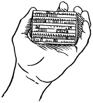
Fig. 20
The type line is placed in the left hand, well down in the palm—not upon the ends of the thumb and finger. The nicks of the type should be upwards and the face toward him. All words should be carefully spelled, especially unfamiliar ones, before taking them from the line. In this way the learner will note the b’s and d’s, p’s and q’s, u’s and n’s, A’s and V’s. These letters are liable to be confusing at first, until one gets used to the inverted appearance of the types.
The distributer must also note the slight difference in the capital I and lower-case l, in the size of small capitals and lower-case letters, and to distinguish between the o, s, w, v, x, z of the two sets of alphabets. In some fonts the difference is so slight that experienced compositors may not always be sure to distinguish [Page 71] them, while other fonts have these six small capitals marked with an extra nick. As a rule, the small capitals are larger and slightly thicker than the round lower-case letters.
Fonts of old style figures have the figure
![]() so near like the small capital i that the difference can only be noted
by the thickness of the body; the figure is on an en set and the small
capital a little thinner. The lower-case o and the old style cypher
so near like the small capital i that the difference can only be noted
by the thickness of the body; the figure is on an en set and the small
capital a little thinner. The lower-case o and the old style cypher
![]() are also easily confused. The cypher is usually rounder than the
lower-case letter.
are also easily confused. The cypher is usually rounder than the
lower-case letter.
The types should be dropped sidewise, with the face slightly upward, the forefinger and second finger gently pushing the types apart as each is dropped from the thumb and forefinger. Drop the type in its place lightly, spelling the letters as they are dropped. If the type is large, lay it in; do not throw it in face down. The eye should follow the hand until it drops in the right box.
Special characters in the matter should be saved aside until the matter is all distributed and then put where they belong. But do not put them in the corner of a box and promise to care for them later. Types put out of sight this way are usually forgotten. A small wooden galley or shallow box kept in plain sight above the case is the best way to care temporarily for extra characters, italics, and types that belong in another case.
One of the most annoying things in a composing room is the distribution of type into a case where it does not belong. This happens through carelessness which should not be tolerated. To the beginner a constant warning should be held up: Look sharp! Do not guess! Examine the nick as well as the face. Do not be misled by a general appearance of similarity. If there is any doubt about the types being returned to the case where they belong, take a letter or two from the case and place it beside a similar letter in the hand for close comparison.
The distribution of advertisements and job work in which there are several sizes and faces of type calls for extra care and a little system in sorting out the lines before distribution. First select all the lines of each kind on the galley, beginning with the large sizes, bringing all the lines of one kind together for distribution at one time. This will save extra steps, save time, and give fewer chances for distributing into the wrong case.
If there is much type to distribute, take it to the case in a small galley, such as a distributing galley or a typefoundry paging galley; or bring the case to the stand where the work can be done conveniently and correctly. Do not stoop down in a dark corner, or reach up to a case above the level of the eyes, and distribute at a guess.
Distribute the different thicknesses of spaces in the boxes where they belong. This should be the rule in all sizes under 24-point. The 3-spaces, 4-spaces, 5-spaces, and hair spaces should be kept separate, so that they will not have to be sorted out when composition is done.
Pied type in any amount should not be distributed from the hand. Set the letters in line in a composing stick, with nicks all one way, and then distribute them in the usual way. If there are several sizes, pick out the large ones first.
If there is only a little type in the case before beginning distribution, this is a good time to clean out the boxes. Clean out the space and quad boxes, sort out the few spaces there may be, pick out any bits of card, paper, string, leads, broken type, etc. If the boxes are dusty, blow them out with bellows or air pump, taking the case to a place where the dust will be carried off and not go into the air to be inhaled.
Neither before nor after distributing is it necessary to shake the type case violently. Rattling the type around in the case usually injures the face. A gentle [Page 73] shake or two will be sufficient to spread out the few remaining types in a nearly empty case or to settle down the types in a full case.
Thin leads and pieces of card or paper used in letter-spacing and justification should not as a rule be left in the cases. If they are worth saving and are likely to be used again they may be kept in a spare box by themselves, not with some other spaces.
Small types in solid or leaded paragraphs are easier distributed if they have been sponged with water a little time beforehand. If the types are loose and dry, the water will hold them together slightly when handled. If the matter has been standing for some time after washing and has become caked or stuck together, it may have to be loosened up by a thorough dampening which will get in between the types. New type is liable to become caked together after standing and will need some soapy water to make it distributable.
Correct Composition. By Theodore L. DeVinne. Published by Oswald Publishing Co., New York.
Printing for School and Shop. By F. S. Henry. Published by John Wiley & Sons, Inc., New York.
Type Spacing. By E. R. Currier. Published by Bowles, New York.
SUGGESTIONS TO STUDENTS AND INSTRUCTORS
The following questions, based on the contents of this pamphlet, are intended to serve (1) as a guide to the study of the text, (2) as an aid to the student in putting the information contained into definite statements without actually memorizing the text, (3) as a means of securing from the student a reproduction of the information in his own words.
A careful following of the questions by the reader will insure full acquaintance with every part of the text, avoiding the accidental omission of what might be of value. These primers are so condensed that nothing should be omitted.
In teaching from these books it is very important that these questions and such others as may occur to the teacher should be made the basis of frequent written work, and of final examinations.
The importance of written work cannot be overstated. It not only assures knowledge of material, but the power to express that knowledge correctly and in good from.
If this written work can be submitted to the teacher in printed form it will be doubly useful.
QUESTIONS
(For additional terms pertaining to type and type composition see page 32, No. 1, of this series of books entitled “Type.”)


THE following list of publications, comprising the Typographic Technical Series for Apprentices, has been prepared under the supervision of the Committee on Education of the United Typothetae of America for use in trade classes, in course of printing instruction, and by individuals.
Each publication has been compiled by a competent author or group of authors, and carefully edited, the purpose being to provide the printers of the United States—employers, journeymen, and apprentices—with a comprehensive series of handy and inexpensive compendiums of reliable, up-to-date information upon the various branches and specialties of the printing craft, all arranged in orderly fashion for progressive study.
The publications of the series are of uniform size, 5 × 8 inches. Their general make-up, in typography, illustrations, etc., has been, as far as practicable, kept in harmony throughout. A brief synopsis of the particular contents and other chief features of each volume will be found under each title in the following list.
Each topic is treated in a concise manner, the aim being to embody in each publication as completely as possible all the rudimentary information and essential facts necessary to an understanding of the subject. Care has been taken to make all statements accurate and clear, with the purpose of bringing essential information within the understanding of beginners in the different fields of study. Wherever practicable, simple and well-defined drawings and illustrations have been used to assist in giving additional clearness to the text.
In order that the pamphlets may be of the greatest possible help for use in trade-school classes and for self-instruction, each title is accompanied by a list of Review Questions covering essential items of the subject matter. A short Glossary of technical terms belonging to the subject or department treated is also added to many of the books.
These are the Official Text-books of the United Typothetae of America.
Address all orders and inquiries to Committee on Education, United Typothetae of America, Chicago, Illinois, U. S. A.
|
PART I—Types, Tools, Machines, and Materials | ||
1. |
Type: a Primer of Information By A. A. Stewart | |
Relating to the mechanical features of printing types; their sizes, font schemes, etc., with a brief description of their manufacture. 44 pp.; illustrated; 74 review questions; glossary. |
||
2. | Compositors’ Tools and Materials By A. A. Stewart | |
A primer of information about composing sticks, galleys, leads, brass rules, cutting and mitering machines, etc. 47 pp.; illustrated; 50 review questions; glossary. |
||
3. | Type Cases, Composing Room Furniture By A. A. Stewart | |
A primer of information about type cases, work stands, cabinets, case racks, galley racks, standing galleys, etc. 43 pp.; illustrated; 33 review questions; glossary. | ||
4. | Imposing Tables and Lock-up Appliances By A. A. Stewart | |
Describing the tools and materials used in locking up forms for the press, including some modern utilities for special purposes. 59 pp.; illustrated; 70 review questions; glossary. | ||
5. | Proof Presses By A. A. Stewart | |
A primer of information about the customary methods and machines for taking printers’ proofs. 40 pp.; illustrated; 41 review questions; glossary. | ||
6. | Platen Printing Presses By Daniel Baker | |
A primer of information regarding the history and mechanical construction of platen printing presses, from the original hand press to the modern job press, to which is added a chapter on automatic presses of small size. 51 pp.; illustrated; 49 review questions; glossary. | ||
7. | Cylinder Printing Presses By Herbert L. Baker | |
Being a study of the mechanism and operation of the principal types of cylinder printing machines. 64 pp.; illustrated; 47 review questions; glossary. | ||
8. | Mechanical Feeders and Folders By William E. Spurrier | |
The history and operation of modern feeding and folding machines; with hints on their care and adjustments. Illustrated; review questions; glossary. | ||
9. | Power for Machinery in Printing Houses By Carl F. Scott | |
A treatise on the methods of applying power to printing presses and allied machinery with particular reference to electric drive. 53 pp.; illustrated; 69 review questions; glossary. | ||
10. | Paper Cutting Machines By Niel Gray, Jr. | |
A primer of information about paper and card trimmers, hand-lever cutters, power cutters, and other automatic machines for cutting paper, 70 pp.; illustrated; 115 review questions; glossary. | ||
11. | Printers’ Rollers By A. A. Stewart | |
A primer of information about the composition, manufacture, and care of inking rollers. 46 pp.; illustrated; 61 review questions; glossary. | ||
12. | Printing Inks By Philip Ruxton | |
Their composition, properties and manufacture (reprinted by permission from Circular No. 53, United States Bureau of Standards): together with some helpful suggestions about the everyday use of printing inks by Philip Ruxton. 80pp.; 100 review questions; glossary. | ||
13. | How Paper is Made By William Bond Wheelwright[Page iii] | |
A primer of information about the materials and processes of manufacturing paper for printing and writing. 68 pp.; illustrated; 62 review questions; glossary. | ||
14. | Relief Engravings By Joseph P. Donovan | |
Brief history and non-technical description of modern methods of engraving; woodcut, zinc plate, halftone; kind of copy for reproduction; things to remember when ordering engravings. Illustrated; review questions; glossary. | ||
15. | Electrotyping and Stereotyping By Harris B. Hatch and A. A. Stewart | |
A primer of information about the processes of electrotyping and stereotyping. 94 pp.; illustrated; 129 review questions; glossaries. | ||
|
PART II—Hand and Machine Composition | ||
16. | Typesetting By A. A. Stewart | |
A handbook for beginners, giving information about justifying, spacing, correcting, and other matters relating to typesetting. Illustrated; review questions; glossary. | ||
17. | Printers’ Proofs By A. A. Stewart | |
The methods by which they are made, marked, and corrected, with observations on proofreading. Illustrated; review questions; glossary. | ||
18. | First Steps in Job Composition By Camille DeVéze | |
Suggestions for the apprentice compositor in setting his first jobs, especially about the important little things which go to make good display in typography. 63 pp.; examples; 55 review questions; glossary. | ||
19. | General Job Composition | |
How the job compositor handles business stationery, programs and miscellaneous work. Illustrated; review questions; glossary. | ||
20. | Book Composition By J. W. Bothwell | |
Chapters from DeVinne’s “Modern Methods of Book Composition,” revised and arranged for this series of text-books by J. W. Bothwell of The DeVinne Press, New York. Part I: Composition of pages. Part II: Imposition of pages. 229 pp.; illustrated; 525 review questions; glossary. | ||
21. | Tabular Composition By Robert Seaver | |
A study of the elementary forms of table composition, with examples of more difficult composition. 36 pp.; examples; 45 review questions. | ||
22. | Applied Arithmetic By E. E. Sheldon | |
Elementary arithmetic applied to problems of the printing trade, calculation of materials, paper weights and sizes, with standard tables and rules for computation, each subject amplified with examples and exercises. 159 pp. | ||
23. | Typecasting and Composing Machines A. W. Finlay, Editor | |
Section I—The Linotype By L. A. Hornstein | ||
Section II—The Monotype By Joseph Hays | ||
Section III—The Intertype By Henry W. Cozzens | ||
Section IV—Other Typecasting and Typesetting Machines By Frank H. Smith | ||
A brief history of typesetting machines, with descriptions of their mechanical principles and operations. Illustrated; review questions; glossary. | ||
| [Page iv]
PART III—Imposition and Stonework | ||
24. | Locking Forms for the Job Press By Frank S. Henry | |
Things the apprentice should know about locking up small forms, and about general work on the stone. Illustrated; review questions; glossary. | ||
25. | Preparing Forms for the Cylinder Press By Frank S. Henry | |
Pamphlet and catalog imposition; margins; fold marks, etc. Methods of handling type forms and electrotype forms. Illustrated; review questions; glossary. | ||
|
PART IV—Presswork | ||
26. | Making Ready on Platen Presses By T. G. McGrew | |
The essential parts of a press and their functions; distinctive features of commonly used machines. Preparing the tympan, regulating the impression, underlaying and overlaying, setting gauges, and other details explained. Illustrated; review questions; glossary. | ||
27. | Cylinder Presswork By T. G. McGrew | |
Preparing the press; adjustment of bed and cylinder, form rollers, ink fountain, grippers and delivery systems. Underlaying and overlaying; modern overlay methods. Illustrated; review questions; glossary. | ||
28. | Pressroom Hints and Helps By Charles L. Dunton | |
Describing some practical methods of pressroom work, with directions and useful information relating to a variety of printing-press problems. 87 pp.; 176 review questions. | ||
29. | Reproductive Processes of the Graphic Arts By A. W. Elson | |
A primer of information about the distinctive features of the relief, the intaglio, and the planographic processes of printing. 84 pp.; illustrated; 100 review questions; glossary. | ||
|
PART V—Pamphlet and Book Binding | ||
30. | Pamphlet Binding By Bancroft L. Goodwin | |
A primer of information about the various operations employed in binding pamphlets and other work in the bindery. Illustrated; review questions; glossary. | ||
31. | Book Binding By John J. Pleger | |
Practical information about the usual operations in binding books; folding; gathering, collating, sewing, forwarding, finishing. Case making and cased-in books. Hand work and machine work. Job and blank-book binding. Illustrated; review questions; glossary. | ||
|
PART VI—Correct Literary Composition | ||
32. | Word Study and English Grammar By F. W. Hamilton | |
A primer of information about words, their relations, and their uses. 68 pp.; 84 review questions; glossary. | ||
33. |
Punctuation By F. W. Hamilton | |
A primer of information about the marks of punctuation and their use, both grammatically and typographically. 56 pp.; 59 review questions; glossary. | ||
34. [Page v] | Capitals By F. W. Hamilton | |
A primer of information about capitalization, with some practical typographic hints as to the use of capitals. 48 pp.; 92 review questions; glossary. | ||
35. | Division of Words By F. W. Hamilton | |
Rules for the division of words at the ends of lines, with remarks on spelling, syllabication and pronunciation. 42 pp.; 70 review questions. | ||
36. | Compound Words By F. W. Hamilton | |
A study of the principles of compounding, the components of compounds, and the use of the hyphen. 34 pp.; 62 review questions. | ||
37. | Abbreviations and Signs By F. W. Hamilton | |
A primer of information about abbreviations and signs, with classified lists of those in most common use. 58 pp.; 32 review questions. | ||
38. | The Uses of Italic By F. W. Hamilton | |
A primer of information about the history and uses of italic letters. 31 pp.; 37 review questions. | ||
39. | Proofreading By Arnold Levitas | |
The technical phases of the proofreader’s work; reading, marking, revising, etc.; methods of handling proofs and copy. Illustrated by examples. 59 pp.; 69 review questions; glossary. | ||
40. | Preparation of Printers’ Copy By F. W. Hamilton | |
Suggestions for authors, editors, and all who are engaged in preparing copy for the composing room. 36 pp.; 67 review questions. | ||
41. | Printers’ Manual of Style | |
A reference compilation of approved rules, usages, and suggestions relating to uniformity in punctuation, capitalization, abbreviations, numerals, and kindred features of composition. | ||
42. | The Printer’s Dictionary By A. A. Stewart | |
A handbook of definitions and miscellaneous information about various processes of printing, alphabetically arranged. Technical terms explained. Illustrated. | ||
|
PART VII—Design, Color, and Lettering | ||
43. | Applied Design for Printers By Harry L. Gage | |
A handbook of the principles of arrangement, with brief comment on the periods of design which have most influenced printing. Treats of harmony, balance, proportion, and rhythm; motion; symmetry and variety; ornament, esthetic and symbolic. 37 illustrations; 46 review questions; glossary; bibliography. | ||
44. | Elements of Typographic Design By Harry L. Gage | |
Applications of the principles of decorative design. Building material of typography: paper, types, ink, decorations and illustrations. Handling of shapes. Design of complete book, treating each part. Design of commercial forms and single units. Illustrations; review questions; glossary; bibliography. | ||
45. [Page vi] | Rudiments of Color in Printing By Harry L. Gage | |
Use of color: for decoration of black and white, for broad poster effect, in combinations of two, three, or more printings with process engravings. Scientific nature of color, physical and chemical. Terms in which color may be discussed: hue, value, intensity. Diagrams in color, scales and combinations. Color theory of process engraving. Experiments with color. Illustrations in full color, and on various papers. Review questions; glossary; bibliography. | ||
46. | Lettering in Typography By Harry L. Gage | |
Printer’s use of lettering: adaptability and decorative effect. Development of historic writing and lettering and its influence on type design. Classification of general forms in lettering. Application of design to lettering. Drawing for reproduction. Fully illustrated; review questions; glossary; bibliography. | ||
47. | Typographic Design in Advertising By Harry L. Gage | |
The printer’s function in advertising. Precepts upon which advertising is based. Printer’s analysis of his copy. Emphasis, legibility, attention, color. Method of studying advertising typography. Illustrations; review questions; glossary; bibliography. | ||
48. | Making Dummies and Layouts By Harry L. Gage | |
A layout: the architectural plan. A dummy: the imitation of a proposed final effect. Use of dummy in sales work. Use of layout. Function of layout map. Binding schemes for dummies. Dummy envelopes. Illustrations; review questions; glossary; bibliography. | ||
|
PART VIII—History of Printing | ||
49. | Books Before Typography By F. W. Hamilton | |
A primer of information about the invention of the alphabet and the history of bookmaking up to the invention of movable types. 62 pp.; illustrated; 64 review questions. | ||
50. | The Invention of Typography By F. W. Hamilton | |
A brief sketch of the invention of printing and how it came about. 64 pp.; 62 review questions. | ||
51. | History of Printing—Part I By F. W. Hamilton | |
A primer of information about the beginnings of printing, the development of the book, the development of printers’ materials, and the work of the great pioneers. 63 pp.; 55 review questions. | ||
52. | History of Printing—Part II By F. W. Hamilton | |
A brief sketch of the economic conditions of the printing industry from 1450 to 1789, including government regulations, censorship, internal conditions and industrial relations. 94 pp.; 128 review questions. | ||
53. | Printing in England By F. W. Hamilton | |
A short history of printing in England from Caxton to the present time. 89 pp.; 65 review questions. | ||
54. | Printing in America By F. W. Hamilton | |
A brief sketch of the development of the newspaper, and some notes on publishers who have especially contributed to printing. 98 pp.; 84 review questions. | ||
55. | Type and Presses in America By F. W. Hamilton | |
A brief historical sketch of the development of type casting and press building in the United States. 52 pp.; 61 review questions. | ||
|
[Page vii]
PART IX—Cost Finding and Accounting | ||
56. | Elements of Cost in Printing By Henry P. Porter | |
The Standard Cost-Finding Forms and their uses. What they should show. How to utilize the information they give. Review questions. Glossary. | ||
57. | Use of a Cost System By Henry P. Porter | |
The Standard Cost-Finding Forms and their uses. What they should show. How to utilize the information they give. Review questions. Glossary. | ||
58. | The Printer as a Merchant By Henry P. Porter | |
The selection and purchase of materials and supplies for printing. The relation of the cost of raw material and the selling price of the finished product. Review questions. Glossary. | ||
59. | Fundamental Principles of Estimating By Henry P. Porter | |
The estimator and his work; forms to use; general rules for estimating. Review questions. Glossary. | ||
60. | Estimating and Selling By Henry P. Porter | |
An insight into the methods used in making estimates, and their relation to selling. Review questions. Glossary. | ||
61. | Accounting for Printers By Henry P. Porter | |
A brief outline of an accounting system for printers; necessary books and accessory records. Review questions. Glossary. | ||
|
PART X—Miscellaneous | ||
62. | Health, Sanitation, and Safety By Henry P. Porter | |
Hygiene in the printing trade; a study of conditions old and new; practical suggestions for improvement; protective appliances and rules for safety. | ||
63. | Topical Index By F. W. Hamilton | |
A book of reference covering the topics treated in the Typographic Technical Series, alphabetically arranged. | ||
64. | Courses of Study By F. W. Hamilton | |
A guidebook for teachers, with outlines and suggestions for classroom and shop work. | ||
THIS series of Typographic Text-books is the result of the splendid co-operation of a large number of firms and individuals engaged in the printing business and its allied industries in the United States of America.
The Committee on Education of the United Typothetae of America, under whose auspices the books have been prepared and published, acknowledges its indebtedness for the generous assistance rendered by the many authors, printers, and others identified with this work.
While due acknowledgment is made on the title and copyright pages of those contributing to each book, the Committee nevertheless felt that a group list of co-operating firms would be of interest.
The following list is not complete, as it includes only those who have co-operated in the production of a portion of the volumes, constituting the first printing. As soon as the entire list of books comprising the Typographic Technical Series has been completed (which the Committee hopes will be at an early date), the full list will be printed in each volume.
The Committee also desires to acknowledge its indebtedness to the many subscribers to this Series who have patiently awaited its publication.
Committee on Education,
United Typothetae of America.
Henry P. Porter, Chairman,
E. Lawrence Fell,
A. M. Glossbrenner,
J. Clyde Oswald,
Toby Rubovits.
Frederick W. Hamilton, Education Director.
Isaac H. Blanchard Company, New York, N. Y.
S. H. Burbank & Co., Philadelphia, Pa.
J. S. Cushing & Co., Norwood, Mass.
The DeVinne Press, New York, N. Y.
R. R. Donnelley & Sons Co., Chicago, Ill.
Geo. H. Ellis Co., Boston, Mass.
Evans-Winter-Hebb, Detroit, Mich.
Franklin Printing Company, Philadelphia, Pa.
F. H. Gilson Company, Boston, Mass.
Stephen Greene & Co., Philadelphia, Pa.
W. F. Hall Printing Co., Chicago, Ill.
J. B. Lippincott Co., Philadelphia, Pa.
McCalla & Co. Inc., Philadelphia, Pa.
The Patteson Press, New York, New York
The Plimpton Press, Norwood, Mass.
Poole Bros., Chicago, Ill.
Edward Stern & Co., Philadelphia, Pa.
The Stone Printing & Mfg. Co., Roanoke, Va.
C. D. Traphagen, Lincoln, Neb.
The University Press, Cambridge, Mass.
Boston Typothetae School of Printing, Boston, Mass.
William F. Fell Co., Philadelphia, Pa.
The Kalkhoff Company, New York, N. Y.
Oxford-Print, Boston, Mass.
Toby Rubovits, Chicago, Ill.
Blomgren Brothers Co., Chicago, Ill.
Flower Steel Electrotyping Co., New York, N. Y.
C. J. Peters & Son Co., Boston, Mass.
Royal Electrotype Co., Philadelphia, Pa.
H. C. Whitcomb & Co., Boston, Mass.
American Type Founders Co., Boston, Mass.
C. B. Cottrell & Sons Co., Westerly, R. I.
Golding Manufacturing Co., Franklin, Mass.
Harvard University, Cambridge, Mass.
Inland Printer Co., Chicago, Ill.
Lanston Monotype Machine Company, Philadelphia, Pa.
Mergenthaler Linotype Company, New York, N. Y.
Geo. H. Morrill Co., Norwood, Mass.
Oswald Publishing Co., New York, N. Y.
The Printing Art, Cambridge, Mass.
B. D. Rising Paper Company, Housatonic, Mass.
The Vandercook Press, Chicago, Ill.
American Writing Paper Co., Holyoke, Mass.
West Virginia Pulp & Paper Co., Mechanicville, N. Y.
Page 5:
Leads and Slugs 20 changed to
Leads and Slugs 21
Page 8:
Setting the Composing Stick 21 changed to
Setting the Composing Stick 22
Page 21:
(nonpareil), 12-point (pica), and 18 point changed to
(nonpareil), 12-point (pica), and 18-point
Page 24:
If the the gage line is changed to
If the gage line is
Page 31:
It oftens happens that the changed to
It often happens that the
Page 44:
between word endings like ——e w——, y a—— changed to
between word endings like ——e w——, ——y a——
Page 47:
at the begining may not need changed to
at the beginning may not need
Page 53:
being shorter than the preceeding changed to
being shorter than the preceding
Page 58:
or a side heading at the begining changed to
or a side heading at the beginning
Page 59:
see other title of this series changed to
see other titles of this series
Page 91:
or the compositor, is out of sorts, See Sorts. changed to
or the compositor, is out of sorts. See Sort.
Page 92:
Roman type changed to
Roman Type
Page iii:
15. Electrotyping and Stereotyping changed to
15. Electrotyping and Sterotyping
Page v:
Illustrations; review questions, glossary; bibliography. changed to
Illustrations; review questions; glossary; bibliography.
The order of Glossary entries has been retained as they appear in the original publication, the following out of alphabetical order:
Cast Up (Page 86)
Extract (Page 88)
Hair Line (Page 88)
High-to-line (Page 89)
Lay of the Case (Page 90)
Logotype (Page 90)
Mutton Fist (Page 91)
Pi (Page 91)
Pica (Page 91)
Planer (Page 92)
Turned Commas (Page 93)
The following words were inconsistently hyphenated, and appear here as in the original:
old-style/oldstyle
re-spacing/respacing
side-stick/sidestick
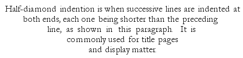
![[Page 1]](images/p001.png)
![[Page 2]](images/p002.png)
![[Page 3]](images/p003.png)
![[Page 4]](images/p004.png)
![[Page 5]](images/p005.png)
![[Page 7]](images/p007.png)
![[Page 8]](images/p008.png)
![[Page 9]](images/p009.png)
![[Page 10]](images/p010.png)
![[Page 11]](images/p011.png)
![[Page 12]](images/p012.png)
![[Page 13]](images/p013.png)
![[Page 14]](images/p014.png)
![[Page 15]](images/p015.png)
![[Page 16]](images/p016.png)
![[Page 17]](images/p017.png)
![[Page 18]](images/p018.png)
![[Page 19]](images/p019.png)
![[Page 20]](images/p020.png)
![[Page 21]](images/p021.png)
![[Page 22]](images/p022.png)
![[Page 23]](images/p023.png)
![[Page 24]](images/p024.png)
![[Page 25]](images/p025.png)
![[Page 26]](images/p026.png)
![[Page 27]](images/p027.png)
![[Page 28]](images/p028.png)
![[Page 29]](images/p029.png)
![[Page 30]](images/p030.png)
![[Page 31]](images/p031.png)
![[Page 32]](images/p032.png)
![[Page 33]](images/p033.png)
![[Page 34]](images/p034.png)
![[Page 35]](images/p035.png)
![[Page 36]](images/p036.png)
![[Page 37]](images/p037.png)
![[Page 38]](images/p038.png)
![[Page 39]](images/p039.png)
![[Page 40]](images/p040.png)
![[Page 41]](images/p041.png)
![[Page 42]](images/p042.png)
![[Page 43]](images/p043.png)
![[Page 44]](images/p044.png)
![[Page 45]](images/p045.png)
![[Page 46]](images/p046.png)
![[Page 47]](images/p047.png)
![[Page 48]](images/p048.png)
![[Page 49]](images/p049.png)
![[Page 50]](images/p050.png)
![[Page 51]](images/p051.png)
![[Page 52]](images/p052.png)
![[Page 53]](images/p053.png)
![[Page 54]](images/p054.png)
![[Page 55]](images/p055.png)
![[Page 56]](images/p056.png)
![[Page 57]](images/p057.png)
![[Page 58]](images/p058.png)
![[Page 59]](images/p059.png)
![[Page 60]](images/p060.png)
![[Page 61]](images/p061.png)
![[Page 62]](images/p062.png)
![[Page 63]](images/p063.png)
![[Page 64]](images/p064.png)
![[Page 65]](images/p065.png)
![[Page 66]](images/p066.png)
![[Page 67]](images/p067.png)
![[Page 68]](images/p068.png)
![[Page 69]](images/p069.png)
![[Page 70]](images/p070.png)
![[Page 71]](images/p071.png)
![[Page 72]](images/p072.png)
![[Page 73]](images/p073.png)
![[Page 74]](images/p074.png)
![[Page 75]](images/p075.png)
![[Page 76]](images/p076.png)
![[Page 77]](images/p077.png)
![[Page 78]](images/p078.png)
![[Page 79]](images/p079.png)
![[Page 80]](images/p080.png)
![[Page 81]](images/p081.png)
![[Page 82]](images/p082.png)
![[Page 83]](images/p083.png)
![[Page 84]](images/p084.png)
![[Page 85]](images/p085.png)
![[Page i]](images/p095.png)
![[Page ii]](images/p096.png)
![[Page iii]](images/p097.png)
![[Page iv]](images/p098.png)
![[Page v]](images/p099.png)
![[Page vi]](images/p100.png)
![[Page vii]](images/p101.png)
![[Page viii]](images/p102.png)
![[Page ix]](images/p103.png)