ILLUMINATING.
By W. J. LOFTIE
LESSONS IN THE ART OF ILLUMINATING.
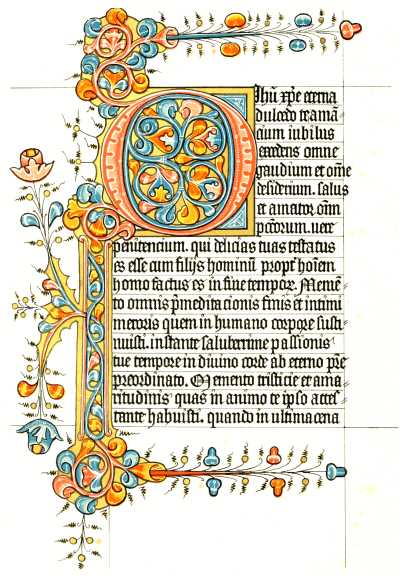
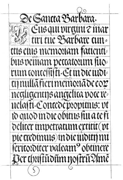
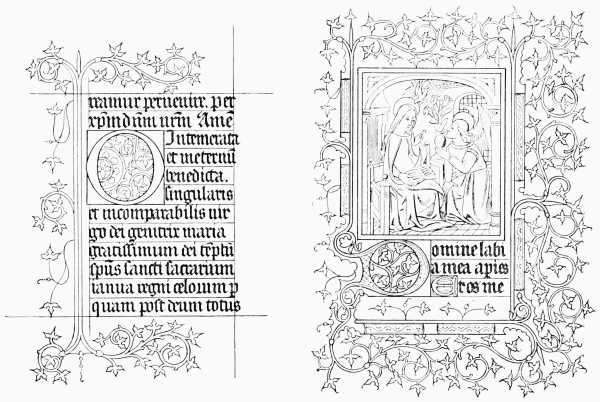
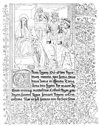
Plate IX.—FACSIMILE PAGE OF A BOOK OF HOURS, 15th Century.
VERE FOSTER'S WATER-COLOR SERIES.
A Series of Examples selected from
Works in the British Museum, Lambeth Palace Library, and
the South Kensington Museum.
With
PRACTICAL INSTRUCTIONS,
AND A SKETCH OF THE HISTORY OF THE ART,
By
W. J. LOFTIE, b.a., f.s.a.,
AUTHOR OF "A HISTORY OF LONDON," "MEMORIALS OF THE SAVOY PALACE," "A CENTURY OF BIBLES," "A PLEA FOR ART IN THE HOUSE," ETC.
London: BLACKIE & SON; Glasgow, Edinburgh, and Dublin.
The Colored Illustrations are Printed by W. G. BLACKIE & CO., Glasgow, from Drawings by J. A. BURT.
The Ornamental Border and Initial of the Title-page are interesting examples of Italian work of the fifteenth century. They are from the Harleian Collection, British Museum (3109 and 4902) different works, but evidently executed by the same hand. The Colors are represented in the engraving by means of lines (as explained on page 18), so that by the aid of these directions the student can reproduce them in the colors employed in the original MSS.
The outlined initials on pp. xv, 9, 13, 21, 25, 29, and 33 are taken from a manuscript of the fifteenth century, preserved at Nuremberg. The originals are very highly but delicately colored, the ground being gold; the body of the letter, black; and the scroll work and foliage pink, blue, green, and yellow. The book, which is dated 1489, is a treatise entitled the "Preservation of Body, Soul, Honour, and Goods." The tailpieces throughout represent heraldic animals, from the Rows Roll and other authentic sources.
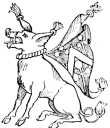
Heraldic Boar.
GENERAL SKETCH.
PERHAPS the art of Illumination, although it is closely connected with that of Writing, may be entitled to a separate history. Men could write long before it occurred to them to ornament their writings: and the modern student will find that what he looks upon as genuine illumination is not to be traced back many centuries. True, one or two Roman manuscripts are in existence which may be dated soon after a.d. 200, and which are illustrated rather than illuminated with pictures. But the medieval art, and especially that branch of it which flourished in our own country, has a different origin, and sprang from the system, not of illustration, but of pure ornamentation, which prevailed in Ireland before the eighth century, but which reached its highest development among the Oriental Moslems. The works of the Irish school were for long and are sometimes still called "Anglo-Saxon," and there can be no doubt that the Irish missionaries brought with them to Iona and to Lindisfarne the traditions and practice of the art, which they taught, with Christianity, to the heathens of England. I will therefore refer the reader who desires to know more of palæography in general, and of the principal foreign schools of the art of writing, to the great works of M. Sylvestre, of Messieurs Wyatt and Tymms, of Henry Shaw, and Miss Stokes, and to various isolated papers in the Transactions of the Antiquarian Societies; and I will begin with the earliest practice of the art in our own country and by our own ancestors.
During the eighth century rivalry to Irish art sprung up in the south; and the immediate followers of St. Augustine of Canterbury founded a scriptorium which produced many fine specimens. In less than two centuries a very high standard had been reached, and many of my readers will remember the Utrecht Psalter, as it is called,[Pg viii] which, though it is one of the oldest Anglo-Saxon MSS. now preserved, is full of spirited drawings of figures and of illuminated capital letters. The volume formerly belonged to England, but was lost, and subsequently turned up in Holland. By the tenth century the art had reached such a pitch of perfection that we find a charter of King Edgar wholly written in letters of gold. The Duke of Devonshire possesses a volume written and illuminated for Ethelwold, bishop of Winchester from 963 to 984, by a "scriptor" named Godemann, afterwards Abbot of Thorney, the first English artist with whose name we are acquainted, if we except his more famous contemporary, Archbishop Dunstan, whose skill in metal work is better remembered than his powers as an illuminator. The wonderful Irish MSS. the Book of Kells, which is in the library of Trinity College, Dublin, the Book of Durham, and others more curious than beautiful, belong to a slightly earlier period, perhaps to the ninth century, as Miss Stokes has suggested.
Many schools of writing throughout England were destroyed in the Danish wars, and the princes of the Norman race did little to encourage literary art. Though one or two interesting MSS. of this period survive, it is not until the accession of the Angevins that English writing makes another distinct advance. By the beginning of the thirteenth century the art had risen to the highest pitch it has ever reached. The scriptorium of St. Albans was the most celebrated. The works of Matthew Paris written there are still extant, and testify, by the character of the pictures and colored letters, to a purity of style and to the existence of a living and growing art which has never been surpassed in this country. It is believed that the numerous little Bibles of this period were chiefly written at Canterbury, and certainly, as examples of what could be done before printing, are most marvellous. One of these MSS. is before me as I write. The written part of the page measures 2-5/8 inches in width and 3-3/4 inches in height, and the book is scarcely more than an inch thick, yet it contains, on pages of fine vellum in a minute almost microscopic hand, the whole Bible and Apocrypha. The beginning of each book has a miniature representing a Scripture scene, and a larger miniature, representing the genealogy of the Saviour, is at the beginning of Genesis. Although this is the smallest complete Bible I have met with, others very little larger are in the British Museum, and with them one, of folio size, exquisitely ornamented in the same style, which bears the name of the artist, "Wills. Devoniensis," William of Devonshire. Besides Chronicles and Bibles the thirteenth century produced Psalters, the form and character of which[Pg ix] were eventually enlarged and grew into the well-known "Horæ," or books of devotional "Hours," which were illuminated in the fifteenth and sixteenth centuries.
Placing side by side a number of Psalters and Hours, and tracing by comparison the prevalence of single sets of designs—all, however, originating in the wonderful vitality of the thirteenth century—is a very interesting study, though seldom possible. It was possible to make such a comparison, however, in 1874, when a large number of magnificently illuminated books were exhibited together at the rooms of the Burlington Club in London. It was then seen that when the form and subject of a decoration were once invented they remained fixed for all generations. A Psalter of the thirteenth century, probably of Flemish execution, which was in the collection of Mr. Bragge, was ornamented with borders containing grotesque figures, and had a calendar at the beginning, every page of which represented a scene appropriate to the month, with the proper sign of the zodiac. Thus, under January there was a great hooded fire-place, and a little figure of a man seated and warming himself. The chimney formed a kind of border to the page, and at the top was a stork on her nest feeding her brood. This MS. was so early that some good judges did not hesitate to assign it to the end of the twelfth century. Close to it was a Book of Hours, written in the fifteenth if not early in the sixteenth century, and under January we have the self-same scene, though the grotesqueness, and indeed much of the quaint beauty of the design has disappeared. It is the same with scriptural and ritual scenes. The Bibles always had the same set of pictures; the Psalter and Hours the same subjects; and the same arrangement of colors was handed down as suitable for the representation of certain scenes, and was unvaried.
It may enable the reader to form a clearer idea of what these highly ornamented volumes were like if I extract the full description of one which was lately in the catalogue of an eminent London bookseller:—It was a Book of Hours, written in France at the beginning of the sixteenth century, or, say during the reign of our Henry the Seventh, 1485 to 1509. It consisted of seventy-seven leaves of vellum, which measured about seven inches by five, with an illuminated border to every page. There were twenty miniatures, some the size of the full page and some smaller. The borders were composed of flowers and fruit, interspersed with grotesque animals, birds, and human figures, most eccentrically conceived. Both the capital letters and the borders were heightened[Pg x] with gold, sometimes flat, and sometimes brilliantly burnished.[1] This is, of course, an unusually rich example. About the same period great pains were taken to ornament the calendar with which these books usually commenced. Some of these Calendars consist simply of a picture in a gold frame, the composition so arranged that it does not suffer by a large blank space being left in the middle. In this space the calendar was written; and the rest of the page was occupied with an agricultural scene, emblematic of the season. In the sky above, painted in gold shell on the blue, was the sign of the zodiac appropriate to each month. In some the border was in compartments. One compartment contained the name of the month in gold letters or a monogram. Another contained an agricultural scene, another the zodiacal sign, another a flower, and the rest the figures of the principal saints of the month.
[1] The miniatures were as follows:—1. The Annunciation, a beautiful miniature with the border painted upon a gold ground; this is the case with all the borders containing miniatures. 2. The Meeting of Mary and Elizabeth. 3. The Infant Jesus lying in the manger at the Inn at Bethlehem, Joseph and the Virgin Mary kneeling in adoration. 4. The Announcement of the Birth of the Saviour to the Shepherds by night. 5. The Worship of the Magi. 6. The Presentation in the Temple. 7. The Journey into Egypt. 8. The Coronation of the Virgin. 9. The Crucifixion. 10. The Descent of the Holy Spirit on the Day of Pentecost. 11. Saint Anthony; a small miniature. 12. The Martyrdom of Saint Sebastian; a small miniature. 13. King David at his devotions in a chamber within his Palace. 14. The Raising of Lazarus. 15. The Virgin Mary with the Infant Jesus, guarded by angels; a small miniature. 16. The body of Jesus taken down from the Cross. 17. Saint Quentin the Martyr. 18. Saint Adrian. 19. Mater Dolorosa. 20. The Virgin and Child. The four last were small.
The student turns with relief from this comparative monotony to Chronicles in which historical scenes are given. One of the oldest is among the Harleian Manuscripts in the British Museum, and relates to the deposition of Richard II. It has been engraved in Archæologia, vol. xx., so that it is accessible wherever there is a good library. A little later French romances were similarly decorated, and we have innumerable pictures to illustrate the manners and costumes of the knights and ladies of whom we read in the stirring pages of Froissart.
Illumination did not decline at once with the invention of printing. On the contrary some exquisite borders and initials are found in books printed on vellum, one very well known example being a New Testament in the Lambeth Library, which was long mistaken for a manuscript, though it is, in reality, a portion of the Great Bible supposed to have been printed at Mentz before 1455, and to be the earliest work of the press of Fust and Schoyffer. A few wealthy people had Prayer-books illuminated for their own use down to a comparatively recent period. The celebrated Jarry wrote exquisite little volumes [Pg xi]for Louis XIV. and his courtiers. A very fine Book of Hours was in the Bragge Collection, and must have been written in the sixteenth century, perhaps for some widow of rank in France. It contained sixteen miniatures which closely resembled Limoges enamels, the only decided color used being the carnation for the faces, the rest of the design being in black, white, gold, and a peculiar pearly grey. Each page had a border of black and gold. From another manuscript, a Book of Hours written in France in the fourteenth century (and exhibited at the Burlington Club by Mr. Robert Young), we have some outline tracings of the ivy pattern (see page 12). The famous illuminations of Giulio Clovio (a native of Croatia, who practised in Italy 1498-1578) hardly deserve the admiration they receive. They are in fact small pictures, the colors very crude and bright, and without the solemnity which attaches to ancient religious art. An illuminated work by Clovio was recently sold in London for the enormous sum of £2050. It had been long in the possession of an old Lancashire family, and is believed to have been illuminated for Cardinal Alexander Farnese, and by him presented to his uncle Paul III., who was pope between 1534 and 1550. In England the latest illuminators became the first miniature painters; and the succession of English artists is carried on from Godemann and Paris, through Nicholas Hilliard (1547-1619) and Isaac Oliver (1556-1617), to the school of Cooper (1609-1672) and Dobson, whose portraits are on vellum.
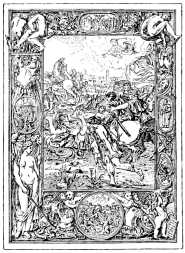
Conversion of St. Paul,
by Giulio Clovio.
From "St. Paul's Epistle
to the Romans,"
in the Soane Museum.
Short as is this survey of the history of Illumination, it will not do to omit all reference to Heraldry. Heraldic manuscripts, it is curious to remark, are rarely illuminated with borders or initials; but in the Chronicles of Matthew Paris shields of arms are frequently introduced with good effect. Occasionally in Books of Hours the arms of the person for whom the work was undertaken are placed in the border. Some fine examples of this kind are to be found in the so-called Bedford Missal, which is really a Book of Hours, and was written for John,[Pg xii] Duke of Bedford, the brother of Henry V. Most of the manuscripts now extant on the subject are of late date and rude execution, consisting chiefly of rolls of arms, catalogues with shields in "trick"—that is, sketched with the colors indicated by a letter, or lists of banners, of which last a fine example is in the library of the College of Arms. Heraldry may be studied to advantage by the modern illuminator, who should endeavour to become so conversant with the various charges that in making a border or filling a letter he may be able to introduce them artistically without violating the strict laws of the "science." A late but very beautiful MS., in four little square volumes, which belongs to Mr. Malcolm of Poltalloch, has been identified as having been written for Bona of Savoy, duchess of Milan, who died in 1494. This identification has been made by means of the frequent occurrence of her badge and mottoes in the borders, many of which contain other devices of a semi-heraldic character, such as a phoenix, which is known to have been a favourite emblem of the duchess, an ermine, a rabbit, and a child playing with a serpent or dragon, all of them allusive to the heraldry of the lady and her husband. The study of heraldry has a further advantage in offering certain fixed rules about the use of colors which may help the student to attain harmony, and also in accustoming the eye and the hand to adapting certain forms to the place they have to fill, as for instance, the rampant lion within his shield, so as to leave as little vacant space as possible.
Some examples of animals treated in heraldic style will be found interspersed in this work as tailpieces. One of these, at the end of the Contents, represents a wild boar, to whose neck a mantle, bearing a coat of arms, is attached. It will be understood that what are called in heraldry "supporters" were a knight's attendants, who disguised themselves as beasts, and held their master's shield at the door of his tent at a tournament. The figures cannot, therefore, be too much conventionalized. (See the examples shown in Plate VII.) Some of the other designs are from the Rows Roll, a heraldic manuscript of the time of the Wars of the Roses. Some beautiful heraldic designs are to be found in Drummond's Noble Families. They were drawn by Mr. Montagu, the author of a charming volume on Heraldry.
Our facsimile reproductions of ancient manuscripts have been selected with a view to supply such examples as are most likely to prove useful to the student. For this purpose we have preferred in several instances to present the whole page with its writing complete, so that the modern illuminator may see[Pg xiii] how the ancient one worked, and how he arranged his painting and his writing with respect to each other.
To this we may add, that for the rest we have chosen our examples as much as possible because they were pretty, instructive, and of English workmanship, a majority of our pictures being copied from manuscripts written in our own country. I need only call attention to the well known but very beautiful style usually called the "English flower pattern," which admits of an endless series of variations and even improvements, and which is as characteristic of our mediæval painters as the Perpendicular style in Gothic is of our architects, both having flourished here and here only during a long period.
And in conclusion I should be inclined to advise the illuminator against stiffness. We are too fond of a vellum which is like sheets of ivory, and of working on it with mathematical precision. The old illuminators used a material much more like what is now called "lawyer's parchment," but perfectly well adapted for taking color and gold. A moment's inspection of our examples will show the freedom and ease of the old work, and the dislike evinced by almost every ancient book painter to having his work confined within definite lines. Such freedom and ease are only attained by careful study combined with experience. Every one has not the ability to originate, but without great originality it may still be found possible to avoid servility. "Who would be free himself must strike the blow;" but those who aspire to climb must first be certain that they can walk. The thing that most often offends the eye in modern illumination is that the artist, to conceal his own want of style, mixes up a number of others. Incongruity is sometimes picturesque, but this kind of incongruity is always disagreeable, from the staring and inharmonious evidence of ignorance which it betrays.
Heraldic Bear from the Rows Roll.
SIXTEENTH-CENTURY WRITING—From "Albert Durer's Prayer-Book."]
 UNLESS when intended for mere practice, all illuminated work should be
executed upon Vellum; its extreme beauty of surface cannot be
imitated by any known process of manufacture, while its durability is
well known. Bristol Board approaches nearest to it in appearance, is
equally pleasing to work upon, and for all practical purposes of the
amateur is quite as good. But, if even that is not attainable,
excellent work may be done on any smooth grained drawing paper.
UNLESS when intended for mere practice, all illuminated work should be
executed upon Vellum; its extreme beauty of surface cannot be
imitated by any known process of manufacture, while its durability is
well known. Bristol Board approaches nearest to it in appearance, is
equally pleasing to work upon, and for all practical purposes of the
amateur is quite as good. But, if even that is not attainable,
excellent work may be done on any smooth grained drawing paper.
Brushes.—Red Sable Brushes are preferable to all others for illuminating purposes, and are to be had in goose, duck, and crow quills,—the larger for laying on washes of color, or large grounds in body color,—the duck and crow for filling in the smaller portions of color, for shading and general work. One of the smallest size should be kept specially for outlining and fine hair-line finishings. For this purpose all the outer hairs should be neatly cut away with the scissors, leaving only about one-third of the hair remaining.
Drawing-pen—Circle or Bow-pen.—For doing long straight lines or circles these instruments are indispensable; they give out ink or color evenly, making a smooth, true line of any thickness required for lining any portion of the work, as in border margins, or any part requiring even lines, unattainable by the hand alone. It is necessary to put the ink or color into the pen with the brush after mixing it to the proper consistency for use. Ink or body color may be used with equal facility. Before starting, the pen should always be tried upon a piece of loose paper, to test the thickness of the line, and also to see if the ink in the pen is not too thick or too thin: if too thick, it will not work evenly, while, if too thin, it will flow too rapidly, and run upon a color ground as if on blotting paper.
Straight-edge, Parallel-ruler, &c.—A thin wooden straight-edge, or, what is better, a parallel-ruler, and also a set square (a right-angled triangular piece of thin wood), will be found necessary for planning out the work.
Burnisher and Tracer.—Agate Burnishers are to be had at the artists' colormen's, either pencil or claw shaped; the former will be most useful to a beginner. An ivory style, or point, is requisite for tracing, and useful for indenting gold diapers.
Pens.—For text or printing, either the quill or the steel pen may be used; both require special manipulation to fit them for the work. It will be most convenient, however, for the amateur to use the quill, as being more easily cut into the shape required; though a steel pen, once made, will last for years if taken care of. The point must be cut off slightly at an angle, such as may be found most convenient. If a steel pen is used, it will be necessary, after cutting off the point, to rub the pen carefully on an oilstone to smooth the roughened edges, and prevent it from scratching the[Pg xvi] paper. The text pen, when properly made, should work smoothly, making every stroke of equal thickness. It is well to have text pens of different widths, to suit for lettering of various thicknesses of body stroke. The pen should be held more upright than for ordinary writing. A broad, almost unyielding point, will give a fine upward and a firm downward or backward stroke with equal facility. For finer writing the pen should be cut with a longer slope in the nib. Fine-pointed pens, for finishing and putting in the hair lines into the text, should also be provided. For this the fine mapping, or lithographic, pen, made by Gillott and others, is most suitable.
Text or Printing Letters.—This is a kind of penmanship which the amateur will, at first, find very difficult to write with regularity, as it requires much special practice to attain anything like proficiency in its execution. But as much of the beauty and excellence of the illuminating depends upon the regularity and precision of the text, it is well worth all the application necessary to master it. The styles of text usually introduced within the illuminated borders are known under the names of "Black Letter," "Church Text," "Old English," and "German Text."
Indian Ink and Lamp Black are the only paints generally used for black text; the difference being that Indian Ink is finer, and therefore better adapted for writing of a fine or delicate character. It works freely, and retains a slight gloss, while Lamp Black gives a full solid tint, and dries with a dull or mat surface;—a little gum-water added will help the appearance in this respect. Some illuminators recommend a mixture of Indian Ink and Lamp Black, with a little gum-water, as the best for text of a full black body, working better than either alone. The mixture should be well rubbed together in a small saucer with the finger before using. If a portion of the text is to be in red, it should be in pure vermilion. If in gold, it must be shell gold, highly burnished with the agate, as hereafter described.
Colors.—Not to confuse the learner with a multiplicity of pigments, we will only mention such as are essential, and with which all the examples in the following studies may be copied. As experience is gained by practice, the range of colors may be increased as requirements may dictate.
| Gamboge. | Crimson Lake. | Burnt Umber. | Prussian Blue. |
| Indian Yellow. | Sepia. | Lamp Black. | Burnt Sienna. |
| Vermilion. | Emerald Green. | Chinese White. | Cobalt. |
| Yellow Ochre. |
A little experimental practice with the colors will do more to show the various combinations of which they are capable than any lengthy exposition. Various portions of color may be tried, particularly for the more delicate tints, for greys, neutrals, and quiet compounds, where great purity is required, and the most pleasing noted for future use.
There are two methods or styles of coloring, which are used either alone, or in conjunction. In the Celtic, and other early styles, including that of the fourteenth century, where the colors are used flat—no relief by shading being given—it is purely a surface decoration, the colors well contrasted, merely graduated from deep to pale, and outlined with a clear, black outline. The masses of color or gold are here usually enriched by diapers, while the stems, leaves, &c., are elaborated by being worked over with delicate hair-line finishings on the darker ground. The other method of treating ornamental forms embraces[Pg xvii] a wide range of style of illuminating, approaching more nearly to Nature in treatment, the ornament being more or less shaded naturally, or conventionalized to some extent. It is important to lay the color evenly in painting, not getting it in ridges, or piling it in lumps, as the amateur is apt to do. This will be best attained by painting as evenly as possible with the brush, mostly in one direction, and not too full of color, and refraining from going back over the parts just painted, if it can be avoided. Patches always show, more or less, and can hardly ever be made to look smooth.
Gold, Silver, &c.—To the inexperienced, the laying on of gold or silver may seem a difficult affair; but it is really comparatively easy, especially when gold and silver shells, sold by artists' colormen, are used. These contain the pure metal ground very fine with gum, and need no preparation. When a drop of water is added, the gold can be removed from the shell, and used with the brush in the ordinary way as a color. One brush should be kept for painting gold or other metallic preparations. As silver is liable to turn black, we would advise the use of aluminium instead, which is not affected by the atmosphere. It can be had in shells in the same manner. In applying gold, or other metal, it should be painted very level and even, especially if it is to be burnished, which make irregularities more prominent. Gold that is to be burnished should be applied before any of the coloring is begun, as the burnisher is apt to mark and injure the effect of the adjoining parts. When the gold is laid on, put a piece of glazed writing paper over it, and, with the burnisher, rub the paper briskly, pressing the particles of gold into a compact film: this gives it a smooth even surface. In this way it is principally used, and is called mat gold. For burnished gold, the paper is removed, and the agate rubbed briskly upon the gold surface, not dwelling too long upon any one part, until a fine, evenly-bright metallic surface is produced. Rubbing the gold lightly with the finger, after touching the skin or hair, facilitates the action of the burnisher.
Preparing for Work, &c.—The vellum or paper having been strained, the surface will, when dry, be perfectly flat and smooth. If the paper or vellum is to be much worked upon, it will be found advantageous to fasten it to a board by drawing-pins or by glueing the edges, having previously damped the back; when this is dry, the surface will be perfectly level, and not apt to bag in working. Paper so mounted should be larger than the size required, to allow for cutting off the soiled margin when completed. To prevent the margins being soiled, a sheet of paper should now be fastened as a mask over the page, with a flap the size of the work cut in it, by folding back portions of which any part of the surface may be worked upon without exposing the rest.
It is almost impossible to erase pencil lines from vellum. The black lead, uniting with the animal matter of the skin, can never be properly got out—India rubber or bread only rubbing it into a greasy smudge. It is, therefore, better to prepare a complete outline of the design upon paper first, which can afterwards be transferred to the strained sheet. For this purpose tracing paper is required, possessing this advantage, that corrections upon the sketch can be made in tracing, and, in placing it upon the vellum, if the sheet has been previously squared off for the work, its proper position can be readily seen and determined. The tracing paper should be about one inch larger each way, to allow of its being fastened to the mask over the exposed surface of the page. A piece of transfer paper of a convenient size is then placed under the tracing. When the tracing is fixed in its proper position by a touch of gum or paste at the upper corners, slip the transfer paper, with the chalked side[Pg xviii] downwards, between the vellum and the tracing, and tack down the bottom corners of the tracing in the same way, to prevent shifting. Seated at a firm table or desk of a convenient height, with the strained paper or drawing board slightly on an incline, the amateur may consider all ready for work. All the lines of the tracing are first to be gone over with the tracing point, or a very hard pencil cut sharp will answer the purpose. A corner may be raised occasionally to see that the tracing is not being done too firmly or so faintly as to be almost invisible. A piece of stout card should be kept under the hand while tracing, to avoid marking the clean page with the prepared transfer paper underneath, by undue pressure of the fingers.
For larger work, not requiring such nicety of detail, the sketch may be transferred direct—especially if the paper is thin—without the use of tracing paper, by merely chalking the back of the drawing, and going over the lines with the tracing point; but the other method is best, and the transfer paper may be used over and over again.
When the subject is carefully traced on the prepared page, and the tracing and transfer paper removed, it will be best to begin with the text. The experienced illuminator will generally, after arranging his designs and spacing out his text, with the initial letters in their proper places, transfer all to his vellum, and do the writing before he begins coloring, covering up all the page except the portion he is working upon. When the lettering is complete, it will in its turn be covered, to prevent its being soiled while the border is being painted.
Work out the painting as directed under "Colors," beginning with the gold where it is in masses, burnishing it level when dry, as before explained: smaller portions can more readily be done afterwards. Paint each color the full strength at once, keeping in mind that it becomes lighter when dry, and finishing each color up to the last stage before beginning another.
Outlining and Finishing.—When the work is at this stage, the colors will have a dull and hopeless appearance; but, as the outline is added, it changes to one more pleasing. The addition of the fine white edging and hair-line finishings (as in fourteenth-century style), still further heightens the effect, giving the appearance of great elaborateness and brilliancy to the coloring, and beauty and decision to the forms. In the conventional style of treatment in coloring, a careful outline is an imperative necessity, and, in this part of the work, practice in the use of the brush is essential. Sometimes objects are outlined in a deeper shade of the local color—as a pink flower or spray with lake, pale blue with darker blue, &c.; but this is not very usual. In the real or natural treatment of the objects forming the subject of the illumination, an outline is seldom used, everything being colored and shaded as in Nature. Lamp black with a little gum water will be found the best medium, being capable of making a very fine or a firm line, at the same time retaining its intense glossy black appearance. A little practice will enable the learner to know the best consistency to make the ink. As it evaporates, a few drops of water may be added, and rubbed up with the brush or finger. For hair-line finishing, either light lines upon a darker ground or vice versâ, the same kind of brush will be used as for outlining. For diapers of a geometrical character, the drawing-pen and small bow-pen will be of great use, either upon color or gold grounds. The ivory tracing point is used to indent upon gold scrolls or diapers. Sometimes there is put over the entire back-ground a multitude of minute points of gold, but not too close together, and punctured with the point of the agate or tracing-point, producing a beautiful glittering effect.
DESIGNED by English illuminators of the twelfth and thirteenth centuries, the initials on this Plate must be separately described. Those at the left top corner are the oldest, and show a certain stiffness of form and dulness of color which contrasts strongly with the spirit and lightness of the letters to the right side of the Plate. These letters, which may be found in manuscripts of many different periods, should be carefully studied. There are some examples in which the initial is simply red or blue, as the case may be. Next it is red and blue combined, the two colors being carefully kept apart by a narrow line of white, which the student will do well not to mark with white paint but to leave out by delicate manipulation. Next the edge of the letter both within and without is followed with a line of red or blue drawn a little way from it and never touching. Then the space so marked within the letter is filled by a tracery of slight flourishes in red and blue, the latter always predominating in the whole design so as to obtain the more harmony of effect. The blue and gold letters are very sparingly treated with red. The blue is Prussian, but very deep in tint in the original. (Addl. MSS. 11,435.)
The initial S in the lower left-hand corner is of earlier date. It will probably, like the letters above it, be seldom used for ornamental purposes, and it will suffice here to mention that the colors used are as follows:—Cobalt raised with Chinese White for the blue parts; for the red, Vermilion shaded with Lake; and for the cool pale olive tint, Indigo and Yellow Ochre, toned with Chinese White.
The large initial E shows a sacred scene, and is of English late thirteenth century work, in a private collection. The harmony is studiously correct, and the original, which is slightly larger, glows with color. It is rather more than four inches square. The figures are firmly outlined, as are their draperies. The gold is leaf, the architectural portion being left very flat, but the nimbus and the border[Pg 2] are burnished. It has been found impossible to reproduce exactly the pattern of the ground in chromo-lithography, but as it may readily be done by hand, a description taken direct from the original will be acceptable to the pupil. The blue ground within the letter is dark: on it is ruled a square cross-bar of deep olive lines of great fineness. Intersecting them, and so to speak keeping them down, is a net-work of very fine nearly white lines, the points of intersection being marked by minute circles. Within the little spaces thus divided are minute circles of vermilion. The outer groundwork is of olive diapered with a deeper shade of the same color. The ground outside the letter is pink divided into squares by brown lines, each square having a little red circle in it. The edges of the draperies are marked by minute white lines, and there is less shading than in the reproduction. Altogether this letter represents the best work of the period, and is an admirable example of the painstaking care by which alone great effects are produced. Even a genius, such as was the artist who produced this little picture, must condescend to take infinite trouble if he would obtain an adequate reward.
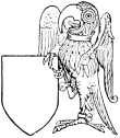
Heraldic Popinjay.
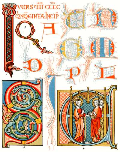
Plate I.—INITIALS BY ENGLISH ILLUMINATORS, 12th and 13th Centuries
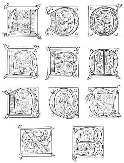
LETTERS FROM AN ALPHABET OF THE FIFTEENTH CENTURY.
(The remainder of the alphabet is shown in colors in Plate II.)
EXECUTED in the fifteenth century, probably in the north of France, the small manuscript from which the twelve initial letters are taken is in a private collection. It consists of twenty-four leaves of rather stout vellum, measuring 4-3/8 inches by 3 inches, and has evidently been a sampler or pattern book for a school of illumination. It contains two alphabets. The letters in the plate are selected from one of them. Outlines of the rest of this alphabet are on the back of Plate I. In copying them for color the student will remember that those letters which contain blue flowers are red, and vice versâ. Each letter is painted on a ground of leaf-gold highly burnished, and is ornamented with a natural flower. We may recognize the rose, the pansy, the strawberry, the columbine, the wall-flower, the corn-flower, the sweet pea, the iris, the daisy, the thistle, and others. Pinks, dog-roses, and forget-me-nots also occur, and the little volume forms, in this respect, a curious and interesting record of the produce of the flower garden so long ago as the time of the English "Wars of the Roses."
The second alphabet is of a wholly different character, the letters, not the ground on which they are placed, being gilt, and the ground colored red or blue. Over the red and the blue is a scroll pattern in white, but the red is sometimes decorated with a pattern in body-yellow, which produces an exceedingly gorgeous effect. In two or three cases the ground is green, worked over in a darker olive tint heightened with yellow. In one, a flower or scroll of grey is placed on a ground of blue dotted all over with minute gold spots.
The blue used in copying these initials for the plate was Prussian, mixed with Chinese White, and shaded with pure color. The green is a mixture of Indian Yellow and Prussian Blue. The pink is Lake and White shaded with pure Lake. The red terminals which appear in some of the letters are of Vermilion, shaded with Lake. Chinese White body color is largely used in working diapers over the letters of both colors.
These letters are good examples of the form chiefly in use for illuminated manuscripts and in ornamental sculpture all over northern Europe from the twelfth century to the sixteenth. They are generally called "the Lombardic character," from some real or fancied connection with Lombardy. Such names must be cautiously accepted. "Arabic numerals," for example, have been proved to be somewhat modified Greek letters. But the Lombardic capitals, whatever their origin, lend themselves readily to the exigencies of the illuminator, and are all the more effective from the contrast they present to the text.
It is now almost universally acknowledged that all the forms of the mediæval and modern alphabet may be traced to Egyptian hieroglyphics. A very interesting passage in Mr. Isaac Taylor's learned book on "The Alphabet," shows us the development of the letter M from the Egyptian picture of an owl. "It will be noticed," he says, "that our English letter has preserved, throughout its long history of six thousand years, certain features by which it may be recognized as the conventionalized picture of an owl. In the capital letter M the two peaks, which are the lineal descendants of the two ears of the owl, still retain between them a not inapt representation of the beak, while the first of the vertical strokes represents the breast." It would be easy to show the same ancient origin for many other letters, and for most of those in the Greek alphabet. F was a horned snake. G was a basket with a handle. K was a triangle. L was a lion seated. N was a zigzag line, of which only three strokes have survived. P was a faggot of papyrus. There is no perceptible difference between the long S still sometimes in use and the hieroglyphic form. U was a quail. Z was a serpent.
The initial E at the beginning of the previous page is of English work, and represents Edward the Black Prince receiving a charter from the hands of his father King Edward III. The prince places one knee on his helmet, and has on his head only the ornamental cap called a "bonnet." His arms and those of the king are colored on their respective "tabards."
The large letter M on the back of Plate II. is from a volume now in the British Museum (Harl. MSS. 3045), which was written in Germany in the twelfth century. It is illuminated in three colors. The ground is emerald green; the letter itself red; and the scroll-work also in red outline, a pale purple ground being substituted for the green in the circular spaces. It would be instructive to the student to color the outline from this description.
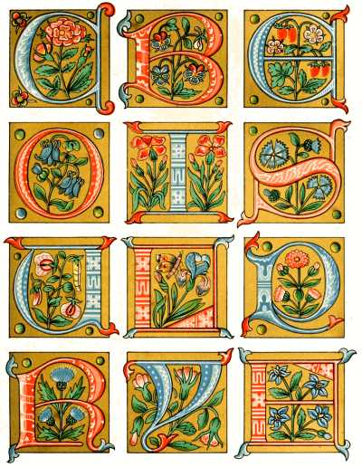
Plate II.—INITIAL LETTERS FROM FRENCH MANUSCRIPT, 15th Century.
LARGE INITIAL LETTER OF TWELFTH CENTURY.
Harleian MSS. 3045, British Museum.
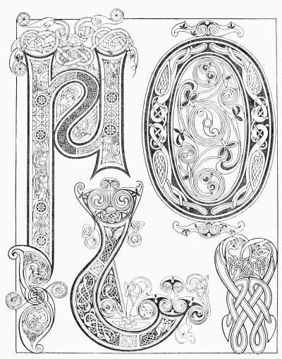
THE beauty of the work executed in the thirteenth century in England,
and that part of what is now France which then belonged to England,
can hardly be exceeded. In this Plate are gathered a few examples of
the period. They are from two books, both in the British Museum, but
one probably written in France and the other at Canterbury. The
initials from the French manuscript may be readily distinguished. The
scroll-work is irregular and even wild, and in some examples the
artist seems to have aimed at nothing less than startling the reader
by his eccentricities. The volume is numbered in the Catalogue,
Additional MSS. 11,698, and contains a treatise on the art of war. The
letters numbered in the Plate 6, 7, and 8, are from this book. The
student will observe the simple scale of harmonious coloring, blue
predominating, as is necessary, and both yellow and also gold being
used to heighten the effect. In copying them the artist used these
colors, besides Chinese White and shell gold: namely, Prussian Blue,
Lake, Indian Red, Emerald Green, Indian Yellow, shaded with Burnt
Sienna, and Burnt Umber, with Sepia for the outlines. In imitating or
copying these initials, the student will find a firm but delicate and
even outline of the greatest importance. If the hand is very steady it
may be put in with a small brush, which is particularly useful in the
erratic flourishes in which this writer rejoiced so much.
The English letters are much more sober and rectilinear in character. The T (fig. 5) commences the prologue of the Book of Wisdom, for the volume is a Bible (Bibl. Reg. 1 D. 1), and a small portion of the text is given with the initial as a guide to the arrangement. The colors are the same as in the French examples. The lines and dots in white are very delicate, and may be closely imitated by the use of Chinese White with a very fine brush, care being taken not to disturb the underlying color. This is the book mentioned in the General Sketch as being the work of a writer named "Wills. Devoniensis," or William of Devonshire.[Pg 10] It is a small folio in size and is written in double columns. At the commencement of the book of Psalms there is a magnificent illumination covering the greater part of the page, and showing, with much scroll-work by way of border, a series of small vignettes, which include a crucifixion, and a number of scenes from the life of St. Thomas of Canterbury, better known in history as Thomas Becket.
A somewhat similar Bible, but not so delicate in workmanship, is also in the British Museum (1 B. 12), and was written at Salisbury in 1254 by William de Hales.
The writing of the thirteenth century differs considerably from that of the two following centuries. It is not so stiff, but much more legible. The distinction will be apparent from a comparison of this Plate with those two which are copied from manuscripts at Lambeth (Plates IV. and IX.) Modern illuminators seem to have preferred the later style, but the advantages of the early should recommend it. The Chronicles written at St. Albans by and under the superintendence of Matthew Paris are all in this style. Facsimiles of several pages are given in the volumes published under the direction of the Master of the Rolls.
The initial T on the previous page is from a beautiful Nuremberg treatise of 1489 on the "Preservation of Body, Soul, Honour, and Goods."
On the back of Plate III. are two pages in outline from a small Book of Hours in the collection of Robert Young, Esq., Belfast. This kind of work is known as the "Ivy Pattern." It was exclusively practised in France in the fourteenth century. The coloring is usually of a very sober character: the prevailing colors being blue and gold only.
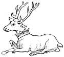
Hart, Badge of Richard II.
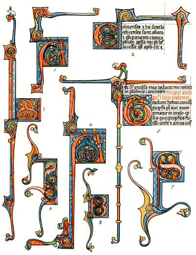
Plate III.—EXAMPLES OF THIRTEENTH-CENTURY WORK.
PAGES FROM A BOOK OF HOURS OF FOURTEENTH CENTURY.
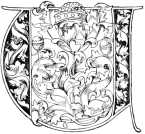
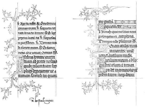
OUR next Plate is from a manuscript in the Lambeth Library. Leave to copy it was readily granted to us by the lamented Archbishop Tait. It is No. 459 in the Library Catalogue, and contains no fewer than twenty miniatures, as well as borders like this one. It belongs like Plate IX. (the Frontispiece) to the English flower pattern style of the fifteenth century, and is remarkable for the sober effect of the gorgeous colors employed, and for the delicacy of the scroll-work in black.
A great deal of this effect is due to the application of gold. The illuminators employed both what we call "shell gold" and leaf. They attached the greatest importance to skill in gilding, and the result is that their "raising" survives after centuries, when that executed at the present day often cracks off after a few weeks or months, if not very carefully handled. Many books, containing the secret of making these preparations, and sizes of all kinds, are in existence; and show that while the same end was attained by many different kinds of processes, one ingredient was never omitted, namely, great care and pains, and the gradual gathering of skill through experience.
It is difficult to explain the method of using gold-leaf without an actual demonstration: and the student will learn more in ten minutes by watching a competent gilder than by reading a library of books on the subject. The "raising" is to be obtained from any artist's colorman, and nothing but practice long and assiduous can secure the power to use it. The same rule must be laid down for burnishing, which is an art not to be acquired in a day. It might be well to commence with the dotted work, common in the fourteenth century, and when we have learned to make a burnished dot with our agate point we may go on and burnish a larger surface. The effect of burnished leaf gold cannot be given in chromo-lithography, but it may be worth while to remark that all the gilding in the original illumination from which this Plate is copied is burnished on a raised surface, even the small letters in the text.
The colors employed by the copier were of a more mixed and complicated character than those for the other page from the Lambeth Library. The reason is apparent in a moment on comparing the two. In this page the brilliancy is so tempered as to produce a comparatively subdued effect. In the General Sketch mention has already been made of miniatures in which the artist restricted himself to the use of certain colors, so as to insure a peculiar and delicate effect. Here there has been no such restriction, but each color has been softened and so worked over with patterns and lines in body white or in pale yellow, that there is no glare or contrast. The student should be careful how he obtains harmony by this method, as he may find all his work weakened and paled; but, skilfully used, the system may be made to produce the most charming results.
The blue is Prussian, over which are dots and lines of Chinese White. The pink is obtained by mixing Lake and Chinese White, shaded with darker Lake, and also heightened with white lines and dots. The orange is pale Indian Yellow shaded with Burnt Sienna, and with an admixture of Lake in the deeper shadows. The green in this example is obtained by mixing Prussian Blue and Indian Yellow in different proportions.
On the back of Plate IV. are two more outlines from Mr. Robert Young's little French Book of Hours. They are admirable models of a kind of work which for fully half a century was to France what the "flower pattern" was to England. The branches are generally dark blue delicately lined with white. The leaves are sometimes gold, that is where there is not already a gold ground, and sometimes yellow, red, and blue. The prevailing tint is blue, and in some pages no other color, besides the gilding, is employed.
Some outline borders and ornaments of the same period and style are to be found on the back of Plates V. and VI. The coloring of some of them will be indicated by a reference to Plates III. and I.
Bull, Badge of Neville.
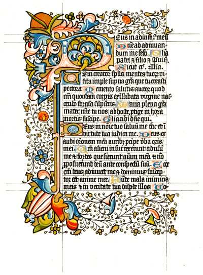
Plate IV.—FACSIMILE OF MANUSCRIPT IN LAMBETH PALACE LIBRARY, 15th Century.
PAGES FROM A BOOK OF HOURS OF FOURTEENTH CENTURY.
PLATE V. shows three ornaments from manuscripts of late date, all in the National Collections.
The border with the raspberries is from a Missal of the sixteenth century in the British Museum (Addl. 18,855), and was probably written and illuminated in the Low Countries. We have already mentioned the extraordinary freedom and ease of the Flemish work of that period. Every beautiful object was made use of for pictorial effect. Children, birds, jewels, shells, as well as fruit and flowers, are to be found. They particularly excelled in painting pearls. One border is green, with chains and ropes of pearls strewn all over it. The calendar represents domestic scenes, each strongly surrounded with a double gold line, the written part being simply left out in the middle, so that the scene forms its border. The gold ground presents a slightly different appearance from that shown in our engraving, as it is flat, being painted with shell-gold not put on very thickly. The shadows are of Burnt Umber, which has a very transparent effect on the gold ground.
Beside this border is a fine letter of somewhat earlier date from a chorale book, German work in all probability, which, with many others, Italian and Flemish as well as German, were ruthlessly cut up into fragments, perhaps at the Reformation, perhaps more recently, and are now in the Art Library of the South Kensington Museum. They are much rubbed and faded, and our chromo-lithograph represents this initial C as it appeared when first finished. In much of the northern work of this period—about the middle of the fifteenth century, say 1450—there is a beautiful style of ornamental scroll-work, which some have proposed to call the "Leather Pattern." It may represent the cut leather work of the mantling of[Pg 18] a knight's tilting helmet. A small specimen of it is shown in the turned-back petals of the flowers in this letter, but whole volumes are to be seen entirely decorated with it, and some of the best work of the period was accomplished in it.
The third of these ornaments is also from the collection in the South Kensington Museum. In this design the thing to be most noticed is perhaps that which is least prominent, namely, the gold spots, with black filaments, as it were, floating from them. They serve to eke out and fill up the composition, and in some books are used with fine effect on almost every page. They should be thickly gilt on a raised surface, and should have dark outlines, and the filaments rapidly and lightly drawn, either with a pen or with a very fine brush, pruned down almost to a single hair. Many other pretty effects may be obtained by early training the hand and eye to draw single lines in this way. The letters in one of our other Plates (No. I.) are entirely filled with tracery of the kind, and the patterns principally in use are easily learned. Anything free is preferable to servile imitation and tracing, and these diapers in particular lose more than almost anything else in the whole art of illumination by direct copying. The student should learn to adapt his delicate lines—chiefly in red and blue—to any form of letter, and while drawing them should not let his hand falter or hesitate for a moment. It is the same with the lace-like patterns in white which were so much in vogue for heightening the edges of letters in the thirteenth and fourteenth centuries. They are very necessary to the effect, but must be painted in with a light touch and great rapidity, or they lose all spirit.
The initial P on the previous page, and also the initials in pages vii. and 1, have been taken from MSS. illuminated with the "English flower-pattern." An attempt has been made to represent the colors employed by means of lines. This system was first applied to heraldry in the first half of the seventeenth century. Horizontal lines represent blue; vertical, red; cross hatching, black; dotting, gold or yellow. Green is denoted by lines "in bend dexter," and purple by lines "in bend sinister."
The bands and borders on the back of Plate V. are of the fourteenth century, but similar ornaments were common at all times. They are chiefly red or blue, with patterns in white lines and dots, and in highly burnished gold. They are employed both as borders and to fill up incomplete lines of writing.
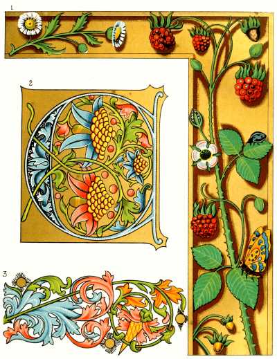
Plate V.—ORNAMENTS AND LARGE INITIAL, 15th and 16th Centuries.
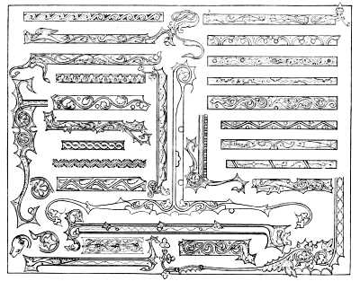
BANDS AND BORDER ORNAMENTS—Fourteenth Century.
A PAGE of writing and five separate initials from a book of "Hours," written in Flanders or Holland at the end of the fifteenth century, are here shown, with a border of the same period from another volume. The first book, which is in a private collection, affords an example of the kind of illumination which is styled by the French "grisaille," a word which may be translated "grey-work." In this style, which consists usually in the artist restricting himself to certain colors, or to black, grey, and white only, very few books were ever written. I have already, in the General Sketch, mentioned one which had pictures in imitation of Limoges enamels. A volume apparently illuminated by the same hand as those in our MS. is in the Burgundian Library at Brussels. The figure pictures in both look as if they were not painted by the same artist as the writing and illumination of the letters, and it is probable two or more were employed in the production.
There was great activity in all the arts in the Low Countries during the fifteenth century, and the most gorgeous books ever illuminated were written there at that period. At Dortrecht, at Bruges, and other places there were schools of illuminators, and the practice of the art was not confined, as in England, to ecclesiastics and the cloister. The books written were, however, mainly religious; and the same designs were used over and over again. It would, in fact, be easy to identify each guild of miniature painters by their employment of the same set of forms. This eventually led to deterioration, and only the introduction of oil painting, by turning the minds of the artists into a wider channel, saved Flemish art. The masters of the Van Eycks, of Memling, of Matsys, of Van Romerswale were undoubtedly the teachers of illumination in books.
The artist in "grisaille" always took especial pains with his draperies. He had so little wherewith to produce his effect that he sometimes almost reached the chiaro-scuro of a later period. Some of the pictures of this school which I have seen look as if they were intended to represent moonlight views. In the present[Pg 22] volume the effect of the soberly coloured figure subjects is greatly enhanced by the rich colors of the border, and the brilliantly burnished gilding. The ground on which the letter O is gilded in Plate VI., is quartered into red and blue, and the outer part "counter-changed," as they say in heraldry. A delicate pattern is worked over the colors in body-white. The small leaves are painted with thick coats of Emerald Green.
The border is from a Book of Hours in the British Museum. The gilding in the original is laid on with shell, worked very flat and very thin, so as rather to impart a yellow tone to the ground than to give it any special lustre. There are other borders in the book of a similar character, and some which, on a green or a purple ground, show jewels of various kinds, especially pearls, sometimes strewn irregularly over the ground, sometimes worked up into ornaments, or made to look as if they were mounted in richly designed gold settings. In fact, at that age the artist let nothing escape him that would go to enhance the beauty or brilliancy of his page. In the original this border enclosed a very elaborate miniature. These miniatures are very carefully and delicately painted, but perhaps by a different hand, as they are not equal in refinement to the borders. The Office for the Dead is ornamented with a black border, on which is architectural tracery in gold on which skulls are arranged, one of them with a pansy or heartsease and forget-me-not, beautifully painted, growing out of the hollow eyes. The border of the picture of the Annunciation is made with a tall lily growing from an ornamental vase at the side.
The Dutch and Flemish illuminators at this period excelled in manipulation, and many of the books which they painted have all the merit and almost all the importance of pictures. Anything and everything was used as ornament. In some no two pages are even in what can be called the same style; but delicacy of workmanship, the faces especially being finished as real miniatures, is characteristic of all. It is probable that whole schools of artists worked on a single volume, dividing the labour according to the skill of each artist.
On the back of Plate VI. will be found some further examples of the ornaments, letters, and "line finishings" of the thirteenth and fourteenth centuries, chiefly from French books. The A and the Z are from the same MS. as Nos. 6 and 7 on Plate III. The KL united form the heading of the Calendar in a book with ivy pattern borders.
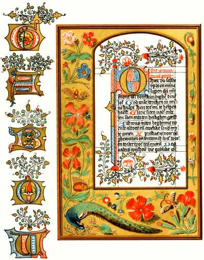
Plate VI.—PAGE AND INITIALS (Low Countries, 15th Century).
BORDER from MS. in British Museum.
FRENCH INITIAL LETTERS AND BORDER ORNAMENTS—Fourteenth Century.
PICTORIALLY considered the illustrations on Plate VII., it must be admitted, are more quaint than beautiful. All the subjects on this page are, with the exception of the thirteenth and fourteenth century borders (6), (4), more or less heraldic in character. It will be best to take them in the order in which they are numbered.
The lady seated (1) holds in either hand the arms of the Duke of Burgundy, slightly varied as to quarterings. The picture is taken from the famous "Bedford Missal" in the British Museum, which is not a missal at all, but a Book of Hours, illuminated in France for the Duke of Bedford, one of the brothers of Henry V. It therefore belongs to the fifteenth century. The lady is sitting on what in heraldry is called "a mount vert," which in turn is supported by the little half architectural scroll-work below; her dress is purple, shaded with grey, in opaque color; the arms are painted in Prussian Blue and Vermilion, the gold being shell.
The gentleman to the right (2) is Sir Nele Loring, a Knight of the Garter. Some time in the fourteenth century a monk of St. Albans, Thomas Walsingham, compiled a list of the benefactors of the abbey, and as far as possible presented his readers with a portrait of each. They are rather rough but eminently picturesque. The book is particularly interesting from the curious particulars it gives us as to the expenses of the illuminator. One Alan Strayler, it tells us, "worked much upon this book," and the editor or compiler ran up a debt with him of the comparatively large sum of three shillings and fourpence, equal to at least £3, 10s. 0d. of our money, for the colors he had used. The book came into the possession of the great Lord Verulam, better known as Lord Chancellor Bacon, and by him it was given to Sir Robert Cotton, who collected the Cottonian MSS. It is known in the British Museum as "Nero D. vii." from its place in the book-case of Sir Robert Cotton which bore the effigy of that Cæsar. Sir Nele, or Nigel, Loring died in 1386, having given the abbey many gifts, and as he was K.G. he is represented in a white robe diapered with "garters."
Our next picture (3) is from a very curious and beautiful, but much injured manuscript, reckoned the number ii. in the collection at Heralds' College. By the kindness of "Somerset Herald" we are allowed to copy it. The book is a list of banners used probably at a tournament in the reign of Henry VIII. Heraldry became more or less the kind of "science" it still is under the last of the Plantagenet kings, and was kept up in great glory by their successors, the first two Tudors. The banner here given is that of Henry Stafford, who was made Earl of Wiltshire in 1509. It shows the swan, the crest of the Staffords, with a crown round its neck and a chain, and the ground, partly black and partly red, the colors of the family, is powdered with "Stafford knots," their badge. Across, in diagonal lines, is the motto "D'Umble et Loyal." These banners, which might well be imitated in modern illumination, are made up of livery colors, with crests and badges, and are usually accompanied by the coat of arms of the person to whom each belonged.
The last of the heraldic features of the page (5) is also the earliest. It represents part of the border of a Psalter made, it is believed, in honour of the intended marriage of Prince Alphonso, the son of Edward I., with a daughter of the King of Arragon. He died at the age of ten years in 1282; but it is possible that the illuminations refer to the intended marriage of his sister, the princess Eleanor, with Alphonso, the young King of Arragon. In any case the manuscript certainly belongs to the middle of the thirteenth century. To the right we see a knight in the chain armour of the period with his shield hung over his arm. Small gold crosses, alternating with "lions rampant" on a blue ground, form part of the border, the other part consisting of "lions passant" on a red ground. Two shields bear, one, the arms of the son of King Edward, "England, differenced with a label, azure," and the other, those of Leon. Crests and mottoes had not been invented, and the artist had little scope for his fancy. But it may not be out of place to call attention to the fact that even at this early period heraldry was made use of for ornament, as in this border, and that it answered the purpose admirably.
On the back of Plate VII. is the outline of an illumination of the Adoration of the Magi, from a French MS. of the 16th century. Borders of this type though very rich seldom occur in books ornamented in England. The branch work is in delicate black lines, with leaves and berries in gold or color. The scrolls are generally in blue, turned up with gold, red, or pink; blue being, however, always the predominant color, so as to insure a certain measure of harmony. The effect, however, depended more on the skill with which the branch work in black was disposed.
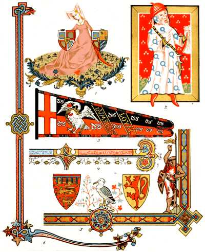
Plate VII.—BORDERS OF THIRTEENTH AND FOURTEENTH CENTURIES, AND HERALDIC DESIGNS.
BORDER AND TEXT, with Adoration of the Three Kings—Sixteenth Century.
NO book on this subject would be complete without something more than a passing reference to the earliest of all the fashions in illumination which have prevailed in our islands. This Plate gives some examples from the very curious manuscript in the Library of Trinity College, Dublin, known as the "Book of Kells." This venerable volume contains the four Gospels in Latin, and, it is sometimes asserted, dates from the seventh century, but more probably belongs to the ninth. The late Sir M. D. Wyatt says of it: "Of this very book Mr. Westwood examined the pages, as I did, for hours together, without ever detecting a false line, or an irregular interlacement. In one space of about a quarter of an inch superficial, he counted, with a magnifying glass, no less than one hundred and fifty-eight interlacements, of a slender ribbon pattern, formed of white lines, edged by black ones, upon a black ground. No wonder that tradition should allege that these unerring lines should have been traced by angels."
The examples before us are purposely taken from a less complicated page, but will be found sufficient to try the skill and patience of even the most painstaking student. The colors are rather more vivid than in the original, which has now greatly faded through age and ill-usage. There is little to be said as to the beauty of the design. Grotesques have an attraction in spite of their ugliness: but we can hardly expect the most enthusiastic admirer of antiquity to imitate these extraordinary complications of form and color, except as an exercise of skill and patience. In one respect, however, early manuscripts and especially manuscripts of this class, are well worthy of imitation. The writing is very clear and distinct. It is easier to read a charter of the seventh or the eighth century than one of the seventeenth. Illuminators might do worse than learn the old Irish alphabet, if only on this account.
There is no gilding in the Book of Kells, but some occurs in the contemporary,[Pg 30] or nearly contemporary Book of Durham. The effect depends wholly on the skill of the scribe in using a very limited palette so as to make the most of it. The modern student would do well to remember this. A wide range of colors does not always conduce to bright or good coloring. Harmony is often found to follow from a sparing use of the more brilliant pigments at our disposal, with a careful eye to effect. The beginner too often imagines that he can make his border or his initial look well if he puts enough gold or vermilion on; but he should remember that the more sober and simple his scale of coloring the more splendid will the bright colors look when he does employ them. It is well to remember that absolute harmony is obtained by the use of blue, red, and yellow in these proportions:—blue, eight; red, five; yellow, three; and that all good pictures or illuminations must depend on this principle. White and black, and also in some cases gilding, may be treated as neutrals. There is usually a sufficiency of black in the lettering of a page. White, in the shape of dots and as heightening, may be largely employed if there is any want of harmony detected. Gold should not be used for this purpose, except in certain styles; and the student may rest assured that a design which does not look well without gold will not look better with it.
A few other specimens, without color, will be found on the back of Plate VIII. It might be good practice for the student to tint them in the style of the colored examples.
The Byzantine style, as it is called, prevailed about the same period in the countries of eastern and northern Europe. The books are of a very different but equally ungraceful character. The work is not so minute or complicated, but the lavish use of gold distinguishes them. Sometimes a page is written in gold letters on vellum stained purple; sometimes the page is entirely gilt. None of the examples in the British Museum are worth the trouble and indeed expense of copying, but they are curious as specimens of barbaric splendour.
Heraldic Lion.
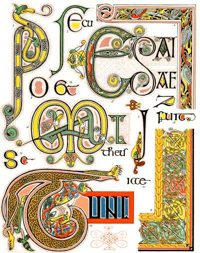
Plate VIII.—EXAMPLES FROM THE BOOK OF KELLS, 9th Century.
EARLY IRISH INITIAL LETTERS.
(FRONTISPIECE.)
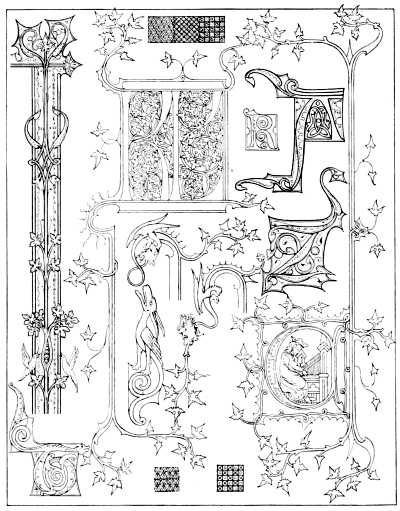
SUCH measure of perfection as had been attained by English illuminators in the latest period is well illustrated by this Plate. It is from a Book of Hours in the library of the Archbishop of Canterbury at Lambeth. Leave to copy it was kindly accorded to us by His Grace the late lamented Archbishop Tait. The volume is square in shape and rather thick, the vellum not being of the fineness seen in the Bibles of the thirteenth century, already noticed. It is numbered 474 in the Catalogue, and is described by Mr. S. W. Kershaw, f.s.a., in his book on the Art Treasures of the Lambeth Library, who assigns it to the early part of the fifteenth century.
The illuminations in this book are admirable examples of what is known as the English flower pattern, a style, as we have already observed, which was as peculiar to our insular artists as the Perpendicular style in architecture. It was used for all kinds of manuscripts, and even law deeds are sometimes to be seen thus ornamented. Even after the invention of printing it continued to flourish for a while; and books are sometimes found printed on vellum abroad, and illuminated in England with the beautiful native flower pattern in borders and initials.
Mr. Kershaw observes regarding the book from which the present page has been taken: "This, a very nice example, is fairly written, and ornamented with a profusion of beautiful illuminated initials of English art. The volume contains but two miniature paintings, the remainder usually found in MSS. of this class having been abstracted. The initial letters vary in size and pattern; they are all upon backgrounds of gold, and frequently form with their finials short marginal ornaments of elegant tracery work. Pink, blue, and orange brown are the prevailing colors, the blue being often heightened on the outer edge with flat white tints. The larger initials are rich in design and varied in their coloring, and would supply the artist or amateur with abundant materials for study."
I would desire to call the student's attention to one or two points of[Pg 34] importance. In imitating or copying work of this kind it is well to observe that though the artist appears to have used the utmost freedom of line and direction, he has really been most careful in his composition. The initial O comes well out from among its surroundings, and is not overpowered by the weight of its dependent ornament. The scroll-work requires especial attention. That which fills the centre of the letter appears to press tightly against the edge, and is so arranged as to fill completely the vacancy for which it is intended. There is nothing limp about it. Too often modern work can be detected by its want of what I must call the crispness of the original.
With regard to the writing, it will be observed that a great change in the form of the letters has taken place since the thirteenth century. The difference between u and n is often hardly perceptible, and has led to many curious mistakes. Nevertheless, if the student is careful about such particulars, this is a very beautiful style, and admirably suited for modern requirements. The colors used by the artist who copied this page were as follows:—for the blue, Prussian, lined and dotted with Chinese White; for the pink, Lake and Chinese White, shaded with the same color darker; the deepest shadows are Lake; for the orange, pale Indian Yellow for the lights, shaded with Burnt Sienna, and Lake for the deepest shadows.
In some books illuminated in this style the centre of the letter is occupied with a scene containing figures, and occasionally a picture extends across the page, the initial fitting close up to it. The picture, in this case, is always surrounded with a double line or framework of blue, or red, and gold; and the color has a delicate white line on it, and occasionally gives out a branch which, crossing the gold line, bursts into flower in the margin. This style was largely used for official documents for a long period, and many excellent facsimiles representing examples are to be found as frontispieces to the volumes of the Roll Series. It lasted with more or less modification until the reign of Charles I.
VERE FOSTER'S WATER-COLOR BOOKS.
"We can strongly recommend these volumes to young students of drawing."—The Times, Dec. 27, 1884.
PAINTING FOR BEGINNERS.—First Stage.
Teaching the use of One Color. Ten Facsimiles of Original Studies in Sepia, by J. Callow, and numerous Illustrations in Pencil. With full instructions in easy language. In Three Parts, 4to, 6d each; or one volume, cloth elegant, 2s. 6d.
PAINTING FOR BEGINNERS.—Second Stage.
Teaching the use of Seven Colors. Twenty Facsimiles of Original Drawings by J. Callow, and many Illustrations in Pencil. With full instructions in easy language. In Six Parts 4to, 6d. each; or one volume, cloth elegant, 4s.
SIMPLE LESSONS IN FLOWER PAINTING.
Eight Facsimiles of Original Water-Color Drawings, and numerous Outline Drawings of Flowers. With full instructions for Drawing and Painting. In Four Parts 4to, 6d. each; or one volume, cloth elegant, 3s.
"Everything necessary for acquiring the art of flower painting is here; the facsimiles of water-color are very beautiful."—Graphic.
SIMPLE LESSONS IN MARINE PAINTING.
Twelve Facsimiles of Original Water-Color Sketches. By Edward Duncan. With numerous Illustrations in Pencil, and Practical Lessons by an experienced Master. In Four Parts, 4to, 6d. each; or one volume, cloth elegant, 3s.
"Must prove of great value to students. Nothing could be prettier or more charming than these sketches."—Graphic.
SIMPLE LESSONS IN LANDSCAPE PAINTING.
Eight Facsimiles of Original Water-Color Drawings, and Thirty Vignettes, after various artists. With full instructions by an experienced Master. In Four Parts 4to, 6d. each; or one volume, cloth elegant, 3s.
"As a work of art in the book line we have seldom seen its equal; and it could not fail to be a delightful present, affording a great amount of pleasurable amusement and instruction, to young people."—St. James's Gazette.
STUDIES OF TREES.
In Pencil and in Water-Colors, by J. Needham. A Series of Eighteen Examples in Colors, and Thirty-three Drawings in Pencil. With descriptions of the Trees, and full instructions for Drawing and Painting. In Eight Parts 4to, 1s. each; or First Series, cloth elegant, 5s.; Second Series, cloth elegant, 5s.
ADVANCED STUDIES IN FLOWER PAINTING.
By Ada Hanbury. Twelve beautifully finished Examples in Colors, and numerous Outlines in Pencil. With a description of each flower, and full instructions for drawing and painting by Blanche Hanbury. In Six Parts, 4to, 1s. each; or one volume, cloth elegant, 7s. 6d.
EASY STUDIES IN WATER-COLOR PAINTING.
By R. P. Leitch and J. Callow. A Series of Nine Pictures executed in Neutral Tints. With full instructions for drawing each subject, and for sketching from Nature. In Three Parts 4to, 1s. 6d. each; or one volume, cloth elegant, 6s.
SKETCHES IN WATER-COLORS.
By T. M. Richardson, R. P. Leitch, J. A. Houston, T. L. Rowbotham, E. Duncan, and J. Needham. A Series of Nine Pictures executed in Colors. With full instructions for drawing each subject, by an experienced Teacher. In Three Parts 4to, 1s. 6d. each; or one volume, cloth elegant, 6s.
"The names of the artists are quite sufficient to stamp these books with the highest qualities. The pictures are judicious in selection and artistic in execution, while the instructions are so full and clear as to almost supersede the need of a teacher."—Liverpool Courier.
ILLUMINATING.
Nine examples in Colors and Gold of ancient Illuminating of the best periods of this interesting and almost forgotten art, with numerous Illustrations in Outline, historical and other Notes, and full descriptions and instructions by the Rev. W. J. Loftie, B.A., F.S.A. Immediately.
Adopted by the Science and Art Department, South Kensington.
VERE FOSTER'S DRAWING COPY-BOOKS.
GRADED AND PROGRESSIVE.
With Instructions and Paper to Draw on.
IN TWELVE PARTS AT ONE SHILLING EACH.
Part I.—ELEMENTARY LESSONS. Part II.—OBJECTS WITH CURVED LINES. Part III.—PLANTS AND FLOWERS. Part IV.—ORNAMENT, by F. E. Hulme. Part V.—TREES IN LEAD PENCIL. Part VI.—LANDSCAPE IN LEAD PENCIL. Part VII.—MARINE, by Callow, &c. Part VIII.—ANIMALS, by H. Weir. Part IX.—ANIMALS, by H. Weir (continued). Part X.—HUMAN FIGURE. Part XI.—PRACTICAL GEOMETRY. Part XII.—MECHANICAL DRAWING.
PUBLISHED ALSO IN FIFTY NUMBERS AT THREEPENCE EACH.
ELEMENTARY LESSONS. A 1 Initiatory Lessons. A 2 Letters and Numerals. B 1 Objects (Straight Lines). B 2 Domestic Objects (Simple).
OBJECTS WITH CURVED LINES. C 1 Domestic Objects (Flat Treatment). C 2 Domestic Objects (Perspective). D 1 Leaves (Flat Treatment). D 2 Leaves (Natural Treatment).
PLANTS AND FLOWERS. E 1 Plants (Simple Forms). E 2 Plants (Advanced). G 1 Flowers (Simple Forms). G 2 Flowers (Advanced).
ORNAMENT, by F. E. Hulme. I 1 Elementary Forms. I 2 Simple Forms (Fretwork, &c.) I 3 Advanced Forms (Carving, &c.). I 4 Ornament (Classic, &c.).
TREES IN LEAD PENCIL. J 1 Oak, Fir, &c. J 2 Beech, Elm, &c. J 3 Oak, Chestnut, Birch. J 4 Birch, Larch, Poplar, &c.
LANDSCAPE IN LEAD PENCIL. K 1 Rustic Landscape in Outline. K 2 Shaded Objects, &c. K 3 Shaded Landscape. K 4 Advanced Landscape.
MARINE, by Callow, &c. M 1 Boats, Foregrounds, &c. M 2 Fishing Craft, Coasters, &c. M 3 Yachts and other Vessels. M 4 Drawing of Waves.
HUMAN FIGURE. Q 1 Features. Q 2 Heads, Hands, &c. Q 3 Rustic Figures, by Duncan. Q 4 Figure from the Antique.
ANIMALS, by H. Weir. O 1 Birds and Quadrupeds. O 2 Poultry, various breeds. O 3 British Small Birds. O 4 British Wild Animals. O 5 Horses (Arab, Hunter, &c.). O 6 Horses (Racer, Trotter, &c.). O 7 Dogs (Seventeen Species). O 8 Cattle, Sheep, Pigs, &c. O 9 Lambs, Ass, Foal, &c. O 10 Foreign Animals, &c.
PRACTICAL GEOMETRY. R 1 Definitions and Simple Problems. R 2 Practical Geometry. R 3 Applied Geometry.
PRACTICAL MECHANICAL DRAWING. T 1 Initiatory. T 2 Details of Tools, &c. T 3 Models for Working Drawings, &c. T 4 Details of Machines and Engines.
Z Blank Exercise Book.
VERE FOSTER'S DRAWING CARDS.
Beautifully Printed on Fine Cards and done up in neat Packets.
First Grade, Set I.—FAMILIAR OBJECTS, 24 cards, 1s. First Grade, Set II.—LEAF FORM, 24 cards, price 1s. First Grade, Set III.—ELEMENTARY ORNAMENT, 24 cards, price 1s. Second Grade.—ORNAMENT, by F. E. Hulme, 18 large cards, price 2s. Advanced Series.—ANIMALS, by Harrison Weir, 24 cards, price 1s. 6d.
OF VERE FOSTER'S DRAWING-BOOKS
The STANDARD says—There is no book of instruction in drawing, no matter what its price, so well calculated to aid self-help as Vere Foster's books. Even in schools that possess the advantage of apt and experienced teachers of drawing, their advantages will speedily become manifest. Mr. Vere Foster has done a public service by the production of this series.
The GRAPHIC says—If any parent who reads these lines has a boy or girl who wishes to learn how to be an artist, let us boldly recommend Vere Foster's Drawing-Book. It is not only the cheapest, but by far the best that we have seen.
The ART JOURNAL says—It would be difficult to overrate the value of this work—a work that is not to be estimated by its cost: one is great, the other very small. Any learner may find in it a huge volume of thought, his studies rightly directed by a competent practical teacher, who will teach him nothing by which he can be led astray, or that he will have to unlearn when he consults the great Book of Nature.
Adopted by the Science and Art Department, South Kensington.
POYNTER'S SOUTH KENSINGTON DRAWING-BOOK.
This New Series of Drawing Copies has been issued under the direct superintendence of E. J. Poynter, R.A. The examples have been selected for the most part from objects in the South Kensington Museum, and the Drawings have been made under Mr. Poynter's careful personal supervision by Pupils of the National Art Training School.
Each Book has Fine Cartridge Paper to draw on.
Two Books. ELEMENTARY FREEHAND DRAWING. Sixpence Each.
I.—Simple Geometrical Forms. II.—Conventionalized Floral Forms.
Six Books. FREEHAND DRAWING, ORNAMENT, FIRST GRADE. Sixpence Each.
I.—Simple Objects and Ornament—Flat. II.—Various Objects—Flat. III.—Objects and Architectural Ornament—Flat and Perspective. IV.—Architectural Ornament—Flat. V.—Objects of Glass and Earthenware—Perspective. VI.—Common Objects—Perspective.
Six Books. Freehand Drawing, Plants, First Grade. Sixpence Each.
I.—Leaves and Flowers—Simplest. II.—Leaves, Flowers, Fruits. III.—Flowers, Fruits, &c. IV.—Flowers and Foliage. V.—Flowers. VI.—Flowers.
Four Books. FREEHAND DRAWING, SECOND GRADE. One Shilling Each.
I.—Forms of Anthemion Ornament, &c.—Flat. II.—Greek, Roman, and Venetian—Flat and Perspective. III.—Italian Renaissance—Flat. IV.—Roman, Italian, Japanese, &c.—Flat and Perspective.
THE SAME SUBJECTS ON CARDS.
Elementary Freehand (Cards), .... .... .... .... Four Packets, Price 9d. each. First Grade, Freehand Ornament (Cards), ... .. ... Six " " 1/ " First Grade, Freehand Plants (Cards), ... ... ... Six " " 1/ " Second Grade, Freehand (Cards), ... ... ... ... Four " " 1/6 "
Four Books. ELEMENTARY HUMAN FIGURE. Sixpence Each.
I.—Michelangelo's "David"—Features. II.—Masks, from Antique Sculpture. III.—Hands, from Sculpture. IV.—Feet, from Sculpture.
Three Books. ADVANCED HUMAN FIGURE, Imp. 4to, Two Shillings Each.
Book I.—Head of the Venus of Melos. Book II.—Head of the Youthful Bacchus. Book III.—Head of David by Michelangelo.
Four Books. FIGURES FROM THE CARTOONS OF RAPHAEL. Imp. 4to, 2s. Each.
Twelve Studies of Draped Figures. Drawn direct from the Originals in the South Kensington Museum. With Descriptive Text, and Paper for Copying.
Four Books, 1s. Each. ELEMENTARY PERSPECTIVE DRAWING. One Vol., cloth, 5s.
By S. J. Cartlidge, F.R.Hist.S., Lecturer in the National Art Training School, South Kensington.
Book I.}
Book II.} For Second Grade Examination of the Department.
Book III.—Accidental Vanishing Points. Book IV.—Higher Perspective.
The PALL MALL GAZETTE says:
"The choice of subjects is admirable; there is not an ugly drawing in the book. Parents and teachers who have been looking in vain for drawing-books that should really train the eye in the study of beautiful forms, as well as the hand in the representation of what the eye sees, will be very grateful to the Science and Art Department for these cheap and most satisfactory productions."
BLACKIE & SON'S BOOKS FOR THE YOUNG.
Price 7s. 6d.
The Universe: Or the Infinitely Great and the Infinitely Little. A Sketch of Contrasts in Creation and Marvels revealed and explained by Nature and Science. By F. A. Pouchet, M.D. With 273 Engravings on wood. 8th Edition, medium 8vo, cloth elegant, gilt edges.
Price 6s.
True to the Old Flag: A Tale of the American War of Independence. By G. A. Henty. With 12 full-page Illustrations by Gordon Browne. Cloth elegant, olivine edges.
In Freedom's Cause: A Story of Wallace and Bruce. By G. A. Henty. With 12 full-page Illustrations by Gordon Browne. Cloth elegant, olivine edges.
With Clive in India: Or the Beginnings of an Empire. By G. A. Henty. With 12 full-page Illustrations by Gordon Browne. Cloth elegant, olivine edges.
Bunyip Land: The Story of a Wild Journey in New Guinea. By G. Manville Fenn. With 12 full-page Illustrations by Gordon Browne. Cloth elegant, olivine edges.
The Golden Magnet: A Tale of the Land of the Incas. By Geo. Manville Fenn. With 12 full-page Pictures by Gordon Browne. Cloth elegant, olivine edges.
The Life and Surprising Adventures of Robinson Crusoe. By Daniel Defoe. Beautifully Printed, and Illustrated by above 100 Pictures designed by Gordon Browne. Cloth elegant, olivine edges. [Reprinted] from the Author's Edition.]
In the King's Name: Or the Cruise of the Kestrel. By Geo. Manville Fenn. With 12 full-page Pictures by Gordon Browne. Cloth elegant, olivine edges.
Under Drake's Flag. A Tale of the Spanish Main. By G. A. Henty. With 12 full-page Pictures by Gordon Browne. Cloth elegant, olivine edges.
Price 5s.
St. George for England: A Tale of Cressy and Poitiers. By G. A. Henty. With 8 full-page Illustrations. Cl. elegant.
Menhardoc: A Story of Cornish Nets and Mines. By G. Manville Fenn. With 8 full-page Illustrations. Cl. elegant.
The Pirate Island: A Story of the South Pacific. By Harry Collingwood. With 8 full-page Pictures. Cloth elegant.
The Wigwam and the Warpath: Stories of the Red Indians. By Ascott R. Hope. With 8 full-page Pictures. Cloth elegant.
By Sheer Pluck: A Tale of the Ashanti War. By G. A. Henty. With 8 full-page Illustrations. Cloth elegant.
Stories Of Old Renown. Tales of Knights and Heroes. By Ascott R. Hope. With 100 Illustrations by Gordon Browne. Cloth elegant, olivine edges.
Facing Death: Or the Hero of the Vaughan Pit. By G. A. Henty. With 8 full-page Illustrations. Cloth elegant.
Nat the Naturalist: Or a Boy's Adventures in the Eastern Seas. By Geo. Manville Fenn. With 8 full-page Pictures. Cloth elegant.
Price 3s. 6d.
Cheep and Chatter; Or Lessons from Field and Tree. By Alice Banks. With 54 Character Illustrations by Gordon Browne. Cloth elegant. With gilt edges, 4s.
The Wreck of the Nancy Bell: Or Cast away on Kerguelen Land. By John C. Hutcheson. Illustrated by 6 full-page Pictures. Cloth extra.
Picked up at Sea: Or the Gold Miners of Minturne Creek. By John C. Hutcheson. With 6 full-page Pictures in Tints. Cloth extra.
Dr. Jolliffe's Boys: A Tale of Weston School. By Lewis Hough. With 6 full-page Pictures. Cloth extra.
Traitor or Patriot? A Tale of the Rye-House Plot. By Mary C. Rowsell. Illustrated by 6 full-page Pictures. Cloth elegant.
Brother and Sister: Or the Trials of the Moore Family. By Elizabeth J. Lysaght. With 6 full-page Illustrations. Cloth extra.
Dora: Or a Girl without a Home. By Mrs. R. H. Read. With 6 full-page Illustrations. Cloth extra.
Garnered Sheaves. A Tale for Boys. By Mrs. Emma R. Pitman. With 4 full-page Illustrations. Cloth extra.
Florence Godfrey's Faith. A Story of Australian Life. By Mrs. Pitman. With 4 full-page Illustrations. Cloth extra.
Life's Daily Ministry. A Story of Everyday Service for Others. By Mrs. Emma R. Pitman. With 4 full-page Illustrations. Cloth extra.
My Governess Life: Or Earning my Living. By Mrs. Emma R. Pitman. With 4 full-page Illustrations. Cloth extra.
Price 2s. 6d.
Each book is beautifully illustrated, and bound in cloth extra.
Brothers in Arms: A Story of the Crusades. By F. Bayford Harrison.
Jack o' Lanthorn. A Tale of Adventure. By Henry Frith.
Winnie's Secret: A Story of Faith and Patience. By Kate Wood.
A Waif Of the Sea: Or the Lost Found. By Kate Wood.
Hetty Gray, or Nobody's Bairn. By Rosa Mulholland.
Miss Fenwick's Failures: Or "Peggy Pepper-pot." By Esmé Stuart.
The Ball Of Fortune; Or Ned Somerset's Inheritance. By Charles Pearce.
The Family Failing. By Darley Dale.
Stories of the Sea in Former Days; Narratives of Wreck and Rescue.
Adventures in Field, Flood, and Forest; Stories of Danger and Daring.
A complete List of Books for the Young, prices from 4d. to 7s. 6d., with Synopsis of their Contents, will be supplied on application to the Publishers.
LONDON: BLACKIE & SON, 49 & 50 OLD BAILEY, E.C.;
GLASGOW, EDINBURGH, AND DUBLIN.