The Project Gutenberg EBook of Drawing for Printers., by Ernest Knaufft

This eBook is for the use of anyone anywhere at no cost and with
almost no restrictions whatsoever.  You may copy it, give it away or
re-use it under the terms of the Project Gutenberg License included
with this eBook or online at www.gutenberg.org/license


Title: Drawing for Printers.
       A practical treatise on the art of designing and
              illustrating in connection with typography. Containing
              complete instruction, fully illustrated, concerning the
              art of drawing, for the beginner as well as the more
              advanced student.

Author: Ernest Knaufft

Release Date: November 20, 2016 [EBook #53561]

Language: English

Character set encoding: UTF-8

*** START OF THIS PROJECT GUTENBERG EBOOK DRAWING FOR PRINTERS. ***


Produced by Chris Curnow, RichardW, and the Online
Distributed Proofreading Team at http://www.pgdp.net (This
file was produced from images generously made available
by The Internet Archive)
THE author has no doubt but that many captious readers, upon opening this book, will find it puzzling. They will think that it does not present the subject in an orderly fashion. They would much prefer to have us suggest one month’s study of outlines, and then finish with the subject; then two months’ study of shading, which we would maintain covered the whole ground; and they would wish us to separate with equal positiveness the whole study of drawing into distinct portions. To these criticisms I reply with the following parable:
Mrs. Smith, the mother of a large family, distressed by the bigness of the physician’s bill (or rather by her husband’s complaints of the same), procured at the druggist’s a case of homœopathic medicine, with a booklet directing its dispensation, which would enable her to act as her family physician, and bringing it home perused it with delight, as she found every ailment which her children were heir to extensively described therein—chicken-pox, croup, diphtheria and scarlet fever were alphabetically set down, and their proper remedy clearly named. When she retired she staid awake, almost hoping to hear little Johnny cough or Mary toss in her crib, that she might prove her knowledge of symptomatology, and the efficacy of the drugs.
Alas, a month’s experience brought with it a source of embarrassment which she had not anticipated on procuring her book. True, she had learned it by heart with ease, and knew that for a slight attack of fever one drop of aconite and two of belladonna should be given on alternate days, and that for an incipient attack of croup she should give one drop of aconite every half hour, “which might be administered more frequently if the case showed symptoms of rapid development.” Alas, the difficulty did not arise from any omission in the book directions for applying remedies, but the puzzling point was to distinguish in nature between the symptoms of croup, for instance, and those of an ordinary cold. Was Johnny’s sonorous barking due to a real croupy throat, or was it the natural formation of his vocal organs which gave so ominous a tone to a cough that might be only the result of his wading in the rain barrel the morning before? Was Tommy’s calling for “a wink of water” no less than six times in a night due to a prospective fever, or was it the result of loneliness because he had for the first time been put in the spare room, and wanted his mother’s company? Was little Mary’s restlessness indicative of a coming attack of measles, or the result of her cousin’s having read her, that afternoon, “The Goblins ’ll Get You if You Don’t Watch Out.” These were the puzzling questions; if the physician could only diagnose the case for her, she herself could have administered the proper quota of drops of aconite or belladonna.
The moral is plain. Those books on drawing which say, “Having made correct outlines, begin to shade with an F pencil as follows,” are very easy reading; but an attempt at application soon convinces one that such instruction presupposes an amount of previous eye-training on the part of the student which is not often the endowment of the ordinary man.
INTRODUCTORY — DESIGNING OF VALUE TO THE PRINTER — NATURAL ABILITY VERSUS INSTRUCTION — SMALL DESIGNS AS DIFFICULT AS LARGE — READER NOT TO BE DISCOURAGED BECAUSE HE CANNOT BE A FULL-FLEDGED ARTIST — “HOW SHOULD I BEGIN TO LEARN TO DRAW?” — LEARNING TO SEE — INSTRUCTION DOES NOT CONSIST OF NAMING MATERIALS — THE STUDY OF A HAT SEEN IN DIFFERENT POSITIONS — THE VALUE OF OBSERVATION.
THERE has been in recent years a marked change in the character of the printing done in this country; plain printing has been superseded by decorative printing; the typographer of a few years back was only a compositor and pressman, today he should be a designer as well. In view of that requirement this little treatise is written, in the hope that, though its advice may not make an illustrator out of its reader, it will at least acquaint him with some principles of design that he may apply in his daily practice.
The reader will not be deceived, the writer not misunderstood, if at the outset it is put on record that great success in art is dependent much more upon natural ability, aye, genius, than upon study, and that these chapters can only tell you how to study—they cannot guarantee you success. A man of fifty, a master printer, may study our advice thoroughly and then attempt to {18} draw an elephant chasing an African, and the result may be conspicuously inferior to the treatment of the same subject by little eight-year-old Johnny Green who is yet in the primary school; but Johnny Green may have “an eye for drawing” and our master printer be as devoid of it as is a cow of melody in her voice.
Not only is it true that without talent you must not expect to succeed in producing important pictures, such as full-page illustrations, double-column portraits, poster designs and large work in general, but it is almost more unlikely that you will succeed in designing the most simple tailpiece or initial letter. It is quite natural that you should suppose it a very easy task to design an initial letter or a tiny silhouette of a leaf or flower, a branch or wreath or two forming a “printer’s mark”; every artist in Christendom thinks the same—until he tries it; but you would be surprised if I filled this chapter with the history of certain initial letters and devices, and tracing them to their fountain head, we found that in nine cases out of ten they were designed by the very greatest artists of the time.
You can take it as an undisputed fact that should some publishing house wish an ordinary full-page illustration for a book, and at the same time a simple “publisher’s mark,” a device about an inch square for the title-page of that book, they would find ten artists who could execute the former to one who could design the latter so that it would be up to the standard of the best “marks” in history.
Is it then, you ask, our intention at the very start to discourage you, and advise you to attempt nothing because you cannot excel in anything? Not at all. A {19} country editor need not refrain from studying rhetoric so as to improve the style of his editorials, just because he knows that without genius he may not expect to equal the diction of Macaulay. The rhetoric may not give him wit to put in his editorials, but it at least may teach him to cast his sentences properly. So this treatise may not supply you with “art feeling,” but it will, we hope, show you how to make a design in a more workmanlike way than you would without our advice; and we most sincerely advise you to try.
Everyone in asking the question, “How should I
begin to learn to draw?” expects that the answer will
direct him to use certain materials in a certain way, and
that by the manipulation of these materials in this certain
way, he will get the desired result. So far as this
treatise is concerned, the reader will be disappointed in
this regard; it is true that the writer is particularly
interested in the technic of the different graphic arts,
and later on will have something to say about the best
methods for pen drawing, for chalk-plate, for wood
engraving; but in these first chapters on drawing it
must be distinctly understood that our advice is that the
student should not worry about what pencil or what
paper he should use, or about how his lines should look,
but should realize from the outset that his principal
study should be the education of his eye. The reason
that we do not draw well in infancy is because we have
not learned to see. You may take it as a positive fact
that the untrained eye of every man sees things in an
absolutely incorrect manner—or rather he does not
know how he sees things. Let us take, for example, an
immense factory-building with over a hundred windows
{20}
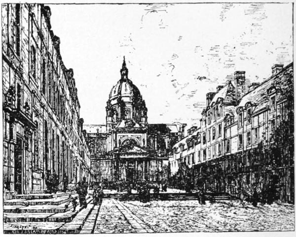 THE
COURTYARD OF THE SORBONNE IN 1886.
Pen drawing by E. Lansyer.
Looking at these buildings as in this picture, an artist knows that a
doorway or a window in the building with the dome would appear as a perfect
rectangle, as we see in the case of the main doorway, because seen “in
front view”; but the windows in the buildings at the sides are not perfect
rectangles because, being seen “in perspective,” or at an angle, their sills
and lintels seem to tip downward. The uneducated eye, however, knowing
them to be rectangles, sees them as such, not realizing that each receding
window is narrower than its predecessor; and that, moreover, the lintels and
sills of a window in a higher story have a greater tip than those of one below,
and that every lintel has greater tip than its corresponding sill. This
knowledge, however, should be known to all artists through the study of
perspective.
{21}
THE
COURTYARD OF THE SORBONNE IN 1886.
Pen drawing by E. Lansyer.
Looking at these buildings as in this picture, an artist knows that a
doorway or a window in the building with the dome would appear as a perfect
rectangle, as we see in the case of the main doorway, because seen “in
front view”; but the windows in the buildings at the sides are not perfect
rectangles because, being seen “in perspective,” or at an angle, their sills
and lintels seem to tip downward. The uneducated eye, however, knowing
them to be rectangles, sees them as such, not realizing that each receding
window is narrower than its predecessor; and that, moreover, the lintels and
sills of a window in a higher story have a greater tip than those of one below,
and that every lintel has greater tip than its corresponding sill. This
knowledge, however, should be known to all artists through the study of
perspective.
{21}
 CARICATURE
OF THE ARTIST HIMSELF.
By Albert Engström.
{22} on its front and on its sides. Let us presume that a man
is standing directly in front of the building; the chances
are that he sees every window in a tolerably correct
manner. He sees that all the windows are alike, etc.;
that each is a certain distance from the other, etc.
Good! But now let him walk to the end of the building
and look at it diagonally; he still sees the building as he
saw it in the front view; depend upon it, that he sees
each window as a perfect rectangle, and each window
the same distance from the other; he would be incapable
of going home and showing you on a piece of paper the
“direction” of every window line. Let an artist step
in his place and he sees every window different from the
other! You probably do not realize the full truth of
this statement at present, but you will after we have our
chapter on perspective. For the present please take
my word for it, and bear in mind that you must first
learn to see.
CARICATURE
OF THE ARTIST HIMSELF.
By Albert Engström.
{22} on its front and on its sides. Let us presume that a man
is standing directly in front of the building; the chances
are that he sees every window in a tolerably correct
manner. He sees that all the windows are alike, etc.;
that each is a certain distance from the other, etc.
Good! But now let him walk to the end of the building
and look at it diagonally; he still sees the building as he
saw it in the front view; depend upon it, that he sees
each window as a perfect rectangle, and each window
the same distance from the other; he would be incapable
of going home and showing you on a piece of paper the
“direction” of every window line. Let an artist step
in his place and he sees every window different from the
other! You probably do not realize the full truth of
this statement at present, but you will after we have our
chapter on perspective. For the present please take
my word for it, and bear in mind that you must first
learn to see.
Let us take the caricature by Albert Engström for
our first lesson. We have selected it for two reasons:
first, because it is a caricature, and we wish our readers
to realize that this treatise is going to be of use to printers
from the beginning, and that we are going to study
drawing in an interesting manner. Many a printer is
as well the publisher of a newspaper and feels that from
time to time he would like to publish a caricature to
enliven his pages, or at any rate he is interested in the
cartoons in the illustrated press, and would like to know
how they are done, and the best way to acquire this
knowledge is to practice a little one’s self. Besides,
the practice of caricaturing is most beneficial to every
draftsman; there have been but few great painters
who {23}
have not indulged in it. Another reason for using this
cut is that it is drawn in a very simple manner in a few
strong lines. While the students at the art schools
usually begin to get effects with light and shade, the
printer will do well to master outline sooner than light
and shade, for it is the most quickly executed and the
most easily engraved, and, I need not add, last but not
least, most easily printed. I should advise you then
to take commonplace objects that are about the house
and make innumerable sketches of them in the manner
of this drawing. Take a derby hat for example, place
it a little above the eye and endeavor to draw it as Engström
did his. Do not worry much about your style of
drawing, do not complain that your pen will not work
and that you cannot get a line varying in thickness like
this one; or if you do succeed, do not ask your friends
to admire your handsome pen line; do not think about
your drawing at all, but solely about learning to see.
Place the hat above you, notice that you see the under
part of the brim nearer you, and the inside of the brim
on the far side; if there is not a head under the hat
endeavor with a single curved line to indicate as much
of the lining as you see; if you see anything else that is
not given in Engström’s drawing and you try to express
it as he expresses things you employ an excellent
method of study. Next place the hat in the same position
but below the eye, on the seat of a chair, and
notice that you no longer see under the brims but inside
of them; then place the hat on its crown upon the chair
so that you see the oval of the inside of its crown, and
endeavor to express that oval with two semi-circles, as
simple as the one which Engström uses in drawing
the {24}
crown of the hat. Again, put the hat on the mantelpiece
and draw a side view of it; this will be more
simple than any of the other views. I think that an
hour’s practice of this kind will soon convince you that
the casual glance of the uneducated eye does not take
in a complete or perfect view of an object, but that after
you have studied an object with a view to drawing it,
you begin to see with more thoroughness. You will,
I think, notice, as you walk home in the evening, the
contours of the different hats that you see in the hatter’s
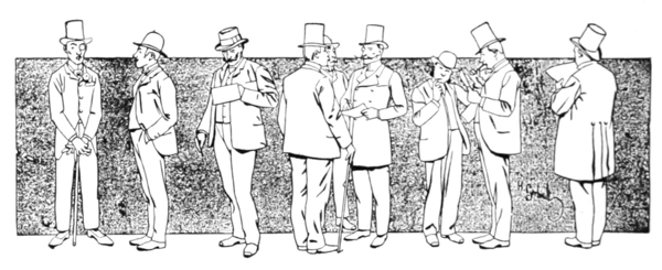 PEN DRAWING WITH
MECHANICALLY STIPPLED BACKGROUND.
By H. Gerbault.
Showing different kinds of hats
in various positions.
window, and upon the pedestrians; you will begin to
guess how you would draw such a hat or cap, and from
time to time you will see headgear that “lends itself to
drawing,” as it were; you will say, “When I go home
I will try to draw that hat.” We print on this page
an interesting drawing by Gerbault. To the casual
observer a drawing of this kind simply represents some
men with their hats on, and he enjoys looking at the
hats collectively, while he may enjoy the
individual {25}
faces; but the illustrator, with his practiced eye, finds
enjoyment in examining the way each individual hat is
drawn. You will find the same enjoyment if you practice
drawing hats as we have recommended, and it is
needless to say that your enjoyment will be profitable,
and, moreover, that your practice need not be limited
to the drawing of hats, but may embrace coats, gloves,
and shoes as well.
PEN DRAWING WITH
MECHANICALLY STIPPLED BACKGROUND.
By H. Gerbault.
Showing different kinds of hats
in various positions.
window, and upon the pedestrians; you will begin to
guess how you would draw such a hat or cap, and from
time to time you will see headgear that “lends itself to
drawing,” as it were; you will say, “When I go home
I will try to draw that hat.” We print on this page
an interesting drawing by Gerbault. To the casual
observer a drawing of this kind simply represents some
men with their hats on, and he enjoys looking at the
hats collectively, while he may enjoy the
individual {25}
faces; but the illustrator, with his practiced eye, finds
enjoyment in examining the way each individual hat is
drawn. You will find the same enjoyment if you practice
drawing hats as we have recommended, and it is
needless to say that your enjoyment will be profitable,
and, moreover, that your practice need not be limited
to the drawing of hats, but may embrace coats, gloves,
and shoes as well.
If such is the influence upon your mind made by this chapter, we feel sure that you will never regret having read it and given the time to the practice we recommend, and we think that the first step in the study of drawing will have been made, and that you will feel it has been a successful one.
MORE ABOUT HATS — PERSPECTIVE MAY BE LEARNED FROM THEM — DRAWING MORE A MATTER OF SEEING PROPERLY THAN USE OF PEN — TEXTURE — SILHOUETTE DRAWINGS USED BY EGYPTIANS.
WE TRUST that you followed the advice of our former chapter, that you tried to draw a hat in several positions, and that you then found, as we prophesied, that you were led to observe the hats that you saw in the street with a new sense of discernment; if that is true, you will appreciate this chapter, we think, though it be very short.
We select two more caricatures for you, in which we find hats that are very similar. Now we can tell you quite positively whether you have an eye for drawing or not. Stop a moment, and before reading the next paragraph, look at these hats, pages 28, 29, and argue out the reason why they are drawn as they are; if your reasons are somewhat like the following, your chances for learning to draw are good; if not, you have much study ahead of you, even before you can make a start.
Your observation is good if you realize that in drawing almost anything you may represent it as a silhouette. The Egyptians did much of their writing in hieroglyphs, using silhouette pictures of thousands of different objects; helmets and crowns, hands and feet, men and animals, tools and utensils were employed as characters in their alphabet; and if you see plainly how a silhouette is made by outlining an object as it is seen from one point {27} of view, usually a perfect side view, the object on a level with the eye, and that the outline is filled in with black, you may be sure that you have been observing correctly. You will notice then that these two hats are (1) on a level with the eye, for if (2) below the eye, you would see the top of the crown and into the brim; if (3) above the eye, you would see underneath the brim. You notice also that the “Hedin” is the true silhouette, which is made by leaving out the lights on the side, the suggestion of the band, and the upper edge of the brim. You will also notice (4), particularly in the “Jörgen,” that the feet are as though the gentleman were walking on a chalk-line on a table and the spectator sitting on a low chair, so that the feet were on a level with his eye; this is a characteristic feature of Egyptian hieroglyphs. If the feet were drawn realistically they would not only not be on a line one with the other, but we would seem to look down upon the shoes, as ordinarily a man’s feet are below the spectator’s eye.
We think that this is enough for one lesson, and if you find that the propositions that we have numbered are not clear to you, you would better work out the problems on a sheet of paper. We take it for granted that Nos. 1 and 2 are clear to anyone who drew the hats according to our last chapter; but Nos. 3 and 4 may not be so evident; if not, get a pair of shoes and put them on the mantel on a level with your eye; next place them upon the floor in the position in which one ordinarily walks or stands, and our propositions will be clear to you.
It is most important that you should understand all
these matters of optics, though it makes little difference
{28}
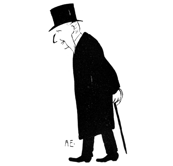 “HEDIN”—A CARICATURE.
By Albert Engström.
The hat and coat
are pure silhouette, the face “suggestive
outline.”
{29}
“HEDIN”—A CARICATURE.
By Albert Engström.
The hat and coat
are pure silhouette, the face “suggestive
outline.”
{29}
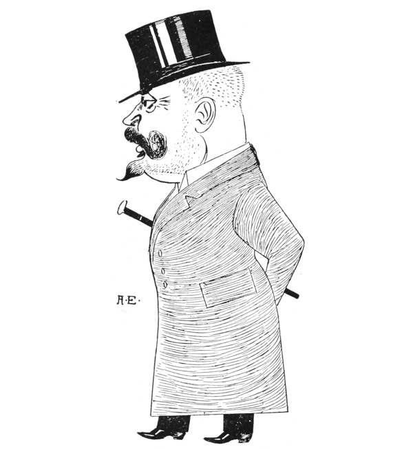 “JÖRGEN”—A CARICATURE.
By Albert Engström.
The hat and shoes are partially silhouette;
but the high lights upon them are connected with finished
work.
{30} with what kind of a pen you may make your drawing.
Having mastered these principles, you would then
understand such a criticism on Engström’s work as the
following: Mr. Engström sometimes employs the pure
silhouette, as in the “Hedin,” and sometimes silhouette
in a modified form, as in the “Jörgen”; in the former
case an artist sacrifices rotundity, detail and texture (the
white streaks on the “Jörgen” hat suggest the surface
of the beaver; this we call texture; a felt hat has no
such white streaks upon it, and might be adequately
represented by a set of lines such as are used on Jörgen’s
coat, but no silhouette can suggest texture); in his caricatures
Engström unites with the silhouette effect the
single-plane effect of the Egyptian hieroglyphs. (The
hieroglyphs were mostly painted on walls and the feet
represented as though flush with the wall, and not one
farther from us than the other, hence we say that they
are on one plane.) Many caricaturists have effectually
burlesqued the Egyptian method of drawing and the
placing of their figures. The trousers and the cane in
the “Jörgen” drawing are the only objects in one
plane; the coat collar is distinctly rounded. In the
Moloch illustration we see also silhouette treatment.
You can easily imagine how Hedin’s hat, if the proper
size, would fittingly rest on Crispi’s
head.
“JÖRGEN”—A CARICATURE.
By Albert Engström.
The hat and shoes are partially silhouette;
but the high lights upon them are connected with finished
work.
{30} with what kind of a pen you may make your drawing.
Having mastered these principles, you would then
understand such a criticism on Engström’s work as the
following: Mr. Engström sometimes employs the pure
silhouette, as in the “Hedin,” and sometimes silhouette
in a modified form, as in the “Jörgen”; in the former
case an artist sacrifices rotundity, detail and texture (the
white streaks on the “Jörgen” hat suggest the surface
of the beaver; this we call texture; a felt hat has no
such white streaks upon it, and might be adequately
represented by a set of lines such as are used on Jörgen’s
coat, but no silhouette can suggest texture); in his caricatures
Engström unites with the silhouette effect the
single-plane effect of the Egyptian hieroglyphs. (The
hieroglyphs were mostly painted on walls and the feet
represented as though flush with the wall, and not one
farther from us than the other, hence we say that they
are on one plane.) Many caricaturists have effectually
burlesqued the Egyptian method of drawing and the
placing of their figures. The trousers and the cane in
the “Jörgen” drawing are the only objects in one
plane; the coat collar is distinctly rounded. In the
Moloch illustration we see also silhouette treatment.
You can easily imagine how Hedin’s hat, if the proper
size, would fittingly rest on Crispi’s
head.

HIEROGLYPHIC DESIGNS OR SILHOUETTES — THEIR USE AS TYPOGRAPHICAL ORNAMENTS — OBJECTS SEEN AS ON ONE PLANE — PLACING YOUR OBJECT — HORIZONTAL LINES PARALLEL TO THE EYE — HORIZONTAL LINES NOT PARALLEL TO THE EYE.
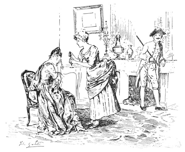
WE PUBLISH two kinds of drawings with this chapter, which many be classified as follows: The Grassets are hieroglyphic-like designs or silhouettes; the Crispi, in his robe de chambre, which for want of the artist’s name we shall call the Don Chisciotte cut—“Don Chisciotte” you no doubt suspect is the Italian for Don Quixote, and it is the name of a cartoon paper—is a pure outline drawing.
Now let us take them in turn. Every printer will recognize that the Grasset designs are excellent, for they may be printed with greater ease than shaded drawings, and their simplicity is in perfect harmony with the solid black of type. Now, not only would it {33} be pleasant for you as a printer to begin making some such silhouettes, but it is very good practice in drawing for you to search the house for objects that you can put up against the window pane and draw their contours, filling them in with black. A whisk broom, a pair of scissors, a pair of eyeglasses, a leaf, a feather may be put up against the glass and its silhouette copied, and you then realize how many objects may be represented by their contours. Later you learn how to silhouette objects less flat; you may try the ink bottle with a pen in it, the glue pot with the brush in it; this leads you to such a thorough understanding of Grasset’s flowers as pages of writing would never give. In walking in the streets after such an exercise you will notice not only the “block” of a man’s hat (which we spoke of in Chapter I), but you will notice what kind of a silhouette it makes against the sky; then the shape of the birds, the weather vanes, the church steeples as they are “etched against the sky,” as the poets say, will have a new interest for you.
In this practice of silhouetting objects you learn something that is most important in more advanced work. You learn to see objects as on one plane. We fancy your knowledge of geometry is sufficient for you to understand what we mean, but let us go over the ground slowly so that it may facilitate our future explanations of perspective problems.
By a plane we mean a plain, a flat surface. A table top is a plane. But the plane the artist draws upon—say a sheet of paper—though he may let it lie horizontal on a table, is always considered a vertical plane, corresponding to a pane of glass in a window. Now, if {34} we are looking across the street, through the window, we know that each receding cobblestone in the street (though in one horizontal plane) is in a different vertical plane from the others. If we wished to make the plane a tangible one we could set up a pane of glass in front of the nearest cobblestone, and then another pane in front of the cobblestone across the street, then it would be evident to anyone that these stones were in two planes, would it not? Good! Now, if you should go to the window and trace with a paint brush a picture of these two cobblestones on the glass, you would draw your picture on one plane, and that a vertical plane. Well, that is just what the artist does when he draws a picture by the eye. He may lay his paper horizontally on a common table, or obliquely on a tipping drawing table, or on an easel, but he does not draw the objects as though seen through a horizontal or oblique plane (except sometimes when he sketches from a church-steeple or a hilltop), but on the contrary, the ordinary drawing always represents objects as seen through a vertical pane of glass and as they would be traced on that pane, hence reduced to one plane.
Having read the foregoing two or three times we will ask you to turn to the Don Chisciotte caricature. Has it not a new interest to you? Do you not see immediately that the legs of the bureau, though in reality some few feet apart and so in different planes, are drawn on a sheet of paper on one plane? Well, the second step after you have learned to draw a simple form in outline is to learn to “place” your objects and their receding parts—as the legs of the bureau. It would be impossible for me to overestimate the trouble this gives the {35} beginner—such as the man who sees the factory viewed at an angle as though it were seen from the front (see Chapter I). But if perchance you can get it into your mind that you must draw as though tracing on a window pane, nay, better still, if you will dip a brush in the ink and actually draw on the pane for several days, you will soon have little need of puzzling over perspective, and when you look diagonally at a rectangular object—as the windows in a factory—you will see at a glance that they are no longer rectangles, as in a front view, but the lintels and sills actually seem to tip (in an upward direction if below the eye, in a downward direction if above the eye). Then you suddenly realize that certain laws of optics come into play in making the very simplest of views. You look at such a simple interior as in the Don Chisciotte room and you recognize at once that the lines in it which were horizontal in nature are governed by three laws; the portière rod and the side boards of the couch are drawn horizontal because the artist sees them in a front view—they are parallel to his eye—but the lines of the front of the bureau and the floor line behind it run up because they are lines seen not in front view, but seen diagonally, and they are below the artist’s eye; but the top line of the mirror runs down because it is above the artist’s eye.
From this chapter any reader with a mathematical mind will have already deduced the facts of the following rules of perspective, even if he has not formulated them in precise language; but you might as well learn them by heart, as they are applied every time you draw a box, a table, a room, a railroad track, a street, etc.
1. All horizontal lines in nature that are parallel
to
{36}
 PEN DRAWING.
By Jules Girardet.
Showing a mantel a little below the
eye.
The student should practice drawing interiors
with the purpose of learning the theory of perspective from every
object drawn. The horizontal lines of the picture frame, for example,
tip in the opposite direction to the mantel, because they are above the
eye. Had the mantel been a few inches higher it would have been drawn
as a perfectly horizontal line.
{37}
PEN DRAWING.
By Jules Girardet.
Showing a mantel a little below the
eye.
The student should practice drawing interiors
with the purpose of learning the theory of perspective from every
object drawn. The horizontal lines of the picture frame, for example,
tip in the opposite direction to the mantel, because they are above the
eye. Had the mantel been a few inches higher it would have been drawn
as a perfectly horizontal line.
{37}
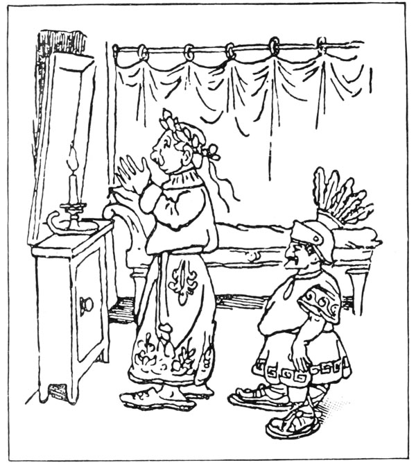 CRISPI AS CÆSAR IN HIS ROBE DE CHAMBRE.
A political caricature from Don
Chisciotte.
{38} the eyes of the spectator (like the portière rod and the
bed part of the couch in the Don Chisciotte caricature,
like the lintels and sills of the Sorbonne doorway), that is when
one is standing directly in front of them, appear as horizontal
lines and are to be so drawn, they do not tip
either up or down whether below or above the eye.
CRISPI AS CÆSAR IN HIS ROBE DE CHAMBRE.
A political caricature from Don
Chisciotte.
{38} the eyes of the spectator (like the portière rod and the
bed part of the couch in the Don Chisciotte caricature,
like the lintels and sills of the Sorbonne doorway), that is when
one is standing directly in front of them, appear as horizontal
lines and are to be so drawn, they do not tip
either up or down whether below or above the eye.
2. But when a horizontal line is no longer parallel to the axis of the eyes, that is when it is seen diagonally, as the floor line, the front of the bureau and the top of the mirror, then it follows this law; if it happens to be just on a level with the eyes, that is on the horizon line, then it is horizontal to the sight and is so drawn; if the mirror were hanging where it is in the Don Chisciotte, but were cut off just on a level with Crispi’s eyes, and the draftsman of the picture were just Crispi’s height, then the base of the mirror would be drawn horizontal. But when the lines are below the eye, as the floor line and the bureau lines, then they seem to run up to the horizon and are drawn slanting upward; while if they are above the eye, as the top of the mirror, they tip down to the horizon and are drawn slanting downward—the end farther away from the artist lower in the picture than the end nearer him. (See the side buildings in the Sorbonne courtyard.)
It is advisable for the student of perspective to cut a rectangular opening, not too large, say the size of this page, in a piece of pasteboard, which he may hold at arm’s length in front of him and look through as he would through a small window. This will not only frame his picture for him, but it gives him two horizontal lines and two perpendicular lines, and he can hold his pencil or his ruler against the face of the frame {39} so that it just covers any straight line he wishes to draw; and he will readily see that all vertical lines in nature make his pencil run parallel to the sides of his frame, while horizontal lines if in nature parallel to the axis of his eyes, or if on a level with his eyes, make it run parallel to the base and top. And then, best of all, he can hold his pencil parallel to oblique lines which run away from him, and they will appear parallel to the face of his frame, or in one plane, as they would be in a drawing. This is very helpful, as there is nothing so confusing to the beginner as the lines which run away from him. (In looking up a railroad track the rails seem to run away. You know they are actually parallel, but to your eye they converge. Not only that, but you know they are flat on the ground, whereas, in a picture, you draw them standing up. All this is at first very confusing.)
POWER OF OUTLINE — SHADED DRAWINGS — TEXTURE — LOCAL COLOR AND VALUES — THROWN SHADOW AND MODELING SHADOW — MANNERISMS OF A CARICATURIST — BEGINNER ADVISED TO USE OUTLINE ONLY, BUT HE MAY PRACTICE IN SHADING.
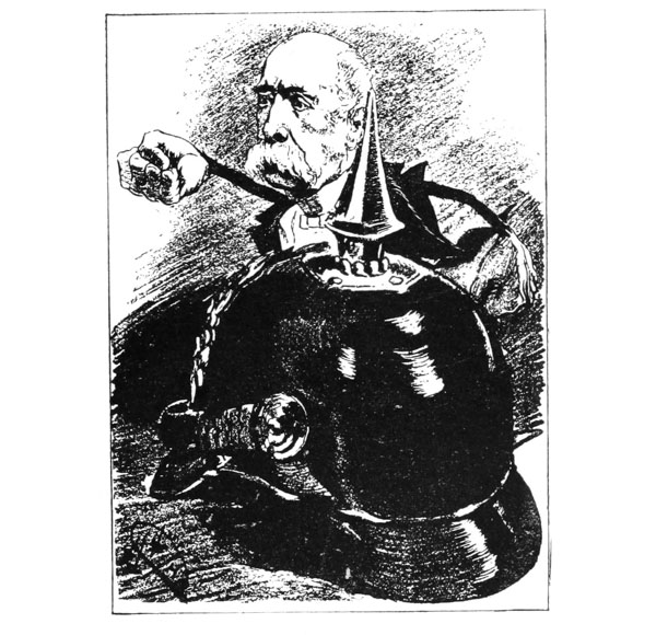
IF I have been successful in making every point clear in my foregoing chapters the reader now has such a knowledge of the art of drawing as will enable him to understand, (1) the power of an outline, and (2) to realize that one may become a tolerable draftsman if he will train his eye to see the outline of an object as if marked upon a pane of glass—that is, reduced to one plane; and to realize, moreover, that (3) this learning to see things in one plane involves some knowledge of perspective, of which more anon; but for the present let us leave outline and take up another branch of the subject. In the Luque cartoon the helmet is represented {42} in a new form. The careful observer will see instantly that it differs materially from the helmet in the Don Chisciotte cartoon, shown upon page 37.
Let us make an analysis of this difference. I contemplated no pun when I wrote of a material difference. Yet that is the main point of contrast. We guess that the helmet of the major domo in the Don Chisciotte is metal, but we only guess it. We argue that the Romans wore metal helmets, hence we fancy this is one; but outline rarely indicates texture (we mean by texture the material of an object—wood, wool, stone, linen, etc.) or color. But in the Luque we are very sure that the helmet is of black leather. True, we surmise this only, because we know that modern helmets are apt to be either metal or black patent leather, and this one is too dark for metal, and the high light upon it is just like the white light on a black patent leather helmet. (When the light falls on a rounded object there is nearly always one place upon it where the light strikes, creating a white light—no matter what the color of the object—which artists call the high light. This is always more apparent upon highly polished objects than upon rough objects.)
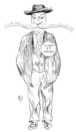
Now, you see in the Luque we have a very different kind of drawing from a pure outline like the Don Chisciotte, or a silhouette like the Grasset. In such drawing the outline is only the framework; after it is put in, the labor is by no means over; to the contrary, every bit of surface has to be covered with an appropriate tint, and two different considerations decide how light or how heavy this tint shall be: first, the consideration of light and shade; secondly, local color. When the artist put a {43} dark mass under Crispi’s mustache he did not mean to suggest that Crispi had been eating blackberry jam, or that he had a negro’s lower lip, but he meant to represent the strong shadow that a thick mustache throws upon a lower lip when the light comes from above; in doing this he noted a “thrown shadow.” When, however, he made the dark line on the lower part of the chin he did not mean to suggest that the upper part of the chin threw a shadow on the lower part, but he represented the part of the chin that rounds under the jaw; this is called a “modeling shadow.” (A circle may represent a ring, or a disk—as in the medal inscribed Literis et Artibus in the Fallström (page 44)—or a sphere; but without shading it is said not to have modeling; and if it is intended for a sphere, it can only suggest a sphere; to make it fully represent one, we shade it; then it is positively not a ring, nor a disk, if the shading is properly done. This shading gives it rotundity, or bulk, and this effect we designate as modeling.) When Luque makes the part of the visor of the helmet to our right darker than the part to our left and leaves a light between, he also models—that is, represents modeling or rotundity; but when he makes both the shaded side and the lighter side dark, and also makes Crispi’s coat black, then he is said to represent local color.
Here you see we have a very advanced form of drawing,
and a form I should not advise you to employ in
your early efforts to do professional work; if you essay
to make a cartoon for your paper, I should advise you to
confine yourself to outline or silhouette. But in order
that you may fully understand a drawing which at first
appears to be outline, but which upon examination
turns
{44}
 DANIEL FALLSTRÖM.
A caricature by Albert Engström.
{45}
DANIEL FALLSTRÖM.
A caricature by Albert Engström.
{45}
 PENCIL SKETCH.
By John Everett Millais.
This is not a careful study, but shows an artist’s
method of “placing” objects. The right-hand figure is
evidently that of a minister, and the artist at first
intended to have his coat fall over his left thigh
but afterwards changed it. The gray lines which thus
place the skirt of the coat are those referred to in
Chapter V. In the left-hand figure the head was drawn
first and the hat added. It is interesting to note
how low upon the head the hat rests. The mistake of
the beginner is usually to put a hat too high on the
skull. (Or perhaps the artist’s first intention was to
draw a derby hat, which was afterwards changed to a
high hat.)
{46} out to be partly shaded, we have introduced in these
first chapters this question of modeling and local color.
We have pointed out (Chapter II) that Engström sometimes
uses pure outline, sometimes outline and silhouette,
and sometimes outline, silhouette and shading.
His “Fallström,” given with this chapter, is without
silhouette effect, but is in outline, shading and local
color. The medal referred to is a piece of pure outline.
Ordinarily, when an artist draws a thing of this kind—a
button, a policeman’s badge, etc.—he makes the
lower line a little heavier than the rest so as to suggest
the shadow the object throws upon the coat; but Engström
has omitted this. In the nose, however, we have
not pure outline, but a distinct broadening of the line
under the nose giving the same suggestion of its protruding
and of its throwing a shadow as does Crispi’s
mustache in Luque’s drawing. In the hat, moreover,
we have both modeling—very good modeling, too,—and
local color.
PENCIL SKETCH.
By John Everett Millais.
This is not a careful study, but shows an artist’s
method of “placing” objects. The right-hand figure is
evidently that of a minister, and the artist at first
intended to have his coat fall over his left thigh
but afterwards changed it. The gray lines which thus
place the skirt of the coat are those referred to in
Chapter V. In the left-hand figure the head was drawn
first and the hat added. It is interesting to note
how low upon the head the hat rests. The mistake of
the beginner is usually to put a hat too high on the
skull. (Or perhaps the artist’s first intention was to
draw a derby hat, which was afterwards changed to a
high hat.)
{46} out to be partly shaded, we have introduced in these
first chapters this question of modeling and local color.
We have pointed out (Chapter II) that Engström sometimes
uses pure outline, sometimes outline and silhouette,
and sometimes outline, silhouette and shading.
His “Fallström,” given with this chapter, is without
silhouette effect, but is in outline, shading and local
color. The medal referred to is a piece of pure outline.
Ordinarily, when an artist draws a thing of this kind—a
button, a policeman’s badge, etc.—he makes the
lower line a little heavier than the rest so as to suggest
the shadow the object throws upon the coat; but Engström
has omitted this. In the nose, however, we have
not pure outline, but a distinct broadening of the line
under the nose giving the same suggestion of its protruding
and of its throwing a shadow as does Crispi’s
mustache in Luque’s drawing. In the hat, moreover,
we have both modeling—very good modeling, too,—and
local color.
You should be reminded that Engström is a caricaturist, and takes liberties with the art of drawing as well as with his subjects. The example we gave in Chapter I, his own portrait, was a perfectly consistent drawing, all pure outline; so was the “Hedin” (Chapter II), because silhouette goes perfectly well with outline. But to model a hat as fully as in this “Fallström” drawing, so that under its rim is a shadow, and yet not have it throw a suggestion of a shadow upon the man’s head, is most inconsistent drawing—permitted the caricaturist only. If you were making such a study from nature you would surely see a thrown shadow on the head and you should put it in. {47}
While I say you should not employ shading and local color to any great extent in your early work, yet you may study the theory of it so as to use it sparingly, and that study is best pursued by putting on a table a group of objects of different colors and textures; put a white box beside a brown book, an ink bottle beside a glass, a teacup beside a brown stone jug, and draw each object in relation to the others. Make your ink bottle blacker than your brown jug, but note that both have distinct high-lights upon them. The white box will probably not have a high-light upon it, but one side of it may be all light, while the corresponding side of the brown book will be darkish, though lighter than its side in shadow. (We suppose that you place your table near a window so that the light from it falls on one side of the objects, the other side being in shadow; this is the best arrangement for objects studied for their light and shade. Do not have light come from other windows.) You, therefore, in your drawing, have white paper to represent the light side of the box, but you put on a slight tint to represent the light side of the brown book. The ink bottle you will treat very much like Luque’s helmet; black as it is there will be streaks of white upon it—sometimes high-lights, and sometimes reflection of the window as seen in a mirror. If the cover of the box, because it projects a little, throws a line of shadow upon the side of the box, you will instantly recognize that this is the same kind of a thrown shadow as that which Luque put under Crispi’s mustache and Engström put under Fallström’s nose. Some study of this sort will soon train your eye to see the reason of spots of light and dark in artists’ drawings. {48}
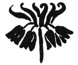
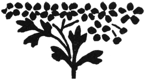
One of the points we admire in an expert’s drawing is the use he makes of black spots. The Japanese have rules of composition, governing this distribution of spots, which they follow, balancing a black here with another there in an admirable manner. In our chapter on wood engraving we shall give some specimens of well distributed blacks. In our tailpiece by Grasset you will notice how on the right-hand side five petals and two buds balance a tri-parted leaf on the opposite side. One of the problems for the designer of printers’ devices is to balance them properly. It is much easier to copy a spray from nature and fill it in with black ink than it is to make that spray balance so that when placed at the end of a chapter or used to divide paragraphs it will balance as perfectly as the letter V or A. It is needless to note that every printer realizes that paragraphs might be separated by the letter I or A or V, but not properly by the letter B or D or E.
HOW TO BEGIN A DRAWING — EDUCATION OF THE EYE THE FIRST THING — MANTELSHELF SEEN FRONT VIEW — SIDE VIEW BUT EXACTLY ON A LEVEL WITH THE EYE — TIPPING DOWNWARD IF ABOVE THE EYE — UPWARD IF BELOW THE EYE — PLACE THE BIG PROPORTIONS OF OBJECTS BEFORE ATTEMPTING DETAIL — THIS SHOULD SHOW PROPORTION AND DIRECTION — SEPARATE COMPLEX SUBJECTS INTO ELEMENTS — MEANING OF ELEMENTS — EVERY OBJECT HAS ITS AXIS — BEGINNING OF EVERY FIGURE SHOULD ALWAYS SHOW ITS ACTION — GENERAL PRACTICE TO PLACE ALL THE OBJECTS IN A PICTURE WITH PENCIL LINES FIRST — SOME EXAMPLES FROM MUNKACSY.
I HEAR
some of my readers ask, “Is there not
something a teacher should tell us that will help
us whether we are drawing in outline or whether we are
shading—something that will teach us how to begin any
kind of a drawing?” The reply is “Yes,” and I propose
to give such help in this chapter; but it has
purposely been delayed till now, because I wished to
emphasize the fact that the principal thing is not for me
to tell you how to draw, but for me to help you to learn
to see so as to know what to draw. For example, I
will ask the printer to insert a rule here in a horizontal
position, thus:
![]() This represents a mantelshelf seen in front view, or one
seen in side view exactly on a level with your eyes.
Now, it stands to reason, does it not, that anybody
can {50}
draw such a line? What you need to be taught, is that
the mantel is to be drawn that way only under the
two circumstances mentioned. The moment you have
a side view of it when it is below or above the eyes, you
must draw it tipping. Tipping downward (away from
you) if above the eye; upward, if below. Thus, if
above the eye:
This represents a mantelshelf seen in front view, or one
seen in side view exactly on a level with your eyes.
Now, it stands to reason, does it not, that anybody
can {50}
draw such a line? What you need to be taught, is that
the mantel is to be drawn that way only under the
two circumstances mentioned. The moment you have
a side view of it when it is below or above the eyes, you
must draw it tipping. Tipping downward (away from
you) if above the eye; upward, if below. Thus, if
above the eye:
![]() (A, the end nearer spectator.) Thus, if below:
(A, the end nearer spectator.) Thus, if below:
![]()
This difference in the direction of line according to the position of the spectator is something the novice does not see, and it is the business of the teacher to point it out. Hence the many references to seeing and the few to drawing which are found in our foregoing chapters.
But there is a suggestion about drawing which I will give you that will help you at the first stage of your study. It is this: Accustom yourself to place something on your paper—some form having a height and a breadth—that resembles the big proportions of your subject, before you attempt to finish any single part of it.
Our illustrations clearly show the working of this
method. In the Herkomer study the lower parts of the
tree trunks are not finished, they are merely placed.
The outlines of the trunks show (1) the relation of the
two trunks to one another, (2) their size, and (3) their
direction. With the same simple means the artist could
have shown contrary facts; for example, that (1) the
trees were nearer together, (2) that the left one
was
{51}
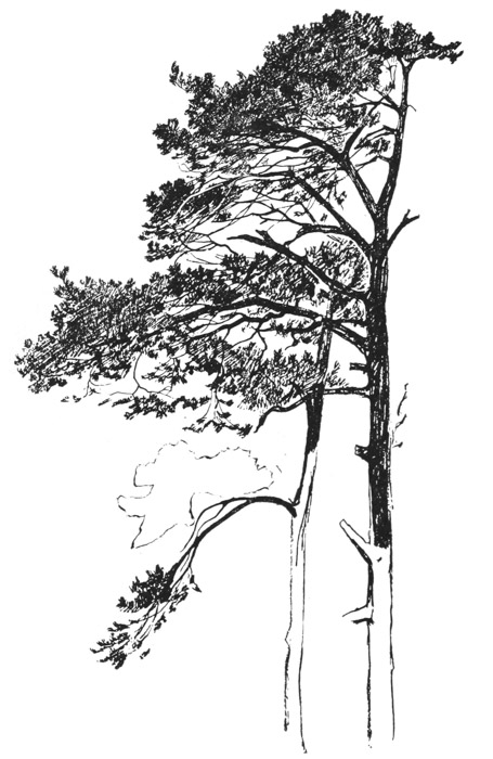 STUDY OF PINE TREES BY HUBERT HERKOMER.
The form above the lowest
branch, which looks something like a cloud, shows
us the artist’s method of “placing” a branch before
finishing it; also the lower parts of the trunks show
their placing. All objects should be thus outlined
before they are shaded.
{52} wider than the right, (3) that they tipped at an angle
of fifteen degrees to our left.
STUDY OF PINE TREES BY HUBERT HERKOMER.
The form above the lowest
branch, which looks something like a cloud, shows
us the artist’s method of “placing” a branch before
finishing it; also the lower parts of the trunks show
their placing. All objects should be thus outlined
before they are shaded.
{52} wider than the right, (3) that they tipped at an angle
of fifteen degrees to our left.
Again, the mass that at first glance looks like a cloud, is really the “placing” of a branch. Now, before the artist put any of the black in his picture, which suggests the dark colors of a pine, he placed all the principal branches, limbs, and the trunks of the two trees, just as you see them in the unfinished places we have pointed out. The reader should need very little more help than this to fit him to go out to nature and begin a landscape.
Almost any element you may see can be begun in
this manner. (I use the word element to cover either
one object or a group of objects; we say of some picture
that it has four elements: a foreground, a pine tree, a
clump of trees and distant hills.) For example, without
the line representing the limb below Herkomer’s outline
for the unfinished branch might almost stand for a
cloud—its outline would then simply be a little less
toothed. Its upper part might also stand for a group
of distant trees. Now, this branch, no less than the
trunks, has its big proportions; it is almost twice as
long as it is high, and no amount of pretty drawing of
details would ever represent that branch if you should
start out with a form twice as high as it is wide. Always
look out for these dimensions at first. The branch also
has a direction—the direction of its axis—which is
downward to our left, and no amount of pretty drawing
of its details would ever represent this branch if it were
represented with a horizontal axis. (The axis of the
lowest branch is at a still greater angle; this downward
tip is characteristic of the lower branches of the pine,
larch, elm, beech, willow, etc.) Now, a cloud has
its
{53}
 STUDY FOR A FIGURE IN A PAINTING.
By Michael Munkacsy.
This shows the placing of the parts of the figure so
that it shows action, though there is no finish.
{54}
STUDY FOR A FIGURE IN A PAINTING.
By Michael Munkacsy.
This shows the placing of the parts of the figure so
that it shows action, though there is no finish.
{54}
 STUDIES FROM A MODEL FOR FIGURES IN A PAINTING.
By Léon Bonnat.
These studies show the placing of the parts of the
figures so that they express action, though there is
no finish.
{55} axis, a group of trees, and you must not draw a stratus
cloud which lies horizontal as though it were a cirrus or
a cumulus cloud blown upward by a contrary wind. In
the placing of an element, then, it is not the margin of
the outline we think of, but the positions of objects,
their general bulk, and the direction of their axes.
STUDIES FROM A MODEL FOR FIGURES IN A PAINTING.
By Léon Bonnat.
These studies show the placing of the parts of the
figures so that they express action, though there is
no finish.
{55} axis, a group of trees, and you must not draw a stratus
cloud which lies horizontal as though it were a cirrus or
a cumulus cloud blown upward by a contrary wind. In
the placing of an element, then, it is not the margin of
the outline we think of, but the positions of objects,
their general bulk, and the direction of their axes.
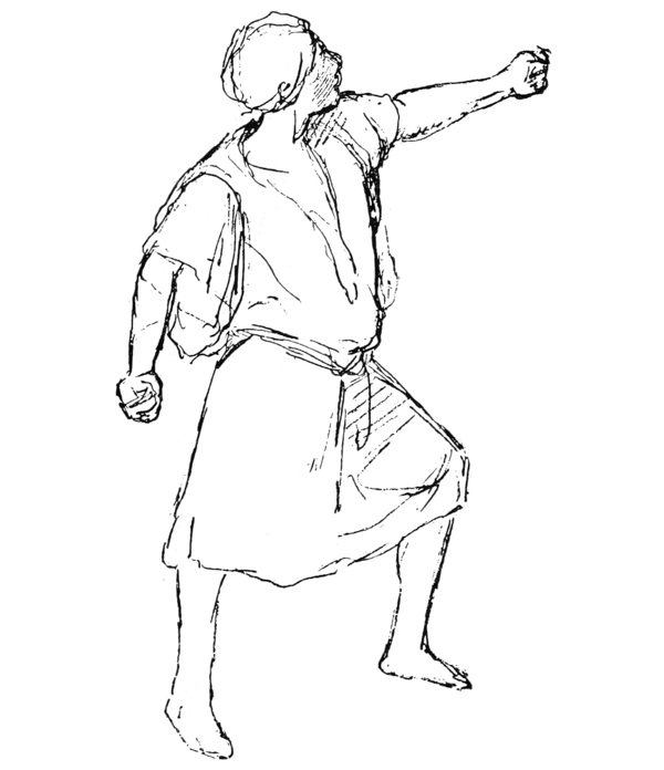
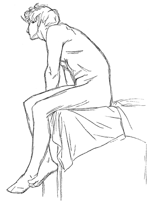
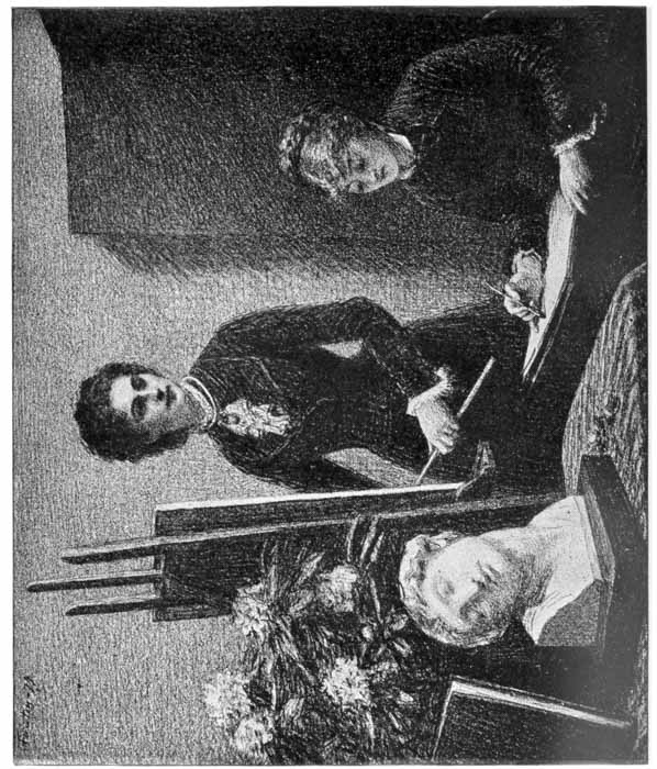
In the figure studies we reproduce by Bonnat and Munkacsy, you can plainly see that the action of the figures is graphically portrayed without any attempt at detail, simply by “placing” the parts of the figure in the right place. A good beginning in the case of figure drawing should always show the action; that is to say, show that the man is stooping over, leaning back, standing upright or sitting down, long before the drawing shows that his coat is black or has four buttons on it, or that he has finger nails on his fingers.
It is nearly always the practice with artists to place objects in this way with a pencil line, even if the subsequent drawing is to be in pen or wash. Let your lines be light, and then you can erase them after your ink lines are put over them. Do not be afraid of feeling your way with lines; put down several until you get the right one. Do not expect to get your work right at first. If you get in a branch of a tree and think it is correct, leave it till the tree is complete; but if in the end you see it is too large for the rest of the tree, rub it out and make it smaller. Every artist has to do this many times if his subject is at all complicated.
VALUE OF A LINE — WHAT THE ARTIST SEES — LINES, NOT CONTOUR LINES, USED TO REPRESENT ORGANIC PARTS — “PLACING” ELEMENTS A MENTAL TRAINING — MORE IMPORTANT TO THE PRINTER-DRAFTSMAN THAN INTRICATE DETAIL — PLACING-LINES TO BE MADE CAREFULLY — SYNTHESIS OF THE HUMAN ARM REPRESENTED WITH A FEW LINES — THE DELIGHT OF AN ARTIST IN SYNTHETIC STUDIES — JAPANESE MASTERS OF SYNTHETIC DRAWING — GRASSET’S SILHOUETTE — THINK OF YOUR OBJECTS, WHEN PLACING THEM, AS SILHOUETTES — REDUCING CONTOUR LINES TO GEOMETRIC FIGURES — HERKOMER’S PINE TREES MAPPED OUT INTO POLYGONS — THIS METHOD NOT TO BE CARRIED TO EXCESS — CHARACTERISTICS OF OBJECTS TO BE LOOKED FOR — NATURE’S FORMS SOON RECOGNIZED IN SIMPLE POLYGONS.
IT IS difficult for the amateur to realize the value of a line as fully as the art student realizes it. We give an illustration of the first laying in or placing of a figure, as done in the Parisian art schools. The student who works for months and months in this manner sees a meaning in an artist’s lines that the casual observer misses. Here, for example, all the lines on the arm represent swellings which are not merely temporary but are organic, belonging to every arm. So also with the cross lines on the abdomen; they are not as one might expect, chance lines, but divide the trunk into organic parts. Any model taking this pose would show some such lines, or rather the body would divide itself into {58} some such parts which would produce the wrinkles which these lines represent; no matter whether he were older or younger, stouter or thinner, the markings would be in about the same place. When we come to the analyzation of the human face this fact of representing parts of the body by lines that are not outlines—i. e., not contour lines—will be still clearer to you. Now, the point we want to make is that the method of “placing” objects, recommended in the last chapter, is not a mere process of procedure in drawing, but is quite as important a mental training as the making of the most intricate outline—in fact, for the printer-draftsman it is more important than the latter. If you wish to make a poster design, it is better that you should know how to place “the elements” of a branch of oak or ivy than that you should draw the venation of the leaves or the delicate modeling of the stems, because if printed in flat tones it is the big characteristics—showing the difference between an ivy leaf and an oak leaf—that you need to secure. Therefore, in all your preliminary sketching do not work carelessly just because you are finally going to rub out your placing lines; but rather try to see how much likeness to the object you can get by the most economical means, in your very placing of the object. In the man’s arm, for example, even the inexperienced draftsman, who might not see the correctness of the drawing in the man’s trunk, can realize that we have here the swelling of the deltoid, the curve of the biceps, the extreme width at the elbow, and the inside lines which mark bones and muscles at the elbow; all of which represent the synthesis of the human arm, though perhaps not the similitude {59} of any one arm. Were you, with an artist companion, looking over a collection of drawings by the masters you would be surprised at his delight in many drawings that were carried little further than this study of an arm. The Japanese are celebrated for their synthetic drawing; they have the ability to make a spot of green that is not a lily leaf in all its intricate detail, but which has all the characteristics of a lily leaf which distinguish it from every other kind of leaf, stand for a perfect lily leaf.
If you will turn to the Grasset design on page 39 you will realize that his wisteria is by no means a complete floral drawing, but simply gives the characteristics of the wisteria in its silhouette. Here you see we revert to the subject of our second chapter, and recommend that in placing your objects you think of them as silhouettes. This wisteria design suggests another help for the beginner. The flower itself in its entirety takes the form in nature of a cone, which in silhouette is a triangle; the entire branch of the ornament on page 48 takes the form of a triangle; and since geometrical forms are more easily analyzed than natural forms, it might be well for you to train yourself to notice if an object takes the general form of a quadrangle or a rectangle, a triangle or a polygon. The branches of trees can frequently be mapped out into triangles or polygons with not more than five or six sides, that are very easy to recognize.
We have made a tracing of the pine trees by Mr.
Herkomer, in which we have mapped out the branches
into polygons, A, B and C
(page 60). The lines D E
and F G are added to suggest how the tree trunks
are
{60}
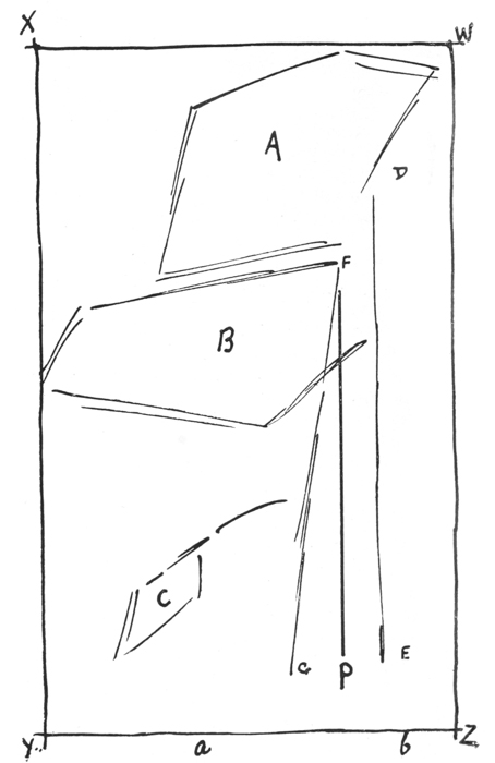 DIAGRAM
NO. 1.
{61}
DIAGRAM
NO. 1.
{61}
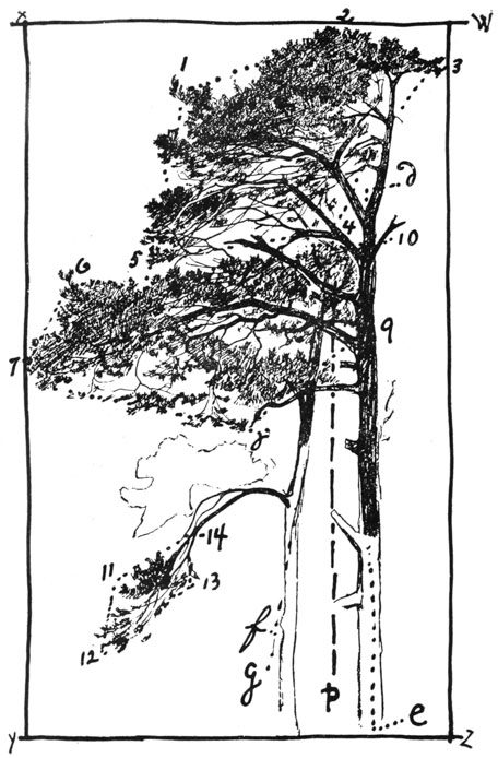 DIAGRAM
NO. 2.
NO. 4—Study of Pine
Tree, by Hubert Herkomer, with lines added showing
rectangles w x y z, containing the
whole group; polygons 1 to 14, containing branches,
lines going through axes of trunk e d, and
f g, and p, plumb-line to which f g
is compared—that is, its angle obtained—as shown in
diagram NO. 1.
{62} first put in as axes, F G being compared with the plumb-line
P. W, X, Y and Z suggest a quadrangle, into
which the whole tree could first be placed.
DIAGRAM
NO. 2.
NO. 4—Study of Pine
Tree, by Hubert Herkomer, with lines added showing
rectangles w x y z, containing the
whole group; polygons 1 to 14, containing branches,
lines going through axes of trunk e d, and
f g, and p, plumb-line to which f g
is compared—that is, its angle obtained—as shown in
diagram NO. 1.
{62} first put in as axes, F G being compared with the plumb-line
P. W, X, Y and Z suggest a quadrangle, into
which the whole tree could first be placed.
We wish to say, however, that we do not consider it advisable to reduce freehand drawings to geometrical forms to too great an extent. The art student in Paris does not think of his model as a combination of cubes and cylinders, but as a human figure; nor when he leaves the atelier does he consider a tree as a combination of cylinders and cones, but as an oak tree, or a maple or a pine; and whether his drawing is a moment’s jotting in a sketch-book, or a week’s study on canvas, he tries to get as much of the characteristics of the pine tree or the oak, in the moment or in the week, as his perception will allow.
You would be surprised, if you practiced this method for a few months, to see how much meaning these first polygons will have to you. If you will map out an elm tree, for example, and then turn to our diagram No. 2, you will instantly recognize that the forms A, B, C, could never be intended for an elm. This negative recognition would be followed by positive recognition, and you would guess at least, if you were not sure, that, in a sketch of a sea coast, certain polygons put more on one side of a line than on the other, which represented a tree trunk, were meant for the branches of a pine!
ORIGINAL “PLACING” AND FINISHED DRAWING COMPARED — SIZE OF THE FRAME DOES NOT AFFECT THE PROPORTIONS IF THE SAME DIMENSIONS ARE RETAINED — BLOCKING IN SHADOWS BY OUTLINE BEFORE SHADING — ALL PRACTICE IN DRAWING LINES WILL BE HELPFUL — LINES USED FOR CONTOUR BOTH OF OBJECTS AND OF SHADOWS — FINDING THE DIRECTION OF SHADOWS — WHY PLASTER CASTS ARE USED AS STUDIES — JAPANESE ART ENTIRELY WITHOUT LIGHT AND SHADE OF THE SORT MOST USUAL IN OCCIDENTAL MODELING — NOTING VALUES — MERE SHADING NOT THE END OF DRAWING.
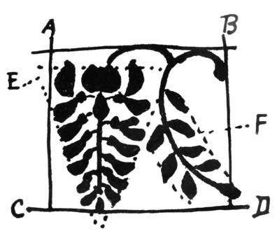
IN ORDER that there may be no doubt about the method of placing elements, as suggested in the last chapter, we have made skeletons (2 and 4) of the Grasset and the Herkomer cuts, on which we have marked, so that there can be no misunderstanding, the lines given in our diagrams 2 and 3. In the Grasset diagram, No. 3, A B C D correspond to a b c d in skeleton diagram No. 4, while the dotted forms, E and F, No. 3, correspond to e and f, No. 4.
In the Herkomer, No. 2, w x y z is the rectangle W X Y Z of diagram No. 1; 1 2 3 4 5 correspond to A, 6 7 8 9 10 to B, 11 12 13 14 to C; while the d e and f g equal D E, F G; p is our plumb-line, P.
It must be distinctly understood that any number of
objects may be contained in a rectangle; let a child
scribble upon this page, anywhere, a dozen or
more
{64}
 DIAGRAM
NO. 3.
DIAGRAM
NO. 3.
 DIAGRAM
NO. 4.
{65} forms, no matter how irregular, and a perpendicular
through the extreme right-hand form, one through the
left, and a horizontal through the top and the bottom
form, and we have a rectangle which has given
dimensions. It may be twice as high as wide, or three
times as wide as high, no matter, let either of those
proportions be preserved, and a rectangle of the same
proportions, drawn upon a visiting card or covering the
wall of a barn twenty feet high, will give you the right
proportions for your group. And then, if you will find
inside of the rectangle, one or a dozen polygons, like
A, B, C, No. 1, and f, No. 4, you will be able to
“place” the most irregular objects.
DIAGRAM
NO. 4.
{65} forms, no matter how irregular, and a perpendicular
through the extreme right-hand form, one through the
left, and a horizontal through the top and the bottom
form, and we have a rectangle which has given
dimensions. It may be twice as high as wide, or three
times as wide as high, no matter, let either of those
proportions be preserved, and a rectangle of the same
proportions, drawn upon a visiting card or covering the
wall of a barn twenty feet high, will give you the right
proportions for your group. And then, if you will find
inside of the rectangle, one or a dozen polygons, like
A, B, C, No. 1, and f, No. 4, you will be able to
“place” the most irregular objects.
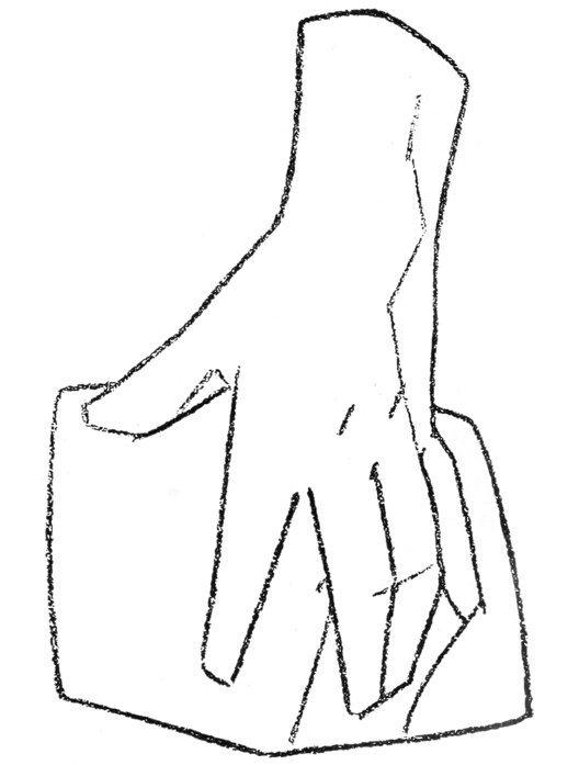
We give with this chapter also, two illustrations showing the manner in which shading is done in the art schools, but the main thing I wish you to note about the illustrations is, not the shaded drawing, but the drawing where the shadow is blocked in, Fig. A. Now, this is important to bear in mind: A line is used, not only for drawing the outside outline or contour of objects, but for drawing the outline of shadows upon and within them; therefore, every bit of practice you may have in drawing lines of any kind will be helpful to you when blocking in the shapes of shadows that bring out the form of an object. It is just as imperative, for example, that you compare the inside margin of the shadows upon the wrist (as indicated in Fig. A) with the plumb-line, so as to see their direction, as it is that you compare the trunk of the Herkomer tree with the plumb-line, that you may get its direction. (In obtaining the direction of small shadows the artist very frequently uses his pencil, held vertical, as a plumb-line.)
We give another illustration that we trust will interest you, the very beautiful drawing by Fantin-La-Tour. Our object in giving this is twofold: first, to show you the drawing of the cast. We have said that the Bargue-Gérôme studies show how students learn to work in Paris. The truth is that nearly all over the world art students learn to draw from white plaster casts on which the shadows are very distinct. The eye is thus trained to see form, as we call it. And it will not be difficult for you to look from the cast drawing in the La-Tour to the head of the standing girl, and see how the form of her face is brought out by shading in the same manner as in the cast.
In publishing a drawing of this kind in a book for printers we do not recommend it as an example of drawing for the press (though it would be an excellent guide for lithography), but it is full of interest in that it exemplifies what artists consider artistic draftsmanship. It is evident that the author of it has studied in an art school and that he gets his effects, not by chance, but by deliberation. He is sensitive to the different degrees of darks upon the several objects. No matter how plainly he may see the shadow upon the cast, he knows that, in order to represent it as a light object, such shadows must not be black. So there is a vast difference between its dark tones and the dark tones of the block on which it stands. Also in drawing the human face he concentrates his darks about the eyes, nose and mouth; the rest of the face is shaded with great delicacy, for he knows that if he puts darks elsewhere he will get the undesirable effect of an old face. The printer is not expected to carry his art as far as this, but we must say {70} frankly that his degree of success depends entirely upon the extent of his knowledge of the truths herein stated. One need not go to an art school to see that a cast is white, and that its shadows are not as black as the shadows upon a bronze; but unless he trains his eye by observation to see this difference in other things, no tricks of pen-technic will help him when he comes to draw a white horse, or a white collar. He does not have to study portraiture in an art school in order to make a drawing in pen and ink, for his paper, from a photograph; but unless he will train himself to observe so that he realizes that in a young face the greatest darks are limited to the eyes, nose, and mouth, he will be likely to make his pen-portrait look more like an old person than a young person, even though in executing the same he imitates the most perfect pen-technic.
Now, as the placing of the shadows in the seated girl’s face is not the same, it is a little difficult for you to realize that it contains the same kind of drawing as the blocked-in cast hand and head.
But the eye becomes trained from drawing casts to see the most delicate modeling of shadows, and the seated girl’s face is really a complex style of drawing, of which the cast head and hand are simple specimens. I mean by “complex style of drawing” a method of getting effects by imitating the light and shade upon objects, as opposed to mere outline style or silhouette style.
Now, therefore, this illustration should indicate to you that it is well to draw from casts, as art students do, if you wish to make finished pictures in black and white.
In the foregoing statements I have been careful in {71} my language. I do not say students all over the world learn to draw in light and shade, for there is a great deal of wonderful Japanese art that is done entirely without knowledge of light and shade of the sort most usual in Occidental modeling. Nor do I say that you must draw from casts to learn to see light and shade, because during the middle ages many great artists learned to draw from life and not from casts. The cast is a comparatively modern art-school accessory.
Another reason for giving this La-Tour drawing is that it brings us a step farther into the consideration of values; we notice that in it the cast appears to be white, the girls’ faces and hands lighter than their gowns, and one girl’s hair lighter than the other’s. Now, when an artist makes a difference between the degrees of the color of objects, we say he notes their values.
Bear this in mind, then, that mere shading is not the end of drawing. You can go a step farther and indicate the color value of a shadow, of which more hereafter.
STUDY BY DAGNAN-BOUVERET — A HAT IN OUTLINE NOT MEANT FOR AN OUTLINE DRAWING — CONNECTING LINK BETWEEN OUTLINE AND SHADED DRAWING — MORE ABOUT ART-SCHOOL METHODS — METHOD OF DRAWING BASED UPON CAST DRAWING — THE BIG SHADOWS VERSUS MINOR SHADOWS — DO NOT DRAW INDIVIDUAL HAIRS — HAIR AND MUSTACHE TO BE CONSIDERED AS A MASS, NOT AS SEPARATE HAIRS — EFFECT TO BE OBTAINED BY MASSES OF SHADOWS — TRAIN THE EYE TO BECOME SENSITIVE TO GRADUATIONS OF LIGHT AND SHADE — LIGHT AND DARK IN THE HEAD INTENDED TO SHOW SHAPE OF THE SKULL, NOT TO INDICATE PARTI-COLORED HAIR — DRAWING FROM PASTEBOARD BOXES GOOD TRAINING IN LEARNING TO SEE LIGHT AND SHADE — CONTRASTING A FINISHED DRAWING (GAILLARD) WITH A ROUGH SKETCH — EQUAL ART IN EACH WHEN BOTH ARE WELL DONE — A NEWSPAPER CUT IN WHICH LIGHT AND SHADE ARE INDICATED BY VARIATION OF THICKNESS IN LINE — BROAD DRAWING RECOMMENDED TO PRINTERS — THE NASO-LABIAL LINE — RÉSUMÉ.
IN OUR illustration by Dagnan-Bouveret we find most interesting indications of how an artist works; and this head may serve as a connecting link between the chapter on outline and the one on shading. The hat is a beautiful piece of outline drawing, which, however, was not meant for an outline drawing. It is simply to serve as the placing of the hat, which would afterward be shaded as are the face and mustache. The eyes, {74} nose and mustache were first outlined in this way, and you will recognize, I think, that this is the same kind of drawing as that of which we treated in our first chapters, though, of course, the hat is not all in one plane.
But before you can thoroughly appreciate the drawing
of the face it is necessary that I should explain a
little further the study of drawing as it is taught in the
art schools. This I will do with the help of the Lœwe-Marchand
cut. In this, we see the method pursued in
almost all art schools the world over: a method based
upon cast drawing. It is found from experience that
students learn to see form more prominently from a plaster
cast, which is white, than from natural objects; and
it is found that the best results are got if the students
are taught to see the big shadows of an object rather
than the multitude of minor shadows which may be
seen upon close scrutiny. So the student is told not to
look for these minor shadows, but to half close his eyes,
and stand a good distance away from the object—say
three times its height—and look for the form that he
sees when the object becomes to his half-closed eyes
nothing more than a mass with a light and a dark side.
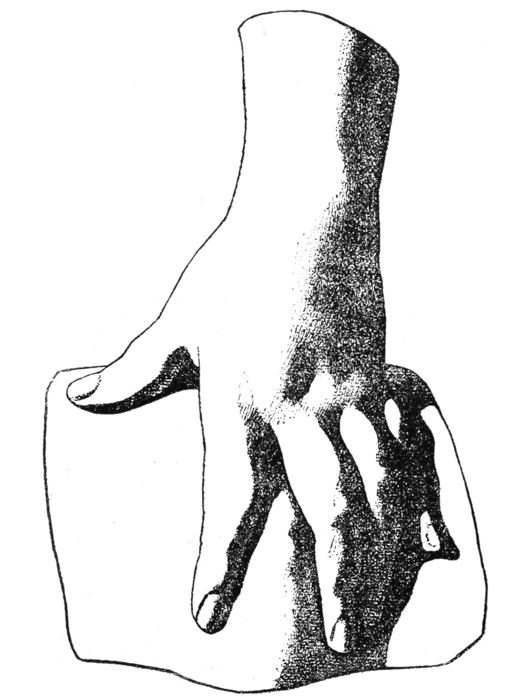
You can imagine that after a person has learned to get
the effect of a hand and a foot, as in the illustration in
Chapters VII and X, by merely noting the shape of the
one big shadow, that it is not difficult for him to go
farther and put in the minor shadows by opening his
eyes and examining the object more closely; and that
when he has learned to do this for several months, or
perchance several years, in the antique class, and then
for as long, or longer, in the life class, that he has
become
{75}
 CHARCOAL
DRAWING.
Portrait of M. X., by Lœwe-Marchand.
This drawing was doubtless made on a sheet of
charcoal paper, possibly gray in color, and was then
photographed for the direct process; and then, in
order to indicate the gray paper, the photo-engraver
tinted the zinc plate with a Ben Day film, which
gives the stipple result. The cross lines in the
corner indicate that after the artist made his study
he wished to enlarge it upon a canvas preliminary
to painting, which was done by covering the drawing
with squares and adding a diagonal to the same. These
squares and diagonals were repeated on a larger scale
on the canvas and the drawing enlarged freehand by
placing the different points of the original in the
corresponding triangles on the canvas. This method of
enlarging drawings has been used for five thousand
years.
{76} so sensitive to seeing shadows that it is not difficult for
him to discern them upon anything and everything.
Now, that is the secret of the beautiful drawing of the
mustache in the Dagnan-Bouveret drawing. The beginner
draws the hairs of the mustache, and tries to get
his effect in that way; but you cannot by drawing the
pelt of a fox on a barn door get the effect of one with a
real live body underneath it. The result in this drawing
is due entirely to Dagnan-Bouveret’s sensitiveness to
light and shade. The lines, which the casual observer
would take to be the hairs of the mustache, are really
the shadows thrown by the groups of hairs as they part
here and there. It is true that if he were etching this
head or drawing it with a fine pen, he might in finishing
it put in a few hairs, and even Albrecht Dürer would
sometimes get a good effect by drawing the hairs of the
mustache or the curls on a head. But in nearly all
modern work, the hair, mustache or beard is considered
as a mass receiving light and shade, and is so treated,
there being no great difference between the golden hair
of a child and the white hair of an old woman.
CHARCOAL
DRAWING.
Portrait of M. X., by Lœwe-Marchand.
This drawing was doubtless made on a sheet of
charcoal paper, possibly gray in color, and was then
photographed for the direct process; and then, in
order to indicate the gray paper, the photo-engraver
tinted the zinc plate with a Ben Day film, which
gives the stipple result. The cross lines in the
corner indicate that after the artist made his study
he wished to enlarge it upon a canvas preliminary
to painting, which was done by covering the drawing
with squares and adding a diagonal to the same. These
squares and diagonals were repeated on a larger scale
on the canvas and the drawing enlarged freehand by
placing the different points of the original in the
corresponding triangles on the canvas. This method of
enlarging drawings has been used for five thousand
years.
{76} so sensitive to seeing shadows that it is not difficult for
him to discern them upon anything and everything.
Now, that is the secret of the beautiful drawing of the
mustache in the Dagnan-Bouveret drawing. The beginner
draws the hairs of the mustache, and tries to get
his effect in that way; but you cannot by drawing the
pelt of a fox on a barn door get the effect of one with a
real live body underneath it. The result in this drawing
is due entirely to Dagnan-Bouveret’s sensitiveness to
light and shade. The lines, which the casual observer
would take to be the hairs of the mustache, are really
the shadows thrown by the groups of hairs as they part
here and there. It is true that if he were etching this
head or drawing it with a fine pen, he might in finishing
it put in a few hairs, and even Albrecht Dürer would
sometimes get a good effect by drawing the hairs of the
mustache or the curls on a head. But in nearly all
modern work, the hair, mustache or beard is considered
as a mass receiving light and shade, and is so treated,
there being no great difference between the golden hair
of a child and the white hair of an old woman.
In the beautiful study by Gaillard we see the shape of the skull under the woman’s hair, and there is a very great difference between the part that is in shadow around her ears and the part that is light on the top of her head. This does not mean that the hair was gray on top, and black around the ears, but it means that the light struck the hair on top, while it did not strike it on the sides.
Now, if you can give yourself the time to study from
the cast, or even from simple pasteboard boxes, so that
your eye will become sensitive to these graduations
from
{77}
 STUDY
FOR
THE
PORTRAIT
OF
MME. R.
By C. F. Gaillard.
{78} light to dark, you will soon realize that, while in your
drawing for printing you may never in a hundred years’
practice draw anything so delicate as the Gaillard, yet
in your simplest drawings you may put in practice the
theory upon which it is made. For example, if you are
drawing an old woman’s head, even if you only use four
or five lines to represent her hair, you will not press upon
your pen when you are doing her hair on the top, but
you will press upon it when you come within the region
of the ears; and that pressure, though it will not represent
hairs, nor the actual value of the shadow, will yet
give the difference between the light on the top of the
head and the shadow behind the ears, and this will suggest
to the educated eye the roundness of the cranium.
STUDY
FOR
THE
PORTRAIT
OF
MME. R.
By C. F. Gaillard.
{78} light to dark, you will soon realize that, while in your
drawing for printing you may never in a hundred years’
practice draw anything so delicate as the Gaillard, yet
in your simplest drawings you may put in practice the
theory upon which it is made. For example, if you are
drawing an old woman’s head, even if you only use four
or five lines to represent her hair, you will not press upon
your pen when you are doing her hair on the top, but
you will press upon it when you come within the region
of the ears; and that pressure, though it will not represent
hairs, nor the actual value of the shadow, will yet
give the difference between the light on the top of the
head and the shadow behind the ears, and this will suggest
to the educated eye the roundness of the cranium.
Now we reproduce also the rough Watts drawing. Let us contrast these two drawings. The one is almost as finished as it can be, the other slight; yet I want you to realize why I recommend this slight drawing to printers and tell you that it is artistic. It is so because in the very heavy lines that you see in the ear, beard and coat there is knowledge of modeling. The artist knew his business just as Gaillard did, and every time he put down a blotty line it was meant to represent the presence of a shadow. This face is from a photograph; hundreds of delicate tones have been left out; and the white hair of the beard is modeled with nothing but thin and heavy lines while the shadows of the photograph were delicate gray tints! A clever penman drawing from a photograph uses darks which the uneducated eye will take to be arbitrary blackening of the drawing, but which an artist knows are the result of intelligent observation.
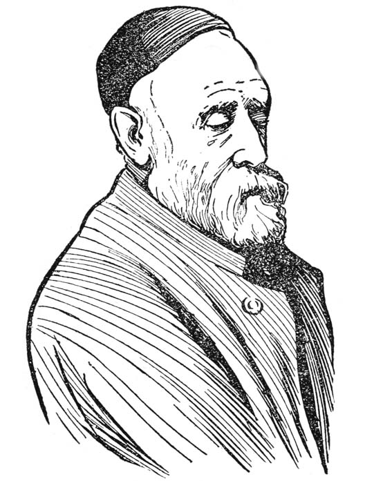
Now, in the Gaillard drawing you see a very delicate line running diagonally from the wing of the nose almost to the corner of the lips. This is called the naso-labial line, and is found in every old face. I say again, that though you work for one hundred years as a printer you would probably never draw a delicate line like this. But if you should make studies in pencil and realize that this line is typical of old age, you would be able to put it in such a drawing as the Watts (the artist has used two lines to represent it), where, you will notice, it comes down about as far on the lower lip as in the Gaillard, and you would realize why it was left out in the Dagnan-Bouveret and Marchand younger subjects.
This chapter should be exceedingly interesting to you as indicating two things—one discouraging and the other encouraging. First, that when students of art have the opportunity to work so beautifully, as in the Bargue-Gérôme studies, and afterward from life, as in the Gaillard, they needs must see more than you do, and you must not expect to equal them if you, a busy printer, can only practice a few evenings a week. Therefore you should not attempt subtile renderings like the Gaillard, but should confine yourself to simple means. On the other hand, when I tell you that this is about all the study there is gone through with in an art school (I say about all, for besides blocking-in, students learn a good deal about values; this we shall treat of in a succeeding chapter), it should be interesting to you to realize that if you will simply train yourself to see light and shade like the plinth in the foot studies given in Chapter XII by drawing a pasteboard box, and then afterward draw from life, so as to see that hair is darker {81} in shaded portions than in light ones, and that in an old person the naso-labial line is marked and shows darker than the cheeks, you will, when copying a photograph for your paper, no matter how roughly you work, be able to indicate the shadows in the hair and the dark naso-labial line, as in the Watts portrait. This, I say, should encourage you, and it is the only way for you to learn to draw.
HEAD BY KNAUS ANALYZED — DRAWN IN THE MANNER OF THE DAGNAN-BOUVERET AND CONTAINING LINES LIKE THE WATTS — THE NASO-LABIAL LINE USED TO DELINEATE OLD AGE — THE SHADOW OF THE NOSTRIL — THE WING OF THE NOSE — THE NOSTRIL USUALLY THE DARKEST SHADOW LINE IN A FACE.
LET US RESUME
the subject of Chapter VIII. We
give a fine drawing of an old man’s head by
Knaus, and we will ask you to look at it and see if
you cannot realize two things about it—first, that no
matter how many lines there may be upon the hat,
which make it look battered and different in texture
from a new silk hat, it was first drawn as was the
Dagnan-Bouveret given in the last chapter; secondly,
do you notice the oblique naso-labial line, which we
spoke of in connection with the Gaillard and Watts?
and do you realize one of two things from this also, that,
either this line in the original drawing ran up to the
wing of the nose but was lost in the several engravings,
or else the artist wished to indicate that his model was
not a very old man, and he did not make the line very
strong in that place? If so, you have learned some
important principles that will help you in drawing, for
you will be able to sketch any hat you wish to draw by
the same process that the best artists employ. Again,
you will be able to use proper judgment in introducing
the lines into a face. If, for example, you were copying,
in pen-and-ink, chalk-plate or wood
engraving,
{83}
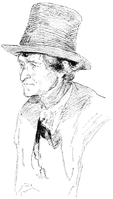 OLD MAN’S HEAD.
Crayon Drawing by Ludwig Knaus.
{84} from some half-obliterated etching or from some faded
daguerreotype, an old man’s head like the Knaus, you
would have the knowledge back of you that would permit
you to draw in the naso-labial with proper accentuation.
If you knew the original was a centenarian you
would most certainly continue the line up to the wing of
the nose and draw it continuously without a break; or if
he were but a sexagenarian of whom the biographical
dictionaries said “he carried his years lightly,” you
might purposely break this line as in the Knaus.
OLD MAN’S HEAD.
Crayon Drawing by Ludwig Knaus.
{84} from some half-obliterated etching or from some faded
daguerreotype, an old man’s head like the Knaus, you
would have the knowledge back of you that would permit
you to draw in the naso-labial with proper accentuation.
If you knew the original was a centenarian you
would most certainly continue the line up to the wing of
the nose and draw it continuously without a break; or if
he were but a sexagenarian of whom the biographical
dictionaries said “he carried his years lightly,” you
might purposely break this line as in the Knaus.
So far, so good. And now for some other lines in the face. At the base of the nose we have the shadow of the nostril, and the curved portion of the nose around it called the wing of the nose; these are nearly always introduced into drawings. In the Knaus they are very happily drawn. Revert to the illustrations of the last chapter, and see if you can find them. In the Marchand and Gaillard they are represented by modeling rather than lines, but they are outlined in the Dagnan-Bouveret and the Watts, the former being in pencil. We notice that one of these objects is grayer than the other; which is it? It is the naso-labial line, and the shadow of the nostril is much the darker. The same effect is got in the Watts by using a fine line for the naso-labial line and a thicker line, or a blot, for the nostril. If, therefore, you were drawing the Gaillard in line, can you not realize that you would approximate the effect of our half-tone by making the outline of the wing of the nose the lightest of your lines, the naso-labial line darker, and the shadow of the nostril the darkest of the three? This order can {85} usually be followed in drawing an old person, and in almost every case (young or old) the nostril shadow is the darker of the three lines mentioned. In regard to the nostril being sometimes a line and sometimes a blot, the difference lies in the character of the original; with some persons the nostril is very straight and little of the inside of the nose shows. This was evidently the case in the Knaus original, so the artist uses a line and nothing more for the nostril (you will, however, not fail to note the subtlety of the artist’s touch, which gives us a strongly marked line for the nostril, but a more delicate line for the wing of the nose). In the Dagnan-Bouveret, however, the nostril goes up at quite an angle, exposing much more of the inside of the nose than in the Knaus; therefore, were you rendering this drawing in pen-and-ink, you could use a blot in the nostril similar in heaviness to that in the Watts portrait on page 79.
We should advise you, by the way, in following these chapters, to make tracings of all our half-tone cuts and render them in pen-line like the Watts; this will help you immensely to understand an analyzation of them.
THE ANALYZATION OF THE NASO-LABIAL LINE INDICATES THE FOUNDATION OF ART STUDY — WHEN THE LINE IS PROPERLY SEEN IT MAY BE DRAWN WITH ANY MEDIUM — CHOUDIEU HEAD BY BONNARD — ITS SIMILARITY TO THE WATTS — STRONG MARKING OF THE NASO-LABIAL LINE IN IT — A SIMILAR ANALYZATION TO THAT GIVEN THE WATTS DRAWING — PORTRAIT BY TOUSSAINT — HOW IT MIGHT BE RENDERED IN SIMPLE PEN LINES LIKE THE WATTS — DRAWING BY BONNARD — ITS HEAVY OUTLINE APPROPRIATE TO PRINTING — THE MEANING OF BLACKS IN A DRAWING — DRAWING BY BONNAT — EXAMPLE OF DRAWING BY LIGHT AND DARK MASSES — THE EMPLOYMENT OF WHITES IN SCRATCH-BOARD AND IN WOOD ENGRAVING — BONNARD’S DRAWING OF CURTAIN — BRUN DRAWING CORRECT IN COLOR VALUES — DIGRESSION IN REGARD TO FRENCH NAMES — DRAWING OF A FOOT SHOWING ART SCHOOL METHODS.
SOME of the most valuable hints we have given our readers are those of Chapters VIII and IX, in connection with the naso-labial line. In these you will find the foundation of our teaching—that is, we do not say that a human face must be made by putting in a black line running obliquely from the nose to the lip, made with such or such a pen, such or such a crayon, ink, or charcoal, but we point out the line in nature, and say that because it is found in nature, artists put it in their drawings. When not found in a face, as that of a young person, then it is left out in a good artist’s drawing of a young face. Whether he uses pen, wash, {87} or crayon, has very little to do with the case. There are some methods of using the pen, wash, or crayon, that are better than others; but, if you are taught to see the naso-labial line in nature, it is very easy to learn to draw it in one of those mediums, and having drawn it in one, it is easier to learn to draw it in other mediums.
We give, with this chapter, the head of Choudieu,
in which this line is marked as conspicuously as in the
 HEAD OF PIERRE RENE CHOUDIEU.
Drawn by Pierre Bonnard
(probably from a medallion, and possibly with a quill
pen), for La Revue Blanche.
Watts. This drawing might have been made with an
ordinary pen, somewhat worn, or (as was probably the
case) with a quill pen, or with a camel’s-hair brush, or
with a Japanese brush (which, like the quill pen, is a
delightful instrument with which to draw heavy lines);
but are we not right in surmising that you are better
prepared to draw such a head because we pointed out
in {88}
the last chapter that the naso-labial line was a characteristic
mark of an old man’s face than if we had given
you directions for using the quill pen or the brush and
said nothing about this line? Of course, we do not
mean to suggest that, were you making a copy from this
line drawing, you would be so careless as to leave out
the naso-labial line, but if you were drawing an old
man’s face from a photograph, might you not easily
overlook this line if it had never been pointed out to
you? If you agree with this proposition you will be in
thorough sympathy with the spirit in which this work
is written, and when our chapter on expression comes
you will not at all regret that it is not a technical chapter
on the use of a drawing instrument.
HEAD OF PIERRE RENE CHOUDIEU.
Drawn by Pierre Bonnard
(probably from a medallion, and possibly with a quill
pen), for La Revue Blanche.
Watts. This drawing might have been made with an
ordinary pen, somewhat worn, or (as was probably the
case) with a quill pen, or with a camel’s-hair brush, or
with a Japanese brush (which, like the quill pen, is a
delightful instrument with which to draw heavy lines);
but are we not right in surmising that you are better
prepared to draw such a head because we pointed out
in {88}
the last chapter that the naso-labial line was a characteristic
mark of an old man’s face than if we had given
you directions for using the quill pen or the brush and
said nothing about this line? Of course, we do not
mean to suggest that, were you making a copy from this
line drawing, you would be so careless as to leave out
the naso-labial line, but if you were drawing an old
man’s face from a photograph, might you not easily
overlook this line if it had never been pointed out to
you? If you agree with this proposition you will be in
thorough sympathy with the spirit in which this work
is written, and when our chapter on expression comes
you will not at all regret that it is not a technical chapter
on the use of a drawing instrument.
Now, let us consider the Choudieu drawing a little
more fully, and in doing so we shall ask you to notice
that the words follow almost verbatim the part of
Chapter VIII referring to the Watts head. This does
not mean that we are at a loss for a vocabulary, but it is
done purposely so that we may thus call attention to it,
and that you may realize that we have called your attention
to a vital principle; moreover, that principle may
be referred to again and again in almost every case
where an old person’s head is under consideration.
We publish also the Duc d’Aumale drawing, in which
you will see the line is again marked. Now, we publish
this drawing mainly in connection with the highly
finished drawings illustrating Chapter VIII, by Dagnan-Bouveret,
Lœwe-Marchand and Gaillard, but you may
profitably note also that were you tracing it, intending
to make a line drawing of it in pen and ink, you
would
{89}
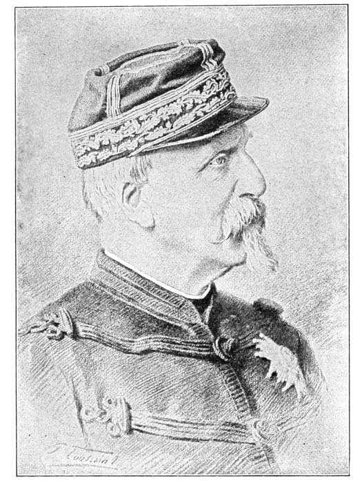 THE LATE DUC D’AUMALE.
Drawn in crayon, by T. Toussaint, and engraved by
half-tone.
{90} represent this muscular indentation with a strong line, as
in the Watts portrait. You will not fail to notice also
the line in the throat corresponding to the one in Bonnard’s
Choudieu, now presented for consideration.
THE LATE DUC D’AUMALE.
Drawn in crayon, by T. Toussaint, and engraved by
half-tone.
{90} represent this muscular indentation with a strong line, as
in the Watts portrait. You will not fail to notice also
the line in the throat corresponding to the one in Bonnard’s
Choudieu, now presented for consideration.
This Bonnard is a slight drawing, but it is recommended
to printers because it is both artistic in treatment
and easily printed. It is artistic because in the
heavy lines that you see in the ear and hair there is a
knowledge of modeling. The artist knew his business
just as Gaillard did, and every time he put down a
blotty line it was meant to represent the presence of a
shadow. We have no means of determining whether
this was from an actual plaster or bronze medallion, or
whether the artist worked from a photograph and from
his imagination rendered the effect of a modeled relief;
but in either case, in the photograph or in nature, there
were thousands of little tones that have been left out.
A clever pen draftsman works in the same manner,
using darks which the uneducated eye will take to be
arbitrary blackening of the drawing, but which an
artist knows is the result of the intelligent observation
of the shapes of shadows, and of the most important
shadows of a face. Now, one of the most conspicuous
lines in this drawing is the one running diagonally from
the wing of the nose almost to the corner of the lips.
This is called the naso-labial line, and is found in every
old face. I say again, that though you work for one
hundred years as a printer, you would probably never
draw as correct a line as this. But if you should make
studies in pencil and realize that this line is typical of
old age, you would be able to put it in such a
drawing
{91}
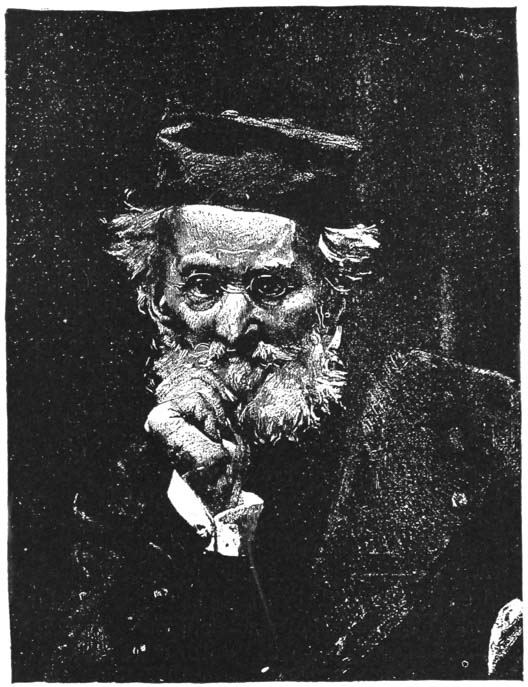 PORTRAIT OF LEON COGNIET.
After the painting by L.
Bonnat, drawn, probably, by the painter himself,
upon grained scratch-board with lithographic
crayon (?), the lights scratched out with a
penknife.
{92} as the Bonnard where, you will notice, it comes down
about as far as the lower lip, as in the Gaillard, and you
would realize why it was left out in the Dagnan-Bouveret
and Marchand drawings.
PORTRAIT OF LEON COGNIET.
After the painting by L.
Bonnat, drawn, probably, by the painter himself,
upon grained scratch-board with lithographic
crayon (?), the lights scratched out with a
penknife.
{92} as the Bonnard where, you will notice, it comes down
about as far as the lower lip, as in the Gaillard, and you
would realize why it was left out in the Dagnan-Bouveret
and Marchand drawings.
The Bonnat portrait of Cogniet becomes particularly interesting from this view point, e. g., practice for the sake of observation. It is executed by a process of no value to the printer of the country newspaper, but there is food for thought in the way the form is brought out by the juxtaposition of masses of light and dark that are not lines. Ordinarily we do not recommend to the printer to experiment with such effects, but rather to confine himself to outline or silhouette, but the value of the white-line will be considered in connection with wood engraving, and any practice in drawing from nature in light masses will help you appreciate the judicious use of white-line in wood engraving, or strong contrasts of white and black in any medium. We publish, for example, two very different kinds of drawing as companions to the Bonnat. One in which Verdyen has obtained an effect of the brilliancy of fireworks by scratching out whites from a very black drawing. Similar effects may be got with great ease in wood engraving.
A still more clear effect of light is got in the Bonnard
tailpiece, where, by simply breaking the window
sash with the light fold of a curtain, he makes us feel the
color of the curtain from the top to the bottom of the
picture. We should advise you to practice in any
medium, endeavoring to get similar effects, as they are
most valuable in saving a drawing from monotony. In
the Brun drawing, for example, no casual
observer
{93}
 A FETE AT BRUSSELS.
Drawn by Verdyen, probably
on ruled scratch-board (see tones in the sky), with
crayon, in sky, and with brush, in figures; the plate
very much retouched by hand.
{94} would appreciate the white pillars, and an untrained
draftsman would be likely to cover them with tones, but
as a matter of fact they help immensely to give variety
to the drawing. In an architectural exhibition we are
frequently tired by the monotony of similar drawings
where the draftsmen, in their desire to render texture
and local color, cover such surfaces with lines meant to
represent stone, brick or mortar.
A FETE AT BRUSSELS.
Drawn by Verdyen, probably
on ruled scratch-board (see tones in the sky), with
crayon, in sky, and with brush, in figures; the plate
very much retouched by hand.
{94} would appreciate the white pillars, and an untrained
draftsman would be likely to cover them with tones, but
as a matter of fact they help immensely to give variety
to the drawing. In an architectural exhibition we are
frequently tired by the monotony of similar drawings
where the draftsmen, in their desire to render texture
and local color, cover such surfaces with lines meant to
represent stone, brick or mortar.
We would remark also that just as our own repetition of the Watts analysis apropos of the Bonnard’s Choudieu portrait was intentional, so the apparent conglomeration of portrait studies, landscapes and buildings is not the result of careless arrangement on our part, but is intentional, that it may be shown that a certain principle in drawing, studied from one object, may be applied to any other. If you draw a friend’s face by lamplight and pick out the lights upon it and his cuff, as in the Bonnat Cogniet, you will be prepared to pick out similar lights on portions of buildings as in the pillars in the Brun drawing; or on window curtain folds as in Bonnard’s tailpiece.
It may be interesting to printers for us to narrate the
difficulty of preparing a proper legend for the Choudieu.
It was a tailpiece to an article in a French magazine,
and bore no legend. To all appearances it was the
portrait of one Mr. Dangers, but knowing how liberal
the French are in their use of cognomens, we took the
precaution to investigate. A Frenchman may be born
Smith, but in manhood is known to the public by one
or a dozen other names. He may marry Miss Brown,
and, therefore, parade as Mr. Brown; his Uncle
Jones
{95}
 TAILPIECE, BY PIERRE BONNARD.
{96} may leave him money, so he publishes his articles under
the name of Jones; he was born in the city of Boston, so
he signs himself de Boston, meaning of, or from, Boston.
Under this name he paints his first picture, but the
town council does not buy his works as he hoped it
would, and the council of Albany does, so he discards
“de Boston” and, in his gratitude, he afterward signs
his canvases d’Albany (abbreviation of de Albany). But
now as to Christian names. Our friend Smith was, perhaps,
named by his father Henry, but at his baptism
there were added the names of Lewis and Charles and
his mother’s name, Black. Then, when at the age of
fifteen he comes to be confirmed, he takes the name
of Matthew, Mark, Luke, John, plus Mary. And with
any of his surnyms he may at any time combine any
two or half a dozen of these pronyms. So that a
French biographical dictionary is one-half biography
and one-half cross-reference. Thus—Brown, see Jones;
Black, see White.
TAILPIECE, BY PIERRE BONNARD.
{96} may leave him money, so he publishes his articles under
the name of Jones; he was born in the city of Boston, so
he signs himself de Boston, meaning of, or from, Boston.
Under this name he paints his first picture, but the
town council does not buy his works as he hoped it
would, and the council of Albany does, so he discards
“de Boston” and, in his gratitude, he afterward signs
his canvases d’Albany (abbreviation of de Albany). But
now as to Christian names. Our friend Smith was, perhaps,
named by his father Henry, but at his baptism
there were added the names of Lewis and Charles and
his mother’s name, Black. Then, when at the age of
fifteen he comes to be confirmed, he takes the name
of Matthew, Mark, Luke, John, plus Mary. And with
any of his surnyms he may at any time combine any
two or half a dozen of these pronyms. So that a
French biographical dictionary is one-half biography
and one-half cross-reference. Thus—Brown, see Jones;
Black, see White.
Knowing this, we referred to the periodical from which this was cut,
and found it was a tailpiece to an article signed Pierre Réné Choudieu.
Ah! this gave us a clue; but, who then was Dangers? Was Choudieu a
sculptor as well as a writer, and was this a medallion portrait by
him of Dangers? Or was it a portrait of Choudieu by a draftsman named
Dangers? The artists were not mentioned in the index nor on any page
in the body of the magazine, but on the title-page we found “Dessins
de Pierre Bonnard,” meaning that the drawings in the magazine were by
one artist—Pierre Bonnard. Therefore, D’Angers could not have been the
artist, so
{97}
 AT THE CAFÉ APHRODITE.
Pen Drawing by A. Brun.
{98}
AT THE CAFÉ APHRODITE.
Pen Drawing by A. Brun.
{98}
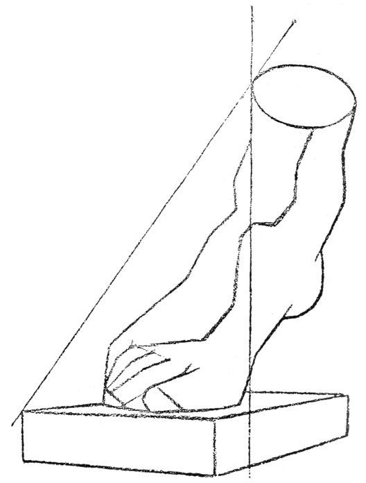 Example of French Art School studies, from plates
published under the direction of Bargue and Gérôme,
showing method of blocking in a cast, both outline and
shadows.
{99}
Example of French Art School studies, from plates
published under the direction of Bargue and Gérôme,
showing method of blocking in a cast, both outline and
shadows.
{99}
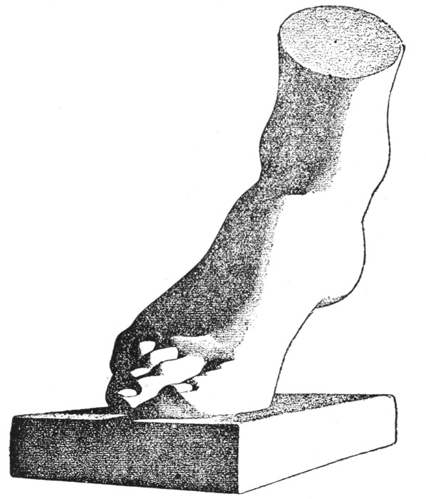 Example of French Art School studies, from plates
published under the direction of Bargue and Gérôme,
showing method of shading in simple tones without
much reflected light or half-tones.
{100}
we must search further; this we did, and luckily, in the
back of the magazine, found the advertisement of a series
of articles by Pierre Choudieu, and one of the paragraphs
in it read, “Pierre Réné Choudieu, naquit a
Angers,” etc. This translated meant that he, Choudieu,
was born at Angers, so that we fathomed our
problem at last, and give the result under the cut.
Example of French Art School studies, from plates
published under the direction of Bargue and Gérôme,
showing method of shading in simple tones without
much reflected light or half-tones.
{100}
we must search further; this we did, and luckily, in the
back of the magazine, found the advertisement of a series
of articles by Pierre Choudieu, and one of the paragraphs
in it read, “Pierre Réné Choudieu, naquit a
Angers,” etc. This translated meant that he, Choudieu,
was born at Angers, so that we fathomed our
problem at last, and give the result under the cut.
The foot plates are identical in treatment with the plates of hands given on pages 66 and 67. The reader should compare these plates, that he may understand that a method may be learned from the drawing of one object and applied to the drawing of a thousand other objects. You must not expect that in a brief treatise of this kind we can give specimens of every object that the printer may have occasion to draw—we should have to publish an encyclopædia for that—but we do purpose to give methods which will enable him to draw every kind of tangible object with light and shade upon it. These hands and feet studies may be used as guides to show how any such object may be “modeled,” i. e., shaded so that the object seems to be solid.
MORE ABOUT THE NASO-LABIAL LINE — IT SUGGESTS OLD AGE — ABSENT IN YOUTH — DRAWING NOT ARBITRARY — LINES INTRODUCED BECAUSE THEY ARE IN NATURE — LINES MADE BY THE ORBICULAR MUSCLE AND THE CROW’S FEET (THESE SUGGESTIVE OF OLD AGE) — LINE AT THE CORNER OF THE MOUTH — LINES MADE BY THE FRONTAL MUSCLE — SUGGESTIVE OF OLD AGE OR OF PASSION — MUCH USED BY THE ACTOR.
LET
us harp a little longer upon the naso-labial line.
We reproduce two very beautiful drawings by
Grellet, the one of a young girl, the other of an old
man. How suggestive is the old man’s head because
of the strong marking of the naso-labial line. Do you
not realize how easily you could draw this line, and the
whole head for that matter, in the manner of the Bonnard
Choudieu? But valuable as it is by itself, how
much more suggestive in connection with the young
girl’s head, where the naso-labial line is hardly perceptible.
This is a lesson in negation, at the value of which
we have hinted so often. It is your business to learn
when to put in a line, but equally your business to learn
when to leave it out. Therefore we give with this chapter
some heads of younger persons, that you may learn
this very lesson. Take the Fred Walker head. How
like the Watts drawing, so far as its treatment goes;
but the naso-labial line is missing. What is the
result?
{102}
 PORTRAIT OF FRED WALKER.
Pen drawing by E. G. T.
Note entire absence of naso-labial line, and of line
about orbicular muscles. Absence of these lines
indicate youth. Contrast with the Watts and Choudieu
heads, where strong markings are prominent because
of advanced age of the subjects.
{103} Why,
we have the characteristics of a younger man. In
this little comparison you have the foundation of all art
study. Drawing is not arbitrary; we do not introduce
lines into a face simply because this artist or that artist
did so; we introduce them because their counterpart is
found in nature. It is not in the province of these
papers, as we have said, to tell the printer how he
should draw every object he may attempt to delineate—a
waste-paper basket, the head of a cow, a printing
press, or a hat. But we can give him hints which will
help him to observe for himself the characteristics of any
object under the sun which he may wish to draw. If
he finds around the mouth of a cow more pronounced
lines than in a calf, he must put them in. If in one
trash basket the wickerwork runs upward with each line
parallel, he must draw it by perpendicular parallel lines,
while in another one the wickerwork is interwoven
diagonally and he must represent it by diagonal lines.
In a coat sleeve, the arm hanging down, there are but
few cross-folds, so he introduces few cross-lines into a
sketch of such a sleeve, but when the arm is bent many
more folds occur at the elbow and he therefore introduces
more cross-lines in his drawing of the sleeve.
This is about all there is to the science of drawing.
PORTRAIT OF FRED WALKER.
Pen drawing by E. G. T.
Note entire absence of naso-labial line, and of line
about orbicular muscles. Absence of these lines
indicate youth. Contrast with the Watts and Choudieu
heads, where strong markings are prominent because
of advanced age of the subjects.
{103} Why,
we have the characteristics of a younger man. In
this little comparison you have the foundation of all art
study. Drawing is not arbitrary; we do not introduce
lines into a face simply because this artist or that artist
did so; we introduce them because their counterpart is
found in nature. It is not in the province of these
papers, as we have said, to tell the printer how he
should draw every object he may attempt to delineate—a
waste-paper basket, the head of a cow, a printing
press, or a hat. But we can give him hints which will
help him to observe for himself the characteristics of any
object under the sun which he may wish to draw. If
he finds around the mouth of a cow more pronounced
lines than in a calf, he must put them in. If in one
trash basket the wickerwork runs upward with each line
parallel, he must draw it by perpendicular parallel lines,
while in another one the wickerwork is interwoven
diagonally and he must represent it by diagonal lines.
In a coat sleeve, the arm hanging down, there are but
few cross-folds, so he introduces few cross-lines into a
sketch of such a sleeve, but when the arm is bent many
more folds occur at the elbow and he therefore introduces
more cross-lines in his drawing of the sleeve.
This is about all there is to the science of drawing.
Now let us proceed a little further. In the Watts
we notice two or three lines below the lower eyelid;
these we find also in the Gaillard, but they are absent in
the Donatello Young Girl’s Head by Grellet; they are
very perceptible in the Brontolone. Here we have to
do with another muscle. In the human head the eye is
{104}
 LITHOGRAPH CRAYON DRAWING.
From bust of a young girl by Donatello, by F. Grellet.
Note absence of strong marking of naso-labial line,
the absence of line at the angle of the lips, and
of orbicular muscles. The absence of these markings
indicates youth. To be compared with the Lefebvre
drawing.
{105} set in a cavity in the skull called the orbital orifice, and
in a very old person the lower edge of this cavity is
sometimes perceptible under the flesh, and occasions a
line in an artist’s drawing. But the main cause for the
lines around the edge of an eye is that the eye is surrounded
by a soft muscle, which is called the orbicular
muscle. The part of this muscle which forms the eyelid
is called the palpebral part; the part above the eyelid,
the superior orbital orbicular; and the part below the
lower eyelid, the inferior orbital orbicular. At the outer
corner of the eye, as the two parts come together, they
show in an old person’s face habitually, and in a child’s
face laughter creates radiating lines called crow’s-feet.
These lines called the crow’s-feet, and still more the
folds in the muscles below the eye between the lower
eyelid and the base of the orbital orifice are, like the
naso-labial line, very conspicuous in old age and almost
entirely absent in childhood. If you understand this
you will turn to the beautiful drawing by Lefebvre, and
realize why, although there is a great deal of shading on
the hair, ear and jaw, and quite a perceptible piece of
shading on the wing of the nose, there are no lines
down the cheek between the eye and the lips. Indeed,
in the original drawing, the white paper was there left
entirely uncovered. Of course, the artist might have
filled the entire space with shading, but in that case it
would have been a graduated tint suggesting the roundness
of the cheek, as in the Grellet Young Girl, but there
would have been no suggestion of lines; the moment
lines are introduced the characteristics of old age
are {106}
LITHOGRAPH CRAYON DRAWING.
From bust of a young girl by Donatello, by F. Grellet.
Note absence of strong marking of naso-labial line,
the absence of line at the angle of the lips, and
of orbicular muscles. The absence of these markings
indicates youth. To be compared with the Lefebvre
drawing.
{105} set in a cavity in the skull called the orbital orifice, and
in a very old person the lower edge of this cavity is
sometimes perceptible under the flesh, and occasions a
line in an artist’s drawing. But the main cause for the
lines around the edge of an eye is that the eye is surrounded
by a soft muscle, which is called the orbicular
muscle. The part of this muscle which forms the eyelid
is called the palpebral part; the part above the eyelid,
the superior orbital orbicular; and the part below the
lower eyelid, the inferior orbital orbicular. At the outer
corner of the eye, as the two parts come together, they
show in an old person’s face habitually, and in a child’s
face laughter creates radiating lines called crow’s-feet.
These lines called the crow’s-feet, and still more the
folds in the muscles below the eye between the lower
eyelid and the base of the orbital orifice are, like the
naso-labial line, very conspicuous in old age and almost
entirely absent in childhood. If you understand this
you will turn to the beautiful drawing by Lefebvre, and
realize why, although there is a great deal of shading on
the hair, ear and jaw, and quite a perceptible piece of
shading on the wing of the nose, there are no lines
down the cheek between the eye and the lips. Indeed,
in the original drawing, the white paper was there left
entirely uncovered. Of course, the artist might have
filled the entire space with shading, but in that case it
would have been a graduated tint suggesting the roundness
of the cheek, as in the Grellet Young Girl, but there
would have been no suggestion of lines; the moment
lines are introduced the characteristics of old age
are {106}
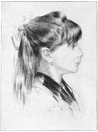 CRAYON STUDY OF A CHILD.
By J. Lefebvre.
Half-tone from a lithographic
CRAYON STUDY OF A CHILD.
By J. Lefebvre.
Half-tone from a lithographic
reproduction by F. Grellet.
suggested. At the corner of the mouth is a line which runs in about
the same direction as the naso-labial line. In youth the cheek is
slightly rounded out from the lip, and in a side view it is usually the
outline of the cheek
which makes the little line at the corner of the lips in the Lefebvre
and the Grellet Young Girl, and always in the side view of a baby’s
head; but as the head becomes less babyish it is the muscles of the
lips which cause this line. The muscles of the lips are exactly like
those of the eye; they run entirely around the lips, but at the
corner of the mouth, instead of having the radiating line like the
crow’s-feet, the threads of the muscle have a more perpendicular trend
and create a line running in the same direction as the naso-labial
line; while below this, but attached to it, is the triangular muscle of
the lips, or the {107}
depressor of the angle of the lips; this, in the ordinary old
person, creates a long line, starting at the corner of
the lip, running down considerably. This line is very
conspicuous in the Brontolone, but absent in the Young
Girl and the Lefebvre. It is seen plainly in the Choudieu,
and we do not see how you can ask for a better
lesson in drawing than the comparing of the highly
finished Brontolone with the very simple
Choudieu!
Once more, above the eyes the forehead is covered with the frontal muscle. The fibers run perpendicularly, but when they contract, as when a person frowns, the folds in the flesh run horizontally; these folds are particularly perceptible in old age. Though every mother will remember their alarming occurence in babyhood, we do not associate them with youth; and so in the Grellet Young Girl we find no lines in the forehead, nor are they in the Lœwe-Marchand, hence a placid temperament is suggested in that portrait. Many men no older than Monsieur X. have constant lines in their forehead, and the actor uses these muscles continually for expression. We write the plural because the muscle is frequently divided into right and left portions which follow the direction of the eyebrows, so that when the muscle is contracted the eyebrow’s are no longer horizontal but have an M shape across the forehead. In the Watts there is a very perceptible line which curves over the right eye, taking the direction of the eyebrow; this is part of the frontalis muscle. If the line on the other side were completed it would take a similar direction over the left eye.
We have thus covered the muscles of the face which have most to do with expression, and so you see that, besides drawing the eyebrows, eyelashes, eyeballs, the bridge of the nose, the nostril, the lips, and the chin, the artist has to do with a great many muscles, and the novice must not only be warned about them, that he may know when to introduce them, but he must remember that they have principally to do with old age or {110} abnormal expression (laughter, grief, hate, etc.), and they must be used to express such attributes only. Hence the three English drawings represent very admirably the normal, placid expression of middle-aged men. If with the foregoing hints you attempt to draw a portrait for your newspaper, we fancy that, if you follow our advice faithfully, you will meet with more success than you imagine.
THE SCIENCE OF PEN DRAWING — PEN DRAWING MAY BE ANY SIZE — THE WATTS IN TWO SIZES — DRAWING MAY BE ENLARGED OR REDUCED — FROM THE PRINTER’S VIEWPOINT PEN TECHNIC LESS IMPORTANT AS REGARDS ITS ADAPTABILITY TO REDUCTION THAN AS REGARDS THE PRINTABILITY OF THE CUT MADE FROM IT — THE PRINTER’S OWN EXPERIENCE A GUIDE IN THIS MATTER — THREE KINDS OF PRINTING CONSIDERED, FOR CONVENIENCE CHARACTERIZED AS I. “MAGAZINE,” II. “CITY NEWSPAPER,” III. “COUNTRY NEWSPAPER” PRINTING — CROSS-HATCHED LINES SUPPOSED TO FILL UP MORE RAPIDLY THAN SINGLE LINES — PORTRAIT OF STEVENSON BY WYATT EATON THE NE PLUS ULTRA OF NEWSPAPER PORTRAITURE — THE NASO-LABIAL LINE IN THIS DRAWING SUGGESTED BY SHADING, NOT BY A SINGLE LINE — A DRAWING BY SICKERT — ANY PEN MAY BE USED FOR THESE DRAWINGS, BUT THE LINES MAINLY TO BE CONSIDERED AS THICK OR THIN, SINCE THEY MAY BE PUT UPON CHALK PLATE, AND NOT DRAWN IN PEN-AND-INK AT ALL.
IN
our last chapter we said that we believed that if
you would attempt to draw a portrait for your
newspaper, following our advice faithfully, you would
meet with more success than you would imagine. But
you say, perhaps, that you are not prepared to attempt
a portrait because we have given you no directions for
pen drawing. Well, here you are partly right and
partly wrong. There is a science of pen drawing
that
{112}
 GEORGE FREDERICK WATTS, R.A.
An English newspaper cut—from Tit-Bits, artist
unknown. An excellent example of newspaper work.
Note that the skull-cap is not represented partly
gray and partly black because the artist meant to
indicate a cap that was one color in front and
another in the back, but he meant to show the
rounding of the cranium, just as Gaillard did in
varying the tones in the hair of the old woman.
An enlargement of this cut was given in Chapter
VIII. If a drawing is made the size of that
enlargement, it can satisfactorily be reduced to the
size of the cut above. Of course it may reduce to
smaller dimensions; the greater the reduction the
nearer the lines come together, and their closeness
makes them more difficult to print.
{113} you may study with profit, but in order to draw a simple
portrait for your newspaper it is not necessary for you
to have any further instruction than we have given you.
If it is going to pay you to follow drawing at all, you
should be able at this stage of progress to make a tolerably
good drawing for a newspaper portrait. But, you
say, “What size should I make the drawing?” We
reply, “Almost any size, though usually not smaller
than the cut is to appear.” But that it may be smaller
is seen by our two Watts cuts. Here is a cut the exact
size of the original Watts, as it went to the engraver,
who by mistake enlarged it to the size it appeared
in Chapter VIII. I accepted this enlargement gladly,
so as to show you that a drawing may be enlarged
or reduced, but more especially with the idea of showing
you the usual size that a drawing is made for
reduction; for you will always be safe in making your
portrait the size of the Watts in Chapter VIII if you
wish it to appear the size of the present cut. I cannot
over-emphasize the importance of your realizing that
you have been told sufficient about pen drawing for you
to go ahead and make drawings for your paper. If there
is anything more to be learned I am candid in saying
that you are better able to find out what it is than I
am, for it is almost entirely a matter of printing, and not
of engraving. Photo-engravers can nowadays reproduce
almost any kind of a drawing, but a cut which
might print well in a magazine might not print at all
in your country newspaper. You know better than I
do the trouble of “bringing up” a fine cut on
poor
{114}
GEORGE FREDERICK WATTS, R.A.
An English newspaper cut—from Tit-Bits, artist
unknown. An excellent example of newspaper work.
Note that the skull-cap is not represented partly
gray and partly black because the artist meant to
indicate a cap that was one color in front and
another in the back, but he meant to show the
rounding of the cranium, just as Gaillard did in
varying the tones in the hair of the old woman.
An enlargement of this cut was given in Chapter
VIII. If a drawing is made the size of that
enlargement, it can satisfactorily be reduced to the
size of the cut above. Of course it may reduce to
smaller dimensions; the greater the reduction the
nearer the lines come together, and their closeness
makes them more difficult to print.
{113} you may study with profit, but in order to draw a simple
portrait for your newspaper it is not necessary for you
to have any further instruction than we have given you.
If it is going to pay you to follow drawing at all, you
should be able at this stage of progress to make a tolerably
good drawing for a newspaper portrait. But, you
say, “What size should I make the drawing?” We
reply, “Almost any size, though usually not smaller
than the cut is to appear.” But that it may be smaller
is seen by our two Watts cuts. Here is a cut the exact
size of the original Watts, as it went to the engraver,
who by mistake enlarged it to the size it appeared
in Chapter VIII. I accepted this enlargement gladly,
so as to show you that a drawing may be enlarged
or reduced, but more especially with the idea of showing
you the usual size that a drawing is made for
reduction; for you will always be safe in making your
portrait the size of the Watts in Chapter VIII if you
wish it to appear the size of the present cut. I cannot
over-emphasize the importance of your realizing that
you have been told sufficient about pen drawing for you
to go ahead and make drawings for your paper. If there
is anything more to be learned I am candid in saying
that you are better able to find out what it is than I
am, for it is almost entirely a matter of printing, and not
of engraving. Photo-engravers can nowadays reproduce
almost any kind of a drawing, but a cut which
might print well in a magazine might not print at all
in your country newspaper. You know better than I
do the trouble of “bringing up” a fine cut on
poor
{114}
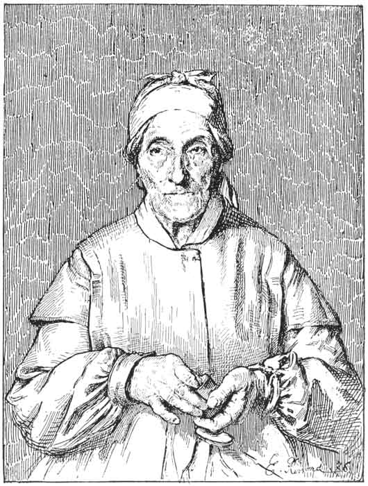 THE GRANDMOTHER.
Pen Drawing, by E. Renard, from a French Catalogue.
The parallel lines in the background represent a
tint, and herein is the foundation of pen drawing,
as distinguished from wash drawing: parallel lines
are used to represent a tint; if they are farther
apart they represent a lighter tint, if nearer
together a darker tint; or again, if the artist
presses on his pen more heavily on one set of lines
than another, he can also get a darker tone without
putting the lines any closer together. For newspaper
work such a method is preferable to placing the
lines near together; the Wyatt Eaton shows the
pressing on the pen method perfectly.
{115} paper,
on a cylinder press, and when you are making
your drawing it is for you to keep in mind the kind of
paper it is to be printed on, and to keep your lines
sufficiently open accordingly. Ordinary intelligence
should be your guide. Let us take the Renard Grandmother
for an example; in the background is a series of
the simplest lines imaginable. If you should make your
drawing the same size as our cut, and the lines the same
distance apart, it could be easily reduced to an inch
wide, and print in a magazine, but it would not then
print in a country newspaper; the lines would be so
near together that they would fill up. The cut might
print in a city newspaper, but it is not likely. The
truth is that a printer can tell better about this than I
can. All I can say is that as a general thing a set of
parallel lines print better than cross-hatched lines.
THE GRANDMOTHER.
Pen Drawing, by E. Renard, from a French Catalogue.
The parallel lines in the background represent a
tint, and herein is the foundation of pen drawing,
as distinguished from wash drawing: parallel lines
are used to represent a tint; if they are farther
apart they represent a lighter tint, if nearer
together a darker tint; or again, if the artist
presses on his pen more heavily on one set of lines
than another, he can also get a darker tone without
putting the lines any closer together. For newspaper
work such a method is preferable to placing the
lines near together; the Wyatt Eaton shows the
pressing on the pen method perfectly.
{115} paper,
on a cylinder press, and when you are making
your drawing it is for you to keep in mind the kind of
paper it is to be printed on, and to keep your lines
sufficiently open accordingly. Ordinary intelligence
should be your guide. Let us take the Renard Grandmother
for an example; in the background is a series of
the simplest lines imaginable. If you should make your
drawing the same size as our cut, and the lines the same
distance apart, it could be easily reduced to an inch
wide, and print in a magazine, but it would not then
print in a country newspaper; the lines would be so
near together that they would fill up. The cut might
print in a city newspaper, but it is not likely. The
truth is that a printer can tell better about this than I
can. All I can say is that as a general thing a set of
parallel lines print better than cross-hatched lines.
(In using the expressions, “a magazine,” “a city newspaper” and “a country newspaper,” to represent first, second and third class printing, I am well aware that the distinction is an arbitrary and not a real one; that sometimes by using good ink, good stock and by printing slowly, the country printer can run a cut in his newspaper with better results than can a city paper using poorer stock and ink for the sake of economy, and printing at lightning speed. But the reader will kindly let the expressions stand for (1) perfect press, good stock and ink, and expert overlaying; (2) perfect press, ordinary “news” stock, poor ink, and little overlaying; (3) poorest stock, ink, cheap press, and not expert overlaying.)
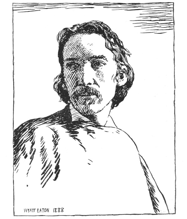
Next to the preference of one set of lines to cross-hatched lines, it is to be said that a dark is better obtained by pressing on the pen than by putting the lines near together. We publish a superb example of pen drawing for newspaper work—the Stevenson, by Wyatt Eaton. We believe that this is the ne plus ultra of newspaper portraiture, for the lines are strong and vigorous, there being no possibility of their running together in printing. I should advise you to look at this portrait under a magnifying glass that you may realize how very simple the treatment is.
McClure’s “Human Documents” contains a baker’s dozen of half-tones of Stevenson, from photographs. You might procure this pamphlet and copy the half-tones in pen, using the Wyatt Eaton as a guide.
(And in parentheses I would say you will notice that the naso-labial lines on both sides of the face are strongly marked, and yet instead of there being one line going in the direction of the muscle, as in Bonnard’s “Choudieu,” we have on the light side of the face eight perpendicular lines, and on the shaded side six blots with almost horizonal, but slightly oblique, direction! Do you not, therefore, see that it is not the kind of line you use, not a matter of “what way the lines go,” but where you put your tones, that counts in drawing? If Wyatt Eaton had not seen the strongly marked naso-labial line on Stevenson’s face, he would not have put these two triangular forms radiating from the nostril. Moreover, Eaton could have represented these lines in another way just as well. Also, it would {118} take too long to explain other subtle features of this drawing, but we would add that you will rarely see so much tone on the light cheek as in this drawing. Stevenson was an invalid, and this tone represents the sunken cheek of ill-health.)
Now, if you will examine the Sickert portrait of Wilson, you will find an equally artistic drawing, but one not quite so adaptable to newspaper printing; for the darks are partly obtained by putting the lines near together rather than by great pressure, and in our reproduction they have frequently run together where in the original print, which was 6 by 9 inches, they were separated. And so also in printing on poor paper; there is a chance that the interstices will fill up, while they would not in the Eaton.
As, however, this drawing was made for printing on a thin manila paper, not on coated paper, and there is great deal of pressure on the pen (note especially the side of the nose), which was put on knowingly by the artist, it contains much that should be imitated in newspaper work.
In regard to the way to make such heavy lines, we
would say that it is a mere matter of practice; the
selection of pen has little to do with it. Excellent
results may be got by using a brush instead of the pen,
and we dare say that Mr. Eaton used a quill pen. But
as a matter of fact, the artist usually prefers to use a
very fine pen such as a crow quill, or mapping pen,
which is flexible, it thus being that a dark line is got,
not by a blunt-pointed pen, but by allowing the nibs
of
{119}
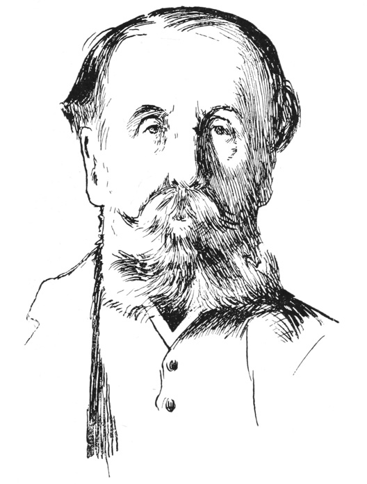 PORTRAIT OF C. RIVERS WILSON.
Pen drawing by Walter Sickert. From the London
Whirlwind, 1890. An example of artistic
portrait-drawing suitable for newspapers, showing
darks obtained both by placing fine lines near
together (see just above mustache on shaded side),
and darks obtained by pressing on the pen (see heavy
lines on shaded side of nose).
{120} a flexible pen to spread so that the ink flows very
freely from it. For ordinary purposes a Gillot 303 or
170 is frequently used by the artists. But it is a matter
of practice mainly, and the pen you usually write with
is apt to be the best medium for practice at first. In
fact, we are particularly anxious to have our reader not
worry about pen technic. Let him realize that he
might wish to put his drawing upon the chalk plate, in
which case he would make a tracing of a photograph,
and, placing it upon the chalk, press upon it with a
hard-pointed pencil, and thus transfer his outline into
an indentation on the chalk. He would then take the
scraping tool and clear away the chalk wherever he
wishes a line. The fact being that he would introduce
lines only where he knew there should be lines in
nature, as in the case of the naso-labial line, the eyelids,
etc.; and he would broaden his lines only where
he knew the tones should be darker in nature than
where he had used a set of fine lines. There would be
no use of pen at all!
PORTRAIT OF C. RIVERS WILSON.
Pen drawing by Walter Sickert. From the London
Whirlwind, 1890. An example of artistic
portrait-drawing suitable for newspapers, showing
darks obtained both by placing fine lines near
together (see just above mustache on shaded side),
and darks obtained by pressing on the pen (see heavy
lines on shaded side of nose).
{120} a flexible pen to spread so that the ink flows very
freely from it. For ordinary purposes a Gillot 303 or
170 is frequently used by the artists. But it is a matter
of practice mainly, and the pen you usually write with
is apt to be the best medium for practice at first. In
fact, we are particularly anxious to have our reader not
worry about pen technic. Let him realize that he
might wish to put his drawing upon the chalk plate, in
which case he would make a tracing of a photograph,
and, placing it upon the chalk, press upon it with a
hard-pointed pencil, and thus transfer his outline into
an indentation on the chalk. He would then take the
scraping tool and clear away the chalk wherever he
wishes a line. The fact being that he would introduce
lines only where he knew there should be lines in
nature, as in the case of the naso-labial line, the eyelids,
etc.; and he would broaden his lines only where
he knew the tones should be darker in nature than
where he had used a set of fine lines. There would be
no use of pen at all!
So you see we have come right to the milk in the cocoanut—right to the matter this series was to teach. Many readers no doubt were disgusted when they did not find in our first chapters directions for the use of the pen and a list of materials for pen drawing, but those who may have occasion to do their portraits in chalk plate will thank us for our hints on the study of nature and the study of lines, no matter how made.
STUDY OF PEN TECHNIC CONTINUED — THE PRINTER MUST NOT EXPECT THE KNOWLEDGE OF PEN TECHNIC TO TAKE THE PLACE OF KNOWLEDGE OF DRAWING — EXAMPLES CONSIDERED — THE GRANDMOTHER BY RENARD — THE MARCHETTI, THE VIERGE, THE ST. ELME, ARE GOOD EXAMPLES OF PEN DRAWING — THE GUILLAUME AN AMUSING EXAMPLE OF USE OF PARALLEL LINES — THE FORAIN A GOOD EXAMPLE OF NEWSPAPER CARTOON STYLE; THE VALLET, OF NEWSPAPER NEWS STYLE — THE MOULLIER AN EXAMPLE OF ECCENTRIC USE OF DOTS — METHOD OF PEN PRACTICE SUGGESTED.
 INITIAL LETTER BY MARCHETTI.
Pen drawing from Paris Illustré.
study of pen technic is helpful to the printer-designer. I
use the adjective “judicious” because I need a word beginning with J
for our initial letter. What I mean is, that just so far as the printer
studies drawing, he may study pen technic, but he must not expect to
progress further in the latter than he has progressed in the former; so
while this chapter will be exceedingly helpful to the reader who has
followed the previous ones, it will only lead to
failure
INITIAL LETTER BY MARCHETTI.
Pen drawing from Paris Illustré.
study of pen technic is helpful to the printer-designer. I
use the adjective “judicious” because I need a word beginning with J
for our initial letter. What I mean is, that just so far as the printer
studies drawing, he may study pen technic, but he must not expect to
progress further in the latter than he has progressed in the former; so
while this chapter will be exceedingly helpful to the reader who has
followed the previous ones, it will only lead to
failure
{122}
 ILLUSTRATION TO PABLO DE SEGOVIE.
Pen drawing by Daniel Vierge, one of the most
celebrated of modern pen-draftsmen. If you will
scrutinize this drawing under a magnifying glass you
can examine this technic with more ease than with
the naked eye.
see
larger
{123} if the reader does not follow our advice in regard
to training the eyes to see as well as in regard to pen
technic.
ILLUSTRATION TO PABLO DE SEGOVIE.
Pen drawing by Daniel Vierge, one of the most
celebrated of modern pen-draftsmen. If you will
scrutinize this drawing under a magnifying glass you
can examine this technic with more ease than with
the naked eye.
see
larger
{123} if the reader does not follow our advice in regard
to training the eyes to see as well as in regard to pen
technic.
We said in our last chapter that the parallel lines in
the background of “The Grandmother,” by Renard,
showed the foundation of pen drawing. The same is
 Illustration (pen drawing);
chapter heading, but without
initial letter, by Marchetti.
From Paris Illustré.
true of our initial letter, in which we find a set
of parallel lines which, contrasted with the white
of the illumination thrown by the lantern, gives us
an effect of gray. This is found again in the other
drawing by Marchetti; and if you will study these
two drawings, and then turn to the Vierge, you will
find that nine-tenths of it is drawn in the same way.
Here and there to get a certain vibration of tone,
Vierge uses crosshatch, but you will notice that the
lightest gray and the intensest dark are got without
crosshatching.
In the St. Elme you may also distinguish very clever
use of parallel lines, without much crosshatching. We
have purposely reproduced this, together with the page
it decorated, so that you may see the artist had a good
reason for not crosshatching; he wished his drawing
to form a decoration about the page, and he did not
want it to be too heavy, so he abstained from
crosshatching.
{124}
 Pen drawing by St. Elme, decorating a page of a
French journal, 9 1/2 by 13, showing a clever use
of parallel lines, and a method of decorating a
printed page, which will be considered later on.
see
larger
{125} The best practice for you is to make drawings
for your publication in any manner you see fit, and
after you have had experience in printing the same, you
can tell very well how much crosshatching is advisable,
and how much clogs up in the printing.
There are
Pen drawing by St. Elme, decorating a page of a
French journal, 9 1/2 by 13, showing a clever use
of parallel lines, and a method of decorating a
printed page, which will be considered later on.
see
larger
{125} The best practice for you is to make drawings
for your publication in any manner you see fit, and
after you have had experience in printing the same, you
can tell very well how much crosshatching is advisable,
and how much clogs up in the printing.
There are
 Caricature of the French painter (whose works are
somewhat dark and misty in effect) Eugène Carrière
at work. By Guillaume. From the French daily, Gil
Blas.
several caricaturists in this country whose work is
printed in daily papers in a thoroughly satisfactory
manner, and yet they use a great deal of crosshatching,
but of course they know just how open to keep the
lines, for they know just what results their printer
can {126}
get and what not. But we would say it is a good principle,
to begin with, that the less crosshatching in your
work the better it will print. Hence the Marchetti and
St. Elme drawings are given as examples.
Caricature of the French painter (whose works are
somewhat dark and misty in effect) Eugène Carrière
at work. By Guillaume. From the French daily, Gil
Blas.
several caricaturists in this country whose work is
printed in daily papers in a thoroughly satisfactory
manner, and yet they use a great deal of crosshatching,
but of course they know just how open to keep the
lines, for they know just what results their printer
can {126}
get and what not. But we would say it is a good principle,
to begin with, that the less crosshatching in your
work the better it will print. Hence the Marchetti and
St. Elme drawings are given as examples.
In the portrait of the painter Carrière, we have an amusing example of the effective use of parallel lines. Instead of giving us a black silhouette, the artist—Guillaume—has given us a gray one, which suggests the subject seen through a fog. Had the artist wished to represent the palette as being of dark wood he could have pressed on his pen lines and thus given us that effect. Had he wished to show that the canvas was lighter than the figure, he could have refrained from pressing so heavily on his pen lines, or, better still, distributed his lines farther apart and thus obtained the effect of a lighter tone. Bear in mind, however, that I used the term pen lines in speaking of this drawing because the original was made in that medium, but the same graduation or contrast of lines is applicable to nearly all methods of line drawing; to etching and chalk plate as well. You will, perhaps, have a better grasp of the subject by thinking of it as—the theory of tone imitation by lines.
When you have grasped the theory of this pen technic, alias the representing of tone by lines, you will be prepared to make your own deductions from various specimens of illustration.
Some of our friends, for example, who might have
been interested in our first chapters and the specimens
of caricature given therein, may have been
disappointed {127}
that we have given so much attention to portraiture
recently, so we have made an effort in this chapter to
give a mélange that will cover many fields of newspaper
illustration. In the Forain we have a splendid example
of such work. It was printed on very poor paper
stock, but it came out admirably, harmonizing with the
type, which is larger than that used in this country,
long
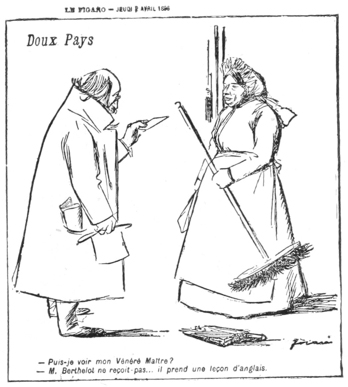 NEWSPAPER CARICATURE.
By Forain, from Figaro. This composition evidently
makes fun of Mr. Berthelot, who has had, or expects
to have, some dealings with England, for the visitor
says, “May I see my honorable master?” and the maid
responds, “Mr. Berthelot is not receiving; he is
taking an English lesson.” The cut in Figaro was
8 by 8, and it represents an excellent method of
newspaper drawing, and one that could be easily
imitated in chalk plate. We would also call
attention to the drawing of the broom. Our readers
who followed the directions of our first chapters
will see that the silhouette of the broom is
indicated in a masterly manner.
{128}
NEWSPAPER CARICATURE.
By Forain, from Figaro. This composition evidently
makes fun of Mr. Berthelot, who has had, or expects
to have, some dealings with England, for the visitor
says, “May I see my honorable master?” and the maid
responds, “Mr. Berthelot is not receiving; he is
taking an English lesson.” The cut in Figaro was
8 by 8, and it represents an excellent method of
newspaper drawing, and one that could be easily
imitated in chalk plate. We would also call
attention to the drawing of the broom. Our readers
who followed the directions of our first chapters
will see that the silhouette of the broom is
indicated in a masterly manner.
{128}
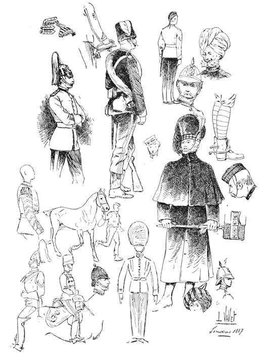 Example of news drawing, by L. Vallet, from a French
periodical.
{129} primer predominating. The drawing of the still-life
objects is particularly interesting. Look at the duster
the woman holds: is not its form exactly what you
would see if it were held up against the window and
viewed in silhouette?
Example of news drawing, by L. Vallet, from a French
periodical.
{129} primer predominating. The drawing of the still-life
objects is particularly interesting. Look at the duster
the woman holds: is not its form exactly what you
would see if it were held up against the window and
viewed in silhouette?
A good example of a news illustration is given in the Vallet page, which could easily be imitated in chalk plate. The artist viewed a collection of English army costumes, or witnessed a drill, and he shows us in very simple lines the style of accouterment. Any newspaper editor who could sketch tolerably well could do the same thing for his county fair.
In the Moullier we have a specimen that is well-nigh as amusing as the artist in the fog, for here we have a pen drawing that is not made by lines, but by a series of stipples. While the newspaper tyro should not employ this technic too frequently in his practice, still, realizing that the tone effect is graphically gained without the use of the conventional line, it must quickly dawn upon him that there are many technics, and, having practiced drawing mantelshelves according to the instructions in our early chapters, he will also appreciate the fact that the artist was in front of this mantelshelf, as the horizontal lines do not tip, and that the shelf was higher than his eye, as the top of the mantel is not shown. This knowledge gathered allows the student to see that various technics may represent the same truth in nature.
A good method of practice for pen work is as follows:
Take a wood engraving or half-tone from
some
{130}
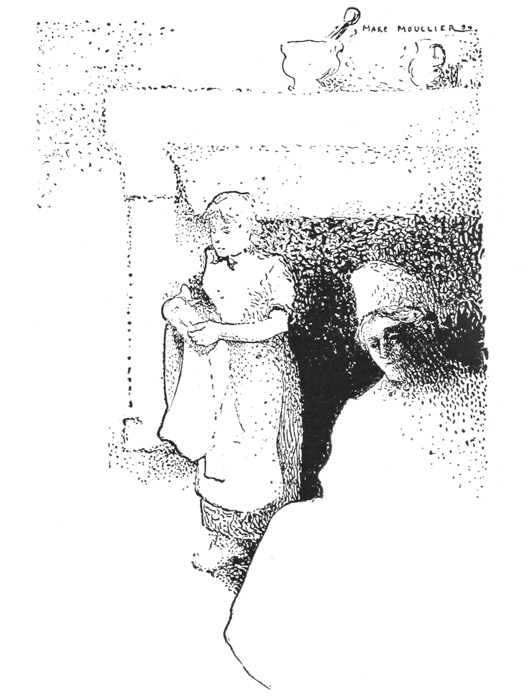 Pen drawing by Marc Moullier, for La Plume,
showing a clever and eccentric use of dots. It may
be remarked that since the mantelpiece is above the
eye we cannot see the top of it. It is parallel
to the artist’s eyes, and so is represented as
a horizontal line. So far as correct drawing is
concerned, it makes no difference how that line
is made. One artist makes it a thick line with a
blunt pen, another a thin line with a fine pen,
and another, like Moullier, makes it with a series
of dots, but each of these methods is a matter of
technic, and the rules of technic are arbitrary,
not fixed as are the rules for drawing. You may
invent your own technic, but you cannot invent
perspective.
{131} periodical, the larger the better, go over the back of it
with a blue pencil, lay it on a sheet of bristol board or
paper, face upward, and go over the outline with a hard
pencil, using such a pressure as will transfer to the bristol
board a blue outline. The object in using blue is,
that you do not have to erase it, but may work over it
with a pen, as the blue does not photograph. Besides
transferring the outline it is also advisable to outline the
shape of any of the shadows you intend to introduce.
You then endeavor with the pen lines to imitate the
delicate shadows of the half-tone or wood cut. Perhaps
instead of saying imitate, we would better say
approximate, for you must not expect to be able to imitate
with pen the extreme delicacy of a
half-tone.
Pen drawing by Marc Moullier, for La Plume,
showing a clever and eccentric use of dots. It may
be remarked that since the mantelpiece is above the
eye we cannot see the top of it. It is parallel
to the artist’s eyes, and so is represented as
a horizontal line. So far as correct drawing is
concerned, it makes no difference how that line
is made. One artist makes it a thick line with a
blunt pen, another a thin line with a fine pen,
and another, like Moullier, makes it with a series
of dots, but each of these methods is a matter of
technic, and the rules of technic are arbitrary,
not fixed as are the rules for drawing. You may
invent your own technic, but you cannot invent
perspective.
{131} periodical, the larger the better, go over the back of it
with a blue pencil, lay it on a sheet of bristol board or
paper, face upward, and go over the outline with a hard
pencil, using such a pressure as will transfer to the bristol
board a blue outline. The object in using blue is,
that you do not have to erase it, but may work over it
with a pen, as the blue does not photograph. Besides
transferring the outline it is also advisable to outline the
shape of any of the shadows you intend to introduce.
You then endeavor with the pen lines to imitate the
delicate shadows of the half-tone or wood cut. Perhaps
instead of saying imitate, we would better say
approximate, for you must not expect to be able to imitate
with pen the extreme delicacy of a
half-tone.
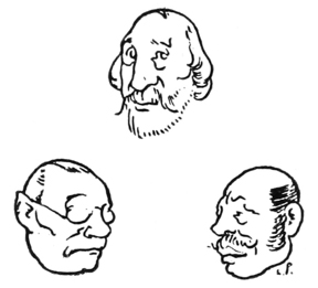
A CHAPTER OF ILLUSTRATIONS AND A RÉSUMÉ — VALLOTTON HEADS ONLY UNDERSTOOD BY THOSE WHO CAN SEE LIGHT AND SHADE UPON OBJECTS — MEDALLIONS BY DAVID D’ANGERS SHOWING THE PLANES OF THE FACE — THESE PLANES BROUGHT OUT IN SOME OF THE VALLOTTON HEADS, AND IN MEDALLIONS BY LORMIER AND D’ILLZACH, AND IN DRAWING BY CHAUME — LANDSCAPE BY LE ROUX, CARICATURE BY FORAIN — THE LE ROUX AND THE PAUL DRAWINGS INDICATE THE FORCE OF OUTLINE — EXAMPLES OF DIFFERENT KINDS OF TECHNIC.
THE definite character of our illustrations to the last two chapters should have made so strong an impression upon the reader (if he practices drawing) that there ought to be little necessity of further letterpress explaining the different technics of pen drawing. {133} So please permit us to introduce a large number of illustrations in this chapter, with slight comment; it being surmised that the reader will, however, give a fuller consideration to the drawings themselves than we do. Each one should be studied again and again, the reader not copying it, but making a drawing in the same style of some similar object. This chapter, moreover, must serve as a general résumé of our instruction in freehand drawing and pen drawing; it virtually ends the first part of our text-book; the succeeding matter will be confined to the consideration of different methods of decorating title-pages, and of designing chapter headings, tailpieces, etc.; and the third part will consist of the consideration of different methods of engraving, chalk-plate, wood engraving and color printing.
Now for our résumé.
In order to learn to draw you must first learn to discern the outline of objects, which you may do by seeing them in silhouette.
To draw the hair in outline, as in Vallotton’s third Nietzsche, you must first see the hair as in the first Nietzsche; that is, see it in mass or in silhouette in nature. Before Vallotton took a brush in hand to put on the solid black of the hair in number one you may be sure he drew a pencil outline like the outline in number three; but before he drew that outline he saw the mass as in number one.
The Vallotton drawings may be further studied from
two very different view-points. The third Friedrich
Nietzsche is pure outline, like the examples of
Engström
{134}
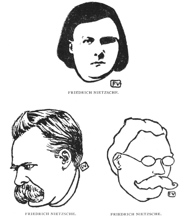 HEADS DESIGNED BY F. VALLOTTON.
{135}
HEADS DESIGNED BY F. VALLOTTON.
{135}
 HEADS DESIGNED BY F. VALLOTTON.
Vallotton has made it a practice to engrave a great
many of his own designs. We do not know whether
these heads were engraved by him, or merely drawn
by him and photo-engraved, but the manner in which
they are designed—that is, with great economy of
line, and a few simple, telling spots—is one which
is the outgrowth of his practice in wood engraving;
he would work exactly like this if drawing on wood.
(We shall treat of wood engraving for printers in a
future chapter.)
{136} given in our early chapters, and is very simple and easy
to understand, though not by any means easy to draw.
The drawing of Malthus, on the other hand, is not easy
to understand, for in addition to the outlines it is modeled—that
is, it contains masses of shadow which bring
out the different planes of the face. And it is necessary
to study light and shade, as indicated in Chapter VII,
before we can fully understand a drawing of this kind.
HEADS DESIGNED BY F. VALLOTTON.
Vallotton has made it a practice to engrave a great
many of his own designs. We do not know whether
these heads were engraved by him, or merely drawn
by him and photo-engraved, but the manner in which
they are designed—that is, with great economy of
line, and a few simple, telling spots—is one which
is the outgrowth of his practice in wood engraving;
he would work exactly like this if drawing on wood.
(We shall treat of wood engraving for printers in a
future chapter.)
{136} given in our early chapters, and is very simple and easy
to understand, though not by any means easy to draw.
The drawing of Malthus, on the other hand, is not easy
to understand, for in addition to the outlines it is modeled—that
is, it contains masses of shadow which bring
out the different planes of the face. And it is necessary
to study light and shade, as indicated in Chapter VII,
before we can fully understand a drawing of this kind.
In order to model, you must learn to see the light and shade upon objects. When your eye is trained to see light and shade, you can draw the hair as in the second Nietzsche, and you can see planes in the face, as in the Malthus.
Although the David d’Angers diagrams were drawn to show the general masses of the head as they are brought out in successive stages by a sculptor, yet they become very interesting to the printer who has not had the benefit of an art school education, for they show him at a glance how much of the character of the human head is dependent upon the different planes of the face, and it explains better than words what is meant by planes. Chapter VIII should be read in connection with it, and the Vallotton portraits, especially that of Malthus, may be examined critically with this in mind, for you will then see that Vallotton has introduced masses of black with the idea of suggesting planes in the face.
We introduce the de Chaume to accompany the
David d’Angers, Lormier and d’Illzach medallions, to
emphasize the matter of the planes of the human
face.
{137}
 Medallion portrait of Hahnemann, after David
d’Angers. Drawing by Carl Robert. Showing successive
stages in modeling, from the flat to the relief.
We do not want our readers to think that the shadows we have pointed
out in our text are the only ones to be noticed in the human
face. Under certain circumstances, notably when an actor’s face
is illuminated by the footlights, there are shadows upon it quite
different from those we have analyzed in previous chapters. But the
shadows we have pointed out are those most prominent in a photograph,
and those most frequently employed by the artist, but if your drawing
is to be very extensive you must learn to look for new shadows in new
aspects; and the de Chaume shows some such shadows, yet in the case of
the naso-labial line it is easy to see
that
{138}
Medallion portrait of Hahnemann, after David
d’Angers. Drawing by Carl Robert. Showing successive
stages in modeling, from the flat to the relief.
We do not want our readers to think that the shadows we have pointed
out in our text are the only ones to be noticed in the human
face. Under certain circumstances, notably when an actor’s face
is illuminated by the footlights, there are shadows upon it quite
different from those we have analyzed in previous chapters. But the
shadows we have pointed out are those most prominent in a photograph,
and those most frequently employed by the artist, but if your drawing
is to be very extensive you must learn to look for new shadows in new
aspects; and the de Chaume shows some such shadows, yet in the case of
the naso-labial line it is easy to see
that
{138}
 Crayon drawing, from a medallion of Alf. Leroux, by
E. Lormier. Drawn on stipple tinted board; or else
on plain paper, and the mechanical stipple added to
the same after the drawing was made.
Crayon drawing, from a medallion of Alf. Leroux, by
E. Lormier. Drawn on stipple tinted board; or else
on plain paper, and the mechanical stipple added to
the same after the drawing was made.
 Medallion portrait of M. A. Soisson, by Ringel
d’Illzach. Drawn by the sculptor on scratchboard
with horizontal line tint, the blacks drawn with
crayon, the whites scratched out with a penknife. As
in the Monet, our engraver, instead of reducing the
cut by the direct process, reduced it by half-tone,
through a screen with diagonal lines, hence the
horizontal lines have disappeared. (See
page 148)
{139} it is not far different from other naso-labial lines which
we have considered.
Medallion portrait of M. A. Soisson, by Ringel
d’Illzach. Drawn by the sculptor on scratchboard
with horizontal line tint, the blacks drawn with
crayon, the whites scratched out with a penknife. As
in the Monet, our engraver, instead of reducing the
cut by the direct process, reduced it by half-tone,
through a screen with diagonal lines, hence the
horizontal lines have disappeared. (See
page 148)
{139} it is not far different from other naso-labial lines which
we have considered.
Again, much of our instruction has been given using
the human face as a basis of study; but it is not for a
moment to be surmised that the study of drawing should
be limited to the human face. We have intended only
to suggest a process of study; this process
may be
 “HAWKS DINNA PIKE OUT HAWKS’ EEN.”
J.
C. DOLLMAN, R.I.
Pen drawing from the artist’s water color, made
for an exhibition catalogue. This cut shows an
excellent style of newspaper drawing, consisting of
outline, and a gray got by parallel lines, without
crosshatching.
applied to anything under the sun. Hence we give
the Forain and the Le Roux outline to portray still life
and landscape. And it is worthy of note that still life
need not be circumscribed to mere drill; on the contrary,
it is very frequently introduced into drawing—much to
the perfecting of the composition. The dishpans,
pots
{140}
“HAWKS DINNA PIKE OUT HAWKS’ EEN.”
J.
C. DOLLMAN, R.I.
Pen drawing from the artist’s water color, made
for an exhibition catalogue. This cut shows an
excellent style of newspaper drawing, consisting of
outline, and a gray got by parallel lines, without
crosshatching.
applied to anything under the sun. Hence we give
the Forain and the Le Roux outline to portray still life
and landscape. And it is worthy of note that still life
need not be circumscribed to mere drill; on the contrary,
it is very frequently introduced into drawing—much to
the perfecting of the composition. The dishpans,
pots
{140}
 ON THE BANKS OF THE ISOLE. BY E. LE ROUX.
Pen drawing by the artist from his painting.
{141}
ON THE BANKS OF THE ISOLE. BY E. LE ROUX.
Pen drawing by the artist from his painting.
{141}
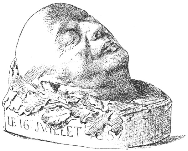 Mask of Béranger. Drawing by Geoffroy de Chaume.
Drawn by the sculptor from his model, with
(lithographic) crayon, on grained paper with a
specially prepared tooth.
{142}
Mask of Béranger. Drawing by Geoffroy de Chaume.
Drawn by the sculptor from his model, with
(lithographic) crayon, on grained paper with a
specially prepared tooth.
{142}
 Newspaper caricature, by Forain, from Figaro. The
butler says: “I have heard him say that you spice
your dishes too much.” The chef says: “Yes, he
misses his Blanchette du Havre.” (Some local hit,
blanchette in cookery being a wrapper of pastry,
bacon, etc.) “If he is not satisfied why doesn’t
he leave?” There are few draughtsmen in the world
more expert in the use of line than Forain. He is
most wonderful in his construction of forms; every
line means something. The French do not mind a
free line—one that runs a little too far out—if it
has meaning to it; hence we see a line through the
butler’s nose, and his mouth extends to the right of
the naso-labial line in quite an unnatural fashion,
but since the line of the cheek is beautifully
attached to the eyesocket and upper eyelid, it does
not annoy the French at all.
{143}
Newspaper caricature, by Forain, from Figaro. The
butler says: “I have heard him say that you spice
your dishes too much.” The chef says: “Yes, he
misses his Blanchette du Havre.” (Some local hit,
blanchette in cookery being a wrapper of pastry,
bacon, etc.) “If he is not satisfied why doesn’t
he leave?” There are few draughtsmen in the world
more expert in the use of line than Forain. He is
most wonderful in his construction of forms; every
line means something. The French do not mind a
free line—one that runs a little too far out—if it
has meaning to it; hence we see a line through the
butler’s nose, and his mouth extends to the right of
the naso-labial line in quite an unnatural fashion,
but since the line of the cheek is beautifully
attached to the eyesocket and upper eyelid, it does
not annoy the French at all.
{143}
 Pen drawing by Guillaume, from the French daily
paper Gil Blas. This is given as a good example
of newspaper work of a kind that could be easily
imitated on chalk plate. It is reproduced with
adjacent head-line and type that you may get an
idea of the typographical appearance of the French
newspaper. The legend says: “Today Gil Blas
publishes its twelfth supplement, which should be
delivered gratuitously (by the news agents) to all
the purchasers of the paper.” The cut, then, is
merely a little joke to call attention to the more
important supplement inside, which supplement in
itself is a pictorial one; French readers are fonder
of illustrations than American readers.
{144}
Pen drawing by Guillaume, from the French daily
paper Gil Blas. This is given as a good example
of newspaper work of a kind that could be easily
imitated on chalk plate. It is reproduced with
adjacent head-line and type that you may get an
idea of the typographical appearance of the French
newspaper. The legend says: “Today Gil Blas
publishes its twelfth supplement, which should be
delivered gratuitously (by the news agents) to all
the purchasers of the paper.” The cut, then, is
merely a little joke to call attention to the more
important supplement inside, which supplement in
itself is a pictorial one; French readers are fonder
of illustrations than American readers.
{144}
 An example of pen drawing. Book illustration, by F.
H. Lucas. This shows splendid modeling with very
delicate pen work, and a certain amount of variety
in the background. It is less adaptable to newspaper
work than our other illustrations. It is given as
a specimen of eccentric line work as regards the
background, which is not unlike the Moullier.
and coal shovel, in the Forain, are particularly suggestive
from this view-point. The Le Roux is given in order
that our text-book may include an example of landscape,
and also that the pupil may realize that drawing is frequently
a matter of the right line in the right place.
As we said in Chapter XIII, just as we studied the matter
of the naso-labial line, and the orbicular muscle,
one should study the direction of the wickers of a trash
basket, so the artist has studied here the characteristic
lines of tree trunk, foliage, hillside, and grasses. If you
will study a city street or a shipyard in the same spirit—that
is, search for the characteristic lines—you will be
able to make a drawing which, even though it
lacks
{145}
An example of pen drawing. Book illustration, by F.
H. Lucas. This shows splendid modeling with very
delicate pen work, and a certain amount of variety
in the background. It is less adaptable to newspaper
work than our other illustrations. It is given as
a specimen of eccentric line work as regards the
background, which is not unlike the Moullier.
and coal shovel, in the Forain, are particularly suggestive
from this view-point. The Le Roux is given in order
that our text-book may include an example of landscape,
and also that the pupil may realize that drawing is frequently
a matter of the right line in the right place.
As we said in Chapter XIII, just as we studied the matter
of the naso-labial line, and the orbicular muscle,
one should study the direction of the wickers of a trash
basket, so the artist has studied here the characteristic
lines of tree trunk, foliage, hillside, and grasses. If you
will study a city street or a shipyard in the same spirit—that
is, search for the characteristic lines—you will be
able to make a drawing which, even though it
lacks
{145}
 Illustration from the Paris Illustré. An example
of combined use of outline, parallel lines and
solid black, with very little crosshatch. Mainly
interesting because of the introduction of
still-life objects, which hint at subjects suitable
for practice. The novice would do well to select a
group of similar objects and endeavor to render them
in a similar manner.
artistic finish, will have a certain graphic value; and for
this very reason (we mean, to show that outline may be
graphic) we purposely introduce into this chapter the
Paul caricatures, consisting mainly of outlines, like those
we gave in our first chapters, and we bid you harp upon
them with the fact ever in your mind that they are
not arbitrary, but each line stands for some prototype in
nature; and that we may go a little farther in the analyzation
of the face, we publish some models in relief in
which the planes of the face are brought out. These
planes were considered in Chapter VII, and you
must
{146}
Illustration from the Paris Illustré. An example
of combined use of outline, parallel lines and
solid black, with very little crosshatch. Mainly
interesting because of the introduction of
still-life objects, which hint at subjects suitable
for practice. The novice would do well to select a
group of similar objects and endeavor to render them
in a similar manner.
artistic finish, will have a certain graphic value; and for
this very reason (we mean, to show that outline may be
graphic) we purposely introduce into this chapter the
Paul caricatures, consisting mainly of outlines, like those
we gave in our first chapters, and we bid you harp upon
them with the fact ever in your mind that they are
not arbitrary, but each line stands for some prototype in
nature; and that we may go a little farther in the analyzation
of the face, we publish some models in relief in
which the planes of the face are brought out. These
planes were considered in Chapter VII, and you
must
{146}
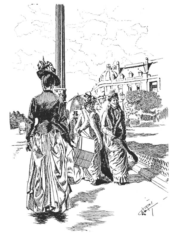 Illustration from Paris Illustré. Pen drawing,
by M. Luque, evidently from an instantaneous
photograph, containing all the elements of pen
drawing without crosshatch. This has been reduced
too much; the shadows in the building seem black
because the lines have run together. In the original
illustration the lines on the building were
separated, and the effect was one of gray, which is
the right tone for shadows seen at a distance on a
clear day. The outlines of the clouds were probably
drawn with an unbroken line, and after they were
engraved were rouletted on the plate, and hence
print as a series of dots.
{147}
Illustration from Paris Illustré. Pen drawing,
by M. Luque, evidently from an instantaneous
photograph, containing all the elements of pen
drawing without crosshatch. This has been reduced
too much; the shadows in the building seem black
because the lines have run together. In the original
illustration the lines on the building were
separated, and the effect was one of gray, which is
the right tone for shadows seen at a distance on a
clear day. The outlines of the clouds were probably
drawn with an unbroken line, and after they were
engraved were rouletted on the plate, and hence
print as a series of dots.
{147}
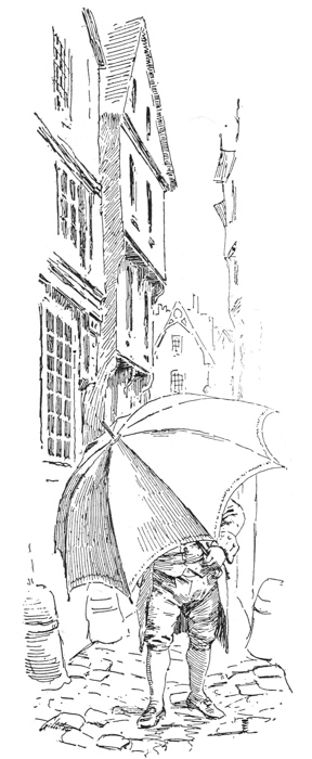 Pen drawing, by Maurice Leloir, showing admirable
effect gained by use of parallel lines without
crosshatch; a splendid example for the novice to
study.
{148} look at Fantin-La-Tour’s cast head in order to understand
them. Do so, and then let your eye jump to the
Vallotton heads, and we think you will grasp their characteristics
immediately, for you will see wherein they
differ from the Engström drawings. They differ in this:
that in addition to pure outline, they mass the constructive
shadows found in the David d’Angers. In other
Pen drawing, by Maurice Leloir, showing admirable
effect gained by use of parallel lines without
crosshatch; a splendid example for the novice to
study.
{148} look at Fantin-La-Tour’s cast head in order to understand
them. Do so, and then let your eye jump to the
Vallotton heads, and we think you will grasp their characteristics
immediately, for you will see wherein they
differ from the Engström drawings. They differ in this:
that in addition to pure outline, they mass the constructive
shadows found in the David d’Angers. In other
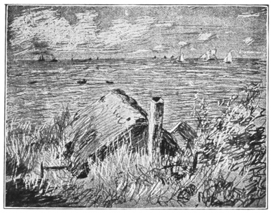 Marine, by Claude Monet. Drawn with lithographic
crayon on scratchboard, the lines running
perpendicularly, instead of horizontally as in
the d’Illzach, the lights scratched out with the
penknife.
This cut has a peculiar interest technically. The
foregoing was dictated with the original in hand,
which was a direct process cut in which one set of
lines ran perpendicularly. Our engraver, however,
instead of reducing the cut by the direct process,
reduced it by half-tone, through a screen with
diagonal lines, hence the perpendicular lines have
disappeared.
words, the black under Vallotton’s eyebrows does not
mean that his eyebrows are abnormally thick, but it
means that he has deep sunken eyes, and that
there is
{149}
Marine, by Claude Monet. Drawn with lithographic
crayon on scratchboard, the lines running
perpendicularly, instead of horizontally as in
the d’Illzach, the lights scratched out with the
penknife.
This cut has a peculiar interest technically. The
foregoing was dictated with the original in hand,
which was a direct process cut in which one set of
lines ran perpendicularly. Our engraver, however,
instead of reducing the cut by the direct process,
reduced it by half-tone, through a screen with
diagonal lines, hence the perpendicular lines have
disappeared.
words, the black under Vallotton’s eyebrows does not
mean that his eyebrows are abnormally thick, but it
means that he has deep sunken eyes, and that
there is
{149}
 Portrait of Fred Walker, by E. G. T., from an
English periodical. Reduced to a smaller area than
when given in Chapter XI. By comparing this with the
cut on page 102
we notice that the drawing is so
simple that there is very little difference in the
general aspect of the two, but here and there, as
under the jaw, the lines have run together a little
more in the smaller cut, giving a darker effect than
in the larger one; the lesson is obvious.
a shadow under the eyebrows and in the plane of the
superior orbicular muscle, which recedes, and Vallotton
wishes to emphasize this. And in the Malthus he does
not mean that Malthus had a triangular birth-mark on
his right cheek, but he means that he had a prominent
cheekbone, and a sunken cheek beneath it; hence the
shadow, which is what we call “a modeling
shadow.”
Portrait of Fred Walker, by E. G. T., from an
English periodical. Reduced to a smaller area than
when given in Chapter XI. By comparing this with the
cut on page 102
we notice that the drawing is so
simple that there is very little difference in the
general aspect of the two, but here and there, as
under the jaw, the lines have run together a little
more in the smaller cut, giving a darker effect than
in the larger one; the lesson is obvious.
a shadow under the eyebrows and in the plane of the
superior orbicular muscle, which recedes, and Vallotton
wishes to emphasize this. And in the Malthus he does
not mean that Malthus had a triangular birth-mark on
his right cheek, but he means that he had a prominent
cheekbone, and a sunken cheek beneath it; hence the
shadow, which is what we call “a modeling
shadow.”
We cannot complete our chapter without mentioning that the styles of drawing we have suggested by no means exhaust the different methods at your disposal. While it is well to confine yourself to outline, or outline and solid black, or outline and slight shading, yet you may experiment in many more complicated methods, as seen in the Monet, and the Ringel d’Illzach, for even if you do not use these methods for illustrations they help you to observe the capital lights and darks in nature.
INSTRUCTION IN DRAWING ABANDONED AND DESIGN CONSIDERED — THIS INSTRUCTION LESS ABSOLUTE THAN INSTRUCTION IN DRAWING — THE PRINTER TO USE AS MUCH OF THE SUBSEQUENT MATTER AS SERVES HIS PURPOSE — IN THE STUDY OF LETTERING ALL STYLES HAVE TO BE COVERED, THOUGH ONLY ONE OR TWO MAY BE OF VALUE TO THE PRINTER — WOOD ENGRAVING VALUABLE BECAUSE IT TEACHES CONCENTRATION AND ECONOMY OF LINE — THE PRINTER IN AMERICA NOT ABLE TO BE ALWAYS ARTISTIC, BUT MUST INTRODUCE ART FROM TIME TO TIME AS OPPORTUNITY ARISES.
THE READER is asked to view this second part of “Drawing for Printers” differently from the first part. In the first part the writer aimed at establishing {154} recognized rules for drawing rather than giving his individual opinions.
He thinks that very little of the first part of the book can be questioned. For example, it is not a matter of personal opinion that the horizon line is on a level with the spectator’s eyes, or that a mantelshelf on such a level should be drawn with a straight line; it is a matter of fact, which he merely reiterates as the writer of a grammar reiterates the indisputable facts of a language, that a noun is a name word, a verb an action word, an adverb a word which qualifies a verb. But when the writer of a literary text-book has exhausted his rules of grammar and takes up the subject of rhetoric, although he endeavors to give only such examples of writing as are excellent, still his own personal taste is apt to guide him in his selections, and he may claim as admirable that which is to be criticised. A rhetoric of the eighteenth century would necessarily contain much artificial, sentimental and Latinized English which a teacher of today would not put before his students.
So it is that in the following chapters I may advocate,
(1) That which may not meet with the approval of my readers.
(2) That which may not suit my readers’ customers, and even
(3) That which is wrong.
You therefore may use as much of my advice as you find practical in your daily work, and discard that which is impractical. {155}
But do not forget that that which may be impractical today may come in handy some time next year!
That there will be much that you will find impractical goes without saying. It is absolutely necessary that the student of the arts (as the writer of these papers) acquaint himself with that which is classical; he then becomes fascinated with it and recommends it. But the classical covers an immense field, embracing that which is best in many ages and in many different lands, and it is utterly impossible that the practical worker in the arts should utilize all the classical styles at one time. Hence only a fragment of any text-book built upon the study of the classic can be practical at any given time.
Let us be more specific. Let us take the department
of lettering alone. If an author publishes a work on
lettering, and he is a cultivated man, he must examine
the many styles of the past. He examines the monumental
letter of classic Rome and the monumental letter
of the Renaissance; the Caroline letter of 700 A. D., as
well as the Gothic and the Visigothic. It is not his
business to place one above the other, but to explain the
beauty of all. If, however, you are a printer of today,
and the Morris style of type is most in vogue, and you
have stocked your cases with it, it is the Gothic letter
you are most interested in, because it is what you are
using and what your customer has just been trained to
like; so the most practical part of a book on lettering
would be that which would treat of the Gothic letter,
and its offspring, the Old English; while the chapter
on Visigothic, with its twisted letters, would seem
quite
{156}
 NEWSPAPER ILLUSTRATION.
From the Paris Figaro, showing harmony of drawing,
type, and rules—a method of drawing that could
easily be imitated on chalk plate.
{157}
NEWSPAPER ILLUSTRATION.
From the Paris Figaro, showing harmony of drawing,
type, and rules—a method of drawing that could
easily be imitated on chalk plate.
{157}
 COVER DESIGN OF THE
WESTMINSTER BUDGET.
Printed on light weight yellow paper, 10 by 13. An
excellent example of the use of silhouette in design.
{158} impractical to you as you could not use the examples
given. Yet it would be the business of the writer on
alphabets to analyze them thoroughly, otherwise his
work would be incomplete.
COVER DESIGN OF THE
WESTMINSTER BUDGET.
Printed on light weight yellow paper, 10 by 13. An
excellent example of the use of silhouette in design.
{158} impractical to you as you could not use the examples
given. Yet it would be the business of the writer on
alphabets to analyze them thoroughly, otherwise his
work would be incomplete.
Now then, I shall try to be practical, and in the chapter on lettering bear in mind that the modern fonts are the Morris, Caxton, Jenson, Erhard Ratdolt, Old English and Touraine. I shall try to give a little more attention to the letters after which these are patterned than I shall to the Phœnician or Etruscan, the Visigothic, the Aldine, and the Irish text letter. But, on the other hand, no printer can be educated without knowing something about these latter alphabets. And so you must bear with me while I analyze them, though they may not be practical.
Once more, suppose you do agree that a style of lettering not now in vogue is a pleasing style, and one worth imitating, the question arises, How much time can you give to the study of it in order to use it? Nearly all artistic work requires hand labor, and hand labor is slow.
In our chapter on wood engraving, we shall recommend the study of that art, both because it can be used and because it trains you to appreciate good designing; but how many printers can neglect their business in order to spend hours and hours in practicing an eminently slow art, when rapid and cheap photo-engraving will serve the purpose almost as well? Very few, I fear.
So, also, when we come to the matter of taste, we come to the question of what should artistic printing {159} look like? Even if you are convinced that coated paper and the half-tone do not belong to ideal printing, how many can afford to attempt a piece of rough printing with heavy type, coarse paper and an outline device, and expect to retain his customers, when his rival, Smith, is using coated paper and half-tones that almost equal photographs? Very few printers, I fear, would be able to pay expenses by such a course. There are very few merchants but would have their catalogues printed by Smith with half-tone illustrations of photographs of their wares. Or even if the printer does not apply his art methods to job printing, but to his own publications, he will probably find few buyers who are cultured enough to appreciate his rough printing, so between the amount of time necessary for preparing artistic productions and the poor chance they have of receiving patronage, it is very difficult for a cultured printer to attain his ideal.
The writer has followed our art periodicals for years and knows too well that nearly all of them have failed. If artistic periodicals advertised for years to art-loving people have failed, how little is the chance of art methods succeeding with the people! We must, then, bear in mind that I may recommend methods because I know them to be artistic without expecting them to be accepted or put in practice.
The practical printer’s course must be a compromise. He introduces an artistic principle here, another there, without ever reaching his ideal. Sometimes it is his own circular, sometimes a literary pamphlet, or {160} sometimes a poster that allows him to experiment, while his average printing is commercial, nothing more.
But, let us say in parenthesis, that while we deprecate the lack of artistic culture that prevents our printers from turning out artistic work, we do not for a moment claim that that which is not artistic is poor, or that all printing that is not rough is not artistic. The half-tone and coated paper have their use. If, as a matter of news or information, exactness is required, any sensible printer will turn to the half-tone for assistance. Even Mr. Walter Crane, in publishing his book on “Decorative Illustration,” though he uses 303 pages of rough paper to exemplify the superiority of the simple wood cut of the past, employs eleven sheets of highly calendered paper to reproduce delicate facsimiles of old manuscripts! He felt that the purpose of these supplementary pages was to illustrate and not to embellish the book; so he sacrificed artistic harmony for science. So, also, a printer does well, when getting up a catalogue of houses, horses or chickens for sale, to insert a frontispiece of coated paper and print on the same a half-tone which gives an adequate idea of the house, horse or chicken to be sold. That is a scientific piece of work. The point is, that a catalogue printed on cheap paper with an insert of a half-tone printed on coated paper can never be an artistic unit, can never be exhibited as a piece of artistic printing. The French, who are extremely artistic people, have carried delicate printing as far as it will go, and the French printer will get you up a catalogue with a half-tone {161} frontispiece, but everything will be in harmony with it; the paper of the body of the book is coated paper, the type is delicate, the initial letters are equally fine, and the printing of the entire brochure is so delicate that it is in keeping with the frontispiece. That is the right principle for bookmaking, that the work be harmonious. There is no objection to fine type (so long as it is not so fine as to tire the eyes) if it is printed properly. The main reason for recommending such heavy type as Morris’ is, that it is pretty sure always to print well. When a French printer turns out a cheap newspaper he uses large type and heavy headlines, accompanied by illustrations that harmonize with such type and headlines.
Our examples of Forain’s work (see previous chapters) show the style of the French drawing made for the daily newspaper in harmony with the typography and in a suitable manner for printing on poor stock. The clipping from the French newspaper we give with this chapter, showing different styles of watch chains, is an excellent example of good taste in this direction. The type, the drawing, and the rules all harmonize. With a chalk-plate outfit a clever printer could supply such diagrams for his paper each week without feeling that he was transgressing the canons of the highest form of art.
From this example it will be seen that one of the requirements for a good newspaper drawing is that it harmonizes with the type page. You may feel then that it is not required of you to make a finished drawing for {162} a newspaper—in fact, the more finished it is the less likely it is to be a good newspaper design.
Another example of good newspaper designing is the Westminster Budget cover. The original covered a folio 10 by 13 inches. The paper being a cheap stock (yellow) and the design being bold and effective, serves as an admirable example of what we choose to call a poor-paper design.
This design will in future be again considered in connection with wood engraving and lettering; and in the next chapter we shall consider similar headings and covers.
THE MATTER OF TASTE AGAIN UNDER REVIEW — “MAGAZINE,” “CITY NEWSPAPER” AND “COUNTRY NEWSPAPER PRINTING,” ARBITRARY TERMS — A STYLE OF DESIGN APPROPRIATE FOR CERTAIN KINDS OF PERIODICALS MAY NOT BE APPROPRIATE FOR OTHER KINDS — SOME GENERAL PRINCIPLES OF DESIGNING — A BROAD, BLACK LINE DESIRABLE FOR LETTERING, “DEVICES” AND DESIGNS IN GENERAL; A FINE LINE MAY BE USED FOR ILLUSTRATIVE CUTS — BOLD MASSES OF LIGHT AND DARK APPROPRIATE FOR ROUGH PRINTING — THE APPROPRIATENESS OF THE DESIGNS FOR JUGEND, PAN, LA REVUE ENCYCLOPÉDIQUE, ETC., CONSIDERED.
I SUPPOSE a very orderly writer would have finished his introduction in the last chapter, beginning in this with definite instruction. But I feel so overwhelmingly the importance of the subject treated of in the last chapter—that is, the matter of taste—that I must before proceeding add a few more words to the subject. Besides, further review will strengthen the reader’s understanding of my principle of instruction, which is that the fitness of things, the taste which you display in following a certain kind of design, is as much a matter of study as is the drawing of an object.
For example, I used the words in the last chapter,
“printing on rough paper.” Now, of course,
that {164}
term is indefinite, and, like our terms “magazine,”
“city newspaper” and “country newspaper” printing,
can stand only for some style of printing
agreed upon
 Front page of the French weekly, Gil Blas. Originally
10 3/4 inches by 15 3/4. This shows an excellent arrangement of
type for the heading and subtitles. Also, the front page cartoon, done
in excellent style, shows the use of outline and solid blacks on the
main objects, with a little parallel lining behind the objects. The
title means, “The Week in Pall Mall,” i. e., in London. “The Grand Prix
[that is, the Spring race, the Derby] has been run; brothers, we must
depart.”
by the writer and reader. Therefore, if you will allow,
the term “rough printing” will stand for printing corresponding
to all that done prior to the introduction
of {165}
coated paper, and where the type used was long primer
or larger. And I choose, as a matter of taste, to insist
upon it that all printing is bad that is not done in this
way. Now, do not set me down as a faddist. I am
not thoroughly converted to Morris’ printing, because
in his matter the words are so closely run together
that they are not read with ease, and, above all things, I
do not consider the so-called “deckle-edge, handmade
paper”—which in all probability is never handmade—such
an “artistic” cloak to cover a multitude of sins
as many printers consider it. The very fact that it is
artificial and imitative makes it as objectionable as
coated paper, which also is artificial and insincere.
Front page of the French weekly, Gil Blas. Originally
10 3/4 inches by 15 3/4. This shows an excellent arrangement of
type for the heading and subtitles. Also, the front page cartoon, done
in excellent style, shows the use of outline and solid blacks on the
main objects, with a little parallel lining behind the objects. The
title means, “The Week in Pall Mall,” i. e., in London. “The Grand Prix
[that is, the Spring race, the Derby] has been run; brothers, we must
depart.”
by the writer and reader. Therefore, if you will allow,
the term “rough printing” will stand for printing corresponding
to all that done prior to the introduction
of {165}
coated paper, and where the type used was long primer
or larger. And I choose, as a matter of taste, to insist
upon it that all printing is bad that is not done in this
way. Now, do not set me down as a faddist. I am
not thoroughly converted to Morris’ printing, because
in his matter the words are so closely run together
that they are not read with ease, and, above all things, I
do not consider the so-called “deckle-edge, handmade
paper”—which in all probability is never handmade—such
an “artistic” cloak to cover a multitude of sins
as many printers consider it. The very fact that it is
artificial and imitative makes it as objectionable as
coated paper, which also is artificial and insincere.
The matter can be explained in this way: We may have no objection to a dress suit and high silk hat. We recognize in it as legitimate a style of dress as the workingman’s overalls; but we do not like to see a man working in a ditch clothed in a dress suit and silk hat. With this objection almost everyone will agree. But there are those who, wishing to follow the dictates of society, do not like to see a man, even if he is a lecturer or a bridegroom, disporting himself in a dress suit and silk hat at any hour of the day earlier than six o’clock.
Now, there are two distinct lines of judgment. The
first is drawn so broadly that nearly all will agree. The
second line is drawn so finely that but few may agree.
But it is a fact that in either case the question is a
matter of taste. So, then, when I claim that the title
of a newspaper should be in heavy type, and not in
such script as would be appropriate for a lady’s
visiting
{166}
 DESIGN FOR THE COVER OF A DICTIONARY,
PUBLISHED IN PAPER-COVERED PARTS.
By Eugene Grasset.
Admirable lettering (more closely following the
Caroline manuscript than the design for La Revue
Encyclopédique), united with harmonious design, the
artist not being contented merely to introduce a girl
with poster-like hair, but bringing out an idea—that
of the expansive distribution of knowledge, signified
by the dandelion seed, which is freely distributed by
the wind; see motto “Je seme a tout vent.” I sow
(or spread) seed with every wind.
see
larger
{167} card, most of you will agree with me. But when I
claim that the title should be in very heavy block type,
and not in French Old Style, I shall not have so many
followers. Of course, it is true that circumstances
alter cases, and while I think it quite necessary that a
“Daily News,” “Journal” or “Press” should have
the heaviest of type, I will acknowledge that a dainty
little weekly in 8vo, called “The Needlewoman,” or
“Embroidery Notes,” might be properly printed with
a pica italic heading.
DESIGN FOR THE COVER OF A DICTIONARY,
PUBLISHED IN PAPER-COVERED PARTS.
By Eugene Grasset.
Admirable lettering (more closely following the
Caroline manuscript than the design for La Revue
Encyclopédique), united with harmonious design, the
artist not being contented merely to introduce a girl
with poster-like hair, but bringing out an idea—that
of the expansive distribution of knowledge, signified
by the dandelion seed, which is freely distributed by
the wind; see motto “Je seme a tout vent.” I sow
(or spread) seed with every wind.
see
larger
{167} card, most of you will agree with me. But when I
claim that the title should be in very heavy block type,
and not in French Old Style, I shall not have so many
followers. Of course, it is true that circumstances
alter cases, and while I think it quite necessary that a
“Daily News,” “Journal” or “Press” should have
the heaviest of type, I will acknowledge that a dainty
little weekly in 8vo, called “The Needlewoman,” or
“Embroidery Notes,” might be properly printed with
a pica italic heading.
I think the reader now understands the object of the second part of “Drawing for Printers,” and will see that nearly all the illustrations in it are selected with a view to their appropriateness for rough printing, simply because it is therein that you need to study the subject of designing for printing. It is self-evident that to print a half-tone cut you need calendered or coated paper, and that with this a little half-tone initial letter could be used, but as we study printing on poor stock, familiarity with the styles of the past is necessary to acquaint you with what is best in pictorial, or rather decorative, effect.
This much said, let us fall to considering some principles of designing. Other things being equal, a broad black line is best if there is any shadow or detail in the drawing. But if there is no shadow the outline need not be very heavy, but the drawing may partake of a diagram effect, as in the watch-chain illustration from the Figaro, given in a preceding chapter (page 165). Such a thin line harmonizes with the type and does not {168} attract too much attention. It is also well suited for the unimportant elements in a heading design. But if you wish to introduce in a heading an important element like the American eagle, the coat-of-arms of a state, or an emblematic design for a class paper, then a strong line or a solid black is preferable. Strong lines and blacks are also preferable for an initial letter that is to form part of the decoration of a page.
Therefore, if we consider the front page of a paper
or catalogue consisting of a heading, an initial letter
and an illustration, we may treat each design according
to the following principles. If the illustration is to be
the main thing, the heading and initial letter
would best
 Heading to a novel in The Pall Mall Budget, an
example of free-hand lettering and device, showing
elements suggestive of the subject matter. The
lettering is not heavy enough for the title-page of a
periodical, nor is it so heavy as to interfere with
the effect of the illustration on the same
page.
be mostly in outline, as in the Figaro watch chains. But
if there is no illustration, and we wish the heading and
initial letter to be decorative, a heavy outline and solid
black may be used. As an example of heavy outline
and solid black we have selected the dictionary cover
by Grasset. This is strong enough to serve as a heading
for a newspaper or periodical, but in the case of
a {169}
chapter heading such heavy lettering might not be
desirable, and the lighter Pall Mall Budget design
might be preferable. So, too, as in the
Jugend, since
Heading to a novel in The Pall Mall Budget, an
example of free-hand lettering and device, showing
elements suggestive of the subject matter. The
lettering is not heavy enough for the title-page of a
periodical, nor is it so heavy as to interfere with
the effect of the illustration on the same
page.
be mostly in outline, as in the Figaro watch chains. But
if there is no illustration, and we wish the heading and
initial letter to be decorative, a heavy outline and solid
black may be used. As an example of heavy outline
and solid black we have selected the dictionary cover
by Grasset. This is strong enough to serve as a heading
for a newspaper or periodical, but in the case of
a {169}
chapter heading such heavy lettering might not be
desirable, and the lighter Pall Mall Budget design
might be preferable. So, too, as in the
Jugend, since
 TITLE-PAGE TO VOLUME II OF JUGEND.
Designed by Caspari.
Showing harmonious uniting of free-hand designed
letter, type, and device. The device, however, is
a little too pictorial; it would be better if its
background were simpler.
the illustration is not the most important thing, heavy
blacks may be used; it is an excellent example of
the {170}
proper heaviness of the heading contrasted with an
unimportant illustration. Here, however, the black is
around, not upon, the letter.
TITLE-PAGE TO VOLUME II OF JUGEND.
Designed by Caspari.
Showing harmonious uniting of free-hand designed
letter, type, and device. The device, however, is
a little too pictorial; it would be better if its
background were simpler.
the illustration is not the most important thing, heavy
blacks may be used; it is an excellent example of
the {170}
proper heaviness of the heading contrasted with an
unimportant illustration. Here, however, the black is
around, not upon, the letter.
Perhaps one of the most enjoyable features of the
printer-designer’s work is that of designing covers for
booklets and pamphlets. If he does not have to confine
himself to a definite idea, he may choose a motive
from a thousand and one different elements. Of course,
he must be more or less logical in his choice of motive,
and not put a Pierrot upon a church fair programme,
nor a bunch of violets upon a stove manufacturer’s catalogue,
though we frequently run across such designing.
One of the enemies to good designing is the prevalent
taste for photographic half-tone covers, where the stove
manufacturer requires the reproduction of his stoves on
the cover. Now, we are utterly opposed to this; not
on the ground that the picture of a stove is not a fit
emblem for a stove manufacturer’s catalogue—for it
certainly is quite proper—but we object on the ground
that the printing of it requires coated paper, which
often is not tenacious enough for a cover; and, secondly,
on the ground that the delicacy of the half-tone, which
has no strong outlines or masses of light or dark, does
not make a picture that can be seen at a sufficient
distance to warrant its being a cover. The brevier
that you use in the body of a book is not the proper
type for its cover, and so a delicate half-tone that is
appropriate for the reading pages of your catalogue
is not appropriate for its cover. The specimens we
give in this chapter, therefore, are nearly all of
them
{171}
 Cover design for a German periodical entitled Pan,
by Franz Stuck. Original, 8 by 12. Printed in black
on heavy green cover paper.
{172}
Cover design for a German periodical entitled Pan,
by Franz Stuck. Original, 8 by 12. Printed in black
on heavy green cover paper.
{172}
 Department heading designed by Eugene Grasset for La
Revue Encyclopédique, showing an excellent style
of lettering (founded on the Caroline), also an
admirable decorative outline made to give a finished
effect, or an effect of delicacy.
adapted to rough, heavy paper, which will make a durable cover.
Department heading designed by Eugene Grasset for La
Revue Encyclopédique, showing an excellent style
of lettering (founded on the Caroline), also an
admirable decorative outline made to give a finished
effect, or an effect of delicacy.
adapted to rough, heavy paper, which will make a durable cover.
The design for Pan, by Franz Stuck, is a particularly good example. Possibly the shadow thrown by the head is a disturbing element in the composition; it makes the right-hand side heavy and is not in itself decorative.
The spacing also between the P and the A is greater than between the A and the N, without, so far as we can see, having a valid reason for so being. But the design was for the cover of a publication of artist’s sketches, and it was consequently more permissible for the artist to draw with freedom than had he been designing a more conventional cover. Stuck is one of the best letterers in Europe; and, in his more serious moments, is most exact in his spacing. The two most interesting characteristics of the design are the elegance of the letters and the boldness of the drawing of the head; {173} substitute more commonplace lettering as in the “Roebuck” heading (page 168) and such delicate drawing as in the Grasset “Encyclopédie,” and the design would lose force as a pamphlet cover.
The Westminster design, given on page 157, recommends itself because of the silhouette steeple, which could be easily engraved on wood, and also because of the lettering, which is as good an example of “pen-hand” as is the Pan of “monumental” lettering. It also suggests effects to be got by white on black, as does the Jugend.
The “Roebuck” (page 168) lacks the elegance of the Pan and the robustness of the Westminster, but it shows a good style for such newspaper lettering as has to be made quickly; as, for example, drawn on the chalk-plate in half an hour, when perfect spacing and proportioning is out of the question. There are times also when a letter is needed that is not truly elegant. It seems sacrilegious, as it were, to design a heading for “On the Diamond and Gridiron” with letters from a Lucca Della Robbia monument, or the Mazarin Bible. Therefore, some such lettering as the “Roebuck” comes in appropriate for the light departments of a paper.
Akin to the Pan design is the Jugend (page 169), though it is not nearly so good. It would be better with a border about it, and still better if the Jugend letters were not quite so narrow, and if the background behind the girl were more simply drawn; but the letter is good and strong, and the figure, being in outline, {174} might be printed upon the roughest paper. The whole page is interesting also as showing recent movement in type design in Germany. This is the result of the William Morris movement in England. It will be noticed that the type letters are broad and well proportioned; they are virtually modernized Jenson.
SOME MISCELLANEOUS ILLUSTRATIONS APPROPRIATE FOR DIFFERENT PURPOSES — THE RIVOIRE APPROPRIATE WHERE EXPENDITURE IS UNLIMITED — HALF-TONES USED FOR NEWS-GIVING OR INFORMATION-GIVING PURPOSES — THE HASSALL OUTLINE APPROPRIATE FOR POSTERS AND DECORATIVE PRINTING.
LET
US RESUME
the consideration of some miscellaneous
illustrations for the sake of investigating
the different styles of design and the principles which
underlie them. As we said in Chapter II, the French,
who are the most ready to use simple designs printed
on rough paper, also are experts in preparing with most
exquisite workmanship most delicate designs. Let us
cite the cover of the Paris Illustré—you will see that
here a half-tone and a wood engraving have been used,
and that each is virtually a picture. The type of the
title is very fine French Old Style (by fine we mean
thin), and while, of course, the hair lines in the a and e
are due to our great reduction of the cut, yet in the
original these lines were very fine, and therefore by
no
{176}
 Cover design, by Rivoire, for a summer number of
Paris Illustré, the flowers printed in slate color,
in half-tone; the portrait, of Mlle. Weber, a wood
engraving, and the title, printed in black. The
original 11 1/2 by 15 inches.
{177} means as well adapted to ordinary printing as the
Grasset, Caspari (Jugend), and Stuck designs given
in Chapter II. Yet I consider the present design an
admirable one. But what are the facts in the case?
The art editor, in getting up this design, had plenty of
money at his disposal. The cover was of heavy calendered
paper, the flowers were printed in half-tone in
color, and the woman’s portrait, printed in black, was
beautifully engraved on wood, a very costly process.
This single cover may have cost as much as the entire
sixteen pages of the body of the weekly.
Cover design, by Rivoire, for a summer number of
Paris Illustré, the flowers printed in slate color,
in half-tone; the portrait, of Mlle. Weber, a wood
engraving, and the title, printed in black. The
original 11 1/2 by 15 inches.
{177} means as well adapted to ordinary printing as the
Grasset, Caspari (Jugend), and Stuck designs given
in Chapter II. Yet I consider the present design an
admirable one. But what are the facts in the case?
The art editor, in getting up this design, had plenty of
money at his disposal. The cover was of heavy calendered
paper, the flowers were printed in half-tone in
color, and the woman’s portrait, printed in black, was
beautifully engraved on wood, a very costly process.
This single cover may have cost as much as the entire
sixteen pages of the body of the weekly.
The Auriol heading of this chapter is French also, and is no less artistic than the realistic flowers on the Paris Illustré cover; but on account of its simplicity it is far superior to the Paris Illustré as a floral design for ordinary printing, simply because it can be printed on cheap stock and can be cheaply and quickly reproduced. There ought to be no mistake, then, about my attitude in recommending one style of designing above another. I do so from a practical point of view.
A third example is found in the two Burns cuts. Surely, when I found the half-tone among the news columns of an English art periodical I did not object to its realism; on the contrary, it gave me a very good idea of what the original statue was like. But think of the expense of having a half-tone made large enough for a poster! Also, how vague it would appear from across the street if the poster were in half-tone.
But, turning to the Hassall, see how admirably the artist has given us
the impression of Burns, how
{178}
 BURNS STATUE.
By F. W. Pomeroy. Recently unveiled at Paisley.
Half-tone from a half-tone from a photograph,
published in the Magazine of Art.
{179}
BURNS STATUE.
By F. W. Pomeroy. Recently unveiled at Paisley.
Half-tone from a half-tone from a photograph,
published in the Magazine of Art.
{179}
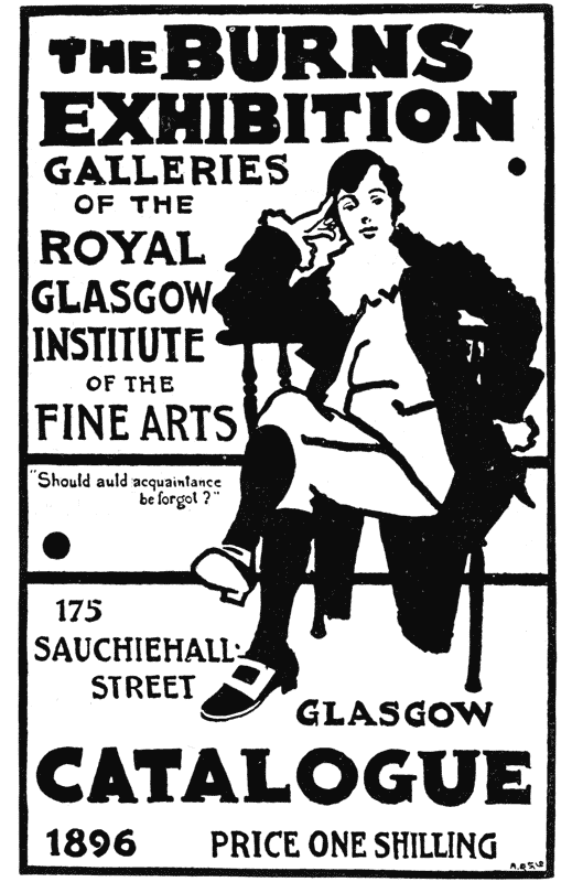 POSTER DESIGN FOR THE
BURNS EXHIBITION, GLASGOW.
By J. Hassall.
{180} well his design would appear from across the street, and how
cheaply it could be reproduced. Therefore, what an excellent style his
is as a guide for my printer readers.
POSTER DESIGN FOR THE
BURNS EXHIBITION, GLASGOW.
By J. Hassall.
{180} well his design would appear from across the street, and how
cheaply it could be reproduced. Therefore, what an excellent style his
is as a guide for my printer readers.
Hence, if the printer readers wish to make a cover design containing a portrait and flowers, I advise them not to follow the Rivoire—not for the reason that it is inartistic, but because it is too expensive for ordinary printing, and for cheap printing a poor imitation is abominable; while a design like the Caspari (Jugend, see page 169), where the portrait would be an outline and the lettering broad so it could be quickly read like the word “Jugend,” and in which the floral form should be decoratively treated like the dandelion design in the Grasset “Larousse,” or like the Auriol, page 175, would be just as pleasing to the eye, would print on the cheapest kind of stock, and would, therefore, appear to the critical as an artistic design.
AN IMPORTANT CHAPTER ON LETTERING — LETTERING CAN NEVER BE WHOLLY ORIGINAL, IT MUST FOLLOW HISTORICAL MODELS; MUST BE BLACKLETTER OR ITALIAN — THE STUDENT ADVISED TO MASTER THREE OR FOUR STANDARD ALPHABETS — STRANGE’S BOOK ON ALPHABETS RECOMMENDED — MONUMENTAL LETTERS CONSTRUCTED UPON A GEOMETRICAL BASIS — MR. GLEASON WHITE ON CHARLES RICKETTS AND THE VALE PRESS QUOTED — IT IS RECOMMENDED TO COPY A MONUMENTAL ALPHABET, AND TO GIVE SOME STUDY TO THE COMPLEX GOTHIC ALPHABETS, THAT THE STUDENT MAY UNDERSTAND THE PRINCIPLES OF THE THICKENING OF DIFFERENT PARTS OF A LETTER BY PEN PRESSURE — IT IS RECOMMENDED TO PRACTICE THE CAROLINE HAND FIRST, AND THEN THE GOTHIC.
This and the following chapters devoted to lettering give much practical information to the printer which may be enhanced in value if, before reading them, he will proceed as follows: Let him turn to the advertising pages of some printers’ magazine and copy, as best he can, three or four lines of ornamental lettering of three or four different fonts. After he has done this, then read this chapter and the next, and follow the suggestions therein. We think he will then get a fuller benefit from them than if he reads our suggestions first and then proceeds to letter according to our directions.
A GREAT
deal of time is wasted by the beginner
who attempts to letter because of his impression
that he can originate new styles of letters. Now, a critic
sometimes speaks of “original lettering,” meaning that
the lettering shows individuality in treatment, and is not
the mere slavish copying of some conventional
form. {182}
But in comparison to the other branches of art there is no
such thing as originality in lettering. Your letter must
be, broadly speaking, either Gothic (or blackletter,
thus
 )
or Italian (or roman letter, thus
A); that is,
it must be built upon Gothic or Italian principles. The
best thing for the beginner to do is to obtain some examples
of good lettering and master two or three alphabets
of Gothic or Italian style. After he has done this, he
will see how all other alphabets he may come across in
printed books will conform to the same general principles
of the alphabets he has mastered. He will see
how certain minor changes may be made, and if, in the
end, he is anxious to be original he will, by broadening
a letter where it may be broadened, or bringing its
cross-bar down a little lower than usual, give a suggestion
of originality to his work. (The chances are,
however, that he will prefer to prove himself a good
workman, and be content to combine, place and execute
traditional letters.)
)
or Italian (or roman letter, thus
A); that is,
it must be built upon Gothic or Italian principles. The
best thing for the beginner to do is to obtain some examples
of good lettering and master two or three alphabets
of Gothic or Italian style. After he has done this, he
will see how all other alphabets he may come across in
printed books will conform to the same general principles
of the alphabets he has mastered. He will see
how certain minor changes may be made, and if, in the
end, he is anxious to be original he will, by broadening
a letter where it may be broadened, or bringing its
cross-bar down a little lower than usual, give a suggestion
of originality to his work. (The chances are,
however, that he will prefer to prove himself a good
workman, and be content to combine, place and execute
traditional letters.)
Strange’s “Alphabets,” published a few years ago, is
an excellent book to study, and we shall give several
alphabets from it. The old books on the subject are apt
to be too ornamental for the printer, and the example we
give from Niedling’s “Book Ornaments” is of far less
practical use than the Strange examples we shall give.
But the Bauernfeind alphabet is valuable for study. It
shows the construction of the capitals on a geometrical
basis, giving an idea of how monumental letters are made.
It is easy to see that with such a guide as this, made by
an architect, the commonest workman, with the aid of
the
{183}
 Page from a Minnesingers’ song-book in the University
library at Heidelberg. Example of Gothic letter.
The initial letters were in black and terra cotta.
The letter W was half black and half terra cotta;
the U, H, and I were terracotta; the ornamentation
was black. In all probability the letters were
half an inch or an inch high. If you examine them
under a magnifying glass you can understand their
construction better than as they now appear. The
first verse reads as follows:
“Winter, dine trüben stunde
und din kelte magnivalt,
ob ich das erwenden kunde,
daz siu wurden has gestalt,
das liesse ich dur die lange naht,
und durh die vil minneklichen
diu mir froeiden vil hat braht.”
see
larger
{184} square and compass, could cut in marble an immense
dedication of a building or archway, though the letters
might be two or three feet high. A little study of this
alphabet will give you the ability to understand anything
written upon the subject of roman letters, so that the
following quotation from an article by Gleason White,
taken from the Magazine of Art, will immediately
become intelligible to you. Mr. White was writing of
Charles Ricketts and the productions of the Vale Press.
He said the Vale Press had its own type, its own paper
with its own watermark, but the printing was done by
Messrs. Ballantyne. The type designed by Mr. Ricketts
was “based on the precedents of the best Italian
alphabets.”
Page from a Minnesingers’ song-book in the University
library at Heidelberg. Example of Gothic letter.
The initial letters were in black and terra cotta.
The letter W was half black and half terra cotta;
the U, H, and I were terracotta; the ornamentation
was black. In all probability the letters were
half an inch or an inch high. If you examine them
under a magnifying glass you can understand their
construction better than as they now appear. The
first verse reads as follows:
“Winter, dine trüben stunde
und din kelte magnivalt,
ob ich das erwenden kunde,
daz siu wurden has gestalt,
das liesse ich dur die lange naht,
und durh die vil minneklichen
diu mir froeiden vil hat braht.”
see
larger
{184} square and compass, could cut in marble an immense
dedication of a building or archway, though the letters
might be two or three feet high. A little study of this
alphabet will give you the ability to understand anything
written upon the subject of roman letters, so that the
following quotation from an article by Gleason White,
taken from the Magazine of Art, will immediately
become intelligible to you. Mr. White was writing of
Charles Ricketts and the productions of the Vale Press.
He said the Vale Press had its own type, its own paper
with its own watermark, but the printing was done by
Messrs. Ballantyne. The type designed by Mr. Ricketts
was “based on the precedents of the best Italian
alphabets.”
Mr. Ricketts believes that the plan on which all letters should be based is that of the perfect circle or the perfect square; it matters not which geometrical form you choose, since a certain number of letters—M, L, H, and the like—demand a parallelogram, and others—C, G, Q, O—an ovate or circular plan. If to draw this distinction between types based on the oval or the circle appear a mere quibble, we must remember that the difference between the Byzantine and the Pointed styles, which divide architecture into two great sections, is one of similar limit. There is all the difference in the world, to a specialist in types, between a small “b,” “g” or “o” that follows the circle (
), and one that is planned upon an oval (
)—I wish to emphasize this point, because I know that the designer regards it as vital; and I, for one, agree entirely with his estimate of its importance. The question of “ceriphs” and the angles of certain strokes; whether a W consists of interlaced V’s, or of two connected only by the ceriph; whether the ceriphs of a capital T are vertical, or slant divers {185}
Reduced page from “Nimphidia,” by Michael Drayton; design and lettering by Charles Ricketts. Lettering to be compared with the Italian “Lucidario.” {186}
Facsimile of the title-page of the “Lucidario” (A. Mischomini: Florence, 1494). Original size of rule, giving proportion of page, 4 7/8 by 7 7/8 inches. Showing early Italian type letter and wood-cut design in harmony with same. {187} ways, or parallel—all these are secondary matters, but the plan of the letter is not secondary.
In the beautiful Kelmscott type, as in the famous Foulis fonts and other notable instances, the O is ovate, and all other letters agree with it. In Mr. Ricketts’ “Vale” type, the square and the circle dominate every letter. If this distinction be passed over as unimportant, further contention is useless. But on this point no compromise can be entertained. If it be unimportant whether the arch is a semicircle, or planned, like Euclid’s first problem, upon the intersection of circles, then it matters little. But so long as architecture is separated by such structural difference, it follows that an O based on a circle, or an H based on a perfect square, must be entirely unrelated to the ovate O or the oblong H. When taste is in question, one allows the adversary equal vantage; but when geometry comes in, axioms must be observed. Therefore, the ill-founded assertion that Mr. Rickett’s type copies any modern font cannot be allowed. You may dislike his symbol for the ordinary “&,” or dispute over the beauty of his ceriphs and the oblique strokes of certain letters; but if you maintain that a circle and an oval are practically alike, the question of these nicer points need not be raised.
We give a reproduction of a page from the Vale Press, and for comparison the Lucidario printed in Florence in 1494. The similarity in the style of lettering is evident.
An evening or two spent in copying the Bauernfeind alphabet, and then making up one upon the principle that most of the letters should be contained in a square will lead you to understand the monumental letter, or what you recognize as upper-case Roman. You might then begin to collect pictures of mediæval and classical monuments, and you would at a glance be able to see {188} the principles upon which their inscriptions are constructed, and you would see that though the letters of certain monuments differed in proportion from others, yet the letters themselves of all the classical monuments would be virtually the same, and most of the Italian mediæval inscriptions the same in character. An Albrecht Durer alphabet given by Strange (on page 174) is particularly interesting, being constructed in the same manner as the Bauernfeind.
The Stimmer and Rogel Gothic alphabets are almost
worthless for printers’ designing, but it will not be without
profit for you to realize that they are built upon the
principle of the swell made with a quill pen, and this
will lead you to the study of what you recognize as
Gothic letters which grew out of the pen hand of the
middle ages. Whether in solid black or white, any
Gothic letter must have more or less the principles of
the Stimmer and Rogel alphabets. Space will not permit
of a full analyzation of the matter, so let us take the
letter L only. In its simplest form it consists of two
lines (or “limbs”) at right angles—one perpendicular,
the other horizontal. Both lines may be the same
length; but conventionality has ordered that if either be
the shorter, the horizontal should be. The irregularity
of the ends of the letter, as in the monumental letters,
is not a necessary characteristic of an L (which may
consist of two simple lines); but it is the most frequent
form in the monuments and is associated with our idea
of a capital letter. When made with a pen in the middle
ages it was sometimes customary to give the
two lines
{189}
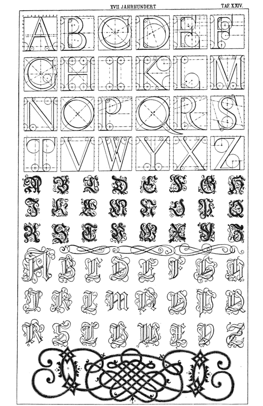 Examples of seventeenth century alphabets. From
“Bücher Ornamentik,” by A. Niedling, Weimar, 1895.
B. F. Voigt. The first alphabet, after Michael
Bauernfeind, is a monumental letter based upon the
square, the margins of the letters being obtained by
segments of circles. With such a diagram a letter
ten feet high could be made as easily as one an
inch high, and by an ordinary workman. The printer
would not advisedly map out his letter with such
exactitude, but it would be well to copy several of
the letters, if not the whole alphabet, that he may
study the character of the monumental letter. The
second alphabet is after Chr. Stimmer; the third
after type, the dies of which were cut by Hans Rogel.
see
larger
{190} an undulatory character, and there is hardly any kind of
twist or curve that has not been given to them. In making
initial letters, in order to fill up the space it became
the practice to make two lines of the upright shaft, and
sometimes three lines were used. Cross-bars were also
introduced, so that in Caxton’s initial letters the L looks
like the monogram P. E. L. Almost nothing restrained
the caligrapher; and if he chose to make a dozen or
two upright shafts, each getting smaller than the other
on either side of the letter, the whole ending in some
such Celtic interlacing as the base of the Niedling plate,
he could do so. But none of this is an organic form of
the letter L; and additional curve is pure ornament.
The distinction between the superficial ornament and
the organic lines of a letter is easily understood by first
practicing the Caroline hand and then the Gothic. In
the next chapter we shall be more explicit as regards
details.
Examples of seventeenth century alphabets. From
“Bücher Ornamentik,” by A. Niedling, Weimar, 1895.
B. F. Voigt. The first alphabet, after Michael
Bauernfeind, is a monumental letter based upon the
square, the margins of the letters being obtained by
segments of circles. With such a diagram a letter
ten feet high could be made as easily as one an
inch high, and by an ordinary workman. The printer
would not advisedly map out his letter with such
exactitude, but it would be well to copy several of
the letters, if not the whole alphabet, that he may
study the character of the monumental letter. The
second alphabet is after Chr. Stimmer; the third
after type, the dies of which were cut by Hans Rogel.
see
larger
{190} an undulatory character, and there is hardly any kind of
twist or curve that has not been given to them. In making
initial letters, in order to fill up the space it became
the practice to make two lines of the upright shaft, and
sometimes three lines were used. Cross-bars were also
introduced, so that in Caxton’s initial letters the L looks
like the monogram P. E. L. Almost nothing restrained
the caligrapher; and if he chose to make a dozen or
two upright shafts, each getting smaller than the other
on either side of the letter, the whole ending in some
such Celtic interlacing as the base of the Niedling plate,
he could do so. But none of this is an organic form of
the letter L; and additional curve is pure ornament.
The distinction between the superficial ornament and
the organic lines of a letter is easily understood by first
practicing the Caroline hand and then the Gothic. In
the next chapter we shall be more explicit as regards
details.
THE DISTINCTION IN LETTERING BETWEEN SUPERFLUOUS ORNAMENTS AND ORGANIC LINES — A SOLID FOUNDATION FOR THE STUDY OF LETTERING — STUDIES, WITH THE QUILL PEN, OF THE CAROLINE ALPHABET AND ITS MODERN REVIVAL IN FRANCE BY GRASSET AND AURIOL — THE MINNESINGER LETTER NOT VERY ORNATE BUT MORE COMPLEX THAN THE CAROLINE — THE MINNESINGER CORRESPONDS TO THE STIMMEL AND ROGEL ALPHABETS — THE BERGOMENSIS LETTER MORE COMPLICATED AND MORE REGULAR THAN THE MINNESINGER — THE ITALIC LETTER MORE SIMPLE AND ROUNDER THAN THE MINNESINGER.
IN
the last chapter we said, “The distinction between
the superficial ornament and the organic lines of a
letter is easily understood by first practicing the Caroline
letter and then the Gothic.” Let us explain the benefit
of this practicing; the keynote to the matter is found in
our Caroline example. Draw the second I and you will
find that it is virtually a simple shaft with a little spreading
at the top and bottom. If you draw with a quill or
reed pen it is very easy to get this swell by a little
extra pressure as you begin to draw and as you finish;
and in almost all Caroline writing the I is made freehand
and the shape depends upon pen pressure and varies a
little each time the letter is made. It is not mapped
out beforehand. The thin curved line on top of the
first I is superfluous ornament; that line is made by a
second stroke. We find several such ornaments in the
first two lines which form the head of a chapter, just as
we find much ornamentation of the initial letter; but
we {192}
do not find any ornamentation of the I’s in the eight
lines of text. There the I’s are all made with a single
stroke of the pen, so that the top and bottom of each
one is a trifle different from that of the others. In the
first line of text there is superfluous ornamenting of the
T’s, and of the H. Otherwise this is a true pen hand;
the I made with one stroke, the C, D, L, O, P, Q, U,
X, etc., with two strokes, the A, B, E, M, N, R, S,
with three. The reader is advised to copy this alphabet
with as large a quill pen as procurable, making the letters
from half an inch to an inch high, and then, turning
to the Grasset “Nouveau Larousse Illustré,” it
will dawn upon him that he knows exactly how the letters
there were made; and he will have little trouble in
imitating almost to perfection the three words, “En
Six Volumes.” When he tries the words, “Nouveau
Larousse Illustré,” he may have some trouble with
the A, the S and with the O, which does not show its
separate halves as in the Caroline: the horizontal line
of the L also is more difficult to make than if it were the
same width throughout. The I, R, N and V he will
find quite simple. As he familiarizes himself with the
Caroline M, D, V and I; with the H in the second line
of the text under the ornamental H; and with the P, S,
C, he will begin to realize that upper and lower case
letters were originally the same. He will also be surprised,
if he next falls to studying the Minnesinger
letters (last chapter) under a magnifying glass, to find
how like they are to the Caroline. Is not the capital I
somewhat clumsier than the first I in the Caroline top
line? Are not the c, d, h, i, o, p, s, u, v and y clumsier,
more angular drawings of the same letters
as in the
{193}
 TITLE-PAGE
BY
JACOBUS
PHILLIPPAS
FORESTI
BERGOMENSIS.
(Ferrara, 1497.)
A splendid example of Gothic lettering. It is to be
remembered that this was originally designed with a
reed or quill pen, and the ornamentations are such
as may be easily made with that instrument. But its
regularity is also due, in a small measure perhaps,
to its having been engraved on white metal. In an
entire book written in this style the letters would
be less regular—a little more like the Minnesinger
letters.
{194} Caroline alphabet? You find the s more decidedly four
strokes, while in the Caroline it may be considered
three. You find the m slightly different: turn to our
last chapter and note the Hans Rogel m, which is upper
case, and see how it corresponds to the Minnesinger
lower-case m.
TITLE-PAGE
BY
JACOBUS
PHILLIPPAS
FORESTI
BERGOMENSIS.
(Ferrara, 1497.)
A splendid example of Gothic lettering. It is to be
remembered that this was originally designed with a
reed or quill pen, and the ornamentations are such
as may be easily made with that instrument. But its
regularity is also due, in a small measure perhaps,
to its having been engraved on white metal. In an
entire book written in this style the letters would
be less regular—a little more like the Minnesinger
letters.
{194} Caroline alphabet? You find the s more decidedly four
strokes, while in the Caroline it may be considered
three. You find the m slightly different: turn to our
last chapter and note the Hans Rogel m, which is upper
case, and see how it corresponds to the Minnesinger
lower-case m.
The Caroline e you think, differs from the Minnesinger e, but if you will look at the e in erat, third line of text, you will see how decidedly the e there is a lower-case e.
Now turn to the Bergomensis letters and recognize
that they have certain characteristics. One characteristic
is that the final letters and several others are ornamented
with the same kind of curved lines as in the first
Caroline I. Then that the letters are made with a pen
stroke, but that three strokes are frequently used where
one is satisfactory in the Caroline. This is plainly seen
in the letter I. And of these three strokes, one is the
shaft of the letter, which is long, the other two are the
top of the shaft, which extends a little to the left, and
the bottom which extends to the right. And these
three strokes become the basis of the letter i, of u which
is a double-i, of n which is a double-i, and of m which
is a triple-i. The o is made of the main shaft and the
right-hand base, and the left-hand top and the main
shaft. So you will then see that the Bergomensis is
nothing less than a more complicated and more regular
letter than the Minnesinger, which in turn is nothing less
than a more irregular letter than the Caroline! In order
to make the Bergomensis letter you must have your
pen cut to a comparatively blunt point the exact width
of the letter—a letterer uses such a pen almost
always. {195}
When you study the Italic specimen (see last chapter,
“Lucidario” page), however, you find that the lower-case
letter is very much like the Minnesinger, except
that it is more simple and a trifle more rounded, but
note that it is evidently written with a comparatively
sharp-pointed quill pen. But it is not to be
overlooked
 Example of seventh century lettering from a Latin
manuscript, reproduced from Strange’s book on
lettering. In this letter, freed of the curves in the
capitals I, T, L, V, C, etc., we find the principles
of a very simple and graceful style of lettering,
virtually the Caroline, which is being revived by
Grasset and Auriol in France today.
that the variety in the letters is still due to the pressure
of the pen. The Italic letter is best practiced with a
new quill; and then when it gets a little out of order it
may be cut a trifle and be used for a Gothic letter, like
the Minnesinger; and then when it spreads again it may
be cut a second time and then used for a broader Gothic
letter like the Bergomensis. {196}
Example of seventh century lettering from a Latin
manuscript, reproduced from Strange’s book on
lettering. In this letter, freed of the curves in the
capitals I, T, L, V, C, etc., we find the principles
of a very simple and graceful style of lettering,
virtually the Caroline, which is being revived by
Grasset and Auriol in France today.
that the variety in the letters is still due to the pressure
of the pen. The Italic letter is best practiced with a
new quill; and then when it gets a little out of order it
may be cut a trifle and be used for a Gothic letter, like
the Minnesinger; and then when it spreads again it may
be cut a second time and then used for a broader Gothic
letter like the Bergomensis. {196}
Now, I do not claim that this chapter will be intelligible to a mere reader—I feel sure that it will not be—but to anyone who will put in practice all the exercises I have suggested, I feel sure that it will be intelligible, and that it will give him the foundation for the whole study of lettering so that he may pick up any alphabet and master its principles after a few days’ practice.
USE OF QUILL FEN NECESSARY IN THE STUDY OF LETTERING — THE ORNAMENTATION IN LETTERING OF NORTHERN AND SOUTHERN SCRIBES COMPARED: THE ITALIAN, GOTHIC, VISIGOTHIC, LOMBARDIC, ROMAN, VENETIAN, ARABIC — THE FIRST PRINTED LETTERS: TYPE OF CAXTON, GUTENBERG, ALDUS — THE ITALIC (LUCIDARIO PAGE), MODERNIZED, BECOMES THE JENSON AND MORRIS TYPE, THE FRENCH OLD STYLE, ENGLISH OLD STYLE, AND OUR MODERN ROMAN LOWER CASE: THE ALDUS TYPE BECOMES OUR ITALIC — THE PRINTER MUST HAVE EDUCATED TASTE IF HE WOULD DESIGN CORRECTLY — APPROPRIATENESS OF CERTAIN LETTERS BECAUSE OF THEIR HISTORIC ASSOCIATIONS — THE BAD TASTE OF ORNAMENT AT THE EXPENSE OF CLEARNESS — AIMLESS, UNBALANCED ORNAMENTATION — OVERORNAMENTATION — GRASSET’S LETTERING STUDIED — IN AURIOL’S LETTERING THE SPIRIT OF PLANT FORM IS EXTENDED BY LETTERING, AS IN GOTHIC ARCHITECTURE PLANT FORM IS BUILT UPON.
IT is to be hoped that upon our advice the printer, after reading Chapter I, attempted to copy some font, and that, not following any special method, he found it pretty tedious work: that he then read Chapters II, III and IV, and found, with the help of our information about the Latin capitals in a square, and about the Gothic letter being dependent upon the spreading of a quill pen, that things seemed clearer, more intelligible. But we think that, with the help of the present chapter, he will make still more progress. If he, fully appreciating our reference to the quill pen, procured one, and set to work studying the Grasset letters {198} he must have made rapid progress; for it is only by using the quill pen that the Grasset and Auriol letters can be understood. So we say that if a printer will procure one and practice the Caroline alphabet given in the last chapter, next the Burgomensis, next the Minnesinger, and then the Stimmel and Rogel alphabets, he will find that he has a solid foundation on which to study lettering, and a clear idea of the genius of letters. He will begin to realize that the Caroline is the simplest, the Burgomensis and Minnesinger the more complex, but not very ornamental, though in them the caligrapher had begun to assert himself, using a flourish from time to time to ornament the letters. And he will notice that these flourishes are such as are made naturally with a quill or reed pen, and that upon these curves and swellings are based not only the Gothic capitals, but also what are known as lower-case letters.
It so happened that most of the southern scribes (Italians and Spanish) confined themselves to a very simple letter, while the northern ones took pleasure in variety. The southern style is called the Italian, or italic; the northern, the Gothic. There are many historical instances, however, where northern manuscripts are simple; and on the other hand, the letters of Visigothic and Lombardic writers, though southern, were more ornamental than those of their Roman and Venetian brethren; and our Burgomensis specimen we call Gothic, though it was originated in Italy. The true southern ornamentation was originated under the Arabic influence in Spain (at the time of the Saracenic conquest), and traveled up to France, where it is found in the elongated d, s and f in the French diplomatic hand.
You, of course, know that when the art of printing was invented the types had to be cast, and the dies were naturally cut in the form of the letters of the manuscript of the country in which the printing was done. Caxton imitated the manuscript of the Low Countries and not that of England, when he printed the first book printed in English movable type. So, too, Gutenberg’s type imitated the German manuscript, while that of Aldus, tradition says, was cast after the manuscript of Petrarch, and that form has been called Italian or italic ever since. We give a specimen of Aldus’ “Horace”: copy with a quill the lower case in it till you can write with ease, and you will be able to write as Petrarch did. It is harder to associate it with quill pen writing than to associate the Gothic with the pen letter. Nevertheless, if you will write for a little while with an old quill, lettering like the Minnesinger, and then with a new quill imitate the Aldus italic, you will soon see that the italic character depends upon the pressure of the quill pen, just as the Gothic does, though not to such a degree. Make lower-case a, d and s, or an m several times, and you will see what I mean. The other Italian form, which printers do not call italic, is like the Lucidario, which is less cursive than the Petrarchian form. When modernized, the Lucidario becomes the “Jenson” and Morris type (while the Aldus is our italic); it only needs a little investigation to realize how easily it became the French Old Style and English Old Style, and then our modern, roman lower case.
It will not be difficult for you, if you will really obtain the quill pen and practice as I propose, to realize the truth of the following suggestions:
A printer should show an educated taste in his {201}
designs. Few people know this, and your fight will
be continually against this ignorance, both
in yourself
 First page of Larousse’s New Dictionary, showing
a scholarly style of decoration. This can be best
studied under a magnifying glass.
see
larger
and your customers. You will think that anything you
like is artistic and appropriate and you will be
tempted {202}
to undertake it. Your customers will say that they
“know nothing about art” but they “know what they
like”; so they will pick out some ill-executed and inappropriate
job and insist upon your following it. But my
business is simply with that which is established as
standard, and not with what people like or dislike.
Now, historic association plays an important part in
designing for printers. The first page of the Larousse
dictionary is a superb example of historic association
introduced into a design. Here, to illustrate the letter
A we have letters from many different periods, but they
are all harmonious because of their ornament and their
execution. And they are appropriate because they are
historical. So if you are designing an announcement
of the Ancient Order of Hibernians, a prospectus of a
genealogical society, a book of early English poetry
(earlier than the tenth century) you could use the sixth
or seventh century A because that belongs to the very
best Irish-English lettering used between the sixth and
tenth centuries. The other letters that go with the
Larousse sixth century ornamented A specimen you
will find in an example from the “Book of Kells,”
given in Strange’s “Alphabets,” and perhaps in the
“Durham Book.” This identical A is probably from
“The Rule of St. Benedict.” Now, if you should
obtain an Anglo-Saxon alphabet and master its style
and apply it as we have suggested, it would be properly
associated with these historic subjects; so you, as an
educated printer, would know that you were right, and
any criticism would not deter you from using it.
First page of Larousse’s New Dictionary, showing
a scholarly style of decoration. This can be best
studied under a magnifying glass.
see
larger
and your customers. You will think that anything you
like is artistic and appropriate and you will be
tempted {202}
to undertake it. Your customers will say that they
“know nothing about art” but they “know what they
like”; so they will pick out some ill-executed and inappropriate
job and insist upon your following it. But my
business is simply with that which is established as
standard, and not with what people like or dislike.
Now, historic association plays an important part in
designing for printers. The first page of the Larousse
dictionary is a superb example of historic association
introduced into a design. Here, to illustrate the letter
A we have letters from many different periods, but they
are all harmonious because of their ornament and their
execution. And they are appropriate because they are
historical. So if you are designing an announcement
of the Ancient Order of Hibernians, a prospectus of a
genealogical society, a book of early English poetry
(earlier than the tenth century) you could use the sixth
or seventh century A because that belongs to the very
best Irish-English lettering used between the sixth and
tenth centuries. The other letters that go with the
Larousse sixth century ornamented A specimen you
will find in an example from the “Book of Kells,”
given in Strange’s “Alphabets,” and perhaps in the
“Durham Book.” This identical A is probably from
“The Rule of St. Benedict.” Now, if you should
obtain an Anglo-Saxon alphabet and master its style
and apply it as we have suggested, it would be properly
associated with these historic subjects; so you, as an
educated printer, would know that you were right, and
any criticism would not deter you from using it.
I take it for granted, however, that you use such
letters as this A only as initials, or in designing a
title {203}
of a line or two; and that you would not let it occupy
too much of the page: for it is not only necessary that
a letter should be associated historically with a subject
and that it be well designed, but it must also be associated
with printing or bookmaking. It is true that
some introductory pages in the sixth and seventh century
Irish-English manuscripts were sometimes very
ornamental, but the reading pages were,
as a rule, quite
 This is a design by Eugene Grasset for the heading
of a department in “La Revue Encyclopédique.” It
represents French designing art at its best. It
is free from conventionality, and yet orderly and
well balanced. The Auriol design for “La Revue
Encyclopédique” is bold and striking, but not as
perfect as this.
simple. The good bookmaker never forgets his pages
are for reading. So, a Gothic ornamental letter that
might be appropriate in a stained glass window or on
a hand-painted testimonial might be offensive throughout
a printed book. I know of nothing more inartistic,
more nauseating to critics, than the millions of lithographed
mottoes, Christmas cards, etc., that the English
lithographic publishers have put out for the last
decade—overburdened with ornament that should be
painted and not printed. And so the whites in this
sixth century A, and the dotted outline around it,
make {204}
it in a way less appropriate for general printing than the
solid black, twelfth century A.
This is a design by Eugene Grasset for the heading
of a department in “La Revue Encyclopédique.” It
represents French designing art at its best. It
is free from conventionality, and yet orderly and
well balanced. The Auriol design for “La Revue
Encyclopédique” is bold and striking, but not as
perfect as this.
simple. The good bookmaker never forgets his pages
are for reading. So, a Gothic ornamental letter that
might be appropriate in a stained glass window or on
a hand-painted testimonial might be offensive throughout
a printed book. I know of nothing more inartistic,
more nauseating to critics, than the millions of lithographed
mottoes, Christmas cards, etc., that the English
lithographic publishers have put out for the last
decade—overburdened with ornament that should be
painted and not printed. And so the whites in this
sixth century A, and the dotted outline around it,
make {204}
it in a way less appropriate for general printing than the
solid black, twelfth century A.
The middle A is in the style of the wood-cut Venetian letter of the sixteenth century; and while on general principles a gray background like this is not so satisfactory as a black one, yet this is not a bad specimen of designing, for the stipple could be punched into the wood very deeply, and is so near together that if one hole did fill up it would not be missed. However, it, too, must not be used for general printing, but only as rich ornament. It is well balanced, mind you, and therefore the detail is not so worrying as would be as much detail put in freehand, aimlessly and unbalanced.
If you will now turn to the cover design of the
Larousse given in the August number, you will find it
a beautiful production by Grasset, wherein we see also
some decorative elements that may be studied in conjunction
with what we have written in this and preceding
chapters about letters. For example, the use of line
with silhouette—we find a dandelion leaf reduced to
silhouette, and another laurel wreath like the one pictured
on the head of Goethe’s mother. But the lettering
of the title is the most interesting part of it. Grasset
has studied the Caroline letter, and reproduces it with
very scholarly fidelity. Only when you have studied
an example like the Caroline alphabet we give from
Strange’s book can you appreciate the workmanship
and good taste in the Grasset. A companion piece to
this is the heading by Auriol where we see a modification
of the monumental letter and the uncial as in the
d and the r. Here the initials J J and the initial L are
Gothic in principle, and you will not fail to see
how
{205}
 Design for an article in “La Revue Encyclopédique”
on “Le Théatre Moderne et L’Influence Étrangère, par
Jean Jullien,” with an initial letter and design
embracing a half-tone portrait of the author. A
harmonious design, showing the use of silhouette; and
Caroline lettering not so well understood as in the
work of Grasset. Designed by George Auriol.
{206} harmoniously the L below the leaves extends the spirit
of the plant design, so that if you have ever read essays
upon Gothic art, like the writings of Ruskin, you will
readily see the plant form is here built upon, as in
Gothic architecture. What we have said so far ought
to have prepared you for a historic survey of the topic
of lettering. Our space is much too limited to make
such a survey very extensive, but what we shall give in
the next chapter will serve as a foundation on which
you can build, by reading, a much more exhaustive
study of the subject.
Design for an article in “La Revue Encyclopédique”
on “Le Théatre Moderne et L’Influence Étrangère, par
Jean Jullien,” with an initial letter and design
embracing a half-tone portrait of the author. A
harmonious design, showing the use of silhouette; and
Caroline lettering not so well understood as in the
work of Grasset. Designed by George Auriol.
{206} harmoniously the L below the leaves extends the spirit
of the plant design, so that if you have ever read essays
upon Gothic art, like the writings of Ruskin, you will
readily see the plant form is here built upon, as in
Gothic architecture. What we have said so far ought
to have prepared you for a historic survey of the topic
of lettering. Our space is much too limited to make
such a survey very extensive, but what we shall give in
the next chapter will serve as a foundation on which
you can build, by reading, a much more exhaustive
study of the subject.
THE GROWTH OF WRITTEN LANGUAGE — SIGNS AND SYMBOLS BECOME HIEROGLYPHS — EGYPTIAN HIEROGLYPHS BECOME HIERATIC OR CURSIVE — THE HIERATIC BECOMES ANGULAR IN THE PHŒNICIAN — PHŒNICIAN ALPHABET A MONUMENTAL ONE AND THE LETTERS LIKE OURS — FROM THE PHŒNICIAN COME THE GREEK AND LATIN ALPHABETS, WHICH ARE USED THROUGHOUT EUROPE TODAY.
THE GROWTH of written language is briefly recorded as follows. Primitive man used signs and symbols, as does the North American Indian. Noah understood the symbol of the dove with the olive branch. Had he wished to record the event of the flood he would probably have drawn several waved lines to represent water, and a mountain peak underneath, to show that the water rose above the mountains. A second picture of a dove with an olive branch would have indicated that the waters had subsided. This method of writing was used by the Assyrians and Egyptians 5000 B. C. With the Assyrians the symbols developed into “cuneiform,” or wedge-shaped signs, stamped on clay. With this form we have nothing to do, as it never influenced our writing; but with the Egyptians (as with the Chinese) the symbols soon took a written form called hieratic (used by the priests), which is the direct parent of our own handwriting. In hieroglyphs on monuments in Egypt, the sign for water was a horizontal zigzag, and for a mountain a silhouette of hill-like form. These {208} were painted, and sometimes partly incised on soft stone or stucco, and had a pictorial character. But when the priests had to write voluminous rituals, they used a reed pen on papyrus, and reduced the silhouette pictures to shorthand-like marks. The first example in the Larousse Dictionary (page 201), represents the hieratic shorthand of the hieroglyph of a bird. But not only did the Egyptians use their signs as hieroglyphic word symbols, but they also used them as phonetic signs, so that the sign for water stood for both water (mu) and the sound n. The Phœnicians and Hebrews are supposed to have borrowed their alphabet from the Egyptian hieratic writing; and in the transition the irregular character of the markings of the reed pen on papyrus disappeared and monumental regularity took its place, as nearly all of the early Phœnician and Hebrew writing was in the form of inscriptions on stone and metal. But in this transition the letters did not revert to the Egyptian hieroglyphic symbol, but simply became an angular, simplified form of the hieratic, so that the A became a V or caret-like form with a line crossing it.
With the Phœnicians and Hebrews the signs were never used for word signs, but for syllabic (or letter) forms, so that with them N was simply a phonetic sign (plus variable vowel accompaniments).
This alphabet was used by the Phœnicians, Hebrews, Moabites and other Semitic inhabitants of Palestine. It is supposed to have been carried by the Phœnicians to Greece, and possibly to countries farther west, but until investigation throws further light upon the subject it is well to suppose that all the other countries of Europe {209} received their alphabets from Greece, so that, virtually, all the alphabets of Europe—Latin, English, German and Russian-are simply modifications of the Greek (see the succeeding specimens in the Larousse Dictionary page). The Greek alphabet was modified in two ways: first, in the monumental form it became more regular—more right-angled—than the Phœnician; secondly, in the manuscript it became much more irregular—cursive in general, with angles not at right angles (see cursive examples, third row of Larousse Dictionary page)—so that in some third century manuscripts there is as much irregularity as in the Egyptian. This character, however, is more apt to be found in the late Greek manuscripts—that is, those written during the Christian era—than in classic Greek manuscripts where simplicity and regularity prevail. It is particularly interesting to the printer to realize this fact: for when he sees a difference in European lettering—as, for instance, the difference between Russian and German text on the one hand, and English on the other—he must remember that Russian and German are outgrowths of the late Greek or ornamental lettering; while English, Italian, Spanish and French are the outgrowths of the simpler classical Greek forms. To distinguish the two we have called the first (most of which is irregular) Gothic, the second (which is generally regular) Latin. But many an irregular manuscript was written by other than Gothic scribes, and there are some Latin manuscripts that are as irregular as the Gothic.
No matter how a letter may vary in ornamentation in a German, Russian, or English book, it is an outcome {210} of a Greek original. In the Russian, in one or two cases, a sign is a compound of two Greek letters, but in English each letter has its Greek prototype. Now anyone who stops to think will notice that monumental letters on stone are about the same in all countries. (The letters on Gothic brasses, however, are dissimilar to the usual monumental letters.) For the monumental letter is usually made by measuring, as in the first Bauernfeind alphabet, and is cut by an ordinary workman who follows a pattern, which should be simple. Therefore, an A is nearly always two oblique uprights and one horizontal crosspiece, like the sixth Larousse example. The two uprights are not always at the same angle, but they are nearly always oblique, though one may be very near the perpendicular. The crosspiece is sometimes oblique, but rarely at an angle greater than fifteen degrees. So a monument erected in Greece 600 B. C., one in Rome 60 B. C., one in Italy in 1400 A. D., and one in Paris today, have virtually the same letter A upon them as one written in Paris today, and a child who had just learned its letters could recognize it in each.
It must not be expected that in a short treatise of this kind we can cover the whole field of paleography, but our few notes on the subject may indicate to some readers a line of study that will repay anyone who undertakes it. The easiest method is to examine manuscripts of Bible text, where the subject matter is pretty well known, and, following the different styles of writing, acquaint oneself with the development of writing in different centuries and in different countries. A valuable handbook giving facsimiles of many Bible pages is “Bible Illustrations,” published by Henry Frowde, New York—it costs but $1.

SUMMARY OF METHOD OF INSTRUCTION GIVEN — PRELIMINARY “PLACING” OF LINES IN A SKETCH — THE RELATION OF A SILHOUETTE TO AN OUTLINE — DRAWING IN OUTLINE, IN SILHOUETTE, WITH PARTIAL SHADING AND WITH FULL SHADING — CUTS GIVEN OF VARIOUS STYLES OF BOOK DECORATIONS — ANALYSIS OF THESE STYLES.
NOW for our summary. My method of teaching in this series has been one of suggestion, and very often I have seemingly gone off at a tangent, to hint at an application of some rule; in so doing perhaps the chapters seem to lack continuity, but I think several readings of them will show that there has been a logical development throughout. Perhaps the following summary will bring various parts together and fix all in the memory.
First, the student is advised to practice drawing from
objects, and to learn to get something on the paper as
soon as possible, and then by further labor to develop
this something. There should be at first, lines and
markings showing about where the different parts of an
object should come. In the Lautrec drawing the lines
are not meant for a bicycle or the calves of a man’s
legs, but the lines represent about where the bicycle and
the man’s calves should come. Anything that can be
seen may be “placed” in this way—a tree, a house, a
cloud. After the student has learned to
“place”
{212}
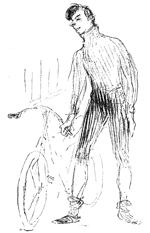 ZIMMERMAN AND HIS MACHINE.
After a lithograph by H. de T. Lautrec, from the
Revue Franco-Americaine.
This is given as an example of rapid manner
in placing a figure. In sketching a figure it is
advisable always to draw the whole figure at once,
and never finish the head first and then go to
the hand. In a few lines, a correct draftsman may
indicate a great deal. It is also given as an example
of a reproduction from a crayon drawing. This is
actually reproduced from a print, but the artist
originally drew on a stone with crayon, and crayon on
paper will reproduce by photo-engraving as well as
this. Lithograph crayon may be used, or an ordinary
hard crayon (the softer the better), or Hardtmuth’s
crayon pencils. Charcoal paper may be used, or any
of the special crayon papers. The more grain on the
paper, the better.
{213} objects fairly well, he finds that by going over his sketch
lines, and improving them a little, he can make outline
drawings. Outlines are frequently used for finished
effect as seen in the Beggarstaff poster.
ZIMMERMAN AND HIS MACHINE.
After a lithograph by H. de T. Lautrec, from the
Revue Franco-Americaine.
This is given as an example of rapid manner
in placing a figure. In sketching a figure it is
advisable always to draw the whole figure at once,
and never finish the head first and then go to
the hand. In a few lines, a correct draftsman may
indicate a great deal. It is also given as an example
of a reproduction from a crayon drawing. This is
actually reproduced from a print, but the artist
originally drew on a stone with crayon, and crayon on
paper will reproduce by photo-engraving as well as
this. Lithograph crayon may be used, or an ordinary
hard crayon (the softer the better), or Hardtmuth’s
crayon pencils. Charcoal paper may be used, or any
of the special crayon papers. The more grain on the
paper, the better.
{213} objects fairly well, he finds that by going over his sketch
lines, and improving them a little, he can make outline
drawings. Outlines are frequently used for finished
effect as seen in the Beggarstaff poster.
Of course, this preliminary “placing” of the lines is
difficult until the eye is trained to see correctly.
I have
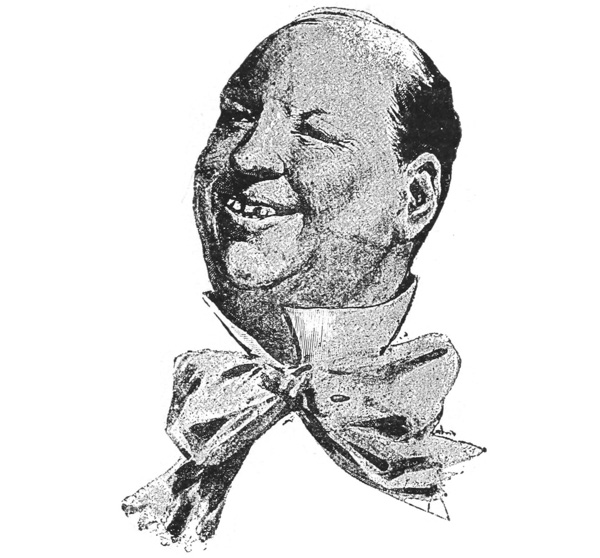 Portrait caricature of the French actor Dailly, from
a French periodical. Half-tone from a wash drawing.
known beginners who could hardly grasp the idea of
what an outline is, so I suggest the excellent method of
trying to see objects as silhouettes. It is not a bad plan
to put a whisk broom, a screw-driver and a hammer
against a window pane and draw them in
silhouette. {214}
The Beggarstaff is very interesting from this point of
view—if you will think of the cocked hat as a mass,
like the Quaker hat, you will find it easier to draw its
outline than as if you see it in all its component parts, as
in the Penlick drawing. We have given previously many
silhouette illustrations to emphasize this method of seeing
things in mass. We also make this point: that the ability
to see objects in silhouette is helpful, not only for the
purpose of representing an entire object in silhouette,
but also because details can frequently be thus represented
with excellent effect. For example, the hair and
mustache in the Penlick, and the hair in the Dailly are
in silhouette.
Portrait caricature of the French actor Dailly, from
a French periodical. Half-tone from a wash drawing.
known beginners who could hardly grasp the idea of
what an outline is, so I suggest the excellent method of
trying to see objects as silhouettes. It is not a bad plan
to put a whisk broom, a screw-driver and a hammer
against a window pane and draw them in
silhouette. {214}
The Beggarstaff is very interesting from this point of
view—if you will think of the cocked hat as a mass,
like the Quaker hat, you will find it easier to draw its
outline than as if you see it in all its component parts, as
in the Penlick drawing. We have given previously many
silhouette illustrations to emphasize this method of seeing
things in mass. We also make this point: that the ability
to see objects in silhouette is helpful, not only for the
purpose of representing an entire object in silhouette,
but also because details can frequently be thus represented
with excellent effect. For example, the hair and
mustache in the Penlick, and the hair in the Dailly are
in silhouette.
Besides outline and silhouette, shading may be employed by the draftsman to bring out form. The Dailly differs considerably from the Beggarstaff—it is fully shaded, and shading brings out the forms of the planes and muscles of the face.
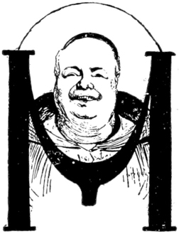 Pen drawing by Albert Mantelet.
antelet’s
initial gives us a third kind of
drawing. It is partly shaded. The
Sphinx design is an excellent example
of shading contrasted with silhouette.
In order to learn to shade, it is well
to draw from white objects, such as
plaster casts or pasteboard boxes,
placed in a good light, which should
come from one direction only. It makes little difference
what material is used to draw with; your aim should be
to accustom yourself to distinguish light and shade. If
you can distinguish it upon the object it is not difficult
to draw it on paper.
Pen drawing by Albert Mantelet.
antelet’s
initial gives us a third kind of
drawing. It is partly shaded. The
Sphinx design is an excellent example
of shading contrasted with silhouette.
In order to learn to shade, it is well
to draw from white objects, such as
plaster casts or pasteboard boxes,
placed in a good light, which should
come from one direction only. It makes little difference
what material is used to draw with; your aim should be
to accustom yourself to distinguish light and shade. If
you can distinguish it upon the object it is not difficult
to draw it on paper.
Lettering and the adaptability or
application of
{215}
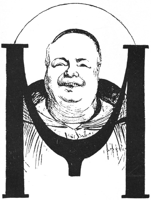 Initial letter, with character portrait. Drawn by
Mantelet, enlarged from a cut in a French periodical.
A drawing might be made this size if intended to be
reduced to the size of the cut opposite.
{216}
the pictorial to printing are matters which we have
allowed to force their way into almost every
page, so a
Initial letter, with character portrait. Drawn by
Mantelet, enlarged from a cut in a French periodical.
A drawing might be made this size if intended to be
reduced to the size of the cut opposite.
{216}
the pictorial to printing are matters which we have
allowed to force their way into almost every
page, so a
 Design by Georg Auriol.
summary of our method of teaching in this series would not be complete
without a further word about the decoration of a
page.
Design by Georg Auriol.
summary of our method of teaching in this series would not be complete
without a further word about the decoration of a
page.
Let us next, therefore, consider the matter of periods or styles in
illustrating. The initial letter designed by Auriol represents a modern
style of design.
 THE BATTLE OF THE SPHINX.
Illustration from a French periodical.
Crayon and silhouette effect.
{217} Twenty years ago the half-tone, as in this portrait, was
unknown, and while the white and black goes back to the fifteenth
century, the free distribution of the leaves is due to the French
artists having studied Japanese designing.
THE BATTLE OF THE SPHINX.
Illustration from a French periodical.
Crayon and silhouette effect.
{217} Twenty years ago the half-tone, as in this portrait, was
unknown, and while the white and black goes back to the fifteenth
century, the free distribution of the leaves is due to the French
artists having studied Japanese designing.
The “Théatre du Chat Noir,” designed by the same
artist, is also Japanesque in treatment. It may be profitably
compared with the Grasset page. Auriol’s
initial
 “L” you will at once recognize as Gothic, and that
also, you see, goes back farther than the fifteenth
century. Now, does not that suggest to you that
in modern designing there may be much recourse to
antique styles? Recognizing this, you will grasp our
idea in publishing these different Ls. We do not
say any special one, like our initial “L,” could be
of immediate use to you; but we do say that, in the
hands of a clever designer, every one could serve
as a basis on which to build a style of design.
“L” you will at once recognize as Gothic, and that
also, you see, goes back farther than the fifteenth
century. Now, does not that suggest to you that
in modern designing there may be much recourse to
antique styles? Recognizing this, you will grasp our
idea in publishing these different Ls. We do not
say any special one, like our initial “L,” could be
of immediate use to you; but we do say that, in the
hands of a clever designer, every one could serve
as a basis on which to build a style of design.
 ooking
at these initials from this
point of view, they offer various
suggestions. Here, for example,
are more natural forms, but not
in the Japanese styles. A close
observer of nature might be able
to engrave a somewhat
clumsier, {218}
but none the less interesting, initial of this kind, while
he could not draw a Japanese-like design with the grace
of Auriol.
ooking
at these initials from this
point of view, they offer various
suggestions. Here, for example,
are more natural forms, but not
in the Japanese styles. A close
observer of nature might be able
to engrave a somewhat
clumsier, {218}
but none the less interesting, initial of this kind, while
he could not draw a Japanese-like design with the grace
of Auriol.
 eaves
and flowers are not the
only motives at the designer’s
service. Here is a little street
vista in which the suggestion of
buildings is nicely brought out,
yet the lines are by no means
exact. If one or two lines have
been cut away in the process of
engraving, we hardly miss them;
and if a few more should be cut away from the design
as it is, they would not be missed. A style of designing
in which free lines are used in this way has its value,
though we should not advise one to found a study of
drawing upon such
principles.
eaves
and flowers are not the
only motives at the designer’s
service. Here is a little street
vista in which the suggestion of
buildings is nicely brought out,
yet the lines are by no means
exact. If one or two lines have
been cut away in the process of
engraving, we hardly miss them;
and if a few more should be cut away from the design
as it is, they would not be missed. A style of designing
in which free lines are used in this way has its value,
though we should not advise one to found a study of
drawing upon such
principles.
 ines
in themselves, as well as
nature’s forms, may be used.
This “L” is little more than a
repetition of Arabic design; again
in our example of Holbein’s book-cover
design we see an echo of
Moorish and Grolier designing,
which were Arabic in character.
ines
in themselves, as well as
nature’s forms, may be used.
This “L” is little more than a
repetition of Arabic design; again
in our example of Holbein’s book-cover
design we see an echo of
Moorish and Grolier designing,
which were Arabic in character.
 ike the former initial “L,” this one
depends upon lines for its ornamentation. These are
curved lines instead of straight ones, and where,
as in the upper part, it resembles the Holbein
cover, it is in a measure Moorish; but where, as
along
ike the former initial “L,” this one
depends upon lines for its ornamentation. These are
curved lines instead of straight ones, and where,
as in the upper part, it resembles the Holbein
cover, it is in a measure Moorish; but where, as
along
{219}
 POSTER.
Designed and engraved on wood by the Beggarstaff
Brothers.
Showing a clever use of silhouette and outline, with
appropriate Old English lettering. One of the most
harmonious designs we publish.
{220} the letter L, the curves have a knot at each end, one
longer than the other, the design is based upon the
Rococo, which is often used in modern illustration, when
lightness and irregularity are required. The French
illustrator Maurice Leloir, in his decorations of some
eighteenth century books, Such as “Sterne’s Sentimental
Journey,” used it advantageously.
POSTER.
Designed and engraved on wood by the Beggarstaff
Brothers.
Showing a clever use of silhouette and outline, with
appropriate Old English lettering. One of the most
harmonious designs we publish.
{220} the letter L, the curves have a knot at each end, one
longer than the other, the design is based upon the
Rococo, which is often used in modern illustration, when
lightness and irregularity are required. The French
illustrator Maurice Leloir, in his decorations of some
eighteenth century books, Such as “Sterne’s Sentimental
Journey,” used it advantageously.
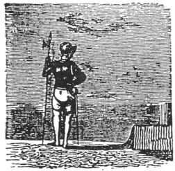 iving
forms may be substituted for
lines, and the ingenious combination
of the figure and its
shadows in this specimen suggests
a method of construction
which is often used by designers.
The sky in this little cut is nicely
engraved, and could serve as a
good exercise for one who had been practicing wood
cutting a month or two.
iving
forms may be substituted for
lines, and the ingenious combination
of the figure and its
shadows in this specimen suggests
a method of construction
which is often used by designers.
The sky in this little cut is nicely
engraved, and could serve as a
good exercise for one who had been practicing wood
cutting a month or two.
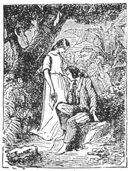 Leaving out the initial, a little rectangular cut
like the foregoing makes an effective introduction
to a paragraph, and again suggests practice in wood
engraving.
Leaving out the initial, a little rectangular cut
like the foregoing makes an effective introduction
to a paragraph, and again suggests practice in wood
engraving.
All the cuts illustrating this chapter, except the
Holbein, are taken from numbers of the French journal,
L’Artist, published between 1861 and 1868, and they
represent a method of designing in vogue during those
years and as far back as 1830, and as late as 1870.
The initials were doubtless originally designed for a
special purpose, so that the subject related to the
text, but later on
cuts
{221}
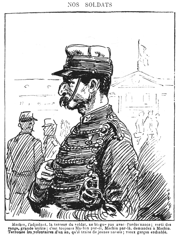 PEN DRAWING BY PENLICK.
From La Petit Journal Pour Rire.
The legend reads: “Our Soldiers. Machin, the staff
officer, the terror of the soldier, doesn’t joke
with the rules and regulations; has risen from
the rank and file; a very useful individual; it’s
always Machin here and Machin there, ask Machin. He
terrorizes the one-year volunteers, whom he treats
as young shoots (literal translation beets); an old
bachelor to the core.”
{222} were put in the case and used promiscuously year after
year; and when the letter needed was not at hand, a cut
like the last example was employed to adorn the page,
as a decoration.
PEN DRAWING BY PENLICK.
From La Petit Journal Pour Rire.
The legend reads: “Our Soldiers. Machin, the staff
officer, the terror of the soldier, doesn’t joke
with the rules and regulations; has risen from
the rank and file; a very useful individual; it’s
always Machin here and Machin there, ask Machin. He
terrorizes the one-year volunteers, whom he treats
as young shoots (literal translation beets); an old
bachelor to the core.”
{222} were put in the case and used promiscuously year after
year; and when the letter needed was not at hand, a cut
like the last example was employed to adorn the page,
as a decoration.
Here we have a design by Holbein with Arabesque or Celtic interlacing, which is often studied by designers, and used with pleasing results.
It is probable that all the early
Italian and French leather book-covers
were imitations of Arab book-covers
(or, at any rate, Eastern
covers) brought into Europe by the
Moors in the twelfth and thirteenth
centuries. Their Mohammedan religion
forbade their picturing the
figures of man or beast, and so the efforts of their
designers were almost entirely centered on lettering,
and on interlacing streamers or bands, or whatever we
may call them (since these were also used by Celtic and
Byzantian designers they are sometimes called Celtic or
Byzantian interlacing); and their book-covers consisted
of beautiful inlays of colored leather on ingenious combinations
of interlaced lines.
In the next chapter the subject of wood engraving will be taken up, and it will make this chapter more interesting.
SUGGESTIONS FOR PRACTICE IN THE TECHNIC OF WOOD ENGRAVING — PHOTO-ENGRAVING THE MORE PRACTICAL, BUT LACKS THE RICHNESS OF THE WOOD-ENGRAVED LINE — DIRECTIONS FOR PRACTICE IN WOOD ENGRAVING — SIMPLE SUBJECTS AND A SIMPLE TECHNIC ARE ADVISED FOR BEGINNERS — MANY CASES INSTANCED IN WHICH CRUDE OR WORN PLATES AND WOOD TYPE MAY BE IMPROVED BY A LITTLE HAND WORK.
WE WISH to supplement the preceding pages with a chapter on the technic of wood engraving, and a few words about kindred arts which are of special consequence to the illustrator-printer. The art of wood engraving I consider one of the most valuable things for the illustrator-printer to learn. True, this art is going out of use because of its tediousness; and, it must be confessed, if you wish a picture of a building in your paper, it is much more economical and you can get a better result if you make a pen drawing and send it to be photo-engraved, than if you engrave it on wood. On the other hand, you get, in an engraved line, whether it is white line or facsimile black line, a richness of line that is in perfect keeping with the printed type. The white line made by the graver is apt to be sharper and deeper than the white space between two photo-engraved black lines, and it does not fill up so easily.
We illustrate this chapter with some valuable suggestions, and we consider that a printer who would learn wood engraving to such an extent that he could {224} execute designs of the kind suggested, could put forth some excellent examples of artistic printing.
Wood engraving is closely associated with the great masterpieces of printing in the past, though, to be candid, I must admit that only a limited public is capable of appreciating these historic associations; and you could not, perhaps, build up your job printing department entirely on such lines. But from time to time you might make posters, handbills and booklets, where antique styles could be followed, and they would meet with appreciation.
Nothing could be more easy to learn than the theory of wood engraving, though the practice is trying to one’s patience. Simply take a block of boxwood and place it upon a leather cushion filled with sand, so that you may turn the block of wood in any direction. The natural tendency is to place the handle of the burin or graver in the middle of the palm and push with all one’s might, in order to cut away the wood; but it should be placed against the palm, directly below the little finger, the little finger nestling in the concave part of the wooden handle and the other three fingers brought up along the shaft of the graver, the ends of the fingers touching the handle of the graver and its shaft, but not wrapped around it. The instrument should be pushed over the wood with about one-tenth of the muscular exertion that the beginner naturally uses. Hold a well-sharpened graver with ease and firmness, and the process of engraving tires the arm no more than writing does.
It takes three or four months’ practice to learn to thus hold the tool and use it with such surety that one {225} can draw in white line on the block as in “The Standard-Bearer” of Schafhausen. But after the facility is acquired, it does not take one long to get up a block either in this style, or in what we should term the Chap-Book style, especially when you have made your design so simple that it can be engraved in a simple way. Please mark this last qualification. The wood engravings in our magazines are of a style unadvisable for the printer to follow, for the engraving of a multitude of gray tones and the printing of the same requires much labor in cutting and in make-ready, but cuts of the kind we recommend can be printed rapidly and with little make-ready. We give a specimen of the genuine Chap-Book illustration, and “The Pedlar’s Lamentation,” which is a clever modern adaptation of the Chap-Book style. These form good examples for the beginner to follow.
Beyond the directions as to holding the burin or
graver, there is little that the experimenter will not find
out for himself. A design is drawn on the block with
pencil, pen or brush. When tones are to be indicated,
it is advisable for the printer to use a pen or brush. To
lighten the yellow color of the wood, the block may first
be rubbed with Chinese white or with moistened whiting.
The design may then be sketched in pencil, and afterward
drawn in ink. As the design must be in reverse,
a good way is to draw it with a pen on thin, smooth
paper. A piece of transfer paper, like typewriters’
carbon paper, is laid on the block; the design is laid
face downward upon this, and a hard pencil or stylus is
used to go over the back of the design, which can be
seen through the thin paper. The pressure
transfers {226}
the mark of the transfer paper to the block, rendering
the design in reverse, and it may then be drawn over
with a pen or brush. In a good wood
engraving the
 THE STANDARD-BEARER OF SCHAFHAUSEN.
A 1521 wood cut in white lines.
curving of lines is generally reduced to a minimum.
Though the transferring and careful cutting around the
line is wearisome at first, it allows one to consider each
line separately and thoroughly to study economy of
line. {227}
The block is held, if small enough, between the thumb
and first finger of the left hand, the fingers holding not
the top and bottom of the block but the
sides of it.
THE STANDARD-BEARER OF SCHAFHAUSEN.
A 1521 wood cut in white lines.
curving of lines is generally reduced to a minimum.
Though the transferring and careful cutting around the
line is wearisome at first, it allows one to consider each
line separately and thoroughly to study economy of
line. {227}
The block is held, if small enough, between the thumb
and first finger of the left hand, the fingers holding not
the top and bottom of the block but the
sides of it.
 EXAMPLE OF GENUINE CHAP-BOOK,
WOOD CUT ILLUSTRATION.
From an article on “Art Among the Ballad-Mongers,”
by Llewellynn Jewett, F. S. A., in the London Art
Journal.
It is then easily turned from side to side on the leather
pad. When a curved line is to be engraved it is not
the graver alone which moves, but the block also is
directed with the left hand, so as to assist
matters. {228}
EXAMPLE OF GENUINE CHAP-BOOK,
WOOD CUT ILLUSTRATION.
From an article on “Art Among the Ballad-Mongers,”
by Llewellynn Jewett, F. S. A., in the London Art
Journal.
It is then easily turned from side to side on the leather
pad. When a curved line is to be engraved it is not
the graver alone which moves, but the block also is
directed with the left hand, so as to assist
matters. {228}
The first process in engraving a line is to take a fine
tool (called a tint-tool as distinguished from the blunter
tool called a graver) and outline the line. In the Schafhausen
cut, the white line around the man’s legs gives a
good idea of the proper character of such an outlining
line, except that the line should be thinner, more uniform,
and more like the lower part of the outline of the
sword and the outline of the left side of the staff of the
standard. The wood is cut away from both sides of a
black line; and then with a gouge of any convenient size
the wood is further cleared away. In this way the genuine
Chap-Book cut was produced. The white line of
the “Standard-Bearer” of Schafhausen can easily be
combined with tint lines. Tint lines may be seen in the
Chap-Book imitation. It is advisable to draw simple
or rough subjects at first; and to draw your outlines
heavier at first than you intend them finally to be, since
in cutting away you are apt to reduce them by a slip of
the tool or by a little more pressure in one place than in
another, and then it is necessary to go around the line
again to reduce it to uniform regularity. It is better to
draw a face like the one in the Crawhall than like the
genuine Chap-Book example, for in following the lines
of the latter a slip of the burin might entirely destroy
an eyebrow or the bridge of the nose; but in the Crawhall
any of the lines might be reduced to a somewhat
narrower one without interfering with the general effect.
The beginner is advised to confine himself to initial letters
and tailpieces and not to attempt ambitious subjects.
He is also especially advised not to plan out, on the day
he receives his tools, a cut for a job wanted immediately,
for he will surely have to keep that order waiting a
week
{229}
 IMITATION OF CHAP-BOOK ILLUSTRATION.
Cut directly on the wood, without any copy, by Joseph
Crawhall.
{230} or two. A pound of boxwood in four or six irregular
pieces from one inch to three inches long and one to
two inches wide, if not squared off, may be obtained for
about 25 cents from a boxwood supply house. The
printer may square these scraps with a miter box and
saw, and he can proportion his designs to the size of the
scraps. Thus, illustrations and devices may be got up
for a mere song. Larger blocks of boxwood may be
ordered at 3 or 4 cents a square inch, which is nearly
the cost of photo-engraving; and as it takes longer to
engrave than to draw in pen-and-ink, wood engraving
is not recommended for general illustration. But as
photo-engravers usually have a minimum price of from
75 cents to $1 for each cut, it is cheaper to cut initial
letters and tailpieces on scraps than to have them photo-engraved.
For instance, twenty photo-engraved tailpieces
might cost you from $15 to $20, but they might
not cost you $2 if boxwood scraps were used.
IMITATION OF CHAP-BOOK ILLUSTRATION.
Cut directly on the wood, without any copy, by Joseph
Crawhall.
{230} or two. A pound of boxwood in four or six irregular
pieces from one inch to three inches long and one to
two inches wide, if not squared off, may be obtained for
about 25 cents from a boxwood supply house. The
printer may square these scraps with a miter box and
saw, and he can proportion his designs to the size of the
scraps. Thus, illustrations and devices may be got up
for a mere song. Larger blocks of boxwood may be
ordered at 3 or 4 cents a square inch, which is nearly
the cost of photo-engraving; and as it takes longer to
engrave than to draw in pen-and-ink, wood engraving
is not recommended for general illustration. But as
photo-engravers usually have a minimum price of from
75 cents to $1 for each cut, it is cheaper to cut initial
letters and tailpieces on scraps than to have them photo-engraved.
For instance, twenty photo-engraved tailpieces
might cost you from $15 to $20, but they might
not cost you $2 if boxwood scraps were used.
In previous illustrations, such as the head of Göthe’s
mother, the Grasset typographical ornaments, the Vallotton,
Auriol and Hassall examples, we gave suggestions
for exercises in wood engraving. The benefit derived
from the practice of wood engraving is not limited to
preparing new cuts alone. No printer who uses illustrations
should be without a wood engraving outfit, consisting
of four to six tools, and the cunning to use it.
There are many cases in which a process plate, or a
chalk plate, or old wood type, can be cleaned up, altered
or improved with a little handwork. Sometimes in a
zinc plate the fine lines in a sky print clearly on a small
run, but soon begin to round and flatten; if not essential
to the design they may then be entirely cut
out {231}
and the run continued. In chalk plate, surfaces may
be cast black and then cut into with a white line, as
in the Schafhausen. And wood type which is too old
to print a solid black evenly, may be punched with
an awl, as in the background of the Larousse Dictionary
A, to reduce it to a stipple gray; or white-lined
like the following portrait; or the sides may be trimmed
with the graver. Rouletting can be imitated with a
 WOOD CUT PORTRAIT.
From a French periodical, showing open white lines
used to represent a tint.
common graver by cutting across the line at regular
intervals. Only when a series of lines has to
be rouletted is it necessary to have a special
instrument, which costs from $1.50 to $3. New
processes are being developed every day whereby
printers can make more or less effective, if crude,
cuts with little expense; but they are rarely perfect
mechanically, and a little handwork will improve their
results a hundred per cent.
WOOD CUT PORTRAIT.
From a French periodical, showing open white lines
used to represent a tint.
common graver by cutting across the line at regular
intervals. Only when a series of lines has to
be rouletted is it necessary to have a special
instrument, which costs from $1.50 to $3. New
processes are being developed every day whereby
printers can make more or less effective, if crude,
cuts with little expense; but they are rarely perfect
mechanically, and a little handwork will improve their
results a hundred per cent.
In order to train oneself to engrave a tint as in the
French portrait, it is excellent practice to make
parallel {232}
lines on a block without any drawing on it. Taking a
tint tool, you engrave a line on the wood, of any thickness,
and then below it engrave another line, leaving
between the two a ridge of wood the same thickness as
your white lines. It is then your task to
cover your
 Practice block No. 1. The top four lines are engraved
by an expert; the others, by a beginner, show normal
progress from the coarse to the fine, but inability
to engrave a perfectly straight line. It takes months
of practice before one can engrave a series of
straight lines.
piece of wood with parallel lines all of the same thickness,
leaving a space between them, always of the same
thickness.
Practice block No. 1. The top four lines are engraved
by an expert; the others, by a beginner, show normal
progress from the coarse to the fine, but inability
to engrave a perfectly straight line. It takes months
of practice before one can engrave a series of
straight lines.
piece of wood with parallel lines all of the same thickness,
leaving a space between them, always of the same
thickness.
This exercise may be varied after you can make an
even tint by making a graduated tint, letting
your white
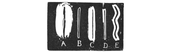 Practice block No. 2. The line A is first outlined as
at B. If the beginner makes a design in which lines
like A may be used throughout, he is apt to get a
better result than if he attempts a fine line like
C (outlined as at D), which is very difficult to
engrave. E represents a waved line.
lines be nearer and nearer together as you approach the
base of the block. These print lighter than those at the top. {233}
Practice block No. 2. The line A is first outlined as
at B. If the beginner makes a design in which lines
like A may be used throughout, he is apt to get a
better result than if he attempts a fine line like
C (outlined as at D), which is very difficult to
engrave. E represents a waved line.
lines be nearer and nearer together as you approach the
base of the block. These print lighter than those at the top. {233}
Another variation is produced by waving the lines; and still another by crossing a tint with white lines. Cross-hatched black lines are very tedious to engrave—we give an example of some.

Besides boxwood, maple wood may be used to engrave upon; it is cheaper than boxwood, costing but 1 cent a square inch.
Proofs are easily taken by laying a thin piece of paper (engravers use india paper) upon the inked block, and rubbing a penknife handle or some hard object over the paper for some minutes until a perfect impression is obtained.

SUGGESTIONS FOR PRINTERS IN REGARD TO PROCESSES, ASIDE FROM WOOD ENGRAVING, BY WHICH ILLUSTRATIONS ARE MADE — DIRECTIONS FOR EXPERIMENTS WITH ZINC PLATES, DESIGNING FOR ZINC-PLATE PROCESS — MANIPULATION IN COPPERPLATE ENGRAVING, ETCHING IN INTAGLIO — LITHOGRAPHY THE CHEAPEST PROCESS KNOWN FOR SHORT RUNS OF PICTORIAL COLOR WORK, ITS RANGE OF EFFECTS — MANY POSSIBILITIES IN THE CHALK-PLATE PROCESS.
THE preceding chapter was devoted to wood engraving: the other processes by which illustrations are made come outside the province of “Drawing for Printers,” and we shall merely give a paragraph to each process.
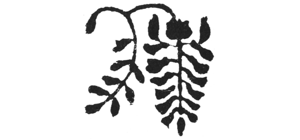
ZINC
PLATES.—Experiments may be made in zinc
plates. The cut above was traced from the Grasset cut
given with Chapter III, Part I. Between the
tracing {235}
paper and the zinc, typewriting carbon paper was laid.
The tracing was gone over with a hard pencil; the
design was thus transferred to the zinc. The lines
were then covered with asphaltum (which is the same
as bitumen), bought in a tube at a paint store. Any
colored oil paint or varnish or transfer ink will do, as
its use is simply to hold the dragon’s blood. It may
be thinned with turpentine so that it will flow easily
from the brush. While the asphaltum was still wet,
the plate was dusted with dragon’s blood, which was
put in a coarse linen rag and held like a bag over the
plate by the right hand; the left hand tapping the right
made the powder fall evenly over the plate. Do this
carefully for practice in order to learn to powder a plate
evenly for a stipple tint (see farther on); the dragon’s
blood may be dumped on the plate. The plate was
then dusted off with a camel’s-hair brush, which
removed the dragon’s blood from the plate except
where bitumen held it. The plate was then held over a
flame till the dragon’s blood turned black; it was then
immersed in an acid bath, about ninety per cent water
and ten per cent nitric acid. The vessel (an old baking
pan painted with asphaltum) holding the bath was
rocked from time to time. The dragon’s blood served
as a stopping-out varnish. The acid will eat away the
plate where it is not protected by dragon’s blood. After
five or ten minutes, when the acid seemed to be eating
into the stopping-out varnish, the plate was taken out,
washed and dried, and again dusted with dragon’s
blood. (In using a large plate, of course, it would be
easier to roll it up with lithographic transfer ink.) A
second and third etching reduced the background,
so {236}
that a proof was taken. For printing in this book the
plate has been routed. The ragged edge is due to our
’prentice hand; this is our second experiment, but a
little practice, we are certain, would bring more satisfactory
results. The Pan lettering is copied from the title-page
by Stuck, given in Chapter II, Part II,
page 171.
 Copy of lettering by Stuck.
Etched on copper without the assistance of
photography.
It is produced as was the Grasset, except that it was etched on copper
and required more bitings than the zinc.
Copy of lettering by Stuck.
Etched on copper without the assistance of
photography.
It is produced as was the Grasset, except that it was etched on copper
and required more bitings than the zinc.
Designs for this process should not be drawn in fine lines like Engström’s portrait of himself, but should be heavy like his portrait of “Hedin” and the Molock “Crispi.” (See Chapters I and II, Part I.) When a white background is not required, the dragon’s blood dusted on the plate may be allowed to remain upon it, in which case a stipple background is the result. An ingenious experimenter can get many different results by this stipple method.
COPPERPLATE ENGRAVING.—Copperplate engraving, and etching in intaglio are not used by the typographical printer, but the printer who executes very fine work would find that he could make handsome frontispieces for limited editions, or book-plates, by either {237} of these processes. For about 25 cents one may obtain Winsor & Newton’s handbook on “The Art of Etching,” by H. R. Robertson, which will give a description of the first process.
Copperplate engraving is most difficult to master
and should not be attempted by anyone
who cannot
 Portrait of Félicien Rops, the etcher, by P. Matlay.
Half-tone from a half-tone. Showing copperplate press.
draw a sure line. A designer with a sure hand might
attempt a simple book-plate. Anyone who can use the
burin on wood can use it on copper, though in the
latter case the pressure from the palm of the hand,
which the beginner in wood engraving should
avoid, {238}
is used because the resistance of copper is much greater
than that of wood. The first finger may be placed on
top of the burin when engraving in copper, but at the
side for wood cutting. We would say that the engraved
line of the copperplate is one of the handsomest lines
in the graphic arts.
Portrait of Félicien Rops, the etcher, by P. Matlay.
Half-tone from a half-tone. Showing copperplate press.
draw a sure line. A designer with a sure hand might
attempt a simple book-plate. Anyone who can use the
burin on wood can use it on copper, though in the
latter case the pressure from the palm of the hand,
which the beginner in wood engraving should
avoid, {238}
is used because the resistance of copper is much greater
than that of wood. The first finger may be placed on
top of the burin when engraving in copper, but at the
side for wood cutting. We would say that the engraved
line of the copperplate is one of the handsomest lines
in the graphic arts.
Etching in intaglio is easier than copper engraving and can be mastered by anyone who can etch in relief.
LITHOGRAPHING.—Lithography, like copperplate, requires a special press, but a secondhand press can be bought for $25 or $30, and it is certainly the cheapest process known for short runs of pictorial color work; and any printer who has many orders for posters or picture printing would do well to investigate the process; for it is not difficult to draw on the stone, and, after the stones are bought, they last for years, and every new design simply necessitates the scouring off of the previous design, which will take a boy only about an hour. A hand press will easily print a 16 by 24 poster, and if it is to be printed in three or four colors by relief printing, the cost of zinc relief plates or wood blocks would be considerable, while in the case of the lithograph it is merely the hire of the boy who cleans the stone. There is no end to the variety of effects to be got in lithography by different combinations of technic: by using, separately or in combination, pen, crayon or brush line; crayon or spatter work tints; solid brush tints of color, or solid brush tints of color with letters or forms scratched out of them with a penknife.
CHALK PLATE.—The chalk-plate process is one that has never been adequately studied by designers. There are very many possibilities in it. It was first introduced {239} into Japan through the instrumentality of the writer. The editor of the “Kohumin Shimbun” called at my studio to investigate the working of the chalk plate, and I drew an outline portrait on the chalk plate, cast it, mounted it, and took a proof of it, all in forty minutes! Full information in regard to the process may be obtained from the Hoke Engraving Company, owners of the patents. Every newspaper owning a stereotype outfit will find that it will pay to use the chalk-plate process.
End of the Project Gutenberg EBook of Drawing for Printers., by Ernest Knaufft

*** END OF THIS PROJECT GUTENBERG EBOOK DRAWING FOR PRINTERS. ***

***** This file should be named 53561-h.htm or 53561-h.zip *****
This and all associated files of various formats will be found in:
        http://www.gutenberg.org/5/3/5/6/53561/

Produced by Chris Curnow, RichardW, and the Online
Distributed Proofreading Team at http://www.pgdp.net (This
file was produced from images generously made available
by The Internet Archive)


Updated editions will replace the previous one--the old editions
will be renamed.

Creating the works from public domain print editions means that no
one owns a United States copyright in these works, so the Foundation
(and you!) can copy and distribute it in the United States without
permission and without paying copyright royalties.  Special rules,
set forth in the General Terms of Use part of this license, apply to
copying and distributing Project Gutenberg-tm electronic works to
protect the PROJECT GUTENBERG-tm concept and trademark.  Project
Gutenberg is a registered trademark, and may not be used if you
charge for the eBooks, unless you receive specific permission.  If you
do not charge anything for copies of this eBook, complying with the
rules is very easy.  You may use this eBook for nearly any purpose
such as creation of derivative works, reports, performances and
research.  They may be modified and printed and given away--you may do
practically ANYTHING with public domain eBooks.  Redistribution is
subject to the trademark license, especially commercial
redistribution.


*** START: FULL LICENSE ***

THE FULL PROJECT GUTENBERG LICENSE
PLEASE READ THIS BEFORE YOU DISTRIBUTE OR USE THIS WORK

To protect the Project Gutenberg-tm mission of promoting the free
distribution of electronic works, by using or distributing this work
(or any other work associated in any way with the phrase "Project
Gutenberg"), you agree to comply with all the terms of the Full Project
Gutenberg-tm License (available with this file or online at
http://gutenberg.org/license).


Section 1.  General Terms of Use and Redistributing Project Gutenberg-tm
electronic works

1.A.  By reading or using any part of this Project Gutenberg-tm
electronic work, you indicate that you have read, understand, agree to
and accept all the terms of this license and intellectual property
(trademark/copyright) agreement.  If you do not agree to abide by all
the terms of this agreement, you must cease using and return or destroy
all copies of Project Gutenberg-tm electronic works in your possession.
If you paid a fee for obtaining a copy of or access to a Project
Gutenberg-tm electronic work and you do not agree to be bound by the
terms of this agreement, you may obtain a refund from the person or
entity to whom you paid the fee as set forth in paragraph 1.E.8.

1.B.  "Project Gutenberg" is a registered trademark.  It may only be
used on or associated in any way with an electronic work by people who
agree to be bound by the terms of this agreement.  There are a few
things that you can do with most Project Gutenberg-tm electronic works
even without complying with the full terms of this agreement.  See
paragraph 1.C below.  There are a lot of things you can do with Project
Gutenberg-tm electronic works if you follow the terms of this agreement
and help preserve free future access to Project Gutenberg-tm electronic
works.  See paragraph 1.E below.

1.C.  The Project Gutenberg Literary Archive Foundation ("the Foundation"
or PGLAF), owns a compilation copyright in the collection of Project
Gutenberg-tm electronic works.  Nearly all the individual works in the
collection are in the public domain in the United States.  If an
individual work is in the public domain in the United States and you are
located in the United States, we do not claim a right to prevent you from
copying, distributing, performing, displaying or creating derivative
works based on the work as long as all references to Project Gutenberg
are removed.  Of course, we hope that you will support the Project
Gutenberg-tm mission of promoting free access to electronic works by
freely sharing Project Gutenberg-tm works in compliance with the terms of
this agreement for keeping the Project Gutenberg-tm name associated with
the work.  You can easily comply with the terms of this agreement by
keeping this work in the same format with its attached full Project
Gutenberg-tm License when you share it without charge with others.

1.D.  The copyright laws of the place where you are located also govern
what you can do with this work.  Copyright laws in most countries are in
a constant state of change.  If you are outside the United States, check
the laws of your country in addition to the terms of this agreement
before downloading, copying, displaying, performing, distributing or
creating derivative works based on this work or any other Project
Gutenberg-tm work.  The Foundation makes no representations concerning
the copyright status of any work in any country outside the United
States.

1.E.  Unless you have removed all references to Project Gutenberg:

1.E.1.  The following sentence, with active links to, or other immediate
access to, the full Project Gutenberg-tm License must appear prominently
whenever any copy of a Project Gutenberg-tm work (any work on which the
phrase "Project Gutenberg" appears, or with which the phrase "Project
Gutenberg" is associated) is accessed, displayed, performed, viewed,
copied or distributed:

This eBook is for the use of anyone anywhere at no cost and with
almost no restrictions whatsoever.  You may copy it, give it away or
re-use it under the terms of the Project Gutenberg License included
with this eBook or online at www.gutenberg.org/license

1.E.2.  If an individual Project Gutenberg-tm electronic work is derived
from the public domain (does not contain a notice indicating that it is
posted with permission of the copyright holder), the work can be copied
and distributed to anyone in the United States without paying any fees
or charges.  If you are redistributing or providing access to a work
with the phrase "Project Gutenberg" associated with or appearing on the
work, you must comply either with the requirements of paragraphs 1.E.1
through 1.E.7 or obtain permission for the use of the work and the
Project Gutenberg-tm trademark as set forth in paragraphs 1.E.8 or
1.E.9.

1.E.3.  If an individual Project Gutenberg-tm electronic work is posted
with the permission of the copyright holder, your use and distribution
must comply with both paragraphs 1.E.1 through 1.E.7 and any additional
terms imposed by the copyright holder.  Additional terms will be linked
to the Project Gutenberg-tm License for all works posted with the
permission of the copyright holder found at the beginning of this work.

1.E.4.  Do not unlink or detach or remove the full Project Gutenberg-tm
License terms from this work, or any files containing a part of this
work or any other work associated with Project Gutenberg-tm.

1.E.5.  Do not copy, display, perform, distribute or redistribute this
electronic work, or any part of this electronic work, without
prominently displaying the sentence set forth in paragraph 1.E.1 with
active links or immediate access to the full terms of the Project
Gutenberg-tm License.

1.E.6.  You may convert to and distribute this work in any binary,
compressed, marked up, nonproprietary or proprietary form, including any
word processing or hypertext form.  However, if you provide access to or
distribute copies of a Project Gutenberg-tm work in a format other than
"Plain Vanilla ASCII" or other format used in the official version
posted on the official Project Gutenberg-tm web site (www.gutenberg.org),
you must, at no additional cost, fee or expense to the user, provide a
copy, a means of exporting a copy, or a means of obtaining a copy upon
request, of the work in its original "Plain Vanilla ASCII" or other
form.  Any alternate format must include the full Project Gutenberg-tm
License as specified in paragraph 1.E.1.

1.E.7.  Do not charge a fee for access to, viewing, displaying,
performing, copying or distributing any Project Gutenberg-tm works
unless you comply with paragraph 1.E.8 or 1.E.9.

1.E.8.  You may charge a reasonable fee for copies of or providing
access to or distributing Project Gutenberg-tm electronic works provided
that

- You pay a royalty fee of 20% of the gross profits you derive from
     the use of Project Gutenberg-tm works calculated using the method
     you already use to calculate your applicable taxes.  The fee is
     owed to the owner of the Project Gutenberg-tm trademark, but he
     has agreed to donate royalties under this paragraph to the
     Project Gutenberg Literary Archive Foundation.  Royalty payments
     must be paid within 60 days following each date on which you
     prepare (or are legally required to prepare) your periodic tax
     returns.  Royalty payments should be clearly marked as such and
     sent to the Project Gutenberg Literary Archive Foundation at the
     address specified in Section 4, "Information about donations to
     the Project Gutenberg Literary Archive Foundation."

- You provide a full refund of any money paid by a user who notifies
     you in writing (or by e-mail) within 30 days of receipt that s/he
     does not agree to the terms of the full Project Gutenberg-tm
     License.  You must require such a user to return or
     destroy all copies of the works possessed in a physical medium
     and discontinue all use of and all access to other copies of
     Project Gutenberg-tm works.

- You provide, in accordance with paragraph 1.F.3, a full refund of any
     money paid for a work or a replacement copy, if a defect in the
     electronic work is discovered and reported to you within 90 days
     of receipt of the work.

- You comply with all other terms of this agreement for free
     distribution of Project Gutenberg-tm works.

1.E.9.  If you wish to charge a fee or distribute a Project Gutenberg-tm
electronic work or group of works on different terms than are set
forth in this agreement, you must obtain permission in writing from
both the Project Gutenberg Literary Archive Foundation and Michael
Hart, the owner of the Project Gutenberg-tm trademark.  Contact the
Foundation as set forth in Section 3 below.

1.F.

1.F.1.  Project Gutenberg volunteers and employees expend considerable
effort to identify, do copyright research on, transcribe and proofread
public domain works in creating the Project Gutenberg-tm
collection.  Despite these efforts, Project Gutenberg-tm electronic
works, and the medium on which they may be stored, may contain
"Defects," such as, but not limited to, incomplete, inaccurate or
corrupt data, transcription errors, a copyright or other intellectual
property infringement, a defective or damaged disk or other medium, a
computer virus, or computer codes that damage or cannot be read by
your equipment.

1.F.2.  LIMITED WARRANTY, DISCLAIMER OF DAMAGES - Except for the "Right
of Replacement or Refund" described in paragraph 1.F.3, the Project
Gutenberg Literary Archive Foundation, the owner of the Project
Gutenberg-tm trademark, and any other party distributing a Project
Gutenberg-tm electronic work under this agreement, disclaim all
liability to you for damages, costs and expenses, including legal
fees.  YOU AGREE THAT YOU HAVE NO REMEDIES FOR NEGLIGENCE, STRICT
LIABILITY, BREACH OF WARRANTY OR BREACH OF CONTRACT EXCEPT THOSE
PROVIDED IN PARAGRAPH 1.F.3.  YOU AGREE THAT THE FOUNDATION, THE
TRADEMARK OWNER, AND ANY DISTRIBUTOR UNDER THIS AGREEMENT WILL NOT BE
LIABLE TO YOU FOR ACTUAL, DIRECT, INDIRECT, CONSEQUENTIAL, PUNITIVE OR
INCIDENTAL DAMAGES EVEN IF YOU GIVE NOTICE OF THE POSSIBILITY OF SUCH
DAMAGE.

1.F.3.  LIMITED RIGHT OF REPLACEMENT OR REFUND - If you discover a
defect in this electronic work within 90 days of receiving it, you can
receive a refund of the money (if any) you paid for it by sending a
written explanation to the person you received the work from.  If you
received the work on a physical medium, you must return the medium with
your written explanation.  The person or entity that provided you with
the defective work may elect to provide a replacement copy in lieu of a
refund.  If you received the work electronically, the person or entity
providing it to you may choose to give you a second opportunity to
receive the work electronically in lieu of a refund.  If the second copy
is also defective, you may demand a refund in writing without further
opportunities to fix the problem.

1.F.4.  Except for the limited right of replacement or refund set forth
in paragraph 1.F.3, this work is provided to you 'AS-IS' WITH NO OTHER
WARRANTIES OF ANY KIND, EXPRESS OR IMPLIED, INCLUDING BUT NOT LIMITED TO
WARRANTIES OF MERCHANTABILITY OR FITNESS FOR ANY PURPOSE.

1.F.5.  Some states do not allow disclaimers of certain implied
warranties or the exclusion or limitation of certain types of damages.
If any disclaimer or limitation set forth in this agreement violates the
law of the state applicable to this agreement, the agreement shall be
interpreted to make the maximum disclaimer or limitation permitted by
the applicable state law.  The invalidity or unenforceability of any
provision of this agreement shall not void the remaining provisions.

1.F.6.  INDEMNITY - You agree to indemnify and hold the Foundation, the
trademark owner, any agent or employee of the Foundation, anyone
providing copies of Project Gutenberg-tm electronic works in accordance
with this agreement, and any volunteers associated with the production,
promotion and distribution of Project Gutenberg-tm electronic works,
harmless from all liability, costs and expenses, including legal fees,
that arise directly or indirectly from any of the following which you do
or cause to occur: (a) distribution of this or any Project Gutenberg-tm
work, (b) alteration, modification, or additions or deletions to any
Project Gutenberg-tm work, and (c) any Defect you cause.


Section  2.  Information about the Mission of Project Gutenberg-tm

Project Gutenberg-tm is synonymous with the free distribution of
electronic works in formats readable by the widest variety of computers
including obsolete, old, middle-aged and new computers.  It exists
because of the efforts of hundreds of volunteers and donations from
people in all walks of life.

Volunteers and financial support to provide volunteers with the
assistance they need, are critical to reaching Project Gutenberg-tm's
goals and ensuring that the Project Gutenberg-tm collection will
remain freely available for generations to come.  In 2001, the Project
Gutenberg Literary Archive Foundation was created to provide a secure
and permanent future for Project Gutenberg-tm and future generations.
To learn more about the Project Gutenberg Literary Archive Foundation
and how your efforts and donations can help, see Sections 3 and 4
and the Foundation web page at http://www.pglaf.org.


Section 3.  Information about the Project Gutenberg Literary Archive
Foundation

The Project Gutenberg Literary Archive Foundation is a non profit
501(c)(3) educational corporation organized under the laws of the
state of Mississippi and granted tax exempt status by the Internal
Revenue Service.  The Foundation's EIN or federal tax identification
number is 64-6221541.  Its 501(c)(3) letter is posted at
http://pglaf.org/fundraising.  Contributions to the Project Gutenberg
Literary Archive Foundation are tax deductible to the full extent
permitted by U.S. federal laws and your state's laws.

The Foundation's principal office is located at 4557 Melan Dr. S.
Fairbanks, AK, 99712., but its volunteers and employees are scattered
throughout numerous locations.  Its business office is located at
809 North 1500 West, Salt Lake City, UT 84116, (801) 596-1887, email
business@pglaf.org.  Email contact links and up to date contact
information can be found at the Foundation's web site and official
page at http://pglaf.org

For additional contact information:
     Dr. Gregory B. Newby
     Chief Executive and Director
     gbnewby@pglaf.org


Section 4.  Information about Donations to the Project Gutenberg
Literary Archive Foundation

Project Gutenberg-tm depends upon and cannot survive without wide
spread public support and donations to carry out its mission of
increasing the number of public domain and licensed works that can be
freely distributed in machine readable form accessible by the widest
array of equipment including outdated equipment.  Many small donations
($1 to $5,000) are particularly important to maintaining tax exempt
status with the IRS.

The Foundation is committed to complying with the laws regulating
charities and charitable donations in all 50 states of the United
States.  Compliance requirements are not uniform and it takes a
considerable effort, much paperwork and many fees to meet and keep up
with these requirements.  We do not solicit donations in locations
where we have not received written confirmation of compliance.  To
SEND DONATIONS or determine the status of compliance for any
particular state visit http://pglaf.org

While we cannot and do not solicit contributions from states where we
have not met the solicitation requirements, we know of no prohibition
against accepting unsolicited donations from donors in such states who
approach us with offers to donate.

International donations are gratefully accepted, but we cannot make
any statements concerning tax treatment of donations received from
outside the United States.  U.S. laws alone swamp our small staff.

Please check the Project Gutenberg Web pages for current donation
methods and addresses.  Donations are accepted in a number of other
ways including checks, online payments and credit card donations.
To donate, please visit: http://pglaf.org/donate


Section 5.  General Information About Project Gutenberg-tm electronic
works.

Professor Michael S. Hart is the originator of the Project Gutenberg-tm
concept of a library of electronic works that could be freely shared
with anyone.  For thirty years, he produced and distributed Project
Gutenberg-tm eBooks with only a loose network of volunteer support.


Project Gutenberg-tm eBooks are often created from several printed
editions, all of which are confirmed as Public Domain in the U.S.
unless a copyright notice is included.  Thus, we do not necessarily
keep eBooks in compliance with any particular paper edition.


Most people start at our Web site which has the main PG search facility:

     http://www.gutenberg.org

This Web site includes information about Project Gutenberg-tm,
including how to make donations to the Project Gutenberg Literary
Archive Foundation, how to help produce our new eBooks, and how to
subscribe to our email newsletter to hear about new eBooks.
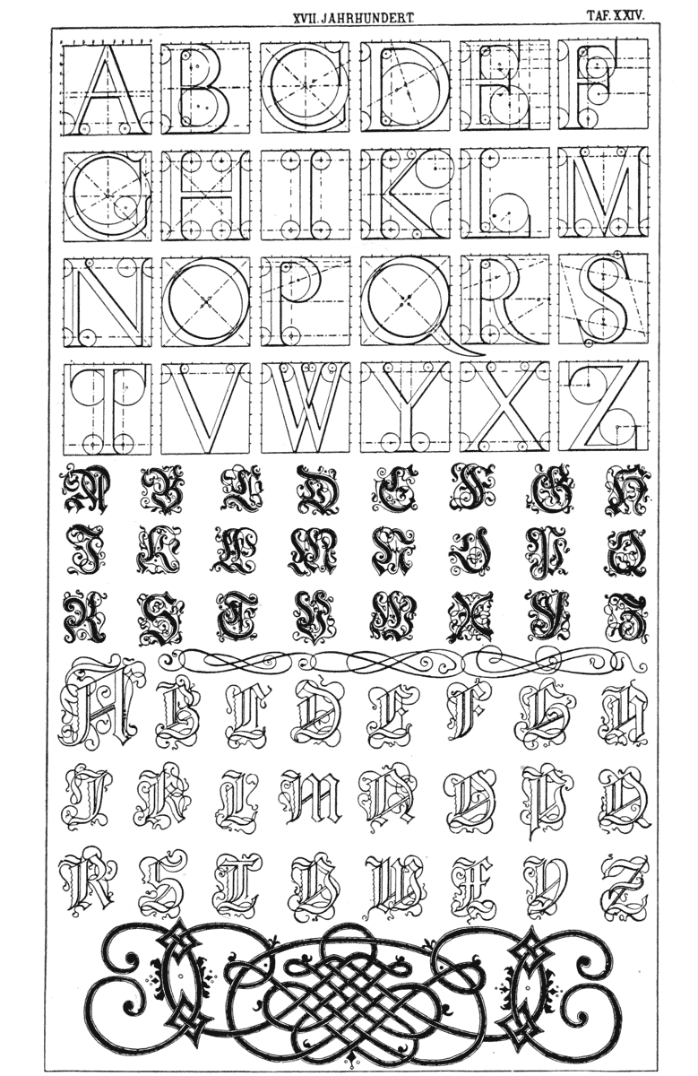