Transcriber’s Note
This e-text uses a lot of uncommon Unicode characters, for example ℔ (U+2114 L B BAR SYMBOL), ꝥ (U+A765 LATIN SMALL LETTER THORN WITH STROKE), ♈ (U+2648 ARIES). If these (and others) don’t display for you, you may need to install additional fonts on your device. In particular, a Fraktur/‘black letter’ font (such as Old English Text MT) is recommended for the parts of the book dealing with German typography.
Page numbering replicates that in the original: pp. i-xiv in Roman, followed by page 9 sqq. in Arabic numerals. No pages are missing or duplicated.
Further notes appear at the end.
THE
American Printer:
A Manual of Typography,
CONTAINING
PRACTICAL DIRECTIONS FOR MANAGING ALL DEPARTMENTS
OF A PRINTING OFFICE,
AS WELL AS
Complete Instructions for Apprentices:
WITH SEVERAL USEFUL TABLES,
NUMEROUS SCHEMES FOR IMPOSING FORMS IN EVERY VARIETY,
HINTS TO AUTHORS, ETC.
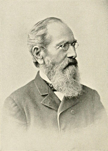
By Thomas MacKellar, Ph. D.
FIAT LUX.
PHILADELPHIA:
MACKELLAR, SMITHS & JORDAN FOUNDRY.
1893.

Entered, according to Act of Congress, in the year 1866, by
L. Johnson & Company,
In the Clerk’s Office of the District Court of the Eastern District of Pennsylvania.
Entered, according to Act of Congress, in the year 1878, by
MacKellar, Smiths & Jordan,
In the Office of the Librarian of Congress, at Washington, D. C.
Eighteenth Edition—Revised and Enlarged.
ELECTROTYPED BY
MACKELLAR, SMITHS & JORDAN FOUNDRY,
PHILADELPHIA.

EIGHTEENTH EDITION.
This edition of the American Printer, while essentially the same as the previous one, contains some additional matter.
Philadelphia,
March, 1893.

PREFACE TO FIRST EDITION.
Usefulness rather than originality has been aimed at in the preparation of the American Printer, which is offered as an improvement on the typographical work formerly published by us. In addition to the results of actual personal experience embodied in the volume, information has been gathered and extracts have been freely made from various publications, such as Ames and Dibdin’s Typographical Antiquities, Thomas’s History of Printing, Timperley’s Dictionary of Printers and Printing, Savage’s Dictionary of Printing, Johnson’s Typographia, Chambers’s Encyclopædia, Beadnell’s Guide to Typography, as well as other books referred to in the notes. The work has been prepared amid the manifold interruptions incident to business life; yet we think nothing has been overlooked that is essential for the instruction of the learner or for the assistance of the workman.
Besides the matter relating to practical typography, the volume contains a sketch of the discovery of printing, and notices of type-founding, stereotyping, electrotyping, and lithography. The implements employed in typography are described and their uses explained; and complete schemes for imposition are laid down. The valuable tables and the plans of cases for various languages, and for music and labour-saving rule, will be found extremely useful; as well as the extensive lists of abbreviations and of foreign words and phrases, and orthographical hints.
Special attention has been given in setting forth the functions and duties of the foreman and proof-reader, so that the operations of an office may be prosecuted with efficiency, comfort, and economy.
Authors and publishers, as well as young printers, may consult the volume with profit; and, indeed, any intelligent person will find it serviceable.
CONTENTS.
| PAGE. | |
| Rise and Progress of Printing | 13-48 |
| Discovery of Printing—Laurentius Koster—Geinsfleisch—Gutenberg—Fust—Bible printed—Peter Schœffer—Caxton—Ulrich Zell—Lambert Palmaert—Abraham Colorito—Humphreys and De Vinne on the invention of printing—Lenox’s collection of rare Bibles—Ancient typographical peculiarities—Catchwords—Invention of Signatures—Printing introduced into America—Type-founding in Europe—Decree of the Star Chamber—Type-founding in America—Prices of Type—Stereotyping—Electrotyping—Lithography—Engraving—Walk over a type-foundry. | |
| Implements or Tools of the Art | 49-120 |
| Types—Roman letter—Italic—Black—Anglo-Saxon—Names and sizes of type—Gradations of type—Point System of Type bodies—A Bill of Pica—A Fount of type—Capitals—Small capitals—Points—Apostrophe—Hyphen—Parenthesis and Bracket—References—Accents—Numerals—Arabic figures—Old-style figures—Cancelled figures—Fractions—Signs—Metal rules or dashes—Braces—Spaces—Two-line letters—Quadrates—Quotations—Labour-saving quotation furniture—Hollow quadrates—Circular quadrates—Labour-saving curvatures—Leads—Flowers and borders—Brass rule—Brass labour-saving rule—Improved labour-saving rule case—Earliest written sounds—Hieroglyphic alphabet—Runic alphabets—Anglo-Saxon alphabet and plan of cases—German alphabet and plan of cases—Greek alphabet and plan of cases—Hebrew alphabet and plan of cases—Russian alphabet—Comparative table of bodies of Music type—Music composition—Music cases—Modern conveniences. | |
| Composition | 121-140 |
| General remarks—Requisites in an apprentice—American cases—Position of a compositor—Laying type—Distributing—Composing—Spacing—Justifying—Head-lines—Notes—Blanking—Paragraphs—Indexes—Titles—Dedications—Contents—Prefaces—Signaturing—Errata—Ironical rules—Advice to apprentices—Ironical rules for beginners in business. | |
| [viii]Imposition | 141-199 |
| General remarks—Tying up pages—Laying pages—Making up furniture—Making the margin—Locking up forms—Memoranda—Nomenclature of sheets—Schemes for imposing, from folio to 128mo. | |
| Proof-reading and Correcting | 200-217 |
| Qualifications of a reader—Should be a printer—Indebtedness of authors to proof-readers—Process of reading—Proof record—Errors made in correcting—Two readers desirable—Punctuation—Alterations in proof—Stower’s remarks—Revise—Correcting in the metal—Capricious alterations—Proper method of correcting—Over-running—Hints to authors—Table of proof-marks, with explanations—Table of signatures. | |
| The Foreman or Overseer | 218-234 |
| General duties—Treatment of compositors—Punctuality—Morning duties—Knowledge of all materials on hand—Order—Overseeing work—Regulating takes of copy—Prompt reading and correcting—Memorandum—Press-book—Press duties—Warehouse—Casting off copy—Managing hurried work—Companionships—Taking copy—Making up—Dividing the letter—Making up furniture—Imposing and distributing letter—Correcting—Transposition of pages—Rules to be observed in a printing-office. | |
| The Press and its Working | 235-292 |
| History of the printing-press—Blaeu, its first improver—Ramage press—Stanhope press—Clymer or Columbian press—Smith press—Washington press—Adams’s bed-and-platen power-press—Invention of the Cylinder press—Frederick König—William Nicholson—Dr. Kinsley—Applegath and Cowper—Account of the house of R. Hoe & Co.—Stop Cylinder press—Cottrell & Babcock presses—Campbell presses—Richard M. Hoe’s type-revolving printing machine—Bullock perfecting press—The Walter perfecting press—The Hoe perfecting press—Presses at the Centennial Exhibition, 1876—Railroad-ticket printing and numbering press—Job presses—Ruggles, Hoe, Gordon, Degener, Wells, and Gally—Franklin press—Nonpareil press—Fire-fly press—Liberty press—Globe press—Peerless press—Universal press—Amateur presses—Folding machines—Setting up a Washington press—Setting up the roller-stand—Composition rollers—Melting kettle—Covering tympans—Wetting paper—Blankets—Making ready a form on a hand-press—Pulling—Rules and remedies for pressmen—Ley-trough—Making ready on cylinder presses—Fine hand-presswork—Printing [ix]wood-cuts—Card printing—Gold printing—Bronze printing—Printing in colours—Ink stone and muller—How to use dry colours—How to multiply colours—Contrast of colours—Oiling a press—How to treat wood type. | |
| Warehouse Department | 293-299 |
| Warehouseman—Warehouse-Book—Receipt of paper and delivery of sheets—Giving out paper to wet—Over-sheets—Hanging up paper to dry—Taking down sheets when dry—Filling in and pressing sheets—Counting out and putting away sheets—Standard sizes of machine-made paper—Table for giving out paper for a thousand copies. | |
| Jobbing Facilities | 300-310 |
| Selection of type and presses—How to make a paying business—Memorandum order—Estimate book—Ames’s paper and card scale—Le Blond’s chart—Cabinets and cases—Rules for the government of a job office—Job composing-sticks—Patent quoins—Corner quadrates—Shooting sticks—Mitering machine—Lead cutter—Perforating machines—Imposing stone—Copy-holder—Paper and card cutters—Megill’s patent gauge pin—Extension feed-guide—Automatic counters—Patent ink fountain—Iron furniture. | |
| Useful Receipts | 311-317 |
| How to make printers’ rollers—German preservative for rollers—Directions for recasting rollers—Printers’ ley—Paste—Mucilage—Glue—Gum—Magenta surface paper—Coloured writing inks—Fire-proof ink—Printing ink varnish—Lithographic transfer ink—To give dark printing inks a bronze or changeable hue—An ink for marking tin or zinc—Drying preparations—Silvering solutions—To soften leather belting—How to open a ball of twine—To prevent adhesion of paper—To detect ground wood in paper—French gold printing—Transfer varnish—To make paper waterproof—To preserve books—To restore engravings. | |
| Orthographical | 318-332 |
| Discrepancies—a or an before a vowel or silent h—o or oh—able and ible—im or in and em or en—in and un—ise and ize—or and our—sion and tion—Farther and further—Peas and pease—Omission of s in the possessive case—Formation of the plurals of words compounded of a noun and an adjective—Pointing of numbers, weights, measures, &c.—Derivation of English words—Rules for spelling—Plurals of nouns. | |
| [x]How to Secure Copyrights | 333-335 |
| Printed title required—Application to be made to Librarian of Congress—Style of printed title—Fees—Two complete copies required—Penalty—Notice of copyright to be given by imprint—Form of notice—Penalty for false notice—Authors may reserve the right to translate or dramatize—Form of notice—Original works only will be entered—Duration of copyright—Renewal—Form of application for renewal—Time of publication—Copyright may be secured for a projected as well as for a completed work—Assignments—Fees—Copies or duplicate certificates—Serials or separate publications—Copyright required for each volume or part of a book—Copyrights for works of art—Copyrights cannot be granted upon trade-marks or labels—Fee for registering at Patent Office—Citizens or residents of the United States only entitled to copyright—Full name and residence of claimant required. | |
| The Metric System | 336, 337 |
| Technical Terms of the Craft | 338-343 |
| Abbreviations | 344-356 |
| Foreign Words and Phrases | 357-372 |
| Index | 373-383 |

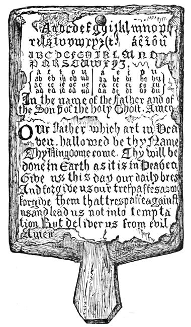
HORN-BOOK OF THE SEVENTEENTH CENTURY.
The Song of the Printer.
Hereby, tongues are known, knowledge groweth, judgment increaseth, books are dispersed, the Scripture is read, stories be opened, times compared, truth discerned, falsehood detected and with finger pointed, and (all as I said) through the benefit of Printing.
Fox’s Martyrs.
At the very epoch when the greatness of Burgundy was most swiftly ripening, another weapon was secretly forging, more potent in the great struggle for freedom than any which the wit or hand of man has ever devised or wielded. When Philip the Good, in the full blaze of his power, and flushed with the triumphs of territorial aggrandizement, was instituting at Bruges the order of the Golden Fleece, “to the glory of God, of the blessed Virgin, and of the holy Andrew, patron saint of the Burgundian family,” and enrolling the names of the kings and princes who were to be honoured with its symbols, at that very moment, an obscure citizen of Haarlem, one Lorenz Coster, or Lawrence the Sexton, succeeded in printing a little grammar, by means of movable types. The invention of printing was accomplished, but it was not ushered in with such a blaze of glory as heralded the contemporaneous erection of the Golden Fleece. The humble setter of types did not deem emperors and princes alone worthy his companionship. His invention sent no thrill of admiration throughout Christendom; and yet, what was the good Philip of Burgundy, with his Knights of the Golden Fleece, and all their effulgent trumpery, in the eye of humanity and civilization, compared with the poor sexton and his wooden type?
Motley’s Rise of the Dutch Republic, Vol. i, 45.
The American Printer.
RISE AND PROGRESS OF PRINTING.
DISCOVERY OF PRINTING.

The credit of inventing the art which perpetuates the history and achievements of all the arts and sciences has been obstinately contested, several cities having advanced rival claims to the honour of the discovery. This, however, should be no matter of surprise when we consider that the inventor of a new art, unprotected by law, would naturally endeavour to conceal its processes for his own use and advantage. After due consideration, we agree with Isaiah Thomas in the opinion that the probabilities point to Laurentius (sometimes called Coster, Koster, and Kustos) as the discoverer of the art of printing.[1]
Laurentius lived at Haarlem and was a man of property. He seems to have been engaged in printing books from wood blocks or plates, well known to antiquaries as the Block Books, in which the reading matter was illustrated by rude pictures. Fragments of works so printed by him are still in existence. Among others, the celebrated Biblia Pauperum, executed between 1410 and 1420, has been attributed to him. It was only natural that his thoughts should be led to the production of single types, as a means of cheapening and facilitating his work. These were first made of wood, and afterward of tin. The date of his invention of separate types is given as about the year 1429. Other dates have been stated, ranging from[11] 1422 to 1436. The first of his printed books, it is claimed, was the Speculum Humanæ Salvationis, of which about ten copies are now known to be in existence. A small primer, or Abecedarium, in our opinion, shows all the marks of the first attempt of an experimenter in a new art. Koster died in 1439.
The necessity for employing workmen to assist in prosecuting the art led to the divulging of the secret. Among these men, it is supposed, was John Geinsfleisch, (or Gutenberg, Senior,) who, after learning the processes, returned to Mentz, his native place, and communicated the secret to his nephew, John Gutenberg, an ingenious artist of Strasburg. It is in evidence that the latter, in connection with two partners, spent a considerable amount of money in some private experiments. These appear to have occupied several years, from 1436 to 1439, when a legal contest arose as to the rights of one of the partners whose zealous activity had caused his death. Gutenberg continued at Strasburg till 1444, when, his means being exhausted, he rejoined his uncle at Mentz. Here he renewed his experiments, and, needing money, he procured an introduction to John Fust, a capitalist and money-lender, who seems to have been struck with the importance of the work, and who advanced a considerable amount (all the tools and presses being pledged as security) in furtherance of the enterprise. Two years were occupied in making the types and necessary machinery, when the great work of printing the Bible was begun. There can be little doubt that, during all his years of experiment, Gutenberg had executed smaller books, one of which is surmised to have been a reproduction of the Dutch Speculum of Koster. The Donatus of 1451, the Appeal against the Turks of 1454, and the Letters of Indulgence of 1454 and 1455, all appeared before the Bible,[2] which[12] was not published till 1455 or 1456. This great book marked an era in the art.[3]
It is painful to be told that about this time Fust foreclosed the mortgage, and the entire work with all the materials passed into his possession. It seems, however, that Gutenberg succeeded in re-establishing a press, and continued to practise the art, but produced no work at all comparable with the Bible. He died about 1468.
After securing possession of the establishment, Fust engaged the service of Peter Schœffer, who had been apprentice or assistant to Gutenberg, and who was distinguished for scholarship as well as mechanical skill. His skill and the improvements made by him in the art soon led Fust to take him into partnership, and the Bible, the Psalter, and other important works were produced. Schœffer was further rewarded by the hand of the grand-daughter of Fust.
From this rapid summary, we may conclude, 1. That the merit of the invention of printing, however rude it may have been, belongs to Koster of Haarlem; 2. That Gutenberg placed the art on a permanent foundation; and, 3. That its economical application was insured by Peter Schœffer’s invention of cast metal types.[4]
It was of course impossible to conceal the knowledge of an art so useful to man, and within ten years after the publication of the great Bible presses were established in several German cities, in Rome and other parts of Italy, and soon thereafter in France and England.
William Caxton acquired a knowledge of the art in Germany, and carried it into practice at Westminster in England. The year 1477 is now accepted as the date of the introduction, the first book printed with a date in England being the Dictes and Sayinges of the Philosophers, emprynted by me, William Caxton, at Westmestre, the yere of our Lord m.cccc.l.xxvij. He had previously printed, without a date, The Recuyell of the Historyes of Troye, which was followed by The Game and Playe of the Chesse, fynysshid the last day of marche the yer of our lord god. a. thousand foure honderd and lxxiiii. These were, however, printed at Bruges; so, according to Mr. William Blades, “the first indisputable date we have to stand on is the printing of The Dictes in 1477.”
Though at that time over sixty years old, Caxton was notable for his industrious habit. He was possessed of good sense and sound judgment; steady, persevering, active, zealous, and liberal in his devices for that important art which he introduced into England, labouring not only as a printer, but as translator and author. The productions of his press amount to sixty-four. In the churchwardens’ books of St. Margaret’s Parish, Westminster, his death is thus recorded: “1491. Item, atte bureyng of William Caxton, for iiii. torches vjs. viijd. Item, for the belle atte same bureyng, vjd.”
The Bible was printed in Spanish at Valencia in 1479 by Lambert Palmaert, a German; but so completely was it afterward suppressed by the Inquisition that only four leaves now remain in the archives of Valencia. The first Hebrew Bible ever printed came from the press of Abraham Colorito, at Soncino, in 1488—a very remarkable work. Iceland had its printing-office in 1530, at which a Bible was printed in 1584.
ANCIENT PECULIARITIES.
The pages were either large or small folios, but sometimes quartos, and, the early books were therefore cumbrous and unhandy. Aldus Manuccio, of Venice, was the first to introduce the octavo form.
The leaves were without running titles, direction-words, paginal numbers, or divisions into paragraphs.
The character itself was a rude old Gothic (similar to that now known as Old English or Black) mixed with Secretary, designed to imitate the handwriting of the times; the words were printed so close to one another that the matter was not easily read.
To avoid divisions, the early printers used vowels with a mark of abbreviation over them to denote that one or more letters were omitted in the word: e.g. co̅pose for compose, co̅pletio̅ for completion, &c. No punctuation-marks were used, except the colon and full point; but an oblique stroke (/) was after a while introduced, for which the comma was finally substituted. Logotypes were frequently employed.
Orthography was various and arbitrary. Proper names and sentences were often begun with small letters, as well as the first words in lines of poetry.
Blanks were left for the places of titles, initial letters, and other ornaments, to be supplied afterward by illuminators, whose calling did not long survive the masterly improvements made by the printers in this branch of their art. These ornaments were exquisitely fine, and curiously variegated with the most beautiful colours, and even with gold and silver. The margins, likewise, were frequently charged with a variety of figures, of saints, birds, beasts, monsters, flowers, &c., which sometimes had relation to the contents of the page, though frequently none at all. These embellishments were often very costly.
The name of the printer, place of his residence, &c. were either omitted or put at the end of the book, with some pious ejaculation or doxology.
The date was also omitted, or involved in some cramped design, or printed either at full length or in numerical letters, and sometimes partly one and partly the other: thus, One[16] Thousand CCCC and lxxiiii; but always placed at the end of the book.
There was no variety of character, nor intermixture of Roman and Italic, which were later inventions; but the pages were printed in a Gothic letter of the same size throughout. Catch-words at the end of the foot-line (now generally abolished) were first used at Venice, by Vindeline de Spire. The inventor of signatures is said to have been Antonio Zarotti of Milan, about 1470.
Books were often encased in massive coverings, which were ornamented with florid and arabesque designs. Jewels and precious metals, the finest stuffs, and the most gorgeous colours were sometimes employed. Scaliger says, that his grandmother had a printed Psalter, the cover of which was two inches thick. On the inner side was a receptacle, containing a small silver crucifix, with the name of Berenica Codronia de la Scala behind it.
Two or three hundred copies of a work were considered to be a large edition.
PRINTING IN AMERICA.
Printing was introduced into America at Mexico by the Viceroy Mendoza in 1536. The first book printed was the Escala espiritual de San Juan Climaco, of which no copy is known to exist; but the oldest American book now extant is the Manual de Adultos, dated 1540, of which only the last four leaves are to be found in the library of the Cathedral of Toledo. The name of the earliest printer is a matter of question.
Cambridge, Massachusetts, is entitled to the distinction of having the first printing-press in North America, which was under the charge of Stephen Daye. For this press the colony was mainly indebted to the Rev. Jesse Glover, a nonconformist minister possessed of a considerable estate, who had left England to settle among his friends in Massachusetts. Some gentlemen of Amsterdam also “gave towards furnishing of a printing-press with letters, forty-nine pounds and something more.” This was about 1638. The first book issued was the Bay Psalm-Book, in 1640.
The first book issued in the Middle Colonies was an Almanac, printed by William Bradford in 1685, near Philadelphia.[17] Bradford was brought out from England in 1684 by William Penn. As the government of Pennsylvania became very restrictive in regard to the press, Bradford in 1693 removed to New York, and was appointed printer to that colony, where he established in 1725 the New York Gazette, the first newspaper published there. He died May 23, 1752, after an active and useful life of eighty-nine years.[5]
The first newspaper in America was the Boston News Letter, which was first issued by John Campbell on Monday, April 24, 1704: it was regularly published for nearly seventy-two years. The second was the Boston Gazette, begun December 21, 1719. The third was the American Weekly Mercury, issued in Philadelphia, by Andrew Bradford, on December 22, 1719. James Franklin, an elder brother of Benjamin, established the New England Courant, August 17, 1721.
The oldest living paper of the United States is the New Hampshire Gazette, published at Portsmouth, now (Oct. 7, 1892) one hundred and thirty-six years old.
The North American and United States Gazette leads the existing daily press of this country in point of antiquity. It is the successor of the Pennsylvania Packet, (begun in 1771 and becoming a daily paper in 1784,) and is still the chief commercial journal of Philadelphia.
The first paper-mill in America was established near Germantown, Pa., in 1690, by William Rittenhouse.[6]
TYPE-FOUNDING IN EUROPE.
For a long period after the discovery of printing, it seems that type-founding, printing, and binding went under the general term of printing, and that printers cast the types used by them, and printed and bound the works executed in their establishments. Type-founding became a distinct calling early in the seventeenth century. A decree of the Star Chamber, made July 11, 1637, ordained the following regulations concerning English founders:—
“That there shall be four founders of letters for printing, and no more.
“That the Archbishop of Canterbury, or the Bishop of London, with six other high commissioners, shall supply the places of those four as they shall become void.
“That no master-founder shall keep above two apprentices at one time.
“That all journeyman-founders be employed by the masters of the trade, and that idle journeymen be compelled to work, upon pain of imprisonment and such other punishment as the court shall think fit.
“That no master-founder of letters shall employ any other person in any work belonging to the casting or founding of letters than freemen or apprentices to the trade, save only in pulling off the knots of metal hanging at the end of the letters when they are first cast; in which work every master-founder may employ one boy only, not bound to the trade.”
By the same decree, the number of master-printers in England was limited to twenty.
Regulations like the above were in force till 1693. The “polyglot founders,” as they have been called, were succeeded by Joseph Moxon and others. But the English were unable to compete with the superior productions of the Dutch founders, until the advent of William Caslon, who, by the beauty and excellence of his type, surpassed his Batavian competitors, when the importation of foreign type ceased, and his founts were, in turn, exported to the Continent.
By an act subsequently passed, no founder was to cast any letter for printing, no joiner to make any press, no smith to forge any iron-work for a press; no person to bring from parts[19] beyond the seas any letters founded or cast for printing; nor any person to buy any letters or any other materials belonging unto printing; without application to the master and wardens of the Company of Stationers.
TYPE-FOUNDING IN AMERICA.
A foundry, principally for German type, was established at Germantown, Pennsylvania, about the year 1735, by Christopher Saur, (or Sower,) a printer, who executed in German the first quarto Bible printed in America, as well as other valuable works in the German language. Three editions of the Bible were printed—viz., in the years 1743, 1763, and 1776, the latter two by his son. In 1739, Saur published a newspaper in Germantown.
An abortive attempt was made about 1768 to set up a foundry at Boston by a Mr. Mitchelson from Scotland, and another in Connecticut in 1769 by Abel Buel. In 1775, Dr. Franklin brought from Europe to Philadelphia the materials for a foundry; but little use of them was made.
John Baine, a type-founder of Edinburgh, sent a relative to this country with tools for a foundry at the close of the Revolutionary War, and soon after came over himself. They carried on the business till 1790, when Mr. Baine died, and his kinsman returned to Scotland.
A Dutch founder, Adam G. Mappa, settled at New York about 1787, and cast Dutch and German faces, as well as Roman styles and several Oriental alphabets. Want of capital prevented his success, and many of his matrices passed into the possession of Binny & Ronaldson.[7]
In 1796, type-founding was commenced in Philadelphia by Archibald Binny and James Ronaldson, natives of the city of Edinburgh, where Binny had carried on the same business. Their assortment was not extensive, but it embraced the essential founts,—Brevier, Bourgeois, Long Primer, Small Pica, Pica, and two-line letters. They were obliging and attentive, and in twenty years made a fortune. They improved their[20] foundry according to the increase of printing and the consequent demands of the trade, extending their assortment from Pearl, of 180 lines in a foot, to 12-line Pica, having 6 lines. Binny made an important improvement in the type-mould, by which a caster could cast 6000 letters in a day with as much ease as he before could cast 4000.[8]
According to Holmes’s American Annals, about 200 newspapers were printed in the United States in the year 1801, of which 17 were issued daily, 7 three times a week, 30 twice a week, and 146 weekly. There must also have been at the same time as many as 60 offices engaged in miscellaneous printing. The whole business had increased threefold in eleven years. Another type-foundry was put in successful operation in Baltimore, about 1805, by Samuel Sower & Co. It had in it some moulds and matrices which had been used by Christopher Sower, who had printed in Germantown, near Philadelphia, and cast his own types. He printed with German characters; but now the foundry was revived with excellent Roman and Italic letters, and among other extraordinary things it had the size called Diamond, with a smaller face than had ever been cast before. It was the smallest type in the world.
The demand for type was very brisk till the war of 1812 commenced, and the foundries were generally three or four months in arrears in their execution of orders.
The names of the newspapers published in the United States in April, 1810, are given in Thomas’s History of Printing, and amount to 359, of which 27 were daily papers, 38[21] were printed twice, 15 three times, and 279 once in a week. Add those required for general printing, and the whole number of offices could not be less than 500,—being an increase of 240 in nine years, and some of them using several thousand pounds of type for book-printing.
In 1811, Elihu White established a type-foundry in New York. He had been long engaged, in connection with Mr. Wing, in the manufacture of printing types at Hartford, Connecticut, upon a plan of their own invention, by which twenty or thirty letters were cast at once; but, abandoning that invention, he adopted the old plan of casting, and, having a good assortment of faces and bodies, his removal to New York was a great convenience to its printers, and they gave him a very satisfactory support. But the principal business in type-founding still continued, as formerly, to be carried on in Philadelphia.
In 1813, another type-foundry was begun in the city of New York, by D. & G. Bruce, principally to cast types for their own use. They had carried on book-printing for seven years, and had now become acquainted with the stereotype art,—Mr. David Bruce having visited England in 1812 and acquired it by purchase and actual labour. For ordinary printing, it was customary to bevel off the body of the type at the face end, or shoulder, as it is usually called, which unfitted it for making a strong stereotype plate in the most approved way: hence the necessity for casting type expressly for stereotype. Their first fount was Bourgeois, with which they cast two sets of plates of the New Testament, (the Common School Testament,) and sold one of these to Mathew Carey, of Philadelphia, retaining the other for their own business. But these were not completed till 1814. In 1815, they cast the plates of the 12mo School Bible, on Nonpareil type, prepared, like the Bourgeois, at their own foundry expressly for stereotyping. They thus gave the first stereotype School Testament and School Bible to America; but not the first stereotype book. John Watts, of England, also commenced stereotyping in New York in 1813, and completed the Westminster Catechism that year, a volume of 120 pages 12mo. David Bruce invented the planing-machine for equalizing the thickness of stereotype plates, which is now used in every stereotype foundry in the United States. The process of stereotyping is, however, entirely[22] different from that of ordinary type-founding, and it is, therefore, generally carried on as a separate business, or connected with the composing department of a printing-office. Twenty compositors and two proof-readers will furnish full employment for one moulder, one caster, and three finishers, who will, among them, complete, on an average, 50 pages of octavo per day.
In 1818, or soon after, a type and stereotype foundry was established in Boston, and another in Cincinnati, principally through the enterprise of the late Elihu White, who, having the means of multiplying matrices with facility, took this method for the extension of his business. Others followed his example, and type-foundries were established in Albany, Buffalo, Pittsburgh, Louisville, and St. Louis, with several additional in New York, Boston, Philadelphia, and Baltimore. The business, in fact, was overdone, and failures and suppressions took place, as competition reduced the prices of types.
The mode of type-founding has within forty years undergone important changes, which must no doubt be considered improvements. First among them is the introduction of machine-casting, in which a pump forces the fluid metal into the mould and matrix, and gives a sharper outline to the letter than was formerly given by the most violent throw of the caster. The old practice of casting a single type only at a time remains. The first idea of this machine originated with William M. Johnson, who obtained a patent for it in 1828. Elihu White put it into use in his type-foundry, and persevered in using and trying to improve it as long as he lived; but he did not succeed in removing the greatest fault, which was a hollowness in the body of the types cast by it, that inclined them to sink under the pressure of the printing-press. The first successful type-casting machine was invented by David Bruce, Jr., of New York, and was patented March 17, 1838. The patent was sold to George Bruce, and the machines were used by him until 1845. David Bruce meanwhile patented another machine in 1843, which, with new improvements, patented two years later, gave entire satisfaction, and is now in general use in American foundries. By Bruce’s machine, three times the quantity of type that was cast by Binny & Ronaldson’s improved mould is now cast in a given time, and nearly five times the quantity that was cast by the[23] common hand-mould eighty years ago. This improvement has passed into Europe, and been adopted by most of the German type-founders; but in Great Britain for some time it found little favour. A so-called “automatic machine,” for casting and finishing type, invented by Johnson & Atkinson, is in operation in London; but its rate of production seems to be less than that of the American machine, while, from its multiform operations, the proportion of imperfect type turned out must of necessity be considerably more.
The protection now afforded by the patent laws having checked the piratical production of matrices by electrotyping, (except in plain faces, a practice still pursued by unprincipled type-founders,) the leading founders in this country have been encouraged to produce types of new styles which in beauty and ingenuity surpass those of foreign origin.
There are now three type-foundries in Boston, seven in New York, one in Buffalo, four in Philadelphia, four in Baltimore, two in Cincinnati, four in Chicago, two in Milwaukee, two in St. Louis, one in Richmond, one in St. Paul, one in Cleveland, one in Kansas City, and three in California—in all, thirty-six. Some of these foundries not only supply the printers of the United States, but most of the printers in Canada, some in the British West India Islands, Mexico, South America, China, India and Australasia. American type, in quality, style, and finish, is equal, if not superior, to any made in Europe.
The following are the prices at which plain types have been sold for the last seventy-five years, given at ten different dates, and naming only the principal and most useful sizes:—
| 1806. | 1811. | 1819. | 1827. | 1831. | 1841. | 1860. | 1866. | 1876. | 1893. | |
|---|---|---|---|---|---|---|---|---|---|---|
| Pica | $0·44 | $0·55 | $0·44 | $0·42 | $0·36 | $0·38 | $0·32 | $0·56 | $0·46 | $0·32 |
| Small Pica | ·48 | ·58 | ·48 | ·46 | ·38 | ·40 | ·34 | ·58 | ·48 | ·34 |
| Lg. Primer | ·56 | ·66 | ·56 | ·50 | ·40 | ·42 | ·36 | ·62 | ·50 | ·36 |
| Bourgeois | ·66 | ·76 | ·66 | ·58 | ·46 | ·46 | ·40 | ·66 | ·52 | ·38 |
| Brevier | ·76 | ·86 | ·76 | ·70 | ·56 | ·54 | ·44 | ·70 | ·55 | ·42 |
| Minion | 1·03 | 1·13 | 1·00 | ·88 | ·70 | ·66 | ·48 | ·76 | ·58 | ·46 |
| Nonpareil | 1·40 | 1·75 | 1·40 | 1·20 | ·90 | ·84 | ·58 | ·84 | ·66 | ·52 |
| Agate | 1·44 | 1·10 | 1·08 | ·72 | 1·00 | ·76 | ·60 | |||
| Pearl | 1·75 | 1·40 | 1·40 | 1·08 | 1·40 | 1·20 | 1·20 | |||
| Diamond | 1·60 | 1·80 | 1·62 | 1·60 |
STEREOTYPING.
Stereotyping is said to have been invented by J. Van der Mey, in Holland, about 1698. A quarto Bible and some other books were printed by him from plates, which were formed by soldering the bottoms of common type together. William Ged, of Edinburgh, discovered the present mode in 1725, and stereotyped parts of the Bible and Prayer-Book. He encountered malicious opposition, and the business was abandoned, the new method dying with the inventor. About 1745, Benjamin Mecom, a nephew of Dr. Franklin, cast plates for a number of the pages of the New Testament. Dr. Alexander Tilloch, of Glasgow, re-discovered the art in 1781. Stereotyping gradually spread, and soon effected a considerable reduction in the cost of books. The arguments that were advanced against its utility have a ridiculous look at the present day, when almost every important work is stereotyped or electrotyped.
Matter for stereotyping is set with high spaces and quadrates. The forms must be small, containing about two pages of common octavo. A slug type-high is put above the top line and another below the foot line of each page, to protect the ends of the plates from injury when they are passed through the shaving-machine. Beveled slugs, in height equal to the shoulder of the type, are placed on both sides and between the pages, to form the flange by which the plate is to be clasped by the hooks of the printing-block.
Before the form is sent into the foundry, the type must be carefully compared with the proof, to detect any errors which may have been left uncorrected. Care must be taken to lock up the form perfectly square and quite tight, to prevent the types from being pulled out when the mould is raised from the pages. It must be evenly planed down, and no ink or dirt or incrustations from the ley be allowed to remain on the surface.
The face of the type being clean and dry, and the bottoms free from particles of dirt, the form is laid on a clean moulding-stone, and brushed over with sweet-oil, which must be laid on as thinly as possible, care being taken that the entire surface of the types is covered. A moulding-frame, with a[25] screw at each corner, (called a flask,) and fitting neatly to the form, is next placed around it.
The material for moulding is finely ground gypsum, nine parts of which are mixed with about seven parts of water, and well stirred up. A small quantity of the liquid mixture is poured over the pages, and gently pressed into the counter of the types with a small roller, for the purpose of expelling confined air; after which, the remainder of the gypsum is poured in, until the mould is somewhat higher than the upper edge of the flask. In a few minutes the mixture sets, and the upper side is smoothed over with a steel straight-edge. In about ten minutes the mould is gently raised by means of the screws at the corners of the flask; and, after being nicely trimmed at the sides, and nicked on the surface-edges to make openings for the metal to run in, it is placed on a shelf in an oven, and allowed to remain until the moisture has quite evaporated.
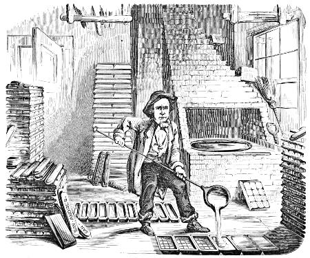
The casting-pans may be large enough to hold three or four moulds. The dried moulds are placed in a pan face downward, upon a movable iron plate called a floater. The cover of the casting-pan, which has a hole at each corner for the passage of the metal, is then clamped to it, and lifted by a movable crane and gently lowered into the metal-pot,—containing, it may be, a thousand pounds of liquid metal,—till the metal begins to flow slowly in at the corners. When the pan is filled, it is sunk to the bottom of the pot. The metal should be hot enough to light a piece of brown paper held in it. After being immersed eight or ten minutes, the pan is steadily drawn out by means of the crane, and swung over to the cooling-trough, into which it is lowered and placed upon a stone so as just to touch the water, in order that the metal at the bottom of the pan may cool first. The metal contracts while cooling, and the caster occasionally pours in a small quantity at the corners from a ladle, till it will take no more. It may be here remarked that some stereotypers do not dry the moulds, but immerse them in a green condition into the metal.
The plates are carefully removed from the solid mass which comes out of the pan, and the plaster is washed from the surface. If, after examination, the face is good and sharply set, the plates are passed over to a picker, who removes any slight defects arising from an imperfection of the[26] mould. They are then trimmed and passed through the shaving-machine, till all are brought to an equal thickness. The flanges are neatly side-planed, and the plates are then boxed, ready for the printing-press.
In England, the plates are merely turned on the back, and consequently vary in thickness. This must be a source of continual expense and annoyance to the pressman. The flanges, besides, are very imperfectly made,—so imperfectly that they cannot be used on American printing-blocks; and English plates, when imported into this country, are therefore sent to a foundry here, to be brought to an equal thickness and to be properly side-planed. An order given some years ago by an English printer for a set of American printing-blocks was afterward countermanded, on account of the prejudice against the introduction of new things.
Several methods of stereotyping are now practised. Many of the leading newspapers of England and America are printed from stereotype plates cast in moulds made of prepared paper: this mode, however, yields very inferior plates, quite unfit for fine books.
Another method, styled the “mud-process,” is by spreading a thin coating of pulverized soapstone and gypsum over an iron plate, and a mould is then obtained by pressing the coated face against a page of type. Several of these mould-plates are then set on end in an iron box, separated from one another by a wire of the thickness of the stereotype desired, and hot metal is poured in. This is a very expeditious process, though not so good as the old method.
In 1804, before the introduction of stereotyping into this country, Mathew Carey, the well-known enterprising publisher in Philadelphia, had the Bible in quarto set up entire, and regularly imposed in chases, to print from at convenience, according to the demand for the volume. The type was cast by Binny & Ronaldson. Stereotyping would have saved much of the large outlay required to carry out the scheme, which, nevertheless, even under these circumstances, was doubtless highly remunerative. The weight of type must have amounted to 25,000 pounds, to say nothing of the number of chases and column-rules required.
ELECTROTYPING.
Stereotyping has been superseded by the process of electrotyping, as described below.
The pages, after being delicately polished with plumbago, are laid in a press; a pan of prepared wax, warmed, is placed over them and pressed down into the counter of the types. The wax mould is then dusted with plumbago, and suspended in the electric bath. On this, in a few hours, is deposited a thin shell of copper, which, after being coated with tin solder, is backed up with metal to the usual thickness of a stereotype plate.
The same care in preparing the pages for electrotyping must be observed as for stereotyping. For stereotyping, high slugs are placed only at the top and foot of the page; but, for electrotyping, they must be set around on all sides, and the bevelled flange must be afterward made by side-planing.
LITHOGRAPHY.
This is the art of printing, by a chemical process, from designs made with a greasy material upon stone. It was discovered about the beginning of the present century by Alois Senefelder, an actor of Munich, Bavaria, whose patience and perseverance under the most disadvantageous circumstances were truly remarkable and praiseworthy. Differing from all other methods of printing, the impressions are obtained from a level surface.
The stone best calculated for lithographic purposes is a sort of calcareous slate found on the banks of the Danube, in Bavaria, the finest being found near Munich. A good stone is porous, yet brittle, of a pale yellowish drab, and sometimes of a gray neutral tint. The stones are formed into slabs from one and a-half to three inches in thickness. To prepare them for use, two stones are placed face to face with some fine sifted sand between them, and then are rubbed together with a circular motion, to produce the requisite granulation, which is made finer or coarser to suit the purpose of the artist.
The principal agents used for making designs on stone are[28] called lithographic chalk and lithographic ink. They are composed of tallow, virgin wax, hard tallow soap, shellac, sometimes a little mastic or copal, and enough lampblack to impart a colour to the mass. These ingredients are put into an iron sauce-pan, and exposed to a strong fire till the mass is in a state of ignition. When the quantity is reduced one-half, the pan is carefully covered, or put into water to extinguish the flame and cool the mixture. After being well worked up, it is formed into small cakes or sticks. The ingredients are the same in the chalk and the ink, but the proportions are varied, and a little Venice turpentine is often added to the latter. The chalk is used in a dry state; but the ink is dissolved by rubbing in water, and is used in a pen or with a camel-hair pencil. The presence of soap renders it soluble in water.
The artist completes a drawing with the chalk upon a grained stone as he would make a drawing in pencil or chalk upon paper. If while in this state a wet sponge were passed over the face of the stone, the drawing would wash off. To prevent this, and to make it capable of yielding impressions, a weak solution of nitrous acid is poured over it, which unites with and neutralizes the alkali or soap contained in the chalk, and renders it insoluble in water. After this, the usual course is to float a solution of gum over the whole face of the stone; and, when this is taken off, the drawing is no longer removable by the application of a wet sponge, because the chalk is now insoluble. The stone is now ready for the printer, who obtains impressions by the following process.
Having damped the surface of the stone equally with a sponge filled with water which has been slightly tinctured by acid, the printer finds that the water has been imbibed by only those parts of the stone which are not occupied by the drawing, which, being greasy, repels the water and remains dry. A roller covered with ink is now passed over the stone, which will not even be soiled where it is wet, from the antipathy of oil to water. But the parts occupied by the drawing, being dry and greasy, have an affinity for the printing-ink, which, therefore, leaves the roller and attaches itself to the drawing. In this state it is said to be charged or rolled in. A sheet of damped paper is then put over it, and, the[29] whole being passed through a press, the printing-ink is transferred from the stone to the paper, and the impression is obtained. Great nicety is requisite in the preparation of all the agents employed in this art, and in the process of printing as well as in making the drawing on the stone.
The most important application of this process is in the production of copies of coloured drawings and paintings,—a process known as chromo-lithography. The object here being to produce as nearly as possible fac-similes in colour, touch, and texture, as well as in drawing and light and shadow, of pictures from the pencils of painters of the highest standing, it has been found necessary to employ a large number of stones, in order to produce the almost infinite varieties of tints which are found united in a single picture,—every stone giving a separate impression in its own particular colour or tint. The mode of procedure is somewhat as follows. First, an outline of the entire subject is made by means of transfer paper, or otherwise, on a stone which is called the outline or keystone of the work. This stone yields impressions which are transferred as guides to all the other stones. On a second and third stone which serve as the basis of the print the general effect of the drawing is washed in, and from these are printed what may be called the chiaroscuro, in a faint tint of sepia and of a neutral colour or gray,—corresponding, in fact, very nearly to the neutral or dead colouring of a water-colour drawing in the method adopted by the early water-colour painters. The stones which follow are each charged with a particular colour or tint, and each leaves its impression on only a particular portion of the print,—one stone printing only the parts which are intended to be yellow or a modification of yellow, another red, another blue, and so on. Other stones charged in parts with grays or secondary colours serve to blend and harmonize the crude colours; others follow which modify these; and, finally, one gives the sharp dark touches, and is usually followed by another which supplies a sort of glaze or finishing wash, and subdues and harmonizes the whole. Of course, we have merely indicated the general method. It will be understood that the sequence of the colours in the printing, the special quality and strength to be given to each particular tint, the effect to be produced[30] by their super-position, and many other particulars, have all to be taken into account in planning the arrangement of the colours on the stones;—since a sequence in some respects different, and an entirely different modification of colours, have to be employed for the works of most artists; and it happens that much of the colour on each of the earlier stones is covered by that of succeeding stones, and that thus only can the broken tints of the original be imitated. It is, in fact, only by watching the progress of a print through all its stages that any clear idea can be obtained of the beauty and accuracy of the whole process, of the prevision that must be exercised, and of the skill, care, and taste required at every step to carry it to a successful termination. For some of the more elaborate prints, from thirty to forty stones have been required to produce a finished print. And in order to produce this print, it must be borne in mind that each sheet of paper has to be passed as many times through the press as there are stones, since each stone imprints upon it only its own particular section of the work. Of course, in proportion to the increase in the number of the stones, does the difficulty increase of making the work upon each fall exactly upon its proper place in the general design; for, if any one were misplaced only the fiftieth of an inch, the drawing and colour of the whole would be disturbed. Hence it is found necessary to arrange the register, or adjustment of the stones, with the utmost care and precision, and to exercise the most careful supervision in the printing, since the sheet of paper expands considerably in passing through the press, and has to be dried and re-damped before it can be passed through again. But practically this is all accomplished with seeming ease, and a large and most complex subject will be found, when the last stage has been reached, to bear the most minute scrutiny; and the result, even when the copy is placed alongside the original, will surprise and delight equally those who have followed the work through its several steps and those who may only examine the completed work.
Of late, many chromos have been beautifully printed from prepared blocks on an ordinary cylinder-press.
ENGRAVING.
The invention of wood engraving has been claimed for the Chinese, whose books have certainly been printed from engraved wood blocks for ages. It is not, however, until the beginning of the fifteenth century that we find any evidence of the existence of wood engraving as we now understand it.
It is probable that Italy was the first European country to make engravings, but only for printing playing-cards. Holland and Germany soon applied the art to better ends.
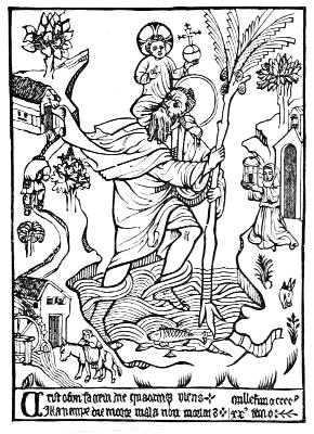
The earliest print of which any certain information can be obtained is in the collection of Earl Spencer. It was discovered in one of the most ancient convents of Germany,—the Chartreuse of Buxheim, near Memmingen in Bavaria,—pasted within the cover of a Latin MS.; it represents Saint Christopher carrying the infant Saviour across the sea, and is dated 1423. We give a reduced fac-simile of this curious engraving. The inscription at the bottom has been thus translated:—
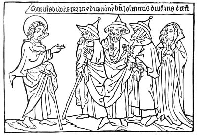
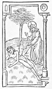
Shortly afterward, a series of books printed entirely from wood engravings, called block-books, were issued. The most important of them were the Apocalypsis, seu Historia Sancti Johannis; the Historia Virginis ex Cantico Canticorum; and the Biblia Pauperum, the last containing representations of some of the principal passages of the Old and New Testaments, with explanatory texts. The illustrations seem to be drawn with a supreme contempt for perspective and proportion, but bear evidence of the draperies and hands and faces having been carefully studied. The above is a copy of one of the cuts in the Apocalypsis. It represents St. John preaching to three men and a woman, with the inscription: “Conversi ab idolis, per predicationem beati Johannis, Drusiana et ceteri,” (By the preaching of St. John, Drusiana and others are withdrawn from their idols.) The adjoining[33] cut, from the Biblia Pauperum, is curious as showing the general manner of representing the creation of Eve during the fifteenth century. Both have the appearance of careful drawings “spoiled in the engraving.” Previous to the invention of movable types, whole books of text were also engraved on wood, and the impressions were evidently taken by rubbing on the back of the paper, instead of a steady pressure, as in the printing-press, the ink used being some kind of distemper colour.
The wood to be engraved on is carefully selected, and cut up into transverse slices seven-eighths of an inch thick. This is done by circular saws, which are necessarily very rigid, so as to insure good even cuts.
After being cut, the slices are placed in racks something like plate-racks, and thoroughly seasoned by slow degrees in gradually heated rooms. When sufficiently seasoned they are reduced to parallelograms of various sizes, the outer portion of the circular section near the bark being cut away, and all defective wood rejected; such, for instance, as knots, irregular grain, as that resulting from the position of branches, which are indicated by light-coloured markings in the wood, known in the trade as “comets,” from their resemblance in shape to those fiery bodies. They are softer than the surrounding wood, and consequently do not cut well with the graver; therefore much care and a practised eye are needed in selecting suitable wood. A section of boxwood almost always exhibits parts of widely different values; the more so as it deviates from the circle in form, for then the annual rings are compressed, and consequently closer on one side than on the other, the side with the wide open rings being usually far inferior in value to the denser and smaller side.
In former times, engravers’ blocks were cut parallel with the grain, the present system of cutting them across the grain being introduced about the middle of the last century. In the preparation of a block, say for a newspaper plate, the parallelograms before spoken of are assorted as to size and fitted together at the back by brass bolts and nuts. So accurately do the edges of the wood fit together, that after the artist has finished his drawing on the smooth face of this compound block, the screws and bolts are loosened, and the pieces separated and given to several men to engrave the design; all that is needed after they have finished their work[34] being to fit the pieces together and screw them up again, when they form one engraved block ready for the printing-press.
Turkey boxwood, from a region of country in the vicinity of the Black Sea, is used for fine engravings. The best is of a delicate yellow colour free from spots or “eyes,” and cuts smoothly without crumbling or tearing.
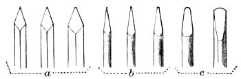
The tools or gravers necessary in wood-engraving are of three kinds,—viz., gravers proper (a); tint tools (b); and scoopers, or cutting-out tools, for clearing out the larger pieces (c). They are arranged in different sizes, to suit the various portions of the work.[9]
According to Vasari, the important discovery of chalcography or engraving on brass or copper was made by Tommaso Finiguerra, a Florentine goldsmith of the fifteenth century, who lived from 1400 to 1460. The manner in which he made this discovery is thus stated by the Rev. T. F. Dibdin:—
“Of engraving upon copper, the earliest known impression is that executed by one Tommaso Finiguerra, a goldsmith of Florence, with the date of 1460 upon it. One of the following circumstances is supposed to have given rise to the discovery. Finiguerra chanced to cast, or let fall, a piece of copper, engraved and filled with ink, into melted sulphur; and, observing that the exact impression of his work was left on the sulphur, he repeated the experiment on moistened paper, rolling it gently with a roller. This origin has been admitted by Lord Walpole and Mr. Landseer; but another has been also mentioned by Huber. ‘It is reported,’ says he, ‘that a washerwoman left some linen upon a plate or dish on which Finiguerra had just been engraving, and that an impression of the subject engraved, however imperfect, came off upon the linen, occasioned by its weight and moistness.’”
PHOTO-ENGRAVING.
Photo-engravings are produced by means of photography. It is a fact worthy of note that experiments in photographic engraving gave rise to photography itself. The aim of Nicéphore Niepce, when he began his researches in 1813, was not only to fix the image obtained by the camera obscura on a plate of metal, but to convert this plate into an engraving which could be used on a printing-press. His early death prevented his perfecting the process to which he had devoted much time and study.
Three distinct methods of photo-engraving are employed in the United States, viz.: swelled gelatine, photo-etching, and wash-out. The latter is known as photo-electrotyping.
The first steps to produce a plate by any of these processes are exactly alike, i. e. a perfectly sharp negative, either in line or stipple, must be produced. If the copy furnished is a wood-cut, steel or lithographic print, in which the lines are absolutely black on white paper or card, the negative is made direct and no drawing is necessary, unless a very great reduction is required, when it becomes necessary to make a drawing, the lines of which are made open enough to stand the necessary reduction. Where the copy furnished is a photograph, or wash drawing, it is first photographed one half larger, or, where fine work is desired, twice the size the plate required. In cases where exceptionally fine work is required it is even made three times the size. The photograph thus obtained is technically termed a silver print, and is an untoned print on plain paper. On this silver print the artist makes his drawing, using the best India ink, which must be so black that the finest hair-line, when examined through a magnifying glass, appears absolutely jet black. After the drawing is made, an alcoholic solution of bichloride of mercury is poured over it, and quickly washed under the tap, leaving the drawing on perfectly white paper. The artist then does whatever retouching may be necessary, and the drawing is ready to be photographed. The advantages of this method of drawing are apparent. The artist, being able to work directly on the enlarged photograph of the object, obtains absolutely correct outlines and detail. The drawing, when finished, is sent to the gallery, where it is photographed to the required size of the plate. The[36] focus of the camera is carefully adjusted with the aid of a focusing glass, so that the negative resulting will be perfectly sharp. This must be carefully done, for unless the negative be sharp a perfect plate cannot be obtained by any process. The sensitized collodion plate is exposed in the camera from one to six minutes, after which it is taken again to the dark room, developed, and fixed. It is then intensified until the portions representing the whites of the picture are perfectly opaque. Up to this point all the processes are alike, and the differences from here will be noted.
If the plate is to be produced by the swelled gelatine process, the negative is varnished and sent to the gelatine room. Here the gelatine is dissolved and the sensitized solution of bichromate of potash is added, and it is flowed on plate glass, then placed in a drying box, where a current of air is continually passed over it. When the gelatine is dry it is placed in a printing frame, in close contact with the negative, and exposed to the light. On removing the negative the picture is plainly seen on the gelatine, the action of the light having changed the color of the exposed portions of the gelatine, besides rendering those parts insoluble, while the parts protected from the action of the light, by the opacity of the negative, remain soluble, and are swelled up by immersion in cold water. The gelatine is then an exact opposite of the plate, the whites being represented by the raised portions. From this mould, or relief, a cast is made in a preparation of wax or plaster, when it is ready for the stereotyper.
For the wash-out or photo-electrotype process, the negative, when dry, is not varnished, but is first coated with a rubber solution and then with plain collodion, after which it is immersed in a dish of acetic acid for about five minutes, when it is stripped from the glass and turned over. It is then what is termed a reversed negative. The method of preparing the gelatine is very much the same as for the swelled process, with the exception that it is cooked for about forty-eight hours, and with the addition of several preparations which are introduced at the time of sensitizing, to make it easily washed out. The negative is exposed in the same manner as described before, but the time of exposure is generally less. After being taken from the printing frame the gelatine is gently scrubbed with a line brush, and kept in tepid water[37] until a very slight relief is obtained. It is then immersed in alcohol for a few seconds, and dried with a cloth, when it is covered with a preparation of lamp black and glycerine, which is allowed to remain about five minutes, when the surface of the plate is carefully rubbed with clean muslin, exposing the surface of the lines,—all this being done in a dark room before an orange light, which is non-actinic. The gelatine is now placed in a frame and exposed to the light from five to twenty minutes, the lampblack protecting the spaces between the lines from the action of the light, so that those portions remain soluble. The gelatine is again scrubbed until the proper relief is obtained, after which it is allowed to dry for about twelve hours, when it becomes hard and is ready to be electrotyped.
The negatives for photo-etching are stripped and reversed in the same manner as for the wash-out process. The metal generally employed for this process is zinc, though copper is sometimes used for very fine work. The zinc is very highly polished, and a thin sensitizing solution is flowed over it and dried, after which it is exposed under the negative to the action of the light. It is then rolled up with lithographic ink, placed in a dish of cold water, and gently rubbed with absorbent cotton, the ink readily leaving the unexposed parts, but remaining on the exposed lines or dots. It is then quickly dried and dusted over with dragon’s-blood powder, which adheres only to the remaining inked portions. The plate is then heated and cooled, and is ready for the etching bath, which consists of a small portion of nitric acid and water. After the first bite the plate is again powdered, heated and cooled, and more acid added to the bath. This is repeated several times, after which the plate is ready for the press. The sides of the lines are protected by the manner in which the powder is applied after the first bite. The relief obtained in this way is greater than can be obtained by any other process.
In reviewing the three processes above described, it is readily seen that the photo-etching process is the shorter method, no moulding or casting being necessary, and the sharpness of the finest lines is preserved in a manner impossible by the other methods. The plates are much deeper, and are equally suitable for the finest art work, down to the roughest newspaper work. This process, of which there are several modes of operating, has become very popular in the last few[38] years, owing to the many improvements introduced by the process inventors, who have turned their attention to it. It has many advantages, among which is the fact that a plate can be put on the press within two hours from the time the copy is ready; and the wearing capacity of the plates is greater. By this process more than 300,000 impressions have been taken from plates of fine work, while swelled gelatine plates of the same character of work would not stand over 5000, and electrotypes 50,000 impressions. The main advantage of photo-etchings to the printer is, that the plates do not require constant washing up, as is the case with plates made by the other processes.
A photograph, brush drawing, or any copy that is not made up of line or stipple, can be produced without the necessity of a line drawing by the aid of the half-tone process. There are several of these processes in operation in this country; and, although originally introduced in Germany by Miesenbach, it has been so improved by American inventors that the European work is far below the standard of the United States. The principal methods of half-tone in this country are worked secretly by the inventors, each having modifications and improvements of his own. It is impossible to give a thorough description here, as none of the inventors are willing to risk patenting their processes, and a complete publication is not desirable. The copy is first photographed, giving a negative with all the details of the original. This negative is then exposed to the camera, and the result is a positive, or, as commonly called, a transparency. This positive is then placed in contact with a glass plate covered with ruled lines. This plate is termed a grating. Being placed in contact, they are then photographed together, giving a negative of the object made up of lines and dots, representing the lights and shades of the picture. Here the half-tone process ends, the resulting plate being produced by any of the photo-engraving methods; but the most satisfactory results are obtained by photo-etching. The main objection to the half-tone plates is their lack of relief. No great depth can be obtained without sacrificing the effect. In printing these plates the greatest care in making ready must be exercised, and a smooth surface paper must be used. It is also necessary that a fine grade of ink be used in small quantity, and that it should be properly distributed.
METAL HOUSE.
A WALK OVER OUR FOUNDRY.
Mr. Typograph, how are you, sir? Glad to see you. How is business with you? Plenty to do, and customers paying up? You are so prompt in paying us, that we have no doubt you have a noble set of customers. You wish to add to your stock our new things? All right, sir. You have a fine office already, but you want to keep up with the times, and give your patrons the best the type-founder can invent? That’s the way, sir. The man on the lookout sees[40] the sun the earliest. Mr. Faithful, show our new things to Mr. Typograph, and take his order.
You say, Mr. Typograph, that you have never gone over a type-foundry? We shall be happy to show you every thing. This way, sir. Here is the metal-house. These piles of dull lead, these casks of sparkling antimony, this copper, and this tin go to form the grand amalgam of which type is made. The worthy and kind-hearted man who is stirring at the kettle, unites, in bonds stronger than matrimony, immense masses of these metals every week. It may appear to you, Mr. Typograph, to be an exceedingly simple thing to throw into the kettle certain amounts of lead and antimony, and copper and tin, and produce type-metal. Not so, good friend. It is not an easy matter to compose a metal that shall be hard, yet not brittle; ductile, yet tough; flowing freely, yet hardening quickly. All these conditions must be met. Break a bar in two, and examine the grain of our metal: is it not beautiful?
PUNCH.
MATRIX.
Now, sir, let us up-stairs and see how these bars are fitted for printers’ use. This is a punch-cutter—a man of exquisite finger and unerring eye—sitting amid keen and delicate tools and accurate gauges. There are but few of this kind of men in the world. On the end of a piece of steel he is forming a letter. A touch here and a touch there, and frequent testing by gauges,—so he proceeds, till the letter is done; then another, and another, till the alphabet is complete; all the letters harmonizing entirely in height, breadth, appearance, length of stroke, &c. A smoke-proof of the dies is taken, and if approved the dies are one by one placed in a stamping-machine, so,—and an oblong piece of copper is set under it, so,—and then this lever is brought down, so,—and a perfect impression of the die is left, as you see, deep in the copper. This is the matrix. The matrices are passed over to other workmen in the adjoining room. Observe now the carefulness and skill exercised in fitting up these bits of copper, so that, when placed in the mould, the types cast in them shall range accurately and be of uniform height. The slightest variation would give the zigzag appearance which you may[41] have noticed in badly-made type. This we endeavour sedulously to avoid, and with how much success you can judge from our Specimen Book. Look at this drawer full of matrices. You say they are triumphs of art? True saying, evincive of good judgment.
CASTING MACHINE.
You wonder what these curious-looking instruments are which lie, in dusty repose, on the shelves around the room?[42] Those, Mr. Typograph, are hand-moulds, and at one time they provoked intense covetousness on the part of rival founders. One of our earliest predecessors, Mr. Archibald Binny (our foundry dates from 1796), added such valuable improvements to the ordinary mould, that no other foundry in the world could rival the expedition and accuracy with which types were cast in the establishment of which he was a co-proprietor. Their day has passed, however. They have been superseded by the machines which you will see in operation in another apartment. But they were capital things in their time, sir, and we regard them with somewhat of an antiquary’s reverence.
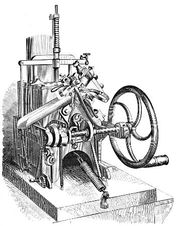
Now we enter the casting-rooms. These tiny machines, small as they are, can throw out more type in one day than you would be likely to count in a month, even if you could call off one hundred a minute, and occupy ten hours a day. Snug little fellows, are they not? They were invented by a New-Yorker, Mr. David Bruce, Jr. A very ingenious man, you say? That is true. Look at one carefully. The metal is kept fluid by a little furnace underneath, and is projected into the mould by a pump, the spout of which, you see, is in front of the metal-pot. The mould is movable, and at every revolution of the crank it comes up to the spout, receives a charge of metal, and flies back with a fully-formed type in its bosom; the upper half of the mould lifts, and out jumps a type as lively as a tadpole. You don’t see how the letter is formed on the end of the type? True, we had forgotten: well, this spring in front holds in loving proximity to the mould a copper matrix, such as you saw just now in the fitting-room. The letter a, for instance, stamped in the matrix, sits directly opposite the aperture in the mould which meets the spout of the pump; and when a due proportion of a’s is cast, another matrix with b stamped in it takes its place; and so on throughout the alphabet. Slow work, you say, one at a time? Well, the world is peopled after that fashion; and it fills up fast enough. But just time this machine: it is making small, thin type. Count the type made in a minute. One hundred and seventy-five, you say. One hundred per minute will probably be the average of the ordinary sizes of printing type.
The types are not finished yet? Oh, no. These nimble-fingered boys are breaking off the jets, or waste ends of the[43] type. Quick, a’n’t they? Now let us go up stairs into the dressing-room. An immense beehive? Yes, indeed, it looks like one. The lads clustered around the large circular stones, with leather-protected fingers, rub off the rough edges of the type. But men as well as type require their rough edges taken off before they are good for much in the world. These boys at the tables set up the type in long lines. You think that if you could pick up dollars as fast as they pick up type, you would retire an independent man in a year or two? We wish you could, Mr. Typograph; we wish you could.
The lines of type now pass into the hands of the dresser. Observe how deftly he slips them into a long stick, shakes them down on their face, screws them up, fastens them into a planing-board, and with one or two pushes with a planing tool accurately grooves the bottom of the type, removing entirely the burr left when the jet is broken off, and giving each type a pair of legs to stand upon, till it is worn out and returned to the melting kettle. What is the eye-glass used for? Why, sir, as soon as the types are grooved, the dresser narrowly inspects the face of the type, and if an imperfect letter is discovered by the aid of the magnifying glass, it is incontinently turned out. Ah, sir, if we were all inspected as severely as he criticises type, some of us, perhaps, would hardly pass muster. The immaculate types are next put up in pages of convenient size, and are ready for the purchaser.
Let us drop into the large machine-room. Does not every thing hum here! Is it not a beautiful sight to see the shafts and belts and pulleys whirling around as if they were all alive? Here we fit up our machines, make our moulds, repair damages to machinery, &c. The multifarious uses of these lathes you must be familiar with: this ponderous machine is an iron planer: how it makes the iron chips fly! What is that curiously-arranged lathe? That is for cutting Labour-Saving Rule,—the rule which you have found so convenient and economical in your job-room. We make it of many different styles of faces: some single, some dotted or hyphen-lines, and others parallel or double, of varying thicknesses. They are all cut to Pica ems in length, and are furnished with mitred corner-pieces of different angles, so contrived, in most of the sizes, as to allow the rule to be used single or double, and with the fine lines inside or outside.
SLOTTED BRASS CORNERS.
Here are specimens of our new slotted brass corners, so handsome and useful to the skilled printer. See how accurately the slotted pieces fit in one another, so that you cannot detect the joint. Are they not effective? Our brass is carefully rolled by the best manufacturers in the country, and is sent to us in strips or in sheets. That wicked-looking shears yonder cuts up the thinner brass with as much unction as Commissioner Yeh’s executioner slices off heads: the thick brass goes under a circular steam-saw.
STEREOTYPE BLOCK.
Now, sir, while we are up here, we will peep into the printers’ furnishing-room. Isn’t this a beautiful stereotype-block? Doesn’t it do your eyes good to look at such perfect workmanship? And these brass galleys, and mahogany galleys and composing sticks, are they not admirable? Our effort in this department, as in all others, is to do our work well. All our miscellaneous wood-work is done here,—stands, racks, drawers, stereotype and packing boxes, &c. Some curious work has been designed and executed for the Smithsonian Institution, as well as brass ciphering-frames for the blind.
Ah, we forgot to show you our large-type room. On our way to the electrotype department, we will glance in it. The types you see here cool too slowly to be cast in a machine, so we continue to pour them. Look over the drawers, and see the multitude of patterns. Some men fancy one style, and some another. So we try to meet all tastes. Feel how[45] solid the type is. You can’t squeeze the life out of that type on a power-press. No, indeed. It is made for wear.
Now, Mr. Typograph, we enter the grimed and murky electrotype-room. Electrotyping, you are aware, is simply stereotyping in copper. Its advantages over stereotyping are, sharpness of outline in plates from wood-cuts, and great durability. Plates for books of large circulation are always electrotyped, as well as cuts, engravings, binders’ stamps, &c. The thing to be electrotyped, after being carefully and almost imperceptibly glazed with plumbago, is laid upon a press, and a prepared mould is placed over it, and an exact impression taken. This is well dusted with plumbago, and then deposited in the electric bath. Nature immediately takes up her part of the work, and a brilliant coating of copper is deposited upon the mould. When sufficiently thick, it is taken out of the battery, and, as you may notice, presents on the wrong side the appearance of a printed sheet of copper. This sheet is then filled up on the back to the requisite degree of thickness, and fastened to a block, ready to be used with type on a common printing-press. Plumbago, you remark, does not improve the countenances of the operatives? True; but a little soap and water, vigorously applied, proves the title of these intelligent workmen to rank among white folk.
To you, Mr. Typograph, our composing-rooms present nothing new, except, perhaps, in its vast number of job founts, due to the fact that we now mainly confine our work in this department to all kinds of jobbing; and yet in ten years we have set up in these rooms and stereotyped more than eight hundred considerable works,—most of them consisting of a single volume, but some of from two to twelve volumes each,—besides a multitude of smaller books, tracts, &c. Among the rest we may mention two Quarto Bibles, (one of them, now published by J. B. Lippincott & Co., the grandest ever got up in America,) Lippincott’s two great Gazetteers, Dr. Kane’s Explorations, The North American Sylva, Thiers’ Napoleon, and Macaulay’s England: Allibone’s magnificent Dictionary of Authors and Books among the number.
After the pages have been set and carefully read, they are sent down to the casting-room. In the electrotype-room, every thing is as black as the brow of a coal-heaver: in the casting-room, all is as white as the neck of a belle. Take[46] care, sir, or your coat will commit a larceny of our plaster. The form of type is laid on this stone, and nicely oiled: and then a mixture of plaster and water—doesn’t it look like a good wife’s buckwheat batter?—is poured over it, and gently rolled in. In a short time the plaster sets, and the mould is removed by screws as tenderly as a nurse handles a baby. It is then dried in this hot-tempered oven, and, after the moisture is all evaporated, it is laid in a pan and fastened tightly, as you see, and plunged into this terrible bath of a thousand pounds of molten type-metal. Phew! you exclaim, what warm work! Yes, sir; but from that fiery sea of lead soon emerges the pan, and its hissing heat is gradually overcome by the water in the trough into which the pan is lowered. Now, caster, break it out. There, Mr. Typograph, is the plate, fixed,—immovable,—stereotyped. The mould is ruined; but the plate is comparatively immortalized. It is rough yet, and, like an uncouth boy, needs polishing.
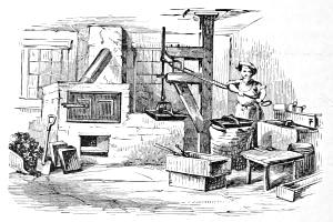
STEREOTYPE CASTING-ROOM.
This next room is the finishing-room. Here the plates are carefully examined, picked, shaved, trimmed, and boxed, ready for the printer. Take a plate in your hand and examine it: it will bear inspection. You say it is far better than the untrimmed, uneven plates of English founders? We know that, sir; for we have often had to re-finish English plates imported by some publisher who imagined he could save a little by ordering a duplicate set of plates of a popular foreign[47] book. A mistake, sir. Both in type-founding and in stereotyping the Americans have driven the foreigner from the field,—and in the only legitimate way, too: simply by surpassing him.
In this nook below, our engraving is done. The drawing is made on the block by the designer, as you see: then patiently and skilfully the engraver cuts and digs out, till the lines and shapes and lights and shades are all revealed in the beautiful picture. Our work in this department gives so much satisfaction that we are seldom without orders.
Now, Mr. Typograph, we shall admit you into our editorial parlour. Walk in, sir. It is not carpeted, and its principal furnishings comprise a desk or two, a few presses, stands and cases, with multitudinous type-surroundings. Here, sir, we edit and print our Specimen Books and our Typographic Advertiser. Don’t you see poetical flies buzzing around, and atoms of wit-dust floating in the air, and odours of sentiment stealing out at the key-holes, and grains of common sense sprinkled all over the floor. Will you have a few specimens as curiosities? You say you have already a good assortment in our Advertiser and our Book? Very well, sir: we hope you will treasure them up. You say truly when you remark, that the printing done in this room is seldom, if ever, surpassed in America. We know that; and we intend to stand on the topmost round of the typographical ladder, and to show our fellow-artists what can be done with type such as we manufacture.
We are afraid, Mr. Typograph, that your long excursion over the house has wearied you. Let us go down-stairs again. These, sir, are our warerooms. On these numerous shelves are ranged founts of all the various sorts of types made by us, carefully put up, labelled and classified, and all accessible at a minute’s notice. Our customers throughout the country keep actively employed all these porters, packers, clerks, salesmen, and bookkeepers. Many of our customers have never visited us; but we put up their orders with as conscientious fidelity and care as if they were standing before us and watching our every movement. We are happy to see them, and hope none will visit our city without calling in and taking us by the hand. We like to see them face to face, so that we can hang up their portraits in our mental gallery; and, when we[48] afterward receive a letter from them, we can imagine that we are hearing them talk to us rather than reading their writing.
The side-door on which your eye has just rested leads to one of our fire-proofs. Enter it. Here, sir, are safely stored many thousand matrices, as well as moulds, when not in use. As it would require the labour of many weary years to replace them if destroyed, we endeavour to keep them secure from the danger of ruin by fire. The upbuilding of a complete type-foundry is a work of generations.
You will hardly care to look into the basement,—the storehouse of ink and other typographical appliances? Your time is exhausted? Then, sir, we bid you good-day. A safe return to your pleasant family, Mr. Typograph.
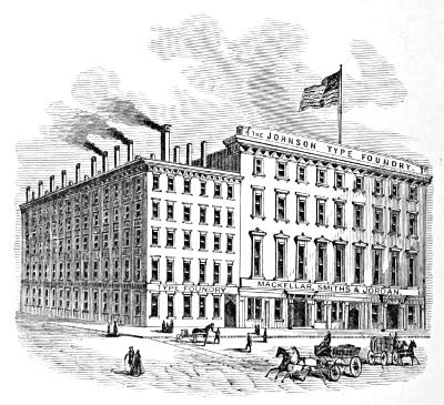
IMPLEMENTS OR TOOLS OF THE ART.
TYPES.
The types or letters generally used for printing in Europe and America are termed Roman, Italic, and Old English, or Black Letter.
ROMAN LETTER.
Roman letters were employed in MSS. from the fifth to about the close of the twelfth century, when what are called Gothic letters (afterward Old English) came gradually into use; these continued for several centuries, when, in most countries, they were superseded by the Roman characters. All printing was in black letter down to 1465, when Sweinheim & Pannartz, in Subiaco near Rome, produced a volume entitled Lactantius, in a character approaching to the actual forms of our modern types. In 1467, they made an improved set of characters, and printed about forty volumes within the five years following. About 1469 John of Spires, in Venice, made a great advance in improving the form of the Roman character, and printed the Natural History of Pliny: the execution of this work is very remarkable. But Nicholas Jenson may fairly be considered the father of the style of Roman letter now in vogue. He printed in Venice four works[50] in the year 1470, the first of which was Eusebii Præparatio Novorum, &c., in types which were cut by him, more perfect in form than those of any earlier printer. The printers named above were all of them Germans.
The Roman letters consist of circles, arcs of circles, and straight lines; and, therefore, on the score of simplicity, precision, and elegance, they certainly deserve to be adopted as the standard for all nations.
A printer, in choosing type, should not only attend to the cut of the letter, but should also observe that its shank is perfectly true, and that it lines or ranges with accuracy, and is of equal height. The quality of the metal of which it is composed and the finish of the letter demand particular attention, as the competition among some of the smaller foundries (which have sprung into existence through the facilities afforded of multiplying matrices by the electrotype process) has led them to use an inferior metal, and produce types without due regard to nicety of finish and exactness of body and standing.
It is important that types should have a deep face, with strong, bevelled bases or foundations under the ceriphs or hairlines, and that the letters should have a deep nick, which should be different from other founts of like body in the same house.
ITALIC LETTER.
Aldo Manuccio, born at Bassano, succeeded Jenson at Venice and turned to good account the latter’s admirable founts of type. He also made many advances in the art of printing, the most notable of which is the invention of the style of type now known as Italic. It was first used in an octavo edition of Virgil issued by him in 1501, and Pope Leo X. gave him a letter of privilege, entitling him to the sole use of the type he had invented. It was said to be founded on the handwriting of Petrarch, which it closely resembles.
Italic was largely employed to distinguish such parts of a book as might be considered appendages, as Prefaces, Introductions, Annotations, &c., all of which were formerly printed in this character; so that perhaps two-fifths of a fount was composed of Italic letter.
At present it is used more sparingly, being superseded by[51] the more elegant mode of enclosing extracts within inverted commas, and by setting poetry and annotations in a smaller-sized type. It is very appropriately used to distinguish the head or subject-matter of a chapter, and is serviceable in grammars and other school-books as well as scientific works. The frequent use of Italic words among Roman in ordinary matter impairs the beauty of the page, and ought to be avoided; yet authors sometimes stubbornly insist on the gratification of their whimsies, even at the sacrifice of every principle of correct taste.
BLACK LETTER.
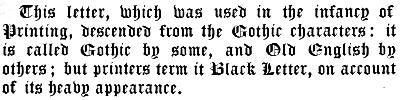
This letter, which was used in the infancy of Printing, descended from the Gothic characters: it is called Gothic by some, and Old English by others; but printers term it Black Letter, on account of its heavy appearance.
In Germany, the letters in common use are founded on the Gothic character; but even there scientific works are printed in the German language with Roman letters.
The Dutch adhere to the black letter in books of devotion and religious treatises; while they make use of the Roman in their curious and learned works.
SAXON CHARACTERS.
The Saxon characters originated probably from the Gothic, but were altered or modified after the Latin ones which the Saxons found in use in England in the fifth century. The first Saxon types were cut by John Daye, under the patronage of Archbishop Parker, about the year 1567. We give the Lord’s Prayer in modern Anglo-Saxon types:
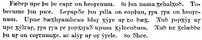
Fæder ure þu þe eart on heofenum. Si þin nama gehalgod. Tobecume þin rice. Cepurðe þin pilla on eorþan, spa spa on heofenum. Urne dæghpamlican hlaf gyfe us to dæg. And forgyf us ure gyltas, spa ssa pe forgifað urum gyltendum. And ne gelædde þu ur on costnunge. ac alys us of yfele. So ðlice.
NAMES AND SIZES OF TYPE.
The principal bodies to which printing letters are cast in England and America are the following:—
| 1. | Diamond. |
| 2. | Pearl. |
| 3. | Agate. |
| 4. | Nonpareil. |
| 5. | Minion. |
| 6. | Brevier. |
| 7. | Bourgeois. |
| 8. | Long Primer. |
| 9. | Small Pica. |
| 10. | Pica. |
| 11. | English. |
| 12. | Columbian. |
| 13. | Great Primer. |
| 14. | Paragon. |
| 15. | Double Small Pica. |
| 16. | Double Pica. |
| 17. | Double English. |
| 18. | Double Great Primer. |
| 19. | Double Paragon. |
| 20. | Canon. |
Besides the foregoing, a smaller size than Diamond, called Brilliant, is now cast in the foundry of MacKellar, Smiths & Jordan of Philadelphia, the body of which is just one-half of Minion. Even this is surpassed in smallness by a music type cast in the same foundry, named Excelsior, which is precisely one-half the size of Nonpareil. Another size omitted in the list is Minionette, (equivalent to six of the Didot points,) which is next above Nonpareil.
Canon is conceded to have been first produced by a French artisan, and was probably used in some work relating to the canons of the church; to which the German title, Missal, alludes.
Two-line Great Primer, Two-line English, and Two-line Pica, owe their names to the respective bodies of which the depth of two em quadrates answers to one of the double sizes.
Paragon was probably first cut in France. It is known as Text by the Germans.
Pica is universally considered as the standard type, and by it furniture, quotations and labour-saving rules are graduated. A line 83 Pica ems long is equivalent to 35 centimeters. The twelfth part of Pica is the unit, called a Point, by which type-bodies are measured. MacKellar, Smiths & Jordan cast their new borders, ornaments, and job type on Pica, and its subdivisions of Nonpareil, (½ Pica,) and Excelsior, (¼ Pica,) and their multiples.
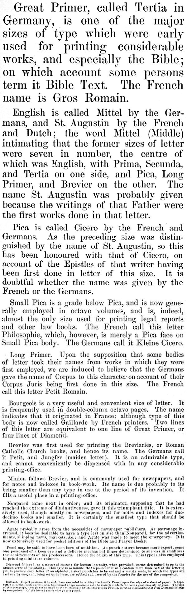
Great Primer, called Tertia in Germany, is one of the major sizes of type which were early used for printing considerable works, and especially the Bible; on which account some persons term it Bible Text. The French name is Gros Romain.
English is called Mittel by the Germans, and St. Augustin by the French and Dutch; the word Mittel (Middle) intimating that the former sizes of letter were seven in number, the centre of which was English, with Prima, Secunda, and Tertia on one side, and Pica, Long Primer, and Brevier on the other. The name St. Augustin was probably given because the writings of that Father were the first works done in that letter.
Pica is called Cicero by the French and Germans. As the preceding size was distinguished by the name of St. Augustin, so this has been honoured with that of Cicero, on account of the Epistles of that writer having been first done in letter of this size. It is doubtful whether the name was given by the French or the Germans.
Small Pica is a grade below Pica, and is now generally employed in octavo volumes, and is, indeed, almost the only size used for printing legal reports and other law books. The French call this letter Philosophie, which, however, is merely a Pica face on Small Pica body. The Germans call it Kleine Cicero.
Long Primer. Upon the supposition that some bodies of letter took their names from works in which they were first employed, we are induced to believe that the Germans gave the name of Corpus to this character on account of their Corpus Juris being first done in this size. The French call this letter Petit Romain.
Bourgeois is a very useful and convenient size of letter. It is frequently used in double-column octavo pages. The name indicates that it originated in France; although type of this body is now called Gaillarde by French printers. Two lines of this letter are equivalent to one line of Great Primer, or four lines of Diamond.
Brevier was first used for printing the Breviaries, or Roman Catholic Church books, and hence its name. The Germans call it Petit, and Jungfer (maiden letter). It is an admirable type, and cannot conveniently be dispensed with in any considerable printing-office.
Minion follows Brevier, and is commonly used for newspapers, and for notes and indexes in book-work. Its name is due probably to its being smaller than any type in use at the period of its invention. It fills a useful place in a printing-office.
Nonpareil came next in order; and its originator, supposing that he had reached the extreme of diminutiveness, gave it this triumphant title. It is extensively used, though mostly on newspapers, and for notes and indexes for duodecimo books and smaller. It is certainly the smallest type that should be allowed in book-work.
Agate probably arose from the necessities of newspaper publishers. As patronage increased, it became desirable to have a type less in size than Nonpareil, for the advertisements, shipping news, markets, &c.; and Agate was made to meet the emergency. It is now extensively used for pocket editions of the Bible and Prayer Books.
Pearl may be said to have been born of ambition. As punch-cutters became more expert, some one possessed of a keen eye and a delicate mechanical finger determined to surpass in smallness the achievements of his predecessors. Hence the origin of this type. This type is also employed in printing miniature volumes.
Diamond followed, as a matter of course; for human ingenuity, when provoked, seems determined to go to the utmost verge of possibility. This type is so minute that a pound of it will contain more than 3300 of the letter i; yet, to produce each letter of an alphabet, a steel punch has to be cut and a matrix made, in which the types are cast one by one, and, being set up in lines, are rubbed and dressed by the founder for the use of the compositor.
Brilliant. Expert penmen, it is said, have succeeded in writing the Lord’s Prayer upon the edge of a sheet of paper. A type-setter in Berlin, most surprisingly, has formed a type so minute as to be scarcely readable without a good magnifying glass. The type of this paragraph, though not so small as the microscopic letters produced in Prussia, is yet so diminutive that even Diamond is large by comparison. Of the letter i nearly 4600 go to a pound.
GRADATION OF TYPES.
The following specimen shows the proportion which one size of type bears to another in width; but it is necessary to observe that it must be taken with certain limitations, because each founder has letter of every size that will either drive out or get in with others of the same body, some faces being more extended and others being more condensed than the standard width of type. The scale contains thirteen sizes in order of gradation, viz., Great Primer, English, Pica, Small Pica, Long Primer, Bourgeois, Brevier, Minion, Nonpareil, Agate, Pearl, Diamond, and Brilliant.
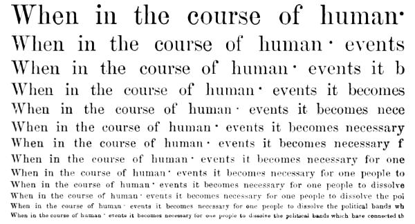
POINT SYSTEM OF TYPE-BODIES.
In 1882, MacKellar, Smiths & Jordan began to make type on the proportional system of bodies. The Pica em, being the eighty-third part of thirty five centimetres, was divided into twelve parts, or points. This system of exact proportional type-bodies was approved of and adopted by the American type-founders generally. It has been favourably received by printers in this country, and all printing offices will in due time be fully equipped with types of this description.
The standard for the height of type was fixed at 2⅓ centimetres.
In some European countries printing offices had their types cast to a height to suit the proprietor’s whim. Some of the foreign founders have sent young men to Philadelphia to be educated in the American system of heights and bodies, and at least two foundries in Germany have adopted the American plan.
The following table shows the systematic gradation of bodies and position of nicks in the point system, one point being equivalent to 1/12 of a Pica em.
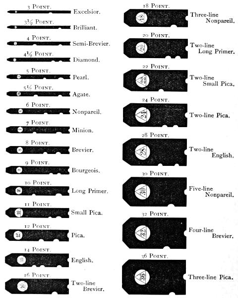
3 Point. Excelsior.
3½ Point. Brilliant.
4 Point. Semi-Brevier.
4½ Point. Diamond.
5 Point. Pearl.
5½ Point. Agate.
6 Point. Nonpareil.
7 Point. Minion.
8 Point. Brevier.
9 Point. Bourgeois.
10 Point. Long Primer.
11 Point. Small Pica.
12 Point. Pica.
14 Point. English.
16 Point. Two-line Brevier.
18 Point. Three-line Nonpareil.
20 Point. Two-line Long Primer.
22 Point. Two-line Small Pica.
24 Point. Two-line Pica.
28 Point. Two-line English.
30 Point. Five-line Nonpareil.
32 Point. Four-line Brevier.
36 Point. Three-line Pica.
A BILL OF PICA.
The following is reckoned by the founders a regular fount, complete in all its sorts:—
A BILL OF 800 LBS. OF PICA.
| a | 8500 |
| b | 1600 |
| c | 3000 |
| d | 4400 |
| e | 12000 |
| f | 2500 |
| g | 1700 |
| h | 6400 |
| i | 8000 |
| j | 400 |
| k | 800 |
| l | 4000 |
| m | 3000 |
| n | 8000 |
| o | 8000 |
| p | 1700 |
| q | 500 |
| r | 6200 |
| s | 8000 |
| t | 9000 |
| u | 3400 |
| v | 1200 |
| w | 2000 |
| x | 400 |
| y | 2000 |
| z | 200 |
| & | 200 |
| ff | 400 |
| fi | 500 |
| fl | 200 |
| ffl | 100 |
| ffi | 150 |
| æ | 100 |
| œ | 60 |
| — | 150 |
| ⸺ | 90 |
| ⸻ | 60 |
| , | 4500 |
| ; | 800 |
| : | 600 |
| . | 2000 |
| - | 1000 |
| ? | 200 |
| ! | 150 |
| ’ | 700 |
| ( | 300 |
| [ | 150 |
| * | 100 |
| † | 100 |
| ‡ | 100 |
| § | 100 |
| ∥ | 100 |
| ¶ | 60 |
| 1 | 1300 |
| 2 | 1200 |
| 3 | 1100 |
| 4 | 1000 |
| 5 | 1000 |
| 6 | 1000 |
| 7 | 1000 |
| 8 | 1000 |
| 9 | 1000 |
| 0 | 1300 |
| é | 200 |
| à | 200 |
| â | 200 |
| ê | 200 |
| All other accents, each. | 100 |
| A | 600 |
| B | 400 |
| C | 500 |
| D | 500 |
| E | 600 |
| F | 400 |
| G | 400 |
| H | 400 |
| I | 800 |
| J | 300 |
| K | 300 |
| L | 500 |
| M | 400 |
| N | 400 |
| O | 400 |
| P | 400 |
| Q | 180 |
| R | 400 |
| S | 500 |
| T | 650 |
| U | 300 |
| V | 300 |
| W | 400 |
| X | 180 |
| Y | 300 |
| Z | 80 |
| Æ | 40 |
| Π| 30 |
| A | 300 |
| B | 200 |
| C | 250 |
| D | 250 |
| E | 300 |
| F | 200 |
| G | 200 |
| H | 200 |
| I | 400 |
| J | 150 |
| K | 150 |
| L | 250 |
| M | 200 |
| N | 200 |
| O | 200 |
| P | 200 |
| Q | 90 |
| R | 200 |
| S | 250 |
| T | 326 |
| U | 150 |
| V | 150 |
| W | 200 |
| X | 90 |
| Y | 150 |
| Z | 40 |
| Æ | 20 |
| Π| 15 |
| Spaces. | |
| Thick | 18000 |
| Middle | 12000 |
| Thin | 8000 |
| Hair | 3000 |
| Em Quads | 2500 |
| En Quads | 5000 |
| Large Quadrates, about 80 lbs. | |
Italic, one-tenth of Roman.
Owing to the varying styles of authors and the diverse subjects of books, some letters will now and then run short in a[58] fount, whatever the proportions may have been at first. A new fount of type may run evenly on a work in general literature written in the third person, while a novel filled with dialogues in the first person will rapidly exhaust certain letters, and require sorts to render the fount serviceable to its full general capacity. So with scientific and other books. Even in the case of two authors writing on the same subject, there is no certainty that the fount will run alike. The master-printer, therefore, to keep the entire letter in use, is compelled to order sorts, and his fount is thus constantly growing larger.
A FOUNT OF TYPE.
A complete fount of type may be comprised under the following heads:—
CAPITALS.
A B C D E F G H I J K L M N O P Q R S T U V W X Y Z Æ Œ &
SMALL CAPITALS.
A B C D E F G H I J K L M N O P Q R S T U V W X Y Z Æ Œ &
LOWER CASE.
a b c d e f g h i j k l m n o p q r s t u v w x y z æ œ ff fi ffi fl ffl
ITALIC CAPITALS.
A B C D E F G H I J K L M N O P Q R S T U V W X Y Z Æ Œ &
ITALIC LOWER CASE.
a b c d e f g h i j k l m n o p q r s t u v w x y z æ œ ff fi ffi fl ffl
FIGURES AND FRACTIONS.
1 2 3 4 5 6 7 8 9 0 ¼ ½ ¾ ⅓ ⅔ ⅛ ⅜ ⅝ ⅞
POINTS AND REFERENCES.
, ; : ? ! - ’ ( ) [ ] * † ‡ § ∥ ¶
BRACES, DASHES AND COMMERCIAL SIGNS.
$ £ ° ` ´ ![]()
![]()
![]() - – — ⸺ ☞ ☜ @ ⅌ ℔
- – — ⸺ ☞ ☜ @ ⅌ ℔
Four kinds of spaces; en, em, two and three em quadrates.
Accents.
These are the ordinary sorts cast to a fount, and are classified by founders as long, short, ascending, descending, kerned, and double letters.
Long Letters fill the whole depth of the face of the body, and are both ascending and descending, such in the Roman as Q and j, and in the Italic f.
Short Letters have the face cast on the middle of the body, (by founders called shank,) as a, c, e, m, n, o, r, s, u, v, w, x, z, all of which will admit of being bearded above and below the face, both in Roman and Italic.
Ascending Letters are all the Roman and Italic capitals; in the lower case, b, d, f, h, i, k, l, t.
Descending Letters are g, p, q, y, in Roman and Italic.
Kerned Letters are types that have part of the face hanging over either one or both sides of the body. In Roman, f and j are the only kerned letters; but, in Italic, d, g, j, l, y are kerned on one side, and f on both sides of its face. Most Italic capitals are kerned on one side of the face.
The Double Letters in modern use are ff, fi, ffi, fl, ffl; and these are so cast to prevent the breaking of the beak of the f when used before a tall letter. The diphthongs æ and œ may be classed among double letters.
Printers divide a fount of letter into two classes.
| 1. | The upper case | } | sorts. |
| 2. | The lower case |
The upper case sorts are capitals, small capital letters, references, dashes, braces, commercial signs and fractions.
The lower case consists of small letters, double letters, figures, points, spaces and quadrates.
CAPITALS.
Lindley Murray gives the following judicious directions in regard to the use of capital letters:—
It was formerly the custom to begin every noun with a capital; but as this practice was troublesome, and gave the writing or printing a crowded and confused appearance, it has been discontinued. It is, however, very proper to begin with a capital,—
1. The first word of every book, chapter, letter, note, or any other piece of writing; and,
2. The first word after a period; and, if the two sentences are totally independent, after a note of interrogation or exclamation. But if a number of interrogative or exclamatory sentences[60] are thrown into one general group, or if the construction of the latter sentences depends on the former, all of them, except the first, may begin with a small letter: as, How long, ye simple ones, will ye love simplicity? and the scorners delight in their scorning? and fools hate knowledge?—Alas! how different! yet how like the same!
3. The appellations of the Deity: as, God, Jehovah, the Almighty, the Supreme Being, the Lord, Providence, the Messiah, the Holy Spirit.
4. Proper names of persons, places, streets, mountains, rivers, ships: as, George, London, the Strand, the Alps, the Thames, the Seahorse.
5. Adjectives derived from the proper names of places: as, Grecian, Roman, English, French, Italian.
6. The first word of a quotation, introduced after a colon, or when it is in a direct form: as, Always remember this ancient maxim: “Know thyself.”—Our great Lawgiver says, “Take up thy cross daily, and follow me.” But when a quotation is brought in obliquely after a comma, a capital letter is unnecessary: as, Solomon observes, “that pride goes before destruction.”
The first word of an example may also very properly begin with a capital: as, Temptation proves our virtue.
7. Every substantive and principal word in the titles of books: as, Johnson’s Dictionary of the English Language; Thomson’s Seasons; Rollin’s Ancient History.
8. The first word of every line in poetry.
9. The pronoun I and the interjection O are written in capitals: as, I write: Hear, O earth!
Other words, besides the preceding, may begin with capitals when they are remarkably emphatical, or the principal subject of the composition.
The method of denoting capital letters in manuscript is by underscoring them with three distinct lines.
SMALL CAPITALS.
Small Capitals are in general cast to Roman founts only, and are used for the purpose of giving a stronger emphasis to a word than that conveyed by Italic. They are likewise used for running heads, heads of chapters, &c. The first[61] word of every section or chapter is commonly put in small capitals; but when a two-line initial letter is used, the remainder of the word should be in capitals.
The small capitals C, O, S, V, W, X, Z so closely resemble the same letters in the lower case, that care is required to prevent intermixing.
In manuscript, small capitals are denoted by two lines drawn under the words.
Italic words are designated by a single stroke underneath.
POINTS.
Points consist of a comma, semicolon, colon, period or full-point, mark of interrogation, and mark of admiration. Shortly after the invention of printing, the necessity of stops or pauses in sentences for the guidance of the reader produced the colon and full-point. In process of time, the comma was added, which was then merely a perpendicular line, proportioned to the body of the letter. These three points were the only ones used till the close of the fifteenth century, when Aldo Manuccio gave a better shape to the comma, and added the semicolon; the comma denoting the shortest pause, the semicolon next, then the colon, and the full-point terminating the sentence. The marks of interrogation and admiration were introduced many years after.
Perhaps there never existed on any subject a greater difference of opinion among men of learning than on the true mode of punctuation. Some sprinkle the page with commas almost as promiscuously as if from a pepper-box, and make the pause of a semicolon where the sense will bear only a comma; while others are extremely careless, and omit points even when they are needed to give the true sense of a passage at the first reading.
The lack of an established practice is much to be regretted. The loss of time to a compositor occasioned by altering points arbitrarily is a great hardship. Manuscripts are often placed in the printer’s hands without being properly prepared: either the writing is illegible, the spelling incorrect, or the punctuation defective. Unless the author will take entirely on himself the responsibility of the pointing, it will be better to omit every point in the copy, except at the end of a sentence, rather[62] than confuse the mind of the compositor by commas and semicolons placed indiscriminately, in the hurry of writing, without any regard to propriety.[10]
The Comma [,] divides the clauses of a long or involved sentence, and commonly marks the shortest pause in reading.
Commas are used to denote extracts or quotations from other works, dialogue matter, or passages or expressions not original, by placing two of them inverted before the first word of the passage quoted, the ending being denoted by two apostrophes. A thin space is used to keep the inverted commas free from the matter. The method of running them down the sides to the end of the quotation has been found inconvenient, especially where a quotation occurs within a quotation, or a speech within a speech: the proper method of distinguishing these is by placing a single inverted comma before the extra quotation, and concluding with a single apostrophe. Where both quotations end together, put three apostrophes, observing after the first to place a thin space.
Inverted commas were first used by Guillemet, a Frenchman, to supersede the use of Italic letter in emphasized words. As an acknowledgment, his countrymen call them after his name. French founders cast them double, thus [«»]. MacKellar, Smiths & Jordan, Philadelphia, furnish them in this way when desired.
A single comma inverted is improperly used as an abbreviation of the word Mac, as in M’Gowen: c is preferable, as McGowen.
The Semicolon [;] denotes a pause greater than that of a comma, and is used between dependent clauses of compound sentences.
The Colon [:] is employed in a sentence between clauses less connected than those which are divided by a semicolon, but not so independent as separate, distinct sentences.
The Period or Full-Point [.] serves to indicate the end of a complete sentence. When used in abbreviations, it has no effect as a full stop in the punctuation, unless at the end of a sentence. In some works this point is discarded as a mark of abbreviation, as in Mr Dr &c.
Full-points are sometimes used as leaders in tables of contents, figure-work, &c.; but dotted rules or leaders are more economical for this purpose, as they save considerable time in the composition.
The sign of Interrogation [?] is used to denote a question. Every interrogation or question should begin with a capital letter, (unless several questions follow one another in connected succession,) according to the method observed in the Bible, where questions and responses, and the beginning of sayings, &c. are denoted by a capital letter.
The sign of Admiration or Exclamation [!] denotes surprise, astonishment, rapture, and other sudden emotions of the mind, whether of joy or sorrow. This sign is put after the interjections Ah! Alas! Oh! &c.; but there are exceptional cases, as, Ah me! Alas the day! &c.
All the points, except the comma and the period, should be preceded by a hair-space; the comma and full-point do not require any space to bear them off.
The em dash [—], though not ranked as a point, is often used by careless writers as a substitute for a comma or semicolon. It may be properly employed in parenthetical sentences, and in rhapsodical writing abounding in disconnected sentences.
A dash stands for a sign of repetition in catalogues of goods, where it implies ditto; and in catalogues of books, where a dash signifies ejusdem, instead of repeating the author’s name with the title of every separate treatise of his writing. A sign of repetition should never appear at the top of a page, but the name of the author, or of the merchandise, should be set out again at length.
A dash likewise stands for to; as, chap. xvi. 3-17; that is, from the third to the seventeenth verse inclusive. At other times it serves for an index, to give notice that what follows it is a corollary of what has preceded; thus:—
APOSTROPHE.
The apostrophe [’] is a comma cast on the upper edge of a type, and is used as a sign of contraction or abbreviation of words in poetry or familiar conversation, as We’re, o’er, don’t, &c. In poetry, it should not be employed where the[64] verb ends with e, as love, change, &c., but only in cases where the verb concludes with a consonant, as, reign, obtain, &c. It also marks the elision of a vowel at the beginning of words, as, ’scape, or of a syllable, as, ’prentice.
The monosyllables though and through are sometimes shortened to tho’ and thro’, but very improperly, as they retain the same sound, and the abbreviation cannot in the slightest degree assist the versification.
Words in the possessive case are generally known by having ’s for their termination.
All quotations which are denoted at the beginning by inverted commas are closed with apostrophes. There is no space required between the apostrophe and the matter.
HYPHEN.
A hyphen is a sign of connection, and denotes that the part of a word at the end of a line belongs to the portion at the beginning of the next line.
A compositor who studies propriety and neatness in his work will not allow an unnecessary division, even in a narrow measure, if he can avoid it by overrunning two or three lines of matter. In large type and narrow measures, the division of words cannot be avoided; but care should be taken that hyphens do not occur at the end of successive lines. In small type and wide measures, the hyphen may frequently be dispensed with, either by driving out or getting in the word, without interfering with the regularity of the spacing. The compositor who is careful on this point will find his advantage in the preference given to his work, and in the respect attached to his character as a master of his business. Numerous divisions down the side of a page and irregular spacing are the two greatest defects in composition.
It is proper, if possible, to keep the derivative or radical word undivided: as, occur-rence, gentle-man, respect-ful, &c. In other cases, printers generally divide on the vowel, which is an excellent method.
The hyphen is also used to connect compound words, which are formed of two substantives, as, bird-cage, love-letter, &c.; also what are termed compound adjectives, as, well-built house, handsome-faced child, &c.
The prepositions after, before, over, &c. are often connected with other words, but do not always make a proper compound: thus, before-mentioned is a compound when it precedes a substantive, as, in the before-mentioned place; but when it comes after a noun, as, in the place before mentioned, it should be two distinct words.[11]
PARENTHESIS AND BRACKET.
The use of the Parenthesis ( ) is to enclose interpolated words or sentences which serve to strengthen the argument, although the main sentence would be complete without the interpolated matter.
Parentheses are not as much used as formerly: authors place their intercalations between commas,—frequently with a dash at the beginning and ending,—which make them quite as intelligible as though they were enclosed between parentheses.
Brackets [ ] are seldom made use of, except to indicate that the word enclosed within them had been carelessly omitted in the old MS. or copy, and was now inserted by the editor.
REFERENCES.
References are marks and signs employed to direct the attention of the reader to notes in the margin or at the bottom of a page.
The characters technically known by printers as references are the following, which are used in the order here given:—
| Asterisk | * |
| Dagger | † |
| Double Dagger | ‡ |
| Section | § |
| Parallel | ∥ |
| Paragraph | ¶ |
In Roman church-books, the Asterisk divides each verse of a psalm into two parts, and marks the place where the responses begin: this in the Book of Common Prayer is denoted by a colon placed between the two parts of each verse. Asterisks also denote an omission, or an hiatus in the original copy; the number of asterisks being multiplied according to the extent of the omission.
The Dagger, originally termed the Obelisk, or Long Cross, is frequently used in Roman Catholic church-books, prayers of exorcism, at the benediction of bread, water, and fruit, and upon other occasions, where the priest is to make the sign of the cross; but the square cross (✠) is the proper symbol for the purpose. The square cross is used, besides, in the pope’s briefs, and in mandates of archbishops and bishops, immediately before the signature of their names. It is not placed among references.
Besides its use as a reference mark, the Paragraph is now employed chiefly in Bibles, to show the parts into which a chapter is divided. In Common Prayer Books, paragraphs are put before the lines that direct the order of the service, and which are called the Rubrics because they were formerly printed in red.
The neatest references, when many are required in books, are either superior letters or superior figures,—thus, ¹, ², ³, or thus, ᵃ, ᵇ, ᶜ. Superior letters are used chiefly in Bibles and other books which have more than one sort of notes, and therefore require different references. When thus used, the letter ʲ should be omitted, as, from its similarity to the ⁱ, the reader might at times be led into error.
ACCENTED LETTERS.
Letters called accented by printers are the five vowels, marked thus:—
| Acute | á é í ó ú |
| Grave | à è ì ò ù |
| Circumflex | â ê î ô û |
| Diæresis | ä ë ï ö ü |
| Long | ā ē ī ō ū |
| Short | ă ĕ ĭ ŏ ŭ |
We may include the French ç, the Spanish ñ, the Portuguese ã and õ, the Swedish and Norwegian å and ö, and the Welsh ŵ and ŷ.
NUMERAL LETTERS.
The Greeks at first employed the letters of the entire alphabet to express the first twenty-four numbers; but the system was cumbrous, and they adopted the happy expedient of dividing their alphabet into three portions, using the first to symbolize the 9 digits, the second the 9 tens, and the third the 9 hundreds; and, as their alphabet contained only twenty-four letters, they invented three additional symbols. Their list of symbols then stood as follows:—
| Units. | Tens. | Hundreds. | |||
|---|---|---|---|---|---|
| α represents | 1 | ι represents | 10 | ρ represents | 100 |
| β | 2 | κ | 20 | σ | 200 |
| γ | 3 | λ | 30 | τ | 300 |
| δ | 4 | μ | 40 | υ | 400 |
| ε | 5 | ν | 50 | φ | 500 |
| ϝ (introduced) | 6 | ξ | 60 | χ | 600 |
| ζ | 7 | ο | 70 | ψ | 700 |
| η | 8 | π | 80 | ω | 800 |
| θ or ϑ | 9 | Ϟ or ϟ (introduced) | 90 | ϡ, |
900 |
By these symbols, only numbers under 1000 could be expressed; but, by putting a mark called iota under any symbol, its value was increased a thousand-fold: thus, ᾳ = 1000, κͅ = 20,000; or, by subscribing the letter Μ, the value of a symbol was raised ten thousand-fold. For these two marks, single and double dots were afterward substituted. This improvement enabled them to express with facility all numbers as high as 9,990,000,—a range sufficient for all ordinary purposes.
It has been supposed that the Romans used M to denote 1000 because it is the first letter of Mille, which is Latin for 1000; and C to denote 100, it being the first letter of Centum, the Latin term for 100. Some also suppose that D, being formed by dividing the old M in the middle, was therefore appointed to stand for 500,—that is, half as much as the M stood for when it was whole; and that L being half a C, was, for the same reason, used to denominate 50. But the most natural account of the matter appears to be this:—
The Romans probably put down a single stroke, Ⅰ, for one, as is still the practice of those who score on a slate, or with chalk; this stroke they doubled, trebled, and quadrupled, to express two, three, and four: thus, ⅠⅠ, ⅠⅠⅠ, ⅠⅠⅠⅠ. So far they could easily number the strokes with a glance of the eye; but they found that if more were added it would be necessary to count the strokes one by one: for this reason, when they came to five, it was expressed by joining two strokes together in an acute angle, thus, Ⅴ.
After they had made this acute angle, Ⅴ, for five, they then added single strokes to the number of four, thus, ⅤⅠ, ⅤⅠⅠ, ⅤⅠⅠⅠ, ⅤⅠⅠⅠ, and then, as the strokes could not be further multiplied without confusion, they doubled their acute angle by prolonging the two lines beyond their intersection, thus, Ⅹ, to denote two fives, or ten. After they had doubled, trebled, and quadrupled this double acute angle, thus, ⅩⅩ, ⅩⅩⅩ, ⅩⅩⅩⅩ, they then, for the same reason which induced them to make a single angle first, and then to double it, joined two single strokes in another form, and, instead of an acute angle, made a right angle, Ⅼ, to denote fifty. When this was doubled, they then doubled the right angle, thus, ⊏, to denote one hundred, and, having numbered this double right angle four times, thus, ⊏⊏, ⊏⊏⊏, ⊏⊏⊏⊏, when they came to the fifth number, as before, they reverted it, and put a single stroke before it, thus,[69] Ⅰ⊐, to denote five hundred; and, when this five hundred was doubled, then they also doubled their double right angle, setting two double right angles opposite to each other, with a single stroke between them, thus, ⊏Ⅰ⊐, to denote one thousand: when this note for one thousand had been repeated four times, they then put down Ⅰ⊐⊐ for five thousand, ⊏⊏Ⅰ⊐⊐ for ten thousand, and Ⅰ⊐⊐⊐ for fifty thousand.
The corners of the angles being cut off by transcribers for despatch, these figures were gradually brought into what are now called numerical letters. When the corners of ⊏Ⅰ⊐ were made round, it stood thus, ⅭⅠↃ, which is so near the Gothic ന that it soon deviated into that character; so that Ⅰ⊐ having the corners made round stood thus, ⅠↃ, and then easily deviated into D. ⊏ also became a plain C by the same means: the single rectangle, which denoted fifty, was, without any alteration, a capital L; the double acute angle was an X; the single acute angle, a V; and a plain single stroke, the letter I. And thus these seven letters, M, D, C, L, X, V, I, became numerals. As a further proof of this assertion, let it be considered that ⅭⅠↃ is still used for one thousand, and ⅠↃ for five hundred, instead of M and D; and this mark, ന, is sometimes used to denote one thousand, which may easily be derived from this figure, ⊏Ⅰ⊐, but cannot be deviations from, or corruptions of, the Roman letter M. The Romans also expressed any number of thousands by a line drawn over any numeral less than one thousand: thus, V̅ denotes five thousand, L̅X̅ sixty thousand; so, likewise, M̅ is one million, M̅M̅ two millions, &c.
Upon the discovery of printing, and before capitals were invented, small letters served for numerals; not only when Gothic characters were in vogue, but when Roman had become the prevailing character. Thus, in early times, i b x l c d m were, and in Roman type are still, of the same signification as capitals when used as numerals. Though the capital J is not a numeral letter, yet the lower-case j is as often and as significantly used as the vowel i, especially where the former is employed as a closing letter, in ij iij bj bij biij dcij, &c. In Roman lower-case numerals, the j is not regarded, but the i stands for figure 1 wherever it is used numerically.
During the existence of the French Republic, books were dated in France from the first year of the Republic: thus An. XII. (1803,) or twelve years from 1792.
ARITHMETICAL FIGURES.
The arithmetical or Arabic numerals are 0, 1, 2, 3, 4, 5, 6, 7, 8, 9. Properly they should be styled Hindu or Indian numerals; for the Arabs borrowed them, along with the decimal system of notation, from the Hindus. They were probably first introduced from the East into Italy about 1202; yet they did not come into general use before the invention of printing. Accounts were kept in Roman numerals up to the sixteenth century. Figures are usually made one en thick; but of late a broader figure is cast for newspaper use, which is two-thirds or six-sevenths of an em in width.
OLD STYLE FIGURES.
Though uniform in height and appearance, we do not deem the modern figures an improvement on the variously-lining figures formerly in vogue, and now happily coming again into use. The latter can be caught by the eye with greater ease and certainty, just as lower-case letter can be read with more facility than continuous lines of capitals. In the new style the 3 and 8 may easily be mistaken for each other, and so with the 6, 9, and 0; but in the old style figures such errors are quite unlikely to happen, as some of them occupy the centre of the body only, and others are ascending or descending characters. The example here given will show the justice of our remarks:
1 2 3 4 5 6 7 8 9 0
1 2 3 4 5 6 7 8 9 0
SCRATCHED OR CANCELLED FIGURES
1̷ 2̷ 3̷ 4̷ 5̷ 6̷ 7̷ 8̷ 9̷ 0̷
Are used in arithmetical matter when certain figures require to be crossed over in an operation.
FRACTIONS.
Common Fractions, or broken numbers in arithmetic, are cast solid to all sizes of type. A great improvement has been introduced by casting the numerator and denominator separately, on bodies of half size, with the line on the under figure, so that odd fractions of any amount may be readily formed, thus: ¹ ² ³ ⁄₂ ⁄₃ ⁄₄ ½ ⅔ ¾.
SIGNS.
COMMERCIAL SIGNS.
| ⅌ | Per, each. |
| @ | At or to. |
| % | Percentum. |
| ℀ | Account. |
| ¢ | Cent. |
| $ | Dollar or dollars. |
| £ | Libra, libræ, pound or pounds sterling. |
| / | Solidus, solidi, shilling or shillings. |
MATHEMATICAL, ALGEBRAICAL, AND GEOMETRICAL.
+ plus, or more, is the sign of real existence of the quantity it stands before, and is called an affirmative or positive sign. It is also the mark of addition: thus, a+b, or 6+9, implies that a is to be added to b, or 6 added to 9.
− minus, or less, before a single quantity, is the sign of negation, or negative existence, showing the quantity to which it is prefixed to be less than nothing. But between quantities it is the sign of subtraction: thus, a−b, or 8−4, implies b subtracted from a, or 8 after 4 has been subtracted.
= equal. The sign of equality, though Des Cartes and some others use this mark, ∝: thus, a=b signifies that a is equal to b. Others use the mark = to denote identity of ratios.
× into or with. The sign of multiplication, showing that the quantities on each side the same are to be multiplied by one another: as, a×b is to be read, a multiplied into b; 4×8, the product of 4 multiplied into 8. Wolfius and others use a dot between the two factors: thus, 7·4 signifies the product of 7 and 4. In algebra the sign is commonly omitted, and the two quantities put together: thus, bd expresses the product of b and d. When one or both of the factors are compounded of several letters, they are distinguished by a line drawn over them: thus, the factum of a+b-c into d is written, d × a̅+̅b̅-̅c̅. Others distinguish the compound factors by including them in parentheses: thus, (a+b-c)d.
÷ by. The sign of division: thus, a÷b denotes the quantity a to be divided by b. Wolfius makes the sign of division two dots; 12:4 denotes the quotient of 12 divided by 4 = 3.
> or ⫍ are signs of majority: thus, a>b expresses that a is greater than b.
< or ⫎ are signs of minority,—when we would denote that a is less than b.
∞ is the character of similitude used by Wolfius, Leibnitz, and others. It is used in other authors for the difference between two quantities when it is unknown which is the greater of the two.
∷ so is. The mark of geometrical proportion disjunct, and is usually placed between two pair of equal ratios: as, 3∶6∷4∶8 shows that 3 is to 6 as 4 is to 8.
∶ or ∴ is an arithmetical equal proportion: as, 7.3∶13.9; i. e. 7 is more than 3, as 13 is more than 9.
⬜ quadrate, or regular quadrangle,—viz. ⬜AB=⬜BC; i. e. the quadrangle upon the line AB is equal to the quadrangle upon the line BC.
△ triangle: as, △ABC=△ADC.
∠ an angle: as, ∠ABC=∠ADC.
⟂ perpendicular: as, AB⟂BC.
▭ rectangled parallelogram, or the product of two lines.
∥ the character of parallelism.
⧧ want of parallelism.
≚ equiangular, or similar.
⫨ equilateral.
▱ rhomboid.
◠ concentrix.
○ circle.
∟ right angle.
∫ integration, (summa or sum).
° denotes a degree: thus, 45° implies 45 degrees.
´ a minute: thus, 50´ is 50 minutes; ´´, ´´´, ´´´´, denote seconds, thirds, and fourths; and the same characters are used where the progressions are by tens, as it is here by sixties.
∺ the mark of geometrical proportion continued, implies the ratio to be still carried on without interruption: as, 2, 4, 8, 16, 32, 64 ∺ are in the same uninterrupted proportion.
√ When used without a figure above it, indicates the square root, and is called the radical sign. Any other root is expressed by the index figure placed above the sign. √16 is the square root of 16, ∛27 the cube root of 27, &c.
≅ difference equal.
∹ the difference, or excess.
Q or q, a square.
C or c, a cube.
QQ, the ratio of a square number to a square number.
In algebraical work, authors should be very exact in their copy, and compositors as careful in following it, so that no alterations may be necessary after it is composed, the over-running of this kind of matter being troublesome and costly.
CELESTIAL AND ASTRONOMICAL SIGNS.
The Twelve Signs of the Zodiac.
| ♈ | Aries. |
| ♉ | Taurus. |
| ♊ | Gemini. |
| ♋ | Cancer. |
| ♌ | Leo. |
| ♍ | Virgo. |
| ♎ | Libra. |
| ♏ | Scorpio. |
| ♐ | Sagittarius. |
| ♑ | Capricornus. |
| ♒ | Aquarius. |
| ♓ | Pisces. |
The Sun and Major Planets.
| ☉ | Sun. |
| ☿ | Mercury. |
| ♀ | Venus. |
| 🜨 | Earth. |
| ♂ | Mars. |
| ♃ | Jupiter. |
| ♄ | Saturn. |
| ⛢ | Uranus. |
| ♇ | Neptune. |
⚳ Ceres, ⚴ Pallas, ⚵ Juno, ⚶ Vesta,
![]() Astræa,
Astræa,
![]() Hebe,
Hebe,
![]() Iris,
and the other asteroids, or minor planets, are now commonly
designated by a circle enclosing a number which indicates
the order of their discovery: thus, ①, ②, ③, &c.
Iris,
and the other asteroids, or minor planets, are now commonly
designated by a circle enclosing a number which indicates
the order of their discovery: thus, ①, ②, ③, &c.
Lunar Signs.
| 🌚 | New Moon. |
| 🌛 | First Quarter. |
| 🌝 | Full Moon. |
| 🌜 | Last Quarter. |
Aspects and Nodes.
☌ Conjunction; happens when two planets stand under each other in the same sign and degree.
☍ Opposition; happens when two planets stand diametrically opposite each other.
△ Trine; happens when one planet stands from another four signs, or 120 degrees, which make one-third of the ecliptic.
□ Quartile; happens when two planets stand three signs from each other, which make 90 degrees, or the fourth part of the ecliptic.
⚹ Sextile; is the sixth part of the ecliptic, which is two signs, and make 60 degrees.
☊ The Dragon’s Head, or ascending node, and
☋ The Dragon’s Tail, or descending node, are the two points in which the eclipses happen.
Planets that denote the Seven Days of the Week.
- Dies Solis—Sunday.
- Dies Lunæ—Monday.
- Dies Martis—Tuesday.
- Dies Mercurii—Wednesday.
- Dies Jovis—Thursday.
- Dies Veneris—Friday.
- Dies Saturni—Saturday.
Many signs and symbols have been invented by pseudo-astronomers to impose upon the credulity of the ignorant; among which are signs to give notice on what day it is proper to let blood, to bathe and to cup, to sow and to plant, to take physic, to have one’s hair cut, to cut one’s nails, to wean children, and many other absurdities; as well as symbols that serve to indicate hail, thunder, lightning, or any occult phenomena.
ECCLESIASTICAL SIGNS.
℟ Response, used in prayer-books.
℣ Versicle, used in prayer-books to denote the part recited by the priest.
✠ or ✝ A sign of the cross employed by Roman Catholic ecclesiastical dignitaries before their signatures. In Roman Catholic prayer-books, it also denotes the place where the priest is to make the sign of the cross.
* Used in Roman Catholic prayer-books to denote the place in a single verse where the response begins.
MEDICAL SIGNS AND ABBREVIATIONS.
℞ stands for Recipe, or Take.
ā, aa, of each a like quantity.
℔ a pound.
℥ an ounce.
ʒ a drachm.
℈ a scruple.
j stands for 1; ij for 2; iij for 3; and so on.
ss. signifies semi, or half.
gr. denotes a grain.
P. stands for particula, a little part, and means so much as can be taken between the ends of two fingers.
P. æq. stands for partes æquales, or equal parts.
q. s. quantum sufficit, or as much as is sufficient.
q. p. quantum placit, or as much as you please.
s. a. secundem artem, or according to art.
METAL RULES OR DASHES.
Metal Rules or dashes, [⸺] like quadrates, are commonly cast from one em to three ems in length. When cast to line and join accurately, they may be used instead of brass rule.
BRACES.
Braces [⏞] are used chiefly in tables of accounts, botanical and geological tables, and similar matter. They are placed before or after a series of items of similar import; and are sometimes used horizontally in the margin, to cut off a chronological or other series from the proper notes or marginal references of the work. Braces, two, three, and four ems in length, are now cast for all sizes of common type.
Middles and ends are also cast, [![]() ] which can be filled
out with dashes to any length required for the brace. Middles
and ends are convenient in genealogical tables, in which they
are used the flat way, and in which the directing point is not
always in the middle.
] which can be filled
out with dashes to any length required for the brace. Middles
and ends are convenient in genealogical tables, in which they
are used the flat way, and in which the directing point is not
always in the middle.
Brass braces of any length, for music and jobbing purposes, are furnished by type-founders.
SPACES.
Spaces are short blank types, and are used to separate
one word from another. To enable the compositor to space
even and to justify with nicety, they are cast to various thicknesses,—viz.
five to an em, [![]() ] or five thin spaces; four to an
em, [
] or five thin spaces; four to an
em, [![]() ] or four middle spaces; three to an em, [
] or four middle spaces; three to an em, [![]() ] or three
thick spaces; and two to an em, [
] or three
thick spaces; and two to an em, [![]() ] or two en quadrates,
which may with propriety be reckoned among the number of
spaces. Besides these, there is what is called the hair-space,
which is cast extremely thin, and is found useful in justifying
lines and assisting uniformity in spacing.
] or two en quadrates,
which may with propriety be reckoned among the number of
spaces. Besides these, there is what is called the hair-space,
which is cast extremely thin, and is found useful in justifying
lines and assisting uniformity in spacing.
TWO-LINE LETTERS
Are equal in depth to two lines of the type in which they are to be used, and of proportionate width. They form the almost only proper type for principal lines in title-pages, and are used at the beginning of chapters and newspaper advertisements.
QUADRATES.
An em quadrate [■] is a short blank type, in thickness equal to the square of the letter of the fount to which it belongs; an en quadrate [▮] is half that size.
The first line of a paragraph is usually indented an em quadrate; but when the matter is leaded or the measure is wide, an em and en, or two or even three ems may be used. An em quadrate is the proper space after a full-point when it terminates a sentence in a paragraph.
En quadrates are generally used after the semicolon, colon, &c., and sometimes after an overhanging letter. They are useful in spacing.
Em and en quadrates, and figures as well, should be entirely exact and uniform in body, as even a trifling variation will be apparent when they are arranged in table or figure-work; and no ingenuity on the part of a compositor can rectify the zigzag appearance caused by irregular types.
The inconvenience arising from founts of the same body not agreeing in depth is great, where the quadrates, through necessity, are sometimes mixed. The founts cast by MacKellar, Smiths & Jordan are not liable to this charge, as their moulds for all regular type of a specific size harmonize perfectly, and the quadrates and spaces work together.
QUOTATIONS.
Quotations are large blank type used for filling up considerable spaces at the beginning or end of a chapter, and also for job-work. They are cast to two sizes, and are called broad and narrow. They vary in size according to the standard of the foundry where they are cast. They are being superseded, however, by
LABOUR-SAVING QUOTATION FURNITURE.
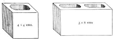
This is cast with great accuracy to Pica, of assorted widths and lengths; and, as its name imports, it serves not only for quotations in general job-work, but also for furniture.
STANDARD METAL FURNITURE.
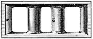
Owing to the large assortment of sizes contained in this furniture, it is useful for blanking out all varieties of work, from the card or circular to the large hand-bill or poster. As the above metal furnitures are not liable to warp or shrink, they form a highly economical substitute for wooden reglet.
HOLLOW QUADRATES
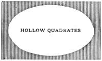
Answer many of the purposes of quotations, but are principally useful as frames or miniature chases for circular or oval jobs. The sizes are graduated from 5 × 8 to 12 × 18 Pica ems.
CIRCULAR QUADRATES.
These are made of various sizes, so as to form circles or parts of circles from one to twenty-four inches in diameter. Each piece is exactly one-eighth of a full circle, and, when combined with similar pieces, will form quarter, half, three-quarter, and full circles. By reversing the combination of some of the pieces, serpentine and eccentric curves may be made of any length or depth.
There are two kinds: inner quadrates, with convex surface, and outer quadrates, with concave surface. The curved line is produced by placing the convex and concave surfaces parallel to each other, so that when locked up firmly they hold the type inserted between them. The other sides of the quadrates are flat and right-angled, to allow a close introduction of type, and an easy justification with common quadrates.
As these quadrates are perfect segments of a large circle, they cannot be increased or diminished without destroying the truth of the curve. If the thin ends are pieced out with common quadrates, good justification will be rendered impossible; if they are shortened by cutting off, they are ruined. Bits of[79] lead or short pieces of card between the curved surfaces are also wrong: they destroy that exact parallelism which is necessary for the security of the type. Very accurate justification of the outer extremities of the quadrates is also indispensable. If the curved surfaces are kept parallel, and the flat surfaces kept square, no difficulty will be found in using them, and they will prove a valuable aid in ornamental printing.
LABOUR-SAVING CURVATURES, &c.
Morris’s Adjustable Line Formers, or Labour-Saving Curvatures, do away with bent leads, plaster, wax, and other methods of making curved lines. Their economical advantages, and the neatness and exactitude of curve secured by their use, will be appreciated at a glance by all practical job printers.
LEADS.
Leads form an essential part of a printer’s outfit, since it is scarcely possible to set up a single page or job in which they may not be usefully employed; but their chief purpose is for spreading the lines apart so as to reduce the amount of matter in a page. Fine works are always thus leaded. They are usually cast by letter-founders in a long mould, and then cut to the required lengths. The bodies are regulated by Pica standard, and they are usually cast four, six, or eight to Pica, but are occasionally varied from one down to fourteen to Pica. Leads for jobbing purposes are now cut to graduated lengths, like labour-saving rule.
FLOWERS AND BORDERS.
The flowers and borders designed and cast at the present time far surpass any made by founders of earlier days. Their richness and variety enable printers to execute delicate and elaborate work, rivalling plate engraving, and afford a wide scope for the display of taste and artistic skill. The combination borders are especially valuable from being cast on uniform bodies, thus rendering them susceptible of a vast number of changes.
The ancient practice of ornamenting pages with head and tail pieces of flowers and odd designs seems to be coming in vogue again, particularly in works printed in the old-style type.
BRASS RULES.
Rules are required mainly for table-work, and for pages which contain two or more columns. They are also useful in titles and jobs. Brass rules should never be more than type height, unless for perforating purposes, to divide railroad checks, &c. A shade lower would be often better, as the pressman would be enabled to bring off their impression more clearly. In table-work, the rule and figures should be separated by a lead, and all the rules should fit closely and accurately.
The lately-invented
BRASS LABOUR-SAVING RULE
is of immense economical advantage to the printer. Being cut to a graduated scale, from one em to fifty ems Pica in length, advancing in the shorter pieces by ens and in the longer by ems, all waste in cutting is avoided by the printer, as rules of any length can be formed by employing two or more pieces. This rule is put up in regular founts, of various styles, with sufficient mitred pieces for outside bordering.
Metal space-rules, cast by type-founders, are commonly used for cross-rules in table-work; but the shorter pieces of labour-saving rule will answer as well.
On the next page we insert a plan of a case for labour-saving rules, with boxes suited for the various sizes, in which the rule should be kept when not in use.
IMPROVED LABOUR-SAVING RULE CASE.
EARLIEST WRITTEN SOUNDS.
The hieroglyphic is the most ancient form of written sounds. The earliest known monuments containing phonetic hieroglyphics date about forty centuries ago, or six hundred years before the time of Moses, who is supposed to have been versed in the knowledge of the hieroglyphs. Yet nothing worthy of the name of an alphabet existed till a later period, when the Phœnicians invented a purely alphabetic system, but suppressing the vowels, and from this has originated all the modes of alphabetic writing now used.[12] The Greeks introduced the vowels into their graphic system, and so brought to perfection the invaluable invention of alphabetic writing.
The discovery of the Rosetta stone furnished a clue to the method of deciphering the Egyptian hieroglyphics; and Dr. Young and Champollion were the first to make use of the suggestive opportunity. The words Ptolemy and Cleopatra were made out; and these served as a key or incentive to further investigations; and extensive and curious volumes have been devoted to the interpretation of Egypt’s mysterious inscriptions on monuments and writings on papyrus.
Among those who have investigated the Egyptian hieroglyphs, Mr. R. Lepsius is one of the most practical, for he has reduced the ancient characters to typographical uses for the behoof of the delvers into the earth’s earliest lore. He began the work soon after his return from a scientific expedition to Egypt during the years 1842-46, and his hieroglyphic types now completed number more than thirteen hundred. The Prussian government furnishing the needful pecuniary means, his first task was to ascertain the forms of hieroglyphic signs which would be most suitable for typographical purposes, and here the labour was immense. After laborious research, he reached the conclusion, that as European print had been formed, not from the monumental characters of the Greeks and Romans, but essentially from the current handwriting of documents on parchment and paper, so the hieroglyphic type should follow, not the chiseled or painted characters on the[84] monuments, but the style of those written on papyrus. The style and proportions having been established, the punch-cutting was mostly executed by Mr. Ferdinand Theinhardt, the excellent Prussian type-founder, who for a series of years has been skilfully engaged in producing the matrices. We are indebted to Mr. Theinhardt for the specimens here given; the first of which is the hieroglyphic alphabet, and the second is the beginning of an ancient text found in a leather roll of the Royal Museum of Berlin, referring to the foundation of the temple of the Sun at On or Heliopolis in Egypt.
HIEROGLYPHIC ALPHABET.
1 Renpt III ȧbeṭ III šat . . . xer ḥen n suten xet xeper-qu-rā sa-rā usertesen maā-xeru ānx tétta r neḥ:
2 suten xāt m sexti, xeper ḥemes m tȧṭet, netńu re n ȧmu-xetef, semer nu
3 . . . ānx utȧ senb, seru r ȧst senentu, utu téṭet xeft setem set netńu re m
4 seun ḥer-sen. Mā-ten ḥen-a ḥer šau qat, sexa m sep m xut;
5 n-mxet ȧrí-ȧ mennu, semen-ȧ utu reṭu n ḥer xuti.
TRANSLATION.
Done in the month of Hatoor of the third year of the King of Upper and Lower Egypt Kheperkara Usertesen I.—the blessed and eternally living.
The King, wearing the double crown, sat in the royal hall. There was held a council of his attendants, the counsellors of the apartments of the Pharao (may he live!) and the great (chiefs) for the site of the foundation. Speeches were made, while they listened; and they deliberated, stepping forward. “Well!” said the King, “let me order the work and fittingly commemorate deeds of glory. Henceforth I will erect buildings and lasting steles to the double Horus,” that is to the god of the rising and setting Sun, etc.
RUNIC ALPHABETS.
Runes were the earliest alphabets in use among the Teutonic and Gothic nations of Northern Europe. The exact period of their origin is not known. The name is derived from the Teutonic rûn, a mystery; whence runa, a whisper, and helrûn, divination; and the original use of these characters seems to have been for purposes of secrecy and divination. Scandinavian and Anglo-Saxon tradition agree in ascribing the invention of runic writing to Odin or Wodin. The countries in which traces of the use of runes exist include Denmark, Norway, Sweden, Iceland, Germany, Britain, France, and Spain; and they are found engraved on rocks, crosses, monumental stones, coins, medals, rings, brooches, and the hilts and blades of swords. Runic letters were also often cut on smooth sticks called rûn-stafas, or mysterious staves, and used for purposes of divination. But there is no reason to believe that they were at any time in the familiar use in which we find the characters of a written language in modern times, nor have we any traces of their being used in books or on parchment. We have an explanation of the runic alphabet in various MSS. of the early middle ages, prior to the time when runes had altogether ceased to be understood.
The systems of runes in use among the different branches of the Teutonic stock were not identical, though they have a strong general family likeness, showing their community of origin. The letters are arranged in an order altogether distinct from that of any other alphabetical system, and have a purely Teutonic nomenclature. Each letter is, as in the Hebrew-Phœnician, derived from the name of some well-known familiar object, with whose initial letter it corresponds. Runes, being associated in the popular belief with augury and divination, were to a considerable extent discouraged by the early Christian priests and missionaries, whose efforts were directed to the supplanting of them by Greek and Roman characters. But it was not easy suddenly to put a stop to their use, and we find runes continuing to be employed in early Christian inscriptions. This was to a remarkable extent the case in the Anglo-Saxon kingdoms of Northumbria, Mercia, and East Anglia, where we have traces of runic writing of dates varying from the middle[87] of the seventh to the middle of the tenth century. Runes are said to have been laid aside in Sweden by the year 1001, and in Spain they were officially condemned by the Council of Toledo in 1115.
The different systems of runes, all accordant up to a certain point, have been classed as the Anglo-Saxon, the German, and the Norse, each containing different subordinate varieties. The Norse alphabet is generally considered the oldest, and the parent of the rest. It has sixteen letters corresponding to our f, u, th, o, r, k, h, n, i, a, s, t, b, l, m, y, but has no equivalent for various sounds which exist in the language, in consequence of which the sound of k was used for g, d for t, b for p, and u and y for v: o was expressed by au, and e, by ai, i, or ia; and the same letter otherwise was made to serve for more than one sound. Other expedients came, in the course of time, to be employed to obviate the deficiency of the system,—as the addition of dots, and the adoption of new characters. But the runic system received a fuller development among the Germans and Anglo-Saxons, particularly the latter, whose alphabet was extended to no fewer than forty characters, in which seem to have been embraced, more nearly than in any modern alphabets, the actual sounds of a language. The table on the following page exhibits the best known forms of the Anglo-Saxon, German, and Norse runic alphabets, with the names and the power of the several letters.
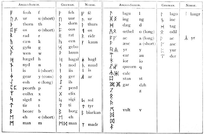
The Anglo-Saxon runes, as here given, are derived from a variety of MS. authorities, the most complete containing forty characters, while some only extend as far as the twenty-fifth or twenty-eighth letter. Neither the name nor the power of some of the later letters is thoroughly known, and they are without any equivalents in the Norse runic system. The German runes are given from a MS. in the conventual library of St. Gall, in Switzerland. Though the various runic alphabets are not alike copious, the same order of succession among the letters is preserved, excepting that, in the Norse alphabet, laugr precedes madr, although we have placed them otherwise, with the view of exhibiting the correspondence of the three systems. The number of characters in the Anglo-Saxon alphabet is a multiple of the sacred number eight; and we have the evidence both of a Swedish bracteate containing twenty-four characters, and of the above mentioned St. Gall MS., that there was a [89]recognized division of the alphabet into classes of eight letters,—a classification which forms the basis of a system of secret runes, mentioned in that MS. Of these secret runes, there are several varieties specified: in particular, 1. Iis-runa and Lago-runa (of which specimens exist in Scandinavia), consisting of groups of repetitions of the character iis or lago, some shorter and some longer, the number of shorter characters in each group denoting the class to which the letter intended to be indicated belonged; the number of longer ones, its position in the class. 2. Hahal-runa, where the letters are indicated by characters with branching stems, the branches to the left denoting the class, and those to the right the position in that class. There is an inscription in secret runes of this description at Hackness, in Yorkshire. 3. Stof-runa, in which the class is indicated by points placed above, and the position in the class by points below, or the reverse.
The best-known inscriptions in the Anglo-Saxon character are those on two grave-stones at Hartlepool, in Northumberland, on a cross at Bewcastle, in Cumberland, and on another cross at Ruthwell, in Dumfriesshire. The inscription on the west side of Bewcastle cross, which we give as a specimen of Anglo-Saxon runes, is a memorial of Alcfrid, son of Oswiu, who was associated with his father in the government of the kingdom of Northumbria, in the seventh century.
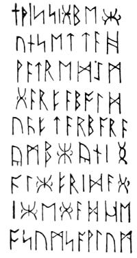
RUNES.
It has been thus deciphered into the Anglo-Saxon dialect of the period:—
Or, in Modern English:—
The inscription on the Ruthwell cross, after being long a puzzle to antiquaries, was first deciphered in 1838 by Mr. John M. Kemble, an eminent Anglo-Saxon scholar. It is written alternately down one side of the stone and up another, and contains a portion of a poem on the subject of the Crucifixion. Mr. Kemble’s interpretation received a very satisfactory confirmation by the discovery of a more complete copy of the same poem in a MS. volume of Anglo-Saxon homilies at Vercelli.
Mr. D. M. Haigh, whose researches have added much to our knowledge of Anglo-Saxon runes, has endeavoured to set up for them a claim of priority over the Norse characters. Instead of considering the additional Anglo-Saxon letters as a development of the Norse system, he looks on the Norse alphabet of sixteen letters as an abridgment of an earlier system, and finds occasional traces of the existence of the discarded characters in the earliest Norse inscriptions, and in the Scandinavian Iis-runa and Hahal-runa, where the letters are classified in accordance with the Anglo-Saxon groups of eight.
The Scandinavian kingdoms contain numerous runic monuments, some of them written boustrophedon, or with the lines beginning alternately from the right and left; and there are many interesting inscriptions on Swedish gold bracteates. The Celtic races, from their connection with the Scandinavians, became acquainted with their alphabet, and made use of it in writing their own language; and hence we have, in the Western Islands of Scotland and in the Isle of Man, runic inscriptions, not in the Anglo-Saxon, but in the Norse character, with, however, a few peculiarities of their own. Some of the most perfect runic inscriptions are in Man; others of similar description exist at Holy Island, in Lamlash Bay, Arran; and there is an inscription in the same character on a remarkable brooch dug up at Hunterston, in Ayrshire. Dr. D. Wilson considers that the Celtic population of Scotland were as familiar with Norse as the Northumbrians with Saxon runes.
We sometimes find the Norse runes used to denote numerals, in which case the sixteen characters stand for the numbers from 1 to 16; ar combined with laugr stands for 17, double madr for 18, and double tyr for 19. Two more letters are used to express higher numbers, as ur ur, 20; thurs thurs os, 34.[13]
ANGLO-SAXON ALPHABET.
The Anglo-Saxon alphabet, and the forms and sounds of the letters, are shown in the following table:—
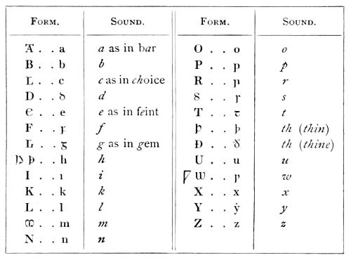
Two useful Anglo-Saxon letters have disappeared from modern English,—namely, Þ or þ th (thin), and Ð or ð th (thine).
The Anglo-Saxon letters which vary from those now used were doubtless mere corruptions of the Roman forms,—viz. the capitals A, C, E, G, H, M, S, and W, and the small letters d, f, g, i, r, s, t, and w. Several marks of abbreviation were used by the Saxons, as ꝥ that, ⁊ and, &c. These were not original members of the alphabet, but were introduced probably for despatch.
About the year 1567, John Daye, who was patronized by Archbishop Parker, cut the first Saxon types which were used in England. In this year, Asserius Menevensis was published by the direction of the archbishop in these characters; in the same year, Archbishop Ælfric’s Paschal Homily; and in 1571, the Saxon Gospels.
On the two following pages will be found a plan of cases for Saxon types.
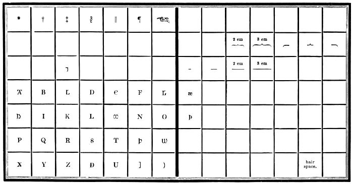
SAXON UPPER CASE.
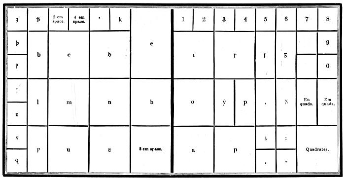
SAXON LOWER CASE.
GERMAN ALPHABET.
Outside of Germany, there is perhaps no country in which German printing is so extensively carried on as in the United States. We present a table of German characters, with their names, and their corresponding forms in English.
| German Form. | English Form. | German Name. | ||
|---|---|---|---|---|
| A | a | A | a | ah |
| B | b | B | b | bay |
| C | c | C | c | tsay |
| D | d | D | d | day |
| E | e | E | e | a |
| F | f ff | F | f ff | ef, ef-ef |
| G | g | G | g | gay |
| H | h ch | H | h ch | hah, tsay-hah |
| I | i | I | i | e |
| J | j | J | j | yot |
| K | k ck | K | k ck | kah, tsay-kah |
| L | l | L | l | el |
| M | m | M | m | em |
| N | n | N | n | en |
| O | o | O | o | o |
| P | p | P | p | pay |
| Q | q | Q | q | koo |
| R | r | R | r | er |
| S | ſ s ſſ | S | s s ss | es, es-es |
| ſz ſt | sz | es-tset, es-tay | ||
| T | t | T | t | tay |
| U | u | U | u | oo |
| V | v | V | v | fōw |
| W | w | W | w | vay |
| X | x | X | x | iks |
| Y | y | Y | y | ipsilon |
| Z | z tz | Z | z tz | tset, tay-tset |
| ä ë ü | ä ö ü or æ œ ue | |||
Several of the German letters, being somewhat similar in appearance, are liable to be mistaken one for another. To aid the learner, we give such letters together, and point out the difference.
B (B) and V (V).
The latter is open in the middle, the former joined across.
C (C) and E (E).
E (E) has a little stroke in the middle, projecting to the right, which C (C) has not.
G (G) and S (S).
S (S) has an opening above, G (G) is closed, and has besides a perpendicular stroke within.
K (K), N (N), R (R).
K (K) is rounded at the top, N (N) is open in the middle, R (R) is united about the middle.
M (M) and W (W).
M (M) is opened at the bottom, W (W) is closed.
b (b) and h (h).
b (b) is entirely closed below, h (h) is somewhat open, and ends at the bottom, on one side, with a projecting hair-stroke.
f (f) and ſ (s).
f (f) has a horizontal line through it, ſ (s) on the left side only.
m (m) and w (w).
m (m) is entirely open at the bottom, w (w) is partly closed.
r (r) and x (x).
x (x) has a little hair-stroke below, on the left.
v (v) and y (y).
v (v) is closed, y (y) is somewhat open below, and ends with a hair-stroke.
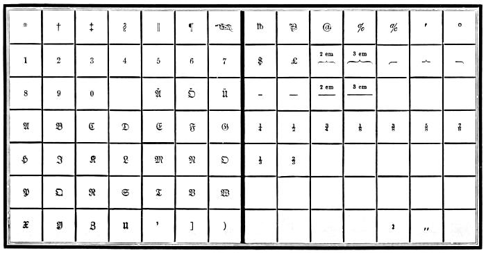
GERMAN UPPER CASE.
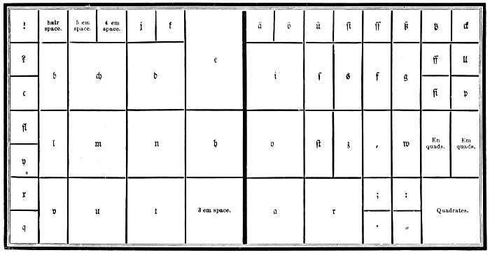
GERMAN LOWER CASE.
GREEK.
A small amount of Greek types is indispensable in every considerable book printing-office. The Greek alphabet contains twenty-four letters, which we give in the following table, with the name of each character expressed in Greek and English, and its sound and numerical value.
THE GREEK ALPHABET.
| Forms. | Names in Greek and English. | Sounds. | Numerical Value. |
||
|---|---|---|---|---|---|
| Α | α | Άλφα | Alpha | a | 1 |
| Β | β ϐ | Βῆτα | Beta | b | 2 |
| Γ | γ | Γὰμμα | Gamma | g | 3 |
| Δ | δ | Δέλτα | Delta | d | 4 |
| Ε | ε | Ἒψῖλόν | Epsīlon | ĕ short | 5 |
| Ζ | ζ | Ζῆτα | Zeta | z | 7 |
| Η | η | Ἦτα | Eta | ē long | 8 |
| Θ | ϑ θ | Θῆτα | Theta | th | 9 |
| Ι | ι | Ἰῶτα | Iōta | i | 10 |
| Κ | κ | Κάππα | Kappa | k c | 20 |
| Λ | λ | Λάμβδα | Lambda | l | 30 |
| Μ | µ | Μῦ | Mu | m | 40 |
| Ν | ν | Νῦ | Nu | n | 50 |
| Ξ | ξ | Ξῖ | Xi | x | 60 |
| Ο | ο | Ὀμῖκρόν | Omĭcron | ŏ short | 70 |
| Π | π | Πῖ | Pi | p | 80 |
| Ρ | ρ | Ῥῶ | Rho | r | 100 |
| Σ | σ ς | Σίγμα | Sigma | s | 200 |
| Τ | τ | Ταῦ | Tau | t | 300 |
| Υ | υ | Ύψῖλόν | Upsīlon | u | 400 |
| Φ | φ | Φῖ | Phi | ph | 500 |
| Χ | χ | Χῖ | Chi | ch | 600 |
| Ψ | ψ | Ψῖ | Psi | ps | 700 |
| Ω | ω | Ὠμεγα | Omĕga | ō long | 800 |
From a desire, probably, to imitate Greek manuscript, a multitude of ligatures, abbreviations, and contractions of letters, as well as duplicates, were cast by the early type-founders. These, however, with two or three exceptions, have been quite discarded; and a fount of modern Greek is readily accommodated in a single pair of cases. The only duplicated[99] characters in the preceding table are β and ϐ, ϑ and Θ, and σ and ς. β looks best when used as an initial letter, and ϐ as a medial. ϑ and Θ are used indiscriminately; but ς is employed as a final letter only.
There are twelve diphthongs or compound vowels in Greek, viz.:—
Six proper,—αι, αυ, ει, ευ, οι, ου; and
Six improper,—ᾳ, ῃ, ῳ, ηυ, υι, ωυ. The point under the first three letters denotes the iota, and is therefore called the subscript iota.
ACCENTS AND ASPIRATES.
| ᾿ | Lenis. |
| ῾ | Asper. |
| ´ | Acute. |
| ` | Grave. |
| ῀ | Circumflex. |
| ῎ | Lenis acute. |
| ῍ | Lenis grave. |
| ῞ | Asper acute. |
| ῝ | Asper grave. |
| ῏ | Circumflex lenis. |
| ῟ | Circumflex asper. |
| ¨ | Diæresis. |
| ΅ | Diæresis acute. |
| ῭ | Diæresis grave. |
Accents are nothing more than small marks which have been introduced into the language to denote the pronunciation of words, and aid its acquisition by learners. The ancient Greeks never used them, as is demonstrated from Aristotle, old inscriptions, and ancient medals. It is not easy to tell the date when the practice of writing with accents first obtained, though it is probable not till after the Romans began to learn the Greek tongue and to send their children to study at Athens,—that is, about or a little before the time of Cicero.
Accents—by the Greeks called τόνοι, tones—show the rising or falling of the voice in pronouncing; either separately in distinct syllables, or conjunctively in the same syllable.
Wherefore there are two sorts of accents: two simple, viz.
the acute, ὀξύς, figured thus [´], which denotes the elevation
of the voice; and the grave, βαρὺς, shaped thus [`], to signify
the falling or depression of the voice: and the circumflex,
περισπώμενος which was formed first of these two lines or points
joined together thus [῍] and afterward was changed into a
round sort of a figure like an inverted upsilon, thus [![]() ], but at
length came to be figured like an s drawn crosswise [῀].[14]
], but at
length came to be figured like an s drawn crosswise [῀].[14]
The acute accent raises the voice, and affects one or more of the last three syllables of a word, if it has so many.
The grave depresses the voice, and affects the last syllable only.
The circumflex lengthens the sound, and affects either the last syllable of a word or the last but one.
There are two spirits, or breathings: the asper [῾], which is equivalent to the modern letter h; and the lenis [᾿], which has no perceptible power, and indicates the bare opening of the mouth and simple emission of the voice.
All the words that begin with a vowel have one of these breathings over them; but the vowel upsilon admits of no other than the spiritus asper at the beginning of a word.
In diphthongs the spiritus is put over the second vowel: as αὐτὸς, not ἀυτὸς.
The letter ρ, at the beginning of a word, has an asper over it, as, ῥέω; and where two ρs meet in a word, the first has a lenis, and the other an asper.
The apostrophe [’] is used for cutting off the vowels α, ε, ι, ο, and the diphthongs αι and οι, when they stand at the end of a word and the next word begins with a vowel: as, παρ’ αὐτῷ for παρὰ αὐτῷ; πάντ’ ἔλεγον for πάντα ἔλεγον.
Sometimes the apostrophe contracts two words into one: as, κᾳ’γὼ for καὶ ἐγὼ; ἐγῶ’μαι for ἐγῶ οἴμαι; κᾳ’κεῖνος for καὶ ἐκεῖνος.
Sometimes an apostrophe supplies the place of the first vowel beginning a word: as ὦ ’γαθὲ for ὦ ἀγαθὲ; ποῦ ’ςι for ποῦ ἐςι. This is chiefly used in poetry.
But the prepositions περὶ and πρὸ suffer no apostrophe though the next word begin with a vowel; for we write περὶ υμῶν, πρὸ ἐμοῦ; περὶ αὐτον, πρὸ ἐτῶν, &c.
The diæresis [¨] is put over the last one of two vowels that come together, to show that they must be pronounced separately, and not as a diphthong: thus, ἀϋτὴ with a diæresis makes three syllables; but without a diæresis αυ is a diphthong, and makes αὐτὴ two syllables.
Diastole [,] is put between two particles that would bear a different sense without it: thus, ὄ,τε ὄ,τι signify whatever; whereas ὁτε stands for as, and ὁτι for that. Τό,τε with a diastole[101] implies and this; but when without, it answers to the adverb then.
The sign of interrogation, in Greek, is made by a semicolon [;].
The colon is made by an inverted full-point [·].
All other points are the same as in English.
The compositor will find it advantageous to bear in mind the following rules:—
1. No accent can be placed over any other than one of the last three syllables of a word.
2. The grave accent never occurs but on the last syllable; and, this being the case, the asper grave ῝ and lenis grave ῍ can be wanted only for a few monosyllables.
3. No vowel can have a spirit, or breathing, except at the beginning of a word.
4. The letter ρ is the only consonant marked by a breathing.
5. Almost every word has an accent, but very seldom has more than one; and, when this happens, it is an acute thrown back upon the last syllable from one of those words called enclitics (leaning back), which in that case has none, unless it be followed by another enclitic. In no other case than this can a last syllable have an acute accent, except before a full-point, colon, or note of interrogation, when the grave accent of the last syllable is changed to an acute,—a circumstance which has often led printers, who were ignorant of the reasons for accenting the same word differently in different situations, to think that there was an error in their copy, and thus to make one in their proof. Most errors, however, proceed from those who do not think at all about the matter.
PLAN OF GREEK CASES.
The following plan of cases for Greek type is probably more convenient than any other. A Roman case may readily be altered to accommodate the lower-case sorts. Compositors who aspire to a full knowledge of their art should by all means make themselves familiar with Greek and Hebrew letters and cases.
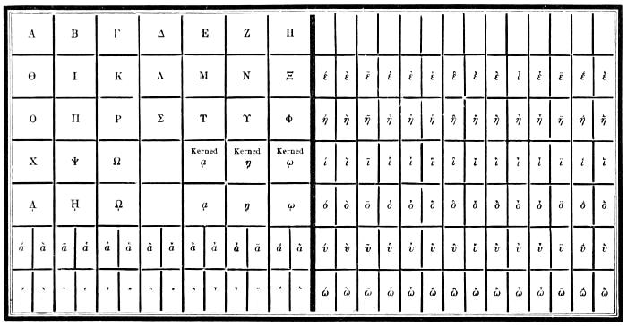
GREEK UPPER CASE.
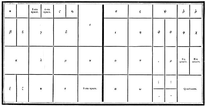
GREEK LOWER CASE.
HEBREW.
The Hebrew alphabet has twenty-two letters. Column No. 1 of the following table indicates the force of Hebrew letters when read without points. Column No. 2 gives their force when the language is printed with the Masoretic points or vowels, which are of later date than the letters. The names and numerical value of the characters are also shown.
THE HEBREW ALPHABET.
| Names. | No. 1. | No. 2. | Numer. Value. | |
|---|---|---|---|---|
| א | Aleph | Sounded a in war (vowel) | A gentle aspirate | 1 |
| ב | Beth | ... | Bh | 2 |
| ג | Gimel | g hard | Gh | 3 |
| ד | Daleth | ... | Dh | 4 |
| ח | He | a in hate (vow.) | A rough aspirate | 5 |
| ו | Vau | u vowel, or before a vowel, w | ... | 6 |
| ז | Zain | ... | Ds | 7 |
| ה | Cheth | ... | Hh | 8 |
| ט | Teth | Th | ... | 9 |
| י | Jod | Like ee in English (vowel) | j consonant, or the softer y | 10 |
| כ ך final | Caph | k or c hard | ... | 20 |
| ל | Lamed | ... | ... | 30 |
| מ ם final | Mem | ... | ... | 40 |
| נ ן final | Nun | ... | ... | 50 |
| ס | Samech | ... | Soft s | 60 |
| ע | Ain | o long (vowel) | hg, or hgh, the roughest aspirate | 70 |
| פ ף final | Phe | ... | ... | 80 |
| צ ץ final | Tzaddi | j soft | ... | 90 |
| ק | Koph | k or qu | ... | 100 |
| ר | Resch | ... | ... | 200 |
| ש | Shin or Sin | ... | s hard | 300 |
| ת | Thau | ... | ... | 400 |
LETTERS THAT HAVE A LIKENESS TO OTHERS.
| Beth | ב |
| Caph | כ |
| Daleth | ד |
| Caph | ך |
| Resch | ר |
| Vau | ו |
| Zain | ז |
| Jod | י |
| Nun | ן |
| Mem | ם |
| Samech | ס |
| Gimel | ג |
| Nun | נ |
| He | ה |
| Cheth | ח |
| Thau | ת |
| Teth | ט |
| Mem | מ |
| Ain | ע |
| Tzaddi | צ |
The dividing of Hebrew words not being permitted, the five following letters are cast broad to enable the compositor to justify the lines without irregular spacing:—
| Aleph | ﬡ |
| He | ﬣ |
| Lamed | ﬥ |
| Mem | ﬦ |
| Thau | ﬨ |
Hebrew has no capitals, and therefore letters of the same shape, but of a larger body, are used at the beginning of chapters and other parts of Hebrew works.
Hebrew reads from the right to the left, which is the case with all other Oriental languages, except Ethiopic and Armenian. In composing it, the general method is to place the nick of the letter downward, and after putting the points to the top,[106] to turn the line and set the points that come under the letters. If the letter has but one leg, the point is placed immediately under it; but where the letter has two legs, it is put under the centre.
The Masoretic points or vowels are subjoined under the consonant בּ (beth).
1. The Long Vowels.
| Kametz | ׇ | aa | בָּ | baa |
| Tzeri | ֵ | ee | בֵּ | bee |
| Long Chirek | י | ii | בִּי | bii |
| Cholem | וֹ | oo | בּבּוֹ | boo |
| Shurek | וּ | uu | בּוּ | buu |
2. The Short Vowels.
| Patach | ַ | a | בַּ | ba |
| Sœgol | ֶ | e | בֶּ | be |
| Little Chirek | ִ | i | בִּ | bi |
| Kametz-chataph | ָ | o | בָּ | bo |
| Kibbutz | ֻ | u | בֻּ | bu |
3. Shevas, which imply a Vowel to be wanting.
| Simple Sheva | חְ | |
| Patach furtive | חַ | |
| Chataph Patach | חֲ | a |
| Chataph Sœgol | חֱ | e |
| Chataph Kametz | חֳ | o |
The last three are called compound shevas; and, in fact, they are only the short vowels, to which the simple sheva [ְְ] is joined.
ACCENTS.
Hebrew accents are either mere points, or lines, or circles.
Those which are mere points or dots consist of one or two or three such points, and are always placed above the middle of the accented letter, thus,
| That consisting of | One, called rebia, ב֗ , i.e. sitting over. |
| Two, called royal zakeph katon, ב֔, or, the little elevator, from its figure, which is composed of upright points. | |
| Three, called royal segolta, ב֒, an inverted [ ֶ]. |
The lines are either upright, inclined, or transverse.
The upright is either solitary or with points or dots.
| The solitary is either | between two words, ב׀ב, termed pesick, or musical pause, and terminating a song. | |
| or under a word, | Metheg, בֽ or bridle, an euphonic accent at the beginning of a word. | |
| Royal silluk, בֽ, end, which is placed before [׃], sophpasuk, i.e. toward the end. | ||
| With points, namely, | two, above the letter, royal zakeph gadhol, ב֕, the great elevator, strains the sound. |
| one, below the letter, royal tebhir, ב֛, broken sound, from its figure and tone. |
Inclined lines hang either above or below.
| Above, toward | the right | Leader pashta, ב֙, extension, extends the voice or sound, and is placed above the last letter of the word. |
| Subservient kadma, ב֨, antecedent, to the leader geresh; and is placed above the penult or antepenult letter. | ||
| the left | Leader geresh, ב֜, expulsion, is sung with an impelled voice. | |
| Gereshajim, ב֞, two expellers, from the figure being doubled. | ||
| Below, toward | the right | Leader tiphcha, ב֖, fatigue, from the song or note. |
| the left | Of subservient merca, ב֥, lengthening out, from its lengthening out the song or note. | |
| Merca kephula, ב֦, a double lengthening out, from its music and figure. |
The transverse line is either right or curved: thus, ־ ֮ .
The right line is placed between two words, connecting them together, thus, ב־ב, and is called maccaph, i.e. connection.
The curved or waved line, ב֮, is called leader, zarka, or the disperser, from its modulation and figure.
Circles are either entire or semi.
The entire circle is placed always above, and has a small inclined line attached to it.
Either on the left, when it is placed at the head of the word, ב֠, and is called leader telisha the greater, or the great evulsion.
Or on the right, when it is placed at the end, ב֩, and is called subservient telisha the less.
On both together, ב֟, called leader karne para, the horns of the heifer, from its modulation and figure.
The semicircle is either solitary or pointed.
The solitary is either angular or reflected.
| The angular is | on the right | Subservient hillui, ב֬, elevated, from the elevation of the voice. |
| Munach, ב֣, placed below, from its position. | ||
| on the left | Leader jethith, ב֚, drawing back, from its figure. | |
| Subservient mahpach, ב֤, inverted, also from its figure. | ||
| The reflected is | either single subservient darga, ב֧, a degree. | |
| or double, leader, shalsheleth, ב֓, a chain, from its figure and modulation. | ||
When joined with other points, it is either above or below the letter.
When above the letter, it has a small line attached to it on the left, ב֡, leader paser, the disperser from the diffusion of the note.
When below the letter, it is pointed either downward, ב֑, called royal athnach, respiration, as the voice must rest upon it, and respire; or upward, ב֢, subservient, jerah-ben-jomo, the moon of its own day, from its figure.
PLANS OF HEBREW CASES.
The first plan shows a common case for Hebrew without points; the second exhibits a pair of cases with points.
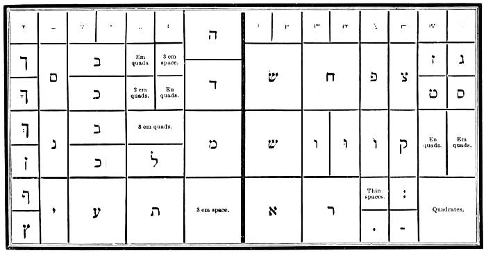
HEBREW LOWER CASE.
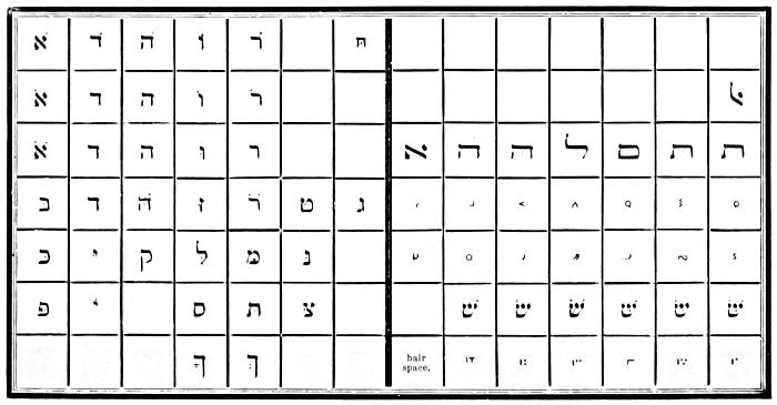
HEBREW UPPER CASE.
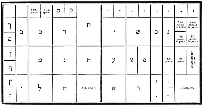
HEBREW LOWER CASE.
RUSSIAN ALPHABET.
| Form. | Sound. | ||
|---|---|---|---|
| А | а | ah, a. | |
| Б | б | b. | |
| В | в | v. | |
| Г | г | g, gh. | |
| Д | д | d. | |
| Е | е | yai or ai. | |
| Ж | ж | zsh. | |
| З | з | z. | |
| И | и | ee. | |
| І | і | ee. | |
| К | к | k. | |
| Л | л | l (guttural). | |
| М | м | m. | |
| Н | н | n. | |
| О | о | o or ah. | |
| П | п | p. | |
| Р | р | r. | |
| С | с | hard s or ss. | |
| Т | т | t. | |
| У | у | oo. | |
| Ф | ф | f, ph. | |
| Х | х | kh, ch. | |
| Ц | ц | ts. | |
| Ч | ч | ch, tch. | |
| Ш | ш | ch. | |
| Щ | щ | sh-tch. | |
| Ъ | ъ | mute e. | |
| Ы | ы | we, ee. | |
| Ь | ь | half-mute e. | |
| Ѣ | ѣ | yai or ai. | |
| Э | э | ai. | |
| Ю | ю | you, ew. | |
| Я | я | yah. | |
| Ѳ | ѳ | f, ph. | |
| Ѵ | ѵ | e. | |
| Й | й | short e. | |
г, х, е, л, щ, ъ, ы, ь, ѣ, я, о, й, are the only letters whose pronunciation offers any difficulty.
Г has a sound nearly like g in the English word goose, as in гру́ша, a pear; read groòshah. But it has a guttural sound not found in English, and which nearly resembles that of the German ch. This sound is especially perceivable in the middle of a word when the г is followed by a consonant, also at the end of a word, as in но́гти, the nails; read nòchtee. In inflections аго, яго, ого, его, of adjectives and pronouns, the letter г is pronounced as v; as in кра́снаго, of beautiful; read kràsnavah.
Е has three different sounds: 1. In Russian words, and in all syllables in which it is preceded by a vowel, е has a sound like that of yai, when the y is nearly sunk in the pronunciation, as in ему́, to him; read yaimoò. 2. At the beginning of words from foreign languages, and at the middle and end of a word when preceded by a consonant, it has the sound of e in met, as in берегу́, I guard; read bayregoò. 3. In the termination екъ of diminutives, in all the characteristic inflections of cases in the nouns, and of persons in the verbs, in fact, in almost all words, this letter when accented has a sound nearly like that of short yo or o; as in куле́къ, a little sack; веде́шь, thou leadest; медъ, the honey; read koolyòk, vaidyòsh, myod. This[113] sound yo or o of the letter е is commonly distinguished by a diæresis over the vowel, as кулёкъ, ведёшь, мёлъ.
Л has a guttural sound nearly analogous to the English w. Писарлъ, he wrote, read pisaw or pisou.
Ль has a soft sound, as in the French word bouillon.
Х corresponds to the German ch. It is a strong aspiration that nearly resembles the sound k when pronounced hastily from the throat; as in хвала́, the praise; read khvahlàh.
Щ unites the sound of ш and ч, as in щитъ, the shield; read shtcheet.
Ъ. This letter has no sound; the preceding consonant, the last letter of the word, ought to be pronounced a little hollow, as in боо́ъ, a bean; read bop.
Ы has a sound nearly like we when the w is pronounced rapidly; as in бу́квьшы, the letters, read boòkwe. It has this sound after the consonants б, в, м, п, ф; but after another consonant it is a thick e, as in сынъ, the son; read seen.
Ь. This letter at the end of a word has a sound nearly like that of the very short e. When followed by a consonant in the middle of a word it is mute, but is pronounced when followed by a vowel; as in знатъ, to know; read znaht.
Ѣ at the beginning of a word has the sound of yai; as in Ѣсть, to eat; read yaist. In the middle of a word it is pronounced yai, the sound of y being almost sunk; as in нѣтъ, no; read nyaitt. At the end of a word it is sounded ay.
Я when accented has the sound of the diphthong yah; as in я́ма, a pit; read yàhmah. But if not accented it is pronounced yai, as in ядро́, a ball; read yaidrò. The pronoun ея́, of her, is pronounced yaiyò, and the syllable ся of pronominal verbs is pronounced sah, as in стара́ться, to exert one’s self; read stahràhtsah.
О is pronounced as English o; but if unaccented it takes the sound of ah, as in ко́локолъ, a bell; колокола́, bells; read kòlahkall, kahlakahlà.
Й is a short e, pronounced very rapidly, as in дай, give; read dàï or die, giving utterance to a short e after the vowel.
In general the pronunciation of Russian words depends especially upon the tonic accent, which is no longer printed in Russian books, except to distinguish some homonymous words, or some grammatical inflections of similar forms; as за́мокъ, a castle, and замо́къ, a lock; read zàhmok and zahmòk.
MUSIC TYPE.
In no department of letter-founding has the progress of improvement been more decided and satisfactory than in the production of music type. The finest work of the music-stamper cannot surpass the ingenious combinations of the type-founder and printer. The music of which specimens are here given is cast on the centre of the body, and any intelligent workman may learn to compose it with facility. Brass lines are now furnished with founts when desired.
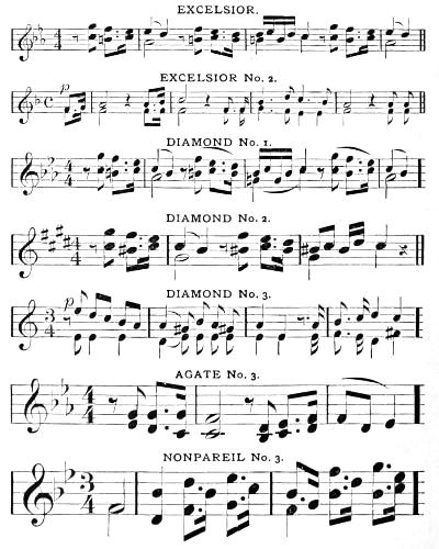
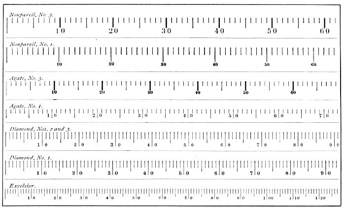
COMPARATIVE TABLE OF BODIES.
MUSIC COMPOSITION.
A knowledge of the rudiments of the art of music is essential to the correct composition of music type; for, unless the compositor is acquainted with the relative time-values of the notes and rests, he cannot space them properly.
The manuscript copy is given to the compositor, with directions regarding the dimensions of the page required and the size of type to be employed. He counts the number of measures in the piece, and allots to each measure the amount of ems in length which the page will permit, so that there shall be a general equality of space throughout the piece.
In instrumental music, and in pieces which are not interlined with poetry, the compositor will set two or more staves simultaneously, ranging the leading notes in the lower staves precisely under the corresponding ones in the upper staff; that is, a certain amount of space in each staff, in a brace, must contain the same amount of time-value. Where lines of poetry are interspersed, as in ballads and in church music, the staves are necessarily set singly; and in composing the second, third, and fourth staves the workman must therefore constantly refer to the first, in order to make the staves correspond.
A good compositor will be careful to make the lines overlap each other, brick-wise, and not allow a joint to fall directly under another. Masters who aim to do cheap rather than good work have the music lines cast double or triple, to expedite composition. Such work has a very slovenly look, as the joints of the lines, coming under one another, are apparent in the entire depth of the staff. We have seen books set in this manner, in which all the lines seem to be composed of dotted rule, instead of a continuous stroke.
The compositor should be careful to make the stems of all the notes in a page of the same length, except those of grace-notes, which should be about half as long.
PLAN OF CASES.
The following plan of cases was arranged by the music typographer, J. M. Armstrong of Philadelphia, expressly for the founts of music cast by The MacKellar, Smiths & Jordan Co., specimens of which are shown on page 114. A table of comparative bodies is given on page 115.
MUSIC UPPER CASE.
MUSIC LOWER CASE.
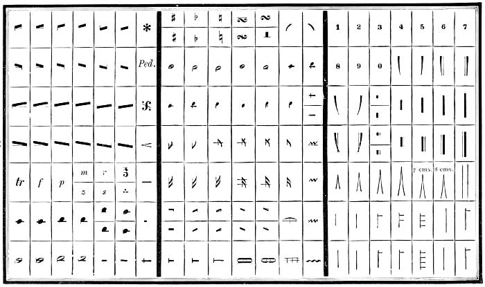
MUSIC SIDE CASE.
MODERN CONVENIENCES.
At no time since the invention of their art have printers been so fully supplied as at present with typographic implements for producing exact and beautiful work. In height of body, harmony and style of face, and excellence of material, modern type is doubtless superior to any heretofore made; but the most striking progression of type-founding is in the beauty and variety of ornamental letters and borders, and in these the American founders have taken the lead. A glance at their late Specimen Books proves the truth of this assertion. Among late novelties produced by The MacKellar, Smiths & Jordan Co. are several beautiful series of ingenious adjustable characters for the ornamentation of display lines, both straight and elliptical. A specimen is given below. Other appliances for job-printing are noted on pages 300-310.
THE ART OF COMPOSITION.
GENERAL REMARKS.
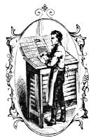
Experience proves that the apprentice foreshadows the workman, just as surely as the bend of the twig foretells the inclination of the tree. The upright, obedient, industrious lad will become a steady, skilful, and capable man, as unmistakably as the perverse, idling, careless boy will ripen into a lazy, dissolute, and worthless fellow. The fact is, a boy is measurably the maker of his own destiny; and if he fails to acquire a master-knowledge of the trade to which he is put, it will mainly be because he did not at his outset determine to be a master-workman. Good morals and steady industry are indispensable.
When a lad who possesses these qualities proposes to learn the art and mystery of printing, it should be inquired of him, Has he had a fair common-school education? Is he a perfect speller? Has he a turn for reading? Is his eyesight good? Is he under fifteen years of age? A true affirmative answer to all these queries will entitle him to the position of reading and errand-boy. He is told the hours at which he is to come and go, and a strict punctuality is enjoined upon him. He sweeps the room,—he sorts out the pi,—he learns the position[122] of the various letters in the case. A year spent in this way is an excellent preparative for “going to case,” or learning the art of composing type.
When he is put to composition, he is told to set up one line and show it to the foreman or to the journeyman under whose care he may be placed. The errors in the line are pointed out to him, and he is required to correct them himself. When the words are perfectly correct, he justifies the line tight enough to prevent it from falling down when the composing-stick is slightly inclined, and yet sufficiently loose to enable him to lift it out with ease. In thus spacing out the line, the blanks between the words must be so graduated that, when the matter is printed, all the words will appear at equal distances apart. No matter how impatient he may be to get on, he must be drilled at this exercise till he becomes a thorough master of it. The grand doctrine to be instilled into him at first is, to do his work well and correctly; swiftness will follow as a natural consequence. He sets a second line; and after it has been made faultless he proceeds with the third, and so on till the stick is full. The utmost care must be taken to keep every letter and every line in an exact vertical position; and when he essays to empty the stick he must be taught to lift the entire mass in one square solid body, and to place it squarely and vertically on the galley. If the lines are allowed to slant either backward or sidewise, it is difficult afterward to make them stand accurately.
After the apprentice has become thoroughly conversant with the shape of every type, and can distinguish “u” from “n,” “b” from “q,” and “d” from “p,” he is allowed to distribute type for his own use. He is taught to take up at one time no more matter than he can conveniently grasp in his left hand, which he holds so that the light falls on the face of the type, and his eye can readily read it. In distributing the various letters, he takes a word or two between the thumb and forefinger of his right hand, and the types are lightly dropped into their respective boxes.
At the outset, and as he proceeds, the novitiate must be cautioned against the acquisition of bad habits; such as swinging the body as the types are picked up, nicking the type against the stick several times before placing it in line, standing on one leg, &c.
While avoiding these ridiculous practices, a learner must acquire (if he does not possess them already) certain habitudes or principles which lie at the foundation of successful effort. The first is
Punctuality. He must conscientiously observe the time-rules of the office in coming and leaving. The early hours are the best for work; and the mind being cheered by the consciousness of doing right, the body feels the influence, and is strengthened; and when the quitting hour arrives, the amount of work accomplished will satisfy himself and his master too. The most successful masters have been distinguished for punctuality. The apprentice’s time is not his own, but his master’s property; and wasting it by want of punctuality, or idling during his master’s absence, is simply equivalent to stealing. The second point is
Obedience. The apprentice has no right to question orders given by the master or his deputy. His duty is promptly to do as he is told, without grumbling or dissatisfaction. Let him remember that he is under orders, and that, if he ever expects to learn how to command, he must learn in his youth how to obey. He will promote his own interests by seeking to anticipate his master’s wishes, and by endeavouring to make himself so useful that his services cannot well be dispensed with. Akin to this is
Courtesy. Good manners in a youth are wonderfully pleasing, and effectively aid in his advancement. Courtesy toward his master is a matter of course, and deserving of little commendation; but he must be courteous to customers when sent out on an errand, and courteous to the workmen in the office. By this means he will secure good-will, and many a friendly hint will be given to him in acquiring a knowledge of the art. The habit when fixed will bless him and others as long as he lives.
PLAN OF CASES.
The following schemes show the order in which the letters are kept in cases in this country. In some offices, however, slight deviations will be found,—such as the transposition of the comma and w, y, p, &c.
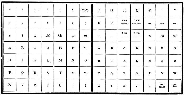
AMERICAN UPPER CASE.
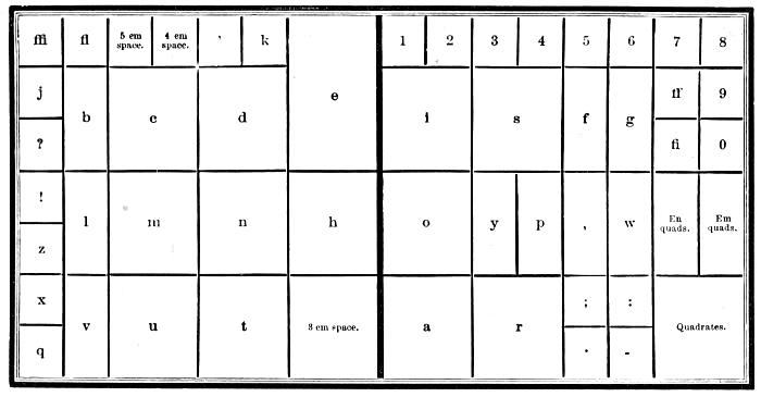
AMERICAN LOWER CASE.
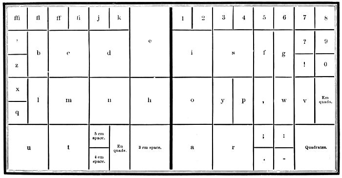
PROPOSED NEW PLAN FOR THE LOWER CASE.
POSITION.
The standing position of a compositor should be perfectly upright, without stiffness or restraint; the shoulders thrown back, the feet firm on the floor, heels nearly closed, and toes turned out to form an angle of about forty-five degrees. The head and body should be kept perfectly steady, except when moving from the Roman to the Italic case, the operations of distributing and composing being performed by the various motions of the arm, from the shoulder-joint alone; and if, to reach a box placed in the further part of the cases, to put in or take out a letter, he should incline the body by a slight motion, he should immediately resume his erect position. The height of a compositor and his frame should be so adjusted that his right elbow may just clear the front of the lower case by the a and r boxes, without the smallest elevation of the shoulder-joint; his breast will then be opposite the space, h, and e boxes. Sitting at work should be rarely permitted, except for lameness, weakness, old age, or other infirmity; and then the stool should be a small piece of board fastened to a single leg. Habit will render a standing position familiar and easy; perseverance in conquering a little fatigue will be amply repaid by the prevention of knock knees, round shoulders, and obstructed circulation of the blood and respiration of the lungs.
LAYING TYPE.
Unwrap carefully the page received from the type-founder, and, laying it on a galley, soak it thoroughly with thin soap-water, to prevent the types from adhering to one another after they have been used a short time. Then, with a stout rule or reglet, lift as many lines as will make about an inch in thickness, and, placing the rule close up on one side of the bottom of the proper box, slide off the lines gently, taking care not to rub the face of the letter against the side of the box. Proceed thus with successive lines till the box is filled.
Careless compositors are prone to huddle new types together, and, grasping them up by handfuls, plunge them pell-mell into the box, rudely jostling them about to crowd more in. This is an intolerable practice.
The type left over should be kept standing on galleys, in regular order, till the cases need replenishment. A fount of five hundred pounds of Pica may have, say, four cases allotted to it; the same amount of Nonpareil, from eight to ten cases.
DISTRIBUTING.
When a learner can infallibly distinguish from each other the letters b and q, d and p, n and u, and l and I, he may be allowed to distribute type for himself.
The head of the page being turned toward him, the learner sets a composing-rule behind the portion to be lifted, and then, placing his thumbs against the rule and his forefingers against the top line, while his remaining fingers press together both sides, he raises the matter quickly. Then, inclining sidewise his right hand, he removes the left, and allows the matter to balance momentarily in his right, while he doubles in the third finger and stretches out the thumb of the left for the reception of the matter, which he at once places in it, the rule lying as a support on the third finger, while the thumb and other fingers embrace the sides. He should take up but a few lines at a time, until he acquires facility in lifting. Large handfuls should always be avoided, as the weight is fatiguing and weakening to the wrist.
Keeping the handful in an inclined position, so that he may readily read the lines, he takes up as many letters as he can conveniently hold between his fingers,—an entire word, if practicable,—and drops the types slantingly, but with face upward, into the several boxes.
The first aim of the learner must be accuracy, even though his progress be slow. Correct distribution aids in clean composition. In time he will be able to drop his types rapidly, with hardly a glance at the boxes; and, while his fingers are flying about correctly and expeditiously, his eyes will take in the next word to be distributed; thus proceeding till the case is filled.
In distributing, the utmost care should be taken in placing the various spaces in their appropriate boxes. A mixing of spaces characterizes the botch.
The letter-board should always be kept clean, and the bottom as well as the face of the form well washed before it is[129] laid on the board and unlocked; for, if any dirt remain in the type after the form is unlocked, it will sink into the matter. This precaution taken, the pages should be well opened, and the whole form washed till the water appears to run from it in a clean state. If the form is very dirty, it is best to lock it up again and rinse the bottom of it, and proceed as before.
It is sometimes necessary to dry the letter at the fire after distributing. In this case, the type should not be used until it is perfectly cold, as very pernicious effects arise from the antimony in the composition of which the type is made. The noxious vapour which arises is sufficient warning of the effects. The compositor ought always to avoid it as a pestilence which will affect his respiration and his sinews, inducing lung-complaints, and causing paralysis of the hand or contraction of the fingers. Where it can be conveniently managed, it is better to distribute at night, or before meals, so that the letter may dry without artificial heat.
COMPOSING.
When copy is put into the hands of the compositor, he should receive directions respecting the width and length of the page; whether it is to be leaded, and with white lines between the breaks; and whether any particular method is to be followed in the punctuation and in the adoption of capitals. These instructions being given, the compositor will make his measure to the number of ems directed, which is done by laying them flatwise in the composing-stick, and then screwing it up sufficiently tight to prevent the slide from moving. He then fits a composing-rule to the measure, and, his case being supplied with letter, he commences his work.
The left hand, which contains the composing-stick, should always follow the right, which takes up the letters. If the left be kept stationary, considerable time is lost in bringing each letter to the stick, because the right hand has, consequently, to traverse a much greater space than is necessary. The eye should always precede the hand, constantly seeking for the next letter while the fingers are picking up one just selected. Each letter should be taken up by the upper end. This method will effectually prevent any false motion, and preclude[130] the necessity of turning the letter when in the hand. If possible, a sentence of the copy should be taken at one time, and, while putting in the point and quadrate at the end of the sentence, the eye may revert to the copy for the next. It is to dexterity in these particulars that compositors are indebted for swiftness. The time thus gained is very considerable, while all appearance of bustle or fatigue is avoided. By taking a sentence into the memory at one time, the connection of the subject is preserved, and the punctuation rendered less difficult.
Those who are careful in distribution find the advantage of it in composition. Foul or slovenly workmanship is disgraceful. To avoid this, a compositor should accustom himself to glance over each line as he justifies it, and correct any error as he proceeds, which he may do with little impediment to his progress.
SPACING.
Uniformity in spacing is, unquestionably, a most important part of a compositor’s occupation; this requires both care and judgment, and, therefore, cannot be too strongly impressed upon the mind of the beginner. Close spacing is as unworkmanlike as wide spacing, and neither ought to be permitted except in very narrow measures; and, frequently, even then with care it might partly be prevented. What is commonly called the thick space is the proper separator between words; though this rule cannot always be adhered to in narrow measures when large type is used. It is not sufficient merely to have a line here and there uniformly spaced: a careful compositor will give every page that uniformity of appearance which is a chief excellency. The beginner should remember that it is better to do little, and do that little well, than to put together a great number of letters without any regard to accuracy and uniformity.
Where a line is evenly spaced, and yet requires justification, the additional space should be put between those words in the line where it will be least observable: viz. a d and an h, being tall, perpendicular letters, will admit an increase of space between them, but not more than a middle and thin space to a thick-spaced line; and an additional space may be placed after a kerned letter, the beak of which may bear upon the top of an ascending letter,—as the f followed by h, &c.
The same rule should be observed where it is necessary to reduce the spacing of a line, less space being required after a sloping letter than after a perpendicular one. The comma requires only a thick space, but the other points should have a hair space before and an en quadrate after them, except the full-point, which should have an em quadrate, as terminating a sentence. Should it be necessary to reduce the spacing generally, the spaces after the points must be altered in the same proportion. Spaces are cast to such regular gradations that the compositor can urge no reasonable excuse either for bad justification or improper spacing.
In matter to be stereotyped, a hair space should be placed after the letter f and other kerned letters when they stand at the end of the line.
JUSTIFYING.
Accurate justification is absolutely essential, as the letters will be warped sidewise in a loose line, making it impossible to get a fair impression from the type. Besides, the letters are liable to be drawn out by the suction of the rollers, to the detriment of the form and the press. The instructor of an apprentice should occasionally pass his finger along the side of matter set by him; and if the lines should not prove evenly justified, they should be put into the composing-stick again and properly corrected.
HEAD-LINES.
Head-lines are generally set in small capitals of the same fount, or in Italic, and sometimes in capitals. Italic capitals of letter somewhat smaller than the body of the work, with folios of a proportionate size, have a neat appearance.
NOTES.
The usual rule for note-type is two sizes less than the text of the work: thus, to Pica work, Long Primer; Small Pica, Bourgeois; Long Primer, Brevier. Side-notes are usually smaller in proportion. When side-notes or references drive down below the lines of the text to which they refer, the expedient of cut-in notes must be resorted to. This is a difficult[132] part of a compositor’s business, and requires skill and patience to adjust all parts, so that every line of note and text may have proper and equal bearing. The reglet or lead between the lines of matter and the side-note must be cut with as much nicety as possible to the length of the text, as far as where the note is to run under; and, having accurately adjusted, by means of the quotations and justifiers, the situation of the first line of the note, such lead or reglet is added to the text as will make it precisely correspond in depth with the lines of note that stand on the side before turning: the remainder of the note is then set in a long measure, to correspond in width with the text, reglet, and side-note; and the page is made up with note, or the text begun again after the note is finished. In Bibles with notes and annotations, in law-books, and other works, it frequently happens that a page exhibits several of these alternate frameworks of note and text, which, if done well, display a workman’s skill to great advantage.
BLANKING.
If the work is very open, consisting of heads, whites, &c., the compositor must be particularly attentive to their depth; so that though the white may be composed of different-sized quadrates, yet their ultimate depth must be equal to the regular body of the type the work is done in; otherwise the register of the work will be incomplete. The pressman cannot make the lines back if the compositor is not careful in making up his matter.
PARAGRAPHS.
The first line of a new paragraph is indented an em quadrate, of whatever type the work may be; though, when the measure is very wide, two or even three ems are preferable. By this means the paragraph is more strongly marked, the indention of an em only being scarcely perceptible in a long line. Authors vary materially in the mode of making paragraphs. Some carry the argument of a position to a great length before they relieve the attention of the reader; while others break off at almost every place that will admit only of a full-point. But the author’s plan is to be followed, unless he direct otherwise. Authors should always make the beginning of a new paragraph conspicuous to the compositor, by[133] indenting the first line of it far enough to distinguish it from the preceding line in case it should be quite full.
It is a practice too prevalent among compositors to drive out a word at the close of a paragraph, or even to divide it, in order to reap the advantage of a break-line. Part of a word, or a complete word, in a break-line, if it contain no more than three or four letters, is improper. It should be the business of the proof-reader to notice and check this irregularity.
The last line of a paragraph should not on any account begin a page, neither should the first line of a paragraph come at the bottom of a page if the work has white lines between the breaks: to prevent this, the compositor may make his page either long or short, as most convenient, always taking care that the odd and even pages back, so that the extra length or shortness of the page may escape observation.
INDEXES.
The index is generally placed at the end of the volume, and set in letter two sizes less than that of the work. It is always begun upon an uneven page. In setting an index, the subject-line should not be indented; but, if the article make more than one line, all but the first should be indented an em.
In preparing the copy of an index, care should be taken that the subject-words are arranged alphabetically, as the compositor will not transpose his matter afterward without remuneration.
Where several index-figures are used in succession, a comma is put after each folio; but, to save figures and commas, the succession of the former is noted by putting a dash between the first and last figures: thus, 4-8. Again, if an article has been collected from two pages, the folio of the second is supplied by sq., or sequente, and by sqq., or sequientibus, when an article is touched upon in succeeding pages. A full-point is not put after the last figures, because it is thought that their standing at the end of the line is a sufficient stop. Neither is a comma or a full-point placed to the last word of an article in a wide measure and open matter with leaders; but it is proper to use a comma at the end of every article where the figures are put close to the matter, instead of running them to the end of the line.
TITLES.
Ornamental type may be used to good purpose in fancy jobs, and without violating any of the canons of a correct taste. The universal eye is pleased with ornament; and it is well to foster this fancy, just as we cultivate a poetical feeling, or a passion for music, or flowers, or any beautiful thing that God has made. But, as life should not be all music, or flowers, or poetry, so printing should not be all ornament. And as men whom nature puts in the fore-front of all other men are noted for a becoming simplicity of life and style, so the title-page that heralds all the inner pages of a book should be printed in a style of elegance severe and unadorned: no fancy type, except a line of Scribe Text, or Old English,—no italics, unless perchance a single-line motto in Pearl caps,—no bold-face type, nor Antique, nor Gothic,—but plain, clear, light-faced letters that seem the embodiment of the soul of thought. All experienced printers incline to this simple style; but publishers sometimes interfere with this province of art legitimate only to a typographer, and insist on the indulgence of a taste which certainly owes no allegiance to any of the laws of beauty; and the printer or stereotyper who executes the book receives credit for a title-page which he would fain utterly repudiate.
We add a few hints which may assist the learner. 1st. Having divided the title into lines, and decided upon the size of type suitable for the principal one, begin by composing those of the second and third class, both in ascending and descending order. 2d. Avoid having two lines of equal length to follow or come in contact with each other. 3d. Catch-words should be set on quite a reduced scale, and proportioned according to the strength of the preceding and succeeding lines; for bold catch-words detract from the general effect of the title. 4th. Close attention should be given to those title-pages which are acknowledged to be displayed with true taste and judgment.
Authors should endeavour to make their title-pages as concise as possible; for a crowded title can never be displayed with elegance or taste.
DEDICATIONS.
The dedication generally follows the title, and seldom exceeds one page. It should be set in capitals and small capitals, neatly displayed. The name of the person to whom the work is dedicated should always be in capitals, and the terms, Your very humble and very obedient, &c., should be in a smaller type, and the signature or name of the author in capitals of a smaller size than that in which the name of the personage is printed to whom the book is dedicated.
CONTENTS.
The contents follow the preface or introduction, and may be set either in Roman or Italic, generally two sizes smaller than the body of the work; the first line of each summary full, and the rest indented an em quadrate, with the referring figures justified at the ends of the respective lines.
PREFACES.
Formerly, the preface was uniformly set in Italic; at present Roman is used, one size larger or smaller than the body of the work. The running title to the preface is commonly set in the same manner as that of the body of the work. If the work has been printed without a running title, and paged in the centre of the line only, then the preface should be treated in like manner.
SIGNATURING.
The title, preface, &c. of a volume are commonly left till the body of the work is finished, as circumstances may arise in the course of its progress through the press which will induce the author to alter his original preface, date, &c., or the work may conclude in such a manner as to admit of their being brought in at the end, in order to fill out a sheet, and thus save both paper and press-work. For this reason, it is well to begin the first sheet of every work with signature B (or 2), leaving A (or 1) for the title-sheet.
It was formerly the custom to omit the letters J, V, and W in the list of signatures. But the greater convenience attending the use of twenty-five letters has recently induced several of our largest establishments to omit the letter J only.
ERRATA.
The errata are put immediately before the body of the work, or at the end of it. They should consist only of such corrections as are indispensably necessary, without noticing any defects in the punctuation, unless where the sense is perverted. It is strongly to be wished that works could be produced perfectly free from errors; but this is almost a vain hope while imperfection clings to humanity, and while every form is exposed to accident and every additional proof may be productive of fresh error.
HINTS HONOURED IN THE BREACH.
When you lay a fount of new type, don’t open the papers carefully, and place the lines evenly with a brass rule in the cases, nick up; but show your skill by tumbling over each package rapidly, and bringing it down with a rush on the imposing-stone; then, roughly throwing the a’s into a chaotic pile, grab them up by handfuls and work them well down in the appropriate box. The harder you jostle them down, the more you will get in. Proceed thus with each letter; and, if the operation has been vigorously performed, the value of the fount will have been reduced, say ten per cent.
2. While you set out one case, let your galley lie on the overheaped type of another case.
3. If a line is rather too tight to permit the last letter to get in easily, push it down hard with your rule or a quadrate. The type may be injured; but why didn’t it fit in just right at first?
4. Empty your matter at a gentle inclination on the galley, and make it up at the same angle. You can bring it right afterward—perhaps—by the energetic application of mallet, shooting-stick, and planer.
5. When the case is half set out, shake up the type energetically, and do so very often. The exercise will strengthen your muscles.
6. Don’t brush off the stone before you lay the matter down. If any sand happens to get under, the type will show its impression beautifully deep and clear on the face of the planer,—perhaps a whole word or two.
7. Don’t plane till the form is locked up, as thus you save the trouble of the first planing. But, now that you do plane, hammer away, and show your musical ability in playing a tattoo on the form. Don’t lay the planer tenderly and lovingly on the types, as if you were afraid to hurt their feelings, and gently tap it; but hold it off about a quarter or three-eighths of an inch, and then bring down the mallet with a will. Phew! how the planer will descend obedient to the stroke, and rebound again, and perhaps again. If the form is not smooth on the surface now, it is not your fault. Repeat this each time when the form is locked up, till it goes to press; and you may depend on it the impression will gain in boldness, if not in looks.
8. When correcting your numerous errors, don’t trouble yourself to lift the lines carefully at the ends, but dig right into the head of the erring letter, and, resting your bodkin on the type below it, pry up the sinner: it does not matter if you demolish two or three types in the under line.
9. Wash your form energetically, and apply the ley bountifully with a good stiff wiry brush. Never mind rinsing: clean type is an old-fogy notion.
10. When the type is out of use, let it lie around promiscuously,—on a table, or board, or any place where it will be occasionally convenient to lay on it a mallet or tin basin. If one strip of matter is placed on another, room will be economized. Moreover, the under layers will be safe from dust.
11 (comprehensively). Do every thing in a loose way generally, letting matters go as they list, throwing your pi into spare boxes or secretly placing it on the letter-table or some out-of-the-way place, stealing sorts from your neighbour, overcharging time-work and extras, fishing for fat takes, &c.
12. If you observe these things faithfully and constantly, and your employer does not kick you out of his office, why—you do not get your deserts.
TO THE APPRENTICE.
Aspiring apprentice, a word or two in your ear. If you desire success in any matter pertaining to this life or the coming, you must have a purpose,—a determination that, God helping you, you will achieve success. You may be poor,[138] friendless, unknown,—your clothing scant, your stomach half filled,—your place may be at the foot of the ladder: no matter. Whatever your position may be, do your duty in it, stoutly and perseveringly, with your eye fixed far ahead and upward.
Keeping the purpose before you that you will rise, be obedient to your employer, attentive to your business, obliging to your shopmates, and courteous to strangers; and seize every opportunity to improve your heart, your mind, and your workmanship. Do every thing well,—no slighting, no hiding defects, aiming always at perfection. Watch those who are skilful, and strive to equal and excel them. Secure the friendship of all by deserving it. Allow no opportunity of rendering a service to pass without improving it, even if it cost you some labour and self-denial. Be of use to others, even if in a small way; for a time may come when they may be of service to you. A selfish man may get ahead faster than you; but selfishness is contemptible,—and you need not envy his success: when you achieve your object nobly, you will enjoy it, and be respected.
Always bear in mind that character is capital. To gain this, you must be so scrupulously honest that you would be as willing to put live coals in your pocket as a penny that is not yours. Never run in debt: do without what you cannot at once pay for, even though you should suffer somewhat. No matter what the amount of your earnings may be, save a portion every week, and invest it in a savings-bank of good standing: it will grow, and will stand you in good stead some day. Better temporary abstinence and constant plenty afterward, than unearned present comfort and future perpetual want. Never lie, openly or covertly, by word or action. A liar may deceive his fellows,—God and himself never. Conscious of falsity, a liar can have no self-respect; without self-respect, reputation cannot be achieved.
With a noble purpose as the end of all your actions, and with actions becoming your purpose, your success is merely a question of time,—always provided you have some brain and abundant common sense.
TO BEGINNERS.
Sanguine beginners sometimes fail in their attempts to establish themselves in business; and in many cases are disposed to lay the blame on every thing and on everybody except themselves. So we here give some rules—(in an ironical way, to make them stick in the memory)—
HOW NOT TO SUCCEED.
1. Get from your father, uncle, aunt, grandmother, or somebody, four or five thousand dollars. You need not give notes or any written obligations, as they may prove troublesome some day.
2. Rent a comfortable room somewhere, no matter whether in a business centre or not, but let it be showy and pleasant.
3. Spend one-fourth of your capital in furnishing the room with matters of personal comfort. Provide an elegant desk, a luxurious lounge, and a pivot-chair: why shouldn’t the master of a printing office “take it easy”? Have a closet in your desk, it is so handy for your whisky-bottle and cigar-boxes.
4. Get all you can from the type-founder, press-maker, and paper-manufacturers. If they will give you credit for one-half of what you buy, well and good: if they trust you for the whole amount, all the better for you, and the more money you will have on hand for jollifications.
5. Put up your sign—a handsome one—
B. Sipwell Lovepunch,
Printer.
and signalize its erection by keeping “open house” for all comers between 11 A.M. and midnight. The mothers and wives of all who become tight and go home loose will long remember your public spirit.
6. Be at your office by nine in summer and ten in winter; and, following Charles Lamb’s witticism, that he who goes to work late should quit early, you need not return after dinner. Let your foreman attend to the business: isn’t he paid for it?
7. When you do go into your office, curse and grumble[140] promiscuously, and be sure to swear at the apprentices, to show your spirit, and to let them know that you are master. Be careful never to praise them or any of the hands, or they may think they are worth higher wages.
8. Take work at any price that will keep it from a competitor, no matter whether it pays or not. Perhaps you can save something by giving short numbers, counting in imperfect copies, using very common ink, &c. The style is of no consequence: you want to make money if you can, let others improve the typographical art if they choose.
9. Cultivate the acquaintance of fancy folk, politicians, and wit-livers. A fast horse or two wouldn’t be a bad thing to bind their friendship; and, besides, you will never be at a loss for a companion in your rides.
10. If you want new type, and the founder who made your outfit won’t sell to you unless you pay off the old score, transfer your patronage to another foundry. How can you expect to get along if you pay your debts? Such a course would compel you to sell your horse and to taboo rum-shops and gay saloons, and to live economically; and this, you know, wouldn’t do at all.
11. Get out a newspaper, and advocate the principles of the strongest party, swearing thick and thin through every thing. You need not bother yourself about writing original matter; crib wherever you can. There are plenty of fellows who want office,—lawyers particularly,—and they will write slang enough to fill your columns. You might quietly levy a little black-mail or hush-money from neighbours guilty of indiscretions: dirty money will buy as much as clean.
12. You needn’t marry, unless some fond rich girl should happen to fancy a fool. You know, you need not trouble yourself much about her after you have secured her money: let her father look after her welfare. If she dies broken-hearted, why—she ought not to have been so sensitive.
13. You may be troubled occasionally by a qualm of conscience; but this can be settled by a dram or two. After a few doses, conscience will go to sleep, and trouble you no more, unless you should happen to see a Bible or hear a sermon, which as a matter of course you will try to avoid. It is true, wreck and ruin will be sure to overtake you, and the devil will catch you at last; but why worry yourself before the time?
IMPOSING, OR PREPARING FOR PRESS.
IMPOSITION
Comprehends a knowledge of placing the pages so that they may regularly follow each other when printed and the sheet is folded up; and also the mode of dressing chases and the manner of making the proper margin. As many pages as are required for a whole or half sheet being made up, the compositor lays them upon the imposing-stone, placing the first page with the signature to the left hand facing him, and then proceeds according to one of the schemes on pp. 150-199. These will be found to contain every necessary imposition,—viz. folios, quartos, octavos, twelves, sixteens, eighteens, twenties, twenty-fours, thirty-twos, thirty-sixes, forties, forty-eights, sixty-fours, seventy-twos, ninety-sixes, and one hundred and twenty-eights. We also introduce schemes for imposing from the centre, by which means the blank or[142] open pages may be thrown in the centre of the form, leaving the solid pages on the outside to act as bearers for the rollers, as well as for the better regulation of the impression.
All odd matter, for any form, should be divided into fours, eights, twelves, and sixteens, which is the groundwork of all the impositions except the eighteens, which differ from all the others; for instance, sixteens, twenty-fours, and thirty-twos are only octavos and twelves doubled, or twice doubled, and imposed in half sheets: for example, the sixteens are two octavos imposed on one side of the short cross; the twenty-fours are two twelves imposed on each side of the long cross; and a thirty-two is four octavos imposed in each quarter of the chase. Thus, a sheet may be repeatedly doubled. By this division, any form or sheet may be imposed, always bearing in mind that the first page of each class must stand to the left hand, with the foot of the page toward you. Having set down the first page, then trace the remainder according to the scheme which applies to its number; in proof of which, the standard rule for all other impositions may be adopted,—namely, the folios of two pages, if placed properly beside each other, will when added together make one more than the number of pages in the sheet; that is, in a sheet of sixteens, pages 1 and 16 coming together will add up 17, and so 9 and 8 will make 17, &c.
In half sheets, all the pages belonging to the white paper, and reiteration, are imposed in one chase. So that when a sheet of paper is printed on both sides with the same form, that sheet is cut in two in the short cross if quarto or octavo, and in the short and long cross of twelves, and folded as octavo or twelves.
TYING UP PAGES.
In tying up a page, use fine twine, winding it four or five times round it, and fastening at the right-hand corner, by thrusting a noose of it between the several turnings and the matter with the rule, and drawing it perfectly tight, taking care always to keep the end of the cord on the face of the page. While tying it, keep the forefinger of the left hand tight on the corner, to prevent the page from being drawn aside.
The twine being fastened, the compositor removes the page from the ledges of the galley, to see if the turns of cord lie[143] about the middle of the shank of the letter; if they lie too high,—as most commonly they do,—he thrusts them lower; and if the page be not too broad, he places the fore and middle finger of his right hand on the off side of the head of the page, and his thumb on the near; then, bending his other fingers under, he presses them firmly against the head of the page; he next places the fingers of his left hand in the same position at the foot of the page, and, raising it upright, lays it on a page-paper; then, with his right hand he grasps the sides of the page and the paper, which turns up against the sides of the page, and sets it in a convenient spot under his frame, placing it on the left hand, with the foot toward him, that the other pages that are in like manner set down afterward may stand by it in an orderly succession until he comes to impose them.
If the page be a quarto, folio, or broadside, it is, of course, too wide for his grasp; and he therefore carries the galley and page to the imposing-stone, and turns the handle of the galley toward him, and, taking hold of the handle with his right hand, he places the ball of the thumb of his left hand against the inside of the head ledge of the galley, to hold it and keep it steady, and by the handle draws the slice with the page upon it out of the galley, letting the slice rest upon the imposing-stone; he then thrusts the head end of the slice so far upon it, that the foot of the page may stand an inch or two within the outer edge of the stone, and, placing his left hand against the foot of the page, he quickly draws the slice from under the bottom of the page.
LAYING PAGES.
In taking up his pages for imposition, the compositor tightly grasps the paper on both sides of the page, in order that it may be kept firm to the bottom of the page; for if it be left slack, the letters will be liable to slip out, unless it be particularly well tied up. Having conveyed it to the stone, he next places the last two fingers of his right hand under the head of the page, but not under the page-paper at the head of it, still grasping the sides with his forefingers and thumb; he then slips his left hand so that the palm of it may turn toward the bottom, and, lifting the page upright on his right hand,[144] with the left he removes the paper; he next grasps again the foot-end of the page with his left hand, in the same manner as the right holds the head of it, and, turning the face of the type toward him, lays it squarely and quickly down, so that the whole page may come in contact with the face of the stone at the same time.
As this method, in inexperienced or careless hands, would frequently endanger a page containing intricate matter, it will be safer to place the pages at first on good, strong, but not coarse and rough papers, and, when they are brought to the stone, instead of lifting them up as just noticed, slide them off the papers in the same manner as before directed respecting a folio page on the slice galley, being careful that no particles of dirt remain under the page.
MAKING UP FURNITURE.
Having ascertained that his pages are laid down right, the compositor proceeds to dress the chases, which we will suppose to be for a sheet of octavo. Accordingly he selects a good pair of chases that are fellows in all respects; and, having laid them over the pages for the two different forms, he puts such gutter-sticks between page and page, and such reglets along the sides of the two crosses, as will give the book proper margins after it is bound.
To ascertain the proper distance, and to prevent wastage of furniture, he takes short pieces of furniture, or quotations, and quadrates or reglets, to fit the space between two pages; then, pushing the pages close to them, he finds the exact width of the furniture necessary, by trying the ends of various pieces, always measuring from the edge of the lines of type above the page-cords.
By observing a proper method in cutting up new furniture, the same will be serviceable for other works as well as the one for which it is intended, even though the size of the page may differ, provided it agrees with the margin of the paper. The gutters should be cut two or three lines longer than the page; the head-sticks wider; the back furniture may run nearly down to the rim of the chase, but must be level with the top of the page, which will admit of the inner head-stick running[145] in; the difference of the outer head-stick may go over the side-stick, and the gutter will then run up between them. The side-stick only need to be cut exact, and the furniture will completely justify.
Wood and metal furniture, cut or cast to specific lengths and widths, may now be had from the type-founders, the use of which will save time, waste, and labour.
MAKING THE MARGIN.
The next business is to arrange the margin, so that each page may occupy one side of a leaf, and have the proper proportion of white paper left at the sides as well as at the head and foot. The page when printed should be a little higher than the middle of the leaf, and have a little more margin on the outside than in the back. This rule is often neglected by careless or ignorant printers, and the appearance of the book when bound is repulsive to the eye of taste.
One mode of making margin is the following:—For octavos, measure and mark the width of four pages by compasses, on a sheet of paper designed for the work, beginning to measure at one extremity of the breadth of the sheet. The rest of the paper divide into four equal parts, allowing two-fourths for the width of two separate gutter-sticks; the remaining two-fourths divide again into four equal parts, and allow one-fourth for the margin along each side of the short cross, and one-fourth for the margin to each outside page. But as the thickness of the short cross adds considerably to the margin, reduce the furniture in the back accordingly, and thereby enlarge the outside margin, which requires the greatest share to allow for the unevenness of the paper itself, as well as for pressmen laying sheets unevenly when the fault is not in the paper. Having thus made the margin between the pages to the breadth of the paper, in the same manner proportion the margin at the head to the length, and accordingly measure and mark the length of two pages, dividing the rest into four parts, one-fourth of which is allowed for each side of the long cross, and one-fourth for the margin that runs along the foot of the two ranges of pages. The furniture on both sides of the long one must be lessened to enlarge the bottom margin, for the reason assigned for extending the side margin.
Go the same way to work in twelves, where, for the outer margin along the foot of the pages, allow the amount of two-thirds of the breadth of the head-sticks, and the same for the inner margin, that reaches from the foot of the fifth page to the centre of the groove for the points; and from the centre of that groove to the pages of the quire, or the cut off, allow half of the breadth of the head-stick. The margin along the long cross is governed by the gutter-sticks; and it is common to put as much on each side of the long cross as amounts to half the breadth of the gutter-stick, without deducting almost any thing for the long cross, since that makes allowance for the inequality of the outer margin.
Another plan, more simple, is the following:—Having laid the pages as nearly as possible in their proper places on the stone, with a suitable chase around them, fold a sheet of paper which has been wetted for the work, or one of the same size, into as many portions as there are pages in the form, and, holding the sheet thus folded on the first or left-hand page of the form, one edge even with the left-hand side of the type, place the adjoining page so that its left side may be even with the right-hand edge of the folded paper, which will leave a sufficient space between the two pages to admit the gutter-stick, which should then be selected of a proper width to suit the form in hand, as follows:—In octavos, about a Great Primer less in width than the space between the pages, as determined by the above rule; in duodecimos, about a Pica less; in sixteens, about a Long Primer; and proportionably less as the number of pages are increased. Having thus secured the proper width for the gutter-sticks, cut them somewhat longer than the page, and holding one of them between the two pages, above the page-cord, close the pages up to it; then open the folded sheet so as to cover the two pages, and, bringing the fold in the paper exactly in the middle of the gutter-stick, secure it there with the point of a pen-knife or bodkin; the right-hand edge of the paper thus opened must be brought to the centre of the cross-bar, which determines the furniture required between it and the pages. Having thus arranged the margins for the back and fore edge of the book, proceed in like manner to regulate the head and foot margins, by bringing the near edge of the folded paper even with the bottom of the first page, and so placing the adjoining off page[147] that its head may be barely covered by the off edge of the folded paper, which will give the required head margin. All other sections of the form must be regulated by the foregoing measurements, when the margins for the whole sheet will be found correct.
The greater the number of pages in a sheet, the smaller in proportion should the margin be: the folded paper, therefore, should lie proportionally less over the edge of the adjoining page, both for gutter and back, in a form of small pages than in one of larger dimensions. A folio may require the page to be half an inch nearer the back than the fore-edge; while a duodecimo may not require more than a Pica em.
In imposing jobs where two or more of the same size, requiring equal margins, are to be worked together, fold the paper to the size appropriate for each, and so arrange the type that the distance from the left side of one page to the left side of the adjoining one shall be exactly equal to the width of the folded paper, as before described.
Having dressed the inside of the pages, next place side- and foot-sticks to their outsides; being thus secured by the furniture, untie the pages, quarter after quarter, the inner page first, and then the outer, at the same time forcing the letter toward the crosses, and using every precaution to prevent the pages from hanging or leaning; and, in order to guard against accidents, when the quarter is untied, secure it with a couple of quoins.
LOCKING UP FORMS.
First, carefully examine whether the pages of each quarter are of the same length; for even the difference of a lead will cause them to hang. Test their exactness: place the ball of each thumb against the centre of the foot-stick, raising it a little with the pressure, and, if the ends of both pages rise equally with the stick, it is a proof they will not bind; then fit quoins between the side and foot-stick of each quarter and the chase. After pushing the quoins as far as possible with the fingers, make use of the mallet and shooting-stick, and gently drive the quoins along the foot-sticks first, and then those along the side-sticks, taking care to use an equal force in the strokes, and to drive the quoins far enough up the shoulders[148] of the side- and foot-sticks, that the letter may neither belly out nor hang, and the lines be kept straight and even. Quoins should be slanted on one side only, but the edges should not be bevelled. The several quarters of a form should be partially tightened before either quarter is finally locked up; otherwise the cross-bar may be sprung.
Before locking up the form, plane the pages gently over all the face. If this be properly done, a second planing is hardly necessary, provided the justification is perfect and the pages are all of the same length. But, as this is seldom the case, the second planing can hardly be dispensed with.
It often occurs that the quoins, when locked up wet, stick so tight to the furniture as to render it troublesome to unlock them: in such cases, drive the quoin up a little, and it afterward unlocks with ease.
Before lifting a form after it is locked up, raise it gently a short distance, and look under it, to ascertain whether any types are disposed to drop out. If all is right, carry it to the proof-press, and pull a good proof. Then rub it over gently with a ley-brush, rinse it well, and place it in a rack, and deliver the proof, with the copy, to the proof-reader.
MEMORANDA.
Each part of the furniture should be in one piece where it is practicable,—as, for instance, the gutters, the backs, and the heads; but sometimes pieces will be wanted of a width that is not equal to any regular size, and then two must be used.
All the gutters of one sheet should be cut of a precise length; so also with the backs and the heads; but each sort should be of a different length from that of the others: thus they can be easily distinguished from each other, and mistakes be prevented.
The sheet being imposed, the stone should be cleared; the saw and saw-block put in their places, the shears, the mallet, planer, and shooting-stick, the surplus furniture, the leads, the quoins, and every other article. The compositor will tie up his page-cords, and, if he has any companions, will return to them their proportion.
The chase and furniture of one form should always be used[149] for a similar form; that is, the chase and furniture of the outer form should be again used for an outer form, and the chase and furniture of the inner form should be again used for an inner form; they should also be put round the pages in the same order in which they were put about those of the preceding forms. For want of care or thought in these apparently trifling circumstances, trouble, inconvenience, and loss of time frequently occur; for the register will be almost sure to be wrong when this is neglected, and then the forms must be unlocked and the leads changed, to correct the fault.
Before the form is printed, a proof should be taken and the sheet folded, to make sure of the correctness of the imposition.
The preceding rules and directions were intended for type-forms, and were formerly of universal necessity. Now most books are printed from stereotyped or electrotyped plates. The same instructions, however, are generally as applicable to plate as to type pages.
NOMENCLATURE OF SHEETS.
When a sheet of paper of Medium or larger size is folded in two leaves, like most newspapers, it is called a folio; when folded in four leaves, it is named a quarto or 4to; when folded in eight leaves, an octavo or 8vo; in twelve leaves, a duodecimo or 12mo; in sixteen leaves, sextodecimo or 16mo; in eighteen leaves, octodecimo or 18mo; in twenty-four leaves, vigesimo-quarto, or 24mo, and so on. The Latin names beyond duodecimo are seldom used.
Abstract Title-Deeds of Estates.
Abstract Title-Deeds of Estates are printed with blanks at the back, with all the margin on the left side, and on single leaves, which are stitched together at the corner.
This method of imposing the form is to save presswork and the compositor’s charge.
A Single Sheet of Folio.
Two Sheets of Folio, Quired, or lying one in another.
Outer Form of the Outer Sheet.
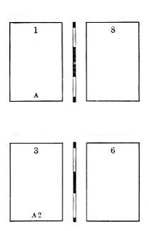
Outer Form of the Inner Sheet.
Imposing in quires may be carried to any extent, by observing the following rule:—first ascertain the number of pages, then divide them into so many sheets of folio, and commence laying down the first two and last two, which form the first sheet, and so on to the centre one, always remembering that the odd pages stand on the left and the even on the right; the folios of each two forming one more than the number of pages in the work: for example, let us suppose the work to consist of thirty-six pages, which is nine sheets of folio, then they should be laid down according to the scheme at the foot of the opposite page.
Two Sheets of Folio, Quired, or lying one in another.
Inner Form of the Outer Sheet.
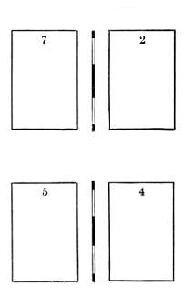
Inner Form of the Inner Sheet.
| Outer. | Inner. | Sheet. | ||
|---|---|---|---|---|
| 1 | 36 | 35 | 2, | 1st |
| 3 | 34 | 33 | 4, | 2d |
| 5 | 32 | 31 | 6, | 3d |
| 7 | 30 | 29 | 8, | 4th |
| 9 | 28 | 27 | 10, | 5th |
| 11 | 26 | 25 | 12, | 6th |
| 13 | 24 | 23 | 14, | 7th |
| 15 | 22 | 21 | 16, | 8th |
| 17 | 20 | 19 | 18, | 9th |
The furniture must be reduced in the backs of the inner sheets, to allow for stitching.
A Sheet of Common Quarto.
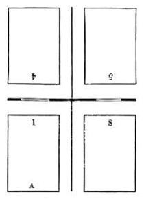
Outer Form.
A Sheet of Quarto, the Broad Way, commonly used in Works of Music.
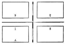
Outer Form.
A Sheet of Common Quarto.
Inner Form.
A Sheet of Quarto, the Broad Way, commonly used in Works of Music.
Inner Form.
Two Half-Sheets of Quarto, worked together.
Outer Form.
Half a Sheet of Common Quarto.
Two Half-Sheets of Quarto, worked together.
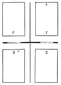
Inner Form.
Half a Sheet of Quarto, the Broad Way.
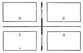
Outer Form of a Sheet of Common Octavo.
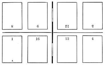
Outer Form of a Sheet of Octavo, the Broad Way.
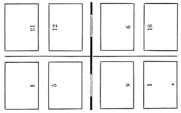
Inner Form of a Sheet of Common Octavo.
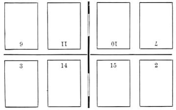
Inner Form of a Sheet of Octavo, the Broad Way.
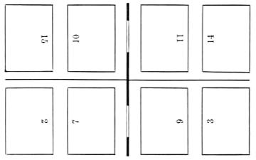
Outer Form of Two Half-Sheets of Common Octavo, worked together.
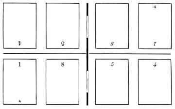
Half a Sheet of Common Octavo.
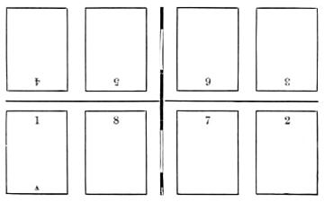
Inner Form of Two Half-Sheets of Common Octavo, worked together.
Two Quarters of a Sheet of Octavo, worked together.
Outer Form of a Sheet of Octavo, 12 of the Work, and 4 of other Matter.
Outer Form of a Sheet of Octavo, of Hebrew Work.
Inner Form of a Sheet of Octavo, 12 of the Work, and 4 of other Matter.
Inner Form of a Sheet of Octavo, of Hebrew Work.
Outer Form of a Sheet of Octavo, Imposed from the Centre.
A Half-Sheet of Octavo, Imposed from the Centre.
Inner Form of a Sheet of Octavo, Imposed from the Centre.
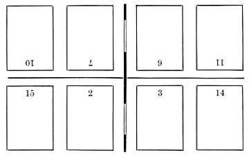
Two Quarters of a Sheet of Octavo, Imposed from the Centre.
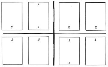
Outer Form of a Sheet of Twelves.
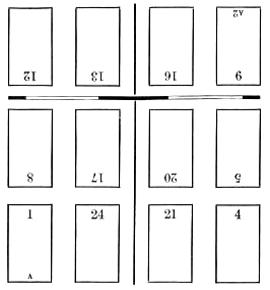
Inner Form of a Sheet of Twelves.
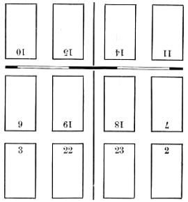
A Sheet of Twelves, without cutting.
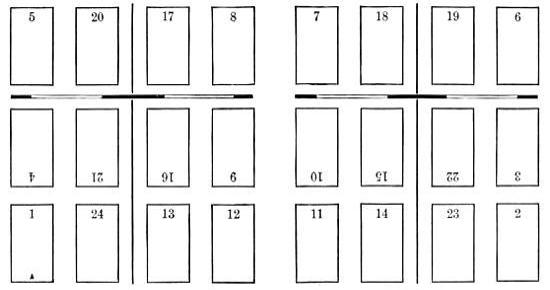
Outer Form. Inner Form.
A Sheet of Twelves, with Two Signatures.
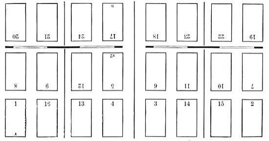
Outer Form. Inner Form.
A Common Half-Sheet of Twelves.
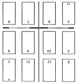
Half-Sheet of Twelves, without cutting.
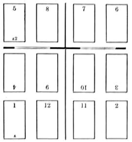
Different Methods of Imposing Half-Sheets of Twelves, from the Centre.
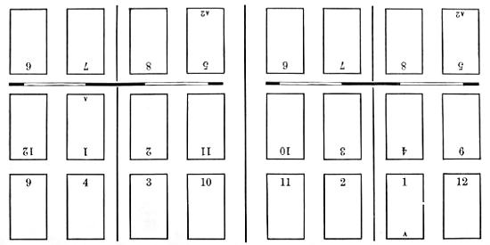
A Sheet of Twelves, Imposed from the Centre.
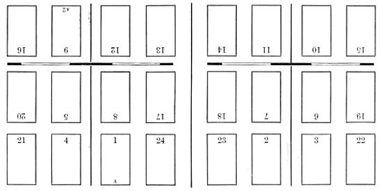
Outer Form of a Sheet of Long Twelves.
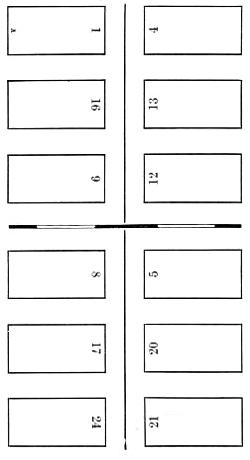
One-third, or 8 pages, of a Sheet of Twelves.
To be imposed as a slip, or in the off-cross.
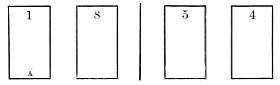
Outer Form.
Inner Form of a Sheet of Long Twelves.
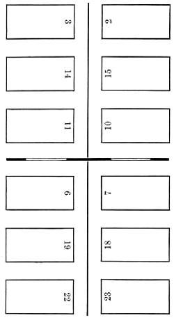
One-third, or 8 pages, of a Sheet of Twelves.
To be imposed as a slip, or in the off-cross.
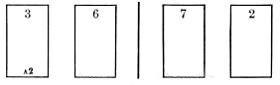
Inner Form.
Two Half-Sheets of Twelves, worked together.
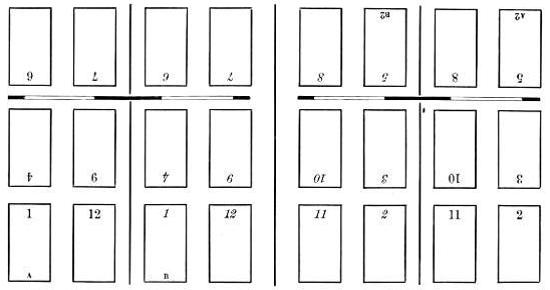
Outer Form. Inner Form.
Half-Sheet of Twelves, with 2 Signatures. 4 pages of other matter.
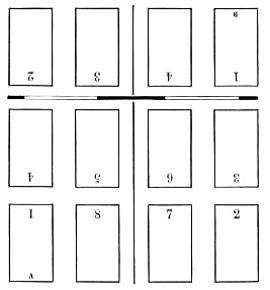
A Half-Sheet of Sixteens.
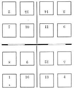
A Sheet of Sixteens, with One Signature.
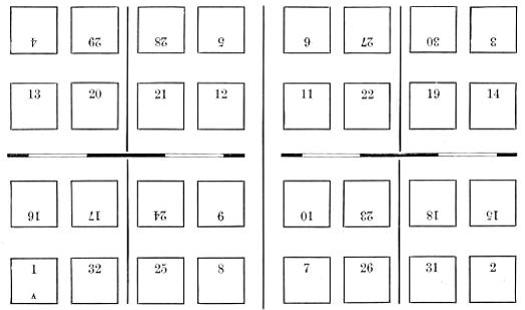
Outer Form. Inner Form.
A Half-Sheet of Eighteens.
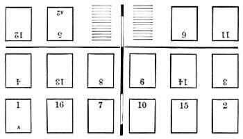
Containing 16 pages.
The white paper of this half-sheet being worked off, the centre pages must be transposed,—viz. pages 7 and 10 in the room of 9 and 8, and pages 9 and 8 in the place of 7 and 10: when this is done, your imposition will be true.
A Half-Sheet of Eighteens.

When the white paper is worked off, transpose the form,—viz. pages 11 and 8 in the room of 7 and 12, and pages 7 and 12 in the place of 11 and 8: this being done, the sheet will then fold up right.
Outer Form of a Sheet of Eighteens, to be folded together.
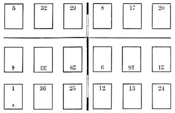
Outer Form of a Sheet of Eighteens, with One Signature.
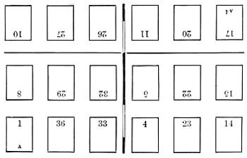
Inner Form of a Sheet of Eighteens, to be folded together.
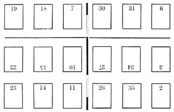
Inner Form of a Sheet of Eighteens, with One Signature.
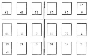
Outer Form of a Sheet of Eighteens, with Two Signatures.
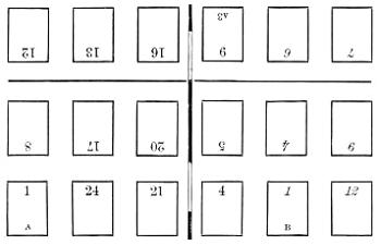
Outer Form of a Sheet of Eighteens, with Three Signatures.
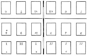
Inner Form of a Sheet of Eighteens, with Two Signatures.
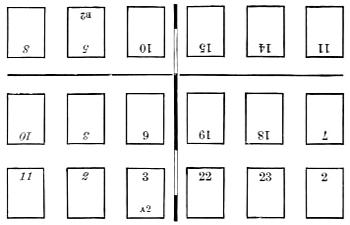
Inner Form of a Sheet of Eighteens, with Three Signatures.
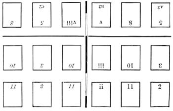
A Half-Sheet of Eighteens, without Transposition.
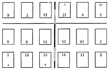
This mode of imposition is very objectionable, as there will be, when the paper is cut up, three single leaves.
A Half-Sheet of Twenties, with Two Signatures.
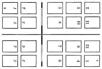
Inner Form of a Sheet of Twenties.
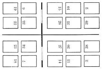
Outer Form of a Sheet of Twenties.
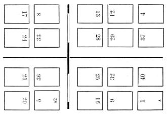
A Half-Sheet of Twenty-Fours.
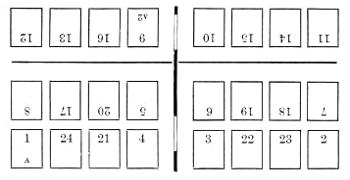
Outer Form of a Sheet of Twenty-Fours, with Two Signatures.
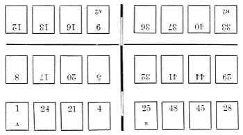
A Half-Sheet of Twenty-Fours, the Sixteen-way.
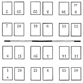
Inner Form of a Sheet of Twenty-Fours, with Two Signatures.
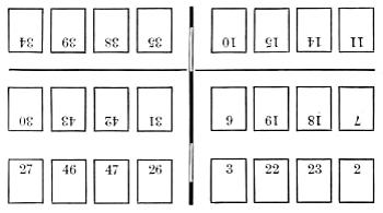
A Half-Sheet of Twenty-Fours, without Inset.
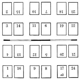
A Half-Sheet of Twenty-Fours, without Inset.
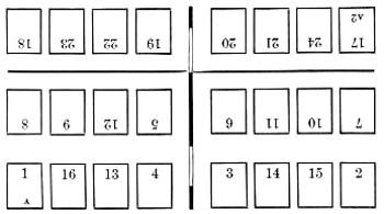
A Half-Sheet of Twenty-Fours, without Cutting.
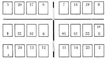
A Half-Sheet of Thirty-Twos.
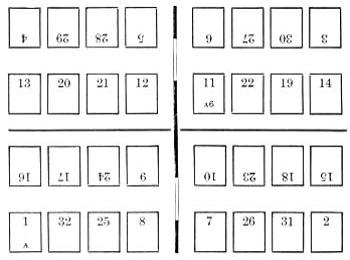
Outer Form of a Sheet of Thirty-Twos.
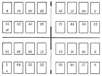
Outer Form of a Sheet of Thirty-Twos, with Four Signatures.
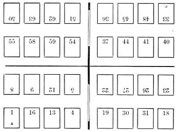
Inner Form of a Sheet of Thirty-Twos.
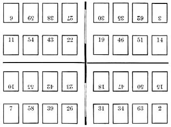
Inner Form of a Sheet of Thirty-Twos, with Four Signatures.
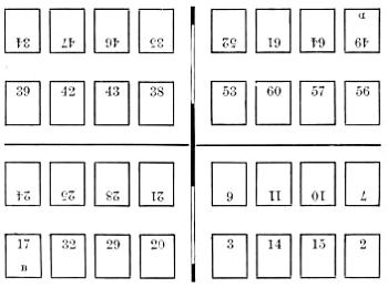
A Half-Sheet of Thirty-Twos, with Two Signatures.
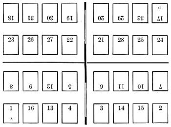
A Half-Sheet of Thirty-Twos, 20 pages of the Work, 4 pages of Title, &c., and 8 of other Matter.
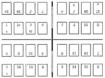
A Half-Sheet of Thirty-Sixes.
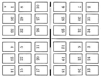
A Half-Sheet of Thirty-Sixes, without Cutting.
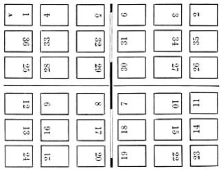
A Half-Sheet of Thirty-Sixes, with Two Signatures.
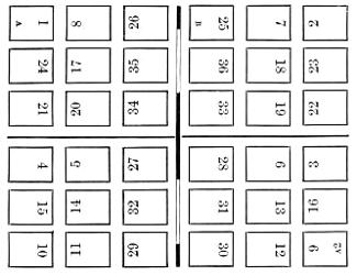
A Half-Sheet of Forties.
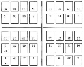
A Quarter-Sheet of Forty-Eights, with Two Signatures.
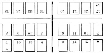
A Half-Sheet of Forty-Eights, with Two Signatures.
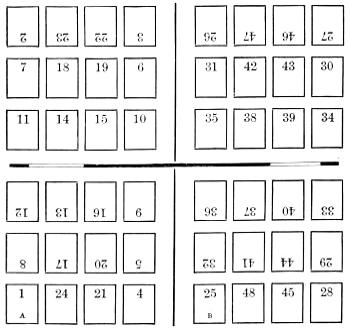
A Quarter-Sheet of Forty-Eights, without Cutting.
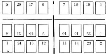
A Half-Sheet of Forty-Eights, with Three Signatures.
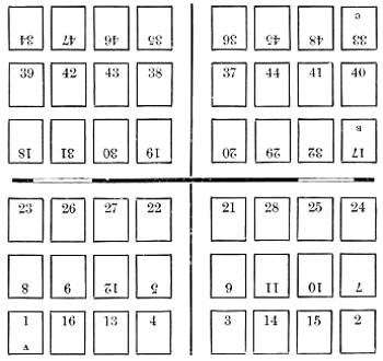
A Common Quarter-Sheet of Forty-Eights.
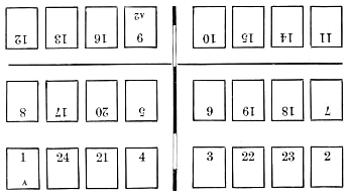
A Quarter-Sheet of Sixty-Fours, with Two Signatures.
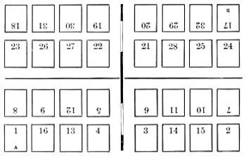
A Common Quarter-Sheet of Sixty-Fours.
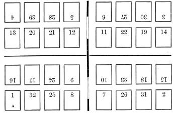
A Quarter-Sheet of Sixty-Fours, 20 pages of the Work, 8 of Title, and 4 of other Matter.
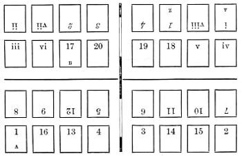
A Half-Sheet of Sixty-Fours.
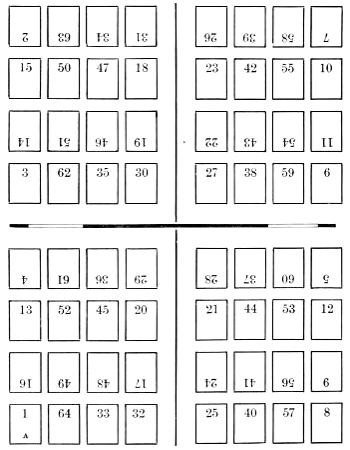
A Half-Sheet of Seventy-Twos, with Three Signatures.
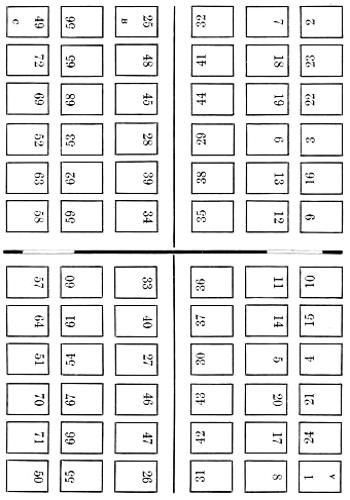
A Half-Sheet of Ninety-Sixes, with Six Signatures.
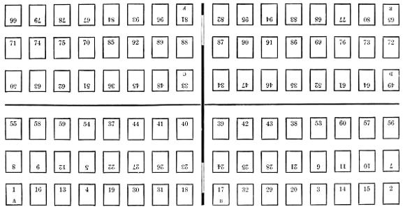
A Half-Sheet of One Hundred and Twenty-Eights, with Eight Signatures.
PROOF-READING AND CORRECTING.
PROOF-READING.
Undeniable as is the fact that a book marred by typographical errors and grammatical blemishes is a scandal to the profession, it must be admitted that a careful, steady, and competent reader is indispensable in every printing-office.
It is eminently desirable that a reader should have been previously brought up a compositor. By a practical acquaintance with the mechanical departments of the business, he will be better able to detect those manifold errata which, unperceived by the man of mere learning and science, lie lurking, as it were, in a thousand different forms, in every sheet; and which, if overlooked, justly offend the taste and discernment of all appreciators of correct and beautiful typography.
Some of the principal imperfections which are more easily observed by the man of practical knowledge in the art of printing are the following: viz. imperfect, wrong-founted, and inverted letters, particularly the lower-case n, o, s, and u, as well as p, d, b, and q; awkward and irregular spacing; uneven pages or columns; a false disposition of the reference[201] marks; crookedness in words and lines; bad making-up of matter; erroneous indention, &c. These minutiæ, which are rather imperfections of workmanship than literal errors, are apt to be overlooked and neglected by mere literary readers.
A person of a thoroughly cultivated typographical taste, a quick eye, and a ready mind, though not a compositor, may doubtless be competent to detect those minor deviations from exact workmanship in a proof which the inexperienced and the careless are apt to overlook. But, without these qualifications, no person can be safely intrusted to read a sheet for press, and the labours of the printer are liable to go forth into the world in a manner that will reflect discredit on the employed and give offence to the employer. No form, therefore, ought to be put to press until it has been read and revised by an experienced reader.
A thorough proof-reader, in addition to a general and practical acquaintance with typography, should understand clearly the grammar and idiomatic structure of his mother-tongue, and have, as it were, an encyclopedic knowledge of the names, times, and productions of its writers, as well as an entire familiarity with the Bible especially, and with Shakspeare. He should be, in fact, a living orthographical, biographical, bibliographical, geographical, historical, and scientific dictionary, with some smattering of Hebrew, Greek, Latin, French, Spanish, Italian, and German. Yet all these accomplishments are valueless unless he also possess a keen and quick eye, that, like a hound, can detect an error almost by scent. There are eyes of this sort, that with a cursory glance will catch a solitary error in a page. The world is little aware how greatly many authors are indebted to a competent proof-reader for not only reforming their spelling and punctuation, but for valuable suggestions in regard to style, language, and grammar,—thus rectifying faults which would have rendered their works fair game for the critic.
Although no corrector of the press can strictly be required to do otherwise than to follow his copy,—that is, faithfully to adhere to the original, with all its defects,—yet every one must perceive that he performs a friendly and perhaps a charitable service, by pointing out, in proper time, imperfections and mistakes which have escaped the observation of a quick or voluminous writer. With the spirit, the opinions, the whims[202] of an author, no corrector of the press has any business to interfere. In reprints of old and standard works, no license of alteration ought to be granted to either correctors or editors.
Strict uniformity should always be preserved in the use of capitals, in orthography, and punctuation. Nothing can be more vexatious to an author than to see the words honour, favour, &c. spelt with and without the u. This is a discrepancy which correctors ought sedulously to prevent. The above observations equally apply to the use of capitals to noun-substantives, &c. in one place, and the omission of them in another. However the opinions of authors may differ in these respects, still the system of spelling, &c. must not be varied in the same work.
When an author gives him the option, a proof-reader ought to spell ambiguous words and arrange compounds in a methodical and uniform way; and, to enable the compositors to become acquainted with and to observe his method, he should furnish for their guidance a list of such ambiguous words and compounds.[15]
Such being the qualifications of a reader, we exhibit the process which proof-sheets ought to undergo before the pages are put to press.
When a first proof is pulled, the compositor who imposed the sheet ought to collect and arrange the copy, and deliver both to the reader, who, after folding the sheet to prove the accuracy of its imposition, carefully examines the signatures, head-lines, and paging. He then calls his reading-boy, to read the copy aloud to him. This boy should be able to read with ease and distinctness any copy put into his hands. The eye of the reader should not follow, but rather precede, the voice of the boy: accustomed to this mode, he will be able to anticipate every single word in the copy; and, should a word or sentence happen to be missing in the proof, his attention will the more sensibly be arrested by it when he hears it pronounced by his reading-boy. He ought to be careful lest his eyes advance too far before the words of the boy; because, in his attention to the author’s meaning, he will be apt to read words in the proof which do not actually appear there, and the accuracy of the reading-boy will but tend to confirm him in the mistake.
When the reading of the sheet is concluded, the number (if more than one) of the volume, signature, and prima, or first word of the ensuing sheet, should be accurately marked on the margin of the copy, and a bracket made before the first word of the next sheet, in order that the compositor, should he not have composed beyond the sheet, may know where to begin, without having the trouble of referring either to the proof or the form, and the reader will be certain that the commencement is right when he gets the succeeding sheet. This prevents unnecessary trouble both to the reader and compositor.
Before the proof is sent to the compositor to be corrected in the metal, an entry should be made in a book, according to the following plan:—
| DATE OF READING. | SIGNATURES. | NAMES OF WORKS. | SENT OUT. | RETURNED. | READ FOR PRESS. | ||||
|---|---|---|---|---|---|---|---|---|---|
| 1878. | 1878. | 1878. | 1878. | ||||||
| May | 2 | 11 | Decorative Printing | May | 2 | May | 4 | May | 5 |
| ” | 4 | 23 | American Printer, (Revised Edition) | ” | 4 | ” | 5 | ” | 6 |
| ” | 6 | 20 | Specific Heat Tables | ” | 8 | ” | 9 | ” | 9 |
| ” | 10 | 2 | The Great Exhibition | ” | 10 | ” | 12 | ” | 13 |
| ” | 27 | 13 | Masterpieces of European Art | ” | 29 | ” | 30 | ” | 30 |
This account being punctually kept, the reader can furnish the employer or overseer with an exact account of the state of each work without delay or inconvenience.
After the compositors have corrected the errors in the form, a clean proof is pulled, which, with the first proof, is handed to the reader, who then collates the corrected sheet with the one before read, in order to ascertain whether the corrections have been properly made, and whether new errors have not been caused by negligence in the process; and, if the work be a reprint, or if the author is not to examine the proof, he then proceeds to read it very carefully for press.
Some proofs are so foul, that it is almost impossible for the compositor to correct all the marks at one time, and it is therefore necessary to have the neglected errors corrected and another sheet pulled before the proof is read finally. It not[204] unfrequently happens that compositors, in the course of correcting, transpose a letter or word, or alter a letter in a word that is not marked, thus not only leaving one error uncorrected, but also making another; sometimes also, in respacing a line, a space is transposed or a hyphen is left in. Consequently it is absolutely necessary, in revising a proof, that the reader should not only look at the word marked, but he ought also to glance his eye over every line in which an alteration has been made.
In offices where two readers are employed, it is advisable that a proof-sheet should be read over by both; because the eye, in traversing the same ground, is liable to be drawn into mistake and oversight. The interest excited by the first reading having abated, a degree of listlessness imperceptibly steals upon the mind, which greatly endangers the correctness of a proof. Should outs or doubles occur in a proof, it ought to be again read by copy, to detect any improper correction in the overrunning or transposition of lines. Figure work should always be read twice by copy.
The duty of amending the punctuation should be generally confined to one reader. Where a compositor is liable, in this particular, to the whim or caprice of several readers, he certainly suffers injustice, because his time is unnecessarily frittered away; and not only is the work retarded, but the types are needlessly exposed to injury, to say nothing of the liability of creating fresh errors, &c.
Before a manuscript is brought to the printer, it ought to be as perfect as the author can make it. The compositor is bound to “follow the copy,” in word and sentiment, unless, indeed, he meets with instances of wrong punctuation or false grammar, (and such instances are not rare,) which his intelligence enables him to amend. After the matter has been read and corrected in the office, a proof is sent to the author; and, if it corresponds with the copy, the compositor’s responsibility is at an end. He has done all he is paid for; and, should the author desire any changes made in his matter, of course he must pay for them.
Sentiments in print look marvellously different from the same ideas in manuscript; and we are not surprised that writers should wish to polish a little; nor do we object to their natural desire of amending or beautifying their mental[205] products. But let them not forget that pay-time will come,—when the item for alterations will loom out with a startling distinctness in the bill. They found it easy in the proof to erase a word or two here and insert a word or two there; without dreaming, perhaps, that in consequence of these little erasures and insertions the compositor would be compelled to alter and reconstruct much of his work. We know of a volume on which the alterations alone have consumed time equal to one man’s work for nearly two and a half years. How unreasonable—nay, how transparently unjust—the expectation that the printer should give gratuitously the time and trouble requisite for the radical changes in the type which an author’s whim or taste may demand!
Stower says, “It may not be improper, in this place, just to take notice of the great danger to the correctness of a work which arises from the practice, too common with some authors, of keeping their proof-sheets too long in their hands before they are returned to the printer. As the pages in the metal get dry, the adhesion of the types to each other is weakened, and the swell or extension of the quoins and furniture, which the moisture had occasioned, is removed; so that there is great danger of letters falling out when a form is long kept from the press. Nor is the danger which is hereby occasioned to correctness the only inconvenience: the impatience of authors to see their works in a fit state for publication is almost proverbial. The pleasure arising from beholding, as it were, the ‘form and texture’ of one’s thoughts, is a sensation much easier felt than described. That authors, therefore, may partake of this pleasure in a speedy and regular succession, they should make a point of forwarding their proof-sheets to the printer as quick as possible, not only that they may the sooner be got ready for the press, but that the work may proceed in a regular manner, without being interrupted by the forwarding of other works in lieu of that the proof-sheets of which are detained beyond the proper time in the hands of the author.
“Authors are very apt to make alterations, and to correct and amend the style or arguments of their works, when they first see them in print. This is certainly the worst time for this labour, as it is necessarily attended with an expense which, in large works, will imperceptibly swell to a serious[206] sum; when, however, this method of alteration is adopted by an author, the reader must always be careful to read the whole sheet over once more with very great attention before it is finally put to press.
“A proof-sheet, having duly undergone this routine of purgation, may be supposed to be as free from errata as the nature of the thing will admit, and the word ‘Press’ may be written at the top of the first page of it. This is an important word to every reader: if he have suffered his attention to be drawn aside from the nature of his proper business, and errors should be discovered when it is too late to have them corrected, this word ‘Press’ is as the signature of the death-warrant of his reputation. A reader, therefore, should be a man of one business,—always upon the alert,—all eye,—all attention. Possessing a becoming reliance on his own powers, he should never be too confident of success. Imperfection clings to him on every side. Errors and mistakes assail him from every quarter. His business is of a nature that may render him obnoxious to blame, but can hardly be said to bring him in any very large stock of praise. If errors escape him, he is justly to be censured; for perfection is his duty. If his labours are wholly free from mistake,—which is, alas! a very rare case,—he has done no more than he ought, and, consequently, can merit only a comparative degree of commendation, in that he had the good fortune to be more successful in his labours after perfection than some of his brethren in the same employment.”
The form being finally laid on the press, and a revise pulled by the pressman, he sends it to the overseer, who carefully examines whether all the marks have been attended to, and looks along the sides and heads of the respective pages, to observe whether any letter has fallen out, or there is any crookedness in the locking up of the form, any battered letters, or any bite from the frisket. Should the revise prove faultless, he returns it to the pressman, with the word “Revise” written on the margin; if otherwise, to the compositor to whom the form belongs, for immediate correction.
CORRECTING IN THE METAL.
Correcting is the most disagreeable part of a compositor’s business, diminishing as it does his earnings, and causing great fatigue, and, by leaning over the stone, endangering his health. A foul proof, however, is a fault without extenuation, and seems to deserve some punishment. The noise and confusion which prevail in badly governed printing-offices, from light and frivolous conversation, not only retard business, but distract the attention of the compositor from the subject he has in hand, and cause him to make many mistakes. Some men, no doubt, can support a conversation and at the same time compose correctly; but their noise confuses those who are unable to preserve accuracy except by close attention to their copy in silence.
The first proof should contain merely the errors of the compositor; but it frequently happens that the corrector heightens them by his peculiarities. When this is unnecessarily done, it is an act of injustice to the compositor: it is sufficient for him to rectify such mistakes as arise either from inattention to his copy or want of judgment. The compositor ought not to suffer from the humour of a reader in capriciously altering commas and semicolons in the first proof, which he not unfrequently re-alters in the second, from a doubt as to the propriety of the points to be adopted.
When a proof is handed to the compositor, he should immediately correct it; and the reader, correlatively, should be equally prompt in his department. Can it reasonably be expected that the compositor will feel inclined to forward his proof, when he knows that the reader will delay it for hours?
Should a compositor have transposed two or more pages, either from an error in the folios or any other cause, he must unlock the quarter containing them, and, loosening the cross or crosses from the furniture, lift the chase and the remaining quarters off the stone. Should he have furniture sufficient round each page, he may move them into their proper stations by pressing the balls of his thumbs and fingers against the furniture at the head, foot, and sides of each page. If the letter be small, it will be advisable to wet the pages, because few imposing-stones are horizontal, or so steady that they[208] will not shake when touched, or by the motion of the floor occasioned by persons walking or dragging forms along.
Should a compositor find that his pages hang, he must unlock the quarter, and pat the face of the type with the balls of his fingers until he gets it into a square position.
When a compositor unlocks a form, he should be careful not to leave the unlocked quoins too slack, as the force necessary to loosen the others may squabble the matter, or occasion it to hang.
It has been aptly said, “What is required of a compositor when he goes about correcting a foul proof, is a sharp bodkin and patience; because, without them, the letter cannot escape suffering by the steel, and hurrying will not permit him to justify the lines true. No wonder, therefore, to see pigeon-holes in one place, and pi in another.”[16]
When the compositor has as many corrections between the thumb and forefinger of his left hand as he can conveniently hold, or, what is better, in his composing-stick, (beginning at the bottom of the page, in order that they may follow regularly,) and an assortment of spaces on a piece of paper, or, what is more convenient, in a small square box with partitions in it,—let him take the bodkin in his right hand, and, instead of raising each letter he may have to alter, place the point of the bodkin at one end of the line, and, with the forefinger of his left hand against the other, raise the whole line sufficiently high to afford him a clear view of the spacing; he may then change the faulty letter and alter his spacing before he drops the line. By this method he will not injure the type, which he must do if he force the bodkin into their sides or heads; a greater degree of regularity is insured where there may be occasion to alter the spacing, and no more time is taken up than by the other method.
In tables, and other matter, where rules prevent the lines from being raised, the letters must be drawn up by the bodkin. This is done by the compositor holding the instrument fast in his right hand, with the blade between his forefinger and thumb, within about three-quarters of an inch from the point: thus guiding it steadily to the faulty letter, he sticks the point of the bodkin into the neck of the letter between the beard and the face, and draws it up above the other types, so that he can take it out with the forefinger and thumb of his left hand. In performing this operation, the blade of the bodkin should be kept as flat as possible on the face of the type, but it should not touch any of the surrounding types, as the slightest graze imaginable will injure their face, and they will consequently appear imperfect in the next proof, when he will have the trouble of altering them, his employer suffering the loss of the type.
The bodkin blade being held almost flat to the form, a small horizontal entrance of its point into the neck of the letter will raise it above the face of the form; but, if the bodkin be held nearly upright, it will not have sufficient purchase to draw the letter up, because the weight of the letter and the pressure of the surrounding types will have greater power than the sharp point of the steel. By pressing sidewise, the bodkin blade acts as a lever, even though it has no other purchase than the slight motion of the hand.
COMMON BODKIN.
POCKET SPRING BODKIN.
In the olden times the printer made his own bodkin by inserting the blunt end of a large steel needle in a piece of wood or cork. At the present day, when every thing is prepared to the workman’s hand, bodkins are manufactured by printers’ furnishers, and he may take his choice of styles. The above cut shows a common form; but in some cases (as in table work) tweezers or a spring bodkin may be preferred. Knives may also be had with bodkin attached, which serve a double purpose. The objection to the knife-bodkin is that[210] the handle is too heavy and cumbersome, and it is sure to injure type should it happen to slip from the fingers and fall on the page.
TWEEZERS.
SPRING BODKIN.
The most careful compositor cannot at all times avoid leaving a word out, or composing the same word twice. When this happens, he should consider the best mode of rectifying the accident, by driving out or getting in, either above the error or below it. This ascertained, let the matter be taken upon a galley, and overrun in the composing-stick. Overrunning on the stone is an unsafe, unworkmanlike, and dilatory method, destroying the justification and rendering the spacing uneven.
KNIFE AND BODKIN.
In correcting, care should be taken to avoid hair-spacing a line, by overrunning either back or forward. In overrunning the matter, the division should be used as little as possible; for, though the compositor may carefully follow the instructions laid down in this work on the subject of spacing and dividing, yet the effect of his attention will be completely destroyed if not followed up at the stone.
We here emphatically remark that, if authors were careful to spell properly the names of persons and places, technical and scientific terms, &c., and to write legibly, marking the end of sentences clearly, the work of the compositor would be facilitated, many errors would be prevented, and time, temper, and expense greatly economized.
Further. Let us remind authors that every correction made on their proof that is a variation from the copy as furnished to the printer is charged for according to the time required to make it. The justice of the charge is obvious; yet, strange to say, there is probably no item so frequently disputed by publishers. A man employs a mechanic to build a house according to fixed specifications; but, in the course of its erection, he improves or changes the plan, and orders certain portions to be torn down and rebuilt: is the mechanic to bear the loss? Certainly not. So, when a compositor builds up his page of type according to the copy furnished, he is right in requiring compensation for alterations made in it. He is not to suffer for the author’s desire to improve his intellectual edifice.
PRINTER’S KNIFE.
TYPOGRAPHICAL MARKS EXEMPLIFIED.
The following table will be appreciated by authors and by all who desire to become acquainted with the technical marks used by practical readers. Due attention to the explanations will insure an apt proficiency in the manual department of proof-reading.
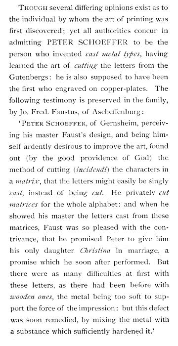
Though several differing opinions exist as to the individual by whom the art of printing was first discovered; yet all authorities concur in admitting PETER SCHOEFFER to be the person who invented cast metal types, having learned the art of cutting the letters from the Gutenbergs: he is also supposed to have been the first who engraved on copper-plates. The following testimony is preserved in the family, by Jo. Fred. Faustus, of Ascheffenburg:
‘Peter Schoeffer, of Gernsheim, perceiving his master Faust’s design, and being himself ardently desirous to improve the art, found out (by the good providence of God) the method of cutting (incidendi) the characters in a matrix, that the letters might easily be singly cast, instead of being cut. He privately cut matrices for the whole alphabet: and when he showed his master the letters cast from these matrices, Faust was so pleased with the contrivance, that he promised Peter to give him his only daughter Christina in marriage, a promise which he soon after performed. But there were as many difficulties at first with these letters, as there had been before with wooden ones, the metal being too soft to support the force of the impression: but this defect was soon remedied, by mixing the metal with a substance which sufficiently hardened it.’
EXPLANATION OF THE CORRECTIONS.
A wrong letter in a word is noted by drawing a short perpendicular line through it, and making another short line in the margin, behind which the right letter is placed. (See No. 1.) So with whole words also, a line being drawn across the wrong word and the right one written in the margin opposite.
A turned letter is noted by drawing a line through it, and writing the mark No. 2 in the margin.
If letters or words require to be altered to make them more conspicuous, a parallel line or lines must be made underneath the word or letter,—viz. for capitals, three lines; small capitals, two lines; and Italic, one line; and, in the margin opposite the line where the alteration occurs, Caps, Small Caps, or Ital. must be written. (See No. 3.)
When letters or words are set double, or are required to be taken out, a line is drawn through the superfluous word or letter, and the mark No. 4 placed opposite in the margin.
Where the punctuation requires alteration, the correct point should be written in the margin. (See No. 5.)
When a space has been omitted between two words, a caret must be made where the separation ought to be, and the sign No. 6 placed opposite in the margin.
When a word should form a compound with another, it is denoted as in No. 7.
When a letter has been omitted, a caret is put at the place of omission, and the letter marked as No. 8.
Where a line is too widely spaced, the mark No. 9 must be placed between the words and also in the margin.
Where a new paragraph is required, a quadrangle is drawn in the margin, and a caret placed at the beginning of the sentence. (See No. 10.)
No. 11 shows the way in which the apostrophe, inverted commas, the star and other references, and superior letters and figures, are marked.
Where two words are transposed, a line is drawn over one word and below the other, and the mark No. 12 placed in the margin; but where several words require to be transposed, their right order is signified by a figure placed over each word, and the mark No. 12 in the margin.
Where words have been struck out that have afterward[215] been approved of, dots should be marked under them, and stet written in the margin. (See No. 13.)
Where a space sticks up between two words, a horizontal line is drawn under it, and the mark No. 14 placed opposite, in the margin.
Where several words have been left out, they are transcribed at the bottom of the page, and a line drawn from the place of omission to the written words, (see No. 15;) but if the omitted matter is too extensive to be copied at the foot of the page, Out, see copy, is written in the margin, and the missing lines are enclosed between brackets, and the word Out is inserted in the margin of the copy.
Where letters stand crooked, they are noted by a line, (see No. 16;) but, where a page hangs, lines are drawn across the entire part affected.
When a smaller or larger letter, of a different fount, is improperly introduced into the page, it is noted by the mark No. 17, which signifies wrong fount.
If a paragraph is improperly made, a line is drawn from the broken-off matter to the next paragraph, and No ¶ written in the margin. (See No. 18.)
Where a word has been left out or is to be added, a caret must be made in the place where it should come in, and the word written in the margin. (See No. 19.)
Where a faulty letter appears, it is denoted by making a cross under it, and placing a similar mark in the margin, (see No. 20;) though some prefer to draw a perpendicular line through it, as in the case of a wrong letter.
Where a word has been accidentally separated by a space, it is marked as in No. 21.
TABLE OF SIGNATURES.
On the two following pages will be found a complete list of signatures for books in octavo, twelves and eighteens, sixteens, and twenty-fours.
The 24mo signatures in this table are arranged to bring the second signature on either the 9th or 17th page of the form. If the sheet is to be folded as an 8vo and 16mo, the figure signatures may be used; but if as two 12mos, the letter signatures will be used.
| 8vo. | 12mo and 18mo. | 16mo. | 24mo. | ||||||||||||||||||||
|---|---|---|---|---|---|---|---|---|---|---|---|---|---|---|---|---|---|---|---|---|---|---|---|
| 1 | 1 | A | 481 | 61 | 3 L | 1 | 1 | A | 313 | 27 | 2 B | 625 | 53 | 3 C | 1 | 1 | A | 1 | 1 | A | 433 | 19 | T |
| 9 | 2 | B | 489 | 62 | 3 M | 5 | 1* | A 2 | 317 | 27* | 2 B 2 | 629 | 53* | 3 C 2 | 17 | 2 | B | 9 | 1* | 441 | 19* | ||
| 17 | 3 | C | 497 | 63 | 3 N | 13 | 2 | B | 325 | 28 | 2 C | 637 | 54 | 3 D | 33 | 3 | C | 17 | . . | A 2 | 449 | . . | T 2 |
| 25 | 4 | D | 505 | 64 | 3 O | 17 | 2* | B 2 | 329 | 28* | 2 C 2 | 641 | 54* | 3 D 2 | 49 | 4 | D | 25 | 2 | B | 457 | 20 | U |
| 33 | 5 | E | 513 | 65 | 3 P | 649 | 55 | 3 E | 65 | 5 | E | 33 | 2* | 465 | 20* | ||||||||
| 41 | 6 | F | 521 | 66 | 3 Q | 25 | 3 | C | 337 | 29 | 2 D | 653 | 55* | 3 E 2 | 81 | 6 | F | 41 | . . | B 2 | 473 | . . | U 2 |
| 49 | 7 | G | 529 | 67 | 3 R | 29 | 3* | C 2 | 341 | 29* | 2 D 2 | 97 | 7 | G | |||||||||
| 57 | 8 | H | 537 | 68 | 3 S | 37 | 4 | D | 349 | 30 | 2 E | 661 | 56 | 3 F | 113 | 8 | H | 49 | 3 | C | 481 | 21 | V |
| 65 | 9 | I | 545 | 69 | 3 T | 41 | 4* | D 2 | 353 | 30* | 2 E 2 | 665 | 56* | 3 F 2 | 129 | 9 | I | 57 | 3* | 489 | 21* | ||
| 73 | 10 | K | 553 | 70 | 3 U | 673 | 57 | 3 G | 145 | 10 | K | 65 | . . | C 2 | 497 | . . | V 2 | ||||||
| 81 | 11 | L | 561 | 71 | 3 V | 49 | 5 | E | 361 | 31 | 2 F | 677 | 57* | 3 G 2 | 161 | 11 | L | 73 | 4 | D | 505 | 22 | W |
| 89 | 12 | M | 569 | 72 | 3 W | 53 | 5* | E 2 | 365 | 31* | 2 F 2 | 177 | 12 | M | 81 | 4* | 513 | 22* | |||||
| 97 | 13 | N | 577 | 73 | 3 X | 61 | 6 | F | 373 | 32 | 2 G | 685 | 58 | 3 H | 193 | 13 | N | 89 | . . | D 2 | 521 | . . | W 2 |
| 105 | 14 | O | 585 | 74 | 3 Y | 65 | 6* | F 2 | 377 | 32* | 2 G 2 | 689 | 58* | 3 H 2 | 209 | 14 | O | 97 | 5 | E | 529 | 23 | X |
| 113 | 15 | P | 593 | 75 | 3 Z | 73 | 7 | G | 385 | 33 | 2 H | 697 | 59 | 3 I | 225 | 15 | P | 105 | 5* | 537 | 23* | ||
| 121 | 16 | Q | 601 | 76 | 4 A | 77 | 7* | G 2 | 389 | 33* | 2 H 2 | 701 | 59* | 3 I 2 | 241 | 16 | Q | 113 | . . | E 2 | 545 | . . | X 2 |
| 129 | 17 | R | 609 | 77 | 4 B | 709 | 60 | 3 K | 257 | 17 | R | 121 | 6 | F | 553 | 24 | Y | ||||||
| 137 | 18 | S | 617 | 78 | 4 C | 85 | 8 | H | 397 | 34 | 2 I | 713 | 60* | 3 K 2 | 273 | 18 | S | 129 | 6* | 561 | 24* | ||
| 145 | 19 | T | 625 | 79 | 4 D | 89 | 8* | H 2 | 401 | 34* | 2 I 2 | 289 | 19 | T | |||||||||
| 153 | 20 | U | 633 | 80 | 4 E | 97 | 9 | I | 409 | 35 | 2 K | 721 | 61 | 3 L | 305 | 20 | U | 137 | . . | F 2 | 569 | . . | Y 2 |
| 161 | 21 | V | 641 | 81 | 4 F | 101 | 9* | I 2 | 413 | 35* | 2 K 2 | 725 | 61* | 3 L 2 | 321 | 21 | V | 145 | 7 | G | 577 | 25 | Z |
| 169 | 22 | W | 649 | 82 | 4 G | 109 | 10 | K | 421 | 36 | 2 L | 733 | 62 | 3 M | 337 | 22 | W | 153 | 7* | 585 | 25* | ||
| 177 | 23 | X | 657 | 83 | 4 H | 113 | 10* | K 2 | 425 | 36* | 2 L 2 | 737 | 62* | 3 M 2 | 353 | 23 | X | 161 | . . | G 2 | 593 | . . | Z 2 |
| 185 | 24 | Y | 665 | 84 | 4 I | 121 | 11 | L | 433 | 37 | 2 M | 745 | 63 | 3 N | 369 | 24 | Y | 169 | 8 | H | 601 | 26 | 2 A |
| 193 | 25 | Z | 673 | 85 | 4 K | 125 | 11* | L 2 | 437 | 37* | 2 M 2 | 749 | 63* | 3 N 2 | 385 | 25 | Z | 177 | 8* | 609 | 26* | ||
| 201 | 26 | 2 A | 681 | 86 | 4 L | 757 | 64 | 3 O | 401 | 26 | 2 A | 185 | . . | H 2 | 617 | . . | 2 A 2 | ||||||
| 209 | 27 | 2 B | 689 | 87 | 4 M | 133 | 12 | M | 445 | 38 | 2 N | 761 | 64* | 3 O 2 | 417 | 27 | 2 B | 193 | 9 | I | 625 | 27 | 2 B |
| 217 | 28 | 2 C | 697 | 88 | 4 N | 137 | 12* | M 2 | 449 | 38* | 2 N 2 | 433 | 28 | 2 C | |||||||||
| 225 | 29 | 2 D | 705 | 89 | 4 O | 145 | 13 | N | 457 | 39 | 2 O | 769 | 65 | 3 P | 449 | 29 | 2 D | 201 | 9* | 633 | 27* | ||
| 233 | 30 | 2 E | 713 | 90 | 4 P | 149 | 13* | N 2 | 461 | 39* | 2 O 2 | 773 | 65* | 3 P 2 | 465 | 30 | 2 E | 209 | . . | I 2 | 641 | . . | 2 B 2 |
| 241 | 31 | 2 F | 721 | 91 | 4 Q | 157 | 14 | O | 469 | 40 | 2 P | 781 | 66 | 3 Q | 481 | 31 | 2 F | 217 | 10 | K | 649 | 28 | 2 C |
| 249 | 32 | 2 G | 729 | 92 | 4 R | 161 | 14* | O 2 | 473 | 40* | 2 P 2 | 785 | 66* | 3 Q 2 | 497 | 32 | 2 G | 225 | 10* | 657 | 28* | ||
| 257 | 33 | 2 H | 737 | 93 | 4 S | 793 | 67 | 3 R | 513 | 33 | 2 H | 233 | . . | K 2 | 665 | . . | 2 C 2 | ||||||
| 265 | 34 | 2 I | 745 | 94 | 4 T | 169 | 15 | P | 481 | 41 | 2 Q | 797 | 67* | 3 R 2 | 529 | 34 | 2 I | 241 | 11 | L | 673 | 29 | 2 D |
| 273 | 35 | 2 K | 753 | 95 | 4 U | 173 | 15* | P 2 | 485 | 41* | 2 Q 2 | 545 | 35 | 2 K | |||||||||
| 281 | 36 | 2 L | 761 | 96 | 4 V | 181 | 16 | Q | 493 | 42 | 2 R | 805 | 68 | 3 S | 561 | 36 | 2 L | 249 | 11* | 681 | 29* | ||
| 289 | 37 | 2 M | 769 | 97 | 4 W | 185 | 16* | Q 2 | 497 | 42* | 2 R 2 | 809 | 68* | 3 S 2 | 577 | 37 | 2 M | 257 | . . | L 2 | 689 | . . | 2 D 2 |
| 297 | 38 | 2 N | 777 | 98 | 4 X | 193 | 17 | R | 505 | 43 | 2 S | 817 | 69 | 3 T | 593 | 38 | 2 N | 265 | 12 | M | 697 | 30 | 2 E |
| 305 | 39 | 2 O | 785 | 99 | 4 Y | 197 | 17* | R 2 | 509 | 43* | 2 S 2 | 821 | 69* | 3 T 2 | 609 | 39 | 2 O | 273 | 12* | 705 | 30* | ||
| 313 | 40 | 2 P | 793 | 100 | 4 Z | 829 | 70 | 3 U | 625 | 40 | 2 P | 281 | . . | M 2 | 713 | . . | 2 E 2 | ||||||
| 321 | 41 | 2 Q | 801 | 101 | 5 A | 205 | 18 | S | 517 | 44 | 2 T | 833 | 70* | 3 U 2 | 641 | 41 | 2 Q | 289 | 13 | N | 721 | 31 | 2 F |
| 329 | 42 | 2 R | 809 | 102 | 5 B | 209 | 18* | S 2 | 521 | 44* | 2 T 2 | 657 | 42 | 2 R | 297 | 13* | 729 | 31* | |||||
| 337 | 43 | 2 S | 817 | 103 | 5 C | 217 | 19 | T | 529 | 45 | 2 U | 841 | 71 | 3 V | 673 | 43 | 2 S | 305 | . . | N 2 | 737 | . . | 2 F 2 |
| 345 | 44 | 2 T | 825 | 104 | 5 D | 221 | 19* | T 2 | 533 | 45* | 2 U 2 | 845 | 71* | 3 V 2 | 689 | 44 | 2 T | 313 | 14 | O | 745 | 32 | 2 G |
| 353 | 45 | 2 U | 833 | 105 | 5 E | 229 | 20 | U | 541 | 46 | 2 V | 853 | 72 | 3 W | 705 | 45 | 2 U | 321 | 14* | 753 | 32* | ||
| 361 | 46 | 2 V | 841 | 106 | 5 F | 857 | 72* | 3 W 2 | 721 | 46 | 2 V | 329 | . . | O 2 | 761 | . . | 2 G 2 | ||||||
| 369 | 47 | 2 W | 849 | 107 | 5 G | 233 | 20* | U 2 | 545 | 46* | 2 V 2 | 865 | 73 | 3 X | 737 | 47 | 2 W | 337 | 15 | P | 769 | 33 | 2 H |
| 377 | 48 | 2 X | 857 | 108 | 5 H | 241 | 21 | V | 553 | 47 | 2 W | 753 | 48 | 2 X | |||||||||
| 385 | 49 | 2 Y | 865 | 109 | 5 I | 245 | 21* | V 2 | 557 | 47* | 2 W 2 | 869 | 73* | 3 X 2 | 769 | 49 | 2 Y | 345 | 15* | 777 | 33* | ||
| 393 | 50 | 2 Z | 873 | 110 | 5 K | 253 | 22 | W | 565 | 48 | 2 X | 877 | 74 | 3 Y | 785 | 50 | 2 Z | 353 | . . | P 2 | 785 | . . | 2 H 2 |
| 401 | 51 | 3 A | 881 | 111 | 5 L | 257 | 22* | W 2 | 569 | 48* | 2 X 2 | 881 | 74* | 3 Y 2 | 801 | 51 | 3 A | 361 | 16 | Q | 793 | 34 | 2 I |
| 409 | 52 | 3 B | 889 | 112 | 5 M | 265 | 23 | X | 577 | 49 | 2 Y | 889 | 75 | 3 Z | 817 | 52 | 3 B | 369 | 16* | 801 | 34* | ||
| 417 | 53 | 3 C | 897 | 113 | 5 N | 269 | 23* | X 2 | 581 | 49* | 2 Y 2 | 893 | 75* | 3 Z 2 | 833 | 53 | 3 C | 377 | . . | Q 2 | 809 | . . | 2 I 2 |
| 425 | 54 | 3 D | 905 | 114 | 5 O | 277 | 24 | Y | 589 | 50 | 2 Z | 849 | 54 | 3 D | |||||||||
| 433 | 55 | 3 E | 913 | 115 | 5 P | 901 | 76 | 4 A | 865 | 55 | 3 E | 385 | 17 | R | 817 | 35 | 2 K | ||||||
| 441 | 56 | 3 F | 921 | 116 | 5 Q | 281 | 24* | Y 2 | 593 | 50* | 2 Z 2 | 905 | 76* | 4 A 2 | 881 | 56 | 3 F | 393 | 17* | 825 | 35* | ||
| 449 | 57 | 3 G | 929 | 117 | 5 R | 289 | 25 | Z | 601 | 51 | 3 A | 913 | 77 | 4 B | 897 | 57 | 3 G | 401 | . . | R 2 | 833 | . . | 2 K 2 |
| 457 | 58 | 3 H | 937 | 118 | 5 S | 293 | 25* | Z 2 | 605 | 51* | 3 A 2 | 917 | 77* | 4 B 2 | 913 | 58 | 3 H | 409 | 18 | S | 841 | 36 | 2 L |
| 465 | 59 | 3 I | 945 | 119 | 5 T | 301 | 26 | 2 A | 613 | 52 | 3 B | 925 | 78 | 4 C | 929 | 59 | 3 I | 417 | 18* | 849 | 36* | ||
| 473 | 60 | 3 K | 953 | 120 | 5 U | 305 | 26* | 2 A 2 | 617 | 52* | 3 B 2 | 929 | 78* | 4 C 2 | 945 | 60 | 3 K | 425 | . . | S 2 | 857 | . . | 2 L 2 |
THE FOREMAN OR OVERSEER.
GENERAL DUTIES.
Vigilant and conscientious oversight is the price of profit and success. An overseer or foreman of a printing-office should be of more than ordinary capacity, and able to keep his temper in firm control. His conduct should be guided by justice and equity in regard to the interests of the employer and the employed. A strict impartiality should be observed in his treatment of the workmen, and no favouritism should be displayed. He should make himself acquainted with the capacity of the men, and apportion work among them accordingly. Some men are valueless except for plain, straightforward composition; others, distinguished for taste and skill, delight in intricate work or matter requiring ingenuity and delicacy, such as tables, music, and algebra. Put one of the first kind on this sort of composition, and he will botch it, and earn small wages; while a workman of the latter class will become restive and dissatisfied with plain, solid matter. While dealing justly with the men under his charge, the foreman should see to it that the employer suffers no detriment from negligent or dishonest practices of unconscientious workmen, whether from careless correcting, allowing dropped types to lie upon the[219] floor, or overcharging, or other methods well known in a printing-office. He should be the first and the last in attendance, in order to satisfy himself that every person does his duty in coming and leaving at the proper time.
LARGE SORT-CASE CABINET, FOR SORTS, QUADS, ETC.
The office having been thoroughly swept at an early hour, and the type found in any alley having been placed in the stick of the compositor occupying it, the foreman should pass around the room and see that it is immediately distributed, instead of being thrown on the window-frame or table. The type found in the body of the rooms should be sorted out and distributed at once, and not be allowed to accumulate. No pi should be permitted to remain over till the next day. This is an essential point to secure a tidy and well-regulated office.
He should see to it that the proof-roller and press are in good condition, and that a sufficient supply of wetted proof-paper is on hand. A badly-printed proof should never be[220] allowed to go to the proof-reader or to the author, as neither can properly read a blurred or imperfect proof. An author will feel kindly toward an office that furnishes him with handsome impressions of his matter.
SORT-CASE CABINET.
The foreman should keep himself fully informed as to the amount and the condition of the materials in the office, not only in gross, but in detail, including every style of type, every variety of accents and peculiar sorts, leads, chases, furniture, rules, borders, corner-pieces, &c. In this he will be greatly aided by insisting on the observance of the good old rule, A place for every thing, and every thing in its place when not in use, as well as by keeping a memorandum-book in which every thing should be entered under its proper head for facility of reference.
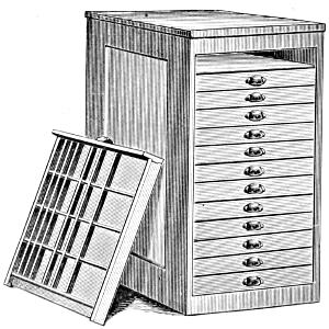
CABINET FOR SPACES, QUADS, ETC.
If the office be well provided, it will contain one or more of the cabinets for sorts, such as are shown in these pages. Strict attention should be given to keeping them in perfect order, and in preventing them from becoming receptacles for pi.
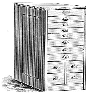
COMBINATION CABINET, FOR SORTS AND QUADS.
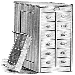
QUAD CABINET.
As a matter of course, he should watch the progress of every job and book, and make sure that they shall be completed within the time contracted for. He should never allow a compositor to have a large take of copy: small takes facilitate expedition, and really tend to the profit of the workmen by bringing an earlier return of letter. He should see to it that every man has his copy closed in proper time, so as not to detain the make-up, and that he passes the make-up without unnecessary delay. As soon as a form or sheet is made up, he should order it to be imposed and a proof pulled, which, with the copy properly arranged, is to be at once handed to the proof-reader. Nor[222] should he allow of any unnecessary delay on the part of the reader, nor on the part of the compositors in correcting the proof when read. When proofs are required by an author, the foreman must forward them promptly to him, and request him to return them at the earliest possible moment. If the proof is not to be sent out, he should have the second reading quickly performed, and the forms prepared for the foundry or the press.
Systematic attention to the above points will tend to the comfort of the overseer, to the advantage of the workmen, and to the profit and satisfaction of the proprietor of the establishment.
The foreman will find a memorandum Press-Book very useful, in which to make entries of the amount of the paper given out by the warehouseman for the various works, the number printed, &c., as well as the names of the pressmen when the work is done on hand-presses.
| WHEN GIVEN OUT TO WET. | NAMES OF WORKS. | NO. | SIGNATURES. | DATE WHEN LAID ON. | NAMES OF PRESSMEN. | ||
|---|---|---|---|---|---|---|---|
| 1878. | 1878. | ||||||
| May | 8 | Specific Heat Tables | 1000 | 11 | May | 10 | Graham. |
| ” | 10 | The Great Exhibition | 5000 | 18 | ” | 12 | Landsdown. |
| ” | 12 | The American Printer | 1000 | 20 | ” | 13 | Windisch. |
| ” | 15 | Masterpieces of European Art | 3000 | 2 | ” | 17 | Smith. |
If not done by the proof-reader, the foreman should examine the press revise; in doing which, he will be careful not only to ascertain whether all the corrections marked in the proof are made, but also to look carefully over the sides, head, and bottom of each page. It frequently happens that the folios drop out of the form in lifting it off the imposing-stone; and in leaded matter, letters at the beginning and ends of lines sometimes fall out of place. Before the revise is given to the compositor, the name of the pressman who is to work off the form should be entered in the Press-Book. With foul compositors, he should require a second revise, in order to ascertain if all the corrections have been made which were marked in the first. He should (where there is not a pressman engaged expressly for the purpose, as is the case in houses employing[223] numerous machine-presses) go frequently to the different presses, and examine the work, point out defects, if any, and glance again over the heads, sides, and bottoms of the pages, to see if any thing has been drawn out by the rollers, which may occur from bad justification of the lines, and careless and improper locking up of the form.
An active and conscientious foreman will not be content with merely managing the concerns of the composing room: he will also see that the business of the warehouse is attended to with regularity and accuracy, and that the warehouseman, errand-boys, and apprentices do their duty.
CASTING OFF COPY.
To cast off manuscript with accuracy and precision is a task which requires great attention and mature deliberation. The trouble and difficulty are much increased when the copy is not only irregularly written, (which is generally the case,) but also abounds with interlineations, erasures, and variations in the size of paper. At times, so numerous are the alterations and additions as to baffle the skill and judgment of the most experienced calculators of copy. Such an imperfect and slovenly mode of sending works to the press cannot be too strongly censured.
The first step necessary is to take a comprehensive view of the copy, noticing whether it has been written even or has many interlineations, &c., and observing also the number of break-lines, and whether the work be divided into chapters and sub-heads, in order that allowance may be made for them in the calculation. These observations may be noted on a separate piece of paper, to assist the memory and save the trouble of re-examining the manuscript.
This preparation being made, we ascertain the number of words contained in the line by counting several separate lines in various parts of the copy, so that the one we adopt may be a fair average. We then take the number of lines in a page, and multiply by the number of words found in the average line: the result we then multiply by the quantity of folios the manuscript copy may contain, and thus we get the amount of words contained in the work with a tolerable degree of accuracy. The necessary allowances should be made for[224] break-lines, chapters, insertions, &c., according to the observations previously made on the memorandum.
If information has been furnished as to the size of letter the work is to be done in and the width of the page, we make our measure accordingly, and, by composing a few lines of the manuscript copy, we ascertain what number of words will come into each printed line: we then take the length of our page in lines, and multiply the one by the other, thus getting the number of words in the printed page. We divide the whole number of words in the manuscript by the number contained in the printed page: the quotient gives the number of pages the manuscript will make. If too many, the page must be enlarged; if too few, the page must be diminished in width and length. For example:—We take the number of words in a line of manuscript at 20, the lines in a page at 50; we multiply 50 by 20, which will produce 1000 words in a page; we then multiply 1000 by 422, the number of folios in the manuscript, and we find that it contains 422,000 words. The work being printed in Pica octavo, 20 ems measure, and each line containing 10 words, each page 40 lines, the case will stand thus:—
MANUSCRIPT.
| 50 | |
| 20 | |
| 1000 | |
| 422 | |
| 2000 | |
| 2000 | |
| 4000 | |
| 422000 | words in MS. |
PRINTED.
| 40 | ||
| 10 | ||
| 400 | )422000 | words in MS. |
| 1055 | pages. | |
| Divide | ||
| 16)1055 | (65 sheets, | |
| 15 pages. | ||
Another method for casting off copy is the following, as laid down by a predecessor:—
“After having made the measure for the work, we set a line of the letter that is designed for it, and take notice how much copy will come into the line in the stick,—whether less or more than a line of manuscript; and, as it is seldom that neither one nor the other happens, we make a mark in the copy where the line in the stick ends, and number the words that it contains. But, as this is not the safest way for casting off close, we count not only the syllables, but even the letters,[225] that are in a line in the stick, of which we make a memorandum, and proceed to set off a second, third, or fourth line, till a line of copy falls even with a line in the stick; and, as we did to the first line in the stick, so we do to the other, marking on the manuscript the end of each line in the stick, and telling the letters in each, to see how they balance against each other. This being carefully done, we begin counting off, each time, as many lines of copy as we know will make even lines in the stick. For example, if 2 lines of copy make 3 lines in print, then 4 make 6, 6 make 9, 8 make 12, and so on, calling every two lines of copy three in print. In like manner we say, if 4 lines make 5, then 8 make 10, and so on, comparing every four lines of copy to five lines in print. And in this manner we carry our calculation on as far as we have occasion, either for pages, forms, or sheets.
The foregoing calculations are intended to serve where a line of print takes in less than a line of copy; and, therefore, where a line of print takes in more than a line of copy, the problem is reversed, and, instead of saying, if 2 lines make 3, we say, in this case, if 3 lines of copy make 2 lines in print, then 6 lines make 4, 9 make 6, 12 make 8, and so on, counting three lines of copy to make two lines in print. In this manner we may carry our calculation to what number of pages, forms, or sheets we will, remembering always to count off as many lines of copy at once as we have found they will make even lines in the stick. Thus, for example, if 5 lines make 7, the progression of 5 is 10, 15, 20, &c., and the progression of 7 will be 14, 21, 28, &c.
In counting off copy, we take notice of the breaks; and where we judge that one will drive out, we intimate it by a mark of this shape [; and again, where we find that a break will get in, we invert it, thus, ]. And to render these marks conspicuous to the compositor, we write them in the margin, that he may take timely notice, and keep his matter accordingly. We also take care to make proper allowance for heads to chapters, sections, paragraphs, &c.
In examining the state of the copy, we must observe whether it has abbreviations, that we may guard against them in casting off, and allow for them according to the extent of the respective words when written out at length.”
The foregoing will convey a sufficient idea as to the best[226] mode of casting off copy; still, these remarks more properly apply to regularly written and thoroughly revised copy. Upon this subject, Smith justly observes,—
“But how often one or more of these requisites are wanting, compositors can best tell; though very few will imagine that among men of learning there should be some who write after such a manner that even those who live by transcribing rather shun than crave to be employed by them: no wonder, therefore, if compositors express not the best wishes to such promoters of printing. But it is not always the capacious genius that ought to be excused for writing in too great a hurry; for sometimes those of no exuberant brains affect uncouth writing, on purpose to strengthen the common notion that the more learned the man, the worse is his (hand) writing; which shows that writing well or bad is but a habit with those that can write.”
HURRIED WORK.
It is sometimes necessary to print pamphlets and other works of a temporary nature in the course of a few hours. When a work of this kind is put in hand, the foreman selects the requisite number of swift and skilful compositors, whose first concern must be to appoint one from among them to make up the matter, and to do every thing which would interfere with the regular business of distributing, composing, and correcting. While they are distributing letter, the clicker, or person appointed to manage the work, procures the copy, with all necessary information respecting it, and provides leads, rules, and every other necessary sort. He then draws out the following table:—
| COMPOSITORS’ NAMES. | FOLIOS OF COPY. | LINES COMPOSED. | MEMORANDUMS. |
|---|---|---|---|
| Farroe | 1- 5 | 184 | |
| Wilson | 6-10 | 168 | |
| Stratz | 11-16 | 121 |
In the first column he writes the name of each compositor when he takes copy; and, in the second, the folio of the copy,[227] that he may be able to ascertain instantly in whose hands it lies. In the third column he sets down, opposite to the workman’s name, the number of lines composed, as fast as the galleys are brought to him. In the fourth, he inserts such remarks respecting the copy, &c. as may be necessary, and also any circumstances that may occur in the companionship.
When the work is finished, each man’s share of lines is readily ascertained, and all disputes are avoided. The publisher may expedite the progress of the work by offering a copy of the book, or some other token, as a premium to the compositor who sets the largest number of ems. The maker-up or clicker usually receives for his compensation the head and foot lines, and two or three cents per thousand, which is deducted from the wages paid to the compositor. Sometimes the compositors work “in pocket,” as it is called, or share evenly in the proceeds. This, however, is not a satisfactory mode, and its tendency is to retard the work, as no man will be anxious to do more than his share.
When the compositors are ready for their first taking of copy, it should be given to them in pieces as short as possible, the first two beginning with shorter takes than the others, to prevent delay in the making up. During the time the first take is in hand, the clicker sets the half-head, head-lines, white-lines, and signature-lines, together with notes and other extraneous matter.
When the first person brings his matter, the clicker counts or measures off with a type-measure the number of lines, and inserts them in the table; he then gives him another take of copy, and proceeds with the making up. The same plan is observed with the rest of the compositors. When the first sheet is made up, the clicker lays the pages on the stone, and informs the foreman of it, who has previously had chases and furniture prepared and the clicker immediately imposes the form.
TYPE MEASURE.
The proofs should be read at once and given to the clicker to have them corrected. As soon as this is done, he lays up[228] the forms, and gives the proof to the compositor whose matter stands first, who should immediately correct it, then forward it to the next, and so on, till the sheet be corrected; the clicker then locks it up and pulls the second proof, which must be duly forwarded, and the type be locked up finally for press.
The work will now proceed rapidly, provided the compositors stick close to their work and there be no hinderance with respect to letter, &c.: this depends on the good management of the foreman.
If the clicker find that he cannot make up the matter as fast as it is composed, he should call one of the compositors to his assistance, who must be the person last in copy.
COMPANIONSHIPS.
Disputes sometimes arise in a printing-office upon trifling as well as important points, which should be settled by a reference to the general custom and usage of the trade. These annoying misunderstandings take place in companionships consisting of several compositors; it is therefore highly desirable that the generally received rules and regulations in this regard should be explicitly laid down for the comfort and government of the compositor.
TAKING COPY.
STEEL COMPOSING RULE.
When the work to be taken in hand is a reprint which is to be followed page for page, a fixed number of pages should be given to each compositor as he comes in turn for copy; or, if the work be in manuscript, an equal average amount should be allowed as a take for each compositor. None of the hands should have access to the copy, but the foreman should deal it out as wanted with perfect impartiality, fat or lean as it may happen to run. Otherwise, a compositor who has an acquaintance with the[229] copy may be tempted to loiter if the next take to be given out be lean, or, if it be fat, to apply for copy before his work in hand is finished. By this course, the foreman will prevent all such sorts of sharp practice, and secure harmony in the companionship. When the foreman gives out copy, he should plainly mark the name of the compositor at the head of the first page of the take if the work be a page-for-page reprint; if it be manuscript, or a reprint in a different measure from that of the copy, he should write the name at the beginning of the first paragraph of the take. Most compositors desire to have a large portion of copy, under the erroneous idea that it will be to their advantage to make up many pages at once. Small takes insure a more rapid execution of the work and bring a quicker return of letter, and so tend to the profit of the hands.
If one of the companionship absent himself, the man next in order should close his copy, whether it be good or bad, unless the larger portion of it be not set, in which case the person who has the last take must go on with it.
MAKING UP.
The compositor who has the first take on the work proceeds without delay to make it up as soon as he has completed it. Having completed as many pages as his matter will make, he passes the overplus, if less than half a page, with the correct head and folio, to the compositor whose matter follows his, at the same time taking an account of the number of lines loaned; if, on the contrary, the overplus makes more than half a page, he borrows a sufficient number of lines to complete his page; each compositor keeping an account of the number of lines borrowed and loaned. The second compositor, following the same course, passes the make-up to the next in succession; each man passing the make-up in like manner without unnecessary delay.
STEEL MAKE-UP RULE.
MAKING UP OF LETTER.
The number of the companionship, if possible, should be determined on at the commencement of the work, to enable all to proceed upon an equal footing. The letter appropriated for the work should be adequate to keep the persons on it fully employed.
If any part of the matter for distribution, whether in chase or in paper, be desirable on account of the sorts it may contain, it should be divided equally, or the choice of it thrown for.
When a new companion is put on the work after the respective shares of letter are made up, and if there be not a sufficiency to carry on all the companionship without making up more, he must bring on an additional quantity before he can be allowed to partake of any part of that which comes from the press.
MAKING UP FURNITURE.
The companions in rotation should make up the furniture in turn, the one who has the last matter in the first sheet leading off. Should an odd sheet be wanted, it will be better to throw for the chance of making it up.
IMPOSING AND DISTRIBUTING LETTER.
The person to whose turn it falls to impose must lay up the form for distribution. To prevent disputes, it will be well to prepare a blank form, as follows, which may be filled up as the work proceeds:—
| SIGNATURES. | THE GREAT INTERNATIONAL EXHIBITION. | BY WHOM IMPOSED. | ||||||
|---|---|---|---|---|---|---|---|---|
| BEATTY. | GOUDY. | FARROE. | WILSON. | CLARK. | MCGUIGAN. | MAYHEW. | ||
| B | 3 | 2 | 2 | 2 | 2 | 3 | 2 | Clark. |
| C | 2 | 2 | 3 | 2 | 3 | 2 | 2 | McGuigan. |
| D | 3 | 2 | 2 | 3 | 2 | 2 | 2 | Farroe. |
| E | 2 | 2 | 3 | 2 | 2 | 2 | 3 | Wilson. |
| F | ||||||||
When the form is laid up, the letter should be divided equally, and, if possible, each person should distribute the matter originally composed by him; by this means, the sorts which may have made his case uneven will return to him. If any man absent himself beyond a reasonable time, his undistributed matter should be divided equally among his companions, and when he returns he may have his share of the next division.
CORRECTING, ETC.
The compositor whose matter is first in the proof should lay up the forms on the imposing-stone and correct it; he then hands the proof to the person who follows next. The compositor who corrects the last part of the sheet locks up the forms.
The compositor who has matter in the first and last part, but not the middle of the sheet, only lays up the forms and corrects his matter; the locking up is left to the person who corrects last in the sheet.
A compositor having the first page only of the sheet is required to lay up one form; also to lock up one form if he has but the last page.
If, from carelessness in locking up the form,—viz. the furniture binding, the quoins badly fitted, &c.—any letters, or even a page, should fall out, the person who locked up the form should repair the damage. But, if the accident occur from bad justification, or from letters riding upon the ends of the leads, the loss should fall upon the person to whom the matter belongs.
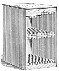
CHASE CABINET.
It is the business of the locker-up to ascertain whether all the pages are of equal length; and, though a defect in this[232] respect is highly reprehensible in the maker-up, (whose duty it is to rectify it,) yet, if not previously discovered by the locker-up, and an accident happen, he must make good the defect.
The compositor who imposes a sheet must correct the alterations in that sheet. He must also rectify any defect in the register arising from want of accuracy in the furniture.
Forms sometimes remain a considerable length of time before they are put to press. In this case, particularly in summer, the furniture is likely to shrink, and the pages may fall out. It is therefore the business of the locker-up to attend to it in this respect, or he will be subject to make good any accident which his neglect may occasion.
When forms which have been worked off are ordered to be kept standing, they are considered under the care of the foreman. When they are cleared away, it is to be done in equal proportions by the companionship. During the time any forms may have remained under the care of the foreman, should there have been any alteration as to form or substance which were not made by the original compositors, they are not subject to clear away those parts of the form thus altered. To prevent dust from settling in the face of the type, it is well to keep the forms in a chase cabinet.
If the pressman unlock a form on the press, and any part of it fall out from carelessness in the locking up, he is subject to the loss that may happen in consequence.
The compositor who locks up a sheet takes it to the proof-press, and, after he has pulled a proof, hands it, together with the foul proof, to the reader, and deposits the form in a place appointed for that purpose.
TRANSPOSITION OF PAGES.
Each person in the companionship must lay down his pages properly on the stone for imposition. The compositor whose turn it is to impose looks them over to see if they are rightly placed. Should they, after this examination, lie improperly, and be thus imposed, it will be his business to transpose them; but, should the folios be wrong, and the mistake arise from this cause, it must be rectified by the person to whom the matter belongs. Pages without folios or head-lines, laid down wrongly for imposition, must be rectified by the person who has been slovenly enough to adopt this plan.
RULES AND REGULATIONS TO BE OBSERVED IN A PRINTING-OFFICE.
Compositors are to receive their cases from the foreman or his assistant, free from all pi or improper sorts, with clean quadrate and space boxes, both Roman and Italic, which they are to return to him in equally good condition.
2. When a compositor receives letter, furniture, &c. from the foreman, he is to return any portion not used, in as good state as he received it, the same day.
3. When a case is taken out of the rack, the compositor is to return it into the proper place immediately after he has done with it.
4. No cases to be placed over others, or under the frames, or on the floor.
5. Compositors are to impose their matter and pull a proof as soon as made up, unless directed otherwise, and to correct the proof without unnecessary delay.
6. The proof, when pulled, to be given to the reader, the copy in regular order to accompany the first proof, and the foul proof the second.
7. Compositors are not to leave either type or furniture on the stone.
8. A compositor is not to detain an imposing-stone longer than the nature of the business may require.
9. Head-lines, or other useful materials, on galleys, used during the course of a work, to be cleared away as soon as the work is finished.
10. When a work is done, the compositor, before beginning another work, unless otherwise directed, is to clear away the forms, taking from them the head-lines, white-lines, and odd sorts, as well as the leads and reglets; which, with the furniture of each sheet, and the matter properly tied up for papering, are to be given to the foreman.
11. Types dropped on the floor to be picked up at once. Matter broken by accident to be cleared away on the same day.
12. The saw, saw-block, bowl, sponge, letter-brush, shears, bellows, &c., to be returned to their respective places as soon as done with.
13. Letter-boards, windows, frames, &c., to be kept free from pi.
14. No person to take sorts from the cases of another without leave, nor hoard useful sorts, not wanting or likely to want them.
15. Compositors employed by the week to work not less than ten hours per day.
16. Unnecessary conversation to be avoided.
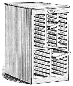
GALLEY CABINET.
THE PRESS AND ITS WORKING.
HISTORY OF THE PRESS.
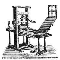
OLD COMMON PRESS.
While poets and orators have expatiated on the glory and power of the press, rulers have exhausted their cunning in attempts to curb and regulate the art of which it is the symbol. Hedged in by arbitrary restrictions, it is not wonderful that printing was long carried on with clumsy implements. The earliest press resembled a screw-press, with a contrivance for running the form of types under the point of pressure. After the impression was taken, the screw was relaxed, and the form withdrawn and the sheet removed.
This rude press continued in general use till 1620, when Willem Jansen Blaeu, at first a joiner and afterward a mathematical instrument maker of Amsterdam, contrived a press in which the bed or carriage was brought under the point of pressure by moving a handle attached to a screw hanging in a beam with a spring, the spring causing the screw to fly back as soon as the impression was given. This movement was afterward effected by means of a double strap or belt, two ends of which were attached to an axle, and the others to opposite ends of the bed. The platen was so small that two pulls were necessary to print one side of a sheet, and each sheet, therefore, required four pulls to produce a complete impression.
Adam Ramage, who came from Scotland to Philadelphia about 1790, and who for a long time was the chief press-builder in the United States, made some improvements in the old press, one of which was the substitution of an iron bed for the stone one before in use.
About the year 1800, Earl Stanhope contrived a press which obtained much notoriety. It was constructed of iron, and of a size sufficient to print the whole surface of a sheet, and such a combined action of levers was applied to the screw as to make the pull a great deal less laborious to the pressman.
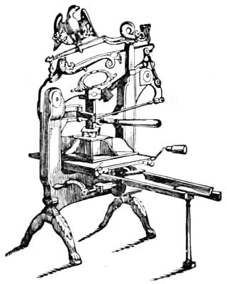
COLUMBIAN PRESS.
The Stanhope press, however, was soon surpassed by the Columbian press, invented by George Clymer, of Philadelphia. Mr. Clymer, as early as 1797, endeavoured to improve the common wooden press. His next efforts were directed to the production of an iron press, till finally eminent success was the result of his labours. In beauty, durability, and power, as well as facility of pull, the Columbian press stands perhaps unsurpassed. The power in this press is procured by a long bar or handle acting upon a combination of exceedingly powerful levers above the platen; the return of the handle or levers being effected by means of counterpoises or weights.[237] The powerful command which the leverage enables the workman to exercise is favourable to delicacy and exactness of printing,—his arm feeling, as it were, through the series of levers to the very face of the types. The inventor removed to England in 1817, and introduced the press there, where it has long been held in high estimation.
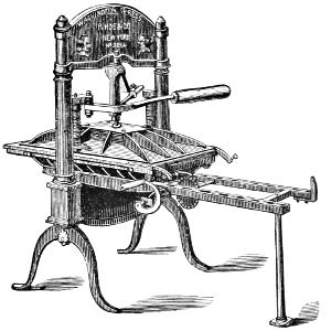
WASHINGTON PRESS.
In the United States, presses of simpler construction have displaced the imposing Columbian press,—the first of which was invented by Peter Smith, of New York, and the latest is Samuel Rust’s Washington press, which has secured general approbation and adoption, as being more simple and cheaper, if not more effective, than the Columbian press. Hand-presses are now restricted to country papers of small circulation, and to book-offices devoted to extra fine printing.
The bed-and-platen power-press invented by Isaac Adams, of Boston, was for a considerable time the only machine-press capable of producing fine work and exact register. It will give from six to eight thousand impressions per day. As the platen rolls off and leaves the bed entirely exposed, forms can be made ready with great facility. The sheets are[238] taken from the feed-board by fingers, and, after being printed, are laid in a pile by a self-acting sheet-flyer.
The Cylinder press, which may be run at a much higher rate of speed than the bed-and-platen machine, was of earlier invention. Frederick König, a Saxon, early in the present century turned his attention to cylinder printing, and was so successful that on November 28, 1814, the London Times announced the fact that the number issued on that day had been printed by machinery propelled by steam. The earliest suggestion of a cylinder press is due, however, to William Nicholson, of England, who, in 1790 took out a patent for such a machine, but it was never perfected. According to Mr. Isaiah Thomas, a Dr. Kinsley, of Connecticut, afterward produced a press varying somewhat from Nicholson’s.
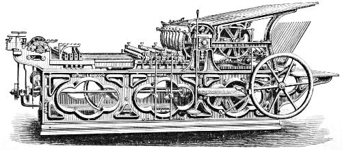
STOP CYLINDER PRESS.
In 1818, Applegath and Cowper made important improvements[239] in König’s press, which greatly enlarged its field of usefulness. This machine, with various modifications and improvements, is in general use in Europe and America, for newspapers of moderate circulation, and even for fine job and book work, as entirely accurate register can now be secured on the new cylinder presses of the best makers, such as Hoe & Co.,[17] Cottrell & Babcock, Campbell, and others. The stop cylinder press (the latest improvement) is particularly well adapted for fine printing.
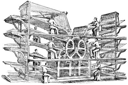
HOE’S TYPE-REVOLVING MACHINE—SIDE VIEW.
The invention of steam printing presses rendered books and periodicals so cheap that the progress of knowledge was amazingly accelerated; and soon the capacity of the cylinder press proved unequal to the work of printing the enormous editions of some of the leading newspapers of the world; and the first successful invention to meet the exigency was[241] made by Col. Richard M. Hoe, of New York, in the Type-Revolving Printing Machine, of which we give an engraving. It is, as its name indicates, on the rotary principle; that is, the form of type is placed on the surface of a horizontal revolving cylinder of about four and a half feet in diameter. The form occupies a segment of only about one-fourth of the surface of the cylinder, and the remainder is used as an ink-distributing surface. Around this main cylinder, and parallel with it, are placed smaller impression cylinders, varying in number from four to ten, according to the size of the machine. The large cylinder being put in motion, the form of types is carried successively to all the impression cylinders, at each of which a sheet receives the impression of the types as the form passes. Thus, as many sheets are printed at each revolution of the main cylinder as there are impression cylinders around it. One person is required at each impression cylinder to supply the sheets of paper, which are taken at the proper moment by fingers or grippers, and after being printed are carried out by tapes and laid in heaps by means of self-acting flyers, thereby dispensing with the hands required in ordinary machines to receive and pile the sheets. The grippers hold the sheet securely, so that the thinnest newspaper may be printed without waste.
The ink is contained in a fountain placed beneath the main cylinder, and is conveyed by means of distributing rollers to the distributing surface on the main cylinder. This surface being lower, or less in diameter, than the form of types, passes by the impression cylinder without touching. For each impression there are two inking rollers, which receive their supply of ink from the distributing surface of the main cylinder: they rise and ink the form as it passes under them, after which they again fall to the distributing surface.
This press is capable of printing either from type or from stereotype plates bent to fit the curve of the cylinder. When type is used, each page of the paper is locked up on a detached segment of the large cylinder, which constitutes its bed and chase. The column-rules run parallel with the shaft of the cylinder, and are consequently straight; while the head, advertising, and dash rules are in the form of segments of a circle. The column-rules are in the form of a wedge, with the thin part directed toward the axis of the cylinder, so as to bind the[242] type securely. These wedge-shaped column-rules are held down to the bed by tongues projecting at intervals along their length, which slide in rebated grooves cut crosswise in the face of the bed. The spaces in the grooves between the column-rules are accurately fitted with sliding blocks of metal even with the surface of the bed, the ends of which blocks are cut away underneath to receive a projection on the sides of the tongues of the column-rules. The form of type is locked up in the bed by means of screws at the foot and sides, by which the type is held as securely as in the ordinary manner upon a flat bed,—if not even more so. The speed of these machines is limited only by the ability of the feeders to supply the sheet.
This machine was first used by the Public Ledger of Philadelphia, and was afterward adopted by the leading newspapers of that city and New York, as well as of the chief cities of Great Britain and other countries.
To obtain the best results from the largest size of this press it was necessary to employ a dozen or more hands to feed and run it. This expensive feature was largely avoided in a new machine projected by Mr. William Bullock, whose press was the forerunner of several machines that may be classed under the general name of Self-feeding or Web Perfecting Presses.
THE BULLOCK WEB PERFECTING PRESS.
This machine is intended for printing on a continuous roll of dampened paper, which passes between a pair of cylinders (one of which is an impression cylinder, and the other a cylinder around which stereotyped plates are bent) and receives an impression on one side, and the sheet then goes forward and is printed on the other side while passing between a second pair of cylinders similar to the first, except that the impression cylinder is four times the diameter of the plate cylinder to prevent more effectually the ink from “setting off.” After being printed, and before delivery, the sheet is cut off by a fixed serrated cutting blade, the ingenious invention of Victor Beaumont of New York. A French device for making flexible papier-maché moulds rendered it possible to cast the type-plates to fit the printing cylinders.[243] Without this auxiliary, web perfecting presses would have been useless and impracticable.
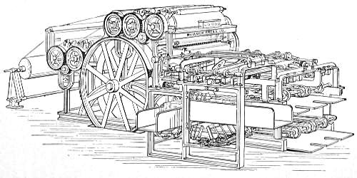
THE BULLOCK SELF-FEEDING PERFECTING PRESS, WITH FOLDER,
WILL FLY THE SHEET FLAT, FOLD IT THREE OR FOUR TIMES AT WILL, OR CUT, FOLD, AND PASTE IT AS FAST AS PRINTED
Mr. Bullock, born in Greene County, New York, was a mechanical genius, and was the author of many inventions in[244] various departments of machinery.[18] About the year 1860, he began to work out the idea of a rotary self-feeding, or web perfecting press. After making a large working model, which is still in existence, he adopted a simpler plan, and in 1861 constructed a machine for the Cincinnati Times, which was successfully operated, but it was far from perfect. Three of these machines were used for a considerable time in the office of the Philadelphia Inquirer.
He continued his efforts, and in 1865 he produced a press which met his original anticipation, and a company was formed to manufacture it. In 1867, while setting up a machine for the Public Ledger in Philadelphia, he suffered a serious injury which terminated his life. More than fifty of the presses are now in use in the United States. The New York Herald press, printing and cutting two copies at each delivery, is said to produce, with but three men to attend to it, 30,000 copies per hour. The New York Sun states: “When our seven Bullock Presses are working, we can turn off, without extravagant assertion, 210,000 copies an hour.” This assertion must be taken with some grains of allowance. The press is twelve feet long by five and a half feet wide.
THE WALTER PERFECTING PRESS.
The Bullock press was not long allowed to be the only press for rapid printing from cylindrical stereotype plates fed by a so-called endless roll of paper. The principle was applied to a machine constructed in the London Times office, called, after the name of its celebrated proprietor, the Walter press. This appears to be an effective press, but it seems more complicated than either the Bullock or Hoe machine, and from its mode of delivering the sheets, it is excessively noisy. The New York Times was printed on it at the Centennial Exhibition in Philadelphia.
THE HOE PERFECTING PRESS.
The enterprise of R. Hoe & Co., of New York, soon gave birth to a web perfecting press combined with a folding machine that answers every requirement.
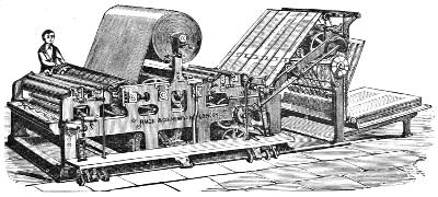
THE HOE WEB PERFECTING PRESS.
The groundwork principle is the same as in other presses of this kind. The first pair of cylinders over which hangs the roll of paper consists of one type and one impression cylinder, and by it the first side of the paper is printed. The second pair, printing the second side, consists likewise of one type and one impression cylinder, but the latter is below the former and is of much greater size, so that the “set off” from the fresh ink shall not fall continuously on the same surface of blanket. There is a third pair of cylinders which cuts off the sheet, and a fourth (in which, however, one cylinder is replaced by a brace of rollers) gives the first fold and shoots the doubled sheet in the circular cutter, which slits it into two papers, sending them on to be folded again separately and delivered in their respective places in piles at the side of the press; or the papers are rolled up exactly on the top of each other, six in number, and flown perfectly on the fly-board.
This machine printed and folded at the rate of more than 28,000 sheets an hour at the Centennial Exhibition, printing and folding at one time two copies of the Philadelphia Times.[246] It is already in use in a dozen newspaper establishments in various parts of the world.
All these machines were in operation at the great Centennial Exhibition in Philadelphia. A fourth press exhibited,—claimed by its inventor, Mr. A. Campbell of New York, to be capable of printing much faster than any other,—was set up too late to prove its capacity by actual test. No press however, can be made more simple and with fewer parts than this.
RAILROAD-TICKET PRINTING AND NUMBERING PRESS.
These presses not only print, but at the same operation number consecutively, tickets and coupons of every size and pattern, which are also indented or cut apart by the machines as fast as printed. Ten local tickets twenty-six inches in length can be printed at one operation. The average rate of speed is about fourteen hundred impressions an hour,—equivalent to fourteen thousand tickets.
JOB PRESSES.
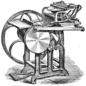
GORDON’S FRANKLIN PRESS.
The invention of machines for printing small work elegantly as well as swiftly is of vast advantage to the printer, and has greatly increased the jobbing department of typography. Here, as in other matters, American ingenuity has taken the lead of all nations; and the presses invented by Ruggles, Hoe, Gordon, Degener, Wells, and Gally,—not to mention numerous other inventors,—defy competition. The Ruggles presses[247] formerly commanded the trade; but the beautiful machines of Geo. P. Gordon, a man of decided genius, and the presses of other makers above named, have entirely displaced them. Hoe’s half medium cylinder job press will run 2500 impressions an hour.
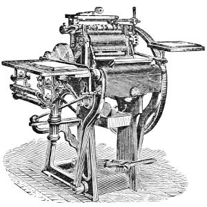
NONPAREIL PRESS.
Gordon’s Firefly press is unique, and requires a so-called endless card-board, which it prints and cuts of the required shape as it goes, at the rate of about ten thousand per hour. This is not in general use; but his eighth medium, quarto medium, and half medium Franklin presses, have achieved a high reputation for expedition and excellent performance. Gordon’s Franklin press has been reproduced in Europe under a different name.
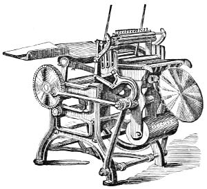
LIBERTY PRESS.
We here present an engraving of another press which has achieved not a little reputation. It is called the Liberty press, and is manufactured by Degener & Weiler, of New York. In sizes as well as in prices, it corresponds with the Franklin. This press also is manufactured in Europe.
The Nonpareil, the Globe, the Peerless, and the Universal job presses all have special points which commend them to favour. Indeed, with so many good machines at the command of the printer, he is without excuse who does not produce handsome work.
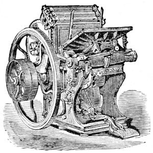
UNIVERSAL PRESS.
What are called amateur presses may do well enough to amuse the boys of a family and keep them out of mischief; but when they are employed by fledgelings in competition with properly trained printers, they become mere paper-smearers, the work produced on them being simply detestable to an educated eye.
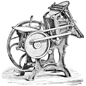
PEERLESS PRESS.
FOLDING MACHINES.
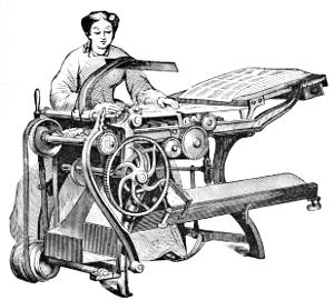
BOOK-FOLDING MACHINE.
Book and Newspaper Folders are entitled to a high rank among modern labour-saving machines. For newspapers of large circulation and in book establishments they have become indispensable. The finest books may be folded by them with accuracy, speed, and economy; and periodicals can be folded, pasted, and covered at about one-fourth the cost of hand-folding alone; while the daily folio newspaper can be folded in two, three, or four folds as fast as the machine press can print; or an eight-page daily or weekly can be folded three or four times, and all the pages pasted together at the back fold, and the head margin trimmed. All these processes are successfully accomplished by the various machines made by Chambers, Brother & Co. of Philadelphia. The engraving given above represents a book-folding machine.
SETTING UP A WASHINGTON PRESS.
All the connecting parts being marked, or indented by points, if these be observed carefully, the press may be put together without difficulty.
After setting the frame upon its legs, and putting on the ribs and bed, lay the platen on the bed, placing under it two bearers about type high. Then put the springs in their places, and the nuts over them, and pass the suspending-rods through them, observing to place the rods so that the number of indentations on them correspond with those on the platen. Give the nuts two or three turns, then run in the bed so as to bring the platen under the rods, and screw them fast to the platen; after which, put in the bar-handle, standard, and lever, (or wedge and knees, if a Smith press.) Turn the nuts on the suspending-rods, so as to compress the springs just enough to give the platen a quick retrograde motion, observing at the same time to get the surface of the platen parallel with the surface of the bed.
After having put the press together and levelled it by means of a spirit-level, be particular not to raise the end of the ribs by the gallows, but let it go under rather loose, which will have a tendency to make the bed slide with more ease on the ribs.
SETTING UP THE ROLLER-STAND.
The roller-stand containing the distributing cylinder should be regulated to the height of the press, bringing the shelf or bridge even with the corner irons, and at sufficient distance from the bed to allow it to run clear; the stand should then be firmly braced, as the constant turning of the rounce is very apt to loosen it; meanwhile being cautious to observe that the rounce, in its revolutions, does not come in contact with the frame of the tympan when up. The position of the distributing cylinder should be sufficiently high to allow the two composition rollers, at least one inch apart, to rest on its top without danger of touching the shelf or bridge in front. It is advantageous to nail two narrow strips of sole leather on the face of the shelf, about eight or ten inches from each[251] end, which, acting as bearers, cause the rollers to pass very smoothly over them.
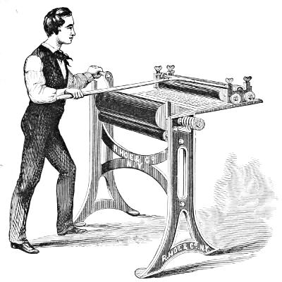
ROLLER STAND.
The roller-handle while in use should lie in a horizontal position, the back end being supported by a bar of wood or iron running parallel with the distributing cylinder. There should be a notch, or hook, about two inches from the end of the handle, to catch on the wooden supporter, to prevent the rollers from jumping forward while distributing or changing. It is also necessary to have a back-board for the end of the roller to strike against in coming off the form, to prevent the rollers from falling backward.
The ink-block is placed about five or six inches to the right of the roller-handle, and about on a level with it. It is furnished with the ink-slice, and a brayer, or a small roller about four or five inches long, and of the same circumference with the larger rollers, being cast in the same mould.
COMPOSITION ROLLERS.
Put the glue in a bucket or pan, and cover it with water; let it stand until more than half penetrated with water, taking care that it shall not soak too long, and then pour it off and let it remain until it becomes soft, when it will be ready for the melting kettle. This is a double vessel, like a glue kettle. Put the soaked glue into the inner vessel, and as much water in the outer boiler as it will contain when the inner vessel is placed in it. When the glue is all melted, (if too thick, add a little water,) the molasses may be slowly poured into it, and well mixed with the glue by frequent stirring. When properly prepared, the composition does not require boiling more than an hour. Too much boiling candies the molasses, and the roller, consequently, will be found to lose its suction much sooner. In proportioning the material, much depends upon the weather and temperature of the place in which the rollers are to be used. Eight pounds of glue to one gallon of sugar-house molasses, or syrup, is a very good proportion for summer-time, and four pounds of glue to one gallon of molasses for winter use. Glue for rollers should be clear and bright in body, and even in texture, when held up to the light: it should break short, and with a clear, sharp edge like glass.
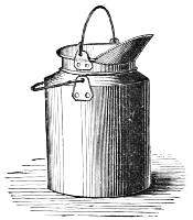
MELTING KETTLE.
For hand-press rollers more molasses should be used, as they are not subject to so much hard usage as cylinder-press rollers, and do not require to be as strong; for the more molasses that can be used the better will be the roller. Before pouring a roller, the mould should be perfectly clean, and well oiled with a swab, but not to excess, as too much oil makes the face of the roller seamy and ragged. The end pieces should then be oiled, and, together with the cylinder, placed in the mould, the upper-end piece being very open, to[253] allow the composition to pass down between the interior of the mould and the cylinder. The cylinder must be well secured from rising, before the composition is poured in, by placing a stick upon the end of it, sufficiently long to reach above the end of the mould, and be tied down with twine. The composition should be poured very slowly, and in such a manner as to cause it to run down only one side of the cylinder, allowing the air to escape freely up the other.
If the mould is filled at night, the roller may be drawn the next morning; but it should not be used for at least twenty-four hours after, except in very cold weather.
To determine when a roller is in order for working, press the hand gently on it: if the fingers pass smoothly over its surface, it may be said to be in order; but should it be so adhesive that the fingers cling to it, it is not sufficiently dry, and should be exposed to the air.
Rollers should not be washed immediately after use, but should be put away with the ink on them, as it protects the surface from the action of the air. When washed and exposed to the atmosphere for any length of time, they become dry and skinny. They should be washed about half an hour before using them. In cleaning a new roller, a little oil rubbed over it will loosen the ink: and it should be scraped clean with the back of a case-knife. It should be cleaned in this way for about one week, when ley may be used. New rollers are often spoiled by washing them too soon with ley. Benzine may be substituted for oil; but, owing to its combustible nature, it is objectionable, as disastrous accidents have ensued from its use.
Mr. Hansard, an eminent English printer, says, “Take glue, made from the cuttings of parchment or vellum, fine green molasses, pure as from the sugar-refiners, and a small quantity of the substance called Paris-white, and you will have every ingredient requisite for good composition. The proportion as follows:—
- Glue, 2 lbs.
- Molasses, 6 lbs.
- Paris-white, ½ lb.
Put the glue in a little water for a few hours to soak; pour off the liquid; put the glue over the fire, and when it is dissolved add the molasses, and let them be well incorporated together for at least an hour; then, with a very fine sieve, mix the[254] Paris-white, frequently stirring the composition. In another hour, or less, it will be fit to pour into the mould.”
Various patented compositions for rollers may now be had from type-founders.
COVERING TYMPANS.
Tympans are generally covered with parchment, which should be of an even thickness, and about two inches and a half wider and three inches longer than the tympans. Tympans have been sometimes covered with linen, which, on account of its evenness, would answer the purpose; but it is so apt to stretch, that the tympans become slack in a short time, and bag (as it is termed), and thus slur the impression. Silk is excellent for fine work.
The pressman spreads as much good paste on the edges of the skin as will cover the frame of the tympan, which is also well pasted. He then lays the skin on the inner side of the frame, with the flesh side to face the type, and draws it regularly, as tight as possible, on all sides. The part of the skin that comes on the grooves of the tympan which receive the point-screws, is cut and wrapped round the inside edge of the grooves, which admits a free passage for the screws. After having fastened the skin on the sides of the tympan, he draws it toward the joints which receive the frisket, and with a knife cuts across these joints to let them through the skin; he then puts the frisket-pins through the parchment, and makes that end of the tympan fast. He next proceeds to the lower joints, and brings the skin as tight as he can round that part of the tympan. The point-screws and duck-bill are then put on, which prevent the skin from starting. The inner tympan, or drawer, is covered in the same manner. To prevent their warping when the skin begins to draw, pieces of furniture or wood of any kind should be placed across the centre till they are perfectly dry.
The skins are put on either wet or dry: if dry, they should be afterward well wet, which will make them give somewhat; but when they dry they will contract, and by this means will be rendered much tighter than they would be if put on wet.
WETTING PAPER.
The size of the wetting-trough should be about two inches longer and wider than the largest-sized paper, folded, that is to be wet in it, and about six inches deep. It should have a cover with hinges on the left side, that the cover may fall over on that side, and, resting horizontally, serve for a shelf to lay the paper upon previous to wetting it.
Having received a certain amount of paper from the warehouseman, the pressman lays one heap on the shelf attached to the wetting-trough, laying the first token across the heap with the back of the quires toward his right hand, that he may know when to turn the token-sheet, and that he may more readily catch at the back of each quire with that hand, for the purpose of dipping it. He then places the paper-board with its breadth before him on his right, on a table, laying a wrapper or a waste sheet of paper on the board, to prevent soiling the first sheet of the heap.
He then takes a quire by the centre of the back with his right hand, and the edge of it in his left, and, closing his hands a little, that the quire may bend downward between his hands, he dips the back of the quire into the left-hand side of the trough, and, relinquishing his hold with the left hand, draws the quire briskly through the water with his right. As the quire comes out, he quickly catches the edge of it again in his left hand, and brings it to the heap, and, by lifting his left hand, bears the under side of the quire off the paper previously laid down, till he has placed the quire in an even position; if the paper be weak and spongy, he draws the quire through the water quickly; if strong and stubborn, slowly. To place the quire in an even position, he lays the back of it exactly upon the open crease of the former, and then lets the side of the quire in his left hand fall flat down upon the heap, and, discharging his right hand, brings it to the edge of the quire, and, with the assistance of his left thumb, still in its first position, opens or divides either a third or a half of the quire, according to the quality of the paper; then, spreading the fingers of his right hand as much as he can through the length of the quire, turns over his opened division of it upon his right-hand side of the heap.
A different process must be used in the wetting of drawing[256] and plate papers. These papers are usually sent in quite flat; that is, not folded into quires or half-quires. The best method of wetting these papers is to use a brush, such as is called a banister brush; and, instead of dipping the paper into the trough, he lays it on the paper-board by the side of the trough, and, dipping the brush into the water, he shakes it gently over the whole surface, to give an equal degree of moisture to all parts; and then proceeds as before described. The drawing-paper, being very hard-sized in the making, will require the brush, and much water, three, four, or even five times a quire; while the plate-paper should have as little water as it is possible to give it, so as to cover it all over; and twice a quire will often be too much. This same mode must also be adopted in wetting paper of extraordinary dimensions.
Having wet his first token, he doubles down a corner of the upper sheet of it on his right hand, so that the farther corner may be a little toward the left of the crease in the middle of the heap, and the other corner may hang out on the near side of the heap about an inch and a half. This sheet is called the token-sheet, being a mark for the pressman, when he is at work, to show how many tokens of that heap are worked off.
Having wet the whole heap, he lays a wrapper, or waste sheet of paper, upon it; then, three or four times, takes up as much water as he can in the hollow of his hand, and throws it over the waste sheet, to moisten and soak downward into the wet part of the last division of the quire; after which, he places in the heap the label which the warehouseman must always furnish for each heap, and upon which are written the title of the work and the date of wetting, one-half hanging out so as to be easily read.
The paper should be pressed for twelve hours, and then carefully turned by each three or four sheets, so that no lift be relaid in the same position with respect to the adjoining lift; at the same time, every fold and wrinkle must be carefully rubbed out by the action of the hand, so that nothing but a flat and even surface shall remain; the heap should then be pressed for about twenty-four hours in a screw-press, and it will be in good order for working.
The wetting of paper must, in all cases, depend entirely upon its fabric; and, since the printer has seldom the choice of the paper, it will require all his skill and patience to adapt[257] his labours to the materials upon which he is to work. The texture of the paper must be suited to the fineness and tenacity of the ink. To attempt doing fine work upon common paper is lost labour. A paper to take the best ink must be made entirely of linen rags, and not bleached by chemicals. A fine hand-made paper, fabricated a sufficient time to get properly hardened, and well and equally saturated with size, so as not to imbibe more water in one part of the dip than in another, nor resisting the water like a duck’s back, is most suitable for fine printing.
Machines for wetting paper are now used in most large printing-offices.
BLANKETS.
Woollen blankets are unnecessary when a book is printed from new type. Nothing more should be used than a sheet or two of paper, as in fine work only the face of the type should show in the impression. But when the types or plates are worn and rounded, fine cassimere or broadcloth should be used in the tympan. In this, as in all matters connected with artistic typography, the pressman must display good judgment and discretion.
MAKING READY A FORM ON A HAND-PRESS.
Before a form is laid on the press, the pressman should carefully wipe the bottom of the type and the bed perfectly clean; for, if a particle of sand remain on it, it will cause a type or two to rise, and not only make a stronger impression, but probably injure the letters.
An octavo form should be laid on the press with the signature-page to the left hand, or nearest the platen; a duodecimo, or its combinations, with the signature at the right hand, or nearest the tympan. The form should be laid under the centre of the platen, and properly quoined up. The tympan is then laid down, and wet if necessary, and paper or blanket put in. It was formerly customary to wet the tympans for all works, and even jobs of almost every description; but, since the introduction of fine printing, and particularly iron presses, the custom is well-nigh banished, excepting for very heavy forms,[258] composed with old letter, which, of course, require more softness to bring them off. After the inner tympan or drawer is put in, it is fastened with the hooks for that purpose, which serve to keep it from springing out. The tympan being lifted up, a sheet of the paper to be worked is folded in quarto, and the short crease is placed over the middle of the grooves of the short cross, if it lie in the centre of the form, as in octavo. In a form of twelves, the paper is folded in thirds, and the long crease placed in the middle of the long cross, and the short cross over the grooves. The sheet lying evenly on the form, the tympan is brought down, and a gentle pull will cause the paper to adhere, when it should be pasted to the tympan and fully stretched. The points are next screwed to the tympan, for large paper short-shanked points being used, and long-shanked for small paper. In twelves, the points must be placed at precisely equal distances from the edge of the paper. In octavo, the off-point may be a little larger than the near one, as it enables the pressman to detect a turned heap when working the reiteration or second side.
When a press is continued upon the same work, the quoins on the off-side of the bed may remain and serve as gauges for the succeeding forms; for, if the chases are equal in size, the register will be almost, if not quite, perfect.
The following operations are comprised in the term of making ready the form:—
1. The frisket should be covered with stout even paper, in the manner described for putting on parchment, the paper being carefully placed on the inside of the frame so as to lie close to the tympan, and to confine the sheet in its place when laid on for printing. When the paste is dry, the frisket is put on the tympan, and, after inking the form, an impression pulled upon it. The frisket is then taken off and laid on a board, or on the bank, and the impression of the pages cut out with a sharp knife about a Pica em larger than the page. After being replaced on the tympan, it is advisable to put a few cords across, to strengthen the bars of paper, and to keep the sheets close to the tympan. When the margin is too small to admit bars of paper, it is necessary to work with cords only.
2. The form should be examined, to see that it is properly locked up and planed down; that no letters or spaces lie in the white lines of the form, nor between the lines in leaded matter.
3. White pages which occur in a form must not be cut out; but, if the page be already cut out, a piece of paper must be pasted on the frisket, to cover the white page in the form, and a bearer put on to keep the adjoining pages from having too hard an impression. Some pressmen use reglets, others furniture cut to a proper height, and a third class adopt cork, which, from its elasticity, is very useful. Spring bearers, made of hard paper rolled up, are also employed to guard the sides and bottoms of light and open pages, when there is an inclination to slur.
4. The pressman must examine whether the frisket bites; that is, whether it keeps off the impression from any part of the pages.
5. He must consider whether the catch of the frisket stands either too far forward or backward: if forward, he may be much delayed by its falling down, and, if backward, it will come down too slowly, and thus retard the progress of the work and not unfrequently cause the sheet to slip out of its proper place. He must, therefore, place the catch so that the frisket may stand a little more than perpendicularly backward, that, when lightly tossed up, it may just stand, and not come back.
6. He must fit the gallows so that the tympan may stand as much toward an upright as he can; because it is the sooner let down upon the form and lifted up again. But yet he must not place it so upright as to prevent the white sheets of the paper from lying secure on the tympan.
7. The range of the paper-bank should not stand at right angles with the bed of the press; but the farther end of the bank should be placed so that the near side may make an angle of about seventy-five degrees with the near side of the bed.
8. The heap of paper should be set on the horse on the near end of the paper-bank, near the tympan, yet not touching it. The uppermost or outside sheet should be laid on the bank; and the pressman then takes four or five quires off his heap, and shakes them at each end, to loosen the sheets, till he finds he has sufficiently loosened or hollowed the heap. Then, with the nail of his right-hand thumb, he draws or slides forward the upper sheet, and two or three more commonly follow gradually with it, over the hither edge of the heap, to prepare those sheets ready for laying on the tympan.
9. He must next pull a revise sheet, which must be sent up to the overseer for a final revision, and for examining whether any letters have dropped out of the form in putting it on the press, &c.
10. While the sheet is undergoing a revision, the pressman should proceed to make register, if half-sheet-wise, which is done by pulling a waste sheet, and turning it, (without inking, as the sheets may afterward be used for slip sheets,) being particular not to stretch the point-holes in the least, or to draw the hand along the sheet in leaving it. In making register, the points must be knocked up or down in such a direction as will bring the first impression under the last, knocking the point only half the distance apparent on the sheet. If register cannot be made with the points, the difficulty must then be either in the furniture, the length of the pages, or in the springing of the cross-bars, from the forms being locked up by careless compositors, who commence at one quarter of the form, and lock it up tightly, and so go around, instead of gently tapping it at opposite sides till the whole is equally tightened. In locking up a form, the quoins at the feet should be gently struck first, to force up the pages and prevent their hanging; but, in unlocking, the side quoins must be first slackened.
Altering the quoins will not make good register, when the compositor has not made the white exactly equal between all the sides of the crosses. The pressman, therefore, will ascertain which side has too much or too little white, and, unlocking the form, will take out or put in as many leads or reglets as will make good register.
PULLING.
In taking a sheet off the heap, the pressman places himself almost straight before the near side of the tympan, but nimbly twists the upper part of his body a little backward toward the heap, the better to see that he takes but one sheet off. This he loosens from the rest of the heap by drawing the back of the nail of his right thumb quickly over the bottom part of the heap, and, receiving the near end of the sheet with his left-hand fingers and thumb, catches it by the farther edge with his right hand, about four inches from the upper corner[261] of the sheet, and brings it swiftly to the tympan: having the sheet thus in both his hands, he lays the farther side and two extreme corners of the sheet down even upon the farther side and extreme farther corners of the tympan-sheet. In the reiteration, care should be taken to draw the thumb on the margin, or between the gutters, to avoid smearing the sheet. The sheet being properly laid on, he supports it in the centre by the fingers of the left hand, while his right hand, being disengaged, is removed to the back of the ear of the frisket, to bring it down upon the tympan, laying at the same moment the tympan on the form. He then, with his left hand, grasps the rounce, and quickly runs the form under the platen; and, after pulling, he gives a quick and strong pressure upon the rounce, to run the carriage out again. Letting go the rounce, he places the fingers of his left hand toward the bottom of the tympan, to assist the right hand in lifting it up, and also to be ready to catch the bottom of the sheet when the frisket rises, which he conveys quickly and gently to the catch: while it is going up, he slips the thumb of his left hand under the near lower corner of the sheet, which, with the aid of his two forefingers, he raises, the right hand at the same time grasping it at the top in the same manner. Lifting the sheet carefully and expeditiously off the points, and nimbly twisting about his body toward the paper-bank, he carries the sheet over the heap of white paper to the bank, and lays it down upon a waste sheet or wrapper; but, while it is coming over the white paper heap, though he has the sheet between both his forefingers and thumbs, yet he holds it so loosely that it may move between them as on two centres, as his body twists about from the side of the tympan toward the side of the paper-bank.
When the pressman comes to a token sheet, he undoubles it, and smooths out the crease with the back of the nails of his right hand, that the face of the letter may print upon smooth paper; and, being printed off, he folds it again, as before, for a token-sheet, when he works the reiteration.
Having worked off the white paper of a form of twelves, he places his right hand under the heap, and, his left hand supporting the end near him, turns it over on the horse, with the printed side downward. If the form be octavo, he places his left hand under the heap, supporting the outside near end with[262] his right hand, and turns it one end over the other. All turning of the paper for reiteration is treated in one of these modes. In performing this operation, he takes from the heap only as much at once as he can well handle without disordering the evenness of the sides of the paper.
Having turned the heap, he proceeds to work it off, as before described, except that with the left hand he guides the point-holes over the points, moving the sheet with the right hand, more or less, to assist him in so doing. The token-sheets, as he meets with them, he does not fold down again.
RULES AND REMEDIES FOR PRESSMEN.
About every five or six sheets a small quantity of ink should be taken; yet this rule is subject to some variation from the nature of the work and quality of the ink. A form of large type or solid matter will require ink to be taken more frequently, and a light form of small type less frequently. During the intervals in which the roller-boy is not employed in brayering out or taking ink, he should be almost constantly engaged in distributing or changing his rollers. He should invariably take ink on the back roller, as it will the sooner be conveyed to the other roller, and, consequently, save time in distributing. When, through carelessness, too much ink has been taken, it should be removed by laying a piece of clean waste paper on one of the rollers, and working it off till the ink is reduced to the proper quantity.
If letters, quadrates, or furniture rise up and black the paper, they should be put down, and the quarter locked up tighter.
If any letters are battered, the quarter they are in must be unlocked, and perfect ones put in by the compositor.
When bearers become too thin by long working, they should be replaced by thicker ones.
When the form gets out of register,—which will often happen by the starting of the quoins which secure the chase,—it must be immediately put in again, as there can scarcely be a greater defect in a book than the want of uniformity in this particular.
If picks, produced by bits of paper, composition, or film of ink and grease or filth, get into the form, they must be removed with the point of a pin or needle; but if the form is[263] much clogged with them, it should be well rubbed over with clean ley, or taken off and washed: in either case, before the pressman goes on again, it should be made perfectly dry by pulling several waste sheets upon it, in order to suck up the water deposited in the cavities of the letter.
The pressman should accustom himself to look over every sheet as he takes it off the tympan: he will thus be enabled not only to observe any want of uniformity in the colour, but also to detect imperfections which might otherwise escape notice.
In order to make perfect uniformity in the colour, the roller-boy should keep his ink well brayered out with the small roller, in proper quantities for the work in hand, and also should change his rollers well after taking ink, and at other times. The rollers are changed by moving the roller-handle slowly to the right and left, while the crank is being turned briskly with the left hand.
Torn or stained sheets met with in the course of work are thrown out and placed under the bank. Creases and wrinkles will frequently appear in the sheets when the paper has been carelessly wet: these should be carefully removed by smoothing them out with the back of the nails of the right hand.
If the frame of the tympan rub against the platen, it will inevitably cause a slur or mackle: this can easily be remedied by moving the tympan so as to clear the platen. The joints or hinges of the tympan should be kept well screwed up, or slurring will be the consequence. When the thumb-piece of the frisket is too long, it always produces a slur: this can be prevented by filing off a part of it. Loose tympans will at all times slur the work, and great care must therefore be observed in drawing them perfectly tight. The paper drying at the edges will also cause a slur: this may be remedied by wetting the edges frequently with a sponge.
Slurring and mackling will sometimes happen from other causes: it will be well in such cases to paste corks on the frisket, or to tie as many cords as possible across it, to keep the sheet close to the tympan.
The pressman should make the boy roll slowly, or the rollers will be apt to jump, and cause a friar. To prevent the rollers from jumping or bounding, bridges or springs made of thin steel, to reach across the gutters, may be used: these[264] springs should taper off at the ends, and having an oblong hole in each end, through which they may be tacked to the gutter-sticks. In very open forms, it may be necessary to put bearers or pieces of reglet where the blank pages occur at the end of the form, to prevent one end of the roller from falling down and leaving a friar at the opposite end. This difficulty may be obviated in a great measure by imposing the form in such a manner as to bring the blank pages in the centre. This mode should always be adopted for title-pages and other light matter.
Before the pressman leaves his work, he covers the heap of paper by first turning down a sheet like a token-sheet, to show where he left off, and then putting a quantity of the worked-off sheets on it, and a paper-board if convenient. Laying the blanket on the heap after leaving off work is a bad custom. If the paper be rather dry, it will be well to put wet wrappers on it, after damping the edges well. If the form be clean, he puts a sheet of waste paper between the tympan and frisket, and lays them down on the form; if it be dirty, it must be rubbed over with clean ley, and several waste sheets pulled on it, as before directed, to suck the dirty ley out of the cavities of the letter. On his return to work in the morning, he takes care to wet the tympan, provided the type be worn. If there should be any pages in the form particularly open, the parts of the tympan where they fall must not be wetted.
THE LEY-TROUGH.
The form being worked off, it is the pressman’s duty to wash it clean from every particle of ink, not only for the cleanly working and well standing of the letter in the subsequent composing, but to save his own time in making ready when the same letter gets to press again. Many an hour is lost from not bestowing a minute or two in thoroughly cleansing and rinsing the form.
For this purpose, printing-offices are provided with a ley-trough, suspended on a cross-frame, and swinging by iron ears fixed somewhat out of the precise centre, so that the gravity of the trough will cause it to fall in a slanting position forward. This trough is lined with lead, the top front edge being guarded from the pitching of the forms by a plate of[265] iron. The form having been placed in the trough, on its side, the pressman takes hold of the rim of the chase by the hook, or instrument for that purpose, and, laying it gently down, pours the ley upon it, and sluices it by swinging the trough on its pivots two or three times to and fro; then, taking the ley-brush, he applies it to the whole form, type, furniture, and chase; the ley is then let out into a receptacle, and the form well rinsed with clean water, by swinging the trough as before; the form is then lifted out, and consigned to the care of the compositor.
The ley is made of pot or pearl ash, or, what is better, of concentrated ley. A large earthen jar is usually chosen for the purpose; a sufficient quantity of ash or concentrated ley is added to the water to make it bite the tongue sharply in tasting.
The ley-brush is made large, the hairs close, fine, and long, in order not to injure the type, while sufficient force is applied to search every interstice in the letter where the ink can have insinuated itself.
MAKING READY ON CYLINDER PRESSES.
Make clean the bed of the press and the impression segment of the cylinder. Adjust the bearers a trifle above ordinary type height. See that the impression screws have an even bearing on the journals, and that the cylinder fairly meets the bearers. Select a suitable tympan or impression surface.
The tympan may be the India-rubber cloth which is furnished with the press, a thick woollen lapping cloth or blanket, several sheets of thick calendered printing paper, or one or more smooth and hard pasteboards. Each of these materials has merits not to be found in any other. Upon the proper selection of the tympan the presswork in great measure depends, and the pressman should be thus guided in making choice.
A pasteboard tympan is most suitable for wood-cuts, for perfectly new type, and for the best kinds of presswork. It is not suitable for miscellaneous work, nor for heavy forms, nor mixed old and new type. If the overlaying is properly executed, a pasteboard tympan will enable the pressman to show a sharper edge and a more delicate impression of the type[266] than can be possible with any other, and it will wear the type less than any other. But it will require a very tedious and careful making ready, or it will prove very destructive to type.
A woollen blanket is best adapted for old stereotype plates, for very old type which has been rounded on the edges, for posters with large wood type, and for all common work which requires a clear but dull impression. For such work a woollen blanket will enable the pressman to make ready a form more quickly than with any other material; but it is injurious to new type, and incapable of producing a fine and sharp impression.
Thick paper is much used for book-work. It also answers well for script circulars and leaded forms. It will not answer so well for mixed old and new type, nor for table-work with unequal heights of brass rule, nor for mixed large and small type. It will prove most serviceable for the average of light and fine presswork.
The India-rubber cloth combines many good qualities not found in other tympans: it has something of the density of the pasteboard, the hardness and evenness of paper, and the flexibility of the blanket, combined with an elasticity peculiarly its own. It will compass a greater variety of work than any other: posters, script circulars, news and book forms, stereotype plates, and old or new type, can all be well printed with an India-rubber blanket. When it is intended to make one tympan answer for all kinds of work, the India-rubber blanket will be found decidedly superior to all others; but when very extra presswork is wanted, the tympan must be specially adapted to the form of type.
There are forms for which none of these tympans are specially suitable. For such cases careful pressmen combine two or more together,—as Welsh flannel over rubber, or thin rubber over pasteboard or under paper. These, however, are exceptional cases, and are only thus combined when very good presswork is wanted from imperfect materials. Careful observation of the quality of the impression given by each style of tympan will teach a pressman how to combine to the best advantage. As it requires experience and discrimination, an arbitrary rule cannot be given.
Whatever may be the material selected, the tympan must be stretched very tightly over the cylinder. All labour in overlaying[267] is but thrown away if this is not carefully attended to. A rubber or woollen blanket can be secured at one end of the cylinder by small hooks projecting inward, while it may be laced tightly with saddler’s thread at the other end; or, by sewing on that end of the blanket a piece of canvas, it may be wound tightly around the reel, and kept secure by the pawl and ratchet.
But paper and pasteboard require a different process,-viz.: Take a piece of Nonpareil cherry reglet of the full length of the cylinder. Trim down the paper or pasteboard to the width of the bed between the bearers, but leave it a little longer than the impression segment of the cylinder. Then crease the pasteboard at a uniform distance of half an inch from the narrower end, and lay this creased part on the flat edge of the impression segment of the cylinder, under the grippers. Put the reglet over this, and bring down the clamps hard on the reglet, so as to bind all securely. When this is done, a thin web of muslin may be stretched over the whole, in the same way in which a blanket is laid on, and rolled up tightly, which will prevent any slipping of the board or of the overlays pasted on it.
A large poster, or newspaper form, or any large form with old type, will require a soft roller with much suction. Book-work, wood-cuts, or fine job-work, will require a harder roller, with very smooth, elastic, and clinging surface. Coloured inks are best printed with a still harder roller and with much less suction. All rollers should be perfectly clean, and free from cracks or holes. The suitableness of these rollers cannot well be explained by words: such a knowledge will be best acquired by observation and experience. It may, however, be necessary to state that one roller will not answer for all styles of presswork: the quality of the work, the size and wear of the type, and the speed of the press, must control the pressman in his choice.
Posters, with large wood type, require a semi-fluid ink, but not surcharged with oil. Ordinary news-work requires a better grade, more tachy, and finely ground. Good book-work should have a stiffer-bodied ink, soft, smooth, and with little oil. Job ink, which is made expressly for presswork on dry paper, should be used only for such work. Book and job inks are not convertible: an ink for wet paper will not work well[268] on dry paper, and vice versâ. Very fine presswork—such as wood-cuts, or letter-press upon enamelled paper—calls for an ink impalpably fine, very stiff, of brilliant colour, and nearly or absolutely free from oil.
Every job-office should keep four grades of ink,—news, book, job, and wood-cut. They can be compounded (if no ink-manufacturer is near) with each other, or reduced with varnish to suit any form. Good presswork is impossible without good inks.
Charge the ink-fountain with the ink selected, and keep it well covered, to protect it from paper dust. Turn down the screws, and cut off all the ink evenly. When the form is ready, turn on the ink cautiously, and wait for ten or twelve impressions before again altering the screws. For small forms and short numbers of any piece of presswork in coloured ink or extra ink, a fountain is not necessary. The ink may be applied with a brayer or palette-knife.
The adjustment of the margin is the next process. Although type can be printed from any quarter of the bed, it will be found most judicious to lay all forms close to the back part of the bed, and equidistant between the bearers. This will secure a good impression, give a fair average margin to every form, and allow the full use of the bed for a large form, without resetting the cylinder. The bed and cylinder travel together, and the grippers, which bring down the sheet to the form, should barely lap over the back part of the bed. So long as the toothed cylinder wheel, and the short toothed rack on the side of the bed, remain undisturbed, the grippers will always pass over the bed in exactly the same place. When the grippers are in this position, (slightly lapping over the back of the bed,) take measurement of the distance between the back edge of the bed and the point of one of the nearest grippers. With a piece of reglet cut a gauge exactly corresponding to this measurement. Let no form be laid upon the press until the distance between the type and the edge of the chase tallies with the gauge. This will prevent the grippers from closing on the form and crushing the type. If the chase will not admit of so wide a margin, or if an extra margin is wanted on the sheet, put a piece of furniture of the extra width behind the chase: the margin can thus be increased or diminished at pleasure.
A book form may be locked up in a chase so large, with the type so far from the edge of the chase, that the grippers will bring down the sheet in such a position that it will be printed with the margin all on one side. To remedy this, the cylinder must be reset. Proceed thus. Remove the screw and washer, and draw the intermediate wheel out of gear, loosen screws in the gauge rack, then turn the cylinder to the point required, connect the intermediate wheel, adjust the gauge rack, and screw up tight.
The press having been adjusted, next examine the form to be printed. Not only see that it is gauged correctly, but also see that it is not locked up too tightly,—that chase, quoins, letter, and furniture are all level, and lie flat upon the bed. If the form springs, the quoins must be slackened; if this loosens the type too much, the justification should be amended. Make clean the type by rubbing it over with a dry brush. The rollers are often made foul and the colour of the ink changed by dust and particles of dirt clinging to the type.
Fasten the form so securely on the bed that it will not be moved by the action of the cylinder or the rollers. Take a proof on its own paper, using very little ink. Proceed to adjust the drop guides so as to bring the sheet exactly in the right position. Push out the iron tongues at the edge of the feed-board, and at equal distances from each other, so that they will equally sustain the paper. Slide the drop guides along the rod until they fall squarely over the tongues. Set the side guide so that it will give a true margin in length to the sheet to be printed. Adjust the grippers so that they will seize the sheet at proper intervals, making the margin exactly even by lengthening or shortening the drop guides. Then take a clean proof on its own paper, exactly in the right position, before making ready, when it may be shown to the reader. It frequently happens that an error in the margin, or an imperfection in the register, is thus noticed; and its timely discovery and correction before overlaying will save much time and trouble. A readable proof may be taken before overlaying, by running through a sheet or two of proof paper. Make register, if it is a book form, before underlaying.
When every thing has been found correct, then proceed to regulate the impression. If the type is fair, the proof should show a decently uniform impression; but if the form is large,[270] or if it contains old and new or large and small type, then the proof will show an uneven impression. To rectify this inequality, pressmen use many expedients.
1. By lowering the bearers and putting on more impression. This, of itself, is a very poor way; for it wears down new type in order to show the face of the old, and invariably produces thick and coarse presswork.
2. By raising the low type to a proper height with thicknesses of paper under them, which is called underlaying.
3. By giving additional thickness to the tympan over every part of the form which shows a weak impression, which is called overlaying.
It is very rare that any one of these modes will prove sufficient: all should be used in conjunction. When the larger part of the proof-sheet shows a weak impression, almost approaching illegibility, then more impression should be added. When one side of the proof-sheet shows a weak impression, while that on the other side is full and clear, then more impression should be given to the paler side. The impression should be made decently uniform before any attempt at overlaying or underlaying. But the bearers should follow the impression screws, both being raised and lowered together, in order to secure the type from the unimpeded force of the impression cylinder. Not only should the bearers be of even height, but the cylinder shaft should always revolve on a true level. If the impression screws are carelessly used, and the bearers are rashly raised and lowered, this even bearing will soon be lost; the difficulty of obtaining a good impression will be much increased, and the press will receive a serious injury. For the same reason, the bearers should never be packed, (by the addition of cards, as is usual on a hand-press,) for it strains the cylinder and all its bearings with an irregular resistance. The bearers should be tampered with even less than the impression screws. When the impression screws are so set that the cylinder gives a fair uniform impression, they have done all that can be expected, and nothing more should be attempted by them. Sometimes the proof may show that a cut, or a line of type, or a set of brass rules, are higher than any other material in the form. But the impression should be set regardless of this: it will be found quicker and neater to reduce the impression on one or two such high lines, by cutting out the[271] tympan-sheet over them, than it would be to underlay and bring up all other types to such an irregular height. Pitch the impression so that it will face the larger portion of the type, and make the less conform to the greater. Those parts which are high must be cut out of the tympan, and those which are low should be raised by underlays, and all inequalities regulated by overlays.
When any part of the form is very low, it will not answer to attempt facing it with overlays: it must be brought up to meet the inking rollers as well as the impression cylinder. When the proof shows low type, cut out the impression of it, raise the form, and paste it over the feet of the letter. If some types are high and some are low, make proper distinction, and carefully avoid increasing the height of any type or rule which seems to have a full impression. Pursue the same course when a marked depression appears in the centre, or a dwindling impression at the edges. Cut out that section which is light, and affix it to the defective part. If the impression dwindles in any part, the underlays must be cut of irregular thickness to suit the tapering off of the impression. Cut out an underlay from the edge where the impression begins to fade; then cut another of smaller size where it is utterly illegible; paste one over the other, laying them carefully in their proper positions, and then paste them all on the bottom of the form, where it is needed, taking care to lay the smallest underlay nearest the bed. This will restore the type to a proper level, and the next proof should show a uniform impression. The same plan will answer for a low corner. Use as little paste as possible, thin and free from lumps. Be careful that the underlays are laid on smoothly, without fold or wrinkle. Cut all underlays from a proof; for the proof serves as a guide both in cutting and in affixing to the form.
Underlaying should not be done to any great extent upon a cylinder press. It is a valuable means of bringing up an old line of type, a hollow, or a low corner. The underlays of any type form should not constitute more than one-fourth of the surface; if more than this is attempted, they will rarely ever fail to work up the quadrates and furniture. The action of the quickly moving cylinder upon a form of type underlaid with yielding paper, must create a spring and a rocking of all the materials in the chase.
Of all materials, old stereotype plates need underlays most, as they are usually very irregular in height. Thin card or pasteboard will be found preferable to paper for the underlaying of plates secured on wood bodies. When the plates are on patent blocks, always underlay between the plate and the block. Always cut the underlay for a plate less in size than the faint impression would seem to require. This will allow for the spring of the plate. If it is cut of full size, the next impression will disappoint the pressman, by being much harder at the edges than he intended. Never attempt to build up a type form to a proper impression entirely or chiefly by underlaying.
Underlays should be put under all large and bold-faced types when used with much smaller types, so as to raise them above the level of the others. This is needed to give it closer rolling, extra supply of ink, and that extra force of impression to transfer the ink to paper which all large types require.
When the type has been so levelled by underlays that all parts receive proper bearing from the inking rollers, and when the cylinder has a corresponding even impression, then overlaying may be commenced. For ordinary news, posters, or job-work, overlaying may be entirely unnecessary; the tapes and fly may be set, and the printing of the form may proceed without further delay. But fine press-work cannot be done without overlays. Underlays are chiefly valuable for securing an even impression; while overlays are indispensable for giving delicacy and finish to that impression.
To overlay a form properly, the tympan should be covered with a sheet of thin, smooth, and hard paper, stretched tightly. Then take a pale impression on the tympan-sheet, and also run through the press two or three proofs on thin and hard paper. Examine the proofs carefully on both face and back. If any brass rules or letters appear too high, cut them out of the tympan-sheet in one or two thicknesses, as their varying height may require. Go over the whole proof, examining every line carefully, and, by cutting out, reduce the impression of all projecting letters to a uniform standard. For this, as for all other work on overlays, use a very sharp knife with a thin point, and cut on a smooth surface, so that there will be no dragged or torn edge to the cut.
The next step should be to raise the impression of those[273] parts of the form when the type appears dull or weak. Cut out carefully, and paste the overlays over the tympan smoothly. Overlays are worse than useless if they are not laid on firmly and smoothly, as the slightest bagginess will cause slur or mackle. If, by accident, the tympan-sheets or overlays should bag or wrinkle, tear them off, and commence anew.
Cut out and overlay the more prominent parts first; then try another impression, and from that cut new overlays for minor defects. Thus proceed until a perfectly smooth and even impression is obtained.
With common work it will be sufficient to cut overlays in masses, as pages or parts of pages; but with fine work every line and letter needs examination, and letters and parts of single letters are often overlaid by careful pressmen. When the pressman is expert at making ready, it is not necessary that he should take a new impression with every successive set of overlays. Many pressmen take a dozen proofs of a form on different styles of paper, and proceed to cut out and overlay on one of the proofs, and finally paste this proof on the tympan. But this boldness and precision can be acquired only by long practice. It is better for the young pressman to feel his way step by step.
The Impression.—A diversity of opinion exists among good printers as to the proper force of the impression: by some a heavy and solid indentation of the paper is considered necessary; while others insist that an impression which does not indent the paper is preferable. But the indentation of the paper is no test of the force of the impression. A light impression against a woollen blanket will show more forcibly than a strong impression against a paper or a pasteboard tympan.
Type is worn out not so much by the direct impression of the platen or cylinder on the flat face of a form, as by a grinding or rounding impression on the edges of the type, caused by the forcing of the tympan between the lines and around the corners of every letter. Every fount of worn-out type, whether from cylinder or platen press, has suffered less from a reduction in height than from a rounding of the edges. When the type is new and the tympan hard and smooth, the impression can be made so flat that the type will not round at the edges, and the impression will not show on the paper. But this cannot be done with old type or with a soft tympan: the impression[274] must be regulated to suit the tympan. On fine work, a rounding impression should be avoided, as it not only destroys type, but also thickens the hair-line and wears off the ceriphs.
It is not sufficient that the paper should barely meet the type: there must be sufficient force in the impression to transfer the ink from type to paper. If there is not sufficient impression, it will be necessary to carry much ink on the rollers; and this produces two evils: the type is clogged with ink, and the form becomes foul; too much ink is transferred to the paper, which smears and sets off for want of force sufficient to impress it in the paper. Distinction must be made between a light and weak impression and a firm and even impression. The latter should be secured even if the paper is indented; though that is not always necessary. But a form of old type, a poster, or other solid form, must have a heavy impression, or else a very tedious and careful making-ready.
To set New Tapes.—Pass the tape around and close to the cylinder. Lap it over one of the tape pulleys, and then pass it around the small guide pulley on the shaft above. To increase its tightness, throw up the guide pulley from the shaft, and set the binding screw more tightly. All these pulleys are movable on their shafts, and distance between them may be altered at pleasure. Let the tapes rest upon the outer margin of the sheet, and see that the overlays on the tympan over which the tapes pass are of equal thickness; if not of equal thickness, the sheet will wrinkle.
To set the Fly.—Run through a sheet of the paper to be printed, and let it run down the fly so far that it is barely held by the fly pulleys. Then set the cam which works the fly, so that its point just clears the small friction roller on the shaft, and it will throw down the sheet correctly. Tighten the spring according to the size of the sheet, and set the spring crank so that it will prevent the fly from striking too hard on the table.
It will be seen that good presswork does not depend entirely upon the press, nor yet upon the workman or the materials. Nor will a superiority in any one point compensate for a deficiency in another: the newest type will suffer from a poor roller, and the most careful making-ready will be of no avail if poor ink is used. It is necessary that all the materials should be of the best kind,—that they should be well adapted to each other, and fitly used. Although a good workman can[275] do much with insufficient materials, there are cases where a neglect to comply with one condition is equal to a neglect of all.[19]
FINE HAND-PRESSWORK.
Fine presswork is the art of printing perfect impressions from the surface of type or engravings in relief: that is, the subject transferred to paper should be an impression from the surface, and the surface only, of the types or engraved lines, of such a tone as to produce all the effect of which the subject is capable, without either superfluity or deficiency of colour.
The press ought to be in the best condition; otherwise it will be impossible to get an equal impression without much trouble and loss of time. The joints of the tympan should not have any play, or the correctness of the register will be affected, and slurs and doubles be caused.
The parchments on the tympans should be thin, and of a uniform thickness, and stretched on the tympans so as not to be flaccid. On account of its thinness, smoothness, and uniformity, silk is probably preferable.
The face of the platen ought to be a true plane, and parallel to the press-stone, or table.
The advantage of having a good press is unavailing for the production of fine work if the types are much worn; for it is impossible to produce a sharp, clear impression when the type is worn and the fine lines are rounded by much use. In consequence of this roundness of the letter, it is necessary to use a thick blanket in the tympan to bring up the type; thus producing a gross and irregular impression of more than the surface.
Ink for fine work should be characterized by the following peculiarities:—
Intenseness of colour.
Impalpability.
Covering the surface perfectly of the type or engraving.
Quitting the surface of the type or engraving when the paper is pressed on it, and adhering to the paper.
Not smearing after it is printed.
Complete retention of colour.
Ink ought to be reduced to an impalpable smoothness, either in a mill or on a stone with a muller. This is essential, as the process gives it the next quality,—that of completely yet very thinly covering the surface of the type or the lines of the engraving, and insuring an even and perfect appearance to the impression on the paper. Another important requisite is, that the ink shall not only cover the surface of the lines on the paper printed, but that it shall also quit the face of the type or engraving and leave it quite clean when the paper is impressed on it, and attach itself to the paper, so as to give a perfect impression of the subject represented, without the colour of the paper appearing through the ink; and that this peculiarity of quitting the type or engraving and becoming attached to the paper shall continue the same through any number of impressions, without any accumulation of ink on the surface printed from. After having obtained these results, and when the printing is as perfect as it can be made by workmanship, something more is requisite,—viz.: that the ink shall not smear on being slightly rubbed, and that it shall retain its colour and appearance without spreading at the edges or tinging the paper.
The rollers should be in good condition; otherwise the pressman may exert his skill in vain, with a great loss of time and waste of paper.
The quality of the paper is of great consequence in fine printing; but it is frequently overlooked by the printer’s employers, who are apt to pay more attention to a showy appearance and a low price than to quality.
The best paper for printing on is that which is made of fine linen rags and moderately sized, without the use of acids in bleaching, and without being adulterated with cotton rags: this paper takes water kindly, is easily got into good condition, receives a good impression, is durable, preserves its colour, and does not act upon the ink.
The use of cotton rags, the introduction of gypsum into the manufacture of fine and other papers, the application of acids and bleaching powders to improve the colour and produce apparently good paper from an inferior staple,—these form the grand hinderances to the American printer in his efforts to equal or excel foreign productions. Hence it is that[277] works printed in this country are less valued than those from the English press, which are printed on paper of fine fabric, made mostly of linen rags, and sufficiently strong to bear a fine ink.
A pressman should, as a matter of course, be well acquainted with the entire routine of presswork; in addition to which, to form his judgment, he should examine the most splendid productions of the press, and study them as patterns of workmanship.
In making ready, it must be evident that, when a clear, sharp impression is wanted, the pressure should be on the surface only. Of course the tympan ought not to be very soft, neither should a woollen blanket be used: the most perfect impression will be obtained when fine thick paper alone is placed in the tympans; and even of this article but few thicknesses should be employed.
After an impression is printed, the pressman examines if it be uniform throughout; if it be,—which is very rarely the case,—he goes on with the work; if not, he proceeds to overlay, in order to produce regularity of pressure and of colour over the whole form. Wherever the impression is weak he pastes a bit of thin, smooth paper, of the size and shape of the imperfect part, on the tympan-sheet; he then pulls another impression, to examine the effect of his overlays, and continues to add to them where wanted, till the pressure of the platen is the same in every part and the impression is of a uniform shade of colour.
If the impression come off too strong in parts, or at the edges or corners of the pages or on the head-lines, it will be necessary to cut away the tympan-sheet in those parts, and, if that does not ease the pressure sufficiently, to cut away the same parts from one or more of the sheets that are within the tympans.
It is generally preferable to overlay on a sheet of stout smooth paper inside the tympan, particularly where the same press does the whole or great part of the work: this sheet is cut to fit the interior of the tympan, so as not to slip about, and has overlays pasted on it where wanted, to bring up the impression till it is very nearly equal. In all succeeding sheets it saves the pressman a great deal of time, as he will be certain that when he pulls a sheet of another form of the same work[278] it will be nearly right, and he will only have to place thin overlays on occasional parts to make the impression perfect.
It is necessary, where short pages occur in a form, to have bearers to protect their bottom lines and the edges of the adjoining pages. These may be of double pica reglet, pasted on the frisket, so as to bear on some part of the furniture or chase; but bearers made to the height of the types are better, when they can be used.
It happens occasionally that the tympan causes the paper to touch the form partially on being turned down, and occasions slurs. This may occur from the parchment being slack or the paper being thin and soft. To prevent this inconvenience, it is customary to roll up a piece of thick paper and paste it on the frisket adjoining the part. Many pressmen prefer pieces of cork cut to about the thickness of double pica, and pasted on the frisket.
In working the white paper, instead of pins stuck into the tympan, to prevent the paper slipping, a duck’s bill (a tongue cut in a piece of stout paper) is frequently used: it is pasted to the tympan at the bottom of the tympan-sheet, and the tongue projects in front of it; indeed, the tympan-sheet appears to rest in it. The bottom of each sheet is placed behind this tongue, which supports it while the tympan is turned down.
The rollers should be kept clean, but should not be too moist, as this will prevent the ink from distributing equally over them, and from covering evenly the surface of the types or engraving; nor should they be too dry, as in that case they will not dispose of the ink smoothly enough to produce a fine impression, neither will they retain particles of dirt on their surface, but it will part with them to the form, thus causing picks.
The ink ought to be rubbed out thinly and equally on the ink-block, so that when it is taken it may be diffused smoothly over the surface of the rollers. It is advisable to keep rubbing the ink out on the block with the brayer, and to distribute the roller almost constantly; the continual friction produces a small degree of warmth, which is of advantage, particularly in cold weather.
As uniformity of colour is requisite for beauty in printing, where the form is large the pressman should take ink for every impression: this may be thought troublesome, but it is[279] advantageous in producing regularity of colour. It is unpleasant to see in a fine book two pages that face each other differing in colour,—the one a full black, surcharged with ink, the other deficient in quantity and of a gray colour; yet this must happen when, as is frequently the case, three or four sheets are printed with one taking of ink.
In fine books, particularly where the paper is large and heavy and the type large, set-off sheets are used to interleave the whole impression while working: these remain till the printed paper is taken down from the poles by the warehouseman. These set-off sheets are put in when the white paper is working, and moved from one heap to the other during the working of the reiteration. They prevent the ink from setting off from one sheet to another while they are newly printed, from the weight of the paper.
To secure uniformity of impression, the pull should be so adjusted in the first instance as to give a proper degree of pressure on the form when the bar is pulled home; then, checking the bar, it should be allowed to rest in that position during a short pause.
It will be perceived that, to produce presswork of a highly superior character, great expense and much time are required; and that it is requisite to have a good press in good condition; to have new types, or types whose faces are not rounded by wear; to have good rollers in good condition; that the ink should be strong, of a full black colour, that it will not fade nor stain the paper, and ground so fine as to be impalpable; the paper should be of the best quality, made of linen rags, and not bleached by means of acids or bleaching powders, which have a tendency to decompose the ink; the rolling should be carefully and well done; the face of the type should be completely covered with ink, without any superfluity, so as to produce a full colour; and the pull should be so regulated as to have a slow and great pressure, and to pause at its maximum in order to fix the ink firmly upon the paper. These particulars observed, with nothing but paper in the tympans, perfect impressions of the face alone of the type will be obtained, and a splendid book will be produced in the best style of printing.[20]
PRINTING WOOD-CUTS.
A single block, when imposed in a large chase, may spring out of the chase while being inked, from the quantity of furniture about it. A good plan is to impose it in a job-chase, and to impose this chase in a larger one: this will cause it to lie flatter on the press and firmer in the rolling, the large chase being secured firmly on the press by quoins and the corner irons.
Before pulling the first impression, the workman should see that the surface of the cut is perfectly clear from particles of dirt, and that no pin or lump of paste is on the tympan. He ought then to pull very gently, or he may injure some of the fine lines of the engraving.
Neither the pressure nor the impression of an engraving on wood should be uniformly equal: if it be, the effect intended to be produced by the artist will fail; and, instead of light, middle tint, and shade, an impression will be produced that possesses none of them in perfection: some parts will be too hard and black, while other parts will have neither pressure nor colour enough, nor any of the mildness of the middle tint, which ought to pervade a large portion of an engraving, and on which the eye reposes after viewing the strong lights and the deep shades.
To produce the desired effect, great nicety and patience are required in the pressman: a single thickness of thin India paper, (the best for overlaying,) with the edges scraped down, is frequently required over very small parts. The overlay should never be cut at the edges; but, even where great delicacy of shape is not required, it should be torn into the form wanted: this reduces the thickness of the edges, and causes the additional pressure to blend with the surrounding parts As particular parts of the impression will frequently come up too strong, and other parts too weak, it will be necessary to take out from between the tympans a thickness of paper and add an additional tympan-sheet, cutting away the parts that come off too hard, and scraping down the edges. Scraping away half the thickness of a tympan-sheet in small parts that require to be a little lightened will improve the impression. The light parts require little pressure; but the depths should be brought up so as to produce a full and firm impression.
If a block be hollow on the surface, underlaying the hollow part will bring up the impression better than overlaying it, at least so nearly that only a thickness or two of paper will be needed as overlays. If a block be too low, it is better to raise it to the proper height by underlays than to use overlays; as the latter act in some measure as blankets, and are pressed into the interstices, rendering the lines thicker than in the engraving.
It will be necessary sometimes, when the surface of the block is very uneven, to tear away parts of the paper in the tympan, to equalize the impression where it is too hard.
The pressman will find it convenient to pull a few impressions, while he is making ready, on soiled or damaged India paper. Out of these he can cut overlays to the precise shape and size wanted, which are always necessary when great accuracy is required in overlaying particular portions. He should be provided with a sharp penknife and a pair of good small scissors. A fine sharp bodkin and a needle or two, to take out picks, are also needful; but he should be particularly careful so to use them that he do no injury. The best way is, to draw the bodkin or needle point cautiously in the direction of the lines.
Engravings in vignette form require great attention to keep the edges light and clear, and in general it is necessary to scrape away one or two thicknesses of paper in order to lighten the impression and keep it clean: the edges being irregular and straggling, they are likely to come off too hard. Bearers type-high placed beside the block will be found advantageous; if they cannot be used, pieces of reglet, pasted on the frisket in the usual way, and taking a bearing on the furniture, must be substituted; but the high bearer is to be preferred where it can be adopted. The bearers equalize the pressure on the surface of the engraving, and protect the edges from the severity of the pull, which is always injurious to the delicacy of the external lines. They also render the subject more manageable, by enabling the pressman to add to or diminish the pressure on particular parts, so as to produce the desired effect.
When great delicacy of impression is required in a vignette, it will be found beneficial, after the engraving is inked, to roll the extremities with a small roller without ink: this will not[282] only take away any superfluity of ink, but will prevent picks, and give lightness and softness to the edges, particularly where the effect of distance is required.
If the extremities are engraved much lighter than the central parts, underlays should be pasted on the middle of the block, which will give a firmer impression to the central parts of the subject. It would save trouble and aid in getting a good impression if the block were engraved a little rounded on the face.
When highly finished engravings on wood are worked separately, woollen cloth, however fine, should never be used for blankets, as it causes too much impression; a sheet or two of hard smooth paper between the tympans is better; sometimes even a piece of glazed pasteboard is used inside the outer tympan. The parchments ought to be in good condition, stretched tight, of a smooth surface, thin, and of regular thickness, so as to enable the pressman to obtain an impression as nearly as possible from the surface only of the engraved lines.
The rollers must be kept in perfect order; and the pressman should be very particular in taking ink and inking the block. He ought to use the best ink that can be procured.
When a wood-cut left on the press all night has become warped, lay it on its face upon the imposing-stone, with a few thicknesses of damp paper underneath it, and place over it the flat side of a planer, with sufficient weight upon it: in the course of a few hours the block will be restored to its original flatness. This method is preferable to steeping the block in water; as the steeping swells the lines of the engraving, and, consequently, affects the impression. To preserve the original effect of the cut as it came from the hands of the artist, the block should never be wet with water; and, when it has been worked in a form with types, it should be taken out before the form is washed.
To prevent warping during the dinner-hour or the night, turn the tympan down upon the form, run the carriage in, and, pulling the bar-handle home, fasten it so that it will remain in this position during the interim.
However long boxwood may be kept in the log, it will always twist and warp when cut into slices for engraving, on account of fresh surfaces being exposed to the air. Large[283] blocks may be restored to their flatness in the course of a night by laying them on a plane surface, with the hollow side downward, without any weight on them.
A fine engraving on wood should never be brushed over with ley: the best method is to wipe the ink off with a fine sponge damped with spirits of turpentine, and, if it get foul in working, clean it with a soft brush and spirits of turpentine; then wipe the surface dry and pull two or three impressions on dry waste paper. Spirits of turpentine take off the ink quicker, and affect the wood less, than any other article. The facility with which the block is again brought into a working state more than compensates for the trifling additional expense incurred.
When a few proofs only are wanted from a small engraving, good impressions may be obtained with little trouble on dry India paper, with about six thicknesses of the same sort of paper laid over it, and pulled without the tympan. If proofs are wanted from large ones, it will be found advantageous to put the India paper for a few minutes into a heap of damp paper.
To do full justice to an engraving, the pressman should get a good impression from the engraver and place it before him as a pattern, and then arrange the overlays, &c. till he produce a fac-simile in effect. Better still is it for an unpractised hand to obtain the assistance of the artist at the press-side, to direct him in making ready the cut.[21]
CARD PRINTING
Has, since the introduction of enamelled or polished cards, made rapid strides toward perfection; the fine absorbing quality of the enamel, under proper management, producing the most beautiful results,—in many cases scarcely discernible from copperplate. A card, to be well printed, requires as careful treatment as a wood engraving, (see p. 280,) so far as making ready is concerned, and in working without blankets and using the finest ink. Having made a light impression on the tympan-sheet, place the pins so as to bring the impression as nearly as possible in the centre of the card, one pin at the[284] lower side and two at the off side, taking care that the head of the pin does not come in contact with the types. The impression should be exceedingly light until properly regulated,—at no time more than is actually necessary to bring up the face of the type. Cards are now mostly printed on small card-machines, at the rate of one, two, and even ten thousand per hour. All cards should be printed dry.
A small quantity of varnish put on the rollers and well distributed will prevent the enamel from peeling. The addition of a little ultramarine blue will beautifully intensify the black ink used in printing enamelled cards.
The patent extension feed guides, or tympan gauge pins, shown on page 310, will be found very convenient and useful.
GOLD PRINTING.
The types being made ready for press in the usual manner, the surface is covered in the ordinary way with gold size instead of ink, and the impression taken upon the paper. For a large job, remove only the back from a book of leaf-gold; for a small one, lay a straight edge across the book, and cut it through, of the size required, with the point of a sharp penknife. This must be done before using the size. Slightly wet the end of the forefinger of the right hand, and, placing the thumb of that hand on the pile of gold, raise the edge of the paper with the forefinger sufficiently to dampen it with the moisture of that finger; then press the moistened edge of the paper on the gold, and it will adhere sufficiently to enable the fingers to lift gold and paper together and place it on the impression. Proceed thus until the size is entirely covered; gently pat the gold with the balls of the fingers, or any soft, pliable substance, until it is set; then, with a very soft hat-brush, remove the superfluous gold, when a clear and beautiful impression will appear. Its sharpness will depend on the judgment of the printer in applying the size to the type.
BRONZE PRINTING
Is used more extensively than gold printing, being attended with far less expense in the cost of the material. The method of printing is the same, except that, instead of laying[285] on the gold-leaf, the impression is rubbed over with the bronze, by dipping a small block, covered with a short, fine fur, or a small wad of raw cotton, into the powder, and brushing off the superfluous bronze with a soft brush, as in gold printing. Bronze can be procured of various colours, and when laid on with judgment the effect is beautiful. The palest bronze is best. To produce a finished effect after bronzing, take finely-powdered soapstone, and apply in the same manner as bronze.
PRINTING IN COLOURS.
When red and black are to be printed on the same sheet,—the same process being applicable to all other colours,—the form is made ready in the usual way, and a chalk-line is traced around the outside of the chase on the press-bed, to show the exact situation in which the form must be replaced after having been lifted. The form is then laid with its face downward on a letter-board covered with the press-blankets. The words marked in the proof to be printed red are then forced down, and Nonpareil reglets nicely fitted into the vacancies, which raise the red lines and words an equal distance from the other matter. A sheet of paper is then pasted on the form, to keep the Nonpareil underlays in their proper places. The form is again laid on the press, observing the utmost care in placing it in its original position as indicated by the marks before made on the bed.
INK STONE AND MULLER.
It must then be made perfectly fast to the corner irons, as it is highly important that it remain firm and immovable during its stay on the press. The frisket (which is covered with strong paper) is then put on, the form rolled over with the red ink, and an impression made on it. The red words are then cut out with a sharp-pointed penknife, with so much nicety as not to admit the smallest soil on the paper from the other matter.
The red being finished and the form washed, the compositor unlocks it, (this should be done on the imposing-stone, as the pressman can easily lay it agreeably to the marks made on the press,) and draws out the red lines, filling up the space with quadrates. When this is done, the pressman cuts out the frisket for the black. An extra pair of points are used to prevent the black from falling on the red, or, as it is technically termed, riding. Generally, when a great number is to be printed, as many forms are used as there are colours to be printed. Another method of placing the underlays is adopted for broadsides, &c. with large letter and with but two or three lines of red. The red lines are taken out on the press, and underlays are put in, upon which the lines are placed, and the frisket is cut out as before mentioned.
A more expeditious method can be employed for forms in which the lines of one colour are not too numerous to be easily lifted. After the form is ready, and the various colours are marked on the proof, a skeleton form is made up, with labour-saving quotation furniture or wood furniture fitted into the spaces of all the lines except those of the colour to be first printed. When the first colour is printed, its lines are lifted from the form, and the spaces filled with furniture, and the lines for the next colour are set in their proper places and printed; and so on till the job is completed.
The custom of printing broadsides, &c. with several colours is so common that ink-makers generally now manufacture coloured inks; consequently the printer can be supplied without the delay and labour of making. We give the following particulars, however, for the benefit of those who wish to prepare their own colours.
Varnish is the common menstruum adopted for all colours in printing. Red is the colour generally used with black. Trieste or English Vermilion, with a small portion of lake, produces a beautiful red, which should be ground with a muller on a marble slab till it be perfectly smooth. If it be in the smallest degree gritty, it clogs the form, and consequently produces a thick and imperfect impression; no pains should, therefore, be spared to render it perfectly smooth; it may then be made to work as clear and free from picks as black. A cheaper red, but not so brilliant, may be prepared with orange mineral, rose pink, and red lead.
Prussian blue makes also an excellent colour, but will require much time and labour to make it perfectly smooth. It is also ground with the best varnish, but made considerably thicker, by allowing a greater portion of colour with the same quantity of varnish than the red; it will then work clear and free from picks. As this colour dries rather rapidly, the rollers should be frequently washed.
Other colours may be made,—viz., lake and Indian red, which produce a deep red; verditure and indigo, for blues; orpiment, pink, yellow ochre, for yellows; verdigris and green verditure, for green, &c. All these colours should be ground with soft varnish, being in themselves driers, or they will choke up the form. The consistency of the ink must be governed by the quality of the work to be executed. For a posting-bill or coarse job, the ink should be very thin, the proportion of varnish being much greater than required for fine work. Should the work be a wood-cut, or small type, the pigment should be made as thick as possible.
The best colours for printing are those of the lightest body and brightest colour.
HOW TO USE DRY COLOURS.
To produce fine qualities of coloured printing inks by mixing pure dry colours with varnish, the printer will do well to give heed to the following particulars:—
1. No more should be mixed at a time than will be required for the job in hand.
2. Coloured inks should be mixed upon a slate or marble slab, by means of the muller, and never upon an iron or other metallic table. The table, before mixing, should be thoroughly clean, and perfectly free from the slightest soil or trace of other inks.
3. For working coloured inks, the roller should not be too hard, and should possess a biting, elastic face. When change of colour is required, it should be cleaned with turpentine, and a moist sponge passed over the face, allowing a few minutes for the roller to dry before resuming its use.
For bronze printing, the roller should have a firm face, or the tenacity of the preparation may destroy it; yet it must[288] have sufficient elasticity to deposit the preparation freely and cleanly on the type.
4. Various shades may be produced by observing the following directions:—
- Bright Pink Ink.—Use carmine or crimson lake.
- Deep Scarlet.—To carmine add a little deep vermilion.
- Bright Red.—To pale vermilion add carmine.
- Deep Lilac.—To cobalt blue add a little carmine.
- Pale Lilac.—To carmine add a little cobalt blue.
- Bright Pale Blue.—Cobalt.
- Deep Bronze Blue.—Chinese.
- Green.—To pale chrome add Chinese blue; any shade can be obtained by increasing or diminishing either colour.
- Emerald Green.—Mix pale chrome with a little Chinese blue, then add the emerald until the tint is satisfactory.
- Amber.—To pale chrome add a little carmine.
- Deep Brown.—Burnt umber, with a little scarlet lake.
- Pale Brown.—Burnt sienna; a rich shade is made by adding a little lake as above.
5. Gold Preparation. Print as with ordinary ink, then put on the bronze powder with a broad camel-hair brush; allow the impressions to remain a short time for the preparation to set, then clean off the superfluous bronze: the impressions will be much improved if passed through rollers.
HOW TO MULTIPLY COLOURS.
A printer who has on hand a stock of yellow, carmine, blue, and black inks, may produce other colours and shades by intermixing as follows:—
| Yellow and carmine, mixed, will give | Vermilion. |
| Carmine and blue | Purple. |
| Blue and black | Deep blue. |
| Carmine, yellow, and black | Brown. |
| Yellow and blue | Green. |
| Yellow and black | Bronze green. |
| Yellow, blue, and black | Deep green. |
Lighter shades may be obtained by adding proper proportions of white ink.
CONTRAST OF COLOURS.
It is wrongly supposed that the art of arranging colours so as to produce the best effects in printing is entirely dependent on the taste of the operator; for harmony is determined by fixed natural laws. The increasing demand for decorative or ornamental work renders it of some importance to the letter-press printer to make himself acquainted with these laws; as, without some attention to them, the most elegant designs of the type founder, and the finest inks that can be made, may yield but an indifferent, if not a decidedly unpleasing, result.
The following remarks will be of use to persons to whom the subject is new; but for a thorough explanation of it they should refer to Chevreul on Colours,—a valuable work in the French language, which has been translated into English.
I. We may, in the first place, consider WHITE LIGHT as composed of three primary colours—blue, red, and yellow—duly blended; these three, in an infinite variety of proportion, serving to produce all the hues in creation. If we take any two of these primaries and mix them, we have a secondary colour. Thus, blue and red form violet, blue and yellow give green, red and yellow make orange. Each of these secondary colours harmonizes perfectly with the primary which does not enter into its composition. Violet, for instance,—itself a mixture of red and blue,—harmonizes with yellow; green, having no red in its composition, agrees well with red; orange, in the same way, forms a perfect contrast with blue. Either of these contrasts has the effect of mutually brightening the colours employed; a red and a green, &c. being more beautiful when placed side by side than when viewed singly. This is termed the HARMONY OF CONTRAST OF COLOURS; and a good example of it is seen in the scarlet geranium, or the holly; the one showing a light green leaf opposed to a bright red flower, and the other a deep green leaf with a dark red berry.
The mixing of colours is a very different thing from contrasting them; for strange as it may seem, although one combination of the primary colours gives white, yet another proportion will produce black. While, then, red and green look beautiful side by side, it does not generally answer to[290] print red ink on green paper. The reason is, that as the ink is slightly transparent, some of the green shows through it, and appears somewhat black, and thus lowers the brilliance of the red in the same degree as so much black ink would, if mixed with it. This remark will apply to orange or yellow on a blue paper, &c. The darker and fuller the body of colour used, the less it is affected in this manner.
The most perfect contrasts are those above mentioned, which are formed by the complementary colours; yet the primaries blue, red, and yellow also agree well together. But if such colours as are not in harmony are placed near each other, the effect is very damaging to their brightness. While red is made more brilliant by the proximity of green, it is dimmed and spoiled by placing it next an orange. Neither blue nor red contrasts well with violet, because the latter contains each of these colours in its composition. In any case where they must come into juxtaposition, the unpleasant effect may be lessened by adding a little of the opposite colour: so, if a violet is to contrast with red, it will be well to give it a shade of blue, making it more purple; if, on the other hand, it is to contrast with blue or green, it should be made redder.
II. Colours with Black. In all contrasts, the depth of the colour is an important element, but especially so in such as are to be affected by the presence of black. In but few instances will the latter bear the neighbourhood of a very deep colour to advantage, while it harmonizes with the lighter ones by contrast of tone. Yellow, from its near approach to white, should always be worked “full;” orange and green should also be full, and moderately deep in tone, to contrast with black. If a blue is employed, it should be light, or it will impoverish the black and be weakened itself. A very light blue border, with a broad margin of white between it and the body of matter enclosed, will give a clean, bright look to black ink, and whiteness to the paper. A light pink (such as carmine reduced with flake-white or with clear varnish) is also good; yet perhaps the preceding is preferable. Dark and heavy borders are frequently a positive injury to printing, where the working in a light shade would have secured a good effect; for the border should always be so far secondary to the matter enclosed as not to draw off the attention too much to itself.
III. Colours on Tinted Papers and Tinted Grounds. Besides the kind of harmony already mentioned, there is another, which is produced by the contrast of light and dark shades of the same colour. This might be employed in letter-press more frequently than it is at present, with some advantage, as the effects it is capable of yielding are very chaste and pleasing. In a photograph or an engraving, all the effect is dependent on difference of tones of one colour; and the beauty of a wood in summer consists chiefly in the contrast displayed by a variety of shades of green only. A deep green ink on a paper of a light tone of the same colour is especially good, if a heavy letter is used; and indeed in most printing in colours, full, solid-faced letter should be preferred to outlines or shaded ones, which are difficult to work, and have at best but an inferior appearance unless the darkest tones are employed. A deep blue on a light blue ground, or against a light blue border, is also good; and without the latter accompaniment it is not unpleasant on a blue wove writing-paper. To secure the proper effect, however, the tints should be of the same hue; that is, if the groundwork is of a bluish green, the colour that is to be worked upon it should also be a green inclining to blue; if, on the other hand, the ground is of a yellower green, the body of ink should also be yellower; and so on. This may easily be managed by adding a small portion of ink of the colour required, until the hue is matched.
IV. Neutral Tints. In selecting borders for the more chaste description of printing, it is a pretty safe rule to avoid such as cover much surface, if they are to be worked in any strong colour or in black. When lighter tints are used, they will bear extension over a larger surface; and in this case a pale gray or neutral border will have a beneficial effect on any body with which it is contrasted, as well as on black itself, which is purified by its proximity. If the central printing is in black only, or in black and yellow, a lavender gray may be substituted for the border. And in any case in which the central matter is all in one colour, it will improve it to have a border of gray which is slightly tinged with the complementary of such colour. Thus, if the body be red, a very small portion of green may be added to the gray; and so forth.
It must be remembered that in ornamental printing absolute[292] cleanliness is indispensable. The same roller should never be used for different colours, even after it has been washed. Instead of hanging exposed to dust and to the air, rollers should be kept in a tightly-closed box; and in this manner they will remain a long time in good order. The tins of ink should be similarly preserved, and the lids never left off except at the moment of using from them. These are small matters; but it is only by patient attention to minute details that excellence can be attained in printing.
OILING A PRESS.
Excessive lubrication is wasteful, unclean, and hurtful to a press. A small quantity of oil should be used at a time, as a large amount will overrun on the press, and hold the dust and grit caused by sweeping the floor; these, working into the journals, will wear the press more than use. The best oil should be used, whether sperm, lard, or coal. Kerosene may be used to clean the ways of a press when they have become gummed by the use of improper oil. Presses should always be kept scrupulously clean.
HOW TO TREAT WOOD TYPE.
To prevent warping, all very large wood type should be set up on the edge when put away, so that both sides may be equally exposed to the air. In cleaning it, neither ley nor water should be employed under any circumstances. Turpentine, camphene, benzine, or kerosene oil may be used; but turpentine and camphene are the best. Procure a small, shallow pan; lay the form flat on a board; pour about six tablespoonfuls of turpentine into the pan; touch the face of the brush to the turpentine, and pass it quickly over the form before it evaporates. Six to eight spoonfuls of fluid will be found sufficient to clean a large form, if thus used.
PALETTE KNIFE.
WAREHOUSE DEPARTMENT.
THE WAREHOUSEMAN.
The warehouseman should be a man sober and upright, and thoroughly competent to the business, on whom entire reliance may be placed,—one who will act upon the principle of making his employer’s interest the end of all his action. The employer or foreman should frequently look to the concerns of the warehouse, and see that all the work is forwarded with despatch and accuracy.
The warehouseman should be provided with a book, termed “The Warehouse Book,” with pages annexed, on the following plan, and about the size of foolscap quarto:—
| Butler’s New American Arithmetic. (No. Printed, 5000.) | |||||
|---|---|---|---|---|---|
| DATE. | RECEIPT OF PAPER, AND OF WHOM. | NO. OF COPIES DELIVERED. | TO WHOM DELIVERED, AND RECEIPTED FOR. | FOR WHOM. | |
| 1878. | |||||
| May | 3. | 43 reams of E. C. & P. H. Warren. | |||
| June | 8. | 40 ditto. | |||
| ” | 24. | 2500 | Speel & Co. | J. H. Butler & Co. | |
| ” | 30. | 2000 | R. Eyelet, binder. | ||
| Aug. | 4. | 300 | Paul Picot. | ” | |
| ” | 5. | With waste | 230 | Wm. Crouse. | ” |
| 5030 | |||||
When the paper is brought, the warehouseman should at once compare it with the bill of delivery, and, if right, enter the quantity immediately into the warehouse book. The number of printed copies delivered to the binder or publisher should also be entered, and his signature be taken at the time of delivery. This plan will prevent disputes with the bookseller or author relative to the receipt of paper or the delivery of sheets.
Having entered the receipt of the paper, the warehouseman should then write on each bundle, with red chalk, the title of the book it is to be used for, and remove it into a convenient part of the warehouse, or into a store-room provided for that purpose.
GIVING OUT PAPER TO WET.
A bundle of paper consists of two reams, or forty quires, each quire containing twenty-four sheets. Formerly, the two outside quires were called cassie quires, as they were mostly made up of torn, stained, wrinkled, or otherwise imperfect sheets. At present, all the quires are considered good, although some outer sheets are injured by the twine used in tying up the bundles.
It is the general custom to print of every work what is termed an even number,—either 250, 500, 750, 1000, &c. These quantities are given out for the wetter in tokens,—viz.: for 250 sheets, one token, containing 10 quires 18 sheets; for 500, two tokens, one 11 quires, and the other 10 quires and a half; for 750, three tokens, two of them 11 quires each, and the other 10 quires 6 sheets; and for 1000, four tokens, three of them 11 quires each, and the other 10 quires. If a work is printed in half-sheets, it of course requires only half the above quantities.
It would be difficult to form any positive and invariable rule for the quantity to be given out for short numbers, as it must depend in some degree upon the quality of the paper. The more expensive papers, on which, generally, short numbers or line copies are printed, must be given out more sparingly than common paper, and the tympan and register sheets be supplied by a more common sort, cut to the size of the finer. For numbers up to 150, on ordinary paper, six[295] sheets over will be sufficient. Some publishers are very testy on this point of allowance for waste.
In giving out paper for what are termed jobs, the amount necessary can easily be found by a simple calculation in division.
For example, a job, (label or any thing else,) 750 in number, 32 on a sheet, will require 24 sheets, which will give an overplus of 18. Where a sheet has to be cut into many parts, allowance must be made for accidents. The overplus sheets are allowed for tympan-sheets, register-sheets, and other incidents, such as bad sheets, faults committed in rolling, pulling, bad register, &c.; in any of these casualties, the pressman doubles the sheet in the middle and lays it across the heap. In laying out the paper, the warehouseman reverses every other token, to enable the wetter to distinguish the different tokens. When this is done, he labels the heap, thus: American Printer, May 10, 1878,—that the pressman may know how long it has been wet, and the state it is in for working.
| 32) | 750 | (23 |
| 64 | ||
| 110 | ||
| 96 | ||
| 14 |
HANGING UP PAPER TO DRY.
When the paper is worked off and counted, the warehouseman carries the heap to the drying-room, where the poles are fixed for the purpose of hanging the sheets upon to dry, and lays it down on a table of convenient height, with one end of the heap toward him. He then takes the handle of the peel in one hand, and lays the top part down upon the heap, so that the upper edge may reach near the middle of the sheet; then, with the other hand, he doubles over as much of the printed paper as he thinks sufficient to hang up at one lift, which should be about twelve sheets, according to the pole-room to hang them.
In hanging up the lifts, he places them so that each lift will lap about an inch over the preceding one. It is necessary, where the end of the pole is exposed to a strong current of air from a window, to lock the last lift. This is done by folding a lift two or three times, so as to concentrate its weight in a small compass, and hanging this over the last lift near the window.
TAKING DOWN SHEETS WHEN DRY.
When the sheets are sufficiently dry, the warehouseman takes his peel and begins with the last lift hung up, on account of the wrapper being with that lift, and proceeds in the reverse order of hanging them up, successively taking them down, and brushing them, if dusty, till he has finished the whole.
Another way of taking the sheets down from the poles is, to lay the flat side of the peel against the edge of that lift which hangs over the other sheets, and push the peel forward, forcing them to slide, one lift over another. But by this method the dust which settles on the sheets while hanging is rubbed in.
FILLING IN AND PRESSING SHEETS.
When the sheets are taken down, the warehouseman removes them to the warehouse, where they are filled in between smooth pasteboards made for the purpose. This operation is generally performed by boys, who, after a little practice, become exceedingly expert at it. We shall try to be somewhat minute in our description of this operation. We will suppose the pasteboards to have sheets between them, which will be the case after they have been once used. The warehouse being provided with long tables or benches, secured to the wall, and a sufficient number of movable tables about the size of the largest paper, the warehouseman places one of the small tables endwise against the long one, forming a right angle, upon which to lay the pressed sheets as they come out of the boards; the boy then takes his stand at the right side of the table, with the dry unpressed sheets at his right hand and the pasteboards at his left, somewhat elevated, leaving sufficient space before him to fill in the sheets. He then proceeds as follows. He first moistens the thumb of his right hand and reaches across to the pasteboards at his left, drawing one off with his thumb and placing it before him; he then catches a sheet of the dry paper also with his right hand and places it as near the centre of the pasteboard as possible; then, twisting his body nimbly round to the left, he slides the pressed sheet from the pile of pasteboards to the table at his[297] left side, and, in resuming his former position, again draws off a pasteboard with his thumb; and so on, till the gross or bundle is filled. It is then laid aside, and another bundle filled and laid across the former, taking care always to keep the bundles separated until they are put in press, when they are separated by smooth boards made of cherry or other hard wood. The bundles being all filled in, the warehouseman proceeds to fill up the standing-press, putting in one bundle at a time and placing a pressing-board between them; there should also be a stout plank introduced between the top board and the platen. In case the press should not hold quite as much as desired, more may be got in by unscrewing the press after it has been once screwed down. The press is finally screwed down as tight as possible. It should remain so for at least twelve hours, when it should be entirely emptied before the sheets are taken out of the boards. The sides of the piles or heaps must be kept perfectly even. In large offices, hydraulic presses are used.
IMPROVED STANDING PRESS.
COUNTING OUT AND PUTTING AWAY SHEETS.
When the sheets are taken out, the warehouseman knocks them up, and, after counting them into quires, ties them up in wrappers, marking the name of the work and signature on each bundle. Two or three sheets of each signature should be laid aside, in case the author, bookseller, or employer should want a copy of the work or a specimen of as many sheets as are finished.
STANDARD SIZES OF MACHINE-MADE PAPER.
(Furnished by A. G. Elliot & Co., Philadelphia.)
PRINTING PAPER.
| Medium | inches, | 19 | × | 24 |
| Royal | 20 | × | 25 | |
| Super Royal | 21 | × | 27 | |
| Imperial | 22 | × | 32 | |
| Royal and Half, | 25 | × | 30 | |
| Double Medium | 24 | × | 38 | |
| Imperial and Half | 32 | × | 33 | |
| Double Super Royal | 27 | × | 42 | |
| Double Imperial, | 32 | × | 44. |
Other sizes kept on hand, but without technical names, are as follows:—22 × 28; 24 × 36; 25 × 39; 26 × 40; 28 × 42.
WRITING PAPER.
| Note | inches, | 8 | × | 10 |
| Packet Note | 9 | × | 11½ | |
| Letter | 10 | × | 16 | |
| Commercial Post | 11 | × | 17 | |
| Packet Post | 11½ | × | 18½ | |
| Foolscap | 13 | × | 16 | |
| Flat Cap | 14 | × | 17 | |
| Crown | 15 | × | 19 | |
| Demy | 16 | × | 21 | |
| Folio | 17 | × | 22 | |
| Medium | 18 | × | 23 | |
| Royal | 19 | × | 24 | |
| Super Royal | 20 | × | 28 | |
| Imperial | 23 | × | 31 | |
| Elephant | 23 | × | 28 | |
| Columbier | 23 | × | 34 | |
| Atlas | 26 | × | 33 | |
| Double Elephant | 27 | × | 40 | |
| Antiquarian | 31 | × | 53 |
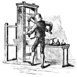
A TABLE
For ascertaining the Number of Forms for a Book of any Size, and the Quantity of Paper necessary to print a thousand copies in any form, from Octavo to 36mo, half-sheetwise.
| NO. OF FORMS. | 8vo. | 12mo. | 16mo. | 18mo. | 24mo. | 32mo. | 36mo. | PAPER FOR 1000 COPIES. | |
|---|---|---|---|---|---|---|---|---|---|
| PAGES. | PAGES. | PAGES. | PAGES. | PAGES. | PAGES. | PAGES. | REAMS. | QRS. | |
| 1 | 8 | 12 | 16 | 18 | 24 | 32 | 36 | 1 | 2 |
| 2 | 16 | 24 | 32 | 36 | 48 | 64 | 72 | 2 | 4 |
| 3 | 24 | 36 | 48 | 54 | 72 | 96 | 108 | 3 | 6 |
| 4 | 32 | 48 | 64 | 72 | 96 | 128 | 144 | 4 | 8 |
| 5 | 40 | 60 | 80 | 90 | 120 | 160 | 180 | 5 | 10 |
| 6 | 48 | 72 | 96 | 108 | 144 | 192 | 216 | 6 | 12 |
| 7 | 56 | 84 | 112 | 126 | 168 | 224 | 252 | 7 | 14 |
| 8 | 64 | 96 | 128 | 144 | 192 | 256 | 288 | 8 | 16 |
| 9 | 72 | 108 | 144 | 162 | 216 | 288 | 324 | 9 | 18 |
| 10 | 80 | 120 | 160 | 180 | 240 | 320 | 360 | 11 | |
| 11 | 88 | 132 | 176 | 198 | 264 | 352 | 396 | 12 | 2 |
| 12 | 96 | 144 | 192 | 216 | 288 | 384 | 432 | 13 | 4 |
| 13 | 104 | 156 | 208 | 234 | 312 | 416 | 468 | 14 | 6 |
| 14 | 112 | 168 | 224 | 252 | 336 | 448 | 504 | 15 | 8 |
| 15 | 120 | 180 | 240 | 270 | 360 | 480 | ... | 16 | 10 |
| 16 | 128 | 192 | 256 | 288 | 384 | 512 | ... | 17 | 12 |
| 17 | 136 | 204 | 272 | 306 | 408 | ... | ... | 18 | 14 |
| 18 | 144 | 216 | 288 | 324 | 432 | ... | ... | 19 | 16 |
| 19 | 152 | 228 | 304 | 342 | 456 | ... | ... | 20 | 18 |
| 20 | 160 | 240 | 320 | 360 | 480 | ... | ... | 22 | |
| 21 | 168 | 252 | 336 | 378 | 504 | ... | ... | 23 | 2 |
| 22 | 176 | 264 | 352 | 396 | ... | ... | ... | 24 | 4 |
| 23 | 184 | 276 | 368 | 414 | ... | ... | ... | 25 | 6 |
| 24 | 192 | 288 | 384 | 432 | ... | ... | ... | 26 | 8 |
| 25 | 200 | 300 | 400 | 450 | ... | ... | ... | 27 | 10 |
| 26 | 208 | 312 | 416 | 468 | ... | ... | ... | 28 | 12 |
| 27 | 216 | 324 | 432 | 486 | ... | ... | ... | 29 | 14 |
| 28 | 224 | 336 | 448 | 504 | ... | ... | ... | 30 | 16 |
| 29 | 232 | 348 | 464 | ... | ... | ... | ... | 31 | 18 |
| 30 | 240 | 360 | 480 | ... | ... | ... | ... | 33 | |
| 31 | 248 | 372 | 496 | ... | ... | ... | ... | 34 | 2 |
| 32 | 256 | 384 | 512 | ... | ... | ... | ... | 35 | 4 |
| 33 | 264 | 396 | 528 | ... | ... | ... | ... | 36 | 6 |
| 34 | 272 | 408 | 544 | ... | ... | ... | ... | 37 | 8 |
| 35 | 280 | 420 | 560 | ... | ... | ... | ... | 38 | 10 |
| 36 | 288 | 432 | 576 | ... | ... | ... | ... | 39 | 12 |
| 37 | 296 | 444 | 592 | ... | ... | ... | ... | 40 | 14 |
| 38 | 304 | 456 | 608 | ... | ... | ... | ... | 41 | 16 |
| 39 | 312 | 468 | ... | ... | ... | ... | ... | 42 | 18 |
| 40 | 320 | 480 | ... | ... | ... | ... | ... | 44 | |
Example.—How many reams will be required for a 12mo book containing 408 pages? Find the number of pages (408) in the 12mo column: in the outer column on the left of the table the number of forms is seen, and in the outer column on the right the quantity of paper required is given.
JOBBING FACILITIES.
There is no department in the art that is better provided with means for its efficient prosecution than job printing. It is true that an establishment fully provided with all the old and new conveniences will involve a very considerable outlay; yet a beginner in a small way, who has to count the cost carefully, may avail himself of many facilities which were unknown a score of years ago. The smaller the capital, the more need for the exercise of a wise discretion in the selection of material. Regard should be had to the special line of work to be undertaken, and the type and presses adapted to that line should be selected. If the master himself shall work with head and hand, perseveringly and early and late, and shall do good work at fair prices—never cutting-under to secure a job at non-paying rates,—and shall be obliging in manner and punctual in delivery, and shall waste no dimes in drink or other useless expenses, the growth of his business will be only a matter of time; and he will gradually be able to order just what that growth necessitates, until he shall find himself the proprietor of a well-appointed office and a paying business. In his first outlay and in all his additions, the best of every kind should be gotten, if possible, as cheap things always prove dear.
It matters little how well appointed an office may be, there will be no gains in it unless the proprietor, counting the cost carefully, makes sure that every job shall pay a reasonable profit.
When a job is taken in, it should be fully entered in a volume, giving all particulars in regard to the number of copies, style, and price. This may serve as a Day Book or Blotter. A memorandum-slip, like the following, may be filled out for each job, and kept on file after the work shall have been completed:—
It will be satisfactory to keep what may be called an Estimate Book, in which may be entered the particulars of estimates given for various kinds of work, whether the job be secured or not, these particulars will be time-saving when a similar piece of work comes in for estimate. Samples of paper, of all grades and colours, may be kept in a convenient receptacle, cut up into various sizes, and with memoranda written on each sample to denote the cost per ream, the weight, and the number of pieces in a sheet.
A useful thing to have in a job office is Ames’s Paper and Card Scale, for fractional sizes, showing the number of pieces of any required size that can be cut from a sheet without waste,[302] with a table giving the number of sheets required to cut 1000 pieces, and another showing the cost of paper by the quire, sheet, and hundred sheets, at any given price per ream. Besides the above, we may mention Le Blond’s Chart, a very compact affair, showing the number of any given size of card that can be cut out of a card sheet 22 × 28 inches.
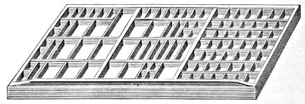
JOB CASE.
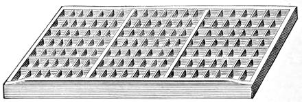
TRIPLE JOB CASE.
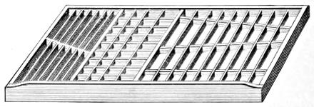
LABOUR-SAVING RULE CASE.
The modern printer has every convenience that can be desired in the way of cases, and his type and other material are amply provided with receptacles well adapted for each special use. There are not only large and small cabinets, filled with job cases of various styles and capacities, but there may be had cases for rules, leads, and furniture, as well as blank cases for indefinite uses. We give representations of these.
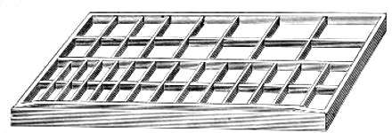
LABOUR-SAVING SLUG CASE.
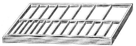
LABOUR-SAVING LEAD CASE.
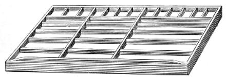
QUOTATION FURNITURE CASE.
BLANK CASE.
All cases should be labelled, and the label should be printed in the same type that is contained in the case.
Capitals and lower-case job types should not be laid together in the same boxes. The saving of time in a year will pay for extra cases.
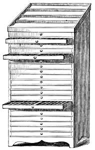
CABINET OF CASES, WITH GALLEY TOP.
Job type-cases should be kept in cabinets, and not in stand-racks, as the latter cannot be used without interfering with the hand whose stand may contain the case wanted. Various kinds of cabinets are shown on pages 219-221, 231 and 234, some of which are constructed to hold cases and quad and space boxes.
All matter should be cleared away as soon as done with. This work can be done by careful boys. Standing galleys, or cabinets with galley tops, for type to be kept awhile, will be found useful and convenient; but matter preserved for occasional future use were better papered up and labeled or stored away locked up in a chase cabinet. (See p. 231.) A rack with sloping boards to support the forms will prove to be a safe and convenient place for keeping the forms of type which need to be held standing.
Labour-saving leads, and slugs, and reglets, cut to varying lengths, when not in use, should be kept in cases specially provided for them. And so with labour-saving brass rule, quotation furniture, rule, etc. It is economical as well as tidy to have appropriate places for every thing.
For fixed measures, or measures not often changed, the standard screw composing-sticks are probably the best; but for jobbing and table-work, where the measure is frequently altered, it will be well to use the new styles, such as are shown above; no screw-key or screw-driver being required, the latter can be quickly and easily set to a new measure.
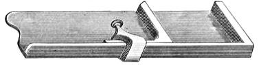
WOODEN JOB STICK.
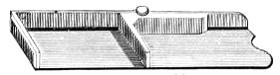
FRANKLIN STICK.
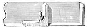
RAYMOND’S PATENT STICK.
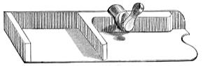
NEWBURY’S STICK.
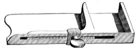
HOE’S PATENT STICK.
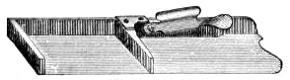
GROVER’S STICK.
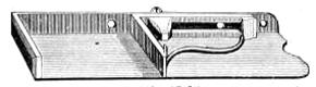
ALBION STICK.
The boxwood quoin will probably continue to hold its place, though not a few printers favour the use of the newly-invented iron articles offered by various manufacturers, such as Webb’s Mechanical Quoin, Ames’s, Hoe’s, Allen’s, and Hempel’s Patent Quoins. The latter quoin has, from its durability and easy application, crowded out all competitors.
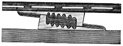
HEMPEL’S QUOINS IN POSITION.
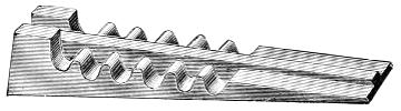
HEMPEL’S QUOIN.
Among the very handy things to have about an office, we may enumerate the circular and hollow quadrates, shown on pages 77 and 78; corner quadrates, cast in type-metal; and also the brass line-formers, shown on page 79, that enable the workman to curve lines expeditiously.
CORNER QUADRATES.
Even so simple a thing as a shooting-stick, commonly made of hickory or ash, is now to be had in brass or iron. These latter are certainly more durable, but dangerous in careless hands.
WOODEN SHOOTING-STICK.
BRASS SHOOTING-STICK.
IRON SHOOTING-STICK.
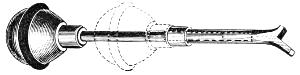
ARMSTRONG’S COMBINED MALLET AND SHOOTING-STICK.
A novel invention is Armstrong’s Patent Combined Mallet and Shooting-Stick. This is desirable for general use, and for locking-up forms on the press, or of service where room for the use of the ordinary mallet and shooting-stick is limited to a confined space.
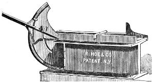
MITERING MACHINE.
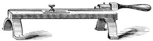
LEAD CUTTER.
A mitering machine and lead-cutter are among the necessary adjuncts of a printing-office.
Perforating Rule is slightly higher than type, and is used in printing coupons and tickets which require to be partially severed while going through the press. It is made of brass or steel. A more convenient (as well as more expensive) article is Ames’s Patent Perforator: its knife, or perforator, lies below the surface of the type while the rollers pass over the form, and rises and makes a clean cut when the impression is on, without injuring the rollers.
PERFORATING RULE.
Machines for perforating round holes are manufactured of several sizes. The lowest-priced machine may be worked on a counter, and will perforate every kind of card-board or paper. We give a cut of this style.
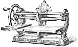
ROUND HOLE PERFORATING MACHINE.
Imposing Stones may be had with drawers and cases underneath; but these we do not deem advisable, unless the printer be cramped in room, as the cases may be wanted when the stone is in use while imposing or correcting forms. For common use, the plain stone with a single drawer, and without a rim, will be found the nicest. When made otherwise, the rim should be fitted snugly to the stone, or the interstices will become filled with types, dropped in while correcting.
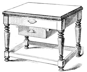
IMPOSING STONE.
A very convenient device for the compositor is the Copy-Holder. This, however, is for the book compositor rather than for the jobber. Its utility consists in bringing the copy nearer to the eye of the workman, and in leaving all the boxes at command and uncovered by the manuscript or printed page. There is also a Lamp-Holder which will be found handy where gas is not accessible.
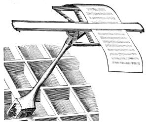
COPY-HOLDER.
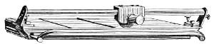
RUGGLES CARD CUTTER.
Card Cutters are made of several styles, and at prices from fourteen dollars to forty-five; and Paper Cutters are yet more numerous, some of them simple and low-priced, and others massive and costing twelve hundred dollars. We give an engraving of one of moderate price. An extensive run of business only would require the employment of a large paper cutter.
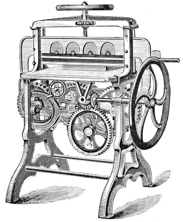
MINERVA CUTTING MACHINE.
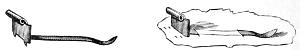
MEGILL’S PATENT GAUGE PIN.
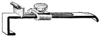
EXTENSION FEED-GUIDE.
Several contrivances for facilitating press operations have been invented. We may mention Megill’s Patent Gauge Pin, of sizes suitable for various margins. Two small teeth, projecting from the lower side of the head of the pin, press into the tympan sheet and prevent the gauge from moving. There is also the Extension Feed-Guide, which furnishes a gauge below the edge of the platen, and is held firmly in place by the tympan-clamp.
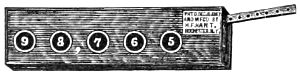
HART’S COUNTER.
When long numbers are printed, the Automatic Counter may be attached to the press. It counts only when the form is being printed, and shows the exact number in plain figures up to 100,000. Several styles of counting machines are made.
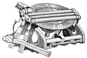
PATENT INK FOUNTAIN.
An ink fountain has been contrived for attachment to the Gordon job press, or any other press with similar plate distribution. It is quite a cosey little thing, and is operated by the impression arm of the press.
Iron furniture is made in sets containing twenty-one pieces, adapted for use on the eighth, quarter, and half medium job presses.
USEFUL RECEIPTS.[22]
Printers’ rollers.—10 lbs. French or Irish heavy glue, 12 lbs. sugar or good quality molasses, and 3 lbs. glycerine. This will be sufficient to make two rollers twenty-nine by three and one-half inches, and can be readily recast by following the directions given for recasting rollers.
Directions.—Soak the glue the necessary length of time that will enable it to melt with ease. After being melted, add the glycerine, and boil fifteen minutes or until thoroughly mixed, when the sugar or molasses may be added. Cook and stir continuously for fifteen minutes, the composition will then be ready for pouring. Strict attention should be given that the moulds be thoroughly cleansed and evenly oiled previous to pouring.
German Preservative for Rollers.—Corrosive sublimate 2 drachms, fine table salt 2 oz.; put together in half a gallon of soft water—let it stand twenty-four hours. When rollers are clean washed with ley, sponge them with the above mixture twice a week.
Directions for Recasting Rollers.—Sponge the face of the roller with hot water; scrape off the face thoroughly with a knife; take the composition off the stock and cut it up small. If the roller has been used only a short time, it may be melted about as readily as new composition; if it is older, put it in a sieve or basket and soak it in cold water for about fifteen or twenty minutes; take it out of the water, cover with a damp cloth, and leave over-night; then melt as usual. If composition[312] is too hard, wait till it is melted, and stir in a sufficient quantity of common molasses; avoid heavy, clarified syrups.
Printers’ Ley.—No. 1.—Dissolve 28 lbs. of soda in 52 gallons of water, to which add 7 lbs. of soft-soap, boiled. Stir well together.
Printers’ Ley.—No. 2.—Boil 3 gallons of water in a copper; throw in while boiling ½ lb. of unslacked lime and 2 lbs. of common soda; stir well for fifteen minutes. Let it settle till cold, when it must be taken out without disturbing the sediment, and the liquid is then fit for use.
Printers’ Ley.—No. 3.—Table salt 2 oz., unslacked lime 2 lb., Scotch washing soda (bruised) 2 lb. Put together in 3 gallons of water, stir well; when settled, ready for use.
Note.—This ley, if prepared carefully, is very strong, and will wash off almost any colour.
A Strong White Paste.—Dissolve 2½ oz. of gum-arabic in 2 quarts of water, and stir it into 1 pound of wheat flour until the whole becomes of a pasty consistency. It is then to be heated, and 1½ oz. each of sugar of lead and alum dissolved in a little water added thereto, and the composition well stirred until it shows signs of boiling, when it must be removed from the fire. Add while hot 6 drops of carbolic acid. This is a very tenacious and durable paste, and may be used on almost any substance.
Pastes for Fixing Labels on Glass.—No. 1.—Take of gum-arabic 1 oz., boiling water and glycerine 2 fluid ounces each. Make a solution.
No. 2.—Take of gum-arabic and powdered gum tragacanth ½ oz. each, water 1½ oz., acetic acid 20 drops. Mix. The acid is used to prevent chemical change, although a stiff paste made of tragacanth alone is not inclined to spoil by fermentation.
To Make a good Mucilage.—The best quality of mucilage is made by dissolving clear glue in equal volumes of water and strong vinegar, and adding one-fourth of an equal volume of alcohol, and a small quantity of a solution of alum in water.[313] The action of the vinegar is due to the acetic acid which it contains. This prevents the composition from gelatinizing by cooling; but the same result may be accomplished by adding a small quantity of nitric acid. Some of the preparations offered for sale are merely boiled starch, or flour, mixed with nitric acid to prevent the gelatinizing.
Liquid Glue.—Take some good strong glue and mix it with full proof whisky. Let it digest for three or four days, and it will be ready for use.
Strong Mucilage.—The Journal de Pharmacie states that if, to a strong solution of gum-arabic measuring 8⅓ fluid oz., a solution of 30 grains of sulphate of aluminium dissolved in ⅔ of an oz. of water be added, a very strong mucilage is formed, capable of fastening wood together, or mending porcelain or glass.
Gum for Backing Labels.—Take any quantity of clear, pure dextrine and mix it with boiling water until it assumes the consistency of ordinary mucilage. Apply thinly with a full-bodied, evenly made, and wide camel’s-hair brush. The paper should not be too thin or unsized. The preparation will dry quickly, and adhere when slightly wet.
Note.—No more of the dextrine should be mixed at one time than can be used at once, as it cannot be remelted easily.
Mucilage for Postage Stamps, Envelopes, etc., is composed of dextrine 2 parts, acetic acid 1 part, alcohol 1 part, water 5 parts.
Common Prepared Glue.—Dissolve 2 lbs. good common glue in 3 pints warm water, and add 1 quart of strong vinegar. Ready to use after twenty-four hours.
For making Magenta Surface Paper.—1½ oz. of Magenta, (aniline,) ½ oz. Bismarck brown, (aniline,) 1 cake of glue; put these into 4 gallons of boiling water. Coat the paper with this, using an 8-inch double-filled camel’s-hair brush. Quantity given will coat two reams of double-crown. A hard-sized paper must be used.
Coloured Writing Inks.—The following receipts have been well tested, and are commended by good authorities as preferable to the solutions of aniline dyes, which are now so extensively used as coloured inks:—
Green.—Two parts acetate of copper, one part carbonate of potash, and eight parts of water. Boil until half evaporated, and filter.
Blue.—Three parts Prussian blue, one part oxalic acid, and thirty parts of water. When dissolved, add one part of gum-arabic.
Yellow.—One part fine orpiment, well rubbed up with four parts thick gum water.
Red.—With the aid of a gentle heat, dissolve four grains of carmine in 1 oz. of aqua ammoniæ, and add 6 grains of gum-arabic.
Gold.—Rub gold leaf, such as is used by bookbinders, with honey, till it forms a uniform mixture. When the honey has been washed out with water, the gold powder will settle at the bottom, and must be mixed with gum water in sufficient quantity.
Silver.—Silver leaf treated in precisely the same manner gives a silver ink. Both these inks may be polished with ivory when dry.
Black.—Three ounces crushed gall-nuts, two ounces crystallized sulphate of iron, two ounces gum-arabic, and twenty-four ounces water.
White.—Fine French zinc-white, or white lead, rubbed up with gum water to the proper consistency.
Fireproof Ink.—Fireproof ink, which can be used either for writing or printing:—Copal 12 grains, graphite 22 drachms, sulphate of iron 2 drachms, tincture of nut-galls 2 drachms, and sulphate of indigo 8 drachms; these are thoroughly mixed and boiled in water, and the ink so obtained is said to be both fireproof and insoluble in water. When any other colour than black is desired, the graphite is replaced by any other mineral pigment of the required colour.
Printing Ink Varnish.—Printing ink varnish is made by adding 4 oz. of boiled linseed or neat’s-foot oil to 6 oz. of yellow rosin.
Lithographic Transfer Ink.—Three parts gum copal, 5 parts wax, 5 purified tallow, 4 soap, 5 shellac, 5 mastic, and one-half part sulphur. The copal is to be melted in a copper vessel, mixing in a little sweet oil, add the wax and tallow, and when these are well melted, light the mass and throw in the soap, well dried and cut in small pieces, then the shellac and mastic. The flame is to be increased by the addition of the flowers of sulphur, and so a perfect mixture of the copal with the other substances will be attained. The flame is to be alternately kindled and extinguished till the whole mass is reduced to one-fourth of its former bulk.
To give dark Printing Inks a Bronze or Changeable Hue.—Take 1½ lb. gum shellac and dissolve it in 1 gallon 95 per cent. alcohol spirits of cologne for 24 hours; then add 14 oz. aniline red; let it stand a few hours longer, when it will be ready for use. Add this to good blue, black, or other dark inks, as needed, in quantities to suit, when, if carefully done, they will be found to have a rich bronze or changeable hue.
An Ink for Marking Tin or Zinc.—An ink composed of copper one part, dissolved in ten parts nitric acid, ten parts water being afterward added, is useful for marking on tin or zinc.
Quick-drying Preparations for Printers’ Inks to be used on Bookbinders’ Cases.—1 oz. beeswax, ¼ oz. gum-arabic dissolved in sufficient acetic acid to make a thin mucilage, ¼ oz. Brown’s Japan, ½ oz. asphaltum varnish. Incorporate with 1 lb. of wood-cut ink.
A Dryer.—No. 1, for fine job work. Damar varnish 6 oz., bergamot 2 drachms, balsam copaiba 2 drachms, balsam of fir 3 oz., creosote 1 drachm, copal varnish 1 drachm. To enough ink for 1000 ordinary business cards, add from 8 to 12 drops of the “Indispensable,” and to larger quantities in proportion. When used for bronze, dry colours, diamond printing, etc., take twice the quantity; and where an extra quick dryer is desired, add a few drops of dissolved gum-arabic to the ink, after it has been mixed with No. 1. In all cases, mix well with the ink before applying to the rollers.
Dryer.—No. 2.—For news and poster ink. Spirits of turpentine 1 qt., balsam copaiba 6 oz. Add a sufficient quantity to the ink to thin it to a proper consistency for working.
Silvering Solution for Electrotype Plates.—Nitrate of silver 2 drachms, distilled water 37 drachms. Dissolve and add sal ammoniac 1 drachm, hypophosphate of soda 4 drachms, precipitated chalk 4 drachms. Agitate the preparation occasionally for twelve hours, when it will be ready for use. Apply with a piece of fine sponge.
How to coat Electrotypes with Silver.—Electrotypes can be coated with silver (for working with red ink) in the following manner: One part copper, 5 parts pure tin; this alloy to be granulated, not too fine, and mixed with water and cream of tartar into a paste. To each 200 parts of the granulated alloy add 1 part oxide silver, the electro is then laid in it, and boiled for a short time, when it will be found to be beautifully plated. Fresh oxide must be added from time to time. This coating is quite equal in durability to silver or tin.
To soften Leather Belting.—Castor oil is a good article for keeping leather belting soft and pliable.
How to open a Ball of Twine.—A ball of twine, if opened from the inside, will run off easily enough and give no trouble in the untwining; but if begun from the outside, it will speedily get tangled and knotted.
To prevent Adhesion.—M. Garde, in l’Imprimerie, tells paper-makers how to obviate the inconvenience of the adhesion together of sized papers, on damping, by the coagulation of the size. This is effected in the mills, by dipping the sheets in a solution of alum or tannin. A secondary advantage obtained is that the paper becomes tougher.
To detect ground Wood in Paper.—Mix three parts of strong nitric acid with one part of sulphuric acid: a drop of this solution will immediately turn paper containing an admixture of ground wood a brown colour.
French Gold Printing.—French copal varnish 1 oz., mastic varnish ¼ of an oz.; mix together and add twenty drops to the black ink table, and distribute; take an impression and apply, with wool, gold leaf, Dutch metal, or bronze. Apply the bronze with cotton wool and rub hard over the black ink. After each fifty printed, wipe off the superfluous gold from the type with a silk handkerchief.
Transfer Varnish.—Take equal quantities of fir balsam and spirits turpentine. Mix, shake well, and set in a warm place until clear. Used in decalcomania, and for maps, prints, drawings, and other articles of paper; and also to prepare tracing papers, and to transfer engravings.
To make Paper Waterproof.—Dissolve 8 oz. of alum and 3⅓ oz. of white soap in 4 pints of water. In another vessel dissolve 2 oz. of gum-arabic and 4 oz. of glue in 4 pints of water. Mix the two solutions and heat them over the fire. Then immerse the paper, sheet by sheet, in the hot liquid, then hang them up edgewise to dry, or pass them between heated cylinders.
Books Preserved.—The bindings may be preserved from mildew by brushing them over with the spirits of wine. A few drops of any perfumed oil will secure libraries from the consuming effects of mould and damp. Russia leather, which is perfumed with the tar of the birch tree, never moulds or sustains injury from damp. The Romans used oil of cedar to preserve valuable manuscripts. Russia leather covered books placed in a stationer’s window will destroy flies and other insects.
To restore Engravings, etc.—Old engravings, wood-cuts, or printed matter, that have turned yellow, may be rendered white by first washing carefully in water containing a little hyposulphite of soda, and then dipping for a minute in Javelle water. To prepare the latter, put 4 lbs. bicarbonate of soda in a kettle over a fire; add 1 gallon of boiling water, and let it boil for fifteen minutes. Then stir in 1 lb. of pulverized chloride of lime. When cold, the liquid can be kept in a jug ready for use.
ORTHOGRAPHICAL.
A thorough reformation of the orthography of the English language, desirable as it is, can scarcely be hoped for in this century; though doubtless the time will come when an international convention will settle authoritatively the spelling of every word, as acceptably as has been done by the Academies of France and Spain in regard to the orthography of the languages of those countries.
A or AN before a Vowel or silent H.
In regard to the use of the indefinite article, Walker’s Dictionary very judiciously says,—
“This indefinite, and, as it may be called, the euphonic article, is said by all our grammarians to be used before a vowel or h mute; but no notice is taken of using a instead of an before what is called a vowel, as, a useful book, a useful ceremony, a usurer, &c.; nor is any mention made of its constant usage before h when it is not mute, if the accent of the word be on the second syllable, as, an heroic action, an historical account, &c. This want of accuracy arises from a want of analyzing the vowels, and not attending sufficiently to the influence of accent on pronunciation. A proper investigation of the power of the vowels would have informed our grammarians that the letter u, when long, is not so properly a vowel as a semi-consonant, and perfectly equivalent to commencing y, and that a feeling of this has insensibly influenced the best speakers to prefix a to it in their conversation, while a confused idea of the general rule, arising from an ignorance of the nature of the letters, has generally induced them to prefix an to it in writing. The same observations are applicable[319] to the h. The ear alone tells us that, before heroic, historical, &c., the an ought invariably to be used; but, by not discovering that it is the absence of accent on the h that makes an admissible in these words, we are apt to prefix an to words where the h is sounded, as, an horse, an house, &c., and thus set our spoken and written language at variance. The article a must be used before all words beginning with a consonant, and before the vowel u when long; and the article an must be used before all words beginning with a vowel, except long u; before words beginning with h mute, as, an hour, an heir, &c.; or before words where the h is not mute, if the accent be on the second syllable, as, an heroic action, an historical account, &c.” The few words in our language in which the h is mute are heir, herb, honest, honour, hospital, hostler, hour, humble, humour, and their derivatives.
O, or OH.
Oh should be used to express surprise, pain, sorrow, or anxiety. When the interjection is followed by a proper name, or as an exclamation of wishing the O should be employed singly, thus: O mother dear, Jerusalem! O Lord! O that I might find him.
ABLE and IBLE.
All English words, without regard to the source from which they have been derived, and those which come from Latin words ending in abilis or French ones in able, take the termination able in English, as, procurable, amendable, desirable, allowable, voidable, available, fordable, incontestable, &c.; but in words from Latin and French words terminating in ibilis or ible, then the ending will be ible in English. For instance: accessible, sensible, defensible, convertible, &c.
In words ending in ce or ge, the final e is preserved before the termination able, for the purpose of indicating the soft sound of the consonant, as in marriageable, chargeable, traceable, serviceable, &c.; but before the ending ible the final e of the primitive disappears, and there is no e before the termination. Examples: deducible, reducible, frangible, &c.
The following list of words in ible is here added; all others end in able:—
- accessible
- admissible
- adustible
- appetible
- apprehensible
- audible
- cessible
- coercible
- collectible
- comminuible
- compatible
- competible
- comprehensible
- compressible
- conceptible
- conclusible
- congestible
- contemptible
- contractible
- controvertible
- convertible
- convincible
- corrigible
- corrosible
- corruptible
- credible
- deceptible
- decerptible
- decoctible
- deducible
- defeasible
- defectible
- defensible
- depectible
- deprehensible
- descendible
- destructible
- digestible
- discernible
- discerptible
- dispraisible
- dissolvible
- distensible
- divisible
- docible
- edible
- effectible
- eligible
- eludible
- enforcible
- evincible
- expansible
- expressible
- extendible
- extensible
- fallible
- feasible
- fencible
- flexible
- forcible
- frangible
- fusible
- horrible
- ignoscible
- illegible
- immarcessible
- immiscible[23]
- impassible[24]
- intelligible
- irascible
- legible
- miscible
- partible
- passible[25]
- perceptible
- permiscible
- permissible
- persuasible
- pervertible
- plausible
- possible
- producible
- quadrible
- reducible
- referrible
- reflexible
- refrangible
- regible
- remissible
- reprehensible
- resistible
- responsible
- reversible
- revertible
- risible
- seducible
- sensible
- solvible
- tangible
- terrible
- transmissible
- visible
IM or IN, and EM or EN.
The prefix in is from the Latin, and that of en from the French and Greek. In generally signifies situation, and en mostly expresses action. Hence, perhaps, in strictness, inclose will signify “to close in,” and enclose, “to make close.” So, to inquire will be “to seek in, or to search in,” and enquire, to “make search.” Immigrate, “to pass into;” emigrate, “to go out of.” But this distinction is not attended to by writers, and is, indeed, too refined for general practice.
Before the letters b and p, en becomes em, as in embattle, empower; and in before some letters becomes ig, il, im, or ir, as in ignoble, illegal, improper, irresolute.
We give a list of those generally spelt with im or in; leaving it to be inferred that the rest are more usual with em or en.
- imbarn
- imbibe
- imboil
- imbound
- imbrue
- imbrute
- imbue
- imburse
- immanacle
- immense
- immerge
- immerse
- immigrate
- immingle
- immit
- immix
- immure
- impact
- impale
- imparadise
- impassioned
- impawn
- impeach
- impearl
- impel
- impen
- imperil
- impinge
- implant
- implead
- import
- impose
- impound
- impregnate
- impress
- imprint
- imprison
- inarch
- incase
- inclasp
- inclip
- incloud
- include
- incrassate
- increase
- incur
- indart
- indent
- indict
- indite
- indoctrinate
- indrench
- induce
- induct
- ineye
- infer
- infest
- inflix
- inflame
- inflate
- inflect
- inflict
- infringe
- infuscate
- infuse
- ingrane
- ingest
- inhabit
- inhale
- inhere
- inhold
- inhume
- initiate
- inject
- inlapidate
- inlay
- inlet
- inoculate
- inosculate
- inquire
- inrail
- inscribe
- insculp
- inseam
- insert
- inset
- inshell
- inship
- insinew
- insphere
- inspire
- inspirit
- install
- instate
- insteep
- instil
- instop
- insure
- inter
- intertwine
- intort
- intreasure
- intrench
- intrude
- intrust
- inumbrate
- inure
- inurn
- invade
- inveigh
- invert
- invest
- invigorate
- invite
- invocate
- invoice
- invoke
- inwall
- inweave
IN and UN.
In, as a prefix, also marks negation: it is probable that it came from the Romans. Un, as a prefix, is synonymous with in: it is of Saxon origin, and generally joined to words from a northern source; while in is oftener applied to those of Latin derivation.
ISE and IZE.
The variation in the terminations ise and ize is due to the different derivations of words,—ize characterizing words from the Greek and Latin, and ise from the French. The rule, however, is not inflexible. The following words are commonly spelled with the s.
- advertise
- advise
- affranchise
- aggrandise
- amortise
- catechise
- chastise
- circumcise
- comprise
- compromise
- criticise
- demise
- despise
- devise
- disfranchise
- disguise
- divertise
- emprise
- enfranchise
- enterprise
- exercise
- exorcise
- galliardise
- manumise
- merchandise
- misprise (mistake)
- premise
- recognise
- reprise (take again)
- supervise
- surmise
- surprise
OR and OUR.
The ending our was in general use until the appearance of Webster’s Dictionary, in which the u was dropped in words terminating with our. This innovation has steadily gained ground. We do not approve of partial tinkerings with English orthography; and, until a general convention of British and American scholars settle the method of spelling English words, we shall adhere to the established usage. We append a list of words terminating in our.
- arbour
- ardour
- armour
- behaviour
- candour
- clamour
- clangour
- colour
- contour
- demeanour
- dishonour
- dolour
- endeavour
- favour
- fervour
- flavour
- harbour
- honour
- humour
- labour
- neighbour
- odour
- parlour
- rancour
- rigour
- rumour
- savour
- saviour
- splendour
- succour
- tambour
- tumour
- valour
- vapour
- vigour
The u is dropped when the termination ous is added to any of these words; as, clamorous, dolorous, humorous, laborious, odorous, rancorous, rigorous, valorous, vigorous. And also in derivative words; such as armory, honorary, &c.
SION and TION.
Primitive words which end in d, de, ge, mit, rt, se, or ss, take sion in their derivatives; but all other words have tion.
EXAMPLES.
- abscind, abscission
- condescend, condescension
- evade, evasion
- intrude, intrusion
- absterge, abstersion
- emerge, emersion
- admit, admission
- remit, remission
- revert, reversion
- convert, conversion
- confuse, confusion
- revise, revision
- impress, impression
- confess, confession
- admix, admixtion
- promote, promotion
IRREGULARS.
- adhesion
- cohesion
- compulsion
- declension
- decursion
- depulsion
- dissension
- divulsion
- evulsion
- exesion
- expulsion
- impulsion
- incursion
- propulsion
- recension
- recursion
- revulsion
- scansion
- tension
- transcursion
- version
- attention
- causation
- distention
- distortion
- coercion
- suspicion
- crucifixion
FARTHER and FURTHER.
Farther is nowadays only employed when speaking of distance; in all other acceptations of the word, further is generally adopted.
PEAS and PEASE.
There are scarcely any words in which a mistake is more frequently made than in peas and pease. Yet the distinction between them is simple and well defined. Peas is the plural of pea, and, consequently, only follows numeral adjectives; as, “ten peas,” “a hundred peas,” “a few peas,” “many peas;” but pease is used when speaking of the legumen in the aggregate, or generally. Thus, we correctly say, “Pease are dear this year,” “Pease were plentifully supplied to the horses,” &c.
Pease is also employed adjectively; as, “pease-pudding,” “pease-soup,” or “pea-soup,” &c.
The Omission of S in the Possessive Case.
It is not uncommon with some persons to omit the s after the apostrophe in the possessive case of nouns, if the name itself ends in s; as, “James’ book,” “Barnes’ Notes.” But this is incorrect; for if we ask, Whose book? we should directly answer, James’s. The only case when the s can be judiciously omitted, and this solely to avoid the too hissing sound of so many s’s in succession, is when the first word ends with the sound of s in its last two syllables, and the next word begins with s; as in Misses’ spectacles, righteousness’ sake, conscience’ sake.
Formation of the Plurals of Words compounded of a Noun and an Adjective.
Adjectives have no plural number. Therefore, in a word compounded of a noun and an adjective, the s denoting the plural number is attached to the end of the noun, as follows:—
| Governor-general | Governors-general. |
| Attorney-general | Attorneys-general. |
| Court-martial | Courts-martial. |
But where the adjective is taken substantively, the mark of the plural will properly follow it. For example: Brigadier-generals, major-generals, lieutenant-generals.
Words compounded of a noun and the adjective full form their plurals thus: spoonfuls, cupfuls, bucketfuls, handfuls, mouthfuls.
Pointing of Numbers, Weights, Measures, &c.
No comma should be placed between the constituent parts of the same number, however long it may be. Thus, we say, “One million one hundred thousand five hundred and twenty-one,” without any interpunction. The reason is, that there is no more than one numerical aggregate intended, or but one complex notion; and, consequently, no separation of parts or members can take place. The same reasoning holds good as respects values, weights, &c. For instance, when we say, “Six dollars and ten cents,” we merely mean that aggregate amount, but not necessarily any one of the coins indicated. If we did so intend, then two commas should be introduced,—one after “dollars,” and the other after “cents.” In like manner we should act with such sentences as, “Five tons three hundredweight two quarters and fifteen pounds;” or, “Ten acres four roods and twenty-seven perches;” and for the same reason: no division of parts is intended, but merely one aggregate amount.
When figures are used to express amounts, a comma should not be inserted to cut off the tens unless the sum requires five figures: e.g. $10,600, 20,000 men, &c. In column matter this rule will not apply.
Derivation of English Words.
Of course the Saxon forms the basis of our language in its essential parts, and is the source whence we derive the greater part of our ordinary and most emphatic words. Nevertheless, various other languages have been put under contribution, especially the French, Latin, and Greek. This will be evident from the following statement of derivations, which will show the unlearned reader how important it is to him that he should acquire some knowledge of those languages, if he desires to attain to a thorough proficiency in his business as an educated printer.
I. From the Greek are derived—
1. Words ending in gram, graph, and graphy; as, telegram,[325] telegraph, geography, &c.; from the word γράφω, (grapho,) I write, and some other Greek word.
2. Those in gon; from γωνια, (gonia,) an angle; as, octagon.
3. All words in logue or logy; as, epilogue, astrology; from λόγος, (logos,) a discourse.
4. Ic, ick, ics are also Greek terminations, generally of adjectives.
5. Words in meter are all of Greek origin, coming from the verb μετρῶ, (metro,) I measure, in combination with some other word.
6. Most words into which the terminations agogue, asis, esis, or ysis enter are also of Greek origin; such as demagogue, emphasis, parenthesis, analysis, &c.
II. But the main source whence we have derived words, with the exception of the Saxon, is the Latin, as will appear from an inspection of the following list:—
1. Words ending in ance, ancy, or ant, and ence, ency, or ent, come from Latin words ending respectively in ans, antia, or ens, entia; as, abundance, from abundantia; infancy, from infantia; abundant, from abundans; absence, from absentia; excellency, from excellentia; and excellent, from excellens.
2. Words in al have their Latin representatives in alis; as, corporal, from corporalis.
3. Verbs in ate mostly come from Latin verbs of the first conjugation; as, moderate, from modero.
4. Words in ator are generally the same in both languages; as, orator, senator, moderator.
5. The termination id comes mostly from Latin words ending in idus; as, acid, from acidus; but sometimes words of this ending are of Greek origin; as, oxide, (more correctly, oxyd,) from ὀξὺς, (oxys;) and, indeed, most scientific words of this ending; as, carotid, from καρώτιδες, &c.; rhomboid, from ῥομβοειδής.
6. Il or ile is likewise from the Latin termination of adjectives in ilis; as, docile, from docilis; civil, from civilis.
7. The Latin termination osus has its English representative in ious or ous; as, copious, from copiosus; numerous, from numerosus. But sometimes the English ending ous comes from a Latin word in ax; as, capacious, from capax.
8. The Latin ending io has its English corresponding word in ion; as, nation, from natio; oration, from oratio.
9. The endings ne, re, and te after a vowel are also for the greater part of Latin origin; as, fortune, from fortuna; aquiline, from aquilinus; culture, from cultura; pure, from purus; complete, from completus, &c.
10. Words in ty come from Latin words in tas; as, equality, from æqualitas; bounty, from bonitas; rarity, from raritas, &c.
11. The termination ude is also of Latin origin, coming from words in udo; as, fortitude, from fortitudo; elude, from eludo.
12. So also is uous, by inserting the letter o; as, ambiguous, from ambiguus; continuous, from continuus, &c.
III. From the French have come—
1. Most of our words in age; as, page, rage, usage.
2. All those in eau; as, beau, flambeau, &c.
3. The French esse is represented by the English ess: as, princess, from princesse.
4. Words in que mostly come to us from the French directly; some from the Latin directly or indirectly; as, antique, (L. antiquus, F. antique,) oblique, opaque.
5. Words ending in ment are nearly the same in both languages; as, commencement, advancement, (F. avancement,) &c.
We subjoin some rules for spelling, adapted from Laidlaw’s American Pronouncing Dictionary.[26]
RULE I.
Words ending in silent e after u or a consonant generally drop the e on taking an additional termination beginning with a vowel; as, sale, salable; plague, plaguy; sue, suing; eye, eying.
Exception I.—Words ending in ce and ge retain e before able and ous; as, service, serviceable; trace, traceable; courage, courageous; advantage, advantageous.
Exception II.—Compounds and prefixes retain e; as, firearms, foreordain, pole-axe, vice-admiral, fire-engine.
Remark.—From singe, springe, swinge, tinge, we write singeing, springeing, swingeing, tingeing, to distinguish from singing, springing, swinging, and tinging. Dyeing, from dye, retains e, to distinguish it from dying, the present participle of die. Mile retains e in mileage. Derivatives from proper names of persons retain e; as, daguerreotype, morseograph.
RULE II.
Words ending in silent e generally retain the e on taking an additional termination beginning with a consonant; as, bereave, bereavement; issue, issueless.
Remark.—Awful, awfully, awfulness, argument, argumentation, argumentative, woful, wofully, wofulness, duly, truly, and wholly, are undisputed exceptions; and abridgment, acknowledgment, judgment, misjudgment, prejudgment, lodgment, wobegone, and rhymster, are disputed exceptions. Some write abridgement, acknowledgement, judgement, misjudgement, prejudgement, lodgement, woebegone, and rhymester.
RULE III.
Words ending in ie change them into y before ing; as, lie, lying. The following words conform to this rule:—
- lie
- belie
- outlie
- lie
- overlie
- underlie
- die
- hie
- tie
- untie
- vie
- outvie
RULE IV.
Words ending in y preceded by a consonant generally change y into i on taking an additional syllable; as, mercy, merciful, merciless; defy, defied, defies, defieth, defiant; busy, busier, busiest, business; ply, pliers; porphyry, porphyritic.
Exception I.—Y after a consonant is not changed into i before ing or ish; as, dry, drying, dryish.
Exception II.—Compounds usually retain y; as, mercy-seat, county-town, dairy-maid, skylight.
Remark.—Dryer, dryest, dryly, dryness, shyer, shyest, shyly, shyness, are undisputed exceptions to the rule; and slyer, slyest, slyly, slyness, are disputed exceptions.
RULE V.
Words ending in y preceded by a vowel retain the y; as, gay, gayly, gayness, gayety; pray, prayer, praying, prayed, prays.
Remark.—From day, lay, pay, say, stay, are formed daily, laid, paid, said, saith, staid. The regular words dayly, layed, payed, sayeth, and stayed, are sometimes used.
RULE VI.
Monosyllables and words having the primary accent on the last syllable, when they end with a single consonant preceded by a single vowel, double their final consonant before an additional syllable that begins with a vowel; as, wet, wetter, wettest, wetting, wetted; drum, drumming, drummed; dispel, dispelling, dispelled.
Exception.—A final x, or the s in gas, should not be doubled; as, fix, fixes, fixed, fixing; annex, annexing; gases, gasefy.
Remark I.—U after q is never reckoned a part of a diphthong or triphthong; so that from quit are formed quitting, quitted; and from quag, quaggy.
Remark II.—This rule applies only to derivatives which retain the accent of their primitives, and not to such as in´ferable, in´ference, pref´erable, pref´erence, ref´erable, and ref´erence, from infer, prefer, and refer. To the forms infer´rible, refer´rible, which are sometimes met with, the general rule applies. Transfer´able, from transfer, is an exception to the general rule; the regular form transfer´rible is not often used. Although parallel´ogram, from par´allel, and modal´ity from mo´dal, remove the primary accent to the point of duplication, they do not double the final l. See Remark II. under Rule VII.
RULE VII.
A final consonant is not doubled when it is preceded by a diphthong, when the primary accent is either not on, or not retained upon, the last syllable, or when the additional syllable begins with a consonant; as, beat, beating, beaten; dif´fer, dif´fering, dif´fered, dif´ference, dif´ferent; prefer´, pref´erence; refer´, ref´erence; fit, fitful, fitly, fitness; ben´efit, ben´efited, ben´efiting.
Exception I.—Compounds that remove the primary accent from the point of duplication retain the double letter; as, broad´-brimmed, heel´-tapping.
Remark I.—When ly is affixed to words ending in l, the l is not considered doubled; as in cool-ly, real-ly, gravel-ly, royal-ly.
Remark II.—Nutmegged, kidnapping, kidnapped, kidnapper, zigzagging, zigzagged, excellence, and some others, are undisputed exceptions to the rule. There are nearly one hundred words, from which more than four hundred derivatives are formed, that are usually made exceptions to this rule. Webster is distinguished for making nearly all the derivatives conform to the rule. Webster and Smart accent the verb curv´et, on the first syllable, with which accentuation curveting and curveted are correct spellings; other orthoepists accent upon the last syllable, then curvet´ting and curvet´ted are correct.
RULE VIII.
Words ending in c accept of k before a termination beginning with e, i, or y; as, frolic, frolicked, frolicking; colic, colicky.
ILLUSTRATIONS.
- colic
- colicky
- frolic
- frolicking
- frolicked
- havoc
- havocking
- havocked
- mimic
- mimicking
- mimicked
- mimicker
- physic
- physicking
- physicked
- rollic
- rollicking
- rollicked
- traffic
- trafficking
- trafficked
- trafficker
- talc
- talcky
- zinc
- zinckiferous
- (zinciferous)
- zincky
RULE IX.
Words ending in a double letter preserve it double after a prefix or before a termination beginning with a different letter; as, op-press, mis-spell, in-thrall, oversee; see-ing, op-pressive, stiff-ness, woo-ed, still-ness, assess-ment.
Remark I.—Annul, until, twibil, and the conservative fulfil, or the Websterian fulfill, are the only exceptions to the first part of this rule extensively recognized by present usage. The conservative distil and instil are at variance; but the Websterian distill and instill, and also twibill, as written by Reid, are in harmony with the rule.
Remark II.—Pontific, and all other derivatives of pontiff, are exceptions to the latter part of this rule, unless an f is discarded in the primitive word, as Webster suggests and the derivation warrants. The derivatives of dull, full, skill, and will, are disputed exceptions: if spelled as Webster writes them, dullness, fullness, skillful, willful, they conform to the rule.
RULE X.
The plural is usually formed from the singular by adding s; as, brave, braves; night, nights; hymn, hymns.
RULE XI.
Nouns ending in o preceded by a vowel accept of s in the plural; as, cameo, cameos; studio, studios.
ILLUSTRATIONS.
- agios
- bagnios
- bamboos
- braggadocios
- cameos
- cuckoos
- curculios
- embryos
- folios
- imbroglios
- intaglios
- internuncios
- koodoos
- nuncios
- olios
- oratorios
- pistachios
- port-folios
- punctilios
- ratios
- seraglios
- solfeggios
- studios
- trios
RULE XII.
Nouns ending in y preceded by a vowel accept of s in the plural; as, money, moneys; attorney, attorneys; valley, valleys.
RULE XIII.
Nouns ending in o preceded by a consonant usually accept of es in the plural; as, echo, echoes; embargo, embargoes.
Remark.—There are more than fifty words that conform to this rule, and about thirty that accept of s only.
ILLUSTRATIONS.
- archipelagoes
- armadilloes
- bilboes
- bravadoes
- bravoes
- buffaloes
- buffoes
- calicoes
- cargoes
- desperadoes
- echoes
- embargoes
- farragoes
- frescoes
- grottoes
- gustoes
- heroes
- innuendoes
- juntoes
- lazarettoes
- lingoes
- lumbagoes
- mangoes
- manifestoes
- mottoes
- mulattoes
- negroes
- palmettoes
- passadoes
- peccadilloes
- potatoes
- prunelloes
- punchinelloes
- punctoes
- ranchoes
- recitativoes
- relievoes
- renegadoes
- ritornelloes
- rotundoes
- stilettoes
- supercargoes
- testudoes
- tomatoes
- tornadoes
- torpedoes
- umboes
- vetoes
- violoncelloes
- viragoes
- volcanoes
- zeroes
EXCEPTIONS.
- albinos
- cantos
- centos
- dominos
- duodecimos
- halos
- hidalgos
- inamoratos
- lassos
- limbos
- major-domos
- mementos
- merinos
- mosquitos
- octavos
- pianos
- porticos
- provisos
- quartos
- rancheros
- ridottos
- rondos
- salvos
- set-tos
- sirocos
- solos
- torsos
- tyros
It would be well if all words ending in o were made to conform to Rules XI. and XIII.
RULE XIV.
Nouns ending in ss, z, x, ch soft, and sh, accept of es in the plural; as, dress, dresses; buzz, buzzes; box, boxes; peach, peaches; dish, dishes.
RULE XV.
Nouns ending in y after a consonant change y into ies in the plural; as, city, cities; daisy, daisies.
RULE XVI.
Compound nouns whose parts are connected by a hyphen accept of the sign of the plural after that part which essentially constitutes the noun; as, knight-errant, knights-errant; son-in-law, sons-in-law; man-of-war, men-of-war; step-child, step-children; ember-day, ember-days; man-singer, men-singers.
ILLUSTRATIONS.
- aides-de-camp
- beaus-ideal or
- beaux-ideal
- cartes-blanche
- charges-d’affaires
- chevaux-de-frise
- coups-de-main
- courts-martial
- cousins-german
- daughters-in-law
- fathers-in-law
- gendarmes or
- gens d’armes
- jets d’eau
- knights-errant
- mesdames
- men-of-war
- messieurs
- mothers-in-law
- poets-laureate
- porte-monnaies
- prices-current
- sergeants-at-arms
- sisters-in-law
- sons-in-law
- step-children
- step-fathers
- valets-de-chambre
Remark I.—If no hyphen is used, the sign of the plural is always placed at the end; as, spoonful, spoonfuls.
Remark II.—The sign of the possessive case is always placed at the end of compound nouns; as, son-in-law’s house.
RULE XVII.
The compounds of man form their plural in the same manner as the simple word; as, fisherman, fishermen; man-of-war, men-of-war.
Exceptions.—The only exceptions to this rule are dragoman, Mussulman, Ottoman, talisman, Turcoman, German, Norman, and landamman, which accept of s.
RULE XVIII.
Of the terminations eive and ieve, and of the derivatives of each, the former are found after c, and the latter after other letters; as, conceive, conceit, receive, receipt; relieve, relief, relieving, thieve, thievish.
ILLUSTRATIONS.
- achieve
- aggrieve
- bas-relief
- belief
- believe
- conceit
- conceivable
- conceive
- deceit
- deceitful
- deceive
- disbelief
- disbelieve
- grief
- grieve
- inconceivable
- lief
- lieve
- misbelief
- misconceive
- perceive
- preconceive
- receipt
- receive
- relief
- relieve
- relievo
- reprieve
- retrieve
- sieve
- thief
- thieve
- unbelief
- unbeliever
- undeceive
Plurals of Nouns which change F or FE into VES.
- beeves
- calves
- elves
- halves
- knives
- leaves
- lives
- loaves
- selves
- sheaves
- shelves
- thieves
- tipstaves
- wharves
- wives
- wolves
All other nouns ending in ff conform to Rule X. Wharfs prevails in Great Britain, wharves in America.
Plurals of Nouns ending in F or FE which accept of S only in the Plural.
- briefs
- chiefs
- fiefs
- griefs
- mischiefs
- kerchiefs
- neckerchiefs
- handkerchiefs
- caliphs
- caufs
- clefs
- coifs
- delfs
- dwarfs
- turfs
- kerfs
- surfs
- fifes
- strifes
- safes
- scarfs
- waifs
- woofs
- hoofs
- roofs
- proofs
- reproofs
- disproofs
- waterproofs
- beliefs
- reliefs
- gulfs
Plurals of Nouns ending in EAU, IEU, and OU.
- beaux
- bureaux
- chapeaux
- chateaux
- flambeaux
- plateaux
- rondeaux
- jets d’eau
- portmanteaus
- purlieus
- adieux
- batteaux
- bijoux
- morceaux
- rouleaux
- tableaux
A number of these nouns admits of two forms in the plural.
HOW TO SECURE COPYRIGHTS.
1. A printed copy of the title (besides the two copies to be deposited after publication) of the book, map, chart, dramatic or musical composition, engraving, cut, print, photograph, or a description of the painting, drawing, chromo, statue, statuary, or model or design for a work of the fine arts, for which copyright is desired, must be sent by mail or otherwise, prepaid, addressed:
Librarian of Congress,
Washington, D. C.
This must be done before publication of the book or other article.
The printed title required may be a copy of the title page of such publications as have title pages. In other cases, the title must be printed expressly for copyright entry, with name of claimant of copyright. The style of type is immaterial, and the print of a type-writer will be accepted. But a separate title is required for each entry, and each title must be printed on paper as large as commercial note. The title of a periodical must include the date and number.
2. A fee of 50 cents, for recording the title of each book or other article, must be enclosed with the title as above, and 50 cents in addition (or one dollar in all) for each certificate of copyright under seal of the Librarian of Congress, which will be transmitted by early mail.
3. Within ten days after publication of each book or other article, two complete copies of the best edition issued must be sent, to perfect the copyright, with the address:
Librarian of Congress,
Washington, D. C.
The postage must be prepaid, or else the publications inclosed in parcels covered by printed Penalty Labels, furnished by the Librarian, in which case they will come FREE by mail, according to rulings of the Post Office Department. Without the deposit of copies above required the copyright is void, and a penalty of $25 is incurred. No copy is required to be deposited elsewhere.
4. No copyright is valid unless notice is given by inserting in every copy published, on the title-page or the page following, if it be a book; or, if a map, chart, musical composition, print, cut, engraving, photograph, painting, drawing, chromo, statue, statuary, or model or design intended to be perfected as a work of the fine arts, by inscribing upon some portion thereof, or on the substance on which the same is mounted, the following words, viz.: “Entered according to act of Congress, in the year ⸺, by ⸺ ⸺, in the office of the Librarian of Congress, at Washington,” or, at the option of the person entering the copyright, the words: “Copyright, 18—, by ⸺.”
The law imposes a penalty of $100 upon any person who has not obtained copyright who shall insert the notice “Entered according to act of Congress,” or “Copyright,” etc., or words of the same import, in or upon any book or other article.
5. Any author may reserve the right to translate or to dramatize his own work. In this case, notice should be given by printing the words “Right of translation reserved,” or “All rights reserved,” below the notice of copyright entry, and notifying the Librarian of Congress of such reservation, to be entered upon the record.
Since the phrase, all rights reserved, refers exclusively to the author’s right to dramatize or to translate, it has no bearing upon any publications except original works, and will not be entered upon the record in other cases.
6. The original term of copyright runs for twenty-eight years. Within six months before the end of that time, the author or designer, or his widow or children, may secure a renewal for the further term of fourteen years, making forty-two years in all. Applications for renewal must be accompanied by explicit statement of ownership, in the case of the author, or of relationship, in the case of his heirs, and must state definitely the date and place of entry of the original copyright. Advertisement of renewal is to be made within two months of date of renewal certificate, in some newspaper, for four weeks.
7. The time within which any work entered for copyright may be issued from the press is not limited by any law or regulation, but depends upon the discretion of the proprietor. A copyright may be secured for a projected work as well as for a completed one.
8. A copyright is assignable in law by any instrument of writing, but such assignment must be recorded in the office of the Librarian of Congress within sixty days from its date. The fee for this record and certificate is one dollar, and for a certified copy of any record of assignment one dollar.
9. A copy of the record (or duplicate certificate) of any copyright entry will be furnished, under seal, at the rate of fifty cents each.
10. In the case of books published in more than one volume, or of periodicals published in numbers, or of engravings, photographs, or other articles published with variations, a copyright is to be entered for each volume or part of a book, or number of a periodical, or variety, as to style, title, or inscription, of any other article. But a book published serially in a periodical, under the same general title, requires only one entry. To complete the copyright on such a work, two copies of each serial part, as well as of the complete work (if published separately), must be deposited.
11. To secure a copyright for a painting, statue, or model or design intended to be perfected as a work of the fine arts, so as to prevent infringement by copying, engraving, or vending such design, a definite description must accompany the application for copyright, and a photograph of the same, at least as large as “cabinet size,” should be mailed to the Librarian of Congress within ten days from the completion of the work or design.
12. Copyrights cannot be granted upon trade-marks, nor upon mere names of companies or articles, nor upon prints or labels intended to be used with any article of manufacture. If protection for such names or labels is desired, application must be made to the Patent Office, where they are registered, at a fee of $6 for labels and $25 for trade-marks.
13. Citizens or residents of the United States only are entitled to copyright.
14. Every applicant for a copyright should state distinctly the full name and residence of the claimant, and whether the right is claimed as author, designer, or proprietor. No affidavit or formal application is required.
Office of the Librarian of Congress,
Washington, 1885.
THE METRIC SYSTEM.
The Metric System is a decimal system of measures and weights, based on the meter as its unit, which originated in France during the last decade of the eighteenth century, and has since been adopted by the greater number of States in Europe and America. In the United States its use was authorized in 1866 by Act of Congress. The length of the meter was intended to be one ten-millionth part of the distance from the equator to either pole, measured at the level of the sea, but it is in reality a trifle less. All other units for measuring and weighing are derived from it, and the higher or lower denominations of the same kind of measure are obtained by multiplying or dividing its unit by tens, and prefixing to its name the Greek numerals, deka 10, hekto 100, kilo 1000, or myria 10000, for the higher denominations, and the Latin numerals, deci 1/10, centi 1/100, or milli 1/1000, for the lower. The unit of weight, called the gram, is theoretically the weight in vacuo of a cubic centimeter of distilled water at the temperature of maximum density assumed to be 4° C. or 39° 1 Fe.
Including the meter and gram, five units have been adopted in the metric system, viz.:—
1. The Meter, the unit of length, = 3.280899 feet = 39.37079 inches.
2. The Are, the unit of surface, = 1 square dekameter = 119.60332 square yards.
3. The Liter, the unit of capacity, = 1 cubic decimeter = 0.26418635 gallon = 1.0567454 quarts.
4. The Stere, the unit of solidity, = 1 cubic meter = 35.336636 cubic feet = 1.308764 cubic yards.
5. The Gram, the unit of weight, = 15.43234874 grains troy.
For practical purposes the following are commonly used as units, viz.:—
For itinerary measure, the kilometer = 0.62138 mile. For land measure, the hektare = 2.47114 acres. For commercial weight, the kilogram = 2.20462125 pounds. The nickel five-cent piece, coined since 1866, weighs exactly 5 grams.
Metric Equivalents of English Measures and Weights.
LONG MEASURE.
| 1 inch | = | 2.540 centimeters. |
| 1 foot | = | 3.048 decimeters. |
| 1 yard | = | 9.144 decimeters. |
| 1 rod | = | 5.0291 meters. |
| 1 mile | = | 1.6093 kilometers. |
SQUARE MEASURE.
| 1 acre | = | 40.467 ares. |
LIQUID MEASURE.
| 1 gill | = | 1.1831 deciliters. |
| 1 pint | = | 4.7325 deciliters. |
| 1 quart | = | 9.4650 deciliters. |
| 1 gallon | = | 3.786 liters. |
DRY MEASURE.
| 1 pint | = | 5.5067 deciliters. |
| 1 quart | = | 1.1013 liters. |
| 1 peck | = | 8.8108 liters. |
| 1 bushel | = | 3.524 dekaliters. |
AVOIRDUPOIS WEIGHT.
| 1 ounce | = | 2.835 dekagrams. |
| 1 pound | = | 4.5359 hektograms. |
TROY WEIGHT.
| 1 grain | = | 6.480 centigrams. |
| 1 ounce | = | 3.1103 dekagrams. |
| 1 pound | = | 3.7324 hektograms. |
Table for Reducing Pounds and Ounces to Kilograms.
| Oz. | Kilo. | Lbs. | Kilo. | Lbs. | Kilo. | Lbs. | Kilo. | Lbs. | Kilo. |
|---|---|---|---|---|---|---|---|---|---|
| 1 | 0.028 | 1 | 0.454 | 31 | 14.062 | 61 | 27.669 | 91 | 41.277 |
| 2 | 0.057 | 2 | 0.907 | 32 | 14.515 | 62 | 28.123 | 92 | 41.731 |
| 3 | 0.085 | 3 | 1.361 | 33 | 14.969 | 63 | 28.577 | 93 | 42.184 |
| 4 | 0.113 | 4 | 1.814 | 34 | 15.422 | 64 | 29.030 | 94 | 42.638 |
| 5 | 0.142 | 5 | 2.268 | 35 | 15.876 | 65 | 29.484 | 95 | 43.092 |
| 6 | 0.170 | 6 | 2.722 | 36 | 16.330 | 66 | 29.937 | 96 | 43.545 |
| 7 | 0.198 | 7 | 3.175 | 37 | 16.783 | 67 | 30.391 | 97 | 43.999 |
| 8 | 0.227 | 8 | 3.629 | 38 | 17.237 | 68 | 30.845 | 98 | 44.452 |
| 9 | 0.255 | 9 | 4.082 | 39 | 17.690 | 69 | 31.298 | 99 | 44.906 |
| 10 | 0.283 | 10 | 4.536 | 40 | 18.144 | 70 | 31.752 | 100 | 45.360 |
| 11 | 0.312 | 11 | 4.990 | 41 | 18.597 | 71 | 32.205 | 200 | 90.720 |
| 12 | 0.340 | 12 | 5.443 | 42 | 19.051 | 72 | 32.659 | 300 | 136.079 |
| 13 | 0.369 | 13 | 5.897 | 43 | 19.505 | 73 | 33.113 | 400 | 181.439 |
| 14 | 0.397 | 14 | 6.350 | 44 | 19.958 | 74 | 33.566 | 500 | 226.799 |
| 15 | 0.425 | 15 | 6.804 | 45 | 20.412 | 75 | 34.020 | 600 | 272.159 |
| 16 | 7.258 | 46 | 20.865 | 76 | 34.473 | 700 | 317.518 | ||
| 17 | 7.711 | 47 | 21.319 | 77 | 34.927 | 800 | 362.878 | ||
| 18 | 8.165 | 48 | 21.773 | 78 | 35.380 | 900 | 408.238 | ||
| 19 | 8.618 | 49 | 22.226 | 79 | 35.834 | 1000 | 453.598 | ||
| 20 | 9.072 | 50 | 22.680 | 80 | 36.288 | 2000 | 907.195 | ||
| 21 | 9.526 | 51 | 23.133 | 81 | 36.741 | 3000 | 1360.793 | ||
| 22 | 9.979 | 52 | 23.587 | 82 | 37.195 | 4000 | 1814.390 | ||
| 23 | 10.433 | 53 | 24.041 | 83 | 37.649 | 5000 | 2267.988 | ||
| 24 | 10.886 | 54 | 24.494 | 84 | 38.102 | 6000 | 2721.586 | ||
| 25 | 11.340 | 55 | 24.948 | 85 | 38.556 | 7000 | 3175.183 | ||
| 26 | 11.793 | 56 | 25.401 | 86 | 39.009 | 8000 | 3628.781 | ||
| 27 | 12.247 | 57 | 25.855 | 87 | 39.463 | 9000 | 4082.378 | ||
| 28 | 12.701 | 58 | 26.309 | 88 | 39.917 | 10000 | 4535.976 | ||
| 29 | 13.154 | 59 | 26.762 | 89 | 40.370 | ||||
| 30 | 13.608 | 60 | 27.216 | 90 | 40.824 |
TECHNICAL TERMS OF THE CRAFT.
Alley.—The space between two stands.
Ascending letters.—Letters that ascend into the upper shoulder; as, b, d, l, &c. and all the capitals.
Author’s proof.—The clean proof sent to an author after the compositors’ errors have been corrected.
Bank.—A table about four feet high, to lay sheets on at press.
Bastard title.—A short title preceding the general title of a work.
Bastard type.—Type with a face larger or smaller than its regular body: as Nonpareil on Minion body, or Minion on Nonpareil body.
Batter.—Types accidentally injured in a form.
Beard of a letter.—The outer angles supporting the face of a type and extending to the shoulder.
Bearer.—A strip of reglet to bear off the impression from a blank page. A long piece of furniture, type-high, used in working jobs. A solid-faced type interspersed among the blank parts of a page composed for stereotyping, to resist the pressure of the knife when the plate is shaved.
Bearer-lines.—The top line and bottom line in a page prepared for stereotyping.
Bed.—The flat part of the press on which the form is laid.
Bevels.—Slugs cast nearly type-high, with a beveled edge, used by stereotypers to form the flange on the side of the plates.
Bite.—An irregular white spot on the edge or corner of a printed page, caused by the frisket not being sufficiently cut out.
Blanket.—A woollen cloth used in the tympan.
Blank-line.—A line of quadrates.
Blocks.—The mahogany forms on which stereotype plates are placed for printing.
Blocked up.—When the fount of type is all set, and none is available for present use.
Bodkin.—A delicate awl-like tool used for correcting errors in type.
Body.—The shank of the letter.
Botch.—A bungling, incompetent workman.
Bottled.—Type wider at the bottom than at the top.
Boxes.—The compartments of a case in which the types are placed.
Brayer.—A wooden or glass rubber, flat at the bottom, used to bray or spread out ink on the ink-block.
Break-line.—A short line.
Broad-side.—A form of one page, printed on one side of a whole sheet of paper.
Broken matter.—Pages of type disrupted and somewhat intermingled.
Bundle.—Two reams of paper.
Bur.—Rough edge of a type which the founder neglected to take off in dressing.
Cabinet.—A receptacle for cases, chases leads, &c.
Cancelled figures.—Figures cast with a line across the face.
Caret.—A character [^] used in proofreading to denote the place where omitted words should be inserted.
Case.—The receptacle for type, divided into numerous compartments.
Cassie paper.—Formerly, the two outside quires of a ream, consisting of defective sheets.
Casting off.—Estimating how many pages a certain quantity of copy will make in type.
Cattie.—Imperfect or smutty look of a printed sheet caused by an oily or unclean roller.
Ceriphs.—The lines or cross-strokes at the ends of the stem of a letter.
Chapel.—A printing-office.
Chapel laws.—Rules of a printing-office.
Chase.—A rectangular iron frame in which pages of type are imposed.
Circular quadrates.—Blank types curved on one side.
Clean proof.—A proof containing few faults.
Clearing away.—Properly disposing of materials after a work has been completed.
Clicker.—The chief of a companionship.
Close matter.—Solid matter with few break-lines.
Companionship.—All the hands employed on a work.
Composing.—Setting type.
Composing-rule.—A steel or brass rule, with a beak at one end, used in typesetting.
Composing-stick.—An instrument in which types are arranged in words and lines.
Corner quadrates.—A quarter section of a hollow square or rectangle.
Correct.—A compositor is said to correct when he amends the faults marked in a proof.
Corrections.—The alterations or errors marked in a proof.
Cut-in letter.—A type of large size adjusted at the beginning of the first paragraph of a chapter.
Cut-in note.—A note justified into the side of a page.
Dead horse.—Matter charged and paid for before it is set.
Dele, ₰.—A proof-reader’s mark, signifying to take out.
Descending letters.—Letters that go down into the lower shoulder of the body; as, g, j, p, q, y.
Devil.—The errand-boy of a printing-office.
Dished.—A defect in electrotyped plates, the centre of a letter being lower than its edges.
Distributing.—Returning types to their various boxes after having been printed from. Spreading ink evenly over the surface of a roller.
Double.—Among compositors, repetition of words; among pressmen, a sheet that is twice pulled and mackled.
Dressing a chase or form.—Fitting the pages and chase with furniture and quoins.
Drive out.—To space widely.
Duck’s-bill.—A tongue cut in a piece of stout paper and pasted on the tympan at the bottom of the tympan-sheet, to support the paper when laid on the tympan.
Duodecimo, or 12mo.—Twelve pages to a form.
Em.—The square of the body of a type.
En.—Half the dimensions of the preceding.
Even page.—The 2d, 4th, 6th, or any even-numbered page of a book.
Fat.—Poetry and leaded matter.
Fat face, or Fat letter.—Broad stemmed letter.
Father of the chapel.—President or chairman of a composing-room or press-room chosen by the hands.
Feed guide.—An implement attached to a press to aid in correct feeding.
Feeding.—Supplying the press with sheets.
First form.—The form first printed, which generally contains the first page of a sheet.
Fly.—The person or apparatus that takes off the sheets from the press.
Folio.—Two pages to a form.
Foot-sticks.—Sloping pieces of furniture placed at the bottom of pages, between[340] which and the chase the quoins are driven to fasten the pages.
Form.—The pages when imposed in a chase.
Foul proof.—A proof with many faults marked in it.
Fount.—A complete assortment of type, of the same nick, body, and face, put up by type-founders in accordance with an ascertained ratio.
Fountain.—Reservoir for ink, attached to printing-presses.
Friar.—A light patch in a printed sheet, caused by defective rolling.
Frisket.—An iron frame fastened by a hinge to the upper part of the tympan, to hold the sheet of paper fast as it goes in and comes from the press.
Fudge.—To contrive without proper materials.
Full press.—When two men work at the press with hand rollers.
Furniture.—Strips of wood or metal placed around and between pages to make the proper margin.
Galley.—A wooden or brass flat oblong tray, with side and head ledges, for holding type when composed.
Galley-slaves.—An ancient term of derision applied by pressmen to compositors.
Gauge.—A strip of reglet with a notch in it, passed with the make-up, to denote the length of the pages.
Gauge-pin.—An instrument to aid in feeding job presses correctly.
Get in.—To set close.
Good colour.—Sheets printed neither too black nor too light.
Guide.—A strip of metal frequently used to denote the last line of copy set.
Gutter-sticks.—Furniture used in imposition to separate the pages.
Half press.—When but one person works at the press.
Half-title.—The title of a book inserted in the upper portion of the first page of matter.
Hanging indention.—Where successive lines are set-in an em or more beyond the first line.
Head-sticks.—Furniture put at the head of pages in imposition, to make margin.
Hell.—The receptacle for broken or battered letters; the old-metal box; the shoe.
High-line.—Term applied to a type that ranges above the rest in a line.
High (or low) to paper.—Applied to a type cast higher or lower than the rest of the fount.
Hollow quadrates.—Metal quadrates mortised for the insertion of types, &c.
Horse.—The stage on the bank on which pressmen set the heap of paper.
Horsing.—Charging for work before it is executed.
Imposing.—Arranging and locking up a form of type in a chase.
Imposing-stone.—The stone on which compositors impose and correct forms.
Imprint.—The name of the printer or of the publisher appended to jobs or title-pages.
Inferior letters.—Small letters cast near the bottom of the line.
Inset.—Same as offcut.
Jeff.—To throw for the first choice with em quadrates instead of dice.
Justifying.—Spacing out lines accurately.
Keep in.—To crowd in by thin spacing.
Keep out.—To drive out or expand matter by wide spacing.
Kerned letter.—Type of which a part of the face hangs over the body.
Laying cases.—Filling cases with a fount of new type.
Laying pages.—Placing pages of type on the stone in a proper order for imposition.
Leaders.—Dots or hyphens placed at intervals of one or more ems in length, to guide the eye across the line to the folio in tables of contents, &c.
Leads.—Thin strips of metal cast of various thicknesses, quadrate-high, to separate lines of type.
Lean.—Close and solid matter.
Lean face.—Light, thin type.
Letter hangs.—When the page is out of square.
Letter-press printing.—Printing from types.
Ligatures.—Two or more letters cast on the same shank, as ff, fi, fl, ffi, ffl, æ, œ.
Line formers.—Brass rule bent in various shapes to aid in making curved lines of type.
Locking up.—Tightening up a form by means of quoins.
Logotypes.—The same as ligatures.
Long cross.—The bar that divides a chase the longest way.
Long pull.—When the bar is brought close to the cheek of a press.
Low case.—When the compositor has set almost all the letters out of his case.
Lower case.—The case containing the small letters of the alphabet, figures, points, &c.
Low-line.—Applied to a type that ranges lower than the rest in a line.
Mackle.—When part of the impression appears double.
Make-up.—To arrange the lines of matter into pages.
Make-up rule.—A steel rule with a projection on the top, for making up matter.
Making margin.—In imposition, arranging the space between the pages of a form so that the margin will be properly proportioned.
Making ready.—Preparing a form on the press for printing.
Mallet.—A wooden hammer.
Matter.—Composed type.
Measure.—The width of a page.
Monk.—A black spot in a printed sheet, owing to the ink not being properly distributed.
Naked form.—A form without furniture.
Nicks.—Hollows cast in the front of the lower part of the shank of a type, to show the compositor how to place it in his stick.
Octavo, or 8vo.—Eight pages to a form.
Octodecimo, or 18mo.—Eighteen pages to a form.
Odd page or folio.—The 1st, 3d, and all uneven-numbered pages.
Off.—Signifies that the pressman has worked off the form.
Offcut.—A portion of a sheet that is cut off before folding.
Off its feet.—When matter does not stand upright.
Open matter.—Matter widely leaded or containing numerous break-lines.
Out.—An omission marked in a proof by the reader.
Out of register.—When the pages do not back each other.
Overlay.—A scrap of paper pasted on the tympan-sheet to bring up the impression.
Overrunning.—Carrying words backward or forward in correcting.
Page-cord.—Twine used for tying up pages.
Passing the make-up.—Passing to the next hand in order the lines remaining (if any) after a compositor has made up his matter, together with the gauge and proper folio.
Peel.—A broad, thin board with a long handle.
Perfecting.—Printing the second form of a sheet.
Perforating rule.—Brass or steel rule, somewhat higher than type.
Pi.—Type promiscuously intermingled.
Pick.—A particle of ink or paper imbedded in the hollow of a letter, filling up its face and occasioning a spot.
Pigs.—An ancient nickname given in derision by compositors to pressmen. The press-room was called a pigsty.
Planer.—A smooth block of wood used for levelling the surface of pages of type when imposed.
Planing down.—To bring down types evenly on their feet, by laying a planer on the page and striking it firmly with a mallet.
Platen.—The part of a printing-press which, acted upon by the lever, gives the impression to a sheet.
Point-holes.—Fine holes made by the points to register the second impression by
Points.—Two thin pieces of steel with a point at one end, adjusted to the tympan with screws, to make register.
Quadrate.—A low square blank type, used to indent the first line of a paragraph, and to fill up blank spaces.
Quarters.—Octavos and twelves are said to be imposed in quarters, not from their equal divisions, but because they are imposed and locked up in four parts.
Quarto, or 4to.—Four pages to a form.
Quire.—Twenty-four sheets of paper.
Quoins.—Small wedges for locking up a form.
Quotation furniture.—Quotations cast of various sizes in length and width, used for blanking and as furniture.
Quotations.—Large hollowed quadrates.
Rack.—Receptacle for cases.
Ratchet.—An instrument for turning the screws of stereotype blocks.
Ratting.—Working at less than the established prices.
Ream.—Twenty quires of paper.
Recto.—Right-hand page.
References.—Letters or characters serving to direct the reader’s attention to notes at the foot of a page.
Register.—To cause the pages in a sheet to print precisely back to back.
Register sheet.—The sheet used to make register.
Reglet.—Thin furniture, of an equal thickness all its length. It is made to match the depth of type.
Reiteration.—The form printed on the second side.
Revise.—The last proof of a form before working it off.
Riding.—One colour falling on another. Type at the end of a line catching against a lead.
Rise.—A form is said to rise when, in raising it from the correcting stone, no letters drop out.
Roller.—A wooden cylinder covered with composition, which, set in an iron frame, revolves upon a rod, and is used for inking type.
Rounce.—The handle for running in and out the carriage of a hand-press.
Round pick.—A dot in a letter in a stereotype plate caused by an air-bubble.
Running title.—The title of the book or subject placed at the top of the pages.
Runs on sorts.— Requiring an inordinate proportion of particular letters.
Saw-block.—A box similar to a carpenter’s mitre-block, to guide in cutting furniture, &c.
Schedule.—A sheet of paper passed with the make-up, containing folios, on which the compositor marks his name opposite to the pages set by him.
Set off.—When sheets that are newly worked off soil those that come in contact with them, they are said to set off.
Shank.—The metal body upon which the face of a letter stands.
Sheep’s-foot.—An iron hammer with a claw-end.
Sheetwise.—When the pages of a sheet are imposed in two forms, which are backed in printing.
Shooting-stick.—A wedge-shaped instrument for locking up a form.
Short cross.—The short bar which, crossing the long bar, divides the chase into quarters.
Shoulder.—The surface of the shank of a type not covered by the letter.
Side sorts.—Types in the side and upper boxes of a case, consisting of letters not frequently used.
Side-sticks.—Sloping furniture on the outside of the pages next to the chase, where the quoins are inserted.
Signature.—A letter or a figure used at the bottom of the first page of a sheet, to direct the binder in placing the sheets in a volume.
Slice galley.—A galley with an upper movable bottom, called a slice, used for pages and jobs too large to be lifted by the fingers.
Slug.—A thick lead. Sometimes with a word or figure on top, used to denote the ownership of matter on galleys.
Slur.—A blurred impression in a printed sheet.
Solid pick.—A letter in a stereotype plate filled up with metal, resulting from an imperfect mould.
Sorts.—The letters in the several case-boxes are separately called sorts, in printers’ and founders’ language.
Space-rules.—Fine lines, cast type-high, and of even ems in length, for table and algebraical work.
Spaces.—Low blank types used to separate words.
Squabble.—A page or form is squabbled when the letters are twisted out of a square position.
Stand.—The frame on which the cases are placed.
Stem.—The vertical strokes of a type.
Stereotype printing.—Printing from stereotyped plates.
Stet.—Written opposite to a word in a proof, to signify that the word erroneously struck out shall remain.
Sub.—A compositor occasionally employed on a daily paper, to fill the place of an absentee.
Superior letters.—Letters of a small face, cast by the founder near the top of the line.
Table-work.—Matter consisting partly of rules and figures.
Take, or Taking.—A given portion of copy.
Token.—Two hundred and fifty sheets.
Turn for a letter.—When a sort runs short, a letter of the same thickness is substituted, placed bottom upward.
Tympan.—A frame covered with parchment or muslin and attached to the press-bed to lay the sheet on before printing.
Underlay.—A piece of paper or card placed under types or cuts to improve the impression.
Uppercase.—The case containing capital and small capital letters, fractions, &c.
Verso.—Left-hand page.
Wayz-goose.—A term given in England to the annual dinner customary among printers there during the summer months.
White line.—A line of quadrates.
White page.—A blank page.
White paper.—Until the second side of a sheet is printed, pressmen call the heap white paper.
Work and turn.—When a sheet is printed half-sheetwise, the paper must be turned and worked on the second side.
Working in pocket.—When the hands share equally their earnings on a work.
PROOF PRESS.

ABBREVIATIONS.
A.—Acting.
a.—are, (of the French metric system.)
A. or Ans.—Answer.
A. A. G.—Assistant Adjutant-General.
A. A. P. S.—American Association for the Promotion of Science.
A. A. S.—Academiæ Americanæ Socius, Fellow of the American Academy (of Arts and Sciences).
A. A. S. S.—Americanæ Antiquarianæ Societatis Socius, Member of the American Antiquarian Society.
A. B.—Artium Baccalaureus, Bachelor of Arts.
A. B. C. F. M.—American Board of Commissioners for Foreign Missions.
Abp.—Archbishop.
Abr.—Abridgment.
A. C.—Ante Christum, before the birth of Christ.
A. C.—Archchancellor.
Acct.—Account.
A. C. S.—American Colonization Society.
A. D.—Anno Domini, in the year of the Lord.
A. D. C.—Aide-de-camp.
Adj.—Adjective.
Adjt.—Adjutant.
Adjt. Gen.—Adjutant-General.
Ad lib.—Ad libitum, at pleasure.
Adm.—Admiral; Admiralty.
Adm. Co.—Admiralty Court.
Admr.—Administrator.
Admx.—Administratrix.
Ad v.—Ad valorem, at (or on) the value.
Adv.—Adverb.
Æt.—Ætatis, of age; aged.
A. F. B. S.—American and Foreign Bible Society.
A. F. & A. M.—Ancient Free and Accepted Masons.
A. G.—Adjutant-General.
Ag.—Argentum, silver.
Agr.—Agriculture.
A. G. S. S.—American Geographical and Statistical Society.
Agt.—Agent.
A. H.—Anno Hegiræ, in the year of the Hegira.
A. H. M. S.—American Home Missionary Society.
Ala.—Alabama.
Ald.—Alderman.
Alex.—Alexander.
Alg.—Algebra.
Alt.—Altitude.
A. M.—Anno mundi, in the year of the world.
A. M.—Ante meridiem, before noon; morning.
A. M.—Artium Magister, Master of Arts.
Amb.—Ambassador.
Amer.—American.
AMM.—Amalgama, amalgamation.
Amt.—Amount.
An.—Anno, in the year.
An. A. C.—Anno ante Christum, in the year before Christ.
Anat.—Anatomy.
Anc.—Ancient; anciently.
And.—Andrew.
Ang.-Sax.—Anglo-Saxon.
Anon.—Anonymous.
Anth.—Anthony.
Aor. or aor.—Aorist.
A. O. S. S.—Americanæ Orientalis Societatis Socius, Member of the American Oriental Society.
Ap.—Apostle; Appius.
Ap.—Apud, in the writings of; as quoted by.
A. P. G. or Ast. P. G.—Professor of Astronomy in Gresham College.
Apo.—Apogee.
Apoc.—Apocalypse.
App.—Appendix.
Apr.—April.
A. Q. M. G.—Assistant Quartermaster-General.
A. R.—Anna Regina, Queen Anne.
A. R.—Anno regni, year of the reign.
A. R. A.—Associate of the Royal Academy.
Arch.—Archibald.
Arg.—Argumento, by an argument drawn from such a law.
Arith.—Arithmetic.
Ark.—Arkansas.
A. R. R.—Anno regni regis, in the year of the reign of the king.
A. R. S. S.—Antiquariorum Regiæ Societatis Socius, Fellow of the Royal Society of Antiquaries.
Art.—Article.
A. S. or Assist. Sec.—Assistant Secretary.
A. S. A.—American Statistical Association.
A. S. S. U.—American Sunday-School Union.
Astrol.—Astrology.
Astron.—Astronomy.
A. T.—Archtreasurer.
A. T. S.—American Tract Society.
Ats.—At suit of.
Atty.—Attorney.
Atty.-Gen.—Attorney-General.
A. U. A.—American Unitarian Association.
Aub. Theol. Sem.—Auburn Theological Seminary.
A. U. C.—Anno urbis conditæ, or, ab urbe conditâ, in the year from the building of the city (Rome).
Aug.—August.
Aur.—Aurum, gold.
Auth. Ver.—Authorized Version, (of the Bible.)
Av.—Average; Avenue.
Avoir.—Avoirdupois.
A. Y. M.—Ancient York Masons.
b.—born; book.
B. A.—Bachelor of Arts.
Bal.—Balance.
Balt.—Baltimore.
Bar.—Baruch.
Bart. or Bt.—Baronet.
bbl.—Barrel.
B. C.—Before Christ.
B. C. L.—Bachelor of Civil Law.
B. D.—Baccalaureus Divinitatis, Bachelor of Divinity.
Bds. or bds.—Boards (bound in).
Benj.—Benjamin.
Bk.—Book.
B. LL.—Baccalaureus Legum, Bachelor of Laws.
B. M.—Baccalaureus Medicinæ, Bachelor of Medicine.
Bost.—Boston.
Bot.—Botany.
Bp.—Bishop.
B. R.—Banco Regis or Reginæ, the King’s or Queen’s Bench.
Br.—Brig.
Brig.—Brigade; Brigadier.
Brig.-Gen.—Brigadier-General.
Brit. Mus.—British Museum.
Bro.—Brother.
Br. Univ.—Brown University.
B. S.—Bachelor in the Sciences.
bu.—bushel.
B. V.—Beata Virgo, Blessed Virgin.
B. V.—Bene vale, farewell.
ca.—centiare, (metric system.)
C., ch. or chap.—Chapter.
C. or cent.—Centum, a hundred.
Cæt. par.—Cæteris paribus, other things being equal.
Cal.—California; Calends.
Can.—Canon.
Cant.—Canticles.
Cap. or c.—Caput, capitulum, chapter.
Caps.—Capitals.
Capt.—Captain.
Capt.-Gen.—Captain-General.
Cash.—Cashier.
Ca. resp.—Capias ad respondendum, a legal writ.
Ca. sa.—Capias ad satisfaciendum, a legal writ.
Cath.—Catherine.
C. B.—Communis Bancus, Common Bench.
C. B.—Companion of the Bath.
C. C.—Caius College; Account Current.
C. C. C.—Corpus Christi College.
C. C. P.—Court of Common Pleas.
C. E.—Canada East.
C. E.—Civil Engineer.
Cel. or Celt.—Celtic.
Cf. or cf.—Confer, compare.
cg.—centigram, (metric system.)
C. G.—Commissary-General; Consul-General.
C. H.—Court-House.
Ch.—Church; Chapter; Charles.
Chanc.—Chancellor.
Chap.—Chapter.
Chas.—Charles.
Chem.—Chemistry.
Chr.—Christopher.
Chron.—Chronicles.
Cin.—Cincinnati.
C. J.—Chief-Justice.
cl.—centiliter, (metric system.)
Clk.—Clerk.
cm.—centimeter, (metric system.)
C. M.—Common Metre.
C. M. G.—Companion of the Order of St. Michael and St. George.
Co.—Company; County.
C. O. D.—Cash (or collect) on delivery.
Col.—Colorado; Colonel; Colossians.
Coll.—Collector; Colloquial; College; Collection.
Com.—Commerce; Committee; Commentary; Commissioner; Commodore.
Com. Arr.—Committee of Arrangements.
Comdg.—Commanding.
Comm.—Commentary.
Comp.—Compare; Compound.
Com. Ver.—Common Version (of the Bible.)
Con.—Contra, against; in opposition.
Con. Cr.—Contra credit.
Conch.—Conchology.
Cong.—Congress; Congius, a gallon.
Conj. or conj.—Conjunction.
Conn. or Ct.—Connecticut.
Const.—Constable; Constitution.
Cont.—Contra.
Cor.—Corinthians.
Corol.—Corollary.
Cor. Sec.—Corresponding Secretary.
C. P.—Common Pleas.
C. P.—Court of Probate.
C. P. S.—Custos Privati Sigilli, Keeper of the Privy Seal.
C. R.—Custos Rotulorum, Keeper of the Rolls.
Cr.—Creditor; credit.
Crim. con.—Criminal conversation; adultery.
C. S.—Court of Sessions.
C. S.—Custos Sigilli, Keeper of the Seal.
Ct., cts.—Cent; cents.
C. Theod.—Codice Theodosiano, in the Theodosian Code.
C. W.—Canada West.
Cwt.—Hundredweight.
Cyc.—Cyclopedia.
d.—Denarius or denarii, penny or pence.
d.—died.
D.—Five hundred.
Dan.—Daniel; Danish.
D. B. or Domesd. B.—Domesday-Book.
D. C.—Da Capo, again.
D. C.—District of Columbia.
D. C. L.—Doctor of Civil Law.
D. D.—Divinitatis Doctor, Doctor of Divinity.
D. D. D.—Dat, dicat, dedicat, he gives, he devotes, he dedicates.
Dea.—Deacon.
Dec.—December; Declination.
Deg.—Degree or degrees.
Del.—Delaware; Delegate.
Del. or del.—Delineavit, he drew it.
Dem.—Democrat.
Dep.—Deputy.
Dept.—Department.
Deut.—Deuteronomy.
D.F.—Dean of the Faculty.
Dft. or deft.—Defendant.
D.G.—Dei gratiâ, by the grace of God.
D.G.—Deo gratias, thanks to God.
dg.—decigram, (metric system.)
Dg.—Dekagram, (metric system.)
D. H.—Dead-head.
Diam.—Diameter.
Dict.—Dictator; Dictionary.
Dim.—Diminutive.
Disc.—Discount.
Diss.—Dissertation.
Dist.—District.
Dist.-Atty.—District-Attorney.
dl.—deciliter, (metric system.)
Dl.—Dekaliter, (metric system.)
dm.—decimetre, (metric system.)
Dm.—Dekametre, (metric system.)
D. M.—Doctor of Music.
Do.—Ditto, the same.
Dols.—Dollars.
Dom. Ca.—Dominion of Canada.
D.O.M.—Deo optimo maximo, to God, the best, the greatest.
Doz.—Dozen.
D. P.—Doctor of Philosophy.
Dr.—Debtor; Doctor.
D. S.—Dal segno, from the sign.
ds.—Decistere, (metric system.)
Ds.—Dekastere, (metric system.)
d. s. b.—Debit sans breve, charge without abatement.
D. T.—Doctor Theologiæ, Doctor of Divinity.
D. V.—Deo volente, God willing.
Dwt.—Pennyweight.
E.—East.
ea.—Each.
E. by S.—East by South.
Eben.—Ebenezer.
Eccl.—Ecclesiastes.
Ecclus.—Ecclesiasticus.
Ed.—Editor; Edition.
Edm.—Edmund.
Edw.—Edward.
E. E.—Errors excepted.
e. g.—Exempli gratiâ, for example.
e. g.—Ex grege, among the rest.
E. I.—East Indies or East India.
Eliz.—Elizabeth.
E. lon.—East longitude.
Encyc.—Encyclopedia.
E. N. E.—East-Northeast.
Eng.—England; English.
Ent.—Entomology.
Env. Ext.—Envoy Extraordinary.
Ep.—Epistle.
Eph.—Ephesians; Ephraim.
Esd.—Esdras.
E. S. E.—East-Southeast.
Esq.—Esquire.
Esth.—Esther.
et al.—Et alii, and others.
et seq.—Et sequentia, and what follows.
etc. or &c.—Et cæteri, et cæteræ, et cætera, and others; and so forth.
Ex.—Example.
Ex.—Exodus.
Exc.—Excellency; exception.
Exch.—Exchequer.
Exec. Com.—Executive Committee.
Execx.—Executrix.
Exr. or Exec.—Executor.
Ez.—Ezra.
Ezek.—Ezekiel.
E. & O. E.—Errors and omissions excepted.
Fahr.—Fahrenheit.
F. A. M.—Free and Accepted Masons.
Far.—Farthing.
F. A. S.—Fellow of the Antiquarian Society.
fcap. or fcp.—Foolscap.
F. D.—Fidei Defensor or Defensatrix, Defender of the Faith.
Fe.—Ferrum, iron.
Feb.—February.
Fec.—Fecit, he did it.
Fem.—Feminine.
F. E. S.—Fellow of the Entomological Society; of the Ethnological Society.
Ff.—The Pandects.
F. G. S.—Fellow of the Geological Society.
F. H. S.—Fellow of the Horticultural Society.
Fi. fa.—Fieri facias, cause it to be done.
Fid. Def.—Defender of the Faith.
Fig.—Figure.
Fin. Sec.—Financial Secretary.
Fir.—Firkin.
Fla.—Florida.
F. L. S.—Fellow of the Linnæan Society.
f. o. b.—Free on board.
Fol.—Folio.
For.—Foreign.
F. P. S.—Fellow of the Philological Society.
Fr.—Fragmentum, fragment.
Fr.—Franc; Frau, (lady.)
Fr.—Francis.
F. R. A. S.—Fellow of the Royal Astronomical Society.
F. R. C. S. L.—Fellow of the Royal College of Surgeons, London.
Fred.—Frederick.
F. R. G. S.—Fellow of the Royal Geographical Society.
Fri.—Friday.
F. R. S.—Fellow of the Royal Society.
Frs.—Frisian.
F. R. S. E.—Fellow of the Royal Society, Edinburgh.
F. R. S. L.—Fellow of the Royal Society, London.
F. R. S. L.—Fellow of the Royal Society of Literature.
F. S. A.—Fellow of the Society of Arts.
F. S. A. E.—Fellow of the Society of Antiquaries, Edinburgh.
Ft.—Foot; feet; Fort.
Fur.—Furlong.
F. Z. S.—Fellow of the Zoological Society.
g.—gram, (metric system.)
G. or g.—Guineas.
G. A.—General Assembly.
Ga.—Georgia.
Gal.—Galatians; Gallon.
G. A. R.—Grand Army of the Republic.
G. B.—Great Britain.
G. C.—Grand Chapter.
G. C. B.—Grand Cross of the Bath.
G. C. H.—Grand Cross of Hanover.
G. C. L. H.—Grand Cross of the Legion of Honour.
G. E.—Grand Encampment.
Gen.—Genesis; General; Genitive case.
Gent.—Gentleman.
Geo.—George.
Geog.—Geography.
Geol.—Geology.
Geom.—Geometry.
Ger.—Germany; German.
G. L.—Grand Lodge.
Gl.—Glossa, a gloss.
G. M.—Grand Master.
G. O.—General Order.
Goth.—Gothic.
Gov.—Governor.
Gov.-Gen.—Governor-General.
G. R.—Georgius Rex, King George.
Gr.—Greek; grain; gramme; groschen.
Gram.—Grammar.
Gro.—Gross.
Grot.—Grotius.
Ha.—Hektare, (metric system.)
h. a.—Hoc anno, this year.
Hab.—Habakkuk.
Hab. Corp.—Habeas corpus, you may have the body.
Hab. fa. poss.—Habere facias possessionem, a writ to put the plaintiff in possession.
Hab. fa. seis.—Habere facias seisinam, a writ now superseded by the preceding.
Hag.—Haggai.
Ham. Coll.—Hamilton College.
H. B. C.—Hudson’s Bay Company.
H. B. M.—His or Her Britannic Majesty.
H. C.—House of Commons.
hdkf.—Handkerchief.
h. e.—Hoc est, that is, or this is.
Hectol.—Hectolitre, (metric system.)
Heb.—Hebrews.
Her.—Heraldry.
Hf.-bd.—Half-bound.
Hf.-cf.—Half-calf.
Hg.—Hektogram, (metric system.)
Hg.—Hydrargyrum, mercury.
hhd.—Hogshead.
Hist.—History.
H. J. S.—Hic jacet sepultus, Here lies buried.
Hl.—Hectoliter, (metric system.)
H. L.—House of Lords.
Hm.—Hectometer, (metric system.)
H. M.—His Majesty.
H. M. P.—Hoc monumentum posuit, erected this monument.
Hon.—Honourable.
Hort.—Horticulture.
Hos.—Hosea.
H. R.—House of Representatives.
H. R. E.—Holy Roman Emperor.
H. R. H.—His Royal Highness.
Hr. hrn.—Herr, Herrn—gentleman, gentlemen.
H. R. I. P.—Hic requiescit in pace, Here rests in peace.
H. S.—Hic situs, Here lies.
H. S. H.—His Serene Highness.
h. t.—Hoc titulum, this title; hoc tituli, in or under this title.
h. v.—Hoc verbum, this word; hic verbis, in these words.
hund.—Hundred.
I. II. III.—One, two, three, or first, second, third.
Ia.—Iowa.
Ib. or ibid.—Ibidem, in the same place.
Ich.—Ichthyology.
Ictus.—Jurisconsultus.
Id.—Idem, the same.
Id. T.—Idaho Territory.
i.e.—Id est, that is.
I. H. S.—Jesus hominum Salvator, Jesus the Saviour of men.
ij.—Two, (med.)
Ill.—Illinois.
In.—Inch; inches.
incog.—Incognito, unknown.
Incor.—Incorporated.
Ind.—Indiana; Index.
I. N. D.—In nomine Dei, in the name of God.
Ind. Ter.—Indian Territory.
Indef.—Indefinite.
In f.—In fine, at the end of the title, law, or paragraph quoted.
Inf.—Infra, beneath or below.
in lim.—In limine, at the outset.
in loc.—In loco, in the place; on the passage.
in pr.—In principio, in the beginning and before the first paragraph of a law.
I. N. R. I.—Jesus Nazarenus, Rex Judæorum, Jesus of Nazareth, King of the Jews.
Inst.—Instant, of this month; Institutes.
In sum.—In summa, in the summary.
Int.—Interest.
Interj.—Interjection.
in trans.—In transitu, on the passage.
Intro.—Introduction.
I. O. O. F.—Independent Order of Odd-Fellows.
I. O. U.—I owe you.
I. q.—Idem quod, the same as.
Isa.—Isaiah.
Isl.—Island.
Ital.—Italic; Italian.
IV.—Four or fourth.
IX.—Nine or ninth.
J.—Justice or Judge. JJ.—Justices.
j.—One (med.)
J. A.—Judge-Advocate.
Jac.—Jacob.
Jan.—January.
Jas.—James.
J. C. D.—Juris Civilis Doctor, Doctor of Civil Law.
J. D.—Jurum Doctor, Doctor of Laws.
Jer.—Jeremiah.
Jno.—John.
Jona.—Jonathan.
Jos.—Joseph.
Josh.—Joshua.
J. P.—Justice of the Peace.
J. Prob.—Judge of Probate.
J. R.—Jacobus Rex, King James.
Jr. or Jun.—Junior.
J. U. D. or J. V. D.—Juris utriusque Doctor, Doctor of both Laws (of the Canon and the Civil Law).
Jud.—Judith.
Judg.—Judges.
Judge-Adv.—Judge-Advocate.
Jul. Per.—Julian Period.
Jus. P.—Justice of the Peace.
Just.—Justinian.
J. W.—Junior Warden.
K.—King.
K. A.—Knight of St. Andrew, in Russia.
K. A. N.—Knight of Alexander Nevskoi, in Russia.
Kan.—Kansas.
K. B.—King’s Bench.
K. B.—Knight of the Bath.
K. B. A.—Knight of St. Bento d’Avis, in Portugal.
K. B. E.—Knight of the Black Eagle, in Russia.
K. C.—King’s Council.
K. C.—Knight of the Crescent, in Turkey.
K. C. B.—Knight Commander of the Bath.
K. C. H.—Knight Commander of Hanover.
K. C. S.—Knight of Charles III. of Spain.
K. E.—Knight of the Elephant, in Denmark.
K. F.—Knight of Ferdinand of Spain.
K. F. M.—Knight of St. Ferdinand and Merit, in Sicily.
Kg.—Kilogram, (metric system.)
K. G.—Knight of the Garter.
K. G. C.—Knight of the Grand Cross.
K. G. C. B.—Knight of the Grand Cross of the Bath.
K. G. F.—Knight of the Golden Fleece, in Spain.
K. G. H.—Knight of the Guelphs of Hanover.
K. G. V.—Knight of Gustavus Vasa of Sweden.
K. H.—Knight of Hanover.
Ki.—Kings.
Kingd.—Kingdom.
K. J.—Knight of St. Joachim.
Kl.—Kiloliter, (metric system.)
K. L. or K. L. A.—Knight of Leopold of Austria.
K. L. H.—Knight of the Legion of Honour.
Km.—Kilometer, (metric system.)
K. M.—Knight of Malta.
K. Mess.—King’s Messenger.
K. M. H.—Knight of Merit, in Holstein.
K. M. J.—Knight of Maximilian Joseph of Bavaria.
K. M. T.—Knight of Maria Theresa (of Austria.)
Knick.—Knickerbocker.
K. N. S.—Knight of the Royal North Star, (in Sweden.)
Knt. or Kt.—Knight.
K. P.—Knight of St. Patrick; Knight of Pythias.
Kr.—Kreuzer, (German coin.)
K. R. C.—Knight of the Red Cross.
K. R. E.—Knight of the Red Eagle, (in Prussia.)
Ks.—Kansas.
K. S. A.—Knight of St. Anne (of Russia.)
K. S. E.—Knight of St. Esprit, (in France.)
K. S. F.—Knight of St. Fernando (of Spain.)
K. S. F. M.—Knight of St. Ferdinand and Merit, (in Naples.)
K. S. G.—Knight of St. George (of Russia.)
K. S. H.—Knight of St. Hubert (of Bavaria.)
K. S. I.—Knight of the Star of India.
K. S. J.—Knight of St. Januarius (of Naples.)
K. S. L.—Knight of the Sun and Lion, (in Persia.)
K. S. M. & S. G.—Knight of St. Michael and St. George (of the Ionian Islands.)
K. S. P.—Knight of St. Stanislaus of Poland.
K. S. S.—Knight of the Southern Star (of the Brazils.)
K. S. S.—Knight of the Sword, in Sweden.
K. S. W.—Knight of St. Wladimir (of Russia.)
K. T.—Knight of the Thistle; Knight Templar.
Kt.—Knight.
K. T. S.—Knight of the Tower and Sword (in Portugal.)
K. W.—Knight of William (of the Netherlands.)
K. W. E.—Knight of the White Eagle, (in Poland.)
Ky.—Kentucky.
L.—Fifty or fiftieth; Liber, book.
l.—liter, (metric system.)
L., £ or l.—Libra, or libræ, pound or pounds sterling.
L. or £, s. d.—Pounds, shillings, pence.
La.—Louisiana.
Lam.—Lamentations.
Lat.—Latitude; Latin.
Lb. or ℔.—Libra or libræ, pound or pounds in weight.
L. C.—Lord Chancellor; Lord Chamberlain.
L. C.—Lower Canada.
l. c.—Lower-case.
L. C. J.—Lord Chief-Justice.
L. D.—Lepide dictum, finely said; Lady-Day.
Ld.—Lord.
Ldp.—Lordship.
Leg.—Legate.
Legis.—Legislature.
Lev.—Leviticus.
Lex.—Lexicon.
L. I.—Long Island.
Lib.—Liber, book.
Lieut.—Lieutenant.
Lieut.-Col.—Lieutenant-Colonel.
Lieut.-Gen.—Lieutenant-General.
Lieut.-Gov.—Lieutenant-Governor.
Linn.—Linnæan.
Lit.—Literally; Literature.
Liv.—Livre, book.
LL. B.—Legum Baccalaureus, Bachelor of Laws.
LL. D.—Legum Doctor, Doctor of Laws.
l. l.—Loco laudato, in the place quoted.
loc. cit.—Loco citato, in the place cited.
Lon.—Longitude.
L. S.—Locus sigilli, place of the seal.
Lt.—Lieutenant.
LX.—Sixty or sixtieth.
LXX.—Seventy or seventieth.
LXX.—The Septuagint (Version of the Old Testament.)
LXXX.—Eighty or eightieth.
m.—Meter, (metric system.)
M.—Mille, a thousand; Meridies, noon.
M. or Mons.—Monsieur.
M. A.—Master of Arts.
Macc.—Maccabees.
Mad.—Madam.
Mad. Univ.—Madison University.
Mag.—Magazine.
Maj.—Major.
Maj.-Gen.—Major-General.
Mal.—Malachi.
Man.—Manasses.
Mar.—March; Maritime.
M. A. N. S.—Member of the Academy of Natural Sciences.
March.—Marchioness.
Marg.—Margin.
Marg. Tran.—Marginal Translation.
Marq.—Marquis.
Masc.—Masculine.
Mass.—Massachusetts.
Math.—Mathematics; Mathematician.
Matt.—Matthew.
Max.—Maxim.
M. B.—Medicinæ Baccalaureus, Bachelor of Medicine.
M. B.—Musicæ Baccalaureus, Bachelor of Music.
M. B. F. et H.—Great Britain, France, and Ireland.
M. C.—Member of Congress.
Mch.—March.
Md.—Maryland.
M. D.—Medicinæ Doctor, Doctor of Medicine.
M. E.—Methodist Episcopal; Military or Mechanical Engineer; Most excellent.
Me.—Maine.
Med.—Medicine.
Mem.—Memorandum.
Mem.—Memento, remember.
Merc.—Mercury.
Messrs. or MM.—Messieurs, Gentlemen.
Met.—Metaphysics.
Metal.—Metallurgy.
Meteor.—Meteorology.
Meth.—Methodist.
Mex.—Mexico or Mexican.
m. ft.—Mistura fiat, Let a mixture be made.
mg.—milligram, (metric system.)
Mg.—Myriagram, (metric system.)
M.-Goth.—Mœso-Gothic.
Mgr.—Monseigneur.
M. H. S.—Member of the Historical Society; Massachusetts Historical Society.
Mic.—Micah.
Mich.—Michigan.
Mil.—Military.
Min.—Mineralogy; Minute.
Minn.—Minnesota.
Min. Plen.—Minister Plenipotentiary.
Miss.—Mississippi.
ml.—milliliter, (metric system.)
Ml.—Myrialiter, (metric system.)
M. L. A.—Mercantile Library Association.
Mlle.—Mademoiselle.
mm.—millimeter, (metric system.)
Mm.—Myriameter, (metric system.)
MM.—Their Majesties; Messieurs, Gentlemen; Two thousand.
Mme.—Madame.
M. M. S.—Moravian Missionary Society.
M. M. S. S.—Massachusettensis Medicinæ Societatis Socius, Fellow of the Massachusetts Medical Society.
Mo.—Missouri; Month.
Mod.—Modern.
Mon.—Monday.
Mons.—Monsieur, Sir.
Mos.—Months.
M. P.—Member of Parliament; Member of Police.
M. P. P.—Member of Provincial Parliament.
M. R.—Master of the Rolls.
Mr.—Mister.
M. R. A. S.—Member of the Royal Asiatic Society; Member of the Royal Academy of Science.
M. R. C. C.—Member of the Royal College of Chemistry.
M. R. C. S.—Member of the Royal College of Surgeons.
M. R. G. S.—Member of the Royal Geographical Society.
M. R. I.—Member of the Royal Institution.
M. R. I. A.—Member of the Royal Irish Academy.
Mrs.—Mistress.
M. R. S. L.—Member of the Royal Society of Literature.
M. S.—Memoriæ sacrum, Sacred to the memory; Master of the Sciences.
MS.—Manuscriptum, manuscript.
MSS.—Manuscripta, manuscripts.
Mt.—Mount or mountain.
Mus. B.—Bachelor of Music.
Mus. D.—Doctor of Music.
M. W.—Most Worthy; Most Worshipful.
Myth.—Mythology.
N.—North; Number; Noun; Neuter.
n.—Note.
N. A.—North America.
Nah.—Nahum.
Nat. Hist.—Natural History.
Nath.—Nathanael or Nathaniel.
N. B.—New Brunswick; North Britain; Nota bene, mark well; take notice.
N. C.—North Carolina.
n. d.—No date.
N. E.—New England; Northeast.
Neb.—Nebraska.
Neh.—Nehemiah.
n. e. i.—Non est inventus, he is not found.
nem. con., or nem. diss.—Nemine contradicente, or nemine dissentiente, no one opposing; unanimously.
Neut.—Neuter (gender.)
Nev.—Nevada.
New M.—New Mexico.
New Test. or N. T.—New Testament.
N. F.—Newfoundland.
N. G.—New Granada; Noble Grand.
N. H.—New Hampshire; New Haven.
N. H. H. S.—New Hampshire Historical Society.
Ni. pri.—Nisi prius.
N. J.—New Jersey.
n. l.—Non liquet, it does not appear.
N. lat.—North latitude.
N. M.—New Mexico.
N. N. E.—North-northeast.
N. N. W.—North-northwest.
N. O.—New Orleans.
No.—Numero, number.
Nol pros.—Nolle prosequi, unwilling to proceed.
Nom. or nom.—Nominative.
Non con.—Not content; dissenting, (House of Lords.)
Non. cul.—Non culpabilis, not guilty.
Non obst.—Non obstante, notwithstanding.
Non pros.—Non prosequitur, he does not prosecute.
Non seq.—Non sequitur, it does not follow.
Nos.—Numbers.
Nov.—November.
N. P.—Notary Public.
N. S.—New Style, (after 1752;) Nova Scotia.
n. u.—Name or names unknown.
Num.—Numbers; Numeral.
N. V. M.—Nativity of the Virgin Mary.
N. W.—Northwest.
N. Y.—New York.
N. Y. H. S.—New York Historical Society.
O.—Ohio; Octarius, a pint.
Ob.—Obiit, he or she died.
Obad.—Obadiah.
Obs.—Obsolete; Observatory; Observation.
Obt. or obdt.—Obedient.
Oct.—October.
O. F.—Odd-Fellow or Odd-Fellows.
O. K.—All correct, (slang.)
Old Test. or O. T.—Old Testament.
Olym.—Olympiad.
Opt.—Optics.
Or.—Oregon.
Orig.—Originally.
Ornith.—Ornithology.
O. S.—Old Style, (before 1752.)
O. U. A.—Order of United Americans.
Oxf.—Oxford.
Oxon.—Oxonia, Oxonii, Oxford.
oz.—Ounce.
P.—Particula, a little part, as much as can be taken between the ends of two fingers; pondere, by weight.
P. or p.—Page; Part; Participle.
Pa. or Penna.—Pennsylvania.
Pal.—Palæontology.
Par.—Paragraph.
Par. pas.—Parallel passage.
Parl.—Parliament.
Pathol.—Pathology.
Payt.—Payment.
Pb.—Plumbum, lead.
P. C.—Patres Conscripti, Conscript Fathers; Senators.
P. C.—Privy Council; Privy Councillor.
Pd.—Paid.
P. E.—Protestant Episcopal.
P. E. I.—Prince Edward Island.
Pent.—Pentecost.
Per, or pr.—By the, or per lb.
Per an.—Per annum, by the year.
Per cent.—Per centum, by the hundred.
Peri.—Perigee.
Pet.—Peter.
P. G.—Past Grand.
Phar.—Pharmacy.
Ph. B.—Philosophiæ Baccalaureus, Bachelor of Philosophy.
Ph. D.—Philosophiæ Doctor, Doctor of Philosophy.
Ph. G.—Pharmaciæ Graduatus, Graduate in Pharmacy.
Phil.—Philip; Philippians; Philosophy; Philemon.
Phila. or Phil.—Philadelphia.
Philem.—Philemon.
Philom.—Philomathes, a lover of learning.
Philomath.—Philomathematicus, a lover of the mathematics.
Phil. Trans.—Philosophical Transactions.
Phren.—Phrenology.
P. H. S.—Pennsylvania Historical Society.
Pinx. or pxt.—Pinxit, he painted it.
P. J.—President Judge; Police Justice.
Pl. or Plur.—Plural.
Plff.—Plaintiff.
P. M.—Post meridiem, afternoon; Post-master; Passed Midshipman.
P. M. G.—Postmaster-General.
P. O.—Post-Office.
Pop.—Population.
Port.—Portugal or Portuguese.
P. P.—Pater patria, the father of his country; Propositum publice, public notification.
P. P. C.—Pour prendre congé, to take leave.
Pp. or pp.—Pages.
Pph.—Pamphlet.
P. R.—Populus Romanus, the Roman people.
P. R. A.—President of Royal Academy.
P. R. C.—Post Romanum conditum, from the building of Rome.
Pref.—Preface.
Prep.—Preposition.
Pres.—President.
Prin.—Principally.
Prob.—Problem.
Prof.—Professor.
Pron.—Pronoun; Pronunciation.
Prop.—Proposition.
Prot.—Protestant.
Pro tem.—Pro tempore, for the time being.
Prov.—Proverbs; Provost.
prox.—Proximo, next (month.)
P. R. S.—President of the Royal Society.
P. S.—Post scriptum, Postscript; Privy Seal.
Ps.—Psalm or Psalms.
Pt.—Part; Pint; Payment; Point; Port.
p. t.—Post-town.
P. T. O.—Please turn over.
Pub.—Publisher; Publication; Published; Public.
Pub. Doc.—Public Documents.
p. v.—Post-village.
pwt.—Pennyweight; pennyweights.
Q.—Queen; Question.
q.—quintal; Quasi, as it were; almost.
Q. B.—Queen’s Bench.
Q. C.—Queen’s College; Queen’s Counsel.
q. d.—Quasi dicat, as if he should say; quasi dictum, as if said; quasi dixisset, as if he had said.
q. e.—Quod est, which is.
q. e. d.—Quod erat demonstrandum, which was to be proved.
q. e. f.—Quod erat faciendum, which was to be done.
q. e. i.—Quod erat inveniendum, which was to be found out.
q. l.—Quantum libet, as much as you please.
Q. M.—Quartermaster.
qm.—Quomodo, how; by what means.
Q. M. G.—Quartermaster-General.
q. p. or q. pl.—Quantum placet, as much as you please.
Qr.—Quarter.
Q. S.—Quarter Sessions.
q. s.—Quantum sufficit, a sufficient quantity.
qt.—Quart.
qu. or qy. (?).—Quære, inquire; query.
Quar.—Quarterly.
Ques.—Question.
q. v.—Quod vide, which see; Quantum vis, as much as you will.
℞.—Recipe, take; Response, in church books.
R.—Regina, Queen; Rex, King; River; Rood; Rod.
R. A.—Royal Academy; Royal Academician; Royal Artillery.
R. A.—Royal Arch; Royal Association.
R. E.—Royal Engineers.
Rec.—Recipe; Recorder.
Recd.—Received.
Rec. Sec.—Recording Secretary.
Rect.—Rector; Receipt.
Ref.—Reference.
Ref. Ch.—Reformed Church.
Reg.—Register; Regular.
Reg. Prof.—Regius Professor.
Regr.—Registrar.
Regt.—Regiment.
Rel.—Religion.
Rep.—Representative; Republican; Report.
Rev.—Reverend; Revelation (Book of;) Review; Revenue; Revise.
Rhet.—Rhetoric.
R. I.—Rhode Island.
Richd.—Richard.
R. M.—Royal Marines; Royal Mail.
R. M. S.—Royal Mail Steamer.
R. N.—Royal Navy.
Ro.—Recto, right—hand page.
Robt.—Robert.
Rom.—Romans (Book of.)
Rom. Cath.—Roman Catholic.
R. P.—Regius Professor, the King’s Professor.
R. P. E.—Reformed Protestant Episcopal.
R. R.—Railroad.
R. S.—Recording Secretary.
Rs.—Responsus, to answer.
R. S. A.—Royal Society of Antiquaries; Royal Scottish Academy.
R. S. D.—Royal Society of Dublin.
R. S. E.—Royal Society of Edinburgh.
R. S. L.—Royal Society of London.
R. S. S.—Regiæ Societatis Socius, Fellow of the Royal Society.
R. S. V. P.—Répondez, s’il vous plaît, answer, if you please.
Rt. Hon.—Right Honourable.
Rt. Rev.—Right Reverend.
Rt. Wpful.—Right Worshipful.
R. W.—Right Worthy.
S.—South; Saint; Scribe; Sulphur; Sunday; Sun; Series; Solidus, a shilling; Stere, (metric system.)
S. A.—South America; South Africa; South Australia.
s. a.—Secundum artem, according to art.
Sam.—Samuel.
S. A. S.—Societatis Antiquariorum Socius, Fellow of the Society of Antiquaries.
Sat.—Saturday.
Sax.—Saxon.
Sax. Chron.—Saxon Chronicle.
S. C.—Senatûs Consultum, a decree of the Senate; South Carolina.
Sc.—Sculpsit, he engraved it.
sc. or scil.—Scilicet, namely.
Scan. Mag.—Scandalum magnatum, scandal of the great.
Schol.—Scholium, a note.
Schr.—Schooner.
Sci. fa.—Scire facias, to show cause.
Sclav.—Sclavonic.
Sculp. or sculp.—Sculpsit, he engraved it.
S. D.—Salutem dicit, sends health.
S. E.—Southeast.
Sec.—Secretary; Second.
Sec. Leg.—Secretary of Legation.
Sec. leg.—Secundum legem, according to law.
Sec. reg.—Secundum regulam, according to rule.
Sect.—Section.
Sem.—Semble, it seems.
Sen.—Senate; Senator; Senior.
Sept.—September; Septuagint.
Seq.—Sequentia, following; sequitur, it follows.
Ser.—Series.
Serg.—Sergeant.
Serg. Maj.—Sergeant-Major.
Servt.—Servant.
S. G.—South Georgia; Solicitor General.
Shak.—Shakspeare.
S. H. S.—Societatis Historiæ Socius, Fellow of the Historical Society.
Sing.—Singular.
S. Isl.—Sandwich Islands.
S. J.—Society of Jesus.
S. J. C.—Supreme Judicial Court.
Skr.—Sanskrit.
S. L.—Solicitor at Law.
S. lat.—South latitude.
S. M.—State Militia; Short Metre; Sergeant-Major; Sons of Malta.
sm. c.—Small capitals.
S. M. Lond. Soc. Cor.—Societatis Medicæ Londonensis Socius Cor., Corresponding Member of the London Medical Society.
s. n.—Secundum naturam, according to nature.
Soc. Isl.—Society Islands.
Sol.—Solomon; Solution.
Sol.-Gen.—Solicitor-General.
S. of Sol.—Song of Solomon.
S. P.—Sine prole, without issue; salutem precatur, he prays for his prosperity.
S. P. A. S.—Societatis Philosophicæ Americanæ Socius, Member of the American Philosophical Society.
S. P. C. A.—Society for the Prevention of Cruelty to Animals.
S. P. D.—Salutem plurimam dicit, he[355] wishes much health, or sends his best respects.
S. P. G.—Society for the Propagation of the Gospel.
Sp. gr.—Specific gravity.
S. P. Q. R.—Senatus Populusque Romani, the Senate and people of Rome.
S. P. R. S.—Sublime Prince of the Royal Secret.
Sq. ft.—Square foot or square feet.
Sq. in.—Square inch or inches.
Sq. m.—Square mile or miles.
Sq. r.—Square rood or roods.
Sq. yd.—Square yard.
Sr.—Sir; Senior.
S. R. I.—Sacrum Romanum Imperium, Holy Roman Empire.
S. R. S.—Societatis Regiæ Socius, Fellow of the Royal Society.
S. S.—Sunday-school.
SS.—Saints.
SS. or ss.—Scilicet, to wit.
ss.—Semis, half.
S. S. C.—Solicitor of the Supreme Court.
S. S. E.—South-southeast.
S. S. W.—South-southwest.
St.—Saint; Street; Strait.
Stat.—Statute.
S. T. D.—Sacra Theologiæ Doctor, Doctor of Divinity.
Ster. or Stg.—Sterling.
S. T. P.—Sacræ Theologiæ Professor, Professor of Divinity.
Subj.—Subjunctive.
Subst.—Substantive.
Suff—Suffix.
Su.-Goth.—Suio-Gothic.
Su., Sun. or Sund.—Sunday.
Sup.—Supplement; Superfine.
Supt.—Superintendent.
Surg.—Surgeon; Surgery.
Surg.-Gen.—Surgeon-General.
Surv.—Surveyor.
Surv.-Gen.—Surveyor-General.
Sus.—Susannah.
s. v.—Sub verbo, under the word or title.
S. W.—Senior Warden; Southwest.
Syn.—Synonym; Synonymous.
T.—Territory.
t.—tonneau, (metric system.)
T.—Tutti, all together.
T. or tom.—Tome, volume.
Ta.—Tantalum (Columbium.)
T. E.—Topographical Engineers.
Tenn.—Tennessee.
Ter.—Territory.
Tex.—Texas.
Text. Rec.—Textus Receptus, the Received Text.
Thlr.—Thaler, (German coin.)
Th. or Thurs.—Thursday.
Theo.—Theodore.
Theol.—Theology; Theological.
Theoph.—Theophilus.
Thess.—Thessalonians.
Tho’.—Though.
Thos.—Thomas.
Thro’.—Through.
Tim.—Timothy.
Tit.—Titus.
T. O.—Turn over.
Tob.—Tobit.
Tom.—Volume.
Topog.—Topography; Topographical.
Tr.—Transpose; Translator; Translation.
Tr.—Trustee. Trs.—Trustees.
tr.—Trillo, a shake.
Trans.—Translator; Translation; Transactions.
Treas.—Treasurer.
Trin.—Trinity.
Tues. or Tu.—Tuesday.
Typ.—Typographer.
U. C.—Upper Canada.
U. C.—Urbe conditâ, year of Rome.
U. E. I. C.—United East India Company.
U. G. R. R.—Underground Railway.
U. J. D.—Utriusque Juris Doctor, Doctor of both Laws, (Civil and Canon.)
U. K.—United Kingdom.
ult.—Ultimo, last; of the last month.
Unit.—Unitarian.
Univ.—University.
U. P. C.—United Presbyterian Church.
U. S.—United States.
u. s.—Ut supra or uti supra, as above.
U. S. A.—United States of America; United States Army.
U. S. M.—United States Mail; United States Marines.
U. S. M. A.—United States Military Academy.
U. S. N.—United States Navy.
U. S. N. A.—United States Naval Academy.
U. S. S.—United States Senate.
U. S. V.—United States Volunteers.
U. T.—Utah Territory.
V.—Five or fifth.
V.—Violin; VV.—Violins.
v. or vid.—Vide, see.
v. or vs.—Versus, against; Versiculo, in such a verse.
Va.—Virginia.
Vat.—Vatican.
V. C.—Vice-Chancellor.
V. D. M.—Verbi Dei Minister, Minister of God’s Word.
Ven.—Venerable.
Ven. or Ven. Fa.—Venire facias, a writ to a sheriff to summon a jury.
Ven. Ex.—Venditione exponas, a writ of execution directed to a sheriff to sell goods, etc.
Ver.—Verse.
V. G.—Vicar-General.
v. g.—Verbi gratiâ, as for example.
VI.—Six or sixth.
VII.—Seven or seventh.
VIII.—Eight or eighth.
Vice. Pres. or V. P.—Vice-President.
Visc.—Viscount.
viz. or vl.—Videlicit, to wit; namely; that is to say.
Vo.—Verso, left-hand page.
Vol.—Volume.
V. R.—Victoria Regina, Queen Victoria.
Vt.—Vermont.
Vul.—Vulgate (Version.)
vv. ll.—Variæ lectiones, different readings.
v. y.—Various years.
W.—West.
Wash.—Washington.
Wed.—Wednesday.
w. f.—Wrong fount.
Whf.—Wharf.
W. I.—West India.
Wisc.—Wisconsin.
Wisd.—Wisdom, (Book of.)
Wk.—Week.
W. lon.—West longitude.
W. M.—Worshipful Master.
Wm.—William.
W. N. W.—West-northwest.
Wpful.—Worshipful.
W. S.—Writer to the Signet.
W. S. W.—West-southwest.
W. T.—Washington Territory.
Wt.—Weight.
W. Va.—West Virginia.
X.—Ten or tenth.
XI.—Eleven.
XII.—Twelve.
XIII.—Thirteen.
XIV.—Fourteen.
XV.—Fifteen.
XVI.—Sixteen.
XVII.—Seventeen.
XVIII.—Eighteen.
XIX.—Nineteen.
XX.—Twenty.
XXX.—Thirty.
XL.—Forty.
XC.—Ninety.
X. or Xt.—Christ.
Xmas or Xm.—Christmas.
Xn. or Xtian.—Christian.
Xnty. or Xty.—Christianity.
Xper. or Xr.—Christopher.
Yd.—Yard.
y. or yᵉ.—The.
yᵐ.—Them.
yⁿ.—Then.
yʳ.—Their; Your.
yˢ.—This.
yᵗ.—That.
Y. M. C. A.—Young Men’s Christian Association.
Yrs.—Years; Yours.
Zach.—Zachary.
Zech.—Zechariah.
Zeph.—Zephaniah.
Zool.—Zoology.
&.—And.
&c.—And so forth.

FOREIGN WORDS AND PHRASES, WITH TRANSLATIONS.
A bas.—Down with.
A capite ad calcem.—From head to foot.
A fin.—To the end.
A fortiori.—With stronger reason.
A l’abandon.—At random.
A la bonne heure.—Opportunely; in good time.
A la dérobée.—By stealth.
A la mode.—According to the fashion.
A main armée.—With force of arms.
A mensa et thoro.—From bed and board.
A posteriori.—From effect to cause; from the latter.
A priori.—From cause to effect; from the former.
A tempo giusto.—To sing or play in true time. (Music.)
A tempo rimo.—To restore the original movement. (Music.)
A vinculo matrimonii.—From the tie of marriage.
A votre santé.—To your health.
Ab extra.—From without.
Ab initio.—From the beginning.
Ab origine.—From the beginning.
Ab ova.—From the beginning.
Ab urbe conditâ.—From the building of the city (Rome); abridged A. U. C.
Abit invidia.—All offence apart; let there be no malice.
Absit omen.—May it not prove ominous.
Absque hoc.—Without this or that.
Ac etiam.—And also.
Actum est de republica.—It is all over with the commonwealth.
Ad absurdum.—To show the absurdity.
Ad arbitrium.—At pleasure.
Ad astra per aspera.—To the stars through difficulties.
Ad captandum vulgus.—To catch the mob or the vulgar.
Ad eundem.—To the same point or degree.
Ad finem.—To the end.
Ad Græcas Calendas.—An indefinite postponement. (The Greeks had no calends.)
Ad hominem.—To the man (that is, to the interests or the passions of the man.)
Ad infinitum.—Without end.
Ad inquirendum.—For inquiry.
Ad interim.—In the mean while.
Ad libitum.—At pleasure.
Ad litem.—For the action (at law.)
Ad nauseam.—To a disgusting degree.
Ad referendum.—For further consideration.
Ad rem.—To the purpose.
Ad unguem.—To the nail; exactly; nicely.
Ad valorem.—According to the value.
Addendum.—An addition or appendix.
Adhuc sub judice lis est.—The affair is not yet decided.
Ægrescit medendo.—The remedy is worse than the disease.
Æquam servare mentem.—To preserve an equable mind.
Æquo animo.—With an equable mind.
Ære perennius.—More lasting than brass; enduring ever.
Affaire du cœur.—A love affair; an amour.
Afflatus.—Inspiration.
Agenda.—Things to be done.
Agitato.—A broken style of performance, to awaken surprise. (Music.)
Agnus Dei.—Lamb of God.
Aide-de-camp.—Assistant to a general.
Aide-toi, et le ciel t’aidera.—Help thyself, and Heaven will help thee.
Alere flammam.—To feed the flame.
Al fresco.—In the open air.
Alga.—A kind of sea-weed.
Alguazil.—A Spanish constable.
Alias.—Otherwise; elsewhere.
Alibi.—Elsewhere; not present.
Alis volat propriis.—She flies with her own wings.
Aliunde.—From some other quarter or person.
Allegretto.—A movement quicker than andante, but not so quick as allegro. (Music.)
Allemande.—A kind of German dance.
Alma mater.—Benign mother (applied to a university.)
Alter ego.—A second self.
Alto octavo.—An octave higher.
Alto relievo.—High relief. (Sculpture.)
Alto ripieno.—The tenor of a great chorus.
Alto violino.—A small tenor violin.
Amende.—Compensation; apology.
Ami du peuple.—Friend of the people.
Amicus curiæ.—A friend of the court.
Amor patriæ.—Love of country.
Amour propre.—Self-love; vanity.
Ancien régime.—Former administration; ancient order of things.
Andante.—Moderately slow movement, between largo and allegro. (Music.)
Anglicè.—In English.
Anguis in herbâ.—A snake in the grass.
Animis opibusque parati.—Ever ready with our lives and property.
Animo et fide.—By (or with) courage and faith.
Animo facto.—Really and truly.
Animus furandi.—Felonious intent.
Anno Domini.—In the year of our Lord.
Anno lucis.—In the year of light.
Anno mundi.—In the year of the world.
Annus mirabilis.—Year of wonders.
Ante bellum.—Before the war.
Ante lucem.—Before light.
Ante meridiem.—Before noon.
Aperçu.—A brief sketch of any subject.
Appogiatura.—A note in a smaller character than the regular notes of the piece. (Music.)
Apropos (Fr. à propos.)—To the purpose.
Aqua vitæ.—Water of life; brandy.
Arbiter elegantiarum.—Master of ceremonies; an umpire in matters of taste.
Arcana imperii.—State secrets.
Arcanum.—A secret.
Argumentum ad crumenam.—An argument to the purse.
Argumentum ad fidem.—An appeal to faith.
Argumentum ad hominem.—An argument to the person.
Argumentum ad ignorantiam.—An argument founded on an adversary’s ignorance of facts.
Argumentum ad judicium.—An appeal to the common sense of mankind.
Argumentum ad populum.—An appeal to the people.
Argumentum ad verecundiam.—An argument to modesty.
Argumentum baculinum.—Club law.
Arioso.—Light, airy.
Armiger.—One bearing arms; an esquire.
Arpeggio.—The notes of a chord played in rapid succession, and not simultaneously. (Music.)
Arrière-pensée.—Mental reservation.
Ars est celare artem.—True art is to conceal art.
Assumpsit.—It is assumed or taken for granted.
Astra castra, Numen lumen.—The stars my camp, the Deity my light.
At spes non fracta.—But hope is not broken.
Au fait.—Well instructed; master of it.
Au fond.—To the bottom, or main point.
Au pied de la lettre.—Literally.
Au pis aller.—At the worst.
Au revoir.—Farewell.
Audi alteram partem.—Hear the other side.
Aura popularis.—The gale of popular favour.
Auri sacra fames.—The accursed thirst for gold.
Auter droit.—Another’s right
Auter foit.—Another time.
Auter vie.—Another’s life.
Aut vincere aut mori.—Victory or death.
Auto-da-fé, Auto-de-fe.—An act of faith; burning of heretics.
Auxilium ab alto.—Help from on high.
Avant-coureur.—A forerunner.
Ave, Maria.—Hail, Mary.
Badinage.—Light or playful discourse.
Bagatelle.—A trifle.
Bas bleu.—A blue-stocking; a literary woman.
Basso-continuo.—Thorough bass.
Basso-relievo.—Figures in low relief.
Bateau.—A long light boat.
Beau-idéal.—A model of ideal perfection.
Beau monde.—The fashionable world.
Bel esprit.—A brilliant mind.
Bella-donna.—The deadly nightshade; fair lady.
Belles-lettres.—Polite literature.
Bellum internecinum.—A war of extermination.
Bellum lethale.—A deadly war.
Bene placito.—At pleasure. (Music.)
Benigno numine.—-By the favour of Providence.
Ben trovato.—Well found; an ingenious solution.
Billet-doux.—A love-letter.
Bis dat qui citò dat.—He gives twice who gives promptly.
Bis peccare in bello non licet.—To blunder twice is not allowed in war.
Bis vincit, qui se vincit in victoriâ.—He conquers a second time, who controls himself in victory.
Bizarre.—Odd; fantastic.
Blasé.—Surfeited.
Bon gré mal gré.—Willing or unwilling.
Bon jour.—Good-day; good-morning.
Bon mot.—A witty saying; a jest; a quibble.
Bon soir.—Good-evening.
Bon ton.—High fashion; first-class society.
Bon vivant.—A high liver.
Bona fide.—In good faith.
Bon-bon.—A sweetmeat; confectionery.
Bonhomie.—Good-natured simplicity.
Bonis nocet quisquis pepercerit malis.—He hurts the good who spares the bad.
Bonne bouche.—A delicious morsel.
Bonus.—An extra payment for a service rendered or a thing received.
Boreas.—The north wind.
Boudoir.—A small private apartment.
Bourgeois.—A citizen of the trading class; a printing type.
Bourgeoisie.—The body of citizens.
Bravura.—A song of difficult execution.
Breveté.—Patented.
Brutum fulmen.—A harmless thunderbolt; unreasoning bluster.
Burletta.—A musical farce.
Cachet.—A seal.
Cacoethes.—A bad habit or custom.
Cacoethes carpendi.—A rage for finding fault.
Cacoethes loquendi.—An itch for speaking.
Cacoethes scribendi.—A passion for writing.
Cadenza.—The fall or modulation of the voice, in music.
Cæca est invidia.—Envy is blind.
Cætera desunt.—The remainder is wanting.
Cæteris paribus.—Other things being equal.
Calibre.—Capacity or compass; mental power; a term in gunnery.
Camera obscura.—A dark chamber used by artists.
Campus Martius.—The field of Mars; a place of military exercise.
Canaille.—The rabble.
Candida Pax.—White-robed Peace.
Cantata.—A poem set to music.
Cantate Domino.—Sing to the Lord.
Cap-à-pie.—From head to foot.
Capias ad satisfaciendum.—You may take to satisfy.
Capriccio.—A fanciful irregular kind of musical composition.
Capriole.—A leap without advancing; capers.
Caput mortuum.—Dead head; the worthless remains.
Caret.—Is wanting or omitted.
Caret initio et fine.—It wants beginning and end.
Carpe diem.—Enjoy the present day.
Carte blanche.—Unconditional terms.
Casus belli.—An occasion for war.
Casus fæderis.—A case of conspiracy; the end of the league.
Catalogue raisonné.—A catalogue of[360] books arranged according to their subjects.
Cause célèbre.—A remarkable trial in a court of justice.
Caveat actor.—Let the doer beware.
Caveat emptor.—Let the purchaser take heed or beware.
Cavendo tutus.—Safe through caution.
Ce n’est que le premier pas qui coûte.—It is only the first step which is difficult.
Cedant arma togæ.—Let military power yield to the civil.
Cede Deo.—Submit to Providence.
Certiorari.—To be made more certain.
Cessio bonorum.—Yielding up of goods.
C’est une autre chose.—That is quite a different thing.
Chacun à son goût.—Every one to his taste.
Chanson.—A song.
Chansonnette.—A little song.
Chapeau.—A hat.
Chapelle ardente.—The place where a dead person lies in state.
Chaperon.—An attendant on a lady, as a guide and protector.
Chargé d’affaires.—An ambassador of second rank.
Château.—A castle; a country mansion.
Chef-d’œuvre.—A masterpiece.
Chevalier d’industrie.—A knight of industry; one who lives by persevering fraud.
Chi tace confessa.—Silence is confession.
Chiaro-oscuro or Chiaroscuro.—Light and shadow in painting.
Chose qui plaît est à demi vendue.—A thing which pleases is already half sold.
Cicerone.—A guide or conductor.
Cicisbeo.—A dangler after a lady.
Ci-devant.—Formerly; former.
Circa.—About.
Citò maturum citò putridum.—Soon ripe, soon rotten.
Clarior e tenebris.—More bright from obscurity.
Clique.—A party; a gang.
Cognomen.—A surname.
Comme il faut.—As it should be.
Commune bonum.—A common good.
Communia propriè dicere.—To express common things with propriety.
Communibus annis.—One year with another.
Compos mentis.—Of sound mind.
Con amore.—With love or hearty inclination.
Concio ad clerum.—A discourse to the clergy.
Congé d’élire.—Permission to elect.
Connoisseur.—-A skilful judge.
Consensus facet legem.—Consent makes the law.
Contour.—The outline of a figure.
Contra.—Against.
Contra bonos mores.—Against good manners.
Contretemps.—A mischance; disappointment.
Coram nobis.—Before us.
Coram non judice.—Before one who is not the proper judge.
Cornucopia.—The horn of plenty.
Corpus delicti.—The whole nature of the offence.
Corrigenda.—Corrections to be made.
Coryphæus.—A leader, or chief.
Cotillon.—A lively dance.
Couleur de rose.—Rose-colour; an aspect of beauty and attractiveness.
Coup de grâce.—The finishing stroke.
Coup de main.—A bold and rapid enterprise.
Coup de pied.—A kick.
Coup de soleil.—A stroke of the sun.
Coup d’état.—A master-stroke of state policy.
Coup d’œil.—Rapid view or glance.
Coûte qu’il coûte.—Cost what it may.
Credat Judæus.—A Jew may believe it.
Crescit amor nummi quantum ipsa pecunia crescit.—The love of money increases as rapidly as the money itself increases.
Crescit eundo.—It increases by going.
Crescite et multiplicamini.—Increase and multiply.
Crimen falsi.—Falsehood; perjury.
Crux criticorum.—The cross or puzzle of critics.
Cui bono?—To whose good?
Cui malo?—To whose harm?
Cul de sac.—The bottom of the bag; a difficulty; a street or lane that has no outlet.
Cum grano salis.—With a grain of salt; with some allowance.
Cum multis aliis.—With many others.
Cum privilegio.—With privilege.
Curia advisari vult.—The court wishes to be advised.
Curiosa felicitas.—A felicitous tact.
Currente calamo.—With a running pen; written off-hand.
Custos rotulorum.—Keeper of the rolls.
Da capo.—Over again.
Damnant quod non intelligunt.—They condemn what they do not comprehend.
Data.—Things granted, (sing. datum.)
De bonis non.—Of the goods not yet administered on.
De die in diem.—From day to day.
De facto.—In fact; in reality.
De gustibus non est disputandum.—There is no disputing about tastes.
De jure.—By law or right.
De mortuis nil nisi bonum.—Say nothing but what is good of the dead.
De novo.—Anew.
De profundis.—Out of the depths.
De trop.—Out of place; not wanted.
Debito justitiæ.—By debt of justice.
Début.—Beginning of an enterprise; first appearance.
Deceptio visûs.—An illusion of the sight.
Dedimus potestatem.—We have given power.
Deficit.—A want of deficiency.
Dei gratiâ.—By the grace of God.
Déjeûner à la fourchette.—A breakfast or luncheon with meats.
Dele.—Blot out or erase.
Delenda est Carthago.—Carthage must be blotted out.
Delta (the Greek letter Δ,) a triangular tract of land toward the mouth of a river.
Dénouement.—An unravelling or winding up.
Deo adjuvante, non timendum.—God helping, nothing need be feared.
Deo favente.—With God’s favour.
Deo gratias.—Thanks to God.
Deo juvante.—With God’s help.
Deo non fortunâ.—From God, not fortune.
Deo volente, or D. V.—God willing.
Dépôt.—A store; the recruiting reserve of regiments.
Dernier ressort.—The last resort.
Desideratum.—Something desired or wanted.
Desunt cætera.—The other things are wanting.
Detinet.—He detains; he keeps.
Détour.—A circuitous march.
Detur digniori.—Let it be given to the more worthy.
Deus ex machinâ.—A god from the clouds; unexpected aid in an emergency.
Devastavit.—He wasted.
Devoir.—Duty.
Dexter.—The right hand.
Dictum.—A positive assertion (pl. dicta.)
Dictum de dicto.—Report upon hearsay.
Dies faustus.—A lucky day.
Dies iræ.—Day of wrath.
Dies non.—A day on which judges do not sit.
Dieu et mon droit.—God and my right.
Dieu vous garde.—God protect you.
Dii majorum gentium.—The gods of the superior class; the twelve superior gods.
Dii penates.—Household gods.
Dilettanti.—Persons who devote themselves to science merely for amusement or relaxation. (Sing. Dilettante.)
Diluvium.—A deposit of superficial loam, sand, &c. caused by a deluge.
Dirigo.—I direct or guide.
Disjecta membra.—Scattered parts, limbs, or writings.
Distrait.—Absent in thought; absent-minded.
Distringas.—A writ for distraining.
Divide et impera.—Divide and govern.
Doce ut discas.—Teach, that you may learn.
Docendo dicimus.—We learn by teaching.
Dolce.—Soft and agreeable. (Music.)
Dolce far niente.—Sweet idleness.
Doli incapax.—Incapable of mischief.
Doloroso.—Soft and pathetic. (Music.)
Domicile (L. domicilium.)—An abode.
Domine dirige nos.—O Lord, direct us.
Dominus vobiscum.—The Lord be with you.
Double entendre.—Double meaning (correctly written double entente.)
Douceur.—A present or bribe; sweetness.
Draco.—A dragon; a constellation.
Dramatis personæ.—The characters in a play.
Duet (Ital. duetto.)—A song for two performers.
Dulce est desipere in loco.—It is pleasant to jest, or revel, at the proper time.
Dulce et decorum est pro patriâ mori.—It is sweet and pleasant to die for one’s country.
Dulia.—An inferior kind of worship.
Dum spiro, spero.—Whilst I breathe, I hope.
Dum vivimus, vivamus.—While we live, let us live.
Duo.—Two; a two-part song.
Duodecimo.—A book having twelve leaves to a sheet.
Durante placito, or durante beneplacito.—During pleasure.
Durante vitâ.—During life.
Dux fœmina facti.—A woman was the leader to the deed.
E pluribus unum.—One out of many; one composed of many: the motto of the United States.
Eau de vie.—Brandy; water of life.
Ecce homo.—Behold the man.
Ecce signum.—Behold the sign.
Eclaircissement.—The clearing-up of an affair.
Eclat.—Splendour; applause.
Editio princeps.—The first edition.
Eheu!—Ah, alas!
Elan.—Buoyancy; dash.
Elegit.—He hath elected; a writ of execution.
Elève.—A pupil.
Elite.—The best part.
Embonpoint.—Roundness; good condition.
Emeritus.—One retired from active official duties.
Emeute.—Insurrection; uproar.
Empressement.—Eagerness; ardour.
En ami.—As a friend.
En avant!—Forward!
En flûte.—Carrying guns on the upper deck only.
En grande tenue.—In full dress.
En masse.—In a mass; in a body.
En passant.—By the way; in passing.
En rapport.—In communication.
En revanche.—In return.
En route.—On the way.
Enceinte.—Pregnant.
Enfans perdus.—Lost children; the forlorn hope.
Ennui.—Weariness; lassitude.
Ense petit placidam sub libertate quietem.—By his sword he seeks the calm repose of liberty.
Ensemble.—The whole taken together.
Entente cordiale.—The cordial understanding between two countries.
Entre nous.—Between ourselves.
Entrée.—Entrance.
Entremets.—Small and dainty dishes set between the principal ones at table.
Eo nomine.—By that name.
Equilibrium.—Equality of weight; even balance.
Ergo.—Therefore.
Eripuit cælo fulmen, sceptrumque tyrannis.—He snatched the thunderbolt from heaven, and the sceptre from tyrants.
Erratum.—A mistake or error (pl. errata.)
Escrow.—A deed or writing left with another, to be delivered on the performance of something specified.
Espièglerie.—Waggish tricks.
Esprit de corps.—The animating spirit of a collective body.
Est modus in rebus.—There is a medium in all things.
Estoppel.—A stop, a preventive plea.
Esto perpetua.—May it last forever.
Et cætera.—And the rest.
Eureka.—I have found it.
Ex.—Out of; late (as, ex-consul.)
Ex animo.—Heartily.
Ex cathedrâ.—From the chair; with high authority.
Ex concesso.—From what has been granted.
Ex curiâ.—Out of court.
Ex fumo dare lucem.—Out of smoke to bring light.
Ex nihilo nihil fit.—Nothing can come of nothing.
Ex officio.—By virtue of his office.
Ex parte.—On one side only (before a noun, exparte.)
Ex pede Herculem.—We recognize a Hercules from the size of the foot:[363] that is, we judge of the whole from the specimen.
Ex post facto.—After the deed is done.
Ex tempore.—Without premeditation.
Ex uno disce omnes.—From one learn all; from one judge of the whole.
Excelsior.—More elevated; onward.
Excerpta.—Extracts.
Exempli gratiâ.—As for example.
Exeunt omnes.—All retire.
Experimentum crucis.—A decisive experiment.
Experto credo.—Believe one who has experience.
Exposé.—An exposition; recital.
Faber suæ fortunæ.—The architect of his own fortune.
Facile primus, facile princeps.—By far the first or chiefest.
Facilis est descensus.—Descent is easy.
Fac simile.—Make it like; hence, an exact copy.
Fac totum.—Do all; a man of all work.
Facta est lux.—There was light.
Fas est ab hoste doceri.—It is allowable to learn even from an enemy.
Fata obstant.—The fates oppose it.
Fauteuil.—An easy-chair.
Faux pas.—A false step.
Felo de se.—A self-murderer.
Feme couverte.—A married woman.
Feme sole.—A woman unmarried.
Festina lente.—Hasten slowly; advance steadily rather than hurriedly.
Fête.—A feast or celebration.
Fête champêtre.—A rural feast.
Feu de joie.—A bonfire; a discharge of musketry on days of rejoicing.
Feuilleton.—A small leaf; a supplement to a newspaper; a pamphlet.
Fiat.—Let it be done.
Fiat justitia, ruat cœlum.—Let justice be done, though the heavens should fall.
Fiat lux.—Let there be light.
Fide, non armis.—By faith, not by arms.
Fide, sed cui vide.—Trust, but see whom.
Fides et justitia.—-Fidelity and justice.
Fidus Achates.—Faithful Achates (that is, a true friend.)
Fieri facias.—Cause it to be done (a kind of writ.)
Filius nullius.—A son of nobody.
Fille-de-chambre.—A chambermaid.
Finale.—To close or end.
Finem respice.—Look to the end.
Finis.—The end.
Finis coronat opus.—The end crowns the work.
Flagrante bello.—While the war is raging.
Flagrante delicto.—In the commission of the crime.
Flâneur.—A lounger.
Flecti, non frangi.—To be bent, not to be broken.
Fleur-de-lis.—The flower of the lily (pl. fleurs-de-lis.)
Forte.—In music, a direction to sing or play with force or spirit.
Fortes fortuna juvat.—Fortune assists the brave.
Fortissimo.—Very loud.
Fortiter in re.—Resolute in deed.
Fracas.—Bustle; a slight quarrel; more ado about the thing than it is worth.
Fruges consumere nati.—Born merely to consume the fruits of the earth.
Fugam fecit.—He has taken to flight.
Fuit Ilium.—Troy has been.
Functus officio.—Out of office.
Furore.—Excitement.
Gaieté de cœur.—Gayety of heart.
Gallicè.—In French.
Gardez bien.—Take good care.
Gardez la foi.—Keep the faith.
Gaucherie.—Awkwardness.
Gaudeamus igitur.—So let us be joyful.
Gendarme.—A military policeman.
Gendarmerie.—The body of the gendarmes.
Genius loci.—The genius of the place.
Genus irritabile vatum.—Irritable tribe of poets.
Gloria in excelsis.—Glory to God in the highest.
Gratis.—Free of cost.
Gratis dictum.—Mere assertion.
Gravamen.—The thing complained of.
Grisette.—Dressed in gray (a term applied to French shop-girls, &c.)
Gusto.—Great relish.
Habeas corpus.—You are to have the body; a writ of right, by virtue of which every citizen can, when imprisoned, demand to be put on his trial.
Habitué.—A frequenter.
Hæc olim meminisse juvabit.—It will be pleasant hereafter to remember these things.
Haricot.—A kind of ragout; a kidney-bean.
Haud passibus æquis.—Not with equal steps. [Wrongly quoted: see Non, &c.]
Haut gout.—High flavour.
Hauteur.—Haughtiness.
Helluo librorum.—A book-worm.
Hic et ubique.—Here, there, and everywhere.
Hic jacet.—Here lies.
Hinc illæ lacrymæ.—Hence proceed these tears.
Hoc age.—Do this; attend to what you are doing.
Homme d’esprit.—A man of talent, or of wit.
Homo multarum literarum.—A man of much learning.
Honi soit qui mal y pense.—Evil be to him that evil thinks.
Honores mutant mores.—Honours change men’s manners.
Hora fugit.—The hour or time flies.
Horresco referens.—I shudder to relate.
Hors de combat.—Disabled for fighting; vanquished.
Hortus siccus.—A collection of dried plants.
Hostis humani generis.—An enemy of the human race.
Hotel de ville.—A town-hall.
Hôtel-Dieu.—The chief hospital in French cities.
Humanum est errare.—It is human to err.
Hunc tu caveto.—Beware of him.
Ibidem, contracted ibid. or id.—In the same place.
Ich dien.—I serve.
Id est.—That is; abridged i. e.
Id genus omne.—All of that sort.
Idem, contracted id.—The same. (Id. ib., the same author; in the same place.)
Idoneus homo.—A fit man.
Ignoramus.—We are ignorant.
Ignorantia legis neminem excusat.—Ignorance of the law excuses no one.
Il a le diable au corps.—The devil is in him.
Imitatores, servum pecus.—Imitators, a servile herd.
Imperium in imperio.—One government existing within another.
Impransus.—One who has not dined.
Imprimatur.—Let it be printed.
Imprimis.—In the first place.
Impromptu.—A prompt remark without study.
In articulo mortis.—At the point of death.
In capite.—In the head.
In cœlo quies.—There is rest in heaven.
In commendam.—In trust.
In conspectu fori.—In the eye of the law; in the sight of the court.
In curiâ.—In the court.
In duplo.—Twice as much.
In equilíbrio.—Equally balanced.
In esse.—In being.
In extenso.—At full length.
In extremis.—At the point of death.
In formâ pauperis.—As a pauper.
In foro conscientiæ.—Before the tribunal of conscience.
In hoc signo vinces.—In this sign thou shalt conquer.
In limine.—At the threshold.
In loco.—In the place.
In medias res.—Into the midst of things.
In memoriam.—To the memory of.
In perpetuum.—Forever.
In petto.—In reserve; in one’s breast.
In posse.—In possible existence.
In posterum.—For the time to come.
In propriâ personâ.—In his own person.
In puris naturalibus.—Quite naked.
In re.—In the matter of.
In situ.—In its original situation.
In statu quo.—In the former state.
In te, Domine, speravi.—In thee, Lord, have I put my trust.
In terrorem.—By way of warning.
In totidem verbis.—In so many words.
In toto.—Altogether.
In transitu.—On the passage.
In utrumque paratus.—Prepared for either event.
In vacuo.—In empty space, or in a vacuum.
In vino veritas.—There is truth in wine.
Incognito.—Disguised; unknown.
Index expurgatorius.—A list of prohibited books.
Infra dignitatem.—Beneath one’s dignity.
Innuendo.—Covert meaning; indirect hint.
Inops consilii.—Without counsel.
Insouciance.—Carelessness; indifference.
Instar omnium.—One will suffice for all; an example to others.
Inter alia.—Among other things.
Inter arma leges silent.—In the midst of arms the laws are silent.
Inter nos.—Between ourselves.
Inter se.—Among themselves.
Ipse dixit.—He himself said it; dogmatic assertion.
Ipsissima verba.—The very words.
Ipso facto.—By the fact itself; actually.
Ipso jure.—By the law itself.
Ira furor brevis est.—Anger is brief madness.
Ita lex scripta est.—Thus the law is written.
Item.—Also.
Jacta est alea.—The die is cast.
Jamais arrière.—Never behind.
Je ne sais quoi.—I know not what.
Jet d’eau.—A jet of water.
Jeu de mots.—Play upon words; a pun.
Jeu d’esprit.—A witticism.
Judicium Dei.—The judgment of God.
Juniores ad labores.—Young men for labours.
Jure divino.—By divine law.
Jure gentium.—By the law of nations.
Jure humano.—By human law.
Jus civile.—Civil law.
Jus gladii.—Right of the sword.
Juste milieu.—The golden mean; a just medium.
Justitiæ soror fides.—Faith is the sister of justice.
La critique est aisée, et l’art est difficile.—Criticism is easy, but art is difficult.
Labor ipse voluptas.—Labour itself is pleasure.
Labor omnia vincit.—Labour conquers all things.
Laissez-nous faire.—Let us alone.
Lapsus calami.—A slip of the pen; an error in writing.
Lapsus linguæ.—A slip of the tongue.
Lapsus memoriæ.—A slip of memory.
Lares et penâtes.—Household gods.
L’argent.—Money, or silver.
Laudator temporis acti.—A praiser of time past.
Laus Deo.—Praise to God.
Laus propria sordet.—Praise of one’s own self defiles.
Le beau monde.—The fashionable world.
Le bon temps viendra.—The good time will come.
Le grand œuvre.—The great work; the philosopher’s stone.
Le pas.—Precedence in place or rank.
Le savoir-faire.—The knowledge how to act; address.
Le tout ensemble.—All together.
Lege.—Read.
Leges legum.—The law of laws.
Lèse majesté.—High treason.
L’étoile du nord.—The north star.
Lettre de cachet.—A sealed letter; a royal warrant.
Levari facias.—That you cause to be levied; a writ of execution.
Levée.—A morning visit or reception.
Lex loci.—The law of the place.
Lex magna est, et prævalebit.—The law is great, and will prevail.
Lex non scripta.—The unwritten or common law.
Lex scripta.—Statute law.
Lex talionis.—The law of retaliation.
Lex terræ, lex patriæ.—The law of the land.
L’homme propose, et Dieu dispose.—Man proposes, and God disposes.
Libretto.—A little book or pamphlet.
Licentia vatûm.—A poetical license.
Lingua Franca.—The mixed language spoken by Europeans in the East.
Liqueur.—A cordial.
Lis litem generat.—Strife begets strife.
Lis sub judice.—A case not yet decided.
Lite pendente.—During the trial.
Litera scripta manet.—The written letter remains.
Literati.—Men of letters or learning.
Loco citato.—In the place cited.
Loco parentis.—In the place of the parent.
Locum tenens.—One who holds a place for another.
Locus sigilli (L. S.).—The place of the seal.
Longo intervallo.—At a great distance.
Ludere cum sacris.—To trifle with sacred things.
Lusus naturæ.—A sport or freak of nature.
Macte virtute.—Proceed in virtue.
Mademoiselle.—A young unmarried lady.
Magna Charta.—The great charter of England.
Magna civitas, magna solitudo.—A great city is a great desert.
Magna est veritas, et prævalebit.—The truth is great, and will prevail.
Magni nominis umbra.—The shadow of a great name.
Magnum opus.—A great work.
Magnus Apollo.—Great Apollo; one of high authority.
Maison de ville.—The town-house.
Maître d’hôtel.—An hotel-keeper; a house-steward.
Majordomo (Ital. maiordomo.)—One who has the management of a household.
Malâ fide.—In bad faith; treacherously.
Mal à propos.—Out of time; unbecoming.
Malaria.—Noxious exhalations.
Malgré.—In spite of.
Malum in se.—Bad in itself.
Mandamus.—We command: a peremptory writ to compel obedience.
Manège.—A riding-school.
Mania a potu.—Madness caused by drunkenness.
Manu forti.—With a strong hand.
Mardi gras.—Shrove-Tuesday.
Mare clausum.—A closed sea; a bay.
Materfamilias.—The mother of a family.
Materia medica.—Substances used in the healing art.
Matinée.—A morning party.
Mauvais goût.—Bad taste.
Mauvais sujet.—A worthless fellow.
Mauvaise honte.—False modesty; bashfulness.
Maximum.—The greatest.
Maximus in minimis.—Very great in trifling things.
Me judice.—I being judge; in my own opinion.
Medio tutissimus ibis.—A medium course will be safest.
Meditatione fugæ.—In contemplation of flight.
Memento mori.—Remember death.
Memorabilia.—Things to be remembered.
Memoriter.—By rote.
Ménage.—Household.
Mens sana in corpore sano.—A sound mind in a sound body.
Metis sibi conscia recti.—A mind conscious of rectitude.
Mensa et thoro.—From bed and board.
Merum sal.—Pure salt; genuine Attic wit.
Meum et tuum.—Mine and thine.
Minimum.—The least.
Minutiæ.—Minute concerns; trifles.
Mirabile dictu.—Wonderful to be told.
Mirabilia.—Wonders.
Mittimus.—We send: a warrant for the commitment of an offender.
Modus operandi.—Manner of operation.
Montani semper liberi.—Mountaineers are always freemen.
Morceau.—A morsel.
More suo.—In his own way.
Mot du guet.—A watchword.
Multum in parvo.—Much in a small space.
Mutanda.—Things to be altered.
Mutatis mutandis.—The necessary changes being made.
Mutato nomine.—The name being changed.
Naïveté.—Ingenuousness; simplicity.
Ne cede malis.—Yield not to misfortune.
Ne exeat.—Let him not depart.
Ne plus ultra.—Nothing further; the uttermost point.
Ne quid nimis.—Not too much of any thing; do nothing to excess.
Ne sutor ultra crepidam.—Let not the shoemaker go beyond his last.
Ne tentes, aut perfice.—Attempt not, or accomplish thoroughly.
Nec pluribus impar.—Not an unequal match for numbers.
Nec scire fas est omnia.—It is not permitted to know all things.
Necessitatis non habet legem.—Necessity has no law.
Née.—Born.
Nefasti dies.—Days upon which no public business was transacted; also, unlucky days.
Nemine contradicente.—No one contradicting.
Nemine dissentiente.—Without opposition or dissent.
Nemo me impune lacessit.—No one wounds me with impunity.
Nemo mortalium omnibus horis sapit.—No one is wise at all times.
Nemo repentè fuit turpissimus.—No man ever became a villain at once.
Nemo solus sapit.—No one is wise alone.
Niaiserie.—Silliness.
Nihil debet.—He owes nothing; a plea denying a debt.
Nihil quod tetigit, non ornavit.—Whatever he touched he embellished.
Nil admirari.—To wonder at nothing.
Nil desperandum.—Never despair.
Nimium ne crede colori.—Trust not too much to looks.
N’importe.—It matters not.
Nisi Dominus frustra.—Unless the Lord be with us, all efforts are in vain.
Noblesse oblige.—Rank imposes obligation.
Nolens volens.—Willing or unwilling.
Noli me tangere.—Don’t touch me.
Nolle prosequi.—Unwilling to proceed.
Nolo episcopari.—I am not willing to be made a bishop (an old formal way of declining a bishopric.)
Nom de guerre.—An assumed name.
Nom de plume.—A literary title.
Nomen et omen.—Name and omen; a name that is ominous.
Non compos mentis.—Not of sound mind.
Non deficiente crumenâ.—If the money does not fail.
Non est disputandum.—It is not to be disputed.
Non est inventus.—Not found.
Non libet.—It does not please me.
Non mi ricordo.—I don’t remember.
Non nobis solum.—Not merely for ourselves.
Non obstante.—Notwithstanding.
Non omnis moriar.—I shall not wholly die.
Non passibus æquis.—Not with equal steps.
Non sequitur.—It does not follow: an unwarranted conclusion.
Non sibi, sed omnibus.—Not for itself, but for all.
Nonchalance.—Coolness; easy indifference.
Nonpareil.—Peerless; a small printing type.
Nosce teipsum.—Know thyself.
Noscitur ex sociis.—He is known by his companions.
Nota bene.—Mark well.
Nous verrons.—We shall see.
Novus homo.—A new man.
Nudum pactum.—An invalid agreement.
Nulla crux, nulla corona.—No cross, no crown.
Nulla nuova, bona nuova.—The best news is no news.
Nullius filius.—The son of nobody.
Nunc aut nunquam.—Now or never.
O tempora! o mores!—Oh, the times! oh, the manners!
Obiit.—He (or she) died.
Obiter dictum.—A thing said by the way, or in passing.
Obsta principiis.—Resist the first beginnings.
Odi profanum.—I loathe the profane.
Odium theologicum.—The hatred of theologians.
Ohe! jam satis.—Oh, there is now enough.
Olla podrida.—An incongruous mixture.
Omne ignotum pro magnifico.—Whatever is unknown is thought to be magnificent.
Omnes.—All.
Omnia bona bonis.—All things are good with the good.
Omnia vincit amor.—Love conquers all things.
On-dit.—A rumour; a flying report.
Onus.—Burden.
Onus probandi.—The responsibility of producing proof.
Ope et consilio.—With assistance and counsel.
Ora et labora.—Pray and work.
Orator fit, poeta nascitur.—The orator is made by education, but a poet must be born.
Ore rotundo.—With full-sounding voice.
Otium cum dignitate.—Dignified leisure.
Outré.—Preposterous; eccentric.
Oyer and Terminer.—A criminal court.
Pallida mors.—Pale death.
Par excellence.—By way of eminence.
Par nobile fratrum.—A noble pair of brothers; two just alike.
Pari passu.—With equal step; in the same degree.
Parole d’honneur.—Word of honour.
Pars pro toto.—Part for the whole.
Particeps criminis.—An accomplice.
Parturiunt montes, nascetur ridiculus mus.—The mountains are in labour; a ridiculous mouse will be brought forth.
Parva componere magnis.—To compare small things with great.
Parvenu.—A new comer; an upstart.
Pas.—A step; precedence.
Passe-partout.—A master-key.
Passim.—In many places; everywhere.
Paterfamilias.—The father of a family.
Pater noster.—Our Father; the Lord’s prayer.
Pater patriæ.—Father of his country.
Patois.—A provincial dialect.
Pax in bello.—Peace in war.
Peccavi.—I have sinned.
Penchant.—An inclination; a leaning toward.
Pendente lite.—While the suit is pending.
Penetralia.—Secret recesses.
Per aspera ad astra.—Through trials to glory.
Per capita.—By the head; equal division.
Per cent. or per centum.—By the hundred.
Per contra.—Contrariwise.
Per curiam.—By the court.
Per diem.—By the day.
Per fas et nefas.—Through right and wrong.
Per saltum.—With a leap; at once.
Per se.—By itself; alone.
Perdu.—Lost.
Père de famille.—The father of a family.
Petit.—Small; little.
Petitio principii.—A begging of the question.
Petit-maître.—A fop.
Peu à peu.—Gradually; a little by little.
Pinxit.—Painted it: placed after the artist’s name on a picture.
Più.—More.
Plateau.—A plain; a flat surface.
Plebs.—Common people.
Pluries.—Very often; a third writ, after two writs have issued.
Poco.—A little.
Poeta nascitur, non fit.—A poet is born, not made.
Point d’appui.—Point of support; prop.
Poisson d’Avril.—April fool.
Populus vult decipi.—People like to be deceived.
Posse comitatûs.—The power of the county.
Postea.—Afterward; endorsement of the verdict upon the record.
Post mortem.—After death.
Postulata.—Things assumed.
Præcognita.—Things previously known.
Præmonitus, præmunitus.—Forewarned, forearmed.
Preux chevalier.—A brave knight.
Primâ facie.—On the first view.
Primum mobile.—The primary motive, or moving power.
Primus inter pares.—Chief among equals.
Principia, non homines.—Principles, not men.
Principiis obsta.—Resist the first innovations.
Pro aris et focis.—For our altars and our hearths.
Pro bono publico.—For the public good.
Pro et con (for contra).—For and against.
Pro formâ.—For form’s sake; according to form.
Pro hâc vice.—For this turn or occasion.
Pro loco et tempore.—For the place and time.
Pro patriâ.—For our country.
Pro ratâ.—In proportion.
Pro re natâ.—For a special emergency.
Pro tanto.—For so much.
Pro tempore.—For the time-being.
Probatum est.—It has been tried and proved.
Procès-verbal.—A written statement.
Prochein ami.—The next friend.
Procul, O procul este, profani!—Far, far hence, O ye profane!
Pronunciamento.—A public declaration.
Propagandâ fide.—For extending the faith.
Protégé.—A person taken charge of, or patronized; a ward, &c.
Prudens futuri.—Thoughtful of the future.
Pugnis et calcibus.—With fists and heels; with all the might.
Punica fides.—Punic faith; treachery.
Quære.—Query; inquiry.
Quamdiu se bene gesserit.—So long as he shall conduct himself properly.
Quantum.—The due proportion.
Quantum libet.—As much as you please.
Quantum meruit.—As much as he deserved.
Quantum sufficit.—A sufficient quantity; enough.
Quare clausum fregit.—An action for damages to real estate.
Quare impedit.—Why he hinders.
Quasi dicas.—As if you should say.
Quelque chose.—A trifle.
Qui capit, ille facit.—He who takes it makes it.
Qui pense?—Who thinks?
Qui tam?—Who as well? the title given to a certain action at law.
Qui transtulit sustinet.—He who brought us hither still preserves us.
Qui va là?—Who goes there?
Qui vive?—Who goes there? hence, on the qui-vive, on the alert.
Quid-nunc?—What now? a newsmonger.
Quid pro quo.—One thing for another; “tit for tat.”
Quid rides?—Why do you laugh?
Quis separabit?—Who shall separate us?
Quo animo?—With what intention.
Quo jure?—By what right?
Quo warranto.—By what warrant or authority.
Quoad hoc.—To this extent.
Quod avertat Deus?—Which may God avert!
Quod vide.—Which see.
Quodlibet.—A nice point; a subtlety.
Quondam.—Former.
Quorum.—Of whom: a term signifying a sufficient number for a certain business.
Quos Deus vult perdere, prius dementat.—Those whom God wishes to destroy, he first deprives of understanding.
Ragout.—A highly-seasoned dish.
Rara avis.—A rare bird; a prodigy.
Re infectà.—The business being unfinished.
Recte et suaviter.—Justly and mildly.
Rectus in curiâ.—Upright in the court; with clean hands.
Redolet lucernâ.—It smells of the lamp; it is a laboured production.
Reductio ad absurdum.—A reducing a position to an absurdity.
Regina.—Queen.
Regium donum.—A royal donation (a grant from the British crown to the Irish Presbyterian clergy.)
Regnant populi.—The people rule.
Rencontre.—An encounter.
Renaissance.—New birth: applied to the revival of the classic arts in the fifteenth and sixteenth centuries.
Requiescant in pace.—May they rest in peace.
Requiescat in pace.—May he rest in peace.
Rerum primordia.—The first elements of things.
Res angusta domi.—Narrow circumstances at home; poverty.
Res integra.—An entire matter.
Respice finem.—Look to the end.
Respublica.—The commonwealth.
Restaurateur.—A tavern-keeper who provides dinners, &c.
Résumé.—An abstract or summary.
Resurgam.—I shall rise again.
Revenons à nos moutons.—Let us return to our subject.
Rex.—King.
Rouge.—Red colouring for the skin.
Rouge et noir.—Red and black (a kind of game.)
Rus in urbe.—The country in town.
Ruse contre ruse.—Diamond cut diamond: trick for trick.
Ruse de guerre.—A stratagem of war.
Salle.—Hall.
Salus populi suprema lex est.—The welfare of the people is in the supreme law.
Salvo pudore.—Without offence to modesty.
Sanctum sanctorum.—Holy of Holies.
Sang-froid.—Coolness; self-possession.
Sans.—Without.
Sans cérémonie.—Without ceremony.
Sans peur et sans reproche.—Without fear and without reproach.
Sans souci.—Without care; free and easy.
Sans tâche.—Stainless.
Sans-culottes.—Without breeches: a term applied to the rabble of the French Revolution.
Sartor resartus.—The cobbler mended.
Satis, superque.—Enough, and more than enough.
Satis verborum.—Enough of words; you need say no more.
Sauve qui peut.—Save himself who can.
Savant.—A learned man.
Savoir-faire.—Ability; skill.
Scandalum magnatum.—Scandal of the great.
Scienter.—Knowingly.
Scilicet.—That is to say; to wit.
Scire facias.—Cause it to be known.
Scripsit.—Wrote it.
Sculpsit.—Engraved it: placed after the engraver’s name in prints.
Secundum artem.—According to rule.
Selon les règles.—According to rule.
Semper fidelis.—Always faithful.
Semper idem.—Always the same.
Semper paratus.—Always ready.
Senatûs consultum.—A decree of the senate.
Seriatim.—In order; successively.
Si quæris peninsulam amœnam, circumspice.—If thou seekest a beautiful peninsula, behold it here.
Sic in originali.—So it stands in the original.
Sic itur ad astra.—Such is the way to immortality.
Sic passim.—So everywhere.
Sic semper tyrannis.—So be it ever to tyrants.
Sic transit gloria mundi.—Thus passes away the glory of the world.
Sicut ante.—As before.
Similia similibus curantur.—Like things are cured by like.
Simplex munditiis.—Of simple elegance.
Sine die.—Without naming a day.
Sine invidiâ.—Without envy.
Sine qua non.—An indispensable requisite.
Siste, viator.—Stop, traveller.
Sobriquet.—A nickname.
Soi-disant.—Self-styled; pretended.
Soirée.—An evening party.
Souvenir.—Remembrance; a keepsake.
Spartam nactus es, hanc exorna.—You have got something good; make the most of it you can.
Spectas et spectaberis.—You will see and be seen.
Spes mea Christus.—Christ is my hope.
Spolia opima.—The richest booty.
Stans pede in uno.—Standing on one foot.
Statu quo, or in statu quo.—In the same state.
Stet.—Let it stand.
Suaviter in modo, fortiter in re.—Gentle in manner, resolute in deed.
Sub judice.—Under consideration.
Sub rosâ.—Under the rose; privately.
Sub silentio.—In silence.
Subpœna.—Under a penalty: a summons to attend a court as a witness.
Succedaneum.—A substitute.
Sui generis.—Of its own kind; peculiar.
Summum bonum.—The chief good.
Supersedeas.—A writ to stay proceedings.
Super visum corporis.—Upon a view of the body.
Suppressio veri, suggestio falsi.—A suppression of the truth is the suggestion of a falsehood.
Supra.—Above.
Suum cuique.—Let every one have his own.
Table d’hôte.—An ordinary at which the master of the hotel presides.
Tabula rasa.—A smooth or blank tablet.
Tædium vitæ.—Weariness of life.
Tale quale.—Such as it is.
Tant mieux.—So much the better.
Tant pis.—So much the worse.
Tapis.—The carpet.
Tartuffe.—A nickname for a hypocritical[371] devotee, derived from the principal character in Molière’s comedy so called.
Te judice.—You may judge.
Tempora mutantur, et nos mutamur in illis.—The times are changed, and we are changed with them.
Tempus edax rerum.—Time the devourer of all things.
Tempus fugit.—Time flies.
Tempus omnia revelat.—Time reveals all things.
Teres atque rotundus.—Smooth and round; polished and complete.
Terra firma.—Solid earth; a safe footing.
Terra incognita.—An unknown country.
Terre tenant.—A person in actual possession of the land.
Tertium quid.—A third something; a nondescript.
Tête-à-tête.—A conversation between two parties.
Tirade.—A tedious and bitter harangue.
Ton.—The fashion.
Torso.—The fragmentary trunk of a statue.
Tort.—A wrong; an injury.
Tot homines, quot sententiæ.—So many men, so many minds.
Totidem verbis.—In just so many words.
Toties quoties.—As often as.
Toto cœlo.—By the whole heavens; diametrically opposite.
Toto corde.—With the whole heart.
Toujours prêt.—Always ready.
Tour à tour.—By turns.
Tout bien ou rien.—The whole or nothing.
Tout ensemble.—The whole.
Tria juncta in uno.—Three united in one.
Tu quoque, Brute!—And thou too, Brutus!
Tuebor.—I will defend.
Tutto è buono che vien da Dio.—All is good which comes from God.
Tuum est.—It is your own.
Ubi jus incertum, ibi jus nullum.—Where the law is uncertain, there is no law.
Ubi libertas, ibi patria.—Where liberty dwells, there is my country.
Ubi supra.—Where above mentioned.
Ultima ratio regum.—The last argument of kings; military weapons; war.
Ultima Thule.—The utmost boundary or limit.
Ultimatum.—A final answer or decision.
Un bel esprit.—A wit; a virtuoso.
Un sot à triple étage.—An egregious blockhead.
Unâ voce.—With one voice; unanimously.
Unique.—Singular; the only one of its kind.
Usque ad nauseam.—To disgust.
Usus loquendi.—Usage in speaking.
Ut infra.—As below.
Uti possidetis.—As you possess; state of present possession.
Utile dulci.—Utility with pleasure.
Vade-mecum.—Go with me; a constant companion.
Væ victis.—Woe to the vanquished!
Vale.—Farewell.
Valet-de-chambre.—A servant who assists his master in dressing.
Variæ lectiones.—Various readings.
Veluti in speculum.—As in a mirror.
Venditioni exponas.—That you expose to sale; writ of execution.
Veni, vidi, vici.—I came, I saw, I conquered.
Venire.—To come; a writ to a sheriff directing him to summon jurors.
Venue.—The place from which the jury are drawn.
Verbatim et literatim.—Word for word and letter for letter.
Verbum sat sapienti.—A word is enough for a wise man.
Verdad es verde.—Truth is green.
Veritas vincit.—Truth conquers.
Versus.—Against; toward.
Vertu, Virtù.—Virtue; taste; art; skill.
Veto.—I forbid.
Vi et armis.—By force and arms.
Viâ.—By the way of.
Via media.—A middle course.
Vice.—In the room of.
Vice versâ.—The terms being exchanged; reversely.
Vide.—See.
Vide et crede.—See and believe.
Vide ut supra.—See as above.
Videlicet.—To wit, namely.
Videttes.—Sentinels on horseback.
Vignette.—A name given to slight engravings with which books, bank-notes, &c. are ornamented.
Vincit amor patriæ.—Love of country prevails.
Vinculum matrimonii.—The bond of marriage.
Virtuoso.—One skilled in matters of taste or art.
Virtute officii.—By virtue of office.
Vis inertiæ.—Inert power; the tendency of every body to remain at rest.
Vis medicatrix naturæ.—The healing tendency of nature.
Vis poetica.—Poetic genius.
Vis vitæ.—The vigour of life.
Vis-à-vis.—Face to face.
Vita brevis, ars longa.—Life is short, and art is long.
Vivâ voce.—By word of mouth; by the living voice.
Vivant rex et regina.—Long live the king and queen.
Vivat regina.—Long live the queen.
Vivat respublica.—Live the republic.
Vive la bagatelle.—Success to trifling.
Vive la reine.—Long live the queen.
Vive l’empereur.—Long live the emperor.
Vive le roi.—Long live the king.
Vive l’impératrice.—Long live the empress.
Vive, vale.—Farewell, and be happy.
Voilà tout.—That’s all.
Voilà une autre chose.—That’s quite a different matter.
Voir dire.—A preliminary examination to determine the competency of a witness.
Volens et potens.—Willing and able.
Volgo gran bestia.—The mob is a great beast.
Volere è potere.—To will is to do.
Volti subito.—Turn over quickly.
Vox, et præterea nihil.—A voice, and nothing more.
Vox populi, vox Dei.—The people’s voice is God’s voice.
Vox stellarum.—The voice of the stars: applied to almanacs.
Vulgò.—Vulgarly; commonly.
Vuelta.—Over, to next page or (o.)
Vulnus immedicabile.—An irreparable injury.
Vultus est index animi.—The countenance is the index of the mind.
Zonam solvere.—To loose the virgin zone.
INDEX.
- Abbreviated syllables, 15.
- Abbreviations, list of, 344-356.
- Abecedarium, probably the earliest attempt at printing, 11.
- Accents and aspirates, Greek, 99-101.
- Hebrew, 106-108.
- Russian, 112, 113.
- Accented letters, 67.
- Acids used in making paper spoil the effect of ink, 276, 277.
- Adams, Isaac, inventor of the bed-and-platen power-press, 237, 238.
- Adhesion of paper, how to prevent, 316.
- Admiration, sign of, 63.
- Agate type, specimen of, 54.
- Alcfrid, Runic memorial of, 89.
- Alexandri Galli Doctrinale, one of the first printed books, 10.
- Almanac, first printed book in the Middle Colonies, 16, 17.
- Alphabet, Anglo-Saxon, 91.
- English, 58.
- German, 94.
- Greek, 98.
- Hebrew, 104.
- Hieroglyphic, 84.
- Runes, 86-90.
- Russian, 112, 113.
- Alterations in a proof justly chargeable, 204, 205, 211.
- not allowable in reprints of old and standard authors, 202.
- Amber ink, how to produce, 288.
- Ambiguous and compound words to be set uniformly, 202.
- American type, superior quality of, 23.
- American Weekly Mercury, third newspaper in America, 17.
- Ancient ornaments, exquisite and curious, 15, 16.
- press, clumsy, 235.
- typographical peculiarities, 15.
- Anglo-Saxon characters, how originated, 51.
- alphabetical table of, 91.
- cases for, 92, 93.
- Lord’s Prayer in, 51.
- runes, table of, 88.
- Apostrophe, how used, 63, 64.
- Appeal against the Turks, of 1454, 11.
- Applegath and Cowper, improvers of the cylinder press, 238, 239.
- Apprentice, how to instruct an, 122.
- must be punctual, obedient, and courteous, 123.
- qualifications required in an, 121.
- ridiculous practices to be avoided by, 122.
- Apprentices, advice to, 137, 138.
- Arithmetical figures, when introduced, 70.
- Article, the indefinite, rule for using, 318.
- Ascending letters, 59.
- Asterisk, use of, 66.
- Astronomical signs, 73, 74.
- Authors, detention of proofs by, 205.
- hints to, 211.
- impatience of, 205.
- whims of, 61.
- Automatic counter, illustrated, 310.
- machine, for casting and finishing type, 23.
- Backing long or short pages, 133.
- Baine, John, sets up a type-foundry in Philadelphia, 19.
- Bay Psalm-Book, first book printed at Cambridge, 16.
- Bearers on hand-presses, how prepared, 259, 277, 278, 281.
- Beaumont, Victor, inventor of serrated cutting blade, 242.
- Beginners, ironical rules for, 139, 140.
- Bewcastle cross, Runic inscription on, 89.
- Bible, first, printed at Mentz, by Gutenberg, Fust and Schœffer, in 1455, of which there are four copies in Europe and two in the United States, 11.
- Brinley’s, 11.
- German, printed in Germantown, by Saur, 19.
- Lenox’s, 11.
- Mazarin, 11.
- printed in Iceland in 1584, 14.
- quarto, in standing type, in Philadelphia, 26.
- Biblia Pauperum, attributed to Koster, 10.
- Bill of type, 57.
- Binny, Archibald, first successful founder in Philadelphia, 19, 20.
- improver of the type-mould, 19, 42.
- [374]Black letter, when used, 51.
- Blades, William, 14.
- Blaeu, Willem Jansen, early inventor of a press, 235.
- Blankets for wood-cut printing, 282.
- India-rubber, 266.
- thick paper, 266.
- Welsh flannel, 266.
- when to be used, 257, 266.
- Blanking, remarks concerning, 259.
- Bleaching powders deleterious, 276.
- Block books, 10.
- Blue ink, how to make, 287, 288.
- Bodkin, how to use the, 208, 209.
- illustrated, 209, 210.
- Books, cheapening of, due to steam-presses, 240.
- early, printed in Gothic character, 16.
- first, printed on one side of the leaf only, 10.
- how to preserve, 317.
- Book-folding machine, illustrated, 249.
- Borders, 80, 120.
- Boston Gazette, second newspaper published in America, 17.
- News-Letter, first newspaper published in America, 17.
- Bourgeois, specimen of, 54.
- Boxwood, description of good, 36.
- liable to warp, 282, 283.
- quoin, 306.
- Braces, use of, 75.
- Bracket, how used, 65.
- Bradford, William, first printer in the Middle Colonies, 16, 17.
- Brass rules, remarks concerning, 80.
- slotted corners, description of, 44.
- Break-lines improperly driven over, 133.
- should never begin a page, 133.
- Brevier, specimen of, 54.
- Brilliant, smallest type in America, 52.
- specimen of, 54.
- Brinley’s collection of Bibles, 11.
- British founders reject American casting-machines, 23.
- Bronze printing, how executed, 284, 285.
- Brown ink, how to produce, 288.
- Bruce, David and George, type-founders in New York, 21, 22.
- David, Jr., type-casting machine invented by, 22.
- Bullock, William, inventor of the first perfecting press, 242-244.
- chain-running press, 244.
- self-feeding perfecting press, illustrated, 243.
- Bundle of paper described, 294.
- Cabinet for chases, illustrated, 231.
- with galley-top, illustrated, 304.
- Cabinets, job cases should be kept in, 304.
- of cases, for sorts, quads, etc., illustrated, 219-221.
- should be kept in perfect order, 221.
- Cambridge, first press in North America at, 16.
- Campbell’s cylinder presses, 239, 246.
- self-feeding perfecting press, 246.
- Cancelled figures, 70.
- Capital, good character is, 138.
- letters, 58-60.
- letters, how to use, 59, 60.
- Card-cutters, 309.
- printing, directions for, 283, 284.
- sheets, chart for cutting, (Le Blond,) 302.
- Carey, Mathew, 26.
- Cases, American plan of Roman, 124, 125.
- blank, 303.
- German, 96, 97.
- Greek, 102, 103.
- Hebrew, 109, 111.
- how to label job, 304.
- job, 302.
- labour-saving lead, 303.
- labour-saving rule, 82, 302.
- labour-saving slug, 303.
- music, 117-119.
- number of, to a fount, 128.
- proposed improvement in, 126.
- quotation furniture, 303.
- Saxon, 92, 93.
- triple job, 302.
- Caslon, William, 18.
- Cassie quires, why so called, 294.
- Casting off copy, methods of, 223-226.
- Catch-words, first used at Venice, 16.
- in titles, how to be set, 134.
- Caxton, William, introduces printing into England, 14.
- his first types not cast or founded, 13.
- Centennial Exhibition, 1876, presses exhibited at, 244-246.
- fast printing at, 245.
- Chalcography, inventor of, 34.
- Chromo-lithography, 29.
- Chromos, printed on cylinder presses, 31.
- Chronicle of Cologne, 9.
- Cicero, French and German name for Pica, 53.
- Circular quadrates, 78.
- Clicker, or maker-up, duties of, 226-228.
- Clymer, George, inventor of the Columbian press, 236, 237.
- Colon, use of, 62.
- Colorito, Abraham, printer at Soncino, 1488, 14.
- Colour, uniformity in, 263, 278, 279.
- Coloured inks, how to make, 286-288.
- printing, instructions for, 285-287.
- Colours, contrast of, 289-292.
- how to multiply, 288.
- how to use dry, 287, 288.
- Columbian press, illustrated, 236.
- introduced into England, 237.
- Combination borders, 80, 120.
- [375]Comma, use of, 62.
- Commercial post paper, size of, 298.
- signs, 71.
- Companionships, how managed, 228-232.
- misunderstandings in, 228.
- Composing, directions for, 129-136.
- how to avoid errors in, 130.
- position in, 127.
- rule, steel, illustrated, 228.
- sticks, illustrated, 305.
- screw, the best for fixed measures, 305.
- Composition rollers, how to make, 252-254, 311, 312.
- how to wash, 253.
- melting-kettle for, illustrated, 252.
- Compositors, differences in 218.
- rules to be observed by, 233, 234.
- Compound words, 64, 65, 331.
- Contents, rules for, 135.
- Continuous sheet, printing from a, 242.
- Contrast of colours, 289-292.
- Conversation in a printing office to be avoided, 234.
- Copy, casting off, 223-226.
- takes of, should be small, 221.
- to be carefully prepared, 204.
- Copyholder, illustrated, 309.
- Copyrights, how to secure, 333-335.
- application to be made to Librarian of Congress, 333.
- cannot be granted upon trade-marks or labels, 335.
- duration of, 334.
- form of notice, 334.
- penalty for false notice, 334.
- renewal of, 334.
- Cork bearers, 259.
- Corner quadrates, illustrated, 307.
- Corpus, German name for Long Primer, 54.
- Correcting in the metal, 207-211.
- directions for, 208-210.
- rules for, in a companionship, 231, 232.
- Coster, (see Koster,) 9-11.
- Cottrell & Babcock’s cylinder presses, 239.
- Counting out sheets, 297.
- Courtesy, importance of, 123.
- Creases and wrinkles in paper, how to remove, 263.
- Cross-bar, how to avoid springing, 148.
- Crown paper, size of, 298.
- Cut-in notes, how adjusted, 131, 132.
- Cuts, how to make ready, 280-283.
- Cylinder press, invention of the, 238.
- presses, making ready on, 265-275.
- Dagger or obelisk, use of, 66.
- Dash, use of, 63.
- Dates, method of, during the French Republic, 69.
- Daye, John, Anglo-Saxon types first cut by, 51.
- Daye, Stephen, first printer in North America, 16.
- Dedications, how displayed, 135.
- position of, 135.
- Degener & Weiler’s Liberty press, illustrated, 246, 247.
- Delicate impression, how to produce, 281, 282.
- Demy paper, size of, 298.
- Derivation of English words, 324-326.
- Descending letters, 59.
- De Vinne’s history of the invention of printing, 12.
- Diamond type, specimen of, 54.
- Diphthongs, Greek, 99.
- Distributing, directions for, 128, 129.
- how to wash matter for, 128, 129.
- pernicious effects from heating
- type for, 129.
- proper times for, 129.
- Dividing words, rules for, 64, 65.
- Donatus of 1451, 11.
- Double imperial paper, size of, 298.
- letters, 59.
- medium paper, size of, 298.
- super-royal paper, size of, 298.
- Drawing paper, how to be wet, 256.
- Dry colours, how to use, 287, 288.
- Duck’s bill, to prevent paper from slipping on the tympan, 278.
- Duodecimo, or twelves, scheme for imposing sheet of, 165.
- the same, without cutting, 166.
- the same, two signatures, 167.
- half-sheet, 168.
- the same, without cutting, 168.
- the same, from the centre, 169.
- sheet of, from the centre, 170.
- the same, long way, 171, 172.
- one-third of a sheet, 171, 172.
- two half-sheets, together, 173.
- half-sheet, two signatures, 174.
- Earl Stanhope’s printing-press, 236.
- Earliest printing-press, 235.
- written sounds, 83-85.
- Egyptian hieroglyphics, specimens of type for printing, 83-85.
- Eighteens, scheme for imposing half-sheet of, 176.
- the same, with two blanks, 176.
- sheet of, folded together, 177, 178.
- the same, with one signature, 177, 178.
- the same, with two signatures, 179, 180.
- the same, with three signatures, 179, 180.
- half-sheet of, without transposition, 181.
- Electro-stereotyping, 27, 43.
- Electrotyping, method of, 27.
- Emerald green, 288.
- [376]Enamelled cards, to be printed dry, 283, 284.
- English type, specimen of, 53.
- Engraver’s proof useful to pressmen, 283.
- Engravings, copper-plate, 34.
- how to print, 280-283.
- how to restore, 317.
- tools for, 34.
- wood, 31-34.
- Epitaph, printer’s, 208.
- Errata, list of, where placed, 136.
- Errors inevitable, 136.
- made in correcting a proof, 203, 204.
- Escala espiritual de San Juan Climaco, the first book printed in America, 16.
- Even impressions on a hand-press, how to obtain, 277-279.
- Exclamation, sign of, 63.
- Feed-guides, Megill’s, illustrated, 310.
- Figgins’s, Vincent, opinion of Caxton’s type, 13.
- Figures, arithmetical, 70.
- old style, 70.
- scratched or cancelled, 70.
- Filling the standing press, 296, 297.
- Fine hand-presswork, remarks concerning, 275-279.
- printing, character of ink required for, 275, 276.
- paper suitable for, 257.
- why difficult in the United States, 276, 277.
- Finiguerra, Thomas, discoverer of chalcography, 34.
- Firefly press, Gordon’s, 247.
- Fireproof ink, 314.
- Flat cap paper, size of, 298.
- Flowers and borders, remarks on, 80.
- Fly on cylinder presses, how to be set, 274.
- Folding machines, 249.
- Folio, imposing single sheet of, 150.
- paper, size of, 298.
- two sheets quired, 151, 152.
- Follow copy, the compositor’s rule, 204.
- Foolscap paper, dimensions of, 298.
- Foreign words and phrases, translated, 357-372.
- Foreman, duties and qualifications of, 218-232.
- Form, how to make ready for hand-press, 257-260.
- of warehouse book, 293.
- Forms, directions for locking up, 147, 148.
- how to impose, 141, 142.
- how to wash, 264, 265.
- precautions in unlocking, 208.
- Forties, scheme for imposing half-sheet of, 191.
- Forty-eights, scheme for imposing quarter sheet of, with two signatures, 192.
- the same, without cutting, 193.
- half-sheet of, 192.
- the same, three signatures, 193.
- quarter sheet of, 194.
- Foul proof, a grievous fault, 207.
- Founders, English, ancient regulations concerning, 18.
- Fount of letter, complete, described, 58.
- Founts, irregularities of, 58.
- Fractions, 70.
- Franklin, Benjamin, attempts type-founding, 19.
- James, establishes the New England Courant, 17.
- Franklin presses, Gordon’s, 247.
- illustrated, 246.
- Friars, how to obviate, 263.
- Frisket, directions for preparing, 258.
- catch of, how to place, 259.
- Full point, use of, 62, 63.
- Furniture, how to make up, 144, 145.
- Fust, John, connection with Gutenberg and Schœffer, 11, 12.
- Gaillarde, French term for Bourgeois type, 54.
- Gallows, how to be placed, 259.
- Game of Chess, first book printed in England by Caxton, 14.
- Gauge pins, Megill’s, illustrated, 310.
- Ged, William, inventor of stereotyping, 24.
- Geometrical signs, 71, 72.
- German alphabet, 94.
- plan of cases for, 96, 97.
- similar letters elucidated, 94, 95.
- Germantown, first paper mill in America, near, 17.
- first quarto Bible in America, printed at, 19.
- type cast at, by Saur, 19.
- Giving out book paper to wet, 294.
- paper for jobs, 294, 295.
- Globe press, 248.
- Glover, Jesse, introduces printing into Cambridge, Mass., 16.
- Glue, common prepared, 313.
- liquid, how to make, 313.
- Gold preparation, how to use, 288.
- printing, how practised, 284, 317.
- size for gold printing, 284.
- Good habits inculcated, 121-123, 137, 138.
- presswork, conditions for securing, 279.
- Gordon’s Franklin press, illustrated, 246.
- job-presses, 246, 247.
- Gothic characters, early books printed in, 16.
- Gradation of type bodies, 56.
- Grant Thorburn, benevolence of, 239.
- Great Primer, specimen of, 53.
- Greek accents and aspirates, 98-101.
- alphabetical table of, 98.
- letters, numerical value of, 67, 98.
- ligatures now discarded, 98.
- numeral letters, table of, 67.
- plan of cases for, 102, 103.
- rules for composing, 101.
- [377]Green ink, how to make, 288.
- Gros Romain, French title for Great Primer, 53.
- Guillemet’s quotation marks, 62.
- Gutenberg, account of, 9-14.
- Gutter-sticks, directions for cutting, 148.
- Gypsum in paper, effects of, 276, 277.
- Haarlem, the birthplace of printing, 9.
- Hand-mould improved by Binny, 20.
- Hand-press, how to prepare impression on, 275-279.
- how to overlay on, 277.
- bearers used on, 277, 278.
- Hand-presswork, fine, how to produce, 275-279.
- Handwriting, erroneous notion concerning, 226.
- Hanging pages, how to rectify, 208.
- up paper to dry, 295.
- Hansard’s receipt for making rollers, 253, 254.
- Hard roller, best for fine work, 267.
- Head-lines, how displayed, 131.
- Heap of paper, how to treat, 259.
- Heated type, pernicious effects from distributing it, 129.
- Hebrew accents, 106-108.
- alphabet, identical with Phœnician, 83.
- alphabetical table of, 104.
- Bible, first printed, 14.
- letters, numeral value of, 104.
- letters of similar appearance, 105.
- lower case, without points, 109.
- Masoretic points or vowels, 106.
- method of composing, 105.
- plan of cases with points, 110, 111.
- scheme for imposing 8vo sheet of, 161, 162.
- spacing letters, 105.
- Height of type, standard for, 57, 58.
- Hieroglyphic alphabet, 84.
- Hinderances to fine printing in America, 276, 277.
- Hints honoured in the breach, 136, 137.
- Hoe & Co.’s cylinder presses, 239-242.
- Hoe, Richard M., inventor of type-revolving printing machine, 241.
- Robert, account of, 239, 240.
- Hoe’s web perfecting press, illustrated, 245.
- Hollow quadrates, use of, 77.
- Horn-book, illustration of, xi.
- Humphreys’s History of the Art of Printing, 12.
- Hurried work, how to expedite, 226-228.
- Hyphen, how employed, 64, 65.
- not used by the earliest printers, 15.
- Iceland, early printing office in, 14.
- Imperial and half paper, size of, 298.
- paper, dimensions of, 298.
- Imposing forms, directions for, 141, 142.
- in companionships, rules for, 230, 231.
- Imposing, memoranda concerning, 148, 149.
- abstract title-deeds, 150.
- Folio, single sheet, 150.
- two sheets, quired, 151, 152.
- Quarto, common sheet of, 153, 154.
- scheme for, music books, 153, 154.
- two half-sheets, together, 155, 156.
- half-sheet, broad way, 155, 156.
- Octavo, sheet of, 157, 158.
- the broad way, 157, 158.
- half-sheet, 159.
- two half-sheets, together, 159, 160.
- two quarters, together, 160.
- sheet, mixed, 161, 162.
- sheet of Hebrew, 161, 162.
- sheet, from the centre, 163, 164.
- half-sheet, from the centre, 163.
- two quarters, from the centre, 164.
- Duodecimo, or 12mo, sheet, 165.
- the same, without cutting, 166.
- the same, two signatures, 167.
- half-sheet, 168.
- the same, without cutting, 168.
- the same, from the centre, 169.
- sheet of, from the centre, 170.
- the same, long way, 171, 172.
- one-third of a sheet, 171, 172.
- two half-sheets, together, 173.
- half-sheet, two signatures, 174.
- Sixteens, half-sheet of, 174.
- sheet of, 175.
- Eighteens, half-sheet of, 176.
- the same, with two blanks, 176.
- sheet of, folded together, 177, 178.
- sheet of, one signature, 177, 178.
- the same, two signatures, 179, 180.
- sheet of, three signatures, 179, 180.
- half-sheet of, without transposition, 181.
- Twenties, half-sheet of, with two signatures, 181.
- sheet of, 182.
- Twenty-Fours, half-sheet of, 183.
- sheet of, two signatures, 183, 184.
- half-sheet of, sixteen-way, 184.
- half-sheet of, long, 185.
- half-sheet, two signatures, 185.
- half-sheet, without cutting, 186.
- Thirty-Twos, half-sheet of, 186.
- sheet of, 187, 188.
- the same, four signatures, 187, 188.
- half-sheet, two signatures, 189.
- half-sheet of, mixed, 189.
- Thirty-Sixes, half-sheet of, 190.
- the same, without cutting, 190.
- the same, two signatures, 191.
- Forties, half-sheet of, 191.
- Forty-Eights, quarter sheet of, with two signatures, 192.
- the same, without cutting, 193.
- common quarter-sheet of, 194.
- half-sheet of, two signatures, 192.
- the same, three signatures, 193.
- [378]Sixty-Fours, quarter sheet, 195.
- the same, two signatures, 194.
- sixty-fours, mixed, 195.
- half-sheet of, 196.
- Seventy-Twos, half-sheet of, 197.
- Ninety-Sixes, half-sheet of, 198.
- One Hundred and Twenty-Eights, half-sheet of, 199.
- Imposing stone, illustrated, 308.
- Impression on cylinder presses, how to regulate, 269-275.
- Indenting paragraphs, rule for, 132.
- Index, directions for preparing copy of, 133.
- rule for setting, 133.
- where placed, 133.
- India paper suitable for overlays, 280.
- India-rubber cloth, good qualities of, 266.
- Ink-block, how to be placed, 251.
- Ink, black, how to intensify, 284.
- coloured, 286, 287.
- requires a hard roller, 267.
- for cylinder presses, 267, 268.
- for fine work, indispensable qualities of, 275, 276.
- how to prevent setting off, 279.
- how to remove surplus from the roller, 262.
- how to produce amber, 288.
- blue, 287, 288.
- brown, 288.
- fire-proof, 314.
- green, 288.
- lilac, 288.
- pink, 288.
- purple, 288.
- red, 286-288.
- scarlet, 288.
- vermilion, 288.
- to mark tin or zinc, 315.
- driers, how to make, 315, 316.
- Ink-fountain, how to manage, 268.
- patent, illustrated, 310.
- Ink-stone and muller, illustrated, 285.
- Interleaving necessary in fine presswork, 279.
- Interrogation, sign of, 63.
- Iron furniture, how made, 310.
- Ironical rules for compositors, 136, 137.
- for beginners in business, 139, 140.
- Italic letter, invention of, 50.
- abuse of, 51.
- Job department, 300-310.
- capitals and lower-case should not be laid together, 304.
- cases should be labelled with the type which is in case, 304.
- how to conduct the business, 300.
- memorandum slip for record, 301.
- requisites for, 301-310.
- selection of material, 300.
- Job presses, American, unsurpassed, 246.
- varieties of, 246-248.
- Jobbing facilities, 300-310.
- Jobs, making margin for, 147.
- Johnson, Lawrence, type-founder in Philadelphia, 20.
- William M., invents a type-casting machine, 22.
- Journeymen, idle, 18.
- Junius, Hadrianus, 10.
- Justification, accurate, absolutely essential, 131.
- Kerned letters, 59.
- Kinsley, Dr., invents a cylinder press, 238.
- Knowledge, progress of, accelerated by steam-presses, 240.
- König, Frederick, inventor of the cylinder press, 238.
- Koster, (or Coster,) Laurentius, inventor of printing, 9-14.
- printer of block books, 10.
- used wooden and tin type, 10.
- Labour-saving brass rule, 81.
- plan of case for, 82.
- curvatures, 79.
- quotation furniture, 77.
- rule, 43, 81.
- Lamp-holder, 309.
- Laying a fount of type, directions for, 127.
- pages, 143, 144.
- Lead cutter, illustrated, 307.
- Leads, described, 80.
- Leather belting, how to soften, 316.
- Lenox, James, of New York, collection of Bibles, 11.
- Lepsius, R., hieroglyphic types of, 83.
- Letter paper, size of, 298.
- Letters of Indulgence, of 1454-5, 11.
- Letters, accented, 67.
- ascending, 59.
- descending, 59.
- double, 59.
- kerned, 59.
- long, 59.
- numeral, 67.
- short, 59.
- two-line, 76.
- Ley, directions for making, 312.
- not to be used on wood-cuts, 283.
- Ley-brush, how to be made, 265.
- Ley-trough, described, 264, 265.
- Liberty press, illustrated, 247.
- Lifting pages, 143.
- Lightning press, Hoe’s, 239-242.
- illustrated, 240.
- Lilac ink, how to make, 288.
- Lithographic chalk and ink, 28.
- stone, 27.
- transfer ink, how to make, 315.
- Lithography, discovery of, 27.
- practice of, 27-31.
- Locking up forms, 147, 148.
- [379]Long letters, 59.
- Long Primer, specimen of, 54.
- Lord’s Prayer in Anglo-Saxon, 51.
- Lower-case sorts, 59.
- Machine-casting, 22.
- Machine-made paper, sizes of, 298.
- Machine-press of Isaac Adams, 237, 238.
- Frederick, König, 238.
- Applegath and Cowper, 238.
- Richard M. Hoe, 239-242.
- William Bullock, 242-244.
- Campbell, 239, 246.
- Cottrell & Babcock, 239.
- Walter, 244.
- Mackling, how to remedy, 263.
- Make-up rule, steel, illustrated, 229.
- Making margin, 145-147.
- for jobs, 147.
- ready a form, directions for, 257-260.
- on cylinder presses, 265-275.
- wood-cuts, directions for, 280-283.
- register, directions for, 260.
- Making up furniture, 144, 145.
- in companionship, 229.
- letter and furniture in companionships, 230.
- Manual de Adultos, one of the first books printed in America, 16.
- Manuccio, Aldo, 61.
- Mappa, Adam G., one of the early American type-founders, 19.
- Margin, how to make, 145-147.
- on cylinder presses, 268.
- Masoretic points, 106.
- Mathematical signs, 71, 72.
- Matrices, copper, 40.
- electrotyped, 23.
- Matrix, illustrated, 40.
- Mazarin Bibles, 11.
- Measure of stick, how to make by ems, 129.
- Mecom, Benjamin, 24.
- Medium paper, size of, 298.
- Melting-kettle, description of, 252.
- Metal rules, 75.
- Metric system, 336, 337.
- Minerva cutting machine, illustrated, 309.
- Minion type, specimen of, 54.
- Mitering machine, illustrated, 307.
- Mittel, German name for English type, 53.
- Modern conveniences, 120.
- Mucilage, directions for making, 312, 313.
- Mud process in stereotyping, 26.
- Music, comparative table of bodies, 115.
- directions for composing, 116.
- plan of cases for, 117-119.
- specimens of, 114.
- New Hampshire Gazette, oldest living paper of the United States, 17.
- Newspapers, number of, printed in the United States in 1801 and 1810, 20.
- New types, how to prevent them from adhering together, 127.
- New York Gazette, first newspaper published there, 17.
- Nicks, position of, 58.
- Nicholson, William, suggester of the cylinder press, 238.
- Ninety-sixes, to impose half-sheet, 198.
- Nonpareil press, illustrated, 247.
- type, specimen of, 54.
- Norse-Runic alphabet, 87, 88.
- North American and United States Gazette, of Philadelphia, oldest daily newspaper in the United States, 17.
- Note paper, size of, 298.
- Notes, proper size of type for, 131.
- cut in, how arranged, 132.
- Numeral letters, Gothic, 68, 69.
- Greek, 67.
- Roman, 68, 69.
- Numerical value of Greek letters, 67, 98.
- Hebrew letters, 104.
- Octavo, scheme for imposing sheet of, 157, 158.
- sheet of, the broad way, 157, 158.
- two half-sheets, together, 159, 160.
- sheet mixed, 161, 162.
- half-sheet, 159.
- two quarters, together, 160.
- sheet of Hebrew, 161, 162.
- sheet of, from the centre, 163, 164.
- half-sheet of, do., 163.
- two quarter-sheets, do., 164.
- Oiling a press, 292.
- Old English letter used by the early printers, 49.
- Old-style figures, advantages of, 70.
- Old works, no license of alteration allowable in reprinting, 202.
- One hundred and twenty-eights, scheme for imposing half-sheet of, 199.
- Ornaments, ancient, exquisite and curious, 15, 16.
- Orthography, hints on, 318-332.
- uniformity in, 202.
- Overlaying on cylinder presses, 272, 273.
- on hand-presses, 277.
- Overrunning, proper method of, 210.
- Overseer, duties of, 218-232.
- Over-sheets, rules for giving out, 294.
- Packet note paper, size of, 298.
- post paper, size of, 298.
- Pages, how to tie up, 142, 143.
- how to lift, 143.
- how to lay, 143.
- Palmaert, Lambert, printed at Valencia, 1479, 14.
- Paper-bank, how to be placed, 259.
- Paper for jobs, rule for giving out, 294.
- cutters, 309.
- instructions for wetting, 255-257.
- qualities of good, 276.
- quantity required for a book, 299.
- sizes of, 298.
- suitable for fine printing, 257.
- [380]Papier-maché moulds, 242.
- Paragon type, so called by printers in all countries, 52.
- Paragraph mark, how used, 66.
- Paragraphs, authors’ irregularities in making, 132, 133.
- rule for indenting, 132.
- Parchment tympans, 254.
- Parenthesis, use of, 65, 66.
- Pasteboard tympan for a cylinder press, advantages of, 265.
- Paste, directions for making, 312.
- Pearl type, specimen of, 54.
- Peerless press, illustrated, 248.
- Penn, William, promotes printing in Pennsylvania, 17.
- Perforating machine for round holes, illustrated, 308.
- rule, illustrated, 308.
- Perforator, Ames’s Patent, 308.
- Period, use of, 62.
- Petit and Jungfer, German names of Brevier, 54.
- Petit Romain, French name of Long Primer, 54.
- Petri Hispani Tractatibus Logicis, one of the first printed books, 10.
- Phœnician alphabetic system, 83.
- Photo-engraving, 35-38.
- Phrases, foreign, translated, 357-372.
- Pica, specimen of, 53.
- the standard type, 52.
- Picks in types, how to remove, 262.
- in wood-cuts, how to take out, 281.
- Pietrison, Thomas, the inventor of printers’ ink, 10.
- Pink ink, how to produce, 288.
- Planetary signs, 73, 74.
- Plate paper, directions for wetting, 256.
- Plumbago, used in electrotyping, 27, 45.
- Point system of type bodies, 55, 56.
- Points, how to arrange, 258.
- Polyglot founders, 18.
- Position of nicks, 58.
- in composing, 127.
- Prefaces, rules concerning, 135.
- Press-book, form of, 222.
- Press arbitrarily restricted, 235.
- history of invention of, 235-248.
- old common, 235.
- to print and number railroad tickets and coupons, 246.
- Presses—see machine-presses.
- how to oil, 292.
- Pressing sheets, mode of, 296, 297.
- Pressmen should examine every sheet as printed, 263.
- rules and remedies for, 262-264.
- should study fine specimens of printing, 277.
- Presswork, requisites for producing fine, 275-279.
- Prima, 203.
- Printed sheets, how treated, 295-297.
- Printers, how not to succeed in business, 139, 140.
- ironical rules for, 136, 137.
- Printer’s knife, illustrated, 210, 211.
- Printing, discovery of, 9-14.
- extension of, 13.
- in bronzes, 284, 285.
- in colours, 285-288.
- in gold, directions for, 284.
- introduced into America, 16.
- manner of discovery, 9-12.
- Printing-machine, type-revolving, 240-242.
- Printing-offices, rules to be observed in, 233, 234.
- Printing-press, amateur, 248.
- Bullock, 242-244.
- Campbell, 239, 246.
- Cottrell & Babcock, 239.
- Degener, 246, 247.
- Earl Stanhope’s, 236.
- earliest, 235.
- first set up in North America, 16.
- Frederick König’s, 238.
- Gally, 246.
- George Clymer’s, 236.
- George P. Gordon’s, 246, 247.
- invention of the, 235-248.
- Isaac Adams’s, 237.
- Job, 246-248.
- Peter Smith’s, 237.
- Railroad-ticket, 246.
- Ramage’s, 236.
- Richard M. Hoe’s, 239-242.
- Ruggles, 246.
- Samuel Rust’s, 237.
- Walter, 244.
- Wells, 246.
- Willem Jansen Blaeu’s, 235.
- Proof-marks, explanation of, 214, 215.
- illustration of, 212, 213.
- Proof-press, illustrated, 343.
- Proof-reader, author’s obligations to, 201.
- duties of a, 202, 207.
- friendly offices of, 201.
- qualifications of, 200-206.
- should be a compositor, 200.
- Proof-readers, caprices of, 207.
- Proof-sheets, alterations in, justly chargeable, 204, 205, 211.
- detained by authors, 205.
- errors in correcting, 203, 204.
- method of reading, 202, 203.
- plan for keeping account of, 203.
- remarks concerning, 202.
- should be read by two readers, 204.
- Proofs of engravings, how to take, 283.
- Proper names should be plainly written, 211.
- Prussian blue ink, 287.
- Publishers’ interference with the printers’ province, 134.
- Pulling, directions for, 260-262, 279.
- [381]Punch, illustrated, 40.
- Punctuality indispensable in an apprentice, 123.
- Punctuation, amending of, should be confined to one reader, 204.
- and orthography to be uniform throughout a book, 202.
- points of later invention than printing, 61.
- variations in use of, 61.
- whims of authors, 61.
- Wilson’s Treatise on, 62, 65.
- Quadrates, circular, illustrated, and described, 78, 79.
- corner, illustrated, 306.
- directions for composing, 78, 79.
- hollow, illustrated, 77.
- Quantity of paper required to print a book of one thousand copies, 299.
- Quarto, scheme for imposing, 153, 154.
- the broad way for music, 153, 154.
- two half-sheets, together, 155, 156.
- half-sheet, the broad way, 155, 156.
- Quires, cassie, of what made up, 294.
- Quitting work, precautions to be used by the pressmen in, 264.
- Quoins, proper form of, 147, 148.
- how to unlock, 148.
- various patents, 306.
- Quotation furniture, illustrated, 77.
- marks, 62.
- Quotations, broad and narrow, 76.
- Railroad-ticket printing-machine, 246.
- Ramage, Adam, 236.
- Reading-boy, 202.
- Receipts, various, 311-317.
- Red ink, how to make, 286, 288.
- References, use of, 66, 67.
- Register, how to make, 260.
- Regulations for a printing-office, 233, 234.
- Reprints from standard authors not to vary from the original, 202.
- Revise, 206.
- Revise sheet necessary, 260.
- Riding, how to prevent, 286.
- Rittenhouse, William, the first paper-maker in America, 17.
- Roller-boy, 262.
- Roller-handle, how to lie when used, 251.
- how to check, 251.
- Roller, hard, best for fine work, 267.
- soft, required for posters and old type, 267.
- Roller-mould, directions for using, 252.
- Roller-stand, how to set up, 250, 251.
- illustrated, 251.
- Rollers, composition, how made, 252-254, 311, 312.
- for hand-presses, how to keep, 278.
- hand-press, 252.
- precautions in using, 252.
- to be adapted to style of work, 267.
- when in working order, 253.
- Roman letter, invention of, 49.
- deserving general adoption, 50.
- Ronaldson, James, type-founder in Philadelphia, 19.
- Richard, type-founder in Philadelphia, 20.
- Rosetta stone, discovery of, 83.
- Royal and half paper, size of, 298.
- Royal paper, size of, 298.
- Ruggles’s job presses, 246.
- card cutter, illustrated, 309.
- Rule, brass, 80.
- labour-saving, illustrated, 81.
- plan of case for, 82.
- Rules and remedies for pressmen, 262-264.
- for beginners in business, ironical, 139, 140.
- for compositors, ironical, 136, 137.
- for perforating, illustrated, 308.
- Runes, earliest alphabets of the Teutons and Goths, 86.
- Runic alphabets, 86-90.
- inscription on Bewcastle cross, 89.
- Russian alphabet, 112, 113.
- Rust, Samuel, inventor of the Washington press, 237.
- Saur (or Sower), Christopher, first American type-founder, 19.
- issues the Germantown Chronicle in 1739, 19.
- prints the first quarto Bible, 19.
- Scarlet ink, how to make, 288.
- Schœffer, Peter, inventor of type-founding, 13, 14.
- Semicolon, invented by Aldo Manuccio, 61.
- use of, 62.
- Senefelder, Alois, discoverer of lithography, 27.
- Setting fly on a cylinder press, 274.
- off, how to prevent ink from, 279.
- tapes, process of, 274.
- up a Washington press, 250.
- up a roller-stand, 250, 251.
- Seventy-twos, scheme for imposing half-sheet of, 197.
- Shades of ink, how to produce, 288.
- Sheets, counting out and putting away, 294.
- filling in and pressing, 296.
- how to take down from the poles, 296.
- names of, 149.
- Shooting-sticks, illustrated, 307.
- Short letters, 59.
- numbers of sheets, allowance for, 294.
- pages, how to back, 133.
- Side notes, how arranged, 131, 132.
- Signatures, table of, 216, 217.
- inventor of, 16.
- Signaturing, remarks concerning, 135.
- [382]Signs, astronomical, 73, 74.
- Signs, commercial, 71.
- mathematical, 71, 73.
- medical, 74, 75.
- Silk tympan-covers, 254.
- Silvering solution, how to make, 316.
- Sitting at work improper, 127.
- Sixteens, scheme for imposing half-sheet of, 174.
- sheet of, 175.
- Sixty-fours, scheme for imposing quarter-sheet of, 195.
- scheme for imposing quarter-sheet of, with two signatures, 194.
- quarter sheet of, mixed, 195.
- half-sheet of, 196.
- Slotted brass corners, illustrated, 44.
- Slovenly copy, censurable, 223.
- Slurring, how to prevent, 263, 278.
- Small capital letters, 58, 60, 61.
- Pica, specimen of, 54.
- Smith, George Frederick, founder in Philadelphia, 20.
- Matthew, press-maker, 239.
- Peter, inventor of a hand-press, 237.
- Sorts, upper and lower case, 59.
- Sounds of German letters, 94.
- Greek letters, 98.
- Hebrew letters, 104.
- Sower—see Saur.
- Samuel & Co., early American type-founders, 20.
- Space-rules, metal, 81.
- Spaces, described, 75.
- various sizes of, should be kept separate, 128.
- Spacing, remarks on, 130, 131.
- Speculum Humanæ Salvationis, the first printed book, 11.
- Spelling, rules for, 318-332.
- Spiegal enser Behoudenisse, one of the first printed books, 10.
- Spring bearers, 259.
- Springing, to prevent wood-cuts from, 280.
- Square cross, where used, 66.
- Standard for height of type, 57, 58.
- metal furniture, 77.
- Standing press, how to fill, 296, 297.
- improved, illustrated, 297.
- Stanhope, Earl, press invented by, 236.
- Star chamber, regulations of, concerning English founders, 18.
- St. Augustin, French and Dutch name for English type, 53.
- Stereotype plates, English imperfections of, 18.
- how to underlay, 272.
- block, illustrated, 44.
- Stereotyping, invention of, 24.
- mode of, 24-26, 46.
- mud process, 26.
- Stop cylinder press, illustrated, 238.
- well adapted for fine printing, 239.
- Stower, extract from, 205, 206.
- Superiors, 67.
- Super-royal paper, size of, 298.
- Syllables, abbreviated, 15.
- how to divide, 64, 65.
- Symbols, absurd, 74.
- Table of paper required for a book, 299.
- proof-marks, 212.
- signatures, 216, 217.
- Takes of copy should be small, 221.
- Taking copy in companionships, 228, 229.
- Taking down sheets when dry, 296.
- Tapes, how to set, 274.
- Technical terms explained, 338-343.
- names should be legibly written, 211.
- Tertia, German name of Great Primer, 53.
- Theinhardt, Ferdinand, Prussian type-founder, 84.
- Thirty-sixes, scheme for imposing half-sheet of, 190.
- half-sheet of, without cutting, 190.
- the same, with two signatures, 191.
- Thirty-twos, scheme for imposing half-sheet of, 186.
- sheet of, 187, 188.
- sheet of, with four signatures, 187, 188.
- half-sheet, two signatures, 189.
- half-sheet of, mixed, 189.
- Thomas, Isaiah, 14.
- Tilloch, Dr. Alexander, 24.
- Tinted paper, coloured ink on, 291.
- Tints, neutral, 291.
- Title-deeds, scheme for imposing, 150.
- Title-pages, hints for setting, 134.
- remarks on, 134.
- Token-sheet, purpose of, 256.
- Tokens explained, 294.
- Tools for wood engraving, 34.
- Trade-marks, how to secure patents, 335.
- Transposing pages, directions for, 207.
- pages in companionships, 232.
- Turkey boxwood, best for engraving, 34.
- Turning a heap, directions for, 261, 262.
- Turpentine, spirits of, best for cleansing wood-cuts, 283.
- Tweezers, illustrated, 210.
- Twenties, scheme for imposing half-sheet of, with two signatures, 181.
- sheet of, 182.
- Twenty-fours, scheme for imposing half-sheet of, 183.
- sheet of, 183, 184.
- half-sheet, the sixteens way, 184.
- half-sheet of, long, 185.
- half-sheet of, without cutting, 186.
- Two-line letters, how used, 76.
- Tying up pages, 142, 143.
- Tympan suitable for cylinder press, 265.
- Tympans, how to cover, 254.
- Type bodies, point system of, 55, 56.
- Type-casting machine, description of, 42.
- illustrated, 41.
- origin of, 22.
- [383]Type-casting machine, perfected by David Bruce, Jr., 22, 23.
- Type-founding a distinct calling in the seventeenth century, 18.
- early, in New York, 19.
- early, in Philadelphia, 19.
- in America, 19.
- in Europe, 18.
- Type-foundries in the United States, 23.
- Type-foundry, first American, at Germantown, Pennsylvania, 19.
- walk over a, 39-48.
- Type, how to lay a fount of, 127.
- Type-measure, 227.
- Type-metal, 40.
- Type-revolving printing machine, Hoe’s, illustrated, 240.
- Types, bill of, 57.
- Black or Old English letter, 49, 51.
- directions for choosing, 50.
- fount of, 58.
- gradation of, 55.
- how to prevent them from adhering, 127.
- Italic, invention of, 50.
- names and sizes of, 52-54.
- prices of, since 1801, 25.
- process of manufacturing, 39-43.
- Roman, invention of, 49.
- specimens of, 53, 54.
- Typographic Advertiser, 20.
- Typographical errors, a blemish, 200.
- peculiarities, ancient, 17, 18.
- Underlaying old stereotype plates, 282.
- Underlays, when proper on cylinder presses, 270-272.
- Uniformity in colors, how to secure, 263.
- in spacing essential, 130.
- Universal press, illustrated, 248.
- Unlocking forms, precautions in, 208.
- Upper-case sorts, 59.
- Van der Mey’s method of stereotyping, 24.
- Variations from copy chargeable, 211.
- Varnish for printing ink, how to make, 314.
- the common menstruum for colours, 286.
- Varnish, prevents enamel from peeling, 284.
- Vignettes, how to prepare on the press, 281.
- Walter perfecting press, 244.
- Warehouse book, form of, 293.
- department, 293-298.
- Warehouseman, duties of, 293.
- Warping of a cut, how to cure, 282.
- how to prevent, 282.
- Washing forms, directions for, 264, 265.
- Washington press, how to set up, 250.
- invented by Samuel Rust, illustrated, 237.
- Waterproof paper, how to make, 317.
- Watts, John, 21.
- Web perfecting presses, 242-246.
- Wells’s job presses, 246.
- Wet paper, how to be protected overnight, 264.
- Wetting paper, directions for, 255-257.
- drawing and plate paper, 256.
- rules for giving out paper for, 294, 295.
- Wetting-trough, how to be made, 255.
- White, Elihu, type-founder in New York, 21, 22.
- White pages, how to be treated, 259.
- Wood-cuts, how to prepare on the press, 280-283.
- how to wash, 283.
- how to take proof of, 283.
- Wood engraving, tools for, 34.
- type, how to be cared for, 292.
- Woollen blankets, needless when new type is used, 257, 266.
- Words and phrases, foreign, 357-372.
- Working in pocket unsatisfactory, 227.
- Works, how to manage hurried, 226.
- Wrinkles in paper, how to remove, 263.
- Writing inks, coloured, how to make, 314.
- Yellow ink, how to produce, 287, 288.
- Zarotti, Antonio, the inventor of signatures, 16.
- Zell, Ulrich, printer of the Chronicle of Cologne, 9.
- Zodiacal signs, 73.
FOOTNOTES
[1] The earliest testimony in favour of Koster is contained in a German volume published at Cologne in 1499, known as the Chronicle of Cologne, which was printed by Ulrich Zell, originally of Mayence, and a well-known follower of Gutenberg and his system. Under the heading “Of the art of printing books, when and where, and by whom, was invented the inexpressibly useful art of printing books,” the author says, “Although the art, as now practised, was discovered at Mayence, nevertheless the first idea came from Holland, and the Donati, which had been previously printed there. Those books are therefore the origin of the art.”—See Humphreys, ch. iii. and iv.
We cite further the following well-known account:—
“About one hundred and twenty-eight years ago, Laurens Zanssen Coster inhabited a decent and fashionable house in the city of Haarlem, situated on the market-place, opposite the royal palace. The name of Coster was assumed, and inherited from his ancestors, who had long enjoyed the honourable and lucrative office of coster or sexton to the church. This man deserves to be restored to the honour of being the first inventor of printing, of which he has been unjustly deprived by others, who have enjoyed the praises due to him alone. As he was walking in the wood contiguous to the city, which was the general custom of the richer citizens and men of leisure, in the afternoon and on holidays, he began to cut letters on the bark of the beech; with these letters he enstamped marks upon paper in a contrary direction, in the manner of a seal, until at length he formed a few lines for his own amusement and for the use of the children of his brother-in-law. This succeeding so well, he attempted greater things; and, being a man of genius and reflection, he invented, with the aid of his brother- or son-in-law, Thomas Pietrison, a thicker and more adhesive ink, as the common ink was too thin and made blotted marks. With this ink he was able to print blocks and figures, to which he added letters. I have seen specimens of his printing in this manner. In the beginning he printed on one side only. This was a Dutch book, entitled Spiegal enser Behoudenisse. That it was one of the first books printed after the invention of the art, appears from the leaves, which are pasted together, that the naked sides might not be offensive to the eyes; and none at first were printed in a more perfect manner. As this new species of traffic attracted numerous customers, thus did the profits arising from it increase his love for the art and his diligence in the exercise of it.
“He engaged workmen, which was the source of the mischief. Among these workmen was one Jan ⸺: whether his surname be that of Faust, or any other, is of no great importance to me, as I will not disturb the dead, whose consciences must have smote them sufficiently while living. This Jan, who assisted at the printing press under oath, after he had learned the art of casting the types, setting them, and other articles belonging to the art, and thought himself sufficiently instructed, having watched the opportunity, as he could not find a better, he packed up the types and the other articles on Christmas eve, while the family was engaged in celebrating the festival, and stole away with them. He first fled to Amsterdam, thence to Cologne, until he could establish himself at Mentz, as a secure place, where he might open shop and reap the fruits of his knavery. It is a known fact that within the twelve months (that is, in the year 1440) he published the Alexandri Galli Doctrinale, (a grammar at that time in high repute,) with Petri Hispani Tractatibus Logicis, with the same letters which Laurens had used. These were undoubtedly the first products of his press. These are the principal circumstances that I have collected from creditable persons far advanced in years, which they have transmitted like a flaming torch from hand to hand: I have also met with others who have confirmed the same.”—Hadrianus Junius, 1568.
[2] The first copies of the Bible are not dated, and do not contain the printer’s name. Only a few impressions have been preserved to the present time; indeed, they were entirely lost to the world until the latter half of the last century, when a copy was discovered in the library of Cardinal Mazarin in Paris; hence, the few existing copies are generally spoken of as Mazarin Bibles. Some of these were printed on vellum, but the earliest copies were on paper. There are only six copies now extant; two of which are in the United States, one belonging to the collection of the late Mr. George Brinley of Connecticut, and the other owned by the late Mr. James Lenox of New York. These two copies are on paper. The Brinley copy is said to have a leaf or two in fac-simile, while the Lenox copy is perfect in every respect. This copy, together with his unequalled collection of rare Bibles, now enriches the magnificent Lenox Library, founded in New York, in 1870, by this excellent and wisely beneficent man. The four remaining copies are in Europe, two of which were sold in London at auction; one on vellum selling for $20,000, and the other, on paper, bringing $14,000.
[3] “The names of Koster and Gutenberg will ever remain associated with its positive invention; and to Koster, if we are to be guided by a vast mass of unanswerable evidence in his favour, must be assigned the glory of achieving the first actual steps in that art, of which Gutenberg was soon destined, not only to extend and solidify the basis, but to raise at once upon that basis a most noble superstructure.”—Humphreys, p. 50.
[4] For detailed and conflicting accounts, see Humphreys’s History of the Art of Printing, (London,) and De Vinne’s Invention of Printing, (New York.)
Humphreys dispassionately goes over the ground, and while giving due credit to Gutenberg, awards to Koster the honour of the invention of the art of printing. A perusal of De Vinne, on the other hand, leaves the impression of an effort to prove a preconceived opinion, every probability in favour of Koster being curtly set aside, and every perchance on the side of Gutenberg being regarded as incontrovertible fact. De Vinne derides the idea that types were at first cut, and not cast or founded; and this in the face of the fact that in the earliest printed books, there are not two letters of one kind that are precisely alike in a page; that is, every letter a varies somewhat from all other a’s, and so with b and all other letters. This could not be the case if the types were cast or founded. To support his view, De Vinne copies from De la Borde a wood engraving representing letters cut and sawn apart; and from the imperfection of this experiment argues that the first types could not have been cut. This proves nothing except the incapacity of the experimenter. A dozen years ago an ingenious man in Philadelphia produced copper-headed types in a mass on type-metal bodies, which had to be cut apart singly. The specimen of these types here given proves conclusively that the thing can be done far better than was done by Koster on wood or metal, though his types were ten times larger than these:—

abcdefghijklmnopqrstuvwxyzABCDEFGHIJKLMNOPQRSTUVWXYZ
New York New Jersey Mississippi Georgia Virginia Louisiana Tennessee Arkansas
Kentucky New Hampshire Maine Massachusetts Kansas
We have repeated the experiment in our own foundry with Long Primer type, and with a similar result. These experiments are sufficient to show the ungroundedness of Mr. De Vinne’s argument. He further states that in some of the specimens given by him, the letters have been so worn that they have run into one another; but the fact is, such letters were logotypes, and cut on the same block. Any accurate type-founder can verify this fact almost at a glance. In a lecture by Mr. Josiah Marples, an accurate English printer, before the Liverpool Literary and Philosophical Society on Type-founders and Type-founding, the speaker alluded to Caxton and his types, and to Mr. Vincent Figgins’s reproduction of the “Game of Chesse,” whose nephew had enabled him to exhibit a copy of the same to the meeting. “Mr. Vincent Figgins, whose skill as a practical type-founder,” it was remarked, “entitled his opinion to great weight, believed that the book was not printed from types such as were cast by Schœffer, but from types which were cast with solid faces, upon which were cut with the graver each letter separately. To this Mr. Figgins attributed the fact that in the original book no pure style of letters was used, but a mixture between the old black and that called Secretary; that no two letters were exactly alike, and that frequent use was made of logotypes.”
Mr. De Vinne finds some difficulty in demolishing the Koster “legend” (as he and Van der Linde call it) in the fact that the existence of numerous volumes and fragments of ancient printing have to be somehow accounted for; and he thereupon adopts the hypothesis of an unknown printer, to whom he attributes these early productions. The admittedly ancient water-marks in the paper he rules out, simply because such water-marks were used long afterward. He gives fac-simile specimens of the types used in these books; but, in violation of all the laws of probability, he gives the inferior specimens last. The necessities of his theory compelled him to this course, the natural order being the reverse of the one adopted by him. The inferior specimens show clearly the first attempts of an inventor, an inventor too who had before been a block printer. The succeeding books show as clearly the successive stages of improvement, the last stage of which was equal or even superior to any thing executed by Gutenberg before the appearance of the great Bible. This “unknown printer” was doubtless Koster.
It is by no means a wild question whether the credit of even the first Bible belongs to Gutenberg or to Peter Schœffer; for, after the dissolution of the partnership between Gutenberg and Fust, the former produced nothing worthy of note, while Schœffer printed the Bible again, as well as other works, notably the Psalter, a most wonderful specimen of ancient typography. Schœffer appears to be as undoubtedly the inventor of type-founding as Koster was of printing,—Gutenberg was neither, though we must award him high credit for his skill in availing himself of the knowledge derived from Koster, and his perseverance through a series of years. But the almost impenetrable cloud of mystery that surrounds the discovery of printing should induce a spirit of hesitancy that is not at all characteristic of Van der Linde and others. Neither ifs, buts, nor perhapses, nor strained inferences, prove anything except the weakness of the argument that rests upon them.
We are satisfied that the types used by the first printers were not cast or founded in a mode at all approximating to the modern method. The question is, not who was the first type-founder in the modern style, but who was the first printer with movable types, no matter whether of wood, pewter, or tin; and we agree with the judicious Isaiah Thomas in the opinion that Koster was that man.
See Haarlem the Birthplace of Printing, not Mentz, by J. H. Hessels, Cambridge, England, 1887: an emphatic confutation of the Gutenberg legend.
[5] Two copies of Bradford’s Almanac are known to be in existence. We give the Address of
THE PRINTER TO THE READERS.
Hereby understand that after great charge & Trouble, I have brought that great Art & Mystery of Printing into this part of America; believing it may be of great service to you in several respects; hoping to find encouragement, not only in this Almanack, but what else I shall enter upon for the use & service of the Inhabitants of these Parts. Some irregularities there be in this Diary, which I desire you to pass by this year; for being lately come hither, my materials were misplaced & out of order, whereupon I was forced to use Figures & Letters of various Sizes: but understanding the want of something of this nature, & being importuned thereto, I ventured to make public this; desiring you to accept thereof; & by the next (as I find encouragement) shall endeavour to have things compleat. And for the ease of Clarks, Scriveniers, &c., I propose to print blank Bills, Bonds, Letters of Attorney, Indentures, Warrants, etc., & what else presents itself, wherein I shall be ready to serve you; and remain your friend.
W. BRADFORD.
Philadelphia, the
10th month, 1685.
[6] Mr. Horatio Gates Jones, of Philadelphia, in his introduction to Frame’s Short Description of Pennsilvania, gives further interesting particulars. See, also, Munsell’s Chronology, &c. of Paper and Paper Making, Albany, N. Y., 1876.
[7] The remainder of this article was mostly furnished by the late Mr. George Bruce, of New York.
[8] After the retirement of Binny & Ronaldson, Richard Ronaldson carried on the business of this foundry until 1833, when he in turn was succeeded by Lawrence Johnson and George F. Smith. Mr. Johnson, a man of great energy and enterprise, had (contemporaneously with Jedediah Howe) introduced stereotyping into Philadelphia, and now both callings were incorporated. Ten years afterward, Mr. Smith retired; and in the year 1845 Mr. Johnson associated with him Thomas MacKellar, John F. Smith and Richard Smith, who had, as it were, grown up with the business. The foundry now quickly grew in importance, and won a wide reputation. Mr. Johnson died April 26, 1860, and was succeeded by his three partners, who, with Peter A. Jordan, constituted the firm known as MacKellar, Smiths & Jordan, under whose management the establishment was brought to rank equal with and excel most of the type foundries in the world. Mr. Jordan died March 25, 1884. In 1885 Wm. B. MacKellar, G. Fredk Jordan and C. F. Huch were associated with the remaining partners, and a corporation was formed under the name of The MacKellar, Smiths & Jordan Company. Their “Typographic Advertiser” (begun in 1855) and Specimen Books are regarded as unique mechanical and literary productions. The height and body of the Pica of this Company have been universally adopted in the United States as the standard of size for the American Point System of type.
[9] Chambers’s Encyclopædia.
[10] Wilson’s Treatise on English Punctuation is a full and explicit work on this subject, and should be studied by every printer and author. It is worthy of adoption as the standard authority.
[11] Wilson, in his Treatise on English Punctuation, says, very judiciously,—
The hyphen is employed in words in such a manner as is best calculated to show their origin, composition, or import, and to exhibit the syllables in their neatest form. Agreeably to this rule,—
1. Compound and derivative words are resolved into their primitives; as, school-master, hand-writing, pen-knife, snuff-box, looking-glass; arch-angel, geo-logy, theo-cracy, ortho-graphy.
2. Prefixes, affixes, and grammatical terminations are separated; as, dis-continue, en-able, trans-port; shear-er, load-ed, print-ing; king-dom, false-hood, differ-ence, command-ment.
3. One consonant between two vowels is to be joined to the latter syllable; as, ta-lent, fa-tal; me-lon, le-ver; spi-rit, si-lence; cy-nic, ty-ro; le-ga-cy, mo-no-po-ly. Except x, and single consonants when they belong to the former portion of a derivative word; as, ex-ile, ex-ist, ex-amine; up-on, dis-ease, circum-ambient.
4. Two or more consonants belong to the latter syllable, when they are capable of beginning a word; as, ta-ble, sti-fle, lu-cre, o-gle, mau-gre, stro-phe, de-stroy.
5. But when the consonants cannot begin a word, or when the vowel preceding them is short, the first should be separated; as, ab-bey, ac-cent, vel-lum, ab-ject, gar-den, laun-dry, pam-phlet; blas-pheme, dis-tress, min-strel.
It is desirable that compound and derivative words should, at the end of lines, be divided in such a manner as to indicate their principal parts. Thus, school-master is preferable to schoolmas-ter, dis-approve to disap-prove, resent-ment to re-sentment, ortho-doxy to or-thodoxy; though, as regards the analysis of words into syllables, the latter mode is unobjectionable. From the narrowness of the printed line, however, in some books, the principle recommended cannot always be adhered to.
The terminations tion, sion, cial, tial, and many others, formerly pronounced as two syllables, but now only as one, must not be divided either in spelling or at the end of a line.
A syllable consisting of only one letter, as the a in cre-ation, should not commence a line. This word would be better divided crea-tion; and so all others of a similar kind.
A line of print must not end with the first syllable of a word when it consists of a single letter; as, a-bide, e-normous; nor begin with the last syllable when it is formed of only two letters; as, nation-al, teach-er, similar-ly. For regard should be had to the principles of taste and beauty as well as to the laws of syllabication.
[12] The Hebrew alphabet is almost identical with the Phœnician.
[13] Chambers’s Encyclopædia, published by J. B. Lippincott & Co., Philadelphia.
[14] Bell’s Greek Grammar.
[15] See pages 318-332.
[16] The following epitaph was no doubt written by a printer after performing the most disagreeable task attendant on his profession:—
[17] We are indebted to a friend for the following sketch of the origin, progress, and present condition of the world-famous house of R. Hoe & Co.
Robert Hoe, the founder of the present house of R. Hoe & Co. of New York, was born at Hose, in Leicestershire, England, in 1784. His father was a well-to-do farmer in that pleasant, sequestered district; but, as the family was large, Robert was apprenticed to a carpenter in a neighbouring town. His attention was early attracted and his mind impressed by the prosperity of the people of the United States; and, being a republican at heart, and conscious that the institutions of his own country presented almost insurmountable obstacles to the advancement of the working classes, he purchased his indentures from his employer, and in 1803 emigrated to New York.
On his arrival he made the acquaintance of Grant Thorburn, who, becoming interested in him, received him into his family, and with great kindness nursed him with his own hands through an attack of the yellow fever, which was then raging in the city. He soon established himself in his trade, and, by his industry, integrity, and enterprise, became advantageously known to the public. At the age of twenty he married the daughter of Matthew Smith, of Westchester Co., New York, by whom he had three sons and six daughters. For a time he was in partnership with his brother-in-law, Matthew Smith, Jr., a carpenter and printers’ joiner, who, on their separation, associated with himself his brother, Peter Smith, who was educated at Yale College, and was the inventor of the well-known hand-press bearing his name.
On the decease of these two brothers, Robert Hoe, in 1823, succeeded to the business, which was then in its infancy, giving employment to only a handful of men, and being conducted in the middle of the block bounded by Maiden Lane, Pine, William, and Pearl Streets, in some old buildings to which access was gained by an alley running from Maiden Lane to Pine Street. Here the business, under the style of Robert Hoe & Co., grew rapidly; but the extension of Cedar Street made necessary its removal to the present location in Gold Street. About this time, the flat-bed cylinder press, for newspaper printing, was introduced into England; and Mr. Hoe sent an intelligent mechanic there to examine it, and it was soon brought into use here, with valuable improvements. In 1832, Mr. Hoe’s failing health obliged him to relinquish the business to his eldest son, Richard M. Hoe, and Matthew Smith, son of his first partner. In the following year he died. Shortly after his decease, the firm erected extensive buildings in Broome Street, in the eastern part of the city, where the greater part of their manufacturing has since been carried on. They also commenced making cast-steel saws, which had previously been exclusively imported from England; and this branch has steadily increased in importance.
Matthew Smith, a man of uncommon ability and business talents, died in 1842. The business was then continued by Richard M. Hoe, with his two brothers, Robert Hoe and Peter Smith Hoe,—the eldest, as before, taking charge of the mechanical department, in which his industry and fertility of invention are attested by the number and value of his patents. In 1837, he patented here and in England his method of grinding circular saws, by which the thickness of any part of a saw can be regulated with accuracy. In 1846, he brought out the so-called “Lightning Press,” or Type-Revolving Printing Machine, described in the text,—the greatest innovation on the routine of the printing craft since the days of Gutenberg. This press entirely superseded all others for fast printing, and was introduced into the principal offices, not only in this country, but in England, Scotland, Ireland, and Australia.
In 1858, the firm purchased of Isaac Adams, of Boston, Massachusetts, his entire patent-rights, together with his establishment for the manufacture of his bed-and-platen book printing presses, and various machines for binders’ use, which they continue to conduct there, though with increased facilities and many improvements. Their works in different places now cover thirty-five city lots, or about two acres, and give employment to nearly six hundred hands. The office and warerooms of the house in England are at 13 Salisbury Square, Fleet Street, London, one of the partners, being a resident in that city, attending to the business there.
[18] While publisher of a paper in Catskill, he produced within a week, aided by some village mechanics, a press for his own use. With the exception of a stone bed, the principal parts were made entirely of wood. It was a flat-bed press, having a series of impression cylinders connected by an endless chain, by means of which they passed over and around the bed continually. He called it the Chain-running Press. It was employed by Frank Leslie to print an edition of his Illustrated Newspaper.
[19] R. Hoe & Co.’s Catalogue.
[20] Adapted from Savage.
[21] Adapted from Savage.
[22] Mostly from the Paper and Printing Trades Journal, London.
[23] For other words beginning with im, in, ir, or un negative, look for the simple word.
[24] Incapable of suffering.
[25] Capable of suffering.
[26] Published by E. C. Markley & Son, Philadelphia. An excellent book.
ET FACTA EST LUX.
ESTABLISHED, 1796.
MacKellar, Smiths & Jordan Foundry,
Letter Founders,
Nos. 606-614 Sansom Street, Philadelphia.
This establishment, the oldest in America, has kept even pace with all the improvements in type-founding; and its productions at the present day, in beauty of style, accuracy of standing, and durability of material, are all that skill, ingenuity, and long experience have been able to effect. Neither pains nor expense will be withheld to maintain its reputation.
Book and Newspaper Faces.
Some are of light and dainty face, others of medium, and others again of broad and massive character. The Lightface Series; the French-Face Series; the celebrated Scotch-Face Series, introduced by us many years ago; the Book Series; the Large-Face Series; the Classic Series; the News Series; the Broadface Series; the Modern Series; the Original Old Style Series; the Bradford Series; the Binny Series; the Ronaldson Series; the MacKellar Series, and all others introduced by us, are kept constantly on hand, in large and small founts.
German Book and Newspaper Faces,
Of various styles, also kept on hand or furnished to order.
Elegant Scripts and other Note and Circular Types,
In great variety of styles, for all kinds of Notes, Blanks, and Circular Printing.
Greek, Hebrew and Music Type.
Music Type without an equal in America, or a superior in the world. The sizes are Excelsior, or half-Nonpareil, Diamond, Agate, and Nonpareil. Greek and Hebrew of all practical sizes.
Fancy and Ornamental Type,
Unrivalled for beauty, originality, extent, and variety. In this department, native and foreign genius and inventive skill are alike laid under contribution, and no other foundry in the world can furnish so complete and beautiful an assortment.
Borders, Flourishes, Corners and Ornaments,
For finest artistic and ornamental printing, to meet every requirement of the printer.
Cuts and Ornaments,
For general use, from more than three thousand subjects, many of them very fine.
Office Furnishings.
Cabinets of various kinds and prices. Stands, double or single, or made in different styles to order, of walnut or poplar. Cases of all kinds. Imposing Stones of regular sizes constantly on hand; special sizes and styles got up to order. Galleys of all kinds, either wood or brass. Stereotype Blocks, with or without rule borders. Chases of wrought or cast iron. Composing-Sticks of all kinds, large and small. Racks for cases. Ink Stones. Card, Paper, Lead and Rule Cutters. Labour-Saving Wood Rule. Labour-Saving Wood Furniture. Labour-Saving Curvatures. Furniture, Quoins, Mallets; Shooting-Sticks of brass, iron or dogwood; Planers, Bodkins, Ley and Washing Brushes, &c.
Eureka Cabinets.
Size to fit in space at left of double stand. Stained in imitation of cherry.
Sort-Case Cabinet.—Contains eight drawers, each divided into sixteen compartments. It will be found useful as a receptacle for quads, leaders or sorts.
Handy Cabinet.—Contains five drawers, arranged to hold twenty different sizes of spaces and quads, and eight blank drawers, for cuts or large type.
Galley Cabinet.—No. 1, for twenty-four single and fourteen double column galleys. No. 2, for forty-eight single galleys. No. 3, for thirty-four double galleys.
Ink Cabinet.—Contains four compartments for ink, &c., and marble slab 18 × 20 inches on top, for mixing inks.
Chase Cabinet.—Arranged to contain one-eighth, one-quarter, and one-half medium chases. With or without ink stone.
Combination Cabinet.—No. 1, contains four blank drawers, three sort-case drawers, and four quad drawers. No. 2, contains four sort-case drawers and six quad drawers.
Quad Cabinet.—Contains twelve drawers, each divided into two compartments, suitable for quads or leaders.
Labour-Saving Leads and Slugs.
Two and three point (six and four-to-Pica) Leads, from 48 to 300 points (4 to 25 ems Pica) in length; put up in any useful quantity. Six and twelve point (Nonpareil and Pica) Slugs, cut to same lengths. Cases arranged specially for Labour-Saving Leads and Slugs.
Labour-Saving Quotation Furniture.
Accurately cast, and equally valuable either as furniture or as quotations. The pieces range from 48 to 240 points in length, and from 24 to 48 points in width, quadrate height, with suitable spaces.
Reversible Metal Furniture,
For imposition of forms and general blank-work. Cast to our standard 12 point body.
Labour-Saving Rule,
(Matching our standard type bodies,) Single, Double, Parallel, Dotted, and Triple faces. Cut accurately of various lengths. It will be found of vast utility in tabular and job work, rendering the use of shears and file entirely unnecessary. Cases furnished specially adapted to it.
Brass Circles and Ovals,
Of various sizes and faces, for label and stamp borders.
Slotted Brass Corners,
Of beautiful original patterns, matching our brass rules.
Hollow Quadrates,
For the easy formation of Circles, Ellipses, &c., made in sizes to suit our Brass Circles and Ovals, from Nos. 1 to 13.
Corner Quadrates,
On 12 point and 6 point Metal and 2 point Brass bodies.
Printing Presses and Ink.
Presses of the most celebrated makers in the United States, as well as all varieties and colours of American and Foreign Printing Inks, Sizes, Bronzes, Varnishes, &c. at manufacturers’ prices.
Roller Composition.
Glue for Rollers, and the various Patent Compositions, furnished to order at manufacturers’ prices.
Electrotyping
Of Almanacs, Jobs, Wood-Cuts, Labels, Binders’ Stamps, &c.
Wood Engraving.
Cuts designed and engraved to order in the finest style of art.
Outfits for Printing Offices.
Estimates given in detail (with the cost) of all the materials required for either Newspaper or Job Offices.
MacKellar, Smiths & Jordan Foundry,
Nos. 606-614 Sansom Street,
Philadelphia.
PRINTERS’ TEXT-BOOKS.
A Manual of Typography, containing Practical Directions for Managing all Departments of a Printing Office, as well as Complete Instructions for Apprentices. Eighteenth Edition. Revised and Enlarged. Price, $2.00. By mail, $2.10.
“Most successful of the books of this class known to me.”—Correspondent of the Archiv für Buchdruckerkunst, Leipzig.
“Any intelligent person will find this work a serviceable companion.”—Journal of Commerce, Chicago.
“A neat volume, beautifully printed.”—L’Imprimerie, Paris.
“The most complete work on the subject.”—Daily Free Press, Atchison, Kansas.
“A great amount of curious information, historical and illustrative.”—Evening Post, New York.
“The result of intelligent research and considerable personal experience.”—The Nation, New York.
“This is taken as the standard American treatise on practical printing, and is eminently worthy the high reputation it has attained.”—Springer’s History and Mystery of Printing.
Wilson’s Punctuation.
A Treatise on Punctuation, designed for Printers, Letter-Writers, Authors, and Correctors of the Press. Price, $1.50. By mail, $1.60.
“It is an excellent work for schools and academies, and for those who would become self-taught.”—Christian Freeman.
“We have never before met with any work on Punctuation which gave us so great satisfaction as this.”—The Student.
“This is a useful and valuable work on English Punctuation, and every one can read it with profit and pleasure.”—Boston Daily Atlas.
“It contains all the necessary directions for self-taught writers and editors.”—American Whig Review.
American Encyclopædia of Printing.
Comprising (with plates) 550 imperial octavo pages, giving more than sixteen hundred definitions, descriptions, and articles relating to the History, Implements, Processes, Products, and auxiliary Arts of Printing; splendidly Illustrated by more than two hundred Chromo-Lithographs, Lithographs, Wood Engravings, Imitations of Water-Marks, Embossed and Ruled Pages, etc. Edited by J. Luther Ringwalt. Price, $6.00.
Typographic Advertiser.
Elegantly printed, and furnished free to all Printing Offices. Needful to those who desire to keep up with the improvements in Typography.
“This grand journal, the oldest in the country, maintains its place in the van against all comers. Its typographic appearance is unequalled in the world of printing, and a careful study of its peerless specimen pages will do more to advance the beautiful in job composition and presswork than all the tawdry imitations of lithography, and badly designed and worse executed rule work that has been thrust upon a suffering art from Caxton to to-day. Its editorial management is as good as its typography is handsome and artistic.”—Springer’s History and Mystery of Printing.
Money spent for good books is well invested; and in this day of typographical progress, no active-minded printer can really afford not to have the above works in his office library. Address all orders to
MacKellar, Smiths & Jordan Foundry,
Nos. 606-614 Sansom Street,
Philadelphia.
Transcriber’s Note
List of changes made to the text:
Page 273, “pressman” changed to “pressmen” (Many pressmen take a dozen proofs)
Page 358, “Felonius” changed to “Felonious” (Felonious intent.)
Letter sounds in the alphabet tables were usually but not always italicised—italic font has been added where it seemed needed to standardise.
Inconsistent use of hyphens and old-fashioned spelling are left unchanged.
ന is used to represent a symbol described as “the Gothic M”. ⊏ and ⊐ are used to represent the primitive square-cornered forms of the Roman numeral Ⅽ and its reverse Ↄ.
₰ is used for the proofreader’s “dele” mark, which inexplicably still doesn’t have its own Unicode codepoint.
Characters which have no sufficiently close Unicode equivalent are included as illustrations.