*** START OF THE PROJECT GUTENBERG EBOOK 48157 ***
Cover created by Transcriber, using an illustration from the
original book, and placed in the Public Domain.
ILLUMINATION
AND ITS DEVELOPMENT
IN THE PRESENT DAY
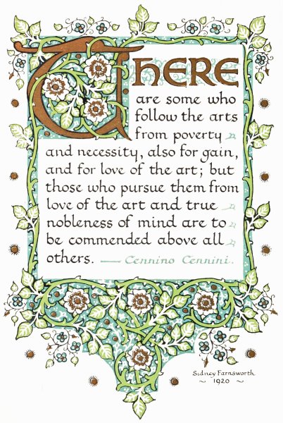
There are some who
follow the arts from poverty
and necessity, also for gain,
and for love of the art; but
those who pursue them from
love of the art and true
nobleness of mind are to
be commended above all
others.—Cennino Cennini.
Sidney Farnsworth
1920
ILLUMINATION
AND ITS DEVELOPMENT
IN THE PRESENT DAY
BY
SIDNEY FARNSWORTH
Illustrated with Drawings
and Diagrams by the Author
NEW YORK
GEORGE H. DORAN COMPANY
Printed in Great Britain
1
PREFACE
This book is the outcome of a series of articles which
appeared in Drawing and Design. At the suggestion
of the Editor of this periodical, the whole of the
chapters originally published have been entirely rewritten
and considerably enlarged; at the same time
a large amount of quite new matter has been added.
The additions that have been made include a
chapter on the development of writing in the past,
together with a number of alphabets based on historical
examples. I have also added a brief sketch of the
history of Illumination, as I felt that the book would
not be complete without some reference to this side
of the subject. Some attention has been given to
the colours and gilding methods of the mediæval
artists, and it is hoped that the notes given may be
of interest to the student. Extensions have also been
made in connection with the use of colours and materials
by the student to-day.
Chapters on the further development of illumination,
the illumination of the printed book, and printed
book decoration, are also amongst the additions.
The chapters on the application of lettering and
decoration from the commercial standpoint have also
been developed considerably, and at the end of the
book some notes have been added on books for further
study.
2
I have tried to write in as simple a manner as
possible, so that the youngest student should have no
difficulty in understanding the instructions that are
given.
So many books have been written on the subject
of Illumination that it may seem quite superfluous to
add yet another to the long list. Still, I think that a
work treating the matter from the present-day standpoint
ought to be of some service to the student who
is desirous of practising this art to-day.
I have felt for some time past that there was a
need for a work that would deal with the various
ways in which this art could be applied in a time like
the present. I have found that most of the books
that have been written on Illumination treat the
subject either from the standpoint of the archæologist
or merely from that of the amateur. It is simply the
result of a sincere desire to supply what I feel to be
a real need that this book has been written, and in
the hope that it may serve as a handbook and guide
for the serious worker.
It has not been written with the idea of introducing
a quick and easy method of becoming expert in the
art of illumination. Success, in this, as in anything
else of importance, can come only through hard work.
I have endeavoured to foster interest and enthusiasm,
so that the student may not look upon the hard
work entailed with this subject merely as a certain
amount of drudgery to be got through. To one who
is keenly interested in any particular study hard work
often becomes a pleasure, and it is only when such is the
case that the full benefit is derived from such study.
3
Illumination has a value in the present day as
well as it had in the past. The developments of this
art are seen in many of the common-place things of
to-day. In some cases the development has been
carried so far as to lose almost its identity with the
original craft from which it has sprung, but the connection
is there all the same.
The art of the book began with the illuminated
manuscript, the early printed books being based
entirely on the manuscripts that preceded them; and
the same thing may be said with regard to the application
of decoration to printed lettering generally.
The practice of illumination in the present day
should result in something more than weak imitations
of illuminated borders which were produced in the
mediæval period. Illumination ought to be a real
living art to-day.
There are numerous ways in which it could be
used as a craft at the present time, quite apart from
the many ways in which it could be applied commercially.
With regard to the study of lettering, there is a
great need for more serious attention to be given to
it. We are so surrounded by bad lettering that it is
well that an effort should be made to get better results,
and, as a means to this, some study of the beautiful
forms of lettering used in the past should be of the
greatest service. For this reason I have tried, by
giving some examples, to direct the student’s attention
to at least some of the fine styles of lettering
that were employed in centuries gone by.
It is a great pity that the splendid book-hands of4
the past should have fallen into disuse, to say nothing
of the beautiful decoration that accompanied the
writing. It would, undoubtedly, be a good thing if
some further encouragement were given to serious study
of the well-formed lettering that was produced during
the mediæval period.
I trust that this small work may, in some slight
measure, be the means of fostering increased interest
in lettering and illumination. I am deeply conscious
of its many imperfections, and I only hope that, in
spite of its many faults, it may be of some use to the
reader who is interested in this art. If the study of
it is the means of creating greater zeal and energy in
the production of good work in this direction, I shall
feel that my efforts have not altogether been in vain.
Sidney Farnsworth.
The Island,
Little Waltham,
Near Chelmsford.
5
INTRODUCTION
“In all great arts, as in trees, it is the height that
charms us; we care nothing for the roots or trunks;
yet they could not exist without the aid of these.”
This quotation from Cicero may as well be applied
to the art of illumination as to anything else. The
fact, however, that the tree cannot exist without the
aid of the trunk and roots, shows how important these
are; and no one who intends giving serious attention
to the tree in its entirety can afford to neglect these.
It is only through careful study of the art of
illumination that it is possible to understand fully the
construction that enters into the growth of this art.
When some knowledge has been gained of the manner
in which this work has been done in the past, through
practical experience, it is then that a real appreciation
is felt for the choice work of the mediæval period.
“Perfect illumination,” says Ruskin, in one of his
Lectures on Art, “is only writing made lovely;...
But to make writing itself beautiful—to make the
sweep of the pen lovely—is the true art of illumination.”
Certainly it is only when the student is able
to produce writing that is attractive in itself, that it is
permissible to add decoration to it. The decoration
should be the natural outgrowth from the writing.
A page of well-formed lettering makes good pattern,6
and is not merely pattern, as it serves also the purpose
for which it was intended, viz., to be read.
It is when he has gained the mastery of the pen,
in making well-formed letters with good arrangement
on the page, that the student may consider that he has
well started on the road to the production of good
illumination.
For the construction of well-finished lettering it
is essential that a mastery of the tool and materials
employed should be acquired. It is when the pen
becomes almost a part of the writer, so that he is
able to concentrate all his energy on the writing,
giving scarcely any attention to the pen itself, that he
may claim to be proficient in the use of the pen.
If there is one thing more than another that one
feels when examining some of the best illuminated
work of the past, it is that the writer was a master of
the pen as a letter-making tool. He did his work well;
his books were transcribed in a workmanlike manner,
and the decoration which followed seems to come quite
naturally from the writing itself.
It is for this reason that so much attention has
been given to the use of the quill and reed pen in the
formation of good writing.
Students are frequently at a disadvantage from
inability to handle the pen properly. To help, in some
measure, to remedy this, the student is shown how to
make sharply-defined strokes before attempting to
form letters. At the same time no particular manner
of holding the pen has been insisted upon.
In the Introduction to his “Essay on the Sublime
and Beautiful,” Burke says: “I am convinced that7
the method of teaching which approaches most nearly
to the method of investigation is incomparably the best;
since, not content with serving up a few barren and
lifeless truths, it leads to the stock on which they
grew; it tends to set the reader himself in the track of
invention, and to direct him into those paths in which
the author has made his own discoveries, if he should
be so happy as to have made any that are valuable.”
This has been the ideal that the present writer has
tried to keep ever before him in writing the instructions
that are given in the succeeding pages. His aim
has been to direct the student in the right way, and
then to encourage him to study the subject for himself.
Whether he has been successful in this endeavour must
be left for the reader to judge.
The study of calligraphy, in connection with
illumination, ought to be helpful in making the ordinary
handwriting more legible. Before the age of printing,
the book-hand developed alongside of the ordinary
cursive handwriting, and possibly the fact that the
book-hand has been lost may be advanced as a reason
why most of the handwriting to-day is so degenerate.
A careful study of some of the fine models of book-hands
of the past cannot but be beneficial. It will
certainly enable the student to appreciate beautiful
forms of lettering, and its influence should soon be
apparent in the lettering in general use. This should
result in better sign-writing, better lettering in our
magazines and papers, in short, better lettering all
round.
Undoubtedly it would be a good thing if the children
in our schools could be taught to form some of8
the fine book-hands of the past with the quill pen. It
is certainly, to a great extent, due to the lack of a
practical knowledge of some of the splendid forms of
lettering used in the past, that the general lettering
in use at the present time is so bad. It ought not to
be at all impracticable for this suggestion to be carried
out.
After the student is able to make well-formed
letters with the quill and reed pen, and arrange them
well, the use of decoration and the further development
of illumination should follow naturally.
There is undoubtedly a place for illumination
to-day, and even in connection with the illuminated
manuscript book, which should certainly possess the
first place amongst the work of the modern illuminator.
There is not the slightest suggestion there that the
illuminated manuscript should usurp the place of the
printed book, but there is no reason why it should not
be in use at the same time. One of the great charms
that a fine manuscript possesses is its uniqueness, not
being one of many, as in the case of the printed book.
Then again, some things, as, for example, Poetry and
Romance, are rendered in a much more sympathetic
fashion in the illuminated manuscript than in the
printed book.
There are many ways in which the art of illumination
might be applied to-day, as well as in the usual
illuminated testimonial. Several suggestions are given
in the following pages for different ways in which it
may be employed.
In the decoration of the printed book the services
of the artist who is well-trained in the use of good9
lettering and book-decoration should be of value to
the printer. Although there is no need for the printer
to endeavour to imitate the work of the illuminator,
there ought, certainly, to be room for a well-developed
style of decoration that could be used with a good form
of type.
A few centuries ago, before printing was used for
the production of books, illumination as a part of
calligraphy was an important craft. Books were
not only beautifully written but they were also richly
decorated with gold and colours. The writing of long
manuscripts was very slow work, compared with the
increased speed of production afforded by the printing
press; but, notwithstanding this, it appears to have
been important that the writing should be rendered
more beautiful by the enrichment of decoration.
Unfortunately, although methods of book-production
are now so speedy, most of the lettering is of the
barest and crudest kind. Book-decoration seems to
be, in most cases, confined to illustration, and even
this does not often form an altogether inseparable part
of the book.
With regard to the various developments on the
purely commercial side, the study of pen- and brush-formed
lettering cannot but be of the greatest service
to the commercial artist who requires lettering for
posters, labels, book-covers, and the many things that
require lettering.
In fact, lettering enters so largely into decorative
design that the study of some of the fine forms of
lettering is of paramount importance to any artist
who desires that the lettering that he uses should be of10
good construction. So many drawings have been
spoiled through the introduction of weak and badly
formed lettering that the need for training the student
to produce lettering that is well-finished and of good
form should be obvious to everyone.
Without doubt one of the great things in lettering
is to allow the tool to have its way. Pen-formed
lettering should be of a form easily constructed with
the pen, and should not pretend to be a brush-formed
lettering, and vice versâ.
It is for this reason that in the first chapter so
much attention has been given in noting the influence
that the tools and materials employed have had on
the shaping of the letters.
11
CONTENTS
| |
PAGE |
| PREFACE |
1 |
| INTRODUCTION |
5 |
| CHAPTER I |
| THE INFLUENCE OF THE TOOL |
| Writing the Foundation of Illumination—Early Influences—Babylonian Characters—Egyptian Hieroglyphics—The reed and quill Pen—The use of Vellum |
23 |
| CHAPTER II |
| THE DEVELOPMENT OF WRITING IN THE PAST |
| Majuscule Writing—Square Capitals—Rustic Capitals—Uncials—Mixed Uncial and Minuscule Writing—Half-Uncials—Irish Half-Uncials—English Half-Uncials—Minuscule Writing—Lombardic Writing—Visigothic Writing—Merovingian Writing—Carlovingian Writing—Later Styles |
32 |
| CHAPTER III |
| THE PREPARATION AND USE OF THE PEN |
| Cutting the Pen—Simple Exercises |
42 |
| CHAPTER IV12 |
| THE FORMATION OF LETTERS |
| Letters formed with simple Pen-strokes—Method in working—How the various Letters are formed |
48 |
| CHAPTER V |
| FORMING WORDS AND SENTENCES |
| Writing a short Quotation—Spacing Letters—Italics—Pen-formed Figures |
54 |
| CHAPTER VI |
| ALPHABETS FOR STUDY, BASED ON HISTORICAL EXAMPLES |
| Uncial Letters—Half-Uncials—Writing, from the Tenth to the Fifteenth Century |
60 |
| CHAPTER VII |
| ROMAN LETTERING |
| Building up Letters with Pen-strokes—Roman Letters made with simple direct Pen-strokes—The Construction of Roman Capitals |
70 |
| CHAPTER VIII |
| SOME HISTORICAL EXAMPLES OF ROMAN LETTERING |
| The Alphabet of the Trajan Column—Various Alphabets from the Thirteenth to the Sixteenth Century |
76 |
| CHAPTER IX |
A BRIEF SKETCH OF THE HISTORY OF ILLUMINATION
1. From the Fourth to the Eleventh Century |
| Classical and Byzantine Illumination—Celtic and Anglo-Celtic—Carlovingian—The Winchester School |
8413 |
| CHAPTER X |
A BRIEF SKETCH OF THE HISTORY OF ILLUMINATION
2. From the Twelfth Century to the Decline |
| Illumination in the Twelfth Century—Thirteenth Century—Fourteenth Century—Fifteenth Century and later |
93 |
| CHAPTER XI |
| THE INITIAL LETTER |
| How the Decoration springs from the Initial letter—Examples from the Seventh to the Fifteenth Century |
101 |
| CHAPTER XII |
| SIMPLE ILLUMINATION IN BLACK AND RED |
| Method of setting out a Page—Arranging the Lettering—Initial letters, and how to construct them—Various arrangements of Lettering |
107 |
| CHAPTER XIII |
| THE COLOURS USED BY THE MEDIÆVAL ILLUMINATOR14 |
| Early treatises—Theophilus—The Book of the Art of Cennino Cennini |
115 |
| CHAPTER XIV |
| COLOURS: THEIR COMPOSITION AND PERMANENCE |
| The importance of a knowledge of the different Colours employed—Yellow Pigments—Red Pigments—Blue Pigments—Green Pigments—Brown Pigments—Black Pigments—White Pigments |
123 |
| CHAPTER XV |
| COLOURS: THEIR PREPARATION AND USE |
| Various forms in which Colours are prepared—Mixing Colours—A method of keeping body colours in a convenient form—Preparing a set of Colours for Illuminating |
131 |
| CHAPTER XVI |
| THE GILDING METHODS OF THE MIDDLE AGES |
| Early gilding methods—Powder gold—The early use of gold-leaf—Raised gilding |
138 |
| CHAPTER XVII |
| THE USE OF GOLD |
| Shell-gold—The use of gold-leaf—How to handle gold-leaf |
146 |
| CHAPTER XVIII |
| ILLUMINATION WITH GOLD AND COLOURS15 |
| Vellum for Illuminating—Hand-made paper—Brushes—Colour-work |
152 |
| CHAPTER XIX |
| THE FURTHER DEVELOPMENT OF ILLUMINATION |
| The development of decoration—Present-day uses of Illumination—Possible developments |
161 |
| CHAPTER XX |
| THE ILLUMINATED ADDRESS |
| The Framed Address—The Vellum Scroll—The Book-form |
171 |
| CHAPTER XXI |
| THE VARIOUS METHODS OF REPRODUCTION |
| Line Blocks—Half-tones—The Three-colour Process—Lithography |
178 |
| CHAPTER XXII |
| CHRISTMAS CARDS |
| Bronze gilding—Setting out to design—Suggestions—Hand-written Cards—Invitation Cards |
185 |
| CHAPTER XXIII16 |
| LETTERING FOR COMMERCIAL PURPOSES |
| Various things requiring Lettering—Lettering for Maps, Plans, etc.—Lettering for Poster-work—Arrangement of letters—Designing a Magazine Cover |
192 |
| CHAPTER XXIV |
| HAND-WRITTEN POSTERS, ETC. |
| A quick method of writing a Poster—The reed pen and the brush—Window Tickets—Showcards |
203 |
| CHAPTER XXV |
| THE ILLUMINATED MS. BOOK |
| The Arrangement of Pages—Planning out—The Colophon—The Primary Object of the Book—The Decoration |
216 |
| CHAPTER XXVI |
| A SIMPLE METHOD OF BINDING MSS. |
| Binding in limp Vellum—Sewing the sections—The Decoration of the Cover |
225 |
| CHAPTER XXVII |
| THE ILLUMINATION OF THE PRINTED BOOK |
| The Combination of Printing and Illumination—Books suitable for Illumination—The Style of Decoration suited to this |
232 |
| CHAPTER XXVIII |
| PRINTED BOOK DECORATION17 |
| The Title-page—The Initial Letter—Types to avoid—Tail-pieces, etc. |
238 |
| CHAPTER XXIX |
| CONCLUDING REMARKS |
248 |
| CHAPTER XXX |
| NOTES ON BOOKS |
256 |
19
LIST OF ILLUSTRATIONS
| |
PAGE |
| Illuminated Page |
Frontispiece |
| Babylonian Characters (Fig. 1) |
25 |
| Egyptian Hieroglyphics (Fig. 2) |
27 |
| Egyptian Hieratic Writing |
28 |
| Stylus and Early Pens |
29 |
| Cadmus gives the Greeks an Alphabet |
32 |
| The Development of Writing (Fig. 3) |
34 |
| The Development of Writing (Fig. 4) |
38 |
| The Pen (Fig. 5) |
43 |
| Simple Pen-Strokes (Fig. 6) |
45 |
| Pen-formed Letters (Fig. 7) |
49 |
| The Construction of Letters (Fig. 8) |
51 |
| Forming Words and Sentences (Fig. 9) |
55 |
| Word-spacing, etc. (Fig. 10) |
57 |
| Alphabets for Study (Fig. 11) |
61 |
| Alphabets for Study (Fig. 12) |
63 |
| Alphabets for Study (Fig. 13) |
64 |
| Alphabets for Study (Fig. 14) |
66 |
| Roman Lettering (Fig. 15) |
71 |
| Pen-formed Roman Lettering (Fig. 16) |
74 |
| The Trajan Column |
76 |
| The Trajan Alphabet (Fig. 17) |
77 |
| The Trajan Alphabet (Fig. 18) |
78 |
| The Trajan Alphabet (Fig. 19) |
79 |
| Roman Alphabets (Fig. 20) |
8020 |
| Roman Alphabet, pen-formed (Fig. 21) |
81 |
| Roman Alphabets (Fig. 22) |
82 |
| The Lindisfarne Gospels |
84 |
| Flemish Initials |
101 |
| Initial Letters (Fig. 23) |
102 |
| Initial Letters (Fig. 24) |
105 |
| A Simple Page in Black and Red |
107 |
| Method of Setting out Page (Fig. 25) |
108 |
| Mediæval Alphabets (Fig. 26) |
110 |
| The Construction of Initials (Fig. 27) |
111 |
| Illumination in Black and Red (Fig. 28) |
113 |
| The Preparation of Colours (Fig. 29) |
133 |
| Gilding Materials (Fig. 30) |
148 |
| Illumination with Gold and Colours (Fig. 31) |
157 |
| Illuminated Altar Tablet |
161 |
| The Development of Illumination (Fig. 32) |
162 |
| Rough Sketches of Illuminated Pages (Fig. 33) |
166 |
| A Roll of Honour |
167 |
| Illuminated Altar Tablet |
169 |
| A Church Porch Text |
170 |
| An Illuminated Address |
171 |
| Various Forms of Illuminated Addresses (Fig. 34) |
172 |
| Designs for Christmas Cards |
185 |
| A Christmas Card |
187 |
| Styles of Cards (Fig. 35) |
188 |
| Styles of Cards (Fig. 36) |
189 |
| Designs for Programme and Progressive Whist Card |
190 |
| Booklet Cover |
192 |
| An Attractive Advertisement |
192 |
| A Handbook Cover |
19421 |
| Lettering for Maps, etc. (Fig. 37) |
195 |
| A Design for a Certificate |
196 |
| An Alphabet for Poster Work (Fig. 38) |
197 |
| Two Designs for Labels |
198 |
| A Design for a Letter Heading |
199 |
| A Design for a Music Cover |
200 |
| A Design for a Bookplate |
201 |
| An Attractive Piece of Lettering |
204 |
| Guide for Hand-written Posters (Fig. 39) |
205 |
| Specimen Poster written with Pen (Fig. 40) |
207 |
| Specimen Poster written with Brush (Fig. 41) |
209 |
| Design for a Menu |
210 |
| Window Tickets (Fig. 42) |
213 |
| A Showcard (Fig. 43) |
214 |
| Frontispiece of Blake’s “Songs of Innocence” |
216 |
| Arrangement for MS. Book (Fig. 44) |
218 |
| Title-page of Blake’s “Songs of Innocence” |
219 |
| Examples of Colophons (Fig. 45) |
221 |
| Two pages from “Songs of Innocence” |
223 |
| Method of Stitching MS. Book (Fig. 46) |
226 |
| Vellum Cover (Fig. 47) |
228 |
| Cover ready for Binding (Fig. 48) |
229 |
| Completing the Cover (Fig. 49) |
230 |
| The Illumination of the Printed Book (Fig. 50) |
233 |
| Styles of Title Pages (Fig. 51) |
239 |
| Types of Initials to Avoid (Fig. 52) |
242 |
| Decorative Initials (Fig. 53) |
243 |
| Tail-pieces (Fig. 54) |
245 |
23
ILLUMINATION
AND ITS DEVELOPMENT
IN THE PRESENT DAY
CHAPTER I
THE INFLUENCE OF THE TOOL
Calligraphy and Illumination are inseparably bound
up with each other. The art of Illumination cannot
be severed from that of Writing. One cannot imagine
the decoration apart from the writing. Undoubtedly
this sprang from a desire to beautify the writing.
Man sought to make his manuscripts beautiful, and
the result was a form of illumination, at first very
primitive, but gradually developing into the beautiful
art that we are so familiar with in the choice manuscripts
of the middle ages.
When commencing the study of the art of illumination
it is extremely important that it should be approached
from the proper standpoint. It is to be
feared that this has not always been the case. The
lure of the bright gold and colours has often led both
teacher and taught astray, and the proper use of the
pen in writing has been almost entirely neglected.
Instead of allowing the tool to have its own way,
it has been forced to form laborious shapes that are
not suited to its construction at all. The decoration,24
it is to be feared, has been looked upon as a sort of
spice to be added as a finishing touch, instead of being
a vital growth springing naturally from the writing.
Until it be viewed from this standpoint, no real progress
can be made. If a building is to be soundly
constructed, the first thing to see to is that the foundations
are well laid. The same principle applies in this
case. The decoration, if it is to be living and real,
must have a starting-point for growth. The student
should see that this is a sure foundation and not
a tottering, shaky structure. Well-formed writing
should be the first consideration.
Ordinary hand-writing is a development of the
kind of writing used by the old calligraphers. Generally
speaking, the connection between the two is not
recognised. Probably if this were so calligraphy of
the present day would be much better than it generally
is. The fact that it is generally referred to as “printing”
shows how the connection has been lost. Drawing
is thought to be more akin to it than hand-writing.
It is no uncommon sight to see a student carefully
drawing the shapes of the letters and then filling them
in with a fine mapping pen. If the individuality of
the pen as a letter-making tool were recognised this
kind of thing would not occur.
It may be interesting to consider briefly some of
the early influences at work in the production of writing.
BABYLONIAN CHARACTERS.
Showing the influence of the tool on the shapes of the Characters.
Fig. 1.
In Fig. 1 some examples of early Babylonian
characters are shown. In these early days the common
writing material was clay. The characters used in
writing were rough pictures of different objects which
were drawn in outline. Thus the sign for “king” was25
a rude drawing of a man crowned; this was scratched
on the surface of the soft clay with a pointed tool.
One can quite understand how these characters
could be constructed with a series of impressions in much
less time than it would take to draw them in outline.
Then again it must have been much easier to draw
on the soft clay in this way. A square-pointed stylus
was used for this purpose, and, with the wedge-shaped
impressions thus produced, the characters could be
formed quite easily. Not only was the scribe able
to write with greater speed, but the way in which the26
characters were produced was more methodical. The
character for “king,” when made with the wedge-shaped
impressions, was constructed as shown in (b).
One can easily recognise the same form placed horizontally,
instead of vertically, as was originally the case.
In course of time the characters became somewhat
simplified. The next step in the development of the
character is shown in (c). The final form is shown in
(d), this being very much simplified. In like manner
the signs represented in (e) and (h) were used to denote
“star” and “sun” respectively. The development
of these is seen in (f) and (g), also in (i) and (j). The
reason for calling attention to these characters is to
show how the shapes are influenced by the tool and
the material employed. This is a most important
factor in the formation of letters.
Where soft clay was used as a material, and the
characters were formed by making impressions with a
stylus, one would naturally expect that these signs
would take the form of a series of indentations rather
than flowing lines as from a brush or pen.
In the case of the Egyptian hieroglyphics, shown
in Fig. 2, a difference is at once noticed. These
characters were at first small pictures carved on stone.
The hieratic characters were simple interpretations of
these formed with a reed pen. It is quite obvious, to
all who care to observe, how easily these characters
could be formed, especially when they are compared
with the earlier signs. In this case the influence is
quite different from that of the Babylonian characters.
Instead of a series of impressions, one notices long flowing
strokes characteristic of the pen. It is interesting27
to note how the essential quality of the more elaborate
character is obtained with simple pen-strokes.
Although the hieroglyphic is often quite complex
there is still a likeness retained in the hieratic form.

EGYPTIAN HIEROGLYPHICS.
Showing the development into the
Hieratic or pen-formed Characters.
Fig. 2.
The reed pen used by the Egyptian scribes was the
forerunner of the modern pen. It was formed from
the hollow stalk of grasses that grew in marshy districts.
Sometimes pens were made from hollow canes and
bamboos. This kind of pen is still used in the East.
The material used for writing upon was known as
papyrus. This was made from the pith of a species of28
reed, the Cyperus Papyrus of Linnæus. This was, in
early days, cultivated in the Delta of Egypt. It
was used for several different purposes, one of the
most important being for writing-material. This
was prepared by cutting it into strips and placing
these side by side, with another set placed across them
at right angles. The two layers were stuck together
and the whole pressed and dried, and the surface
smoothed to make a sheet of writing-material.
It is a most difficult matter to state when the quill
pen was first used. Probably the earliest allusion to
it occurs in the writings of St Isidore, Archbishop of
Seville, who lived in the early part of the seventh
century. The following is the quotation in question:
“Instrumenta scribæ calamus et penna; ex his
enim verba paginis infiguntur; sed calamus arboris
est, penna avis, cujus acumen dividitur in duo.”
(“The tools of the writer are a reed and a quill;
for by these words on pages are impressed; the reed
is of wood, the quill from a bird, and its point is
divided into two.”)
But of course it is extremely probable that quill pens
were in use at a much earlier period than this. It is
well known that metal pens were used by the Romans,
as a number of these, made of bronze, are in existence
at the present time.
For general writing purposes tablets coated with
wax were used by the Greeks and Romans. A stylus
with one end pointed and the other flattened was used
to write with, the writing being done with the sharp
point and erasures made with the flattened end.
Egyptian Hieratic Writing.
29

Ivory Stilus.
Silver Stilus, bound with gold wire.
Ancient Roman Bronze Pen.
Ancient Reed Pen.
30
The skins of animals have been used as a writing
material since quite an early period, and the use of
vellum was probably an improvement upon this.
Pliny, in his “Natural History,” tells the story, on
the authority of Varro, of how Eumenes II., King of
Pergamus from 197 to 159 B.C., was desirous of extending
the library in his capital, but the Ptolemies, being
jealous, stopped the export of papyrus, thinking by this
means to prevent the royal library from growing.
Owing to the lack of papyrus, skins were employed
and, necessity being the mother of invention, the
manufacture of vellum came about. Whether any
real importance can be attached to this story or not,
it is certain that Pergamus was a great centre for the
manufacture of vellum. In fact, the word “parchment”
is derived from charta Pergamena, i.e., “paper
from Pergamum.”
It is easy to see how this ideal writing-material,
with the quill pen, must have had a great influence
upon the formation of letters. Generally speaking,
the writing on parchment or vellum is crisper and more
sharply defined than that on the papyrus.
There is not the slightest doubt that the influence of
the tool and the writing-material had a great deal to
do with forming the shapes of the letters. Good lettering
was seldom or never consciously designed, but was
the result of certain influences at work.
In the development of lettering in the past, the
pen, as a letter-making tool, has played a most prominent
part. A reed or quill pen cut with a broad nib,
so as to give crisp thick and thin strokes, is an ideal
tool for the formation of letters, but one thing is
necessary: the pen must be allowed to have its own way.31
The letters should not be designed first and copied
with the pen afterwards. If the lettering is to be
pen-formed, let it be formed with the pen; it should
come straight from the pen.
The capabilities of the pen as a letter-making tool
should be carefully studied. The reed or quill pen
should be used, and one of the best ways to become
intimate with the pen is to cut it to shape for oneself.
One is thus able to understand the possibilities of this
tool as a means for the formation of letters, in a much
more intimate manner than if a ready-made tool is
placed in the hand. The first thing to endeavour
to grasp is how to cut and use the pen. After this has
been mastered, the next step should be the formation
of letters. This is followed by forming letters into
words. Then comes writing and designing with masses
of writing. Not until the student is thoroughly
familiar with the use of lettering should he attempt to
add any decoration to it. A fine piece of writing in
black, or black and red, on vellum or fine hand-made
paper is a piece of decoration by itself, but a bad piece
of lettering cannot be made beautiful, however much
ornament be added afterwards. The first step towards
the study of illumination proper comes then, and
attention should be given to the place of the initial
letter and the part it has played in the past as a starting-point
for the decoration in the MSS. of the mediæval
period. At first a good deal can be done with the use of
black and red only, or black, red, and blue. Then come
simple decoration with gold and colours; the use of
raised burnished gold; the application of illumination
for commercial purposes; and the illuminated MS. book.
32
CHAPTER II
THE DEVELOPMENT OF WRITING IN THE PAST
Before describing the method of cutting and using
the pen, it may possibly be instructive to survey
briefly the development of writing through the centuries.
The alphabet, as we know it, has been traced right
back to that used by the Phœnicians. In fact, until
a comparatively short time ago, it was thought by some
that it could be traced back to the Egyptian hieroglyphics,
but in the light of recent discoveries this
theory is no longer tenable. The origin of our alphabet
is therefore still a matter for research, although there
seems to be no doubt concerning its descent from the
Phœnician alphabet.
The Roman alphabet seems to be a direct descendant
from this, and it is from the Roman alphabet
that the lettering that is in use to-day has been derived.
Roman writing was divided into two distinct
classes: the formal book-hand, and the cursive hand
which was the common hand-writing of the people.
MAJUSCULE WRITING
The book-hand first took the form of majuscules,
which in turn were divided into Square Capitals,
Rustic Capitals, and Uncials. After this came the33
modified forms of Uncials caused by the admixture of
minuscules.
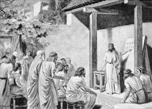
Cadmus gives the Greeks an Alphabet.
(Tradition relates that letters were first introduced into Greece by a Phœnician named Cadmus.)
By way of explanation it may be here mentioned
that, in both Greek and Latin palæography, capital
letters are termed “majuscules,” while small letters
are known as “minuscules.”
SQUARE CAPITALS
Probably the earliest Latin majuscule writing is
that known as square capitals. These seem to be
modelled on the same type of letter that was used for
the fine inscriptions. Although the general opinion
is that these are the earliest form, there is very little
square capital writing in existence. The earliest
specimen known has been attributed to the end of the
fourth century, although it is thought that this form
of writing had been in use some centuries before this.
It was in use until the fourth or fifth century. There
is not the slightest doubt that writing, when these
letters were used, must have been comparatively slow
work.
RUSTIC CAPITALS
Rustic capitals seem to be an attempt to write
the letters by means of simple pen-strokes. Writing
with this type of letter must have been much quicker
than when the square capitals were used. This style
of writing has been used in the earliest Latin MSS.
now in existence, but, although this is the case, the
general opinion seems to be that the square capitals
were used first. The title “Rustic” is somewhat34
misleading, as it might lead one to suppose that these
letters are rough in character, when they are generally
written quite as carefully as the square capitals.
UNCIALS
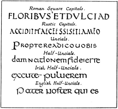
Roman Square Capitals.
Rustic Capitals.
Uncials.
Half-Uncials.
Irish Half-Uncials.
English Half-Uncials.
Fig. 3.
The next stage is the use of the majuscules known
as “Uncials.” These are true pen-formed letters.
They seem to be based on the square capitals, but, in
place of so many angles, curves are employed, these
being much more adapted to the use of the pen. It
is a round hand, and a very beautiful form of writing.35
The simplicity of the characters with their flowing
curves is such that they may be easily formed with a
sharply-cut reed or quill. The letters, A, D, E, H,
M, and U, are the principal letters that show the
characteristics of this form of writing. It seems to
have been in common use as a book-hand in the fourth
century. It is, however, thought by some that it is
quite possible that it may have been in use as early
as the third century, as in the oldest specimens that
are known the lettering appears to be fully developed.
One of the special distinctions of this kind of writing
is the way some of the vertical strokes rise above, or
fall below, the line of writing. From the fifth to the
eighth centuries it was given the premier place as a
literary hand. The early uncials, as also were the
square capitals and rustic capitals, were written with
a pen cut with a slanted point.
MIXED UNCIAL AND MINUSCULE WRITING
It must be remembered that all the time these
majuscules, both capitals and uncials, represent only
one side of the handwriting employed, viz., that used
for the production of books. The ordinary handwriting
of the people, known as “cursive” writing, was
in extensive use at the same time. Very often this
form of writing got mixed up with the other, and the
result was a mixed style. For example, in some of the
early majuscule MSS., notes have been found written
in this style. This gradually came to be used as a
book-hand, until soon very few of the early uncial
forms were left.
36
HALF-UNCIALS
To this form of writing in its full development the
title of “Half-Uncial” has been given. It was employed
as far back as the fifth century for writing MSS.
It may have been used because it could be written
more quickly than the ordinary uncial; anyway, it
seems to have been very extensively used as a literary
hand. This style is very important, as it marks the
beginning of the change from majuscule to minuscule
writing. These characters were generally formed with
a straight-cut pen.
IRISH HALF-UNCIALS
Writing in the British Isles was greatly different
from that used on the Continent. On the Continent
the hand was developed from the Roman cursive
writing, while in England and Ireland the Roman
Half-Uncial was the starting-point of development.
There is not the slightest doubt but that the rise
of Christianity in the British Isles had a great deal to
do with the development of the book-hand. It is a
well-known fact that the Christian missionaries from
Rome brought with them a number of MSS. which may
have served as models for the native scribes. These
were probably written in Roman half-uncials, which
would account for the manner in which the Irish
handwriting developed. Evidently no MSS. written
in pure uncials came to Ireland; anyway, there seems
to be no reason to suppose that such was the case, as
no MS. of this type has been found that may be claimed
to be purely Irish without any shadow of doubt.
37
Early Irish writing is in two forms, round and
pointed. The round hand is distinctly half-uncial.
Although it is most difficult to state the earliest date
of the Irish MSS., the general opinion is that they date
back at least as far as the seventh century. The
famous Book of Kells is a well-known example of
Irish half-uncials. The pointed writing was developed
in the eighth and ninth centuries. This is probably
a development of the round hand, and in course of
time became the Irish national hand.
ENGLISH HALF-UNCIALS
In England there were two distinct schools of
writing, one of which came from Ireland and the other
brought over by the Roman missionaries. Very
little is known of the writing brought over by the
foreign missionaries, as only a small amount is
known to be in existence. There is evidence, however,
that some of the Roman rustic capitals were
made use of.
The English half-uncials were modelled on the
Irish half-uncials. The writing in the Durham Book,
now in the British Museum, affords a good example of
this kind of writing. It is interesting to compare
this writing with that of the Book of Kells; there
is a great similarity. Both are carefully written
with the straight-cut pen. The English half-uncials
also developed in the eighth and ninth
centuries into a pointed hand. Capitals which were
used for initials, etc., are simply variations of the
majuscules.
38
MINUSCULE WRITING
As mentioned before, the Roman cursive was the
basis of the writing on the Continent. Three great
national hands were formed, viz., Lombardic, Visigothic,
and Merovingian.
LOMBARDIC WRITING
Fig. 4.
This was the national handwriting of Italy; it
was used from the eighth to the eleventh centuries.
The term “Lombardic” is given as a general term
to the writing of Italy in the early middle ages. In
Fig. 4 some free renderings are given of this hand.39
The first (a) is an example in one of its earliest stages,
written cursively in the early part of the ninth century.
The next, shown in (b) is the book-hand a little later.
The third example (c) is a later development of the
eleventh century, known as “broken Lombardic.”
It may be noted that in all these the slanted-cut pen
has been used.
VISIGOTHIC WRITING
The title “Visigothic” has been given to the
national handwriting of Spain. Derived also from the
Roman cursive, it developed into a book-hand that
was used in the eighth century. It was in use until
the twelfth century. The first example (d) is a half-cursive
book-hand of the seventh or eighth century.
The next (e) a book-hand of the early tenth century.
The last example (f) is the last stage, being of the
twelfth century. All these are written with the
slanted-cut pen.
MEROVINGIAN WRITING
This is the name given to the writing practised in
the Frankish empire. This form of writing leads on
to the great reform in the time of Charlemagne. Starting,
as was the case in the other two schools, from the
Roman cursive, it developed into a set book-hand which
is noticeable in several MSS. of the seventh and eighth
centuries. An early specimen is shown in (g). Several
different types of writing were used within the limits
of the Frankish empire, some of which bear a strong
resemblance to the Lombardic style. In fact, so similar40
are they that it is rather difficult to distinguish one
from the other. The example (h) is one of this type,
being of the late seventh century. As uncial and
half-uncial characters were still used for a good number
of MSS. it is but natural that these should influence
the style of writing. The specimen given in (i) is an
example showing the influence of the half-uncial, and
is a step towards the full development of the Caroline
minuscule.
CARLOVINGIAN WRITING
The great revival of learning during the reign of
Charlemagne resulted in the development of a new
school of writing known as Caroline, or Carlovingian.
Towards the end of the eighth century the decree
calling for the revision of the Church books naturally
became the cause of fresh activity in the writing
schools connected with the monasteries. At Tours
the book-hand was developed which is known as the
Caroline Minuscule. An example is given of this hand.
This form of writing spread rapidly all over the Frankish
empire and gradually influenced the book-hands
employed in the neighbouring countries. The use of
the slanted-cut pen is an important thing in connection
with the formation of these minuscules.
LATER STYLES
The tenth century example given is from the
Benedictional of Æthelwold, Bishop of Winchester from
A.D. 963–984. This lettering is of the foreign type,
but it has a strongly defined native character all its41
own, some of the letters being distinctly Saxon in
type.
From the twelfth century onwards a great number
of MSS. were produced, each country having its own
particular style and developing on certain definite
lines. It is impossible to give specimens of all the
different kinds of Calligraphy. The examples shown
must be taken as roughly indicating the general
style of the writing. The use of the slanted-cut
pen tended towards the compression of the letters,
thus forming a strong contrast to the letters produced
in the earlier periods with the straight-cut pen.
In the thirteenth century writing became considerably
smaller. In the latter part of this century a very
large number of Bibles appear to have been written,
and volumes were smaller, standing out in strong
contrast to the ponderous tomes of the preceding
century. In the fourteenth century the writing became
considerably stiffer and more angular. This tendency
showed itself still more strongly in the fifteenth
century.
In Italy this tendency did not make itself felt quite
as early as in the writings of Northern Europe. Although
later on they became more or less affected in
this way, there is a decided difference between Italian
writing and the styles employed by the other countries.
In the fifteenth century the Italian scribes appear
to have gone back to their early periods for models for
book-hands, and it is this that influenced the early
printers of Italy to use type of this character, which
has its modern representative in the Roman type of
to-day.
42
CHAPTER III
THE PREPARATION AND USE OF THE PEN
To obtain a practical knowledge of the use of the pen
as a letter-making tool is, as stated before, the first
important thing for the student to acquire. All the
practice he can get in cutting it to shape, and using it
in the manner described here, will be found to be of
the greatest service in helping him to produce good
lettering with it later on.
For large writing, the best tool is undoubtedly the
reed pen. In fact, this is probably the best pen for
the beginner to experiment with first. It is somewhat
difficult to obtain a good reed pen. The ordinary kind
that is sold by the artists’ colourmen is rather too soft
and soon becomes sodden with the ink. Crisp writing
is then impossible. A pen made from a piece of hollow
cane or bamboo seems to answer best of all.
A sharp knife is required for cutting, and a thin piece
of metal to form a spring to hold the ink is a great
advantage. It should be quite easy to see from Fig. 5
how the pen should be cut. The great thing to remember
is to see that the pen is cut with a nice chisel point,
as this ensures crisp and sharp writing. Another
important detail is the slit in the nib. This should be
just the right length for easy writing. If it is too long
it makes the pen too soft, while, on the other hand, if43
too short it is difficult to write with it. The student
will find that experiment alone will teach him what is
right in this matter. An hour or two spent experimenting
for himself with a reed or quill will teach him far
more than pages of instruction. Beyond just giving
a few hints, there is no need to devote much space to
directions as to how to cut the pen. The few details
given are just to act as a guide to the student.

In cutting the nib, care should be taken that the
slit is a clean cut, also that the points are equally
proportioned on each side. The spring is best made
from a piece of thin brass, copper, or pure tin. If,
ordinary tinned iron is used it is liable to get rusty
besides being generally too thick. It will be found that
a great deal depends on the position in which this is
placed, with regard to the flow of ink from the pen.
44
When using the reed pen for large writing it will be
found necessary to pare the curved inside of the pen
quite flat at the point, to ensure a firm stroke, as otherwise
a hollow stroke will be the result.
For smaller writing the best pen is the turkey
quill. The goose quill is not quite firm enough, but a
good turkey quill can be cut either for quite tiny writing
or large bold writing. It is best to strip the feather
part right away, as there is no advantage in having it
on the pen. This can easily be torn off by pulling the
end of the feather downwards.
For practice any good smooth-surfaced paper may
be used. Several of the well-known makers of high-class
hand-made drawing papers make a special paper
for writing and illumination.
A good fluid waterproof drawing ink should be
used. Care should be taken to procure one that will
not thicken either in the bottle or in the pen. It is
a great fault with some inks that, although they do not
seem to thicken very much in the bottle, they do so in
the pen. When this is the case, good writing is almost
impossible. One cannot produce good writing if one
has to stop every little while to wash out one’s pen.
Besides, when the ink is beginning to thicken, clear,
sharp writing becomes impossible.
Fig. 6 gives some simple exercises with the pen.
It should be quite easy to understand the formation of
the pen-strokes from this diagram. They should be
practised over and over again until the strokes can
be made very easily. It should be noticed that the
pen is kept practically at the same angle all the time.
It must be held as easily as possible. There is no need45
to acquire any special manner of holding it. Different
people hold the pen in different ways and it is best for
the student to find out which way is easiest for him
to hold it to produce good writing. If the pen is held
in a manner which may be correct according to a copy-book
but which feels awkward and cramped for the
writer, the writing produced in this way is bound to
show evidences of this. If, however, the pen is held
freely, and easily, it becomes almost a part of the writer
himself, and there is a feeling of freedom about the
writing that is entirely absent from that produced by
the other method.
Fig. 6.
The strokes in the diagram were made with a turkey
quill pen in exactly the same manner as described here.
One of the most important things is to endeavour to
keep the pen practically at the same angle all the time.46
If the pen is allowed to twist about in the hand, the
distinction between the thick and thin strokes will
not be sufficiently marked. It should be quite easy
for the student to acquire this mastery of the pen
without holding it in a vice-like grip.
For clear, sharp writing it is practically essential
that there should be no ink on the back of the nib.
A small piece of linen, free from fluff, should be kept
for a pen-wiper, and the back of the pen should be
wiped before commencing to write. The ink should
be kept free from pieces of fluff or small hairs, as if
these get into the pen it is impossible to produce good
writing.
The exercise should be practised first with two ruled
lines, then with one only. It is good training if, after
this, the student will try his skill in writing without
any lines at all. He should not sketch it in lightly
first in pencil, but should start straight away with the
pen.
The width of the nib should be approximately
the same as the thickness of the thick strokes of the
writing.
When the nib becomes blunt or uneven it should be
carefully re-cut. When re-cutting the pen it is
advisable not to cut it in too drastic a fashion. Cut
it gradually, taking very little off at first and using
only a very sharp knife. One of the best knives for
this purpose is a surgeon’s scalpel, as, being made of
hard surgical steel, it does not get blunt so quickly as
the ordinary pen-knife.
In the next chapter it is intended to begin to practise
the formation of letters. Before studying it the student47
should practise cutting the pen and forming the strokes
in Fig. 6. He should endeavour to make a sharp distinction
between the thick and thin strokes, and also
strive after perfect regularity. The more he practises
this exercise the better will he be able to form the
letters in the succeeding ones.
The student is advised thoroughly to master one
stage before proceeding with the next. One that has
been mastered is of more value than several hurried
over in a careless fashion.
48
CHAPTER IV
THE FORMATION OF LETTERS
Having become somewhat acquainted with the use of
the pen, the next step to be taken is the formation of
letters, on the same principle as the strokes were made
in the last chapter.
Fig. 7 shows an alphabet of capital letters and also
one of small letters. Each letter is formed with simple
pen-strokes, and the student should experience no
difficulty in forming these after practising the previous
exercise.
Perhaps it would not be amiss to give a few suggestions
as to working. In the first place he should set
about his task in a workmanlike manner. It is
practically useless practising on a few odd scraps of
paper, in a slipshod way, without making any special
preparations. This method of working is responsible
for a good deal of slovenly work and cannot be too
severely censured. The old proverb, “If a thing is
worth doing it is worth doing well,” is perfectly true
in this case.

PEN-FORMED LETTERS.
Fig. 7.
The student should obtain a drawing-board and
fasten his paper down carefully before commencing to
work. It will be found that a pad made of several
sheets of blotting-paper placed under the writing-paper
will make the writing easier. This makes a much more49
sympathetic surface to write upon than the hard
drawing-board. Then the slope should be considered.
It is not advisable to work with the board flat on the
table. It should be raised to form a convenient slope.
In the old illustrations that we have representing the
mediæval illuminator at work, he is always depicted
as writing at a sloping desk. By far the most suitable
for writing is a firm water-colour easel which can be
inclined to any angle. If, however, this is not to
hand, a drawing can be raised on a table to the required50
angle by resting one end of the board on a small box.
Another point is the lighting. It is best to arrange
this so that the light comes over the left shoulder,
otherwise the shadow of the hand falls on the work.
Rule lightly, with a black-lead pencil, some lines
to work upon. First rule two lines for each row of
letters. For the capitals these should be about ¾ in.
apart, and for the lower-case letters 3/8 in. should be
sufficient.
The pen should be cut so as to give a fairly bold
stroke, to prevent forming a thin, weak-looking letter.
Great care should be taken to ensure that the writing
be crisp and sharp. See that the back of the nib is
free from ink, and be careful to keep the pen at practically
the same angle. The habit of turning the pen
about in the hand while writing is responsible for a lot
of clumsy work. The beginner generally fails to turn
the ends of his strokes smartly, thus failing to distinguish
between the thick and thin strokes. This is
caused by not keeping the pen at the same angle.
The least possible pressure should be put on the nib.
Let the pen have its own way; do not force it at all.
Some prefer to dip the pen into the ink, wiping the
back of the nib on a small linen pen-wiper. Others use
a small brush or quill for dropping the ink into the
pen. Some dealers put their ink into bottles provided
with quill stoppers for this purpose. Whichever way
be used, care should be taken not to fill the pen too
full, as if this is done there is every probability that a
blot may be caused by ink dropping from it.
Fig. 8 shows exactly how the various strokes are
formed. The different strokes that go to make up the51
capital A are carefully shown in the proper order and
exactly how they can be made. Most of the letters in
the alphabet are also shown with the pen-strokes
necessary for their production. They are numbered so
that the student should have no difficulty in understanding
exactly how to form them, the first stroke being
numbered 1, the second 2, and so on. It will be found
that the letters that are not shown in this manner are
made up of strokes that are shown plainly in some other
letter.
Fig. 8.
52
After practising the formation of these letters between
two lines, the student should use one line only.
In fact, after he begins to get familiar with this method
of forming letters he should discard altogether the use
of the second line, as he should be able to write just as
easily on one line only. Some students seem to be
afraid that they will not be able to keep the writing
the same size unless they use two lines. It is strange
that in ordinary hand-writing they would never think
it necessary to rule two lines to keep their writing
the same size. The use of two lines is necessary to the
beginner until he has become familiar with the pen, but
there is no necessity to keep using these, for they only
hamper him and give him less freedom in working.
One of the difficulties that beginners generally
experience, in attempting to form letters with the
pen in this way, is that they are unable to get good
firm curves and strong upright strokes. The cause of
this is nothing more or less than simply lack of practice.
If the student has any trouble in this way he should
practise the earlier exercise again and again. Weak-looking
curves and tottering strokes will soon become
few and far between as he gains confidence in himself.
If he gives his whole attention to forming the strokes,
the facility to produce well-formed letters will soon be
acquired.
Another cause of bad writing is often due to the
pen. If this is not cut so that it will give crisp strokes
good lettering is impossible. The student should not
waste time trying to write with a badly-cut pen; it
is much better to re-cut it straight away.
After practising forming the letters this size, he53
should reduce them. The pen should be cut with a
smaller point to suit the size of the letters, and lines
should be ruled closer together. He should endeavour
to get the same crispness and sharp distinction between
the thick and thin strokes as in the larger writing.
He should not rest satisfied until he is able to produce
clear sharp writing on single lines. He should strive
to keep the strokes of the letters quite upright, not
leaning to the right or to the left. If he has practised
the earlier exercise thoroughly he should experience
no difficulty in this matter.
The next chapter will deal with massing letters
together to form words and sentences. It is, however,
as well to emphasise the fact that the formation of
the individual letters should be mastered thoroughly
first.
54
CHAPTER V
FORMING WORDS AND SENTENCES
One of the best ways to get familiar with spacing and
forming letters into words is to write out a short quotation.
In Fig. 9 one is given for the student to transcribe.
A sheet of smooth-surfaced paper should be fastened
to a board with drawing-pins, placing the pad of
blotting-paper underneath. The page should then be
ruled out with the lines 3/16 inch apart, with the exception
of the first lines, which are 3/8 inch apart. Rule the
lines as lightly as possible, with an HB. pencil, so that
they are just visible, and can be removed by the
gentlest possible touch of the rubber.
It should be noticed that the width of the paragraph
is determined by the first word, “Imagination.” The
way that the individual letters are carefully packed
together, side by side, is an important factor. It is
hardly worth while cutting a special wide pen for
writing the initial I. This can be easily formed by
making two strokes closely together. This practice
should not be adhered to as a general rule for this type
of letter, as some letters present a patched appearance
when constructed in this manner. Letters should
be composed either of simple pen-strokes or else built
up. Never attempt to worry a letter into existence.55
Later on a method of building up letters will be shown.
They are, however, a different type from those shown
here.
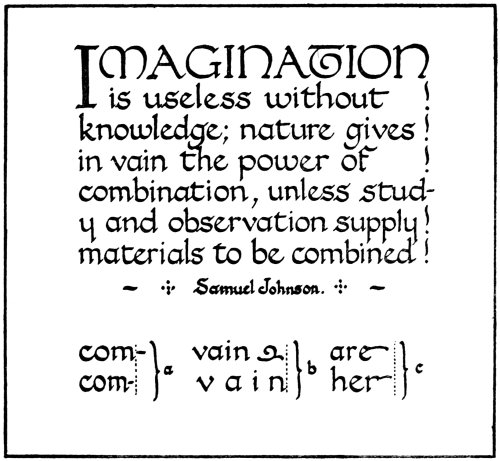
Fig. 9.
This exercise should first be written between two
ruled lines to each row of lettering. Then write it out
using one line only. Then reduce the size, cutting a
pen with a smaller point, but keeping to the same proportion
in spacing. In copying this do not draw the
lettering first in pencil, but go straight ahead with the
pen. Also do not attempt to copy it in a rigid manner,
endeavouring to get exactly the same number of words
on each line as in the copy. Pack each letter closely56
to its fellow, and do not attempt to spread out any word
to make it fit better. The distance between each word
should be about the width of a small letter. Do not
try to squeeze a word or syllable in at the end of a line.
It is better to let it project slightly over the line; see
(a) Fig. 9. If, when the end of the line is reached,
there is a space left not quite large enough for the next
word, do not attempt to spread out the last word, but
either add a simple pen ornament as in (b) or the line
may be emphasised by pen-strokes or dots, as in the
copy. Still another method is shown in (c), where
flourishes from the final letter fill the space. These,
however, should be used sparingly, as they tend to
make the matter less readable.
After the student has had a good amount of practice
in writing in this manner he will begin to feel
his way and be able to mass and arrange the letters
and words properly. It is only when he becomes
master over the pen, so that he can write quickly and
easily, that he is able to mass the letters into words
with facility.
After having written this quotation, a fresh one
may be selected and written out in a similar manner.
If this practice is persisted in, the student will gain
valuable experience in the spacing and arrangement of
words.
Fig. 10.
In Fig. 10 several interesting points are noticed.
In the first place the necessity for packing the letters
should be noted in (a). If the two renderings of the
same word be carefully examined, it will be seen that
the first one has a somewhat broken appearance. This
is notwithstanding the fact that each letter is exactly57
the same distance from the next to it. In the second
example there is much more unity, yet the letters
are not really so equally spaced. The way to get over
this difficulty is to place each letter as closely as possible
to its fellow. The first example looks like
L ETTER ING because due consideration has not
been given to the fact that however closely L and E,
and R and I, are placed together, there will always be a
fair amount of space, so that these should be packed,
if possible, closer together than the rest. As the E
is a curved letter, the L can easily be formed so that58
the lower part comes underneath. Also the tail of
the R can project under the I. This device should
not be carried to excess as shown in (b). One often
sees architectural drawings disfigured by a lot of this
kind of thing. The student is advised carefully to
guard against this, or his writing will become freakish.
In (c) two examples are given which show the
advantage of massed writing. In the first example
the letters are placed together in a loose manner, and
the two lines are too far apart. The second is much
easier to read because the letters are packed closer
together, and also the lines of lettering are nearer.
For general purposes massed writing is undoubtedly
best, but for some things, as, for example, in writing
poetry, the lines may be wider apart. The letters,
however, should be packed together, and it is not a
bad plan to make the stems and tails of the letters just
a trifle longer than usual.
A curious optical illusion is shown in (d), in connection
with the letter S. The first one is constructed
so that each half is approximately the same size, but
it appears to be larger in the top half. It presents the
same illusion if the page is held upside down. The
second one, which is drawn with the top half slightly
smaller, appears right. This applies to several other
letters in the alphabet, but in the letter S it is most
noticeable. The letter P is a letter that requires
some attention. If a word begins with this letter, the
form with the stem projecting below the line may be
used; but when this occurs in the middle of a word, it
tends to make it less readable. The example given,
at first glance, looks like HEADS.
59
A modern fad of using V instead of U, and I in
place of J, should be discouraged. In Latin, possibly,
there is something to be said for it, but in modern
English it looks foolish and affected, besides being
almost unreadable at times.
The student will find the alphabet of italics useful
for rapid lettering of plans, maps, etc. He should
endeavour to preserve the same slope, not getting some
letters falling over and others nearly upright. There
is no need to give detailed instructions as to how to
form the individual letters, as, after having practised
the formation of letters in the preceding chapter, he
should experience no difficulty in feeling his way with
regard to the forming of the individual strokes that go
to make up each letter. The same thing applies to the
pen-formed figures that are given here. These are all
composed of simple pen-strokes, and the student should
be able to form these quite easily and quickly.
Constant practice with the reed or quill pen will
do more than anything to make him an efficient writer.
60
CHAPTER VI
ALPHABETS FOR STUDY, BASED ON HISTORICAL EXAMPLES
After the student has, to some extent, mastered the
pen, and is able to write fairly easily, it would be a good
plan for him to study some of the best historical
examples, forming the letters in the same simple
manner.
The examples given here are free renderings of the
various alphabets used in the different periods. In
the case of any of the letters being missing to form the
complete alphabet, these have been constructed in a
similar style. The reason for doing this is so that the
student should experience no difficulty in writing when
using any one of these alphabets, as would possibly
be the case if an incomplete alphabet were given. These
alphabets are merely given for convenience, the object
not being in any way to keep the student from studying
the original manuscripts for himself. It was thought,
however, that it might possibly be helpful if the
various letters were given in the form of complete
alphabets, as, after studying the various forms of
lettering in this manner, the student would be encouraged
to study the actual MSS. for himself.
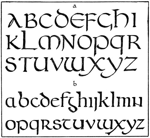
Fig. 11.
One of the most beautiful forms of simple pen-formed
lettering is given in Fig. 11. The uncial characters
shown here (a) afford one of the best examples61
for practice in writing with the reed or quill. These
letters are all formed with simple strokes made with
the slanted-cut pen. For the purpose of general writing
it may be as well to change the form of one or two of
the letters, such as the A, for example, and possibly
the D. Forming these characters with a well-cut pen is
splendid practice for the student. He should endeavour
to form the letters with simple direct strokes, with no
touching up afterwards. After having practised the
previous exercises well, he should be able to form these
letters quite easily. He should, as opportunity occurs,62
examine carefully some of the fine uncial manuscripts,
or at any rate some good reproductions of them.
The alphabet shown next (b) is founded on the
Irish half-uncials. The one striking difference between
this and the previous alphabet is that this is
written with a straight-cut pen instead of a slanted-cut
pen. This is plainly noticeable in the round letters
such as a, c, e, o, etc., the thickness coming in quite a
different place. It will be found that writing in this
manner with the straight-cut pen is much slower work
than writing in the other way. It is, however, very
good practice for the student. The same remarks
that were made about the uncial letters apply also
here; it would be as well to modernise some of the
letters, such as the “g” and the “n,” when writing
with this alphabet.
In Fig. 12 some very beautiful alphabets are shown
which are excellent in every way as examples for
study. These are all formed with quite simple
strokes made with the slanted-cut pen. The one
shown in (c) is a free rendering of the letters used in
the famous “Benedictional of Æthelwold.” As the
“s” and the “t” given here are liable to be somewhat
unreadable, additional forms of these letters are
suggested.
The example given in (d) is taken from a tenth-century
Psalter, now in the British Museum. This
MS. is a very beautiful example of the English writing
of this period. The writing of this century should be
very carefully studied. The student should not be
content with merely working from the letters given
here, but should study some of the MSS. of this period63
for himself, noting carefully the spacing and the arrangement
of the lettering.

Fig. 12.
The next alphabet (e) is taken from an Italian
twelfth-century MS. This is slightly stiffer in character
than the preceding one, and the writing tends to become
more compressed. However, the lettering still retains
its round character. It is easy to mass the letters
together when using this alphabet.
The letters in Fig. 13 are still more compressed in
character. The alphabet shown in (f) is taken from a
late twelfth-century MS. of the French School. It is64
a very good form of lettering and will well repay careful
study.
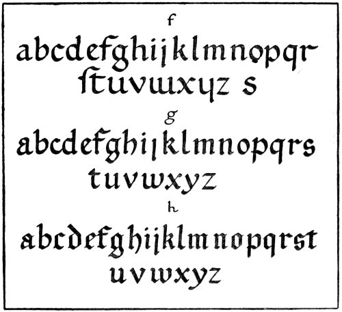
Fig. 13.
The next one (g) is a typical example of the style
of lettering largely employed in the thirteenth century.
Although the letters are shown here as large as in the
preceding example, the lettering generally was much
smaller. If the student examines carefully any of the
thirteenth century MSS. he will notice this to be the
case. He should practise using this alphabet in the
same way, cutting his pen so that he is able to form the
small letters quite easily. He will probably experience65
difficulty in producing writing as small as the mediæval
scribe was able to do, as this comes only from a great
amount of practice, but he should be able to write
quite easily with the lines of lettering not more than
3/16 in. apart.
The alphabet that follows this (h) is from a fourteenth
century MS. It will be noticed that the
letters here are much more angular, and they conform
more to what is popularly known as “Old English.”
This form of writing can be quite easily formed with
the slanted-cut pen.
There is no need to employ a fine pen for putting
in the thin strokes, as is so often the case, as the complete
letter may be formed with the same pen if it is
cut with a nice chisel point. It is most important that
the student should form the whole of the letter with the
same pen, without any touching up afterwards. The
practice of forming letters roughly and shaping them
up afterwards with a fine pen tends to cultivate most
unworkmanlike habits and cannot be too severely
censored. Also letters formed in this manner are
always lacking in character and vitality. If the
student has become familiar with cutting and handling
the pen he ought to be able to form any of the letters
given here without the slightest difficulty.
The alphabets of capital letters given in Fig. 14
will be useful as initials, etc., in connection with the
small letters. It is quite obvious that these letters
are not formed with simple pen-strokes in the same
manner as the small letters are. These are built up
with a series of strokes, the body of the letter being66
then filled in with either pen or brush. This method
of building the letters up with pen-strokes will be
described in detail in a later chapter.
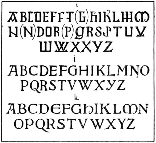
Fig. 14.
The first alphabet given here (i), is based on the
capital letters used in the famous Book of Kells.
These will serve well as initials when using the Irish
half-uncial characters for writing with. A good many
of the letters are given in a variety of forms.
Some of these are shown here and are liable to be somewhat
unreadable if used in the present day. For67
example, the Irish O is shaped more like D, and
may as well be used instead of this letter, which is
not very distinct in character. The letter G would
be hardly recognisable if used in the Irish form, so
a simplified letter has been suggested. Some slight
modifications have also been suggested in the letters
N and P. By raising the cross-bar in N it conforms
more to the modern shape of this letter. It is
necessary to simplify the Irish P, as this letter resembles
the letter R more than anything else.
The next alphabet, shown in (j), is based on capitals
used in the tenth century, a somewhat stiff and severe
type of letter.
The last one (k) shows the type of capital used in
the eleventh century.
Some further alphabets will be given later on, when
dealing with illumination.
The student should not content himself merely
with forming the letters given here, but should study
the subject for himself. He should, if possible, examine
some of the illuminated MSS. exhibited in the various
museums in London and elsewhere. He is specially
recommended to study the MSS. produced between
the tenth and thirteenth centuries. If he cannot
possibly study the actual MSS. he should experience
no difficulty in obtaining reproductions of them. The
British Museum publishes an excellent series of collotype
plates of a good number of their choicest illuminated
MSS., as well as some splendidly reproduced in gold
and colours. It will be found that a fair amount of
time given to the study of these old MSS. will well repay68
in the end. The way the letters are massed together
should be carefully noted, as well as the formation of
the individual letters. He should note also the
freedom displayed, the letters not being cramped in
any way.
When studying lettering from photographs, or
photographic reproductions, the proportional compass
is extremely useful for measuring the exact size of the
letters. The exact size of the page is nearly always
given, and it is quite a simple matter to adjust the
compass so that, when the measurement is taken with
the smaller end, the exact size of the lettering can be
marked off with the opposite end. This instrument
is most useful when used in this manner, as it is difficult
to gauge the exact size of the lettering from the measurements
of the page. It is also always advisable to
know, if at all possible, the exact size of the lettering
in the original when studying a reproduction of a
MS.
When examining MSS. in glass cases, when it is
not convenient to have them taken out, a magnifying
lens of about five or six inches focus is very useful for
analysing the construction of fine lettering. This
depth of focus enables the lens to be used through
the glass without the necessity of having the case
opened.
The student should seize every opportunity that
may arise to examine some of the best work of the
mediæval period.
For the present he should confine his attention to
the lettering. The decoration will be considered later69
on, but, as this springs from the lettering, it is essential
that sufficient attention should be given to the foundation
before attempting to build upon it. He should
also, when opportunity arise, examine some of the
best modern work in this direction.
70
CHAPTER VII
ROMAN LETTERING
The Roman alphabet is certainly one of the most
beautiful of all the alphabets that we possess. It is,
however, strictly speaking, not a pen-formed alphabet.
The fine forms of the Roman capitals, as exemplified
in the well-known inscription on the Trajan Column,
were most certainly the result of the evolution of chisel
forms. The pen-formed letters that came after were
evolved from these Roman capitals.
At first the type of letter used was practically the
same as the chisel form. Writing with this type of
letter must have been extremely slow work, compared
with the simpler pen-forms that came into use later.
It is impossible to write, in the true sense of the word,
when using Roman letters. Although in the case of
the early square-capital writing these letters were
constructed in a fairly simple fashion with a slanted-cut
pen, it is very difficult to write with any speed in this
manner and at the same time produce a well-finished
letter. For general purposes it is better to form the
letters as shown in Fig. 15.
These are constructed in quite a different way from
the types already shown, the difference being that while71
they were formed with simple pen-strokes as in ordinary
handwriting, these are built up.

Fig. 15.
For the purpose of illumination, Roman lettering
is not by any means ideal. It is much better to select
a true pen-formed alphabet; but for modern usage,
such as the various branches of commercial work,
Roman lettering is used a great deal. It possesses
one very great advantage, that is, its legibility. As
the man in the street has his daily newspaper printed
in a form of Roman lettering, he is therefore more
familiar with this type than any other. The greater
bulk of the commercial art of the present day aims to
attract the attention of this individual, so that it is72
necessary that it should be just what he can understand.
To letter a popular advertisement in a late
Gothic lettering would be foolish in the extreme, as
he would, in all probability, experience difficulty in
deciphering it. The thing to aim at, in this case, is
to do it so that he cannot help seeing it. The most
important thing, in the eyes of the advertiser, is not
so much the design of the poster as the goods advertised,
and the lettering calling attention to these must
be clear, distinct, and prominent. Lettering, therefore,
that is based on the Roman type is best for this
kind of work.
Illumination, in general, appeals to a different type
of individual. Something is required that is away from
the ordinary. Also as illumination is so inseparably
bound up with writing, it is almost essential that a
true pen-formed lettering should be used.
The Roman capitals, as shown in Fig. 15, are based,
to a great extent, on those used in the Trajan Column
inscription. It will be found that the more practice
that one has in forming letters with simple pen-strokes,
as already shown, the easier it will be to form the
letters by building them up, as in this case.
For general purposes the easiest way to form Roman
letters is with a pen cut with a medium point and a
fairly long slit. The outward strokes should be made
first, then the ones that come inside the letter. The
serifs are then added, the outline filled in, and the
letter is complete. The lower-case letters given are a
type that may be used in conjunction with the capitals.
Apart from the utility of this alphabet, the student73
will find that forming these letters in this way will be
extremely good practice. He should also practise
forming them with a brush. For this purpose he
should use a small, but firm, sable water-colour brush.
Construct the letters in exactly the same manner as
when using the pen. After a good amount of practice
in this way he will be surprised at the dexterity he
is acquiring with the use of the brush. Then, using
a larger brush, he should endeavour to form large
letters in this way. This will be extremely useful for
writing large notices and announcements.
For work where very accurate lettering is required,
such as high-class commercial art, title-pages, etc., the
outlines of the letters should be produced by means of
tee-square, set-square, and compasses. The serifs
also should be carefully drawn. In this case it is not
wise to go straight ahead with the pen, without drawing
first carefully in pencil.
The letters given in Fig. 16 are a type of Roman
lettering made with simple direct strokes of the pen.
These will no doubt be useful, as they may be very
easily and quickly written. They should be very
helpful for writing quickly announcements, notices,
etc.
A few notes may be useful to the student with
regard to the characteristics of the various Roman
capitals.
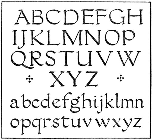
Fig. 16.
The letter A is sometimes pointed at the top,
being generally formed in this manner in inscriptions,
but for pen- and brush-formed lettering it is preferable
to finish it in the way shown in Fig. 15. It should be74
noticed that in the letter B the top part forms an angle
with the upright, while the bottom part curves into the
stem. The same thing applies to D, E, and L. The
serifs on the lower limbs of E and L should point outwards,
while the serifs on the other limbs of E are
quite straight. This also applies to F. It is best to
make the cross-bar in H form angles with the uprights
rather than curving into them. The form of the letter
J may be varied, the tail may be curved round, but it
is as well to avoid the ugly shape that is in general
use. The tail may project below the line considerably,
if it is felt to be necessary, but care should be taken not
to exaggerate this too much. The same thing applies
to the tail of the next letter, K. In the letter M the two75
outside strokes occasionally spread outwards, and in
the form used in inscriptions the top serifs are missing.
These, however are generally added to the pen- or
brush-formed letter. The same thing applies to the
letter N. The letter O is not quite a circle; it is sometimes
made in the tilted form, i.e., as formed with the
slanted-cut pen; when this is the case all the corresponding
curved letters should be treated in the same
way. The curve of P does not always touch the upright
stem below. The tail of the Q may be lengthened
occasionally, as also is the case in the letter R. The
letter S often leans slightly forward, but this tendency
should not be accentuated too much. The top part
of this letter should be made slightly smaller than the
lower part; this applies also to all letters similarly
divided in the middle. In the letter T the top generally
forms angles with the centre stem instead of
curving into it. For general writing the curved type
of U should be used in preference to the V which is
used in Latin inscriptions. W is formed by crossing
two V’s.
The student is strongly advised to study some of
the best historical examples of Roman lettering. Some
of these are detailed in the next chapter.
76
CHAPTER VIII
SOME HISTORICAL EXAMPLES OF ROMAN LETTERING
The examples given in this chapter do not pretend to
be, in any way, a complete series of alphabets of Roman
lettering. To go into this matter properly would
require far more space than is available here. If,
however, sufficient interest is aroused to encourage
the student to study the subject for himself, it will be
worth while dealing briefly with the subject here.
One of the most important alphabets is that used
in the inscription on the base of the Trajan Column
(circa 114 A.D.). To help the student to form these
letters in their proper proportions, each letter has been
enclosed in a square (See Figs. 17–22). This should be
a great help in determining the correct form of the
different letters. For example, take the letter O;
this is not quite a circle, as is shown plainly by placing
the letter in a square. In the case of the W, as
this is larger than the other letters, this has been placed
in two squares.
As the alphabet from this inscription is incomplete,
suitable forms have been suggested for H, K, Y, and Z.
Also additional letters have been given for J, U, and
W, which are necessary in modern usage.
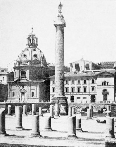
The Trajan Column.
This alphabet is extremely beautiful, and for77
important inscriptions it is hardly possible to find a
better model. The student is advised to make a
careful study of this alphabet.
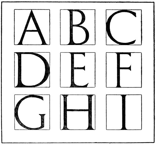
Fig. 17.
When using this alphabet for writing an inscription
it is not a bad plan to make a small cardboard
gauge giving the width of the different letters in proportion
to the height decided upon. A small gauge like
this is very easily constructed and should be a great
help in quickly spacing the letters. For example,78
it may be noted that the letters C, D, G, H, K, M, N,
O, Q, U and Z nearly fill the square, while A, R, T, V
come next in size. B, X, and Y are slightly narrower,
while the letter P is a shade less than these. L and
S are still slightly less in width, and E and F are the
most narrow of all the letters, excepting, of course, I
and J. If these various widths are marked on the
edge of a small strip of card it ought to be quite an
easy matter to space these letters quickly.
Fig. 18.
The first alphabet shown in Fig. 20 (a) is a free79
rendering from a thirteenth-century inscription in the
Church of St. Ursula, Cologne. As the alphabet was
incomplete it has been completed, so that it may be
used without any difficulty arising through any of
the letters being missing.
Fig. 19.
The next one is from an inscription of the early
part of the fourteenth century (b).
A late fifteenth-century alphabet is given in (c),
which is taken from an inscription in niello on a silver
plaque fitted to a reliquary. This is Italian and is
dated 1496.
80
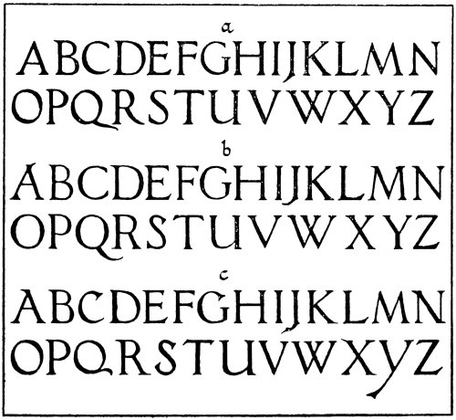
Fig. 20.
The alphabets of capitals and minuscules shown in
Fig. 21 are of special interest to the illuminator.
These are based on the writing used in a late fifteenth-century
illuminated MS. now in the British Museum,
St. Augustine’s “City of God” (Add. MS. 15246).
These letters are formed with quite simple strokes of
the pen. In this MS. the f-shaped minuscule s is used.
In the alphabet given here this has been substituted
by one more in keeping with the modern type of letter,
and several letters have been added to make the81
alphabet complete. The student is strongly advised
to study the lettering in this MS. for himself. It makes
a very effective script if written fairly small with a
crisply-cut pen.

Fig. 21.
Some further alphabets are shown in Fig. 22. The
lettering from which the alphabet is taken that is
shown in (a) is from a title-page from “Utopia et
Mori et Erasmi Epigrammata,” dated 1518. It has
woodcut borders and title-pages by Holbein. This
style of letter is used throughout the book for headings,82
etc. It is undoubtedly a very fine type of letter and is
worthy of careful study. As has been the case in the
other alphabets, this alphabet has been completed by
adding letters of approximate form to supply the
missing ones.
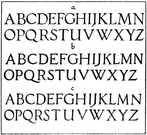
Fig. 22.
The next alphabet, given in (b), is taken from an
inscription in marble on the monument of the Marchese
Spinetta Malaspina (d. 1352), relating to its re-erection
in the Church of San Giovanni in Sacco at Verona in
1536.
83
The last one shown here, in (c), is from an inscription
on the marble monument of Filippo Decio
(d. 1535), in the Campo Santo, Pisa, by Stagio
Stagi (d. 1563).
Of course, numerous other examples might be given,
but sufficient have been shown to enable the student
to study the subject further if he so desires. There
are numbers of reproductions from old inscriptions
and MSS. easily obtainable.
In studying these alphabets the student will find
that it is not a bad plan, after forming the letters
with a pen as described in the preceding chapter, to
use a brush as also suggested there. He should then
endeavour to form them fairly large, working straight
away with the brush. A good brush for this purpose
is a sable “writer,” such as is commonly used by sign-writers.
Dexterity with this type of brush is to a great
extent merely a matter of practice. In fact, as has
been insisted on repeatedly throughout this book,
practice, and plenty of it, will do more than anything
else towards making the student efficient.
When studying this subject further the student
should note especially the manner in which the letters
are arranged in the various inscriptions, as a great deal
depends upon the arrangement of the letters and words.
84
CHAPTER IX
A BRIEF SKETCH OF THE HISTORY OF ILLUMINATION
(1) From the Fourth to the Eleventh Century
Perhaps it would be as well, before dealing with the
practical side of illumination, to give a brief sketch of
the history of this art in Europe. It will not be possible
to do more than give just a very short outline of the
history here. The modern illuminator should, however,
know something of the history of illumination.
It is not intended to deal with any but vellum MSS.
Possibly it may be claimed that some of the Egyptian
Papyrii are illuminated MSS., but these have little in
common with the illuminated work of the Middle Ages,
and it is with this that this short review is chiefly
concerned.
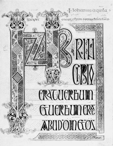
By kind permission of
the British Museum.
CLASSICAL AND BYZANTINE ILLUMINATION
It is known from the Epigrams of Martial, who himself
lived in the first century, that vellum MSS. were
illuminated as early as A.D. 100. Although this was
undoubtedly the case, very few MSS. have survived.
It is very difficult to state exactly the date of the
earliest of these, but most authorities are of the85
opinion that the third or fourth century is the earliest
date that any of them can be assigned to. Some think
that the MS. of Virgil in the Vatican (No. 3225) is
the oldest illuminated MS. This MS. is written on
seventy-six leaves of vellum. It has fifty miniatures,
but of this number five are scarcely visible at the
present time. These miniatures are framed with gilt
or coloured bands, but the MS. displays nothing in the
way of ornament which is generally associated with
illuminated work.
Another early MS. is the Ambrosian Iliad, at Milan,
which some think to be of the third century and others
of the fourth or fifth. This is noted for its fine handwriting
and also its illustrations.
These early MSS. are really illustrated rather
than illuminated, as the term is generally understood.
Following on after this comes the Byzantine School
of illumination. The most important of the early MSS.
are the Dioscorides and the Genesis of the Vienna
Library. These two MSS. are both thought to be
of the sixth century. The first of these, called after
its principal author the “Dioscorides,” is a collection
of treatises on botany, hunting, etc., by several
Greek physicians. This was written for the Princess
Juliana Anicia, daughter of Flavius Anicius Olybrius,
who was Emperor of the West in 472. It is written
in uncial characters and contains, amongst other
things, a portrait of Juliana. It contains also a number
of coloured drawings of plants, birds, insects, etc.,
illustrating the text.
86
In the Vienna Genesis the text is written in gold
and silver on purple vellum. It has forty-eight miniatures
which are placed in square frames, and there is
no marginal decoration. Gold is occasionally used,
but it is not burnished.
There is also a fragment of a Genesis Codex in the
British Museum (Cott. Otho. B. VI.), which is supposed
to be of the same period.
The Joshua Rotulus in the Vatican Library (Codex
Vat. Palat. Gr. 431) is a very important MS. It is
thought by some to be a copy of an original MS.
possibly as old as the fifth century. Opinions, however,
differ, other authorities ascribing it to the fifth or
sixth century.
Another well-known MS. is the famous Gospel
Book in the Laurentian Library of Florence, known
as the Rabula MS. This MS. is dated 586.
The first phase of the Byzantine School is Hellenesque,
and, no doubt, it was part of the Alexandrian
School, which was at its height in the sixth century.
The later style, which reached its maturity about the
end of the ninth century and began to decline after
the twelfth century, represents what is generally
understood as Byzantine. A Simeon Metaphrastes of
the eleventh-twelfth century (Add. MS. 1180) and
a twelfth-century Gospels (Harley MS. 1810), both in
the British Museum, represent the peculiarly dignified
ecclesiastical style of this school.
The Byzantine School influenced the development
of illumination very strongly. Especially is this
noticeable in Italy.
87
CELTIC AND ANGLO-CELTIC ILLUMINATION
In the development of illumination the Celtic
School played a most important part. There is a
very strong contrast between this and the Byzantine
School. The Byzantine MSS. were illustrated by more
or less naturalistic representations, while in the Celtic
MSS. everything seems to be treated as pure ornament.
Even when the human figure is introduced
it seems to be treated in this way. Gold is also
absent in purely Irish MSS. The artists do not
appear to represent the figure with any degree of
realism.
The chief characteristics of Celtic work are intricate
spirals and interlaced pattern, also patterns composed
of dots, and curious elongated creatures entwined together
in a most complicated fashion.
Possibly the earliest date mentioned in connection
with Celtic illumination is that given by Giraldus
Cambrensis, who went to Ireland at the time of the
Anglo-Norman invasion. He was chaplain to John,
the son of Henry II. He wrote concerning a famous
MS. called the Book of Kildare, a book which at
present is not known to be extant. He describes it
as having been written at the “dictation of an angel
in St. Bridget’s own time.” St. Bridget, of Kildare,
lived in the latter part of the fifth and the early sixth
centuries, so that, if this account may be relied upon,
it must have been written at least a century before the
celebrated Book of Kells. From the details that
Giraldus Cambrensis gives of the Book of Kildare,88
he might easily be describing the Book of Kells.
It was evidently very similar.
The Book of Kells is now in the Library of
Trinity College, Dublin. Some authorities think this
to be as old as the seventh century, while others assign
it to the eighth or ninth century. This is an extremely
beautiful MS.; it has been described so many times
that there is no need to give a detailed description
here.
Another well-known MS. is the Book of Durrow,
also in Trinity College, Dublin. Some have thought
that this was written by the famous Columba of Iona,
as the name “Columba” is mentioned in the colophon
at the end of the MS., but whether this Columba was
St. Columba of Iona is, of course, debatable. Certainly
a number of authorities are agreed that its
claims to be an actual relic of St. Columba are by no
means to be altogether rejected. The Book of Durrow,
although very fine, is not such a good example as the
Book of Kells.
It would be interesting to know if St. Columba
had much to do with the cultivation of this art. The
early biographies certainly speak of him as an enthusiastic
calligrapher, and in an ancient “Life of St.
Columba” he is spoken of as having written “three
hundred splendid, lasting books.”
It was through the efforts of the Scoto-Irish missionaries
from Iona that the art of illuminating was introduced
into the north of England. They founded a
monastery at Lindisfarne early in the seventh century.
The famous Durham Book, or Lindisfarne Gospels,89
now in the British Museum, was written here about
the year 700 (Nero D. IV.). The decoration and writing
in this splendid MS. are essentially Celtic. It, however,
differs from the Book of Kells by the slight use
of gold in the decoration, also in the four full-page
portraits of the Evangelists, which show a strong
Italo-Byzantine influence. This MS. is undoubtedly
one of the choicest treasures amongst the illuminated
MSS. in the British Museum.
CARLOVINGIAN ILLUMINATION
At the end of the eighth century the great revival
of the arts which followed the accession of Charlemagne
acted as a great impetus to the art of illumination.
This art was developed from the crude Merovingian
style, and many elaborate volumes were produced.
Some of the most sumptuous are the Alcuin Bibles,
and the Gospel Books, which were written in gold.
One of these Alcuin Bibles is exhibited in the British
Museum (Add. MSS. 10546), also one of the Gospel
Books (Harley MS. 2788). The miniatures and decoration
in these MSS. seem to show the influence of the
Roman, Byzantine, and Celtic Schools. The best
period of Carlovingian illumination seems to be the
eighth century.
THE WINCHESTER SCHOOL
One cannot write even the briefest of sketches
concerning the history of illumination without referring
to the work produced by the two Winchester90
Scriptoria, generally referred to under the appellation
of “Opus Anglicum.”
The Anglo-Celtic tradition seems to have been
completely lost, probably due to the Danish raids in
the ninth century.
It is said that in the time of Alfred the Great, there
was a scriptorium already in existence at Winchester,
founded by St. Swithin, who was made Bishop of
Winchester in 852. Alfred, when a boy of five,
went with his father to Rome, and there is, at the
very least, presumptive evidence that, when returning,
he saw the library of Charlemagne at Aix-la-Chapelle.
When he came to the throne in 871 he founded
another monastery near the old one, attaching a
scriptorium. These two scriptoria were, at a later
date, to become the nursery of English illumination.
Although Alfred seems to have done so much to
foster this art, there are, unfortunately, no specimens
which have survived that can be assigned to any
earlier date than that of his grandson Athelstan
(925–40).
A small MS. known as Athelstan’s Psalter was
principally written on the Continent in the ninth
century, but many additions were made to it in England
towards the middle of the tenth century. This
MS. shows that some efforts had been made to replace
the lost art of the Anglo-Celtic School, which had
flourished more than 200 years before by a new style
based on Continental models; and, although these
miniatures may appear somewhat crude, they probably91
represent the best work of the English artists at this
early period.
The first known example of actual Winchester
work is the “Golden Charter” of King Edgar, in 966,
now in the British Museum (Cott. MS. Vesp. A. VIII.).
This represents an enormous advance on the crude
paintings in Athelstan’s Psalter; a miniature on a
purple ground shows King Edgar, standing between
the Virgin and St. Peter, offering the Charter to the
Saviour. This page is well designed and a fine decorative
border surrounds the miniature.
The most famous example, however, is the well-known
Benedictional of Æthelwold, in the Library of
the Duke of Devonshire. If the student wishes for
a full and illustrated description of this fine MS.
he is referred to the twenty-fourth volume of the
Archæologia.
This MS. was written by Godeman, a monk of the
old Minster, at Winchester; it contains twenty large
miniatures, each facing a benediction for the most
important days, with seven others of groups of Confessors,
Virgins, and Apostles at the beginning, and
at the end the bishop is represented giving a benediction
in his cathedral. All these miniatures, excepting
the last, are surrounded with arches or frames of gold
and colours, and a similar border surrounds the
opening words of the benediction.
The Harleian Psalter (Harl. MS. 2904), in the
British Museum, is another MS. of this school. It
would take far too much space to go into details concerning
this, but special mention should be made of92
the drawing of the Crucifixion. This is in outline and
is slightly tinted and shaded. It is very interesting
as showing the stage that figure-drawing had reached
at this early period. One very characteristic feature
of Winchester work is the curious “fluttering” drapery
which is noticeable in practically all the work of this
school.
93
CHAPTER X
A BRIEF SKETCH OF THE HISTORY OF ILLUMINATION
(continued)
(2) From the Twelfth Century to its Decline
ILLUMINATION IN THE TWELFTH CENTURY
A great change is noticeable in the illuminated work
of the twelfth century, one of the most important
being the development of initial decoration and the
use of raised and burnished gold, and especially the
miniatures, which were often introduced within the
initial letters. The art of illumination gained considerably
during this century, of which the second half
is notable for the number of richly-illuminated Bibles
of large size that were produced.
In England during this century there is a great
difference between the work produced and that of the
preceding century. Probably a number of things may
be instanced as having caused this. There is hardly
a doubt but that the Norman Conquest may have had
a great deal to do with the introduction of Continental
ideas. It is also possible that the Crusades may have
been responsible for a better knowledge concerning
the Byzantine and Eastern Schools.
94
The framing borders to the miniatures, etc., are
somewhat different to the loose entwined borders of
the Winchester School, being generally simple rectangular
bands, either displaying a simple pattern or
else practically plain and severe. It is in initial-ornament
that the greatest development is noticeable.
In the latter part of the century some very beautiful
initials filled with conventional foliage with human,
animal, and grotesque forms entwined were produced.
Both in miniature painting and also in outline drawing
a very definite style was formed.
The Psalter of Westminster Abbey (Royal MS.
2 A. XXII.) is a good example of the miniature painting
of this period, while the famous Guthlac Roll (Harley
Roll Y. 6) affords a good example of the outline drawing
of this period.
THIRTEENTH-CENTURY ILLUMINATION
In the thirteenth century the style of decoration
was more refined. Some of the most beautiful work
in the whole history of illumination was produced in
this century. Numerous examples abound, and these
deserve very careful study. The ornamental border,
which had practically disappeared in the twelfth
century, gradually re-developed during this century;
first in the form of a growth from the initial letter, it
developed into a foliated border upon which small
animals, birds, and quaint little figures were placed.
Some of the French MSS. of this period are particularly
beautiful. Bibles are numerous, being often95
quite small in size. Some of these MSS. appear
to be as perfect as if they had just been completed,
the gold being still brilliant and the colours still
retaining their freshness. All the MSS. of this period
seem to follow a general scheme of decoration. For
example, the opening page of Genesis is one of the
most elaborate, being taken up with a series of miniatures
representing the days of Creation; the Jesse
tree was also represented at the opening of the Gospels.
In the latter half of this century diaper backgrounds
were used a great deal in the miniatures, and in some
cases burnished gold was used with patterns indented
upon it.
A typical example of a thirteenth-century Bible
is shown in the Bible of Robert de Bello, who was
Abbot of St. Augustine’s, Canterbury, 1224–1253.
This MS. is in the British Museum (Burney MS. 3).
It is written in a minute hand and illuminated with
figure initials and partial borders. The initial I
of Genesis is quite characteristic of thirteenth-century
work.
Another MS. in the British Museum, a Bible History,
moralized, in Latin (Add. MS. 18719), is a good example
of the outline drawing at the end of this century. This
is a MS. of the French School.
Another fine French MS., of about 1300, also in
the British Museum, is that of the Somme le Roi
(Add. MS. 28162), which, with its bright colours and
burnished gold, is a good example of the best French
work of this period.
There are, of course, many other MSS. that might96
be detailed, these instanced here being merely typical
of the general style of work produced in this century.
ILLUMINATION IN THE FOURTEENTH CENTURY
The illumination of the fourteenth century was a
development of the work of the preceding century.
Nature was copied more, and natural foliage treated in
a conventional manner was largely used. The oak,
the hawthorn, the ivy, and various other natural
growths were frequently employed. Especially was
this the case with the ivy, which in the French MSS.
was used a great deal. The use of very large initials
was not so usual, but while the initials decreased in
size the technique improved. This tendency towards
naturalism developed more and more as the century
advanced. These natural forms, however, were still
considered as decoration and were not mere naturalistic
renderings.
Miniature painting was also developed in this
century; indeed, the art of illumination is generally
considered to have reached its highest point of development
in this century. Certainly some of the most
beautiful and richly-decorated MSS. are of this period.
There is a fine example of English work of the early
fourteenth century in the British Museum in the MS.
known as Queen Mary’s Psalter (Royal MS. 2 B. VII.).
This MS. is very interesting, as it not only has the usual
richly-illuminated pages, but also a large number of
lightly tinted outline drawings.
A beautiful example of French miniature work of97
the early part of this century is shown in an Apocalypse,
also in the British Museum (Royal MS. 19 B. XV.).
The miniatures in this MS. are drawn in outline and
slightly tinted, on grounds of dark blue and red.
Another fine French MS. in the British Museum
is an Epistle in French by Philippe de Maizières, Celestin
of Paris, to Richard II. of England, advocating peace
and friendship between him and Charles VI. of France,
1395–1396. This affords a good example both of
miniature work and ivy-leaf decoration.
Some initials that have been cut from a large Missal
(Add. MSS. 29704, 29705) show the development of
rich decoration in England towards the end of the
fourteenth century.
ILLUMINATION IN THE FIFTEENTH CENTURY AND LATER
In the early part of the fifteenth century the work
of the French School was undoubtedly superior to
that of the English. The ivy-leaf decoration of the
fourteenth century was developed into an elaborate
decorative scheme. The gold and diaper backgrounds
began to be dispensed with and natural scenery was
substituted. In fact miniature painting became more
and more naturalistic in treatment, and the same tendency
is noticeable in the decoration, which, although
often most elaborate and highly finished, is not to be
compared with the earlier work.
In this century, Flemish illumination, which
during the thirteenth and fourteenth centuries was98
very similar in style to the French and English MSS.,
developed into a most distinctive style specially notable
for its fine, delicate drawing. An illuminated MS. in
the British Museum, “Mandeville’s Travels” (Add.
MS. 24189), is an example of this style. It contains
twenty-seven miniatures, without text, illustrating
Sir John Mandeville’s travels. These are drawn with
a pen on vellum that has been tinted a soft pale green.
They have been shaded in black and white with a
brush, and colour is used for flesh tints, foliage, etc.,
and gold is also used for crowns, nimbi, etc.
In Flemish illumination of the latter part of the
fifteenth century miniature painting became highly
developed, becoming more realistic. The decoration
became debased, becoming eventually merely a frame
of gold or colour upon which were painted realistic
representations of flowers, fruit, insects, etc. These
were often beautifully painted, and the miniatures
also show great skill from a technical standpoint, but
lacking generally the fine feeling that characterises
the work of the earlier periods.
This later style is represented by a number of MSS.
in the British Museum. One only is mentioned here,
although this is but one of many. The “Hours of the
Virgin” (Egerton MS. 1147).
The Breviary of John, Duke of Burgundy (Harley
MS. 2897), and the “Book of Hours” of John, Duke
of Bedford (Add. MS. 18850), are two famous MSS.
of the French School at this period, now in the British
Museum.
“The Missal of William Melrith, Alderman of99
London” (Arundel MS. 109), is an example of English
illumination of the first half of this century.
In Italy, as was the case in regard to writing, the
illuminators in the early part of this century seem to
have gone back to the period of the eleventh and
twelfth centuries for models. A familiar type of
decoration is formed of twining vine-tendrils, generally
in white on coloured grounds. Another type that was
in use a great deal was a delicate style of decoration
composed of a conventional treatment of flowers,
foliage, etc., studded with a large number of raised
gold spots brilliantly burnished, outlined and rayed.
In course of time these styles became much more
elaborated with medallions, vases, candelabra, portrait
busts, realistic renderings of gems, and Renaissance
figures.
Some examples of late Italian work in the British
Museum are as follows:—St. Augustine’s “Commentary
on the Psalms” (Add. MS. 14799); “Luiz, de Bello
Macedonico,” etc. (Harley MS. 3694); “Book of Hours,”
of Bona Sforza, Duchess of Milan (Add. MS. 34294).
When the art of printing from type was first practised,
this did not at once stop the production of
illuminated MSS. The large number of MSS. that
were produced after this date shows quite plainly that,
except in the commoner class of books, the MS. book
still occupied the most prominent place. Professional
illuminators were still employed by people in high
positions, and some very costly and elaborate volumes
were produced. Many of the early printed volumes
were printed with spaces left for initials, miniatures,100
etc., to be filled in by the illuminator. However, in
course of time this art gradually fell into disuse.
This brief summary of the history of this art is
necessarily incomplete; it has not been possible to
deal thoroughly with this subject here. It is hoped,
however, that the student will continue the study of
the historical side of illumination, and that this little
sketch will serve as an introduction to further study.
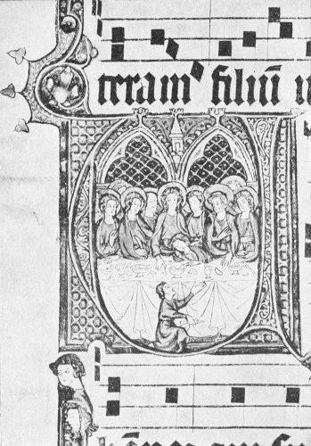
Early 14th Century.
Flemish Initials.

Late 13th Century.
Flemish Initials.
101
CHAPTER XI
THE INITIAL LETTER
If the illuminated MSS. of the Middle Ages are carefully
studied, the importance of the initial letter as a
starting-point for the growth of the decoration cannot
possibly escape one’s notice. The rough sketches
shown in Figs. 23 and 24 trace the development in
this direction through the various centuries. These
are given simply to indicate the way in which the initial
letter was used in the different periods. The student
is strongly advised to study the subject for himself.
If he cannot examine the details from the actual MSS.,
there are plenty of excellent reproductions published
which will enable him to study them at his leisure. It
is, however, practically essential that, even if he cannot
spend much time over them, he should make a point
of at least seeing some of the actual work of the
mediæval artists.
In the famous Book of Kells the initial letter is
used to great advantage. It will well repay the student
to study carefully some good reproductions of the
pages of this wonderful MS. It shows what can be
done with fine decoration based on lettering. Quite a
number of pages are taken up with the words Liber102
generationis Christi, while one page is entirely devoted
to the sacred monogram X P I.
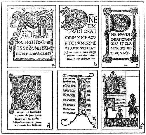
Fig. 23.
In Fig. 23 an example is shown in (a) from the famous
Lindisfarne Gospels, now in the British Museum
(Cotton MS., Nero D. IV.). This beautiful MS. is
written in fine, half-uncial characters, the decoration
being of the kind known as Hiberno-Saxon, or Anglo-Celtic.
A note at the end of this MS. states that it
was written by Eadfrith, Bishop of the Church of
Lindisfarne. It was finished about the year 700.
It has a most interesting history, which is much too
detailed to describe here. It should, however, be
carefully studied from the standpoint now being considered,
viz., the initial letter. The page represented103
by this rough sketch is the opening page of the Gospel
of St. Matthew. Of course this very rough suggestion
can convey no idea of the beauty of the original, but
it gives one some notion of the way in which the monogram
X P I has been used as a basis for the decoration.
Perhaps it would be as well for the student to study,
for the present, some of the MSS. of the best periods
from this standpoint alone. He should note exactly
how the letters are placed and the manner in which
they are used. For the time being he should not concern
himself so much with the details of the decoration.
This may follow later, after he has become more
familiar with the subject.
The page shown in (b) is from a Psalter probably
written at Winchester in the latter part of the tenth
century (Harley MS. 2904). It is the commencement
of Psalm ci. This is also in the British Museum, as
also are all the examples illustrated here. It is quite
different to that of the Lindisfarne Gospels, although
possibly some Celtic influence may be noted.
The next one (c) is also from a Psalter (Arundel MS.
60). This is a further development of the same school
as the last, and was probably written at New Minster,
Winchester, about 1060. It is interesting to observe
how the D is linked up with the border.
The initial B, illustrated by (d), is from a twelfth-century
Psalter of Westminster Abbey (Royal MS.
2 A. XXII.). Very large initials were very common
during this period. This letter is filled with foliage,
animals, etc., and also shows scenes from the life of
David. The initial B at the commencement of the104
Psalms was a favourite subject with the illuminator
at this time. He generally introduced the subject of
David slaying Goliath also.
A common feature of the thirteenth-century
illumination was the use of large decorated examples of
the initial I, of which an instance is given in (e). These
were filled with miniatures and foliage and were
extremely decorative in character. This one is from
a French Gospel Lectionary (Add. MS. 17341), and
is filled with scenes from the Life of Christ.
A charming example is shown in (f), which is from
a Book of Hours (Stowe MS. 17). The initial D contains
a miniature, as also does the A. This is probably
either late thirteenth or early fourteenth century.
David and Goliath are also represented. The whole
MS. is delightful in style.
Fig. 24 shows some more examples. Another page
from a Book of Hours is given in (g) (Egerton MS.
2781). This is a fourteenth-century MS. The initials
and borders are rather rough in technique, but they
are very interesting from the point of view of design.
The large initial D has a miniature representing a
legendary story of the childhood of Christ.
The initial A shown in (h) is from a fourteenth
century Missal (Harley MS. 2891). The letter is
filled with a most delightful miniature.
The next example (i) is a very beautiful initial
taken from a Bible executed in England during the
latter part of the fourteenth century (Royal MS.
1 E. IX.). A number of the initials are filled with
foliage, as in this case, and others contain miniatures.105
The backgrounds of these letters are usually of burnished
gold with patterns indented upon them.
A simple, but very beautiful, type is given in (j).
This is taken from an extremely fine MS. written, also,
at the end of the fourteenth century (Royal MS.
20 B. VI.). It is a very interesting MS., being an
Epistle by Philippe de Maizières to Richard II. of
England, advocating peace and friendship between him
and Charles VI. of France. This type of initial was
fairly common at this period. It is a type of letter
that should be very useful for the beginner.
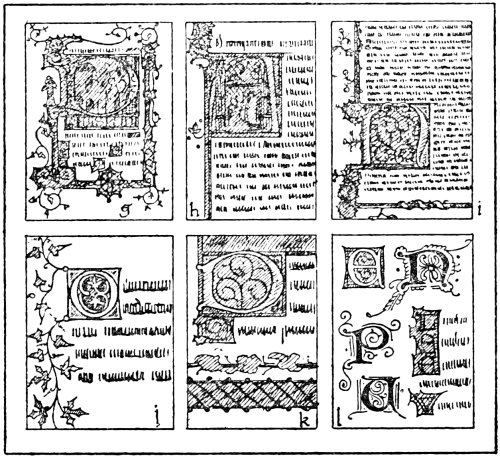
Fig. 24.
In the fifteenth century the initial letter lost a
good deal of its importance. The result of this was
that the decoration became debased in character, until106
it finally became nothing more or less than a number of
naturalistic renderings of flowers and insects, painted
on a gold border and represented as throwing shadows
upon it. There is, however, a certain amount of
sweetness about some of this work, especially when it
is compared with some of the work of the present day.
However, some of the MSS. that were produced in the
earlier part of this century are very fine pieces of work.
The example illustrated by (k) is from a Psalter of
Henry VI., about 1425–1430 (Cotton MS. Domitian
A. XVII.). The large initial D is joined to a miniature.
Several initials are given in (l). These are all of
the thirteenth century. The E is of raised and burnished
gold on a blue block, the centre being red and
the whole finished with white lining. The N, P, and
U are of a type largely used, being generally red with
blue pen-work, or vice versâ. The others are similar
to the E, but are shown as an example of how they were
joined when coming close together.
Excellent reproductions of these examples have
been published by the British Museum authorities
in a series of collotype plates, the only exception
being (e) in Fig. 23, of which an illustration is published
in the Guide to the MSS., Part III.
The main object of this chapter is to direct the
student to the study of the MSS. for himself and especially
to show what an important place the initial letter
had in the MSS. of the mediæval period. He is
strongly advised to make a point of studying some of
the actual MSS. for himself.
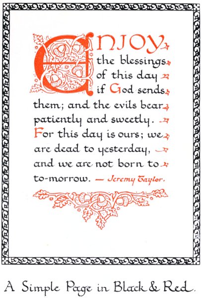
A Simple Page in Black & Red.
107
CHAPTER XII
SIMPLE ILLUMINATION IN BLACK AND RED
A good deal of very effective work can be done by
using black and red only. The student should be able
to do good work in this way before attempting to use
gold and colours.
A method for setting out the page, before commencing
to write, is shown plainly in Fig. 25. For this
purpose a tee-square and set-square are required,
together with a pair of spring dividers and a sharply-pointed
HB. pencil. The approximate size of the
page and the distance between the lines of lettering must
be decided. Then the margins at the top and the two
sides must be marked out, and the upright lines
drawn in by means of the set-square. The distance
between the lines of lettering is then pricked off down
one side with the spring dividers. The lines can then
be ruled across against the tee-square. A word of
caution is perhaps needed here: the pencil should be
held as shown in the diagram, and kept at the same
angle during the ruling of the line. If this rule is not
carefully observed, it is possible to start with the point
of the pencil close up against the edge of the tee-square,
or set-square, and finish the line with it about one-108sixteenth
of an inch away from it. If this habit is
developed, the lines of lettering will hardly ever be
quite straight and even. Another important detail
is to see that the tee-square rests tightly against the
edge of the board, and the set-square against the tee-square.
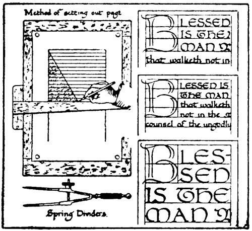
Fig. 25.
It will be found that an HB. pencil is the most
satisfactory grade for ruling the lines with, as if used
lightly the lines can be cleaned off quite easily afterwards
with a piece of soft rubber. Some illuminators
recommend an H. or HH. pencil for this, but,
although these keep a sharp point longer, the lines
produced are not so easily erased.
After ruling the page the next thing to be settled
is the size of the initial letter. It should be lightly
sketched in with the pencil. It is best to use the writing
lines to govern the size of this. For example, the size
of this letter might be four or five lines down.
109
It is very effective to have the first few words in
capitals. Several different arrangements are shown in
Fig. 25. The position of these may be roughly planned
out in pencil. They may then be written in red straight
away, or may be left until after the black lettering is
done. It is best not to finish the initial until after the
lettering is done.
When the position of the initial and the opening
words is determined, the black lettering should be proceeded
with. The student should endeavour to ensure
perfect freedom in working, also to aim at preventing
the writing from looking as if a great deal of trouble
had been taken to make it fit and space well. For
anyone to derive any joy out of it, there must be a
feeling of spontaneity and freedom about it. He
should allow his imagination to work when writing.
If he studies the words that he is writing he is bound
to have suggestions come to his mind. For example,
perhaps one verse seems to stand out very prominently,
and it is felt that it would be better if written entirely
in red. Or, again, another verse seems to start a new
line of thought, and a fresh initial is suggested.
After the writing is completed, attention should be
paid to the initial and the decoration. A good method
for the beginner is to fix a sheet of tracing-paper over
the page; as the lettering shows plainly through, there
is plenty of opportunity for experimenting with
decoration.
Some good types of letters suitable for initials are
shown in Fig. 26. The first alphabet is based largely on
a type of letter used in the eleventh century, while the110
second one is a free rendering of thirteenth-century
letters. These letters are all built up. They may be
made with either pen or brush.
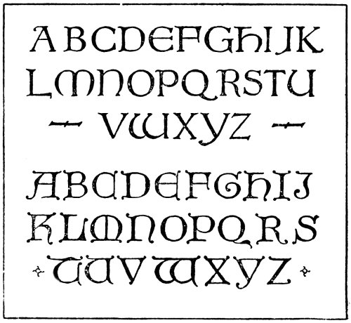
Fig. 26.
Building up these letters with strokes made with
the pen or brush is excellent practice for the student.
For constructing the letters in the first alphabet the
pen will probably be found to be the best tool. These
letters are constructed in a similar manner to that
described in an earlier chapter on forming Roman
capitals. Some suggestive details are shown in Fig. 27.
The letters in the second alphabet may be formed
much more easily with a brush than with a pen. It
will be seen in Fig. 27 how naturally the letter is filled
in with the brush, the end of the stroke terminating in111
a small knob. For filling in the letters in this way a
brush should be used quite full of colour, and it should
also have; a good point.
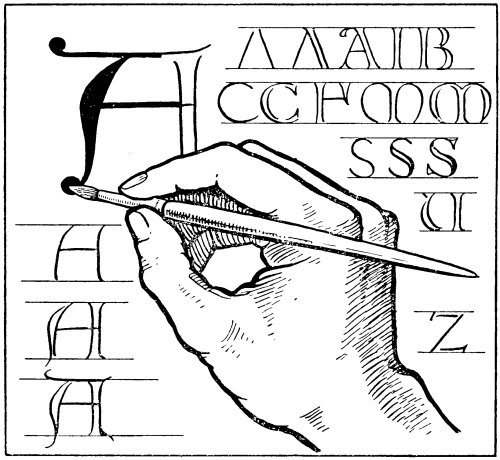
Fig. 27.
After having a fair amount of practice in forming
letters in this way the student will soon be able to
produce them quickly and easily.
The terminals of these letters may be drawn out if
necessary, or they may be joined up with the border.
The student should take note, from the examples
given in the previous chapter, of the manner in which112
the initial was used in the past as a starting-point for
the decoration.
Vermilion is a good red for this purpose. There
are several varieties sold, known by various names,
such as scarlet vermilion, orange vermilion, vermilion,
and Chinese vermilion. The kind known simply as
vermilion seems to answer best of all. Scarlet and
orange vermilion are liable to look somewhat weak.
This also applies to the Chinese vermilion we are able
to get in this country. Some illuminators prefer to
add a little crimson to the vermilion.
It is important that the red should be painted in
solid, and not be thin and washy in character. This
also applies to the black, which should be a decided
black, not inclining to brown or grey. The red should
be kept quite bright and clean, care being taken not
to get it mixed up with dirty colour in any way. A
great deal of the effect depends on the strong black
and brilliant red.
In Fig. 28 an initial with a simple border is shown in
(a). The initial letter and the decoration may be
done in red, and also the opening words.
Very decorative arrangements are possible with
simple lettering and a fine initial, as in (b). When an
initial letter is used in this way, without any border,
it is best to fit it in with the lettering so that the line
of the letter does not project beyond the line of the
black lettering. When, however, a simple border is
added down the side, it may project, as shown in
(c).
An interesting arrangement is shown in (d), where113
two columns are used. By the judicious use of red,
a fine decorated page is possible if carried out in this
style.
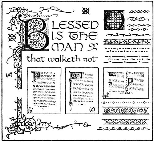
Fig. 28.
The initial O shown here is an example of what can
be done with simple pattern work in the way of diapers.
In the illuminated manuscripts from the twelfth to
the fourteenth centuries a great number of these were
used. This simple pattern work is very pleasant, and
the student is recommended to study these for himself.
He should also study the fine initials with pen-work
in red and blue. He can then vary his work by
adding blue in addition to red, using a red initial with
blue decoration, or vice versâ.
The various forms of simple pattern work, made114
with simple pen-strokes, and shown here, should also
claim his attention. He should endeavour to make
borders for himself in this simple way. They may
serve as tail-pieces and line finishings, and the construction
of these is all good practice in design.
It is excellent practice for the student to write out
a number of quotations in this way, in black and red,
with nicely-drawn initials and borders of simple pattern
work. He should endeavour to guard against making
them too florid in treatment, and, above all, should be
careful not to employ a lot of meaningless flourishes.
The work of the mediæval period affords the best
examples for study that he could possibly have.
115
CHAPTER XIII
THE COLOURS USED BY THE MEDIÆVAL ILLUMINATOR
One can hardly study the illuminated work of the
Middle Ages without being interested in the methods
employed by the artists of this period. The MSS.
still in existence, with colours still fresh and bright,
make one curious to know what colours were used to
produce this result.
Our knowledge of the colours used in classical times
is derived chiefly from Pliny’s “Natural History” and
the writings of Vitruvius. Theophrastus, in his work
on stones, also adds some description of pigments.
It appears from these writers that the earth colours,
such as the ochres and siennas, were well known, as
also was the green earth terra verte. Blues and greens
were obtained from the ores of copper, one of the most
notable being azurite, a blue carbonate of copper.
Verdigris was prepared by the action of vinegar on
copper. Cinnabar, a native variety of red sulphide
of mercury similar to our vermilion, which is the same
thing artificially prepared, and orpiment, the native
sulphide of arsenic, were also colours used at this period.
A number of white earths were also employed,
chalk being the most important. White lead was used,116
being prepared in practically the same way as the best
is to-day. Lakes were made by dyeing chalk or
gypsum. Several vegetal dyes were used for this
purpose, such as madder, weld, and woad. In addition
to these dyes, lakes were prepared from kermes and
the celebrated murex. Kermes is a red dye caused by a
small insect similar to that of the cochineal insect;
it was used for dyeing and for making pigments, both
in classical and mediæval times. The murex was a
species of shellfish from which was extracted the famous
purple dye. This was the dye used for the purple
vellum that was used so much in the early period.
The blacks used were carbon-blacks, such as lamp-black,
bone-black, or the black prepared from grape
husks and vine leaves.
Indigo was undoubtedly in use, and it is highly
probable that the red resin known as dragon’s blood
was also in use. Pliny, in his “Natural History,”
describes the fighting between the elephant and the
dragon, and he states that the name cinnabar should
be given to the thick matter which issues from the
dragon when crushed beneath the weight of the dying
elephant, mixed with their blood. It is thought that
he may be referring to this pigment, for, in another
chapter, he refers to India sending the corrupt blood of
her dragons and elephants. There is one colour, which
was one of the principal pigments of the Middle Ages,
of which no mention is made in the classical period,
and that is ultramarine.
It is difficult to be certain as to how the different
colours were mixed, but the ink used was prepared from117
lamp-black mixed with gum and water, and it is
probable that the colours were mixed with either gum,
glue, or egg.
The Lucca MS. of the eighth century, in the cathedral
library at Lucca, contains, amongst other things, a
short list of pigments. There is very little difference
between the information given here and that given
by Pliny. This MS., however, gives the first distinct
directions for making artificial vermilion. It is also
interesting as giving definite information as to how
colours were mixed for working on parchment or vellum,
as the following quotation plainly shows: “On wood
the colours being mixed with wax, on skins fish-glue
being mixed.”
In the twelfth-century MS., the Mappæ Clavicula,
the greater part of the Lucca MS. is repeated.
The Schedula Diversarum Artium of Theophilus
is also of about the same date, and is a very important
MS. It is divided into three books, the first dealing
with painting, the second with the manufacture of
glass, and the third with metal-work. It is evident
that Theophilus, who was a monk in some German
monastery, was a worker in metal. However, he
collected quite a lot of information on various forms
of art work. It is, of course, in the book on painting
that the information with regard to colours is found.
In Chapter XXVII. he gives instructions for preparing
the gum for mixing with colours. This is
described as follows: “Take gum which exudes from
the cherry or plum tree, and, cutting it up very small,
place it in an earthenware pot, and pour water upon it118
abundantly and place it in the sun, or in winter upon
the coals, until the gum has liquefied; and mix it
together with a smooth piece of wood. Then strain
it through a cloth, and grind the colours with it and
lay them on.”
In Chapter XXXIV., which is entitled “How
Colours are Tempered for Books,” he says: “Make a
mixture of the clearest gum and water as above, and
temper all colours except green and ceruse and minium
and carmine. Salt green is worth nothing for books.
You will temper Spanish green with pure wine, and if
you wish to make shadows, add a little sap of iris or
cabbage or leek. You will temper minium and ceruse
and carmine with clear of egg. Compose all preparations
of colours for a book as above, if you want them
for painting figures. All colours are laid on twice in
books, at first very thinly, then more thickly; but
once for letters.”
Salt green, that is mentioned here, was a mixture
of verdigris and subchloride of copper. Spanish green
was verdigris, and minium was red lead, while ceruse
was white lead. Verdigris is, of course, a notoriously
fugitive colour, but while in ordinary water-colour
painting it would probably not be safe to use, it would
last fairly well in books. Certainly it seems to have
done so in the past, if one may judge from the greens
in many of the old MSS., which are still brilliant.
Other colours described are those known as “folium”
colours. These seem to have been different vegetal
dyes.
In Chapter XL. he gives a description of how to119
prepare ink. This is quite different from the ink of
the classical period, which, as mentioned before, was
made from lampblack and gum-water. The ink
described by Theophilus is more of the nature of our
modern writing-ink, being prepared from the bark
of thorn-trees, amounting really to an infusion of
tannin, with the addition of iron sulphate, popularly
known as green vitriol.
There is no mention in this MS. of the preparation
of ultramarine.
Following this there are the MSS. that have been
translated by Mrs. Merrifield, viz., Eraclius, Alcherius,
the book of Peter St. Andemar, all included in the MSS.
of La Bègue, the Sloane MS., and the Strassburg MS.
The MS. of Eraclius is regarded as not being later
than the thirteenth century, the first two books being
very early and quoted by Theophilus.
In these MSS. it is plainly stated that the colours
were generally mixed with either gum-water or egg.
White of egg was often used, but occasionally the yolk.
For example, it seems to have been used as a medium
for vermilion and orpiment. These MSS. contain a
lot of information very similar to that in the MS. of
Theophilus.
Lakes were, in the earliest MSS., prepared in a
similar way to that used in the classical period, and
are described in this manner in the MS. of Eraclius.
In the MS. of Jehan le Bègue, however, there are
several recipes that have been compiled by him from
the MSS. of Alcherius, of the fourteenth century, which
are practically the same as the modern method.
120
The MS. of Le Bègue is also of interest, as it contains
a recipe for the preparation of real ultramarine.
Perhaps the most interesting MS. of all is that
known as the Book of the Art of Cennino Cennini.
This is a most delightful treatise on the methods then
in use. Cennino Cennini was an Italian painter and
was living in Padua in 1398. The MS. in the Vatican
is dated 1437, but this is in all probability merely the
date attached by the copyist. It is evident that the
colours and methods that he mentions were in use
during the fourteenth century.
As this was a period when some of the finest
examples of illumination were produced, it is interesting
to note the various colours used, so they are given
in detail.
The reds mentioned by him are sinopia, cinabrese,
cinnabar, minium, amatisto, dragon’s blood, and
lake. Sinopia is a similar colour to light red, either
native or prepared by roasting yellow ochre. Cinabrese
is a mixture of sinopia with chalk. Cinnabar,
as mentioned before, is mercuric sulphide, which, when
artificially prepared, is termed vermilion. There is
hardly any doubt that the variety Cennino was familiar
with was the artificial kind, for he remarks that it
“is produced by alchemy, performed in an alembic.”
Minium is red lead, while amatisto is probably hæmatite.
Dragon’s blood, as already referred to, is a
resinous colour, and lakes were prepared from various
dyes.
The yellow pigments were ochre, giallorino, orpiment,
risalgallo, zafferano, and arzica. Giallorino121
is supposed to have been a native mineral yellow pigment.
It is described by Cennino as a volcanic
product. Some, however, think this to be similar to
the pigment that used to be known as Naples yellow,
which was a compound of the oxides of lead and antimony.
Risalgallo realgar, or red orpiment, was prepared
by gently heating orpiment. Zafferano was saffron,
while arzica was a lake prepared from weld, which is
wild mignonette.
The greens that he refers to are verde terra, verde
azzurro, and verderame. Verde terra is the natural
earth known also as terra verte. In all probability
verde azzurro was a native copper carbonate,
similar to green bice. Verderame was verdigris.
The blues used were azzurro della magna, azzurro
oltre marino, and indaco baccadeo. Azzurro della
magna was a copper-blue similar to the azurite of the
classical period. Azzurro oltre marino was the genuine
ultramarine. Cennino’s description of the preparation
of this pigment from the lapis lazuli is very similar to
the recipes that are given in other MSS. Indaco
baccadeo was indigo from Bagdad.
The white pigments were bianco sangiovanni and
biacca. Bianco sangiovanni was whiting or chalk,
while biacca was white lead.
The blacks were “a soft black stone,” black “made
of the young shoots of the vine, which are to be burnt,
and when burnt, thrown into water, and quenched, and
then ground like other black pigments.” Another
black pigment “is made of the shells of almonds, or of
peach-stones.” Lampblack was also used.
122
The colours were mixed with gum arabic or egg.
Cennino also makes mention of the use of the
pezzuole colours, or clothlet tints, which were used a
great deal in the Middle Ages. These were pieces of
linen stained with transparent pigments. When required
for use, a small piece was cut off and soaked in
water to make a tint of the colour, a little gum being
added.
Cennino also treats of tinting parchment with
various colours. This was not done, as was the custom
in the earlier period, by staining the vellum with a dye,
but by washing a colour over it with a large brush.
It may be noted that practically all the permanent
colours mentioned in these MSS. are in use to-day.
Some of the colours used in the Middle Ages can hardly
be recommended to-day. The copper blues, for instance,
are not reliable, as impure air is very liable to
change them into copper sulphide. Orpiment is an
unsafe colour to use, while kermes will fade in a strong
light, besides being no longer an article of commerce.
Both dragon’s blood and saffron are notoriously fugitive
colours.
It is hoped that these few brief notes with regard
to the colours used by the mediæval artist may be of
interest to the student. If he wishes to study this
subject further he is referred to the various works
mentioned.
123
CHAPTER XIV
COLOURS: THEIR COMPOSITION AND PERMANENCE
One of the characteristics of the mediæval artist was
that he had a good knowledge of the different materials
that he employed in his work. One cannot help being
struck by this fact when reading some of their writings
that have come down to us. They seem to have
known all the various properties of the different colours
and materials that they used. It is probable that the
chief reason for this was that it was absolutely necessary
for them to be able to prepare the materials for
use, as it was practically impossible to buy them ready
prepared.
The artist of to-day can buy so many things ready
prepared for him by the artists’ colourman that he is
very liable to give little or no attention to their composition
and quality. It is as well, however, that the
artist should have some knowledge of the materials
that he uses, so that he may be able to select the best
for his purpose.
It is important that he should understand something,
at any rate, about the composition of the various
colours that he uses, and that he should be able to
distinguish permanent colours from those notoriously124
fugitive. Of course, it must not be understood by this
that it is necessary for the artist to subject all his
colours to chemical analysis; if he buys his colours
from any reliable artists’ colourman he can rely on
the colours being true to their name.
There are, however, some students who have not
the slightest idea of the character of the different
colours that they are in the habit of using. It is a
great pity when good work is completely spoiled by
being executed with fugitive colours through the
ignorance of the artist. Good work should be as
lasting as it is possible to have it, and this is not
practicable if one is not certain whether the colours are
likely to fade or change in any way.
The following notes as to the composition and
permanence of the different colours may be of service
to the student.
YELLOW PIGMENTS
Aureolin, Cadmium Yellows, Chrome Yellows,
Gamboge, Raw Sienna, Yellow Ochre, Naples Yellow.
Of these colours, Aureolin is the most expensive,
but it is a very beautiful colour, and has the advantage
of being permanent. It is sometimes called Cobalt
Yellow; it is prepared from cobalt and potassium
nitrites.
The Cadmium Yellows are sulphides of cadmium,
and are in various shades from pale yellow to orange;
they are also permanent.
Chrome Yellows are all chromates of lead, and they
darken very quickly in an impure atmosphere, especially125
when used in water-colour painting. These colours
are very cheap, and, at the same time, very brilliant,
but they should be avoided in all cases where permanence
is desirable. They also produce serious changes
when mixed with other colours; for example, a green
made by mixing chrome yellow with prussian or
antwerp blue is notoriously fugitive in character.
Gamboge is a gum-resin from the East Indian tree
Garcimia Cambogia. It forms a bright opaque yellow
solution with water, requiring no grinding or mixing
in any way, owing to its natural gum. It is fairly
permanent and works well in water-colour, but is not
quite so satisfactory in body-colour painting.
Raw Sienna and Yellow Ochre are both natural
earths containing iron oxide. They are quite permanent.
Naples Yellow is generally prepared by mixing
Cadmium Yellow with Zinc White.
RED PIGMENTS
Vermilion, Rose Madder, Scarlet Madder, Alizarin
Crimson, Crimson Lake, Carmine, Indian Red, Light
Red, Burnt Sienna.
Vermilion is one of the most important colours for
the illuminator. It is prepared from sulphide of
mercury. There are various kinds, which are termed
Orange Vermilion, Scarlet Vermilion, Vermilion Extract,
Vermilion, etc. Probably that known simply
as Vermilion is most useful to the illuminator.
Most vermilions are manufactured in this country,126
but that known as Chinese Vermilion is imported from
China.
Although vermilion is indispensable to the illuminator,
it cannot be guaranteed as being absolutely
permanent. Cennino Cennini, writing about this
pigment, says: “But remember that vermilion is not
durable when exposed to the air; it is more lasting on
pictures than on walls, because, by long exposure to
the air, it becomes black when applied to walls.”
It is a fact that vermilion does change in this way,
but it is debatable whether it is affected by the air.
It is thought by some that the action of the sun’s rays
is a more likely cause of change. There are two varieties
of mercuric sulphide, the red and the black; unfortunately
the red is liable to change into the black.
No chemical change is necessary for this, as they are
both identical from a chemical standpoint. In the
diffused light of a room this colour seems to be quite
permanent, but it is liable to turn black suddenly when
exposed to direct sunlight. There is conclusive proof
that vermilion, when not placed so that the rays of the
sun come into direct contact, is quite permanent by
the fact that in the illuminated MSS. produced centuries
ago the vermilion is still bright.
Most authorities are of the opinion that genuine
Chinese vermilion is more permanent than the English
variety. There are two methods employed at the
present day in the manufacture of this colour—the
wet and the dry process. The dry method is used
in China and the other in Europe. The wet method
is more economical, but it is generally admitted127
that vermilion produced by the dry process is more
permanent than the other kind. Unfortunately the
Chinese vermilion that is obtainable in this country is
often rather poor in quality.
Rose Madder and Scarlet Madder are lakes prepared
from the madder root. These are very beautiful colours
and are permanent under ordinary conditions. They
should not, however, be exposed to direct sunlight.
Alizarin Crimson is a permanent crimson with a
coal-tar origin.
Crimson Lake and Carmine are lakes prepared from
cochineal; they are quite fugitive and should not be
employed for serious work.
Indian Red is a variety of iron oxide and is permanent.
Light Red and Burnt Sienna are prepared by burning
Yellow Ochre and Raw Sienna; they are both quite
permanent.
BLUE PIGMENTS
Cobalt Blue, Cerulean Blue, Ultramarine, Ultramarine
Ash, French Ultramarine, New Blue, Prussian
Blue, Antwerp Blue, Cobalt Violet, Purple Madder.
Cobalt Blue is a fine colour prepared from cobalt
oxide and alumina. This is quite permanent under
ordinary conditions.
Cerulean Blue, made from cobalt and tin oxides, is
also a permanent colour.
Genuine Ultramarine is a beautiful permanent
colour obtained by grinding the lapis lazuli.
Cennino Cennini, in his treatise, gives interesting128
particulars concerning the method then used to prepare
this colour. Ultramarine Ash is a second quality of
this same blue. Unfortunately the great cost of genuine
ultramarine debars the majority of artists from using
this colour. Happily, under the name of French
Ultramarine, it is now made synthetically. By this
means a good permanent colour is produced at a cheap
rate. New Blue is a pale variety of French Ultramarine.
Prussian Blue is ferrocyanide of iron. Antwerp Blue
is a weaker variety of the same colour containing
alumina. These colours are not altogether reliable, as
they are subject to change.
Cobalt Violet is a purple colour made from cobalt,
and is quite permanent.
Purple Madder is usually prepared from the madder
root, and is permanent under ordinary conditions.
Sometimes, however, it is prepared from Crimson Lake,
in which case it is fugitive.
GREEN PIGMENTS
Chromium Oxide, Viridian, Emerald Green.
Chromium Oxide is, as its name implies, an oxide
of chromium; this is an opaque variety. Viridian is
also an oxide of chromium, but is transparent. Both
these are quite permanent.
Emerald Green is aceto-arsenite of copper, and a
somewhat dangerous colour to use; it is darkened by
impure air, but this is not so serious as are its effects
upon other colours when mixed with them. If used at
all, it should be used quite by itself, as if it is mixed with129
other colours it is sure to have a bad effect on them.
It turns some colours black very quickly.
BROWN PIGMENTS
Raw Umber, Burnt Umber, Sepia, Vandyke Brown.
Raw Umber is a natural earth, containing oxide
of manganese; it is quite permanent. Burnt Umber
is the same colour burnt, by which it becomes darker
and richer in colour.
Sepia is generally prepared from the ink of the
cuttle-fish, although occasionally a natural earth is
substituted. Vandyke Brown is also a natural earth;
both these colours are permanent.
BLACK PIGMENTS
Ivory Black, Lamp Black, Indian Ink.
Ivory Black is made from ivory and bone charred
to blackness.
Lamp Black is a smoke-black, being a finely divided
soot formed by the incomplete combustion of hydrocarbons.
Genuine Indian Ink does not come from India, as
might be supposed, but from China. There are, however,
several other varieties in liquid form. It is
generally admitted that carbon-black forms the bulk of
all these.
All these black pigments are quite permanent.
WHITE PIGMENTS
Zinc White, Flake White.
130
Zinc, or Chinese, White is an oxide of zinc. This
pigment is quite permanent and should be used always
when a lasting white is needed. Unfortunately this
white does not photograph its true value, so for process
work it is best not to use this.
Flake White is prepared from lead carbonate and
hydrate, and may be used for process work in place of
zinc white. It, however, should not be used for work
that is required to be lasting, as when used as a water-colour
it soon turns black. As, however, it has more
body than zinc white, it photographs better. A white
is sometimes prepared for process work from barium
sulphate. This is permanent, but does not work quite
so well from the brush.
131
CHAPTER XV
COLOURS: THEIR PREPARATION AND USE
It is practically needless to say that the colours used
for illuminating are water-colours. These are sold by
the artists’ colourmen, ready prepared, in three different
forms, viz., in cakes, pans, and tubes. These consist
of powder colour ground with gum arabic, or senegal
(a brown variety of the same gum), to which a portion
of honey and glycerine is added.
The best prepared colours are undoubtedly those
sold in the form of cakes, as they are the purest. The
other forms contain a considerable amount of glycerine,
which does not improve the colour, but enables them to
be kept moist for quite a long time—a greater advantage
to the artists’ colourman than to the artist.
Tube colours contain more glycerine than those
sold in pans. The great advantage, however, that tube
colours possess is their convenience. A small quantity
of clean colour can be squeezed out and the cap replaced
on the tube, thus keeping the rest of the colour
free from dust. The admixture of so much glycerine
with the colour, however, often prevents it from drying
quite flat when used as body colour.
One word of warning may be useful here: gum132
should not be mixed with water-colours. This is often
recommended in books on illumination, but it is not
only unnecessary but it entirety spoils the appearance
of the colour. There is always quite sufficient gum
mixed with the colour, and there is nothing specially
beautiful about the shiny appearance caused by an
excess of gum in the colour.
Without a doubt the best colours for the illuminator
to use are powder colours. They are mixed with gum
arabic and water. Care should be taken to get the
right quantity of gum mixed with the colour. If there
is not sufficient to bind the colour it will rub off when
dry, while, on the other hand, if there is too much, it
will dry patchy, and if very much in excess it will
present a shiny appearance. Experience will soon
show the exact amount necessary.
One very great objection that is often urged against
the use of powder colours is their inconvenience, but
if these are prepared in the manner described below
they should not be more inconvenient to use than the
ordinary ready-prepared water-colours.
For illuminating, where the work is required to be
lasting, none but permanent colours should be used;
but when making designs which are for temporary use
only it is foolish to use expensive colours like aureolin
and cadmium yellow when the same effect can be
obtained with the various shades of chrome yellow,
which is much cheaper, although notoriously fugitive.
It is best to buy the colours ready ground. A china
slab or a piece of plate glass may be used to mix the
colours on, or the back of a large white plate might133
serve in lieu of these. When it is necessary to grind
the colour a muller is used for this purpose. (See
Fig. 29.)
Slab & Muller.
Palette Knife.
Scraper.
Saucer, with Cover.
Method of taking Gum from Jar.
Fig. 29.
Gum arabic is prepared in a very simple manner for
mixing with colours. Some pieces of this gum are
placed in a wide-mouthed jar and covered with cold
water. It should be given a stir occasionally, and the
following day it will probably be dissolved. It may
be strained through muslin if necessary. A few drops
of carbolic acid added to it will prevent this solution134
from becoming sour. It is as well also to provide a loose-fitting
cover for the jar to keep dust from the gum.
For mixing the colour a palette-knife is required.
A little of the powder colour is placed on the slab and
mixed with the palette-knife to a stiff paste with
water and a little gum. A glass tube may be used to
take the gum from the jar. If this tube is placed in the
jar of gum, and the finger placed over the top of it,
a small quantity of gum can be easily removed and may
be dropped on to the slab by removing the finger. (See
Fig. 29.) This is a much better method than dipping
the palette-knife into the gum, as this is very likely to
get contaminated with the colour if this is done.
It is not advisable to mix the colour too thinly with
water before adding the gum, as one of the effects of
the gum is to make the colour flow much easier, and
if there is a fair quantity of colour on the slab it is
liable to flow over the edges.
After it has been well mixed up with the palette-knife
it should be tested to see if it has sufficient gum
in it. The student should take a clean brush and paint
a small square with the colour on a piece of paper.
When this is quite dry it is very easy to tell if it has
the proper quantity of gum in it. As mentioned
before, if it has too much the colour will look patchy
or shiny. To find out if there is enough gum in it,
take a small piece of rough paper and rub the patch
of colour vigorously with it; if there is insufficient gum
to bind the colour it will rub off on to the paper; if
there is too much gum, more colour should be added;135
while, on the other hand, if there is not enough a little
more should be mixed with it.
When painting a fresh square of colour for testing
purposes it is essential that the brush should be
thoroughly washed before painting the new patch.
If this is not done the result will be that the colour will
be mixed with that already in the brush, and the test
will not be a true one. Another important thing is
to see that the colour is well mixed with the gum, otherwise
one is very liable to get one brush full of colour
that is nearly all gum and another with insufficient
gum in it.
When the colour is well mixed up with the right
quantity of gum it should be thinned out with water
and is then ready for use. It should be placed in
little saucers, which may be obtained from any artists’
colourman. A small square of glass may be placed over
the saucer to prevent the evaporation of the water from
the colour, as, if left exposed to the air, this will soon
dry quite hard. If it is desired to keep the colour
moist for any considerable time, a small quantity of
glycerine and honey should be added to it. The colour,
however, does not work so well when used as body-colour
if this is done.
The following is a good method of keeping body-colour
in a convenient form. The colour should be
painted on large pieces of glass or slabs of porcelain
and allowed to get perfectly dry. It can then be
scraped up in the form of a fine powder. An old
chisel-knife, or a broken palette-knife, makes a good
scraper. This powder requires only a little water to be136
added to it and the colour is ready for use. It dissolves
very quickly in water to form an easy-flowing colour,
much superior to colour that has glycerine and honey
added to it to keep it moist. Especially is this the
case when working on vellum. It dries with a dull,
velvet-like surface which shows in strong contrast
to brightly burnished gold. If the colour, when scraped
up, is not very finely divided it should be rubbed up,
in its dry state, on the slab, with the palette-knife or
muller, until it is quite fine, as the finer the powder the
more quickly will it dissolve.
A complete set of colours for illuminating may be
prepared in this way and put into small bottles until
required. No gum should be added when using them,
as each small grain of colour has its own portion
of gum which binds it to the surface on which it is
painted.
When it is required to use any of the colours prepared
in this way, a small quantity of the powder should
be placed in a small saucer and a little water added.
It should then be worked up with the finger-tip until
it is fluid enough to work well with the brush.
Colours prepared in this way work very well also
in the pen, vermilion especially working very well
indeed. It is not advisable to use a brush to mix the
colour up with, as this method not only quickly spoils
a brush, but also it does not mix the colour up nearly
so well as the finger-tip.
If a little colour is left in the saucer after using it,
it can easily be moistened up again with a little water.
It is not, however, advisable to mix up much more than137
is required, as it dries rather hard and requires soaking
some little time if a considerable quantity is left to dry.
When mixing colours in this way it is as well to
label carefully the bottles in which the colour is stored.
If this is not done, one is very liable to mistake a
fugitive colour for a permanent one, and vice versâ.
Cadmium yellow may easily be mistaken for chrome
yellow, and crimson Lake for permanent crimson.
138
CHAPTER XVI
THE GILDING METHODS OF THE MIDDLE AGES
The most casual observer cannot fail to notice the
gilding that is such a prominent feature of the MSS.
of the mediæval period. Brightly burnished gold,
which appears as if it had been laid and burnished quite
recently, although centuries have passed since the
work was completed, cannot fail to impress and arouse
one’s curiosity as to the gilding methods employed
when this work was produced.
Some of the old MSS. that treat of painting and
the preparation of colours give also some information
concerning the various methods of gilding, and our
knowledge of these methods is chiefly derived from
these MSS.
Dr. A. P. Laurie has made careful examination of
the different forms of gilding employed in illuminated
MSS., and in his book, “Pigments and Mediums of the
Old Masters” says that gold was used in three distinct
forms: as gold-leaf laid on the surface, and in the
form of gold paint, prepared by grinding leaf-gold to
powder; the other method seems to have been a
paint made of rounded granules of gold. He suggests
that this gold was probably obtained from river washings,
and that the only preparation has been to sift139
out the finer grains. He says, further, that when it is
examined under the microscope this form of gold paint
is easily distinguished from that prepared from leaf-gold,
which presents the appearance of little particles
of gold with sharp corners and edges, while this shows
rounded granules.
The art of gold-beating is of very great antiquity.
Pliny, in his “Natural History,” states that one ounce
of gold was made into 750 leaves, each leaf being four
fingers square. This is about three times as thick as
the ordinary gold-leaf of the present day. It is very
difficult to form any idea as to when and where it
originated. Some think that it arose amongst Oriental
peoples. It certainly has been practised amongst
these since quite remote periods. Some of the coffins
of the Egyptian mummies have gilding on them evidently
done with gold-leaf in a similar way to modern
methods. Some of the books of gold-leaf used by the
ancient Egyptians are in existence to-day, there being
one at the Louvre in Paris.
Pliny says, “Gold-leaf is laid over marble, etc.,
with white of egg, on wood with glue properly composed;
they call it leucophoron.” In another place
he states that leucophoron is composed of sinopia
(a red earth colour), light sil (yellow ochre), and
melinum (a white earth). Evidently this was mixed
with size to form a ground upon which to lay the
leaf.
The Lucca MS., of the eighth century, gives instructions
how to prepare gold for writing by reducing the
metal to a fine powder to form a gold paint.
140
The following recipe is from the “Mappæ Clavicula,”
a MS. of the twelfth century: “If you wish to write
in gold, take powder of gold and moisten it with size,
made from the very same parchment on which you
have to write; and with the gold and size near to the
fire; and, when the writing shall be dry, burnish with
a very smooth stone, or with the tooth of a wild boar.
Item, if then you wish to make a robe or a picture, you
may apply gold to the parchment, as I have above
directed, and shade with ink or with indigo, and
heighten with orpiment.”
Parchment size is prepared by boiling parchment or
vellum cuttings with just enough water to cover them
for about two hours. The size is then poured off and
sets in a firm jelly when quite cold. When required
for use a small portion is placed in a jar, which is put
into a basin of hot water, the size then quickly
becoming liquid.
In the writings of Theophilus, of about the same
period, he gives a good deal of information concerning
the mediæval methods of gilding. In Chapter XXIV.
he gives directions for hammering out gold-leaf. The
next chapter, which is quoted, explains how the leaf
is laid on. “In laying on gold, take the clear part of
the white of egg, which is beat up without water, and
then with a pencil paint lightly over the place in which
the gold is to be placed, and, the handle of the same
pencil being wetted in your mouth, touch one corner of
the cut leaf, and so elevating it, lay it on with the
greatest quickness, and spread it even with a brush.
And at that moment you must beware of a current of141
air and refrain from breathing, because if you blow
you lose the leaf and with difficulty recover it. When
this is laid on and dried, superpose another upon it,
if you wish, in the same manner, and a third likewise,
if it is necessary, that you may be able to polish it more
brightly with a tooth or a stone.”
Evidently this was the general method of gilding,
for he states that the leaf can be laid in the same manner
on a wall or ceiling.
In Chapter XXX. he describes the method of
grinding gold for books. This is done by first filing the
gold very finely and then gradually grinding it until
it is an extremely fine powder. In the next chapter,
which is entitled, “How Gold and Silver are Laid in
Books,” the method of applying the gold is given. This
is as follows: “Afterwards take pure minium and
add to it a third part of cinnabar, grinding it upon a
stone with water. Which being carefully ground,
beat up the clear of the white of an egg, in summer
with water, in winter without water, and when it is
clear, put the minium into a horn and pour the clear
upon it, and stir it a little with a piece of wood put
into it, and with a pencil fill up all places with it upon
which you wish to lay gold. Then place a little pot
with glue over the fire, and when it is liquefied, pour
it into the shell of gold and wash it with it. When you
have poured which into another shell, in which the
purifying is kept, again pour in warm glue, and, holding
it in the palm of the left hand, stir it carefully with the
pencil, and lay it on where you wish thick or thin, so,
however, that there be little glue, because, should it142
exceed, it blackens the gold and does not receive a
polish. But after it has dried, polish it with a tooth or
bloodstone carefully filed and polished, upon a smooth
and shining horn tablet. But should it happen,
through negligence of the glue not being well cooked,
that the gold pulverises in rubbing, or rises on account
of too great thickness, have near some old clear of
egg beat up without water, and directly with a pencil
paint slightly and quickly with it over the gold;
when it is dry, again rub it with the tooth or stone.
Lay in this manner silver, brass, and copper in their
place, and polish them.”
In this early period this form of gilding was certainly
used a good deal, but soon after this the raised gilding,
which was produced by laying the leaf on a raising
made of gesso, was in general use. A number of
different recipes have been found. Probably the most
important, however, are those given by Cennino Cennini
in the early part of the fifteenth century. Chapter
CLVII. is entitled, “How You Must do Miniature-Painting
and Put Gold on Parchment.” It is quoted
in full. “First, if you would paint miniatures you
must draw with a leaden style figures, foliage, letters, or
whatever you please, on parchment, that is to say in
books; then with a pen you must make the delicate
permanent outline of what you have designed. Then
you must have a paint that is a sort of gesso, called
asiso, and it is made in this manner; namely, a little
gesso sottile and a little biacca, never more of this than
equals a third part of the gesso; then take a little
candy, less than the biacca; grind these ingredients143
very finely with clear water, collect them together,
and let them dry without sun. When you wish to use
some to put on gold, cut off a piece as large as you have
need of, and temper it with the white of an egg, well
beaten, as I have taught you. Temper this mixture
with it; let it dry; then take your gold, and either
breathing on it or not, as you please, you can put it
on; and the gold being laid on, take the tooth or burnishing-stone
and burnish it, but hold under the parchment
a firm tablet of good wood, very smooth. And
you must know that you may write letters with a pen
and this asiso, or lay a ground of it, or whatever you
please—it is most excellent. But before you lay the
gold on it, see whether it is needful to scrape or level
it with the point of a knife, or clean it in any way, for
your brush sometimes puts more on in one place than
in another. Always beware of this.”
The next chapter is also quoted, as it gives another
method of laying gold on parchment. “If you would
like another kind of asiso—but this is not so good, but
may be used for putting on gold grounds, though not
to write with—take gesso sottile, and a third part
biacca, a fourth part Armenian bole, with a little
sugar; grind all these very finely with the white of
an egg; lay on the ground in the usual manner, and
let it dry; then with the point of a knife scrape and
clean the gesso. Put the previously mentioned tablet
under the parchment, or a very flat stone, and burnish
it; and should it by chance not burnish well when you
put on the gold, wet the gesso with clean water with
a small minever brush, and when it is dry burnish it.”
144
Gesso sottile was plaster of Paris that had been
thoroughly slaked by long soaking in water so that it
had lost all its setting properties. As mentioned in a
previous chapter, biacca was white lead. The white
of egg is prepared by beating it thoroughly to a thick
froth and letting it stand one night to clear itself.
Armenian bole is a red earth colour which seems to
have been used a great deal to give colour to the ground
for gilding. In some of the MSS. where the gold has
been slightly rubbed off, the red colour of the raising
preparation plainly indicates that is one of the ingredients
used.
In Chapter CLX. instructions are given on “How to
Grind Gold and Silver, and How to Temper Them to
Make Foliage and Embellishments.” Evidently in
this case the gold was prepared by grinding the leaf-gold—not,
as was the case in the earlier descriptions, by
first filing the metal and gradually reducing it to a fine
powder.
The powder gold was, however, generally used only
for painting in fine gold lines and heightening miniatures,
although in the latter part of the fifteenth century
matt gold grounds were often used as borders round
miniatures, etc.
The raised gilding was, however, used more often,
and the various recipes given in the different MSS.
are generally very similar to those given by Cennino.
Sometimes chalk or pipe-clay is used instead of gesso,
and occasionally parchment size or fish-glue is recommended
as a medium for mixing it with.
Endeavouring to work from these recipes is no easy145
matter, and the student is not advised to waste too
much time in experimenting in this direction. Although
there is a certain amount of fascination in
trying the various preparations and methods, there is
so much that is important that should claim the attention
of the student that it is hardly profitable for him
to spend a lot of time trying to work from these old
formulas when it might be better employed.
One cannot help being interested, however, in
these old recipes and directions for applying gold to
vellum.
146
CHAPTER XVII
THE USE OF GOLD
Gilding, in illuminated work, is done with either gold-leaf
or shell gold. Gold-leaf is the metal that has
been beaten out into thin sheets, and shell gold the
same ground up and mixed with gum and honey.
Shell gold is so called on account of the fact that it is
sold in small shells ready for use.
The student is especially warned against using any
of the varieties of gold paint for work that is desired
to be permanent. These are mixed up with powdered
bronze, and, in course of time, will turn black.
Shell gold is painted on in the same way that other
colours are. A small brush should be used, so as not
to waste any more than is absolutely necessary. It is
also essential that quite clean water should be used,
to ensure the gold being as bright as possible, as if
the water is contaminated with colour it will dull the
gold when mixed with it. The great disadvantages of
shell gold are lack of brilliance and also the expense.
It is, however, very useful for putting in very fine lines,
which are difficult when using gold-leaf.
The use of gold-leaf for gilding purposes has been
known since quite an early period. Some of the early
manuscripts were written with gold and silver letters147
on purple vellum. Silver-leaf is prepared in a similar
manner to gold-leaf; unfortunately, however, it
quickly turns black when exposed to the air. The
best substitute for silver-leaf is undoubtedly platinum,
although it is very expensive. Aluminium leaf is
sometimes used, but it is rather too thick for fine work.
Sometimes aluminium paint is used where silver work
is required. This, however, has the same objection as
shell gold in lacking brilliance.
Without a doubt the use of leaf, raised and burnished,
is the ideal method of gilding. If the student examines
any of the old MSS. of the best periods he is bound to
be struck with the brilliance of the raised gold, and he
will notice how superior are the results to any produced
by means of gold paint. Gold-leaf gilding, even if it
is unburnished, is infinitely more brilliant than either
gold paint or shell gold. Some difficulty may at first
be experienced in handling the leaf, as, being so thin,
it has an unpleasant habit of blowing about. It is
sold in books containing twenty-five leaves. It is
best to get that known as “double fine gold,” specially
prepared for illuminating. For large masses of gold,
a thicker leaf may be used, known as “quadruple.”
The student should be careful to use only the best
gold-leaf. Some of the cheap foreign leaf is very poor
in quality. He should be careful also to avoid the
leaf known as “Dutch metal,” which is not gold at all.
A gilder’s cushion should be obtained with a knife
and tip. (See Fig. 30.) The cushion is generally about
nine inches by six in size, and is made by stretching a
piece of soft leather over a piece of board slightly148
padded. A piece of parchment is fastened on one end,
which acts as a shield to prevent currents of air from
blowing the leaf about. The student should be extremely
careful to prevent touching the surface of the
cushion with his fingers, as, if it becomes greasy in the
slightest degree, he will experience trouble through the
leaf sticking to it.
Guilder’s Cushion
Guilder’s Tip
Agate Burnisher
Guilder’s Knife
Camel Hair Mop
Fig. 30.
The best way for the beginner to learn how to
handle the gold-leaf is to get an experienced gilder to
show him how to use the cushion. If this is not149
possible he ought, by carefully following the directions
given here, to be able to manage the leaf after a little
practice.
The best way is to take the book of gold-leaf and
open it very carefully. It is then turned over
so that the leaf rests on the cushion. The back of the
book is then gently tapped with the finger-tips; if
it is then carefully lifted up the leaf will be found
lying upon the surface of the cushion. If it is not
lying quite flat and even, it may easily be smoothed
by blowing gently on the centre of it. It is as well,
however, not to be too vigorous, or the result may be
to crumple the leaf up worse than before.
The student should be careful not to touch the
leaf with his fingers, otherwise it will stick to them and
the whole leaf will probably be spoiled. He should
also avoid breathing upon the surface of the leaf, or it
will probably roll up in a hopeless tangle, or else go
floating off into the air, as the slightest puff of wind
tends to do this.
It is hardly necessary to point out that it is not
wise to attempt handling gold-leaf for the first time
with the doors and windows open, as the slightest
draught will carry the leaf with it.
The gilder’s knife must not be sharpened, as, if
this is done, the result will be that instead of cutting
the leaf it will probably tear it and cut the cushion.
One important thing to remember is that the fingers
should be kept from touching the blade, otherwise the
leaf will stick to it owing to the slight amount of grease
left on it. Also if the blade is allowed to get rusty it150
is liable to tear the leaf instead of cutting it properly.
The knife should be kept clean, and the edge should
occasionally be burnished with the back of a pen-knife,
or something similar, to remove any roughness that
may prevent it from giving a clean cut. If it is found
that the leaf sticks to the blade of the knife, it is because
there is a slight amount of grease on it; this may
be removed by rubbing the knife on a board with a
little powdered bath brick.
The leaf is cut by placing the knife carefully down
on to the surface of the leaf, and moving it backwards
and forwards with a sawing movement. The knife
should be pressed down firmly on the cushion when
cutting, and great care should be taken not to rumple
the leaf in so doing.
It is as well not to endeavour to be too economical
when cutting the leaf up. A piece of leaf should be
cut large enough to cover the part that it is required
to gild. If the student tries to be too exact in cutting,
he is very liable to cut the piece too small, and then
other pieces have to be cut to patch the parts not
covered with the leaf. When this is the case, apart
from the extra time taken up, it is false economy, as
more leaf is required than if a slightly larger piece was
cut at first.
After the leaf is cut, it is conveyed from the cushion
to the work by means of the gilder’s tip. (See Fig. 30.)
This is a kind of brush made by fixing a thin layer of
hair between two pieces of card, which are pasted or
glued together. This tip is used by first rubbing it
on the skin or hair, and then placing it on the piece of151
leaf, which will then adhere to it. It can then be carried
and placed in position where it is needed. The reason
that the gold adheres to the tip is because by rubbing
it on the skin or hair the tip becomes slightly greasy
and attracts the leaf.
If any leaf is left on the cushion after finishing the
gilding, it should be carefully replaced in the book.
This may be done by putting the top of the blade of
the knife down flat on the cushion and pushing it
under the centre of the leaf. By this means the leaf
may be lifted and carried to the book. The tip should
not be used for this purpose, or some difficulty may be
experienced in inducing the leaf to leave this for the
book. When pushing the knife under the leaf, however,
it should be pressed firmly on the cushion, otherwise
the result will be to crumple the leaf and spoil it.
For dusting the loose leaf away after gilding, a
large camel-hair mop similar to that shown in Fig. 30
is useful.
For burnishing the gold, an agate burnisher is
required. The best shape is shown in Fig. 30.
For commercial work it is hardly worth while
using gold-leaf, and bronze powder is recommended
instead. A method of using this will be explained
later when dealing with commercial work.
152
CHAPTER XVIII
ILLUMINATION WITH GOLD AND COLOURS
The best material for the illuminator to work upon is
undoubtedly vellum. No paper has ever been made that
is equal to it. The chief drawback that this material
has is, of course, the expense. Parchment is cheaper,
but not nearly so nice.
In selecting vellum for illuminating, the ordinary
thick kind, generally known as illuminators’ vellum,
is to be avoided. This presents too much the appearance
of shiny cardboard, the surface being much too
hard and horny. This kind is prepared calf-skin, and
it is most objectionable to work upon. A very fine
vellum, known as “Roman Vellum”—probably prepared
lamb-skin—has an ideal writing surface. It is
perhaps best to get a slightly heavier vellum if it is
intended to cover it with a lot of heavy work.
A very curious statement has found its way into a
number of books on illumination to the effect that it is
impossible to remove pencil-marks from the surface
of vellum. It has been stated that all attempts to
remove a pencil-mark with rubber or bread result
only in producing a greasy smudge. The present
writer has worked on a considerable quantity of vellum,
but he has never come across any from which he has153
experienced any difficulty in removing pencil-marks.
Of course it is not advisable to use a very soft pencil,
such as a 4 or 6B, very freely on a piece of vellum,
especially if it is at all inclined to be greasy. The use
of carbon-paper is often recommended for transferring
a design to vellum, but, generally speaking, the use of
this material is not desirable. It is generally somewhat
greasy, and it certainly is difficult to remove these
marks from the surface of the vellum. The best way
is to cultivate the habit of working straight away on to
the vellum. Work that is carried out in this manner is
generally characterised as having more vitality and
displaying more freedom than when it is traced off from
another drawing.
Some of the fine hand-made papers, specially
prepared for writing and illuminating, make excellent
substitutes for vellum, although, of course, paper is
never as durable as vellum. Cold tea makes a very
good and quite harmless stain with which the paper
can be tinted a similar shade to vellum. When tinting
the paper with tea, it is best not to use too strong
tea for this purpose, otherwise the result may not be
altogether satisfactory. The paper should be carefully
fastened to a board with drawing-pins. A broad,
flat camel-hair brush is useful for washing the tint on,
care being taken to get this quite even. If the paper
is needed to be used for a MS. book, both sides should
be tinted, but this is hardly necessary if one side only
of the paper is to be worked upon.
When using paper for large, important work it is
best to stretch it before commencing to work upon it.154
This is done by damping it freely until it becomes quite
limp. The margin is then coated with paste for about
half an inch all round. It is then stuck on to the
drawing-board by means of this pasted margin while
the paper is still wet. Care should be taken that the
pasted margin dries hard before the rest of the paper
begins to dry, otherwise, when the paper starts to
contract, it will come away from the board. This is
obviated by re-damping the centre of the paper, so
that the margin has a chance of becoming firmly
attached to the board before the paper begins to
pull.
The beginner is not advised to attempt to stretch
vellum in this manner. It requires considerable experience
to stretch vellum satisfactorily, and it is
quite easy to spoil a large sheet in an unsuccessful
attempt at stretching it. The best way is to fasten it
to the drawing-board with plenty of drawing-pins.
If the sheet of vellum is placed in a damp place for
some little time before pinning it on to the drawing-board,
or placed for a short time between damp blotting-paper,
it will, if stretched tightly on the board with the
drawing-pins while it is slightly damp, be found to be
stretched quite well enough for all practical purposes
when dry.
Perhaps it would be as well here to have a word to
say about brushes. The best kind for the illuminator
are red sables. These are made both in quills and
with metal ferrules. Some prefer one kind and some
the other. Two or three of the smaller sizes should
be selected, with a larger one for bolder work. The155
student will soon find out which size is most convenient
for him to use. The present writer uses a No.
1, metal ferrule, for most of his work, using a larger
brush for filling in broad masses of colour and larger
work. To ensure getting the best service out of brushes
they should be taken care of. After using, they should
be carefully washed by shaking vigorously in a jar
of clean water. Brushes soon spoil if they are put
away dirty. The colour gets between the hairs and
prevents the brush from coming to a point. If the
colour dries in the brush it is very difficult to get it
quite clean afterwards. One would think it was
hardly necessary to state that brushes should not be
placed so that they are resting on their points, but
they are often left in this way by careless people.
When a brush has been used for Indian ink it will be
found that washing in ordinary water will be insufficient
to clean it. In this case soap and water may be
used, carefully washing the soap out afterwards with
clean water.
Vellum is generally pounced before working upon
it. A very good pounce may be prepared by mixing
equal parts, by measure, of pumice powder and french
chalk. When pouncing vellum it should be spread
out flat on a board covered with a sheet of clean paper.
The pounce is sprinkled over it and rubbed in with the
palm of the hand. Care should be taken not to pounce
too long, or the vellum will be roughened and spoiled.
After the vellum has been well pounced, the pounce
is shaken off and the vellum carefully dusted with a
soft handkerchief.
156
If the surface of vellum is examined very carefully
it will be noticed that one side is different from
the other. The side which was originally the hair
side of the skin is rougher than the flesh side. The
smoother side is nicer for writing upon, although, when
using one side of the vellum only, it is not advisable
for the beginner to use the flesh side, as it is so difficult
to make an erasure on this side, without spoiling the
skin. Of course, it is much better to endeavour to
avoid making mistakes, but still it is almost impossible
to prevent them occasionally. When it is necessary
to make an erasure a very sharp knife should be employed
with the least possible pressure. For erasures
on the flesh side of the vellum the kind of rubber
known as kneaded rubber is very useful. This erases
very slowly, but at the same time very efficiently.
When using a knife for erasures on vellum it is essential
that it should be extremely sharp and that scarcely
any pressure be put on it. It is best, however, to
avoid the use of the knife on the flesh side of vellum.
A simple but effective style of illumination is
shown in Fig. 31. This is based, to a large extent, on
pen-work. The block of the initial P may be blue,
with the centre red. The initial itself is of raised gold,
as also are the buds and centres of the small flowers
in the surrounding decoration. The fine scroll-work
may be in black or brown, the decoration on the
initial being white.
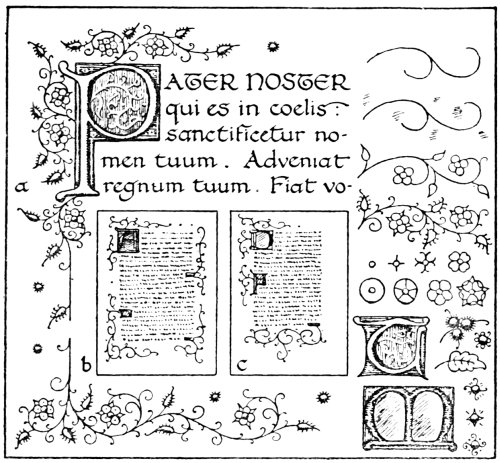
Fig. 31.
After the lettering is completed, the decoration
should be drawn in carefully with pencil. The scroll-work
may then be drawn in with the pen. The page157
should then be carefully cleaned with a piece of soft
rubber, removing all pencil-marks that will not be
covered with colour. The next step is the gilding.
Various preparations are sold by different artists’
colourmen for this purpose. When buying gold-size,
however, the student should see that he gets the kind
specially prepared for illuminating. There are many
varieties on the market, some of which are useless on
vellum. For example, it would be foolish to try and
gild on vellum with oil gold-size or japanners’ gold-size.
Also the different kinds of water gold-size, used
by decorators and picture-frame gilders, are difficult
to use on vellum, as the gold is laid by flooding the
surface of the size with water and then applying the158
leaf. The result of this is to cockle the vellum in a
most unpleasant fashion.
Most dealers sell raising preparation and water
gold-size. The raising preparation is generally sold
in two distinct forms by different makers, one in the
form of a thick paint and the other a thick jelly, which
requires heating to liquefy ready for use. The former
kind will be found the most satisfactory.
A small ichneumon brush may be used for applying
the raising preparation. Before filling in the parts
that it is desired to raise it is not a bad plan to roughen
the surface of the vellum slightly in these parts. This
will help to prevent the raising from scaling off when
it dries.
Difficulty is often experienced through air-bubbles
in the raising preparation. In drying, of course, these
show as tiny holes. In this case prevention is better
than cure. These bubbles are generally introduced
into the preparation by means of the brush. The
brush being full of air is used to stir the preparation,
and the air leaves the brush in the form of bubbles,
which mix with the raising preparation. The best
way to use the raising preparation is to take a small
quantity out of the bottle and place it in a small
saucer. It should then be carefully worked up with
the finger-tip with a little water until it is about the
consistency of cream. It is much better to use the
finger-tip to mix it up with rather than a brush.
Using a brush for this purpose is a fruitful source of
air-bubbles, besides spoiling the brush. Before using
the brush to lay on the preparation with it should be159
shaken vigorously in water and squeezed out, thus
displacing the air and preventing the formation of
bubbles. All the parts that it is desired to gild should
be given a fairly substantial coating. It should be
almost dropped from the brush. It is not desirable
to raise it too high, or the effect will be somewhat
tawdry. The student should use the work of the
mediæval artist as his guide in this direction. When
this is all filled in, the work is placed in a room free
from dust for the raising to dry firm and hard. The
surface is then scraped carefully with a knife until it
is quite smooth, all little irregularities being removed.
It is then given a coat of water gold-size, and when
this appears dry on the surface it is breathed upon
until it becomes tacky. The leaf is then cut to size
and laid on at once, pressed down with cotton-wool
and left to dry. The superfluous gold is then brushed
away with a camel-hair mop. On the following day it
may be burnished. If the burnisher does not work
freely on the surface, its action may be facilitated by
rubbing the surface of the gold with a soft cloth that
has been slightly smeared with beeswax.
When using the water gold-size it is most important
that this should be kept free from dust, and especially
small hairs and pieces of fluff that often float about in
the air. It is impossible to gild successfully if the
size is full of these. After painting on the size it
should not be allowed to get thoroughly dry before
laying the leaf—it should only appear dry on the surface.
If it is allowed to get properly dry it will be next
to impossible to make it tacky by breathing upon it.
160
It is just possible that after the gilding has been
done it will be noticed that the gold-leaf has adhered
to the surface of the vellum in parts where it was not
intended. Brushing the surface with the camel-hair
mop is not sufficient to remove this. It, however,
can generally be cleaned by means of kneaded rubber.
There is no need to use any friction; if it is pressed on
the parts and lifted again it will pick up the leaf from
the vellum. Care should be taken, however, to avoid
touching the surface of the raised gold, as it is very
liable to spoil the appearance of it.
After the gilding is completed, the colouring should
be proceeded with. The large masses of colour are
laid in first, then the white lining on the colour, and
finally the outline. If the surface of the vellum is at
all inclined to be greasy it may be advisable to use a
little oxgall with the colour.
The various other suggestions shown in Fig. 31
practically explain themselves; (b) and (c) are different
methods of spacing the decoration. Two more initials
are shown, also the construction of the decoration and
other suggestive details.
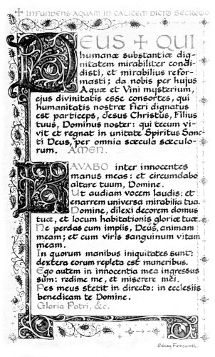
Illuminated Altar Tablet.
161
CHAPTER XIX
THE FURTHER DEVELOPMENT OF ILLUMINATION
The style of decoration suggested in the previous
chapter was based, to a large extent, on pen-work.
The examples indicated in Fig. 32 show a further
development, in which brush-work plays a more
prominent part.
A suggestion for an illuminated version of the
Twenty-third Psalm is shown in (d). The decoration
here may appear somewhat stiff, but it is difficult to
show in black and white the effect that colour gives.
This simple and somewhat severe type of decoration
is, however, much easier for the beginner than the freer
kind of ornament.
It is rather difficult to suggest in writing the exact
colouring, as so much depends on the various shades
used to form the general colour scheme. Possibly
the following notes may be useful to the student as
indicating roughly the colours that may be used.
Fig. 32.
The writing is in black with the capital letters in
red. The background of the initial and border, viz.,
the parts indicated by horizontal shading, should be
blue. This colour should be neither too dark nor too
light, also it should not tend towards either purple or162
green. The student should take special note of the
blues used by the mediæval artists. The large initial
T should be painted in a warm shade of red, not quite so
vivid as vermilion, nor yet a cool crimson. The centre
of this initial and also the centres of the blossoms, with
the background of the small circles formed by the
stems, are of raised burnished gold, as also are the
small buds in the line work. The stems should be
painted in a neutral tint and may be heightened up in
places with touches of clean bright colour. The leaves
may be green shaded with a lighter tint of the same
colour. The flowers might be a pale creamy tint
with the centres shaded with orange. The scroll-work
on the colour may be painted either in white or in a163
lighter tint of the background colour upon which it is
painted. The initial T may be treated in this way, and
also shaded with a darker red.
In (e) an arrangement is shown for a page with the
border completely surrounding it. Some endeavour
should be made to get good pattern with the masses of
gold and colour. In the page suggested in (f) the
decoration is formed down one side, springing from the
initial P. The initial B that is shown here is in raised
gold, the flowers in the centre also being in gold, as
well as the berries in the pen-work springing from
the letter. The background of the letter is blue and
red—blue where the shading is indicated by horizontal
strokes and red where vertical strokes are used.
A study of plant form is very useful to the illuminator.
The decoration used by the mediæval artist
was practically all based on natural forms, and some of
the best advice that can be given to the modern
illuminator is that he should study nature. In doing
this the student should remember that the object is
primarily decoration and not representation. He
should not degrade this art into a mere realistic rendering
of sprays of flowers, insects, etc., but rather aim at
producing decoration as the direct result of his study
of nature. As an example, some of the ivy-leaf decoration
that was so much used during the fourteenth
century is shown here. The importance of study from
nature cannot be emphasized too strongly. Drawing
from plant-form is one of the best exercises the illuminator
can have. Possibly a few hints on this important
study will be of service to the student.
164
In the first place, when drawing a plant, or indeed
any natural object, one should be careful to avoid
drawing it like drawing a map, i.e., without realising
that it is form. If this is persisted in, the result will
be that the drawing will be lacking in vitality, besides
being not nearly so intelligible. If the endeavour be
made to keep constantly before the mind the fact
that it is form that one is drawing, and everything is
carefully reasoned out before attempting to draw
it, the finished drawing will not only have far more
life in it, but it will also be much easier to understand.
One should also strive to draw with feeling; there
is a great difference between a living plant and an
artificial reproduction of it. The drawings of plants
and flowers made by some students remind one of
paper flowers and foliage, as they are drawn in such a
hard and severe manner. A natural leaf is a thing of
beauty, there is nothing rigid or stiff about it, but one
that is cut out of paper is dead and unyielding in every
respect and is absolutely devoid of all feeling. One
should get all the life and feeling possible into one’s
drawing, and this comes from plenty of practice in
careful and thoughtful drawing from nature.
When making plant studies for one’s own use in
design there is no need to limit oneself by making outline
drawings in pen and ink, as when they are intended to
be reproduced by means of line-blocks. The aim of the
artist should be to make the drawing as much as
possible like the original. It is not advisable to go
in for sketchy effects; everything should be made165
perfectly intelligible so that it is possible to understand
every detail of the drawing.
Of course, some parts of the plant should be painted
in colours, so as to form a record of the actual colours,
but for general drawing a soft black-lead pencil, such
as a 3 or 4B, is very useful. One should be careful
to observe all the details, such as the way the branches
attach themselves to the main stem, also the manner
in which the leaves and flowers arrange themselves.
The feeling of unity which runs throughout the whole
of the plant should be carefully noted, how there is a
distinct relationship between every leaf and bud with
the main stem.
There is no need to confine one’s nature study to
actual plant-drawing. If one’s powers of perception
are trained to observe, there is a great deal to be learned
from a walk in the country. Attention should be
given to the pattern that abounds everywhere in
nature; flowery banks and hedgerows are rich in suggestion.
The meadow spangled with buttercups and
daisies is a delightful example. A field of barley
when it is just beginning to change colour offers a
wealth of possibilities both in pattern and colour.
Then take trees, their different structure and foliage.
No two species of trees are exactly alike in the arrangement
of foliage, etc. One should not, however, give
too much attention to detail to the neglect of considering
things as a whole. For example, a tree as a
whole should be noted, attention being given to the
way in which the trunk springs from the ground and
the general massing of the branches and foliage.
166
The use of a sketch-book for noting things down is
very useful, but too much reliance should not be placed
on this. If one’s powers of perception are trained to
observe, the memory will be stored with an abundance
of suggestions and ideas from the study of nature that
has been going on almost unconsciously day by day.
Fig. 33.
As well as nature study, the student should also
make careful study of some of the best illuminated
work of the mediæval period, especially on the
lines indicated in the chapter on the Initial Letter.
The use of a note-book will prove to be very serviceable
for this purpose. Quick sketches of the arrangement
of the pages, as suggested in Fig. 33, should help
the student very much in arranging the decoration167
of the page. Of course, the drawing of details is
also useful, as by carefully copying some of the
initials and decoration he is able to gain some experience
of the mediæval artists’ methods of working.
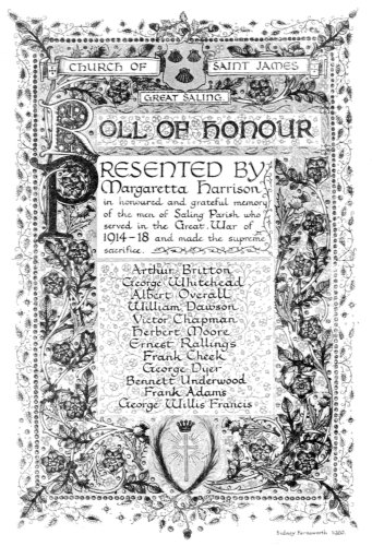
By kind permission of
Miss Harrison, of
Little Waltham Hall.
Possibly it may be as well to say a few words about
miniature painting in connection with illumination.
As has often been explained, the term “miniature”
when used with reference to illuminated MSS. must not
be confounded with the modern idea of miniature
painting, i.e., painting on a small scale in a minute
fashion, as the word “miniature” is derived from the
Latin word minium, the red pigment used in the
decoration of MSS., therefore the original meaning is
writing or painting with minium. There is also no
reason at all why miniatures, when painted on vellum
and used in conjunction with illumination, should be
stippled and worked up in the minute fashion that is
usual with the ordinary miniatures on ivory.
It is not advisable to paint these in a similar way
to the ordinary water-colour painting. It is very
difficult to paint on vellum in this way. Undoubtedly
the best way is to paint fairly direct, using body colour.
The miniatures should be nicely finished without any
excessive laboured finish produced by stippling or
other similar methods.
A miniature should always be treated as part of
the decoration, and not as a picture added to it. If
the student examines carefully the best work of the
mediæval period he will notice that it is practically
impossible to separate the miniature from the rest of
the decoration. A strong feeling of unity runs168
throughout the whole. The greater part of modern work,
however, differs in this respect. The miniature is
often quite good, so also is the decoration, but they
are independent of each other. It would be quite
possible to replace the miniature by another totally
different. The ideal that he should endeavour to
attain to is to make the miniature with the rest of the
decoration form one harmonious whole.
Although the miniature should be essentially decorative,
there is no need to make it too rigid and conventional.
A fair amount of sketching from nature will
go a good way towards preventing this. It is not a bad
plan for the student to practise making small quick
sketches in oils from nature, treating the subject
broadly and going for colour. This will help him very
much in painting his miniatures in a direct fashion, and,
if this is combined with plenty of careful drawing, it
should enable him to develop his style of decoration
considerably.
With regard to the decoration as a whole, it has
often been said that it is impossible to teach one how
to design, but that it is possible to direct one in the
right way; and there is no better method than that
suggested above, viz., a study of nature combined
with good examples of work that has been done in the
past.
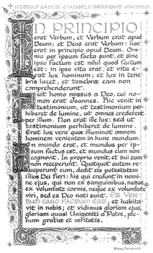
Illuminated Altar Tablet.
When designing, it is a great mistake to strive
after originality. The way to be original is to be
natural and do the work in the best way that one is
able. If the artist does this he is certain to be original,
as he cannot help himself. If he strives after originality169
the work produced will be of an unhealthy type, and
will show signs of affectation which will be anything
but pleasant.
Imitating someone else is equally foolish, as an
imitation can never be equal to the real thing. Art
is worth nothing unless it springs spontaneously from
the joy of working, without any concentration on its
æsthetic aspects. Therefore the thing for the modern
illuminator to do is not to imitate either ancient or
modern artists, but simply seek to do his best,
giving the best workmanship that he is capable of.
There are untold possibilities in the future for the
development of schools of illumination as great as any
of those that have existed in the past.
There are quite a number of different ways in which
illumination might be used in the present day. Perhaps
it might be useful to suggest a few of these.
The Illuminated Address and the Illuminated MS.
Book are so important that separate chapters have
been devoted to these.
One of the most important things that illumination
can be used for is for the service of the Church.
Altar tablets offer plenty of scope for the modern
illuminator. They should, of course, be on vellum
and be framed quite simply.
Service Books, such as the Communion Service,
also provide another application for illumination.
Books should be written in sections. (See Chapter 25
on the Illuminated MS. Book.) A Service Book may
either be fairly elaborate or may be written simply
in black and red. It is as well to use red for the Rubrics,170
so as to make a distinction between these and the rest
of the text.
The Marriage Service is another thing that may well
be written out in good script and illuminated. This
should have the size of the pages on the small side,
as in this case it would be for the use of a private person
and not for the clergy.
Texts for churches, the Creed, Commandments,
etc., are also subjects suitable for illumination. These
should be bold and distinct.
Permanent Notices in churches and other buildings
would be much more attractive if, instead of the usual
printed form being used, they were executed with
beautiful lettering, preferably with a reed pen, and
possibly illuminated. These should, however, not be
overburdened with decoration, as it is necessary that
they should be as distinct as possible. Black and
burnished gold makes a very effective combination.
Another use to which illumination might be utilised
is Family Trees and Pedigrees. These are likely to
give plenty of opportunities for the illuminator, as
good decoration may easily be formed with coats of
arms and other symbols.
Many other things will probably suggest themselves
to the artist as subjects suitable for illumination.
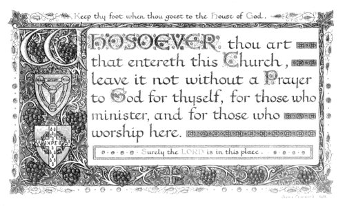
A Church Porch Text.
171
CHAPTER XX
THE ILLUMINATED ADDRESS
The illuminated address is the form which most
modern illumination takes. The greater number of
these cannot, even by the widest stretch of imagination,
be called works of art. Not only are they generally
executed with vivid and crude colour schemes, but
also the style of decoration is usually extremely bad.
Some of the letters are painfully contorted. Others
are represented as if they were solid blocks throwing
shadows, and are drawn in false perspective. Meaningless
flourishes abound. Occasionally a little bit of
decoration, that has been copied from some mediæval
work, is introduced. This, however, is mixed up with
a lot of straggling ornament which it is impossible to
conceive as having been produced by any artist of the
Middle Ages.
One can quite understand how this is so when one
considers how so much of the work is done. Illuminated
addresses are often executed by people who have
had practically no training at all. One can scarcely
complain if they are in bad taste when such is the case.
If one has had a good grounding by studying the work
of the ancient illuminators it is practically impossible172
to produce this type of work. Therefore, before
attempting to work in a modern style, the student
should make a careful study of the work of the mediæval
period.
When one receives an enquiry regarding an illuminated
address, a definite understanding is necessary as to
the form which the address is to take. Those generally
employed are the Framed Address, the Book form,
and the Vellum Scroll. (See Fig. 34, a, b, c.)
Fig. 34.
One should be able and willing to give advice and
help in the matter of wording. It is advisable to
guard against the usual foolish and somewhat bombastic
manner of wording testimonials. The first or third
person is generally employed, but it would be much
better if it took the form of an ordinary letter expressing
appreciation and good wishes. Whichever form173
is employed, care should be taken that these are not
confused in any way.
It is a good plan to make, first of all, a careful copy
of the wording, and get it checked with the original
before commencing to work. This will prevent mistakes
being made. Then the artist should find out
if any coats of arms, etc., are needed to be introduced
into the decoration. The approximate size is then
decided, and the whole is roughed out in pencil on detail
paper to find the exact spacing of the lettering and
decoration.
The form that the address should take depends on
the matter to be introduced. If, for example, 500
names are required to be appended, a framed testimonial
is clearly out of the question. For the same
reason one in the form of a scroll is useless. The only
practical method is to do it in book form.
When executing an address in this manner, the
best way is to write it in sections composed of two
folded sheets. After the work is completed, the whole
is carefully bound by an experienced binder. Another
method is to write it in a blank album, but, if this is
done, care should be taken that the paper is of good
quality and suitable for writing and illuminating. The
paper of which these albums are generally made is
unfortunately rather poor in quality.
If the scroll form is employed, it is best that large
masses of raised gold should not be used in the decoration,
owing to the likelihood of this cracking when the
vellum is rolled. When completed, the scroll is
generally enclosed in a cylindrical case or a metal174
casket. Of course, the latter, if made by a good craftsman,
is much to be preferred.
For a framed testimonial the best kind of frame is
undoubtedly a black one, as this serves well to show up
the brilliance of the gold and colours. It is also a
good plan to frame it with a cut mount, so that the
vellum does not touch the glass.
A word of warning is possibly needed here. When
having illuminated work on vellum framed, it is most
important that the frame-maker should not be allowed
to mount it. If he does this he is almost certain to
spoil the work, as, when the back of the vellum is
damped, the moisture soaks through and softens the
raising preparation, thus spoiling the raised gold
work; also the chances are that the vellum will be
spoiled at the same time. It is very annoying, after
spending a considerable time on the work, to find it
completely ruined by an unsuccessful attempt to
mount it.
If a list of names is wanted at the end of an address
it should be ascertained if signatures are needed or a
carefully-written list of names. If signatures are
required, it is best to get these before completing the
decoration. Lines should be ruled faintly with a
sharply-pointed H.B. pencil to act as a guide for the
various writers. The signatures should all be written
under the artist’s personal supervision. It is a great
mistake to allow the work to leave one’s hands before
it is properly finished. If it is carried here and there
by various people it is very liable to become soiled, to
say nothing of mistakes made and signatures written175
in ink of various shades. A good fluid Indian ink,
the same as that which the lettering is written with,
should be provided. A number of pens of different
styles should be to hand, with paper for the subscribers
to try the pens on before signing the actual
address.
Signatures certainly have a more sentimental
value than a mere list of names. A neatly-written
list of names, however, looks much better
and is more in keeping with the decoration. It is
best to place the names in alphabetical order.
If the names are to be put in by the artist, he should
first of all, as mentioned before in the case of the wording,
make a copy of these and get it carefully checked
before writing them in.
It is very usual to include coats-of-arms in the
decoration. When this is done, great care should be
taken that these are blazoned in the correct colours,
and also that they are properly drawn. A good handbook
on Heraldry should be consulted. The illuminator
should have, at any rate, an elementary knowledge of
this subject, as he is so often called upon to make use
of it.
After he has carefully ascertained by means of the
rough drawing the measurements and spacing, he
should start work straight away on the vellum. It
is not necessary to go into details as to how to set
about this. Explanations have already been given,
in a previous chapter, concerning how to set out an
illuminated page.
In the case of a beginner who has not sufficient176
confidence in himself to work direct on the vellum, the
first drawing may be made on a sheet of tracing paper.
If this is pinned over a piece of white paper it is quite
easy to work upon. When the drawing is completed,
the tracing paper should be reversed, and the whole of
the decoration should be traced on the back of it with
a finely-pointed H.B. pencil. This is referring to the
decoration only. The lettering should in any case
be written straightway on to the vellum, after the
necessary measurements and calculations have been
made.
After the whole of the decoration has been traced
through the tracing paper should be carefully placed
in position on the vellum. It should be fastened
with drawing-pins down one side. The traced decoration
can then be easily transferred to the vellum by
rubbing the back of the tracing paper with a burnisher
or paper-knife. Care should be taken that the paper
does not shift about during this process. It should be
held firmly, lifting it up occasionally to see if a clear
impression is being made.
It is just possible that the illuminator may be
asked to submit a rough sketch. He should bear in
mind that the object of this is to give some idea of
the finished work. This should be executed in a bold
fashion on cartridge paper with a soft pencil. A few
words may be written in the script that he intends to
use, and it is as well to finish a small portion of the
decoration in colours. This should enable his client
to understand something of what the finished work will
be.
177
A simple but very effective form of address is
that having a coat-of-arms at the top, with the matter
in plain lettering with a fine initial, as indicated in
(d). A still simpler form might consist of a nice piece
of lettering with a plain initial either in raised gold or
vermilion, omitting the coat-of-arms at the top.
178
CHAPTER XXI
THE VARIOUS METHODS OF REPRODUCTION
It is essential that the artist who does work for reproduction
should have some knowledge of the different
methods employed. A lack of knowledge in this
respect is responsible for a large number of drawings
made which are quite unsuitable for the purpose.
It is not necessary that the student should be able to
reproduce his own work by the various methods used,
but he should be familiar, in a slight degree, with the
processes used.
For black-and-white work, the two processes largely
used by publishers in magazines, etc., are known as
Line Process and Half-Tone. The former is used for
the reproduction of pen-drawings, and the latter for
tone drawings.
The line process is the most useful for the class of
work that the illuminator is likely to do. In this case
the method of procedure is briefly as follows: The
drawing is made with good black ink on white paper.
It is then photographed. A piece of polished zinc is
given a thin film of fish-glue in which some bichromate
of potash has been dissolved. The effect of the
bichromate is to make the fish-glue insoluble when it179
has been exposed to the light. The zinc plate is dried
rapidly in a subdued light, and is then exposed behind
the negative. The light, penetrating through the
clear parts of the negative, renders these insoluble.
The zinc is then given a thin coating of soft, greasy
ink with a roller. It is then placed in a dish of water
to develop. The effect of the water is to dissolve the
fish-glue that has been protected, and is therefore still
soluble. This leaves the design on the surface of
the zinc in ink. While the ink is still tacky, it is
dusted over with resin. This is fused over a stove, and
the background of the zinc is etched away in an acid
bath, leaving the design standing in relief.
This is, briefly, an outline of the process of making
a line block. Of course, it must be understood that
many details are omitted in this description. These,
however, although most important to the block-maker,
are not necessarily essential to the artist. The
chief thing that he should be careful to ensure is that
his drawings should be executed with an absolutely
black line on white paper. By this means he will
have done his part to help the block-maker to obtain
a clear negative, which is unquestionably vital to
the production of a successful process block. Drawings
executed with a weak, washy kind of ink on yellow-toned
paper do not give the block-maker a chance.
The thing, then, for the artist to remember is to see that
his drawing consists of firm black lines on a white
surface, with no half-tones, unless these are produced
by means of lines.
For drawings executed in tone, the other method,180
known as the half-tone process, is used. In this case
the drawing is photographed with a glass screen in
front of the negative. This screen is ruled with fine
lines in such a manner that the tints of the original
are broken up into dots. The print is obtained on the
metal, and the block is made in a somewhat similar
manner to that of a line block. In etching, the metal
is bitten away round the edges of the various dots
more or less, according to the strength of these. This
gives a similar effect of light and shade to the original.
An examination, with a magnifying-glass, of any reproduction
of a photograph or tone-drawing in any of
the magazines of the present day will show this quite
plainly.
When working for this process, drawings should
be rather more vigorous than are required in the
finished production. The reason for this is that the
photograph generally softens down everything, so it
is as well to forestall this by making the original
stronger.
It is also important that the half-tones in the
drawing should not tend towards being a bluish grey,
as blue does not photograph well. The result of a
reproduction from a drawing of this kind would be
that the half-tones would be much weaker than in the
original.
In colour reproduction, a method largely used is
that known as the three-colour process. This is a
development of the half-tone process. In this case,
however, the drawing is photographed three times in
succession on different plates. In each case a colour181
filter is placed in front of the lens, which allows only
the red, yellow, or blue rays to pass through. By
this means the three negatives obtained are records of
the red, yellow, and blue used in the drawing. Three
blocks are made, and are printed in red, yellow, and
blue ink respectively, superimposed over each other.
This, if carefully done, gives a fairly faithful reproduction
of the original. Sometimes an extra block is used,
and in the case of the reproduction of illuminated work,
a special block is used to print the gold. It can
easily be understood why this is necessary, as, when
printed from the three blocks only, this comes out as
a colour in the printing.
When working for this form of reproduction there
is no need to limit oneself in the number of colours
used. Work that has been executed with about
twenty different colours can be reproduced as
easily as that in which only four or five colours are
used.
As in half-tone, the work should be stronger and
more vigorous than is needed in the finished reproduction.
The colours also should be bright and clear,
and the modelling should be strongly accentuated,
as this process has a tendency towards flattening everything.
If the original appears flat and washed-out
in treatment, it will certainly look much worse when
reproduced.
Another process, largely used for commercial work,
is lithography. This is quite different from any of the
previously mentioned processes. In all these the
blocks are in relief, and are printed in a typographic182
press. For the general form of lithography, a species
of limestone is used. This process depends on the
absorption of grease by this stone, and on the mutual
antipathy of grease and water. The design is drawn
on the surface of the stone with a greasy ink. The
grease is absorbed by the stone. The stone is then
damped all over; the greasy ink of the design repels
the water, but where there is no design the surface of
the stone becomes wet. An ink-roller is then passed
over the stone while it is still damp. As this printing
ink is of a greasy nature, it will leave the roller only for
the lines of the design, which remain quite dry. The
moist surface of the stone repels the ink. After the
stone has been inked up, a print is obtained in a
lithographic press.
For general work the surface of the stone is
highly polished, but for the reproduction of chalk
drawings and for shading purposes it is given a
grain.
Zinc and aluminium plates are often used as substitutes
for stone. These, although not as good as
stone, have the advantages of being cheaper and more
portable.
Colour printing by this process is known as chromo-lithography.
A separate stone is used to print each
colour. A careful tracing is first made of the outline
of the drawing, and this is transferred to the surface
of the stone. This forms the key-stone from which
the other colour stones are prepared. When it is
desired to print gold, the stone is rolled up with a very
sticky kind of ink. A print is obtained in this medium,183
and while this is still tacky it is dusted over with
powdered bronze, which adheres to the print and
gives the effect of gilding to some extent. For very
special work real gold is occasionally employed instead
of bronze powder.
It can easily be understood that the larger number
of colours used, the more costly this process is. Students
often wonder why designs are sometimes not
accepted by firms who use this process. Very often one
of the most important reasons is that too many colours
are employed. If a design is shown that can be produced
with a striking effect with two or three printings
only, it will certainly be considered before one
requiring ten or twelve.
Lithography is used for the greater bulk of commercial
work, such as posters, labels, Christmas cards,
etc.
The great thing to remember when doing work
for reproduction by chromo-lithography is to get a
good effect with as few colours as possible. There
is no need in this case to make the drawing more
vigorous than is required, as the lithographer will
endeavour to get exactly the same effect as in the
original.
The student who is ignorant as to the different
methods of reproduction employed should at any rate,
after paying a little attention to the descriptions given,
avoid making designs that are almost impossible to
reproduce satisfactorily. The object of this chapter
is not to teach the student how to reproduce his
drawings by means of the processes described. The184
only reasons for dealing with the subject are to
enable him to produce workable designs, and at
the same time to give him an added interest in his
work by an elementary knowledge of the methods of
reproduction.
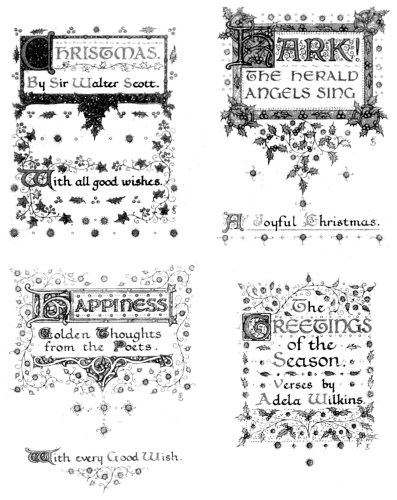
Designs for Christmas Cards.
By kind permission of
Messrs. Raphael Tuck & Sons, Ltd.
185
CHAPTER XXII
CHRISTMAS CARDS
In the application of illumination for purposes of
reproduction, designing for Christmas cards occupies a
prominent place. Although these are not all necessarily
of the illuminated type, a great number are of this
kind. All varieties have lettering as an important
part of the design. There is plenty of scope for the
illuminator in this direction. If he can produce
effective designs that can be easily printed, and are
likely to be saleable when reproduced, publishers of
Christmas cards will always be pleased to see his work.
When designing, there is no necessity for using
permanent colours, as the original is seldom kept
after it has been printed. The same thing applies
to the use of gold-leaf for gilding. This can be done
with bronze powder. Gold paint can be readily made
by mixing the powdered bronze to a stiff paste with
gum-water, then thinning it out with water so that it
flows freely from the brush. Care should be taken to
get the right amount of gum in it, as if there is too
much it will present a shiny appearance and will
turn black quickly. If, on the other hand, there
is not enough to bind the particles of bronze together,
it will rub off when touched. The best way186
is to test before proceeding with the work, by painting
on a small piece of paper and noting the effect
when dry.
When it is desired to produce raised gold, this also
can be done with bronze powder. For this purpose
some raising preparation, of the kind sold in the form
of a thick paint, should be used. A little should be
placed in a small saucer, and a drop of honey added
to it with some water. It should then be carefully
rubbed up with the finger until it is about the same
consistency as cream. Care should be taken not to
add too much honey, otherwise the raising will not
dry at all, but will remain a sticky mass.
The parts that are intended to be raised should be
filled in with this, in the same manner as described
for leaf-gilding in a previous chapter. After this has
become dry on the surface, it should be breathed upon
until it becomes tacky. The bronze powder is then
dusted over it with a small piece of cotton-wool.
After leaving for a little while, the superfluous bronze
is dusted off with a clean piece of cotton-wool. Any
parts where the bronze powder has not attached itself
can generally be covered by again breathing upon the
surface and applying the bronze. No attempt
should be made to burnish gilding done in this way.
Christmas cards are nearly always produced by
means of chromo-lithography, as described in the
previous chapter. Occasionally they are produced by
means of line and three-colour blocks, but, generally
speaking, chromo-lithography is the process employed.
By kind permission of
Messrs. Raphael Tuck & Sons, Ltd.
When about to make a design, the student should187
endeavour to visualise the completed design before
commencing work. If he cultivates this habit he will
find it much better than worrying a design into existence—a
method very often employed.
It is a good plan, when setting out to design, to
ask oneself a series of questions: “How is it to be
reproduced?” “What style of design is needed?”
“What is the general taste of the buyers of this kind
of thing?” etc. If one asks oneself a number of
similar questions to these, it should, at any rate, be
the means of ensuring that the design is suited to its
purpose.
A very common fault in designing Christmas cards
is making them too heavy in treatment. It is essential
that the finish should be light and dainty.
Designs may be either for the complete card or
merely for the outside cover. Several suggestions
are shown in Fig. 35. Of course, it will be understood
that these are only rough sketches. They do not
pretend to be designs.
The one represented by (a) is for the general type
of illuminated design. This is for the outside cover
only: a short greeting with an illuminated initial and
decoration. When selecting words for this purpose,
one should be careful to choose something not too trite.
On the other hand, it is as well to avoid using some
copyright quotation.
The designer must be up-to-date: he must not expect
to sell his designs if he gets his ideas from Christmas
cards that were published twenty years ago.
There are no special sizes to work to, as cards of188
all shapes and sizes are produced. It is best, however,
not to get them too large.
The style of card indicated in (b) is a very usual
kind. The centre is left blank for a small picture, or a
monogram, to be inserted.
If the artist is able to paint little landscapes or
girls’ heads, he could insert them himself as shown in
(c). He should, however, avoid getting these heavy or
crude in colour.

Fig. 35.
The designer will always find that he is much more
likely to sell his designs if they represent new ideas. The
publisher is always on the look-out for something new.
For example, the idea might be a small booklet
containing a brief anthology on “Happiness,” or
some other like subject.
189
If a small booklet is designed, it is as well to remember
that all the pages should not be fully illuminated.
The cover and the opening page might be
illuminated in gold and colours, while the rest might
be in black and red only. If the booklet was executed
with all its pages fully illuminated it would probably
be rejected on the score of expense of reproduction.
It is little things like this which, if taken into consideration,
would prevent a good number of the disappointing
refusals that are so often received.
Fig. 36.
A very attractive form of card is shown in (d).
This has a cover design, a greeting with a space for
name, and a quotation. When a card of this type is
designed it should be arranged as shown in Fig. 36.
By this means the card, when opened out, has the190
design all on the same side of the paper, and is much
more convenient. Some may be made upright and
others oblong in shape, as in Fig. 36.
The prices paid for Christmas card designs may be
anything from 10s. 6d. to £3 3s. Of course, higher
prices than these are often paid for good work, when
there is a demand for the work of the designer. A good
average price for a design, however, is £1 1s.
It is a mistake to mark designs at a low figure,
with the idea that the publisher will be more likely to
take them. This is quite a wrong impression, as, if
the publisher wants the designs, he will not be slow to
make an offer if the price is too high; while, on the
other hand, if they are not suitable for his purpose, he
would not take them as a gift.
When sending designs, it is as well not to write
long letters of explanation. Letters should be as
brief and pointed as possible.
Apart from designing for publishers, the illuminator
ought to be able to produce a series of hand-written
Christmas cards. There ought to be a demand for
cards well written in fine script on nice hand-made
paper. A little simple decoration might be added in
colour, and the modern illuminator ought to be able
to produce these quite quickly, and therefore cheaply.
Designs for Programme and Progressive Whist Card.
Invitation cards for select parties are amongst
numerous other things that suggest themselves for
production in this manner. Of course, for large
gatherings, where a good number of invitations are
sent out, writing them by hand is out of the question.
But when this is the case, one copy could be nicely191
written in black and a zinc line block made from this.
The edition could then be printed off. An invitation
card written in well-formed lettering would make a
pleasant change from the usual type of card.
Possibly a number of other opportunities will
suggest themselves where fine pen-formed lettering
might be substituted in place of the ordinary style of
thing.
192
CHAPTER XXIII
LETTERING FOR COMMERCIAL PURPOSES

An Attractive Advertisement.
By kind permission of
Messrs. Benn Bros, Ltd.
The ability to produce good lettering is of the utmost
importance to the artist employed in commercial work.
The list of things that require lettering seems almost
endless. To mention just a few, there are posters,
catalogue covers, showcards, labels, boxes, packages,
displayed advertisements, calendars, title-pages, book
covers, magazine covers, letter headings, maps, diagrams,
etc. This list might be extended considerably and yet
not include all the many things for which lettering is
absolutely necessary.
Design for Booklet Cover.
By kind permission
of the House of Vanheems
and Messrs. Clarke
& Sherwell, Ltd.
193
In fact, when one begins to consider the number of
things that require lettering of some description, one
begins to realise how essential it is that the artist should
be able to produce good and well-spaced lettering.
As mentioned before in an earlier chapter, there is
nothing like having plenty of practice with the reed
and quill pen to help the student towards ability to
mass and arrange lettering in the best possible way.
The difference between the lettering done by one who
has had plenty of practice with the reed or quill, and
one who has had no experience in this direction, is
most noticeable. The one is able to design with words,
while the other is concerned only with the shapes of
the letters. To be able to produce well-arranged
lettering it is necessary to be able to design with words,
and familiarity with the reed or quill gives this facility
better than any other training. No matter how the
letters are formed afterwards, the experience gained
in massing letters together in this way to form words
will be found to be of great service.
The arrangement of letters to form words is of the
utmost importance; in fact it might be said to be as
essential a factor as the formation of the individual
letters.
A well-arranged inscription often adds greatly to
the finish of a drawing, and with the latter it often
happens that it is incomplete without a heading or
title of some description. But this, if badly done, may
completely spoil the appearance of the drawing.
A Handbook Cover.
Maps and diagrams require a simple form of lettering
that is distinct and at the same time can be written195
in a fairly quick manner. The style of Roman lettering,
formed with simple pen-strokes, shown in a
previous chapter, might be used for this purpose; or
the simple pen-formed italics might be used. For
writing these a sharply-cut quill pen is required.
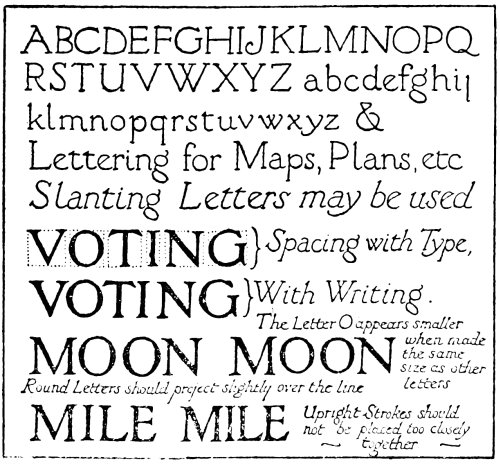
Fig. 37.
In Fig. 37 an alphabet is shown which is formed
with all strokes of equal thickness. This is a very
useful kind of lettering for illustrations, maps, and
diagrams. It has one distinct advantage: that is, it
can be written with the same pen that the drawing is
made with. If this style of lettering is used, however,
it is as well to make sure that all the strokes are of
equal thickness. It should not look like quill-pen
writing badly done. This type of lettering may be196
upright or slanting. Until the student is quite familiar
with this lettering two lines may be used. The writing
should be done very carefully and the words should be
well spaced. This kind of lettering should be used
only for names on maps, notes on diagrams, or references
under illustrations. When a title is needed for
an illustration, or a heading is required, carefully-drawn
Roman lettering should be used. Each letter
should be exact in finish, and at the same time there
should be good arrangement.
For poster work it is essential that the lettering
should be bold and decisive. For hand-written posters,
that need to be produced quickly, the Roman alphabet,
formed with simple pen-strokes, given in a previous
chapter, will be found useful. A large reed pen
should be used for this purpose. By using red and
black inks very effective hand-written notices may
be produced. If the poster is to be displayed out-of-doors,
waterproof inks only should be used for writing
it with. However, this will be dealt with in the next
chapter.
A Design for a Certificate.
BY SIDNEY FARNSWORTH.
By kind permission of the
National Institute for the Blind,
and the Byron Studios.
For lettering on a poster that is to be reproduced,
a good strong Roman type of lettering is the best.
The type shown in Fig. 38 is a very suitable kind.
It must be strong, bold, and well displayed. The
principal words must show up strongly defined. For
this, and, indeed, all kinds of commercial design, the
lettering must be firm and exact to a nicety. The
looseness that is suited to illumination will not do for
this kind of work. The little accidental turns and
twists, which are one of the charms of illuminated197
work, would be entirely out of place in commercial
work, which must be firm and strong in every detail.
Penscript is not used to any large extent. The greater
part of the lettering used in commercial design is
carefully drawn in an extremely accurate manner.
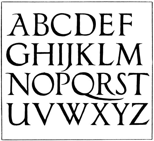
Fig. 38.
When lettering a poster, some endeavour should
be made to get a certain amount of display in the
lettering. For example, if the object is to advertise
“Brown’s Tea,” or “Smith’s Cocoa,” great prominence
must be given to these words. The lettering should199
be so arranged that it is practically impossible to avoid
seeing the name of the commodity that is being advertised.

Two Designs for Labels.
Another important thing when lettering advertisements
is to see that each letter is quite distinct. For
example, C must not be mistaken for a G, and vice
versâ.
For good arrangement in lettering the mistake
should not be made of taking type as a model, as,
owing to each type letter being in the form of a block,
it is impossible to space it with the same facility that
is possible with writing. Note the examples given
in Fig. 22.
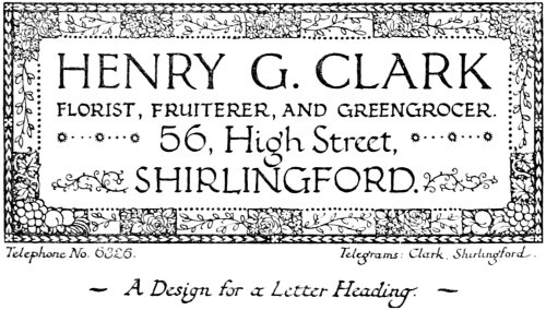
A Design for a Letter Heading.
One or two further hints may be useful. It is
never advisable to put two upright strokes too closely
together. Also in the case of round letters, such as
O, C, G, etc., these should project slightly over the
line, otherwise they will appear smaller than the other200
letters. This should, however, be very slight, as it is
easy to overdo this kind of thing.
When lettering a diagram, if possible keep all the
lettering the same way, so that there is no need to turn
the page round to read it. This is, of course, not
always possible, but if it is at all practicable it is quite
the best thing to do.
It is never wise to jumble a number of different
styles of lettering together in one inscription, as is
sometimes done. The practice of this kind of thing
tends to make the lettering less readable, besides
making it look somewhat freakish. Sometimes the
use of two styles of lettering together, such as an
upright form of Roman lettering and an italic, helps
to emphasize certain words; but when a variety of
different forms is used the only result is to make the
lettering look confused.
For the greater part of commercial work a form of
Roman lettering is used. The student who intends to
practise this kind of work should study some of the
best modern work. He will have no difficulty in
getting plenty of examples.
When designing a cover for a magazine, one of the
first things to be taken into consideration is how to
make it stand out in a striking manner so that it will
be noticed on the bookstall.
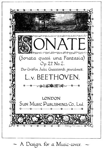
A Design for a Music-cover.
Designs for magazine covers may be roughly
divided into two classes, viz., those which occupy the
whole of the cover, and those where the design is in
the form of a heading. In any case, however, it is
best that the title should be prominently arranged at201
the top of the cover, so that it can readily be seen
when the magazine is placed on the bookstall, and is
generally in that position partly covered through
other magazines and books overlapping it. The great202
thing to remember is that the object of each design
for a magazine cover should be to make it stand out
distinct from all the other magazines on the stall, so
that it can be recognised in an instant.
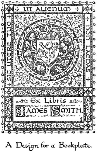
A Design for a Bookplate.
One important piece of advice in this kind of work
is to avoid making the lettering look freakish by
forming some of the letters quite tiny and others excessively
large in the same word. This is one of the
most prominent signs of the amateur.
203
CHAPTER XXIV
HAND-WRITTEN POSTERS, ETC.
It is very useful at times to be able to produce quickly
a hand-written poster. It is not always desirable to
have printed ones, especially when one or two copies
are all that are required, and a hand-written poster
can be very effective even if it is produced hurriedly.
It is, however, very essential that these should be
written as quickly as possible, as the price that the
writer would have to charge for a poster that he had
spent a whole day in writing would make it quite
prohibitive. Therefore speed of production is an
important factor that must be considered in connection
with the hand-written poster.
It is well to remember that a poster must attract
attention. Unless there is something arresting about
it, comparatively few people will stop and read it,
however well it may be written. Of course all posters
do not depend upon the lettering alone to attract, but
in any case the lettering should be distinct and prominent.
However, the type of poster described here is
composed of lettering alone, and so depends entirely
on the display of this to catch the eye.

An Attractive Piece of Lettering.
By kind permission of
Messrs. Marshall & Snelgrove, Ltd.
A poster that is written comparatively badly may
attract attention much more than one that is written205
well but without any display, because the badly-written
poster may have something striking about it that compels
attention. The thing to aim at is to make the
poster prominent without annoying people by offending
their artistic susceptibilities.

Fig. 39.
The following is a good method of quickly writing
a poster. A sheet of paper is ruled, in the manner
shown in Fig. 39, with a soft black-lead pencil. The
lines should be ruled lightly and fairly closely together.
If the poster is to be written on thin paper, it is not a
bad plan to rule these lines boldly in ink on another
sheet, so that if this is placed under the paper upon206
which the poster is to be written these lines will show
through quite plainly enough to act as a guide to the
writer. It is a good practice to have a number of sheets
of various sizes ruled out, so that when a poster is
required of a given size one of these can be utilised
and the poster written quickly.
The lettering may be roughly sketched in either
with a soft black-lead pencil or a piece of charcoal.
It may then be written straight away with the pen or
brush. When the lettering is quite dry the pencil-marks
may be cleaned off with bread or soft rubber, or
if charcoal has been used this may be dusted off quite
easily; the poster is then complete.
As is plainly obvious, the poster shown in Fig. 40
is produced by means of the pen. The best type of
pen for poster-writing is undoubtedly the reed pen,
especially if the writing is needed to be fairly large.
When this form of pen is used it is advisable to cut
it with a fairly long slit; this will ensure the pen
working much easier.
When writing with black and red inks, one pen
should be kept for black and the other for red. If
this is not done, the pen should be carefully washed
after it has been used for black ink before using red
ink, otherwise the black left in the pen will mix
with the red and make the colour dirty. Undoubtedly
the best way is, as already mentioned, to use a separate
pen for each colour.

Fig. 40.
As most posters have to be exposed to the weather
it is well to use only fixed inks. Fixed inks are generally
prepared by being mixed with shellac which is208
dissolved in a solution of borax. Ordinary water-colours
may, however, be made waterproof quite easily
by the following method. A saturated solution is
made of some bichromate of potash, and a few drops of
this solution are added to the colour just before using
it. As this chemical makes a bright orange solution
it will alter some colours slightly, but for blacks and
reds it will not be noticeable. This chemical has the
property of making glue, size, or gum insoluble when
it is mixed with them, after exposure to the light, and,
as water-colours are mixed with gum, it has the same
effect in this case. If, therefore, the poster be exposed
to the light of the sun for a short period after it has
been written, the colour quickly becomes insoluble
and therefore waterproof. The best way is to mix as
much colour as will be required in a small saucer,
adding the bichromate solution. It is quite easy to
understand that if any of this colour dries in the saucer
it will have to be thrown away, as the light quickly
affects it when dry and it will be quite useless owing to
its insolubility. Possibly it will be noticed that a
yellow stain will show on the back of the poster when
the bichromate has penetrated. As, however, in this
case one side only of the paper is used, this will not
matter in the least.
Larger posters may be written with the brush
(see Fig. 41), or partly with the pen and partly with the
brush. A brush that is very suitable for quick writing
is a Japanese brush like the one illustrated in Fig. 41.
This can be used almost in the same manner as the
pen, and it is possible to write very quickly with it.
209
Fig. 41.
210
By kind permission
of Messrs. Marshall
& Snelgrove, Ltd.
212
For very careful writing the best brush is the kind
known as a sable writer. This is a sable brush with
rather long hair. Practice is necessary before the
student becomes expert in the use of it, but it will be
found that the long sweeping curves of the round
letters, as also the straight strokes of the other letters,
may be formed much more easily with this type of
brush than with the ordinary kind used for painting.
Writers are generally in quills, so perhaps a word
may be useful here with regard to the method of fixing
a quill brush on a handle. It is not wise to take the
quill as it comes from the shop and push it on to a
stick. The quill is very liable to split if pushed on too
tightly, while, on the other hand, if it is not fixed
securely it will drop off, probably whilst doing some
important work, and will almost certainly spoil it
if it falls off when well charged with colour.
The proper way to fix a quill brush is, first of all, to
soak the brush well until the quill becomes quite soft.
The stick is then carefully tapered with a sharp knife
until it exactly fits the quill. Then, while the quill is
still soft, it is carefully fitted on to the stick. The
result of this method is that when the quill gets dry
and hard it will be found to be fitted quite tightly on
to the stick, and will certainly not fall off; while,
at the same time, there is no danger of splitting the
quill.
When writing posters in black and red, the red
should be used to give emphasis to words that are
important. For example, in the specimen shown, the
word “CONCERT” may be in red; also the place,213
date, and time may well be written in this colour to
make them more conspicuous. A simple border may
be added composed of some slight decoration formed
with direct brush strokes if so desired. This may be
either in one or two colours.

Fig. 42.
Large notices that are required to be lasting may
be written on canvas, using oil-colours.
Some examples of window-tickets are shown in
Fig. 42. These may be written with the quill pen.
The use of black and red is very effective for these, but
any colours may be used. It might be a good idea to
write a quantity of tickets according to a special215
colour scheme for a particular window display. This,
however, could best be done by working in conjunction
with the one who is responsible for dressing the window.
Some tickets might be written in white on a dark
background. It will be found that, for use in the pen,
colours that have been mixed with gum and water
without any addition of honey or glycerine will flow
much better than ordinary water-colours. When these
are used they tend to clog the pen. There is no
necessity in this case to fix the colours as they will
not be exposed to the weather, so therefore will not
need to be waterproof.

Fig. 43.
If the student has become familiar with the use of
the quill pen he should be able to write these fairly
quickly and therefore cheaply. The use of simple
decoration formed with the same pen that the lettering
has been done with may be employed, but this
should not be overdone.
In Fig. 43 an example is given of a show-card that
has been written with the pen in a simple, straightforward
fashion. A simple border has been added
which may be quickly and easily formed with the pen
or brush. For writing small show-cards the quill pen
may be used, but for larger ones the reed pen will be
more serviceable.
216
CHAPTER XXV
THE ILLUMINATED MS. BOOK
In the Middle Ages the illuminated MS. book occupied
a very prominent position. The printing-press was
not then in existence, so the manuscript book was
without a rival. To-day the printing-press is to the
forefront and the manuscript book is practically unheard
of. There is, nevertheless, no reason why the
art of illumination should not be practised in the same
manner as was formerly the case. It is true that
beautiful books are produced by the printer, but there
ought also to be a demand for books beautiful, written
and illuminated by artists of the present day. An
illuminated manuscript has many advantages over
the printed book, one of which is the fact that it is
unique instead of being one of many. There is no
need to enumerate the many other advantages that
the manuscript book possesses.
The best material upon which to write a manuscript
book is undoubtedly vellum, although fine hand-made
paper may be substituted if it is not desirable to go to
the expense of procuring vellum for this purpose. A
paper that is soft and flexible should be selected in
preference to one that is hard and stiff. Anything
approaching cardboard should be avoided.
Frontispiece of Illuminated MS. of Blake’s “Songs of Innocence.”
BY SIDNEY FARNSWORTH.
217
The first thing to decide in writing a manuscript
book is the size of the page. After this is settled, the
size of the lettering should be taken into consideration.
If the manuscript is to be on vellum this should be
bought ready cut to the size required. It is much
cheaper to buy vellum in this way than to buy the
skin and cut it for oneself. The reason for this is because
the manufacturer can cut up a more or less imperfect
skin into small pieces, but when a whole skin is required
this must be perfect in every respect.
The best vellum for manuscript books is the kind
known as Roman vellum, a very soft and flexible kind
of vellum. For title-pages, and any other pages
which are likely to be covered with elaborate work, a
slightly heavier vellum may be advisable.
For general purposes a good size for the page is
10 in. by 7½ in., i.e., the vellum sheets should be cut
10 in. by 15 in. It is as well to leave a slight margin
for drawing-pins in addition to this. One of these
sheets should be ruled out, as shown in (a), Fig. 44,
with a sharply-pointed H.B. pencil. The lines should
be ruled very lightly so that they may be erased with
the slightest possible touch of the rubber. After one
sheet has been carefully ruled out in this manner, the
others can be marked out in a similar fashion by
pricking through.
Manuscript books are generally written in eight-page
sections, formed by folding one sheet within the
other, as in (b).
The proportion of the margins may vary according
to circumstances, but it is best to make them fairly218
wide. The inside margin is made smaller than the
outside one, because the two inner margins come
together, thus forming a wide margin between the two
pages of lettering. It should, however, be made
wider than half the size of the outside margin, to allow
for the folding of the leaves when the book is bound.
A good arrangement for the commencement of a MS.
book is shown in Fig. 44 (b), (c), or (d). The title is
written on page 1. Pages 2 and 3 are blanks. The
frontispiece and title-page occupy pages 4 and 5.
Page 6 is another blank, and the manuscript starts on
page 7. The title may be written simply in red, or
red and black. This should not be written quite in
the centre of the page, a larger space should be left
at the bottom, as if this is equal with the top it will look
as if a larger space had been left at the top.
Fig. 44.
For the frontispiece a miniature may be used,
illustrating some passage in the book; or a coat-of-arms219
or some symbol may be worked in surrounded
by decoration. The title-page should have the title
and the author’s name, but the artist should not put
his name here. When he has finished the MS. he may
write at the end a colophon, stating his name, and when
and where the book was written. It is best when
writing out the manuscript to leave the title-page
and frontispiece until the rest of the matter has been
written.
Title-Page of Illuminated MS. of Blake’s “Songs of Innocence.”
BY SIDNEY FARNSWORTH.
No elaborate planning of pages is necessary. A
good number of pages should be ruled out with lines
ready for writing, and the manuscript should be written
straight away with the quill pen. Spaces are left for
initial letters, miniatures, etc., as the writer feels they
are fitting and necessary. The student should be very
careful to write out the pages in the proper order, as
it is very easy to make mistakes by writing on the
wrong pages. For example, if he is not careful he
is very liable, after having written the second page of
a section, to go on writing on page 7, instead of page
3, which is on another sheet of vellum folded inside the
first. A good method for avoiding this is to number
the pages lightly in pencil with large figures at the
head of each page.
When writing out the words, the vellum should be
fastened to the drawing-board with drawing-pins, a
pad formed with several sheets of blotting-paper being
placed under the vellum to ensure easy writing. If
possible, place the copy just above the writing level,
where it can easily be seen.
If it is necessary to find out how many pages the220
manuscript is likely to run into, a rough calculation
can easily be made by ruling out a sheet of paper and
lightly pencilling in a page of the writing. It will then
be an easy matter to count up the number of words to
form an estimate of the number of pages required.
The student should always, before commencing to
write, read through the matter and decide what initials
he will have, also whether he will have any miniatures,
etc. In fact, he ought to be able, before he commences
work, to visualise the whole of the manuscript completed.
If his mental image of the finished book is a
grand one he will be inspired to do his utmost to
make the actual one as much like the one in his imagination
as possible.
After the writing has been done, the initial letters,
borders, etc., may be drawn lightly with pencil.
After this, the next stage is the gilding. Before this
is done, however, the vellum should be carefully
fastened tightly to the drawing-board with a large
number of drawing-pins to prevent it from cockling.
When the gold has been laid and burnished, the
colouring is proceeded with, and the page is finished.
The colophon is written at the end, a blank page
being left between it and the last page of writing.
This should be in quite simple lettering without any
ostentatious show of decoration. The wording may
be as follows: “This book, written out by me —— in
——, for ——, was finished on the —— day of ——,
Anno Domini, 19—.”
Of course, there is no need to word the colophon
always in this manner. This is merely a form221
suggested. In the case of a book where several have
taken part in the work, mention should be made of
this. It is not a bad plan also to include the name of
the binder, in the event of the book being bound by
a good craftsman. Some examples of colophons are
shown in Fig. 45.
It is a mistake to make all the pages elaborate in
style; in fact it is best to make the majority of them
quite simple in treatment, with here and there one
that is more ornate in character.
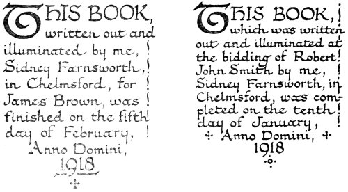
Fig. 45.
The writing is the principal thing in the book,
therefore nothing must be added that will in any way
detract from this. If the addition of decoration has
this effect it would be much better to leave the writing
quite plain. It is impossible to lay down any rules
to govern the use of decoration in the manuscript
book. It is largely a matter of feeling one’s way. If222
the decoration is well-considered and suited to the
words it will help, rather than detract from, the
lettering.
It should be remembered that the primary object
of a book is to be read. If the book fails in this respect
it will also most certainly fail from the standpoint of
beauty. One of the first essentials of anything that
lays claim to beauty is that it shall serve its purpose.
Therefore care should be taken that nothing be done
that will, in any way, tend to make the book less
readable.
The decoration should be strongly influenced by
the subject-matter of the book. Some illuminators
appear to have one idea only with regard to illumination.
No matter what the words are, the same kind
of decoration is used. They seem to make no distinction
whether the subject is a mediæval romance or
something quite modern. This is a great mistake,
and shows a lack of thought and imagination on
the part of the artist. The ideas expressed in the
words should also be felt in the decoration; in fact, the
book when completed should form one harmonious
whole.
When miniatures are introduced these also should
harmonise with the decoration. It is not advisable
to make these resemble small water-colour paintings
that have no connection with the rest of the ornament.
On the other hand, these should not be drawn in too
conventional a manner. They should be essentially
decorative in treatment, and careful study from nature
should prevent the student from making these too hard223
and rigid in character. Complete unity should run
throughout all the work.
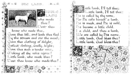
Two Pages from the Illuminated MS. of Blake’s “Songs of Innocence.”
BY SIDNEY FARNSWORTH.
Even in the writing itself it is possible to express
something. For example, some prose looks best if
written with a fairly heavy massed writing, whilst
other of a lighter character seems to be best if written
with the lettering less heavy and more loosely arranged.
Poetry generally seems to require to be written with a
lighter type of letter and with the lines of lettering
wider apart. It is, however, not wise to lay down hard
and fast rules with regard to this: one should be able
to feel what is the best thing to do.
When writing the MS., and, indeed, right through
every stage, absolute quiet is necessary to concentrate
one’s mind on the work. One should endeavour to
give it one’s undivided attention.
A test as to whether an artist has succeeded is
to observe, when the book is shown to anyone, whether
the words are noticed at all, or if the decoration only is
admired without any apprehension as to what the words
are about. If the latter is the case, then, to some extent,
the artist has failed. A manuscript that has been
illuminated in the right spirit should enable the reader
to understand and appreciate the words better.
After the MS. is completed it should be carefully
bound by an experienced binder. It is as well to choose
a good craftsman for this purpose, and one who has
had some experience in binding manuscripts containing
raised gold, as it is very easy for a binder to spoil the
manuscript if he is not accustomed to handling
work of this kind. To make the whole thing a224
success it is necessary that the binder should be an
artist as well as the illuminator.
A simple method of binding MSS. in limp vellum,
without special appliances, is described in the next
chapter.
225
CHAPTER XXVI
A SIMPLE METHOD OF BINDING MSS.
The method of binding described in this chapter is
not intended to take the place of proper binding in
leather. However, it is sometimes useful to be able to
put the MS. in a cover when it is not desirable or
convenient to go to the expense of having the book
bound in the usual way. Binding with stiff boards is
an art that requires considerable experience as well as
skilled training, but there is no reason why MSS.
should not be bound in limp vellum in the manner
described here. No special appliances are needed for
this method, and the writer should be able to complete
his MSS. by binding them without any difficulty if the
directions given here are carefully followed.
Two additional sections of plain paper or vellum
should be made, to serve as end-papers, one at each
end of the book. If the MS. is on vellum, the end-papers
should be of the same material, but if on paper
the end-papers should be made of paper of the same
kind as that used for the rest of the book.
Four strips of binder’s vellum should then be cut,
these being about 3/8 in. wide and four inches long.
The sections should be knocked up quite squarely,
and should be marked on the back with a soft black-lead226
pencil in the manner shown in Fig. 46, using a
square to get the lines accurate. The sections should
all be marked quite distinctly so that each section
shows the divisions quite plainly. This gives the
position of the four strips of vellum and the kettle-stitches
at each end. The mark for the kettle-stitch
should be about ½ in. from each end, although sometimes
at the bottom a little more than this is allowed.
The position of the vellum strips should be in the same
proportion as given in Fig. 46.
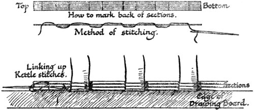
Fig. 46.
When ready to sew the sections, take the four
vellum strips and fold each one about 1½ in. or 1¾ in.
at right angles from each end, according to the thickness
of the book. Then take a drawing-board and
place on the edge of it the first section face downwards,
with the four strips placed in position with their
shorter ends underneath. Get a needle, threaded with
good silk or unbleached thread, and insert it at the
top kettle-stitch mark from the outside, bringing it out
again at the first mark for the vellum strip. Bring227
the thread round the strip and re-insert the needle on
the other side, bringing it out again and round the
next strip, and so on until it comes out at the bottom
kettle-stitch. When this is done it should have the
effect, shown in Fig. 46, of a continuous thread passing
in and out and round the vellum strips. Now take
the next section and place it in position and sew in
the same manner, continuing with the same thread but
in the reverse manner. Upon coming to the loose end,
where the needle was first inserted, this should be tied
up with it. Then add another section, going backwards
and forwards, adding section by section until
the whole is completed. Each kettle-stitch is linked
up as shown in Fig. 46, and it is a good plan also to
link up the threads that cross over the vellum strips
in the same manner.
To keep the sections in position while stitching,
a small paper-weight is useful. The thread should be
drawn fairly tightly, a fresh needleful of thread being
tied on to the end of the other when it is exhausted,
and when the stitching is completed the end should be
carefully tied up with the last kettle-stitch. The
back may then be covered with thin glue and lined
with a piece of thin leather or tough paper, and the MS.
is then ready for covering. (See Fig. 49.)
A piece of binding vellum is cut for the cover and
marked with a folder on the underside, as shown in
Fig. 47. The two lines marked down the centre
represent the thickness of the sections. The two
spaces on either side, exclusive of margins, should be
slightly larger than the size of the sides of the book.228
The wide margin that extends all the way round may
be approximately 1½ in., while the additional narrow
margin on two sides may be ¼ in. in width. The
corners should be cut along the dotted lines with a
sharp knife.
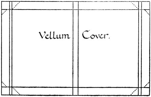
The cover is then folded up in the manner shown in
Fig. 48. It is as well to stick the edges down with a
little stiff quick-drying paste. The two narrow margins
should be marked with the folder and folded over to
form two flaps on the fore-edge of the book. All these
folds should be made very carefully so as to ensure
them being quite even. Some people find it best to
make a cover of stiff paper first, and, when this fits
correctly, they make the vellum cover exactly the
same size. It is possible by this method to avoid229
spoiling the vellum through cutting it so that it does
not fit.
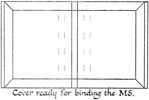
Cover ready for binding the MS.
Fig. 48.
The next thing to do is to mark the places on the
inside of the cover for the vellum strips to be laced
through. These should be made about ¾ in. from the
creases of the back. Another mark should be made
about 3/8 in. away from the first mark. If the book is
now placed in the cover it will be quite an easy matter
to mark exactly where the vellum strips intersect these
lines, and slits may be cut with a sharp knife in the
cover in the places marked with dotted lines in Fig. 48.
The vellum strips may now be laced through
these slits and the ends stuck down with strong
paste. Some pieces of good silk ribbon may be attached
to the top and bottom strips and laced through the230
cover, leaving the ends to tie, or the book may be left
without these.
The two outside end-papers may then be pasted
down on to the inside of the vellum cover. This will
cover up the ends of the vellum strips. It is, however,
essential that for all this a quick-drying paste should
be used and not one that is very liquid, as this would
quickly strike through and cockle the vellum. The
end-papers should be pasted down very neatly and
then the book should be placed under pressure until it
is quite dry. One or two heavy books make a very
good press for this purpose.

MS. ready for insertion
in Cover.
Finished Volume.
When the book is quite dry the decoration of the
cover may be proceeded with. The title may be written
on it with quite plain lettering or it may be decorated
in a more elaborate fashion. It is better not to use231
raised gold, as it is very liable to get damaged on the
cover of the book. However, some very good effects
can be obtained with flat gilding. The vellum strips
that are laced through the cover offer scope for decoration.
If it is desirable to write the title on the back of
the book it is better to do this before the book is bound,
as it is rather a difficult matter to write here when the
book has been bound.
If it is desired to do so, the cover may be made of
thin card or stout paper in this way and then have a
cover of vellum folded over it. If this is done, the
vellum strips will, of course, be covered up on the outside,
as well as the inside, of the cover.
Generally the books most suitable for this style of
binding are small ones, although larger MSS. are sometimes
bound in this way.
The same remarks that were made with regard to
the style of decoration in the MS. itself apply equally
here. The subject of the book must decide, to a large
extent, what style of ornament is to be used. For
example, a volume of modern poetry will require quite
different treatment to that of a mediæval romance.
It ought to be possible for the illuminator to make
some very charming little volumes in this manner.
232
CHAPTER XXVII
THE ILLUMINATION OF THE PRINTED BOOK
As already mentioned in an earlier chapter, some of
the early printed books were enriched with fine illuminated
initials, borders, etc. These books were printed
with spaces left for the artist to insert these, and this
seems to have often been the custom during the early
days of printing.
There ought to be a demand for books produced
in this manner in the present day, and the modern
illuminator should be able to do good work in this
way.
When it is intended to apply illumination to the
printed book, it is well that the book selected should
be worthy of being illuminated, both with regard to
subject-matter and also the way in which it is printed.
It should be beautifully printed on good paper. Some
choice editions have been printed on vellum, but
these are few and far between. However, if possible,
the book selected should be printed on good hand-made
paper. The illuminator should carefully avoid
so-called “art” papers, which have a clay surface and
are by no means durable, besides being far from ideal
for working upon. The book should be printed from233
good type, with nice wide margins so as to leave plenty
of scope for decoration.
Fig. 50.
Illuminating a book after it has been bound is a
rather difficult matter, so it is better to procure the
sheets, if possible, before they have been bound. It is
much more convenient to work upon them when they
are unbound, as each page in turn can be fastened to
the drawing-board in the usual way. A good edition
of any book can generally be obtained from the publishers
in sheets if application is made. In the case
where it is possible only to work on the book after it
has been bound, it is best to tie the pages back with a
piece of narrow tape in the manner shown in Fig. 50.
A piece of stout cardboard is placed at the back of the
book, and the book is tied to this by means of the
tapes. This not only prevents the pages from turning234
over, but also precludes the possibility of the book
accidentally closing.
One thing is extremely important in connection
with the illumination of the printed book, and that is
that the decoration should be in keeping with the
modern type used in printing. The book should not
look as if the text ought to be written in Gothic script.
The illuminator must endeavour to preserve a feeling
of unity about the book. If the book is illuminated
like a thirteenth-century missal, the ordinary Roman
type will look out of place. It is hardly necessary to
add that Gothic initials should not be used, as they
would be entirely out of keeping with the type. A good
form of Roman capital may be used instead.
If illustrations in the form of full-page plates form
part of the book they may be mounted on good stout
hand-made paper and have the titles nicely written
underneath. For writing the titles under illustrations
a simple form of Roman script should be used, so
as to be as much in keeping with the type as possible.
It is not advisable to add any decoration to the page
on which the illustration is mounted. The inscription
alone is sufficient and should be nicely written in
well-formed writing.
For the title-page of the book this may either be
substituted by one entirely done by hand, or the
printed one may be slightly decorated. It is best not
to make this too elaborate, especially if the printed one
is used. In fact it may be best to leave it practically
plain, but this is a point that must be decided by one’s
own good taste.
235
The opening page may be made important by
using a fine initial letter. By the use of body colours
it is possible to paint this in on top of the printed
letter. The first word, which is generally printed in
capitals, may also be painted in the same way, either
in gold or colours. The decoration should be suited
to the subject-matter of the book and should not be
carried to excess. It is much better for the decoration
to be somewhat too simple in character than for it to
look too ornate and crowded.
The decoration should be kept quite free in character
and every endeavour should be made to prevent
it from getting hard and severe. All the poetry and
sweetness possible should be put into it.
Every page should not be covered with decoration;
this should not be attempted. All the variety possible
should be got by making some pages quite simple in
treatment, others may be more elaborate, while some
may be left quite plain. Too many heavy borders
should not be introduced.
The use of illuminated tail-pieces affords a good
opportunity for the illuminator to add to the interest
of the page, and there is generally plenty of scope for
these at the end of chapters, etc.
Generally speaking, the printed book should not
be used for illuminating when it is possible to write
out the words, as a manuscript book is certainly preferable
to a printed one. But in cases where a book is
too long to be written out, the application of illumination
to typography is certainly a great advantage if
judiciously used.
236
At the end of the book the illuminator may add his
colophon, stating that the illumination in the book was
executed by himself, and giving the date of its completion
and other interesting details.
A complete edition of the works of a favourite
poet is a good example for illumination in this manner.
It would take far too much time, as well as being too
costly, for the modern illuminator to write out a large
volume of poetry, but it might be nicely printed and
illuminated in this way. By these means a beautiful
book might be produced that ought to appeal to the
lover of choice books.
Doubtless there will be many books that will
suggest themselves for treatment in this manner,
although it is to be feared that a great many of the
books written in the present day are hardly suitable
for illumination. No one would dream of illuminating
a treatise on surgery to-day, and yet even this was
done in the Middle Ages. There is in the British Museum
an illuminated MS. of a French treatise on surgery
of the thirteenth century which is quite charming in
style. This kind of thing is, however, quite impossible
to-day. Still, there is quite a large number of books
that are suitable in every way for illumination.
Service books for use in churches may well be made
subjects for decoration in the form suggested here.
These alone ought to offer plenty of scope for the
modern illuminator. A service book beautifully
printed on fine hand-made paper and illuminated
should form an ideal gift for a church.
A well-printed edition of a favourite author,237
illuminated with fine initials and borders, might
occasionally be substituted for the usual illuminated
address. This would probably be appreciated very
much more than the ordinary type of testimonial
which is generally given. In this case an inscription
may be written at the commencement of the book
giving particulars concerning the presentation.
238
CHAPTER XXVIII
PRINTED BOOK DECORATION
There ought to be plenty of scope for the modern
illuminator in printed book decoration. His training
in writing and illumination ought to be of the greatest
service to him when he is called upon to produce
decoration for the purpose of printing with type.
Without a doubt, the ideal form of printed decoration
is that produced by means of wood-blocks that
have been engraved by the artist. If he is able to
engrave blocks from his own designs it will be possible
for him to get much more human interest in his work.
As a direct method of artistic expression wood-engraving
has merits far above that of the mechanical methods
of reproduction. Wood-engraving is, however, so
important as to require a separate treatise, it being
quite impossible to deal with it here.
By far the greater part of printed book decoration
is produced from line process blocks, and it is with
this form of reproduction that it is intended to deal
in this chapter.
One of the most important parts of the book, from
the point of view of decoration, is undoubtedly the
title-page. In Fig. 51 some of the forms that this
may take have been suggested. In making a design for239
reproduction by this process it is not advisable to
make the drawing much larger than it is required to
be when reproduced. The decoration loses much of
its individual charm when it is reduced too much.
A successful reproduction should represent the original
drawing of the artist as nearly as possible, and if it is
reduced a great deal there will probably be a considerable
difference between the reproduction and the
original.

Fig. 51.
In designing a title-page a great deal depends on240
the style of book it is intended for. A book on architecture
or engineering would require quite different
treatment from a volume of poetry.
A very simple form of title-page is suggested in
Fig. 51 (a). This consists of nicely-arranged lettering
with a printer’s device or some symbolical ornament.
If desired, the larger lettering may be drawn and the
rest printed from good type well arranged. It is
hardly necessary to add that the lettering should
be in keeping with that used in the other part of the
book.
A title-page with the lettering printed from type
and suitable decoration added is a very satisfactory
form.
The next one, shown in (b), is one where the lettering
is enclosed within a border. This may be either
quite simple or elaborate, as desired.
The style indicated in (c) is one in which the lettering
is incorporated with the design. This is a form
often employed for an elaborately decorated edition,
such as a volume of poems.
The next one (d) is the pictorial type: nicely-arranged
lettering with a picture in the centre. This
may be either in line or colour, but generally it is in
line, treated rather boldly. A woodcut illustration
with red and black lettering makes a very effective
title-page.
The last suggestion, given in (e), is for the double
form of title-page. A good number of richly decorated
volumes are of this form.
Another type that is often used is where the241
lettering is placed on a tablet, scroll, cartouche, or other
ornamental device; or the page may be a combination
of lettering, border, and illustration. Instead
of a border that is rigidly defined it may have a border
that is quite loose in character.
Possibly several other variations will suggest themselves
to the artist.
Another important part of book decoration is
the initial letter. As mentioned in the previous
chapter on the illumination of the printed book, these
should be of the Roman type. Gothic initials should
never be employed with modern type. Above all,
the initial letter should always be distinct. A puzzle
is all right in its place, but this is not the place for it.
In Fig. 52 some examples are given of bad forms for
the student to avoid. It would have been easy to
have filled quite a large number of pages with letters
of this character. The letter A shown here is a type
of initial that was very familiar in books about fifty
years ago. Occasionally one sees it now, but not
often. Most of these bad forms arise from a misconception
as to the nature of the letter. A letter is simply
a sign intended to convey a meaning to the reader;
there is no reason why it should pretend to be something
else. The sign may certainly be a thing of
beauty, but surely making it look as if it is formed
with branches like a rustic bridge is not making it
beautiful.
Another bad type of letter is shown in the initial
B. This form of letter is largely used by sign-writers
even in the present day. In this case the letter is242
apparently conceived as a solid block, which is drawn
in false perspective so that it may throw a meaningless
shadow.

Types of Initials to avoid.
Fig. 52.
Sometimes the surface of the letter is broken up,
as in the letter C. In the case of a stencilled letter,
breaking the surface of the letter is, of course, unavoidable
(although even in this case it would not be broken
up like this example), but for a printed letter, where
there is no necessity, it is extremely foolish.
The other C is another example sometimes seen,
formed with a coil of rope.
243
Fig. 53.
The other shapes are all equally bad, and no one
with a training in really good forms of lettering could
possibly originate them. They all practically err in
the same direction, i.e., in pretending to be something
that they are not. It is curious that this tendency
should so develop.
Another bad form of initial, not illustrated here,
is that formed by contorting figures into shapes to
represent various letters. All this sort of thing cannot
be too severely censured.
244
It is far better to have initials quite simple in
character rather than forms like these, which are
absolutely debased in style. A fine form of Roman
capital with little or no ornament added is much to
be preferred.
In Fig. 53 some elaborate examples are given
showing how it is possible to produce striking initials
without resorting to any of the devices illustrated
in Fig. 52.
The A and the T are examples of initials filled with
decoration based on plant-form. This makes a very
good style of letter.
One of the O’s has a decorative landscape placed in
the centre. Of course, only the round letters can be
treated in this fashion.
The other letter O has a fanciful style of decoration
very suitable for the commencement of a fairy tale.
In fact this initial was designed for that purpose, the
story commencing in the usual way, “Once upon a
time.”
In Fig. 54 some suggestions are given for tail-pieces
which are used to fill up when a chapter ends
half-way down the page. These may be of various
shapes, such as triangular, rectangular, lozenge-shaped,
or irregular. They may consist merely of decoration
or they may embody the words, “The End,” “Finis,”
“Conclusion,” or “Here ends the story of——.”
A small decorative scene may be employed as
suggested here. Another way often used, and also
indicated here, is for the lettering to be separate, with
a band of ornament beneath it.
245
Borders for illustrations should be in keeping with
the style of the illustration.

Fig. 54.
Chapter headings may be either well-arranged
lettering enclosed within a border, or the lettering may
be placed on a scroll, cartouche, etc. Another form
may be that in which a picture is incorporated with
the decoration. Generally, chapter-headings are used
more in magazines than in books. If one is designed
for a special page in a magazine it should be definitely
for that particular page.
246
When making a design that is to be reproduced in
two colours, in which both colours are distinct—i.e.,
they do not overlap—the drawing should be made all
in black. A sheet of tracing-paper is then pasted on
the top edge at the back and folded over on the face
of the drawing. The parts that are intended to be
printed in the second colour should then be painted in
with vermilion on the tracing-paper. This indicates
to the block-maker the parts to cut out when making
the blocks. The reason for doing this is because it
is much easier to make the line-blocks from the drawing
if it is all in black. Of course, this only applies when
the two colours are quite distinct. When they overlap,
the best way is to make two separate drawings in
black. This can be done quite well by making a pencil
drawing first, then painting in one colour in black on
this drawing; the second colour is then painted on a
piece of tracing-paper which is placed over this drawing
for the time being. A small cross should be placed at
each corner of the drawing and traced through on to
the second one to act as register marks for the block-maker.
Generally speaking, all designs for book-decoration
should be in line. The great disadvantage of the half-tone
process is that the blocks cannot be printed well on
a paper that has the slightest tendency towards
being rough on the surface. The best results are
undoubtedly produced when they are printed on art
paper. Art paper is, however, far from durable, and
should not be used for books that are required to be
lasting. Apart from this, the half-tone process is not247
nearly so satisfactory as the line process. A good
line block will give a fairly faithful reproduction of the
original drawing without losing detail. This cannot
be altogether claimed for the half-tone process. Three-colour
process blocks, being a development of this,
are open to the same objections. When the student
has seen some of his work reproduced by these processes
he will be able to appreciate the difference.
If colour is required in the decoration, a much more
satisfactory form of colour reproduction is that produced
from several line blocks, but, of course, if this
process is used there must be no attempt at wash
effects.
This chapter is intended to be merely suggestive
of the developments in printed book-decoration that
ought to be quite possible for the modern illuminator.
248
CHAPTER XXIX
CONCLUDING REMARKS
It may be as well again to emphasise the fact that it
is imperative, if one desires to succeed in the art of
illumination, that it should be taken up in a serious
manner and not merely as a pleasant pastime. It is
an art which is worthy of the best that time and
careful study can give to it, and it may serve as useful
a purpose in the present day as it has done in the past.
There is no royal road to success: this can only
come through steadily plodding along the lines suggested.
The methods of study that have been outlined
in the previous chapters are the result of what
the writer has learned in the hard but excellent school
of experience.
Good, well-formed writing comes first and foremost,
making use of the reed and quill pen in the formation
of letters. The method of practice, commencing with
simple pen-strokes, that is given in the early part of
this book, ought to enable the student to produce good
lettering if he works with the exercises in the manner
suggested. After he has become familiar with the use
of the pen in this way he will be able to study the
various forms of lettering that were used in the past
in a much more intelligent fashion than would be the249
case if he had no knowledge concerning the manner
in which the letters were formed. He should continue
this study on the lines suggested in Chapter 6,
and should not be content with the examples given here
but should study the original manuscripts for himself.
Careful attention should be given to the way in
which the lettering is arranged and the manner in
which the letters and words are massed together.
The student cannot have too much practice with the
reed and quill pen.
The many good historical forms of Roman lettering
should not be neglected. Roman lettering is, without
doubt, the most useful form of lettering for general
inscriptions, and it is necessary that the modern
illuminator should be familiar with the beautiful forms
of this style of lettering. He should note the general
arrangement of these letters when used in inscriptions,
etc. He will experience no difficulty in getting
photographs of some of the important Latin inscriptions
that were executed with letters of this style.
He should endeavour to form these letters in a
direct manner with the pen and brush, and, if he has
worked consistently with the quill and reed pen in
the manner described, he will find that he will soon
acquire dexterity in forming these letters. The practice
that he gets through forming these letters with the
brush will be most helpful to him when the time
comes for him to make use of the brush for painting in
decoration.
It is hoped that the very brief sketch that is given
of the history of illumination may arouse some interest,250
so that the student will study this subject for himself,
going into detail that is quite impossible here. Even
if the whole of this volume had been devoted to the
history of this art it would have been impossible in
this limited space to deal with it in an efficient manner.
The object of this short survey has been merely to act
as an introduction to the study of this important
subject.
Making use of a simple colour scheme such as red
and black, as is suggested in Chapter 12, is likely
to act as an excellent training in taste. If the student
starts straight away with a full array of colours, the
chances are that the result may be anything but
pleasant and agreeable. If he is able to produce good
pattern with black and red, he will probably be able
to do good work with gold and colours. However, if
he cannot make good pattern with these, he will find
it difficult to do it more successfully with less limited
means.
The student will never regret the time spent in the
study of the best work of the Middle Ages. By this
means he is brought face to face with examples of
the work of artists who were masters in this particular
craft. The study of the best work that the mediæval
artists have produced, combined with plenty of study
from nature, is, without doubt, the finest training that
the modern illuminator could possibly have. One
would hesitate to recommend the one without the
other, as the general tendency of the illuminator who
neglects nature study, going to ancient examples
only, is to produce weak imitations of mediæval work.251
If this is the case, there can be no opportunity for real
living art. On the other hand, if the study of the best
work of the mediæval period is neglected, he loses the
benefit that may be gained by a close study of the
methods of working employed by the artists of the
Middle Ages. The same problems that confront him
were before the mediæval artist, and, although there
is no necessity for him to produce imitation thirteenth-and
fourteenth-century illumination, he is able to build
on the foundation that these artists have laid and help
to carry forward the traditions of the craft in the best
way that he is able.
That there are abundant ways in the present day
in which the modern illuminator may make use of his
craft has been amply exemplified in the preceding
pages. The work of the craftsman, of course, stands
first and foremost, but it must be remembered that
the machine has come to stay, and the artist must
endeavour to realise something of the great possibilities
that there are in this direction. Although the
product of the machine can never equal that of handcraft,
there is no reason why, if there is intelligent
co-operation between the artist and the manufacturer,
the greater part of the work produced should not be
infinitely superior in character than is so often the case.
There are numerous ways in which the machine
is employed in which it would be quite impossible
adequately to deal with the matter from a craftsman’s
standpoint. To mention just one branch alone: Christmas
cards and calendars. It would be quite impossible
to do all these by hand, and yet it is certainly252
desirable that they should be done in the best possible
taste and in as efficient a manner as possible. It is
here that the opportunity for the properly trained
artist arises, and, if he gives of his best workmanship,
the finished production should be all the better through
his influence.
This is surely a sufficient excuse for dealing with
the various developments of illumination commercially.
Book decoration, both in connection with MS.
book and the printed book, is, however, the thing most
in keeping with the true spirit of illumination. Illumination
seems to be bound up with book production,
and, if the modern collector could only see that a fine
illuminated manuscript was a work of art as desirable
as a picture for a permanent possession, there ought
to be a fair demand for the work of the modern
illuminator.
The illuminated MS. book is, without doubt, the
ideal work for the illuminator, and it seems a pity
that there should not be a greater demand than there
is at the present time. Certainly an illuminated manuscript
book, specially written, would be much better
for a presentation than the average illuminated
testimonial, and it would probably meet with far more
appreciation.
No one would be so foolish as to wish to do away
with the printed book, as this has now become a necessity,
but surely the manuscript book should not be
altogether a thing of the past!
Some people are of the opinion that it is a waste of
time producing illuminated manuscripts in the present253
day. Still, is time ever wasted in producing beautiful
workmanship? Surely not. The time spent in the
production of any real work of art is never wasted.
Poetry, when mixed up with commercial matter
and obviously printed by commercial methods, loses
considerably because the surroundings are uncongenial.
However, the illuminated manuscript enhances it by
presenting it in an artistic form.
Probably nothing offers a better opportunity for
the illuminator, as a subject for an illuminated volume,
than poetry. The illuminated rendering seems to
give it an extra quality. The antiquity of the illuminated
book, and the fact that it was a means of presenting
the romances of the Middle Ages, makes it the natural
vehicle for the poetic message.
Its value for liturgical purposes is also of importance,
and certainly it has been more generally used for this
purpose than any other in the past. Probably the
reason why it is so suited to this is owing to the conservative
nature of liturgy demanding antique associations.
No doubt, like most other hand methods of production,
the demand for this must necessarily be limited,
as the modern craze for cheapness renders the price
impossible to any large extent. Therefore it can
never be expected to enter into competition with the
printed book. Also printing has now become a
separate art—at least, the style of lettering and decoration
owes little or nothing to the illuminated manuscript
as was the case with the earliest European printed
books. The art of printing has, however, developed254
considerably since those times, and, the character now
being totally different, consequently there is no reason
why the printed book should be an imitation of the
manuscript.
Illumination and printing should both develop
along their special lines, the developments of both
depending on the exigencies of the materials employed.
Thus, in relation to the printed book, the printing
process should be developed to get the best results
possible.
Probably the ideal printed book would have the
decoration printed from wood-blocks engraved by the
artist himself. If the decoration and illustrations take
the form of reproductions of drawings there can never be
the same life and vitality as when the whole is the
direct creation of the artist.
Of course, this is mentioned merely as an ideal of
what the printed book should be. In practice, however,
one is not always able to work up to this standard.
Reproduction by means of line blocks is probably one
of the best forms of process work that can be employed
in book decoration.
Any peculiar qualities that the form of press or
machine used is able to give should be used to advantage.
The printer should seize every opportunity which
occurs that may help to render his work more effective.
Although it is not desirable that the printer should
imitate the work of the illuminator, there is certainly
no reason why they should not work together as
suggested in Chapter XXVII, the illuminator adding
illuminated initials, borders, and other decoration so255
that the completed volume represents the work of the
printer and the illuminator. This was often done in
the early days of printing, and there is surely the
possibility of good work being done in this way at the
present time.
There certainly ought to be plenty of opportunities
for the illuminator even in the present day. It
is, however, of the utmost importance that he should
be able to produce high-class workmanship. Weak,
amateurish efforts have no commercial value. To
attain perfection patient and sincere effort is required.
256
CHAPTER XXX
NOTES ON BOOKS
In this the closing chapter of this book it may be as
well to suggest a few books that might be useful for
further study. It is not intended, by any means, to
give anything like a complete bibliography on this
subject, but merely to refer to a few of the books that
the writer has found to be of service to him. Some
of the books mentioned may possibly be out of print,
but copies may be seen in most of the larger public
libraries.
The following books treat the subject of illumination
broadly from the historical standpoint: English
Illuminated MSS., by Sir E. M. Thompson, Illuminated
MSS. in Classical and Mediæval Times, by J. H.
Middleton, and Illuminated Manuscripts, by J. A.
Herbert. Another most useful book for the student
is the Historical Introduction to the Collection of Illuminated
Letters and Borders in the National Art Library, by
John W. Bradley.
Reproductions of some of the illuminated MSS.
in the British Museum have been published by the
Museum authorities. Illuminated Manuscripts in the
British Museum, by G. F. Warner, contains a series of
plates beautifully reproduced in gold and colours.257
These give as nearly as possible in a reproduction
some idea of what the originals are like. Three sets
of fifty collotype plates, Reproductions of Illuminated
Manuscripts, are also published of the illuminated MSS.
in the British Museum. A Guide to the Manuscripts
in the British Museum also contains a number of half-tone
reproductions, and The Catalogue of Illuminated
Manuscripts, Part 2, Miniatures, Leaves, and Cuttings,
published by the authorities of the Victoria and Albert
Museum, has a good number of illustrations. The
series of excellent photographic facsimiles published
by the Palæographical Society are also most useful
for reference.
For students who wish to give special attention
to the work of any particular schools of illumination,
such as the Byzantine, Celtic, or Winchester Schools,
the following books are recommended:
Byzantine School.—For a general history of
Byzantine art, Byzantine Art, by O. M. Dalton, and
Manuel d’Art Byzantine, by Ch. Diehl. Both of these
writers deal with illuminated manuscripts as well as
other branches of Byzantine art. For a work dealing
exclusively with Byzantine MSS. the Histoire de l’Art
Byzantin considere ... dans le Miniatures, by M.
Kondakoff, may be recommended.
Celtic School.—Early Christian Art in Ireland, by
Margaret M. Stokes, is a very useful book. Other helpful
books are The Fine Arts and Civilization of Ancient
Ireland, by Henry O’Niell, and Celtic Art in Pagan and
Christian Times, by J. Romilly Allen. An Enquiry into the
Art of the Illuminated Manuscripts of the Middle Ages.258
I. Celtic Illuminated Manuscripts, by Johann Adolf
Bruun, deals with the Celtic MSS. in a fairly comprehensive
manner. This book is illustrated with reproductions
from some of the manuscripts referred to.
Facsimiles of the Miniatures and Ornaments of Anglo-Saxon
and Irish Manuscripts, by J. O. Westwood, contains
a number of chromo-lithographic reproductions
of these manuscripts. The Book of Kells, recently
published by the publishers of The Studio, contains a
large number of the pages and initials from this well-known
manuscript which have been reproduced by
means of the three-colour process. The Introduction
to this volume has been written by Sir Edward Sullivan.
Winchester School.—An account of one of the
most important manuscripts of this school, viz., the
famous Benedictional of Æthelwold, is given in Vol. I.
of the Bibliographical Decameron, by Dr. Dibdin; also
Dr. Waagen gives a description of it in Vol. III. of
Treasures of Art in Great Britain. In Vol. XXIV. of the
Archælogia, pages 1–117, there is also A Dissertation
on St. Æthelwold’s Benedictional, by John Gage
Rokewood. This is illustrated with thirty-two plates
of reproductions of the pages of this manuscript. The
same writer gives, in pages 118–136, A Description
of a Benedictional or Pontifical, called Benedictionarius
Roberti Archiepiscopi. Thus two of the most famous
of all the Winchester MSS. are here described in a most
careful and painstaking fashion.
Lettering, especially in its application to illumination,
is dealt with very thoroughly in Writing and
Illuminating and Lettering, by Edward Johnston.259
This book is well illustrated with diagrams, and the
instructions given on how to cut and use the reed and
quill pen are very clear. It is a very useful book for
the student. Other books on the subject of lettering
that will be found to be of service are Lettering in
Ornament, and Alphabets, Old and New, by Lewis F.
Day, also Alphabets, by Edward F. Strange. For
those who wish to study lettering from the standpoint
of palæography, Greek and Latin Palæography, by
Sir Edward Maunde Thompson, is a good introductory
work on this subject.
The following books may be of interest to the
student who is desirous of further information concerning
the colours and methods of working employed
by the mediæval artist: Mrs. Merrifield’s Ancient
Practice of Painting, the Schedula Diversarum Artium
of Theophilus, and The Book of the Art of Cennino
Cennini. Mrs. Merrifield’s book contains a number of
translations of the early manuscripts that describe
the technical methods employed by the mediæval
artists. The treatise of Theophilus has been translated
into English by R. Hendrie, and the best translation
of Cennini’s book is that by Mrs. Herringham.
Materials of the Painter’s Craft, and Processes, Pigments,
and Vehicles, by Dr. A. P. Laurie, are books that deal
with this subject in a very interesting and helpful
manner.
As the study of Heraldry is very important to
the illuminator, the following books are mentioned:
Complete Guide to Heraldry, by A. C. Fox-Davies,
English Heraldry, by Charles Boutell, and Heraldry,260
by W. H. St. John Hope. The Stall Plates of the
Garter, 1348–1485, also by W. H. St. John Hope.
Didron’s Iconography of Christian Art, and Emblems
of the Saints, by F. C. Husenbeth, are books that
are most useful to the illuminator when doing work
that is ecclesiastical in character.
* * * * *
The list of books that is detailed here is necessarily
incomplete, but the student will find that by studying
these he will be referred to others, and so will be
able to continue the study.
261
263
INDEX
- Address, illuminated, 171–7
- Advertisement, design for, 192
- Advertisements, lettering for, 72, 192, 196–9
- Air bubbles in raising preparation, 158
- Alcuin Bibles, 89
- Alfred the Great, 90
- Alizarin crimson, 127
- Alphabet, its development, 32
- the Roman, 32, 70–83
- from the Book of Kells, 66
- Alphabets for study, 60–9
- Altar tablets, 169
- Aluminium leaf, 147
- paint, 147
- Ambrosian Iliad, 85
- Anglo-Celtic illumination, 87, 102
- Armenian Bole, 143–4
- Arsenic, sulphide of, 115
- Art paper, 232
- Arzica, 120, 121
- Athelstan’s Psalter, 90
- Æthelwold, Benedictional of, 91
- Aureolin, 124
- Azurite, 115
- Azzuro della magna, 121
- oltre marino, 121
- Babylonian characters, 25
- Backgrounds, diaper, 95
- Barium sulphate, 130
- Beauty, 222
- Bedford Book of Hours, 98
- Benedictional of Æthelwold, 91
- Biacca, 121, 142
- Bianco Sangiovanni, 121
- Bible of Robert de Bello, 95
- Bible History, moralised, 95
- Bichromate of potash, 208
- Binding MSS., a simple method of, 225–231
- Black pigments, 129
- Blocks, line, 178–9
- half-tone, 180
- three-colour, 180–1
- Blood, dragon’s, 116, 120
- Blue pigments, 127
- Body-colours, 135
- Bole, Armenian, 143, 144
- Book, the illuminated MS., 216–24
- printed, illumination of, 232–37
- printed, decoration of, 238–47
- Book-hands, the study of, 60–9
- Bookplate, 201
- Borders, 245
- Bridget, St., 87
- British Museum publications, 106
- Bronze gilding, 185–6
- powder, 146
- Brown pigments, 129
- Brushes, 154, 155
- Brush-formed lettering, 73, 110, 111, 208–12
- Bubbles in raising preparation, 158
- Building up letters, 71, 109–11
- Burnisher, agate, 148, 151
- Burnt sienna, 127
- Burnt umber, 129
- Byzantine illumination, 85–6
- Cadmium yellows, 124
- Calligraphy, its development, 23
- Cambrensis, Giraldus, 87
- Camel-hair mop, 148, 151
- Capitals, square, 33
- rustic, 33
- Capital letters, 65, 66, 67, 110
- Carbolic acid, 133
- Carlovingian illumination, 89
- writing, 40
- Carmine, 127
- Celtic and Anglo-Celtic illumination, 87, 102
- Cennino Cennini, 120, 142
- Cerulean Blue, 127
- Ceruse, 118
- Chalk, 115, 121
- Chapter headings, 245
- Charlemagne, 39, 89
- Charta Pergamena, 30
- Charter, Golden, 91
- China slab, 132
- Chinese vermilion, 126264
- Christmas cards, 185–191
- Chrome yellows, 124, 125
- Chromium oxide, 128
- Chromo-lithography, 182
- Cinabrese, 120
- Cinnabar, 116, 120
- Classical illumination, 84
- Clay as writing material, 24
- Clothlet tints, 122
- Cobalt blue, 127
- Cobalt violet, 128
- Cobalt yellow, 124
- Cochineal, 127
- Cold tea for tinting paper, 153
- Colophon, the, 221
- Colours used by the mediæval illuminator, 115–122
- their composition and permanence, 123–30
- cake, 131
- tube, 131
- powder, 132
- body, 135
- their preparation and use, 131–7
- Columba, St., 88
- Commercial design, lettering for, 192–202
- Compass, proportional, 68
- Concluding remarks, 248–55
- Copper blues and greens, 115, 118, 121, 122
- Crimson, alizarin, 127
- lake, 127
- Cursive writing, 32
- Cutting the pen, 42, 43
- Cyperus papyrus, 28
- Decoration, 156, 161–6, 222, 234
- of printed book, 238–47
- Designs in two colours, 246
- Designing, 187
- Designing a magazine cover, 200–2
- Diagrams, lettering for, 195
- Diaper backgrounds, 95
- Dioscorides, The, 85
- Dividers, spring, 107
- Dragon’s blood, 116, 120
- Durham Book, 37, 88, 102
- Durrow, Book of, 88
- Dutch metal, 147
- Earth colours, 115
- Edgar, Golden Charter of, 91
- Egg, white of, 118–9
- used for gilding, 139, 140, 141, 143
- yolk, 119
- Egyptian hieroglyphics, 27
- writing materials, 27, 28
- Eighth-century writing, 38, 39
- Emerald green, 128
- Eraclius, 119
- Erasures, 152–3
- Eumenes II., king of Pergamus, 30
- Exercises in the use of the pen, 45
- Family trees, 170
- Fifteenth-century illumination, and later, 97–100
- writing, 41, 79, 80
- Fifth-century writing, 33–5
- Figures, pen-formed, 57
- Fish-glue for mixing with colours, 117
- Fixed inks, 206, 208
- Flake white, 130
- Forming words and sentences, 54–9
- Fourteenth-century illumination, 96
- writing, 65
- Fourth-century writing, 33
- Framing illuminated work, 174
- Gamboge, 125
- Garcinia Cambogia, 125
- Genesis of Vienna Library, 85–6
- Codex in British Museum, 86
- Gesso Sottile, 142–4
- Giallorino, 120–1
- Gilding methods of the Middle Ages, 138–145
- raised, 142, 147, 157–60
- bronze, 185–6
- Gilder’s cushion, 147–8
- knife, 148–50
- tip, 148, 150–1
- Giraldus Cambrensis, 87
- Glycerine in colours, 131
- Gold, the use of, 136–51
- leaf, 139, 146–7
- handling it, 148–9
- shell, 146
- paint, 146, 185
- grinding, 141, 144
- Gold size and raising preparation, 158–9
- Gold-beating, its antiquity, 139
- Golden Charter of King Edgar, 91
- Gospels, The Lindisfarne, 37, 88, 102
- Green pigments, 128
- Gum, for mixing colours, 133
- Half-tone blocks, 180
- Half-uncials, 36
- Irish, 36
- English, 37
- Handwriting, ordinary, 24
- Harleian Psalter, 91
- Heraldry, 175265
- Hiberno-Saxon illumination, 102
- Hieroglyphic and hieratic characters, 27
- Holding the pen, 44–6
- Honey, mixed with colours, 131
- in raising preparation, 186
- I, THE LETTER, 59
- Ichneumon brush, 158
- Iliad, Ambrosian, 85
- Illumination, the study of, 23, 166, 248–51
- classical and Byzantine, 84–6
- Celtic and Anglo-Celtic, 87–9, 102
- Carlovingian, 89
- Winchester, 89–92
- twelfth-century, 93–4
- thirteenth-century, 94–6
- fourteenth-century, 96–7
- fifteenth-century, 97–9
- Italian, 99
- in black and red, 107–14
- with gold and colours, 152–60
- the further development of, 161–70
- Illuminated MS. book, 216–24
- Illustrations, lettering under, 234
- Indaco baccadeo, 121
- Indian ink, 129
- Indigo, 116, 121
- Influence of the tool, 23–31
- Initial letter, 101–6
- Ink, 44
- classical, 117
- mediæval, 119
- Invitation cards, 190
- Isidore, St., 28
- Ivory black, 129
- J, THE LETTER, 59
- Japanese brush, 208–9
- Jehan le Bègue, MS. of, 119
- Joshua Rotulus, 86
- Kells, Book of, 88, 101
- Kermes, 116
- Kildare, Book of, 87
- Kneaded rubber, 160
- Knife for cutting the pen, 46
- Labels, designs for, 198
- Lakes, 116, 119
- Lampblack, 129
- Lapis Lazuli, 127
- Laurie, Dr. A. P., 138
- Lead, white, 121, 130
- Leaf, gold, 139, 146–7
- Lens, magnifying, 68
- Letter, the initial, 101–6
- Letters, pen-formed, 48–53
- brush-formed, 73, 110–1, 208–9
- building up, 73, 110–1
- capital, 65–7, 110
- Lettering, Roman, 70–83
- for advertisements, 72, 192, 196–9
- for commercial design, 192–202
- Leucophoron, 139
- Lighting of work, 50
- Lindisfarne Gospels, 37, 88, 102
- Line blocks, 178–9
- Lithography, 181–2
- Liturgical purposes, the value of illumination for, 169–70, 253
- Lombardic writing, 38–9
- Lucca MS., 117, 139
- Machine, the, 251
- Madder, purple, 128
- rose, 127
- scarlet, 127
- Magazine covers, designing, 200–2
- Magnifying lens, 68
- Majuscule writing, 32
- Manuscript books, illuminated, 216–24
- Mappæ Clavicula, 117, 140
- Maps and diagrams, lettering for, 195
- Marriage Service, 170
- Mary’s Psalter, 96
- Mastery of the tool, 42
- Menu, design for, 210–11
- Merovingian writing, 39–40
- Merrifield, Mrs., 119
- Metaphrastes, Simeon, 86
- Method of setting out page, 107–8
- Miniature painting, 91, 100, 167–8, 222
- Minium, 118
- Minuscule writing, 38
- Mixed uncials, 35
- Muller for grinding colours, 133
- Murex, 116
- Ninth-century writing, 37
- Naples yellow, 125
- Natural History, Pliny’s, 115–6
- Nature study, 163–6
- New blue, 128
- Note-heading, 199
- Notices, 170
- Ochre, yellow, 125
- “Old English,” 65
- Opus Anglicum, 90
- Originality, 168–9
- Orpiment, 115, 119, 122266
- Oxgall, 160
- P, THE LETTER, 53
- Pad for writing upon, 48
- Page, method of setting out, 107–8
- Palæography, 33
- Palette knife, 133–4
- Paper, 44, 153
- art, 232
- stretching, 154
- Papyrus, 28
- Parchment, derivation of the word, 30
- tinting, 122
- size, 140
- Pattern, simple, 113–4
- Pedigrees, 170
- Pen, holding the, 44–6
- cutting the, 42–3
- exercises in the use of the, 45
- the reed, 27–8, 42
- the quill, first mention of, 28
- -strokes, 45
- -formed letters, 48–53
- figures, 57
- -wiper, 46
- Pencils, 107, 152–3
- Pezzuole colours, 122
- Philippo de Maizières, Epistle of, 105
- Phœnician alphabet, 32
- Pigments, blue, 127
- brown, 129
- black, 129
- green, 128
- red, 125
- white, 129
- yellow, 124
- Planning out MS. book, 217–20
- Plant drawing, 163–5
- Plaster of Paris, 144
- Platinum leaf, 147
- Pliny, 115–6
- Plum-tree gum, 117–8
- Poetry, illumination of, 223, 253
- Posters, lettering for, 197
- hand-written, 203–13
- Potash, bichromate of, 208
- Pounce for vellum, 155
- Powder colours, 132
- Practise in writing, 52
- Preparing colours, 131–7
- Printed book, the ideal, 254
- the illumination of, 232–7
- the decoration of, 238–47
- Printing and illumination, 254
- Process blocks, 178–81
- work, white for, 130
- Proportional compass, 68
- Psalter, Athelstan’s, 90
- Queen Mary’s, 96
- of Westminster Abbey, 94
- Harleian, 91
- Pumice powder, 155
- Queen Mary’s Psalter, 96
- Quill pen, the earliest allusion to it, 28
- cutting it, 42–3
- Rabula MS., 86
- Raised gilding, 142, 147, 157–60
- Raising preparation, 158–9
- Raw sienna, 125
- umber, 129
- Red and black, the use of, 107–14, 250
- Red pigments, 125
- Reed pens, 27–8, 42
- Reproduction, the various methods of, 178–84
- Risalgallo Realgar, 121
- Roman bronze pens, 28
- lettering, 70–83
- made with simple pen-strokes, 73–4
- Rose madder, 127
- Rubber, kneaded, 160
- Rustic capitals, 33
- S, THE LETTER, 57–8
- Sable writer, 83, 212
- Saffron, 121–2
- St. Bridget, 87
- Columba, 88
- Isidore, 28
- Swithin, 90
- Salt green, 118
- Sap of Iris, 118
- Saucers for colour, 135
- Scarlet madder, 127
- Schedula Diversarum Artium, 117
- Scraper, 133, 135
- Scriptoria, the two Winchester, 90
- Sections for MS. books, 217
- Sepia, 129
- Service books, 169
- Service, Marriage, 170
- Set square, 107–8
- Setting out page, 107–8
- Seventh-century writing, 36
- Sewing sections, 226–7
- Show-cards, 214–5
- Sienna, burnt, 127
- raw, 125
- Silver leaf, 147
- Simeon Metaphrastes, 86267
- Sinopia, 120
- Sixteenth-century writing, 83
- Size and raising preparation, 158–9
- parchment, 140
- Sketch book, the use of a, 166
- Skins of animals as writing material, 28
- Slope for writing, 49
- Somme le Roi, 95
- Spacing words and letters, 57
- Spanish green, 118
- Spring dividers, 107
- for pen, 43
- Square capitals, 33
- Stretching paper, 154
- vellum, 154
- Stylus, the use of the, 25–6
- Success in illumination, 248
- Tablets, writing, 28
- Tail-pieces, illuminated, 235
- printed, 244–5
- Tea, for tinting paper, 153
- Tee square, 107–8
- Tenth-century writing, 38, 62
- Texts for churches, 170
- Theophilus, 117
- Theophrastus, 115
- Thirteenth-century illumination, 94
- writing, 41, 64
- Three-colour blocks, 180–1
- Tinting parchment, 122
- Title-page, 234, 238–40
- Tool, the influence of the, 23–31
- the mastery of the, 42
- Trajan column, 76
- Tube colours, 131
- Turkey quill, 44
- Twelfth-century illumination, 93–4
- writing, 41, 63
- U, THE LETTER, 59
- Ultramarine, 121, 127–8
- ash, 128
- French, 128
- Umber, burnt, 129
- raw, 129
- Uncials, 34
- mixed, 35
- half-, 36
- Irish, 36
- English, 37
- V, THE LETTER, 59
- Vandyke brown, 129
- Vellum, 152–6, 216–7
- limp, binding MSS. with, 225–31
- reputed origin of, 28
- Verde azzuro, 121
- Verde terra, 115
- Verderame, 121
- Verdigris, 118, 121
- Vermilion, 117, 119, 125–7
- Vienna Genesis, 85–6
- Violet, cobalt, 128
- Virgil MS. in the Vatican, 85
- Viridian, 128
- Visigothic writing, 39
- Vitruvius, 115
- Wedge-shaped Characters, 25
- Westminster Abbey, Psalter of, 94
- White of egg, 118–9
- used for gilding, 139–41, 143
- White lead, 121, 130
- White pigments, 129–30
- Winchester School of Illumination, 90
- Window tickets, 213
- Wood-engraving, 238
- Words, forming, 54–9
- Workmanship, good, 255
- Writer, sable, 83, 212
- Writing, beautiful, the foundation of true illumination, 23–4, 248
- expression in the, 223
- majuscule, 32
- cursive, 32
- minuscule, 38
- Lombardic, 38–9
- Visigothic, 39
- Merovingian, 39–40
- Carlovingian, 40
- fourth-century, 33
- fifth-century, 33–5
- seventh-century, 36
- eighth and ninth-century, 38–9
- tenth-century, 38, 62
- twelfth-century, 41, 63
- thirteenth-century, 41, 64
- fourteenth-century, 65
- fifteenth-century, 41, 79–80
- sixteenth-century, 83
- Yellow pigments, 124
- Yolk of egg, 119
- Zafferano, 121
- Zinc white, 129–30
PRINTED BY THE ANCHOR PRESS, LTD., TIPTREE, ESSEX, ENGLAND.
Transcriber’s Notes
Punctuation, hyphenation, and spelling were made consistent when a predominant
preference was found in this book; otherwise they were not changed.
Simple typographical errors were corrected; occasional unbalanced
quotation marks retained.
Ambiguous hyphens at the ends of lines were retained.
Index not checked for proper alphabetization or correct page references.
All “facing” references in the List of Illustrations, and
all “Facing page” information in the captions of illustrations have
been deleted. The illustrations in this eBook have been placed
between paragraphs near their original locations.
“An Illuminated Address”, listed in the List of Illustrations, was not found in this book.
*** END OF THE PROJECT GUTENBERG EBOOK 48157 ***
