The Project Gutenberg EBook of Text Books of Art Education, Book IV (of 7), by
Hugo B. Froehlich and Bonnie E. Snow

This eBook is for the use of anyone anywhere at no cost and with
almost no restrictions whatsoever.  You may copy it, give it away or
re-use it under the terms of the Project Gutenberg License included
with this eBook or online at www.gutenberg.org


Title: Text Books of Art Education, Book IV (of 7)

Author: Hugo B. Froehlich
        Bonnie E. Snow

Release Date: November 27, 2011 [EBook #38154]

Language: English

Character set encoding: ISO-8859-1

*** START OF THIS PROJECT GUTENBERG EBOOK TEXT BOOKS--ART EDUCATION, V4 ***


Produced by Juliet Sutherland, Alex Gam and the Online
Distributed Proofreading Team at https://www.pgdp.net
These books were planned in a series of conferences and consultations with leading art teachers and educators, among whom were the following:
Miss Bonnie E. Snow, Formerly Director of Art, Public Schools, Minneapolis, Minn.
Miss Wilhelmina Seegmiller, Director of Art, Public Schools, Indianapolis, Ind.
Miss Harriette L. Rice, Director of Art, Public Schools, Providence, R. I.
Mr. Walter Scott Perry, Director of the Art Department, Pratt Institute, Brooklyn, N.Y.
Mrs. M. E. Riley, Director of Art, Public Schools, St. Louis, Mo.
Dr. Hugo Münsterberg, Professor of Psychology, Harvard University.
Mrs. Alice W. Cooley, Department of Education, University of North Dakota.
Mr. John S. Clark, Boston, Mass.
BY
HUGO B. FROEHLICH
FORMERLY INSTRUCTOR IN PRATT INSTITUTE
BROOKLYN, N.Y.
AND
BONNIE E. SNOW
FORMERLY SUPERVISOR OF DRAWING IN THE
PUBLIC SCHOOLS OF MINNEAPOLIS, MINN.

THE PRANG EDUCATIONAL COMPANY
NEW YORK BOSTON CHICAGO
Copyright, 1904, By
THE PRANG EDUCATIONAL COMPANY
Copyright, 1906, By
THE PRANG EDUCATIONAL COMPANY
In presenting to the public the series of Text Books of Art Education, of which this volume is a part, it is desired to state briefly the aims and purposes of the plan upon which the series is based.
It is not necessary to review the history of art education in public schools, nor to present argument for the introduction or retention of drawing as an important study. These questions have been exhaustively treated, and need no fresh discussion. The school that does not offer to its community some kind of systematic art instruction is today an exception.
Education along specific lines should conform to the philosophy which is accepted as fundamental in general educational work. The educational principles adhered to in these books are, therefore, in accord with the psychological laws of child development which are endorsed by the leading educators of the present time, and the effort has been made to work out in these books a series of lessons that shall be not only educationally sound and artistically correct, but at the same time adapted in the different stages to the child's ability to comprehend and his power to express.
With this end in view, the lessons in the Text Books of Art Education have been divided into three groups which may be known as the Observational or Objective Group, in which the study of things is the aim; the Subjective Group, in which the study of principles or laws of beauty is the aim; and the Creative Group, in which the application of accumulated knowledge and ability is the aim. In furthering the work of the first group, the topics so familiar to the art teacher of our modern schools are treated—landscape, plants, life, and still life. In the second group are presented the principles of perspective, of industrial drawing, of color harmony, and most important of all, the principles of pure design. In the third group are placed creative exercises in composition, in decorative design, and in many forms of manual training. While the same division of work is kept throughout the course, the manner of presentation differs greatly in the different years. In the primary grades, the work is largely objective in its character. Children are taught to see and to do. In the intermediate grades, the children are introduced to the principles of arrangement, Balance, Rhythm, and Harmony, which have been adopted as the working basis of this series of books, and in the light of which the subjective and creative work of the upper grades is planned. As the work progresses through the different years, the subjective and creative sides are more and more emphasized, and the study of objects is felt to be merely a means necessary to an end.
All through the series, there is a definite, logical progression, so that in schools where these ideas are put into practice, there should be no ground for the complaint that the work of the intermediate and grammar grades falls below the work of the primary grades, in general excellence.
These books are the outgrowth of years of experience in practical fields of work. They have been prepared with a keen appreciation of the obstacles which have confronted the art teacher in public education, and with an intimate knowledge of the child mind, in its various stages of development. Never before has an attempt been made to put into the hands of children a text of lessons in art. The illustrations serve the double purpose of illuminating the text and of furnishing the children with standards of work in the various mediums.
For the Theory of Color Relations used in these books, special acknowledgment is due to Dr. Denman W. Ross, of Harvard University. The lessons in design are preparatory to the fuller exposition in the upper books of Dr. Ross's principles of arrangement—Balance, Rhythm, and Harmony.
We are indebted to Messrs. Little, Brown, and Company, for permission to use Miss Dickinson's poem, "The Railway Train," on page 58, and to Mr. Charles G. Blanden for the lines from his poem, "Plea of the Poets," used on the page facing page 1. The lines used on page 16 are from James Russell Lowell's "Epistle to George William Curtis," and the verses on page 30 are from "A Boy's Song," by James Hogg.
| PAGE | |
| OUT OF DOORS (Landscape) | 1 |
| Use of a Finder in Selecting Material for Landscapes; Autumn, Winter and Spring Effects in Color and in Value; The Same Landscape Expressed in Different Arrangements of Values; Trees in Foliage and with Bare Branches; Pictures from our Surroundings; Study of a Masterpiece; Home Exercises. | |
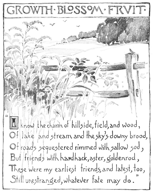
| GROWTH, BLOSSOM, FRUIT (Flowers and Plants) | 16 |
| Bittersweet, Iris, and Geranium in Color; Use of the Finder in Sketching most Interesting Part of a Growth for a Sketch; Flowers and Leaves in Different Positions; Growth of Stems, Joints, Buds, Leaves, and Sprays; Root Growths; Use of the Accented Outline; Composition from Plant Forms. | |
| LIFE AND ACTION (The Human Figure, Animals, and Birds) | 30 |
| Brush Studies in Color from Pose; The Same Pose in Different Positions; Different Steps in Pose Drawing; Proportion and Action Shown in Leading Lines or "Skeleton" Figures; Hands and Feet; Dog and Pigeon in Leading Lines, in Outline and in Values; Study of a Masterpiece; Home Exercises. | |
| BEAUTY IN COMMON THINGS (Still Life) | 44 |
| Beauty in Common Objects; A Bowl in Four Different Mediums; Principles of Grouping; The Accented Outline in Object Drawing; Japanese Lanterns Studied in Values; Use of the Finder in Making Beautiful Compositions; Home Exercises. | |
| APPARENT DIRECTION OF EDGES AND OUTLINES (Perspective) | 58 |
| The Circle in Three Positions; Foreshortened Surfaces in Common Objects; How to Test Foreshortened Surfaces and Converging Lines; Foreshortened Circle seen in Beautiful Historic Baptismal Font. | |
| MEASURING AND PLANNING (Geometry) | 66 |
| Making Simple Tools with which to Measure and Plan; Drawing and Dividing Circular, Square, Oblong, and Triangular Spaces; How to Place Decorations within these Divisions; Planning of Patterns for Portfolio, Box, Envelopes, and Pocket-book; Making Case for Newspaper Clippings; a Simple Alphabet and How to Draw its Plan; Initial Letters. | |
| DESIGN | 76 |
| The Color Chart Related to the Scale of Values; Colors in Full Intensity; the Neutral Value Scale, Showing Seven Steps Between Black and White; Dividing a Space into Large and Small Areas; Use of Values in Expressing Light and Dark Effects; Space Divisions to Form Plaids; Design Motives from Nature, and Their Application in Simple Rhythms and Balanced Designs; Color Schemes from Nature, and their Application; a Portfolio whose Beauty Depends on Arrangement and Proportion of Values; Pottery Forms. |

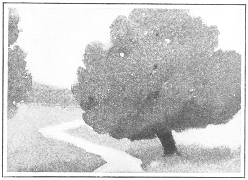
The Out-of-Door World in Autumn.
Have you ever been in the country, or in a city park, after the green of the maple-trees has turned to scarlet and gold? If you have noticed the trees in their gorgeous hues, you have probably found that the grass, also, shows patches of color not seen in the summer-time. The sky is often very blue, and its color is reflected in the quiet water of a lake or pool, or in a gently flowing stream. A smoky haze hangs over the distant trees, and softens, though it does not hide, their brilliant coloring.
Study the sketch on this page. Then paint an autumn picture. Show a bright blue sky, a field or hillside,—once green, but now touched with russet and brown,—a path or a pool of water, distant foliage, and one large tree. Save your picture to use in another lesson.

Making and Using a Finder.
If you look on page 4 you will see three little pictures that seem quite complete in themselves, and yet look like parts of the picture on page 2. The upper sketch shows the same big tree by the stream, and the lower right sketch has been taken from the left side of the large picture. A small part near the middle of the large picture was then selected, and this part was enlarged to make the third sketch shown.
You can often find some parts of your large sketches that are more interesting than others. On this page are some drawings of a little device which will help you to do this. It is called a finder, and is simply an oblong opening cut from a piece of paper so as to leave all around it a margin an inch or two wide. It looks like a little mat for a picture, or like a window-frame. Two square corners or L-shaped pieces of paper can be placed together so that the size of the opening can be changed by pushing the uprights nearer together or by pulling them farther apart. An adjustable finder like this (shown in the right sketch) can be used in a number of ways.
Draw on a sheet of 9 × 12 paper, an oblong seven inches high and three, four, or five inches wide. Around the oblong, which is to be cut out, leave a margin of at least an inch. Slip this large finder over the autumn sketch you made in the lesson on page 2, until you have found the part you like best. Cut this part out, and mount it on a large sheet of fresh paper, leaving a pleasing margin. The class sketches will make a fine exhibition.


Shapes and Growth of Trees.
No one can study out-of-door pictures without wishing to know how to draw trees. This can best be done by observing from a distance some tree as it grows.
The pictures on this page tell you plainly that the willow and the sycamore, or buttonwood tree, were chosen for the sketches, yet not a single leaf is shown as you would see it if you held it in your hand. What is it, then, that tells the story? It is the truthful drawing of the big things—the shape of the mass of foliage, the height and width of the trunk below the boughs, the size and direction of the branches, and the way they grow from the trunk.
In the sketch of the willow, the many small branches are plainly seen, and you can easily understand why it is that the willow bends and sways so gracefully in the wind. The brush strokes show something of the slender, pointed character of the leaves.
The sycamore is not round and regular like the willow, but shows patches of foliage and stretches of bare branches in a ragged and uneven way. Its shape is very different from the shape of the willow.
Make a large drawing with ink or crayon, from some tree out of doors.

Shapes of Bare Trees.
Winter is the best time in all the year to study the growth of trees. Although the leaves are gone and the branches are bare, the trees themselves are beautiful.
It is well to study a tree that is at some distance from you, so that its dark branches may be seen against the light sky. The willow and the sycamore are shown without their leaves on this page, and their shapes stand out clearly. You can see the strong trunk, and the branches that spring from it. The trunk of the sycamore becomes smaller as it throws off its boughs, and all the branches and twigs taper at the end.
Measure the height of the sycamore tree in the sketch,—from the topmost twig to the ground,—and see what part of the whole height the trunk below the foliage measures. Is it half as high, or only a fourth or a third? Notice trees out of doors and see how much of their height is above the trunk. Children sometimes draw trees with tall, stiff trunks and short, stunted tops.
Study and draw a beautiful tree without leaves. Make it of large size and use brush or crayon. Try to tell in your picture just what tree you studied.

What fun it is to gather nuts in the fall!
See the children in the picture. One boy "clubs" the tree until the nuts come rattling down and are half hidden in the grass and dry leaves.
Recall some pleasant time you have had gathering nuts or apples. Draw a picture showing where you were, what you gathered, and the kind of a tree on which the fruit grew. Show distant bushes and trees, and place the main tree so that its branches rise against the sky.
Make your picture tell an interesting story.

Sunset in Winter.
When you painted autumn landscapes, you thought, no doubt, that the world was more beautiful in October than at any other season. Perhaps it seemed to you that the cold, snow-covered earth could never be so interesting to paint.
Look at this winter picture. The sky is bright and the distant trees look violet. Did you ever notice that the snow at sunset does not seem to be white as you look across it to the horizon? If you hold a sheet of white paper in your hand and glance from that across the snow-covered fields at sunset, you will see that the whiteness of the snow has changed to violet-gray. Sometimes, too, the snow seems to be tinted by the rosy light of the sunset. As you study out-of-door objects, you will find that their colors appear different at different times of the day, or as they are near you or far away.
Paint a winter sunset. Try to see and to paint truthfully the color of distant trees, snow-covered ground, a far-off steeple or tower, or a tree near at hand.
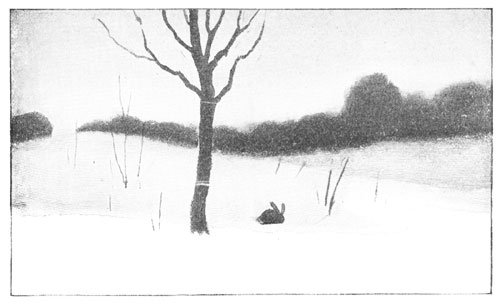
A Sunset Picture in Values.
We can show with black crayons, with charcoal, or with brush and ink many pictures of out-of-doors that are rich in color. Even a sunset sky can be shown in grays, so that we will think of the lovely colors that the grays, or values, express.
Here is our winter sunset, shown in values. You will remember that by values we mean the different degrees of light and dark used to express color. Compare the two sunset pictures. The light gray-violet of the snow is shown in a light gray or neutral value in the picture on this page. The trees are very much darker, and the sky is neither as light as the snow nor as dark as the trees. The little rabbit makes a dark spot in the snow, and the foreground—that part of the picture that seems to be nearest—is white. You see that it has taken about four values to express the colors seen.
Draw in values the sunset picture you painted in the lesson on page 8. Which of all the colors used do you think should be shown in darkest value? Which in lightest? Make your picture large, and use charcoal, crayon, or brush and ink. Then with your finder select that part of your picture which you like best. Cut out this part, and mount it neatly.

A Different Arrangement of Values.
When you are out of doors or are looking through a window at some of nature's pictures, think how you would paint or draw in values the different things you see. Notice which objects appear darkest, which lightest, and which might be expressed by a "half-way" gray, or middle value. If you learn to see these light and dark effects in the world about you, pictures, photographs, and out-of-door scenes will become matters of great interest to you.
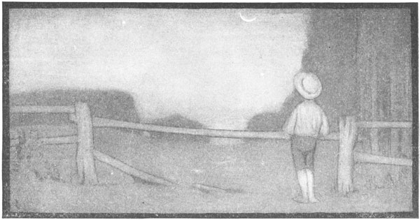
On this page is the same little piece of the world we saw under sunset skies. The sun has gone to rest, and the bright colors in the sky have given place to darkness. But in the midst of the darkness the moon rises, and sheds its white light over the sleeping world. How beautiful "out-of-doors" is now!
See the darker value of the sky at night, and the pleasing contrast made by the big white moon. A soft gray shadow is over all the snow. The moonlight on the snow does not dazzle our eyes, as the sunshine does by day.
Paint with ink or draw with crayon a moonlight picture.

A Beautiful Composition.
In painting or drawing a picture, it is not enough to put down a number of shapes or lines without regard to their relation to each other. We must arrange or compose them, just as we arrange furniture in a room. We must study to place things where they will best satisfy our idea of beauty.
In the picture on this page, painted by Alexander Harrison, an American artist, the horizon line is placed above the middle, so that the artist might show how the waves broke on the shore, and sent rippling, flowing lines of water along the shining sand. The motion of the water is as regular as if it were keeping time to music. Can you see how the big curves seem to mark the beats?
Notice, too, the arrangement of values—the light foam, the darker sky and ocean, the wet sand, and the solid mainland. Only four things are shown—sky, moon, sea, and shore—but they are so drawn as to give the necessary variety.
Pictures from Our Own Surroundings.
Out of Doors in the City. If all the beauty of out-of-doors were in the country, what a sad thing it would be for the boys and girls who spend their lives in cities and towns! It is true that we think of the country when we speak of the landscape, and many artists go there when they wish to gather material for pictures. But often the things you see out of doors in a city or town are as interesting to sketch as country landscapes.
Keeping a Journal. Did you ever hear of a person who kept a journal, and wrote in it the interesting things that happened from day to day? Have you ever tried it yourself? You need not think your life dull because you do not take journeys or see great sights or do unusual deeds. Some of the best journals we know about have been kept by people who lived quiet lives. They wrote about the little things they saw and heard and did. It was the way in which they told these things that made their journals as interesting as storybooks.
An Artist's Journal. Artists and people who love to make pictures keep a kind of journal that they call a sketch-book. They are always on the lookout for material for pictures. They see much more than people do who are not trained to observe.
Some Leaves from a Sketch-book. Look at the sketches on page 13. They are leaves from an artist's sketch-book. He tells of a shady road winding by a little church in a village; of freight-boats on a canal or river; of a view from a high window in a city office building; of a fine stone arch, and beyond it a bridge with a railroad train rushing across it; of a fountain in a city park, and of a grimy, noisy factory, with its long low roofs, its smoke-stacks, and its line of waiting cars. Have you thought of looking for pictures in places like these?
Pictures in Your Own Town. Where are the interesting places in the town in which you live? Is the town near the water? Then there are boats and bridges. Is there a machine shop, a mill, or a quarry? Then you will find something to draw, as interesting as the factory in the artist's sketch. Does a railroad run through the place? There is the station, the switch tower, the engines and the freight cars. Or, perhaps there is a blacksmith shop or a trolley car. Keep your eyes open, and find the things in your town that show the life of the people. Tomorrow, bring a sketch showing some picture you have seen in the place where you live.


The Colors of Springtime.
One of the earliest shrubs that blossoms in the springtime is the forsythia. Its blossoms cover the whole bush before the leaves come, making a mass of yellow in the midst of the green grass. Yellow and green are favorite colors of springtime.
Choose some flowering tree or shrub to paint in a picture. In painting a landscape like the one on this page, one good way is first to draw with a brush line and very light violet color, the shapes that must be carefully placed. Then add the sky and foreground washes and drop on the damp paper the colors you see in the bush or tree. Draw the trunk of the tree, or the branches of the shrub, in dark gray-violet. A path or road may be wiped out of the foreground with the nearly dry brush, and a little red and yellow added to give the color of sandy ground.
Paint a spring landscape, not like the one in the book.
Home Exercises.

Green Things Growing.
Brush Studies of Grasses.

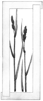
Grasses and sedges are some of the "green things" that need but little encouragement. In fact, they grow to greatest size in some neglected fence corner or in places so wet that other plants do not flourish. Grasses lack the bright colors of flowers, but they are fine studies to draw, because of their simple, direct growth and the interesting shapes of their leaves and heads.
You will enjoy brush drawings, using color or ink, of different kinds of grasses. Select three or four of large size and place them in a bottle. They will then fall gracefully into a natural position. Behind the bottle place a tall background of some kind, so that the shapes of the grasses will be clearly seen. Use paper large enough to show in life size the grass heads and part of the leaves and stems. Before beginning the study, practice drawing grass leaves with one stroke of the brush, without first outlining their shapes. Then draw from the arrangement before you, working freely with the brush. In studying the leaves, notice where the greatest width is seen. Observe the size and direction of the stems, and draw them so that they express the upright growth and the grace of the plant. Grass stems are not like the stems of flowering plants or vines. Try to see and express the difference.
Selecting with a Finder the Most Interesting Part of a Sketch.
Do you see what has been done with the drawing of grasses? A finder was moved about on the sketch until a pleasing arrangement of shapes appeared within the opening. You will notice it was not necessary to show the whole of each leaf and head. The sketch on this page would be quite satisfactory, if it were cut out along the inner edges of the finder and mounted upon another sheet of paper.
Brush drawings of grasses and common weeds are beautiful when drawn in color upon a tinted background. You can tint paper with water-color in much the same way that you put on landscape washes. Dampen a sheet of paper, and then apply a very little red, blue, and yellow, washing the three colors down the sheet. A little practice will teach you how to use the color to get a green-gray, a yellow-gray, or a blue-gray tint. Tint several sheets at one lesson.
Using a sheet of your tinted paper, make a brush drawing in color, from a growth of grass or sedge. Draw in large size, and make a "finder" picture from your sketch.
Autumn Leaves and Berries.

If you have never seen the bitter-sweet vine growing over a dead tree, you have missed a beautiful sight. In the fall its bright berries hang in graceful clusters, and stay on the vine long after its leaves have fallen. The real berry is held in the close grasp of a several-parted case until a sharp frost bursts the outer covering and shows the scarlet fruit within.
The sketch on this page is from a spray of bittersweet before the leaves have dropped.
You can see that in the leaves more yellow than is usual was used, because their color is decidedly yellow-green. Most of the berries are shown, still held in their orange-colored cases. Can you tell what two colors were used in painting the berries?
Sometimes yellow and green alone do not give you the green you may desire; if you add a little red it will soften, or make gray, a green that seems too bright.
Choose a bright spray of autumn leaves and place it against a background. Study the growth, the different shapes of leaves and berries, and the color. Paint in life size just what you see.

A Flower and Its Growth Expressed in Color.
Members of the iris family are found in many places. The dwarf garden iris blossoms very early in the spring, and has short, stout stems, bearing several flowers. The common blue flag found in wet places is a country cousin of the garden iris. Both are related to the flower-de-luce, the stately lily of France. They are unlike other flowers in shape, and are beautiful in color, with sword-shaped leaves.
The sketch on this page shows two different colors of the iris. If you cannot find flowers like them, choose a stalk of blue flag or early garden iris. Flowers of all kinds must be painted with fresh, clean colors, used directly from the box. Do not mix or stir color in the palette. Colors that are "handled" too much become muddy and dead. One color may be dropped in another, allowing them to blend on the paper. You have made stained glass effects in this way. Sometimes two colors may be taken in the brush at once. They will flow together as you draw. For instance, if you fill your brush with yellow and dip it lightly in blue, you can make a brush stroke of green. In painting the violet iris, red may be dropped in blue. Before painting your flower study, practice drawing leaves and large petals in this direct way.

A Flower in Different Positions.
Suppose that in the sketch on page 20, each leaf had been of the same size and shape. Would you have liked the picture as well? Plants that are regular in their growth, like the fern or the ivy, are seldom chosen for sketches. We like to see a variety of shapes and sizes. Even when the leaves of a plant have the same general shape, their positions make their shapes appear unlike.
So it is with flowers. On this page are three different drawings of the same flower. Can you tell why they are not alike? It is because the flower was held in three different positions. When the flower-head is turned toward you, as in the first sketch, its shape is quite like a circle. In the second sketch, the shape is much narrower from front to back, and some of the petals appear shorter. Can you tell how it was held? The third sketch shows the back or under side of the flower, and the shape is again different. You see, then, that every flower you draw must be studied carefully, to find the shape as it really appears to you.
Take a large flower, like the brown-eyed Susan or the sunflower, and draw it in different positions. Use brush or crayon for your sketches.
Growth and Shapes of Tree Buds.
In the bright days of February or early March, before spring has really come, place some branches of common trees and shrubs in water, and keep them near a sunny window in the house. You can then watch the buds swell, as they waken from their long winter sleep. Every day will show some change in their shape and size. You will enjoy making sketches of the twigs, from day to day, as the buds grow and the little leaves appear.
On this page are some drawings that show us different forms of growth, and the different ways in which Mother Nature protects her tender baby leaves.
Make some sketches from the beautiful tree buds of early spring.

A Study of the Geranium.
In any window box of growing plants, you will be almost sure to see the geranium. It lifts its bright blossoms among the green leaves, and grows thrifty and strong, if its simple needs are supplied.
The sketch shows you a stalk of geranium. The leaves were very similar in shape as they grew, but in the sketch their position has given them four different shapes. When you study your own stalk, see if the leaves show you the same interesting variety. Do you notice that the flower-head does not show each blossom, separate and distinct? The shape of the whole cluster is expressed, with a few petals showing more plainly near the outside of the cluster.
A good way to get the bright scarlet of the flower cluster is to paint it in with a yellow wash; then drop in red. You will need red to soften the green of the leaves, and probably you will see a rosy color in some parts of the stalk and stems.
Paint a stalk of geranium against a background, at some distance from you.

Root Growths of Spring.
On your walks through the woods in the early spring days, you surely have discovered these plant growths from roots which have lived all winter. They are the bloodroot, the hepatica, and the fern.
The hepatica comes first, with its pale violet blossoms nearly hidden under a thick covering of the dead leaves of the forest. Its little buds seem to be protected from the cold by soft garments of fur. All winter long the spotted leaves of last autumn have stayed on the plant. They are beautiful now, in shape and in color.
The bloodroot has a large round leaf which folds close about the flower-bud until the snow-white blossoms open. Its root is a sort of underground stem, and has a bright orange or red juice, from which the plant is named.
Find some of the root growths of early spring. Dig them up carefully, without shaking the earth from the roots, and place them where their whole growth can be seen. Make charcoal or brush drawings of the whole plant.
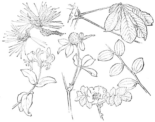
The Growth of Leaves.
There are certain forms of growth that belong to different plant families. In drawing from flowers and plants, these family likenesses must always be truthfully shown. A rose leaf does not grow like the leaf of a thistle, and a pine needle is not at all like the thick, round pad of a water-lily.
On this page are shown different growths from trees and plants that you know. Find the sketch of the slender leaves of the pine; the palmate or hand-like leaves of the horse-chestnut, with its seven leaflets growing from one footstalk; the honeysuckle, whose leaves sit closely on the stem; the familiar clover, with its three-parted leaf; the rose, and the wandering jew, or joint plant. Study the ways in which these different growths are expressed.
Bring twigs or sprays of different trees and plants, and draw them carefully with pencil. These are good studies for your sketch-book.

Interesting Growth of a Vegetable.
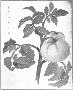
Vegetables from the garden make fine studies to draw and to paint. Almost any fruit or vegetable is more interesting if studied as it grows. We do not often choose to paint or draw a single flower without its stem, leaves, buds, and all of the parts that are included when we speak of its growth. It is the presence of all of these shapes that gives variety to a drawing. Do you not think the sketch of the tomato is much more interesting because it shows the growth of the plant? The leaves, stems, stalks, and the large and small tomatoes make an attractive arrangement of shapes. They were first drawn just as they appeared, and then the finder was moved about upon the sketch, to find its most beautiful part.
Beans, peas, beets, turnips, radishes, and many other vegetables may be brought from the school garden or from the garden at home, to use in a drawing lesson. A growth of cucumber vine would be an interesting study. Make a brush or charcoal drawing from something of this kind, and then use your finder to select the most interesting part. Cut out your "finder" picture and mount it neatly.
The Growth of the Orange Tree.
A Familiar Fruit. When you see the bright pyramids of oranges on fruit-stands or in store windows, do you wonder where the fruit comes from, or upon what kind of a tree it grows? In certain parts of our country there are a great many orange trees, and the children of Florida and Southern California know them as well as the children of the north know apple or cherry trees.
The Orange Tree. Look at the picture of the tree, on page 29. It is not a tree that one would choose to put in a landscape, because it is not what is called picturesque—it is too trim, even, and regular. Its chief beauty is in its coloring. Its "spheres of golden sunshine" hang in the midst of glossy, dark green leaves, and sometimes the fruit stays on the tree until the buds and blossoms of a new crop appear. It is no uncommon sight to see an orange tree bearing leaves, buds, blossoms, and fruit, all at the same time. One of the sketches shows you a spray of orange blossoms. They are white and waxy, with a strong, sweet fragrance.
Gathering the Fruit. Sometimes, the trees are so heavily laden with fruit that props are put under the branches to keep them from breaking off before the crop is ready to be gathered. The fruit is not allowed to fall from the tree, but when it is ripe an army of pickers, each one provided with a cutter and a canvas bag, comes to the grove. The pickers do not climb the tree and shake the boughs, as you would do if you were gathering nuts, but they mount ladders, carefully cut each orange from its twig, and put it in the bag. The bags, when filled, are emptied into boxes, which are carried to the packing house. There the oranges are sorted into lots, according to size, wrapped in tissue-paper—each orange by itself—and packed in boxes for shipment. You have seen them in their tissue wrapping, after they have reached their journey's end.
Designs from the Orange. One of the sketches on page 29 shows the growth of some oranges with their leaves and twigs. Below is a design made by repeating the shapes of the orange, its leaves and stem. Any shape or group of shapes that is repeated in a design is called a unit. Do you know what suggested the unit shown in one of the small sketches above the tree?
Sketch from the growth of any fruit you can get. Try to make from the shapes you find in your own study, a simple unit of design.

People and Animals.
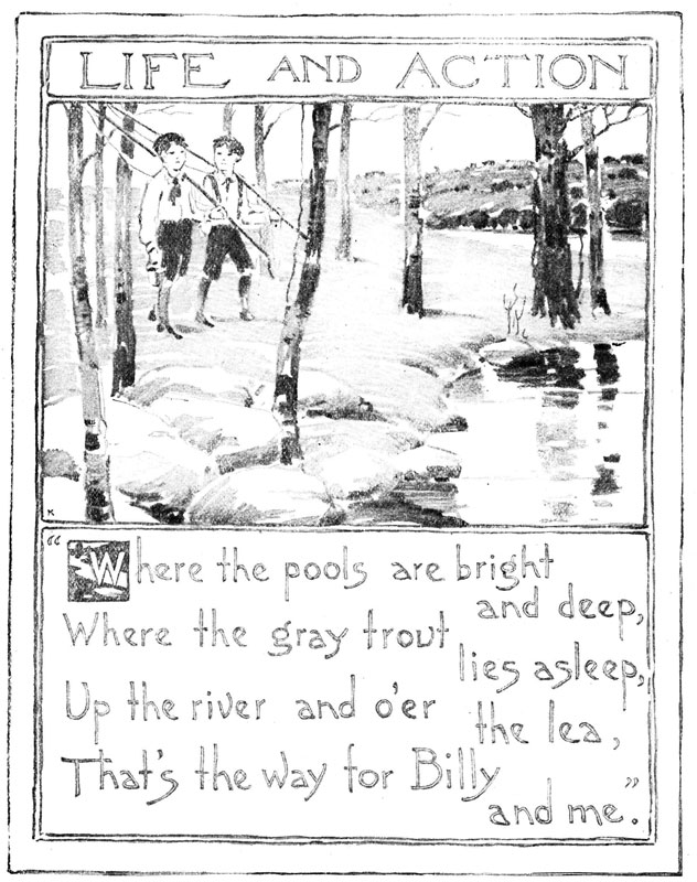
An Out-of-door Picture. On the opposite page is a picture that seems to invite you to close your books and go into the country for a picnic or for a day's fishing. You cannot look at the grassy meadow, the little river, the tall trees, the distant hills and woods, without wishing that you might be there. What fun it would be to sit on those big, flat stones and dabble your feet in the water while you ate your lunch, or to hold your fish-pole over one of the deep pools, "where the gray trout lies asleep!"
A New Interest. If any one should ask you to tell what part of the picture interested you most, what would you say? Would you think first of the stream, its pleasant banks, the tall trees, the large stones, the distant hills and fields? Or would you say at once that it was the presence of the boys in the picture that first attracted you? You wonder where they came from, where they are going, what they are carrying over their shoulders and in their hands. You are glad that there are two boys instead of one in the picture, for in your own sports and games the pleasure is doubled if some one is with you.
Our Companions and Friends. Suppose you were able to live in that part of the world that seems most beautiful to you. Do you think that the landscape alone, or the most interesting of plants and flowers would be enough to make you happy? No matter how much you enjoyed these things, or how much you might love the beautiful country, nothing could take the place of companions and friends. No books or toys or fine houses could keep you from being lonely if you had no one to talk to or to play with. Our brothers and sisters and friends are worth all the books and toys and fine houses in the world.
Our Friends among the Animals. We have many good friends, too, among the animals. It is true they cannot talk with us, but some of them seem to understand what we say to them, and they show us in many ways what they think and how they feel. Do you not know when your dog is glad or sorry, thirsty or hungry, proud or ashamed? How does he tell you?
Drawing our Friends. In the chapter that follows, you will study your playmates,—the boys and girls that you know and like,—and some of your friends among the animals. You will learn to draw them as they look, and to express their action just as you expressed what you discovered about flowers.

Drawing from a Pose.
Little children with their bright dresses and picturesque bonnets make delightful studies for us to draw and to paint. They are generally glad to "pose" for a few minutes, while having their pictures taken.
The sketch of this little child was made from the pose, in a school-room. The little girl stood on a table in front of the pupils and held a string, which was fastened to a toy boat. The color and shape of her sunshade and of the color-mass of her dress, the position of her arm, the size and length of her legs and feet, were all carefully studied and drawn. The blue waters of the lake, the sail-boat, and the sandy shore, were added from memory to complete the picture.
Make a pose drawing from your small brother or sister, or from some little friend. A pink or blue bonnet might be used as part of the costume, instead of a hat. Let the pose represent some character or occupation. Add a very simple landscape. Use water-color or colored crayons.
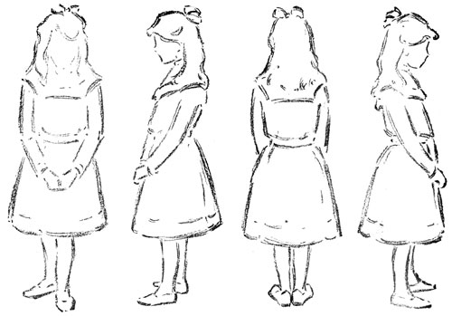
Different Positions of the Same Pose.
In your study of plants you found that the appearance of a leaf or flower depended upon its position. In making a picture of a daisy as it grows, we do not show the exact size and shape of leaves and petals, as they would look if we laid them on paper and traced around them. Such a drawing, while it might show certain facts of the plant, would not tell the truth about its appearance.
In drawing from boys and girls, also, we must study appearances. We know that our model has two eyes and two ears, and that the nose is in the middle of the face. Yet the model may stand so that we do not see all or any of those features. Study the four drawings above, and tell how the girl is standing in each sketch.
One of your schoolmates will pose while you make four five-minute sketches from four different positions of the same pupil. Make large drawings, using charcoal or crayon. Your model should not stand more than five minutes without resting.
Three Steps in Pose Drawing.
When you drew the shapes of trees, you found that if you made a mistake in the proportions of a tree you could not make the picture truthful by drawing the branches, the foliage, or the little twigs ever so perfectly.
So it is in drawing from the figure. Suppose you plan a sketch that is ten inches from the top of the head to the foot. A good way to do would be to draw a light line or place two dashes, to indicate the height. Then decide how much of that height is needed for the head; for the waist; for the length of skirt or trousers; for the legs and feet. Next, think about the width and shape of these various parts, and sketch them in as lightly and brokenly as the lines are in the first sketch on this page. If your work is correct up to this point, you can finish the shapes a little more, as in the second sketch. You will now have studied the shapes and proportions of the things of most importance in the sketch. Then the masses of light and dark may be expressed.
From the pose of one of your schoolmates, try one large sketch, done by the three stages shown above. Use charcoal or crayon.
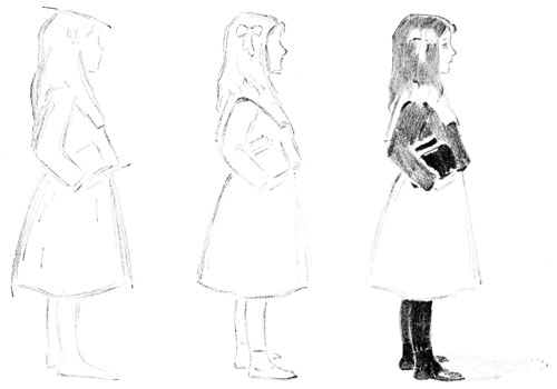
Some Proportions of the Human Figure.
Although these skeleton figures are stiff and angular in appearance, from them you can learn something about the human figure that you will be glad to know. In each of them the thigh line is exactly half way between the top of the head and the foot. The knee-joint is half way between the thigh line and the foot. The shoulder line is placed at the base of the neck, and the elbow-joint is between two slanting lines that represent the lower and upper arm.
A knowledge of these things will help you in drawing the garments or clothes of a pose. The waist is a little above the thigh line, and is so drawn in Figure 4. The bottom of the blouse in Figure 2 is a little below the waist line, but is still above the thigh line. Stand up and hold your arms close to your sides, and notice where the tip of the middle finger comes, in relation to the knee-joint. Be careful not to draw the arms too short or too long.
Draw two skeleton figures like Figure 1. Make them at least four inches tall. On one skeleton draw the garments of a boy, carefully studying the clothes worn by a real boy. The other is to be dressed like a girl.

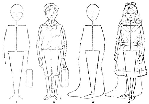
Actions and Attitudes of the Human Figure.
Action and attitude, as well as proportion, can be expressed by the simple line figures on this page. You do not need the second and fourth sketches to tell you of the action expressed in the first and third.
In the figures on page 35, the lines were nearly all vertical and horizontal; the figures were standing still. In Figure 1 on this page, you notice that every line is slanting; the figure expresses action. Stand erect, and think of the direction of lines that your body takes. Then push hard with both hands against a wall. You can feel that your erect position is changed. The vertical lines become slanting, or oblique.
Study the lines and their changed relations in Figure 3. Draw several line sketches that express a familiar action, such as walking, jumping, running, lying, or sitting. "Clothe" these action sketches.

Hands and Feet.
You have drawn from the figure long enough to find out that hands and feet are by no means the easiest things in the world to draw. Like almost everything else, they change their appearance with every change of position. We cannot learn to draw a hand or a foot so that we can use it in all kinds of poses. We can only learn to see the different sizes and shapes which each new position shows, and try to draw them as they appear.
The sketches on this page are good studies for you to copy. When you can do this well, try to draw the hands or feet of one of your friends. Sometimes a pair of boots or rubbers may be placed in exactly the same position that they would be in were the pose actually standing. Practice drawing from studies like these until you are better able to see shapes, and to draw them truthfully.
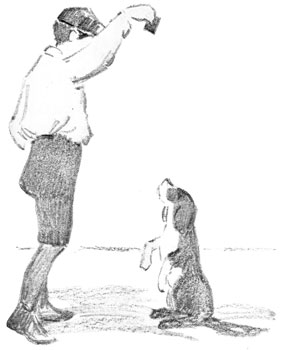
An Animal Pose.
Have you a dog that will sit up and beg, or carry a basket? Perhaps he would not object to posing in school, with his master or mistress.
If your teacher can arrange for a lesson of this kind, choose large paper, and sketch rapidly with charcoal or crayon. Begin with the dog, for he will change his position soon, and you must get quickly the main lines that will show his attitude and shape. Then you can sketch the figure of the boy or girl after the dog has grown tired.
Do you notice in the picture, the fine arrangement of light and dark? The boy's light waist contrasts well with his dark trousers and cap. The little dog, too, is more attractive because of his white spotting. Finish your drawing by adding dark masses, as suggested by the pose.
Actions and Attitudes of Animals.
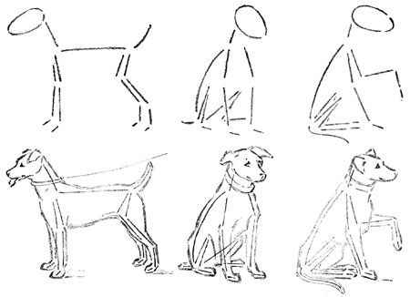
You will enjoy making skeleton sketches of animals. On this page are shown three different positions of a dog. Very few lines are used in Figure 1, yet they are so placed that you know at once the animal that is represented, its attitude, and its shape. Lines that tell the important facts about an object are called leading lines. The skeleton figures we have been studying show us the leading lines in certain attitudes of people and animals. If the leading lines of any object are correctly drawn, the finished sketch is almost sure to be good.
From the pose of a dog, or of any other animal that you can study, make leading line sketches. Before you try to clothe these skeletons, study carefully the proportions expressed by your first drawing. If a mistake is there, correct it. Then study and draw the shapes and sizes of head, legs, tail, ears, etc. Sometimes parts of your leading lines can be used, as parts of the finished outline. Use pencil or charcoal for work of this kind. These are good studies for your sketch-book.

The Spotting, or Light and Dark Values, of Animals.
When you wish a more finished sketch of an animal, you should first study and draw the leading lines, just as you did in the lesson before this. The proportions and shapes of all parts of the sketch must be true, before any thought is given to the planning of eyes, ears, nose, or any other small feature. If you are able to express quickly, with a few lines, the most important facts, it will not matter so much if the pose moves about or changes position. We cannot expect a dog or a pigeon to keep one position until we have made a finished sketch. The quick use of eyes and pencil will enable you to make notes of something that you can work on after the pose has changed position.
Study an animal pose, and plan to make a large sketch that will show its coloring, or values of light and dark. A black and white cat, or a spotted rabbit will do as well as a dog. Let the animal take a natural position on a table before the class. Sketch the leading lines that show this position. Then draw the shape of the head and body, the legs and tail. When all these shapes and proportions are truthfully expressed, add the dark masses that show the spotting of the animal.

Study of a Pigeon.
In the beautiful city of Venice is one of the most celebrated cathedrals in the world. It is called the Cathedral of St. Mark. The front of the building faces a large open space, which is surrounded on three sides by ancient palaces of marble. These old buildings, with their arches and towers, and the nooks and crannies of the cathedral, form fine nesting places for pigeons, and hundreds and thousands of them are found flying about the square. Years ago, the pigeons were fed at the city's expense, and any one who injured or killed one of them was fined or put in prison. The people thought that the pigeons brought peace and prosperity to their city, and kept it from being swallowed by the waves. If you should visit the square today, and should bring with you one of the little bags of corn that the street venders sell for a penny, you would be instantly surrounded by pigeons.
Study a pet pigeon, which some one will bring to school. Notice the oval shape of the body, the beautiful curve of the wings, and the lovely spotting of light and dark values. The legs are set far back on the body, and they and the little feet are as red as a rose.
Draw the leading lines with a brush stroke of light gray. Study carefully the proportions of head, body, wings, tail, legs, and feet. When these are correctly drawn, add the dark and middle values, to show spotting.

"Life and Action" Shown in a Masterpiece.
Of all pictures in the world probably none are more interesting to us than those which tell us of the lives of people; of their work, their times of rest, their joys and their sorrows. You probably know many of the pictures of Millet, who painted the simple country life of French peasants, as they worked in the fields, watched their flocks, or cared for their children at home. Millet's pictures make us feel great respect for a man or woman who works.
The picture shown you on this page is from a painting called "Loading the Cart," by Anton Mauve, a native of Holland. He, like Millet, was a painter of quiet country landscapes and farm life. In this picture, notice how few are the shapes and masses he has cared to paint. He seems to have thought only of the big things—the sky, the ground, a clump of trees, a bending figure, a patient horse, a loaded cart. It is the artist's task to show us the beauty which lies in a simple country scene like this.
Anton Mauve was born in 1848 and died in 1888. He made his first exhibition of paintings in America at Philadelphia in 1876.
Home Exercises.


Learning to See Beauty.
How We See Things. The best thing that our lessons in drawing and painting can do for us is to teach us to see. To truly see a thing means that eyes and brains must work together. Our eyes must look and our brains must think; that is what gives us the power to see.
Interesting Things Out of Doors. When you were making a special study of landscape, you found that many things out of doors that you had not thought about before, became very interesting to you. You began to notice the colors of the sky and earth, the shapes of trees, the forms of clouds, the change from day to night. These things had always been around you, but you had not thought about them, and so you had not really seen them.
Observing Our Surroundings. Your lessons from flowers and plants, and from birds and animals help you to see and enjoy much more in nature than you did before. A walk in the country, or even along the city street, is never dull to one who is interested in what is going on around him, and whose eyes are trained to really see.
Beauty in Common Things. Not all of the beauty of the world is out of doors. Things about us in our homes are often interesting in their character, and they should be beautiful as well. The picture on the opposite page shows you an old-fashioned kitchen fireside. The wide hearth, the logs of wood, the andirons, the pots and kettles hanging over the fire, all give you a sense of homely comfort and cheer. Would you not like to draw your chair close to the blazing logs on a cold winter night, and roast apples, or pop corn, while the wind howled and roared up the big chimney? There is real beauty in this picture of home and the common things of every-day use.
Finding and Expressing Beauty. In the houses we live in nowadays, there may be no kitchen fireplaces like this; but the thought that we get from the picture is that beauty may be found in those things for which we sometimes care the least. Let us study the common dishes we cook with, the vegetables that come from market or garden, the furniture we use every day. Let us discover for ourselves whether these things are beautiful or ugly. If beauty is there, let us find it, and show it to others. If we enjoy those things which are really beautiful, we shall find them everywhere, and if we try, we ourselves shall be able to do something which will add, in some small way, to the beauty of the world in which we live.
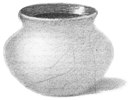
A Bowl in Charcoal Mass.
The bowl from which this sketch was made is of common earthenware, not unlike the clay used in making flower-pots or tiles. Although this material is neither costly nor rare, articles made from it are beautiful, if they are pleasing in shape and proportion, tasteful in coloring, and well adapted to their uses.
This little bowl was probably meant to hold short-stemmed flowers. Notice that it is low and broad, with a wide mouth or top. It will hold plenty of water for its purpose and will not easily be upset. The inner curve near the top suggests a vase or flower holder. A bowl designed for holding liquids or liquid food would probably be without this curve in its outline.
The simple coloring of the bowl has also been carefully planned. It is not by accident that the glaze on the inside is in darker value than the outside color. This contrast of light and dark is one of the elements of beauty. Look for it in things about you, and try to show its effect in sketches that you make.
Choose a bowl of simple form showing light and dark contrasts. Place it at some distance from you, so that you can see a little way into it. Draw the bowl in charcoal mass, using the flat side of a short piece of charcoal or crayon.

A Wash-Drawing of the Bowl.
The drawing on this page, the one on the page before this, and the two on pages 48 and 49, are all pictures of the same bowl. They do not look alike, because they are done with different materials, or, as we sometimes say, with different mediums. It is well for us to know how to draw with charcoal, brush and ink, pencil, crayons, and water-color, so that we can choose the medium or material that seems best suited to the particular object which we may wish to represent. A good workman understands the use of many tools.
Drawings that are made with a brush and water mixed with ink or color are sometimes called wash-drawings. In such work, light and dark effects are shown, rather than actual color. Wash-drawings differ in character from drawings made with pencil, charcoal, or crayons. You can easily tell which sketches of the bowl were made with a wet medium and which with a dry medium.
In the sketch on this page do you see that there are two values shown on the inside of the bowl? Although the inner glaze was everywhere the same color, the deep shadows in the bowl give the effect of a darker value.
Make a wash-drawing of the bowl you studied in charcoal mass. Do not draw its outline first. Wash in the shape of the top, and then the mass for the front or outer surface. Notice the use made of the white line in suggesting the edge.
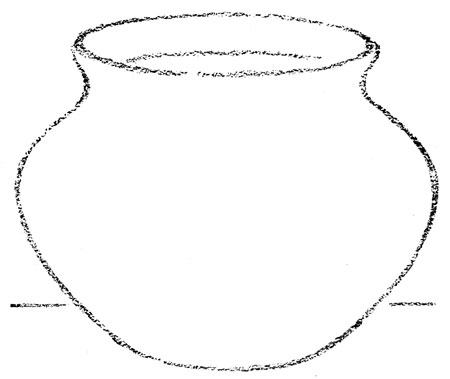
The Bowl in Outline.
You know that the true shape of the top of this bowl is a circle. But when the bowl is placed on a table in front of you, its top appears narrower from front to back than it does from left to right. The shape that you have often drawn to show this appearance is called an ellipse. In a circle, all diameters are equal. In an ellipse, one diameter is always longer than the other.
Some ellipses are more beautiful in their proportions than others. If the bowl had been placed in a position where the width of the ellipse looked twice as great from front to back as it is shown here, the sketch would be less pleasing. Generally, a narrow ellipse is more beautiful than a wide one, and in arranging objects like the bowl for studies, we should be careful to place them so that the ellipses do not appear too wide from front to back. The beauty of the proportions of an ellipse has much to do with the beauty of the whole drawing.
Make an outline drawing from a bowl, carefully studying its shape, and the proportions of the ellipse seen at the top. Sketch the ellipse first, beginning at the middle of the front edge, and drawing the shape with one stroke of the pencil. Try to draw the sides of the bowl just alike. Place a table-line in the proper place. A table-line suggests a surface on which an object may rest.

The Bowl in Color.
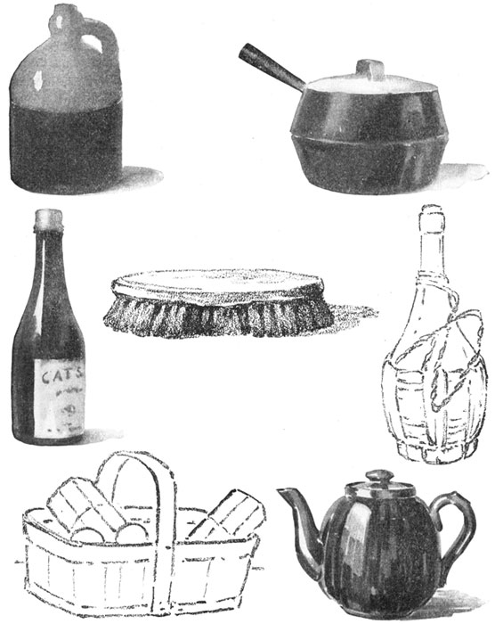
Artists and other people who draw and paint often speak of objects such as you have lately been studying as "still life."
"Still life" means objects without life, like most of those studied in this chapter, although fruits and flowers are also frequently included. Mounted birds and insects or other animal forms from which life has gone are also classed as still life. It would be correct to speak of the drawing on this page as a study of still life. The group on page 50, the familiar objects shown on page 51, and the lanterns on page 54 are all examples of the kind of objects that are included under the head of still life.
The little bowl appears again, now, perhaps, in its most attractive way. It is always a delight for us to see a beautiful bit of color. In studying the sketch, you can see how freely and simply the brush has done its work, showing the fresh, clear color of the bowl, the darker value of the inner lining, and the gray-violet shadow cast upon the table.
Make a water-color painting of a simple piece of still life, choosing a color not too brilliant. Make the entire drawing with the brush, trying not to "work" your colors until the life and freshness are lost.
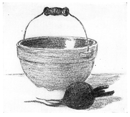
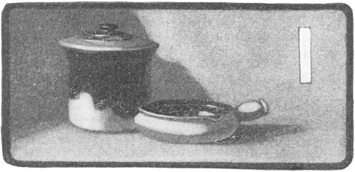
A Group of Still Life.
Here are two common articles that might be found in any kitchen. The dish is a sort of earthenware kettle, and shows that it was designed for cooking purposes. It is provided with short legs and a handle or bail. The legs serve as supports for the kettle, and keep its rounding surface from rocking, while the handle is useful in lifting the kettle and its contents from the fire.
The kettle is simple in form, of pleasing proportions, and shows a good contrast of light and dark values. As you study the sketch, notice the drawing of the rim. Is it of the same thickness at every point? Study the appearance of rims in different bowls, and find out where they appear thickest.
The beet is decidedly darker in value. It is less regular in shape, and its surface differs in quality from the hard, smooth surface of the kettle.
Choose for a group two common objects of household use, that seem to belong together. In your group you should have something large and something small; something tall and something short; something light and something dark; something near and something far.
Sketch your group lightly in outline, and finish in charcoal mass.
A Growing Plant.

Hyacinths and tulips grow easily indoors, and their bright blossoms fill the florists' windows just at the time when we are beginning to grow tired of winter and to look forward to the coming of spring. You can plant bulbs so that they will grow and blossom in the school-room. There is nothing more beautiful for a window decoration than a row of tulips, hyacinths, or daffodils.
A growing plant of this kind is a fine study in still life. We enjoy looking at it, and we become much interested in trying to express its beauty. We are beginning to understand some of the elements or laws of beauty.

Let us study the drawing on this page. We have found that a group of still life, a spray of plant growth, or a landscape should show variety in shapes, in sizes of shapes, and in light and dark, or values. Does the hyacinth show these contrasts? Notice the shape of the mass of bloom, as differing from the shapes of the long, slender leaves, the stem, and the flower-pot. You will also find large shapes and small in different parts of the sketch. The flower-pot and the mass of bloom are large in proportion to the leaves and stem. Contrast and variety in color you can easily see.
Make a drawing with colored crayons or with water-colors from a growing plant, in bloom. Select one that shows simple growth, few leaves, and a bright mass of color in the blossom.
The Plant in Values.
It is often well to paint in grays a study that you have painted in color. On page 9 is a picture in values of the sunset scene on page 8. While we cannot express the actual color of objects with anything but color, we can show the light and dark effect of color with a gray medium, such as pencil or charcoal, ink or charcoal-gray water-color.
In using a gray medium, we must try to keep our contrasts as well marked as though we were using the actual color itself. Suppose in this wash-drawing of the hyacinth, the flower, the leaves, and the flower-pot had all been of the same value. Can you not imagine how much such a picture would lose in interest? The difference in values, in the picture on this page, suggests to us the difference in color seen in the plant. If you look again at the drawing of the hyacinth on page 52, you will see that the darkest colors in it are the red-violet of the blossom and the red-gray of the flower-pot. These are represented in the wash-drawing by dark gray. The gray-green of the leaves is shown in a lighter gray value.
In washing in the flower-pot, the flange, together with the ellipse for the top, should be drawn first. Then the base can be added, in a value which is deepened a little directly under the flange.
Select a plant in bloom, from which to make a wash-drawing. A tulip or a daffodil would make a good study. Study its growth, the shapes and sizes of its different parts, the values of its blossom, leaves, and stems, and of the jar in which it grows. Show how beautiful a picture of a plant and its bright flower may be made, without the use of color.

The Accented Line.
Have you ever heard any one read aloud in an even tone of voice, without changing the pitch or giving what is called expression to the story? You soon grow tired of listening to such reading even though the words are distinctly spoken. The same thing read with the right accent and inflection will hold your attention. You will enjoy and remember what is well read, because more truth and beauty are brought out by beautiful expression.
It is so in our drawing. We can make pictures of objects in a way that will give the facts of their forms and proportions, and still will not show the real beauty and character of those objects. Compare the two sketches of the barrel at the top of this page. Sketch B gives the facts of the barrel as well as Sketch A. But who would care for a picture that expressed so little of real interest? In Sketch A you feel the roundness or width of the barrel from back to front, and the quality of its rough and splintered surface. The line that is used to express all this is called an accented line. Such a line is varied in strength, being deepened in some places to express certain accents of form or color, and lightened in others. Sometimes it is broken off altogether, the eye seeming to continue the outline. It differs from the even, uniform line used in Sketch B just as the even, monotonous voice in reading differs from the voice that is full of expression and feeling.
Select a basket, or a wooden box of somewhat rough surface, and make an outline sketch, using the accented line.

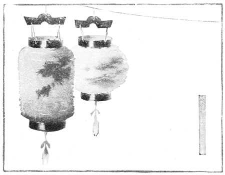
Japanese Lanterns in Values.
The wash-drawings on this page show some Japanese lanterns that are beautiful in their light and dark quality, as well as in their color. They are fine studies in values. The lantern on the left was red, with violet spots; the light one just behind was yellow, with blue and red spots; and the right lantern was a soft dark green at the top, blending to light green at the bottom. The dark bands and the wooden hangers provide sharp contrasts in values, and give character and accent to the picture.
Choose two or three lanterns of contrasting colors, sizes, and shapes. Arrange them on a cord, hung across the corner of the room. It does not matter whether they hang above or below the level of your eyes. Paint them in values of ink or charcoal-gray.
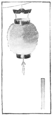
Selecting with a Finder an Interesting Arrangement of Shapes.
You will remember that you used a finder upon certain sketches, in order to select parts that seemed more interesting than others. Any drawing looks much better if the space around it is carefully planned and adapted to the shapes shown in the drawing. This is the reason we use a finder on a sketch like that on page 55. Although the lantern on the right is well drawn and is a pleasing part of the whole sketch, it seems to have received added beauty in the left sketch on this page. It has been taken away from other interests, and placed within an enclosure which is well adapted to its shape, size, and color. The gray oblong at the bottom brings the eye to a part of the picture, not so important as the lantern. This oblong would be a good place for the initials or name of the artist, which should be as thoughtfully placed as any other part of the sketch.
See what a different enclosure is used in the second selection. The two lanterns make a large dark mass which needs more space. The dark name-place on the right is placed just where it is most needed.
Use a finder on the sketch of lanterns you made. Find a beautiful arrangement of shapes, adjusting the finder until you have found the enclosure and the shapes that suit you best. Cut out your selection and mount it neatly.
Home Exercises.

THE RAILWAY TRAIN.
The Circle in Three Positions.

In order to understand the sketches on this page, you must place a large bowl on a table in front of you, so that its top will be exactly opposite the level of your eyes. You can manage this by putting some books on the table for the bowl to rest upon, piling them up until just the right height is reached. Then sit directly in front of the bowl, and at some distance from it, as you would naturally do when making a sketch. Hold your pencil straight out in front, at arm's length, so as to hide the entire upper edge of the bowl. If the top of the bowl is exactly opposite your eyes, your pencil will be exactly horizontal when it hides the edge from you. You will not be able to see into the bowl, nor to find that the edge curves above or below the pencil. The appearance of the circular top, in this position, will be a horizontal line.
If you lower the bowl a little, you will find that you can no longer hide the top with a horizontal pencil. The top looks more natural in this position. You have often drawn a narrow ellipse for the appearance of a circular shape seen slightly below the eye.
If the bowl is lowered still more, the ellipse will appear wider from front to back.
Make sketches from a bowl, in these three positions.

The Foreshortened Circle.
When a surface, because of its position, appears less wide than it really is, we say that it is foreshortened. The circular top of the bowl appears in three positions on page 59. In the first picture it is foreshortened to such an extent that its width from back to front has disappeared altogether. In the second, the foreshortened circle appears as a narrow ellipse. In the third, the ellipse is wider, because the bowl is seen further below the eyes.
On this page are some sketches of a half-orange and a half-apple. Can you tell the positions in which they were held? Notice the foreshortened circle in Sketch 2. The sections of the orange are changed in appearance very much as the petals of the daisy are foreshortened, in the middle sketch on page 22.
Read again the lesson on page 48. Then decide which sketch of the half-orange is most pleasing. Which picture of the half-apple do you like best?
Draw a half-lemon in a position showing a foreshortened circle of pleasing proportions.
The Foreshortened Square.
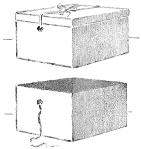
Circular shapes are not the only ones that are foreshortened when they are seen under certain conditions. Figure 1 on this page is a picture of a square hat-box, showing the top and two sides. Not one of the three shapes is seen as it would actually measure. The top looks like a long narrow diamond. It is not so different from the shape of a narrow ellipse as you might at first suppose. If you changed the straight lines into curved lines, rounding off the four corners or angles of the diamond, you would have an ellipse. You could also place a box like this turned cornerwise, so that its top would look like a straight line. Where would the top be to look like that?
The two sides of the box are also foreshortened in this position; they appear shorter from front to back than they really are. You can see that the two farther vertical edges or corners appear shorter than the nearer one, just as trees in the distance appear smaller than trees of equal size near you. The lines on the top and bottom of the box appear to slant upward, instead of keeping their actual direction, which is horizontal.
Figure 2 shows the same box with the cover off. The inside was lined with colored paper and the dark value of the diamond-shaped mass adds interest to the picture.
Place cornerwise, on a table in front of you, a large box with a square top. See if the three faces in sight are foreshortened. Notice if the edges appear changed, in direction and in length. Make a sketch in outline, showing just how the box appears to you.

Measuring a Foreshortened Surface.
A good way to prove to yourself that the appearance of a surface or shape differs from its reality, is to test it in some way.
The girl in the picture is measuring the appearance of a book. She has put two books on the desk, with their backs facing her. Under the cover of the top book she has placed a string long enough to allow her to hold both ends of it in one hand, in such a way as to hide the two ends of the cover. She knows that in reality the ends of the cover do not slant; they are perfectly horizontal. But she finds that to hide the ends of the cover she must bring the lines made by the string toward each other. This proves that the ends of the book in this position must be represented by slanting lines. When the strings hide the ends of the cover, she finds that they meet directly opposite the eye. Holding the string tight, and keeping their meeting point exactly opposite the eye, she slips a horizontal pencil between the two lines, starting near the place where they meet, and moving down until the pencil hides the further edge of the cover. The appearance of the cover is shown in the space bounded by the horizontal pencil, the nearer edge of the cover, and the two slanting parts of the string seen between them.
Arrange a large book on the desk in front of you. With a string, make the test that has been explained. Draw in values what you see.
The Study of Perspective.
What a Picture may Show Us. The pencil sketch on the next page would be quite difficult for you to draw, but it is not too difficult for you to understand and enjoy. It is one that will help you to use your eyes intelligently, in trying to find out of doors some of the things that are shown you in pictures. One of the best things that pictures can do for us is to help us to see in our own surroundings things that are interesting and beautiful.
Perspective. The lessons in this chapter have helped you to see how surfaces and shapes change in appearance, as they are seen under different conditions. You have also found that certain edges and outlines appear to change their direction, when seen in different positions. There is a name given to the study of these things, which you will often hear used. It is perspective. Perspective is only another name for the study of appearances, as differing from facts. You will hear some one say, for instance, that a certain sketch or picture is good in perspective; you will understand that the picture shows, in some interesting way, the effect of distance and position, or how certain appearances differ from actual facts.
Perspective of the Railroad. One of the best places in which to study perspective is on a bridge over a railroad track. You have noticed, no doubt, how the rails seem to come together as they stretch into the distance, and how the telegraph poles seem to grow shorter and shorter, until they disappear altogether. You know that the rails are just as far apart a mile away from you as they are at your feet, but a sketch drawn so would not be correct in perspective, because it would not show how the track looked.
Perspective Affecting Apparent Size. The sketch on page 58 will interest you. Have you watched an engine grow from a mere speck in the distance to its full size as it rushes past you, and then grow smaller and smaller again as it hurries away, and finally disappears in the far-off horizon?
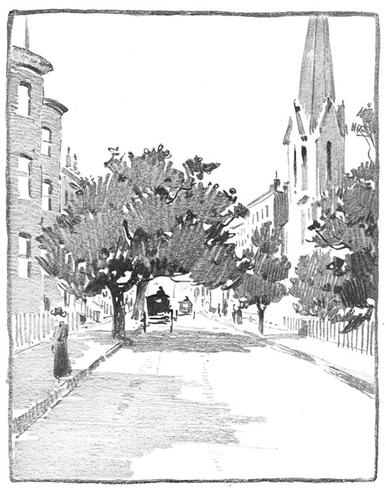
Perspective of a Street. Do you see anything on page 64 that makes you think of the railroad? If you stand in the middle of the street and look down its length you will notice that the lines of the sidewalk seem to run together, that the trees and houses decrease in height as they are seen farther away, and that people in the distance appear smaller than people near you. When you can see these effects for yourself, you will begin to understand what the study of perspective means.
A Beautiful Baptismal Font.
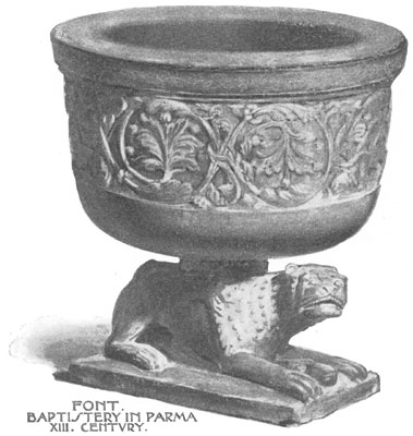
In the fine old city of Parma, in northern Italy, is a beautiful cathedral, built hundreds of years ago. Near the cathedral is a building much smaller in size called a baptistery, a place where baptisms are made in connection with church services. This baptistery is built of red and gray marble, and is one of the finest in Italy. It contains but one room, and in the middle of its floor, under the beautiful dome, is a very large font, carved from one piece of yellowish red marble. In one corner of the room is a smaller font—the one shown you on this page. It is standing on a lion whose paws are set upon the head of a ram, and it is richly carved in foliage and in strange animal forms. To it are still brought for baptism all the children born in Parma.
Some Tools With Which to Measure and Plan.

By the time you have come to this chapter in your book, you will have drawn a great many pictures of objects. In doing this you have depended on your eyes and hand alone. You have not used a ruler to measure with, nor any tool that would tell you the exact length of a line or the exact size of any shape.
But sometimes it is necessary that a line or shape should be of exact length or size. On this page are shown some very simple tools which you can make yourself, and which you will find useful in carrying out the lessons in this chapter on Measuring and Planning. Figure I is a "circle maker." It can be used in place of a compass. To make it, take a strip of cardboard seven inches long and one inch wide. Bisect its short edges and rule a line connecting these points. Upon this line, mark off, by measuring with a ruler, inch, half-inch, and quarter-inch spaces. Through these points draw lines, and pierce holes with a pin where they cross the center line. A pin placed through the first hole will act as a pivot. Push a sharp pencil through one of the other holes, just far enough to allow the lead to make a mark. The pin marks the center, and the pencil swings around it, as shown in the sketch at the top of page 68. The line drawn by the pencil is the circumference of the circle. The distance between the center and the circumference is the radius of a circle. We speak of one radius and of two or more radii of a circle.
Figure II is a little tool that will help you to draw square corners. Mark with a ruler upon an end and one side of the back of an envelope, the spaces for inches, and their divisions into halves and quarters. "Square corner" is another name for right angle. You will often wish to use this measure, called a test square, in squaring corners, and in drawing lines at right angles to each other. A No. 9 envelope will be a good size to use, as the long edge will serve as a ruler. You can make the drawings in this chapter with a ruler and compass, or you can use these simple tools, made by yourself.
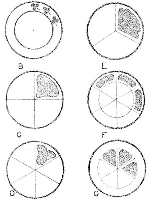
Dividing a Circular Space.
There are many ways in which a circular shape may be divided and decorated. Sketch B shows two circles drawn around the same center, with different radii. Such circles are called concentric. Sketch C shows the circle divided into fourths. To do this, place the angle of your test square at the center of the circle and rule two radii. Repeat to secure four right angles at the center of the circle.
Sketches D, F, and G show circles divided into sixths, by setting off the radius six times on the circumference, and drawing diameters connecting these points.
Sketch E shows a circle divided into thirds. Set off the radius six times on the circumference; draw a radius from every other point.
Draw concentric circles, and divide them into halves, fourths, thirds, and sixths.
Some Divisions of Square Spaces.
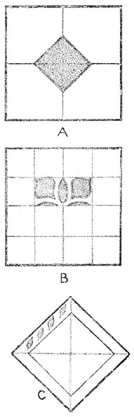
A square is said to be on its diameters when one of its diameters is vertical and the other horizontal; it is said to be on its diagonals when the diagonals are in this position. Sketch A shows the larger square on its diameters and the small inner square on its diagonals.
To draw a square on its diameters, place your test square to locate the lower left corner of the square, and draw the two sides at right angles, extending the lines to the desired length. Use your test square in drawing all other corners of your square. For the diameters, bisect each side and connect the points of bisection. For a design plan like Sketch A, bisect the semi-diameters and connect these points. Diameters of a square bisect opposite sides; diagonals bisect opposite angles.
In Sketch B, each side is quadrisected, or divided into fourths, and the opposite points connected. This division of a square may be used for a decorative plan in a number of ways, one of which is shown in the sketch.
To draw a square in the position of Sketch C, use your test square, and draw the diagonals first, dividing them into inch spaces. Connect the ends of the diagonals to get a square. In the plan for the border design in Sketch C, connect the outer points on the diagonals to form the space for a border decoration.
Draw two squares, one on its diameters, and one on its diagonals. Show by divisions made in each, some plan for a design.
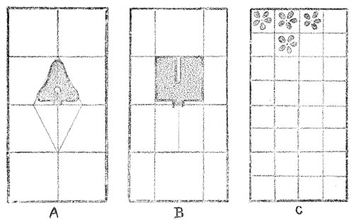
How an Oblong Space May be Divided.
You can draw an oblong with your test square in the same way that you drew a square, measuring the sides to get the length you wish. In Sketch A the semi-diameters are bisected and the points connected, forming a diamond-shaped space, something like a square on its diagonals. In making the unit used in the upper half of this space, the lines of the triangle are changed very slightly, but this change makes an interesting decoration. In Sketch B the sides are quadrisected, and the space is divided by connecting some of the opposite points, making an oblong on its diameters for the middle space. In the upper half of this space a simple shape, very like a square, is used. It can be reversed, as can the triangular shape in Sketch A, to fill the lower half of the space.
Sketch C shows a plan for dividing the oblong into many small squares. In each of these, or in every other one, a simple unit could be placed, to make an "all-over" pattern.
Draw an oblong, and by dividing its sides, make a plan for a decorative design. Show how a decoration can be made by slightly changing the lines of an enclosing shape.

The Equilateral Triangle.
With the help of your circle maker or compass you can easily draw an equilateral triangle.
Rule a horizontal line of any desired length, for the base of your triangle—that side upon which the triangle seems to rest. Place the pivot of your circle maker at one end of the line, and take a radius equal to its length. Draw above this line part of the circumference of a circle, called an arc. Then take as a center the other end of the horizontal line, and with the same radius, draw an intersecting arc. Rule lines from the intersecting arcs to each end of the line. You have drawn an equilateral triangle.
Sketches A and B show you how an equilateral triangle may be divided. Sketch C shows how one line may divide the triangle into two shapes, whose outlines may be slightly changed or modified, to make a decoration.
For a surface covering like Sketch D, construct one equilateral triangle and carry the base line across the paper. Rule a line parallel to this, passing through the apex of the triangle. Set off upon these lines lengths equal to one side of your triangle. Draw lines connecting these points, as shown in the sketch. Repeat this process for a surface covering.
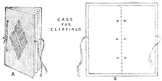
A Case for Newspaper Clippings.
When you know how to measure accurately and can plan good proportions, you can make many simple articles, both useful and beautiful.
To make the case for newspaper clippings shown on this page, cut an oblong of stiff manila paper, 8 ½ × 9 ½ inches. Use your test square in measuring all corners, to get right angles. Then cut an oblong 9 ½ × 10 ½ inches of "cover" paper, of some good color. Fit the manila oblong within this, in such a way as to leave an inch margin of colored paper all around it. Fold over this margin, pasting it down neatly. Cut an oblong 8 ¼ × 9 ¼ inches, of tinted paper of lighter weight. Lay this oblong as an inside lining to the cover, pasting to leave a narrow margin of the dark cover paper around the lining. Place the cover on your desk, with the long edges from left to right. Fold the nearer edge to meet the farther edge. Crease well. Bisect the crease, and place a point 3⁄8 of an inch up from the crease. Measure three inches from each end, and place points at these distances, 3⁄8 of an inch up from the crease. Within the folded cover, place six or eight No. 9 envelopes, the bottom edges of the envelopes touching the crease. Fit the envelopes within the cover, to leave an equal margin around the front and ends of the case. Holding the envelopes firmly within the cover, make holes with an eyelet punch at the points placed for them. Tie the envelopes in the case with raffia, tape, or cord.
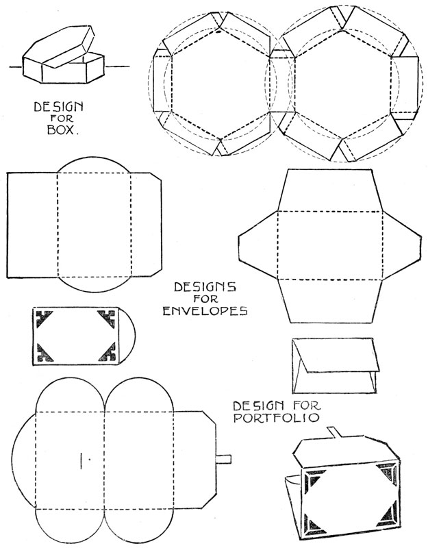
How to Draw Letters.
Before the Days of Printing. There was once a time when all the books in the world were lettered by hand. This hand printing was done by men called monks, who lived in monasteries, away from the noise and bustle of the world, and who often devoted their whole lives to the lettering of religious books. They did this lettering on sheepskin or parchment instead of on paper, and they spared no pains in making these manuscripts as beautiful as possible. Color was often used for initials and for capital letters, and sometimes artistically designed borders were placed around the lettering, making each page in these manuscript books as beautiful as a picture. The great amount of time that was necessary to make one of these books made them very expensive, and only people of great wealth could own them.
Type and the Printing Press. When type and the printing press were invented, the printer at first tried to make his pages look like the manuscript pages of the monks. For this reason, the earlier printing was artistic, although the letters were not as clear and perfect as type letters are now. The first books printed from type were also expensive, but little by little the process was made cheap, until at last type letters lost much of their beauty. Lately, however, printers have realized that single letters are like design units in an all-over pattern. The size of the letters, their shapes and thickness, the spaces between them, and the spaces between the lines are all of great importance.
A Simple Alphabet. On the next page is a simple alphabet, planned on squared paper. You can print in this style, any title or words you may wish on a program or book-cover. Plan your printing on a separate piece of paper, marking the height of the space you intend to fill with the letters. Quadrisect this height and draw through these points horizontal lines. Lay off on the lower horizontal, distances equal to the quadrisection. From these points erect vertical lines, using your test square. Mark in a sketchy way the width of each letter in the word you are planning, making the thickness of each letter the width of a square, and leaving the same distance (the width of a square) between each letter. Be careful to keep uniform thickness in slanting lines and curves, as in K and C. Avoid angles in your curves. If you have more than one word in your line, leave three squares for the space between the words, and if more than one line of printing is used, guard against too much space between the lines. The width of two squares would be a safe distance in a style like this.
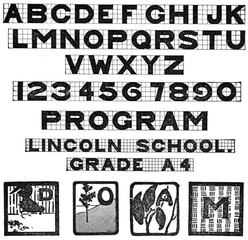
Transferring the Letters. When your plan is complete, rub soft lead pencil evenly over the back of the paper, and place the plan exactly where you wish the lettering to go, on your book-cover or program, with the lead painting next to the cover. Then mark over the letters with a sharp point, and a faint tracing will appear on the under surface. You can then finish your lettering in ink or color, as you prefer.
All lettering must be done with much care, with exactness, and with the greatest neatness.
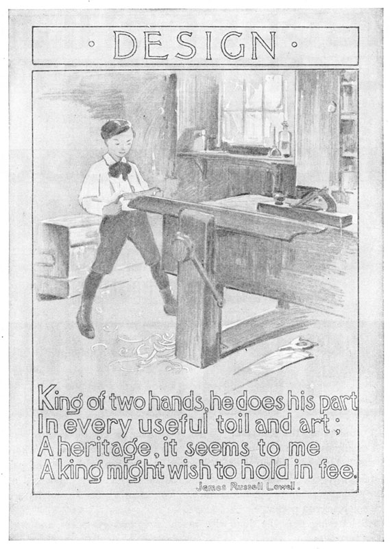
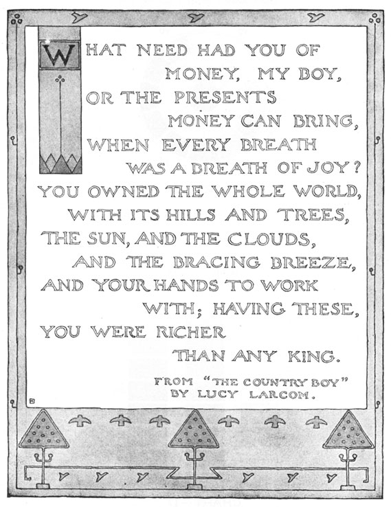
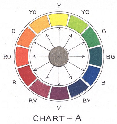
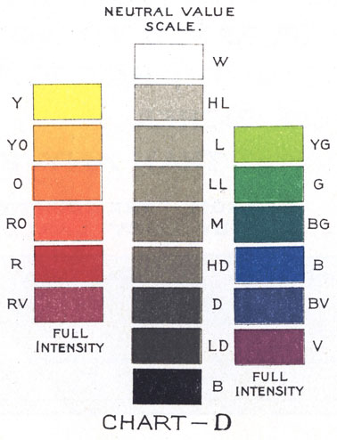
Colors in Full Intensity and their Neutral Values.
Light and Dark Colors. When you painted an autumn scene like the one on page 2, you found that it could be done with three colors—yellow, red, and blue. Blue made the sky and water; blue and yellow the grass and the foliage of the smaller tree; blue and red the distance; yellow, red, and blue the tree trunks and the autumn colors of the large tree. Look again at the sketch. Do you see that the two trees are darker than the grass, that the water and the sky are of nearly the same value, and that the tree-trunks are the darkest colors in the picture? In the winter scene on page 8, and in the spring picture of the yellow bush, both dark and light colors have been used. The colored flower studies all show dark and light colors. Both light and dark colors are needed to express truth and beauty, just as in music we need both high and low tones for perfect melody.
An Orderly Arrangement of Colors. In Chart A these colors are arranged in an orderly way. Yellow (Y) is the lightest color and is placed directly opposite violet (V), the darkest color in the circle. Yellow-orange (YO) and yellow-green (YG) come next to yellow on either side. Then orange (O) and green (G) follow, and next to them are red-orange (RO) and blue-green (BG). Next in the circle are red (R) and blue (B), and after them red-violet (RV) and blue-violet (BV). The colors in the chart are the strongest that your three colors can make. Colors of this strength are said to be in full intensity.
Expressing Colors in Neutral Values. On page 4 are "finder" pictures taken from the autumn scene on page 2. These are done in gray washes that correspond to the colors in the autumn sketch. The trees are shown in grays that make them just as dark as the trees in the colored picture. When we make gray washes just as light and as dark as colors that we wish to represent, we say that we express those colors in neutral values.
The Neutral Value Scale. In Chart D the scales are arranged to show the grays or neutral values that correspond to the different colors in their full intensity. In this chart yellow is as light as the gray wash called High Light (HL). Yellow-orange and yellow-green are of the same value as Light (L). Orange and green are of the same value as Low Light (LL). Red-orange and blue-green are of the same value as Middle (M). Red and blue equal the neutral value High Dark (HD). Red-violet and blue-violet are equal to Dark (D), and violet, the darkest color, is expressed by Low Dark (LD). Low Dark is almost black.

The Neutral Value Scale.
A scale of neutral values, larger in size than that on page 78, is printed on this page. White and black are added. They do not correspond to any color, but they help us to see the many steps that may be taken between them. Only seven of these steps from black to white are shown in our scale. Of course there are other grays, not represented in the scale, just as there are tones of music not expressed in the musical scale or octave. The musical scale and this value scale are used to help locate all other notes and all other degrees of light and dark. You could make, for instance, other grays between High Light and White. But it is useful to know that certain grays have definite names, and definite places in the scale.
With the aid of this larger scale, we can more easily compare the values of the colors of a landscape, a flower, or a still-life group with the same values in gray. Turn to pages 8 and 9. On page 8 the winter landscape is in color, and you see the same scene on page 9 in neutral values. In it the sky and part of the snow are of the same value, and they match the gray marked High Light in the scale. The distant hill is Low Light; the dark band of trees on the horizon is High Dark, and the tree in the foreground is Dark. In this way you can find in the scale the neutral values used in a picture.
Name the values of the hyacinth, on page 53. What values were used in the moonlight picture on page 10? Make a little scale showing these values and giving their names.
Dividing a Space into Large and Small Spaces.
Plaids are most attractive when seen in color. Before the color is added, however, definite spaces must be divided by lines into other spaces, making an interesting variety. In drawing from flowers, you found that a spray showing large and small shapes made a more interesting sketch than one in which leaves and flowers were of uniform shapes and sizes.
Sketches 1 and 2 show how vertical and horizontal lines may divide a square into a variety of spaces. Either arrangement is more beautiful than sketch 3, where the spaces are more nearly alike. Look at the still-life group in sketch 4, where the three objects are so nearly of the same size. Do you think this group as pleasing as the group shown in sketch 5? Our designs, as well as our pictures, must show variety and good arrangement of shapes and spaces, in order to be interesting.
Too much variety in a picture or design is as bad as not enough variety. Look at the number of lines and spaces in sketch 6. The design is crowded and "fussy," like an overtrimmed bonnet, or a room in which there is too much furniture. The still-life group in sketch 7 shows the same effect of too much variety.
Draw four squares, each four inches on a side. Divide each into large and small spaces of pleasing variety by using vertical and horizontal lines, four inches in length.
Large and Small Spaces in Two Values.
One way of adding to the interest and beauty of large and small spaces is to show them in values. Compare Sketches 1 and 2 on this page with Sketches 1 and 2 on page 81. You will find the plaids which are shown in values more interesting than those which are made with lines only. The two values in each sketch on this page are chosen from the neutral value scale on page 80. In Sketch 1, High Light (HL) and Black (B) are used, and in Sketch 2, we find Middle (M) and Black (B). You see how different in effect the two plaids are. The same difference can be shown in landscape, flowers, or in any other picture or design, by changing the values. Sketches 3 and 4 show simple groups of still life, first drawn in outline from the objects, and then painted in values chosen from the value scale. Sketch 3 is painted in the same values as the plaid in Sketch 1, and Sketches 2 and 4 are alike in values.
Choose two of your best plaid designs, done in the lesson on page 81, and paint the spaces in one, HL and B; in the other M and B.

Pictures in Different Keys.

In your study of music you have learned to sing in different keys. Some songs are pitched in high keys, and others in low. Or, the same song may be sung in several different keys. The tune or melody remains the same, but there is a difference in the sound.
Pictures are sometimes spoken of as being painted in keys. If the darker values of the scale are used, the picture is said to be in low key. If the picture is full of light color, it is said to be in a high key.
Sketches 1 and 2 show you how different the same design appears, when painted in different keys. Sketch 3 is a landscape in the same values used in Sketch 1. Sketch 4 shows the same scene in a lower key. The soft, silvery light of early morning has given place to the deeper tones of dusk.
Draw two four-inch squares and divide them alike into large and small spaces. Using two values, paint one in a high key, and the other in a low key. Make a little scale under each sketch, naming the values you have used.
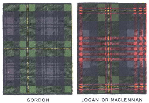
Scotch Plaids.
Long, long years ago, before the days of kings and queens, people lived together in great families or tribes. In Scotland these tribes were called clans, and the sign or badge of a clan was shown in the tartan plaid. This was a heavy piece of woolen cloth worn over the shoulders, as a protection from the weather. A sort of skirt, called a kilt, was made from the same plaid, and this costume was worn by both men and women of the clans in the Highlands of Scotland. The tartans were woven in bright colors, forming designs like those at the top of this page. They were often very beautiful in their arrangement of spaces and colors. Each different design received a name from the clan that wore it. Those at the top of this page are the Gordon and the Logan or MacLennan tartans.
Copy in colors some good plaid design, that you can find in ginghams, in silk, or in woolen cloth.
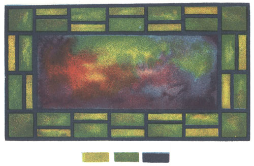
A Stained Glass Window.
Some stained glass windows are as beautiful to look at as fine paintings. Their rich colors glow with light, and they show an interesting variety and arrangement of shapes. They are usually made of colored glass, held together by lead grooves. These are represented in the design on this page by the heavy black lines.
You can make with water-colors an effect very much like stained glass. With pencil, draw an oblong ten inches long and about seven inches wide. Within this, draw another oblong, for the central piece of glass. The size of this inner oblong you must determine for yourself. Remember that its size fixes the width of the border. In the border space, draw some simple straight line design. Paint the smaller oblong, by wetting its surface evenly, and dropping in red, yellow, and blue. Let the colors blend as they will, and use the brush to carry color to the edges of the oblong. When this is dry, paint the shapes in the border in flat washes of any two colors. Last of all, paint strong, black lead lines.

The Stained Glass Window in Values.
The greater part of the illustrations which appear in books and magazines is done in neutral grays. All sorts of color effects are represented by grays in these different pictures, and this is done by people who understand just what neutral value is needed to represent a certain color, its tints, or its shades. You have often represented flowers, landscapes, figures, and still life in gray washes, or with pencil or charcoal. In Chart D you see that certain colors like yellow, yellow-orange, orange, yellow-green and green are represented in their full intensity by grays chosen from the upper end of the neutral value scale, and that the darker colors like red, red-violet, blue, blue-violet, and violet are represented in their full intensity by the grays below middle gray.
Compare the colors you used in making your stained glass window design with Chart D on page 77. Draw the same plan that you used for your colored design. Cover the smaller oblong with a water wash and drop in charcoal-gray, in values to suit the light and dark colors in your stained glass window design. Fill the small oblongs in the border with flat washes of gray. Try to determine just what grays would represent the colors you used. Your lead lines should be of even thickness throughout. Draw them when the rest of the work is thoroughly dry.
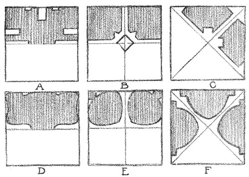
Several Ways of Decorating a Square Space.
On pages 69, 70, and 71 you learned how to draw and divide certain shapes. You saw that by slightly changing the direction of construction lines, decorative designs could be made. Construction lines are lines used in drawing and dividing a shape. They may or may not be retained, after the design is finished. In Sketch A on this page the four sides of the square and the horizontal diameter may be taken as construction lines. By following these lines with a narrow pathway and slightly changing the direction of parts of them, designs can be made in great variety.
In Sketch B diameters are drawn and in the center is a small square on its diagonals. Little pathways lead from the sides of the square to the center, resulting in a four-sided decoration. In Sketch C diagonals are drawn and pathways sent along them to the center. Sketches D, E, and F are like A, B, and C, except that curved lines have been used instead of straight lines.
Draw six four-inch squares. Copy the construction lines and their modifications as shown in the six sketches on this page. Finish each design and strengthen the lines which will bring out the decoration.

Decorating an Oblong Shape.
The oblong is a favorite shape for book-covers, envelopes, card-cases, portfolios, and other articles that can be made in the school-room. Hundreds of objects about you in school and at home are also based, in their proportions, on the oblong. Think of the books, boxes, rugs, doors, and windows, that you constantly see. They are nearly always shaped like an oblong. You will be interested to know some of the ways in which decorations for these objects are planned. In a rug or a book-cover, for instance, we often wish a design similar to that shown in Sketch A. In planning for this, a smaller oblong was drawn within the larger one. The lines of the smaller one were used as construction lines, and these were modified in the same way as were the construction lines of the square on page 87.
In Sketch D, the diameters of the oblong were drawn and the semi-diameters bisected. Then these points were connected. In both Sketch A and Sketch D, all construction lines not used in the design were erased.
Draw two oblongs not less than eight inches high, and wide enough to make a panel of pleasing proportions. Plan and draw designs similar to, but not exactly like, those shown in Sketches A and D.
How to Use Shapes from Nature in Design.
If all our designs were like those which can be made by following the construction lines of certain definite shapes, we would very likely grow tired of seeing so much decoration of that kind. We may get many ideas of beautiful lines and shapes from a plant or a flower, and we may use these ideas in making designs, as the drawings on this page and the next will show.
Look at the sketch of the marsh-marigold, and then at the small drawings at the right. A is a petal, B is a stamen, C is a side view of the flower, showing three petals and a stem, D is a leaf, and E a bud and stem. In these sketches the lines are even, the shapes are regular, and all "accidents of growth" are omitted. Sometimes the shapes were drawn larger than their true size, and sometimes the parts were separated, as in C and E. We need not copy just what we see, but we may modify shapes or change their size and arrangement to suit the spaces which they are to fill.
Study a wild flower in this way. See how many design ideas you can get from one plant.
Shapes from Nature in Borders and Other Decorations.
Nature has suggested some of the most beautiful decorations we have. In the baptismal font on page 65, the carved decoration was evidently from the growth of a vine. The vine is not represented exactly as it grew. A decoration that showed the actual appearance of the plant would not have been adapted to the space.
In the three oblongs on this page, the marsh-marigold shapes have been used in three ways. In Sketch A, the petals of the flower were used in a border design, and the size of the unit, or shape repeated, was carefully planned. If the petal shapes had been drawn larger, the border would have been too heavy for the size of the oblong.
In Sketch B, two leaves and an arrangement of petal shapes suggesting the flower were used, and in Sketch C, the side view of the flower and a part of the stem form a unit which is used to "spot" the oblong. These spots are not crowded, but are placed with careful thought as to the best appearance of the oblong. No matter how beautiful a unit, a border, or a central group may be in itself, we must think of its effect upon the object to be decorated.
Draw three oblongs four times the size of those on this page. Decorate these with a border, a central group, and by spotting. Use the design ideas you found in the lesson on page 89.
A Simple Design for a Portfolio.

Good proportion and the right arrangement of light and dark values will often make an object beautiful, without the addition of ornament. In the chapter on still life, the objects you studied were not decorated, but they were well designed in their beauty of proportions, their color, and their contrast in values.
Many familiar objects such as envelopes, boxes, and book-covers, depend for beauty on these simple elements. The sketch of the portfolio on this page is beautiful because it has a fine proportion of parts, and because the gray values of these parts are harmonious. If the dark band of the back had been wider or narrower, if the space for the name had been placed differently, or if the size of the corner-pieces had been changed, the harmony of parts would have been disturbed, and the portfolio would not have been beautiful. Or, if the dark gray trimming had been black, there would have been too great a difference between the values used, and that again would disturb the harmonious effect of the whole. You can tell how large to make the parts, where to put them, and what arrangement of values to use, only by trying several ways, and then selecting the most beautiful.
This portfolio may be made by pasting tinted paper or book linen over cardboards. The boards should be covered first with the material chosen for the outside. Then the corners and back should be added, and a lining of paper pasted across both boards on the inside. The space for a name on the outside should be carefully planned. Within this space should be drawn very carefully, the letters of any name you may wish to place on the portfolio.
Color Schemes from Nature.


In the world about you, every object that you see has color. From the bright colors you can so easily see in flowers, leaves, grasses, and the sunset sky, to the grayed colors of tree trunks, clouds, the ground, and buildings, there is the greatest variety and range. Even in the moonlight, objects though greatly changed in effect, still have color. If it were not for this, we could not see them. It is only in the darkest night, when we can see but a few feet ahead of us, that objects seem to lose their color.
In our houses, too, everything has color—not the bright hues that we find in flowers and landscapes, but softer, grayed color. We would not like carpets and wall-paper of the bright color we find in poppies, for instance. The colors we use in our furnishings should not be glaring and intense, but quiet and restful. To find these color relations, and to train the eye to know and enjoy fine color harmonies, we study what artists have done, in paintings and other works of art. In nature, too, we find color suggestions in endless variety. In autumn the world is flooded with rich color. Even the common weed that is shown you on this page shows a combination of colors that would be safe to use in any work of our own. See how the colors in the plant have been arranged in a little scale. Such an arrangement is called a color scheme.
Make a sketch in color from some plant or seedhead. Under the sketch, arrange in little oblongs the colors you found in the plant.
Using one of Nature's Color Schemes.
Nature's color schemes become most interesting to us when we use them in some work of our own. The brush-broom holder on this page shows in its coloring the scheme found in the plant growth on page 92.
In making a holder of this kind, choose materials that will be strong, and that will look well together. Pasteboards should be cut in good proportions, of a size and shape to fit a particular broom. These should be covered on both sides in the same way that you covered the sides of your portfolio on page 91. The material for this covering may be stout paper, linen, plain gingham, or leather, colored to suit one of the colors in the scheme you have chosen. A simple design may be placed on the holder in another color chosen from your scheme. Then holes for lacing are to be punched in the sides. The cord for lacing should harmonize in quality and color with the rest of your design. The color of the broom itself may be brought into harmony with the holder by painting it with water-color, or by dipping it in a mixture of water-color that matches one of the colors in your scheme. A few Indian beads of bright color strung on the lacing strings will add greatly to the effect.
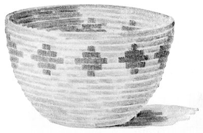
A Raffia Basket.
Many of the baskets made by the American Indians are so beautiful that they deserve to be classed as works of art. We wonder that a race of people so savage in their tastes and so wandering in their habits could have produced articles of so much beauty from the materials they found in the wilderness of nature. Many of these materials it is impossible for us to find or to use, but we can make with raffia and rattan, baskets that are something like those made by the Indians.
The sketch on this page is from a "soft coil" basket, made entirely of raffia. The amount of raffia used depends entirely on the size of the basket. Before beginning the basket, make a sketch showing its height, the width of the top and bottom, the shape of its sides, and a simple decoration in color. The bottom of the basket is to be made first, beginning the coil at the center. The coil should measure about a quarter of an inch in diameter, and is to be made of a number of strands of raffia, placed with the large ends together, forming a blunt point. Wind the strands tightly together with a strand of raffia, one end of which is threaded through a large needle. Work back from the end until you have a firm coil about half an inch in length. Start the spiral with this end, doubling it back, and sewing it firmly in place. Wind the raffia strands with the strand carrying the needle, sewing the coil thus made to the center. After the first time around, the stitches should be made about a quarter of an inch apart, and should be fastened through the upper part of the last coil. Strands of raffia must be added to the coil, to keep it of uniform size.
When a new needleful is taken, the end of the winding and sewing strand must be hidden in the coil. The stitch is the same throughout the basket. The bottom is kept perfectly flat, and the sides shaped to suit the design. Any decoration in color, such as is shown in the sketch, is wound in with colored raffia. When finishing the basket, the coil is to be cut, and the end tapered, wound, and sewed firmly down to the coil below.

A Woven Cushion-Cover.
Raffia is an artistic material which lends itself to many uses. The covers for the porch-pillow shown in the sketch on this page are woven with raffia, on a strong loom. The size of the loom determines the size of the woven cover. The cushion from which this sketch was made measured eighteen inches square without the fringe, and about two and a half pounds of raffia were used in the covers, the fringe, and the filling of the cushion. Sketch C shows the wooden needle used in carrying the strands of raffia over and under the warp.
Raffia is used both for the warp and the woof of the weaving. In "stringing" the loom, fourteen to sixteen pieces of raffia should be used as one strand or thread of the warp, and these strands should be tied firmly to the ends of the loom. As many of these strands must be used as can be tied on the loom without crowding. They may touch, but not overlap. In weaving, the large needle is threaded with raffia to make a strand equal in size to the strands of the warp, and this strand is woven under and over the strands of the warp, making the familiar "basket weave." The ends of the strands used in this way form the fringe, which is trimmed to the desired length when the weaving is done.
Stripes, plaids, or simple figures may be woven in with colored raffia. The two sides of the cushion may show different designs.
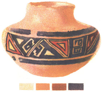
Color Schemes from Man's Handiwork.
Leaves, plants, flowers, insects, butterflies, shells, feathers, clouds, and countless other objects in nature can furnish us with many delightful color schemes. We can also learn much from the artistic work of people. In Indian pottery and weaving we often see fine combinations of color. The Indians understood how to make beautiful dyes from roots, berries, and other vegetable growths, and the colors obtained in this way have a peculiar quality and beauty, not found in many of the dyes in common use today. The picture on this page is from a fine specimen of Sikyatki pottery. Sikyatki was an Indian village in New Mexico, and was the home of a tribe of Pueblo Indians.
When the Indians wished to send a written message they made use of picture-writing; that is, they made pictures so simple that they are called signs or symbols. Their symbol of a tree, for instance, would look much like the tree pictures made by very little children; three short vertical marks sometimes meant three warriors; a zigzag line stood sometimes for the lightning, sometimes for a serpent; and a wavy line extending in a horizontal direction was the symbol of a brook, a river, or the great ocean.
From a good Indian bowl or basket make an exact copy, and place underneath it the scale of colors found in the object.

Using Color Schemes in Pottery.
In planning a bowl or vase like the one shown you on this page, a sketch of the front view should be made showing the diameter of the top and bottom of the bowl, its height, its shape, the color scheme, and the decoration. Such a drawing might be called a design for a bowl.
After drawing such a design, the next step is to make the bowl of clay. For the bowl represented here, a lump of clay was rolled and patted into a low, roughly shaped cylinder. The thumbs were then thrust into the middle of the cylinder, and they, together with the fingers, pushed the clay outward to form the bottom and part of the sides of the bowl. The sides were finished by adding flat pieces of clay, their edges being carefully worked until the pieces added seemed a part of the form. The sides and bottom of the bowl were kept of uniform thickness. Then the bowl was allowed to stand about a day, or until it became what is called "leather hard." The border was then painted on with potter's colors, the lower part of the bowl was colored, and the inside glazed. The bowl was again allowed to dry, this time very thoroughly. It was then fired in a potter's kiln.
Make a flower holder of clay. Use the color scheme you found in your Indian bowl or basket. If possible, fire the bowl in a kiln.
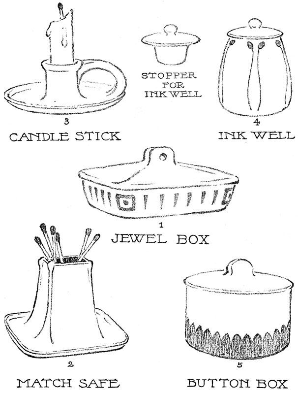
End of the Project Gutenberg EBook of Text Books of Art Education, Book IV
(of 7), by Hugo B. Froehlich and Bonnie E. Snow

*** END OF THIS PROJECT GUTENBERG EBOOK TEXT BOOKS--ART EDUCATION, V4 ***

***** This file should be named 38154-h.htm or 38154-h.zip *****
This and all associated files of various formats will be found in:
        https://www.gutenberg.org/3/8/1/5/38154/

Produced by Juliet Sutherland, Alex Gam and the Online
Distributed Proofreading Team at https://www.pgdp.net


Updated editions will replace the previous one--the old editions
will be renamed.

Creating the works from public domain print editions means that no
one owns a United States copyright in these works, so the Foundation
(and you!) can copy and distribute it in the United States without
permission and without paying copyright royalties.  Special rules,
set forth in the General Terms of Use part of this license, apply to
copying and distributing Project Gutenberg-tm electronic works to
protect the PROJECT GUTENBERG-tm concept and trademark.  Project
Gutenberg is a registered trademark, and may not be used if you
charge for the eBooks, unless you receive specific permission.  If you
do not charge anything for copies of this eBook, complying with the
rules is very easy.  You may use this eBook for nearly any purpose
such as creation of derivative works, reports, performances and
research.  They may be modified and printed and given away--you may do
practically ANYTHING with public domain eBooks.  Redistribution is
subject to the trademark license, especially commercial
redistribution.


*** START: FULL LICENSE ***

THE FULL PROJECT GUTENBERG LICENSE
PLEASE READ THIS BEFORE YOU DISTRIBUTE OR USE THIS WORK

To protect the Project Gutenberg-tm mission of promoting the free
distribution of electronic works, by using or distributing this work
(or any other work associated in any way with the phrase "Project
Gutenberg"), you agree to comply with all the terms of the Full Project
Gutenberg-tm License (available with this file or online at
https://gutenberg.org/license).


Section 1.  General Terms of Use and Redistributing Project Gutenberg-tm
electronic works

1.A.  By reading or using any part of this Project Gutenberg-tm
electronic work, you indicate that you have read, understand, agree to
and accept all the terms of this license and intellectual property
(trademark/copyright) agreement.  If you do not agree to abide by all
the terms of this agreement, you must cease using and return or destroy
all copies of Project Gutenberg-tm electronic works in your possession.
If you paid a fee for obtaining a copy of or access to a Project
Gutenberg-tm electronic work and you do not agree to be bound by the
terms of this agreement, you may obtain a refund from the person or
entity to whom you paid the fee as set forth in paragraph 1.E.8.

1.B.  "Project Gutenberg" is a registered trademark.  It may only be
used on or associated in any way with an electronic work by people who
agree to be bound by the terms of this agreement.  There are a few
things that you can do with most Project Gutenberg-tm electronic works
even without complying with the full terms of this agreement.  See
paragraph 1.C below.  There are a lot of things you can do with Project
Gutenberg-tm electronic works if you follow the terms of this agreement
and help preserve free future access to Project Gutenberg-tm electronic
works.  See paragraph 1.E below.

1.C.  The Project Gutenberg Literary Archive Foundation ("the Foundation"
or PGLAF), owns a compilation copyright in the collection of Project
Gutenberg-tm electronic works.  Nearly all the individual works in the
collection are in the public domain in the United States.  If an
individual work is in the public domain in the United States and you are
located in the United States, we do not claim a right to prevent you from
copying, distributing, performing, displaying or creating derivative
works based on the work as long as all references to Project Gutenberg
are removed.  Of course, we hope that you will support the Project
Gutenberg-tm mission of promoting free access to electronic works by
freely sharing Project Gutenberg-tm works in compliance with the terms of
this agreement for keeping the Project Gutenberg-tm name associated with
the work.  You can easily comply with the terms of this agreement by
keeping this work in the same format with its attached full Project
Gutenberg-tm License when you share it without charge with others.

1.D.  The copyright laws of the place where you are located also govern
what you can do with this work.  Copyright laws in most countries are in
a constant state of change.  If you are outside the United States, check
the laws of your country in addition to the terms of this agreement
before downloading, copying, displaying, performing, distributing or
creating derivative works based on this work or any other Project
Gutenberg-tm work.  The Foundation makes no representations concerning
the copyright status of any work in any country outside the United
States.

1.E.  Unless you have removed all references to Project Gutenberg:

1.E.1.  The following sentence, with active links to, or other immediate
access to, the full Project Gutenberg-tm License must appear prominently
whenever any copy of a Project Gutenberg-tm work (any work on which the
phrase "Project Gutenberg" appears, or with which the phrase "Project
Gutenberg" is associated) is accessed, displayed, performed, viewed,
copied or distributed:

This eBook is for the use of anyone anywhere at no cost and with
almost no restrictions whatsoever.  You may copy it, give it away or
re-use it under the terms of the Project Gutenberg License included
with this eBook or online at www.gutenberg.org

1.E.2.  If an individual Project Gutenberg-tm electronic work is derived
from the public domain (does not contain a notice indicating that it is
posted with permission of the copyright holder), the work can be copied
and distributed to anyone in the United States without paying any fees
or charges.  If you are redistributing or providing access to a work
with the phrase "Project Gutenberg" associated with or appearing on the
work, you must comply either with the requirements of paragraphs 1.E.1
through 1.E.7 or obtain permission for the use of the work and the
Project Gutenberg-tm trademark as set forth in paragraphs 1.E.8 or
1.E.9.

1.E.3.  If an individual Project Gutenberg-tm electronic work is posted
with the permission of the copyright holder, your use and distribution
must comply with both paragraphs 1.E.1 through 1.E.7 and any additional
terms imposed by the copyright holder.  Additional terms will be linked
to the Project Gutenberg-tm License for all works posted with the
permission of the copyright holder found at the beginning of this work.

1.E.4.  Do not unlink or detach or remove the full Project Gutenberg-tm
License terms from this work, or any files containing a part of this
work or any other work associated with Project Gutenberg-tm.

1.E.5.  Do not copy, display, perform, distribute or redistribute this
electronic work, or any part of this electronic work, without
prominently displaying the sentence set forth in paragraph 1.E.1 with
active links or immediate access to the full terms of the Project
Gutenberg-tm License.

1.E.6.  You may convert to and distribute this work in any binary,
compressed, marked up, nonproprietary or proprietary form, including any
word processing or hypertext form.  However, if you provide access to or
distribute copies of a Project Gutenberg-tm work in a format other than
"Plain Vanilla ASCII" or other format used in the official version
posted on the official Project Gutenberg-tm web site (www.gutenberg.org),
you must, at no additional cost, fee or expense to the user, provide a
copy, a means of exporting a copy, or a means of obtaining a copy upon
request, of the work in its original "Plain Vanilla ASCII" or other
form.  Any alternate format must include the full Project Gutenberg-tm
License as specified in paragraph 1.E.1.

1.E.7.  Do not charge a fee for access to, viewing, displaying,
performing, copying or distributing any Project Gutenberg-tm works
unless you comply with paragraph 1.E.8 or 1.E.9.

1.E.8.  You may charge a reasonable fee for copies of or providing
access to or distributing Project Gutenberg-tm electronic works provided
that

- You pay a royalty fee of 20% of the gross profits you derive from
     the use of Project Gutenberg-tm works calculated using the method
     you already use to calculate your applicable taxes.  The fee is
     owed to the owner of the Project Gutenberg-tm trademark, but he
     has agreed to donate royalties under this paragraph to the
     Project Gutenberg Literary Archive Foundation.  Royalty payments
     must be paid within 60 days following each date on which you
     prepare (or are legally required to prepare) your periodic tax
     returns.  Royalty payments should be clearly marked as such and
     sent to the Project Gutenberg Literary Archive Foundation at the
     address specified in Section 4, "Information about donations to
     the Project Gutenberg Literary Archive Foundation."

- You provide a full refund of any money paid by a user who notifies
     you in writing (or by e-mail) within 30 days of receipt that s/he
     does not agree to the terms of the full Project Gutenberg-tm
     License.  You must require such a user to return or
     destroy all copies of the works possessed in a physical medium
     and discontinue all use of and all access to other copies of
     Project Gutenberg-tm works.

- You provide, in accordance with paragraph 1.F.3, a full refund of any
     money paid for a work or a replacement copy, if a defect in the
     electronic work is discovered and reported to you within 90 days
     of receipt of the work.

- You comply with all other terms of this agreement for free
     distribution of Project Gutenberg-tm works.

1.E.9.  If you wish to charge a fee or distribute a Project Gutenberg-tm
electronic work or group of works on different terms than are set
forth in this agreement, you must obtain permission in writing from
both the Project Gutenberg Literary Archive Foundation and Michael
Hart, the owner of the Project Gutenberg-tm trademark.  Contact the
Foundation as set forth in Section 3 below.

1.F.

1.F.1.  Project Gutenberg volunteers and employees expend considerable
effort to identify, do copyright research on, transcribe and proofread
public domain works in creating the Project Gutenberg-tm
collection.  Despite these efforts, Project Gutenberg-tm electronic
works, and the medium on which they may be stored, may contain
"Defects," such as, but not limited to, incomplete, inaccurate or
corrupt data, transcription errors, a copyright or other intellectual
property infringement, a defective or damaged disk or other medium, a
computer virus, or computer codes that damage or cannot be read by
your equipment.

1.F.2.  LIMITED WARRANTY, DISCLAIMER OF DAMAGES - Except for the "Right
of Replacement or Refund" described in paragraph 1.F.3, the Project
Gutenberg Literary Archive Foundation, the owner of the Project
Gutenberg-tm trademark, and any other party distributing a Project
Gutenberg-tm electronic work under this agreement, disclaim all
liability to you for damages, costs and expenses, including legal
fees.  YOU AGREE THAT YOU HAVE NO REMEDIES FOR NEGLIGENCE, STRICT
LIABILITY, BREACH OF WARRANTY OR BREACH OF CONTRACT EXCEPT THOSE
PROVIDED IN PARAGRAPH 1.F.3.  YOU AGREE THAT THE FOUNDATION, THE
TRADEMARK OWNER, AND ANY DISTRIBUTOR UNDER THIS AGREEMENT WILL NOT BE
LIABLE TO YOU FOR ACTUAL, DIRECT, INDIRECT, CONSEQUENTIAL, PUNITIVE OR
INCIDENTAL DAMAGES EVEN IF YOU GIVE NOTICE OF THE POSSIBILITY OF SUCH
DAMAGE.

1.F.3.  LIMITED RIGHT OF REPLACEMENT OR REFUND - If you discover a
defect in this electronic work within 90 days of receiving it, you can
receive a refund of the money (if any) you paid for it by sending a
written explanation to the person you received the work from.  If you
received the work on a physical medium, you must return the medium with
your written explanation.  The person or entity that provided you with
the defective work may elect to provide a replacement copy in lieu of a
refund.  If you received the work electronically, the person or entity
providing it to you may choose to give you a second opportunity to
receive the work electronically in lieu of a refund.  If the second copy
is also defective, you may demand a refund in writing without further
opportunities to fix the problem.

1.F.4.  Except for the limited right of replacement or refund set forth
in paragraph 1.F.3, this work is provided to you 'AS-IS' WITH NO OTHER
WARRANTIES OF ANY KIND, EXPRESS OR IMPLIED, INCLUDING BUT NOT LIMITED TO
WARRANTIES OF MERCHANTIBILITY OR FITNESS FOR ANY PURPOSE.

1.F.5.  Some states do not allow disclaimers of certain implied
warranties or the exclusion or limitation of certain types of damages.
If any disclaimer or limitation set forth in this agreement violates the
law of the state applicable to this agreement, the agreement shall be
interpreted to make the maximum disclaimer or limitation permitted by
the applicable state law.  The invalidity or unenforceability of any
provision of this agreement shall not void the remaining provisions.

1.F.6.  INDEMNITY - You agree to indemnify and hold the Foundation, the
trademark owner, any agent or employee of the Foundation, anyone
providing copies of Project Gutenberg-tm electronic works in accordance
with this agreement, and any volunteers associated with the production,
promotion and distribution of Project Gutenberg-tm electronic works,
harmless from all liability, costs and expenses, including legal fees,
that arise directly or indirectly from any of the following which you do
or cause to occur: (a) distribution of this or any Project Gutenberg-tm
work, (b) alteration, modification, or additions or deletions to any
Project Gutenberg-tm work, and (c) any Defect you cause.


Section  2.  Information about the Mission of Project Gutenberg-tm

Project Gutenberg-tm is synonymous with the free distribution of
electronic works in formats readable by the widest variety of computers
including obsolete, old, middle-aged and new computers.  It exists
because of the efforts of hundreds of volunteers and donations from
people in all walks of life.

Volunteers and financial support to provide volunteers with the
assistance they need are critical to reaching Project Gutenberg-tm's
goals and ensuring that the Project Gutenberg-tm collection will
remain freely available for generations to come.  In 2001, the Project
Gutenberg Literary Archive Foundation was created to provide a secure
and permanent future for Project Gutenberg-tm and future generations.
To learn more about the Project Gutenberg Literary Archive Foundation
and how your efforts and donations can help, see Sections 3 and 4
and the Foundation web page at https://www.pglaf.org.


Section 3.  Information about the Project Gutenberg Literary Archive
Foundation

The Project Gutenberg Literary Archive Foundation is a non profit
501(c)(3) educational corporation organized under the laws of the
state of Mississippi and granted tax exempt status by the Internal
Revenue Service.  The Foundation's EIN or federal tax identification
number is 64-6221541.  Its 501(c)(3) letter is posted at
https://pglaf.org/fundraising.  Contributions to the Project Gutenberg
Literary Archive Foundation are tax deductible to the full extent
permitted by U.S. federal laws and your state's laws.

The Foundation's principal office is located at 4557 Melan Dr. S.
Fairbanks, AK, 99712., but its volunteers and employees are scattered
throughout numerous locations.  Its business office is located at
809 North 1500 West, Salt Lake City, UT 84116, (801) 596-1887, email
business@pglaf.org.  Email contact links and up to date contact
information can be found at the Foundation's web site and official
page at https://pglaf.org

For additional contact information:
     Dr. Gregory B. Newby
     Chief Executive and Director
     gbnewby@pglaf.org


Section 4.  Information about Donations to the Project Gutenberg
Literary Archive Foundation

Project Gutenberg-tm depends upon and cannot survive without wide
spread public support and donations to carry out its mission of
increasing the number of public domain and licensed works that can be
freely distributed in machine readable form accessible by the widest
array of equipment including outdated equipment.  Many small donations
($1 to $5,000) are particularly important to maintaining tax exempt
status with the IRS.

The Foundation is committed to complying with the laws regulating
charities and charitable donations in all 50 states of the United
States.  Compliance requirements are not uniform and it takes a
considerable effort, much paperwork and many fees to meet and keep up
with these requirements.  We do not solicit donations in locations
where we have not received written confirmation of compliance.  To
SEND DONATIONS or determine the status of compliance for any
particular state visit https://pglaf.org

While we cannot and do not solicit contributions from states where we
have not met the solicitation requirements, we know of no prohibition
against accepting unsolicited donations from donors in such states who
approach us with offers to donate.

International donations are gratefully accepted, but we cannot make
any statements concerning tax treatment of donations received from
outside the United States.  U.S. laws alone swamp our small staff.

Please check the Project Gutenberg Web pages for current donation
methods and addresses.  Donations are accepted in a number of other
ways including including checks, online payments and credit card
donations.  To donate, please visit: https://pglaf.org/donate


Section 5.  General Information About Project Gutenberg-tm electronic
works.

Professor Michael S. Hart was the originator of the Project Gutenberg-tm
concept of a library of electronic works that could be freely shared
with anyone.  For thirty years, he produced and distributed Project
Gutenberg-tm eBooks with only a loose network of volunteer support.


Project Gutenberg-tm eBooks are often created from several printed
editions, all of which are confirmed as Public Domain in the U.S.
unless a copyright notice is included.  Thus, we do not necessarily
keep eBooks in compliance with any particular paper edition.


Most people start at our Web site which has the main PG search facility:

     https://www.gutenberg.org

This Web site includes information about Project Gutenberg-tm,
including how to make donations to the Project Gutenberg Literary
Archive Foundation, how to help produce our new eBooks, and how to
subscribe to our email newsletter to hear about new eBooks.