The Project Gutenberg EBook of The Art of Illustration, by Henry Blackburn

This eBook is for the use of anyone anywhere at no cost and with
almost no restrictions whatsoever.  You may copy it, give it away or
re-use it under the terms of the Project Gutenberg License included
with this eBook or online at www.gutenberg.org


Title: The Art of Illustration
       2nd ed.

Author: Henry Blackburn

Release Date: May 10, 2010 [EBook #32320]

Language: English

Character set encoding: ISO-8859-1

*** START OF THIS PROJECT GUTENBERG EBOOK THE ART OF ILLUSTRATION ***


Produced by Marius Masi, Chris Curnow and the Online
Distributed Proofreading Team at http://www.pgdp.net.
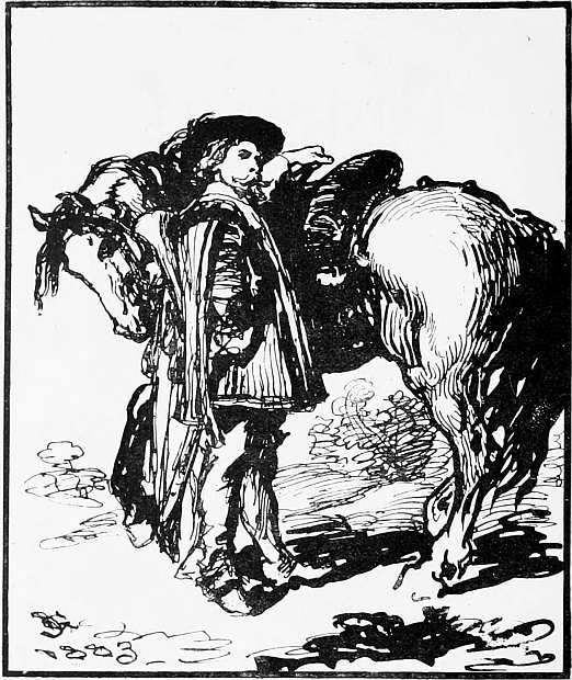
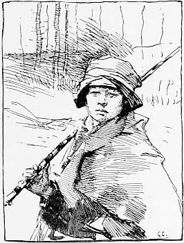
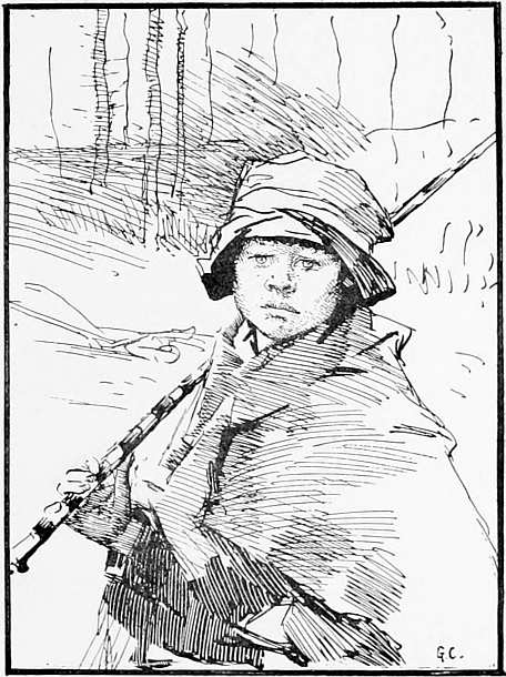
“THE TRUMPETER.” (SIR JOHN GILBERT, R.A.)
(Drawn in pen and ink, from his picture in the Royal Academy, 1883.)
[Size of drawing, 5½ by 4¾ in. Photo-zinc process.]
The Art of Illustration.
BY
HENRY BLACKBURN,
Editor of “Academy Notes,” Cantor Lecturer on Illustration, &c.
WITH
NINETY-FIVE ILLUSTRATIONS.
SECOND EDITION.
LONDON:
W. H. ALLEN & CO., Limited,
13, WATERLOO PLACE, S.W.
1896.
PRINTED BY
WYMAN AND SONS, LIMITED,
LONDON, W.C.
DEDICATED TO
SIR JOHN GILBERT, R.A.,
ONE OF THE PRINCIPAL PIONEERS
OF BOOK AND NEWSPAPER ILLUSTRATION.
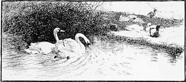
(PEN-AND-INK DRAWING FROM HIS PICTURE, BY MR. CHARLES COLLINS, 1892.)
[Photo-zinc process.]
 |
HE object of this book is to explain the modern systems of Book and Newspaper Illustration, and especially the methods of drawing for what is commonly called “process,” on which so many artists are now engaged.
There is almost a revolution in illustration at the present time, and both old and young—teachers and scholars—are in want of a handbook for reference when turning to the new methods. The illustrator of to-day is called upon suddenly to take the place of the wood engraver in interpreting tone into line, x and requires practical information which this book is intended to supply.
The most important branch of illustration treated of is line drawing, as it is practically out of reach of competition by the photographer, and is, moreover, the kind of drawing most easily reproduced and printed at the type press; but wash drawing, drawing upon grained papers, and the modern appliances for reproduction, are all treated of.
The best instructors in drawing for process are, after all, the painters of pictures who know so well how to express themselves in black and white, and to whom I owe many obligations. There is a wide distinction between their treatment of “illustration” and the so-called “pen-and-ink” artist.
The “genius” who strikes out a wonderful path of his own, whose scratches and splashes appear in so many books and newspapers, is of the “butterfly” order of being—a creation, so to speak, of the processes, and is not to be emulated or imitated. There is no reason but custom why, in drawing for process, a man’s coat should be made to look like straw, or the background (if there be a background) have the appearance of fireworks. No ability on the part of the illustrator will make these things tolerable in the near future. There is xi a reaction already, and signs of a better and more sober treatment of illustration, which only requires a better understanding of the requirements and limitations of the processes, to make it equal to some of the best work of the past.
The modern illustrator has much to learn—more than he imagines—in drawing for the processes. A study of examples by masters of line drawing—such as Holbein, Menzell, Fortuny or Sandys—or of the best work of the etchers, will not tell the student of to-day exactly what he requires to know; for they are nearly all misleading as to the principles upon which modern process work is based.
In painting we learn everything from the past—everything that it is best to know. In engraving also, we learn from the past the best way to interpret colour into line, but in drawing for the processes there is practically no “past” to refer to; at the same time the advance of the photographer into the domain of illustration renders it of vital importance to artists to put forth their best work in black and white, and it throws great responsibility upon art teachers to give a good groundwork of education to the illustrator of the future. In all this, education—general education—will take a wider part.
The Illustrations have been selected to show the possibilities of “process” work in educated, capable hands, rather than any tours de force in drawing, or exploits of genius. They are all of modern work, and are printed on the same sheets as the letterpress.
All the Illustrations in this book have been reproduced by mechanical processes, excepting nine (marked on the list), which are engraved on wood.
Acknowledgments are due to the Council of the Society of Arts for permission to reprint a portion of the Cantor Lectures on “Illustration” from their Journal; to the Editors of the National Review and the Nineteenth Century, for permission to reprint several pages from articles in those reviews; to the Editors and Publishers who have lent illustrations; and above all, to the artists whose works adorn these pages.
H. B.
123, Victoria Street, Westminster.
May, 1894.
| PAGE. | |
| CHAPTER I.—Introductory | 1 |
| CHAPTER II.—Elementary Illustration | 15 |
| Diagrams—Daily Illustrated Newspapers—Pictorial v. Verbal Description. | |
| CHAPTER III.—Artistic Illustrations | 40 |
| Education of the Illustrator—Line Drawing for Process—Sketching from Life—Examples of Line Drawing. | |
| CHAPTER IV.—The Processes | 102 |
| “Photo zinco”—Gelatine Process—Grained Papers—Mechanical Dots—“Half-tone” Process—Wash Drawing—Illustrations from Photographs—Sketch, Graphic, &c.—Daniel Vierge. | |
| CHAPTER V.—Wood Engraving | 182 |
| CHAPTER VI.—The Decorative Page | 197 |
| CHAPTER VII.—Author, Illustrator, & Publisher | 211 |
| Students’ Drawings | 223 |
| Appendix | 233 |
[The copyright of all pictures sketched in this book is strictly reserved.]
| PAGE. | ||
| “The Trumpeter.” Sir John Gilbert, R.A. | (Process) | vi |
| Swans. Charles Collins | ” | ix |
| “Ashes of Roses.” G. H. Boughton, A.R.A. | ” | 5 |
| “Badminton in the Studio.” R. W. Macbeth, A.R.A. | ” | 6 |
| “A Son of Pan.” William Padgett | ” | 11 |
| “Home by the Ferry.” Edward Stott | ” | 12 |
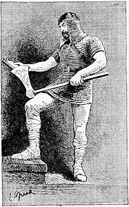
| Man in Chain Armour. Lancelot Speed | ” | 14 |
| “Greeting.” The Hon. Mrs. Boyle | ” | 15 |
| Diagrams (5) | ” | 19-32 |
| View above Blankenburg | (Wood) | 38 |
| The Curvature of the World’s Surface | ” | 39 |
| “Tiresome Dog.” E. K. Johnson | (Process) | 43 |
| “Frustrated.” Walter Hunt | ” | 44 |
| “On the Riviera.” Ellen Montalba | ” | 46 |
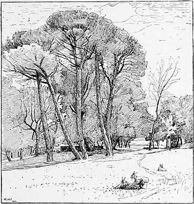
| “Landscape with Trees.” M. R. Corbet | ” | 47 |
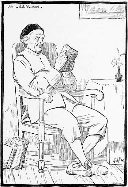
| “An Odd Volume.” H. S. Marks, R.A. | ” | 49 |
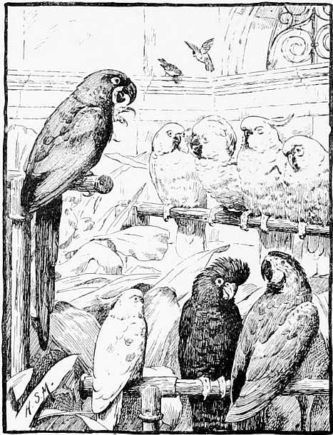
| “A Select Committee.” H. S. Marks, R.A. | ” | 50 |
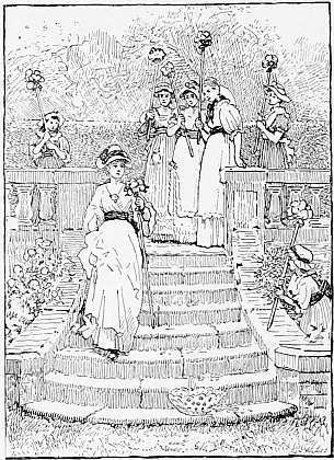
| “The Rose Queen.” G. D. Leslie, R.A. | ” | 52 |
| “Finding of the Infant St. George.” C. M. Gere | ” | 56 |
| “A Ploughboy.” G. Clausen | ” | 59, 61 |
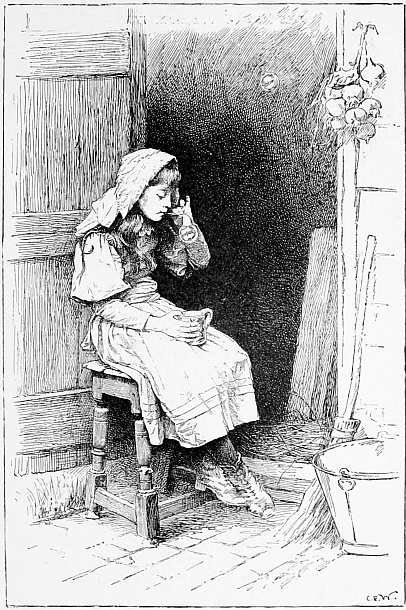
| “Blowing Bubbles.” C. E. Wilson | ” | 65 |
| “Cathedral, from Ox Body Lane.” H. Railton | ” | 69 |
| “By Unfrequented Ways.” W. H. Gore | ” | 70, 71 |
| “Adversity.” Fred. Hall | ” | 73, 75 |
| “A Willowy Stream.” Maud Naftel | ” | 76 |
| “Twins.” Stanley Berkeley | ” | 79 |
| “The Dark Island.” Alfred East xv | ” | 80 |
| “A Portrait.” T. C. Gotch | ” | 83 |
| Sir John Tenniel. Edwin Ward | ” | 87 |
| The Rt. Hon. John Morley. Edwin Ward | ” | 90 |
| “Nothing venture, nothing have.” E. P. Sanguinetti | ” | 92, 93 |
| “On the Terrace.” E. A. Rowe | ” | 94 |
| “For the Squire.” Sir John Millais, Bart., R.A. | ” | 97 |
| “The Stopped Key.” H. S. Marks, R.A. | ” | 100 |
| Nymph and Cupid. Henry Holiday | ” | 101 |
| Illustration to “The Blue Poetry Book.” L. Speed | ” | 102 |
| A Portrait. T. Blake Wirgman. | ” | 103 |
| “Forget Me Not.” Henry Ryland | ” | 105 |
| “Baby’s Own.” G. Hillyard Swinstead | ” | 107 |
| “A Silent Pool.” E. W. Waite | ” | 108 |
| “The Miller’s Daughter.” E. K. Johnson | ” | 111 |
| “The End of the Chapter.” W. Rainey. | ” | 112 |
| “In the Pas de Calais.” J. P. Beadle | ” | 113 |
| “Golden Days.” F. Stuart Richardson | ” | 114 |
| “Twilight.” Hume Nisbet | ” | 115 |
| “Le Dent du Géant.” E. T. Compton | ” | 116, 117 |
| Landscape. A. M. Lindstrom | ” | 119 |
| Volendam. C. J. Watson | ” | 123 |
| “Old Woman and Grandchild.” Hugh Cameron | ” | 125 |
| “An Arrest.” Melton Prior | ” | 127 |
| “Sunrise in the Severn Valley.” M. R. Corbet | ” | 129 |
| “The Adjutant’s Love Story.” H. R. Millar | ” | 131 |
| Illustrations from “The Blue Poetry Book.” L. Speed | ” | 134, 5, 7 |
| “Seine Boats.” Louis Grier | ” | 138 |
| “There is the Priory.” W. H. Wollen | ” | 139 |
| From “Andersen’s Fairy Tales.” J. R. Weguelin | ” | 141, 143 |
| “Two’s company, three’s none.” H. J. Walker | ” | 147 |
| Illustration from “Black and White.” C. G. Manton | ” | 149 |
| “A Sunny Land.” George Wetherbee | ” | 150 |
| Decorative Design. The late Randolph Caldecott | ” | 151 |
| Sketch in wash (part of picture) from “Sketch | ” | 155 |
| “The Brook.” Arnold Helcké | ” | 157 |
| From a Photograph from Life. By Mr. H. S. Mendelssohn (“Sketch”) xvi | ” | 161 |
| From a Photograph from Life. By Messrs. Cameron & Smith (“Studio”) | ” | 165 |
| From a Photograph from Life (“Graphic”) | (Wood) | 169 |
| “Proud Maisie.” Lancelot Speed | (Process) | 173 |
| From “Pablo de Segovia.” Daniel Vierge | ” | 177 |
| Drinking Horn from “Eric Bright Eyes.” L. Speed | ” | 181 |
| Heading from “Grimm’s Household Stories.” W. Crane | (Wood) | 182 |
| Photograph from Life. “The Century Magazine” | ” | 187 |
| “Driving Home the Pigs.” John Pedder | (Process) | 193 |
| Joan of Arc’s House at Rouen. Samuel Prout | (Wood) | 195 |
| Heading from “Grimm’s Household Stories.” W. Crane | ” | 197 |
| Decorative Page. A. J. Gaskin | (Process) | 199 |
| Decorative Page from “The Six Swans.” W. Crane | (Wood) | 201 |
| Title Page of “The Hobby Horse.” Selwyn Image | ” | 205 |
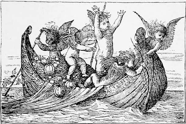
| Viking Ship from “Eric Bright Eyes.” L. Speed | (Process) | 208 |
| “Scarlet Poppies.” W. J. Muckley | ” | 209 |
| “Take Care.” W. B. Baird | ” | 222 |
| Spanish Woman. Ina Bidder | ” | 225 |
| Children Reading. Estelle d’Avigdor | ” | 227 |
| Sketch from Life. G. C. Marks | ” | 229 |
| Bough of Common Furze. William French | ” | 231 |
 |
HERE are, broadly speaking, two kinds of engraving for illustration in books, which are widely distinct—1. intaglio; 2. relievo. The first comprises all engravings, etchings, and photogravures in which the lines are cut or indented by acid or other means, into a steel or copper plate—a system employed, with many variations of method, from the time of Mantegna, Albert Dürer, Holbein and Rembrandt, to the French and English etchers of the present day. Engravings thus produced are little used in modern book illustration, as they cannot be printed easily on the same page as the letterpress; these planches à part, as the French term them, are costly to print and are suitable only for limited editions.
In the second, or ordinary form of illustration, the lines or pictures to be printed are left in relief; 2 the design being generally made on wood with a pencil, and the parts not drawn upon cut away. This was the rudimentary and almost universal form of book-illustration, as practised in the fifteenth century, as revived in England by Bewick in the eighteenth, and continued to the present day. The blocks thus prepared can be printed rapidly on ordinary printing-presses, and on the same page as the text.
During the past few years so many processes have been put forward for producing drawings in relief, for printing with the type, that it has become a business in itself to test and understand them. The best known process is still wood engraving, at least it is the best for the fac-simile reproduction of drawings, as at present understood in England, whether they be drawn direct upon the wood or transmitted by photography. There is no process in relief which has the same certainty, which gives the same colour and brightness, and by which gradation of tone can be more truly rendered.
As to the relative value of the different photographic relief processes, that can only be decided by experts. Speaking generally, I may say that there are six or seven now in use, each of which is, I am informed, the best, and all of which are adapted 3 for printing in the same manner as a wood-block.1 Improvements in these processes are being made so rapidly that what was best yesterday will not be the best to-morrow, and it is a subject which is still little understood.
In the present book it is proposed to speak principally of the more popular form of illustration (relievo); but the changes which are taking place in all forms of engraving and illustration render it necessary to say a few words first upon intaglio. We have heard much of the “painter-etchers,” and of the claims of the etchers to recognition as original artists; and at the annual exhibition of the Society of Painter-Etchers in London, we have seen examples in which the effects produced in black and white seemed more allied to the painter’s art than to the engraver’s. But we are considering engraving as a means of interpreting the work of others, rather than as an original art.
The influence of photography is felt in nearly every department of illustration. The new photo-mechanical methods of engraving, without the aid of the engraver, have rendered drawing for fac-simile reproduction of more importance than ever; and the wonderful invention called photogravure, in which an engraving is made direct from an oil painting, is almost superseding handwork.2
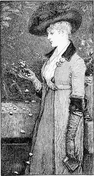
No. II.
“Ashes of Roses,” by G. H. Boughton, A.R.A.
This careful drawing, from the painting by Mr. Boughton, in the Royal Academy, reproduced by the Dawson process, is interesting for variety of treatment and indication of textures in pen and ink. It is like the picture, but it has also the individuality of the draughtsman, as in line engraving.
Size of drawing about 6½ x 3½ in.
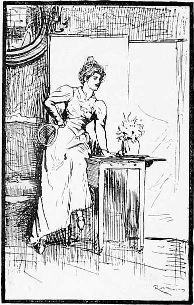
“BADMINTON IN THE STUDIO.” (FROM THE PAINTING BY R. W. MACBETH, A.R.A.)
(Royal Academy, 1891.)
7 The art of line-engraving is disappearing in England, giving way to the “painter-etchers,” the “dry-point” etchers and the “mezzotint engravers,” and, finally, to photogravure, a method of engraving which is so extraordinary, and so little understood (although it has been in constant use for more than ten years), that it may be worth while to explain, in a few words, the method as practised by Messrs. Boussod, Valadon & Co., successors to Goupil, of Paris.
In the Royal Academy Exhibition of 1882, Sir Frederick Leighton’s picture called “Wedded” will be remembered by many visitors. This picture was purchased for Australia, and had to be sent from England within a few weeks of the closing of the exhibition. There was no time to make an 8 engraving, or even an etching satisfactorily, and so the picture was sent to Messrs. Goupil, who in a few weeks produced the photogravure, as it is called, which we see in the printsellers’ windows to this day. The operation is roughly as follows:—First, a photograph is taken direct from the picture; then a carbon print is taken from the negative upon glass, which rests upon the surface in delicate relief. From this print a cast is taken in reverse in copper, by placing the glass in a galvanic bath, the deposit of copper upon the glass taking the impression of the picture as certainly as snow takes the pattern of the ground upon which it falls. Thus—omitting details, and certain “secrets” of the process—it may be seen how modern science has superseded much of the engraver’s work, and how a mechanical process can produce in a few days that which formerly took years.
What the permanent art-estimate of “photo-engraving” may be, as a substitute for hand-work, is a question for the collectors of engravings and etchings. In the meantime, it is well that the public should know what a photogravure is, as distinct from an engraving. The system of mechanical engraving, in the reproduction of pictures, is spreading rapidly over the world; but it should be 9 observed that these reproductions are not uniformly successful. One painter’s method of handling lends itself more readily than that of another to mechanical engraving. Thus the work of the President of the Royal Academy would reproduce better than that of Mr. G. F. Watts or Mr. Orchardson. That the actual marks of the brush, the very texture of the painting, can be transferred to copper and steel, and multiplied ad infinitum by this beautiful process, is a fact to which many English artists are keenly alive. The process has its limits, of course, and photogravure has at present to be assisted to a considerable extent by the engraver. But enough has been done in the last few years to prove that photography will henceforth take up the painter’s handiwork as he leaves it, and thus the importance of thoroughness and completeness on the part of the painter has to be more than ever insisted upon by the publishers of “engravings.”
A word may be useful here to explain that the coloured “photogravures,” reproducing the washes of colour in a painting or water-colour drawing, of which we see so many in Paris, are not coloured by hand in the ordinary way, but are produced complete, at one impression, from the printing-press. The colours are laid upon the plate, one by one, by the printer, by a system of stencilling; and thus an almost perfect fac-simile of a picture can be reproduced in pure colour, if the original is simple and broad in treatment.
No. III.
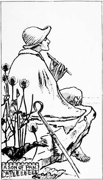
“A Son of Pan,” by William Padgett.
Example of outline drawing, put in solidly with a brush. If this had been done with pencil or autographic chalk, much of the feeling and expression of the original would have been lost. The drawing has suffered slightly in reproduction, where (as in the shadows on the neck and hands) the lines were pale in the original.
Size of drawing 11½ × 6½ in. Zinc process.
“HOME BY THE FERRY.” (FROM THE PAINTING BY EDWARD STOTT.)
(Royal Academy, 1891.)
One other point of interest and importance to collectors of engravings and etchings should be mentioned. Within the last few years, an invention for coating the surface of engraved plates with a film of steel (which can be renewed as often as necessary) renders the surface practically indestructible; and it is now possible to print a thousand impressions from a copper plate without injury or loss of quality. These modern inventions are no secrets, they have been described repeatedly in technical journals and in lectures, notably in those delivered during the past few years at the Society of Arts, and published in the Journal. But the majority of the public, and even many collectors of prints and etchings, are ignorant of the number of copies which can now be taken without deterioration from one plate.
It is necessary to the art amateur that he should know something of these things, if only to explain why it is that scratching on a copper plate has come so much into vogue in England lately, and why there has been such a remarkable revival of 14 the art of Dürer at the end of this century. The reason for the movement will be better understood when it is explained that by the process just referred to, of “steeling” the surface of plates, the “burr,” as it is called, and the most delicate lines of the engraver are preserved intact for a much larger number of impressions than formerly. The taste for etchings and the higher forms of the reproductive arts is still spreading rapidly, but the fact remains that etchings and éditions de luxe do not reach one person in a thousand in any civilised community. It is only by means of wood engravings, and the cheaper and simpler forms of process illustration, that the public is appealed to pictorially through the press.
LINE PROCESS BLOCK.
1 All the illustrations in this book are produced by mechanical processes excepting those marked in the List of Illustrations; and all are printed simultaneously with the letterpress. For description of processes, see Appendix.
2 One of the last and best examples of pure line-engraving was by M. Joubert, from a painting by E. J. Poynter, R.A., called “Atalanta’s Race,” exhibited in the Royal Academy, 1876. The engraving of this picture was nearly three years in M. Joubert’s hands—a tardy process in these days.
“GREETING.” (BY THE HON. MRS. BOYLE.)
 |
HE first object of an illustration, the practical part, is obviously, to illustrate and elucidate the text—a matter often lost sight of. The second is to be artistic, and includes works of the imagination, decoration, ornament, style. In this chapter we shall consider the first, the practical part.
Nearly twenty years ago, at a meeting of the Society of Arts in London, the general question was discussed, whether in the matter of illustrating books and newspapers we are really keeping pace 16 with the times; whether those whose business it is to provide the illustrations which are tossed from steam presses at the rate of several thousand copies an hour, are doing the best work they can.
In illustrated newspapers, it was argued, “there should be a clearer distinction between fact and fiction, between news and pictures.” The exact words may be thought worth repeating now.3
“In the production of illustrations we have arrived at great proficiency, and from London are issued the best illustrated newspapers in the world. But our artistic skill has led us into temptation, and by degrees engendered a habit of making pictures when we ought to be recording facts. We have thus, through our cleverness, created a fashion and a demand from the public for something which is often elaborately untrue.
Would it, then, be too much to ask those who cater for (and really create) the public taste, that they should give us one of two things, or rather two things, in our illustrated papers, the real and the ideal—
1st. Pictorial records of events in the simplest and truest manner possible;
2nd. Pictures of the highest class that can be printed in a newspaper?
Here are two methods of illustration which only require to be kept distinct, each in its proper place, and our interest in them would be doubled. We ask first for a record of news and then for a picture gallery; and to know, to use a common phrase, which is which.”
17 At the time referred to, drawing on the wood-block and engraving were almost universal—instantaneous photography was in its infancy, “process blocks,” that is to say, mechanical engraving, was very seldom employed, and (for popular purposes) American engraving and printing was considered the best.
The system of producing illustrations in direct fac-simile of an artist’s drawing, suitable for printing at a type press without the aid of the wood engraver, is of such value for cheap and simple forms of illustration, and is, moreover, in such constant use, that it seems wonderful at first sight that it should not be better understood in England. But the cause is not far to seek. We have not yet acquired the art of pictorial expression in black and white, nor do many of our artists excel in “illustration” in the true sense of the word.
It has often been pointed out that through the pictorial system the mind receives impressions with the least effort and in the quickest way, and that the graphic method is the true way of imparting knowledge. Are we then, in the matter of giving information or in imparting knowledge through the medium of illustrations, adopting the truest and simplest methods? I venture to say that in the 18 majority of cases we are doing nothing of the kind. We have pictures in abundance which delight the eye, which are artistically drawn and skilfully engraved, but in which, in nine cases out of ten, there is more thought given to effect as a picture than to illustrating the text.
It has often been suggested that the art of printing is, after all, but a questionable blessing on account of the error and the evil disseminated by it. Without going into that question, I think that we may find that the art of printing with movable type has led to some neglect of the art of expressing ourselves pictorially, and that the apparently inexorable necessity of running every word and thought into uniform lines, has cramped and limited our powers of expression, and of communicating ideas to each other.
Let us begin at the lowest step of the artistic ladder, and consider some forms of illustration which are within the reach of nearly every writer for the press. With the means now at command for reproducing any lines drawn or written, in perfect fac-simile, mounted on square blocks to range with the type, and giving little or no trouble to the printer, there is no question that we should more frequently see the hand work of the writer as well 19 as of the artist appearing on the page. For example: it happens sometimes in a work of fiction, or in the record of some accident or event, that it is important to the clear understanding of the text, to know the exact position of a house, say at a street corner, and also (as in the case of a late trial for arson) which way the wind blew on a particular evening. Words are powerless to explain the position beyond the possibility of doubt or misconstruction; and yet words are, and have been, used for such purposes for hundreds of years, because it is “the custom.”
But if it were made plain that where words fail to express a meaning easily, a few lines, such as those above, drawn in ink on ordinary paper, may be substituted (and, if sent to the printer with the manuscript, will appear in fac-simile on the proof with the printed page), I think a new light may dawn on many minds, and new methods of expression come into vogue. 20
This illustration (which was written on the sheet of MS.) is one example, out of a hundred that might be given, where a diagram should come to the aid of the verbal description, now that the reproduction of lines for the press is no longer costly, and the blocks can be printed, if necessary, on rapidly revolving cylinders, which (by duplicating) can produce in a night 100,000 copies of a newspaper.
Before exploring some of the possibilities of illustration, it may be interesting to glance at what has been done in this direction since the invention of producing blocks rapidly to print at the type press and the improvements in machinery.
In the spring of 1873 a Canadian company started a daily illustrated evening newspaper in New York, called The Daily Graphic, which was to eclipse all previous publications by the rapidity and excellence of its illustrations. It started with an attempt to give a daily record of news, and its conductors made every effort to bring about a system of rapid sketching and drawing in line. But the public of New York in 1873 (as of London, apparently, in 1893) cared more for “pictures,” and so by degrees the paper degenerated into a picture-sheet, reproducing (without leave) 21 engravings from the Illustrated London News, the Graphic, and other papers, as they arrived from England. The paper was lithographed, and survived until 1889.
The report of the first year’s working of the first daily illustrated newspaper in the world is worth recording. The proprietors stated that although the paper was started “in a year of great financial depression, they have abundant reason to be satisfied with their success,” and further, that they attribute it to “an absence of all sensational news.”(!)
The report ended with the following interesting paragraph:
“Pictorial records of crime, executions, scenes involving misery, and the more unwholesome phases of social life, are a positive detriment to a daily illustrated newspaper. In fact, the higher the tone and the better the taste appealed to, the larger we have found our circulation to be.”
The great art, it would seem, of conducting a daily illustrated newspaper is to know what to leave out—when, in fact, to have no illustrations at all!
In England the first systematic attempt at illustration in a daily newspaper was the insertion of a little map or weather chart in the Times in 1875, 22 and the Pall Mall Gazette followed suit with a dial showing the direction of the wind, and afterwards with other explanatory diagrams and sketches.
But, in June, 1875, the Times and all other newspapers in England were far distanced by the New York Tribune in reporting the result of a shooting match in Dublin between an American Rifle Corps and some of our volunteers. On the morning after the contest there were long verbal reports in the English papers, describing the shooting and the results; but in the pages of the New York Tribune there appeared a series of targets with the shots of the successful competitors marked upon them, communicated by telegraph and printed in the paper in America on the following morning.4
After this period we seem to have moved slowly, only some very important geographical discovery, or event, extorting from the daily newspapers an explanatory plan or diagram. But during the “Transit of Venus,” on the 6th of December, 1882, a gleam of light was vouchsafed to the readers of the Daily Telegraph (and possibly to other papers), and that exciting astronomical event from which “mankind was to obtain a clearer 23 knowledge of the scale of the universe,” was understood and remembered better, by three or four lines in the form of a diagram (showing, roughly, the track of Venus and its comparative size and distance from the sun) printed in the newspaper on the day of the event.
Maps and plans have appeared from time to time in all the daily newspapers, but not systematically, or their interest and usefulness would have been much greater. Many instances might be given of the use of diagrams in newspapers; a little dial showing the direction of the wind, is obviously better than words and figures, but it is only lately that printing difficulties have been overcome, and that the system can be widely extended.
It remains to be seen how far the Daily Graphic, with experience and capital at command, will aid in a system of illustration which is one day to become general. Thus far it would seem that the production of a large number of pictures (more or less à-propos) is the popular thing to do. We may be excused if we are disappointed in the result from a practical point of view; for as the functions of a daily newspaper are primâ facie to record facts, it follows that if words fail to communicate the right meaning, pictorial expression should come to the aid of the 24 verbal, no matter how crude or inartistic the result might appear.
Let me give one or two examples, out of many which come to mind.
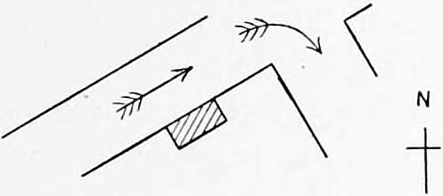
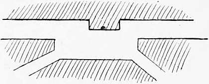
1. The transmission of form by telegraph. To realise the importance of this system in conveying news, we have only to consider (going back nearly forty years) what interest would have been added to Dr. Russell’s letters from the Crimea in the Times newspaper, if it had been considered possible, then, to have inserted, here and there, with the type, a line or two pictorially giving (e.g.) the outline of a hillside, and the position of troops upon it. It was possible to do this in 1855, but it is much more feasible now. The transmission of form by telegraph is of the utmost importance to journalists and scientific men, and, as our electricians have not yet determined the best methods, it may be interesting to point out the simplest and most rudimentary means at hand. The method is well known in the army and is used for field purposes, but hitherto newspapers have been strangely slow to avail themselves of it. The diagram on the opposite page will explain a system which is capable of much development with and without the aid of photography. 25
If the reader will imagine this series of squares to represent a portable piece of open trellis-work, which might be set up at a window or in the open field, between the spectator and any object of interest at a distance—each square representing a number corresponding with a code in universal use—it will be obvious, that by noticing the squares which the outline of a hill would cover, and telegraphing the numbers of the squares, something in the way of form and outline may be quickly communicated from the other side of the world.
CODE FOR TRANSMITTING FORM BY TELEGRAPH.
This is for rough-and-ready use in time of war, when rapidity of communication is of the first importance; but in time of peace a correspondent’s letter continually requires elucidation. 26
Next is an example, which, for want of better words, I will call “the shorthand of pictorial art.” A newspaper correspondent is in a boat on one of the Italian lakes, and wishes to describe the scene on a calm summer day. This is how he proceeds—
“We are shut in by mountains,” he says, “but the blue lake seems as wide as the sea. On a rocky promontory on the left hand the trees grow down to the water’s edge and the banks are precipitous, indicating the great depth of this part of the lake. The water is as smooth as glass; on its surface is one vessel, a heavily-laden market boat with drooping sails, floating slowly down” (and so on)—there is no need to repeat it all; but when half a column of word-painting had been written (and well-written) the correspondent failed to present the picture clearly to the eye without these four explanatory 27 lines (no more) which should of course have been sent with his letter.
This method of description requires certain aptitude and training; but not much, not more than many a journalist could acquire for himself with a little practice. The director of the Daily Graphic is reported to have said that “the ideal correspondent, who can sketch as well as write, is not yet born.” He takes perhaps a higher view of the artistic functions of a daily newspaper than we should be disposed to grant him; by “we” I mean, of course, “the public,” expecting news in the most graphic manner. There are, and will be, many moments when we want information, simply and solely, and care little how, or in what shape, it comes.
This kind of information, given pictorially, has no pretension to be artistic, but it is “illustration” in the true sense of the word, and its value when rightly applied is great. When the alterations at Hyde Park Corner (one of the most important of the London improvements of our day) were first debated in Parliament, a daily newspaper, as if moved by some sudden flash of intelligence, printed a ground-plan of the proposed alterations with descriptive text; and once or twice only, during Stanley’s long 28 absence in Africa, did we have sketches or plans printed with the letters to elucidate the text, such as a sketch of the floating islands with their weird inhabitants, at Stanley’s Station on the Congo river, which appeared in a daily newspaper—instances of news presented to the reader in a better form than words. “The very thing that was wanted!” was the general exclamation, as if there were some new discovery of the powers of description.
As the war correspondent’s occupation does not appear likely to cease in our time, it would seem worth while to make sure that he is fully equipped.
The method of writing employed by correspondents on the field of battle seems unnecessarily clumsy and prolix; we hear of letters written actually under fire, on a drum-head, or in the saddle, and on opening the packet as it arrives by the post we may find, if we take the trouble to measure it, that the point of the pen or pencil, has travelled over a distance of a hundred feet! This is the actual ascertained measurement, taking into account all the ups and downs, crosses and dashes, as it arrives from abroad. No wonder the typewriter is resorted to in journalism wherever possible.
A newspaper correspondent is sent suddenly to the seat of war, or is stationed in some remote 29 country to give the readers of a newspaper the benefit of his observations. What is he doing in 1894? In the imperfect, clumsy language which he possesses in common with every minister of state and public schoolboy, he proceeds to describe what he sees in a hundred lines, when with two or three strokes of the pen he might have expressed his meaning better pictorially. I have used these words before, but they apply with redoubled force at the present time. The fact is, that with the means now at command for reproducing any lines drawn or written, the correspondent is not thoroughly equipped if he cannot send them as suggested, by telegraph or by letter. It is all a matter of education, and the newspaper reporter of the future will not be considered complete unless he is able to express himself, to some extent, pictorially as well as verbally. Then, and not till then, will our complicated language be rescued from many obscurities, by the aid of lines other than verbal.5
In nearly every city, town, or place there is 30 some feature, architectural or natural, which gives character to it, and it would add greatly to the interest of letters from abroad if they were headed with a little outline sketch, or indication of the principal objects. This is seldom done, because the art of looking at things, and the power of putting them down simply in a few lines, has not been cultivated and is not given to many.
Two things are principally necessary to attain this end—
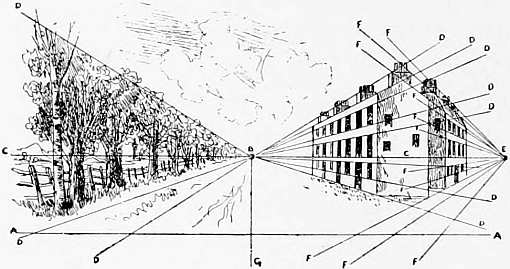
A STUDY IN PERSPECTIVE. (HUME NISBET.)
A. Standpoint. B. Point of Sight. C. Horizontal line. D. Vanishing lines.
E. Point of distance. F. Vanishing lines of distance. G. Line of sight.
1. The education of hand and eye and a knowledge of perspective, to be imparted to every schoolboy, no matter what his profession or occupation is likely to be. 31
2. The education of the public to read aright this new language (new to most people), the “shorthand of pictorial art.”
The popular theory amongst editors and publishers is that the public would not care for information presented to them in this way—that they “would not understand it and would not buy it.” Sketches of the kind indicated have never been fairly tried in England; but they are increasing in number every day, and the time is not far distant when we shall look back upon the present system with considerable amusement and on a book or a newspaper which is not illustrated as an incomplete production. The number of illustrations produced and consumed daily in the printing press is enormous; but they are too much of one pattern, and, as a rule, too elaborate.
In the illustration of books of all kinds there should be a more general use of diagrams and plans to elucidate the text. No new building of importance should be described anywhere without an indication of the elevation, if not also of the ground plan; and, as a rule, no picture should be described without a sketch to indicate the composition. In history words so often fail to give the correct locale that it seems wonderful we have no 32 better method in common use. The following rough plan will illustrate one of the simplest ways of making a description clear to the reader. Take the verbal one first:—
“The young Bretonne stood under the doorway of the house, sheltered from the rain which came with the soft west wind. From her point of vantage on the ‘Place’ she commanded a view of the whole village, and could see down the four streets of which it was principally composed.”
In this instance a writer was at some pains to describe (and failed to describe in three pages) the exact position of the streets near where the girl stood; and it was a situation in which photography could hardly help him.
It may seem strange at first sight to occupy the pages of a book on art with diagrams and elementary outlines, but it must be remembered that plans and diagrams are at the basis of a system of illustration which will one day become general. The reason, as already pointed out, for drawing 33 attention to the subject now, is that it is only lately that systems have been perfected for reproducing lines on the printed page almost as rapidly as setting up the type. Thus a new era, so to speak, in the art of expressing ourselves pictorially as well as verbally has commenced: the means of reproduction are to hand; the blocks can be made, if necessary, in less than three hours, and copies can be printed on revolving cylinders at the rate of 10,000 an hour.
The advance in scientific discovery by means of subtle instruments brings the surgeon sometimes to the knowledge of facts which, in the interests of science, he requires to demonstrate graphically, objects which it would often be impossible to have photographed. With a rudimentary knowledge of drawing and perspective, the surgeon and the astronomer would both be better equipped. At the University of Pennsylvania, in Philadelphia, where the majority of students are intended for the medical profession, this subject is considered of high importance, and the student in America is learning to express himself in a language that can be understood.
In architecture it is often necessary, in order to understand the description of a building, to indicate in a few lines not only the general plan and elevation, 34 but also its position in perspective in a landscape or street. Few architects can do this if called upon at a moment’s notice in a Parliamentary committee room. And yet it is a necessary part of the language of an architect.6
These remarks apply with great force to books of travel, where an author should be able to take part in the drawing of his illustrations, at least to the extent of being able to explain his meaning and ensure topographical accuracy.
A curious experiment was made lately with some students in an Art school, to prove the fallacy of the accepted system of describing landscapes, buildings, and the like in words. A page or two from one of the Waverley novels (a description of a castle and the heights of mountainous land, with a river winding in the valley towards the sea, and clusters of houses and trees on the right hand) was read slowly and repeated before a number of students, three of whom, standing apart from each other by pre-arrangement, proceeded to indicate on blackboards before an audience the leading lines of the picture as the words had presented it to their minds. It is needless to say that the results, highly 35 skilful in one case, were all different, and all wrong; and that in particular the horizon line of the sea (so easy to indicate with any clue, and so important to the composition) was hopelessly out of place. Thus we describe day by day, and the pictures formed in the mind are erroneous, for the imagination of the reader is at work at once, and requires simple guidance. The exhibition was, I need hardly say, highly stimulating and suggestive.
Many arguments might be used for the substitution of pictorial for verbal methods of expression, which apply to books as well as periodicals. Two may be mentioned of a purely topical kind.
1. In June, 1893, when the strife of political parties ran high in England, and anything like a rapprochement between their leaders seemed impossible, Mr. Gladstone and Mr. Balfour were seen in apparently friendly conversation behind the Speaker’s chair in the House of Commons. A newspaper reporter in one of the galleries, observing the interesting situation, does not say in so many words, that “Mr. G. was seen talking to Mr. B.,” but makes, or has made for him, a sketch (without caricature) of the two figures standing talking together, and writes under it, “Amenities behind the Speaker’s chair.” Here it will be seen that the 36 subject is approached with more delicacy, and the position indicated with greater force through the pictorial method.
2. The second modern instance of the power—the eloquence, so to speak, of the pictorial method—appeared in the pages of Punch on the occasion of the visit of the Russian sailors to Paris in October, 1893. A rollicking, dancing Russian bear, with the words “Vive la République” wound round his head, hit the situation as no words could have done, especially when exposed for sale in the kiosques of the Paris boulevards. The picture required no translation into the languages of Europe.
It may be said that there is nothing new here—that the political cartoon is everywhere—that it has existed always, that it flourished in Athens and Rome, that all history teems with it, that it comes down to us on English soil through Gillray, Rowlandson, Hogarth, Blake, and many distinguished names. I draw attention to these things because the town is laden with newspapers and illustrated sheets. The tendency of the time seems to be to read less and less, and to depend more upon pictorial records of events. There are underlying reasons for this on which we must not dwell; the point of importance 37 to illustrators is the fact that there is an insatiable demand for “pictures” which tell us something quickly and accurately, in a language which every nation can understand.
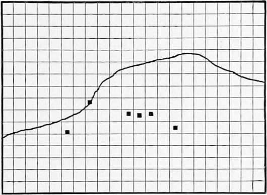
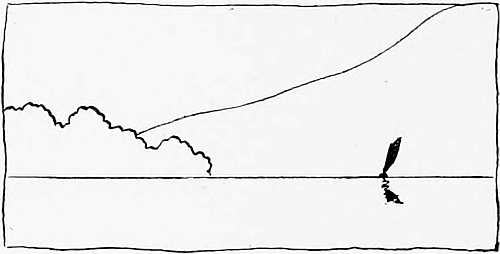
Another example of the use of pictorial expression to aid the verbal. A traveller in the Harz Mountains finds himself on the Zeigenkop, near Blankenberg, on a clear summer’s day, and thus describes it in words:—
“We are now on the heights above Blankenberg, a promontory 1,360 feet above the plains, with an almost uninterrupted view of distant country looking northward and eastward. The plateau of mountains on which we have been travelling here ends abruptly. It is the end of the upper world, but the plains seem illimitable. There is nothing between us and our homes in Berlin—nothing to impede the view which it is almost impossible to describe in words. The setting sun has pierced the veil of mist, and a map of Northern Germany seems unrolled before us, distant cities coming into view one by one. First, we see Halberstadt with its spires, then Magdeburg, then another city, and another.
“We have been so occupied with the distant prospect, and with the objects of interest which give character to it, that we had almost overlooked the charming composition and suggestive lines of this wonderful view. There is an ancient castle on the heights, the town of Blankenberg at our feet, a strange wall of perpendicular rocks in the middle distance; there are the curves of the valleys, flat pastures, undulating woods, and roads winding away across the plains. The central point of interest is the church spire with its cluster of houses spreading upwards towards the château, with its massive terraces fringed with trees, &c., &c.”
This was all very well in word-painting, but what a veil is lifted from the reader’s eyes by some such sketch as the one below.
VIEW ABOVE BLANKENBERG, HARZ MOUNTAINS.
It should be mentioned that three photographic prints joined together would hardly have given the picture, owing to the vast extent of this inland view, and the varying atmospheric effects.
The last instance I can give here is an engraving from Cassell’s Popular Educator, where a picture is used to demonstrate the curvature of the world’s surface; thus imprinting, for once, and for always, on 39 the young reader’s mind a fact which words fail to describe adequately.
THE CURVATURE OF THE WORLDS SURFACE.
This is “The Art of Illustration” in the true sense of the word.
3 The quotations are from a paper by the present writer, read before the Society of Arts in March, 1875.
4 This system of reporting rifle contests is now almost universal in England.
5 It seems strange that enterprising newspapers, with capital at command, such as the New York Herald, Daily Telegraph, and Pall Mall Gazette, should not have developed so obvious a method of transmitting information. The Pall Mall Gazette has been the most active in this direction, but might do much more.
6 It has been well said that if a building can be described in words, it is not worth describing at all!
 |
N referring now to more artistic illustrations, we should notice first, some of the changes which have taken place (since the meeting referred to in the last chapter), and, bridging over a distance of nearly twenty years, consider the work of the illustrator, the photographer, and the maker of process blocks, as presented in books and newspapers in 1894; speaking principally of topical illustrations, on which so many thousand people are now engaged.
It may seem strange at first sight to include “newspapers” in a chapter on art illustrations, but the fact is that the weekly newspapers, with their new appliances for printing, and in consequence of the cheapness of good paper, are now competing with books and magazines in the production of illustrations which a few years ago were only to be found in books. The illustrated newspaper is one of the great employers of labour in this field and distributor of the work of the artist in black and white, and in this connection must by no means be 41 ignored. The Post-office carries a volume of 164 pages (each 22 by 16 inches), weighing from two to three pounds, for a half-penny. It is called a “weekly newspaper,” but it contains, sometimes, 100 illustrations, and competes seriously with the production of illustrated books.
Further on we shall see how the illustrations of one number of a weekly newspaper are produced—what part the original artist has in it, what part the engraver and the photographer. These are things with which all students should be acquainted.
The first stage of illustration, where little more than a plan or elevation of a building is aimed at (as suggested in the last chapter), and where an author, with little artistic knowledge, is yet enabled to explain himself, is comparatively easy; it is when we approach the hazardous domain of art that the real difficulties begin.
As matters stand at present, it is scarcely too much to say that the majority of art students and the younger school of draughtsmen in this country are “all abroad” in the matter of drawing for the press, lacking, not industry, not capacity, but method. That they do good work in abundance is not denied, but it is not exactly the kind of work required—in short, they are not taught at the outset the value of a line. That greater skill and certainty of drawing can be attained by our younger draughtsmen is unquestionable, and, bearing in mind that nearly every book and newspaper in the future will be illustrated, the importance of study in this direction is much greater than may appear at first sight.
No. IV.
“Tiresome Dog,” by E. K. Johnson.
This example of pen-and-ink work has been reproduced by the gelatine relief process. The drawing, which has been greatly reduced in reproduction, was made by Mr. Johnson for an Illustrated Catalogue of the Royal Water-Colour Society, of which he is a member.
It is instructive as showing the possibilities and limitations of relief process-work in good hands. The gradation of tone is all obtained in pure black, or dotted lines. Mr. Dawson has aided the effect by “rouletting” on the block on the more delicate parts; but most of the examples in this book are untouched by the engraver.
(See Appendix.)
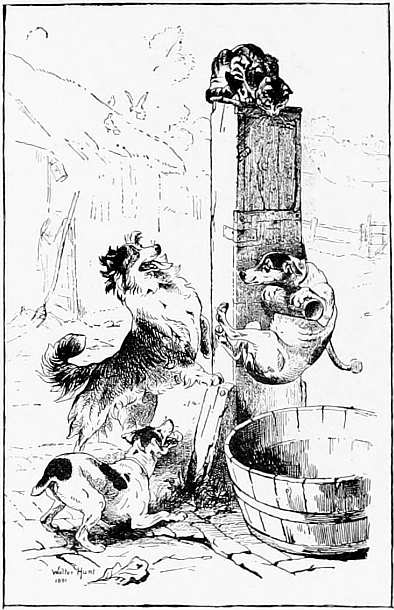
“FRUSTRATED.” (FROM THE PAINTING BY WALTER HUNT.)
(Royal Academy, 1891.)
Referring to the evident want of training amongst our younger draughtsmen, the question was put very bluntly in the Athenæum some years ago, thus:—
Why is not drawing in line with pen and ink taught in our own Government schools of art? The present system in schools seems to render the art of drawing of as little use to the student as possible, for he has no sooner mastered the preliminary stage of drawing in outline from the flat with a lead pencil, than he has chalk put into his hand, a material which he will seldom or never use in turning his knowledge of drawing to practical account. The readier method of pen and ink would be of great service as a preparatory stage to wood drawing, but unfortunately drawing is taught in most cases as though the student intended only to become a painter.
Since these lines were written, efforts have been made in some schools of art to give special training for illustrators, and instruction is also given in wood engraving, which every draughtsman should learn; but up to the present time there has been no systematic teaching in drawing applicable to the various processes, for the reason that the majority of art masters do not understand them. 46
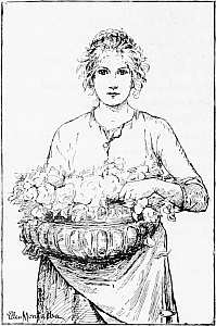
“ON THE RIVIERA.” (ELLEN MONTALBA.)
The art of expression in line, or of expressing the effect of a picture or a landscape from Nature in a few leading lines (not necessarily outline) is little understood in this country; and if such study, as the Athenæum pointed out, is important for the wood draughtsman, how much more so in drawing for reproduction by photo-mechanical means? A few artists have the gift of expressing themselves in line, but the majority are strangely ignorant of 47 the principles of this art and of the simple fac-simile processes by which drawing can now be reproduced. In the course of twenty years of editing the Academy Notes, some strange facts have come to the writer’s notice as to the powerlessness of some painters to express the motif of a picture in a few lines; also as to how far we are behind our continental neighbours in this respect.
“A LIGHT OF LAUGHING FLOWERS ALONG THE GRASS IS SPREAD.” (M. RIDLEY CORBET.)
No. V.
H. S. Marks.
An example of line drawing and “the art of leaving out,” by the well-known Royal Academician.
Mr. Marks and Sir John Gilbert (see frontispiece) were the first painters to explain the composition and leading lines of their pictures in the Academy Notes in 1876. Mr. Marks suggests light and shade and the character of his picture in a few skilful lines. Sir John Gilbert’s pen-and-ink drawing is also full of force and individuality. These drawings reproduce well by any of the processes.
“A SELECT COMMITTEE.” (FROM THE PAINTING BY H. S. MARKS, R.A.)
(Royal Academy, 1891.)
It is interesting to note here the firmness of line and clearness of reproduction by the common process block; the result being more satisfactory than many drawings by professional illustrators. The reason is not far to seek; the painter knows his picture and how to give the effect of it in black and white, in a few lines; and, in the case of Mr. Corbet and Miss Montalba, they have made themselves acquainted with the best way of drawing for the Press. There are many other methods than pen-and-ink which draughtsmen use,—pencil, chalk, wash, grained paper, &c, but first as to line drawing, because it is the only means by which certain results can be obtained, and it is the one which, for practical reasons, should be first mastered. Line drawings are now reproduced on zinc blocks fitted for the type press at a cost of less than sixpence the square inch for large blocks; the processes of reproduction will be explained further on.
It cannot be sufficiently borne in mind—I am speaking now to students who are not intimate with the subject—that to produce with pure black lines the quality and effect of lines in which there is some gradation of tone, is no easy matter, especially to those accustomed to the wood engraver as the interpreter of their work. Sir John 52 Tenniel, M. du Maurier, and Mr. Sambourne, not to mention others on the Punch staff, have been accustomed to draw for wood engraving, and would probably still prefer this method to any other.
“THE ROSE QUEEN.” (G. D. LESLIE, R.A.)
(From “Academy Notes,” 1893.)
But the young illustrator has to learn the newer methods, and how to get his effects through direct photo-engraving. What may be done by process 53 is demonstrated in the line drawings interspersed through these pages, also in the illustrations which are appearing every day in our newspapers, magazines, and books—especially those which are well printed and on good paper. Mr. George Leslie’s pretty line drawing from his picture, on the opposite page, is full of suggestion for illustrative purposes.
But let us glance first at the ordinary hand-book teaching, and see how far it is useful to the illustrator of to-day. The rules laid down as to the methods of line work, the direction of lines for the expression of certain textures, “cross-hatching,” &c., are, if followed too closely, apt to lead to hardness and mannerism in the young artist, which he will with difficulty shake off. On these points, Mr. Robertson, the well-known painter and etcher, writing seven years ago, says well:—
“The mental properties of every line drawn with pen and ink should be original and personal ... this strong point is sure to be attained unconsciously, if an artist’s work is simple and sincere, and not the imitation of another man’s style.”7
When the question arises as to what examples a beginner should copy who wishes to practise the art of pen-and-ink drawing, the difficulty will be to select from the great and varied stores of material 54 that are everywhere to his hand. All steel and copper-plate engravings that have been executed in line, and all wood engravings, are within the possible range of pen-and-ink drawing. I hold, however, that much time should not be occupied in the imitatative copying of prints: only, indeed, so much as enables the student to learn with what arrangement of lines the different textures and qualities of objects may be best rendered.
There are, roughly, two methods of obtaining effect with a pen—one by few lines, laid slowly, and the other by many lines, drawn with rapidity. If the intention is to see what effect may be obtained with comparatively few lines deliberately drawn, we may refer to the woodcuts after Albert Dürer and Holbein, and the line engraving of Marc Antonio. The engraved plates by Dürer furnish excellent examples of work, with more and finer lines than his woodcuts [but many of the latter were not done by his hand]. “Some of the etchings of Rembrandt are examples of what may be fairly reproduced in pen and ink, but in them we find the effect to depend upon innumerable lines in all directions. In the matter of landscape the etched plates by Claude and Ruysdael are good examples for study, and in animal life the work of Paul Potter and Dujardin.” 55
Thus, for style, for mastery of effect and management of line, we must go back to the old masters; to work produced generally in a reposeful life, to which the younger generation are strangers. But the mere copying of other men’s lines is of little avail without mastering the principles of the art of line drawing. The skilful copies, the fac-similes of engravings and etchings drawn in pen and ink, which are the admiration of the young artist’s friends, are of little or no value in deciding the aptitude of the student. The following words are worth placing on the walls of every art school:—
“Proficiency in copying engravings in fac-simile, far from suggesting promise of distinction in the profession of art, plainly marks a tendency to mechanical pursuits, and is not likely to be acquired by anyone with much instinctive feeling for the arts of design.” There is much truth and insight in this remark.
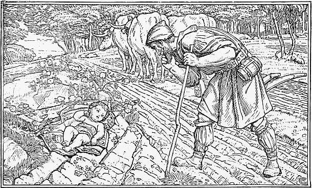
“THE FINDING OF THE INFANT ST. GEORGE.” (CHARLES M. GERE.
(From his painting in the New Gallery, 1893.)
In line work, as now understood, we are going back, in a measure, to the point of view of the missal writer and the illuminator, who, with no thought of the possibilities of reproduction, produced many of his decorative pages by management of line alone (I refer to the parts of his work in which the effect was produced by black and white). No amount of patience, thought, and labour was spared for this one copy. What would he have said if told that in centuries to come this line work would be revived in its integrity, with the possibility of the artist’s own lines being reproduced 100,000 times, at the rate of several thousand an hour. And what would he have thought if told that, out of thousands of students in centuries to come, a few, a very few only, could produce a decorative page; and that few could be brought to realise that a work which was to be repeated, say a thousand times, was worthy of as much attention as his ancestors gave to a single copy!
On the principle that “everything worth doing is worth doing well,” and on the assumption that the processes in common use—[I purposely omit mention here of the older systems of drawing on transfer paper, and drawing on waxed plates, without the aid of photography, which have been dealt with in previous books]—are worth all the care and artistic knowledge which can be bestowed upon them, we would press, upon young artists especially, the importance of study and experiment in this direction. As there is no question that “the handwork of the artist” can be seen more clearly through 58 mechanical engraving than through wood engraving, it behoves him to do his best. And as we are substituting process blocks for wood engraving in every direction, so we should take over some of the patience and care which were formerly given to book illustrations.
We cannot live, easily, in the “cloistered silence of the past,” but we can emulate the deliberate and thoughtful work of Mantegna, of Holbein, of Albert Dürer, and the great men of the past, who, if they were alive to-day, would undoubtedly have preferred drawing for process to the labour of etching and engraving; and, if their work were to be reproduced by others, they would have perceived, what it does not require much insight in us to realise, that the individuality of the artist is better preserved, by making his own lines.
To do this successfully in these days, the artist must give his best and most deliberate (instead of his hurried and careless) drawings to the processes; founding his style, to a limited extent it may be, on old work, but preserving his own individuality.
But we must not slavishly copy sketches by the old masters, which were never intended for reproduction. We may learn from the study of them the power of line to express character, action, and 59 effect, we may learn composition sometimes, but not often from a sketch.
“A PLOUGHBOY.” (G. CLAUSEN.)
As to copying the work of living artists, it should be remembered that the manner and the method of a line drawing is each artist’s property, and the repetition of it by others is injurious to him. It would be an easy method indeed if the young artist, fresh from the schools, could, in a few weeks, imitate the mannerism, say of Sir John Gilbert, whose style is founded upon the labour of 50 years. There is no such royal road.
No. VI.
“A Ploughboy,” by George Clausen.
An excellent example of sketching in line. The original drawing was 7¾ × 5¾ in. I have reproduced Mr. Clausen’s artistic sketch of his picture in two sizes in order to compare results. The small block on page 59 (printed in Grosvenor Notes, 1888) appears to be the most suitable reduction for this drawing. The results are worth comparing by anyone studying process work. The first block was made by the gelatine process; the one opposite by the ordinary zinc process. (See Appendix.)
To return to illustration. The education of the illustrator in these days means much more than mere art training. The tendency of editors of magazines and newspapers is to employ those who can write as well as draw. This may not be a very hopeful sign from an art point of view, but it is a condition of things which we have to face. Much as we may desire to see a good artist and a good raconteur in one man, the combination will always be rare; those editors who seek for it are often tempted to accept inferior art for the sake of the story. I mention this as one of the influences affecting the quality of illustrations of an ephemeral or topical kind, which should not be overlooked.
In sketches of society the education and standing of the artist has much to do with his success. M. du Maurier’s work in Punch may be taken as an example of what I mean, combining excellent art with knowledge of society. His clever followers and imitators lack something which cannot be learned in an art school.
It should be understood that, in drawing for reproduction by any of the mechanical processes (either in wash or in line, but especially the latter), there is more strain on the artist than when his work was engraved on wood, and the knowledge of this has left drawing for process principally in the hands of the younger men. They will be older by the end of the century, but not as old then as some of our best and experienced illustrators who keep to wood engraving.
No. VII.
“Blowing Bubbles,” by C. E. Wilson.
This is an excellent example of drawing—and of treatment of textures and surfaces—for process reproduction. The few pen touches on the drapery have come out with great fidelity, the double lines marking the paving stones being the only part giving any trouble to the maker of the gelatine relief block. The skilful management of the parts in light shows again “the art of leaving out.”
I am touching now upon a difficult and delicate part of the subject, and must endeavour to make my meaning clear. The illustrations in Punch have, until lately, all been engraved on wood (the elder artists on the staff not taking kindly to the processes), and the style and manner of line we see in its pages is due in great measure to the influence of the wood engraver.8
This refers to fac-simile work, but the engraver, as we know, also interprets wash into clean lines, helps out the timid and often unsteady draughtsman, and in little matters puts his drawing right.
The wood engraver was apprenticed to his art, and after long and laborious teaching, mastered the mechanical difficulties. If he had the artistic sense he soon developed into a master-engraver and illustrator, and from crude and often weak and inartistic 67 drawings produced illustrations full of tone, quality, and beauty. From very slight material handed to him by the publisher, the wood engraver would evolve (from his inner consciousness, so to speak) an elaborate and graceful series of illustrations, drawn on the wood block by artists in his own employ, who had special training, and knew exactly how to produce the effects required. The system often involved much care and research for details of costume, architecture, and the like, and, if not very high art, was at least well paid for, and appreciated by the public. I am speaking of the average illustrated book, say of twenty years ago, when it was not an uncommon thing to spend £500 or £600 on the engravings. Let us hope that the highest kind of wood engraving will always find a home in England.
Nobody knows—nobody ever will know—how much the engraver has done for the artist in years past. “For good or evil,”—it may be said; but I am thinking now only of the good, of occasions when the engraver has had to interpret the artist’s meaning, and sometimes, it must be confessed, to come to the rescue and perfect imperfect work.
No. VIII.
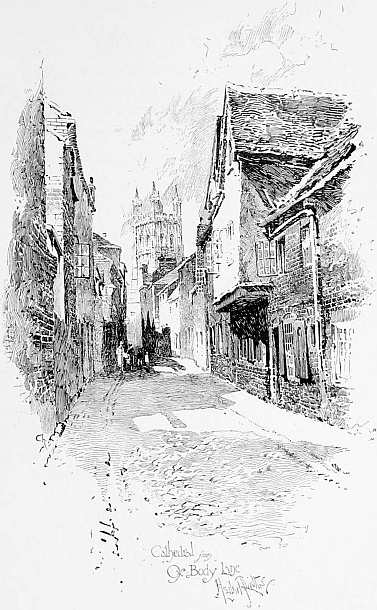
Illustration to “Dreamland in History,” by Dr. Gloucester. (London: Isbister & Co.) Drawn by Herbert Railton.
Example of brilliancy and simplicity of treatment in line drawing for process. There is no illustration in this book which shows better the scope and variety of common process work. Mr. Railton has studied his process, and brought to it a knowledge of architecture and sense of the picturesque. This illustration is reduced considerably from the original drawing.
The artist who draws for reproduction by chemical and mechanical means is thrown upon his own resources. He cannot say to the acid, “Make these lines a little sharper,” or to the sun’s rays, “Give a little more light”; and so—as we cannot often have good wood engraving, as it is not always cheap enough or rapid enough for our needs—we draw on paper what we want reproduced, and resort to one of the photographic processes described in this book.
“BY UNFREQUENTED WAYS.” (W. H. GORE.)
I do not think the modern illustrator realises how much depends upon him in taking the place, so to speak, of the wood engraver. The interpretation 71 of tone into line fitted for the type press, to which the wood engraver gave a lifetime, will devolve more and more upon him. We cannot keep this too continually in mind, for in spite of the limitations in mechanically-produced blocks (as compared with wood engraving) in obtaining delicate effects of tone in line, much can be done in which the engraver has no part.
“THE LOWING HERD WINDS SLOWLY O’ER THE LEA.” (W H. GORE.)
I purposely place these two pen-and-ink drawings by Mr. Gore side by side, to show what delicacy of line and tone may be obtained on a relief block by proper treatment. One could hardly point to better examples of pure line. They were drawn on ordinary cardboard (the one above, 4¼ × 9¾ in.) and reproduced by the gelatine relief process.
All this, it will be observed, points to a more 72 delicate and intelligent use of the process block than is generally allowed, to something, in short very different to the thin sketchy outlines and scribbles which are considered the proper style for the “pen-and-ink artist.”
But “the values” are scarcely ever considered in this connection. Mr. Hamerton makes a curious error in his Graphic Arts, where he advocates the use of the “black blot in pen drawing,” arguing that as we use liberally white paper to express air and various degrees of light, so we may use masses of solid black to represent many gradations of darkness. A little reflection will convince anyone that this is no argument at all.
Mr. Ruskin’s advice in his Elements of Drawing, as to how to lay flat tints by means of pure black lines (although written many years ago, and before mechanical processes of reproduction were in vogue) is singularly applicable and useful to the student of to-day; especially where he reminds him that, “if you cannot gradate well with pure black lines, you will never do so with pale ones.”
To “gradate well with pure black lines” is, so to speak, the whole art and mystery of drawing for the photo-zinc process, of which one London firm alone turns out more than a thousand blocks a week. 73
As to the amount of reduction that a drawing will bear in reproduction, it cannot be sufficiently widely known, that in spite of rules laid down, there is no rule about it.
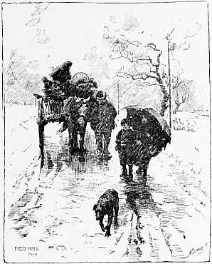
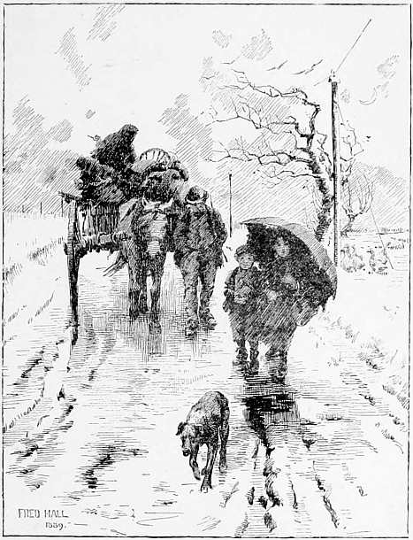
“ADVERSITY.” (FRED. HALL.)
It is interesting to compare this reproduction with the larger one overleaf. There is no limit to the experiments which may be made in reduction, if pursued on scientific principles.
No. IX.
“Adversity,” by Fred. Hall.
This fine drawing was made in pen and ink by Mr. Hall, from his picture in the Royal Academy, 1889. Size of original 14½ × 11½ in. Reproduced by gelatine blocks.
The feeling in line is conspicuous in both blocks, many painters might prefer the smaller.
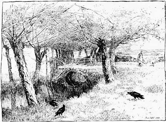
“A WILLOWY STREAM.” (FROM THE PAINTING BY MAUD NAFTEL.)
(New Gallery, 1889.)
Mr. Emery Walker, of the firm of Walker and Boutall, who has had great experience in the reproduction of illustrations and designs from old books and manuscripts, will tell you that very often there is no reduction of the original; and he will show reproductions in photo-relief of engravings and drawings of the same size as the originals, the character of the paper, and the colour of the printing also, so closely imitated that experts can hardly distinguish one from the other. On the other hand, the value of reduction, for certain styles of drawing especially, can hardly be over-estimated. The last drawing was reduced to less than half the length of the original, and is, I think, one of the best results yet attained by the Dawson relief process.
Again, I say, “there is no rule about it.” In the course of years, and in the reduction to various scales of thousands of drawings by different artists, to print at the type press, my experience is that every drawing has its scale, to which it is best reduced.
In these pages will be found examples of drawings reduced to one-sixtieth the area of the original, whilst others have not been reduced at all.
No. X.
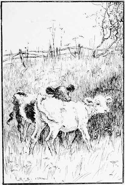
“Twins,” by Stanley Berkley.
Sketch in pen and ink (size 8¼ × 5½ in.) from Mr. Berkley’s picture in the Grosvenor Gallery in 1884.
A good example of breadth and expression in line, the values being well indicated. Mr. Berkley, knowing animal life well, and knowing his picture, is able to give expression to almost every touch. Here the common zinc process answers well.
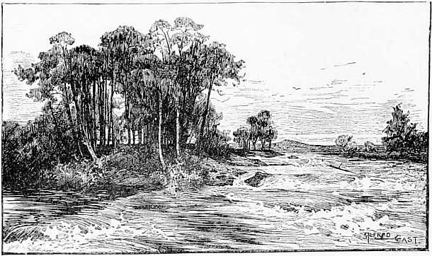
“THE DARK ISLAND.” (FROM THE PAINTING BY ALFRED EAST.)
(Royal Academy, 1885.)
There is much instruction in these drawings by painters, instruction of a kind, not to be obtained elsewhere. The broad distinction between a “sketch” from Nature and a drawing made in a sketchy manner cannot be too often pointed out, and such drawings as those by Mr. G. Clausen (p. 59), Fred. Hall (p. 73), Stanley Berkley (p. 79), T. C. Gotch (p. 83), and others, help to explain the difference. These are all reproduced easily on process blocks.9
As to sketching in line from life, ready for reproduction on a process block, it is necessary to say a few words here. The system is, I know, followed by a few illustrators for newspapers (and by a few geniuses like Mr. Joseph Pennell, Raven Hill, and Phil. May, who have their own methods), and who, by incessant practice, have become proficient. They have special ability for this kind of work, and their manner and style is their capital and attraction.
No. XI.
A Portrait, by T. C. Gotch.
Pen-and-ink drawing (size 7½ × 6½ in.); from his picture in the Exhibition of the New English Art Club, 1889.
Mr. Gotch is well known for his painting of children; but he has also the instinct for line drawing, and a touch which reproduces well without any help from the maker of the zinc block.
The absence of outline, and the modelling suggested by vertical lines, also the treatment of background, should be noticed. This background lights up when opposed to white and vice-versa.
But to attempt to teach rapid sketching in pen and ink is beginning at the wrong end, and is fatal to good art; it is like teaching the principles of pyrotechnics whilst fireworks are going off. And yet we hear of prizes given for rapid sketches to be reproduced by the processes. Indeed, I believe this is the wrong road; the baneful result of living in high-pressure times. It is difficult to imagine any artist of the past consenting to such a system of education.
Sketching from life is, of course, necessary to the student (especially when making illustrations by wash drawings, of which I shall speak presently), but for line work it should be done first in pencil, or whatever medium is easiest at the moment. The lines for reproduction require thinking about, thinking what to leave out, how to interpret the grey of a pencil, or the tints of a brush sketch in the fewest lines. Thus, and thus only, the student learns “the art of leaving out,” “the value of a line.”
The tendency of modern illustrators is to imitate somebody; and in line drawing for the processes, where the artist, and not the engraver, has to make the lines, imitation of some man’s method is almost inevitable.
No. XII.
“Sir John Tenniel,” by Edwin Ward.
Example of another style of line drawing. Mr. Ward is a master of line, as well as a skilful portrait painter. He has lost nothing of the force and character of the original here, by treating it in line.
Mr. Ward has painted a series of small portraits of public men, of which there is an example on p. 90.
Size of pen-and-ink drawing 8½ × 5½ in., reproduced by common process.
Let me quote an instance. The style of the late Charles Keene is imitated in more than one journal at the present time, the artists catching his method of line more easily than the higher qualities of his art, his chiaroscuro, his sense of values and atmospheric effect. I say nothing of his pictorial sense and humour, for they are beyond imitation. It is the husk only we have presented to us.
As a matter of education and outlook for the younger generation of illustrators, this imitation of other men’s lines deserves our special consideration. Nothing is easier in line work than to copy from the daily press. Nothing is more prejudicial to good art, or more fatal to progress.
And yet it is the habit of some instructors to hold up the methods (and the tricks) of one draughtsman to the admiration of students. I read in an art periodical the other day, a suggestion for the better understanding of the way to draw topical illustrations in pen and ink, viz.: that examples of the work of Daniel Vierge, Rico, Abbey, Raven Hill, and other noted pen draughtsmen, should be “set as an exercise to students;” of course with explanation by a lecturer or teacher. But this is a dangerous road for the average student to travel. Of all branches of art none leads so quickly to mannerism as line work, and a particular manner when thus acquired is difficult to shake off.
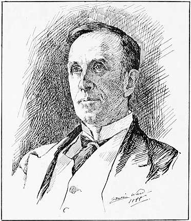
THE RT. HON. JOHN MORLEY, M.P. (EDWIN WARD.)
Think of the consequences—Vierge with his garish 90 lights, his trick of black spots, his mechanical shadows and neglect of chiaroscuro—all redeemed and tolerated in a genius for the dash and spirit and beauty of his lines—lines, be it observed, that reproduce with difficulty on relief blocks—imitated by countless students; Mr. E. A. Abbey, the refined, and delicate American draughtsman, imitated 91 for his method—the style and chic of it being his own, and inimitable. Think of the crowd coming on—imitators of the imitators of Rico—imitators of the imitators of Charles Keene!
It may be said generally, that in order to obtain work as an illustrator—the practical point—there must be originality of thought and design. There must be originality, as well as care and thought bestowed on every drawing for the Press.
The drawing of portraits in line from photographs gives employment to some illustrators, as line blocks will print in newspapers much better than photographs. But for newspaper printing they must be done with something of the precision of this portrait, in which the whites are cut deep and where there are few broken lines.
It is the exception to get good printing in England, under present conditions of haste and cheapening of production, and therefore the best drawings for rapid reproduction are those that require the least touching on the part of the engraver, as a touched-up process block is troublesome to the printer; but it is difficult to impress this on the artistic mind.
No. XIII.
“Nothing venture, nothing have,” by E. P. Sanguinetti.
Pen-and-ink drawing from the picture by E. P. Sanguinetti, exhibited at the Nineteenth Century Art Society’s Gallery, 1888.
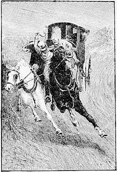
The large block is suitable for printing on common paper, and by fast machines. The little block is best adapted for bookwork, and is interesting as showing the quality obtained by reduction. It is an excellent example of drawing for process, showing much ingenuity of line. The tone and shadows on the ground equal the best fac-simile engraving. (Size of original drawing, from which both blocks were made, 15 × 10 in.)
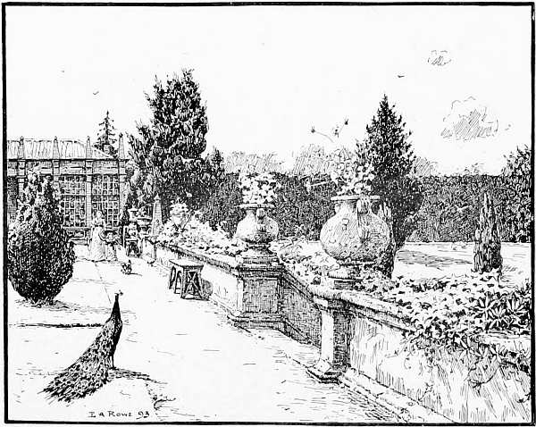
“ON THE TERRACE.” (E. A. ROWE.) From his water-colour in the New Gallery, 1894.
Size of Pen Drawing, 5¾ x 7½ in.
Some people cannot draw firm clean lines at all, and should not attempt them. Few allow sufficiently for the result of reduction, and the necessary thickening of some lines. The results are often a matter of touch and temperament. Some artists are naturally unfitted for line work; the rules which would apply to one are almost useless to another. Again, there is great inequality in the making of these cheap zinc blocks, however well the drawings may be made; they require more care and experience in developing than is generally supposed.
As line drawing is the basis of the best drawing for the press, I have interspersed through these pages examples and achievements in this direction; examples which in nearly every case are the result of knowledge and consideration of the requirements of process, as an antidote to the sketchy, careless methods so much in vogue. Here we may see—as has probably never been seen before in one volume—what harmonies and discords may be played on this instrument with one string. One string—no “messing about,” if the phrase may be excused—pure black lines on Bristol board (or paper of the same surface), photographed on to a zinc plate, the white parts etched away and the drawing made to stand in relief, ready to print with the letterpress of a book; every line and touch coming out a black one, or rejected altogether by the process.
No. XIV.
“For the Squire,” by Sir John Millais, Bart., R. A.
This is an example of drawing for process for rapid printing. The accents of the picture are expressed firmly and in the fewest lines, to give the effect of the picture in the simplest way. Sir John Millais’ picture, which was exhibited in the Grosvenor Gallery in 1883, was engraved in mezzotint, and published by Messrs. Thos. Agnew & Sons. (Size of pen-and-ink drawing, 7¼ × 5½ in.) It is suitable for much greater reduction.
Drawings thus made, upon Bristol board or paper of similar surface, with lamp black, Indian ink, or any of the numerous inks now in use, which dry with a dull, not shiny, surface, will always reproduce well. The pen should be of medium point, or a brush may be used as a pen. The lines should be clear and sharp, and are capable of much variation in style and treatment, as we see in these pages. I purposely do not dwell here upon some special surfaces and papers by which different tones and effects may be produced by the line processes; there is too much tendency already with the artist to be interested in the mechanical side. I have not recommended the use of “clay board,” for instance, for the line draughtsman, although it is much used for giving a crisp line to process work, and has a useful surface for scraping out lights, &c. The results are nearly always mechanical looking.10
On the next page are two simple, straightforward drawings, which, it will be observed, are well suited to the method of reproduction for the type press. The first is by Mr. H. S. Marks, R. A. (which I 100 take from the pages of Academy Notes), skilfully drawn upon Bristol board, about 7 × 5 in.
Here every line tells, and none are superfluous; the figure of the monk, the texture of his dress, the old stone doorway, the creeper growing on the wall, and the basket of provisions, all form a picture, the lines of which harmonise well with the type of a book.
“THE STOPPED KEY.” (H. S. MARKS, R. A.)
In this deliberate, careful drawing, in which white paper plays by far the principal part, the 101 background and lighting of the picture are considered, also the general balance of a decorative page.11
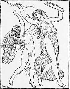
“NYMPH AND CUPID.” SMALL BAS-RELIEF. (H. HOLIDAY.)
(From “Academy Notes.”)
7 No one artist can teach drawing in line without a tendency to mannerism, especially in art classes.
8 One of the most accomplished of English painters told me the other day that when he first drew for illustration, the wood engraver dictated the angle and style of cross-hatching, &c., so as to fit the engraver’s tools.
9 Special interest attaches to the examples in this book from the fact that they have nearly all been drawn on different kinds of paper, and with different materials; and yet nearly all, as will be seen, have come out successfully, and give the spirit of the original.
10 For description of the various grained papers, &c., see page 113, also Appendix.
11 The young “pen-and-ink artist” of to-day generally avoids backgrounds, or renders them by a series of unmeaning scratches; he does not consider enough the true “lighting of a picture,” as we shall see further on. The tendency of much modern black-and-white teaching is to ignore backgrounds.
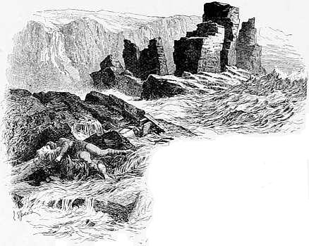
IN order to turn any of these drawings into blocks for the type press, the first process is to have it photographed to the size required, and to transfer a print of it on to a sensitized zinc plate. This print, or photographic image of the drawing lying upon the zinc plate, is of greasy substance (bichromate of potash and gelatine), and is afterwards inked up with a roller; the plate is then immersed in a bath of nitric acid and ether, which cuts away the parts which were 103 left white upon the paper, and leaves the lines of the drawing in relief. This “biting in,” as it is called, requires considerable experience and attention, according to the nature of the drawing. Thus, the lines are turned into metal in a few hours, and the plate when mounted on wood to the height of type-letters, is ready to be printed from, if necessary, at the rate of several thousands an hour.
PORTRAIT. (T. BLAKE WIRGMAN.)
(From “Academy Notes.”)
[This portrait was exhibited in the Royal Academy in 1880. I reproduce Mr. Wirgman’s sketch for the sake of his powerful treatment of line.]

No. XV.
“Forget-Me-Not,” by Henry Ryland.
(From the “English Illustrated Magazine.”)
An unusually fine example of reproduction in line, by zinc process, from a large pen-and-ink drawing. It serves to show how clearly writing can be reproduced if done by a trained hand. Students should notice the variety of “colour” and delicacy of line, also the brightness and evenness of the process block throughout.
This illustration suggests possibilities in producing decorative pages in modern books without the aid of printers’ type, which is worth consideration in art schools. It requires, of course, knowledge of the figure and of design, and a trained hand for process. One obvious preparation for such work, is an examination of decorative pages in the Manuscript Department of the British Museum. (See Appendix.)
It would be difficult, I think, to show more clearly the scope and variety of line work by process than in the contrast between this and the two preceding illustrations. Each artist is an expert in black and white in his own way.
“BABY’S OWN.” (G. HILLYARD SWINSTEAD.)
(From “Academy Notes,” 1890.)
A wonderful and startling invention is here, worthy of a land of enchantment, which, without labour, with little more than a wave of the hand, transfixes the artist’s touch, and turns it into concrete; by which the most delicate and hasty strokes of the pen are not merely recorded in fac-simile for the eye to decipher, but are brought out in sharp relief, as bold and strong as if hewn out of a rock! Here is an argument for doing “the best and truest work we can,” a process that renders 108 indestructible—so indestructible that nothing short of cremation would get rid of it—every line that we put upon paper; an argument for learning for purposes of illustration the touch and method best adapted for reproduction by the press.13
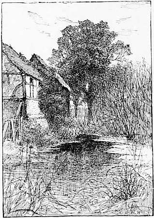
“A SILENT POOL.” (ED. W. WAITE.)
(From “Academy Notes,” 1891.)
GELATINE PROCESS.
By this process a more delicate and sensitive method has been used to obtain a relief block.
The drawing is photographed to the required size (as before), and the negative laid upon a glass plate (previously coated with a mixture of gelatine and bichromate of potash). The part of this thin, sensitive film not exposed to the light, is absorbent, and when immersed in water swells up. The part exposed to the light (i.e., the lines of the drawing) remains near the surface of the glass. Thus we have a sunk mould from which a metal cast can be taken, leaving the lines in relief as in the zinc process. In skilful hands this process admits of more delicate gradations, and pale, uncertain lines can be reproduced with tolerable fidelity. The blocks take longer to make, and are double the price of the photo-zinc process first described. There is no process yet invented which gives better results from a pen-and-ink drawing for the type-press. These blocks when completed have a copper surface. The reproductions of pencil, chalk, or charcoal drawings by the zinc, or “biting-in” processes are nearly always failures, as we may see in some of the best artistic books and magazines to-day.
No. XVI.
“The Miller’s Daughter,” by E. K. Johnson.
Another very interesting example of Mr. E. K. Johnson’s drawing in pen and ink. Nearly every line has the value intended by the artist.
The drawing has been largely reduced, and reproduced by the gelatine relief process.
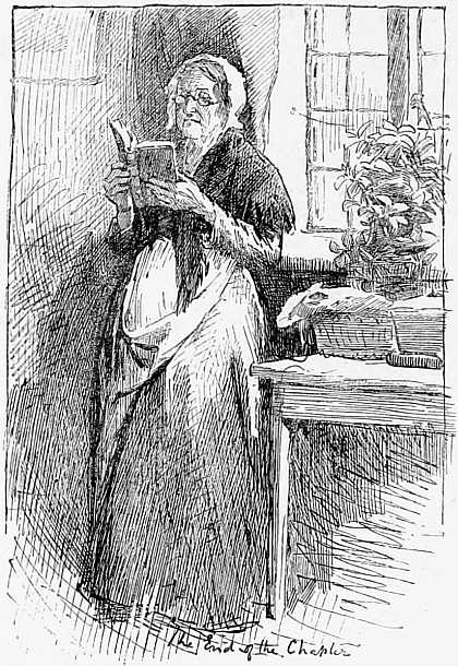
“THE END OF THE CHAPTER.” (FROM THE PAINTING BY W. RAINEY.)
Royal Academy, 1886.
(Reproduced by the old Dawson process.)
“IN THE PAS DE CALAIS.” (JAS. PRINSEP BEADLE.)14
GRAINED PAPERS.
For those who cannot draw easily with the pen, there are several kinds of grained papers which render drawings suitable for reproduction. The first is a paper with black lines imprinted upon it on a material suitable for scraping out to get lights, and strengthening with pen or pencil to get solid blacks. On some of these papers black lines are 114 imprinted horizontally, some vertically, some diagonally, some in dots, and some with lines of several kinds, one under the other, so that the artist can get the tint required by scraping out. Drawings thus made can be reproduced in relief like line drawings, taking care not to reduce a fine black grain too much or it will become “spotty” in reproduction.
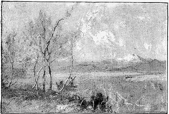
“GOLDEN DAYS.” (F. STUART RICHARDSON.)
(Black-grained paper.)
This drawing and the one opposite by Mr. Hume Nisbet show the skilful use of paper with vertical and horizontal black lines; also, in the latter drawing, the different qualities of strength in the sky, and the method of working over the grained paper in pen and ink.
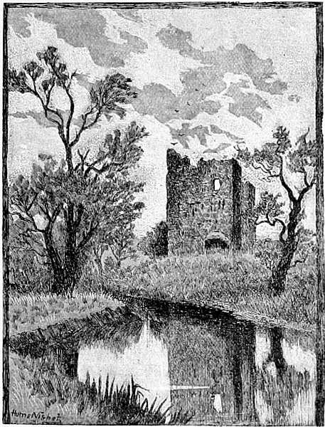
No. XVII.
“TWILIGHT.” (SPECIMEN OF BLACK-GRAINED PAPER.)
(From “Lessons in Art,” by Hume Nisbet, published by Chatto & Windus.)
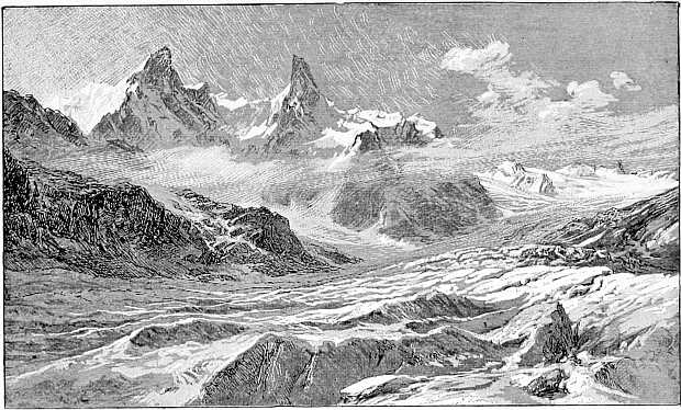
No. XVIII.
“Le Dent du Géant,” by E. T. Compton.
Another skilful use of the black-grained paper to represent snow, glacier, and drifting clouds. The original tone of the paper may be seen in the sky and foreground.
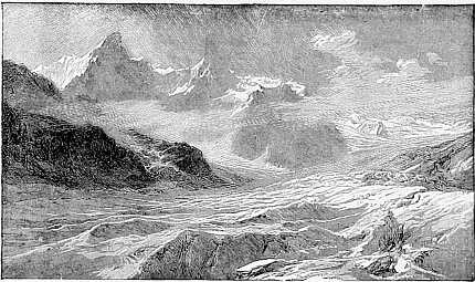
The effect is obtained by scraping out the lighter parts on the paper and strengthening the dark with pen and pencil.
It is interesting to compare the two blocks made from the same drawing. (Size of drawing 7¾ × 4 in.)
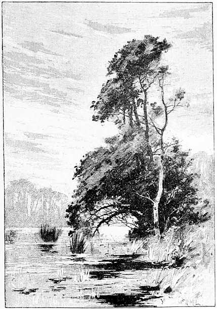
No. XIX.
Landscape, by A. M. Lindstrom.
Example of bold effect by scraping out on the black-lined paper, and free use of autographic chalk.
This drawing shows, I think, the artistic limitations of this process in the hands of an experienced draughtsman.
The original drawing by Mr. Lindstrom (from his painting in the Royal Academy) was the same size as the reproduction.
Other papers largely used for illustration in the type press have a white grain, a good specimen of which is on page 123; and there are variations of these white-grained papers, of which what is known in France as allongé paper is one of the best for rough sketches in books and newspapers.
The question may arise in many minds, are these contrivances with their mechanical lines for producing effect, worthy of the time and attention which has been bestowed upon them? I think it is very doubtful if much work ought to be produced by means of the black-grained papers; certainly, in the hands of the unskilled, the results would prove disastrous. A painter may use them for sketches, especially for landscape. Mr. Compton (as on p. 116) can express very rapidly and effectively, by scraping out the lights and strengthening the darks, a snowdrift or the surface of a glacier. In the drawing on page 123, Mr. C. J. Watson has shown us how the grained paper can be played with, in artistic hands, to give the effect of a picture.
The difference, artistically speaking, between sketches made on black-grained and white-grained papers seems to me much in favour of the latter.
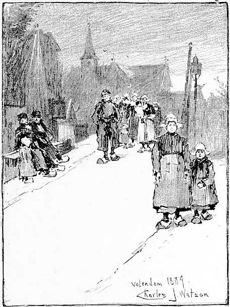
No. XX.
“Volendam,” by C. J. Watson.
Example of white-lined paper, treated very skilfully and effectively—only the painter of the picture could have given so much breadth and truth of effect.
This white paper has a strong vertical grain which when drawn upon with autographic chalk has the same appearance as black-lined paper; and is often taken for it.
(Size of drawing 6 × 4½ in.)
But at the best, blocks made from drawings on these papers are apt to be unequal, and do not print with the ease and certainty of pure line work; they require good paper and careful printing, which is not always to be obtained. The artist who draws for the processes in this country must not expect (excepting in very exceptional cases) to have his work reproduced and printed as in America, or even as well as in this book.
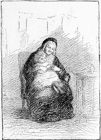
“AND WEE PEERIE WINKIE PAYED FOR A’.” (FROM THE PAINTING BY HUGH CAMERON.)
Example of a good chalk drawing too largely reduced.
No. XXI.
“An Arrest,” by Melton Prior.
This is a remarkable example of the reproduction of a pencil drawing. It is seldom that the soft grey effect of a pencil drawing can be obtained on a “half-tone” relief block, or the lights so successfully preserved.
This is only a portion of a picture by Mr. Melton Prior, the well-known special artist, for which I am indebted to the proprietors of Sketch.
The reproduction is by Carl Hentschel.
The reproduction on the previous page owes its success not only to good process, paper, and printing, but also to the firm, decisive touch of an experienced illustrator like Mr. Melton Prior. A pencil drawing in less skilful hands is apt to “go to pieces” on the press.
Mr. C. G. Harper, in his excellent book on English Pen Artists, has treated of other ways in which drawings on prepared papers may be manipulated for the type press; but not always with success. In that interesting publication, The Studio, there have appeared during the past year many valuable papers on this subject, but in which the mechanism of illustration is perhaps too much insisted on. Some of the examples of “mixed drawings,” and of chalk-and-pencil reproductions, might well deter any artist from adopting such aids to illustration.
The fact is, that the use of grained papers is, at the best, a makeshift and a degradation of the art of illustration, if judged by the old standards. It will be a bad day for the art of England when these mechanical appliances are put into the hands of young students in art schools.
For the purposes of ordinary illustrations we should keep to the simpler method of line. All 129 these contrivances require great care in printing, and the blocks have often to be worked up by an engraver. The material of the process blocks is unsuited to the purpose. In a handbook to students of illustration this requires repeating on nearly every page.
As a contrast to the foregoing, let us look at a sketch in pure line by the landscape painter, Mr. M. R. Corbet, who, with little more than a scribble of the pen, can express the feeling of sunrise and the still air amongst the trees.
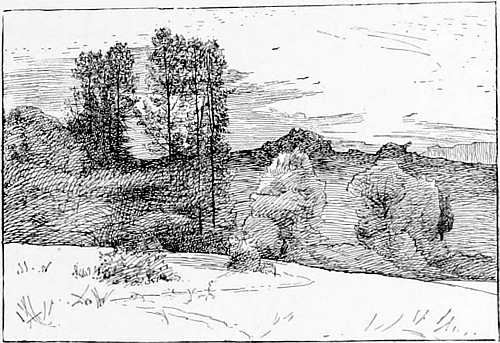
“SUNRISE IN THE SEVERN VALLEY.” (MATTHEW R. CORBET.)
MECHANICAL DOTS.
Amongst the modern inventions for helping the hurried or feeble illustrator, is the system of laying on mechanical dots to give shadow and colour to a pure line drawing, by process. It is a practice always to be regretted; whether applied to a necessarily hasty newspaper sketch, or to one of Daniel Vierge’s elaborately printed illustrations in the Pablo de Segovia. One cannot condemn too strongly this system, so freely used in continental illustrated sheets, but which, in the most skilful hands, seems a degradation of the art of illustration. These dots and lines, used for shadow, or tone, are laid upon the plate by the maker of the block, the artist indicating, by a blue pencil mark, the parts of a drawing to be so manipulated; and as the illustrator has not seen the effect on his own line drawing, the results are often a surprise to everyone concerned. I wish these ingenious contrivances were more worthy of an artist’s attention.
On the opposite page is an example taken from an English magazine, by which it may be seen that all daylight has been taken ruthlessly from the principal figure, and that it is no longer in tone with the rest of the picture, as an open air sketch. The system is tempting to the hurried illustrator; he has only to draw in line (or outline, which is worse) and then mark where the tint is to appear, and the dots are laid on by the maker of the blocks.
“THE ADJUTANT’S LOVE STORY.” (H. R. MILLAR.)
(Example of mechanical grain.)
No. XXII.
In the illustration on the last page (I have chosen an example of fine-grain dots; those used in newspapers and common prints are much more unsightly, as everyone knows), it is obvious that the artist’s sketch is injured by this treatment, that, in fact, the result is not artistic at all. Nothing but high pressure or incompetence on the part of the illustrator can excuse this mechanical addition to an incomplete drawing; and it must be remembered that these inartistic results are not the fault of the process, or of the “process man.” But the system is growing in every direction, to save time and trouble, and is lowering the standard of topical illustrations. And it is this system (inter alia) which is taught in technical schools, where the knowledge of process is taking the place of wood engraving.
The question is again uppermost in the mind, are such mechanical appliances (“dodges,” I venture to call them) worthy the serious attention of artists; and can any good arise by imparting such knowledge to youthful illustrators in technical 133 schools? Wood engraving was a craft to be learned, with a career for the apprentice. There is no similar career for a lad by learning the “processes;” and nothing but disappointment before him if he learns the mechanism before he is an educated and qualified artist.
Mention should be made here (although I do not wish to dwell upon it) of drawing in line on prepared transfer paper with autographic ink, which is transferred to zinc without the aid of photography, a process very useful for rapid and common work; but it is seldom used for good book illustration, as it is irksome to the artist and not capable of very good results; moreover, the drawing has often to be minute, as the reproduction will be the same size as the original. It is one of the processes which I think the student of art had better not know much about.15
That it is possible, by the common processes, to obtain strong effects almost equal to engraving, 134 may be seen in some process illustrations by Mr. Lancelot Speed, in which many technical experiments have been made, including the free use of white lining.
Mr. Speed is very daring in his experiments, and students may well puzzle over the means by which he obtains his effects by the line processes.
The illustration opposite from Andrew Lang’s Blue Poetry Book, shows a very ingenious treatment of the black-lined papers. Technically it is one of the best examples I know of,—the result of much study and experiment.
From Andrew Lang’s “Blue Poetry Book.” (LANCELOT SPEED.)
No. XXIII.
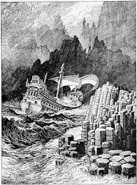
No. XXIV.
“The Armada,” by Lancelot Speed.
This extraordinary example of line drawing for process was taken from Andrew Lang’s Blue Poetry Book, published by Messrs. Longmans.
In this illustration no wash has been used, nor has there been any “screening” or engraving on the block. The methods of lining are, of course, to a great extent the artist’s own invention. This illustration and the two preceding lead to the conclusion that there is yet much to learn in drawing for process by those who will study it. The achievements of the makers of the blocks, with difficult drawings to reproduce, is quite another matter. Here all is easy for the reproducer, the common zinc process only being employed, and the required effects obtained without much worrying of the printer, or of the maker of the blocks.
Thus far all the illustrations in this book have been produced by the common line process.
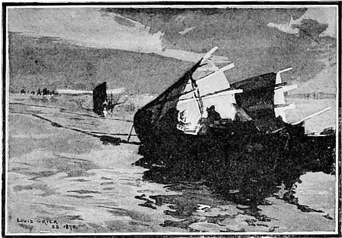
“SEINE BOATS.” (FROM THE PAINTING BY LOUIS GRIER.)
“HALF-TONE” PROCESS.
The next process to consider is the method of reproducing wash drawings and photographs on blocks suitable for printing at the type press, commonly known as the Meisenbach or “half-tone process;” a most ingenious and valuable invention, which, in clever hands, is capable of artistic results, but which in common use has cast a gloom over illustrations in books and newspapers.
First, as to the method of making the blocks. As there are no lines in a wash drawing or in a photograph from nature, it is necessary to obtain some kind of grain, or interstices of white, on the 139 zinc plate, as in a mezzotint; so between the drawing or photograph to be reproduced and the camera, glass screens, covered with lines or dots, are interposed, varying in strength according to the light and shade required; thus turning the image of the wash drawing practically into “line,” with sufficient interstices of white for printing purposes.
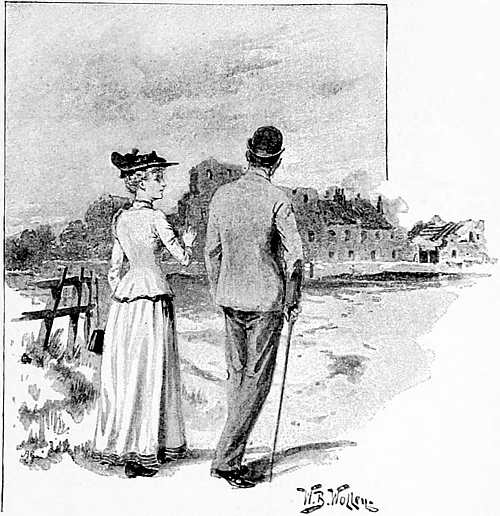
“THERE IS THE PRIORY!”
Thus, all drawings in wash, chalk, pencil, etc., that will not reproduce by the direct line processes, already referred to, are treated for printing at the type press; and thus the uniform, monotonous dulness, with which we are all familiar, pervades the page.
The conditions of drawing for this process have to be carefully studied, to prevent the meaningless smears and blotches (the result generally of making too hasty sketches in wash) which disfigure nearly every magazine and newspaper we take up. There is no necessity for this degradation of illustration.
The artist who draws in wash with body colour, or paints in oils in monochrome, for this process, soon learns that his high lights will be lost and his strongest effects neutralised, under this effect of gauze; and so for pictorial purposes he has to force his effect and exaggerate lights and shades; avoiding too delicate gradations, and in his different tones keeping, so to speak, to one octave instead of two. Thus, also for this process, to obtain brightness and cheap effect, the illustrator of to-day often avoids backgrounds altogether.
In spite of the uncertainty of this system of reproduction, it has great attractions for the skilful or the hurried illustrator.
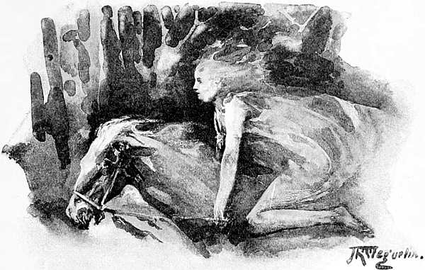
No. XXV.
“Helga rode without a saddle as if she had grown to her horse—at full speed.”
(“Hans Andersen’s Fairy Tales.”)
No. XXVI.
“The Storks,” by J. R. Weguelin.
“And high through the air came the first stork and the second stork; a pretty child sat on the back of each.”
Example of half-tone process applied to a slight wash drawing. The illustration is much relieved by vignetting and leaving out: almost the only chance for effect that the artist has by the screened process. It suggests, as so many of the illustrations in this book do, not the limits but the scope and possibilities of process work for books.
This and the preceding illustration by Mr. Weguelin are taken from Hans Andersen’s Fairy Tales (Lawrence & Bullen, 1893).
That this “half-tone” process is susceptible of a variety of effects and results, good and bad, every reader must be aware.
The illustrations in this book, from pages 138 to 165, are all practically by the same process of “screening,” a slight difference only in the grain being discernible.
The wash drawing on page 139 suffers by the coarse grain on it, but the values, it will be seen, are fairly well preserved. The lights which are out of tone appear to have been taken out on the plate by the maker of the block, a dangerous proceeding with figures on a small scale. Mr. Louis Grier’s clever sketch of his picture in wash, at the head of this chapter, gives the effect well.
Mr. Weguelin’s illustrations to Hans Andersen’s Fairy Tales have been, I understand, a great success, the public caring more for the spirit of poetry that breathes through them than for more finished drawings. This is delightful, and as it should be, although, technically, the artist has not considered his process enough, and from the educational point of view it has its dangers. The “process” has been blamed roundly, in one or two criticisms of Mr. Weguelin’s illustrations, whereas the process used is the same as on pages 149 and 157.
However, the effect on a wash drawing is not satisfactory in the best hands. So uncertain and gloomy are the results that several well-known illustrators decline to use it as a substitute for wood engraving. We shall have to improve considerably before wood engraving is abandoned. We are improving every day, and by this half-tone process numberless wash drawings and photographs from nature are now presented to the public in our daily prints.
Great advances have been made lately in the “screening” of pencil drawings, and in taking out the lights of a sketch (as pointed out on page 127), and results have been obtained by careful draughtsmen during the last six months which a year ago would have been considered impossible. These results have been obtained principally by good printing and paper—allowing of a fine grain on the block—but where the illustration has to be prepared for printing, say 5,000 an hour, off rotary machines, a coarser grain has to be used, producing the “Berlin wool pattern” effect on the page, with which we are all familiar in newspapers.
Let us now look at two examples of wash drawing by process, lent by the proprietors of Black and White.
No. XXVII.
This is a good average example of what to expect by the half-tone process from a wash drawing. That the result is tame and monotonous is no fault of the artist, whose work could have been more brightly rendered by wood engraving.
That “it is better to have this process than bad wood engraving” is the opinion of nearly all illustrators of to-day. The artist sees his own work, at any rate, if through a veil of fog and gloom which is meant for sunshine!
But the time is coming when the public will hardly rest content with such results as these.
No. XXVIII.
Illustration from “Black and White,” by
G. G. Manton.
This is a good example of wash drawing for process; that is to say, a good example from the “process man’s” point of view.
Here the artist has used his utmost endeavours to meet the process half-way; he has been careful to use broad, clear, firm washes, and has done them with certainty of hand, the result of experience. If, in the endeavour to get strength, and the best results out of a few tones, the work lacks some artistic qualities, it is almost a necessity.
Mr. Manton has a peculiar method of lining, or stippling, over his wash work, which lends itself admirably for reproduction; but the practice can hardly be recommended to the attention of students. It is as difficult to achieve artistic results by these means, as in the combination of line and chalk in one drawing, advocated by some experts.
At the same time, Mr. Manton’s indication of surfaces and textures by process are both interesting and valuable.
“A SUNNY LAND.” (FROM THE PAINTING BY GEORGE WETHERBEE.)
(New Gallery, 1891.)
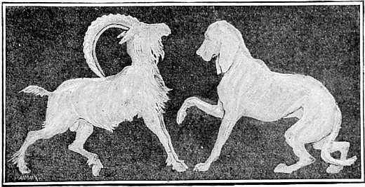
DECORATIVE DESIGN BY RANDOLPH CALDECOTT.
(The above design, from the Memoir of R. Caldecott, is lent by
Messrs. Sampson Low & Co.)
One of the many uses which artists may make of the half-tone process is suggested by the reproduction of one of Mr. Caldecott’s decorative designs, drawn freely with a brush full of white, on brown paper on a large scale (sometimes two or even three feet long), and reduced as above; the reduction refining and improving the design.
This is a most legitimate and practical use of “process” for illustrating books, architectural and others, which in artistic hands might well be further developed.
Of the illustrators who use this process in a more free-and-easy way we will now take an example, cut out of the pages of Sketch (see overleaf, p. 155).
Here truths of light and shade are disregarded, the figure stands out in unnatural darkness against white paper, and flat mechanical shadows are cast upon nothing. Only sheer ability on the part of a few modern illustrators has saved these coarse ungainly sketches from universal condemnation. But the splashes, and spots, and stains, which are taking the place of more serious work in illustration, have become a vogue in 1894. The sketch is made in two or three hours, instead of a week; the process is also much cheaper to the publisher than wood engraving, and the public seems satisfied with a sketch where formerly a finished illustration was required, if the subject be treated dramatically and in a lively manner. If the sketch comes out an unsightly smear on the page, it at least answers the purpose of topical illustration, and apparently suits the times. It is little short of a revolution in illustration, of which we do not yet see the end.16
The bookstalls are laden with the daring achievements of Phil May, Raven Hill, Dudley Hardy, and others, but it is not the object of this book to exhibit the works of genius, either for emulation or imitation. It is rather to suggest to the average student what he may legitimately attempt, and to show him the possibilities of the process block in different hands. It may be said, without disparagement of the numerous clever and experienced illustrators of the day, that they are only adapting themselves to the circumstances of the time. There is a theory—the truth of which I do not question—that the reproductions of rapid sketches from the living model by the half-tone process have more vitality and freedom, more feeling and artistic qualities than can be obtained by any other means. But the young illustrator should hesitate before adapting these methods, and should never have anything reproduced for publication which was “drawn to time” in art classes.
One thing cannot be repeated too often in this connection: that the hastily produced blotches called “illustrations,” which disfigure the pages of so many books and magazines, are generally the result of want of care on the part of the artist rather than of the maker of the blocks.
No. XXIX.
This is part of a page illustration lent by the proprietors of Sketch. It does not do justice to the talent (or the taste, we will hope), of the illustrator, and is only inserted here to record the kind of work which is popular in 1894. (Perhaps in a second edition we may have other exploits of genius to record.)
It should be noted that this and the illustration on p. 149 are both reproduced by the same half-tone process, the difference of result being altogether in the handling of the brush. This sketch would have been intolerable in less artistic hands. Artists will doubtless find more feeling and expression in the broad washes and splashes before us, than in the most careful stippling of Mr. Manton.
Students of wash drawing for process may take a middle course.
A word here on the influence of
PROCESS-BLOCK MAKERS
on the young illustrator. The “process man,” the teacher and inciter to achievements by this or that process, is not usually an “artist” in the true sense of the word. He knows better than anyone else what lines he can reproduce, and especially what kind of drawing is best adapted for his own process. He will probably tell the young draughtsman what materials to use, what amount of reduction his drawings will bear, and other things of a purely technical not to say businesslike character. Let me not be understood to disparage the work of photo-engravers and others engaged on these processes; on the contrary, the amount of patience, industry, activity, and anxious care bestowed upon the reproduction of drawings and paintings is astonishing, and deserves our gratitude.17 This work is a new industry of an important kind, in which art and craft are bound up together. The day has past when “process work” is to be looked down upon as only fit for the cheapest, most inferior, and inartistic results.
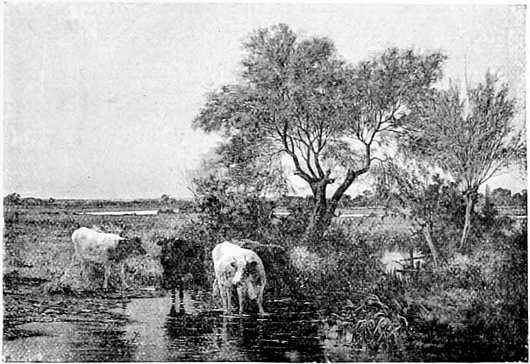
“THE BROOK.” (FROM A PAINTING BY ARNOLD HELCKÉ.)
PHOTOGRAPHIC ILLUSTRATIONS.
One result of hasty work in making drawings, and the uncertainty of reproduction, promises to be a very serious one to the illustrator, as far as we can see ahead, viz.: the gradual substitution of photographs from life for other forms of illustration. The “Meisenbach” reproduction of a photograph from life, say a full length figure of an actress in some elaborate costume, seems to answer the purpose of the editor of a newspaper to fill a page, where formerly artists and engravers would have been employed. One reason for this is that the details of the dress are so well rendered by photography on 158 the block as to answer the purpose of a fashion plate, an important matter in some weekly newspapers. The result is generally unsatisfactory from an artist’s point of view, but the picture is often most skilfully composed and the values wonderfully rendered, direct from the original.
In the case of the reproduction of photographs, which we are now considering, much may be done by working up a platinotype print before giving it out to be made into a block. Much depends here upon the artistic knowledge of editors and publishers, who have it in their power to have produced good or bad illustrations from the same original. The makers of the blocks being confined to time and price, are practically powerless, and seldom have an opportunity of obtaining the best results. It should be mentioned that blocks made from wash drawings, being shallower than those made from line drawings, suffer more from bad printing and paper.
A good silver print (whether from a photograph from life or from a picture), full of delicate gradations and strong effects, appears on the plate through the film of gauze, dull, flat, and comparatively uninteresting; but the expression of the original is given with more fidelity than could be 159 done by any ordinary wood engraving. This is the best that can be said for it, it is a dull, mechanical process, requiring help from the maker of the blocks; and so a system of touching on the negative (before making the block) to bring out the lights and accents of the picture is the common practice. This is a hazardous business at the best, especially when dealing with the copy of a painting. I mention it to show where “handwork” in the half-tone process first comes in. The block, when made, is also often touched up by an engraver in places, especially where spotty or too dark; and on this work many who were formerly wood-engravers now find employment.
There is no doubt that the makers of process blocks are the best instructors as to the results to be obtained by certain lines and combinations of lines; but in the majority of cases they will tell the artist too much, and lead him to take too much interest in the mechanical side of the business. The illustrator’s best protection against this tendency, his whole armour and coat of mail, is to be an artist first and an illustrator afterwards.
This is the sum of the matter. Perhaps some of the examples in this book may help us, and lead to a more thorough testing of results by capable men.
“SKETCH.”
It will be interesting here to consider the material of which one number of an illustrated paper (Sketch) is made up, and how far the artist and wood engraver have part in it. From an economic point of view it will be instructive. I take this “newspaper” as an example, because it is a typical and quite “up-to-date” publication, vieing, in circulation and importance, with the Illustrated London News, both published by the same proprietors. In one number there are upwards of 30 pages, 10 being advertisements. There are in all 151 illustrations, of which 63 appear in the text part, and 88 in the advertisement pages. Out of the text illustrations, 24 only are from original drawings or sketches. Next are 26 photographs from life (several being full pages), and 13 reproductions from engravings, etc., reproduced by mechanical processes—in all 63. Some of the pages reproduced from photographs are undeniably good, and interesting to the public, as is evidenced by the popularity of this paper alone. In the advertisement portion are 88 illustrations (including many small ones), 85 of which have been engraved on wood; a number of them are electrotypes from old blocks, but there are many new ones every week. The reason for using wood engraving largely for advertisements is, that wood blocks print more easily than “process,” when mixed with the type, and print better (being cut deeper on the block) where inferior paper and ink are employed. But this class of wood engraving may be summed up in the words of one of the craft to me lately:—“It is not worth £2 a week to anybody.”
No. XXX.
MISS KATE RORKE. (FROM “SKETCH.”)
Photographed from life by H. S. Mendelssohn. Reproduced by half-tone process)
Thus it will be seen that in the “text” part of this newspaper two-thirds of the illustrations are produced without the aid of artist or wood engraver!
To turn to one of the latest instances where the photographer is the illustrator. A photographer, Mr. Burrows, of Camborne, goes down a lead mine in Cornwall with his apparatus, and takes a series of views of the workings, which could probably have been done by no other means. Under most difficult conditions he sets his camera, and by the aid of the magnesium “flash-light,” gives us groups of figures at work amidst gloomy and weird surroundings. The results are exceptionally valuable as “illustrations” in the true meaning of the word, on account of the clear and accurate definition of details. The remarkable part, artistically, is the good colour and grouping of the figures.18
Another instance of the use of photography in illustration. Mr. Villiers, the special artist of Black and White, made a startling statement lately. He said that out of some 150 subjects which he took at the Chicago Exhibition, not more than half-a-dozen were drawn by him; all the rest being “snap-shot” photographs. Some were very good, could hardly be better, the result of many hours’ waiting for the favourable grouping of figures. That he would re-draw some of them with his clever pencil for a newspaper is possible, but observe the part photography plays in the matter.
In America novels have been thus illustrated both in figure and landscape; the weak point being the backgrounds to the figure subjects. I draw attention to this movement because the neglect of composition, of appropriate backgrounds, and of the true lighting of the figures by so many young artists, is throwing illustrations more and more into the hands of the photographer. Thus the rapid “pen-and-ink artist,” and the sketcher in wash from an artificially lighted model in a crowded art school, is hastening to his end.
No. XXXI.
(A Photograph from life, by Messrs. Cameron & Smith. Reproduced by half-tone process.)
The time is coming fast when cheap editions of popular novels will be illustrated—and many in the following way. The artist, instead of being called upon to draw, will occupy himself in setting and composing pictures through the aid of models trained for the purpose, and the ever-ready photographer. The “process man” and the clever manipulator on the plates, will do the rest, producing pictures vignetted, if desired, as overleaf. Much more the makers of blocks can do—and will do—with the photographs now produced, for they are earnest, untiring, ready to make sacrifices of time and money.
The cheap dramatic illustrations, just referred to, which artists’ models in America know so well how to pose for, may be found suitable from the commercial point of view for novels of the butterfly kind; but they will seldom be of real artistic interest. And here, for the present, we may draw the line between the illustrator and the photographer. But the “black and white man” will obviously have to do his best in every branch of illustration to hold his own in the future. It may be thought by some artists that these things are hardly worth consideration; but we have only to watch the illustrations appearing week by week to see whither we are tending.19
The last example of the photographer as illustrator, which can be given here, is where a photograph from life engraved on wood is published as a vignette illustration.20 It is worth observing, because it has been turned into line by the wood engraver, and serves for printing purposes as a popular illustration. The original might have been more artistically posed, but it is pretty as a vignette, and pleases the public. (See opposite page.)
There are hundreds of such subjects now produced by the joint aid of the photographer and the process engraver. It is not the artist and the wood engraver who are really “working hand-in-hand” in these days in the production of illustrations, but the photographer and the maker of process blocks. This is significant. Happily for us there is much that the photographer cannot do pictorially. But the photographer is, as I said, marching on and on, and the line of demarcation between handwork and photographic illustrations becomes less marked every day.
The photographer’s daughter goes to an art school, and her influence is shown annually in the exhibitions of the photographic societies.
No. XXXII.
(A Photograph from life, engraved on wood.)
This influence and this movement is so strong—and vital to the artist—that it cannot be emphasised too much. The photographer is ever in our midst, correcting our drawing with facts and details which no human eye can see, and no one mind can take in at once.
On the obligations of artists to photographers a book might be written. The benefits are not, as a rule, unacknowledged; nor are the bad influences of photography always noticed. That is to say, that before the days of photography, the artist made himself acquainted with many things necessary to his art, for which he now depends upon the photographic lens; in short, he uses his powers of observation less than he did a few years ago. That the photographer leads him astray sometimes is another thing to remember.
The future of the illustrator being uppermost in our thoughts, let us consider further the influences with which he is surrounded. As to photography, Mr. William Small, the well-known illustrator (who always draws for wood engraving), says:—“it will never take good work out of a good artist’s hands.” He speaks as an artist who has taken to illustration seriously and most successfully, having devoted the 171 best years of his life to its development. The moral of it is, that in whatever material or style newspaper illustrations are done, to hold their own they must be of the best. Let them be as slight as you please, if they be original and good. In line work (the best and surest for the processes) photography can only be the servant of the artist, not the competitor—and in this direction there is much employment to be looked for. At present the influence is very much the other way; we are casting off—ungratefully it would seem—the experience of the lifetime of the wood engraver, and are setting in its place an art half developed, half studied, full of crudities and discords. The illustrations which succeed in books and newspapers, succeed for the most part from sheer ability on the part of the artist; they are full of ability, but, as a rule, are bad examples for students to copy. “Time is money” with these brilliant executants; they have no time to study the value of a line, nor the requirements of the processes, and so a number of drawings are handed to the photo-engravers—which are often quite unfitted for mechanical reproduction—to be produced literally in a few hours. It is an age of vivacity, daring originality, and reckless achievement in illustration. “Take it up, look at it, and throw it 172 down,” is the order of the day. There is no reason but an economic one why the work done “to look at” should not be as good as the artist can afford to make it. The manufacturer of paperhangings or printed cottons will produce only a limited quantity of one design, no matter how beautiful, and then go on to another. So much the better for the designer, who would not keep employment if he did not do his best, no matter whether his work was to last for a day or for a year. The life of a single number of an illustrated newspaper is a week, and of an illustrated book about a year.
The young illustrators on the Daily Graphic—notably Mr. Reginald Cleaver—obtain the maximum of effect with the minimum of lines. Thus Caldecott worked, spending hours sometimes studying the art of leaving out. Charles Keene’s example may well be followed, making drawing after drawing, no matter how trivial the subject, until he was satisfied that it was right. “Either right or wrong,” he used to say; “’right enough’ will not do for me.”
No. XXXIII.
“PROUD MAIRIE.” (LANCELOT SPEED.)
(From “The Blue Poetry Book.” London: Longmans.)
Pen-and-ink drawing by line process.
Another influence on modern illustration—for good or bad—is the electric light. It enables the photographic operator to be independent of dark and foggy days, and to put a search-light upon objects which otherwise could not be utilised. So far good. To the illustrator this aid is often a doubtful advantage. The late Charles Keene (with whom I have had many conversations on this subject) predicted a general deterioration in the quality of illustrations from what he called “unnatural and impossible effects,” and he made one or two illustrations in Punch of figures seen under the then—(10 or 15 years ago)—novel conditions of electric street lighting, one of which represented a man who has been “dining” returning home through a street lighted up by electric lamps, tucking up his trowsers to cross a black shadow which he takes for a stream. Charles Keene’s predictions have come true, we see the glare of the magnesium light on many a page, and the unthinking public is dazzled every week in the illustrated sheets with these “unnatural and impossible effects.”
Thus it has come about that what was looked upon by Charles Keene as garish, exaggerated, and untrue in effect, is accepted to-day by the majority of people as a lively and legitimate method of illustration.
DANIEL VIERGE.
One of the influences on the modern illustrator—a decidedly adverse influence on the unlearned—is the prominence which has lately been given to the art of Daniel Vierge.
There is probably no illustrator of to-day who has more originality, style, and versatility—in short more genius—than Vierge, and none whose work, for practical reasons, is more misleading to students.
As to his illustrations, from the purely literary and imaginative side, they are as attractive to the scholar as drawings by Holbein or Menzell are to the artist. Let us turn to the illustration on the next page, from the Pablo de Segovia by Quevedo; an example selected by the editor, or publisher, of the book as a specimen page.
First, as to the art of it. Nothing in its own way could be more fascinating in humour, vivacity, and character than this grotesque duel with long ladles at the entrance to an old Spanish posada. The sparkle and vivacity of the scene are inimitable; the bounding figure haunts the memory with its diaphanous grace, touched in by a master of expression in line. In short, we are in the presence of genius.
No. XXXIV.
Example of Daniel Vierge’s illustrations to Pablo de Segovia, the Spanish Sharper, by Francisco de Quevedo-Villegas, first published in Paris, in 1882; afterwards translated into English (with an Essay on Quevedo, by H. E. Watts, and comments on Vierge’s work by Joseph Pennell), and published by Mr. T. Fisher Unwin, in 1892.
Vierge was born in 1851, and educated in Madrid, where he spent the early years of his life. Since 1869 he has lived in Paris, and produced numerous illustrations for Le Monde Illustré and La Vie Moderne, and other works. His fame was made in 1882 by Quevedo’s Pablo de Segovia, the illustrations to which he was unable to complete owing to illness and paralysis. About twenty of these illustrations were drawn with the left hand, owing to paralysis of the right side. His career, full of romantic interest, suggests the future illustrator of Don Quixote.
These drawings were made upon white paper—Bristol board or drawing paper—with a pen and Indian ink; but Vierge now uses a glass pen, like an old stylus. The drawings were then given to Gillot, the photo-engraver of Paris, who, by means of photography and handwork, produced metal blocks to be printed with the type.
But the whole effect is obviously untrue to nature, and the tricks—of black spots, of exaggerated shadows on the ground, of scratchings (and of carelessness, which might be excused in a hasty sketch for La Vie Moderne)—are only too apparent.
In nearly every illustration in the Pablo de Segovia (of which there are upwards of one hundred), the artist has relied for brilliancy and effect on patches of black (sometimes ludicrously exaggerated) and other mannerisms, which we accept from a genius, but which the student had better not attempt to imitate. To quote a criticism from the Spectator, “There is almost no light and shade in Vierge. There is an ingenious effect of dazzle, but there is no approach attempted to truth of tone, shadows being quite capriciously used for decoration and supplied to figures that tell as light objects against the sky which throws the shadows.” And yet in these handsome pages there are gems of draughtsmanship and extraordinary tours de force in illustration.
In the reproduction of these drawings, I think the maker of the blocks, M. Gillot, of Paris, would seem to have had a difficult task to perform. The fact is, that Vierge’s wonderful line drawings are sometimes as difficult to reproduce for the 180 type press as those of Holbein or Menzell, and could only be done satisfactorily by one of the intaglio processes, such as that employed by the Autotype Company in éditions de luxe. That Vierge’s drawings were worthy of this anyone who saw the originals when exhibited at Barnard’s Inn would, I think, agree.
It is the duty of any writer or instructor in illustration, to point out these things, once for all. That Vierge could adapt himself to almost any process if he pleased, is demonstrated repeatedly in the Pablo de Segovia, where (as on pages 63 and 67 of that book) the brilliancy and “colour” of pure line by process has hardly ever been equalled. That some of his illustrations are impossible to reproduce well, and have been degraded in the process is also demonstrated on page 199 of the same book, where a mechanical grain has been used to help out the drawing, and the lines have had to be cut up and “rouletted” on the block to make them possible to print.
Of the clever band of illustrators of to-day who owe much of their inspiration (and some of their tricks of method) to Vierge, it is not necessary to speak here; we are in an atmosphere of genius in this chapter, and geniuses are seldom safe guides to students of art.
Speaking generally (and these remarks refer to editors and publishers as well as draughtsmen), the art of illustration as practised in England is far from satisfactory; we are too much given to imitating the tricks and prettinesses of other nations, and it is quite the exception to find either originality or individuality on the pages which are hurled from the modern printing press; individuality as seen in the work of Adolphe Menzell, and, in a different spirit, in that of Gustave Doré and Vierge.
12 The heading to this chapter was drawn in line and reproduced by photo-zinc process. (See page 134.)
13 The mechanical processes, neglected and despised by the majority of illustrators for many years, have, by a sudden freak of fashion, apparently become so universal that, it is estimated, several thousand blocks are made in London alone every week.
14 This excellent drawing was made on rough white paper with autographic chalk; the print being much reduced in size. It is seldom that such a good grey block can be obtained by this means.
15 The young artist would be much better occupied in learning drawing on stone direct, a branch of art which does not come into the scope of this book, as it is seldom used in book illustration, and cannot be printed at the type press. Drawing on stone is well worthy of study now, for the art is being revived in England on account of the greater facilities for printing than formerly.
16 The evil of it is that we are becoming used to black blots in the pages of books and newspapers, and take them as a matter of course; just as we submit to the deformity of the outward man in the matter of clothing.
17 On the opposite page is an excellent reproduction of a painting from a photograph by the half-tone process.
18 “’Mongst Mines and Miners,” by J. C. Burrows and W. Thomas. (London: Simpkin, Marshall & Co.)
19 Both Mr. Cameron’s and Mr. Mendelssohn’s photographs have had to be slightly cut down to fit these pages. But as illustrations they are, I think, remarkable examples of the photographer’s and the photo-engraver’s art.
20 From the Graphic newspaper, 28th October, 1893.
FROM “GRIMM’S HOUSEHOLD STORIES.” (WALTER CRANE.)
 |
O turn to a more practical side of book illustration. The first principle of illustration is to illustrate, and yet it is a fact that few illustrations in books or magazines are to be found in their proper places in the text.
It is seldom that the illustration (so called) is in artistic harmony with the rest of the page, as it is found in old books. One of the great charms of Bewick’s work is its individuality and expressive character. Here the artist and engraver were one, and a system of illustration was founded in England a hundred years ago which we should do well not to forget.21
We are fast losing sight of first principles and aiming rather at catching the eye and the public purse with a pretty page; and in doing this we are but imitators. In the English magazines it is strange to find a slavish, almost childish imitation of the American system of illustration; adopting, for instance, the plan of pictures turned over at the corners or overlapping each other with exaggerated black borders and other devices of the album of the last generation. This is what we have come to in England in 1894 (with excellent wood engravers still), and the kind of art by which we shall be remembered at the end of the nineteenth century! I am speaking of magazines like Good Words and Cassell’s Magazine, where wood engraving is still largely employed.
It may be as well to explain here that the reasons for employing the medium of wood engraving for elaborate illustrations which, such as we see in American magazines, were formerly only engraved on copper or steel, are—(1) rapidity of production, and (2) the almost illimitable number of copies that can be produced from casts from wood blocks. The broad distinction between the old and new methods of wood engraving is, that in early days the lines were drawn clearly on the wood block and 184 the part not drawn cut away by the engraver, who endeavoured to make a perfect fac-simile of the artist’s lines. It is now a common custom to transfer a photograph from life on to the wood block (see p. 167), also to draw on the wood with a brush in tint, and even to photograph a water-colour drawing on to the wood, leaving the engraver to turn the tints into lines in his own way.
In the very earliest days of book illustration, before movable type-letters were invented, the illustration and the letters of the text were all engraved on the wood together, and thus, of necessity (as in the old block books produced in Holland and Belgium in the fifteenth century), there was character and individuality in every page; the picture, rough as it often was, harmonising with the text in an unmistakable manner. From an artistic point of view, there was a better balance of parts and more harmony of effect than in the more elaborate illustrations of the present day. The illustration was an illustration in the true sense of the word. It interpreted something to the reader that words were incapable of doing; and even when movable type was first introduced, the simple character of the engravings harmonised well with the letters. There is a broad line of demarcation, 185 indeed, between these early wood engravings (such, for instance, as the “Ars Moriendi,” purchased for the British Museum in 1872, from the Weigel collection at Leipsic, and recently reproduced by the Holbein Society) and the last development of the art in the American magazines. The movement is important, because the Americans, with an energy and naïveté peculiar to them, have set themselves the task of outstripping all nations in the beauty and quality of magazine illustrations. That they have succeeded in obtaining delicate effects, and what painters call colour, through the medium of wood-engraving, is well known, and it is common to meet people in England asking, “Have you seen the last number of Harper’s or the Century Magazine?” The fashion is to admire them, and English publishers are easily found to devote time and capital to distributing American magazines (which come to England free of duty), to the prejudice of native productions. The reason for the excellence (which is freely admitted) of American wood-engraving and printing is that, in the first place, more capital is employed upon the work. The American wood-engraver is an artist in every sense of the word, and his education is not considered complete without years of foreign study. The American engraver is always en rapport with the artist—an important matter—working often, as I have seen them at Harper’s, the Century Magazine, and Scribner’s in New York, in the same studio, side by side. In England the artist, as a rule, does not have any direct communication with the wood engraver. In America the publisher, having a very large circulation for his works, is able to bring the culture of Europe and the capital of his own country to the aid of the wood-engraver, spending sometimes five or six hundred pounds on the illustrations of a single number of a monthly magazine. The result is an engraver’s success of a very remarkable kind.
No. XXXV.
(Photograph from life, engraved on wood. From the Century Magazine.)
A Portrait engraved on wood at the Office of the
Century Magazine.
Example of portraiture from the Century Magazine. It is interesting to note the achievements of the American engravers at a time when wood engraving in England is under a cloud.
This portrait was photographed from life and afterwards worked up by hand and most skilfully engraved in New York.
A discussion of the merits of the various styles of wood engraving, and of the different methods of drawing on wood, such as that initiated by the late Frederick Walker, A. R. A.; the styles of Mr. William Small, E. A. Abbey, Alfred Parsons, etc.—does not come into the scope of this publication, but it will be useful to refer to one or two opinions on the American system.
“Book illustration as an art,” as Mr. Comyns Carr pointed out in his lectures at the Society of Arts ten years ago, “is founded upon wood engraving, and it is to wood engraving that we must look if we are to have any revival of the kind of beauty which early-printed books possess. In the mass of work now 190 produced, there is very little trace of the principles upon which Holbein laboured. Instead of proceeding by the simplest means, our modern artist seems rather by preference to take the most difficult and complex way of expressing himself. A wood engraving, it is not unjust to say, has become scarcely distinguishable from a steel engraving excepting by its inferiority.”
Mr. Hubert Herkomer, R. A., who has had a very wide experience in the graphic arts, says:—
“In modern times a body of engravers has been raised up who have brought the art of engraving on wood to such a degree of perfection, that the most modern work, especially that of the Americans, is done to show the skill of the engraver rather than the art of the draughtsman. This, I do not hesitate to say, is a sign of decadence. Take up any number of the Century or Harper’s magazines, and you will see that effect is the one aim. You marvel at the handling of the engraver, and forget the artist. Correct, or honest, drawing is no longer wanted. This kind of illustration is most pernicious to the student, and will not last....
“America is a child full of promise in art—a child that is destined to be a great master; so let us not imitate its youthful efforts or errors. Americans were the first to foster this style of art, and they will be the first to correct it.”
Mr. W. J. Linton, the well-known wood engraver, expresses himself thus strongly on the modern system, and his words come with great force from the other side of the Atlantic:—
“Talent is misapplied when it is spent on endeavours to rival steel-line engraving or etching, in following brush-marks, in pretending to imitate crayon-work, charcoal, or lithography, and in striving who shall scratch the greatest number of lines on a 191 given space without thought of whether such multiplicity of lines adds anything to the expression of the picture or the beauty of the engraving. How much of talent is here thrown away! How much of force that should have helped towards growth is wasted in this slave’s play for a prize not worth having—the fame of having well done the lowest thing in the engraver’s art, and having for that neglected the study of the highest! For it is the lowest and the last thing about which an artist should concern himself, this excessive fineness and minuteness of work.... In engraving, as in other branches of art, the first thing is drawing, the second drawing, the third drawing.”
This is the professional view, ably expressed, of a matter which has been exercising many minds of late; and is worth quoting, if only to show the folly of imitating a system acknowledged by experts to be founded on false principles.
But there is another view of the matter which should not be lost sight of. Whatever the opinion of the American system of illustration may be, there is, on the other side of the Atlantic, an amount of energy, enterprise, cultivation of hand and eye, delicacy of manipulation, and individual industry, cleverly organised to provide a wide continent with a better art than anything yet attempted in any country. Some fine engravings, which the Americans have lately been distributing amongst the people, such, for instance, as the portraits (engraved from photographs from life) which have 192 appeared in Harper’s and the Century magazines, only reach the cultivated few in Europe in expensive books. It is worth considering what the ultimate art effect of this widespread distribution will be. The “prairie flower” holds in her hand a better magazine, as regards illustrations, than anything published in England at the same price; and a taste for delicate and refined illustration is being fostered amongst a variety of people on the western continent, learned and unlearned. That there is a want of sincerity in the movement, that “things are not exactly what they seem,” that something much better might be done, may be admitted; but it will be well for our illustrators and art providers to remember that the Americans are advancing upon us with the power of capital and ever-increasing knowledge and cultivation. In the Century magazine, ten years ago, there was an article on “The Pupils of Bewick,” with illustrations admirably reproduced from proofs of early wood engravings, by “photo-engraving.”
This is noteworthy, as showing that the knowledge of styles is disseminated everywhere in America; and also, how easy it is to reproduce engravings by “process,” and how important to have a clear copyright law on this subject.
Of the English wood engravers, and of the present state of the profession in England much has been written. I believe the fact remains that commercial wood engraving is still relied on by many editors and publishers, as it prints with more ease and certainty than any of the process blocks.
That there are those in England (like Mr. Biscombe Gardner and others, whose work I am unable to reproduce here), that believe in wood engraving still as a vital art, capable of the highest results, I am also well aware. But at the moment of writing it is difficult to get many publishers to expend capital upon it for ordinary illustrations.
On the next page is an example of good wood engraving.
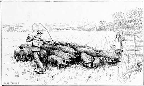
“DRIVING HOME THE PIGS.” (JOHN PEDDER.)
(Academy Notes, 1891.)
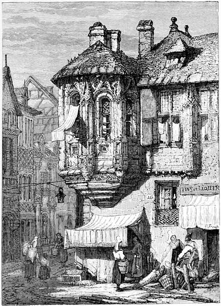
No. XXXVI.
Joan of Arc’s House at Rouen, by the late
Samuel Prout.
Engraved on wood by Mr. J. D. Cooper, from a water-colour drawing by Samuel Prout.
The original drawing, made with a reed pen and flat washes of colour, was photographed on to the wood block, and the engraver interpreted the various tints into line. The method is interesting, and the tones obtained in line show the resources of the engraver’s art, an art rather carelessly set aside in these days.
This engraving is from Normandy Picturesque. (London: Sampson Low & Co.)
21 In The Life and Works of Thomas Bewick, by D. C. Thomson; in The Portfolio, The Art Journal, The Magazine of Art, and in Good Words, Bewick’s merits as artist and engraver have been exhaustively discussed.
DESIGN BY WALTER CRANE.
 |
To turn next to the more decorative side of modern illustration, where design and the ensemble of a printed page are more considered, it is pleasant to be able to draw attention to the work of an art school, where an educated and intelligent mind seems to have been the presiding genius; where the illustrators, whilst they are fully imbued with the spirit of the past, have taken pains to adapt their methods to modern requirements. I refer to the Birmingham Municipal School of Art.
No. XXXVII.
Decorative Page, by A. J. Gaskin.
(From Hans Andersen’s Fairy Tales. London: George Allen.)
This is a good example of the appropriate decoration of a page without any illustration in the ordinary sense of the word. The treatment of ornament harmonises well with old-faced type letter.
The original was drawn in pen and ink, about the same size as the reproduction. The ground is excellent in colour, almost equal to a wood engraving.
This is another example of the possibilities of process, rightly handled, and also of effect produced without reduction of the drawing.
Whilst using wood engraving freely, the illustrators of Birmingham (notably Mr. Gaskin), are showing what can be done in line drawing by the relief processes, to produce colour and ornament which harmonise well with the letterpress of a book. This seems an important step in the right direction, and if the work emanating from this school were less, apparently, confined to an archaic style, to heavy outline and mediæval ornament (I speak from what I see, not knowing the school personally), there are possibilities for an extended popularity for those who have worked under its influence.22
The examples of decorative pages by experienced illustrators like Mr. Walter Crane and others, will serve to remind us of what some artists are doing. But the band of illustrators who consider design is much smaller than it should be, and than it will be in the near future. A study of the past, if it be only in the pages of mediæval books, will greatly aid the student of design. In the Appendix I have mentioned a few fine examples of decorative pages, with and without illustrations, which may be usefully studied at the British Museum.
No. XXXVIII.
In all these pages, it will be observed, what is called “colour” in black and white is preserved throughout; showing that a page can be thoroughly decorative without illustrations to the text. Closely criticised, some of the old block designs may appear crude and capable of more skilful treatment, but the pages, as a rule, show the artistic sense—unmistakably, mysteriously, wonderfully.
In these and similar pages, such, for instance, as Le Mer des Histoires, produced in Paris by Pierre le Rouge in 1488 (also in the British Museum), the harmony of line drawing with the printed letters is interesting and instructive. (See Appendix.)
It is in the production of the decorative page that wood engraving asserts its supremacy still in some quarters, as may be seen in the beautiful books produced in England during the past few years by Mr. William Morris, where artist, wood engraver, typefounder, papermaker, printer, and bookbinder work under the guiding spirit (when not the actual handwork) of the author. They are interesting to us rather as exotics; an attempt to reproduce the exact work of the past under modern conditions, conditions which render the price within reach only of a few, but they are at least a protest against the modern shams with which we are all familiar.
The nineteenth-century author’s love for the literature of his past has led him to imitate not only the style, but the outward aspect of old books; and by a series of frauds (to which his publisher has lent himself only too readily) to produce something which appears to be what it is not.
The genuine outcome of mediæval thought and style—of patience and leisure—seems to be treated at the end of the nineteenth century as a fashion to be imitated in books, such as are to be seen under glass cases in the British Museum. It is to be feared that the twentieth-century reader, looking back, will see few traces worth preserving, either of originality or of individuality in the work of the present.
What are the facts? The typefounder of to-day takes down a Venetian writing-master’s copybook of the fifteenth century, and, imitating exactly the thick downward strokes of the reed pen, forms a set of movable type, called in printer’s language “old face”; a style of letter much in vogue in 1894, but the style and character of which belongs altogether to the past. Thus, with such aids, the man of letters of to-day—living in a whirl of movement and discovery—clothes himself in the handwriting of the Venetian scholar as deliberately as the Norwegian dons a bear-skin.
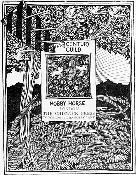
No. XXXIX.
DESIGN FOR THE TITLE PAGE OF THE “HOBBY-HORSE.” (SELWYN IMAGE.)
(This is a reduction by process from a large quarto wood engraving.)
The next step is to present in his book a series of so-called “engravings,” which are not engravings but reproductions by process of old prints. The “advance of science” in producing photo-relief blocks from steel and other intaglio plates for the type printing press, at a small cost per square inch, is not only taking from the artistic value of the modern édition de luxe, but also from its interest and genuineness.
The next step is to manufacture rough-edged, coarse-textured paper, purporting to be carefully “hand-made.” The rough edge, which was a necessity when every sheet of paper was finished by hand labour, is now imitated successfully by machinery, and is handled lovingly by the bookworm of to-day, regardless of the fact that these roughened sheets can be bought by the pound in Drury-lane. The worst, and last fraud (I can call it no less) that can be referred to here is, that the clothing—the “skin of vellum”—that appropriately encloses our modern édition de luxe is made from pulp, rags, and other débris. That the gold illuminations on the cover are no longer real gold, and that the handsomely bound book, 207 with its fair margins, cracks in half with a “bang,” when first opened, are other matters connected with the discoveries of science, and the substitution of machinery for hand labour, which we owe to modern enterprise and invention.23
Looking at the “decorative pages” in most books, and remembering the achievements of the past, one is inclined to ask—Is the “setting-out of a page” one of the lost arts, like the designing of a coin? What harmony of style do we see in an ordinary book? How many authors or illustrators of books show that they care for the “look” of a printed page? The fact is, that the modern author shirks his responsibilities, following the practice of the greatest writers of our day. There are so many “facilities”—as they are called—for producing books that the author takes little interest in the matter. Mr. Ruskin, delicate draughtsman as he is known to be, has contributed little to the ensemble or appearance of the pages that flow from the printing press of Mr. Allen, at Orpington. His books are well printed in the modern manner, but judged by examples of the past, a deadly monotony pervades the 208 page; the master’s noblest thoughts are printed exactly like his weakest, and are all drawn out in lines together as in the making of macaroni! Mr. Hamerton, artist as well as author, is content to describe the beauty of forest trees, ferns and flowers, the variety of underwood and the like (nearly every word, in an article in the Portfolio, referring to some picturesque form or graceful line), without indicating the varieties pictorially on the printed page. The late Lord Tennyson and other poets have been content for years to sell their song by the line, little heeding, apparently, in what guise it was given to the world.
In these days the monotony of uniformity seems to pervade the pages, alike of great and small, and a letter from a friend is now often printed by a machine!
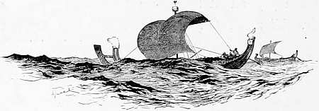
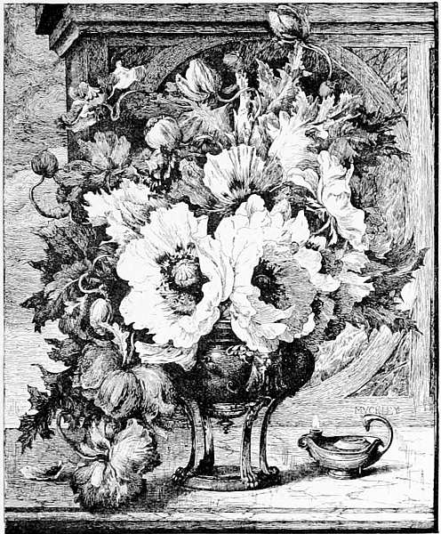
No. XL.
“SCARLET POPPIES.” (W. J. MUCKLEY.)
This beautiful piece of pen work by Mr. Muckley (from his picture in the Royal Academy, 1885) was too delicate in the finer passages to reproduce well by any relief process (the pale lines having come out black); but as an example of breadth, and indication of surfaces in pen and ink, it could hardly be surpassed.
22 I mention this school as a representative one; there are many others where design and wood engraving are studied under the same roof with success in 1894.
23 Mr. Cobden Sanderson’s lecture on Bookbinding, read before the “Arts and Crafts Society,” is well worth the attention of book lovers.
 |
ET us now consider shortly the Author, the Illustrator, and the Publisher, and their influence on the appearance and production of a book. If it be impossible in these days (and, in spite of the efforts of Mr. William Morris and others, it seems to be impossible) to produce a genuine book in all its details, it seems worth considering in what way the author can stamp it with his own individuality; also to what extent he is justified in making use of modern appliances.
How far, then, may the author be said to be responsible for the state of things just quoted? Theoretically, he is the man of taste and culture par excellence; he is, or should be, in most cases, the arbiter, the dictator to his publisher, the chooser of style. The book is his, and it is his business to 212 decide in what form his ideas should become concrete; the publisher aiding his judgment with experience, governing the finance, and carrying out details. How comes it then that, with the present facilities for reproducing anything that the hand can put upon paper, the latter-day nineteenth-century author is so much in the hands of others as to the appearance of his book? It is because the so-called educated man has not been taught to use his hands as the missal-writers and authors of mediæval times taught themselves to use theirs. The modern author, who is, say, fifty years old, was born in an age of “advanced civilisation,” when the only method of expression for the young was one—“pothooks and hangers.” The child of ten years old, whose eye was mentally forming pictures, taking in unconsciously the facts of perspective and the like, had a pencil tied with string to his two first fingers until he had mastered the ups and downs, crosses and dashes, of modern handwriting, which has been accepted by the great, as well as the little, ones of the earth, as the best medium of communication between intelligent beings; and so, regardless of style, character, or picturesqueness, he scribbles away! So much for our generally straggling style of penmanship.
There is no doubt that the author of the future will have to come more into personal contact with the artist than he has been in the habit of doing, and that the distinction I referred to in the first chapter, between illustrations which are to be (1) records of facts, and (2) works of art, will have to be more clearly drawn.
Amongst the needs in the community of book producers is one that I only touch upon because it affects the illustrator:—That there should be an expert in every publishing house to determine (1) whether a drawing is suitable for publication; and (2) by what means it should be reproduced. The resources of an establishment will not always admit of such an arrangement; but the editors and publishers who are informed on these matters can easily be distinguished by the quality of their publications. By the substitution of process blocks for wood engravings in books, publishers are deprived to a great extent of the fostering care of the master wood engraver, to which they have been accustomed.
Amongst the influences affecting the illustrator, none, I venture to say, are more prejudicial than the acceptance by editors and publishers of inartistic drawings.
It would be difficult, I think, to point to a period 214 when so much bad work was produced as at present. The causes have already been pointed out, the beautiful processes for the reproduction of drawings are scarcely understood by the majority of artists, publishers, authors, or critics. It is the misuse of the processes in these hurrying days, which is dragging our national reputation in the mire and perplexing the student.
The modern publisher, it may be said without offence, understands the manufacture and the commerce of a book better than the art in it. And how should it be otherwise? The best books that were ever produced, from an artistic point of view, were inspired and designed by students of art and letters, men removed from the commercial scramble of life, and to whom an advertisement was a thing unknown! The ordinary art education of a publisher, and the multitude of affairs requiring his attention, unfit him generally, for the task of deciding whether an illustration is good or bad, or how far—when he cheapens the production of his book by using photographic illustrations (“snap-shots” from nature)—he is justified in calling them “art.” The deterioration in the character of book illustration in England is a serious matter, and public attention may well be drawn to it.
Here we look for the active co-operation of the author. The far-reaching spread of education—especially technical art education—is tending to bring together, as they were never brought before in this century, the author and the illustrator. The author of a book will give more attention to the appearance of his pages, to the decorative character of type and ornament, whilst the average artist will be better educated from a literary point of view; and, to use a French word for which there is no equivalent, will be more en rapport with both author and publisher.
For the illustrator by profession there seems no artistic leisure; no time to do anything properly in this connection.
“It is a poor career, Blackburn,” said a well-known newspaper illustrator to me lately (an artist of distinction and success in his profession who has practised it for twenty years), “you seldom give satisfaction—not even to yourself.”
“It is an ideal career,” says another, a younger man, who is content with the more slap-dash methods in vogue to-day—and with the income he receives for them.
Referring again to the question in the Athenæum, “Why is not drawing for the press taught in our 216 Government schools of art?” I think the principal reasons why the art of illustration by the processes is not generally taught in art schools are—
(1) drawing for reproduction requires more personal teaching than is possible in art classes in public schools; (2) the art masters throughout the country, with very few exceptions, do not understand the new processes—which is not to be wondered at.
It is not the fault of the masters in our schools of art that students are taught in most cases as if they were to become painters, when the only possible career for the majority is that of illustration, or design. The masters are, for the most part, well and worthily occupied in giving a good groundwork of knowledge to every student, as to drawing for the press. There is no question that the best preparation for this work is the best general art teaching that can be obtained. The student must have drawn from the antique and from life; he must have learned composition and design; have studied from nature the relative values of light and shade, aërial perspective and the like; in short, have followed the routine study for a painter whose first aim should be to be a master of monochrome.
In the more technical parts, which the young illustrator by process will require to know, he needs personal help. He will have a multitude of questions to ask “somebody” as to the reasons for what he is doing; for what style of process work he is by touch and temperament best fitted, and so on. All this has to be considered if we are to keep a good standard of art teaching for illustration.
The fact that a pen-and-ink drawing which looks well scarcely ever reproduces well, must always be remembered. Many drawings for process, commended in art schools for good draughtsmanship or design, will not reproduce as expected, for want of exact knowledge of the requirements of process; whereas a drawing by a trained hand will often look better in the reproduction. These remarks refer especially to ornament and design, to architectural drawings and the like.
The topical illustrator and sketcher in weekly prints has, of course, more licence, and it matters less what becomes of his lines in their rapid transit through the press. Still the illustrator, of whatever rank or style, has a right to complain if his drawing is reproduced on a scale not intended by him, or by a process for which it is not fitted, or if printed badly, and with bad materials.
But the sketchy style of illustration seems to be a little overdone at present, and—being tolerable only when allied to great ability—remains consequently in the hands of a few. There is plenty of talent in this country which is wasted for want of control. It plays about us like summer lightning when we want the precision and accuracy of the telegraph.
The art of colour printing (whether it be by the intaglio processes, or by chromo-lithography, or on relief blocks) has arrived at such proficiency and has become such an important industry that it should be mentioned here. By its means, a beautiful child-face, by Millais, is scattered over the world by hundreds of thousands; and the reputation of a young artist, like Kate Greenaway, made and established. The latter owes much of her prestige and success to the colour-printer. Admitting the grace, taste, and invention of Kate Greenaway as an illustrator, there is little doubt that, without the wood engraver and the example and sympathetic aid of such artists as H. S. Marks, R.A., Walter Crane, and the late Randolph Caldecott, she would never have received the praise bestowed upon her by M. Ernest Chesneau, or Mr. Ruskin. These things show how intimately the arts of 219 reproduction affect reputations, and how important it is that more sympathy and communication should exist between all producers. In the mass of illustrated publications issuing from the press the expert can discern clearly where this sympathy and knowledge exist, and where ability, on the part of the artist, has been allied to practical knowledge of the requirements of illustration.
The business of many will be to contribute, in some form, to the making of pictures and designs to be multiplied in the press; and, in order to learn the technique and obtain employment, some of the most promising pupils have to fall into the ways of the producers of cheap illustrations, Christmas cards, and the like. On the other hand, a knowledge of the mechanical processes for reproducing drawings (as it is being pressed forward in technical schools) is leading to disastrous consequences, as may be seen on every railway bookstall in the kingdom.
In the “book of the future” we hope to see less of the “lath and plaster” style of illustration, produced from careless wash drawings by the cheap processes; fewer of the blots upon the page, which the modern reader seems to take as a matter of course. In books, as in periodicals, the illustrator by process will have to divest himself, as far as possible, 220 of that tendency to scratchiness and exaggeration that injures so many process illustrations. In short, he must be more careful, and give more thought to the meaning of his lines and washes, and to the adequate expression of textures.
There is a great deal yet to learn, for neither artists nor writers have mastered the subject. Few of our best illustrators have the time or the inclination to take to the new methods, and, as regards criticism, it is hardly to be expected that a reviewer who has a pile of illustrated books to pronounce upon, should know the reason of the failures that he sees before him. Thus the public is often misled by those who should be its guides as to the value and importance of the new systems of illustration.24
In conclusion, let us remember that everyone who cultivates a taste for artistic beauty in books, be he author, artist, or artificer, may do something towards relieving the monotony and confusion in style, which pervades the outward aspect of so 221 many books. It is a far cry from the work of the missal writer in a monastery to the pages of a modern book, but the taste and feeling which was shown in the fifteenth and sixteenth centuries in the production of books, exists in the nineteenth, under difficult conditions.
In the “book of the future” the author will help personally, more than he has ever done, as I have already suggested. The subject is not half-ventilated yet, nor can I touch upon it further, but the day is not far distant when the power of the hand of the author will be tested to the utmost, and lines of all kinds will appear in the text. There is really no limit to what may be done with modern appliances, if only the idea is seized with intelligence.
Two questions, however, remain unanswered—(1) Whether, as a matter of language and history, we are communicating information to each other much better than the ancients did in cuneiform inscriptions, on stones and monuments. (2) Whether, as a matter of illustrative art, we are making the best use of modern appliances.
Let us, then, cultivate more systematically the art of drawing for the press, and treat it as a worthy profession. Let it not be said again, 222 as it was to me lately by one who has devoted half a lifetime to these things, “The processes of reproduction are to hand, but where are our artists?” Let it not be said that the chariot-wheels of the press move too fast for us—that chemistry and the sun’s rays have been utilised too soon—that, in short, the processes of reproduction have been perfected before their time! I think not, and that an art—the art of pictorial expression—which has existed for ages and is now best understood by the Japanese, may be cultivated amongst us to a more practical end.
“TAKE CARE.” (W. B. BAIRD.)
(Royal Academy, 1891.)
24 There seems but one rule of criticism in this connection. If a book illustration comes out coarsely and (as is often the case) a mere smudge, the process is blamed, when the drawing or photograph may have been quite unsuitable for the process employed.
The following four examples of drawing from life, by students at Victoria Street, fresh from art schools, are interesting as tentative work. The object has been to test their powers and adaptability for line work; avoiding outline in the experiment as much as possible.
Nos. 1, 3, and 4, it will be observed, evade backgrounds altogether—the too ready solution of a difficult problem in line.
These drawings were made direct from life, in line; a system not to be recommended, excepting as an experiment of powers.
Examples of students’ wash drawings, &c., will appear in future editions of this book.
No. XLI.
“Spanish Woman.” A Study from Life.
By Ina Bidder.
This is a clever sketch with pen and ink and brush, and drawn with a bold free hand, reproduced on an (untouched) process block. It shows originality of treatment and courage on the part of the student; also the value of great reduction to give strength and effect.
(Size of drawing, 16 × 11½ in.)
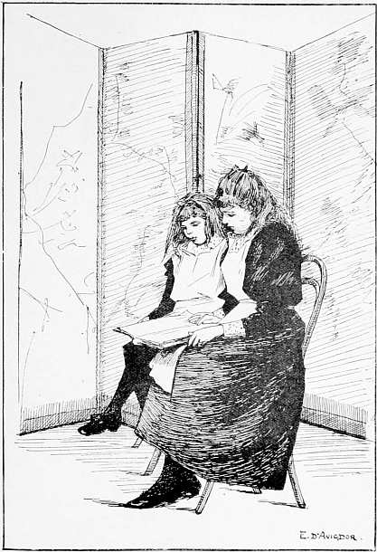
No. XLII.
“Sketch from Life,” by Estelle d’Avigdor.
This student was the winner in a prize competition lately in The Studio. She has undoubted ability, but not clearly in the direction of line drawing. After considerable success in painting, this student writes: “I still find the pen a difficult instrument to wield.”
In this sketch we see the influence of Aubrey Beardsley and others of the dense-black, reckless school of modern illustrators.
(Size of drawing, 10 × 6¾ in.) Zinc process.
No. XLIII.
Sketch from Life, by G. C. Marks.
This pen-and-ink drawing is interesting for colour, especially in the hair; it would have been better modelled if drawn first in pencil or chalk.
This student has an obvious aptitude for line work; the touch is very good for a beginner.
(Size of drawing, 10½ × 8 in.) Zinc process.
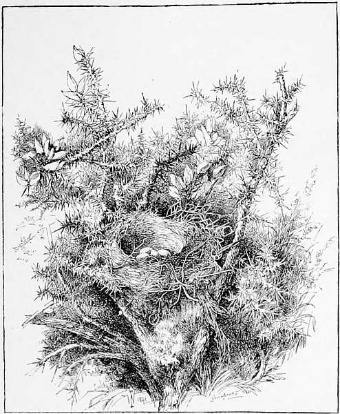
No. XLIV.
Bough of Common Furze, by William French.
A most careful study from nature in pen and ink. (Size of original drawing, 14 × 11½ in.) Reproduced by zinc process.
This artist learned the method of line work for process in a month.
The Illustrations in this Volume are, for the most part, reproductions of drawings which—for purposes of study and comparison—are shown by Mr. Blackburn at his Lectures in Art Schools, enlarged to a scale of 15 to 20 ft.
Students who may be unable to attend these lectures can see some of the original drawings on application (by letter) to “The Secretary, at Mr. Henry Blackburn’s Studio, 123, Victoria Street, Westminster.”
1. Photo-zinc Process.—2. Gelatine Process.—3. Half-tone.—4. Intaglio Processes.—5. Drawing Materials.—6. Books for Students.—7. Decorative Pages.—8. List of Photo-engravers.
PHOTO-ZINC PROCESS.
FOR THE REPRODUCTION OF LINE DRAWINGS IN RELIEF, SUITABLE FOR PRINTING AT THE TYPE PRESS.
Description of the Process.—The first stage is to have the drawing photographed to the size required, and to transfer a print of it on to a sensitized zinc plate. This print, or photographic image of the drawing lying upon the zinc plate, is of greasy substance (bichromate of potash and gelatine), and is afterwards inked up with a roller; the plate is then immersed in a bath of nitric acid and ether, which cuts away the parts which were left white upon the paper, and leaves the lines of the drawing in relief. This “biting in,” as it is called, requires considerable experience and attention, according to the nature of the drawing. Thus, the lines are turned into metal in a few hours, and the plate, when mounted on wood to the height of type-letters, is ready to be printed from, if necessary, at the rate of several thousands an hour.
The cost of these blocks averages 6d. the square inch where a number are made at one time, the minimum price being 5/-.
Small book illustrations by this process, by firms who make a specialty of producing single illustrations, are often charged 9d. the square inch, with a minimum of 7/6; but the cost should never be more than this for a single block by the zinc process.
GELATINE PROCESS.
FOR THE REPRODUCTION OF DRAWINGS IN LINE IN RELIEF, SUITABLE FOR PRINTING AT THE TYPE PRESS.
This is a more delicate and sensitive method of obtaining a relief block. It is called the “gelatine,” or “Gillot” process.
The drawing is photographed to the required size (as before), and the negative laid upon a glass plate (previously coated with a mixture of gelatine and bichromate of potash). The part of this thin, sensitive film not exposed to the light is absorbent, and when immersed in water swells up. The part exposed to the light, i.e., the lines of the drawing, remains near the surface of the glass. Thus we have a sunk mould from which a metal cast can be taken, leaving the lines in relief as in the zinc process. In skilful hands this process admits of more delicate gradations, and pale, uncertain lines can be reproduced with tolerable fidelity. There is no process yet invented which gives better results from a pen-and-ink drawing for the type press.
Reproductions of pencil, chalk, and charcoal are also possible by this process; but they are not suited for it, and there is generally too much working up by hand on the block to suit rapid printing. These blocks when completed have a copper surface. The blocks take longer to make, and are about double the price of the photo-zinc process. The cost varies from 9d. to 1/6 the square inch.
M. Gillot, in Paris, may be said to be the inventor or perfector of this process, now used by many photo engravers in London, notably by Mr. Alfred Dawson, of Hogarth Works, Chiswick.
HALF-TONE PROCESS.
FOR THE REPRODUCTION OF WASH DRAWINGS, PHOTOGRAPHS, ETC., BY THE SCREENED PHOTO-ZINC RELIEF PROCESS.
This method of making the blocks is more complicated. As there are no lines in a wash drawing, or in a photograph from nature, or in a painting, it is necessary to obtain some kind of grain, or interstices of white, on the zinc plate, as in a mezzotint; so between the drawing or photograph to be reproduced and the camera, glass screens covered with lines or dots, are interposed, varying in strength according to the light and shade required; thus turning the image of the wash drawing or photograph practically into “line,” with sufficient interstices of white for printing purposes.
The coarseness or fineness of grain on these blocks varies according to circumstances. Thus, for rapid printing on cylinder machines, with inferior paper and ink, a wider grain and a deeper cut block is necessary.
The examples in this book may be said to show these process blocks at their best, with good average printing. The results from wash drawings, as already pointed out, are uncertain, and generally gloomy and mechanical-looking.
The reproductions of pencil, chalk, or charcoal drawings by this process are generally unsatisfactory, even when printed under good conditions. The blocks are shallow as compared with the zinc line process, and are double the cost.
INTAGLIO PROCESSES.
PHOTOGRAVURE, AUTOTYPE, DALLASTYPE, ETC.
Photogravure.—First, a photographic negative is taken direct from the picture to be reproduced, and from this an autotype carbon print is taken and transferred on to glass or silvered copper, instead of on the paper used in making carbon prints for sale. This picture is in delicate relief, and forms the mould, upon which copper is electrically deposited. After being made “conductive,” the carbon mould is placed in a galvanic bath, the deposit of copper upon it taking the impression perfectly.
Another method is to transfer the same mould upon pure, clean copper, and then operate with a powerful biting solution, which is resisted more or less according to the varying thickness of carbon mould to be penetrated. Thus the parts to be left smoothest are thick of carbon, and the parts to be dark are bare, so that the mordant may act unresisted. This, it will be perceived, is the opposite way to the process above given, and is therefore worked from a “transparency,” or photographic “positive,” instead of a negative. This is the Klick and Fox Talbot method, and is very commonly in use at present.
The process of “photogravure” is well known, as employed by Messrs. Boussod, Valadon, & Co. (Goupil), of Paris, and is adapted for the reproduction of wash drawings, paintings, also drawings where the lines are pale and uncertain, pencil, chalk, etc.; the greys and gradations of pencil being wonderfully interpreted. In London the intaglio processes are used by many of the firms mentioned on page 240. They are now much used for the reproduction of photographic portraits in books, taking place of the copperplate engraving.
The cost of these plates is, roughly, 5/- the square inch. The makers of these plates generally supply paper, and print, charging by the 100 copies. But engravings thus produced are comparatively little used in modern book illustration, as they cannot be printed simultaneously with the letter-press of a book; they are suitable only for limited editions and “éditions de luxe.”
DRAWING MATERIALS FOR REPRODUCTION.
1.—For Drawings in Line.—For general use, liquid Indian ink and Bristol board; or hard paper of similar surface. “Clay board,” the surface of which can easily be removed with a scraper, is useful for some purposes, but the pen touch on clay board is apt to become mechanical.
2.—For Drawings in Pencil and Chalk, grained papers are used (see p. 113 and following). These papers are made of various textures, with black or white lines and dots vertical, horizontal, and diagonal. As a matter of fact, grained papers are little used in book and newspaper illustration in this country, and unless artistically treated the results are very unsatisfactory. They are most suitable for landscape work and sketches of effect.
3.—For Wash Drawings.—Prepared boards for wash drawings, varying in surface and texture according to the scale of the drawing, the brush handling of the artist, and the nature of the work to be reproduced. These must be decided by the teacher. Lamp black and opaque white are commonly used. A combination of line and wash is generally to be avoided.
The materials for drawing for reproduction are to be obtained from the following amongst other artists’ colourmen.
|
A. Ackerman, 191, Regent Street, W. J. Barnard & Son, 19, Berners Street, W. Cornelissen & Son, 22, Great Queen Street, W.C. Lechertier, Barbe, & Co., 60, Regent Street, W. Jas. Newman, 24, Soho Square, W. Reeves & Sons, 113, Cheapside, E.C. Chas. Roberson & Co., 99, Long Acre, W.C. Geo. Rowney & Co., 64, Oxford Street, W. Winsor & Newton, 37, Rathbone Place, W. Percy Young, 137, Gower Street, W.C. |
BOOKS FOR STUDENTS.
The following will be found useful:—
1.—“The Graphic Arts,” by P. G. Hamerton (London: Macmillan & Co.).
2.—“Pen and Pencil Artists,” by Joseph Pennell (London: Macmillan & Co.).
3.—“English Pen Artists of To-Day,” by J. G. Harper (London: Rivington, Percival & Co.).
The value and comprehensive character of Mr. Hamerton’s book is well known, but it reaches into branches of the art of illustration far beyond the scope of this book. Of the second it may be said that Mr. Joseph Pennell’s book is most valuable to students of “black and white,” with the caution that many of the illustrations in it were not drawn for reproduction, and would not reproduce well by the processes we have been considering. The third volume seems more practical for elementary and technical teaching. It is to be regretted that these books are so costly as to be out of the reach of most of us; but they can be seen in the library of the South Kensington Museum.
Mr. Hamerton’s “Drawing and Engraving, a Brief Exposition of Technical Principles and Practice” (London: Adam and Charles Black, 1892), “The Photographic Reproduction of Drawings,” by Col. J. Waterhouse (Kegan, Paul, & Co., 1890), “Lessons in Art,” by Hume Nisbet (Chatto & Windus, 1891), are portable and useful books, full of technical information. Sir Henry Trueman Wood’s “Modern Methods of Illustrating Books,” and Mr. H. R. Robertson’s “Pen and Ink Drawing” (Winsor & Newton) are both excellent little manuals, but their dates are 1886.
DECORATIVE PAGES.
(FROM OLD MSS. AND BOOKS TO BE SEEN IN THE BRITISH MUSEUM.)
(Reprinted from the Cantor Lectures.)
1. “Example of early Venetian writing, from a copybook of the 15th century, written with a reed pen. Note the clearness and picturesqueness of the page; also the similarity to the type letters used to-day—what are called ‘old face,’ and of much (good and bad) letter in modern books.”
2. “A beautiful example of Gothic writing and ornament, from a French illuminated manuscript in the British Museum; date 1480. Here the decorative character and general balance of the page is delightful to modern eyes.”
3. “Fac-simile of a printed page, from Polydore Vergil’s “History of England,” produced in Basle, in 1556. The style of type is again familiar to us in books published in 1894; but the setting out of the page, the treatment of ornament (with little figures introduced, but subservient to the general effect), is not familiar, because it is seldom that we see a modern decorative page. The printer of the past had a sense of beauty, and of the fitness of things apparently denied to all but a few to-day.”
4. “An illuminated printed page, 1521, with engraved borders, after designs by Holbein; figures again subordinate to the general effect.”
5. “Examples of Italian, 14th century; ornament, initial, and letters forming a brilliant and harmonious combination.”
Illustrations of the above and other decorative pages (which could not be reproduced in this book) are shown at the lectures on a large scale.
Of the many modern books on decoration and ornament, the handbooks by Mr. Lewis Foreman Day (London: Batsford) are recommended to students of “the decorative page”; also “English Book Plates,” by Egerton Castle (G. Bell & Sons).
LIST OF PROCESS BLOCK MAKERS.
From a long list of photo-engravers, the following are mentioned from personal knowledge of their work:—
Relief Blocks.
|
André & Sleigh, Bushey, Herts. The Art Reproduction Company, Clairville Grove, South Kensington. Mr. Dallas, 5, Furnival Street, E.C. A. & C. Dawson, Hogarth Works, Chiswick. Dellagana & Co., Gayton Road, Hampstead, N.W. Direct Photographic Company, 38, Farringdon Street, E.C. Hare & Sons, Ltd., Bride Court, Fleet Street. Carl Hentschel, 182, Fleet Street, E.C. Chas. Geard (Agent for Krakow), MacLean’s Bldgs., New St. Sq., E.C. Meisenbach Co., Ltd., Wolfington Road, West Norwood, S.E. John Swain & Son, 58, Farringdon Street, E.C. Swan Electric Light Co., 114, Charing Cross Road, W.C. Typographic Etching Co., 3, Ludgate Circus Buildings, E.C. Walker & Boutall, Clifford’s Inn, Fleet Street, E.C. Waterlow & Sons, Ltd., London Wall, E.C. Vincent & Hahn, 34, Barbican, E.C. |
Intaglio.
Several of the firms mentioned above are makers of “Intaglio” plates; some are also wood-engravers, photo-lithographers, etc.; and agents for French, German, and Austrian photo-engravers.
Amongst leading firms who make “Intaglio” plates are Messrs. Boussod, Valadon, & Co. (London and Paris); and Messrs. Angerer & Göschl, of Vienna.
The Autotype Company’s admirable reproductions of photographs and drawings should also be mentioned in this connection.
“Black and White.”
NOTICE.—MR. HENRY BLACKBURN’S STUDIO is open five days a week for the Study and Practice of DRAWING FOR THE PRESS with Technical Assistants. Students join at any time.
Private Instruction and by Correspondence.
123, Victoria Street, Westminster (near Army & Navy stores).
“‘The Art of Illustration’ is a brightly written account, by a man who has had large experience of the ways in which books and newspapers are illustrated nowadays.... As a collection of typical illustrations by artists of the day, Mr. Blackburn’s book is very attractive.”—The Times.
“Mr. Blackburn explains the processes—line, half-tone, and so forth—exemplifying each by the drawings of artists more or less skilled in the modern work of illustration. They are well chosen as a whole, to show the possibilities of process work in trained hands.”—Saturday Review.
“We thoroughly commend this book to all whom it may concern.”—Athenæum.
“Mr. Henry Blackburn, perhaps our greatest expert on the subject of the book illustrator’s art, has written a most interesting volume, which no young black-and-white artist can very well afford to do without. Nearly a hundred splendid and instructive illustrations.”—Black and White.
“The author’s purpose in this book is to show how drawing for the press may be best adapted to its purpose.... Many of Mr. Blackburn’s instructions are technical, but all are beautifully illustrated by choice reproductions from some of the best black-and-white work of the time.”—Daily News.
“Mr. Blackburn’s interesting and practical manual is designed, in the first instance, for the guidance of students who intend to become illustrators in black-and-white, but for the general reader it contains a large quantity of readable and attractive matter.”—The Literary World.
“We must express our admiration for the contents of ‘The Art of Illustration,’ and its fund of technical information.”—Bookseller.
“The book is full of interest, containing close upon a hundred varied examples of illustrations of the day. A work of unquestionable value.”—Publishers’ Circular.
“Mr. Blackburn knows from experience what is best for the processes; his volume is illustrated with nearly one hundred drawings, most of them good examples of what is being done. ’The Art of Illustration’ is an entirely safe guide.”—Art Journal.
“Mr. Henry Blackburn has written an able book on ‘The Art of Illustration,’ which, it is not overpraise to say, should be in the hands of every artist who draws for reproduction.”—The Gentlewoman.
“‘The Art of Illustration’ is perhaps the most satisfactory work of art of its kind that has yet been published.”—Sunday Times.
“A very clear exposition of the various methods of reproduction.”—Guardian.
“Mr. Blackburn sails his book under the flag of Sir John Gilbert, and justly expounds the all-importance of line.”—National Observer.
“‘The Art of Illustration’ contains a vast amount of valuable artistic information, and should be on every student’s bookshelf.”—Court Circular.
“Mr. Henry Blackburn is a well-known authority on the technical aspects of painting and design, and this circumstance lends value to his exposition of ‘The Art of Illustration.’... He writes with admirable clearness and force.”—Leeds Mercury.
“The excellent series of reproductions in this book show (inter alia) the variety of effects to be obtained by the common zinc process. Mr. Blackburn’s book will prove of great value to the student and interest to the general reader.”—Manchester Guardian.
“This volume is full of good criticism, and takes a survey of the many processes by which books may be beautified.... A charming and instructive volume.”—Birmingham Gazette.
“’The Art of Illustration’ will have the deepest interest for artists and others concerned in the illustration of books.”—Yorkshire Post.
“A very interesting quarto, worth having for its typical illustrations.”—British Architect.
“Mr. Blackburn’s volume should be very welcome to artists, editors, and publishers.”—The Artist.
“A most useful book.”—Studio.
End of Project Gutenberg's The Art of Illustration, by Henry Blackburn

*** END OF THIS PROJECT GUTENBERG EBOOK THE ART OF ILLUSTRATION ***

***** This file should be named 32320-h.htm or 32320-h.zip *****
This and all associated files of various formats will be found in:
        http://www.gutenberg.org/3/2/3/2/32320/

Produced by Marius Masi, Chris Curnow and the Online
Distributed Proofreading Team at http://www.pgdp.net.


Updated editions will replace the previous one--the old editions
will be renamed.

Creating the works from public domain print editions means that no
one owns a United States copyright in these works, so the Foundation
(and you!) can copy and distribute it in the United States without
permission and without paying copyright royalties.  Special rules,
set forth in the General Terms of Use part of this license, apply to
copying and distributing Project Gutenberg-tm electronic works to
protect the PROJECT GUTENBERG-tm concept and trademark.  Project
Gutenberg is a registered trademark, and may not be used if you
charge for the eBooks, unless you receive specific permission.  If you
do not charge anything for copies of this eBook, complying with the
rules is very easy.  You may use this eBook for nearly any purpose
such as creation of derivative works, reports, performances and
research.  They may be modified and printed and given away--you may do
practically ANYTHING with public domain eBooks.  Redistribution is
subject to the trademark license, especially commercial
redistribution.


*** START: FULL LICENSE ***

THE FULL PROJECT GUTENBERG LICENSE
PLEASE READ THIS BEFORE YOU DISTRIBUTE OR USE THIS WORK

To protect the Project Gutenberg-tm mission of promoting the free
distribution of electronic works, by using or distributing this work
(or any other work associated in any way with the phrase "Project
Gutenberg"), you agree to comply with all the terms of the Full Project
Gutenberg-tm License (available with this file or online at
http://gutenberg.org/license).


Section 1.  General Terms of Use and Redistributing Project Gutenberg-tm
electronic works

1.A.  By reading or using any part of this Project Gutenberg-tm
electronic work, you indicate that you have read, understand, agree to
and accept all the terms of this license and intellectual property
(trademark/copyright) agreement.  If you do not agree to abide by all
the terms of this agreement, you must cease using and return or destroy
all copies of Project Gutenberg-tm electronic works in your possession.
If you paid a fee for obtaining a copy of or access to a Project
Gutenberg-tm electronic work and you do not agree to be bound by the
terms of this agreement, you may obtain a refund from the person or
entity to whom you paid the fee as set forth in paragraph 1.E.8.

1.B.  "Project Gutenberg" is a registered trademark.  It may only be
used on or associated in any way with an electronic work by people who
agree to be bound by the terms of this agreement.  There are a few
things that you can do with most Project Gutenberg-tm electronic works
even without complying with the full terms of this agreement.  See
paragraph 1.C below.  There are a lot of things you can do with Project
Gutenberg-tm electronic works if you follow the terms of this agreement
and help preserve free future access to Project Gutenberg-tm electronic
works.  See paragraph 1.E below.

1.C.  The Project Gutenberg Literary Archive Foundation ("the Foundation"
or PGLAF), owns a compilation copyright in the collection of Project
Gutenberg-tm electronic works.  Nearly all the individual works in the
collection are in the public domain in the United States.  If an
individual work is in the public domain in the United States and you are
located in the United States, we do not claim a right to prevent you from
copying, distributing, performing, displaying or creating derivative
works based on the work as long as all references to Project Gutenberg
are removed.  Of course, we hope that you will support the Project
Gutenberg-tm mission of promoting free access to electronic works by
freely sharing Project Gutenberg-tm works in compliance with the terms of
this agreement for keeping the Project Gutenberg-tm name associated with
the work.  You can easily comply with the terms of this agreement by
keeping this work in the same format with its attached full Project
Gutenberg-tm License when you share it without charge with others.

1.D.  The copyright laws of the place where you are located also govern
what you can do with this work.  Copyright laws in most countries are in
a constant state of change.  If you are outside the United States, check
the laws of your country in addition to the terms of this agreement
before downloading, copying, displaying, performing, distributing or
creating derivative works based on this work or any other Project
Gutenberg-tm work.  The Foundation makes no representations concerning
the copyright status of any work in any country outside the United
States.

1.E.  Unless you have removed all references to Project Gutenberg:

1.E.1.  The following sentence, with active links to, or other immediate
access to, the full Project Gutenberg-tm License must appear prominently
whenever any copy of a Project Gutenberg-tm work (any work on which the
phrase "Project Gutenberg" appears, or with which the phrase "Project
Gutenberg" is associated) is accessed, displayed, performed, viewed,
copied or distributed:

This eBook is for the use of anyone anywhere at no cost and with
almost no restrictions whatsoever.  You may copy it, give it away or
re-use it under the terms of the Project Gutenberg License included
with this eBook or online at www.gutenberg.org

1.E.2.  If an individual Project Gutenberg-tm electronic work is derived
from the public domain (does not contain a notice indicating that it is
posted with permission of the copyright holder), the work can be copied
and distributed to anyone in the United States without paying any fees
or charges.  If you are redistributing or providing access to a work
with the phrase "Project Gutenberg" associated with or appearing on the
work, you must comply either with the requirements of paragraphs 1.E.1
through 1.E.7 or obtain permission for the use of the work and the
Project Gutenberg-tm trademark as set forth in paragraphs 1.E.8 or
1.E.9.

1.E.3.  If an individual Project Gutenberg-tm electronic work is posted
with the permission of the copyright holder, your use and distribution
must comply with both paragraphs 1.E.1 through 1.E.7 and any additional
terms imposed by the copyright holder.  Additional terms will be linked
to the Project Gutenberg-tm License for all works posted with the
permission of the copyright holder found at the beginning of this work.

1.E.4.  Do not unlink or detach or remove the full Project Gutenberg-tm
License terms from this work, or any files containing a part of this
work or any other work associated with Project Gutenberg-tm.

1.E.5.  Do not copy, display, perform, distribute or redistribute this
electronic work, or any part of this electronic work, without
prominently displaying the sentence set forth in paragraph 1.E.1 with
active links or immediate access to the full terms of the Project
Gutenberg-tm License.

1.E.6.  You may convert to and distribute this work in any binary,
compressed, marked up, nonproprietary or proprietary form, including any
word processing or hypertext form.  However, if you provide access to or
distribute copies of a Project Gutenberg-tm work in a format other than
"Plain Vanilla ASCII" or other format used in the official version
posted on the official Project Gutenberg-tm web site (www.gutenberg.org),
you must, at no additional cost, fee or expense to the user, provide a
copy, a means of exporting a copy, or a means of obtaining a copy upon
request, of the work in its original "Plain Vanilla ASCII" or other
form.  Any alternate format must include the full Project Gutenberg-tm
License as specified in paragraph 1.E.1.

1.E.7.  Do not charge a fee for access to, viewing, displaying,
performing, copying or distributing any Project Gutenberg-tm works
unless you comply with paragraph 1.E.8 or 1.E.9.

1.E.8.  You may charge a reasonable fee for copies of or providing
access to or distributing Project Gutenberg-tm electronic works provided
that

- You pay a royalty fee of 20% of the gross profits you derive from
     the use of Project Gutenberg-tm works calculated using the method
     you already use to calculate your applicable taxes.  The fee is
     owed to the owner of the Project Gutenberg-tm trademark, but he
     has agreed to donate royalties under this paragraph to the
     Project Gutenberg Literary Archive Foundation.  Royalty payments
     must be paid within 60 days following each date on which you
     prepare (or are legally required to prepare) your periodic tax
     returns.  Royalty payments should be clearly marked as such and
     sent to the Project Gutenberg Literary Archive Foundation at the
     address specified in Section 4, "Information about donations to
     the Project Gutenberg Literary Archive Foundation."

- You provide a full refund of any money paid by a user who notifies
     you in writing (or by e-mail) within 30 days of receipt that s/he
     does not agree to the terms of the full Project Gutenberg-tm
     License.  You must require such a user to return or
     destroy all copies of the works possessed in a physical medium
     and discontinue all use of and all access to other copies of
     Project Gutenberg-tm works.

- You provide, in accordance with paragraph 1.F.3, a full refund of any
     money paid for a work or a replacement copy, if a defect in the
     electronic work is discovered and reported to you within 90 days
     of receipt of the work.

- You comply with all other terms of this agreement for free
     distribution of Project Gutenberg-tm works.

1.E.9.  If you wish to charge a fee or distribute a Project Gutenberg-tm
electronic work or group of works on different terms than are set
forth in this agreement, you must obtain permission in writing from
both the Project Gutenberg Literary Archive Foundation and Michael
Hart, the owner of the Project Gutenberg-tm trademark.  Contact the
Foundation as set forth in Section 3 below.

1.F.

1.F.1.  Project Gutenberg volunteers and employees expend considerable
effort to identify, do copyright research on, transcribe and proofread
public domain works in creating the Project Gutenberg-tm
collection.  Despite these efforts, Project Gutenberg-tm electronic
works, and the medium on which they may be stored, may contain
"Defects," such as, but not limited to, incomplete, inaccurate or
corrupt data, transcription errors, a copyright or other intellectual
property infringement, a defective or damaged disk or other medium, a
computer virus, or computer codes that damage or cannot be read by
your equipment.

1.F.2.  LIMITED WARRANTY, DISCLAIMER OF DAMAGES - Except for the "Right
of Replacement or Refund" described in paragraph 1.F.3, the Project
Gutenberg Literary Archive Foundation, the owner of the Project
Gutenberg-tm trademark, and any other party distributing a Project
Gutenberg-tm electronic work under this agreement, disclaim all
liability to you for damages, costs and expenses, including legal
fees.  YOU AGREE THAT YOU HAVE NO REMEDIES FOR NEGLIGENCE, STRICT
LIABILITY, BREACH OF WARRANTY OR BREACH OF CONTRACT EXCEPT THOSE
PROVIDED IN PARAGRAPH F3.  YOU AGREE THAT THE FOUNDATION, THE
TRADEMARK OWNER, AND ANY DISTRIBUTOR UNDER THIS AGREEMENT WILL NOT BE
LIABLE TO YOU FOR ACTUAL, DIRECT, INDIRECT, CONSEQUENTIAL, PUNITIVE OR
INCIDENTAL DAMAGES EVEN IF YOU GIVE NOTICE OF THE POSSIBILITY OF SUCH
DAMAGE.

1.F.3.  LIMITED RIGHT OF REPLACEMENT OR REFUND - If you discover a
defect in this electronic work within 90 days of receiving it, you can
receive a refund of the money (if any) you paid for it by sending a
written explanation to the person you received the work from.  If you
received the work on a physical medium, you must return the medium with
your written explanation.  The person or entity that provided you with
the defective work may elect to provide a replacement copy in lieu of a
refund.  If you received the work electronically, the person or entity
providing it to you may choose to give you a second opportunity to
receive the work electronically in lieu of a refund.  If the second copy
is also defective, you may demand a refund in writing without further
opportunities to fix the problem.

1.F.4.  Except for the limited right of replacement or refund set forth
in paragraph 1.F.3, this work is provided to you 'AS-IS' WITH NO OTHER
WARRANTIES OF ANY KIND, EXPRESS OR IMPLIED, INCLUDING BUT NOT LIMITED TO
WARRANTIES OF MERCHANTIBILITY OR FITNESS FOR ANY PURPOSE.

1.F.5.  Some states do not allow disclaimers of certain implied
warranties or the exclusion or limitation of certain types of damages.
If any disclaimer or limitation set forth in this agreement violates the
law of the state applicable to this agreement, the agreement shall be
interpreted to make the maximum disclaimer or limitation permitted by
the applicable state law.  The invalidity or unenforceability of any
provision of this agreement shall not void the remaining provisions.

1.F.6.  INDEMNITY - You agree to indemnify and hold the Foundation, the
trademark owner, any agent or employee of the Foundation, anyone
providing copies of Project Gutenberg-tm electronic works in accordance
with this agreement, and any volunteers associated with the production,
promotion and distribution of Project Gutenberg-tm electronic works,
harmless from all liability, costs and expenses, including legal fees,
that arise directly or indirectly from any of the following which you do
or cause to occur: (a) distribution of this or any Project Gutenberg-tm
work, (b) alteration, modification, or additions or deletions to any
Project Gutenberg-tm work, and (c) any Defect you cause.


Section  2.  Information about the Mission of Project Gutenberg-tm

Project Gutenberg-tm is synonymous with the free distribution of
electronic works in formats readable by the widest variety of computers
including obsolete, old, middle-aged and new computers.  It exists
because of the efforts of hundreds of volunteers and donations from
people in all walks of life.

Volunteers and financial support to provide volunteers with the
assistance they need, are critical to reaching Project Gutenberg-tm's
goals and ensuring that the Project Gutenberg-tm collection will
remain freely available for generations to come.  In 2001, the Project
Gutenberg Literary Archive Foundation was created to provide a secure
and permanent future for Project Gutenberg-tm and future generations.
To learn more about the Project Gutenberg Literary Archive Foundation
and how your efforts and donations can help, see Sections 3 and 4
and the Foundation web page at http://www.pglaf.org.


Section 3.  Information about the Project Gutenberg Literary Archive
Foundation

The Project Gutenberg Literary Archive Foundation is a non profit
501(c)(3) educational corporation organized under the laws of the
state of Mississippi and granted tax exempt status by the Internal
Revenue Service.  The Foundation's EIN or federal tax identification
number is 64-6221541.  Its 501(c)(3) letter is posted at
http://pglaf.org/fundraising.  Contributions to the Project Gutenberg
Literary Archive Foundation are tax deductible to the full extent
permitted by U.S. federal laws and your state's laws.

The Foundation's principal office is located at 4557 Melan Dr. S.
Fairbanks, AK, 99712., but its volunteers and employees are scattered
throughout numerous locations.  Its business office is located at
809 North 1500 West, Salt Lake City, UT 84116, (801) 596-1887, email
business@pglaf.org.  Email contact links and up to date contact
information can be found at the Foundation's web site and official
page at http://pglaf.org

For additional contact information:
     Dr. Gregory B. Newby
     Chief Executive and Director
     gbnewby@pglaf.org


Section 4.  Information about Donations to the Project Gutenberg
Literary Archive Foundation

Project Gutenberg-tm depends upon and cannot survive without wide
spread public support and donations to carry out its mission of
increasing the number of public domain and licensed works that can be
freely distributed in machine readable form accessible by the widest
array of equipment including outdated equipment.  Many small donations
($1 to $5,000) are particularly important to maintaining tax exempt
status with the IRS.

The Foundation is committed to complying with the laws regulating
charities and charitable donations in all 50 states of the United
States.  Compliance requirements are not uniform and it takes a
considerable effort, much paperwork and many fees to meet and keep up
with these requirements.  We do not solicit donations in locations
where we have not received written confirmation of compliance.  To
SEND DONATIONS or determine the status of compliance for any
particular state visit http://pglaf.org

While we cannot and do not solicit contributions from states where we
have not met the solicitation requirements, we know of no prohibition
against accepting unsolicited donations from donors in such states who
approach us with offers to donate.

International donations are gratefully accepted, but we cannot make
any statements concerning tax treatment of donations received from
outside the United States.  U.S. laws alone swamp our small staff.

Please check the Project Gutenberg Web pages for current donation
methods and addresses.  Donations are accepted in a number of other
ways including checks, online payments and credit card donations.
To donate, please visit: http://pglaf.org/donate


Section 5.  General Information About Project Gutenberg-tm electronic
works.

Professor Michael S. Hart is the originator of the Project Gutenberg-tm
concept of a library of electronic works that could be freely shared
with anyone.  For thirty years, he produced and distributed Project
Gutenberg-tm eBooks with only a loose network of volunteer support.


Project Gutenberg-tm eBooks are often created from several printed
editions, all of which are confirmed as Public Domain in the U.S.
unless a copyright notice is included.  Thus, we do not necessarily
keep eBooks in compliance with any particular paper edition.


Most people start at our Web site which has the main PG search facility:

     http://www.gutenberg.org

This Web site includes information about Project Gutenberg-tm,
including how to make donations to the Project Gutenberg Literary
Archive Foundation, how to help produce our new eBooks, and how to
subscribe to our email newsletter to hear about new eBooks.