
Project Gutenberg's Applied Design for Printers, by Harry Lawrence Gage

This eBook is for the use of anyone anywhere at no cost and with
almost no restrictions whatsoever.  You may copy it, give it away or
re-use it under the terms of the Project Gutenberg License included
with this eBook or online at www.gutenberg.org


Title: Applied Design for Printers
       Typographic Technical Series for Apprentices #43

Author: Harry Lawrence Gage

Release Date: December 30, 2009 [EBook #30804]

Language: English

Character set encoding: ISO-8859-1

*** START OF THIS PROJECT GUTENBERG EBOOK APPLIED DESIGN FOR PRINTERS ***


Produced by Barbara Tozier, Bill Tozier, Stephanie Eason,
and the Online Distributed Proofreading Team at
https://www.pgdp.net.
This primer of design is an earnest effort to make intelligible to the apprentice student certain fundamental principles of arrangement and of ornamentation whose use is instinctive to the accomplished typographer.
It has been often written that there are no rules in Art, and equally often that the master artist (or craftsman) is he who can skillfully break all rules. It must be inevitable that the apprentice shall adhere too closely to each newly observed principle before his work can be a well-rounded embodiment of them all. To him is commended this exact procedure, recognizing, as his perception grows, that there are good reasons why traditions are emphasized here and all-embracing rules and formulae are not to be found.
Due credit must be paid to Mr. Ernest Allen Batchelder, who first devoted his pen and brush directly to the printer’s problem in design, and who in turn gives honor to the influence of Mr. Denman Ross. Neither has expressed a method but has graphically analyzed the attitude of mankind during successive epochs toward those matters which deal with beauty.
It is to be hoped that this little book may serve as a simple guide and as a stimulant toward an extended study of the larger attributes of printing which are not concerned with utility alone. H. L. G.
| page | |
| Introductory | 7 |
| The Surface | 8 |
| The Materials of Design | 10 |
| The Qualities of Design | 12 |
| Proportion | 19 |
| Balance | 24 |
| Symmetry | 28 |
| Variety | 31 |
| Motion | 31 |
| Ornament | 34 |
| The Periods of Design Which Have Most Affected Printing | 43 |
| Supplementary Reading | 64 |
| Review Questions | 65 |
| Glossary | 68 |
Raw material may be made into a finished product which will have the quality of usefulness alone. Utility is the first purpose of most of the works of man. But when the maker is moved by pride in his work and a desire for beauty to make his handiwork pleasing in appearance as well as useful a second purpose is fulfilled. All civilization and most forms of savagery demand that the equipment of routine life shall be pleasing to the eye after its prime purpose of usefulness has been developed.
If an article be pleasing in appearance its making will have involved some of the elements of design. The relationship of its parts, the lines of its construction, its coloring, the manner in which it is ornamented will depend first upon its purpose, but will be guided by a group of recognized traditions which we call the principles of design.
Design governs the arrangement of masses, lines, and dots to secure the qualities of beauty and fitness.
Any piece of work which is definitely arranged with consideration for its various parts and their relationship is called, in the abstract, a “design.” Thus we speak of a poster, a decorated wall, a building, or a printed page as “a design.”
Any successful design will have the qualities of fitness and beauty. Fitness to purpose is largely a mechanical factor. An ugly building may protect its occupants from the weather, and an ugly printed page may be entirely legible. Beauty depends upon esthetic[Pg 8] qualities; that is, upon the characteristics of the design which will appeal to the eye and mind through the consideration of—
Harmony (of shape, tone, color, and conception).
Balance and proportion (of mass, shape, and color).
Rhythm (of shape, line, tone, and color).
This conception of the elements of design covers all of the many things that mankind makes—buildings, or railroad trains, or sculpture, or paintings, or pottery, or furniture, or the printed page alike. In each, different though they be, the purpose of design is to relate the various surfaces, masses, and structural lines and to decorate or ornament the finished whole. Countless materials may be used and all the varied purposes of the equipment of mankind must be satisfied, but the application of the principles of design will be similar throughout. This point is emphasized so that the student of printing may find a common ground with the workers in all the fine and useful arts.
In the printed page, design is concerned with the arrangement of masses and lines on a flat surface—the face of the sheet of paper. Hence design in printing considers two dimensions only, width and length. The third dimension, depth, which must be treated in all but flat surfaces, can only be represented on the printed page and the means of showing depth is really an illusion by which the eye sees various colors and tones which convey a pictorial impression.
It is important to note that design and pictorial representation serve each a different purpose in printing. Yet they are similar mechanically in that each requires a printing surface (type, borders, ornaments, and engravings) which may be prepared by the same[Pg 9] mechanical procedures. The picture exists for its own interest or as an illustration for the text. As such it is merely an element in the design of the page. Decoration or ornament may be used to embellish the page, as a pattern on its flat surface, and may be related to the text, but need not serve as an illustration to it.
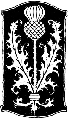 | 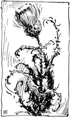 |
Fig. 1. A design of flat surfaces and a realistic pen sketch of the same subject.
As an example: Much of the material devised for the decoration of the printed page (ornaments and borders) is derived from natural forms; i. e., leaves, flowers, etc. The leaves, stems, and flowers which are adapted to form the ornament shown in Fig. 1 are a flat pattern of black and white. The same material is rendered pictorially in the pen sketch accompanying the ornament. It will be observed that the flat treatment[Pg 10] of the ornament depends upon arrangement of interesting flat masses for its significance. The pen sketch not only conveys an impression of the form of the natural objects, but it also suggests depth. A photograph of the natural objects, reproduced by a printing plate, would be still more realistic.
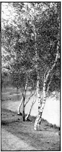
The preceding points have been given emphasis as a warning against a tendency to use pictures, however pleasing, as decorative material; or to allow design in printing to be concerned with a representation of depth. The same masses of shadow and light which express roundness or depth in a picture may be formed into decorative flat masses and thus embodied in the design of the page. In Fig. 2, A is a picture which might be used as an illustration or for its own interest. B is a flat rendering whose arrangement of masses suggests the pictorial interest of A without denying the flat surface upon which it is printed.
Since design is a matter of arrangement, its materials are the masses, lines, and dots which make up the whole form.
A dot theoretically has no dimensions. And a line (being the path of a dot in motion) theoretically has length but no width. While if a line be moved sideways it produces a mass which has area and shape.
Practically, a dot may be larger than a pin point and may have definite shape—a square dot or a round dot. Also in the common terms of design a line may have width (often called weight). Thus we speak of a narrow or light line as contrasted with a wide or heavy line.
 |
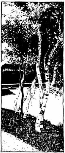 | |
| Fig. 2, A. Halftone engraving from a photograph, retaining full pictorial effect of depth, expressed in various gray tones and soft edges. This is an illustration. | Fig. 2, B. Decorative pen drawing from the same subject, telling the story of the photograph in flat surfaces of black and white. Suitable to decorate a type page. |
A mass will have shape, which is the impression conveyed to the eye by its general contour. It will[Pg 11] have size or measure, which will be its actual or relative area. It will further have tone or color, its general relation in appearance to black and white or to the colors of the spectrum. Embodying these terms in an example: We may specify a mass square in shape, having an area of four square inches, and being gray[Pg 12] in tone. These three characteristics, then, will identify and describe any mass.
In printing, the successive lines of type which form a paragraph, block, or connected series of paragraphs or blocks, are considered as a mass. An initial letter may be another mass; a head-band still another; and ornaments or illustrations may form other masses. All must be considered as mass elements in the design of the page, with rule borders as surrounding lines, or heavier designed borders as surrounding masses.
Thus all the component parts of the printed page are reduced to elements or materials of design, and with these materials an arrangement is to be made, for the sake of beauty, which will have the qualities of harmony, balance, proportion, and rhythm.
The dictionary defines harmony, in art, as “a normal state of completeness in the relation of things to each other.” This “state of completeness” in a harmonious scheme is such that we have no desire to change or modify any detail or characteristic.
Balance is defined as “the state of being in equilibrium.” In design this refers to the equilibrium or balance of attraction to the eye between the various masses.
Proportion is “the comparative relation of one thing to another” with respect to size.
Rhythm, in design, “is a movement characterized by regular recurrence of accent.”
Let us discover the embodiment of these qualities of design with a simple experiment. Cut from black, dark gray, and light gray cover paper a miscellaneous assortment of small pieces as shown in Fig. 3. This group of squares, oblongs, triangles, diamonds, circles, and whatnot has none of the qualities of design as it appears in Fig. 3.
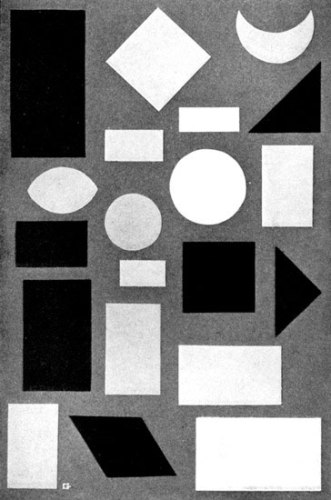
Fig. 3. A group of miscellaneous masses having various measures,
shapes, and tones. Arranged without thought of design.
[Pg 14]Choose from Fig. 3 certain pieces which seem to have a definite similarity of shape. Combine them with another rectangle, as in Fig. 4, and the result is certainly more orderly and pleasing than the unrelated tangle in Fig. 3. In Fig. 4 we have developed the quality of shape harmony.
But we note that in spite of the harmony of shapes in Fig. 4 some of the pieces of paper seem unduly prominent because of their blackness. They do not seem harmonious with the gray tone of the others. If we replace them with other pieces gray in color, as in Fig. 5, the result will be a more pleasing relationship of tone throughout the design. Thus we have made a simple demonstration of tone harmony.
If our pieces of paper were of various colors we could make another arrangement to express a color harmony. The problem of color, however, has so many phases that it is considered separately in this series.
If rhythm is to give us a “regular recurrence” of various features of a design, it will be possible to choose a combination of pieces of paper which will show a rhythmic arrangement, Fig. 6. It will be noticeable here that the shapes occur in successive groups which repeat an idea.
We may also arrange a series of pieces in which the tones are rhythmic, progressing from light to dark in repeated groups. This will be a simple example of tone rhythm, Fig. 7.
Summing up the experiment thus far the following definitions may be noted:
Shape harmony will exist when masses similar in contour or shape are used to form a design.
Tone harmony results from the use of tones in a design which carry a feeling of relationship.
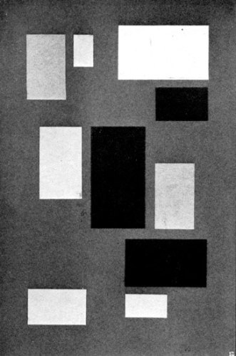
Fig. 4. Units selected from Fig. 3, having a common similarity
of shape. But they are not harmoniously related in tone.
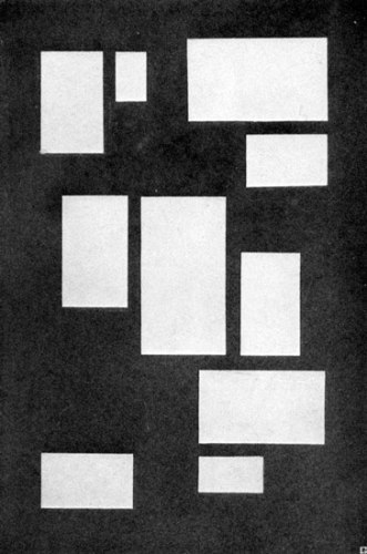
Fig. 5. The same shapes used in Fig. 4, substituting equal
tones of gray as needed to produce harmony throughout.
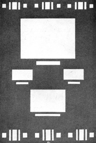
Fig. 6. Simple development of shape and measure rhythm such
as might occur on a printed page. Masses should be related in
measure as well as in shape.
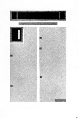
Fig. 7. Simple illustration of tone rhythm as it may occur
on a type page. The tones progress from the white of the
margins
through the light gray masses of type,
to the darker grays of decorations.
[Pg 19]Shape rhythm is the regular recurrence of similar shapes in a design or a rhythmic increase or decrease in the size of shapes used in a design.
Tone rhythm is a recurrence of similar tones or a regular progression of related tones from light to dark or the reverse through a design.
The four qualities above are so closely related that there is often no definite dividing line between them; indeed, a successful design will embody them all.
Our definition of proportion as a comparative relationship of size is so broad that any sizes may be in proportion. The quality of proportion in design is always assumed to be a pleasing relationship of sizes. It thus becomes necessary to determine what relationship of sizes will be most pleasing.
The use of equal masses in a design is monotonous. The eye finds variety of size more interesting. But to determine what form of variety is most interesting we must find, if possible, the ideal area relationship between masses in a design. This problem has of necessity been solved by the designers of all nations and all periods, and it is interesting to note that the result has everywhere been practically the same.
Let us arrive at the expression of good proportion by the simple means of dividing a rectangle into two parts which will have the most interesting relationship. This rectangle is A in Fig. 8. B shows a division into equal parts, the result being uninteresting and monotonous. In C the division gives a feeling that the lower part is too large; it is crowding the upper and the result is not pleasing. The relationship in D is so nearly equal that the division seems to have been an inaccurate effort to locate the center. Somewhere[Pg 20] between the division point in C and that in D will probably be the best point. Repeated trials will locate the point about as in E, which will be found to lie about two-fifths of the distance down from the top. This will give the upper area in E an area of 2 and the lower an area of 3. Hence the relationship or proportion is said to be as 2 is to 3. By the term “good proportion,” or merely the word “proportion,” in speaking of design this ratio of 2 to 3 is assumed.
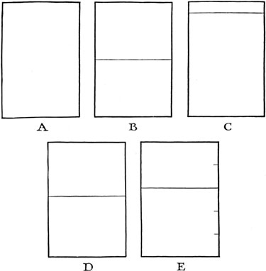
Fig. 8. The division of a rectangle, A, to secure spaces
of interesting
relationship. Equal division in B. Overbalanced effect in
C. Too nearly
equal in D. More interesting in E, where the relationship of spaces is as 2 is to 3.
It is interesting to note that when a space has been divided into the ratio of 2 to 3, the relationship of the smaller to the larger is practically the same as the relationship of the larger to the original whole. Or, mathematically, if the original, having an area of 5, is divided into parts of 2 and 3, then 2 is to 3 as 3 is to 5,—a ratio which is approximately true.
The student of architecture finds the most careful consideration of proportion in the relationship of[Pg 22] spaces throughout all the architectural orders. In printing, the designer must be guided by the same traditions.
Fig. 9. “Spotting” a single line on a page so that it
makes an
interesting division of space. There are 2 parts of white space
above and 3 parts below.
Fig. 10. Placing a single line so that it will appear to
be centered.
The dotted lines show the mathematical center of the vertical side.
The straight lines show the center of the type line.
The most simple application of proportion to the division of a printed page occurs when a single type line or compact group of lines is to be placed on the page (Fig. 9).
It is unfortunate that it is so easy to divide space mechanically in a type page by using identical measures of furniture or slugs above and below. When, in certain instances (as in a business card), tradition demands that a line be “centered” vertically, it will be found that the exact centering of the line will make it appear a bit low. An optical illusion demands that such a line be raised slightly if it is to appear in the vertical center (Fig. 10). This apparent center is called “the optical center.”
[Pg 23]The same condition makes it necessary when an apparent square is to be used that the width of the “square” be slightly greater than the height. (Fig. 11.)
Fig. 11. A true square above and an optically corrected
square below.
Psychologists explain that the eyes find it more difficult
to judge the
length of vertical lines, hence are inclined to exaggerate them.
The physical equilibrium which exists in the balanced “seesaw” of our childhood and the optical balance which is the result of the proper adjustment of masses within the confining edges of a design are similar, in that each is an equalizing of forces of attraction. In the former the force is gravity; in the latter, the attraction to the eye, which varies with the size and tone of the mass. While the force of gravity usually brings balancing masses to a horizontal alignment, optical balance may bring the masses in a design into equilibrium on any desired line, horizontal, vertical, or diagonal.
The attraction which a mass possesses varies directly with its size and tone. Thus a mass of four square inches, solid black, will be twice as strong in attraction value as a mass of two square inches, solid black. It will also be twice as strong in attraction value as a mass of four square inches, neutral gray (the gray being half the value of black). The attraction value of gray tones particularly affects the consideration of blocks of type which vary in depth of tone according to the blackness of the type face, closeness of spacing, etc.
Since the “seesaw” must have its sawhorse and the weighing scale its point of support, it follows that any condition of equilibrium, physical or optical, demands a point of balance. In design, this point will determine the location of the related masses. It will be apparent upon further thought that the point of balance should have some relationship to the edge or confines of the design.
The confining edge of the design is usually a rectangle, on the printed page. The location of a point of[Pg 25] balance within this rectangle tends to divide it. How shall it be divided in the most interesting way? By applying the ratio of good proportion. So the point of balance may be located usually on a line which divides the page into parts of 2 and 3.
When equal masses are to be balanced it is obvious that they will be equidistant from the point of balance. (Fig. 12.)
Fig. 12. Equal masses balanced at equal distance from the center point.
When the masses are unequal the point is at unequal distances from the centers of the masses. These unequal distances have the same ratio as the masses themselves, but the larger mass is always the shorter distance from the point. If 1 pound is to balance 4[Pg 26] pounds it is obvious that the 1-pound mass must be 4 times as far from the point of balance as the 4-pound mass.
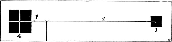
Fig. 13. Mass of 4 units balanced by 1 unit.
Hence, to balance two masses in a rectangle, the point of balance will be found by proportion, placing it[Pg 27] on a line which divides the rectangle into parts of 2 to 3. The balancing of the masses across this point will then be a matter of determining their relative distances from it. It is apparent that the larger of two masses may be far enough from the point of balance so that it will force the smaller entirely out of the rectangle. It is of course easy to move the larger closer to the point which automatically brings in the smaller. What constitutes a proper distance from the edge of the rectangle will be discussed under “Margins,” in the book on Typographical Design.
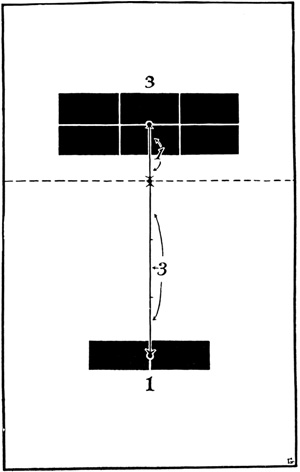
Fig. 14. Mass of 3 units balanced by mass of 1 unit,
taking the point of balance upon the line which divides
the space in good proportion.
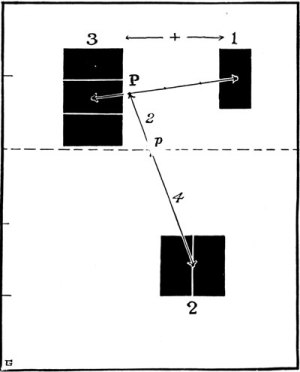
Fig. 15. Measures of 3 and 1 balanced by a measure of 2,
the point of balance dividing the space in good proportion.
The balance of three or more masses within a rectangle involves the consideration of two at a time, balancing the pair or pairs with the remaining mass or masses.
In Fig. 15, masses 1, 2 and 3 are to be balanced within the rectangle. Balancing 3 with 1 gives the balancing point P. Taking 3 plus 1 from the point P, we locate the mass 2 to balance them across the line AB which divides the rectangle in good proportion. The point p then becomes the balancing point for the entire group. Mathematically, 3 plus 1 equal 4; 4 is twice 2; therefore the mass 2 must be twice as far from the point p as the balanced masses 3 plus 1.
Two other combinations might have been worked out with the masses in Fig. 15: 3 plus 2, balanced by 1, the mass 1 being placed five times as far from the point p as would the point P. Or 2 plus 1 might have been balanced by 3, in which case the distances would have been equal.
The application of these principles of balance to the problems of typography is largely a matter of influence. The typographer should be guided by them but he need not make mathematical calculations if his eyes be trained to judge relative attraction values so that he can arrange his various masses to secure balance.
When two parts of a design are equal in every respect so that if the design were folded over one-half would superimpose in every detail with the other half, then a state of symmetry exists and the design is said to be symmetrical. The line upon which such a design would be folded, or, in other words, the line which bisects a symmetrical design, is called its axis.
[Pg 29]The printed page is often symmetrical with respect to its vertical axis (Fig. 16).
In Fig. 16 the line AB is the vertical axis of the page.
Fig. 16. Type page, symmetrical with respect to its vertical axis.
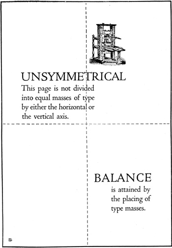
Fig. 17. Page arranged for variety. Not symmetrical on
either axis.
This arrangement is frequently used in advertising display,
but is rare in book work.
It is rarely possible that the printed page can be symmetrical with respect to its horizontal axis. Such[Pg 31] a state would involve a division of the page below its optical center and would also have an uninteresting division of its spaces, with equal masses above and below. It should be noted that symmetry on the vertical axis permits full variety in the size of the masses used.
The absence of symmetry in a design gives it the character of variety, which may be defined as a state of inequality in the arrangement of the parts of a design.
In Fig. 17, neither the horizontal axis nor the vertical axis divides the page so that its units are symmetrically arranged.
In any arrangement, pictorial or decorative, the eye of the observer is attracted to various parts in succession, depending on their character and position with respect to each other. This quality, called motion, will be more pronounced as the several units tend to lead more definitely from one to another. Fig. 18 shows the path which the eye follows as it looks at the ornament. In pictorial composition the same quality is employed to emphasize the story to be told or the character of the arrangement used by the painter. Then it is called “line.” This quality of design is not to be confused with “action,” which is the depiction of a figure in motion, as shown in Fig. 19.
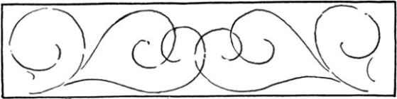
Fig. 18. The diagram shows the motion of the eye as it
perceives the
design above. This motion is due to line entirely, not to accents of tone.

Fig. 19. Showing action in the figure depicted, without motion in design.
On the printed page the eye may be definitely directed from one unit to another through this quality of motion, which forms a very valuable resource for the printer. Fig. 20 is a diagram of a simple use of motion, the eye progressing as indicated by the arrows through the masses which make up the page.
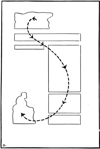
Fig. 20. Diagram of motion as employed in advertising
to lead the eye progressively through a page.
While the elements of design concern all the parts of a proposed scheme (on the printed page, its masses of type, decorative border, head-band, initial letters, tail-piece, etc.) certain parts will be used solely to beautify the whole design. They ornament or decorate it. “Ornament is a means by which Beauty or Significance is imparted to Utility.”
Ornament may be either Symbolic or Esthetic.
Symbolic ornament consists of elements or forms chosen because they are significant of the purpose of the design.
In Fig. 22, the ornament is symbolic in its close connection with the message conveyed by the type.
Esthetic ornament consists of forms chosen for their beauty alone. In Fig. 23, the head-band and initial are pleasing in design and they beautify the page without having the slightest relation to the text of the page.
Esthetic ornament characterizes the periods of design which have had the most important influence in the development of printing: the Greek, Roman, and Renaissance.
Symbolic ornament is found in Egyptian, Assyrian, Byzantine, Scandinavian, Celtic, Persian, Indian, Gothic, Chinese, and Japanese design. For intimate study of these various styles and periods the reader is referred to the various books listed in the bibliography.
Fig. 21. Ornament designed with natural forms.
Fig. 22. House-organ cover design by Mr. F. W. Goudy,
in which the ornament is symbolic of the message of the page.
Fig. 23. Type page decorated with esthetic ornament. Much of the
decorative
material available to printers is of this character. Since the
printer need not study its symbolic significance
he may choose such
decoration for its qualities of tone and good drawing.
Ornament may be natural or inventive. Natural ornament confines itself to the rendition in decorative design of forms chosen from nature, either animate of inanimate. Inventive ornament consists of elements not derived from any natural source. It is usually geometric in character; that is, it is rendered in patterns and masses expressed in geometric shapes.
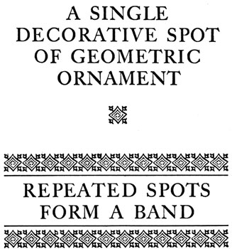
Fig. 24. Type border used as geometric ornaments.
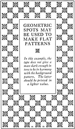
Fig. 25. Further use of type border to make a flat
pattern or “all-over”
design. Compare the effect with that shown in the facing illustration.
[Pg 39]In the artistic development of the various races, geometric design has often been the result of religious restrictions upon the imitation of any animate forms. The Mahometans have developed it to its highest type of expression. Arabian and Moorish architecture and handicrafts are the best examples, with the crystal beauty of the Alhambra, the wonderful palace built by the Moors in Spain, as the supreme achievement of geometric design.
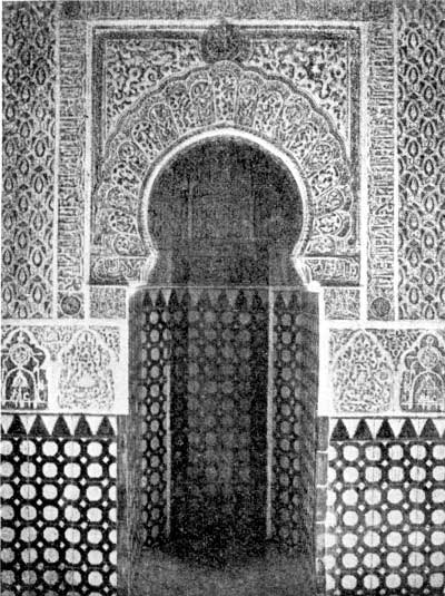
Fig. 26. A niche in the Alhambra, at Granada, Spain.
Showing characteristic Moorish ornamentation.
[Pg 40]Geometrical design uses simple materials, being the oldest of the elements of decoration. The implements of savages and the tattooing of the Indians prove this. From the first crude expressions of the original squares, circles, zigzag lines, and sundry simple combinations, gradual development led finally to the delicate forms of Moorish design. The elaboration of this style involves deep mathematical problems and careful draftsmanship.
The majority of geometrical ornaments may be divided into three groups. As we find them in typographical material these groups are bands or borders, made up visually of repeated units or spots; enclosed spaces or panels; and unlimited flat patterns or “all-over” designs.
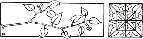
Fig. 27. The development of a motif (stems, leaves, and
berries) into a
decorative spot. Diagram in the upper corner shows the
geometrical
arrangement of the material. The spot has been repeated to form a band.
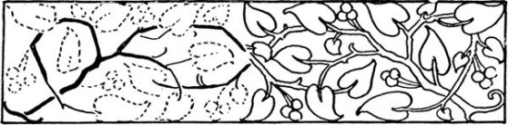
Fig. 28. Development of the motif used in Fig. 27 into a
natural ornament.
The forms and growth are not distorted but the
rendering is in flat surfaces to hold the decorative quality.
In nearly every style and period of design the plant-world has been the biggest source of material for adaptation. The direct imitation of natural forms, keeping as much as possible of their shape, color, formation, etc., is called naturalistic design. A departure from the exact details of the natural form, forming the design according to the rules of rhythm and symmetry, with strict attention to regularity leads to a result more artificial in character.
Whether the ornament you consider be naturalistic or artificial, the original source, which is the plant-form or other natural form from which the design was made, is called the motif of the design. It is interesting to survey the world about you and note here and there a recognizable motif in the design of wallpaper, hangings, furniture, rugs, books, and so on all through the works of man.
The development of a motif into ornament or decoration calls for the use of all the principles thus far established, plus familiarity with the medium to be used and the inventiveness that comes only with some[Pg 42] experience. If the reader lacks this experience and is interested in undertaking to devise ornament or decoration with pen, pencil, or brush, he is advised to consult some one or more of the books on the subject which are listed in the bibliography. If he has facility with his pencil and enthusiasm for the work he will find it a most fascinating undertaking.
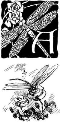
Fig. 29. Initial letter decorated with natural ornament
and a pen sketch treating the motif in a more realistic
way. Further
emphasis of the essential flatness of surface
in material that is to decorate a flat sheet of paper.
The student of design finds that historical study of his subject carries him through the entire history of art, from the crude expressions of prehistoric man down the long and varied centuries to the styles and fancies of the present day. He will find his theme closely interwoven with the story of the development of races, the rise and fall of nations, the whole thrilling drama of ancient and modern history.
Printing, as a means of making records and of embodying and illustrating thought, has given us the wide field of literature on design. But in the making of books as an application of design, and in the making of all other forms of printed matter, printers since Gutenberg have been influenced by relatively few of the many distinct periods through which art has come. And those few have usually been the artistic feeling which prevailed at the time the printers lived.
To trace the periods of design that have most influenced printing is to tell in part the history of the craft. Since that subject is developed elsewhere in this series, suffice it to follow briefly the steps through which the making of books has passed.
Since the invention of movable types came opportunely to meet the desire for enlightenment by means of books, it was natural that printed books should be planned closely to imitate the hand-written or lettered books. These latter, having been produced for centuries by the men of the church to whom had been given training in the arts, had been brought to a high state of perfection in design. It has often been said that Gutenberg’s forty-two line Bible, one of the first books printed from type, has never been surpassed in pure beauty of design and in the rich quality of its type masses.
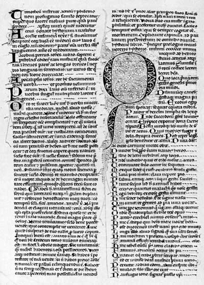
Fig. 30. A reproduction, greatly reduced, of a page from
a Manuscript Bible
of the early 14th Century. Entirely the product of
the quill and brush
of the writer and illuminator. Such books were
usually done in black ink
on parchment or vellum and decorated in water colors and gold leaf.
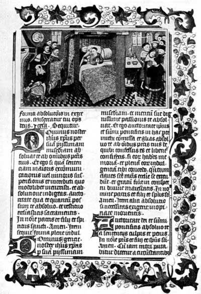
Fig. 31. A page from an illuminated Flemish manuscript of
the middle
15th Century, showing characteristic treatment of
illustration and
decoration. This and the preceding example are shown
for
comparison with Figs. 32 and 33. They demonstrate the
effect of the writing of books upon the development of printing.
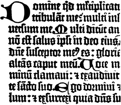
Fig. 32. Type of the Mazarin Bible (exact size).
But the first books printed from type were all of religious character, and the type itself was designed to imitate the black, condensed “text” letter forms which had been developed by the scribes. The elaborate initial letters which marked the sundry divisions of thought were repeated by the early printers, sometimes to be illumined by hand and later as engravings on wood or metal. There was no distinct departure from the ecclesiastical style of the monks save as was necessitated by the mechanical limitations of the new process of printing. Hence came a style which marked the first years of printing with the influence of the church. And that style today can be embodied in modern work by means of typographic material, black text types, missal initials, and liberal use of color. But it will always be associated by the power of tradition with church literature and ecclesiastical printing.
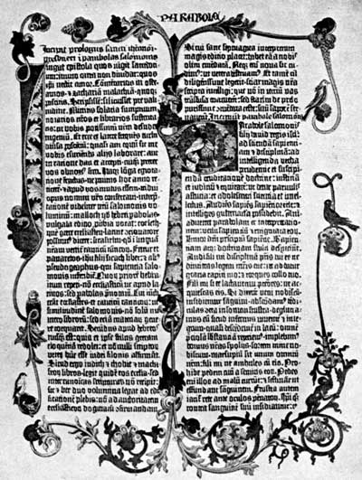
Fig. 33. Reproduction of a page from Gutenberg’s 42-line
Bible, of which it
has been said that no later book has been more
beautifully designed.
In completing this book and for some years after,
the illuminating and
decoration were done by hand, only the type being set and printed on the press.
[Pg 48]Perhaps it was fortunate for the future of the printing art that the upheaval in Mainz drove printers out of the restricted atmosphere in which their craft was growing. For with the spread of printing into Italy, where printers sought freer fields, there straightway came a marked change in its use. The first Roman type was cut and the printers grew under the influence of the most splendid period in the history of art, the Italian Renaissance, the revival and further development of the arts which had well-nigh perished through the dark centuries. The purity of line and form, the severe dignity, and the almost too perfect proportion which had been developed by the Greeks over a thousand years before were revived and interpreted with more human feeling by the Italians of the fifteenth century.
Just as Gutenberg, Fust and Schoeffer set a standard in ecclesiastical printing with their first efforts, so Nicholas Jenson in cutting his first Roman type established a precedent which has lived to the present day.
Designers of today find inspiration in the classic expression of the Greeks for printed work which is to be similarly restrained and dignified. Type faces have been developed which are distinctly classic in feeling, echoing the letter-forms of the inscriptions which were cut in stone by Greek and Roman artisans. (Figs. 35-6.)
The design of the Renaissance has been embodied in the books of many nations. Indeed, it may be said that modern book design dates from the start of printing in Italy. But, just as the fine arts have never since flourished as they did in that resplendent period, so has the progress of design in printing been a matter of the work of individuals or limited groups rather than the character of a period or a national expression.
Fig. 34. Ecclesiastical style in modern typography.
[Pg 50]The voluptuous vagaries of the successive French periods of design gave little lasting distinction to contemporary printing.
Type faces were cut at various times and by men of different nationalities which have marked characteristics, but they are not to be noted as establishing periods or styles in printing.
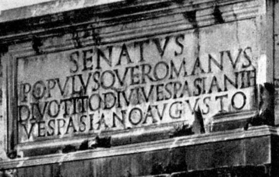
Fig. 35. An inscription in Classic Roman. Study opposite illustration.
In the seventeenth and eighteenth centuries printing in England grew into forms of expression which have been recognized under the term of “Georgian” or “colonial.” The first editions of Shakespeare typify the earlier development of this style, which was marked by poor typographical materials that were nevertheless arranged in a direct and interesting manner. (Fig. 37.)
A few years later the growth of printing in the American colonies brought this form of typographic[Pg 51] expression into most of the printed matter which has been preserved. The museums of printing and the literature dealing with the times are rich with examples. See Figs. 39 to 41.
Through the ensuing decades printing developed mechanically, but it lapsed into styles which had little or no relationship to design. It is interesting historically to follow the efforts of the printers who rode on the first steamboats and railroad trains; who recorded the rise and fall of slavery and secession; who bent their rules and jumbled their type faces during the “early Pullman days” that marked the start of many modern successful printers. The history of the craft through all these times has been picturesque and closely identified with the growth of the country. But it has little or no significance for the designer.
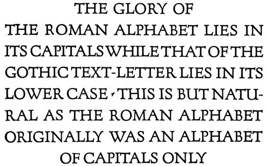
Fig. 36. Forum, a Classic Roman type, designed by Mr. F. W. Goudy.
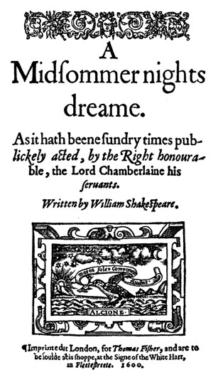
Fig. 37. Title page, much reduced, of a Shakespeare first
folio, showing the
Georgian style of typography. The types were poorly
fitted and of
uncertain alignment. The “stock” ornaments, cut on wood,
were
often bruised and worn. Yet there is undeniable charm in the result.
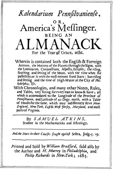
Fig. 38. An early American page, dated 1685, showing the
influence of the
Georgian style upon the Colonial printers. An
improvement in mechanical
quality may be noted. Large capitals, a
profusion of italics, and
frequent use of cross rules mark this period of printing.
[Pg 54]Design in printing has suffered through the marvelous mechanical development of machines and devices whose sole purpose has been to multiply gross output. Necessary as sheer volume of production has been, it has remained for very recent years to witness a renewal of interest in the beauty of printing, as determined by the principles of design.
William Morris, in England, devoted a very few years, toward the end of his life, to a protest against the commonplace and mechanical qualities which had dominated printing previously. He revived many of the old traditions and marked his books with his strong personality. We owe much of our present wide-spread reverence for good design in printing to his influence, even as we are similarly indebted to him for the well-designed and useful appurtenances of our daily life which have supplanted twisted and distorted furniture, stuffed birds under glass jars, and all the atrocities of a generation or two ago. See Figs.
Among the present-day designers of printing whose work shows an intimate study of the principles and the traditions of the craft are such men as Rogers, Updike, Goudy, Cleland, and Currier. The product of their work may frequently be seen in reproductions in the trade publications. It should be studied by younger designers, for it shows the results of earnest and understanding effort to make modern printing reach and even pass the artistic standards which were established nearly five hundred years ago.
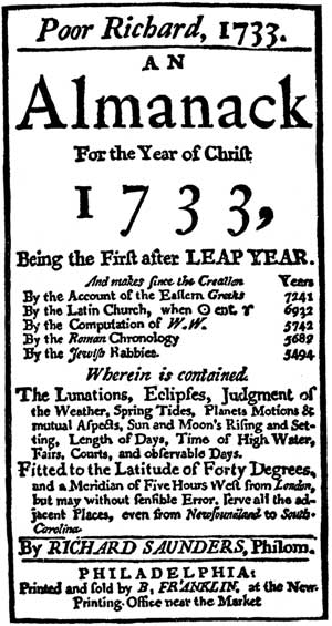
Fig. 39. Page from Poor Richard’s Almanack, one of the
best known
of the Colonial publications. Its style is typical of that period.
Fig. 40. Illustrating the period of transition from the
true Colonial
style. Type and material are obviously improved in
mechanical
qualities, but the compositor must have been seeking
for “something new” in typography.
Fig. 41. Showing a typical title page composed at the
beginning of the
decline of typography in America. During almost the
entire 19th Century
there was neither reason nor design in most of the printing produced.
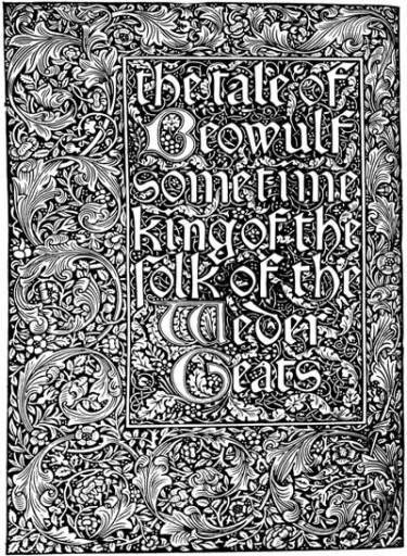
Figs. 42 and 43. Facing pages from “The Tale of Beowulf,”
as designed
and printed by William Morris. The small reproductions give but
a suggestion of the Morris conception of book-making.
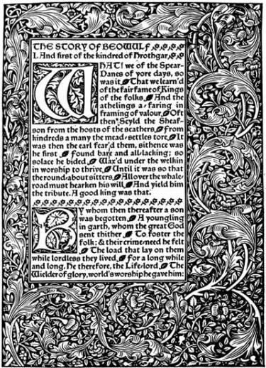
After a century or more of the most haphazard printing, Morris revived
the traditions of the first book-makers, thereby stimulating a
world-wide renewal of interest in typography and design.
Fig. 44. Page designed by Mr. Bruce Rogers.
Fig. 45. Title page by Mr. F. W. Goudy.
Fig. 46. Folder cover arranged by Mr. T. M. Cleleand.
Fig. 47. Catalogue page by Mr. D. B. Updike.
The Principles of Design. By Ernest Allen Batchelder. Inland Printer Company, Chicago.
Design in Theory and Practice. By Ernest Allen Batchelder. MacMillan Company, New York.
A Manual of Historic Ornament. By Richard Glazier. B. T. Batsford, 94 High Holburn, London.
Line and Form. By Walter Crane. G. Bell and Sons, London.
The Bases of Design. By Walter Crane. G. Bell and Sons, London.
A History of Ornament. By A. D. F. Hamlin. Century Company, New York.
Ornament and Its Application. By Lewis F. Day. Scribner’s, New York.
Nature in Ornament. By Lewis F. Day. B. T. Batsford, 94 High Holburn, London.
The following questions, based on the contents of this pamphlet, are intended to serve (1) as a guide to the study of the text, (2) as an aid to the student in putting the information contained into definite statements without actually memorizing the text, (3) as a means of securing from the student a reproduction of the information in his own words.
A careful following of the questions by the reader will insure full acquaintance with every part of the text, avoiding the accidental omission of what might be of value. These primers are so condensed that nothing should be omitted.
In teaching from these books it is very important that these questions and such others as may occur to the teacher should be made the basis of frequent written work, and of final examinations.
The importance of written work cannot be overstated. It not only assures knowledge of material but the power to express that knowledge correctly and in good form.
1. What purpose in the works of mankind is served by design?
2. In what manner does design influence man’s handiwork?
3. What is design?
4. What is “a design”?
5. What is the difference between beauty and fitness to purpose?
6. What are the elements of design?
7. What relationship has a printer to a sculptor, an architect, a painter, a decorative designer?
8. How does the printed page limit its design?
9. What is the difference between a printed picture and a printed design based upon that picture?
10. Why are pictures unsuitable to decorate a printed page?
11. What are the materials of design?
12. Analyze a well-designed typographical ornament into the materials which compose it.
[Pg 66]13. When the materials of design are put to use, what conditions must be satisfied in their arrangement?
14. What is harmony?
15. What is balance?
16. What is proportion?
17. What is rhythm?
18. How may the foregoing qualities be demonstrated?
19. What shapes should be used in combination?
20. What further relationship should they have?
21. On a type page 20 picas wide by 30 picas deep would a panel 18 picas wide by 8 picas deep be proper? What, if anything, would be preferable?
22. Would a rule line 6 points wide be suitable to surround a mass of 18 point Caslon old style caps? Why?
23. If the printed page is to be other than black and white, what further consideration of harmony is involved?
24. What must we consider in related areas with respect to their size or measure?
25. What relationship of sizes is often most interesting?
26. Place a single line on a cover page in a desirable position.
27. Is the eye always to be trusted in the judgment of space relationships?
28. Should mathematical measurements or the effect upon the eye be the guiding factor in arrangement? Why?
29. What is the effect of the surrounding edge or border upon the masses of a design?
30. How should the masses in a design be arranged with respect to the surrounding edge?
[Pg 67]31. What mathematical principles influence this arrangement?
32. How is equality in the halves of a printed page sometimes desirable and sometimes not?
33. When there is no equality in the halves of a design, what condition exists and what principles must guide such an arrangement?
34. What is ornament?
35. What qualities may ornament possess? Define them.
36. In what periods of design does each quality appear most pronouncedly?
37. How is ornament related to nature? To inventiveness or ingenuity?
38. How is ornament related to mathematics?
39. What are the important divisions of mathematical ornament?
40. What happens when an ornament is developed from a natural source?
41. What is the source called?
42. What periods of design have most affected printing? Why?
43. Explain how each of the above periods influences modern typography.
44. What should be the typographer’s attitude toward the activities of designers of every age and period?
45. What has been the effect of mechanical development in printing upon typographic design?
46. Name some of the modern men whose work is of interest to the typographer.
Assyrian (Art)—The Assyrian Empire lay in Southwestern Asia between the Tigris and the Euphrates, now part of Turkey in Asia. Its art was largely expressed in the treatment of flat surfaces, using enameled bricks, painted stuccoes, figured bronzes, etc. Bricks were the only building material. The period dates from 4000-3000 B.C. to about 500 B.C.
Attraction—The force exercised upon the eye by a mass through its tone, color, size, or shape.
Axis—A line dividing a surface for purpose of comparison or construction.
Balance—An apparent state of rest between the various attractions in a design. To balance the elements of a design is to arrange them so that they are set at rest with one another.
Byzantine (Art)—The art of Eastern Christendom, from the time when Byzantium (now Constantinople) became the capital in 330 A.D. until the taking of the city by the Turks in 1453 and even later. Byzantine art embodied Asiatic luxury in splendor and in profusion of color and gilding. Its forms of design were purely geometrical and conventional, with no use of the human figure.
Celtic (Art)—Particularly active in the fourth century among the people of what are now the British Isles. It was influenced by Central Asia and Persia, and is thus somewhat oriental.
Chinese (Art)—Characterized by the use of fantastic forms and brilliant color. Best exemplified in porcelains, lacquers, and carvings in wood and semi-precious stones. The source of inspiration of the Japanese who have commercialized and cheapened it in everything save wood-block cutting and printing.
Classic—The period of early Greece and Rome.
Colonial (Art)—Found in the printing and other applied design of the early American colonies and during the first years of the American Republic. Derived from England and sometimes called “Georgian.”
Color—The kind of light reflected by a surface.
Conception—The process of forming an idea or scheme.
[Pg 69]Decoration—Any thing or group of things that embellishes or adorns.
Design (In general)—An arrangement of forms or colors, or both,
intended to be executed in hard substances or pliable material or to be applied to a fabric or other surface for ornament.
(In printing)—The arrangement of masses, lines, and dots to secure the qualities of beauty, and fitness.
(Specific)—“A design”: any piece of work into which the elements of design have been incorporated.
Egyptian (Art)—Includes the period of art activity in Egypt dating from about 4000 B.C. through successive steps to 500 B.C. It was highly conventionalized, richly decorated, making use of material forms interpreted with vigorous color. In architecture its chief characteristic was durability.
Esthetic—Pertaining to beauty as manifested in the fine arts. “The esthetic imagination differs from the scientific.... The difference is seen in the fact that the end is no longer knowledge but beauty.”
Ecclesiastical (Style)—That which characterized the books and manuscripts of the early churches, usually in black text letter forms with elaborate ornamentation and illumination.
Geometrical (Design)—Based upon spots, bands, or all-over patterns made up of straight and curved lines developed geometrically.
Georgian (Period)—Included the English and Colonial American design of the 17th and 18th centuries. Similar to “Colonial.”
Gothic (Art)—Developed in the architecture and applied design in Europe from 1200 A.D. to 1500 A.D. Characterized by vertical lines, pointed arches, and decorative material based directly upon nature.
Greek (Design)—That of early Greece, dated from about 620 B.C. to about 350 B.C., developed under the influence of Egypt and Assyria but rising far above either in purity and expression. “The Greek artisan had the unerring taste of the artist and sought his inspiration from the same sources.”
Harmony (In art)—A state of completeness in the relationship to things to each other.
[Pg 70]Headband—The horizontal strip of decoration used to ornament or to set off a type page.
Indian (Art)—That of the East Indies or India, which have several styles, all oriental in character. American Indian art was manifested in geometric ornament, raw colors, and crude representation of animate forms.
Initial Letter—A large letter, unornamented or decoratively designed, used to mark the beginning of a chapter, an important change in the text, or to decorate a single mass of type.
Japanese (Design)—Derived from the Chinese and usually commercialized in its application. Of chief interest to printers in the arrangement and rendering of wood-block prints.
Mahometans—Followers of the Prophet Mahomet, including Arabian, Indian, Moorish, Persian, and other nations.
Mass—One of the main portions of a design, readily distinguished and having some unity in itself, yet remaining in proper relationship to the whole scheme.
Materials of Design—Masses, dots, and lines which compose the completed design.
Motif—The original source for a decorative scheme or element.
Natural Forms—Motifs of design chosen from nature, either animate or inanimate.
Naturalistic (Design)—The direct imitation of forms taken from nature, retaining as much as possible of their original shape, color, etc.
Optical Illusion—An error, normal to the average eye, in the perception of certain lines, angles, and spaces. Recognized by the designers of type and of typography.
Ornament—Similar to decoration.
Persian (Art)—Covered by the period from about 550 B.C. to 330 B.C. Derived from Assyrian art but strongly influenced by the Greek.
Point of Balance—The point, unindicated in the finished design, upon which the various attractions of the design are balanced in appearance.
Proportion—The comparative relationship between the various elements in a design.
[Pg 71]Renaissance—The period of art activity in the 14th and 15th centuriesin Italy. A revival of the classic arts but developed and enriched beyond former heights.
Rhythm—Movement, characterized by the regular recurrence of accent or motion.
Roman (Design)—A transplanted development of Greek design, influenced by Roman habits and character. More realistic in the treatment of natural forms than the Greek.
Shape—The contour or appearance of an area.
Scandinavian (Design)—That of the nations Denmark, Norway, and Sweden, characterized by rich interlacements, and many symbolic devices.
Symbolic—Typifying or representing the idea or purpose of a design.
Symmetry—Regular arrangement of parts across a given axis, so that a division through that axis will give similar halves.
Tone—The amount (not kind) of light reflected from a given surface—“a light tone” or “dark in tone.”
Variety—An intermixture of elements in a design different in form or color and not arranged symmetrically.
The following list of publications, comprising the Typographic Technical Series for Apprentices, has been prepared under the supervision of the Committee on Education of the United Typothetae of America for use in trade classes, in course of printing instruction, and by individuals.
Each publication has been compiled by a competent author or group of authors, and carefully edited, the purpose being to provide the printers of the United States—employers, journeymen, and apprentices—with a comprehensive series of handy and inexpensive compendiums of reliable, up-to-date information upon the various branches and specialties of the printing craft, all arranged in orderly fashion for progressive study.
The publications of the series are of uniform size, 5 x 8 inches. Their general make-up, in typography, illustrations, etc., has been, as far as practicable, kept in harmony throughout. A brief synopsis of the particular contents and other chief features of each volume will be found under each title in the following list.
Each topic is treated in a concise manner, the aim being to embody in each publication as completely as possible all the rudimentary information and essential facts necessary to an understanding of the subject. Care has been taken to make all statements accurate and clear, with the purpose of bringing essential information within the understanding of beginners in the different fields of study. Wherever practicable, simple and well-defined drawings and illustrations have been used to assist in giving additional clearness to the text.
In order that the pamphlets may be of the greatest possible help for use in trade-school classes and for self-instruction, each title is accompanied by a list of Review Questions covering essential items of the subject matter. A short Glossary of technical terms belonging to the subject or department treated is also added to many of the books.
These are the Official Text-books of the United Typothetae of America.
Address all orders and inquiries to Committee on Education, United Typothetae of America, Chicago, Illinois, U. S. A.
PART I—Types, Tools, Machines, and Materials
| 1. Type: a Primer of Information | By A. A. Stewart |
Relating to the mechanical features of printing types; their sizes, font schemes, etc., with a brief description of their manufacture. 44 pp.; illustrated; 74 review questions; glossary.
| 2. Compositors’ Tools and Materials | By A. A. Stewart |
A primer of information about composing sticks, galleys, leads, brass rules, cutting and mitering machines, etc. 47 pp.; illustrated; 50 review questions; glossary.
| 3. Type Cases, Composing Room Furniture | By A. A. Stewart |
A primer of information about type cases, work stands, cabinets, case racks, galley racks, standing galleys, etc. 43 pp.; illustrated; 33 review questions; glossary.
| 4. Imposing Tables and Lock-up Appliances | By A. A. Stewart |
Describing the tools and materials used in locking up forms for the press, including some modern utilities for special purposes. 59 pp.; illustrated; 70 review questions; glossary.
| 5. Proof Presses | By A. A. Stewart |
A primer of information about the customary methods and machines for taking printers’ proofs. 40 pp.; illustrated; 41 review questions; glossary.
| 6. Platen Printing Presses | By Daniel Baker |
A primer of information regarding the history and mechanical construction of platen printing presses, from the original hand press to the modern job press, to which is added a chapter on automatic presses of small size. 51 pp.; illustrated; 49 review questions; glossary.
| 7. Cylinder Printing Presses | By Herbert L. Baker |
Being a study of the mechanism and operation of the principal types of cylinder printing machines. 64 pp.; illustrated; 47 review questions; glossary.
| 8. Mechanical Feeders and Folders | By William E. Spurrier |
The history and operation of modern feeding and folding machines; with hints on their care and adjustments. Illustrated; review questions; glossary.
| 9. Power for Machinery in Printing Houses | By Carl F. Scott |
A treatise on the methods of applying power to printing presses and allied machinery with particular reference to electric drive. 53 pp.; illustrated; 69 review questions; glossary.
| 10. Paper Cutting Machines | By Niel Gray, Jr. |
A primer of information about paper and card trimmers, hand-lever cutters, power cutters, and other automatic machines for cutting paper. 70 pp.; illustrated; 115 review questions; glossary.
| 11. Printers’ Rollers | By A. A. Stewart |
A primer of information about the composition, manufacture, and care of inking rollers. 46 pp.; illustrated; 61 review questions; glossary.
| 12. Printing Inks | By Philip Ruxton |
Their composition, properties and manufacture (reprinted by permission from Circular No. 53, United States Bureau of Standards); together with some helpful suggestions about the everyday use of printing inks by Philip Ruxton. 80 pp.; 100 review questions; glossary.
| 13. How Paper is Made | By William Bond Wheelwright |
A primer of information about the materials and processes of manufacturing paper for printing and writing. 68 pp.; illustrated; 62 review questions; glossary.
| 14. Relief Engravings | By Joseph P. Donovan |
Brief history and non-technical description of modern methods of engraving; woodcut, zinc plate, halftone; kind of copy for reproduction; things to remember when ordering engravings. Illustrated; review questions; glossary.
| 15. Electrotyping and Stereotyping | By Harris B. Hatch and A. A. Stewart |
A primer of information about the processes of electrotyping and stereotyping. 94 pp.; illustrated; 129 review questions; glossaries.
PART II—Hand and Machine Composition
| 16. Typesetting | By A. A. Stewart |
A handbook for beginners, giving information about justifying, spacing, correcting, and other matters relating to typesetting. Illustrated; review questions; glossary.
| 17. Printers’ Proofs | By A. A. Stewart |
The methods by which they are made, marked, and corrected, with observations on proofreading. Illustrated; review questions; glossary.
| 18. First Steps in Job Composition | By Camille DeVéze |
Suggestions for the apprentice compositor in setting his first jobs, especially about the important little things which go to make good display in typography. 63 pp.; examples; 55 review questions; glossary.
| 19. General Job Composition |
How the job compositor handles business stationery, programs and miscellaneous work. Illustrated; review questions; glossary.
| 20. Book Composition | By J. W. Bothwell |
Chapters from DeVinne’s “Modern Methods of Book Composition,” revised and arranged for this series of text-books by J. W. Bothwell of The DeVinne Press, New York. Part I: Composition of pages. Part II: Imposition of pages. 229 pp.; illustrated; 525 review questions; glossary.
| 21. Tabular Composition | By Robert Seaver |
A study of the elementary forms of table composition, with examples of more difficult composition. 36 pp.; examples; 45 review questions.
| 22. Applied Arithmetic | By E. E. Sheldon |
Elementary arithmetic applied to problems of the printing trade, calculation of materials, paper weights and sizes, with standard tables and rules for computation, each subject amplified with examples and exercises. 159 pp.
| 23. Typecasting and Composing Machines | A. W. Finlay, Editor |
| Section I—The Linotype | By L. A. Hornstein |
| Section II—The Monotype | By Joseph Hays |
| Section III—The Intertype | By Henry W. Cozzens |
| Section IV—Other Typecasting and Typesetting Machines | By Frank H. Smith |
A brief history of typesetting machines, with descriptions of their mechanical principles and operations. Illustrated; reviewquestions; glossary.
PART III—Imposition and Stonework
| 24. Locking Forms for the Job Press | By Frank S. Henry |
Things the apprentice should know about locking up small forms, and about general work on the stone. Illustrated; review questions; glossary.
| 25. Preparing Forms for the Cylinder Press | By Frank S. Henry |
Pamphlet and catalog imposition; margins; fold marks, etc. Methods of handling type forms and electrotype forms. Illustrated; review questions; glossary.
PART IV—Presswork
| 26. Making Ready on Platen Presses | By T. G. McGrew |
The essential parts of a press and their functions; distinctive features of commonly used machines. Preparing the tympan, regulating the impression, underlaying and overlaying, setting gauges, and other details explained. Illustrated; review questions; glossary.
| 27. Cylinder Presswork | By T. G. McGrew |
Preparing the press; adjustment of bed and cylinder, form rollers, ink fountain, grippers and delivery systems. Underlaying and overlaying; modern overlay methods. Illustrated; review questions; glossary.
| 28. Pressroom Hints and Helps | By Charles L. Dunton |
Describing some practical methods of pressroom work, with directions and useful information relating to a variety of printing-press problems. 87 pp.; 176 review questions.
| 29. Reproductive Processes of the Graphic Arts | By A. W. Elson |
A primer of information about the distinctive features of the relief, the intaglio, and the planographic processes of printing. 84 pp.; illustrated; 100 review questions; glossary.
PART V—Pamphlet and Book Binding
| 30. Pamphlet Binding | By Bancroft L. Goodwin |
A primer of information about the various operations employed in binding pamphlets and other work in the bindery. Illustrated; review questions; glossary.
| 31. Book Binding | By John J. Pleger |
Practical information about the usual operations in binding books; folding; gathering, collating, sewing, forwarding, finishing. Case making and cased-in books. Hand work and machine work. Job and blank-book binding. Illustrated; review questions; glossary.
PART VI—Correct Literary Composition
| 32. Word Study and English Grammar | By F. W. Hamilton |
A primer of information about words, their relations, and their uses. 68 pp.; 84 review questions; glossary.
| 33. Punctuation | By F. W. Hamilton |
A primer of information about the marks of punctuation and their use, both grammatically and typographically. 56 pp.; 59 review questions; glossary.
| 34. Capitals | By F. W. Hamilton |
A primer of information about capitalization, with some practical typographic hints as to the use of capitals. 48 pp.; 92 review questions; glossary.
| 35. Division of Words | By F. W. Hamilton |
Rules for the division of words at the ends of lines, with remarks on spelling, syllabication and pronunciation. 42 pp.; 70 review questions.
| 36. Compound Words | By F. W. Hamilton |
A study of the principles of compounding, the components of compounds, and the use of the hyphen. 34 pp.; 62 review questions.
| 37. Abbreviations and Signs | By F. W. Hamilton |
A primer of information about abbreviations and signs, with classified lists of those in most common use. 58 pp.; 32 review questions.
| 38. The Uses of Italic | By F. W. Hamilton |
A primer of information about the history and uses of italic letters. 31 pp.; 37 review questions.
| 39. Proofreading | By Arnold Levitas |
The technical phases of the proofreader’s work; reading, marking, revising, etc.; methods of handling proofs and copy. Illustrated by examples. 59 pp.; 69 review questions; glossary.
| 40. Preparation of Printers’ Copy | By F. W. Hamilton |
Suggestions for authors, editors, and all who are engaged in preparing copy for the composing room. 36 pp.; 67 review questions.
| 41. Printers’ Manual of Style |
A reference compilation of approved rules, usages, and suggestions relating to uniformity in punctuation, capitalization, abbreviations, numerals, and kindred features of composition.
| 42. The Printer’s Dictionary | By A. A. Stewart |
A handbook of definitions and miscellaneous information about various processes of printing, alphabetically arranged. Technical terms explained. Illustrated.
PART VII—Design, Color, and Lettering
| 43. Applied Design for Printers | By Harry L. Gage |
A handbook of the principles of arrangement, with brief comment on the periods of design which have most influenced printing. Treats of harmony, balance, proportion, and rhythm; motion; symmetry and variety; ornament, esthetic and symbolic. 37 illustrations; 46 review questions; glossary; bibliography.
| 44. Elements of Typographic Design | By Harry L. Gage |
Applications of the principles of decorative design. Building material of typography: paper, types, ink, decorations and illustrations. Handling of shapes. Design of complete book, treating each part. Design of commercial forms and single units. Illustrations; review questions, glossary; bibliography.
| 45. Rudiments of Color in Printing | By Harry L. Gage |
Use of color: for decoration of black and white, for broad poster effect, in combinations of two, three, or more printings with process engravings. Scientific nature of color, physical and chemical. Terms in which color may be discussed: hue, value, intensity. Diagrams in color, scales and combinations. Color theory of process engraving. Experiments with color. Illustrations in full color, and on various papers. Review questions; glossary; bibliography.
| 46. Lettering in Typography | By Harry L. Gage |
Printer’s use of lettering: adaptability and decorative effect. Development of historic writing and lettering and its influence on type design. Classification of general forms in lettering. Application of design to lettering. Drawing for reproduction. Fully illustrated; review questions; glossary; bibliography.
| 47. Typographic Design in Advertising | By Harry L. Gage |
The printer’s function in advertising. Precepts upon which advertising is based. Printer’s analysis of his copy. Emphasis, legibility, attention, color. Method of studying advertising typography. Illustrations; review questions; glossary; bibliography.
| 48. Making Dummies and Layouts | By Harry L. Gage |
A layout: the architectural plan. A dummy: the imitation of a proposed final effect. Use of dummy in sales work. Use of layout. Function of layout man. Binding schemes for dummies. Dummy envelopes. Illustrations; review questions; glossary; bibliography.
PART VIII—History of Printing
| 49. Books Before Typography | By F. W. Hamilton |
A primer of information about the invention of the alphabet and the history of bookmaking up to the invention of movable types. 62 pp.; illustrated; 64 review questions.
| 50. The Invention of Typography | By F. W. Hamilton |
A brief sketch of the invention of printing and how it came about. 64 pp.; 62 review questions.
| 51. History of Printing—Part I | By F. W. Hamilton |
A primer of information about the beginnings of printing, the development of the book, the development of printers’ materials, and the work of the great pioneers. 63 pp.; 55 review questions.
| 52. History of Printing—Part II | By F. W. Hamilton |
A brief sketch of the economic conditions of the printing industry from 1450 to 1789, including government regulations, censorship, internal conditions and industrial relations. 94 pp.; 128 review questions.
| 53. Printing in England | By F. W. Hamilton |
A short history of printing in England from Caxton to the present time. 89 pp.; 65 review questions.
| 54. Printing in America | By F. W. Hamilton |
A brief sketch of the development of the newspaper, and some notes on publishers who have especially contributed to printing. 98 pp.; 84 review questions.
| 55. Type and Presses in America | By F. W. Hamilton |
A brief historical sketch of the development of type casting and press building in the United States. 52 pp.; 61 review questions.
PART IX—Cost Finding and Accounting
| 56. Elements of Cost in Printing | By Henry P. Porter |
The Standard Cost-Finding Forms and their uses. What they should show. How to utilize the information they give. Review questions. Glossary.
| 57. Use of a Cost System | By Henry P. Porter |
The Standard Cost-Finding Forms and their uses. What they should show. How to utilize the information they give. Review questions. Glossary.
| 58. The Printer as a Merchant | By Henry P. Porter |
The selection and purchase of materials and supplies for printing. The relation of the cost of raw material and the selling price of the finished product. Review questions. Glossary.
| 59. Fundamental Principles of Estimating | By Henry P. Porter |
The estimator and his work; forms to use; general rules for estimating. Review questions. Glossary.
| 60. Estimating and Selling | By Henry P. Porter |
An insight into the methods used in making estimates, and their relation to selling. Review questions. Glossary.
| 61. Accounting for Printers | By Henry P. Porter |
A brief outline of an accounting system for printers; necessary books and accessory records. Review questions. Glossary.
PART X—Miscellaneous
| 62. Health, Sanitation, and Safety | By Henry P. Porter |
Hygiene in the printing trade; a study of conditions old and new; practical suggestions for improvement; protective appliances and rules for safety.
| 63. Topical Index | By F. W. Hamilton |
A book of reference covering the topics treated in the Typographic Technical Series, alphabetically arranged.
| 64. Courses of Study | By F. W. Hamilton |
A guidebook for teachers, with outlines and suggestions for classroom and shop work.
This series of Typographic Text-books is the result of the splendid co-operation of a large number of firms and individuals engaged in the printing business and its allied industries in the United States of America.
The Committee on Education of the United Typothetae of America, under whose auspices the books have been prepared and published, acknowledges its indebtedness for the generous assistance rendered by the many authors, printers, and others identified with this work.
While due acknowledgment is made on the title and copyright pages of those contributing to each book, the Committee nevertheless felt that a group list of co-operating firms would be of interest.
The following list is not complete, as it includes only those who have co-operated in the production of a portion of the volumes, constituting the first printing. As soon as the entire list of books comprising the Typographic Technical Series has been completed (which the Committee hopes will be at an early date), the full list will be printed in each volume.
The Committee also desires to acknowledge its indebtedness to the many subscribers to this Series who have patiently awaited its publication.
Committee on Education,
United Typothetae of America.
Henry P. Porter, Chairman,
E. Lawrence Fell,
A. M. Glossbrenner,
J. Clyde Oswald,
Toby Rubovits.
Frederick W. Hamilton, Education Director.
For Composition and Electrotypes
Isaac H. Blanchard Company, New York, N. Y.
S. H. Burbank & Co., Philadelphia, Pa.
J. S. Cushing & Co., Norwood, Mass.
The DeVinne Press, New York, N. Y.
R. R. Donnelley & Sons Co., Chicago, Ill.
Geo. H. Ellis Co., Boston, Mass.
Evans-Winter-Hebb, Detroit, Mich.
Franklin Printing Company, Philadelphia, Pa.
Gage Printing Co., Ltd., Battle Creek, Mich.
F. H. Gilson Company, Boston, Mass.
Stephen Greene & Co., Philadelphia, Pa.
William Green, New York, N. Y.
W. F. Hall Printing Co., Chicago, Ill.
Frank D. Jacobs Co., Philadelphia, Pa.
Wilson H. Lee Co., New Haven, Conn.
J. B. Lippincott Co., Philadelphia, Pa.
MacCalla & Co. Inc., Philadelphia, Pa.
The Patteson Press, New York.
The Plimpton Press, Norwood, Mass.
Poole Bros., Chicago, Ill.
Remington Printing Co., Providence, R. I.
Edward Stern & Co., Philadelphia, Pa.
The Stone Printing & Mfg. Co., Roanoke, Va.
State Journal Company, Lincoln, Neb.
The University Press, Cambridge, Mass.
For Composition
Boston Typothetae School of Printing, Boston, Mass.
William F. Fell Co., Philadelphia, Pa.
The Kalkhoff Company, New York, N. Y.
Oxford-Print, Boston, Mass.
Toby Rubovits, Chicago, Ill.
Electrotypers
Blomgren Brothers Co., Chicago, Ill.
Flower Steel Electrotyping Co., New York, N. Y.
C. J. Peters & Son Co., Boston, Mass.
Royal Electrotype Co., Philadelphia, Pa.
H. C. Whitcomb & Co., Boston, Mass.
[Pg x]
For Engravings
American Type Founders Co., Boston, Mass.
C. B. Cottrell & Sons Co., Westerly, R. I.
Golding Manufacturing Co., Franklin, Mass.
Harvard University, Cambridge, Mass.
Inland Printer Co., Chicago, Ill.
Lanston Monotype Machine Company, Philadelphia, Pa.
Mergenthaler Linotype Company, New York, N. Y.
Geo. H. Morrill Co., Norwood, Mass.
Oswald Publishing Co., New York, N. Y.
The Printing Art, Cambridge, Mass.
B. D. Rising Paper Company, Housatonic, Mass.
The Vandercook Press, Chicago, Ill.
For Book Paper
American Writing Paper Co., Holyoke, Mass.
Bryant Paper Co., Kalamazoo, Mich.
The Miami Paper Co., West Carrollton, Ohio.
Oxford Paper Company, New York, N. Y.
West Virginia Pulp & Paper Co., Mechanicville, N. Y.
For Book Cloth
Interlaken Mills, Providence, R. I.
End of Project Gutenberg's Applied Design for Printers, by Harry Lawrence Gage

*** END OF THIS PROJECT GUTENBERG EBOOK APPLIED DESIGN FOR PRINTERS ***

***** This file should be named 30804-h.htm or 30804-h.zip *****
This and all associated files of various formats will be found in:
        https://www.gutenberg.org/3/0/8/0/30804/

Produced by Barbara Tozier, Bill Tozier, Stephanie Eason,
and the Online Distributed Proofreading Team at
https://www.pgdp.net.


Updated editions will replace the previous one--the old editions
will be renamed.

Creating the works from public domain print editions means that no
one owns a United States copyright in these works, so the Foundation
(and you!) can copy and distribute it in the United States without
permission and without paying copyright royalties.  Special rules,
set forth in the General Terms of Use part of this license, apply to
copying and distributing Project Gutenberg-tm electronic works to
protect the PROJECT GUTENBERG-tm concept and trademark.  Project
Gutenberg is a registered trademark, and may not be used if you
charge for the eBooks, unless you receive specific permission.  If you
do not charge anything for copies of this eBook, complying with the
rules is very easy.  You may use this eBook for nearly any purpose
such as creation of derivative works, reports, performances and
research.  They may be modified and printed and given away--you may do
practically ANYTHING with public domain eBooks.  Redistribution is
subject to the trademark license, especially commercial
redistribution.


*** START: FULL LICENSE ***

THE FULL PROJECT GUTENBERG LICENSE
PLEASE READ THIS BEFORE YOU DISTRIBUTE OR USE THIS WORK

To protect the Project Gutenberg-tm mission of promoting the free
distribution of electronic works, by using or distributing this work
(or any other work associated in any way with the phrase "Project
Gutenberg"), you agree to comply with all the terms of the Full Project
Gutenberg-tm License (available with this file or online at
https://gutenberg.org/license).


Section 1.  General Terms of Use and Redistributing Project Gutenberg-tm
electronic works

1.A.  By reading or using any part of this Project Gutenberg-tm
electronic work, you indicate that you have read, understand, agree to
and accept all the terms of this license and intellectual property
(trademark/copyright) agreement.  If you do not agree to abide by all
the terms of this agreement, you must cease using and return or destroy
all copies of Project Gutenberg-tm electronic works in your possession.
If you paid a fee for obtaining a copy of or access to a Project
Gutenberg-tm electronic work and you do not agree to be bound by the
terms of this agreement, you may obtain a refund from the person or
entity to whom you paid the fee as set forth in paragraph 1.E.8.

1.B.  "Project Gutenberg" is a registered trademark.  It may only be
used on or associated in any way with an electronic work by people who
agree to be bound by the terms of this agreement.  There are a few
things that you can do with most Project Gutenberg-tm electronic works
even without complying with the full terms of this agreement.  See
paragraph 1.C below.  There are a lot of things you can do with Project
Gutenberg-tm electronic works if you follow the terms of this agreement
and help preserve free future access to Project Gutenberg-tm electronic
works.  See paragraph 1.E below.

1.C.  The Project Gutenberg Literary Archive Foundation ("the Foundation"
or PGLAF), owns a compilation copyright in the collection of Project
Gutenberg-tm electronic works.  Nearly all the individual works in the
collection are in the public domain in the United States.  If an
individual work is in the public domain in the United States and you are
located in the United States, we do not claim a right to prevent you from
copying, distributing, performing, displaying or creating derivative
works based on the work as long as all references to Project Gutenberg
are removed.  Of course, we hope that you will support the Project
Gutenberg-tm mission of promoting free access to electronic works by
freely sharing Project Gutenberg-tm works in compliance with the terms of
this agreement for keeping the Project Gutenberg-tm name associated with
the work.  You can easily comply with the terms of this agreement by
keeping this work in the same format with its attached full Project
Gutenberg-tm License when you share it without charge with others.

1.D.  The copyright laws of the place where you are located also govern
what you can do with this work.  Copyright laws in most countries are in
a constant state of change.  If you are outside the United States, check
the laws of your country in addition to the terms of this agreement
before downloading, copying, displaying, performing, distributing or
creating derivative works based on this work or any other Project
Gutenberg-tm work.  The Foundation makes no representations concerning
the copyright status of any work in any country outside the United
States.

1.E.  Unless you have removed all references to Project Gutenberg:

1.E.1.  The following sentence, with active links to, or other immediate
access to, the full Project Gutenberg-tm License must appear prominently
whenever any copy of a Project Gutenberg-tm work (any work on which the
phrase "Project Gutenberg" appears, or with which the phrase "Project
Gutenberg" is associated) is accessed, displayed, performed, viewed,
copied or distributed:

This eBook is for the use of anyone anywhere at no cost and with
almost no restrictions whatsoever.  You may copy it, give it away or
re-use it under the terms of the Project Gutenberg License included
with this eBook or online at www.gutenberg.org

1.E.2.  If an individual Project Gutenberg-tm electronic work is derived
from the public domain (does not contain a notice indicating that it is
posted with permission of the copyright holder), the work can be copied
and distributed to anyone in the United States without paying any fees
or charges.  If you are redistributing or providing access to a work
with the phrase "Project Gutenberg" associated with or appearing on the
work, you must comply either with the requirements of paragraphs 1.E.1
through 1.E.7 or obtain permission for the use of the work and the
Project Gutenberg-tm trademark as set forth in paragraphs 1.E.8 or
1.E.9.

1.E.3.  If an individual Project Gutenberg-tm electronic work is posted
with the permission of the copyright holder, your use and distribution
must comply with both paragraphs 1.E.1 through 1.E.7 and any additional
terms imposed by the copyright holder.  Additional terms will be linked
to the Project Gutenberg-tm License for all works posted with the
permission of the copyright holder found at the beginning of this work.

1.E.4.  Do not unlink or detach or remove the full Project Gutenberg-tm
License terms from this work, or any files containing a part of this
work or any other work associated with Project Gutenberg-tm.

1.E.5.  Do not copy, display, perform, distribute or redistribute this
electronic work, or any part of this electronic work, without
prominently displaying the sentence set forth in paragraph 1.E.1 with
active links or immediate access to the full terms of the Project
Gutenberg-tm License.

1.E.6.  You may convert to and distribute this work in any binary,
compressed, marked up, nonproprietary or proprietary form, including any
word processing or hypertext form.  However, if you provide access to or
distribute copies of a Project Gutenberg-tm work in a format other than
"Plain Vanilla ASCII" or other format used in the official version
posted on the official Project Gutenberg-tm web site (www.gutenberg.org),
you must, at no additional cost, fee or expense to the user, provide a
copy, a means of exporting a copy, or a means of obtaining a copy upon
request, of the work in its original "Plain Vanilla ASCII" or other
form.  Any alternate format must include the full Project Gutenberg-tm
License as specified in paragraph 1.E.1.

1.E.7.  Do not charge a fee for access to, viewing, displaying,
performing, copying or distributing any Project Gutenberg-tm works
unless you comply with paragraph 1.E.8 or 1.E.9.

1.E.8.  You may charge a reasonable fee for copies of or providing
access to or distributing Project Gutenberg-tm electronic works provided
that

- You pay a royalty fee of 20% of the gross profits you derive from
     the use of Project Gutenberg-tm works calculated using the method
     you already use to calculate your applicable taxes.  The fee is
     owed to the owner of the Project Gutenberg-tm trademark, but he
     has agreed to donate royalties under this paragraph to the
     Project Gutenberg Literary Archive Foundation.  Royalty payments
     must be paid within 60 days following each date on which you
     prepare (or are legally required to prepare) your periodic tax
     returns.  Royalty payments should be clearly marked as such and
     sent to the Project Gutenberg Literary Archive Foundation at the
     address specified in Section 4, "Information about donations to
     the Project Gutenberg Literary Archive Foundation."

- You provide a full refund of any money paid by a user who notifies
     you in writing (or by e-mail) within 30 days of receipt that s/he
     does not agree to the terms of the full Project Gutenberg-tm
     License.  You must require such a user to return or
     destroy all copies of the works possessed in a physical medium
     and discontinue all use of and all access to other copies of
     Project Gutenberg-tm works.

- You provide, in accordance with paragraph 1.F.3, a full refund of any
     money paid for a work or a replacement copy, if a defect in the
     electronic work is discovered and reported to you within 90 days
     of receipt of the work.

- You comply with all other terms of this agreement for free
     distribution of Project Gutenberg-tm works.

1.E.9.  If you wish to charge a fee or distribute a Project Gutenberg-tm
electronic work or group of works on different terms than are set
forth in this agreement, you must obtain permission in writing from
both the Project Gutenberg Literary Archive Foundation and Michael
Hart, the owner of the Project Gutenberg-tm trademark.  Contact the
Foundation as set forth in Section 3 below.

1.F.

1.F.1.  Project Gutenberg volunteers and employees expend considerable
effort to identify, do copyright research on, transcribe and proofread
public domain works in creating the Project Gutenberg-tm
collection.  Despite these efforts, Project Gutenberg-tm electronic
works, and the medium on which they may be stored, may contain
"Defects," such as, but not limited to, incomplete, inaccurate or
corrupt data, transcription errors, a copyright or other intellectual
property infringement, a defective or damaged disk or other medium, a
computer virus, or computer codes that damage or cannot be read by
your equipment.

1.F.2.  LIMITED WARRANTY, DISCLAIMER OF DAMAGES - Except for the "Right
of Replacement or Refund" described in paragraph 1.F.3, the Project
Gutenberg Literary Archive Foundation, the owner of the Project
Gutenberg-tm trademark, and any other party distributing a Project
Gutenberg-tm electronic work under this agreement, disclaim all
liability to you for damages, costs and expenses, including legal
fees.  YOU AGREE THAT YOU HAVE NO REMEDIES FOR NEGLIGENCE, STRICT
LIABILITY, BREACH OF WARRANTY OR BREACH OF CONTRACT EXCEPT THOSE
PROVIDED IN PARAGRAPH F3.  YOU AGREE THAT THE FOUNDATION, THE
TRADEMARK OWNER, AND ANY DISTRIBUTOR UNDER THIS AGREEMENT WILL NOT BE
LIABLE TO YOU FOR ACTUAL, DIRECT, INDIRECT, CONSEQUENTIAL, PUNITIVE OR
INCIDENTAL DAMAGES EVEN IF YOU GIVE NOTICE OF THE POSSIBILITY OF SUCH
DAMAGE.

1.F.3.  LIMITED RIGHT OF REPLACEMENT OR REFUND - If you discover a
defect in this electronic work within 90 days of receiving it, you can
receive a refund of the money (if any) you paid for it by sending a
written explanation to the person you received the work from.  If you
received the work on a physical medium, you must return the medium with
your written explanation.  The person or entity that provided you with
the defective work may elect to provide a replacement copy in lieu of a
refund.  If you received the work electronically, the person or entity
providing it to you may choose to give you a second opportunity to
receive the work electronically in lieu of a refund.  If the second copy
is also defective, you may demand a refund in writing without further
opportunities to fix the problem.

1.F.4.  Except for the limited right of replacement or refund set forth
in paragraph 1.F.3, this work is provided to you 'AS-IS' WITH NO OTHER
WARRANTIES OF ANY KIND, EXPRESS OR IMPLIED, INCLUDING BUT NOT LIMITED TO
WARRANTIES OF MERCHANTIBILITY OR FITNESS FOR ANY PURPOSE.

1.F.5.  Some states do not allow disclaimers of certain implied
warranties or the exclusion or limitation of certain types of damages.
If any disclaimer or limitation set forth in this agreement violates the
law of the state applicable to this agreement, the agreement shall be
interpreted to make the maximum disclaimer or limitation permitted by
the applicable state law.  The invalidity or unenforceability of any
provision of this agreement shall not void the remaining provisions.

1.F.6.  INDEMNITY - You agree to indemnify and hold the Foundation, the
trademark owner, any agent or employee of the Foundation, anyone
providing copies of Project Gutenberg-tm electronic works in accordance
with this agreement, and any volunteers associated with the production,
promotion and distribution of Project Gutenberg-tm electronic works,
harmless from all liability, costs and expenses, including legal fees,
that arise directly or indirectly from any of the following which you do
or cause to occur: (a) distribution of this or any Project Gutenberg-tm
work, (b) alteration, modification, or additions or deletions to any
Project Gutenberg-tm work, and (c) any Defect you cause.


Section  2.  Information about the Mission of Project Gutenberg-tm

Project Gutenberg-tm is synonymous with the free distribution of
electronic works in formats readable by the widest variety of computers
including obsolete, old, middle-aged and new computers.  It exists
because of the efforts of hundreds of volunteers and donations from
people in all walks of life.

Volunteers and financial support to provide volunteers with the
assistance they need are critical to reaching Project Gutenberg-tm's
goals and ensuring that the Project Gutenberg-tm collection will
remain freely available for generations to come.  In 2001, the Project
Gutenberg Literary Archive Foundation was created to provide a secure
and permanent future for Project Gutenberg-tm and future generations.
To learn more about the Project Gutenberg Literary Archive Foundation
and how your efforts and donations can help, see Sections 3 and 4
and the Foundation web page at https://www.pglaf.org.


Section 3.  Information about the Project Gutenberg Literary Archive
Foundation

The Project Gutenberg Literary Archive Foundation is a non profit
501(c)(3) educational corporation organized under the laws of the
state of Mississippi and granted tax exempt status by the Internal
Revenue Service.  The Foundation's EIN or federal tax identification
number is 64-6221541.  Its 501(c)(3) letter is posted at
https://pglaf.org/fundraising.  Contributions to the Project Gutenberg
Literary Archive Foundation are tax deductible to the full extent
permitted by U.S. federal laws and your state's laws.

The Foundation's principal office is located at 4557 Melan Dr. S.
Fairbanks, AK, 99712., but its volunteers and employees are scattered
throughout numerous locations.  Its business office is located at
809 North 1500 West, Salt Lake City, UT 84116, (801) 596-1887, email
business@pglaf.org.  Email contact links and up to date contact
information can be found at the Foundation's web site and official
page at https://pglaf.org

For additional contact information:
     Dr. Gregory B. Newby
     Chief Executive and Director
     gbnewby@pglaf.org


Section 4.  Information about Donations to the Project Gutenberg
Literary Archive Foundation

Project Gutenberg-tm depends upon and cannot survive without wide
spread public support and donations to carry out its mission of
increasing the number of public domain and licensed works that can be
freely distributed in machine readable form accessible by the widest
array of equipment including outdated equipment.  Many small donations
($1 to $5,000) are particularly important to maintaining tax exempt
status with the IRS.

The Foundation is committed to complying with the laws regulating
charities and charitable donations in all 50 states of the United
States.  Compliance requirements are not uniform and it takes a
considerable effort, much paperwork and many fees to meet and keep up
with these requirements.  We do not solicit donations in locations
where we have not received written confirmation of compliance.  To
SEND DONATIONS or determine the status of compliance for any
particular state visit https://pglaf.org

While we cannot and do not solicit contributions from states where we
have not met the solicitation requirements, we know of no prohibition
against accepting unsolicited donations from donors in such states who
approach us with offers to donate.

International donations are gratefully accepted, but we cannot make
any statements concerning tax treatment of donations received from
outside the United States.  U.S. laws alone swamp our small staff.

Please check the Project Gutenberg Web pages for current donation
methods and addresses.  Donations are accepted in a number of other
ways including including checks, online payments and credit card
donations.  To donate, please visit: https://pglaf.org/donate


Section 5.  General Information About Project Gutenberg-tm electronic
works.

Professor Michael S. Hart was the originator of the Project Gutenberg-tm
concept of a library of electronic works that could be freely shared
with anyone.  For thirty years, he produced and distributed Project
Gutenberg-tm eBooks with only a loose network of volunteer support.


Project Gutenberg-tm eBooks are often created from several printed
editions, all of which are confirmed as Public Domain in the U.S.
unless a copyright notice is included.  Thus, we do not necessarily
keep eBooks in compliance with any particular paper edition.


Most people start at our Web site which has the main PG search facility:

     https://www.gutenberg.org

This Web site includes information about Project Gutenberg-tm,
including how to make donations to the Project Gutenberg Literary
Archive Foundation, how to help produce our new eBooks, and how to
subscribe to our email newsletter to hear about new eBooks.